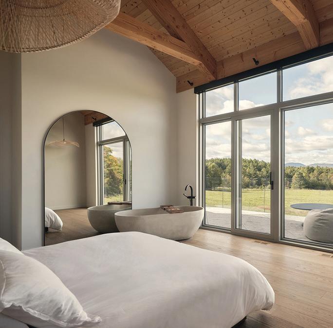
From urban infill to sprawling rural sites, these quietly progressive residential designs start with basic tools like asking and listening.
Blending hospitality with transit-grade durability in the evolving typology of airport lounges.
CANADIAN INTERIORS
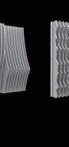
SUMA COLOR SERIES
A new collection for residential and construction projects by Silestone
Superior Performance
Our solutions for interior design cover from kitchen surfaces, to bathrooms and furniture, with up to 25-year guaranteed resistance and durability.
Endorsed by Cosentino
Our decades of pioneering leadership in the surface industry endorse us to provide high quality products.
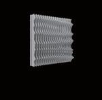
Conscious Sustainability
Our low-crystalline silica surfaces are made with 100% renewable electrical energy and 99% recycled water.
Siberian Persian White Motion Grey Linen Cream Bronze Rivers
BRONZE RIVERS
WHITHER THE KEYWORD
From Victorian constraints to contemporary calm, Creative Union Network’s renovations prove that conversation, craft and spatial rigour outperform any design shorthand.
By Dave LeBlanc
CALL ME BY THE LAND
A young Québec firm demonstrates how contemporary architecture can be deeply rooted in the landscape, effectively blending modern forms with a sense of having “always been there.” By
Martha Uniacke Breen
BEFORE BOARDING
From lush lounges to moody dining rooms, these airport projects show how hospitality-led design can transform travel downtime into a destination all its own.
By Waheeda Harris
CREATIVE COLLIDE
Challenging the clichés of children’s interiors, these projects blend Scandinavian restraint, material durability, and architectural collaboration to design for kids and adults alike. By Shannon Moore
14 20 26 14 20 26
COVER – Junction Triangle House in Toronto, designed by Creative Union Network.
Photo by 5VS Studio
01/02 2026
8 ARIDO JOURNAL
10 CAUGHT OUR EYE
12 THE GOODS The kilometres of corridor carpets running through condos are due for a rethink, one that shifts supply, sustainability and authorship back into designers’ hands.
34 GOOD READS
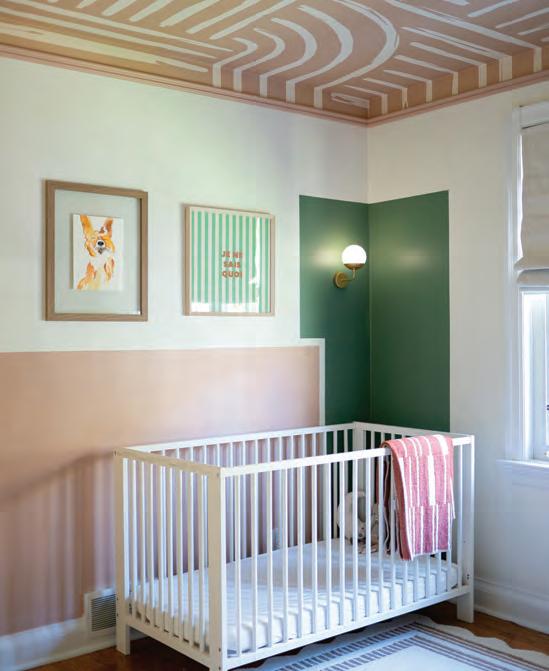
36 OVER & OUT This children’s bedroom redefines what it means to design for both play and longevity.
CANADIAN INTERIORS
Jan | Feb 2026 / V63 #1
Editor in Chief Peter Sobchak
Art Director Roy Gaiot
Contributors
Martha Uniacke Breen, Waheeda Harris, Dave LeBlanc, Shannon Moore, Sharon Portelli, Anna Stranks
Online Editor Lucy Mazzucco
Publisher Faria Ahmed 416-441-2085 x. 5 fahmed@canadianinteriors.com
Canadian Interiors publishes six issues, per year. Printed in Canada. The content of this publication is the property of Canadian Interiors and cannot be reproduced without permission from the publisher. Subscription rates > Canada $38.95 per year (plus taxes) U.S.A. $71.95 USD per year, Overseas $98.95 USD per year.
Back issues > Back copies are available for $15 for delivery in Canada, $20 USD for delivery in U.S.A. and $30 USD overseas.
Please send payment to:
Canadian Interiors, 126 Old Sheppard Ave, Toronto, ON M2J 3L9 or order online www.canadianinteriors.com
For subscription and back issues inquiries please call 416-441-2085 x2
e-mail: circulation@canadianinteriors.com, or go to our website at: www.canadianinteriors.com
Those who came of age in the 1990s and watched a lot of the TV show Friends will no doubt remember the famous scene where Ross, Rachel, and Chandler struggle to move a new couch up the stairs, during which an exasperated Ross continually yells “Pivot!” As 2025 closed out and the flood of year-end market surveys followed, that word and its hilarious delivery rang in my ears.
Military conflicts, Trumpian-inflected macroeconomic and policy shocks, plus other headlines may come first to mind, but for Canadian interior designers 2025 will likely be remembered as the year when slow-building pressures finally collided. What had once felt like background noise became unmistakably structural. Market cycles tightened and longstanding assumptions about where work would come from, and how reliably it would arrive, no longer held. Sectors that firms once depended on began to wobble. Pipelines that once felt predictable froze or fractured. The interior design profession found itself navigating not a downturn, but a reconfiguration.
Nowhere has this been more evident than in the condo market. For many small and mid-sized firms, particularly in Toronto and other dense urban centres, condo-driven residential work functioned as a dependable engine. That engine has stalled. According to data from CMHC, condo sales dropped roughly 75 per cent in the Toronto CMA between 2022 and mid-2025, unsold inventory ballooned and many investors faced losses. This downturn is not merely cyclical noise. It has exposed how vulnerable speculative residential pipelines can be when financing, investor confidence and policy align against them. For designers who built their businesses around this model, the shock has been acute.
Institutional work has also become uneven. Policy changes affecting international student enrollment have rippled through the education sector, leading to deferred or cancelled campus projects in some regions. Firms that once relied on steady institutional pipelines are discovering that even traditionally conservative sectors are no longer immune to policy risk.
At the same time, the competitive field has grown more crowded. The boundaries around who offers design services have blurred. Developers, contractors, real estate conglomerates, and technology-enabled platforms increasingly position themselves as early-phase problem solvers, offering feasibility studies, space planning, and interior concepts that once sat firmly within the designer’s domain. For clients under pressure to control risk and compress timelines, these bundled services can feel efficient, even if they di-
By Peter Sobchak
lute design authorship. For independent firms, they represent a new kind of competition that is less about aesthetics and more about control of the value chain.
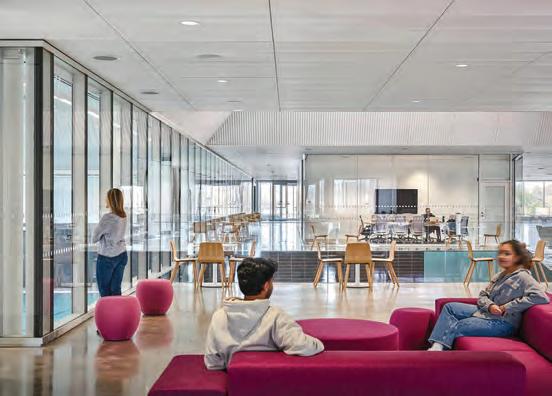
Yet this is not a story of uniform decline. The office sector has emerged as a rare bright spot. Return-to-office mandates have triggered a wave of interior work that is less about expansion and more about reinvention. Companies are rethinking layouts, amenities, and spatial strategies to support hybrid work and cultural reset. This has created meaningful demand for designers who understand workplace performance, change management, and adaptive reuse. Unlike speculative residential projects, this work is often driven by operational need rather than market timing, making it a more stable source of revenue.
What emerges from this landscape is not a single prescription, but a clear warning. Over-reliance on any one sector, particularly those tied to speculative development, is no longer defensible. At the same time, spreading too thin across residential, retail, office, and institutional work without a clear identity can leave firms indistinct and operationally strained. The challenge ahead is not simply diversification, but intentional repositioning.
All that being said, there is reason for cautious optimism. Demand for interiors has not disappeared so much as shifted: a recent market analysis of Canadian interior-design services expects a compound annual growth rate of nearly five per cent between 2025 and 2034. Renovation, retrofit, rental conversion, and adaptive reuse are gaining momentum as clients seek value from existing assets. These areas reward designers who bring strategic thinking alongside spatial intelligence.
The firms most likely to emerge stronger from this moment will be those that treat 2025 as a turning point rather than an anomaly. They will refine their focus, articulate their value beyond decoration, and align their business models with sectors driven by long-term need rather than short-term speculation. In doing so, they may escape the boom-and-bust cycles that have long defined parts of the Canadian design market.
The work ahead is as always: complex, competitive, and demanding. Some designers coming out of 2025 may feel like Ross’s new couch after the stair ordeal: filthy and sawed in half. But there is still plenty of opportunity for practices that are resilient, open-minded and strategically able to pivot.
The Unapologetically Canadian Reset
Kerri Henderson from Perkins&Will Ottawa extols building with Canadian values, from sourcing locally and designing collectively to embedding reconciliation and inclusion in every project.
Beyond Brands and Price Tags
Andrew Borsk from TG Appliance Group discusses how local appliance retailers can offer something big-box giants can’t.
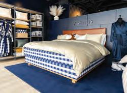
Quiet Luxury
Ringo Wu of Hästens Vancouver explores the bedroom evolution into self-care spaces designed for restoration, emotional balance and sensory comfort.
From Utility to Asset
Katrin Ferge from Tork discusses how thoughtful public restroom choices impact building reputation, tenant satisfaction, and operational efficiency.
THE GOODS
The aesthetics of these faucets blend modern simplicity with sleek designs to bring an elegant, luxurious touch to bathrooms.
From Japanese traditions to nature-inspired products, these
provide a relaxing escape rooted in comfort and sustainability.
Exclusive to our DIGITAL EDITION
COOL READS
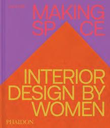
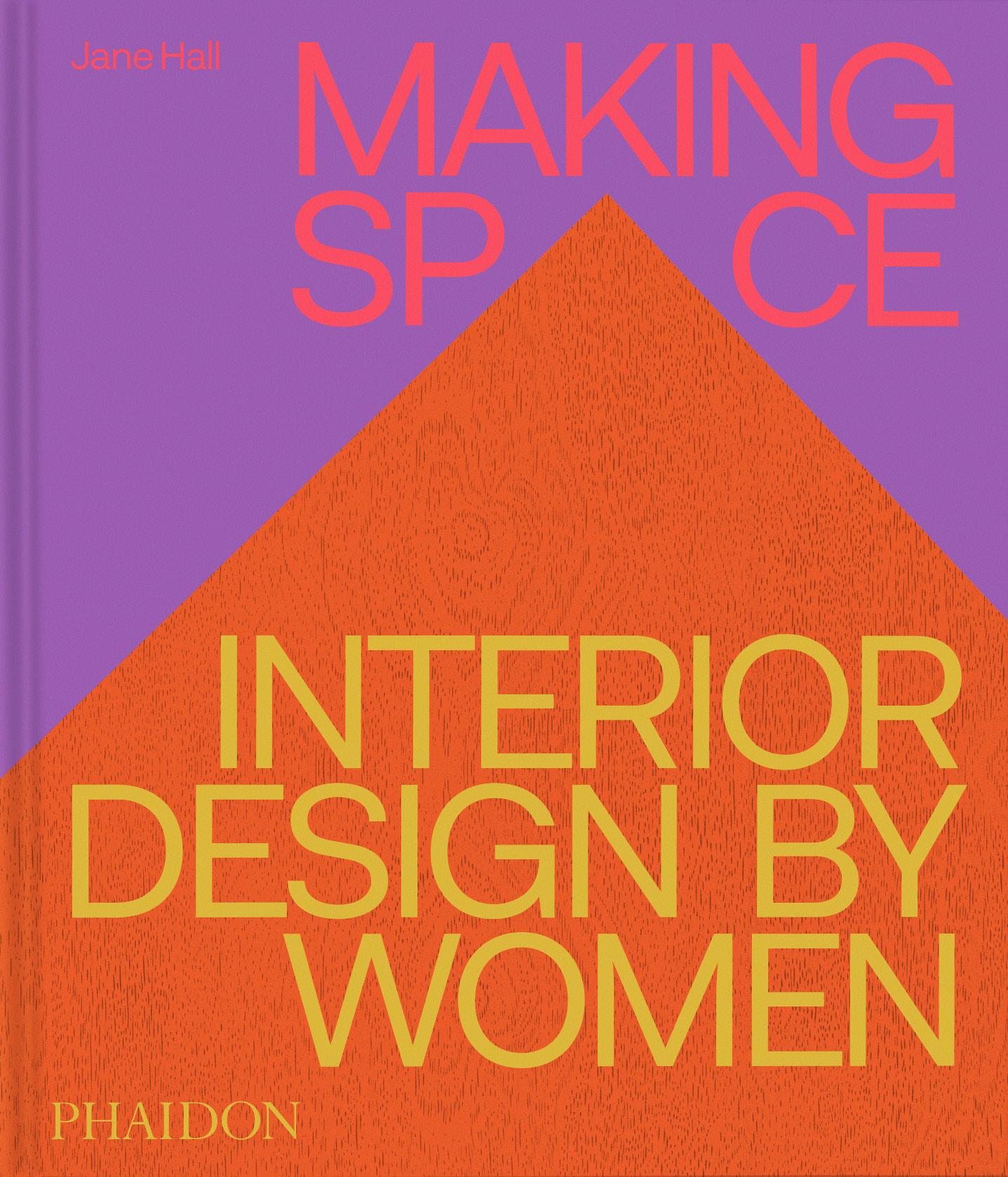
A global survey showcasing the work of 250 of the most creative women practicing interior design.
The Goods: Faucets
The Goods: Tubs
tubs
ARIDO Journal
Fleeting Unity
Recently, a new Interior Design association formed called The Federation of Interior Design Regulatory Associations of Canada (FIDRAC). It was founded by eight provincial regulatory bodies while excluding Ontario (ARIDO) and Québec (APDIQ), due to different provincial requirements.
ARIDO and APDIQ have existed since the mid-1930s as organizational stewards in their respective jurisdictions. For ARIDO, striving for regulation in Ontario continues to be the ultimate goal; a journey that seems like an eternity stemming from the 1980s.
Since 2014, ARIDO has expanded pathways into Registered membership by aligning its framework with the Ontario Fairness Commissioner’s standards in preparation for a future with regulation.
Our recent project, the Registered Interior Designer Assessment (RIDA), enabled ARIDO to become the first provincial leadership for Interior Design in Canada to build a new exam requirement that is a progressive, fair and inclusive assessment. This heightens ARIDO’s sovereignty by no longer relying solely on third parties to carry out the qualifications process.
While intentions for this work were grounded in the Direct Regulation Model, we didn’t predict that our maturity and vision as a progressive leadership would entice a floodgate of uninformed mistrust and what at times appeared to be intentional misinformation by other Canadian and American leadership groups.
By Sharon Portelli
During the development of RIDA , our voices were under fire. Our communication strategy was consistent in highlighting several facts. The exam requirement alternative would mimic the architecture framework in Ontario by providing two options for the final qualifying exam requirement: the NCIDQ exams and ARIDO’s new assessment. As
rior design in Canada. Lastly, the alternative exam requirement would be guided by the professions’ experiences in becoming qualified and respond to decades of feedback.
Unfortunately, other leadership groups began to publicly communicate misinformation about our project and intentions. ARIDO was accused of diluting qualifications standards and putting the public at risk by creating an exam requirement that was “easier.” Communication also threatened barriers to reciprocity due to a new, different exam requirement. ARIDO’s requirements would not be recognized by other Provinces, prohibiting ARIDO Registered members from pursuing interior design work in other jurisdictions.
The hard truth is that national standards have not been uniform. In Québec, the education system does not result in a CIDA-Accredited Degree. Therefore, differences in standards across Canada
Good leaders understand that the misuse of power and influence creates reputational harm, destroys trust and confidence, especially when it leads to segregation amongst those who were once allies.
work continues towards the Direct Regulation Model via the Ontario Architect’s Act, a second exam was inevitable. We also saw no value in duplicating what already existed. The work we would fund and develop would entail a different assessment approach: one that was inclusive, addressed existing barriers, and was reflective of how one practices inte-
have long existed whether ARIDO developed RIDA or not. Regardless of the criticism, RIDA was launched as the second exam requirement in Ontario in May 2025 and a bilingual version in Québec in November 2025.
Regulatory leadership is not an easy responsibility. It requires mitigation of personal and professional biases in or-
der to put public interest at the forefront of all decision making related to qualifying a practitioner. ARIDO has never been negligent in its regulatory responsibilities. We understand how gatekeeping, antiquated practices and cultures keep leadership and professions comfortable while limiting access points to practitioners who possess competencies.
ARIDO passively propping up status quo would have been the easier road taken: remaining behind progression and fighting modernization while claiming to prioritize public protection. It was clear during our work that the resistance we faced was a direct result of challenging the status quo.
Veering from what has always been in place can create a sense of dissonance. Except for those who are change leaders. Those who are emotionally intelligent build collective vision through trust and inspire others by fostering collaboration. Good leaders understand that the misuse of power and influence creates reputational harm, destroys trust and confidence, especially when it leads to segregation amongst those who were once allies. How can a future for any professional group be clouded by the unacceptance of diverse opinions, ideas and progressive strategies? How can burning bridges and igniting a countrywide division amongst leaders result in a positive outcome?
What truly puts the public in harm’s way is not modernizing at all or that power trumps all. It’s the most dangerous decision leadership can make. To remain stuck in what is comfortable, familiar, and preferred. Keeping the status quo alive is the crux of most regulatory bodies and deters most governments from implementing new practice legislations due to concerns around the creation of monopolized professions that gatekeep and remain inaccessible. In Ontario, the criticism around regulatory bodies and exclusive, antiquated regulatory frameworks has threatened the introduction of new practice acts for close to 15 years now.
At a time when global challenges are rising by the day, ensuring progression and relevance of what we mandate for — licensing requirements — keeps the profession adapting in a constantly shifting landscape. What is clearly required is collaboration amongst design leadership groups, of all disciplines. Just as design itself carries value, so does a collective approach: one where unity, openness and collaboration form the foundation. No profession is without its challenges, and the more divided we stand the farther away regulation and public protection gets. Ensuring that the public has access to qualified professionals and that buildings, including their interiors, are safe, functional and support human end users is a collective responsibility.
Sharon Portelli is Leadership and Governance Consultant for ARIDO and has 25 years of experience in regulatory organizations focused on qualifying professions.
Since 1934, ARIDO has been the self-regulatory body for interior design in Ontario, focused on protecting the public and furthering the profession.
CAUGHT OUR EYE
Toni Hafkenscheid
Crash In conjunction with the Gardiner Museum’s reveal of a transformed ground floor (the Museum’s largest capital project in two decades), Linda Rotua Sormin took over the third floor with Uncertain Ground, a sprawling, multisensory installation that fuses raw clay, fired ceramics, found objects, video, sound, and digital fabrication to explore diaspora, ancestry, and spiritual belonging. Drawing on Batak mythology and her Thai-Canadian-Indonesian background, Sormin investigated contemporary urban life colliding with ancestral memory and decolonial inquiry.
Off the Deep End In early November, organizers of the Boutique Design New York (BDNY) trade fair invited four studios to push hospitality design boundaries by creating temporary installations for Designed Spaces. Nivek Remas, one of two Canadian firms who partook, designed The Splash Pad together with DREAM Hotels. Inspired by poolside culture of high-end resorts, the space merged “daylife energy with nighttime allure” using mirrored planes, aquatic tones and sounds.
Ball in Hand On view in a Vancouver gallery for only a few days during the holiday season, Bocci explored the sculptural nature of hand-blown glass with Shapes of Light, an installation comprised of 61 pendants from the company’s 28 series, in green hues that echoed the tones and atmosphere of the season. On site, two performers assembled the globes through choreographed dance, placing each sphere as the structure grew.
Heavy Metal Toronto artist Ranbir Sidhu made his Art Gallery of Ontario debut with No Limits, three large-scale sculptures (including Asteroid 3033 X1, 2025, shown) that reinterpret Sikh iconography through industrial materials and precision engineering. Fabricated in aluminum and steel, the works employ advanced metalworking techniques to test scale, balance, and surface. Ancestral symbols are abstracted into structural forms, positioning Sikh visual language within contemporary sculptural and postwar traditions.
By Peter Sobchak
THE GOODS
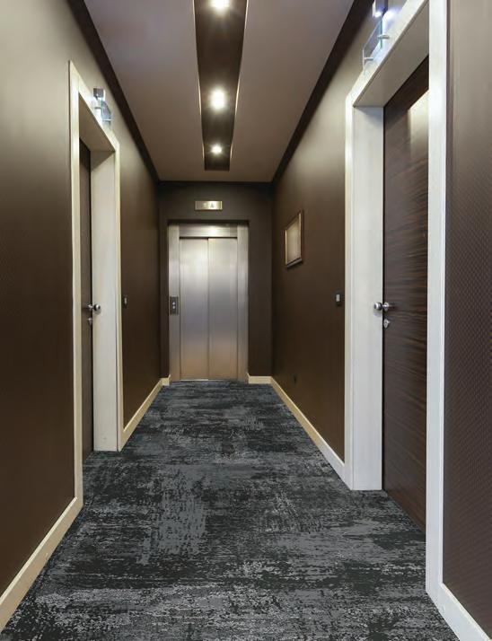
Beyond Beige
The kilometres of corridor carpets running through Toronto condos are due for a rethink, one that shifts supply, sustainability, and authorship back into designers’ hands.
Toronto’s condo market is a machine: thousands of towers, millions of square feet of shared corridors, and a relentless retrofit cycle that quietly shapes the aesthetic DNA of the city. Every seven to 10 years, those corridors are stripped and recarpeted. Multiply that across roughly 2,700 condo corporations, and the result is staggering: nearly 270 to 380 buildings re-carpeted annually, representing $80 to $120 million a year and more than $1 billion per decade.
Until now, nearly every dollar has flowed south. More than 90 per cent of corridor projects rely on solution-dyed ColorPoint carpets from Dalton, Georgia, and 65 per cent of commercial carpet used in Canada originates in the U.S. It’s a monopoly built not on design ambition, but on supply-chain inertia.
Interior designers operating in Canada’s multi-family and retrofit sector know the drill: long rolls, fire and acoustic compliance, durability under wheel-and-foot traffic, and finishes that quietly sit in the background of everyday life. But they also know the dullness of “condo beige” corridors. Enter Matter & Co, a Canadian-owned distributor that is rewriting the script by forging partnerships with European carpet leaders in France (Balsan) and Denmark (Ege). We’re talking wool and recycled fibers produced
under strict EU environmental standards, supported by Canadian warehousing, sampling, and project service. In a multicultural design landscape where hospitality, residential, and commercial aesthetics continually cross-pollinate, the move injects choice, character, and sustainable rigor into a category that has long lagged behind luxury lobbies and amenity zones.
Why this matters for Canada
Beyond aesthetics, there’s a macro-economic subtext. The current supply chain sends over $100 million per year directly to U.S. mills, a flow of capital that leaves Canadian designers, developers, and condo boards tethered to a single foreign ecosystem. In a climate of unpredictable tariffs and tightening cross-border politics, diversifying supply isn’t just a matter of taste: it’s strategic.
Toronto’s vertical housing experiment is maturing. As condo living becomes a generational reality, common spaces matter. Corridor design — once treated as a utilitarian footnote — is now a site for brand identity, resident experience, and resale value. Affordable luxury in shared circulation zones is no longer a contradiction; it’s the next evolution in multifamily design. For designers, this isn’t just another vendor shift. It may represent a structural disruption in a quiet but massive market. One that starts in the hallway.
Matter & Co wants to keep things local: stock product domestically; support project teams here; and reinvest in Canadian infrastructure while tapping into European technical and creative leadership. We reached out to Lisa Parise from Matter & Co to better understand the origins of this “beige industrial reality” and the value of a global design / Canadian distribution strategy.
Toronto’s condo retrofit cycle represents a massive, recurring design opportunity, yet historically, most corridor carpets have come from a small cluster of U.S. mills. From your perspective, why has this supply chain become so concentrated, and what does diversifying suppliers mean for designers?
The condo supply chain in Toronto has become heavily concentrated on American-made products largely because, as the city’s skyline began booming, U.S. carpet manufacturers invested aggressively in Canada. They placed sales teams and brand reps north of the border to secure condo corridor specifications and support their factories back home. At the time, free trade made this cross-border model efficient and cost-effective, and the dominance of American solution-dyed nylon (SDN) production reinforced the trend [with] SDN being the preferred fibre type for condo corridors due to its durability and stain resistance.
However, while this solved supply and logistics challenges for a growing city, it also narrowed the design palette. Toronto’s design community draws influence from both American modernism and European minimalism, yet the U.S. mills generally offered more conservative, repetitive patterns. The result was a market saturated with similar aesthetics, limited colour stories, and a lack of avant-garde or architectural motifs.
Bringing European factories to the Canadian market has changed this dynamic. European mills — particularly those in France, Denmark, the U.K., and the Netherlands — bring more sophisticated design options, including biophilic patterns, architectural geometrics, woven textures, and broader custom capabilities; more advanced sustainability attributes, as the EU is years ahead of North America in circularity, low-carbon production, EPD transparency, and reductions in chemicals of concern; alternative fibre systems, including regenerated nylon, recycled content, and non-nylon solutions for projects seeking PVC-free or lower-carbon interiors; and a wider aesthetic vocabulary, aligning better with Toronto’s increasingly international design perspective.
You say that European carpets promote higher sustainability benchmarks. What sustainability metrics or material criteria do you think Canadian interior designers should prioritize when specifying corridor carpets for high-density residential buildings?
For high-density residential corridors, Canadian designers should prioritize carpets with low embodied carbon, transparent EPDs, and clean material chemistry (low-VOC, PFAS-free, Red-List–free). Fibre choice matters: wool, regenerated nylon, and recycled-content SDN offer far better sustainability performance than virgin petroleum-based fibres. Designers should also look for PVC-free or recycled backings, strong circularity programs (take-back or recycling), and mills that operate with renewable energy or low-carbon manufacturing. Finally, durability itself is a sustainability metric: carpets with higher tuft density, better backing systems, and easy repairability reduce long-term waste and carbon impact.
Condo corridors balance heavy wear, acoustics, fire-testing requirements, and practical installation formats, but they also shape resident perception and developer brand identity. How should designers evaluate carpets for this dual mandate, and what emerging performance or aesthetic trends should they be watching for in multifamily corridor design?
Designers should evaluate carpets through a dual lens: durability and brand identity. On the performance side, prioritize high-density constructions, strong acoustic ratings, Class A fire performance, and formats that install cleanly in long hallways (tiles, planks, or custom woven Axminster). At the same time, corridors are increasingly seen as an extension of a building’s personality. Designers are moving toward biophilic patterns, organic textures, and earthy palettes for a sense of calm, while others are embracing architectural geometrics and bold colour moments to create boutique-hotel energy. Advances in European patterning and dyeing now allow truly custom storytelling in corridors, letting buildings differentiate themselves while still meeting the heavy-wear demands of multifamily living.
By Dave LeBlanc
Whither The Keyword
From Victorian constraints to contemporary calm, Creative Union Network’s renovations prove that conversation, craft and spatial rigour outperform any design shorthand.
Ah, the dreaded “keyword.”
Like the myriad passwords that buzz like flies around twenty-first century heads, the keyword — with or without a hashtag fronting it — must be harnessed during even the most menial of Facebook or Pinterest tasks and, of course, whilst conducting scholarly research. A wrong word choice and one can be led down the garden path.
Which begs the question: what magical keywords might unlock an architect’s heart so that they might produce an interior one would never want to leave? Could the words be vague? “Light,” “Meditative,” “Open”? Or do they need to be more specific? “Open back wall to allow light,” “A room without clutter so I can think,” and “Kitchen and family room to flow into each other”?
While architects Claudia Bader and Timothy Mitanidis of Toronto-based Creative Union Network do ask for keywords on the two-page questionnaire they hand to new clients, they also don’t
mind a “long gestation” period: “Working through the ideas, discussing them, coming up with concepts, changing our minds [and] circumstances changing,” says the soft-spoken, salt-andpepper bearded Mitanidis.
Mitanidis is thinking of a house he and wife/business partner Bader designed for Shelley Simmons and Paul Haley in Toronto’s Little Portugal neighbourhood. Simmons, a video game innovator, was able to produce multiple sketches — a visual wish list rather than a (key) wordy one — of what she wanted her semi-detached house to look like, and, with the onset of the pandemic and materials delays, there was ample time for back-and-forth.
Keywords, however, tend to describe a macro view: no keyword could ever account for the light-filled spot in Adrian Myers’ and Laura Salisbury’s house designed specifically so Myers’s mother can sit and Riley
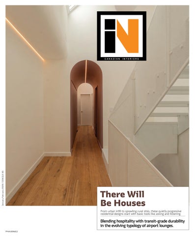
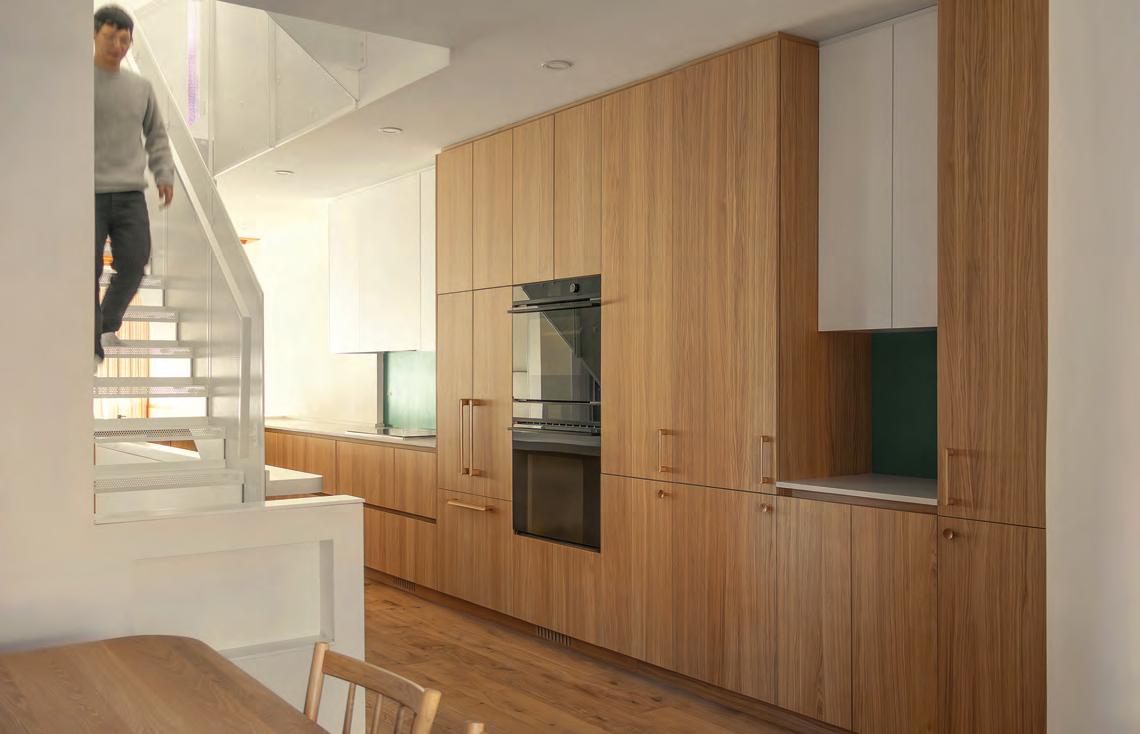
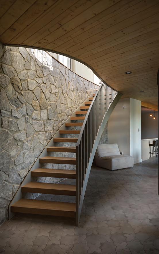
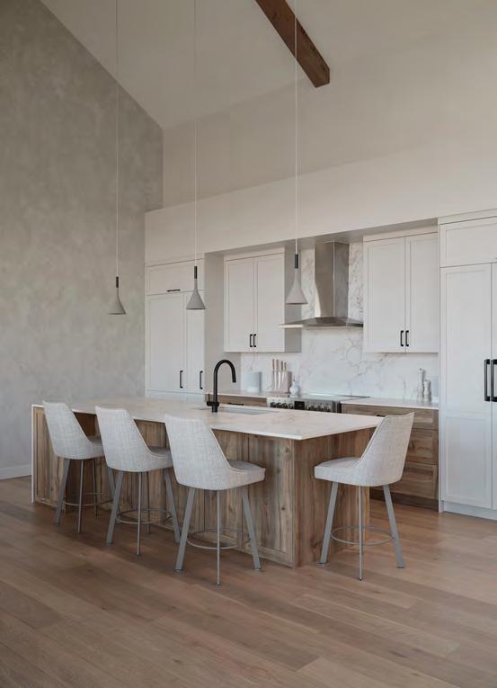
This spread Portugal Village House I reframes a 19th-century Toronto bay-and-gable through interior strategies that privilege light, precision, and multi-use living. Once dark and compartmentalized, the ground floor is opened via generous glazing, skylights, and level adjustments that reconnect daily life to the backyard. Built-in cabinetry and custom furniture do the heavy lifting, compressing storage and function into crisp architectural elements. An eight-foot-high triangular window is a contemporary interpretation of the traditional bayand-gable style bay window that opens the space to the street and allows the eastern morning light to pour through.
watch her son cook. “We spent the whole pandemic just hating our house,” laughs Salisbury of the Junction Triangle detached home she shares with Myers and their young son.
Whether using keywords, conversations or sketches, Creative Union has a knack for reshaping old, outdated-and-cramped Toronto interiors into wide-open, modern living miracles. A wasted corridor morphs into usable space which handles circulation from time to time; an overall layout is honed and refined to the millimeter; and a problematic constraint is wrestled into an opportunity. Yet rather than the let-down of revealing every design move right from the front door, there are still corners to turn, halfwalls to shield, and hidden vignettes to keep visitors (and owners) delighted rather than dejected. “It’s always a surprise,” confirms Myers. “Every morning, I wake up and walk out there and [I’m] in this new space.”
A Wider World View
Perhaps Europe has something to do with their space planning expertise. Born in Frankfurt, Germany, Bader, 50, received her diploma in architectural drafting at Philipp-Holzmann-Schule in 1998 before an exchange program at Toronto Metropolitan University (then Ryerson) led her to her future husband. The pair then embarked on an
educational journey to Germany together: at the Frankfurt University of Applied Sciences, Bader got her degree while the Toronto-born Mitanidis, 48, worked toward a postgraduate degree in conceptual architectural design.
While Bader continued to hone her skills in Frankfurt on projects as varied as the Ministry of Oil for the government of Iran and school cafeterias for the German government, by the mid-2000s Mitanidis was off to work for UNStudio in Amsterdam. There, he worked on a sustainable headquarters for a biotech company and a prize-winning building for the Dutch Ministry of Revenue. And, if that weren’t enough, the couple “renovated three old houses in Greece while spending summer breaks there,” says Bader.
Moving permanently to Toronto in 2007, Bader crafted private residences — one the complex conversion of an old industrial building — and community centres at a few different firms while Mitanidis immersed himself in the intricacies of people- and machinery-moving at SGA-IBI Group, designers of transit stations for Metrolinx and the Toronto Transit Commission. Once the Creative Union Network shingle was hung between 2012 and 2013, that macro world view could be applied to the microcosm of Toronto’s old Victorian and Edwardian housing stock. Riley
Snelling
Portugal Village House I
Before Shelley Simmons and Paul Haley put their heads together with Creative Union, their 2,200-sq.-ft. bay-and-gable, like most Victorian homes, suffered from a light deficit mid-way through the main floor. There were pokey bits, too, such as a raised, boxy, modern fireplace jutting into the living space, which made for awkward circulation patterns. And while the kitchen was nice, the island was too large for the narrow house, and there was an orphaned cabinet off to one side. There was talk, too, of the need for an adults-only floor with principal bedroom and an indulgent ensuite.
After that aforementioned “gestation” period, the couple broke ground in 2021 and were able to move in 14 months later (they waited six months for appliances). While Creative Union has respected the home’s heritage vis-à-vis crown moulding and an orderly geometry of uses, they’ve also added a few non-90-degree angles, curves in the drywall, and manipulated light penetration to produce a soothing, womb-like environment.
From the front door, the eye travels along a herringbone floor to an enormous glass door at rear, which looks onto the couple’s rental property. This unimpeded eye travel is made possible by a much more linear and logical kitchen with a smaller island. And while it might seem counterproductive to wall up a formerly spindled, heritage staircase, the lack of visual clutter also helps with light and flow. New handrails sport hidden lighting that illuminates both wall and treads. To illuminate the middle of the main floor, a skylight rains millions of photons from the new third floor adult’s area via a perforated metal staircase, which looks light-as-a-creampuff but, underfoot, feels sturdy-as-an-oak.
And speaking of light, the third floor welcomes it through both a meditative, triangular alcove under the building’s prominent gable and a tiny outdoor courtyard/balcony with fully glazed walls: “On these old, existing buildings, a lot of them are too close to the property line to introduce new windows,” says Mitanidis. “So with that little inset, it allows us to increase to a larger percentage [of
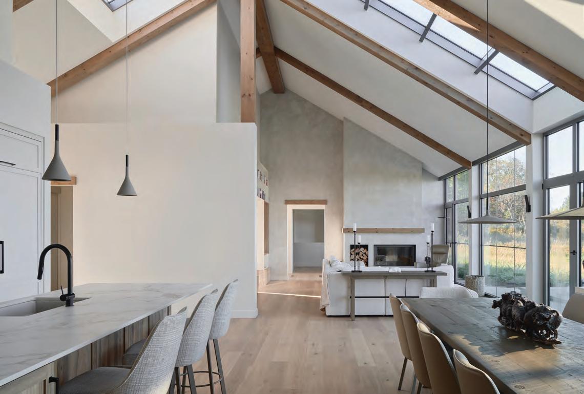
This spread Portugal Village House II treats a Victorian bay-and-gable as both inheritance and framework. Original stair balustrades and crown mouldings anchor the front rooms, where a reinstated foyer, stair hall, living room, and dining room restore a sense of formal sequence. From there, the house shifts register: a generous rear opening draws the plan into a contemporary kitchen and family space defined by precision detailing and light. Solid oak jambs mediate old and new, while a restrained palette does the rest. Crisp white walls and tall cabinetry sharpen the volume; walnut millwork and dark quartz counters bring depth and tactility.
glazing] on that wall.” By moving his-and-hers sinks and closets into the middle portion of the open concept floor—a sort of hallway washing and dressing area—the small bathroom can accommodate a very large shower with a long bench, which peek-a-boos through a triangular window into the main space. A freestanding fireplace beside a wall-curve adds the perfect touch of indulgence. “For me, I really focus in it,” says homeowner Shelley Simmons of the third floor. “It’s like a Cone of Silence.”
Portugal Village House II
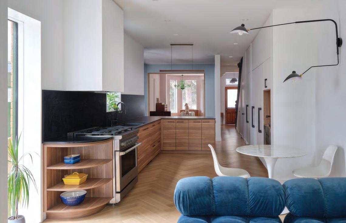
Portugal Village House II, another bay-n-gable, had been divided into a triplex, and Creative Union was tasked with giving it a rebirth as a single-family home. Again, the front portion was allowed to remain formal: a foyer and stair hall with crown moulding; and, in the two front rooms, picture frame moulding. But, after the traditional dining room, the main floor explodes into a light-filled festival of twenty-first century family life for a family of five and a dog.
Like with many Victorians, a lean-to rear shed — which blocked off all communication to the backyard — was jettisoned in favour of a massive amount of glazing. Curves in cabinets, on walls, a rounded, plush, royal blue sofa, the use of warm woods, and clever, boat-like storage keep the eye moving and interested. Upstairs, neutral tones and luxe finishes keep things restful.
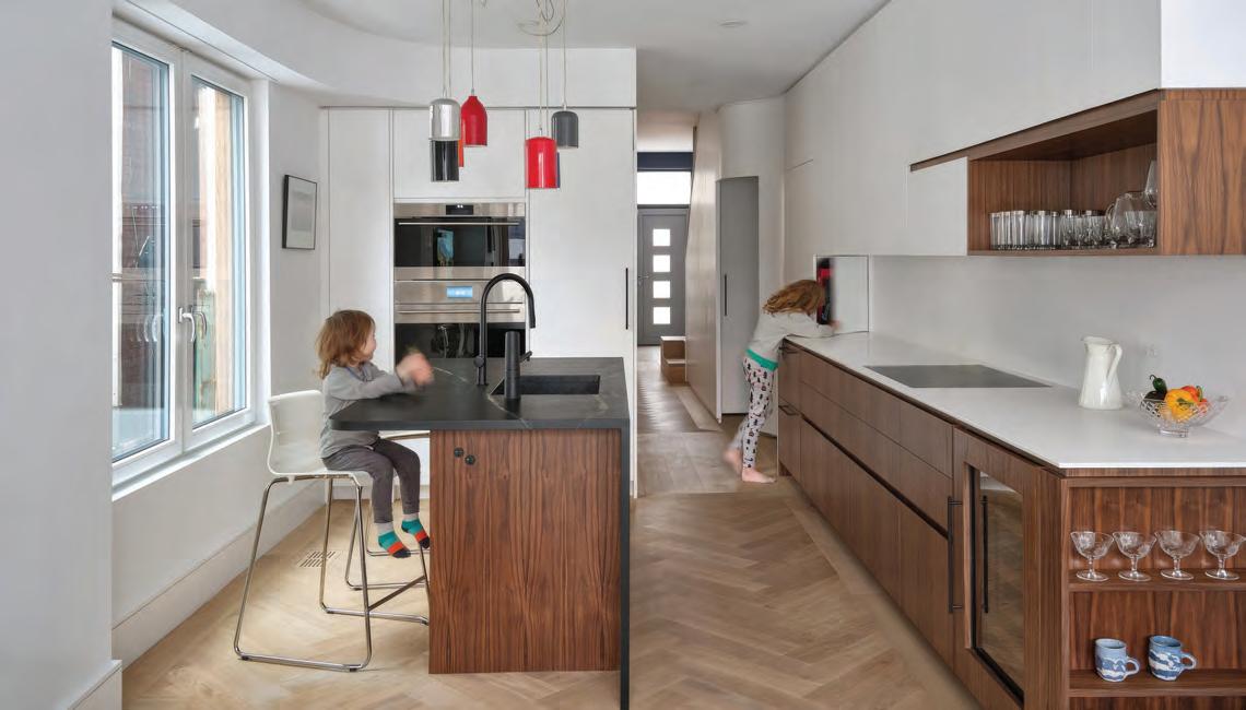
Junction Triangle House
Adrian Myers’s and Laura Salisbury’s 2,800-sq.-ft. home near the railroad tracks — tracks that once transported livestock to the stockyards to the north — wasn’t quite a bay-and-gable, but being of similar vintage, it presented similar challenges. “There used to be a room outside of this, a mudroom that someone had built,” says Myers as he stands in the now generous foyer where a built-in, red upholstered couch can be spied through a screen. “I think there was a skunk that died underneath it, and that was the impetus for this project,” he laughs.
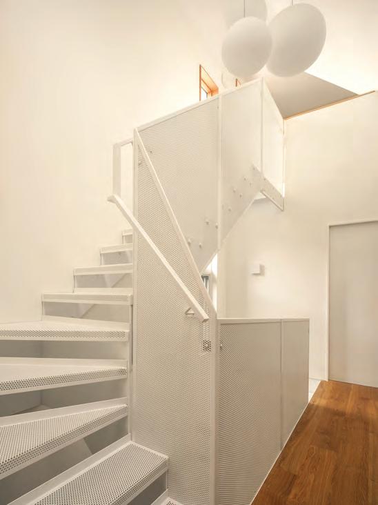
After removing the poorly-built addition to “reclaim” the original street-facing façade, the matter of circulation could be addressed, since the collection of narrow hallway, staircase, and small rooms didn’t meet the needs of the family. Placing a power room where the stair used to be, the couple decided on a full perforated metal stair — they’d toured the Simmons/Haley house and were smitten — in the middle of the floor.
Despite being a tried-and-true light penetration method, it was trickier this time since the house featured an apartment building-style light well that pinched available floor space. But fill it in, and the proximity to the neighbouring house would suck away most of that precious daylight. “We were standing here with a
measuring tape since we were really worried about this space,” says Bader. “I think we did reduce the breakfast counter by an inch.”
And despite the kitchen’s L-shaped floor doubling as a corridor to carry the family to the sunken family room — Myers’s mom’s perch (to watch her son cook) is tucked between two cabinets just before the two-steps-down — there isn’t a lot of elbow jostling: “It’s more functional than I thought, even when people are gathered,” beams Myers.
To add an informal, 1970s recreation room feel to the sunken room, CU tricked the space out with exposed rafters and curved-wood wainscoting: “That idea [of] the height of the kitchen really frames the space,” says Mitanidis. On the second floor, to achieve “compression and expansion,” a mauve-painted, curved tunnel leads to their child’s bedroom (it has a tiny loft that pokes into the former attic space) and a home office.
Salisbury’s office is interesting. Reached by its own stair and occupying the highest point of the house, it’s a quirky oasis with its
own deck. It also provides a home to Salisbury’s father’s old-fashioned desk chair (he was a professor at McGill), and her grandmother’s Québec farmhouse chair, needlepoint, and a spoon collection. “What are we going to do with these things that do not fit with a lot of what we’re doing in the house,” laughs Myers. “Let’s make a little, weird, British Cotswolds-y room.”
Whether retail space, loft, garden or laneway suite, the full renovation of a 1938 house (all things they’ve done), Creative Union Network sweats the small things — that are really big things — such as where to hide HVAC, plumbing and electrical. They choose celebratory moments of expensive tile or custom metalwork sparingly so as not to break the bank, and they encourage clients to incorporate colour and curves to avoid sterility. If this writer had to choose keywords to describe them? Thorough. Friendly. Adventurous.
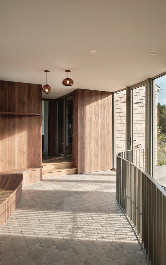
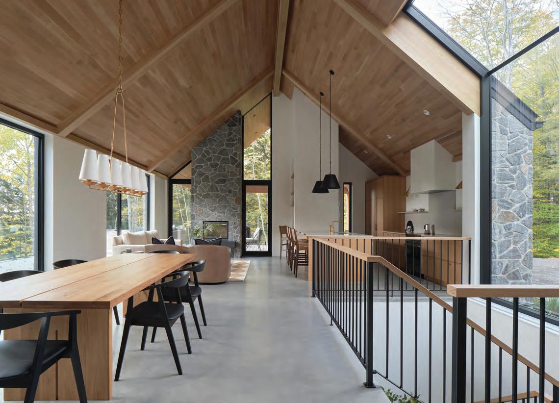
This spread Junction Triangle House recasts a former factory condo as a layered, light-filled loft that leans into its industrial DNA while softening it for domestic life. A custom stair with white oak treads and a crisp HSS guard becomes both connector and centerpiece, anchoring the dramatic entry sequence. Upstairs, kitchen, dining, and living zones flow openly, unified by pale millwork, light grey counters, and engineered white oak floors that add warmth and acoustic calm.
By Martha Uniacke Breen
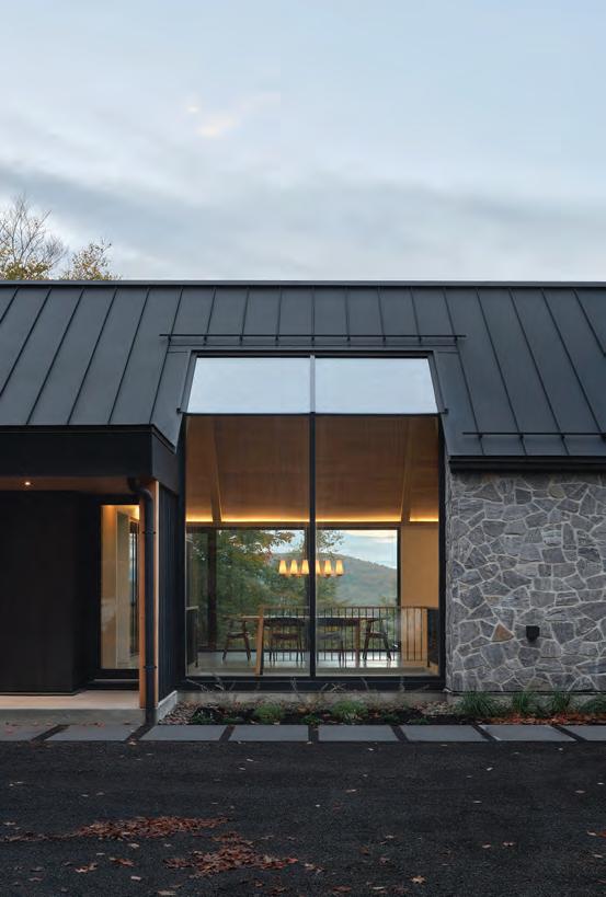
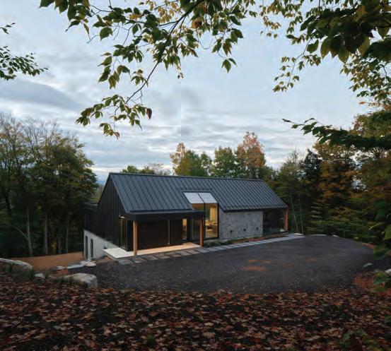
Call Me by the Land
A young Québec firm demonstrates how contemporary architecture can be deeply rooted in the landscape, effectively blending modern forms with a sense of having “always been there.”
It’s hardly revolutionary for architects to consider the landscape in the creation of their works, especially with country houses. In fact, most who work in this area will say the site and its immediate surroundings are integral, in everything from materials to site planning.
But in the case of Bromont, Québec-based Muuk Architecture and Construction, it’s about much more than analyzing the land, views, light and prevailing winds (though it includes all these elements, of course). It’s about what Muuk co-founder Sylvain Bélanger calls “listening” to the site, from their very first encounter with a new property.
Particularly in its residential work, much of which is focused in the rolling fields and woods of rural Québec, Muuk raises the idea of synchronicity with the land to the level of an art form: modern cottages that, from a distance, look like they’ve been there for many decades rather than just a few years; materials that echo the land-
Phil Bernard
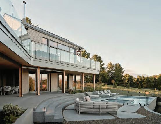
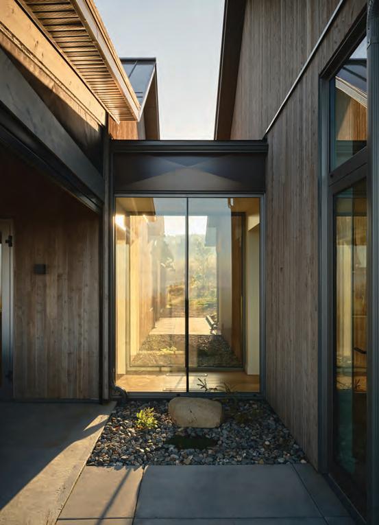
This spread The 4,000-sq.-ft. residence in Georgeville, in the Magog region of Québec, frames interior design as an extension of landscape. Timber structure and red cedar ceilings lend warmth, while natural stone walls pull the site indoors. A central fireplace grounds the living space; the kitchen’s built-in banquette and textile wall treatment add domestic softness. Curved circulation culminates in a stair wrapped by stone, leading to guest rooms below and a bar with retractable glazing that opens directly to the pool, blurring interior, pavilion and terrain.
scape or let the home almost disappear into its surroundings, while at the same time being uncompromisingly modern and minimalist.
“For us, the first site visit is not about measuring or analyzing constraints right away,” he explains. “We spend time walking the land, observing how it reveals itself. We look at topography, natural light, prevailing winds, existing vegetation, views, and how the site has been shaped over time, both naturally and by human use. Often, we try to understand what the land ‘wants,’ before imposing any architectural idea on it.”
Bélanger and partners Marie-Isabelle Gauthier and Alexandre Gauthier launched Muuk in 2017 out of a shared desire to unite architecture, design, and construction under one roof, with a strong focus on thoughtful, well-built, and meaningful spaces. Eight years after its founding, the team continues to work from an office they designed and built themselves in Bromont along with a team of eight employees.
Marie-Isabelle is an architect with many years of professional experience, while teammate (and Marie-Isabelle’s brother) Alexandre has been a general contractor for just as long. However, Bélanger’s professional journey, as he explains it, took a slightly more roundabout route. “I initially studied medicine at McGill University and worked for nearly 15 years as a medical illustrator,” he says. “Over time, my interest in design and the built environment became central, and I decided to start my own design and construction practice.” About 10 years ago, he made a significant career shift.
“The turning point came when an entrepreneur refused to build a house I had designed for myself, saying it was too complex to construct. Rather than simplify the idea, I chose to obtain my
general contractor’s license and build it myself.” That experience became the foundation of a professional transition, and deeply shaped Belanger’s approach to architecture and construction.
His association with the Gauthier siblings began as a personal friendship. Alexandre and his family lived on the same mountain in Shefford; their wives worked together and Gauthier’s daughters babysat Belanger’s children. When a large project came to sister Marie-Isabelle that was too substantial for a single firm to handle alone, the three decided to collaborate on that project. Although it ultimately never materialized, they quickly realized they had a similar approach to the idea of making architecture, and Muuk was born.
The name “Muuk” is itself characteristically iconoclastic. The word comes from the Mayan language and refers to strength and greatness. “The Maya were extraordinary builders and architects, and the name reflects our respect for craftsmanship, structure, and timeless construction knowledge,” says Bélanger.
Muuk buildings are distinctive by their very subtlety. While often deceptively simple, even plain in form, they sit on their founda- Phil Bernard
tions in a uniquely comfortable, settled way, “nested” in the landscape. But as is so often the case in modern architecture, arriving at such simplicity requires a complex thinking process. “What inspires us most are the subtle, often overlooked elements,” he says.
“The way a slope frames a view, how a forest opens unexpectedly, the contrast between exposure and shelter, or how a building might appear or disappear from a distance.
“We are very interested in how architecture is perceived as you approach it, how it sits in the landscape, and how it ages over time. That’s why many of our projects feel almost archetypal from afar, like long-standing farm structures, even though they are entirely contemporary in their detailing and spatial organization.”
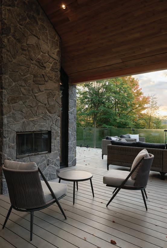
Balancing natural and traditional references with a minimalist approach is really about restraint, Belanger continues. “We don’t try to imitate vernacular architecture literally. Instead, we abstract it. We take fundamental principles such as simple volumes, honest materials and clear structural logic and reinterpret them in a modern language.” Materials play a critical role in this balance. The firm’s designs favour materials that weather well and resonate with their surroundings, such as wood, stone, and steel,
This spread This 5,110-sq.-ft. private residence at the edge of a vast agricultural field near Bolton-Ouest presents a quietly assured interior shaped by light and landscape. Linked by glazed passages, the home’s living spaces unfold across gabled volumes, where weathered cedar, stone, and matte steel establish a refined rural palette. A linear skylight draws daylight into the plan’s core, animating circulation and softening the transition between rooms. Generous glazing frames long views over the fields, ensuring the interior reads as both grounded and expansive.
and then deploys them in a straightforward, almost raw way. Texture, patina, and even imperfections add warmth and depth, while the overall composition remains precise and contemporary.
A common thread appears when looking at the firm’s most recent residential projects. Starting with the site, traditional references are abstracted rather than copied, and architecture feels calm, precise, and lasting: modern, but never disconnected from its environment. Take, for example, a countryside home in Magog completed in 2025. Viewed from a distance, it resembles a cluster of old farm buildings, and elements like grey steel roofs, natural cedar siding and the asymmetrical arrangement of its different volumes suggest it might have been there for decades, instead of just a year or two. “This project was about scale and collectivity, rather than a single object building. The inspiration came from the idea of a small rural cluster, almost like an informal hamlet that could have grown organically over time,” says Bélanger. “We worked with simple, archetypal forms and carefully calibrated distances between volumes, allowing views, light, and privacy to coexist.”
As with the Magog cottage, a trio of volumes set slightly offside to each other connected by glass walkways impart a familiar, almost traditional farmstead feeling, this time in Bolton-Ouest But the orientation of the different sections and the abundance of glass serve a purely contemporary purpose: making the most of the wide-open, pastoral views of rolling pastures surrounding the house. “We wanted the architecture to feel almost secondary to the land itself. [Le Pâturage] draws directly from agricultural references: long, low volumes, restrained gestures, and materials that echo the surrounding fields and tree lines. The building sits lightly on the site, emphasizing horizontality and continuity with the terrain, while the interior spaces are minimalist, luminous, and oriented toward long views.”
Clad in black steel, concrete and natural stone that harmonize beautifully with its mountainside surroundings, a restrained hideaway in Bromont answers the question of how to set a house on a steep wooded hillside and maximize light and breathtaking views. “Built on a sloped mountainside, it required a strong relationship between structure, terrain, and movement. Stone, steel, and wood
This spread This residence near Bromont offers a disciplined, light-driven interior that balances modernist clarity with material warmth. Beneath a cathedral roof, living, dining, and kitchen zones flow as a single, linear volume, animated by vertical glazing that draws forest light deep into the plan. Stone and black steel set a robust architectural frame, softened inside by restrained wood accents and built-in furnishings. An indoor-outdoor stone fireplace anchors the space, while exposed concrete floors provide both thermal mass and tactile presence.
are used in a very direct way, expressing both solidity and lightness. The house feels protective and grounded from the uphill approach, and open and expansive toward the landscape.”
“Minimalism, for us, is not about coldness or reduction for its own sake; it’s about clarity. By removing what is unnecessary, we allow the relationship between the building, the landscape, and light to become the main architectural expression,” says Bélanger. “Ultimately, our goal is to create architecture that feels both deeply rooted and quietly modern, buildings that belong to their site, that could not easily exist elsewhere, and that will continue to feel relevant and grounded over time.”
By Shannon Moore
Creative Collide
Challenging the clichés of children’s interiors, these projects blend Scandinavian restraint, material durability, and architectural collaboration to design for kids and adults alike.
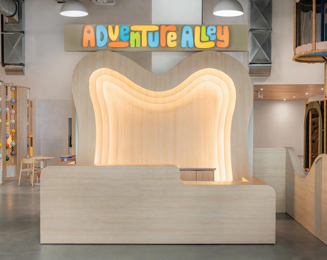
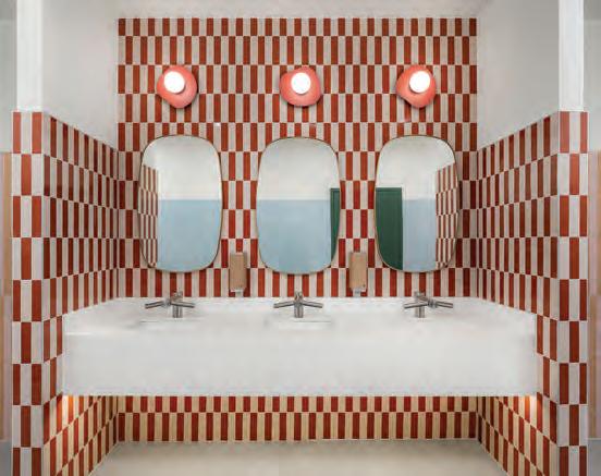
If you are a parent or guardian, chances are you’ve frequented traditional playspaces marred by fluorescent lighting, outdated furnishings, and retro carpeting. Devoid of fashion and flair, these indoor corrals for children — be they bowling alleys, arcades, restaurants or playgrounds — leave little to be desired. So, when Adventure Alley co-owners Amanda Neves and Sebastian Kennedy dreamed up a spot “designed for families, by families,” a new kind of experience was born.
“They had this idea to build a community-driven play space for both children and parents to enjoy. A place where everyone can come from their busy city life and feel a breath of fresh air,” said Jordana Leventhal, principal designer at Toronto-based LV Interior Design Studio. “There’s a lack of this in the market, and I think people are becoming Dan Molina
more conscious of that. We need to keep both children and parents in mind through a user experience.”
Adventure Alley
Conveniently located at Dufferin and Dupont Streets in Toronto’s downtown core, Adventure Alley has been well-received since opening its doors to families in the fall of 2025. Scandinavian in feel, visitors
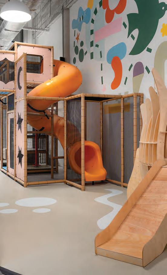
This spread Adventure Alley reframes the children’s play space as a considered interior environment, balancing imaginative freedom with architectural calm. A Scandinavian-inflected palette of light woods and muted pastels establishes a serene baseline, animated by geometric forms that cue exploration without visual overload. Polished concrete floors and resilient wood-look millwork ground the space, while rubberized surfaces soften key play zones. Sculptural, city-inspired volumes give way to treehouse-like structures, reading nooks and fencing details that gently introduce nature as a spatial theme.
are welcomed by natural wood tones and soft pastel colours as soon as they enter the space. With few straight lines in sight, children are encouraged through the design to channel their curiosity and immerse themselves in play. “We wanted all the lines to be wavy to invoke the children’s imaginations,” said Leventhal. Right off the bat, she says, children ask themselves “where can this line take me? How can I follow it? How can I escape from the environment that I’m in and come into a new one?”
Two multi-level playscapes sit in the main recreation area, stacked 19-ft. high in a stocky style reminiscent of Adventure Alley’s surrounding urban landscape. Positioned around them are two party spaces, tactile and sensory stations, and a digital room where kids can play interactive games. “Every area is very intentional for the type of play and age group that are to be in there. It’s about making sure that every child is enjoying the experience, and when they come back, they can have a new experience as well,” said Leventhal. “It grows with them.” Suspended above and sprinkled throughout are nature-based nods, including cloud lighting fixtures, treehouse-style nooks, a picket fence, and moon and star elements.
At its centre, Adventure Alley features a lounge where parents can work, relax, or observe their children. Unlike traditional playspaces that cater exclusively to kids, Adventure Alley was poised to appeal equally to caregivers from the start. The goal: “to think about them as a whole, [as] a full entity,” said Leventhal. “That’s how you attract people.”
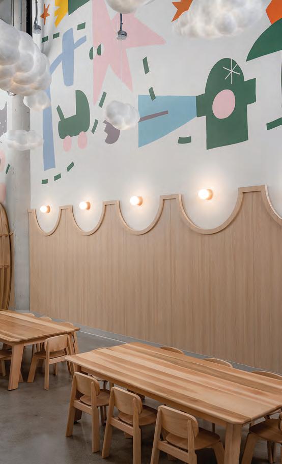
While polished concrete floors occupy the entry areas, the design studio opted for comfortable, double-layer rubber composite flooring in the play areas. Rubber continues into the party rooms in the form of high-performance tile, while the walls favour ceramic tile and melamine cladding. A mural painted by local artist Justin Broadbent adds colour and interest, as do wallpaper, graphics, branding, and a unique abacus-inspired display.
Real maple is used for much of the furniture throughout. As for the millwork, a melamine product was selected for its close appearance to natural wood, and for its durability and wipeability. “We really needed to think about the sustainability of the space and the longevity of the materials, as well as the comfort and safety of the kids,” said Leventhal.
Fluvarium Lilypad Daycare Centre
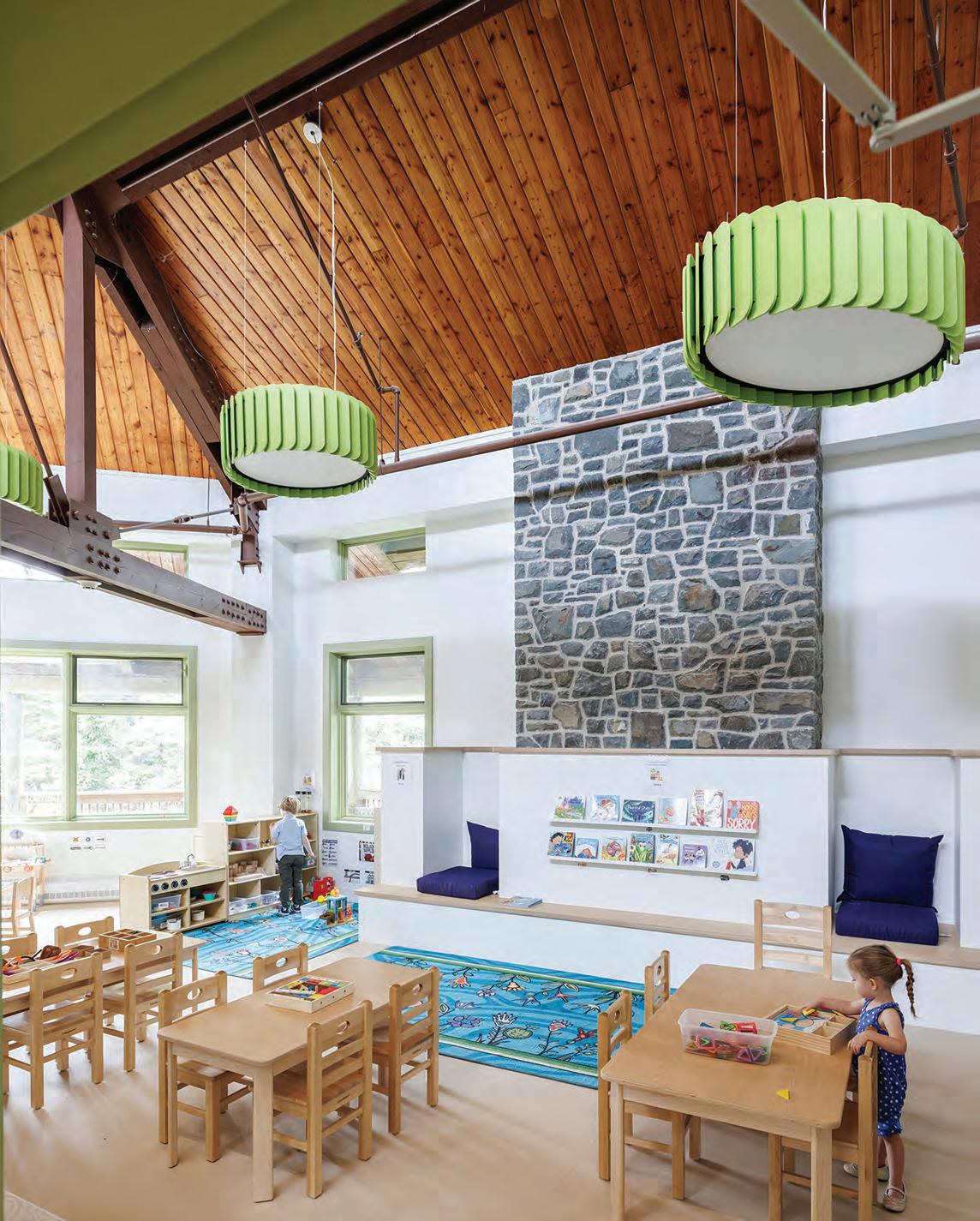
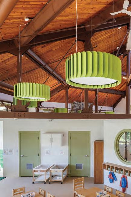
Much further east, another project similarly challenges the conventions of traditional children’s design. The Fluvarium Lilypad Daycare Centre in St. John’s, Newfoundland is unlike usual childcare settings. Located in a 1980s environmental education building, the daycare’s architects needed to determine how best to retain the original character of the structure while ushering in a new mandate and purpose for the space.
The first challenge was to work with three branches of government — the city, province, and department of education — as well as the fire department, to determine how best to integrate a childcare facility on the top floor of a three-storey building that’s also used as a public museum. “Assembly and care are as far apart as you can get in the building code,” said Chris Woodford, architect at St. John’s-based Woodford Architecture, who led the design alongside architect Devan
This page In Adventure Alley, party rooms shift mood through light and enclosure. Throughout, durable materials are deployed with restraint, ensuring the interior feels cohesive, contemporary, and quietly sophisticated despite its high-energy brief.
Opposite page The Fluvarium Lilypad Daycare Centre transforms the building’s top floor into a light-filled interior shaped as much by structure as by landscape. Stripped back to reveal its heavy timber frame and distinctive octagonal plan, the space allows architecture to guide atmosphere. Dan Molina
Burry and building technologist Keita Foley-Tanaka. “We spent about six months discussing this with government and we had the entire building reclassified as a daycare.”
This proved to be a huge win for the design team. Not only did it set a precedent for the possibilities that can arise from collaborative conversations between designers and government-level authorities, but it empowered Woodford Architecture to approach the renovation with the respect and care it required. “Everyone respected the original building enough to bring it back. That’s something I’m proud of. Because often, it’s too difficult, or ego gets in the way and you want to make it your thing,” said Woodford. “We let the original building sing.”
The Fluvarium’s original timber structure, built around a large central staircase, was thoughtfully uncovered and left exposed amid the addition of interior partitions that creatively stop short of the ceiling. “We wanted to make a visible break between the renovation and the existing building,” said Woodford, who notes that the original structure is entirely angular. “Everything is square or rectangular. We decided that our intervention would be the walls that come in and don’t quite touch the structure, perforated with these round openings that look complimentary but different to the existing building.”
Woodford also notes that the change in building code allowed the design team to avoid the need for a new dividing wall between the public and private spaces, which would have destroyed both the project’s budget and the flow of the existing staircase, as well as intro-
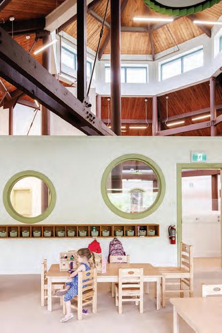
This page New classrooms in the Fluvarium Lilypad Daycare Centre are carved from the geometry, each benefiting from sloped ceilings, generous daylight and direct outdoor access. Interior partitions stop short of the original beams, preserving openness and making the structure legible at a child’s scale. Circular windows punctuate the walls, pulling light deep into the plan while creating visual connections between rooms. The result is a calm, nature-inflected environment where material honesty and spatial clarity quietly support early learning.
duced the need for additional entrances and exits.
Pops of colour in the classrooms compliment the calming tones of the white walls and warm wood ceiling, while natural light shines in through a cupola whose function — to bring light in — had been lost to the Fluvarium’s past renovations. In uncovering the original timber structure, Woodford and team were able to restore the cupola’s essential purpose. “Because the roof is so big on the building, and the way they had it divided, it was amazing how dark it got on the top floor of all places,” said Woodford. Coupled with the open staircase and interior circular windows, every child now benefits from the cupola’s light. “We were trying to make sure that every classroom could see it.”
A final, essential consideration of the daycare’s design was a connection to nature and access to the abundance of green space offered by the surrounding 3,400-acre Pippy Park. The Fluvarium, established by the Quidi Vidi / Rennie’s River Development Foundation in the 1980s, has long been committed to environmental education in protection of the site’s waterways and the species that inhabit them. By repurposing a wrap-around deck, the design team provided quick outdoor access for the daycare, while ensuring that the surrounding landscape could remain untouched for continued preservation and nature-based play.
At their cores, both the Fluvarium and Adventure Alley demonstrate a new, creative era in children’s design, as well as what can be accomplished when collaboration and vision collide.
By Waheeda Harris
From lush
lounges to
moody
Before Boarding
dining rooms,
these airport projects show how hospitality-led design can transform travel downtime into a destination all its own.
In the promised land beyond airport security, frequent fliers and vacationers aren’t rushing to their gate: airports now offer more than a quick bite or a last-minute purchase: contemporary airport design rivals top tier restaurants and boutique hotels, providing a memorable place before departure.
For travellers making their way through Calgary and Edmonton’s international airports, two additions to these hub’s F&B offerings are pairing hospitality chic with transport grade durability, making the time between arrival and departure a welcome and relaxing experience.
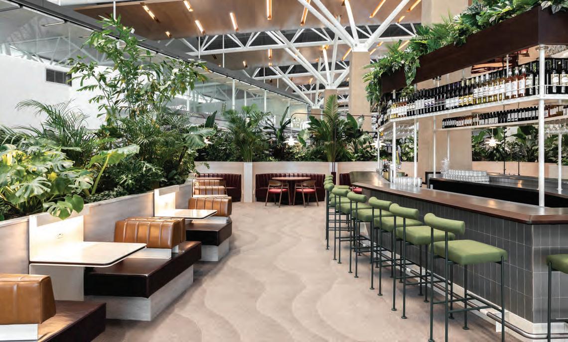
Aspire WestJet Garden Lounge YYC
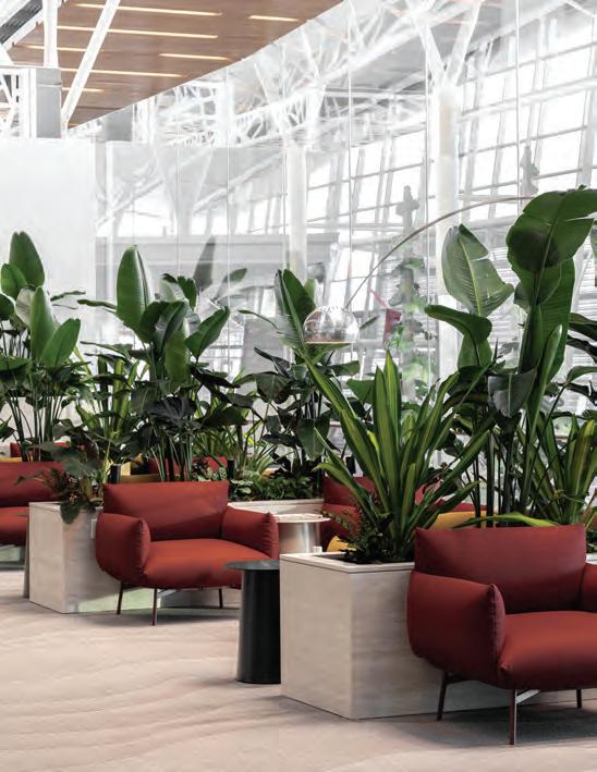
One of the top five busiest airports in Canada, Calgary International Airport (YYC) is continually evolving, including its expansion of the Aspire WestJet Garden Lounge, accessible to passengers travelling to the United States. The Aspire sign can be seen from afar, seemingly floating above the greenery, a lodestone for a traveller seeking pre-departure sanctuary.
This transborder space is not merely a weigh station for passengers before going to the gate: this airport club offers a variety of seating, additional workspaces for individuals and groups featuring charging ports, small plate menu items reflecting time of day and a lounge bordered by lush tropical plants.
Helmed by MRDK, a Montréal-based architecture and design firm, this lush and bright 2,700-sq.-ft. project was an addition to the existing Aspire WestJet Lounge (MRDK has previously worked on two projects at YUL Montréal airport). “The main difference between other hospitality projects and ones in airports is the red tape associated with building in an airport,” explains David Dworkind of MRDK. “Few environments experience as much continuous use as an airport, where traffic flows through 24/7. This makes durability essential, thoughtful detailing key and to ensure the space feels inviting and continues to perform and age gracefully.”
The project took one year from inception to completion, said Dworkind. “We were fortunate to be working with Ledcor, an excellent general contractor with lots of experience working in airports which helped expedite the build.”
The firm’s first challenge was to solve the issue of additional electrical needs without the ability to drill in concrete floors. The solution? MRDK chose a natural option — plants — which took centre stage. The greenery helped to delineate pathways and create calming
Above Aspire WestJet Garden Lounge transforms an airport concourse into a composed, garden-like interior. Soaring ceilings, skylights, and a full-height curtain wall establish a greenhouse-like calm, while raised planter boxes discreetly house power and choreograph circulation.
natural barriers, while the raised planter boxes concealed electrical cables and plugs, providing a savvy and simple cover to provide plugs and ports demanded by today’s traveller. “We were very lucky to have a flexible client who was open to how we envisioned the future of Aspire’s physical spaces,” says Dworkind. “We were not constrained by the past and open to explore new materials, colours and textures.”
A new entry was created, highlighting the lofty 40-ft. ceilings and skylights, welcoming guests to choose from a myriad of seating zones, reminiscent of modern living rooms with a two-person couch and two lounge chairs to foster a laid-back atmosphere, a row of co-working spaces and curved booths with tables for meeting or dining. Soft seating was sourced from Design Within Reach, Kit Interiors and Suite 22, a specialist in Italian furnishings based in Ontario.
A palette of earth tones is found throughout this oasis, the collection of numerous plants highlighted by muted shades of green, brown and cream. Louis Poulsen provided 1970s-style low lighting with the Panthella table lamps, designed by Verner Panton, placed within niches between seating, while the row of PH5 pendant lamps above add a soft glow.
A rhombus-shaped bar in the centre of the space is ringed with stools, while nearby two-person booths add to the rhythmic flow
between seating and space in the lounge. This was the first design MRDK completed with Swissport, and its success has led to the studio currently working on future projects with this international aviation services company.
OEB Kitchen & Bar YEG
The dream of Chef Mauro Martina became a reality, as OEB Breakfast Co. has established itself as a favoured breakfast and brunch restaurant. Since 2009, Martina has opened locations in OEB’s homebase of Calgary and from Victoria to Toronto in nine Canadian cities as well as south of the border in Arizona and California.
Launching its first airport location in December 2024, OEB Breakfast Co. worked with Edmonton-based CKDesign Associates Inc., well-known for its numerous hospitality creations throughout Edmonton including The Canadian Brewhouse and Avalon, located at Edmonton International Airport (YEG).
Tasked with creating a design reflecting OEB’s established persona and its metamorphosis at YEG into a full-service, all-day restaurant, CKDesign focused on lighting, materials and seating. “The objective was to completely mitigate the inherent ‘breakfast restaurant’ aesthetic in favor of a sophisticated, durable, and comfortable all-day/late-night dining environment, “explains president and founder, Chris Kourouniotis.
David Dworkind
Tapping into their three decades of hospitality design, including several airport creations, CKDesign worked with longtime partner ECG Ventures (formerly ECG II Restaurant Group). The planning and construction were a tight turnaround and successfully completed in less than six months.
Core brand elements of OEB Breakfast Co. featured at this location include the mid-century modern palette and custom millwork such as the farm table design. Additional elements were incorporated such as OEB’s recognizable semi-circular “egg” booths, and oversized service stations featuring open pantry shelving for an aesthetic display of curated items and dry goods reflecting the brand’s farm-to-table philosophy, and a notable use of visual merchandising within the dining area.
A key element distinguishing this airport location design is lighting: within the restaurant CKDesign chose architectural accent lighting, task lighting and dimmable fixtures. Custom lighting was designed with forms reflecting motion, altitude and historic aviation shapes. For materials, Kourouniotis and his team selected textured options for furniture and decor, avoiding the stereotypical choices of breakfast-focused restaurants such as bright tiles or laminate. Darker woods, warm metals such as copper and brass and upholstery in jewel tones or leather all make for a warm and welcoming environment at any time of the day. “These choices absorb light and enhance the intimate, sophisticated feel,” says Kourouniotis.
The OEB YEG design also includes areas which typically wouldn’t be featured in a breakfast restaurant, such as a prominent bar area, communal tables and lounge-style seating, encouraging guests to linger. “The intentional creation of a darker ambient environment serves to encourage and support evening trade, specifically the sale of alcoholic beverages, wine and dinner items,” says Kourouniotis.
The focal bar is an aesthetic anchor, a primary visual drawing the guest’s eye and conveying the restaurant’s use as an all-day space. It’s a space for patrons to seek a happy hour cocktail or a late-night beverage as much as the beloved breakfast and brunch items of OEB Breakfast Co. The restaurant also features a custom art program reflecting the city of Edmonton and its transportation location.
Both projects reflect a successful balance of airport hospitality, welcoming environments and the evolution of two brands wanting to offer a world-class experience within these busy transportation hubs.
Opposite page left Aspire’s residential-scale seating, sculptural banquettes, and earthy palette temper the infrastructure, creating a calm pause within the terminal. Opposite page right and above OEB Kitchen & Bar brings mid-century warmth to the airport interior through wood floors, accent tile zoning, and aviation-inspired ceiling details. Purposeful lighting and a restrained palette of saturated brand colours lend clarity and comfort, transforming a high-traffic dining space into a composed, characterful pause within the terminal.
Design’s Missing Half
Drawing on 250 global practitioners, Making Space restores women to their rightful place in design history, exposing how interiors shaped culture long before the spotlight followed.
Making Space: Interior Design by Women by Jane Hall and published by Phaidon is a compelling tribute to feminist reclamation in the built environment and to the essential creative role women have played in shaping interior design from the late 19th century to the present. Drawing on the work of 250 designers from around the world, Hall reframes the history of interiors by foregrounding the women who were overlooked, underestimated, or pushed to the margins of male‑dominated design fields. She argues that the domestic sphere—long dismissed as merely decorative—was in fact a vital site of innovation, artistic expression, and self‑deter mination during a period of expanding political influence and shifting social norms for women.
Hall contends that although women faced persistent “erasure” in the broader narrative of the built environment, early private res idential commissions offered them room to experiment and de velop a distinct design language, even as they were excluded from public architectural work. She notes that many of the first gener ation of decorators, emerging at the turn of the 20th century, came from privileged backgrounds. Their social standing not only shaped the careers of figures such as Dorothy Draper but also helped insulate the young profession from economic volatility.
Because class and glamour were far from representative of most homes, Hall argues, decorators were often omitted from “canon ical” design histories. In response, many practitioners adopted more corporate identities to distance themselves from the pro fession’s feminine and domestic associations. As decorating evolved into a competitive service industry, women increasingly found opportunities in commercial design. Expanding design ed ucation further legitimized their expertise, while lifestyle maga
zines played a pivotal role in reshaping public perceptions by presenting women designers as influential agents in the shaping of modern interiors.
Hall’s narrative is both richly researched and fluidly written, trac ing a clear line from early pioneers like Elsie de Wolfe and Doro thy Draper to contemporary innovators such as Ilse Crawford— who dissolves boundaries between art, architecture, and interiors—and China’s Xiang Li, whose technologically driven work creates fantastical, immersive environments.
Organized alphabetically, the book pairs concise biographical narratives with hundreds of striking photographs that showcase a wide spectrum of styles, from culturally rooted and ethnically informed interiors to exuberant maximalism and serene contem porary minimalism.
Through this global survey, Hall restores women to their rightful place in design history, celebrating the breadth, creativity, and cul tural impact of their work while reminding readers of the feminist lineage of interior design. For design enthusiasts, historians, and anyone curious about the spaces we inhabit, Making Space is both enlightening and inspiring.
Anna Stranks is principal of STUDIO A Design Collaborative and a professor at Humber College’s Bachelor of Interior Design program.
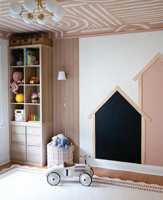
This children’s bedroom redefines what it means to design for both play and longevity.
Created by Toronto-based Studio Boden for a two-year-old, the space was envisioned as a room that could evolve with the child throughout the years. The design draws directly from its surroundings and features earthy tones, organic shapes and warm natural finishes to echo the woodland outside the window. To fit the theme of creativity, the room also features original artwork by Kiki Heath, co-founder and project manager.
“The design process began with the setting itself. Nestled along Mimico Creek in Sunnylea, the home is surrounded by old oak trees and an almost storybook landscape. From the start, we knew this bedroom needed to feel connected to that environment,” says Heath. “While the room was created for a child, it needed to evolve with her; feeling playful in the present, yet timeless enough to grow into. That meant moving away from trends and themed décor, and instead, building a foundation of warm natural materials, soft organic forms, and a palette that’s both grounded and imaginative.”
“Warm wood tones, soft textiles, and an earthy palette serve as a grounding backdrop, allowing the ceiling pattern to lead the narra-
tive while maintaining a serene aesthetic.” says co-founder and lead designer, Jenny Huggon. To balance the environment with opportunities for play, the design team incorporated a chalkboard wall meant to be an interactive detail to encourage creativity. One of the challenges was balancing the imagination of childhood with the sophistication of enduring design. The approach was to weave subtle gestures of play into an elevated framework. “Designing for a twoyear-old is unique. You want the space to feel magical now, but you also must think several years ahead. Avoiding anything too themed or age-specific required an intentional approach, where every element needed to feel playful without becoming something she would outgrow quickly,” says Huggon.
In a world where childhood is increasingly defined by screens, this space offers a sanctuary that invites “unplugged creativity.” The room captures the dual essence of childhood: the freedom to explore and the comfort of a safe nest. “What truly sets this project apart is the way the ceiling became the heart of the design. Instead of relying on traditional focal points, we treated the ceiling almost like a canopy; something that instantly evokes the snug, enveloping feeling of a treehouse,” says Huggon.
Jenny Huggon and Kiki Heath
Introducing Lioli Porcelain by Caesarstone Ltd – a cutting-edge porcelain surface range that transforms your boldest creative dreams into reality. Crafted with a passion for exceptional quality, Lioli’s surface solutions offers endless possibilities, both indoors and out. Design without limits.