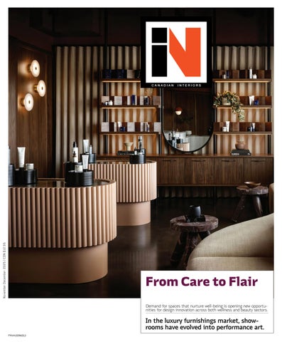
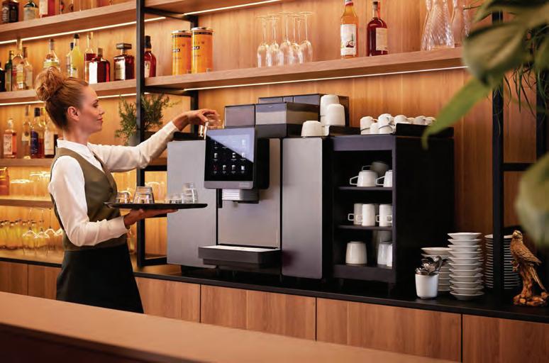
Demand for spaces that nurture well-being is opening new opportunities for design innovation across both wellness and beauty sectors.
In the luxury furnishings market, showrooms have evolved into performance art.
CANADIAN INTERIORS
Introducing Lioli Porcelain by Caesarstone Ltd – a cutting-edge porcelain surface range that transforms your boldest creative dreams into reality. Crafted with a passion for exceptional quality, Lioli’s surface solutions offers endless possibilities, both indoors and out. Design without limits.
A GREAT LIFT
How medical aesthetics clinics are taking inspiration from hospitality and retail to shine in a crowded market. By Matthew Hague
33
TAKING CARE
From the dentist to the oncology ward, designers are crafting elevated spaces of wellness for both patients and healthcare providers.
By Evan Pavka
DESIGN SELLS THE DREAM
Across Toronto and Montréal, high-end suppliers are swapping static displays for full-on design narratives where surfaces, sofas, and brands act out the lifestyles they sell.
By David Lasker
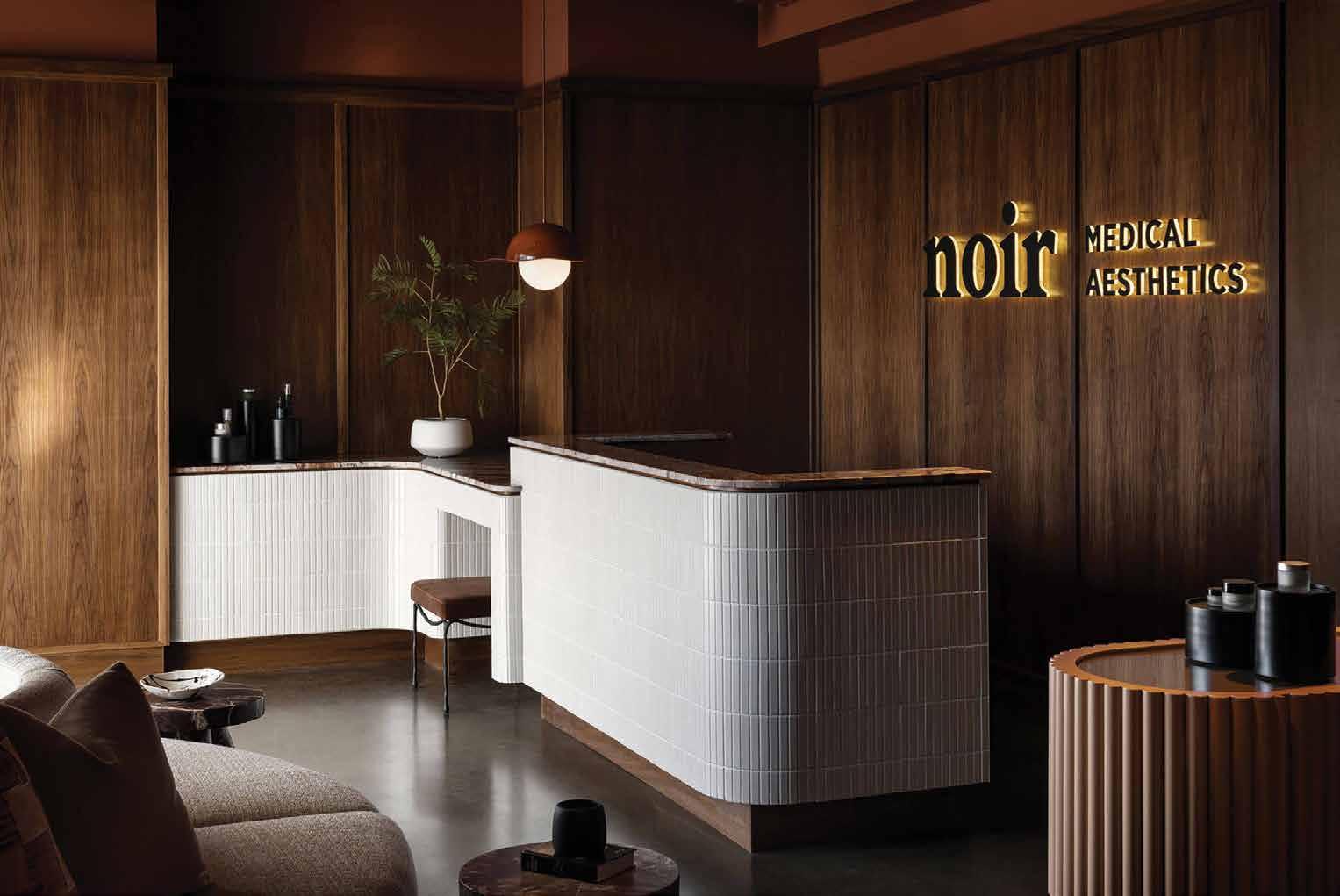
COVER – Noir Medical Aesthetics, designed by Amanda Hamilton Interior Design.
Photo by Eymeric Widling.
11/12 2025
10 IDC DIMENSIONS
12 CAUGHT OUR EYE
22 SEEN With its warm hues and playful forms, Feria Hábitat València proved that the future of furniture isn’t just functional; Host Milano 2025 demonstrated how hospitality can be an ecosystem of ideas.
48 THE GOODS A selection of thoughtful design objects and collectible daily essentials.
52 GOOD READS
54 OVER & OUT A symbolic and functional thread draws visitors through this hybrid boutique.
26 33 40
CANADIAN INTERIORS
Editor in Chief Peter Sobchak
Art Director Roy Gaiot
Contributors
Matthew Hague, David Lasker, Evan Pavka, Vesna Plazacic
Canadian Interiors magazine is published by iQ Business Media Inc.
126 Old Sheppard Ave, Toronto, ON M2J 3L9
Telephone 416-441-2085
e-mail: info@canadianinteriors.com
website: www.canadianinteriors.com
Canadian Interiors publishes six issues, per year. Printed in Canada. The content of this publication is the property of Canadian Interiors and cannot be reproduced without permission from the publisher. Subscription rates > Canada $38.95 per year (plus taxes) U.S.A. $71.95 USD per year, Overseas $98.95 USD per year.
Back issues > Back copies are available for $15 for delivery in Canada, $20 USD for delivery in U.S.A. and $30 USD overseas.
Please send payment to: Canadian Interiors, 126 Old Sheppard Ave, Toronto, ON M2J 3L9 or order online www.canadianinteriors.com
For subscription and back issues inquiries please call 416-441-2085 x2
e-mail: circulation@canadianinteriors.com, or go to our website at: www.canadianinteriors.com
Through tonal whites and tactile restraint, Fancy Interiors Studio shows how minimalism can still honour memory.
Banking on the Future: Dynasty Power Offices
Davignon Martin Architecture + Interior Design flips the corporate script on a high-octane HQ with wellness amenities that outsize the workspace.
Elevating the Experience: Gordon Ramsay Steak Restaurant
Inside Design Studio balances a palette of nostalgia, modernity, and functionality in a reinvention of the grand dining experience.
Oasis Retreat: Cottage on Fisher Lake
With minor site work, Denegri Bessai Studio opened a cabin’s east facing exposure, creating new views across the lake.
Natural Stone
Discover the virtues of natural Adair® limestone
Since the 1960s, we’ve extracted Adair® limestone from our quarries in Ontario and it graces many iconic buildings, from embassies to symphony halls. Today, we offer the most exceptional product offering, with formats and finishes unparalleled in the industry. Contact us to uncover your design opportunities.
Wellness Is the Measure
Once associated with yoga studios, fitness chains and destination spas, wellness has moved from lifestyle trend to market imperative and is reshaping real estate development worldwide. At the intersection of health, design and economics lies a sector that is rapidly outpacing traditional construction growth: wellness real estate. Globally valued at $584 billion in 2024, it is projected to surpass $1.1 trillion by 2029, expanding at nearly four times the pace of the overall building industry, according to The Global Wellness Institute. While the United States still dominates global wellness real estate, Canada’s trajectory is remarkable, growing from $6 billion in 2019 to $16 billion in 2024, outpacing North America overall.
For interior designers, the implications are profound. From retail clinics to urban spas, wellness environments are becoming critical testing grounds for ideas about sensory experience, material health and community building. Early iterations of wellness real estate often relied on high-end amenities like Himalayan salt rooms, cryotherapy chambers or lavish hydrotherapy suites, and while these remain hallmarks of flagship spas and resorts, the market has matured into something more expansive, where interiors are expected to simultaneously signal credibility and trust while delivering experiences.
One of the most significant shifts in wellness real estate is the move from siloed functions to integrated environments, and project examples in this issue of Canadian Interiors illustrate that transition. In Ontario and Alberta, the rapid expansion of boutique wellness clinics has created demand for interiors that merge hospitality design cues such as soft lighting, natural materials and lounge-style waiting areas with clinical functionality. These spaces are less about sterile efficiency and more about cultivating sensory calm. For interior designers, retail wellness spaces must do more than just draw in clients with posh material palettes and product positioning but also operate in dialogue with their surroundings, underscoring the shift from individual to collective experiences and wellness not as a decorative afterthought but as a deliberate health outcome.
Across the projects featured in this issue, this shift can be seen in how each environment rejects clinical sterility in favour of
By Peter Sobchak
tactile warmth and organic forms that encourage emotional ease. Natural materials anchor spaces in biophilic principles, while lighting and acoustic control fine-tune the body’s response. Reception zones feel more like cafés, hotel lounges or galleries than waiting rooms, using furniture arrangements and multifunctional layouts to foster social connection and a sense of belonging. Intuitive wayfinding eases cognitive load, while durable, cleanable finishes quietly meet regulatory demands without compromising atmosphere. Whether it’s a meditation room at the heart of a dermatology clinic or a staff wellness retreat shaped by user input, these designs choreograph sensory experience to reduce stress, support routine care, and reframe medical visits as acts of self-care. Wellness here operates as infrastructure: spatial, material and social.
The next phase of wellness real estate will see design expand along several axes. First, affordability: as the sector matures, wellness features must extend beyond luxury spas into accessible clinics and community health hubs. Next will be climate adaptation: Canadian developers are beginning to integrate resilience strategies such as wildfire-resistant materials, passive cooling and renewable microgrids into wellness projects, underscoring the link between planetary and human health. For interior designers, these shifts demand fluency not only in aesthetics but also in science and sociology. Materials must be vetted for chemical safety; lighting calibrated to circadian rhythms; acoustics shaped for both privacy and connection.
Wellness real estate is not a passing trend. It is a structural redefinition of how buildings and interiors create value. In Canada, the growth of this sector underscores both market demand and cultural appetite for environments that support well-being. For interior designers, retail wellness environments such as spas and clinics offer the most immediate laboratories for this transformation. They demand interiors that are multisensory yet restrained, technologically advanced yet deeply human. As the market races toward $1.1 trillion globally, wellness real estate challenges designers to rethink not just what makes a space beautiful, but what makes it healthy and, increasingly, what makes it essential.
IDC Dimensions
The Future of Interior Design Education
By Vesna Plazacic
It’s no longer a question whether artificial intelligence, or AI, will transform the landscape of interior design – it’s already happening.
Changes are taking shape in interior design education, and according to Sylvie Allain, Interior Design Professor and Program Coordinator at Collège communautaire du Nouveau-Brunswick (CCNB), the adoption of AI is inevitable across all fields. Allain says that the school’s goal is to expose students to a wide range of tools while addressing both their advantages and limitations.
“Given the rapid and widespread adoption of AI in practice, we see it as our responsibility to guide students in developing a critical and strategic approach to these technologies, so they graduate with a competitive edge,” she says.
Allain says while these tools have been a positive addition for students using AI to polish their writing, manage workloads, and structure their ideas more effectively, those attempting more creative endeavours have faced shortfalls, which highlights the importance of original, human-driven creative work.
Hamza Khan echoes the importance of human creativity at the centre of the AI revolution. Khan is a two-time bestselling author and multi-award-winning entrepreneur whose TEDx talk titled Stop Managing, Start Leading has been viewed millions of times. He delivered the opening keynote address at this year’s IDC Design Symposium, an annual two-day event that brings together interior design professionals, architects, academics, and students to learn from inspiring speakers and panel discussions, participate in workshops and connect with others in the industry.
“Let AI be your productivity engine,” says Khan “your logic brain, your pattern-detecting genius, but let you be the soul, the resonator.”
Khan believes the future of work is more human, not less. He’s on a mission to help organizations revolutionize leadership and rehumanize the workplace by adopting a bold ‘people first’ approach. Khan’s latest venture, Saige, is an AI-powered leadership development platform that upskills leaders for the wisdom economy.
Ahmed Mekallach is known for turning abstract technologies into deeply human tools. He believes that AI is making us more human by enabling us to turn our ideas into reality, reclaim our time, and interact with reality in new ways.
As founder and CEO of MYTE Group, he helps teams and individuals build their own AI-powered operating systems to scale clarity, creativity, and execution. Mekallach is a systems architect by training and works at the intersection of human intent and machine intelligence, empowering people to move from idea to outcome with speed and sovereignty.
Mekallach was another inspiring speaker at the IDC Design Symposium, whose engaging workshop, using just a mobile phone, allowed participants to explore how clear intent and structured thinking can turn AI into a strategic thought partner.
In his recent TEDx talk, titled The Paradox of Automation: How AI Makes Us More Human, Mekallach urges students to learn the tools and transform their futures. “All of you have the tools that enable you to speak your ideas into
Ahmed Mekallach, Founder and CEO, MYTE Group AI.
existence, to do what normally took months and build it out in a few days to a few weeks,” he says. “You don’t need money. You don’t need investors or a mass of team. You only need the will to act, the will to make a change and an impact, not just to your community here, but to the world.”
A 2023 Forbes article outlining ways our industry should get ready for the AI takeover suggests that interior designers should integrate new technologies, be transparent about it and show clients the advantages of AI.
“Creative industry professionals have been under the ‘threat’ of technology for decades, but so have other jobs. Integration of AI-based tools into daily work is neither unique nor dangerous, and this requires interior designers to gain new skills and learn how to integrate AI into daily tasks. In turn, AI would speed up their workflow in times of need.”
Tiia Manson thinks that eventually AI will be able to perform repetitive and technical tasks, but graduates will still need to use their creativity to find the best solutions and comply with building codes and bylaws. Manson is the head of the Bachelor of Interior Design program in the School of Construction and the Environment at the British Columbia Institute of Technology (BCIT).
When it comes to issues that educators are currently seeing with students using AI, she notes a few: the ‘voice’ of the document is not that of the student; reliance on instant answer solutions and less exploration through ideation; the lines between original design and plagiarism are becoming blurred; a lack of individuality in AI generated responses; along with bias and incorrect answers.
Manson agrees that AI could accelerate some aspects of the design process. “We can see it used extensively in concept or preliminary renderings to generate ideas and multiple options,” she says. “Educators will need to further focus on critical thinking and verifying information generated by artificial intelligence.”
While those in academia like Manson and Allain cite concerns with plagiarisms, given how easily original content can be created or altered, the focus has been on introducing AI as a support tool, not a replacement for authentic design thinking.
Allain notes that CCNB’s curriculum emphasizes projectbased learning rooted in real-world design processes. “We anticipate that the designer’s role will increasingly revolve around what AI cannot replicate: understanding the client, interpreting human needs, and creating authentic, meaningful and original design solutions,” says Allain. “While AI will automate certain technical or administrative tasks, the essence of interior design, risk-taking, exploration, empathy, and creativity remains inherently human.”
Allain sees AI’s role in interior design as a positive change. “As AI grows more pervasive, the demand for truly human-centred and authentic design will only increase,” she says, “ensuring that designers remain indispensable.”
Vesna Plazacic is the Director of Marketing and Communications at Interior Designers of Canada (IDC).
Since 1972, Interior Designers of Canada (IDC) has been the national advocacy association for the interior design profession, representing more than 5,000 interior designers professionals. www.idcanada.org
Hamza Khan, Leadership Futurist and Best-Selling Author.
CAUGHT OUR EYE
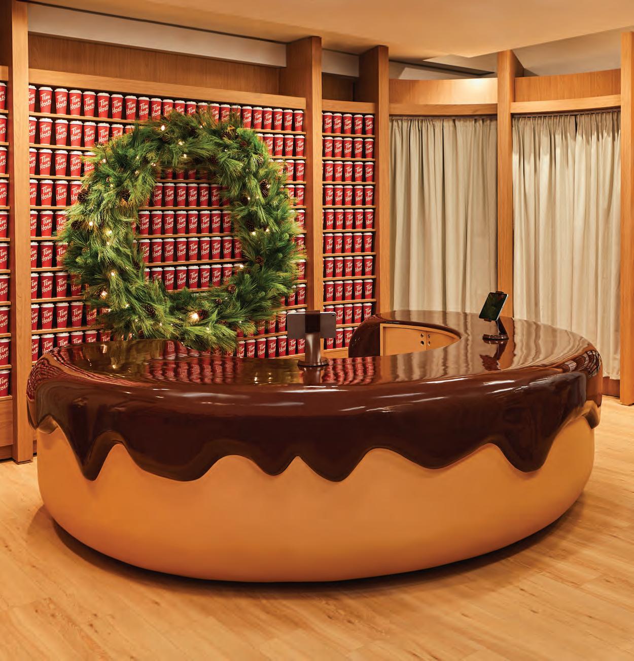
Double Double extra haute Canada’s caffeine icon, Tim Hortons, tapped Mason Studio to design a pop-up shop in Toronto’s Eaton Centre that blurs nostalgia and futurism, creating a surreal retail playground where memory becomes material. A seven-foot teddy bear, quilted architectural forms, and a donut-shaped cash desk turn everyday touchpoints into sculptural moments, while a red-cup wall and deconstructed food-truck kiosk reframe familiar icons.
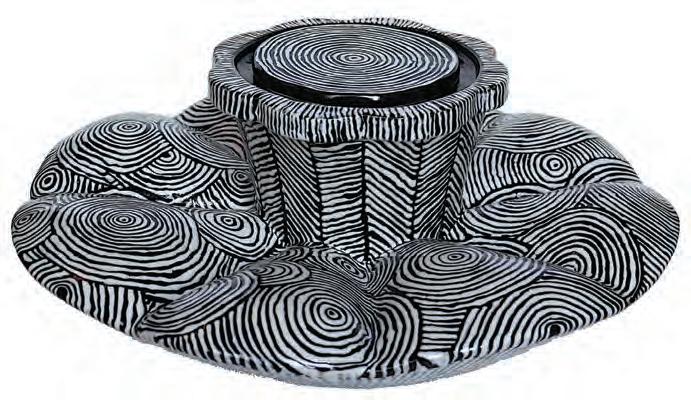
Covered Crockery Vessels + Sticks announced its debut onto the Toronto gallery scene with What Holds: Ceramic Boxes and the Language of Containment , an exhibition focused on the ceramic box as both functional container and conceptual device. Featuring six invited artists and 25 selected by open call, the exhibition underscored the gallery’s mandate to situate ceramics within broader dialogues of ritual, memory and material experimentation.
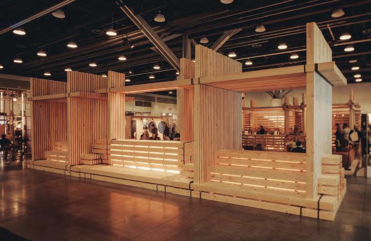
Gravity’s Grip For IDS Vancouver, In/Tension by dHKarchitects turned raw lumber into a conversation about restraint. Built entirely without screws — instead, gravity and tension — the temporary bar was designed so all 20,000 linear feet of lumber could be reused. AD Projects realized the structure, anchored by Brent Comber’s sculptural Bjorn , a salvaged-wood totem that reimagines waste. The result: a serene, sustainable counterpoint to the trade show’s sensory overload.
Like a Bird Merging cinematic technology with regional history and landscape, Niagara Takes Flight is a new flying theatre attraction in Niagara Falls, Ont. that integrates suspended gondola seating, a domed projection screen and synchronized sensory effects to simulate flight across the Niagara River corridor. Designed with contributions from Forrec, Brogent Technologies plus Indigenous artists, visitors move through a sequence of pre-show display rooms focusing on geological, industrial and Indigenous history before entering the theatre.
Britney Gill Photography
Marissa Alexander
Niagara Parks
Experience the Gaggenau Difference
Experience the Gaggenau Difference
Our Gaggenau showrooms invite you to embrace the intersection of quiet luxury and culinary excellence.
Our Gaggenau showrooms invite you to embrace the intersection of quiet luxury and culinary excellence.
For those who know the extraordinary.
For those who know the extraordinary.
Toronto
Toronto
Montreal
Montreal
Vancouver
Vancouver
Learn more about our showrooms.
Learn more about our showrooms.
The difference is Gaggenau
The difference is Gaggenau
WE SPENT OVER 100 YEARS
WE SPENT OVER 100 YEARS
REVOLUTIONIZING THE KITCHEN
REVOLUTIONIZING THE KITCHEN
SO YOU CAN SAVOUR EVERY MINUTE YOU SPEND IN IT.
SO YOU CAN SAVOUR EVERY MINUTE YOU SPEND IN IT.
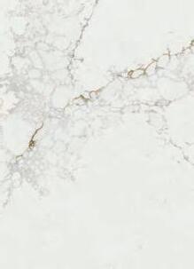
SUMA COLOR SERIES
A new collection for residential and construction projects by Silestone
SUMA COLOR SERIES
A new collection for residential and construction projects by Silestone
Superior Performance
Superior Performance
Our solutions for interior design cover from kitchen surfaces, to bathrooms and furniture, with up to 25-year guaranteed resistance and durability.
Our solutions for interior design cover from kitchen surfaces, to bathrooms and furniture, with up to 25-year guaranteed resistance and durability.
Endorsed by Cosentino
Endorsed by Cosentino
Our decades of pioneering leadership in the surface industry endorse us to provide high quality products.
Our decades of pioneering leadership in the surface industry endorse us to provide high quality products.
Conscious Sustainability
Our low-crystalline silica surfaces are made with 100% renewable electrical energy and 99% recycled water.
Conscious Sustainability
Our low-crystalline silica surfaces are made with 100% renewable electrical energy and 99% recycled water.
Siberian Persian White Motion Grey Linen Cream Bronze Rivers
BRONZE RIVERS
Siberian Persian White Motion Grey Linen Cream Bronze Rivers
BRONZE RIVERS
Design Gets Its Groove
Warm hues, microcement chairs and modular sofas defined Spain’s leading design fair, where tone, tactility and pops of colour proved just as influential as tech.
From bold, playful colours to unique textures and innovative uses of sustainable materials, this year’s edition of Feria Hábitat set the tone for trends to look out for in the year ahead. Garnering over 40,000 visitors, the four-day event in València, Spain brought together exhibitors and industry professionals to celebrate the latest interior design trends.
An ongoing theme that was spotted on the show floor this year was warm pops of colour and glittery accents. With Taylor Swift’s recent album and its “Portofino Orange Glitter” aesthetic drawing attention from designers and brands in recent months, it’s possible that some exhibitors were either tuned into this trend or simply leaning into it due to its growing popularity. While new pieces and collections seen at Feria Hábitat may not have been directly inspired by the album, it’s clear that this aesthetic is making waves and will continue gaining momentum in the months ahead.
1 Enca | Casual Inspired by chains, this table symbolizes how a black sheep feels pressured to move in a single direction alongside its flock. Featuring a solid base, curved lines, and a matte finish, it serves as a distinctive accent piece. The top is made of solid beech/oak wood, laminated particle board, veneer, stain, or porcelain, and features an oven-lacquered metal structure and base with finishes from Casual’s collection. www.casualsolutions.es
2 Acero Respaldo | Ondaretta Acero Respaldo, part of the Tam collection by Nahtrang, combines metal and upholstery to create a minimalist design that emphasizes the relationship between structure and material. Its minimalism pairs well with a variety of interior styles, and its pop of colour makes it a unique addition to indoor spaces such as kitchens. www.ondarreta.com/es
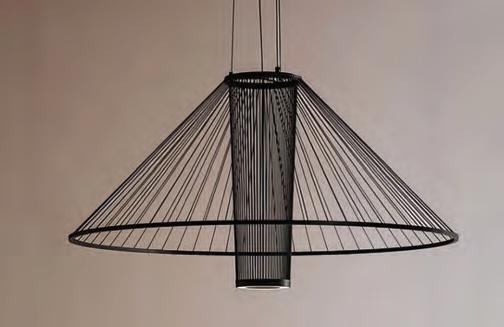
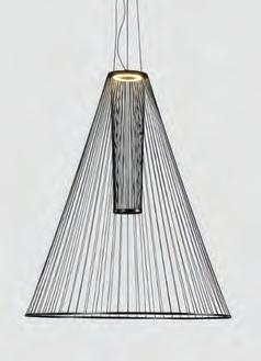
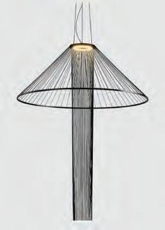
3 Medusa | Ole! Lighting Named after the Spanish word for “jellyfish” and inspired by the flowing movement of this sea creature, this pendant lamp made with metal and hand-woven cord can be adjusted by sliding the rings up or down, changing both its shape and how it casts light. www.ole-lighting.com
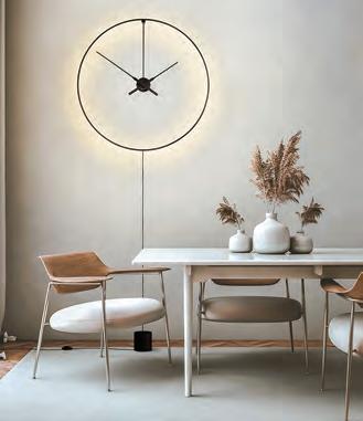
4 Ombra Clock | Nomon This wall-mounted clock features a black aluminum ring with an integrated LED strip to create a soft effect that can be used as a focal point or decorative piece in indoor spaces. The clock provides a clean, wire-free aesthetic, is available in plug-in and hardwired versions, and is roughly 31.5-in. wide. It can be styled in office spaces, kitchens, or even lobbies or other common areas. www.nomon.es
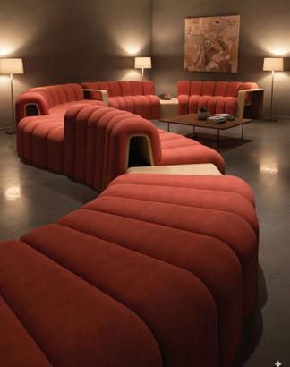
5 Nubbi | Ogo Made from curved wood and soft fabric, this modular sofa system appears to float in space. Inspired by the search for organic and fluid forms found in nature, Nubbi features interchangeable modules that can be arranged into straight lines or circular arrangements. This configuration makes it adaptable for common areas such as lounges and waiting areas. www.ogofurniture.com
6 Bolonia Lamps | iSiMAR Inspired by Bolonia, considered one of the best virgin beaches in southern Spain, the smooth lines featured in the collection imitate waves that sand creates on the dune. While made with durable materials, the lamp in the collection has a lightweight yet sturdy frame and uses LED lighting for a variety of settings. www.isimar.es
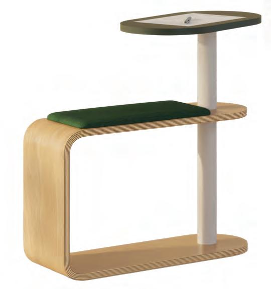
7 Dot | Ofitres This seating solution combines plywood and steel to create a compact, functional geometric design. The large-section tube functions as a pillar and provides stability, while also being a strong visual element. The rotating tray can accommodate various seating positions, and space beneath the seat can be used for storage. www.ofitres.es
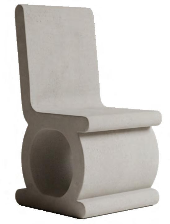
8 Mee Chair | Cimentstudio Being made of microcement means it can be used in both indoor and outdoor residential or commercial spaces. Despite its stone-like appearance and name that is a nod to the word “cement,” the chair is actually lightweight and relatively easy to move. The neutral colour also pairs well with different décor elements in both modern and contemporary spaces. www.cimentstudio.com
By Peter Sobchak
The Future Is Served
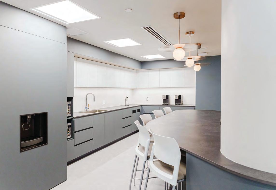
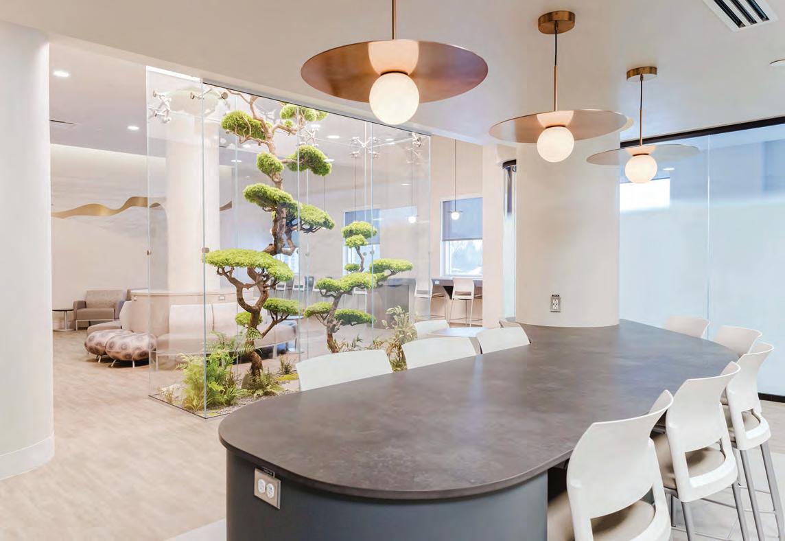
Host Milano 2025 turned hospitality into an arena for innovation, design, and sustainability. Over five days, the global trade fair brought together 2,050 exhibitors and over 200,000 attendees to witness hospitality meeting innovation, with AI, sustainability, and design converging to redefine global dining and leisure.
The fair’s expanded global footprint and ESG focus made it a model for the sector’s evolution. With automation, AI integration and cross-sector design dialogue taking centre stage, Host Milano positioned itself as the hospitality world’s think tank. Next stops: Riyadh in December with Host Arabia, and the U.S. in 2027, signaling serious international expansion for the Milan-based platform.
1 Akiko | Mesa Ceramics LDA This collection fuses Japanese wabi-sabi aesthetics with Portuguese innovation. Crafted from ID7 vitreous stoneware, it offers exceptional durability for high-pressure hospitality settings while reducing gas use and CO₂ emissions. An advanced formulation ensures zero-waste production with non-toxic materials, a feat recognized by the SMART Label and German Design Awards www.mesaceramicshotel.com
2 A Line | Franke Coffee Systems Comprising the A600 and A800, the new line advances fully automatic coffee technology with precision systems like iQFlow for controlled extraction, New FoamMaster for temperature-stable milk textures, and IndividualMilk for dairy and plant-based separation. Powered by FrankeOS with cloud connectivity, the machines enable real-time monitoring and modular scaling, while
HeatGuard insulation cuts energy loss by up to 44 per cent. www.franke.com
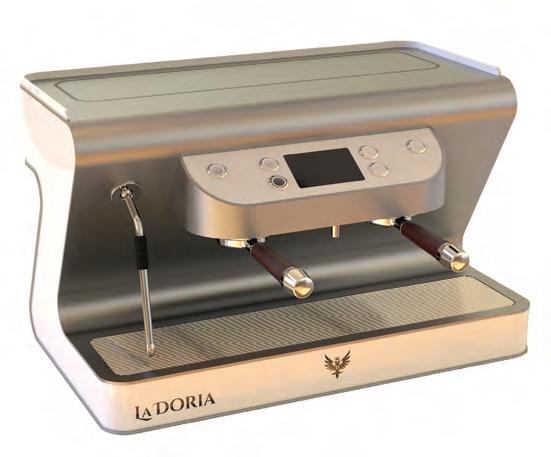
3 ZS Pro 2G | La Doria Machine srl Designed for high-volume hospitality settings, the ZS Pro 2G delivers barista-level precision with instant readiness and temperature accuracy within ±0.5°C. Its dual independent boilerless thermoblocks and rotary pump ensure stability under pressure, while AISI 304 stainless steel construction and up to 80 per cent lower energy use combine durability with sustainability, making it a Smart Label winner at the show. www.ladoriamachine.com
4 Alina Collection | Steelite International Merges Japanese minimalism with Scandinavian ease in durable hard porcelain designed for professional use. A subtle central embossing structures each piece, framing culinary presentation while enhanc ing light and texture. Stackable and resistant to thermal shock and edge impact, Alina’s linear form and functional detailing balance aesthetic restraint with the performance demands of high-volume dining environments. www.steelite.com
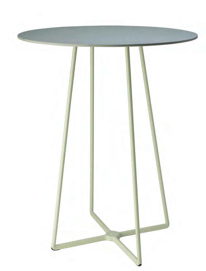
5 Alu | Pedrali Debuted at Host 2025, this new table with an extruded aluminium frame and the company’s first aluminium top is engineered for indoor and outdoor use. Elliptical legs set at a 45° angle integrate with the perimeter frame for rigidity. Available in fixed or extendable versions, Alu conceals extensions in a central drawer. Its powder-coated finish and fully detachable system emphasize modularity, durability and design precision. www.pedrali.com
6 ATOMO | S-CAB The design aims to create a table capable of fitting seamlessly into any outdoor environment. “The light and robust structure of the base consists of a ground base in die-cast aluminium, a core, which holds the steel legs that support the tabletop,” say the design duo of Spalvieri & Del Ciotto. “The elegant connection between the die-cast base and the tubular legs is refined and almost invisible.” www.s-cab.it
7 UNIT | EPTA SpA
the company’s 4R principle of Reuse, Repair, Recondition, Recycle and is up to 80 per cent recyclable at end of life. Featuring cork insulation for thermal performance and low environmental impact, UNIT uses the eco-efficient R600a refrigerant. Its mod ular build, pull-out technical panel and customizable finishes deliver accessible maintenance and adaptable design.
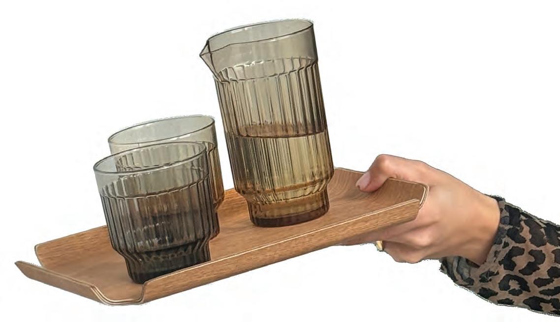
8 Deck Tray | XLBoom
walnut grain with rounded U-shaped corners for a contemporary profile. Sloped sides improve grip and handling, while an impressive anti-slip base ensures stability. Available in multiple stackable sizes, the tray is dishwashertolerant for easy maintenance.
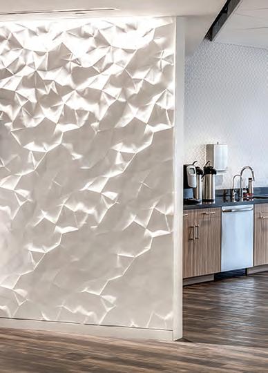
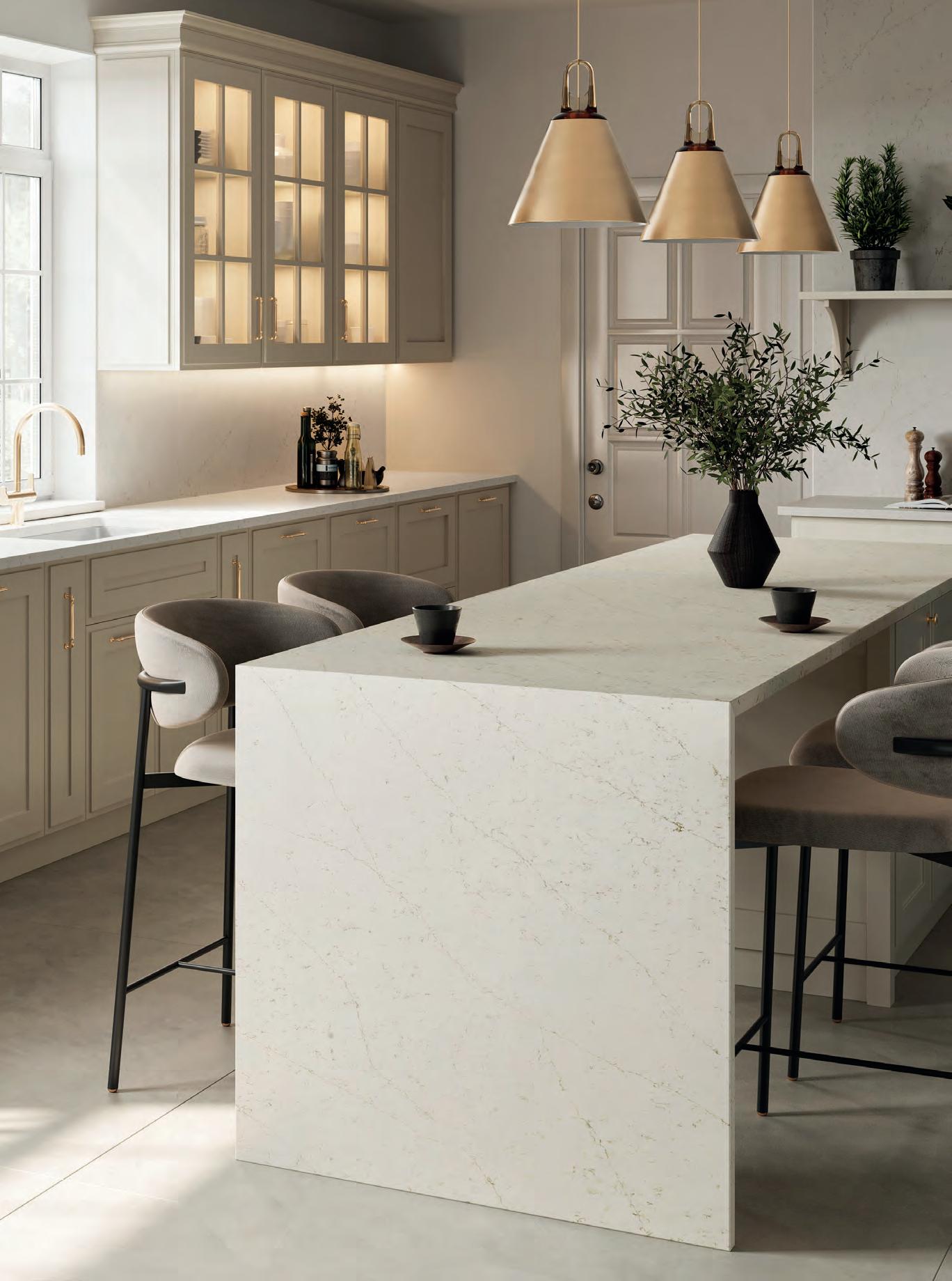
A Great Lift
How medical aesthetics clinics are taking inspiration from hospitality and retail to shine in a crowded market.
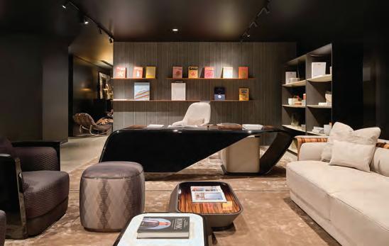
Interior designer Amanda Hamilton creates sumptuous, warmmodern interiors in rich woods and lush colours. The word clinical does not apply. So when her aesthetician Twyla Black, a nurse practitioner who specializes in Botox and injectable fillers, asked her to design a new space for her Calgary clinic, Noir Medical Aesthetics, she was in a bind. “Twyla originally asked for the expected things,” says Hamilton. “She used words like fresh or bright. But to me, every medical space, whether it’s a dentist’s office or a hospital, feels that way. They all feel the same. So, we approached things entirely differently.”
Rather than the standard — maybe an all-white lobby with a stack of ancient Reader’s Digests on a Formica table — Hamilton suggested doing something with more of an edge. “I was thinking along the lines of a hotel lobby,” she says. “I’m a client, too. I wanted it to have a really good vibe.”
Hamilton’s 2,000-sq.-ft. design is more Soho House than nurse’s station, with clubby, walnut-panelled walls, floor-to-ceiling velvet drapes, and a sinuous sofa where clients wait for their appointments. And while it is distinct with its veined marble counters and
Paul Dussault
sculptural lighting, the overall approach is on-trend for similar spaces across the country. These days, hospitality-inspired interiors are giving aesthetics clinics a facelift.
“It’s about strategy,” explains Hamilton. “Medical aesthetics is a very competitive market. It’s a saturated market. The question is: how do the best practitioners set themselves apart? Design is a powerful way to communicate talent and capability, to show your clients that you know what looks good.” After all, it’s a business about appearances. Looking good matters.
Atelier 1618
In Québec City, the lobby of Atelier 1618 is like a set from Mad Men or a curated tableau from a vintage Herman Miller catalogue. Its dark wood panelling, understated earth tones and simple shapes have a playful, mid-century modern vibe. But while it might look like a swanky ad agency or a purveyor of fine furniture, Atelier 1618 is the business of Dr. Gabriel Beauchemin, a plastic surgeon who, alongside a team of nurses and aestheticians, offers services such as neck lifts and nose jobs.
The 3,000-sq.-ft. interiors, by Montréal’s Agence Spatiale, are carefully calibrated. Dr. Beauchemin asked for a space that felt like home: somewhere comfortable that would ease the nerves of potentially knife- and needle-shy patients. Lead designers Marianne Charbonneau and Daniel St-Jean conceived something with the cushiness of a highend living room but that also functions well as an aesthetic clinic.
Plastic surgery patients often like to keep their procedures a secret. While the lobby has a large window at one end to bring in soothing natural light, the space is portioned with screens made from semitransparent glass and walnut. The panelling allows sunshine to pass
This spread For Atelier 1618, Agence Spatiale layered warm woods, sculptural curves, and nuanced textures to dissolve clinical tropes, trading white gloss for tactile calm. Glass partitions stagger for privacy without sacrificing luminosity; a 3D-printed concrete desk echoes facial contours with quiet wit. Beyond it, richly dimmed spaces and a burgundy cocoon-like lounge reinforce softness, intimacy, and a heightened, almost domestic elegance.
through, without compromising privacy. “The dividers are placed so that there can be four people or four couples in the waiting room,” says St-Jean. “And they won’t see one another, or be seen from outside.”
From the lobby, patients also don’t see into the treatment area. It is hidden behind a solid panelled wall and an ethereal reception desk. The desk is one of the most special features of the room: it’s cloud-white and curvy, custom 3D printed from white concrete. “The desk looks soft, but it’s quite hard,” says St-Jean. “It took quite a lot of research and development to get the colour of the concrete just right.”
The panelled wall behind the desk is symmetrical, and an intentional attribute. “Our client approaches plastic surgery with the idea that everything should be as balanced and well-proportioned as possible,” says St-Jean. “He believes symmetry is beautiful. It’s what makes a beautiful face.” Behind the wall, the treatment rooms are somewhat more standard, with off-white walls, easy-to-clean faux-bois floors, and tan leather recliners where the procedures take place. But even there, singular features emerge, such as Scandi-modern side chairs and art Dr. Beauchemin has collected on his travels.
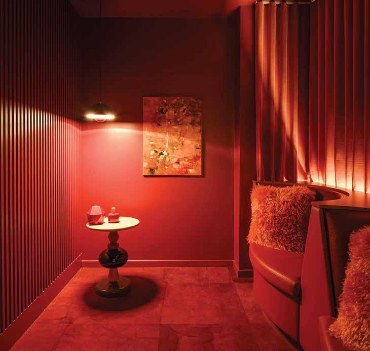
And one back-of-house space has the sultry personality of an avant-garde jazz club. Just past the lobby, there is a small lounge with
deep red walls, red carpeting, a red ceiling, and dim lighting. “After treatments, people might want to decompress a bit before leaving,” says St-Jean. “But they don’t necessarily want to be in a bright room with mirrors where they can see their scars or bandages. This lounge allows people to relax in very flattering light.”
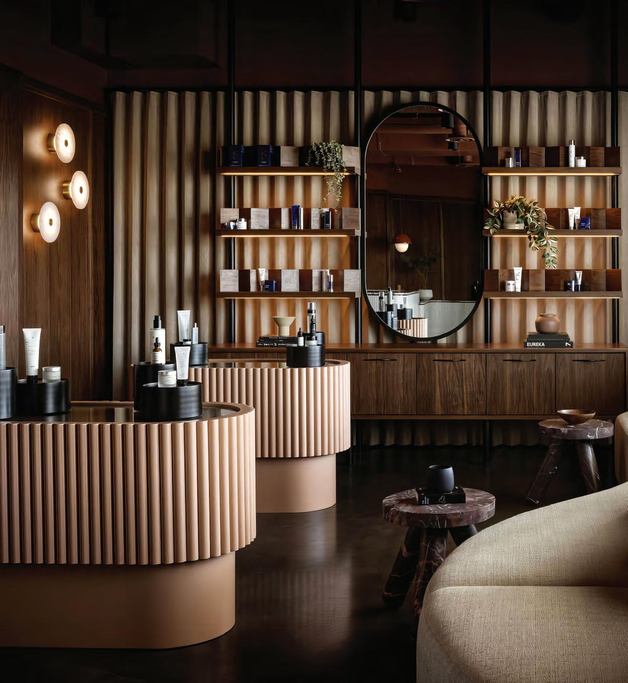
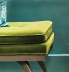
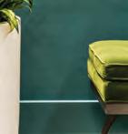
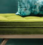
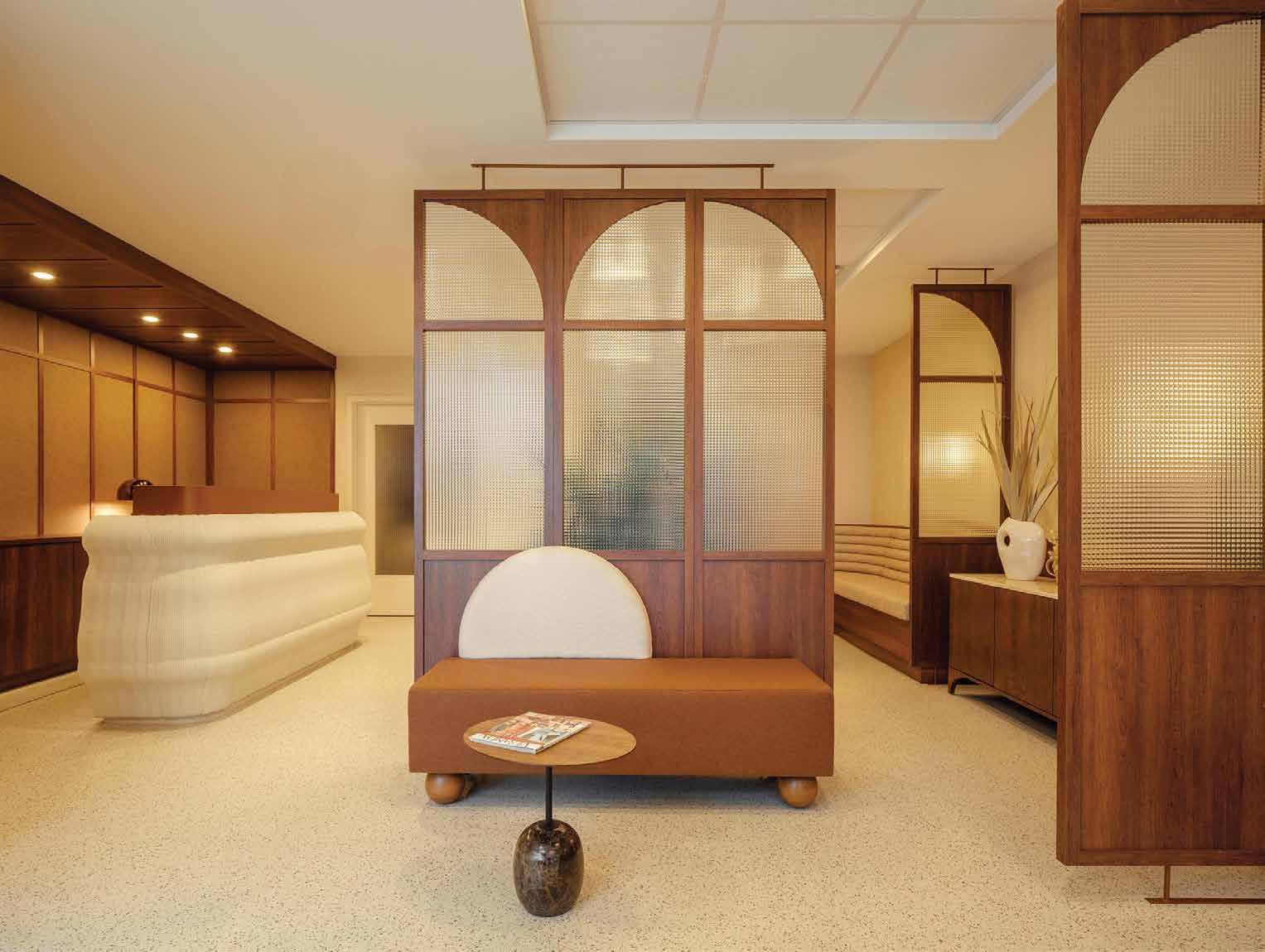
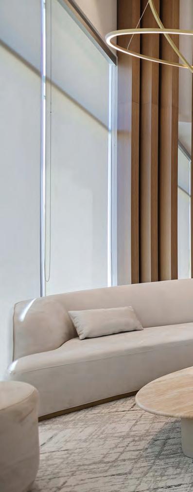
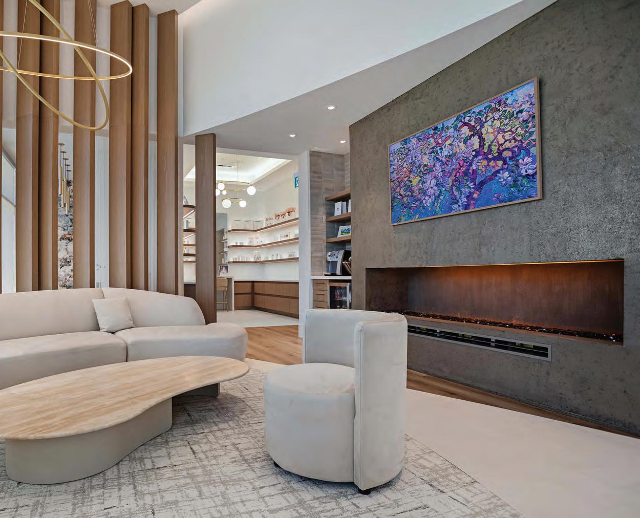
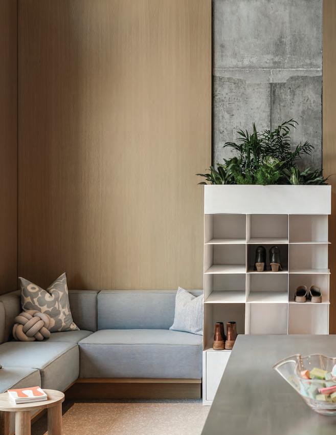
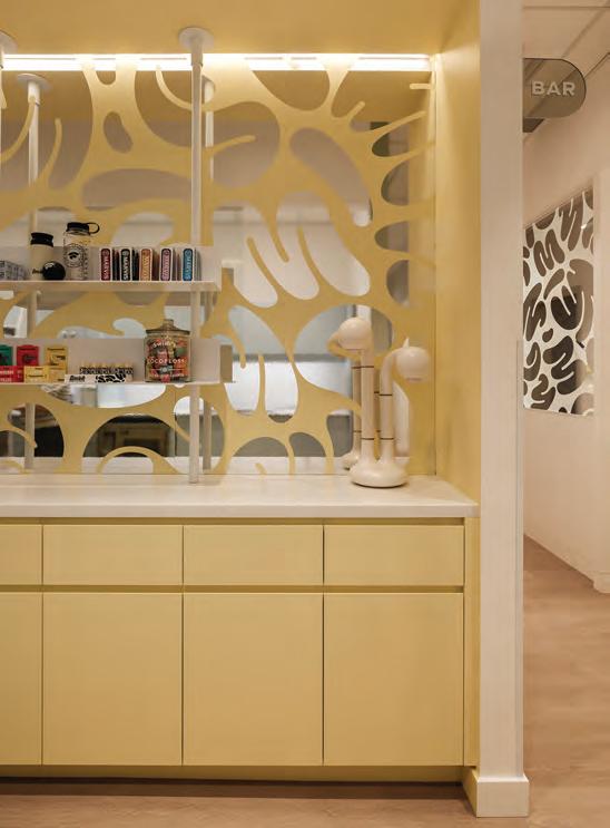
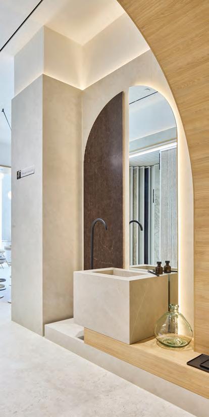
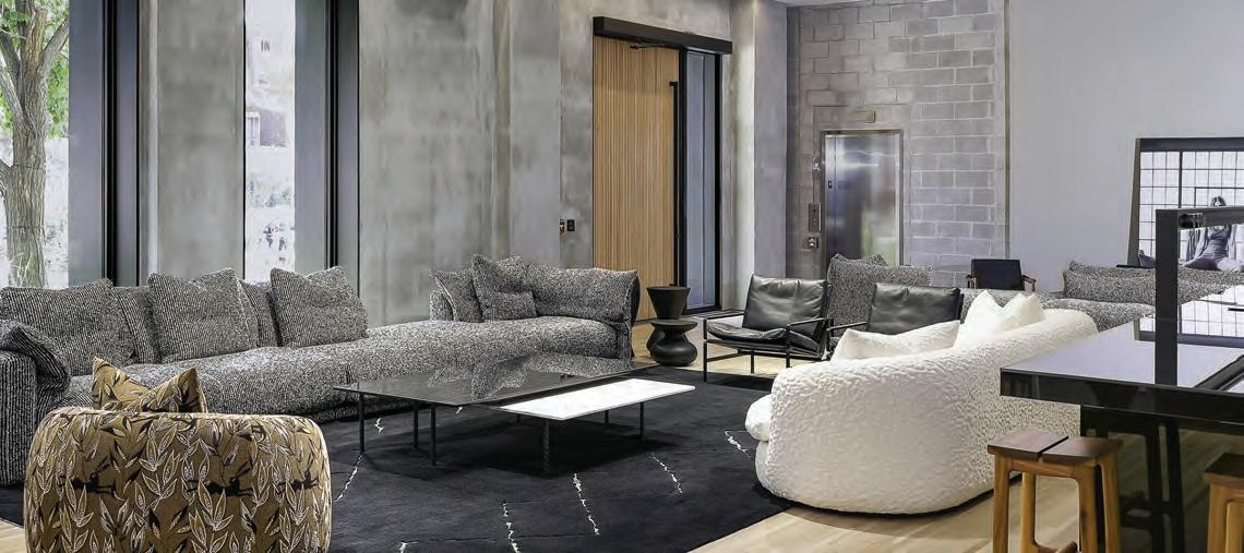
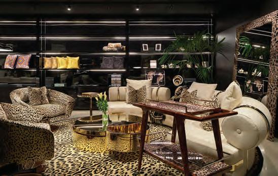
Noir Medical Aesthetics
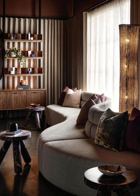
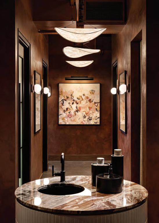
Like Atelier 1618, Noir Medical Aesthetics by Calgary-based Amanda Hamilton has a focus on privacy. The lobby is lined with two layers of pleated drapes: one is an opaque taupe velvet, the other a natural linen. Both can be drawn over the street-side window to block out views as needed, either partially or completely. By running floor-toceiling, the drapes also add luxury and drama, like theatre curtains.
Unlike Atelier 1618, Noir is less mid-century modern, more contemporary. It has peach-coloured, mirror-topped display counters for cosmetics, oxblood-coloured accent tables, and white subway tiles on the face of the marble reception desk. It’s like a boutique hotel, the kind of chic place where someone might spot an A-list celebrity waiting to meet their agent (or, more hush-hush, their Botox technician).
To Hamilton, sourcing the right lighting, such as the flower-shaped Magnolia pendant from Quebéc’s Luminaire Authentik in the lobby, Eymeric
was critical to the atmosphere. “Lighting is like art,” she says. “All the lighting here is sculptural. That’s important because Noir serves both men and women. The lights help strike the right balance. Many of the features have feminine, sculptural lines that complement the darker wood panelling on the wall. Anything dark can sometimes feel a bit masculine.”
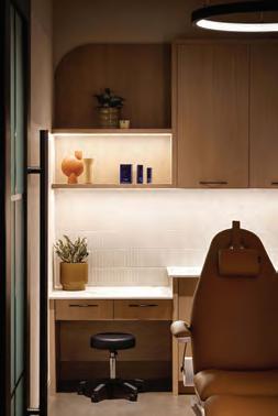
The temperature of the lighting was also considered with care. “The tone of the light is warm and cozy,” says Hamilton. “It’s not a car dealership or a jeweller, where you might find cooler lights in the range of 3,500K. We focused more in the 2,700K range, like you might find in a residential setting.” The mood lighting works well in the hallways that lead to the clinic rooms, catching in the texture of the burgundy Venetian plaster walls, creating a gentle glow. In contrast, the clinical spaces are much brighter, with LEDs shining off white and grey walls. “We needed to be thoughtful about the clinicians and aestheticians having adequate lighting to do their work,” says Hamilton. “The difference is a bit like the experience of moving from a hotel lobby, down the hallway, and then entering into a bedroom.”
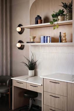
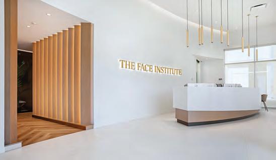
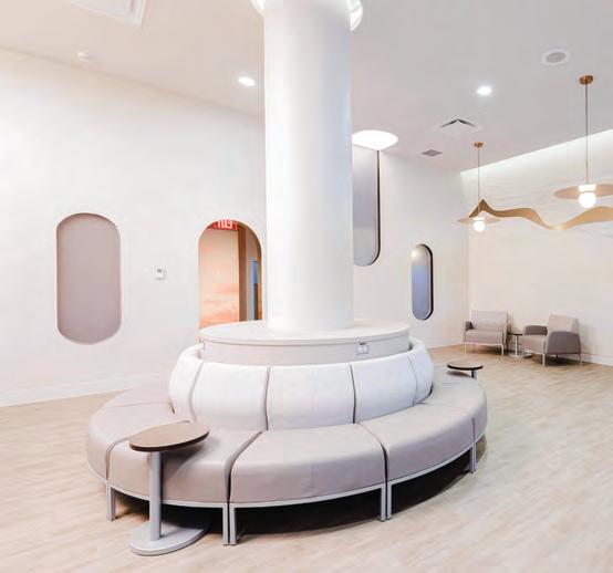
The Face Institute
In Edmonton, the Wolski Design Group has created several medical aesthetics clinics, each with unique personalities. “They have to be
This spread Noir Medical Aesthetics trades clinical sterility for cinematic depth. Espresso-stained walnut wraps the entry in a velvety sheath, punctuated by a sculptural Arabescato Orobico Rosso marble desk. Terracotta limewash walls deliver a sun-kissed tactility, contrasted with exposed ductwork, concrete flooring, and blackframed glazing. Velvet drapery, fluted wood accents, and a serpentine sectional soften the industrial edge, while warm, layered lighting and creamy, curved treatment rooms create a sensuous, cohesive palette.
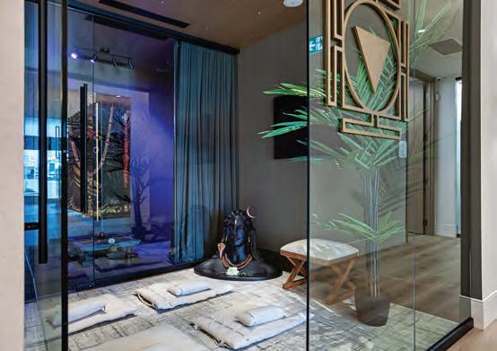
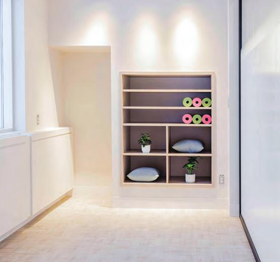
This spread The Face Institute is a soft-spoken study in serenity and craft. A curving reception and sculptural seating introduces organic circulation, while high ceilings and natural wood ground the palette in quiet luxury. Intimate lighting, earthy neutrals and refined tilework temper sleek lines and solid-surface detailing. A meditation room anchors the plan, and a custom liquid-metal fireplace adds gravity. Expanded retail and treatment rooms maintain seamless material continuity and calm.
differentiated as part of the branding,” says Wolski principal Michele Roach. For one of the latest efforts — the 4,600-sq.-ft. Face Institute, run by nurse practitioner Julie Wuis — Roach was inspired by high-end day spas. Distinct from Atelier 1618 and Noir, there are bright white walls, but there are also lots of blond wood accents and touches of warm metals. In the lobby, 17-ft. ceilings soar above a long, linear fireplace and comfortable seating. Light floods in through wall-to-wall windows, which are covered with semi-transparent blinds for privacy.
“It was very important to Julie that the Face Institute feel like a holistic place to get care,” says Roach, lead interior designer on the project. “The idea was to have a place, like a spa, where people not only come to look better, but feel good throughout the process.”
Leah Rae Photography
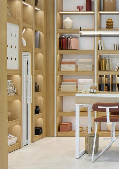
Core to both the concept as well as the clinic itself are two centrally located, glass-enclosed meditation rooms. Kitted out with pillows, mats, and candles, their importance is underscored by the approach: they are accessed off the lobby, down a hallway lined with white oak fins, where a herringbone floor points the way with its chevrons. “Those rooms are for clients to calm themselves before and after treatment,” explains Roach. “Julie is a strong believer in building community. Even if clients are not coming for a treatment, they can still come in and sit and meditate.”
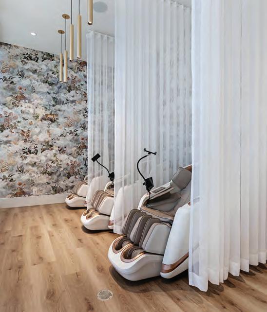
The spa-like effect is evident elsewhere. Off the lobby, there is a socalled numbing room. The idea — a place to apply numbing cream to dull the pain of ensuing injections — is common in medical aesthet-
ics clinics. But at the Face Institute, patients sit on plush chairs with electronic massagers that tenderize their muscles from head to toe. The chairs have rests for phones and iPads to help pass the time. “Patients might be sitting there for a while,” says Roach. “For privacy, as well as to add a sense of softness, we separated the chairs with sheer, floor-to-ceiling drapery.”
While the clinic rooms are a bit less spa-like, with drop ceilings and bright task lighting, the corridors between them also have elegant, hospitable touches. The doors are inset with brass. The door numbers, etched on glass, are lit with glass-and-brass wall sconces. “We wanted the space to feel jewel-like and special,” says Roach. “It’s a luxury service, so the space should feel like luxury, too.”
Taking Care
From the dentist to the oncology ward, designers are crafting elevated spaces of wellness for both patients and healthcare providers.
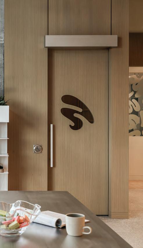
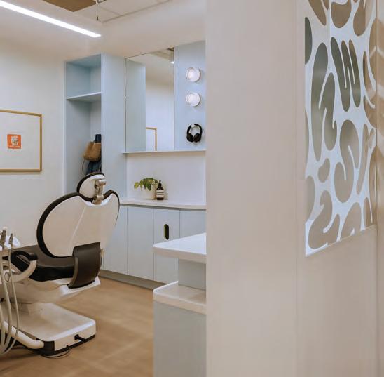
Ever since the term “self-care” ascended into the cultural lexicon, the healthcare and design industries have equally grappled with reframing routine procedures, check-ups and visits — from the hygienist to the doctor’s office — through a lens fixed on the patient experience. From dental offices that integrate elements of luxury hospitality to evidence-based design principles championing the benefits of natural cues, it has also ushered in a renewed emphasis on the critical role that design plays in this expanded field of care. In Alberta, two recent projects ride the wave of this architectural and social zeitgeist, further reimagining the potential of wellness spaces for patients and practitioners alike.
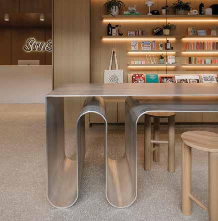
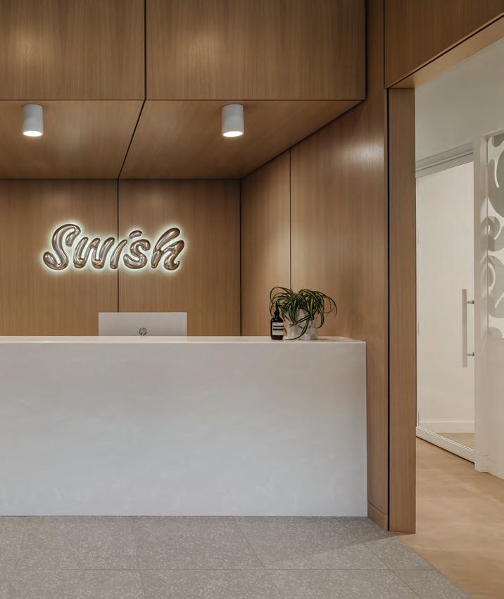
Swish Oral Care
“Most people go to the dentist because they’re told to go,” asserts designer Sarah Ward when reflecting on her practice’s most recent outpost for Calgary-based dental clinic Swish Oral Care. “We really wanted to turn that on its head,” she adds, “and make it a space
that’s desirable, interesting, welcoming and approachable.” Following the success of the first location in the Bridgeland neighbourhood just north of the city’s downtown core, clinic co-founders Adam Jiwani and Alim Kassam once again enlisted the local designer and her eponymous studio, Sarah Ward Interiors, to aid in pushing the physical and conceptual limits of what dental care can be.
Though more often associated with anxiety and trepidation, the company’s inaugural clinic drastically departed from this image of oral health with tailored details, natural materials and a bright, calming ambiance aimed at making a trip to the dentist a delight rather than a dread. According to Jiwani, the impetus for Swish was “to make oral care the new ‘self care’,” and shift the overwhelmingly negative perception of these common medical procedures. As Ward puts it, the concept was to reframe “how oral healthcare can become part of your overall wellness experience.” With additional floor space to flex, the almost 3,000-sq.-ft. sophomore location in the prairie
Previous page and this spread Swish Oral Care’s University District clinic swaps clinical tropes for a hospitality-forward sensibility. Warm wood panelling and south-facing daylight envelop a lounge conceived more as café than waiting room, anchored by a long custom sofa and refreshment bar. Sculptural, swirling Corian shapes the reception desk, positioned for privacy, while soft organic curves, plants and abundant natural light reinforce biophilic calm. Three Cloud Softlights hover above, lending human scale and diffused glow.
metropolis’s bustling University District offered both the owners and designer room to push the initial elements, offerings and unrealized ideas from the flagship even farther.
The first step to this transformation, literally and figuratively, began at the front door. As opposed to a more traditional entrance procession, where patients immediately confront the reception, visitors to Swish enter a sartorial, hospitality-inspired lounge more akin to a café than a dental office. “When you walk in, it doesn’t
feel clinical at all, says Ward. Instead, a custom solid aluminum bar with an undulating base reminiscent of a squirt of toothpaste is accented by three textural suspended Cloud Softlight fixtures provided by Vancouver-based Molo. Its sweeping curves lift from the brand’s distinctive logo, picked up again in the softened edges of an accompanying mirror mounted above the beverage centre where patients or even parents waiting for their child’s appointment can grab a coffee, tea, or sparkling water while relaxing momentarily or catching up on work.
Nearby, custom low-slung seating wrapped in a playful upholstery resembling demure teeth runs the length of the floor-to-ceiling windows. Amplified by the soft glow of integrated shelf lighting, the street-facing retail wall displays the latest products ranging from toothbrushes to Swish-branded oral care as objet d’art alongside bold hard-covered volumes on creatives like Virgil Abloh and Yayoi Kusama. Just a few steps away, a monolithic reception desk hewn from gently veined Corian and enclosed in a continuation of the wood panelling cladding the lobby further revel in the effect of natural materials. Its slight offset from the main lounge area provides added privacy for checking, scheduling the next cleaning and discussing sensitive matters.
Ward integrated such nuanced considerations of user experience into almost every aspect of the interior, down to multi-tonal wallpaper lining the corridor to the treatment rooms that elevates and animates the often-stressful approach to these operatory spaces. Building off the extensive learning curve from the Bridgeland outpost, where the designer conceived a range of millwork elements typically specified from dental manufacturers from scratch, custom cabinetry offers dedicated room for each patient to store their belongings. These sky-blue pieces join the seamless choreography and strategic concealment of the many mechanisms required for dental care: computer systems; x-ray machines; and even an integrated TV. The same warm wood panelling from the entrance is continued along the ceiling, a calming salve to “distract from the grittiness of cleaning teeth,” Ward laughs. This procession also takes patients past the patented Swish bar pioneered at the first location. Much like the graphic storefront display, this retail-inspired addition elevates everyday oral care to museum-worthy objects presented on folded metal shelving floating in front of reflective decals recalling the swooping gestures of Swish’s graphic identity.
As exactingly executed and considered as the guest experience is, Ward carried the same care into the staff amenities, turning what could have been an otherwise mundane lunchroom into a sanctuary fitted with space to relax and connect. With plans for lobby pop-ups and even a summer patio, Swish’s tailored atmosphere integrates
This page Special attention was paid to the Swish staff room with a larger kitchen area, counter height table for small meetings and meals, and a long banquette to rest on. Wallpaper by BlockShop textiles playfully lines the walls. Opposite page The Cross Cancer Institute’s Staff Wellness Room reimagines respite with a “dreamscape” sensibility of soft organic lines, gentle palette and fluid ceiling planes shaping an immersive shift from clinical corridors to cocooned calm.
natural materials, gentle tones and softened geometries to recast wellness spaces such as dental clinics as important nodes in the community, and as community hubs in and of themselves.
Cross Cancer Institute
In Edmonton, WalterFedy Architects leveraged the same approach in retrofitting a former photography studio into a much-needed area of respite for the staff of the Cross Cancer Institute (CCI). With few initial asks, principal interior designer Adrianne Gillese set out to survey CCI’s employees to get a better sense of what some 1,200 diverse healthcare workers might require to continue providing Alberta’s most advanced cancer care. Across numerous focus groups, questionnaires and interviews, a range of requests slowly surfaced: space for rest, room for socialization and celebrations, and a site for impromptu conversations and connections with colleagues. To begin accommodating these varied needs while drastically departing from the existing mid-century interiors, the designers stripped back the 1,600-sq.-ft. space to its generous 13-ft. ceiling height. This provided room to insert a luminous new intervention embracing muted tones and organic forms through both subtle and explicit nods to nature.
Fitting for one of the province’s leading medical centres, an array of cutting-edge research from neighbouring fields like neuroscience was mapped into the renovation, namely the possibilities for architecture and design to stimulate the vagal nerve: a core aspect of our body’s unconscious actions that regulates heart rate, digestion and breathing. “When we are around tall trees, we can’t help but have this sense of calm, awe, and rejuvenation,” says Gillese. The implication, she explains while citing several peer-reviewed studies, is that integrating plant life may generate a similar subconscious response for occupants, alleviating, or at least partially mitigating, the highstress hospital environment.
Though unable to integrate actual living flora — soil and all — into an oncology ward due to obvious issues around infection prevention, Gillese and her team opted for a different option: a hyper-realistic artificial grove crafted by Vancouver-based Greenscape Design & Decor. Encased in glass for ease of cleaning, the final piece replicates a typical tree in exacting detail, down to its delicate leaves. The existing raised floor allowed the designers to slightly recess the synthetic plants to appear as if they were growing into the staff room. Integrated lighting above conceals the apex of the installa-
tion, creating a sense of wonder upon approach. “These interventions really hit the deepest parts of our physiology and help us be our best selves,” says Gillese.
Aside from its soothing effects, this pseudo-natural element also creates a subtle distinction between zones in the otherwise open interior, framing the transition from the soaring volume of the lobby area and its softened arched windows to the more intimate community kitchen. Here, a restrained palette complements the gentle curves of undulating countertops that, along with the varied marbling on their surfaces, recall a host of geological features from riverbeds to sand dunes. Additional evidence-based design approaches were also integrated throughout, including circadian lighting and flexible programming. “User control sits very high on these recommendations,” Gillese says, “so giving people the ability to adapt their environment based on their needs gives them a strong sense of autonomy and dignity.”
In a shift from clinical to restorative, Swish and the CCI staff room deploy simple yet powerful details to elevate community and care as equally important wellness and design principles. Whether the den-
This spread Evidence-based wellness informs every design gesture: circadian lighting modulates tone and tempo; sustainably sourced finishes and tactile fabrics invite ease; flexible nooks balance solitude with collegiality. Warm timber accents and muted natural textures ground the space, while a hyper-realistic tree installation delivers biophilic theatre. Durable surfaces and refined upholstery choices ensure longevity without sacrificing softness, proving healthcare interiors can be restorative, spirited, and enduring in equal measure.
tist’s office or the oncology ward, “design,” Ward emphasizes, “does have a critical impact on your health and wellness.” Gillese echoes this sentiment, further noting the real potentials of attuning interior environments to not only natural forms and rhythms, but to the many users who eventually occupy them. “I think we can sit back and appreciate the work that is done by healthcare providers,” she adds. “We can also acknowledge how burnt out they must feel and continue to feel. Yet, they’re still expected to come back every day and give their all. As designers, we can create these spaces that may help support them in some way by offering tremendous amounts of refreshment and recharge.”
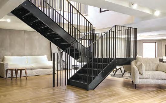
Design Sells the Dream
Across Toronto and Montréal, highend suppliers are swapping static displays for full-on design narratives where surfaces, sofas, and brands act out the lifestyles they sell.
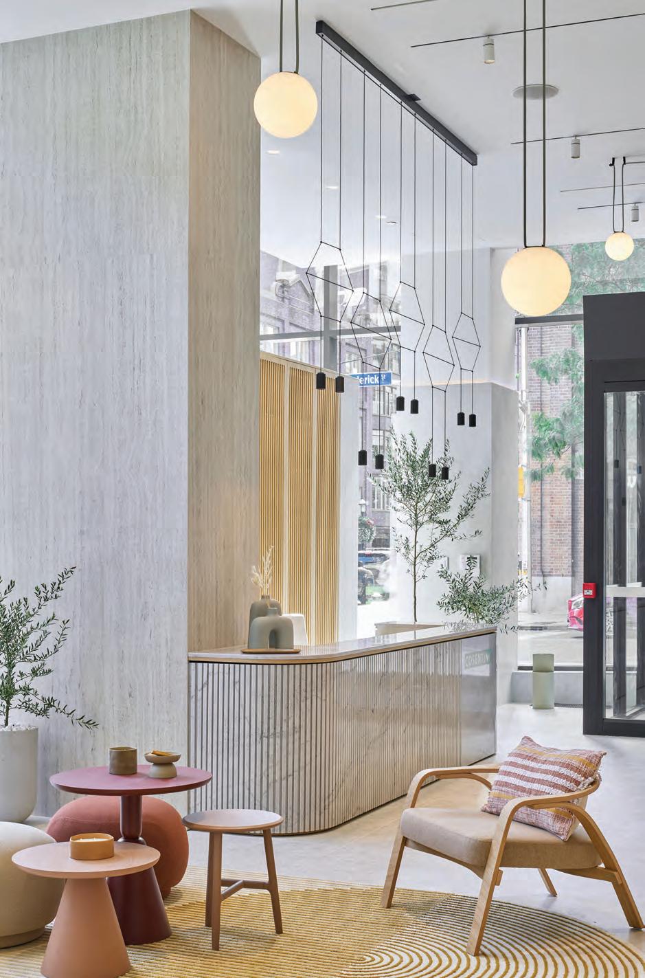
There’s a new trend shaping up in the high-end furnishings market with suppliers peddling not just products but lifestyle as well. Three new showroom retail stores exemplify the shift: solid-surfacing supplier Cosentino and seating manufacturer Montauk Sofa in Toronto’s King East Design District, and Maison Territo in Montréal’s Royalmount upmarket mega-mall, billed as “the first Canadian destination to unite the most iconic Italian design houses under one roof,” including Fendi Casa, Dolce & Gabbana Casa, Versace Home, Bentley Home, and Gallotti & Radice.
No surprise that these businesses are popping up in Canada’s largest cities. According to Milan-based World Furniture Online by CSIL, high-end furniture accounts for nearly 15 per cent of sales within the global furniture industry. Their “World Market for High-End, Luxury & Design Furniture” report states that “North America is the largest market thanks to its concentration of affluent consumers, including over 40 per cent of global millionaires.”
Cosentino Toronto City Center
“There’s been a clear shift in how luxury showrooms are conceived. They’ve evolved into immersive, experiential spaces that tell a story about how we live with design,” said Heather Dubbeldam, principal
This spread Cosentino’s Toronto flagship is a materials playground: the double-height, corner-site showroom stages Dekton and Silestone across floors, cladding, furniture, and a working kitchen and bath. A product library with pull-out panels encourages tactile pairing and palette testing, while collaborative zones and street-facing slab displays collapse threshold and city, positioning the space as both hub and beacon. As installations evolve seasonally, the showroom becomes a living catalogue of material innovation.
This spread Montauk Sofa’s new Toronto flagship inhabits a 1920s building reimagined as a quietly opulent residence, where proportion, light and materiality take centre stage. White-oak plank floors meet parged concrete and original brick and stone, creating a tactile backdrop for the brand’s sculptural seating. Natural light pours through expansive windows and skylights, framed in anodized aluminum, with recessed linear lighting amplifying the gallery-like calm. Furniture is spaced to breathe, complemented by creamy textiles, warm camels, and soft blues, while a metal stair rises to a rooftop terrace finished in limestone Dekton.
of her eponymous Toronto firm and architect of record for Cosentino’s new Toronto City Centre showroom. “[Cosentino] embodies this approach, presenting its surfacing materials in full-scale environments that blur the line between display and architecture. It’s not just about what luxury looks like, but how it feels.”
Cosentino moved from its former digs, located in “nosebleed territory” north of St. Clair Ave. near Elte Carpet. “We wanted to go to a new, cooler place that was more posh and with a lot of designers around,” explained Cosentino interior design manager Cristina Hernán Mateos. The master design for City Centre showrooms worldwide was created by Cosentino’s in-house design team. “There’s a connection with wood,” Hernán Mateos said. “We didn’t want to make the showroom all stone because that would be too cold. The wood brings in the look of nature for more warmth. The inspiration for the showroom is the coastal or Mediterranean eco look.” Indeed, the colour palette is sun-bleached. The coastal theme was applied with restraint, sans fishing nets, hemp macrame or other kitschy maritime elements.
The guiding concept was to create a showroom that goes beyond product display to helping designers envision their projects brought to life with Cosentino materials. Vignettes within the showroom portray relatable, inspirational, real-life applications: a hotel recep-
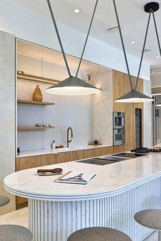
tion desk; a fireplace; an executive meeting/dining room and an open working Gaggenau kitchen with Kohler faucets. They are populated with furniture, fabrics, carpet and architectural lighting from Spanish suppliers Andreu World, Gancedo, Naturtex and Vibia, respectively. There is even a fully functioning, accessible “Bathelier” zone showcasing how designers can specify a seamless, unified look using Dekton product for sinks and shower trays as well as traditional bathroom applications such as vanities, walls and floors.
To exploit the showroom’s corner site with its double-height space and windows on two sides, rotating lozenge-shaped metal frames exhibiting slabs of Cosentino surfaces face the street to create public-facing displays, plugging the showroom experience into Toronto’s urban fabric and engaging passersby.
Cosentino’s new Dekton Ukiyo product skirts that lozenge-shaped hotel reception desk, actually the welcome desk/kitchen island. Ukiyo’s ribbed surface is something new for a product category previously available only as smooth or subtly textured slabs. The fluted material emulates the wood tambour fronts and wood-slat screens reposing nearby in the showroom. (Ukiyo is the Japanese term for the urban lifestyle of that country’s Edo period, circa 1600 to 1867, and to the prints of contemporaneous artists such as Hokusai and Hiroshige who engraved their images into woodblocks. The ribbed
Opposite page Maison Territo’s welcome counter blends noble materials with a sculptural brass pendant light designed by Verchères, Que.-based Larose Guyon, which adds an airy, luminous touch. Above The Fendi Casa living room blends clean lines and architectural details, true to the Roman elegance of the brand.
texture also evokes the patterns of raked sand in Zen gardens.) The worksurface is equally intriguing. The 60mm countertop was built by layering three 20mm Silestone slabs, each separated by a five millimetre groove, creating gaps that add depth and texture without compromising strength.
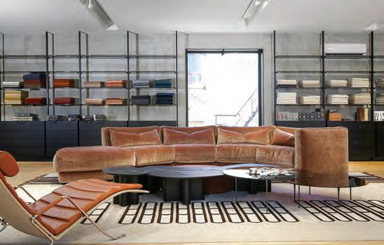
Montauk Sofa
There’s a connection to the new Montauk Sofa showroom a few blocks away: the roof terrace is surfaced in Cosentino’s Dekton panels. The Toronto flagship continues the house style of industrial shabby chic and lush landscaping set a few years ago by the Montréal mother ship, which reposes within the partially preserved shell of a 1940s-era factory. Both locations were designed by Winnipegand Montréal-based Cohlmeyer Architecture. The Toronto outpost boasts tall grasses near the sidewalk and atop the terrace. “We always like to bring in the garden effect,” said Montauk Sofa founder and owner Tim Zyto, in an interview. “In Montréal, we tore down the first 25 per cent of the building to build our garden.”
But first, you must be wondering, what’s the origin story of the proudly Canadian company (everything is custom made in their Montréal factory) with the Yankee name that began operations in 1995? “I read The Gold Coast, this really cheesy novel by Nelson DeMille,” Zyto said of the 1990 book by The New York Times bestselling thrillers author that takes place amongst mansions built during the Great Gatsby era of the early 20th century when the
Vanderbilts, Guggenheims and Astors erected lavish estates on Long Island’s north shore in towns such as Oyster Bay and Glen Cove. Zyto and his girlfriend would explore those places, “and we would often end up at beautiful homes in Montauk that were quite significant but subtle; you would never see anything much from the street.” Montauk is on Long Island’s eastern tip, where celebrities such as Andy Warhol, Richard Avedon, Edward Albee and Princess Lee Radziwill (Jackie Kennedy’s sister) lived. It happened that Zyto was looking to name his fledgling business. “I thought, oh, ‘significant and subtle,’ that’s good for us. Our sofas are not flashy, but they’re quite substantial. I wasn’t going to call my company Oyster Bay, but Montauk was a cool name.”
The four-storey, 8,000-sq.-ft. Toronto showroom is a renovation and adaptive-reuse of a 1920s building with an underground tunnel, rumour has it, for bootleggers to smuggle alcohol. The main intervention on the exterior was to add a sense of massiveness to the façade. “We thought the building looked flat,” said Montauk Sofa co-founder and design head Danny Chartier. To that end, new anodized-aluminum window surrounds protrude nine inches, adding rhythm to the façade and literally framing views of the upmarket sofas, sectionals, chairs, beds and outdoor furniture within.
The main floor features a Valcucine show kitchen, aligning with Montauk Sofa’s exclusive distribution of the line in Canada. The space is finished with white oak narrow-plank floors and parged
concrete walls. The lower level retains the building’s original brick and stone walls. The furniture and fabric library located on the second floor provides a work environment for designers to collaborate with clients. “A lot of designers don’t have offices anymore; they’re welcome to come here and meet their clients,” Chartier said. On the top floor, new perimetrical skylights flood the interior with daylight. Throughout, the focus is always on the sofa; there’s never a sense
of clutter or claustrophobia from too many accessories. “We want to keep it simple,” Zyto said. “The messaging is simple. The advertising is simple. The sofas are simple. The spaces are simple. We’re debating the design of our next store: It will be very raw.”
Further drawing eyeballs to the sofas is the impressive array of hightouch fabrics that drape them, such as embossed velvet with thick ridges evoking brain coral; and thick, nubbly bouclé. Unlike the well-tailored perfection at Cosentino, a more casual and “comfy” spirit prevails. “For us it’s always about comfort,” Zyto said. “We want
Yourfirstlineofdefense!
SelectingABDDEFENDER rubberfloorttiles andsstair treads isyour first line of defense foremergencyexitsstairwaysofhighbuildingsrequiringsuperiorfire-retardant propertiesandlowsmokedevelopment.
Above Each brand has a dedicated space that embodies its unique aesthetic with signature materials, all integrated into a unified architectural vision. A bold Dolce & Gabbana Casa living room, for example, features the brand’s iconic full leopard print look on the floor and seating.
you to live on the sofa. Our idea of success is that you jump on there Friday night and you stay there happily ‘till Monday morning.”
Maison Territo
At Maison Territo, a series of playfully overlapping arcs, evocative of giant-scale croquet arches and, not by coincidence, a Fendi brand identifier, animate the landscape and draw the passersby’s eyes to the entrance. And speaking of brand identifiers, for the 11,000-sq.ft. project, “The big challenge was to work with the egos and aesthetic standards of different companies that don’t love each other,” said Patrick Blanchette, who heads his eponymous Montréal-based architecture firm, blanchette archi.design. A pervasive communal Maison Territo look was established using a polished-concrete floor running like an allée through the collections from one end of the lengthy floorplate to the other.
Speaking of brands, folded champagne aluminum in the custom integrated display shelving, and peinture à chaud wall finish (traditional cement painting), signify Fendi, for example, which occupies half the floorplan. As for its signature motif, “Every time you look at Fendi furniture, you see the arches,” says Blanchette. They’re embodied in the back and arms of a sofa, pendant lighting, the large photograph over the sofa of a surrealist de Chirico-esque arcade, and in the cast-aluminum table designed by Karl Lagerfeld.
Fendi white clashes with Versace white, but no one notices when the tall pivoting doors, covered in a visually permeable 3D-textured metal mesh, close off the Fendi shop-in-shop while allowing shoppers to remain oriented to the rest of the boutique. Each brand’s zone boasts a decorative feature wall that doubles as a selfie backdrop, such as the Fendi Casa HDF wall sector embellished with CNC-routered interlocking “F” logo figures.
At Versace, characteristic brand touches include Arabesco marble walls, silver and gold finishes and an element of retro modernism. “Dolce & Gabbana is another really expressive brand with big patterns. The brand is really black,” said Blanchette, who created lacquer-black display shelving with wide, eight-foot bays and downlighting on the front and back of each shelf. The giant LED screen on the back wall, on axis with the entry, draws shoppers into the zone. A frosted-glass conference room can be reserved by designers to meet confidentially with their clients. Bentley, meanwhile, is notable for the minimalist gesture of leather-covered floating steel shelving anchored in the dark volcanic stonesheathed back wall.
Maison Territo is named after co-founder David Territo. Fittingly, the first and last feature visitors see is the cash wrap near the entry, which doubles as a bar and kitchen because “in Italian culture, the kitchen is the heart of the family,” Blanchette says. It also makes the statement that the place, at the end of the day, is a lifestyle store. And an upscale one at that, as the willow tree inspired, USD$86,000 gold-leaf Saule pendant lighting by Larose Guyon, based in Verchères, Que., makes clear. Because the chandelier is yellow, the accent colour, your eye zooms to it. “We wanted to showcase the Québec design industry along with the international major brands.”
ARCHITECTURAL SHADING, ENGINEERED TO PERFECTION
Since 1979, Brading has been the trusted partner for architects, designers, and luxury home builders across the GTA and cottage country. We specify, design, supply and install precision shading systems for both residential and commercial projects.
SIGNATURE PROJECTS
•50’ motorized curtain tracks for Massey Hall
•40’ x 23‘ motorized curtains at the Schwartz Reisman Auditorium, U of T
•300’ span of interior motorized shades for OLG Theatre, Niagara Falls
•Custom digitally imprinted motorized shades for the Ismaili Centre and Aga Khan Museum
• A significant number of luxury custom projects through a trusted network of home builders
BUILDING CANADIAN ECONOMIC RESILIENCE
Schedule a consultation to discuss your next project!
416-488-6600 | BRADING.COM
3206 YONGE ST, TORONTO, ON M4N 2L2
Something for Everywhere
A selection of thoughtful design objects and collectible daily essentials, perfect for gifting or claiming as your own, when beauty and utility align.
For the KITCHEN
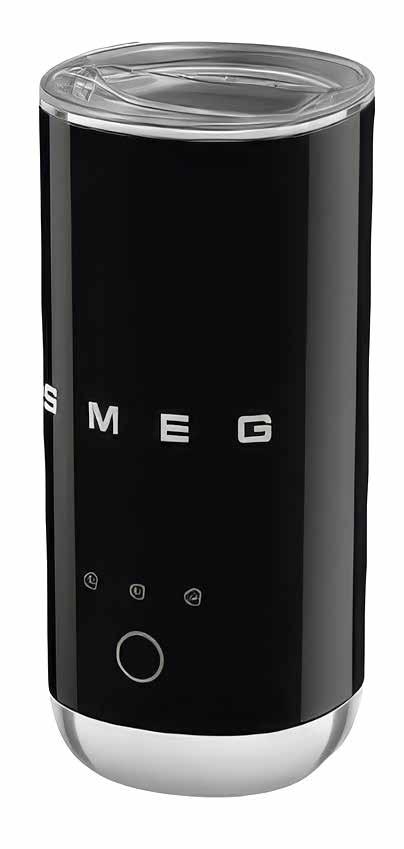
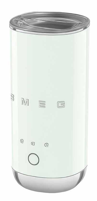
1 Portable Milk Frother | SMEG
The Portable Milk Frother whips up warm or cold foam with ease, perfect for travel, office or any cozy corner at home. Designed with SMEG’s signature style and built for versatility, it brings elevated coffee moments to any setting. www.smeg.com/ca
2 Canadian Tea Towel | pi’lo
A thoughtful accent for kitchens where design and everyday ritual meet, Toronto textile designer Heather Shaw revives a classic with the Canadian Tea Towel. Handmade in her downtown studio and crafted from organic linen printed with understated beavers and maple leaves, it blends nostalgia with utility. “I originally designed the towel for Canada’s 150th anniversary and the timing couldn’t be more perfect to bring it back,” says Shaw, an Emily Carr University of Art + Design alum. “Now more than ever, supporting homegrown brands and showing our patriotism is important.” www.pilo.ca
For the GAME ROOM
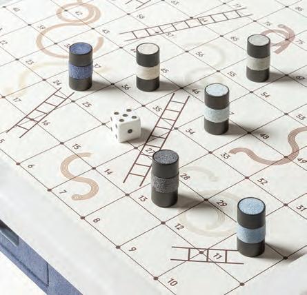
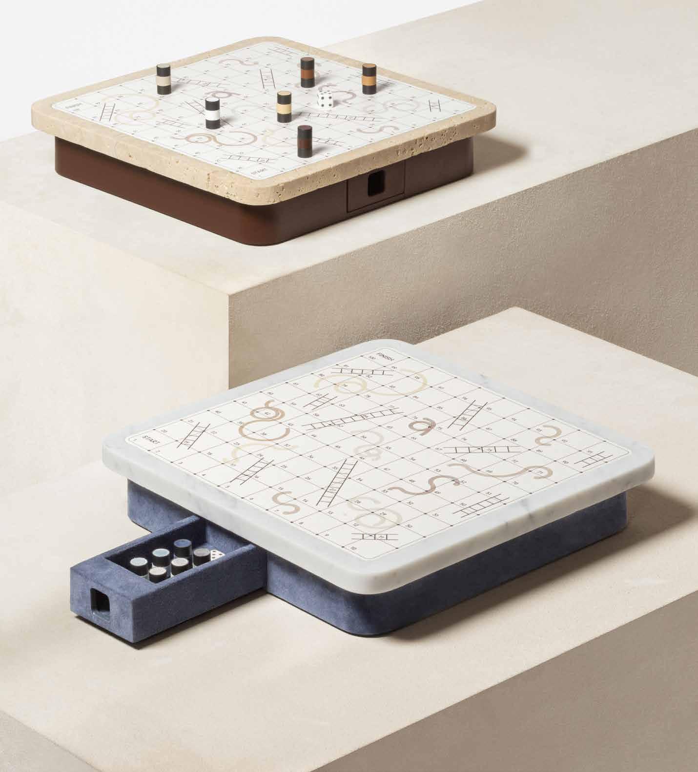
3 Game sets | Giobagnara Giobagnara turns game night into a tactile design experience. The Delos Snakes & Ladders pairs leather-clad wood with metal pieces in chrome, bronze, or brass. The Mahjong set wraps tradition in sleek leather and bakelite. Mocambo Backgammon, in walnut and printed marble, channels architectural gravitas. With refined detailing and customizable finishes, these sets are as at home in a yacht salon as a designer’s library. www.giobagnara.com
For the CUPBOARD
4 XL Vintage ABC cups | Design Letters
Made of fine bone porcelain, these oversized mugs reimagine Arne Jacobsen’s 1937 typeface into words like HERO and SMILE in crisp lettering, bringing playful modernity to a design classic. Durable yet refined, they’re a witty nod to mid-century signage, ideal for studios or kitchens where typography meets tactility. www.designletters.dk
5 6
For the LIBRARY
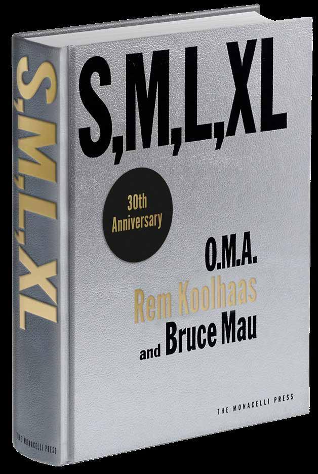
5 S,M,L,XL (30th Anniversary Edition) | Phaidon
Thirty years on, S,M,L,XL still feels like a creative rupture. The 1995 “novel about architecture” that critics said “changed the idea of the architecture monograph forever” returns in a collectible new colourway. Koolhaas and Mau’s mash-up of projects, essays, sketches, and myth-making remains a tactile provocation and an intellectual workout whose “effort… is still a thrill.” For designers, it’s not nostalgia; it’s a reminder to think bigger, stranger, bolder. www.phaidon.com
For the BATHROOM
6 Wildflower Mercantile Bath, Body & Home
This is a new Canadian brand of handcrafted, small-batch, refillable essentials launched by Vancouver Island-based entrepreneur and photographer Emily Yewchuk. From soothing bath soaks and soft skin creams to soy candles and biodegradable cleaners, the collection makes everyday rituals feel indulgent while staying gentle on people and the planet. www.wildflowermercantile.ca
For SHEVLES
7 Tadelakt Pottery | Obakki
The Vancouver-based but internationally focused lifestyle brand has launched a new Morocco Collection that taps into the region’s heritage and craft. Here, Marrakechbased artisans Zakaria, Abdel, and Mohammed continue the ancient tradition of Tadelakt pottery, an architectural technique once used to waterproof palaces and hammams. Each piece begins with lime-based clay and natural pigments, shaped by hand and coated in Tadelakt, a fine lime plaster. The hallmark of this process is the final polish: Zakaria uses a smooth river stone to burnish each vessel into its signature velvety finish. ww.obakki.com
For
the OFFICE
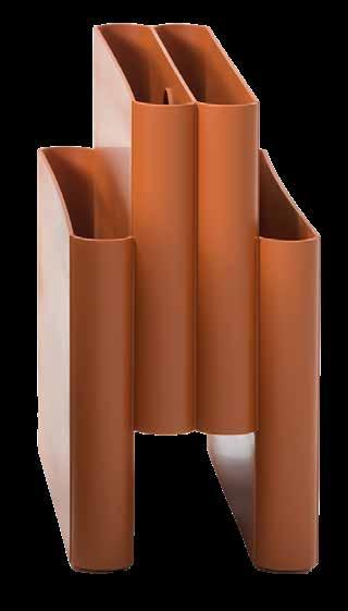
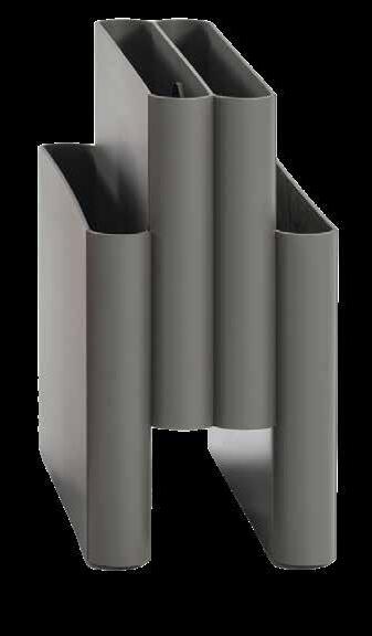
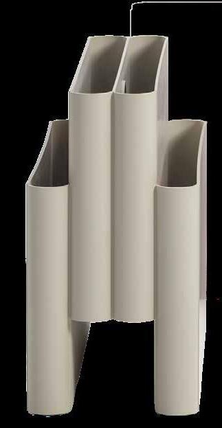
8 Magazine Rack | Kartell
An icon of Italian design, Giotto Stoppino’s Magazine Rack now comes in a choice of colours that gives it a more modern look: Bordeaux, Orange, Dove Grey and matte Anthracite. The new colours give this unique object (for which we in the magazine biz have an obvious soft spot) a more contemporary aura and enable it to blend in with modern interiors without losing any of the fascination of the original concept. www.kartell.com
For ANY ROOM
9 2025 Advent Calendar | SOJA&CO
This year’s Advent Calendar arrives with a luxe new look: think gold accents, embossed details, and a magnetic closure that snaps shut with satisfying precision. Inside, 24 soy candles (23 minis and a 4 oz finale) blend bestsellers, winter scents, nostalgic favourites, and exclusive creations. Crafted in Québec from recycled materials, it’s a tactile, olfactory countdown designed to light up December with quiet sophistication. www.sojaco.ca
By Peter Sobchak
GOOD READS
This Land Is Your Land
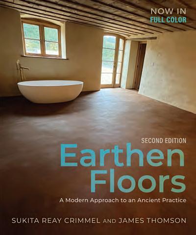
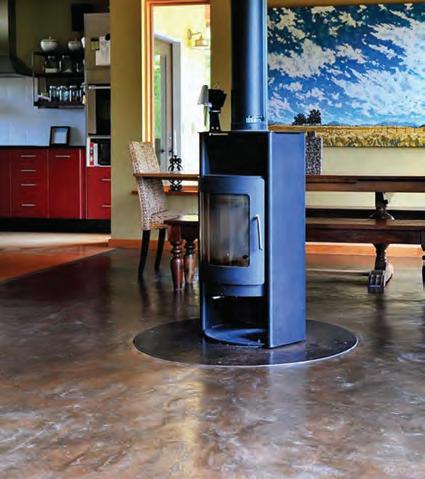
Updated to reflect current best practices, this guide lays the story of earthen floors through the ages and their role in modern green building.
In an age when biophilic design and embodied carbon are shifting from buzzwords to benchmarks, Earthen Floors: A Modern Approach to an Ancient Practice, published by New Society Publishers, offers a compelling synthesis of heritage technique and contemporary innovation. Far from a nostalgic paean to mud huts, this revised edition is a technically rigorous manual that brings the ancient craft of earthen flooring into the 21st century with a pragmatic clarity that will intrigue both specifiers and sustainability-focused designers.
Sukita Reay Crimmel and James Thomson, veterans of the natural building movement, guide readers through the science, aesthetics, and construction process of earthen floors, a surface that is simultaneously soft underfoot and high in thermal mass. Their primary material palette of clay, sand, fiber, and natural oils serves as a case study in carbon-conscious sourcing. But the book’s strength lies in its applied research: this edition includes expanded guidance on subfloor types; updated oil-hardness comparisons; radiant heating integration; and finish durability testing. These aren’t artisan secrets; they’re best practices backed by iterative fieldwork and user feedback.
What distinguishes this volume from its predecessor is the integration of international case studies and systematized techniques that address both performance and perception. From low-income
housing prototypes in Rwanda via EarthEnable to retrofitted Craftsman homes in Oregon, the authors show that earthen floors can be as contextually adaptable as they are materially expressive. For design professionals, the aesthetic benefits—a rich spectrum of earth tones, tactile warmth,and a patina that ages with grace— are joined by measurable benefits: low embodied carbon; VOC-free finishes; and inherent fire resistance.
While earthen floors may not yet be code-standard in most jurisdictions, their inclusion in the International Residential Code Appendix and growing use in urban settings mark a quiet but significant shift in sustainable construction norms. This second edition is not just a how-to manual; it’s a persuasive manifesto for a lowtech, high-impact design solution whose time has come again.
For interior designers seeking alternatives to synthetics, and for architects exploring holistic material systems, Earthen Floors is worth a look. It blends technical insight with cultural intelligence, an example of material design thinking that goes deeper than surface.
Miri
Stebivka
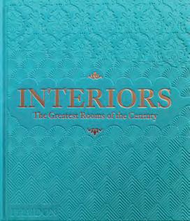
Insider Knowledge
This
sky-blue edition maps a century of design influence, spotlighting icons, omissions, and the power structures that define “greatness.”
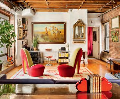
Phaidon’s Interiors: The Greatest Rooms of the Century (Sky Blue Edition) doesn’t just document interiors, it canonizes them. First published in 2019 and now wrapped in a new sky-blue livery, the 448-page tome promises a “global celebration” of design but functions more like an aesthetic power map: a visual index of who’s shaped interior taste over the past century.
The book’s structure is clean and encyclopedic: 400 rooms arranged A–Z, spanning Belle Époque salons, mid-century modern icons, and contemporary experiments. William Norwich’s introduction situates the interiors canon within the history of photography, shelter publishing, and taste-making; a reminder that what gets photographed is what survives in the design imagination. It’s a catalog of influence, not a history lesson.
The usual tastemakers dominate: Billy Baldwin, David Hicks, Colefax & Fowler, Anouska Hempel, Kelly Hoppen. Fashion designers and artists such as Armani, Saint Laurent and Donald Judd make appearances too, underscoring how lifestyle branding has long blurred the line between living space and cultural stage set. The essays that open the volume are sharp: Graeme Brooker tracks the shift from unified architecture to autonomous interiors; David Netto explores traditionalism’s comeback; Carolina Irving dissects the tyranny of “good taste.” Collectively, they set a thoughtful frame for what could have been a more expansive global survey.
And here’s where the book falters. Despite its “global” billing, the canon remains unmistakably Euro-American. The gravitational
pull is Paris–London–New York–L.A. Non-Western rooms appear, but often through a Western lens—colonial appropriations, grand tours or expatriate fantasies—rather than from the perspectives of designers working in Asia, Africa, Latin America, or Indigenous contexts. In 2025, that editorial framing feels dated. It celebrates excellence but doesn’t challenge the boundaries of who defines it.
Still, for practitioners, Interiors is undeniably useful. It’s a visual lexicon of how taste has cycled: from modernist austerity to 1970s irreverence to postmodern playfulness and beyond. Think of it less as a coffee-table book and more as a mood board for a century’s worth of design thinking. The photography is sumptuous, the references deep, and the A–Z format makes it easy to jump between eras and styles. For design media like Canadian Interiors magazine and others who chronicle the present, this kind of tome is not far from an editors’ reach.
Ultimately, Interiors is a beautiful, authoritative archive, one that reflects the establishment more than the edges. For interior designers, that’s both inspiration and a provocation: to look beyond the canon and imagine what a truly global “greatest rooms” might look like.
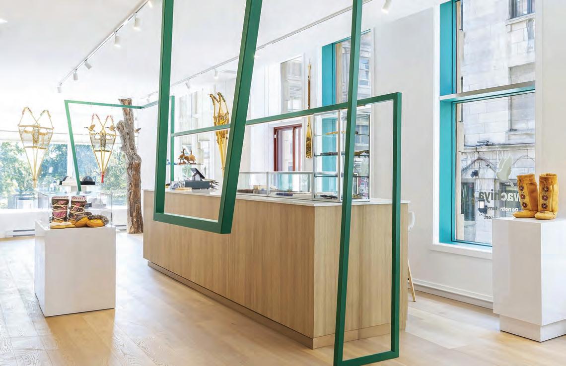
A symbolic and functional thread draws visitors through this hybrid boutique.
The Wachiya boutique in Old Montréal, designed in collaboration with the Cree Native Arts & Crafts Association (CNACA) and Montréal-based interior design firm Clairoux, is a 1,700-sq.-ft. cultural and commercial space dedicated to showcasing Cree craftsmanship that goes beyond traditional retail by offering an experience that combines contemporary design and Indigenous traditions. At the core of the project was a mission: to build a meaningful space within three months with a limited budget of $80,000. “For me, Wachiya is not just a boutique, it’s an encounter,” says Frédric Clairoux, principal designer and founder of Clairoux. “As a designer, I often work with materials, proportions, and circulation, but here, I felt I was working with something much deeper: the spirit of a people and their relationship to the land.”
The interior design concept is based on the idea that “we are connected to everything around us: our environment, others, and every action we take has an impact on another.” This quote became the backbone of the space, inspiring the creation of a subtle visual thread that runs through the store. “That green line is, for me, the soul of the space. On the surface, it’s functional: it holds merchan-
dise and guides people through the boutique, but the intention behind it goes much deeper,” says Clairoux. “What really inspired me was learning how, in Cree tradition, a simple horizontal bar placed above the fire was used to dry animal skins. That image struck me; an object so modest, yet essential, carrying both practical and cultural meaning. Reinterpreting that gesture into a retail setting felt like a way of honouring this heritage while giving it new life.”
Wachiya’s layout adopts a minimalist, contemporary approach that blends sleek aesthetics with functionality to ensure smooth circulation and optimal display of handcrafted artworks. From the exterior, the symbolic thread draws visitors into an immersive journey and connects them to the essence of Cree identity: the forest. Wachiya’s signature colour, green, visually reinforces the central design thread. This experience is further enhanced by a projection at the back of the boutique evoking the Cree landscape, while tree trunks sourced from Cree forests serve as a natural connection to the origins of the displayed artworks. The use of natural, locally sourced materials, combined with close collaboration with the Cree community, underscores a commitment to sustainability and social responsibility.
Julien
Reimagine Drywall
The Unmistakably Quiet AcoustiBuilt®
Have it all with acoustical ceilings that look just like drywall but feature Total Acoustics® performance. The smooth, monolithic visual of AcoustiBuilt is easy to mistake for drywall — until you hear the peaceful combination of high sound absorption and sound blocking. Deliver quiet spaces and design flexibility at armstrongceilings.com/reimagine
AcoustiBuilt Seamless Acoustical Ceiling System with Axiom® Trim Children’s Research Hospital - Memphis, TN Evans Taylor Foster Childress Architects - Memphis, TN