
COLOUR THEORY
Colourtheoryisthestudyofhowcoloursworktogether andhowtheyaffectouremotionsandperceptions.
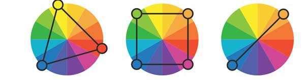
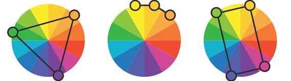
COLOUR SCHEMES
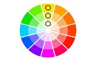
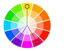
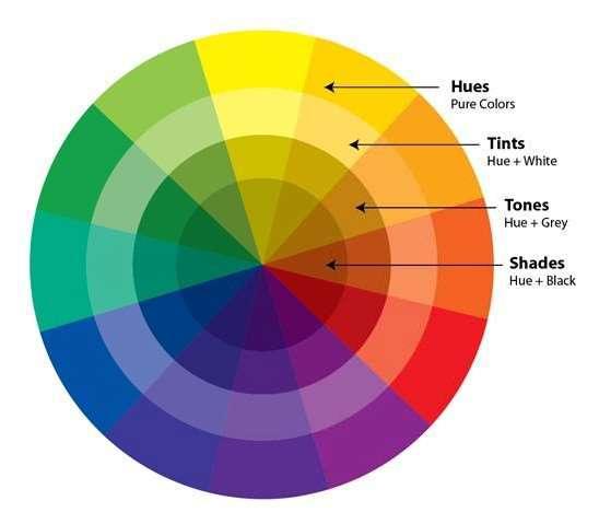
Hue referstotheoriginofthecolorswecansee. PrimaryandSecondarycolors(Yellow,Orange,Red, Violet,Blue,andGreen)areconsideredhues.
Tint referstoanyhueormixtureofpurecolorsto whichwhiteisadded.Pastelcolorsaregenerallytinted colors.Tintedcolorremainsthesamecolor,butitis palerthantheoriginal.
To ne isahueormixtureofpurecolorstowhichonly puregrayisadded(equalamountsofblackandwhite). Addinggraytoacolorwillmaketheintensitymuch duller.
Shade isahueormixtureofpurecolorstowhichonly blackisadded.Itcontainsnowhiteorgray.Shade darkensthecolor,butthehueremainsthesame.
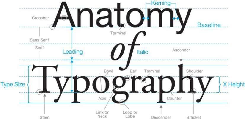
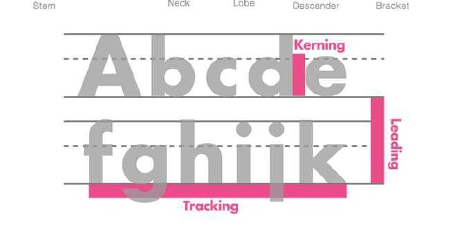
TYPOGRAPHY
Typographyis theartandtechniqueofarrangingtypetomakewrittenlanguagelegible, readableandappealingwhendisplayed.Thearrangementoftypeinvolvesselectingtypefaces, pointsizes,linelengths,linespacing,letterspacing,andspacesbetweenpairsofletters.
Seriffontshavelittlestrokes called serifs attachedtothemainpartof theletter.
Sansseriffontsdon'thavethatextra stroke—hencethename,whichisFrench for without s e rif.
Displayfontscomeinmany different styles,likescript,blackletter,allcaps,and justplainfancy.
Hierarc hy shows thereader'seye wheretobegin andwheretogo next usingdifferent levelsof emphasis.
L ea ding isthe space between lines of text, also known asline spacing.
Tr a cking is theoverall space between characters, sometimes calledcharacter spacing.
Ker ning is thespace between specific characters. Unlike tracking, it varies over the course of the word because each letter fits together differently. H

Heading
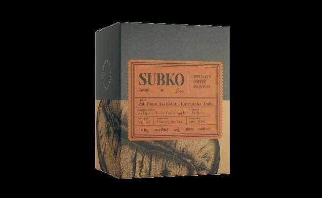
Subko Specialty Coffee Roasters strives to highlight the complexity, care, and craft of the Asian specialty coffee value chain, whilst creating an experience that is focused on the Indian Subcontinent.
Complimentary colour scheme
Pastel shades of the colours have been used giving it a subtle look.
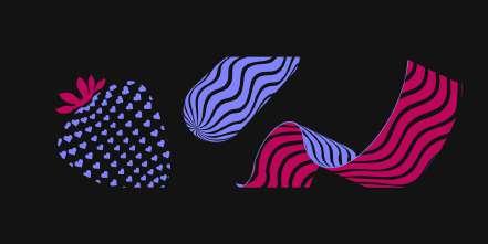
A simple layout is used where the lower half contains graphics depicting the nature of the product
“Karlie Serif Condensed”
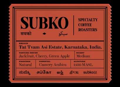
Body- Bold
Body
Font is constant across the packaging.
Hierarchy of typography is evident with variations in boldness and text size
Huber and Hollly is a premium ice cream brand with a variety of ice creams, cakes, snakcs, pastry, and milkshakes.
Analogous colour scheme
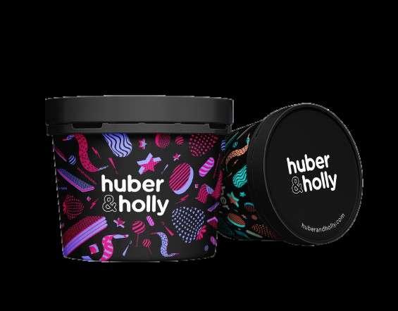
“Fag Rounded Bold”
The font used adds a playful element to the packaging attracting younger crowds.
Vibrant colours appeal to the all age groups and highlight different flavours of ice cream. The accent black adds a touch of elegance and exclusiveness
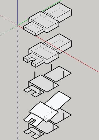
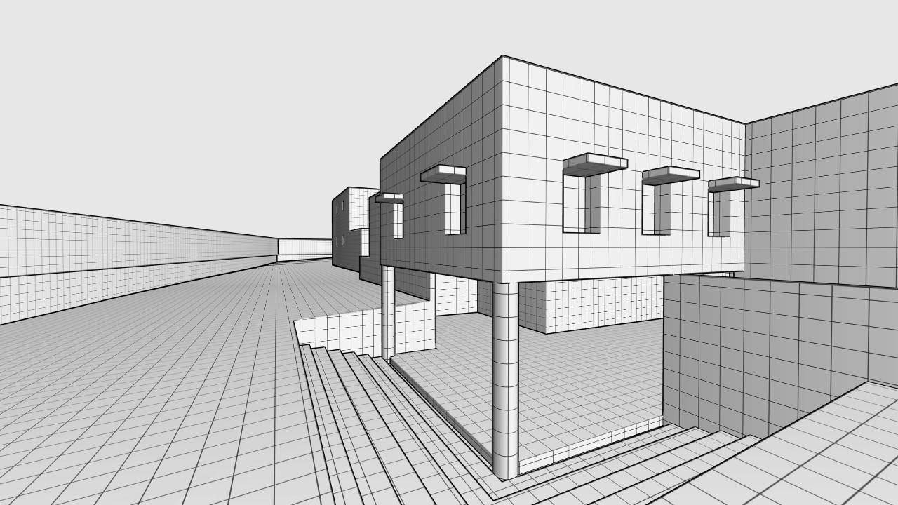
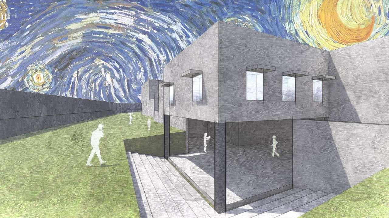
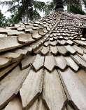
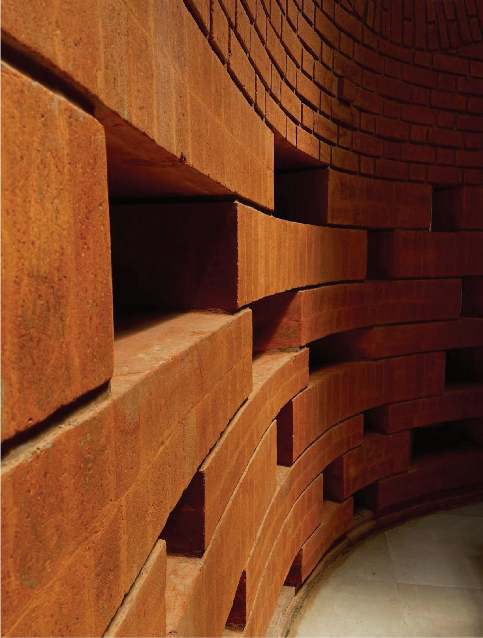
addition of sloping roof making it blend into the surrounding terrain
addition of columns
introduction of a courtyard on the side of the temple
division of spaces in 3 di erent layers
incorporating symmetry, grids, balance and compostion
grade 3 TRINITY elocution examinations
architectural photography workshop by Ar. Nakul Jain elementary, intermediate examinations
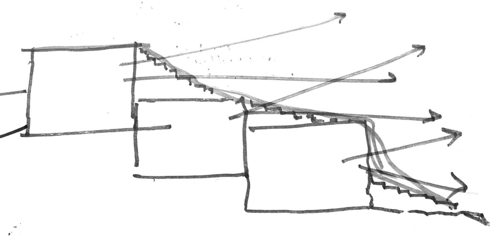
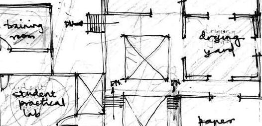
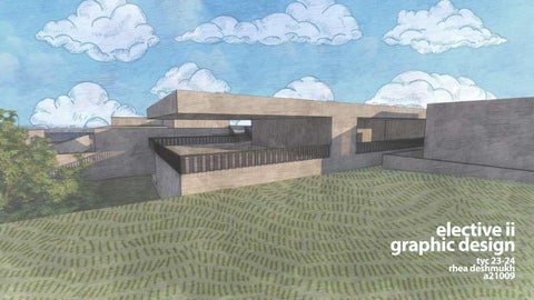
02 03 04 05 kagzikhana a handmade paper factory and training institute ad I sy I sem iv
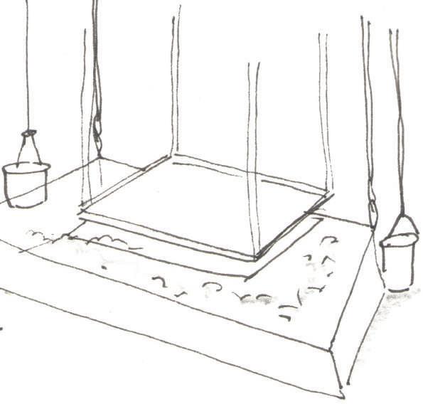
adding background, sky cover, humans and material rendering