

YOUR SAP TICKETS TELL THE TRUTH THAT SLAS DON’T
YOUR SAP TICKETS TELL THE TRUTH THAT SLAs DON’T

TOTALTEK PROJECT
DIRECTED BY:
JENNIFER DAVIES
Green SLA dashboards can hide a red user experience. Two anonymized SAP environments show why five signals in your ticket history—incident‑to‑service request ratio, time‑in‑status, aging, severity mix, and mean time between incidents—diagnose system health faster and make next month easier than this one.
By Brad Nicolaisen, SVP of Strategic Growth - SAP, PMO & AI Innovation
Green SLAs with a red experience is one of the most common paradoxes in enterprise software. The fix isn’t more stopwatch discipline; rather, it’s reading the evidence you already own.
Your SAP ticket history is that evidence. Read properly, it’s an EKG of your ERP: monthly spikes are arrhythmias, incident‑to‑service request ratio is blood pressure, reopen and duplicate rates are relapse metrics, backlog composition is


cholesterol, and time‑in‑status tells you where the flow constricts. It’s blunt, it’s honest, and it’s faster to act on than any dashboard of averages.
Why SLAs Miss the Point
Picture the monthly operations review.
The SLA page is green across response and resolution time, yet your inbox is full of déjà‑vu: period‑close scrambles, familiar hotfixes, and user complaints that sound oddly similar to last quarter. SLAs confirm speed, not learning. They tell you someone picked up the phone and clicked “resolve” on time; they do not tell you whether the fix prevented tomorrow’s ticket, whether this month’s “new” incident is a sequel, or where work is actually waiting in your process. The only way to answer those questions quickly is to read the ticket history itself, like a radiologist reads an x ray, not a stopwatch.
Read the History Like an X-Ray
Five signals make that X‑ray fast and honest. First, the incident‑to‑service request (INC:SR) ratio tells you posture, reactive firefighting versus proactive improvements. Second, a simple volume timeline laid over your business calendar exposes recurring peaks tied to month‑end, promotions, or seasonal cutovers. Third, time‑in‑status shows where work waits, “In Progress,” “On Hold,” or “Pending Validation.” Fourth, backlog composition tells you whether the long tail of P3/P4 incidents and stalled software requests is quietly taxing your users. Fifth, severity mix and mean time between incidents (MTBI) for your most important business events translate risk into something leaders can govern. When these lines move, the experience improves even before the SLA bars do.

Two Snapshots That Prove the Gap
“Client 1’s median posture remains incident‑heavy at 2.55:1; July’s 3.81:1 spike is the inflection point into retirement.”
— Based on order to cash ticket history, Jan 2024–May 2025
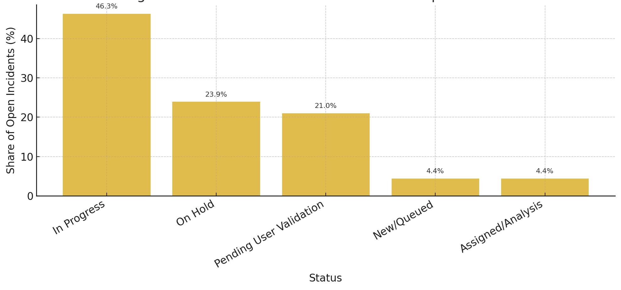
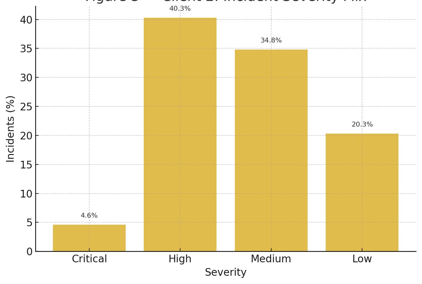
In one anonymized environment (“Client 1”), incidents kept outnumbering service requests by roughly two‑and‑a‑half to one for consecutive years[1]. Regions behaved differently: EMEA operated near a healthy balance while North America and Latin America ran far more reactive[2]. The backlog felt small until we inspected its mix: recurring P3/P4 issues and “Software” requests that needed design decisions more than heroics. In another environment (“Client 2”), throughput looked tidy, about the same number of tickets opened and closed each month, yet stability never improved. A heavy share of incidents stayed High or Medium, and a large fraction of open work lived in statuses like “In Progress,” “On Hold,” and “Pending User Validation[3][4].” In both cases, nothing on the SLA page was technically wrong; it was simply incomplete. The ticket history told the truth that the stopwatch couldn’t.

Figure 1 - Client 1: INC:SR Trend by Month
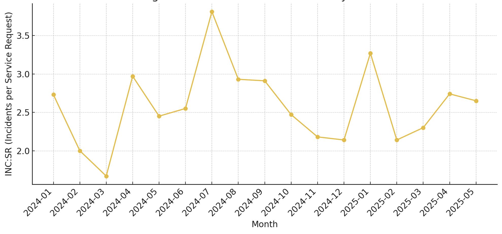
Figure 1A - Client 1: Regional INC:SR (Jan 24-May 25)
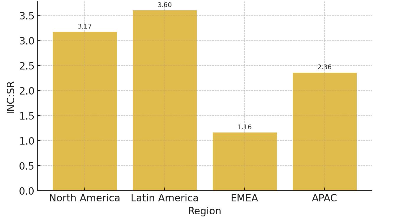
Figure 1 — Client 1: INC:SR Trend by Month (posture over time; July 2024 spike 3.81).
Figure 1A — Client 1: Regional INC:SR (NA 3.17:1; LATAM 3.60:1; EMEA 1.16:1; APAC 2.36:1).
A Five‑Step Fix You Can Start Monday
1) Instrument what matters. Trend INC:SR by month and region; overlay volume on the business calendar; measure reopen/ duplicate rates, time‑in‑status, and backlog composition.
2) Close the loop on root cause analysis (RCA): the third appearance of any pattern becomes a problem record with an owner, a prevention plan, and a due date. “Done” means volume goes to ~zero for 60–90 days.
3) Convert repeat incidents into enhancements (I2E): small configuration tweaks, automation, validation rules, or monitoring that remove the trigger.
4) Tighten triage and flow: redefine severity around business impact and cap work‑in‑progress so “In Progress” stops being a parking lot; schedule short validation windows so “Pending Validation” doesn’t become a graveyard.
5) Govern by outcomes: pair stability indicators (incidents per 100 users, High/ Critical share, aged items, reopen rate) with improvement indicators (INC:SR trend, I2E throughput, family eliminations, automation wins, MTBI for the top five business events). Tie incentives to these outcomes so the right behavior is the easiest behavior.
2 — Client 2: Status Distribution of Open Incidents (In Progress 46.3%; On Hold 23.9%; Pending Validation 21.0%).
Figure 3 — Client 2: Incident Severity Mix (High 40.3%; Medium 34.8%; Low 20.3%; Critical 4.6%).
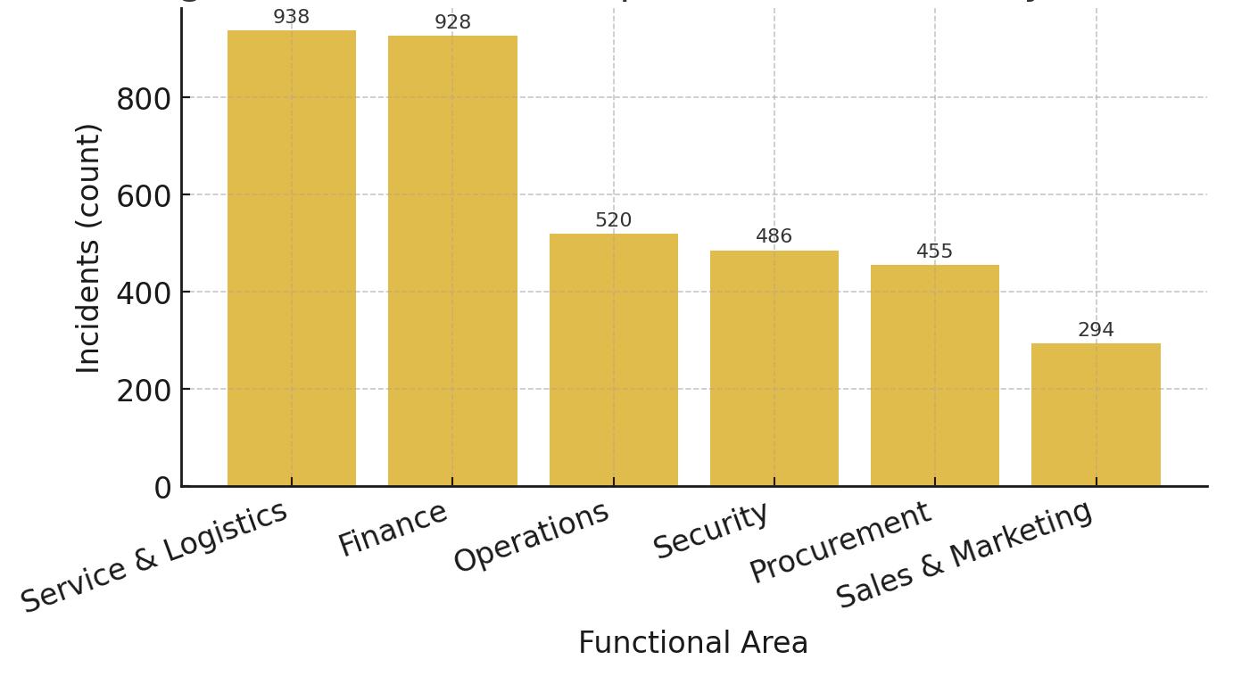
Figure 3A — Client 2: Top Functional Areas by Inci dents (S&L 938; Finance 928; Ops 520; Security 486; Procurement 455; Sales & Marketing 294).
Figure 3A - Client 2: Top Functional Areas by Incidents
Figure
Figure 2 - Client 2: Status Distribution of Open Incidents
Figure 3 - Client 2: Incident Severity Mix

What “Good” Looks Like (and How You’ll Feel It)
“Good” is not a greener SLA chart; it’s a quieter month. Practically, posture bends toward balance: an INC:SR ratio that moves from ~2.5:1 toward 1:1 over the year, with the worst‑performing regions catching up to the best. Peaks around business events flatten as design debt is retired. Flow stops bloating: the share of open work sitting “In Progress” drops toward a quarter, and “Pending Validation” becomes a brief stop, not a holding pattern. Prevention becomes normal: the top incident families are cut in half within two quarters, reopen/duplicate rates drift toward low single digits, and small enhancements ship every week. Risk recedes as a consequence with fewer High/Critical surprises and longer stretches between incidents for the moments that matter most. Users notice the absence of friction first; the charts catch up later.
A Quick 30/60/90 to Make It Real
First 30 days: publish the first outcome scorecard, cap WIP per team, and ship a handful of ≤20‑hour fixes that remove obvious repeaters. Days 31–60: standardize severity, run a focused RCA sprint on the loudest incident family, and stand up a simple Incident‑to‑Enhancement (I2E) cadence. Days 61–90: replicate what works in the strongest region to the weakest and lock targets for posture, flow, prevention, and risk/experience so budget and attention follow evidence, not anecdotes. The test of success is simple. Next month is easier than this one, and you can prove why with pictures anyone can read.
Govern with a Simpler Scorecard
Most organizations already collect more metrics than they can use, which is why the page that matters gets ignored. A simpler scorecard beats a bigger one. Pair four lenses: posture (INC:SR and volatility), flow (time‑in‑status and WIP), prevention (repeaters and incident‑to‑enhancement conversions), and risk/experience (aging by severity, severity mix, and MTBI on your five critical business events). Each lens needs one number that can go up, down, or stay the same so leaders can decide, not admire. Budget follows evidence when the picture is simple enough to point at. Two practical rules make it stick. First, attach owners and dates to the top incident families the way you would to revenue initiatives; publish an extinction date for each. Second, create a tiny change‑fund for ≤20‑hour fixes so prevention never waits on paperwork. When you revisit the scorecard in 30 days, celebrate shipped design changes, not decks. Within a couple of quarters, you’ll feel the difference: fewer surprises at close, fewer tickets sitting in motion, and a backlog that looks like a to‑do list instead of a museum.
The Payoff
SLAs measure speed; ticket history measures learning. When you govern to the latter, two things happen. First, the work gets lighter because repeaters go extinct and design changes replace patches. Second, the SLA page finally means what you hope it means: not just fast response, but fewer reasons to need it. Read the history, not just the stopwatch; your ERP will start to feel, and behave, like a system that learns.
www.totaltek.com
Disclosure: client examples are anonymized; figures reflect real SAP ticket histories summarized for confiden tiality. The author leads AMS services in this domain; the article remains non‑promotional.


