PORTFOLIO
KAILA GONZALEZ
PERSONAL STATEMENT
My passion for architecture stems from a deep desire to create spaces that transcend mere shelter, fostering belonging, identity, and connection for individuals and communities. Architecture is more than the creation of physical structures; it is shaping environments that resonate with the human experience. I hope to continue my architectural education at UT Austin and ultimately earn my architectural license. I want to use this knowledge design environments that are rooted in the needs of people and cultures at any scale. Through thoughtful design and a forward-thinking approach, I hope to contribute to an architectural legacy that prioritizes people and transforms the way we interact with our surroundings.
KAILA A. GONZALEZ
01 FILLING IN THE GAPS
Instructor + Programs: Tyrene Calvesbert, Texas Target Communities, Preservation Dallas
Team: Maria Nguyen, Alyssa Foertsch
Contributions: research, concept, form development, graphic representation, site mapping
Location: Dallas, Texas
CONCEPT:
HOUSING TYPOLOGY
INFILL DEVELOPMENT
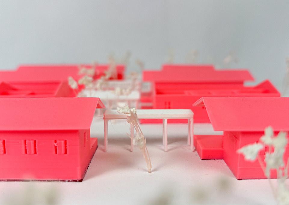
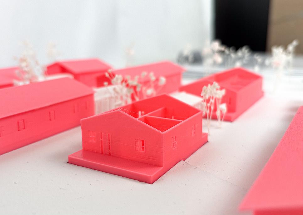
This project focuses on one of the few remaining historic Freedmans’ Towns in the United States, which holds significant cultural importance due to its architecture, memories, and historical legacy, earning its place in the National Registerof Historic Places. The Double Shotgun typology in 10th Street is utilized as an approach to infill development, aiming to preserve the district’s character and boister it’s vitality.
RESEARCH QUESTION: How can affordability be encouraged in Tenth Street long term by increasing the number of houses per block to advocate for self sufficiency while supporting multi-generational families? How does this role of the double shotgun typology allow for different arrangements at multiple scales (parcel, building, and block) to further explore its historical significance?
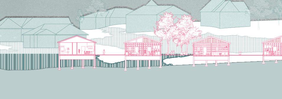
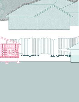
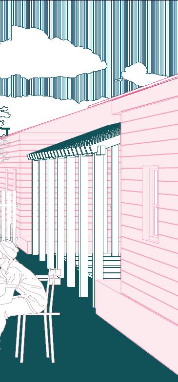
Covered porch connecting the ADU and footprint of the house, creating efficient density use of parcel space
Covered porch connecting the ADU, the footprint of the house, and additions to the house, increasing square footage.
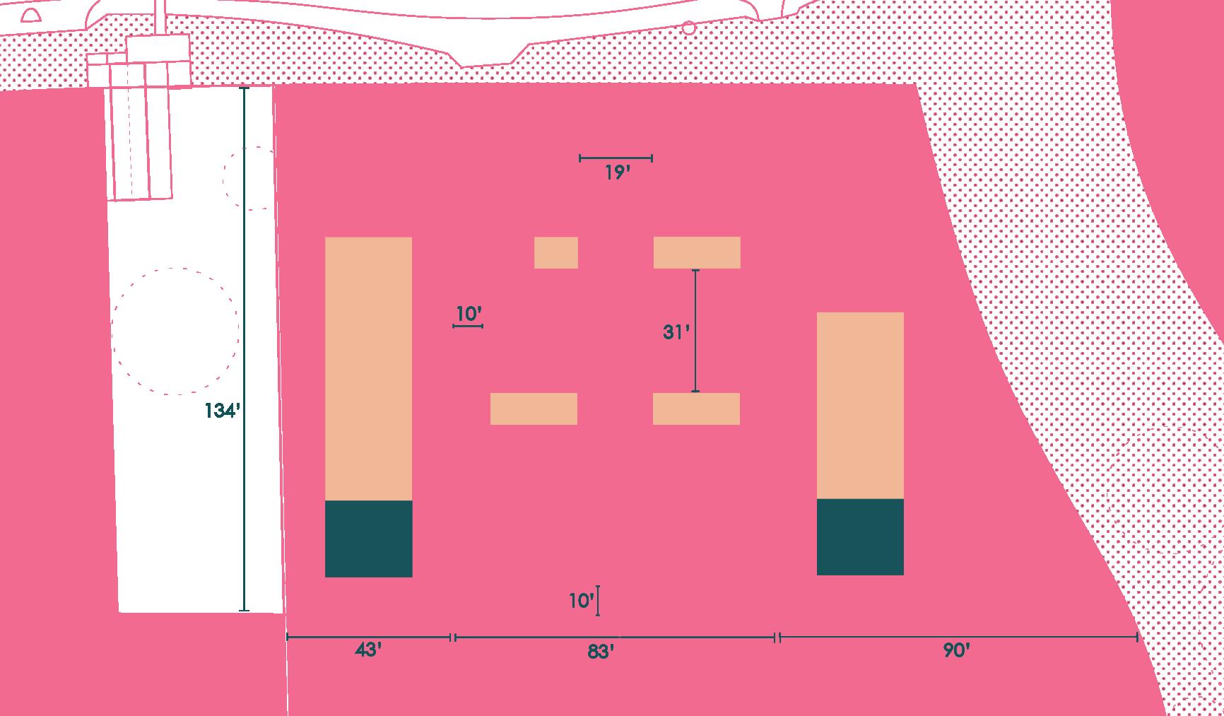
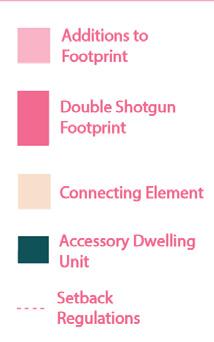
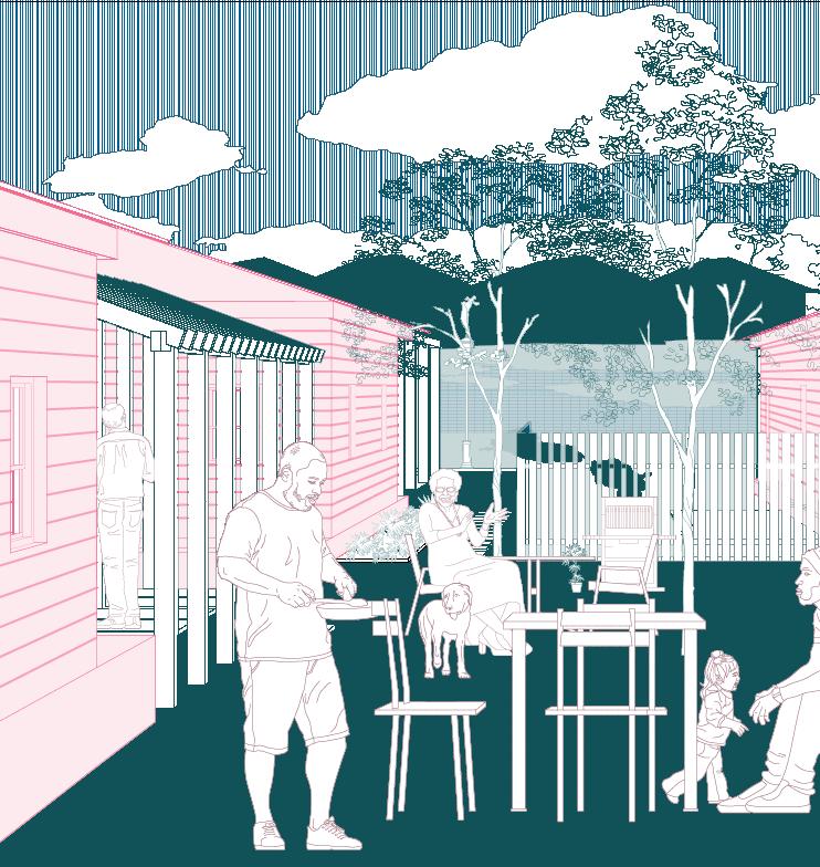
Additions of porches face each other creating connections between residents, fostering the sense of community
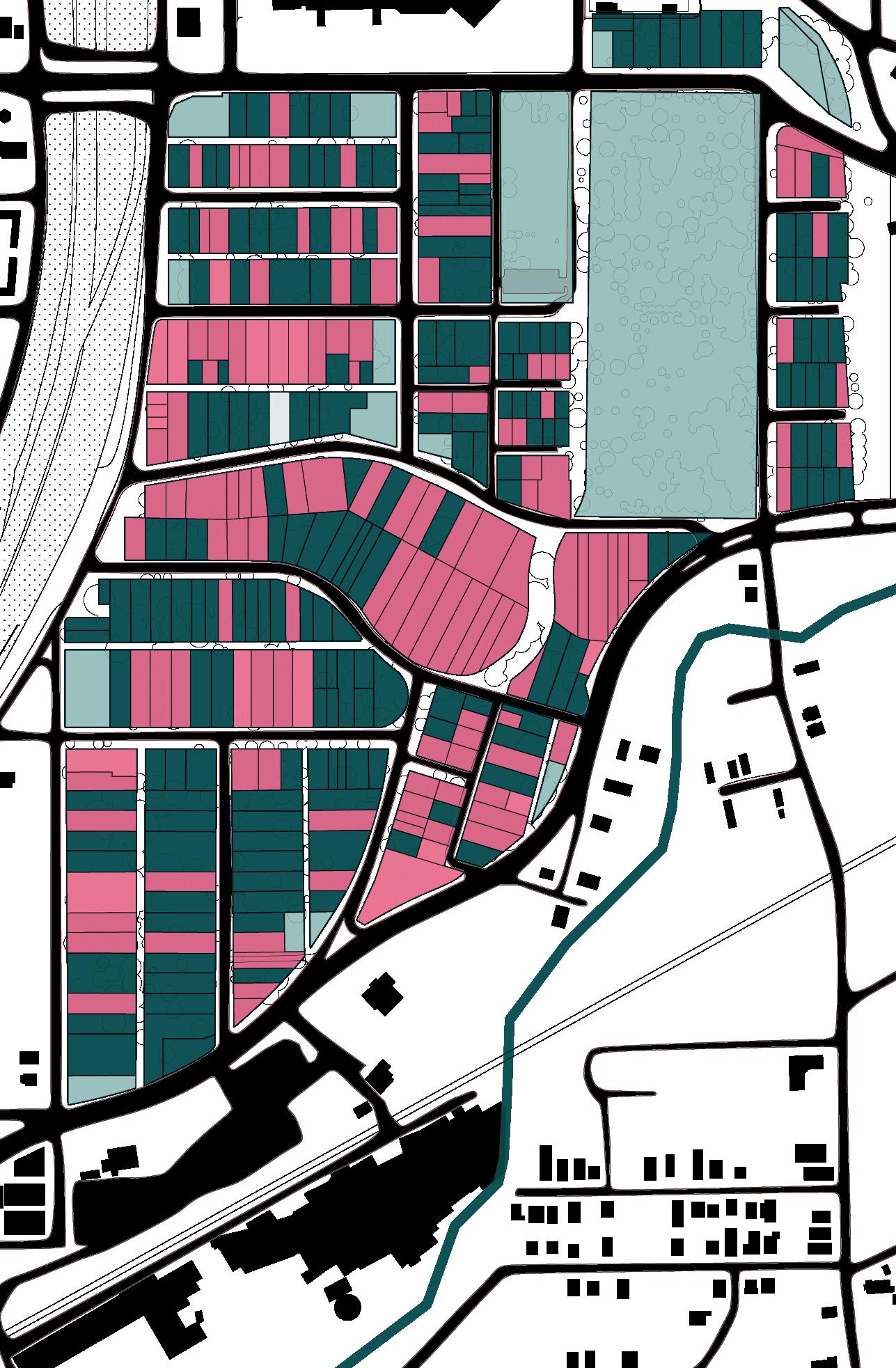
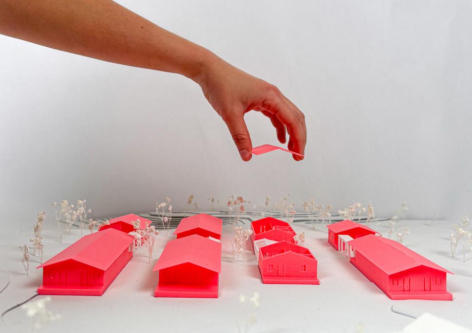
By providing new construction of updated Double Shotgun typologies and introducing a public communal building & accessory dwelling units (ADU) to fill vacant lots, an affordable housing plan for community members is generated; Embodying a movement of a community-based task, this project will detail an updated housing typology that presents cost-effective constructio techniques suitable for residents to undertake themselves.
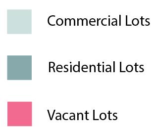
01. Tenth st. map: lot analysis
02. Infill strategy: double shotgun typology
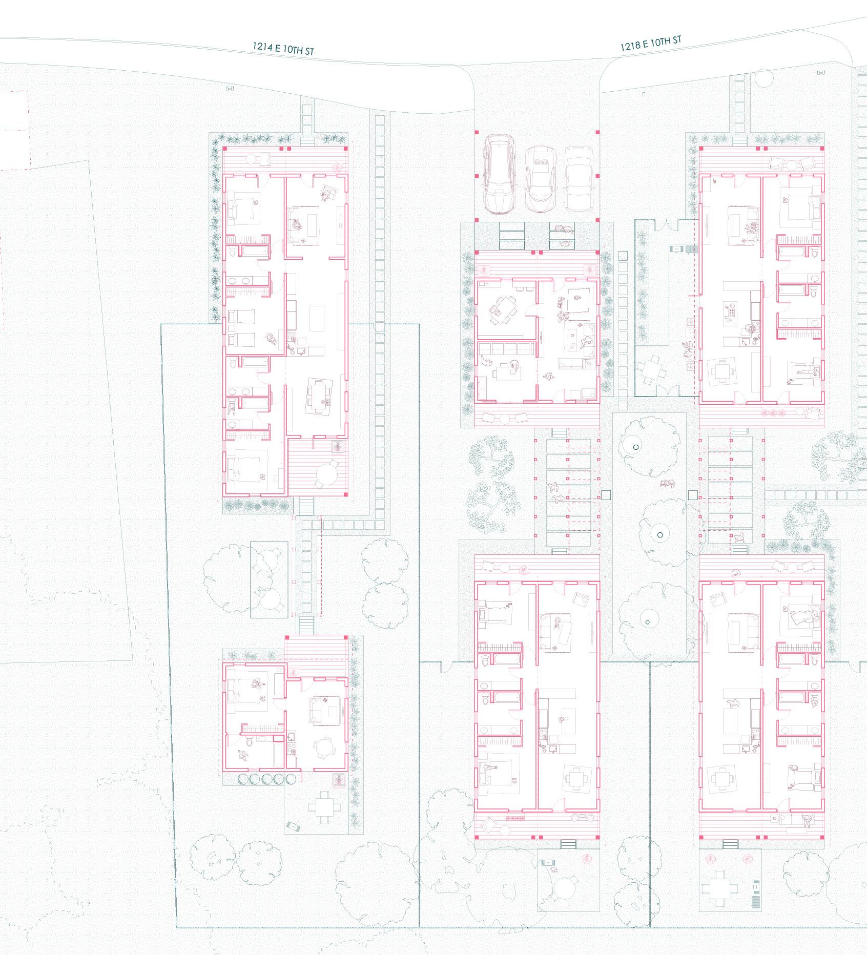
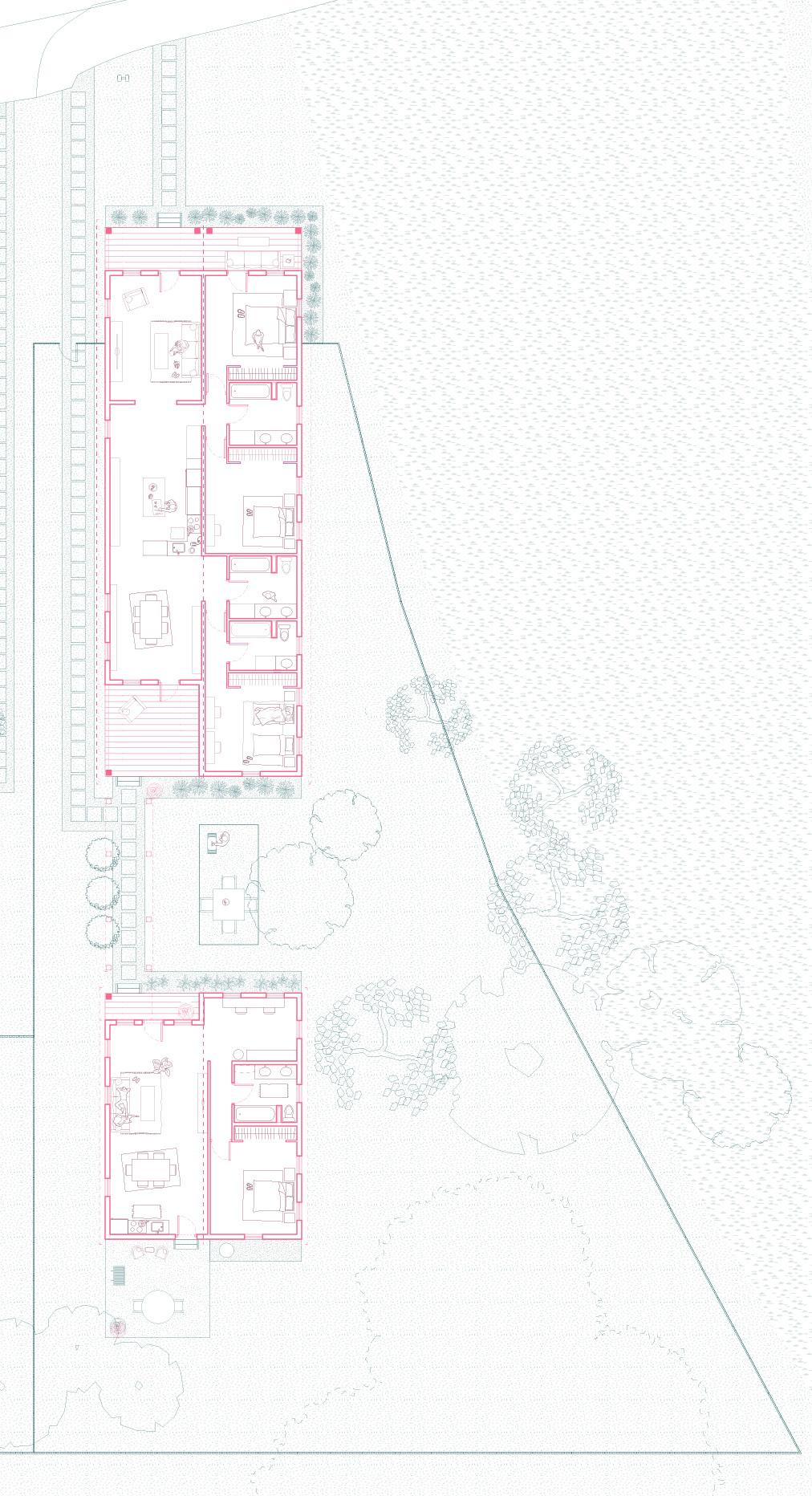
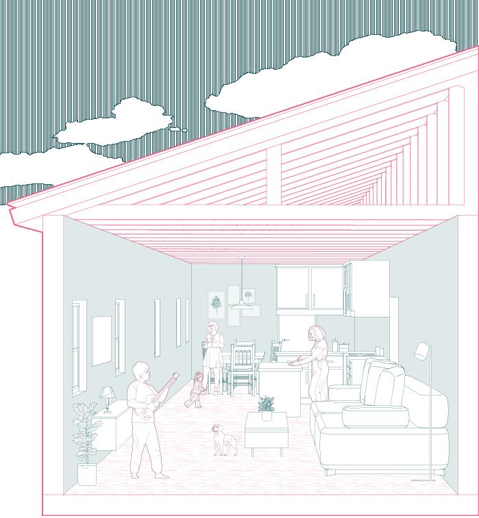
Multi-generational large family double shotgun with attached ADU
Smaller families with communal building
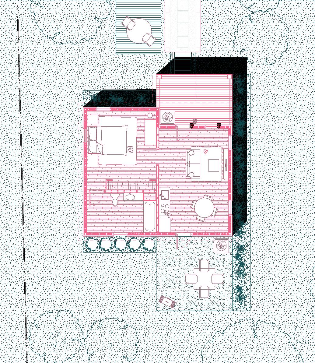
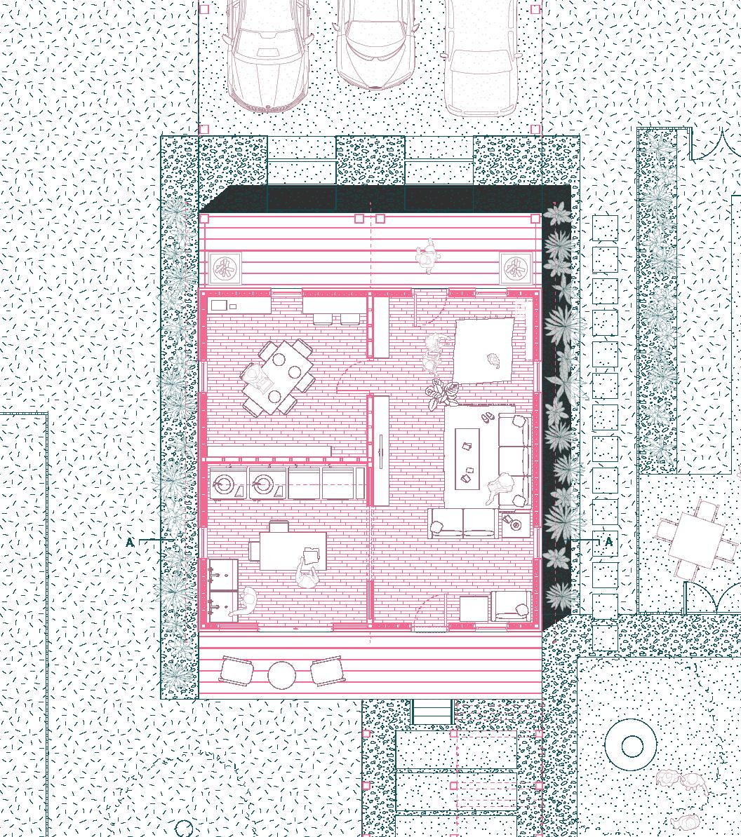
The Additional Dwelling Unit serves for larger families with multi-generational members. ADU’s can also be rented out as an opportunity for passive-income.
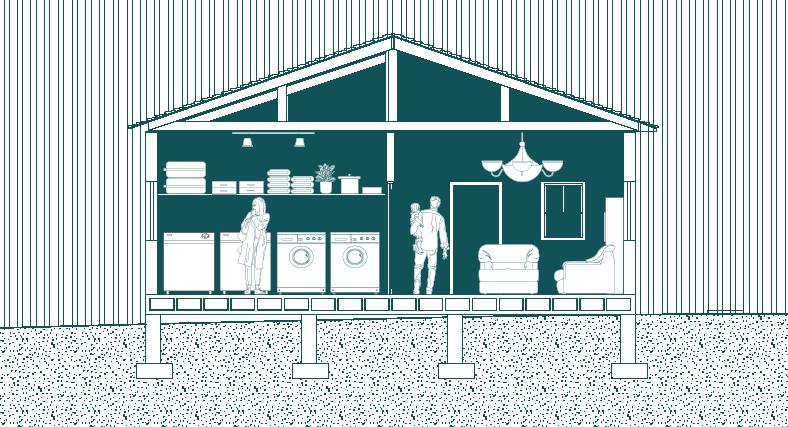
Shared amenities will be a dedicated space to foster self-sufficiency, hosting a large laundry space, an office, and a shared living space.
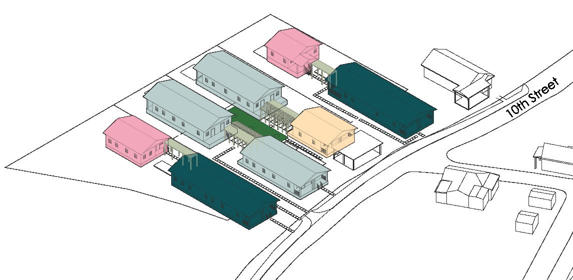
Double shotgun modified version 1
Double shotgun modified version 2
Community amenities
Covered walkways
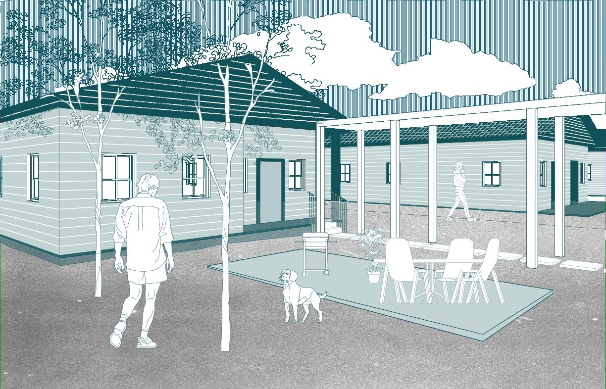
Central shared patio
This central green space serves as a moment of connection, restoring a sense of community
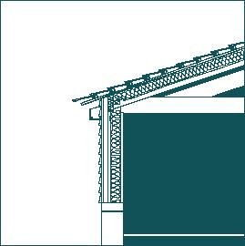
The double shotgun shell is respected, while re-thinking the interior to fit the needs of the contemporary family.


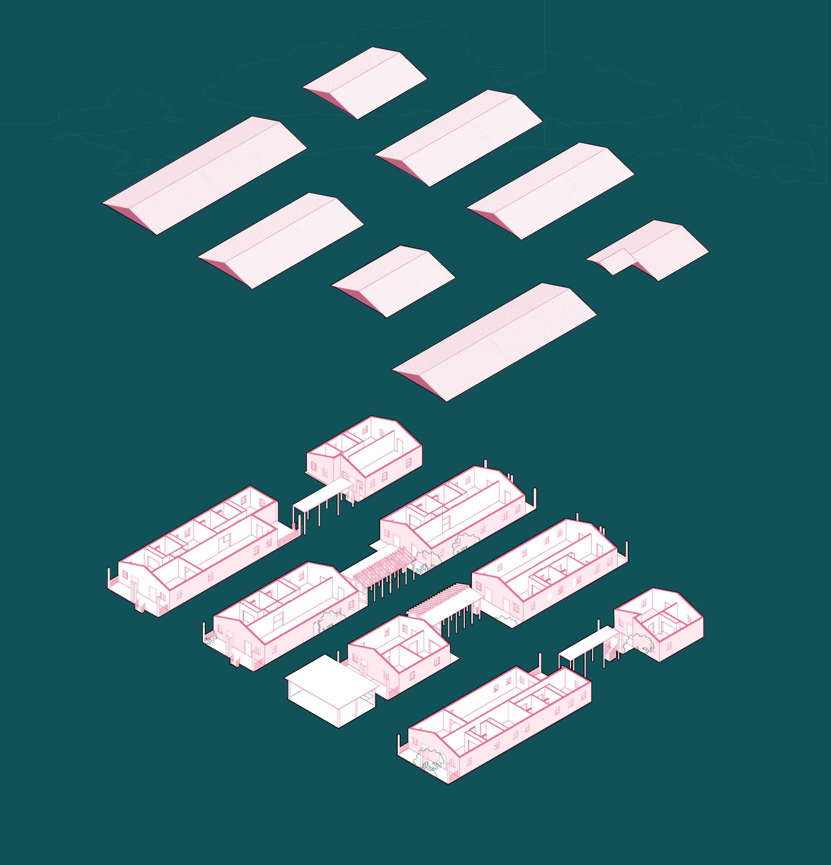
01. Exploded axon of all three lots
01.
02.
03.
02 TERRA NEXUS
Instructor: David Jimenez Iniesta
Team: Austin Taylor
Contributions: research, concept, diagrams, form development, graphic representation, drawings
Location: Bryan, Texas
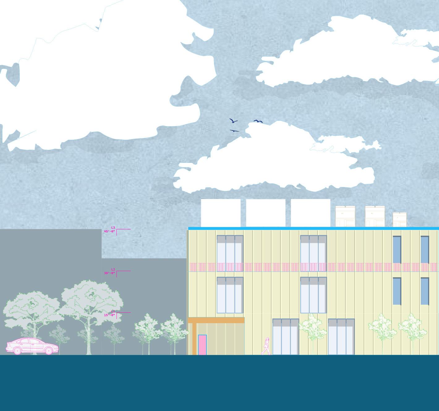
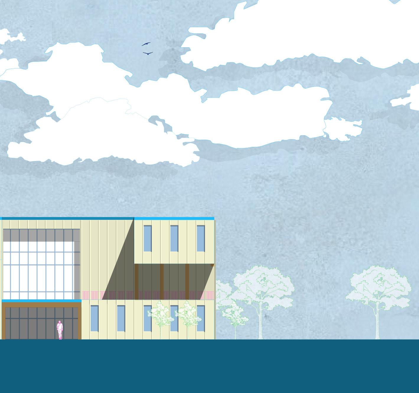
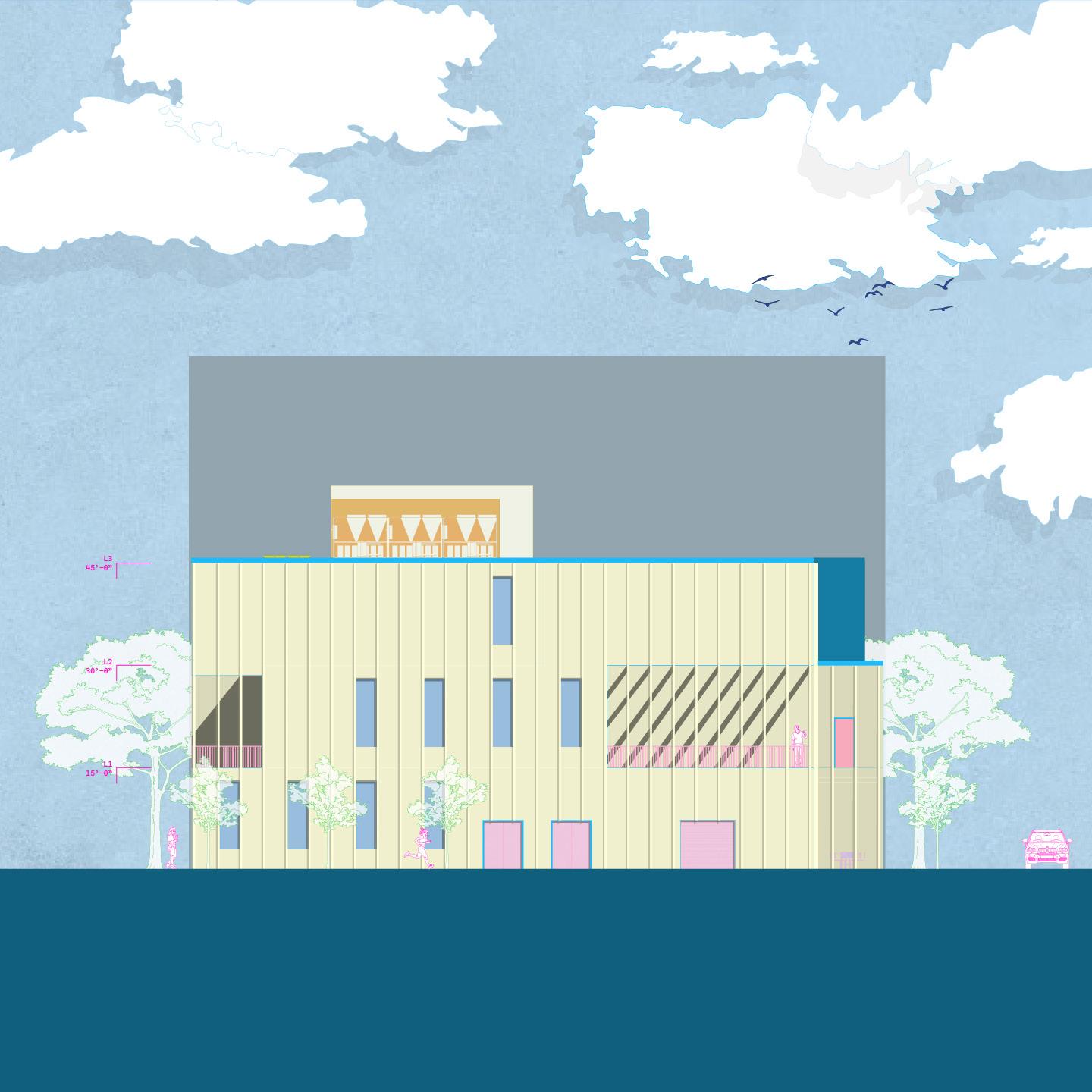
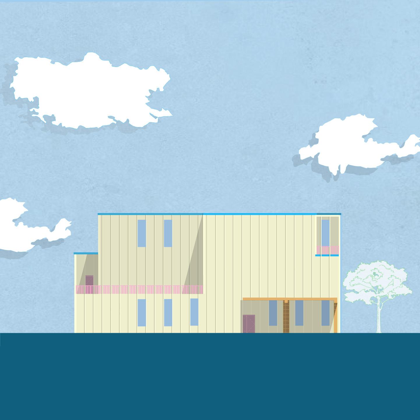
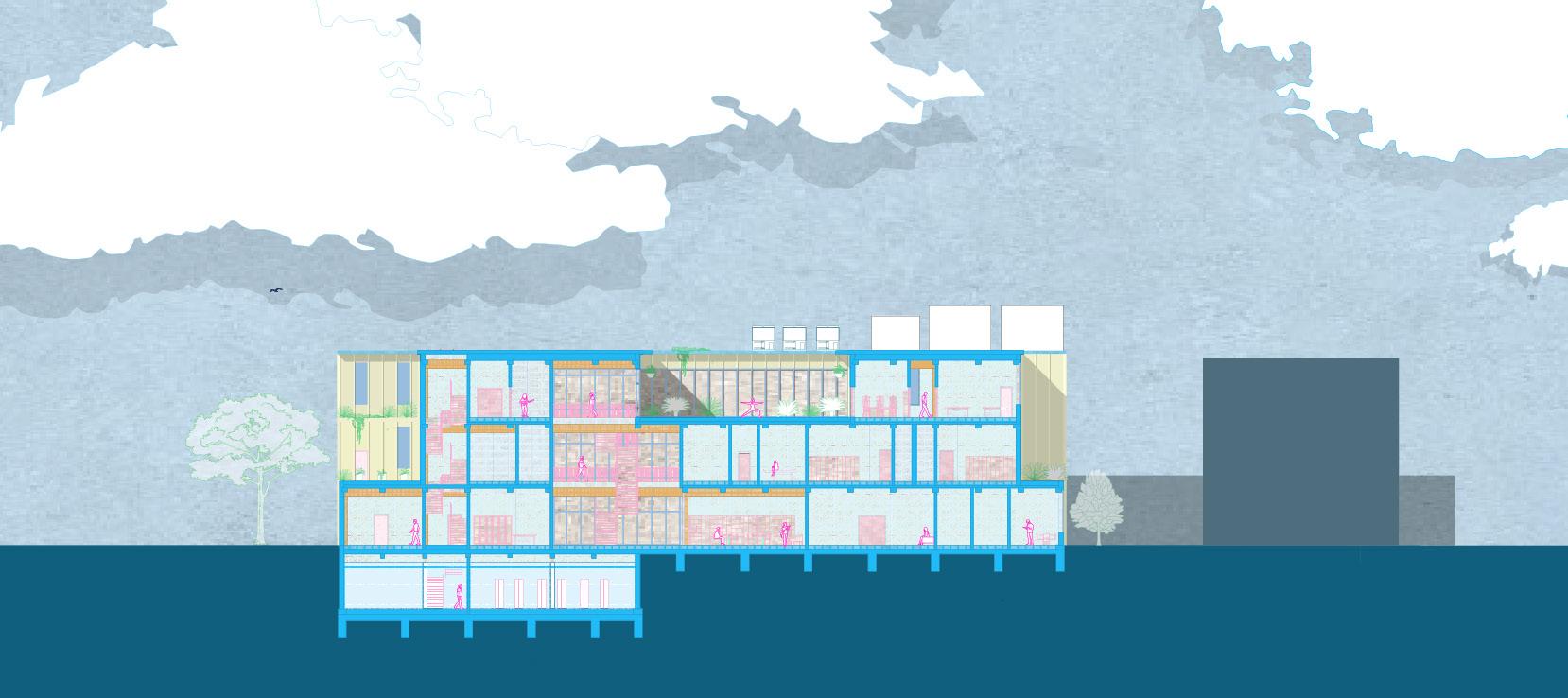
The following project was done in collaboration with Austin Taylor in the 405 studio, a comprehensive design studio focused on the integration of systems and structures, with respect to the chosen site, national and local code, and prospective users.
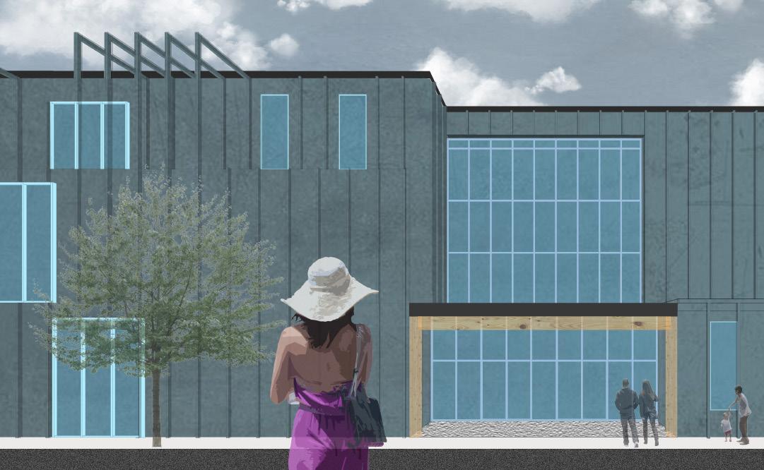
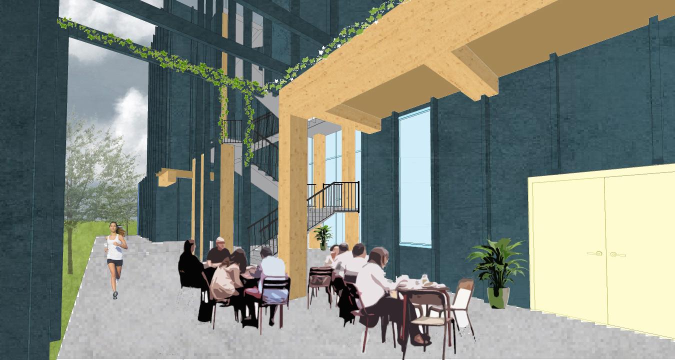
At its core, Terra Nexus embraces the triadic principles of mind, body, and soul, translating these abstract concepts into tactile, immersive experiences. The architecture bridges the gap between high technology and human introspection, drawing users into spaces that prioritize balance over output, introspection over immediacy.
The data center itself is in the lowest level; Its placement symbolizes the inescapable intersection of humanity and technology, yet it is deliberately obscured, a statement on its subordinate role within the larger narrative.
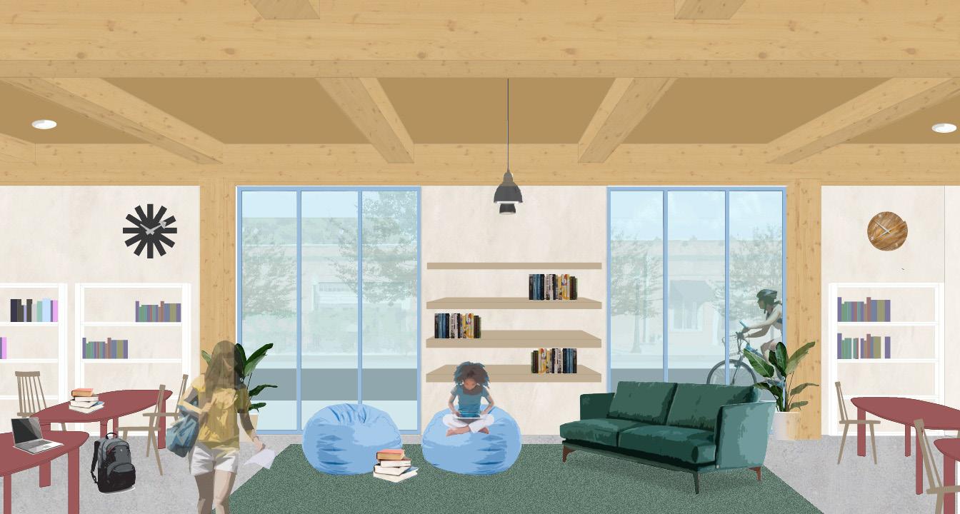
Terra Nexus is a sanctuary for reconnection and introspection. Programs like exercise studios, floatation pod therapy, and biophilic workshops, focus on the regrounding of the human spirit and the rejuvination of the soul. It is not merely a space, but a manifesto—a declaration that architecture can/ should serve as a mediator between the frenetic and the grounded. For those who enter its walls, the message is clear: slow down, breathe, and reconnect.

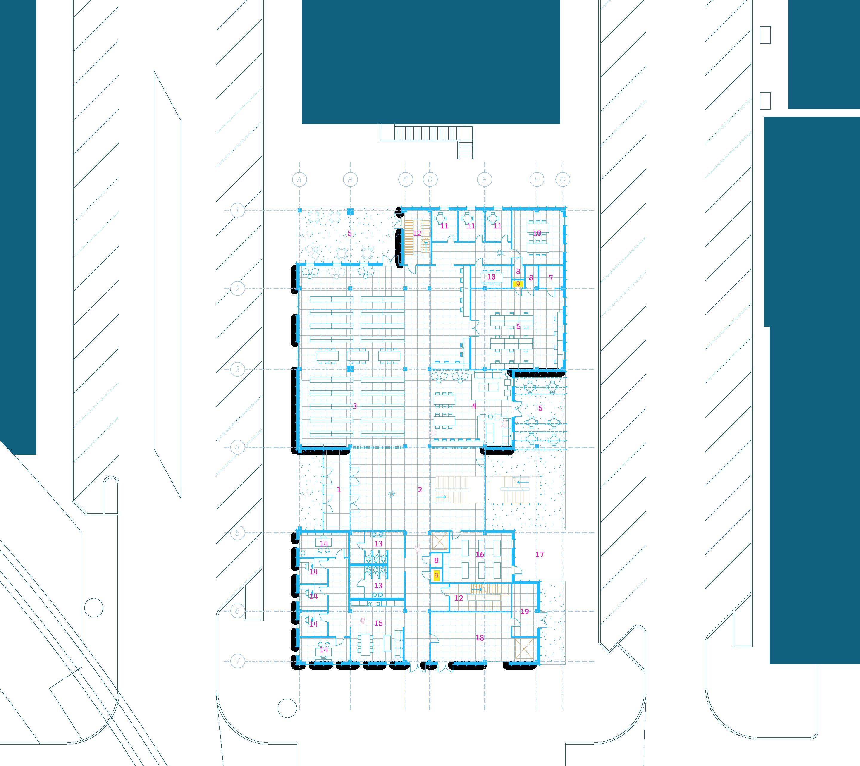

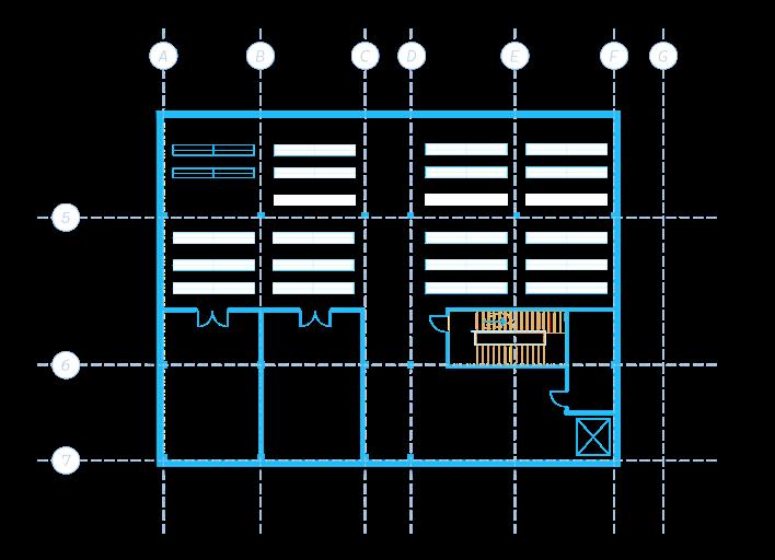
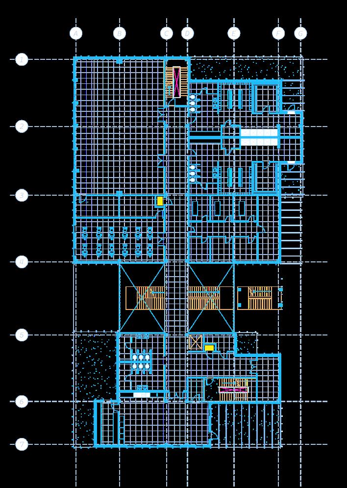
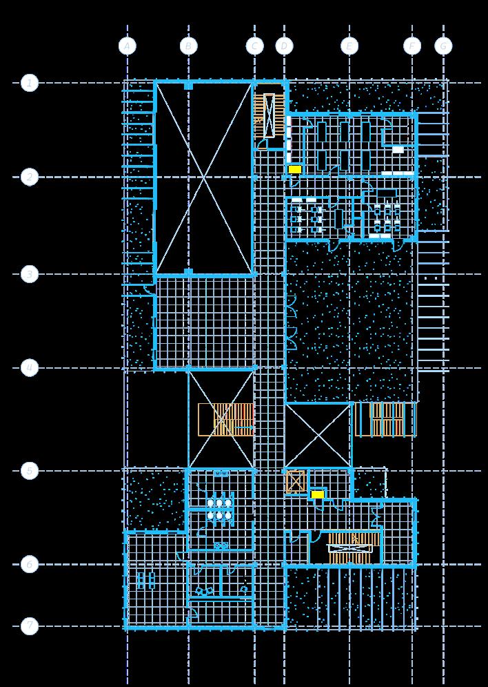
The mind is nurtured through areas that promote focus and introspection, such as reading rooms or spaces for intellectual engagement, strategically positioned away from disruptions. For the body, active and restorative zones, like fitness/wellness studios and therapy spaces are integrated. The soul finds solace through art spaces and music studios-- art forms that serve as conduits for human emotion, expression, and spirituality.
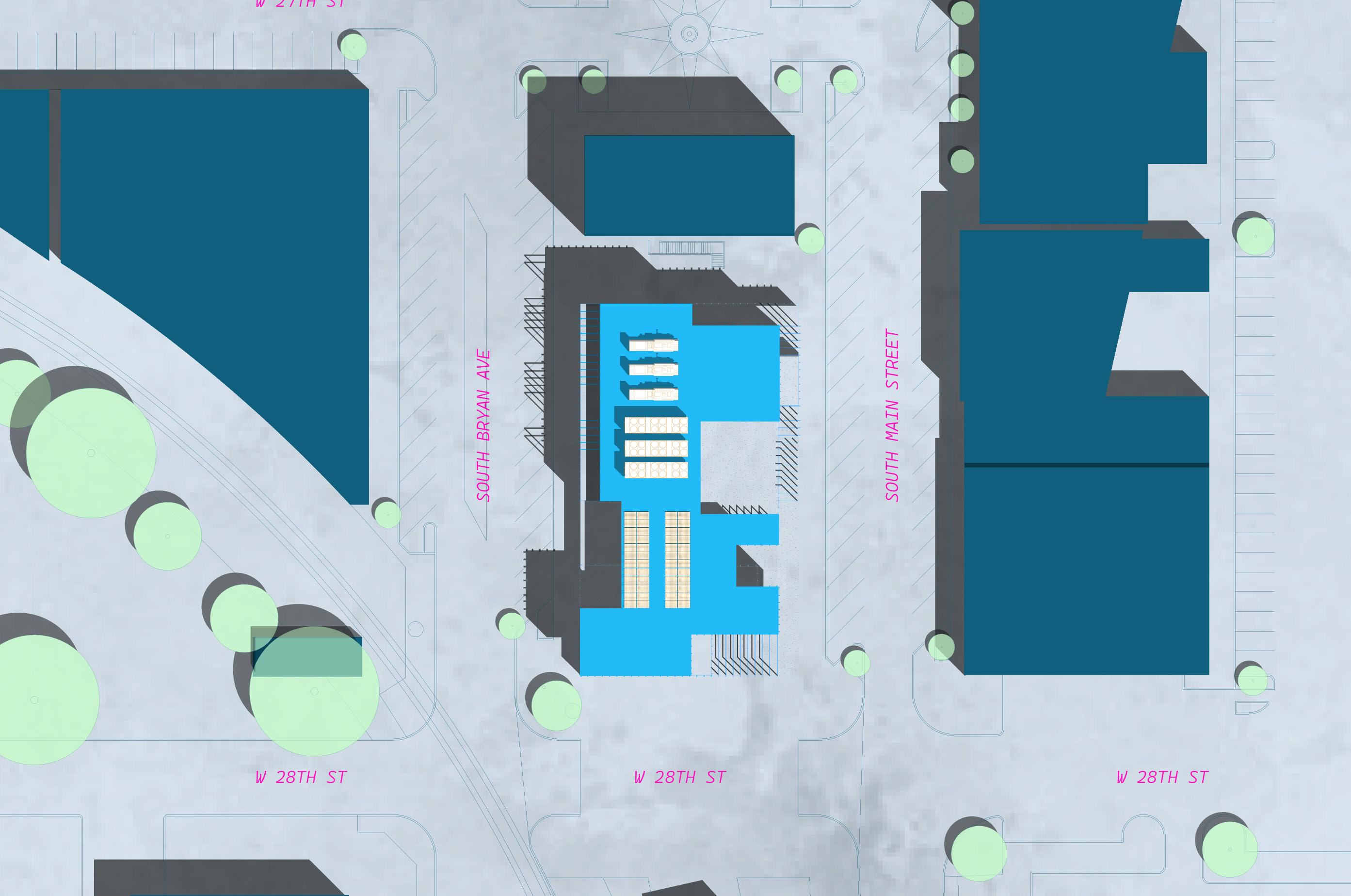
01. Level -01 plan
02. Level +01 plan
03. Level +02 plan

02.
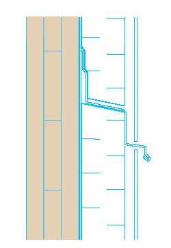
CLT WALL PANEL
WRB - SELF ADHESIVE
EXT. INSULATION
VERTICAL FURRING STRIPS
5MM ZINC CLADDING
FLOOR-LINE FLASHING
03.
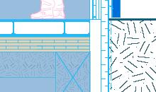
1”x24”x24” FLOOR TILES
6” PEDESTALS
(2) 5/8” GYP. BOARD
FIVE PLY CLT PANEL
The use of mass timber as a primary structural and design element evokes a profound sense of connection to the earth. Zinc, chosen for its environmentally friendly properties, further supports this ethos. The integration of an underfloor air distribution (UFAD) system is also an approach to energy efficiency. Also, it minimizes disruption to the mass timber ceiling structures, preserving their aesthetic and structural integrity while ensuring occupant comfort.
03 A JUNETEENTH LEGACY
Instructor: SeWoong Kim
Team: Austin Taylor, Karen Rodriguez
Contributions: research, concept, diagrams, graphic representation, drawings
Location: Galveston, Texas
CONCEPT:
VISITOR’S CENTER
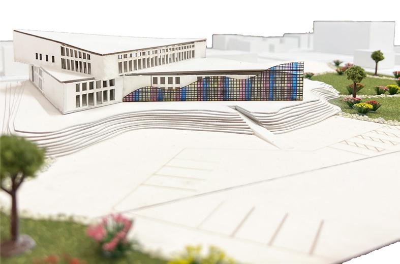
The main structure of the building is defined by two intersecting triangles, inspired by the geometric motifs often seen in Harlem Renaissance art. This choice serves as a visual tribute to the cultural and historical significance of that transformative period, anchoring the building in a rich narrative of creativity and resilience.
The façade takes inspiration from Galveston’s coastal identity, incorporating a wave-like design that captures the movement and fluidity of the sea. To achieve this effect, a second skin compromised of pre-fabricated mesh panels waa arranged to create the illusion of waves, adding texture and visual dynamism to the exterior while weaving a deeper cultural story into the building’s architecture.


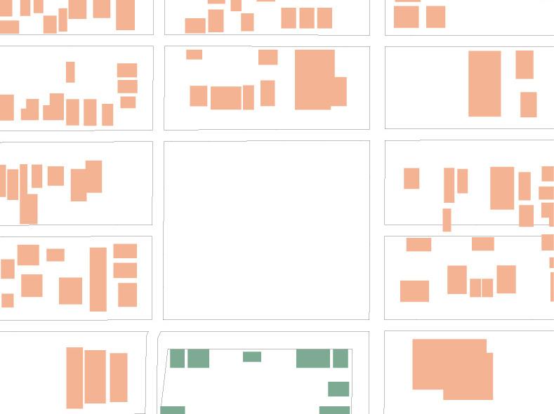
SITE


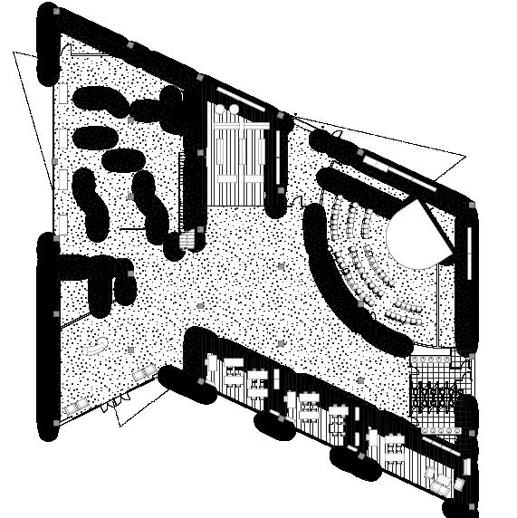
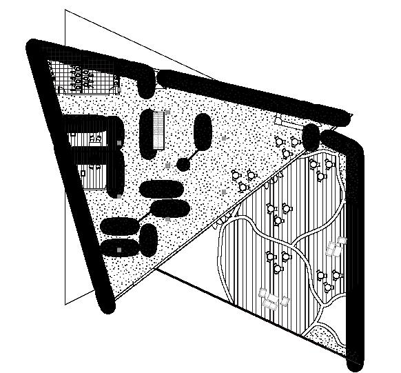
Entrance
Education
Restrooms
Auditorium
Backstage
Loading storage
Giftshop
Exhibition
Storage
Custodial


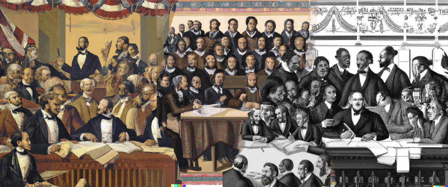


Murals tell a story...
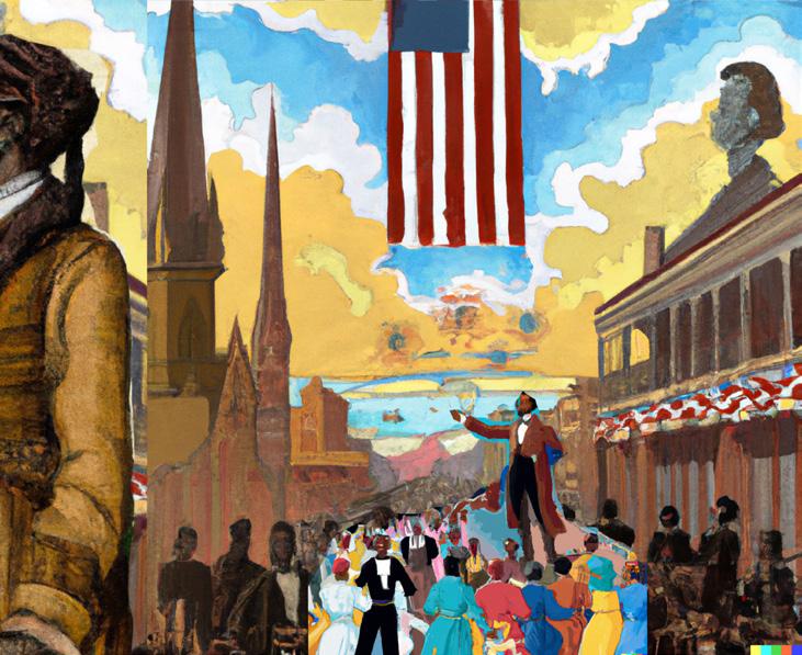
As part of the project, we were tasked not only with designing the building but also with memorializing the history of Juneteenth and the journey leading to its significance. To achieve this, we developed a series of murals through prompts entered in MidJourney (AI). These murals vividly depict key moments surrounding Juneteenth while celebrating the broader contributions of Black culture throughout history. The result is an immersive experience where architecture and storytelling converge, and are displayed on an exterior memorial.


04 MARIPOSA
Instructor: Sora Key
Team: Blanca Macias, Samantha Morales
Contributions: research, concept, graphic representation, drawings
Location: College Station, Texas
CONCEPT:
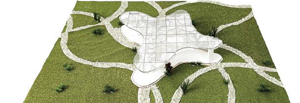
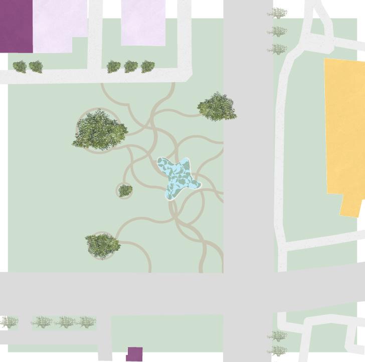
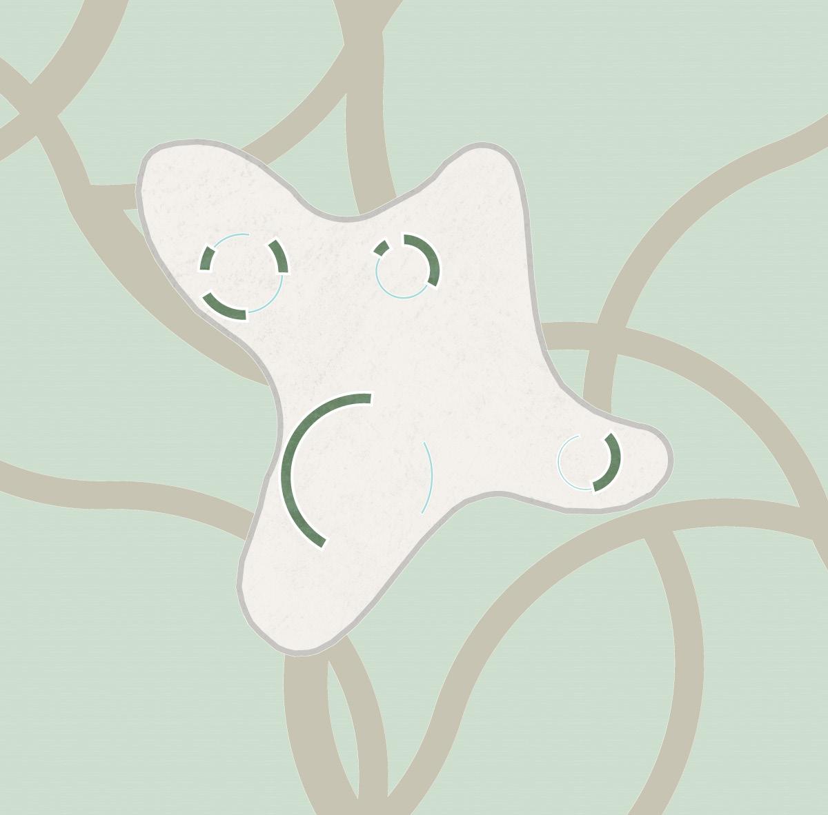
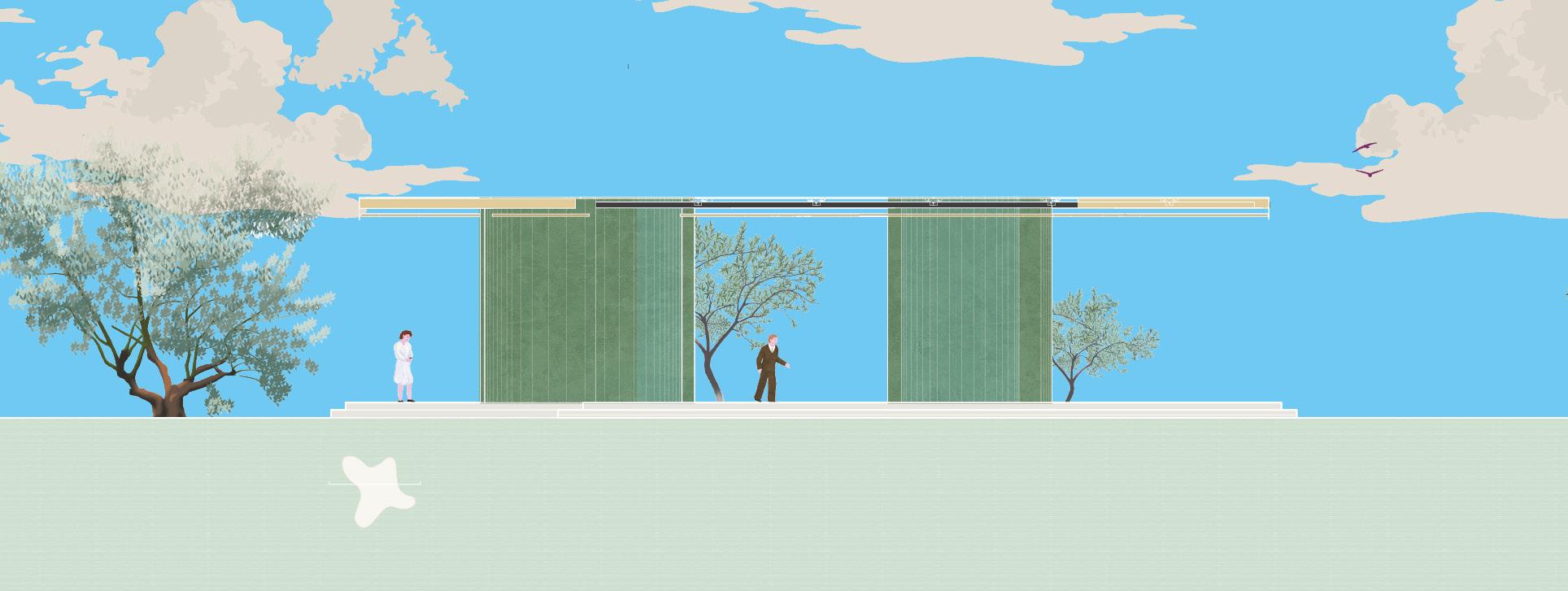
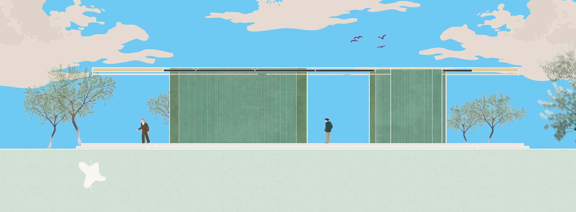
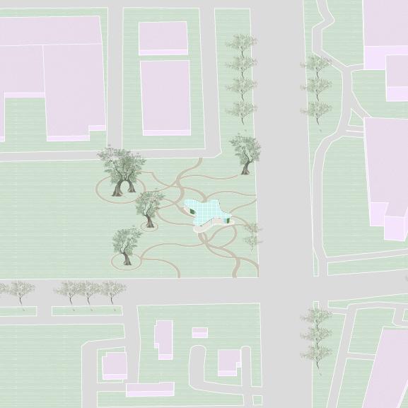
Mariposa on Century Square is a design consisting of transperancy, shadow, and openness. Drawing inspiration from the 2002 Serpentine Pavilion, the structure showcases an intricate roof design; It emerges from the manipulation of the naturally occurring Voronoi sequence, resulting in a pattern of interwoven solids and voids. These elements play with light in an extraordinary way, casting a display of intricate, ever-shifting shadows onto the spaces below.
This intricate roof is balanced by the pavilion’s simple, unadorned walls. Constructed from concrete, these walls serve as a striking contrast to the ornate canopy above. Each wall has a distinct function, forming zones that range from private, reflective spaces to open, communal areas. The deliberate simplicity of the walls ensures that the focus remains on their purpose while complementing the dynamic interplay of light and shadow created by the roof.
05 CONSTRUCT
Instructor: Sora Key
CONCEPT:
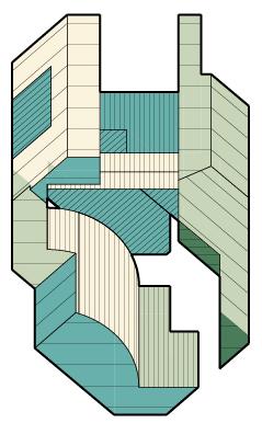
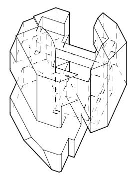
BOOLEAN OBJECT
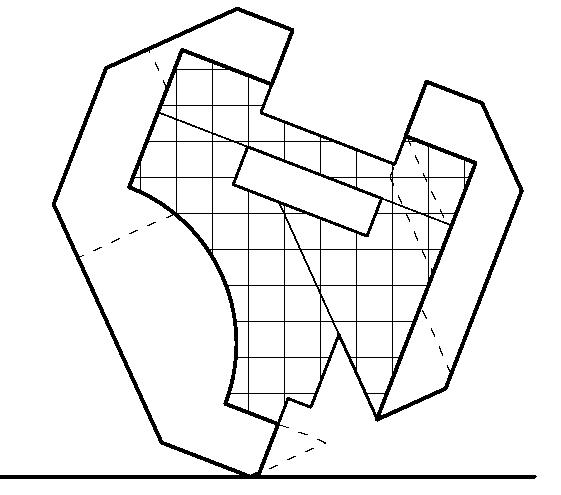
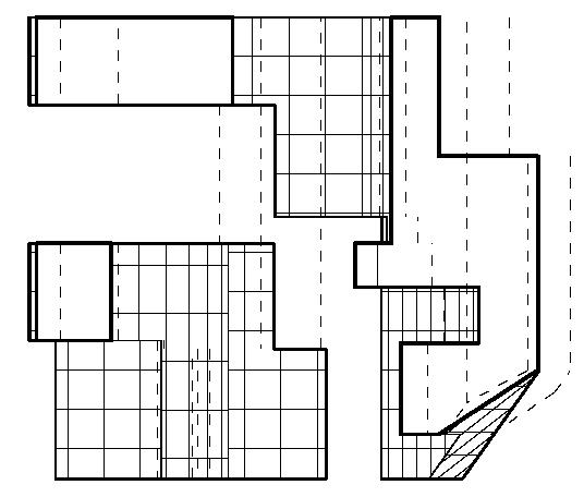
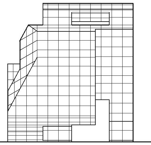
A digital intensive to introduce boolean software tools to develop architectural graphic representation and abstract thinking. In this architectural construct, hierarchy is created through the interplay of voids carved within the surrounding solids, creating a dynamic tension that defines the spatial relationships. Coloring, hatching, and contouring add depth and clarity, allowing for a greater understanding between interior and exterior surfaces. These elements also highlight the particular angles and intricate geometries within the complex object, ensuring that each facet is expressed. Colors were inspired by “Green Wheat Field with Cypress” by Vincent van Gogh.
06 HERZOG STUDY
Instructor: Julie Rogers
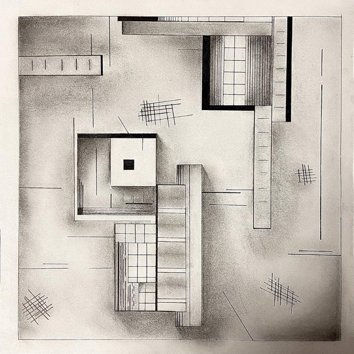
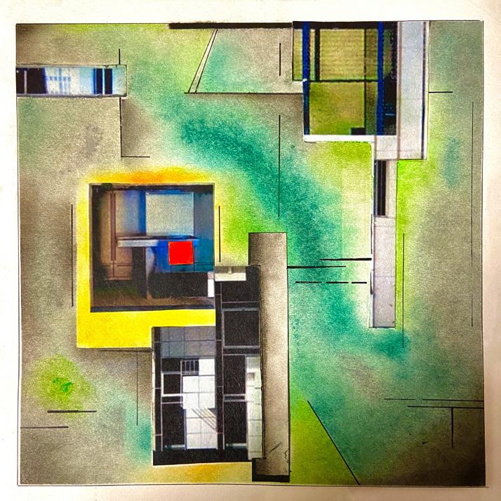
CONCEPT: SHADOW BOX
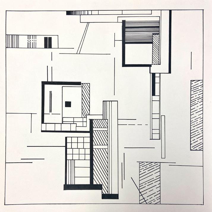
Based on Ginny Herzog’s architectural abstract piece “18-419,” the pieces are transformations progressively develop. First, in the line and shape, the focal point establishes hierarchy by being the sole black square in the space. The repeated lines seen throughout the piece serve to direct movement towards the focal point and engage the primary figures together, creating a more harmonious piece. In 1B, tone and texture, the same ideas are reinforced with depth. The focal point is once again brought out of the foreground through the central figures’ added depth, while the other figures are primarily grounded. In 1C, the same ideas are augmented through color theory. The yellow color around the primary figure highlights its hierachy among the other main figures. The focal point inside the primary figure, contrasted to its surrounding murky grey background, establishes importance further. The green tones, complementary to the red/orange focal point, maintain stability through the piece while also guiding movement across it through its diagonal form.
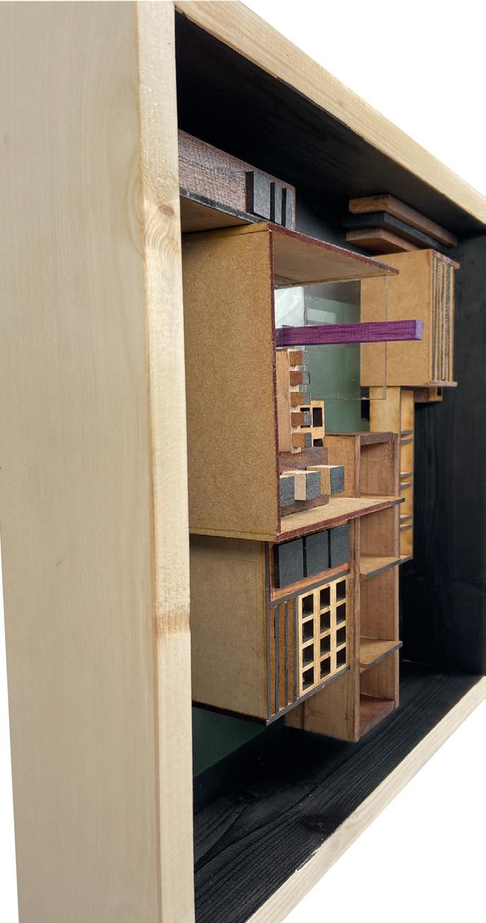
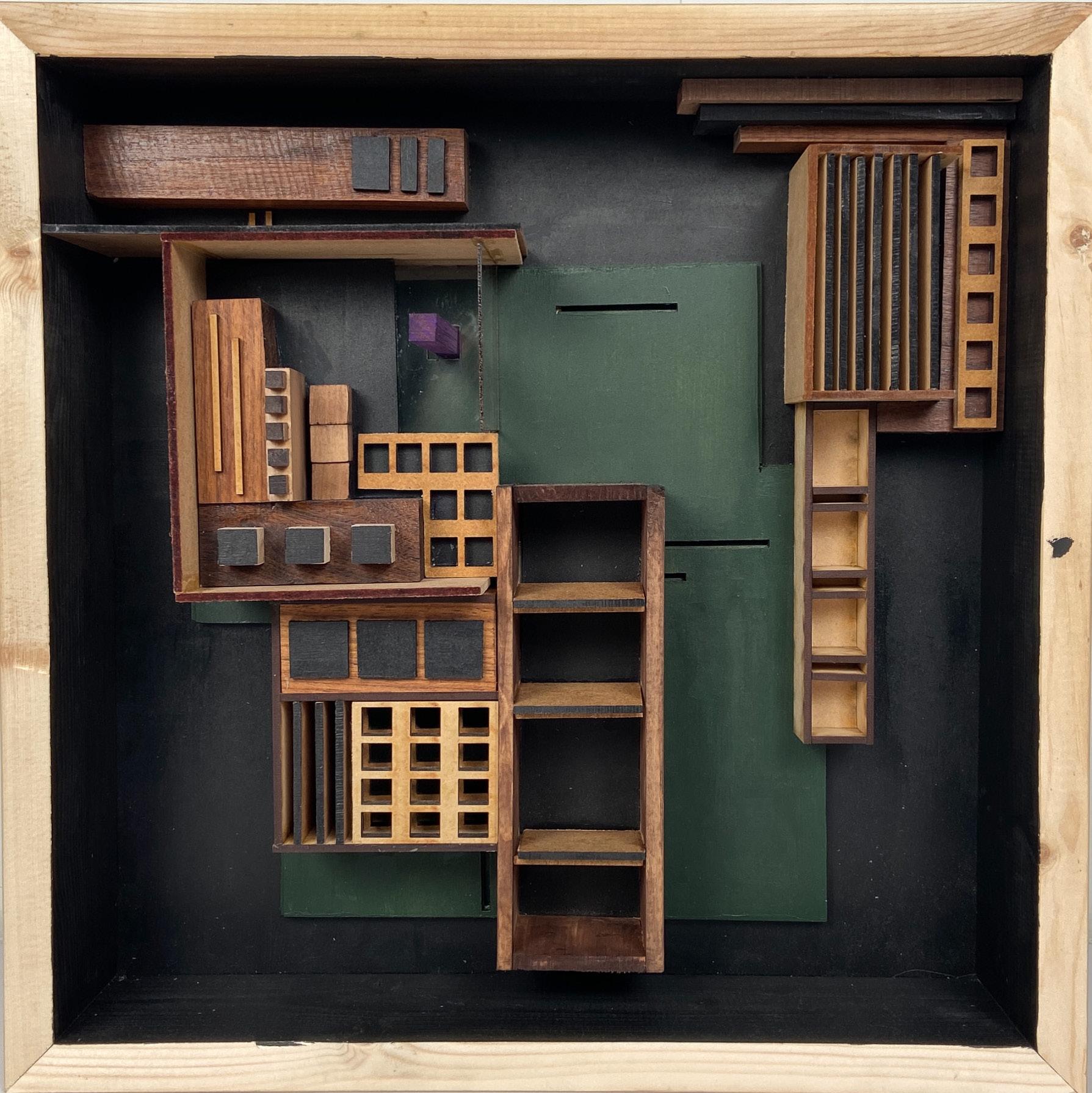
This shadow box displays verticality through the piece’s bigger figures, which are often more vertical and longer, while balance is simultaneously achieved by countering the longer forms with small cubes organized on smaller grid patterns. This can be seen through the laser cut square grids, the cube forms scattered through the piece, and the piece’s focal point. A purple wooden rectangular cube rises from the negative space to engage the foreground. Its purple heart tone contrasts to the dark wooden tones, creating hierarchy. TIn the area of the focal point, the U-shaped plane directs the eyes from the left side of the piece to the right. The green background was inspired from the pieces’ original palette.
