SHOWCASE SHOWCASE
RETRO PACK DESIGN TRENDS MIX IT UP WITH NEW E-COMM REALITIES Brands are bringing back the vibrant colors, geometric shapes, and bold patterns that epitomized the Memphis Design trend of the ’80s, with their own modern twist. We’ll see how throwback design trends intersect with new concepts like e-commerce’s ‘unboxing’ and ‘porch appeal.’
6 Brands Reinventing the Memphis Retro Trend By Tristan Le Breton, Contributing Editor
I
f you’re not familiar with Memphis Design by name, you’d likely recognize it by sight. Featuring bold, graphic patterns and retro, clashing color palettes with plenty of neon hues, the ’80s design aesthetic is hard to miss. Design styles are often an indication of, or a reaction to, the times we’re living in; Memphis Design is the perfect example of this—both when it first came onto the scene and now. The 1960s and 1970s were heavily influenced by modern minimalism, which played by the rule “less is more,” encouraging clean lines and neutral tones. Tired of this lack of excitement in design, a group of architects and industrial designers in Milan, Italy, responded by doing the exact opposite. Calling themselves the Memphis Group, they rebelled against the wave of understated design with a style centered around vibrant colors and a jumble of geometric shapes, stripes, and bold patterns. Initially coming to life in the form of furniture, the trend soon expanded to art, design, fashion, and popular culture. Given that we’ve all spent much of the last 18 months stuck within the four walls of our homes, it’s no surprise we’re seeing a collective yearning for more excitement in design and beyond. Brands are once again embracing more artful trends for their packaging that not only show off their personalities, but also brighten up their customers’ days too. Memphis Design’s loud presence may be polarizing, especially when not approached in the right way, but many brands are finding impressive ways to put their own spin on the trend and expertly walk the line between fashionably retro and dated. Here are six brands doing a great job of bringing back Memphis Design in a modern way, one package at a time.
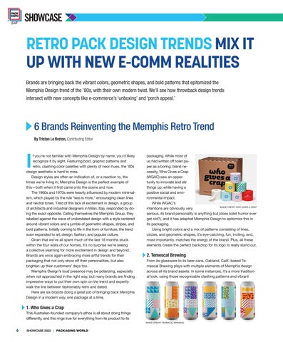
packaging. While most of us had written off toilet paper as a boring, bland necessity, Who Gives a Crap (WGAC) saw an opportunity to innovate and stir things up, while having a positive social and environmental impact. While WGAC’s IMAGE CREDIT: WHO GIVES A CRAP intentions are obviously very serious, its brand personality is anything but (does toilet humor ever get old?), and it has adapted Memphis Design to epitomize this in its packaging. Using bright colors and a mix of patterns consisting of lines, circles, and geometric shapes, it’s eye-catching, fun, inviting, and, most importantly, matches the energy of the brand. Plus, all these elements create the perfect backdrop for its logo to really stand out.
2. Temescal Brewing From its glassware to its beer cans, Oakland, Calif.-based Temescal Brewing plays with multiple elements of Memphis design across all its brand assets. In some instances, it’s a more traditional look, using those recognizable clashing patterns and vibrant
1. Who Gives a Crap This Australian-founded company’s ethos is all about doing things differently, and this rings true for everything from its product to its IMAGE CREDIT: TEMESCAL BREWING
6
SHOWCASE 2022 | PACKAGING WORLD
PXE22Showcase_Story.indd 6
2/1/22 1:45 PM


