
illustration & design kit moore
KIT MOORE ILLUSTRATOR - DESIGNER - ARTIST
I am a creative with a passion for art, design, and everything in between. In your hands are some of my favorite illustration projects I have done in my design path thus far, and I am honored I get to share them now with you. I tailor my visual approach and style to match every project I encounter, which has resulted in dozens of projects which were both a joy to work on and a fantastic learning experience.
Much of my work has been done for organizations and individuals around my college campus, but I also have a large body of freelance illustration.
ART, ARCHITECTURE, & DESIGN
Throughout my time in college I have been able to do numerous illustrations for the art & design department. I have made buttons, stickers, posters, and illustrated promotional materials for events and initiatives.
A favorite project of mine is the “Better Together” ice cream cone mascot. When the art and design department merged with the architecture department, this little mascot was born. He symbolizes the three different disciplines joining as one, truly a trio that is better together.
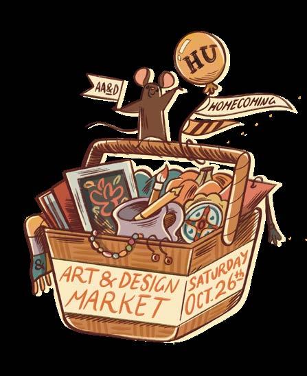

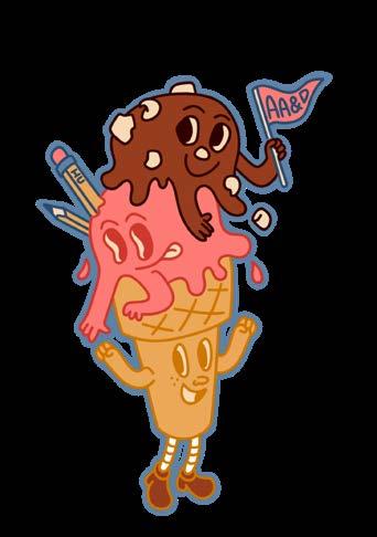
“BETTER TOGETHER “MASCOT
AA&D STICKER
AA&D STICKER
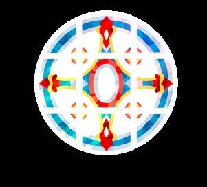
AA&D SOLAR ECLIPSE STICKER
STAINED GLASS STICKER ART AND DESIGN MARKET PROMO
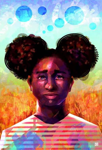
“GHOSTS” PERSONAL WORK
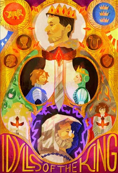
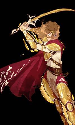
“IDYLLS OF THE KING” PERSONAL WORK
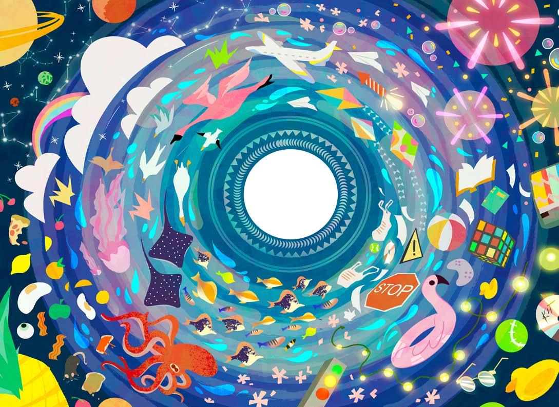
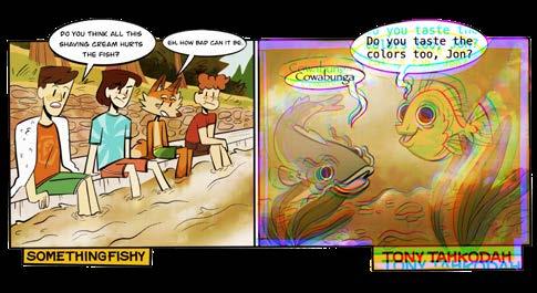
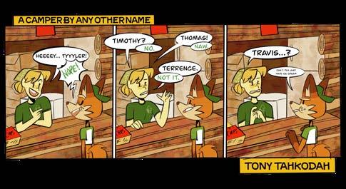
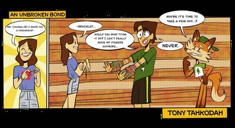
TONY TAHKODAH COMIC SERIES
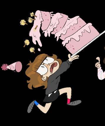
Over the course of 7 years, I have been developing and illustrating a comic strip series for Harding University’s Camp Tahkodah. The series follows Tony Tahkodah, an energetic and somewhat aloof fox summer camp camper. The focus of the comic strips is the ups, downs, joys, and frustrations of camp life. Each year I make a set of roughly 12 comic strips which are physically put up on pin boards around camp. It doesn’t get more old school than that. It has remained one of my favorite projects to work on to date.
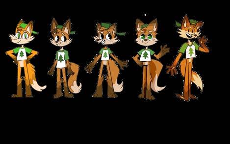
DESIGN ITERATIONS, 2019-2023

RUBI CHOCOLATE
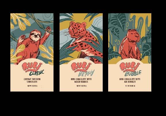
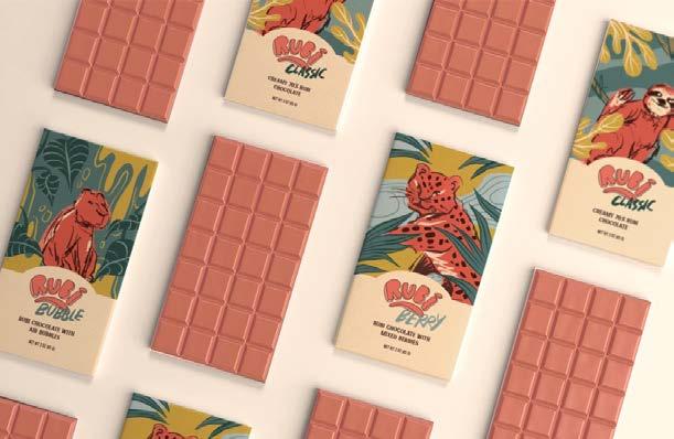
This package design project was done in my junior year. My brief was to create branding for a new chocolate brand located in an American city with beans sourced from Ecuador. I was to highlight both of these locations in my designs. The chocolate itself is a “ruby chocolate” variety, which is naturally grown in South America. This unique chocolate which really is pink (no dyes!) packs a punch of tangy flavor. For this project I wanted my illustrations to feel like biting into this chocolate bar: wild, unique, and pink. I chose Kansas City to use as inspiration. The sketchy, curvilinear lines of the animals and backgrounds echo the young and spunky vibe of the arts district in downtown KC. The animals on the packaging are native to Ecuador and were very fun to illustrate. The lose linework is an approach I do not use often, but for this project it fit in perfectly with the look I was going for.
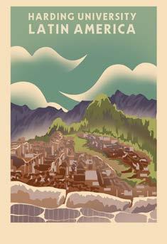
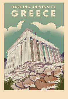
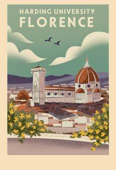
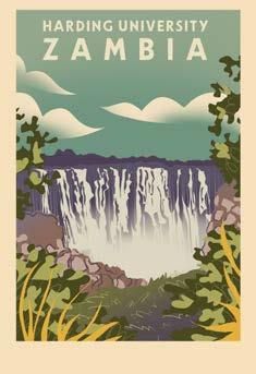
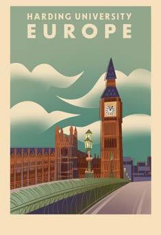
HARDING STUDY ABROAD POSTERS
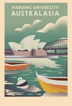
This series of posters was created as a fundraising project for study abroad programs at Harding University. Each poster features a location where students can study for a semester. The challenge with this series was to find a balance between abstraction and recognition. I wanted each of these landmarks to look unique while also blending seamlessly into the series as a whole. I achieved this through a consistent color palette and layout.
Even though I studied in Florence for a semester, my favorite poster out of the series is actually Zambia. I had professors and students voice so much excitement over having a poster from the trip they so thoroughly enjoyed. Knowing my designs struck a cord with so many people made this a very special project to me.
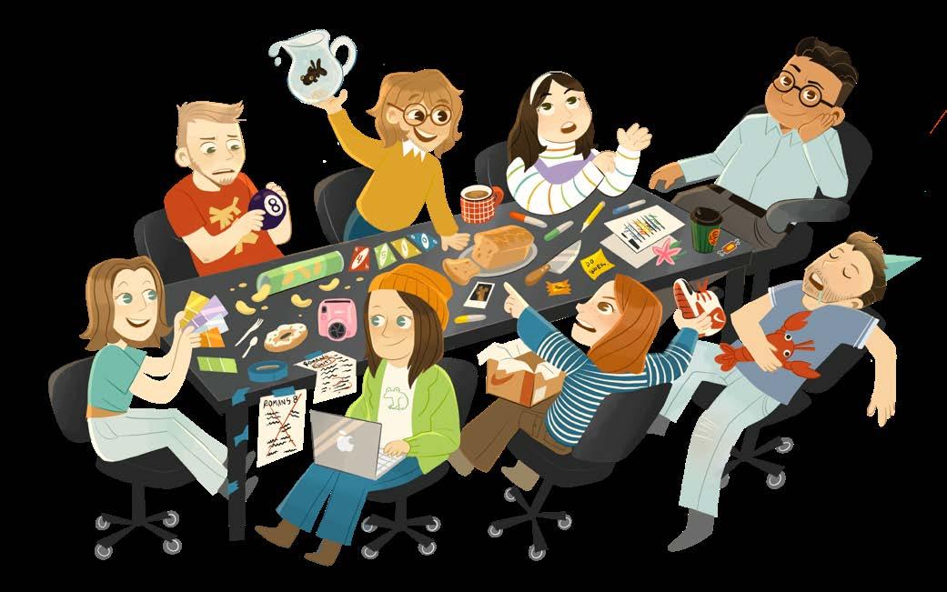
SENIOR CLASS SILLINESS
This illustration of my senior graphic design class was hung up in our studio as a fun reminder of all the wild antics we get into. At the right end of the table is one of our very patient graphic design professors, who has had to sit through a good deal of silliness.

THE MURDER HOTEL
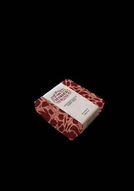
Who would want to stay at the “Murder Hotel”? Well, if you are into satirical dark literature, maybe it would be you. The theme of this junior branding project was to design a boutique hotel brand that was inspired by a subset of world literature. My team was given the prompts of humor, satire, and short story. We explored many satirical short stories and found many of them were dark in nature, which gave us the idea for the name of our hotel, “The Murder Hotel”. Elegant, mysterious, young, and a little unserious were the keywords for our brand.
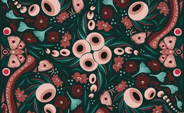
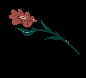
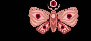
One of my favorite assets I made for this project was the wallpaper. This design actually drove many other factors in the visual identity. From the packaging to the logo itself, the motifs used in the wallpaper are sprinkled throughout the branding. I was inspired by William Morris, with his flowing floral motifs. I hid eyeballs within the flowers of my pattern, as well as the backs of the moths that fly around the design. This pattern challenged me to think in terms of a greater whole. All of the wild elements had to find a rhythm to dance together to. With a wallpaper like this, we hoped to leave guests simply dying for more.
Group Project members: Esther Chen, Cassell Stewart, Kit Moore

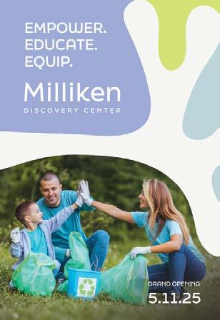
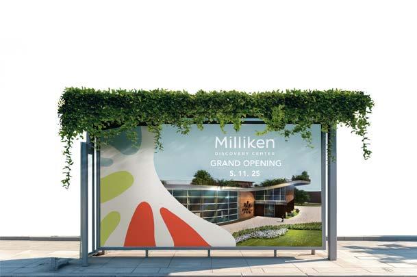
THE MILLIKEN DISCOVERY CENTER
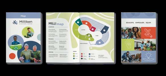
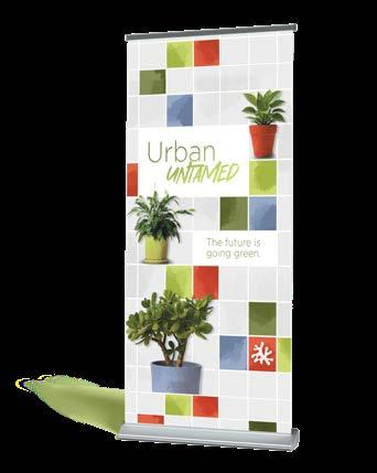
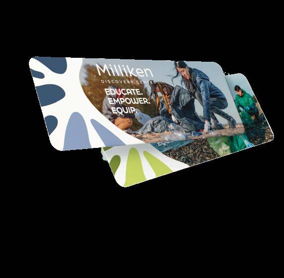
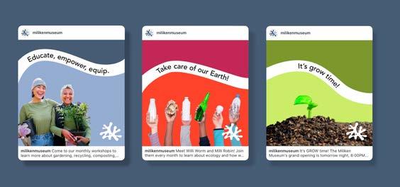
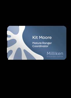
The Milliken Discovery Center was a large-scale branding projet that was completed my senior year of college. The prompt was to create branding for a science and natural history museum in Detroit, Michigan. My team, composed of graphic designers, interior designers, and architects, built this museum concept from the ground up. The Milliken Discovery Center is named after William G. Milliken, a sponsor for public parks in Detroit. It was a fun challenge to put a fresh breath of life into a new museum. The Milliken logo represents the compression and expansion of this “breath”. The logo mark is seem througout our branding and is the scaffolding for the colors and text in our touchpoints.
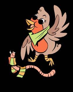
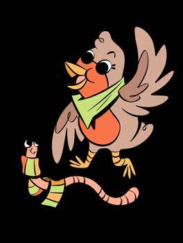
My favorite part of this brand to design was Willi Worm and Milli Robin. As the faces of the children’s program, these little characters guide students throuought the museum and help them learn about our natural world. Their designs are bubbly and bright, just like the Milliken.

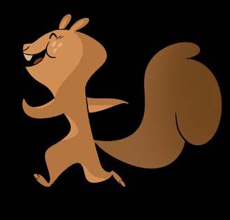
SQUIRELLEY COMICS
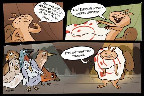
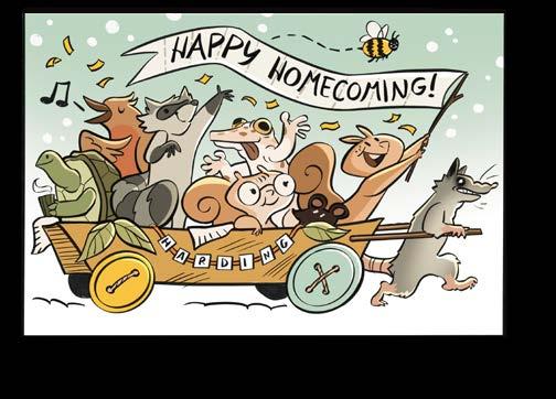
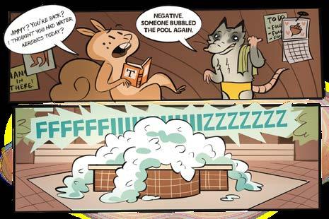
After his run online, Squirrelly pivoted to starring in the campus paper as an ongoing comic series. The viewer follows the wild adventures of Squirrelly and his animal friends as they navigate the ups and downs of a crazy wild college life.
It has been fulfilling to see how one of my characters can quickly adapt to fit the needs of different platforms and forms of media. Squirrelly’s simple design lends to easy translation between different art styles and contexts, while always leaving room for a fair dose of goofy squirrelleyness. Despite Squirelley’s fun design, everybody’s favorite character is Jimmy the possum, Squirrely’s weird roomate.
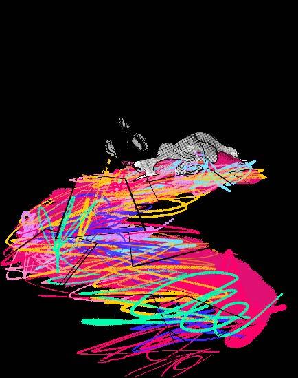
“PHASMOPHOBIA”
PERSONAL WORK
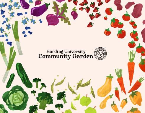
HARDING UNIVERSITY COMMUNITY GARDEN
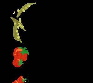
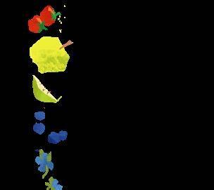
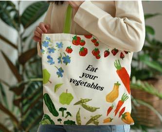
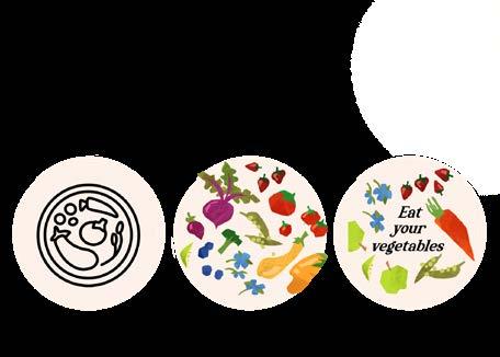
This was a small-scale brand identity job I did for my university’s community garden. The direction they wanted to take it in was very illustration heavy, which was very fun for me to experiment with. I wanted to stay away from something too childish while also adding an element of whimsy. I took direct inspiration from the colors of produce that the community planned to grow in the space.
As promotional material, I created pinback buttons that were sold as a fundraiser to get the garden started. The “Eat Your Vegetables” tagline button was by far the bestseller, and to this day I still see them on bags and backpacks around campus.
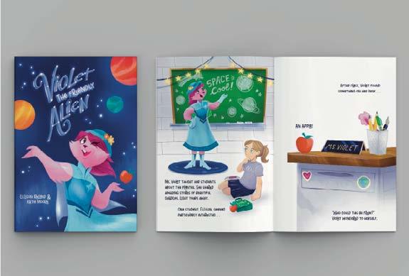

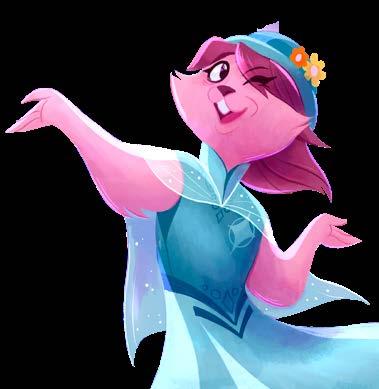
VIOLET THE FRIENDLY ALIEN
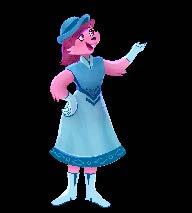
For this illustration project I teamed up with a child from a local school group. My co-creator Ellison designed the friendly alien who she named Violet, and I refined the character and formed a story around her concepts. This was a very fun project, and it gave me a good chance to explore color schemes and concepts I had never really experimented with. At the end of the project I got to print out my illustrated spreads and share them with my kid co-creator. I wish I could do more projects like this one!
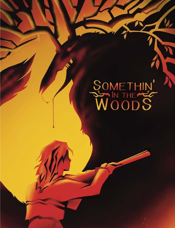
SOMETHIN’ IN THE WOODS
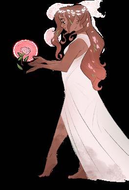
Somethin’ In the Woods is a creative project pitch I designed in an upper level illustration class. The goal was to put a new spin on a well known story, and create a mock “pitch” as if we were to sell it to producers. The Beauty and the Beast narrative has always stood out to me growing up, and I had just recently come back from a trip to the smokies when I started the project. These two elements came together which resulted in my driving theme, “what if “Beauty and the Beast’ happened in the deep south?”. As part my pitch I created the masthead design, story synopsis, character concept art, digital paintings, and storyboards. This was one of the biggest and most holistic projects I had ever tackled in my college career.
My story revolves around Beau, a taxidermist in Tennessee who dreams of a bigger and brighter life than her grandfather can give her. In this retelling, her world gets turned upside down when she finds that the fabled local cryptid becomes more than just a local legend. This project gave me the opportunity to really flesh out a world and setting for my characters, something I usually do not have the time to accomplish.
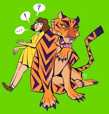
My favorite character to develop was “The Thing” in the woods. It was fun taking inspiration from different cryptids in North America and mashing them together.
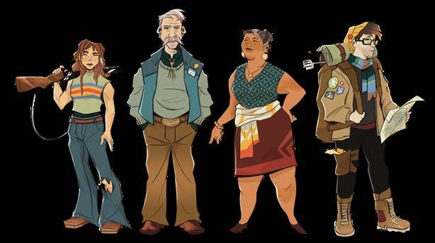
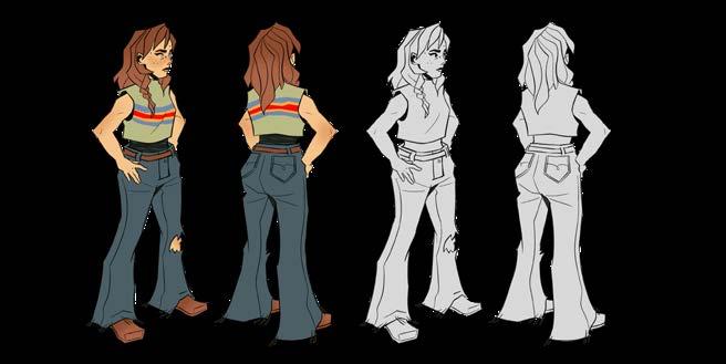
BEAU DESIGN DEVELOPMENT
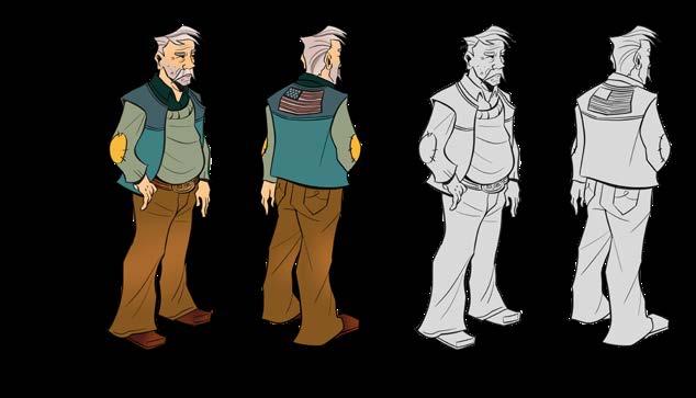
GRAMPS DESIGN DEVELOPMENT

“THE THING” DESIGN DEVELOPMENT
THANK YOU
Thank you for taking the time to look through my portfolio!
Instagram - @katiekitmoore Email - kitcrusoe@gmail.com
