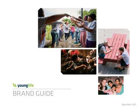
Young Life Brand Guide (110625)

Page 1


BRAND GUIDE

Dear Friends,

welcome to our updated brand book. It is chock full of great information and tips about how to best represent our mission through print, web, and merchandise design.

we want this comprehensive guide to be your “go-to resource” for everything related to our brand and logos as you diligently work to communicate the purpose of Young life in your area.

of course, we are always available to walk alongside you if a unique situation arises!

Thank you so much for partnering with us to know kids and make christ’s name known around the world.

Brand rallies and binds us around a common cause — Christ and kids.

MISSION, VISION, VALUES, METHODS

MISSION, VISION, VALUES, METHODS

Mission

Introducing adolescents to Jesus christ and helping them grow in their faith.

Vision

Together, we are compelled to model the way of Jesus in the lives of young people, to develop as leaders, to inspire others, and to go as a diverse community on mission — resulting in more adolescents known by name and for who they truly are, in more kids knowing Jesus, and in young people knowing their Kingdom purpose.

Values

1. The Gospel living according to and communicating the whole gospel of Jesus christ.

2. Scripture

Acting under the authority of Scripture and relying on the Holy Spirit to empower our ministry.

3. All Kids

Reaching adolescents of every ability and all economic, cultural, and ethnic backgrounds through innovative approaches.

4. Ecumenical collaborating with followers of christ from various traditions and local churches worldwide.

Methods

1. Praying for young people.

2. Going where kids are and building personal relationships with them.

3. Earning the right to share the good news of Jesus christ.

4. Providing fun, adventurous, life-changing, and skill-building experiences.

5. Inviting kids to personally respond to the good news and walking in friendship with them regardless of their response.

6. Preparing kids for a lifelong relationship with christ and a love for his word, his mission, and the local church.

Download a PDF of Young Life’s Mission, Vision, Values, and Methods

5. Diversity welcoming those whom God calls to our mission — men and women of all ethnicities and abilities who are committed to the common purpose.

6. Health

Encouraging our staff and volunteers in their personal and spiritual health so we may minister out of a consistent and growing relationship with christ and his followers.

7. Stewardship observing the highest standards of stewardship of all the resources placed in our trust.

7. working in community alongside likeminded adults (volunteer leaders, committee members, donors, and staff).

BRAND | GUIDE

WHAT IS A BRAND?

AND WHY IS IT IMPORTANT?

To be clear, a brand is more than a logo — it is our DNA. It is our culture; why we do what we do; our unique language; how we tell the stories of the changed lives of kids, our humor, our techniques for reaching kids, and most importantly — the brand is YoU.

As you are meeting kids where they are, leading club, taking kids to camp, and discipling them after they make a commitment to christ. You are the Young life brand. People may not remember our logo or everything we say, but they do remember how they felt in the relationships we make with them.

<< BACK TO CONTENTS

BRAND | mESSAGING AND VoIcE

“YOU WERE MADE FOR THIS.” “BEST WEEK EVER” “YOU BELONG HERE.” “PARTY WITH A PURPOSE”

Brand Voice

Voice Characteristics Description Do Don’t

FUN

RELATION

CHRIST-CENTRIC

Young life believes that no one should ever bore a kid with the gospel. It encourages people to have fun while growing in their faith.

Young life values relationships as a top priority. we want to meet adolescents right where they are, sharing our lives with them as well.

Young life honors that Jesus is their identity. Jesus is our Savior, and we want teens to know that truth and the hope behind it.

Use exciting verbs Use positive adjectives lots of club and camp pictures

Go overboard Be passive Be indirect

Pictures with kids/leaders Invite people in Be warm and casual Be too formal Be dull Be exclusive

Point to Jesus

Reflect Jesus through actions

Spend time with Jesus Glorify yourself

BRAND | ToNE AND cHARAcTERISTIcS

Brand Tone

Young life is an energetic, inclusive, and authentic friend. Its tone is casual, approachable, and full of enthusiasm, fostering an environment where individuals feel accepted and valued. It combines warmth with a sense of adventure, encouraging a positive and supportive atmosphere. overall, the brand tone of Young life is inviting, lively, and dedicated to building meaningful relationships with adolescents across the world.

Brand Characteristics

• Jesus

• Fun

• Exciting

• creative

• Inviting

• A Friend

• Sense of Humor

• Story-driven

• casual

LOGO | GUIDE

WHAT IS A LOGO?

AND WHY IS IT IMPORTANT?

The logo is a key part of our brand. It is the visual representation of who we are.

Think about well-known brands like cocacola. The brand is a quality, great-tasting soda drink that is enjoyed and consumed by millions of people every day. For many of us, it brings back memories of picnics, popcorn, movies, and family dinners. The coca-cola logo represents those experiences.

When people see our logo, we want them to think of our purpose and how we love people well.

LOGO | ElEmENTS AND NAmE

our logos are identified by three key visual elements:

1. Symbol – the “Yl.”

2. Word Mark – the words “Young life” in the stylized Klavika font with the Yl symbol — never alone.

3. Tagline – “You were made for this.®”

The elements of the logo work together in a unique arrangement of characters. Using the provided

graphics with the trademark symbols ® will protect the Young life symbol, word mark, and tagline.

The tagline is to be used with the Young life logo only and not the other life Stage logos. See page 14 of this guide for more.

All Young life communication, regardless of media, should bear the logo, including legal documents, contracts, leases, foundation, and grant requests.

DOWNLOAD A PDF OF THE TOP 10 LOGO TIPS

LOGO | lIFE STAGES

To help people understand what we do in Young life and the kids we serve, we communicate in terms of life-stage ministry. Although distinctive, each one shows a strong “familial resemblance” to the others.

our primary logo represents Young life overall, or our “parent brand.” (You can think of this also as our official logo for the organization known as “Young life.”) This same logo also depicts Young life’s primary life-stage ministry: Young life for high school students.

The wyldlife logo represents our ministry for middle/junior high students and the college logo represents our ministry for college students.

PRIMARY LOGOS
HORIZONTAL LOGOS

LOGO | SUB BRANDS, EVENTS, AND PRoGRAmS

consider Young life, wyldlife, and Young life college as our primary logo family members.

other integral ministries within our mission are extended family members. Because of their very specific focus, they require unique identifiers. However, the primary mission logo is always included as one of the identifiers — like a family name.

LOGO | FocUS mINISTRIES

our focus ministries are defined as segments of our life-stage ministries focused on specific groups of kids. For example, our YoungLives ministry’s purpose is to serve expectant and parenting adolescents as they grow in faith, grow in life, and grow in leadership; Young life capernaum works with young people with disabilities.

To communicate the ministry purpose, we have what we call name drops. The name drops identify the ministry focus within Young life.

Each sub-ministry has a descriptor to help identify and understand its purpose.

Capernaum: Young people with disabilities

Club Beyond: military teens in partnership with military community Youth ministries

Multiethnic: Kids of every ethnicity

Small Towns: communities of fewer than 25,000 people

YoungLives: Expecting and parenting adolescents

LOGO | AREAS/REGIoNS/EVENTS

Click here to create a custom name drop for your area, region, division, or event. Do NoT create your own name drop or logo.

A Name Drop Package consists of 24 customized files delivered to you via email and 12 primary and 12 horizontal logos with your content below the line in EPS (Vector – scalable) and PNG formats all with a transparent background.

Please note that digitized (.dst) embroidery files ARE NoT included.

PRIMARY LOGO

Area or event name is centered in blue Klavika type on one or two lines.

HORIZONTAL LOGO

Area or event name is right aligned in blue Klavika type on one or two lines.

Pikes Peak Region

FOCUS MINISTRY

Area name and ministry in blue Klavika type on one or two lines.

*On dark backgrounds, everything is reversed to white, including the divider line.

Midlands Capernaum

LOGO | SYmBol AND TAGlINE

YL SYMBOL

The Yl symbol is not meant to be used apart from the word mark — Young life — in print and digital applications. Not everyone is familiar with the letters “Yl” and the symbol alone does not clearly communicate who we are. The exception is with merchandise.

TAGLINE

It is best to use the tagline wITH the Young life logo. The “message” we want people to hear is: “You were made for this.®” The two go together. There will be applications where the logo and tagline can be separated but still work together (e.g., having the logo on the front of a T-shirt or coffee mug and the tagline on the other side).

The tagline is designed to be part of Young life’s signature rather than an event

theme, publication headline, or primary element on a page or product. consider using a theme that leads to the tagline, such as, “ what were you made for?”

The tagline is to be used with the Young life logo only and not the other life Stage logos or graphics.

Think about the use of the tagline. when is it appropriate? For instance, placing with the logo on a pencil or pen does not make sense.

Use the graphic files provided for the tagline instead of trying to type it. It is a registered trademark and should include a period and ® at the end.

Examples

BEST PRACTICES | DoN’TS

Don’t squish, stretch, rotate, or distort — use the logo intact.

DON’T place the logo over a busy background like a photo or other graphic — less is better.

DON’T add a gradient, outline, stroke, or shadow.

DON’T use the logo to create a pattern, decoration, or headline — tell your story with photos and text.

DON’T place text, photos or graphics over the logo — let the logo stand alone.

ANY TOWN

DON’T use the word mark without the Yl symbol.

BEST PRACTICES | moRE DoN’TS

DON’T take apart, change, or move logo elements around.

DON’T use any of the previous logos.

DON’T place the logo on every page or panel of your document as if it were a design element — look at the logo as a welcome or parting handshake.

DON’T add anything to the logo.

The previous logos are allowed for a one-time event (anniversary or banquet), but must be used along with the current logo and show the dated timeline.

DON’T fill the Yl symbol with a mascot from a school or any other element.

AND MOST OF ALL ... DON’T make your own logo.

BEST PRACTICES | SomE DoS

DO use a stylized font and make it NoTIcEABlY different.

Young Life

Young Life

DO place only one or two logos on a print promotional product. look at the logo as a welcome (beginning or first page) and/or a parting handshake (at the end or last page).

It is fine to have the words Young life in a headline, but use a font instead of the logo.

DO use Young life as two words and not one when typing it.

Young Life is a non-profit ...

DO use the recommended fonts and colors when possible.

Klavika is the font family and the PmS colors are 303U (Blue) and 382U (Green). See the color chart on page 25 for RGB, cmYK, and HEX values for these colors.

LOGO | mINImUm clEAR SPAcE

MINIMUM CLEAR SPACE

The minimum clear space around the logo is equal to the height of the “e,” measured from the top to the bottom edge. To create the greatest impact, allow even more space around the logo. Do not allow photos, typography, or other graphic elements to enter the minimum clear space area.

This rule applies to All Young life logos, not just the two on this page.

* This guideline applies only to print and digital designs. It does not apply to apparel or merchandise. See those guidelines on page 73.

EXAMPLE

LOGO | SIZES AND ScAlING

MINIMUM SIZES

our logo should never be displayed smaller than the minimum sizes indicated here for print and digital use.

SCALING PROPORTIONALLY

The proportions of the logo should never be altered in any way. All elements need to be used intact. To resize an approved logo hold down the shift key when scaling to maintain the correct proportions.

PRIMARY LOGOS

The minimum size the Primary logo(s) may appear is 3/4”, left to right.

PRIMARY HORIZONTAL LOGOS

The minimum size the Primary Horizontal logo(s) may appear is 1”, left to right.

PRIMARY AND HORIZONTAL LOGOS WITH TAGLINE AND TAGLINE ALONE

minimum sizes are 1 1/8” left to right for the Primary logo with tagline and 1½” left to right for the Horizontal logo with tagline. when using the logo with the tagline a larger minimum size is required to maintain readability of the tagline text.

LOGO | AlIGNmENT/PoSITIoN

ALIGNMENT/POSITION

when lining up text or other objects below the logo, use the logo without the tagline and line up using the left edge of the (lowercase) “y” for primary logo and left edge of the (uppercase) ”Y” for the horizontal logo. centering beneath the logo is another option, with the type not extending beyond the end of the logo on either side. If adding an address below the logo, always place a blue horizontal line (1 pt. in width) below the logo, but above the address. The space from the bottom of the “g” to the top of the line should be equivalent to the width of the lowercase letters, and be the same from the bottom of the line to the top of the letters (address).

COLOR | GUIDE

COLOR | PRImARY — PRINT

our main colors are Pantone Blue 303U and Pantone Green 382U. when referring to the Pantone matching System, we say PmS. It is important to use these approved color numbers for our logo. There are thousands of hues and these two shades are our official colors. over time, the colors are part of the instant recognition of our logo.

Use the full-color version when possible.However, if you do not have a printer that can accurately reproduce the logo colors or you are using the logo in a medium in which the colors are not accurate (e.g., projected on a bright screen), feel free to use the white, blue, or black versions.*

*Please see exceptions for apparel and merchandise on page 73

Full-color
White on dark backgrounds White and green on dark backgrounds
limited use — the options below are allowed in specific situations, only when full color is not possible. one-color (blue); one-color (black); two-color (gray and white)

COLOR | comPlEmENTARY — PRINT

our primary colors convey a lively, approachable, and contemporary tone. They should be used as the dominant colors of every Young life printed communication. Black and gray and tints of the blue work well for text, divider lines, and backgrounds.

cmYK – Short for cyan-magenta-YellowBlack, and pronounced as separate letters. cmYK is a color model in which all colors are described as a mixture of these four process colors. cmYK is the standard color model used in offset printing for full-color documents. Because such printing uses inks of these four basic colors, it is often called fourcolor printing.

In contrast, display devices generally use a different color model called RGB, which stands for Red-Green-Blue.

*Secondary colors should not take up more than 25% of any Young Life printed communications.

Primary Colors

Secondary / Complimentary Colors

#91C83E #555555 #AAAAAA #F3F3F3

#48397F

c=87 m=92 Y=18 K=5 R=72 G=57 B=127

#8777B7 c=51 m=56 Y=0 K=0 R=135 G=119 B=183

#245B91

#00B1E8

c=71 m=11 Y=0 K=0 R=0 G=177 B=232

#CBF1FF c=18 m=0 Y=1 K=0 R=202 G=242 B=255

#5A9B32

#CAE0B9

#F95E0A

#F0920A

#F0C400

c=7 m=21 Y=100 K=0 R=240 G=196 B=10

One of the most difficult aspects of desktop publishing is color matching — properly converting the RGB colors into CMYK colors so that what gets printed looks the same as what appears on the monitor.

#003A5B

COLOR | TYPES

PRINT AND ONSCREEN

There are two basic categories of color types: print and onscreen. color on the printed page is subtractive, while color onscreen is additive (more on this later).

For now, it’s important to understand that the digital and print mediums render color very differently from one another. You don’t use PmS colors on a website just like you don’t use RGB colors on a printing press.

we use four of the most popular color types — PmS, cmYK, RGB, and Hex — all fall into one of the two basic categories. PmS and cmYK are for print. RGB and HEX are for onscreen.

PMS (PANTONE® MATCHING SYSTEM)

Use: Printing PmS colors (also called Pantone® colors) are patented, standardized color inks made by the Pantone company. Pantone

is one solid color of ink. Young life’s PmS 303 and 382 were selected to ensure the strictest color consistency across different print products and across the globe.

CMYK (CYAN, MAGENTA, YELLOW, BLACK)

Use: Printing cmYK color (also called four-color process) is actually a method whereby a combination of tiny transparent dots of four ink colors: cyan, magenta, yellow, and black are printed. Different combinations of large and small cmYK transparent dots overlap each other to create a wide spectrum of colors.

RGB (RED, GREEN, BLUE)

Use: Onscreen

The most commonly used color profile in the world of computers, TV screens, and mobile devices is RGB. RGB is the process by which colors are rendered onscreen by using combinations of red, green, and blue.

RGB is specific to digital applications only. This includes mobile devices, computer monitors, laptops, TV and movie screens, games, and illuminated signs.

HEX (HEXADECIMAL COLOR)

Use: Onscreen for websites

Designers and developers use HEX colors in web design. A HEX color is expressed as a six-digit combination of numbers and letters defined by its mix of red, green, and blue (RGB). Basically, a HEX color code is shorthand for its RGB values with a little conversion gymnastics in between.

TYPOGRAPHY | GUIDE

TYPOGRAPHY | PRImARY FoNT

The Klavika font is the primary font for communications. Klavika is available on the staff site

Typography provides the framework for Young life’s identity system.

The light and regular (or equivalent) fonts can be used for body text, preferably in 10, 11, or 12pt size type.

The bold font works well for headlines.

For emphasis, use bold or italic, or a larger size type — do not underline or use another font.

KLAVIKA LIGHT

KLAVIKA LIGHT ITALIC

abcdefghijklmnopqrstuvwxyz

AB c DEFGHIJK lm N o PQRSTUV w XYZ

1234567890-=!@#$%^&*()_+

abcdefghijklmnopqrstuvwxyz

ABCDEFGHIJKLMNOPQRSTUVWXYZ

1234567890-=!@#$%^&*()_+

KLAVIKA REGULAR

KLAVIKA REGULAR ITALIC

abcdefghijklmnopqrstuvwxyz

ABCDEFGHIJKLMNOPQRSTUVWXYZ

1234567890-=!@#$%^&*()_+

abcdefghijklmnopqrstuvwxyz

ABCDEFGHIJKLMNOPQRSTUVWXYZ

1234567890-=!@#$%^&*()_+

KLAVIKA BOLD

abcdefghijklmnopqrstuvwxyz

ABCDEFGHIJKLMNOPQRSTUVWXYZ

1234567890-=!@#$%^&*()_+

TYPOGRAPHY | AlTERNATIVE FoNTS

Alternative san serif fonts are Arial, Poppins, or Montserrat.

ARIAL REGULAR abcdefghijklmnopqrstuvwxyz

ABCDEFGHIJKLMNOPQRSTUVWXYZ 1234567890-=!@#$%^&*()_+

POPPINS REGULAR abcdefghijklmnopqrstuvwxyz

ABCDEFGHIJKLMNOPQRSTUVWXYZ 1234567890-=!@#$%^&*()_+

MONTSERRAT REGULAR abcdefghijklmnopqrstuvwxyz

ABCDEFGHIJKLMNOPQRSTUVWXYZ 1234567890-=!@#$%^&*()_+

WHAT IS A SAN SERIF FONT?

A typeface that does not use the small lines at the ends of characters called Serifs.

Complementary serif fonts are Charis Sil, Georgia, or Bitter.

CHARIS SIL abcdefghijklmnopqrstuvwxyz

ABCDEFGHIJKLMNOPQRSTUVWXYZ 1234567890-=!@#$%^&*()_+

GEORGIA abcdefghijklmnopqrstuvwxyz

ABCDEFGHIJKLMNOPQRSTUVWXYZ 1234567890-=!@#$%^&*()_+

BITTER abcdefghijklmnopqrstuvwxyz

ABCDEFGHIJKLMNOPQRSTUVWXYZ 1234567890-=!@#$%^&*()_+

WHAT IS A SERIF FONT?

A Serif is a small line or stroke regularly attached to the end of a larger stroke in a letter or symbol.

PRINT | GUIDE

PRINT | oVERVIEw

The Young life Print Guide is here to offer the best practices for professional looking printed pieces. many elements like logo usage, typography, and colors, already mentioned in regard to other branded resources, are equally important in making printed pieces look polished.

It is wise before publishing any piece, to step back and carefully review for consistency, unity, and uniformity across all your assets both print and digital. This thought toward consistency is helpful in making decisions as a printed piece is created.

with each published piece, consider the audience and what you are trying to communicate. A communication piece for kids will typically look different than something for a donor or corporation. However, you can still make these communications feel cohesive with similar font and color choices.

LET’S

Typography, colors, and carefully arranged logos on these pieces brand them as “Young Life” and give them a feeling of connectedness even though they may not be used or seen together.

GET DOWN TO THE NITTY GRITTY.

PRINT | loGo USAGE

If you are unsure of where to use the Young life logo on your printed piece, a general rule of thumb is less is more. You definitely want to brand your piece with the logo, but you certainly don’t want to overuse it or try to incorporate it as a design element. we like to think of the logo as a parting handshake — strong but firm and leaves a favorable impression.

Here are some important guidelines to consider:

• Adjust the size of the logo according to the size of the communication used.

• Avoid using the logo on every side of a multiple-page piece.

• Do not recreate the logo.

• Always enlarge and reduce the logo proportionally.

• Refrain from using the Yl symbol.

Subtle, well-placed logos on the above communications give the designs clear branding without overdoing it.

PRINT | TYPoGRAPHY AND coloRS

one key element that makes a communication piece cohesive is font choice and size. when consistently arranged in an appealing and readable display, it can be a powerful unifier. we refer to it as typography.

Typography can also be a main pitfall in design. with so many font choices and sizes to choose from, it can be tempting to want to use several, however, carefully selecting a maximum of three fonts throughout your printed piece is recommended.

To assist you with typography, we have listed some complementary fonts to our primary font, Klavika, along with header and body sizes. To download Klavika click here.

color is the other key ingredient for making your printed and digital assets feel unified. Please see pages 23-25 for colors that complement the blue/green of the Young life logo.

PRIMARY FONT: KLAVIKA

Klavika

COMPLEMENTARY FONTS: Arial, Poppins, montserrat, charis Sil, Georgia, Bitter

Arial Poppins Montserrat Charis Sil Georgia Bitter

RECOMMENDED FONT SIZES

• Body text: 10 point

• Subhead text: 14 point

• Header text: 20 point

CONTENT | GUIDE

CONTENT | YoUNG lIFE STYlE

• adult guest

• alumna = female singular

• alumnae = female plural

• alumnus = male singular

• alumni = male plural, co-ed plural

• Bible, biblical

• campaigners — Plural in all uses except in reference to one kid. (e.g., “campaigner kid” is acceptable, but “kid involved in campaigners” is preferred.)

• christlike

• club room

• email

• e.g., — means “for example”; always use two periods and a comma.

• Facebook

• face to face (hyphens when used as adj.) — e.g., They talked face to face. They had a face-to-face conversation.

• fundraising

• good news

• gospel

• i.e., — means “that is to say”; always use two periods and a comma.

• Instagram

• internet

• Kingdom

• follow up (v.) — e.g., I will follow up tomorrow.

• follow-up (adj. or n.) — e.g., The follow-up meeting went well.

• lifelong

• longtime

• long-term

• midweek

• missionwide (no hyphen, even though spell check does not like it.)

• multiethnic

• Say-So

• Scripture, scriptural

• summer staff

• website

• weeklong

• work crew

• work week

CONTENT | YoUNG lIFE STYlE

DIVERSITY:

Him or her, he or she — never “him/her” or “he/she”

Hispanic — from European Spanish descent: Spain, Portugal, canary Islands

Latino — from cuba, mexico, South America, Puerto Rico, U.S.; latino is preferred over Hispanic when referring to the Spanishcultural countries that aren’t in Europe

African American, Asian, Native American — people of color

Always use “kids with disabilities” instead of “disabled kids” — kid first, ability second

Multiethnic —use when describing kids in diverse cultural communities and those in economically depressed areas

MINISTRIES:

Capernaum — ministry with kids with disabilities

Club Beyond — ministry with military teens in partnership with military community Youth ministries

International — ministry outside of the U.S.

Multiethnic — ministry focused on kids in diverse cultural communities and those in economically depressed areas

Small Towns — ministry in communities of fewer than 25,000 people

WyldLife — middle school ministry

Young Life — high school ministry

Young Life College —college and university ministry

YoungLives — ministry with teen moms

CONTENT | cAPITAlIZATIoN AND TITlES

CAPITALIZE:

Official titles: if preceding personal names — President Newt crenshaw, Area Director Brian Ford

Department names: Human Resources, Accounting department, (department is NoT capitalized) BUT lowercase when referring to the services themselves (e.g., The Service center provides human resources, accounting, and more)

Special events: Young life Fall carnival, late Night with Young life

Regions of a country: the west, the Far East

Scripture: Bible, Scripture, BUT biblical and scriptural

Young Life: campaigners, Service center, Say-So, BUT lowercase club, camp, committee, contact work

Geographical names: Southern california Region, western Division, BUT lowercase the region, the area, the division when not with a specific name

DO NOT CAPITALIZE:

Titles in reference to someone or when they follow personal names: Newt is the president of Young life.

Seasons: (fall, winter), a.m./p.m., compass points (north, south) unless in an address: last summer they flew north to Alaska where the sun didn’t set until 1 a.m.

Evangelical: the gospel, good news (This rule changed to follow AP style in fall 2016.)

C’s of Young Life: club, contact work, camp, campaigners and committee

Young Life: staff associate, work crew, summer staff, work week

Deity: pronouns referring to God or Jesus — he, him, his, who, whom, you

CONTENT | NUmBERS AND ABBREVIATIoNS

NUMBERS:

Express in WORD form: one to nine, a number used at the beginning of a sentence: Fifteen kids and two leaders enjoyed camp last week.

Express in FIGURE form: all ages, 10+, dates, times, dimensions (15x20): our area took 18 kids to camp from July 1-9.

Phone numbers are: 719-438-9572 NOT (719) 438-9572 or (719) GET-YlSc.

Don’t begin sentences with numerals (UNLESS it’s a year).

PUNCTUATION:

one space after all punctuation, not two.

limit the use of exclamation points (!).

ABBREVIATIONS:

& — ONLY use when part of a legal corporate name.

AD/RD/VP/SVP* — may oNlY be used in internal Young life communications. *(Area Director/Regional Director/Vice President/Senior Vice President).

OK — is correct. NoT o.K. or okay.

State names: State two-letter abbreviations can only be used for addresses or in tabular material. AlwAYS spell out state names in text.

U.S. — always use periods.

WL* — NEVER use in professional writing. *(wyldlife)

YL* — Do NoT use in professional writing. Exceptions: Yl Access, Yl connect, Yl Network, Yl Pray 24/7. *(Young life)

YLC* — NEVER use in professional writing. *(Young life college)

DIGITAL | GUIDE

DIGITAL | oVERVIEw

The Young life web Guide exists to help us make professional-looking sites, apps, and on-screen presentations. we’ve all run into sites that are inconsistent, have different colors all over the place, a huge range of font sizes, etc. The Style Guide is our place of truth.

In the pages that follow, we’ve listed some of the common elements of style that you might be interested in.

NOTE

The style guide assumes a general knowledge of HTML and CSS, including basic tags, classes, and ids. If those words aren’t familiar, contact our friendly Web Services department for help.

If you don’t find something you’re looking for here, or have any questions about if you’re styling something right, be sure to contact us.

DIGITAL | coloRS

Primary Colors

our primary colors convey a warm, approachable, and contemporary tone. They should be used as the dominant colors of every Young life website or application, at approximately the proportions shown here.

Gray should be used mainly for text, divider lines, and backgrounds.

NOTE

Secondary colors should not take up more than 25% of any Young Life website or application.

Secondary / Complimentary Colors

#48397F #8777B7
#00B1E8 #245B91 #CBF1FF
#003A5B #91C83E #555555 #AAAAAA #F3F3F3
#F95E0A
#5A9B32 #F0920A #CAE0B9 #F0C400

ELECTRONIC | IcoNS

Icons are used to quickly communicate ideas. They should be easily identifiable with the thing they represent.

our style of icon uses solid, closed shapes. corners are subtly round so the shapes look soft rather than rigid. This style complements the aesthetics of the Young life logo and maintains legibility across various sizes.

Icons can be different colors, but multicolored icons should be avoided so as not to feel busy or compete with the Young life logo.

Click here to download a set of icons. Please contact the design team for custom icons that you would like to see added to the collection. “Font Awesome” is the icon library we use for our sites whenever possible. Click here for more information about “Font Awesome.”

DIGITAL | TYPoGRAPHY

The logo font is Klavika but we do not recommend using this as the main font for all things digital. If you have the ability to use Klavika for header text in your website or app, that’s great. If not, we have included some Google font recommendations on the following page.

on the right we’ve included general guidelines for setting up a font style hierarchy.

Click here to download the Klavika font.

Body Text

font: Klavika light, Arial, Helvetica, sans-serif font-size: 14px

color:#555555

Header h1

font: Klavika medium, Arial, Helvetica, sans-serif font-size: 40px

color: #91c83e

Header h2

font: Klavika light, Arial, Helvetica, sans-serif

font-size: 28px

color: #aaaaaa

Header h3

font: Klavika medium, Arial, Helvetica, sans-serif font-size: 22px

color: #aaaaaa

Header h4

font: Klavika medium, Arial, Helvetica, sans-serif font-size: 18px

color: #91c83e

DIGITAL | TYPoGRAPHY

If Klavika is not available for your digital communication we recommend using the Poppins or montserrat font as a Klavika alternate. If you have any questions about web fonts and their usage please email Creative Services.

Poppins Regular

Poppins Medium

Poppins Bold

Poppins is a Google font and a good alternative font to use when you are unable to use Klavika.

Montserrat Regular

Montserrat SemiBold

Montserrat Bold

montserrat is a Google font and it maintains legibility at small sizes.

DIGITAL | EmAIl SIGNATURES

EMAIL SIGNATURES SHOULD INCLUDE:

1. Text in black, dark blue, or the logo blue (R-0, G-63, B-95).

2. FoNTS: Arial, calibri, or Tahoma are preferred over Klavika*.

3. Include the grayscale (preferred) or blue version of the horizontal logo in new email messages, not reply messages.

4. Do not include scriptures, images, backgrounds, or quotations.

GENERAL STANDARDS

• Body text should be 10 or 11 pt. regular or medium.

• Use single line spacing (1 pt larger than type pt. size).

• Email hyperlink should be underlined. Font should match the color of the other text.

• cell, fax, and 800 phone numbers are optional.

*Klavika does not render if it is not installed on recipients’ computers.

NEW MESSAGE (WITH LOGO)

First and Last Name

Title

email

555-555-5555

555-555-5555 (mobile)

12 pt. Bold

9 pt. Regular

8 pt. Regular OPTIONAL

SUBSEQUENT COMMUNICATION (NO LOGO INCLUDED)

First and Last Name

Title

555-555-5555

555-555-5555 (mobile)

OPTIONAL: New and/or reply signature including personalized autograph. If you prefer to use an autograph, place a scanned image of your handwritten name into the email signature. Do NoT use a cursive or script font to sign your name.

BBoyle@sc.younglife.org (316) 3047033 (mobile)

Scanned signatures should not exceed this space of 1/2” top to bottom, or four lines of 9 pt. type with a 10 pt. line spacing. Keep the pixels (ppi) to a minimum — around 100 is ideal. It may take more than one attempt to get this right.

CONFIDENTIALITY NOTICE (Only required when sending legally sensitive information.) Use this link to access this notice. Copy and paste it into your email signature using an 8 pt. font.

DIGITAL | wHY SocIAl mEDIA IS ImPoRTANT

Social media is a vital tool in how we communicate as an organization. Platforms like Facebook, Instagram, and X (formerly known as Twitter) allow areas to connect directly with their community. Social media offers a cost-efficient way to share updates, promote events, showcase success stories, and build community engagement. By maintaining a consistent presence online, areas can increase visibility, attract participation from students, their families, volunteers, and donors.

whether you are a beginner or a pro, we hope some of these tips and best practices will help you take your communication to the next level.

DIGITAL | SocIAl mEDIA DoS

MAKE IT A TEAM EFFORT

Build volunteer roles to help make it an effective tool (comms, Social media, Photography, Video …). 3-4 volunteers will be more effective than just one person in executing planning, content creation, caption writing, and will be able to consistently post content like posts and stories.

DIGITAL | SocIAl mEDIA DoS

BE STRATEGIC

Identify your goals and purpose. who do you want your content to reach. Kids? Parents? Donors? Research and determine which platforms your target audience will be on. This will save you time and money and make social media a tool not a chore.

DIGITAL | SocIAl mEDIA DoS

BE CONSISTENT

Developing and executing a consistent posting schedule allows you to utilize platform algorithms to expand your reach more efficiently. Posting often will also help you to become more prominent in your followers’ feeds.

consistently monitor your posts and the engagement with your accounts. Interact with your audience, answer questions in your comment sections and your direct messages. Report and remove spam from any of your comment sections to help reduce unwanted noise and social topics.

DIGITAL | SocIAl mEDIA DoS

SHARE GREAT CONTENT

one of the easiest parts of utilizing social media as a communication, but often the most overlooked part. Tell your area’s story. Use high-resolution pictures, videos, news and updates, ask questions. Post consistently and plan your content. Post at a time you think your audience will actually see it.

DIGITAL | SocIAl mEDIA DoS

USE YOUNG LIFE CONTENT

we have access to a lot of quality content and templates. Take advantage by signing up for our canva Enterprise Subscription to utilize templates and photo banks for your social media needs.

DIGITAL | mSITES DoS

The Young life logo must appear within the top 4 inches of each page (we recommend upper left corner and generally the horizontal logo works best.

If using your name drop file, it must have been created using the name drop generator. Your website should be created using the mSite portal.

Style tone and other specifics should follow the guidelines given elsewhere in this Brand Book.

Click here for more specifics about Young life mSites.

USE YOUR RESOURCES

Click here to see an example mSite. This site has the latest and greatest in mSite flair as well as step-by-step instructions to make your site simple, time-efficient, and professional!

GO “AUTOMAGIC”

Tools like Google calendar, social media feeds, and the countdown Timer update “automagically,” saving you time and energy promoting events, club, and camp.

SHOW CONTACT INFO

A friendly face goes a long way! Display the names, faces, and emails of all area staff and your committee chair in an easy-tofind spot on your site.

KNOW YOUR AUDIENCE

Decide who you want to reach with your mSite. check out samplemsite.younglife. org/personas for ideas on how to involve everyone coming to your site!

FEATURE CAMP

The camp Trip web Part is a one-stop shop for camp! It takes two minutes to add to your site and automatically pulls in your

area’s camp trip and payment information with a number of customizable options, including registrations.

THINK VANITY

“Vanity” URls are memorable addresses used to drive traffic to your mSite from print sources. consider samplearea. younglife.org/camp on all of your camp flyers to send parents directly to summer information. Just ask the Help Desk!

ENGAGE DONORS

Use your giving page to tell the story of your area and ask for help. Pictures of kids, cost of camp, and progress bars are great places to start.

DIGITAL | mSITES DoN’TS

FEEL OVERWHELMED

Thirty minutes every 30 days is enough to keep your mSite fresh and professional.

TRY TO DO IT ALONE

The Young life Help Desk is available monday through Friday, 7:30-5 p.m. mT at 719-381-1929, and are happy to answer emails sent to helpdesk@sc.younglife.org and msites@sc.younglife.org

USE AN ALTERNATE SITE

Your mSite is registered with Google to

return in search results and is linked to and from the locator on younglife.org! Don’t limit traffic to your site. (If you want to make a blog part of your online presence, we’re fans of wordPress.)

FORGET VIDEO on average, viewers spend 100% more time on a page with video elements. check out Vimeo.com/younglife for the perfect promo spot and put it on your site using the Video web Part.

PHOTOGRAPHY | GUIDE

PHOTOS | wHY IS PHoToGRAPHY ImPoRTANT?

Photography is essential to Young life because it captures the joy, connection, and transformation that happen in real time during clubs, camps, and everyday life with kids. These images tell the story of relationships being built, faith being explored, and lives being changed—often more powerfully than words ever could. Sharing authentic moments through photography invites parents, supporters, and potential leaders to see the heart of the mission, celebrate the impact, and feel inspired to get involved or give. Photos don’t just document the work of Young life—they show why it matters.

PHOTOS | wHAT mAKES A GooD PHoTo?

The focus in all Young life photography should be relationships. Photography captures real, unscripted moments— laughter at club, deep conversation at camp, a spontaneous game with leaders and kids. we use photography as a key part of our communication strategy we believe the best photos feel alive and full of connection, showing authentic relationships and the joy of being known and loved.

To consistently capture relationships for how we communicate, it is best to plan out what photo content you need for social media, web digital communication, and future print communication.

PHOTOS | PHoToGRAPHIc PRocESS

when taking photos, two main ideas must be kept front of mind; composition and lighting.

• composition

• lighting

PHOTOS | comPoSITIoN

composition is about how you arrange elements in your photo to tell a clear, engaging story. A good composition draws the viewer’s eye to what matters most. All photos should use the rule of thirds composition rule, but composition requires you to know what you are taking the photo for.

Are you taking this photo for social media? Try keeping the focal point in the center of your frame.

Shooting for print or digital communication channels? Frame your composition to be wide angle with as much extra space as possible and keep the main subjects in the inner lines going vertically.

Framing is crucial to your composition being effective across various use cases. Be intentional about what’s in and what’s out of the frame. Use backgrounds that

don’t distract, and leave space around your subject when needed. look for natural frames (like doorways, windows, or arms forming a circle around a kid) to guide the viewer’s focus. Don’t be afraid to move — step closer, lower down, or higher up for better perspective.

All compositions should keep in mind various aspect ratios for various needs. Use the rule of thirds to help guide you with placing your subject. For example a dynamic image can have an off-center subject to create more visual interest and leave space for text communication.

For more information, reference Aspect Ratios.

PHOTOS | lIGHTING

lighting is what makes an image look visually appealing and can make memories captured look distorted or not attention grabbing. lighting is about shaping the mood, clarity, and emotional tone of your photo. It’s one of the most important factors in making your image feel alive and authentic. Good lighting doesn’t just make a photo look nice — it helps tell the story of the moment.

For our communication system, we aim for soft, natural light primarily. Young life photography should focus on using lighting styles like loop lighting, butterfly lighting, and broad lighting.

Avoiding hard shadows from any light source is imperative to maintaining Young life’s brand communication. Harsh flash photography should be avoided except for specific scenarios mentioned below.

when focusing on portraiture and hard natural light is not avoidable, use diffusion material to help soften the light. To reduce unflattering shadows, use a light colored material to bounce light into the shadows.

morning and evening light offer the most flattering tones, while harsh midday sun or overhead indoor lighting can create unflattering shadows and distractions. Ask yourself: what is the emotion or story I’m trying to capture? That should guide your lighting choices.

Framing with light is just as important as framing a composition. watch how light hits your subject’s face — avoid strong backlighting unless you’re going for a silhouette. And if indoors, place your subject near a window or diffuse artificial lighting for a more natural feel. mixed lighting (daylight + fluorescent, for example) can introduce strange color casts, so be aware of your environment.

Even though harsh flash photography should be avoided, for events that are in a dark space with lights that cast colors in unflattering ways, a flash with diffusion is recommended.

All lighting decisions should also consider how the photo will be edited or used. It’s better to shoot slightly brighter and adjust in post, rather than lose important details in shadows or blown-out highlights.

For more information, reference the section on Editing and Color.

PHOTOS | cATEGoRIES

The photos should tell a story of hope. Young life photography can be broken down into four main categories:

• People

• Environment

• Moments

• Details organizing photos into meaningful categories helps us tell a fuller, more compelling story of how God is moving in the lives of kids, leaders, and communities. Each category plays a role in reflecting the heart of Young life.

PHOTOS | cATEGoRIES

PEOPLE

These photos showcase the people that make Young life. The kids, the families, the volunteers, the staff, and their supporters.

• Candids: Unposed moments that show real emotion, laughter, and connection. These are often the most powerful photos because they feel authentic and alive. These put a spotlight on relationships. Great for generic use in both digital and print materials.

• Group Photos: Full of energy and unity, these capture the community aspect — small groups, cabin mates, clubs, and camp teams. These put a spotlight on the area and allow for viewers to put faces to the impact made. Great for sending to donors and potential volunteers.

• Portraits: Simple, focused shots that help us see individuals clearly — often used to introduce leaders or feature kids’ stories. These allow you to put a spotlight on what makes your area unique. Great for social media and professional networking.

• Studio Headshots: clean, consistent photos of staff or committee members, ideal for professional materials like websites, presentations, newsletters, or reports.

PHOTOS | cATEGoRIES

ENVIRONMENT

These images show where Young life happens. It places the kids where they are, and how Young life makes an impact in their environments.

• Contact Work: Photos of leaders meeting kids where they are — schools, games, lunch tables — highlighting the relational foundation of the mission.

• Club: The fun, chaos, and joy of club nights — singing, games, and messages. These are key to showing the spirit of Young life.

• Camp: From wide camp landscapes to group shots by the lake, these photos capture a life-changing environment that’s central to the mission.

• Committee: Show the adult supporters who pray, fund, and serve behind the scenes — often overlooked but essential to the story.

• Campaigners: Intimate moments of Bible study, prayer, or mentorship. These photos reveal spiritual growth and deepening relationships.

PHOTOS | cATEGoRIES

MOMENTS

moments are about timing. These shots freeze emotions around key experiences and events that make up the Young life experience.

• Before the moment: Anticipation, nervousness, quiet — what’s happening just before the big game, the talk, or the leap into the unknown.

• During the moment: Action, excitement, the emotions overflowing and showing through their facial reactions and body language.

• After the moment: Reactions, relief, joy, or reflection — what we see once something meaningful has just occurred. These often carry deep emotion.

PHOTOS | cATEGoRIES

DETAILS

Small things often tell big stories. These images zoom in on what might otherwise be missed.

• Capturing Comfort: A Bible in a cabin bunk, a leader’s hand on a kid’s shoulder, or shared food — these details convey warmth, safety, and care.

PHOTOS | TEcHNIcAl SPEcIFIcATIoNS

To ensure consistency and quality across all Young life visual content, please follow these technical guidelines when capturing and submitting photos:

• Image Format

• Editng

• Exporting

PHOTOS | TEcHNIcAl SPEcIFIcATIoNS

To ensure consistency and quality across all Young life visual content, please follow these technical guidelines when capturing and submitting photos:

• Image Format

• Editing

• Exporting

PHOTO | ImAGE FoRmATS

For the most flexibility, take photos in RAw (.cr2, .nef, .arw) formats. RAw formats are important for future editing and archiving capabilities. other (less recommended) standard file types are .png, .jpeg, but will lack the editing capabilities RAw formats contain.

when archiving your photos, it is best to keep unedited RAw files and uncropped JPEG copies.

Archival systems should use well-thoughtout naming conventions similar to below.

* Use this format: Event_location_Date_ Description_Initials.jpg

* Example: club_westSeattle_2025-04-12_ GamesNight_KT.jpg

<< BACK TO CONTENTS

PHOTO | EDITING

Editing is where your photo’s tone and mood are finalized. It’s not just about making an image “look better” — it’s about enhancing clarity, emotional resonance, and brand consistency. Every photo should feel authentic, warm, and connected to real moments. Additionally, editing is the process that allows Young life to have a cohesive branded look across all mediums and in various communication channels.

Color photos should be the primary photography used by areas in their communications. color helps convey context and life — it allows viewers to connect with the atmosphere of the moment.

Black and white should be used intentionally, and for very specific use cases. Its primary use should be for background visuals in layouts, such as behind text in print or digital materials.

<< BACK TO CONTENTS

It can also be helpful when you want to simplify a busy image or emphasize emotion — but should not be the default.

Editing should always stay consistent with Young life branding and support a story narrative. The editing of a photo should not make the photo itself distracting. Avoid using heavy filters, high-contrast presets, or overly stylized effects that take away from the natural feel of the moment.

Instead, aim to:

• Keep tones natural, with a slight warmth to reflect Young life’s welcoming, relational environment

• Preserve true-to-life skin tones and realistic lighting

• Enhance clarity and vibrancy without losing authenticity

PHOTO | EXPoRTING FoR DIGITAl USE

Exporting is the final step before your photo is shared or published — and how you export matters just as much as how you shoot. It doesn’t matter whether your image is headed to Instagram, a slideshow, or a printed magazine. Every image should be exporting with the right specs for digital use, but remain flexible to be used in a variety of ways. All images need to look sharp, professional, and on-brand.

Photos used for digital use such as web, email, or social platforms need to be optimized for clarity and speed, without sacrificing quality.

• File Type: Export as JPEG (.jpg) or PNG (.png). JPEG is preferred for photos and PNG can be used for images that need transparency or crisp edges.

• Resolution: Images should be at least 3000px on the long edge to ensure flexibility across formats and devices.

• Aspect Ratios (choose based on the platform):

Formats like 4:5 and 1:1 are the standard for social media ratios used for regular posts. These ratios are most commonly used on Instagram but can be used on other platforms as well.

16:9 – Best for slideshows, YouTube thumbnails, and website banners. 9:16 is used for vertical formats like meta Stories or Snapchat.

• Responsiveness: Always leave safe space around the subject in the frame to allow for cropping or resizing across multiple screen sizes and layouts.

• Color Space: Export in sRGB for all digital and web files. This ensures colors look consistent across most screens and browsers.

• PPI (Pixels Per Inch): Use 72 PPI, which is standard for screen resolution.

PHOTO | EXPoRTING FoR PRINT USE

Exporting is the final step before your photo is shared or published — and how you export matters just as much as how you shoot. Every image should be exporting with the right specs for all print pieces. This requires that images be exported at the correct size and color space for professional printing needs.

• File Type: Export as JPEG (.jpg) or PNG (.png). JPEG is preferred for photos and PNG can be used for images that need transparency or crisp edges.

• Resolution: Images should be at least 3000px on the long edge to ensure flexibility across formats and devices.

• Aspect Ratios (choose based on the platform): Use 3:2 or 4:3 for most print layouts. Formats like 4:1 and 1:1 are also used but not as common as 16:9 for landscape photos. Avoid extreme

crops that may limit layout options or result in quality loss when resized.

• Color Space: Export in cmYK for final print output. If editing in sRGB, convert to cmYK before sending to the printer to ensure accurate color reproduction.

• DPI (Dots Per Inch): All print files must be at least 300 DPI for highquality, sharp output.

PHOTO | REcommENDED GEAR

DSLR OR MIRRORLESS CAMERA

• APS-c or Full Frame sensor (e.g., canon R-series, Sony a-series, Nikon Z-series)

• At least 20 megapixels for highquality print and digital use

Lenses

• 35mm or 50mm prime for portraits and low-light (great for club or camp)

• 24-70mm or 18-135mm zoom for flexibility

• 70-200mm for camp games, sports, or candid distance shots

Other Essentials

• Extra batteries and memory cards

• lightweight tripod or monopod (for long shots or low light)

• External flash (if needed — use with care to avoid harsh lighting)

SMARTPHONES

modern smartphones can capture powerful, story-driven moments — especially when you’re in the right place at the right time. while DSlR and mirrorless cameras are ideal, phones are great tools for quick candids, behind-the-scenes shots, and social media content.

Use Recent Models

• iPhone 12 or newer

• Google Pixel 6 or newer

• Samsung Galaxy S21 or newer (These models have strong low-light performance, portrait modes, and video capabilities.)

Camera Features to Use

• Portrait mode (for subject-background separation)

• wide or Ultra-wide lens (for camp scenes, groups, or landscapes)

• live Photo or Burst mode (to capture motion or the perfect expression)

SOFTWARE

Photo Editing

• Adobe lightroom (classic or cc ) – for batch edits and color correction

• Adobe Photoshop – for detailed retouching or editing

• Affinity

Organizing and Backup

• Google Drive, Dropbox, or external hard drives for backup

Optional Tools

• canva for our Young life photo library and creating social-ready graphics from images

APPAREL AND PRODUCT | GUIDE

APPAREL AND PRODUCT

BILLBOARDS FOR YOUNG LIFE

Apparel and products are like walking billboards. They aren’t just an opportunity for the wearer to show they are a fan of Young life; they also create visibility for the Young life name and logo — potentially thousands of times over the life of a product. These guidelines, followed by camp stores and the Young life Store, enable you to create fun, relevant T-shirts and products that represent Young life well.

STYLIZED DESIGNS – USE OF

ALTERNATIVE FONTS

creating a “stylized design” (as shown here) allows you to use any color or font when producing Young life apparel. The sky is the limit when it comes to using alternative fonts. when creating a stylized design, always remember: never knock off another company’s logo or design — this puts Young life at great legal risk.

GUIDELINES FOR APPAREL AND PRODUCTS

1. color.

• Apparel. It is fine to use the logo in one different color to complement a design or garment color (not multiple colors).

• Product. It is fine to use the logo in one different color to complement a product. When using the two-color logo it needs to be in the approved logo colors only (official green/blue, all blue, all black, all white, green/white or gray/ white).

2. Group/Event name with the logo. If you would like to incorporate your area, region, event, or other group name (e.g., Smithtown leader Team) with the logo, please use the “name drop generator.”

3. Registration symbol (®). Please follow the guidelines for trademarks (detailed on the next page) for both apparel and product and whether using the logo or a stylized font in your design.

4. Embroidery. The ® symbol can be removed entirely if the vendor requires it be enlarged (don’t allow a vendor to enlarge the ® symbol). Digitized files for embroidery are available on Staff Resources. Using the logo in “tone on tone” is a great alternative to using the logo colors. This is done by using a lighter or darker tone of the garment color for the embroidery thread.

APPAREL

There will be applications where the logo and tagline can be separated but still work together (e.g., having the logo on the front of a T-shirt or coffee mug and the tagline on the other side).

when using the wyldlife or Young life college logos, place the tagline graphic in another location on the garment or product (e.g., the back of a T-shirt or the other side of a mug) rather than directly under the these logos.

APPAREL AND PRODUCT

TRADEMARK SYMBOLS

why are trademark symbols important?

Young life has invested in and developed a broad portfolio of “intellectual property” over the past 80+ years that represents an important asset. This intellectual property includes our various ministry names, logos, and taglines.

Trademark symbols tell the public that the owner is claiming ownership rights to the word, logo, tagline, or design. The ® symbol indicates that a mark is federally registered in the U.S. Patent and Trademark office. The ™ is the abbreviation for “trademark” and tells the public that the owner is claiming rights to it. The ™ is used while registration for a particular mark is pending.

GUIDELINES FOR TRADEMARK SYMBOLS ON APPAREL AND HARD GOODS

1. Are you using a Young life logo on a product? If so, please make sure you have the most current logo file. Also make sure the vendor does not remove any of the trademark symbols (with the exception of embroidery if necessary — see previous page).

2. Are you using the names Young life, wyldlife, or YoungLives on a product in an alternative font? If so, the ® should be used at the end of the name.

3. Are you using a camp name on a product either with the logo or in an alternative font? If so, the ® symbol should be used with all* camp names on product with the following exceptions:

• Windy Gap and Lake Champion should not have any trademark symbol on apparel (only). The Gap (as in the store at your mall) and Champion Sportswear own the trademark rights of any usage of “Gap” and “Champion” on clothing respectively. Therefore, we are not able to register those two camp names in the market segment of clothing.

• Note: Pico Escondido and RockRidge Canyon are the only non-U.S. camps with registered trademarks. A ® symbol should be used with these two camp names. Trademark symbols are currently not needed with all other nonU.S. camp names.

4. Are you using the tagline, “You were made for this.®” on a product either with the logo or separately in an alternative font? If so, please make sure the ® is used at the end of the tagline.

THE YOUNG LIFE STORE MAKES FOLLOWING THESE GUIDELINES EASY!

Halo Branded Solutions, the company that operates younglifestore.com, follows all Young life brand guidelines. The Store exists to offer Young life staff, leaders, and committee members access to a broad range of well-branded merchandise at the best possible prices. There are dozens of items with the option to choose your logo, ministry name, or camp name. The Store has a variety of customizable apparel to choose from, or you can send in your own design (or design idea) for Halo to produce for you. If you don’t see what you need online but don’t want to design your own graphic apparel or source your own logoed products, have Halo do it for you! They have access to a wealth of products at great prices for all your special custom order needs. contact a Young life representative at 800-266-1665.

GLOSSARY | GUIDE

GLOSSARY | BRAND TERmINoloGY

BRAND: It’s our promise to people we encounter inside and outside of the mission. It encompasses Young life’s personality, ideas, and reputation. The fulfillment of our promise creates expectations and develops loyalty to Young life.

BRAND ESSENCE: The simple, differentiated, and relevant meaning established for the Young life brand. what a brand stands for in people’s minds; the core idea.

BRAND IDENTITY: The collection of visual elements used consistently in our marketing and communications materials, including our logo symbol, word mark, and tagline.

BRANDING: The communications process that reinforces desired associations with Young life. It is the sum of the many ways we talk about and deliver on our promise.

BRAND PLATFORM: An articulation of key communication points that Young life strives to reinforce about itself. Text in

websites, brochures, articles, press releases and speeches, or other materials should be in harmony with these messages.

COLOR MATCHING: our logo is designed with specific colors from the Pantone matching System (or PmS). These inks are named and numbered and are called “spot colors.” These colors can be matched in three and fourcolor processes for various applications. The “formulas” for these matches are included in Section 13.

EDITORIAL STANDARDS GUIDE: The handbook of spelling, grammar, and writing style recommended for and specific to Young life print communications.

LOGO: made up of a symbol (or “icon”), the typographical representation of the Young life name (the word mark), and the inclusion of a tagline that becomes a standard part of Young life’s corporate identity.

MESSAGING: Young life writes content to

describe itself and reflect key elements of the mission’s identity.

NAME DROP: customizing the logo to your area/region/division/event. In order to maintain consistent and uniform communication, specifications are provided to help the design process.

PARENT BRAND: Young life overall is our corporate “parent brand.” The “promise” that people associate with their involvement in any aspect of our mission should ultimately be tied to the name Young life.

PRIMARY LOGO: This is the preferred logo in the majority of applications to represent Young life.

TRADEMARK DESIGNATIONS: The symbols ® and Tm must be used in conjunction with all marks in order to legally protect Young life’s ownership of the logos. The logo files provide and include the appropriate symbols.

LEGAL | RIGHTS AND DISclAImERS

This section discloses the legal rights and requirements associated with the use of identity elements.

REGISTERED TRADEMARKS

OF YOUNG LIFE include the following:

1. Young life ®

2. The symbol “Yl” should display ®.

3. The tagline “You were made for this.”  should display ®.

RESERVATION OF RIGHTS

Young life is the owner of all rights, title, and interest in the Young life brand and logos. No person or entity may reproduce or use (or authorize the reproduction or use of) the Young life logos in any manner other than expressly authorized by Young life. Unauthorized use of Young life brands and logos is strictly prohibited.

Young life may, at its sole discretion, modify the Young life brands and logos at any time.

Please refer to the logo Standards Guide periodically for guidance. In order to ensure compliance and quality control (and to share some of the best practices in the mission), Young life reserves the right to request samples of any marketing, advertising, or other material that includes the Young life brands and logos.

If you contract a third-party vendor to create items for your area/region/division/event using the Young life name or logos, please email your design to Creative Services for review and approval prior to production or call 719-381-1893 if you need assistance. Your vendor may be asked to sign a trademark license agreement depending upon intended logo use.

COPYRIGHT AND TRADEMARK REQUIREMENTS

The contents of this guide are protected by copyright. All restrictions apply. Design or color alterations to the specifications

outlined in this manual are prohibited without the consent of the marketing and communications department.

Young life reserves the right to reject delivery of materials or requests for materials that contain unauthorized or incorrect usage based on the guidelines found in this Brand Guide.

NO ENDORSEMENT OR AFFILIATIONS

You may not:

• Use any Young life logo for personal, political, or non-business purposes.

• Place its elements on any social networking site on the internet.

• Use marketing materials containing the Young life logos in a manner that suggests an association with another entity.

Turn static files into dynamic content formats.

Create a flipbook
Issuu converts static files into: digital portfolios, online yearbooks, online catalogs, digital photo albums and more. Sign up and create your flipbook.