Welcome to the comprehensive guide for the Visit Santa Fe brand. Within these pages, you’ll discover everything necessary to craft compelling assets and marketing materials that capture the very essence of The City Different. By adhering to these guidelines, we can ensure that every piece of work maintains a cohesive look, feel, and voice. In doing so, we will build a resilient tourism brand that not only distinguishes itself in the market but flourishes over time. Our concerted efforts help us achieve our immediate and future goals, while staying authentically aligned with the vibrant soul of Santa Fe.
Embrace these guidelines as your compass, guiding you to where every creation resonates with the spirit of our beloved destination. Let’s tell the story of Santa Fe in a way that captivates hearts, ignites imaginations, and leaves an indelible mark on the tourism industry.
15 18 PHOTOGRAPHY & VIDEO GUIDELINES LOGO STANDARDS WEBSITE AND SOCIAL LINKS BRAND COLOR PALETTE
21
PART ONE
THE SANTA FE BRAND THE CITY
DIFFERENT
In the early 1900s, “The City Beautiful” movement was sweeping across the nation, prompting cities to transform their landscapes and beautify their architecture to attract newcomers and visitors. As other cities embraced the trend, Santa Fe’s city leaders chose a different path. Proudly defying the mainstream, they declared Santa Fe as “The City Different,” enacting laws to safeguard the cherished adobe architecture and preserve the diverse tapestry of their multicultural heritage.
Over a century later, this distinctive spirit continues to permeate every aspect of life in Santa Fe. At every turn, the city embraces its individuality and authenticity, offering experiences, inspiration, and attractions you simply won’t find anywhere else. It’s just one of the things that makes The City Different, but there’s still so much waiting to be uncovered.
THE BRAND PLATFORM CULTURAL
COURAGE
We’re a place that knows who we are and who we’re for. Santa Fe offers Seekers a full sensory adventure that’s not only unique to each individual, but also changes with each and every visit. It satisfies the soul and spurs a transformation that comes from self-reflection, introspection, and digging in deeper.
BRAND BELIEFS & TRAITS
PROMISE
Santa Fe is a place that’s cultivated for the curious—a new level of exposure that if you let it, will swing open your soul.
VALUES
Openness: adventurous, imaginative, fluid, appreciative of the unusual
Depth: reverence for its roots, with a progressive, expressive momentum
Authentically Cultivated: a place defined with intention, but not perfectly polished
Emotional Agility: fully open to the experience that any moment brings
How We Look: simplicity that’s thoughtful, elegant, and arresting
How We Feel: intriguing, inviting, reflective, empowering
MESSAGING
The messaging for Visit Santa Fe should be simple and always centered around the city itself and all that it has to offer. The “brand pillars” to focus on are:
» History and Multicultural Background
» Outdoors
» Cuisine
» Visual & Performing Arts
» Shopping
» Relaxation and Rejuvenation
» City
AUDIENCE ONE: LEISURE TRAVELERS
The most interesting humans are constantly in a state of chrysalis, on a never-ending search for inspiration to uncover a new, and personally expansive, “different.”
CORE GROUP
$3k-$7K 12.58% 25-75
years old, mostly adults 35+
spend on travel yearly PRIZM Segments make up 12.58% of the U.S. population
THE LEISURE TRAVELER MINDSET
When a leisure traveler is picking out a destination for their next getaway, here’s what they’re looking for:
1. Relaxation, but with a few surprises or unexpected adventures thrown in.
2. The ability to experience something profoundly different.
3. To take home something other than just souvenirs.
4. The sense of nostalgia.
WHY THEY CHOOSE SANTA FE
When creating assets that will be targeting our leisure travelers, keep the following Santa Fe draws in mind:
1. All the obvious attractions, of course: food, shopping, art, culture, etc.
2. The spirit of the city itself.
3. The unquestionable “funk” of the city.
WHAT THEY HAVE TO SAY
“The appeal is that it is a town that you can live and work in and yet, it is also a place that feels lost in time.”
“What you cannot find elsewhere, though, is the sense of spirituality that lives there.”
“I’ve been trying to convey the emotional pull as well as sooo many diverse activities that bring us back!”
“Santa Fe was and always is beautiful. The architecture and landscape and the way they complement one another is unique to the region. The food and the arts and shopping truly make it a great getaway.”
AUDIENCE TWO: MEETINGS & GROUPS
CONNECTED TRADITIONALISTS
Relationship-centric
More likely to pick up the phone to seek out information
Will leverage colleagues for recommendations
Will be your biggest advocate if they have a pleasant experience
PROGRESSIVE STRATEGISTS
Prefer doing their research through websites and other owned channels
Prefer communicating digitally
Will prioritize technological amenities when looking for an event space
THE MEETING PLANNER MINDSET
Meeting planners have needs and non-negotiables that are as varied as the events they host. Here are just a few things that they look for when picking a destination for a meeting or conference:
1. The ability to combine business and leisure.
2. Convenience, convenience, convenience.
3. Amenities, inside the conference and out.
WHAT THEY HAVE TO SAY
“Everyone on our committee voted unanimously for Santa Fe. They love it here.”
“We wanted to go somewhere in Western U.S. that had interesting history, museums, and unique culture.”
“The intimacy of the city is a main factor. We like the fact that it has great places to visit, yet is not a huge destination centered around theme parks, etc. Additionally, most of our employees live in the Western United States, so it is an easier destination for them.”
“Perfect size meeting space, whether at a hotel or the conference center, reasonably priced guest rooms, a huge variety of hotels for our big meetings, great food, art, and culture.”
WHY THEY CHOOSE SANTA FE
Here are the reasons meeting planners choose Santa Fe, time and time again:
1. The sense of intimacy.
2. The endless “leisure” options.
3. The distinct “Santa Fe vibe.”
PART TWO
THE UNCOVER YOUR DIFFERENT CAMPAIGN
To invite people to come visit The City Different, we created a campaign called Uncover Your Different. The campaign is centered around the idea that there truly is something for everyone in Santa Fe, and you may be quite surprised to find what exactly that something is for you. It’s a blend of education and self-discovery and it sheds light on all the things that make The City Different.
For too long, we’ve been told to fit in, to follow the leader and color inside the lines. But in a place where the Earth speaks with a sacred voice, the winds of change blow strong and encourage us to be free from the shackles of conformity. To shed the masks we wear and the personas we portray. To wander through the streets, the trails, the hills, and discover the beauty that your difference instills.
To celebrate our uniqueness and all the colors of our souls.
For in Santa Fe, you’ll find a community of like-minded individuals, where we’re all different, but one in the same, a beautiful tapestry of artists, dreamers, those who think big and those who live free. Where individuality is revered and your true self can be liberated.
A place to…
UNCOVER YOUR DIFFERENT.
PHOTOGRAPHY & VIDEO GUIDELINES
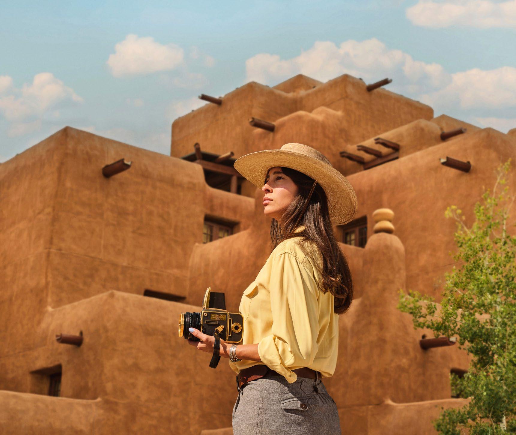
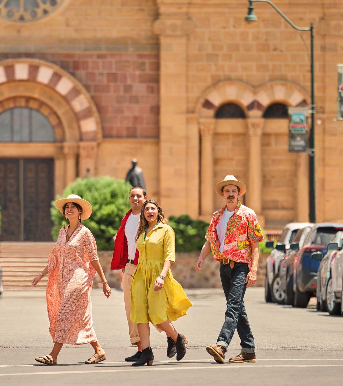
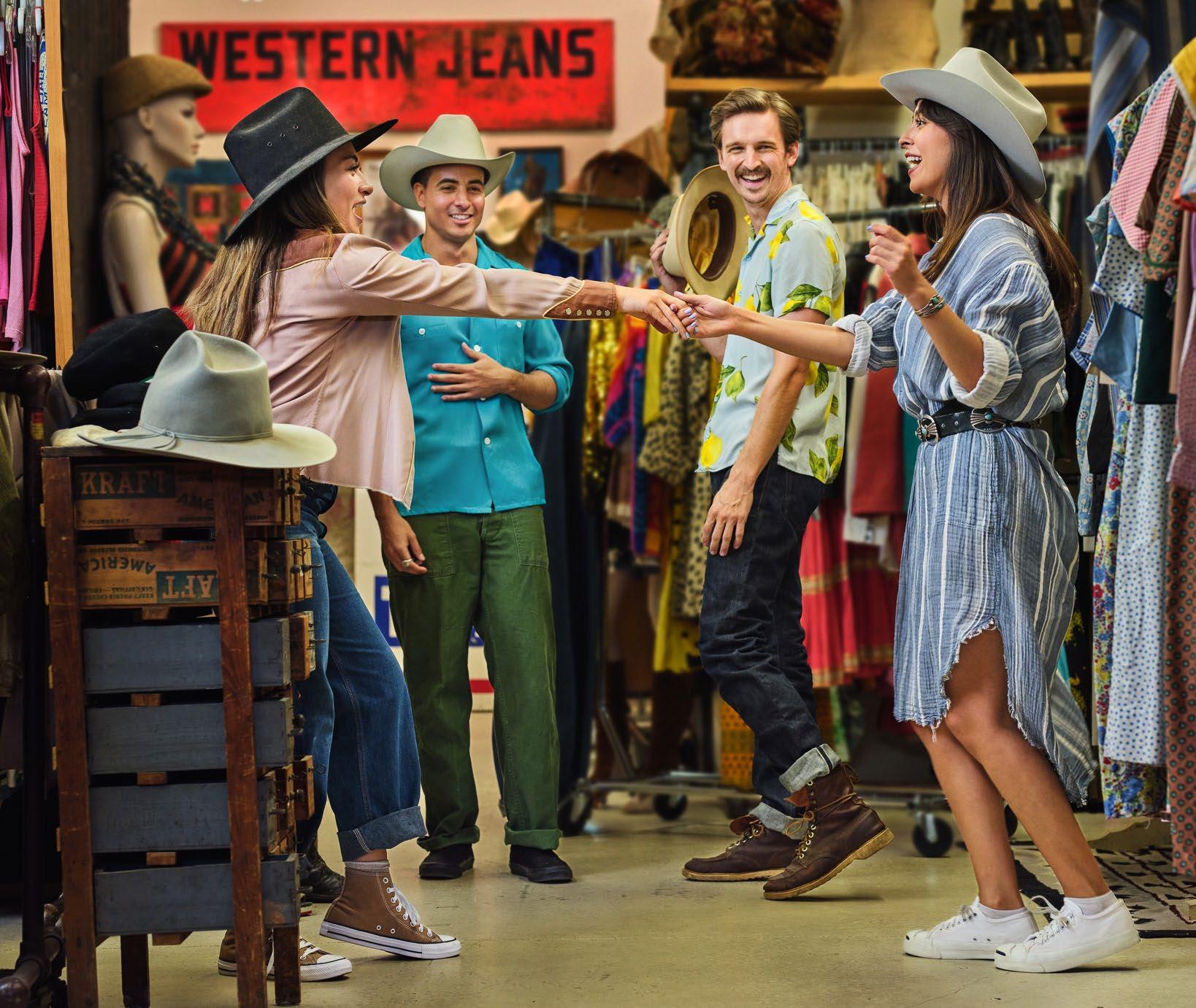
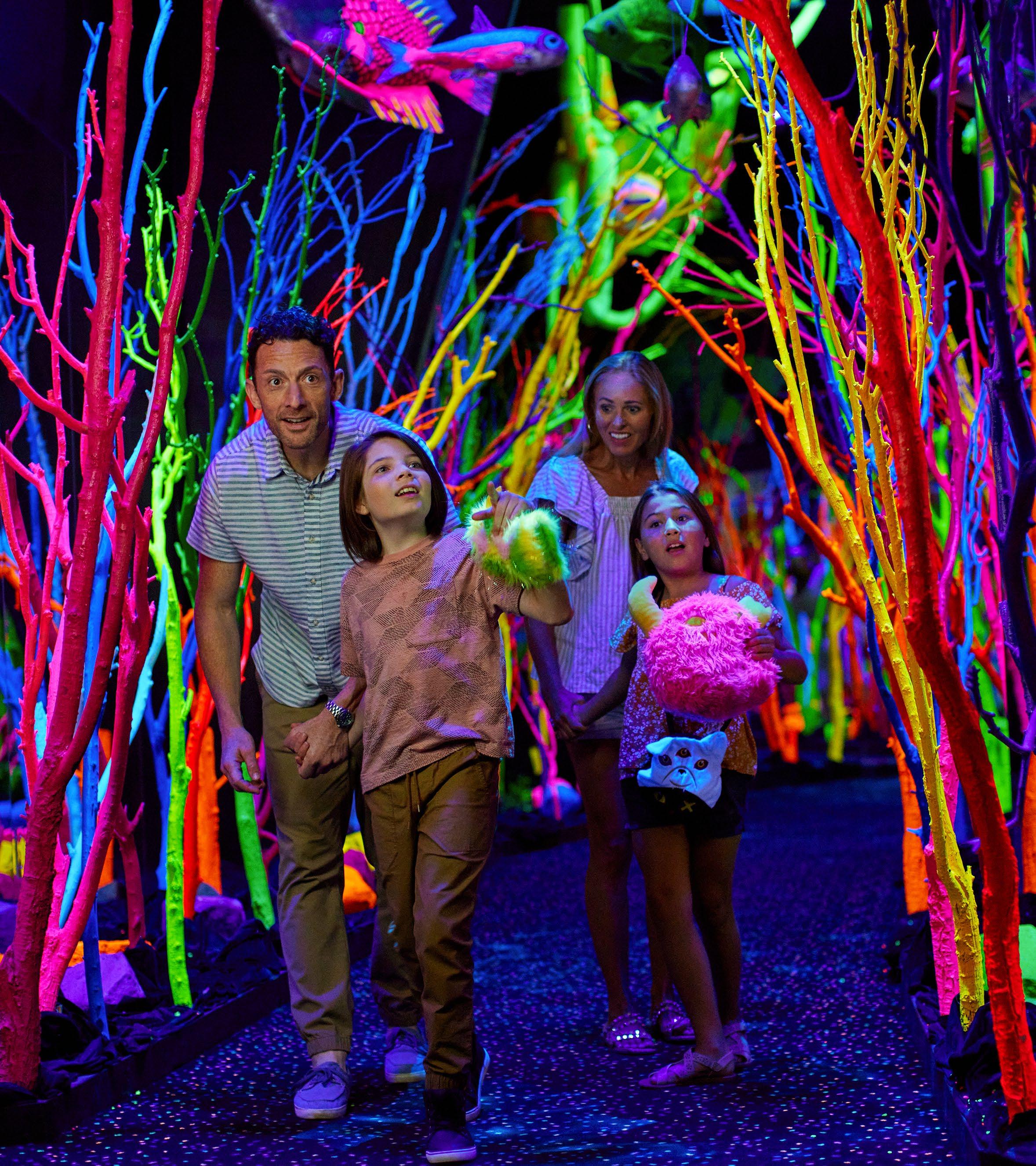
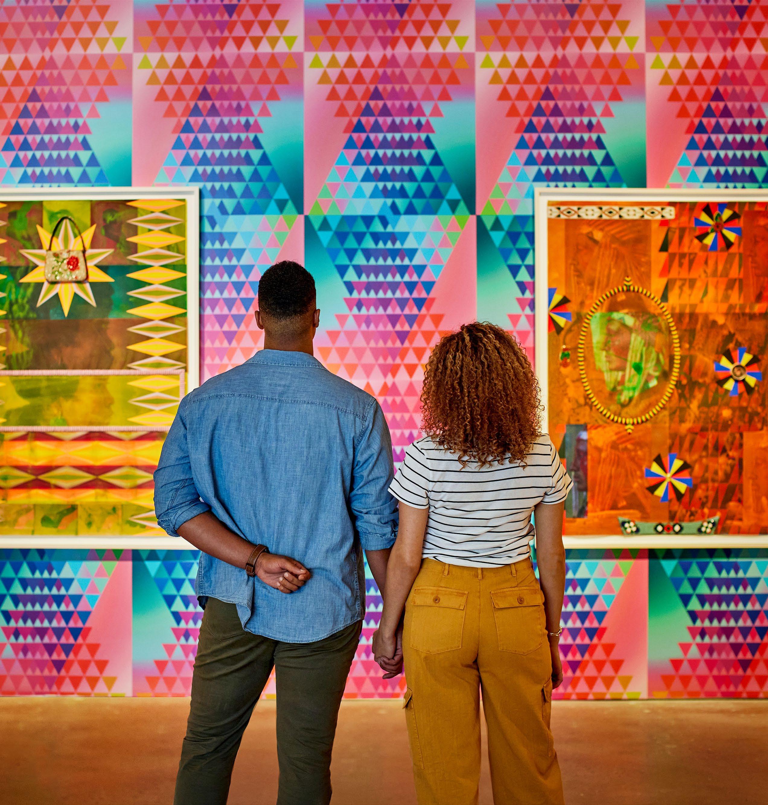
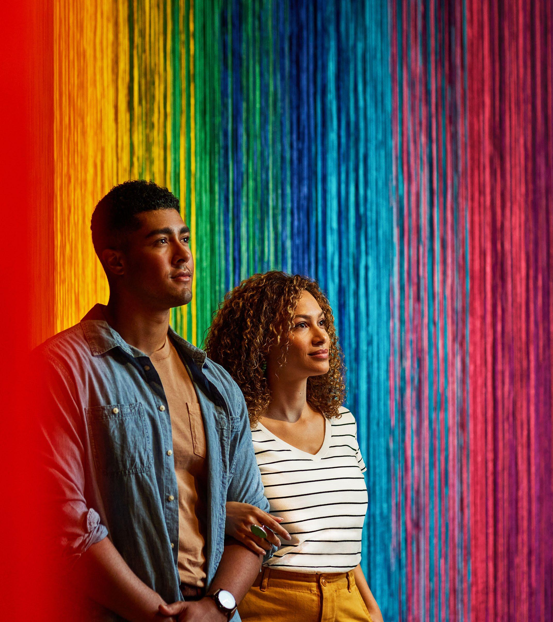
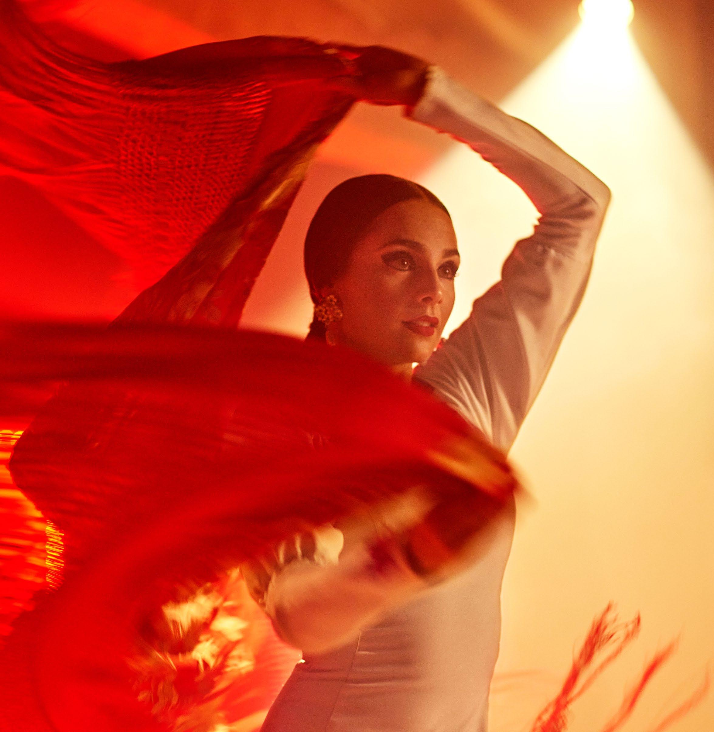
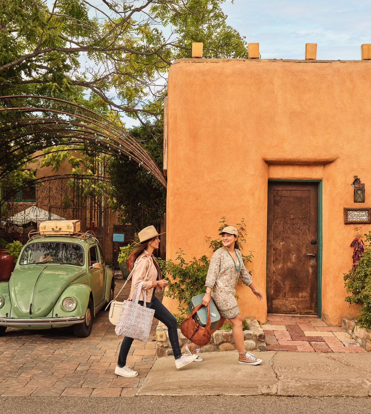
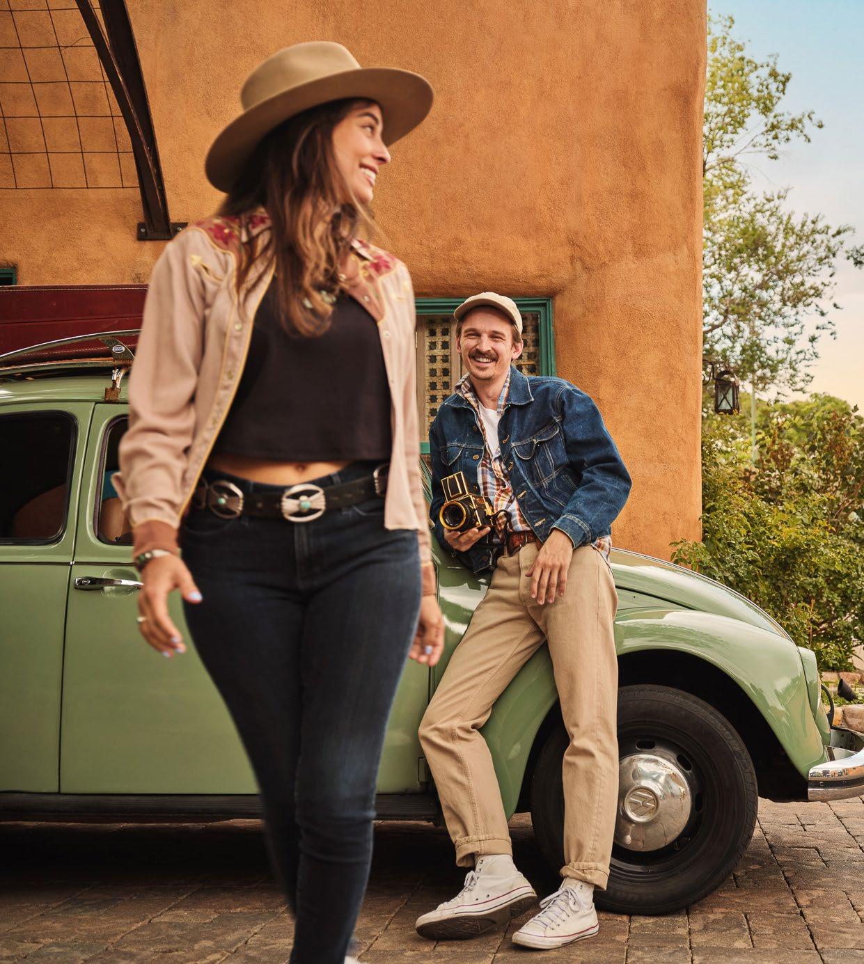
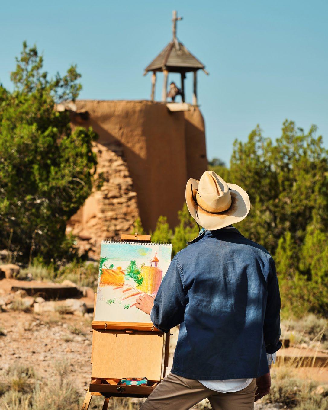
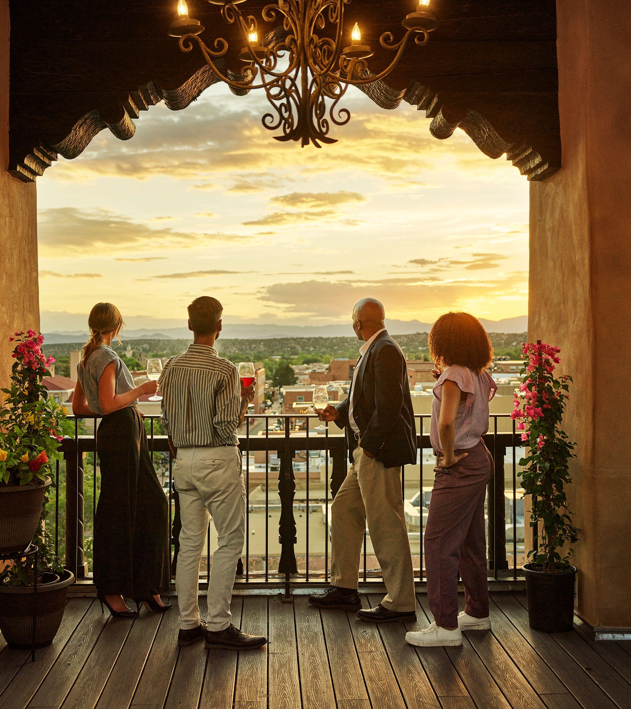
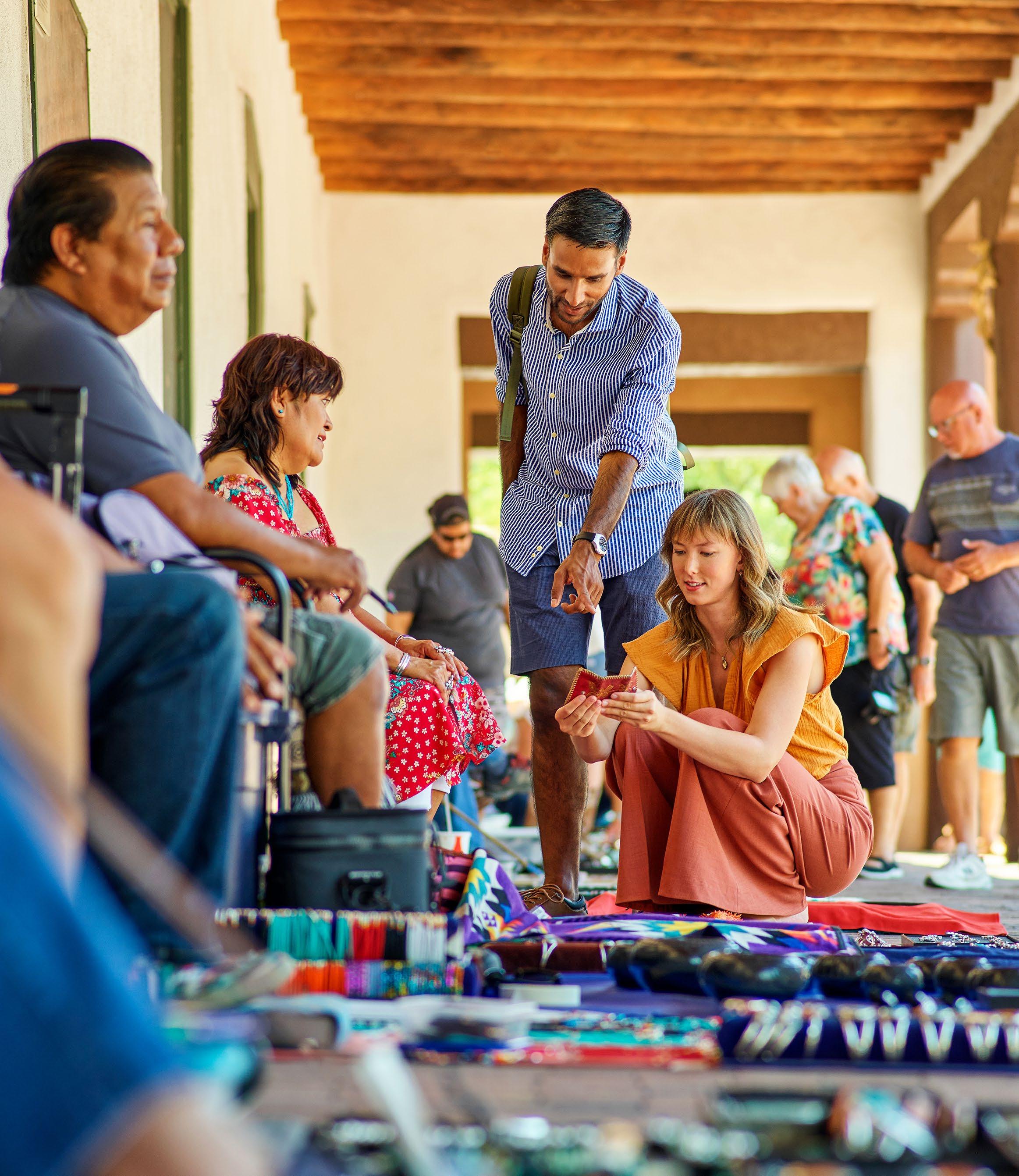
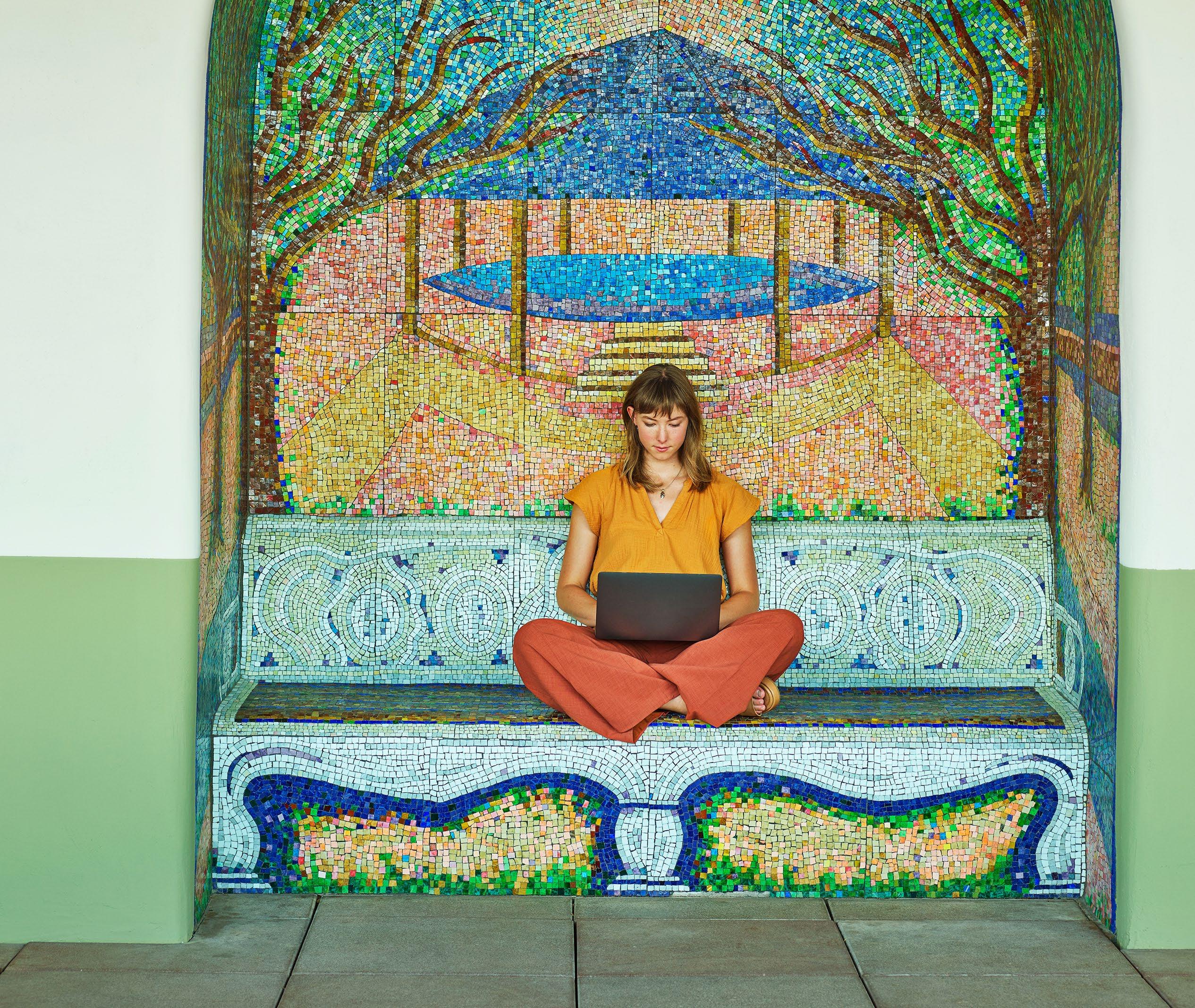
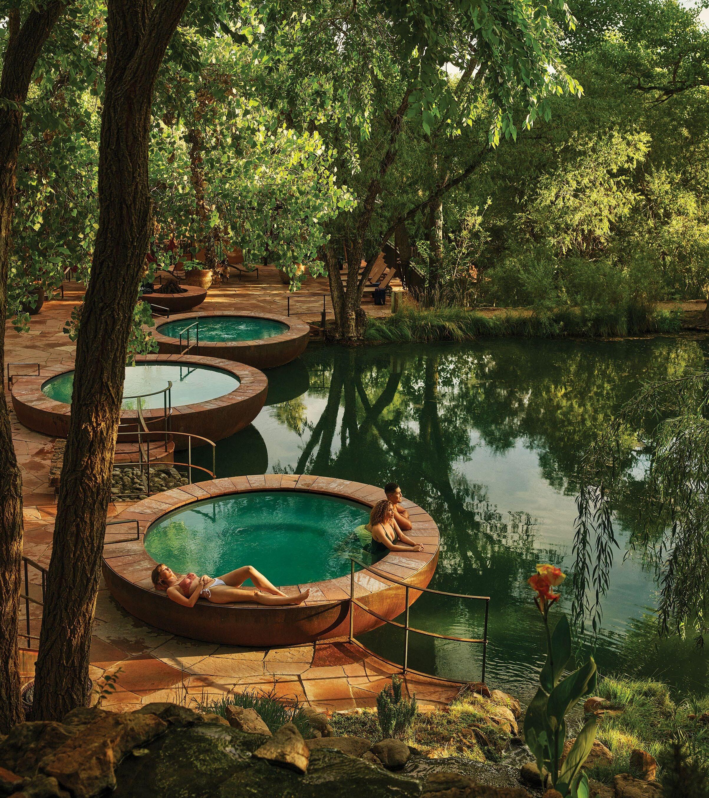
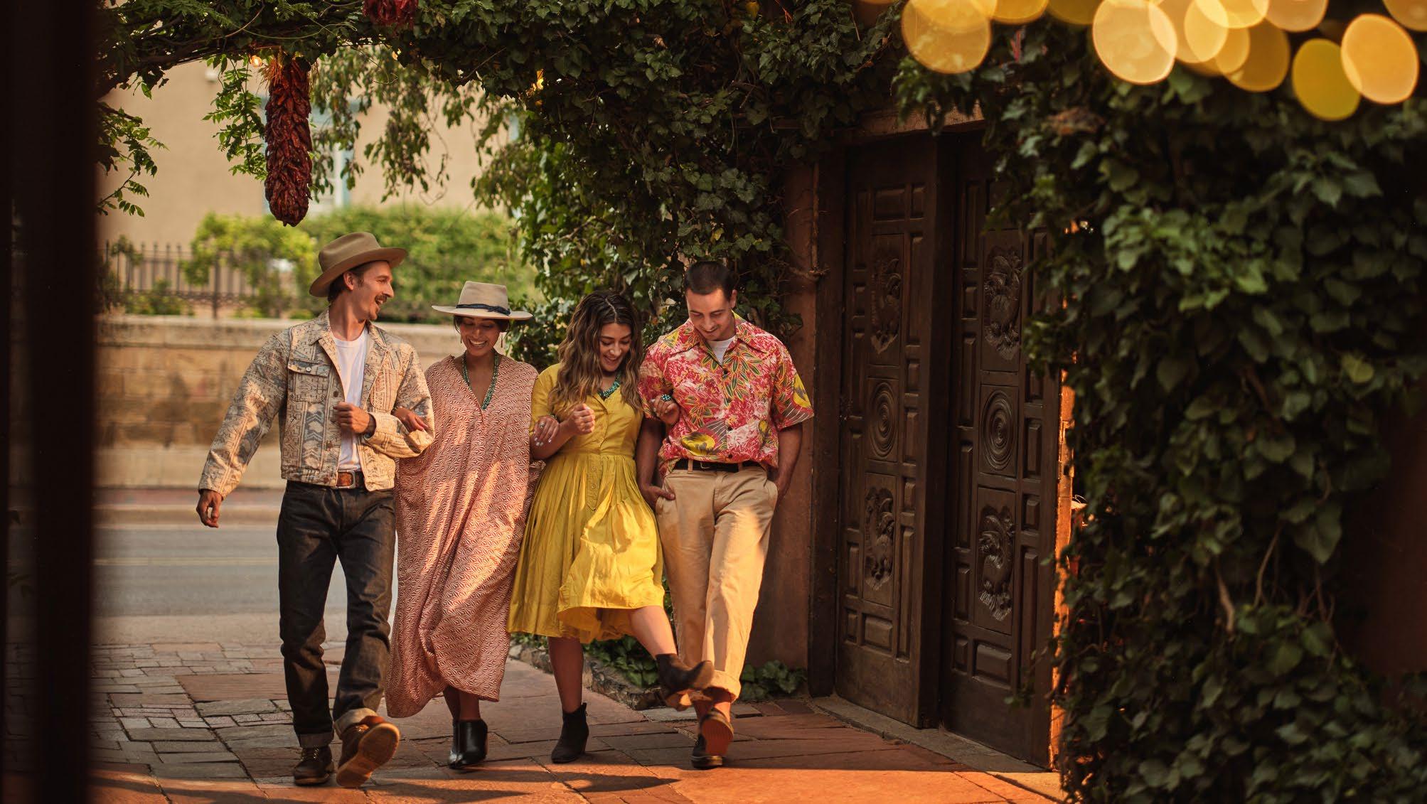
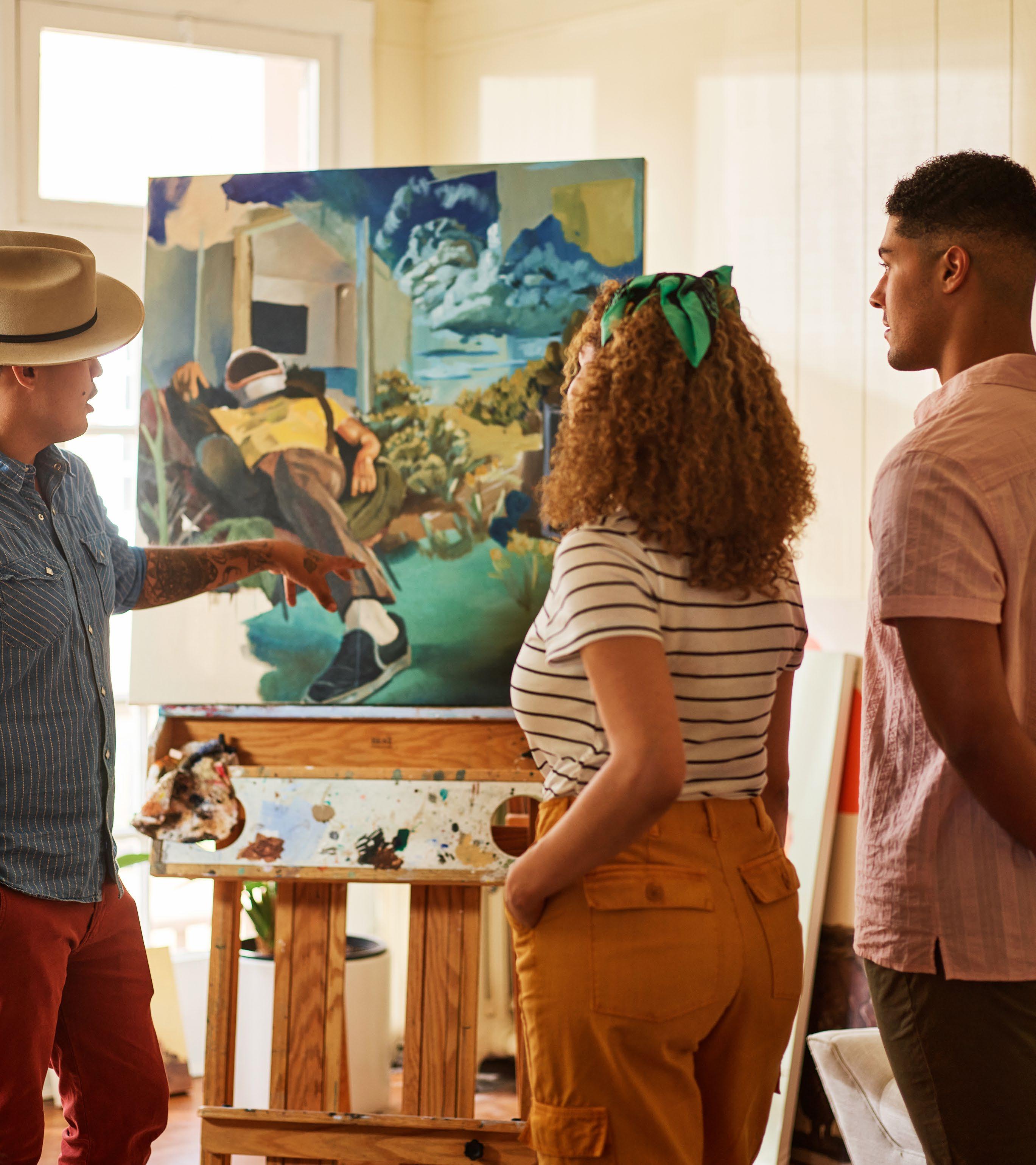
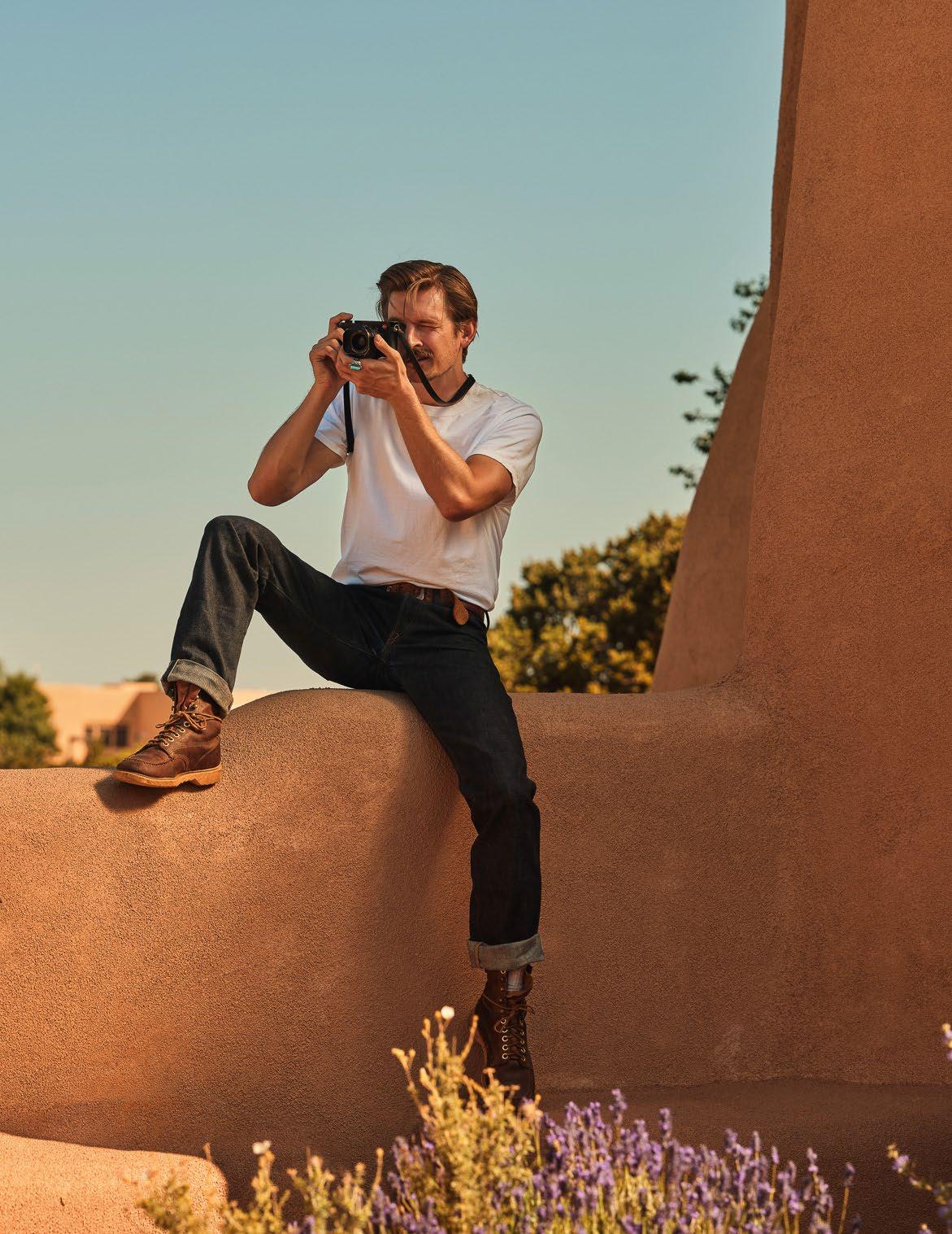
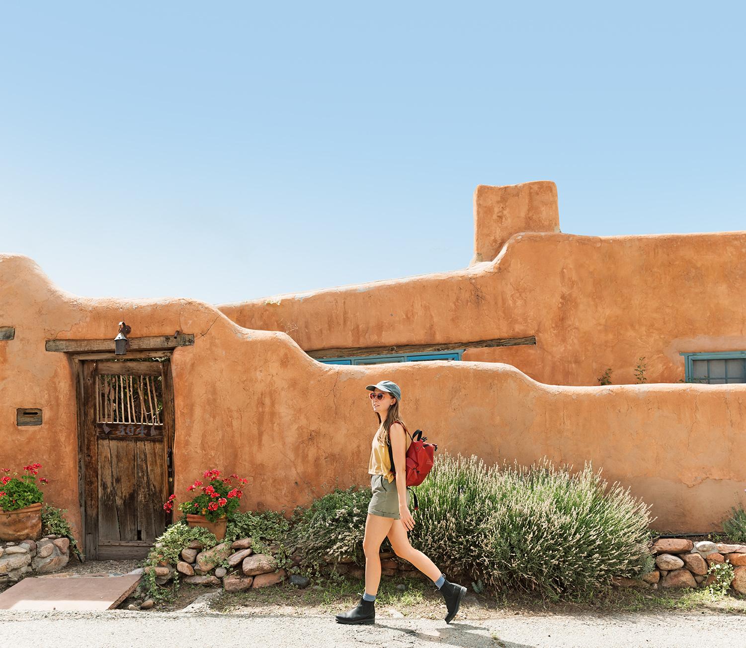
Every visual execution should focus on capturing authentic Santa Fe experiences in a way that feels effortless, authentic, and different—just like the city itself. Video and photography should showcase people discovering the city in natural, unfiltered scenarios, creating a cohesive, unique style that only Santa Fe can own. Be intentional and mindful to capture the distinctive colors, clouds, sunlight and artistry of the city.
COPY GUIDELINES
When writing copy for the Uncover Your Different campaign, open all five senses before opening your laptop. Close your eyes and let the aroma of piñon wood burning, the vibrant colors of adobe buildings, and the gentle rustle of trees flood your senses. Let the smells, sights, sounds and flavors of Santa Fe fill your soul and thereafter flood the page. Below are more guidelines to keep in mind when writing copy for the Uncover Your Different campaign.
Do:
» Speak about the city pillars mentioned on page 5.
» Use verbiage that evokes wonder and adds artistic flair to the writing, mimicking the artistry of the city.
» Use “Uncover Your Different” as a call to action. In instances where it is used in body copy, it should always be sentence case (i.e., Uncover your different at visitsantafe.com.), not initial capped.
» Write about the sights, sounds, smells, flavors and experiences that make Santa Fe truly different.
» Initial cap the city’s tagline, The City Different, when using it in a sentence or as a stand-alone.
» When writing body copy, always end with this line: It’s just one of the things that makes The City Different, but there’s still so much waiting to be uncovered.
» Focus on what you’ll discover in the city and include what spending time in The City Different can uncover within yourself. Examples: A new perspective, inspiration, expanded palate and imagination.
Don’t:
» Use language that is too flowery or convoluted, e.g., “enchanting” or “magical.”
» Overemphasize “self-discovery.”
» Refer to Santa Fe in the first person perspective by using words like “our” or “here.”
TAGLINE
Always initial cap Uncover Your Different when it’s standing alone or in lockup form, like at the end of our video spots.
In instances where “Uncover Your Different” is used as part of a CTA or referenced in long-form copy, it should use sentence case. For instance, “Uncover your different at visitsantafe.com” or “Uncover your different in The City Different.”
UNCOVER YOUR DIFFERENT
LOGO
Use these guidelines when working with the Santa Fe logo for the Uncover Your Different campaign pieces.
Logo Lockup
The Santa Fe “The City Different” logo must always be in Santa Fe Cloud and must always appear within the Santa Fe Turquoise tag. Exceptions may be made based on the size of asset and any legibility issues. This tag serves as our logo lockup and in using it, we are ensuring all viewers know that our marketing material relates back to Santa Fe.
Logo Placement
The logo should always be the last thing seen in any asset to complete the story and ensure brand recognition. It should also always bleed off the bottom of the placement. This means it will typically appear in the bottom right-hand corner of most marketing materials (exceptions apply to some banner sizes). For unimpeded identity, the logo should be surrounded by clear space at a minimum equal to “The” in “The City Different” tagline.
Alternate Logo Lockup Examples
These alternate options are sometimes used for sponsored advertorials and similar uses. These versions are modified from our primary logo to reduce the “boxiness” by offsetting “The City Different” below “Santa Fe.”
CAMPAIGN COLORS
To honor the history and culture of Santa Fe, the Uncover Your Different campaign uses a bright Turquoise as its primary color. This should be used for headlines and the logo lockup. The secondary colors are Silver, Cloud, and Obsidian.
Silver should be used to break up white space as necessary, Obsidian should be used for any body copy, and Cloud is used for text backgrounds.
SANTA FE TURQUOISE
SANTA FE
SILVER
SANTA FE OBSIDIAN
SANTA FE CLOUD
TYPOGRAPHY
Refer to these typography guidelines when creating Uncover Your Different campaign pieces. (These guidelines are not applicable to social.)
Headlines
For print and display, all headlines for the Uncover Your Different campaign should use SS Nickson Four - Regular all caps. Use Santa Fe Turquoise for headlines; limited use of Santa Fe Terra-Cotta may be approved as a headline or subhead on specific executions.
Body Copy
The body copy should always be directly under the headline. Use Gotham Narrow Book in Santa Fe Obsidian for all body copy. (Body copy guidelines are not applicable to display banner ads or social.)
CTA Copy
For print assets, the CTA should always go directly under the body copy and should be SS Nickson Four - Regular in Santa Fe Turquoise. For digital assets, the CTA should always be Santa Fe Turquoise.
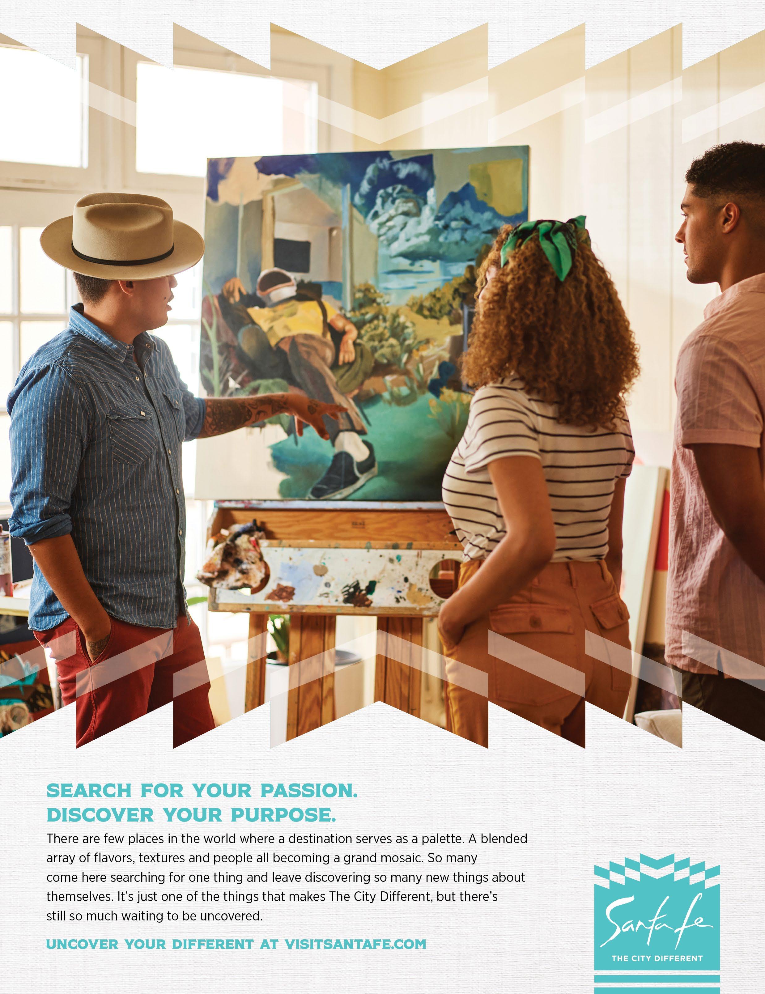
Search for your passion. Discover your purpose.
There are few places in the world where a destination serves as a palette. A blended array of flavors, textures and people all becoming a grand mosaic. So many come here searching for one thing and leave discovering so many new things about themselves. It’s just one of the things that makes The City Different, but there’s still so much waiting to be uncovered.
Uncover your different at visitsantafe.com
Font: SS Nickson Four - Regular Size: 15
Tracking: 0
Kerning: Optical
Leading: 19 (126% of font size)
The space between the headline and body copy is equal to the leading space in the headline.
Font: Gotham Narrow Book
Size: 10.5
Tracking: 0
Kerning: Optical
Leading: 15 (142% of font size)
Paragraph Spacing: 0.0625
Font: SS Nickson Four - Regular Size, Tracking, Kerning, Leading & Paragraph Spacing: Same as body copy
BRAND COLORS
Primary Colors
The primary colors best portray the Santa Fe brand and should be used whenever possible. Some basic guidelines for using the primary colors are:
» Use Turquoise for the Santa Fe logo lockup
» Use Turquoise for headlines
» Use Light Adobe or Terra-Cotta for subheads
Secondary Colors
The secondary colors should only be used to support primary colors or in instances where primary colors may be too overwhelming, like in web interfaces. Some basic guidelines for using the secondary colors are:
» Use Obsidian for any body copy that appears on a Cloud background
» Use Cloud for any body copy that appears on a colored background
» Use Silver to break up white space
» Use Sand or Clay on the website for any design elements that will help balance the brightness of the primaries (e.g., CTAs, backgrounds, and outlines)
PRIMARY
SANTA FE TURQUOISE
SECONDARY
DESIGN EXAMPLE - PRINT TEMPLATE
Headlines
Image Frame
The image frame should always be the width of the print piece. The height of the image frame can be adjusted by using the direct select tool (keyboard shortcut: A) on all of the anchor points on either the top or bottom. When adjusting the height of the image frame be sure to leave enough room for the copy to breathe.
White Pattern Overlay
This pattern should always match the width of the image frame so that it keeps a consistent look/ style with logo.
The outside points of the overlay should match up with the inner points of the image frame.
For print, all headlines for the Uncover Your Different campaign should use SS Nickson Four - Regular all caps. Use Santa Fe Turquoise for headlines; limited use of Santa Fe Terra-Cotta may be approved as a headline or subhead on specific executions.
Suggested point size: 20 pt
Body Copy
The body copy should always be directly under the headline. Use Gotham Narrow Book in Santa Fe Obsidian for all body copy.
Suggested point size: 12 pt
CTA Copy
For print assets, the CTA should always go directly under the body copy and should be SS Nickson Four - Regular in Santa Fe Turquoise.
Suggested point size: 12 pt
Logo
The strip at the bottom’s height should always match the height of the middle strip for a consistent look.
DESIGN EXAMPLES - DIGITAL AND SOCIAL
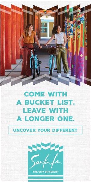
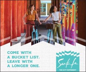
All digital and social assets follow the previous listed design elements such as the image frame, white pattern overlay and the headline style. Body copy guidelines are not applicable to display banner ads or social. For digital assets, the CTA should always be Santa Fe Turquoise.
Digital
There are a few slight differences depending on the size of the asset that is being made.
For an example, on the digital asset size 728x90 and 300x50 the image frame has the pattern on one side and the rest of the image runs off the edge. That is done to show more image and allow for the headline to be larger.
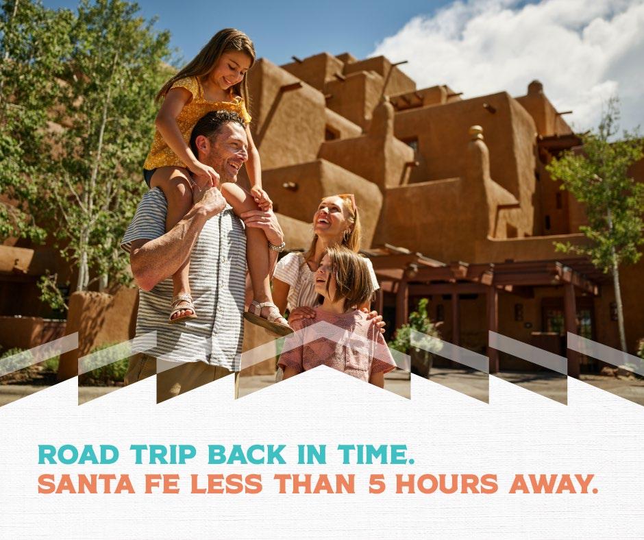
Social
Social assets can vary. Some include copy and some are just an image.