The Victorian Artists Society acknowledges the Traditional Owners of the land on which we reside, the Wurundjeri people of the Kulin Nation, and pays respect to their Elders past and present.
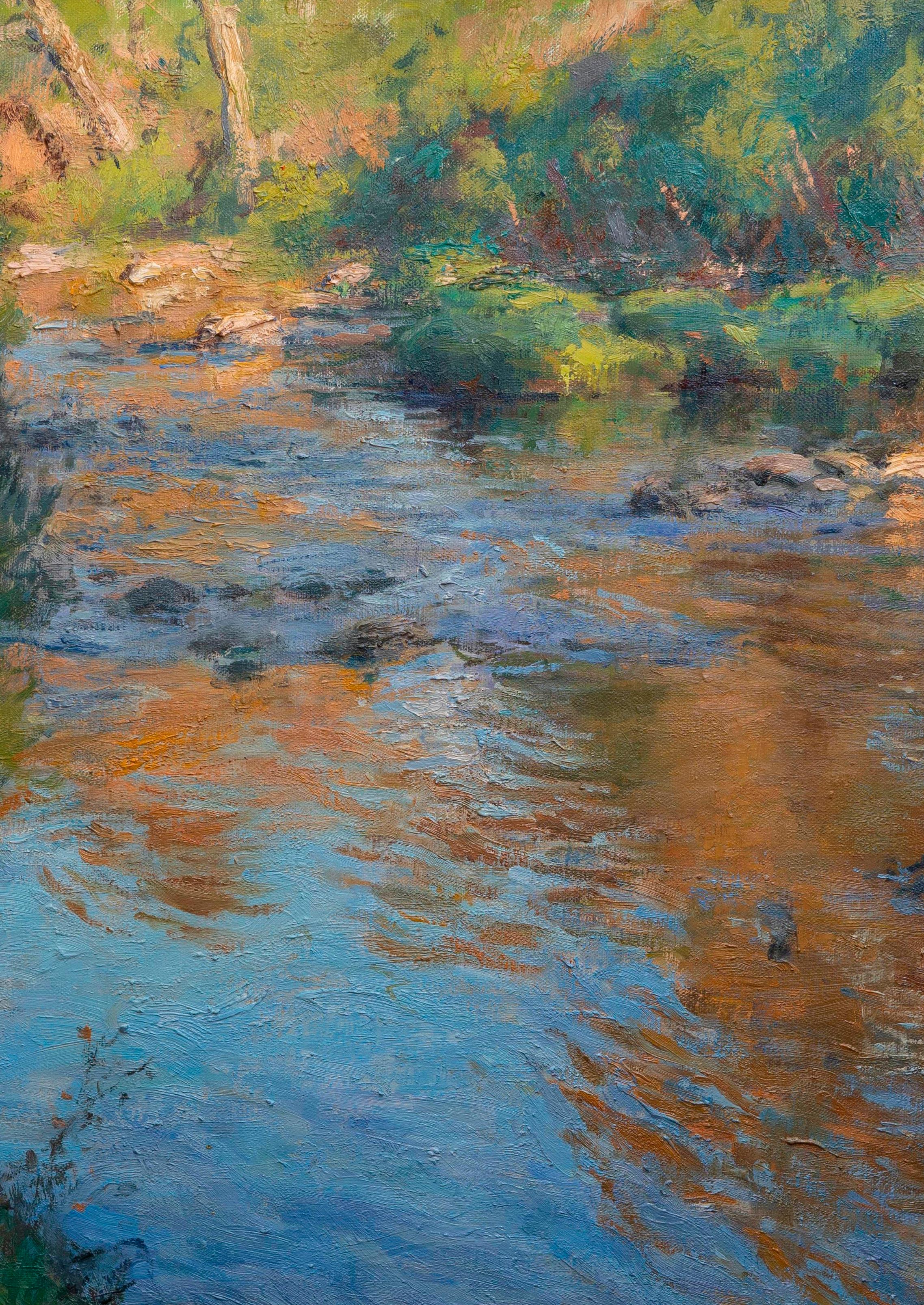
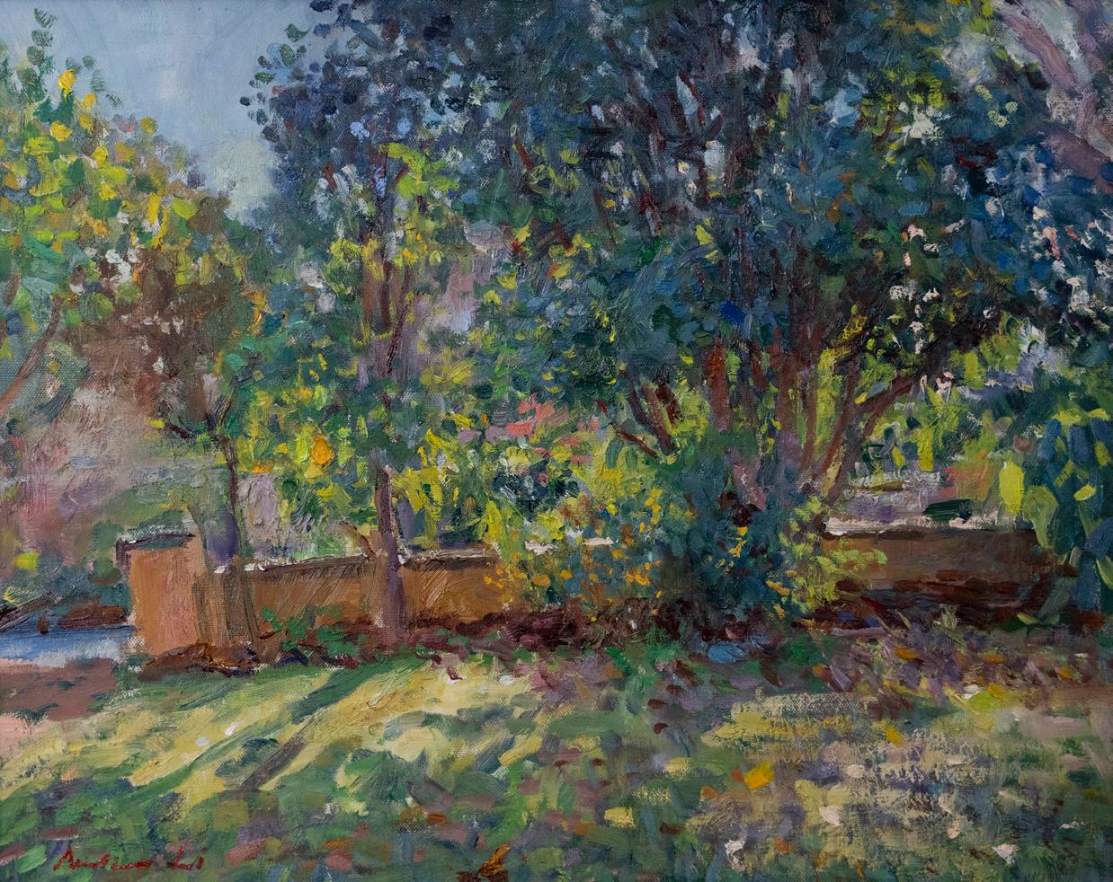
Morning over the Yarra, (cropped), Andrew Li
The Victorian Artists Society acknowledges the Traditional Owners of the land on which we reside, the Wurundjeri people of the Kulin Nation, and pays respect to their Elders past and present.
Morning over the Yarra, (cropped), Andrew Li
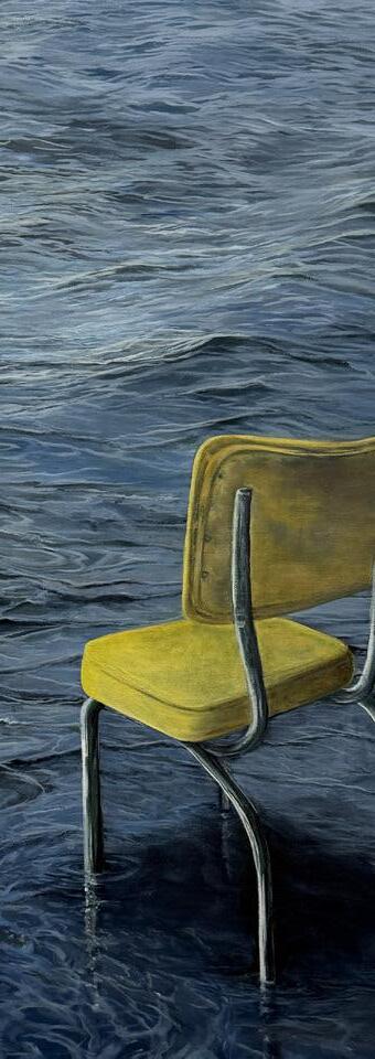
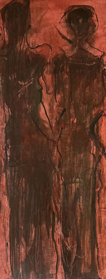
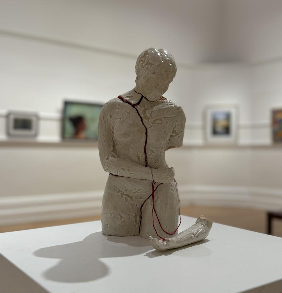
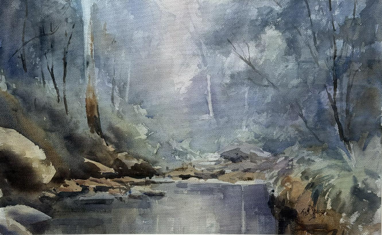
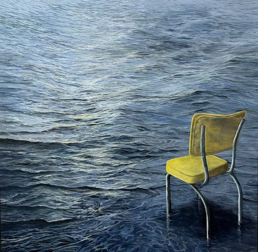
In an ocean of large impressive works like Ted Dansey’s The Gellibrand and Jane Millington’s Wait you find yourself drawn to the details and romance of smaller pieces in this year’s Autumn Select. D’Arcy Rouillard’s quiet depiction of healing - Mending shows a figure picking up the pieces of themselves to come together again. D’Arcy thoughtfully brings sombre narrative to her distinctly human sculptures.
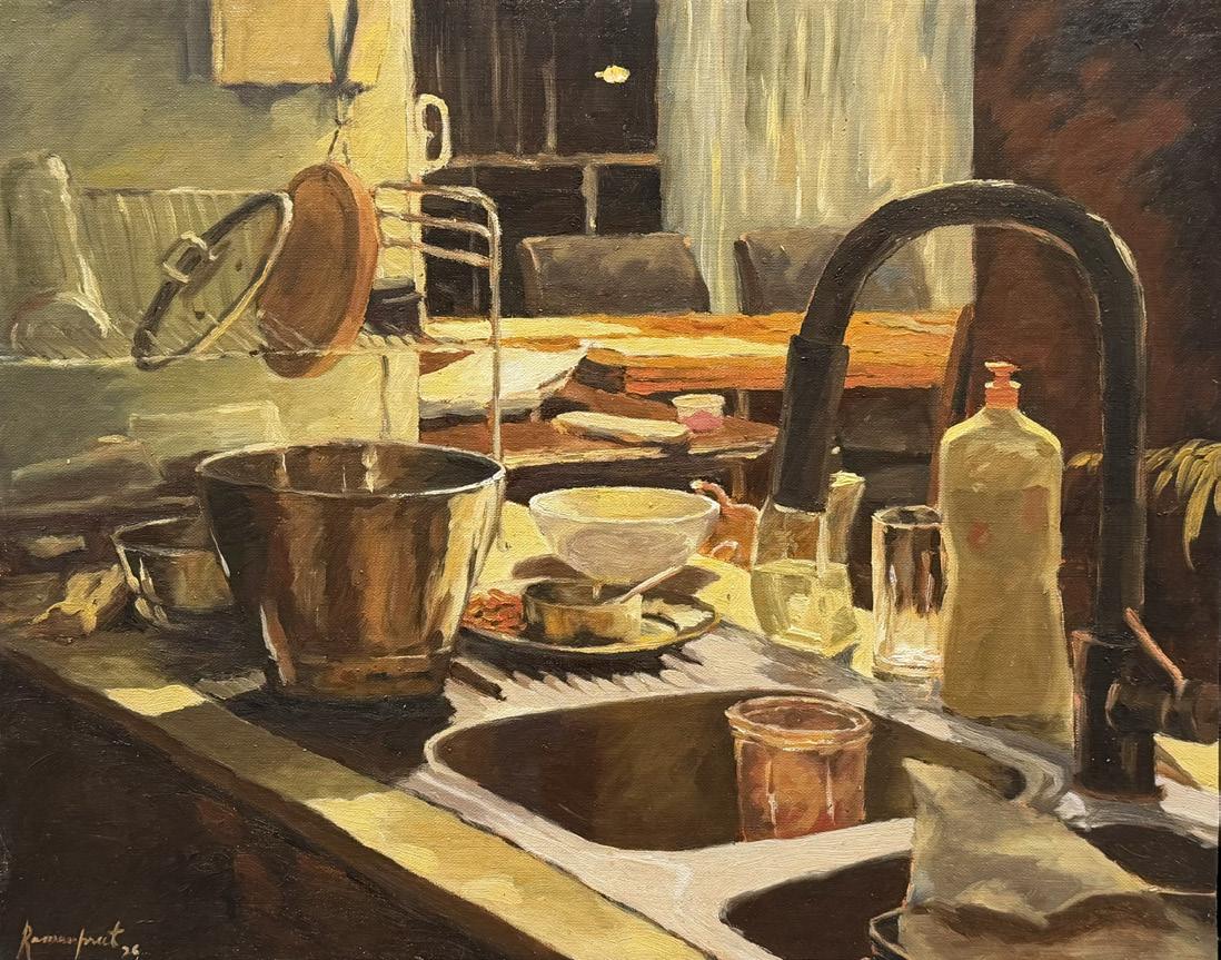
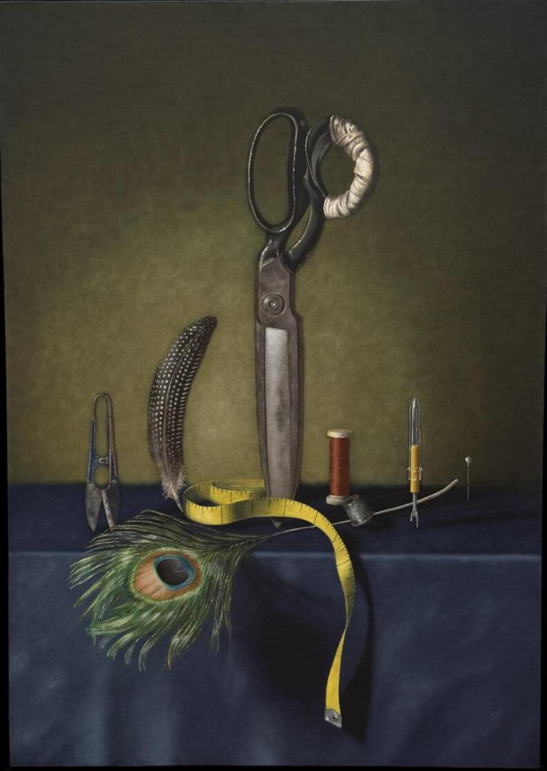
The first Select of the year and as the weather cools, we see a few works of self reflection like the The Wearable Artist by David Bongiorno, a surrealist collection of sewing tools stood on end. The whimsy of the composition and delightful vibrant colours ignite the imagination for this self portrait in haberdashery. Alternatively, Ramanpreet Kaur’s End of the Night
invites you into a portrait of an evening well spent. Warm tones and dappled light shine on abandoned dishes at the sink and on the drying rack.
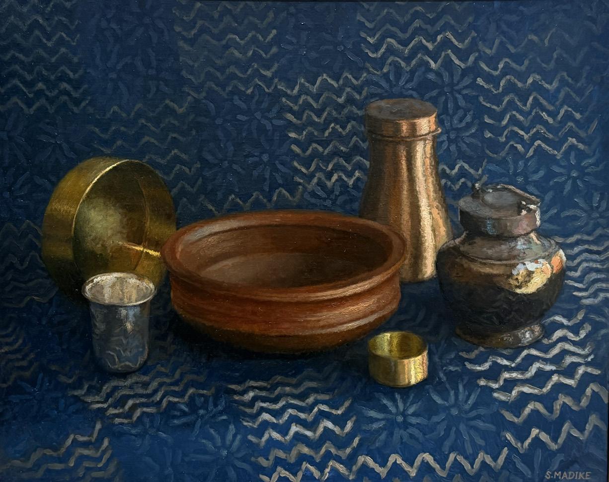
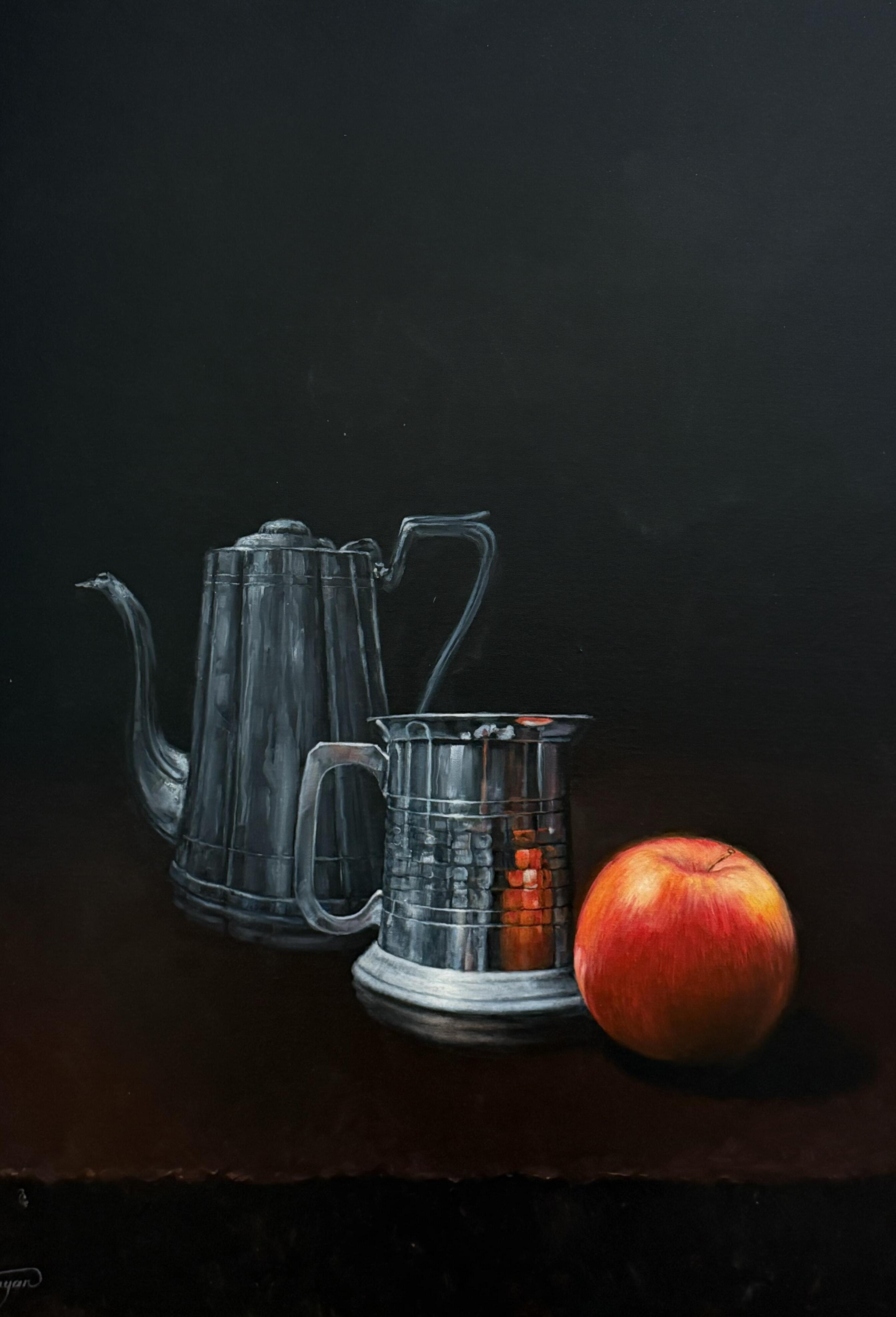
Within the still lifes on display, Swathi Madike's Vessels on Indigo Block Printed, is an example of traditional still life with rich character. The deep coppers, irons and golds of spice boxes, water jugs next to the earthen clay biryani cooking pot conjure up a fantastic feast in a welcoming home. Similarly, Fred Toumayan’s Reflection also plays with metals but within the drama of stark black against bold red. The elegant simplicity of the silver vessels and crimson apple highlight his clever technique. Congratulations to everyone who exhibited for this year’s Autumn Select. It was a delight to see how members emerge each season.
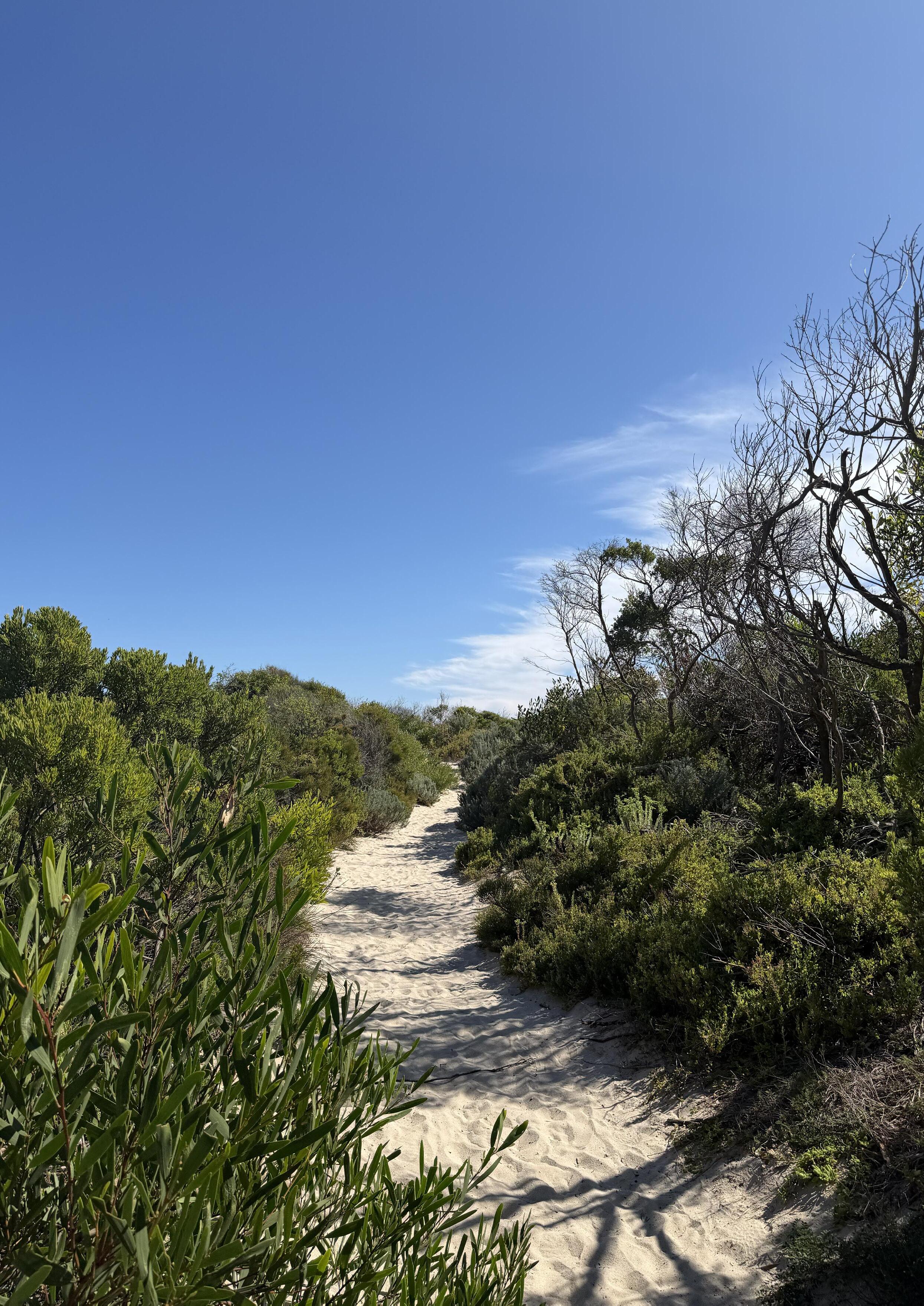
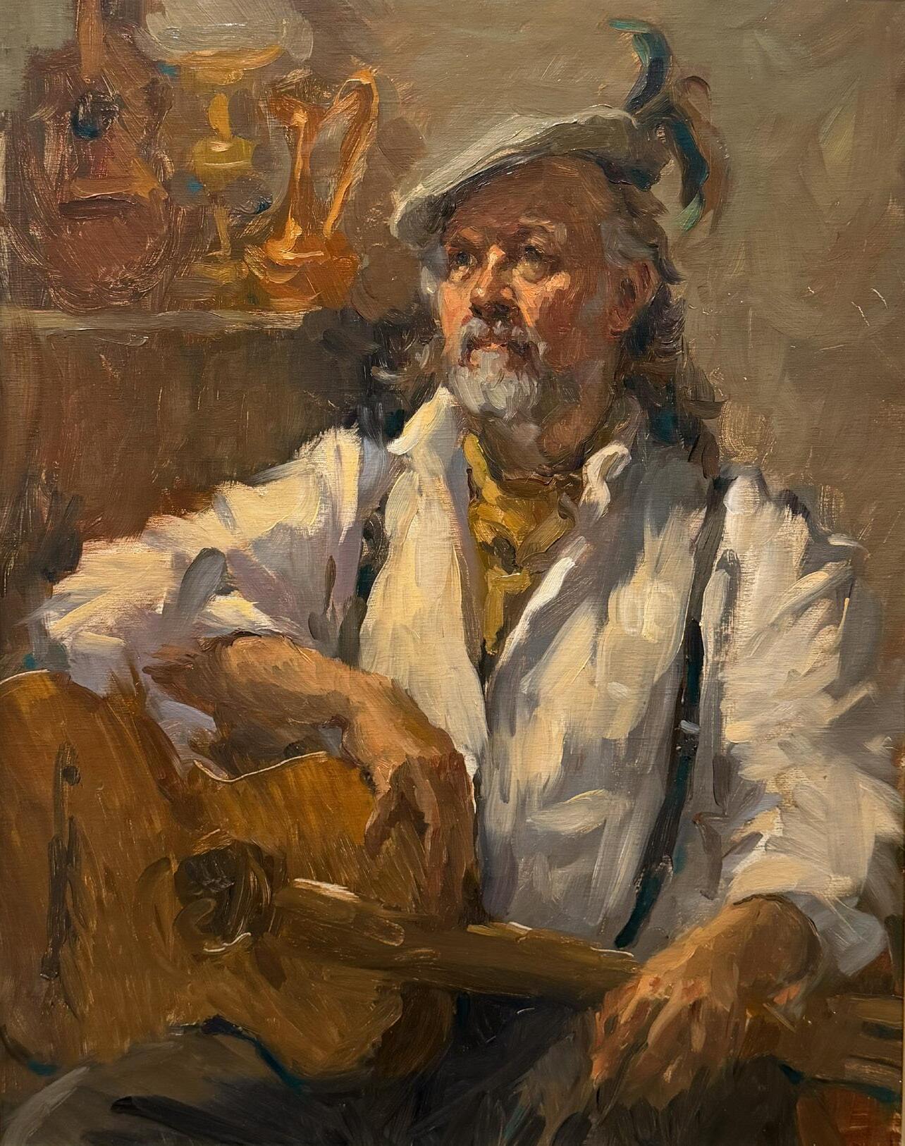
From Coast to Calm: A Painter’s Journey Through Waratah Bay
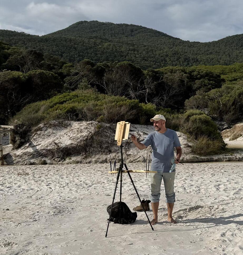
Iwas very excited to set out on this trip to Waratah Bay and devote as much time as possible to plein air painting. Although not my first VAS paint out, it was my first visit to this much-loved part of Victoria, and I was enchanted from the moment we left the main highway from Melbourne and began moving closer to our destination.
My partner and I decided to arrive a day early so we would be ready to paint at the first location on Day 1. We chose Walkerville North Beach, with its magnificent rock formations scattered throughout the bay. The temperature was mild and, although the sky was overcast, the landscape offered plenty of drama. The sea reflected the shifting tones of the sky, and rocks of varying sizes rose like small islands from the water. It was a delight to paint— always challenging— but I already felt I had arrived in painting paradise. I worked in oils, while my partner Tony sketched with pen and watercolour. It was a pleasure to be painting in the morning before my afternoon workshop with Tim Murphy—a chance to warm up and test my eye. Cape Liptrap Lighthouse was our afternoon location. From this elevated vantage point, we looked out across the ocean and down onto rugged cliffs, with waves crashing onto the rocks below. It was a striking contrast to the morning’s scene. Added to this was the thoughtful and generous guidance of painting tutor Tim Murphy. I was very glad I had chosen to attend the plein air workshop. His instruction was
thorough, and I especially appreciated his warm and encouraging manner. Painting outdoors can be daunting—particularly for beginners—as everything you think you know can seem to fall away when confronted with the full complexity of nature.
That evening, VAS hosted a pasta night at the farmhouse where they were staying in Waratah Bay. For $10, it was all-you-can-eat pasta, complete with wine. It was a pleasure not to think about dinner and instead enjoy time catching up with friends, fellow members, and staff.
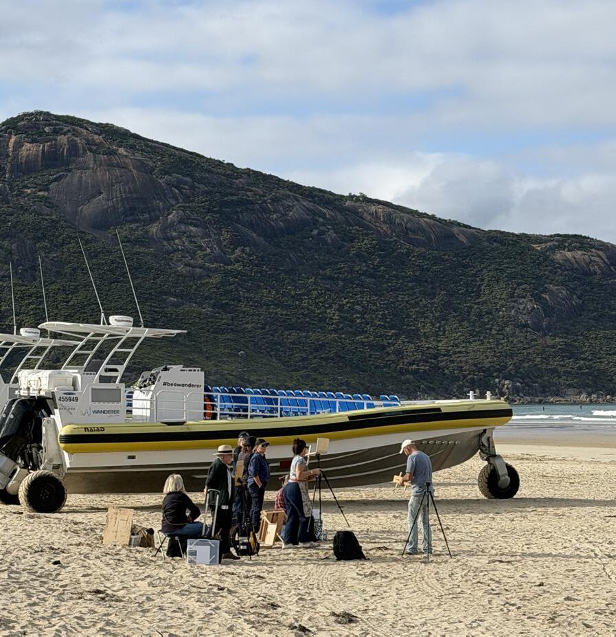
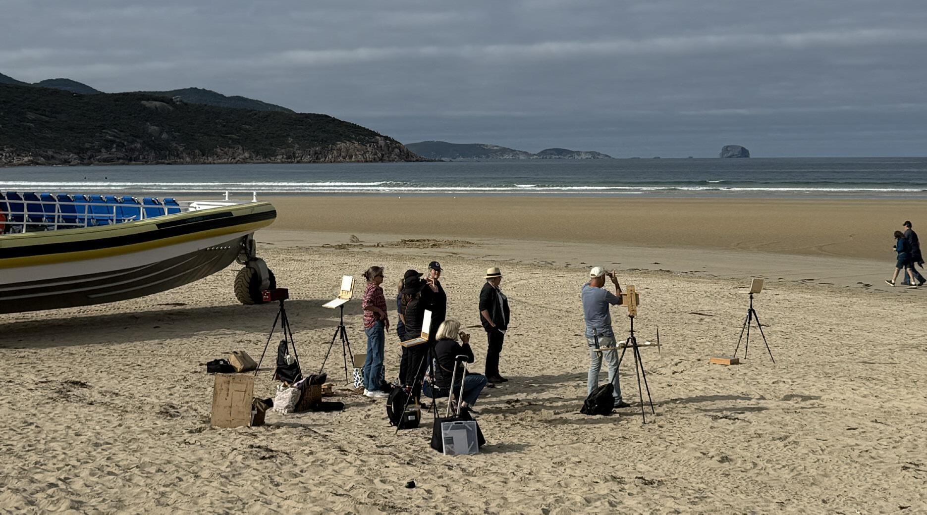
On Day 2, I allowed myself a slower start after the previous day’s full schedule. Members met at the Wilsons Promontory Tidal River Visitors Centre in the morning, where Tim held his second workshop for those who had booked. We arrived around midday with a picnic lunch—always a wise decision on these trips, as painting outdoors quickly builds an appetite— and joined the group for the afternoon session on the beach.
I chose to paint at Squeaky Beach. The walk in was short—one of the many appealing aspects of these locations—and the visual interest immediate. The massive boulders were striking, catching and reflecting the light in endlessly subtle ways. There was no shortage of inspiration anywhere on this trip.
That evening, we gathered for dinner at the Fish Creek Hotel. Around forty VAS members filled
a private room, wine glasses in hand, enjoying delicious food and lively conversation.
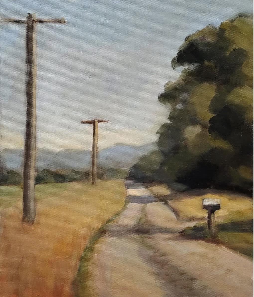
The following day, after an early night, I chose to paint at the farmhouse property where the VAS organisers were staying. Alternatively, participants could explore any location in the Waratah Bay area. I found this inland setting especially rewarding. It offered a quieter focus: open fields, roadside trees, and the quiet rhythm of telegraph poles stretching into the distance. The farmhouse itself, set within its rural surrounds, also inspired many painters.
This was an all-day location, and for those not rushing off to clean brushes, there was a 6pm BBQ organised by VAS staff. Again, $10 provided a generous meal, salads, and even a glass of wine. Some participants brought their own provisions to cook. As the sun set on another full day of painting, I imagine many of us slept deeply that night.
Sunday, March 22 — Lancey’s Lookout (en route back to Melbourne)
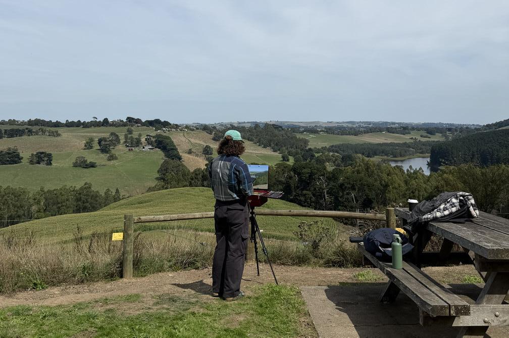
Sunday was my final opportunity to paint, and I wasn’t going to miss it. I’m so glad we stopped at Lancey’s Lookout on the way home. The drive
itself was memorable—a winding road climbing steadily along a ridge to a high vantage point overlooking the land below.
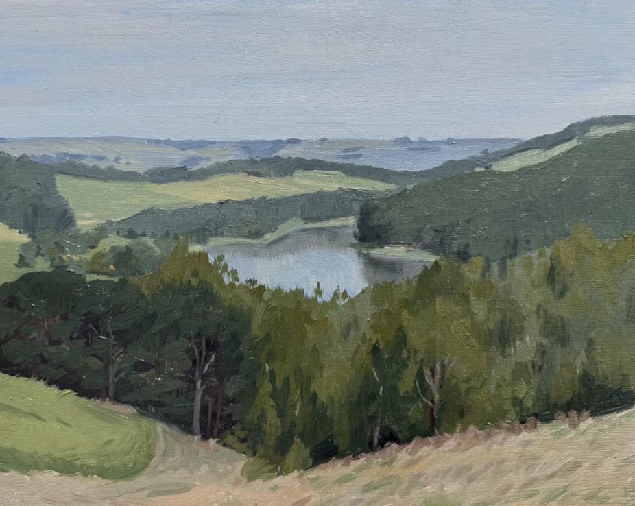
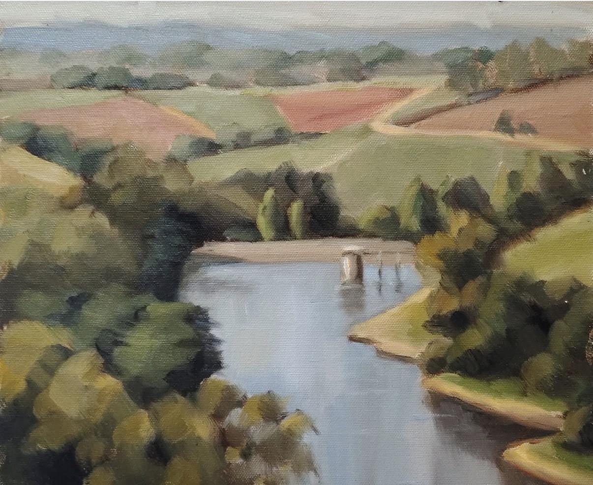
In contrast to the drama of ocean cliffs and boulder-strewn beaches, the lookout opened onto a quiet sweep of South Gippsland countryside. Two still reservoirs lay nestled within rolling green hills, farmland stitched together with fences and dotted with distant homesteads. The land rolled gently rather than dropping away sharply, creating the sense of a lived-in landscape—soft, spacious, and deeply calm.
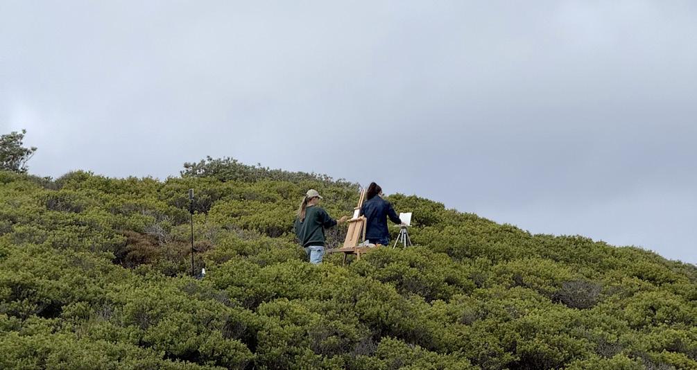
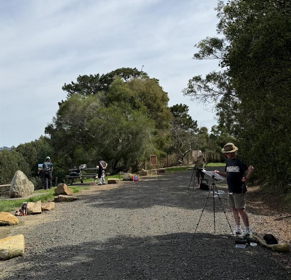
There were endless compositional choices: a single tree, a small section of the view, or an ambitious attempt to take in the wider panorama. I found myself in good company at the lookout. Tim was painting nearby and offered friendly conversation along with his usual encouragement. Surrounded by fellow artists, we shared our work, exchanging insights, frustrations, and small triumphs. It was an atmosphere of easy camaraderie—so characteristic of plein air painting. I’m already looking forward to the next VAS paint out.
words Liz Gridley
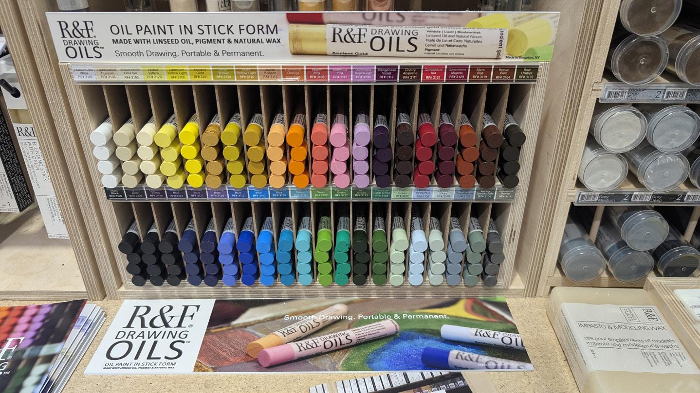
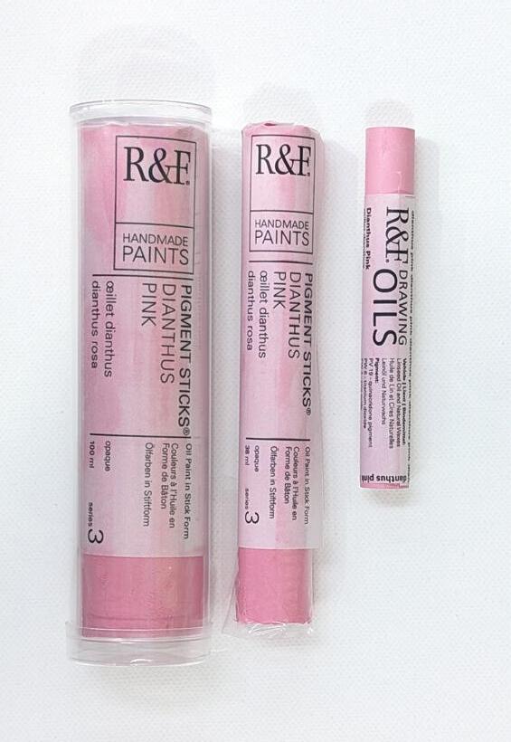
New to the R&F range, Drawing oils are an easy to use, portable drawing-with-paint stick with a harder formulation. Unlike oil pastels, crayons or chalk, R&F drawing oils will dry to form a permanent, protective oil film. No need for fixative.
Each stick is formulated from Pigment, Linseed Oil & Natural Waxes. The sticks are available individually and in sets, and are available in many Australian art stores after debuting in 2025.
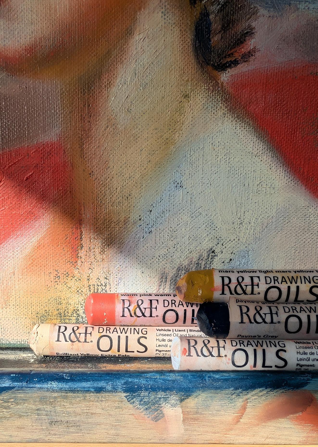
Liz Gridley took these home to try as soon as she saw them appear in stores, with a limited palette of 5 (Mars yellow light, Warm Pink, Cerulean extra pale, Brilliant Yellow extra pale and Payne’s Grey). She took to figuring out how to manipulate this new form of oil paint without employing brushes and medium or solvent for as long as possible (the standard oil painting tools of the trade!).
“The Drawing Oils initially look and feel like an oil pastel but a bit closer to the texture of a lipstick (once the skin is removed). As the Drawing oils contain linseed oil they form a natural ‘skin’ on the outside of the stick exposed to air. This can be removed by using a pencil or crayon sharpener (.50” diameter), a razor blade, or simply by pushing the stick across a piece of scrap paper. I experimented and found removing the
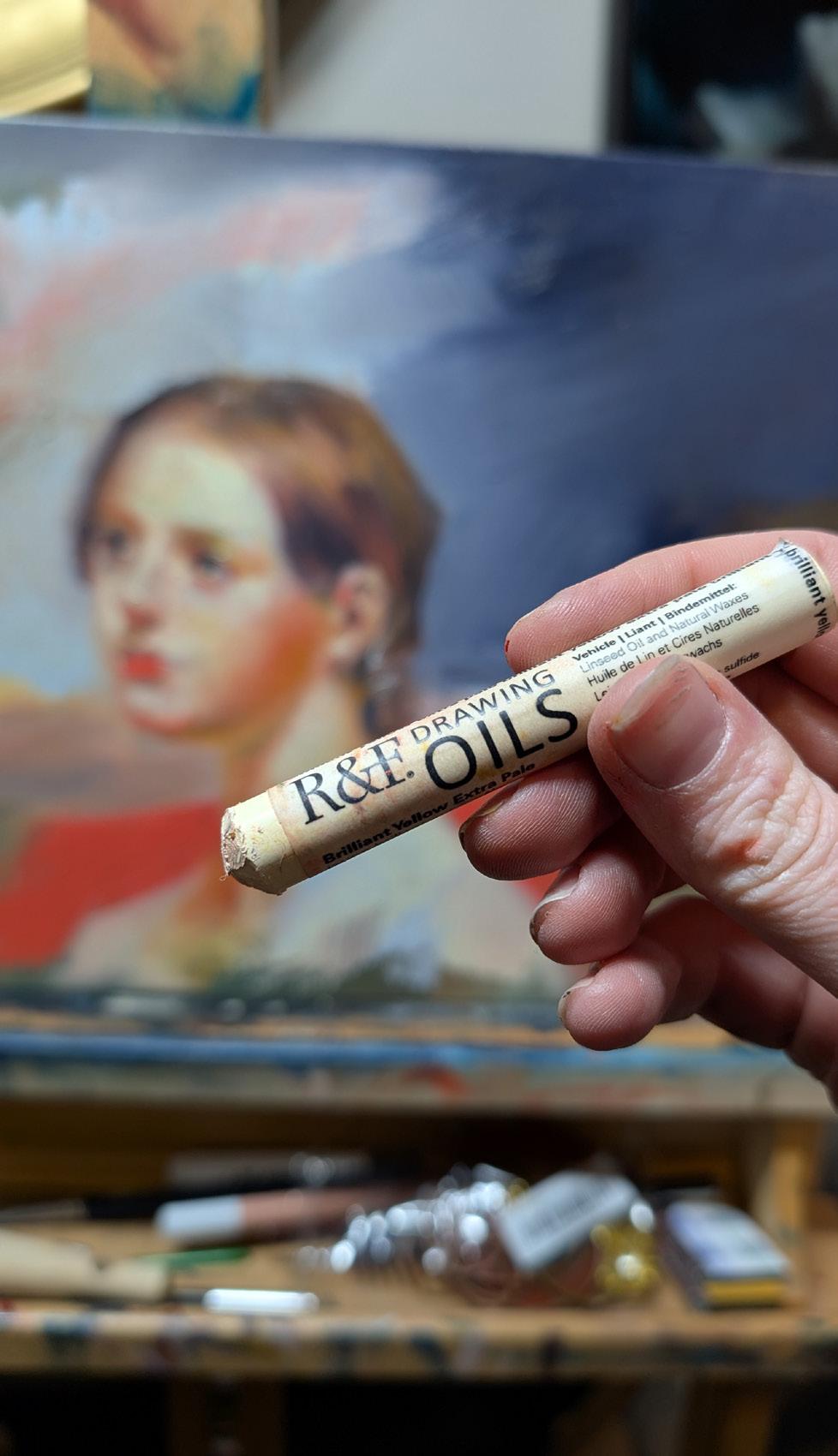
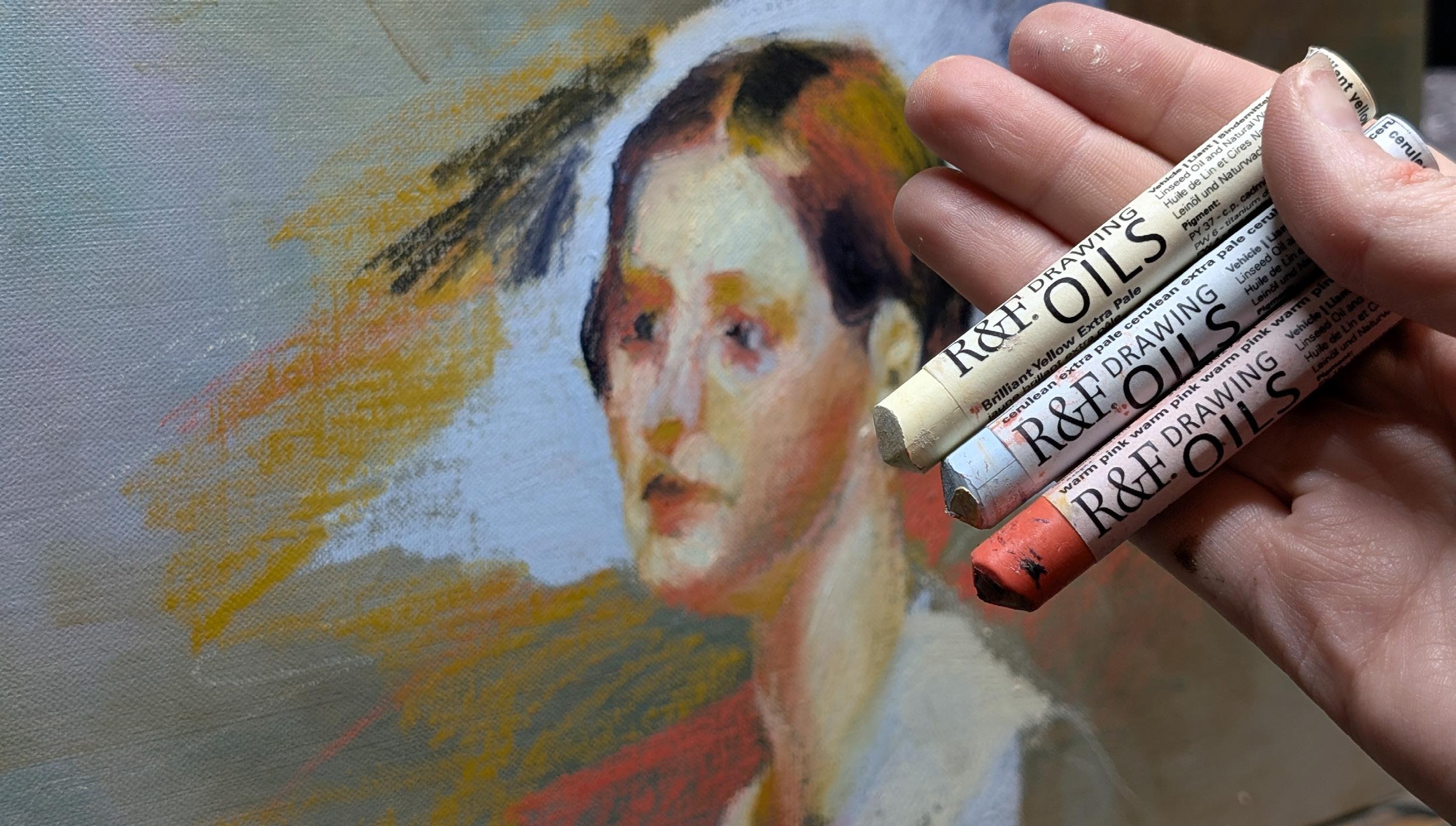
skin with a blade wasted a lot of the material. So I stuck with pushing it across scrap paper then twirling the tip in some paper towel to remove any fragments of dried oil skin before starting drawing on my board.”
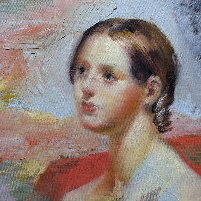
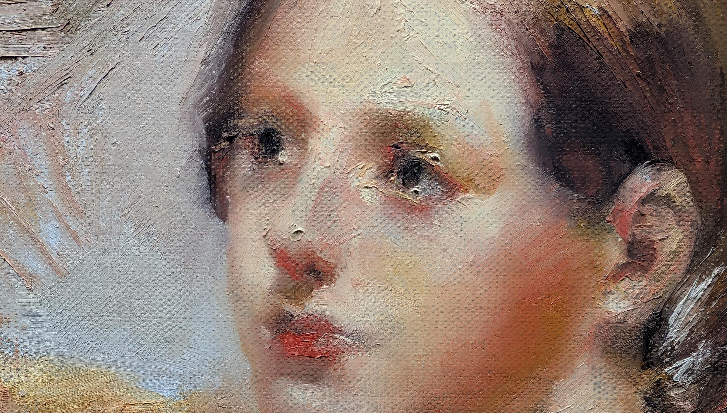
Drawing on a transparent primed linen panel, with a wiped remnant of a failed oil painting, Liz chose to complete a cropped study of the painting Susan Walker Morse (The Muse) by Samuel F.B. Morse. Starting with a light sketch with the Brilliant Yellow extra pale, then blocking in mass forms of the head - the linen had sufficient texture to allow the Drawing Oils to grip the substrate and lay down easily. They layered well and after blocking in the piece Liz found a ‘Blending/ Rubbing tool’ in her collection (which has one stiff end and the other squishy dense foam, similar to a digital tablet stylus) was wonderful at manipulating the oil as it lay to create the fine and more precise features of the face.
• Very easy to pick up and paint with straight away, no need to prepare a palette and likewise easy to pack up at the end of a painting session
• They’re very versatile, being able to be used on their own, with tools like brushes or paper stumps or blending/rubbing tools and oil paint mediums. Marks can be achieved in both textured and blended extremes.
• They dry to a permanent paint film, just like
traditional oil paint. With minimal ingredients their makeup can be related to using a wax medium whilst painting and all common oil painting varnishing techniques can be employed.
• Wax paper like packaging has the colour name printed multiple times down the length and end of the stick (it’s a small feature but very helpful if looking to identify a colour after heavy use)
• The wax content allows the drawing oils to dry to a reasonably consistent matte finish (which can be altered through varnishing if the artist wishes).
• Limited colour range (40 currently available) compared to other mediums like oil or soft pastels.
• On a hot day they get a bit melty or excitable and all the pigment load wants to decorate everything it touches (if drawing with them on a hot day I recommend wearing gloves and placing them in a tupperware container with paper towel or similar to transport)
• Drying times per colour vary WIDELY. R&F Drawing Oils contain no driers and will dry according to the pigments present in the formulation. Earth colors such as Raw Umber and Payne’s Grey will dry in just a few days, whereas Egyptian Violet can take weeks, depending on the substrate, thickness of application and ambient studio conditions. Pigment information can be found on the sticks themselves and the colour chart available on the R&F website.
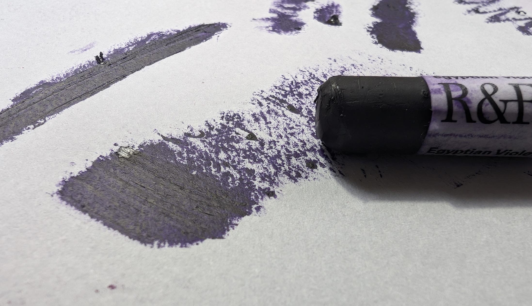
“An instant love affair, combining paint with drawing in a creamy stick that's easy to manipulate is a win for me. I plan to take these to Life Drawing sessions and maybe even plein air painting if I get a chance as they’re so fast to make marks with, I can’t wait to experiment more.”
If you’d like to see a video of these Drawing Oils in action, Liz has a recording of this painting on her YouTube Channel “Liz Gridley Artist”.
Imprint returned to VAS and welcomed 8 talented artists each offering a distinct perspective, evolved through multiple disciplines to respond to the theme ‘What Remains’, exploring what keeps us alive in memory, matter, landscape and in love, and transforming the galleries into a melancholic multisensory experience from April to May. The exhibition expands the visual barriers of our traditional space with works spanning reimagined still life objects, installation, drawings, sculpture and abstracted painting forms. Imprint opened with a flower embedded recycled paper experience suspended by thread from
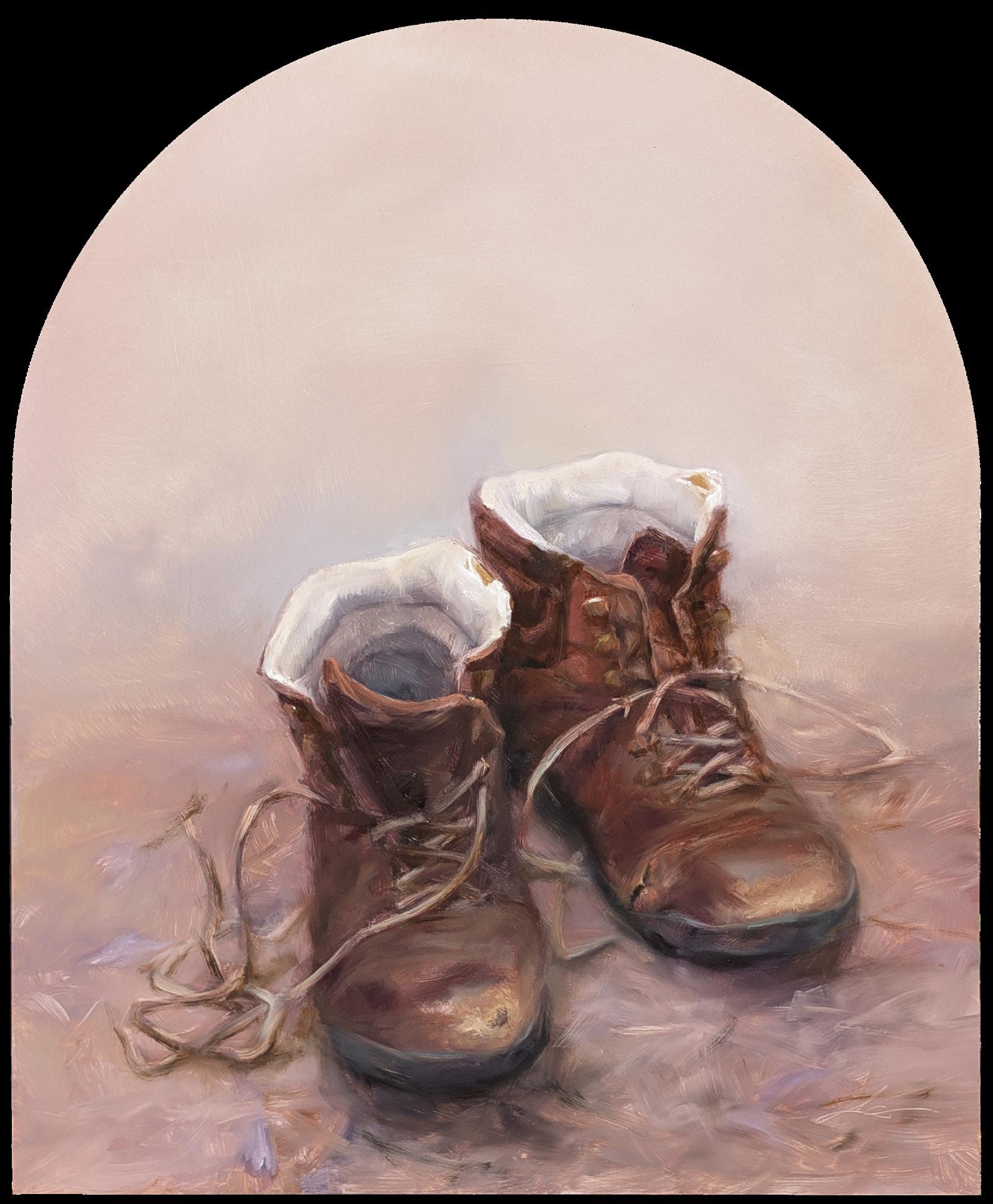
wood branches to encourage an interactive collective contemplation. Our artists wove their magic throughout our space with an expansive 2-part program that also featured workshops. It was so inviting to have members of our community engaging with various art practices and forms like tonal realism, paper making and archaeoligical still life. Liz Gridley anchored the program with Relics for the duration of Imprint offering tender portraits of loved ones rendered through the objects they once held. Gridley painted live in the gallery accepting commissions throughout as the audience was invited to bring objects of past loved
ones in to be immortalized through a relic painting. This personalised offering cemented a reflection of loss and love and welcomed the viewer to take part in the show.
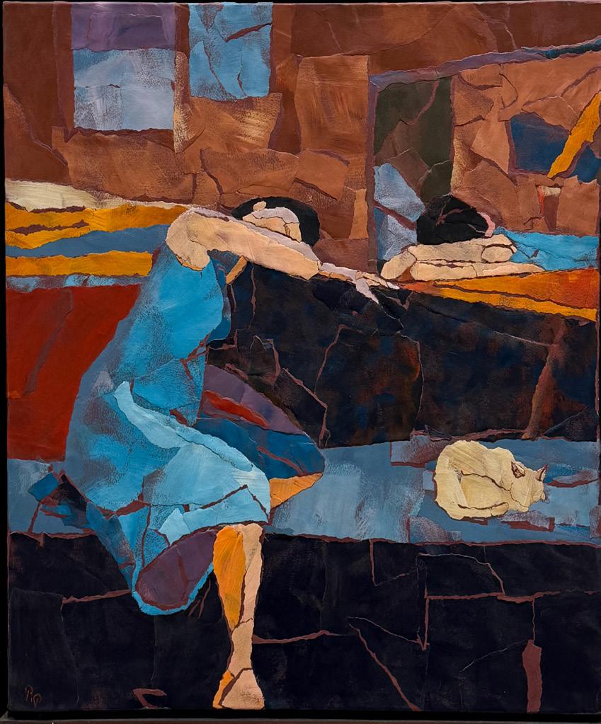
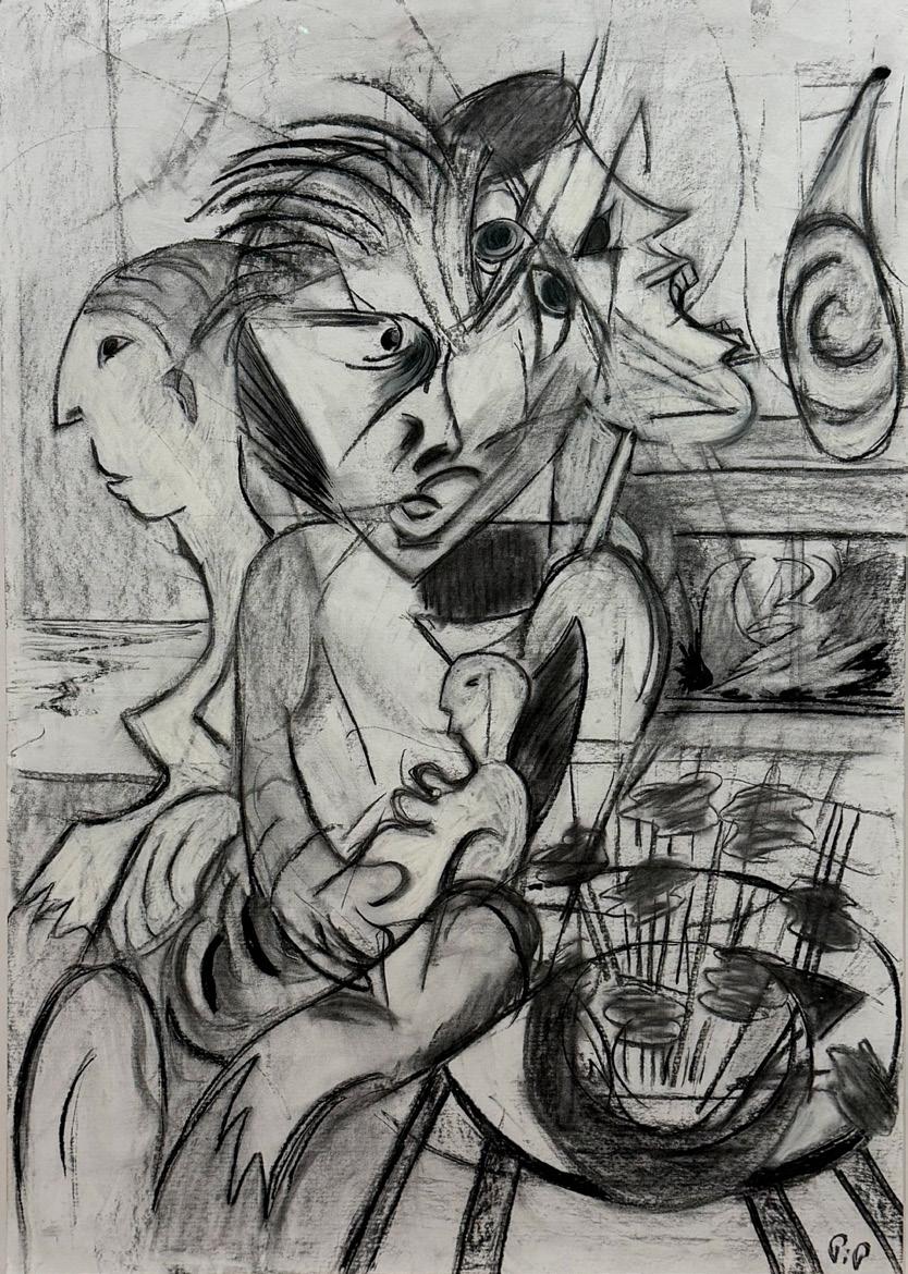
Philippa Croll's Spectrum is a journey extending from collage, drawing and painting into sculpture through an abstracted archaeological approach to reconstruct what makes us human through places, figures and objects reminiscent of the ways artefacts are recovered. You are engulfed in her body of work and are welcomed to find narrative in the reassembling of
elements and to uncover the traces left behind.
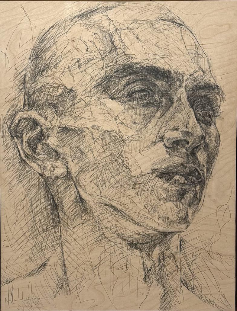
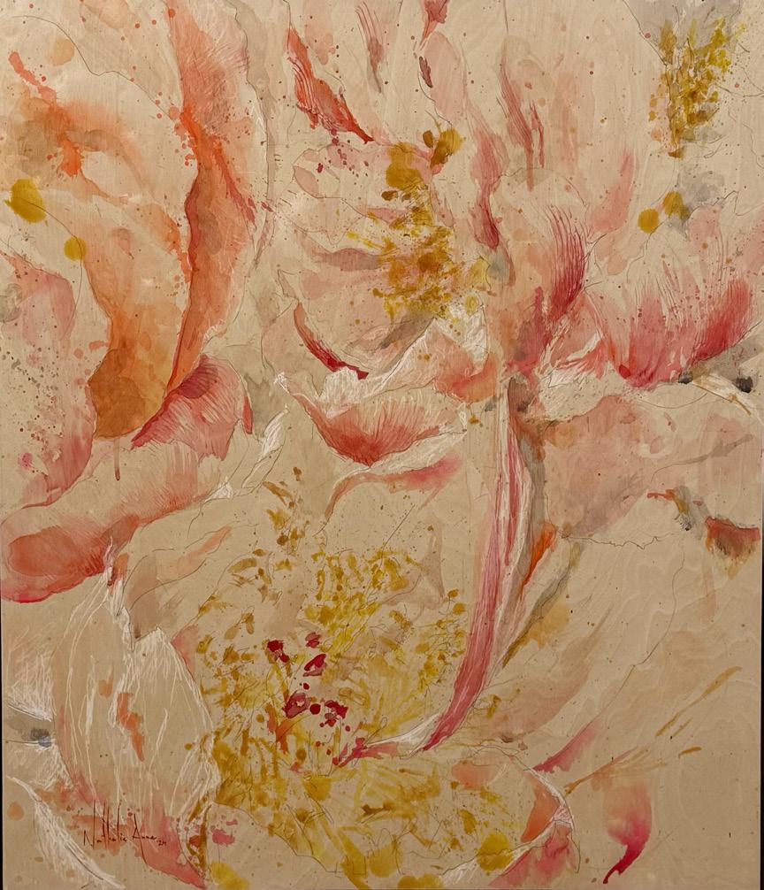
Nathalie Anne's Held in Line connected her expansive collection of drawings through unraveled silk threads. Material exploration of graphite and wood evolves throughout as each piece weaves a mirroring of deeply human existence, as we leave traces of our earlier selves behind, never fully erased. The rawness of the material invites a reflection of the deliberate erosion embedded permanently in each version of the self.
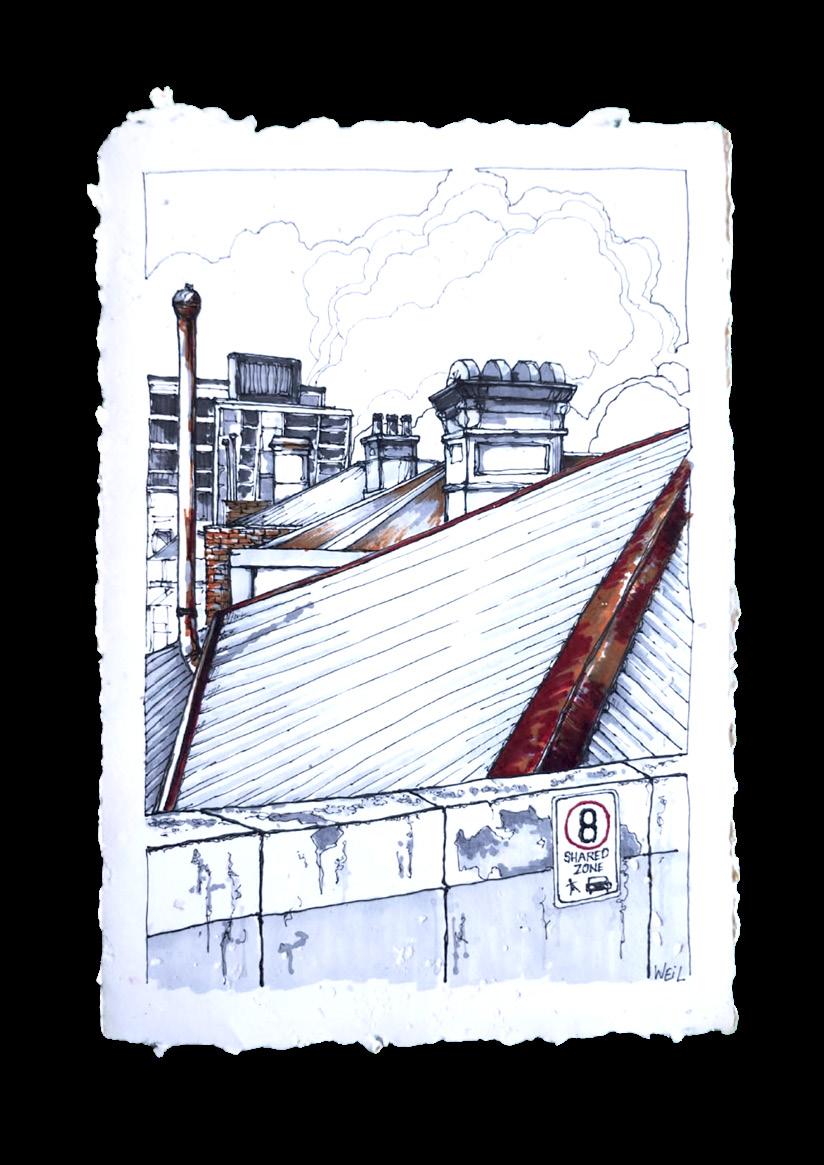
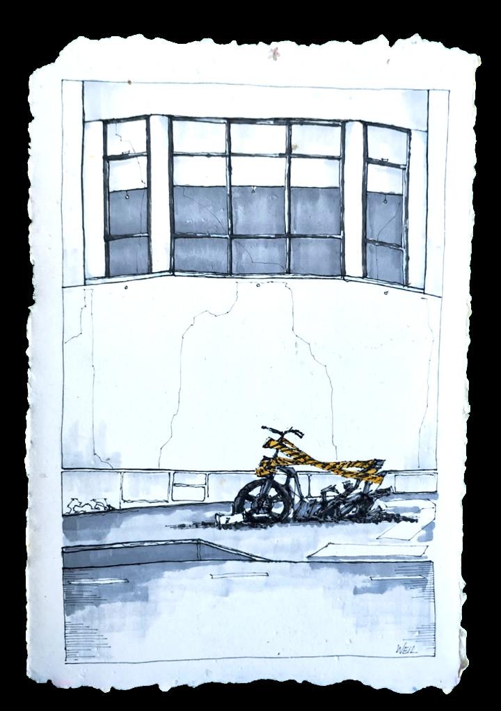
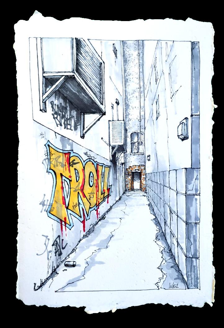
Linda Weil's Dodgy Melbourne shifted the everyday ‘dodgy’ corners of Melbourne into works of art. Her drawings on recycled paper draw attention to unloved and overlooked corners of Melbourne where urban decay may exist. The simplified fine line detail work in the building facades overlaid with traces of colour highlight the appeal of our streets.
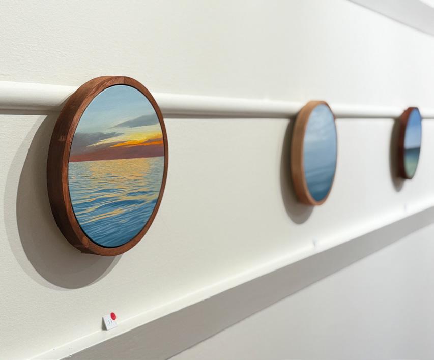
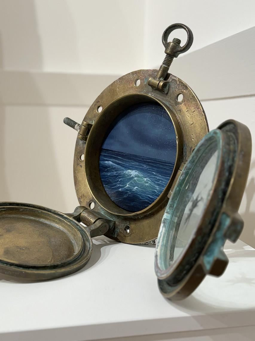
Charli English's Portholes utilizes unique frame shapes and sizes to represent windows into disappearing views of land and sea. These hybrid painting sculpture works examined the intersection of coastal erosion and the housing crisis. You’re invited to look through these portholes into these landscapes which transport you through this playful body of work.
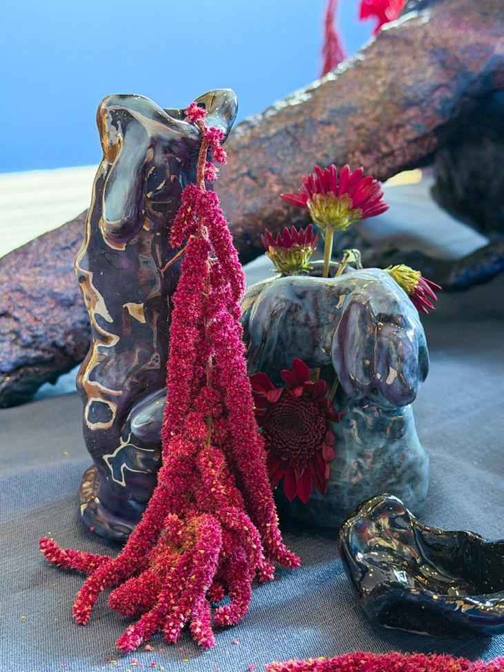
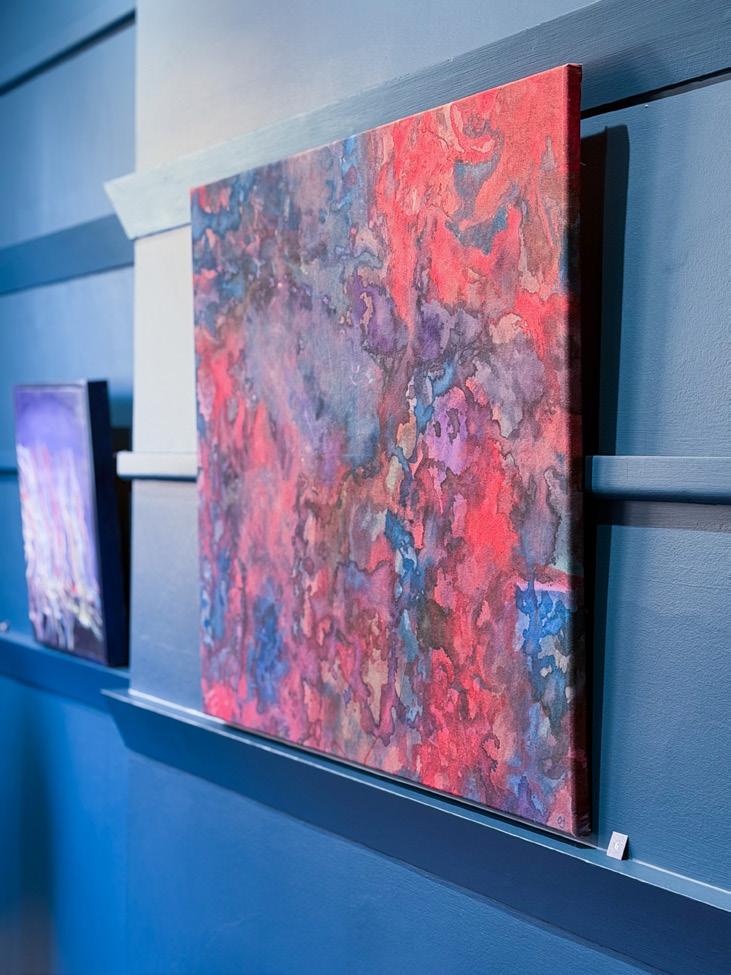
Olivia Jane's Delirium broke in the freshly painted walls of the now deep blue Mackley Members Room. Reflected within the sculptural installation is a colour scheme of reflective blues, deep reds and purples. The immersive space met you with a distinct smell of paint and surrounded you with flowers that decomposed throughout the duration of the show representing the body decaying away and reflecting on what remains from the collective experience of grief: an immersive space for the residue of the parts of the self-removed and destroyed.
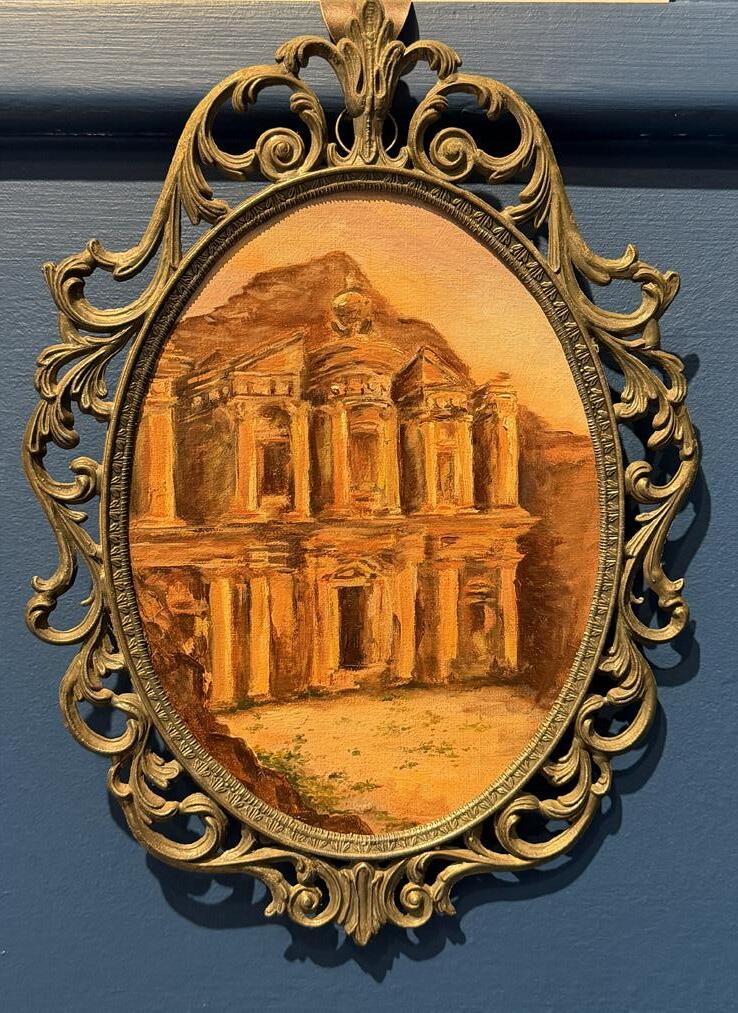
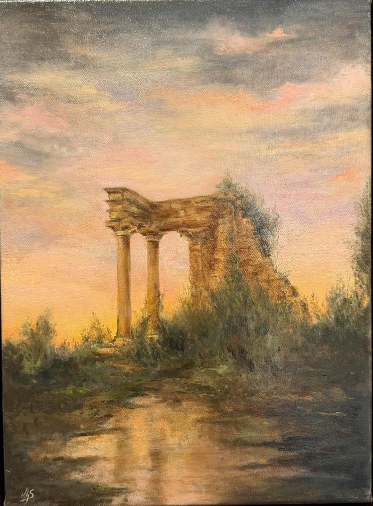
Madaline Harris-Schober brought Ancient Nostalgia: Mourning Paintings That Could Have Been, to the blue drenched room contrasting distinctly with the warm tones framed in antique gold frames, bringing together her archaeological excavation and research driven oil paintings and watercolour travel journals of the sites, landscapes and finds urging the viewer to reflect on memory, place, and the traces we always carry.
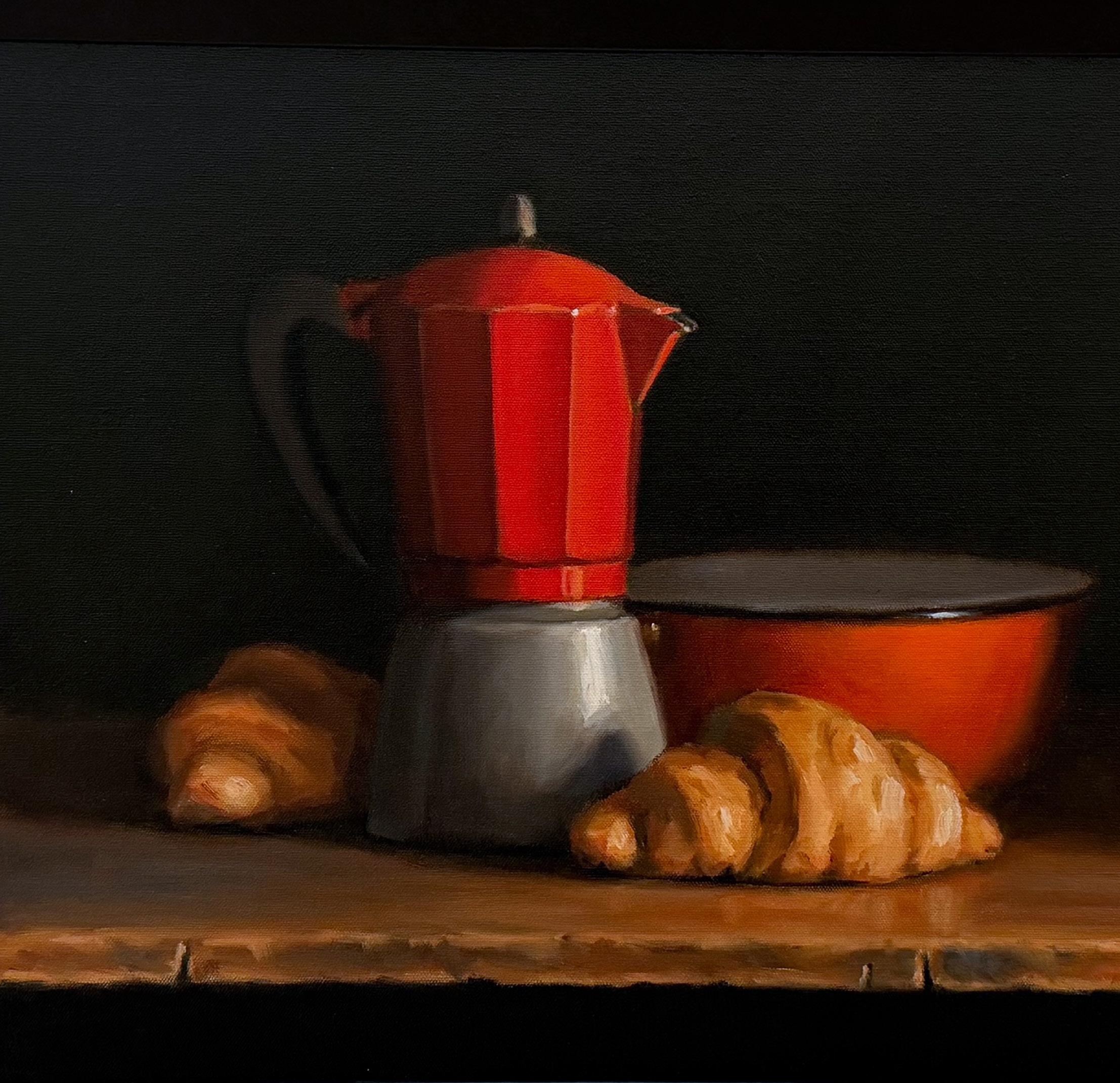
T.J. Murphy's show Remains To Be Seen collided puns and vintage still lifes into works to inhabit through memory, contemplation and of course laughter: dad humour juxtaposed with refined painting skills. From jugs to pears to oranges and Voltaire's hand, the show doesn’t skip a beat. The fire extinguisher was the first to sell due to its "extinguishing features".
What remains is a collective experience through the exploration of materials, mediums and various viewpoints colliding. We leave behind a feeling we may not be able to put into words but one that remains embedded in the self, objects, places and material.
J. Lindsay
Joan (Weigall) Lindsay, was born in November 1896, in Alma Road St. Kilda, and died in December 1984. Joan was a good art student under Frederick McCubbin, her tutor and mentor up at the National Gallery School of Victoria. She was a member of the Victorian Artists Society between 1918 and 1921 and occasionally exhibited her charming Australian landscape paintings around Melbourne. However, both her painting and her venture into creative writing were only part time
endeavors, as she had a full and demanding domestic life as the devoted and hard working wife of Daryl Lindsay. ‘Sir’ Daryl (he was knighted in 1956) was one of the ten feisty and artistic Lindsay children from Creswick. He became the Director of the National Gallery of Victoria from 1941 – 1956 and was also an exhibiting member of the Victorian Artists Society from 1921 until 1951. He was an accomplished painter in his own right – and he and Lady Lindsay led a busy, high profile life both in Melbourne and overseas. In 1956, they were involved in the founding of the National Trust of Australia and Sir Daryl was its first President.
A relatively new book on the life of Joan Lindsay was recently recommended to me and it made for easy and
pleasurable reading. Written by Brenda Niall, it is simply titled Joan Lindsay. The front cover reads – JOAN LINDSAY, The hidden life of the woman who wrote “PICNIC AT HANGING ROCK".
It is quite a revealing biography, and although I don’t think Joan’s life was particularly ‘hidden’, it was certainly one filled with a longing which was never quite fulfilled either through her painting or her writing. Until, that is, in 1967 at the age of 71 she wrote Picnic at Hanging Rock. It was written with passion and haste over a period of only a few weeks, in her home ‘Mulberry Hill’ on the Mornington Peninsula which she shared with Sir Daryl most of her married life.
It became an iconic book, leading several years later to the making of the equally popular film of the same name. It is the story of privileged, frivolous and curious school girls who found themselves in the wrong place at the wrong time. They disappeared in a place where they should never have ventured. Joan’s novel has always been surrounded by nonsense theories and spooky speculation, but the author always insisted that she wrote it “for my own joys and sorrows” and described it merely as “a mystery novel". It was a work of fiction.
Joan was primarily a visual artist, with a great love for the Australian landscape and bush. She adored the outdoors, tending her beloved chooks and cultivating her garden – and so in 1967, as her husband grew frail and languished in old age, Joan flourished and thrived.
Picnic became a best seller and gave Joan a ‘voice’ of her own for the first time in her life. One could describe the novel as having been ”painted with words”. In it she meticulously describes the spectacular beauty as well as the awful harshness of the Australian bush land she so greatly loved and respected. As well as this, Joan had a first hand understanding of the social strata of early Melbourne society evoked so colourfully throughout her story. She was comfortable writing about this well off community in which she was raised, and possessed a finely observed understanding of life in an exclusive Boarding school for Young Ladies.
Her description of how the wealthy folk of
Melbourne spent their holidays up in Mt Macedon (the summer playground of Melbourne’s wealthiest families dutifully looked after by the working class locals) is accurately documented.
However, Joan admitted to facing her own personal ‘demons’ in this book. She literally dreamt of fair haired schoolgirls in white dresses invading the black monolith known as ‘Hanging Rock’ near Mt. Macedon – young, innocent women never to be seen again.
In the story, thirteen year old ‘Sara’ - a forlorn, rather lost little pupil at the College, was Joan herself at the same age, on the outer social circle of her precocious fellow students. Although sent to one of the best Colleges available, Joan felt her early education was ‘erratic’ – perhaps school life took on a loneliness, and she found herself in a dark place from which she could not escape – just like the girls who were similarly overpowered by the darkness of the infamous rock.
Even one of Joan’s early teachers shares the same name as a teacher in the novel. So it is evident the highly imaginative events created in her fictional novel resonated strongly for the aging Joan. In her own words, she described her book simply as “..a mystery story.” She never elaborated further.
As well as facing what she called ‘her childhood demons’, Joan also found great inspiration for her famous novel from the Melbourne art world.
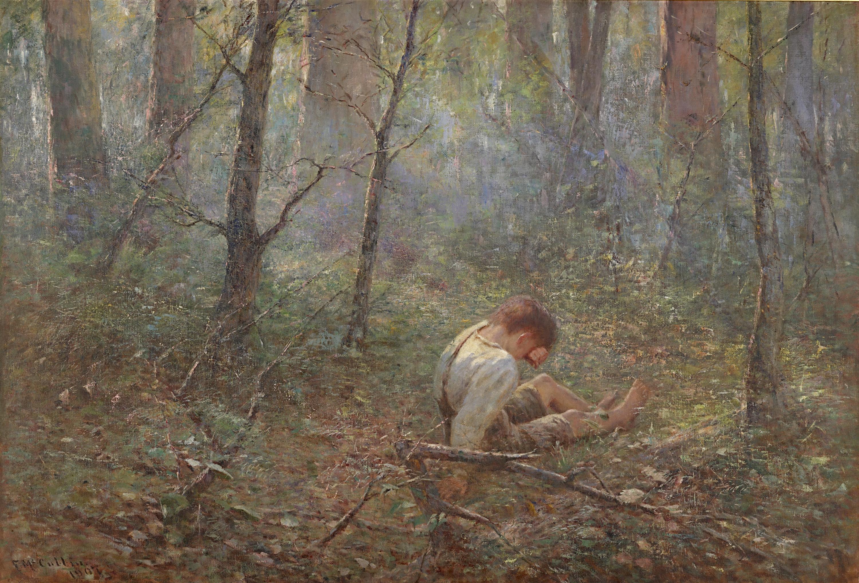
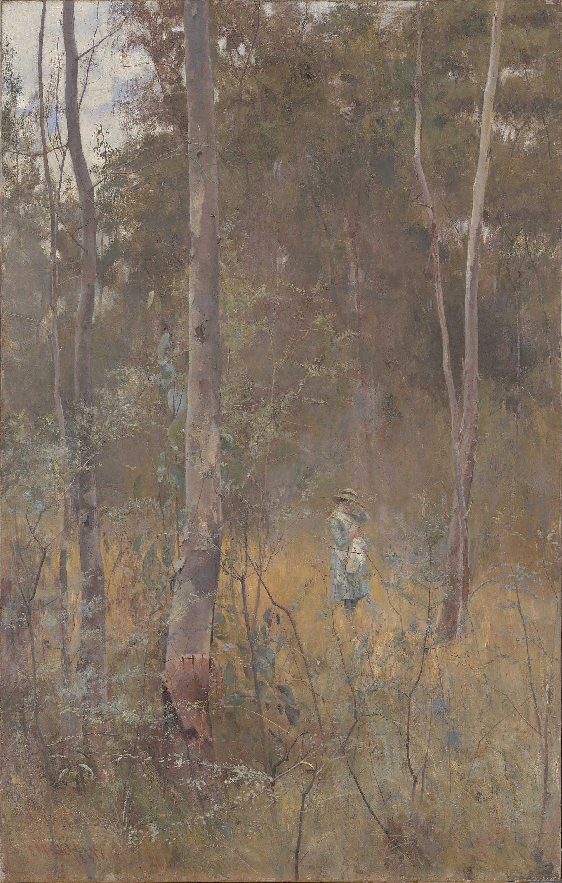
As a young woman she had studied painting under Frederick McCubbin and was familiar with his famous works Lost and The Lost Child.
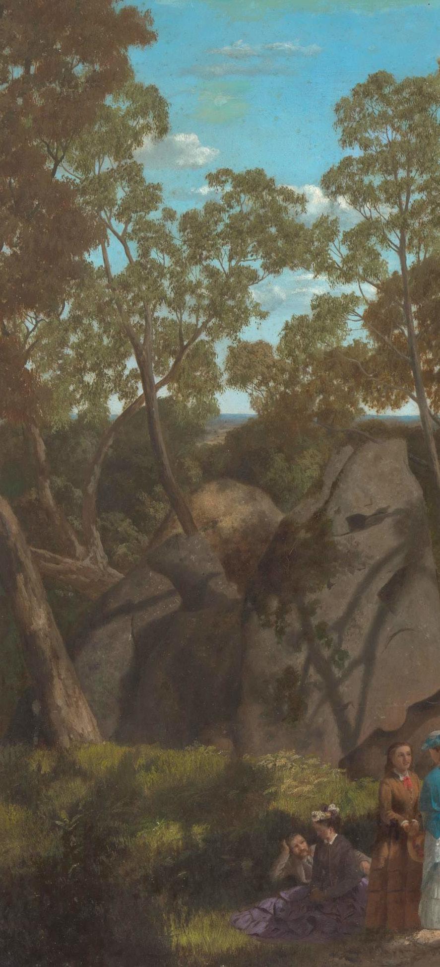
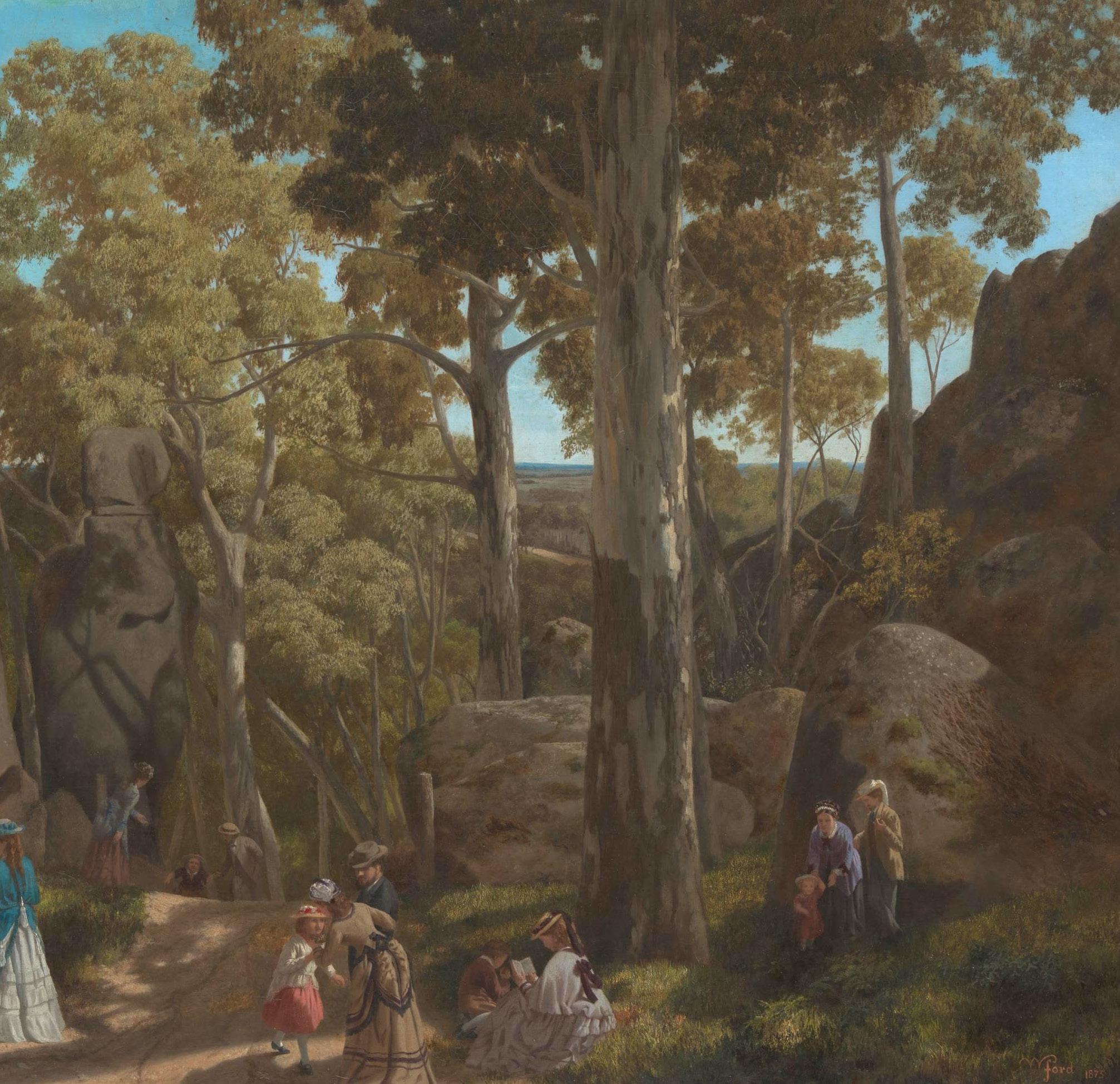
Like many others, she was also a great admirer of the 1875 landscape by William Ford, called At The Hanging Rock Mt Macedon. This was a painting well educated young people grew up with, and Joan identified closely with its haunting depiction of the Macedon trees and bushland, dwarfing the rather out of place humans in their refined colonial hats and gloves and long dresses picnicking and relaxing in the foreground.
Thus, combined with her own love and knowledge of nature and Australia’s flora and fauna, Joan drew on a number of memories and
At
National Gallery of Victoria, Melbourne Purchased, 1950
sources for her novel. For her, the bush was always ‘a place of mystery’. The theme of the novel, is thought provoking in itself ..The earth rejecting what does not belong..
The fictional school girls in Picnic at Hanging Rock did not belong in the Australian bush according to the author, "any more than white settlers belonged in the ancient land they colonized."
Over a century later, the reality of children becoming ‘lost’ in the Australian bush is still a terrifying one, which since our days of early settlement, has captured the imagination of artists, poets, novelists and dramatists.
Today, news of a little one who has strayed and disappeared into the bush still fills us with dread. Here in the city, whenever we hear of a child who goes missing on a day out in the country or wanders off on a camping trip in the bush, we say –“How could this happen in broad daylight? No child would just wander off like that..” But these things happen. Lured by strange shapes and smells, fascinated by quaint sounds, curious to explore strange places and eventually disorientated by shadows and the unfamiliarity of their surroundings they become lost. The bush takes hold. Our children are where they do not belong…
Joan Lindsay constantly asked the question “ To whom does the earth belong?" Acknowledging that she could
not paint people, only trees, she claimed that Picnic at Hanging Rock was her one opportunity to show the landscape and people in their ’irreconcilable relationship’. Over the years when curious admirers and readers asked her about the ‘meaning’ of her book, Joan Lindsay would simply say - "It’s about the earth rejecting what does not belong..”
….A Modern Post Script
Mid year 2022, a girl, not very much older than the teenage students in Joan Lindsay’s novel, lost her way in the Tasmanian wilderness.
Sometime later, a young man who was part of a search party, described the landscape he was fighting his way through in this west coast region of Tasmania, as having a ‘magical aspect’. It was an unexpected statement from a down to earth self confessed young ‘adventurer,’ and it may have surprised many. However, by early 2026 it was tragically evident that, in Joan Lindsay’s own words, the earth once more had cruelly consumed then discarded ‘what did not belong.’
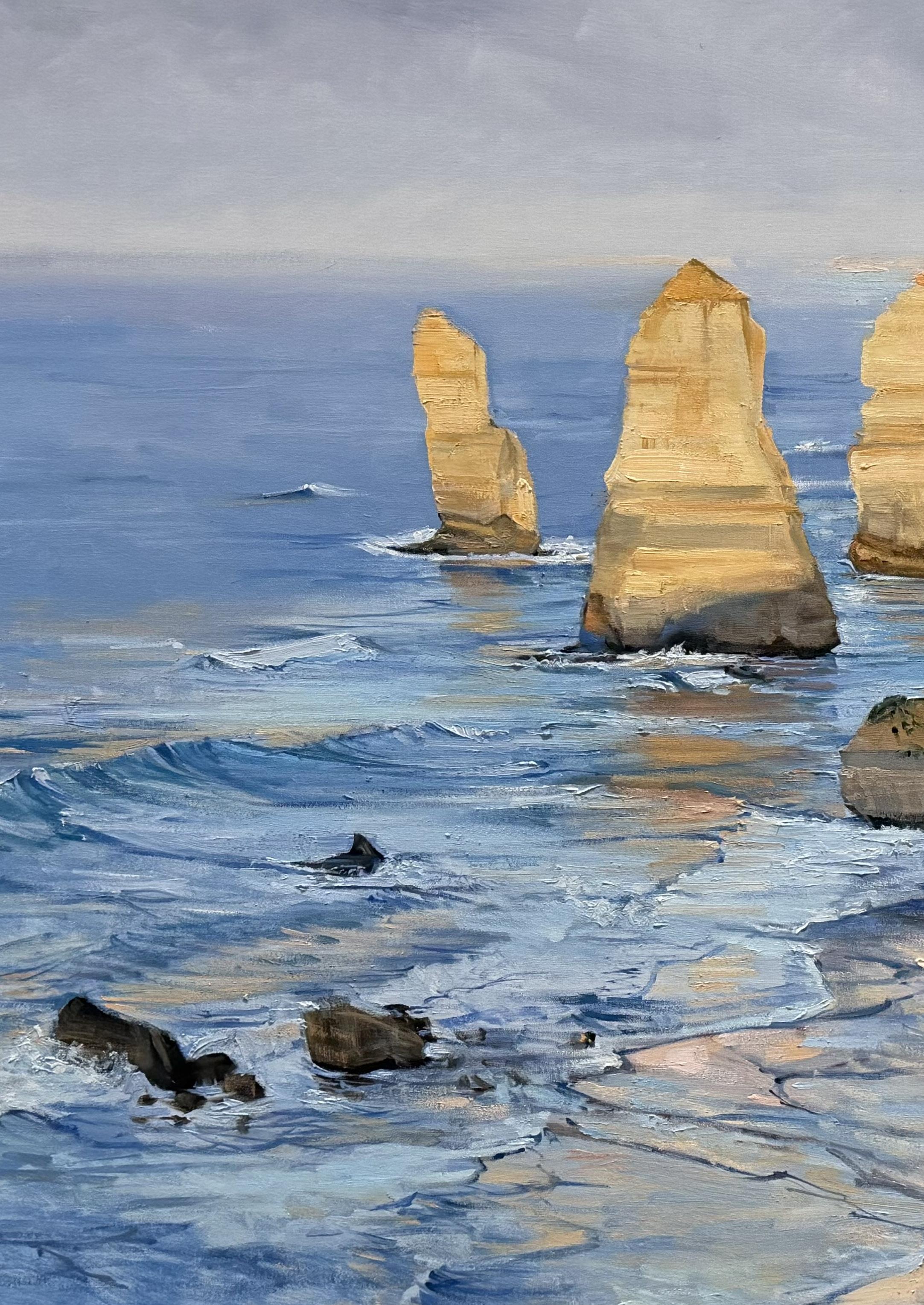
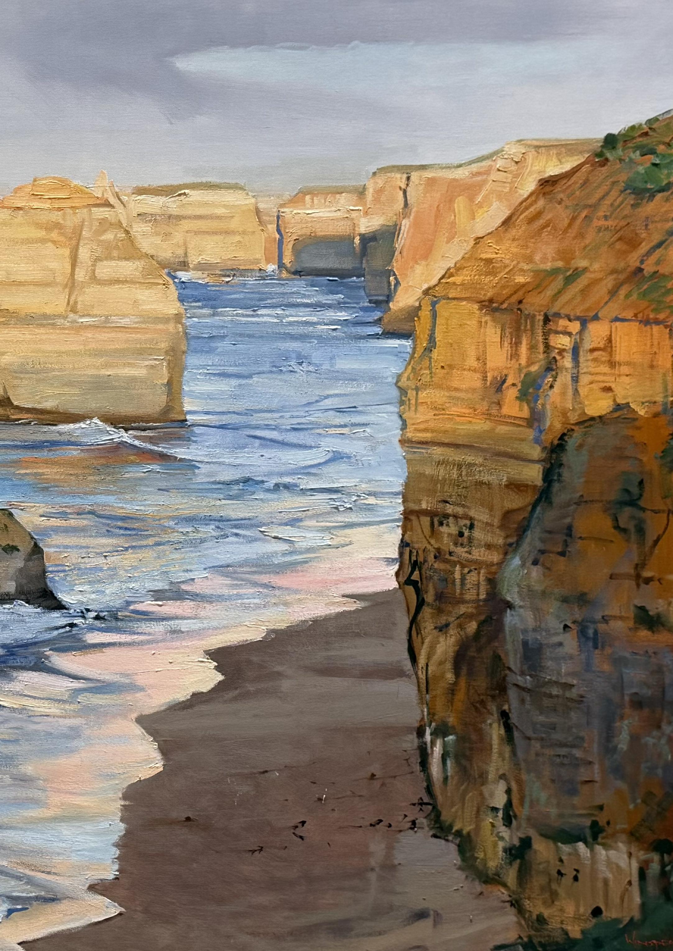
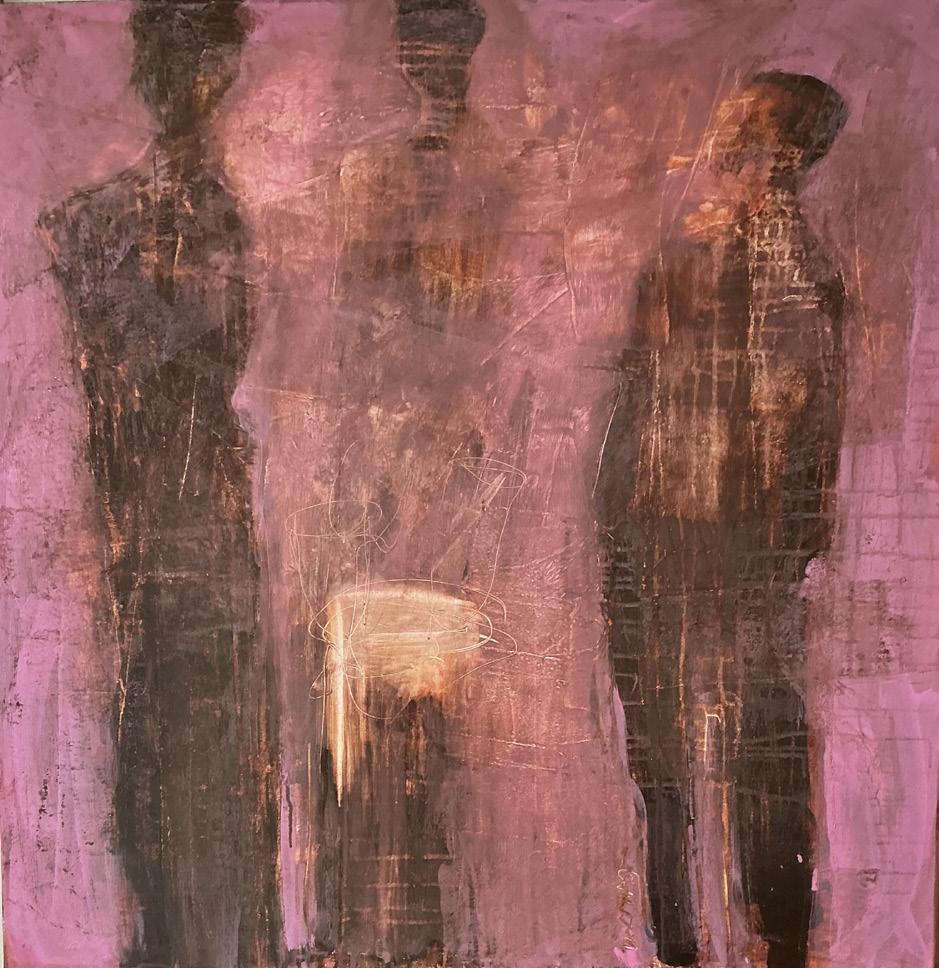
"I have fallen in love with these monoliths and have painted them many times already this year."
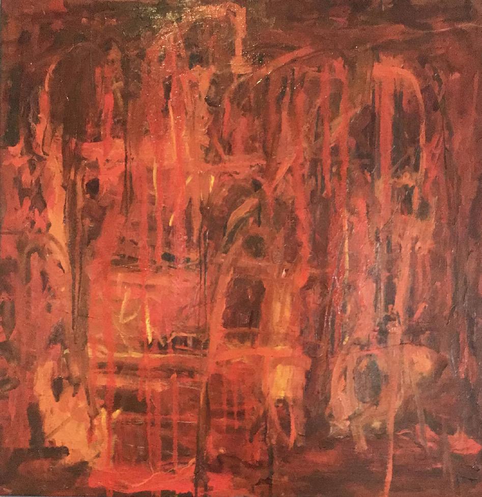
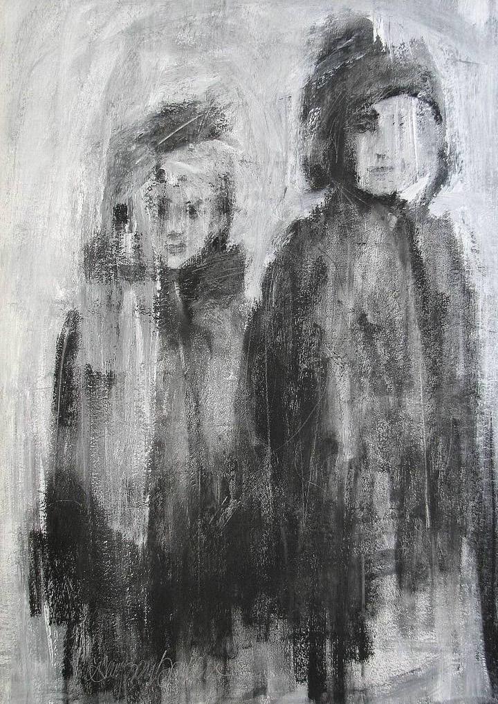
There is a rawness to my works. They don’t adhere to rules of art theory. Many simply happen with no preconceived concept and no intention of how the outcome should or ought to be or what it should represent. I apply paint for the pleasure of putting marks on canvas or paper and seeing how the colours, the textures and layers react. Out of the chaos of initial swirls and marks, a
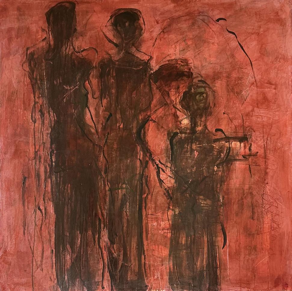
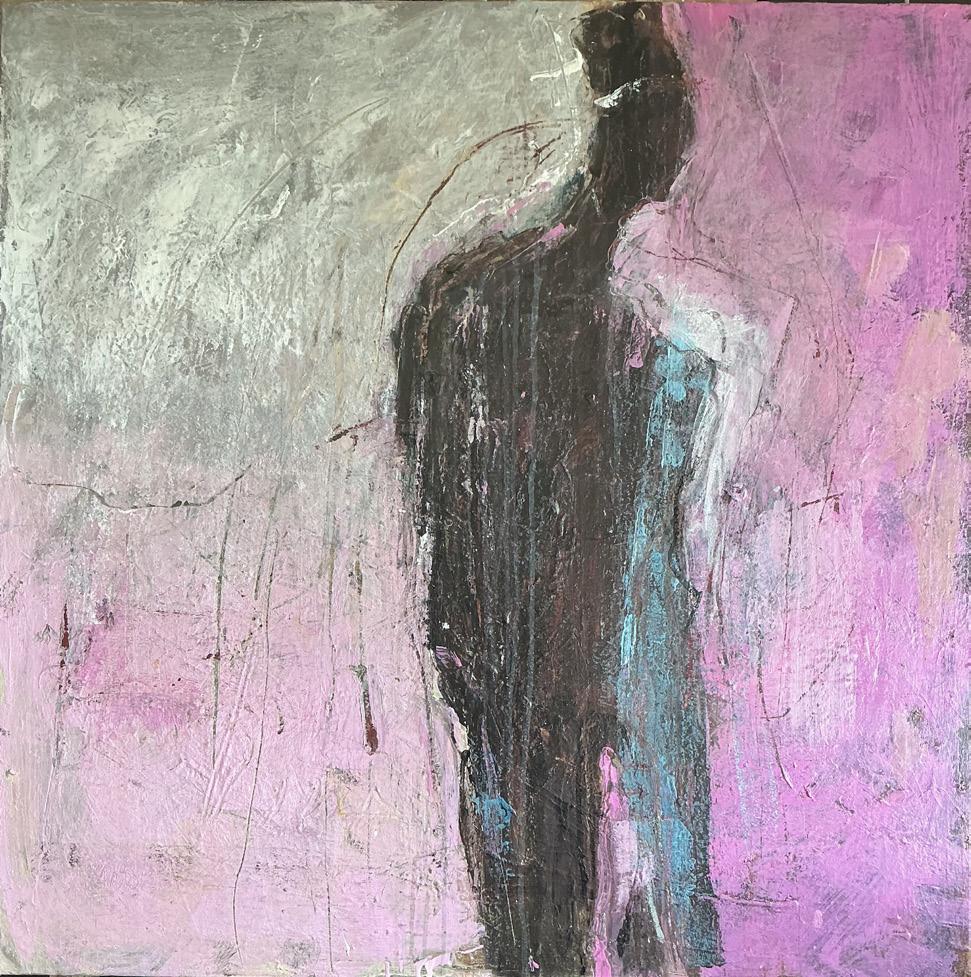
pattern emerges, a suggestion of direction. Just a singular mark or shape might suggest a shape, telling me the direction the work wants to go.
I will keep on experimenting. Life is about learning. I hope to keep learning each day in this autumn of my life.
Dr Fiona Moore is the Archives Manager at the Melbourne Athenaeum. She has worked in the museum and gallery sector for over twentyfive years, holding positions in collections and exhibitions management, registration, and project management. Fiona has also worked in academia teaching into the Master of Arts Curatorship Program at the University of Melbourne as well as sitting on the board of non for profit arts organisations.
The Victorian Artists Society (VAS) and the Melbourne Athenaeum hold significant positions in the history of the fine arts in Melbourne. The VAS, which came into being in 1888 through the amalgamation of the Victorian Academy of Arts and the Australian Artists’ Association is the city’s oldest art society. The Melbourne Athenaeum, formed in 1839 as the Melbourne Mechanics’ Institution was the town’s first public cultural institution and still operates today. Despite the lengthy history of both organisations, what remains relatively unknown is the collaboration that existed between both institutions in the early twentieth century. This article, the first of two outlines this significant relationship which resulted in the establishment of the Melbourne Athenaeum Art Gallery opening in 1910.
The Melbourne Mechanics’ Institution was the initiative
of the Melbourne Union Benefit Society, which formed in 1839. Representing the trades that were constructing the new city of Melbourne, they passed a resolution to form a mechanics’ institute to provide their members with opportunities for learning and self-development. From its foundation, the Melbourne Mechanics’ Institution had the support of the colony’s leading figures, including Superintendent of the Port Phillip District Charles Joseph La Trobe, Police Magistrate Captain William Lonsdale and Supreme Court Judge Sir Redmond Barry.
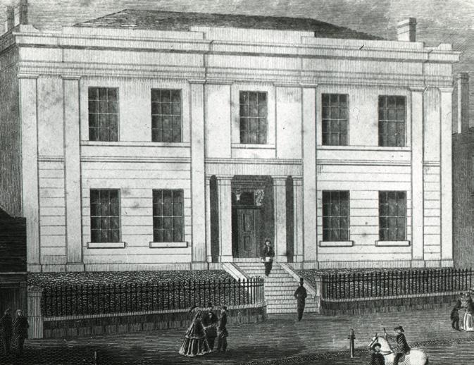
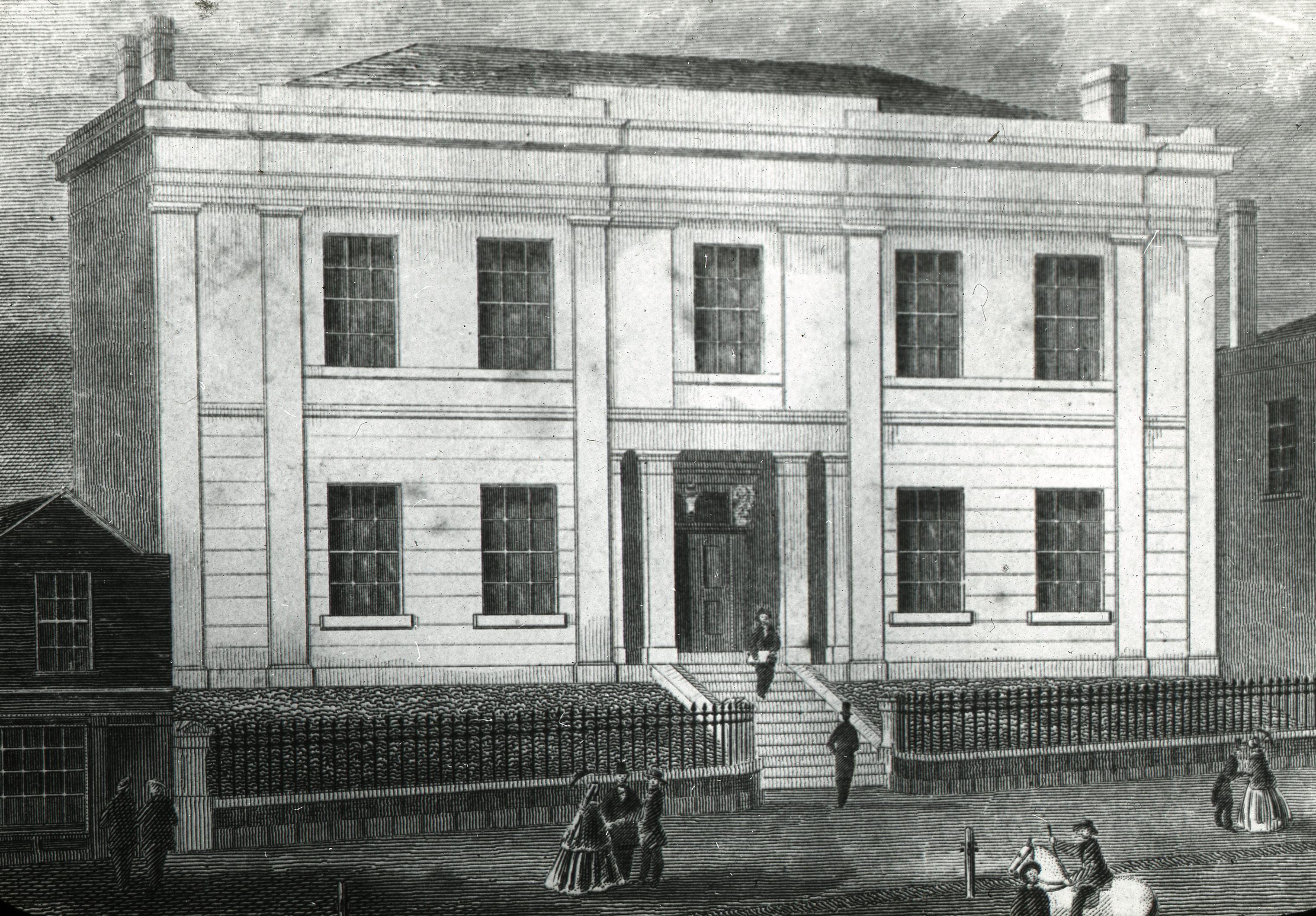
Opening initially in leased premises in Bourke St, in 1842 it relocated to a purpose-built home at 188 Collins Street (which it still occupies today). The building was equipped with a lending library, museum and a hall that hosted a wide variety of activities including musical and theatrical events, art exhibitions, lectures, balls and fairs. From its beginnings, the Melbourne Mechanics’ Institution was supportive of the fine arts. The first art exhibition held at the institution took place in 1847 with a display of works by artist and drawing teacher George Alexander Gilbert who was also the institution’s Secretary and Librarian. Gilbert taught drawing at the institute and anointed himself as the organisation’s Professor of Fine Arts.
From this date up to the formal opening of the Athenaeum Art Gallery in 1910 many artists and artists’ groups chose to exhibit their work with the organisation, including Eugene von Guerard, William
Strutt, Frederick McCubbin, John Mather, Grace Joel and the Yarra Sculptors’ Society. It was also the venue for the first (and only) exhibition of works by members of Melbourne’s first art society, the Victorian Fine Arts Society, established in 1853. Some of these exhibitions were held in the upper hall of the Melbourne Athenaeum, which had been constructed in the 1880s as part of a larger renovation of the building. The upper hall, or small hall as it was often referred to, was also used for rehearsals and meetings so it was a multipurpose venue.
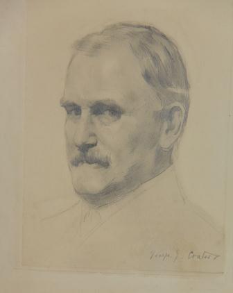
Although exhibitions were a regular feature of the upper hall, the space was not ideally set up for the display of art. The idea to transform the space into an art gallery came about through conversations the Secretary of the Athenaeum, Reginald Wilmot had with artists Walter Withers, Lindsay Bernard Hall,
Frederick McCubbin and John Mather. At the time of the discussions, these artists were all members of the VAS with Mather, McCubbin and Withers having also held the role of President of the VAS Council. They suggested that the interior of the upper hall could be improved by the installation of top lighting, rather than relying on light from the southern windows to illuminate the works on display. In assessing this, Wilmot felt the proposal required support not just from individual artists but also from the wider fine arts community, so he asked the artists to take their suggestion to the VAS to obtain its co-operation and support. As a result, the VAS approached the Athenaeum’s Committee of Management and offered to rent the gallery for its eight-week annual exhibition at £6 per week for a fouryear period if the upper hall was redeveloped.
With the VAS confirming its involvement, the
Athenaeum’s Committee of Management appointed a subcommittee to discuss the proposed plans and the installation of a lantern light in the roof, which would provide the recommended top lighting in the upper hall. The Athenaeum’s 1910 annual report confirms that Wilmot and the committee were keen to take advantage of the Athenaeum’s prominent city location, stating that the ‘want of a central art gallery in Melbourne … led to the belief that the Upper Hall could be converted into an up-to-date picture gallery’.
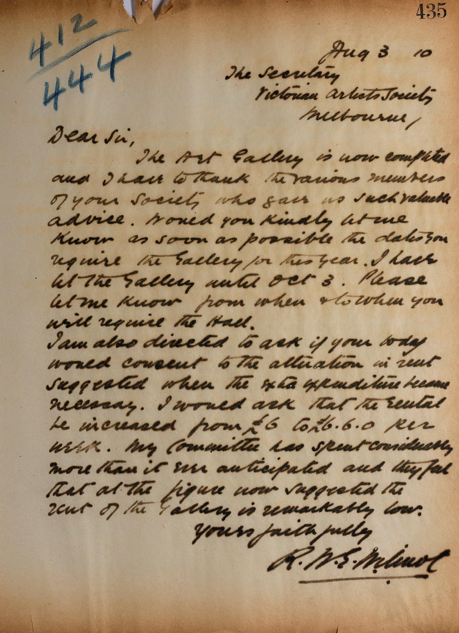
The redesign of the upper hall was undertaken by architects, Sydney Smith and Ogg and completed in a timely manner by builders Spargo and Taylor. Wilmot wrote to the Secretary of the VAS on August 3, 1910, advising that the ‘Art Gallery is now complete and I have to thank the various members of your society who gave us such valuable advice.’ The new gallery was formally opened on 11 August 1910 by the Governor of Victoria, Sir Thomas Gibson-Carmichael, showing an exhibition by Walter Withers. The gallery received much praise, with the Argus providing a detailed description of the renovated interior. The newspaper referred to it as a ‘splendid gallery’ and recorded that: the hall itself is 63 ft long by 37 ft wide and gives a line measurement of nearly 200 ft. At a cost of about £400 the Committee has entirely remodelled the room, putting in a lantern light of Muranese glass (which diffuses the light transmitted) 40 ft in length by 17 ft in width. The walls have been painted a greenish umber colour, relieved by a buff frieze.
The VAS mounted their annual members exhibition at the Athenaeum Art Gallery in October of that year as well as in 1911. These were significant displays for both institutions and will be the focus of discussion in part two of this article.
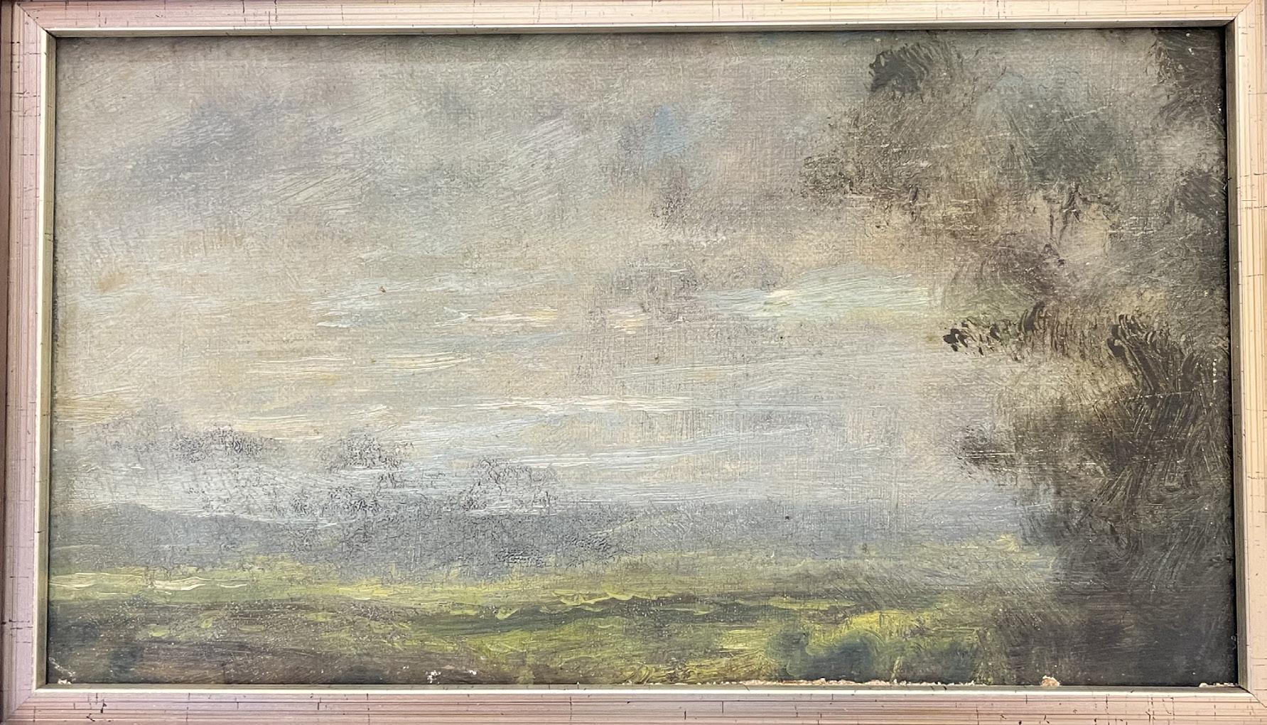
Artist: Sir John Longstaff (1861-1941)
Title: A Long View
Date (c.1890s)
Medium: Oil on Board
Size: 9" W x 5" H
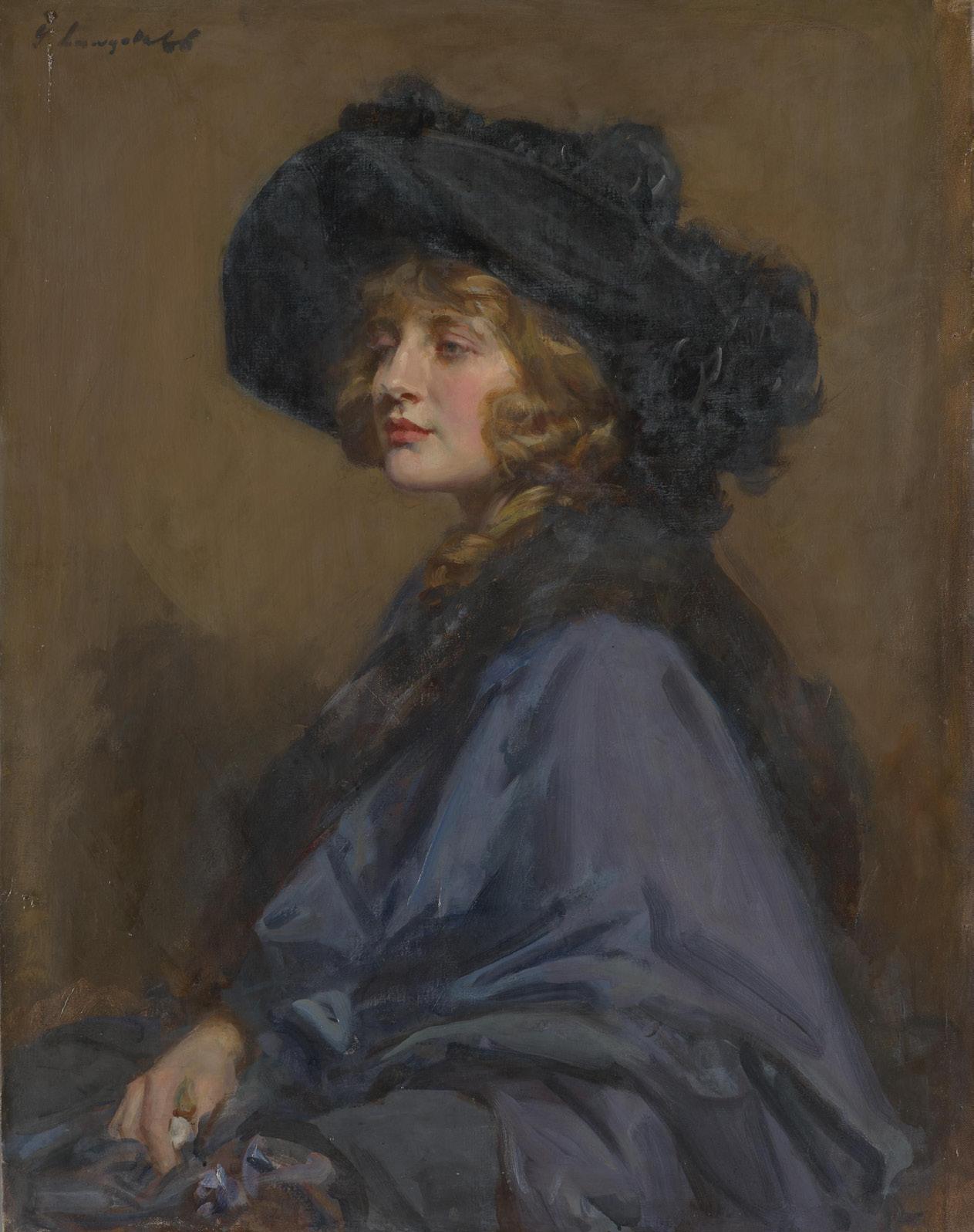
John Longstaff was born in the gold-mining town of Clunes in 1861, son of a shopkeeper. He showed an interest in drawing as a child, winning a school drawing prize at the age of 12.
The family moved to Shepparton, and despite the disapproval of his father, young John worked as a clerk by day and taught himself drawing from an instruction manual by night. His lack of interest in the family business persuaded his father to send him to study at the National Gallery School in Melbourne, where, under the tutelage of George Folingsby he was trained in portraiture and painting.
Longstaff soon proved his ability and became the first recipient of the school’s travelling scholarship. In 1887, he and his young wife set off for Europe, arriving in London and then quickly relocating to Paris where he came under the influence of the exuberant art scene there. He was also a great admirer of Velasquez and his dark tonal style and spent three months in Spain
studying his works.
He returned to Australia briefly but was called back to London in 1901 to undertake a commission for the NGV of a huge canvas titled ‘Arrival of Burke, Wills and King at the deserted camp at Cooper's Creek, Sunday evening, 21st April 1861’. At this time he was gaining a reputation as a fine portrait painter in both London and Paris. Longstaff was appointed an official war artist in France during 1918-19.
In 1920, Longstaff returned permanently to Australia and set up his household in Melbourne. He continued to be a society portrait painter and it is for these commissions that he remains best known today. His work is represented in most of the larger galleries in Australia as well as in Europe. The NGV holds 25 of his works, the majority of which are portraits.
He became the President of VAS in 1925 and remained an active and influential part of the Melbourne art scene until his death in 1941.
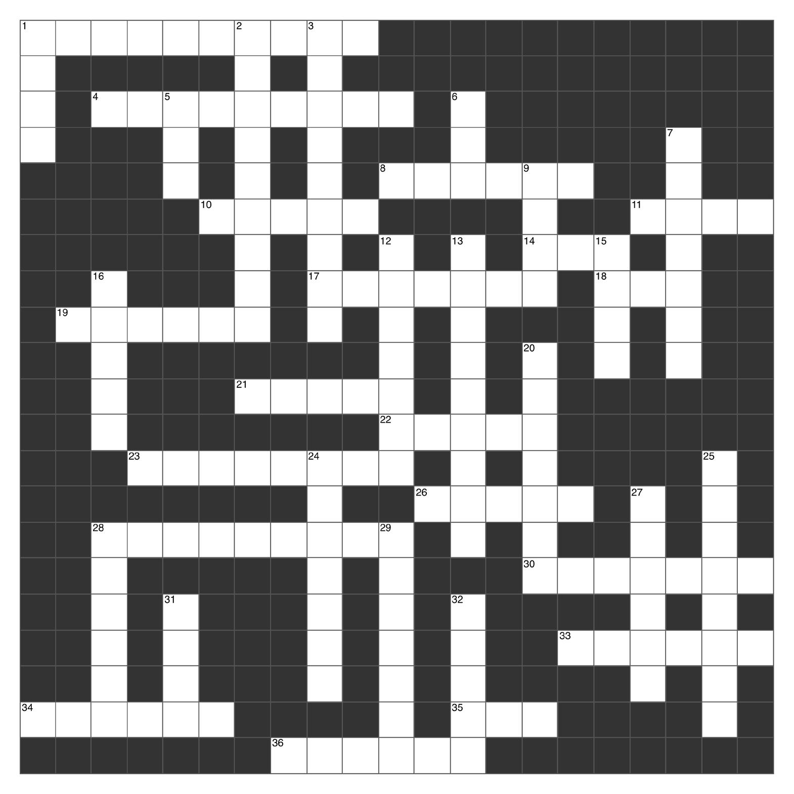
1. Santa Maria delle Grazie is the location of Da Vinci's famous fresco (4,6)
4. Artist Rachel Zegler was referencing in her 2026 MET Gala look (9)
8. Japanese contemporary artist who often uses polka dots (surname) (6)
10. Early photographers made their images on this material (5)
11. Animal (depicting Satan), the centre focus in Goya’s Witches Sabbath (4)
14. Non-fungible tokens (abbrev) (3)
17. Name of this traditional Japanese art of floral arrangement (7)
18. Number of paintings sold by Van Gogh in his lifetime (3)
19. Another name for the Fibonacci Spiral (6)
21. Country we first see watercolours used (5)
22. Australian painter famous for his Ned Kelly paintings (surname) (5)
23. Winner of the 2025 Hylton Mackley AOTY (8)
26. Winner of the 2026 Archibald Prize (surname) (5)
28. 1985 art group devoted to fighting sexism in art spaces, .... girls (9)
30. NGV exhibition showcasing emerging artists completing their VCE studies (7)
33. Inventor of pointillism (6)
34. Painting of which Whistler family member destroyed by Mr Bean in the 1997 Bean: The Movie (6)
35. Style of art characterized by the use of popular imagery and consumer culture (3)
36. Most featured in Dali's The Persistence of Memory (6)
1. Common name amongst VAS staff and artists, our current President (4)
2. Pottery consists of three different "wares": earthenware, stoneware and ... (9)
3. Type of painting technique done by mixing pigments with hot liquid wax (9)
5. Andy Warhol's star sign (3)
6. Above reception at VAS is a work by William Taylor Smith Tibbits depicting what building? (3)
7. Subject of many Georgia O'Keeffe paintings (7)
9. Australia art gallery hosting the annual art festival Dark Mofo (4)
12. Venus of Hohle Fels was found in which country (7)
13. Sculpture remains attached to the plane it was carved from (9)
15. Featured in Madaline Harris-Schober’s exhibition, Pyramids of Giza were built for this purpose (4)
16. Frida Kahlo museum in Mexico, Blue ....? (5)
20. Famous Indigenous artist Albert Namatjira, the great grand father of modern Indigenous artist .... (7)
24. American artist that was a pioneer of Abstract Expressionism (7)
25. Max Meldrum was born in this country (8)
27. One of the two artists who invented Cubism (6)
28. Type of sculpture that represents a person dying (6)
29. Paint made from pigments and plastic (7)
31. New colour of the Mackley Members Room (4)
32. Common abbreviation for turpentine (5)
1
2
3
What two primary colours are mixed to make a green?
How many faces or sides are there to a tetrahedron?
What is the term for painting done on wet plaster?
4
What art gallery is currently under construction behind the NGV International Melbourne?
5
6
Which Australian coin features the lyrebird?
What is the name of the prehistoric cave paintings in southern France discovered in 1940?
7
8
9
What is a “triptych”?
What is traditionally used for etching plates?
Which 16th century Dutch artist painted The Garden of Earthly Delights?
10
In sculpture, what material is traditionally used in lost-wax casting?
11
Which Dutch artist painted The Night Watch currently in the Rijksmuseum?
12
What type of perspective uses a single vanishing point?
13
Michelangelo’s Pieta in Saint Peter’s Basilica, Vatican City, is carved from what material?
14
Literally meaning “deceives the eye”, what realistic art style creates a 3D illusion on a flat surface?
15
What is the name for a painting of inanimate objects like fruit or flowers?
16
What is the name of Japanese calligraphy emphasizing brush technique?
17 What does “pentimento” refer to in painting?
18
Who was the winner of the 2026 VAS Contemporary Art Prize?
19 Which indigenous art movement originated at Papunya (Northern Territory) in the early 1970s?
20
What is the binder traditionally used in oil paint?
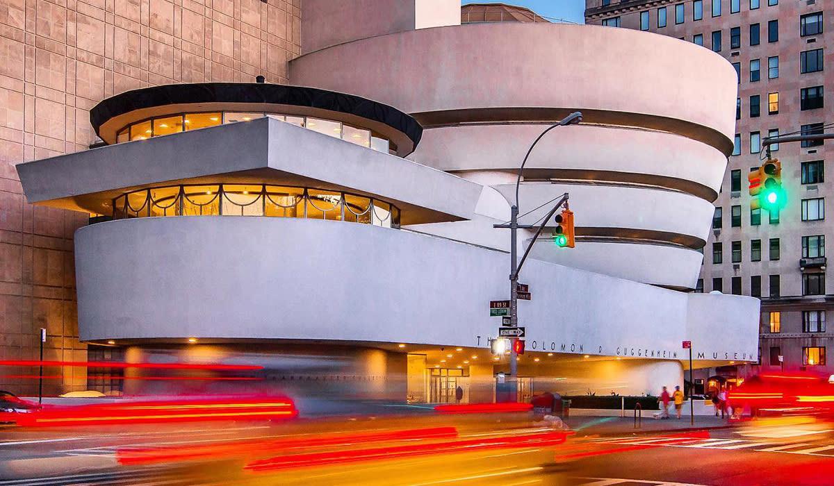
21 Which architect designed the Guggenheim Museum in New York?
Answers on Page 44
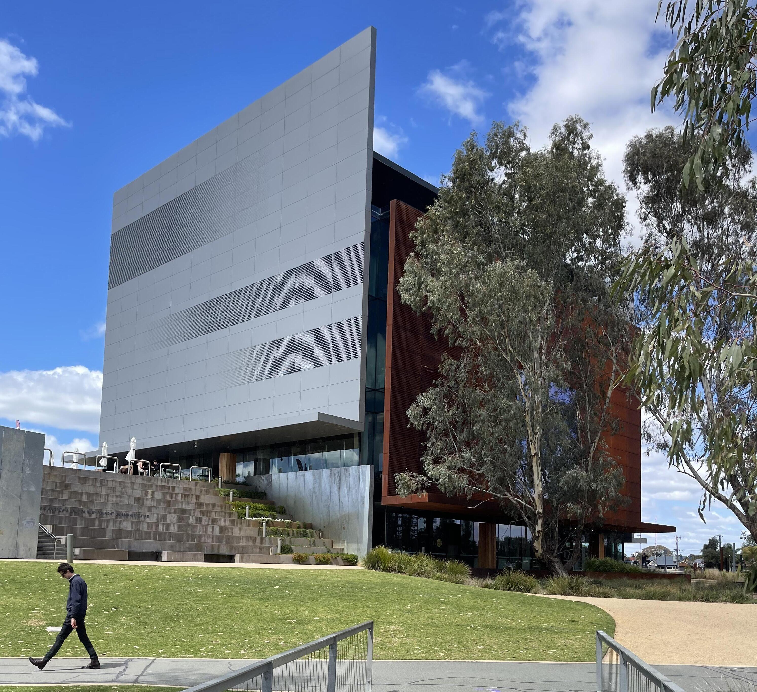
The Editor and fellow VAS member Creagh Manning recently visited Shepparton Art Museum. Our thanks to the staff at SAM for their hospitality and guidance during the visit
Unlike the Bendigo, Ballarat, Castlemaine, and Geelong Art Galleries which benefited from the munificence of 19th century gold boom, the Shepparton Art Gallery had a much later and more modest start. It wasn’t until 1936 that Shepparton Art Gallery opened and then only within the doors of the existing Municipal Chambers. In 1965, it relocated to the new Civic Centre. These venues had limited suitable hanging space and climate controls which restricted the Gallery’s ability to borrow and exhibit significant artworks and touring exhibitions. SAM, the new purpose-built Gallery, completed in 2021 on the shores of the Goulburn River floodplain, was funded by 3 tiers of Government as well as local philanthropic contributions notably from the Gantner family.
VAS alumnus and former President Sir John Longstaff
(1861–1941) made a significant contribution to the early development of the Shepparton Art Gallery. He was one of those instrumental in securing funding for its establishment and then took on the role of advisor to the Shepparton Council regarding art acquisitions (see page 32). Management of the museum has shifted from the Shepparton Council to an independent Board. The facility has grown to include not only the art museum itself but also a café, a regional visitors centre, and the Kaiela Arts gallery and studio. The Kaiela Arts space provides accessible facilities for local Aboriginal artists, supporting creative expression and community engagement.
The Shepparton Art Museum (SAM) collection is notable for its strong representation of ceramics and indigenous artwork. It also features the works of significant VAS alumni such as Eugene von Guerard, John Ford Paterson, Arthur Streeton, Rupert Bunny, and Frederick McCubbin; most of whom belonged to the Buonarotti Club with Longstaff. Their works contribute significantly to the museum's artistic offerings, showcasing a range of styles and periods
that reflect the depth and diversity of Australian art history.
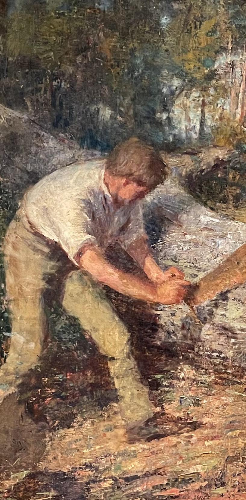
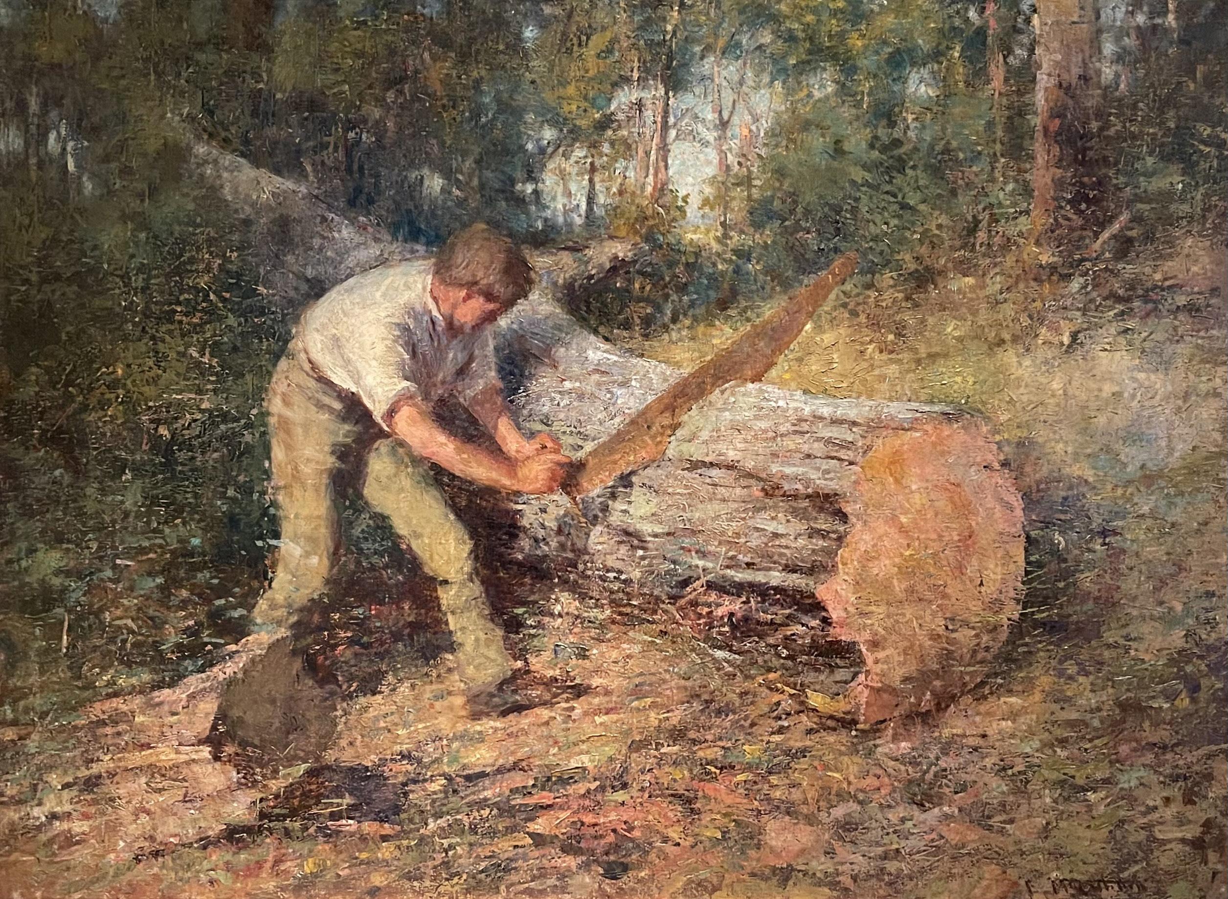
McCubbin likely painted The Wood Sawyer at Mt Macedon, where he owned the cottage ‘Fontainebleau’. McCubbin named it after the forests near Paris where the Barbizon painters had worked. The Barbizon painters (Corot, Millet) laid the groundwork for the French Impressionist movement, focussing on real landscapes and rural life.
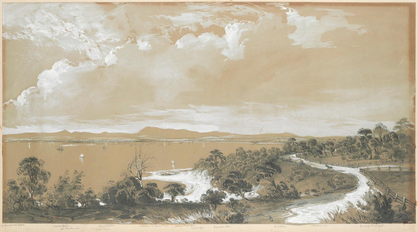
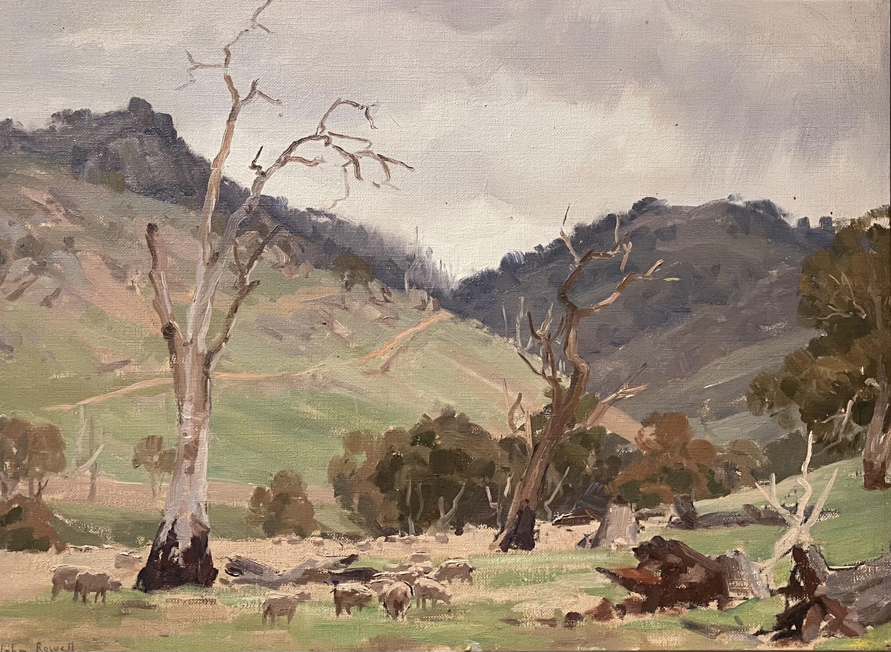
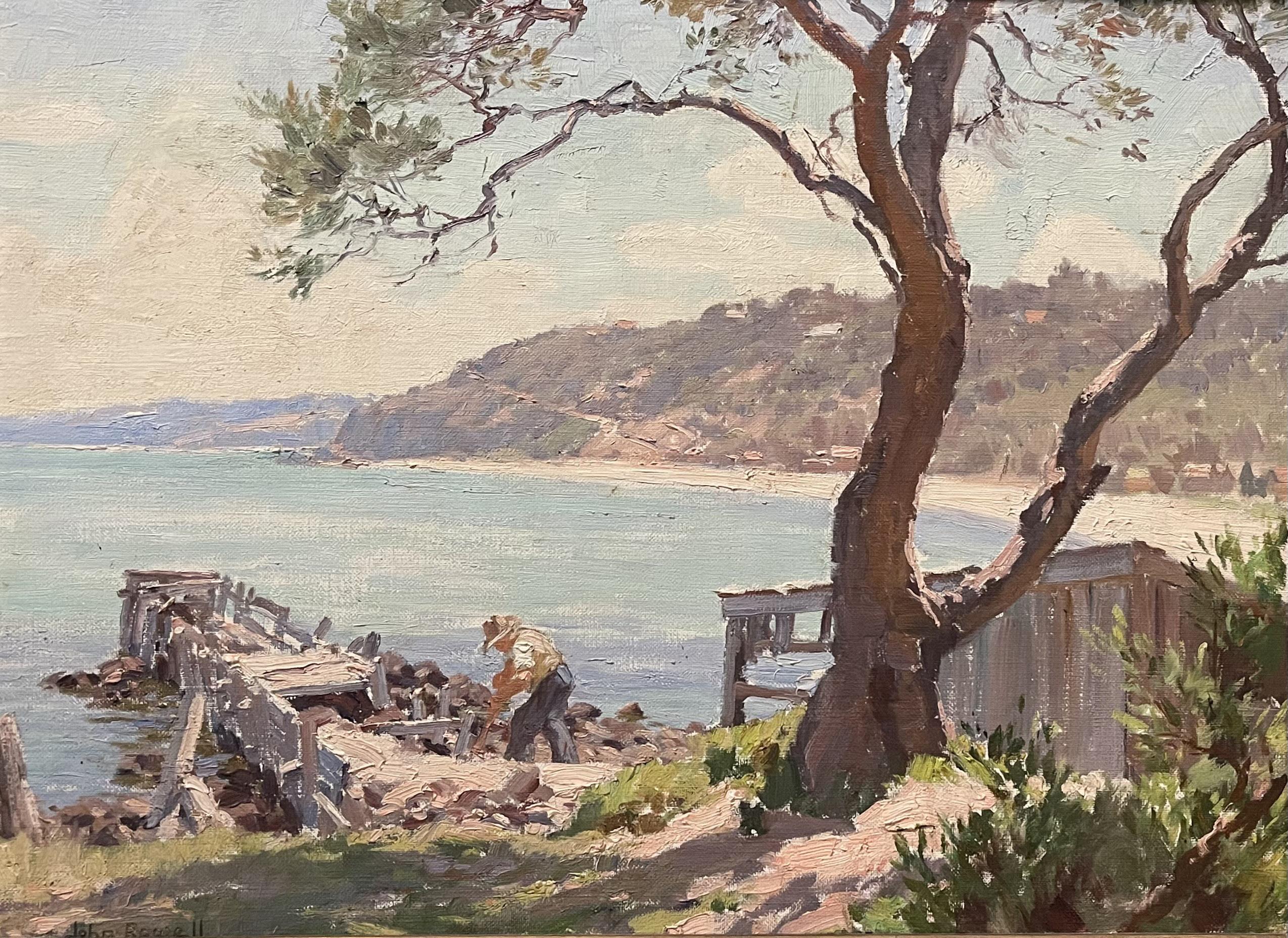
John Nightingale Rowell (1894–1973) is an underappreciated figure within Australian Impressionism. The creative accomplishments he made are frequently eclipsed by the innovative work of predecessors such as Frederick McCubbin and Walter Withers. Despite this, Rowell’s work demonstrates a distinct impressionist style. Rowell is notable for his contre-jour landscapes using backlighting to capture atmospheric effects, especially brilliant sunlight. Rowell was a VAS Councillor (1931) and studied at the National Gallery School between 1912-17 under Bernard Hall and McCubbin. A Wet Day at Tallarook, which depicts an overcast day in a pasture 90km south of Shepparton, was one of the first artworks to enter the SAM Collection in 1936. A Shepparton Councillor described it as “too sombre” following which Rowell
donated a second sunnier painting of an idyllic seaside landscape view of Mornington.
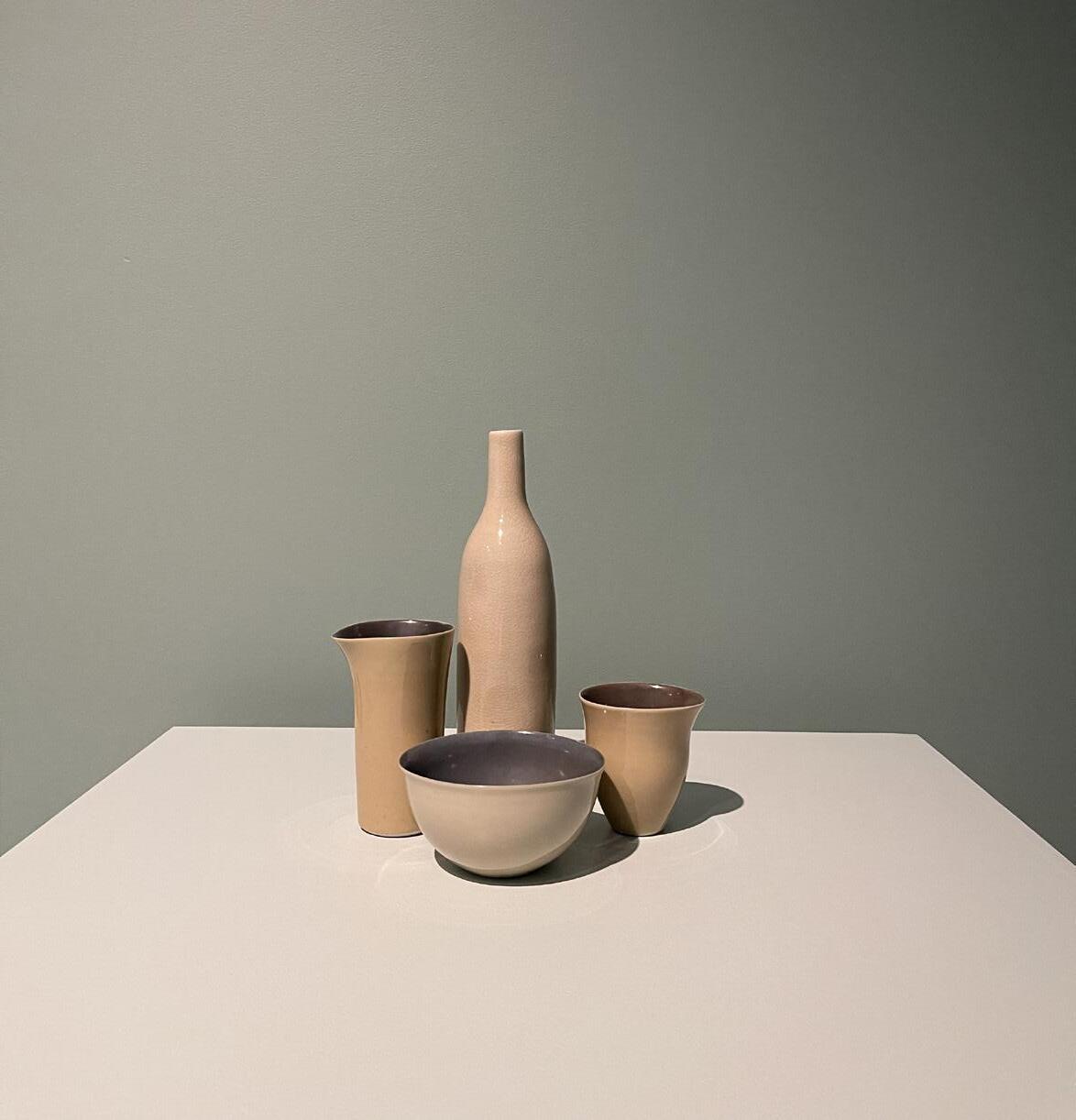
It was impossible to ignore the austere display of porcelain still-life groups by Ballarat potter Gwyn Hanssen Pigott (1935-2013). Her work is clearly influenced by the still life paintings of Italian painter Giorgio Morandi. The compositions and colours reflect his serene style. “Hanssen Pigott noted that her interest in, and continued use of, porcelain was due to its strength when rendered fine, and the way that the rims absorb light”1
Melbourne architectural practice Denton Corker and Marshall won the competition to design SAM. DCM’s practice thrived under Jeff Kennett’s premiership, with projects like ‘Jeff’s Shed’ and Melbourne Museum. Later they established an international reputation winning the prestigious Stonehenge Visitor Centre and Manchester Civil Justice Centre commissions in the UK. (www.dentoncorkermarshall.com).
The building sits in a parkland setting and unlike the other regional Galleries it is a multi-storey monolith,
the tallest building in town.
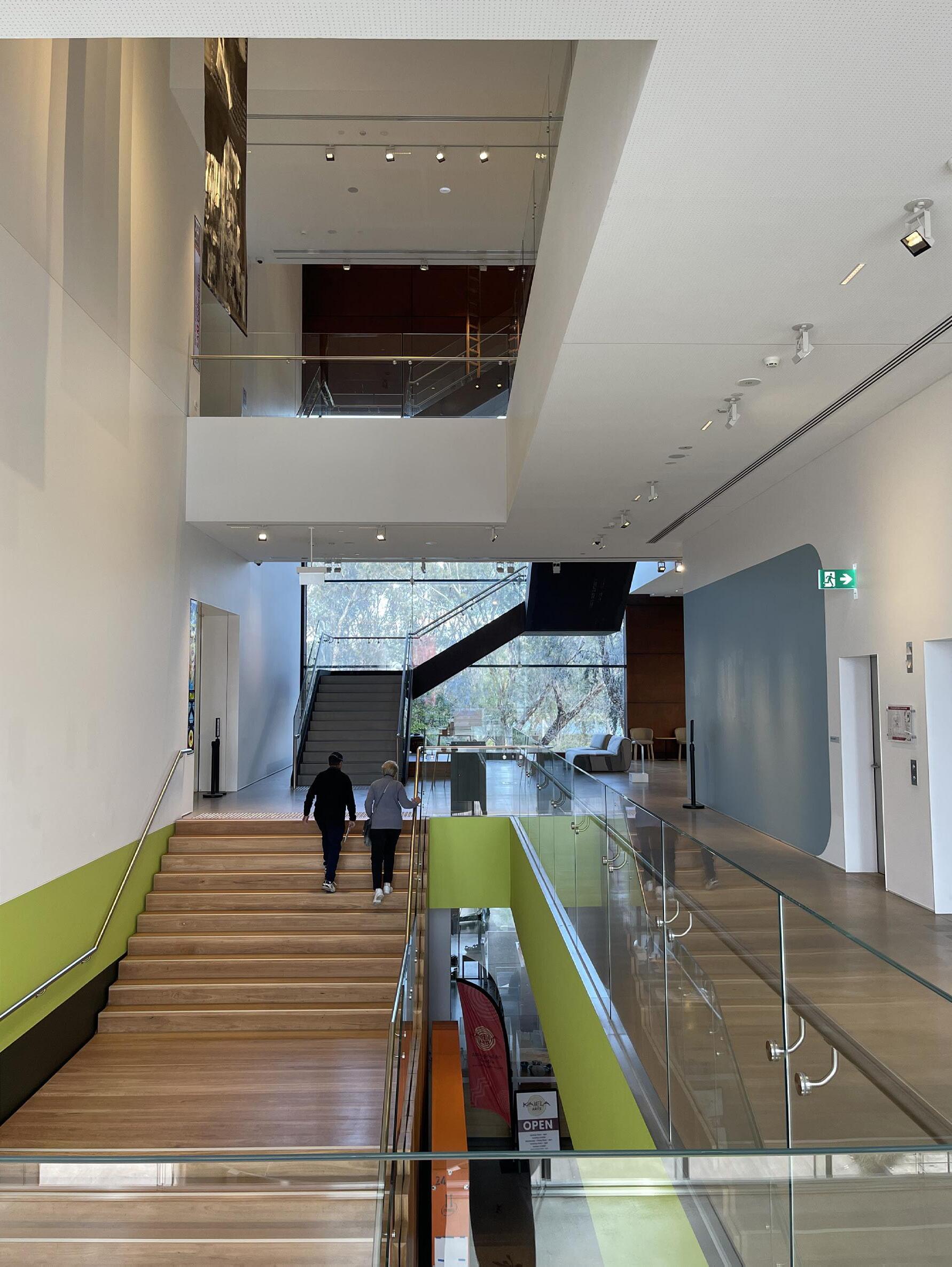
“We wanted the gallery to be a signal for Shepparton, a signal of confidence in culture, and that Shepparton was a place to come to”.²
Functionally it is a major departure from traditional low rise, top lit art galleries. The galleries span four levels, arranged around a central area which is dedicated to internal circulation and building services. This open ended naturally lit ‘core’ of the building is the genius of the design with views outwards on all levels to the natural environment beyond. I would have liked to have seen more natural light inside the Galleries themselves, on the basis that a mix of controlled
natural light and artificial light is the ideal combination for viewing art. However, it is truly a pleasure moving from one floor to another, and from gallery to gallery. The internal colour scheme is fresh and stimulating and the external building materials complement the colour and texture of the surrounding bushland. SAM is an innovative and landmark addition to Victoria’s network of exceptionally fine regional art galleries.
References:
1 Extract from Eighty Years of SAM: The Collection SAM 2017
2 Statement by John Denton of DCM
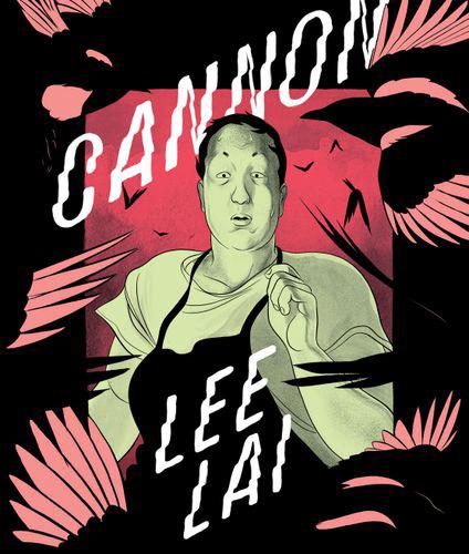
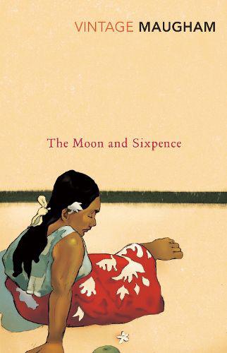
This month’s bookshelf moves between shadowy backstreets, artistic obsession, and quietly devastating self-discovery. From the gritty, noir-like tension of Cairo to the intimate and beautifully observed relationships in Cannon, each title offers a distinctly different lens on creativity, identity, and human connection. Rounding out the selection is The Moon and Sixpence, the classic tale
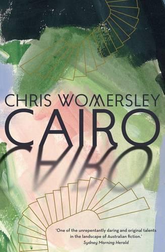
of a man who abandons convention in pursuit of artistic ambition at any cost. Together, they make for a compelling mix of contemporary and classic reads for anyone drawn to art, ambition, and the messiness of being human.
All titles are available through local Readings stores (readings.com.au).
Moon And Sixpence
Frustrated by country life, seventeen-year-old Tom Button moves to the city to study. Once there, he is befriended by the eccentric musician Max Cheever, and their close-knit circle of painters and poets.
As Tom falls under the sway of his charismatic older friends, he enters a bohemian world of parties and gallery openings. Soon, however, he is caught up in more sinister events involving deception and betrayal. (Readings)
Cannon is the first graphic novel to win the Stella Prize.
In Cannon, Lee Lai's follow-up to the critically acclaimed and awardwinning Stone Fruit, the full palette of a nervous breakdown is just a part of what is on offer. Lai's sharp sense of humour and sensitive eye produce a story that explores the intimacy of queer friendship and weight of family responsibility, and breaks open the question of what we owe both to each other and to ourselves. (Readings)
Charles Strickland, a conventional stockbroker, abandons his wife and children for Paris and Tahiti, to live his life as a painter. Whilst his betrayal of family, duty and honour gives him the freedom to achieve greatness, his decision leads to an obsession which carries severe implications.
Inspired by the life of Paul Gauguin, The Moon and Sixpence is at once a satiric caricature of Edwardian conventions and a vivid portrayal of the mentality of a genius. (Readings)
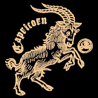
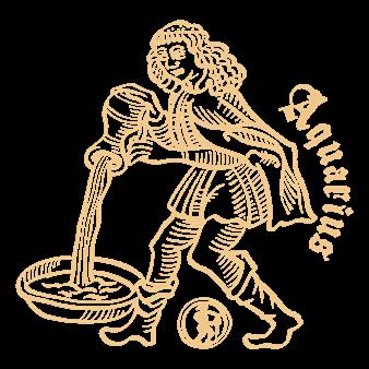
DECEMBER 22 - JANUARY 19 JANUARY 20 - FEBRUARY 18
You approach your work with discipline, structure, and quiet determination. This week, something shocking happens: you actually finish a piece and feel satisfied. Don’t panic. It’s unfamiliar, but not dangerous. You may even allow yourself a brief moment of pride.
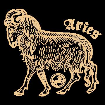
MARCH 21 - APRIL 19
Your ego and enthusiasm hit peak genius—again. You begin three bold new works before morning tea and loudly declare a “new direction.” Unfortunately, your attention span moves on before your paint dries. Try finishing something before announcing your retrospective.
You reject convention entirely. Rules are irrelevant, expectations meaningless. You’re either ahead of your time or completely off track—no one, including you, can tell. Either way, people will have opinions, which is exactly what you wanted.
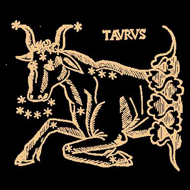
APRIL 20 - MAY 20
You’re deeply in love with your materials. The weight of the paper, the smell of oil paint, the texture of that brush… it’s getting intimate. Your artwork is progressing slowly but luxuriously. No one knows what you’re making, but it is undeniably well-crafted.
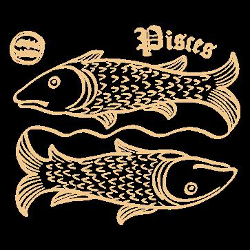
FEBRUARY 19 - MARCH 20
You trust your instincts and let your emotions guide the process. Sometimes this leads to magic; other times, to confusion and mild regret. Going with the flow is fine, but even you might benefit from a loose plan—just don’t follow it too closely.

MAY 21 - JUNE 20
Ideas everywhere, actual art nowhere. You’ve conceptualised at least six projects and explained them brilliantly to anyone who’ll listen. The only missing piece is making literally any of them. Consider committing to one idea for longer than an afternoon.
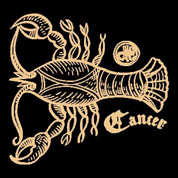
JUNE 21 - JULY 22
Your art is your soulmate… until it betrays you. You nurture it, protect it, and then suddenly decide it’s emotionally toxic. After several dramatic revisions, you may realise the problem isn’t the work—it’s your attachment to it. Step away before you spiral.

SEPTEMBER 23 - OCTOBER 22
You’re paralysed by choice. This composition? Or that one? Move it two millimetres left? Or right? You will spend so long perfecting balance that you forget to actually enjoy making the work. Remember: indecision is also a decision.

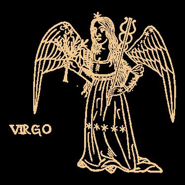
JULY 23 - AUGUST 22 AUGUST 23 - SEPTEMBER 22
You’re ready to wow the crowd. The concept is bold, the execution theatrical, and yes—you’ve rehearsed what you’ll say when people inevitably ask about it. Just be aware: the spotlight you’re chasing may reveal details you hadn’t planned on showing.
You notice every imperfection, every slightly off line, every microscopic failure. You fix, refine, and adjust until the life quietly drains out of the work. Relax— no one else can see what you’re seeing. At some point, “done” is better than “technically flawless.”
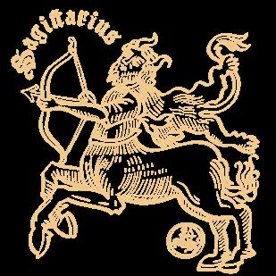
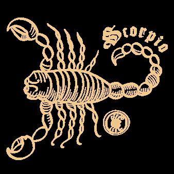
OCTOBER 23 - NOVEMBER 21 NOVEMBER 22 - DECEMBER 21
You’re tempted to go deep—too deep. Everything feels intense, layered, symbolic, possibly a bit confronting. While this is your natural habitat, not every piece needs to emotionally devastate the viewer. Consider restraint… or at least a slightly smaller canvas.
You try everything. New mediums, new styles, new techniques— why not? Some experiments will be inspired, others baffling. You won’t necessarily learn from either. Still, your enthusiasm is admirable, even if your results are… inconsistent.
GEMINI ARTISTS
Damien Hirst (June 7)
M.C. Escher (June 17)
CANCER ARTISTS
Frida Kahlo (July 6)
Gustav Klimt (July 14)
Marcel Duchamp (28 July)
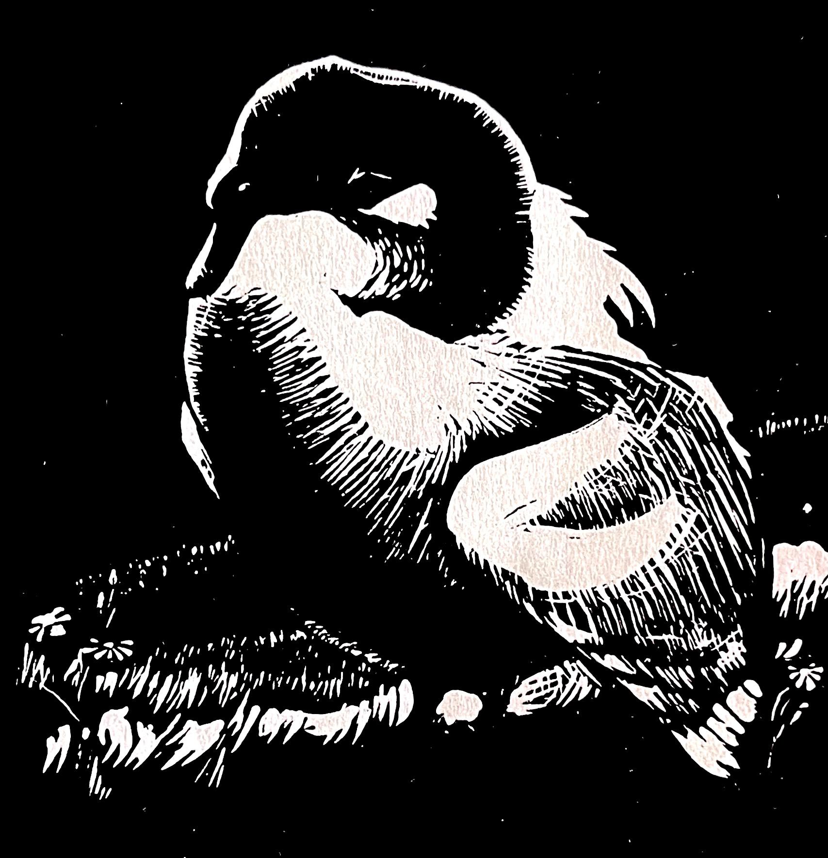
VAS Cato Gallery 20-31 May 2026
Edward Heffernan (1912–1992) was a painter, draftsman, printmaker and sculptor whose career spanned six decades. He had a long and significant association with the Victorian Artists Society, serving on Council for twelve years and as President from 1977 to 1980. In recognition of his outstanding contribution, he was awarded a VAS Fellowship, the Distinguished Service Award and Honorary Life Membership—honours reflecting an impact on the Society matched by few in its history. In 1984, he was awarded the Order of Australia Medal for services to the arts.
This retrospective is drawn from the private collection of the late Ms Cherrll Rogers, who worked closely with Edward Heffernan for many years as his assistant and occasional model.
We are grateful for the opportunity her collection has made possible: to present a selection of drawings, paintings and linocuts that span the full breadth of Heffernan’s distinctive artistic life.
All works were offered for sale at accessible prices, inviting both new and established collectors to acquire a lasting piece of VAS history
1. Blue and yellow
2. Four 3. Fresco
4. The Fox NGV Contemporary
5. Ten cents
6. Lascaux Caves
7. A work of art divided into three panels
8. Copper (also zinc in some cases)
9. Hieronymus Bosch
10. Bronze
11. Rembrandt
12. One-point perspective
13. Marble (Carrara) 14. Trompe L’oeil
15. Still Life
16. Shodo
17. A visible trace of an earlier composition beneath the surface
18. Fred Toumayan VAS
19. Papunya Tula movement (Western Desert art movement)
20. Linseed oil
21. Frank Lloyd Wright (1867-1959)
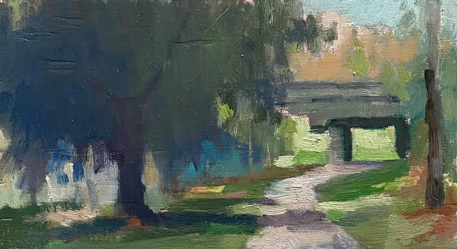
1 JUL – 2 AUG 2026
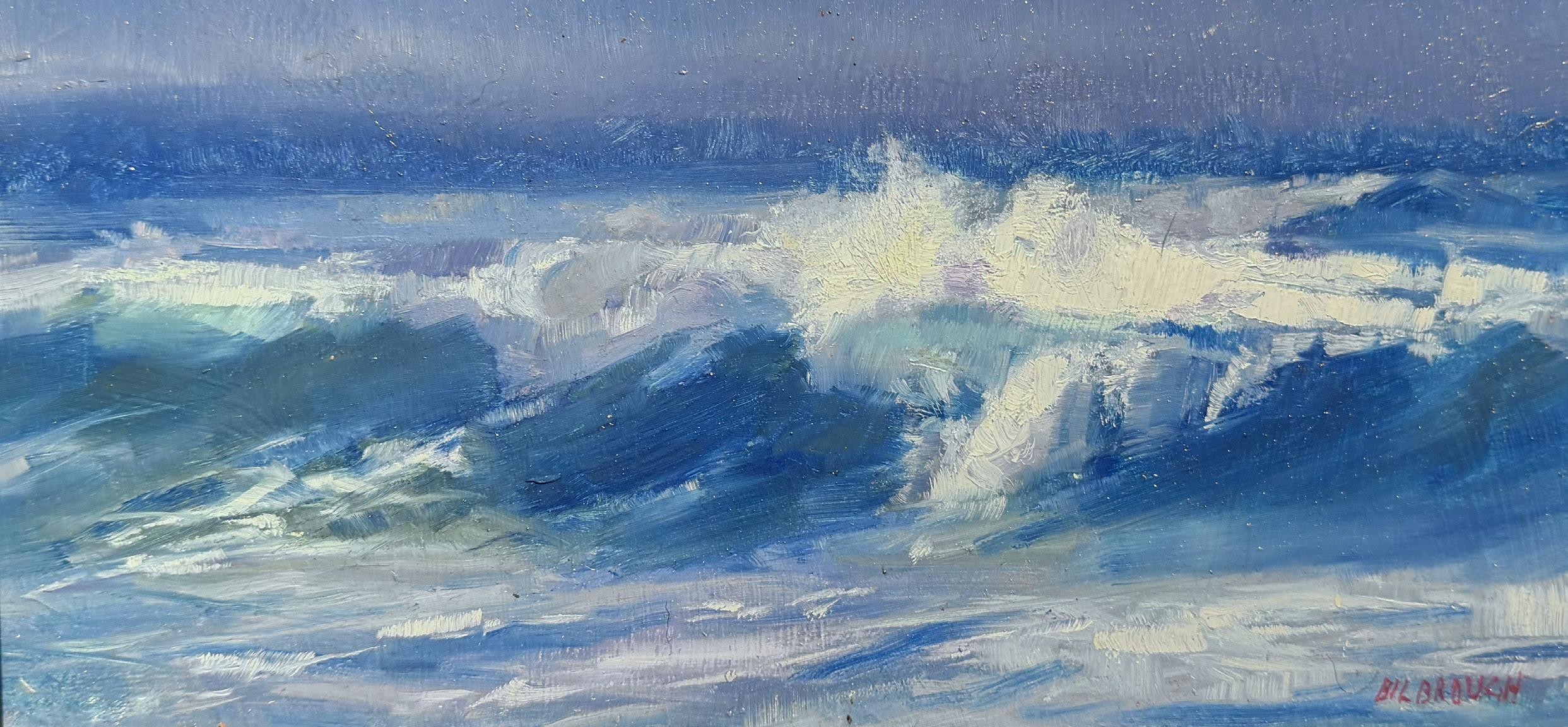
16 JUL – 2 AUG 2026
PATRON IN CHIEF
Governor of Victoria, Her Excellency Professor the Honourable Margaret Gardner AC
COUNCIL
PRESIDENT Lucy Maddox
TREASURER
Raymond Barro
EXHIBITING
Bruce Baldey VAS
Gino Severin
D’Arcy Rouillard
Liz Gridley
Swathi Madike
Tim Murphy VAS
Leonie Khoury
Liz Moore Golding VAS
Meg Davoren-Honey OAM VAS FVAS
NON-EXHIBITING
Rosemary Noble HON FVAS
Ron Smith OAM HON FVAS
HONORARY HISTORIAN
Andrew Mackenzie OAM HON FVAS
MANAGER & SECRETARY
Kari Lyon PhD
ADMINISTRATION OFFICER
Rhiannon Lawrie
MARKETING & DESIGN COORDINATOR
Catherine Jaworski
EDUCATION & PROGRAMS OFFICER
Lucy Wilde
INSTALLATION & CURATION SERVICES
Sam Bruere VAS
GALLERY ASSISTANTS
Olivia White
Thomas Bladon
ARCHIVIST
Anne Scott Pendlebury HON FVAS
MAGAZINE COMMITTEE
EDITOR
Bruce Baldey VAS
DESIGNER
Catherine Jaworski
Opinions expressed herein are not necessarily those of the VAS Council or the editors of this magazine. Articles from members will be appreciated. Contributions will be published on a strictly honorary basis and no payment will be made.
ADVERTISING ENQUIRIES
Bruce Baldey VAS magazine@vasgallery.org.au
MAGAZINE SUBMISSIONS
Deadline for DEC-FEB issue: 15th October email: magazine@vasgallery.org.au
Telephone 03 9662 1484
Website vasgallery.org.au
Email info@vasgallery.org.au
Address 430 Albert St East Melbourne 3002
Standard Opening Hours 10am – 4pm Weekdays 11am – 4pm Weekends