Valpo Athletics Valpo Athletics BRAND INFOSHEET

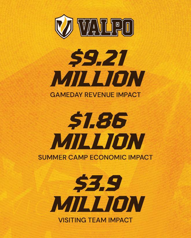
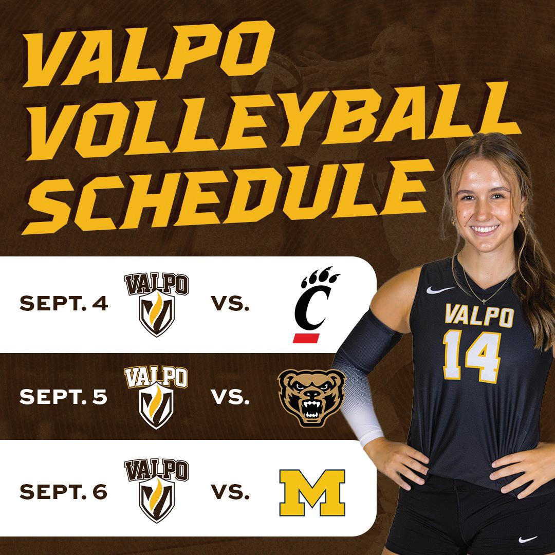
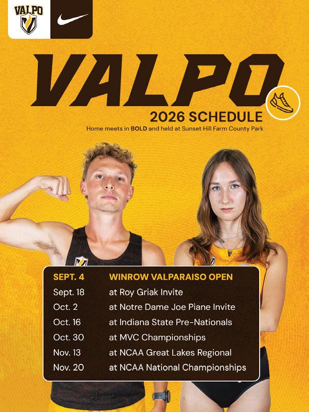
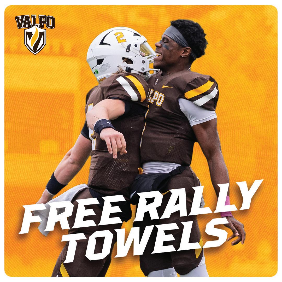
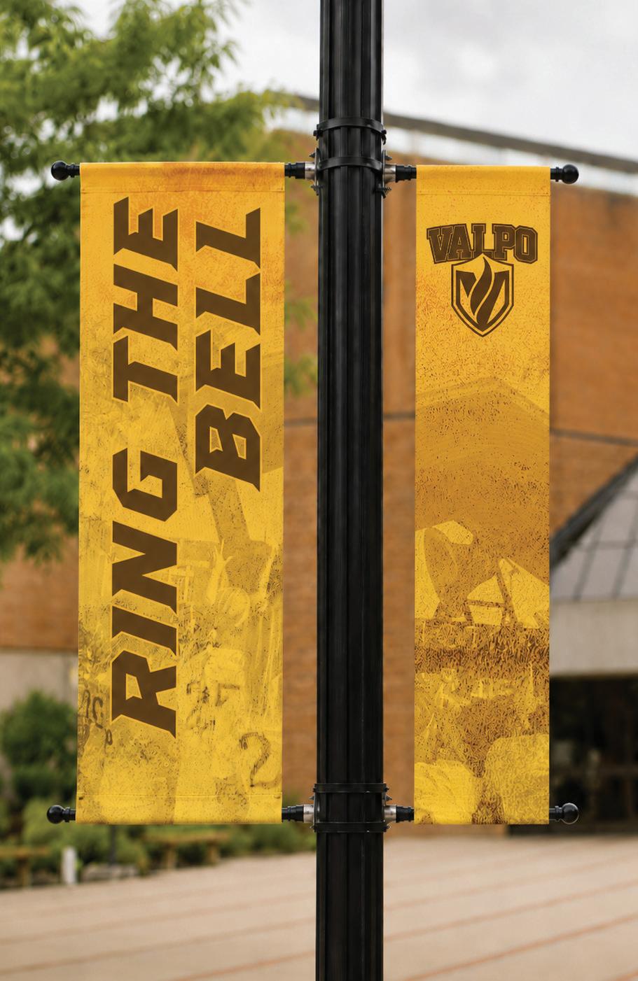
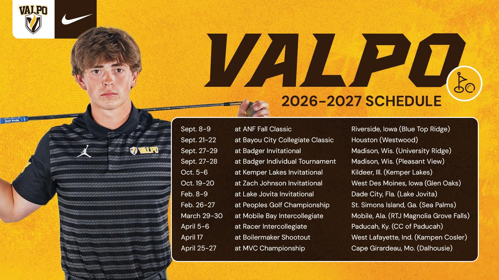
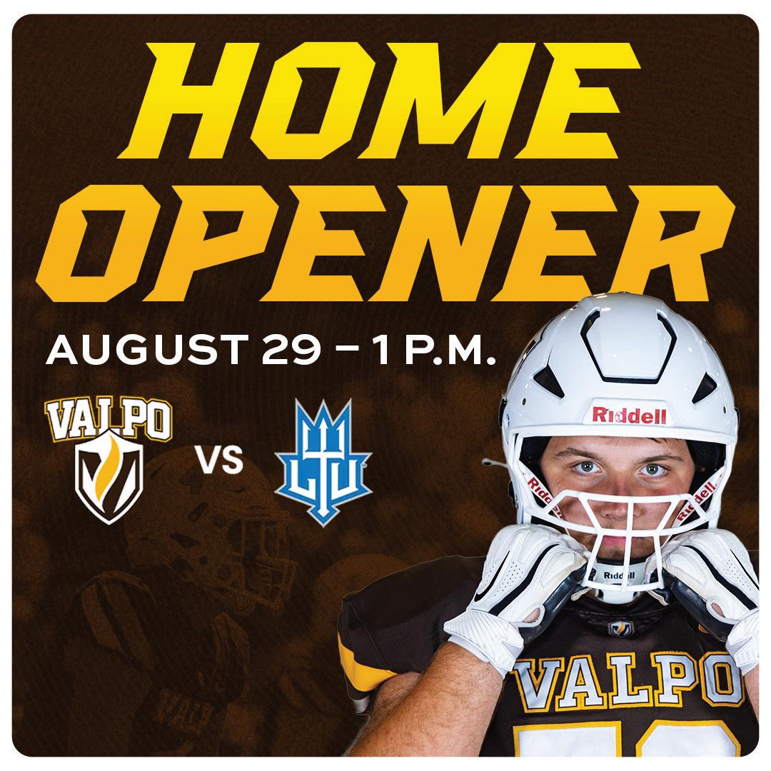
Valpo Athletics continues to evolve its visual identity, embracing a more collegiate, competitive aesthetic that reflects the energy of our teams and the spirit of competition while remaining unmistakably Valpo. Inspired by professional and peer athletics brands, this direction emphasizes bold photography, intentional white space, layered textures, paper elements, reflections, equipment details, and iconography to create designs with greater depth and momentum.
This evolution is intended to elevate — not replace — our existing brand platform. Core elements, including brown and gold and the Valpo Athletics logo, continue to create a clear connection to the University, while overly decorative effects, such as heavy radiating lines, take a step back to let our student-athletes and stories shine. The result is a more modern, energetic visual system that feels authentic to today’s athletics landscape while remaining rooted in the Valpo brand.
TYPOGRAPHY
KSN Ironklaw
(Headlines)
Large text only
SWEET SANS
(Subheadlines or longer headlines)
Small or large scale, use in all capital letters, with generous tracking (letter spacing)
Other important typographic notes:
• Do not use any typefaces not listed above.
• Do not stretch text.
• Legibility and readability of text is key.
DM Sans
(Body copy)
Secondary body copy text, including schedules
Paris Script
(Player names only)
Small player “signature” next to their photo, set kerning to metrics and tracking to zero
TEXT ACCESSIBILITY
In order for our communications to be effective, they must be inclusive. Our audiences are broad and accessibility is important for serving everyone. Whenever possible, we want to remove barriers that prevent interaction with our messages.
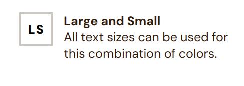
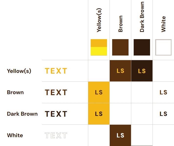
This color matrix demonstrates the options available for applying text, using our brand colors, to achieve an AA level of accessibility compliance. The matrix is a quick and clear reference guide for combining foreground and background colors that are easy for everyone to read. Don’t forget that the size of the text will also influence the degree of legibility and compliance.
TEXT COLOR
LOGO ACCESSIBILITY
ON DARK BROWN, BROWN, OR SIMPLE
PHOTO BACKGROUNDS:




ON WHITE OR SIMPLE LIGHT

ON GOLD OR YELLOW BACKGROUNDS:
Other important logo notes:
• Do not use the shield or logo as a design element.
• A buffer the height of the “V” in Valpo is required around all sides of the logo to be in compliance with Valpo’s registration with the United States Patent and Trademark Office. No graphics elements or text may infringe on this buffer.
In order to highlight our partnership with Nike, a Valpo Athletics and Nike logo lockup was created. This lockup provides a secondary option for logo inclusion. The ideal placement for this duel logo lockup is top left, top right, or top center of the design, and it should intersect with the top edge of the design.
DARK BROWN, BROWN, OR DARK PHOTO BACKGROUNDS:
DARK
PHOTO BACKGROUNDS:
LOGO LOCKUP
ON
ON WHITE OR LIGHT PHOTO BACKGROUNDS:
ON GOLD OR YELLOW BACKGROUNDS:
Gold/Yellow
Gold/Yellow
COLOR
YELLOW
HEX (digital):
#FFE300
CMYK (print):
0 7 100 0
Pantone (print):
PMS 107 C
GOLD HEX (digital):
#F5B80A
CMYK (print): 0 22 100 0
Pantone (print):
PMS 1235 C
BROWN
HEX (digital):
#5C3000
CMYK (print): 0 68 100 67
Pantone (print): PMS 1535 C
Other important color notes:
• Valparaiso University’s secondary colors are not permitted.
• CMYK is the preferred colorspace Designworks uses for print.
DARK BROWN
HEX (digital): #331A00
CMYK (print): 33 66 76 68
Pantone (print): PMS 476 C
• Pantone (PMS) color is preferred for promotional and giveaway items, including t-shirts, hats, or anything with only a logo imprint.
DESIGN ELEMENTS
1. Thin Radials: Should be positioned so the center point is located behind a prominent focal point, such as an athlete cutout, headline text, or logo. This element should always appear in the background, rather than on top of text or athlete photos, and should not interfere with the ability to read text.
2. Gritty Texture: Should overlay background imagery, not player photos or text.
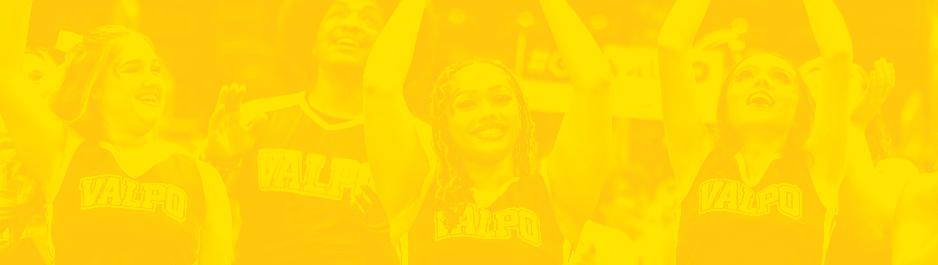
3. Halftone Background Imagery: Provides additional texture, but should not interfere with ability to read text.
4. Rounded Corner Boxes and Frames: Can be used to frame the entire design, or to contain or call out content.
WHITE
HEX (digital): #FFFFFF
CMYK (print): 0 0 0 0
GRAY
HEX (digital): #DAD9D6
CMYK (print): 13 10 12 0
Pantone (print):
PMS Cool Gray 1 C 50% tint
• Valparaiso University logos may only appear in gold, dark brown, and white

5. Sport Iconography: Acts as a secondary design element. Should remain small and the icon illustration should be consistent across the same program.
6. Buttons and Ribbons: Can be used to contain or highlight such content as website URLs, calls to action (CTAs), or special promotions.
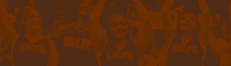
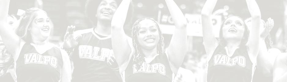
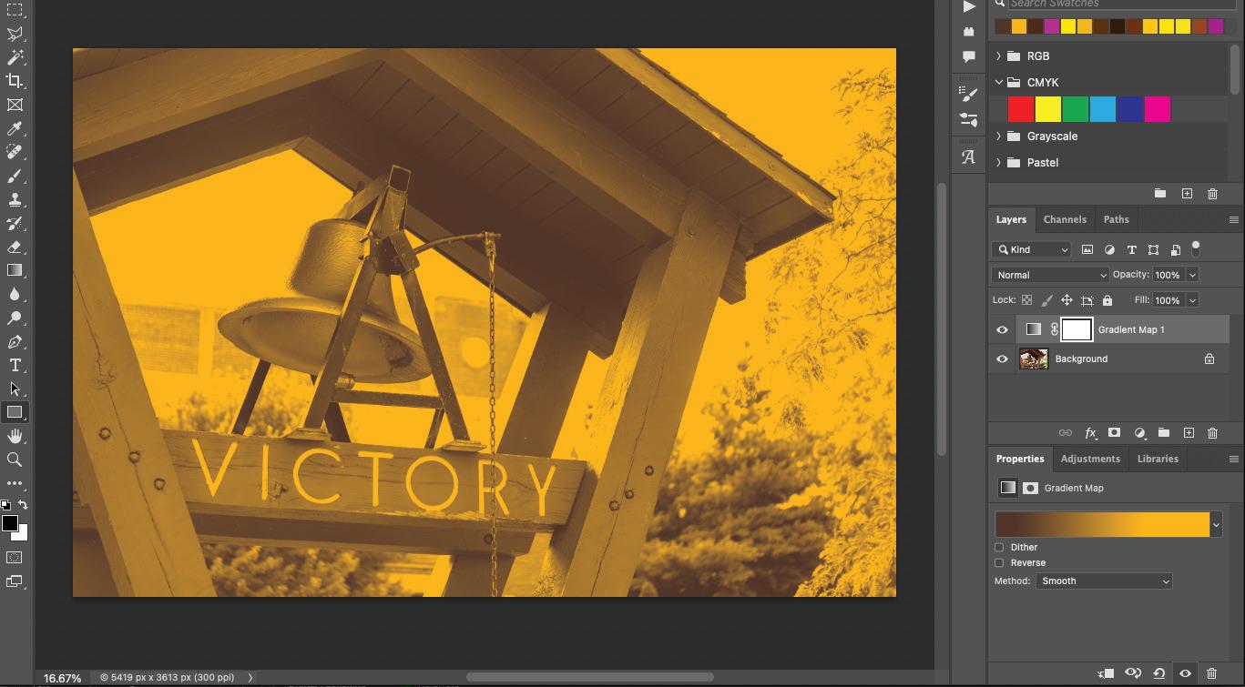
You may choose to add a halftone effect to an image as a background element, under the thin radial element of the design. To achieve this, in Adobe Photoshop, choose “Gradient Map” under the Adjustments menu. Set to desired approved colors, and adjust handles closer together on the gradient map bar to achieve a high contrast look. See page 51 in the Valparaiso University brand guidelines for more detailed instructions.