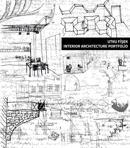
UTKU FİŞEK INTERIOR ARCHITECTURE PORTFOLİO
UTKU FİŞEK interior architect utkufisek@gmail.com +90 538 310 44 33 Istanbul/Uskudar
Education
Languages
Istanbul Technical University 2012-2020 Bachelor of Science, Interior Architecture
Turkish
native language
English Kadıköy Anatolian Highschool
C1
2007-2012
Experience
Software Skills
Çelik Çizgi Mimarlık (internship)
2016
GIMP
5/5
Ark Insaat (internship)
2019
AutoCad
5/5
Microsoft Office
4/5
3ds Max
3/5
Workshops and Competitions Sett3: Kabuk Workshop serries
2013
InDesign
3/5
Bi’sürü Dönüsüm Atolyesi
2013
Illustrator
4/5
Itü için tasarım Kendi oturma elemanını tasarala
InkScape
2/5
2018 Sketch up
2/5
DIALux
2/5
Syntax2D
4/5
Yurtbay Seramik Gelecegi Tasarla 2019 Amorf Dogaltas Proje ve Tasarım Yarısması
2020
THE MARMARA TAKSÄ°M 2019 fall semester
Taksim square
Even though “The Marmara� is located at one of the most central and popular areas of Istanbul, it used to be detached from the local activity and presence. In response to that, the first two floors were redesigned to connect the hotel with local life and enhance the hospitable attitude. Additionally, the ball hall at the ground floor was replaced with an atrium and retail shops that historically belonged to Taksim such as Rebul Pharmacy, Kelebek Corset and also a charge-free sitting area was left in the middle to boost sales. Modern shops like new coffee shops and restaurants were placed in retail areas. The lobby was kept on the first floor as a continuation of previous designs and also for security reasons. In contrast to the local-heavy atrium, the lobby is generally populated by guests.
The lounge was relocated to function as a bridge between the two. Finally, a fine dining restaurant was isolated from all other spaces except for a connection with a small part of the lobby. To distinguish what is new from what is old and to emphasize the communality of the mentioned spaces, different colors, forms and materials were used. Fiber-reinforced plastic was the main material of the atrium with its smooth texture and organic form. For the soft surfaces of the atrium, leather was used to enhance the character. In contrast to the atrium, the fine dining restaurant was designed with regular luxury elements. Fabric and curvy furniture were used at the lobby and lounge to facilitate the transition between public and private edges and to provide them with a pleasant environment.
The diagram shows the connection between the main spaces and their grouping under the functions of a hotel. Red lines are visitors with different interests. We realize that retail, coffee shops, and restaurants are where different groups of people cross each other so we should emphasize these functionalities in our design.
previous
best
final design
At the start of the design process, two isovist maps were produced with the previous plan and a plan that gives us the best result. New attempts were tested with the same syntax tools to identify deficiencies. The last map shows the final results of the design.
ground floor plan
first floor plan
E-E’ section
G-G’ section
F-F’section
fiber-reinforced plastic
atrium furniture details
FILMING 2018 summer
ACADEMY Maslak auto industry zone
Atatßrk Auto Industry Zone is relatively close to the city. With the neighborhood going through a slow gentrification process, people working at nearby high-rises and blue-collars in the Industry Zone become increasingly disconnected. Maintaining healthy communication between two cliques and establishing an active learning environment emerges as a serious concern. Movie school approaches learning as an iterative and creative process. Thus, the filming process is divided into three consecutive movements: theoretical lectures, pre-shooting, and shooting. This understanding brings us to the composition of the school’s individual regions and their relations with each other.
The dominant pattern in AtatĂźrk Auto Industry Zone is repetitive rectangles. We can observe them at doors, windows, plans of modules, etc. This rectangle motif is preserved and heavily used in the design of the Movie School. In contrast to this preservation, different materials and varying sizes of rectangles are used as the result of the functionality changes. A multi-functional cabinet and baluster that extends to create a display surface are exemplary in this regard. This school is one of the first facilities of the gentrifying district, so the interaction with locals is limited to visual contact only, and further improvements are postponed to upcoming facilities.
Phase I Theoretical Study
Phase II Preperation Process
Phase III Shooting and Editing
Disciples learn basics from mentors.
after this process everything should be ready for shooting
It needs a lecture hall.
cooperative works need a brainstorming area, performers need an exercise area and production designers need an atelier and a storage
It requires a studio. A rest area and a restroom is needed for whole process.
director director of photography
script writer
sound mixer
product design
post production peroformer
lets go back shooting
we planned shooting here
we took equipments here
now we are shooting
local repairmen will be a witness of the filming process and become familiar with shooting academy for taking a break the crew have to pass spaces of previous phases so they recall them chronologically large lecture and discussing area lets users feel each other works to improve their study decors and other artworks for filming are crafted, stored and finally used at filming
studio variations
floor plan
lecture hall variations
A-A’ section
front view
black board maple multipurpose cabinet
steel frame for lighting (50mm x200m)
maple handrail (40x40mm) steel frame (20x20mm) epoxy (5mm) screed (20mm) concrete (80mm) steel deck
epoxy (5mm) screed (90mm) soil
B-B’ section
detail A
detail B
detail C
detail D
KI-KA-LAB an Innovation Lab 2018 summer
Taşkışla, İstanbul
innovation lab is facilitation machine whose aim is to cope complex problems. to facilitate diverse groups comes together and uses complex tools. space has to adapt to these tools and to groups identity so space must be like white paper with pencil and eraser. in facilitation process hierarchy appears and disappears for example double diamond method is hierarchic method but groups doesnt have dominance over each other so space must follow this characteristic. for domesticity users must connect with space but it shouldnt be like home. it should be like an office because their function are similar but users can create their own space maybe a chair maybe a personal resting space. if groups can create synergy space also can create synergy. corporality is process to produce an innovation lab from idea of innovation lab. designer who create innovation lab must consider operability.
meeting area of homogenous users
build a team
meeting area with divided labour
frame your design
vertical design surface
create project
gathering togather
plan recruiting
private talking area
interview
non-hierarchic group talking area
group interview
design surface
card sort
horizontal design surface
collage
horizontal design surface
peers observing peers
design surface
extremes and mainstreams
understanding the problem
individual design surface
secondary research
design surface
define your audience
non-hierarchical group talking area
expert interview
find t
themes
Lightings are chosen from Vij5’s collection. Its cornered shape tunes with hexagonal design. Mobile furniture is designed for maximum flexibility to adapt to various uses of the lab. The hexagonal shape derived from flexibility concern and splayed to the whole lab. Fixed furniture will be used for storing mobile furniture and seatings for the refretshment area. The material of fixed is wooden and the color of the chosen wood is similar to the flooring but lighter. Stone flooring has preserved to maintain the connection between TaskĹsla and the lab. The wooden flooring used for circulation areas and mezzanine with different colors. All floorings are in harmony with neutral color choices. The volume between 126 and 127 at TaskĹsla is divided into two massive walls to create three smaller volumes. The middle volume will be used for management and refreshment purposes. Edge volumes where mezzanines are placed will be used for innovation.
design surface
how find themes might be
displayable design surface
design surface
share inspiring stories
create framework
displayable design surface
top five
individual design surface
explore your hunch
non-hierarchicalt group talking area
brain storm
searching for solutions
horizontal design surface
displayable design surface
horizontal design surface
displayable design surface
get visual mash-up
design principles
bundle ideas
story board
scenery area
meeting area
role playing
gut check
testing solutions
design surface
co-creation session
displaying surface
get feedback
A-A’ section
B-B’ section
mezzanine floor plan
floor plan
stair and cabinet section cushion hook&loop mdf 3cm hook&loop cushion wooden beam
seating detail
seating element
electric cable hanger wire
light fixture
modular seating unit
DON’T GIVE UP! exhibition design
2016 fall
Pera Museum
“Don’t give up” is an exhibition whose major concern is to demonstrate the absurdity of people’s despondency about the present and the future. The exhibition was envisioned to imitate this chaotic and desperate nature of daily life and thus help the visitor maintain a distance with their own desperation about daily life. The interior was designed to resemble a labyrinth but keeping personal comfort and ease of travel in mind. Obstacles and intuitive signs carefully placed inside the structure force the visitor to visit every section in the intended sequence and cause the works to be revealed in the desired manner. These signs, combined with the labyrinthine layout, help decrease foot traffic by “suggesting” visitors to always move in the same direction.
Each of the two entrances of “Don’t Give Up” offers one narrow and one wide passage, with the assumption that many people would opt for the wider passage, out of their feeling of personal comfort. Small works were deliberately left out of the main path, in order to guide the visitors to go back to the main path once they finish experiencing the small works. Should a visitor drift out of the main path, they are very likely to move into a “trap” work. The function of these traps is to subliminally persuade the visitors who move in the wrong direction into turning back on the intended route. Two observation points were placed to view the exhibition, and one more was placed to see the outside view.
A-A’
B-B’
C-C’
D-D’
Thank You
Utku Fisek +90 538 310 44 33 utkufisek@gmail.com