HD D& THE





“Creating
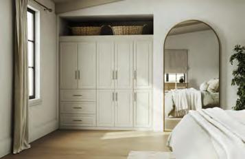
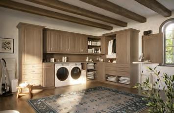
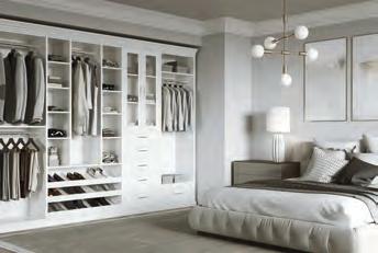
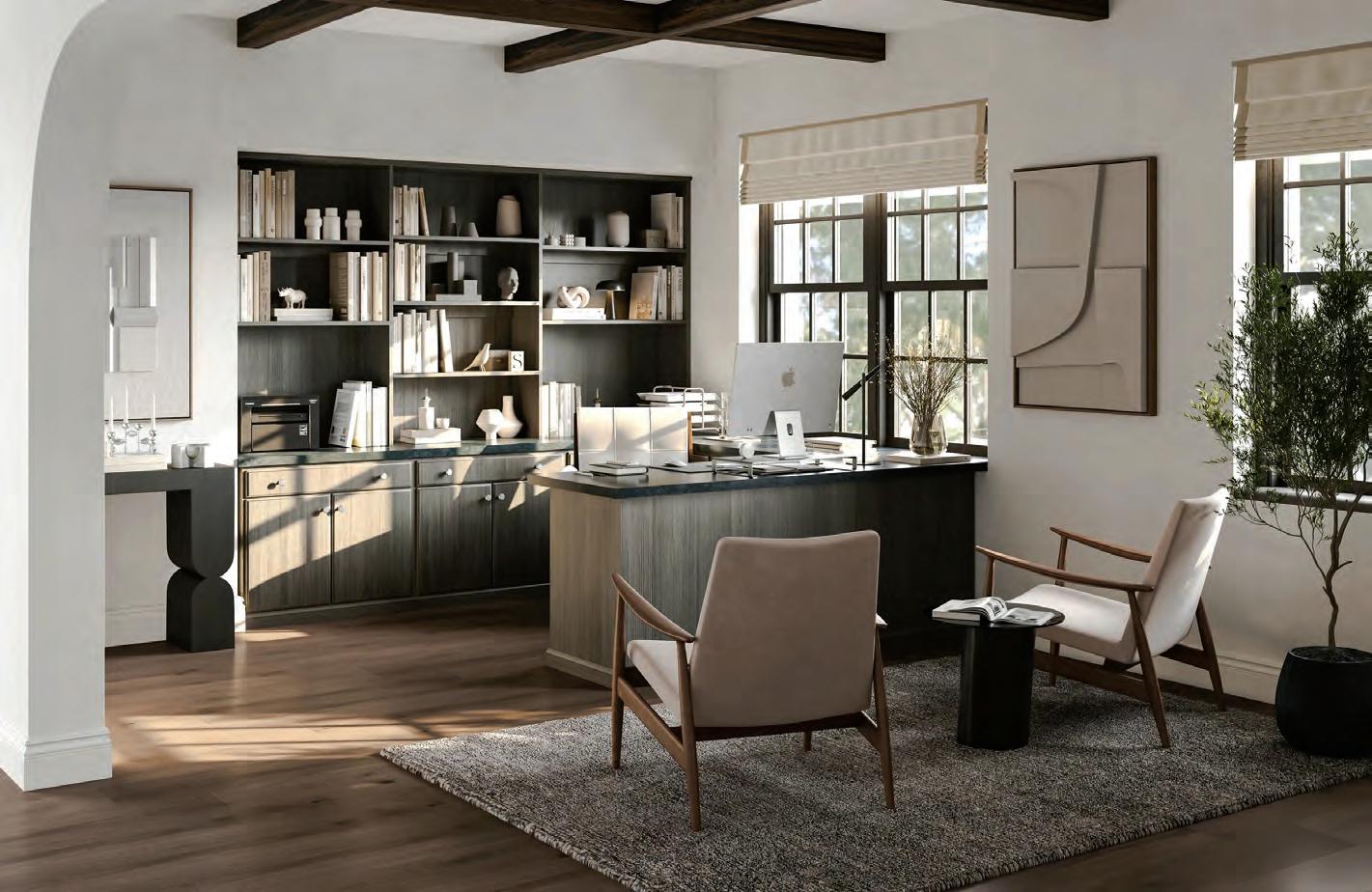
“Coming in late spring 2026 to Cornelius, NC. Look for our new showroom opening.”



































Caravaggio | Revolution: Baroque Masterpieces from the Roberto Longhi Foundation is generously presented by M.A. Rogers and Bank of America with additional support from the Samuel H. Kress Foundation. Individual sponsorship support for this exhibition is kindly provided by Betsy and Alfred Brand; Jane and Hugh McColl, Pat Rodgers, and Leigh-ann and Martin Sprock; Beverly and Jim Hance, Anna McKeithen Webersen, Laura McKeithen, Susan and Loy McKeithen, Marshelette and Milton Prime, and Rocky and Curtis Trenkelbach; Sarah and Tim Belk, Mary and Charles Bowman, and Jo Ann and Joddy Peer; Marty and Weston Andress, Mary Lou and Jim Babb, and Robin and Bill Branstrom. The Mint Museum is supported, in part, by the City of Charlotte and the North Carolina Arts Council. Caravaggio | Revolution is organized by the Fondazione di Studi di Storia dell’Arte Roberto Longhi and Civita Mostre e Musei, in collaboration with The Mint Museum and the Museum of Fine Arts, St. Petersburg. IMAGE: Valentin de Boulogne, known as Le Valentin (French, 1591–1632). Denial of St. Peter (detail), 1615–17, oil on canvas. Florence, Fondazione di Studi di Storia dell’Arte Roberto Longhi. Mint Museum Uptown at Levine
“The
we’ve ever had.”
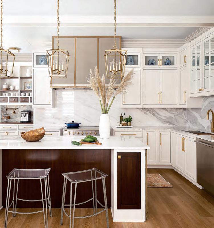
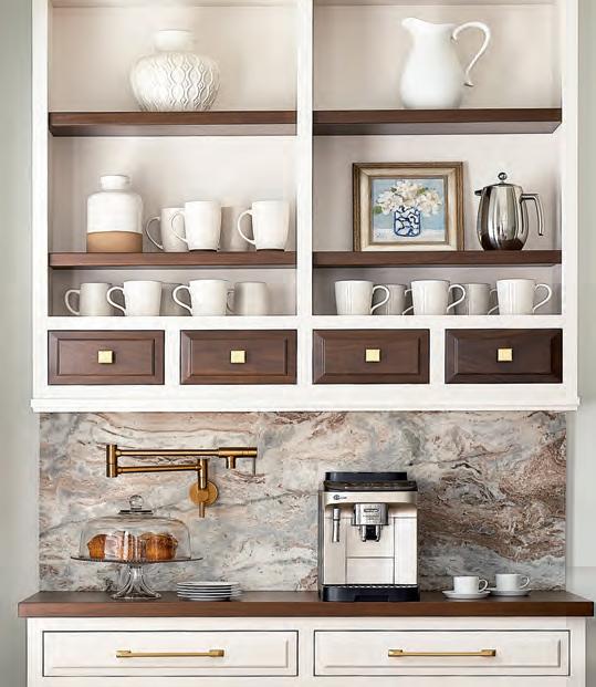
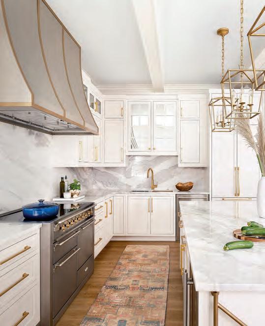
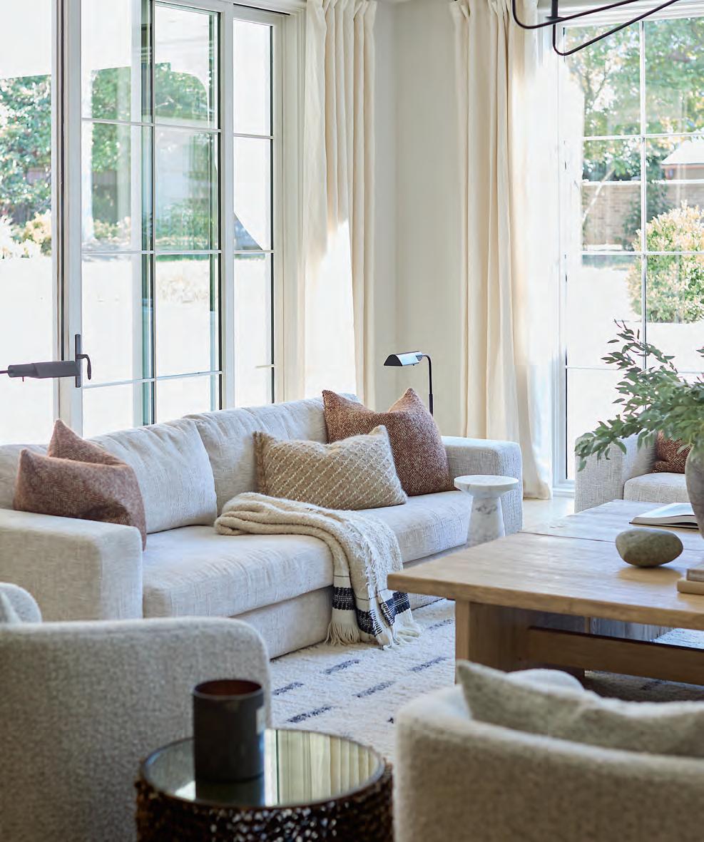
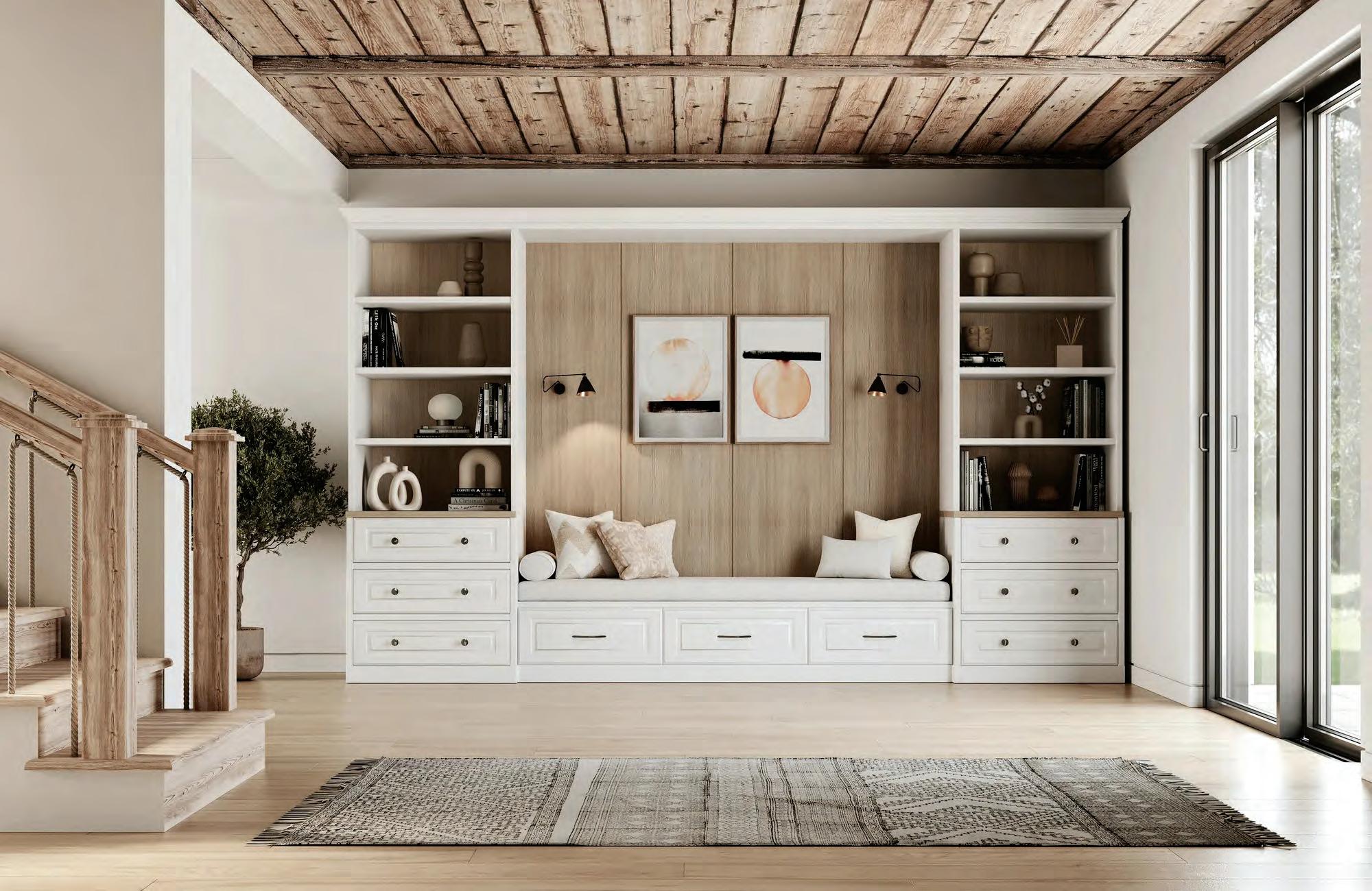
At DesignLoft, we believe the most meaningful escapes happen at home. Through custom cabinetry and thoughtful renovation, we create kitchens and living spaces that feel calm and intentional. Spaces designed to slow you down and welcome you in.
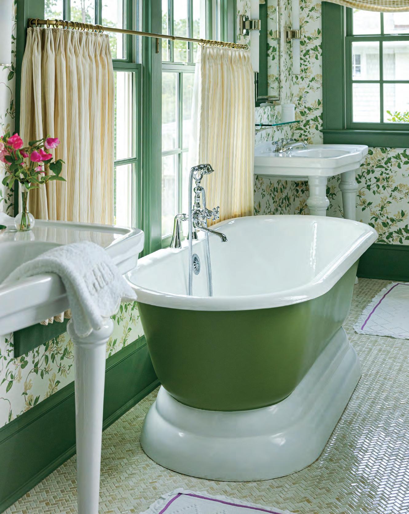

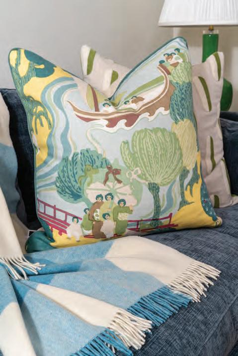
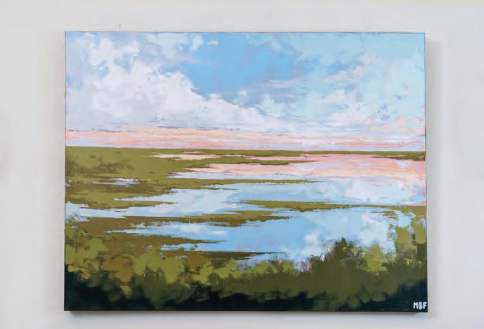
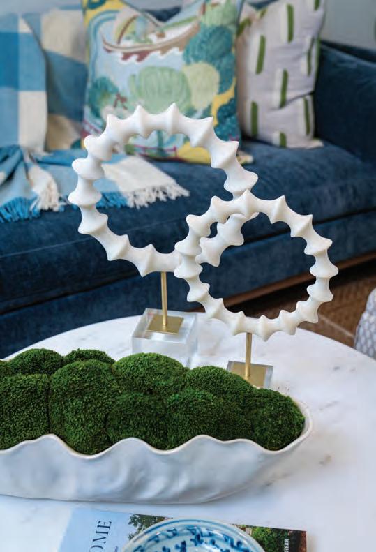
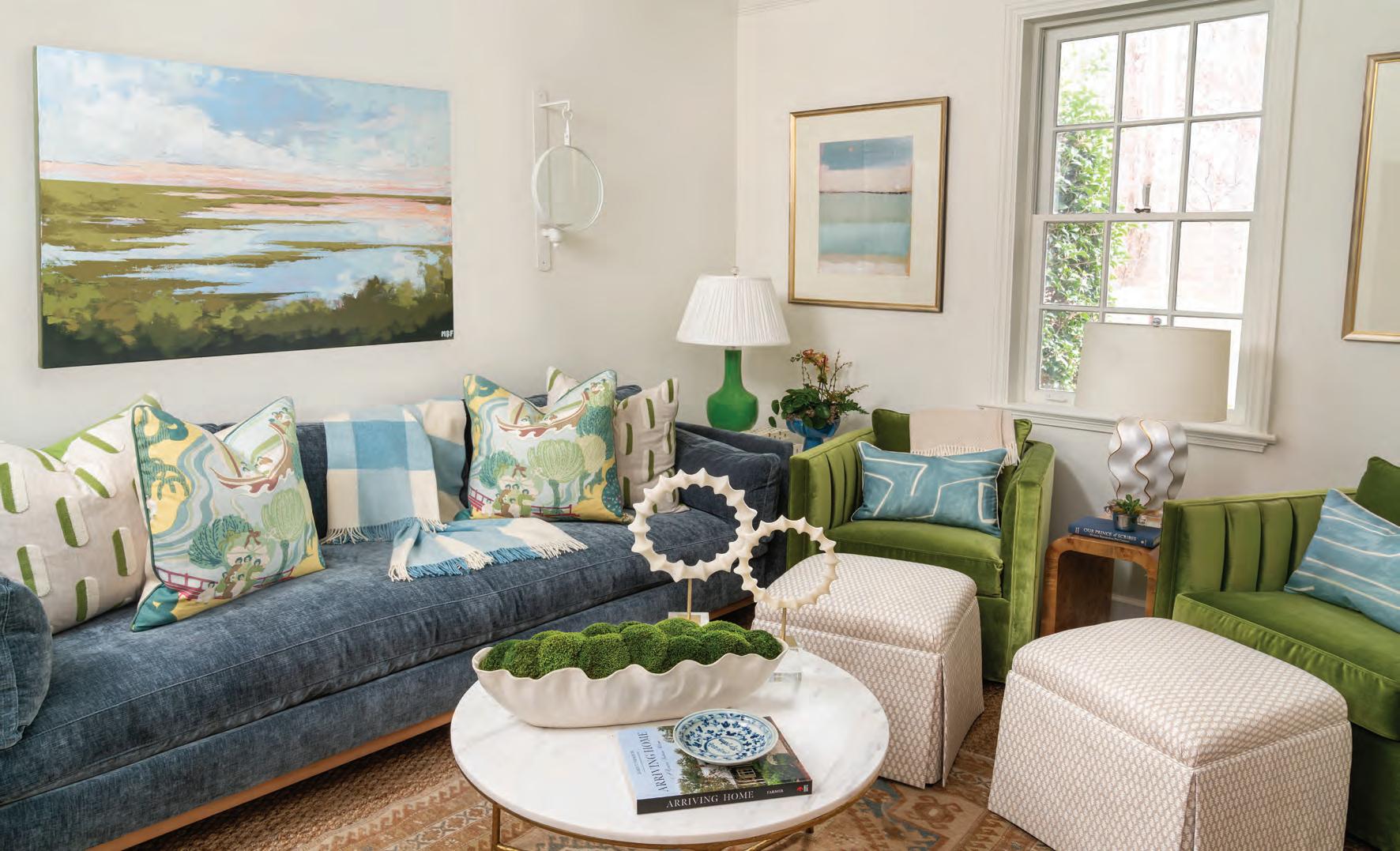
Stylist Allison Welch’s home layers collected character with tailored interiors, all grounded in the surrounding landscape.
A reimagined family home balances beauty and function while layering color, pattern, and considered design.
Designer Mary Margaret Underwood brings both function and form to a classic country home.
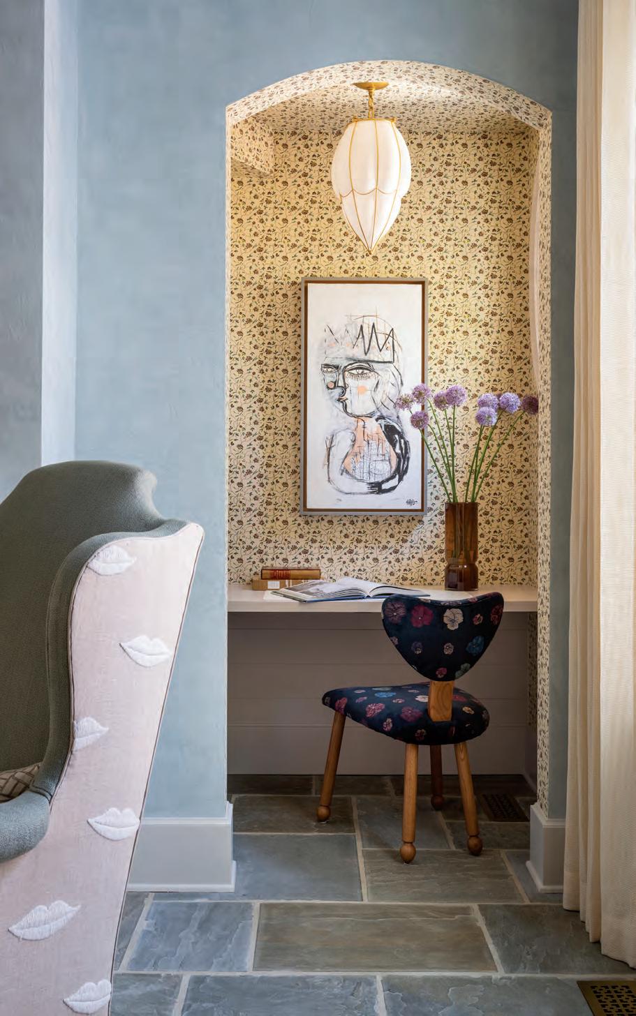
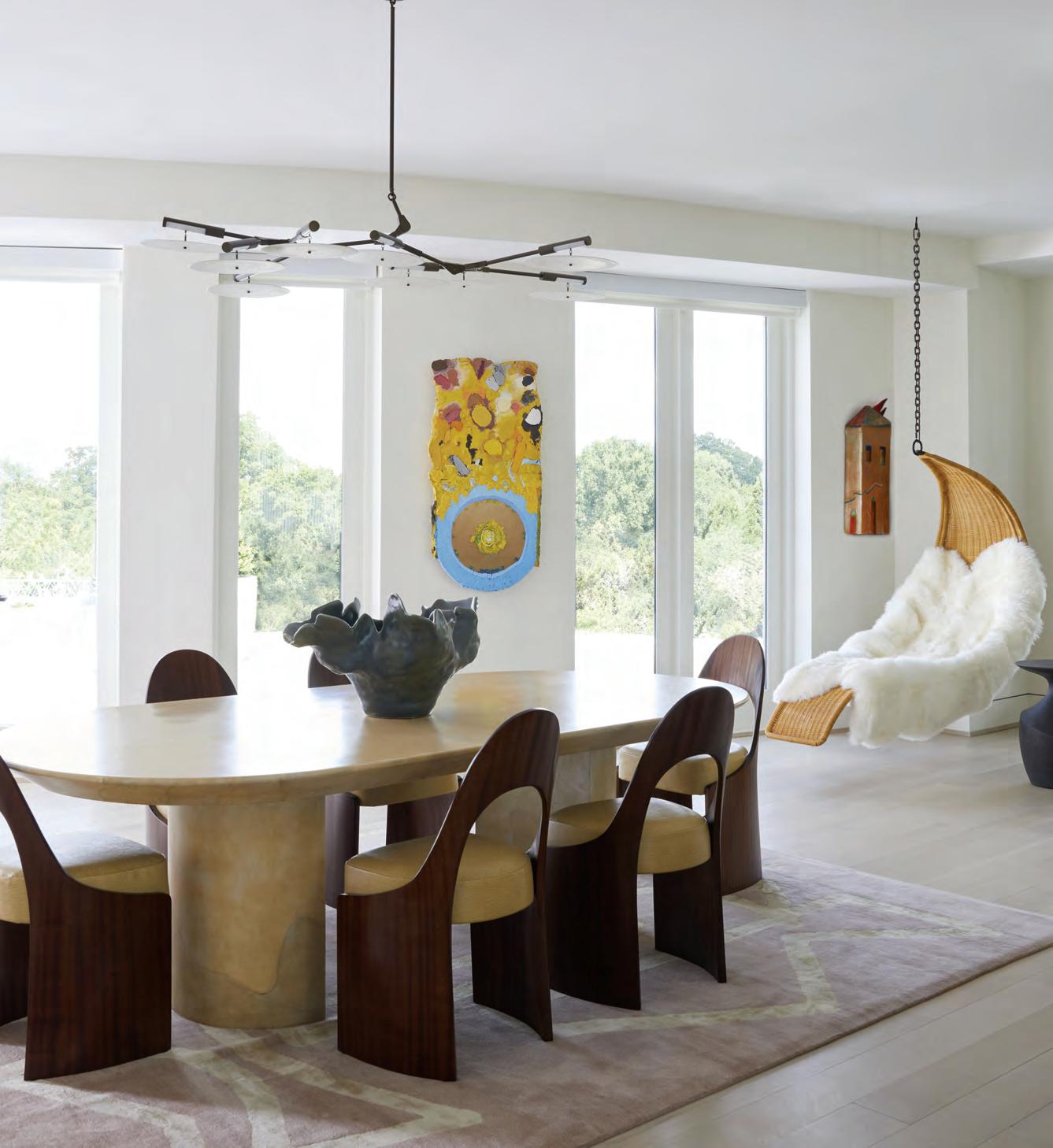

Pantone’s Cloud Dancer redefines neutrals, but five local designers share their own bold color picks and palette inspirations for the year.
Built with trust and a shared vision, this deeply personal Greenville home exudes a timeless appeal.
Our editor picks for a pop of color that can bring a space fully to life.
Two design professionals open the doors to their color-rich private spaces, revealing the palettes that make each feel unmistakably like home.
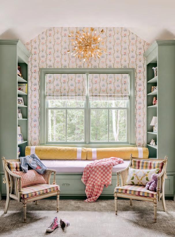
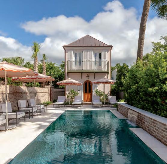
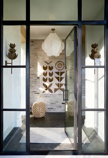
Just beyond the city’s busiest streets, a carefully restored nineteenthcentury residence is now a quietly luxurious boutique retreat, where historic charm meets a refined, modern sensibility.
guide to this season’s best exhibits and gallery openings.
by
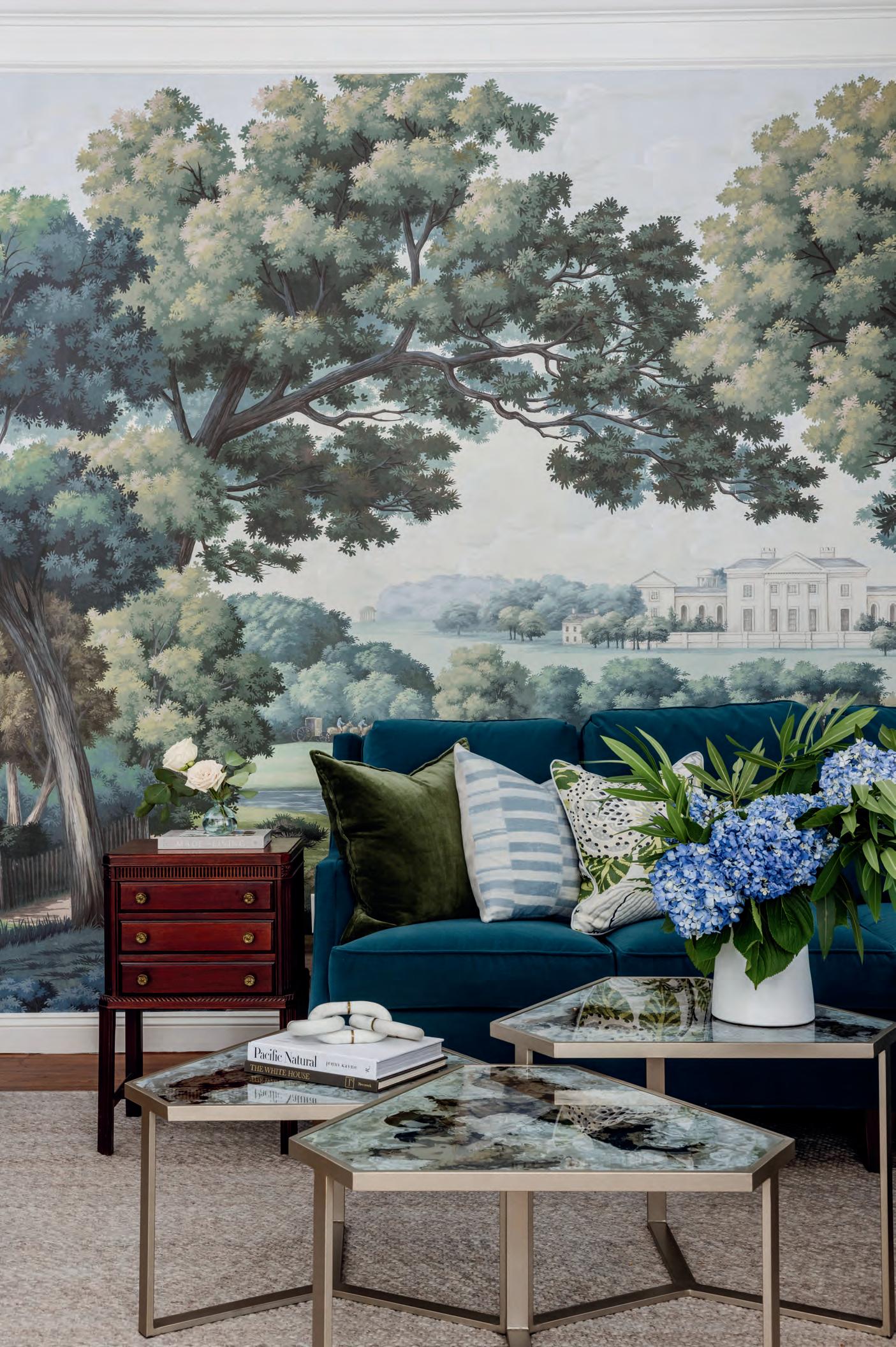
CURATING HOMES THAT INSPIRE GRACIOUS LIVING
INTERIOR DESIGN REMODELS CUSTOM HOMES


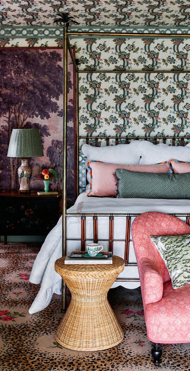
olor has a silent way of reaching people. In moments when the world feels particularly muddled— complex, fast-moving, and often uncertain—we instinctively turn toward spaces that restore us. And often, it’s color that does the powerful work of providing grounded calm, renewed energy, or much-needed joy or inspiration.
Our annual Color Issue celebrates color as an intention. From boldly expressive interiors to thoughtfully chosen inflection points, these pages reflect a growing shift in how we intend to live—less restrained, more intimate, and deeply connected to emotion. Love it or hate it, even Pantone’s Color of the Year reveals a collective desire for warmth, vitality, and renewed perspective, though a few local designers share their own perspectives.
In the Carolinas, tradition and evolution meet so beautifully, and color becomes that bridge between past and possibility in our own homes. This issue showcases what happens when you use it with abandon.

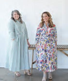
Blake Miller and Anne Marie Ashley Co-Editors-in-Chief

Michael Kooiman
Associate Publisher
Oonagh Murray E
Co-Editors-in-Chief
Anne Marie Ashley
Blake Miller
Senior Editor Karin Simoneau
Art
Lindsay Richards P
Production Coordinator
Shelley Kemper
Writers
Maria Masters
Brandy Woods Snow
Photography
Anna Routh Barzin
Emily Bolt
Chris Edwards
Adam Kane Macchia
Cat Wilbourne








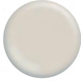
PANTONE’S COLOR of the Year, Cloud Dancer, is a modern take on a classic neutral. It symbolizes many things to many people, but the myriad choices in the color wheel left some craving saturation. Here, five designers weigh in on their personal color of the year, including advocates of the new neutrals. Offfering design inspiration and coordinating product picks, these alternate colors of the year give us food for thought.
Produced by Anne Marie Ashley
“MY PALETTE IS ALWAYS EVOLVING,
but I don’t design by trend report. I’m drawn to what I call ‘new neutrals’—whites layered with taupes, warm browns, loden greens, and muddy blues. Nature is still the best color card, and I rarely think about color as a single note. The beauty is in variation—layering shades the way I layer texture. When tones sit comfortably beside one another, a room feels richer, quieter, and far more enduring. Timeless trumps trendy.”

Lisa Sherry
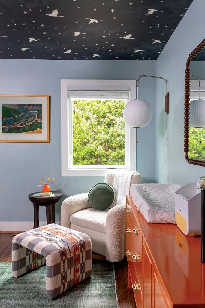

“HAIL THE INV IGOR ATING PRESENCE OF THIS VIBRANT SECONDARY COLOR, NAVAL ORANGE.
It perfectly combines the intensity and passion that a red commands, and the optimism and joy a yellow brings. This beautiful hue doesn’t wait to be noticed. It’s the friend that boldly stands up for you in a crowd, the first pair of shorts after a cold winter, the unexpected fries in the bottom of the bag after you thought you’d finished. It’s the color you never thought you’d use and now can’t imagine your space without it.”

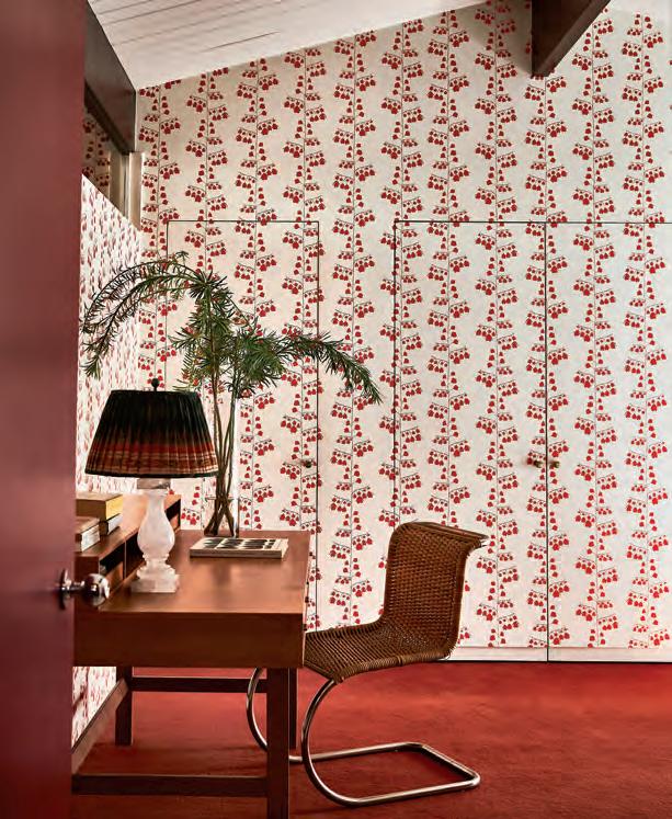
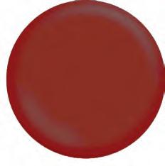
“THIS PARTICULAR RED BRINGS A RICHNESS and warmth that
instantly
energizes
a space. It’s bold enough to make a statement, yet versatile enough to pair effortlessly with a range of other colors.”

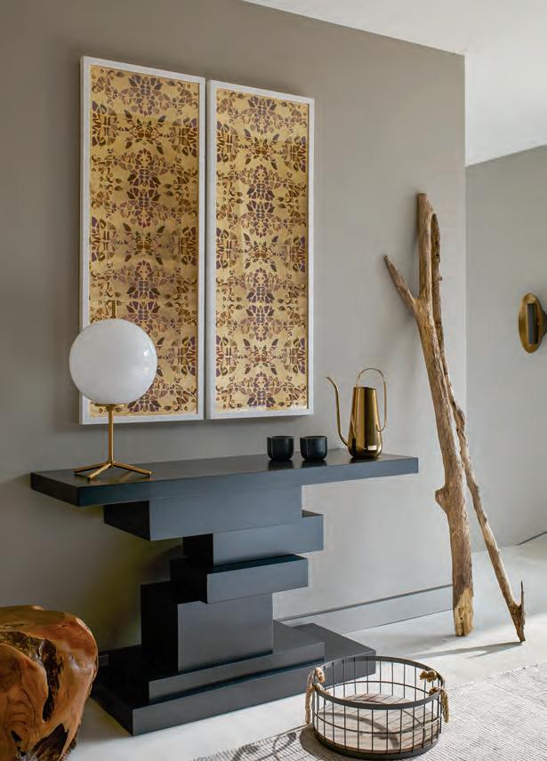
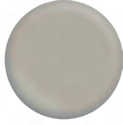
“I LOVE THIS WARM GREIGE SO MUCH. It makes any shade of white look crisp, works well with both antiqued brass and polished nickel, and has these subtle violet undertones that give it such depth. This color can feel fresh or rich, depending upon the textiles and light in the room. We’ve used versions of this color so many times. It’s universal. This is a neutral with some body to it, which I love for any home.”

“DE
NIMES
IS ONE OF MY FAVORITE BLUES
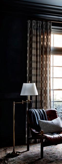
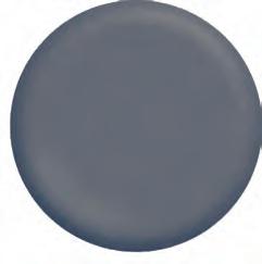
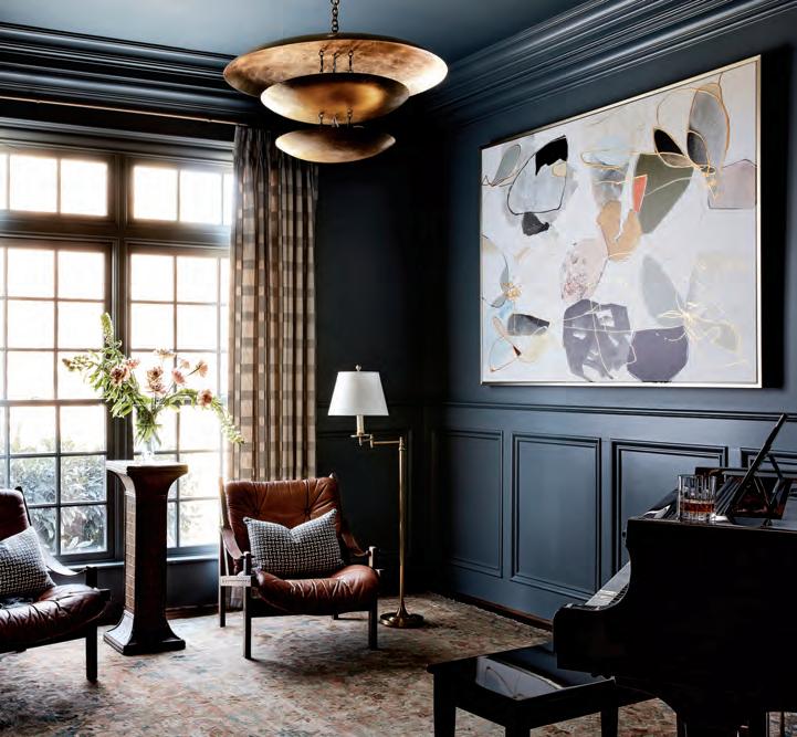
because it has incredible depth without ever feeling heavy. It strikes a nice balance of being both classic and modern, and it works beautifully across a range of interior styles. I love using it on walls and millwork to create a rich, enveloping backdrop that allows art, textiles, and warm materials like leather and brass to truly shine.”


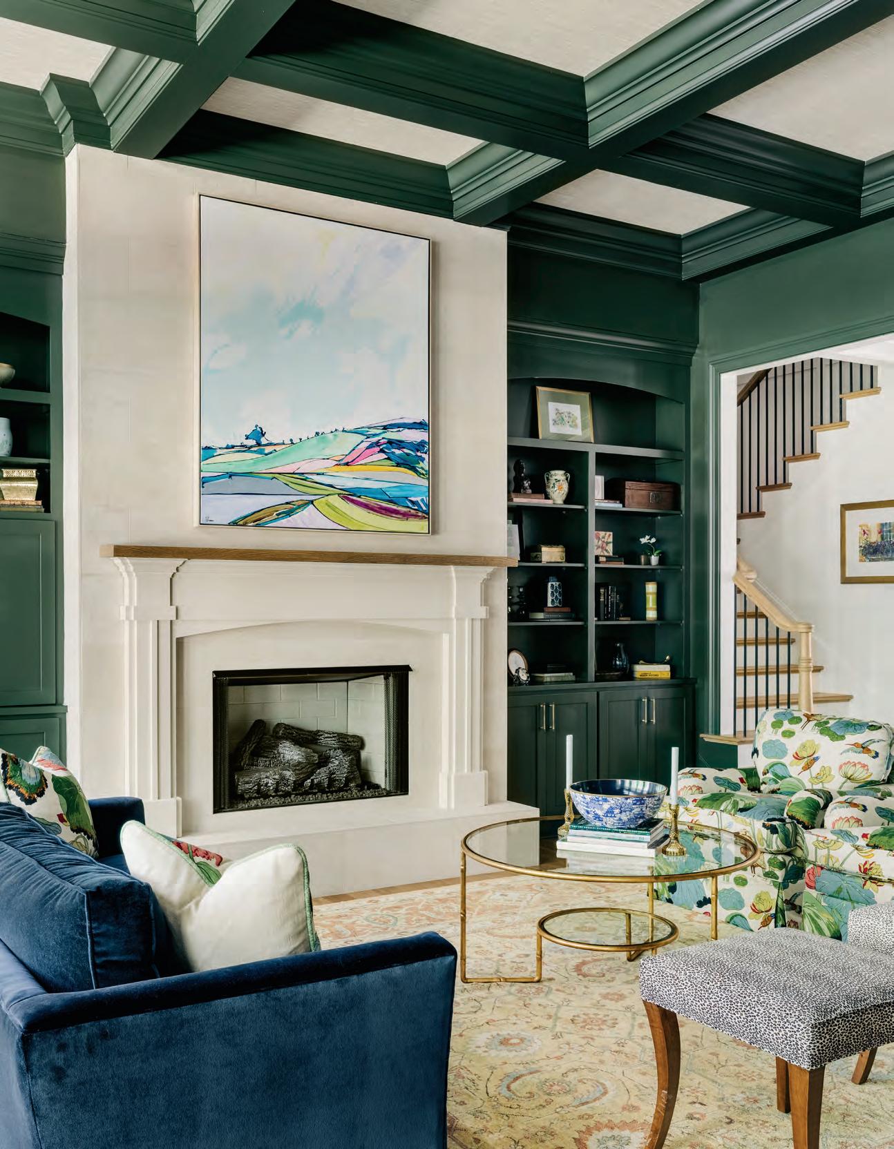
To infuse the living room’s grand scale with a sense of intimacy, King incorporated an elegant, warm wall color and lined the ceiling’s coffered recesses with grasscloth. The homeowners' heirloom chairs were reupholstered, while the art above the fireplace became a focal point.
Rooted in trust and a shared vision, a Greenville home feels both timeless and personal.
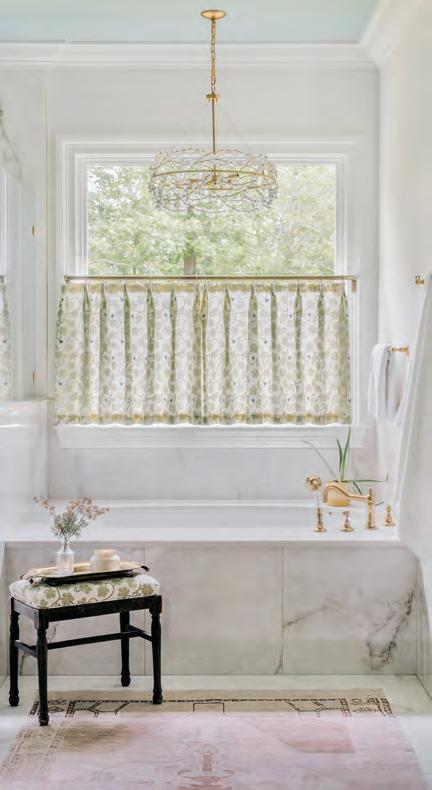
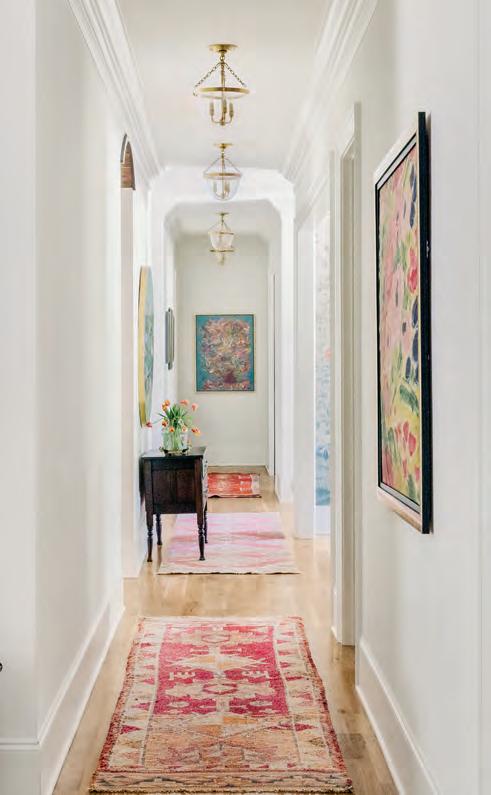
Just minutes from downtown Greenville, a long driveway leads to a private home set on several acres of bucolic landscape. Chosen for its sense of seclusion and proximity to conveniences, the property offered an idyllic setting for a busy family of five.
Built by J. Francis Builders, the homeowners initially enlisted designer Everett King to review the architectural drawings, but what began as a five-hour consultation quickly evolved into a full-service design project.
“Our favorite kind,” King says with a laugh. The vision was clear: to infuse the interiors with a calm, organic sensibility that reflects the natural beauty of the land.
The team focused on a handful of thoughtful details not often found in new builds of this scale, like a more intimate connection between spaces. An inviting keeping room just off the kitchen, with the sink oriented toward it, maintains a sense of flow and interaction, while a raised, bar-height countertop subtly shields the view of dishes from the keeping room. Brick flooring adds natural warmth underfoot, complemented by a wood-topped island that infuses richness and texture to the space.
Though the homeowners favored a more traditional aesthetic with antiques and restrained color, King
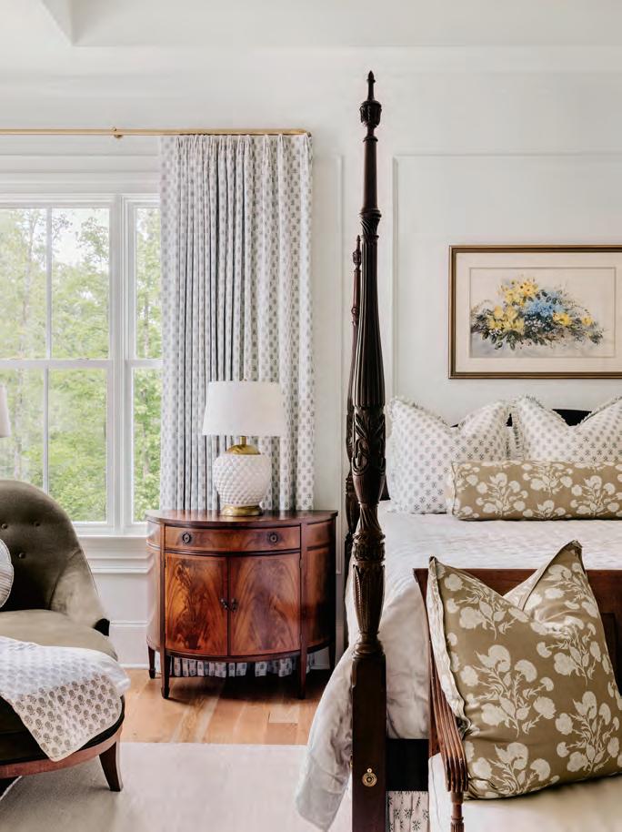
realized while working through the design process that the homeowners do love color—when executed well.
The kitchen, keeping room, and owner’s bedroom were painted in soft whites; elsewhere, the designer introduced color and mood throughout the home. “As we started to make recommendations, our trust in each other continued to grow, and thus the use of color as well. We knew their vision, but we also knew the house had the ability to handle strategically placed classic color.” Foregoing trends, King researched historical homes and updated renovations to find the right color palettes. “We also worked to source wallpapers that were different in palette but played together nicely,” she says.
Drawing on their deep ties to New Orleans, the homeowners incorporated antique doors from The Bank Antiques into the powder room, pantry, and office, bringing a sense of history and heritage to the new build. They envisioned an updated classic style layered with antiques and character—and King delivered. What began as a modest request evolved into complete trust: “Just do it,” she recalls the homeowners saying. That trust between the homeowners, project manager, and design team shaped every detail. “We all worked together to build a house this family will always call home.”
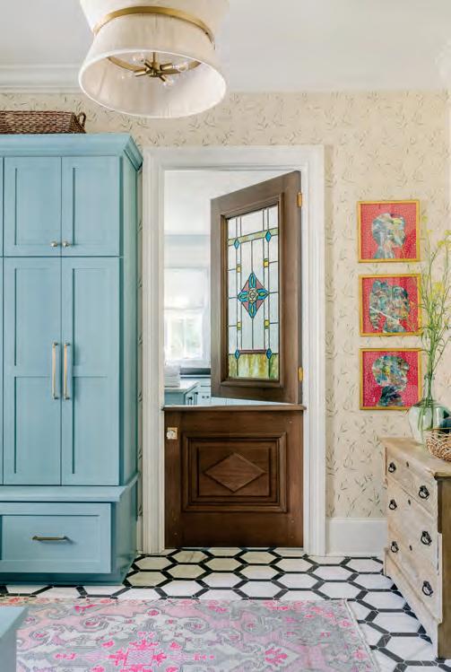
The friends' entrance to the laundry room balances function and charm. Black-and-white tile grounds the space, while an antique Dutch door with a custom stain-glass design by Greenville artist Sherrill Hill instills a sense of history. The children’s silhouette portraits, matted in pink, add whimsy and color. Tile: Circles & Squares. Dutch door: The Bank Antiques. Wallpaper: Dorothy Shains.
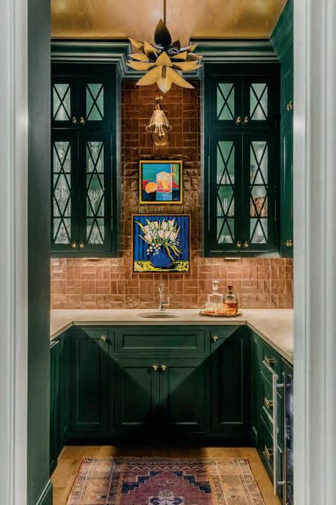
A showstopping pendant by Hinkley was the jumping-off point for the moody scullery. King paired the rich, earthy, deep green tones on the cabinetry with a copper tile. Looking up, antique bronze wallpaper covers the ceiling, the warmth and drama pulling the space together. Tile: Circles & Squares. Wallpaper: Winfield Thybony. Wall color: Benjamin Moore Essex Green.
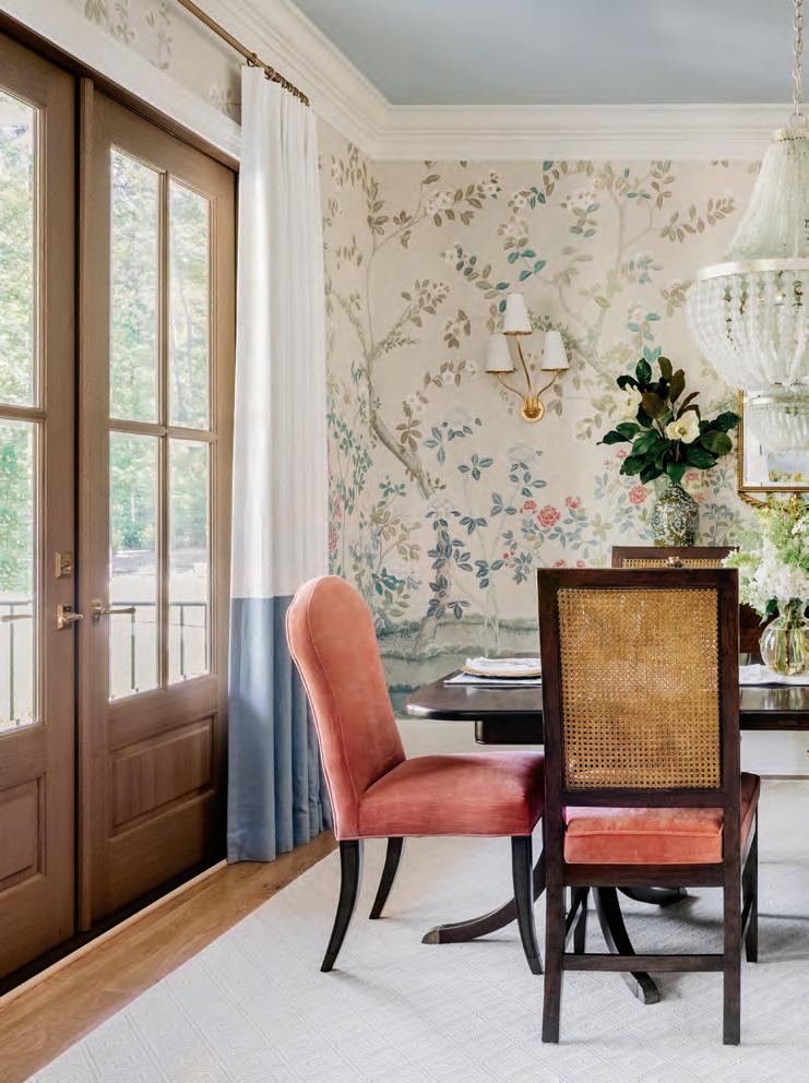
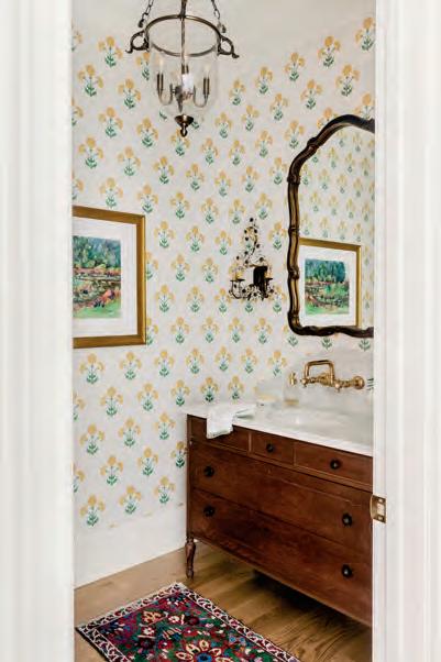
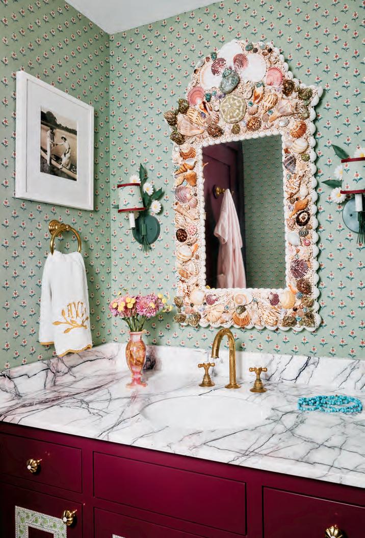
Floral wallpaper sets the tone in the vintage-layered powder room, where a chest of drawers was converted into a vanity and an antique pendant from western North Carolina casts a warm light above. Wallpaper: Schumacher. Sconces and mirror: The Rock House Antiques. Pendant: Screen Door.
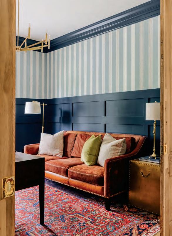
The homeowners initially doubted their rust-colored sofa would suit the new house, but “we loved it so much, we designed the office around it,” says King. Anchoring the space with warmth, a gleaming gold side table offers a distinctive contrast. Paint color: Benjamin Moore Hale Navy. Pocket doors: The Bank Antiques. Wallpaper: Thibaut.
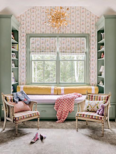
In the daughter’s room, a whimsical, sculptural chandelier takes center stage. Delicate, feminine wallpaper and fabrics complement the trim’s soft tone, creating a sense of cohesion. Vintage chairs flank the window seat, while books and art layered along the shelves imbue warmth and personality. Chandelier: Visual Comfort. Wallpaper and fabric: Lulie Wallace.






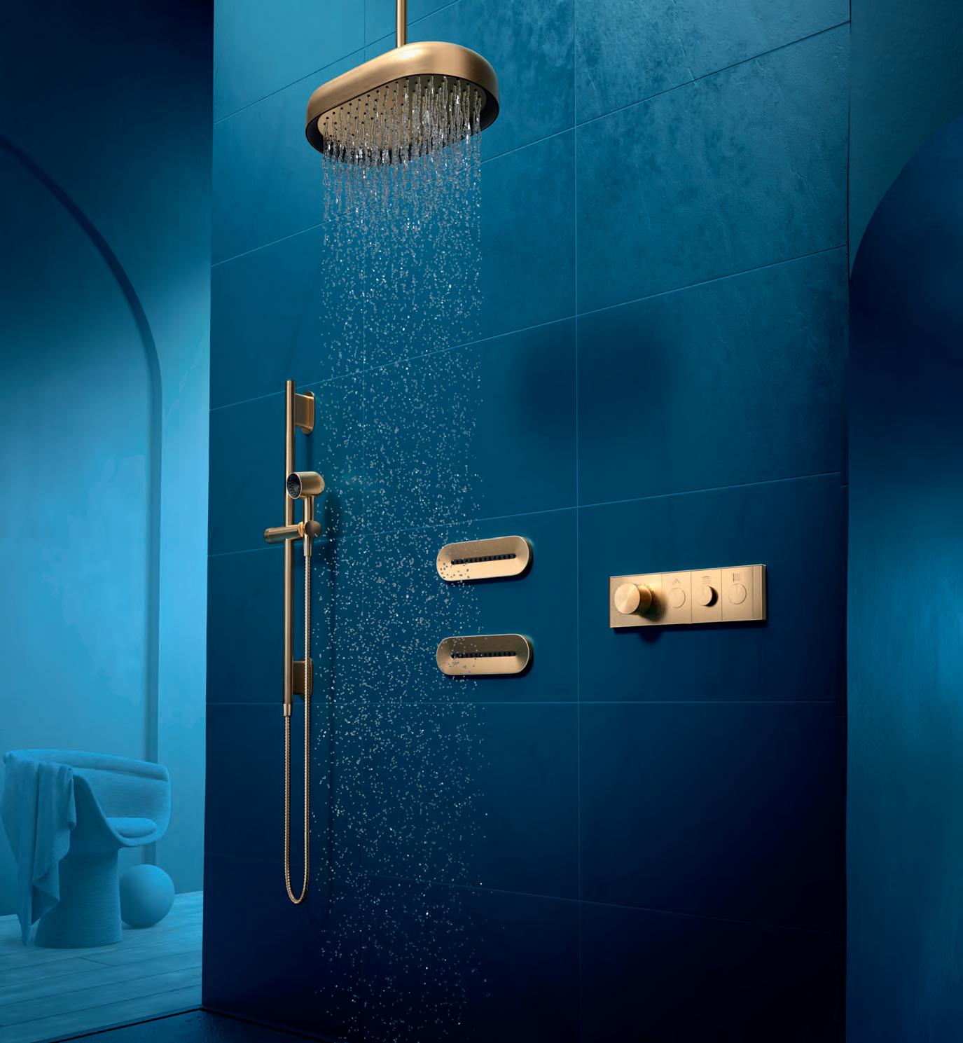
The Statement ™ showering collection with Anthem ™ controls and valves feature unexpected designs, indulgent spray options, and a range of universal forms. The versatile portfolios are meticulously crafted to fit all global plumbing standards, opening the door to truly seamless specification and unfettered creativity. Visit our virtual portal to explore the possibilities and unleash your imagination.

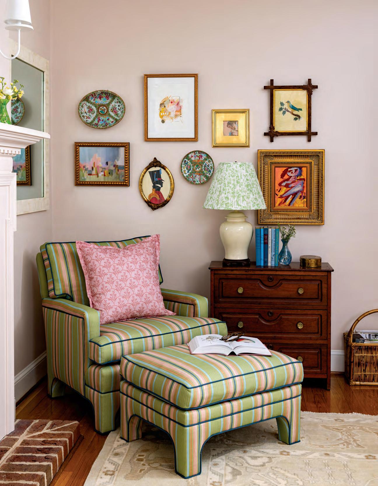
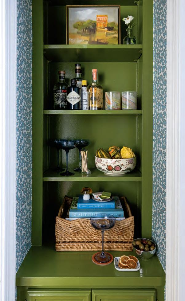
Two interiors mavens⎯Ally Holderness of Elliston House and Caroline Walker of Spoonflower⎯give us a peek into their colorful private spaces, sharing why these palettes make them feel at home.
Produced by Anne Marie Ashley
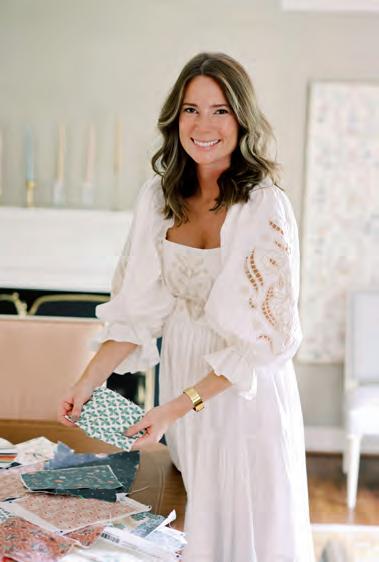
One half of the design duo that founded Charlottebased textile brand Elliston House, Ally Holderness’s love of pattern play and color mixing starts in her home. “I gravitate toward color to make my home feel warm, layered, and inviting. It brings energy to spaces, keeping things cheerful and comfy for my family. Color and pattern are things I play with daily through Elliston House, so, of course, many of those same concepts find their way into my home. Green is one of my favorite colors lately, and I’m drawn to small geometrics in multicolors that add depth and interest without overwhelming a room.”

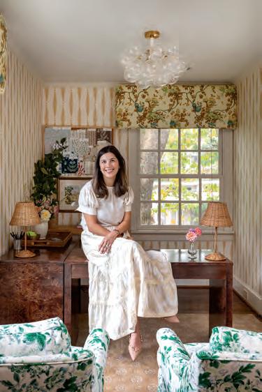
As Senior Director of Sales and Marketing for Triangle-born wallpaper and fabric powerhouse Spoonflower, Caroline Walker has an affinity for bold color that comes with the territory. “For me, color and pattern are very personal and often nostalgic. Rich, dark browns and burgundies have made their way into my home as of late, and, sourcing most of my wallpaper and textiles locally at Spoonflower, I have commissioned this stunning Boddicott print for both window treatments and throw pillows. I am often drawn to yellow, too. It feels like a familiar, warm hug, but plays nicely with bolder hero prints. In some of my largest living spaces, it provides restraint without feeling contrite.”
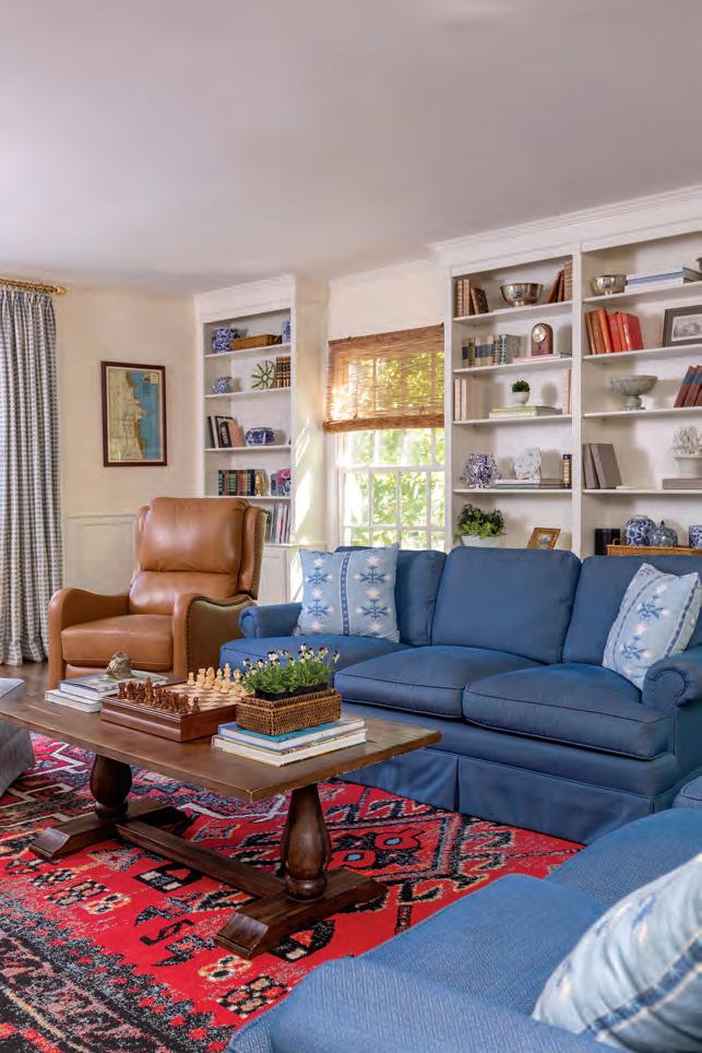
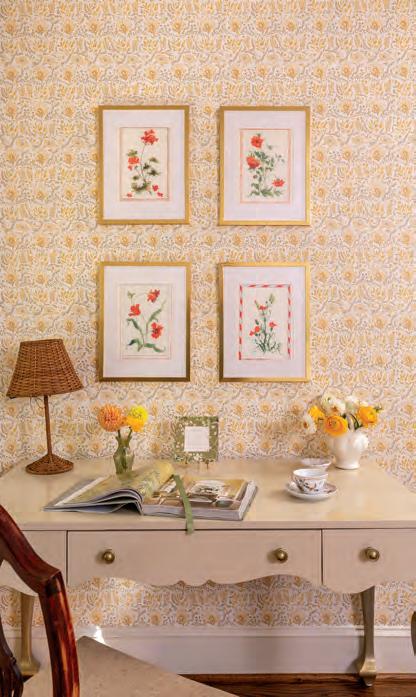
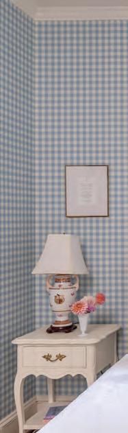
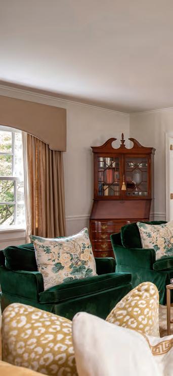
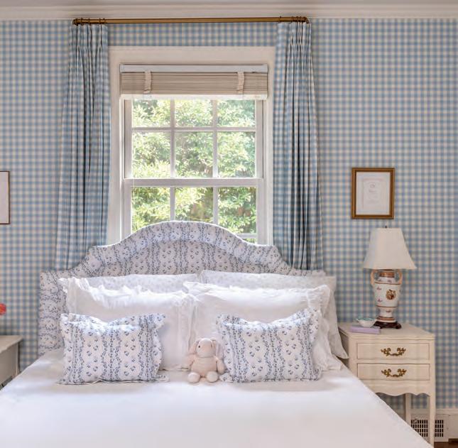
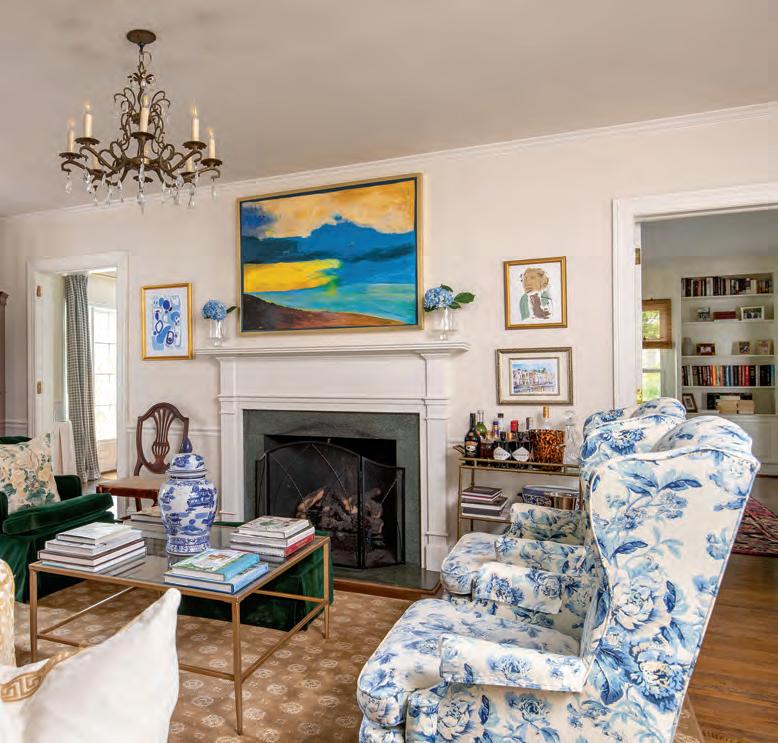
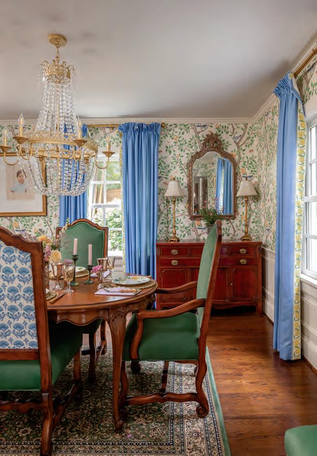
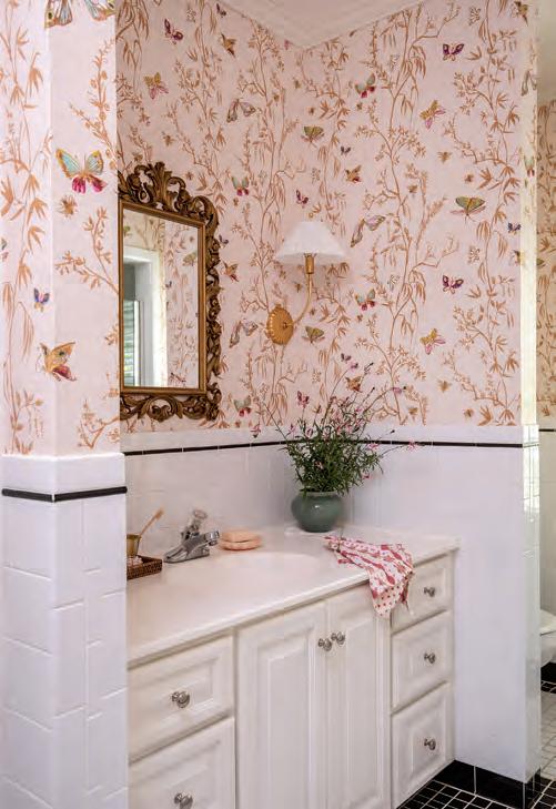
Just beyond the city’s busiest streets, a lovingly restored nineteenthcentury residence emerges as a quietly luxurious boutique retreat, blending historic charm with a refined, modern sensibility.
THE STORY OF 86 Cannon mirrors that of many Charleston homes. Originally a handsome nineteenthcentury residence in the Cannonborough-Elliotborough neighborhood, it served as a private home for more than a century, embodying the city’s signature architectural language—narrow proportions, deep piazzas, and richly detailed facades. Over time, it passed through a succession of owners, from everyday residents to more prominent figures, as the neighborhood itself evolved into one of Charleston’s most vibrant and culturally layered enclaves.
Eventually, however, time took its toll. By the early 2000s, the structures that now comprise 86 Cannon had fallen into significant disrepair, their former elegance worn and obscured.
A turning point came when Lori and Marion Hawkins acquired the property, recognizing its untapped potential. The couple embraced a preservation-first approach—thoughtfully restoring multiple historic structures, including residences dating back to the 1860s and 1880s, and weaving them together into a cohesive, design-forward boutique retreat.
To shape the interiors, the Hawkinses enlisted Charleston-based designer Betsy Berry of B. Berry Interiors, tasking her with reimagining the main house (and, in 2024, two newly expanded adjacent cottages). The directive was clear: strike the often elusive balance between historic integrity and a more fashion-forward sensibility—something Berry executed with ease.
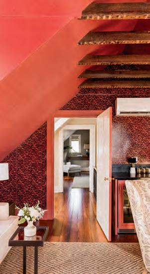
The designer grounded the spaces in a classic Charleston palette—deep indigos and pomegranate hues softened by layers of European neutrals—while leaning heavily on texture to create depth. Indigo-dyed grasscloth walls, Venetian plaster finishes, and hand-stenciled details by local artisans come together in a look that feels moody,
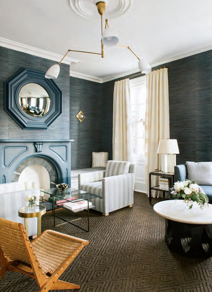
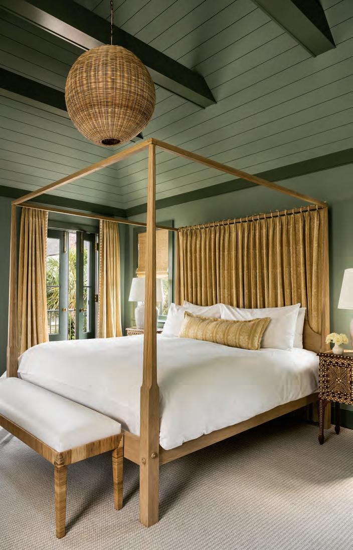
tailored, and quietly unexpected within the framework of a nineteenth-century home.
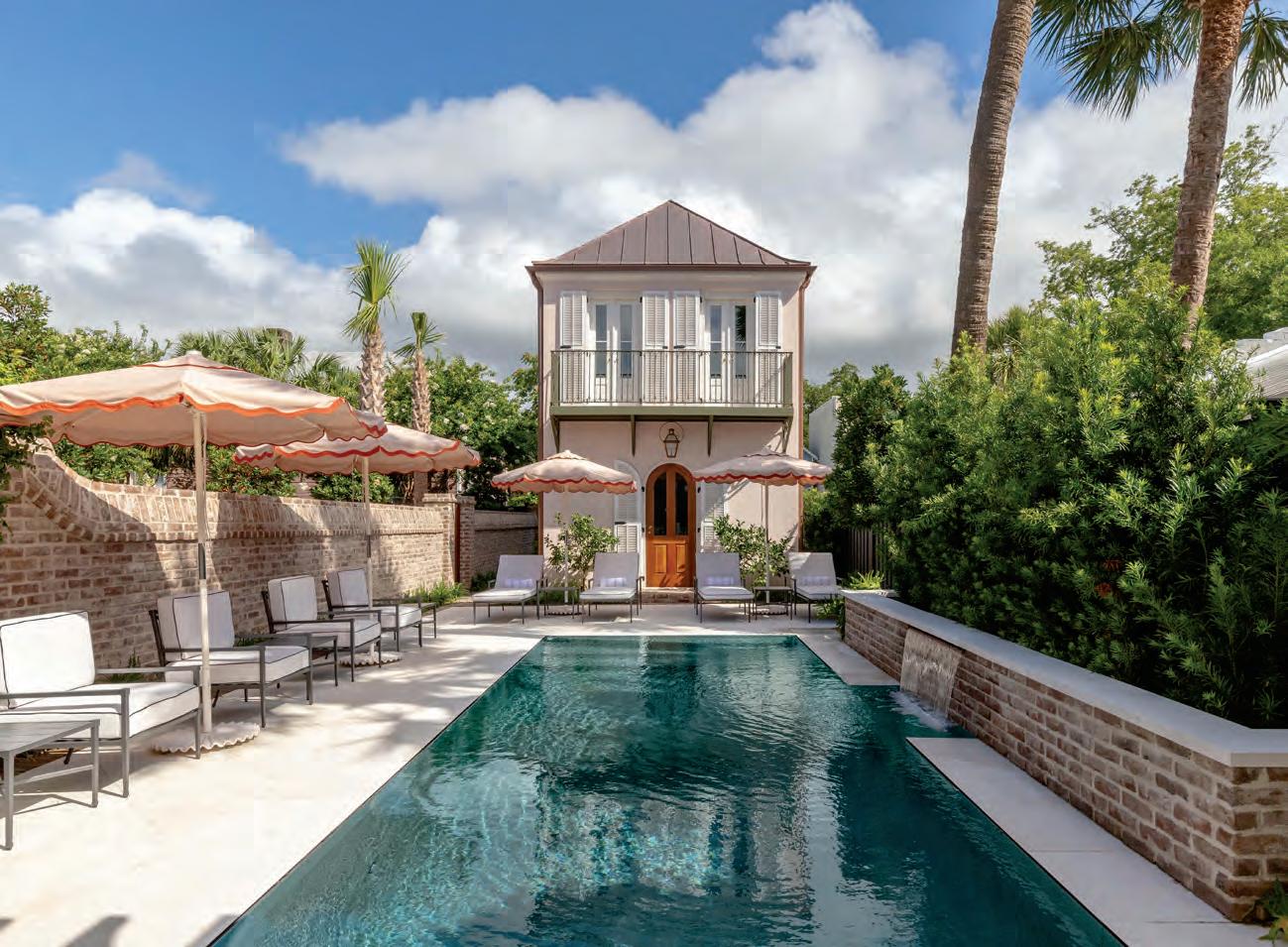
The property is so hushed and discreet, it feels less like a hotel and more like a private residence. A petite plunge pool, framed by flamingo-pink umbrellas and crisp white chaises, opens onto a quiet garden anchored by a softly trickling fountain. Above, piazzas overlooking Cannon Street—lined with coffee shops and intimate neighborhood restaurants—invite lingering moments, ideally with a glass of wine and 86 Cannon’s signature complimentary cheese board in hand.
Tucked away from the bustle of the Battery and the energy of King Street, 86 Cannon offers a quieter, more considered side of Charleston. It feels like a true hidden gem—ideal for those drawn to a slower pace and the understated charm of a thoughtfully restored boutique inn, far from the city’s more tourist-trodden paths.
JERALD MELBERG GALLERY | MAY 16–JUNE 27
Moon Garden is a solo exhibition of abstract paintings by Canadian-born, Austin-based artist Katherine Boxall. The exhibition presents an expansive vision of abstraction shaped by Boxall’s ongoing exploration of gesture, color, and atmospheric space. Her paintings evoke forms emerging and receding in low light— where color softens, edges dissolve, and perception becomes more intuitive than fixed. jeraldmelberg.com

SHAIN GALLERY | JUNE 19–JULY 1
Self-taught French Canadian artist France Jodoin paints many different subjects—cityscapes, figures, and still lifes, to name a few—that all start as an abstract landscape. They only reveal more specific images as marks are made. Her Impressionistic scenes invite the beholder to ask what is happening and why, what came before, and what comes next. Jodoin explains, “What inspires me is not necessarily what I have seen, but what I have felt. It can rest in my mind for years. Ideas come to the surface, not unlike waves that come and go—waves whose ebb and flow I do not control. I try to create places where people can rest, like landscapes do.” shaingallery.com

THE MINT MUSEUM | THROUGH OCTOBER 25
Caravaggio | Revolution: Baroque Masterpieces from the Roberto Longhi Foundation offers a rare opportunity to experience a painting by Caravaggio in the United States—particularly in the Southeast. At its heart is Boy Bitten by a Lizard, one of fewer than eighty works attributed to the artist, who died at just thirty-eight. More than thirty paintings by leading Baroque masters and Caravaggisti surround this masterpiece, tracing the spread of his revolutionary realism. Film clips, photographs, and commentary—including insights from Martin Scorsese— demonstrate how his dramatic chiaroscuro continues to shape modern cinema, photography, and music videos. mintmuseum.org

IN TODAY’S MARKET, MOVE-IN-READY IS MORE THAN A PREFERENCE –IT’S AN EXPECTATION AND NECESSITY.
HASSLE-FREE HOME UPGRADES WITH ZERO UPFRONT COSTS OR FEES.
“The ‘Market Ready’ program Helen Adams Realty offered really clinched the deal. We were able to get new flooring, refinish the hardwoods and banisters, new paint, a kitchen update, etc. Because the firm paid the upfront costs, we did this ALL without having to tap into our cash reserves.
It is an amazing program. Our agent managed it all! She scheduled the vendors and had all of our updates done and went to market in under 30 days. We had multiple offers within several days.”
MORE THAN $4M INVESTED AND 300 HOMES UPGRADED THROUGH STAGING, DESIGN SERVICES, REPAIRS, LANDSCAPING, AND MORE.
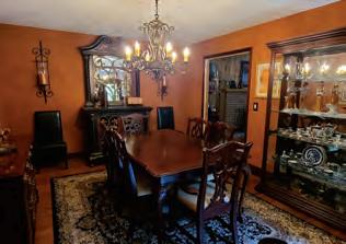
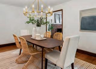

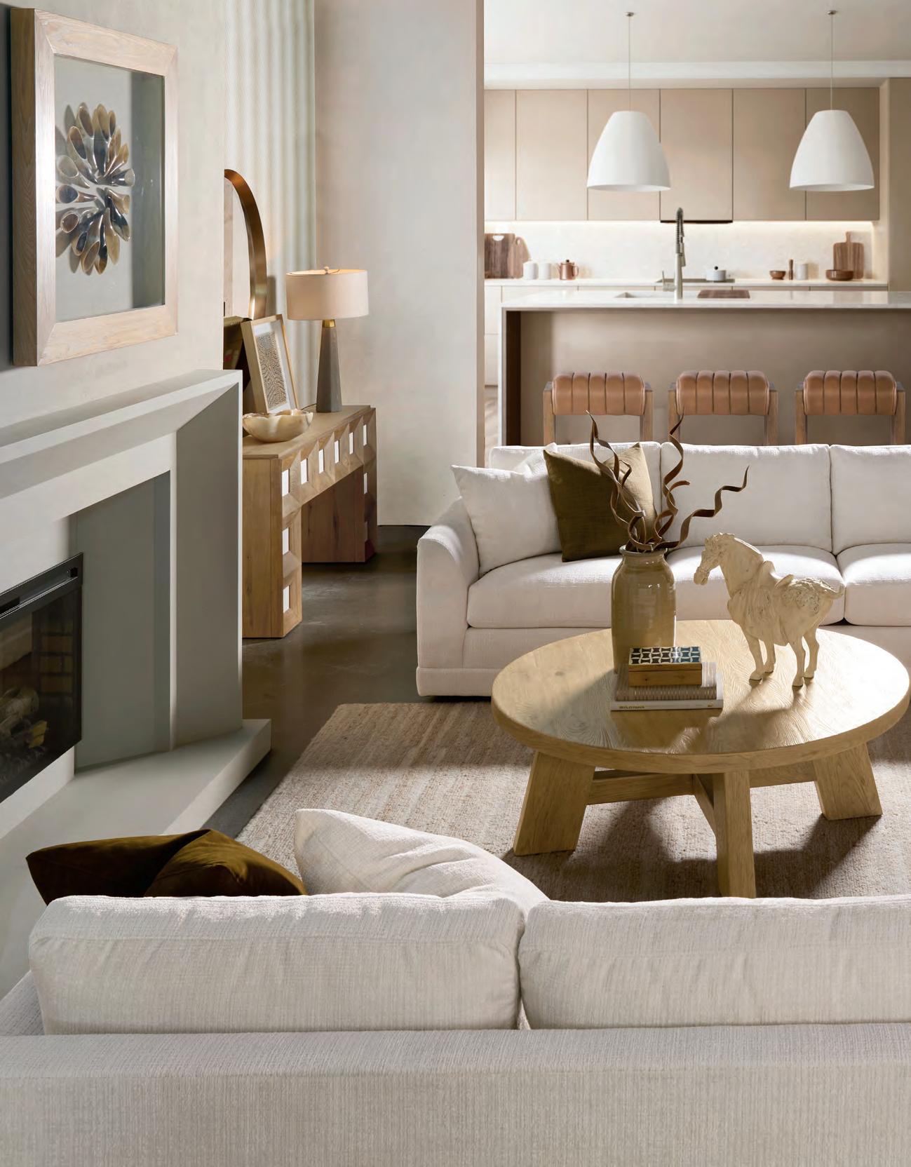



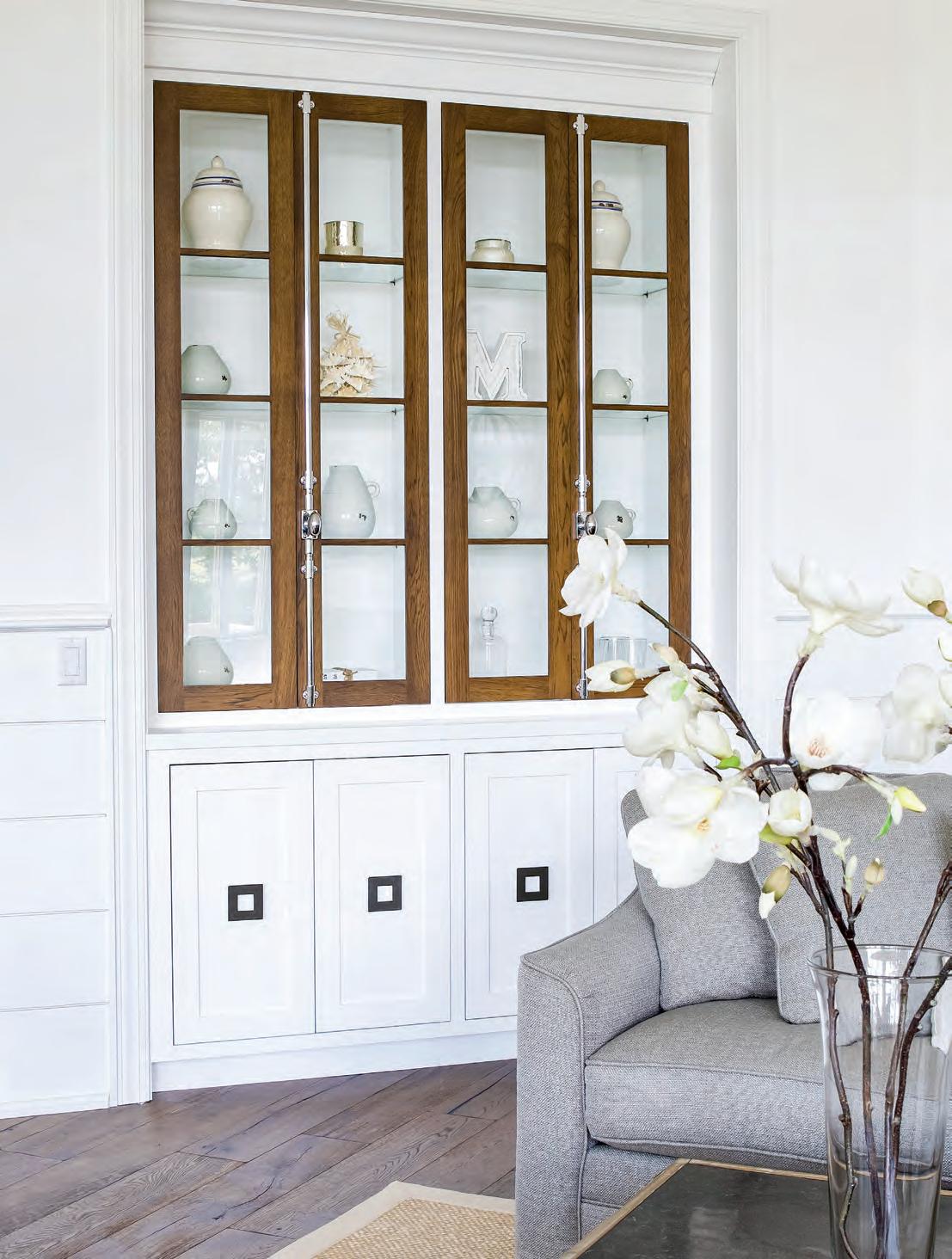

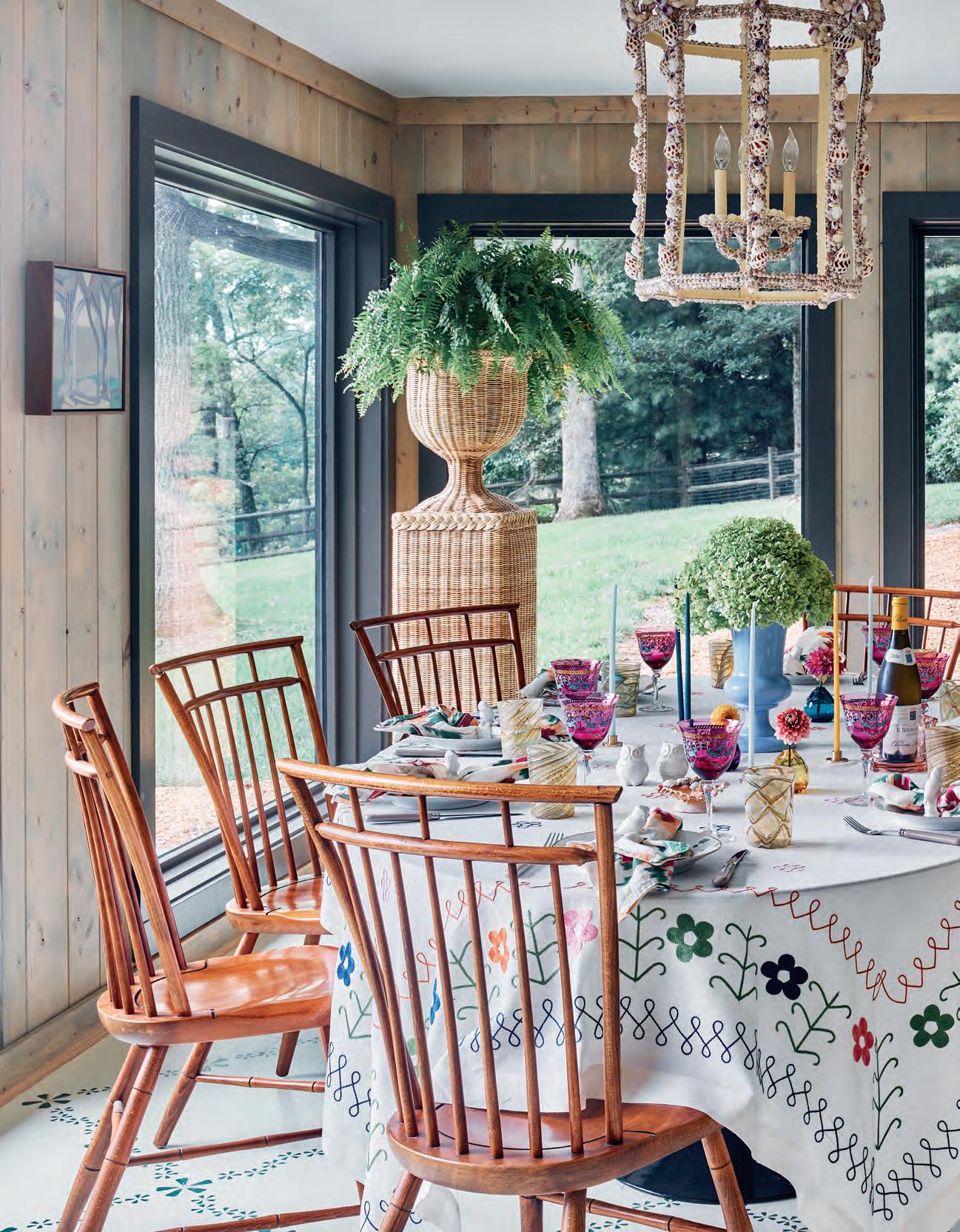
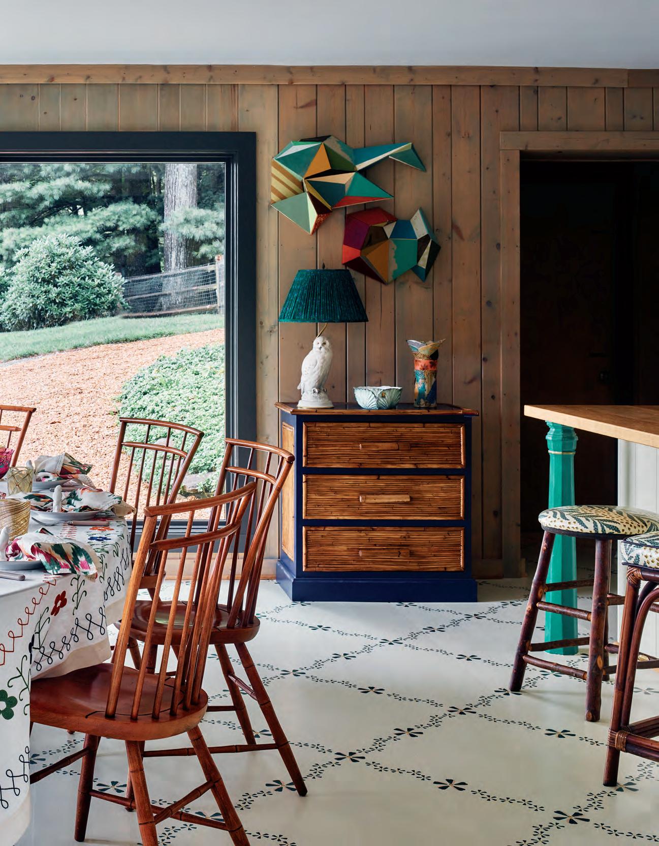
The original 1970s ranch, though dark and dated, held a quiet promise in the sweeping mountain views just beyond its rear walls. Designer Charlotte Lucas reworked the floor plan to open the once-cramped galley kitchen to the living spaces, while replacing the existing windows with larger, more expansive ones—allowing the landscape to take center stage and flood the home with light. Table: Design Within Reach.
Allison Welch has long considered herself a beach devotee.
“If I have to choose between the mountains or the coast, it’s always going to be the coast,” she says. Her husband, Al, feels otherwise. A lifelong mountain enthusiast, he gently lobbied for western North Carolina when the South Carolina natives began dreaming up a second home—a quiet retreat for their family of four. “He loves the mountains so much and wanted something closer to Charlotte, where we currently live,” Welch says. “I finally said, why not? Now I can’t imagine having a vacation home anywhere else.”
After years of visiting places like Linville and Valle Crucis, the Welches discovered a secluded community tucked deep in the Blue Ridge Mountains. With few
vacant lots remaining, they turned their attention to an existing property: a sprawling midcentury-modern ranch with great bones—and an even better view. As a fashion stylist with an instinctive eye for design, Welch immediately recognized the home’s potential—especially in the hands of her friend, designer Charlotte Lucas, whom she tapped to dream up the home’s interior design.
“The house definitely needed some help,” says Lucas, who was on speed dial the moment the Welches found it. Dark wood paneling, dusty carpeting, stained linoleum, dated bathrooms, and a cramped galley kitchen might have discouraged others, but not Lucas. She could see the promise beneath the patina. “The home was dark and dated,” she recalls, “and absolutely desperate for natural light.”
Known for her instinctive ability to layer color and pattern with ease, Lucas immediately understood how to breathe new life into the home. Her priority was to fully embrace the sweeping mountain views at the rear of the property. To do so, she replaced the existing windows with larger, more expansive openings and removed walls that once enclosed the cramped galley kitchen from the living room. The result was transformative— living spaces that feel open and fluid, now bathed in natural light where darkness once lingered. Bathroom renovations followed, along with a larger, more spacious kitchen open to a light-filled dining area.
With the footprint refined and natural light restored, Lucas turned her attention to the interiors, working closely with Welch to shape a scheme that felt distinctly her own—mountain chic, layered with color and pattern. The close friends traded texts and emails, volleying ideas back and forth until landing on the perfect fabric, vintage find, or statement fixture that captured them both.
Their shared travels became something of an ongoing sourcing trip, from Paris to Round Top and everywhere in between, uncovering one-of-a-kind pieces that slipped effortlessly into the story they were building. “We really feed off each other,” Lucas says. “I’ll throw out an idea, she’ll build on it, and with each pass the design becomes more layered, more elevated.”
That creative rhythm led to several special finds, including a vintage coffee table in the family room.
Discovered on a trip to West Palm Beach, the piece immediately stood out. “It’s one of my favorites,” Lucas says. “It’s not your typical coffee table height, but the lines are so beautiful—we knew we’d find a way to make it work.”
Though the project unfolded over several years, neither minded—the search for pieces became a joyful extension of their travels together. What emerged is a home that feels both collected and deeply comfortable, attuned to its mountain setting without relying on convention. “It’s not your typical mountain home, but it feels like it belongs here,” Welch says. “When people walk in, they always say how cozy it feels—and I think that’s the ultimate compliment to Charlotte. She created something so beautiful and interesting, yet it still feels completely at home.”
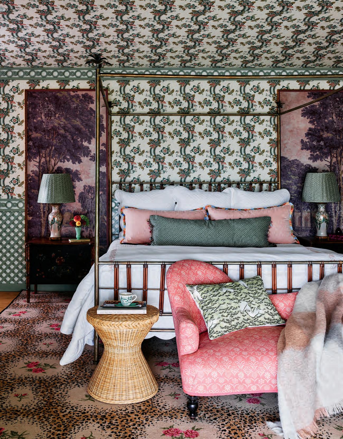
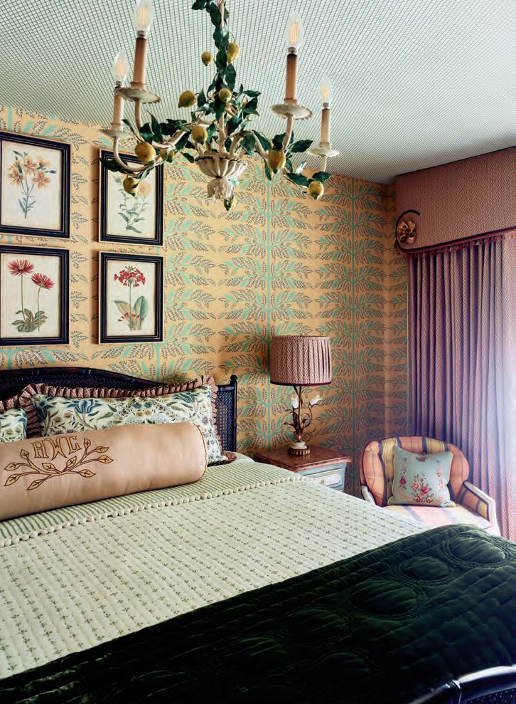
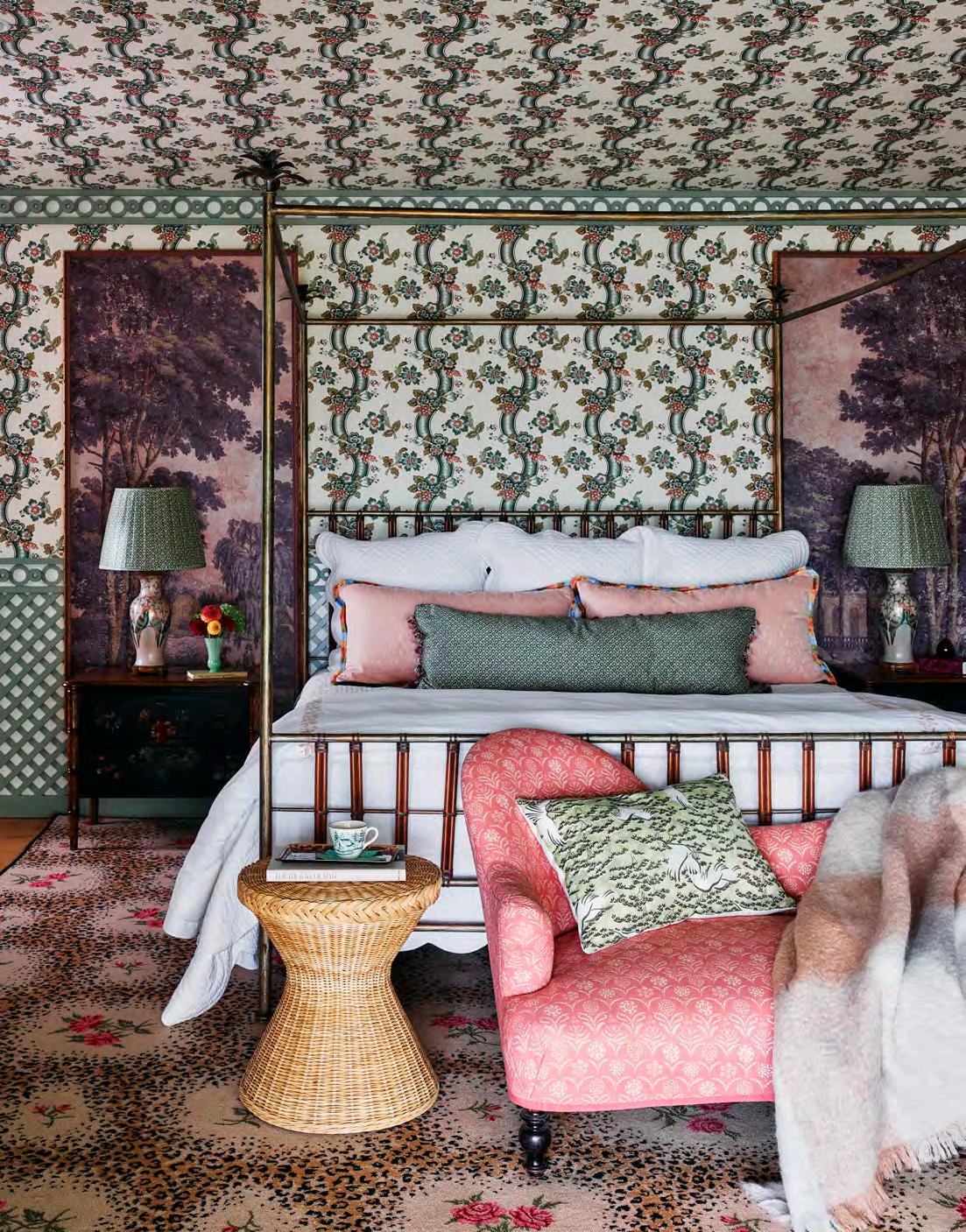
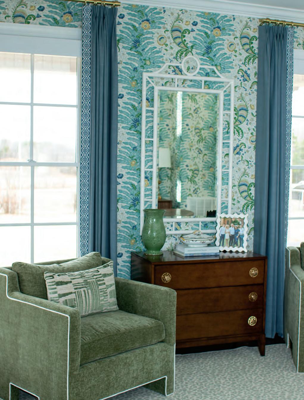
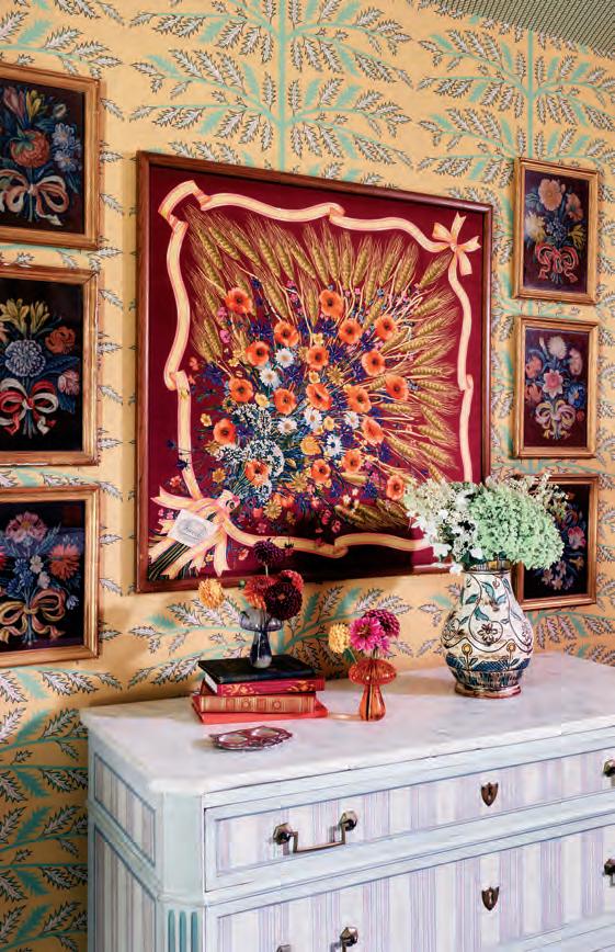
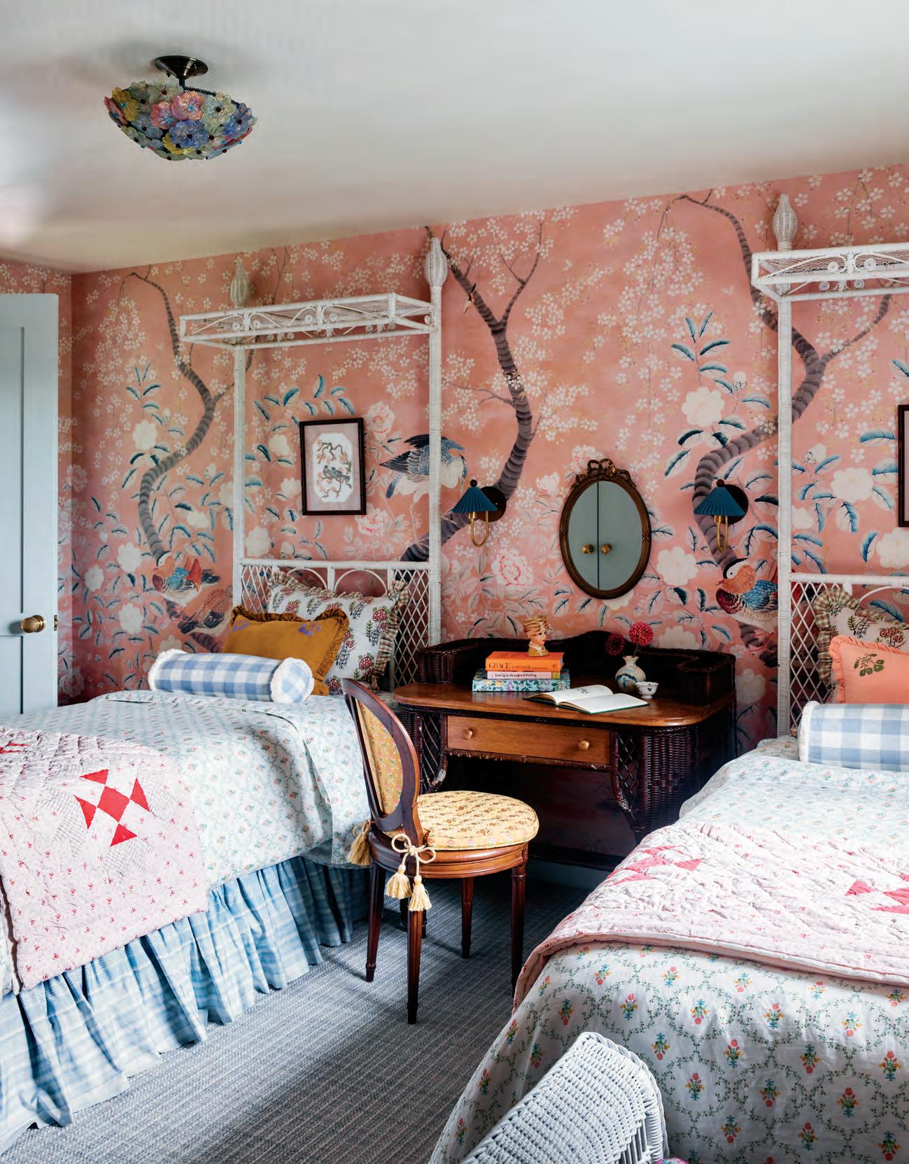
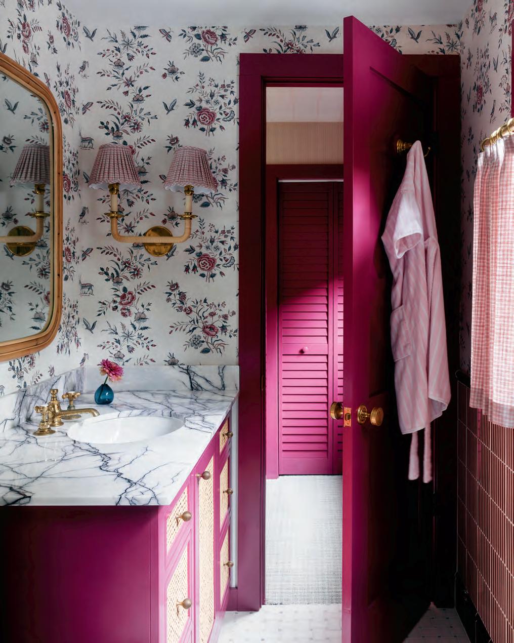
ABOVE AND TOP RIGHT: Lucas was drawn to the structure of the green vine wallpaper: “It’s a fresh, modern interpretation of a traditional print.” The guest bedroom is further layered with a framed vintage silk Gucci scarf, flanked by classic floral paintings, creating a collected and quietly refined composition. Wallpaper: Schumacher. Ceiling wallpaper: Supply Showroom.
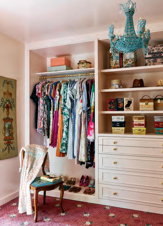
BOTTOM RIGHT: The owner’s closet was inspired entirely by Welch herself—“our little fashionista”— as the designer puts it. Custom cabinetry by Heirloom Cabinetry sets a tailored foundation, layered with soft carpeting underfoot, an antique needlepoint chair for a touch of history, and a chandelier sourced in Paris that adds a hint of glamour. Carpet: Stark.
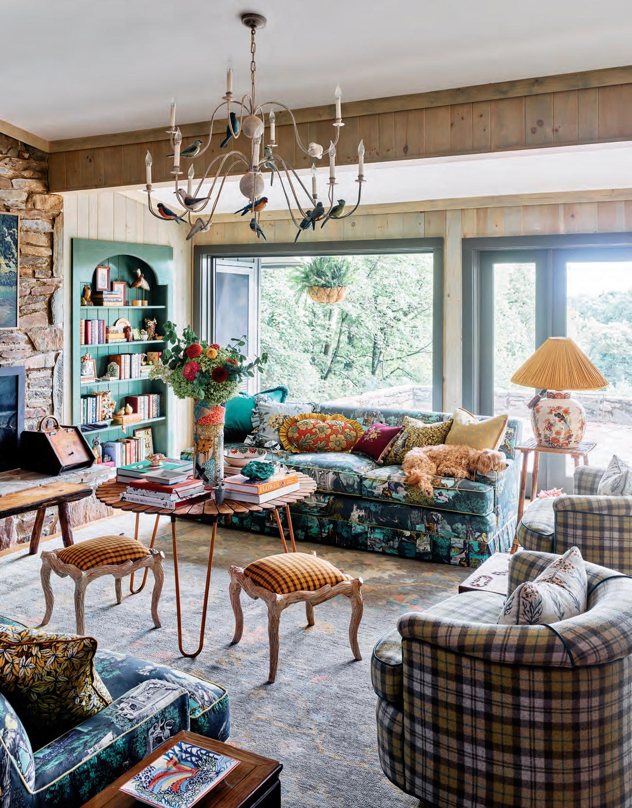
OPPOSITE: The home was wrapped entirely in natural wood paneling—an element both Lucas and Welch were eager to preserve. Rather than remove it, Lucas applied a soft green-blue wash, introducing a hint of color while maintaining the paneling’s inherent warmth and rustic character. Sofa fabric: Cole & Son. Rug: Vintage, Charlotte Rug Gallery. Stools: Vintage, in a Jim Thompson fabric.
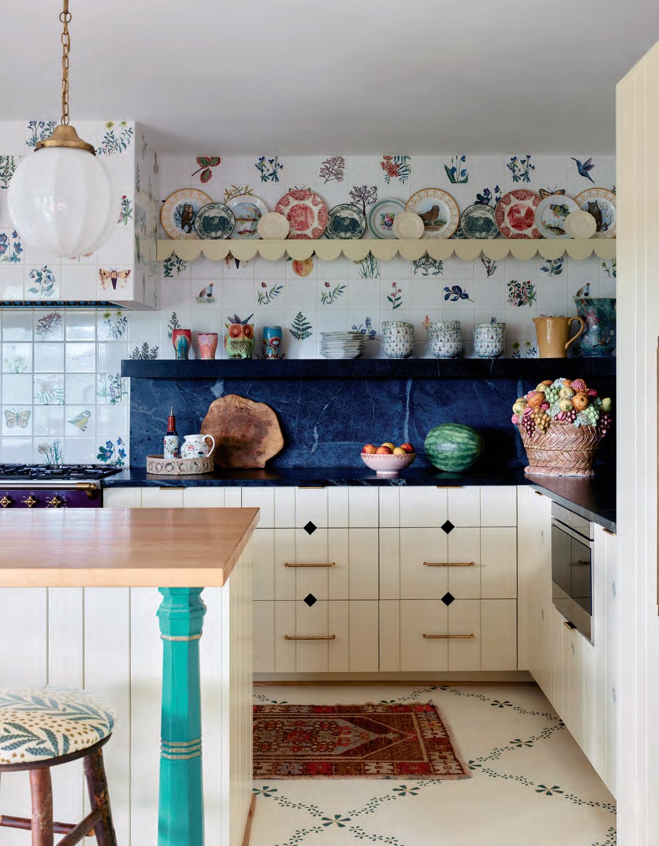
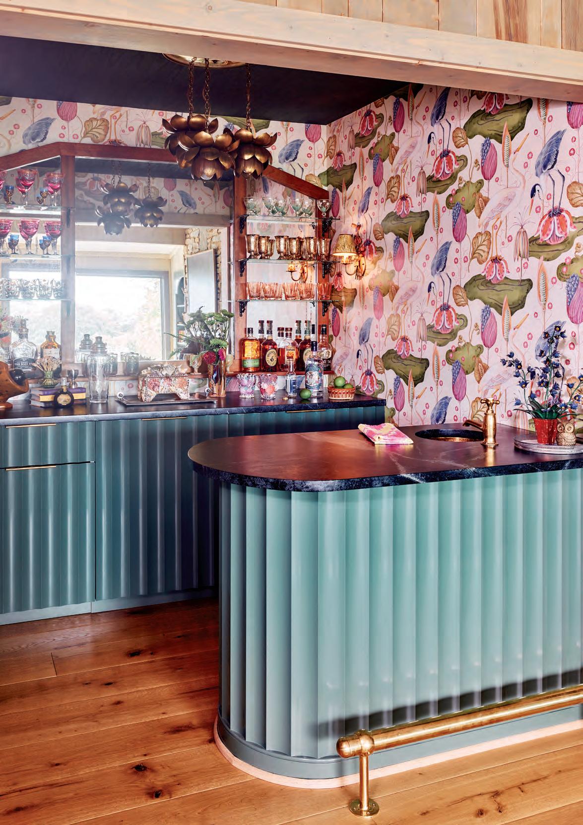
Lucas approached the kitchen with an eye toward function and nostalgia, creating a space that feels as practical as it is evocative. Custom cabinetry by Heirloom Cabinetry anchors the design, adding a tailored, enduring touch.
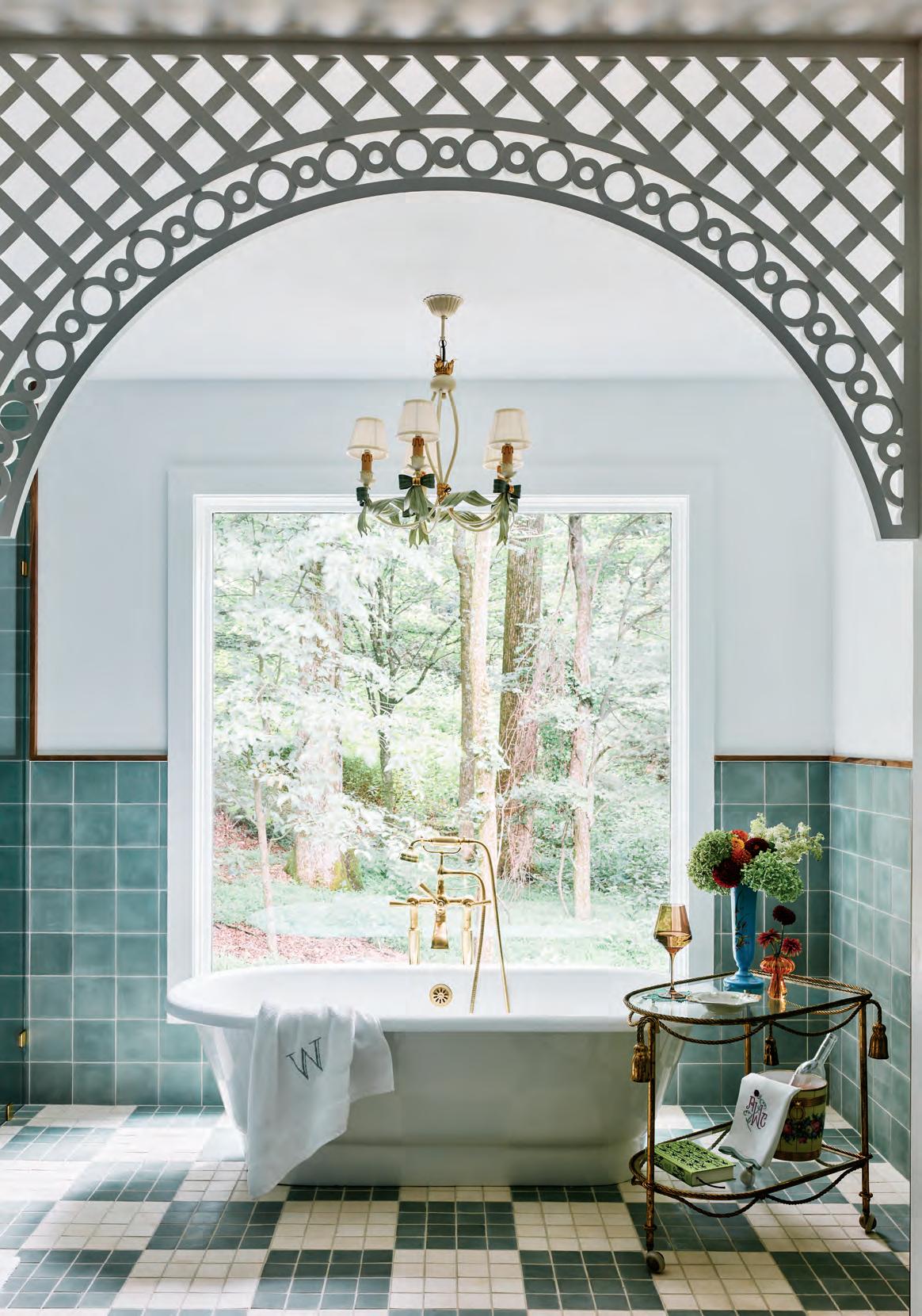
Pendants:1stDibs. Backsplash tiles: Maude Smith. OPPOSITE: Lucas set out to draw the beauty of the outdoors into the owner’s bath, creating a space that feels both fresh and quietly romantic. A trellis lends architectural interest, while a bath cart sourced at auction and a chandelier discovered on Etsy add layers of character and charm. Trellis: Fuller Architectural Panels.
Lucas and
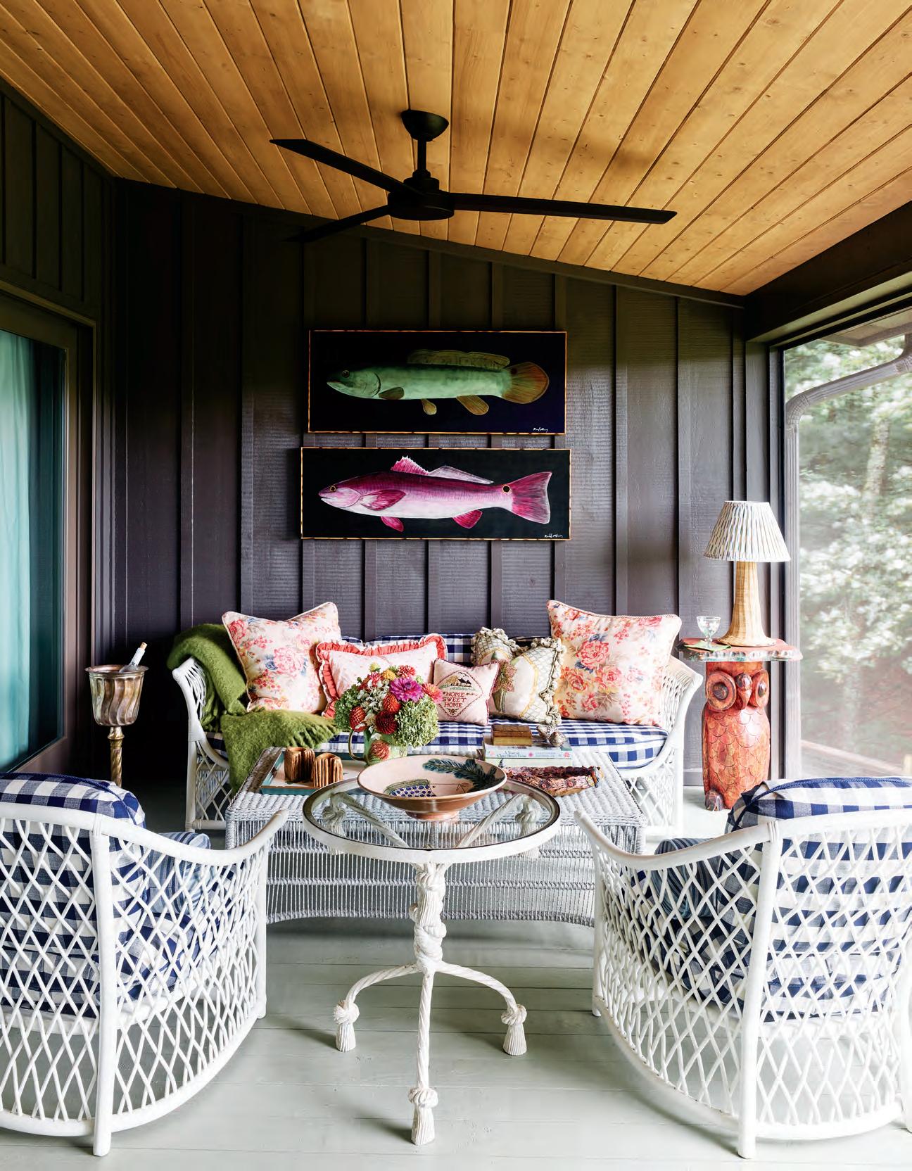
set out to create an outdoor living space that feels equal parts comfortable, vintage, and eclectic.

A thoughtfully reimagined family home balances beauty and function while layering color, pattern, and smart design to create spaces that feel both elevated and effortlessly livable.
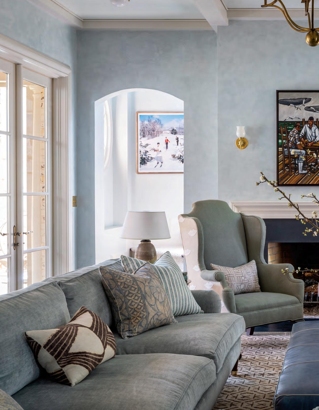
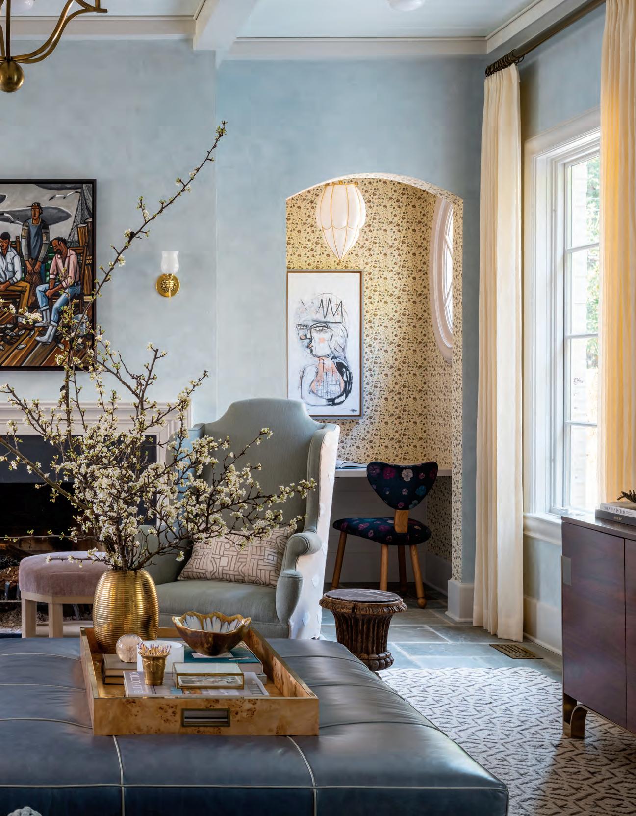
The goal was to create a room that could shift effortlessly— from a cozy fireside retreat for family movie nights to an inviting, adults-only space suited for entertaining, says designer Sarah Lyons. The original room felt dark, with little in the way of overhead lighting, so multiple layered light sources were introduced to brighten and soften the space. Venetian plaster walls, finished with a subtle sheen, further enhance the effect, reflecting light and lending the room a warm, luminous quality. Sectional: Custom from Pumas Upholstery Corp. in a Romo fabric. Chairs: Vintage, 1stDibs.

When Sarah Lyons first met her client, the connection was immediate.
Both mothers of young children, the two became fast friends, bonding over the juggle of work and family life—and a shared love of design. So, when the client and her husband set out to update their Eastover home to better suit their growing family, Lyons was their first and only call.
The stately white Colonial had just three owners in its lifetime, with only one significant renovation completed by its previous residents. While undeniably beautiful, the home’s layout and finishes no longer aligned with the pace and needs of modern family living. “We have two boys, a girl, and a Labrador, so things get messy and hectic,” explains the homeowner. “We really needed a space where nothing was too precious for dog hair and dirty socks and everyday living with growing kids.”
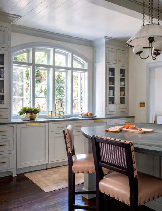
Seemingly small inefficiencies—a lack of pantry space, an oversized casual dining room, and a too-tight family room—were among the first to be addressed. Working in close collaboration with Lyons, architectural designer Emily Bourgeois of Bourgeois McGinn reimagined the layout, resulting in a home that feels markedly more functional and attuned to daily life.
But the transformation extended well beyond the floor plan. Lyons reworked the interiors with an eye toward ease and comfort, turning what had been a formal, underutilized family room into a relaxed, inviting
space for movie nights and game days with a family of five. A tiny den for the kids was transformed into a more open game room. “My client had a strong instinct for what wasn’t working,” Lyons explains. “She knew she wanted change, even if she didn’t always know exactly how to get there. But she was incredibly open—when something resonated, she fully embraced it.”
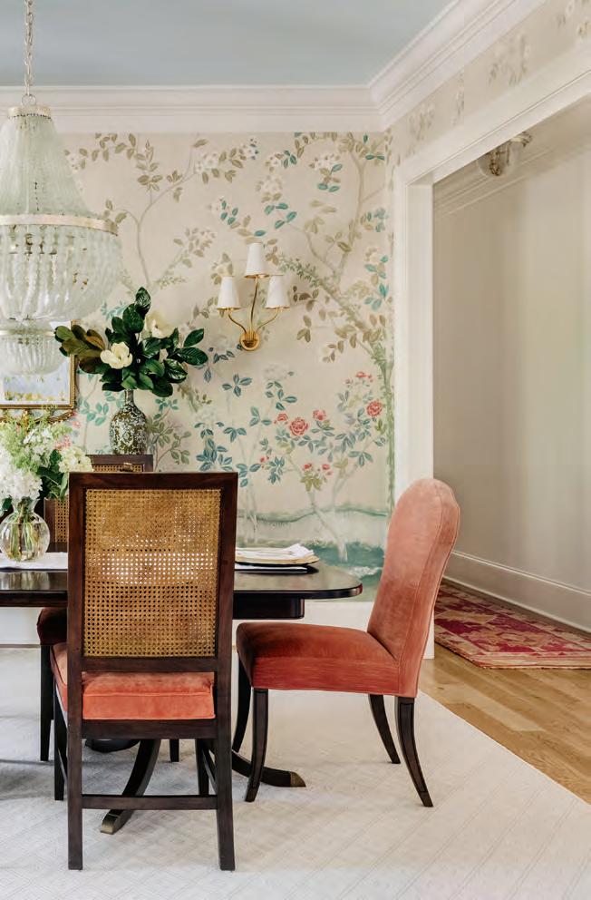
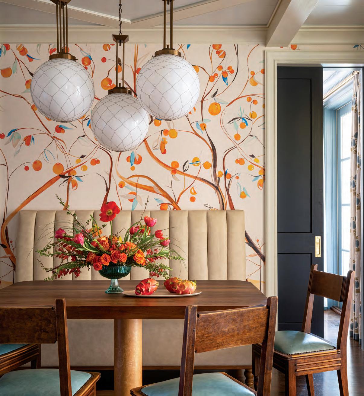
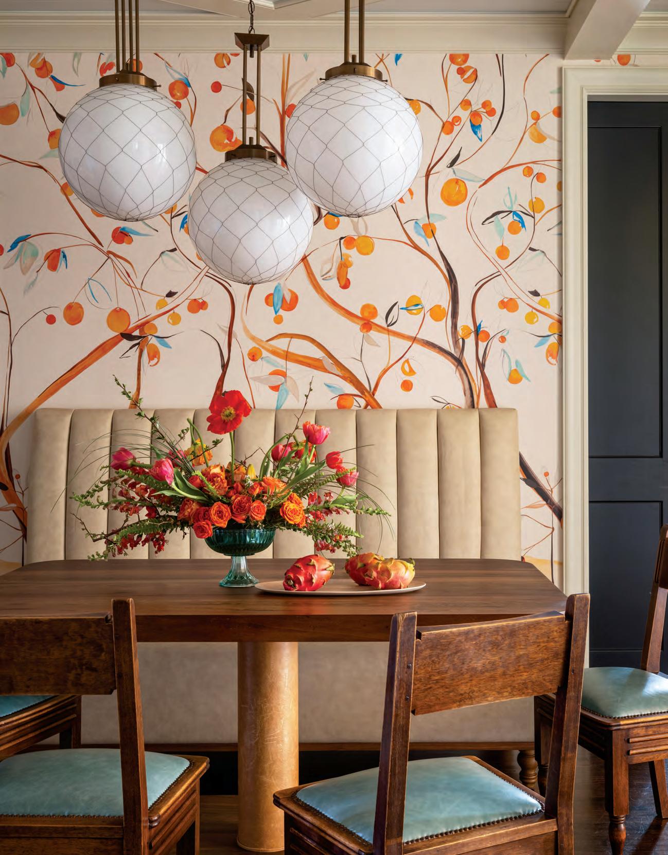
That openness paved the way for bolder moves, like swapping the family room’s neutral walls for a soft blue Venetian plaster that introduces both color and texture. Pattern, too, became a throughline. In the reimagined breakfast nook, a lively Orangerie chinoiserie wallpaper by Voutsa takes center stage, balanced by a custom channeled leather banquette in a neutral hue. Even the pantry was given a moment of personality, wrapped in a vibrant wallpaper that transforms the once purely functional space into an unexpected delight.
While the home isn’t awash in color, it’s thoughtful, unexpected color moments that lend a sense of sophistication and quiet playfulness—softening the formality and making it feel more in step with the family’s lifestyle. “Sarah just nailed it,” the homeowner says. “She would look at a space and know exactly what needed to happen. She was so much more than a designer—she understood how we wanted to live and brought it to life in a way that feels both beautiful and effortless.”
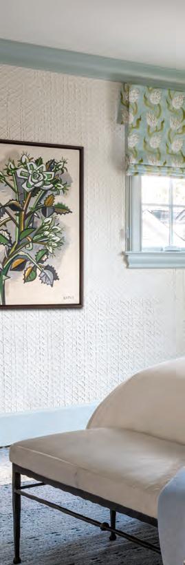
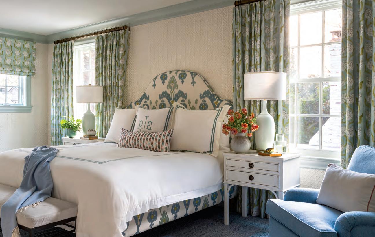
ABOVE: Lyons kept the owner’s bedroom soft and elegant, drawing from the same serene palette introduced in the adjoining bath. Thoughtful adjustments to the furniture layout—most notably repositioning the bed—helped open the room, resulting in a more inviting and balanced space overall. Wallpaper: Innovations. Drapery fabric: Claremont.
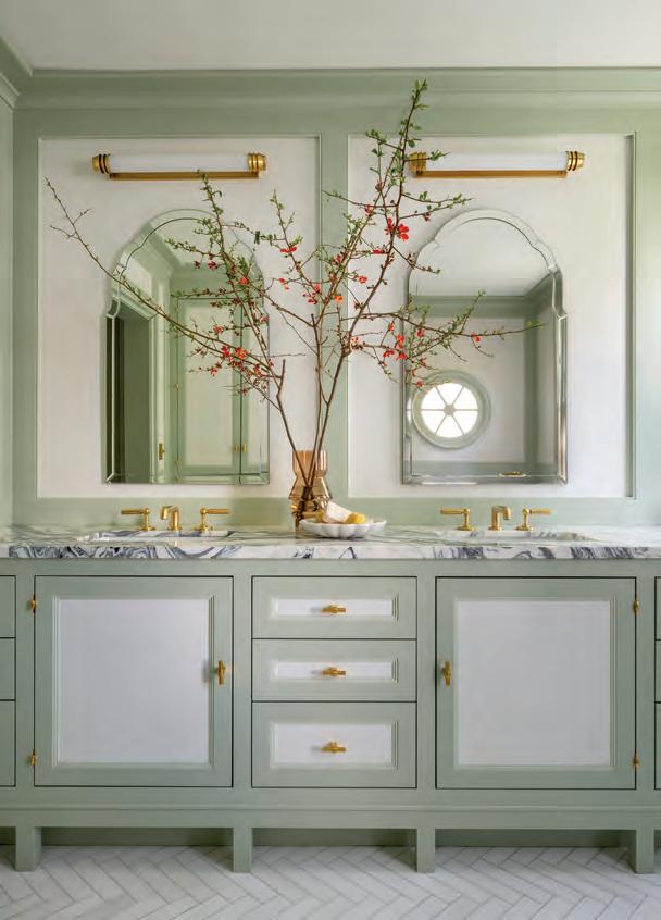
FAR RIGHT: The owner’s bath felt grand in scale but inefficient in use. The tub was repositioned to allow for a long, shared vanity along a clean interior wall, providing ample storage for both husband and wife. Paneling plays a pivotal role throughout, concealing built-in medicine cabinets behind each mirror and integrating a generous linen cabinet seamlessly into the design. Countertop: BAS Stone. Floor tile: Palmetto Tile Distributors.
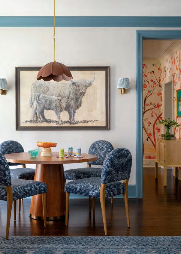
RIGHT: “The goal in the kids’ playroom was to create a room rooted in comfort with a sense of easy playfulness,” explains Lyons. A range of blue tones sets a relaxed, cohesive palette, anchored by artwork that perfectly complements the seating arrangement. Pendant: L’Aviva Home.
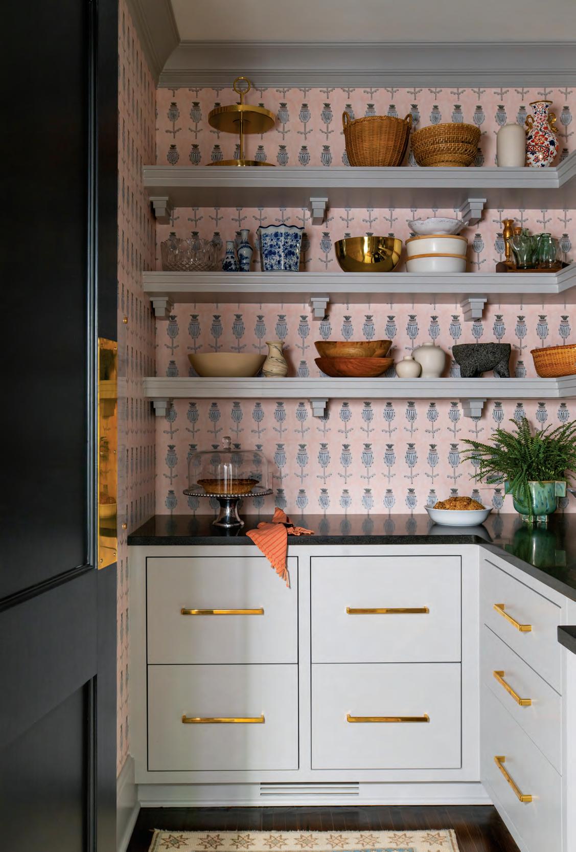
Even the pantry was treated as an opportunity for expression, wrapped in a vibrant wallpaper that transforms the once purely utilitarian space into an unexpected moment of delight.

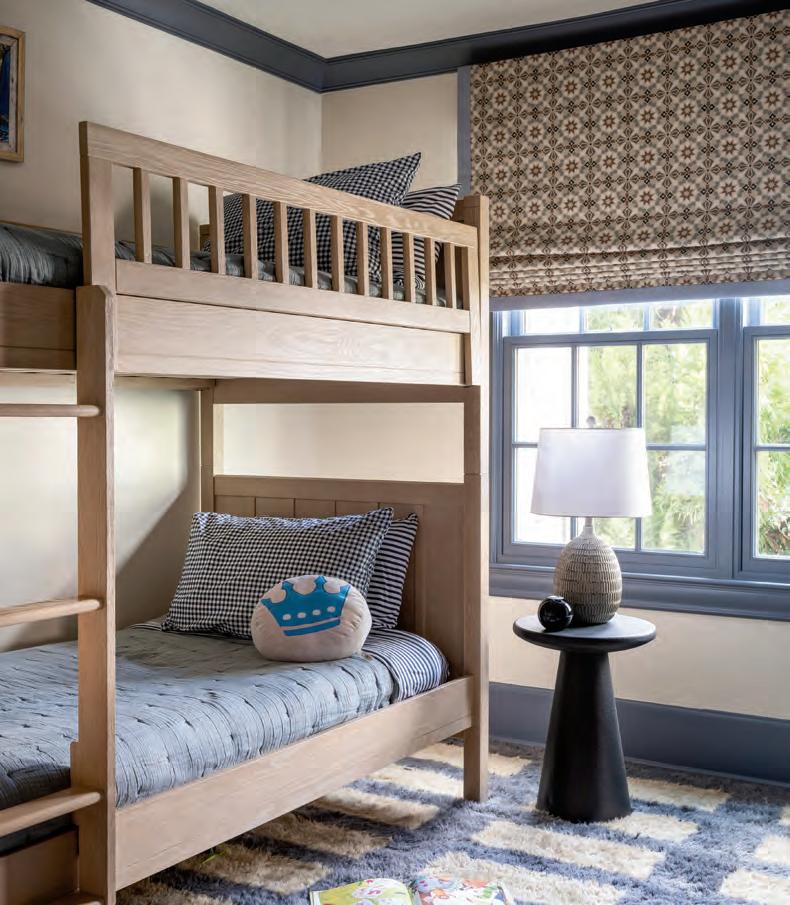
ABOVE LEFT: The middle son’s bedroom was entirely reimagined following a shift in the home’s architecture, which eliminated a pair of oversized corner closets. By streamlining storage into a single, more efficient closet, the design team freed up wall space for a new bed configuration—making room for the bunk beds. Bunk bed and side table: Pottery Barn.
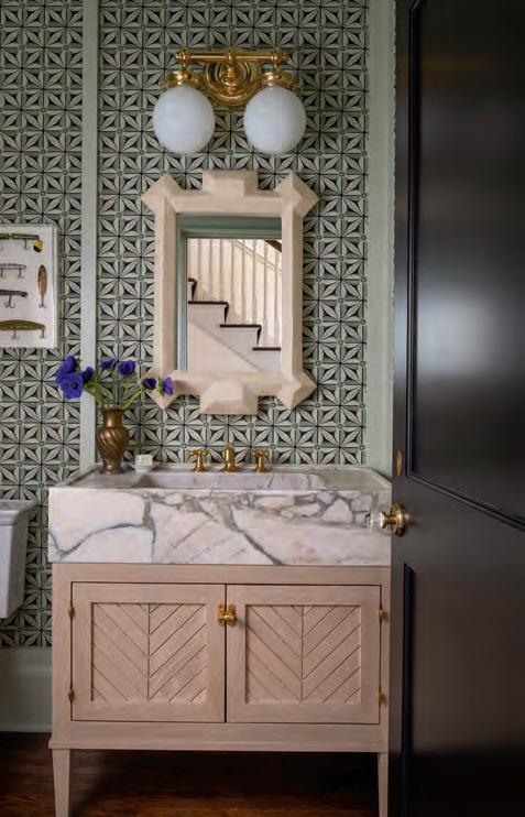
ABOVE RIGHT: The original powder room felt notably dark, enveloped in a black toile wallpaper that made the space read almost as a void. Lyons removed the existing paper and reintroduced the room with a bright geometric pattern, complemented by painted trim for added definition. Wallpaper: Antoinette Poisson. Vanity: Etsy.
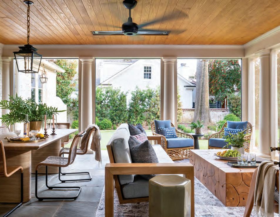
LEFT: The covered porch was, in many ways, the catalyst for the entire renovation. The clients envisioned a space equally suited to hosting intimate dinners as it was to gather for game day. To achieve that balance, both dining and lounge areas were thoughtfully integrated, all while maintaining an easy flow to the yard and grill beyond. Sofa: Williams Sonoma, in a Scalamandré fabric. Swivel chairs: Made Goods.
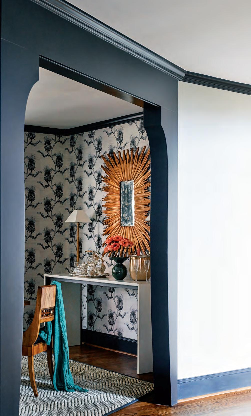

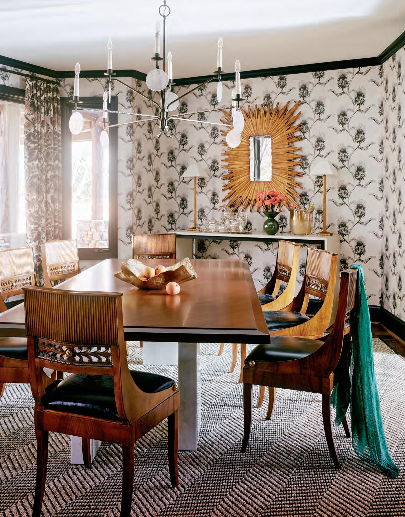
The dining room embodies the homeowners’ personal aesthetic—a mix of traditional and contemporary. “I love to mix the two styles,” says designer Mary Margaret Underwood. “I think it makes each one more interesting.” Dining table: Hickory Chair. Dining chairs: Bennett. Chandelier: Visual Comfort. Rug: Fibreworks. OPPOSITE: Underwood added a wall between the foyer and the dining room to create a defined space, more suitable to intimate conversation. Console: Hickory Chair. Wallpaper: The Vale London. Lamp: Visual Comfort.
Set on forty acres of land, the house came with a horse barn, walking trails, and a pond—an idyllic place for a couple with three young, active children and their friends. “I had a vision of groups of kids coming over to swim,” says Galloway. “I knew we would use the property for more than just us.” The house itself, though, was less than picturesque. “There was a Western theme going on inside, with lots of wood accents and rock walls,” recalls Galloway. “It looked a little like Great Wolf Lodge.”
At first, the Galloways tried sprucing up the home on their own, with a few fresh coats of paint on the walls and trim, but in 2023, they turned to designer Mary Margaret Underwood for help. “She’s my cousin,” says Galloway, “and she’s also the best there is.” Galloway knew this from experience—she’d seen how Underwood had updated her great-grandfather’s historic Concord house without sacrificing its charm and character, and she knew Underwood would bring the same thoughtful approach to her own unique home.
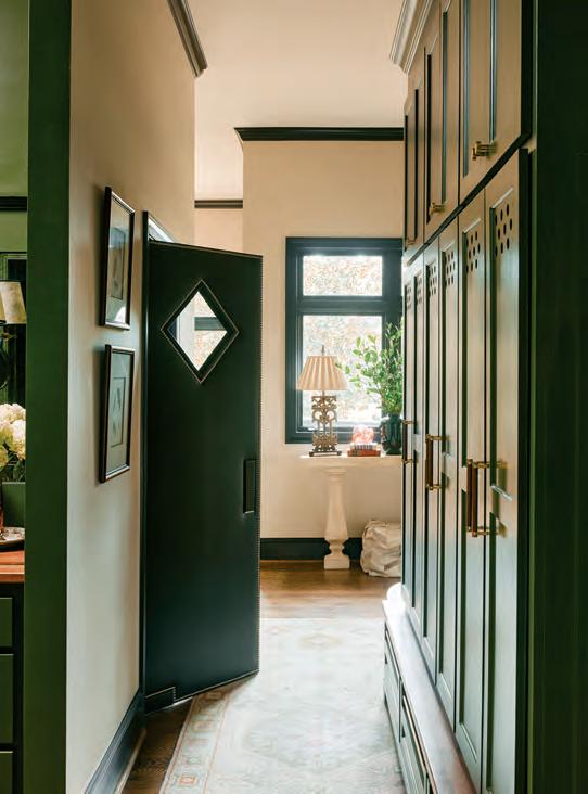
With the help of architect Duffy-Magus + Associates, Underwood first set about reconfiguring the floor plan to add more definition to the space. “The [first floor] was almost too open,” says Underwood. “There was no place for your eye to land.” She started in the front of the home, where she added a wall to create a defined dining room, and took the kitchen down to the studs before adding a butler’s pantry to the space; a leather-studded swinging door leads from the pantry to the back entry hall. “We wanted to create spaces that added more warmth to the home,” says Underwood.
Hardwood floors run the length of the kitchen, which Underwood connected to the hearth room. “Everyone hangs out there,” says Galloway, “so it was important to create enough seating.” To that end, Underwood commissioned a custom-built sectional that could seat
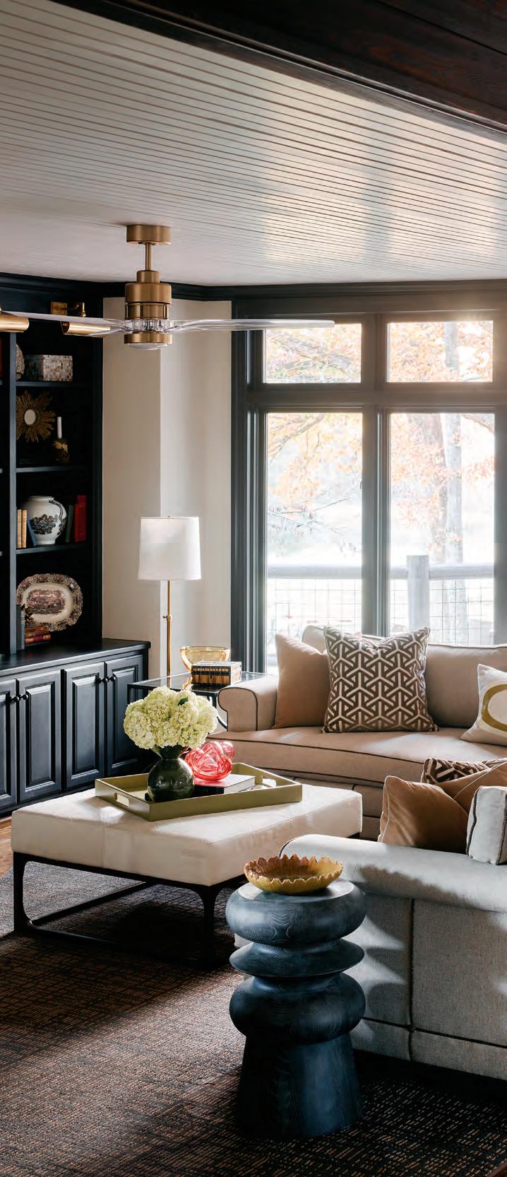
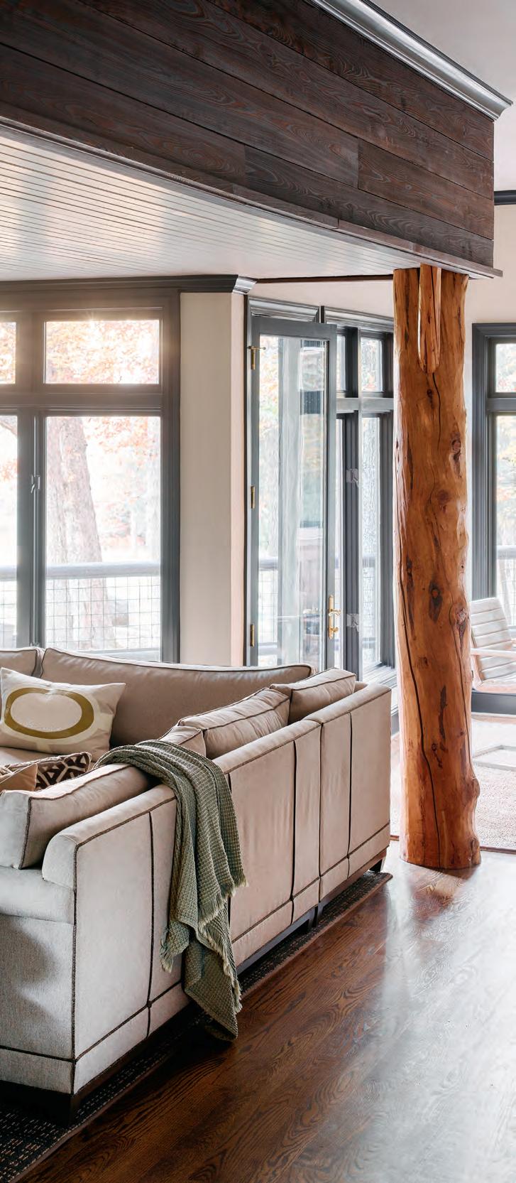
at least five people. To accommodate a natural drop in the ceiling, she also installed wooden beams in the Shou Sugi Ban–style—a Japanese technique of charring wood—along the length of the room. Underwood originally wanted to use a company to char the wood, but due to timeline constraints, she pivoted to her contractor, Josh Airheart of Reliable Woodworks, who did the work by hand. “It’s phenomenal,” Galloway says. “It made the biggest difference in the world.”
The renovations took a little under a year to complete, but the result was a traditional yet modern home with a timeless appeal. “I want the home I’m designing to be beautiful now and also beautiful in twenty years,” says Underwood. “I think it’s important to choose materials that will stand the test of time.”
“We really transformed the house into a much more useful space,” Underwood continues. The project was also close to her heart given that the Galloways are family. “They’re a gracious family who entertain often, and now, I think they can be really proud of sharing their home with others.”

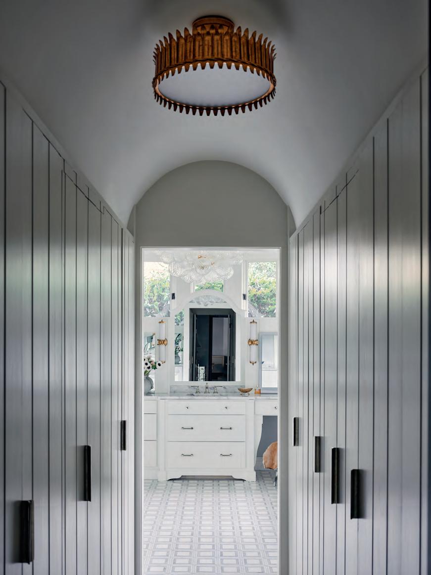
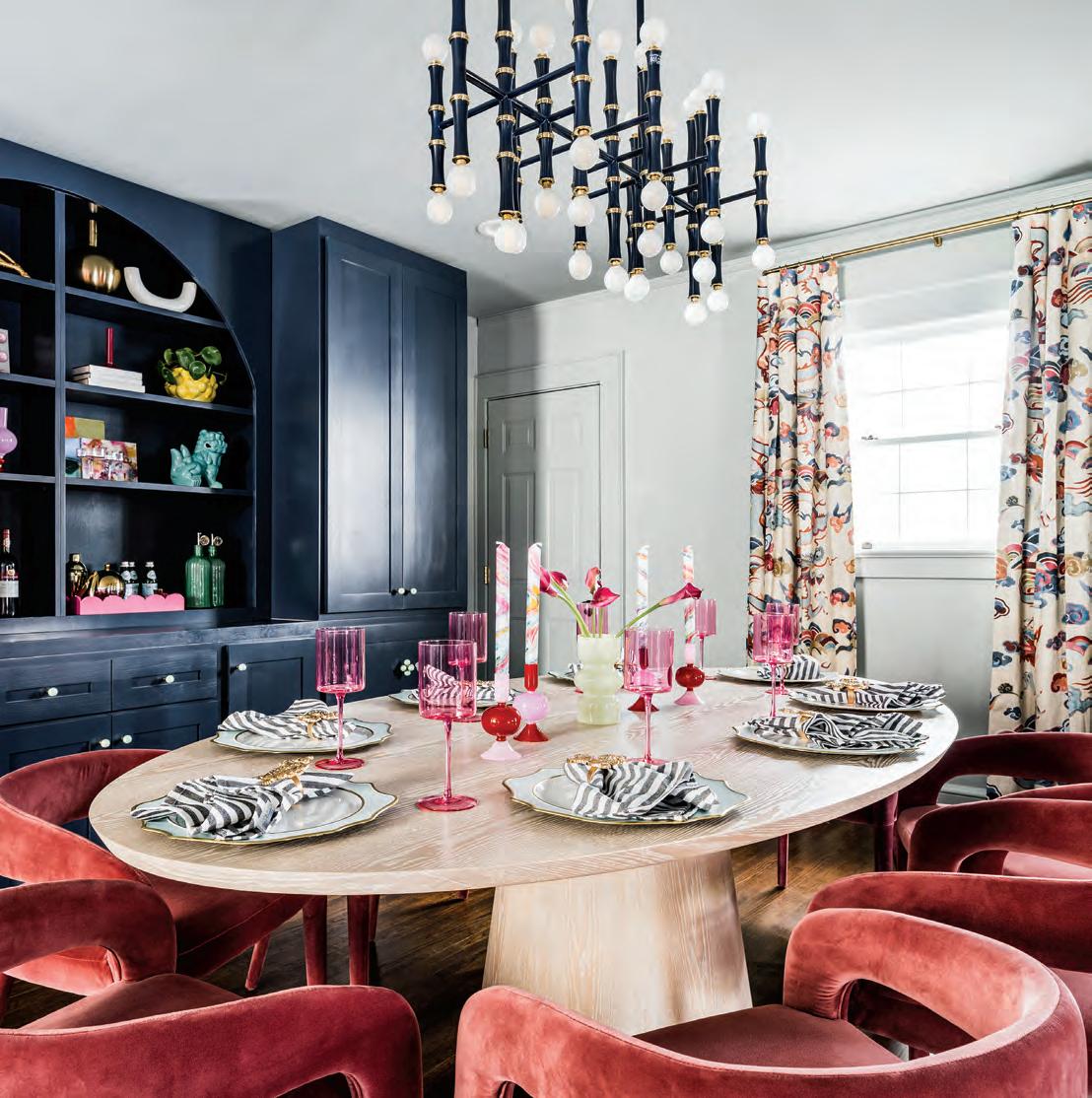
Across the Carolinas—from rolling highlands to breezy coastlines—a remarkable community of interior designers is redefining how we live at home. The creatives highlighted on the following pages blend classic influences with contemporary vision, shaping interiors that feel deeply personal and distinctly elevated. From tranquil escapes to polished city spaces and charming havens, their work invites comfort, style, and authenticity, embodying the essence of Southern charm while pushing the boundaries of thoughtful design.
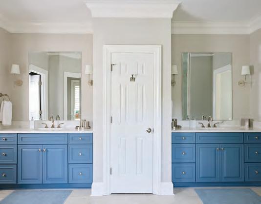

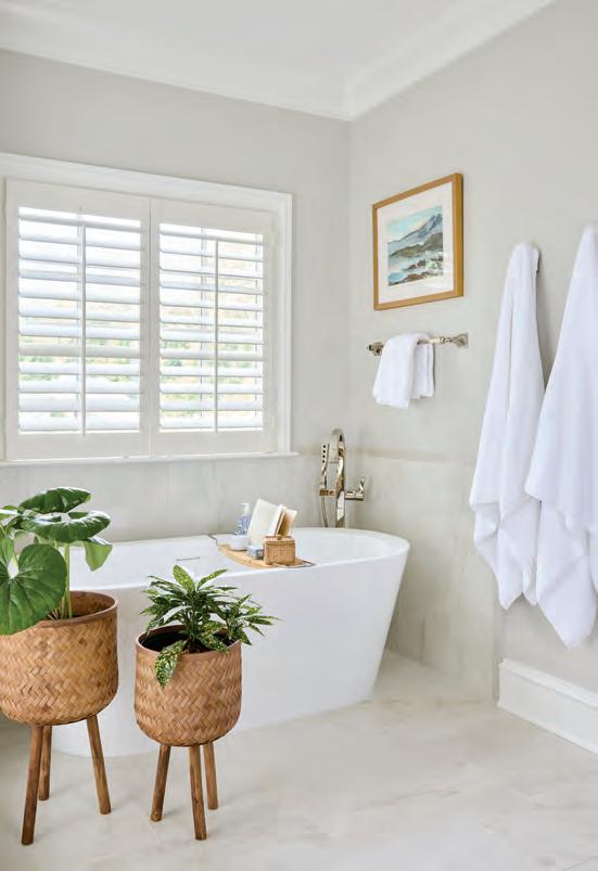
jpeachinteriors.com | @jpeachinteriors4 704.287.7616
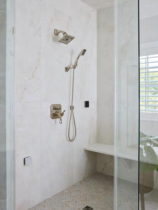
THIS PRIMARY BATH renovation by J. Peach Interiors transforms a once purely functional space into a refined, spa-inspired retreat designed for both comfort and everyday luxury. Every detail was thoughtfully considered to create a calming, elevated experience, balancing timeless design with modern functionality.
The walk-in steam shower serves as a focal point, featuring largeformat tile work, seamless glass, and a curated mix of finishes that create a sense of openness and serenity. Paired with a freestanding soaking tub, the layout invites relaxation and offers a true escape within the home.
The result is a primary bath that feels polished and personal: a quiet sanctuary designed to elevate the rhythm of everyday living.
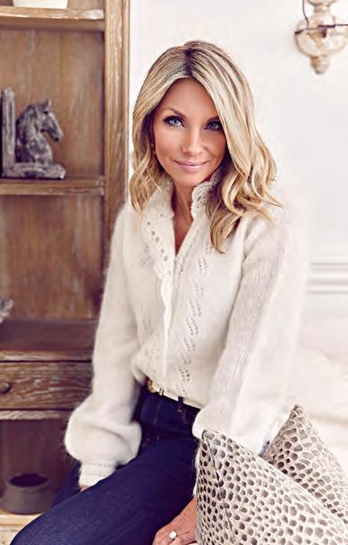
Sara Lynn Brennan
saralynnbrennan.com | @saralynnbrennan
704.246.6266
SOME HOMES are conceived as a vision; others take shape as a feeling. This Lake Wylie waterfront retreat belonged firmly to the latter, its story beginning well before the first shovel met the soil. Our clients—busy medical professionals with a full, sports-driven family life—came to us with newly completed architectural plans and schedules already stretched thin. What they needed was not simply a designer, but a trusted partner: someone to guide the intricacies of the build, collaborate closely with their builder, and serve as their eyes and ears on-site while life unfolded elsewhere.
From the outset, we worked to ensure the architecture aligned seamlessly with how they lived. During our Idea Session, we uncovered a shared pull toward transitional design—timeless yet layered, refined yet personal. The direction allowed us to shape a home that feels both polished and inviting, an authentic reflection of the family behind it.
Across the eighteen-month build, we led every selection with intention. From foundational materials—flooring, cabinetry, tile—to the final layers of furnishings, window treatments, and styling, each
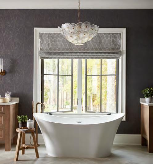

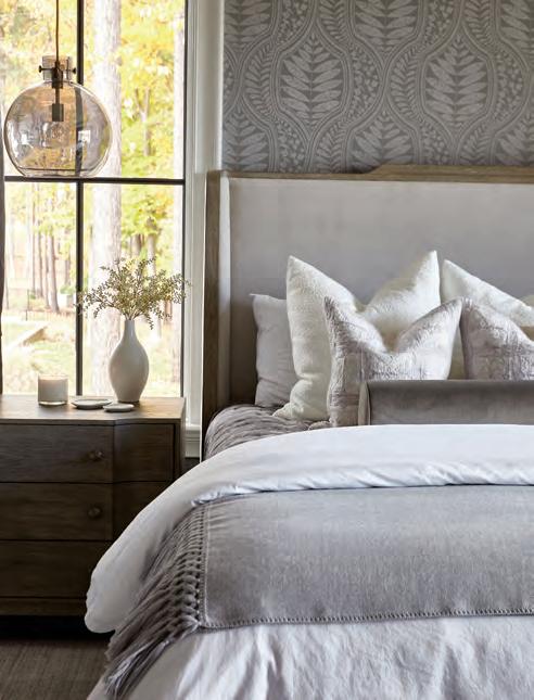
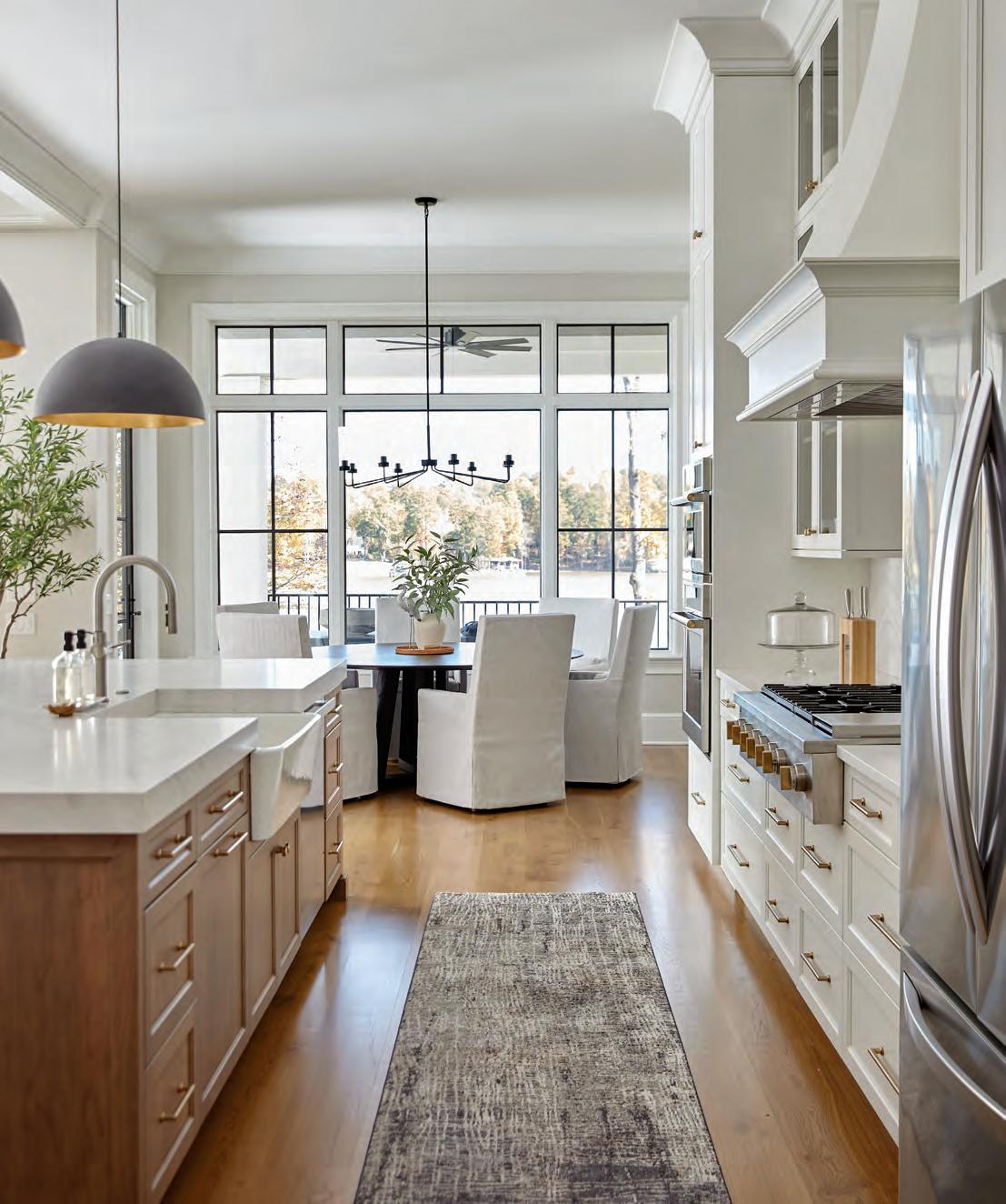
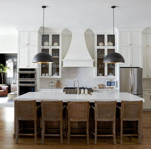
decision balanced beauty with function, creating a cohesive, turnkey result that honored both aesthetic and investment.
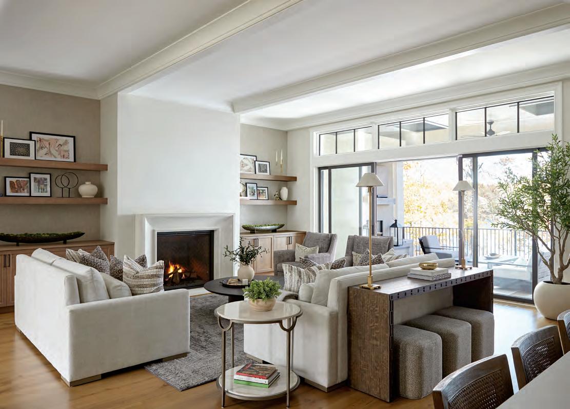
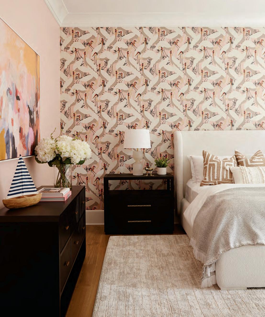
The finished home is as livable as it is lovely. At its center, a fully custom kitchen anchors daily life, its tailored details designed for a household in constant motion. Living spaces flex easily from quiet family evenings to lively gatherings, striking a natural balance between comfort and sophistication. Moments of whimsy—seen in a joy-filled guest suite and a playful pool bath wrapped in spirited wallpaper—add levity and charm.
Throughout, contrast creates depth: soft, layered spaces meet richer, more masculine notes, lending a sense of individuality to the whole. What began as a build ultimately became something more enduring—a retreat designed to welcome, restore, and evolve alongside its owners. More than a house, it is a home that tells a story, shaped by life and elevated through thoughtful design.
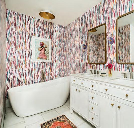

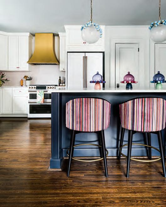
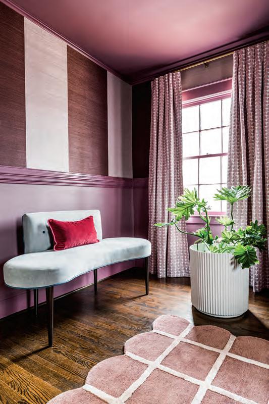
Ashley DeLapp Interior Design ashleydelapp.com | @ashleydelapp 704.307.4949
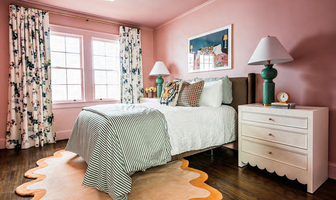
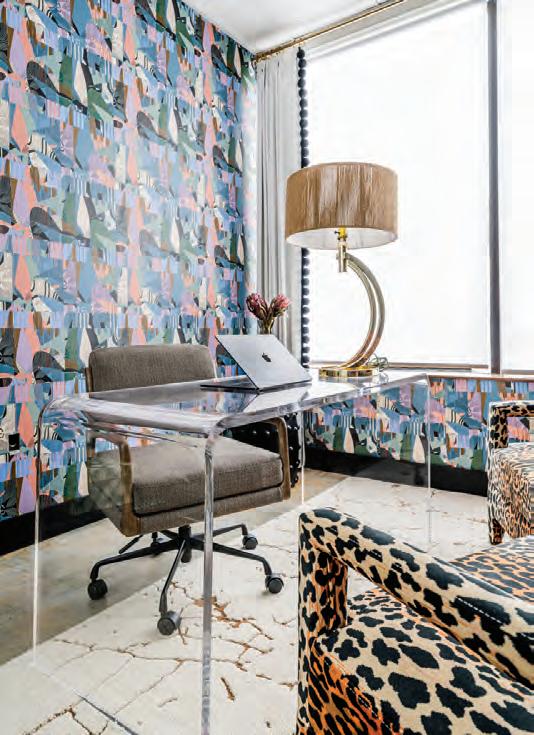
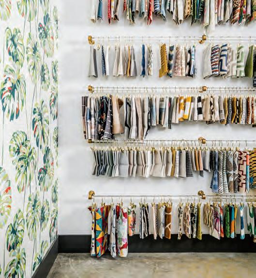
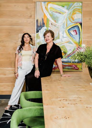
ROOTED IN A FEARLESS USE of color and a deeply layered approach to design, Ashley DeLapp’s West Park Avenue project began with a simple directive from the client: “Do what you do.” With that creative freedom, this historic Wilmore home was reimagined through a bold, highly curated lens. Saturated tones, statement patterns, and a thoughtful mix of vintage and new create a space that feels collected rather than decorated. Each room unfolds with intention, balancing playful moments with architectural precision. The result is a vibrant yet livable interior that’s distinctive, cohesive, and unmistakably personal.
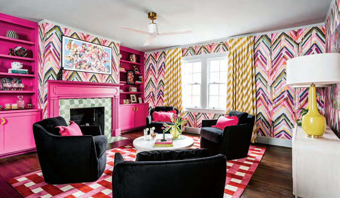

bohemianbungalowdesign.com | @bohemianbungalowdesign
BOHEMIAN BUNGALOW DESIGN is a Charlotte-based interior design studio known for creating modern, eclectic, and unique interiors throughout Charlotte and the Southeast. For more than twelve years, they have helped clients transform their homes into spaces that are unique, layered, and full of life.
Their approach blends rich textures, bold colors, and interesting wallpapers to create interiors that feel both curated and effortless. Combining vintage finds with new furniture from unique vendors, they bring together unexpected pieces to create interior that are fresh, distinctive, and tailored to each client.
Founder Wendy Fennell also launched the Bohemian Bungalow Wallpaper collection in collaboration with Mitchell Black. The collection features bold and artfully designed wallcoverings that reflect the studio’s signature love of color and pattern with a modern, eclectic vibe. Check it out here! mitchellblack.com/collections/bohemian-bungalow.



An inside look at a boutique showroom that turns rugs into works of art.
Text by Brandy Woods Snow
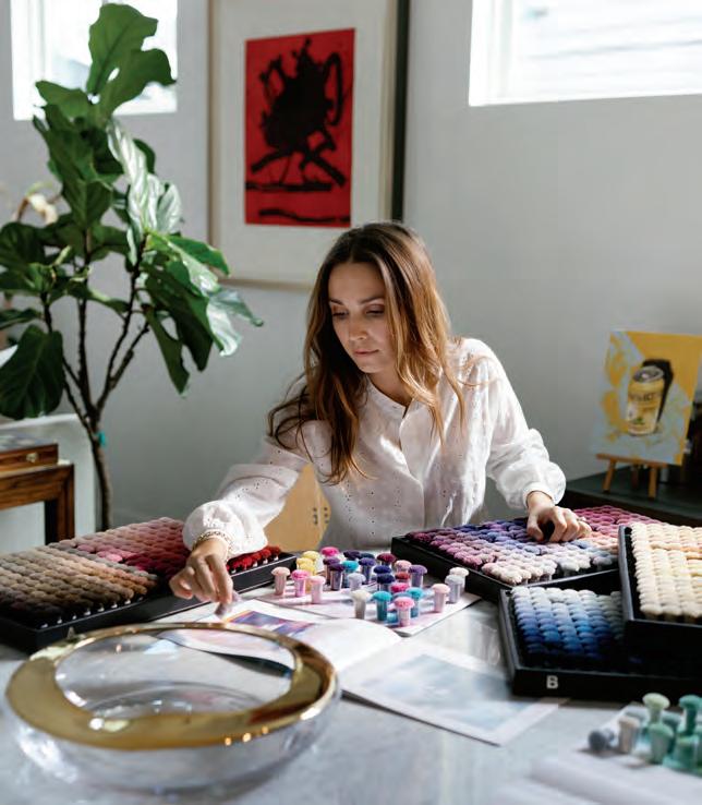
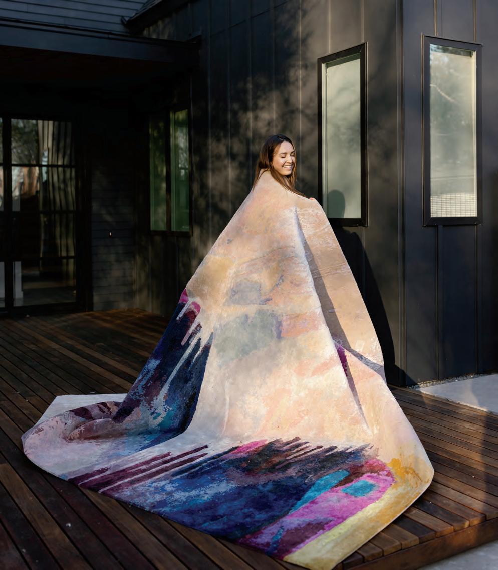
WHAT BEGAN as a search for some artwork became one of the most extraordinary collaborations in textile art. Several years ago, Ali Nikrooz, founder of Couture Knots, a boutique rug showroom serving interior designers, was scrolling Instagram, searching for inspiration in the form of a piece of art to buy for his home. He found an artist whose work moved him, and, in a twist of fate, something else in her online photo caught his eye. There, on her floor, was one of his own rugs.
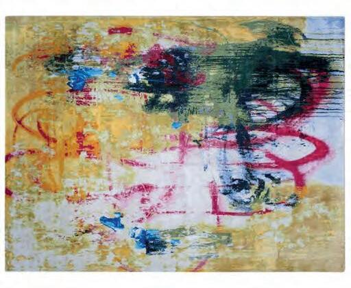
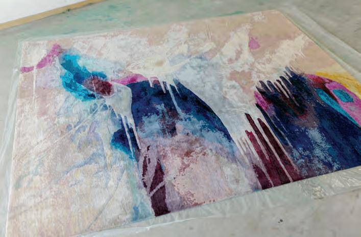
That serendipitous moment sparked a conversation with artist Katherine Boxall, and, eventually, a trade. She wanted a rug; he wanted a painting. But Nikrooz had an even bolder proposal. He approached her with the idea of turning one of her pieces into a custom rug. That’s when the complicated work began.
Boxall’s paintings are defined by a signature fluidity, a sense of running paint that catches and shifts with the light. Translating this from a canvas to a softer textile medium was no easy feat, but Nikrooz’s solution was inventive—and meticulous. To replicate the fluidity of movement, the rug was carved into three distinct layers using scissors to create a variation in pile height and woven in a combination of wool and silk. The silk’s luminous appeal mimicked the sensation of liquid in motion to a T.
With more than seventy individual colors, the finished 8 x 10 piece boasts 1.5 million individually hand-tied knots, each guided by an intricate map that coordinated every pixel in the original art to a specific knot in the rug. The project took six months to complete.
“Don’t you want something no one else has?”
—Ali Nikrooz
“This was a work of textile art,” Nikrooz says. “The process, the journey—that’s what makes this design special.”
That kind of devoted attention is the foundation of every rug produced at Couture Knots. Unlike traditional rug showrooms with examples stacked on racks, Couture Knots carries samples from more than twenty exclusive lines—more than any other showroom in the country—and allows designers to come in and see, touch, and customize by size, shape, color, pile height, fiber, texture, and budget. One of the most requested and luxurious materials is Highland Wool from highaltitude grazing Tibetan sheep, which are naturally rich in lanolin, which results in a luminous sheen and built-in stain resistance. Other signature materials include cashmere, silk, alpaca, mohair, aloe, and cactus fibers. Most of Nikrooz’s rugs are hand-knotted in Nepal and always under ethically sourced, fair-wage conditions.
“A lot of designers walk in and say they’ve never seen anything like this before,” Nikrooz says. “They see things on our floor they never imagined could become a rug.”
Couture Knots feels more like an art gallery than a rug showroom, and that’s by design. Nikrooz empowers designers to think outside the box when creating the perfect statement piece. “Don’t you want something no one else has?” he asks.
For his clients, the answer is an unequivocal yes.
Lucy and Company transforms a lakeside new build into a serene, collected retreat.
BETH CONANT-KEIM, owner and principal designer of Lucy and Company, got the call every designer dreams of: a lakeside new build, a client with a vision, and a green light to do it all, including furniture, finishes, fixtures, and everything in between.
The client’s directive was clear. They wanted a light, airy, and neutral aesthetic with a layered quality that felt gathered over time. “The client wanted a home with a collected feel through a beautiful mix of pattern, texture, and interesting pieces that all lived together naturally,” says Conant-Keim. “That vision guided every decision I made.”
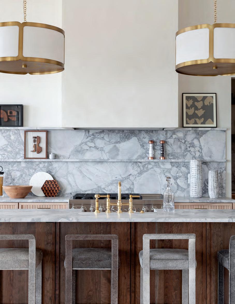
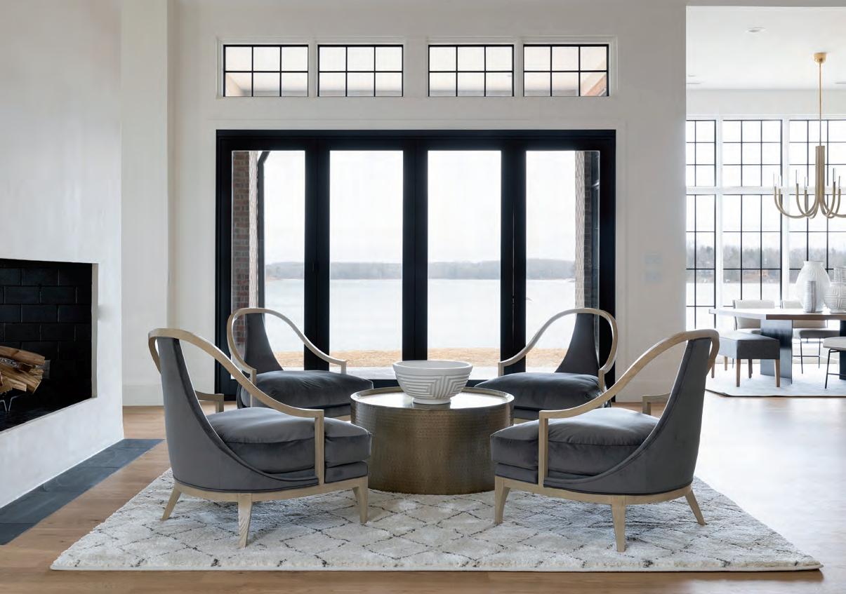
Conant-Keim began in the kitchen and adjoining family room, where twenty-two-foot vaulted ceilings and generous windows frame an unobstructed view of the lake and flood with rooms with gorgeous natural light. She selected a two-toned approach to the cabinetry, pairing stained white oak in both light and dark finishes to create visual depth without heaviness. The true showstopper is the two-tiered stone backsplash, a sculptural choice that rises to meet the room’s dramatic proportions while doubling as an art ledge. That same stone is visible from the four-chair conversation area beside the double-sided fireplace—a design move that ensures its beauty can be admired from adjacent living spaces.
"The client wanted a home with a collected feel through a beautiful mix of pattern, texture, and interesting pieces.”
—Beth Conant-Keim
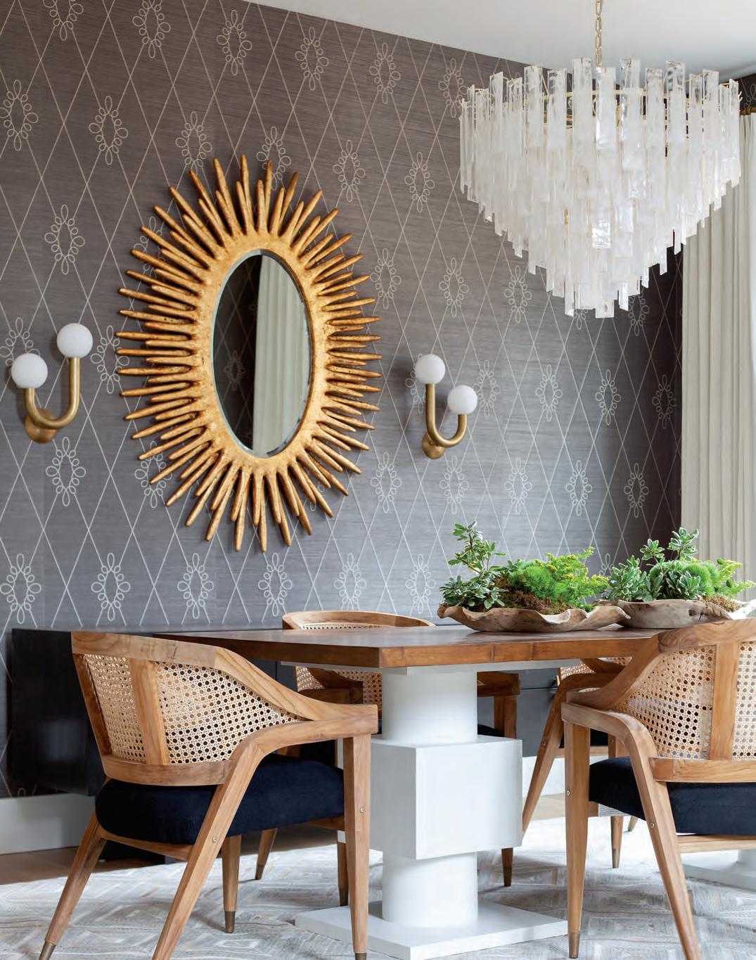
For the dining area, Conant-Keim introduced a touch of homeowner-requested glamour with a patterned grasscloth wallcovering that adds warmth and dimension and is grounded with a casual wood dining table and cane chairs, creating a space that is both approachable and elevated.
With such an open concept floor plan, cohesion was paramount. The designer maintained a through-line of complementary tones across every room, punctuated with striking pieces that draw attention. “The cohesive color palette roams throughout the house with some spaces being a little more saturated than others but all coming together,” Conant-Keim says.
The result is a curated and collected home that feels settled and secured on the banks of the lake, swathed in natural light and scenic vistas—fulfilling the client’s vision of a turnkey, well-appointed home.
For more information, call 704-342-6655 or visit lucyandcompany.com.


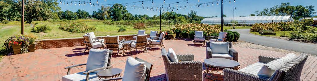


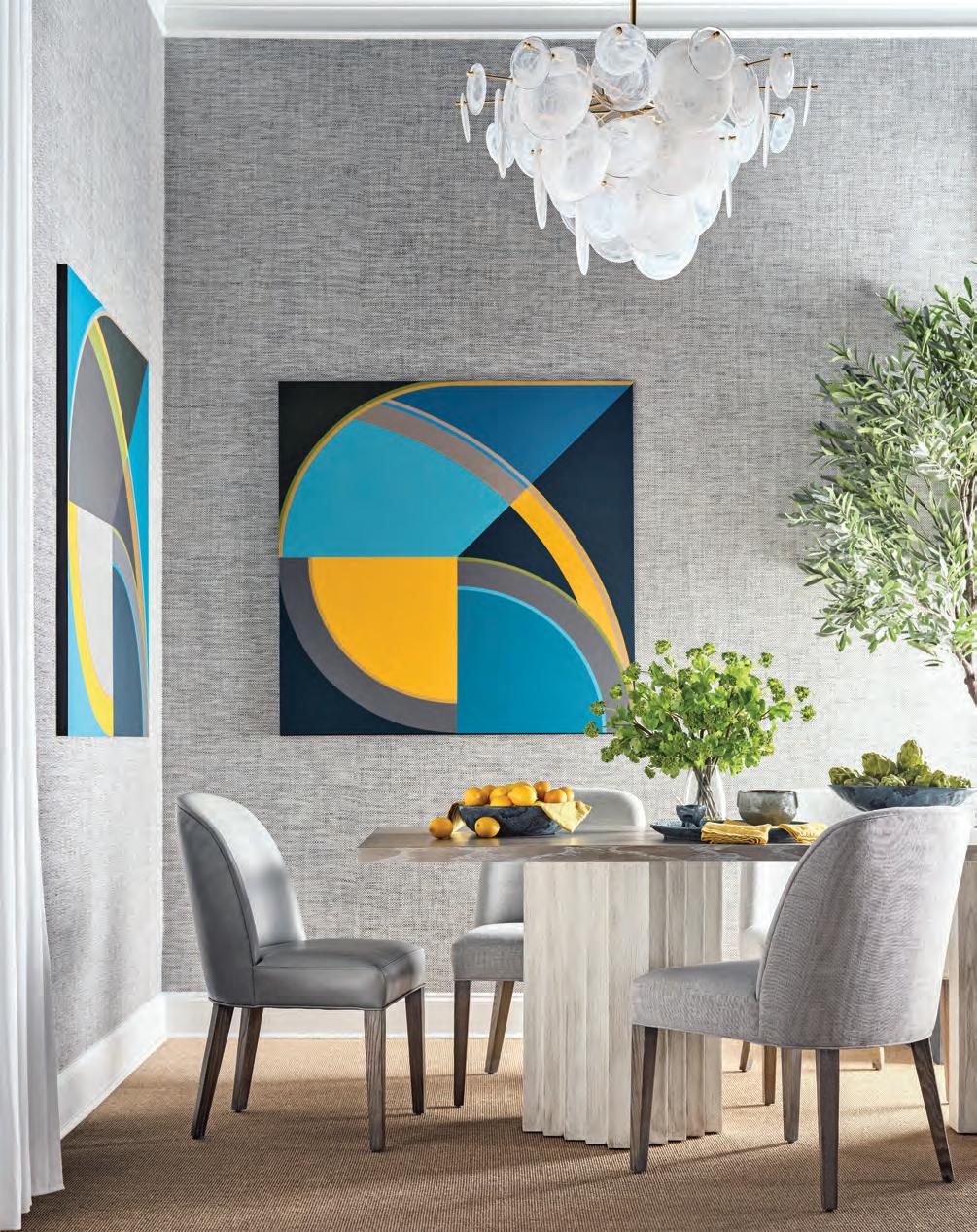
Good’s Home Furnishings brings its signature blend of luxury and value to Cornelius.
Text by Brandy Woods Snow
FOR MORE THAN fifteen years, Good’s Home Furnishings has built a brand that focuses on fine home furnishings at a great value, offering customers worldclass furniture and luxury upholstery, crafted by local Hickory artisans from some of the best furniture manufacturers worldwide. The company’s proximity to these manufacturers gives them the edge on the most competitive pricing and value that turns first-time shoppers into devoted customers. And their footprint is expanding.
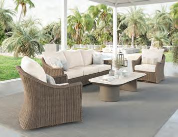
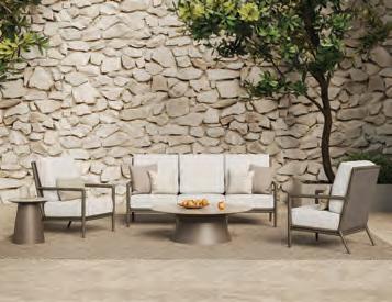
Coming in early 2026, Charlotte’s most discerning homeowners will enjoy the quality and value synonymous with the Good’s name with backyard convenience as the company opens its first showroom in Cornelius on northwest Charlotte’s I-77 corridor. The timing feels like a long-overdue arrival.
“This area has been underserved in the premium-to luxury-home furnishings segment for decades,” says Kevin Bowman, owner and CEO. “We feel that those in this community who appreciate high-quality home furnishings and design services will be very excited to welcome us.”
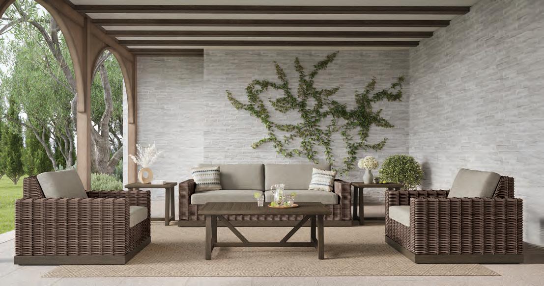
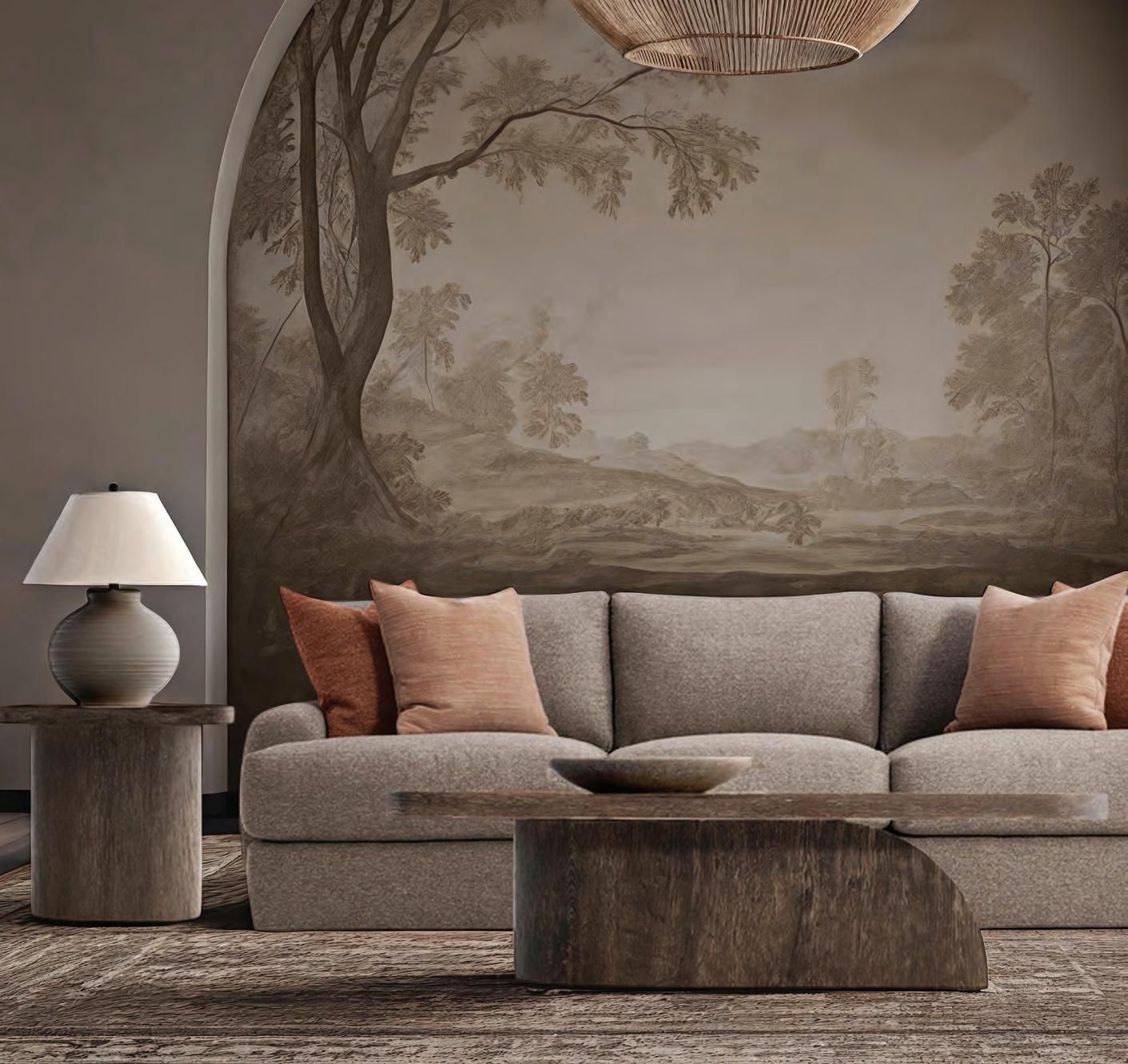
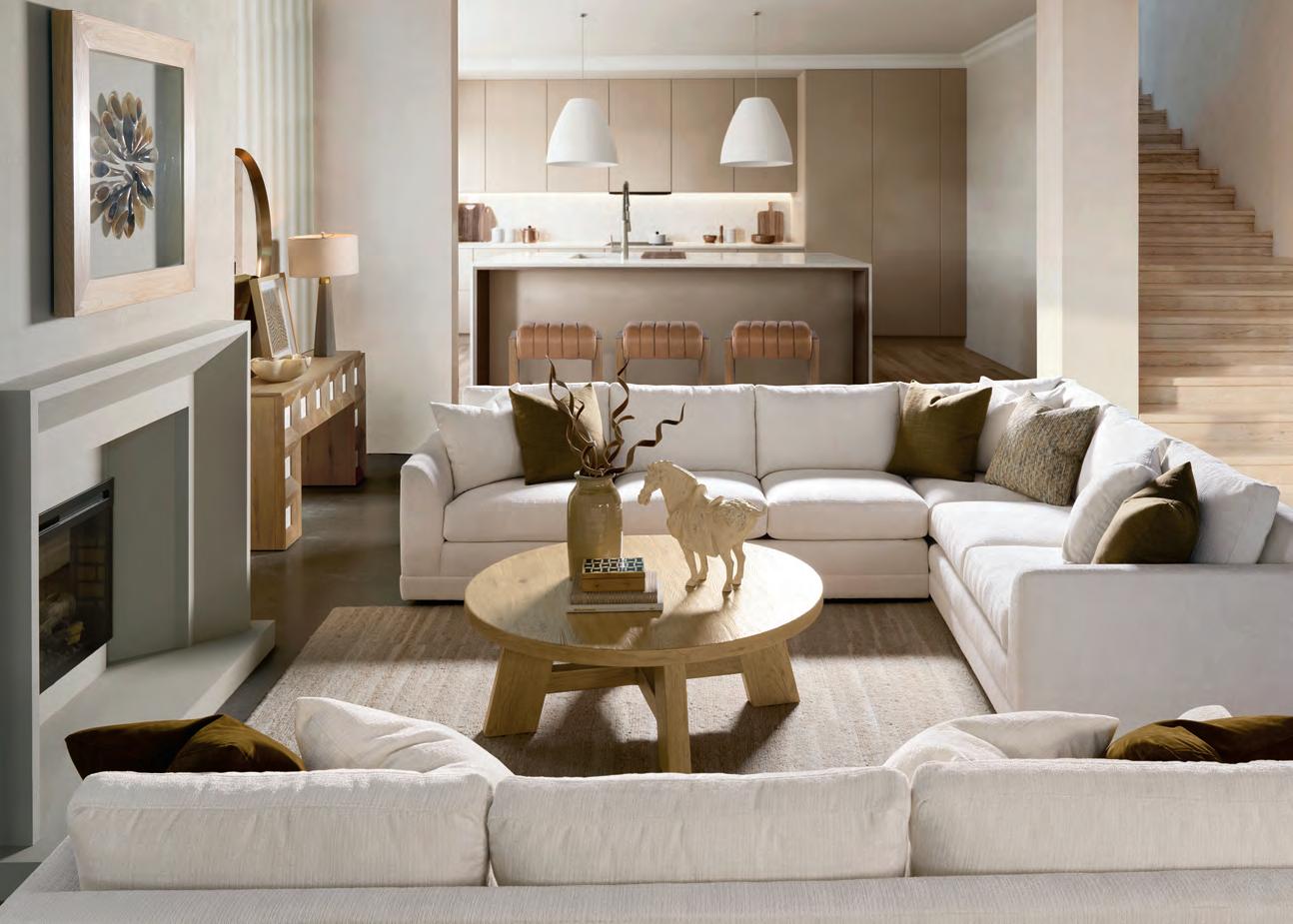
The Cornelius showroom is intentionally curated to showcase a refined edit of the brand’s most compelling offerings in a gallery-like experience. Visitors can peruse luxury upholstery, the warmth of artisan woodwork— with its more recent return to lovely browner tones— and the subtle movement of innovative new materials appearing on storage-piece fronts across the industry’s best lines.
There are new design trends having a moment, too. Bowman notes that color is confidently reentering the conversation in pillows, accent chairs, and statement rugs, with neutrals anchoring the larger pieces with timeless ease. In Good’s publication, Inspiring, a two-page section called Woven tracks textiles and provides insights into the latest in furniture fabrics from the best minds in the industry.
Beyond the store merchandising, it’s the Good’s team and their dedication to service that truly distinguishes the furniture-buying experience. “For the discerning consumer who values quality, comfort, and customization, our endto-end experience—from the stores through delivery and beyond—is unrivaled,” Bowman says.
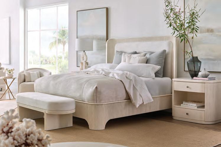
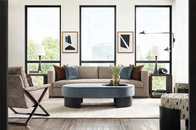
“Our end-to-end experience—from the stores through delivery and beyond—is unrivaled.” —Kevin Bowman
While having tens of thousands of product choices is a distinct advantage, Good’s team of skilled sales designers will assist each customer, asking the right questions to help narrow the search for the perfect piece. Each sales designer brings deep product knowledge, access to sophisticated selection tools, and the option for in-home consultations. This store functions much like a design showroom but without the high fees often found with that level of service. For more information, call 828-855-3220 or visit
With Pineville anchoring the south and Hickory serving the northwest suburbs, the Cornelius opening completes a thoughtful arc across the Charlotte metro area. And if this new, more intimate showroom format performs as expected, it may well become the blueprint for Good’s next chapter. “This new showroom is the next step in affirming our commitment to the Charlotte community,” Bowman says, “and its success could well mark an expansion into adjacent markets in the Carolinas.”
Step into the design showroom where creativity, community, and collaboration live under one roof.
Text by Brandy Woods Snow
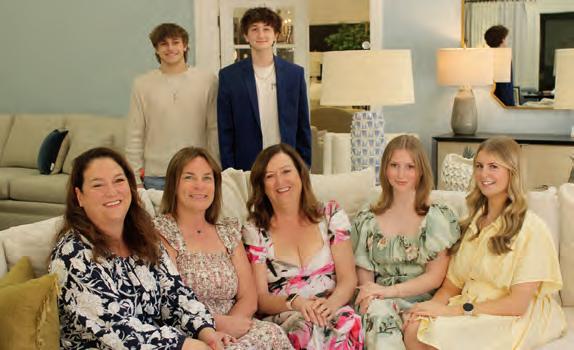
IN CHARLOTTE'S thriving design community, one destination has become a partner in every aspect of the design process. The Designers Marketplace (DMP) is widely revered as a creative home, built from the ground up with the working designer in mind.
The DMP offers access to more than 150 manufacturer lines spanning upholstery, furniture, fabrics, rugs, and more—all within one thoughtfully curated space. Designers can bring clients in to experience materials firsthand, work alongside knowledgeable staff on floor plans and mood boards, and tap into a full-service ordering system that handles everything from placement to white-glove delivery.
At the helm is Karol Ann Kreshon, CEO and ASID member with more than twenty-five years of industry experience. Her vision for the DMP was deeply personal. “I wanted to create a space that I wished existed earlier in my career,” Kreshon says. “A place where designers could feel supported, inspired, and equipped with needed resources in a highly collaborative and functional environment.” That vision has taken remarkable shape. Alongside Kreshon, the DMP team includes a lead kitchen designer and a lead interior designer, as well as an incredible behind-the-scenes system of professionals, including an office manager, a customer support specialist, and warehouse staff. They all work seamlessly to ensure designers feel fully supported and uplifted at every stage of their journey.
“Having everything in one thoughtfully curated space saves time and sparks ideas in a way that browsing online simply doesn’t,” Kreshon says. “Our format allows designers to experience the materials firsthand and feel confident that our design staff is always on hand to assist.”
Recent growth has only deepened the DMP’s offering. A newly expanded kitchen cabinet department now features custom paint and stain finishes, and upcoming CEU-accredited lunch-and-learn events will offer valuable opportunities for designers interested in continued learning and growth. A newsletter, branded merchandise, and even a potential podcast are on the horizon, all aimed at strengthening the sense of community that has become the DMP’s defining characteristic.
Inspiring, supportive, collaborative: these three words are how Kreshon describes her team and the environment of the DMP. In a time when so much sourcing has moved online, the DMP offers that spark that only comes from experiencing beauty in person, surrounded by people who share the same passion. Designers who call the DMP their creative home understand this all too well.
“Whether someone is just starting out or more established, we want them to feel like they have a place here, ” Kreshon says. “We strive to be a design destination and partner that sparks creativity, supports designers in meaningful and tangible ways, and creates a genuine sense of connection and belonging.”
"Whether someone is just starting out or more established, we want them to feel like they have a place here."
—Karol Ann Kreshon

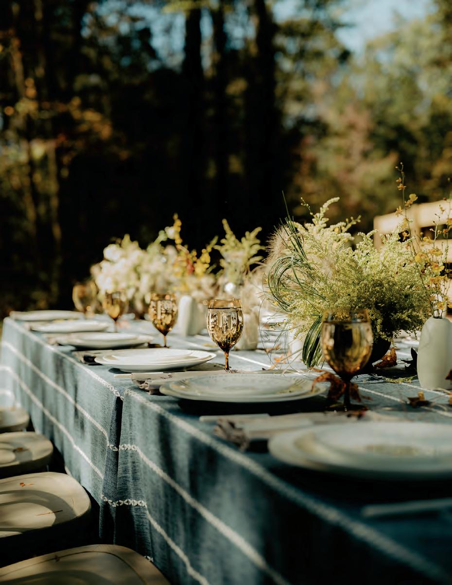
SOME OF THE MOST memorable meals I’ve ever been part of didn’t happen in a restaurant. They happened at weddings, at long tables during family celebrations, or in a room full of friends where the conversation carried on long after all the plates had been cleared. Those kinds of gatherings are what inspired us to create Field Pea Catering.
The name Field Pea comes from a staple of Southern kitchens, something simple that has nourished families for generations. It reminds us that good food doesn’t have to be complicated to be meaningful. What matters most is the care behind it and the people gathered around the table.
You see, in the South, food and hospitality have always gone hand in hand. A table set with love says something long before anyone ever takes their seat. The way a room is arranged, the lighting, the linens, the serving pieces—all of it helps create the feeling of an experience. When those details come together, people relax a bit. They stay longer. Their meal becomes part of their celebration rather than something served during it.
Field Pea grew out of that understanding. In our restaurants, we have the chance to welcome guests into spaces we have built. Catering allows us to step into someone’s space to help create experiences in which folks mark important moments in their lives. One week, we may be part of a wedding reception, the next, a family gathering or a company celebration. Each event is different, and that’s part of what makes the work so meaningful for us.


“Catering allows us to step into someone's space to create experiences in which folks mark important moments in their lives.”
The food we serve follows the same approach we’ve always believed in. Start with good ingredients, prepare them with care, and serve them in a way that feels generous and inviting. Southern cooking has always been about abundance and hospitality, and that spirit fits naturally with gatherings where people come together to celebrate.
At the end of the day, our goal with Field Pea has always been quite simple. We want to create gatherings where people feel welcome and at ease, where the food makes the moments special, and the atmosphere encourages everyone to slow down and enjoy their time. When that happens, the meal becomes a part of the memories that will last well beyond the time spent enjoying it.







1.
“I love ceramics, especially when they have a Western flair to them. Robyn Yeang is the coolest English Cowgirl!"

2. The Social Hat by Byrdie Golf Social Wear
“My favorite BGSW accessory for makeup-free and bad-hair days! The denim makes me feel more polished and styled.”

3. Lucien Latchback Earrings in Moissanite from Dorsey
“These are everyday earrings that don’t break the bank but look like they do! I love stacking the different sizes together.”
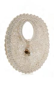
4. Jacquemus Petit
Round Spiaggia
Dente Clutch from Moda Operandi
“This bag will make you want to plan your next vacay.”
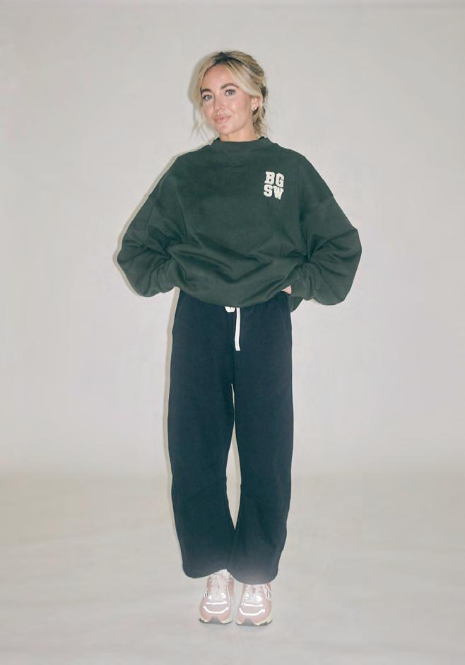
IF YOU ASK Rachelle Wates where she’s from, she’ll claim North Carolina, but the sunshine sparkle of South Florida still shapes her style. That mix of Southern charm and coastal confidence defines Byrdie Golf, the fashion-forward brand she launched in 2021 after years of sacrificing style for the sport. Her mission? Bring more women into club sports without the boxy polos. And 2026 is set to be big, with an expansion of Byrdie’s Social Wear category—ready-to-wear pieces designed to move seamlessly from course to clubhouse. Though she jokes that interiors feel “so permanent,” the mom of one has a clear point of view. Inspired by the English countryside and a love of antiques, her aesthetic lands somewhere between cottage charm and Palm Beach rattan. What she loves most about Charlotte’s design scene is its authenticity—rooted in textile heritage, layered with warmth, and effortlessly unpretentious. Here, she shares what she’s loving this spring.

“Are
also
as
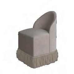
“There are no notes for this Coley Home Fringed Sophie dining chair! I love having subtle statements around the house that draw your attention at every height.”
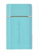
“Truly summer in a bottle. I do not go without my Westman Atelier Sun Drops!”