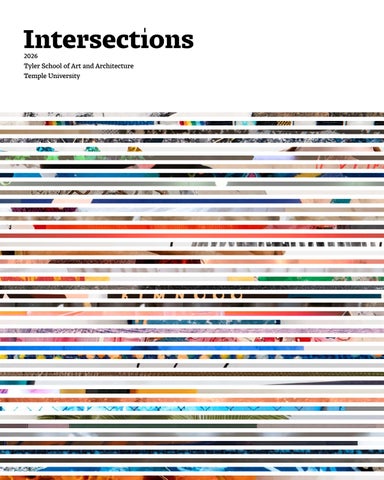
Intersections 2026 Tyler School of Art and Architecture Temple University
2
TYLER SCHOOL OF ART AND ARCHITECTURE MASTER OF FINE ARTS CATALOG 2026
Intersections
DILMAR M. GAMERO SANTOS
3
Intersections is an interdisciplinary collaboration produced by the 2026 Master of Fine Arts candidates in partnership with graduate art history students at the Tyler School of Art and Architecture, Temple University.
Acknowledgments
Graduate Faculty
4
Mariola Alvarez
Tracy E. Cooper
Jane DeRose Evans
David Herman Jr.
Laurin Aman
Mia Culbertson
Clifton Fordham
Kelly Holohan
Stephen Anderson
Chad D. Curtis
Sam Fritch
Renee E. Jackson
Kate Benisek
Matt Curtius
Dilmar M Gamero S
C.T. Jasper
Mauricio Bertet
Delaney DeMott
Philip Glahn
Simona Josan
Sonja Bijelic
Ryan Devlin
Abby Ryan Guido
Jessica J. Julius
Gerard F. Brown
Jeffrey Doshna
Sally Harrison
Lisa Kay
Douglas Bucci
Müge Durusu-Tanrıöver
Jesse Harrod
Nichola Kinch
Susan E. Cahan
Sasha Eisenman
John Hatfield
Joseph R. Kopta
Joshua Caplan
Amze Emmons
Nathan M. Heavers
Robert T. Kuper
TYLER SCHOOL OF ART AND ARCHITECTURE MASTER OF FINE ARTS CATALOG 2026
Baldev Lamba
Odili Donald Odita
Fauzia Sadiq Garcia
Na Wei
Scott Laserow
Karyn Olivier
Lauren Sandler
Ashley D. West
Dermot Mac Cormack
Michael Olszewski
Bryan Martin Satalino
Mallory Weston
Christopher McAdams
Sharyn O’Mara
Paul Sheriff
Kate Wingert-Playdon
Pablo Meninato
Pepón Osorio
Mark Shetabi
Andrew J. Wit
Rebecca Michaels
Alpesh Kantilal Patel
Robert Shuman Jr.
Nathan William Young
Leah Modigliani
Erin Pauwels
Samantha Simpson
Taryn Mudge
Andrea Ray
Corinne Teed
Jeffrey Nesbit
Jeff Richards
Ulysses Sean Vance III
Emily Neumeier
George Rodriguez
Jeremy Voorhees
5
Foreword
It’s the End of the World As We Know It (And I Feel Fine) (1987) is the title of both a song by the band R.E.M. and a captivating, humorous work by the late artist ev Leto (MFA ’26) in which a giant inflatable beach ball ambles through the streets of Philadelphia puzzling and delighting pedestrians and drivers. The title captures something essential about this moment: that amid profound uncertainty, even catastrophe, we can—and must—hold on to empathy, truth, curiosity, and the power of connection. We publish this catalog at a moment when art and higher education are under pressure in the United States. We face an uncertain future that raises urgent questions for our field. What will creative learning environments look like in the years ahead? What role can large research universities play in sustaining ambitious artistic practice? How do we preserve the communities of critique, experimentation and mutual support that are essential to the making of meaningful art? And how do we guide our colleagues in other disciplines to better understand creative research, not as myth or mystique, but as a rigorous form of inquiry? The artists in this catalog are profoundly aware that formerly reliable systems have been destabilized. They pick up the pieces of a broken world and combine them in new ways to create art that is relevant, poignant and ethical. Much of the work embodies processes of remaking in which objects, images and sounds from one context are transferred to another. Curator Leah Triplett has called this approach “scaffolding a future through the vestiges of the past and present.” This is a refusal to add more stuff to the world and instead insist on making better use of what we already have.
6
TYLER SCHOOL OF ART AND ARCHITECTURE MASTER OF FINE ARTS CATALOG 2026
This fourteenth annual Tyler School of Art and Architecture graduate catalog celebrates the accomplishments of our 2026 MFA graduates brought even more vividly to life through essays by our master's and doctoral students in art history. Together, these artists and writers demonstrate how creative practice and critical inquiry enrich one another. As you move through these pages, I hope you experience this catalog as a thoughtful reflection on our shared condition and art's enduring capacity to help us understand ourselves, each other and the world around us. My deepest appreciation goes to everyone who contributed their time, expertise and care to this project. I am especially grateful to Sharyn O’Mara, associate professor, program head of sculpture, and graduate program director in the Art Department; Emily Neumeier, associate professor in the Art History Department; Erin Rose Boyle, assistant director of academic enrichment programs; and Faith Kellermeyer, assistant dean of Strategic Communications, for their leadership of this publication. I warmly thank our faculty and staff editors, Mariola Alvarez, Tracy E. Cooper, Maggie Dunkle, Müge Durusu-Tanrıöver, John A. Hatfield, Richard Hylton, Amara Johnson, Joseph R. Kopta, Leah Modigliani, Alpesh Patel, Andrea Ray, Erin Pauwels and Ashley West. I am deeply grateful to our catalog designers, Matt Bouloutian (BFA ’99) and Emma Lindsay (BFA ’18) of Modern Good, and especially to Robin Morris (PhD candidate) and Daniel Gottschalk (MFA ’26), the art historian and artist whose vision and dedication guided this project from beginning to end. These pages present far more than individual accomplishment. They bear witness to the conversations, mentorship, collaboration and community that define graduate education at the Tyler School of Art and Architecture. They remind us that art is never created in isolation and that, especially in difficult times, creative communities help us imagine and build a more thoughtful, compassionate future.
Susan E. Cahan Dean
7
Table of Contents ACKNOWLEDGMENTS / 4
FOREWORD / 6
WRITERS
WRITERS AND ARTISTS / 10 - 63
IN MEMORIAM: EV LETO / 64
CONTRIBUTING AUTHORS / 72
A RTISTS
22 DANIEL GOTTSCHALK
Emily Angelucci Jessica Braum Julia Carita Natalie Cruz Béatrice Duchastel de Montrouge
18 JAMIE CABREZA 16 RICH BROWN
20 MARY CHAMPAGNE 24 WILL GRIMM
14 MAXIMILIAN ART BOYCE
Merve Köksal Martina Merlo
10 JUDITH ADDISON
26 RACHAEL HENSON
Claire Miller Robin Morris Mahsa Nouri Soula 28 BRIANNA HOWARD
Lillian Oberschlake Fabiola Palacios-Murillo Corinne Annalisa Scala Fernanda Senger Damla Tuğ Srđan Tunić Gillian Yee
12 GWYNETH ZELENY ANDERSON
44 TRAM (ZOE) NGUYEN
62 ANANDA VOECKS 56 BRANDON AQUINO STRAUS 30 RYLIE KELLEY
40 MARTA MURRAY
50 JESS SANTANA 42 NABEEL NAVEED
58 MEREDITH TENNEY-FREE
48 LAURA SALLADE
38 ZAHRA MOMENI
60 MADISON TUBBS 54 OLIVIA SMITH
34 JESSALYN MAILOA
52 LENA RUTH SCHWARTZ 32 WEIWEI LI 46 MARCÈ NIXON-WASHINGTON 36 JOSEPH MALSON
You find yourself in a paradisiacal realm of seemingly organic, translucent white porcelain objects. Some are reminiscent of anatomy, whether a spine or a brain; some resemble familiar flora, fauna, marine life or other living systems; others are taller and more structurally complex than any feat of engineering carried out by human, termite or ant. Yet what you see is not merely a collection of objects, and the illusory comforts of volumetric solidity, materiality, texture and color give way to new, grounding sensations and stimulations beyond the physical world.
Judith Addison Written by Martina Merlo
Judith Addison’s Eutierria is a series of traces, of material indexes of a process: a process of breath and of tactile manipulation, of a cyclical and repetitive embodied motion of spiraling and accumulation. Addison’s every exhale builds upon itself with impossibly thin wet porcelain, a living collaborator that actively responds to and materializes the artist’s temporal behavior. As you navigate a pathway within the gallery, shaped and punctuated by these expressive, sculptural remnants resembling the infrastructures of a brain or coral reef, your awareness of the invisible increases. You become convolved in a dialogue between the clay, the body, the mind and the perpetual motion, all in tune with the slow and imperceptible vibrations of the earth. Eutierria is not only a reflection of movement, but also an active and reciprocal form of care that connects all facets of the natural world. Addison’s process is a reorientation, a physical re-working of neural pathways born from continual urgency to mitigate focal seizures characteristic of their temporal lobe epilepsy. While the seizures produce manifold and disorienting symptoms including hand movements, hypergraphia, nonlinear thinking, mouth movements and the feeling resembling an attempt to climb out of the skin, Addison’s movement in their work—a form of sensory stimulation—grounds the artist in the corporeal realm. While not acutely representational, each piece in Eutierria reflects Addison’s experiences of these symptoms, their embodied mitigation of them and the ways in which this unique form of care has the potential to connect us all. In experiencing the indexical work, your own neural pathways begin to reconfigure, uniting you with a greater ecological system.
Gyre (detail)
Eutierria
Shoal (detail)
Eutierria, (installation view)
(ABOVE)
(TOP LEFT)
(TOP RIGHT)
(BOTTOM CENTER)
Porcelain. 24" x 24"x 24". Photo credit: John Carlano.
Porcelain. Dimensions variable. Photo credit: John Carlano.
Porcelain. 48" x 48" x 168". Photo credit: John Carlano.
Porcelain. Dimensions variable. Photo credit: John Carlano.
10
TYLER SCHOOL OF ART AND ARCHITECTURE MASTER OF FINE ARTS CATALOG 2026
JUDITH ADDISON
11
Before I say a word about any of the artworks, look at them. Give them some time and attention. Be generous. Lend an ear to the “Dream Radio” in a dark corner, playing people’s recollection of dreams as they woke up. Read the banners hanging from the ceiling, describing and depicting sensations people might have while entering the gallery space or upon waking up in bed. Walk around the plastic cups with straws pointing off-center and two bananas shamelessly spooning on the floor. Do not forget to look up at the video of rapidly changing clouds, try to read a letter on eugenics, and observe interconnected metal hangers on the wall! By using these quotidian, even seemingly banal objects, Gwyneth Zeleny Anderson’s exhibition Emergency Contact relies on our own attention as material for contemplation. The artist activates awareness of immediate living environments and our affective, bodily relationship with them. This immediacy of the familiar coupled with almost surreal framing invites a free play of associations and the absurd.
Gwyneth Zeleny Anderson Written by Srđan Tunić
Snow collected on the day the US and Israel bombed Iran (ABOVE)
Snowmelt, bucket, headphones, headphone splitters. 108" x 72" x 23". Photo credit: John Carlano.
12
Zeleny Anderson successfully employs the conceptual strategy of the readymade, being very open-minded in their material-centric approach, by using animated film, earthworks, collage, sound, etc. Operating against disciplinary boundaries, these seemingly scattered but discrete objects are animated by a recognizable logic of arrangement that includes play and humor as a means of overcoming alienation in the world filled with violence, ongoing and new wars and crumbling human rights. The work does not escape into imagination but instead challenges our feelings of desensitization and despair. Consider this show as a powerful spell. An acknowledgement of the absurdity of the psychological scale of one's own depression through the display of feeble materialities and ephemeral gestures, which somehow make it all bearable. A reminder of the poetic beauty of the world made possible by the artist's choreographed intimacy of small everyday items.
Spotlight (for Chaofeng Ge)
Chorus, (detail)
(TOP LEFT)
(MIDDLE LEFT)
Projection of stop motion animation, tripod, yarn, plastic bag, soil gathered at the entrance of the ICE detention centerat Moshannon Valley in Pennsylvania. 22" x 54" x 36". Photo credit: John Carlano.
Plastic cups and straws. 7" x 40" x 40". Photo credit: John Carlano.
TYLER SCHOOL OF ART AND ARCHITECTURE MASTER OF FINE ARTS CATALOG 2026
Floodwater collected while we waited two hours for campus police to help, (installation view) (BOTTOM LEFT)
Floodwater, bucket, microphone, transducer, audio electronics. Dimensions variable. Photo credit: John Carlano.
Emergency Contact, (installation view) (RIGHT)
Dimensions variable. Photo credit: John Carlano.
GWYNETH ZELENY ANDERSON
13
Our urban landscape is filled with forgotten buildings and sites, the remnants of long-past industrialization. As quickly as they were built to fuel a growing city, they have now become vestiges of these same industries. For some, they have been commodified, flipped into lofts that want an “industrial” aesthetic, or the reverse, left in a ruined state as a monument to decay. It is from an abandoned building like this that Maximilian Art Boyce extracts resources, reusing items like window grilles and porcelain insulators that have been discarded. However, as philosopher Jane Bennett writes, “a vital materiality can never really be thrown ‘away,’ for it continues its activities even as a discarded or unwanted commodity.”[1] In Echoes of Expansion, Boyce aims to foster these continuing activities, collaborating with these extracted materials to share their specific histories and construct their futures. Combining them with materials recognized in new-construction settings, such as glass and concrete, the works in Echoes of Expansion pull these sites out of dormancy, opening new possibilities for their material language.
Maximilian Art Boyce
For example, “Threshold Adrift” is a single-channel video projected on a screen of reclaimed safety glass mounted in the corner of the gallery. Shot in the abandoned building Boyce has extracted many of his materials from, he is shown in several sequences attempting to sweep the rubble left on the floor, an act of care. However, the wind continuously cuts through the windowless enclosure, unable to be controlled, making his gesture ultimately futile. The screen itself is created through a similar tension: Boyce establishes the conditions of the kiln that allow the safety glass to slump away from its own internal wire grid, but it is ultimately the glass that chooses its final form.
Written by Béatrice Duchastel de Montrouge
In this era of perpetual obsolescence, sites become ignored and materials discarded as soon as we have used them up. Boyce’s works resist this, showing the vitality of these discarded materials and expanding our ideas of their potential uses, far beyond the ones of control we have ascribed to them. [1] Jane Bennett, “The Force of Things,” in Vibrant Matter: A Political Ecology of Things (Duke University Press, 2010), 6.
Threshold Adrift, still (ABOVE)
Single Channel Video Projection (4:45) Wood, steel and safety glass. 27" x 27" x 14".
14
Echos of Expansion, (installation view) (TOP CENTER)
Single Channel Video Projection (4:45), wood, steel, safety glass, concrete, rebar, wood, glass, copper galvanized grilles, retention bolts, porcelain, cast iron, copper, steel, and packing paper. Dimensions variable. Photo Credit: John Carlano.
Dielectric Orientation, (detail)
Al Centro, Pá Dentro
(BOTTOM LEFT)
(BOTTOM RIGHT)
Porcelain, cast iron, copper, steel, packing paper and wood. 73" x 84" x 84". Photo Credit: Johno Carlano.
Concrete, rebar, steel, wood and glass. 72" x 32" x 55". Photo Credit: John Carlano.
TYLER SCHOOL OF ART AND ARCHITECTURE MASTER OF FINE ARTS CATALOG 2026
MAXIMILIAN ART BOYCE
15
The vessels not only hold the shape of the fabric endoskeleton, but also significant memories throughout Rich Brown’s life in his show, Nostalgia. From “Lost Adolescences,” a fragile porcelain hoodie, to “Matriarch,” an African wax print collage of his mother’s clothes stitched into a tall vase that towers over the room, we are taken through a past that continues to inform the present. The thin metal stands suspend all but one vessel in a light and tender embrace as one would with a sentimental memory. However, their technical impressiveness almost distracts from the precariousness of the vessels’ off-center positions on the stands, emphasizing our tenuous grasp on our often-flawed recollections of the past. Nostalgia is a double-edged sword, to remember the good is to remember the bad and everything in between. The shadows cast on the crisp white gallery walls make this paradoxical situation a real, physical entity; they do not merely silhouette the vessels, but represent the haunting presence of memories that have become murky or unreachable throughout time.
Rich Brown Written by Natalie Cruz
Matriarch, Father Figure, Perpetrator, (installation view) (ABOVE)
Repurposed Dresses, repurposed work shirt, repurposed door, repurposed sweatshirt. Dimensions variable. Photo credit: John Carlano.
16
The echo of this can be found in “Tributary,” the only vessel situated on the gallery floor. As a funerary libation container fired with the fibrous remnants of every vessel in the exhibition, the piece serves as a collective repository for the individual memories and histories attached to each work in the show. Brown invites the viewer to meditate on not only his past, but how their own would manifest in ceramic and textiles from the cast sidewalk curb aptly titled “Gathering Place.” You then enter the world of Nostalgia as you look up at the works from the ground and reflect on how your past experiences have led you to the present.
MVP, (detail exposed zipper)
Be Track #5
(TOP LEFT)
(TOP RIGHT)
Repurposed basketball rim, repurposed sneakers, denim, basketball shorts. Dimensions variable. Photo credit: John Carlano.
Wood, metal. Dimensions variable. Photo credit: John Carlano.
TYLER SCHOOL OF ART AND ARCHITECTURE MASTER OF FINE ARTS CATALOG 2026
Gathering Place, Tributary, (installation view) (BOTTOM LEFT)
Concrete, LED lights, stoneware, metal. Dimensions variable. Photo credit: John Carlano.
Lost Adolescents (BOTTOM RIGHT)
Porcelain. 18" x 16". Photo credit: John Carlano.
RICH BROWN
17
Jamie Cabreza’s monumental photographs create landscapes out of litter. In Latent Commons, Cabreza turns the viewer’s focus downward, to the debris that has become an artifact of contemporary human presence. The series is informed by anthropologist Anna Tsing’s theory of latent commons, which suggests that mutual survival in a capitalist society is only possible when humans learn to cohabitate and collaborate with the natural world. In her expansive photographs, Cabreza notices and documents the inextricable entanglement of built and natural environments through the single-use plastics and cracked sidewalks found in her hometown of Easton, Pennsylvania.
Jamie Cabreza Written by Julia Carita
Once enlarged and brought into the gallery, these unassuming assemblages take on the scale and presence of grand photographic landscapes. The viewer is immediately drawn to a large-scale pairing that transforms the dirt-and-concrete ground into a compelling, sprawling topography. The photographs feel all-encompassing, as a mosaic of dead leaves, dirt, acorns and cigarette butts comes into sharp focus. Cabreza’s care in depicting such a mundane vignette encourages the viewer to ask, “When is the last time I looked down at the ground?” In the center of each composition, a discarded straw maps a horizon across the center of the picture plane, precariously balanced between natural and artificial. As discarded plastics become increasingly integrated into our environment, the fate of our habitat feels similarly precarious. Around the gallery, the synthesis of ground and debris continues to grow, as photographed bottle caps are tiled and enlarged to create an index of discarded material. Each composition feels uniquely and strangely beautiful, as colorful plastic becomes enmeshed with the organic textures of its environment. The sheer scale of Cabreza’s community index is underscored by a set of artist books that exhibition visitors are invited to explore, which allow both the photographs and the litter they represent to accumulate directly in the viewer’s hand. In a culture so hyper-focused on convenience and immediacy, Latent Commons provides a welcome invitation to slow down and consider our place in the ecosystem. Neither accusatory nor affirming, Cabreza simply presents the reality of our cross-pollinated plastic environment through observation and archival preservation.
Straw L1070798, (detail)
Safety Strung
Blue Moon, Grey skies
Satellite, (installation view)
(ABOVE)
(TOP LEFT)
(TOP RIGHT)
(BOTTOM CENTER)
Archival Pigment Print on Fine Art Paper, wood frame. 44" x 66" x 1" framed. Photo credit: John Carlano
Archival Pigment Print on Fine Art Paper, found objects, mounted on wood. 13.3" x 20" x 1". Photo credit: John Carlano.
Archival Pigment Print, 64" x 94". Photo credit: John Carlano.
Archival Pigment Print on Fine Art Paper. 25 individual 13" x 20" prints in a grid, total Dimensions variable. Photo credit: John Carlano.
18
TYLER SCHOOL OF ART AND ARCHITECTURE MASTER OF FINE ARTS CATALOG 2026
JAMIE CABREZA
19
It could be…it might be…it is…but is it really? In MOONSHOT, Mary Champagne asks us to consider the truth, the artifice, and the quest for perfection that lie behind America’s favorite pastime. Through witty and multilayered sculptures and installations, Champagne considers some of the weird and wonderful ways that baseball players attempt to improve their stats and increase their abilities, approaching posthumanism in their implementation of special materials and techniques.
Mary Champagne Written by Julia Carita
The sights and sounds of MOONSHOT are electric and enticing. While some works tick forward in perpetual motion, others remain poised on the anticipatory brink of propulsion. Nestled in the corner, a strike zone demarcated in red houses a spindly, spider-like creature with a pine rosin body. Spliced clips from the 1949 science fiction film It Happens Every Spring and Encyclopedia Brittanica’s 1947 guide to Throwing in Baseball are projected onto the rosin, transmitting quippy dialogue about pitching techniques and melding fantasy with reality in the quest for greatness. In other works, Champagne’s choice of material alludes to the expectations of exceptionalism that have become synonymous with American sports. Polished walnut, brass, and marble are reminiscent of the trophies relentlessly pursued by student and professional athletes alike. Champagne deepens her commentary on this quest for superhuman perfection in her juxtaposition of smooth, lacquer-like pine rosin and dense, viscous Spider-Tack. These substances, both derived from pine and used by pitchers to improve their grip on the ball, are separated by their legality in Major League Baseball. While the former is endorsed by MLB, the latter is classified as an illicit material and carries a risk of ejection; in other words, only one is deemed “human enough” for game use. Still, the underlying question in MOONSHOT remains: does it matter whether something is “true” if its result is real? Suspended just below the ceiling and beside the gallery door, a pine rosin disk sways precariously. Does it depict the luminous moon, a home run baseball hit by the next Babe Ruth, or the formidable, futuristic Death Star? As long as it thrills and inspires us, does it matter?
Consider the Grip (still)
MOONSHOT, (installation view)
Untitled (Catfish Hunter)
Untitled (Battery)
(ABOVE)
(TOP CENTER)
(BOTTOM LEFT)
(BOTTOM CENTER)
Steel, pine rosin, projector, “It Happens Every Spring” (1949), “Throwing in Baseball via Encyclopedia Brittanica” (1947). Found moon cycle and wave form videos. 24"×36"×24". Photo credit: John Carlano.
Steel, pine rosin, nylon, mirrored plastic lawn ornament, disco ball motor, projector, “It Happens Every Spring” (1949), “Throwing in Baseball via Encyclopedia Brittanica” (1947), found moon cycle and wave form videos, leather, silk, granite, ball bearings, Darth Vader house key, nylon, marble, Spider-Tack, gravity. Dimensions variable. Photo credit: John Carlano.
Leather, partial deadbolt lock, pine rosin. 6" x 9" x 8". Photo credit: John Carlano.
Steel, Spider-Tack, bearing ball, gravity. 4" x 4" x 5". Photo credit: John Carlano.
20
TYLER SCHOOL OF ART AND ARCHITECTURE MASTER OF FINE ARTS CATALOG 2026
That’s No Moon, (detail) (BOTTOM RIGHT)
Steel, pine rosin, Death Star temporary tattoo, used titanium magnet braided necklaces, stone. Dimensions variable. Photo credit: John Carlano.
MARY CHAMPAGNE
21
What becomes important to you when all of society’s pleasantries fall away? This question frames Daniel Gottschalk’s exploration of the rawness of life through a material practice grounded in precision and endurance. Lost in the Future’s Unknown History invites reflection on how significance is formed through encountering the unknown. Across this body of work, viewers engage a myriad of forms that appear purposeful yet remain unresolved. Their silhouettes and details are reminiscent of contemporary objects and tools, implying familiarity, but their purpose is intentionally left open. It is within this unknown that the emphasis shifts from identification to speculation, encouraging viewers to consider how these objects might operate within invented routines or symbolic practices. Works with unique and non-descriptive titles such as “Dopry” and “Thook” further prompt the viewer’s imagination. With guiding titles such as cooking, defense, ceremony and construction, Gottschalk’s work contends with what is vital in life and what remains after death.
Daniel Gottschalk Written by Emily Angelucci
From tools to body adornments, each of the objects within this exhibition bear evidence of casting, shaping and finishing that foreground the effort and durability inherent in metalworking. Gottschalk’s deliberate insistence on working with the nature of each material gives the objects a sense of physical authority, as the art of metalworking stretches back to antiquity. It is through this craftsmanship and materiality that Gottschalk’s work transcends temporalities, leading to viewer speculation of a timeline. The absence of context surrounding the works places the viewer within the realm of the unknown. Disrupting habitual expectations and ways of interpretation prompts the audience to consider how meaning is developed without the known reference points to ground it. Gottschalk’s work creates an open dialogue with the viewer themselves, inviting them to let their imagination wander in unexpected directions. Lost in the Future’s Unknown History encourages the audience to recall a time in their lives when they had a childlike sense of wonder through which they explored the world around them.
Spidle
Comet Walking Stick
Bick
The Hand of
(ABOVE)
(TOP CENTER)
(BOTTOM LEFT)
(BOTTOM RIGHT)
3" x 3" x 4.8984". Bronze. Photo credit: John Carlano.
60" x 10". Bronze, Ironwood stick. Photo credit: John Carlano.
2.25" x 1.375" x 5.75". Bronze, Sapphire. Photo credit: John Carlano.
2.125" x 2.25" x 5.75". Bronze, Garnet. Photo credit: John Carlano.
22
TYLER SCHOOL OF ART AND ARCHITECTURE MASTER OF FINE ARTS CATALOG 2026
DANIEL GOTTSCHALK
23
Will Grimm’s Lost & Found (on top of everything else) centers on a series of quilts constructed from textiles scavenged from everywhere—plucked from trash cans, salvaged from donation bins, grabbed off the streets of Philadelphia and pulled from Grimm’s own closet. By suspending these mirror-shaped quilts at eye level, Grimm mimics the familiar placement of a looking glass, yet they offer a reflection of a fragmented material history. While each work is marked with a single letter, these characters have an arbitrary relationship to the quilts, bearing no direct connection to the titles or the specific origins of the scavenged fabrics. This disconnect invites a deeper look at the relationship between language and material. Both “textile” and “text” share the Latin root texere, meaning to weave. By presenting these “texts” in the shape of mirrors, Grimm suggests a literal and metaphorical entanglement. The viewer is woven into the absurdity of the work, caught in a surface that reflects their own image back through a tapestry of discarded remnants.
Will Grimm Written by Natalie Cruz
Lost & Found (on top of everything else), (installation view) (ABOVE)
Cotton fabric shreds, scraps, slivers, and rags collected from artist’s practice, donation bins, and trash cans in Tyler; overdyed yellow, boyfriend’s towels (abandoned after mopping up cat piss); MX dye; backed with vintage wool blanket, gifted, thrifted, found, and donated ties; white(ish) textiles collected from streets, gutters, and trash piles around campus. Dimensions Variable. Photo credit: John Carlano. 24
The absurdity of this entanglement is perhaps most evident in the work titled “Rosebud.” The red oval quilt with the drop-shadowed, calligraphic letter “V” was constructed from Grimm’s boyfriend’s abandoned towels after cleaning up “cat piss.” Behind the brazen honesty and humor lies a silent question: “What would you have done with them?” This prompts personal connections and questions that spiral into conversations about consumption—most importantly, how long have I kept my “lost crusty socks,” and how many washes did it take to get the smell of cat piss out of the towels?
Teeny, (detail)
Teeny, (installation view)
O-Face, (detail)
(TOP CENTER)
(MIDDLE LEFT)
(BOTTOM LEFT)
Tapes, trims, lanyards, shoelaces, and ribbons collected by artist; donation bin sherpa; athletic tape frame stuffed with batting scraps; copious amounts of glue. 60" x 62". Photo credit: John Carlano.
Tapes, trims, lanyards, shoelaces, and ribbons collected by artist; donation bin sherpa; athletic tape frame stuffed with batting scraps; copious amounts of glue. 60" x 62".
Cotton fabric shreds, scraps, slivers, and rags collected from artist’s practice, donation bins, and trash cans in Tyler; overdyed yellow. 64" x 64". Photo credit: John Carlano.
Diggin’ My Heel into the F Word, (installation view) Artists’ worn out/busted out/forgotten/lost crusty socks collected between 2015-2025; backed with vintage wool blanket. 37" x 54". Photo credit: John Carlano.
TYLER SCHOOL OF ART AND ARCHITECTURE MASTER OF FINE ARTS CATALOG 2026
My Big Ass A (BOTTOM RIGHT)
T-shirts, shorts, tank tops, jeans found on street and dyed brown; pink pants and grey blanket found on trash day; background quilts made in 2020 by artist dyed and bleached. 74” x 90”. Photo credit: John Carlano.
WILL GRIMM
25
Rachael Henson’s Be Not Afraid is a collection of interactive installations that blurs the line between the “real” and not real, between what exists in the gallery space and in a virtual realm beyond comprehension. In this exhibition, you are asked to blindly trust in a new conception of the world despite uncertainty, discomfort or skepticism. This universe is built with technologies that surround us daily, in which each tool is a collaborator—neither separate from us, nor inherently evil or amoral. Henson proffers possibilities for different ways of engaging with technological life—for empathy, care, devotion and new relationalities. Indeed, where is the boundary between the living and the synthetic? Henson’s emphasis on the porosity between these fabricated categories is a testament to the ways in which all life, including things that are “alive” outside of the biological definition of organism, is hybrid and transcendent.
Rachael Henson Written by Martina Merlo
Be Not Afraid celebrates the fact that we—as humans, electronics, soft robots, silicone membranes and Artificial Intelligence—are all entangled, reciprocally shaping and shaped by, maintaining and maintained by, and living within one another. Henson’s show blends the medical, religious and technological, as she showcases sculptures that subvert conventional understandings of how we view technology and the ways in which it is used in more sinister applications. Prompting direct engagement with the work, Henson presents a speculative optimism: from an organlike object that is jarringly warm to the touch, to a sensing robot-rat hybrid requiring participatory movement, to a medical device that bone-conducts a pseudo-religious sermon that actively disrupts Christo-fascism’s control of the masses through AI. With each piece, Henson asks something of the body, activating phenomenological experiences beyond the limitations of sight—an invitation to touch, to provide breath and to bend over as if undergoing a medical examination or praying. This embodiment creates opportunities for empathetic connections not only with one another, but also with technological life and its continually expansive definition. Be Not Afraid forces a return to the corporeal, the senses and the essence of humanity—ultimately prompting new daydreams for what “humanity,” animism, life, care and connection could mean within an increasingly entangled world.
Ratbot
The Interface, (still)
(ABOVE)
(TOP LEFT, RIGHT, MIDDLE RIGHT AND BOTTOM RIGHT)
Mangdang Minipupper, silicone. 7" x 4". Photo credit: John Carlano.
26
Video, 2:30. Photo credit: John Carlano.
Breath Experiment II, (installation view)
The Benefits of Skin to Skin, (installation view)
(BOTTOM LEFT)
(BOTTOM RIGHT)
Petri dishes, rain x, breathe. 10" x 60". Photo credit: John Carlano.
Silicone, sand, heating pad, temperature controller. 9" x 4". Photo credit: John Carlano.
TYLER SCHOOL OF ART AND ARCHITECTURE MASTER OF FINE ARTS CATALOG 2026
RACHAEL HENSON
27
Brianna Howard’s paintings are each a negotiated process, a meeting at the intersection of mechanized reproduction and human creation. She explores the inputs and outputs of repeated motion, turning digital programming into analog rituals. Networks of discrete points expand outward into overlapping grid-like color fields, vibrating in and out of focus. Points are individualized and made irreducible, yet they amalgamate, merging into shifting assemblages that crystalize and dissipate. As the audience experiences these assembled forms, the moiré fringe between each field of points creates the illusion of motion, granting a temporal quality to her work.
Brianna Howard Written by Lillian Oberschlake
Howard’s exhibition show, The Channel Remains Open, exemplifies this intersection between analog and digital processes. Thousands of marks replicate that of a diode on a screen, becoming a signifier of encoded data. Liquid forms drift across each network, breathing like distortions from digital artifacting. Offsets become chromatic aberrations, eroding the stability of each point, becoming purposeful ripples that reinforce the artistic process. Each point, though, remains ever stable, defined clearly when viewed individually. Through this, Howard questions about the faultless repetition of mechanized procedures. The tension between point and field, at the same time, extends through time, providing no resolution to their constantly reforming assemblages. Howard’s oeuvre offers glimpses into the field of distorted, replicable data, yet each work is unique; their oscillating patterns manifested from the murmur of the artistic hand. The constant change within these networks interfaces the viewer with the process, meditating on the memory of Howard’s own hand upon the image plane. This relationship extends haptically as well; each intersection becomes a raised mark on the plane, building like sediment. The resulting grid builds as though shoals threatening to disappear at a moment’s notice. The Channel Remains Open does not submit itself to a simple overview. It is a display of coalescent artistry; much like the individual point, each color field generates composite forms that temporarily emerge. The activation of the ocular and the tactile grants a somatic dialogue between artist, viewer and process. Through this interaction, Howard questions the nature of recursion, reconsidering the tension between the defined and the absent, the repetitive and the aberrant.
Signals in Blue Distance (ABOVE)
Acrylic on canvas mounted on wood. 30" x 24" x .5". Photo credit: John Carlano.
28
The Channel Remains Open, (installation view) (TOP CENTER)
Acrylic on canvas mounted on wood. Dimensions variable. Photo credit: John Carlano.
Edge of Measure
Passage Open, (detail)
(BOTTOM LEFT)
(BOTTOM RIGHT)
Acrylic on canvas mounted on wood. 30" x 24" x .5". Photo credit: John Carlano.
Acrylic on muslin mounted on wood. 24" x 18" x .5". Photo credit: John Carlano.
TYLER SCHOOL OF ART AND ARCHITECTURE MASTER OF FINE ARTS CATALOG 2026
BRIANNA HOWARD
29
Rylie Kelley has always heard the shore calling. Looking at their work for the first time, I felt as if a salty breeze was wafting into the room, washing over the copperplate engravings hanging on the wall that exude the quietness and intimacy of the seaside. Kelley embraces the ocean’s ebb and flow, finding solace and freedom on beaches that are imbued with a perpetual state of becoming. An interdisciplinary artist and poet, Kelley’s practice is heavily research-based, informed by queer ecology, queer and transgender studies, the blue humanities and their background in psychology. The artist draws from the long history of gay beaches claimed as protected havens, as spaces where queer people could fully inhabit their bodies away from the city’s probing eyes. Their work relocates queerness outside the metropolis, into the blue waters teeming with life and diversity of forms. Tidal Longings presents five prints alongside three ceramic works, each housing a recorded poem composed by the artist. The engravings depict portraits of Kelley and their partner, with their bodies flowing across and into the shells, cradled inside them, sprouting from their openings and folded together—human flesh flowering with souls.
Rylie Kelley Written by Merve Köksal
Awash with the sensuous balm of the ocean, the portraits are suffused with the emotive hues of the shells Kelley has been collecting over the years: the oyster, the moon snail, the tint olive and the fornicata slipper limpet. Blind embossments conjure aquatic creatures from the paper’s negative space, evoking queer bodies that exist in the negative space of official records, present but not acknowledged. Along the right wall of the gallery, three ceramic shells rest on a bed of sand. Leaning in, we listen to Kelley’s poems emanating from these shells like a shared pulse of the ocean, as pale pink, rusty orange and subtle blue gleam through their cracks. “The beach,” Kelley says, “is the convergence of binaries where everything sloshes together,” collapsing into one. This sense of oneness and in-betweenness lies at the core of their artmaking. Tidal Longings asserts a visual-poetic genealogy of Rylie Kelley’s selfhood, woven with the grim reality of queer loss and the effusion of queer joy.
I see myself in the scallops and coquinas and the shifting holes of sand fleas (detail) (ABOVE)
Shaped copperplate intaglio print with soft ground etching, aquatint, and viscosity roll. Blind embossment. 20" x 28". Photo credit: John Carlano. 30
Draped across one another, spine to spine to spine (detail) (TOP CENTER)
Shaped copperplate intaglio print with soft ground etching, aquatint, and viscosity roll. Blind embossment. 21" x 28". Photo credit: John Carlano.
We twist and tangle, carried by the dancing eddies of the tide pools
Your hands glide across my chest, a gentle tide of salt and brine
(MIDDLE LEFT)
(BOTTOM LEFT)
Shaped copperplate intaglio print with soft ground etching, aquatint, and viscosity roll. Blind embossment. 28" x 46". Photo credit: John Carlano.
Ceramic. Sand. Sound recording of the Atlantic Ocean. Poetry. Dimensions variable. Photo credit: John Carlano.
TYLER SCHOOL OF ART AND ARCHITECTURE MASTER OF FINE ARTS CATALOG 2026
Drenched in sunlight, dreaming of flight (detail) (BOTTOM RIGHT)
Shaped copperplate intaglio print with soft ground etching, aquatint, and viscosity roll. Blind embossment. 28" x 46". Photo credit: John Carlano. RYLIE KELLEY
31
Encountering Weiwei Li’s work, I was reminded of origami suspended in time, where each fold seems to hold a memory—capturing a quiet tension between surface and emotions that are stuck to these surfaces. Weiwei Li's practice resists simple categorization. While at first glance it may evoke associations with childhood play, her work ultimately moves beyond them. The body of work unfolds into a layered exploration of transitions, particularly the passage from childhood into adulthood. Her use of folding techniques builds upon traditional origami. The shift from two-dimensional surfaces into three-dimensional structures mirrors a psychological and emotional evolution, where simplicity gives way to complexity. In the series Brooches: Quiet Fragments, one of the materials she chose is titanium, which reflects this duality brilliantly. Each piece features a metallic exterior paired with a vividly colored interior, reinforcing the tension between outward composure and an inner world that remains fluid and emotionally active. This contrast suggests that the inner child never disappears but instead persists beneath the surface, continuing to shift and respond.
Weiwei Li
As Weiwei notes, “Each brooch captures a pause within a continuous process of shifting and folding.” This idea of a pause within movement emphasizes the work as a kind of liminal space: never fixed, always in transition. The exterior can be understood as a protective layer, while the interior holds a more unpredictable, layered emotional landscape. Her work is also deeply experiential. In the “Play Area,” the invitation to physically engage with the pieces encourages viewers to move between interior and exterior spaces: not just visually but bodily. Her largest piece, which resembles an enclosure, feels less like a place of concealment and more like a site of confrontation and acceptance. Within it, emotions are not hidden but allowed to shift freely. It becomes a space where one does not escape emotional complexity but instead sits with it along with all the different colors.
Written by Damla Tuğ
Quiet Fragments, (detail)
Quiet Fragments
A Whimsy Ring
Fold/Form, (installation view)
(ABOVE)
(TOP CENTER)
(BOTTOM LEFT)
(BOTTOM RIGHT)
38 brooches made with anodized Titanium, Niobium, gold foil. Dimensions variable: each at 2.7" x 1.5" x 0.007". Photo credit: John Carlano.
38 brooches made with anodized Titanium, Niobium, gold foil. Dimensions variable: each at 2.7" x 1.5" x 0.007". Photo credit: John Carlano.
Titanium, Sterling silver, CZ. 2.9”x2.9”x2.7”. Photo credit: John Carlano
PLA, Plastic, Mesh, Thread, Titanium, Sterling silver, CZ, Stainless steel. Dimensions variable. Photo credit: John Carlano.
A Box (BOTTOM LEFT)
Titanium, Sterling silver, Stainless steel. 2.7"x2.7"x1.9". 32
TYLER SCHOOL OF ART AND ARCHITECTURE MASTER OF FINE ARTS CATALOG 2026
WEIWEI LI
33
In Jasmine Automata, Jessalyn Mailoa constructs a synthetic environment of relational entities that queries the value systems governing nature, craft and technology. Drawing on childhood memories of cultivating jasmine and drinking jasmine tea with her family, Mailoa emphasizes the transformative power of scent as both a mnemonic device and critical framework. Jasmine has held deep cultural meaning in Indonesia for centuries, woven into weddings, religious offerings and funerals. Here it functions as a repository of lineage, longing and belonging. Yet jasmine is also a global commodity, circulated far beyond its ecological origins. withheld through electronic and mechanical means. The kinetic flowers live within a field of glass vessels and plastic tubing that circulates jasmine tea. A central red bulb, embroidered with glass seed beads and adorned with dried jasmine buds, expands and contracts through a concealed pump, evoking the pulse of a living organ. White fabric petals open briefly
Jessalyn Mailoa Written by Corinne Annalisa Scala
vitality. The softness of this gesture is disrupted by the audible hiss of air pumps and the hum of exposed electronics, underscoring the paradox of automata. Her work becomes a metaphor for life and death within contemporary systems of circulation, inviting reflection on how we assign artistic value to bodies, materials and forms of knowledge in an increasingly technologized world. Mailoa asks the viewer to consider how a nurtured plant becomes an extractable good and when labor and care become invisible within global networks of exchange. By merging the labor-intensive practice of beading, historically coded as women’s work yet now practiced across genders, with microcontrollers, motors and sensors, Mailoa does not simply collapse the boundary between craft and engineering but complicates it. Rather than fully erasing this distinction, she draws attention to the ways value has been unevenly assigned, in which feminized forms of making have been marginalized even as they persist and evolve. In bringing beading into dialogue with electronics, Mailoa highlights both continuity and transformation, suggesting that craft traditions are not static but responsive to shifting social and technological conditions.
Jasmine Automata, (installation view) Dried jasmine flowers, jasmine tea, blown glass, glass seed beads, organza, brass, aluminum, silicone, acrylic, PLA, PVC tubing, microcontrollers, electrical wires, servo motors, air pumps, peristaltic pumps, PIR sensors, batteries. Dimensions variable. Photo credit: John Carlano. 34
Jasmine Automata, (detail)
Jasmine Automata, (detail)
Dried jasmine flowers, jasmine tea, blown glass, glass seed beads, organza, brass, aluminum, silicone, acrylic, PLA, PVC tubing, microcontrollers, electrical wires, servo motors, air pumps, peristaltic pumps, PIR sensors, batteries. Dimensions variable. Photo credit: John Carlano.
Jasmine tea, PVC tubing, acrylic. Dimensions variable. Photo credit: John Carlano.
TYLER SCHOOL OF ART AND ARCHITECTURE MASTER OF FINE ARTS CATALOG 2026
JESSAYLN MAILOA
35
Upon entering Joseph Malson’s The Cat’s Mouth* cuts like pinking shears, the viewer encounters strikingly feline-themed assemblages that feel both autonomous and constrained—suggesting an encompassing sense of being simultaneously trapped yet free. Works such as the artist’s surrogate self-portrait posed beside a coiled patchwork snake, the leopard-printed bondage attire complete with mask, collar and leash, and the large hanging feline face all point to an exploration of grief's transformative power. Cats—referencing domestic intimacy, self-determination and perhaps even a hint of mischief—reappear on the artist’s hanging wardrobe, their gazes directed outward as if inviting the viewer to look inside. Yet, contrary to expectation, the interior reveals nothing but an empty space, dimly illuminated by a single candle. Through this work, Malson returns us to our bodily, affective experiences of grief. The bondage wear evokes not only the feeling of being trapped within one’s own emotional state—of becoming “submissive” to grief— but also suggests mourning as larger indicative acts of love, intimacy and connection. By consenting to engage with grief in the context of this exhibition, Malson's work invites viewers to participate in grief as something shared, unfolding through an interconnected web of trust, care and reciprocity.
Joseph Malson
In the artist’s vibrant collection of found material and collage, identity is often crafted through such experiences of loss. While Malson presents a portrait of himself here, he also incorporates viewers through a television displaying a live feed of the exhibition space. A camera perched above captures their likeness and feeds it into a program that remixes and replicates their form. Through this process, The Cat’s Mouth* cuts like pinking shears becomes a site of shared grief where viewers encounter themselves transformed and reassembled through a kaleidoscopic view in the artist’s carefully constructed domestic space.[1]
Written by Gillian Yee
[1] The artist dedicates the The Cat’s Mouth* cuts like pinking shears to his late mother. As his very first art teacher, Malson’s mother remains a crucial figure in his practice and aims to replicate her dedication towards education, autonomy and compassion in his artistic identity.
After Tammy Faye, (T.V.) and Cake Eaters (ABOVE)
Dimensions variable. Photo credit: John Carlano.
36
The Cat’s Mouth* cuts like pinking shears, (installation view) (TOP CENTER)
Dimensions variable. Photo credit: John Carlano.
One Blue Pussy (detail)
Teenage Suicide 1
(BOTTOM LEFT)
(BOTTOM RIGHT)
Found Material, Thread. Dimensions variable. Photo credit: John Carlano.
Found Material, Thread, Adhesive, Garment Hanger, Closet Bracket, Wood. 34" x 17" x 8". Photo credit: John Carlano.
TYLER SCHOOL OF ART AND ARCHITECTURE MASTER OF FINE ARTS CATALOG 2026
JOSEPH MALSON
37
Have you ever felt like you have become part of an artwork? When one enters the gallery to immerse themselves in Zahra Momeni’s installation of Your Trace in the Farthest Nearness, it feels like entering the artist’s mind and memories. Transparent fabrics hang from above, inscribed with handwritten texts in Persian and English, moving gently, as memories can drift in and out of a person’s consciousness. When visitors come near, the fabrics sway in response to the movement of their bodies, like a soft wind. Can visitors get close to the scrawled letters, to Momeni’s private memories? Are these texts meant to be read?
Zahra Momeni Written by Mahsa Nouri Soula
The dim space is illuminated by two projected lights, and the shadows of visitors appear on the wall. Every time someone approaches the hanging textiles to read, it seems each person leaves a trace in the mind of the artist. The viewer must move through the space, and their body becomes part of the work through shadows and shifting perspectives. The installation depends on the presence of visitors; it is not a fixed, static artwork, but an active one that changes in space and meaning through the viewer. In this sense, the installation can be understood through Maurice Merleau-Ponty’s idea of embodied perception, in which meaning is produced through physical experience rather than detached observation.[1] The installation turns writing into a spatial experience, where memory is not something we read clearly, but something we move through in fragments. As an Iranian artist in diaspora, Zahra Momeni explores how migration shapes her identity and memory. This project began with her feelings about missing her mother—the letters she never sent, not meant to be read—but it developed into an exploration of in-betweenness and unstable identity shaped by migration. Standing in front of the installation, you cannot read everything clearly; the texts are faded, like the artist’s memory. But they are still persistent in their existence, like her feelings. Translucent sheets with handwritten Persian and English overlap and dissolve into each other. Is her Persian mixing with English, creating a new language and identity? Momeni creates a hybrid language that reflects her in-between condition—partially belonging, partially uncertain. Gloria Anzaldúa argues that living between cultures, languages and belief systems not only creates pain and conflict, but also produces a new kind of consciousness—mestiza consciousness.[2] Momeni’s work embodies this new journey and the new consciousness she has gained. [1] Merleau-Ponty, Maurice. Phenomenology of Perception. Translated by Donald A. Landes. Abingdon, Oxon; New York: Routledge, 2012. [2] Anzaldúa, Gloria. Borderlands/La Frontera: The New Mestiza. San Francisco: Aunt Lute Books, 1987. “Towards a New Consciousness,” 99–120.
Your Trace in the Farthest Nearness, (detail)
Your Trace in the Farthest Nearness (installation view)
(ABOVE)
(TOP CENTER TO BOTTOM RIGHT)
Mixed media installation with overhead projection, phytograms, transparent fabric, and handwritten text. Dimensions variable. Photo credit: John Carlano.
Mixed media installation with overhead projection, phytograms, transparent fabric, and handwritten text. Dimensions variable. Photo credit: John Carlano.
38
TYLER SCHOOL OF ART AND ARCHITECTURE MASTER OF FINE ARTS CATALOG 2026
ZAHRA MOMENI
39
Marta Murray’s artmaking is, in her own words, a process of disillusionment and discovery. Bombshell is confrontational and critical, revealing Murray’s painful recognition of the irreconcilability between the impositions of the American beauty industry and women’s bodily freedom. Bombshell is also remedial, as a hard-won outcome of the artist’s years-long research, conducted as a meditative act in search of reconciliation with her bodily experiences under the patriarchal gaze.
Marta Murray
Murray excavates pop culture imagery from American magazines and films of the 1960s and 1970s and confronts the concealed, fragmented photographs of the Epstein Files, fusing these excavations of past and present with her glimmers of memory that are at times petal-soft but at other times broken into grimy fragments. Endlessly branching, her memories merge with the American consciousness. Murray rips apart the cozy curtain of nostalgia, turning the gaze back onto the oppressor as rankish, poisonous, corrupted. The artist’s grief and rebellion rise like a flood on the receptive surface of backdrop paper whose disposable nature and large-scale theatricality make it an ideal surface for her work. Broad swaths of pink, applied intuitively with a roller, accumulate into fleshscapes on which Murray arrays her reimaged magazine clippings and plastic objects with collaged repetitive reductions and graffiti aesthetics. These carnal yet synthetic fleshscapes function as a recursive connective tissue, folding back on themselves and conveying her palimpsestic iconography that are highly legible to womanhood whose flesh is ground by the beauty industry.
Written by Merve Köksal
Bombshell follows the serpentine path toward Marta Murray’s memories of becoming and being a woman, brilliantly resisting the patriarchal invention and invasion of women’s bodies.
DOJ disclosures (detail)
Atlas as a Girl
“Fried”
Pharmaconcealer
(ABOVE)
(TOP LEFT)
(TOP RIGHT)
(MIDDLE RIGHT)
Ink and acrylic on paper. Series of 9 drawings.
Batter, pink slime, oil, acrylic, ink and grommets on paper. 90" x 112". Photo credit: John Carlano.
Acrylic, ink, oil, heritage foundation screen capture on canvas. 12" x 16". Photo credit: John Carlano.
Batter, pink slime, ink and grommets on paper. 86" x 100". Photo credit: John Carlano.
40
TYLER SCHOOL OF ART AND ARCHITECTURE MASTER OF FINE ARTS CATALOG 2026
flight pattern (BOTTOM CENTER)
Acrylic and ink on paper and canvas. 67” x 187.5". Photo credit: John Carlano.
MARTA MURRAY
41
In Hexagons and Margins, Nabeel Naveed presents a collection of surfaces animated by tactile painterly abstraction. Mark making is overwhelmingly vertical—insistent strokes accumulate into dense rectangular clusters. Impasto retains its fresh oil sheen as if newly applied, while matte areas suggest time’s passage. Where the paint has fractured and fallen away, the underlying muslin emerges—stained yet intact—registering material fatigue and endurance. Across these layered planes, traces of facial features, design layouts and texts surface and recede, forming microsites of investigation.
Nabeel Naveed Written by Robin Morris
Naveed’s work explores the tensions between the histories and monuments produced by those in power and the peripheral conversations and spaces that emerge organically in response. The geometry of the hexagon, often used in state architecture,[1] becomes a conceptual device for Naveed to examine how power and representation are entwined and how representation, in turn, generates a form of exclusion. His works “Public Wall” and “MNA Posters” are inspired by debates surrounding the conservation of Neela Gumbad (Blue Dome), a 17th-century Sufi shrine and heritage monument in Lahore, Pakistan. The shrine’s restored grounds function as a tourist attraction, inviting audiences to view a curated space that is cut off from residents and businesses of the immediate neighborhood. Public walls surrounding the Blue Dome become structures of bifurcation but also serve as potent sites of congregation for those outside or at the margins. As surfaces soliciting business, broadcasting religious gatherings and circulating local news, such walls represent the collective consciousness of the adjacent Ravi Road, Lahore. Naveed draws on this dynamic in “Public Wall,” where thin red margins reminiscent of a school notebook carry the phrase “The annual letter writing competition,” announcing an event for schoolchildren. An English phrase written using Urdu script, the sign gestures toward the multiple identities people inhabit. In “MNA Posters,” the exhibition’s largest piece, paint wraps around the canvas’ edge—messages so dense they could stand as a wall on their own. Hexagons and Margins is both a collection of surfaces and the surfaces’ collection: time compressed across canvas planes, thick with layered social voices. [1] According to the artist, the hexagon is utilized frequently in Pakistani state architecture. Naveed draws on the hexagon due to its ability to tessellate seamlessly. For these reasons, too, the hexagon has been a fundamental design form in Islamic art and architecture, its authority and cosmic associations coming from its perfection as a modular form that can be infinitely repeated. See: Wendy M. K. Shaw, What Is “Islamic” Art?: Between Religion and Perception (Cambridge University Press, 2019), 268–99.
Green Stain (detail) (ABOVE)
Oil on Muslin. 13” x 17”. Photo credit: John Carlano.
Hexagon and Margins, (installation view) (TOP CENTER)
Eucalyptus & Complaint (RIGHT), Grid & Eucalyptus (CENTER), MNA Posters (LEFT)
Blood River
Cloud
(BOTTOM LEFT)
(MIDDLE RIGHT)
Oil on Muslin. 12" x 8.5". Photo credit: John Carlano.
Oil on Muslin. 8.5" x 12". Photo credit: John Carlano.
Oil and pigment on Muslin. Dimensions variable. Photo credit: John Carlano. 42
TYLER SCHOOL OF ART AND ARCHITECTURE MASTER OF FINE ARTS CATALOG 2026
Public Wall (BOTTOM RIGHT)
Oil & Pigment on Muslin. 68" x 96". Photo credit: John Carlano.
NABEEL NAVEED
43
Drawing on her experiences of migration, linguistic dislocation and prolonged uncertainty, Tram (Zoe) Nguyen approaches design as a process of translation that moves meaning across language, medium, time and audience. Her MFA exhibition, IN [ ] TRANSLATION, foregrounds this condition as both a conceptual framework and lived reality. The title’s bracketed absence gestures toward what remains unresolved or difficult to articulate: gaps between languages, cultural contexts and the layered formation of selfhood. Rather than resolving these tensions, Nguyen’s work inhabits them, using graphic design, interaction and material form to render translation as an embodied, ongoing negotiation.
Tram (Zoe) Nguyen Written by Jessica Braum
Across the exhibition, translation emerges as adaptive strategies shaped by lived experience. “The Nest,” a mobile app concept developed to support Temple University’s international students, structures its interface around temporal stages—before arrival, initial settlement and post-graduation—reflecting how needs evolve. The app translates fragmented institutional knowledge into a sequence of steps that respond to users’ shifting requirements. A negotiation between past and present informs “Sàigòn Slab,” a type design project developed through close study of mid-twentieth-century Sài Gòn songbooks. Nguyen translates the historical qualities of printed lettering—“bold slab forms, compact proportions, and crisp angles [that commanded] attention within the constraints of inexpensive print”— into a contemporary typographic system.[1] Crucially, the typeface fully integrates Vietnamese diacritical marks—accent signs indicating tone and pronunciation—positioning them in careful relation to each letterform. This approach challenges typographic conventions shaped by English and Western European standards, which have historically marginalized languages whose writing systems incorporate tonal and accent markings, instead asserting the visual and semantic integrity of written Vietnamese. Density, rhythm and geometric precision carry both historical resonance and cultural specificity. “Léxicân,” an experimental “book,” turns to the limits of language by rendering untranslatable words through typography and augmented reality (AR). Printed cards, when scanned, activate animated letterforms in digital space, shifting translation from linguistic rendering to a sensory, interactive experience through AR. One such term is “Hiraeth”, a Welsh word describing a deep, often painful longing for a home, place or time that is lost or unattainable. In the AR environment, letters outlined in white spelling HIRAETH, stacked vertically, form diaphanous bands that ripple across a dark field, fading in and out of view. The word flickers in bold, luminous white in the viewer’s upper-left field of vision, then briefly disappears. Meaning emerges not through definition but through a spatial, kinetic, and affective experience.
Sàigòn Slab: A Vietnamese Midcentury Typeface (detail) (ABOVE)
Inkjet prints on matte paper. Dimensions variable. Photo credit: John Carlano.
44
Ngoc Tram Pharmacy: A Neighborhood Health and Essentials Brand (detail) (TOP CENTER)
Bottle labels and category labels on shelves. Inkjet print on adhesive paper, applied to plastic bottles and printed display signage. Dimensions variable. Photo credit: John Carlano.
Throughout Nguyen’s work, translation is inseparable from questions of identity and belonging. Moving between physical and digital media, her practice produces hybrid forms that resist fixed categorization. Rather than resolving tensions between languages, places, or temporalities, Nguyen makes them perceptible and generative, reframing translation as a mode of attention to the conditions through which meaning takes shape. [1] “Sàigòn Slab,” Tram Zoe Nguyen, accessed March 8, 2026, https://www.tramzoenguyen.com/saigonslab.
TYLER SCHOOL OF ART AND ARCHITECTURE MASTER OF FINE ARTS CATALOG 2026
In [ ] Translation, (installation view)
The Nest: A Digital Tool for International Students (details)
Lexican: An AR Collection of Untranslatable Words (detail)
(MIDDLE CENTER)
(BOTTOM LEFT)
(BOTTOM RIGHT)
Dimensions variable. Photo credit: John Carlano.
Application User Flows.
Inkjet prints on matte paper. 11" x 17". Photo credit: John Carlano.
TRAM (ZOE) NGUYEN
45
Echoing her grandmother’s saying, “they cannot erase me,” Marcè Nixon-Washington utilizes clay as a material that can withstand fire and water to resist the erasure of Black history, drawing inspiration from the endurance of artifacts like the famous Terracotta Warriors. The exhibition, titled STOP AT THE RED LIGHT, features a group of artworks that evoke several types of spaces: third, non-abandoned and personal spaces. Third spaces, belonging to neither home nor work, encompass “The Boys” and “Public Pools,” each featuring two kids, either in hoodies holding balls in front of a fence or adorned with goggles and snorkels in an active water fountain. We also encounter “Meet you at the corner,” a group of slip-cast teddy bears with candles indicating a personal memorial site, so common in cities, with an elevated plastic orange milk crate above it, representative of a basketball hoop, as a gathering spot. These crates are a common working-class referent that Nixon-Washington draws from her hometown, Pittsburgh—an omnipresent and multipurpose object.
Marcè NixonWashington Written by Srđan Tunić
In “Bus Stop Lady,” the artist rejects the idea of the bus stop as a nameless "non-place." While a Black woman waits, a face emerges from the bus sign—a morphing of the many individuals whose presence has been erased from the community. These figures linger within the city’s physical framework, asserting that even in transit, these often-overlooked people are an inseparable part of the urban fabric. An abandoned space takes the center stage. “Those abandoned lots for sale...” has two young women, sitting in contemplation on debris and dirt of a former home, around them scattered faded Polaroid photos of someone’s life. As the two figures contemplate and try to foster relationships with the abandoned site, the audience is invited to join them. There is a bench and two stools with mud-cloth patterns that resemble crosswalks and arrow signs, underlining the gallery space as another third space. Overall, STOP AT THE RED LIGHT by Nixon-Washington counters the fear of Black urban neighborhoods that passersby should assumedly avoid and drive through. The artist creates a place of healing, familiarity and everyday joy by metaphorically and indexically placing us in one of them.
Untitled (self-contained water fountain)
STOP AT THE RED LIGHT, (installation view)
(ABOVE)
(TOP CENTER)
Stoneware & copper glaze. 16" x 9" x 17". Photo credit: John Carlano.
Dimensions variable. Photo credit: John Carlano.
46
The Boys (BOTTOM LEFT)
Ceramic stoneware. 54" x 15". Photo credit: John Carlano.
TYLER SCHOOL OF ART AND ARCHITECTURE MASTER OF FINE ARTS CATALOG 2026
I'll be the Light, (installation view) (BOTTOM CENTER)
Ceramic, neon and plastic orange milkcrates. 84" x 24". Photo credit: John Carlano.
Public Pools, (detail) (BOTTOM RIGHT)
Ceramic stoneware, water, wood and mixed media. 42" x 48". Photo credit: John Carlano.
MARCÈ NIXON-WASHINGTON
47
In her thesis show Intersections: Latitude and Longitude, Laura Sallade uses industrial materials to point back to the earth through topographic forms. Large freestanding sculptures meet viewers at eye level, and relief pieces reach from walls high above. Iridescent glass in green, blue and metallic tones evokes glacial pools and slick ice—a feast for the eyes. However, upon approaching the work, visitors encounter sharp angles and delicate balances that slow exploration. From ground-level layers that stack like infinity pools rise thin steel rods, fused into irregular prisms where glass panels protrude on severe planes and sandy concrete lumps rest atop. Geology and architecture coalesce to form an array of angles—no plane is left unbroken.
Laura Sallade Written by Robin Morris
Sallade's work redresses long-held assumptions about mapping as an objective practice, instead addressing its highly fallible, subjective constructions as well as its modern digital complexity. She proposes maps as imaginative, generative tools for understanding the relationship between geological, architectural and psychological perception. Inspired by Benjamin Bratton’s concept of “the stack”[1]—which posits a world organized not by nation-states but by layered digital infrastructure— Sallade proposes that abstraction, rather than computation as Bratton suggests, is the interface for understanding the complexity of our world. Despite its entangled complexity, however, technological mediation has created an oversimplification that compresses, flattens, accelerates and ultimately obscures our perspective. Trained in the cult of speed, we have lost our ability to look slowly. As a remedy, Sallade offers a way of navigating that abandons the digital in favor of abstraction and material ecologies. In “Speculative Atlas,” her exhibition’s magnum opus, Sallade transforms the gallery into an enchanting terrain of towering and suspended pieces of glass—simultaneously inviting and threatening. The experience demands slow navigation, grounding the viewer in a phenomenological encounter with geology and architecture. However, unexpected angles, reflections, and asymmetries destabilize our perception and produce disorienting psychological effects. Installed across multiple sites and in diverse iterations over time, “Speculative Atlas” becomes a shifting depiction of our world’s interconnections. [1] Benjamin H. Bratton, The Stack: On Software and Sovereignty (MIT Press, 2015).
Speculative Atlas (detail)
Speculative Atlas (detail)
(ABOVE)
(TOP LEFT, RIGHT, BOTTOM CENTER)
Installation: Reclaimed glass, silver, steel, concrete, mixed media painting on mylar, cyanotype on paper and silk, archival inkjet print, resin. Dimensions variable. Photo credit: John Carlano.
Installation: Reclaimed glass, silver, steel, concrete, mixed media painting on mylar, cyanotype on paper and silk, archival inkjet print, resin. Dimensions variable. Photo credit: John Carlano.
48
TYLER SCHOOL OF ART AND ARCHITECTURE MASTER OF FINE ARTS CATALOG 2026
LAURA SALLADE
49
What does it mean for an animal like a goldfish to be flushed down the toilet? Is it a means of disposal and loss? Or of escape and freedom? In their work, Jess Santana fashions herself as a bipedal goldfish, running along and getting stuck in pipes with a rubber ducky companion who represents her much younger brother. For Santana, the bathroom represents a space of safety, comfort, and escape while also being a space in which they take on a mothering role for their younger brother. In the bathroom, Santana contended with the care of her curly hair and the internalized racism that made her feel like it was dirty, messy and unkempt. As the goldfish breaks free of the safety and security of the bathroom, Santana invites the viewer to share in the excitement and anticipation of seeing the goldfish explode into the world, wreaking havoc upon a system that expects organized perfection.
Jess Santana
Santana makes their own paper using recycled scraps and abaca fiber to be not only pragmatically economical but also to have their hands in all facets of the creation process. The paper not only becomes more than just the support for the printed image but also an art object. Santana sandwiches strands of their own hair between sheets of the recycled paper pulp and translucent abaca fiber to deeply embed herself and her DNA into the tile floor of the bathroom she calls home. Santana’s use of printmaking comes from her deep love of the collaborative nature of the medium, its replicability and its capacity to be shared with others.
Written by Claire Miller
Inner Workings (detail)
Inner Workings
(ABOVE)
(TOP CENTER)
Screenprint, etching. Dimensions variable. Photo credit: John Carlano.
Casted handmade paper, screenprint, etching, monoprint. Dimensions variable. Photo credit: John Carlano.
50
Really Gotta Go, (installation view)
Really Gotta Go, (installation view)
(BOTTOM LEFT)
(BOTTOM RIGHT)
Casted Handmade paper, screenprint, etching, monoprint, colored pencil, mirrored bathroom cabinet, and artist’s hair. Dimensions variable. Photo credit: John Carlano.
Casted Handmade paper, screenprint, etching, colored pencil, and metal towel bar. Dimensions variable. Photo credit: John Carlano.
TYLER SCHOOL OF ART AND ARCHITECTURE MASTER OF FINE ARTS CATALOG 2026
JESS SANTANA
51
We are no longer the same after experiencing art! In Behemoth, Lena Ruth Schwartz's thesis exhibition, we are invited to inhabit a world shaped by extinction. As we navigate the gallery, however, we are met with absolute gentleness. Ghostly sculptural presences draw us into their intimate worlds, reminding us that all beings are transhistorically interconnected, and therefore, life and death understood through a purely anthropocentric point of view are incomplete.
Lena Ruth Schwartz Written by Fernanda Senger
These paradoxes are reinforced as we dwell in the quasi-ceremonial bassoon-based soundscape Schwartz designed to mediate our encounters. While the largest creature in the room, “Moose Husk,” intimidates the viewer with its large scale, it also suggests that facing the gigantic beast is not the worst thing but rather an alternative for understanding and reconnection. Schwartz lets us enter the bowels of the creature and offers us shelter. Its textured interior, lined with monochromatic cardboard pulp, evokes a prehistoric cave, in dialogue with “Chimes Horse” nearby. The smaller beast sports six elegant, curved metal legs and a skeletal torso composed of opaque ceramic cylinders reminiscent of Neanderthal flutes. In her own words, Schwartz “wants to compress time, to exist between the expanse of prehistory and the unruly future.” She invites us to embrace the past in search of sustainable answers for our ephemeral present, one responsible for a future where our own ghosts will continue living among generations of more-than-human species. The artist’s interest in laborious artmaking processes culminates with the use of her own body, enacted through a performance as a graceful hybrid frog. She embodied its elastic, black-and-green form by contorting herself while wearing a jacquard fabric costume. Her exposed arms and legs became animal limbs, moving through the gallery in synchrony with a frog-inspired backing track and her own melodic voice. This more-than-human assemblage activated the movement contained in the fellow creatures, carrying the exhibition's lyrical echo of collective grief in the face of biodiversity loss and extinction. From their song: “You must love to mourn.” You must also love to care—and to emerge from experiencing Behemoth no longer the same.
Flock, (detail)
Chimes Horse
Moose Husk, (detail)
(ABOVE)
(TOP LEFT)
(TOP RIGHT)
Wool. Dimensions variable. Photo credit: John Carlano.
Ceramic, underglaze, steel, wool. 63" x 65" x 18". Photo credit: John Carlano.
Cardboard pulp, glue, chicken wire, wood, pvc. 87" x 60" x 44". Photo Credit: John Carlano
52
TYLER SCHOOL OF ART AND ARCHITECTURE MASTER OF FINE ARTS CATALOG 2026
Bird Husk, Flock, Moose Husk, (installation view) (BOTTOM CENTER)
Wool, cardboard pulp, glue, chicken wire, wire mesh, wood, pvc. Dimensions variable. Photo credit: John Carlano.
LENA RUTH SCHWARTZ
53
Olivia Smith’s art interrogates the outlines of her own hands to form dynamic shapes that showcase the productive hands of female creativity. Women’s hands must cook, clean, work, care and literally do everything. Domestic chores are represented in brightly colored prints and varied fibers that suggest constant movement and repetition. Beyond these physical tasks, Smith also points to the mental labor women carry, the constant planning, remembering and organizing that structures daily life yet often remains unseen. Smith was drawn to monoprints due to their capacity for layering and for a process structured around bursts of energy followed by periods of reflection. By documenting her own hands forming dynamic shapes and transferring these gestures to the press, the works become intimate physical and representational interactions with the self, presenting past, present, and future iterations of the artist. She explores individuality through this replication and variation, paralleling the uniqueness of hands themselves.
Olivia Smith Written by Corinne Annalisa Scala
Intertwined, (detail) (ABOVE)
Cotton Weaving, Wood. 36" x 12" x 17". Photo credit: John Carlano.
54
Weaving captivated Smith owing to its rigid structure and equally prompted her impulse to disrupt the grid. Weaving is considered a feminized-coded artistic practice in Western tradition, often treated as inconsequential and functional. Smith upsets tradition by intentionally bringing to the fore the “invisible hands” that have been anonymous for centuries, literally privileging the manual labor. Smith is showing that women’s unacknowledged work can no longer be discounted and dismissed, nor confined to anonymity. The wooden structure from which the prints and textiles hang evokes a drying rack, giving the works a place to rest and bringing the domestic sphere into the gallery. Although Smith’s work depicts the quiet, grueling labor of domestic space, the studio becomes a site of release. Her installation suggests that creative labor, while still work, offers freedom and playfulness, quite distinct from the obligations of household drudgery.
Working Hands Quilt Ladder, (detail)
Working Hands Drying on Rack, (detail)
(TOP LEFT)
(TOP RIGHT)
Mono print on Mulberry Paper, Wood. 72" x 30" x 10". Photo credit: John Carlano.
Mono print on Mulberry Paper, Wood. 60" x 40" x 14". Photo credit: John Carlano.
TYLER SCHOOL OF ART AND ARCHITECTURE MASTER OF FINE ARTS CATALOG 2026
Working Hands (BOTTOM CENTER)
Installation view. Mono print on Mulberry Paper, Wood, Woodblock Print. Dimensions variable. Photo credit: John Carlano.
OLIVIA SMITH
55
While not a part of the American consciousness, evidence of the United States’ colonial possession of the Philippines (1898-1946) can be found in institutional archives. From plant specimens extracted from the natural landscape for study to the copious documentation of the Philippines that exists as lantern slides created by the Philadelphia Commercial Museum, this material fed into scientific research that was meant to justify the rationale of colonization. When the Philadelphia Commercial Museum was demolished in 2005, these lantern slides moved to the Wagner Free Institute of Science, where they can still be accessed. Many of the plant specimens can also still be found in the collections of the University of Pennsylvania and Temple University. Brought outside their home, these plants are kept in high-tech greenhouses that are closely monitored to mimic their original tropical environment.
Brandon Aquino Straus Written by Béatrice Duchastel de Montrouge
These are the settings for Brandon Aquino Straus’ video installation “Flora After.” In the work, Straus’ narrations juxtapose the language of scientific research studies with Filipino mythology and Indigenous horticultural knowledge. These narrations alternate between the four projections, which highlight various themes: a viewer exploring lantern slides, Aquino Straus being taken through his grandmother’s medicinal herb garden, a pseudo-botanical-psychological experiment taking place across a black backdrop and Adobe Photoshop and Filipino specimens in greenhouses in Philadelphia. While the narrations alternate, causing each screen to exchange prominence, the videos continue in the background, building new connections through this interplay. These institutional collections have been frozen in a colonial gaze; by expanding them using Filipino knowledge systems and digital tools, Aquino Straus chooses to reanimate them. In doing so, he takes stories that were subsumed in the American colonial archive and explores them in ways that foreground the rich, ongoing traditions and environmental heritage of the Philippines. Ultimately, through “Flora After,” Aquino Straus demonstrates a path forward. In the last moments, a black background fills all four projections before flooding the screens with digitally rendered seeds. The metaphor is telling: what stories could be allowed to bloom if we just worked to engage our histories with new technologies and forms that expand our modes of storytelling?
Flora After, (film still)
Flora After
(ABOVE, TOP CENTER, BOTTOM RIGHT)
(MIDDLE LEFT, MIDDLE RIGHT)
4 channel video Installation, (12:48). Dimensions variable.
56
4 channel video Installation, (12:48). Dimensions variable. Photo credit: John Carlano.
TYLER SCHOOL OF ART AND ARCHITECTURE MASTER OF FINE ARTS CATALOG 2026
BRANDON AQUINO STRAUS
57
Meredith Tenney-Free’s work confronts grief. It asks us to look to nature, trees and science to learn about how we can die well and live with the cyclical nature of death in a commodified modern world. Tenney-Free explores quantum mechanics and quantum entanglement, a phenomenon in which two particles that are separated yet in close proximity become entangled with and exert influence on each other. Thus, even when a loved one is lost, they remain entangled with the living. Even separated by death, they affect one another.
Meredith Tenney-Free Written by Claire Miller
Tenney-Free uses paper pulp made from recycled magazines and catalogues to make her organic forms. The only binder she needs to stick the paper pulp to itself is water. While there is an eco-critical bent to her work, the recycled paper is also a method through which Tenney-Free can honor the memory of the lives of these organic beings, cut down to become printed materials destined for the trash. Hanging silk forms are eco-printed with leaves, primarily from sweet gum and walnut trees, collected from a beloved farm where Tenney-Free takes her compost. The tannins from the decomposing leaves get imprinted on the treated silk, leaving a stain that won’t fade or wash away, like the way leaves will stain a sidewalk. The copper wire that suspends the silk from the ceiling is reminiscent of power lines, as copper is a conductor of energy, and points to how energy and resources flow throughout the entangled and interconnected forms. Wall-mounted objects reference the stations of the cross—a method for medieval Europeans to feel connected with the Holy Land even after the failure of the crusades. In this way, Tenney-Free makes the local sacred and the sacred local—generating her own sacred space within her studio—a space in which the viewer is invited to contemplate a rewilding of grief by examining the life that runs rampant in death in the natural world. The hanging silk forms, haloed by the copper wire that suspends them, take on the role of saints, watching over and protecting the space.
Syntropy Forms (Saints), (detail)
If a Tree Falls, (Installation view)
Syntropy Forms (Saints), (detail)
Leaching (Meets their Mother)
(ABOVE)
(TOP LEFT, BOTTOM RIGHT)
(TOP RIGHT)
(BOTTOM LEFT)
Silk dyed with leaves foraged from the farm I give my compost. Smoketree branches from the parking lot next door. Copper wire, plate, and leaf. Catalogs and magazines collected from numerous friends, recycled using a borrowed blender. Cast off window glass. Methylcellulose. Dimensions variable. Photo credit: John Carlano.
Silk dyed with leaves foraged from the farm I give my compost. Smoketree branches from the parking lot next door. Copper wire, plate, and leaf. Catalogs and magazines collected from numerous friends, recycled using a borrowed blender. Cast off window glass. Methylcellulose. Catalogs and magazines collected from numerous friends, recycled using a borrowed blender. Dimensions variable Photo credit: John Carlano
Silk dyed with leaves foraged from the farm I give my compost. Smoketree branches from the parking lot next door. Copper wire, plate, and leaf. Catalogs and magazines collected from numerous friends, recycled using a borrowed blender. Cast off window glass. Methylcellulose. Dimensions variable. Photo credit: John Carlano
Catalogs and magazines collected from numerous friends, recycled using a borrowed blender. 20" x 12" x 5". Photo credit: John Carlano.
58
TYLER SCHOOL OF ART AND ARCHITECTURE MASTER OF FINE ARTS CATALOG 2026
MEREDITH TENNEY-FREE
59
In Bloom, Madison Tubbs challenges our perception of the pictorial image. For the artist, painting is a tool for learning how we see the world. What does light reveal about perception? What could light teach us about our embodied experience of the world? In the show, the luminous meets the shadowed; the opaque touches the diaphanous. Light, rather than being a representational device, is actively present and a force that emerges from the canvas. The paintings become a liminal space between our vision and the material world, a threshold that dissolves the image into gleaming light. Tubbs makes stain-based painting in which colors drift subtly across the canvas, revealing a potent sense of expansion. Light does not simply appear; it unfolds, asserting its presence gradually on the surface. The gentle and soft interplay of the colors in “Soft Beams” (2025) heightens the notion of ephemerality: the sensation when something is so radiant that it exceeds our vision. “Fractured Glow” (2026) introduces light and gradients as forms of disruption and tension between the materiality of the fabric and the vastness of light.
Madison Tubbs
Bloom is an exploration of brightness, fragmentation, smoothness, edges, and multiple layers of perception. The sense of expansion intertwines the works with each other; the force of light transcends individuality. The artwork helps us reflect on temporality and attentiveness; it invites us to see light as a force that challenges control, transparency and fixed notions of reality.
Written by Fabiola Palacios-Murillo
Threshold, (detail)
Fractured Glow
Bloom, (installation view)
(ABOVE)
(TOP LEFT)
(BOTTOM CENTER, TOP RIGHT)
Acrylic on canvas. 24" x 30". Photo credit: John Carlano.
Acrylic on canvas. 24" x 30". Photo credit: John Carlano.
Acrylic on canvas. Dimensions variable. Photo credit: John Carlano.
60
TYLER SCHOOL OF ART AND ARCHITECTURE MASTER OF FINE ARTS CATALOG 2026
MADISON TUBBS
61
Ananda Voecks’ Circling, Still is full of juxtapositions: motion and stasis, presence and absence, color and monochrome, yet an easy balance is found. The continuity of the lines and circles throughout the show creates a cohesive presence, despite the intended contrasts. This equilibrium is found in aspects of each piece, as is particularly evident in her hanging wire pendulums—some of which include reflective acrylic discs—that bathe the gallery in ephemeral shadows that change depending on where the viewer is in the space, creating a dynamic interplay of temporary form and fleeting illumination. Everything has an equal and opposite reaction, and this duality is further explored through the monochromatic acrylic disc wall pieces that are in various states of overlap, size and pattern. The eclectic mix alludes to Voecks’ artistic practice of curious playfulness, where she constantly experiments with different materials, forms and combinations to create a unique viewing experience, made more distinctive through light and angle. It culminates in her domed brooches, which purposefully blur the lines between utilitarian and decorative objects, as the wearer experiences a unique perspective from their vantage point, distinct from that of an outside viewer.
Ananda Voecks Written by Natalie Cruz
In order to demonstrate this in the gallery space, they are fixed less than a foot away from the wall, allowing each individual spotlight to cast a uniquely colorful shadow. A physical shift in the viewer’s stance or lighting—much like the shift in a wearer’s positioning—creates endless optical illusions. This interplay connects the viewer and potential wearer through their differing visual experiences, making Voecks’ juxtapositions harmonious through an immediate, personal experience.
Black Dome Brooch, (detail)
Full Circle Mobile, (detail)
Moiré Pendulums, (detail)
(ABOVE)
(TOP LEFT)
(TOP RIGHT)
Brass, acrylic, steel wire. 1.5" x 1.5" x 1". Photo credit: John Carlano.
Aluminum, steel wire. 16" x 9". Photo credit: John Carlano.
Acrylic, vinyl, steel wire. Dimensions variable. Photo credit: John Carlano.
Metal Dome Brooch, Black Dome Brooch, White Dome Brooch, Split Dome Brooch, (installation view) (BOTTOM CENTER)
Brass, steel wire, acrylic, silver, glass. Dimensions variable. Photo credit: John Carlano. 62
TYLER SCHOOL OF ART AND ARCHITECTURE MASTER OF FINE ARTS CATALOG 2026
ANANDA VOECKS
63
It is an ambitious pursuit to render truthfully one's lived experiences with wholeness and levity, as though the entity of humor themself held a scalpel to the veins of the body only to expose the body's blood; blood posed as a deep honesty. For ev Leto, this pursuit was a necessary one. Whether it be through exhaustive attempts at packing the memory foam mattress topper back into its ripped cardboard sleeve or forcing their entire breath into the oversized beach ball, moments disguised as comedic relief are in actuality their resistance to a world in favor of unreachable perfection. Newsprint, surgical wrap, magazine clippings, butcher paper, packing tape, and food become materials in the studio to examine memory, endurance, fragility, consumption, and labor. Their work holds an affect of liberation, positing skin as a makeshift tent and 'brokenness' as the starting line for a race with no visible end. This rebel's cause a practice of absolute survival culminates with this exhibition, a thesis founded on intervention and a diary written towards conjuring self-care. Ultimately an outcome of their embodied research, lifepro leaves us with proof that the artist has surely professed what Leto described as, "These works present my body rebelling against conformity and expectation, surviving the experience of space, leaning into another body for support, insisting on the room to expand freely and, above all, deserving of rest."
In Memoriam Compiled by ev's loved ones
ev Leto
Notes on the studio wall 2026
Artist’s studio door 2026`
(ABOVE)
(OPPOSITE PAGE)
64
TYLER SCHOOL OF ART AND ARCHITECTURE MASTER OF FINE ARTS CATALOG 2026
EV LETO
65
ev Leto was Always Moving “84. I hated that time and I hated that apartment and soon after I painted everything yellow I moved out. I looked at dozens of apartments and when I entered the hallway of the one I moved into next I knew I could live there because it was cheap and the hallway was baby blue. My friends all told me it smelled as bad there as it did in the last one but I found a heads-up penny on the threshold and anyway I don’t live there anymore.” — Maggie Nelson, Bluets (2009) The impulse to keep searching for something not yet fully identifiable finds resonance in Maggie Nelson’s Bluets. What matters in Nelson’s reflection is not the discovery of an ideal apartment, but the act of movement itself: looking, leaving, choosing, noticing, hoping, and moving again. A baby-blue hallway and a heads-up penny become enough evidence to continue. Movement becomes a condition of becoming, an acknowledgment that something remains unresolved, not yet known, but still worth moving toward. ev Leto embodied a similar condition of movement throughout their practice. This movement was not only literal, though relocation and transition shaped different periods of their life and career. More significantly, ev’s practice moved fluidly across printmaking, painting, sculpture, video, books, writing, and performance. Their work resisted categorization and did not seek perfection, permanence, or a singular artistic language. Instead, it honored what is tender, provisional, excessive, humorous, vulnerable, and defiantly alive.
Commitment (TOP LEFT)
120 sheets of newsprint. Dimensions variable. Photo Credit: John Carlano.
66
At the center of ev’s practice was the fat, queer, trans body, not as a problem to be solved, corrected, or reduced, but as a site of knowledge, endurance, relation, and liberation. Their work asked difficult and necessary questions with clarity, wit, and radical openness. Their works do not ask permission to exist. They model what it means to already belong. As ev wrote, “I’m not asking for the world to be different so I can fit into it; I am proof that I already belong.” lifepro, the title of ev’s exhibition, reads not only as a phrase, but as a method: a life practice, a life proposition, a life processed through pressure, and made visible with honesty, humor, and care. Through humor, labor, and radical honesty, lifepro makes visible a body refusing containment and claiming its right to remain. That refusal becomes materially present in Commitment / FAT FOREVER (2023), a suspended installation composed of 120 sheets of newsprint bound with adhesive, string, and tape. Cut repeatedly into the fragile surface is the phrase: “I will be fat forever.” What first reads as repetition, or even obsession, gradually becomes declaration. ev described the work as imagining “my future in my current body, not a smaller version of myself.” The work refuses the fantasy of worth deferred and instead insists on presence, endurance, and belief in the body as it is. As viewers move through the gallery, Commitment responds to air currents, swaying gently in the space. Light passes through the cut paper, making the repeated phrase unexpectedly radiant. Newsprint, usually a disposable studio material, becomes central rather than secondary. ev reclaims its fragility and impermanence, allowing the
It’s the End of the World as We Know It (TOP RIGHT)
One channel video installation. Dimensions variable. Photo Credit: John Carlano.
TYLER SCHOOL OF ART AND ARCHITECTURE MASTER OF FINE ARTS CATALOG 2026
material’s softness and deterioration to deepen the work’s meaning. The piece feels almost alive, quietly breathing with the room. Questions of instability, support, and bodily accommodation continue in Untitled (Tape Chairs) (2024–25). ev fabricated translucent replicas of metal folding chairs using packing tape, then attempted to stack, arrange, or sit within them. The folding chair, often treated as a universal object, efficient, practical, and ready for every body, becomes unreliable. ev’s versions collapse almost immediately, sometimes unable to support even their own weight. Through this dysfunction, ev exposes the assumptions built into supposedly universal design. The collapsing chairs become metaphors for bodies asked to fit systems that were never made for them. Yet the sculptures are not simply failures of function. They are strange, ghostly, funny, and tender. ev called them “lil spaceships” and “lil prayers,” asking whether a chair that cannot physically support the body might still hold us “in other ways.” In that question, usefulness becomes emotional, relational, and beautifully unstable. Humor was essential to how ev navigated these questions. Their humor was not decorative or evasive. As ev wrote, humor in their work “is not a shield; it’s a scalpel.” Absurdity becomes a way to cut through shame, propriety, and inherited scripts about labor, embodiment, appetite, desire, and selfhood. The joke opens the door; then the work rearranges the room.
releases it from the roof of their South Philadelphia row house. The ball drifts through the neighborhood, redirected by wind, passersby, and eventually children at a basketball court. The work becomes communal and collaborative, shaped by collective interaction rather than singular control. It holds together both catastrophe and play, asking what tenderness might still be possible in a world that always seems close to rupture. Humor also structures Butt Munching Webinar (2025), in which ev uses a cooking baster as a presentation pointer while moving through images of mouths and bodily openings. Beneath the absurdity is a sharp investigation of consumption, desire, and spectatorship. ev exposes how bodies are made consumable visually, culturally, and linguistically. The work is ridiculous, yes, but ridiculous in the way many true things become ridiculous once someone finally says them out loud. The relationship between body, labor, and everyday objects appears again in Memory (2023), where ev attempts to compress a decompressed memory-foam mattress back into its original packaging. The task is exhausting, awkward, and nearly impossible. Once exposed to air, the mattress refuses attempts to return to its former state. The action is funny because it seems so clearly futile, and because many of us recognize the effort: trying to force something changed back into a container that no longer fits.
In It’s the End of the World as We Know It (2025), ev writes the chorus lyric from the R.E.M. song onto a large inflatable beach ball and
A quieter but equally incisive gesture unfolds in Straightening Out (2024). ev attempts to straighten a bent paper clip against a penciled graphite guide. The paper clip never fully returns to an imagined ideal
lifepro, (installation view)
Straightening Out
Butt Munching Webinar
Commitment
(ABOVE)
One channel video installation.
One channel video installation.
120 sheets of newsprint.
Dimensions variable. Photo Credit: John Carlano.
EV LETO
67
form; it keeps the visible traces of pressure and previous shaping. Through this ordinary object, ev offers a meditation on resistance, deviation, and queer embodiment. Imperfect form is not failure. It is evidence of having lived. This examination of labor, embodiment, and cultural expectation culminates in Life Pro (2025), a multi-channel video in which ev sits, shifts, and balances on a vibrating exercise platform. Referencing wellness culture, dieting, and the relentless language of self-improvement, the work questions technologies that promise optimization. The body is asked to improve, shrink, tone, and become more acceptable. ev refuses that script. Instead of transformation or mastery, Life Pro foregrounds awkwardness, endurance, imbalance, and presence. The platform vibrates; the body responds; the promise of control begins to wobble. Across ev’s artist books, accumulation, revision, and material memory remain central. Made from layered papers, tape, surgical wrap, found imagery, handwritten notes, and textual fragments, books such as Malpractice (2024) and Memorial (2025) function as archives, autobiographies, sketchbooks, and experimental spaces. They show that art-making was not separate from daily life for ev, but one of its organizing structures. The books think in layers.
Artist books, (detail)
Commitment, (detail)
(TOP LEFT)
(TOP RIGHT)
Dimensions variable. Photo Credit: John Carlano.
120 sheets of newsprint.
They hold evidence. They do not clean themselves up for us. Again and again, ev returned to impermanence, not as disappearance, but as transformation. Newsprint, surgical wrap, magazine clippings, butcher paper, packing tape, memory foam, paper clips, and food became materials for thinking through memory, endurance, fragility, consumption, and labor. ev wrote of choosing materials that “embrace impermanence not as rejection, but as an opportunity for transformation.” This philosophy shaped not only the work’s form, but the conditions it created: an invitation to empathy, a refusal of reduction, and a demand that vulnerability be met with care rather than pity. ev Leto’s work leaves us with more than images, objects, videos, books, or texts. It leaves a method for living: to remain open to transformation, to resist shrinking, and to build from endurance without letting endurance define the limits of becoming. Their practice reminds us that softness is not weakness, humor is not avoidance and impermanence is not disappearance. ev’s work continues to ask us not merely to witness, but to meet it, and one another, with courage, tenderness, and the radical belief that we already belong.
Life Pro One channel video installation. Dimensions variable. Photo Credit: John Carlano.
68
TYLER SCHOOL OF ART AND ARCHITECTURE MASTER OF FINE ARTS CATALOG 2026
lifepro, (installation view)
Untitled, tape chairs
Memory
(ABOVE)
Packing tape.
One channel video installation.
Dimensions variable. Photo Credit: John Carlano.
It’s the End of the World as We Know It One channel video installation.
EV LETO
69
ev Leto b. 1992 New Jersey; d. 2025 Philadelphia PA ev Leto was a remarkable artist who passed away in September 2025 after a battle with cancer while pursuing a Master of Fine Arts degree in Sculpture at Tyler School of Art and Architecture. Their work centered the fat, queer, trans body as a site of transformation, exploitation, and a tool for liberation. ev’s impact on those of us who worked with them was immense. ev taught everyone around them. They taught us about vulnerability, about finding freedom in your practice, and about embracing impermanence—a lesson for us now especially after the loss of them. As ev said “even if something collapses, it was here. It mattered. And its impact is undeniable.” Their work weaponized humor deftly using it to dismantle systems of oppression not just for their own survival but as a gift to beloved community. Their fierceness and deep engagement with life was infectious, and we have been fundamentally changed from knowing them. In February 2026, friends and colleagues mounted a posthumous MFA Thesis Exhibition titled lifepro, and in May 2026, Temple University honored ev Leto and their profound work with the award of a posthumous Master of Fine Arts Degree in Sculpture. We share this essay about their thesis work with gratitude for their too-brief presence in our lives, and to ensure that their work and their research keep moving in this world.
70
TYLER SCHOOL OF ART AND ARCHITECTURE MASTER OF FINE ARTS CATALOG 2026
EV LETO
71
Contributing Authors
Emily Angelucci
Jessica Braum
Julia Carita
Emily Angelucci is an MA student and museum professional whose research focuses on Bronze Age cross-cultural exchange between the ancient Near East and Mediterranean. She has worked in curatorial, collections and exhibition roles at Temple Contemporary, the Allentown Art Museum and the Trout Gallery. Her research examines the modern circulation of ancient objects with a focus on provenance, collecting practices and how museum narratives shape contemporary interpretations of the ancient world.
Jessica Braum is a doctoral candidate whose dissertation examines Kim Lim’s printmaking and sculpture practice through transnational feminist frameworks, reassessing postwar British and Southeast Asian art histories. Drawing on feminist theory and interdisciplinary methods, she studies artists working across geographic and cultural contexts. Jessica serves as co-chair of the College Art Association’s Committee on Research and Scholarship, Graduate Representative of the Society of Contemporary Art Historians and Community Engagement Coordinator for The International Journal for Digital Art History. Her writing has appeared in Asian Diasporic Visual Cultures and the Americas, ASAP/Journal, Sequitur and Passage.
Julia Carita is an MA candidate specializing in photography and ephemera from the American counterculture. Her research focuses on late twentieth-century snapshot photography, experimental development techniques and punk zines. She is interested in the expression of identity and community through photography. Carita received her BA in Art History from Bucknell University, where she published an entry in the Routledge Encyclopedia of Modernism. Prior to beginning her master’s studies, she worked in a commercial art gallery.
72
TYLER SCHOOL OF ART AND ARCHITECTURE MASTER OF FINE ARTS CATALOG 2026
Natalie Cruz
Béatrice Duchastel de Montrouge
Merve Köksal
Natalie Cruz is a second-year PhD specializing in global contemporary art. Her work centers on diasporic artists from the SWANA region (South West Asia and North Africa) and how they contend with or reinvent their multi-hyphenated identities through photography, film, archives and the connected paradoxes of these mediums. She received her BA in Art History from Pacific University Oregon (2021) and her MA from Temple University (2023).
Béatrice Duchastel de Montrouge (she/her) is a first-year PhD student whose research focuses on contemporary artists in North America and the ways they use the forms of museum installations, memorials, monuments and public art to critique the power structures found in traditional institutional spaces and the national narratives found in traditional modes of histories. She received her BA in American Studies and the History of Art and Architecture from Brown University.
Merve is a PhD student specializing in modern art, migration and cross-cultural exchange in late Ottoman Istanbul. Since 2020, she has collaborated on interdisciplinary projects at the Orient-Institut Istanbul, contributing to documentary production and curating an exhibition. Her publications have appeared in international research projects of LMU Munich and CNRS Paris. In 2024, she held a guest scholarship at the Oriental Institute of the Czech Academy of Sciences. Merve is also a practicing artist; opening her first solo exhibition in 2026 in Istanbul’s Feriköy Protestant Cemetery.
73
Contributing Authors
Martina Merlo
Claire Miller
Robin Morris
Martina Merlo is a PhD student and an interdisciplinary scholar-practitioner of architecture, visual studies, urbanism, music and sound synthesis. Merlo’s research explores the built environment, audio and visual time-based media, technology and multisensory, experiential aesthetics—with a particular focus on global club and nightlife cultures from the 1960s to the 1990s and their sociopolitical ideologies and implications—through investigative methodologies that include social and cognitive sciences, philosophy, acoustics and cinema studies. Merlo holds a BA in Visual Studies and Architecture from the University of Pennsylvania, and dual MSc degrees in Architecture from Politecnico di Milano and Politecnico di Torino. In addition to their contributions to conferences, charette workshops and design competitions, their architectural work has been cited in Dr. Marta Averna’s Come belle addormentate: Progetti e ricerche per il riuso delle colonie di Savignone, and their writing and multimedia projects are featured in Artblog among other print, digital and independent publications— with more forthcoming in 2026 and 2027.
Claire Miller is a first-year PhD student who studies fifteenth-century German printed materials about queerness, monsters death and general spookiness. She is interested in the way gender and sexuality intertwine with spirituality and how the materiality of printmaking adds to the tactility and physical encounter with the printed object of devotion. Claire received her MA Honours in Art History and English (BA equivalent) at the University of St Andrews in 2019 and her MSc in Premodern Global Art History (MA equivalent) at the University of Edinburgh in 2022.
Natalie Cruz is a second-year PhD specializing in global contemporary art. Her work centers on diasporic artists from the SWANA region (South West Asia and North Africa) and how they contend with or reinvent their multi-hyphenated identities through photography, film, archives and the connected paradoxes of these mediums. She received her BA in Art History from Pacific University Oregon (2021) and her MA from Temple University (2023).
74
TYLER SCHOOL OF ART AND ARCHITECTURE MASTER OF FINE ARTS CATALOG 2026
Mahsa Nouri Soula
Lillian Oberschlake
Fabiola Palacios-Murillo
Mahsa Nouri Soula (she/her) is a first-year PhD student in specializing in Islamic art and architecture, holding degrees from the University of North Texas and the University of Tehran. Her research examines power, space, architecture, and representation in nineteenth-century Iran. She also studies the collection, circulation and display of Islamic works, focusing on how these processes shaped knowledge and cross-cultural encounters between Iran, the Islamic world, Europe and the United States.
Lillian Oberschlake is an MA candidate who focuses on gender and sexual identity in early modern Venetian costume books. Her research includes discussions on fashion, print culture, and ephemera. Lillian holds a BA from Bowling Green State University in Art History, Digital Art, and Classical Literature. Prior to her pursuit of her master’s degree, she also worked in an auction house as a jewelry and clothing specialist.
Fabiola Palacios-Murillo is a PhD Student whose research focuses on video art, performance, and film from Central America through the lens of gender studies, affect theory, and visual culture. She received a BA in Art History (2020) and a BA in Social Work (2016) from the University of Costa Rica.
75
Contributing Authors
Corinne Annalisa Scala
Fernanda Senger
Damla Tuğ
Corinne Annalisa Scala is a PhD student specializing in Italian Early Modern art, with a focus on women artists of the Renaissance. She studies the creation, reception and legacy of female-authored altarpieces and their role in shaping narratives of women’s artistic agency. She received her BA in Art History and International Studies from Eckerd College and her MA from the Courtauld Institute of Art.
Fernanda Senger is a PhD student in the field of Modern and Contemporary Latin American Art, concentrating on modernist printmaking in Brazil and its relation to hemispheric and transatlantic networks in the 20th century. Her research interests also include drawing and prints and their intersection with global modernisms, art and labor, migration, placemaking, ecocriticism and indigenous studies. Fernanda received a double degree in History (Research and Teaching) from Pontifícia Universidade Católica do Rio Grande do Sul (PUCRS), Brazil.
Damla Tuğ is a first-year PhD student and an archaelogist whose research focuses on the archaeology of childhood, examining material culture through toys and playthings from Bronze Age Anatolia (modern-day Turkey).
76
TYLER SCHOOL OF ART AND ARCHITECTURE MASTER OF FINE ARTS CATALOG 2026
Graduate Program Director Sharyn O’Mara
Graduate Catalog Advisor Emily Neumeier
Graduate Catalog Coordinators Erin Boyle Faith Kellermeyer
Graduate Catalog Student Representatives Robin Morris Daniel Gottschalk
Faculty Editors
Srđan Tunić
Gillian Yee
Srđan Tunić is a 3rd year PhD candidate who specializes in global contemporary art, with a focus on public art, graffiti, street art and murals. His current research explores horizontal art history and transcultural interdisciplinary frameworks, feminist and queer theories, as well as affect, social semiotics, appropriation and activist aesthetics. He is one of the co-founders of MEGA / Micro Gallery: Tyler Art on the Road project, together with Robin Morris and Heather Swenson.
Gillian Yee (they/them) is a Ph.D. candidate and scholar of global contemporary art whose research focuses on practices engaging with themes of death, dying and acts of mourning. They seek to explore and expand the realm of queerness, transness and “non-normative” identities within the discipline through decolonial, diasporic and more-than-human theory. Yee received both their M.A. in Art History and a Graduate Certificate in Women’s, Gender, and Sexuality Studies from Georgia State University in 2021.
Mariola Alvarez Tracy E. Cooper Müge Durusu-Tanrıöver John A. Hatfield Richard Hylton Joseph R. Kopta Leah Modigliani Emily Neumeier Alpesh Patel Andrea Ray Erin Pauwels Ashley West
Copy Editor Maggie Dunkle Amara Johnson
Catalog Design Modern Good Matt Bouloutian, Tyler BFA ‘99 Emma Lindsay, Tyler BFA ‘18
Printed by Sea Group Graphics, Inc.
77
Tyler School of Art and Architecture Temple University 2001 N. 13th Street Philadelphia, PA 19122 tyler.temple.edu/mfa-at-tyler
© 2026 Tyler School of Art and Architecture, Temple University All rights reserved. Copyright for individual images belongs to the individual artist as listed on each page. No part of this book may be used or reproduced in any manner without written permission from the artist or the Tyler School of Art and Architecture, Temple University.
Tyler School of Art and Architecture 2001 N. 13th Street Philadelphia, PA 19122 tyler.temple.edu