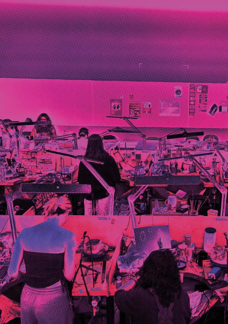

The Silversmithing and Jewellery graduates of 2026 present a diverse and considered body of work informed by individual research, experimentation, and making. Across the collections, students engage with a wide range of subject matter, including identity and the body, place and memory, cultural narrative, sustainability, function and adornment, heritage, and evolving approaches to craft and technology.
Rooted in material exploration and technical skill, the work reflects a dialogue between tradition and innovation, where conceptual enquiry and making are closely intertwined. Together, these collections offer thoughtful, ambitious, and forward-looking perspectives from a new generation of makers.
Anna Gordon Head of Department & Programme Leader
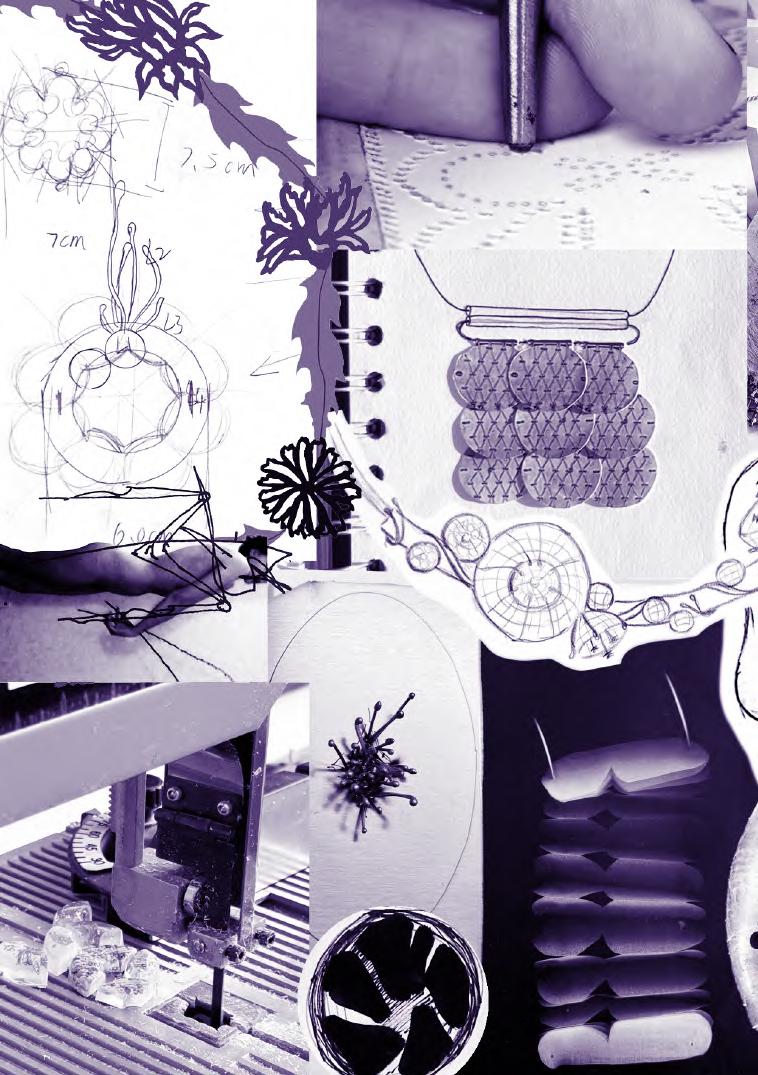
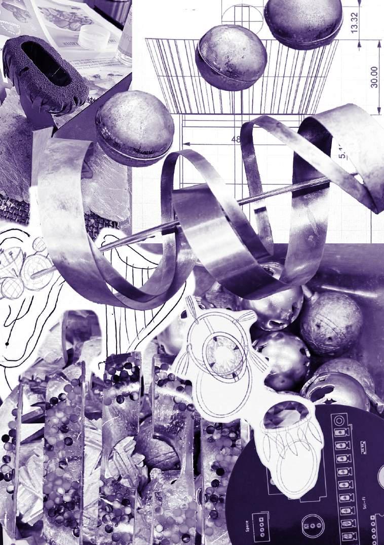
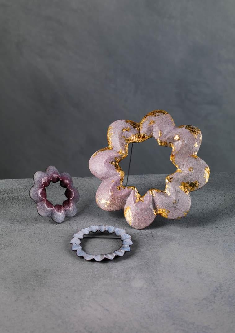
Jellyfish Stage III: Bloom explores the connection between nature and emotion, focusing on fluidity and instability through jewellery. Experiences like sensing ocean rhythms and encountering jellyfish inspired the ongoing exploration of ‘flowing’.
The jellyfish’s life cycle is structured into four stages: Seeds, Growth, Bloom, and Fade, each with its own design language.
Stage I: Seeds draws the jellyfish’s eggs round shape for small, circular pieces.
Stage II: Growth refers to the polyp stage, where branching, plant-like forms are displayed through composite constructions.
Stage III: Bloom reflects the ephyra stage, using vibrant enamel to evoke clustered, expanding formations.
Stage IV: Fade marks the final stage of the jellyfish’s life, where it dissolves back into the ocean; using soap that gradually disappears through use.
The work captures a state between existence and disappearance, turning jewellery into a medium for emotion, memory, and material transformation intersect.
Brooches Copper, Silver, Steel Wire, Enamels
@liatrisbian_
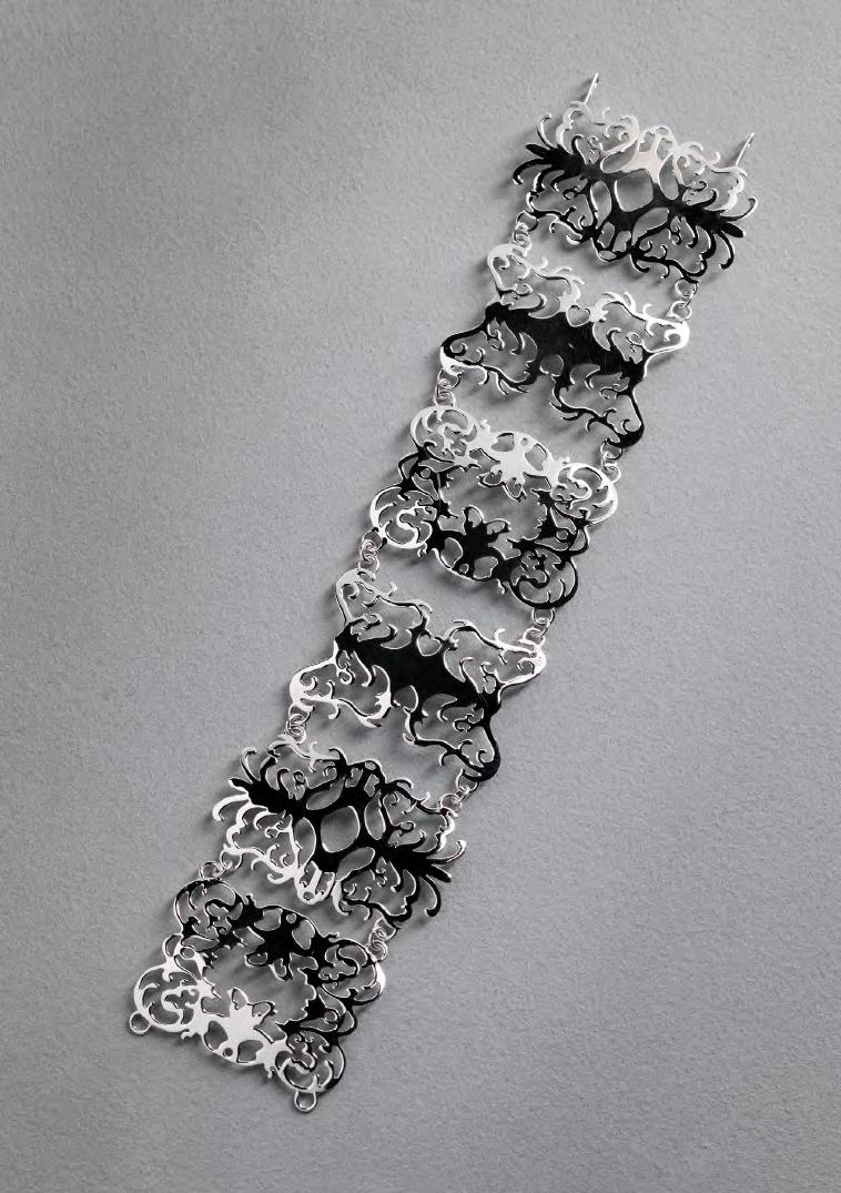
This collection explores my fascination with fictional worlds, drawing my inspiration from artwork, literature and interactive gaming found in Final Fantasy XV, and translating the rich visual language into intricate jewellery by blending elements of fiction with reality through the lens of historical art styles and contemporary designs.
My creative process begins with identifying compelling forms within these imagined landscapes. I manipulate these shapes through mirroring, subtraction, and addition, developing symmetrical, ornate compositions that form the foundation of each piece. These designs are then translated into wearable forms that balance intricacy with structure.
A central technique within my practice is detailed hand-piercing, which allows me to create delicate yet structured pieces. The process itself is meditative, enabling a sense of immersion in the fantasy environments that inspire my work and reinforcing the connection between making and imagination.
Throughout the collection, I explore the idea of materialising dreams, bringing fictional worlds into reality through ethereal, refined designs. Influences from Baroque and Rococo art are reinterpreted within a contemporary context, creating a cohesive visual language that runs across the collection.
Bracelet Silver @bbecca.art
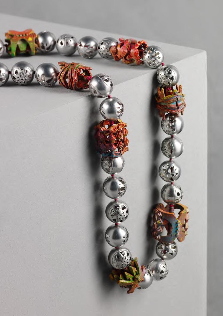
Josie Chanfi is a British-French-Comorian artist whose practice is inspired by her heritage and exploring the amalgamation of these cultures. Born in Bristol: a city full of art and culture, and where graffiti is a part of everyday life. This culture surrounded her upbringing and influenced Chanfi’s identity. Conversely, having never visited the Comoros islands, this side of her identity always fascinated her. The making of this collection, entitled ‘Métisse’, has opened the opportunity to begin an exploration into her own identity.
Through visits to museums and archives, Chanfi researched Comorian design, tradition and history. There is a particular influence from the vivid shades and patterns noticed in some of these Comorian textiles. Colour becomes a central theme of the collection and Chanfi uses spray paint to achieve these bright colours – further blending her Bristolian and Comorian identity.
Chanfi uses aluminium casting to create intricate and layered forms. Aluminium allows big and bold pieces to be lightweight and practical. The collection consists mainly of wearable pieces as Chanfi defines jewellery to be a symbol of identity and memory. The act of wearing jewellery is intimately tied to the body and therefore the identity of the wearer.
Necklace
Aluminium, spray paint and waxed cotton cord
@josiesjewellery
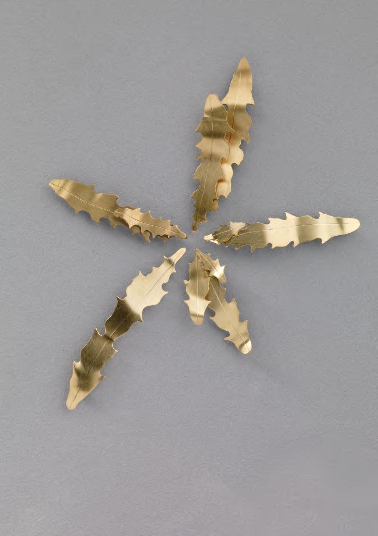
Pockets of nature can be found growing everywhere in our urban environments, from cracks in walls and pavements to holes in drains but are often overlooked during our everyday activities or seen as a nuisance that we should get rid of.
Through my collection Uncontrollable I aim to highlight the beauty of this part of plant life as well as nature’s ability to grow, adapt and thrive in unexpected places. To represent this, I used shapes from the leaves and flowers of a dandelion plant in my designs. I was originally drawn to dandelions as I admired their stubbornness and how difficult they are to get rid of as well as their ability to grow almost anywhere, emphasising how nature can never full be controlled, no matter how hard we try to.
By wearing the pieces in this collection, these plants have a new unexpected place to ‘grow’.
5 individual brooches
Brass, silver and stainless-steel wire
@ecolljewellery
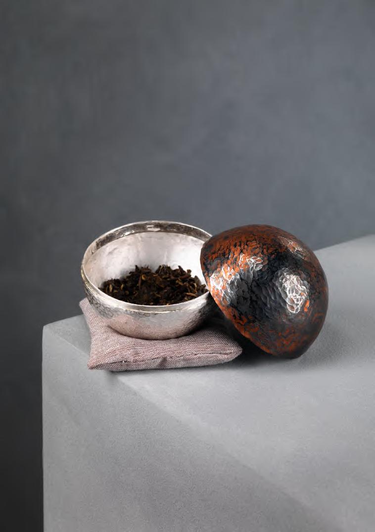
This work comes from my ongoing interest in tea as both material and experience. I think about the tea table as a kind of composition, where objects are arranged with attention, closer to an image than a purely functional setting.
I became interested in the tea plant itself, especially the relationship between tea leaves and tea flowers. Although they come from the same plant, the flower is rarely seen. In this piece, I place a flower-like form at the centre of the container, so that opening it becomes a moment of revealing.
The work is not only about holding tea, but about holding attention. The contrast between metal and wood creates differences in temperature and texture, while the form explores the relationship between inside and outside, centre and edge.
Vessel, Plate Silver, Brass, Copper, Textiles, Tea Leaves, Wood @ss.dai.ss
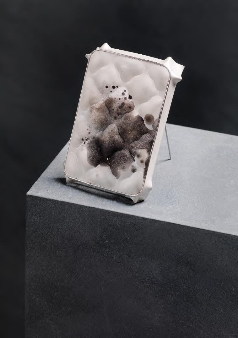
Stupéfaction is a kind of paralysis of thought – a moment when thinking confronts what it cannot think and must remain exposed to that impossibility. In my work, I am interested in approaching making as not being advanced by what works, but instead as propelled forward by the crisis solicited as a result of something not working. Similarly to the state of language collapsing onto itself, my pieces are complete by the lack of normative action on my behalf as a maker, allowing the material itself to exhort agency and express itself.
I use material exploration as a way to dissolve the boundary between the human and the non-human, instead viewing consciousness as co-constituted at the moment of entangled creation. Whether it is traditional silversmithing techniques like white-baking or digital image generation through promptengineering, I seek to find action in inaction, the beauty in that which is ‘not working’. Staining silver by overheating the surface of metal metaphorically corresponds to the failures of AI image generation, where chance and mistakes allow for machine delusions, endearing, liminal misinterpretations as well as freedom, creativity, new ways of thinking and pure expression.
Brooch Silver, steel @erratasaeon
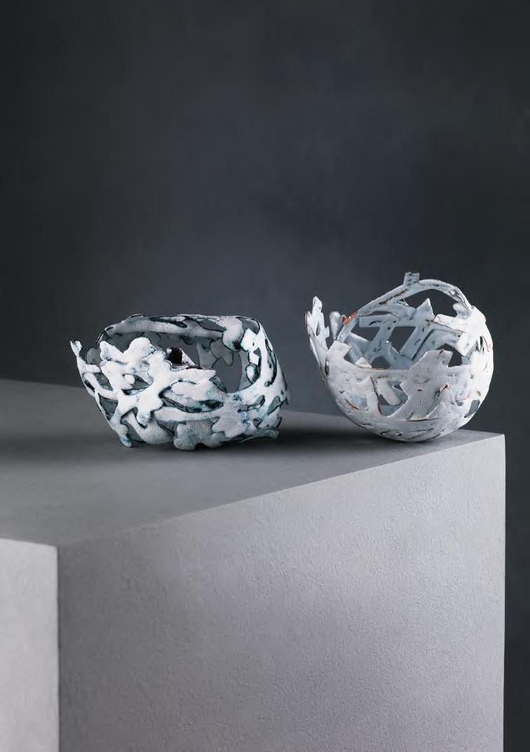
I am captivated by the beauty found in nature, the rhythm of the seasons and the anticipation of things to come. My studio collection is inspired by the shapes and colours of the plants and flowers I grow in my allotment and encounter on daily walks. Capturing tiny details in photographs, I translate these forms into designs through sketches and models.
As well as reflecting my love of gardening and being in nature, individual pieces are linked to memories of significant places and events from my life. The shapes I fashion from copper are elongated and distorted, alluding to the way these memories shift and change over time. Individual elements are then enamelled, the heat of the kiln dictating the final appearance of each piece. This organic process is an ongoing investigation, deliberately experimental and undertaken with a willingness to leave a certain amount to chance, much in the way a gardener sows seeds and waits in anticipation of the rewards.
Second Nature is a celebration in metalsmithing and jewellery design of my connection to nature. Each piece offers an impression of something familiar yet illusive, inviting us to look afresh at the beauty of the world around us and contemplate the fragility of our environment.
Vessels
Copper and enamel
@juliet_hardwicke_design
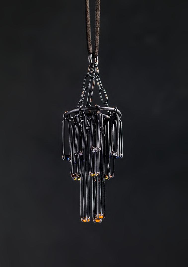
My collection explores the vivid beauty of tropical birds through sculpted silver and brass, accented with vibrant gemstones. Inspired by their plumage, movement, and spirited presence, each piece captures a moment of untamed elegance. Carefully selected coloured gems reflect the rich hues of these exotic birds, revealing their brilliance as they catch the light.
Incorporating subtle movement within the designs, I have introduced articulated elements that enhance this interplay of light, allowing the gemstones to shimmer dynamically as they are worn. By blending organic forms with contemporary design, the collection invites the wearer to carry a fragment of the tropics—its vibrancy, luminosity, and living energy—into everyday life.
Toucan Cascade, Pendant Copper, yellow/peach/tanzanite CZ stone & carnelians
@nicole_herbiee
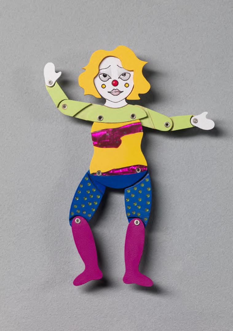
Inspired by the spontaneity of children’s crafts and the enchanting world of the circus, my collection Clowning Around celebrates freedom, joy, and movement. It highlights the importance of play in the creative process and everyday life, inviting wearers to take a break from routine and embrace a moment of whimsy.
Revisiting childhood crafting methods like collage and finger painting, I embrace messiness and instinct. This allows me to create freely, without pressure of perfection, leading to more honest and intuitive ideas that rekindle the pure joy of making. Using mixed media, each piece echoes childhood handmade objects - paper crafts and improvised constructions, reinterpreted into wearable art.
The circus, with its vibrant imagery and sense of wonder, serves as visual and conceptual inspiration. Designed to fidget with, pieces feature moveable parts that engage the senses. This playful interaction encourages, humour and a touch of silliness, offering a refreshing contrast to everyday routines.
Ultimately, Clowning Around aims to create an atmosphere in which wearers feel free to reconnect with a childlike sense of wonder. By breaking the seriousness and encouraging play, it celebrates the creativity, curiosity, and joyful expression that enrich both art and life.
Posing Pip, Brooch
Paper, Foil Sweet Wrapper, Resin, Alcohol Ink, Formica, Silver @kat.hdesign
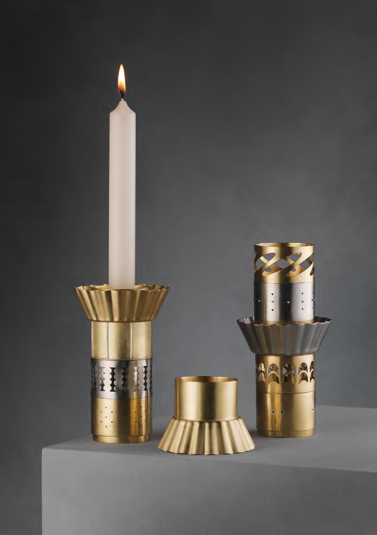
The kitchen table is the fulcrum around which many homes turn. This is where we gather to eat food, dissect our days, talk and laugh. We now have more and more objects of distraction around our homes, drawing us away from the table and away from the community it fosters. The act of sitting and eating together can start discussions and forge connections.
The objects in this collection are to be used everyday, they are not to be saved for best but to celebrate and glorify the daily rituals of the kitchen table. These objects then become containers for the memories that are made at the table, triggering recollections.
Several of these objects are designed with more than one use, they could hold tea lights, candles or flowers, depending on the meal or time of day. This creates some visual variety to keep them interesting even if you see them day after day.
The designs are inspired by objects of kitchen equipment, everyday items that we use to create the delicious meals that bring us together.
Candlestick Sterling silver, brass, nickel silver @Sophie.izard
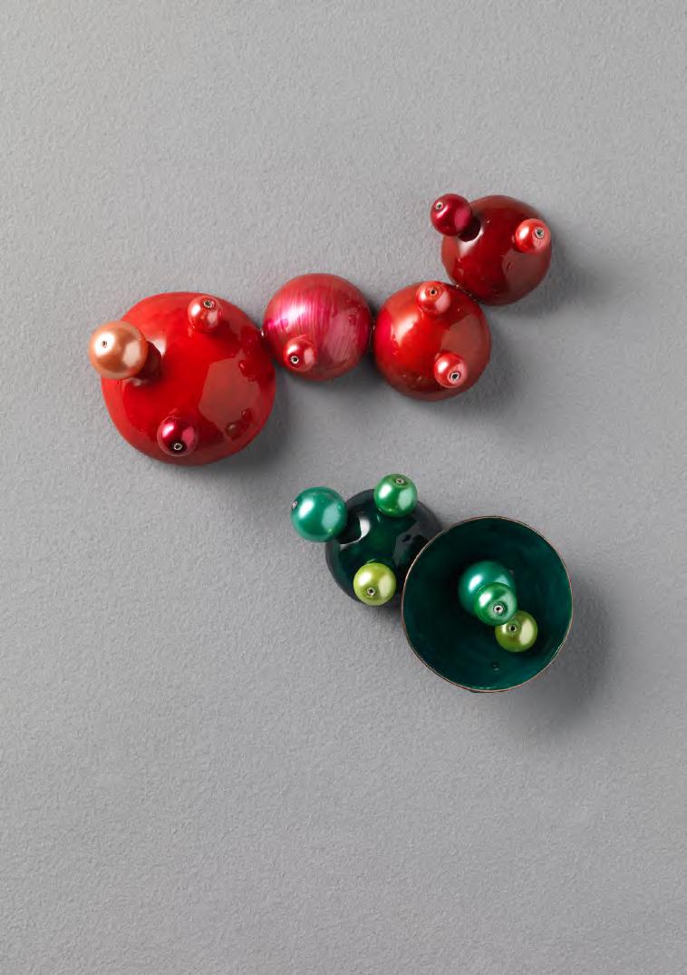
Juicy is inspired by my fascination with fruit its colour, texture, and the way it feels so visually tempting. I was drawn to how fruit can look almost too perfect, with bright, saturated tones and unique forms that seem edible even before you taste them. The rich colours used throughout the pieces are inspired directly by the natural intensity of fruit, which often appears vibrant and full of life.
I wanted my collection to feel playful and inviting, encouraging people not just to look at them but to want to touch them. To support this, each peice includes moveable components, allowing the forms to shift slightly and adding a tactile, interactive quality. During the making process, I explored different materials and finishes before settling on a glossy surface, which enhances the sense that the pieces are almost “lickable,” while also creating a subtle artificial quality.
The clustered beads represent the seeds found within fruit, but in a more abstract, otherworldly way. Light bounces between the beads and the glossy surface enhancing their bright, juicy appearance.
By transforming these ideas into wearables, Juicy celebrates colour, curiosity, and the simple pleasure of engaging with something that looks good enough to eat.
Brooches
Silver, cooper, steel, cold enamel, beads
@gjdesign__
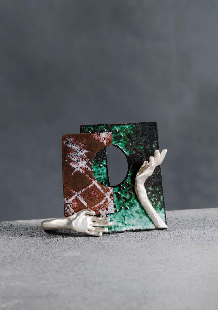
Unearthed is a collection shaped by the traces of touch and time. Quietly influenced by the language of excavated artefacts, it reflects a pull towards the land as a place of belonging.
The work moves between what is found and what is imagined. Forms feel partially revealed, as if held somewhere between emergence and erosion. Copper and enamel are used in a process that resists full control; surfaces shift and stain, producing soft hues that are reminiscent of aged surfaces and buried objects.
Silver motifs recur throughout the collection as subtle markers of human presence, suggesting touch, ritual, and the ways we navigate and interpret our surroundings. Dreamlike and tactile, the work sits between past and present, inviting quiet reflection on the emotional resonance of the world around us.
Brooch, Ring Silver, Copper, Vitreous Enamel, Cashmere @omina.studio
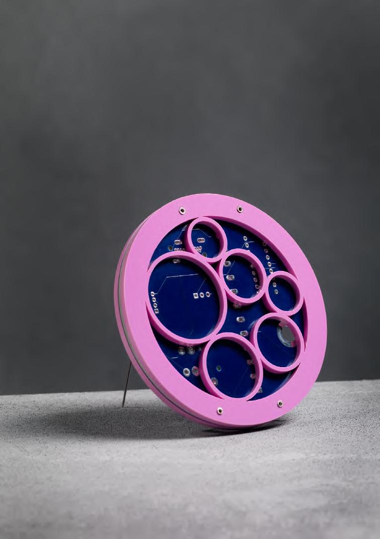
Intergalactic Perception is designed to invoke fun, and lightheartedness using shapes and colour and explores my interest in the science fiction movie genre. Taking inspiration from the buttons, lights and screens on spaceship control panels together with neon lights in cities on distant planets, this allowed me to discover interesting patterns. Simultaneously examining our own technology, notably in circuit boards.
Using coloured acrylic to mimic the neon lights and incorporating circuit boards to represent technology, allowed me to express my feelings of escaping into alternative worlds. Using Adobe Illustrator to create digital designs for both laser cutting and etching, allowed me to translate my ideas into physical forms. The addition of custom-made printed circuit boards was achieved using KiCad software, resulting in authentic looking technology to be incorporated into my pieces.
Inspiration was gained from observing the precise edges achieved from the laser cutting process which emulates the structured lines found in technology. The overlapping nature of my pieces represents the interlocking attributes of the genre, and explores complex connections found in modern technology. This collection invites the feeling of travelling to other galaxies and expanding your horizons, or could be worn by a character in a science fiction story.
Brooch
Acrylic, printed circuit boards, silver, steel pin @erinm.jewellery
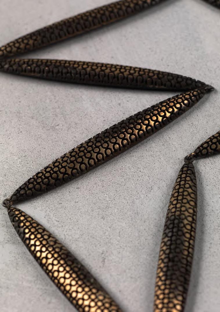
My practice explores the relationship between place, memory, and the natural world through jewellery focusing on my experiences with wild animals living in South Africa, the work translates encounters with animals into wearable forms that carry narrative and emotion.
Each piece draws from specific moments or observations of movement, texture, and behaviour reinterpreted through colour, surface, and structure. These forms act as small, intimate archives, capturing fleeting interactions with wildlife and transforming them into objects that can be held, worn, and shared.
Material choice plays a central role in communicating these stories. A combination of natural found materials, vivid colour, mixed media, and experimental processes, used to evoke the richness and intensity of the South African landscape. Contrasts between materials reflect the tension between fragility and resilience found within these environments, as well as the complex relationship between humans and animals.
The work moves between documentation and imagination, balancing recognisable references with abstraction. Rather than directly depicting animals, suggesting their presence through pattern, form, and colour, inviting the wearer to construct their own interpretation and connection. Through jewellery, these experiences are reconfigured into tactile narrative objects that function not only as adornment but as vessels of memory, storytelling, and place.
the porcupine, neck piece
Brass
@garnetggreen
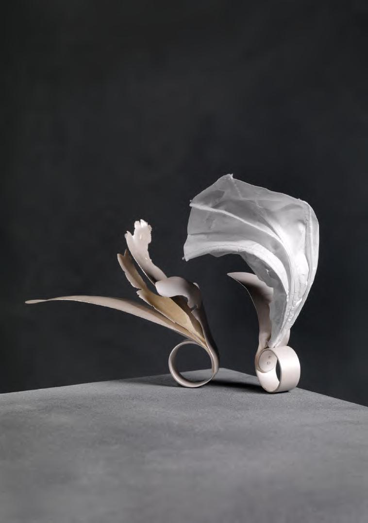
Still in Motion is a collection centred around a sense of movement and the visual language of paper. The pieces are made to appear light and fragile, as if they have been caught and held in motion, a physical representation of the fleeting moment of stillness, a pause within continuous movement.
My work is influenced by the materiality of paper. Each piece is intentionally crumpled, imprinted or torn to embody the texture and visual qualities of paper. Sheets are warped and manipulated to create organic movement. Through materials such as Tyvek and silver, the pieces aim to preserve this fragile quality and sense of weightlessness while translating into more permanent, wearable forms.
I have centred my collection around a study of all white materials as a way to accentuate light and shadow, enhancing the dimension and movement of the pieces. Still in Motion is a balance of structure and lightness, transience and permanence, stillness and shift.
Rings
Sterling silver, Tyvek, thread
@hannahredpathdesign
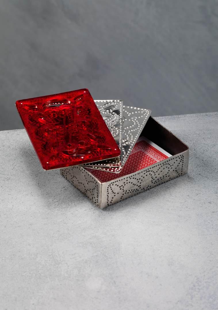
This collection by artist Lily Roberts, has been inspired and developed from the atmosphere and culture of Scottish Pubs. The pieces welcome the viewer into a warm setting: inviting engaged play, drinking and familiar discussion. The artist’s relationship with Scottishness and her continued experience as a bartender informs the foundations of this body of work. The title, Solas anns an Sgàil, directly translated as ‘light in the shade’ in Scottish Gaelic embodies the comforting environment of your local pub and is loosely based on the Italian term ‘Chiascuro’the artistic use of intense contrasting dark and light.
Her material choices embrace the cosy energy of low lighting –utilising the reflective nature of polished nickel-silver and notes of the colour red. Functionality is an important aspect of Lily’s work, with each piece serving one if not more practical purposes. While simultaneously representing and celebrating the range of emotions and interactions experienced nightly in pubs.
Tabletop Cards and Matchbox
Nickel Silver, Silver and Acrylic
@lilyrobertsdesign
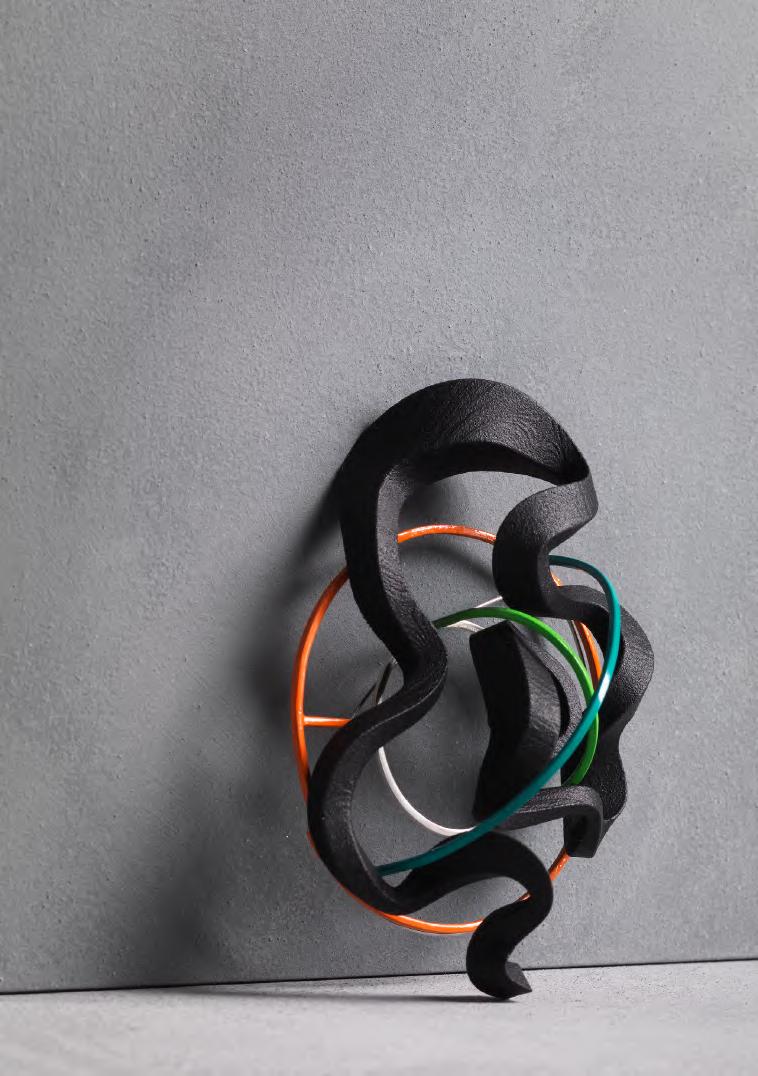
Flow is a state of total absorption, where making feels effortless, instinctive, and alive. For four years, I have been chasing it, catching glimpses, and losing it just as quickly. Life, noise, and the occasional spiral of self-doubt have been a habit of getting in the way.
This collection maps that relationship. Working intuitively, I begin each piece digitally before realising it through 3D printing in nylon, metal work, and aluminium casting. Each material was chosen for its demands of me; nylon captures fluid digital form made physical, wire is where my intuition runs freest, and casting freezes a moment of movement permanently.
Very little is planned in advance, and each piece reveals itself in the making, constructed through instinct rather than intention. Not every form is graceful. Some are fluid and liquid; others are tangled or restless - each a different version of how flow is felt, reflecting the process that made it.
Where rigid geometric structures meet organic, flowing forms, that tension becomes visible. This collection asks what it means to be in control of something as instinctive as flow, and whether control is even the right word. Four years of momentum and confusion, clarity and conflict, worn on the body.
Brooch
SLS Nylon, Silver, Copper, Steel, Enamel paint
@samrdesign
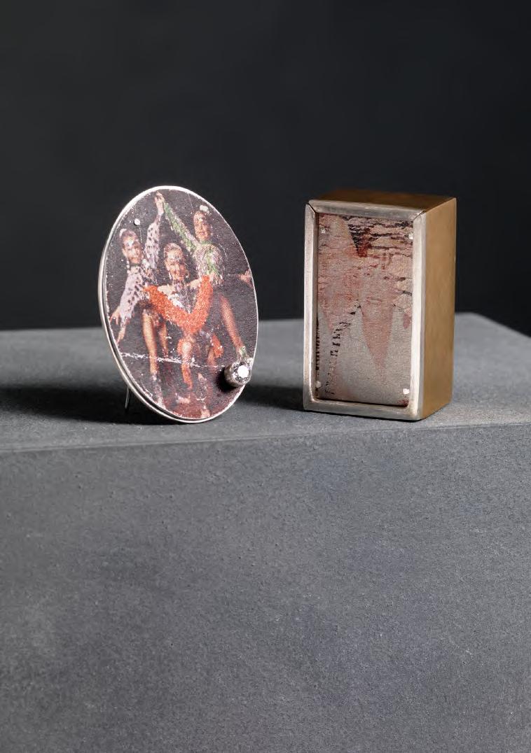
Through the Album seeks to revive the tactile nostalgia and profound emotional connection found in the act of sharing family photography.
These shared moments and the uncovered stories, remain the primary inspiration and influence throughout my work. I want to preserve the intimacy of this experience, by engaging with visual story telling to bridge my family’s past, present and future. My collection acts as an insight into the family photo album, documenting lives raised in industrial Glasgow - journeys defined by the immersion in a world of dance and movement. Two pillars that are central to my work, where I draw inspiration from fluidity to structure.
The creative and technical process of transferring my photographs onto metal is intentionally unpredictable, the outcome resists complete control. Much like a singular snapshot, there is only one opportunity to capture the instant, producing a technique that yields imperfect, candid moments, which feel as raw and honest as the memories they hold.
Within my “album” each box signifies a new chapter, a vessel revealing new stories and lives to be shared. Resulting in a journey of a never ending archive that continues to evolve as each memory is uncovered.
Brooches
975 Sterling Silver, aluminium, gilding metal
@melissamuffin
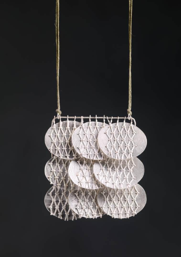
In a world of increasing noise and distraction, escape has never felt more necessary. For me, that escape has always come in two forms: the absorbing silence of reading, and the focused intensity of making.
Making My Escape is a collection of jewellery that explores these feelings, with each piece acting as proof of an imagined world. Within this world, I draw on an unconscious curation of fantasy — the accumulated influence of a lifetime of reading. Without the objects, this escape does not exist. Through emphasis on texture, sound and detail, the collection aims to bring this imagined world into physical reality. The intimacy of jewellery pulls it closer still, involving the world with the body and the self in a way no other medium can.
Through making, a clear interest in textile processes wove itself into my work. A longstanding familiarity with textiles was, perhaps, the earliest form this escapism took. Using fine wire to sew into the metal became its own form of escape — the same absorbed concentration that only a good book understands.
Necklace
Silver and Green Cord
@laniward.jewellery
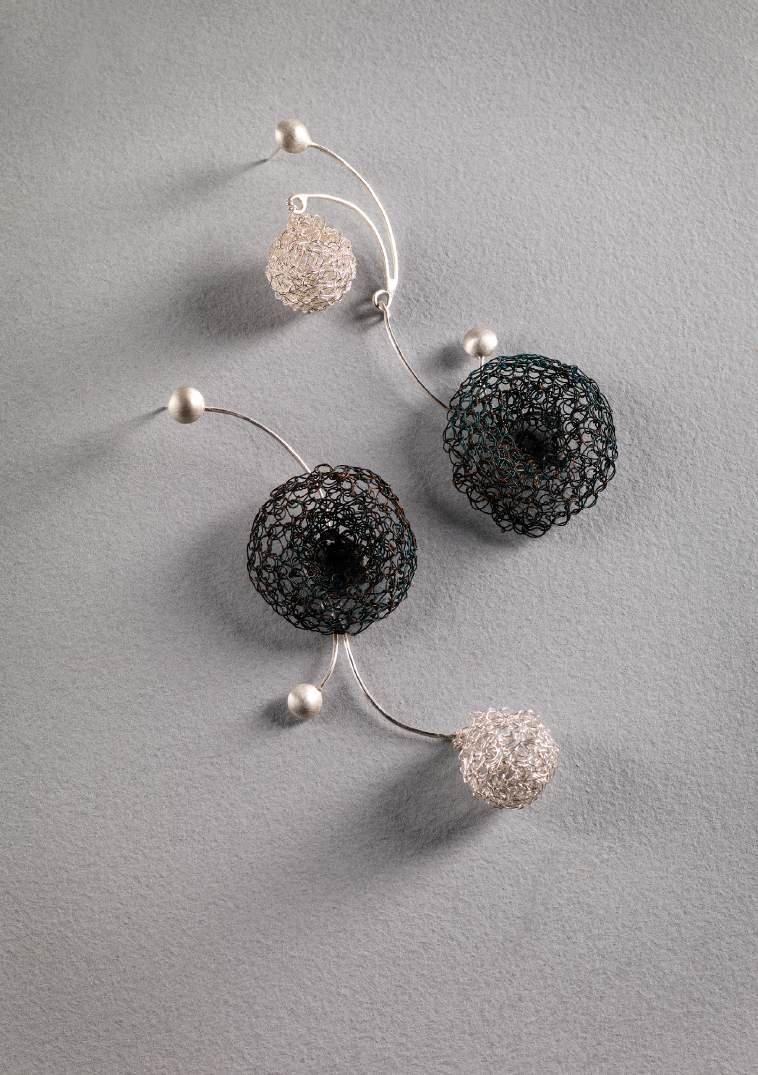
This collection explores the connections shared between family, partners, and friends. The work gives physical form to these relationships, shaped by personal memory, the lasting presence of others, and the intimacy of being worn close to the body.
Central to the project is the idea of being interlinked: a profound connection in which lives, emotions, and experiences become closely entwined. For me, being interlinked is tied to feelings of calm, reassurance, and care, reflecting the emotional steadiness that close relationships can bring. Each piece considers how relationships remain within us through memory, feeling, and emotional trace. Memory stretches, softens, and overlaps, continually reshaping how a person is held and understood. It takes on a dreamlike quality, where moments blur, soften, and return through feeling rather than fact.
The visual language of the work is inspired by synapses, the tiny yet essential structures that support connection, memory, and emotional experience. Their branching, interwoven forms run throughout the pieces, offering a metaphor for the invisible bonds between people. Through wire weaving and enamel painting, the making process became therapeutic and connective, mirroring these quiet emotions. Blues and greens are used throughout the work to evoke calm, nurture, and emotional softness.
Earrings Silver, Fine Silver, Patinated Copper
@Emilyyeatsdesign
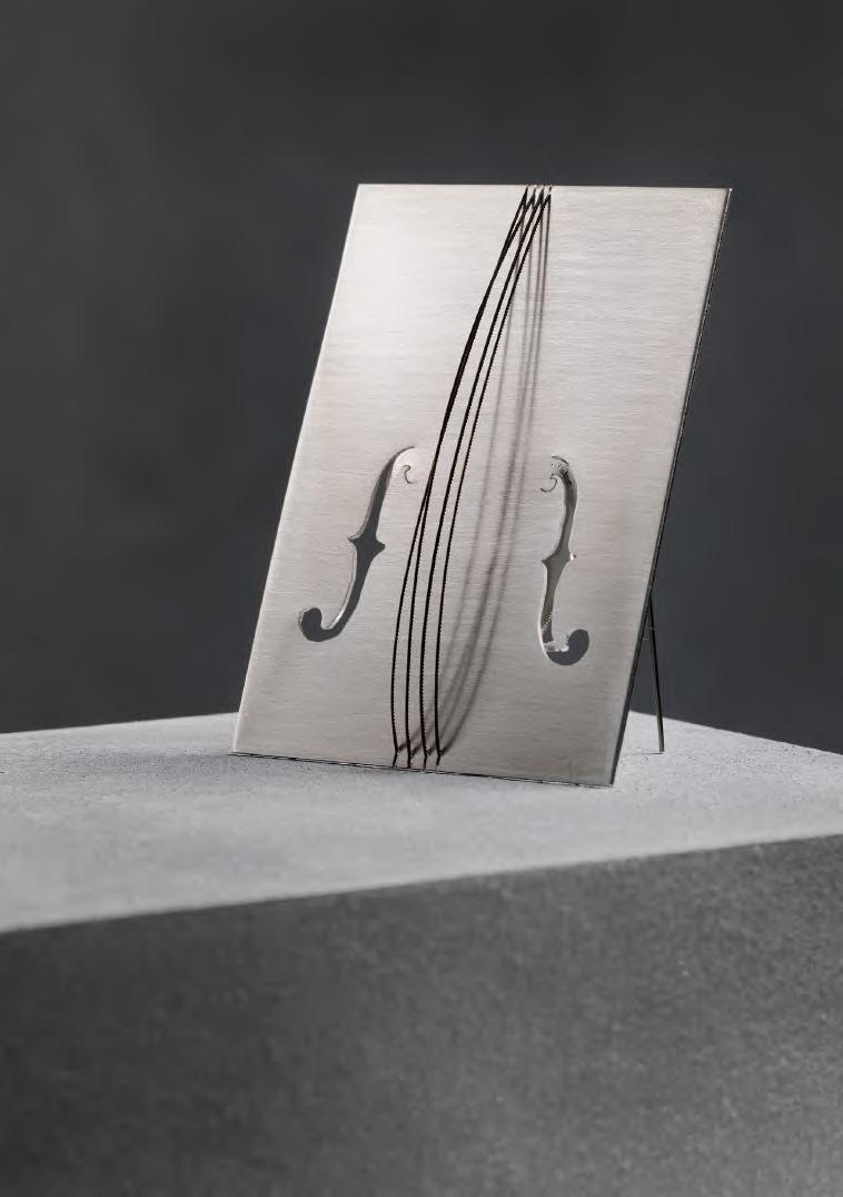
“Ornament” refers both to adornment and to musical ornamentation. My practice focuses on the generation of perception at a micro scale. I understand jewellery as a sensory device worn close to the body, and my research explores the translation between materials, making gestures, wearing actions, and multisensory experience. Repetition and rhythm, interval and pause, vibration and resonance, layering and harmony, and the subtle sounds produced through material contact all shape the work.
I aim to reveal the often overlooked sensory experiences embedded in jewellery making. Tensioned jeweller’s saw blades produce crisp, string like sounds when touched, recalling a miniature violin or cello and transforming cutting into performance. Chasing pitch is reimagined as a sticky, sweet malt syrup base, where pressing, embossing, and attaching resemble both metal forming and candy making. Through this displacement of materials, I reframe jewellery making as a multisensory event, one that can be heard, touched, smelled, seen, and even tasted.
Brooch
silver, used jeweller’s saw blades
@ruby_cr2o3
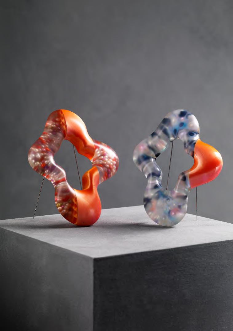
My project explores emotional comfort and transition through soft, distorted jewellery forms, rooted in my study-abroad experience of distance, pressure and change. I focus on the emotional resonance of small comforts like doughnuts, translating it into imperfect, circle-like shapes that evoke protection and comfort, while revealing underlying tension.
The work balances near-utopian calm and shifting emotional reality. Materials including resin, beads, zircon and 3D-printed PLA filament bridge softness and structure, dream and physicality. Jewellery becomes a medium to hold evolving emotions, reminding us of the importance of connection and presence.
Brooches
Resin, Colorful Beads, PLA Filament, steel pin
@viviankexinzou
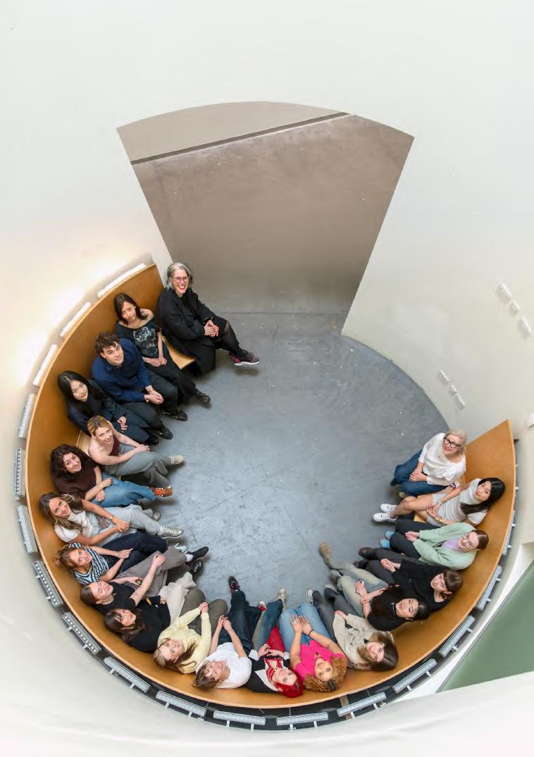
Connections in Gold is a necklace created by the class of 2026 during their third year of the four year BA (Hons) course in Silversmithing and Jewellery Design at GSA, made possible with the generous support of the Edinburgh Assay Office22 makers exploring the symbolism and inherent qualities of gold. Each participant was given 3.6 grams of 18ct gold grain to transform from ingot into a single wire link for a necklace, responding expressively to personal themes while contributing to a shared, collective vision. The challenge was to create a piece that fully exploited the properties of gold wire and reflected the idea that the “whole is greater than the sum of its parts.”
The final necklace is a collaboration of ideas, connections, and individual expression. It drapes freely, with no clasp, front, or back, removing hierarchy so each link carries equal weight in meaning and impact. Drawing inspiration from the transformative power of gold, myth, and enduring symbolic value, the collective responses explore cycles, growth, the human form, science, tension, fragility and politics.
The result is a necklace that is as rich in narrative as it is in material value.
Necklace 18ct Fairmined gold (not for sale), circumference approx. 90cm @gsa_sj
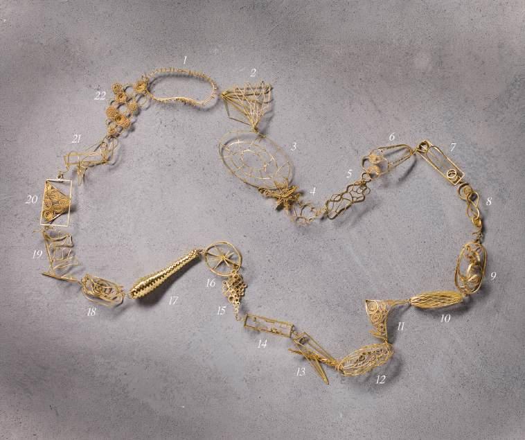
1. Ekaterina Filippova
2. Elizabeth Currie
3. Josie Chanfi
4. Lily Roberts
5. Becca Brown
6. Katy Hester
7. Nicole Herbison
8. Emily Yeats
9. Juliet Hardwicke
10. Lani Ward
11. Sushan Dai
12. Sophie Izard
13. Ruby Yujia Zhai
14. Melissa Stewart
15. Liatris Yaxuan Bian
16. Erin Mclean
17. Sally Johnston
18. Eloise Collins
19. Ruari McVeigh
20. Grace Jordan
21. Samantha Ross
22. Kexin Zou
Academic Staff
Anna Gordon
Michael Pell
Marianne Anderson
Andrew Lamb
Silvia Weidenbach
Helen McCormack
Technical Staff
Shona Guthrie
Maciej Sankowski
Caius Bearder
Artists in Residence
Misha McLean
Milly Milenkova
Kyle Ferguson
Duoduo Lin
Bette Nunneley
Isabel Honey Coles
Beth Sanderson
Thanks also to TSD Team
Lesley Black
Sean Black
Stephen Keane
Christopher Thompson Royds
Karen Westland
Edinburgh Assay Office
Studio photographs: Elaine Livingstone
Photography: Shannon Tofts
Catalogue design: Kim McNeil