October was a beautiful, festive month that brought warmth, celebration, and a renewed sense of connection. As we shared in the lights, colors, and traditions of the season, I was reminded of the importance of art, culture, and community in bringing us all together. I hope that joy and inspiration are still lingering as we move into November and wrap up the year.
In this issue, we are honored to feature two exceptional calligraphers: Jamyang Dorjee, who has dedicated his life to Tibetan calligraphy, and Salva Rasool, a talented Arabic calligrapher and multimedia artist. Both artists bring their unique cultures and perspectives to life through their work, reminding us of the power and beauty of script in telling timeless stories. Happenings Around the Community also highlights the Timeless Truth exhibition and Akshar Samvad, two events that celebrated the artistry and heritage of calligraphy within our community.
Under Lipikrit Bharat segment, we’re excited to share an article exploring the beauty and history of the Telugu script, offering a glimpse into this unique and graceful writing style. In Knowledge Nugget, we dive into a topic that sparks much curiosity: Brushpen Calligraphy vs. Brush Lettering. This article sheds light on the differences, benefits, and unique qualities of each technique, helping you decide which is right for your creative journey.
As we approach the end of the year, I want to thank you for being a part of this wonderful community. Your support, passion, and engagement mean everything to us, and it’s because of you that we continue to grow and thrive. There’s much more ahead, so let’s continue on this journey together, with curiosity, creativity, and a shared love for calligraphy.
Regards,
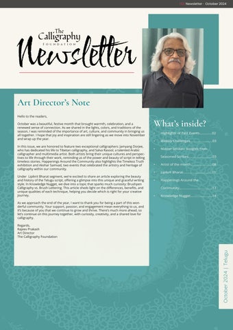
Rajeev Prakash
Art Director
The Calligraphy Foundation
What’s
• Highlights of Past Events..............02
• Weekly Challenges.........................03
• Master Strokes: Insights from Seasoned Scribes...........................03
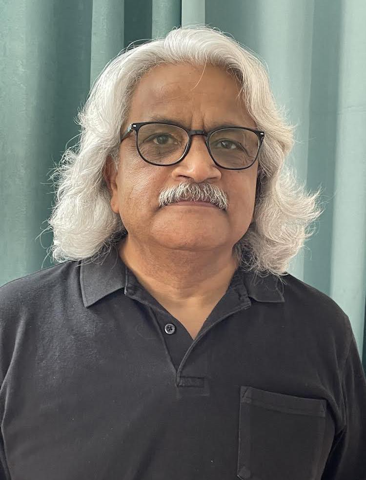
The first session of The Calligraphy Foundation's reimagined virtual meetups, "Illuminating Diwali with Calligraphy Lanterns," brought together a vibrant community of calligraphy enthusiasts for an unforgettable experience. As part of the Seasonal Scribbles series under the Srijan initiative, participants explored the unique art of paper cutting, creating calligraphy-inspired lanterns that captured the festive spirit of Diwali. The session was filled with enthusiasm, as members exchanged valuable tips, tricks, and techniques to enhance their designs. The energy and creativity shared throughout the session made it a joyful and inspiring gathering, with heartfelt thanks to all who joined in making it such a success.
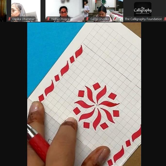
Monoline Uncial Workshop
The Monoline Uncial workshop was successfully completed online, where participants learned the basics of the Uncial script using a monoline approach. They focused on creating consistent strokes and forming clear, elegant letterforms. The session offered practical tips and allowed attendees to practice and refine their skills. It was an engaging and productive experience for all learners.
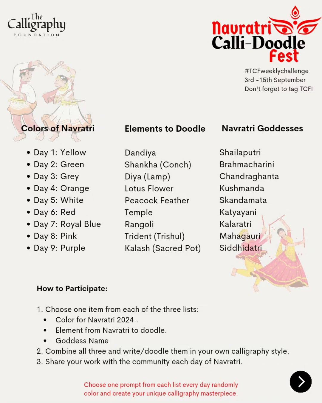
Weekly Challenges
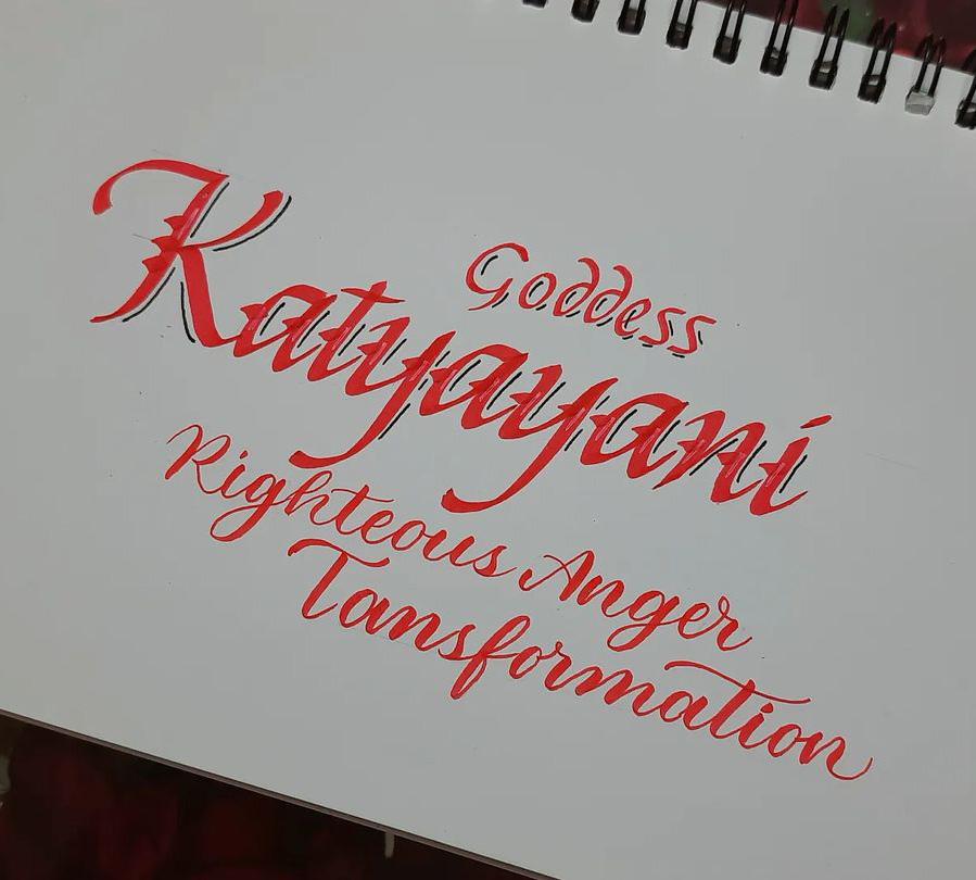
The Weekly Challenge is an initiative by TCF to make social media a helpful platform for calligraphy. Every week throughout the month, we provide new prompts where people can join in and share their knowledge and progress. Keep yourself informed about weekly challenges by following the Instagram account @thecalligraphyfoundation_pnp.
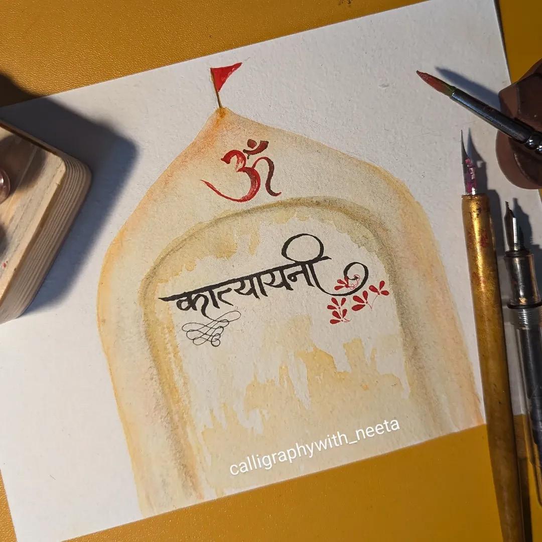
Neeta Dua (New Delhi)
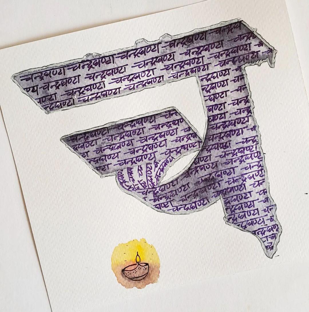
Rajat Agarwal (Lucknow)
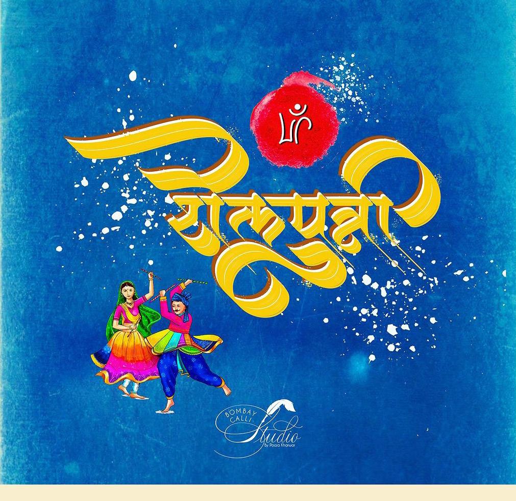
Pooja Kharwar ( Surat)
Reshu Garg (Ghaziabad)
Master Strokes: Insights from Seasoned Scribes
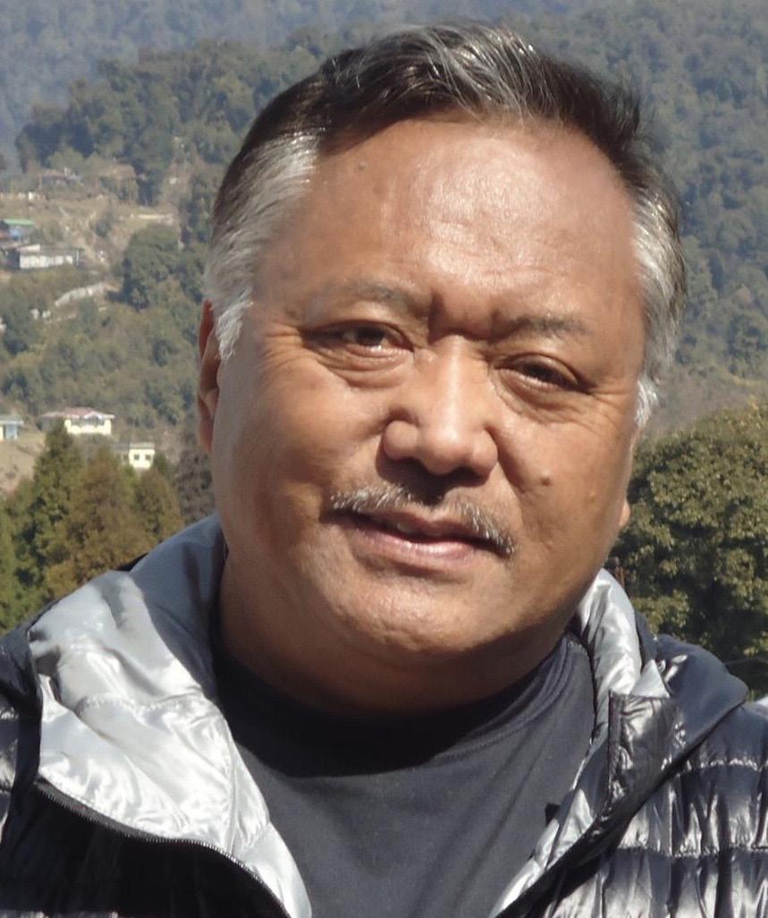
Jamyang Dorjee Chakrishar Gangtok, Sikkim
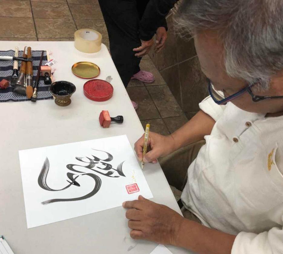
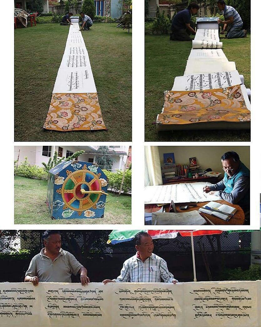
Jamyang Dorjee is a dedicated advocate for Tibetan calligraphy, having transitioned from a distinguished career in public service to passionately preserving and promoting this ancient art form. His deep connection with Buddhist spiritual masters and His Holiness the Dalai Lama's administration fueled his commitment to Tibetan calligraphy. Jamyang’s creation of the world’s longest calligraphy scroll and his ongoing contributions have solidified his role as a pioneering figure in elevating Tibetan calligraphy globally.
1. Your dedication to Tibetan calligraphy is inspiring. Can you share the pivotal moment when you realized this art form was your true calling, and how that revelation has shaped your journey?
My path to Tibetan calligraphy emerged from a rich career of public service. After retiring as a senior civil servant in the Sikkim state government, I had the privilege of working with His Holiness the Dalai Lama's administration in Himachal Pradesh. Throughout these years, my interactions with Buddhist spiritual masters left me with a profound conviction: each of us should strive to leave a meaningful legacy. In contemplating my own divine potential, I recognized that my true gifts lay in creativity and writing.
While calligraphy has long been revered as a sophisticated art form in Chinese, Japanese, and Islamic traditions, Tibetan calligraphy remained largely unknown to the wider world. This became starkly apparent in 2008 when my search for information on the subject yielded remarkably little.
The story of Tibetan script itself is fascinating - developed from India's Devanagari script, it emerged primarily as a vehicle for translating Buddhist teachings. Though the script evolved into various beautiful styles from the 7th century onward, many Tibetan spiritual masters traditionally prioritized mental cultivation over artistic pursuits, sometimes viewing the latter as mere distractions.
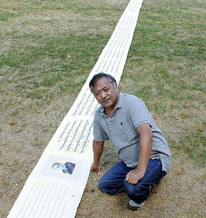
This historical context inspired my mission: to elevate Tibetan calligraphy to its rightful place among the world's great artistic traditions. My journey culminated in an ambitious project - creating the world's longest calligraphy scroll, stretching 165 meters. This achievement not only set a world record but also helped establish Tibetan calligraphy in the global artistic consciousness. It changed my life, I became calmer and focused.
“ ” I approach each stroke of calligraphy not merely as an artistic endeavor, but as a step along my spiritual path.
2. You write prayers each morning as part of your practice. How does this daily ritual influence your creativity and mindset, and what insights have you gained from it?
As a seeker of truth, my journey centers on understanding the depths of my mind and its inherent primordial wisdom. In the art of calligraphy, I've found a profound spiritual practice that combines meditation, devotion, contemplation, and inner peace. The quiet hours of dawn have become my sacred time, when brush meets paper and ordinary consciousness transforms into something extraordinary. Through this daily ritual, I've discovered a gateway to boundless creativity, leading me to a state of profound contentment and tranquillity that transcends everyday experience.
3. How do your spiritual beliefs influence your artwork, especially in depicting prayers and Buddhist deities?
In my practice, creativity and spirituality are inseparable, each nourishing the other. I approach each stroke of calligraphy not merely as an artistic endeavor, but as a step along my spiritual path.
4. Could you elaborate on the significance of the Buddhist deities and symbols in your calligraphy? What do you hope viewers feel or understand through these elements?
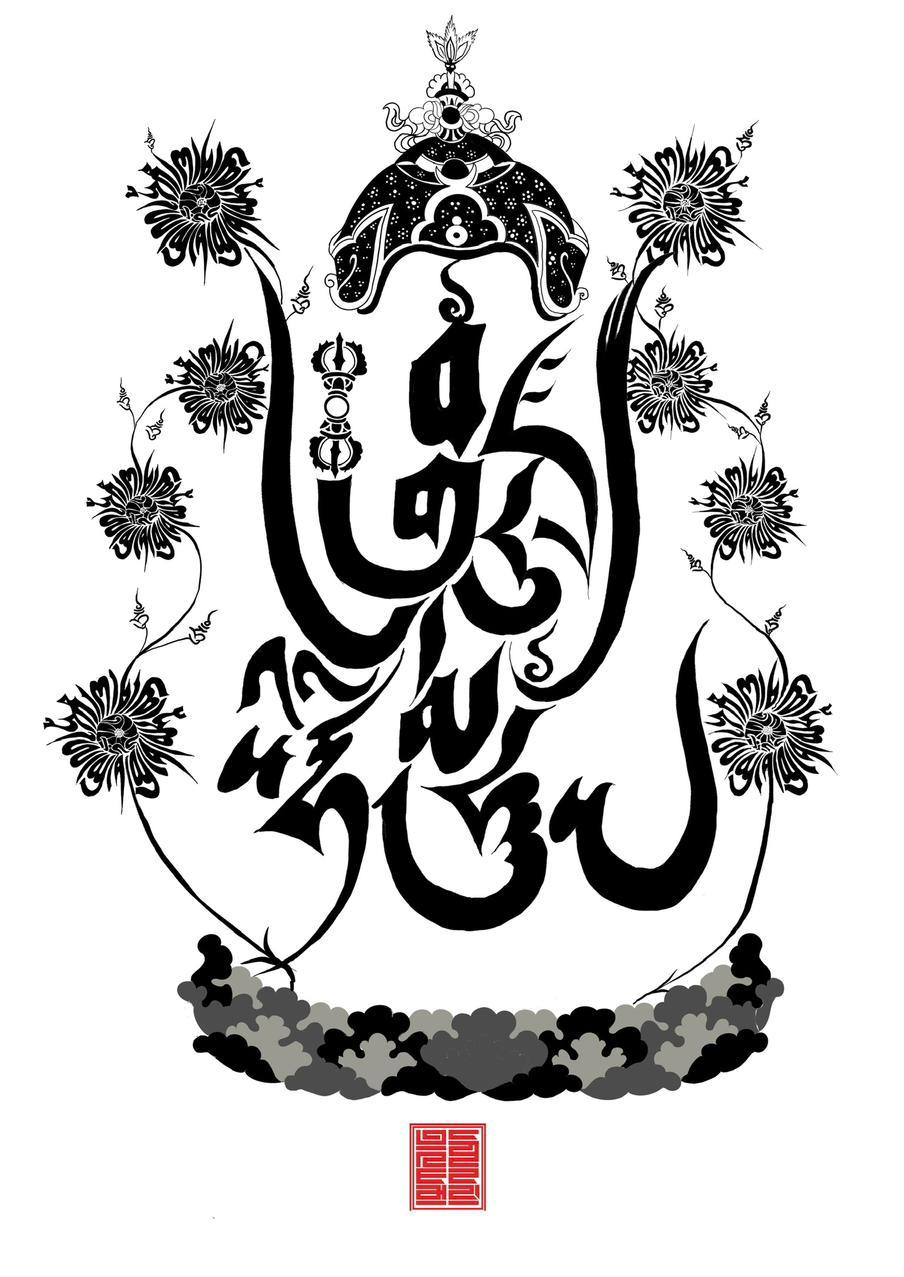
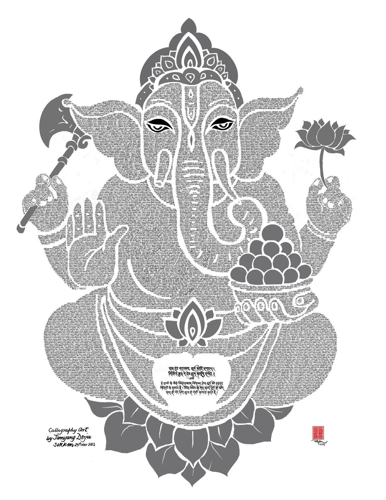
The Buddha's original teachings, twenty-five centuries ago, did not require physical representations - the connection between teacher and student was profound enough to transcend such needs. However, as society evolved, spiritual masters adapted their methods, developing creative ways to convey wisdom to their disciples. Just as we teach children the alphabet through tangible objects like 'A for apple,' these masters crafted symbolic representations: Buddha figures to embody form, sacred scripts to capture speech, and stupas to represent mind. This evolution led to deeper explorations of letters, mantras, and the profound concept of emptiness (śūnyatā). In my artistic practice, I've sought to unite these elements in a novel way. Through calligraphy, I create deities formed entirely from their own sacred prayers, achieving a unique synthesis where body, speech, and mind of the Buddha converge in a single artistic expression. This innovative approach brings a new dimension to the ancient art of calligraphy and a different perspective to the Buddhists.
5. Your calligraphy often serves as a tool for meditation and reflection. How do you envision viewers interacting with your work spiritually, and what emotions do you hope to evoke in them?
True calligraphy speaks to its audience on dual levels - through its visual beauty and its spiritual resonance. In my work, every stroke carries intention, whether crafting ancient mantras or expressing messages of compassion, ethics, and love. When all elements alignthe perfect harmony of ink, paper, and focused energy - the calligraphy comes alive, drawing viewers into a deeper conversation with the art. This is what masters mean when they say 'calligraphy speaks': it's the moment when written forms transcend their physical boundaries to touch the viewer's spirit."
6. Creating the world's longest calligraphy scroll is a monumental achievement. What sparked the inspiration for this ambitious project, and what challenges did you face along the way?
The virtual absence of Tibetan calligraphy in the digital world sparked in me a bold vision: to create something so extraordinary it would command global attention. Our calligraphic tradition deserves to stand proudly alongside the world's most celebrated styles. Driven by this conviction, I embarked on an ambitious six-month journey to create something unprecedented - the world's longest calligraphy scroll. This monumental work, stretching 165 metres and weighing 52 kilograms, became more than just a record-breaking achievement; it became a beacon illuminating our rich calligraphic heritage for the world to see.
The world's longest calligraphy scroll. 165 metres and weighing 52 kilograms.
7. Tibetan calligraphy features various styles, each with its own character. How do you select the style for a specific piece, and what emotions or concepts do you hope to convey through these choices?
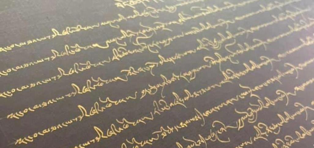
Tibetan calligraphy encompasses three fundamental styles: U-chen ('with head'), the formal script found in printed dharma texts; U-med ('headless'), commonly used for handwritten documents; and Druk-tsa, a decorative style reserved for captions and embellishments. Within the U-med tradition lies the Kyug style, a cursive form that offers unique creative freedom. It is this Kyug style that I employ in my artistic work, as it allows me to maintain traditional foundations while exploring personal expression. The fluidity of cursive writing becomes a vehicle for conveying individual emotion and artistic vision, transforming each piece into a unique work of art.
8. You often use traditional materials like Lokta paper. How do these materials enhance the aesthetic and spiritual qualities of your work, and how do they connect you to your cultural heritage?
My commitment to environmental conservation flows naturally from Buddhist teachings about interdependence - the profound understanding that our existence is woven into the fabric of nature itself. This isn't merely philosophy; it's practical wisdom: any harm we inflict on our environment inevitably circles back to us. While chemically treated papers may offer immediate visual appeal, their beauty is fleeting and their environmental cost high. This is why I choose Lokta paper, a natural handmade material that embodies both cultural preservation and practical durability. Harvested from shrubs growing above 10,000 feet in the Himalayas, Lokta represents nature's remarkable resilience - the more these plants are pruned, the more vigorously they grow. In this way, my artistic medium itself becomes an expression of sustainable harmony with nature. more it grows so no harm to nature.
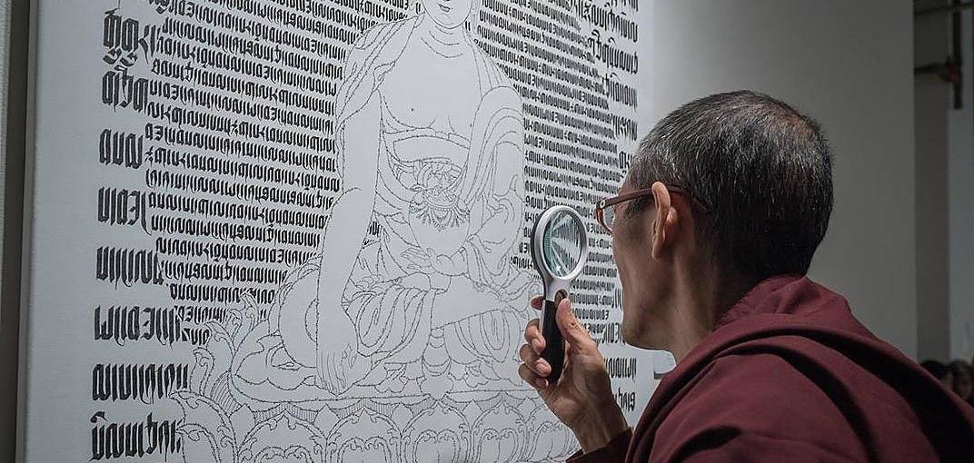
9. Your miniature calligraphy is remarkable for its precision. Can you walk us through the techniques you use to achieve such fine detail, and what it feels like to create art at such a small scale?
After completing the longest calligraphy scroll in 2010 and helping to popularize the art, I began to delve deeper into the essence of writing. I discovered that one of our revered masters, Acharya Shantideva from Nalanda University, inscribed the Bodhisattva-caryāvatāra on a single palm leaf in the 7th century. Inspired by this, I started creating miniature calligraphy, writing small mantras with the aid of a magnifying glass. This technique allows me to fit entire compositions of prayers on a single page—a practice that brings me immense joy and a sense of uniqueness.
10. The history of Tibetan calligraphy is rich and complex. How do you see your role in preserving this art form, and what aspects do you think are most important for future generations to understand?
Tibetan calligraphy holds profound historical and cultural significance, as it was developed specifically to translate Buddhist teachings (Buddha dharma). Following Buddhism's decline in India, Tibetan script became the primary vessel preserving Buddha's complete teachings - including 108 volumes of direct teachings and 226 volumes of commentaries by 17 renowned scholars from Nalanda University. This written heritage is invaluable not only to Tibet but also to India, as it safeguards ancient Indian Buddhist knowledge. My mission is twofold: to help younger generations understand the importance of this cultural treasure, and to emphasize that if India aspires to global leadership, it must protect and promote this Buddhist wisdom preserved in Tibetan script."
11. How have cultural exchanges, like those with Mongolia and China, influenced the development of Tibetan calligraphy and its scripts?
Buddha dharma is a common bonding amongst the Asian countries and using the Tibetan calligraphy which is based on Devanagari is a very good diplomatic tool for neighbourhood exchanges. Last few years, I have exhibited Tibetan calligraphy Art exhibitions in Bhutan, Nepal and Bangkok sponsored by the respective Indian embassies and proved very useful.
Artwork in Kyug Script
Miniatures Calligraphy Artworks
the
12. You mentioned the Horyig (Mongol Script) created in the 12th century. Can you explain its purpose and how it was influenced by Tibetan calligraphy?
Yes, Drogon Chogyel Pakpa (1235–1280), a Tibetan lama and leader of the Sakya tradition, created the Mongol script in 1270. Pakpa's script, also known as the Phagspa script or Mongol square script, was based on the Tibetan alphabet but written vertically. Pakpa was the imperial preceptor to the Mongol emperor Qubilai Khan. In 1271, Qubilai made the Phagspa script the official script of the Mongol Empire. The Phagspa script was used on official documents, monuments, and passports. However, it was never widely used and fell out of use after the Yuan dynasty collapsed in 1368. It is thought to have influenced the development of modern Korean script.
13. How do you see modern adaptations of Tibetan calligraphy evolving, and are there any recent developments that you find particularly interesting?
The impressive feat of creating a Tibetan calligraphy scroll that set a world record in 2010 has ignited a newfound sense of hope and inspiration among the younger generation of Tibetans in Tibet. In 2015, they went a step further by officially declaring April 30th, representing the four vowels and thirty consonants of the Tibetan script, as a national day of calligraphy. This increased enthusiasm for Tibetan calligraphy has led to a surge in demand for its artistic integration across various applications. Businesses and organizations are now regularly seeking the creation of Tibetan calligraphic designs for product branding, film captions, and even the naming of hotels and resorts. This growing trend showcases the rising prominence and recognition of Tibetan calligraphy as a vibrant and versatile art form.
14. As a veteran calligrapher with deep knowledge of script history, what advice would you give to those interested in learning about the evolution of Tibetan calligraphy, especially its connections to other cultures?
The evolution and development of Tibetan calligraphy has the potential to unite the people across the Himalayan region, from Ladakh to Arunachal Pradesh in India, as well as the Kingdom of Bhutan, Tibet, Nepal, and Mongolia. This is because these areas share a deep connection through the study of Tibetan scriptures and the Nalanda tradition of Buddhism.Since Tibetan calligraphy is an extension of the Devanagari script of India, the artful and stylized Tibetan calligraphic tradition could serve as a cultural bridge, attracting interest and appreciation from Buddhist countries throughout the region towards India.For individual artists, the practice of Tibetan calligraphy can be seen as a form of meditation. The focus and concentration required to master this art form can have a calming and centering effect, helping the practitioner to achieve a state of mindfulness and focus.In this way, the development of Tibetan calligraphy has the potential to not only unite people across the Himalayan region through a shared cultural heritage, but also to provide a transformative personal experience for the artists themselves, helping them to cultivate inner peace and clarity.
15. As someone dedicated to Tibetan calligraphy, what do you believe organizations and the government should do to support this art form? Why is it important to preserve, and what steps can be taken to ensure its continuity for future generations?
As an artist, one's focus should be solely on the art itself, without aspirations for wealth or fame. The true artist lives within their art, fully immersed in the creative process, and it is this dedication that allows masterpieces to emerge. While the support of governments, NGOs, and the media can be valuable in promoting art that celebrates a nation's cultural heritage and pride, an artist's primary commitment should be to the art itself. Both the Tibetan/Bhoti and Devanagari scripts have a rich, established tradition, yet they remain relatively underdeveloped in the realm of calligraphy art compared to the renowned Sufa of China and Shodo of Japan. This presents a vast, untapped potential waiting to be explored. Just as there is always a sky beyond the sky we see, the art world holds limitless possibilities for those willing to venture into uncharted territory. As an artist, one must embrace this sense of boundless potential and strive to push the boundaries of their respective mediums and traditions. It is in this spirit of exploration and dedication to the craft that the most meaningful and impactful works of art can emerge.
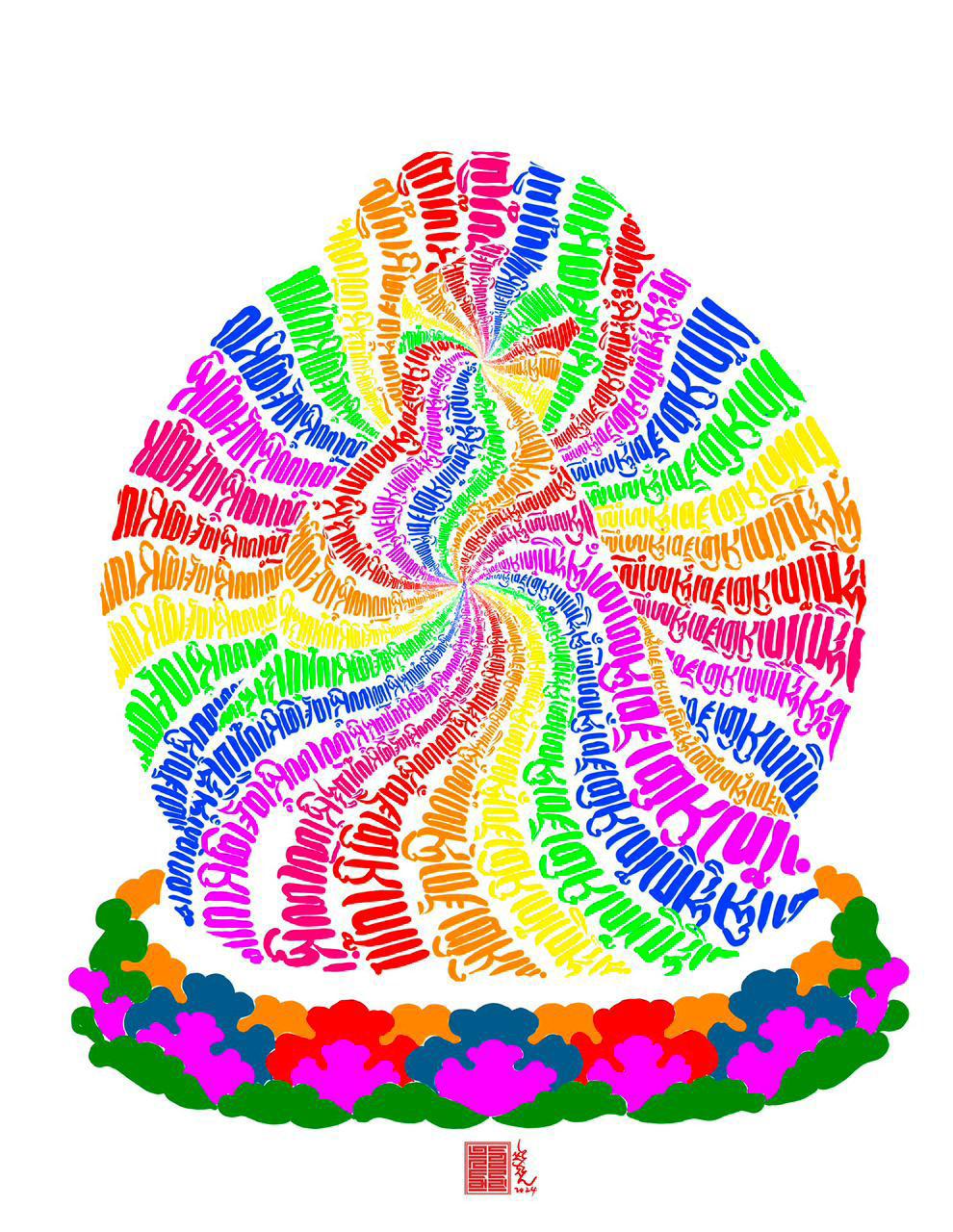
Heart Sutra of Buddha: This colorful artwork shows 'Tong Nyi' (Shunyata) at the center, symbolizing the Buddha's teaching of emptiness and unity
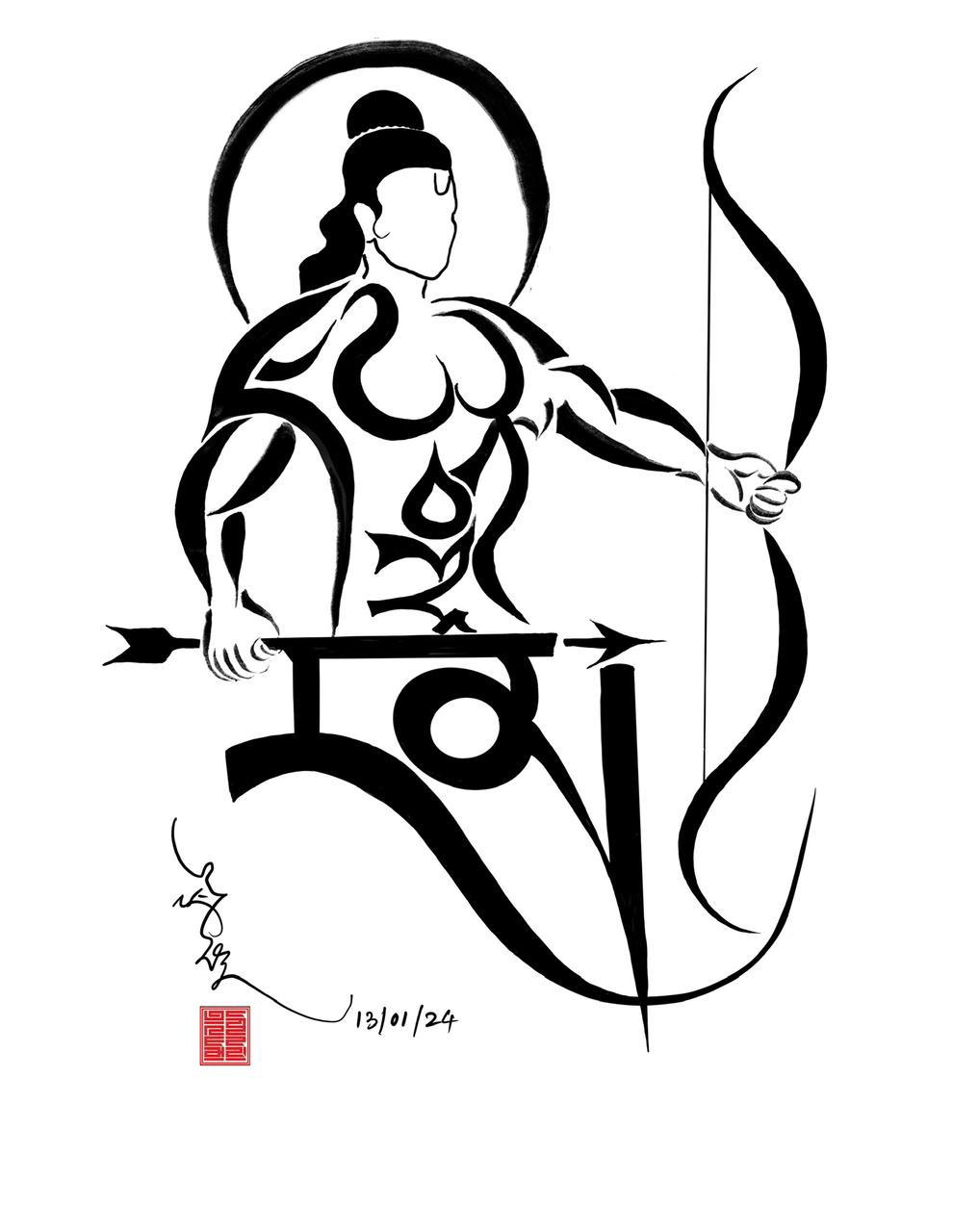
'Jai Shri Ram’ written in Tibetan Uchen script, resembling
style of Devanagari
Artist of the Month
1. What initially inspired you to explore Arabic calligraphy, and how has your artistic approach evolved over the years?
I graduated from Sir J J School of Art in Mumbai in the year 1985, specializing in typography in both English and Devanagari scripts. As a child, reading the Holy Quran introduced me to the Arabic language and sparked my journey into the world of Arabic calligraphy.
In most Muslim homes, carpets with embroidered lettering or artefacts featuring printed calligraphy are common decor. During my time in art school, I noticed a lack of modern, contemporary options for wall art that still honored calligraphy traditions. I also observed that few calligraphers in India were experimenting with calligraphy in mixed-media approaches. So after graduation, I embarked on my journey as an artist who was inspired to innovate by merging traditional elements with modern art techniques, a blend that I hoped would bring fresh energy to the field of calligraphy in India.
An art dealer from South Africa encountered my work and commissioned pieces for his gallery in Johannesburg, marking a pivotal moment in my career. Since then, my art has been showcased in countries around the world, including Canada, Iran, Indonesia, Lithuania, the Middle East, Singapore, South Africa, UK and the US.
In 2010, I held my first solo show in Mumbai at the now defunct Museum Art Gallery in Kala Ghoda, a milestone that proved to be incredibly successful and was a turning point for my work’s reception in India. The positive response encouraged me to continue developing my distinctive style which also incorporates inspirations from Urdu and Devanagari scripts.
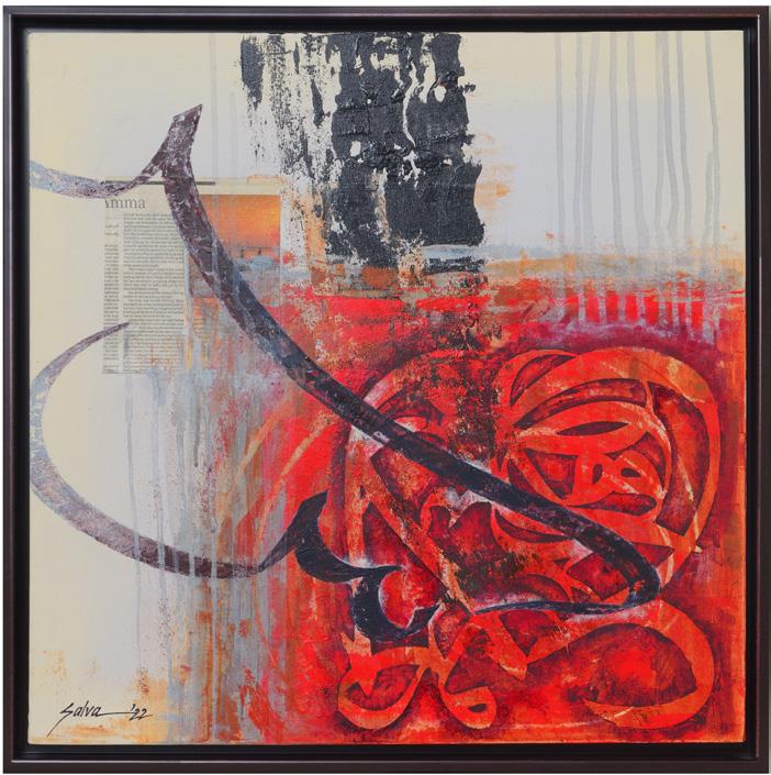
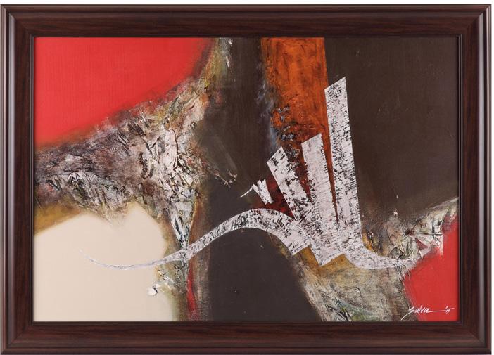
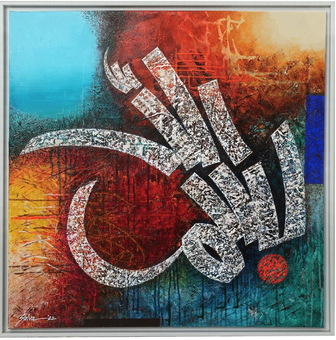
Salva Rasool
Mumbai, Maharashtra
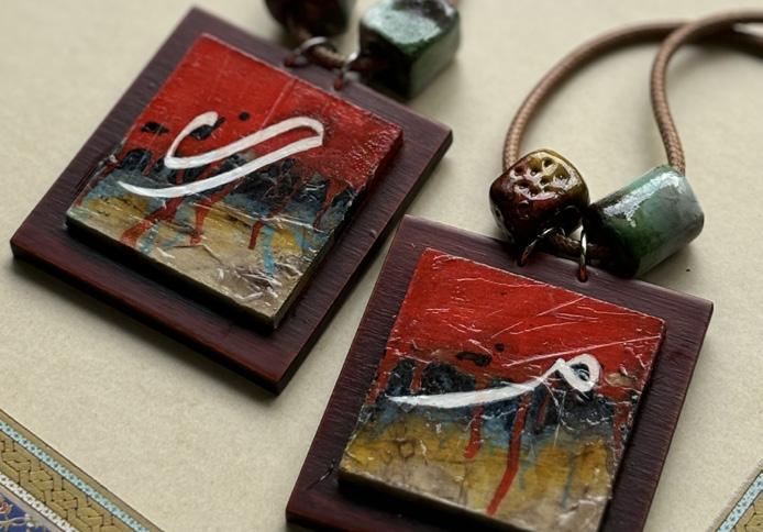
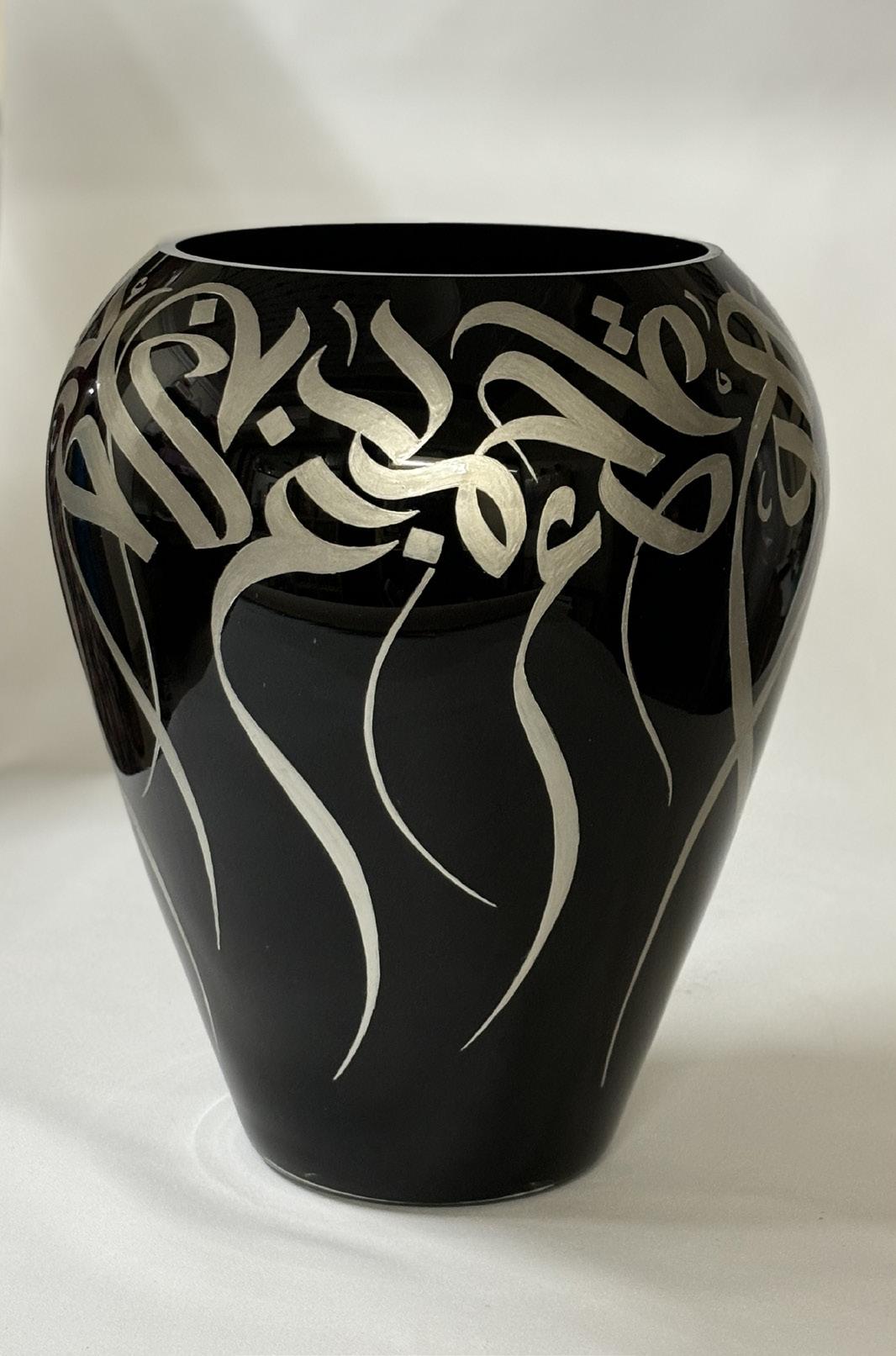
Salva Rasool, a graduate of Sir J J School of Art, Mumbai, is an innovative artist and calligrapher specializing in Arabic, Urdu, and Devanagari scripts. Her journey into Arabic calligraphy began with her exposure to the Holy Quran in her childhood. Combining traditional calligraphy with modern art techniques, Salva’s work has been showcased globally in countries like South Africa, Iran, and the US. Known for experimenting with diverse materials like terracotta, glass, and leather, Salva’s calligraphy transcends cultural and spiritual boundaries, blending heritage with contemporary artistry.
“As the world becomes more interconnected, calligraphy has the potential to become a universal art language, bridging past and present, tradition and innovation, while preserving its profound
cultural and spiritual roots.
2. Arabic calligraphy carries a rich cultural history and is admired globally. How do you ensure that your art resonates with both those who understand the script and those who see it as a visual masterpiece?
While doing Arabic calligraphy, I focus on balancing the script’s intrinsic and sometimes traditional beauty with creating a universal visual appeal through the painting's background. My aim is to let the flow and rhythm in each piece speak to viewers, regardless of if they understand Arabic or not. By using a variety of textures, layering, abstract designs and striking colors among other things, I strive to evoke emotion and convey the essence of the words, allowing anyone to connect with the art on a visual and spiritual level.
3. Your work is known for its innovation. What inspires you to push the boundaries of traditional calligraphy?
I am driven by my desire to make this timeless art form accessible and relatable to contemporary audiences. I’m constantly inspired by the world around me -- nature, architecture, and even modern design trends, all of which inform my compositions and colour choices. I enjoy experimenting with structure, form, and style so that traditional scripts feel fresh
”and dynamic. I view innovation as a bridge that connects the rich legacy of calligraphy to the present, keeping the art alive and evolving while respecting its deep-rooted heritage.
4. You’ve explored various materials like terracotta, glass, and leather in your art. What inspires your choice of materials, and how do they influence the final pieces you create?
Each material I work with, whether terracotta, glass, wood, leather, or others…brings its own unique texture, weight, and character, all of which greatly influence various aspects of the calligraphy. My choice of material is inspired by the visual experience I want to create and convey. For instance, terracotta carries an earthy, grounding quality while glass offers a modern, ethereal feel. These materials allow me to shape calligraphy not only as text but as an immersive, three-dimensional experience, allowing deeper ways for viewers to connect with the art.
5. What inspired you to incorporate modern elements like stripes and vibrant colors into your calligraphy? How do you balance tradition with contemporary style?
Incorporating modern elements like stripes and vibrant colors allows me to create a dialogue between the past and the present. This blend was inspired by a desire to make calligraphy resonate with today’s audiences, connecting classical forms with contemporary aesthetics. Stripes and bold colors introduce rhythm and contrast, adding a fresh energy that complements the graceful flow of calligraphy. Balancing tradition with modern style requires a deep respect for the original scripts; I focus on maintaining its integrity while using colors and patterns to enhance rather than overshadow the art.
6. How do you incorporate the cultural and spiritual significance of Arabic calligraphy into your work, and how does your art bridge cultural divides?
I approach each of my creations as more than just visual art -- a way to convey beauty and spirituality. By thoughtfully choosing texts and words with universal themes like peace, love, and patience, I aim to create pieces that resonate with viewers across diverse backgrounds. This connection allows the art to transcend the barriers of language and religion, turning calligraphy into a visual language that speaks to shared human values. Through my work, I hope to inspire a deeper appreciation for our diversity.
7. Your artwork has been exhibited in various countries. How is your art received in different cultural contexts, and what has your experience been like exhibiting in diverse places?
Exhibiting my art in different countries has been incredibly rewarding, constantly reminding me how my calligraphy resonates universally, even in different cultural contexts. Audiences often connect with the visual art, even if they don’t understand the script itself. Some are drawn to the spiritual dimension while others see it as a contemporary art form with a unique cultural flavor. Each exhibition brings new insights and interactions, reaffirming the power of calligraphy to transcend language and cultural barriers.
8. As someone redefining Arabic calligraphy, where do you see the future of this art form heading, both in your practice and in the broader art world?
I see the future of Arabic calligraphy as one where tradition and innovation coexist, allowing the art form to continually evolve. In my practice, I plan to explore new materials, digital mediums, and even collaborations with artists from other disciplines to further expand calligraphy’s reach and relevance. Globally, I believe Arabic calligraphy will continue to gain appreciation as artists incorporate modern elements, experiment with forms, and introduce it to new audiences through cross-cultural projects. As the world becomes more interconnected, calligraphy has the potential to become a universal art language, bridging past and present, tradition and innovation, while preserving its profound cultural and spiritual roots.
9. You’ve experimented with different calligraphy styles and often choose bright, unconventional colors. What guides your decisions when it comes to style and color in your work?
My choice of style and color is guided by the message I want each piece to convey and the emotions I hope to evoke in the viewer. Different calligraphy styles have their own rhythm and energy, so I select ones that best align with the theme—Nastaliq for its elegance, Thuluth for its grandeur, Calligraffiti for its modernity and so on. As for color, I enjoy using bright, unconventional tones to add vibrancy and modernity, making the art feel alive and accessible. Each hue is chosen to amplify the script’s emotional impact, creating a visual experience that both respects and enhances it.
10. Islamic art traditionally adheres to certain color palettes and styles. How do you feel your approach challenges these norms and redefines contemporary Islamic art?
My approach challenges traditional norms by introducing bold colors, modern compositions, and experimental materials, which bring a fresh perspective to Islamic art while still respecting its core principles. Traditionally, Islamic art uses earth tones and specific color schemes that reflect its historical and spiritual roots. By infusing vibrant, contemporary colors and blending calligraphy with modern design elements, I aim to make the art form feel current and accessible. This redefinition allows Islamic art to evolve, inviting new interpretations and connecting with audiences across cultures and generations.
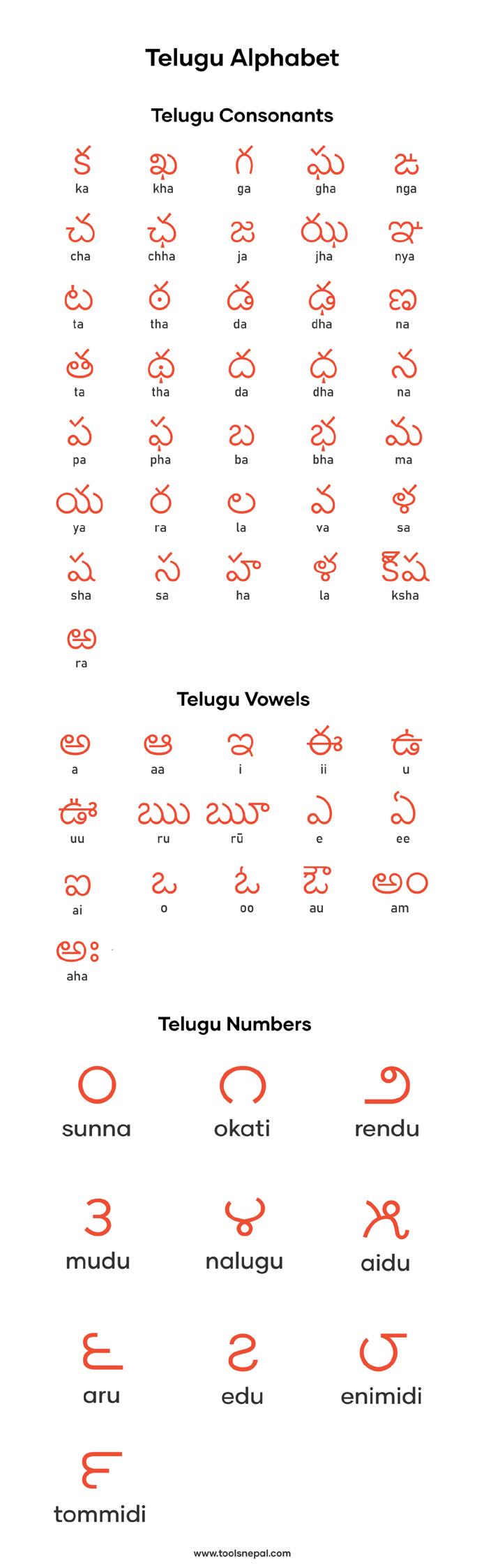
Lipikrit Bharat: Telugu Script from Palm to Pixels
Source : toolsnepal.com
The Telugu script has a rich heritage, deeply rooted in India’s linguistic and cultural tapestry. As part of the Dravidian language family, Telugu evolved from the ancient Brahmi script, which is considered one of India’s earliest writing systems. The transition began with the Ashokan edicts, as Brahmi spread throughout South India, eventually adapting into regional variations that included early Telugu forms. By the 5th century AD, inscriptions in what we now identify as Telugu began appearing, marking the language's formal emergence. Today, Telugu is one of India’s most widely spoken languages, recognized as an official language and taught in schools. Telugu is the official language of the Indian states of Andhra Pradesh and Telangana. It is also an official language of the union territory of Puducherry.
During the medieval period, the Kakatiya dynasty (12th-14th centuries) played a vital role in standardizing the Telugu script. This era not only stabilized the script but also contributed to the rise of Telugu literature, thanks to royal patronage that supported poets, scholars, and calligraphers. Telugu continued to evolve under various dynasties, particularly the Vijayanagara Empire, which helped refine the script's style. By the 19th century, Telugu adapted further under British influence, with printing presses facilitating its spread through newspapers, books, and educational materials.
The Telugu alphabet, renowned for its extensive composition, surpasses all other Indian languages in its array of characters. A total of 56 letters, comprising 18 vowels and 38 consonants (with 2 vowels and 2 consonants removed), form its foundation.
The core Telugu alphabet is composed of 52 letters. Each Telugu Vowel has both an independent form and a diacritic form used with consonants to create syllables. Several letters are earmarked for removal due to shifting linguistic trends. This process of removal aims to address words lost over time due to influences like Sanskrit, Urdu, and English.
The Evolution
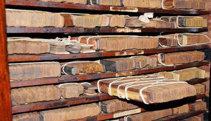
Telugu has undergone significant linguistic and stylistic transformations over the centuries. Initially, Telugu writing was predominantly angular due to inscriptions on stone and metal. With the advent of palm-leaf manuscripts, which were softer and more pliable, Telugu began to adopt the fluid, rounded shapes it is known for today. Writing tools like the Ghantam (a metallic stylus) allowed scribes to create intricate, curvilinear letters, which became hallmarks of Telugu's visual appeal. The Tanjore Maharaja Serfoji’s Sarasvati Mahal Library preserves many of these manuscripts, providing a glimpse into how the script evolved to meet the demands of its mediums.
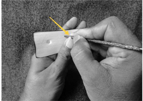
A typical model of a metal stylus made of iron- craftsman uses various sizes and sharpness for different needs, such as writing and illustration.
Calligraphy and Manuscript Art
Telugu calligraphy holds a special place in the art of South Indian writing. Historically, manuscripts were meticulously created using palm leaves treated through a lengthy process involving sand, turmeric, and rice water to enhance durability. The Ghantam stylus was used to etch characters into the leaves, and then ink or soot was rubbed over to make the characters more visible. This method allowed for a high level of craftsmanship, making each manuscript not only a literary work but also an artistic artifact. Telugu manuscripts from the Tanjore collection showcase a range of calligraphic styles, from religious texts to poetry, each reflecting a unique stylistic flair.
The script itself has transitioned smoothly into the digital age, where it is now used across platforms ranging from newspapers and books to mobile and web applications. Modern fonts preserve the rounded aesthetic of Telugu, ensuring the script’s identity remains intact even in digital typography. Telugu calligraphy has also seen a revival, with artists adapting traditional techniques into digital designs, making this ancient art form accessible to younger audiences and a broader global community.
Tanjore Manuscripts
The Tanjore manuscripts, particularly those preserved in the Sarasvati Mahal Library, offer a fascinating glimpse into Telugu’s literary and calligraphic legacy.A unique collection of manuscripts that represent the southern school of Telugu literature. The collection includes works by Nannaiya, Tikkanna, Bodanna, Krishnadevaraya, and Vijayaraghava Nayak. The Tanjore Telugu manuscripts collection is unique and it represented the home productions of royal patrons of art, their court Pandits and other scholars domiciled in the Tanjore country. It may be said that the collection represents the southern school of Telugu literature. Patronized by the Maratha rulers of Tanjore, these manuscripts include a diverse array of texts in Telugu, Tamil, and Sanskrit, reflecting the cultural convergence of South India. For centuries, scribes carefully transcribed religious texts, epics, and poetry
onto palm leaves, preserving Telugu’s literary tradition. These manuscripts highlight not only the linguistic beauty of Telugu but also its adaptability, having survived both time and tropical conditions through continuous preservation efforts. The Telugu Manuscript section deal with Padya Kavyas, Dvipada Kavyas, Satakas, Yakshaganas, Astrology, Medical etc., are there in this section. The works of Nannaiya, Tikkanna, Bodanna, Krishnadevaraya, and Vijayaraghava Nayak are also available. These are the most valuable collection of manuscripts particularly relating to the Southern School of Telugu Literature. These manuscripts are catalogued in two volumes.
The Bhagavata Mela, tradition of dramas was first written in Telugu language and a lot of dramas are available in palm leaf manuscripts.
A craftsman demonstrating the writing posture using the grove on the thumb - this practice is particularly prevalent to inscribe Tamil letterforms - the size, shape, spacing between letters and lines was determined by the movement of the thumb.
Collection of palm leaf manuscript in saraswati mahal library
References
1. A Descriptive Catalogue of the Telugu Manuscripts in the Tanjore Maharaja Serfoji’s Sarasvati Mahal Library. Internet Archive.
2. History of Telugu Literature. Semanticscholar.org. Available at: https://pdfs.semanticscholar.org/ABC123/history-of-telugu-literature.
3. Impact of Writing Tools in the Evolution of Telugu Script. ResearchGate. Available at: https://researchgate.net/impact-writing-tools-evolution-telugu-script.
4. Jangamwadi Math: Telugu Manuscripts in the Tanjore Maharaja Serfoji’s Sarasvati Mahal Library. Archive.org.
5. Rao A, Aalla C. Evolution and Ergonomics of Telugu Script. Raiith IITH Repository.
6. Journal of Asian Arts, Culture, and Literature. Southern Asian Calligraphy; Calligraphy and Telugu Manuscripts.
7. D’Source Design Resource. Typography Day: The Art of Telugu Writing.
8. Alawi D. Calligraphy Tools and Techniques in South India. Typography Day Conference. 2015.
In the current landscape, Telugu continues to thrive. With increased digital resources, Telugu is accessible to a global diaspora. Its use in modern calligraphy also persists, bridging traditional practices with new techniques and materials. Institutions and cultural foundations are increasingly investing in Telugu calligraphy workshops, exhibitions, and educational programs to keep the script alive. The language has thus adapted to new challenges while preserving the artistic expression that has defined it through the ages.
The journey of the Telugu script from stone inscriptions to digital fonts is a story of resilience and artistic evolution. Its aesthetic and structural distinctiveness, nurtured through centuries of cultural adaptation, continues to capture the imagination of linguists, artists, and cultural enthusiasts worldwide. As we move further into the digital age, Telugu’s timeless elegance and adaptability ensure that it remains a vibrant part of India’s cultural heritage.
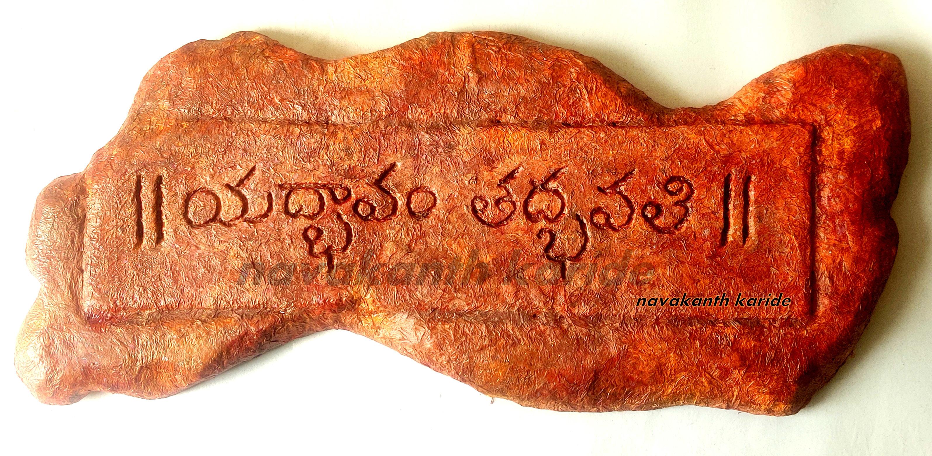
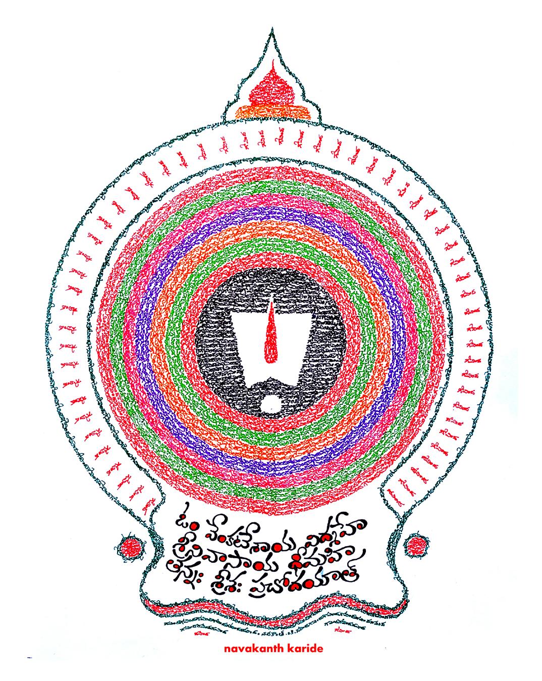
Artwork credits: Navankanth Karide
Happenings Around the Community
Akshar Samvad 2024: Celebrating Calligraphy in Rural Maharashtra
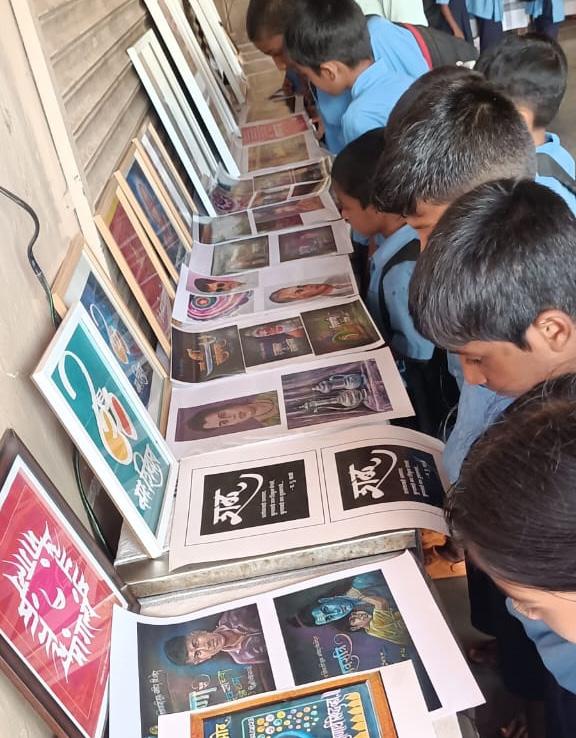
Akshar Samvad 2024, held from October 10th to October 13th, 2024, at the Shri Vaghjaidevi Temple Cultural Hall in Bhor, Maharashtra, brought the art of calligraphy to rural audiences. Organized by Kalidas Dhadve in association with Akshar Vishwa Creativity Institute, Sanskar Bharti (Bhor Branch), and Shiledar Pratishthan Bhor, this unique exhibition showcased the cultural beauty of calligraphy and demonstrated the commendable efforts of local organizers to promote this art form despite limited resources.
The event, held during the Navratri festival, was inaugurated by senior painter and visual arts coordinator Kudaliya Hiremath of Sanskar Bharti, who served as the main guest. The program was anchored by Rashmi Mhasawade, adding to the smooth coordination of the event. Esteemed guests included Shailaja Sawant (Vice President, Pune District Sanskar Bharti), Vinayak Mane (Joint General Secretary of Western Maharashtra Province), and Pramod Gujar (President, Bhor Education Society). Works by artists Nikam, Pawar, and Bagde were also featured, contributing to the exhibition's "letter communication" theme, which emphasized the power of words and visuals in conveying emotion and storytelling.
Hiremath spoke about the importance of calligraphy and praised Kalidas Dhadve and his team for bringing quality artwork to rural areas like Bhor, inspiring young people to connect with this art form. The exhibition attracted students, art lovers, and community members, providing a rare opportunity to experience calligraphy in a place where such events are uncommon.
The success of Akshar Samvad 2024 reflects the dedication of Dhadve and his team, who brought the beauty of calligraphy to rural Maharashtra. Their efforts have inspired young people to appreciate calligraphy and their cultural heritage, even with limited resources.
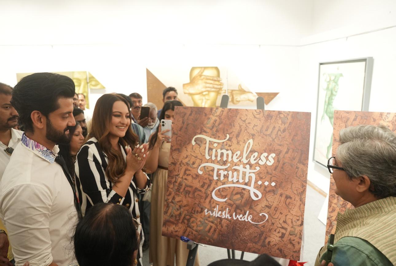
Timeless Truth: A Visual and Philosophical Journey
Held from 8th to 14th October at the Jehangir Art Gallery in Mumbai, Maharashtra, Timeless Truth by Nilesh Vede offered a mesmerizing exploration of art, philosophy, and human experience. Known for his surrealist approach, Vede’s work is deeply rooted in Mumbai’s vibrant culture and emotional landscape, blending realism with imaginative symbolism. This exhibition highlighted his distinctive style, where vivid visuals and calligraphic text created a unique visual language, engaging viewers in an immersive experience.
In Timeless Truth, Vede’s paintings depicted raw human emotions—joy, solitude, melancholy—captured through dreamlike figures and expressive use of text. Words seemed to “speak” directly from the canvas, inviting viewers to interpret emotions as they would read a story. The interplay between text and imagery transformed the exhibition into a poetic journey, blending familiar human forms with surreal atmospheres. His work offered viewers a moment of introspection, encouraging them to connect more deeply with their own emotions and inner world.
Each brushstroke and written word reflected Vede’s search for timeless truths that connect humanity across cultures. This exhibition was truly a visual treat, offering a profound dialogue between language and imagery, reality and imagination, and inviting viewers to pause, reflect, and reconnect with their inner selves.
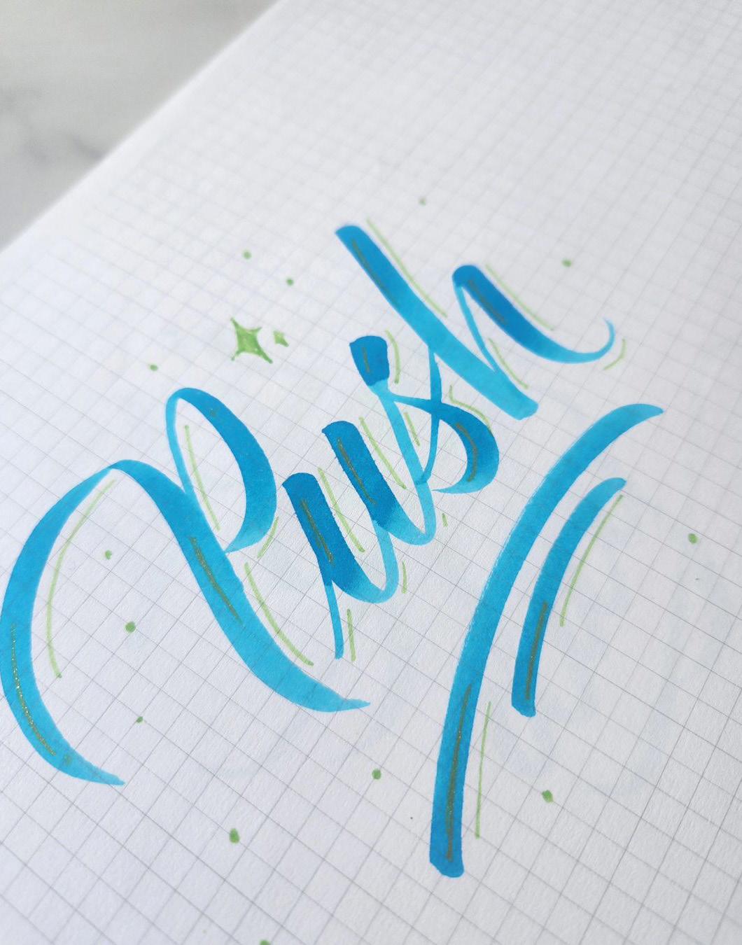
Knowledge Nugget
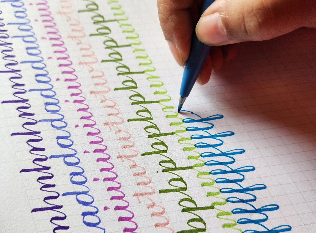
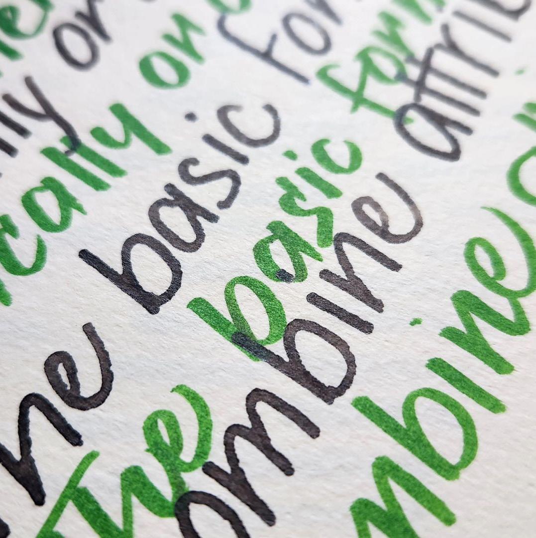
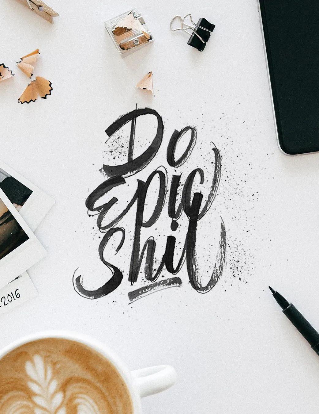
Brush Pen Calligraphy vs. Brush Lettering: Understanding the Difference
Brush pen calligraphy and brush lettering are two beautiful yet distinct forms of art that use a brush pen to create expressive text. Though they may look similar at first glance, they each follow unique techniques and serve different creative purposes. Whether you’re new to the world of brush pens or just curious about the differences, understanding these two styles can help you decide which direction to pursue or even inspire you to try both.
Let’s break down brush pen calligraphy and brush lettering to highlight what makes each one special.
Technique: Pressure vs. Design
Writing vs. Drawing Letters
At its core, brush pen calligraphy is about “writing” letters in a structured, rule-following manner. This style emphasizes traditional calligraphic forms, where each stroke is carefully crafted to follow the natural flow and form of a specific script. When you think of classic calligraphy styles like Copperplate or Gothic, you’re looking at forms that rely on consistent, rhythmic strokes and intentional letter shapes. In brush pen calligraphy, the focus is on following these rules to create fluid, balanced letters.
Brush lettering, on the other hand, is more like “drawing” letters. In lettering, each letter can be individually designed and stylized, and there are fewer rules to follow. This approach emphasizes creativity over tradition. Artists often play with the shapes, spacing, and proportions of each letter, which makes lettering feel more like an illustration. Rather than adhering to the strict guidelines of calligraphy, lettering allows for personal flair and imaginative designs.
One of the major technical differences between these two styles lies in how you create each stroke. In brush pen calligraphy, the technique is all about pressure control. For a proper calligraphic stroke, you apply light pressure for thin upstrokes and heavier pressure for thick downstrokes. This variance in pressure is what gives calligraphy its distinct flow and rhythm. Each stroke is connected and flows naturally to create cohesive, structured words.
In brush lettering, however, artists often “draw” each letter one by one, and the strokes don’t necessarily have to follow the pressure rules of calligraphy. Instead, the focus is more on the overall design of each letter, and pressure variations are used more flexibly. You might play with the weight and spacing of each letter, adding decorative flourishes or whimsical touches that don’t necessarily conform to a traditional style.
Structure and Consistency: Rules vs. Flexibility
Brush pen calligraphy is structured, and consistency is key. Letters should align with each other in terms of size, spacing, and slant, creating a harmonious and repetitive pattern. This structure is what gives calligraphy its elegant, rhythmic feel and makes it instantly recognizable.
With brush lettering, there is more flexibility, and the emphasis on rules is minimal. Each letter can be treated as its own design, allowing for more variety in size, shape, and spacing. In lettering, this flexibility is actually encouraged, leading to a playful and sometimes eclectic result. Artists have the freedom to make each letter unique, which adds an element of fun and spontaneity to the piece.
Purpose and Application: Formal vs. Creative Designs
The purpose of brush pen calligraphy is to produce aesthetically pleasing, historically accurate scripts. This style is often used for formal applications, such as wedding invitations, certificates, or classical art pieces that benefit from a sophisticated, polished look. Calligraphy leans toward traditional settings, where elegance and precision are valued.
On the flip side, brush lettering has a more modern and creative application. It’s commonly used in logos, posters, social media graphics, and even personal projects like custom quotes. Since lettering offers greater artistic freedom, it’s particularly popular in contemporary design and branding, where a unique look can make text more visually engaging.
Practice and Learning: Precision vs. Experimentation
Learning brush pen calligraphy takes patience and practice, as the style demands a high level of precision. Beginners often start by practicing basic strokes and repeating letterforms to master the pressure technique. The focus is on control and consistency, which means a lot of practice to achieve even lines and balanced compositions.
Brush lettering, by contrast, encourages experimentation. Since lettering allows for varied styles and embellishments, artists are free to try new things and explore creative approaches. Rather than strictly following set patterns, lettering practice is about discovering and refining your own personal style.
Both brush pen calligraphy and brush lettering bring beautiful and unique elements to the world of art. While calligraphy emphasizes structure, rhythm, and historical scripts, lettering is a creative playground for artists looking to bring words to life in their own way.
If you’re someone who enjoys tradition, repetition, and structure, brush pen calligraphy might be your calling. But if you prefer creativity, flexibility, and a modern touch, brush lettering could be a great fit. And for those who love both structure and freedom, exploring each style could be a rewarding way to enhance your skills as a versatile artist.
References
1. Dean, P. (2019). The Ultimate Brush Lettering Guide. Watson-Guptill.
2. Klapstein, K. (2017). The Art of Brush Lettering. Quarry Books.
3. Ostrom, A. (2018). Brush Pen Lettering Practice Book. Watson-Guptill.
4. Engelbrecht, L. (2017). Modern Calligraphy and Hand Lettering: A Mark-Making Workbook for Crafters, Cardmakers, and Journal Artists. Quarry Books.
5. Lim, S. (2018). Hand Lettering 101: An Introduction to the Art of Creative Lettering. Blue Star Press.
6. Morgan, M. (2006). The Calligrapher’s Bible: 100 Complete Alphabets and How to Draw Them. Chronicle Books.
7. Cheng, J. (2017). The Art of Brush Lettering: A Stroke-by-Stroke Guide to the Practice and Techniques of Creative Lettering and Calligraphy. Watson-Guptill.
Connect with the Calligraphy: Reach Out to Us
For Workshop Inquiries: workshops@thecalligraphyfoundation.com
For Membership Queries: membership@thecalligraphyfoundation.com
For Virtual Meetup Coordination: tcfprogrammanager.mal@gmail.com
For Newsletter Submissions: newsletter@thecalligraphyfoundation.com
General Queries: thecalligraphyfoundation@gmail.com
You can also directly connect with us through forms on our website for contributions, grievances, and suggestions in every section.