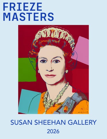
SUSAN SHEEHAN GALLERY 2026
Cover: Andy Warhol, Queen Elizabeth II (Royal Edition), 1985
BOOTH F9
OCTOBER 14TH (BY INVITATION) OCTOBER 15TH-18TH (PUBLIC DAYS) LOCATION: GLOUCESTER GREEN, AT THE NORTHEAST CORNER THE REGENT’S PARK LONDON NW1 4HA FOR SHOW INFORMATION: https://www.frieze.com/fairs/frieze-masters
SUSAN SHEEHAN GALLERY 146 Greene Street New York, NY 10012 +1-212-489-3331 info@susansheehangallery.com www.susansheehangallery.com
Helen Frankenthaler: Madame Butterfly Madame Butterfly (2000) is Helen Frankenthaler’s final collaboration with groundbreaking print publisher Kenneth Tyler. It also marks Frankenthaler and Tyler’s second time working with Japanese woodblock carver and printer Yasuyuki Shibata, after the success of their prior woodcut project, Tales of Genji (1998), a series of six large-scale woodcuts produced over a three year period and inspired by Murasaki Shikibu’s classic 11th-century Japanese novel, The Tale of Genji. Madame Butterfly was printed in 102 colors from 46 blocks on three joined sheets of handmade paper, which was fabricated by papermaker Tom Strianese.12 The lyrical beauty of Madame Butterfly deftly conceals the technical challenges of the project. Frankenthaler frankly admitted earlier in her career that she “didn’t want to monkey around with acids, paper, and travel. I worked on unsized, unprimed cotton duck and was not involved with precious editions or working small.”13 Despite her early resistance to printmaking, she would come to embrace many techniques, most notably woodcut, an ancient invention first developed in China during the 8th century known for being notoriously difficult to master. Taking its compositional cues from a Japanese folding screen and its title from Giacomo Puccini’s tragic opera, Madame Butterfly brings Eastern and Western influences into a work of layered meanings.14 Its synthesis of diverse cultural references finds a parallel in the seamless integration of its technical processes: the color appears to have been breathed onto the paper, despite having been printed from dozens of wooden blocks. Frankenthaler once quipped that she wanted her prints, like her paintings, to give the effect of being “born at once,” and Madame Butterfly exemplifies this perhaps more than any other print in her career, coming nearly thirty years after her first woodcut, East and Beyond (1973).15 Frankenthaler nearly abandoned the project several times, and its apparent spontaneity was hard won through numerous stages of experimentation and proofing.16 Yet the medium’s intricacies gave her something productive to work against.
Kenneth Tyler, Helen Frankenthaler, and Yasuyuki Shibata inspect proofs of Tales of Genji I in the Tyler Graphics studio, 1997. Image credit: Marabeth Cohen-Tyler, Courtesy of the National Gallery of Australia.
Helen Frankenthaler Madame Butterfly, 2000 Woodcut on three adjoining sheets Sheet size: 41 3/4 x 79 1/4 inches, overall Printer: Yasuyuki Shibata at Tyler Graphics Ltd., Mount Kisco, New York Publisher: Tyler Graphics Ltd., Mount Kisco, New York Edition size: 33, plus proofs Signed, numbered, and dated
David Hockney Afternoon Swimming, 1979 Lithograph Sheet size: 31 5/8 x 39 1/2 inches Printer and Publisher: Tyler Graphics Ltd., Bedford, New York Edition size: 55, plus proofs Catalogue Raisonné: MCAT 233, Tyler 266 Signed, dated, and numbered
Andy Warhol: Queen Elizabeth II (Royal Edition) Andy Warhol’s Queen Elizabeth II, from Reigning Queens (Royal Edition) (1985), brings the ceremonial authority of royal portraiture into the brilliant, artificial world of Pop. The larger portfolio comprises sixteen screenprints depicting four queens, each represented in four color variations: Queen Elizabeth II of the United Kingdom, Queen Beatrix of the Netherlands, Queen Margrethe II of Denmark, and Queen Ntfombi Twala of Swaziland. The allure of celebrity had long attracted Warhol and yet there were some public figures, including Queen Elizabeth II, who had remained just out of reach. This fact would not stop him from trying. In 1982, Warhol’s European dealer George C. P. Mulder reached out on his behalf to Buckingham Palace to get permission to use the Queen’s image in a new portfolio of screenprints. Although the Palace declined to support the venture, the Queen’s secretary, Sir William Heseltine, stated that the Queen “would certainly not wish to put any obstacles in Mr. Warhol’s way,” but cautioned that “she would not dream of offering any comment on this idea.”20 Desperate to reproduce the monarch, and with this informal blessing, Warhol would proceed with the project. For Queen Elizabeth II, Warhol appropriated an official photograph by Peter Grugeon, taken at Windsor Castle in 1975 and released to the public for the Queen’s Silver Jubilee in 1977. Warhol’s portrait of the Queen was issued in two editions: a standard edition comprising forty prints, and a “Royal Edition” of thirty impressions embellished with diamond dust, the sparkling ground glass that Warhol included in many of his most iconic works. Both editions were printed by Rupert Jasen Smith, Warhol’s preferred printer at the time. In Queen Elizabeth II (Royal Edition), Warhol makes the surface itself a compelling expression of power: dazzling, reproducible, and sustained by the attention it commands. One can also find visual and thematic parallels to Warhol’s 1975 portfolio Ladies and Gentleman, where drag queens, rather than actual queens, are portrayed with similarly bold palettes. The guise of glamour pervades both worlds. Reigning Queens debuted at Walton-Gilbert Galleries in New York City in June 1985, but was not universally well received.21 Its debut also marked a personal low point for the artist, who described the opening in his diary as “hitting rock bottom…This show, I have sunk to the bottom of the gutter. The rock bottom of the skids of the end of the line. It was like having an opening in somebody’s rent-controlled apartment. I mean, they had a paper covering a mirror! And they had hors d’oeuvres that I think they were making in the kitchen. ... It was so low-down and tacky.”22 The portfolio would be later exhibited at Leo Castelli’s uptown space in October, 1985. Despite negative early feedback, others, like Jonathan Jones for The Guardian, would later describe the prints as “a camp treat,” demonstrating how the general appreciation of Warhol’s late works has continued to change over time. Thirty years after their publication, the Royal Collection purchased impressions of all four portraits of Queen Elizabeth from the Royal Edition portfolio to mark the 60th anniversary of the regents’s coronation.23 They are the only portraits of her in the collection that the Queen did not personally sit for.
Andy Warhol with proofs of Queen Elizabeth II at The Factory, New York, in 1985. Photo: Derek Hudson.
Portrait of Queen Elizabeth II by Peter Grugeon, taken at Windsor Castle in 1975 in honor of her Silver Jubilee in 1977
Andy Warhol Queen Elizabeth II, from Reigning Queens (Royal Edition), 1985 Screenprint with diamond dust Sheet size: 39 3/8 x 31 1/2 inches (100 x 80 centimeters) Printer: Rupert Jasen Smith, New York Publisher: George C. P. Mulder, Amsterdam, The Netherlands Edition size: 30, plus proofs Catalogue Raisonné: Feldman and Schellmann II.334a Signed and numbered From Reigning Queens (Royal Edition), a portfolio of sixteen portraits of the four current queens regnant at the time of publication: Queen Elizabeth II of the United Kingdom, Queen Beatrix of the Netherlands, Queen Margrethe II of Denmark, and Queen Ntombi Twala of Swaziland. The Royal Edition was published in an edition of 30, plus proofs and is distinct from the regular edition of 40, plus proofs due to the inclusion of diamond dust.
Roy Lichtenstein: Landscape with Poet Roy Lichtenstein’s Landscape with Poet (1996) is the artist’s late-career print masterwork and part of his acclaimed series Landscapes in the Chinese Style. It was printed by Gemini G.E.L. in Los Angeles in sixteen colors from five lithographic plates and fourteen silkscreens, making it among the largest and most technically complex prints of his career.7 Building on an early interest in Chinese art, explored during his time in the army and later in art history classes at Ohio State University, Lichtenstein would take up the subject in his practice during the mid-1990s, eventually producing a series of twenty-one paintings, two editioned prints, and two sculptures.8 Lichtenstein felt a special attraction to work of the Song Dynasty (960-1279), leading to an exploration of the theme in early studies for this print in 1994 and 1995. He worked on Landscape with Poet at Gemini for over a year, and this monumental print marks one of the earliest uses of the vertical format within the larger series. In Landscape with Poet, Lichtenstein replaced the subtle washes and gentle brushstrokes of traditional Chinese landscape painters with his signature Ben-Day dots, continuing to expand his technical and material repertoire. Lichtenstein was particularly attracted to Song painters like Mu Qi and Guo Xi, largely due to several exhibitions of East Asian art he saw in the 1990s in New York, Washington, D.C., and Boston. At the same time he acquired several books on the subject.9 Lichtenstein remarked on his inspiration for this body of work, “I’m thinking about something like Chinese landscapes with mountains a million miles high.”10 In the eleventh century, Guo Xi (c. 1001-1090) described three main views of mountains: gaoyuan, shenyuan, and pingyuan. According to his definitions, gaoyuan is the view of the summit seen from the foot of the mountain; shenyuan means the viewer stands before the mountain looking beyond it, and pingyuan is the view from the top of one mountain toward more distant mountains.11 In Landscape with Poet, we see Lichtenstein combining the elements of shenyuan and pingyuan, as the print incorporates the perspectives of the viewer of the vista (the figure with the cap) as well as the viewer of the artwork who sees the entire scene.
Roy Lichtenstein in his studio, New York, 1996 © Estate of Roy Lichtenstein
Roy Lichtenstein Landscape with Poet, 1996 Lithograph and screenprint Sheet size: 90 1/4 x 36 inches (229.3 x 91.4 centimeters) Printer and Publisher: Gemini G.E.L., Los Angeles Edition size: 60, plus proofs Catalogue Raisonné: RLCR 4544 Signed, dated, and numbered
Roy Lichtenstein Road Before the Forest, 1985 Lithograph, woodcut, and screenprint Sheet size: 40 x 55 1/8 inches (101.6 x 140 centimeters) Printer and Publisher: Gemini G.E.L., Los Angeles Edition size: 60, plus proofs Catalogue Raisonné: RLCR 3252 Signed, dated, and numbered From the Landscapes series of seven experimental mixed-media prints which also includes Moonscape, Seascape, Sunshine through the Clouds, The River, The Sower, and View from the Window.
Roy Lichtenstein Reverie, 1965 Screenprint Sheet size: 30 x 24 inches (76.2 x 61 centimeters) Printer: Knickerbocker Machine and Foundry, Inc., New York Publisher: Original Editions, New York Edition size: 200, plus proofs Catalogue Raisonné: RLCR 1132 Signed and numbered From the portfolio 11 Pop Artists, Volume II, which also includes prints by Allan D’Arcangelo, Jim Dine, Allen Jones, Gerald Laing, Peter Phillips, Mel Ramos, James Rosenquist, Andy Warhol, John Wesley, and Tom Wesselmann. The set was one of three portfolios commissioned by the U.S. Information Agency and sponsored by the Philip Morris tobacco company in order to widen exposure to American Pop Art. Editions of this set, alongside 11 Pop Artists, Volume I and Volume III, were shown in international and domestic touring exhibitions throughout the late 1960s.
Cy Twombly: Natural History Part I, Mushrooms At the invitation of the German curator, author, and editor Heiner Bastian, Cy Twombly produced Natural History Part I, Mushrooms (1974), one of his most ambitious achievements in printmaking. The portfolio’s ten works combine lithography, grano-lithography, collotype, and photochrome with collage and passages of hand-coloring.17 Printed imagery and individually drawn marks occupy the same surface, complicating distinctions between original and copy, unique work and editioned multiple. As Bastian noted about the project, “All of these prints evoke internal paraphrases, projections, and empathies that interact to access their field of meaning.”18 Botanical illustrations of fungi provide the portfolio’s recurring point of departure and were inspired by Naturalis Historia, the Ancient Roman encyclopedic text by Pliny The Elder. Twombly juxtaposes these images with photographic fragments, diagrams, grids, and color charts, interspersing them with scrawled notations, smudges, and loosely drawn forms. The botanical imagery introduces a thematic tension between classification and association. Scientific illustration offers a means of identifying and distinguishing natural forms; Twombly places those forms within arrangements that invite less determined associations. The mushrooms themselves can be understood as emblems of emergence and transformation. This reading finds a formal counterpart in the layered surfaces, where images are preserved, obscured, and reworked, hovering at the threshold of legibility. Encountered together, the ten prints develop these relationships through repetition and variation. Botanical motifs, grids, photographic fragments, and handwritten marks recur in changing configurations. The portfolio proposes a natural history shaped by the contingencies of perception: a gathering of specimens, sensations, and associations. The prints for Mushrooms are based on collages which Cy Twombly prepared specifically for this project. After its completion, he altered the original collages, probably owing in large part to the successes of the finished print portfolio.19 This project was followed by a companion series by Twombly, Natural History Part II, Some Trees of Italy (1975-76), a suite of eight prints that uses many of the same printmaking processes established in Natural History Part I, Mushrooms.
Cy Twombly at Lake Bolsena, Italy, 1972. Photo by Plinio De Martiis.
Cy Twombly Natural History Part I, Mushrooms, 1974 Lithographs, grano-lithographs, collotypes Sheet size: 29 7/8 x 22 inches, each (75.9 x 55.9 centimeters, each) Printer: Matthieu Studio, Zurich-Dielsdorf Publisher: Propyläen Verlag, Berlin Edition size: 98, plus proofs Catalogue Raisonné: Bastian 42-51 Each sheet is initialed, I-VI and VIII-X are numbered 61/98, and VII is numbered 54/98 The very rare complete portfolio of ten mixed media prints that retains its original paper-bound portfolio.
Cy Twombly Roman Notes I, 1970 Offset lithograph Sheet size: 34 1/8 x 27 1/2 inches (86.7 x 69.9 centimeters) Printer: Electa Editrice, Venice Publisher: Neuendorf Verlag, Hamburg Edition size: 100, plus proofs Catalogue Raisonné: Bastian 21 Signed, dated, and numbered on verso Provenance: The Cy Twombly Foundation, New York From Roman Notes, a series of six offset lithographs. This impression is notable for its exceptional condition, color, and provenance.
Cy Twombly Untitled, 1969-71 Screenprint Sheet size: 25 1/2 x 25 1/2 inches (64.8 x 64.8 centimeters) Printer and Publisher: Edition Domberger, Filderstadt, Germany Edition size: 100, plus proofs Catalogue Raisonné: Bastian 27 Signed and numbered on verso From the portfolio On the Bowery, edited by William Katz, which also includes screeneprints by John Giorno, Charles Hinman, Robert Indiana, Will Insley, Gerald Laing, Les Levine, Robert Ryman, Richard Smith, and John Willenbecher.
Cy Twombly Sketches, 1967 Etchings Sheet size: 8 5/8 x 12 1/8 inches, each (21.9 x 30.8 centimeters, each) Printer and Publisher: Universal Limited Art Editions, West Islip, New York Edition size: 18, plus proofs Catalogue Raisonné: Bastian 12-17 Each sheet is signed and numbered Provenance: Wolfgang Wittrock, Berlin European private collection The exceedingly rare complete portfolio of six etchings which retains its colophon page, inner paper folder, and original paper portfolio.
Cy Twombly Untitled (The Song of the Border Guard), 1952 Linocut on red paper Sheet size: 13 x 20 inches (33 x 50.8 centimeters) Printer: The Artist Publisher: Black Mountain Graphics Workshop, Black Mountain, North Carolina Edition size: Unknown, approximately 30-40 copies Catalogue Raisonné: Bastian 1 Provenance: Fine Arts Museums of San Francisco, Sold to Benefit the Acquisition Fund of the Achenbach Foundation for Graphic Arts With letterpress poem “The Song of the Border Guard” by Robert Duncan on a separate broadsheet folded in the verso.
Pablo Picasso Portrait de jeune fille, d’après Cranach le Jeune, II, 1958 Linocut Sheet size: 30 1/4 x 22 1/2 inches (76.8 x 57.2 centimeters) Printer: Imprimerie Arnéra, Vallauris, France Publisher: Galerie Louise Leiris, Paris Edition size: 50, plus proofs Catalogue Raisonné: Bloch 859, Baer 1053 Signed and numbered Provenance: Galerie Berggruen & Cie, Paris. European private collection
Pablo Picasso La femme au tambourin, 1939 Etching and aquatint Sheet size: 30 x 22 1/8 inches (76.2 x 56.2 centimeters) Printer: Lacourière, Paris Publisher: Galerie Louise Leiris, Paris Edition size: 30, plus proofs Catalogue Raisonné: Bloch 310, Baer 646 Signed and numbered Provenance: The Estate of the Artist Collection of Marina Picasso, the artist’s granddaughter Collection of Georges Bloch, author of the first catalogue raisonné of Picasso’s prints, with the collector’s stamp on verso Jan Krugier Gallery, New York
Henri Matisse Grand masque, 1948 Aquatint Sheet size: 25 3/4 x 19 3/4 inches (65.4 x 50.2 centimeters) Printer and Publisher: Lacourière, Paris Edition size: 25, plus proofs Catalogue Raisonné: Duthuit 800 Signed and numbered Provenance: The Estate of the Artist Private collection
Henri Matisse Jeune étudiant. Masque I, 1952 Aquatint Sheet size: 25 1/2 x 20 inches (64.9 x 50.8 centimeters) Printer and Publisher: Lacourière, Paris Edition size: 15, plus proofs Catalogue Raisonné: Duthuit 818 Signed and numbered
Henri Matisse Grande odalisque à la culotte bayadère, 1925 Lithograph Sheet size: 27 3/8 x 22 inches (69.5 x 55.9 centimeters) Printer: Atelier Duchâtel, Paris Publisher: Edmond Frapier, Paris Edition size: 50, plus proofs Catalogue Raisonné: Duthuit 455 Signed and numbered
Ellsworth Kelly: Colored Paper Images Ellsworth Kelly’s series Colored Paper Images (1976–77) is one of the great achievements in the history of postwar graphic arts. With their delicately mottled surfaces and bleeding contours, the works were a radical departure for Kelly, who was typically known for using flat and unmodulated planes of color and crisp edges in his paintings and prints. At the same time, this series extended upon his lifelong interest in the effects of chance and indeterminacy. The project marked another collaboration between the artist and Kenneth Tyler, who had left Gemini G.E.L. in Los Angeles three years earlier to found his own print workshop in Bedford, New York: Tyler Graphics Ltd. Tyler had already shown an interest in handmade paper during his tenure at Gemini, when he collaborated with the Richard de Bas paper mill in France to produce Robert Rauschenberg’s Pages and Fuses series. Upon opening his new venture in 1973, Tyler partnered with papermakers John and Kathleen Koller at the HMP Paper Mill in Woodstock, Connecticut, to publish series by artists Ronald Davis and Frank Stella. Kelly’s Colored Paper Images were also made with the Kollers, but unlike Stella, who incorporated various mixed media, Kelly’s works consisted exclusively of colored paper pulp.1 Kelly mixed nearly fifty colors of acrylic gouache to color the pulps, which were then ladled into molds made from joined pieces of Lucite or bent metal rulers held together with string, positioned over layers of wet, unpigmented pulp.2 The molds were removed, and the base layer with its simple colored forms was placed on a press between heavy layers of felt to produce a single paper plane. This process resulted in significant variations in paper texture and color bleeding between impressions, creating a singularity that complicates the traditional distinction between unique and multiple. The works are also, as Kelly observed, distinctly intermedia: “I was intrigued with the idea of another way of putting color to paper and think of the Colored Paper Images series as wet collages which are a cross between painting and collage. I have always worked in collage and these pieces are a natural outgrowth of that process.”3 Kelly’s Colored Paper Images series was instrumental in encouraging Tyler to set up his own in-house papermaking facility in 1978, and their striking appearance prompted David Hockney to begin his historic Paper Pools series at Tyler Graphics the same year.4 In 1986, Kelly assigned new titles to the first twenty-one works in the series, which had been originally titled with just the series name and a Roman numeral.5 Colored Paper Image II (Dark Green Curves) (1976) was derived from a collage, Green Curves (1951), which was itself a preliminary study for Kelly’s pioneering book project Line, Form, Color (conceived in 1951; published in 1999). Colored Paper Image XIII (Yellow Green Black Blue Orange) (1976) is related to two other spectrum works in the series with different color configurations, as well as to a 1968 spectrum painting, Red Orange White Green Blue, in the collection of the Norton Simon Museum in Pasadena, California, with which it shares proportions.6
Ellsworth Kelly holding a semicircular mold used in his Colored Paper Images series at Tyler Graphics Ltd., Bedford, New York, 1976. Photograph by Betty Fiske.
Ellsworth Kelly Colored Paper Image II (Dark Green Curves), 1976 Colored and pressed paper pulp Sheet size: 46 1/2 x 32 1/2 inches (118.1 x 82.5 centimeters) Printer: Ellsworth Kelly and Kenneth Tyler, fabricated at HMP Paper Mill, Woodstock, Connecticut Publisher: Tyler Graphics Ltd., Bedford, New York Edition size: 17, plus proofs Catalogue Raisonné: Axsom 142 Signed and numbered
Ellsworth Kelly Colored Paper Image XIII (Yellow Green Black Blue Orange), 1976 Colored and pressed paper pulp Sheet size: 32 1/2 x 31 1/4 inches (82.6 x 79.4 centimeters) Printer: Ellsworth Kelly and Kenneth Tyler, fabricated at HMP Paper Mill, Woodstock, Connecticut Publisher: Tyler Graphics Ltd., Bedford, New York Edition size: 23, plus proofs Catalogue Raisonné: Axsom 153 Signed and numbered
Ellsworth Kelly 18 Colors (Cincinnati), 1979-82 Lithograph Sheet size: 16 x 90 1/4 inches (40.6 x 229.2 centimeters) Printer and Publisher: Gemini G.E.L., Los Angeles Edition size: 57, plus proofs Catalogue Raisonné: Axsom 193 Signed and numbered
Jasper Johns Figure 7, 1969 Lithograph Sheet size: 38 x 31 inches (96.5 x 78.7 centimeters) Printer and Publisher: Gemini G.E.L., Los Angeles Edition size: 40, plus proofs Catalogue Raisonné: ULAE 66 Signed, dated, and numbered From Color Numerals Series, a landmark portfolio of ten large-scale lithographs rendered in vivid color. Figure 7 is the most iconic work from the series due to its intricate imagery, featuring a detail of Leonardo da Vinci’s Mona Lisa and an impression of the artist’s hand.
Jasper Johns Savarin, 1977 Lithograph Sheet size: 45 1/4 x 33 7/8 inches (114.9 x 86 centimeters) Printer and Publisher: ULAE, West Islip, New York Edition size: 50, plus proofs Catalogue Raisonné: ULAE 183 Signed, dated, and numbered
Jasper Johns Cicada, 1979 Screenprint Sheet size: 22 x 18 inches (55.9 x 45.7 centimeters) Printer: Simca Print Artists Inc. Publisher: Jasper Johns and Simca Print Artist, Inc. Edition size: 100, plus proofs Catalogue Raisonné: ULAE 204 Signed, dated, and numbered From the 1981 portfolio Marginalia: Hommage to Kusuo Shimizu, which also includes works by Christo & JeanneClaude, Sam Francis, Claes Oldenburg, and Jean Tinguely. Kusuo Shimizu was founder of Minami Gallery, an avant-garde artists’ hub in Tokyo where Johns completed a two-month residency in 1964. Shimizu was an early advocate of Johns’s work, acquiring several of the artist’s prints in the early 1960s and organizing his first solo exhibition in Japan in 1965.
Jasper Johns Coat Hanger I, 1960 Lithograph Sheet size: 36 1/8 x 26 7/8 inches (91.8 x 68.3 centimeters) Printer and Publisher: ULAE, West Islip, New York Edition size: 35, plus proofs Catalogue Raisonné: ULAE 2 Signed, dated, and annotated ‘artist’s proof’ Provenance: The Collection of Lois B. Torf, Boston
Jasper Johns Flag I, 1960 Lithograph Sheet size: 21 7/8 x 29 3/4 inches (55.6 x 75.6 centimeters) Printer and Publisher: ULAE, West Islip, New York Edition size: 23, plus proofs Catalogue Raisonné: ULAE 4 Signed, dated, and numbered
László Moholy-Nagy Konstruktionen. Kestnermappe 6, 1923 Lithographs Sheet size: 23 1/2 x 17 1/4 inches, each (59.7 x 43.8 centimeters, each) Printer: Robert Leunis and Chapman, Hannover, Germany Publisher: Eckart von Sydow, Hannover, Verlag des Buchhändlers Ludwig Ey, Hannover, Germany Edition size: 50, plus proofs Catalogue Raisonné: Passuth 122-127 Each sheet is signed, numbered on justification page Provenance: The Artist Collection of Walter Paepcke, Chicago, gift of the aritst American private collection Walter Paepcke was a prominent Chicago-based art collector, businessman, and philanthropist. As a member of the Association of Arts and Industries, Paepcke was introduced to László Moholy-Nagy when the artist immigrated to Chicago to lead The New Bauhaus: American School of Design. Following the school’s closure in 1939, Paepcke supported Moholy-Nagy in opening the Institute of Design in Chicago. The very rare complete set of six lithographs that retains its original justification page numbered in pencil and linen-covered portfolio case with text label.
Josef Albers Homage to the Square: Edition Keller lk, 1970 Screenprint Sheet size: 21 5/8 x 21 5/8 inches (54.6 x 54.6 centimeters) Printer: Herbert Geier, Ingolstadt, Germany Publisher: Josef Keller Verlag, Starnberg, Germany Edition size: 125 Catalogue Raisonné: Danilowitz 203.10 Initialed, dated, titled, and numbered
Josef Albers Homage to the Square: Edition Keller la, 1970 Screenprint Sheet size: 21 5/8 x 21 5/8 inches (54.6 x 54.6 centimeters) Printer: Herbert Geier, Ingolstadt, Germany Publisher: Josef Keller Verlag, Starnberg, Germany Edition size: 125 Catalogue Raisonné: Danilowitz 203.1 Initialed, dated, titled, and numbered
Josef Albers Homage to the Square: Edition Keller lh, 1970 Screenprint Sheet size: 21 5/8 x 21 5/8 inches (54.6 x 54.6 centimeters) Printer: Herbert Geier, Ingolstadt, Germany Publisher: Josef Keller Verlag, Starnberg, Germany Edition size: 125 Catalogue Raisonné: Danilowitz 203.8 Initialed, dated, titled, and numbered
Josef Albers Homage to the Square: Edition Keller lc, 1970 Screenprint Sheet size: 21 5/8 x 21 5/8 inches (54.6 x 54.6 centimeters) Printer: Herbert Geier, Ingolstadt, Germany Publisher: Josef Keller Verlag, Starnberg, Germany Edition size: 125 Catalogue Raisonné: Danilowitz 203.3 Initialed, dated, titled, and numbered
Richard Diebenkorn Large Light Blue, 1980 Aquatint and etching Sheet size: 39 1/2 x 26 inches (100.3 x 66 centimeters) Printer and Publisher: Crown Point Press, Oakland, California Edition size: 35, plus proofs Catalogue Raisonné: Liguori 264 Initialed, dated, and numbered
Richard Diebenkorn XIV, 1988 Monotype Sheet size: 40 1/2 x 24 inches (102.9 x 61 centimeters) Printer and Publisher: Garner Tullis Workshop, Santa Barbara, California Catalogue Raisonné: Liguori 323 Initaled and dated
Richard Diebenkorn Blue Surround, 1982 Aquatint with etching and drypoint Sheet size: 35 x 26 1/2 inches (88.9 x 67.3 centimeters) Printer and Publisher: Crown Point Press, San Francisco, CA Edition size: 35, plus proofs Catalogue Raisonné: Liguori 284 Initialed, dated, and numbered
Ed Ruscha Mint, 1969 Lithograph Sheet size: 17 x 24 1/8 inches (43.1 x 61 centimeters) Printer and Publisher: Tamarind Lithography Workshop, Los Angeles Edition size: 20, plus proofs Catalogue Raisonné: Engberg 9 Signed, dated, and and annotated ‘B.A.T’ The annotation ‘B.A.T.’ stands for “bon à tirer,” which indicates this was the final proof before the regular edition was printed.
Ed Ruscha Made in California, 1971 Lithograph Sheet size: 19 7/8 x 28 inches (50.5 x 71.1 centimeters) Printer: Cirrus Editions, Los Angeles, California Publisher: Grunewald Graphic Arts Foundation, University of California, Los Angeles, California Edition size: 100, plus proofs Catalogue Raisonné: Engberg 52 Initialed, dated, and numbered
Ed Ruscha Boiling Blood, Fly, 1969 Lithograph Sheet size: 12 x 13 5/8 inches (30.5 x 34.6 centimeters) Printer and Publisher: Tamarind Lithography Workshop, Los Angeles Edition size: 20, plus proofs Catalogue Raisonné: Engberg 27 Signed, dated, and numbered
Andy Warhol Suckling Pig, c. 1959 Ink with Dr. Martin’s Aniline Dye and gold leaf on paper Sheet size: 18 x 22 1/2 inches (45.7 x 57.2 centimeters) Stamped on the verso by The Estate of Andy Warhol and The Andy Warhol Foundation; initialed ‘VF’ by Vincent Fremont of The Andy Warhol Foundation; estate numbered ‘290.001’ in pencil on verso Provenance: Estate of Andy Warhol, New York The Andy Warhol Foundation for the Visual Arts, Inc., New York Anthony d’Offay Gallery, London Private collection
Andy Warhol Campbell’s Soup I: Black Bean Soup, 1968 Screenprint Sheet size: 35 x 23 inches (88.9 x 48.4 centimeters) Printer: Salvatore Silkscreen Co., Inc., New York Publisher: Factory Additions, New York Edition size: 250, plus proofs Catalogue Raisonné: Feldman and Schellmann II.44 Signed and stamp numbered on verso
Joan Mitchell Bedford II, 1981 Lithograph Sheet size: 42 5/8 x 32 1/2 inches (108.3 x 82.6 centimeters) Printer and Publisher: Tyler Graphics Ltd., Bedford, New York Edition size: 70, plus proofs Signed and numbered
Bruce Nauman Pay Attention, 1973 Lithograph Sheet size: 38 1/4 x 28 1/4 inches (97.2 x 71.8 centimeters) Printer and Publisher: Gemini G.E.L. Los Angeles Edition size: 50, plus proofs Catalogue Raisonné: Cordes 16 Signed, dated, and numbered
References 1. Richard H. Axsom. The Prints of Ellsworth Kelly. A Catalogue Raisonné, 1949-1985. New York: Hudson Hills Press, 1987, 21-22. 2. Ibid 116. 3. Ellsworth Kelly in Jane M. Farmer, Paper as medium. The Smithsonian Institution Travelling Exhibition Service. 1978, 41. 4. Axsom 22. 5. Ibid 116. 6. Ibid 117 7. Mary Lee Corlett and Ruth E. Fine. The Prints of Roy Lichtenstein: A Catalogue Raisonné 1948-1997. New York and Washington, D.C.: Hudson Hills Press and the National Gallery of Art, 2002, cat. no. 303, 272. 8. Ibid. 9. Karen Bandlow-Bata, “Roy Lichtenstein—Landscapes in the Chinese Style,” in Roy Lichtenstein: Landscapes in the Chinese Style. Hong Kong: Gagosian Gallery, 2011, 8. 10. Roy Lichtenstein in Jo Ann Lewis, “Lichtenstein’s Eastern Sunset,” The Washington Post, November 13, 1998. 11. Bandlow-Bata, 8. 12. Jane Findlay, “Helen Frankenthaler: Radical Beauty,” in Jennifer Scott, ed. Helen Frankenthaler: Radical Beauty. London: Dulwich Picture Gallery, 2021, 14. 13. Judith Goldman, “Painting in Another Language,” ARTnews 74, no. 7 (September 1975), 28. 14. Judith Goldman. Frankenthaler: The Woodcuts. Naples, FL: Naples Museum of Art; New York: Georges Brazilier, 2002, 56. 15. Helen Frankenthaler, quoted in Suzanne Boorsch, “Conversations with Prints,” in Pegram Harrison. Frankenthaler: A Catalogue Raisonné, Prints, 1961-1994. New York: Harry N.Abrams, Inc., 1996, 17. 16. Goldman 2002, 7. 17. Heiner Bastian. Cy Twombly: The Printed Graphic Work: Catalogue Raisonné. Munich: Schirmer/Mosel, 2017, 20. 18. Ibid. 19. Ibid, 68. 20. Sir Wiliam Heseltine to George C.P. Mulder, Letter from Balmoral Castle, 16 September, 1982. 21. Andy Warhol in Pat Hackett, ed. The Andy Warhol diaries. New York: Warner Books, 1991, 654, 680. 22. Ibid. 23. Jonathan Jones, “Portrait of the Week; No 3: Andy Warhol’s Reigning Queens: Queen Elizabeth II (1985),” The Guardian - Saturday Review, 29 April 2000.
Helen Frankenthaler, Madame Butterfly (detail), 2000
SUSAN SHEEHAN GALLERY 146 Greene Street New York, NY 10012 Tel: +1-212 489-3331 info@susansheehangallery.com www.susansheehangallery.com