Beyond Surface
Sullivan+Strumpf
Bimonthly Publication
The Oct/ Nov/ Dec edition of the Sullivan+Strumpf Magazine offers an in-depth view of our forthcoming program across our galleries in Naarm/Melbourne, Gadigal/Sydney and Singapore.
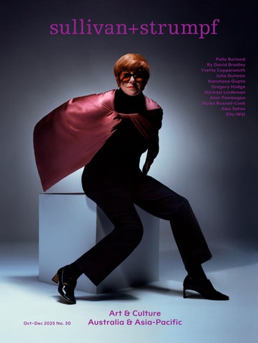
Working with extraordinary voices and writers from the Australasian arts landscape to illuminate the incredible work of our artists. This edition, the final of 2025 features Polly Borland, Ry David Bradley, Yvette Coppersmith, Julia Gutman, Kanchana Gupta, Gregory Hodge, Michael Lindeman, Alair Pambegan, Alex Seton and Ella Witt.