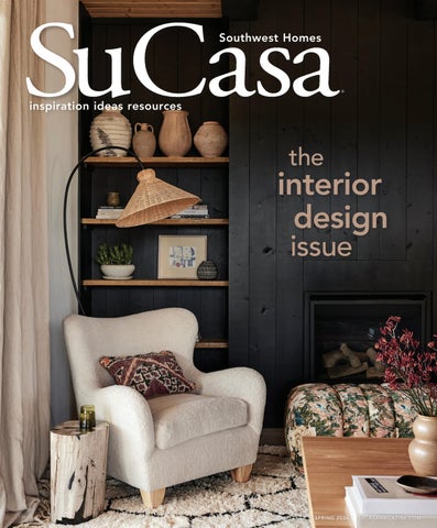
inspiration ideas resources Southwest Homes interior design issue the
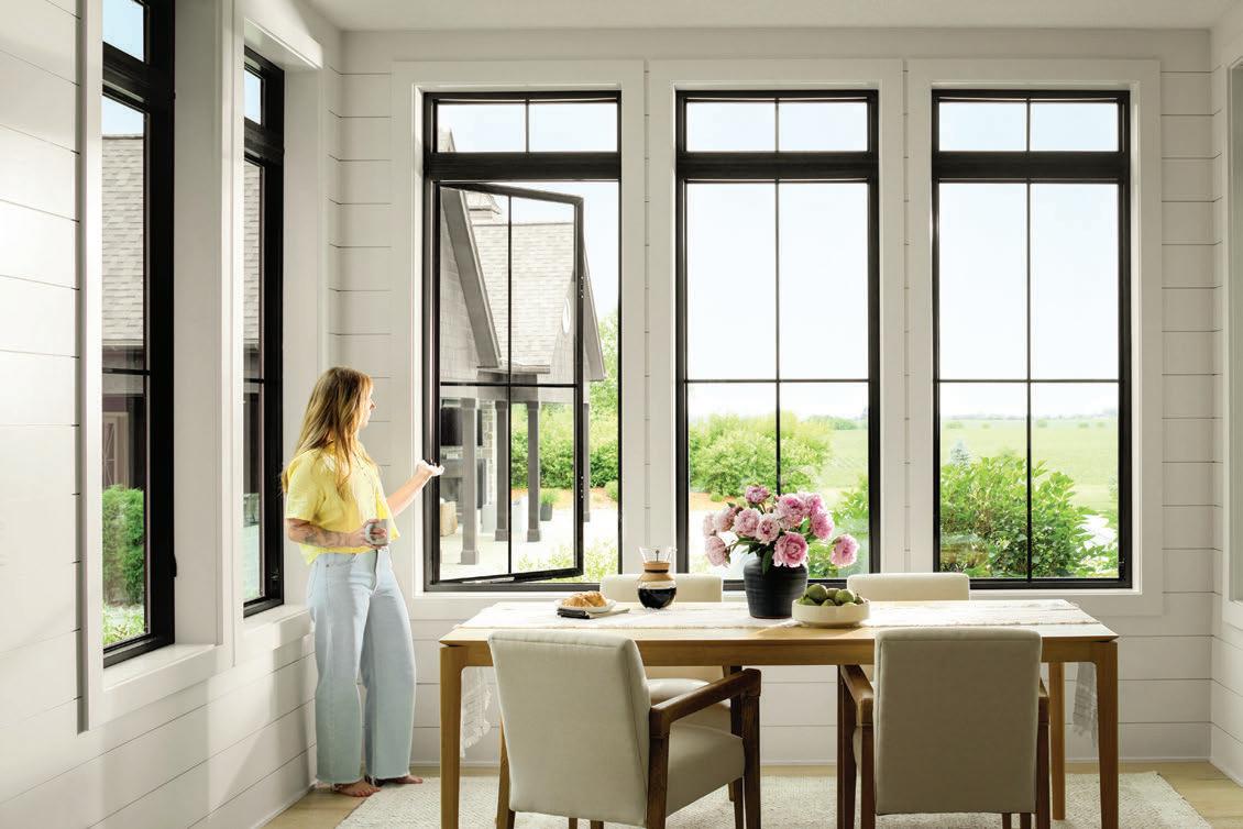

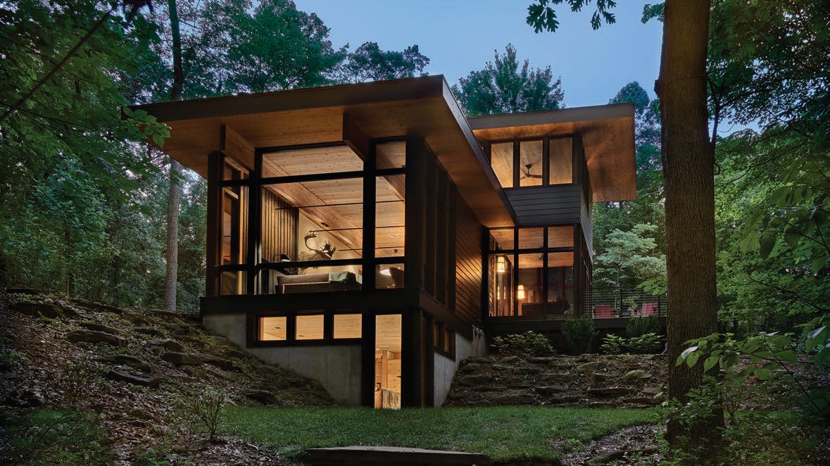
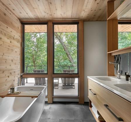

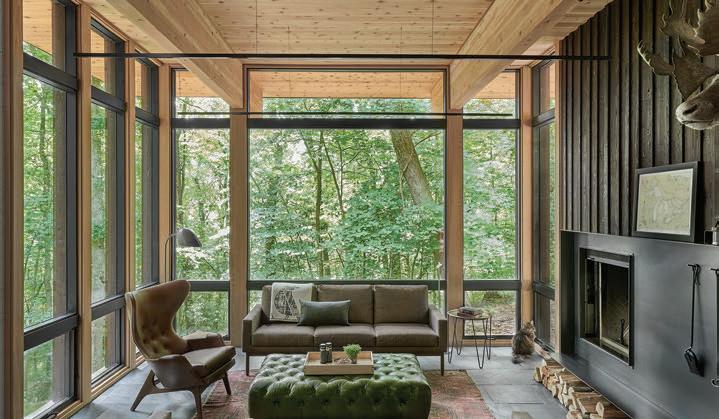

Kolbe Windows & Doors leads the industry with innovative products that set new standards for style and performance. VistaLuxe® WD LINE windows capture floor-to-ceiling views of woods and wildlife, with the organic appeal of warm wood interiors.

We are proud to announce our partnership with La Madera Windows and Doors. Together, we’re expanding our ability to provide high-quality products, installation, and service to our customers. Contact


Crafting Quality Custom Homes — For You, With You
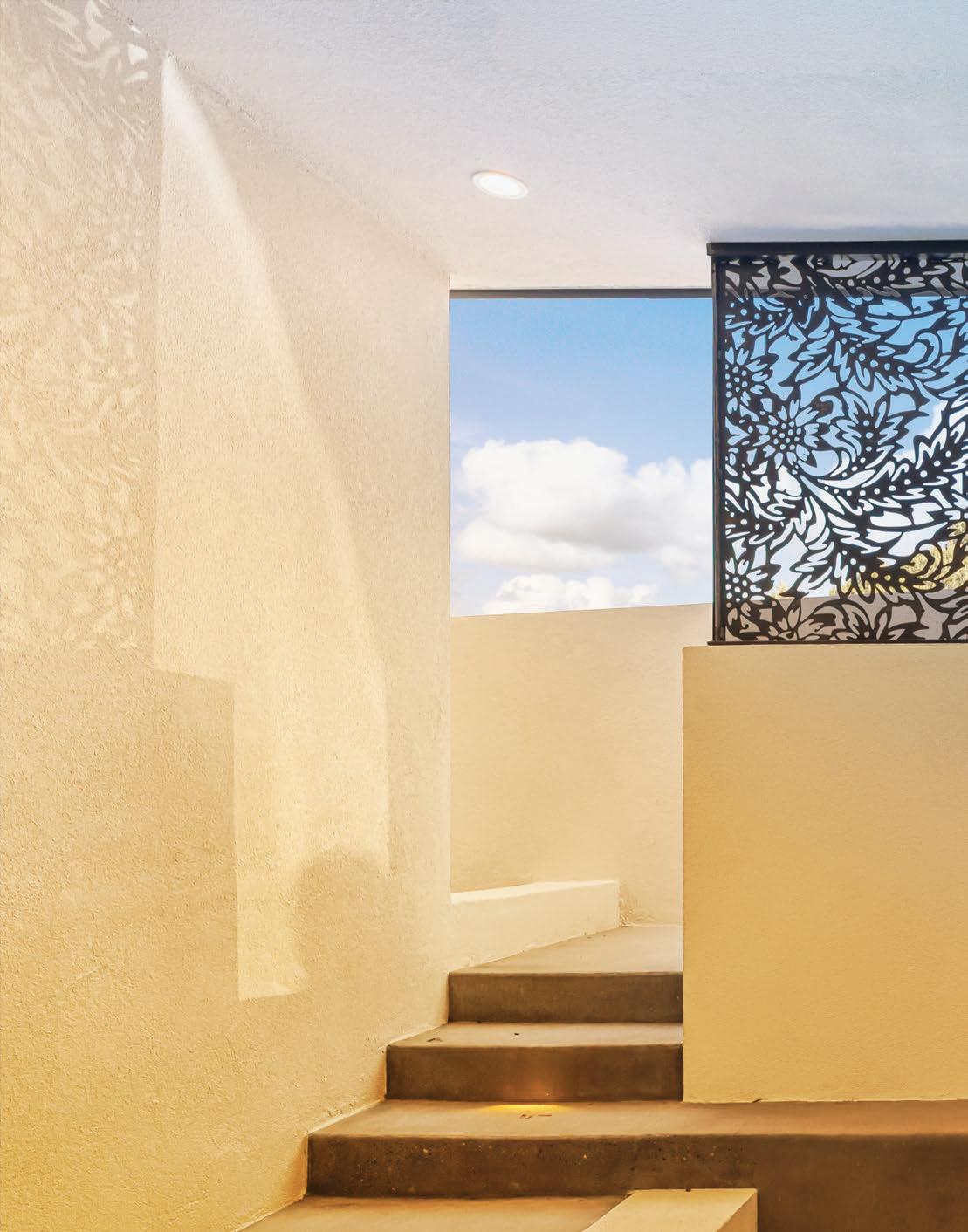


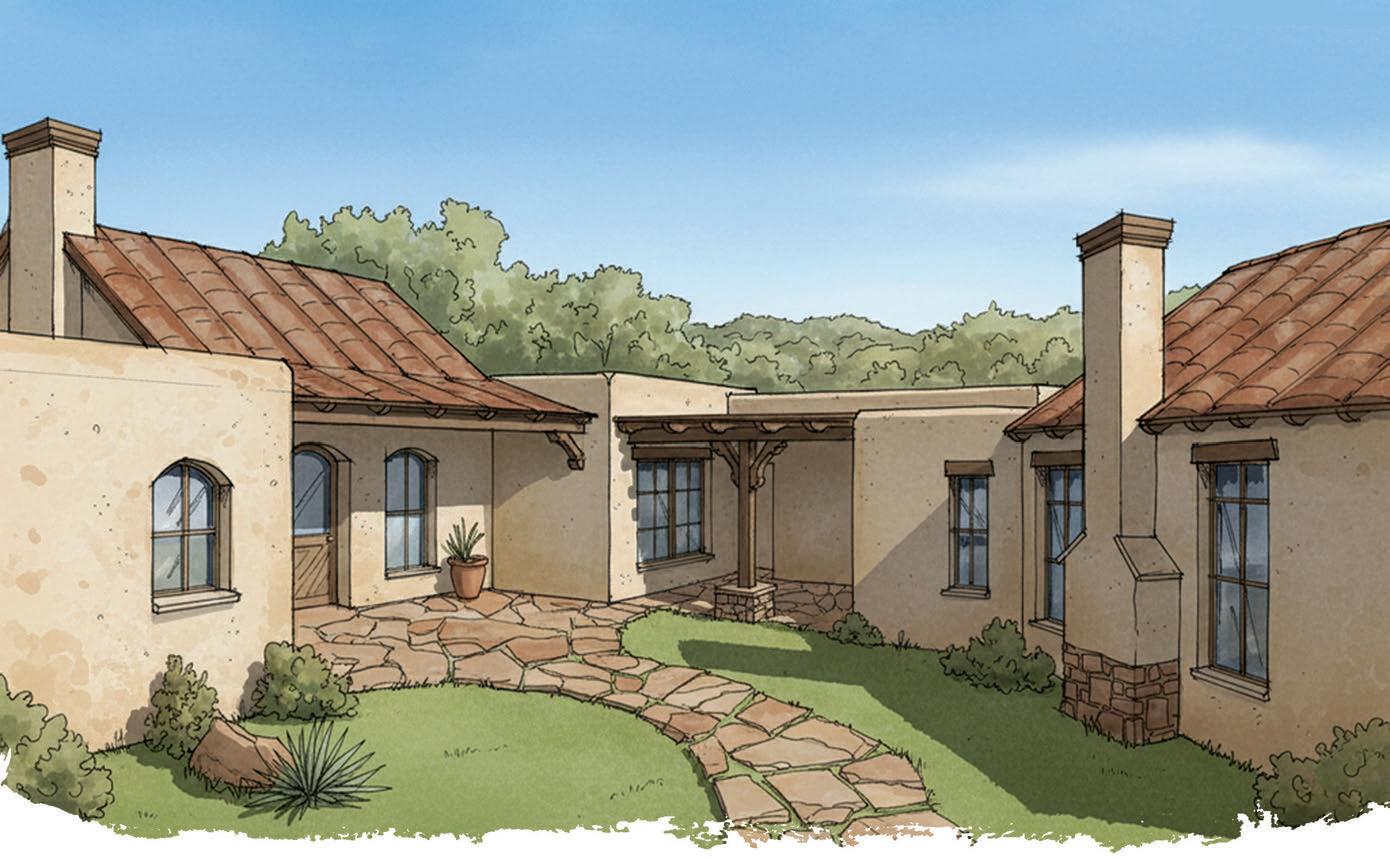

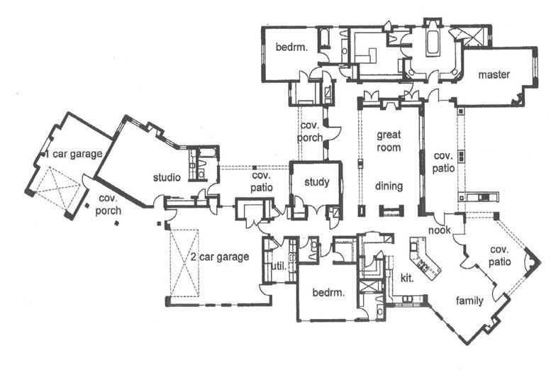

Designed by ©Jim Beverly





Peggy
505.450.5211 peggy@peggywheelerteam.com










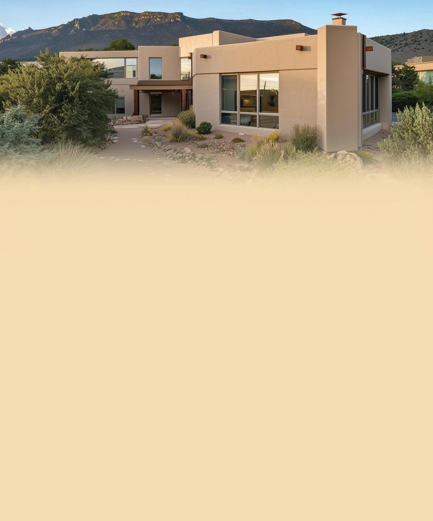






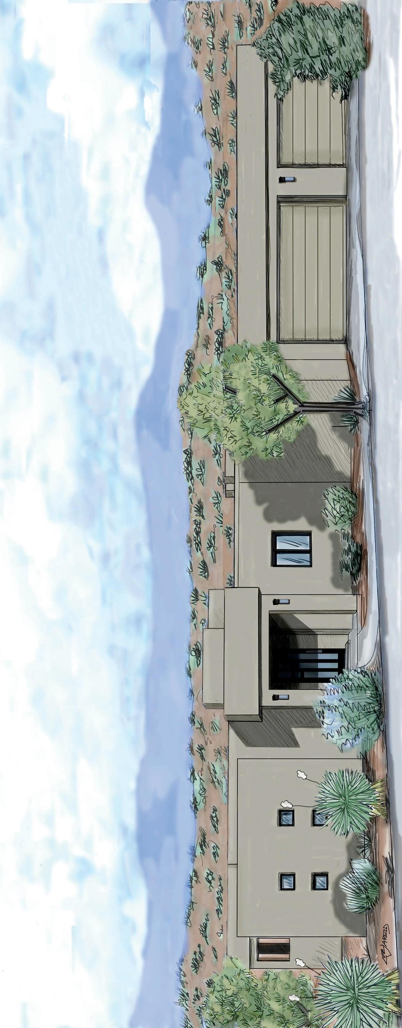
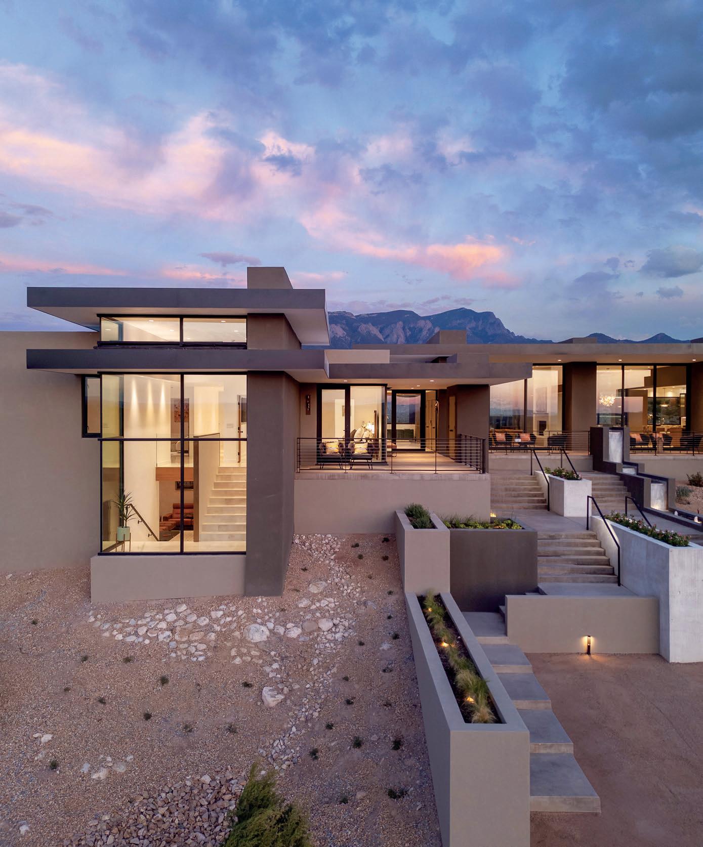
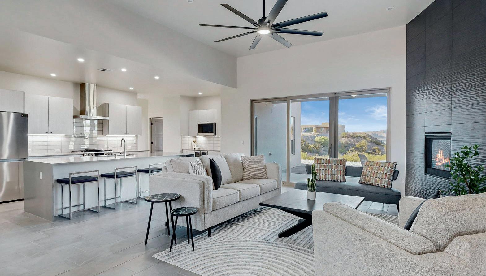
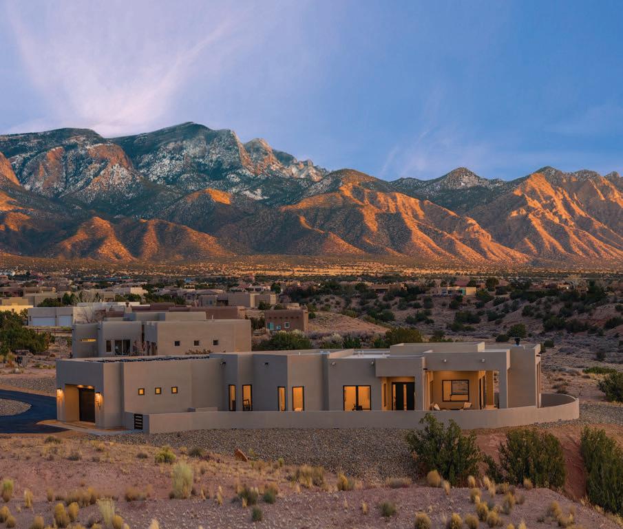
Tour this STUNNING contemporary Southwest model home by Vineyard Homes
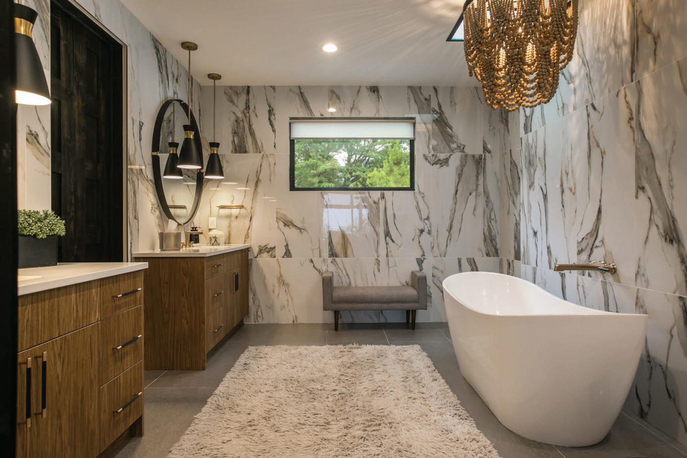
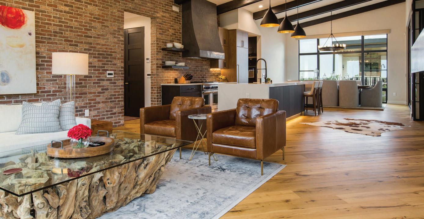
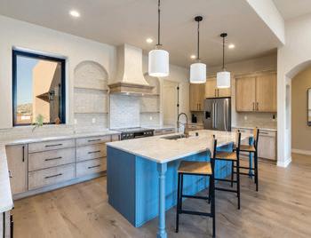
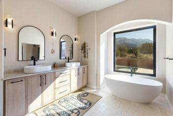
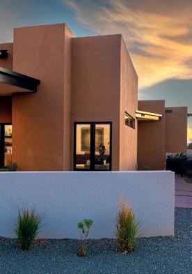
The home blends desert warmth with refined sophistication. Soaring ceilings, exposed beams, gold chandeliers and wide plank floors welcome you. Oversized windows frame the desert views while creamy alder custom cabinetry and champagne bronze hardware enhance the kitchen. The livingroom features a kiva-style fireplace finished with smooth plaster and floating shelves. The primary ensuite is a sanctuary of natural tones accented with brushed gold fixtures.

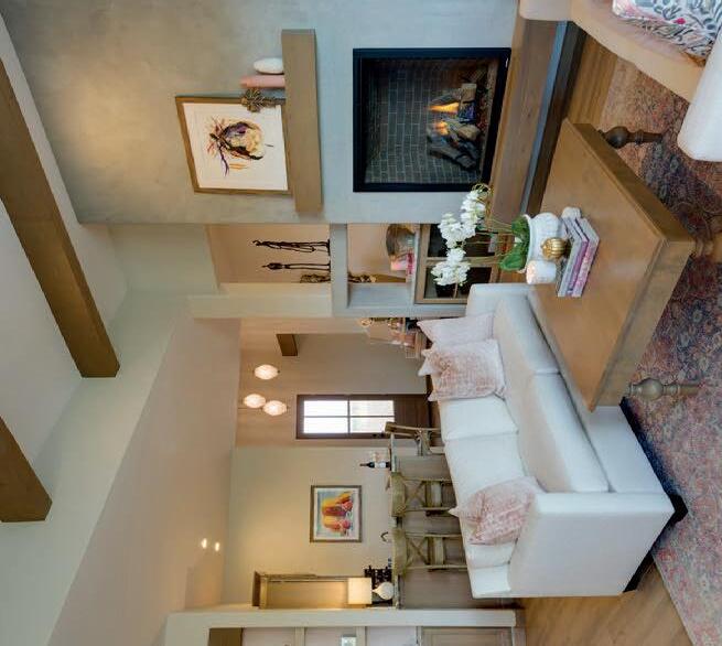
Photo: Mark William Photography
56 inspiration ideas resources
SOUTHWEST
HOMES
46 A Contemporary Vision
These homeowners wanted a modern home in Aldea de Santa Fe that bridges his Pennsylvania roots with the New Mexico landscape. The team designed a home that cascades down the hillside, turning the lot’s limitations into architectural drama, incorporating out-of-state materials to achieve the ultimate goals.
56 Personalized Palettes
The most successful spaces begin with a thoughtful response to architecture, landscape or the people who live within them. Three interior designers share how they shaped deeply personal palettes—with neutral foundations, layered in expressive color—for three distinct homes in Las Campanas.
Jenna Peffley
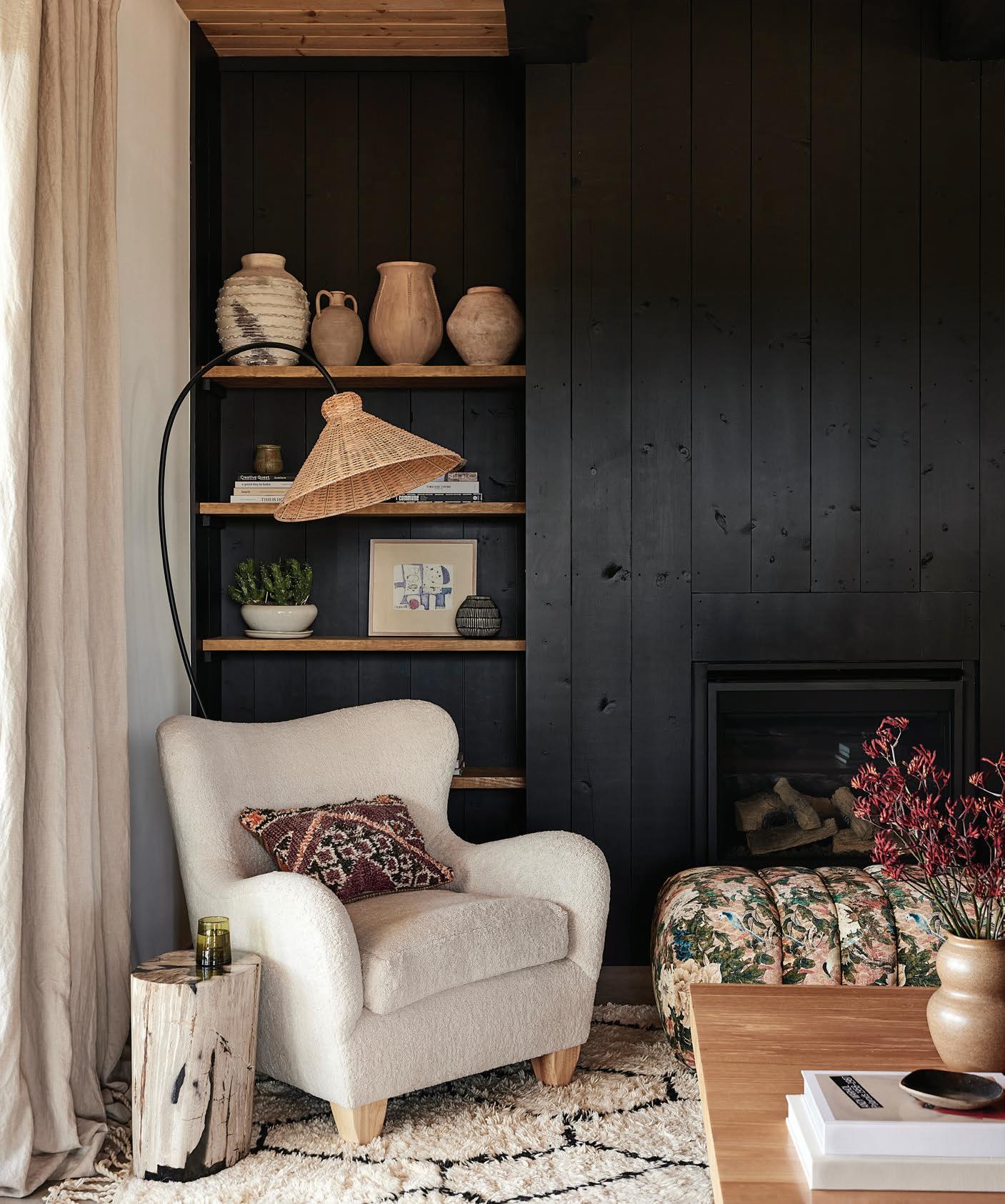
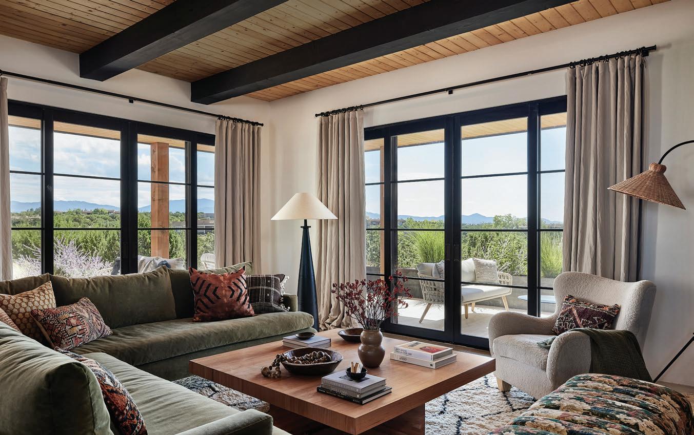
On the cover: This Las Campanas home has an inviting mix of muted colors, natural materials and meaningful collections—all punctuated with perfectly placed black elements for striking contrast. Photograph by Jenna Peffley.
Jenna Peffley

IN EVERY ISSUE
20 Inside Su Casa
24 Life+Style Southwest
Burled wood brings elegance and striking texture to decor products—and your home. There’s no time like the present when it comes to gardening. Start seeds indoors and get a jump on outdoor soil prep for your plot-to-plate crops.
30 Design Studio
We’re engaging in a design dialogue with pros from across the Southwest— Santa Fe to Palm Springs. Long before the phrase “lifestyle brand” entered the cultural vocabulary, fashion and interior design were often at a crossroads. We explore this intersection and the history that shaped it. Midcentury retro silhouettes play nicely with Southwestern design elements.
68 Vida Buena
The quaint Oregon town of Cannon Beach beckons with top-notch dining, superior shopping and picturesque views.
72 Artist Spotlight
Artist Kelee Katillac reimagines historic homes using vintage wallpaper patterns in fresh, bold hues.
76 Su Cocina
Meet Nob Hill’s 3128 Social House, which brings together elevated comfort food and creative cocktails with genuine neighborhood hospitality.
80 ¡ Salud!
Oregon’s Willamette Valley is snapping weighty chardonnay stigmas with juicy succulence and bright acidity that defines Pacific Northwest wines.
82 Su Libro
“Kitchen Garden Living” by Bailey Van Tassel will inspire you to slow down and make gardening a way of life. “The Art of the Clash: A Manifesto Against Mundane Design” by Sophie Von Oertzen Williamson is a compelling argument for mismatching your interiors.


J Douglas Design
Daniel Nadelbach
Follow us @ sucasamagazine

Creative
Lisa
Heather
Lexi
Kastle
Kristen
Advertising





Nancy


















































Su Casa: Newsstands
Albertsons
Barnes & Noble
Books-A-Million
CVS
Fry’s Food and Drug
Safeway
Smith’s Food and Drug
Walgreens
Walmart
Whole Foods Market
Local Showrooms
Albuquerque Sound & Vac
Bright Ideas, Inc.
Floorscapes
J. Douglas Design
Keller Williams Realty
Maloy Mobile Storage
Mountain West Sales
Pella Windows & Doors
Realty One of New Mexico
Rio Grande Credit Union
Rocky Mountain Stone
Tesuque Stucco
The Amish Connection
Waterstone Mortgage
Western Building Supply

PHOTO: ERIC SWANSON



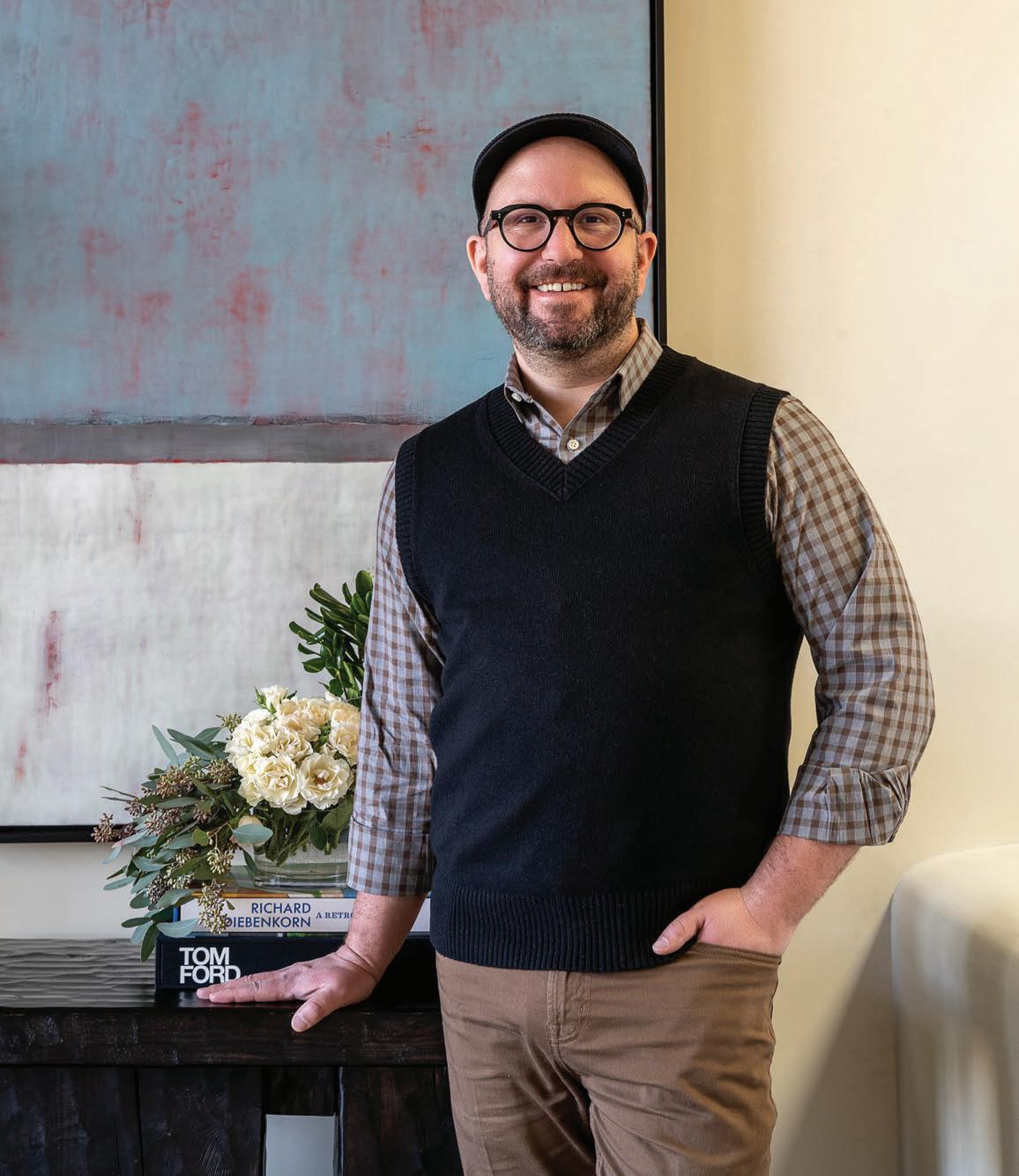
Welcome to the spring Issue of Su Casa
In spring, our attention naturally turns inward and outward at the same time. We open windows, refresh rooms, rethink tired corners, and imagine new ways our homes might better reflect the way we live now. At Su Casa, this season has always been about inspiration—and this year, that inspiration arrives from more directions than ever.
This issue celebrates interior design in all its many expressions, beginning with a lively, far-reaching conversation we call Voices of the Southwest.
Designers with projects spanning Arizona, Southern California and New Mexico share perspectives on how regional history, landscape and culture shape the spaces they create.
We also step inside three beautifully conceived residences by local interior designers who are redefining what New Mexican living looks like. From artful renovations to fresh, modern interpretations of classic forms, these projects showcase the creativity and craftsmanship flourishing within our own design community. Our feature home takes that spirit a step further—a design-forward new construction in Santa Fe that blends contemporary architecture with warmth, texture and a deep sense of place.
Spring is also the moment when many of us turn our attention to the garden. We offer practical guidance for planning and planting now so that summer brings a rewarding harvest. And because a change of scenery can be just as refreshing as a redesigned room, our travel feature heads to Cannon Beach, Oregon—consistently ranked among the country’s most beloved coastal towns.
I’d be remiss if I didn’t mention what you won’t find in these pages: the Parade of Homes. The Home Builders Association has gone digital with its promotion, and we wish it the best with its new approach.
As always, our goal is to fill these pages with ideas that spark imagination and possibility. We hope this issue invites you to look at your home—and the wider world—with renewed curiosity and joy.
William P. Lang Publisher
Read more on page
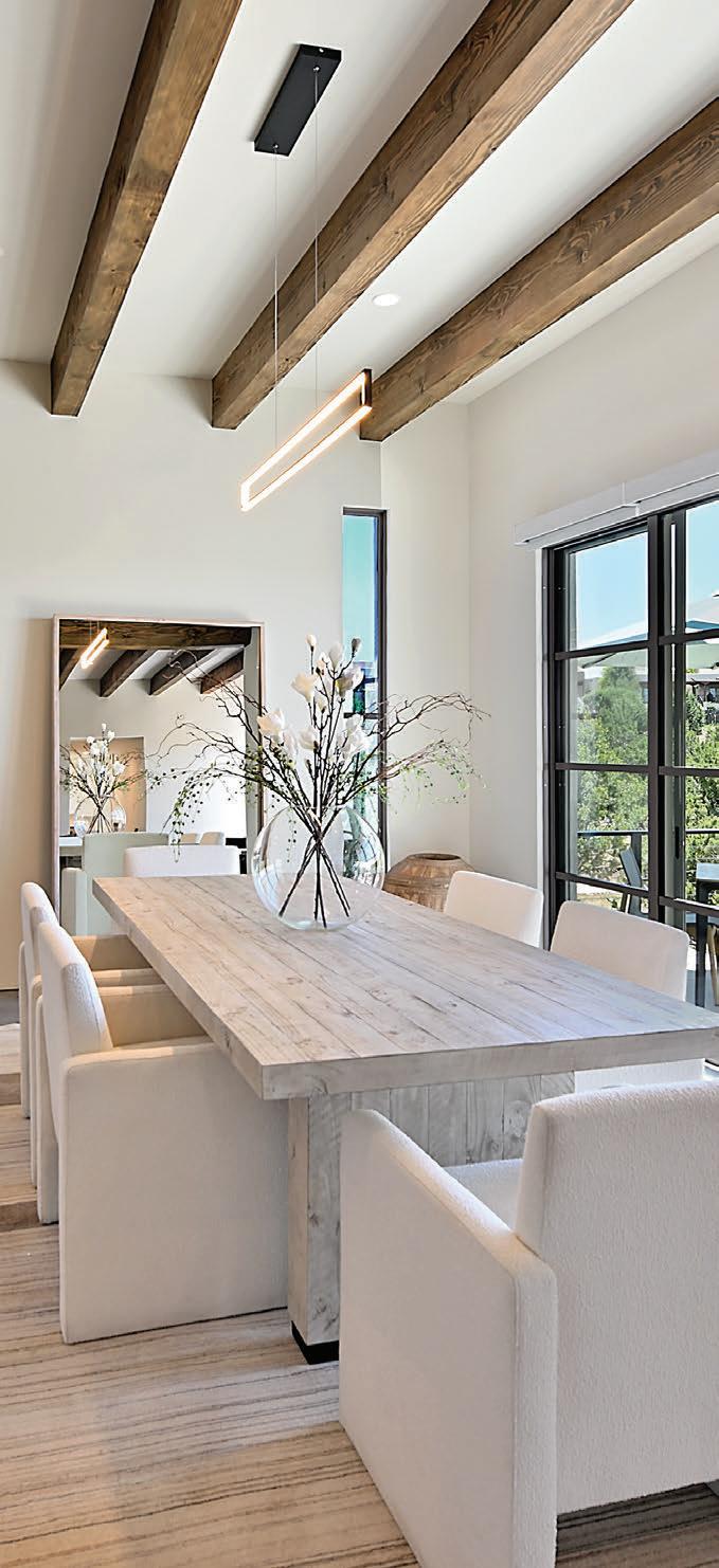
Right: This Aldea de Santa Fe home’s material palette celebrates both contemporary aesthetics and traditional craftsmanship with ample light at every turn.
46.
Daniel Nadelbach


New Mexico's most recommended floor & more store!




rooted in burl
classic craftsmanship meets modern form, defined by warmth and pattern
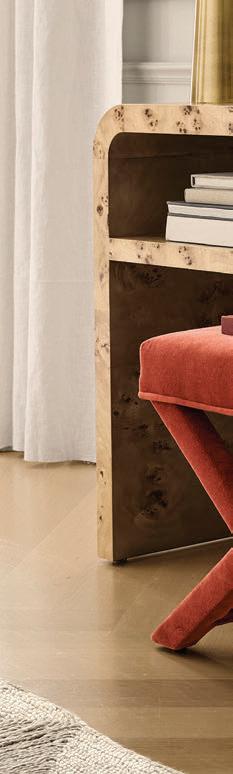
There’s an unmistakable richness to burlwood—the way its intricate grain catches light, adding warmth, depth and subtle drama to a room. In forms that range from sculptural consoles to heirloom-inspired cabinetry, today’s interpretations balance tradition with modern restraint. This curated collection highlights pieces that honor traditional artistry while embracing contemporary living, creating interiors that feel layered, grounded and quietly luxurious.
1. Heritage in Contrast
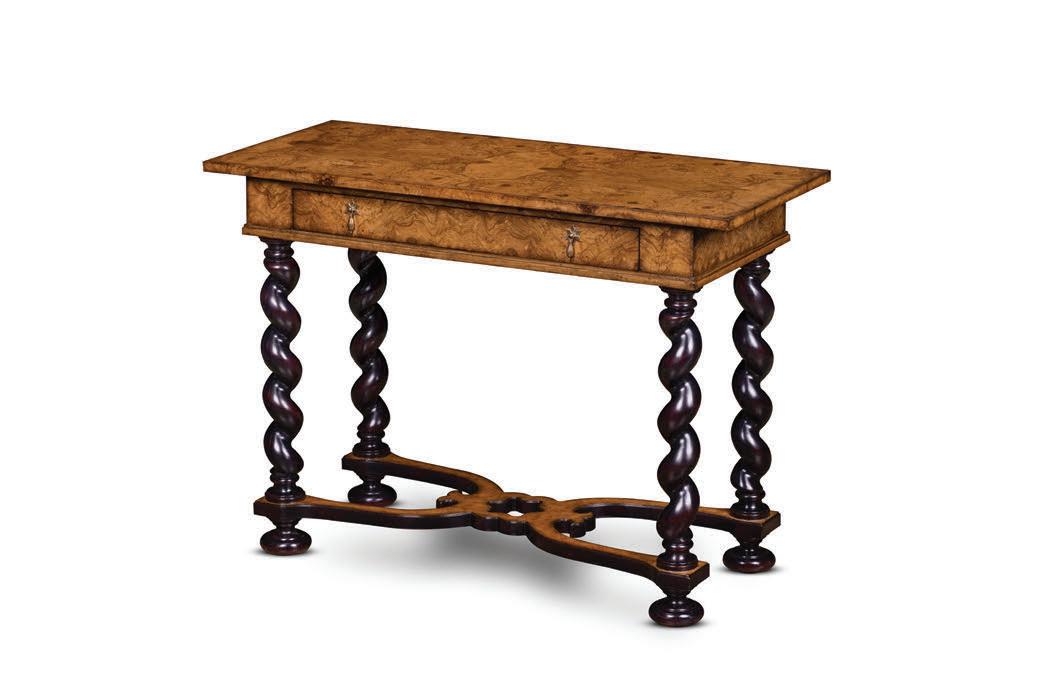
Rooted in classical European influence yet undeniably modern in execution, this barley-twist console table celebrates craftsmanship at every turn. Hand-matched burl veneer glows with natural richness across the top and drawers, set against the dramatic presence of sculpted legs finished in a deep, lustrous tone. A refined stretcher base introduces architectural balance, while cast-brass pulls add a final note of tailored elegance. Milton Side Table, $5,997, J. Douglas Design in Santa Fe, jdouglasdesign.com
2. Refined Ritual
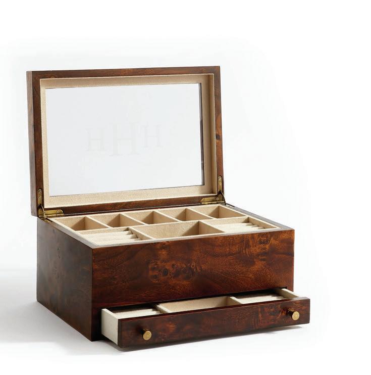
This burl wood jewelry armoire pairs rich natural patterning with thoughtfully tailored interiors. The warm, high-gloss veneer reveals swirling grain unique to each piece, while a soft ultra-suede lining cushions watches, rings and heirloom treasures within neatly divided compartments. A mirrored lid adds both function and a subtle sense of ceremony, transforming the simple act of selecting jewelry into a moment of calm indulgence. Burlwood Jewelry Armoire, $199, potterybarn.com
3. Softly Structured
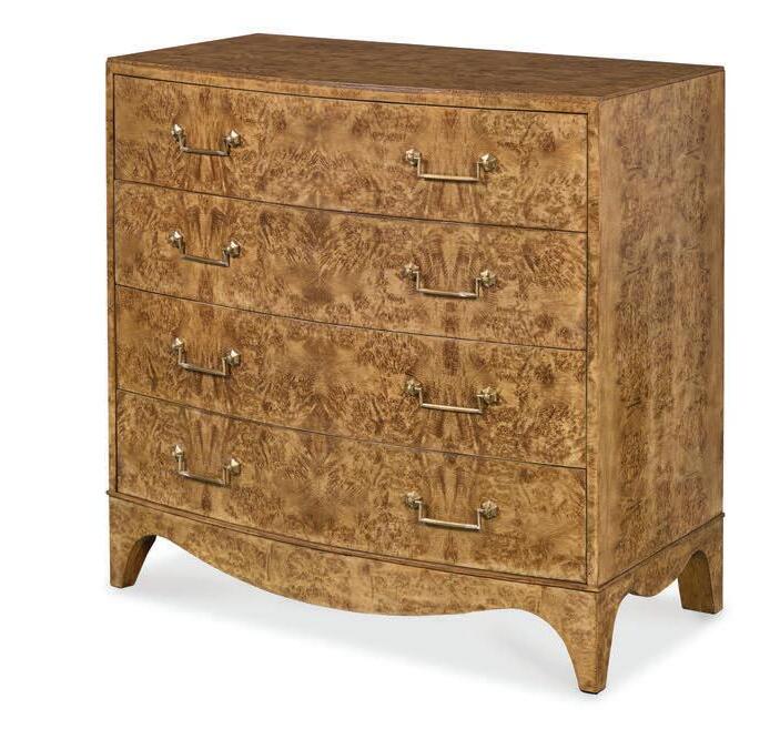
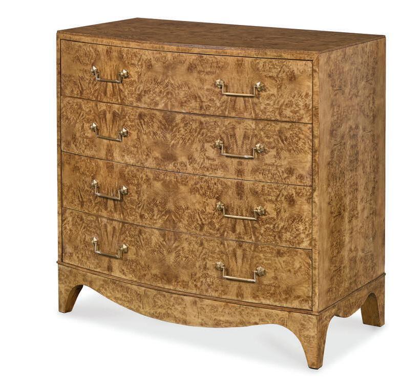
A study in quiet luxury, this bowfront chest of drawers showcases the mesmerizing movement of bleached oak burl, its organic figuring lending depth and dimension to a clean, architectural silhouette. Custom hardware punctuates the softly curved façade with understated brilliance, while four spacious drawers provide seamless storage beneath the sculptural surface. Both refined and grounded, the piece balances artistry with everyday function—an heirloomworthy statement that anchors a bedroom or living space with warmth, texture and timeless sophistication. Maui Chest, $7,995, J. Douglas Design in Santa Fe, jdouglasdesign.com
4. Modern and Warm
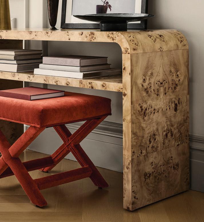
Defined by a fluid, midcentury-inspired silhouette, this open console table balances architectural clarity with the organic richness of natural wood grain. Defined by a fluid, midcentury-inspired silhouette, this open console table balances a softly curved profile with a smooth matte finish. Holland Open Console Table (50”), $2,695, williams-sonoma.com
5. Illuminated Heirloom
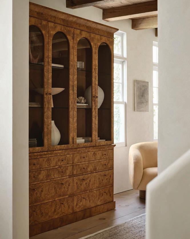
Graceful arches and richly figured mappa burl lend this vintage-inspired cabinet the presence of a collected antique, while thoughtful modern details refine it for contemporary living. Glass-paneled doors create an elegant stage for ceramics, books or treasured objects, while smooth-gliding drawers—complete with removable flatware dividers—add practical storage. Crown molding, burnished brass hardware and a skirted plinth base balance tradition with quiet sophistication. Maison Burl Wood and Glass Lighted Storage Display Cabinet, $6,798, crateandbarrel.com
timing is everything planning your summer harvest in New Mexico
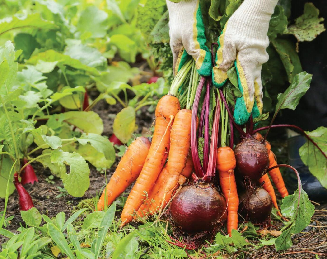
IN NEW MEXICO, the gardening season often begins before spring officially arrives, at least from a planning perspective. As winter loosens its grip, late winter and early spring provide an important window for planning and planting a vegetable garden that can deliver fresh, homegrown meals all summer long. With frost risk and elevation differing across the state, planting schedules are shaped by local conditions and crop preferences rather than a one-size-fits-all calendar.
For many gardeners, that planning isn’t just about plants—it’s the promise of summer meals shaped by whatever is ready to harvest that day. In north-central New Mexico, understanding frost risk and local climate patterns is especially important. The last frost date is a helpful guideline, but it is not a guarantee. While the average final spring freeze often falls in mid- to late-April, colder pockets can experience frost well into May. Gardeners in higher elevations, including Santa Fe, are often safest waiting until mid-May to plant frost-sensitive crops.
by Kristen West
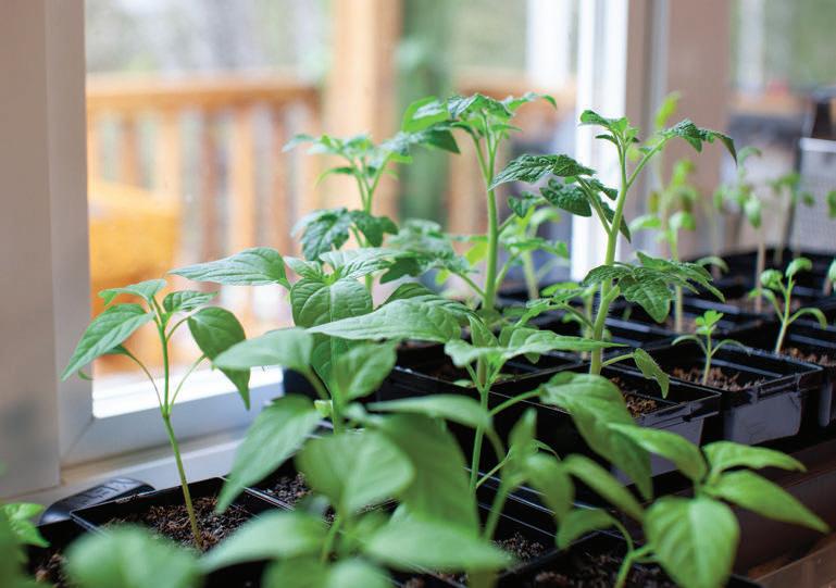
Even while waiting for warmer nights, there’s plenty to do. Starting seeds indoors will give you a head start on any cool- or warm-weather crops. Seeds germinate well in fine-textured seed-starting mix or simple indoor greenhouse kits with expandable soil pellets, which are especially beginner-friendly. Once seedlings are established and ready to be transplanted into containers, using well-made potting soil blends, rather than basic, fertilizer-heavy mixes, can support healthier growth. If seeds don’t take, most nurseries offer vegetable starts toward the end of February, particularly for cool-season crops. Those first trays of seedlings are easy to overlook, but they’re the beginning of July salads, late-summer salsas and the small daily habit of stepping outside for dinner ingredients instead of driving to the store.
Outdoor soil preparation is just as important, according to staff at Newman’s Nursery in Santa Fe. They recommend building healthy soil using compost before planting outdoors. For in-ground gardens, mixing compost roughly
half and half with native soil into the top 8 to 12 inches improves fertility, structure and moisture retention, while winter freeze-thaw cycles help naturally blend nutrients into the soil. This can be done weeks or even months in advance, as long as the ground isn’t frozen.
Staff at Albuquerque’s Alameda Greenhouse note that mid- to late-February is an ideal time to start planning and even planting certain cool-season vegetables, while gardeners in Santa Fe are generally advised to wait until March or April to plant theirs outdoors. Leafy greens such as lettuce, kale, spinach, bok choy and cabbage, along with onions and other hardy plants, are great frost-tolerant crops and actually prefer cooler temperatures. Using frost cloths or row covers can provide an extra layer of protection for young plants during cold snaps. These early crops rarely make it as far as the kitchen counter; they’re often picked and eaten the same day, marking the quiet shift from planning a garden to living from it.
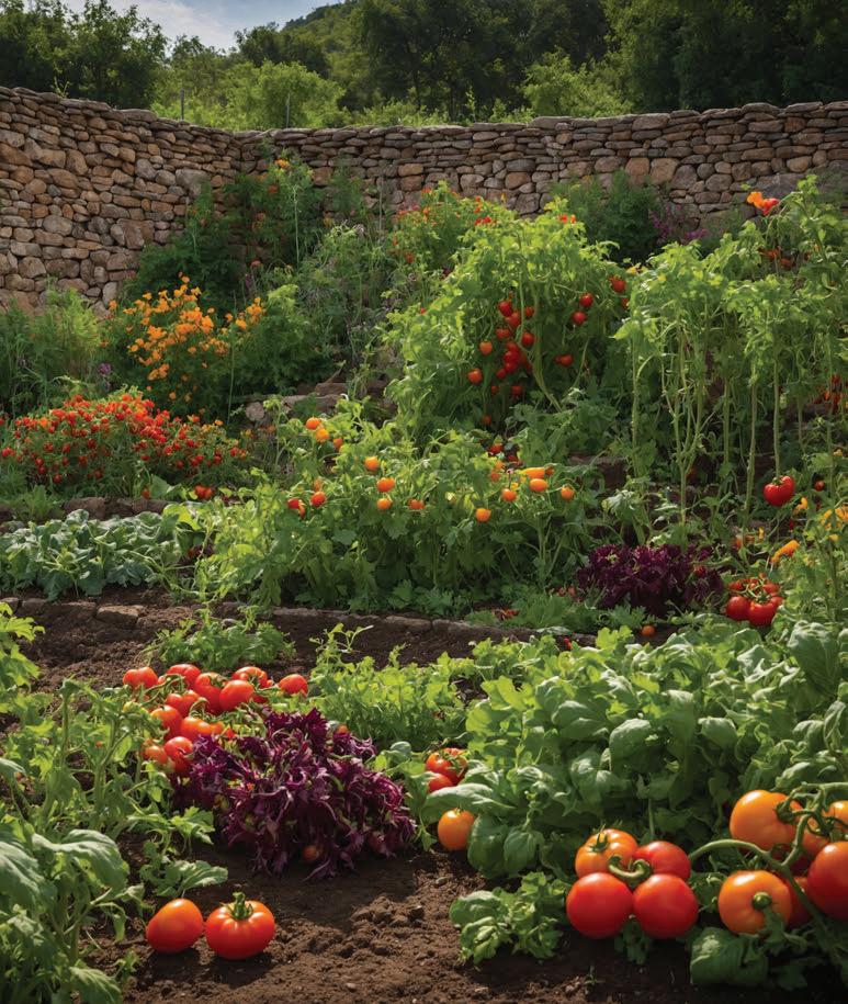
As spring progresses, warm-season crops come into focus. Tomatoes, peppers, squash, cucumbers, melons and zucchini should be planted after the danger of frost has passed; many New Mexico gardeners use Mother’s Day as a safe benchmark. Tomatoes and peppers thrive in warm soil and benefit from the state’s long growing season, often producing for four to five months—sometimes more. Faster-growing warm-season vegetables like squash and cucumbers can be direct-sown once soil temperatures are consistently warm, about 65 degrees.
Watering needs change with the season. In early spring, monitoring soil moisture every day or two is usually enough. As temperatures climb, most vegetables will need daily watering, and during extreme summer heat, some plants, like tomatoes, may require water in the morning and evening. By midsummer, the garden begins to influence not just what you cook, but how you move through the day—watering in the morning, harvesting in the evening and building meals around what the soil offers first. Light mulching, though not required, helps protect roots, moderate soil temperature and retain moisture without smothering young plants.
Gardening in New Mexico isn’t just about growing vegetables. It’s about shaping the rhythm of summer meals—stepping outside for ingredients, cooking with the season and tasting the landscape in every bite.








by Heather Shoning
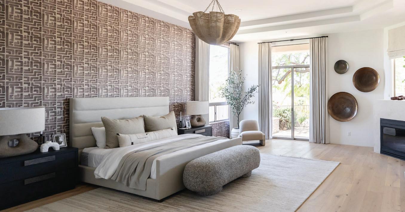
voices of the Southwest a regional interior design dialogue
THE SOUTHWEST HAS ALWAYS CARRIED a powerful visual identity—sun-washed landscapes, deep shadows, handmade materials and architecture shaped as much by climate as by culture. But today, what it means to live beautifully in this region is no longer defined by a single aesthetic. Designers are increasingly treating the Southwest less as a style to replicate and more as an evolving conversation between landscape, history and the people who inhabit these spaces. Homes are becoming more personal, layered with global influences while still responding to the desert’s light, materials and rhythms of daily life.
As Southwestern design continues to shift—less about clichés and more about interpretation—the region’s enduring architectural traditions remain a grounding force. Meanwhile, interiors are constantly reimagined through color, craft and contemporary living. Three designers working across the Southwest share how that narrative continues to unfold in their work today.
Living with Lolo
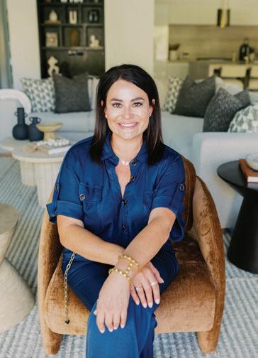
Founded by principal designer Lauren Lerner, Living with Lolo has become one of Arizona’s most recognizable luxury residential design firms. The Scottsdale studio offers full-service interior design and design-build services, guiding projects from early planning through final installation. Lerner’s work is known for its balance of refined finishes and relaxed livability—creating homes that feel elevated but still deeply comfortable for everyday life.
Where do you draw the line between regional influence and personal signature?
Regional influence gives me the framework, but my signature lives in proportion, restraint, and thoughtful layering. I treat the desert as context, not a theme. The goal is work that feels grounded and intentional without leaning on obvious references. When a space still feels personal and relevant without signaling its location, the balance is right.
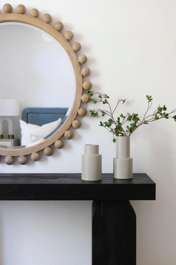
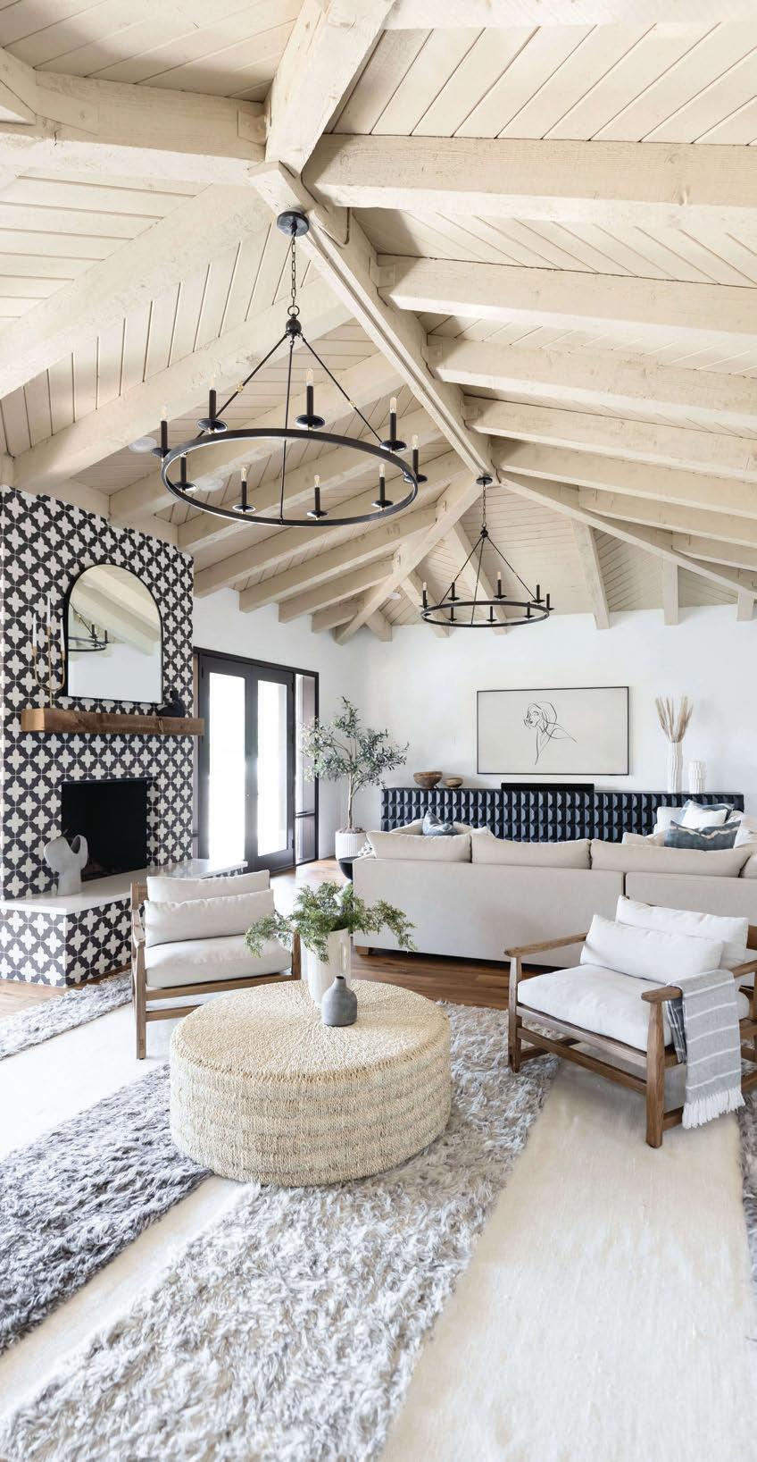
How do client preferences shape the way you incorporate Southwestern design elements?
Clients today want homes that feel livable, layered and collected rather than overtly regional. They travel, collect and value comfort. That pushes Southwestern design toward a more blended and sophisticated style.
Arizona design often balances warmth with minimalism—how do you keep spaces from feeling either too sparse or too precious?
I rely on texture and scale to bring warmth to clean, minimal spaces without adding clutter. Natural materials, softer lines, and finishes that are meant to age keep a home from feeling too precious. The goal is for the space to feel easy and livable, not perfect.
How does light—especially harsh desert light—shape your approach to texture and surface choices?
Harsh desert light reveals everything, so I gravitate toward matte finishes and textured surfaces. Those materials soften the light and feel calmer as it shifts throughout the day. High-gloss finishes tend to feel unnatural in this environment.
Do you see Southwestern design becoming more regional—or more blended—over the next decade?
Southwestern design will keep evolving in a more blended direction, influenced by global design but grounded in climate and landscape. The regional identity will show up in how a home lives and performs, not in literal references to place. That shift feels natural and lasting.
Lauren Lerner
AM Interior Design
Founded by designer Aimee Meisgeier, AM Interior Design is a Seattle-based boutique studio specializing in custom homes, renovations and thoughtfully curated interiors. Established in 2008, the firm focuses on highly personalized spaces shaped by close collaboration with clients. While rooted in the Pacific Northwest, the studio takes on projects nationwide—including Palm Springs in Southern California.
How do you balance your personal design signature with the visual language of the Southwest?
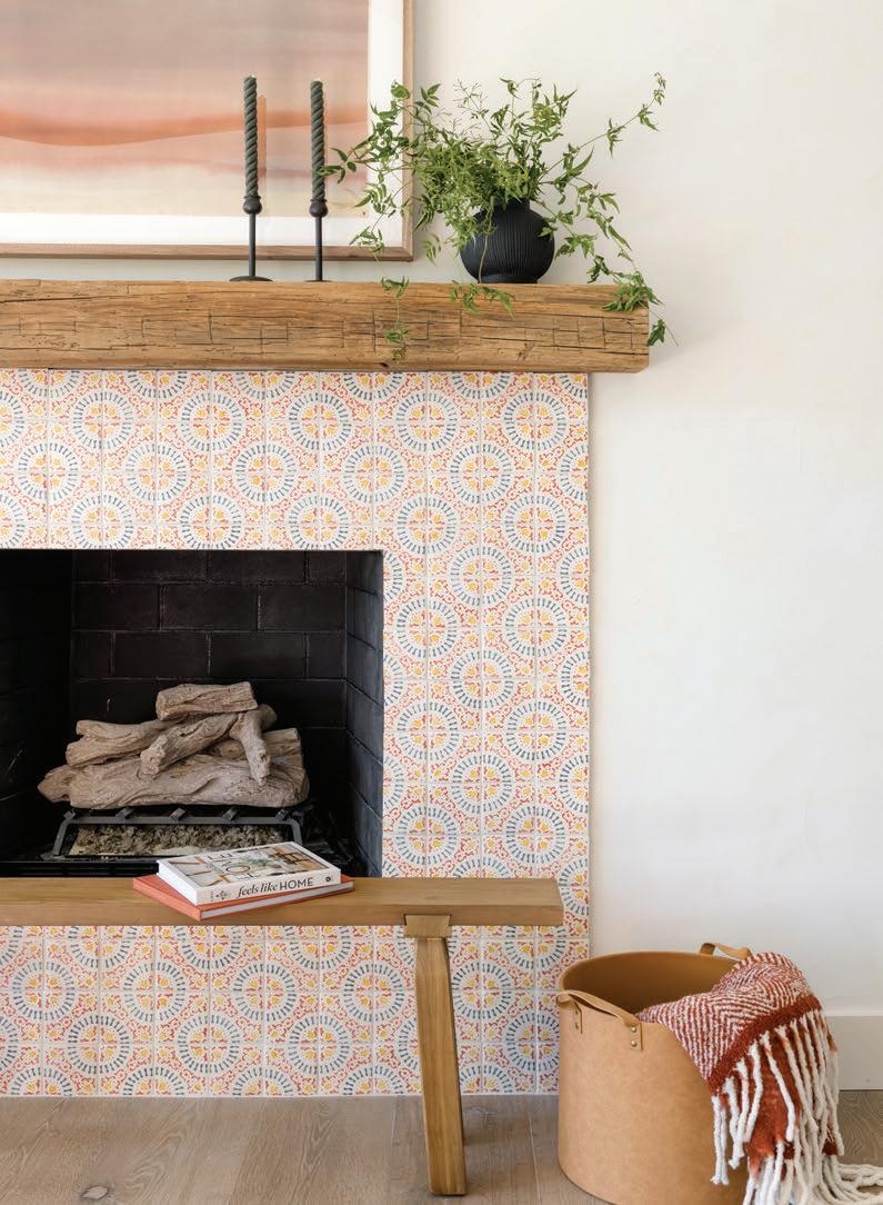
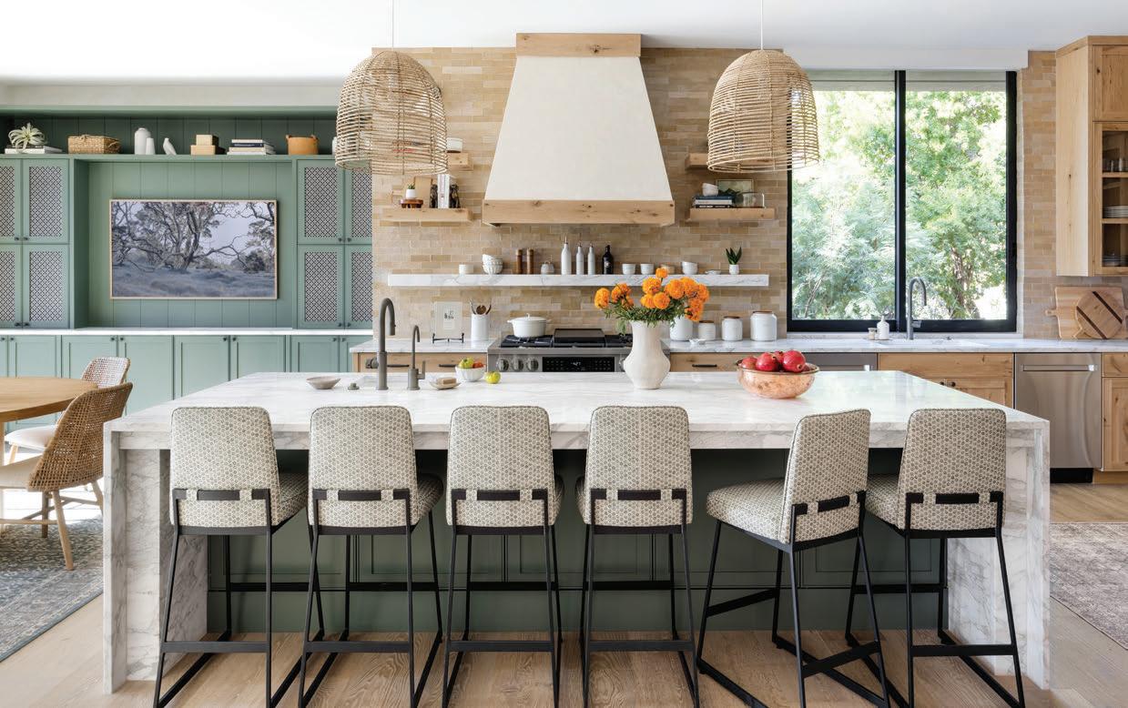
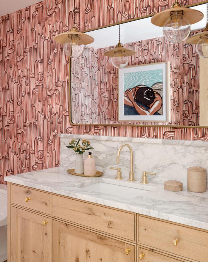
My personal signature involves the love of color and pattern play, so it was a pretty easy transition to bring that into my desert projects, where those two design elements are key. I do make sure, though, that my use of color, patterns and selected materials still respects the integrity of the region’s design aesthetics while also shying away from clichéd regional attributes.
What materials or finishes feel essential to your work right now—and which ones feel dated or overused?
I always try to select timeless, natural materials chosen for their craftsmanship—stone, wood, handmade tiles—over other man-made products. Finishes such as unlacquered brass, which will patina and become more beautiful over time, will also be incorporated as much as possible into my designs. I love using lots of color, as well, and I am glad to see more designers are embracing color these days and trending away from ‘sad beige’ that was so popular a few years back.

What does “timeless” actually mean to you in a region where trends cycle fast?
What role does restraint play in your interiors— especially in a region known for boldness?
There is definitely a fine line between pushing design boundaries in an innovative way—the use of bold color, pattern play and incorporating as many textures as possible—and going overboard with the Southwestern style, making the design feel clichéd and chaotic. Adding pops of neutral elements can help calm the senses and provide that much-needed restraint in a space. For instance, I like to go bold with my tile choices, mixing contrasting colors and patterns, but I will select a subtle stone countertop like soapstone to break things up for the eye.
To me, timeless means that the selected materials will always respect the region’s integrity. Selecting as many locally sourced natural materials as possible helps keep the design true to its environment and allows it to age gracefully as the years go by.
Palm Springs has a strong visual legacy. How do you design within that context without competing with it?
I think Palm Springs has such an inclusive design flair that it easily welcomes bold creativity with a non-competitive ‘more, the merrier’ attitude. I can push the boundaries there with ‘expect the unexpected’ concepts, and it is all accepted.
Are there design elements that feel deeply rooted in the Southwest and don’t always translate well elsewhere?
Certain colors and patterns of traditional Talavera tiles may not travel well to projects outside of the Southwest. Not to say that they cannot be used
Miranda Estes Photography
Aimee Meisgeier
in other regions, as I feel like there really are no design rules, but careful consideration of elements that work within the project’s environment should be taken.
Do you see Southwestern design reaching a broader audience in today’s interiors?
I feel Southwestern design has already become more blended, with the resurgence in popularity of time-honored style brands like Pendleton and Ralph Lauren. Both are known for home decor and design items featuring tried-and-true Southwestern patterns and colors that can add a fun pop of color to anyone’s home.
What’s one design rule you regularly break in your work—and why does it matter here?
I really try not to follow design rules, as I feel that stifles creativity. As long as things are done deliberately, rather than haphazardly, being a rule breaker can produce some very memorable designs. One thing I do like to push for, though, which a lot of people shy away from, is the use of natural stone, especially marble, for countertops. In Southwestern design, natural materials help to represent the rustic feel of the environment, so I have incorporated them in all my desert projects.
Miranda Estes Photography
Brent Henry Photography
Design Studio
French & French
French & French Interiors is a Santa Fe–based design studio founded by husband-andwife team Heather and Matt French. Known for bold color, layered pattern and soulful references to the Southwest, the nationally recognized firm creates expressive interiors that feel deeply personal to the people who live in them. While rooted in Santa Fe’s artistic heritage, the studio works on residential and boutique commercial projects nationwide.
How does the desert climate—not just the aesthetic—influence your material and layout decisions?
We love this question because the reality of living in the desert is that it can be tough. The sun is hard on our homes and our bodies. The dryness is a constant battle. The overall intensity of the desert can feel overwhelming at times.
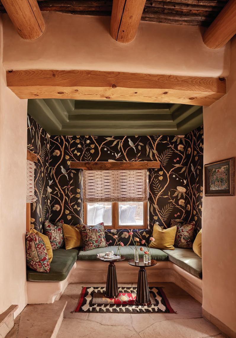
We try to craft homes that balance that harshness. While some designers emulate the desert climate directly in their interiors, we take a different approach by bringing in softness. That softness shows up through materials and pattern: velvets and mohairs in saturated colors and unique floral patterns. At the same time, we contrast that with folk art developed in the region, working with local artisans to create one-of-akind pieces and incorporating textiles by Native artists. It’s important to us that homes not only feel beautiful, but that they honor the history and culture of the region in an authentic way.
What materials or finishes feel essential to your work right now—and which ones feel dated or overused?
Balancing the harshness of the high desert with softness inside is key for us. Right now, that means layering fabrics, especially mohair and velvet. We also love introducing wallpaper into adobe homes. When we first tried it over ten years ago, we didn’t see anyone else doing it—but yes, you can wallpaper plaster walls, and they’re beautiful. Grasscloth, in particular, adds a subtle texture that works wonderfully in these spaces.
We don’t use as much leather as people might expect, given its association with traditional Southwestern design. And layered neutrals have never quite been our cup of tea. That said, you can absolutely achieve a ‘neutral’ look that still feels exciting—it’s about mixing unique patterns thoughtfully, even within a restrained palette.
What elements make Southwestern design feel enduring rather than trend-driven?
For us, timelessness comes down to the materials that have always existed in the region, but more importantly, how we reinterpret them. It often relates back to the architecture. We lean more traditional overall, while other designers in the region embrace a more modern aesthetic. We love that cross between traditional, grounded style and a timeless Southwestern sensibility.
New Mexico carries a deep architectural history. How do you honor that without slipping into pastiche?
The architecture of New Mexico, especially in Santa Fe, plays a huge role in our work. We’re endlessly inspired by the historic properties throughout the city. Most of our projects here have strong architectural bones, and we work within that framework rather than against it.
Jenna Peffley
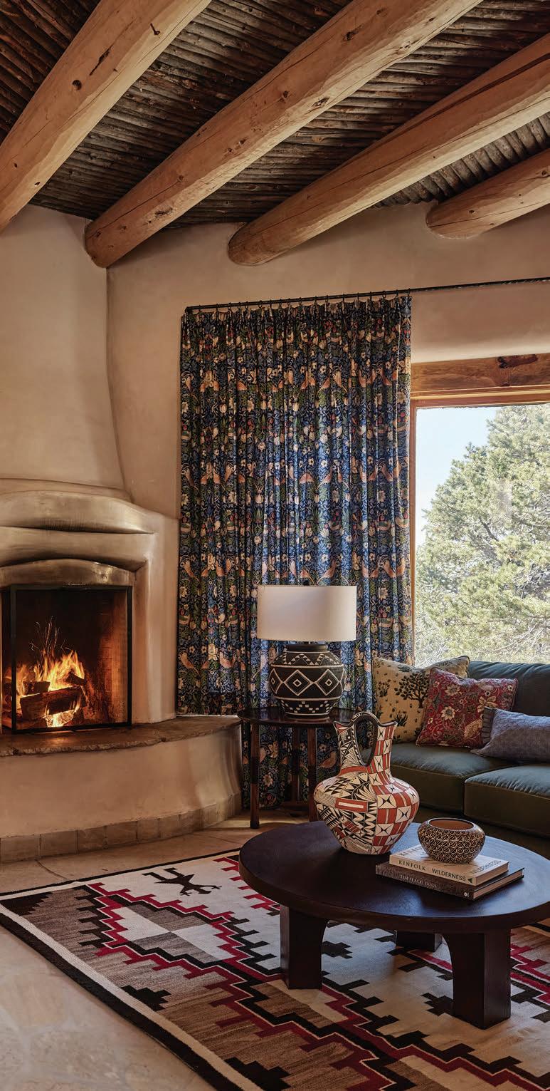
We’re not ones to remove vigas or erase what makes these homes special. We embrace tradition, then layer in fresh furnishings, materials, finishes, lighting and drapery to create something entirely new within that context. It would be easy to follow the status quo of what’s considered typical Southwestern style and lean fully into that. What makes our work feel distinct is the conversation between those strong architectural elements and our design choices that push the space somewhere unexpected.
What regional materials or craftsmanship traditions still feel underutilized in contemporary interiors?
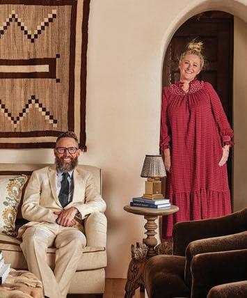
Adding contemporary newness doesn’t mean buying modern furniture. We love working with local artisans who draw from historic Southwestern traditions but create pieces suited for modern living.
For example, we’ve collaborated with local furniture makers to create historically inspired pieces, such as custom armoires or TV consoles, that look like antiques but function for today’s lifestyle. We’re also big fans of traditional tin work for lighting and mirrors, and we love seeing that craft embraced in fresh, new ways.
What’s one design rule you regularly break in your work—and why does it matter here?
Lately, we’ve been bending the traditional rule of mixing small, medium, and largescale patterns in a tidy formula. Instead, we’re focusing more on texture and color. We’re playing with similar-scale patterns but varying color and material to create harmony in a new way. The result feels unexpected but still cohesive.
If a reader wanted to understand the Southwest beyond aesthetics, what detail should they pay attention to first?
You can’t have Southwestern style without the landscape and the culture. It’s informed by the history of this place. Once you understand the land and take the time to get to know the culture, the aesthetic becomes infinitely richer.
Jenna Peffley
Heather and Matt French
a shared language of style
how fashion and interior design have evolved in tandem for a century
by Heather Shoning
Editor’s Note:
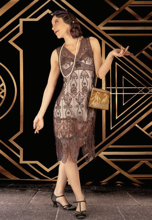
Because historical imagery from this period is limited, the images shown are intended to evoke the aesthetics of each era.
CLOTHING AND INTERIORS have always been part of the same interwoven conversation, reflecting interpretations of a broader cultural narrative. Long before the phrase “lifestyle brand” entered the cultural vocabulary, the forces shaping how people dressed—technology, economics, social change and evolving ideals of beauty—were simultaneously transforming the spaces they inhabited. Hemlines rose and fell alongside color palettes. New textiles inspired new upholstery. Cultural optimism, glamour or restraint appeared just as clearly in living rooms as on the runway.
A handful of influential designers understood this relationship instinctively and built careers that moved between wardrobe and home with unusual fluency. In the early twentieth century, Elsie de Wolfe reimagined dark Victorian interiors as light, livable rooms that reflected the same liberation women were beginning to express through modern dress. Coco Chanel extended her sharply edited fashion sensibility into her storied apartment at 31 Rue Cambon, where mirrored screens, sculptural furniture and dramatic contrasts created a spatial expression of her couture. Midcentury visionaries like Dorothy Draper brought theatrical style into hotels, products and even automotive interiors, while Ralph Lauren later formalized the modern lifestyle empire, translating his cinematic Americana into furniture, textiles and architecture. Today, designers such as Kelly Wearstler and architects such as Peter Marino continue to foster this design integration, shaping both the garments we admire and the environments we move through.

Harwood
Just as these designers reflected their moment, the broader culture of each decade—from postwar optimism to minimalist restraint—left its imprint on both fashion and interiors, shaping the colors, materials and moods that defined how people dressed and how they lived.
Together, their work reveals the simple truth that style has never belonged solely to the closet or the home, but lives in the seamless dialogue between the two.
The Art Deco Era
The 1920s arrived on a wave of relief.
World War I had ended, industry was booming, jazz filled nightclubs, and cities crackled with new energy. After years of austerity, Americans were yearning for modernity—and for a little sparkle.
Design answered the call.
By the mid-1920s, fashion and interiors were speaking the same bold language, and what women wore to cocktail parties often looked like a close relative of what architects installed in dining rooms.
Picture a 1928 evening gown—a sleek column of silk satin trimmed with beaded chevrons and metallic fringe. Step into an art deco living room from the same year, and the parallels are immediate. A rug repeats those chevron angles, a mirror bursts outward in matching rays and even the hardware on a lacquered cabinet echoes the stepped pattern stitched across a bodice.
This wasn’t coincidence. It was a shared aesthetic response to a rapidly modernizing world.
Art deco celebrated progress. Skyscrapers were rising, automobiles were becoming common and new machinery promised a streamlined future. Fashion reflected that spirit with clean silhouettes and graphic ornamentation, while interiors abandoned heavy Victorian fussiness in favor of glossy finishes, geometric patterns and furniture that felt engineered rather than carved.
Materials crossed boundaries as freely as ideas. Metallic threads and sequins on flapper dresses appeared
1930s
This wasn’t coincidence. It was a shared aesthetic response to a rapidly modernizing world.
in rooms as polished chrome, mirrored surfaces and high-gloss lacquer. Velvet and silk became popular for upholstery and draperies. Even the color stories aligned with bold contrasts of black and cream, deep emeralds and sapphires and glints of gold—a nod toward optimism and prosperity.
Patterns graced items from closets to living rooms. Fan motifs on Parisian evening wraps reappeared as wallpaper in Manhattan apartments. Zigzags on a clutch became zigzags on terrazzo floors. Sunbursts radiated from brooches and headboards with equal enthusiasm.
It was also the first era when designers consciously bridged between fashion and home. Couturiers began creating textiles and decorative objects alongside dresses, promoting a radical idea for the time: style could be expressed throughout an entire environment.
Walk into a fashionable 1930s apartment, and you could often guess exactly what its owner liked to wear. The same woman who favored a beaded shift dress with angular deco patterns probably gravitated toward geometric rugs, mirrored trays and sculptural lighting. For the first time in modern history, personal style became environmental style.
Domestic Optimism
After the turbulence of the 1930s and the sacrifices of World War II, the 1950s arrived with a collective exhale.
Factories that had once produced planes and tanks now turned out automobiles, refrigerators and other shiny new appliances. Suburbs expanded, kitchens became the heart of the home and Americans embraced a vision of modern life that felt orderly, cheerful and full of promise.
Fashion led the way with a return to polish and femininity. Christian Dior’s “New Look,” introduced in 1947, set the tone with cinched waists, full skirts and soft shoulders.
Step into a 1950s living room and you’ll see the same spirit translated into furniture and finishes. Sofas curved gently like the sweep of a tea-length skirt, while dining chairs perched on slim, tapered legs that mirrored the tidy lines of a kitten heel. Everything felt tailored and coordinated.
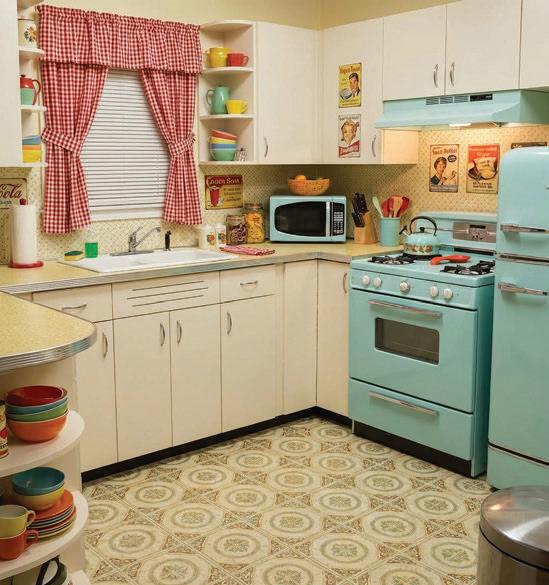
The postwar palette favored approachable pastels—mint green, powder blue, pale pink, buttery yellow. These shades appeared everywhere at once, including in cardigan sets and summer dresses, in tiled bathrooms and in the glossy enamel of new appliances. A woman in a pink shirtwaist dress could easily be standing in a kitchen finished in the same hue.
Patterns crossed effortlessly from closets to countertops. Atomic motifs— boomerangs, starbursts and abstract dots—appeared on circle skirts and midcentury wallpaper alike. Ginghams and florals decorated both picnic dresses and kitchen curtains.
New materials reinforced the connection. Just as fashion embraced crisp cottons and easy-care synthetics like nylon, interiors celebrated practical
1950s Homes were meant to look put-together. So were their owners.
innovation. Formica countertops, vinyl flooring and molded fiberglass chairs promised modern convenience with a glossy, can-do attitude. Both worlds were selling the same dream of stability with a modern twist. Homes were meant to look put-together. So were their owners. A welldressed hostess in a fitted dress and pearls looked perfectly at home beside a gleaming pastel range and chrome dinette set.
Color Gets Loud—and Moves In
By the early 1960s, the tidy optimism of the post-WWII era was beginning to fray as a new generation questioned traditions and rewrote rules in the shadow of the Vietnam War. The space race captured imaginations. Civil rights movements reshaped society. Music, art and politics pulsed with experimentation.
Design responded by turning up the volume on a two-sided album. First, fashion burst open with mod style—graphic shift dresses, bold color blocking and eye-popping patterns—while synthetic fabrics such as polyester and acrylic made colors brighter than ever. Hues included tangerine, lime green and magenta.
Additionally, patterns grabbed hold. Op Art graphics appeared on minidresses and wallpaper alike. Psychedelic swirls migrated from concert posters to bedspreads.
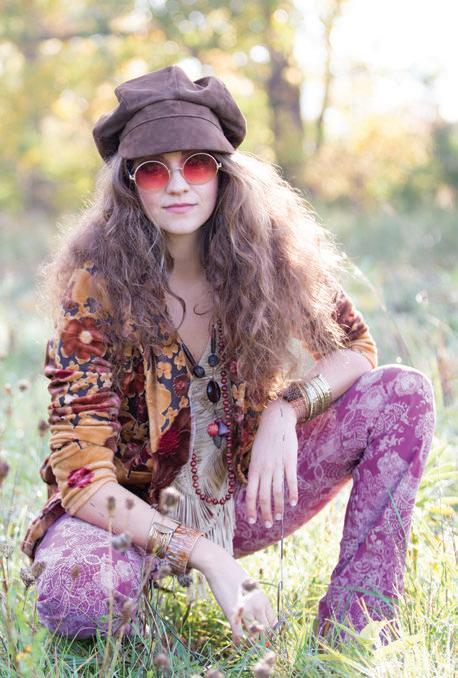
By the end of the ’60s, flower power and hippie culture took hold, and the color story shifted from bright primaries to earthier hues—mustard, rust, olive and burnt orange. Those tones appeared just as readily in bell-bottoms as they did in shag carpets and upholstered sofas.


Pattern language shifted as well. Crisp optical prints loosened into paisleys, florals and free-form swirls. A peasant blouse printed with oversized blooms felt perfectly at home beside a floral sofa or boldly patterned rug.
Texture became the new common denominator.
Clothing embraced corduroy, denim, crochet and fringe. Homes answered with macramé wall hangings, wicker furniture, woven textiles and thick shag carpets.
Materials reinforced the evolution. Suede boots and leather belts matched the growing popularity of leather chairs and natural wood finishes.
Embroidered blouses and patchwork skirts found counterparts in handmade ceramics and woven baskets.
What people wanted to wear was exactly how they wanted to live: relaxed, expressive and closer to nature.
By the mid-1970s, the futuristic polish of the previous decade had given way to a softer aesthetic that flowed easily between closets and homes.
Power Dressing Meets Power Decorating
The 1980s opened with a surge of confidence.
After the economic uncertainty of the 1970s, the new decade embraced prosperity and unapologetic consumerism. Wall Street swaggered, pop culture exploded and success became something to display.
Fashion strutted this newfound prosperity with power dressing—sharpshouldered suits, glossy fabrics and statement accessories that announced authority from across the room.
Interiors adopted the same posture, with living rooms becoming stages for high-gloss finishes, mirrored surfaces and furniture with presence. Lacquered cabinets, glass coffee tables and brass accents reflected the same appetite for shine that ruled eveningwear, but all in a decidedly upgraded style from its younger sister of ’20s-era prosperity.
Color made the connection even clearer.
Wardrobes filled with electric blues, hot pinks and emerald greens, while interiors leaned into saturated palettes and bold contrasts. Black-and-white graphics appeared everywhere—from dresses to checkerboard floors.
No influence captured the moment more perfectly than the Memphis design movement (founded in Milan, named after a Bob Dylan song). Its playful squiggles, clashing colors and cartoonish shapes spilled into both fashion and furniture. Models posed in magazines wearing outfits that looked as if they’d been cut from the upholstery behind them.

materials and open space, and furniture grew sleeker and simpler. Textures aligned as well. Fashion favored matte fabrics and uncomplicated cottons. Interiors echoed that softness with linen drapery, wool rugs and simple upholstery.
Another cultural parallel emerged around authenticity as, in fashion, the grunge movement rejected polish in favor of thrifted flannels and wornin denim. Homes adopted a similar “realness,” celebrating exposed brick, industrial lighting and loft living.
Materials carried the message, too. Leather, metallics and high-shine satins dominated eveningwear, while homes embraced chrome, glass and polished marble.
Nothing in the 1980s was meant to whisper. Both fashion and interiors treated style as a form of personal branding. Bigger hair paired with bigger sofas. Flashier jewelry matched flashier lighting.
The Great Minimalist Reset
By the early 1990s, however, the country was tired. A recession and growing skepticism of excess made the flashiness of the previous decade suddenly feel out of step. At the same time, the rise of technology culture brought a cooler, more restrained sensibility.
Out went shoulder pads and metallics. In came slip dresses, simple tailoring and a pared-back palette of black, white, gray and beige. Designers such as Calvin Klein and Jil Sander championed clean lines and understated fabrics.
Interiors followed almost immediately, as the 1990s embraced white walls, natural
Technology played a role, too. As personal computers and sleek electronics entered everyday life, both fashion and interiors adopted streamlined silhouettes and stainless steel surfaces. The message in both worlds was refreshingly simple. Less is more.
Personal Style Goes Global
The new millennium arrived with a mix of excitement and uncertainty. Global travel expanded, the internet accelerated cultural exchange and inspiration came from everywhere at once.
Fashion reflected that freedom.
The early 2000s became a collage of influences that ranged from boho chic to glossy glamour to sporty casual, and a renewed interest in decoration.
2010s
Social media instantly turned everyone into a tastemaker, with Pinterest boards and Instagram feeds shaping how people dressed and decorated.
Where the 1990s insisted on minimalism, the 2000s welcomed comfort and personality back into the home. Rooms layered with global textiles, rich woods, and decorative details. Moroccan poufs, Indian block prints and Asian-inspired motifs appeared beside sleek modern furniture.
Texture bridged the two worlds. Fashion embraced ruffles, embroidery, sequins and velour, while interiors saw plush pillows, beaded lampshades, patterned draperies and richly textured rugs.
Color returned as well, though in a softer way than the 1980s. Tones like turquoise, plum and chocolate brown appeared in both wardrobes and rooms.
Celebrity culture strengthened the connection. Red-carpet glamour influenced fashion with metallic dresses and statement handbags, while interiors borrowed from boutique hotels—velvet sofas, dramatic lighting and glossy finishes.
Technology shaped both realms. Fast fashion accelerated trends, and home decor followed suit with quick updates and seasonal accessories. Closets and living rooms alike became expressions of personality rather than adherence to a single aesthetic.
Curated Comfort and the Instagram Effect
The 2010s began in the shadow of the Great Recession. At the same time, social media instantly turned everyone into a tastemaker, with Pinterest boards and Instagram feeds shaping how people dressed and decorated.
Fashion reflected a softer kind of minimalism. Neutrals ruled again—camel, blush, cream and gray—but silhouettes relaxed. Oversized sweaters, casual tailoring and athleisure defined everyday wardrobes.
Interiors mirrored the new season with Scandinavian-inspired design dominated by pale woods, white walls and simple furniture. Homes became lighter and intentionally calm.
Texture replaced ornament. Boucle jackets found their match in boucle chairs. Linen dresses echoed linen sofas and curtains.
Color trends traveled easily between fashion and interior design worlds. Millennial pink appeared simultaneously on runways and living-room walls. Sage green, dusty blue and warm terracotta moved from dresses to cabinetry and accent pillows.
Social media heightened the cultural crossover as clothing and interiors were designed to be photographed. Outfits were assembled like compositions and rooms
were styled like lifestyle backdrops. By the early 2020s, the comfort era became solidified as the pandemic pushed people indoors, and both fashion and interiors softened in response.
Lounge sets and easy silhouettes became everyday wear, while homes embraced curved furniture and cozy upholstery.
Warm minimalism—rounded forms, earthy tones, tactile materials—appeared just as clearly on runways as in living rooms.
Once again, the two worlds are speaking the same language of calm, comfortable and intentionally personal.
The Shared Language of Style
From the geometric glamour of art deco to the cozy curves of today, fashion and interior design have spent more than a century quietly influencing each other. Colors rise and fall together. Patterns migrate from dresses to drapes, and materials that define an era’s clothing eventually appear in its furniture and walls.
The connection isn’t about copying—it’s about culture. What people want to wear reflects how they want to live, and vice versa. Every decade leaves behind a visual trail that runs straight from the closet to the front door. Look around your home right now. Chances are, it tells the same style story as your favorite outfit. What will the next era hold?
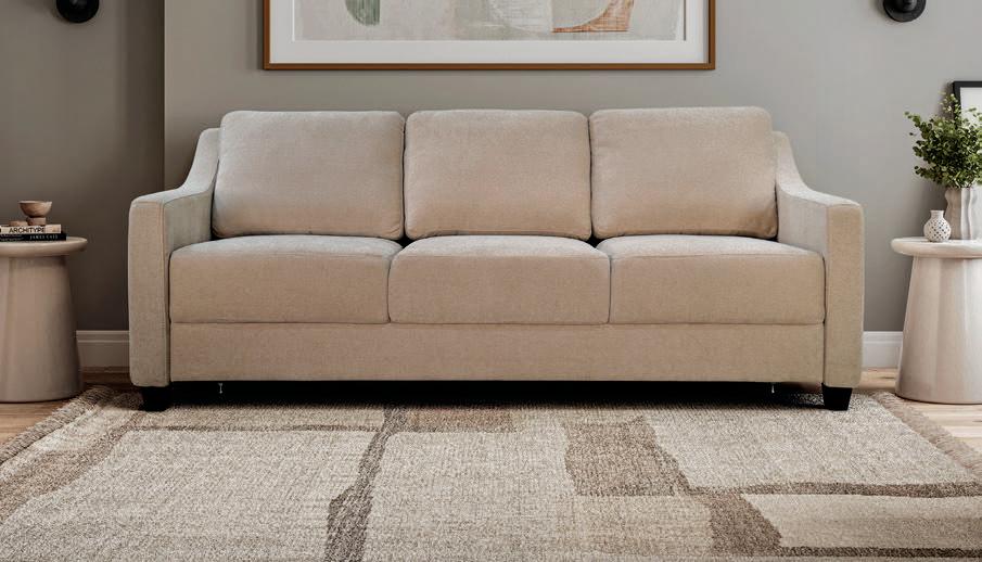
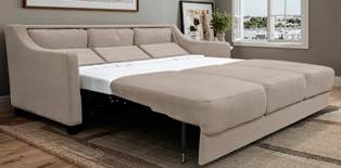
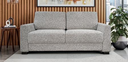
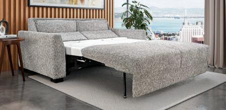
Our sofa is truly a remarkable sleeper and sofa. You will likely agree that it’s a classic, comfy sofa and be amazed that it’s concealing a sleeping oasis. You only need to remove the back cushion, that’s right, leave the seat cushions in place. You will be WOWED by our premium-flow mechanism that makes it super easy to open. Once you open your sofa it will reveal a plush mattress that invites a dream-filled REM sleep.
by Heather Shoning
retro revival
how midcentury function meets Southwestern design
MIDCENTURY DESIGN never really left—it just waited for everyone else to catch up. Born in the post-war boom from the late 1940s through the 1960s, the style was a rebellion against heaviness. Designers stripped away ornamentation, leaned into clean geometry and championed function you could see and feel. They introduced purposeful simplicity, organic curves, tapered legs and honest materials like walnut, teak and molded fiberglass. It was design for a new era—lighter, cleaner, more optimistic.
Fast-forward to now, and midcentury silhouettes are having a full-blown renaissance. Not because we’re nostalgic—okay, maybe a little—but because the architecture and interiors we’re building today practically beg for pieces with this kind of clarity. As homeowners shift toward open floor plans, natural light and streamlined spaces, midcentury furniture fits right in. The profile of a credenza with long, slim legs or the quiet curve of a low-slung lounge chair brings presence
without overpowering a room. These pieces hit that rare sweet spot: sculptural but not showy, functional without feeling utilitarian.
Where things get especially interesting is how beautifully midcentury form plays against Southwestern style—the earthy materials, plaster finishes, rugged textures and grounded palette that define so many desertinspired homes today. On paper, the pairing shouldn’t make sense. Midcentury design is crisp; southwestern design is tactile and rooted in craft. But that tension is exactly what makes the combination so compelling.
A sleek walnut console instantly sharpens a room with creamy stucco walls, arches and decorative wood elements such as vigas. Angular, tapered legs hover lightly above a handwoven rug or saltillo tile, allowing the eye to register both the furniture and the craftsmanship beneath it. A curved glass-top coffee table creates negative space that plays against chunky pottery, carved wood accents or hammered-metal
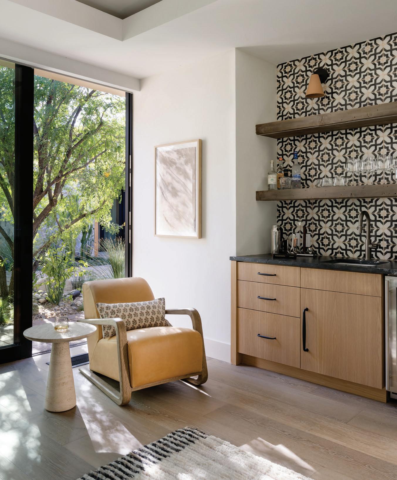
This Palm Springs–area home by Aimee Meisgeier of AM Interior Design, featured in our Voices of the Southwest article, is a lesson in blending sleek midcentury silhouettes with the warm textures and patterns of Southwestern design elements.
Miranda
Estes Photography
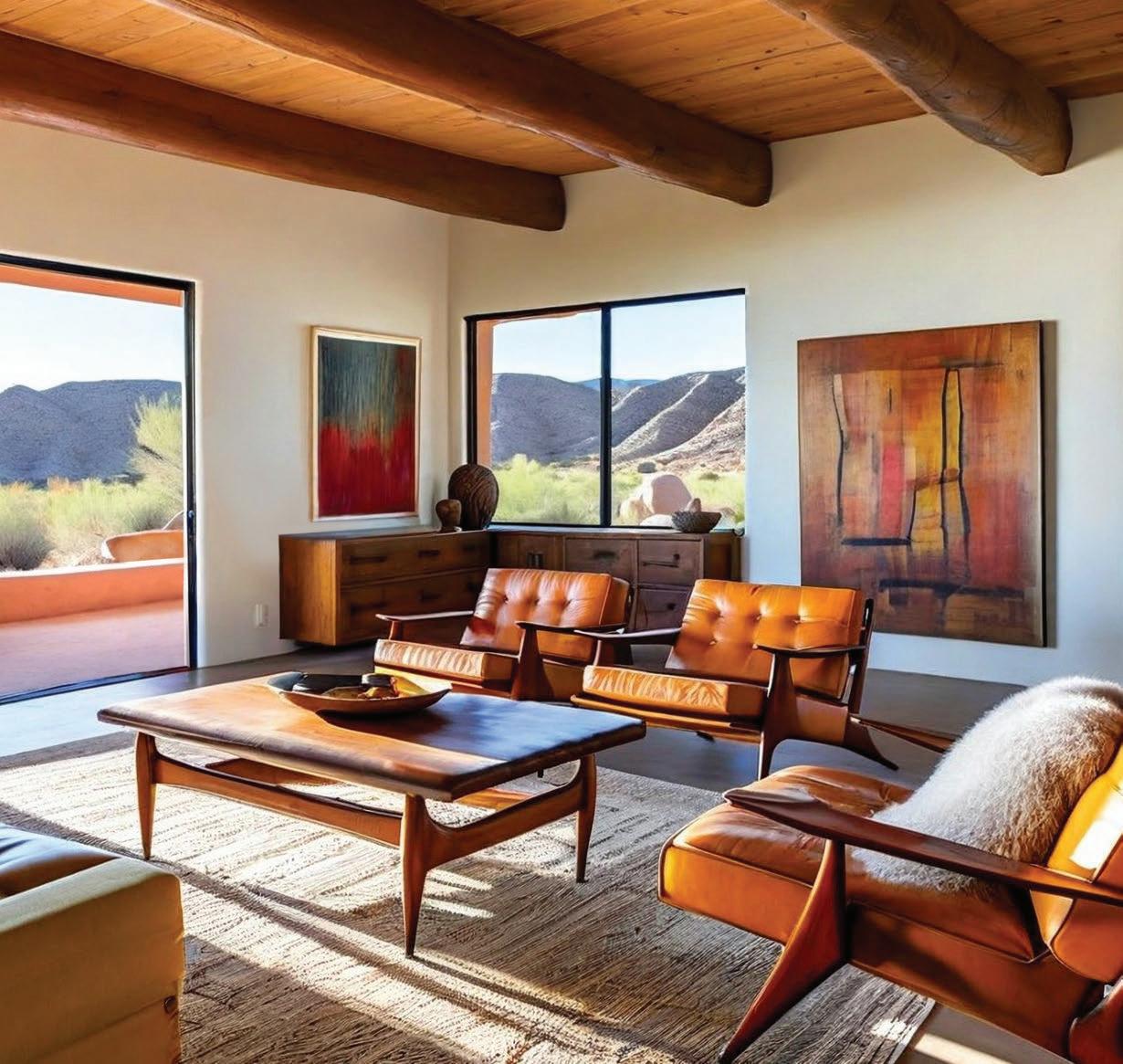
lighting. Even bold midcentury art or lighting—with its saturated color and playful geometry—becomes more vibrant when placed in a space wrapped in sunbleached neutrals.
Southwestern design thrives on warmth, patina and a connection to place. Midcentury pieces bring structure and modernity. Together, they create rooms that feel grounded but not weighed down, contemporary but still tied to tradition. The contrast highlights the best of both styles—midcentury’s disciplined lines and Southwestern’s handmade textures.
It’s also a practical pairing. Desert-inspired interiors can lean heavy if everything is rustic, carved or earth-
toned. Bringing in a midcentury profile—a cabinet with clean inset doors, a chair with a sculpted seat, a sofa raised gracefully on wooden legs—introduces visual breathing room. It keeps the palette warm but elevates the space with intentional, modern precision.
That’s why designers keep returning to midcentury form. These pieces don’t shout. They refine. They clarify. They strike the balance between comfort and sophistication that so many homeowners want right now. And when you put that refined silhouette against the raw, organic soul of Southwestern style, the room gains depth and contrast—proof that good design, no matter its decade, always finds its moment again.
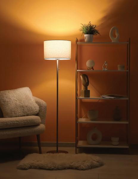
Ever notice how the right lighting can completely change the feel of a room? Adding a dimmer cord and compatible bulb to an existing lamp is one of the simplest ways to create instant ambience in your home. Lamps already provide a softer, more flattering light than overhead fixtures, and a dimmer gives you full control over the mood. Lower settings create warmth and relaxation in the evening, while higher light levels are better for reading or other tasks. Dimmer cords plug into standard outlets and work with most table and floor lamps, making them an easy upgrade without rewiring. When paired with warm-tone LED bulbs, the result is a cozy, layered glow that feels intentional and inviting. With minimal effort, a dimmer turns everyday lighting into a flexible design element.

a contemporary vision
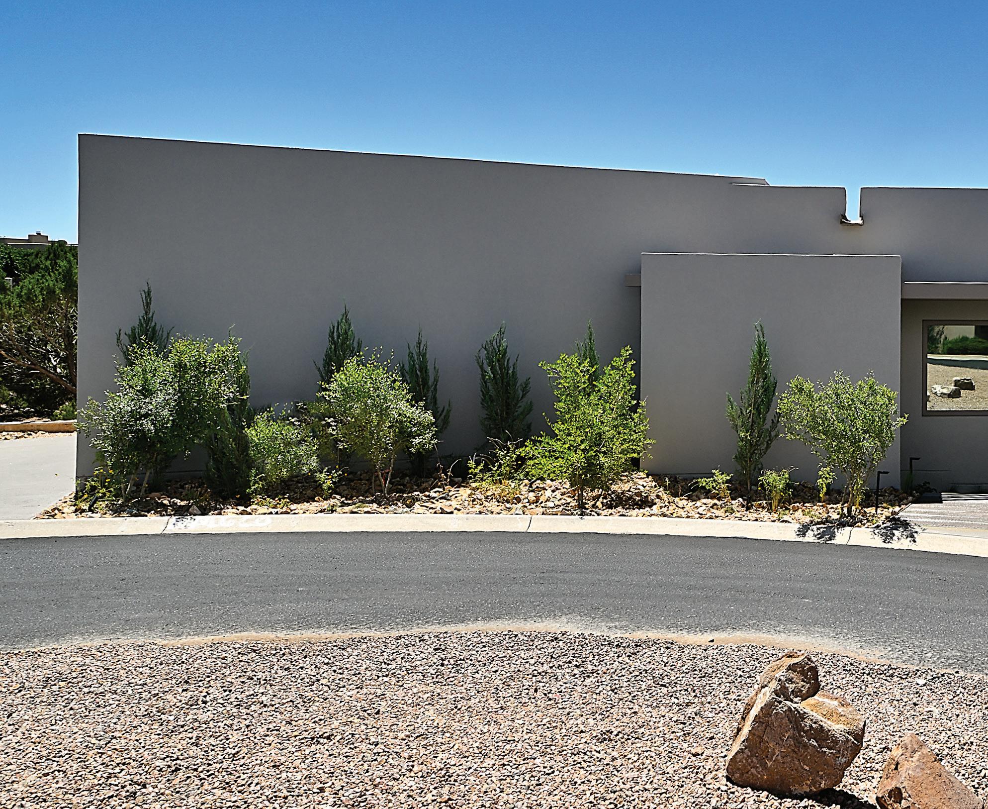
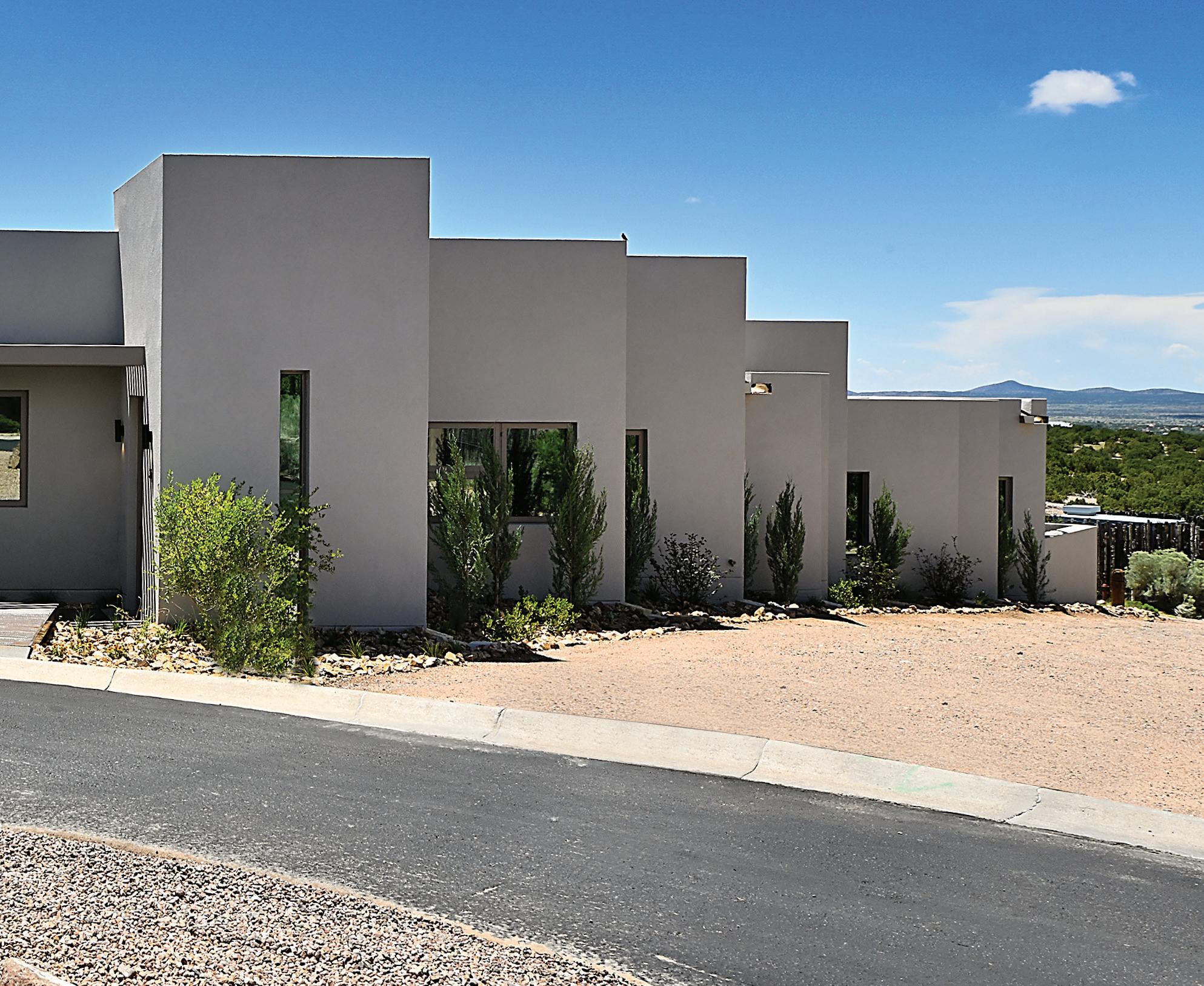
this modern home in Aldea de Santa Fe bridges Pennsylvania roots and New Mexico landscapes
by Lexi Marshall photographs by Daniel Nadelbach
The story of Greg Weaver and Shannon Brady’s Santa Fe home begins with a rainbow. Standing on a sloped lot in the Aldea neighborhood one evening in 2023, the couple watched as a rainbow arced across the distant Jemez Mountains. That moment of natural beauty crystallized their vision for what would become “Project Rainbow”—a contemporary residence that honors both the dramatic New Mexico landscape and Weaver’s Pennsylvania heritage.
“That spot in nature just screamed potential,” recalls Greg, a biotech executive who relocated to Santa Fe with his wife Shannon, a yoga teacher, after falling in love with the city’s culture and pace during their first visit.
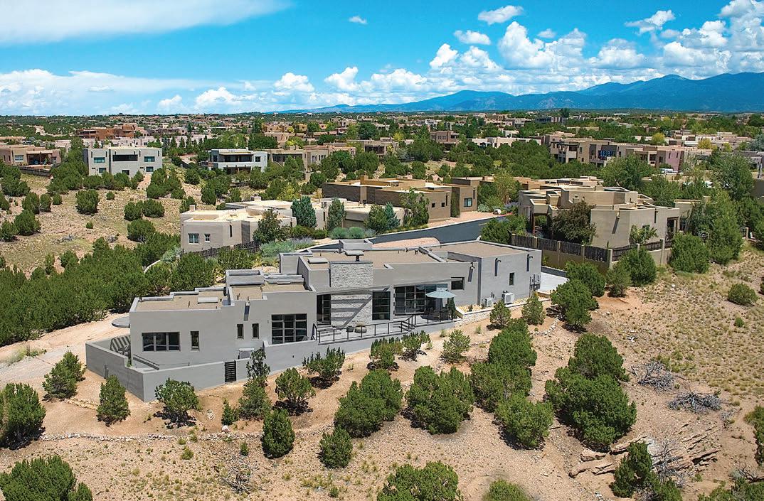
The potential, however, came with significant constraints. The narrow lot drops 30 feet from top to bottom—a dramatic fall compressed into a tight footprint that pushed development from lot line to lot line. For Acacia Builders’ Brandon MutzThomas and his team, including his sister Alyssa Mutz, the challenge demanded creative problem-solving that would become a hallmark of the project.
Mutz-Thomas, whose family-run company has built a reputation over six years for high-end craftsmanship and custom residential work, noted that they were granted a variance that extended outside the lot size. The variance allowed them to build on portions of land owned by the Aldea community, as the surrounding land was designated open greenbelt and a service road that separates the homeowners’ two lots. “It really forced us to step this property down, creating this staircase effect as you move through the house,” he says.
Working with architect Jon Dick of Archaeo Architects, the team designed
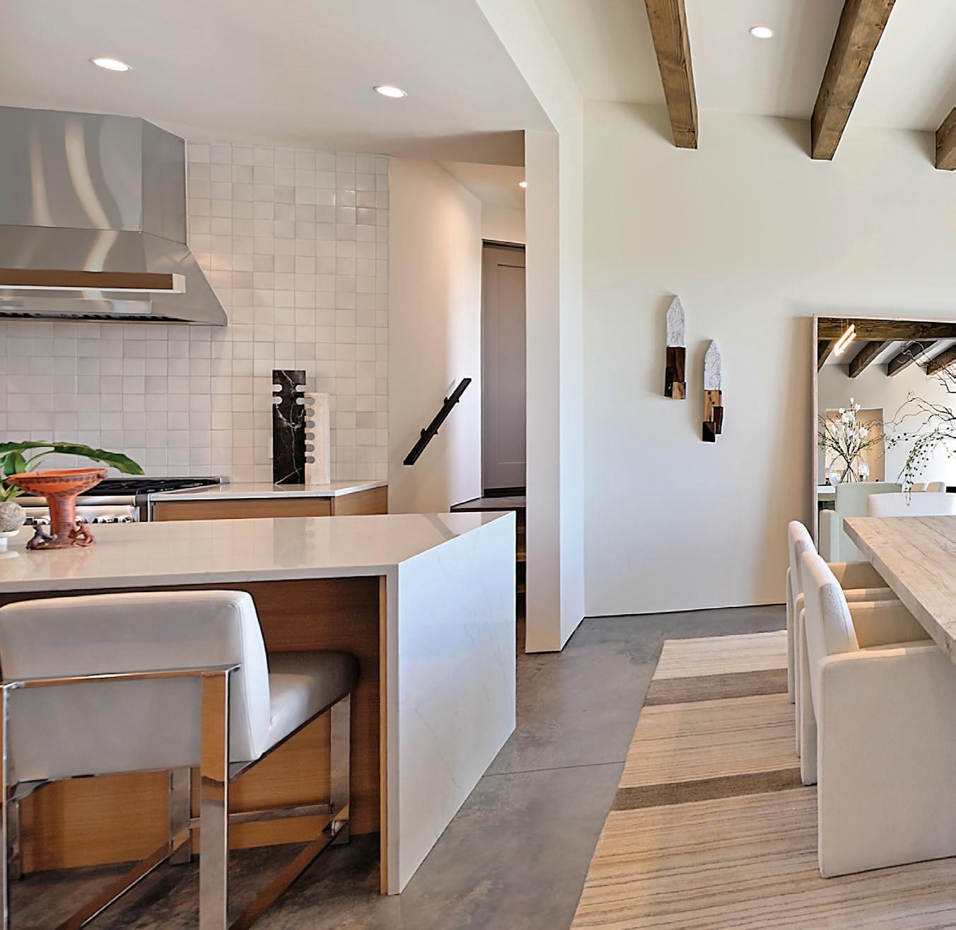
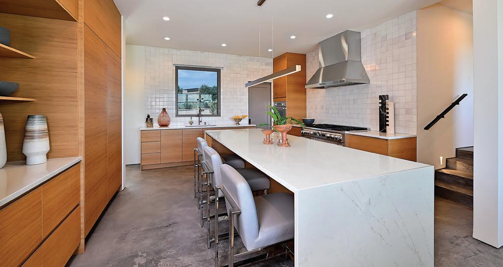
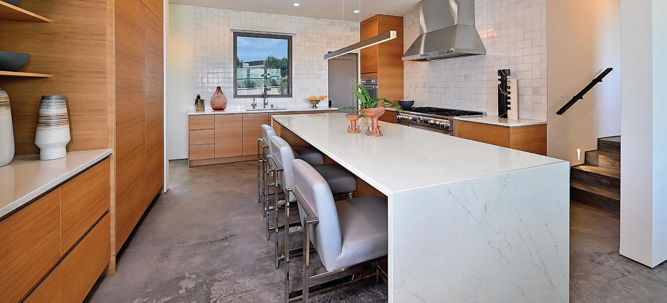
White oak cabinetry features solid white oak interior drawer boxes, an uncommon luxury in modern construction that speaks to Acacia’s commitment to quality in places most guests will never see.
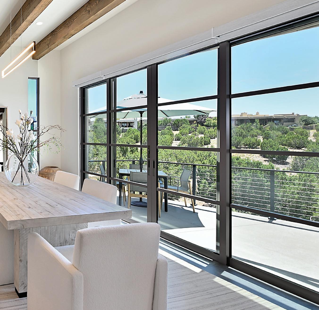
a home that cascades down the hillside, turning the lot’s limitations into architectural drama. Dick, whose firm has spent three decades creating award-winning work throughout the Southwest, saw the project as an exercise in spatial economy. “The character of the lot called for added creativity in orienting the structure and fenestration so that the primary spaces could capture the best views,” he notes.
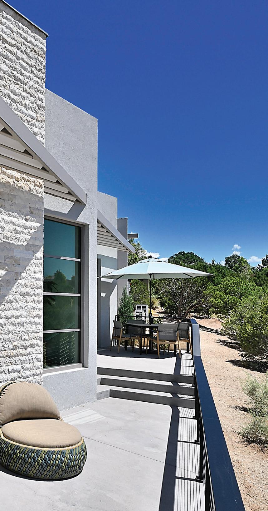
The result is a 2,741-square-foot residence that feels both expansive and intimately connected to its surroundings. Two 12-foot-high vestibules serve as pivot points, their skylights flooding the interiors with New Mexico’s legendary light. Glass walls dissolve boundaries between inside and out, while the home’s strategic stepping preserves sight lines to the arroyo and mountain vistas beyond.
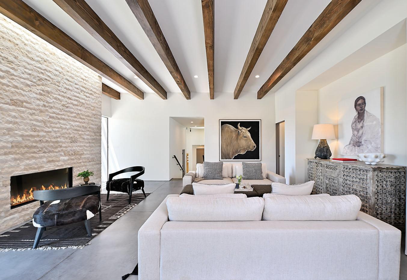
At the heart of the design lies a deeply personal element: Pennsylvania limestone. Greg, who grew up in Pennsylvania, requested the material as a connection to his roots. The limestone appears on a dramatic fireplace mass and extends outdoors to define yard walls throughout the property, creating “a story that walks through the house,” as MutzThomas calls it.
“He wanted to somehow fit true Pennsylvania limestone into his fireplaces and key aspects of the house,” Mutz-Thomas says. “Jon’s design of the fireplace mass that the door pockets into was the perfect spot for that limestone to pull that concept into the project.” Given the lot’s constraints, traditional swinging doors would have consumed precious square footage.
The stone installation wasn’t without adventure. When the first shipment arrived, the delivery truck malfunctioned, dumping material across the building site. “It was a very large deal at the time,” laughs Alyssa Mutz. “But it makes for a good story at the end of the day.”
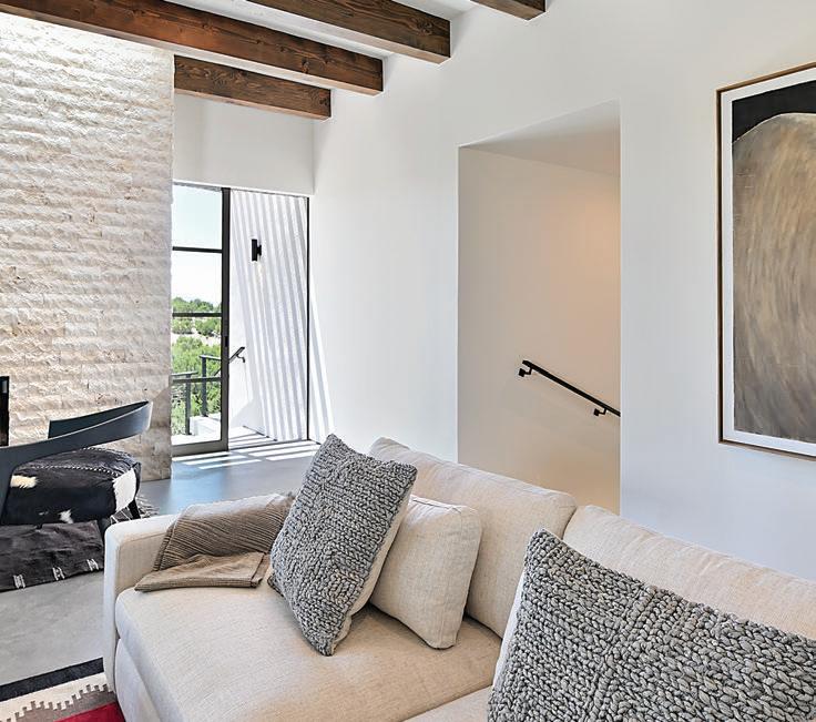
The homeowners’ collection of New Mexico and Arizona art and Navajo rugs find the perfect backdrop in the home’s minimal palette, with white walls and concrete floors allowing the couple’s carefully curated pieces to take center stage.
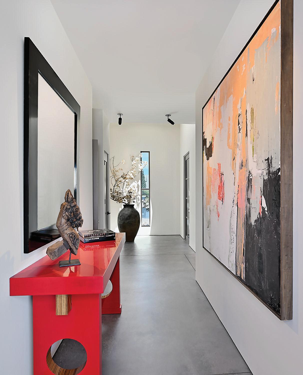
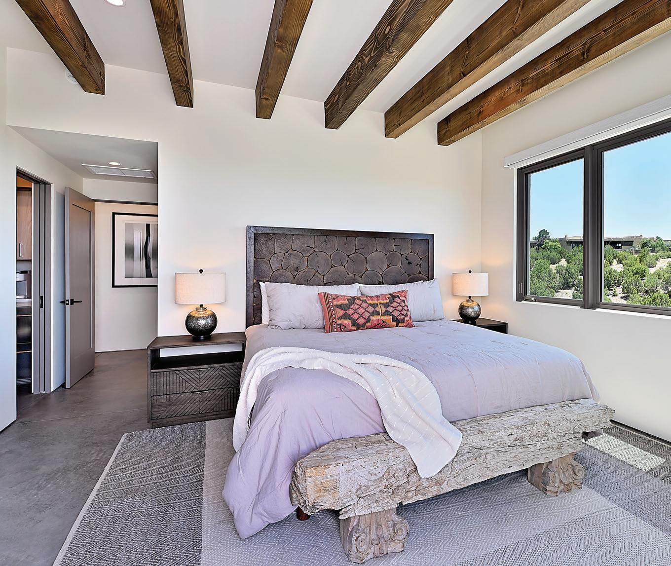
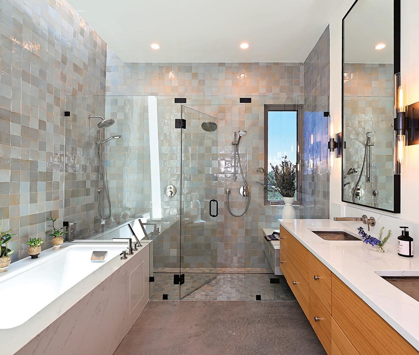
The home’s material palette celebrates both contemporary aesthetics and traditional craftsmanship. Handmade Moroccan zellige tiles—each hand-snapped and handglazed—cover kitchen and bathroom walls in undulating patterns. The irregular tiles, which can vary up to a quarter inch, require painstaking installation. Acacia’s tile masons hand-sort each piece to maintain nearly invisible grout lines, traditionally just 1/32-inch wide.
“In the primary bathroom, we have that huge run of zellige tile that runs into the shower, and there’s a wall-towall skylight above it,” Mutz-Thomas says. “During the day, you get this beautiful casting of light that plays off the hand-glazed tile.”
Equally striking are the exposed concrete floors. To accommodate the floors’ subtle variations, Acacia finished
the walls with a reglet detail.
“The drywall doesn’t touch the floor,” Mutz-Thomas says. “It gives this effect that your walls are floating off the ground, and that detail steps down throughout the staircase and all the interior spaces.”
The approach reflects Acacia’s philosophy of layering small, considered details into every project. White oak cabinetry features solid white oak interior drawer boxes—a level of finish rarely seen in contemporary construction. Floating cabinets, massive wood ceiling beams and traditional canales nod to Santa Fe’s architectural heritage while maintaining clean, modern lines.
Greg and Shannon, who split time between Santa Fe and New York, participated actively in the design process despite being out of state during much of the 10-month
build. Acacia’s use of an online portal allowed the couple to review selections, track progress through daily photos and stay connected to every decision.
“We were able to do all the selections remotely—the tile, the exterior concrete color, the interior concrete color, confirming the Pennsylvania limestone coursing,” MutzThomas says. “Being very transparent and open during the build phase keeps clients very happy, because building a house is stressful. There are thousands of decisions.”
The transparency paid off. The couple trusted Acacia enough to feature the home in Santa Fe’s 2025 Haciendas Parade of Homes. “They never said ‘no’ to even our craziest ideas,” Greg says of the building team.
Surroundings Studio completed the landscaping vision, creating intimate garden moments within the tight site
and extending the Pennsylvania limestone theme through retaining walls. Native plantings soften the home’s modern geometry while respecting water conservation principles essential to high-desert living.
For Greg and Shannon, the home is a gallery for their collection of New Mexico and Arizona art and Navajo rugs—a retreat that captures the spirit of their adopted city. “We are so blessed and grateful for this special Santa Fe place to call home,” Greg says.
On a challenging lot where most builders might have seen only obstacles, they found opportunity—proving that even in a city steeped in architectural tradition, there’s room for fresh interpretation when guided by respect for place, commitment to craft and the inspiration of a rainbow.
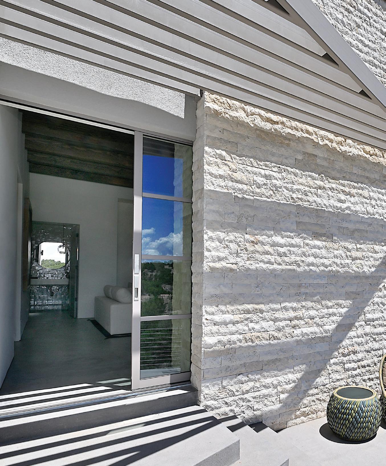
Exterior pocket doors on both sides of the home maximize usable square footage on the constrained lot, eliminating the swing radius traditional doors require and creating seamless indoor-outdoor transitions when the doors disappear into their pockets.
resources
Architecture
Archaeo Architects
Home Builder/Home Design
Acacia Builders, Inc.
acaciabuilders.com
Interior Design
Alchemy Staging & Design
Samuel Design Group
Appliances
Builders Source Appliance Gallery
Bathroom/Kitchen Fixtures/Sinks
Dahl Plumbing
Beams
Builders FirstSource
Cabinetry
Heceli Kitchens and Baths (vanities)
Reform (kitchen and laundry)
Countertops
Arizona Tile (supplier)
Raby Home Solutions (installation)
Decor/Art
Sukhmani Designs
Susan Eddings Perez Gallery
Fireplace/Outdoor Furniture
The Firebird
Flooring (concrete)
Advanced Concrete Design
Front Door/Sliding Doors/Windows
Architectural Windows & Doors
Gate
Norskog Metal Works
Interior Doors
Pats Doors
Landscaping
Surroundings Studio (architecture)
JS Landscape and Construction (installation)
Metal Railing
Viewrail
Trellis
Construction De Funes (fabrication)
Ultimate Construction (installation)
Window Coverings
Custom Window Coverings
color defined by architecture, landscape and life personalized palettes
by Lisa Marie Hart
Interiors can be cozy and cocoon-like, moody and mysterious or simply a calm pause for the spirit. Whether grounded in a neutral foundation or layered with expressive color, the most successful spaces begin with a thoughtful response to architecture, landscape or the people who live within them. Three interior designers share how they shaped deeply personal design palettes for three distinct homes within the Las Campanas community.
contemporary contrasts modern
organic interiors balance high-contrast neutrals with natural materials to a cozy effect
photos by Jenna Peffley
ONE BLANK CANVAS led to another for designer Cara Scarola of WDB Interiors. After she and her husband built a home from the ground up, she considered the empty rooms another chance to begin with a fresh slate.
Set against the quiet openness of the golf community, the house was sited for peacefulness and views—conjured as a haven to nurture relaxation after a long workday. Outdoor living is integral to that sense of relief, and her material and color selections call out to the surroundings beyond. Her design also prioritizes the conveniences and joys of family life as well as functionality for easy entertaining.
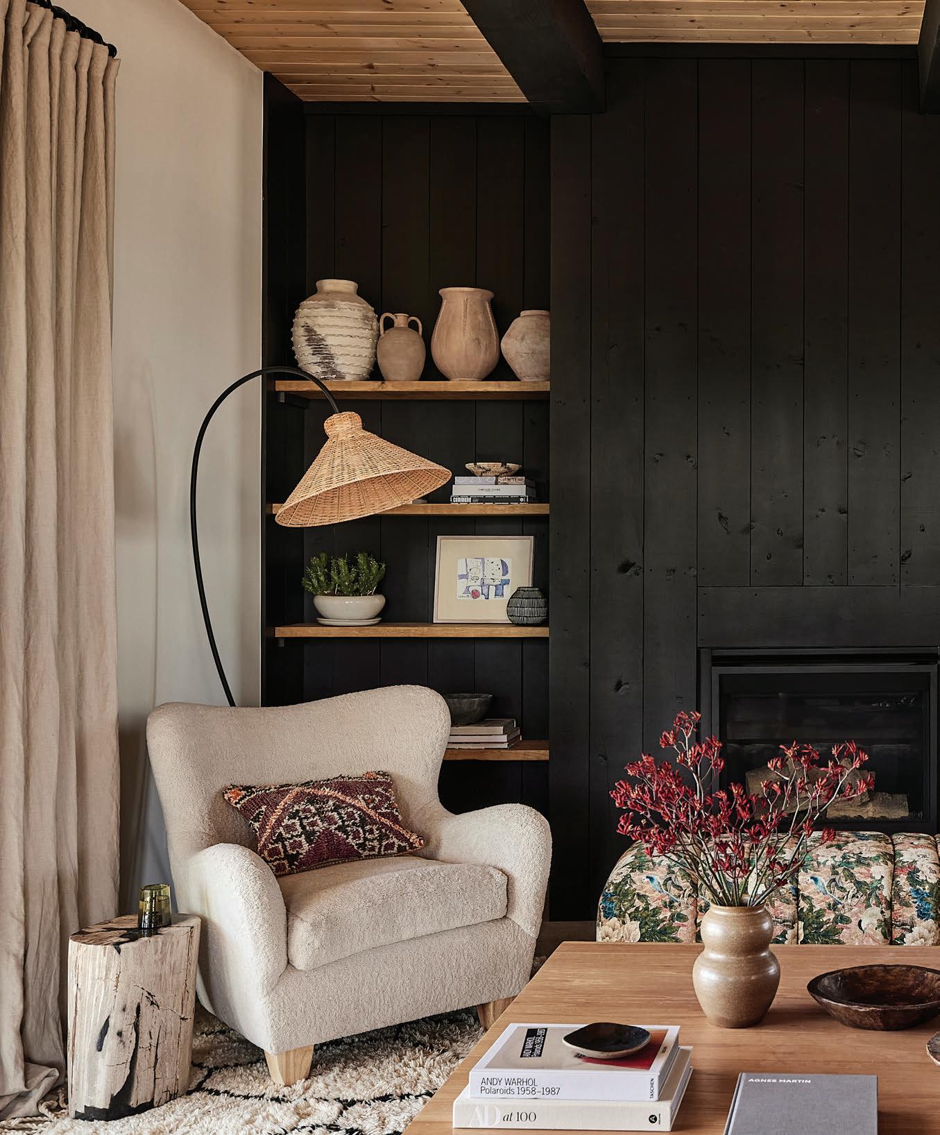
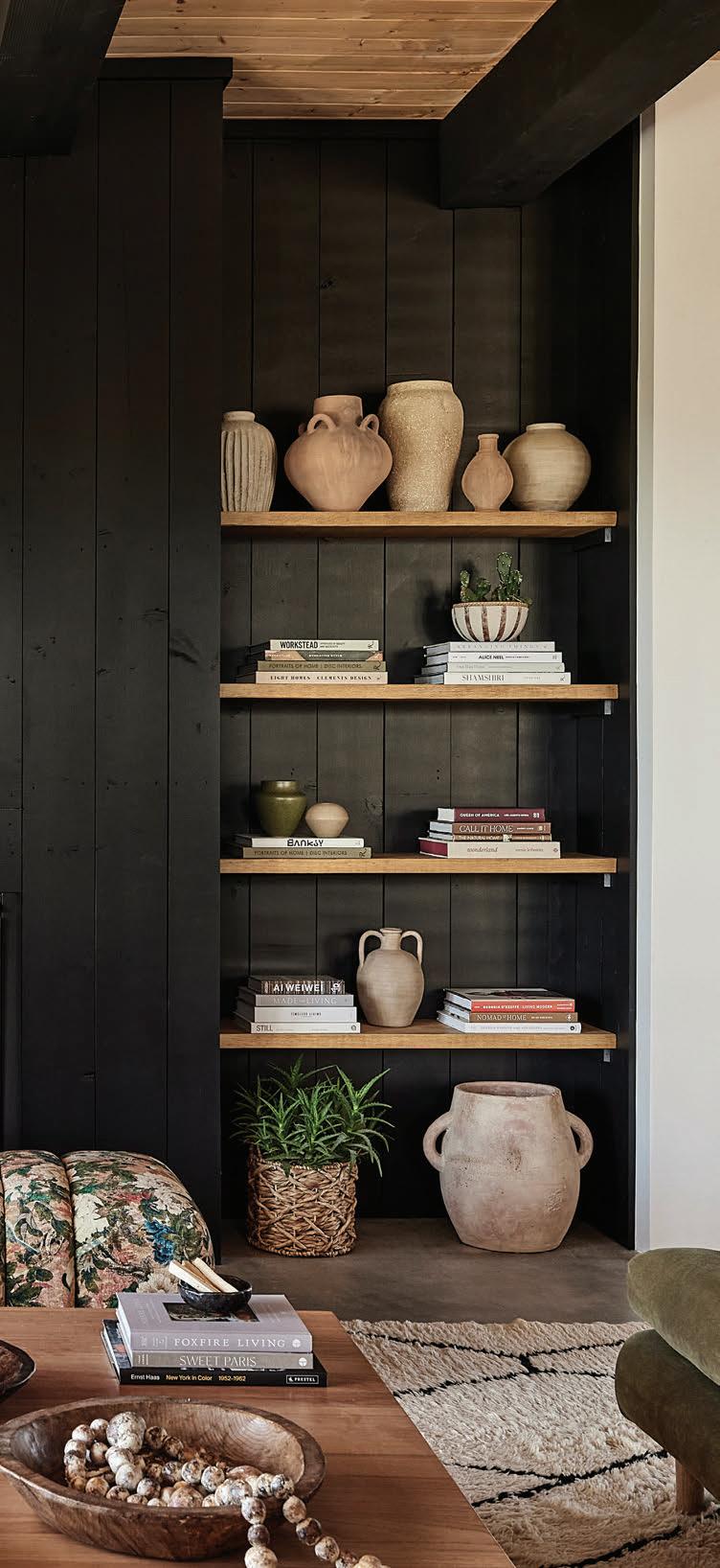
Scarola calls the aesthetic “modern organic.” It’s an inviting mix of muted colors, natural materials and meaningful collections that are both rooted in place and deeply personal—all punctuated with perfectly placed black elements for striking contrast. From custom furnishings to tile and lighting she’s long admired, each choice contributes to a home that looks chic and contemporary yet feels warm and welcoming.
“The house is relatively clean and simple with its concrete floors, white walls, and black and wood accents,” she says. “It has a nice neutral palette, which gave us a lot of freedom.” Each space lay open to the possibility of personalization—a chance to make it a little different than the next, yet still part of a cohesive whole.
The heart of the home is the view-laden kitchen, living and dining area, set in an open-plan with glass sliders on multiple sides. It’s the place where they spend the most time, and the indoor-outdoor flow to the covered portals makes it live even larger. Two fabric-and-bamboo pendants from Thailand—saved on Scarola’s pinboard for years— hang above the sleek kitchen island with a black marble countertop with a waterfall edge. A single artwork depicting a black car heightens the drama of the contrasting styles.
Furnishing the house from scratch turned out to be a project highlight. “We decided everything
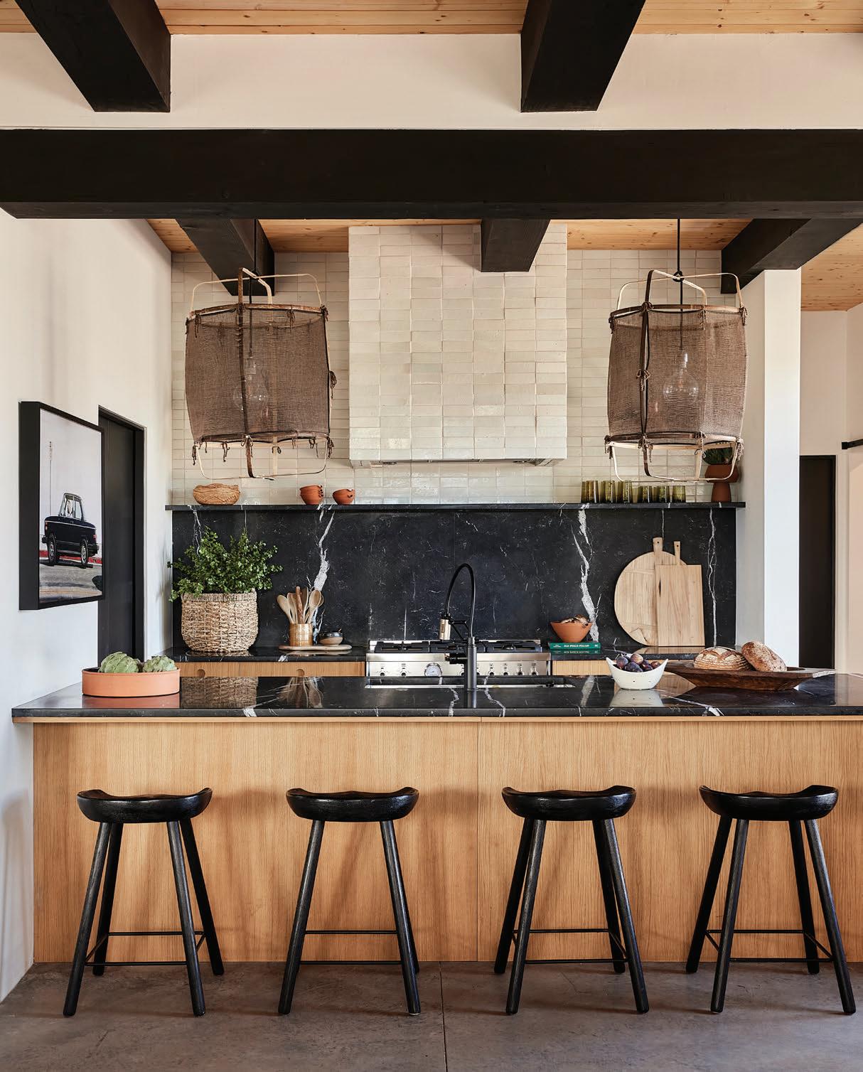
The uneven surfaces and highgloss glaze of Moroccan zellige tiles add texture to the bathrooms and kitchen, reflecting light across the backsplash and hood.
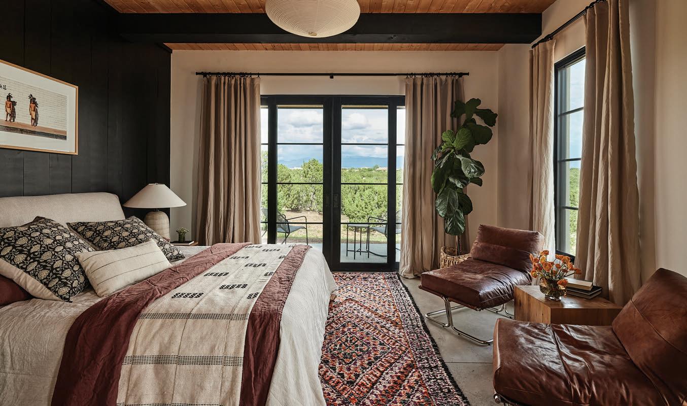
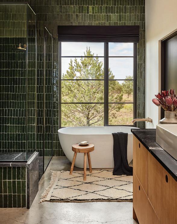
goes—we’re starting over,” Scarola says. Her own custom pieces enhance the home’s style, scale and proportions. She juxtaposed them with vintage finds and work by local artists—a thoughtful mix she also brings to clients. Pottery and baskets gathered over time—some from the International Folk Art Market, others special gifts or passed down from family—create meaningful displays.
In the more private corners of the house, personality reigns. Her teenage son’s room features an eye-catching wood-trimmed wall treatment in matte green, while her daughter’s youthful lair embraces her love of collage, floor to ceiling, anchored by a custom headboard with black-andwhite checked fabric. The color-drenched bathrooms lean into earthy hues Scarola notices deep in the landscape. “They’re an updated earthy,” she clarifies, “not the old fiery reds” traditionally associated with the region. Deep burgundy builtins in one, and in the others, gleaming Moroccan zellige tile in ochre and botanical green—her favorite way to pump up the texture while reflecting natural light.
But it’s black that wraps every element together. Scarola introduced it with a measured hand—framing the windows and doors, bringing modernity to the mudroom, coating the vigas, plus one wall of the primary bedroom. The contrast gives the rooms a crisp edge without cooling them down, a contemporary twist on Santa Fe’s vernacular that still feels easy to live with. “Even though the house has these tall ceilings and a lot of glass, it feels cozy,” she says. The ideal place to relax.
Home Design/Interior Design: Cara Scarola of WDB Interiors (formerly Built Design)
An essential combination in Scarola’s “modern organic” design is the honeyed wood tones and rich blacks that pair up in every room.
hint of blue
a luxe modern home takes color cues from the closet
photos by 4Birds Photography
WHAT BEGAN AS A VACATION RETREAT
for a Texas couple evolved into the luxuriously livable full-time home they’d long envisioned. He golfs; she’s into fitness. They both agreed that relocating to Santa Fe was their best move. Designer Chandler Prewitt of Chandler Prewitt Design shaped the complete remodel with an eye toward calm, modern environments that support their active lifestyle.
Originally featured on the Parade of Homes, the 15-year-old house had started to lose its luster. The couple was excited to invigorate their spaces with purposeful updates and upgraded finishes. Working with them remotely at first, Prewitt tailored the home to their personal taste and restored its sense of newness. “They wanted it to feel like Santa Fe, but with a bit more of a modern aesthetic,” he says. “She especially wanted something lighter and much softer to the eye.”
Quality materials and craftsmanship guided every decision. Prewitt’s approach centers on quiet luxury, longevity and a sense of place— values reflected in the home’s restrained palette and carefully considered details. A single question he posed uncovered their color preferences for the contemporary redo. “I like to ask clients, ‘If we were to go through your closet, what would we find?’” Prewitt says. “She has a lot of neutrals, but she also has a lot of blues.”
The remodel began with the broadest brushstrokes, including replacing the original, pink-toned plaster with a warm, creamy hue, extending wood flooring into the bedrooms and kitchen, and refining the existing cabinetry with a new paint treatment, glaze and hardware. “Coming up with the right color for the kitchen cabinets was really important to me—and something I labored over,” Prewitt says. Even as he wrapped natural wood bands around the kitchen hood, a kiva fireplace and the living room mantle, he ensured the wood tones complemented the palette.
In the living room, Prewitt finessed the voluminous proportions to create a more intimate setting without losing its openness. A substantial water feature outside the window became part of the experience. High above, he removed the plastic, candle-style covers on the chandelier, then commissioned artisan hurricanes made of crackled glass—a bespoke enhancement that elevated the entire fixture.
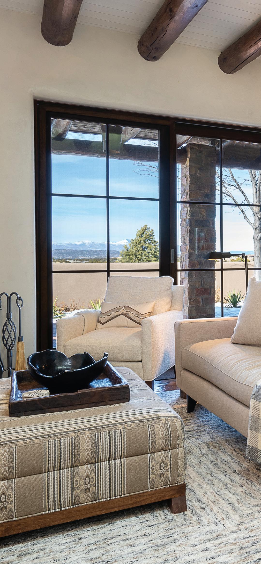
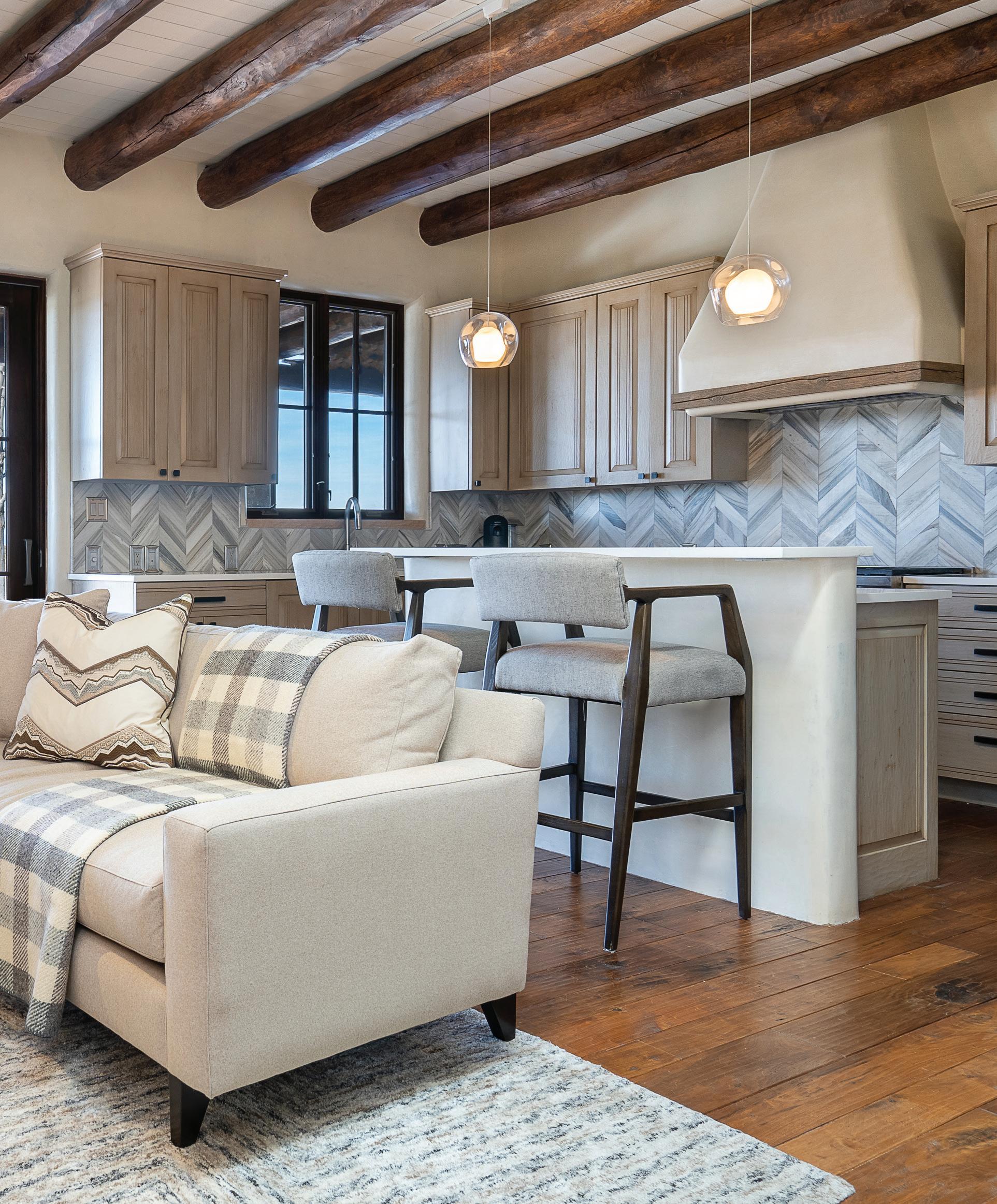
Though the living room presented a grand scale— with a window encompassing nearly one full wall—Prewitt grounded the space for closeness with art, handcrafted tables and handblown glass.
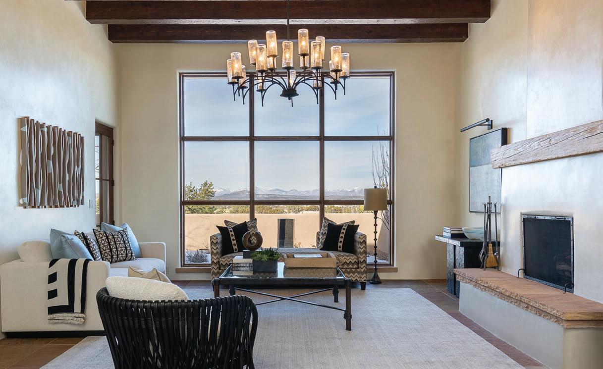
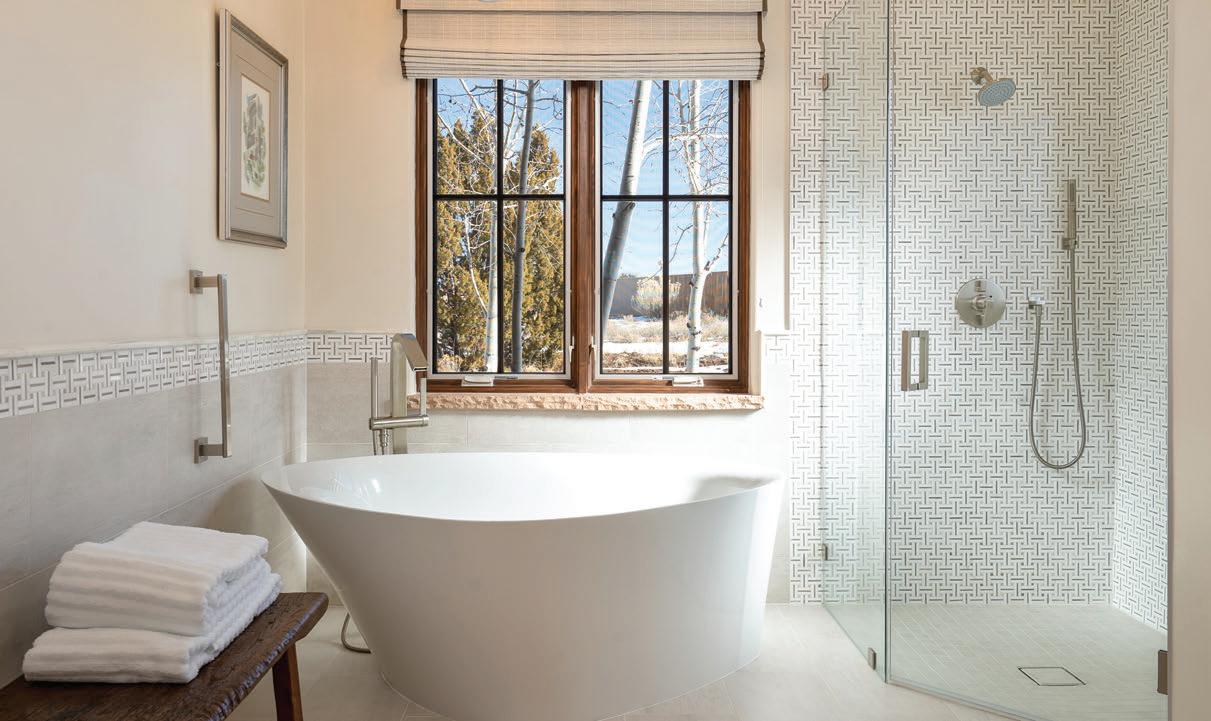
The lighter hues and modern fixtures of the primary bathroom are foundational elements that flow through the home, updating its spaces with a quiet, luxurious ambience.
Shades of blue shift from room to room, but as the home’s single accent color, they create a calming continuity without ever feeling predictable.
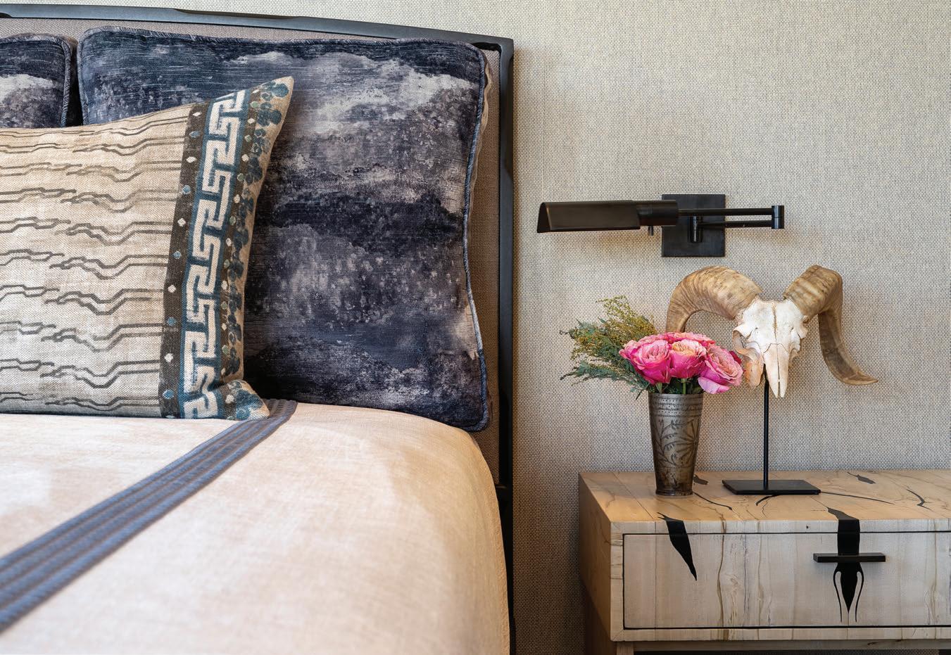
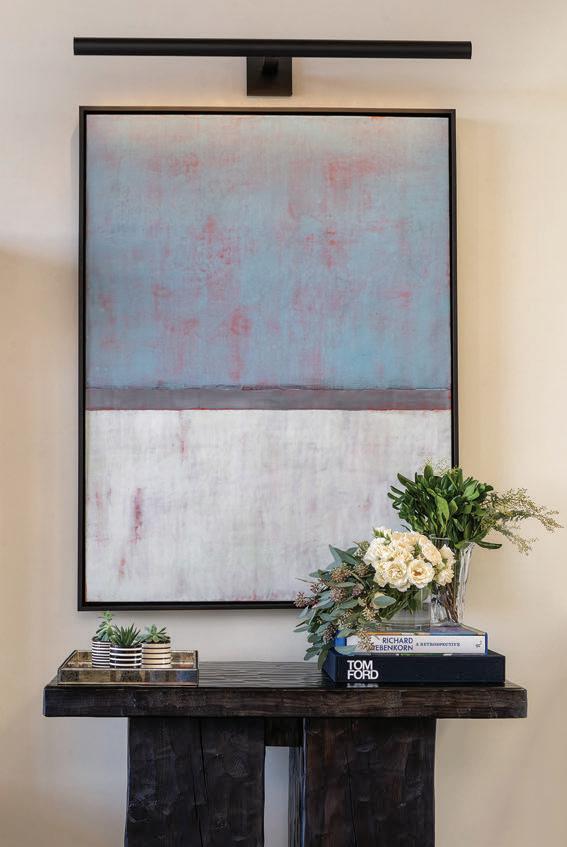
The kitchen and its adjacent lounge invite casual connection. Over the island’s bar-height chairs, bubble-shaped blownglass pendants balance the angles of the chevron tile backsplash. Steps away, a cozy fireside conversation area serves as the couple’s media room. Upholstering the ottoman in a Southwest fabric added a touch of regional flavor.
Art brings individuality and local color throughout the home. Prewitt curated significant works by Santa Fe artists, including two encaustic color-field paintings by Amy Van Winkle. “Our use of color was limited,” Prewitt notes, “so we let the artwork take center stage.” The dark wood console tables beneath each painting were handmade in New Mexico by Pfeifer Studio.
In the primary suite, floating wood nightstands and luxurious textiles with hints of midnight blue fold into a dreamy sanctuary. The lighter, brighter bathroom shines as one of the most dramatic transformations. Replacing dated finishes and the heavy look of the former built-in tub are an asymmetrical soaking tub, a minimalist chandelier and an antique bench. Summing up that space, and the full project, Prewitt says, “They really loved the way it turned out—and I love the way it turned out, too.”
Interior Design: Chandler Prewitt Design, chandlerprewitt.com
a desert rainbow
blending past, present and the colors of the high desert turns a new house into a soulful family retreat
photos by Amanda Powell
HOUSTON-BASED DESIGNER Mary Patton of Mary Patton Design knows exactly how to make a house a home—one that feels familiar, loved and just lived in enough, even from the first night under its roof. It’s a rare skill clients seek her out for, in addition to her joyful approach to elegant, eclectic interiors. For her family’s own Santa Fe getaway, she reached deep into her designer’s toolbox and applied her own best practices.
The couple chose a new Spanish Pueblo Revival home as they each have fond childhood ties to the location—her family had a second home in Santa Fe, while her husband spent summers there visiting his grandparents. A hideaway with sunset views promised a new chapter of memories plus more space for hosting guests than their Texas abode can offer. While its newness offered high ceilings, plenty of light and a feeling of openness that Patton loves, its blank spaces came up short on character.
“Time is valuable, so I didn’t need to commit a year to a renovation or invest in construction,” she says. By using her signature techniques for layering furniture, draperies, rugs and local finds, “I worked with what was already here to make it our own.”
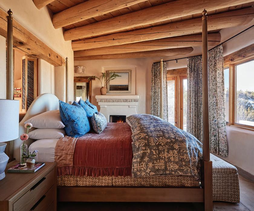
Patton’s approach blends past and present with an easy confidence—a mix of new custom pieces, plus vintage finds and antiques that infuse instant warmth. She gravitates toward furnishings with history and soul, pairing traditional motifs with unexpected touches. Here, Moroccan kilims, French nightstands and an antique Spanish mirror live in richly textured harmony.
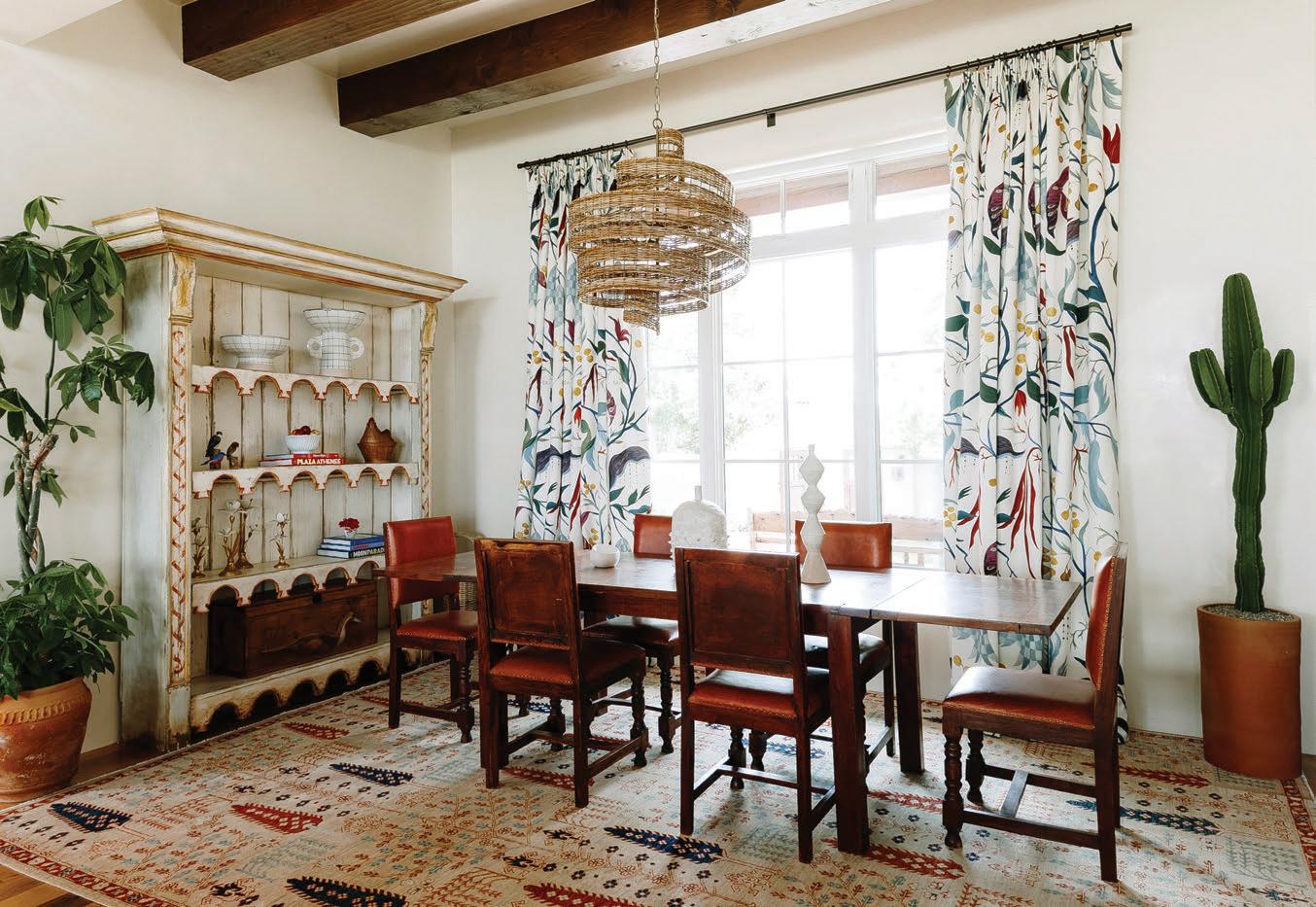
A devotee of patterns and prints, she followed her textile obsessions. Fanciful fabrics she had treasured but never used found their way into her design. Pierre Frey drapery in several rooms underscores her belief that well-chosen florals can soften and elevate Southwest style.
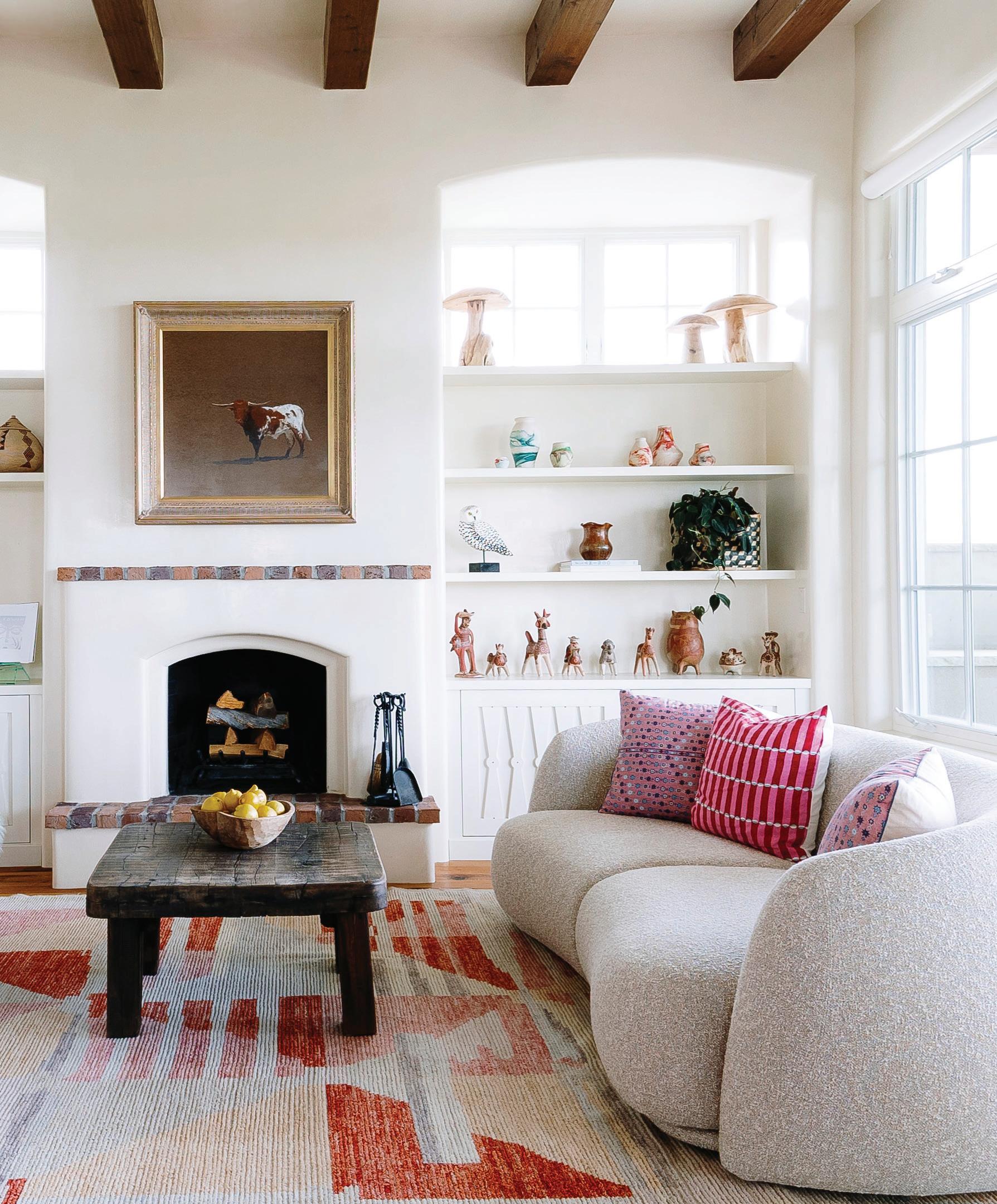
The home highlights Patton’s artfully placed color, as if by a paintbrush, in a palette that celebrates the vibrancy of the high desert. “This setting is so beautiful. If you pay attention, you can pick out every single color of the rainbow,” she says. Her creative execution harnesses the sky in the custom pale blue sofa and a sunset pink rug in front of the tub. She reflects the rock in earthy
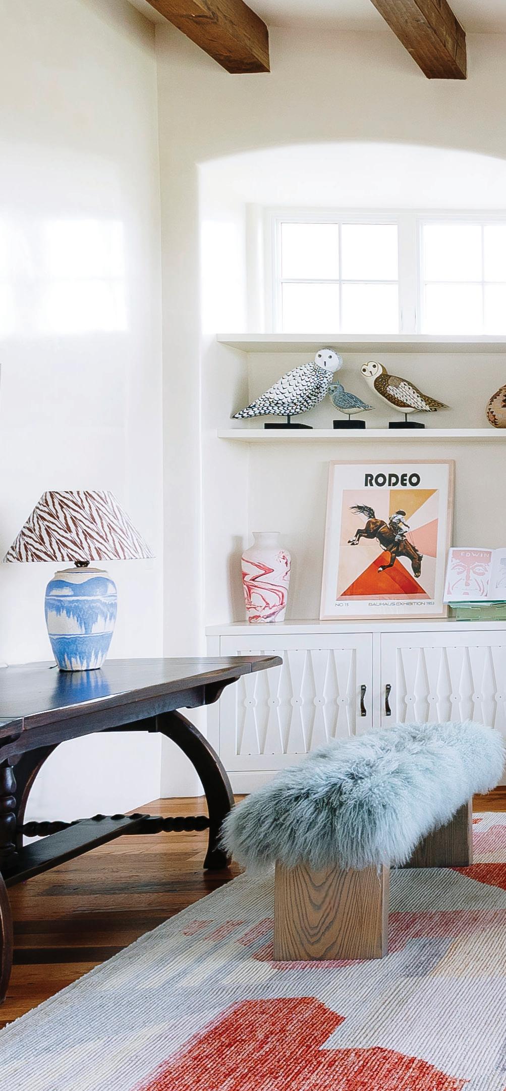
Light washes across the high-ceilinged new home, warming Patton’s colorful, collected interiors and enhancing each cozy moment she curated for her family.
In the dining room, Pierre Frey drapery establishes the palette for a few bold statement pieces, from the vintage table to the antique shelving.
tones of leather furnishings, while colors from the plant life and wildflowers grace accents sprouting throughout the home.
Patton didn’t bring existing artwork or accessories, yet she wanted each room to feel inviting and collected. She has a surprising trick for shopping swiftly to achieve a curated look: consignment stores. “I’ve found several in town that have the coolest stuff,” she says. Often, she strikes gold and discovers pieces all from one home that already work together—a readymade assemblage for her living room built-ins or the dining room’s antique Spanish shelving.
Knowing that plants enliven any home, Patton asked the owner of SABO in Santa Fe to outfit hers with a selection of living decor. Even easy-care cacti, she notes, add another layer of visual softness and interest.
Her finishing flourish illuminates the entry with a touch of sentimentality. “Growing up, my family had a light just like this one,” she says of the star-shaped tin pendant lamp, studded with rainbow-colored glass. “I always remembered it.” Simple and rustic, her favorite light fixture brings a long-held affection into the family’s new home right from the threshold.
Interior Design: Mary Patton Design
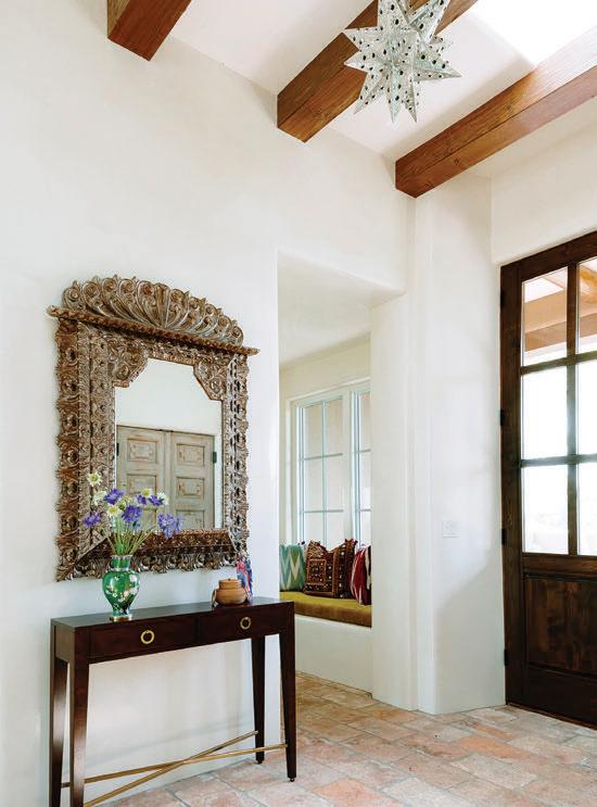
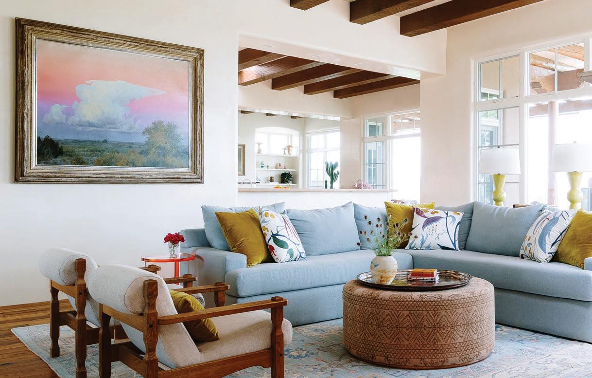
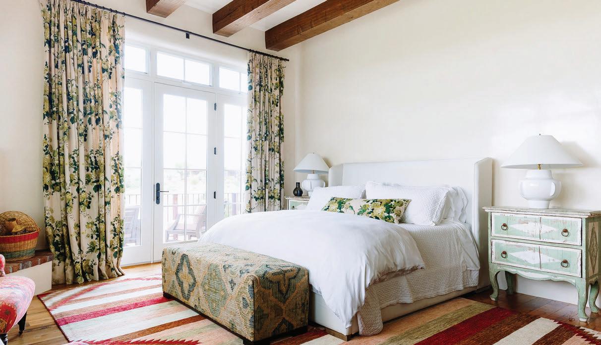
Throughout her spaces, Patton blends clean lines with soft curves, new furnishings with rustic vintage ones and romantic florals with eclectic, time-honored textiles.
Vida Buena

Cannon Beach calls
the
quaint Oregon town invites visitors into a slower rhythm of shops, wine and sweeping coastal views
ON OREGON’S RUGGED coastline, just south of Ecola State Park, lies the seaside village of Cannon Beach. Spanning just more than a square mile, this tiny town welcomes more than 1.5 million visitors each year. Best known for Haystack Rock—a 232-foot sea stack made famous by films like “The Goonies” and the “Twilight” saga—Cannon Beach buzzes on weekends as Hemlock Street fills with beachgoers, boutique browsers and diners hunting for fresh oysters and a glass of local red. And it’s often celebrated as one of the most scenic coastal destinations in the state.
To start your stay, check into the Inn at Haystack Rock, a cluster of cozy cottages just one block from the beach. The cheerful bungalows are easy to spot, painted bright turquoise with signature pink doors. Each cottage centers around a shared courtyard with a fire pit and Adirondack chairs—an inviting spot to soak in the
by Haley Rae Shoning
coastal air while unwinding with a beverage.
Once you’ve settled in, set aside a full day to explore the town and wander in and out of the quaint shops and galleries around North Hemlock between Washington and 3rd streets. Antler & Alder is an ideal spot to bring home a keepsake from the trip. The thoughtfully curated boutique offers everything from playful stickers and distinctive home goods to on-trend beachwear, all infused with a distinctly Oregon sensibility.
Just across the way, you’ll find Cannon Beach Book Company. From the outside, this welcoming bookstore looks to be a typical coastal home, right down to the wooden front porch and traditional pine shingles. But inside you’ll find shelves and tables packed with bestsellers, rare reads and delightful stationery.
Next door, The Wine Shack offers a perfect pause for both shopping and a refreshing sip. Named one of GQ’s

Top Wine Stores in America, the shop is home to the Puffin Tasting Room, where travelers can sample a lineup of awardwinning Puffin Wines crafted exclusively for the store by Oregon vintners. Purchase a bottle or two to take home, and the tasting is complimentary.
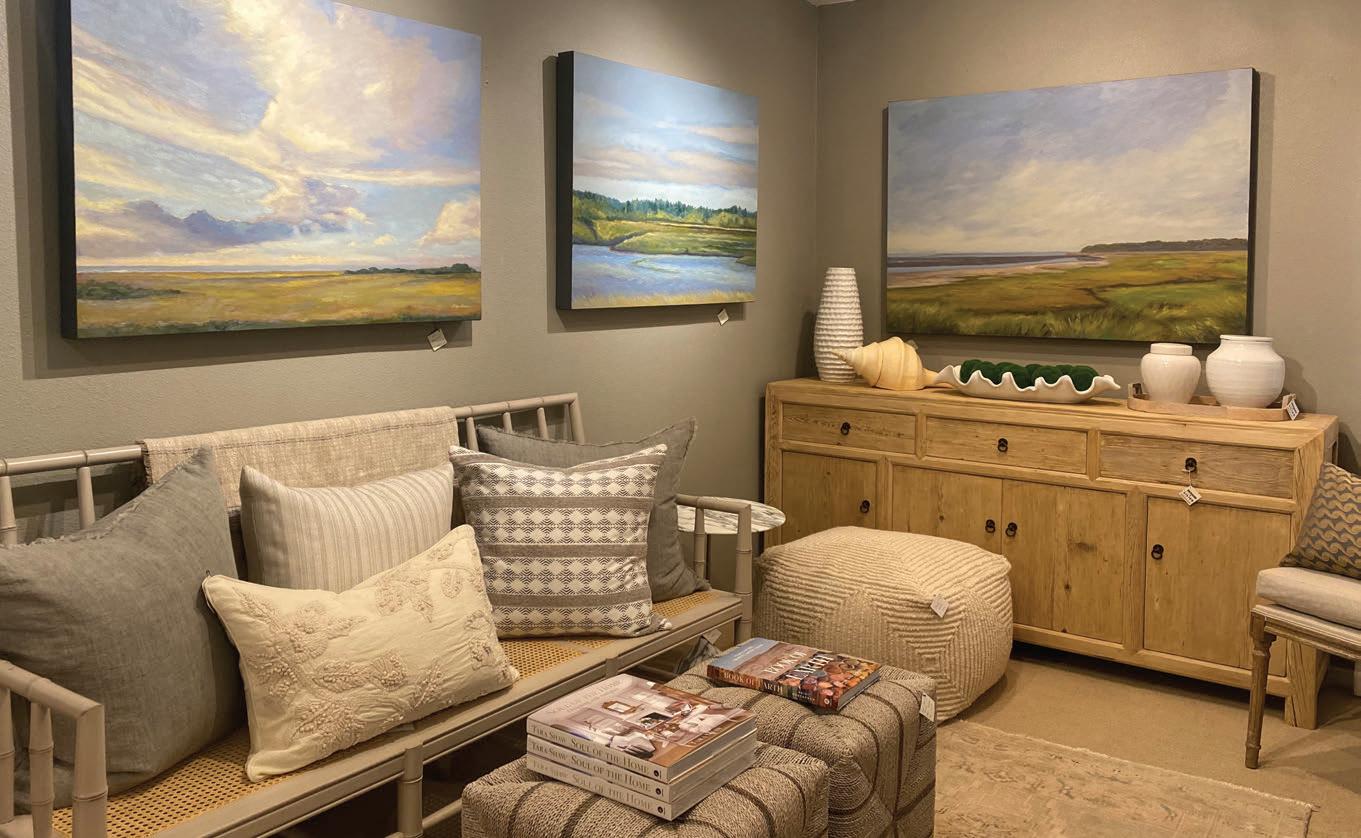
When you’re ready to keep exploring, continue north to Second Street, where Sesame + Lilies sits just off the main drag. An independently owned interior design firm and town fixture for more than two decades, the shop is a go-to for distinctive finds. Many call it a hidden gem—here, you’ll find a vast, handpicked selection of antique home furnishings and decor, plus upscale gifts like luxury soaps and perfumes.

James Ferguson
Baum
Vida
Sesame + Lilies
Before the sun goes down, make your way over to the edge of town to the beach. While the shoreline fills with daytime visitors in the afternoon, the crowds thin by evening. It’s the perfect time to snap a photo with Haystack Rock, slip your toes into the chilly Pacific, and explore the tide pools for starfish. With a bit of luck, you may also spot tufted puffins nesting on Haystack Rock or even herds of elk grazing along the beach at dusk.
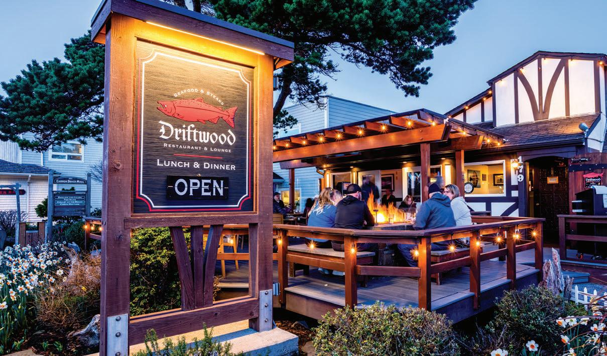
After taking in one of the area’s signature sunsets, head back into town to sample the local cuisine— particularly the fresh seafood that comes with a coastal setting. A longtime fixture, Driftwood Restaurant & Lounge serves classic seafood and steak dishes alongside an extensive wine list. Guests can linger over dinner on the expansive outdoor deck, gathering around firepits as the evening cools.
For an intimate evening out, the menu at Anna’s Table highlights flavors of the Pacific Northwest, such as oysters on the half shell, crab cakes and octopus. Head chef and owner John Nelson grew up helping his mother at her dockside clam chowder shack and now crafts fresh, seasonal meals inspired by his experiences along the North Coast. Complement the source-to-table fare with a rotating selection of wines from the nearby Willamette Valley to unwind and close out the evening.
Whether you’re an outdoor enthusiast eager to explore the Pacific Northwest, an oenophile hunting for a standout local vintage or simply seeking a quintessential coastal experience, Cannon Beach should be at the top of your 2026 travel list. A long weekend here is just enough time to relax and soak in the sights, sounds and charm of the Oregon coast.


by Kastle Waserman
designer Kelee Katillac brings a fresh take to wallcoverings colorful histories
Aaron Leimkuehler
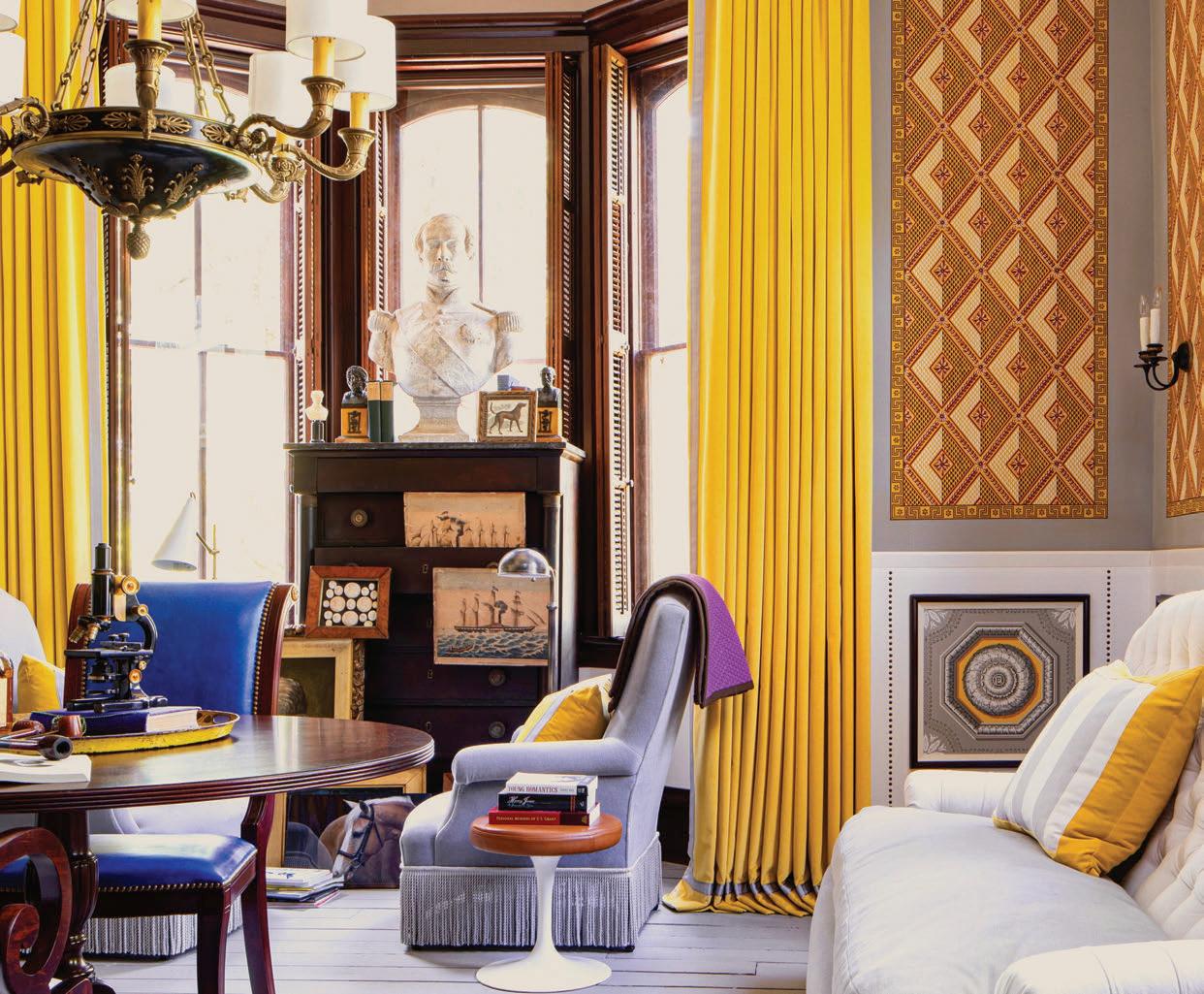
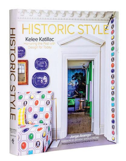
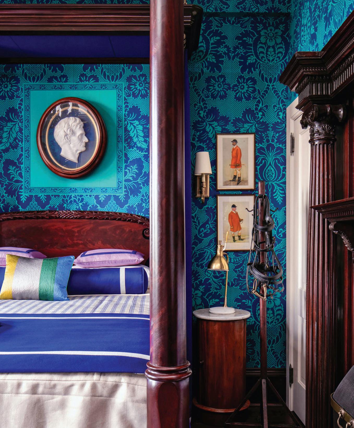
AS AN ARTIST, Kelee Katillac knows the power of color and custom design. Growing up in Kansas City, she knew in college that interior design was her calling. She practiced design in New York in what she called a “traditional way” before finding her style using her diverse artistic skills of painting, ceramics and sewing to inform her work.
Though she has worked all over the U.S., she recently relocated to Santa Fe. Before her move, Katillac set out to answer the question: Can historic design be renovated to honor the past while remaining relevant today? The designer, artist and historian thinks so. She aims to reinterpret spaces and continue the narrative of their occupants, which led to a partnership with Adelphi Paper Hangings to reimagine historic patterns with bold colors for fresh looks.
The collaboration began after Katillac embarked on a monumental project to restore a crumbling manor house in the farmlands of Missouri. Built in 1878 by Henry and Sarah Blosser and designed by Swiss architect John Daniel Walters, it was saved from the wrecking ball by the late Dr. Arthur Elman and his wife, Carolyn Elman, for historic preservation. They enlisted Katillac to begin the monumental task of renovation.
“I envisioned the house as a book. It starts with the early phases of American history and French history when you walk in the front door. Then we go into the
Aaron Leimkuehler


20th century as we go up the floors. So, room by room, it tells the story,” Katillac says.
Dr. Ellman was the French consul to the Midwest. Katillac recalls he was fond of French style, so she worked to evolve the home’s story to include the current owners, a hallmark of her work on historic spaces over the past 20 years. “My heart’s work has been to bring everyone into the story and create new narratives and address the fact that many of those places were created by craftspeople who were not recognized as part of the story.”
Katillac used 12 historic pattern wallpapers from Adelphi throughout the Blosser estate, amping up the pigments and injecting new energy and personality. “Adelphi had worked with designers before. But mostly they would pick things from the archive with muted colors,” she says. When Katillac took a
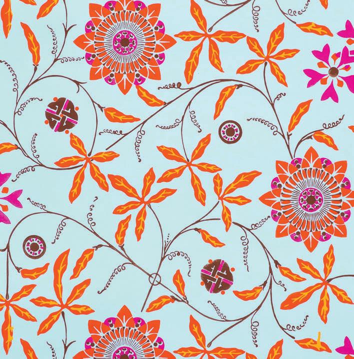
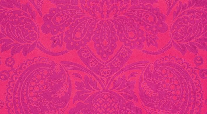
different approach and started sending them samples of unconventional colorways, she says they were skeptical at first, but then their tone changed. “There was a glow coming from the emails—an excitement, a receptivity. I think it energized the house of Adelphi in a new way.”
Katillac says she uses color meditation to find the right hues. “I’m always trying to align with a higher power. I start by filling with white light. Then I ask what color I need. Then pause. And I literally get the color. I hear it and see it.”
Today, surrounded by desert hues, she says she’s a student of the land. “My clients mentor me,” Katillac says. “Because I work with a diverse group, I’m always learning and trying to better understand and represent the organic style that grew out of the pueblo.”
Refreshing your home with light, natural spring fragrance can instantly shift the indoor mood. Sachets filled with dried lavender, citrus peel or fresh herbs are an easy way to scent drawers, closets and entryways without overpowering the space. Simmer pots—often called stovetop boils—are a simple way to add fresh fragrance to a larger area. Gently heat water with ingredients like lemon slices, rosemary, mint or vanilla to release a clean, subtle aroma. Fresh flowers and clipped greenery also contribute a soft fragrance while adding visual interest. Beeswax or soy candles infused with botanical notes offer a longer-lasting option plus ambience for evenings. The key is layering scents thoughtfully and keeping them light. Spring fragrance should feel clean and uplifting, not heavy, allowing your home to feel fresh, open and renewed.
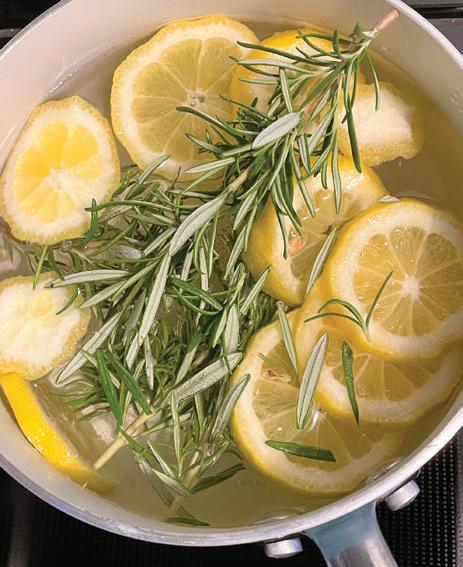
















Beatriz Hernandez
Maria
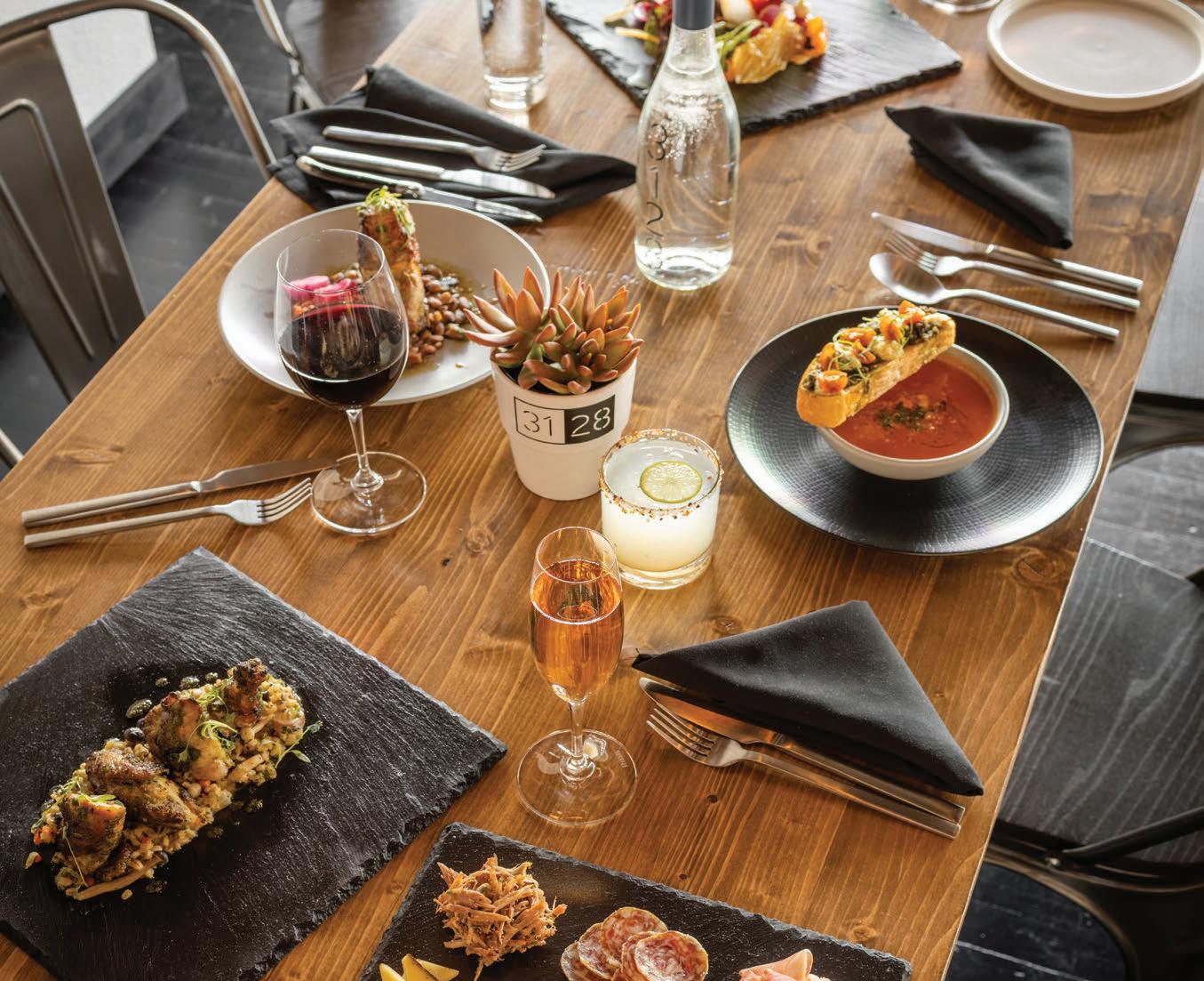
where Nob Hill comes together
3128 Social House brings together elevated comfort food and creative cocktails with genuine neighborhood hospitality
“WALK IN AND FEEL WELCOMED. Warm lights, inviting tables, laughter in the air,” says proprietor Dustin Darnell of 3128 Social House. “We want people to feel like they’ve stepped into a friend’s living room— with extraordinary food.”
That congenial spirit is no accident. In a world that can often feel less than welcoming, knowing that 3128 Social House in Nob Hill was established to be a neighborhood gathering place with an open-
door philosophy that serves great food, great drinks and genuine hospitality makes this more than just a restaurant. It’s a place to feel safe, comfortable, wellcared for and well-fed by people who want you to feel seen and special.
Located in the former Nob Hill Bar & Grill, Darnell transformed the space into a vibrant gastropub and social hub, which inspired the name. He says, “3128 is our address on Central, but ‘social house’ is about
by Heather Hunter
3128 Social House
connection and community. A place where people come together to share stories over seasonal plates and thoughtful cocktails.”
This isn’t Darnell’s first foray into the restaurant business. He opened Gather in May 2022, and 3128 Social House followed one month later. In February 2025, he opened 200 Social House in Bernalillo. Darnell also started Twisted Tree Farm—adjacent to the land where he grew up in Albuquerque—where they grow seasonal produce for all three restaurants and a special event venue, making the entire operation feel even more homegrown and distinctive.
At the heart of it all: the food, of course. The small, but smart menu continues to evolve with the seasons.
“Shareable dishes are part of our ethos of building community, and breaking bread with people is important to us,” he says. An array of tantalizing appetizers—shrimp ceviche, braised octopus, glazed pork belly are all standouts, but the tempura mushrooms are true showstoppers. The lightly fried, umami mushrooms are paired with an addictively tangy dipping sauce. With the double dipper, you get roasted garlic hummus and smoked artichoke dip, served with crispy, house-made potato chips.
Moving on to mains, of the nine entrees, the top-sellers are the filet mignon, braised short rib and the catch of the day. For vegetarians, there is a kale salad with the option to add protein. The more adventurous eaters will fall for the glazed maple leaf duck breast, the ribeye or the house burger, which never disappoints—and they offer a vegan and gluten-free option for the burger as well.
No meal here is complete without dessert, which Darnell says is crafted to close the meal on a high note. Choose from house-made ice creams or a light panna cotta with seasonal fruit to satisfy that sweet craving.
Drinks are just as much a draw here as dinner. Award-winning beverage director Ian Bahe—who
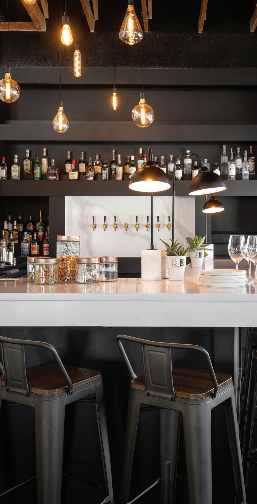
won Albuquerque’s 505 Bar Fights (2025) and Hollow Spirit’s Annual Bartending Competition—takes cocktails to a higher level. Bahe uses seasonal flavors and puts playful twists on classic drinks, Darnell notes. The signature cocktails are the guest favorites, while the carefully selected wines run the gamut to complement the shareable plates and elevated gastropub cuisine.
Behind the scenes, the kitchen found its groove about a year ago when chef Dennis Escovedo joined to lead the kitchen. “He brings both heart and deep culinary insight,” Darnell says. Born in Taos, Escovedo describes his cooking style as rooted in traditional techniques with an upscale take on classic New Mexico dishes and the thoughtful inclusion of Asian flavors.
It’s apparent that Darnell and his team of hospitality experts take their work seriously, but it’s the delicious fun and sense of community that make 3128 Social House a place where you bring your friends and celebrate all things big and small.

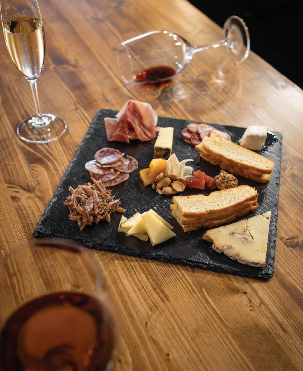


by Rebecca Toy
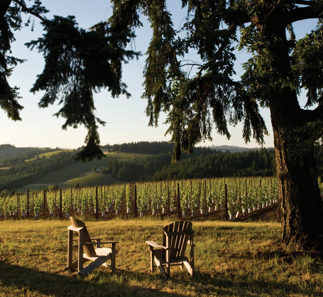
spring’s bright white
your new everyday chardonnay
ONE OF THE WINE WORLD’S most polarizing stars is chardonnay, evoking instant assumptions of buttery weight and oaky depth. Yet Oregon’s Willamette Valley, stretching 150 miles south of Portland, is snapping stigmas with a style characterized by juicy succulence, bright acidity, plush texture, and the range of volcanic and marine minerality that defines Pacific Northwest wines.
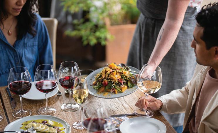
Cheryl Juetten
Cheryl Juetten
The valley’s winemakers took cues from Burgundy—the regions share a cool climate latitude—and dialed in picking precision for ripeness. Now the Willamette Valley, long known for pinot noir, has another variety with international acclaim. While the region has doubled its limited chardonnay acreage since 2014, it’s a fight for the few thousand acres of fruit. Evening Land Vineyards, Lingua Franca and Domaine Drouhin are touted producers along with Morgen Long, an exclusively chardonnay winemaker.
With plenty of stakes in chardonnay, Soter Vineyards makes the most of its northern valley sites for the Estates Chardonnay. This winery’s diverse options allow it to play, with stunners like its 2022 vintage, which layers fragrant lychee, yellow apple, zesty lemon, toasted almond and a rich, starchy breadfruit. Chris Fladwood, Soter’s winemaker, values the palate-driving acidity with the lingering elegance of chalky minerality.
Guests to Soter’s Mineral Springs Ranch tasting room— an hour southwest of Portland near Carlton—can best savor this wine’s versatility with a reservations-only Provisions Experience. The vineyard’s 250acre certified biodynamic farm is the perfect hilltop perch for the winery to marry its prize labels with Oregon’s locally sourced, seasonal cooking ethos. For at-home hosting, executive chef Clayton Allen recommends smoky, earthy, umami-rich pairings as well as citrusy touches with textured finishes. Think smoked salmon, chickpea flatbread with rosemary and mushrooms, or whipped ricotta with orange oil. Whether in the shadow of Mt. Hood or the comfort of your own casa, Willamette’s chardonnay will bring crisp and elevated pours to your glass this spring.
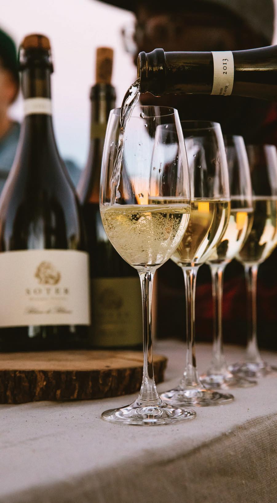
by Kate Jonuska
cultivating community
a book—and lifestyle—aimed at sharing joy one veggie at a time
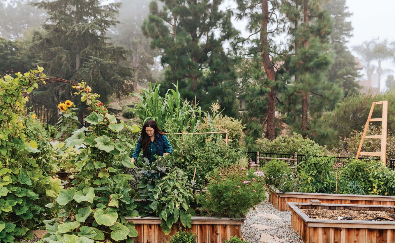
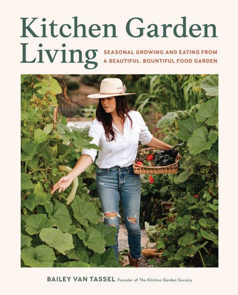
“Kitchen Garden Living: Seasonal Growing and Eating from a Beautiful, Bountiful Food Garden” by Bailey Van Tassel, published by and photos courtesy of Cool Springs Press, hardcover $16.
SOME GARDENING BOOKS are meant to be reference material, full of facts and tips that are consulted often over the years. Others focus on gorgeous photography that inspires as much as it educates. While it certainly contains both loads of expert instruction and vivid photos, “Kitchen Garden Living: Seasonal Growing and Eating from a Beautiful, Bountiful Food Garden” by Bailey Van Tassel is a different beast altogether. It’s a book that paints kitchen gardening as a lifestyle choice that positively affects all it touches.
“Kitchen garden living is about placing the garden as a cornerstone in our lives,” Van Tassel writes, “a place from which we draw inspiration, connect to and learn from the land, celebrate traditions old and new, and create a home around the bounty and brilliance of our backyard (or front yard, like I once did).”
She starts the book there, in the front-yard community garden that was the first Van Tassel ever tackled. A more active and lyrical writer than most gardening experts, she says that gardening “opened me up to the ordinary magic that we all need daily to survive the mundane.”
That experience—connecting with the soil, her family and their neighbors over fresh food—was so transformative that it led Van Tassel to become not only an author but also the founder of The Kitchen Garden Society, a thriving social media community.
Her first book, “Kitchen Garden Living” aims to show readers how to similarly start and maintain a life inspired by the garden. To that end, it includes tons of useful information about planning, growing and tending your garden, from soil amendments and
seed selection to which plants require regular dividing and which crops require curing.
But on those pages sure to be marked for reference, the tone remains easy, emphasizing the accessibility of kitchen gardening to folks at any life stage.
“Ten minutes a day,” she insists. “At the very minimum, an average-sized kitchen garden can be kept thriving with a mere ten minutes a day of focused energy. Twenty minutes is ideal for me and aligns with what doctors recommend for anyone hoping to manage stress through gardening.”
Most unique, however, is the intentionality Van Tassel encourages, for instance, through exercises that engage the senses in the garden and help recognize the seasons. She offers ways to mark the year’s solstices and equinoxes and likens the seasons to inhales and exhales.
Also, she incorporates her adorable young children not only in the colorful photography but with tips for engaging kids with the garden, sorted by age. Gardening, she says, unlocks wonder and awe in children.
In addition to improving the lives of your family, Van Tassel stresses throughout “Kitchen Garden Living” that gardening also helps grow community, and she includes recipes for get-togethers, plus a super-crafty section with ideas of how to gift and share your garden’s bounty.
“The famous quote is, ‘A rising tide lifts all ships,’ but I like to think of it as, ‘A growing garden saves all souls,’” she writes. “...To share your kitchen garden experience is to share joy.”
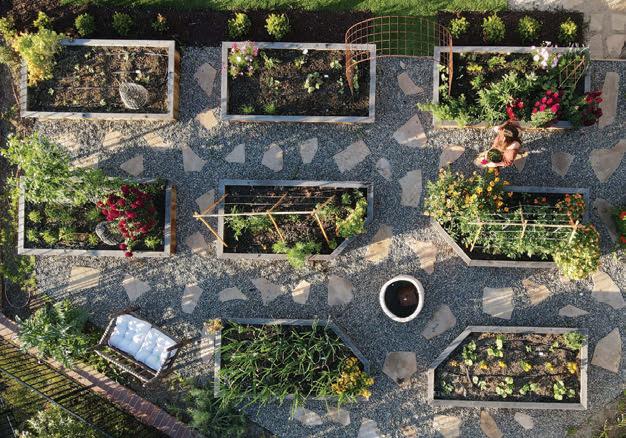
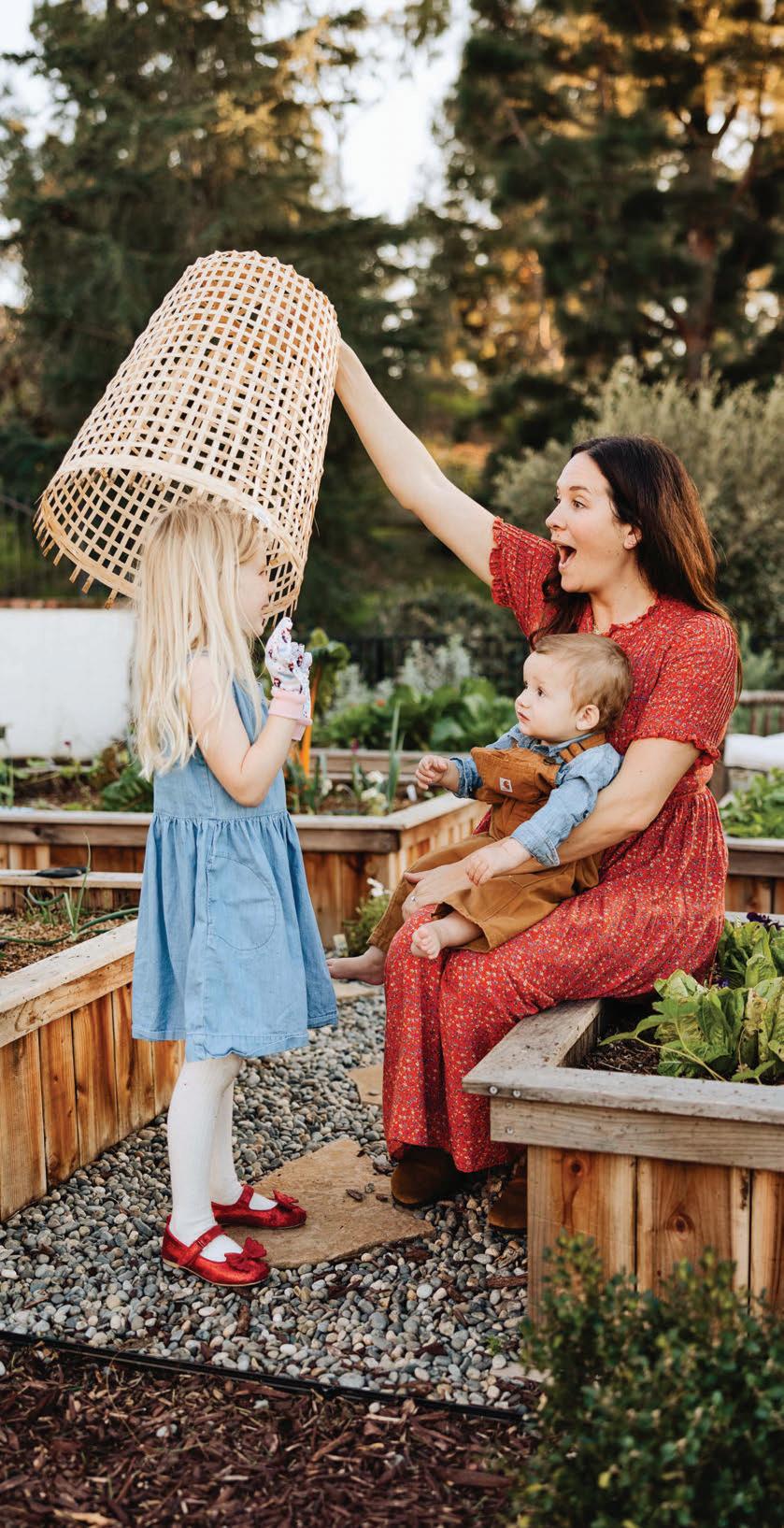
by Kate Jonuska
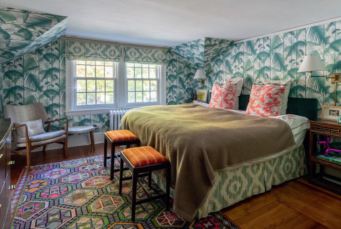
mismatch mindset
creating complexity in your home that mimics real life
SOPHIE VON OERTZEN WILLIAMSON understands there is immense beauty in the mundane, meaning day-to-day life. In design, however, the mundane connotes bland spaces devoid of meaning, intention and personality, and, as a designer, Von Oertzen Williamson counters this mundanity by integrating eclectic and even opposing energies to create rich and fascinating spaces, which she aptly dubbed the art of the clash.
“Perhaps this is a little philosophical, but I believe the human experience is as beautiful as it is messy precisely because of its glorious imperfections,” she writes. “Life, in all its chaos, has a richness and complexity that makes it extraordinary. And so should your home.”
Indeed, “The Art of the Clash” is part philosophy, built on the idea that conflict (a.k.a. clashing) creates interest. Rather than matching harmonically, the many layers of a room—including color, pattern, scale, era—should therefore conflict intentionally, generating tension
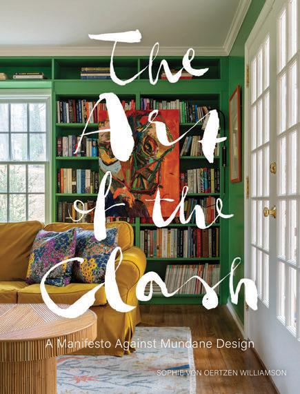
“The Art of the Clash: A Manifesto Against Mundane Design” by Sophie Von Oertzen Williamson, published by and photos courtesy of Gibbs
Smith, hardcover $45.
and texture we find innately alluring.
“I sometimes compare the tension I crave in design and interiors to a chocolate chip cookie,” explains Von Oertzen Williamson. “Once you’ve tried a chocolate chip cookie sprinkled with some salt flakes, you will always notice when the salt is missing. A cookie without salt is still good, but one with salt is mindblowingly good, all because of the tension of sweet and savory.”
Truly, the color and pattern combinations Von Oertzen Williamson highlights in “The Art of the Clash” are bold, whimsical and personal, the exact opposite of common real estate advice to decorate generically for resale value. Having started her design career in linens and soft furnishings, the author’s talent with textiles is particularly stunning, whether in mixing bright prints, using tablecloths as curtains, or repurposing artisan rugs as headboards.
Born in Germany and having lived all over the world, some of Von Oertzen Williamson’s opinions are adorably European. For instance, she prefers kitchen tables to kitchen islands and has an aversion to overly open floor plans and gallery walls of only family photos. (Add some art, fabric or other elements to your gallery to make it clash!)
The author also generously shares her mother’s advice about homemaking, hostessing and life, including gems like “be your own best guest.” In other words, rather than perfection, the goal of the home and any get-together is to create “an environment where you, your family, and your friends feel at ease; where conversation flows; and where you, the host, are as much a part of the fun as your guests.”
Too often, she argues, our homes feel like impersonal showrooms, devoid of soul, where the formal furniture is stiff and so is the atmosphere. Her book is meant to be an inspiration as you take your own journey toward creating a home that feels distinct and distinctly yours.
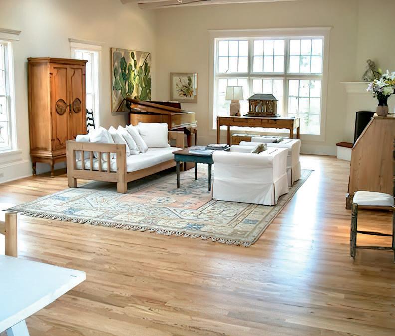

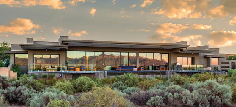
visceral vistas
Completely reimagined in a spectacular custom remodel by Jay Parks, this highcaliber residence at the top of Sandia Heights captures sweeping views of the Sandia Mountains and sparkling city lights of Albuquerque. Backing directly to the Cibola National Forest, the setting ensures privacy and forever unobstructed vistas. Floor-to-ceiling windows frame the scenery, while multiple levels are designed for effortless entertaining. Refined finishes include coffered ceilings, cast stone details, ornate fireplaces, hand-forged iron railings, designer lighting, automated shades and custom closets. The chef’s kitchen includes furniture-grade cabinetry with custom detailing, rich granite and marble countertops, an expansive island and Thermador appliances.
1446 Honeysuckle Dr. NE
Listing Price: $1,950,000, Dominic Serna, Keller Williams Realty, 505-271-8200 (office) 505-319-1604 (cell), dominicjserna.com
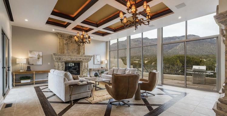
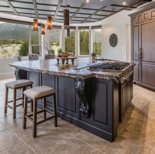
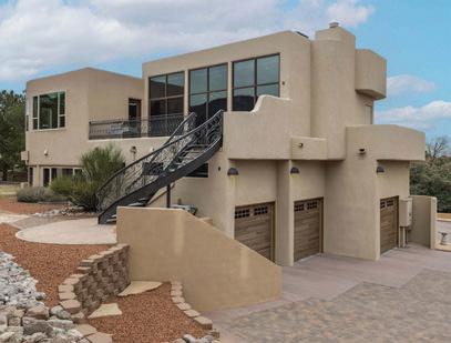
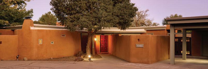
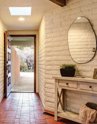
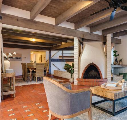
traditional touches
Sited on a corner lot in coveted Dietz Farms, this charming residence features a 2,900-square-foot main house and an 850-square-foot casita. The detached casita includes a primary suite, office or second bedroom, kitchen, laundry, and powder room. Classic Pueblo details grace the main home, including kiva fireplaces, brick flooring with decorative tile inlays and beamed ceilings. The living room and den are comfortably divided by a doublesided fireplace, while the semi-open concept kitchen flows into both indoor and outdoor areas. The spacious .59 acre cul-de-sac lot allows for covered RV parking and hiddenaway storage for boats, trailers and additional toys. Refrigerated air conditioning and a TPO roof complete this rare multi-generational opportunity in the North Valley.
4000 Ivy Lawn Court
Listing Price: $925,000, Joshua Goss, Tradition Real Estate, 505-604-7826, nmtradition.com
Photo Santiago Martinez-DeWees
Photo Fotovan
First impressions matter, especially when it comes to your home’s exterior. Adding a new brick path or porch instantly elevates curb appeal, creating a sense of warmth, craftsmanship and permanence. Brick-look pavers offer an especially smart solution for updating existing concrete walkways or patios without the cost and disruption of a full tear-out. These thin pavers are designed to be installed directly over sound concrete, delivering the classic texture and charm of brick while improving durability and slip resistance. Brick-look pavers can be installed in a range of classic patterns—such as herringbone, running bond or basketweave layouts—each offering a distinct visual rhythm that can subtly shift a home’s style from traditional to more contemporary. The result feels custom and timeless, not trendy. A refreshed path draws the eye toward the entry, while a new brick-style porch creates a welcoming transition between outdoors and in.
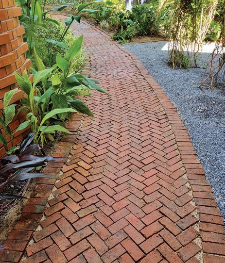

SANTA FE’S PREMIER CUSTOM HOME &
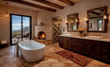
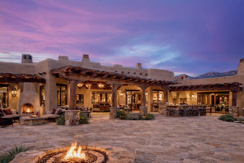
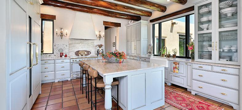
by Heather Shoning
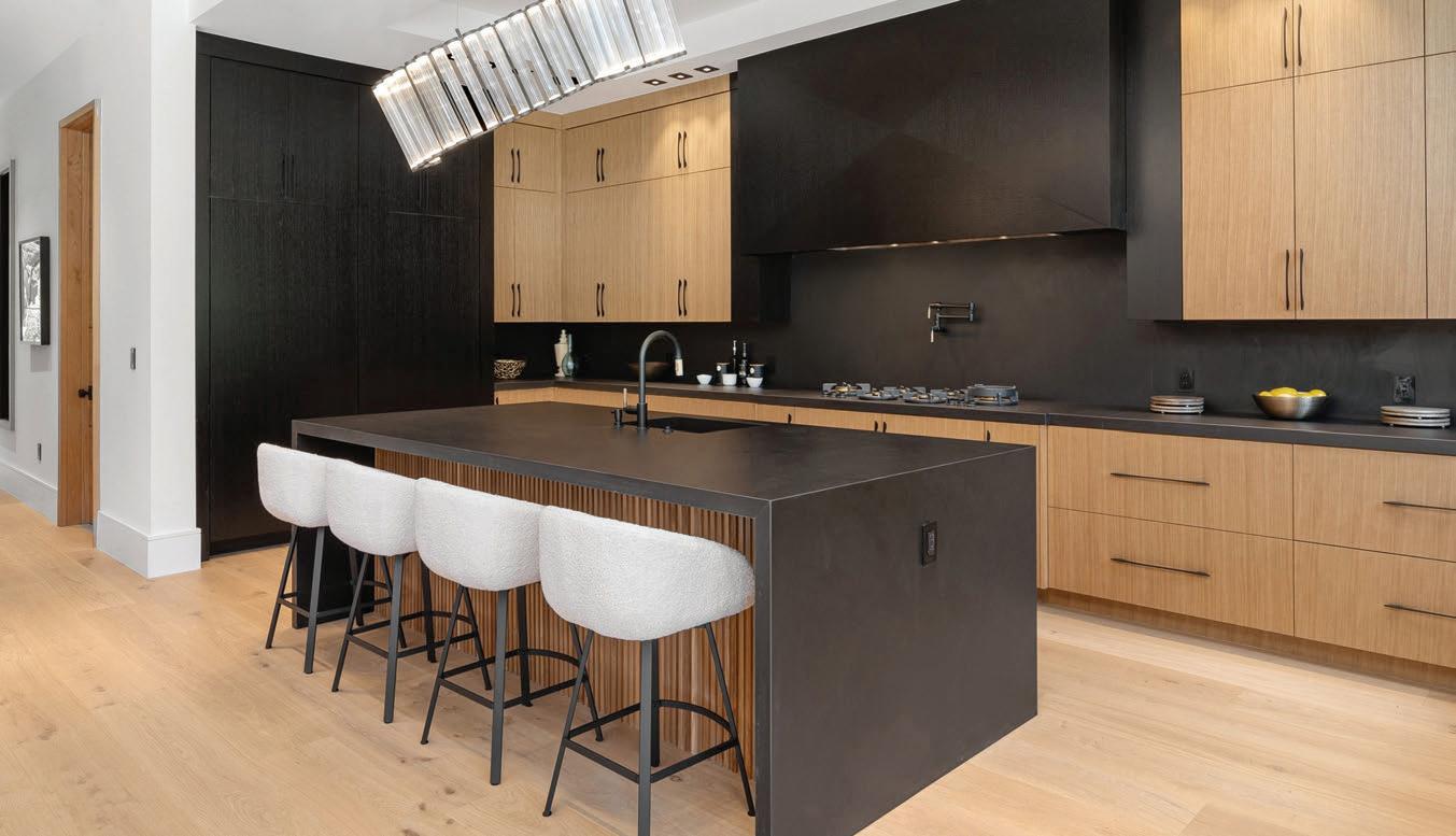
couture countertops
durable surfaces and top trends
for modern desert living
THESE DAYS, countertop decisions are less about trend-chasing and more about performance under pressure. Materials are being judged on how they handle heat, sunlight and daily wear—not just how they photograph. In the Desert Southwest, where UV exposure is constant and temperatures swing dramatically, that scrutiny intensifies. The surfaces gaining traction now combine structural resilience with warmer, more natural aesthetics—and hold their color and integrity long after installation.
Porcelain slabs have quickly moved into the top tier of high-end choices. Ultra-thin and lightweight, they offer remarkable resistance to heat, scratches, stains and UV rays—qualities that make them particularly well-suited to sun-filled interiors and outdoor kitchens. Large-format slabs minimize seams and allow for fullheight backsplashes, reinforcing the clean, architectural look that defines many contemporary Southwestern
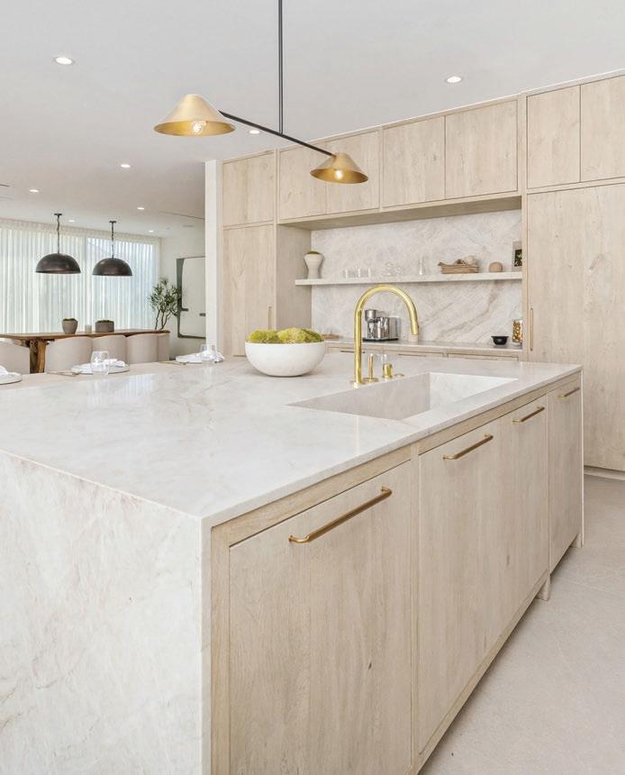
homes. Thin 12mm profiles are especially popular, delivering a minimalist edge without sacrificing durability. For desert climates, porcelain’s UV stability and resistance to thermal shock make it a dependable option.
Sintered stone is often described as a “super-material,” and the label is not an exaggeration, including brands such as Dekton and Neolith. Produced using extreme heat and pressure that replicate the natural formation of stone, it is nonporous, nearly scratch-proof and capable of handling extreme temperatures. Hot pans can be placed directly on the surface without damage. Because it is completely UV-resistant and will not fade, sintered stone performs exceptionally well in desert conditions, including in outdoor kitchens exposed to full sun. Its resistance to thermal shock also makes it resilient against rapid nighttime temperature drops common in arid regions.
Natural quartzite continues to surge in popularity, particularly for homeowners who admire the look of marble but need greater durability. Harder than granite and highly heat-resistant, quartzite delivers strength without sacrificing elegance. White-based varieties with soft movement—most notably Taj Mahal quartzite—are among the most sought-after looks for 2026. In desert settings, quartzite’s UV resistance and lighter coloration provide additional advantages. Pale creams and sandy tones reflect heat rather than absorb it, helping keep surfaces cooler to the touch in bright kitchens.
Granite remains a steady mainstay and a particularly strong natural option for the Southwest. Formed under intense natural heat, it is exceptionally resistant to high temperatures and less prone to fading or discoloration than many engineered materials. While it requires periodic sealing, its durability and resilience make it a practical choice in high-use kitchens. As with other materials, lighter tones tend to perform better in sun-exposed spaces, as dark stones can act as heat sinks.
Quartz—engineered stone—is one of the most popular countertop materials for modern, low-maintenance kitchens. Non-porous and stain- and bacteria-resistant, it does not require sealing and offers consistent patterning. The newest generation includes advanced, more sustainable formulations that incorporate recycled materials and significantly reduce crystalline silica content, which, in its finished form, is safe but
is considered highly hazardous during fabrication. Aesthetic preferences are shifting toward matte or honed finishes that mimic natural stone rather than high-gloss surfaces. However, in desert climates, standard engineered quartz must be selected carefully. Traditional quartz contains polymer resins that can yellow, fade or crack under prolonged direct sunlight. In bright or outdoor applications, only outdoor-rated, UV-stable lines should be considered.
Sustainability is influencing more than quartz formulations. Recycled glass and terrazzo surfaces—made from glass chips embedded in cement or resin—are gaining attention for their durability, non-porous construction and vibrant, retro character. Paper-based composites such as Paperstone and Richlite offer another environmentally conscious alternative. With a warm, matte texture and strong durability, they appeal to homeowners seeking distinctive surfaces with a lighter environmental footprint.
Marble endures, of course, as a timeless, high-end option prized for its beauty, though it is softer and more porous than many alternatives, requiring frequent sealing and careful maintenance. Solid surface materials such as Corian provide a seamless, non-porous and often more affordable solution. Butcher block introduces warmth and rustic charm but demands regular maintenance to prevent staining and scratching. Soapstone, while highly heat-resistant, poses a specific consideration in desert settings: Its dark color absorbs significant thermal energy and can become excessively hot if placed in direct sunlight.
Across materials, the broader design language of 2026 is clear. Matte and honed finishes are replacing high-gloss for a softer, more lived-in luxury that hides fingerprints. Warm neutrals— creams, beiges, taupes and soft browns—are overtaking cool grays. Waterfall edges remain a defining detail, with today’s preference leaning toward a slimmer profile than in years past.
Ultimately, the strongest countertop choices are those aligned with both lifestyle and environment. For maximum durability in high-traffic kitchens, quartzite and sintered stone stand out. For a blend of style and easier maintenance, quartz continues to lead—when chosen with climate in mind. In the Desert Southwest, beauty is never enough on its own. The most successful surfaces are those that endure the sun as confidently as they define the space.


SCHONBEK FOREVER


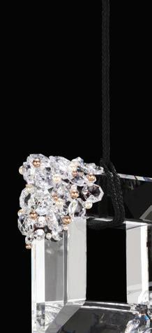




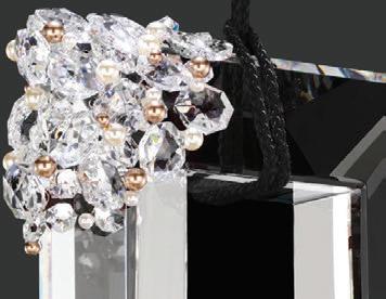
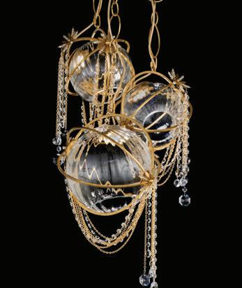
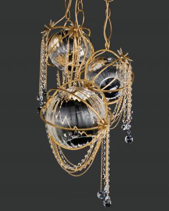

Green Piece

foolproof flooring
by Carol Orona
today’s hard surface options offer lasting beauty, sustainability and performance
Flooring is one of the most visible and lasting decisions in home construction or a renovation, shaping how a home looks, feels and performs. Renewable natural options such as bamboo and cork, plus reclaimed and engineered woods, offer the perfect balance of style, durability and environmental responsibility. Careful material selection and quality installation ensure floors that support healthy interiors while delivering long-term comfort and enduring beauty.
Bamboo has become a popular choice in modern interiors for its refined appearance and rapid renewability. Durability depends on manufacturing: Strand-woven bamboo holds up well in busy households, while lower-grade products may show wear sooner. Low-VOC adhesives and finishes are essential for protecting indoor air quality.
Cork is often overlooked but offers strong performance benefits. Naturally resilient and comfortable, cork absorbs sound and provides thermal insulation, creating a quieter, more stable interior environment. It works well in bedrooms, home offices and kitchens. Proper sealing protects against moisture and dents, and harvesting does not require cutting down trees, making cork one of the most sustainable flooring options.
Reclaimed wood appeals to homeowners who value authenticity and character. Salvaged from older buildings, it brings depth and variation that new materials cannot replicate. Durability is excellent when boards are properly processed, though supply can be limited and costs higher due to sourcing and preparation. From a sustainability standpoint, reclaimed wood extends the life of existing resources and reduces demand for new harvesting.
Engineered wood is a versatile, high-quality solution. Its layered construction improves stability and reduces movement, making it suitable for a wide range of interior conditions. Engineered flooring offers consistent quality and wide-plank styles across a broad range of price points. While the ability to refinish depends on veneer thickness, it uses less hardwood per plank and performs well with certified cores and low-emission finishes.
By focusing on durability, healthy finishes and long-term performance, sustainable flooring becomes more than a design choice. Thoughtful selection and proper installation create floors that support everyday comfort, reflect personal taste and help create a home that remains resilient and beautiful for its lifetime.

Carol Orona holds a master’s degree in architecture and is nationally recognized for stainable, high performance design. She shares practical solutions that reflect her passion for building science, comfort and inspiring others to create better homes.
Marigolds are your garden’s own little bodyguards. These bright and cheerful flowers aren’t just there to look pretty; they’ve got a no-nonsense attitude toward garden pests. The roots of certain varieties release compounds that fight against soil-dwelling nematodes, which can damage vegetables and flowers. Above ground, they emit a strong scent that discourages insects such as aphids, whiteflies and mosquitoes from settling nearby. While they are not a complete solution, marigolds work best when planted throughout garden beds or along borders, creating a protective barrier around vulnerable plants. They are especially effective near tomatoes, peppers, beans and squash. In addition to pest control, marigolds are easy to grow, tolerate heat and bloom continuously through the season. Their bright flowers also attract beneficial pollinators, supporting a healthy, balanced garden ecosystem.
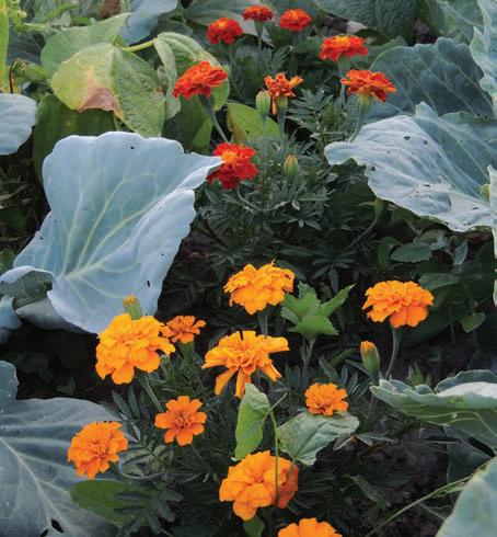

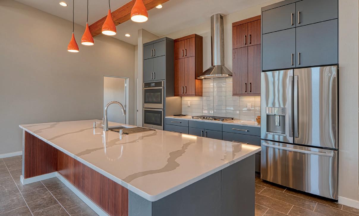
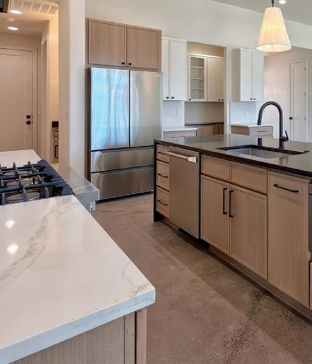


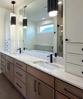


photo: ©Darrell Devantier
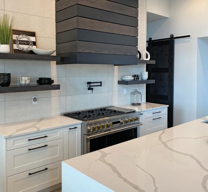

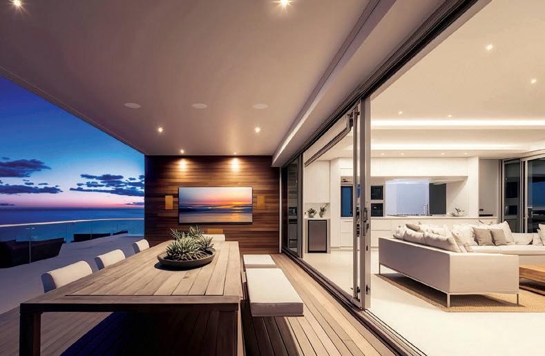



Creating Timeless Spaces

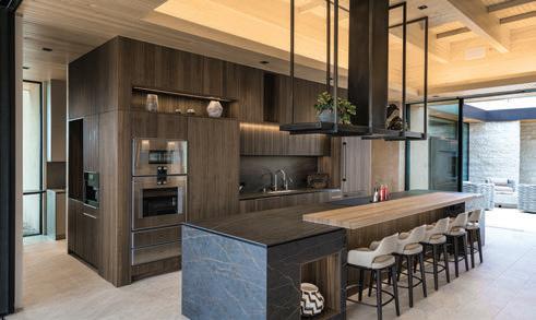






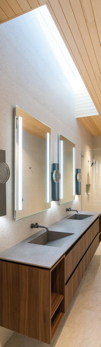
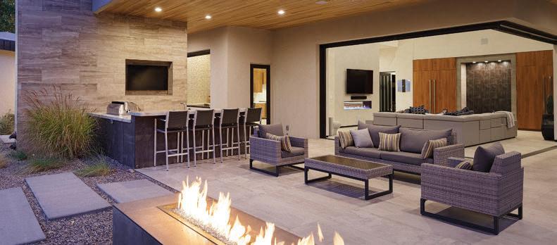
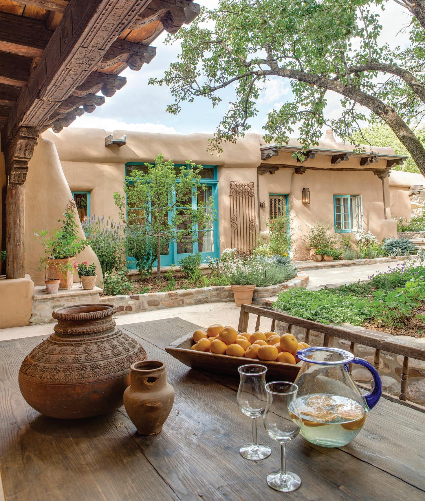
authentic beauty
Once home to Santa Fe artist Gerald Cassidy, this property carries a deep connection to the region’s creative and architectural history. Its early 2000s careful restoration by K.M. Skelly, Inc. preserves not only the time-honored materials but also its authentic Southwestern design.
Under the shade of salvaged, hand-carved and weathered beams, this courtyard reveals why this style endures far beyond passing trends.
Earthen-hued stucco walls glow with warmth, their softly rounded edges honoring the craftsmanship of skilled hands. Turquoise-painted doors and windows add color rooted in regional history, while wrought-iron detailing and natural stone are meant to age gracefully rather than be replaced. Nothing here feels disposable. Even the simplest details reflect a belief that beauty is built slowly, and a commitment to authenticity keeps Southwestern style forever relevant.
photograph by Amadeus Leitner

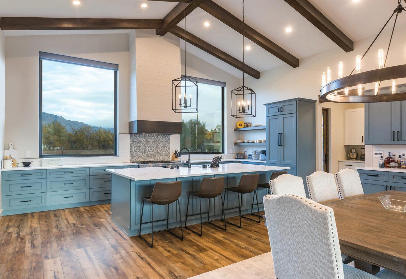
BUILT FOR THE WAY YOU LIVE.

Fotovan