9 APRIL –2 JUNE
9 APRIL –2 JUNE
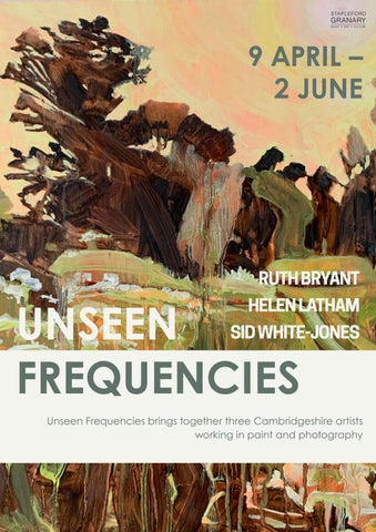
Unseen Frequencies brings together three Cambridgeshire artists working in paint and photography
INTRODUCTION UNDERSTANDING COLOUR
LIST OF WORKS
“The title Unseen Frequencies grew from a discussion with all three artists. We spoke about colours, layers of materials and processes, all of which are read by our subconscious We came to describe these as unseen frequencies; elements that travel beneath our awareness and shape how we interpret an artwork ” - Jess Henry
Sid White-Jones is interested in the concept of preservation. He works with discarded digital media such as old photographs, negatives, and slides. Through an arduous process of physical, chemical, and digital manipulation, images are transferred onto canvas resulting in pictures with a strong painterly quality Playing with scale, small details in a pocket-sized photograph will often become large imposing images The extensive layering process resembles print-making more than painting; and a final stage involves scrubbing away the layers of paint until only the ink remains. Sid describes the element of surprise, along with unexpected slippages or breaks as 'welcome interventions'.
Sid graduated with First Class Honours in BA Photography from Norwich University of the Arts and has exhibited at Kettle’s Yard, OUTPOST, Ruskin Gallery, David Parr House, Motion Sickness Project Space and Cambridge Artworks, with work published by Der Greif, Plaintiff Press, Uncertain States, ICBQ, Art UK and Folium Publishing. He has curated contemporary exhibitions at Kettle’s Yard, Babylon ARTS, and Norwich Shoe Factory.
Ruth Bryant explores the intersection between craft and painting Her pictures start with a colour wash, usually connected to an emotion. She then overlays this with further colour washes which counteract the initial mood. She adds spontaneous fabric-like graphic layers, strongly connected to her needlework practice. Sometimes the marks are suggestive of writing or figures, but mostly they remain abstract Ruth describes the purpose of the graphic marks as ‘taking control, grounding the initial emotional response in the everyday’.
Ruth graduated with a BA (Hons) in Fine Art from Northumbria University in 2007. Her paintings have been shown at Church Street Gallery in Saffron Walden and published in JUNO magazine Ruth also participates in Cambridge Open Studios
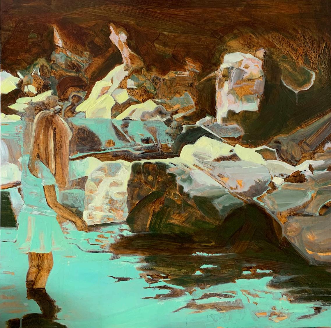
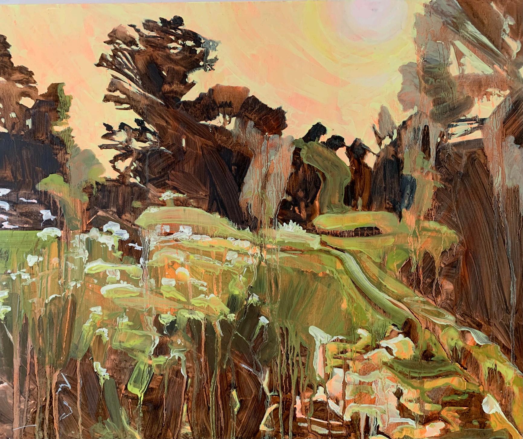
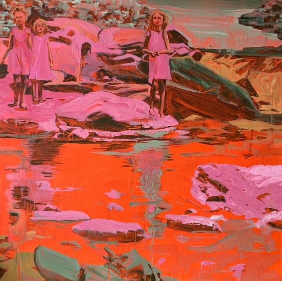
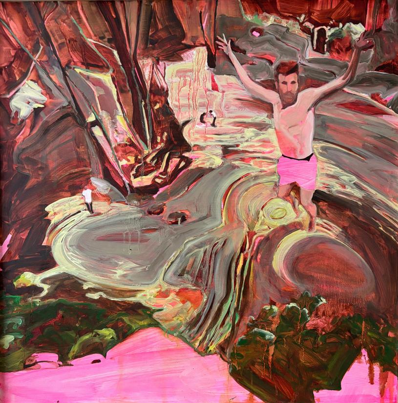
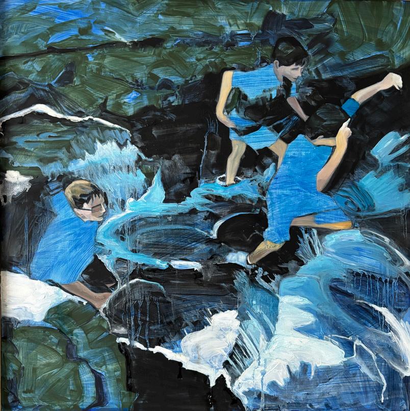
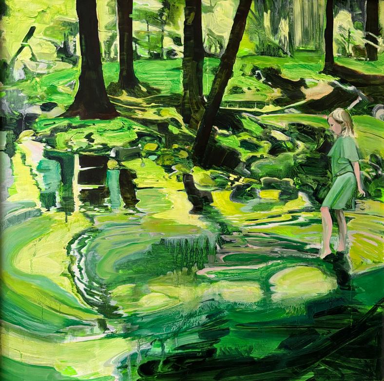
Informed by her degree in colour chemistry, Helen Latham is fascinated by the physical and psychological effects of colour. Using photographs - often taken on walks - as a starting point, she alters the images through inverted colour, distortion, and loose mark making to affect an emotional response The depiction of children at play in natural landscapes evokes a strong sense of nostalgia and she describes them as having an ‘Enid Blyton-esque’ quality.
Helen has worked for over 30 years in the textiles industry but painting has always been a passion She was selected for the Royal Academy Summer Exhibition in 2022 and 2023 Other recent exhibitions include Battersey Affordable Art Fair (2024) Cambridge Summer Open (2019), Dinner is Ready at the West End Centre, Aldershot (2018) and People, What Are They Like? at Déda in Derby (2018).
Ruth Bryant, Helen Latham and Sid White-Jones find inspiration in colour, using vibrant palettes across a diverse range of mediums and processes. Colour is one of the most immediate ways that we connect with art, evoking emotion, conveying messages and altering our behaviours. Art Producer Jess Henry looks at the bold and subtle ways in which artists use colour, and how their choices affect us.
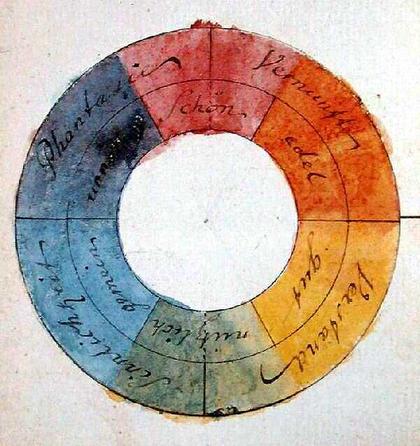
Newton, Goethe, Chevreul and the Impressionists all contributed to theories of colour. The study of colours can be traced back to antiquity, but the science began with Isaac Newton’s publication of his ‘new theory about light and colors’ in the Philosophical Transactions (1672-1676), following his breakthrough use of a prism to split white light. Thirty years later, Newton published Opticks, his treatise on light, which included the first colour wheel. He placed the seven spectral colours into a circle of unequal segments, and created a geometric model which underpins all subsequent theory on colour harmony.
Much of our response to colour happens instinctively; we often sense the impact of colour before we analyse it. A deep blue might instigate a calm or reflective response, while a vivid red might provoke an energetic or tense reaction. Because these reactions happen subconsciously, we may not always recognise how strongly colour is shaping our experience. By referring to a framework for the ways in which colours interact, combine, and influence human emotion, colour theory helps the viewer to understand the artist's intent, the structural composition and possible psychological impact of what we are seeing
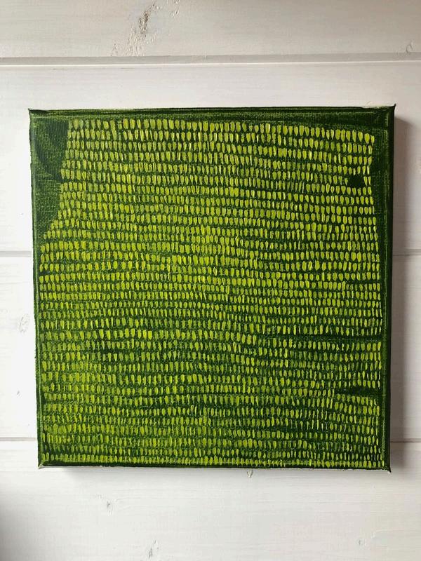
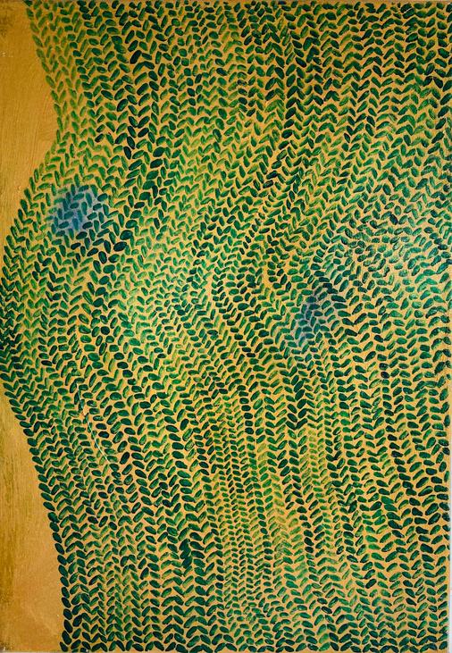
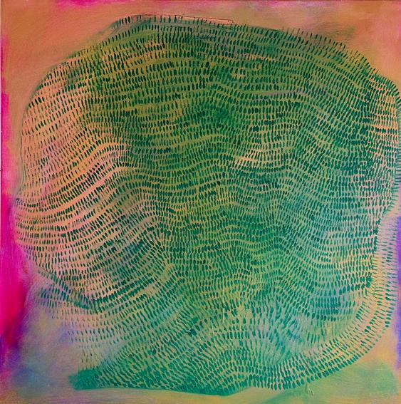
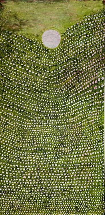
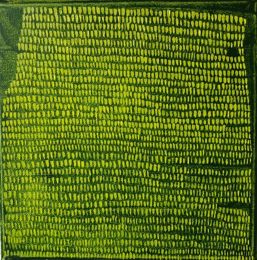
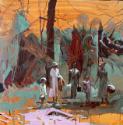
In New Shoots, Ruth Bryant presents a dark green background, layered with a brighter green patterned motif. These colours sit closely to one another on the colour wheel and the analogous colour scheme results in a harmonious and cohesive composition. The vibrancy and energy of the more vivid foreground colour suggests a transition; a movement away from darker, subdued tones toward the freshness and vitality associated with new growth.
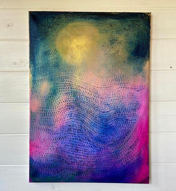
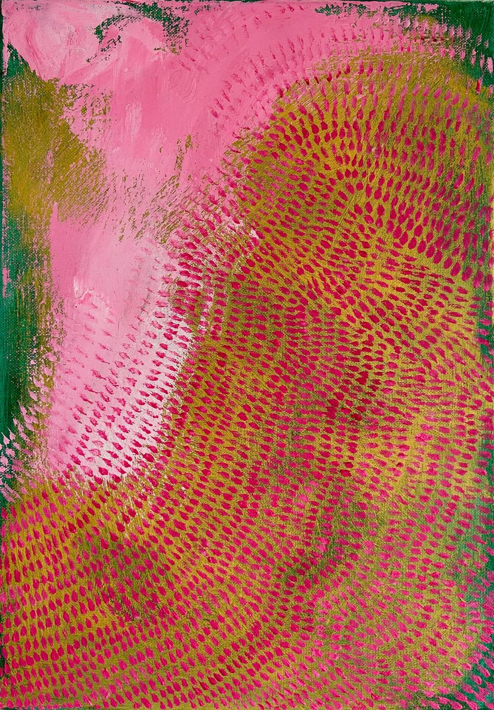
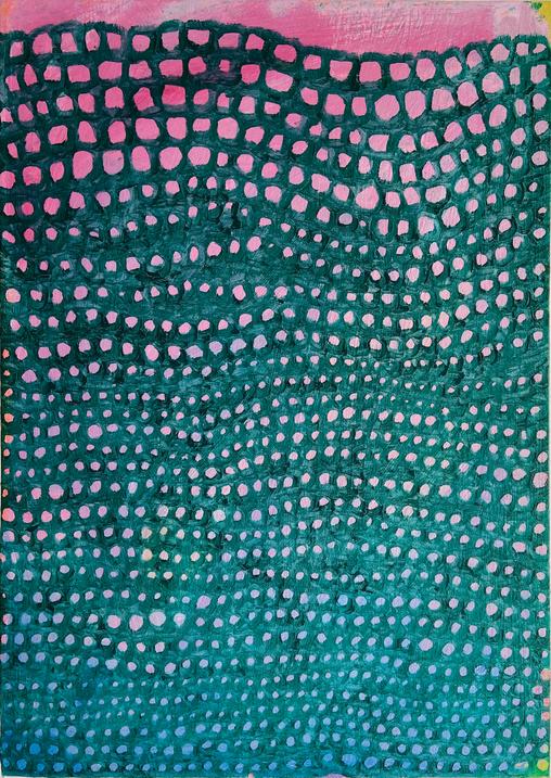
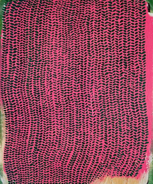
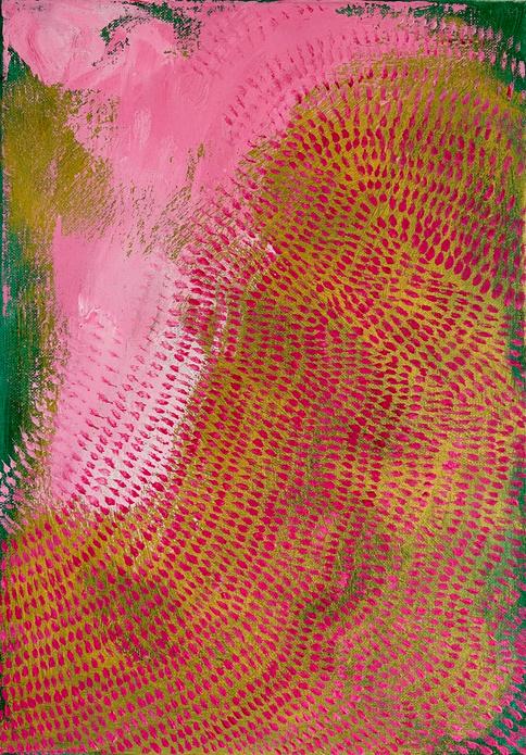
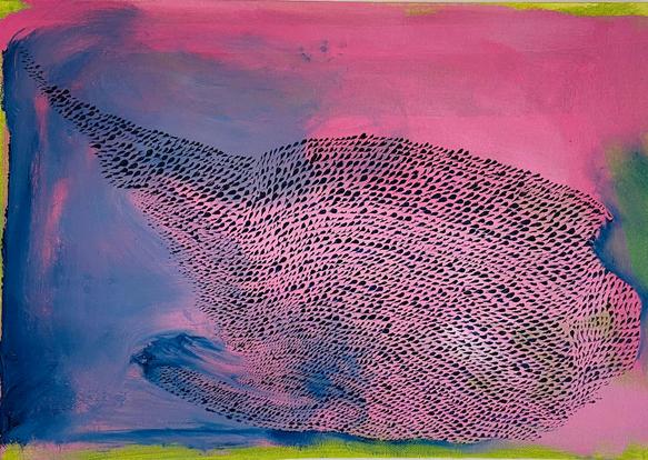
In All is not lost, Byrant introduces a more complex colour relationship. Four dominant colours - blue, yellow, purple, pink - form a tetradic (doublecomplementary) colour scheme. These colours are located in opposite areas of the colour wheel, resulting in a high contrast colour scheme with increased visual tension Bryant’s careful layering creates balance and structure, encouraging the viewer to read the work in two halves; the upper section consists of teal and yellow, and the lower, of pink and blue. By balancing and controlling the values (lightness and darkness), Bryant creates a composition that contains energy and resolution.
Artists also consider qualities of colour beyond basic hue relationships Lightness and darkness can define form, create depth and guide the viewer’s eye.
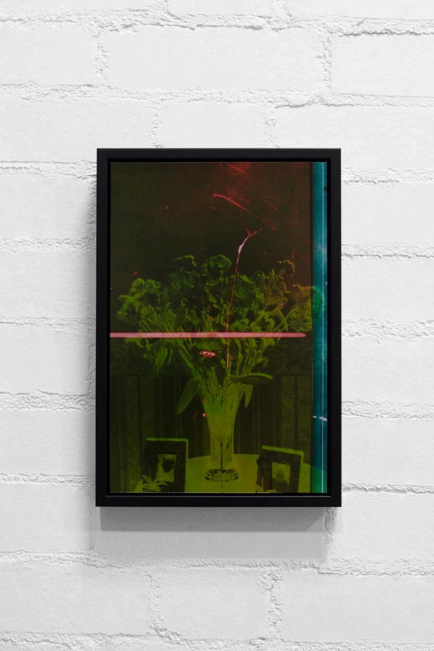
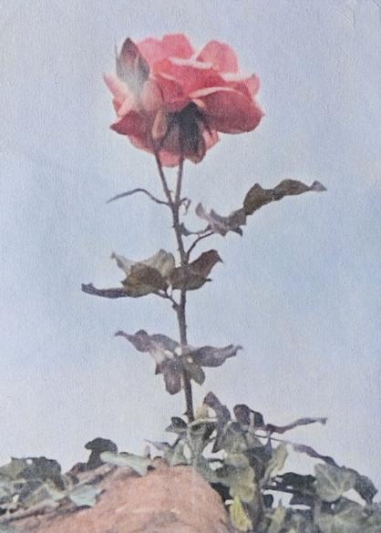
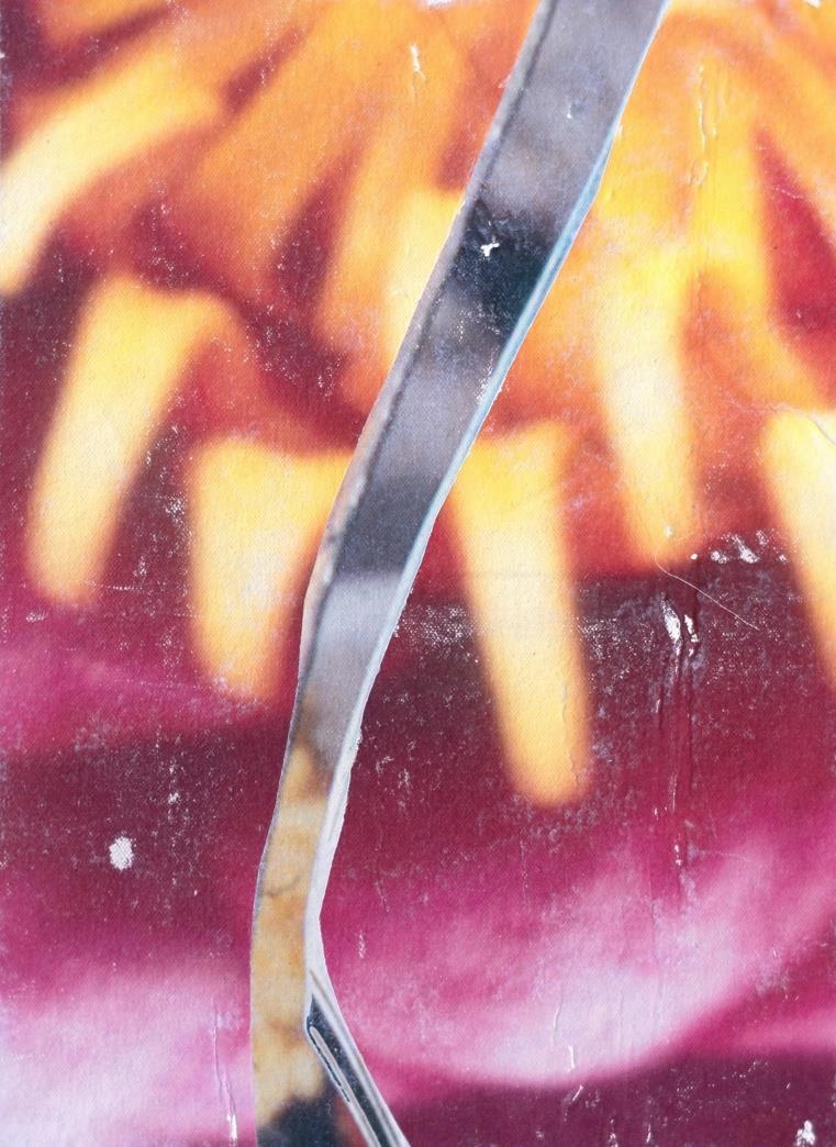
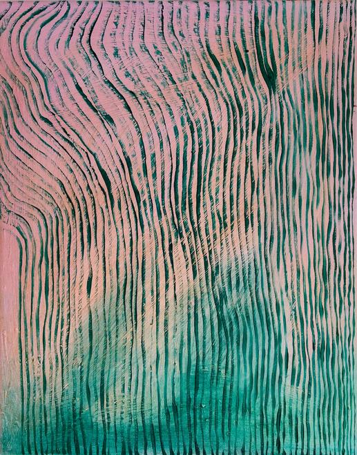
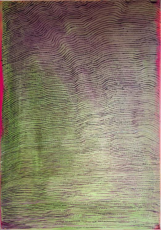
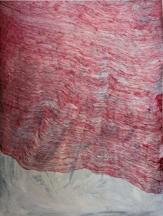
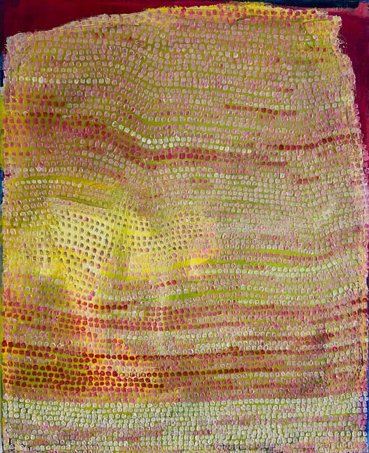
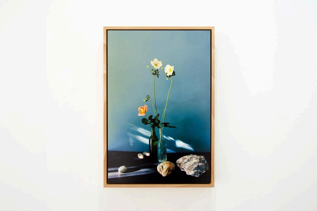
Saturation of colour measures intensity, from vivid and pure to muted and subdued, allowing artists to subtly manipulate atmosphere and meaning. For The Rose, Sid White-Jones uses soft, hazy tones to create a sense of nostalgia.
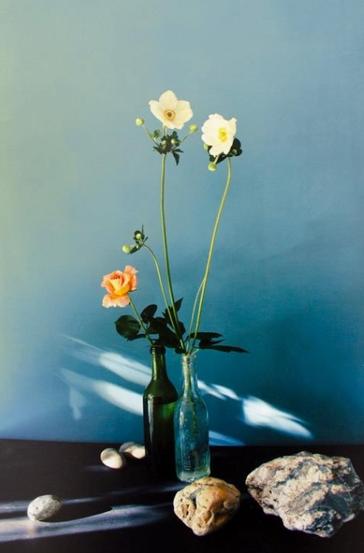
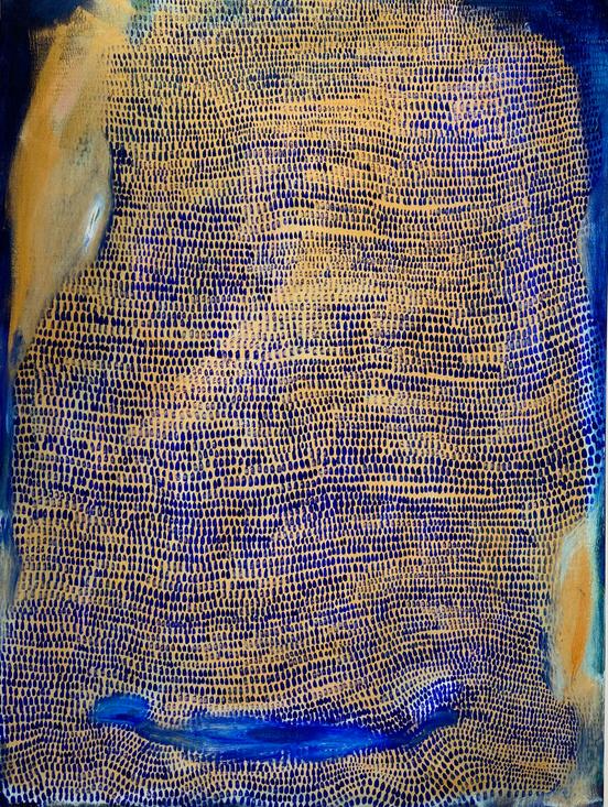
In contrast, his more saturated compositions such as Untitled Still Life (with anemones, pebbles, bottles and rose), while still dominated by blues, is a more contemporary piece, resembling the controlled elegance of traditional still life paintings By adjusting hue, value and saturation, White-Jones controls how the artworks are read
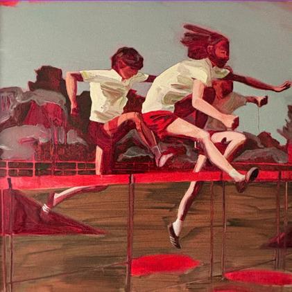
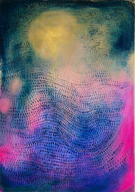
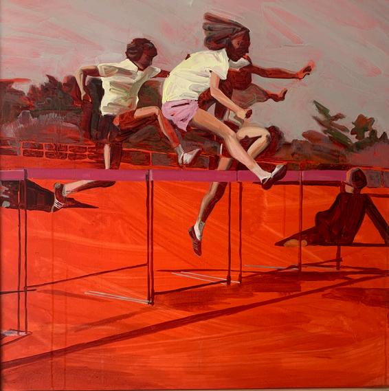
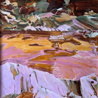
Colours are often associated with particular emotions, and these associations have developed over time, continuing to influence our subconscious responses This can be seen in Helen Latham’s Olympics Next, 1, where the dominance of saturated reds could suggest heat, intensity and physical exertion. The largely monochromatic red scheme creates an immersive and claustrophobic atmosphere. Rather than presenting a purely realistic scene, the colour appears to push the image into something more exaggerated, amplifying the sense of movement and urgency within the figures.
A further reading might focus on the subject matter; children participating in what appears to be a school sports activity. The intensity of the red could be interpreted as heightening the emotional experience of memory, transforming an ordinary moment into something more dramatic and theatrical. The colour becomes deliberately provocative, disrupting a straightforward reading of the image and drawing it into a space between reality and imagination.
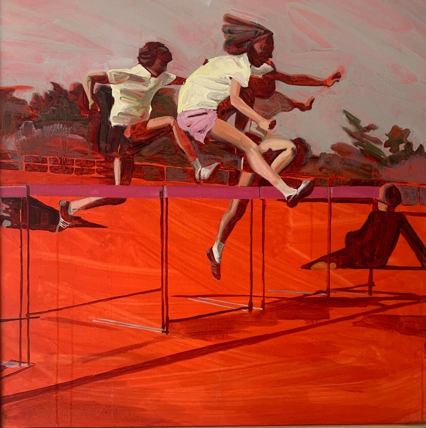
“As a colour chemist I have studied, and am fascinated by, the physical and psychological effects colour has on our brain... If you look hard at the scarlet then close your eyes you will see green on the inside of your eyelids. This is because you have saturated the red cones in your eye, leaving the complimentary colour, green. Here, red is the opposite colour to the one you would expect." - Helen Latham
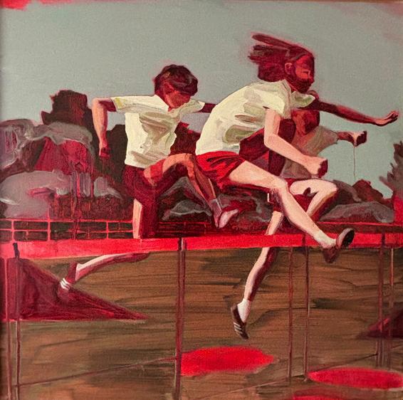
Olympics Next, 2 introduces a wider range of colours, including muted greens, browns and greys. The use of cooler neutral tones layered over the intense red, provides visual relief. This results in a shift in how the viewer engages with the work, allowing more space for observation and reflection Through these variations, Latham demonstrates how colour can be used not only to depict a scene, but to actively construct its emotional impact.
By focussing on colour, abstract artworks can become more accessible. Rather than searching for a clear subject or narrative, viewers can begin by observing colour relationships; where the eye is drawn, how different areas interact, what emotional responses are triggered, moving from passive viewing to active interpretation. Artists guide our attention, create depth, and evoke feeling through deliberate choices, and colour becomes a language that communicates beneath the surface of the image There is no single correct way to respond to colour. Our reactions are shaped by culture, experience, and instinct. But by trusting our responses whilst developing understanding, we can engage with art in a way that is both personal and informed, enabling a deeper and more meaningful connection.
60 x 42cm
£550
60
£550
46 x 36cm
£300
30
£300
£500
50
£700
£300
£700
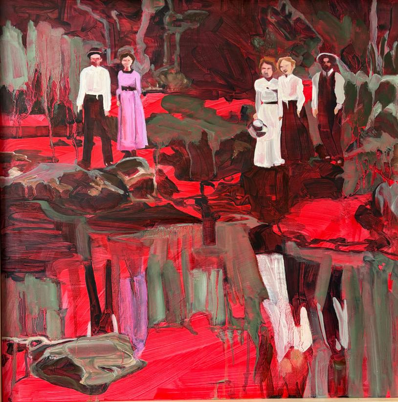
With Every Fibre of Our Human Being, 2023
92
£1100
£500
£250
£150
£650
£1100
£300
Whittlesford, 2024
acrylic and oil on board
63 x 63cm
£ 850
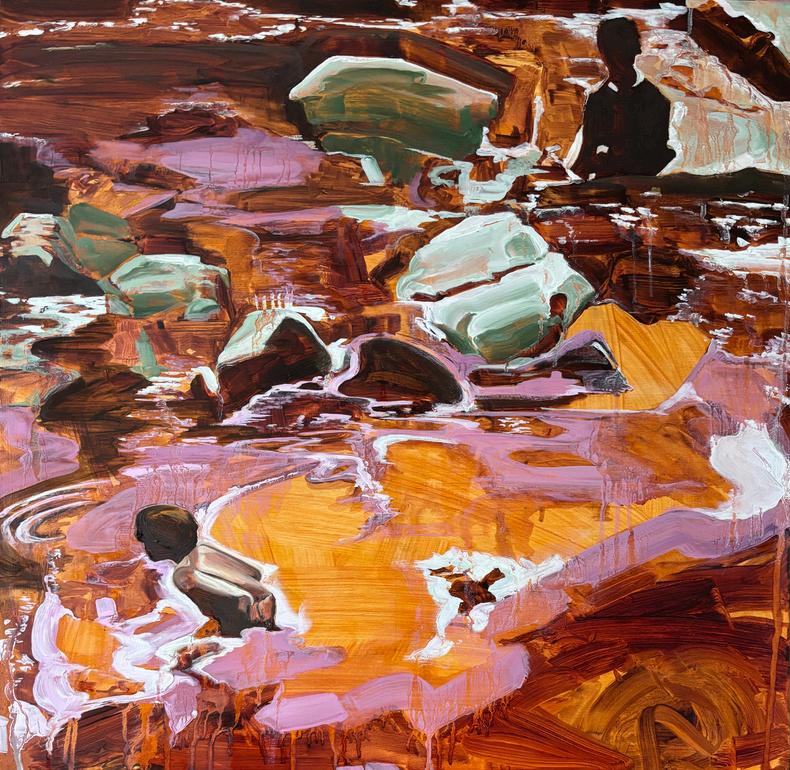
Becoming water, 2026
acrylic and oil on board
63 x 63cm
£ 850
Between the water and me, orange, 2026
acrylic and oil on board
63 x 63cm
£850
Looking Through Time, 2, 2026
acrylic and oil on board
63 x 63cm
£ 850
Letting go, 2025
acrylic and oil on board
63 x 63cm
£ 850
Hold My Hand, 2024
acrylic and oil on board
63 x 63cm
£ 850
South Cambridgeshire
acrylic and oil on board
63 x 63cm
£ 850
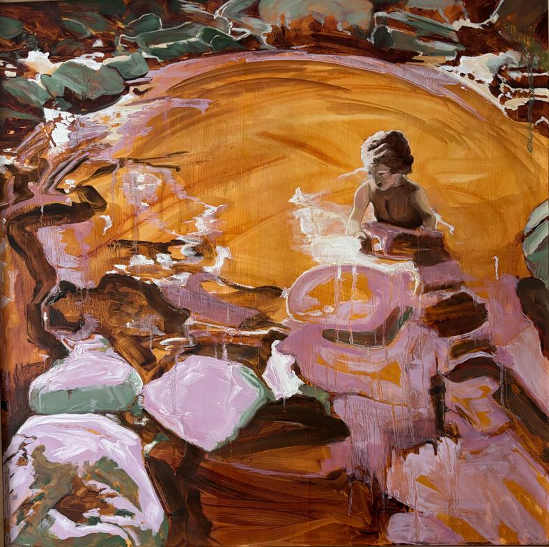
Rebecca and the Rocks, 2026
63 x 63cm
£ 850
Up the creek, 2026
acrylic and oil on board
63 x 63cm
£850
Emerging, 2025
acrylic and oil on board
63 x 63cm
£ 850
Making a Splash, 2025
acrylic and oil on board
63 x 63cm
£ 850

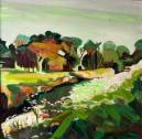
Cambridgeshire, 2024
64 x 53cm
£850
63 x 63cm
£ 850
Untitled Still Life (with apple and chair), 2022
Giclée print
42 x 28cm
£260
1969 or Thereabouts, 2026 ink and gesso on canvas
20 x 28cm
£350
Untitled Still Life (orange, rose and lemon), 2022 Giclée print
42 x 28cm
£260
Plastic Bottle with Rose and Verbena, 2026 ink and gesso on canvas
20 x 29cm
£350
Glass Vase, Irises, 2020
Giclée print
24 x 34 cm
£260
The Rose, 2025 ink and gesso on canvas
19 5 x 27cm
£350
Glass Vase, Roses, 2020 Giclée print
24 x 34cm
£260
Over The Line, 2025 ink and gesso on canvas
18 3 x 27cm
£350
Pistil, Lily (Fragment #1), 2026 ink and gesso on canvas
20 x 27 5cm
£350
The Hidden Room, 2026 ink and gesso on canvas
20 x 28 5cm
£350
Numismatist, 2026 ink and gesso on canvas
20 2 x 28 5cm
£350
Summer. Reassembled. (with Chrysanthemums), 2025 ink and gesso on canvas
26 5 x 28cm
£425
Summer. Reassembled. (with Rose), 2025 ink and gesso on canvas
28 2 x 28 4cm
£425
Summer. Reassembled. (with Butterfly), 2025 ink and gesso on canvas
75 5 x 75 5cm
£1140
Untitled Still Life (with anemones, pebbles, bottles and rose), 2022
Giclée print
28 x 42cm
£260
Glass Vase, Bouquet, 2026
Giclée print
24 x 34 cm
£260