111
PRINT BUYER | 111/2026 | STRATEGO GROUP | Via Cassanese, 224 | 20054 Segrate (Milano) | ITALIA | € 17,00
NEXT IS NOW
www.plastigraftrevigiana.com
Glamorous, authentic, intense, striking or tactile – our sustainable paperboards bring your brands to life. kapag.com | oppboga.com
Follow us on
Warming Your Spirits
Editorial by MICHELA PIBIRI
I S
N O T
L O S T
Illustration by Serena Ferrero @santamatita
A L L
Between Luxury and Mass-market
10
Barilla, a tradition that looks to the future
BY THE EDITORIAL TEAM
BY MICHELA PIBIRI
How are the luxury and mass-market sectors evolving, and what impact are these new trends having on the print industry, particularly in light of the PPWR Regulation?
An interview with Antonio Esposito, Global Pasta and Condiments Packaging Director, on the production, technological and market challenges the Barilla Group is currently facing.
Design, a commitment to excellence
28
The parrot in the library
20
35
BY R O B E R TA R A G O N A
BY LO R E N Z O C A P I TA N I
Two of the world’s leading designers in the field of luxury packaging, Vincent Villeger and Jérôme Dinand, share their vision of excellence and sustainability with us.
From the Infinite Monkey Theorem to Big Tech: the possible implications of applying artificial intelligence to the publishing industry.
EDITORIAL by Michela Pibiri All is not lost
5
GRANDANGOLO Chamel® Recycled Prestige
33
WE ARE PRINTLOVERS People in love with printing
55
HOW PRINTLOVERS #111 IS MADE I materiali, le tecniche, i partner
8
COMPANIES Mosaiq Group
42
GRANDANGOLO myCordenons, paper as a design element
61
COMPANIES Pozzoli
16
SPAZIO ROBILANT Suspended Luxury
44
GRANDANGOLO Varigrafica for Mahala Boutique Hotel
62
COMPANIES Sappi
25
COMPANIES GPS Bags
50
WE TALKED ABOUT People and companies mentioned in this issue
78
COMPANIES Siegwerk
26
PAT’S SUITCASE Luxury lives in the details
52
Printing desire
46
Resins and Voluptuousness
BY C AT E R I N A P U C C I
BY PAO L A C A R B O N E
When does a surface cease to be mere decoration and become a language? And what role do materials, technique and mass production play in shaping desire?
In cosmetics and perfumery, the transparency of glass is a standard. Resins fit into the same aesthetic framework, whilst offering greater design freedom.
Riding the wave of corrugated
70
When printing changes the rules of the game
BY ALEXIA RIZZI
BY G I R L S W H O P R I N T I TA L I A
From a humble material par excellence to a design medium: corrugated cardboard is now a key player across high-end packaging and prestigious interior décor.
Two print advertising campaigns in shopping centres managed by Savills shed new light on discrimination and gender-based violence.
64
74
PRINT BUYER # 111/2026 DIRETTORE RESPONSABILE Enrico Barboglio COORDINATRICE EDITORIALE Michela Pibiri michela.pibiri@strategogroup.net HANNO COLLABORATO Lorenzo Capitani, Paola Carbone, Angelo Ferrara, Pat McGrew, Caterina Pucci, Roberta Ragona, Alexia Rizzi
PRINTLOVERS SU WEB www.printlovers.net redazione@printlovers.net STRATEGO GROUP srl Via Cassanese 224, 20054 Segrate (MI) amministrazione@strategogroup.net PUBBLICITÀ Deborah Ferrari | t. +39 389 9004599 › deborah.ferrari@strategogroup.net
TRADUZIONI Philip Sanders – The Language Switch
Segreteria pubblicità › brando.zuliani@strategogroup.net
ART DIRECTOR Stefano Torregrossa › onicedesign.it
REA MILANO 1190227 Aut. Trib. Milano n. 706 | 11/10/2004
STAMPA PRESSUP – Nepi (VT) ABBONAMENTI T. + 39 02 49534500 | F. +39 02 26951006 abbonamenti@strategogroup.net Annuale 60 euro – Bonifico bancario a STRATEGO GROUP srl IBAN: IT70 C034 4020 6000 0000 0264 200 MEDIA PARTNER OF
Gli articoli firmati impegnano esclusivamente gli Autori. Dati e caratteristiche tecniche sono generalmente forniti dalle Case costruttrici, non sono comunque tassativi e possono essere soggetti a rettifiche in qualunque momento. Tutti i diritti sono riservati. Notizie e articoli possono essere riprodotti solo a seguito di autorizzazione dell’editore e comunque sempre citando la fonte. Testi e fotografie, qualora non espressamente richiesto all’atto dell’invio, non vengono restituiti. Desideriamo informarLa che il D.Lgs. 196/03 (Testo Unico Privacy) prevede la tutela di ogni dato personale e sensibile. Il trattamento dei Suoi dati sarà improntato ai principi di correttezza, liceità e trasparenza e della Sua riservatezza. Ai sensi dell’art. 13 del Testo Unico, Le forniamo quindi le seguenti informazioni: il trattamento che intendiamo effettuare verrà svolto per fini contrattuali, gestionali, statistici, commerciali, di marketing; il trattamento, che comprende le operazioni di raccolta, consultazione, elaborazione, raffronto, interconnessione, comunicazione e/o diffusione si compirà nel modo seguente: archiviazione su supporto cartaceo e archiviazione informatizzata su personal computer. Il titolare dei dati è: Stratego Group srl nella persona del Rappresentante Legale. Il responsabile del trattamento dei dati è: Enrico Barboglio [enrico.barboglio@strategogroup.net, via Cassanese 224, Segrate MI, T. 02.49534500]. Al titolare del trattamento Lei potrà rivolgersi per far valere i Suoi diritti così come previsti dall’art. 7 del D.Lgs. 196/03.
Leggi questo numero in italiano qui:
HOW PRINT LOVERS 111 IS MADE
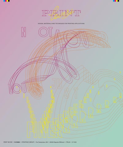
NOT LOUDER, JUST FINER. For issue 111 of PRINTlovers, the cover interprets the concept “Not louder. Just finer”, translating a concept rooted in music into the language of print. Just as in audio production, quality stems from balance, detail and control, so this project highlights the precision of the line and the sensitivity of the printing process. Subtle lines and overlapping strokes evoke the threedimensional propagation of sound, transforming an invisible phenomenon into an essential and abstract graphic pattern, which nevertheless conceals the magazine’s concept. An invitation to rediscover excellence in moderation, where expressive power derives not from intensity, but from attention to detail and the technical challenge of the three overlapping hot-stamping processes. INNER PAPER Magno Volume is THE heavyweight paper by definition with a matte surface, combining the excellence of coated printing with a warm, natural tactile experience. Made in Europe while maintaining the highest sustainability standards. Benefits: higher yield and efficiency, machinability and stability, faithful reproduction of images and colors with a natural touch. Wide range: available from 80 to 450 g/m².
METALLISATION
HOT STAMPING COLOURS AND CLICHÉS
Plastigraf Trevigiana is a leading Italian company specialising in coating applications on paper and cardboard, through lamination with layers or the application of coatings. The family-run business was founded in 1979 and today employs 37 people, operating 4 roll-to-roll lamination lines and 9 sheet-to-sheet lamination lines. Since 2024, it has been a partner of the French company Eurobrillance, thanks to which it has doubled its production capacity. Growing investment in Research and Development has enabled the company to develop cutting-edge solutions that comply with international standards or even anticipate them, leading the company to specialise also in the lamination of bioplastics, the manufacture of ultra-thin products, recycled and recyclable products, and the application of aqueous dispersions designed to provide a direct barrier on paper and board.. C www.plastigraftrevigiana.com
Luxoro is the exclusive partner in Italy of the KURZ Group, a global leader in finishing technologies for hot stamping, cold stamping and digital printing. With an eye to the future, it redefines the concept of finishing, transforming creative visions into sustainable, cutting-edge solutions. It goes beyond the physical product, collaborating with brands and designers to enhance packaging and visual identity through innovation, technical excellence and environmental responsibility. Its commitment to sustainability is reflected in certified materials, recyclable and compostable finishes, and pioneering initiatives such as the recovery of used polyester carriers. Luxoro is a company powered by 100% renewable energy and supports cultural and environmental projects, embodying a vision in which creativity and responsibility guide the future of finishing.. C www.luxoro.it
FULL-PAGE METALLISATION The cover metallisation was carried out by Plastigraf Trevigiana using Zeroplast®, a metallisation process for paper and card developed for the luxury market. This technology involves transferring an ultra-thin layer of coated aluminium to protect and enhance the cellulose substrate. The laminated product is therefore free from plastic film – which is recovered and sent for recycling – yet boasts extreme brilliance and good scratch resistance, as well as being suitable for subsequent print finishes. In the case of this cover, Zeroplast® technology has been combined with Natureal engraving technology, which allows a patterned effect to be added to the silver-metallised surface to personalise the design.
PRINTING AND FINISHING To produce the cover, Grafica Metelliana used a 6-colour UV Heidelberg Speedmaster XL offset press, ensuring the highest standards of quality and performance. The real added value lies in a sophisticated finishing technique carried out using the BRAUSSE SIGNA 105OFI: high-precision hot foil stamping, achieved through the millimetre-precise overlay of three different foils. The result is a design with meticulous attention to detail, which brings out the brilliance and vibrancy of the colours to the full.
HOT STAMPING COLOURS AND CLICHÉS Luxoro interprets the theme “Not louder. Just finer” through three colours from the new Extra!ordinari catalogue: LUXOR® 109652 Graffiti Pink, a bright, contemporary pink; LUXOR® 26290N, a metallic orange-gold with a matt finish and warm coppery highlights; and LUXOR® 111004 Emerging Yellow, an intense, luminous yellow, for high-impact accents. The three colours are hot-stamped using a Hinderer+Mühlich Italia flat stamping die, with separate passes and extremely precise registration. At selected points, two effects overlap to create new shades, highlights and depth: a specialised process that requires high-performance materials and rigorous process control. A project that demonstrates how hot stamping can go beyond simple finishing to become an integral part of the visual design itself.
PRINTING AND FINISHING
DESIGN
Grafica Metelliana is a company that has been operating in the printing sector for over thirty years. From technical consultancy to the production of commercial print materials, publishing, packaging, paper products, labels and wide-format printing, it transforms ideas into tangible products capable of communicating, evoking emotion and enhancing each client’s identity.Always focused on innovation and attuned to market trends, Grafica Metelliana has expanded its range of services by investing in a new production line for roll-fed labels: a further step towards providing increasingly comprehensive communication solutions capable of meeting the widest variety of needs. C www.graficametelliana.it
O,nice! Studio is an independent creative agency based in Verona, Italy, that transforms ideas into impactful brands, products and experiences. We are a team of curious minds, design enthusiasts and problem solvers who genuinely enjoy working together—and believe that the best ideas often come from sharing perspectives (and occasionally coffee). We combine strategic thinking, design expertise and production know-how to develop distinctive visual identities, packaging, communication and printed projects. Every solution is tailored to the client's goals, balancing creativity, functionality and attention to detail through a collaborative and flexible design process. . C www.onicedesign.it
PRINTING & PACKAGING TODAY, BETWEEN LUXURY
AND MASS-MARKET by T H E
10
E DI TORI A L
TE A M
S C E N A R I O
O U R
C H O I C E
PISACANE ECOLUXURY BOX: CRAFTSMANSHIP MEETS INNOVATION
LUXURY Luxury has always been a selective market, but today it is becoming even more focused on high-spending customers and the quality of the relationship built around them. For packThe luxury market is going aging, print and retail through a period of rebalancing that environments, this is directly affects those who design creating a landscape in and produce packaging and communication tools for brands. On which materials, per- the one hand, BCG and Fondazione sonalisation, physical Altagamma’s “True-Luxury Global Consumer Insight 2025” records a experience and trace- slowdown among aspirational conability are increasingly sumers and the growing importance of so-called top-tier customers. On strategic. And to sup- the other, Deloitte’s “Global Powers port packaging compa- of Luxury 2026” depicts an indusincreasingly focused on value, nies in adapting to EU try margins and customer relationships Regulation 2025/40 – rather than volume growth. In short, is investing in perceived the PPWR – the Istituto luxury quality and experience. Italiano Imballaggio has developed its Guidelines Lower volumes, greater value per customer for the Environmental According to BCG-Altagamma, top-tier consumers account for less Management of Luxury than 0.1% of the luxury customPackaging. er base, yet generate 23% of total spending, rising to 37% when luxury mobility and wellness are included. These consumers look for connection, intimacy, excellence and
Manual shaping turns rigid cardboard into fluid, rounded curves, redefining the premium gift box for global luxury brands. The Art of the Curve Breaking geometric rules requires deep expertise. Designed for high-end fashion, jewelry, and selective perfumery, this project features a rigid FSC-certified cardboard core meticulously twisted by hand to create a smooth, rounded structure. The result is a sleek silhouette that trades sharp corners for elegant, organic lines. Mixed Materials & High-End Appeal Wrapped in premium embossed paper, the box features a custom screen-printed texture. The tactile depth of the paper blends with luxury leather details: a genuine leather handle is applied post-production, transforming the packaging into a collectible prestige accessory. Green Bonding Elegance aligns with modern eco-design. Every bonding step is completed using water-based eco-adhesives. This versatile hatbox structure serves as the perfect canvas for premium spirits and cosmetics, elevating the unboxing experience into a sustainable luxury ritual. www.pisacaneboxes.com
recognition: 89% consider craftsmanship and quality essential, while 80% prefer exclusive, private retail environments. At the same time, aspirational consumers have become more selective and increasingly sensitive to whether price genuinely corresponds to the quality and value of a product. For suppliers, this means addressing a market in which materials, execution and attention to detail carry renewed weight. Primary and secondary packaging, presentation boxes, shopping bags, catalogues, invitations and materials created for VICs can all help build the sense of exclusivity the market is seeking to restore. There is also growing room for more targeted production, versioning, short runs and personalisation capable of supporting increasingly precise clienteling strategies. Retail remains a fundamental part of the experience According to Deloitte, 28.6% of surveyed executives see customer experience and loyalty as the leading growth opportunity for 2026. At the
11
S C E N A R I O
O U R
C H O I C E
TIME IN A PACK BY SAMORANI GROUP
same time, the industry is rethinking its retail network, focusing on the quality of flagship stores and their ability to become experiential destinations. Galleries, cafés, pop-ups, installations, ateliers and private spaces for top clients are expanding the role of the physical environment, which is increasingly expected to express the brand and build relationships. For the print industry, this opens up opportunities that extend well beyond packaging. Visual communication, interior decoration, displays, tactile materials, catalogues, lookbooks and special editions can become part of a coordinated system in which physical media contribute to the overall quality of the experience. Digital technologies are also entering this relationship: QR codes, NFC and connected tools cited by Deloitte point to a growing integration between objects, environments and digital content. Materials, circularity and traceability Sustainability remains another crucial driver, but it is increasingly taking on an industrial dimension.
12
Deloitte identifies innovation in materials and production processes as the second most important factor expected to transform luxury over the next five years, after artificial intelligence. R&D, lower-impact materials, circularity and advanced lifecycle management are progressing alongside traceability, while the Digital Product Passport is set to become part of brands’ operational infrastructure. The growth of pre-owned products, repair and refurbishment is also changing the very concept of a luxury product. The relationship with an object extends over time and requires systems capable of communicating its origin, authenticity and history. For packaging and print, the challenge is therefore to combine high perceived value, sensory quality, verifiable sustainability and information content. In this landscape, packaging is the first physical space in which product, identity, service and brand storytelling come together. For printers, packaging manufacturers, converters and material suppliers, as well as companies involved in retail
In ancient Greek mythology, Aion was time without beginning or end – eternal and cyclical. Samorani Group has encapsulated this concept in packaging designed for a smartwatch, where every detail conveys this idea. The circle is the central theme: it recurs in the structure of the box, in the finishes, on the label and in an embossing designed specifically for this paper – a texture that the hand recognises even before the eye does. Inside, a silent book continues the narrative through images. Time radiates outwards like the ripples created by a drop of water, and the surface captures this movement in a precious, delicate hot-foil finish that interacts with the box’s inner core: multiple layers of recycled, raw and textured honeycomb cardboard. A duality that becomes a statement of intent: the passage of time is present as much in the finish as in the substance. Packaging that does not merely contain, but works with the material of the paper to give tangible form to an idea. www.samoranigroup.it
environments and printed communication, the direction highlighted by the two reports rewards above all design expertise, innovation and close collaboration with customers. A new idea of luxury packaging This evolution is also reflected directly in the Linee Guida per la gestione ambientale del packaging per il lusso – “Quando il contenitore fa il valore” (Guidelines for the Environmental Management of Luxury Packaging), published in 2026 by the Istituto Italiano Imballaggio. Conceived as a technical and operational tool, the Guidelines are intended to support the luxury supply chain in adapting to EU Regulation 2025/40 – the PPWR. The document addresses packaging sustainability by seeking to reconcile environmental and regulatory requirements with the characteristics that define high-end products: manufacturing quality, aesthetics, brand identity, emotional value and user experience. It also proposes a shared working method across the entire value chain, from the initial brief and design phase
S C E N A R I O
ON THESE PAGES Opening photo: Takashi Sakamoto Dior photo: Laura Chouette Photo below: Tara Clark —Courtesy of Unsplash
O U R
C H O I C E
EVE BY TONUTTI TECNICHE GRAFICHE, THE CHARME OF BEAUTY
Eve reinterprets the charm of beauty through a language that intertwines different eras and inspirations. Inspired by a female figure recalling the charisma of Giacomo Casanova, it combines the elegance of the Baroque with the vibrant energy of the Eighties, creating an urban-inspired packaging concept designed for young consumers with a free spirit. Bold and intense colours contrast with the softness of a soft-touch material, creating a sophisticated balance that enhances its premium positioning. The fan becomes the distinctive element identifying the beauty routine, while a magpie holding a silver spoon evokes the imagery of Rossini’s world. Every detail takes shape through the balance between graphic design, material research and printing expertise: embellishments and finishes enhance the narrative, amplifying its visual and tactile impact. It is through the synergy between customer, design studio – the project is by Massimiliano Gosparini – and printer that labels are born, transforming a cosmetic product into a sensory experience and demonstrating how Tonutti Tecniche Grafiche’s excellence, long established in the Wine & Spirits sector, now finds a natural expression in the beauty world as well. www.grafiche-tonutti.it
through production and compliance verification. The Guidelines were developed by the Italian Packaging Institute through its Luxury Packaging Commission, with contributions from experts in regulation, materials, design, printing and converting. They are intended for all stakeholders involved in managing the transition of luxury packaging towards the new regulatory framework, and their approach is deliberately multidisciplinary: according to the document, compliance must be built through coordinated involvement across the entire supply chain. The Guidelines therefore emphasise the importance of involving creative, technical, production, regulatory and environmental expertise from the earliest stages of development. For suppliers, this means increasingly moving beyond the role of executor to become a design and development partner, capable of proposing materials, structures, finishes and industrially scalable processes that respond simultaneously to the aesthetic brief and to new environmental requirements.
MASS– MARKET In the mass-market consumer goods sector, implementation of the PPWR is also a pivotal point in a transformation that has been underway for several years. At the same time, the industry is having to contend with the effects of the international geopolitical situation on sourcing For essential goods and largeand logistics, alongside scale consumer markets in Italy, a dethe slow – but decisive – tailed picture is provided by the Pack maturation of advanced Around 2026 survey, conducted by Stratego Group and Largo Consumo digital tools. Together with the support of a technical-scienwith the drive towards tific committee bringing together expertise from academia and research more sophisticated de- and coordinated by Marco Scatto. Based on a sample of 142 mansign approaches, these agers from manufacturing and disare the key issues ex- tribution companies, the research plored by the Pack portrays a packaging supply chain that is fully aware of the strategic Around 2026 survey. role of packaging, yet still working to translate that awareness into efficient operating models. According to the survey, the PPWR is accelerating change, while choices continue to be driven by efficiency, continuity of supply, costs and measurable return on investment. One recurring theme is the growing need for collaboration across the entire value chain. Trends in mass-market packaging In Design & Communication, packaging is used first and foremost to communicate product quality, while sustainability appears to be less overtly displayed and increasingly embedded in design itself. Attention is growing around readability, recycling instructions and digital tools such as QR codes and NFC, although accessibility remains only partially addressed. More than 68% of companies
13
S C E N A R I O
say they apply a “Design for All” approach, although the research highlights a gap between the language of inclusion and the actual adoption of user-centred methodologies. Ergonomics, tactile materials and neuroscience are gaining ground, while user research and design for disassembly remain marginal. Digitalisation is now a priority, although progress is uneven. Material traceability is the most advanced area, while data interoperability, the Digital Product Passport and information governance remain relatively underdeveloped. Some 69.2% of respondents identify traceability and interoperability as a priority investment area for the next three years. Companies are looking at tools capable of assigning recyclability scores, generating digital passports and reducing errors or non-compliance, although ROI remains decisive. Artificial intelligence is also being approached cautiously: its potential is recognised, but adoption depends above all on cost and the availability of reliable data. Smart packaging remains largely centred
14
on QR codes, used by more than half of the sample. The section on organisational models highlights an internal challenge: packaging is considered strategic, yet decisions are often still highly centralised. CEOs and senior management lead investment decisions, followed by marketing and procurement, while R&D, quality and sustainability carry less weight. Slow decision-making, skills shortages, fragmented budgets, misaligned KPIs and organisational silos all hinder ecodesign. Supply stability is the most structured criterion, while end-oflife and recyclability considerations are less mature. Innovation is driven above all by relationships with packaging, machinery, print and converting suppliers, while universities and research centres still play a marginal role. The result is innovation that is predominantly incremental and geared towards short- to medium-term outcomes. In Materials & Printing, a pragmatic approach prevails. Paper and board remain strong, while mono-material plastics are con-
solidating their position as a more manageable solution from both an industrial and recycling perspective. Multi-material structures, by contrast, are under increasing pressure. Recycled content has now become part of practical decision-making: a large proportion of respondents report using shares above 30%, while 42.1% exceed 50%. Choices are driven by sustainability, costs, margins, availability and supply-chain considerations. No single printing technology dominates. Offset, flexography and digital printing coexist according to volumes and applications, while gravure plays a more marginal role within the survey sample. Recent investments have focused primarily on reducing waste, consumption and environmental impact. Logistics is turning packaging into an infrastructure for resilience. Geopolitical instability and raw-material volatility are pushing companies away from single sourcing: 50% rely on a limited number of qualified suppliers for each category, while strategic stockholding and dedicated warehousing are increasing.
Design is increasingly focused on transport and handling efficiency, placing secondary packaging at the centre of optimisation efforts. A truly systemic view, however, remains weak: only a minority of companies assess in advance the interaction between primary, secondary and tertiary packaging. Reverse logistics is even less developed. As a result, the supplier relationship is evolving towards consultancy, co-design and optimisation of total costs. Finally, the Environment & Sustainability section shows a supply chain that has moved beyond sustainability as a simple communication tool: for almost half of respondents, it is now integrated into corporate strategy. The main obstacle remains economic, followed by regulatory uncertainty. Design for recycling is driving the transition towards mono-material structures, lightweighting and higher recycled content. Some 33.3% consider the introduction of recycled material a strategic priority. Yet major end-of-life issues remain unresolved: recovery infrastructures, separability, reuse, reverse
S C E N A R I O
logistics and effective monitoring of EoL pathways are still insufficiently structured. The packaging of the future will depend on the ability to integrate design, data, organisation, production, logistics and recycling into a single supply-chain system. A direct dialogue with industry To conclude the Pack Around 2026 project, a forum was held in Milan on 23 June 2026, bringing together industry, retailers, brands and suppliers to discuss the transformations affecting packaging. The event opened with Giuseppe Vignali, Professor of Food Pack Technology at the University of Parma, who presented the main findings of the survey in his role as a member of the Technical-Scientific Committee. The discussion that followed translated the trends identified by the research into concrete company experiences. Antonio Esposito, Global Pasta and Condiments Packaging Director at Barilla, described a sustainability journey that began in the early 2000s and is based on recyclability,
format optimisation and cross-functional collaboration. The redesign of packaging for tagliatelle nests, for example, made it possible to reduce packaging by 11% and distribution and storage requirements by 25%. Olga Astapets, Packaging Manager at Molino Nicoli, outlined investments in high-speed packaging, automation, mono-material films and certified recycled paper. On the supplier side, Alberto Pecorelli, CEO of SayHay Italia, presented the company’s experience with bio-based, compostable materials derived from agricultural by-products and developed to run on existing equipment with minimal adjustments. Giacomo Loreto, Sales Manager at Cielle Imballaggi, focused on flexible mono-material polyethylene structures, downgauging and multilayer extrusion technologies. A second strand of discussion addressed packaging as a communication tool. Looking ahead to Print4All 2027, Paola Sarco, Head of Business Unit Building & Industrial Exhibitions at Fiera Milano, highlighted the role of printing, convert-
ing and finishing in creating brand identity and recognition through labels, textures and embellishments. Federica Trombetta, Head of Marketing and Online Operations at Costadoro, explained how graphics, premium materials and content can support the perceived value of a product, together with a careful review of claims and logistics optimisation. Simone Salvioni, Marketing Director at Abafoods, stressed the importance of clear, verifiable and consistent labelling, particularly in product categories where consumers pay close attention to ingredients, benefits and product characteristics. For Anita Casamento, founder of Azienda Agricola Oliviera, dark, heavy glass protects the product while becoming an integral part of the story surrounding the oil. The supply-chain approach was another particularly significant theme during the forum. Sara Bernabeo, Packaging Manager at Unigrà, described new packaging development as a collective effort involving R&D, quality, production, purchasing, IT, marketing and sales, sup-
ported by the scouting of new materials and the gradual replacement of non-recyclable solutions. Through its Private Label Packaging Manager Diego Lazzarin, Bennet highlighted ecodesign, reduced overpackaging, transparent environmental messaging and logistics control, while stressing that functionality remains essential. Michele Cantisani, R&D Packaging Manager Home Care & Personal Care at Bolton, focused on circularity, mono-material solutions, increased use of recycled content and the selection of suppliers capable of delivering innovation. Finally, Clara Sasso, Regulatory Affairs Manager at L’Erbolario, described investments in recycled and bio-based plastics, airless systems, mono-material solutions and format standardisation, identifying technical expertise, consistency with the brand and traceability as key requirements when selecting partners. Together, these experiences portray a supply chain that increasingly sees packaging as an integral part of both industrial and brand strategy.
15
C O M PA N Y
S P O T L I G H T
P O Z Z O L I
S PA
www.pozzolispa.com
PACKAGING AS A CRAFT POZZOLI INVESTS IN ITS OWN FUTURE Two years ahead of its 60th anniversary, the Inzago-based company has drawn up a three-year plan built on three pillars, HR, Technology and IT, to keep doing what it does best: staying ahead of the market.
16
A
A presentation box that turns buying a perfume into a small unwrapping ritual. A carton that holds a wine bottle and produces a tribute to its terroir, even before the cork comes out. A collector’s edition that means as much to the person receiving it as the music it holds. In tailor-made secondary packaging, the difference between a box and an experience comes down to a few millimetres of finishing, to embellishment done with real craft, to a delivery time honoured without sacrificing quality. It is within this razor-thin margin that Pozzoli SpA — based in Inzago, with further sites in Marano Vicentino (Pozzoli Couture) and Paris (Pozzoli France) — has built its reputation from 1968 to today. And it is to defend and widen that margin that the company has decided to commit to a three-year investment plan in Human Resources, Technology and Information Technol-
ogy, ahead of an occasion that could not be more symbolic: the 60th anniversary of its founding, in 2028. The plan grows out of a clear-eyed reading of how the market Pozzoli operates in is changing: luxury packaging, cosmetics, wine & spirits, fine food, entertainment — sectors being reshaped by new customer expectations, supply-chain pressures, accelerating digitalisation and a growing focus on sustainability, a theme on which highend packaging is now called on to prove that elegance and environmental responsibility can coexist. For Pozzoli, responding to these shifts means doing so with the same method that has always defined the company: determination, precision, and the ability to turn complexity into opportunity. People before machines
The first pillar is about people. Pozzoli aims to strengthen its human capital through new hires, contin-
uous training and growth paths, to attract talent that shares the company’s culture of innovation and artisanal excellence. «The quality that sets us apart comes from people’s hands and minds before it comes from machines. That’s why the first investment that makes sense is in people: without the right skills, even the most advanced machinery goes to waste» explains Alfonso Cefaliello, Chairman and CEO. Machines and data, one single investment
The second and third pillars run in parallel: on one side, new, latest-generation machinery and production facilities to expand processing capacity and cut execution times without giving up quality; on the other, the modernisation of the digital infrastructure, to make processes more agile, integrated and data-driven, both in internal management and in rela-
P O Z Z O L I
tionships with customers and partners. «Technology and IT need to be thought of together. A new plant without the data to run it just produces the same old mistakes, but faster. We want every investment in machinery to be matched by an investment in information: know sooner, decide better, correct in time» notes Carlo Miranda, General Manager.
S PA
www.pozzolispa.com
in its proposals, more solid in execution. «Our industry has no mercy for those who wait for the customer to spell out their need. The best way to meet it is to anticipate it. That’s what our founder Aldo Pozzoli used to say when he founded the company in 1968, and it’s still the principle that guides us today» continues Cefaliello. 2028: A snapshot, not a promise
Modernity, market, method
Behind the three pillars, three words guide the plan: modernity, market, method. Updating facilities, processes and skills without losing the competitive edge of artisanal quality; translating investments into concrete commercial results, through new customers, new sectors and greater international reach; and, above all, changing pace in how the company engages the market — quicker to listen, more proactive
In this sense, 2028 is not conceived as a finish line to be celebrated by looking back, but as a milestone on a journey already under way. «We don’t want to reach our 60th anniversary and discover that the market has changed while we haven’t. We want to get there having already done the work: a more modern structure, more solid processes, better-prepared people. At that point, the anniversary will be the snapshot of a change that has already hap-
C O M PA N Y
pened, not the promise of a change still to be made» says Miranda. From Grafica Pozzoli in 1968 to today’s multi-business group, with business units dedicated to Entertainment, Cosmetics & Perfumery, Wine & Spirits and Food, the company’s history tells the story of constant evolution without losing its identity. It’s the same balance that the investment plan aims to protect: growing without losing itself, going digital without ceasing to be craftspeople. «Investing in the future is not an option — it is our responsibility to those who believed in this project and to those who will believe in it tomorrow» the Pozzoli family and management conclude. A statement that sounds less like a slogan and more like a commitment made to customers, partners and to the company’s own history.
S P O T L I G H T
POZZOLI SPA AT A GLANCE Founded in 1968 by Aldo Pozzoli in Inzago (Milan), Pozzoli SpA is today a benchmark in high-end packaging, with business units dedicated to Entertainment, Cosmetics & Perfumery, Wine & Spirits and Food. Alongside its Inzago headquarters sit Pozzoli Couture, its Marano Vicentino subsidiary specialising in the most complex processes, and Pozzoli France, based in Paris. The company serves international clients with special, tailormade and patented packaging solutions, combining artisanal quality with industrial efficiency in a model unique on the market.
17
2026
L’Oro della Stampa è l’unico e il più ricercato riconoscimento all’eccellenza delle aziende della stampa e del converting. Entra nel club di chi con la stampa e la trasformazione partecipa alla storia dell’industria italiana.
CANDIDA LA TUA AZIENDA A VINCERE UN
ORO DELLA STAMPA La tua azienda verra valutata da una giuria qualificata secondo questi criteri: Profilo etico Investimenti tecnologici e strutturali Certificazioni Accordi Merger and Acquisition (M&A)
Internazionalizzazione dell’offerta Visibilità/ campagne adv/ marketing Iniziative ESG Formazione Risultati di bilancio negli ultimi 3 anni
La cerimonia di premiazione si terrà il giorno
3 DICEMBRE 2026 Stratego Group (logo CMYK) - formato pdf.pdf 1 21/10/2019 12:50:05
È UNA INIZIATIVA DI
Trovi il regolamento e tutte le informazioni per partecipare su www.orodellastampa.it
8/2026
Commer Carta is the premier partner for sourcing and custom-sheeting all major packaging grades - including FBB, SBS, GT, and GD - either unlined or laminated with traditional or eco-friendly films, tailored specifically for the printing and converting sectors. Our certified, rigorous substrates for the Luxury, Beauty, Pharma, and Food Packaging markets are trusted daily by Italian converters and global brands to produce sophisticated folding cartons, premium displays, and high-performance, easily recyclable food packaging. Drawing on over 40 years of industry expertise, we are widely recognized for our reliable, just-in-time service and technical customer consultancy, alongside the exceptional quality of our materials and our commitment to sustainable products and processes. Discover more about our solutions on our website commercarta.com.
Incada Exel is a premium, lightweight fresh-fibre GC2 engineered specifically for high-impact packaging applications where outstanding visual appeal is vital. Its multi-layer, hard-sized construction delivers exceptional stiffness and superior structural integrity, maximizing your overall packaging yield while minimizing raw material consumption. This premium high-yield substrate guarantees flawless high-speed conversion, excellent printability, and robust moisture resistance, reliably maintaining its core mechanical properties even at very low temperatures. The doublecoated print surface ensures an ultra-smooth profile and uniform ink absorption, perfectly optimized for demanding offset, gravure, and digital printing. When specific technical or aesthetic properties are required, our custom lamination provides high-performance barriers for strict foodcontact specifications, as well as stunning metallic or textured finishes tailored for premium Beauty and Luxury packaging. Utilizing state-of-theart reel-to-reel and sheet-fed laminators, we deliver precision-sheeted, ready-to-convert boards directly to your facility. This highly efficient integrated process completely eliminates multi-stage logistics, slashes processing lead times, and significantly reduces material waste. Discover the ultimate balance of yield, barrier performance, and exceptional print gloss. Touch and feel our range of raw and film-laminated substrates at Stand A73, PCD, Paris Packaging Week 2027.
Printed on Incada Exel 325 gr
C O L L E C T I O N
8/2026
VALORIZZIAMO L’ECCELLENZA DEL TU O BR AN D dal corporate al packaging il tuo partner per la stampa di qualità
www.lazzati.biz
B R A N D S
H A V E
T H E I R
S A Y
B A R I L L A A TRADITION T H AT L O O K S TO THE FUTURE
by M I C H E L A
20
P IB I R I
B R A N D S
In Italy, the name Barilla evokes a shared culture. It is a heritage that goes beyond mere food: it nourishes the imagination. But behind it lies an industrial enterprise that constantly tackles production, technological and market challenges to stay ahead of the curve: packaging is one such challenge. We spoke about this with Antonio Esposito, Global Pasta and Condiments Packaging Director at the Barilla Group.
H A V E
T H E I R
S A Y
Since 1877 – just a few years after the unification of Italy – the Barilla family has been bringing pasta to family tables. First to households in the city of Parma, where it began as a bakery and pasta-making workshop, then to households throughout Italy, right up until the 1950s, when it began bringing pasta to tables all over the world (“The choice of Italy” was the slogan used to promote its distribution in the United States of America). A corporate history intertwined with the country’s customs and traditions, helping to forge a national identity and present it to the world. All this, thanks in part to an unmistakable brand identity, capable of innovating and evolving alongside society and its values. But Barilla is not just about products, food culture and the collective imagination: today it is an international group that has retained its status as a family-run business, yet whose figures help us understand its role in the global food industry. It has 30 production sites – 15 in Italy and 15 abroad – which together produce over 2 million tonnes of products each year. In 2025, turnover was 4.837 billion euros (and net profit 233 million euros). A commitment to sustainability rated E+ in 2022 on a scale from F to EEE by the rating agency Standard Ethics as part of the SE Food&Beverage Sustainability Italian Benchmark; and, still on the subject of ratings, the top spot in the Global RepTrak® 100 ranking for reputation in the food sector, achieved in 2026 for the third consecutive year. It is easy to see how every decision regarding packaging is crucial to the success of a mass-market food company of this scale, particularly in the face of geopolitical complexity and evolving regulations. We discussed all this with Antonio Esposito, Global Pasta and Condiments Packaging Director at the Barilla Group.
21
B R A N D S
H A V E
T H E I R
S A Y
Barilla: 150 years of Italian history preserved in the archives
What are the main areas of investment in packaging on which Barilla is focusing most? In recent years, Barilla has focused its investments on developing increasingly sustainable packaging. The company was already building on a solid foundation: it was a pioneer in sustainable packaging. Since 2020, 99 per cent of Barilla’s packaging has been ‘designed for recycling’. This enables us to respond to regulatory and market developments from a favourable position, but it does not eliminate the need to continue investing. Today, the priority is to further strengthen sustainability, thanks in part to advances in materials, technologies and machinery. The most significant issue within the ESG framework is decarbonisation. Investments are not merely financial: they also involve resources, expertise and working time dedicated to managing projects that help reduce emissions. The strategic plan looks ahead to 2030 and is structured around several key areas: reducing material weight, minimising material use, seeking alternative materials and optimising each type of packaging.
22
What impact is the new European PPWR regulation having on your strategies? Barilla’s starting position is a significant advantage: the vast majority of our packaging is already designed for recycling. The PPWR confirms and reinforces this direction, driving the entire market towards a ‘designed for recycling’ approach. The critical issue, however, is the uncertainty surrounding its implementation. Even as the regulation comes into force, many operational definitions remain missing: recyclability classes, practical design criteria, implementation procedures and technical details. For those responsible for industrial investment decisions, this uncertainty is highly significant: a wrong choice regarding an asset or a technology can affect the company for years to come. One positive aspect we expect from the regulation is the harmonisation of collection and recycling chains across countries. Today, a product sold in multiple markets may carry different symbols and disposal instructions, which are often not aligned. This causes confusion for consumers and can undermine confidence in the information on the packaging. Greater harmonisation would therefore be welcome.
Over 60,000 documents, two linear kilometres of materials, and almost a century and a half of corporate history: the Barilla Historical Archive, founded in 1987 at the behest of Pietro Barilla, preserves a heritage that extends far beyond the company’s own history and traces the evolution of Italian food culture, advertising, and customs from 1877 to the present day. Recognised by the Ministry of Culture as a site of significant historical interest, the archive holds photographs, films, posters, packaging, moulds, artefacts and merchandising materials. Among the most significant items are more than 150 advertising posters, around 3,500 films for cinema and television, adverts featuring Mina and Federico Fellini, and objects that have become part of the collective imagination, such as Mulino Bianco’s famous ‘Coccio’. In recent years, Barilla has improved the physical preservation of the materials through new mobile shelving and advanced environmental control systems. At the same time, the collection has been digitised and made available online at no charge. Open to scholars, researchers and visitors, the Historical Archive is now a resource for knowledge that interweaves industry, communication and the identity of ‘Made in Italy’.
The issue of recycled plastic content in food contact materials also remains unresolved. Whilst the legislation sets targets for recycled content by 2030, regulatory constraints and limited technological availability persist, particularly for materials compliant with MOCA requirements. Chemical recycling could be a solution, but at present it is uncertain whether market capacity, costs and technical specifications will be sufficient and available within the required timeframe. How do you communicate the implications and importance of sustainable packaging both externally, to customers, and internally across the company’s departments? Barilla’s corporate communication on this topic is primarily channelled through the Sustainability Report, which details the activities carried out in the previous year and is distributed both externally and internally. It is a comprehensive report, but it is rather technical in nature and aimed at an already knowledgeable audience. The average consumer is unlikely to read a sustainability report, and so many of these activities remain unseen. Communicating these initiatives in a more
B R A N D S
accessible way could help people understand that even the most familiar brands are constantly working to reduce their environmental impact. At the same time, some of the group’s brands already enjoy a very strong reputation for trust. For brands such as Barilla or Mulino Bianco, consumers tend to take it for granted that the packaging will have certain qualities in terms of quality and responsibility. What materials do you primarily use in your packaging mix? Are you researching innovative materials? In terms of packaging mix, Barilla is strongly focused on paper: the core of its packaging consists of paper and cardboard. Another important material in the mix is glass, particularly for sauces and pestos. Glass accounts for a significant proportion of the tonnage, although this figure must be interpreted in light of the technical characteristics and volumes of the various product categories. Plastic accounts for around 6 per cent of the packaging portfolio. Our focus is on further reducing this figure, prioritising areas where plastic is not strictly necessary. However, in some categories, plastic remains indispensable today to ensure shelf life and product protection, particularly in the bakery, snacks and bread sectors.
One of the function of technical packaging is to minimise the logistical impact. The aim, looking ahead, is to achieve greater integration between the product and the packaging.
H A V E
We are exploring replacing plastic with alternative materials, particularly paper, where technical performance allows. However, the approach must be scientific: replacing plastic with paper does not automatically reduce environmental impact. A plastic film weighing just a few grams may, in terms of CO₂ emissions, have a lower impact than much heavier paper packaging. We must therefore balance consumer perception with measurable results. As for bioplastics and compostable materials, however, we must distinguish between different areas of application. Whilst, as a company, we are opposed to deriving plastic from food sources when this involves taking food away from the food supply chain, compostable materials can make sense when the product and its packaging form almost a single unit, as in some tea bags or coffee pods, where the consumer disposes of everything together. In other cases, however, recycling remains preferable from a scientific point of view, as it preserves the material’s value, whilst composting mainly produces water and CO₂ and does not necessarily generate nutrient-rich compost.
T H E I R
S A Y
How do you foster collaboration with your partners in the packaging supply chain? The choice of partners is based on a combination of factors: cost competitiveness, reliability, technical capability, compliance with specifications, on-time delivery and a focus on sustainability. Not all suppliers play the same role: some are chosen primarily for production and cost efficiency; others for their capacity for innovation. For Barilla, it is essential to work with suppliers capable of investing in research, challenging raw material suppliers and collaborating on ambitious objectives. Innovation in packaging stems, in fact, from a close relationship between the industry, converters and raw material suppliers. The company communicates its needs to the market; the supply chain, in turn, can direct research towards solutions aligned with the industry’s real needs. The ideal outcome is a balanced supplier portfolio: efficiency and cost on the one hand, innovation and the ability to anticipate trends on the other. Focusing solely on cost would risk eroding innovative capacity in the long term. Collaboration with the supply chain is equally crucial. Converters and raw material suppliers must be involved to bring technically advan-
23
B R A N D S
H A V E
T H E I R
S A Y
ced solutions to market. Packaging is currently in an exciting phase: in recent years, technical development has accelerated, partly due to greater consumer awareness and regulatory pressure on environmental issues. What principles guide your packaging design? The in-house department I coordinate, dedicated to the technical development of packaging, is tasked with designing and optimising packaging to reduce its environmental impact, maximise efficiency and minimise costs, whilst always ensuring product quality and safety. This development requires balancing competing requirements and necessarily involves several business functions: product development, marketing, sales, the supply chain and technical teams. Integration is becoming increasingly important, as it enables us to generate value right from the start of the development process. Accessibility is an increasingly important issue. Barilla has launched a ‘design for all’ programme that includes testing with diverse groups of consumers. At this stage, the focus is particularly on older people: an ageing population makes it important to design packaging that is easy to read, handle and open, even for those with minor mobility or vision impairments. The aim is not to desi-
24
gn for a niche market, but to improve the experience for everyone. Packaging that is easier for an older person to open may also be more convenient for a younger consumer. Some solutions have already been implemented, such as easier-to-open features on certain Mulino Bianco biscuit ranges. Others are under development, including for pasta. However, every improvement must meet one essential requirement: the packaging must protect the product throughout the entire supply chain, from logistics to the shop shelf and right through to consumption. Making the packaging easier to open must not compromise its strength, safety, tamper resistance or protection against infestation. Packaging design affects logistical efficiency: what challenges do you face, and how do you resolve them? One of the functions of technical packaging is to minimise the logistical impact: in practical terms, this means fitting as much product as possible onto a pallet and making better use of transport capacity.
Antonio Esposito is Global Pasta and Condiments Packaging Director at Barilla. An industrial chemist who graduated from the University of Naples Federico II with a specialisation in materials science, he began his career as a researcher at ENEA. In 2010, he joined Unilever’s Ice Cream division, where he worked for seven years in various roles, including in the United States. In 2017, he moved to Reggio Emilia to serve as packaging manager at Indian-Gelato d’Italia, now part of the Glacier Group. Since 2018, he has been at Barilla, overseeing packaging development across pasta, bakery and condiments. He now coordinates the technical packaging development teams for pasta and condiments.
Historically at Barilla, the product was always developed first, with packaging built around it. Today, the approach is increasingly integrated: the product and packaging are designed together because small changes to the product can yield significant logistical benefits. One example concerns the tagliatelle nests sold in 500-gramme boxes. A change in how the nests are formed has made it possible to make them slightly smaller without altering the product’s characteristics. This has allowed the height of the packaging to be reduced by 20 mm: a change that is almost imperceptible to the consumer, but one with a significant impact. The amount of primary and secondary packaging material was reduced by around 11 per cent, equating to a saving of 150 tonnes of cardboard. The pallet was able to hold 25 per cent more product, resulting in a reduction in the CO2 impact of logistics of around 20 per cent. Looking ahead, the aim is to achieve greater integration between the product development and packaging teams, so that packaging is considered from the outset as a means of industrial, logistical and environmental efficiency.
S A P P I
www.sappi.com
C O M PA N Y
S P O T L I G H T
THE SENSORY POWER OF PRINT: PHYSICAL MEDIA WINS IN A DIGITAL WORLD
I
In a world saturated with fleeting digital impressions, brands are rediscovering the value of something far more enduring: physical connection. For luxury and premium sectors, where perception defines value, print is not simply a channel, it is a tangible expression of brand truth. While digital platforms offer speed and scale, they often fall short on trust and emotional resonance. Print, by contrast, engages multiple senses simultaneously. The weight of paper, the texture of a surface, even the subtle scent of ink; these elements create a deeper, more memorable interaction that screens cannot replicate. The Science of Engagement
Neuroscience shows that the brain processes printed and digital content differently. Reading on paper stimulates higher levels of focus and comprehension, while screen-
based reading is more fragmented and prone to distraction. In practical terms, this means print delivers more attentive audiences. This matters. In an environment where digital ads are skipped, blocked, or ignored, print stands apart. It commands attention. It signals importance. And crucially, it builds credibility, one of the most valuable currencies in today’s marketplace. Why Touch Drives Value
At the heart of print’s effectiveness lies the “Endowment Effect”, a psychological principle whereby people assign greater value to things they can physically touch. When consumers handle a printed piece, they form a subconscious connection that elevates both perception and recall. For luxury brands, this is critical. A beautifully produced catalogue or brochure is not just communication, it is part of the product experi-
ence. Consider high-end real estate portfolios designed as collectible books, or premium materials catalogues printed on uncoated, tactile papers to enhance authenticity. These are not marketing tools; they are brand artefacts. Print as a Driver of Innovation
Far from being traditional, print continues to evolve. Interactive formats – incorporating texture, structure, and even scent – transform print into an experience. Campaigns that integrate tactile print elements have proven their ability to spark digital amplification, bridging physical and online worlds seamlessly. Sustainability and Responsibility
As brands prioritise sustainability, print’s credentials are increasingly relevant. Paper is renewable, recyclable, and central to a circular, biobased economy. Modern production processes have significantly reduced
emissions, positioning print as a responsible choice when compared to the hidden environmental costs of digital infrastructure. The Business Case
For marketers, the impact is measurable. Print enhances campaign effectiveness, strengthens brand trust, and improves return on investment when integrated into the media mix. It doesn’t compete with digital: it elevates it. In luxury, perception is everything. Print delivers that perception in its most powerful form: something you can see, feel, and remember. EXPLORE THE SCIENCE AND PROVEN IMPACT BEHIND PRINT. Dive deeper into the evidence and insights in Sappi’s Print Effectiveness hub:
25
C O M PA N Y
S P O T L I G H T
S I E G W E R K
www.siegwerk .com
WHERE LUXURY MEETS CIRCULARITY: RETHINKING PREMIUM PACKAGING FOR BEAUTY BRANDS How sustainable UV offset inks support premium paper & board packaging by enabling visual excellence, efficient performance, and improved recyclability all at once.
ABOUT SIEGWERK Siegwerk is one of the world’s leading suppliers of printing inks and coatings for packaging applications and labels. From paper & board to flexible packaging and labels to digital printing, the company offers a diverse portfolio of solutions designed to boost quality, efficiency and sustainability of packaging. More at www.siegwerk.com
26
T
The luxury beauty and fragrance market is redefining what premium packaging means. While exceptional aesthetics remain non-negotiable, sustainability has become equally important. More and more brand owners are replacing plastic with sophisticated fiber-based packaging solutions, combining premium shelf appeal with improved recyclability. This shift places new demands on converters and printers: they must deliver brilliant colors, flawless print quality and premium finishing while supporting circular packaging concepts. This is where Siegwerk comes into play.
SICURA Litho Pack ECO: Sustainable by Design
With its sustainable UV offset ink series SICURA Litho Pack ECO, the renowned ink and coating manufacturer offers a proven solution for non-food paper and board packaging applications that combines excellent printing performance with
an environmentally conscious formulation. The low-odor, free radical UV offset series contains more than 30% bio-based, renewable raw materials – approximately four times the bio-renewable content of a conventional UV offset ink – making it an environmentally friendly alternative without sacrificing performance. In line with the EuPIA Exclusion Policy Guidelines, the formulation is also free of benzophenone, intentionally added TMPTA, as well as CMR Category 1 and 2 substances. With its excellent deinkability, the ink series is recyclable via standard flotation deinking processes according to INGEDE Method 11 and thus helps preserve the recyclability of paper and board substrates. Achieving an ERPC (European Recovered Paper Council) score above 95, SICURA Litho Pack ECO demonstrates outstanding compatibility with established paper recycling processes, enabling converters and brand owners to develop fib-
er-based packaging solutions that fit into circular material streams without compromising premium appearance. Premium Performance for Premium Brands
However, sustainability only becomes a true advantage if it goes hand in hand with reliable production performance. SICURA Litho Pack ECO therefore offers the process stability that converters expect from modern UV offset inks. Its high color strength, excellent ink transfer, stable ink/water balance – even during long runs – and excellent dot sharpness ensure premium print results on a wide range of fiber-based substrates, including uncoated paper and board. The series’ good film flexibility also supports downstream finishing processes commonly used for premium and luxury packaging applications – from folding cartons and board packaging to self-adhesive and wrap-around labels on paper.
S I E G W E R K
www.siegwerk .com
C O M PA N Y
S P O T L I G H T
RIGHT The folding carton of Kenzo Parfums’ “L’EAU PURE” was printed by Autajon using Siegwerk’s SICURA Litho Pack ECO inks and varnishes, resulting in next-generation luxury fragrance packaging that combines premium aesthetics with recyclability. FAR LEFT SICURA Litho Pack ECO combines high performance with a formulation designed to support sustainable, fiber-based packaging solutions.
Supporting Luxury Packaging from Color to Finish
Whether a design calls for standardized process colors, precise brand shades or sophisticated finishing effects, converters need an ink portfolio that offers both flexibility and consistency. SICURA Litho Pack ECO meets these requirements with a comprehensive UV offset system comprising four-color process inks meeting the specifications of ISO 2846, Pantone colors, base inks and special colors, complemented by flexo and offset overprint varnishes (OPVs) in both gloss and matt finishes. This enables converters to achieve consistent premium results across a wide variety of packaging designs and finishing requirements. Proven in Luxury Packaging
SICURA Litho Pack ECO has already proven its benefits in commercial luxury applications. One example is the folding carton for Kenzo Parfums’ “L’EAU PURE” fragrance, produced by Autajon, an
international packaging group specializing in folding cartons, rigid boxes, and labels. Seeking an ink solution that could deliver premium print quality and reliable performance on recyclable cardboard packaging, the French packaging converter and Kenzo Parfums chose Siegwerk’s SICURA Litho Pack ECO for this project. With its vibrant colors and elegant design, the finished packaging demonstrates that recyclability and premium brand aesthetics can go hand in hand. Color Consistency Across Every Print Run
However, visual consistency is also essential for ensuring a uniform brand experience - especially in luxury packaging, where every shade matters for protecting the brand identity. With Colorwerk FastMatch Cloud, Siegwerk offers a next-generation cloud-based color management platform that combines color formulation, correction and quality
control in one system, enabling faster and more accurate color matching while reducing press downtime, waste and ink inventory. With centralized color data and standardized ink recipes, converters can consistently reproduce demanding brand colors – an essential advantage for globally marketed premium packaging where every detail matters. A Partner for Every Packaging Application
SICURA Litho Pack ECO is just one example of Siegwerk’s comprehensive portfolio of conventional and UV offset inks and coatings for all kinds of sheetfed applications, serving a wide range of markets – from FMCG, food and spirits to cosmetics and luxury goods. Under the SICURA product family, Siegwerk offers highly reactive and VOCfree UV offset solutions for paper, cardboard, aluminum and plastic substrates. All inks and coatings for food and cosmetic packaging are characterized by extremely low mi-
gration levels and fully comply with all applicable legal requirements and regulations. Projects such as the collaboration with Autajon for Kenzo Parfums’ “L’EAU PURE” demonstrate how partnerships across the packaging value chain can shape the future of sustainable luxury packaging. To this end, Siegwerk is continuously working on new formulations of eco-friendly alternatives, helping converters combine premium shelf appeal with increasing circularity ambitions.
Discover Siegwerk’s entire portfolio of inks, coatings and services for packaging and label printing
27
D E S I G N
Ph. Aidan McCarthy
DESIGN: AN EVER-EVOLVING COMMITMENT TO EXCELLENCE
Now that the PPWR regulation has come into full force, the luxury sector too must fully integrate sustainability into packaging throughout its entire life cycle. The challenges may also touch on cultural and behavioural aspects concerning the very concept of luxury. How does this affect design? We discussed this with two of the world’s leading figures in the field of fragrance design: JÉRÔME DINAND and VINCENT VILLEGER.
by R O B E R T A
28
RAG ON A
D E S I G N
When a luxury brand is set to launch a new fragrance and is looking for an outstanding external agency, the shortlist of candidates is very carefully curated. Both Jérôme Dinand and Vincent Villeger feature on this shortlist without a doubt. Dinand represents the second generation of a family of packaging designers; after working for Ateliers Dinand – founded by his father Pierre in 1968 – he established his own firm and has also passed on the art of luxury packaging design to his son Jules. Villeger, a Frenchman who moved to the UK over 25 years ago, founded his multi-award-winning studio on the strength of his extensive experience as an insider in the luxury sector, including eight years spent within Burberry. They share – as peers – some major fashion houses as clients, and throughout these long-standing, high-level collaborations, they have often been ahead of their time in developing innovative solutions that are now regarded as essential requirements for packaging that integrates sustainability throughout its entire life cycle. How-
LEFT: Vincent Villeger has been designing refillable bottles for 20 years. For By Far, he wanted to take it a step further. By creating a 20ml refillable bottle, it became small enough to be transformed into a customisable handbag charm with 168 possible combinations.
ABOVE: Aether, the immaterial feel of a fragrance sillage in a smooth rectangular bottle. The silkscreening becomes an enchanting kinetic experience, as a single move initiates the optical effect making the logo appear and disappear. Design by Jules Dinand.
ever, the challenges posed by the new regulation are not only technical, but also cultural. We asked both of them to share their vision with us. The evolving role of the packaging designer As luxury packaging moves towards greater sustainability, designers are being asked to combine creativity with an increasingly complex understanding of materials, regulations and environmental impact. How are these responsibilities reshaping the relationship between creative freedom, brand identity, technical feasibility and sustainability goals? For Vincent Villeger, technical knowledge is part of creativity itself. «Technical understanding has always been central to my practice. I am a child of the factory floor. My understanding of manufacturing, materials and production gives me more creative freedom, not less». Sustainability has also informed his work for years; what has changed is the market around it. «The challenge wasn’t convincing myself; it was for the market to mature. Until the BBC showed us
dead whales and plastic-filled oceans on television, many of us weren’t as mindful as we are today. That meant clients didn’t perceive sustainable design as adding value, and the industry didn’t always offer viable alternatives. Legislation is accelerating change now, but I’ve been designing this way for years. The key is that today the market values it». Jérôme Dinand describes a continuous negotiation «between personal commitment and adaptation to industrial requirements». «The design of a fragrance bottle is already a challenge. These new constraints change the conception and execution of packaging, but do not necessarily affect creativity. At the same time as we adapt to regulatory issues, we develop alternatives for our clients, who are definitely eager to communicate a sustainable image through their packaging». This also means keeping pace with industrial change: «We stay informed about the evolution and constraints of our industry through professional exhibitions, press articles and discussions with different suppliers» concludes Dinand.
29
PPWR: a constraint or a driver of innovation? By promoting recyclability, material separation and greater efficiency, the PPWR is setting new standards for packaging development. Dinand sees the PPWR as the latest set of technical parameters with which design must work. «We deal with technical limits every day. Fortunately, improvements and innovations are balancing the different restrictions introduced by regulations such as the PPWR. Glassmakers are doing a great job regarding energy efficiency, lighter glass and the famous “3Rs”: reduce, reuse, recycle». He cites lightweight bottles, threaded necks and programmes for lightweight and infinitely recyclable glass, as well as mono-material spray caps. «I see the PPWR as a new generation of creative challenges, offering the chance to explore innovative manufacturing processes and sustainable packaging designs». The pressure is not unique to packaging. «Fragrance creators are in a similar situation, permanently facing new regulations concerning ingredients and allergens. The main challenges are to maintain attraction
30
and originality, and to convey quality and luxury even through simplicity». Villeger reaches the same conclusion. «I choose to see sustainability as an opportunity rather than a constraint. Every project presents limitations of one kind or another, and creativity has always been about what you choose to do with them. My role is to leverage the opportunities that sustainability creates rather than dwell on what it prevents. Often the result is a better design: simpler, more intelligent and more distinctive». Redefining the codes of luxury Weight, thickness and material abundance have long communicated prestige in luxury packaging, but Villeger believes that those elements are losing their authority as automatic signs of value. «Today there can be no luxury without sustainability. Excessive use of materials, or the continued use of unsustainable materials and processes, is increasingly perceived as a negative by luxury consumers». Reduction should not, however, be confused with minimalism. «There is still plenty of room for expressiveness». Less material may
LEFT: Fine Scents is a mix of British and French “art de vivre” in a elegant bottle. Luxury is simply suggested by the delicate lines sculpted in the glass. Threaded neck for refill and sorting purposes. Design by Jules Dinand. ABOVE: Lili Bermuda by Vincent Villeger
mean a different structure, replacing foam with moulded paper pulp or removing lamination. The designer must explain why these decisions matter, while recognising that «designers don’t hold the cheque book. It is absolutely our job to put these developments on the table, but we don’t always hold the final say». Dinand sees the codes shifting from weight and complexity towards «a subtle sophistication, an understated luxury mixing simplicity and attractive details». Lightweight glass, he notes, is not new. «Looking back through fragrance history, many prestige bottles from the twentieth century had lightweight glass, like La Rose Jacqueminot, Coty (1910) or Flèches d’Or, Lancôme (1957). Thin glass walls can be as nice as thick ones, inspiring the ethereal feel of a fragrance, surrounding its colour with delicacy and bringing more spirituality than a solid block».
D E S I G N
There are physical limits: glass must retain sufficient resistance, yet niche fragrances have also changed consumer perception by using standard silhouettes refined through proportion, customisation and detail. «A little less of everything, with a touch of taste and quality, is becoming one of today’s selective codes» says Dinand. «Today a sleek design produced with harmony is better than overloaded, multi-material packaging that looks like a wedding cake». The future of luxury finishing Finishing techniques play a fundamental role in creating premium packaging, yet decorations and surface treatments can complicate recycling and sorting. In glass decoration, sustainability intersects with price, minimum order quantities, colouring restrictions and sorting. Dinand explains that the difficulties surrounding body-tinted glass have increased demand for coloured surface treatments: «Decorators have worked on solutions to improve the sustainability of their processes, such as water-soluble lacquers, UV inks and the elimination of heavy metals, in a transition similar to that of the printing industry. For sorting in industrial recycling, transparent colours are preferable to opaque lacquers». The use of one bottle across several fragrance variants has also increased demand for lacquered glass, while labels remain an option for brands wishing to retain flint glass. Villeger focuses on consumer perception. «One of the biggest challenges isn’t technical; it’s perception. If customers instinctively perceive a material as inferior, it will fail regardless of how sustainable it is. Part of my role is helping brands understand how those choices will be interpreted
IN THIS PAGE: By Far by Vincent Villeger.
ONE OF THE BIGGEST CHALLENGES ISN’T TECHNICAL; IT’S PERCEP TION. IF CUSTOMERS INSTINCTIVELY PERCEIVE A MATERIAL AS INFERIOR, IT WILL FAIL REGARDLESS OF HOW SUSTAINABLE IT IS.
by their customers». He also separates fashionable finishing from actual material quality. «Soft-touch laminates are a good example. Personally, I can’t stand them; they’re a lazy shortcut to premium packaging. A beautifully tactile uncoated paper feels inherently far more luxurious to me. Let the material do the work, don’t cover it in plastic». The responsible material palette is now much broader. Says Villeger: «Twenty-five years ago, sustainable often meant brown, speckled recycled board. Today I can specify everything from the deepest black papers to high-shine metallic finishes while still meeting demanding sustainability objectives». Designing a premium refill experience Refillable formats are transforming primary packaging into objects intended to last, be reused and remain desirable over time. Villeger, who
designed his first refillable fragrance bottle back in 2006 for Givenchy Parfums, sees refillability as an opportunity to reconsider formats and habits, rather than simply add a function to the disposable pack. «Who says you have to decant 100 ml into another 100 ml bottle? By creating for By Far a 20 ml refillable bottle, it became small enough to transform into a customisable handbag charm with 168 possible combinations». Technical solutions are available, but use does not always follow declared preferences. «Consumers consistently say they value refillability, but commercial uptake still has some catching up to do». Dinand concentrates on the construction of the system. «Refillability is a central topic. Most of our clients are looking forward to launching refillable bottles. These primary packs are easy to design, as long as we avoid complicated accessories such as plastic cases or sophisticated spray-
31
D E S I G N
through systems». Premium quality depends on practical details. «A good refill experience means easy access and opening, attractive accessories, a practical refill bottle that is simple yet recognisable, and an adapted pouring system». Sustainability claims and brand consistency As environmental claims face greater scrutiny, luxury brands must communicate sustainability with precision and transparency. «Greenwashing and misleading claims are everywhere – says Dinand – and AI can also contribute to this confusion. To avoid an unclear perception of the product, there must be consistent storytelling, with advertising that matches the sustainable packaging». The pack itself must also be proportionate. «The size of the secondary packaging has to be balanced with the fragrance bottle. Environmental benefits can be expressed through a design with selective simplicity: a few good materials, perfect fitments, practical use, not oversized, pure. Sincerity and quality are the best ambassadors».
32
Villeger argues that credibility is built beyond the single pack. «The most effective place to communicate sustainability is at brand level, not simply on pack. You don’t build trust because one carton carries a claim. You build trust because a brand behaves consistently over time and across touchpoints». Packaging contributes through clear information and honest material choices, but «not every responsible decision needs to become a marketing campaign. Luxury brands also understand the value of restraint and discretion. Luxury is knowing when to remain quiet». A new aesthetic for luxury? Sustainability will generate a distinctive new aesthetic for luxury? Villeger does not expect sustainability to become a recognisable style. «I actually think the bigger shift won’t come from sustainability itself. It will come from the evolution of consumers and brands becoming more confident in expressing their individuality. Luxury customers are increasingly diverse. This gives brands permission to move away from a cookie-cutter idea of luxury and express more distinctive
LEFT: Molton Brown by Vincent Villeger.
ABOVE: Sujet is a new fragrance brand focused on natural ingredients by the creator of Typology Cosmetics. The lightweight bottle designed by Jules Dinand suggests the seasons, nature and sustainable agriculture. Paper label and faceted black cap in bakelite.
THE CHALLENGE FOR LUXURY IS TO BECOME SIMPLER IN CONCEP TION, YET ORIGINAL, AND PRESERVE ITS HIGH-END FEEL FOR SIGHT AND TOUCH.
personalities. Increasingly, we want to understand what makes a brand unique rather than simply recognise the so-called traditional codes of luxury. Sustainability will support that evolution, but I don’t believe it will become a visual style in its own right». The change is from accumulation to selection. «The best luxury packaging doesn’t remove material for the sake of it. It removes everything that doesn’t deserve to be there. Everything that remains has to earn its place». Dinand is equally cautious about predicting one future aesthetic. «Trends and fashion are also key players. At some point, have we reached the limits of simplicity? Will it end up with a biodegradable fragrance patch, with no bottle, cap or pump? Not for luxury». For fragrance, the pack does more than contain the product. «Packaging is part of the olfactory experience. It protects and displays the precious liquid, preserves its memory even when empty, and becomes collectible itself. Packaging aesthetics are in permanent evolution, not only because of sustainability. The challenge for luxury is to become simpler in conception, yet original, and preserve its high-end feel for sight and touch».
G R A N D A N G O L O
CHAMEL® RECYCLED PRESTIGE — THE ART OF ELEVATION Chamel Recycled Prestige is the latest addition to Winter & Company’s suede-like family available in 8 colours. It is designed for luxury packaging as well as visual merchandising by bringing together refined tactility, a calm matte finish and luxurious touch with writing effect. Crafted with 35% recycled polyester, it is a considered choice for brands that value both beauty and responsibility. It supports blind and foil embossing, ships from stock in rolls, meets REACH as well as Vegan sustainability standards and is part of the Winter Wrup-Cycling collection. A surface that invites touch Chamel Recycled Prestige is designed to be noticed through the hand as much as the eye. Its suede finish feels soft and supple from the first contact, with a writing effect that changes subtly as the fibres respond to touch and light. This quiet shift gives the surface depth without shine. It makes the box
feel warmer, more personal and more considered – a material that adds to the experience rather than competing with it. Made for luxury packaging and visual merchandising Behind the refined look is a material built for use. Chamel Recycled Prestige offers a stretchable material for seamless covering and precise lining, as well as good grip and handling during production. That combination makes it especially suited to premium watch and jewellery packaging, where precise finishing and tactile impact both matters. It is also appropriate for displays and window decoration, extending its role beyond the box. Finishing and durability Chamel Recycled Prestige is designed for packaging that lives beyond the first impression. According to test reports, it shows high abrasion and tear resistance, supporting long-lasting du-
rability and dependable performance. It also works well with screen printing, blind embossing and foil embossing, allowing finishes to add depth without overwhelming the material. Done well, these details do not shout but invite a closer look and a longer pause. Sustainability with substance Beautiful materials should also be responsible. Chamel Recycled Prestige contains 35% recycled polyester, bringing a positive recycled story into premium packaging without losing the luxurious feel. It combines the calm, suede-like surface of the range with a material story that supports more conscious choices in high-end packaging. The result is a surface that feels refined, while still reflecting the values of modern brands. Chamel® Recycled Prestige: 8 elegant colours Chamel Recycled Prestige is available in 8 elegant colours ideal for luxury packaging and visual merchandising.
33
LE AZIENDE ASSOCIATE
FESPA Italia rappresenta gli interessi di tutto il mercato della stampa specialistica, dei suoi settori applicativi – Textile, Interior Decoration, Product Decoration, Out & Digital Out Of Home (OOH e DOOH), Industrial Printing & 3D – e delle sue tecnologie di stampa – serigrafia, tampografica, inkjet e digitale. RELAZIONI
INFORMAZIONI
PROMO E COMUNICAZIONE
Una opportunità unica per dialogare con colleghi, fornitori, competitor, potenziali partner.
Un luogo per accedere a contenuti formativi, guide tecniche, realizzati da esperti di settore.
Il modo per promuovere la tua azienda come riferimento per il mercato della stampa specialistica.
LE AZIENDE ASSOCIATE
B+B International S.r.l.
aggiornato al 24 aprile 2024
SEGRETERIA FESPA ITALIA +39 0226927081 segreteria@fespaitalia.it www.fespaitalia.it
www.fespaitalia.it Unisciti alla community
HOW IT'S MADE THE PARROT IN THE LIBRARY Have you heard of the Infinite Monkey Theorem? Today, that combinatorial mirage has left the realm of science fiction and taken up residence on the servers of the big tech companies. But this is just one of the possible implications of applying artificial intelligence to publishing.
di L O R E N Z O
CA P I TA N I
35
H O W
I T ' S
M A D E
AI-generated image
“All that is needed is a pen that writes automatically, driven by a mechanism that combines characters in every possible way.” So wrote the German mathematician and science fiction writer Kurd Laßwitz in December 1901 in his short story “The Universal Library”. He imagined that, by taking a fixed set of characters, spaces and punctuation marks and combining them in every possible way, a machine would be able to create all texts: an infinite archive, he writes, “not only containing all the lost masterpieces of classical antiquity and the answers to the great mysteries of science, but also the biographies of every human being yet to be born and the legal codes of future civilisations”. 36
Forty years later, in 1941, Jorge Luis Borges gave shape to this mathematical vertigo in “The Library of Babel”, creating a universe of an indefinite sequence of hexagonal rooms. Crammed within them are all possible 410-page books, generated by the random and disordered combination of the 25 letters of the alphabet. The librarians who inhabit that labyrinth eventually go mad and take their own lives because, for every meaningful line, there are an infinite number of cacophonies, incoherent phrases and linguistic oddities generated by pure chance. Amidst this chaos, a truly comprehensible text remains buried beneath an inextricable statistical background noise. This story is nothing more than a literary representation of what is commonly known as the Infinite Monkey Theorem: if we leave a monkey in front of a keyboard for an infinite amount of time, sooner or later it will produce Hamlet. The monkey does not know what theatre is, has none of Hamlet’s doubts, nor does it know the rules of syntax: it merely presses keys. The monkey becomes a parrot Today, with the advent of AI, that monkey has stopped pressing keys at random; it knows grammar and syntax and has studied millions of texts in thousands of libraries. Today, that combinatorial mirage has left the realm of science fiction and is installed on the servers of the largest tech companies. The automatic pen imagined by Laßwitz is no longer a hypothetical mechanical device, but software accessible to anyone. Large Language Models (LLMs) and generative artificial intelligence systems, which are revolutionising our approach to work, writing, data analysis, translation, information and study – right down to the simplest web search – operate on a principle that the linguist Emily M. Bender has crystallised in the definition of ‘stochastic parrots’. When an AI generates any text – today, at least (tomorrow is anyone’s guess) – it is not drawing on conscious inspiration, nor is it developing its own critical thinking; rather, within the context of given instructions, it strings words together, repeats patterns, imitates styles and combines linguistic structures, based on the highest statistical probability of one word following another, drawing on an immense corpus of data.
H O W
(c) BoliviaInteligente @unsplash
It has no experiences of its own to draw on, only knowledge, to produce output that is as closely aligned as possible with our requests. In short, it responds only when questioned and does so based on our questions. Furthermore, unlike the monkey, what it produces is no longer a chaotic jumble of letters, nor merely a trivial, fluid, plausible and grammatically flawless simulation of human speech, but the statistically most appropriate selection – one that is incredibly effective. Ever since the public release of ChatGPT 3.5 in November 2022, this technological leap was bound to have an impact on those who make their living from text – namely, the publishing world – which immediately felt under siege, fearing that the value placed on originality and creativity – its primary sources of livelihood – would be undermined and that the very concept of the author (including their rights) would no longer make sense, whilst at the same time being captivated by the allure of unprecedented productive efficiency. It is therefore time to see “how far into the night we have come”[1].
+ + + Fifty-one per cent of publishers fear that AI might ‘hallucinate’ and generate false or entirely fabricated information
I T ' S
M A D E
A poster for 'Fabrication Humaine,' a French initiative introducing a free label to certify human-made creative works and support human artists alongside AI.
Beyond the facts, beyond impressions[2] Let’s start with the figures. According to research by the AIE Research Department presented in January 2026, Italian publishers have already fully grasped what is at stake. Fifty-one per cent fear that AI might ‘hallucinate’ and generate false or entirely fabricated information, yet present it with the confident and impeccable tone of established facts: invented bibliographies, incorrect dates, apocryphal quotations, authors who never existed – yet unwittingly presented by the AI as real facts. Furthermore, 59 per cent of publishers point to the risk of copyright infringements, particularly during the training phases of language models, which have been developed over years by scouring the web, digital archives and libraries of varying legal status, often without consent and without remuneration (as done by Anthropic, but they are just one of many). Finally, 64 per cent view with concern the impact this technology may have on the work of authors, translators, editors and sup-
pliers. This is not merely a trade union issue, but a structural problem for society: if the way a text is written, translated, proofread, illustrated, promoted or summarised changes, so too do contracts, rights, responsibilities, supply chains and our culture. Yet, whilst awareness is growing, the regulations are lagging behind. More than 60 per cent of Italian publishing houses have not yet adopted company policies on the use of AI in their workflows, even though they are already using it in some form. Only 18 per cent of publishers have amended their contracts with external collaborators, with figures peaking at 33 per cent in the professional and educational sectors. As regards licences for training models, 72 per cent have no contracts in place, but 59 per cent say they are willing to negotiate – often at rock-bottom prices – should an explicit request come from tech companies. In short, AI has already made its way into publishing houses. There is a desire to curb AI training through rules and regulations, without, however, realising that simply
37
H O W
I T ' S
M A D E
LEFT: Outline of Veristage's Insight program BELOW: (c) Emiliano Vittoriosi @unsplash
by editing a text in Word, it is already on Meta’s servers even before it becomes a book; by sending it via email or storing it in the cloud, it is also on servers where it is read by Gemini, and so on, from platform to platform. It is feared as a threat yet used as an everyday shortcut. But there is another aspect that is generally underestimated: the indiscriminate proliferation of books, essays, manuals, guides and novels generated entirely by prompts, written in an authorial tone, yet containing data, dates, quotations and bibliographies that nobody bothers to check. Books are not merely products, but vehicles of consciousness, and the moment we entrust their production, synthesis and management to probabilistic software, the most serious threat is not, in the medium term, to proofreaders, but the dilution of knowledge. Platforms such as the Amazon Kindle Store are already experiencing a wave of ‘synthetic’ non-fiction texts, generated in a matter of minutes by AI. Data from major self-publishing platforms, particularly Amazon Kindle Direct Publishing, show that the impact of these books—written openly (or covertly) using AI—is generating an unprecedented crisis of overproduction. Since
38
2025, Amazon has been forced to make it a permanent, stringent requirement for authors to explicitly state whether texts, images, or translations have been generated by an algorithm, dividing its catalogue into ‘Human-Centric’ and ‘AI-Generated’ or ‘AI-Assisted’ content. Simply type it in, and the logic engine retrieves it from the central Tank[3] Market analyses of these sales volumes are bringing the Borgesian paradox to life. On the one hand, the number of titles has skyrocketed, with entire series (primarily novels, self-help books, algorithmic thrillers and travel guides) being produced at a rate of dozens of volumes per month per individual account; on the other hand, actual sales figures show that this abundance does not generate economic value. Indeed, there is a commercial rejection of texts openly written by AI, which manifests itself, on the one hand, in a collapse in perceived value – because readers refuse to pay the standard price for a product they know was generated in a matter of seconds and at no cost – and, on the other, in the saturation of ‘useless’ texts, which are nevertheless given prominence because they are perfectly aligned with the algorithms of e-commerce platforms.
+ + + Books are vehicles of consciousness, and the moment we entrust their production, synthesis and management to probabilistic software, the most serious threat is the dilution of knowledge.
And what of authors and editors? Theirs is not a rejection: 39 per cent, according to the AIE, express curiosity and openness towards AI, even in the creative phase, where it is often used for brainstorming or as an assistant for documentary research. However, 26 per cent express reservations or fears, particularly regarding the risk of stylistic homogenisation and, of course, the infringement of intellectual property rights. To understand the nature and real limits of this interaction between humans and the ‘stochastic parrot’ in the field of pure writing, creative director Gabriele Moschin and designer Andrea Filippi put the machine’s authorial capabilities to the test as early as 2023 by writing, together with ChatGPT, a collection of poems entitled “Poems from the Thinking Machine”, illustrated in parallel using DALL-E. This experiment, published on Amazon within the space of just a few days, offers a perfect insight. “We focused,” say the authors, “on the generation of possibilities – what we call Augmented Imagination – but artistic value arises
H O W
The new InDesign feature that uses AI to generate image alt-text
through their selection, or what we define as Supervised Co-authorship. The machine generates, proposes, deviates, and even makes mistakes; authorship emerges when the human being decides what to retain, what to reject and what to transform.” The strategy adopted to push the software’s limits and test its creative capacity was particularly interesting: the authors fed the algorithm with generic and deliberately misleading commands, with the explicit aim of driving the machine towards chaos, causing it to make mistakes and diverge from conventional semantics. “We’re not interested in asking the machine to be creative, but rather in understanding how human creativity changes when confronted with a system capable of multiplying possibilities at a speed never before experienced. We felt like co-authors and, provocatively, signed our work as such. At the time, we accepted around 30 per cent of the text outputs and a similar proportion of the images; today, this margin can vary incredibly.” AI, lacking lived experience and existential trauma, ends up
+ + + The real boost to editorial work comes when AI is applied to the editing and proofreading stages, which involve continuous technical microchecks.
I T ' S
producing naïve texts comparable to those of a teenager, relying on stereotypical visions of good feelings and on elementary, predictable rhymes. Filippi Moschin’s experiment foreshadowed a trend that has since evolved into a structural phenomenon now reaching the publishing industry. To date, the major Italian publishers – driven in part by obvious legal, trade union and brand-positioning considerations – do not explicitly include in their catalogues novels or essays written entirely by AI; however, AI is used – with appropriate disclaimers in the colophons – for covers and graphic design, for digital-first specialist non-fiction series, or for translations. To date, therefore, the real impact on catalogues is not in books written ‘by’ AI, but in those produced and promoted ‘with’ AI. We created the Machine to carry out our will[4] A publishing house’s editorial workflow has long been characterised by a chronic imbalance between the volume of incoming material – from scouting and editorial assessment – and the time available to process it and move on to the production phase. Even at these early stages, AI has enabled genuine macro-textual analysis
M A D E
and evaluation systems. The most interesting tool is Marlowe, developed by the Authors.ai platform. Designed for fiction, it is not a generative AI—it does not write a single line of text—but simply reads and analyses the text, producing a comprehensive analytical report that graphically maps the narrative arc, quantifies the pace and density of dialogue relative to descriptions, traces the characters’ emotional arcs, examines the presence, relationships and psychological and emotional traits of the protagonists throughout the text, and identifies the author’s verbal tics or recurring stylistic clichés. Furthermore, by comparing the manuscript with a vast historical database of global bestsellers, the algorithm can estimate the text’s commercial potential. A great help for an editor, but who knows how Marlowe would cope with revolutionary works that are deliberately unbalanced, asymmetrical or linguistically subversive, such as Joyce’s Ulysses or Cortázar’s Hopscotch? But the real boost to editorial work comes when AI is applied to the editing and proofreading stages, which involve continuous technical micro-checks. In this context, AI software trained specifically on the text operates with surgical precision that far surpasses the capabilities of the human eye alone. The
39
LEFT: Book cover of Poesie dalla macchina pensante: Liriche dell’AI by Andrea Filippi and Gabriele Moschin (Independently published, 2023) BELOW: Radar chart showing the AI adoption gap by comparing theoretical AI capability (blue) with observed usage (red) across professional sectors. Anthropic (2026)
algorithm is programmed to uncover deep-seated and hidden logical and structural inconsistencies across the hundreds of pages of a book. Furthermore, and just as importantly, AI ensures compliance with editorial standards and checks for double spaces, euphonic ‘d’s, capitalisation, quotation marks, italics and the transliteration of foreign names. Tools such as EuloTech’s ‘Corrige dell’italiana’, ProWritingAid and Paperpal are specialised tools that free the editor from the most mechanical, tedious and alienating aspects of proofreading, leaving them more time for stylistic editing. Even processes prone to a high rate of errors, such as OCR, benefit from AI by going far beyond a simple comparison with a dictionary used as a template; instead, they effectively ‘read’ the text, resolving ambiguous cases and enabling the reactivation of catalogue titles for which no archive exists. It is no coincidence that, according to the AIE’s analysis, almost half of the publishers surveyed have already integrated some form of AI into their text management processes, using it to assist with an initial reading of manuscripts for scouting and selection, for structural editing, and for proofreading. Amazon now makes extensive use of AI to create audiobooks for its Audible service. And with the latest release of Adobe InDesign, version 21.4, AI is also beginning to support page layout, thereby reducing the time spent on repetitive
40
The Three Laws of Robotics “Editorial” according to Filippi Moschin
#1
Never delegate judgement. A machine can generate possibilities; only the creator can attribute meaning.
#2
Use AI to expand what is possible, not to replace thought. Artificial intelligence must enhance imagination, not reduce cognitive effort. When it becomes a shortcut, it ceases to be a creative tool and becomes an oracle.
#3
Be prepared to contradict the machine and yourself. The work arises from the negotiation between human intention, algorithmic deviation and error, within the same ecosystem. The author must steer the dialogue with it.
Implicitly, Filippi Moschin turns Asimov on his head. There, the laws serve to prevent the robot from harming humans; here, they serve to prevent humans from relinquishing their authorial role.
tasks and allowing graphic designers to make creative changes to images and text without having to constantly switch between programmes (such as Photoshop or Illustrator). Interoperability between AI and professionals has also reached a high level of maturity in the field of translation. Advanced neural-network-based tools, such as DeepL, are being used effectively in technical non-fiction, manuals and professional publishing. In many cases, AI is used to produce a first draft, which is then subjected to human linguistic revision. And in the publishing industry? The world of printing is also benefiting from dedicated AI tools. In particular, software such as Enfocus Phoenix or Ultimate Impostrip, designed for the imposition stage, calculates the optimal mathematical combination based on format, print run, type of press (offset vs digital) and finishing options to reduce paper waste to zero. But it is web-to-print solutions in particular that benefit from the advantages of AI: managing high volumes of orders with widely varying technical specifications
and quantities requires real-time optimisation for both the quotation stage and production planning; orders are thus processed more quickly and in a predictive manner, anticipating stockouts. Even more advanced are the so-called AIM (Automatic Inventory Management) and ASR (Automatic Stock Replenishment) systems, which, by monitoring the number and rate of copies sold via AI, calculate the lead time and trigger a reprint at the appropriate moment for the expected number of copies. Ingram Content Group, North America’s largest book distributor, even initiates reprints at the facility closest to where the order was received. You simply press the keys for what you want to know or see[5] As in other fields, particularly social media, generative AI is adept at producing communication and marketing texts, as well as paratexts and metadata, in the publishing world. Veristage, a B2B platform focused on the book supply chain, operates in this segment with its Insight module. Its aim is to process PDFs, Word files, ePubs and, shortly, InDesign files within a secure envi-
The table shows the percentage of publishing houses using different types of AI tools, broken down by company revenue bracket (multiple responses allowed). Source: AIE research report, “Artificial Intelligence in Publishing Houses: What Is It Used For?”, 2025.
ronment that safeguards intellectual property, without the texts being used to train large language models (LLMs). The AI performs in minutes tasks that would otherwise require hours of work by the press office and marketing department: it analyses the text, extracts metadata and metrics such as page count, character count and reading time; classifies it with extreme precision according to the BISAC and Thema taxonomies; suggests similar published works; and drafts various versions of synopses, back-cover blurbs tailored to different target audiences and channels, press releases for social media and online stores, including SEO-optimised descriptions. In addition, it produces media such as 3D models of the book and promotional images, translates, creates audiobooks and provides the alternative and extended descriptions required by the European Accessibility Act, as well as a chatbot that responds to enquiries about each uploaded text. There are also more specialised tools, such as Shimmr AI, which, by analysing psychological, emotional, thematic and stylistic nuances (which it calls ‘BookDNA’), generates advertising copy, promotional texts and visual suggestions targeted at a specific niche of readers. It also constantly launches and optimises dynamic adverts on the main digital advertising platforms, managing
+ + + AI can help us, but it does not understand what culture is; it does not experience truth; it does not feel the ethical responsibility for its own words; and it lacks the experiences and feelings needed to translate them into works of art.
budgets and target audiences in real time based on conversions and actual sales. The aim is to revitalise the catalogue and generate economic value, partly through micro-revenues. Processing vast volumes of sales data with AI tools such as K-Lytics or Publisher Rocket, alongside monitoring the review market, discussion topics and changes to competitors’ catalogues, enables publishers to access predictive reports of exceptional clarity. The system can flag the emergence of a new market niche or a sudden surge in interest in a literary subgenre even before it becomes apparent on the official bestseller lists. Furthermore, it supports the sales department by instantly generating promotional and sales materials for the sales network (order forms for booksellers, comparative price analyses, performance reports on similar titles), transforming commercial intuition into a data-driven strategy. The Guardian of Law Zero The AI permeating the publishing world is proving to be an extraordinarily powerful tool: whilst on the one hand it frees us from the most repetitive, low-value-added tasks, on the other it demands a deeper level of attention than in other sectors. The risk of flooding the market with empty, bland texts – sterile rewrites offering nothing
new – can only lead to a deterioration in the quality of what is on offer. With the advent of AI, Asimov’s vision and his laws of robotics are strikingly relevant today. Not because (chat)bots have taken the place of editors – not yet, at least – but because the question, now as then, remains the same: what can a machine do? Who is accountable for it? And what happens if it is left to act without rules? AI can help us, but it does not understand what culture is; it does not experience truth; it does not feel the ethical responsibility for its own words; and it lacks the experiences and feelings needed to translate them into works of art. In this sense, AI contravenes not only Asimov’s Three Laws but, above all, the Zeroth Law, which states that “a robot may not injure humanity, nor, through inaction, allow humanity to come to harm”[6]. It contravenes them because whilst it possesses extraordinary abilities and boundless knowledge – perhaps even intelligence – it certainly lacks consciousness, unlike us.
[1]
Fruttero & Lucentini, A che punto è la notte, 1979
[2]
E. M. Forster, The Machine Stops, 1909
[3]
Murray Leinster, A Logician Named Joe, 1946.
[4]
E. M. Forster, The Machine Stops, 1909
[5]
Murray Leinster, A Logician Named Joe, 1946.
[6]
Isaac Asimov, The Robots and the Empire, 1985
41
C O M PA N Y
S P O T L I G H T
M O S A I Q
G R O U P
www.mosaiqgroup.org
MOSAIQ GROUP: LUXURY PACKAGING AS AN INTEGRATED BRAND EXPERIENCE Alessandro Tonoli CEO and Managing Director of Mosaiq Group
42
L
Luxury packaging is increasingly evolving from a purely functional role to a key element of the overall brand experience, particularly across fashion, beauty, jewelry and premium consumer goods. In this context, Mosaiq Group, created through the integration of six Italian companies specializing in luxury packaging, represents a model built on the combination of paper-based packaging, textile solutions, labeling, accessories and complementary services within a single industrial ecosystem. The Group brings together different industrial cultures and competencies, with the aim of offering a fully integrated approach to luxury packaging, from concept development to production and delivery. Today, through an integrated manufacturing network across Italy and
Albania, Mosaiq produces more than 350 million items annually, ranging from rigid and folding boxes to shopping bags, garment covers, tags and labels. This scale and breadth of production reflect a clear market direction: luxury brands are increasingly demanding consistency across all physical touchpoints, ensuring that every element of packaging contributes coherently to brand identity. According to Alessandro Tonoli, CEO and Managing Director of Mosaiq Group, «In the luxury sector, packaging can no longer be considered a collection of individual components. Brands are looking for a consistent experience that accompanies the customer from the first interaction to the final product». This approach reflects a broader shift in the industry, where packag-
ing is no longer perceived as a set of isolated elements, but as an integrated system that must work across categories, materials and functions. In this sense, the role of suppliers is also evolving, moving from production specialists to strategic partners capable of managing complexity and ensuring coherence across different product families. «This perspective becomes even more relevant in a context where digital channels dominate communication, while the physical experience continues to play a decisive role in shaping perception, emotional engagement and perceived value» Tonoli adds. «For luxury brands, the moment of physical interaction remains essential in reinforcing identity and creating continuity between digital storytelling and real-world experience».
M O S A I Q
Digital experiences mainly rely on visual communication. A multisensory approach adds new dimensions to the brand experience, engaging touch, scent and movement to create stronger emotional connections and lasting memories. For several years, Mosaiq Group companies have invested in the research and development of multisensory solutions that enrich the way people experience brands. Materials and finishes become true storytelling tools, capable of expressing values such as quality, authenticity and attention to detail through direct sensory interaction. A textured paper, a precisely crafted rigid box, the softness of a fabric pouch or the detailing of a woven label all contribute to building a perception of excellence that cannot be replicated in digital environments. The continuous research carried out across the Group’s companies allows the Group to explore, select and test a wide range of materials,
G R O U P
www.mosaiqgroup.org
developing solutions that are fully compatible with industrial production through both proprietary expertise and advanced technologies. This innovation capability gives brands the freedom to explore materials, finishes, embellishments and construction techniques. From textile accessories to paper-based packaging, Mosaiq Group develops integrated solutions that combine creativity, manufacturing excellence and innovation, including solutions for traceability, anti-counterfeiting, sustainable materials and processes, and circularity throughout the product lifecycle. At the same time, the growing complexity of global markets is accelerating the need for greater integration across packaging categories and supply chains. Luxury brands are now facing increasing pressure in terms of speed-to-market, traceability, product authenticity and operational efficiency, all of which require higher levels of coordination between partners.
C O M PA N Y
Mosaiq’s structure reflects this evolution, bringing together complementary competencies spanning engineering, production, logistics and creative development. This integrated model allows the Group to manage different packaging categories within a single coordinated system, ensuring consistency in quality, lead times and brand alignment. Sustainability is a key driver of transformation across all business areas. Within Mosaiq Group, this commitment is reflected not only through continuous material research and process optimization, but also through the presence of Bulgarelli Production, a certified B Corp company contributing to the Group’s broader ESG strategy. This approach reinforces a long-term vision based on responsibility, transparency and measurable impact across the entire production value-chain. As Alessandro Tonoli explains, «we are first and foremost manufactur-
S P O T L I G H T
ers, with a strong industrial culture and direct control over production processes. At the same time, we are building an organization capable of supporting international brands through integrated solutions and a comprehensive service model. This combination is what increasingly differentiates us in the market. The goal is not standardization, but integration: preserving the identity of each company while making them work as a unified system». In this framework, Mosaiq Group positions itself within the ongoing transformation of luxury packaging, increasingly defined by integration, specialization and the ability to connect products, services and brand vision into a unified and coherent brand experience. A transformation that reflects the Group’s ambition to become a global industrial partner for premium brands, combining manufacturing excellence, innovation and integrated expertise.
43
Angelo Ferrara Specializing in Corporate Branding and Brand Language, Angelo Ferrara helps organizations turn strategy into distinctive brand experiences.. After more than 15 years of experience at some of the industry's most innovative companies in London, Angelo Ferrara joined Robilànt to lead the strategic and creative direction of its Corporate Branding division, becoming Partner in 2012. His rare ability to unite design thinking with strategic vision has enabled him to create and direct branding projects for some of the world's most prestigious clients. He also leads Robilànt's Corporate Social Responsibility initiatives, overseeing the firm's pro bono projects and internal communication. Angelo has taught branding and design at leading institutions across Europe, including IED, NABA and Politecnico di Milano, ISCTE Business School in Lisbon, and the British Higher School of Art & Design in Moscow. 44
Not slow, not calm, not quite: suspended-luxury. Luxury that holds back time. There is a fascinating contradiction running through contemporary luxury. We live in an era of absolute speed: content consumed in seconds, images that scroll without leaving a trace, increasingly impulsive purchases. And yet, it is precisely the generations raised within this continuous flow that seem to be seeking the opposite: slower, deeper, more meaningful experiences. In an attention economy, true luxury is no longer price or rarity: it is Time. Not time saved, but time earned. A valuable product increasingly becomes an object that invites you to pause, something that is not exhausted in an immediate glance, but reveals itself progressively, through details, layers of reading, small discoveries. This shift has direct consequences for packaging and printed language.
For years, luxury has sought impact and recognisability through visual excess. Today the direction seems different: creating surfaces that attract the eye but also demand time. We could call it hypnotic-luxury. Hypnotic because it still needs to seduce and be recognised. True because it builds value through interaction. For this reason, it is not simply about slow or quite luxury. The point is not to slow down: it is to interrupt. It is to stop and extend the moment of pleasure. An idea of luxury-of-suspension: a luxury that suspends time for more than a single instant and makes it perceptible. A fracture in the continuous flow of attention, in which the product fully exists only at the moment it is being explored.
In this scenario, time itself is not only slowed down, but stretched and layered. Increasingly often, labels and packaging create a temporal short-circuit: elements of the past, references to artisanal traditions or archival aesthetics, are reinterpreted through a contemporary, clean, essential language. What emerges is a hybrid space in which the product never belongs to a single time, but overlaps them. In this suspended space, packaging becomes a temporal device, capable of making the consumer feel an intimate connection with something that seems to have already existed, yet fully lives in the present.
Packaging must not only attract attention: it must earn it. Younger generations, particularly Gen Z, show a growing sensitivity to this dynamic. Accustomed to filtering thousands of visual stimuli, they increasingly seek depth, authenticity, and layering. Value lies not only in the object itself, but in the time it is able to hold. In this sense, true luxury is not what is seen the most, but what manages to last the longest in perception. And perhaps this is exactly where contemporary packaging finds its new centrality: not as a surface that shows, but as an experience that remains.
For this reason, the premium packaging of the future will be less interested in ostentation and more obsessed with the ability to stop time. To transform a few seconds into a relationship. Not an exercise in aesthetic power, but an invitation to discovery and to a form of personal intimacy.
45
T R E N D S
A N D
A P P L I C A T I O N S
In contemporary luxury, a brand’s identity is not defined solely by its most explicit symbols but by a system in which print and materials help to cement and make its values memorable.
by C A T E R I N A
46
P UCCI
T R E N D S
A pattern, a finish, the texture of a surface: these elements often make an impression even before the logo does. This is not merely an aesthetic matter but a system of signs that shapes perception, memory and desire, and which, in recent years, has extended its reach far beyond the product itself: a printed fabric, packaging, an invitation or a display all become strategies for brand identity. In this system, printing is not simply a reproduction technique: it is a tool through which an idea takes shape. But when does a surface cease to be mere decoration and become a language? What makes a pattern capable of standing the test of time and becoming a symbol? And what role do material, technique and mass production play in shaping desire? To understand this, we have brought together three voices: Giovanni Maria Conti, lecturer in Fashion Design at the Politecnico di Milano; Elena Salmistraro, designer and artist with a studio of the same name in Milan; and Valentina Ascione, co-founder of the Milan-based graphic design and art direction studio ascionemagro.
LEFT: Wallpaper by Elena Salmistraro. IN THIS PAGE: Elena Salmistraro, Medusa. ascionemagro, packaging rebranding for Versace.
The true distinguishing feature is intentionality: every technical or material detail must be the result of a conscious design choice.
A N D
The blurred line between decorating and identifying Not all surfaces are the same, even when they appear to serve the same purpose. There is a theoretical (but far from abstract) distinction between a surface that decorates and one that communicates identity. «The boundary is blurred: a decorative surface has a design, chromatic and geometric value; an identity-defining surface, on the other hand, becomes a true sign, with a semiotic function» explains Giovanni Maria Conti. «If I remove the LV logo from a product, recolour the Burberry pattern, or leave it in black and white, and the result remains recognisable, then the surface was already an identity-defining element. If it loses its meaning, it was merely decorative». For Conti, Bottega Veneta is the clearest example: the woven leather needs no monogram to be recognised. «Be careful», continues Conti, «not to confuse the logo with luxury. There are seasons when brands want the logo on display, others when they prefer the symbol to be embedded within the texture, but luxury is defined first
A P P L I C A T I O N S
and foremost by consistency: the same intention repeated across every surface the brand touches». It is the same principle that Valentina Ascione articulates in terms of intentionality: «Rather than calling for a different kind of surface, luxury requires a surface that reflects its exclusivity». Customised papers, special finishes, complex treatments: printing can become a sensory experience, but the value does not lie in ostentation. «The true distinguishing feature is intentionality: every technical or material detail must be the result of a conscious design choice». Mass production is not a flaw A widespread misconception holds that industrial reproducibility is the enemy of luxury. Conti refutes this with a concrete example: «Take the case of Pucci silk printed on large, engraved aluminium rollers, used for a run of several kilometres and then melted down. Even though it was industrially printed, the printing plate was discarded: a limited edition was created almost automatically». It is not, therefore, the printing technique
47
T R E N D S
A N D
that determines a product’s luxury value (Ken Scott, Versace and many others have made printing their distinctive language, not their weakness) but everything that accompanies it: the quality of the material, the authorship of the design, and the attention to detail in the finishes. «Value stems from the design, from the person who created it, and from the person who printed it», summarises Conti, quoting the painter Raoul Dufy, who designed Orientalist motifs for Paul Poiret’s coats: proof that behind an industrial print there can lie an entire visual culture, a unique gesture even when the process that brings it to life is mechanical. And today, he adds, luxury no longer seeks quantity but recognisability: «A few well-made, high-quality pieces: exclusivity is preferred over quantity». For Ascione, the printing technique is never a stage that comes after the concept, but an integral part of the design process. In this approach, the material, rather than simply serving as a medium, becomes an integral part of the narrative. For the Moleskine collection dedicated to the Rolling Stones, the ascionemagro stu-
48
A P P L I C A T I O N S
dio chose to ‘clothe’ the notebooks in fabrics such as denim, velvet and silk, evoking the band’s imagery through the material itself rather than through the printed image. For the NaturaSì in-store display, on the other hand, the material itself becomes the message: the link to sustainability led to printing directly onto untreated wooden panels, a surface that does not hide its nature but highlights it. Technical constraints and creativity For Elena Salmistraro, the creative process always begins with emotion: a search that draws on nature and mythological figures, captured on paper «in excessive quantities» before production costs are considered. Originally an artist, she now works as a designer, a language she describes as «influenced by different worlds. The artist seeks to express themselves; the designer solves problems. I try to bring these two souls together», she says. But technical constraints often push her in a different direction: in one of her projects, which won an award at the Salone del Mobile, the shift to para-
LEFT: Primate by Elena Salmistraro. ABOVE: ascionemagro, Furla Holiday packaging.
Luxury no longer seeks quantity but recognisability: a few well-made, high-quality pieces: exclusivity is preferred over quantity.
metric design (using Grasshopper) enabled her to replicate patterns that, if done by hand, would have been more traditional. «What seemed like a limitation led me in a direction I hadn’t expected and which the graphic concept alone would not have envisaged». Salmistraro rejects the dichotomy between one-off pieces and mass production, which is currently very much in vogue in design galleries: «It’s not right to demonise mass production. I feel at home in both fields, perhaps thanks to my cross-disciplinary background spanning art, fashion and industrial design, which means I’m not afraid to move between different disciplines». Mass production, therefore, is not the opposite of exclusivity; it is one of the ways in which exclusivity can take shape. The grammar of materials In the world of luxury, a surface is not judged solely by the eye. «At the MIC museum in Faenza, during an exhibition on Ginori entitled Alchimia Ginori 1737–1896. Art and Technique in Manufacturing – says Conti – you can see how Italian
T R E N D S
manufacturers adapted French and German models to local craftsmanship, proof that every material carries its own grammar, even when it originates by imitating a foreign language». It is the same principle Salmistraro applied in a project for CEDIT, part of the Florim Group. «In that case, we used a printing technique on porcelain stoneware that allows you to feel the weft and warp of a fabric to the touch, recreating through ceramics a sensation that would normally belong to a completely different material». Ascione takes a similar approach when choosing denim, velvet and silk to ‘dress’ a publication: not colour variations, but textures that speak to the touch even before they speak to the eye. From pattern to symbol, even without realising it The transition from pattern to symbol is never immediate and sometimes occurs without the creator even realising it. “Missoni’s zig-zag,” says Conti, «arose from a specific technical constraint (the Raschel loom) and has become iconic because that
ABOVE: Texture by Giovanni Maria Conti. RIGHT: Serena Confalonieri, Servomuto Venus Alcova.
Different materials speak different sensory languages, but the identitydefining grammar that runs through them remains unique.
A N D
yarn, woven on that loom, produces a pattern no other machine can replicate. Loro Piana developed technical systems for walking shoes that later became the brand’s hallmark. At the time, those who designed these distinctive elements were unaware that they had something iconic on their hands». Salmistraro agrees from the pattern designer’s perspective: «A pattern becomes a symbol when it is instantly recognisable and, at the same time, evolves and stands the test of time. We designers must steer clear of fads: when you follow a trend, you fall by the wayside immediately. It’s not just a matter of printing a logo everywhere, but of applying it with such consistency and coherence that it slowly becomes embedded in people’s visual memory». A pattern becomes meaningful not simply because it is repeated, but because every manifestation of it (be it a bag, a shop, a pair of shoes or a piece of furniture) maintains the same design intent. From product to space The printed surface is not confined to the product: it extends to packaging, invitations, physical
A P P L I C A T I O N S
spaces and publishing. For Salmistraro, in packaging and publishing, the starting point is the narrative, not the object: «Editorial storytelling is extremely important, and only gradually do I make it three-dimensional». In an installation, there is maximum freedom: «Normally I design in two dimensions; there, however, I enter my own worlds». Conti observes the same phenomenon from the perspective of brand consistency: Hermès packaging is not a container separate from the product, but a fragment of the same identity repeated across different scales. «A luxury brand cannot afford any inconsistency between what it prints on an invitation and what it prints on a garment. Different materials speak different sensory languages, but the identity-defining grammar that runs through them remains unique: it is this dual level – both material and conceptual – that makes print a tool capable of shaping perception as much on a handbag as on a paper invitation». Industrial printing is not the opposite of uniqueness, but the mechanism through which a visual code takes root.
49
C O M PA N Y
S P O T L I G H T
G P S
B A G S
www.gpsbags.com
GPS BAGS: 50 YEARS OF TURNING PAPER INTO BRAND EXPERIENCE
A
In 2026, GPS Bags celebrates its 50th anniversary. From its beginnings to its current position as an industrial specialist in shopping bags and retail packaging, the Schio-based company has built its growth on technology, customisation, research and service.
50
A shopping bag may look like a simple object, but in reality it performs several roles at once. It protects a purchase, carries a brand into the public space and extends the retail experience long after the customer has left the store. For fifty years, GPS Bags has been developing this apparently straightforward product, turning it into the core of a highly sophisticated industrial system. Founded in Schio, in the province of Vicenza, in 1976 by the current president, Daniele Grotto, the company initially manufactured polyethylene bags. During the 1980s, it gradually shifted towards paper and began specialising in customised shopping bags and focused its know-how and investments on packaging for retail, fashion and luxury brands. «Celebrating fifty years of history in our new headquarters means building on strong roots while looking firmly to the future. We have made decisive investments in our management structure and in the world’s most advanced technologies to create value and di-
stinctive identities for leading international brands», says Daniele Grotto, President of GPS Bags. «Fifty years means having experienced very different markets and continuing to evolve alongside our customers’ needs» says Alberto Mormile, CEO of GPS Bags. Industrial strength, tailored solutions
Today GPS operates two production sites in Schio, employs around 180 people and covers approximately 50,000 square metres of indoor space. Its manufacturing capacity reaches 2 million shopping bags per day, supported by an automated warehouse offering more than 12,500 pallet locations to handle production, stock management and distribution across different markets. Scale, however, is only part of the story. One of GPS Bags’ key strengths is its ability to combine industrial volumes with a highly flexible approach. Orders can range from a few thousand pieces to tens of millions of units, depending on the project. The production platform includes offset, flexographic and digital printing,
both sheet-fed and roll-fed technologies, as well as around 44 converting lines dedicated to shopping bag production. More recently, investments have also expanded into packaging solutions for e-commerce. «When a product becomes a consumable, competitiveness is not just about how good it looks» Mormile explains. «You need automation, efficiency, reliability and the ability to manage the customer properly». GPS has developed proprietary software that tracks every order from entry through to shipment, while its customer service organisation is structured to support brands operating hundreds or even thousands of retail locations. One bag, endless brand expressions
Shopping bags remain the company’s signature product, but the category itself has become increasingly sophisticated. GPS works with paper and innovative materials to develop luxury, gift, reusable and basic bags, alongside products designed for digital production and short runs. Size, handles, substrates, textures, graphics and
G P S
finishing techniques can all be combined to reflect the personality of a brand and the environment in which the packaging will be used. For premium projects, development often starts with the material itself. GPS works with a wide range of papers, including substrates developed together with paper mills for specific applications. Surface treatments and finishing techniques then become part of the visual language of the pack. Embossing plays an important role, including customisable options such as Matrix, alongside the natural papers of the Ecophilosophy range, special print effects, manual finishing and combinations designed to create distinctive tactile and visual experiences. And the company’s expertise now extends far beyond the traditional shopping bag. GPS produces presentation boxes, rigid boxes, wine packaging, pouches, e-commerce envelopes and reusable bags, enabling brands to de-
B A G S
www.gpsbags.com
velop coordinated packaging systems across multiple formats. A single project can therefore include bags, boxes, pouches and other bespoke packaging elements, all designed to maintain consistency across materials, colour, printing and finishing. The company serves a broad range of markets, including luxury, fashion, cosmetics, food & wine, hospitality, art and culture, design, industry, promotional applications, takeaway and e-commerce. Different sectors, but one shared objective: turning a functional object into a tangible expression of the brand. Research starts with a question
Innovation at GPS often begins with a specific customer requirement. «Some of the most interesting solutions come from requests that force us to move beyond what we have already done» says Mormile. «When that happens, we work back through the supply chain, involving paper
C O M PA N Y
mills and our own R&D specialists to create something genuinely new». The company’s research and development activities focus on innovative and reusable materials, ergonomics, bag functionality and new manufacturing technologies. GPS uses FSC- and PEFC-certified papers, operates what it describes as a fully traceable supply chain and has achieved an EcoVadis Gold rating, among other certifications. Sustainability also extends to its production facilities. Around 14,450 square metres of photovoltaic panels generate a reported 1 GWh of electricity per year, with an estimated annual reduction of approximately 400 tonnes of CO₂. The next chapter
Reaching fifty also marks the beginning of a new managerial phase for GPS Bags. In 2026, the ownership entrusted operational leadership to Alberto Mormile and began strengthening the organisation with a
S P O T L I G H T
new generation of middle managers, many under 40 and bringing experience from other areas of packaging and materials. The idea is not to rewrite the company’s history, but to build on it by introducing new skills and fresh perspectives. «It is not about starting over» Mormile says. «It is about continuing to evolve. The shopping bag remains our core product, but bringing in people with different backgrounds also helps us look beyond what we already know extremely well». At fifty, GPS Bags combines the scale and efficiency of an industrial manufacturer with an approach that remains closely linked to design, materials and perception. A shopping bag may be produced in millions of identical units. The brand it carries, however, should never feel ordinary.
51
Pat’s Suitcase — Luxury Lives in the Details
Pat McGrew, founder and managing director of McGrewGroup, Inc. and MC2 Services, is a renowned industry evangelist in the world of printing: with over 30 years’ experience in the sector, she helps clients achieve success through communication projects. We also know her for the suitcase she takes with her as she travels the world, always packed with samples of the latest innovations in the printing industry: in this column, she opens it up for PRINTlovers readers. → pcm@mcgrewgroup.com
Let’s ask a deceptively simple question: what makes print feel luxurious now? The easy answer is embellishment. Foil. Embossing. Varnish. Texture. Metallic effects. The better answer is excellence. Today’s premium printed piece earns its status through a combination of design intelligence, material choice, print precision, finishing discipline, and the confidence to use all of that with restraint. In other words, luxury is no longer just something you add at the end of the press line. It is something you build from the first design decision onward. That is an exciting shift. For years, premium often meant visibly more: more shine, more decoration, more layers, more cost. That approach still has its place, especially in beauty, fragrance, wine and spirits, gifting, and limited-edition publishing. But the new premium feel is moving in two directions at once. One direction is spectacular: sculptural varnishes, digital foil, tactile effects, and embellishment that can be personalized and versioned quickly. The other direction is quieter: felt-marked papers, precise typography, carefully managed white space, richer blacks, sharper edges, more refined structures, and materials that feel honest in the hand. The best work in the market is not choosing one over the other. It is about choosing the right balance.
The Post-Press Toolbox Grows Up
Let us start with finishing, because the post-press toolbox really is evolving. Luxury packaging designers are now talking about digital embellishment not as a novelty but as a practical premium production tool. That matters because producing luxury printed goods has become faster. Brand owners want short runs, special editions, event editions, regional variations, personalized names, and rapid mockups without waiting on traditional tooling for every change. Digital embellishment addresses that with strong registration, on-demand and variable-content foil, layered varnishes, tactile textures, variable-data metallic effects, and even holographic treatments for security and fraud prevention/detection. Premium finishing is no longer reserved only for long, static runs! Printers and converters can offer more luxury options for shorter runs, bringing agility to the menu. And here is the happy twist: the premium feel does not always arrive wearing foil. Sustainability is reshaping the language of luxury, and that is forcing the industry to think more carefully. The conversation coming out of luxury print and packaging circles is full of words like circularity, authenticity, and desirability. That means more finish no longer implies more luxury. Sometimes the premium move is a raw material surface, a beautifully chosen board, a print-free structure, or a finish used so sparingly that it feels intelligent rather than decorative. Even in the world of metallic effects, the sustainability question is being taken seriously, with industry bodies publishing work on recyclability and repulpability to show how decorative processes can fit into more responsible packaging systems. Premium today has to look beautiful and make sense.
52
Every Detail Has to Agree
This is where design and print discipline come back to the center of the story. A package, label, or book does not feel luxurious because someone added a special effect at the eleventh hour. It feels luxurious when every detail agrees with every other detail. The board weight supports the structure. The paper surface suits the concept. The color is exact. The typography has room to breathe. The registration is invisible because it is perfect. The tactile effect is there for a reason. Material suppliers are responding to exactly this mood, with papers, boards, and label stocks built around texture, natural fibers, and tactile sophistication, while still asking for strong print performance and sustainability credentials. That is a very modern definition of excellence: beauty that survives contact with production reality. Labels are a particularly strong example. In wine and spirits, premium food, beauty, and craft applications, the label has to do a remarkable amount of work in very little space. It must tell a story, survive the environment, perform on the line, and still create that split-second hand reach on the shelf. That is why tactile facestocks, natural-fiber materials, embossed-feel papers, and subtle finishing continue to matter so much. But the strongest premium labels are not only decorated. They are coherent. Texture, print contrast, adhesive performance, and embellishment all serve the same brand voice. That is the difference between a label that looks expensive and one that feels considered. Publishing tells the same story in a different accent. The market’s affection for sprayed edges, intricate foils, gilded endpapers, decorated cases, and collector-style editions is real and growing. Readers clearly respond to books that offer something screens cannot: ceremony, tactility, ownership, and display value. But anyone who works in print knows the secret. A beautiful special edition is not one step. It is choreography. Cover material, block edges, stamping pressure, line sharpness, endpaper color, ribbon choice, casing-in quality, and overall fit all have to land together. Luxury in publishing is not excess for its own sake. It is precision dressed as pleasure. This idea is not limited to packaging, labels, and books. The same premium logic is now visible in greeting cards, invitations, high-end brand books, presentation folders, commemorative pieces, folding cartons, marketing collateral, and even decorated 3D objects. Award programs for print finishing continue to show just how widely embellishment travels across applications, from hardback book covers to cartons to premium promotional pieces. What we used to think of as specialty finishing is now part of a much broader premium-print vocabulary. That should be exciting for every printer because it means luxury is not a niche. It is a mindset that can travel almost anywhere print goes.
53
Building the Infrastructure of Excellence
So, what infrastructure do printers need to offer this kind of excellence to customers with confidence? J First, they need a material strategy. Build a working library of boards, special papers, labelstocks, films, laminates, and embellishment samples that can be touched, tested, and compared. J Second, build color and print discipline. Premium work is unforgiving; if the black is muddy, the foil misregisters, or the type fills in, the illusion collapses. J Third, build a finishing map. Know when conventional hot foil, embossing, casting, laminates, or specialty coatings are the right answer, and when digital embellishment gives you the speed and flexibility the customer needs. J Fourth, build prototyping capability, because luxury buyers increasingly want to see, touch, and refine before they commit. J And fifth, build supplier relationships. Premium production is rarely a solo performance. It is a collaboration between printer, finisher, material supplier, toolmaker, and designer. Just as important, printers need to build the human side of the infrastructure. Premium print depends on judgment. Sales teams need to ask better questions. Designers need to understand production consequences. Press operators need to know when a tactile stock will alter behavior. Finishers need to see not just the sheet, but the brand intent. The trade fair circuit is making this beautifully visible: live demonstrations are increasingly centered on the meeting of advanced machinery and artisanal craftsmanship, while package-printing events now present finishing, substrate innovation, automation, and AI-driven workflows as a single connected ecosystem. That is the real opportunity. Luxury is no longer a separate room in the print house. It is a connected capability. Here is the thought I will leave in the suitcase: premium print is not getting simpler, but it is getting smarter. Finishing still matters enormously. Texture still seduces. Foil still signals. Embossing still elevates. But the most convincing luxury now comes from the printers who know when to do more, when to do less, and how to make every detail feel intentional. In the end, excellence is the most luxurious finish of all.
54
I’M A PRINTLOVER BECAUSE I TURN CREATIVITY INTO CONCRETE SOLUTIONS FOR OUR CLIENTS. ANNALISA SAMORANI
General Manager
Alliance Etiquettes Tonutti Tecniche Grafiche Every great brand starts with a label. Every great label begins long before printing. For over 80 years, Tonutti Tecniche Grafiche has been supporting leading companies and emerging brands, in Italy and worldwide, in the production of self-adhesive and roll-fed labels for the Wine & Spirits, Food, Cosmetics and Pharmaceutical sectors, establishing itself as a trusted partner for brands seeking quality, innovation and reliability. Every project originates from a close collaboration with customers and design studios. Attention to detail, premium embellishments, innovative materials and highly accurate mock-ups that faithfully reproduce the final result allow each concept to be transformed into a label capable of enhancing brand identity. From short runs to large industrial volumes, Tonutti delivers the same flexibility and commitment to quality, accompanying every customer through a shared development journey. Thanks to its membership in Alliance Etiquettes Group, Tonutti further expands its expertise, economies of scale and range of solutions, including premium applications such as metal labels. Because a label is not just print: it is the detail that makes a brand recognizable.
Alliance Etiquettes – Samorani Group The Samorani Group was founded in Forlì in the early 1990s as a small family-run printing business, and since then it has continued to grow alongside the local area. Today, the Group brings together four synergistic divisions: Samorani specialises in offset, digital and screen printing for packaging, paper products and publishing, including food-contact applications; Etica’s focuses on labels, ranging from beverages to cosmetics and pharmaceuticals; Procom supports brands in their communications, from graphic design to web design; Side designs spaces and installations, applying the same creative rigour to interior design. Since 2024, the group has been part of the international Alliance Etiquettes network. The latest development is the implementation of a new machine for dry stamping, hot foil stamping and large-format die-cutting. These technologies treat the surface of the paper, imparting tactile depth and enhancing its perceived value.
I’M A PRINTLOVER BECAUSE I HELP BRANDS SHINE THROUGH PRINT. BARBARA PAGNUTTI
Sales and Marketing director
55
PRINTLOVERS’ STORIES. CARTES, BUILT TOGETHER. In Moglia, in the province of Mantua, CARTES manufactures machines for printing and embellishing labels. Yet behind the metalwork, automation and more than four thousand installations worldwide lies, above all, a way of working built on listening. Enrica Lodi, the company’s Marketing & Sales Manager, describes it as an ongoing exchange between our staff, printers, designers, customers and suppliers: «It is not just industry. It becomes a collaboration with the customer». Many CARTES solutions are born from this dialogue. A need identified in Mexico may prove useful in Japan, a printer’s intuition may become a new device, and a designer’s idea may help shape the configuration of a machine. «Everyone sees things differently», Lodi observes. This is why the company does not operate in isolated departments: even a mechanic can suggest a change capable of transforming a project. «Everyone here can contribute». CARTES’ history also bears the marks of an extremely difficult challenge. In 2012, the earthquake that struck Emilia and the Mantua area destroyed the company’s production faci-
56
lity. CARTES rebuilt the premises and managed to resume operations after just one week. The episode reflects the strength of a business community capable of reacting, keeping people and expertise together, and turning fear into the determination to start again. The deepest bond, however, remains the one connecting the company to its territory and its people. When Lodi joined CARTES thirty years ago, the company employed twelve people. Today, its growth is experienced as a shared achievement. She remembers returning from Brussels after winning an award in 2023: «We came back at eleven in the evening and all our colleagues were there waiting for us, with tears in their eyes. We laughed, we went wild. It was an achievement for everyone». The same sense of belonging extends to younger generations. CARTES works closely with schools, welcomes students from technical institutes and brings them directly into production, alongside experienced mechanics and electricians. Lodi still remembers a seventeen-year-old student who approached her at the end of his placement, visibly moved: «Now I
know I do not have to become only a car mechanic. I can also work in a sector where I can see graphics and design». Some of those students continued their education and later joined the company. At CARTES, innovation also means giving people the opportunity to imagine a different future for themselves without having to leave the place they come from. «If you want to, you can», says Lodi, fully aware that it takes courage, time, curiosity and vision. Above all, however, it takes a group of people who believe in the same direction.
ENRICA LODI CARTES Marketing & Sales Manager
I AM A PRINT LOVER BECAUSE THE ENCOUNTER BETWEEN PAPER AND INK IS A JOY FOR THE EYES AND AN INEXHAUSTIBLE SOURCE OF SENSATIONS. SERGIO MOLINATTO
Creative Director
Due Emme Pack Group Due Emme Pack Group is the paper boutique where ideas take shape. For 35 years, the company has supported publishers, packaging companies and paper converting professionals in choosing the right raw material, with the same care a tailor devotes to selecting the perfect fabric for a bespoke garment. At the heart of Due Emme Pack Group is a team of 30 highly skilled professionals: they guide customers step by step through graphic papers, publishing papers, uncoated and coated papers, as well as 100% recycled solutions, all the way to paper converting options — further strengthened by its subsidiary CRC Art — to turn every packaging idea into something tangible. Thanks to a sales network covering the entire country, the company is always close to its customers. Deliveries within 96 hours, direct technical support from the paper manufacturers and optimized sheet cutting complete a service designed to support customers at every stage. Because at the Boutique, even before finding the right product, customers will always find someone ready to listen and guide them — with a tangible commitment to sustainability, also demonstrated by the company’s 2025 Sustainability Report.
Arché Arché is a group of graphic designers and creatives passionate about printing in all its forms. Founded in Turin in 2004, they now dedicate themselves fully to packaging, from design to printing. With their motto “Without packaging, it’s just a product” they emphasize the importance of packaging in all its aspects: aesthetic, communication, and environmental. Arché is also a digital printing laboratory where ideas come to life. They produce single pieces or small series of packaging or point-of-sale materials to support their clients in their presentations, photoshoots, or market research. By combining various digital printing techniques with traditional printing systems, they can produce packaging in a range of shapes, sizes and materials, ensuring the highest color fidelity and any type of finish. They have unique expertise in small-run simulations of all types of industrial packaging. They support printers and agencies in optimizing packaging designs and with digital proofing before production. They also produce large and small-format prints for exhibitions, trade shows or events, and they install information panels or free-standing display structures.
I LOVE PAPER BECAUSE IT’S THE FIRST STEP IN ANY PRINTED PROJECT: CHOOSING THE RIGHT ONE RIGHT AT THE START MEANS SHAPING EVERYTHING THAT COMES AFTERWARDS. RICCARDO MARCHESINI
Key Account Manager
57
The story of P&P Promotion is told in the video podcast «Riceve il mercoledì», through an interview conducted in collaboration with students from IULM’s Languages, Culture and Digital Communication course.
PRINTLOVERS’ STORIES. P&P PROMOTION: BEHIND THE GLASS Behind every bottle decorated by P&P Promotion lies a story of intuition, determination and human connection. Paolo Lorusso, the company’s founder and CEO, describes his work as the ability to «create emotions and expectations before the product has even been tasted». This idea lies at the heart of a business built around glass, printing and the constant search for effects capable of making a product stand out on the shelf. His creative instinct emerged long before the company was founded, during a photography course at secondary school. In the darkroom, he discovered how technique and imagination could transform an image and give it character. Years later, he found the same potential in prepress, raised effects, treatments and glass decoration processes. P&P Promotion developed in an area deeply connected to wine and sparkling wine, surrounded by wineries, technicians and oenologists. Lorusso realised that there was room for something different. At first, however, the answer was almost always the same: «It can’t be done». He continued to search for machinery, expertise and solutions, often with limited financial resour-
58
ces and no established path to follow. The most difficult moment came with the 1994 flood. The workshop was devastated, the warehouse destroyed and the machinery engulfed by water and mud. «At that moment, I thought my journey as an entrepreneur was over», he recalls. Friends helped him recover, but the decisive encouragement came from a customer who offered him new orders, space in a warehouse and the support of his own mechanics. «He told me: you must not even allow yourself to think that you won’t make it». That confidence gave Lorusso the strength to start again. Since then, the company has continued to grow according to the same principle: embrace challenges, keep learning and observe worlds far beyond its own industry. For Lorusso, «there is no instinct and no creativity without knowledge». Ideas, he explains, emerge by collecting experiences, like marbles thrown into a large room that will eventually collide. People, however, remain at the centre of everything: employees, children, customers, those who offered support during difficult times and those now preparing to carry the company forward. To his daughter Francesca and his son
Luca, he often says: «Put something of yourself into it. Put your emotions into it. Don’t simply tell stories: tell your stories, and mine». This is perhaps the true heart of P&P Promotion: transforming glass without forgetting what brings it to life. The desire to surprise goes hand in hand with the wish to leave something meaningful to others. «I would like young people to understand that they, too, can create something new. Inspiring other people would be the most rewarding achievement of all».
PAOLO LORUSSO Founder and CEO P&P Promotion
I LOVE PRINT BECAUSE IT IS THE HEART OF MY WORK: IT TRANSFORMS IDEAS INTO VALUE, STRENGTHENS BRANDS, AND CREATES CONCRETE AND LASTING EXPERIENCES. GERARDO DI AGOSTINO Chief Executive Office
Oropress Founded in 1952, Oropress views embellishment as a subtle art, where technique meets aesthetic sensitivity and material becomes storytelling. For over seventy years, the company has pursued a clear vision: to give shape to creativity and transform it into experience. A true expression of Italian entrepreneurial tradition, Oropress is guided by a family-driven spirit that defines its identity. Over time, the company has built a reputation rooted in care, reliability and a genuine passion for detail, combining these values with steady, structured growth that has established it as one of the leading players in the market. Hot stamping, cold foil, lamination and film transfer, together with the most advanced finishing techniques, are not simply embellishment materials, but real opportunities for expressive language through which creativity takes shape and becomes an experience. In Oropress’s vision, quality, responsibility and environmental awareness guide a commitment that looks to the future with elegance and consciousness. Because loving print means exactly this: making creativity tangible and transforming it, every day, into brilliant solutions.
Grafica Metelliana Since 1991, Grafica Metelliana has strived to be a reliable partner in the publishing and commercial printing, packaging, paper engineering, wide format, and labels. Based in Mercato San Severino (SA), the company combines the meticulous care of traditional craftsmanship with the capabilities of modern industrial technologies, always seeking the most suitable solution for the specific needs of those who trust us. Grafica Metelliana deeply believes in the value of graphic culture: every project is a shared journey to give concrete form to their clients’ ideas. They pay the most attention to detail, from the choice of materials to color accuracy, ensuring every single print is enhanced. From premium packaging to wide format, up to their new production line dedicated to labels, their goal is to transform projects into tangible, carefully crafted products. They consider themselves printers at the service of your ideas, ready to let the paper speak with simplicity, precision, and dedication.
I’M PRINTLOVER BECAUSE I MAKE CREATIVITY TANGIBLE, CREATING BRILLIANT SOLUTIONS. MARTINA CULPO
Export Sales and Brand Manager
59
Simeoni Arti Grafiche For Simeoni Arti Grafiche, paper and panels are not merely substrates, but living elements. The constant search for fine materials, unique textures and innovative materials transforms every project into an unforgettable visual and tactile experience. Meticulous attention to detail and finishing: this means taking care of every single nuance. From foils to special coatings, every finish is designed to enhance the aesthetic impact of the final product, bringing out the very best in each creation and giving it a unique, elegant visual identity that is instantly recognisable on the market. A fusion of traditional craftsmanship and technology: a passion for traditional printing blends with the most advanced digital printing and finishing technologies, guaranteeing the very highest standards of quality. Every project is tailored to the client’s needs in order to fully meet their requirements and exceed all expectations through bespoke solutions, dedicated consultancy and impeccable support at every stage of the creative and production process. For Simeoni Arti Grafiche, printing is the art of transforming every insight into a printed masterpiece destined to stand the test of time.
PRINTING IS NOT JUST AN INDUSTRIAL PROCESS: IT IS THE ART OF GIVING SHAPE AND SUBSTANCE TO IDEAS. MATTIA SIMEONI
Head of marketing & Scodix expert
www.simeoniartigrafiche.com
Subscribe to PRINTlovers now and receive the next 4 issues!
60
60 € per year
130 € per year
for 4 issues of PRINT LOVERS
for 4 issues of PRINT LOVERS and 6 issues of IL POLIGRAFICO
S U B S C R I B E AT
strategogroup.net
myFeel&Print Materials that speak, crafted to evoke emotion Discover it
printed on myChagall Sabbia 260 gsm
G R A N D A N G O L O
myCORDENONS: PAPER AS A DISTINCTIVE DESIGN ELEMENT myFeel&Print, a comparative tool developed by myCordenons, demonstrates how the choice of paper can shape the perception, experience, and value packaging and visual communication projects. In packaging and visual communication, choosing the right paper is far more than a technical decision. It is a design element that shapes product perception, strengthens brand positioning, and creates a sensory experience that reflects the values a brand wishes to convey. This belief lies at the heart of myCordenons’ approach. Specialised in the development, production, and distribution of creative and technical papers, the company has long partnered with designers, creative professionals, printers, converters and brands to deliver high-value projects. To demonstrate in a tangible and immediate way how paper can significantly influence the final outcome of a
printed piece, myCordenons has developed myFeel&Print, an exclusive comparative tool featuring a selection of papers from its collection. The same graphic design, enhanced with identical premium printing and finishing techniques, is reproduced on both coated and uncoated papers. This allows designers, specifiers and brand owners to compare visual effects, colour reproduction, and tactile perception directly. The comparison reveals how differently the same creative concept can be expressed depending on the paper selected. Coated paper enhances image brilliance, sharpness, and contrast, while uncoated paper offers a more authentic and tactile experience, conveying craftsmanship, elegance, and sustainability. With the graphics and finishing kept consistent, the paper itself becomes the variable and therefore a powerful part of the communication.
This attention to detail is reflected in myCordenons’ extensive portfolio which includes more than 1.500 creative and technical paper products available to the international market. This extensive range is the result of continuous investment in research and development, enabling the company to anticipate emerging trends and meet the evolving needs of a constantly changing industry. Innovation is one of the company’s defining strengths. By combining advanced manufacturing technologies with specialist expertise, myCordenons develops solutions that bring together technical performance, aesthetic appeal, and exceptional sensory qualities. myCordenons’ high level of production flexibility also enables the development of tailor-made solutions in terms
of colour, grammage, and finish, giving brands and designers the opportunity to create papers perfectly aligned with a product’s identity, positioning and communication objectives. Alongside quality and innovation, sustainability plays a central role. All myCordenons papers are FSC® certified (FSC-C015523), recyclable, and Aticelca certified, reflecting the company’s tangible commitment to responsible manufacturing and the principles of the circular economy. At a time when packaging and printed communication are increasingly expected to create meaningful and memorable experiences, paper continues to stand out as a distinctive element capable of transforming a printed project from a simple support into a distinctive brand touchpoint.
61
G R A N D A N G O L O
VARIGRAFICA FOR THE MOHALA BOUTIQUE HOTEL We are just a few minutes from Lecce, on a six-hectare estate in the heart of Salento, designed as a refuge dedicated to slow living, among centuries-old olive trees and tropical gardens that invite you to really slow down. The Mohala Boutique Hotel was born from the desire to offer an exclusive stay experience in the heart of Salento, in Diso. A place designed to welcome guests in a refined environment, where elegance, comfort and nature meet to create a unique and relaxing atmosphere. In this green and harmonious setting, every detail is taken care of to offer services of the highest level and hospitality capable of making every guest feel special. Staying at the Mohala Boutique Hotel means living an experience made of
62
elegance, nature, well-being and attention to detail, to discover Salento in a context of charm and refinement. The philosophy of the resort starts from the very meaning of the Hawaiian term “Mohala”, a drive to flourish again that invites moments of connection with oneself and with nature. It was precisely from these key points that the study of Varigrafica’s creative department for Mohala Boutique Hotel began, with the aim of creating a uniform visual experience that the public can immediately associate with the spirit of Mohala, thus increasing trust and the perceived brand’s value. Varigrafica has worked by combining creativity, attention to detail and technical expertise, following the whole project from the conception phase to
the final realization. Varigrafica has designed the visual elements that make a brand recognizable, from the logo to the colour palette, from the typography to the official guidelines as well as the packaging as they strongly believe that packaging and visual communication are not merely aesthetic tools, but strategic elements capable of enhancing a brand’s value and creating a distinctive customer experience. Mohala Boutique Hotel: when paper becomes an experience There are projects in which print is no longer simply an element of communication, but becomes an integral part of a place’s identity. This is the case of the Mohala Boutique Hotel, where Varigrafica was challenged to translate a contemporary and authentic
approach to hospitality, deeply rooted in the local area, into a coherent visual identity capable of accompanying guests from their very first interaction. A project in which material, colour and typographic workmanship work together to build a sensory experience that extends beyond the simple paper support. The entire system was developed starting from the choice of paper. Varigrafica selected Shiro Echo Raw Green by Favini, a high-quality paper with 100% recycled fibers, an optimal choice for sustainable printing projects and eco-friendly packaging. A decision that reflects not only a sensitivity towards quality materials, but also the desire to express discreet and conscious luxury. The hue also immediately recalls the
G R A N D A N G O L O
Apulian landscape: the centuries-old olive trees, the Mediterranean vegetation and the intense colours of the soil. From this material base, a colour palette inspired by the nature of the territory was born, capable of giving continuity and recognizability to every element of communication. Paper thus becomes the common thread of an elegant, essential and contemporary visual identity. The visual identity is developed through a coordinated system of materials: letterheads, coordinates envelopes, business cards, notebooks and welcome kits, all designed to offer a consistent visual language at every moment of the guest experience. Each support tells the same story, maintaining a perfect balance between functionality, elegance and character where they have combined different processing techniques to enhance
every detail. Hot stamping, debossing, laser cutting, die-cutting and lamination, create a refined play of surfaces, depth and reflections. The result is a balance between craftsmanship and technical precision, where every detail contributes to conveying the perceived quality of the brand. Tailor-made printing and production technologies An iconic element of the collection created for the Mohala Boutique Hotel, it is certainly the business card. His task is an arduous one, as it represents a basic element but which, at first glance, must be able to convey the essence and spirit of the project and the brand itself. For this piece Varigrafica selected two papers whose colors evoke the surrounding landscape. The first one, reminiscent the warm tones of the earth was printed with HP Indigo technology
while the second, in a warm and tactile green characteristic of Shiro Echo Raw Green, was hot foil stamped using materials from Foilco on a debossing that recalls the name of the boutique hotel and then laser-cut with fine precision to create the logo with calls to flourish and blossom to regain personal well-being. Then the two papers were paired together to give greater concreteness and stability to the final product.
Project outcomes The final result is much more than a collection of printed materials. It is a tangible identity, built through the choice of materials, finishes and workmanship. A project that captures the essence of Mohala Boutique Hotel and allows the brand to express itself coherently in every detail, offering guests an experience that begins with touch, continues with the eye and remains imprinted in the memory.
63
M A T E R I A L S
LUXURY, RESINS
AND
VOLUPTUOUSNESS Exploring polymers in cosmetic packaging by P A O L A
64
C A R B O N E
M A T E R I A L S
_RIGHT Carthusia: the coloured, glossy resin interacts with the golden metal, lending the bottle a luminous Mediterranean touch. All the photos are courtesy of Candiani. _LEFT Transparent and faceted, the resin plays with light like glass, multiplying reflections, depth and the sense of preciousness.
In modern cosmetics and perfumery, the relationship between content and container is crucial, so much so that established conventions have taken root in the sector: one of these is the transparency of glass.
Resins do not imitate it literally, but they fit into the same aesthetic framework whilst offering greater design freedom.
There are plastics designed to offer transparency, brilliance and a tactile quality similar to glass. Might these polymers replace glass in cosmetic packaging? Put in these terms, the answer can only be a resounding ‘no’. Because glass, in the world of cosmetics and perfumery – especially in the high-end sector – is not merely a technical material: it conveys value, purity and stability. Glass continues to play a dominant role in the primary perfume container. Polymers come into play in the ‘enhancement’ of the container: caps, cream jars, decorative or functional components. In other words, in what can transform a container into a unique and memorable object, but talking about a highend perfume bottle made of polymer is heresy. Delving into the material: what are ionomers? In high-end cosmetic packaging, ionomeric thermoplastic resins have taken on a prominent role: materials prized for their high aesthetic appeal, transparency, brilliance and ability to be moulded even at significant thicknesses. Designed for specific uses, they have effectively replaced other
plastics in similar applications, becoming a new standard. To understand what an ionomer resin is, it is best to start with the more general concept of a polymer: a macromolecule formed from smaller units, known as monomers. These units are linked together in very long chains, and their nature, arrangement and interactions help determine the material’s properties: flexibility, strength, transparency and workability. Ionomers, which belong to the polymer family, have a distinctive feature: along the chain, there are, in limited quantities, chemical groups capable of acquiring an electric charge or binding to metal ions, such as sodium, zinc or lithium. These interactions make the material more cohesive and resistant without causing it to lose its thermoplastic nature – that is, its ability to be heated, melted and moulded. The ionic domains act as a reversible physical cross-linking mechanism: at room temperature, they contribute to cohesion and toughness; during processing, the polymer can be rendered fluid. It is this chemical architecture that sets ionomers apart from other plastics.
65
M A T E R I A L S
A plastic that doesn’t want to look like plastic Whilst remaining a relatively specialised market, ionomer resins have found applications across a wide range of fields. In packaging, they are used as films, sheets, or functional layers, often in combination with other materials. They are particularly valued for their weldability, puncture resistance, gloss, and compatibility with food, pharmaceutical, cosmetic, and medical packaging. The same family of materials is also used in contexts far removed from packaging: golf ball covers, protective coatings, sports equipment, technical footwear, household items, surfaces subject to abrasion, and intermediate layers for safety glass. Rather than simply being ‘transparent plastic’, it is a family of materials that, depending on the formulation, can offer industrial processability, gloss, good surface quality and a distinctive material appearance.
66
Beyond transparency: mass, light, touch In the cosmetics and perfumery sector, a variant of ionomer resin has proven particularly well-suited to high-end applications. In addition to its impact and abrasion resistance, it boasts very high transparency, which is maintained even at considerable thicknesses. Furthermore, it can be coloured, given a satin finish, metallised or decorated, paving the way for components capable of reinterpreting certain qualities of glass: luminosity, depth, thickness and tactile sensation. Many components seek precisely that sense of substance and presence typical of more traditional materials such as glass or metal. A cap or a jar must convey a sense of weight and solidity. Ionomer allows us to come closer to that ideal, offering greater design freedom and improved durability in everyday use.
Luxury is not a mere display of value but the construction of an experience: a perceptible order of things, a composed beauty, time stolen from haste, a form of physical, corporeal pleasure.
Luxury as a ritual “There, all is nothing but order and beauty/luxury, calm and voluptuousness.” Baudelaire’s verses still seem, today, to be one of the most accurate definitions of luxury, if it is understood not as a mere display of value but as the construction of an experience: a perceptible order of things, a composed beauty, time stolen from haste, a form of physical, corporeal pleasure. Within this constellation, the world of cosmetics and perfumery also finds its place. Caring for the body, applying perfume, and applying a cream become rituals, moments in which the product becomes part of a personal liturgy of the self. For this reason, everything that accompanies that gesture – the bottle, the cap, the jar, the surface, the weight, the sound of a closure – must be consistent with an imagery of preciousness, care and desire. In modern perfumery, the relationship between content and container has become particularly evident. The perfume, even before it is smelled, is heralded by its bottle. The
M A T E R I A L S
glass’s transparency, its weight and its ability to reflect light have established one of the sector’s most enduring codes. Some images are almost archetypal: the slow gesture of unscrewing a cap, the perfume applied behind the ear or on the wrist. Scenes in which the container is part of the product’s allure. Transparent ionomer resins are of interest not because they literally imitate glass, but because they allow designers to work within the same visual language while offering greater creative freedom. The cap: a miniature theatre of fragrance In alcoholic perfumes, glass remains the most difficult material to replace for the primary container: it is stable, has low permeability and does not readily interact with complex formulations, alcohol, oils or fragrances. Some plastics, on the other hand, can absorb, release or allow components to migrate over time. Ionomer resins are used in caps, closures and decorations.
_PREVIOUS PAGE Amo Ferragamo: a resin cap encasing a metal core: a technically complex pairing with three-dimensional aesthetic effects. All the photos are courtesy of Candiani. Dolce & Gabbana: The decorative cap becomes a narrative element: the crown, metal, and coloured inserts create an instantly recognisable design language. Photo courtesy of Candiani. _ABOVE The jar retains the qualities of glass — thickness, reflections, perceived solidity — but the resin lightens its weight and reduces production constraints. Photo courtesy of Candiani. A resin cap encasing a metal core: a technically complex pairing with three-dimensional aesthetic effects. Photo courtesy of Candiani.
Here, the polymer enables the component’s weight to be reduced, allows for substantial thicknesses, and opens up a wide range of surface finishes. In some designs, the glass bottle is encased in a transparent ionomer resin shell. The result is a design approach that enables the creation of effects that would otherwise be difficult to achieve with glass alone. Alternatively, decorations, fabrics or internal elements can be incorporated; when encased beneath a transparent layer, these create a sense of three-dimensionality. The decoration on the stopper is not merely an addition: it shapes the perception of the whole container. The cap must be seen, held in the hand, removed, set down and resealed. A transparent ionomer can closely resemble glass in optical quality and, at the same time, be UV-printed, coloured throughout, left transparent, satin-finished, varnished, lacquered, metallised, or screen-printed.
Surfaces: printing, finishing and lacquering The finish, therefore, becomes crucial. Electroplating can be used for decoration, producing rich, highly recognisable metallic effects, but it also poses environmental and process-related challenges, particularly those associated with chemical baths. Consequently, the sector is closely examining alternative solutions, such as high-vacuum metallisation (PVD) or sputtering, which enable metallic surfaces on plastic substrates. Another form of finishing, less obvious but equally important, is lacquering: this is not necessarily intended to change the colour of the cap, but to alter its tactile feel. It has a significant impact on the final price and on how the component is perceived. Appeal is not just visual; it also lies in how a surface interacts with the hand.
67
M A T E R I A L S
The mechanics of luxury Highly aesthetic ionomers are rigid, transparent materials that are highly effective when the component serves a primarily aesthetic or protective function; however, they become more delicate when they must withstand repeated mechanical stress. If the cap operates solely by friction, remaining constantly under pressure against the neck or the bottle’s ring, the stress is concentrated at the points of contact. Over time, this may compromise the seal or cause cracking. Hence the importance of designing the closure system whilst considering the material’s elastic limits. For this reason, in high-end closures, the ‘click’ closure is preferred: the cap features small internal recesses that allow it to snap into place when pressed onto the bottle neck, which has a protruding ring. The force is applied only at the moment of engagement. This technical choice has now become a hallmark of quality. Alternatively, small magnets inserted into the cap can hold it firmly in place on the metal spray nozzle. It is an elegant and tactile solution, but it has an environmental and industrial drawback: the magnet remains bonded to the plastic, making the component more difficult to separate at the end of its life. Furthermore, the supply of magnets has been subject to an increasingly problematic supply chain in recent years.
68
Jars: lightness and a sense of quality There is greater scope in the world of creams, where the glass jar remains a guarantee of the product’s preservation and integrity, but it must contend with its most obvious limitations: weight, ease of handling, and durability. When the size increases, particularly beyond 100 ml, the filled container can become impractical to carry and use. It is here that materials such as glass-effect ionomer resins serve a specific purpose: to retain the full, transparent appearance of glass, whilst reducing the weight of the final product and offering greater freedom in moulding. In jars, the solution can also be constructed from two materials: an outer body chosen for its aesthetic appeal and an inner cup made from a polymer better suited to direct con-
_ABOVE Trussardi: The dark, transparent resin works through layering: it filters colour, captures light, and gives the cap a compact, sophisticated presence. Photo courtesy of Candiani. Transparency, thickness and light evoke glass while maintaining a strong visual presence.
tact with the cream, such as PET. This distinction allows two requirements to be addressed separately: on the one hand, the visual quality of the packaging; on the other, the product’s protection. The glass-effect material is therefore used on the most exposed and recognisable part of the packaging, where it must maintain the perception of luxury without the physical limitations of glass. Ultimately, in high-end cosmetic packaging, ionomer resins serve as design tools for rethinking certain parts of the container in a contemporary way and for striking a new balance between imagery and function, and between dream and industry. With thanks to
Carlo Candiani —CEO, Candiani srl
LAVORIAMO INSIEME PER VALORIZZARE LA DIVERSITÀ COME LEVA DI INNOVAZIONE Siamo un’associazione di donne, uomini e persone di tutte le identità che promuove iniziative per superare i pregiudizi di etnia, genere, orientamento sessuale, disabilità nell’industria del printing, del converting e della comunicazione visiva. Entrare in GWP Italia significa accedere a formazione e approfondimenti esclusivi, ricevere insight sullo stato della Diversity, Equity, Inclusion and Accessibility nel settore, avere visibilità nel nostro database di persone esperte, e contribuire a una community che vuole cambiare davvero le cose.
ASSOCIATI SU www.girlswhoprint.it Seguici su @GWP - Girls Who Print Italia
T E C H N O L O G Y
From a humble material par excellence to a design medium: lightweight, recyclable and versatile, corrugated cardboard — with its selected fibres, honeycomb structures, through-coloured finishes, increasingly sophisticated printing and embellishment techniques — is now a key player across high-end packaging, retail displays, exhibition stands and prestigious interior décor.
70
T E C H N O L O G Y
LEFT and ABOVE: Dwell Dripper for Verve Coffee Roasters, Zenpack, USA. RIGHT: Rollor Packaging, NL. All the pictures in these pages are Courtesy of Pentawards
by A L E X I A
RI ZZ I
For graphic designers, designers and brands, corrugated cardboard is increasingly becoming an expressive language in its own right, sought after in contexts where one might expect to find more refined materials: shop windows, boutiques, showrooms, exhibition stands, event installations, high-end packaging and even interior furnishings. The factors driving its success include a wider range of substrates than in the past, printing technologies capable of delivering a wide variety of finishes, and market demand for proven circularity. The availability of varieties beyond the classic flute To speak of corrugated board in the singular today is reductive. The best-known variable is flute height: from B and C flutes, designed for strength and shock absorption, we have moved to E and F micro-flutes and N nano-flutes, as thin as card yet with the structural rigidity that enables precise creasing, complex die-cutting and high-quality print surfaces. Double and triple flutes open up possibilities for large-format display and structural applications. Alongside traditional corrugated board, hon-
eycomb board has established itself: panels with a cellular paper core enclosed between two liners, offering an extraordinary stiffness-to-weight ratio. Brands such as Re-board and Xanita — the latter featuring a core made from recycled kraft paper and sugarcane fibre — are now standard for exhibition stands, totems, temporary furnishings and self-supporting structures, which can be decorated using direct printing and cut to shape using a cutting plotter. The liner — that is, the outer covering — also plays a key role in defining the quality of the cardboard: coated papers with high whiteness offer maximum colour rendering, whilst recycled, Havana or Kraft papers lend a refined textural quality, which is currently in high demand, particularly in the premium segment, where a deliberately natural aesthetic has become highly prized. Then there is the whole subject of coloured materials. Dye-through cardboard, where the outer layer and the flute share the same shade — solid black, Havana, saturated colours — features details such as colour-coordinated edges, subtle touches that
make all the difference in high-quality packaging, where the exposed cut edge must never reveal a grey core. Added to this are coated and laminated substrates, in which a structural flute is enhanced with a high-quality offset-printed liner or with special, textured and tactile papers, which give the cardboard surface a finish that is a pleasure to look at and touch. The combination of flute type, liner grammage and finish offers an almost unlimited choice of colours and effects, which the designer can tailor to strength, tactile quality and print quality. Printing, finishing, converting The creative evolution of corrugated board as a material suitable for a wide variety of applications goes hand in hand with the development of printing technologies. The latest generation flexo printing, with HD plates and fine screens, has taken direct printing onto corrugated board to levels of detail that were unthinkable just a few years ago. But it is digital technology that has multiplied production possibilities: single-pass systems have made even short runs and
71
T E C H N O L O G Y
highly customised designs economically viable, using inkjet systems that print directly onto pre-formed corrugated board with water-based inks and thermal inkjet printheads. These systems can deliver such high speeds that they bring digital technology up to the standards of industrial printing. As for packaging, the e-commerce sector in particular can make use of all-in-one systems based on inkjet technology that start with a sheet of cardboard and produce a printed and formed box at the output, with graphics and dimensions that can even vary from one box to another, thereby promoting the spread of mass customisation. Conversely, large-format printing now offers a range of options, with inks ranging from water-based to UV or UV LED, right through to the latest-generation Latex machines, which ensure that printed applications meet environmental compatibility requirements and are free from harmful substances. For rigid panels and honeycomb board, flatbed systems allow direct double-sided printing, whilst
72
offset and digital roll-fed printing systems are the standard when the cover is printed on sheets and then laminated to the corrugated core. The most recent leap in quality lies in surface finishing. Thick UV varnishes and tactile-effect coatings, soft-touch laminations, embossing and debossing, textured effects, and die-cutting – including laser cutting – for precision cut-outs and perforations: everything that makes cardstock valuable today can now be applied to corrugated board, greatly enhancing its perceived impact. Digital finishing has also made inroads into large-format rigid materials, thanks to the introduction of a range of flatbed printing systems capable of applying varnishes, opaque white, spot colours, fluorescent inks, and tactile effects. Recently, dedicated finishing systems have been launched that offer a wide range of embellishments achievable without printing plates, making it cost-effective to decorate even small runs and one-off pieces on large-format rigid materials. The re-
ABOVE: Vanish Multi-Power Tabs, Marks, NL.
In luxury packaging, corrugated board has conquered territories once reserved for solid board.
sult is that cardboard can be both raw and sophisticated, and even when recycled, it remains visually rich. The state of the art: from packaging to interior décor In luxury packaging, corrugated board has conquered territories once reserved for solid board. Dyein-the-mass micro-corrugated board has become the material of choice for premium e-commerce and gift boxes that must withstand shipping without compromising an engaging unboxing experience for the consumer while enhancing the brand. The cosmetics, wine & spirits, gourmet food and fashion sectors rely on enhanced corrugated structures precisely to combine protection, lightness and brand storytelling. In retail and trade fair displays, honeycomb board has long been the material of choice and is now increasingly valued for its recyclability. Floor-standing displays, corners, walls, totems and even entire stand structures are now created from printed and die-cut honeycomb panels:
T E C H N O L O G Y
they can be assembled without tools, transported at low cost thanks to their light weight, and disposed of as part of the paper recycling stream at the end of the event. Increasingly, the creative use of cardboard is producing applications that take centre stage even in the prestigious shop windows of fashion houses. It is no surprise that major brands are also turning to cardboard for popup stores and temporary shops: entire retail structures, including shelving and seating, are built from corrugated and honeycomb modules that last for a single season and then re-enter the paper cycle, with logistical and environmental costs that are hard to match for wood or metal. For the exhibition sector – which has historically been criticised for its wastefulness – this represents an increasingly viable solution. The same applies to the events industry, where cardboard structures and furnishings enable striking, temporary set-ups with a low environmental footprint. In the field of interior design, companies such as Lessmore – a
ABOVE: Meyer Accent Series Packaging, Hong Kong, and Osmo, Pearlfisher.
The challenge for designers and brands working with cardboard is ‘design for recycling’.
brand founded by architect Giorgio Caporaso – have for years been producing chairs, bookcases, tables, and accessories made from recyclable cardboard – often combined with wood and other materials – designed for hotels, commercial spaces, shop windows, and homes. These signature design pieces make lightness and modularity their key strengths, proving that cardboard can withstand daily use and last, thereby dispelling the misconception that it is merely a disposable material. The environmental value From an environmental perspective, cardboard has a head start: it is a renewable and widely recycled fibre, with well-established collection networks and recyclability within the paper cycle. But the real advantage goes beyond the material itself: the challenge for designers and brands working with cardboard – as with other materials used for communication, packaging and installations – is ‘design for recycling’. Choosing finishes and protective films compatible with recycling, prioritising water-based inks and
varnishes, and reducing paper weights and transport volumes by capitalising on its lightness are now possible thanks to the ability to conduct precise analyses of materials and processes. Then there is the factor of durability and reuse: a display stand or a modular piece of furniture that can be dismantled and reconfigured extends its life cycle well beyond a single use, shifting the focus from simple recycling to true circularity. A Life Cycle Assessment (LCA), which compares the product’s entire life cycle rather than just its end-of-life stage, remains the most reliable tool for measuring these benefits. Certifications such as FSC provide guarantees regarding the origin of the fibres, but it is the consistency of the entire project that distinguishes genuine sustainability from greenwashing. In this context, cardboard stands out as a mature material, offering designers a balance of creative freedom, technical performance and environmental responsibility, thereby dispelling the myth that it is inferior.
73
P O W E R E D
B Y
G W P
I T A L I A
When printing changes the rules of the game With “Basta Titoli” (Enough with the headlines) and “Stesso gioco, regole diverse” (Same game, different rules), Savills has launched two campaigns in Italian shopping centres spaddressing violence and gender inequality. Thousands of stickers, a walk-on board, panels, game pieces and oversized dice have transformed retail spaces into places for engagement and awareness. by G I R L S
WH O
P RI N T
I TAL I A
It is a community of women, men and people of all identities that promotes initiatives and activities to overcome prejudices based on ethnicity, gender, sexual orientation and disability, through reflection on the themes of diversity, inclusion, accessibility and social justice. It operates specifically within the printing, converting and visual communications industries. The association is part of the network founded in the United States and now active in various countries around the world. www.girlswhoprint.it
74
P O W E R E D
Escalators, mirrors, tables, floors. Surfaces we usually pass by without much attention can become means of communication, provided the message resonates with the place and the people who frequent it. This is precisely what happened with “Basta Titoli” and “Stesso gioco, regole diverse”, the campaigns organised by Savills to mark 25 November 2025, the International day for the elimination of violence against women, and 8 March 2026 the International women’s day, respectively. The two projects address different aspects of gender inequality and share the same approach: engaging the public through a physical experience integrated into the everyday life of shopping centres. In both cases, printed materials shaped the concept, defining its language, the duration of engagement and its relationship with the space. Stickers in various sizes, walk-on displays, information panels, giant pawns and dice were designed as active components of the campaigns. The project involved Savills and Yawcom Media Builders in a process that interwove strategy, graphic design, material selection, production, distribution and installation.
Savills and the management of retail spaces Savills is an international property consultancy group, founded in the United Kingdom in 1855 and also operating in Italy, providing services to property investors, owners and occupiers. In the retail sector, its activities include, amongst other things, the management and enhancement of shopping centres and retail parks, covering property, technical, commercial and marketing aspects. From this perspective, the shopping centre takes on a role that goes beyond the strictly commercial. Particularly in small to medium-sized urban centres, it often serves as a permanent meeting place, frequented by families, young people and the elderly. It hosts events, services, entertainment and community-focused initiatives. During FESPA Italia Day 2026, Alice Usai, Senior Retail Marketing Consultant at Savills, and Sonia Coppolaro, Business Development Manager at Yawcom Media Builders, described these spaces as communication channels with distinct characteristics. Shopping centres feature large floor areas, high footfall and numerous points of contact with visitors. Their identity also stems from shared activities, independent of the commercial strategies of individual shops. Building on this, Savills develops marketing plans to strengthen ties with local communities. Events and promotions boost footfall and turnover, whilst awareness campaigns enable the centre to assume public responsibility and engage in the debate on issues that directly affect people’s lives.
B Y
G W P
I T A L I A
“Basta Titoli”: before violence becomes news “Basta Titoli – We need courage, not more news” stems from the realisation that gender-based violence enters the public discourse mainly when it reaches the pages of newspapers. Headlines report on femicides, assaults and abuse only after the events have already taken place. The warning signs that precede them remain far less visible, often present in everyday life as control, isolation, economic dependence, belittlement and psychological abuse. The campaign brought this message to 15 shopping centres managed by Savills, spread across Italy. The aim was to pause visitors’ routine activities for a few moments and suggest that violence can manifest itself even in the most familiar places, close to the people with whom we share a space, without knowing their story. The message “it happened here” appeared on escalators, in lifts, on columns, on tables in food courts, on floors, on doors and on bathroom mirrors. The placement contributed to the meaning of the phrases. Each text was designed with regard to the point at which it would be read, the viewing distance and the time available. The graphic design was reminiscent of a newspaper layout. Bold typefaces, short headlines and a minimalist layout evoked the news stories that continue to pile up in the daily press. Taken from the page and applied to everyday spaces, those words took on a different sense of immediacy. The campaign was developed with
75
P O W E R E D
B Y
G W P
the support of D.i.Re – Donne in Rete contro la violenza (Women’s Network Against Violence), which helped validate the content and the overall design. This collaboration ensured the topic was addressed using the correct terminology and with reliable references. 5,451 stickers in 15 shopping centres The campaign involved the production and installation of 5,451 stickers in various formats. Such a large-scale roll-out required meticulous adaptation, organisation and quality control. The design therefore took into account the practical conditions of use on surfaces with very different characteristics. Stickers intended for floors had to withstand constant foot traffic whilst maintaining legibility and colour accuracy. On escalators, movement, safety and the limited time available for reading came into play. Mirrors, tables, doors, columns and wall coverings required solutions compatible with specific materials, curvatures and cleaning conditions. The dimensions were also designed with the environment in mind. The format had to ensure visibility without interfering with the normal use of the spaces. Optimising the dimensions made it possible to minimise waste and keep costs under control. In addition to durability, the materials needed to be applied and removed easily and
76
I T A L I A
tween printed materials and digital content transsafely. Installations began simultaneously across formed a widespread exhibition into an accessible multiple locations, so the management and teams information journey. at the centres needed to receive elements that To support the campaign, a national and local were pre-organised, easily recognisable and acsocial media editorial plan was developed, comcompanied by the necessary instructions. prising teasers, launch content, photographs of Savills led the concept development, creative the installations, and follow-up stories after the direction, relations with the participating shopping initiative. The centres involved published more centres and supervision of the installations. Yawthan 60 posts, reaching 104,407 users and genercom Media Builders managed the formats, graphic ating 200,464 impressions design, production, adapand 2,140 interactions. tation of the final artwork, There were 3,447 QR printing, logistics and discode scans. During the camtribution. Collaboration beThe two projects address paign, the participating ventween the two organisations different aspects of gender ues recorded more than 1.4 underpinned every stage. inequality and share the same million visitors. This figure reflects the potential reach From printed materials to approach: engaging the public of a project set up within digital resources Each sticker featured a through a physical experience. venues already frequented daily by a wide and diverse QR code linking to a dedicataudience. ed landing page. The page contained up-to-date data, 8 March, without celebratory platitudes information on the various forms of violence, supA few months later, Savills addressed the issue port tools, and references to anti-violence centres. of gender equality to mark 8 March. The starting The experience began in the physical space and point was the frequency with which this occasion continued on the smartphone. The printed slogan is associated with well-wishes, discounts, freebies caught the eye, and the QR code enabled users to and celebratory initiatives. These are common explore the topic in greater depth, recognise warntropes that rarely help people understand how ining signs and find useful guidance. The link be-
P O W E R E D
installation, roll the dice and follow the instrucequalities affect real-life experiences. The “Stesso tions. Understanding the message came through gioco, Regole diverse” campaign therefore arose personal experience, movement and interaction from a desire to make disparities in treatment with other participants. tangible. To achieve this, the project drew on one of the best-known childhood games: the Game of A walk-on game board in the centre of the gallery the Goose. The game board, installed in the centre The production required a large, printed walkof the concourse at the Tanit Shopping Centre in on game board, oversized game pieces, large dice, Sassari, featured two routes governed by differinformation panels, and coordinated graphic eleent rules. Men and women started from the same ments that provided the necpoint and encountered the essary context for interpretsame squares, whilst the ing the experience. instructions varied according to gender. Some particiThe materials had to pants moved forward; others The campaign involved the withstand repeated use, promissed a turn, were forced to production and installation vide good stability, and be stop or had to go back. of 5,451 stickers in various installed without disrupting the centre’s activities. The Each move was inspired formats. oversized dimensions made by situations relating to the game visible from a diswork, motherhood, the ditance and transformed it vision of household tasks, into a small-scale set open career opportunities and to the public. The response was, above all, parthe judgements that accompany everyday life. The ticipatory. Visitors played the game and directly game’s mechanics allowed participants to experiexperienced the differences in treatment. The ence, in just a few minutes, how much slower and initiative also attracted the attention of the local more bumpy a journey can become when the rules community and the mayor of Sassari. On Savills’ assign different possibilities. channels, the project was presented as an immeThe gallery took on a new layout for the occadiate way to demonstrate that men and women sion. Visitors were invited to physically enter the
B Y
G W P
I T A L I A
can find themselves playing the same game but under different rules. Designing with production in mind “Basta Titoli” and “Stesso gioco, regole diverse” take different forms and scales. The first campaign was rolled out across thousands of touchpoints, maintaining a subtle yet persistent presence. The second centred on a large-scale installation designed to attract people and invite participation. Both demonstrate how an understanding of print, materials and installation can shape a project’s development. Formats, surfaces, durability, strength, logistics and installation all helped define how the messages would be received by the public. In Savills’ projects, the shopping centre is understood as a network of spaces, routes and relationships. Print allows us to engage with this network with great flexibility: it can be woven into everyday routines via a small sticker or occupy part of the concourse through a large-scale installation. In the first instance, news reports reach people before an act of violence becomes a headline. In the second, an inequality often described in terms of statistics and percentages is transformed into an obstacle encountered along the way. These are different experiences, united by their ability to bring to the fore what tends to remain in the background.
77
W E
T A L K E D
A B O U T
Abafoods.................................................... 15
Fiera Milano..............................................15
Oro della Stampa.................................. 18
Alliance Etiquettes.............................55
Foilco............................................................62
Oropress....................................................59
Arché...........................................................57
GPS Bags................................................. 50
P&P Promotion.....................................58
Ascione Valentina...............................47
Grafica Metelliana....................2, 9, 59
Pagnutti Barbara...................................55
ascionemagro........................................47
Grotto Daniele...................................... 50
Pecorelli Alberto.................................... 15
Astapets Olga......................................... 15
GWP Italia.........................................74, 69
Pisacane Boxes........................................11
Az. Agricola Oliviera............................ 15
Heidelberg...................................................9
Plastigraf Trevigiana................3, 8, 80
Barilla Group.................................... 15, 20
Hinderer+Muehlich...............................9
Politecnico Milano...............................47
Bennet......................................................... 15
HP..................................................................62
Pozzoli..........................................................16
Bernabeo Sara........................................ 15
Ist. Italiano Imballaggio....................... 12
Bolton........................................................... 15
Kapag..............................................................4
Robilànt Associati...............................44
Bulgarelli Production..........................42
KURZ...............................................................8
Candiani Carlo.......................................64
L’Erbolario..................................................15
Cantisani Michele................................. 15
Lazzarin Diego........................................ 15
Caporaso Giorgio................................. 72
Lazzati..........................................................19
Cartes..........................................................56
Lessmore.................................................. 72
Casamento Anita................................. 15
Lodi Enrica...............................................56
Cefaliello Alfonso..................................16
Loreto Giacomo....................................15
Cielle Imballaggi..................................... 15
Lorusso Francesca.............................58
Commer Carta.................................... ins.
Lorusso Luca..........................................58
Conti Giovanni Maria.........................47
Lorusso Paolo........................................58
Coppolaro Sonia.................................. 74
Luxoro....................................................8, 79
Costadoro.................................................. 15
Marchesini Riccardo..........................57
Culpo Martina........................................59
MC2 Services........................................52
Tonoli Alessandro................................42
Di Agostino Gerardo..........................59
McGrewGroup.......................................52
Tonutti Tecniche Grafiche......... 13, 55
Dinand Jérôme......................................28
Miranda Carlo..........................................16
Trombetta Federica............................ 15
Due Emme Pack Group..................57
Molinatto Sergio...................................57
Unigrà............................................................ 15
Esposito Antonio................................ 20
Molino Nicoli.............................................15
Usai Alice................................................... 74
Eurobrillance..............................................8
Mormile Alberto................................... 50
Varigrafica.................................................62
Favini............................................................62
Mosaiq Group........................................42
Vignali Giuseppe................................... 15
Ferrara Angelo........................................44
myCordenons.........................................61
Villeger Vincent.....................................28
Fespa Italia................................................34
myCordenons.......................................ins.
Winter & Company.............................33
FESPA......................................................... 74
O,nice! Studio............................................9
Yawcom Media Builders.................. 74
Salmistraro Elena.................................47 Salvioni Simone..................................... 15 Samorani Annalisa..............................55 Samorani Group............................12, 55 Sappi.......................................................8, 25 Sarco Paola............................................... 15 Sasso Clara............................................... 15 Savills........................................................... 74 SayHay Italia............................................. 15 Siegwerk....................................................26 Simeoni Arti Grafiche......................60 Simeoni Mattia.....................................60
NEXT IS NOW
111
PRINT BUYER | 111/2026 | STRATEGO GROUP | Via Cassanese, 224 | 20054 Segrate (Milano) | ITALIA | € 17,00