T FOSTERING
NET WORK
BRAND GUIDELINE BOOK 10 / 2024

CONTENTS
INTRODUCTION
THE FOSTERING NETWORK
OUR GOALS
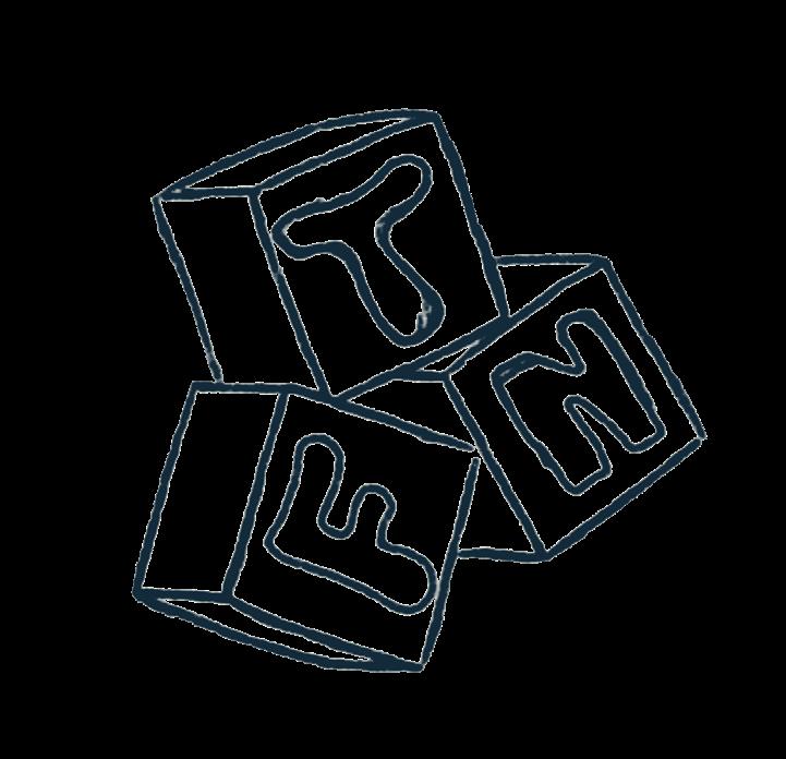
LOGO
SHAPE
COLOUR
PLACEMENT
TYPEFACE
MISUSE
LOGO MISUSE
SOCIAL
SOCIAL MEDIA ICONS
ASSETS
ASSETS USAGE
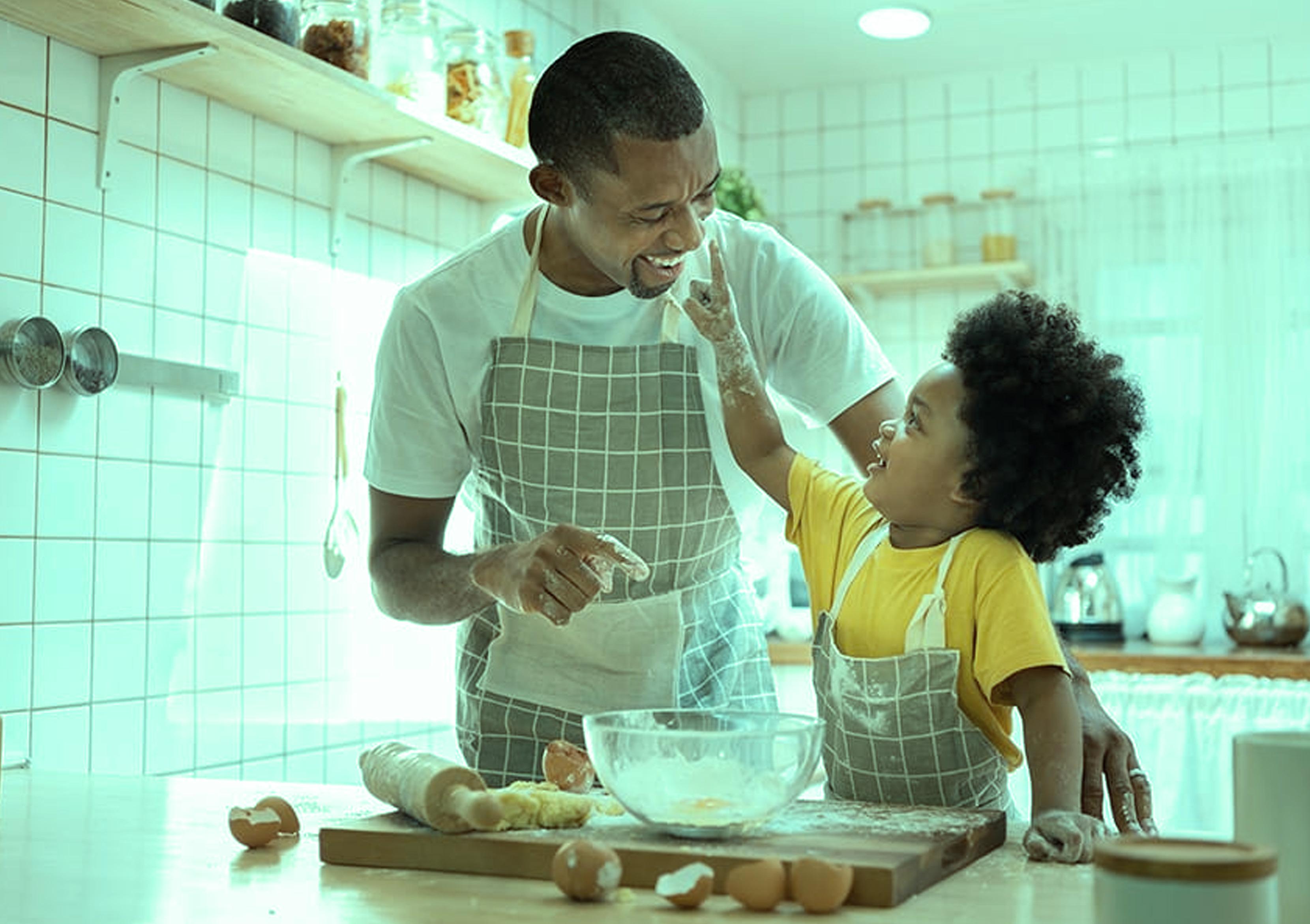
CHAMPIONING FOSTERING

THE FOSTERING
Network
“
The name ‘National Foster Care Association’ has served us well over the last 26 years, but ‘The Fostering Network’ will take us forward for the next stage of our development. It will better describe the work we do and our ambition to work closely with everyone involved in ‘the fostering network’ to improve the service for children and young people.
Gerri McAndrew, chief executive
1995-2003, announcing the new brand in 2001
OUR GOALS
Our vision when tackling on to the task of a redesign for The Fostering Network was to make the brand more alive and symbolic. To create a new illustrative face for a charity in a sector that is frequenctly over-looked and underappreciated. We want to spread it’s ideals of ‘CHAMPIONING FOSTERING’ so that it is seen and heard. We set out on this process to reimagine the brand through the use of visual elements. A cheerier and bright outlook for quite a gloomy sector, and this is what we want to switch up.


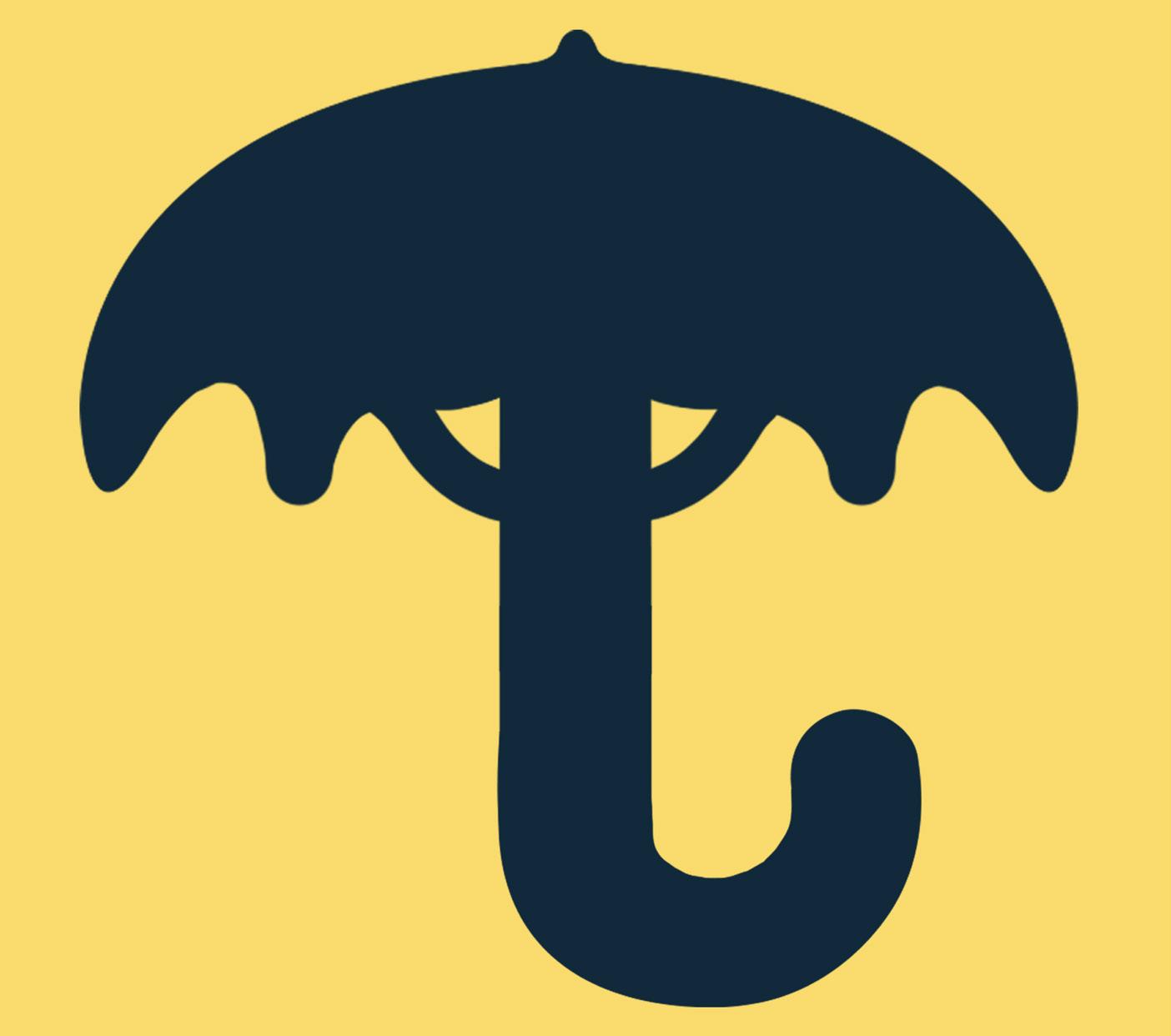
LOGO
The Fostering Network logo is a symbol of safety and support for those in or helping around the fostering sector. It’s to unite those across the country to spread of awareness and support, creating a safe space for those who need it the most. The logo should only be presented:
...in two main colours, Turquiose or Prussian blue as listed.
...with no additional text, unless paired with the name ‘The Fostering Network’.
...as the designed shape, no alterations.

Main Turquiose Logo
Secondary Prussian Blue Logo
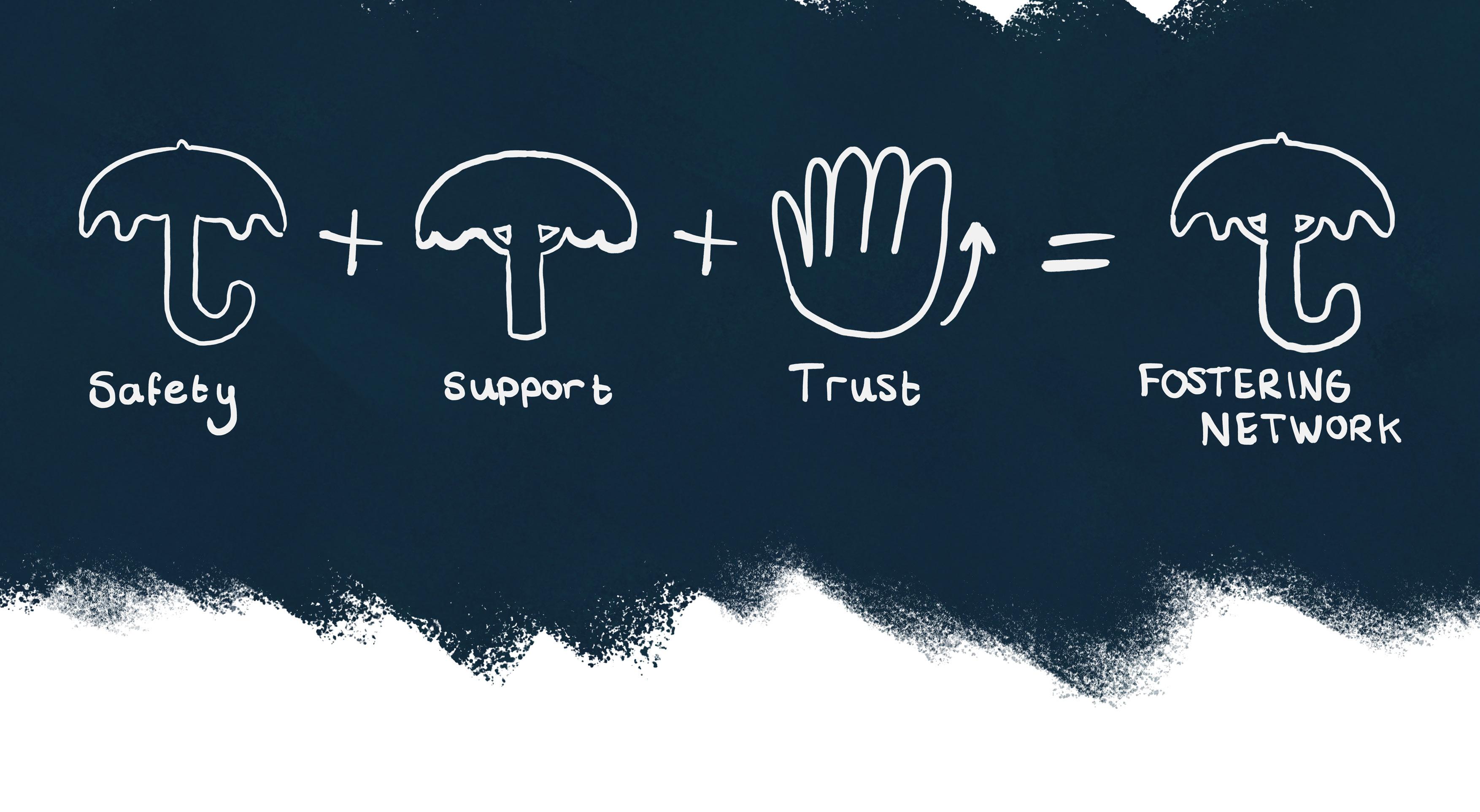

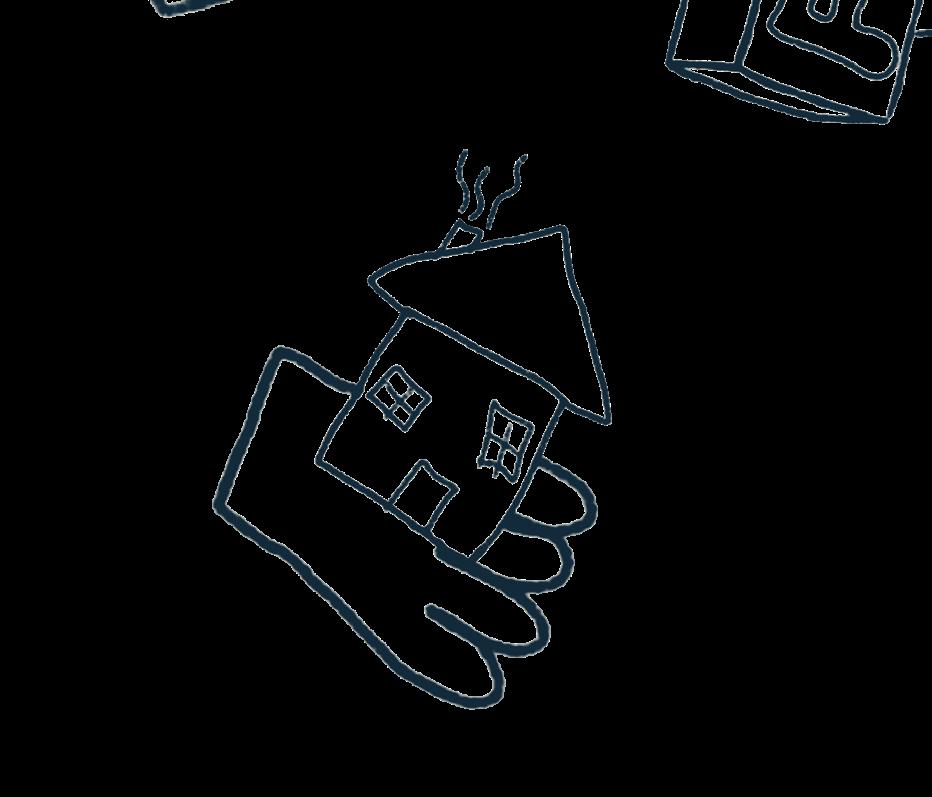
The logo was intended to symbolise a few different aspects that were drawn from the Fostering Networks ideals and ethos. The umbrella was our main inspiration as a symbolism for safety, to gurantee a ‘safety umbrella’ for those who are vulnerable. The tree shows the support the Fostering Network offers for those who need it’s services and advice on the topic of foster care. The hand speaks for itself as a way of showing trust and that the charity is always there if things go wrong.
PRIMARY
Turquoise
67D7B3
COLOUR
SECONDARY ACCENT
ACCENT
ACCENT
Prussian Blue
172A3A
Jungle Green 40AB89
Eggshell
F1EFDF
Naples Yellow
F9DB6D
The colour palette chosen contrasts well together and created our invisioned bouncy and fun outlook on the brand.
Use the presented colour palette when using the logo. The logo can be displayed in any colour combination of your choosing as layed out here:

[NOTE: logo usage differs when using for social media profiles, see social media icons page for more information.]


UK’S LEADING FOSTER CHARITY


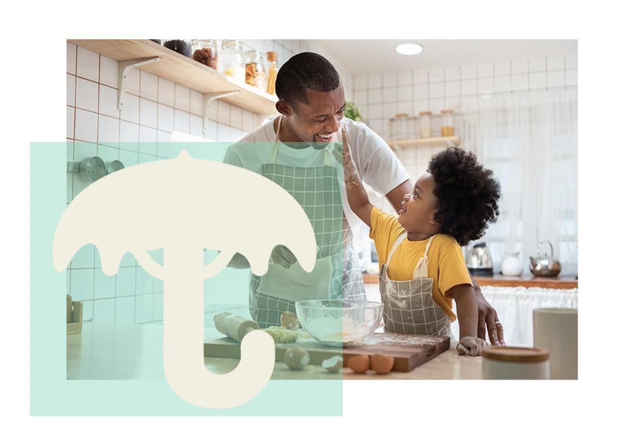
The logo should be used across all aspects of advertsing and branding materials either: The main subject of the material.
Subtly inserted into a corner or somewhere else on the material.
Do NOT alter the logo in any way to fit the advertising material, only changing the colour of the logo to the preset colour palette.
PLACEMENT
SUPER BOYS
SUPER FOODS
Secondary Font
TYPEFACE
ABCDEFGHIJKLMNOPQRSTUVWXYZ

LOGO
Do NOT add any patterns to the logo
Do NOT make the logo ALIVE
Do NOT attempt any kind of shading other than block colours
Make sure the logo is block coloured correctly
Do NOT alter the dimensions of the logo
Do NOT outline the logo
MISUSE
Keep the logo upright (unless used in patterns)
Do NOT compress the logo
Do NOT alter the lines of the logo
Do NOT flip the logo
Do NOT block colour part of the logo
Do NOT insert any text or shapes into the logo
[certain design exceptions apply.]

SOCIAL MEDIA ICONS


[can be mixed and matched with the colour palette we have previously stated]
Rounded Square Logo
320 x 320 pixels
Rounded Circle Logo
320 x 320 pixels
Square Logo
320 x 320 pixels
When using the icon for Social Media purposes it should either displayed using the Turquiose or Prussian Blue with the listed background colour combinations (if using a white variatent of the logo any background colour or pattern can be used).
DO N A T E
Our logo benefits from the addition of a background, however feel free to use it by itself in any of the colour palettes we have layed out.

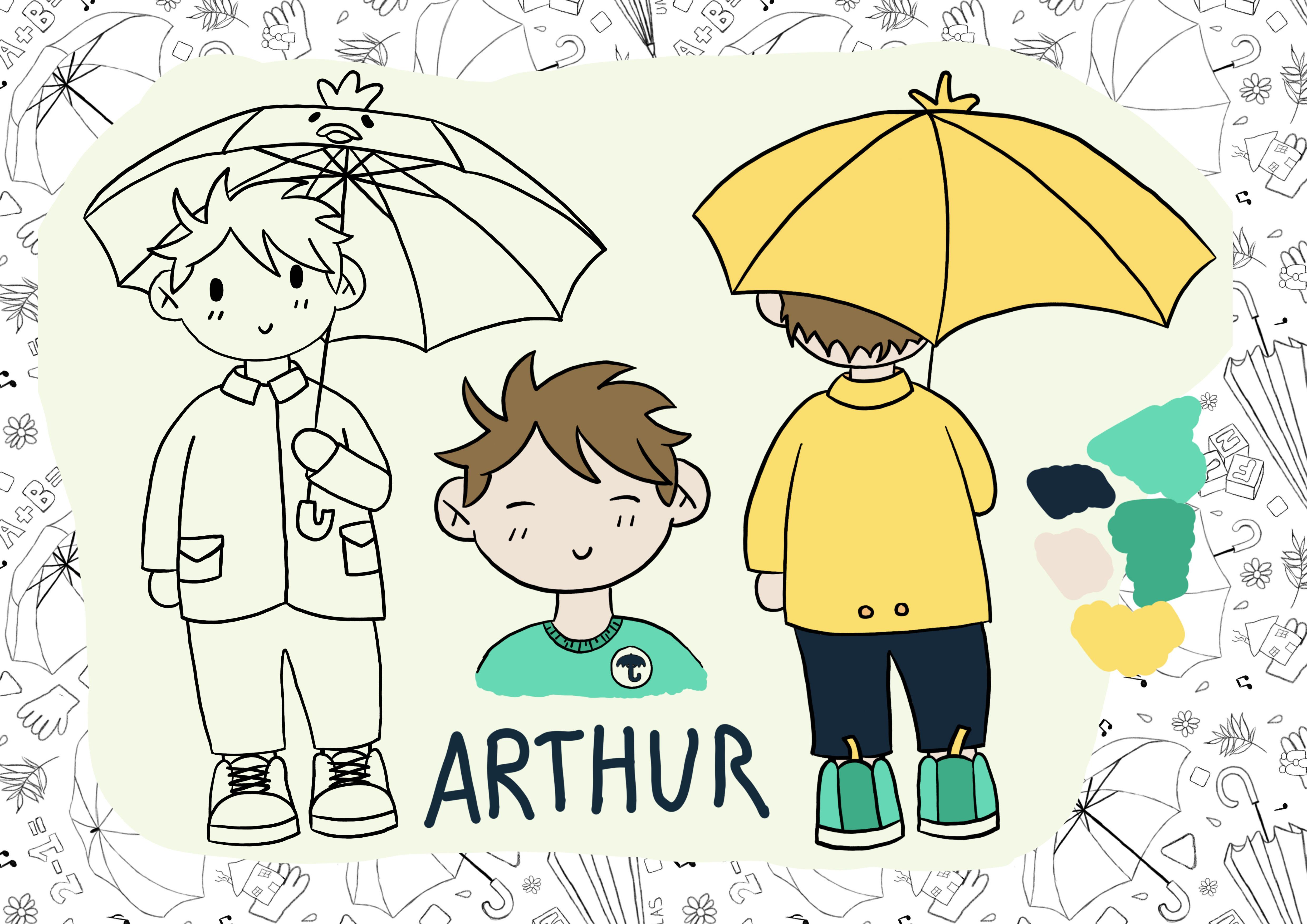
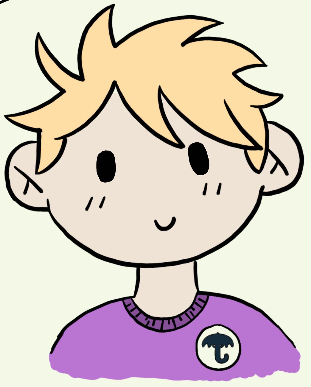
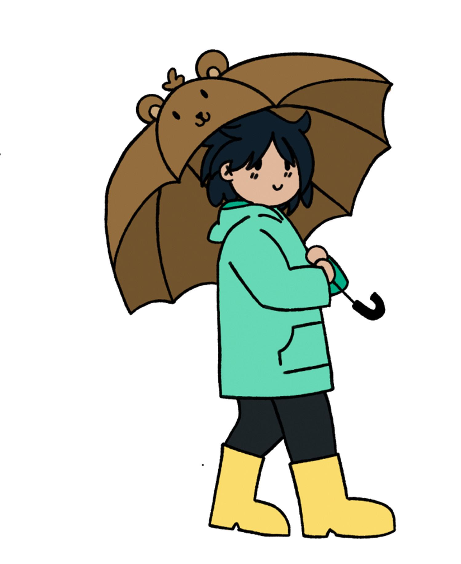
ASSET USAGE
To use alongside the logo, we have created mascot characters that can be used whenever needed. However, these are the conditions for the usages of the characters: Keep in line with the presented colour palette, do NOT change the colours outside of these colours.


The hair and overall body of the character should NOT be changed (style and colour).
The clothing can be changed to anything that is desired.
Do NOT change the given names for the character, they have been well thought through.