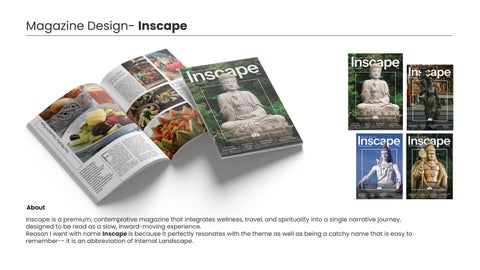
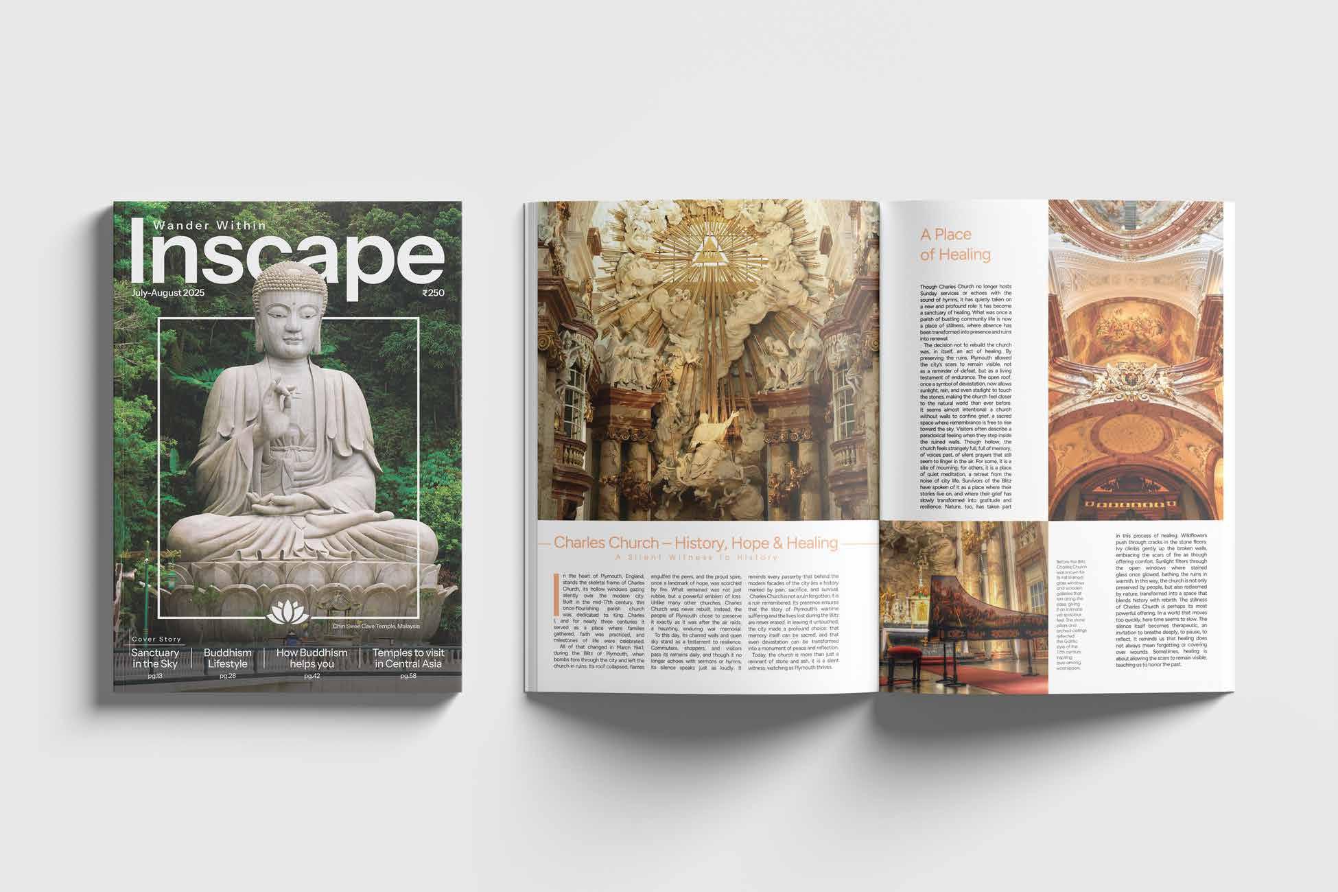
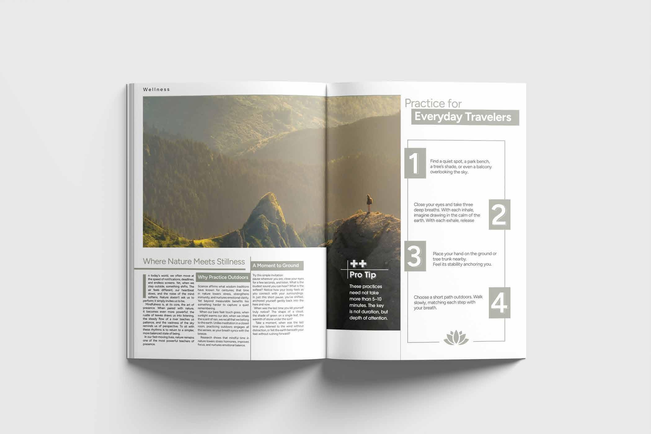
Magazine Design- Inscape
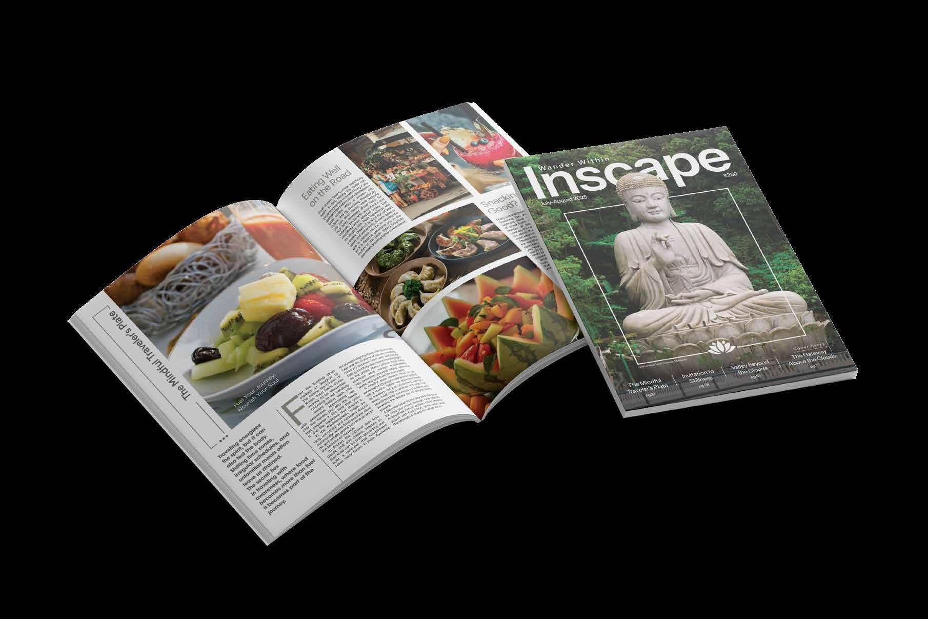
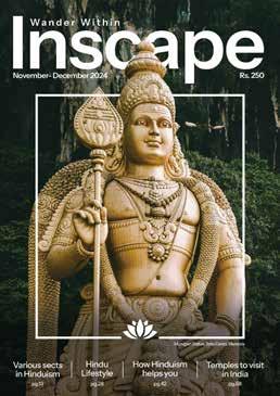
Inscape is a premium, contemplative magazine that integrates wellness, travel, and spirituality into a single narrative journey, designed to be read as a slow, inward-moving experience. Reason I went with name Inscape is because it perfectly resonates with the theme as well as being a catchy name that is easy to remember-- it is an abbreviation of Internal Landscape. About
Brand Colours and Identity
Brand Colours and Identity
Inscape’s editorial rhythm is guided by three core dimensions- Wellness, Travel, and Spirituality.
Each section carries its own distinct color identity that helps readers intuitively navigate the magazine while reinforcing the emotional tone of the content.
Primary
Used for Wellness section as it Evokes nature, health, and renewal, shows introspection and self-care found in the Wellness section.
Used for Travel section as it represents the excitement and warmth of exploration while maintaining softness.
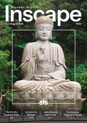
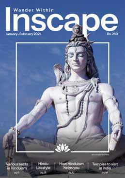
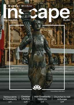
Used for Spirituality section as it suggests emotional depth, mindfulness, and humanity, which is ideal for reflective, spiritual narratives.
Brand Colours and Identity
Brand Colours and Identity
Secondary Colours
#f4e2b4
Balances the brighter tones of the primary palette. Evokes sunlight, serenity, and natural calm.
#4d48b
e
Introduces quiet sophistication and visual contrast. Symbolizes introspection, creativity, and higher awareness.
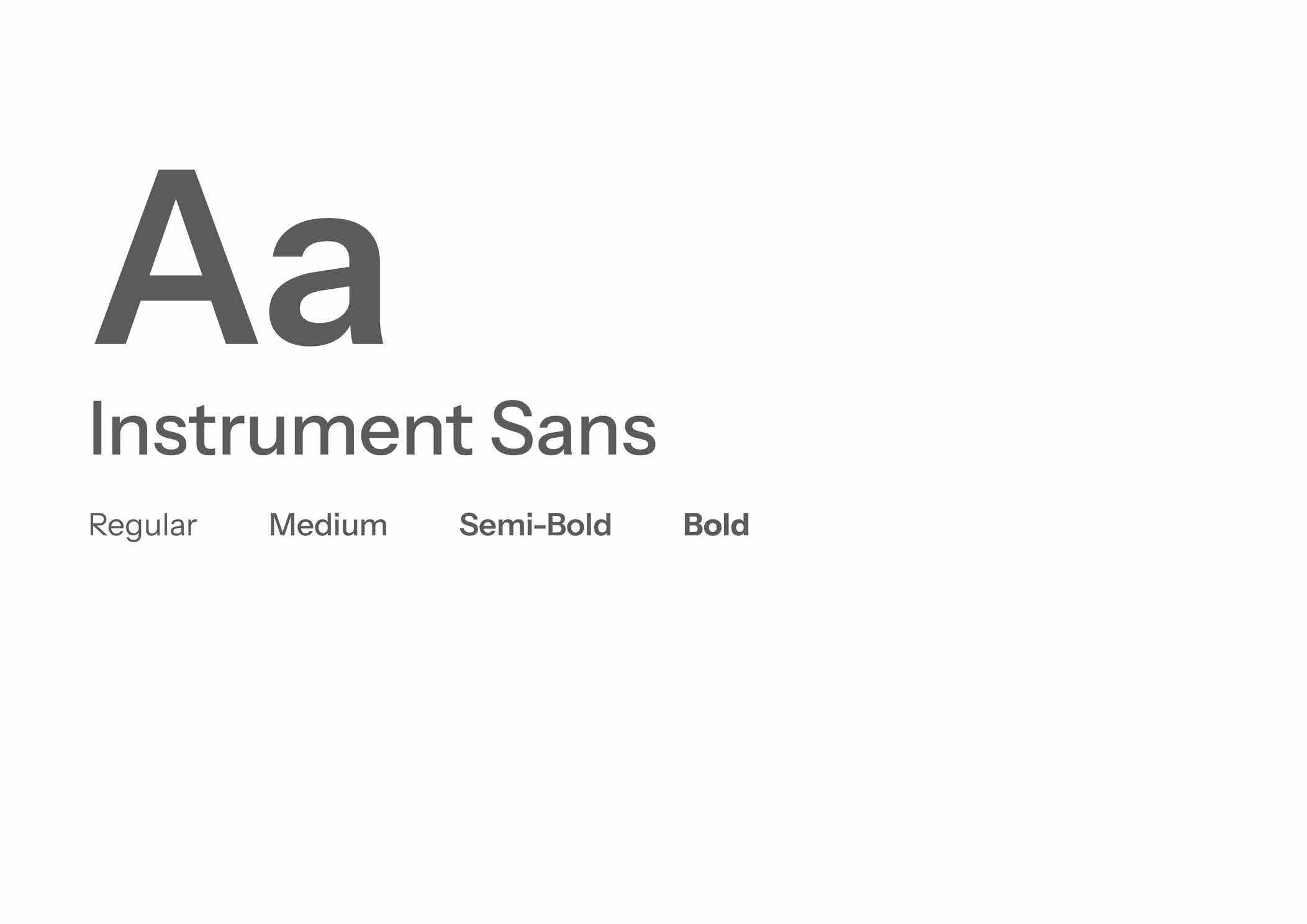
Typography
Primary
Typography
Instrument Sans reflects Inscape’s clarity, calm, and modern mindfulness. Its open counters, geometric curves, and humanist warmth give it both precision and emotion, allowing it to communicate spirituality and sophistication without excess decoration.
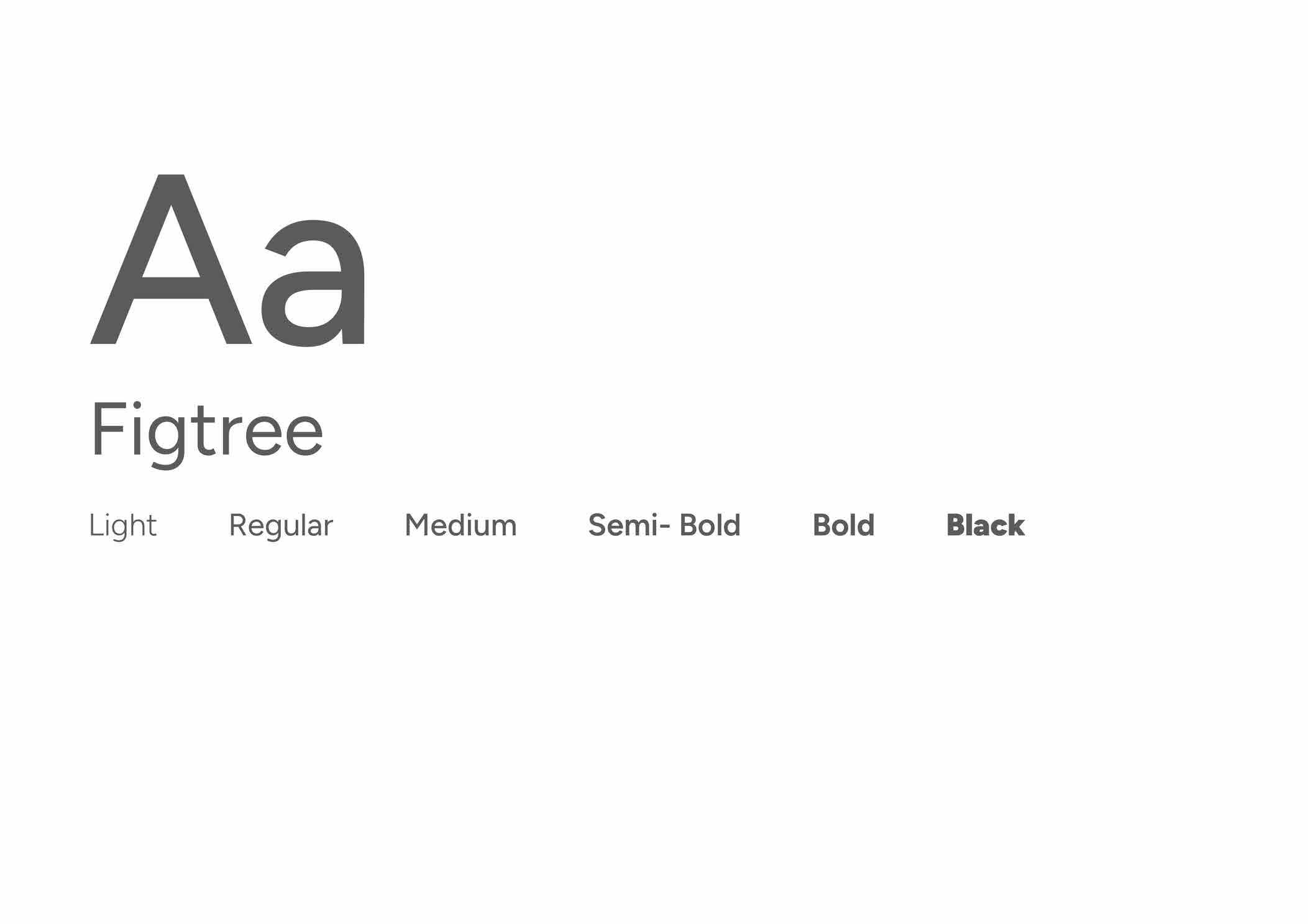
Typography
Figtree is approachable, balanced, and contemporary, a typeface that feels human, not mechanical. It brings Inscape’s content to life through clear readability and understated personality.
Logo/ Wordmark

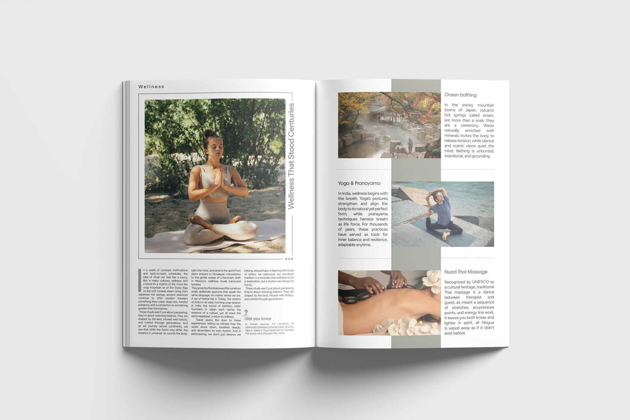
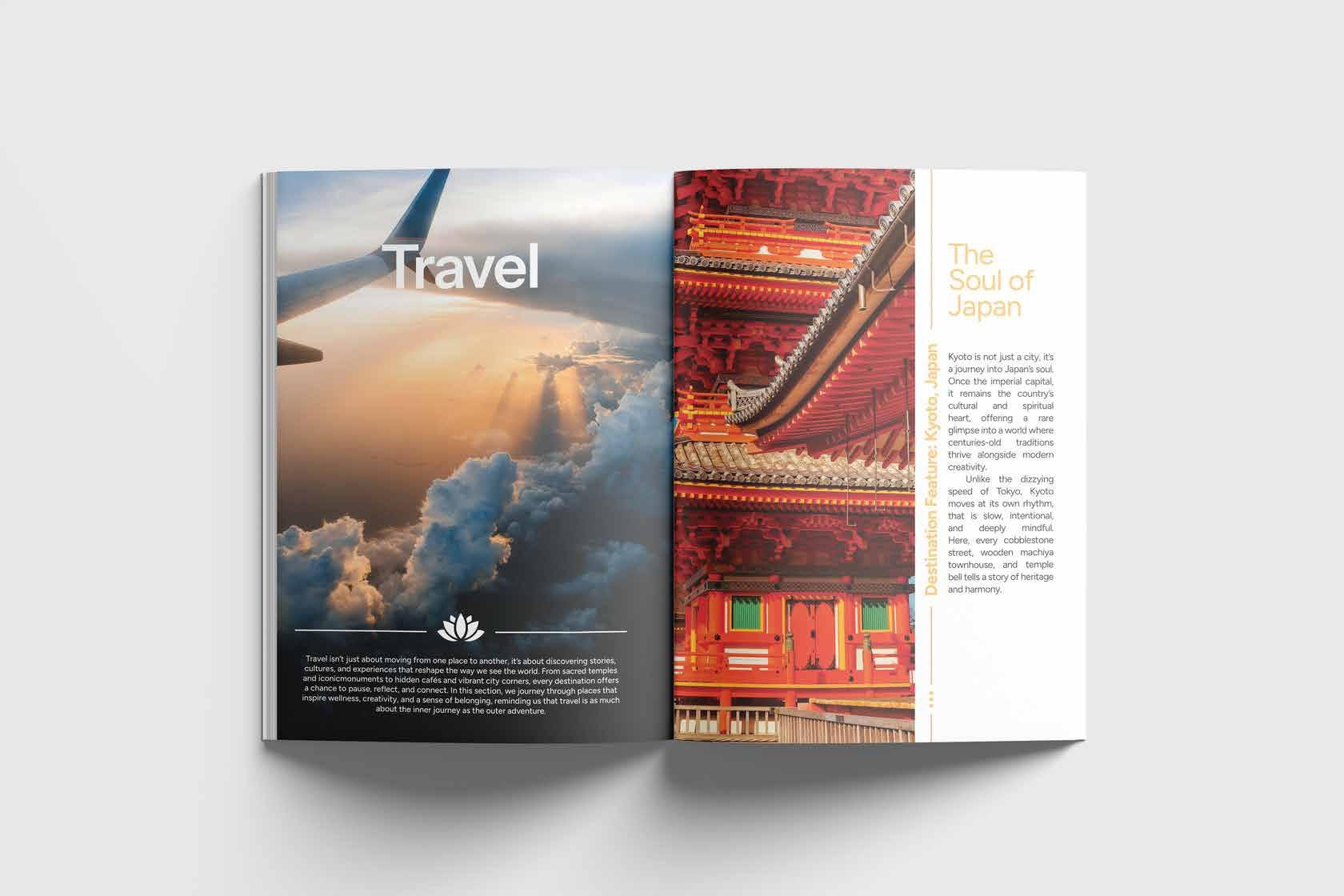
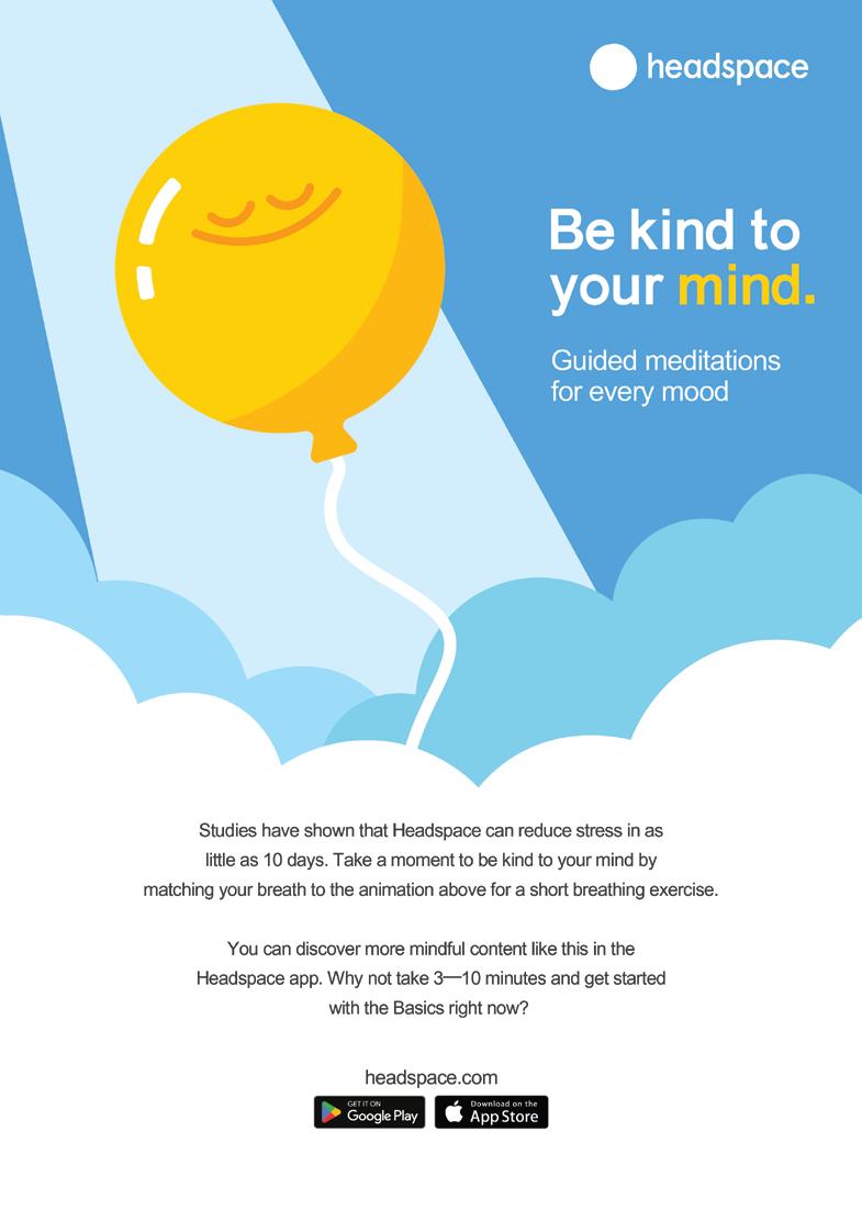
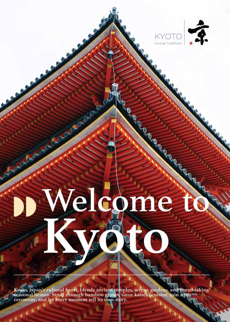
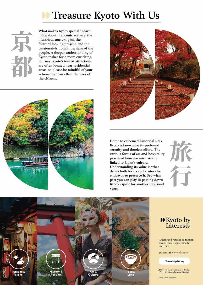
Advertisements (Single and Spread)
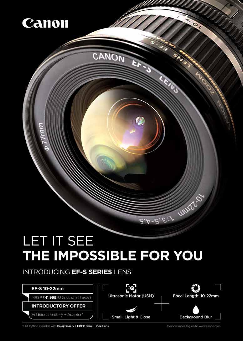
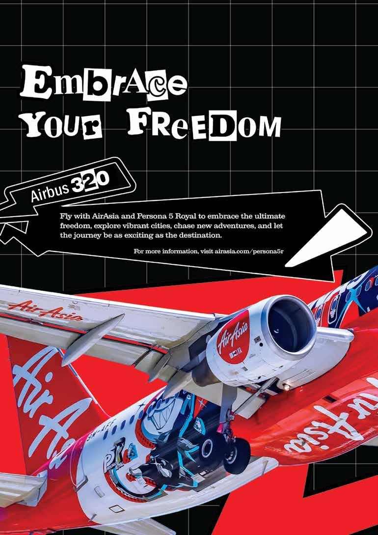
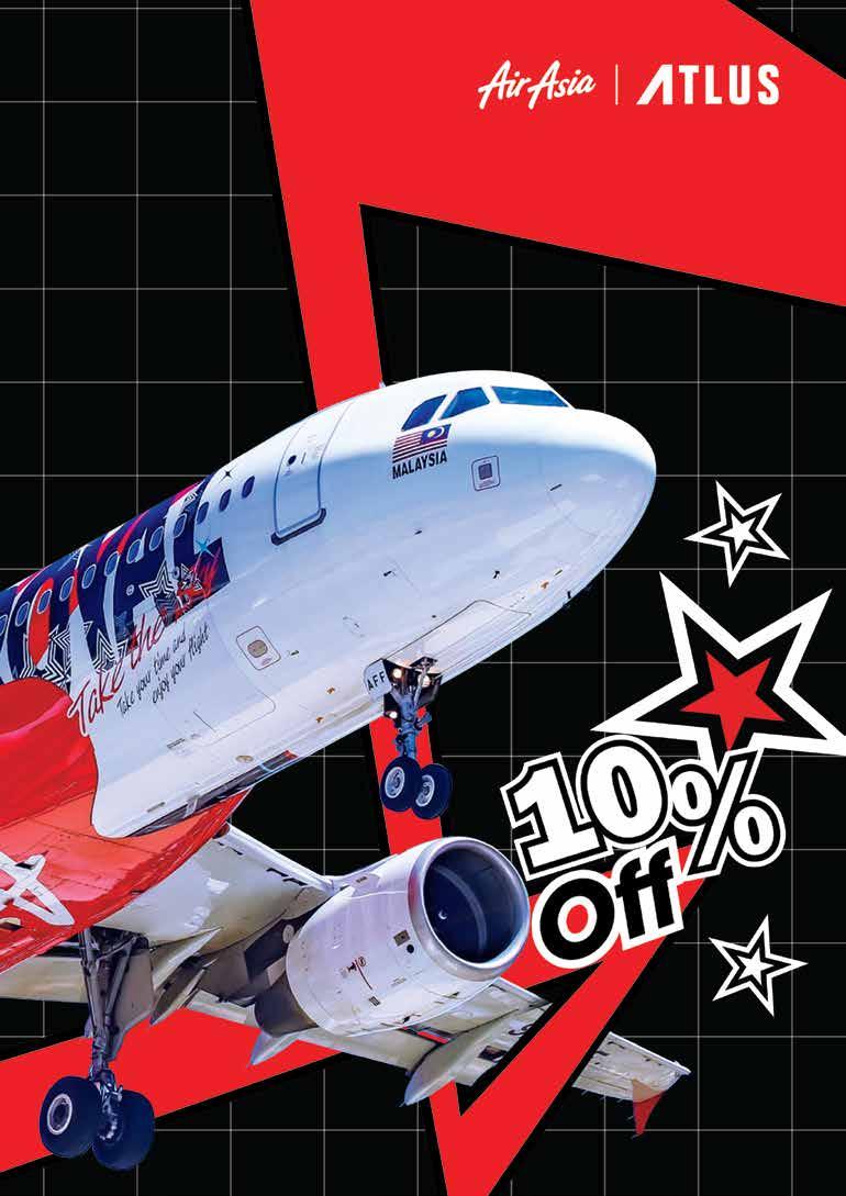
Advertisements (Single and Leaflet)
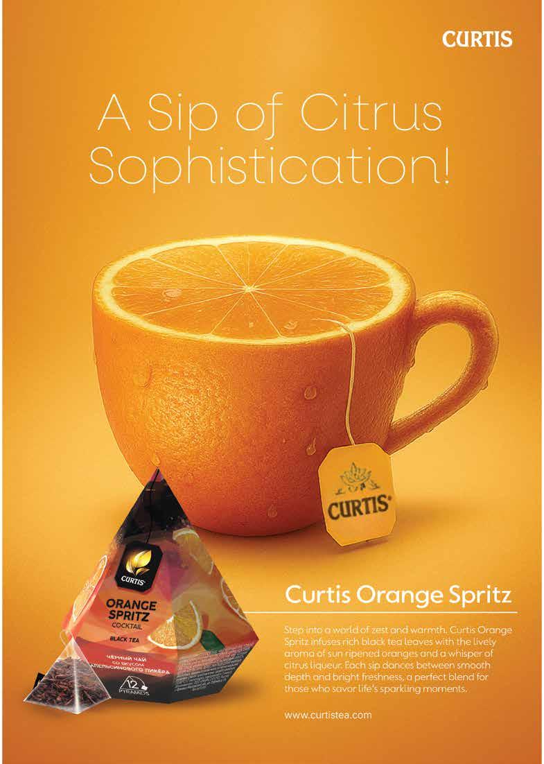
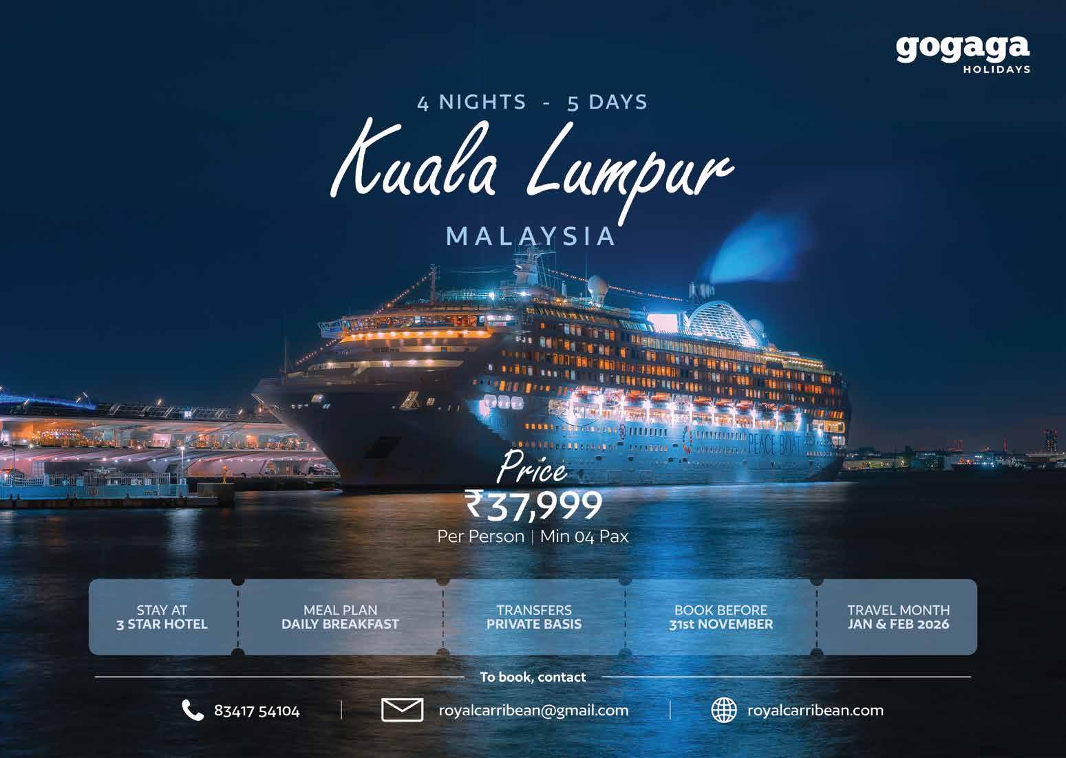
Advertisements (Single and Spread)