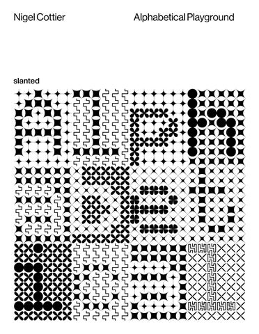
An alphabet formed of squares split horizontally based on its letter's alphanumeric code
An all-caps alphabet with letters formed of two equal congruent parts bisected by a single line
An all-caps alphabet with letters formed of a single line bisecting two equal congruent parts
An all-caps alphabet with letters formed of two equal congruent parts bisected by a single curved line
An alphabet formed of units of letters based on its letter's alphanumeric code
A continuous single line all-caps cursive with a squared path
A continuous single line all-caps cursive with a squared intersecting path
A continuous single line all-caps cursive with a rounded intersecting path
A continuous single line all-caps cursive with a squared coiling path
A continuous single line all-caps cursive with a detailed squared intertwining path
A continuous single line all-caps cursive with a detailed rounded intertwining path
A continuous single line all-caps cursive with an intricate squared coiling path
A continuous single line all-caps cursive with an intricate squared intertwining path*
A continuous single line all-caps cursive with an intricate rounded intertwining path
A continuous single line all-caps cursive with a 9 phase labyrinthine path
What’s remarkable about the Roman alphabet is its exceptional resilience. Despite being reworked in a million different ways – bent, stretched, fragmented, and mangled – its core shapes remain instantly recognisable, lodged deep in the consciousness of the reader. Think of the countless variations that must exist across the millions of typefaces in use today. How do we make sense of them all? What exactly is the essence of a letter? What actually happens when we read?
We’re so fluent in the visual grammar of written language that we are able to decode meaning from wildly divergent forms, the alphabet always remaining remarkably impervious. You can push its basic structure to breaking point, and it still communicates. So where does that leave legibility? Perhaps nowhere. Or maybe it’s just wildly overrated.
In Alphabetical Playground, Nigel Cottier gleefully explores the outer limits of readability, where each turn of the page brings something new and unexpected. Guiding us through this space is Cottier’s meticulously structured, methodical approach, one that demonstrates the full potentials of both advanced type design and experimental process. With every new outcome, Cottier offers insights into his process, deepening our appreciation of the inventive, unprecedented forms that fill this bold and absorbing publication.
Hamish Muir
Hamish Muir was co-founder of the London-based graphic design studio 8vo (1985–2001), and co-editor of Octavo, journal of typography (1986–92). In 2009, with Paul McNeil, he co-founded MuirMcNeil, a studio which focusses on exploring systematic approaches to type and graphic design.
A Alphanumeric A set of alphabets constructed using alphanumeric codes where each letter is either formed, influenced, or substituted by a corresponding number. By embedding secondary numerical inputs into the body of the alphabet, a symbiotic relationship emerges between letter codes and number codes. In each alphabet this relationship is interpreted differently, with some using numerical values to shape the letterforms and others reducing the letters to purely numerical representations. These systems constitute a form of pseudo-writing — patterned encodings that express the language they contain as abstractions.
ABCDEF GHIJK LMNOP QRSTUV WXYZ
A.D An all-caps alphabet formed of units of letters based on its letter's alphanumeric code.*
An ALL-CAPS alphabet formed of units of letters based on
each letter's alphanumeric code.
ECHO ALPHA DELTA OSCAR WHIS KEY key h otel echo romeo echo
BRAV OIND IASI ERRA
B.B An all-caps alphabet with letters formed of a single line bisecting two equal congruent parts
Bravo India Sierra
ECHO CHAR LIET ANGO
B.B Echo Charlie Tango
C.K A continuous single line cursive with a highly intricate coiling path
C.L A continuous single line cursive with a detailed squared decoratively intersecting path
Section Notes:
Created using Glyphs, C.A, C.B, C.C, C.D, C.E, C.F, C.G, C.H, C.I, C.N, and C.T are fully developed alphabets that include uppercase and lowercase charcter sets, numerals, and basic punctuation. Each is available as a variable font with adjustable weight. C.K, C.L, C.M, C.O, C.P, C.Q, C.R, C.S, and C.U exist only as conceptual sketches—preliminary designs illustrating potential directions for the cursive theme.
Created in Glyphs, F.A consists of a single font file containing characters with zero width, functioning as non-spacing marks—similar to diacritics in a standard font. This design allows each character frame to occupy the same space, or word-space. The width of the space character is determined by the word-space, enabling the font to shift to a new frame with each new word.
Contextual alternates enable one of 15 stylistic sets within each character profile to be applied based on the letter’s position within a word, allowing the reader to decipher the embedded linguistic information. F.B and F.C combine F.A with vector based components allowing them to be overlaid consecutively within a word-space.
IN DI A ZU
India Zulu Oscar H.A
LU OS CA R
Ta ng
ABC DEF GHI JKL MNO
R
O
Whiskey india go hotel Papa dia novem
Whiskey india tan hotel Papa innovem
Al ph ap la y
ABC DEF GHIJ KLM NO PQR STU VWX
NOVE MBER OSCA R
Whiskey romeO Foxtrot oscAR wHiskey
echO romeo erra Whiskey inDia
Whiskey echo eCho Foxtrot lima wHiskey romeo si Whiskey tanGo
The Ultra system comprises three alphabets that extend to the outermost limits of traditional typographic weight and width classifications. The set includes an Ultra-Black, an Ultra-Hairline, and an Ultra-Condensed variant. Each design serves as an extreme exaggeration of its respective class, intended to exceed the structural limits of conventional typographic systems.
UN IFO R M
KILO INDIA GO HOTEL SIERRA
TANGO
SCAR BRAVO
OSCAR FOXTROT
ALPHA CHARLIE
YANKEE ECHO ROMEO
OVEMBER
TANGO INDIA
ARLIE ECHO
RLIE OSCAR A OSCAR YANKEE EY HOTEL ROMEO
INDIA TAN HOTEL ALPHA TANGO O
BRAVO ECHO
FOXTROT CHARLIE
YANKEE
BRAVO ROMEO N OVEMBER ECHO INDIA CH ECHO CHA OSCAR LIM
OSCAR GOLF YANKEE WHISK HOTEL ECHO ECHO
Vertical × Shifting Pattern × Kinetic.
An alphabet formed of a vertical line pattern shifted within units to reaveal modular letterforms with an optical kinetic effect
Disclaimer: The publisher assumes no responsibility for the accuracy of all information. Reproduction and storage require the permission of the publisher. Signed contributions do not necessarily represent the opinion of the publisher or the editor.
The German National Library lists this publication in the German National Bibliography; detailed bibliographic data is available on the Internet at dnb.de.
Slanted Publishers is an independent design, publishing and media house founded in 2014 by Lars Harmsen and Julia Kahl. They publish the award-winning print magazine Slanted biannually featuring global design and culture. Since 2004, the daily blog highlights international design and showcases inspiring video interviews. Slanted Publishers initiates and creates publications, focusing on contemporary design and visual culture, working closely with editors and authors to produce outstanding publications with meaningful content and high quality.Slanted was born from great passion and has made a name for itself across the globe. Its design is vibrant and inspiring—its philosophy open-minded, tolerant, and curious.
Nigel Cottier is a designer and experimental typographer with an ongoing interest in creating work of beauty using formulae, hidden systems and data as tools for creation. As a designer and director he has led notable commercial projects for Apple, BMW, Google, Nike, NASA and Rapha. In 2021 he published his first book with Slanted, Letterform Variations is a playful study into letterform construction using basic grid and shape based systems, and its potential to generate vast amounts of varying alphabetical outcomes. alphabeticalplayground.com @process.pattern