45 SYMBOLS / CLAY TO CODE
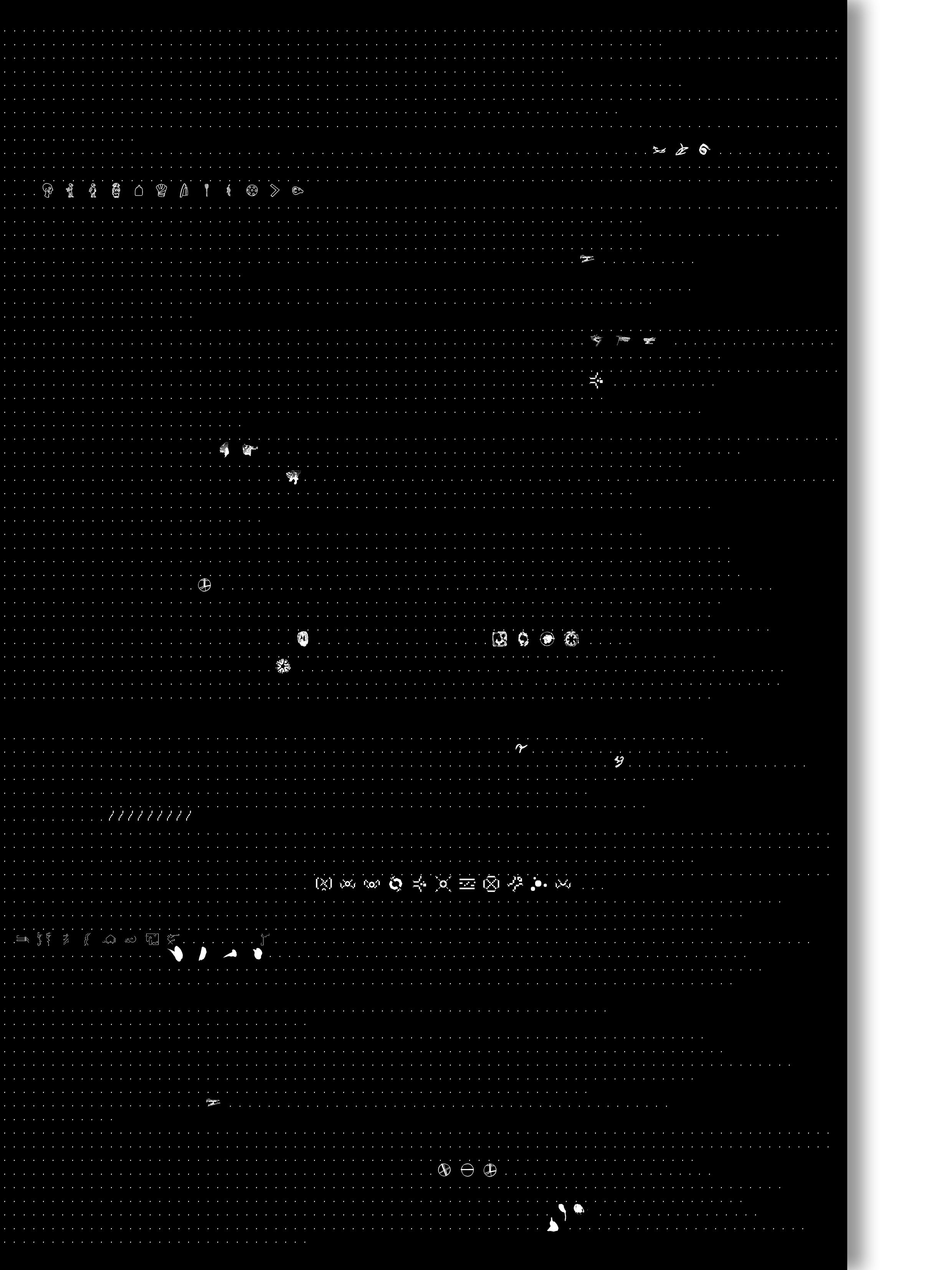

h
h
y z r s j k l n
u v w x
s S t
v w x y z r
f F g G h
s o p
. . . .
C d D e M n N O O / / / / / / / / / / / / / / / / / / / / / / / / / / / / / nhsdte / / /.
. . / / / / / / / / / / / nNoOp nhsdtegbs / / / / /.
/
/ eEfFgGhHiIj
. / / / / / / / / / s S t T u U v V A K E / / / / / / / / / / / . . . .
. . . . . . . . . .A b B c C f F g G h H i I j J / / / / / / / / /R s S t T u U. . . . . .
. . . . . . . .
. . . a b c d e f g h i j k l n o p q r s t r s t. .
.
.
y z r s
s
. . / / / / / / / / u v w x y z r s t h s s o a
i j k
/ / /
v w x y z r s t h x y z r s t / / / / / / / / / / / . . .
j k l n
u v w x
Introduction—Visual Language as Cultural Record
From Clay to Code
Olivier Arcioli, Pascal Glissmann, Andreas Henrich /
From Petroglyphes to Portable Document Formats
Echoes from the History of Signs and Symbols
Olivier Arcioli, Pascal Glissmann, Andreas Henrich / / / / / / / / / / / / / / / / / / / / / / / / / / / / /
The Phaistos Disc
An Ancient Cipher in Clay Unknown /
Shaping Language
Gesture, the New Script
Andrea Sara Gallo /
The PET Proof of Identity
A Forensic Archive of Everyday Convenience
Madelene Hilber & Franziska Krenmayr /
Glitched
Digital Objects, Extinction of the Imperfection?
Farida Foda /
Chews a Character
Anthropological Leftovers: From Disposable to Iconic
Patricia Grabowicz /
Rounded Biographies
More-than-human Ways of Seeing Humans
Karen Trachsel /
Holding On
A Community in Lockdown—Marks of Isolation and Connection
Nicoletta Corbett /
St. Peter
Leaving Marks: The Building as a Book
Christina Möser /
Hinter Gittern
The Pretty Prisons of Bogotá
Sol Carolina Arciniegas
Deltas in Danger
Fragile Ecosystems:
Portraits of Endangered Landscapes
Lena Meier /
Earports
Blueprints of Noise Pollution
Stefan Fitze & Maxim Staehelin /
Carbon Fingerprint
Interchanges: A Modern Marvel?
Vianey Diaz /
Dialectic Dancescape
Choreographic Notations for Central Park
Lily Taggart /
Try To Trace The Tracks
The Algorithmic Experience of Daily Commuting
Johanna Buehler /
Planned Views
Global Landmarks of Our Collective Memories
Sarah Al-Fulaij /
Melting Glaciers
Mapping the Transformation of Alpine Giants: 1864 to 2013
Onur Köroglu /
Urbic
Urban Studies as Arabic Script and Streets
Tracy Bassil /
Nomad Script
Glyphs of Movement and Belonging
Clarisa Diaz
/ / / / / /
From the very beginning of human expression, clay has held a singular role. It is among the first materials shaped by human hands to hold meaning, memory, and language. The Phaistos Disc, discovered on the island of Crete and dated to the second millennium BCE, stands as a symbol of this transformation—an artifact in which impressions in clay became a system of communication. Yet, to this day, its true meaning eludes us. What matters most is not what it says, but what it invites us to imagine: the leap from gesture to symbol, from impression to interpretation. 45 Symbols begins there— with clay, with a mark, with an attempt to make visual recordings and translate thought into form.
Artists and designers from around the world have studied the Disc—its materiality and its speculative meanings—and identified individual research inquiries to which they responded through new visual, systematic explorations. This book presents only a small selection of works developed over more than a decade of collaboration. Through its many iterations, the project has offered a framework for both individual and collective visual research—spanning typography and writing systems, protest, identity, memory, and nature. The symbols presented here are not only typographic—they are narrative, conceptual, and deeply personal. Just as the Disc transitioned from clay to meaning, these forty-five sets of symbols evolve across time and geography, using artistic research, fieldwork, and code to question how we communicate what we know and feel.
or more of these definitions. Taken together, they form a matrix of inquiry—tracing a line from ancient clay impressions to imagined new grammars of seeing, where code becomes both language and interface.
In 2014, we began a journey to find collaborators, make friends, and meet new allies in a field we have been passionate about for years: the intersection of visual language and art & design education. The jumping-off point was not a manifesto, mission statement, or set of shared learning outcomes. Instead, we selected a single artifact from media art history—the aforementioned Disc of Phaistos, with its unresolved code of forty-five symbols—to spark a conversation about the many ways of seeing, reading, and interpreting the same thing: an unknown visual code.
Our hope was that this collective act of engaging with an artifact from the past—its unresolved questions and object biography (Is it a fake?)—would position all of us as novice learners, creating an open learning community that invited voices from across cultural boundaries and beyond educational constraints. A statement about the future, we felt, would have inadvertently established a hierarchy from the outset. In this spirit, we launched the project in a non-hierarchical and anti-institutional space.
To be clear, we have long been members of institutions that educate future artists and designers—decades, in fact—as learners, teachers, and administrators. We deeply value the physical infrastructures, pedagogical frameworks, and supportive environments they provide. By definition, an institution is a collective entity with shared objectives, often articulated through a manifesto or mission statement. Ideally, that statement translates into the curriculum, the community, and the values that support even the smallest decisions made daily by students, teachers, and administrators.
In this context, code carries multiple meanings. It refers to computational code— scripts that instruct algorithms and generate visual output—but also to cultural codes that express identity, heritage, and belief. It includes visual codes used to signal, structure, and persuade, as well as theoretical codes that shape ideologies and systemic logics. Every project in this catalog engages with one [1]
Design education has historically been shaped by institutions with bold pedagogical visions. The Bauhaus, founded in 1919, declared in its manifesto a desire to “create a new guild of craftsmen without the class distinctions which raise an arrogant barrier between craftsman and artist.” 1 It placed the hand
Walter Gropius, “Manifesto of the Bauhaus,” 1919, in Programs and Manifestoes on 20th-Century Architecture, ed. Ulrich Conrads (Cambridge, MA: MIT Press, 1970), 49–53.
[6]
Silvia Ferrara, Die grosse Erfindung (Munich: C.H.Beck Verlag, 2021), 10-13. Translation by the editors.
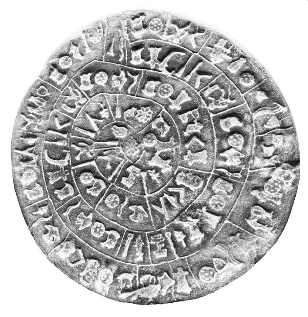
FIG. [6]
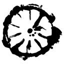
Disc of Phaistos [1800–1500 BCE]
Side A. It transmits a message from the 2nd millennium BCE. 45 different symbols, 241 stamp impressions. Diameter: 15 to 16 cm. Found: 1908. Material: Clay. Heraklion Archaeological Museum. Photo: The editors from a museum quality replica.
representation. Yet this principle eventually led to an overwhelming complexity, which required specialized training to master.
Crete, the Greek island, was a significant site
with future media technologies—from the invention of the printing press to the rise of digital communication. This perspective finds resonance in the work of Silvia Ferrara, who describes the disc as “a cipher in the guise of an object, a message wrapped in its own opacity,” under-scoring its extraordinary medial status. As she puts it, “We write because we are human. Not because we are modern.
scripts—including the disc—remain undeciphered, largely due to the absence of additional artifacts bearing the same or similar signs.
The Phaistos Disc holds a singular place in the history of communication and in the evolution of signs and symbols more broadly. Its fascination stems from its mysterious discovery, its archaeological context, its heterogeneous sign types, its material form, its media qualities, and its aesthetic and object-like presence. Perhaps most remarkably, it stands out for seemingly bridging ancient symbolic systems
renders it an ideal reference point for examining the parameters of visual language.
The Phaistos Disc was found in 1908 by the Italian archaeologist Luigi Pernier in the Minoan palace-site of Phaistos. Even though its purpose and authenticity are still discussed it is considered to potentially be an early, if not the earliest, document of movable type printing. The clay-impressed notation is assumed to be a textual representation and comprises forty-five unique and recurrent symbols. As Herbert Brekle points out in the article
“The typo-graphic principle ,” published in the Gutenberg-Jahrbuch: “An early clear incidence for the realization of the typographic principle is the notorious Phaistos Disc (ca. 1800–1600 B.C.). If the disc is, as assumed, a textual representation, we are really dealing with a “printed” text, which fulfills all definitional criteria of the typographic principle.” 7
Still, many unresolved questions remain about the Disc, and it continues to be a mysterious artifact in the history of archaeology and writing systems. What we know for certain
permanence and complexity. These symbol systems, revered as conduits to the divine and the afterlife, were embedded in sacred architecture intended for eternity—just as the pyramid itself stands as an eternal symbolic structure. In contrast, the island cultures of Greece and, later, Rome reveal an emerging sense of mobility in communication. Dispersed across numerous city-states and archipelagos, these societies cultivated a sensitivity to media that could bridge both space and time. In the context of maritime exchange, the
is that the clay-impressed notation contains 241 tokens, comprising forty-five distinct signs. However, the fact that the Phaistos Disc represents a profound shift in thinking—both within media culture and in the handling of information—clearly illustrates that Marshall McLuhanʼs thesis is not only justified, but also aptly captures a central function of media: “The medium is the message.” This idea also applies to the way we engage with the Disc today. When viewed side by side, the writing cultures of the ancient Near East, Africa, and the Mediterranean present notable differences. Egyptian hieroglyphic culture, spanning over three millennia, is marked by monumental
Greek—and later Roman—alphabets found fertile ground for development.
Of particular interest in this process is the interaction between form, tool, and material: pens draw lines, brushes trace movements and curves, and stamps leave impressions in pliable matter. These interactions gave rise to highly differentiated writing techniques and systems, and thus to distinctive aesthetics of signs and symbols.
[7]
Herbert E. Brekle, “Das typographische Prinzip. Versuch einer Begriffsk-lärung,” Gutenberg-Jahrbuch 72 (1977): 58–63.
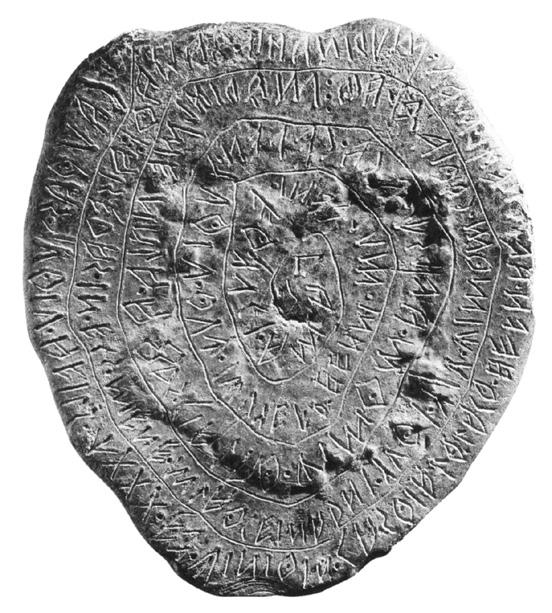
FIG. [7]
Lead Plate from Magliano [450 BCE]
This plaque contains a text in the Etruscan language and sends a message from the 5th century BCE. The script evolved from a Western Greek alphabet and served as a basis for the Latin alphabet. Written from right to left, 70 words. Diameter: 7 to 8 cm. Found: 1882. Material: Lead. The Archaeological National Museum of Florence. Photo: Baden State Museum Karlsruhe, The Etruscans (Stuttgart: Karl Theiss Verlag, 2017), 295. Public domain, via Wikimedia Commons. https://commons.wikimedia. org/wiki/File:Bleiplatte_von_ Magliano.jpg.
i p a h r R s S t T u U v
C d D e
/ / / / / /
From fingerprinted bottles to the dents of fingertips in clay, this chapter demonstrates how art and design practices can bear witness to the quiet, persistent marks left by life as it unfolds. Inspired by the materiality of the Phaistos Disc, the projects in this chapter investigate how meaning emerges through touch, accumulation, and memory. They ask: how do the overlooked materials of the everyday—such as packaging, screen gestures, and other traces—become signifiers of culture, behavior, and belief? The artists and designers exhibit close attention to the intimate and incidental, alongside a focused observation of how culture embeds itself in the margins—in food containers, digital remnants, and the private rituals of writing and remembering. They take on the role of ethnographers, cataloging the residues of daily life and re-presenting them as symbolic systems.
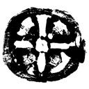
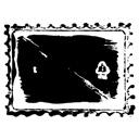
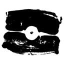
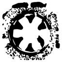
In The PET Proof of Identity [ 40-45] , Madelene Hilber and Franziska Krenmayr use industrial packaging as forensic evidence. The circular indentations found on the bottoms of PET bottles— mass-produced, easily overlooked, and disposable—are collected and archived like fingerprints, transformed into an alternate index of everyday consumption. In contrast, Holding On [ 64-69] by Nicoletta Corbett draws its symbols not from mass production, but from the direct imprint of the human hand. Created in the aftermath of the COVID-19 lockdown, the project invites participants to grasp slabs of clay while reflecting on what gives them hope during isolation. These
impressions—individual, emotional, and tactile—form a visual language of resilience. They archive a moment in history not through headlines, but through grip, pressure, and personal memory. Shaping Language [ 34-39], by Andrea Sara Gallo, examines another kind of touch— the fluid, fleeting gestures made on a phone screen. By tracing these movements, the project captures a new form of embodied writing. These glyphs emerge not from traditional calligraphy but from everyday interaction with digital surfaces, revealing how our fingers produce meaning in a world increasingly mediated by a network of interfaces. Offering a different view on technology, Glitched [ 46-51] by Farida Foda investigates the aesthetics of error and the loss of imperfection in digital environments. As machine vision and image compression strive toward smoothness and optimization, the project asks what is lost in that process. It proposes a visual language rooted in the glitches, flaws, and compression artifacts often discarded as noise. In reclaiming these imperfections, Glitched presents the broken or incomplete image as a site of critical reflection—one that resists seamless consumption. Together, these projects do not explain the world through grand statements. Instead, they slow down perception, asking us to look again at what we overlook. They advocate for ways of thinking and noticing that are grounded in material culture—where data is tactile, archives are personal, and even the smallest trace can hold meaning. / / / / / /
THE PHAISTOS DISC AN ANCIENT CIPHER IN CLAY UNKNOWN // 28 //
SHAPING LANGUAGE GESTURE, THE NEW SCRIPT ANDREA SARA GALLO // 34 //
THE PET PROOF OF IDENTITY A FORENSIC ARCHIVE OF EVERYDAY CONVENIENCE MADELENE HILBER & FRANZISKA KRENMAYR // 40 //
GLITCHED DIGITAL OBJECTS, EXTINCTION OF THE IMPERFECTION? FARIDA FODA // 46 //
CHEWS A CHARACTER ANTHROPOLOGICAL LEFTOVERS: FROM DISPOSABLE TO ICONIC PATRICIA GRABOWICZ // 52 //
ROUNDED BIOGRAPHIES
MORE-THAN-HUMAN WAYS OF SEEING HUMANS KAREN TRACHSEL // 58 //
HOLDING ON A COMMUNITY IN LOCKDOWN MARKS OF ISOLATION AND CONNECTION NICOLETTA CORBETT // 64 //
ST. PETER
LEAVING MARKS: THE BUILDING AS A BOOK CHRISTINA MOESER // 70 //
HINTER GITTERN THE PRETTY PRISONS OF BOGOTA SOL CAROLINA ARCINIEGAS // 74 //
[15]
[20]
[22]
[26]
[42]
//// MADELENE HILBER & FRANZISKA KRENMAYR // 2018 ////
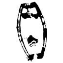
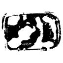
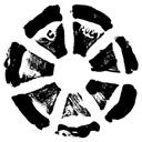
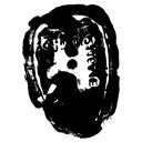
Consuming goods stored in plastic bottles made of polyethylene terephthalate (PET) has become a normalized part of our daily lives. These containers are practical, disposable, and seemingly harmless—but they come at a steep environmental cost. The amount of oil needed to produce a single PET bottle is equivalent to filling it one quarter of the way with oil. Many of these bottles are never recycled. Instead, they end up clogging oceans or are incinerated, releasing toxic chemicals into the air. A single PET bottle, if left in nature, takes around 450 years to decompose. And yet, if all PET were properly recycled, we could eliminate the need for 47 billion liters of oil and reduce greenhouse gas emissions by 152,000 tons. While this information is widely known, meaningful change remains elusive. In our project The PET Proof of Identity, we do not aim to shame or
accuse. Rather, we seek to heighten awareness—to draw attention to the seemingly insignificant parts of our routines that have vast ecological consequences.
Our forty-five symbols in The PET Proof of Identity undertake a forensic analysis of the bottoms of plastic bottles. By inking and pressing the containers as one would fingerprints, we construct an analog database of the PET containers that shape our basic everyday activities. From toilet cleaner to curry sauce, PET bottles convey the basic materials of our everyday lives to us in convenient, environmentally destructive bottles. In that sense, The PET Proof of Identityʼs aesthetic is also ethnographic. Our visual system emphasizes the textures of the mundane, while taking a political stance toward the taken-for-granted facets of human existence.
MADELENE HILBER /
IN 2018, I STUDIED VISUAL COMMUNICATION AT THE BASEL ACADEMY OF ART AND DESIGN FHNW IN SWITZERLAND. /
TODAY, IN 2025, I AM THE MOTHER OF A WONDERFUL CHILD. PARENTHOOD HAS SHARPENED MY AWARENESS OF THE OFTEN UNNOTICED DETAILS IN EVERYDAY LIFE AND OPENED UP NEW PERSPECTIVES FOR ME. /
WWW.MADELENE.CH
FRANZISKA KRENMAYR /
IN 2018, I STUDIED VISUAL COMMUNICATION AT THE BASEL ACADEMY OF ART AND DESIGN FHNW IN SWITZERLAND. /
TODAY, IN 2025, I AM RETURNING FROM A ROUND-THE-WORLD TRIP, DURING WHICH I HAVE SEEN AND EXPERIENCED MANY CULTURES AND COUNTRIES. I AM STARTING THE NEXT CHAPTER OF MY LIFE WITH RENEWED CREATIVITY AND INSPIRATION / WWW.BEHANCE.NET/ FRANZISKAKRENMAYR/ /






















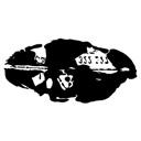
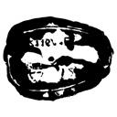



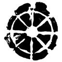




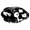



[01] MOUTH RINSE 500 ml 48 g
[02] WATER 330 ml 22 g
[03] HAND SANITIZER 25 ml 12 g
[04] ORANGE JUICE 330 ml 27 g
[05] HAND SANITIZER 80 ml 28 g
[06] ICE TEA 500 ml 28 g
[07] KITCHEN CLEANER 750 ml 71 g
[08] REUSABLE TRAVEL BOTTLE 100 ml 20 g
[09] ALOE VERA DRINK 500 ml 38 g
[10] WATER 1 l 28 g
[11] HAIR OIL 125 ml 40 g
[12] BATHROOM CLEANER 500 ml 38 g
[13] ICE TEA 1 l 40 g
[14] CLEANING VINEGAR 1 l 46 g
[15] REUSABLE TRAVEL BOTTLE 50 ml 8 g
[16] WATER 75 cl 31 g
[17] OLIVE OIL 2 l 78 g
[18] SUN FLOWER OIL 1 l 41 g
[19] EYE MAKE-UP REMOVER 200 ml 30 g
[20] SUN FLOWER OIL 1 l 45 g
[21] DISH SOAP 750 ml 57 g
[22] SHAMPOO TESTER 35 ml 10 g
[23] YOGURT 500 ml 33 g
[24] GLASS CLEANER 750 ml 81 g
[25] KITCHEN CLEANER 500 ml 55 g
[26] TOILET CLEANER 1 l 80 g
[27] WATER 50 cl 20 g
[28] SMOOTHIE 750 ml 38 g
[29] MILK 1 l 42 g
[30] SIRUP 0.5 l 54 g
[31] COCA COLA 0.2 l 17 g
[32] GREEN TEA 600 ml 27 g
[33] BODY LOTION 250 ml 53 g
[34] CURRY SAUCE 220 ml 26 g
[35] SHOWER OIL 50 ml 16 g
[36] SHAMPOO 30 ml ml 11 g
[37] OLIVE OIL 1 l 45 g
[38] SHAMPOO TESTER 30 ml 11 g
[39] SIRUP 50 cl 28 g
[40] SALAD DRESSING 500 ml 34 g
[41] ALOE VERA DRINK 500 ml 34 g
[42] SIRUP 75 cl 38 g
[43] DESCALER 1000 ml 48 g
[44] ICE TEA 75 cl 33 g
[45] LIQUID SOAP 300 ml 48 g


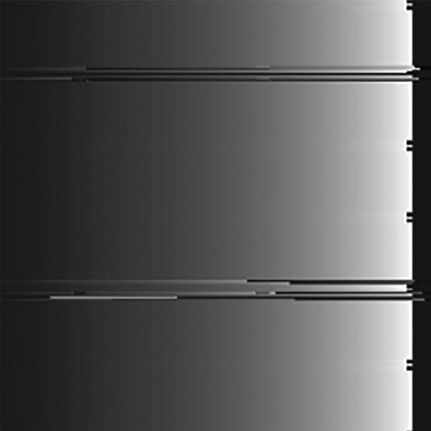
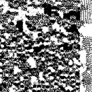
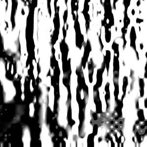
[04] REDUCTION_3
[05] REDUCTION_4
[08] LIQUIFIED_3
[09] LIQUIFIED_4
[14] FLARE_1
[15] FLARE_2
[16] FLARE_3
[20] PIXELATION_3
[21] PIXELATION_4
[28] DRIFTER_3
[35] EROSION_2
[37] EROSION_4
//// KAREN TRACHSEL // 2019 ////
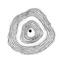
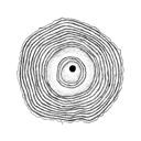
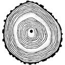
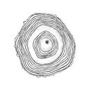
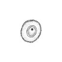
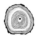
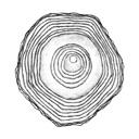
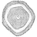
A tree can tell stories, and there is even a science to it, known as dendrochronology—the study of the annual rings formed within a treeʼs trunk. These rings reveal not only a treeʼs age but also the conditions of its life: the climate it endured, the environment it inhabited, its orientation, and even the injuries it sustained. Through the thickness and spacing of these rings, nature creates a visual autobiography, recording events such as sunny days, droughts, storms, and earthquakes—traces of time untouched by human intervention. In this sense, dendrochronology traces a timeline that is not part of the human historical record. Yet, the trees must be chopped clean down in order to reveal these autographic traces.
I am fascinated by this natural storytelling and observe tree cross-sections as information
graphics—biographies etched into wood. This inspired me to use dendrochronology as a medium to illustrate human history. By adapting the visual language of tree rings, I translated the lives of historical figures such as Kant, Voltaire, Leibniz, and Bacon into symbolic tree rings. To create these forty-five human “tree biographies,” I adjusted parameters to blend the forms of trees and people, revealing a profound connection between the two. The lives of humans and trees are strikingly similar. Both endure famine, injury, and moments of growth and vitality. By visualizing human histories through the lens of dendrochronology, we uncover the natural within the human and the human within the natural, bridging the divide between our existence and the world around us.
KAREN TRACHSEL / IN 2019, I WAS A GRAPHIC DESIGN STUDENT AT THE BASEL ACADEMY OF ART AND DESIGN FHNW IN SWITZERLAND. / NOW, IN 2025, I'M A FREELANCE GRAPHIC DESIGNER AND ALSO WORK ON A FARM, WHERE WE CARE FOR TRADITIONAL FRUIT TREES AND PROCESS THEIR HARVEST. / WWW.NERAK.CH / / / / / / / / /
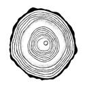
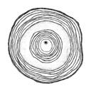
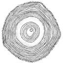
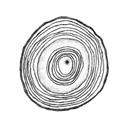
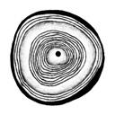
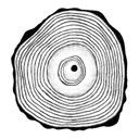
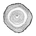
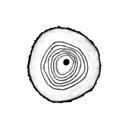
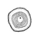
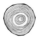
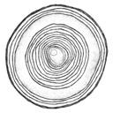
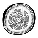
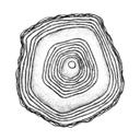
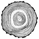
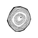
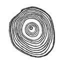
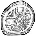
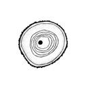
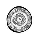
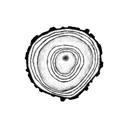
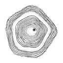
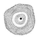
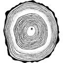
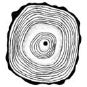
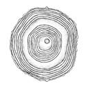
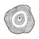
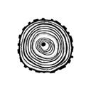
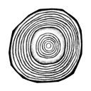
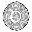
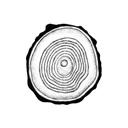
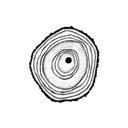
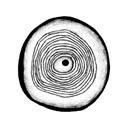
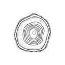
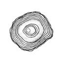

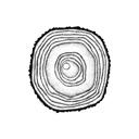
[01] CHRIST [02] VON FLÜE [03] DA VINCI [04] LUTHER [05] ELISABETH I [06] BACON [07] GALILEIO [08] VAN RIJN [09] BLAISE [10] LUDWIG XIV [11] LEIBNIZ [12] BACH [13] VOLTAIRE [14] KANT [15] COOK [16] WATT [17] MOZART [18] FRIEDRICH [19] GRIMM [20] CHOPIN [21] MARX [22] VAN GOGH [23] TESLA [24] PLANCK [25] STEINER [26] CURIE [27] GANDHI [28] LENIN [29] EINSTEIN [30] KAFKA [31] LAUREL [32] HITCHCOCK [33] DISNEY [34] ARENDT [35] KAHLO [36] LINDGREN [37] TERESA [38] MANDELA [39] BEUYS [40] MONROE [41] HEPBURN [42] FRANK [43] MARLEY [44] JOBS [45] JACKSON
[05] TRACE05
[06] TRACE06
[09] TRACE09
[11] TRACE11
[21] TRACE21
[24] TRACE24
[27] TRACE27
[33] TRACE33
[34] TRACE34 [41] TRACE41
//// LILY TAGGART // 2023 ////
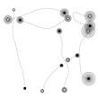
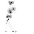
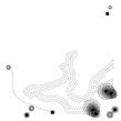
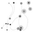
Central Parkʼs sprawling landscape and winding paths offer an inviting escape from New York Cityʼs gridded confines. Conceived by Frederick Law Olmsted, this park embodies an evolving design philosophy rooted in a dialectic which, like collaborative dance, embraces evolution rather than isolated formation. Choreography, like the parkʼs layout, defies rigid structure through ephemerality. Dialectic Dancescape represents choreographic visualizations of the parkʼs paths that reimagine them as dance movements, empowering dancers to create their own captivating, uncharted gestures.
I divided the parkʼs map into forty-five sections, and traced its paths. Using standard choreographic timing, I chose eight paths, which formed the origins of movement in each section. Lines were formed into rhythmic groups and were then ordered by growing concentric circles,
so the projectʼs visual progression mirrored dynamic intensity growth. The choreography in the symbolsʼ connecting lines are dotted to encourage dancers to improvise within each gesture. To celebrate varied perspectives, Dialectic Dancescapeʼs symbols were named after the many Central Park gates welcoming New Yorkers to the park. These entrances, named for the remarkably diverse and intricately mixed population that enabled the parkʼs creation, honor the variation that Dialectic Dancescape seeks to inspire.
In the same way Olmsted envisioned Central Park as ever-evolving, Dialectic Dancescape gives dancers the freedom to produce new perspectives from patterned routines. The projectʼs analogy underscores the enduring power of the dialectic that exists between creation and evolution in artistic expression and the natural world.
LILY TAGGART / IN 2023, I WAS AN INTEGRATED DESIGN STUDENT AT PARSONS SCHOOL OF DESIGN. / NOW, IN 2025, I AM THE CHEF AND FOUNDER OF UDO CULINARY, A NEW YORK-BASED CULINARY STUDIO, WHICH CREATES ARTFUL MEALS USING LOCAL INGREDIENTS AND SEASONAL PRODUCE. I WILL BE ATTENDING LE CORDON BLEU PARIS IN THE FALL. / WWW.LILYTAGGART.COM
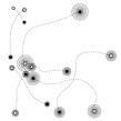
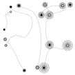
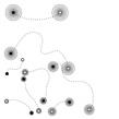
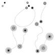
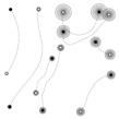
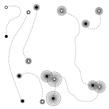
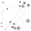
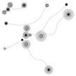
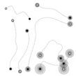
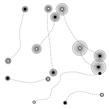
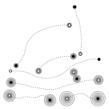
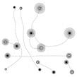
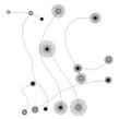
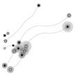
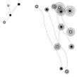
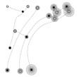
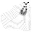
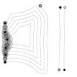
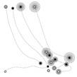
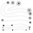
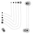
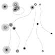
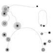
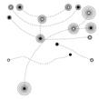
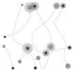
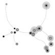
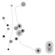
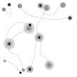
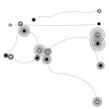
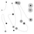
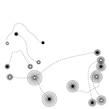
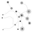
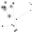
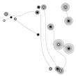
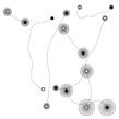
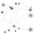
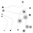
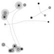
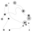
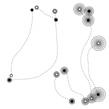
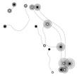
[01] WARRIORʼS GATE [02] FARMERʼS GATE [03] GATE OF THE EXONERATED [04] STRANGERʼS GATE [05] TRADERʼS GATE [06] PIONEERʼS GATE [07] GATE OF THE EXHAUSTED [08] FIRST RESPONDERʼS GATE [09] GIRLʼS GATE [10] BOYʼS GATE [11] PATIENTʼS GATE [12] FOREIGNERʼS GATE [13] GATE OF ALL SAINTS [14] MOTHERʼS GATE [15] WOODMANʼS GATE [16] CULTIVATORʼS GATE [17] VOLUNTEERʼS GATE [18] GATE OF THE STRUGGLING [19] GATE OF THE UNEMPLOYED [20] DREAMERʼS GATE [21] ENGINEERʼS GATE [22] MARINERʼS GATE [23] LOVERʼS GATE [24] GATE OF THE QUEER [25] HUNTERʼS GATE [26] LABORERʼS GATE [27] MINERʼS GATE [28] NATURALISTʼS GATE [29] PERFORMERʼS GATE [30] VISITORʼS GATE [31] GATE OF THE INSPIRED [32] RUNNERʼS GATE [33] SMOKERʼS GATE [34] WOMENʼS GATE [35] GATE OF THE MISUNDERSTOOD [36] INVENTORʼS GATE [37] VAGABONDʼS GATE [38] SUNBATHERʼS GATE [39] CHILDRENʼS GATE [40] OLD TIMERʼS GATE [41] HOMEMAKERʼS GATE [42] SCHOLARʼS GATE [43] MERCHANTʼS GATE [44] ARTISANʼS GATE [45] ARTISTʼS GATE
round on trol to ajor om round on trol to ajor om ake your pro tein pills and put your helmet on round on trol to ajor om ten, nine, eight, seven, six ommencing countdown, engines on five, four, three, two heck igni tion and may od s love be with you one, lift off his is round
ontrol to a jor om ou ve real ly made the grade nd the pa pers want to know whose shirts you wear ow it s time to leave the capsule if you dare his is ajor om to round ontrol m stepping through the door nd m float ing in a most peculiar way nd the stars look very
different today or here m sitting in a tin can ar above the world lanet arth is blue nd there s nothing can do hough m past one hundred thousand miles m feeling very still nd think my spaceship knows which way to go ell my wife love her very much she knows round on trol to ajor om our circuits dead, there s something wrong an you hear me, ajor om an you hear me, ajor om an you hear me, ajor om an you ere am float ing round my tin can ar above the moon lanet arth is blue nd there s nothi ng can do
/ / / / / / / /
To draw a symbol is to take a position. In the projects gathered in this chapter, visual language becomes a tool for questioning power, representing unheard voices, and imagining more inclusive futures. These works trace the intersections between politics and expression, between personal memory and structural systems. They ask: Who gets to speak? Who is counted? Who is seen?
At the core of these projects is the interrogation of language—visual, spoken, written— and how it can be both a site of exclusion and a means of resistance. In St-uh-teh-rrr [ 170-173] , Kiara dos Reis constructs a visual lexicon from the embodied act of stuttering. Her system draws from breath, pause, repetition, and disruption—elements often stigmatized in speech. By elevating these patterns into symbols, the project affirms the political agency of the voice in its fullest form: not only what is said, but how it is said, and who is allowed to say it. A different kind of embodied code emerges in The Code of Gumboot [ 136-141] , a group project that revisits the history of enslaved mine workers in South Africa. Gumboot dancing, developed under apartheid conditions, becomes here a system of non-verbal communication—part resistance, part rhythm, part survival. The project honors this form by turning it into a visual system, emphasizing that even under surveillance, language finds a way to move. Surveillance is also central in Watching You [ 154-159] by Yoko Kristiansen,
which explores the aesthetics of facial recognition, CCTV networks, and algorithmic profiling. This speculative project proposes revealing oneself entirely through abstract symbols, reclaiming identity and shifting power away from the technological networks that observe us. It questions our changing relationship to visibility in the post-privacy age. What does it mean to be watched constantly, and how do we draw ourselves back into focus? The question of recognition is also at the center of LGBTQIA+ in Taiwan [ 142-147] by Aslin Yu-Heng Lin. Created in the wake of Taiwanʼs marriage equality debates, the project reimagines existing visual languages to create symbols for inclusion and visibility. These symbols visualize not only rights won, but spaces opened—for expression, protection, and presence.
Collectively, these projects remind us that every line drawn is shaped by the forces around it—laws, biases, histories, and movements. Visual language is rarely neutral but holds the power to reclaim: through protest, as survival, as invitation. In their multiplicity, these projects offer a vision of collective becoming— where identities are not smoothed into sameness, but rendered visible in all their difference.
THE CODE OF GUMBOOT THE LANGUAGE OF ENSLAVED MINING WORKERS GROUP PROJECT // 136 //
LGBTQIA+ IN TAIWAN LINGUISTIC ARCHITECTURE OF INCLUSION
ASLIN YU-HENG LIN // 142 //
HUMAN DATABASE ANTHROPOGENIC FUTURES AND THE POLITICS OF GIVING LIFE CELINE PEREIRA // 148 //
WATCHING YOU SEEING AND BEING SEEN IN A POST-PRIVACY WORLD YOKO KRISTIANSEN // 154 //
SUBURBAN MIDWEST THE SURFACE OF TRADITION, THE UNDERCURRENT OF CHANGE TAYLOR CHILDERS // 160 //
WILD BLUE YONDER UNKNOWN FORCES: GROWING UP ON A US MILITARY BASE CODY PUMPER // 164 //
ST-UH-TEH-RRR TONGUE, BREATH, PAUSE: A VISUAL LEXICON OF VOICE KIARA DOS REIS // 170 //
LINES THAT SPEAK DRAWINGS BEFORE WORDS: THE LANGUAGE OF CHILDREN MONIQUE SMIT // 174 //
MONOCULTURE
PLANT, REPEAT: SOYBEAN CULTIVATION UNIFORMITY VS. INDIVIDUALITY SALOMÉ ANNA NEUHAUS // 178 //
//// MONIQUE SMIT // 2023 ////
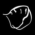
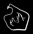
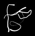
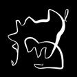
This project is about unlearning how we see. Weʼre trained, over time, to filter ambiguity, to dismiss the unformed. A childʼs drawing—what many adults would call a “scribble”—is often tucked into a box, pinned to a fridge, or forgotten. Rarely do we stop to ask what it means. But to the child, the meaning is already there, alive in every line.
Lines That Speak began as a collaboration with a group of 2- to 5-year-olds in an elementary school. The students were given space to draw freely, unprompted. Then they were asked: What did you make? Their answers, often poetic, surreal, or oddly precise, guided the naming and
tracing of each image. Forty-five forms emerged, digitized not as representations of “childrenʼs art,” but as studies in perception and projection. Like the haunting linework of Louise Bourgeois or the directness of AI-generated sketches, these symbols linger in that psychological space between instinct and interpretation. They invite us to look again—not to decode but to dwell. The project asks adults, especially designers, to set aside trained vision. To re-engage the world with a looser grip. To find form in chance, connection in abstraction. To learn how to see again, we might first have to unlearn how weʼve been taught to look.
MONIQUE SMIT / IN 2023, I STARTED AS A GRAPHIC DESIGN STUDENT AT GREENSIDE DESIGN CENTER. / NOW, IN 2025, I'M IN MY FINAL YEAR AND PASSIONATE ABOUT BRANDING AND VISUAL STORYTELLING. I ENJOY BLENDING STRATEGY WITH CREATIVITY, AND AIM TO BUILD A CAREER WHERE DESIGN CREATES REAL IMPACT. /
WWW.BEHANCE.NET/MONIQUEBARNARD1 / / /
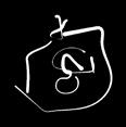
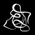

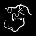


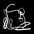
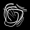
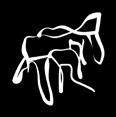
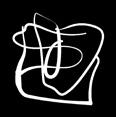

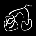
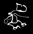
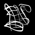
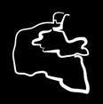
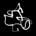


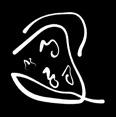
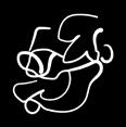
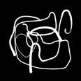

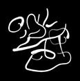
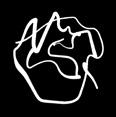

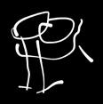
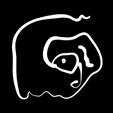
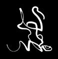
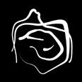
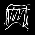
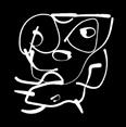
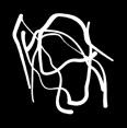
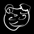
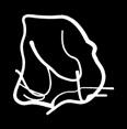
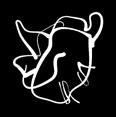
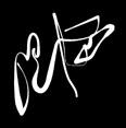

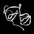
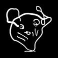
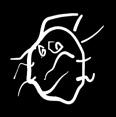

[01] APPLE [02] BALL [03] BANANA [04] BATH [05] BEAR [06] BEE [07] BICYCLE [08] BIRD [09] BOAT [10] BOOK [11] BUG [12] CAR [13] CROCODILE [14] DAD [15] DINOSAUR [16] DOG [17] DUCK [18] ELEPHANT [19] FEELING SAFE [20] FISH [21] FLOWER [22] FOOD [23] GARDEN [24] GIRAFFE [25] HEART [26] HOUSE [27] ICE CREAM [28] LION [29] MAN [30] MOM & DAD [31] MOM, DAD & WATER [32] MOUSE [33] PLAYPARK [34] POOL [35] RABBIT [36] RAINBOW [37] SHOE [38] SNAIL [39] SONIC [40] SPIDER [41] SPRINGBUCK [42] SUN [43] SUPERMAN [44] TREE [45] WORM
4TH CHAPTER /
//// CHIEH-TING LEE // 2016 ////
Which god is in charge of your haircut? To whom do you pray when you post on social media? For practitioners of Chinese Taoism, these are important questions. The Taoist pantheon contains a variety of gods. Showing deep respect and devotion to the gods results in their blessings. People tend to assign a god a role based on their traits or historical deeds; worshiping them brings blessings in those areas. However, as times have changed, many practitioners are no longer familiar with many of these deitiesʼ identities or the areas they represent. In Living With Gods, I sought to combine the stories of Taoist gods with contemporary life. My forty-five symbols convey knowledge and bring an element of fun to the everyday. I aimed to update the vast Taoist pantheon using explicit meanings
and relatable imagery. Taoist deities can be classified into three categories: immortal figures from Taoism itself, deities from other religions integrated into Taoism, and contemporary figures transformed into gods by popular worship. By updating their “job descriptions” for modern times, my goal was to transform lofty religious rituals into accessible, daily experiences. While the duties of the gods may have evolved, they remain willing to help those who sincerely worship them. By updating the visual language of the Taoist pantheon, I designed symbols with more explicit meanings and more relatable imagery. The overall tone brings a modern, personalized flavor to an ancient tradition. Living With Gods reminds us that the everyday is still enchanted by the divine.
CHIEH-TING LEE /
IN 2016, I WAS A COMMERCIAL DESIGN STUDENT AT TAIWAN TECH. / NOW, IN 2025, I AM AN IN-HOUSE DESIGNER AT HTC, SPECIALIZING IN BRANDING DESIGN, BUSINESS STRATEGY, AND BUSINESS COMMUNICATION. / WWW.WOLFKING623.MYPORTFOLIO.COM / / / / / / / / /
[01] FENG SHENG/GOD OF FLYING KITES [02] DING MU/GOD OF POWER SUPPLIES [03] WENCHANG WANG/GOD OF FINAL EXAMS [04] KITCHEN GOD/GOD OF SNACKS [05] FU XING/GOD OF LOTTERY [06] CAISHEN/GOD OF MONEY [07] LEI GONG/GOD OF SWEARING [08] YU BO/GOD OF GOOD WEATHER [09] DRAGON KING/ GOD OF WATER ACTIVITIES [10] SHENHU/GOD OF SAFETY [11] HU YEH/GOD OF DESSERT [12] YUE LAO/GOD OF LOVERS [13] LU DONGBIN/GOD OF HAIR STYLES [14] LU YU/GOD OF TEA [15] HE YE/GOD OF BUILDINGS [16] CAI LUN/GOD OF GRAPHIC ARTS [17] NUWA/GOD OF RESTORATION [18] LU BAN/GOD OF TOOLS
[19] GUAN SHENG DI JUN/ GOD OF HOMEWORK
[20] CHEN TUAN/GOD OF GOOD SLEEP [21] YULU/GOD OF SAFETY [22] JIUTIAN XUANNU/GOD OF LAMPS [23] JIUTIAN XUANNU/GOD OF DRINKING [24] ZHUGE LIANG/GOD OF TASTY BREAD [25] SUN BIN/GOD OF SHOES [26] WU DAOZI/GOD OF PAINTING [27] ZHI NU/GOD OF CLOTHES
[28] HUA XIAN/GOD OF FLOWER [29] CHUANGMU/GOD OF SEX [30] NEZHA/GOD OF DRIVING [31] BAOSHENG DADI/GOD OF RECOVERY [32] LORD XIQIN/GOD OF MOVIES
[33] YUEN TIN SHEUNG TAI/GOD OF PORK [34] GUANYIN/GOD OF SOCIAL NETWORK
[35] WU PAN GUAN/GOD OF FIGHTING [36] WEN PAN GUAN/GOD OF SCORES [37] CHENGHUANG YE/GOD OF TRAFFIC [38] WIND-FOLLOWING EAR/ GOD OF GOSSIPING
[39] THOUSAND-LI EYE/GOD OF PEEPING
[40] SKANDA/GOD OF TIME
[41] TIENTU YUANSHUAI/GOD OF MUSIC
[42] TAISHANG LAOJUN/GOD OF FITNESS [43] ZHANG SHUAI/GOD OF PIMPLES
[44] FAJU ZHENJUN/GOD OF TRAVEL [45] HOUJI/GOD OF RICE
//// JULIEN RONDEZ // 2018 ////
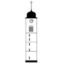
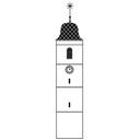
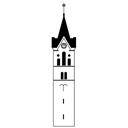
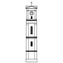
Rural communitiesʼ characters are often defined by the way their inhabitants relate to the landscape. In the northwest of Switzerland, the canton of Jura exists in a rural area dominated by nature, containing many small villages dotted throughout the countryside. Each village has its own bell tower that is visible throughout the village. Each bell tower has a unique architectural design, instantly recognizable to the villageʼs inhabitants. For them, these structures are more than landmarks—they embody the identity of their community. Inspired by the cultural heritage of this area, Jura Skyline is an architectural metonym of a Swiss cultural landscape. The name of each symbol matches the name that the inhabitants of the village call themselves—idiosyncratic systems of identification are at play not only in the variation of the architecture, but also in how the people in the towns define themselves.
My abstract depiction of local church towers represents not only the unique scenery in the center of Europe, but also details collective memories and cultural identities. Jura Skyline portrays historical landmarks of architecture alongside contemporary examples. I applied consistent rules of abstraction to precisely implement a syntactic visual grammar. Each of the forty-five symbols I produced tells an individual story, while in their entirety the symbols create a diorama of a region. These forty-five symbols incorporate the personal narratives that inform each townʼs sense of a shared identity. The project celebrates the heritage of Switzerland and the diversity of its regional architecture. It invites the viewer to think about their own heritage and inspires them to find their own ways of preserving and documenting their communitiesʼ identities.
JULIEN RONDEZ / IN 2018, I WAS A GRAPHIC DESIGN STUDENT AT THE BASEL ACADEMY OF ART AND DESIGN FHNW IN SWITZERLAND. /
NOW, IN 2025, I WORK AS A FREELANCE GRAPHIC DESIGNER AND AS A MEMBER OF THE EXECUTIVE TEAM OF THE SWISS SEED EXCHANGE (SCHWEIZERISCHE SAMENBÖRSE), I SPEND MOST OF MY TIME IN MY GARDEN, WHERE I FIND INSPIRATION AND A LOT OF LIFE. / WWW.JULIENRONDEZ.CH / / / / / / / / /
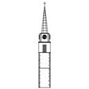

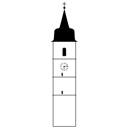
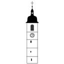
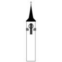
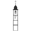
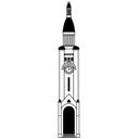
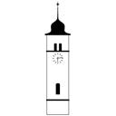

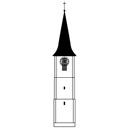
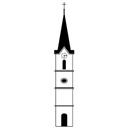

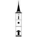
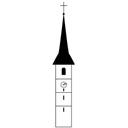
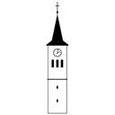
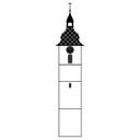
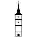
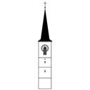
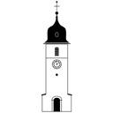



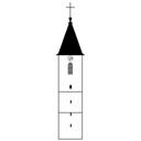
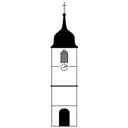
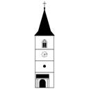


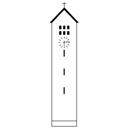
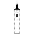
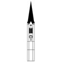
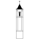
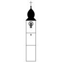
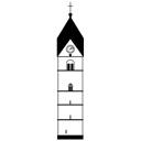
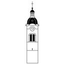
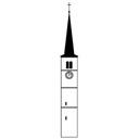
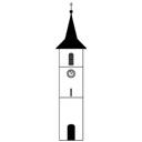
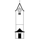
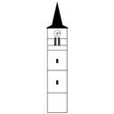
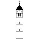
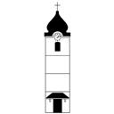
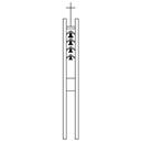
[01] LES MERGATS [02] LES VERMÉCHÉS [03] LES PATAS [04] LES BOÉLONS [05] LES TCHAITS-COUTCHIES [06] LES CANARDS [07] LES GUEULES DE FOUÉDA [08] LES BUIX [09] LES BURETS [10] LES NOIRES GAYES [11] LES GRÔS-BOÉS [12] LES TCHʼNÉYES [13] LES BREÛLES-TÔS [14] LES CORBENÈZ [15] LES COURRENGEAUX [16] LES LOUPS [17] LES COURTEDOUX [18] LES GUÉGUELLES [19] LES DAMPHREUX [20] LES DAINVOIS [21] LES DELÉMONTAINS [22] LES ESCARGOTS [23] LES PTÉTS BATS [24] LES TCHAIS [25] LES GLOVE [26] LES GUEILLEMETINS [27] LES DJOULAIS [28] LES BREULOTIERS [29] LES DGENEVÉSAIS [30] LES MERVE [31] LES MONTFAUCON [32] LES MONTSE [33] LES PRÉVÔTOIS I [34] LES PRÉVÔTOIS II [35] LES MULETS [36] LES BRUNTRUTAINS [37] LES ETÇHÉYES [38] LES GRAVALLONS [39] LES LOITCHOUS [40] LES CRAÎTCHIS [41] LES SOYHIÈRES [42] LES SAINT-BRAIS [43] LES PTÉTS AÎNES [44] LES BREÛLES-TCHÏNS [45] LES VICQUOIS
//// RAAFIA JESSA // 2016 ////
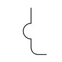
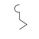
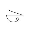
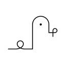
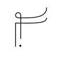
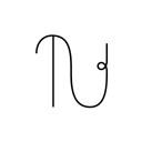
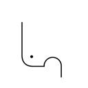
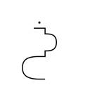
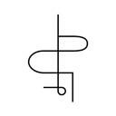
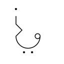
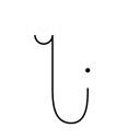
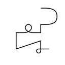
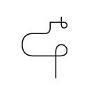
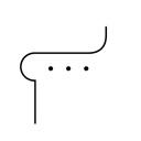
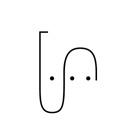
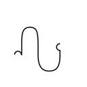
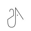
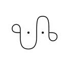
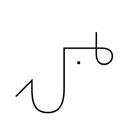
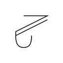
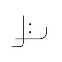
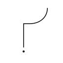
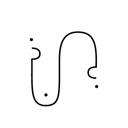
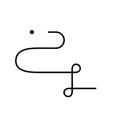
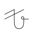
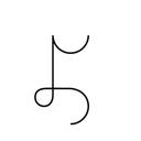
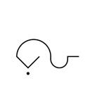
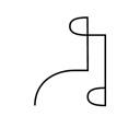
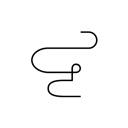
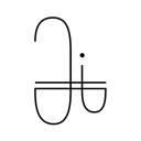
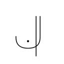
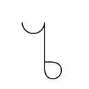
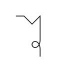
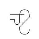
What could be more abstract than the rules that govern language? Acoustic adaptation is a phenomenon often apparent in songbirds: the frequencies of their songs alter depending on the level of vegetation in their habitat. If a relationship exists between a birdʼs song and the average yearly temperature, rainfall and degree of tree cover, is there also a relationship between environment and human speech? Is it possible that languages have their own unique melody, with variations in pronunciation because of distinct articulatory processes shaped by physiological and environmental factors? /ʼlo.kwi:/ (loqui) is Latin for “to speak.” The project is about unencumbered communication. I celebrate the sound of language. My projectʼs
fictitious alphabet consists of forty-five symbols which combine Arabic, Persian, Urdu, and Latin characters based on their sounds. Arabic, Persian, and Urdu all have a more extensive set of characters compared to English; many sounds that can be made in these languages cannot be made in English. These forty-five symbols were made to promote the concept of a universal language. Each symbol is attached to a character from IPA (International Phonetic Alphabet) instructing the reader in the sounds that the symbols represent. Focusing on the musicality of language doesnʼt necessarily tell us what a sound means; rather it tells us something about the meaning of meaning. Pure sound becomes pure visual poetry.
RAAFIA JESSA /
IN 2016, I WAS A GRAPHIC COMMUNICATIONS STUDENT AT THE UNIVERSITY OF HOUSTON. /
NOW, IN 2025, I AM A FREELANCE DESIGNER BASED IN ITALY AND THE CO-FOUNDER OF SPAZIO VUOTO, A CREATIVE PHOTOGRAPHY AND DESIGN STUDIO. I ALSO WRITE A BLOG CALLED MUSINGS ABOUT NORMALCY, WHICH EXPLORES WHAT IS CONSIDERED "NORMAL" IN CONTEMPORARY SOCIETY. /
WWW.RAAFIAJESSA.COM / / /










[01] Ӕ [02] B [03] P [04] Θ [05] Ʈ [06] Š [07] ʤ [08] ʧ [09] Ħ [10] X [11] D [12] Ḍ [13] Z [14] R [15] Ɽ [16] Ẑ [17] Ʒ [18] Ʃ [19] S [20] Ʌ [21] T [22] Ð [23] Ž [24] Ʊ [25] F [26] Ɣ [27] Q [28] G [29] K [30] L [31] M [32] N [33] ɳ [34] H [35] W [36] ɧ [37] ʼ [38] Y [39] LA [40] ʎ [41] I [42] U [43] ÆN [44] IN [45] Ʉ
//// CHANDELLE WILSNAGH / MMATSHEPO SIMELANE / ASHIR AJUDHIYA / DOBYL MALUBANE // 2018 ////
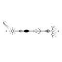
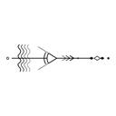
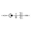
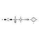
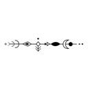
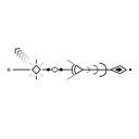
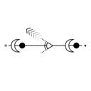
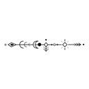
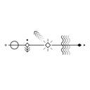
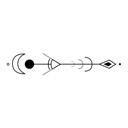
All around us, creatures follow patterns that we are mostly unaware of. Global warming and its attendant ecological destruction, however, have disrupted many of these fundamental biological patterns. Faced with rising global temperatures and sea levels, deforestation, new pathogens, and pollution, animals are migrating differently to adapt to climate changes and unreliable sources of food and water. More frequent polar vortexes, for example, have compelled snow geese, known to cover thousands of miles, to migrate earlier to warmer zones in search of grubs. The Navigators explores the migration patterns of many such species throughout the world.
We began by rethinking the cardinal points. A symbolic compass is the basis of our symbols. Eleven fundamental visual elements combine in various constellations to depict cardinal positions and geographic circumstances. Each point symbolizes a relevant characteristic; for example, “west” is represented by a setting sun. In order to place emphasis on each animalʼs habitat, we also created symbols that represent natural elements connected to the air, land, and sea. Stylistically, we chose a horizontal approach. Symbols are meant to be read from left to right, so that the viewer receives a story about the animalʼs migration. Each symbol is based on patterns that have been plotted on
maps by environmental scientists. We hope that The Navigators will initiate a discourse about geological and biological processes, the fragile interconnectedness of natural habitats, and the Anthropoceneʼs influence on our climate and environments.
/ / / / / / / / / / / / /
CHANDELLE WILSNAGH /
IN 2018, I WAS A GRAPHIC DESIGN STUDENT AT GREENSIDE DESIGN CENTER IN JOHANNESBURG, SOUTH AFRICA. /
NOW, IN 2025, I AM A SENIOR GRAPHIC DESIGNER AT A ZIMBABWE-BASED ADVERTISING AGENCY CALLED COLUMBUSDDB, WORKING WITH A DIVERSE RANGE OF CLIENTS FROM BANKING AND RETAIL TO CSR AND ESG INITIATIVES.
/
WWW.BEHANCE.NET/CHANDIWILS3B06 /
MMATSHEPO SIMELANE /
IN 2018, I WAS A MULTIMEDIA DESIGN STUDENT AT GREENSIDE DESIGN CENTER IN JOHANNESBURG, SOUTH AFRICA. /
NOW, IN 2025, I AM A MOTHER TO A TODDLER, A SENIOR PRODUCT DESIGNER WORKING FOR SANLAM FINTECH, AND PURSUING MY STUDIES IN DESIGN LEADERSHIP.
ASHIR AJUDHIYA /
IN 2018, ASHIR AJUDHIYA BEGAN DEVELOPING A PURPOSEFUL DESIGN PRACTICE GROUNDED IN SIMPLICITY AND CURIOSITY. THEY USE DESIGN THINKING TO CRAFT IMPACTFUL VISUAL NARRATIVES, COMBINING ILLUSTRATION AND MOTION GRAPHICS TO COMMUNICATE IDEAS AND IMPROVE DAILY LIFE.
DOBYL MALUBANE /
IN 2018, DOBYL MALUBANE BEGAN SHAPING A DESIGN PRACTICE ROOTED IN CURIOSITY AND STRATEGIC THINKING. THEY APPROACH BRANDING AND CREATIVE INNOVATION THROUGH DESIGN THINKING, AIMING TO CRAFT MEANINGFUL EXPERIENCES AND ADDRESS CONTEMPORARY GLOBAL CHALLENGES. / / /
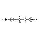
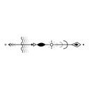
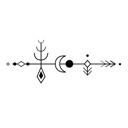
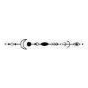
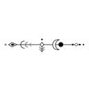
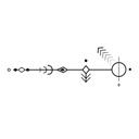
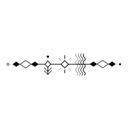
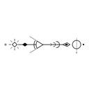
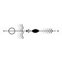
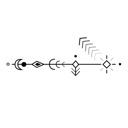
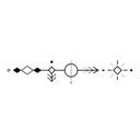
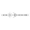
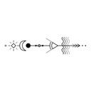
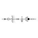
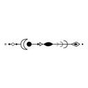

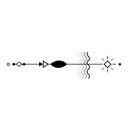
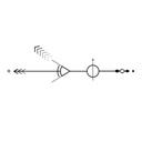
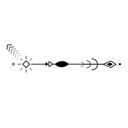
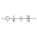
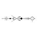
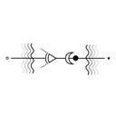
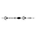
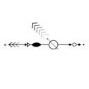
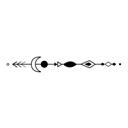
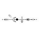
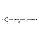

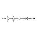
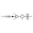
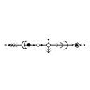
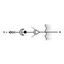
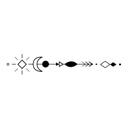

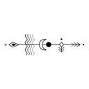
[01] PENGUIN [02] STINGRAY [03] FLAMINGO [04] DUCK [05] RATTLESNAKE [06] BUTTERFLY [07] CRAB [08] TURTLE [09] SEAL [10] CARIBOU [11] ARMADILLO [12] GOOSE [13] SALMON [14] DEER [15] GOPHER SNAKE [16] BISON [17] MOOSE [18] ELK [19] DRAGONFLY [20] HUMMINGBIRD [21] SPOTTED FROG [22] BAT [23] TUNA FISH [24] EAGLE [25] POLAR BEAR [26] SNOW GEESE [27] SEA MANATEE [28] ARCTIC TERN [29] SEA LION [30] PIGEON [31] WOLVES [32] TORTOISE [33] ARCTIC FOXES [34] GREY WHALE [35] GREAT WHITE [36] DOLPHIN [37] ELEPHANT [38] NEWT [39] POLAR BEAR [40] SHEEP [41] IMPALA [42] SWALLOW [43] TUFTED DUCK [44] WILDEBEEST [45] ZEBRA
A b B c d
B c C d F g G E f h H i I j J k K l
/ Lecture Austria
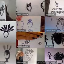
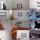
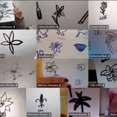
2022 /
One last round? Let's make it count. We launch one final open call: Translations & Recordings of the Anthropocene whatever that means to you and your environment.
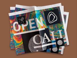
/ / / 2023 /
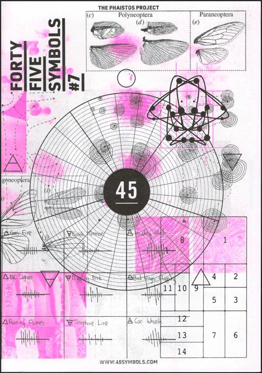
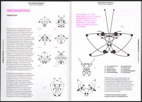
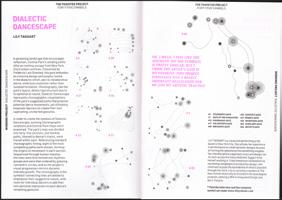
Our last open call! Our last risograph zine? Of course. This time, we go full circle back to research, back to reflection. Visuals meet footnotes. Symbols meet sources.
/ / / / / 2024 / Ten years. Seven risograph magazines. Hundreds of participants. Thousands of symbols. We pause. We breathe. We look back. / If we break down this tent and move on should we leave with a bang? / / We begin to work on a book.
Presentation of the last zine and the research project as part of the Open House Exhibition, Austria
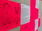
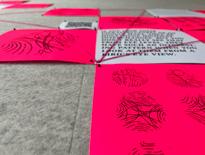
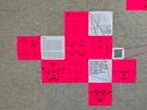
/ / / /
We sift through ten years of spiral drawings, zine layouts, screenshots, notes, and photo folders with names like: "45_FINALDOC_final_nowFINAL."
/ / The archive speaks back. We invite people back in. Every email feels like a reunion.
/ / / / / / / / / / / / / / / // / / / /
2025 /
We thought riso printing was tough? Try making a book like this. Getting it into the world is a whole different kind of wild slow, exhausting, consuming on every level.
/ /
But here we are.It's printed. It's bound. It's in your hands. And honestly? Totally worth all the work.
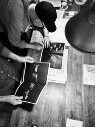
et voila!
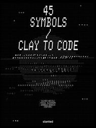
/ / / / / 2025/2026
/
Next stop: Porto Design Biennale! Come find us in Portugal. 45 Symbols unfold as a time-based installation in a garage under City Hall (yes, really). Cool space. Cooler stories. / / / / / /
Looks like the "final chapter" turns out to be a plot twist: unexpected beginnings and a whole new wave of ideas.
/ / / The spiral is still turning want in?
Join the journey at www.45symbols.com. We're listening.
/ / / / / / /
RANDA ABDEL BAKI /
IS A SCHOLAR, DESIGN EDUCATOR, AND VISUAL ARTIST BASED IN BEIRUT, LEBANON. SHE IS AN ASSOCIATE PROFESSOR AT THE LEBANESE AMERICAN UNIVERSITY (LAU) IN THE DEPARTMENT OF ART AND DESIGN, WHERE SHE HAS ALSO HELD SEVERAL ADMINISTRATIVE ROLES, INCLUDING SERVING AS DEPARTMENT CHAIR FROM 2009 TO 2014 AND AGAIN FROM 2018 TO 2020. / HER WORK FOCUSES ON BILINGUAL TYPOGRAPHY AND PATTERN DESIGN AND ILLUSTRATIONS, EXPLORING HOW VISUAL LANGUAGE REFLECTS CULTURAL IDENTITY AND COMMUNICATION. COMBINING RESEARCH WITH CREATIVE PRACTICE, HER PROJECTS HAVE BEEN EXHIBITED AND PUBLISHED INTERNATIONALLY. ABDEL BAKI'S CONTRIBUTIONS HAVE ESTABLISHED HER AS A RECOGNIZED VOICE IN THE FIELD OF VISUAL DESIGN.
/ / /
Reflecting on this journey as a juror and founding collaborator of 45 Symbols, I recall the enriching discussions, the occasional debates, the laughter and the fun times that made every annual meeting a pleasurable and a memorable moment. This collaboration has been more than just an exploration and assessment of symbols; it has been a celebration of communication, creativity, and friendship. Over the years, I had the opportunity of working with a remarkable group of colleagues: Pascal, Mariko, Olivier, Andreas, and Annelie each sharing their unique insights, expertise, and creativity. Our annual jury sessions were intense and dynamic. I always looked forward to our conversations, which were inspiring in many ways. Pascal would reach out to coordinate our meetings, juggling time zones from New York to Beirut, Kyoto to Cologne, and Bogotá. Although we met online once a year, we always picked up where we left off, with conversations that remained lively and engaging.
As I write this essay, I find myself smiling, remembering our academic discussions along the laughter and the sense of dedication that defined our collective work.
I recall a particular submission, from a few years ago that sparked an extended debate. Each juror brought a different assessment, and while it took time to reach consensus, the process highlighted the strength of diverse thinking. Often, thorough analysis of design processes, and symbolic meanings would eventually give way to lighter moments and humorous anecdotes, easing the weight of decision-making. Clear insights emerged after efforts to decipher the intricacies of a design process or to reason over the historical or cultural interpretations of a set of symbols. Afterwards, we would chill, unwind, and laugh. Beyond the structured and intense discussions, the social moments were vital and priceless. Looking back at the initial winning projects, it is evident that they became benchmarks, influencing subsequent participants. One of the most striking aspects of these submissions was how culture played a significant role in shaping the symbols. Whether it was the rich history of a city, cultural references, or personal narratives tied to regional identities, the cultural lens through which students approached the project added depth and meaning to their designs. This exploration of culture was often reflected in the symbolism,
iconography, and visual languages students chose to represent. The shortlisted submissions carried stories and histories unique to their designersʼ cultural contexts.
A significant aspect of this journey was mentoring students and observing how they interpreted the brief, navigating each stage of the challenge to arrive at their own unique and personal visual storytelling. At the initial stage of the project, a cohort of my students at the Lebanese-American University collaborated on developing a comprehensive dingbat symbol font; a set of 45 symbols representing the city of Beirut. While students in New York City and Cologne concurrently created their own interpretations of their respective cities. The project culminated in the creation of city fonts that captured the unique iconography of each city. The following year, while teaching at Falmouth University, I introduced the 45 symbols competition to my students. They explored their personal narratives, often drawing on historical references or experimenting with abstraction to stretch the definition of what a symbol could be. While presenting their work and process, whether nervously or confidently, they emphasized the challenge of creating a set of 45 symbols that could convey their intentions shaped by context, culture, and interpretation.
As the project progressed, a shift in design submissions became evident. Early winning projects became reference points, influencing later entries with recurring themes and styles. We began to notice repeated themes in later submissions, making unique entries increasingly rare.
Moreover, over time, many design students seemed to rely heavily on platforms like Pinterest or Behance for inspiration. While these sources can be helpful, they often result in work that feels repetitive and a bit too familiar. On the other hand, some students took a different path, a more critical and unconventional approach. They dedicated their time to researching and experimenting, and were fully committed to their creative process. Those are the ones who stood out, showing real originality.
Building on this observation, many students today are drawn to quick results, influenced by the speed of technology and the rise of AI tools. While this approach can generate visual outputs with just a few prompts, it often bypasses the design process and limits
deeper, more thoughtful creative exploration. AI can be a valuable tool, especially for refining ideas, but it should support and not replace the creative journey. True design takes time, critical thinking, and a willingness to go beyond the obvious. We need to encourage students to build a strong foundation so they can fully engage with the process and develop more original and unique work.
Looking back, 45 Symbols has been much more than an annual design challenge; it has been a space for shared learning, creative dialogue, and meaningful connection. Whether through mentoring students or exchanging ideas with peers across time zones, the project has continually reminded me of the value of thoughtful design and the personal stories behind it. As we move forward, I hope we continue to nurture originality, curiosity, and the kind of collaborative spirit that made this journey meaningful.
SLANTED PUBLISHERS UG (haftungsbeschränkt)
Nördliche Uferstraße 4–6 76189 Karlsruhe, Germany T +49 (0) 721 85148268 info@slanted.de slanted.de @slanted_publishers
© Slanted Publishers, Karlsruhe, 2026
Nördliche Uferstraße 4–6, 76189 Karlsruhe, Germany
© Text and Design by artists, authors & editors
© Image & Photo Credits
Fig. 1, p. 14: iStock, PROMT8, ID 1215036287, Fig. 2, p. 15: iStock, Olena Lialina, ID 12893759557, Fig. 3, p. 16: Fig. 5, p. 17, Fig. 7, p. 19, Fig. 8, p. 20, Fig. 10, p. 21, Fig. 11, p. 22: Public domain via Wikimedia Commons.
All rights reserved.
All other images were kindly made available by the artists, authors & editors.
ISBN: 978-3-948440-95-4 1st edition 2026
DESIGN
Olivier Arcioli, Pascal Glissmann, Andreas Henrich
PUBLISHING DIRECTION
Lars Harmsen, Julia Kahl
PRODUCTION MANAGEMENT
Julia Kahl
PAPER
115 g/m² Munken Print White
TYPEFACE
Conman, Jakob Fischer, www.pizzadude.dk
Source Sans Pro, Paul D. Hunt
BOOKBINDING
Buchbinderei Spinner
PRINTER
Stober Medien
INITIATORS & CO-DIRECTORS
Pascal Glissmann
Associate Professor of Communication Design Parsons School of Design, New York, U.S.A.
Olivier Arcioli
Program Director and Professor of Graphic and Informationsdesign New Design University, St. Pölten, Austria
Andreas Henrich
Professor Emeritus Academy of Media Arts, Cologne, Germany
COLLABORATORS
Randa Abdel Baki
Associate Professor Lebanese American University Beirut, Lebanon
Annelie Franke
Professor of Media Design International University Campus Mainz, Germany
Mariko Takagi
Professor
Doshisha Womenʼs College of Liberal Arts, Department of Information and Media, Kyoto, Japan
RESEARCH ASSISTANT
Daniel Bogre Udell [2014/15]
Evelyn Zhang [2015/16]
Sachi Chandiramani [2016/17]
Paula Volchok [2016/17]
Thomas Nghia Nguyen [2017/18]
Pune Dracker [2019]
Eric Lish [2019]
Nicole DʼAlessio [2020]
Brianna Corley [2023]
Madeleine Adams [2024/25]
SUPPORT & FUNDING
Parsons School of Design, New York New Design University, St. Pölten Academy of Media Arts, Cologne

DISCLAIMER
The publisher assumes no responsibility for the accuracy of all information. Publisher and editor assume that material that was made available for publishing, is free of third party rights. Reproduction and storage require the per mission of the publisher. Photos and texts are welcome, but there is no liability. Signed contributions do not necessarily represent the opinion of the publisher or the editor.
The German National Library lists this publication in the German National Bibliography; detailed bibliographic data is available on the Internet at dnb.de.
In our increasingly AI-saturated visual landscape, authentic creative voice has never been more valuable—or harder to develop. How do you transform research, personal stories, and complex ideas into compelling visual language that cuts through the noise?
This book reveals how emerging artists and designers worldwide are answering that question, developing systematic approaches to visual language inspired by one of humanity's most mysterious communication artifacts: the 3,700-year-old undeciphered Phaistos
Disc. From personal narratives to planetary challenges, the work curated for this publication demonstrates how to build distinctive visual grammar—unique systems for translating ideas into images that resonate. It's less about "getting it right" and more about cultivating critical disruptions—through asking sharper questions, telling bolder stories, and rethinking how we see the world.
Over more than a decade, 45 Symbols has grown from six simultaneous design seminars into a global community shaped by open calls, workshops, exhibitions, and risograph publications. The 2,025 symbols gathered here are not only a living archive of research inquiries, but also a reflection of the impact of collective experimentation and cross-cultural dialogue.
For students, educators, and practitioners alike, this book ofers both inspiration and actionable methods for cultivating the visual storytelling skills our image-flooded world needs most—authentic, systematic, and uniquely personal.