REBRAND

SHOPPING. MARKET.
COMMUNITY.
ALL UNDER ONE ROOF.


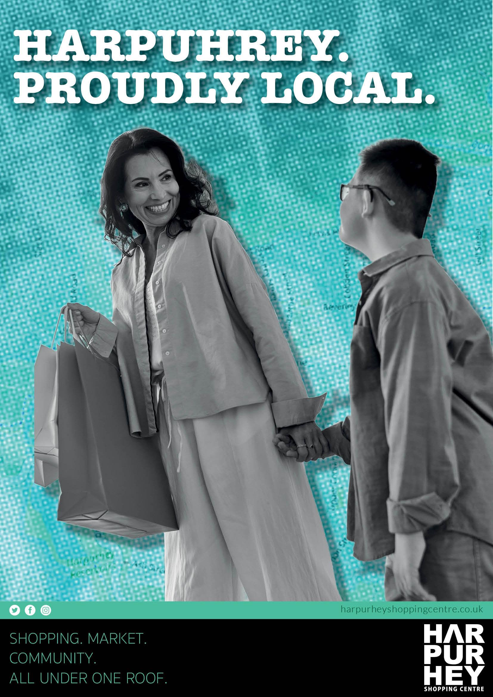
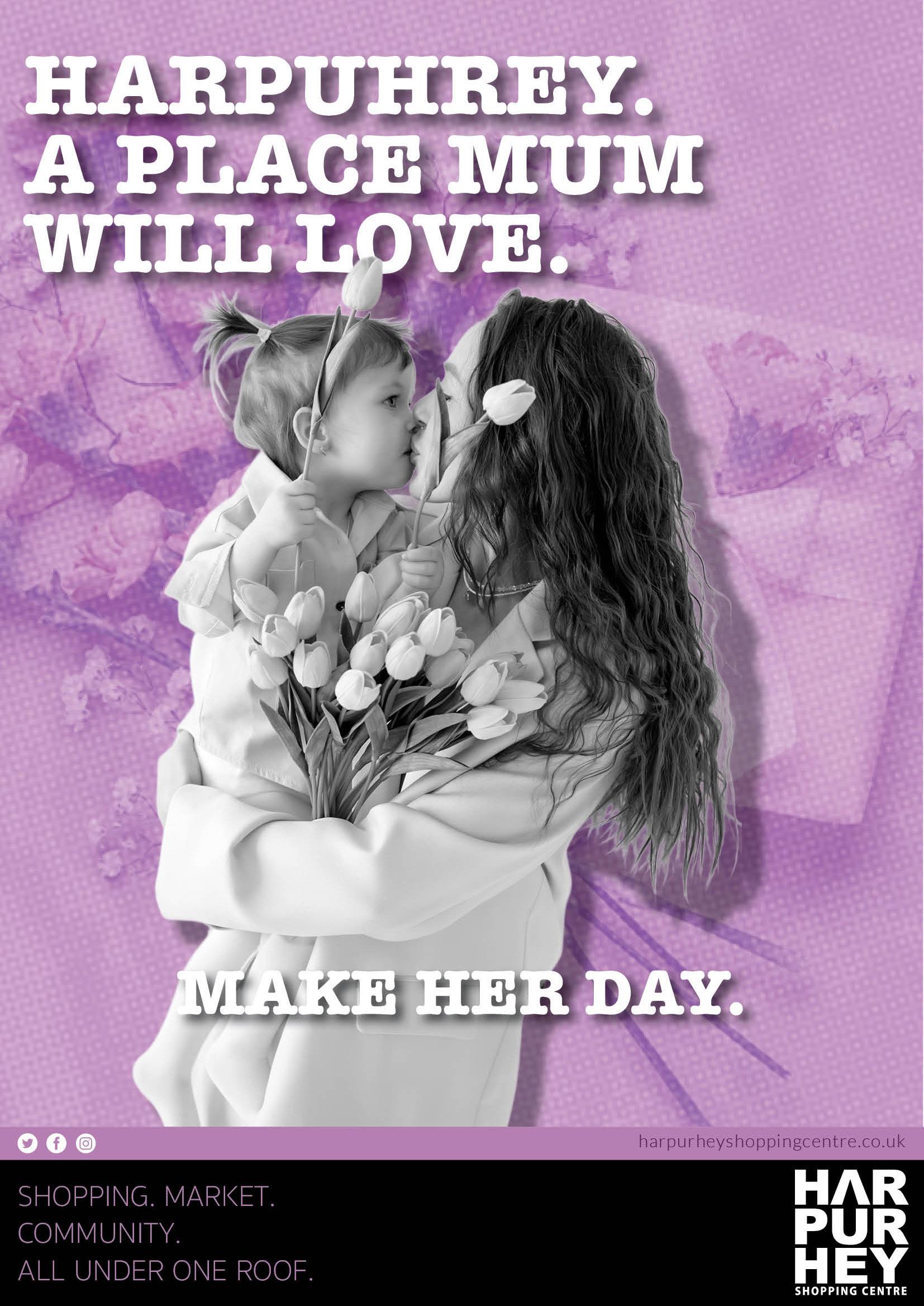
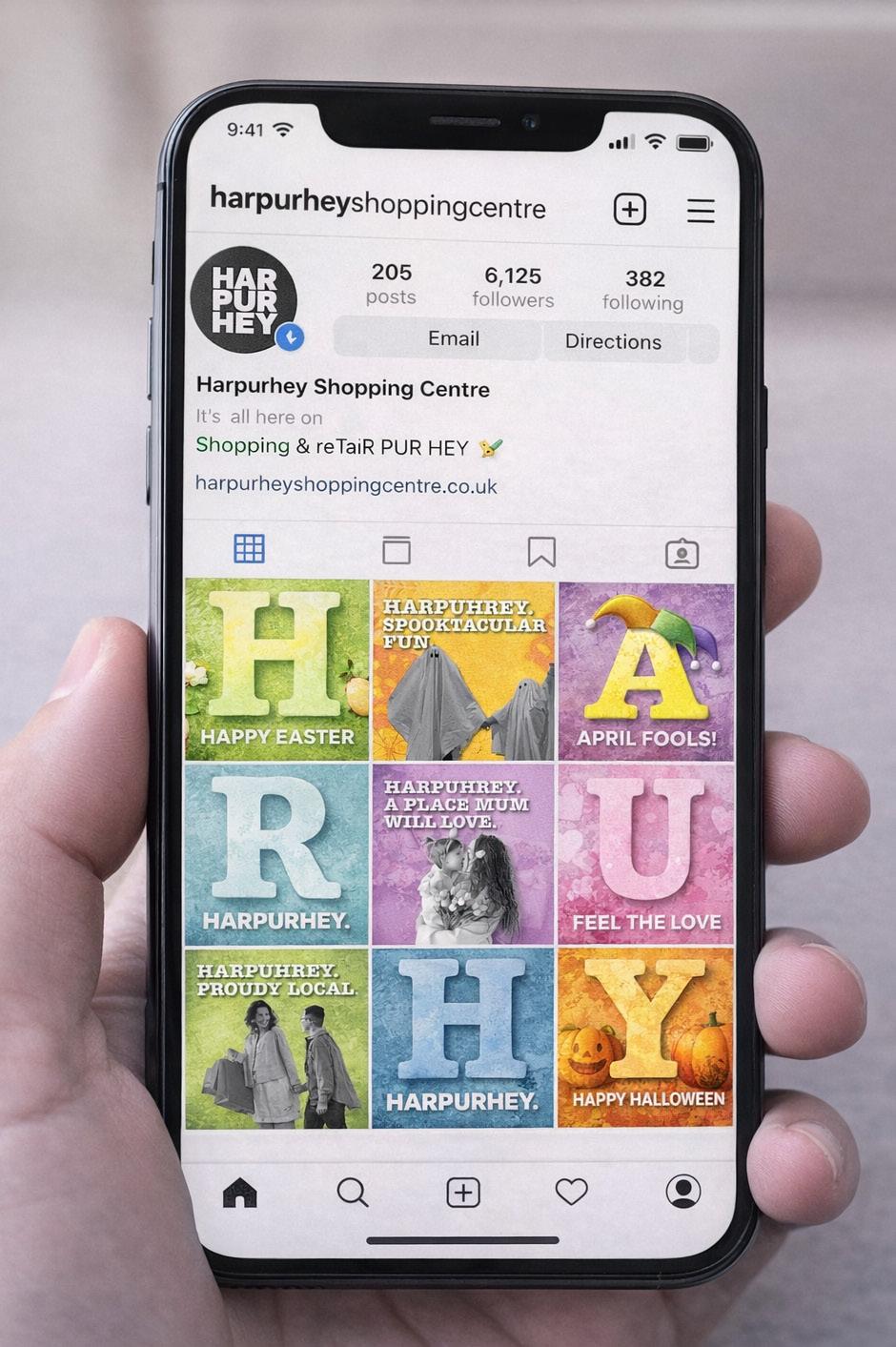
Using the existing logo and established colour palette as the foundation, ensuring the designs feel instantly recognisable and confidently on-brand. The core brand colours are alternated across seasonal events and key calendar moments to maintain consistency while keeping the campaign visually fresh and engaging. Each event adopts a variation of the palette — from lime greens for Easter to bold yellows for April Fools and pale blues for spring — allowing the centre to celebrate different occasions without losing its visual identity.
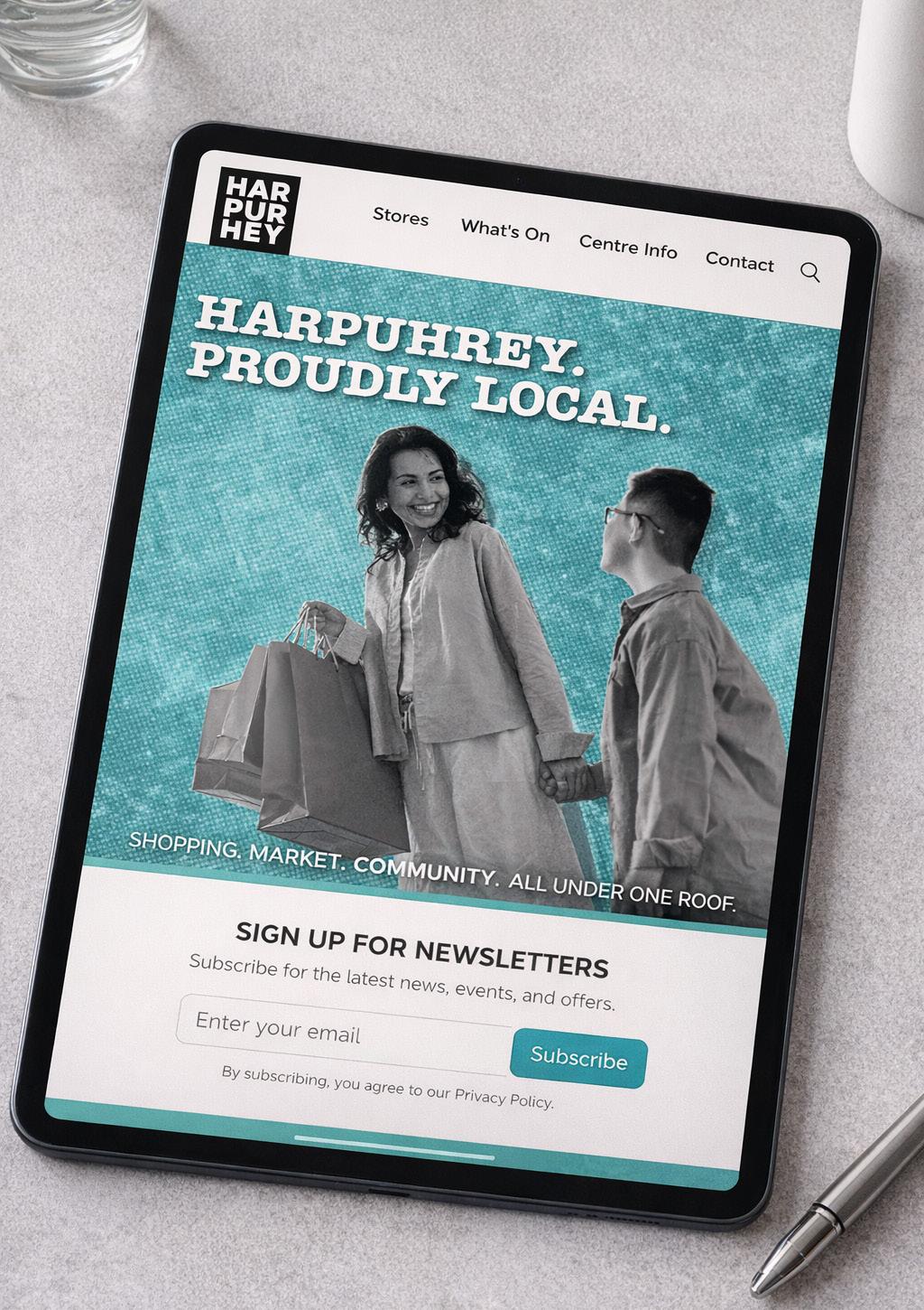
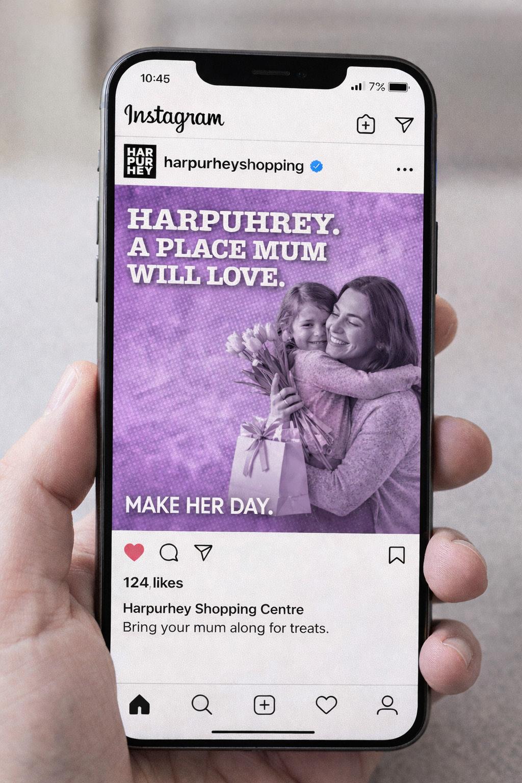
The introduction of a textured background adds depth, warmth and personality, preventing the designs from feeling flat or overly digital. The texture gives the artwork a tactile, community-focused feel that reflects Harpurhey’s character as a lively and welcoming local hub. The monochrome imagery placed in the foreground works particularly effectively because it creates strong contrast against the bold brand colours, ensuring headlines remain clear and impactful.This approach is especially powerful across social media. When viewed as an Instagram grid, each square works individually but also forms part of a larger, eye-catching visual system. The alternating colours and bold typography ensure the feed feels vibrant and curated rather than repetitive. Introducing standalone letter tiles — such as a large “H” in lime green for “Happy Easter,” an “A” in yellow for April Fools, an “R” in pale blue, and so on — adds a playful branded rhythm to the grid. As these posts sit together, they subtly spell out HARPURHEY across the feed, reinforcing brand recognition while celebrating different events.
The result is a bold, cohesive and scroll-stopping social presence that reflects Harpurhey Shopping Centre as a proud, community-driven destination.