TECHNOLOGY ISSUES
A GUIDE TO DATA VISUALIZATION By Olivia Kleiner As the field of accounting merges with data analytics, creating sharp visualizations is essential to effectively working with clients. Concisely conveying solutions to clients has always been an invaluable skill for a CPA, but it has grown even more important as the role of accountants shifts to analysts. With the transformations in the profession, CPAs need to become well-versed in tools that summarize large data sets clearly – data visualization tools.
Data Visualization: The Basics Data visualization involves taking large sets of data and summarizing them through graphs and other visual elements (Data Visualization Beginner’s Guide: A Definition, Examples and Learning Resources). Its ultimate goal rests in seeing trends and outliers in data easily – the audience can understand data at a glance. Instead of poring over a massive spreadsheet for analysis, users can immediately pinpoint what’s important through graphs and charts.
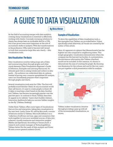
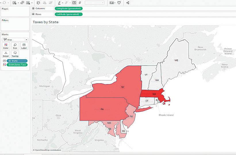
Examples of Visualizations To show the capabilities of data visualization tools, a few examples from Tableau are provided below. Unless specifically noted otherwise, all visuals are created by the author of this article. Here, it’s apparent at a glance that Massachusetts has the highest tax rate compared to neighboring states. This simple geographic visualization demonstrates where the company has the heaviest tax burden. In a presentation, the extraneous information (the Tableau interface) would not be included. In this instance, it’s shown to demonstrate the ease of creating the graph. By choosing one dimension for the column and one for the row, users can put together a slick presentation slide for analysis.
Several visualization tools exist for CPAs. The first will probably sound familiar: Excel. As any accountant worth their salt knows, it’s easy to create graphs in Excel. All it takes is inserting a chart based on the data. Another tool, Tableau, has become increasingly popular over the past few years. In contrast to Excel, Tableau describes its appeal on its website: “Leave chart builders behind... Interactive dashboards help you uncover hidden insights on the fly” (Tableau Desktop). Unlike Excel, Tableau offers more types of visualizations that are live and interactive, taking data visualization to the next level. Lastly, Power BI, sold by Microsoft, consists of features similar to Tableau; Microsoft defines it as a “collection of software services, apps and connectors that work together to turn your unrelated sources of data into coherent, visually immersive and interactive insights” (Blythe and Sparkman). According to Tamara Scott, a research and content manager at TechnologyAdvice, Tableau better fits the needs of data analysts and Power BI suits a more general audience (Scott).
Tableau makes visualization intuitive through providing a pop-up with all of the recommended visualizations, as shown.
Today's CPA July / August 2020 9


