JOURNAL
STUD I O AR T Q UILT ASSOCIATES
INSIDE: STEPS TO SECURE SOLO EXHIBITION • DEB CASHATT’S NEW PATH • LET COLOR TELL YOUR STORY • MEET KIM
EICHLER-MESSMER • PART 2: CHAOS TO CREATIVITY •
INSPIRED: PEGGY BROWN • JURIED ARTIST SHOWCASE •
MEMBER GALLERY: JOURNEY • ART EVOLVED: INTERTWINED
2023 | Volume 33, No. 3
IN THIS ISSUE
BOARD MEMBERS PRESIDENT
Mel Beach
San José, California
VICE PRESIDENTS
Lilo Bowman
Fort Worth, Texas
Shannon Conley Moore, Oklahoma
SECRETARY
Claire Passmore
Riviere du Rempart, Mauritius
TREASURER
Gwyned Trefethen
Cohasset, Massachusetts
Holly Brackmann
Ukiah, California
Shin-hee Chin
McPherson, Kansas
Jette Clover
Lier, Belgium
Carolyn Ducey
Lincoln, Nebraska
Cynthia Friedman
Merion Station, Pennsylvania
Susie Floyd Goodman
Bloomington, Indiana
Kathie Kerler
Portland, Oregon
Michael McCormick
Tualatin, Oregon
Candice Phelan
QUICK NOTES
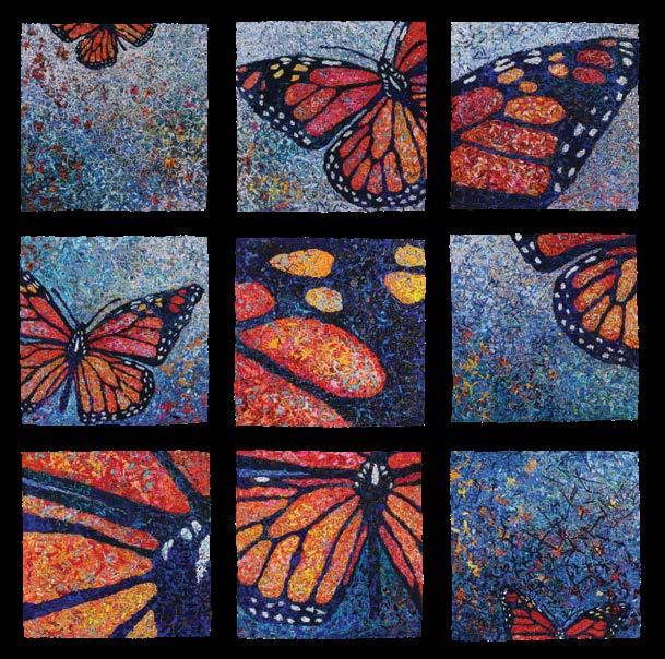
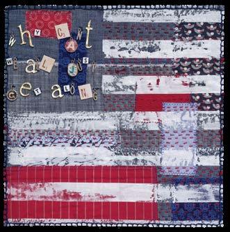
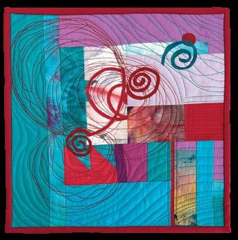
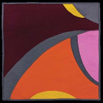
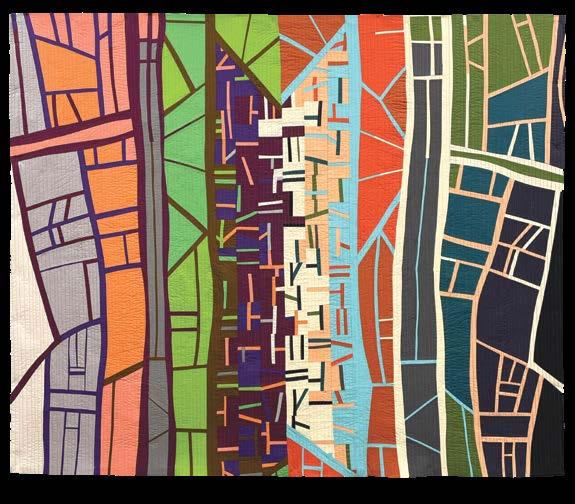
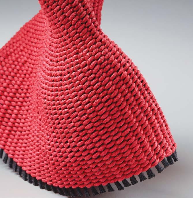
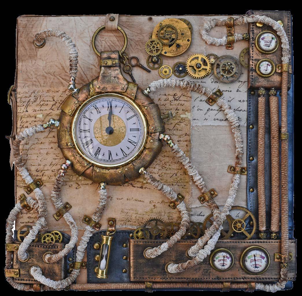
ON THE COVER:
12 x 12 inches | 30 x 30 cm | 2023
To find out more about SAQA, contact Martha Sielman, executive director, by phone at 860.530.1551, or by email at execdirector@saqa.com.
Explore varied resources on our website at www.saqa.com. Annual membership for U.S. and international members, listed in USD, is $90.
Studio Art Quilt Associates, Inc. (SAQA) is a nonprofit organization whose mission is to promote the art quilt. Through exhibitions, resources, publications, and membership, we seek to increase appreciation for the art quilt as a fine art medium and to support our members in their artistic and professional growth.
The SAQA Journal is published four times a year. To submit articles or story ideas, contact Diane Howell, SAQA Journal editor, at editor@saqa.com. Review submission guidelines at www.saqa.com/journal-submit
For delivery questions, contact circulation@saqa.com
For advertising information, visit www.saqa.com/ads
Boynton Beach, Florida
Maggie Vanderweit
Fergus, Ontario, Canada
Melissa Wraalstad
Grafton, Wisconsin
Zara Zannettino
Highbury, Australia
EXECUTIVE DIRECTOR
Martha Sielman
Hebron, Connecticut
SAQA JOURNAL EDITOR
Diane Howell
Chandler, Arizona DESIGNER YellowDog Denver,
2 • SAQA Journal • 2023 | No. 3
Colorado
Green!
can choose to read the SAQA Journal online only. Log in to mySAQA (www. saqa.com/mySAQA) and select Manage Your Account.
Go
You
ARTICLES: Part 2: Chaos to creativity 5 Deb Cashatt: A new artistic path 10 The great storyteller: color . . . . . . . . . . . . . . . . . . . . . . . . . . . . . . 16
Eichler-Messmer . . . . . . . . . . . . . . . . . . . . 24 Steps to secure a solo exhibition . . . . . . . . . . . . . . . . . . . . . . . . . 28 COLUMNS: Editor’s Notes . . . . . . . . . . . . . . . . . . . . . . . . . . . . . . . . . . . . . . . . . . . . 3 Thoughts from the president . . . . . . . . . . . . . . . . . . . . . . . . . . . . . 4 Inspired: Peggy Brown . . . . . . . . . . . . . . . . . . . . . . . . . . . . . . . . . . 39 GALLERIES: Juried Artist Showcase . . . . . . . . . . . . . . . . . . . . . . . . . . . . . . . . . 14 SAQA Global Exhibition: Art Evolved: Intertwined . . . . . . . . . 22 Member Gallery: Journey . . . . . . . . . . . . . . . . . . . . . . . . . . . . . . . 30 SAQA NEWS SAQA Award at Quilt National . . . 9 In memoriam: Christine Chester, Suzy Bates, Ruby Horansky . . . . .34
FEATURE
Featured Artist: Kim
Kate
Steam
Crossley
Stitch
From the 2023 Benefit Auction
My mailbox tells me that we need to talk.
Some of you have expressed how sorry you are to hear about this magazine going away—but SAQA Journal (SJ) isn’t going anywhere! It is your member publication and is committed to keeping you informed of important SAQA events as well as the latest trends in making and exhibiting.
But with the closure of our sister publication, Art Quilt Quarterly (AQQ), we have new opportunities to fine tune our editorial content. You will soon see new departments and an increase in the number of artists featured as we plan for a special issue at the end of next year.
So tell me, what do you want to read?
There is a foolproof way for you to let me know—a reader survey! Go to www.saqa.com/journal-survey and follow the prompts. We want to know what you like to read and any ideas you have for stories.
What do you want to read?
by Diane Howell
We have some ideas in the works. We know you love the Artists to Watch profiles in AQQ, and we will be reformatting those for SJ. We know you love to look at art quilts. Next year, a print exhibition will be open to all members through a call for entry.
Those of us who worked on both publications, including AQQ Editor Sandra Sider and myself, will deeply miss AQQ. But SJ will meld the best of both publications and remain your member publication.

Here’s to new opportunities!
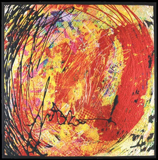
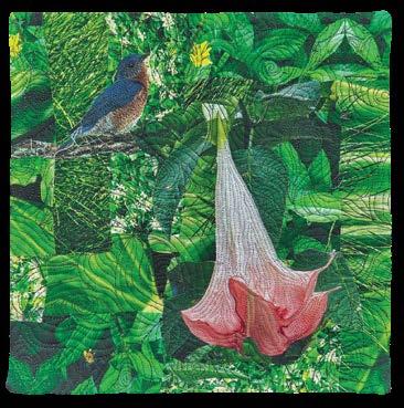
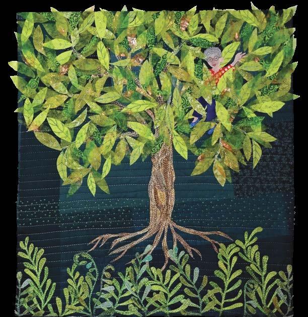
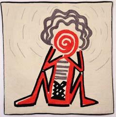
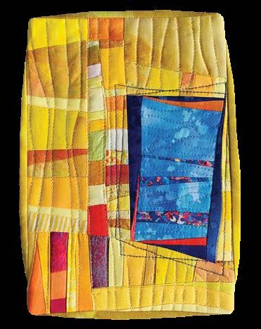
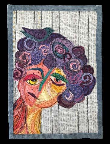
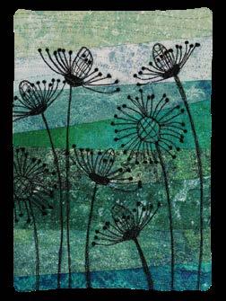
Right now, enjoy the read! This issue is packed with info on color, organization, getting a solo exhibition, and so much more! By the way, that amazing piece on the cover is by Kate Crossley and can be yours if you bid in the upcoming 2023 SAQA Benefit Auction—the most anticipated event on our calendar.
Article update
In the previous issue (SAQA Journal 2023,Vol. 33, No. 2), Kestrel Michaud wrote an article about AI art generators.
In it, she stated that she "was unable to find an AI image generator or image dataset that did not include copyrighted artwork." Since then, Michaud says that Adobe has created its own image generator model called Firefly. The dataset used to train Firefly contains only ethically sourced images, such as those in the public domain and user-provided images to Adobe's stock photo library. Artists who submit to Adobe stock have the ability to opt-out if they don't want their work used for training. ■
SAQA Journal • 2023 | No. 3 • 3
EDITOR’S NOTES
“
” SJ will meld the best of both publications and remain your member publication.
Next steps in SAQA’s event planning
 by Mel Beach
In April, more than 200 SAQA members gathered in Toronto for our first in-person conference since 2019. After three years of virtual conferences and programs, it was wonderful to meet with fellow SAQA members in person. As many members had only met via Zoom, we quickly discovered how much shorter or taller folks were in real life. There were lots of hugs to be had as members connected and reconnected during all of the events—even on elevator
we could admire the details of each piece while we stealthily placed bids on our favorites.
Leading up to the conference, the SAQA Board held its annual retreat. One agenda item was how best to balance in-person and virtual events going forward. While we celebrated how each venue advances SAQA’s mission, vision, values, and goals, we also discussed the challenges and limitations, especially with regard to access and costs to attend for our growing, global community.
to watch your email for announcements about the lineup of presenters and registration details. Then we set our sights on St. Petersburg, Florida, for our next in-person conference from April 3-6, 2025.
rides! The conference flew by quickly as attendees left with nuggets of inspiration from the fantastic lineup of speakers. If they were lucky, a few pieces of art from the Spotlight Auction went home with them too! What a treat it was to see almost 400 donated art quilts on display where
The good news is that SAQA will continue to offer in-person and virtual events. The 2024 conference, Plurality & Heritage, will take place virtually from April 12-20, 2024, and will showcase our Europe and Middle East region. Several members from that region are already involved on the Local Advisory Committee to provide insights and suggestions to the Special Events Committee. Be sure
The Board, Special Events Committee, and staff are planning each event in order to maximize the benefits of each format. The goals are to celebrate fiber art and provide inspiration while creating new connections among SAQA members. We are also exploring the feasibility and technology available to offer hybrid events to make content and connection more accessible for all members.
We welcome your input in planning future events. Consider serving on the Special Events Committee, which meets each month to plan future conference programs. Our Development Committee is also looking for volunteers to help plan membership meetups, parties, and receptions for SAQA. We hope you will bring your ideas to help these committees meet the interests and needs of our membership.
For details on how you can participate, visit saqa.com/volunteers. ■
4 • SAQA Journal • 2023 | No. 3
THOUGHTS FROM THE PRESIDENT
“ ”
The good news is that SAQA will continue to offer in-person and virtual events.
From chaos to creativity
‘THE BIG SORT’ YIELDS CALMING STUDIO SPACE
 by Lilo Bowman
When the overarching need for a change in the studio arrives, most of us envision an exhausting process of emptying an entire room of its contents in one fell swoop and then determining what to keep and what to toss. This scenario does not rate high on the fun factor, and it is the reason many avoid the task. But when done in a slow and methodical approach, instilling order can be less overwhelming and even calming. I’d like to share a method of approaching a space and the items in it that allows you to make personal decisions along the way to achieving a creative sanctuary.
Sorting and Purging Benefits
While sorting and purging is often seen in a negative light, the aftereffect is relief from the mental drain on your brain, thereby resulting in a calmer you. Bringing things into the light of day allows you to evaluate an entire collection as a whole, while lowering the frustration of buying items twice because you can’t find them. It also opens up space for the things you are excited about now. As Dorothy Calder said about her recent studio reorganization: “It is the act of understanding what was important in the past and whether it is relevant in the future.”
Moving every few years for more than two decades as a military spouse resulted in my lifelong habit of clearing out my studio on a regular basis. This refresh gives me the opportunity to assess my collections and sometimes discover items I thought had
been lost. Several years ago, frustrated by my thirty-year collection of make do and mismatched storage containers as well as poor lighting in the studio closet, I decided to install a system that functioned better for me. This major change gave me the opportunity to spend several days assessing everything that was stored in the closet. One day, as I began going through a box labeled paint, which probably hadn’t been opened in almost ten years, I was floored to discover a lost crystal vase belonging to my grandparents. For years I had had lingering sadness over the loss of this item. The vase was a wedding gift, and one of the few items I made sure to hand-carry with me in every

SAQA Journal • 2023 | No. 3 • 5 PART 2
Repurposing the center bays of a four-car garage provides ample space.
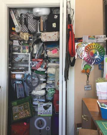
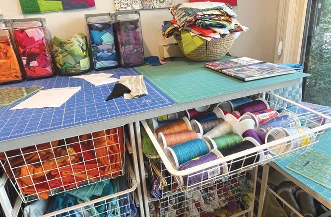
Years of avoidance can lead to overstuffed closets.
Image courtesy N. Dion
move. The relief I felt in that find alone made the work on the closet worth it.
Face The Bully
Congratulations! You took to heart the message and decided that there needs to be a change in your studio. You’ve scheduled several days on the calendar, arranged for a friend to come help and determined where donated items will go. It’s Day One, and you have an assortment of baskets, boxes, and a good-sized folding table ready for action. Now comes the most difficult task for everyone.
Facing an overstuffed closet, mountains of shopping bags, or an entire room of items you don’t want to deal with can be overwhelming. Seeing what months or years of avoidance has produced might make you weak in the knees. Take a deep breath and remember the underlying reason for undertaking this task—the desire for a warm and welcoming place.


The Big Sort
The accumulation didn’t happen overnight. It took months or even years to get to this point, so the act of
pulling out and purging should also be broken into zones (e.g., side of a room, books, fabric, mixed-media, closet) over several days. This is the time to have blinders on and only focus on your zone of the day; avoid the temptation to take in other areas. Have your friend work in another zone within the same room so you can chat while working.
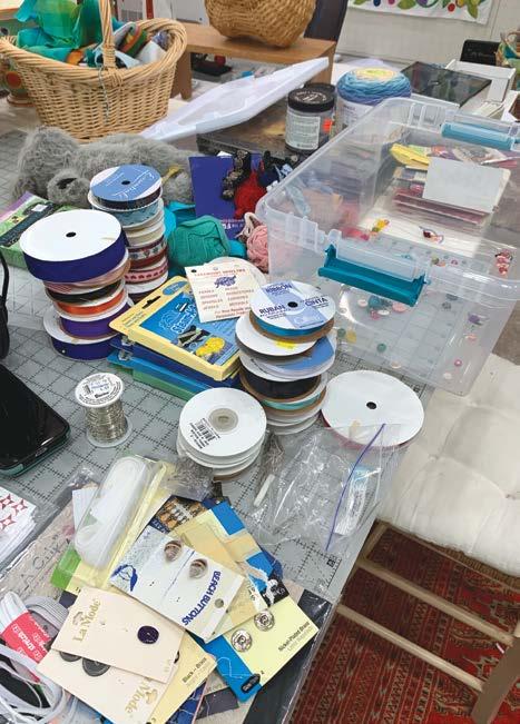
Begin with the first thing you see, be it a bag, basket, box, etc., and bring it to the designated worktable. As you remove the contents, take a moment to evaluate whether an item is destined for the keep, donate, or toss category. This initial process is what I call The Big Sort—items that fall within an entire category such as fabric, sticky stuff, cutting tools, books, yarn projects, paint, thread, garment-making supplies, etc. Items that you are keeping move to the worktable as a temporary like-withlike holding station. Donations go into containers designated as such, and broken or unusable items are set aside for the trash. Deciding what stays and what goes should ideally be a quick decision, with many items being an easy yes or no. If in doubt,

6 • SAQA Journal • 2023 | No. 3
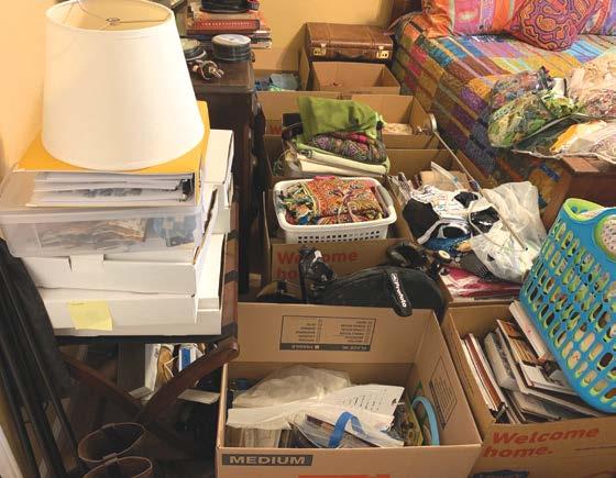
Guest bedrooms often become the space where things are out of sight and out of mind.
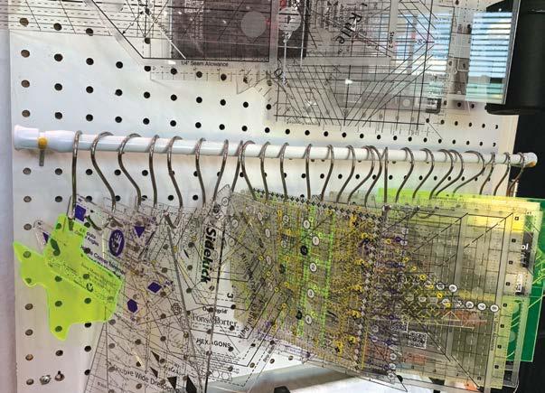
Vertical storage of specialty rulers provides visibility and easy access.
Creating areas for like items (e.g. garment construction, ribbon, beads, books) on the sorting table makes the job of clearing out faster and easier.
ask your friend’s opinion. Avoid the temptation to linger too long over every single item you come across.
If you are not sure, move the item to the keep stations. You can always reevaluate the decision a bit later, but remember the reason for purging is to cut down and remove items that you aren’t using. The big sort allows you to visualize entire collections in the holding stations and later gives you a second opportunity to reevaluate those items.
Things to consider when evaluating are:
• What’s the worst thing that will happen if I let it go?
• Do I still use this item?
• Am I still working in this medium?
• Is this item easily replaceable if I need it in the future?
• Why am I keeping this?
• Does this item hold a high priority in the type of work I am doing now?
• Would I buy this item again?
• Would this item help someone else?
As an example, think about your standard rotary cutting rulers and
consider how often you use every ruler within a certain size. Over the years as this tool has evolved, so have your personal needs, and you have knowingly or unknowingly determined a personal favorite. While there’s nothing wrong with the other brands, they don’t fit your current criteria, resulting in unused rulers taking up space that could otherwise be opened for another use. Still not convinced? An easy way to determine if every tool you own is being utilized is to place a small piece of colored tape on the item as you use it. Try this for a month or two and it quickly becomes obvious which tool is a priority versus a storage hog.
By the end of the first day, your worktable should have items in holding stations, some donation boxes or bags should have been transferred to the car, and discards should be on the way to the trash. Yes, the worktable appears to be a jumbled mess, but on closer inspection it is organized into the groups of things you are keeping. Continue the sort and purge process over the next day or maybe even two, depending on the number of areas you are clearing out. At the end of the big sort,
you should literally see and feel the increased breathing room because a significant number of open areas have been created in closets, bookcases, drawers, corners of a room, and areas under worktables, etc. Pat yourself on the back and know that you are well on the way—but the journey is not quite over.

Focus On Details
The task over the next few days is to subdivide the general categories into smaller and more specific groups. Before jumping in, it is important to review your personality answers from the questions listed in Part I of this series (SAQA Journal 2023, Vol. 33, No. 2) to determine how you are going to store the items you are keeping to best fit with your nature and needs.
If you’re visually inspired, consider using:
• Shallow open shelving (to avoid items being hidden), glass door storage units, or roll-top cabinets.

• Clear containers where items are visible while being organized.
see “Chaos to Creativity” on page 36
SAQA Journal • 2023 | No. 3 • 7
Fabric storage in clear containers and baskets offers visual inspiration and easy access.
Photo courtesy Cindy Grisdela
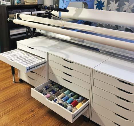
Utilize the available space under a longarm to store thread cones and other longarm-related accessories
Image courtesy Tamarack Shack
Help SAQA connect to art lovers everywhere!
SAQA creates meaningful connections for art quilts through publications, education, networking, and exhibitions.


• In 2024, more than 20 Global Exhibitions will be traveling the world.
• More than 15 SAQA regions are organizing traveling exhibitions.
• Our Virtual Gallery program will add four more exhibitions.
• Hundreds of thousands of viewers enjoy SAQA exhibitions online and in person.
• More than 200,000 people have viewed Textile Talks, a valuable outreach tool.
Help us connect with all of our audiences by making a gift today.
WWW.SAQA.COM/DONATE
8 • SAQA Journal • 2023 | No. 3
Correspondence With Hope (left) and Oxidation (right) by Judith Quinn Garnett
SAQA Award bestowed at Quilt National
Congratulations to Barbara J. Schneider, who was named the SAQA Award recipient at Quilt National ’23 for Tree Bark Fragment, var. 5 .

Schneider, of Woodstock, Illinois, was selected by the exhibition’s jurors, who make their decision based on the award’s criteria that winning pieces be compelling, dynamic, and progressive. The award winner receives a $500 prize. The SAQA award is presented to one artist at four prestigious textile exhibitions: Quilt National, Art Quilt Elements, Quilt Visions , and Interpretations
Schneider’s piece is part of an ongoing series.
“I continue to work on re-creating the beautiful remains I find as I walk in the forest. Even when a tree is no longer alive, it is creating life for the forest floor. As it breaks down, lichen and mosses grow, other small plants nestle into its interior, and new shoots put down roots. The work is created using a thermoplastic fabric [Fosshape] that shrinks and stiffens when heat is applied. I use that property to shape the piece. Assorted stitching, burning, and thread painting is also included in the process.”
Congratulations to our latest SAQA Award winner!
Barbara J. Schneider Tree Bark Fragment, var. 5 58 x 15 x 6 inches | 147 x 38 x 15 cm | 2022
[Note: For the past twenty years, Deb Cashatt and Kris Sazaki have collaborated as the Pixeladies. They are retiring the brand in October 2023, and many friends and colleagues have been asking what’s next for them. Sazaki is returning to her first love of writing, including articles in the SAQA Journal and an article to be published shortly in the final issue of Art Quilt Quarterly .]
Deb Cashatt

Charting her own course
by Kris Sazaki
Deb Cashatt has embarked on a solo career, with work that is distinctive from her work under the Pixeladies name. Yet, she brings the same passion and commitment to the art as she did as a Pixelady. Having experimented with many art media over the years, Cashatt lets her interests guide her art. She remains fascinated with block printing, but her artistic course has not been so straightforward.
In 2019, Cashatt joined the Cloth in Common art group organized by fellow SAQA member Karol Kusmaul. Cashatt initially saw this group as an avenue to

work abstractly. Her 7” from the Midday Sun is an example of this type of work. Hand-quilted, it is the result of drawing while listening to live music as well as the song Smooth by Santana. Cashatt was hoping to continue this mode of creation in Cloth in Common. Unfortunately, she found that she could not work abstractly within the time constraints of the group. Working in this style has shown Cashatt that her strongest asset is color.
The Covid-19 pandemic actually helped Cashatt develop her own style. During those many months of isolation, she pieced to keep herself occupied in her studio since collaborating was not possible. Piecing brought Cashatt back to sewing, and, having come of age sewing clothes, she reveled in that activity. Around the same time, she discovered the 100 Days Project, a SAQA Special Interest Group. She began her participation by making her favorite pattern, the Greek key meander. Once the keys went on the design wall, they started to take on the shape of everyday—and not so everyday— things. Tricia Wyard-Scott, a member of the group, once commented that some of Cashatt’s pieces looked like aliens. That set her off on a new creative path: random piecing could become something tangible.
10 • SAQA Journal • 2023 | No. 3
Deb Cashatt
7" from the Midday Sun 40 x 40 inches | 102 x 102 cm | 2018
Cashatt’s main focus is now piecing. She still tells stories in cloth as she did as a Pixelady, but in a more stylized way, intentionally avoiding the use of text. By combining the words “symbol” and “graphic” Cashatt created her own word to describe these artworks: “symbographic.” The seemingly casual placement of symbols actually provides the viewer with a language to “read” the quilt or to make up a story. For Cashatt, the use of text that features so heavily in the Pixeladies’ work was more an aesthetic element than actual writing. These symbographic quilts build on that notion.

Working improvisationally until objects begin to appear, Cashatt then purposefully creates new objects that thematically go with the improvised pieces. She filled her earlier pieces with solids and prints (commercial or of her own design), but the allure of pure solids to enhance her symbographs soon took hold.
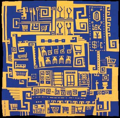
Working with only two colors, the iconic blue and yellow of the Ikea furniture store (and Swedish flag), Cashatt realized with Pre-Kaya that she could flip background and foreground colors to great effect. PreKaya sends viewers through a maze similar to that of an actual Ikea store—the title is a play on pre-writing iconography and the Swedish


pronunciation of the store—where shoppers get lost among the available wares. The viewers are even rewarded with Ikea’s famous meatballs, if they let their gaze wander long enough along the maze.
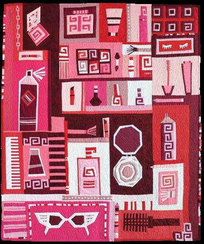
Putting on My Face developed Cashatt’s concept of symbography further. Responding to the prompt Faces in her Cloth in Common group, Cashatt conjured up memories of her grandmother and how she would say she was putting on her face. Symbographs abound in a limited color palette: a hairspray can, false eyelashes, a compact, lipstick, comb, brush, mascara, and nail polish. Cashatt’s grandmother was not known for wearing makeup, but that’s how prompts work for Cashatt. An innocent word or thing takes on new meaning. Many of the items include her favorite shape, the Greek key. They even create the different powders of the eye shadow palette. Avoiding curved lines in her symbographs, Cashatt is still able to evoke movement in the placement of line, with the viewer’s eye moving easily from beauty item to beauty item.
Cashatt’s work using prompts can definitely yield quirky results. For the prompt Cell, Cashatt’s immediate thought was cell, as in prison cell, and Folsom Prison Blues was born.
SAQA Journal • 2023 | No. 3 • 11
Pre-Kāya 48 x 48 inches | 122 x 122 cm | 2021
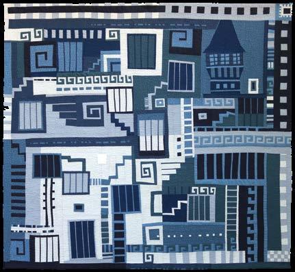
40 x 43 inches | 102 x 109 cm | 2022
Putting on My Face 40 x 35 inches | 102 x 89 cm | 2021 Folsom Prison Blues
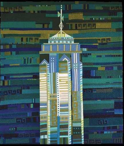
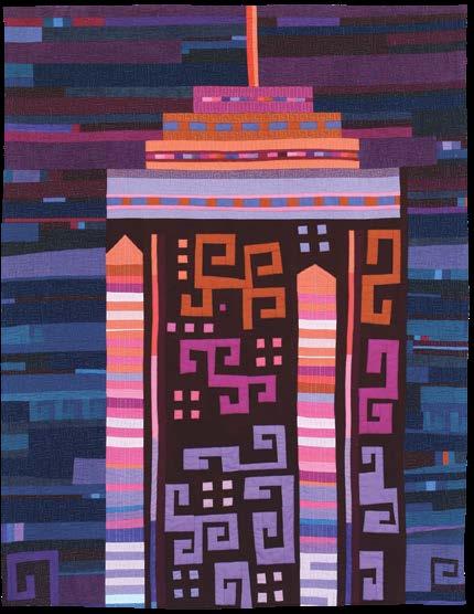
It’s perhaps the best example of how Cashatt creates graphic elements, intuitively combining them into rectangular containers suggestive of comic books and Chinese curio boxes. In Folsom Prison Blues, her jail cells are connected by mysterious pathways, stairs, and ladders. Folsom’s recognizable tower keeps the jail in its sights. Although Cashatt avoids the use of text, it hasn’t stopped her from adding the title to this piece: think Morse code. Color is integral to Cashatt’s work, as can be seen in her two versions of The Center, the fifth tallest skyscraper in Hong Kong. Situated across Victoria Harbor from the hotel Cashatt has stayed in during several visits to Hong Kong, she has often commented on the mesmerizing lights on the building, which rotate through the color spectrum every evening. Focusing on pinks and purples in Deb’s Building and greens and blues in The Center #2 , Cashatt shows how the same color palette can occupy the background as well as the foreground. It’s in the critical placement of shape with color that one can differentiate building from background. Quilted with metallic thread, the buildings take on the sparkle the actual building provides in the Hong Kong skyline. The Center’s triangular protrusions accent horizontal lines that also change color at night. Cashatt somehow manages to reference these iconic shapes without recreating them exactly. And it’s her new shapes within each building— the symbographs—that inspire the viewer to ascribe a different mood to each differently colored building.

Would not another version of The Center tell yet another story?
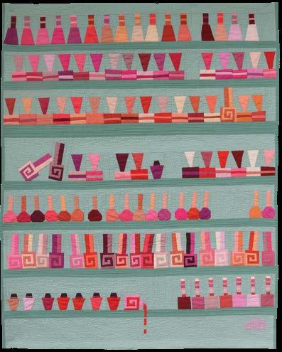
Cashatt’s use of color hits new heights in Wall of Polish. She often finds inspiration in everyday objects, but here she makes nail polish bottles extraordinary. Working with more than forty colors of red and changing the bottle shapes and necks, it seems as if Cashatt is able to make each of the 111 bottles of polish take on their own personality, almost like a visual anthropomorphism. One could, for example, read the bottles as dressed up revelers after a night of celebrating, with one very tipsy partygoer at the bottom. When asked if she dyes her own fabric, Cashatt gives an emphatic no! She has discovered 100 percent cotton solids at Art Gallery Fabrics. They remind her of a good broadcloth, unlike Kona cottons, which she finds stretch too much for the small pieces that she constructs.
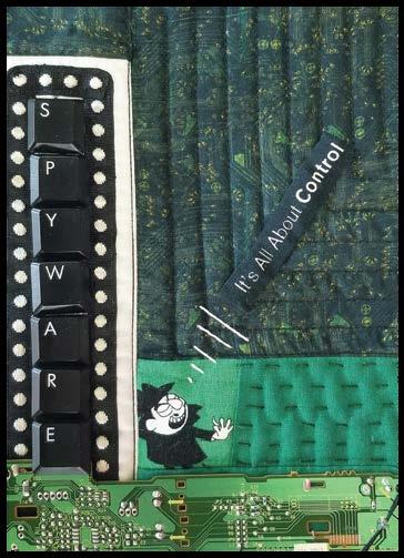
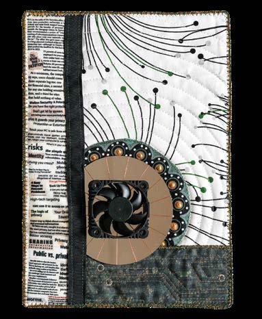
Another way in which Cashatt has developed her own voice is in the thirteen approximately 5 x 7-inch computer quilts she has been making. For her, these small pieces are a fun way to play with the parts she’s rescued from old computers and other found items to tell a story. Many of these computer quilts explore issues that are inherent in technology: identity theft, software security, and spyware. Spyware stands out because it combines not only different computer parts but also shows off Cashatt’s love of hand stitiching, especially her favored running stitch. Spyware also includes Cashatt’s homage to one of her favorite cartoon characters, Boris Badenov, making this one of her more personal computer quilts.

12 • SAQA Journal • 2023 | No. 3
40
Deb's Building
x 30 inches | 102 x 76 cm | 2022
40
35
102
The Center #2
x
inches |
x 89 cm | 2022
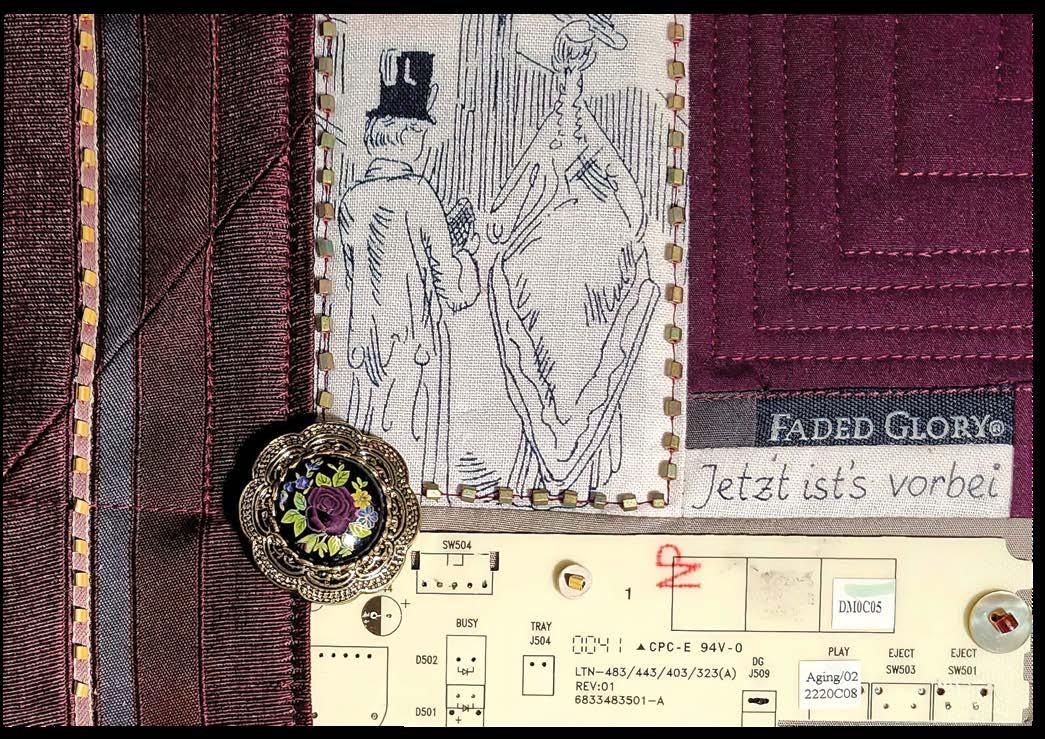
Cashatt’s most recent piece, Faded Glory, also combines a board from a CD player in an old computer with an image of a couple, a brooch, and a brand name clothing tag. All the elements emphasize a grand era now gone. The couple is even looking back, as if viewing their own faded glory. One might be inclined to see this piece as Cashatt’s farewell to the Pixeladies. The “Jetzt ist's vorbei,” (German for “it’s over now”) might point to how she and Sazaki met at their university German Club. They are known to have often included German text to their collaged pieces, so adding German to this piece creates a hidden message.


see “Deb Cashatt” on page 33

SAQA Journal • 2023 | No. 3 • 13
Faded Glory 6 x 8 inches | 15 x 20 cm | 2022
Wall of Polish 40 x 32 inches | 102 x 81 cm | 2023
Spyware 8 x 6 inches | 20 x 15 cm | 2022
JURIED ARTIST SHOWCASE


Juried Artist Showcase is a gallery of work produced by artists who have each been named a Juried Artist of SAQA. A Juried Artist has successfully presented a portfolio to the Juried Artist Review Panel. This portfolio includes a selected body of work and documentation showing a professional approach to art.

14 • SAQA Journal • 2023 | No. 3
34
19 x 13 inches | 86 x 48
33 cm | 2021
Susan Else Family Secrets
x
x
Photo by Marty McGillivray
75
79
16
| 191
201
41
| 2019
Brigitte Kopp Engel der Sehnsucht (Angel of Desire)
x
x
inches
x
x
cm
Noriko Endo
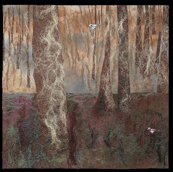
Birds Play in The Woodland 50 x 50 inches | 127 x 127 cm | 2021
Photo by Yuji Nomura


SAQA Journal • 2023 | No. 3 • 15 Sandra
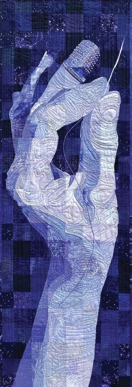
Blue-Violet Hand 45 x 15 inches | 114 x 38 cm | 2022 Teresa
Dreams 40
|
Bruce
McLaughlin
x 40 inches
102 x 102 cm | 2019
Photo by Rachael Dorr
Mita Giacomini
Dance Lessons 39 x 39 inches | 99 x 99 cm | 2021
Saved by a tweak
Small color changes set work in new light
by Kestrel Michaud
The colors we choose for our quilts affect how viewers interpret our designs. I’m not just talking about colors and what they emotionally represent (red conveys energy, passion, and strength, while blue represents trust, tranquility, and competence, for example).
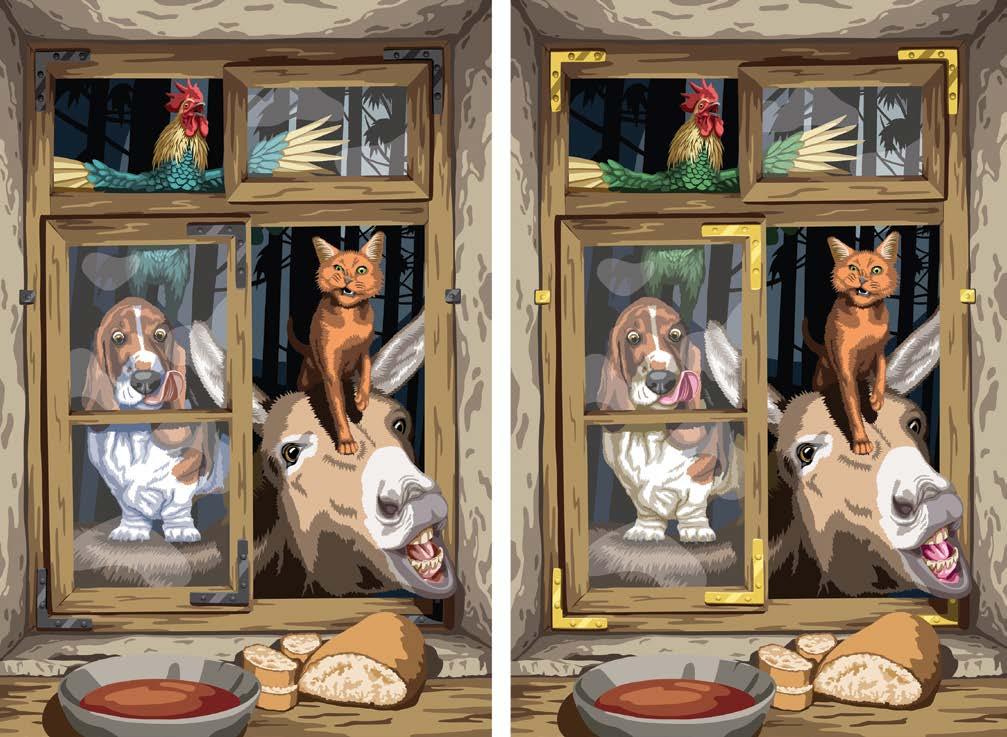
As an artist who works in realism, the colors I choose for various parts of my composition impact whether a living creature looks healthy, whether the foreground feels connected to the background, or what kind of light source is providing illumination. These specific examples are situations I considered when designing a recent quilt project,
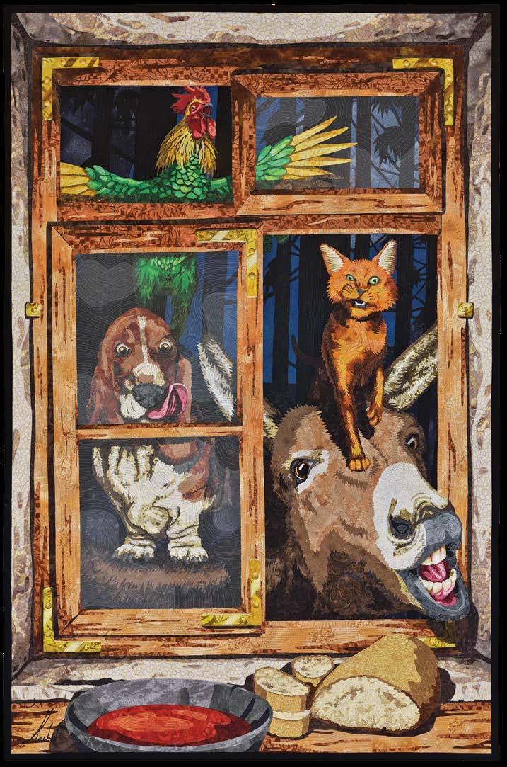
Bremen Town Musicians
Background story
For me, story is everything. Bremen Town Musicians, based on a Brothers Grimm fairy tale, is my interpretation of a scene that takes place toward the end of the tale. The four animals—a dog, a cat, a donkey, and a rooster—stand on each others’ backs, look in a window of a poor farmer’s house, and make a racket to scare away the thieves that have taken up residence inside.
In order to tell this story, I carefully considered the colors I planned to use to make sure they would communicate with my audience the way I wanted them to. These color choices were deceptively simple, yet had a profound impact on the overall success of the design. I did this entirely on my computer before ever looking at a scrap of fabric. One of the great benefits of designing a

16 • SAQA Journal • 2023 | No. 3
Kestrel Michaud
Bremen Town Musicians 47 x 31 inches | 119 x 79 cm | 2022
quilt digitally is the ability to test color choices before working with the fabric. I was able to apply color to the entire design, assess what worked and what didn’t, and then make necessary adjustments to the colors until I found the correct hues.
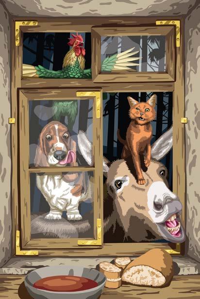
At left is Bremen Town Musicians, the finished quilt. Figure 1 shows its digital template. This template started as a drawing to which I added color and extra detail in Adobe Illustrator. For the purpose of this article, I will edit the colors in the template to show you what might have been had I not made the decisions that ultimately led to the finished quilt.
Decision 1
The animals’ mouths
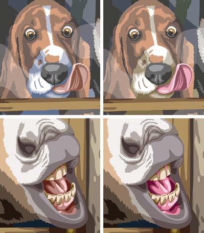
My first color decision had to do with the color of the donkey's mouth and the dog’s tongue. Figure 2 shows the colors I’d originally chosen for the animals’ mouths. They’re dull and flat compared to the colors used in the final version of the design and finished quilt.


In the story, these animals are old. They can no longer perform their duties on the farms and are in danger of being killed by their former owners. So, they’ve run away and met up with each other while traveling. I initially chose dull mauve for the mouths to help show their age. Younger, healthy animals have bright pink gums and tongues.
I changed these elements to a bright pink in the final design because I realized the dull pink didn’t work with the rest of my design decisions. Although the animals are old and worn out in the fairy tale, I’d drawn and colored them (mouths aside) to look like much younger, healthy creatures. Some characteristics of old animals include grey hair, dull feathers, and
possibly missing teeth. The critters in my quilt have richly colored fur, iridescent feathers, and no scrapes or scars indicating a hard life. Therefore, the dull pink mouths were incongruous. I’d either need to completely redesign the animals to make them look older, or I’d have to make their mouths look younger. Changing pinks was the easier option.
But why not go the other way and make my animals look old? It would have been more effort, and I’m not one to shy away from hard work if that hard work would improve the visual story I want to tell. Another factor that weighed on my decision to make young critters is the limitations of working with fabric using my personal style of fused appliqué. Because my work is made from a jigsaw-like combination of thousands of pieces of fabric, and I don’t use any paint or dye or other surface design embellishment, I don’t have a way to create a gradient. This would make it very difficult for me to show splotchy, greying fur. This is an entirely personal limitation, but it’s a challenge nonetheless.
Second, I knew I needed to choose ninety different fabrics for this design. Adding even more fabrics— which would be required to show dull feathers and greying fur—was a daunting prospect. Find extra fabrics, sure. But find fabrics that looked distinctly different from all of the other fabrics I would already be using? That was the part I was worried about.
Those two considerations tipped my decision in favor of going with younger animals.
Decision
2
The rooster's feathers
I debated long and hard about the color of the rooster's feathers. The
SAQA Journal • 2023 | No. 3 • 17
Figure 1
This digital artwork is the final version of the template created to use as a pattern for the quilt.
Figure 2
These images show the first version of colors chosen for the dog’s tongue and donkey’s mouth (left) and the final colors for those areas (right).
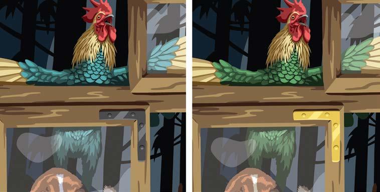
decision was between green feathers and blue feathers. See Figure 3.
My rooster is loosely based on the Old English Game Fowl breed of chicken. This breed is known for light-colored neck feathers and flight feathers on its wings, but dark, iridescent body feathers. The decision of whether those dark feathers should be blue or green came down to how I wanted the rooster to feel connected to the overall scene.

The light source illuminating the window and animals is behind the viewer. It’s a lantern or fireplace within the dwelling, casting light around the room and illuminating the critters just outside the window. The source of light is fire, meaning it’s a very warm light and consequently casts a warm glow on the objects it touches. This influences their color. In contrast, the sky and trees outside the window are backlit by the cool, blue light of the moon.
The blue feathers visually connected the rooster to the cool light of the moon. Adding a little yellow to the blue turned the feathers green, which visually connected him to the other animals and the interior of the building. This was the deciding factor for me. I wanted the rooster to look like he was being illuminated by warm firelight, just like everything else in the foreground, and that meant his feathers had to be green.
Decision 3
The dog's body
I’ve written before (SAQA Journal 2021 Vol. 31, No. 2) about giving white objects blue shadows in order to make them look “pure” white. Because of that rule, my default design practice is to use blue shadows for all white objects, and that was initially true for the basset hound’s fur. See Figure 4.

Although the rule held true and the dog’s white fur did look “pure” white, he didn’t look like he fit into the scene. Something was wrong, so what happened?
Once again, it all came down to the light. The rule of thumb about true white and blue shadows is correct, but only in 5000k, or daylight, lighting conditions. Bremen Town Musicians does not have ideal studio lighting. The dog with blue shadows looked out of place because it appeared he was being lit by a different light source than everything else in the picture. I had to change his blue shadows to dirty blonde so he’d visually fit in with the rest of the foreground imagery.
Decision 4
The window brackets
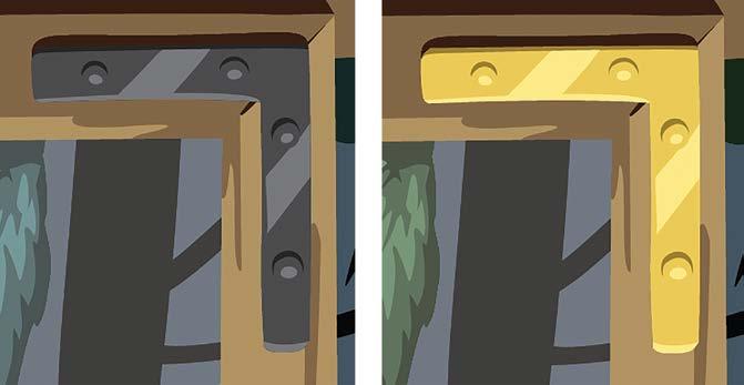
The final color decision I had to make was about the window brackets. I’d initially considered using black, wrought iron brackets. See Figure 5.
18 • SAQA Journal • 2023 | No. 3
Figure 3
The blue feathers (left) were the initial choice for the rooster, but green feathers (right) were used in the final design.
Figure 4
The blue shadows (left) on the dog’s white fur were replaced with beige shadows (right) in the final design.
The wrought iron would have been more accurate to the original story; the farmhouse was owned by poor, blue-collar workers in the early 1800s. It would have had rough surfaces, warped glass, and weathered wood. The poor people would not have been able to afford shiny, brass brackets. However, the black brackets were dull and boring. I tried the brass brackets just to see what would happen, and I was amazed at the difference. The brass brackets add a sparkle to the design that really sells the firelit warmth of the interior. So although not true to the original fairy tale, I took a bit of artistic liberty with this one and kept the brass brackets.
Conclusion
different between the two are: the dog’s tongue, the donkey’s mouth, the rooster’s feathers, the dog’s white fur, and the window brackets.

see “Tweaking Colors” on page 35

SAQA Journal • 2023 | No. 3 • 19
Figure 6 shows a side-by-side comparison of the template with rejected colors (left) next to the finished design (right). The colors that are
Figure 5 Black, wrought iron window brackets (left) were replaced with brass (right) in the final design.
Figure 6
The left artwork shows all of the initial color choices (dull pink mouth and tongue, blue feathers, blue fur shadows, black window brackets). The right artwork shows the colors used in the final design (bright pink mouth and tongue, green feathers, beige fur shadows, and brass window brackets).
The fun starts now! 2023 SAQA Benefit Auction
SEPTEMBER 14 – OCTOBER 8
Creativity is the power behind our annual Benefit Auction.
From that spark, hundreds of 12 x 12-inch art quilts pour in from around the world, all made by SAQA members. So many are available that a bidding plan must be made to fully enjoy this highly anticipated fundraiser.


Preview now! Make a list! Register to bid!
Diamond Day is Thursday, September 14, when all quilts are available for $1,000.
On Monday, September 18, the first of three weekly bidding sessions opens. Each week, prices start at $750 and drop to $100 on Saturday. Will your favorite art quilt make it to Saturday? Only time will tell.

Full details and images of all Benefit Auction quilts are at www.saqa.com/auction

20 • SAQA Journal • 2023 | No. 3
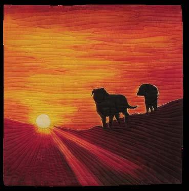
Sonya Prchal, Day's End
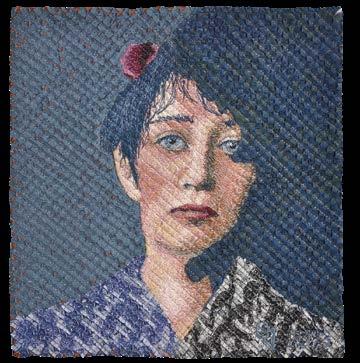
Geneviève Attinger, Melancholia
Dariel Dodge, Diestelkamp - Angel's Trumpet
Chiaki Dosho, The Glistening Light 2023


SAQA Journal • 2023 | No. 3 • 21
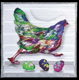
Lana Dragon, Colorful Chick
Wendy Fuselier, Together-ish
Teresita Leal, Resilience
Fuzzy Mall, Fabric Study
Judy Mathieson, Happy!
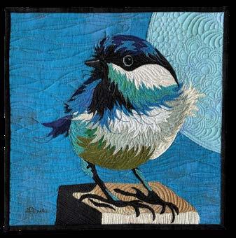
Linda Diak, Blue Crested Chickadee aka Little Bird
Sherri McCauley, Bright Lines
Marie McEachern, Highrise
Susie Monday, Wind Made Visible
Margaret Phillips, Figure Abstraction
Jeannie Moore, HooHoo
Dorothy Raymond, Sentinels 12
Selections from
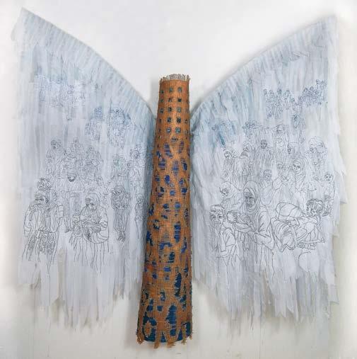
This exhibition represents a continuum where beauty and function blend and diverge in the hands of the contemporary artist. Even when traditional materials such as thread, fabric, wood, reed, and paper are used, these artists combine skill, imagination, and vision to meld their materials into art which resonates in today’s world. Artists were invited to participate in a conversation between media to illustrate the continuum between beauty and functionality. This is a joint exhibition with the National Basketry Organization.
Jurors were Beth C. McLaughlin, artistic director and chief curator at Fuller Craft Museum in Brockton, Massachusetts; Jane Sauer, an internationally recognized curator, lecturer, and art consultant who resides in St. Louis, Missouri; and Lisa Ranallo, registrar and acting curator at the Yellowstone Art Museum in Billings, Montana, where this exhibition premiered.
For more details, including all exhibition artwork, videos, and schedule, visit www.saqa.com/artevolved.

Valerie Maser-Flanagan
Up the Rabbit Hole #4
51.5 x 54 inches | 131 x 137 cm | 2019


22 • SAQA Journal • 2023 | No. 3
Photo by Joe Ofria
Changing Landscape 26
37
66
Ana Buzzalino
The Prairies
x
inches |
x 94 cm | 2017
Irene Roderick Twitter 93 x 77 inches | 236 x 196 cm | 2022
Photo by Petra Reeves
48 x 52 inches | 122 x 132 cm | 2021

Fieldwork/Dreamwork
43.25 x 40 x 2 inches | 110 x 102 x 5 cm | 2020
50 x 50 x 4 inches | 127 x 127 x 10 cm | 2022


SAQA Journal • 2023 | No. 3 • 23
Connie Rohman
Topaz Internment Camp
Photo by Mark Harvey
Jerry Bleem
Photo by Tom Van Eynde
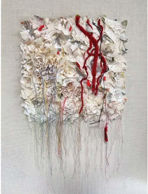
Christine Chester #sumofourexperiences
Photo by Michael Wickes
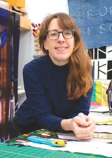
KIM EICHLER-MESSMER
by Cindy Grisdela
When Kim Eichler-Messmer went to college at Iowa State University in Ames, Iowa, she thought she wanted to major in engineering. Fairly quickly, she realized that “the kind of creative problem solving I was interested in was happening in the art department, not engineering.” She switched majors and took all the art classes she could—not just in textiles, but in metal, wood, printmaking, ceramics, painting, and even dance.
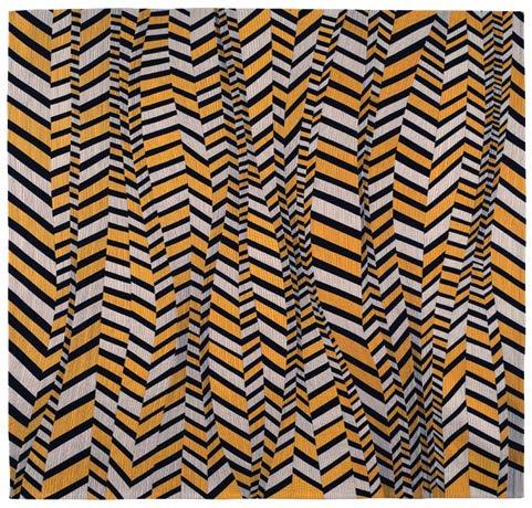
Yet the influence of EichlerMessmer’s interest in engineering is apparent in her artwork. In Doppelganger, inset lines create shapes that are orderly, even as they are skewed rather than straight. And her love of color shows through as well, as she deftly sets up interesting juxtapositions

of light and dark and of dull and saturated.
By day, Eichler-Messmer is a professor at the Kansas City Art Institute (KCAI), where she teaches quilting, surface design, and natural dyeing. On weekends and during the summer, she works on her own studio practice, which is primarily in textiles but includes ceramics and paper collage.

Eichler-Messmer comes from a family of makers. Her mom was a stained-glass artist, and her dad was a woodworker who used traditional quilt patterns as inspiration. Her dad taught her to sew when she was about ten years old, and they made a quilt together from old clothing. “I loved sewing and remember how the fabric felt and the magical transformation from old shirts to cozy new quilt.”

24 • SAQA Journal • 2023 | No. 3 FEATURED ARTIST
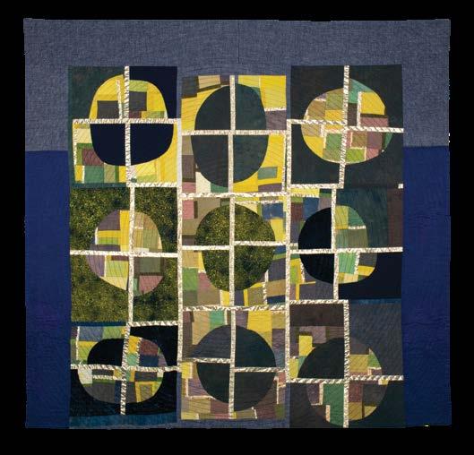
Plot 56
59
| 142
150
| 2019
x
inches
x
cm
62
74
157
Kim Eichler-Messmer in her studio Doppelganger
x
inches |
x 188 cm | 2022
She learned to screen print and dye fabric in college, and was influenced to try quilting by Mary Anne Jordan, a professor of textiles at the University of Kansas where she earned a Master of Fine Arts degree. “I fell in love with the process and never looked back.”
Eichler-Messmer creates her quilts improvisationally out of commercial and hand-dyed fabrics. She includes a range of fabric types in her designs, such as cotton, linen, hemp, and silk, as well as a range of surfacedesign techniques, such as shibori and discharge.
Plot includes cotton, silk, linen, and velvet, dyed with natural dyes. Oddly shaped curved elements in medium and dark tones are bisected in an irregular grid with lines of lighter fabric, giving depth to the composition. The yellow values seem to glow from within.
Prior to 2013, Eichler-Messmer used primarily synthetic dyes in her studio practice. Then her dad passed away unexpectedly, and she began to explore natural dye processes as a way to make healthier choices. “Because I have always been interested in nature, art, and science, using natural dyes was an exciting combination of the three.”
She took classes with teachers whose work she respected and spent several
years growing plants for dyeing, testing the dyes on fabric for color fastness and sensitivity to light, and practicing surface-design techniques with natural dyes. Eichler-Messmer enjoyed the process of working this way and how it made her feel even more connected to textile practices from across human history. But working with natural dyes is time consuming and the color palette is limited. Over time, she realized these limitations were impacting her creativity, so she decided to teach natural dyeing at KCAI and move back to synthetic dyes in her own work. Spending time in nature and observing the world around her are key to the inspirations for her artwork. Gardening, daily walks, and hiking on vacation all provide insights that spark her creativity.
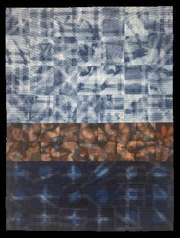
Reverberate is an example of EichlerMessmer’s work using machine-sewn shibori surface design techniques and natural dyes on cotton fabric. In machine-sewn shibori, the artist stitches pleats or other stitched elements into the fabric before dyeing, then removes the stitching to reveal the irregular patterning after the piece is dyed.


Eichler-Messmer’s studio is a 600-square-foot building on the same lot as her house. The space has high
ceilings and plenty of natural light, plus a wet area for dyeing, a padded print table, a longarm quilting machine, and two large design walls. Prior to creating her own studio, she shared studio space. Although she misses the community aspect of the shared space, she loves being able to “leave messes” without worrying about bothering others.
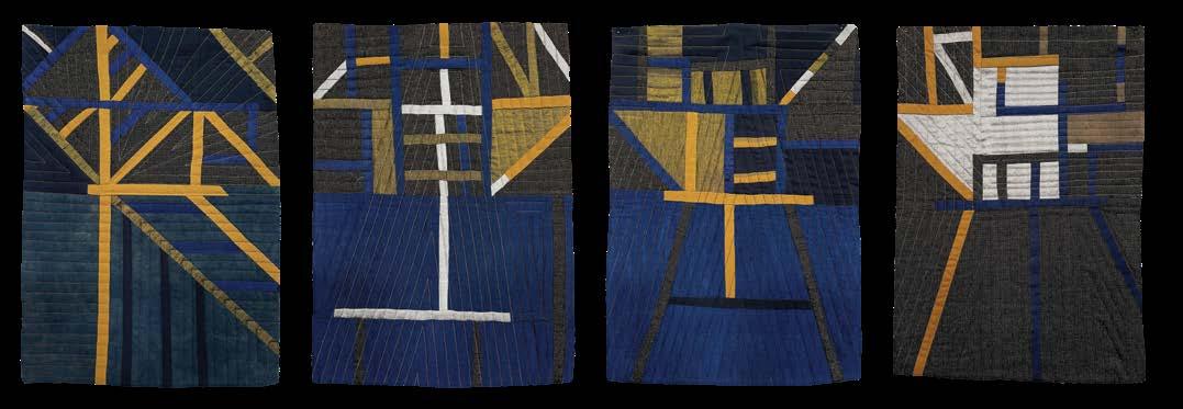
During the school year, EichlerMessmer’s time for her personal art is limited. She tends to work on smaller pieces and explore or practice techniques. Her Time and Space series is a collection of eight 18 x 14-inch compositions that are made of cotton, linen, silk, and wool, improvisationally pieced in a
SAQA Journal • 2023 | No. 3 • 25
Time and Space Series 1-4 Each piece 18 x 14 inches | 46 x 36 cm | 2021
Reverberate 58 x 43 inches | 147 x 109 cm | 2022
relatively limited color palette, and machine quilted.
A new piece almost always starts with building a color palette by dyeing fabrics or pulling fabric from her stash, even if she isn’t sure exactly what form the composition will take. A workshop
in 2022 with Nancy Crow helped her view color in a new way.
Once the palette is chosen and she has a range of appealing colors, EichlerMessmer cuts the fabric up into strips and smaller pieces to create elements to work with on her design wall. She

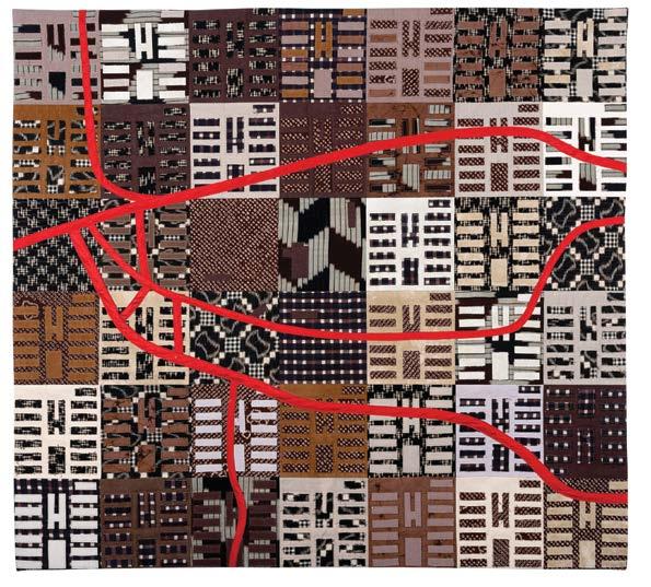
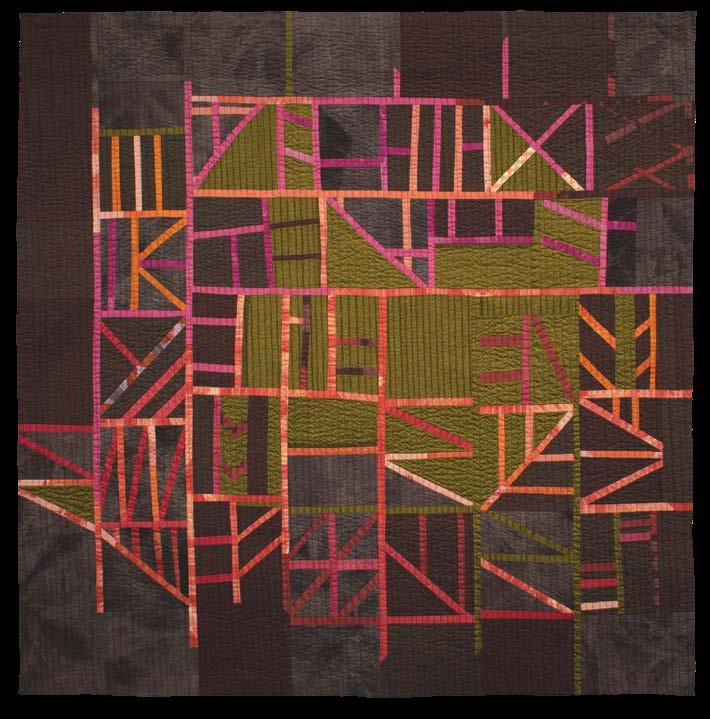
particularly likes a “slice and insert” piecing technique that often results in map-like constructions, such as Paths Inserts of pink, orange, and purple appear to overlay the background of olive green and deep purple like a view of the land from an airplane.

“I make a lot of bits and pieces that I place on my design wall to begin finding the larger composition. I almost always have to start making in order to know where a piece is going.”
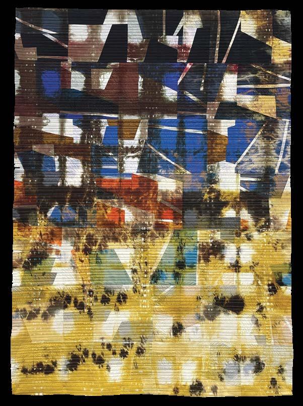
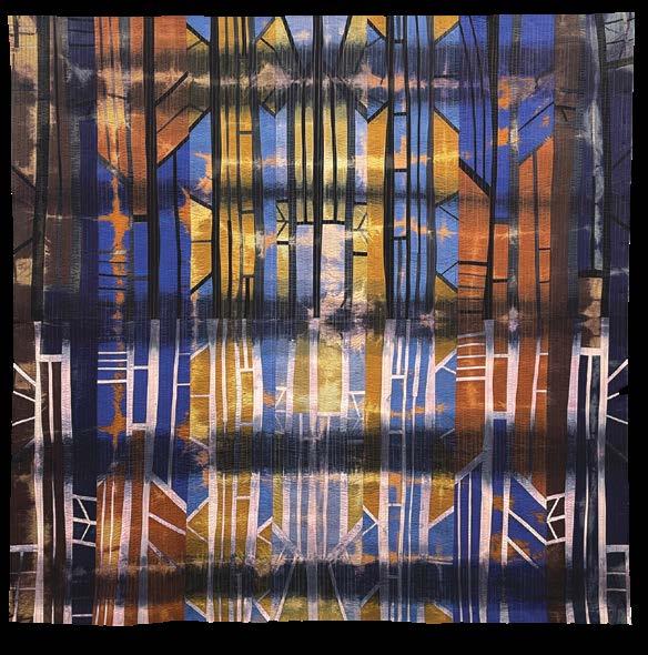
Eichler-Messmer also uses overdyeing and discharging to add a “level of uncertainty” into her work. Since these processes can’t be totally controlled, the end result can be a surprise. Ice Palace and Down Under the Earth were created using these techniques.
Many designs turn into a series. “I feel like I’m always discovering things as I work—either things I’m excited to experiment with more or things that I’m not satisfied with. So, each piece informs the next piece,” she says.
Because Eichler-Messmer works full-time as a professor, she doesn’t worry about actively selling her work or teaching outside of the academic setting, although she does sometimes teach at venues such as Arrowmont School of Arts and Crafts in Gatlinburg, Tennessee, or Penland School of
26 • SAQA Journal • 2023 | No. 3
Time and Space Series 5-8
Each piece 18 x 14 inches | 46 x 36 cm | 2021 Paths 59 x 50 inches | 150 x 127 cm | 2021
Craft in Penland, North Carolina. At times, the constraints of having a fulltime job and less time for her own creativity is frustrating, but she loves teaching and KCAI gives her flexibility in what she teaches. “I am able to fall down rabbit holes and make experimental pieces without the stress of always having to sell work.”
Color and sewing will be part of Eichler-Messmer’s studio practice “no matter what.” But she also enjoys learning new materials and processes. During the Covid-19 pandemic, she took some ceramics classes and now has dedicated a corner in her studio to create pieces using the slab-building technique; she decorates the work with resists and underglazes. Because ceramics is new to her and mostly for fun, the work is much looser than her art quilts. But she is starting to see its influence in her textile pieces. And she is developing a new class for her KCAI students that will explore hand-sewing practices from around the world, such as sashiko, mola, bojagi, and appliqué.
For more information about EichlerMessmer and her work, visit her website at www.kimemquilts.com. ■

Cindy Grisdela is a SAQA Juried Artist who resides in Reston, Virginia. You can view her work at www.cindygrisdela.com.

SAQA Journal • 2023 | No. 3 • 27
Ice Palace
74 x 73 inches | 188 x 185 cm | 2022
Down Under the Earth 63 x 45 inches | 160 x 114 cm | 2022
Apply yourself to book solo exhibitions
by Susan Lenz
At SAQA’s Pathways to Possibilities conference in Toronto this past April, I asked a number of attendees how they secured their exhibition opportunities. To my surprise, almost everyone summed it up in one word: apply.
Applying for a solo exhibition does work. But the act of applying is the result of many steps, including knowing what kind of solo exhibition you want.
There are all sorts of solo exhibitions. Some are in brick-and-mortar galleries. Others are online, in museum settings, in alternative retail or nonprofit spaces, in rental venues, and even in private homes. A solo exhibition can function to entice sales or round out a resumé. It can be a way to experiment with a new body of work, showcase a large installation, or provide an educational component for a hosting organization.
DIY exhibition
If you host your own solo exhibition, you don’t even have to apply. You nonetheless gain benefits, including the fact that you have 100 percent control. You will need a business license, a way to accept payments, an empty storefront or rental space, friends to bring finger food for the opening, wall labels, and a press release stating dates and hours.
Even if it is just for a weekend, such an exhibition can be an excellent first for an emerging artist.

Document the event in pictures and share them on social media. Put it on your website and resumé. It functions as proof of your professionalism and readiness for future opportunities. (Remember to upload your information to the SAQA event calendar!)
A helping hand
Networking with other professionals can also result in a solo exhibition. Recently, I had four pieces in the invitational exhibition Entwined at the Marietta Cobb Museum of Art in Marietta, Georgia. I asked curator Madeline Beck how she selected work for this recent exhibition that featured textile and fiberbased artwork. "While curating an exhibition, it all begins with an idea—focused on a concept, material, movement, or otherwise. I develop an idea based on patterns and themes I notice developing amongst the artists I am most interested in at the moment. Once I start reaching out to a core group of possible participants, the idea takes on a life of its own. Artists start suggesting others they feel would be a good fit, I stumble across Instagrams and websites that organically speak to the project, and just keep my eyes constantly open for ways to boost the diversity and dynamism of my exhibitions."
When picking up my four pieces after Entwined closed, I asked Beck how solo exhibitions are selected. Instantly, she said that opportunities are
28 • SAQA Journal • 2023 | No. 3
Once and Again: Alterations by Susan Lenz
As installed at Piedmont Arts in Martinsville, Virginia
often extended because the working relationship with an artist in a group exhibition went well and the work was engaging. You can bet I’ll be sending my current solo exhibition proposal.
At the heart
Proposals really are at the core of any application, whether for already existing art or ideas for a new series. My proposals have always been for a previously created, cohesive body of work. Each proposal includes a 100-200 word statement addressing who I am, where I come from, and a brief conceptual description of the exhibition written in a straightforward, succinct manner. Next, there’s an inventory list for five to ten quality images. Most applications require a biography, resumé, contact information, and links to your website and social media accounts. Generally, I provide two professional references.
Before applying, I have spent hours researching opportunities. There is no sense in applying to a gallery specializing in antiquarian prints or photography. It takes time and a sustained effort to locate calls for exhibitions. CaFÉ (www.callforentry.org) is a good place to start. Signing up for newsletters from galleries, museums, and arts organizations that host solo exhibitions is another avenue to receive call information. I keep a list of potential calls, organized by deadline.
Once I decide to apply, I carefully read the instructions. Often images must be formatted in a certain way and statements must fit a word count. There’s no sense in applying incorrectly, especially when a call might receive hundreds of submissions. Applications that don’t follow the rules are generally considered unprofessional and are the ones that can be eliminated in the first round of consideration no matter the quality of the work.
Personal touch
Christine Hager-Braun found that personal involvement with a venue can aid in getting an exhibition. “I volunteered in various capacities such as board member, vice president, and president for a regional art quilt organization. I negotiated the terms of exhibition contracts or shipped entire exhibitions before I needed to apply this knowledge for my own exhibitions. I established relationships with gallery managers and staff. Although I still needed to
formally apply to the calls for entry, my name along with my professional attitude, my timely communication, and my willingness to work as partners toward a mutual goal, quickly put me on the short list for solo exhibitions.”
Hager-Braun also does her homework. “I research the style of the artwork in past exhibitions (most importantly if they have had exhibitions of fiber art before or art that is thematically aligned with my work), the size of the gallery, how far in the future exhibitions are scheduled, and any costs associated with an exhibition. If I can’t find the information online, I email the gallery specific questions, which is another way of forming a personalized connection.”
We both use the resources SAQA provides, following the announcements for other members’ exhibitions and the venues that are open to fiber art. We keep our websites updated. We also know that there is no standard to the application process.
In 2018 I applied for a solo exhibition at City Gallery at Waterfront Park in Charleston, South Carolina. This city-owned, nonprofit gallery schedules approximately three years in advance. I was not selected. Yet when the pandemic hit, exhibitions were thrown into disarray and future plans were not addressed. A vacancy opened in fourth quarter 2022, and I was contacted. Anonymous Ancestors was on view from October 28, 2022, through January 29, 2023.
In 2019, I spent more than twenty hours over four days using the American Alliance of Museum’s website (www.aam-us.org) to research potential locations for a small series, The Feminist To Do List . State by state, I opened the websites for member museums. I searched each one for any exhibition calls for entries. If there was a process, I followed it. If there wasn’t a process, I looked for the staff directory and hoped for a curator’s email. If there was one, I copied and pasted this short email:
Greetings from South Carolina!
My name is Susan Lenz. I'm a fiber and installation artist blending found, vintage textiles with contemporary feminist hand-stitched phrases. 2020 marks the centennial of the 19th amendment's passage. This and any time thereafter are excellent times to celebrate the struggle for gender equality see “Solo Exhibitions” on page 32
SAQA Journal • 2023 | No. 3 • 29
Journey
Taormina Selfie
16 x 16 inches | 41 x 41 cm | 2022
Don’t you dare climb that tree 19.5 x 18 inches | 50 x 46 cm | 2022


Siberian Winter
40 x 40 inches | 102 x 102 cm | 2022
Marina 26 x 28 inches | 66 x 71 cm | 2020


30 • SAQA Journal • 2023 | No. 3
MEMBER GALLERY
Lena Meszaros
Maryte Collard
Iina Alho
Dana Owczarek


SAQA Journal • 2023 | No. 3 • 31
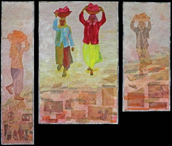
Karin Tauber The Brick Carrier (Triptych) 35 x 41.5 inches | 89 x 105 cm | 2021
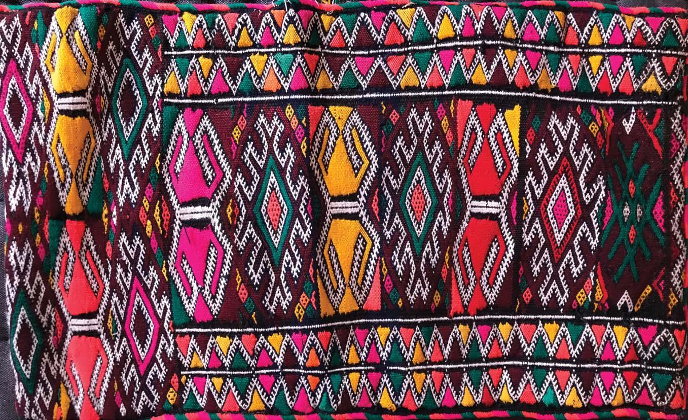
Christie King Eckardt Gateway to the Rub’ Al Khali 26 x 9 inches | 66 x 23 cm | 2022
Judith Ahlborn Santorini Rooftops 8 x 10 inches | 20 x 25 cm | 2019
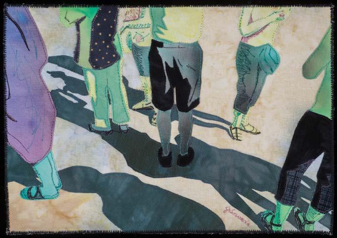
Joan Sowada Walking Tour 7 x 11 inches | 18 x 28 cm | 2017
Solo Exhibitions

from page 29
in art and through educational programming. My work, The Feminist To Do List, is a series of forty-two 10-inch diameter wooden embroidery hoops with altered quilt blocks. It is available for presentation during the centennial year and beyond. The work is flexible in size. Attached is a pdf including images, a brief CV, and professional references. Thank you in advance for any consideration.

Some of the websites had no administrative emails. Some did not take unsolicited proposals; in those cases, I went on to the next museum. As a result, I secured three opportunities. I also kept a folder of any response I received. Within a year, I contacted those respondents with this message:
We have corresponded before with regards to my artwork, The Feminist To Do List. Please consider this message an update. Attached is a pdf for Once and Again: Alterations by Susan Lenz, a solo exhibition proposal. In addition to descriptive paragraphs, this proposal includes a resumé, professional references, and pictures. High resolution images can easily be sent. Please consider this submission for any upcoming opportunity, whether a single piece for a curated group exhibition or for general feedback.
I secured two solo exhibitions from this effort.
I am still on the lookout in my own hometown and have submitted through calls for entry. I am also open to alternative spaces. I am writing new proposals and doing the research needed to simply APPLY! ■
Susan Lenz is a SAQA Juried Artist who resides in Columbia, South Carolina. You can see her work at www.susanlenz.com.


Deb Cashatt
from page 13
When asked what Cashatt will take away from her years as a Pixelady, she said it is the “hyperorganization” of the studio, from accounting and inventory tracking to draft layouts of artwork. As proof of this, Cashatt’s website (www. debcashatt.com) and Instagram page are already up and running.
And what will Cashatt miss now that she’s on her own? The collaboration. Being able to count on the other person to complete the task you find odious was comforting. Cashatt hated embroidering French knots and writing. But she’s charting her own course now. Writing will not be a hindrance, for Cashatt has developed her own type of writing: symbographic quilts. ■
CALL FOR ENTRY: JUNE 1-30, 2023
CALL FOR ENTRY: JULY 1-31, 2023
Kris Sazaki is a freelance writer and one half of the Pixeladies. View the Pixeladies’ work at www.pixeladies.com.
CALL FOR ENTRY: OCTOBER 1-31, 2023
CALL FOR ENTRY: JANUARY 1-31, 2024
CALL FOR ENTRY: NOVEMBER 1-30, 2023
JOINING THREADS
CALL FOR ENTRY: FEBRUARY 1-28, 2024


CALL FOR ENTRY: OCTOBER 1-31, 2023
For complete details on all exhibitions, visit www.saqa.com/calls
SAQA Journal • 2023 | No. 3 • 33
BE INSPIRED GET CREATIVE EXPLORE TECHNIQUES + MATERIALS Join the National Basketry Organization! nationalbasketry.org
TRESSA SULARZ
V IRT U AL G A LLER IES GLOBAL EXHIBITIONS
CALLS FOR ENTRY
In Memoriam
Recently, three beloved SAQA members passed away: Christine Chester, Ruby Horansky, and Suzy Bates. All three were known for imaginative work and will be greatly missed.
Christine Chester
Christine Chester of Eastbourne, East Sussex, England, died on June 20, 2023. An innovative artist, much of her work focused on the theme of absence, either through dementia or of women in history and craft.
She gained a Distinction for her Master’s Degree in Art & Design at the University of Brighton. She also was a founding member of unFOLD, a textile art group known for pushing the boundaries of textile art. Christine’s website states that she was doing what she always wanted: working as an artist and a teacher.
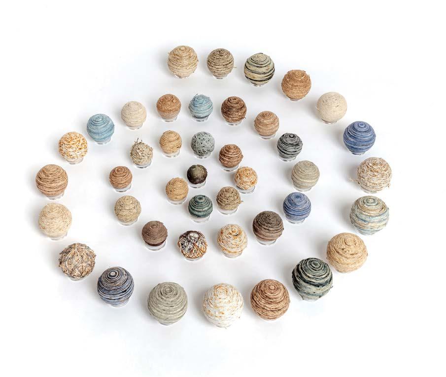
The last piece she was able to complete was #sumofourexperiences, which is currently traveling with the SAQA Global Exhibition Art Evolved: Intertwined, a joint endeavor with the National Basketry Organization.

Ruby Horansky
Ruby Horansky of Warminster, Pennsylvania, passed away on July 12, 2023, after a brief illness. An insightful artist, she was noted for her love of plaid fabrics. Her art was exhibited in SAQA regional and national shows as well as elsewhere. Her art quilt Blaze is currently traveling with the SAQA Global Exhibition Light the World. She was wise and kind, and deeply committed to her art.
Suzy Bates
Suzy Bates of Beaverton, Oregon, died on July 31, 2023, from cancer. Despite the fact that Suzy had this disease for a few years, she remained courageous. She is remembered by SAQA Oregon members as creative, fun, and funny. Her art quilts invited contemplation as they provided colorful insight into her imagination.
All three of these SAQA members will be remembered for their bright outlook on life and their dynamic artwork.

34 • SAQA Journal • 2023 | No. 3
Tweaking Colors
from page 19
The design on the left feels like a room being lit with flat studio lighting, whereas the design on the right sparkles with warmth. This dramatic difference came down to a few color changes in key areas, and making sure all colors worked together to tell the same story. These deceptively subtle color decisions had a profound impact on the overall feeling and success of the art quilt.
Use this knowledge to your advantage. Pay attention to all the color choices in your designs. You may find that subtle changes in color help to more accurately tell the story in your art. ■

Kestrel Michaud is a SAQA member who resides in West Melbourne, Florida. You can view her work at www.kestrelmichaud.com.
An online gathering 2024 Annual Conference
APRIL 12-20, 2024
SAQA’s 2024 Annual Conference showcases our Europe and Middle East region. Travel to this event online via your computer to explore the many talents and cultural insights of this varied region.
SAQA Journal • 2023 | No. 3 • 35
Watch www.saqa.com/conference for upcoming details and registration info.
Chaos to Creativity


from page 7
• Color-coded and labeled binders on a shelf.
• Wire basket system or clear bins to store fabric by a single-color group versus value within a color.


• Mounted thread racks on the wall near a worktable
• Labels on the outside of containers if your storage is limited to a closet or drawer units.


• A single organizer for each work area filled with only the tools that directly relate to that task.
If you’re visually quiet, consider using:


• A streamlined and neutral color scheme for walls, furniture, and storage. Be selective about color and artwork and its placement in the space to avoid becoming distracted.
• Storage systems (Elfa, Ikea, Craftsman, Viper, US General, Winsome Halifax, etc.) that keep items arranged while being out of sight.
• Labeled files in vertically mounted holders that follow the neutral color scheme or a filing cabinet.
• Drawer units or stacking snap lid containers for thread.
• A favorite item to hold the essentials by a worktable.
In Part 3 of this series, I will share more storage ideas and the importance of utilizing unused and often wasted space. ■
Lilo Bowman is the Vice President of SAQA, the author of the book Love Your Creative Space, a lecturer, and the editor-in-chief of TheQuiltShow.com. She regularly lectures and consults on organizing for creative makers at all levels of achievement.
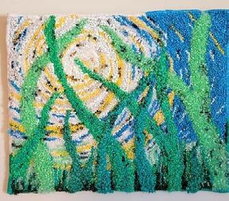
36 • SAQA Journal • 2023 | No. 3 vaquiltmuseum.org 301 S. Main St. Harrisonburg, VA 22801 (540) 433-3818 Stories are Made Loop by Loop On Display: July 12 - October 7 Curated by Susan L Feller, West Virginia Artists in this exhibition use rug hooking to document and explore social, emotional and personal topics.
BY:
News! The next Sacred Threads will be held in Indianapolis in 2025. Check the website for all the details. Traveling Exhibit Our 2022 exhibit is traveling through the summer of 2024. Check the website to find a location near you! www.sacredthreadsquilts.com
SPONSORED
Exciting
joy inspiration
Breaking Dawn by Linda Henke
spirituality healing GRIEF PEACE


SAQA Journal • 2023 | No. 3 • 37 SAQA 8 Comments Seen by 13 Like Comment Connect today! Join https://www.facebook.com/groups/mySAQA Join SAQA - Members Only on Facebook • Daily contact with SAQA members around the world • Inspiration • Special invitations • Works in progress • Camaraderie Be part of SAQA - Members Only to enjoy NATIONAL BRAND PARTNERS Reliability by Design LEARN MORE AT AMERICANQUILTER.COM GRAND RAPIDS, MI SEPTEMBER 13–16, 2023 DES MOINES, IA SEPTEMBER 27–30, 2023 20 24 PLAN YOU NEXT QUILT ADVENTURE FOR 2023 ⊲ SHOW DATES ANNOUNCED ▼ DAYTONA BEACH, FL FEBRUARY 21–24 BRANSON, MO MARCH 13–16 PADUCAH, KY APRIL 24–27 GRAND RAPIDS, MI AUGUST 21–24 LANCASTER,PA SEPTEMBER 11–14
Explore creativity with SAQA’s Trunk Show!
The SAQA Trunk Show program is all about inspiration. Nearly 400 pieces of artwork showcase the talent of our members and help promote the art quilt to audiences at museums, art centers, galleries, and quilt guilds.


Ten curated trunks allow you to share the diversity of the art quilt with your favorite viewers. It’s easy and cost-efficient to reserve a trunk.
Details: saqa.com/trunkshow
38 • SAQA Journal • 2023 | No. 3
Anne Bellas, Le Rêve Bleu/Blue Dream
Judith S. Ahlborn, More Beautiful Than Before
Lisa Ellis, Dandelions
Deb Cashatt, Backup
Libby Williamson, June and Willow
Shoshi Rimer, Flourishing
Michele Hardy, Geoforms: Fractures #13
Contrast
by Diane Howell
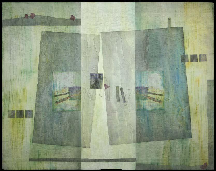
An interplay of light and dark dances across Shade and Shadow made by Peggy Brown. Its limited and subtle color scheme creates a definite shift from pastel to dark without losing its delicate nature. It isn’t long before a viewer looking at this piece can imagine a cooling breeze on a hot summer day at the beach.
Two factors were the inspiration for the piece: colors in one of Brown’s watercolor paintings and companion pieces in her Alike but Not the Same series, to which this piece belongs. The series, Brown notes, “divides the image into two or more sections that are alike in color and shape, but not the same in form and value.” It is a celebration of contrast.
For Shade and Shadow , Brown explains: “I painted and mounted two
main sections over a three-part substrate that is positive and negative; together they add depth. Two digital transfers of my inspiration piece, one in reverse, are my center of interest; small geometric collage pieces add movement to the piece.”
The digital transfers of her watercolor collage painting are what influenced the palette. “The entire quilt is completed with subtle colors selected to complement the transfers.” The asymmetrical nature of the piece provides a frame while allowing the eye to explore every inch of an everchanging complementary palette.

The materials used in Shade and Shadow add to the piece’s ethereal nature: hand-painted silk and archival tissue that is hand-painted with transparent watercolor paint and digital imagery on treated silk. These give it a
lightness of being, a feeling of being free to move with the wind currents. Wonder Under fusible web, cotton flannel batting, and a Kona black cotton fabric backing give it structure.
Shade and Shadow was an award winner in Quilt Visions 2018 at Visions Museum of Textile Art in San Diego, California. Along with two other quilts by Brown— Passageway I and Water it is now in the permanent collection of the International Quilt Museum in Lincoln, Nebraska. “I cannot think of a more wonderful place to own and show my work,” Brown says.
Brown lives and creates in Nashville, Indiana. You can view more of her work at www.peggybrownart.com ■
SAQA Journal • 2023 | No. 3 • 39
Diane Howell is the SAQA Journal editor. She resides in the Phoenix Metro.
INSPIRED BY
Shade and Shadow 44 x 56 inches | 112 x 142 cm | 2016


 by Mel Beach
 by Lilo Bowman
