


I am an interior designer with a passion for creating environments that feel intentional, expressive, and deeply human. My work is shaped by my travels, love of art, and commitment to thoughtful, research-driven design.
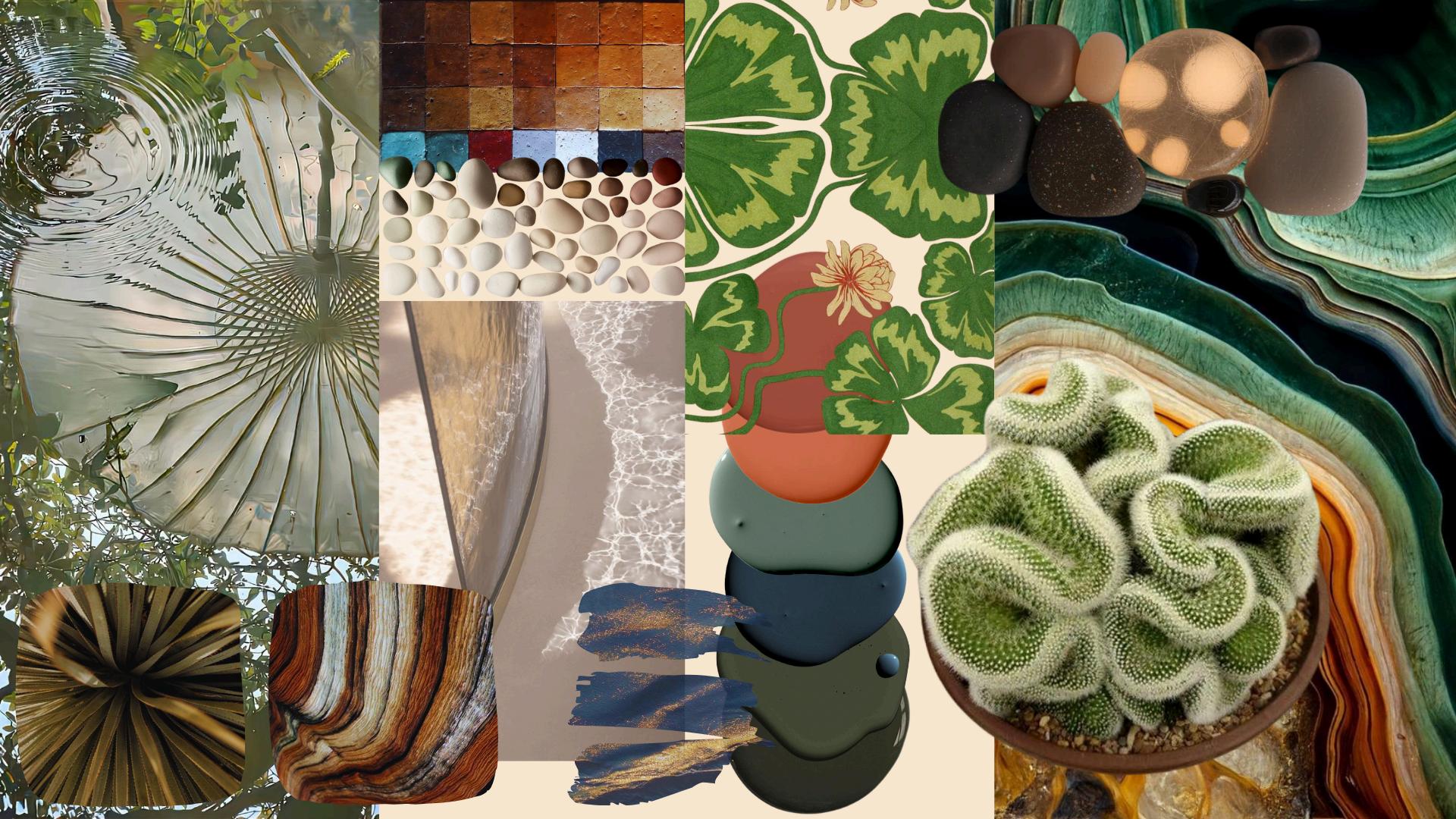
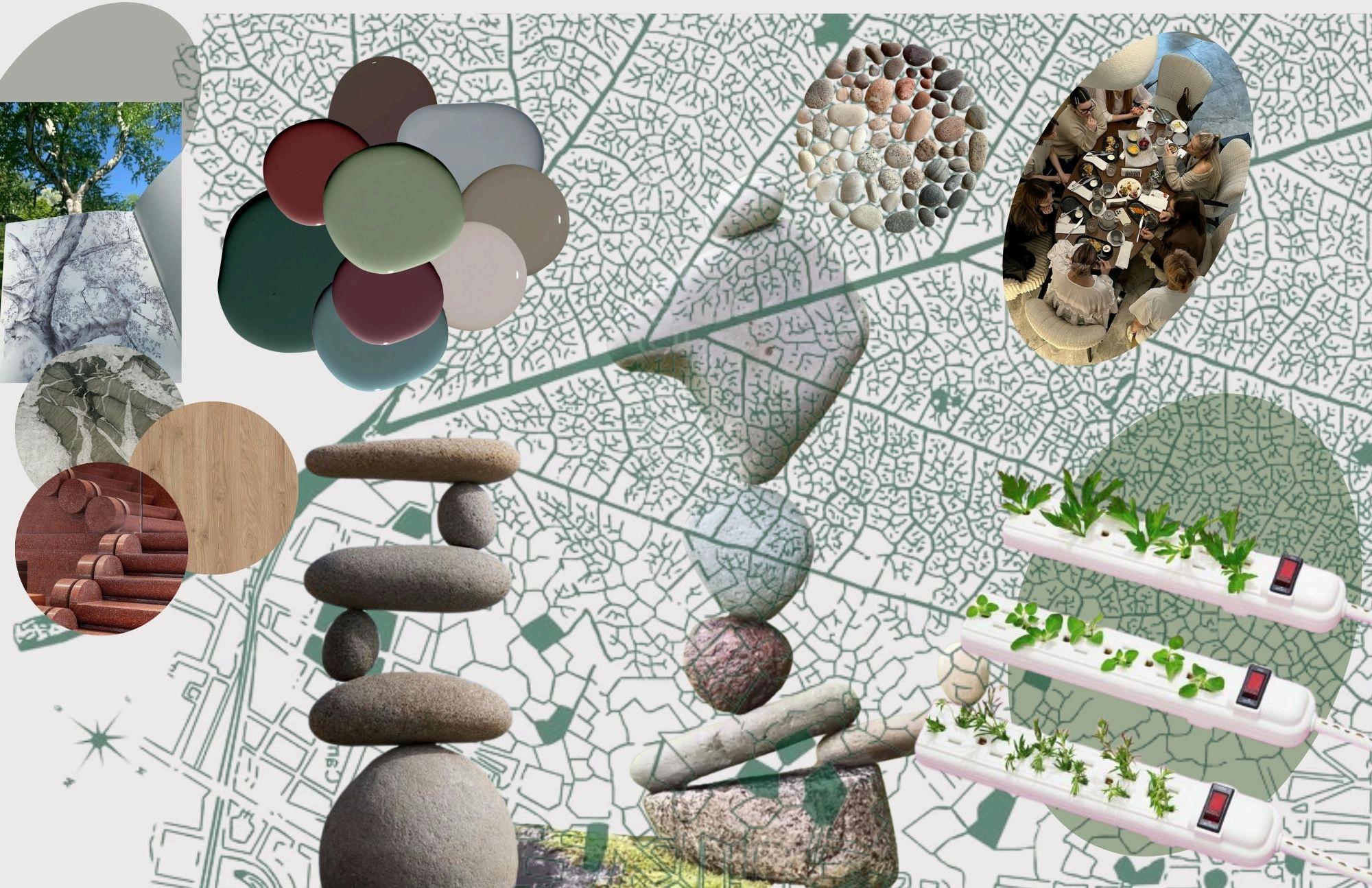
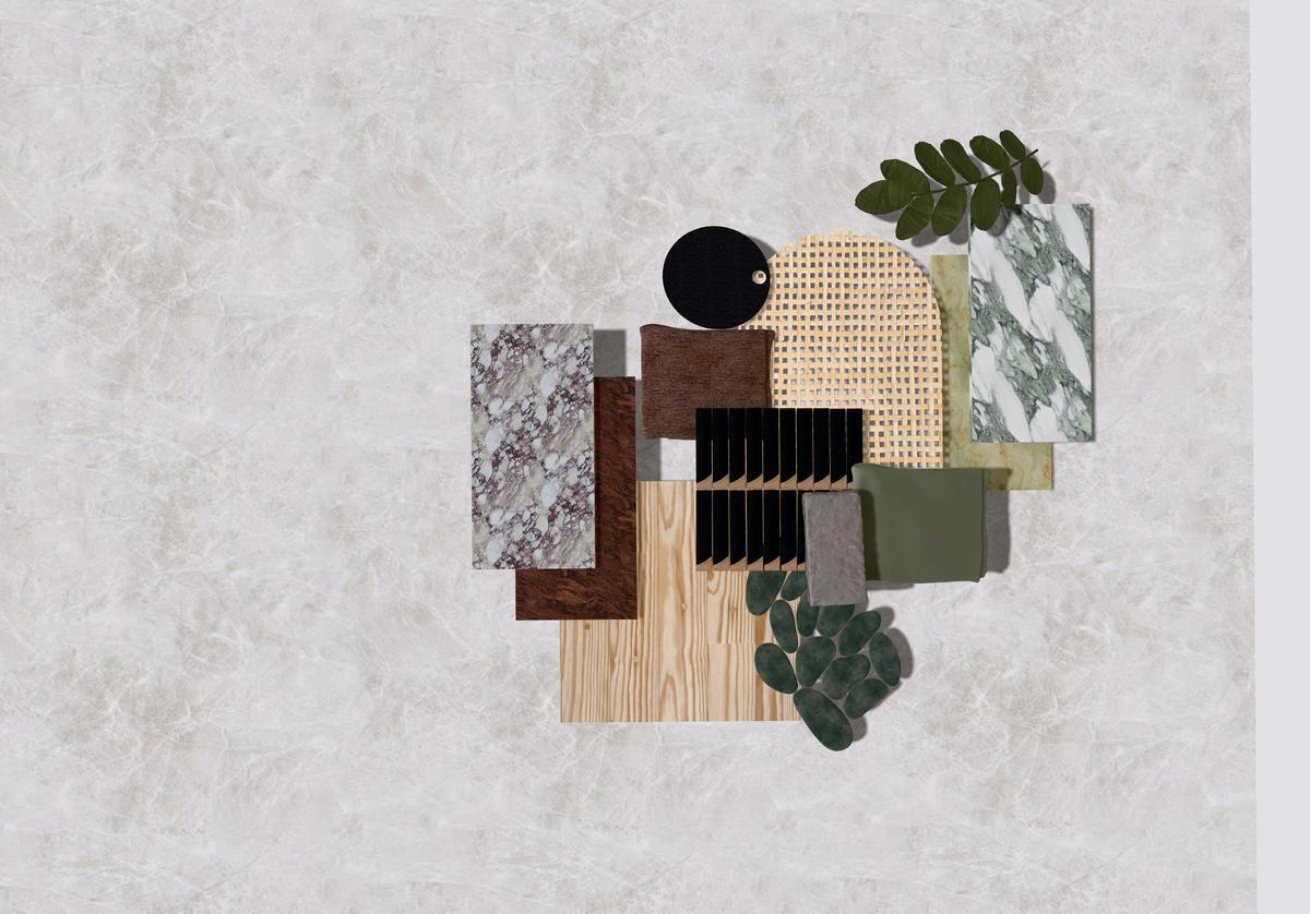
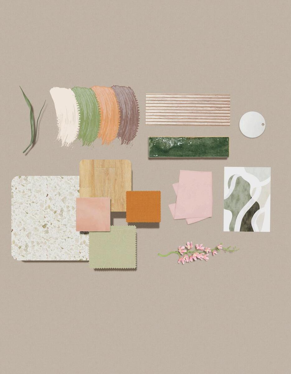
Each project begins with a cover page featuring its moodboard as the background. For me, a moodboard isn't decoration - it's the thesis statement everything else has to answer to.


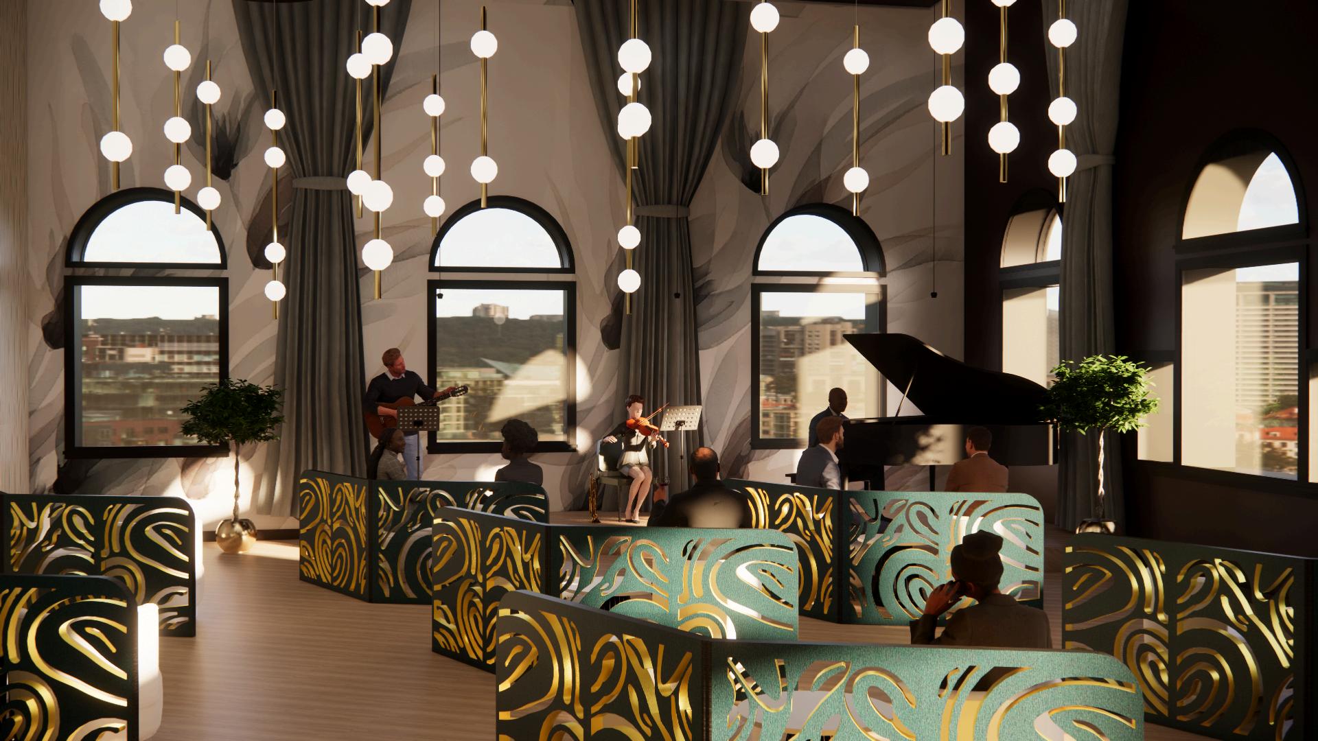
JAZZ IN THE GARDEN JAZZ IN THE GARDEN
AMAN LUXURY HOSPITALITY DESIGN
AMAN LUXURY HOSPITALITY DESIGN
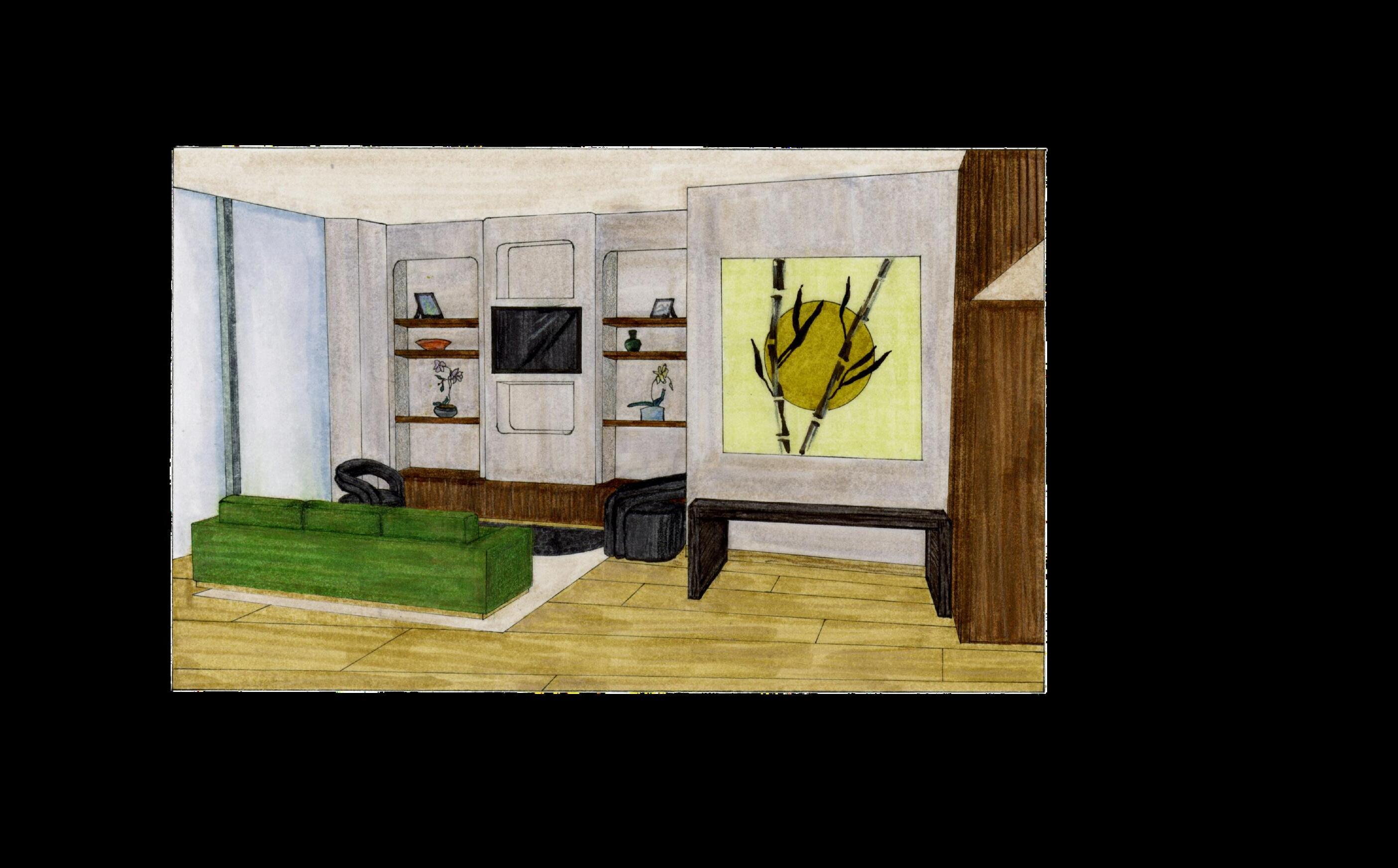
PRINTS OF HARMONY
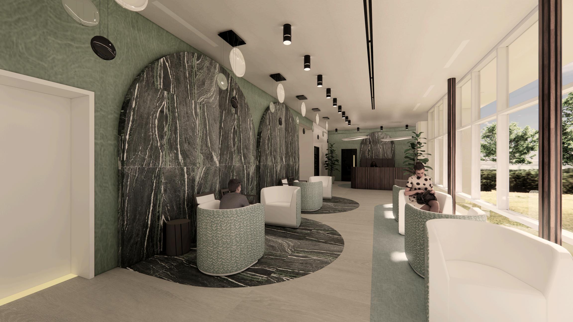
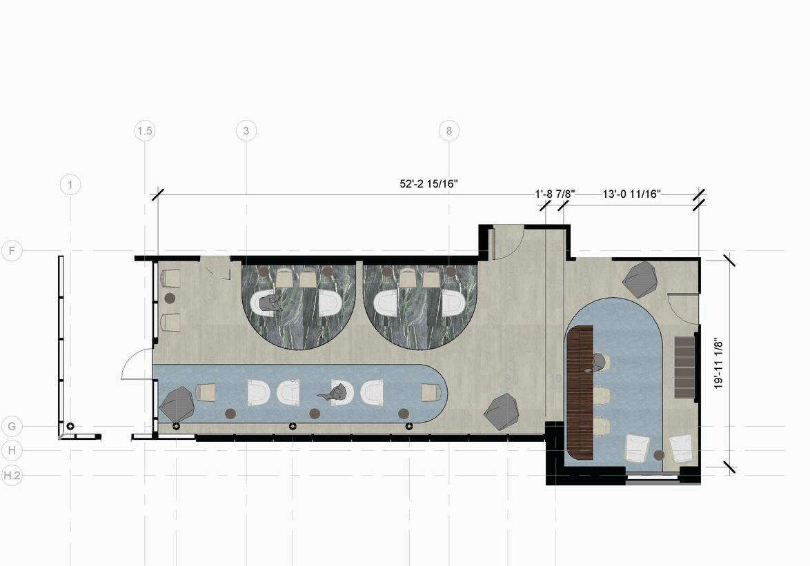
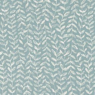
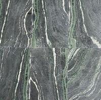
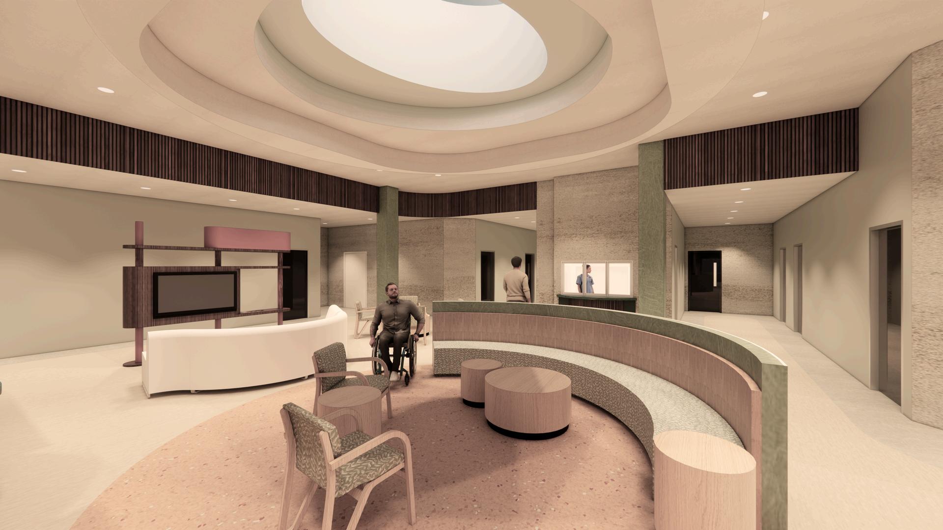
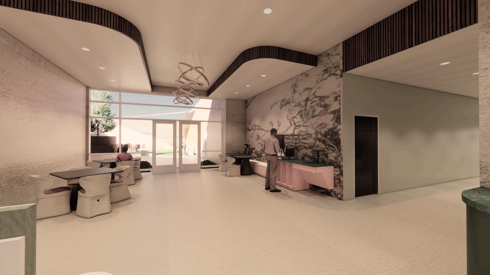
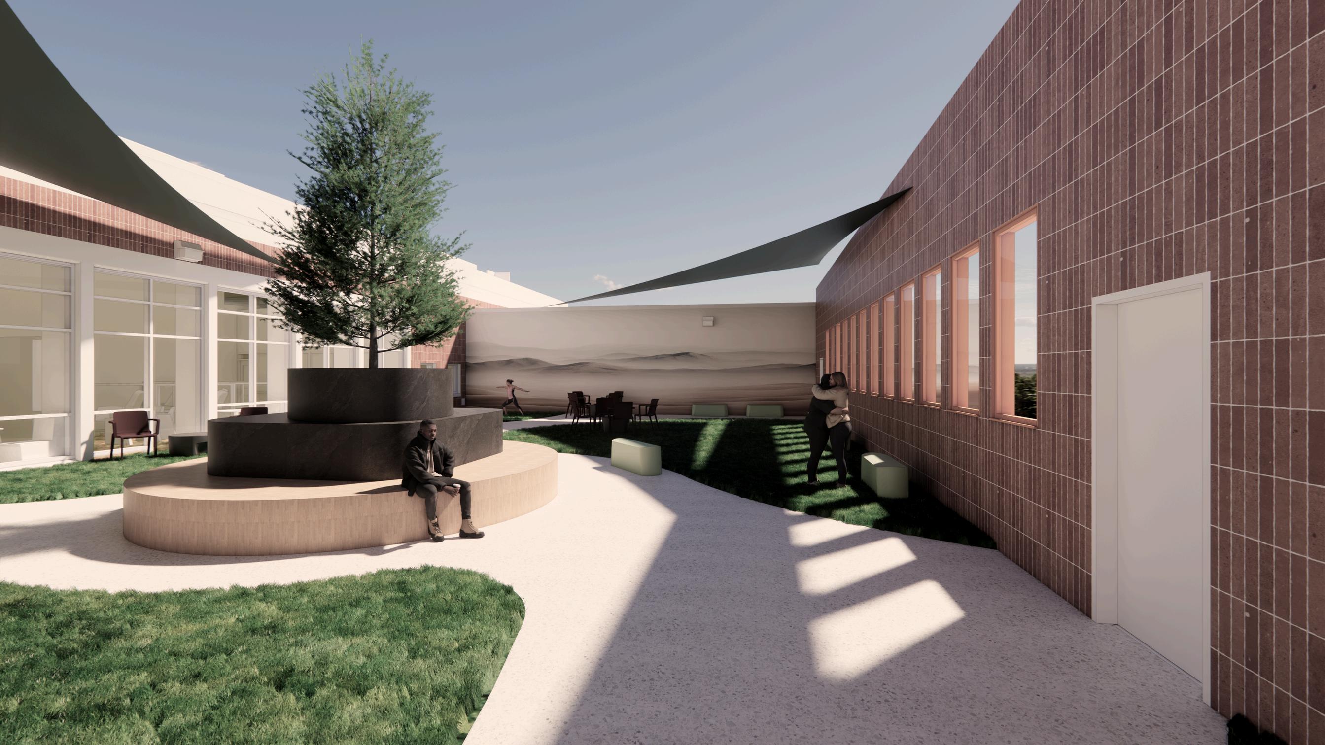
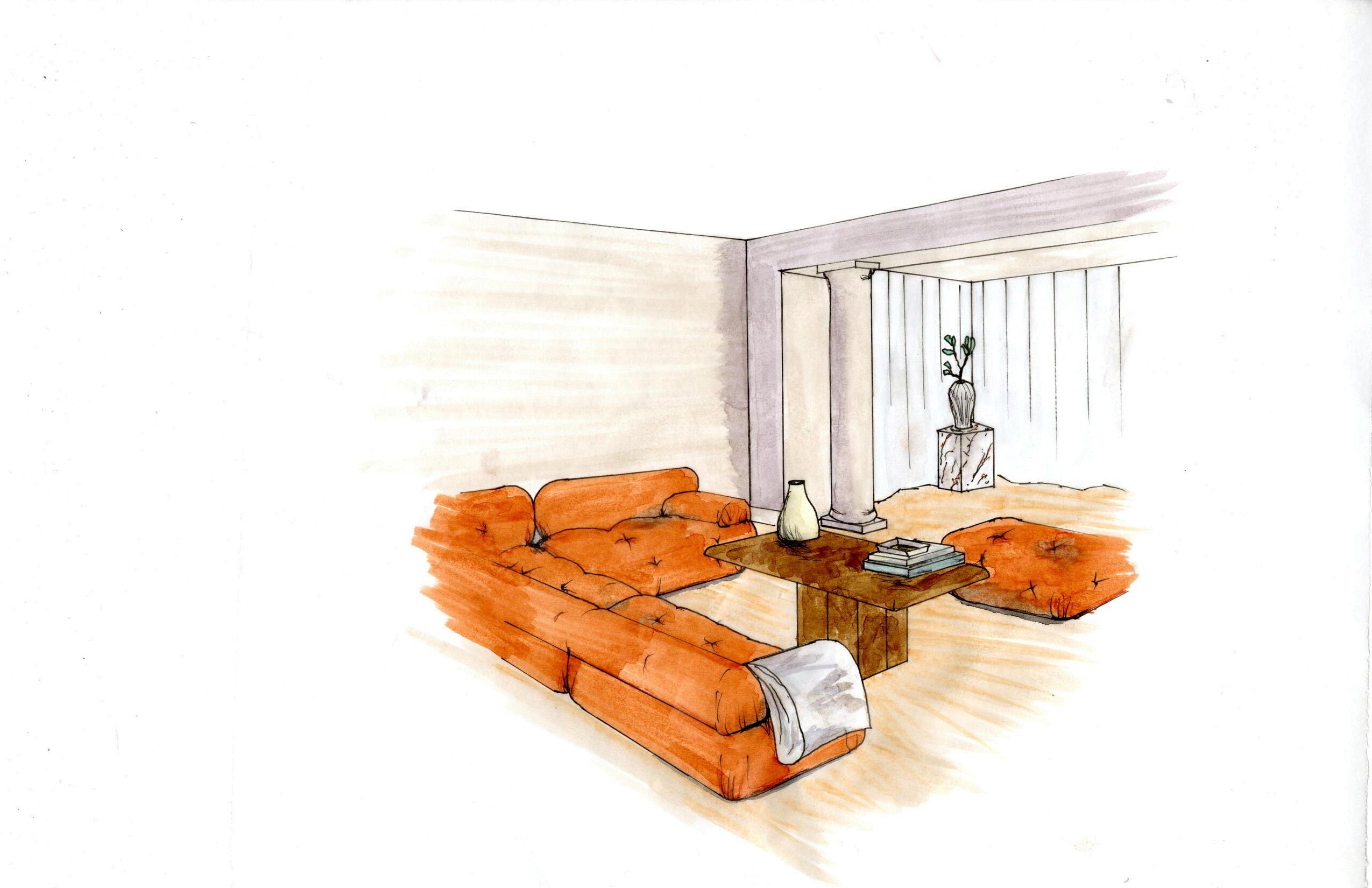
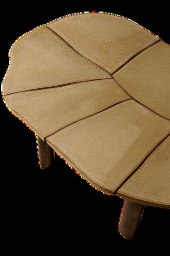
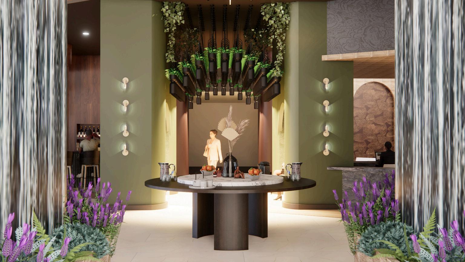
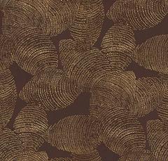
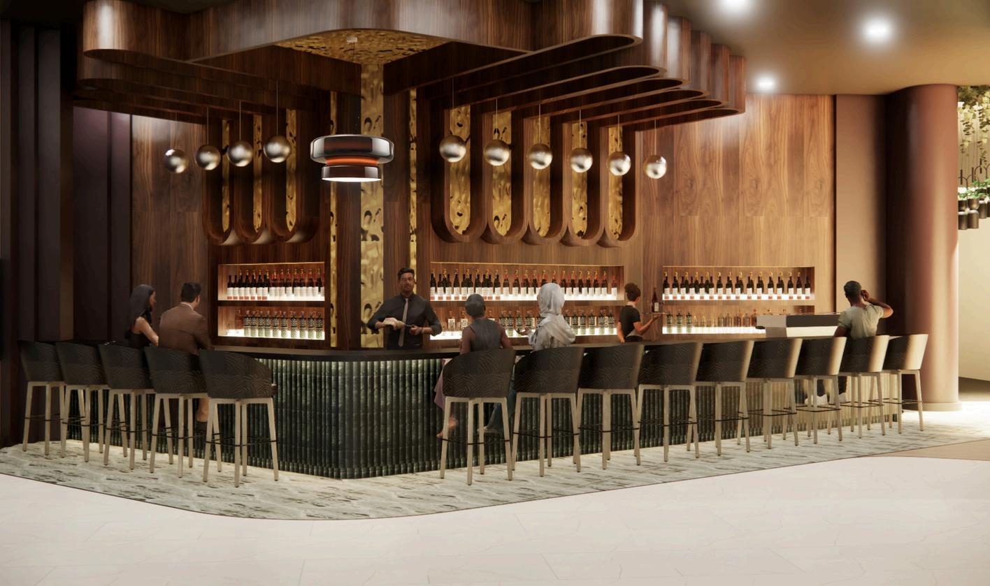
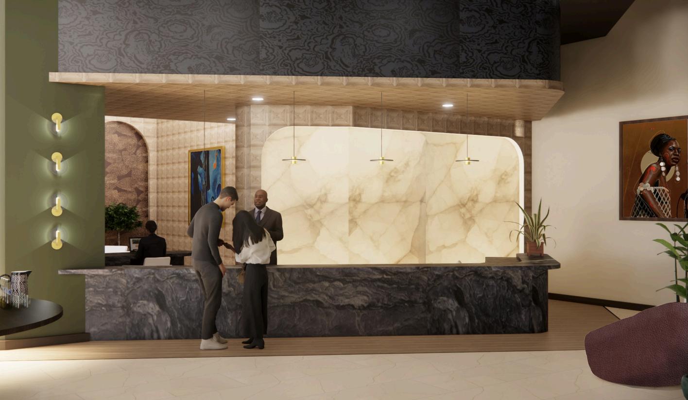
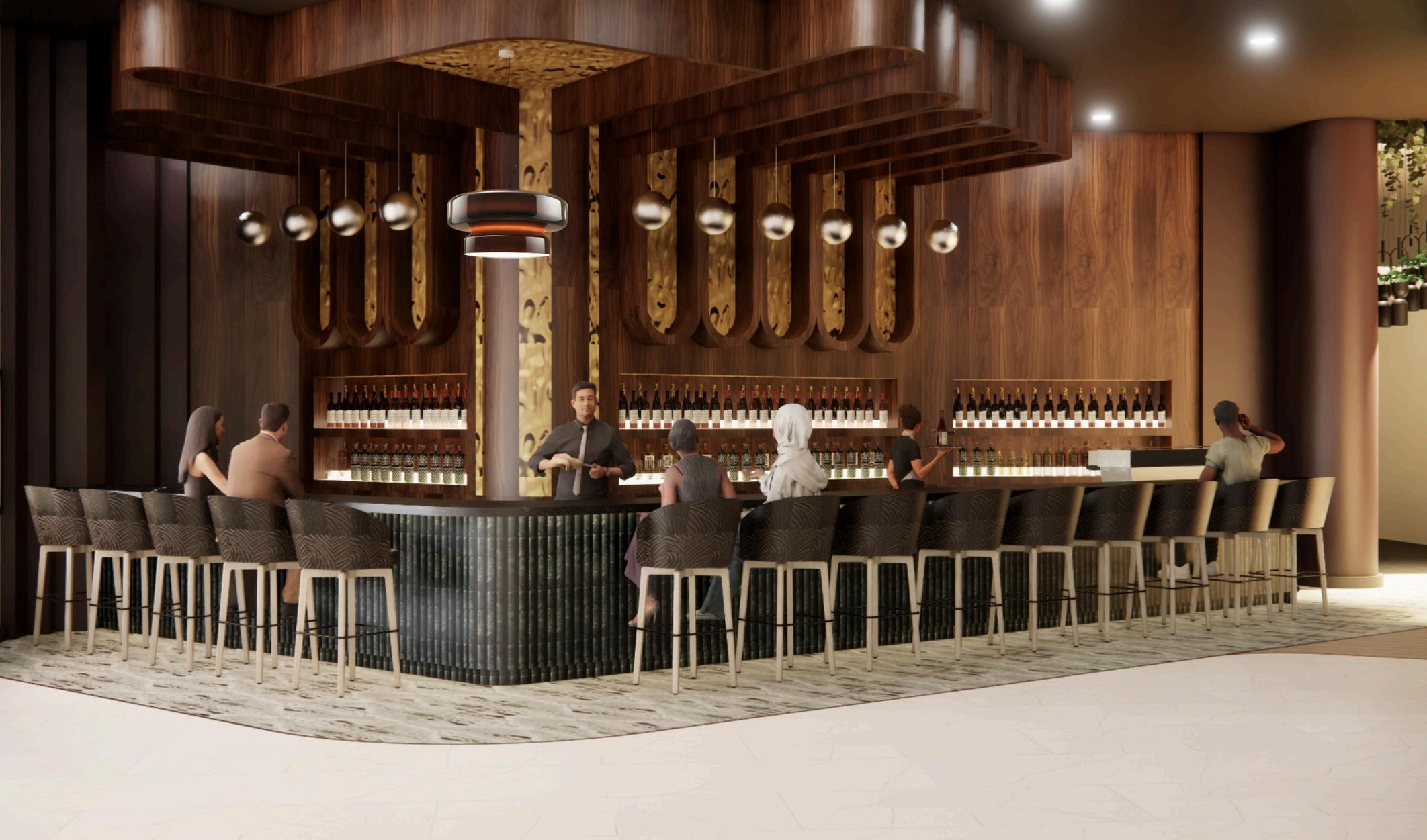
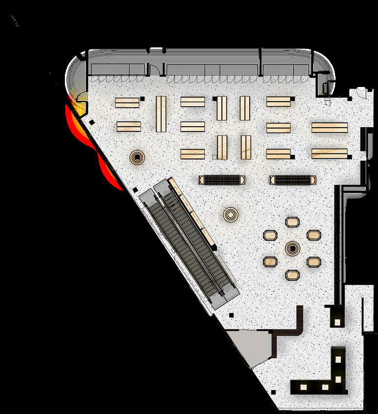
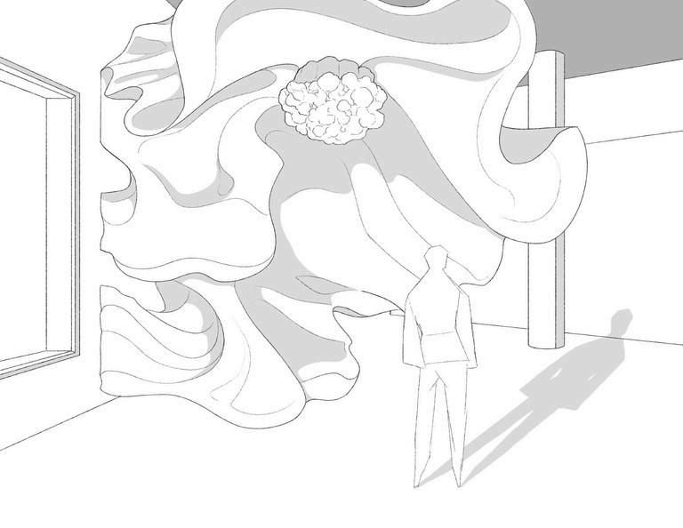
Prints of Harmony defines Aman Atlanta, reflecting the brand’s ethos of peace, beauty, and intentional design. Inspired by Atlanta’s artistic culture and jazz legacy, the design language draws from repetition and layering reinterpreted through Aman’s refined minimalism. Textures, colors, and materials carry the spirit of music without overwhelming the space. A recurring motif, the human fingerprint, appears in textiles, wall treatments, and furnishings, symbolizing individuality within community and honoring the makers who shape culture through craft. Within this vision and taking inspiration from Nina Simone, the hotel lobby is expressed as Jazz in the Garden a tranquil retreat of earthy palettes, tactile materials, and layered moments. It is a space of balance stillness and movement, self and shared experience—ever-growing and ever-evolving with its guests.

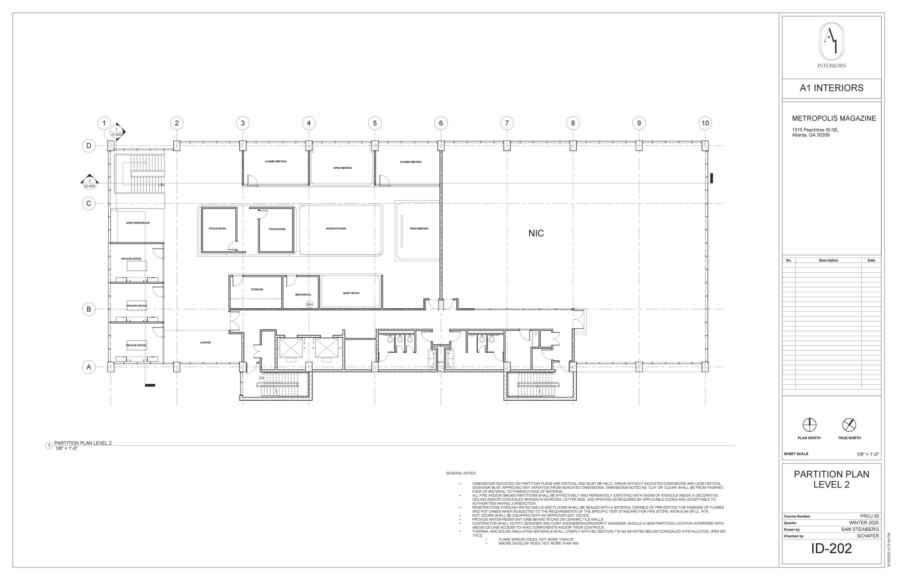
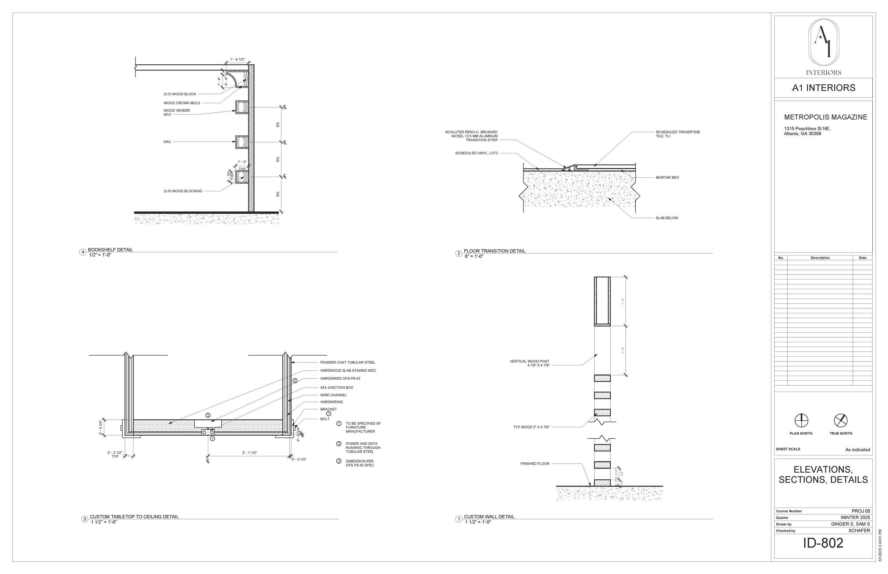
PROJECT TYPE: Luxury Hotel Lobby & Restaurant (Group Work, 2025 Quarter 2)
LOCATION: Buckhead, Atlanta, GA
CONTEXT
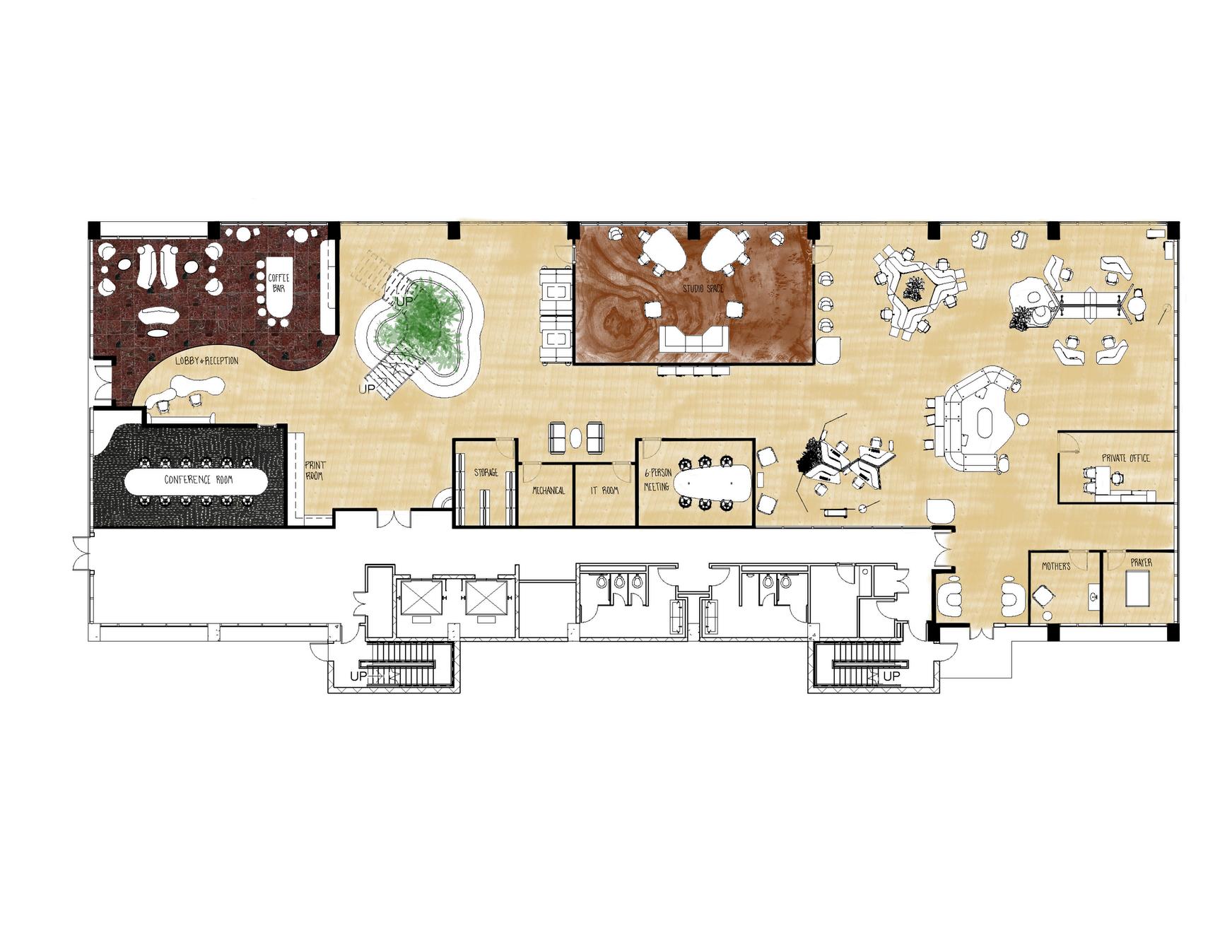
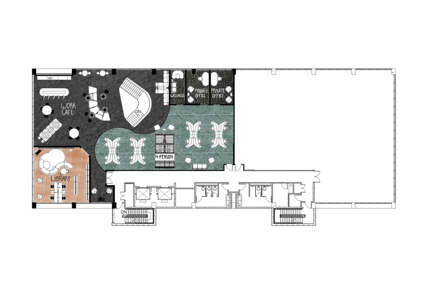
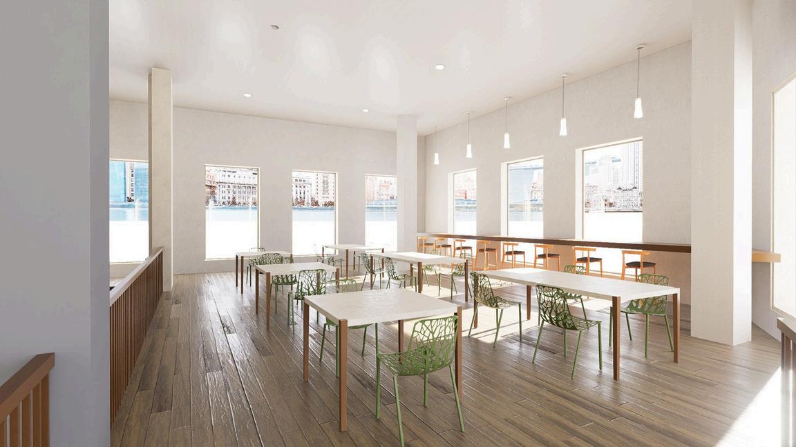
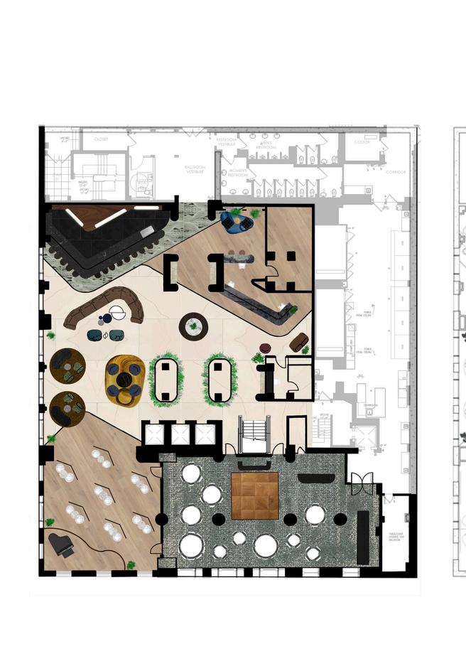
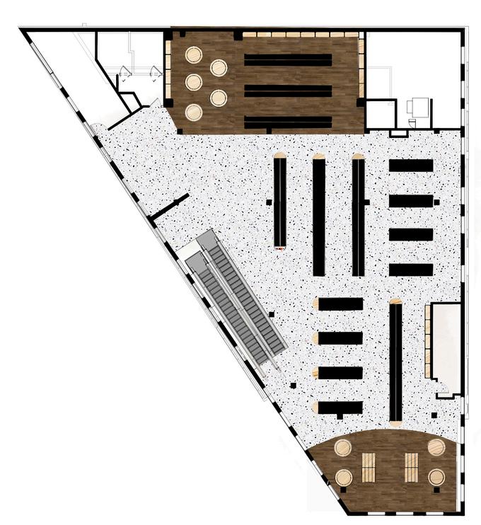
This project, completed with my peers Anna, Jethro, and Isabella in Studio IV: Hospitality at SCAD, focuses on designing the main public spaces of Aman Atlanta a luxury hotel featur a Michelin-star restaurant, a casual bistro, specialty retail, and entry across 6,100 SF at street level and 8,130 SF on the second floor (hotel lobby as featured). As team lead, I ensured each space maintained its own identity while speaking the same design language. I also took on the space planning and renderings for the second level. Guided by shared design drivers, every detail, from food to service, embodies harmony and purpose. The restaurant on level one, Simone’s, is in partnership with Chef Christopher Grossman, infusing Southern flavors with Aman’s elegance, ensuring luxury is not only seen but deeply felt.


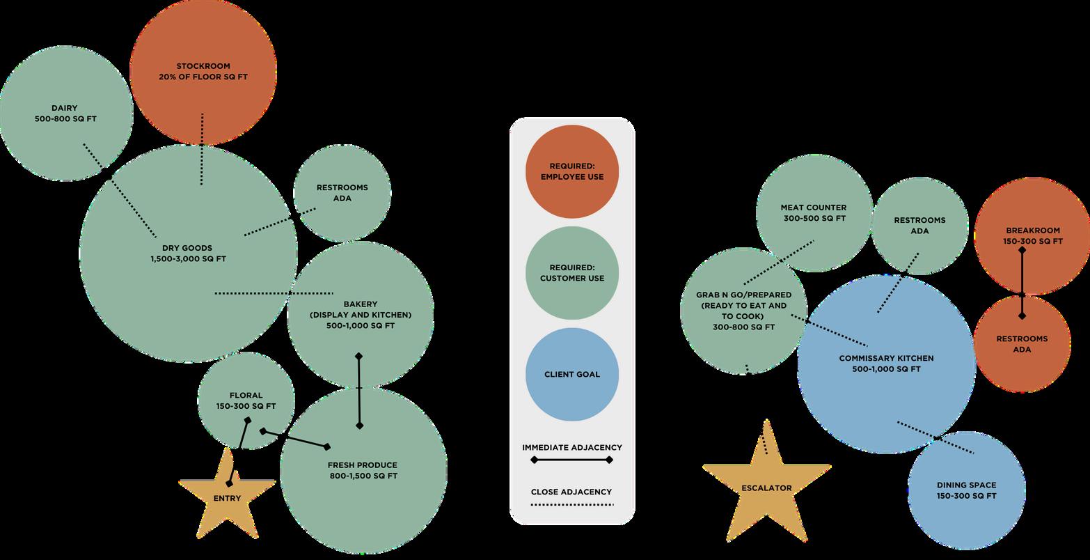
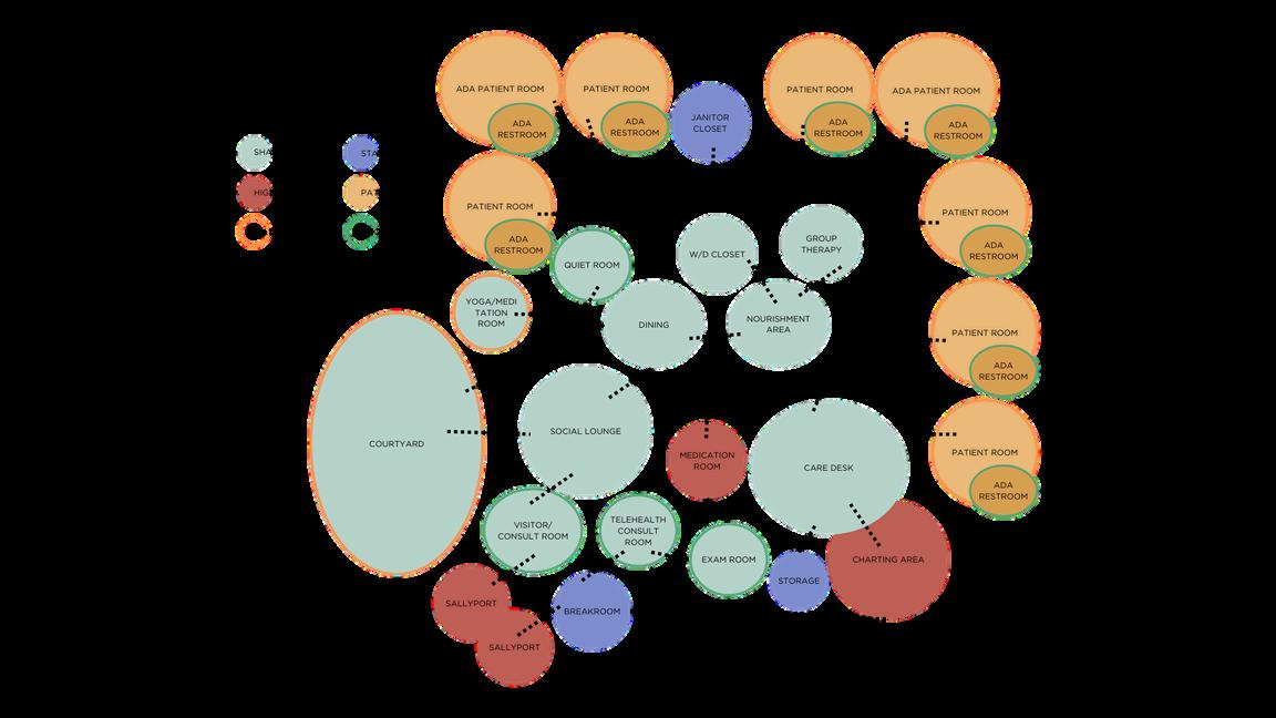
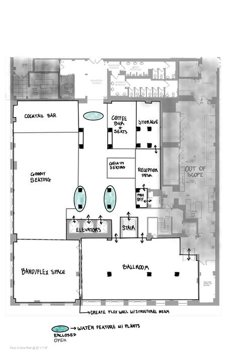
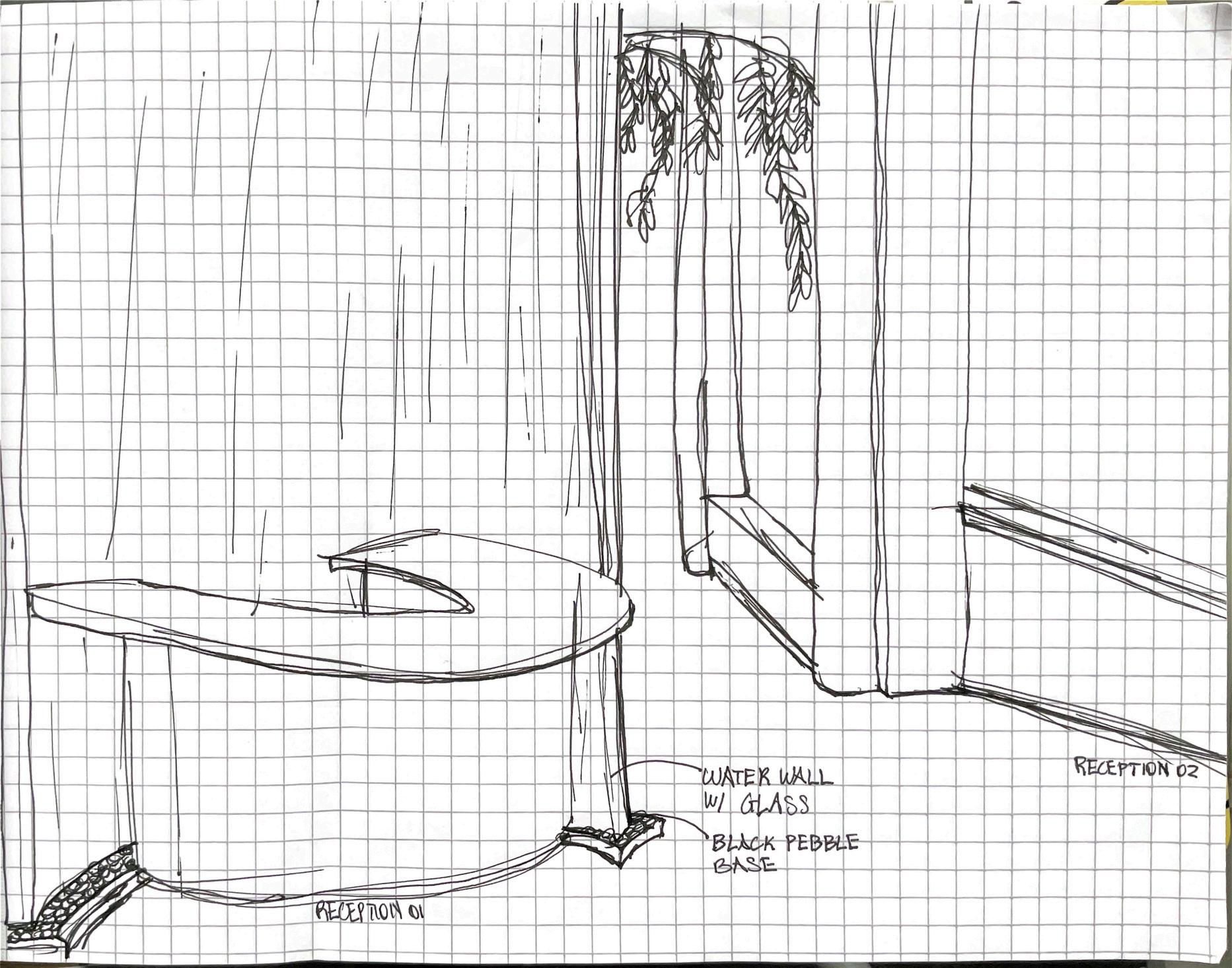
Blocking Diagram:
We knew early on that water

SENSE OF PLACE THEORY
Subtle cultural references and indoor outdoor views envoke curiousity in the space that blends with the surroundings
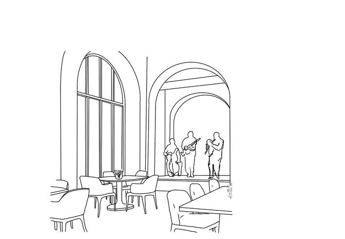
RHYTHMIC RESONANCE THEORY
Repetitive patterns across floors, ceilings, walls, and furniture to complement the live music


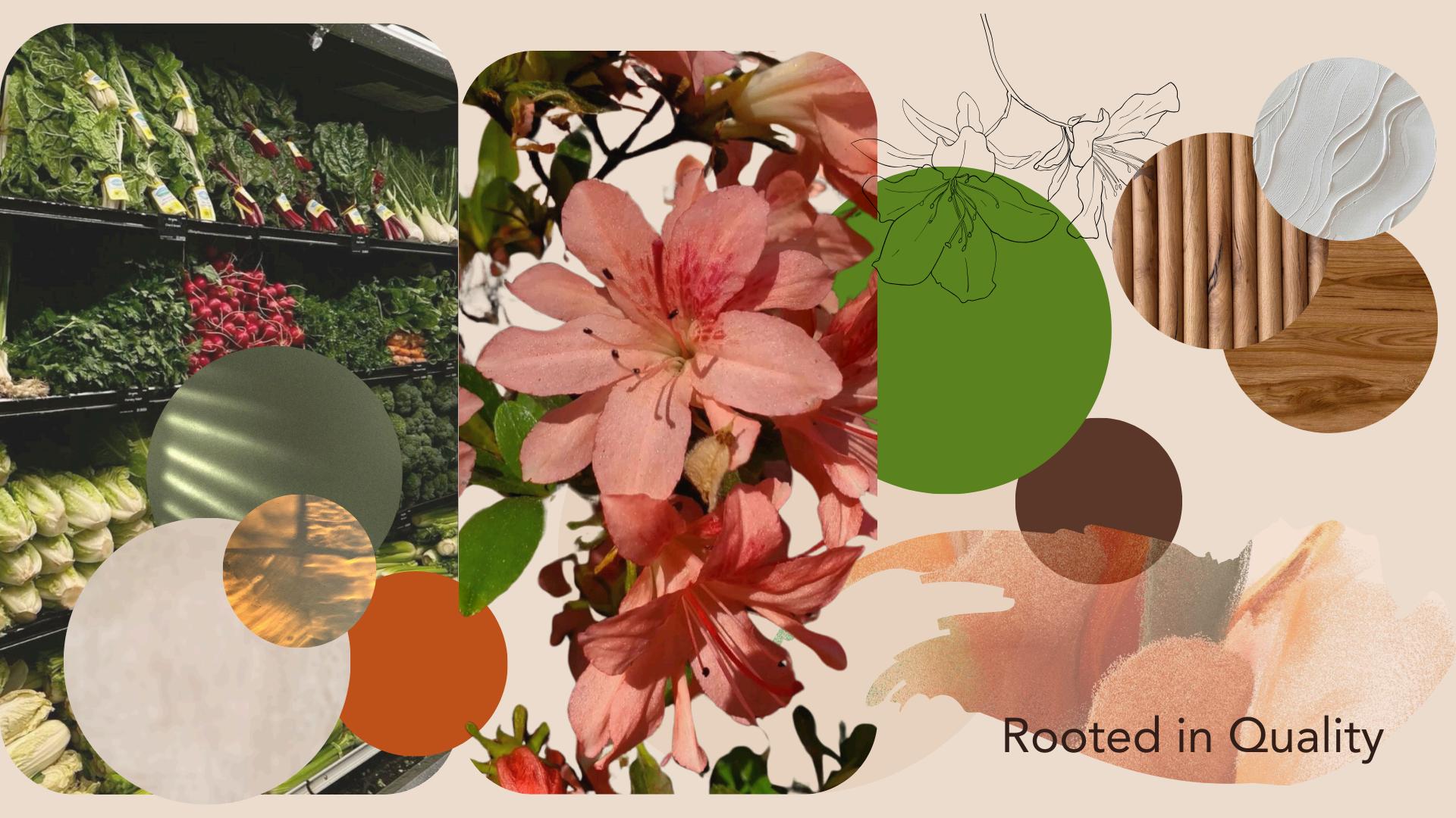
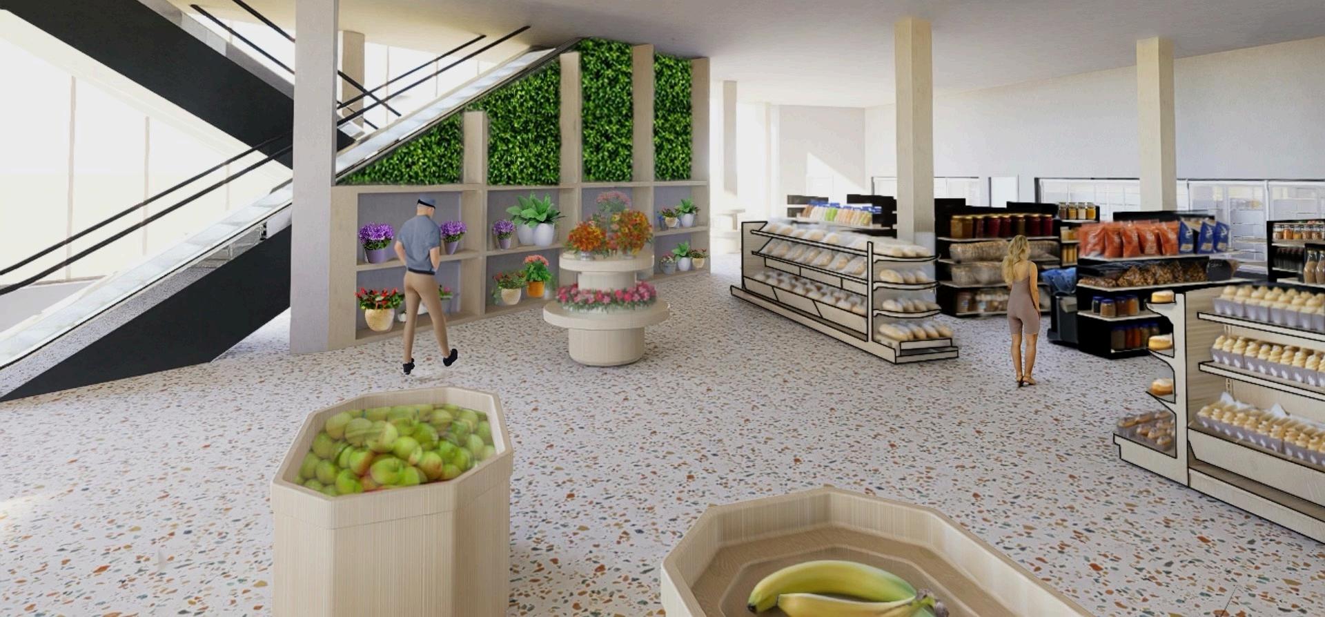
THE AZALEA’S RESILIENCE
Azalea’s Market is more than a grocery store it is a symbol of resilience and renewal. Designed to bloom in the very place it is needed most, Azalea’s responds directly to the challenges of food accessibility in downtown Atlanta. Much like the rose that grew from concrete, it thrives in its environment, rooted at 25 Peachtree Street NW, to provide neighbors with fresh food, convenience, and a sense of belonging. The brand identity draws inspiration from the natural world, reflecting strength, stability, and growth. Earthy browns ground the brand in warmth and tradition, while vivid greens represent freshness and vitality. These tones create a palette that translates seamlessly across signage, interiors, and packaging to form a cohesive, welcoming experience. More than just a market, Azalea’s is a lasting symbol of hope and progress one that nourishes both body and community while helping shape the future of downtown Atlanta.
PROJECT TYPE: Grocery store design
(Group Work, 2024 Quarter 4)
LOCATION: Downtown, Atlanta, GA
Opened August 2025.
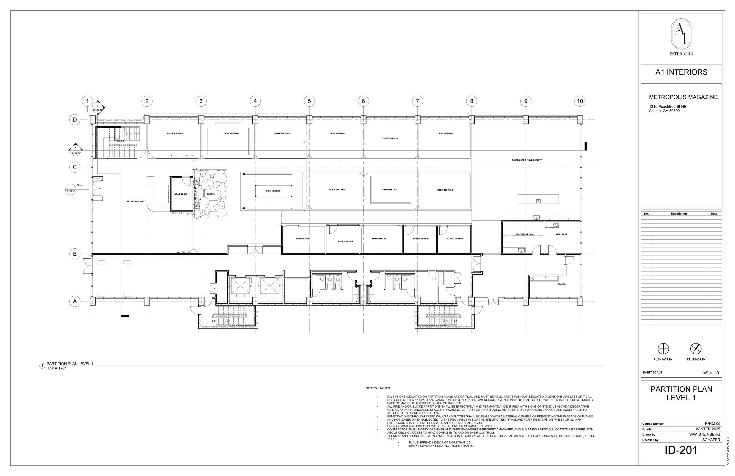
SCAD, in partnership with SAVI Provisions and guided by the Independent Grocers Alliance (IGA), has joined forces with the City of Atlanta to place a grocery store in the historic building. Sparked by the closure of a Walgreens and the growing food desert Downtown, this collaboration seeks to transform the Olympia Building into a community-centered grocery store. This project combines branding, advertising, and interior design to establish a welcoming, community-centered environment that addresses local needs, providing fresh, high-quality food at accessible and affordable prices. The initial concepts were derived from branding ideas developed by the branding designers. The initial interior design concepts integrated elements of brand identity into the spatial experience to create a cohesive brand presence. Design drivers for each team included accessibility, inclusivity, efficiency, locality, community-centric, and sustainability. This formed into two branding concepts supported by differing floor plans to provide the client with two options. The team I worked with, Azalea’s, is what is ultimately chosen by Mayor Dickens and SAVI Provisions owner, Paul, for opening day.
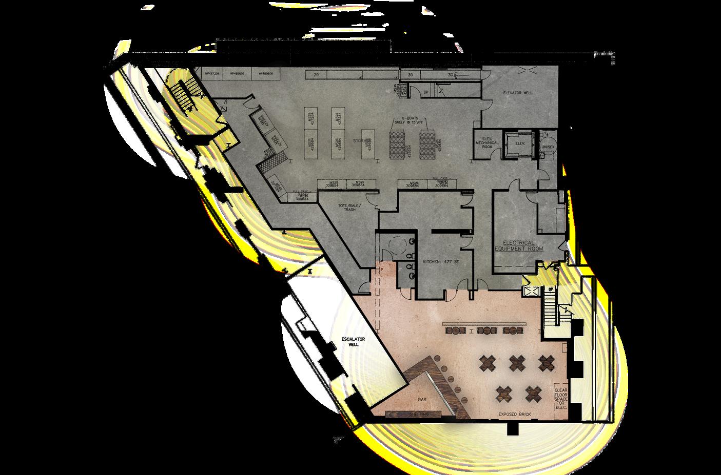
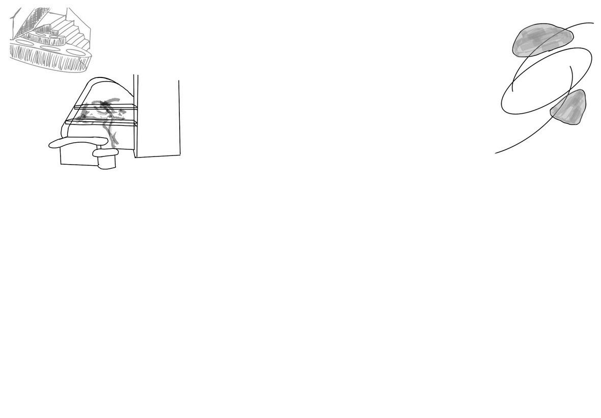
DESIGN CHALLENGE:
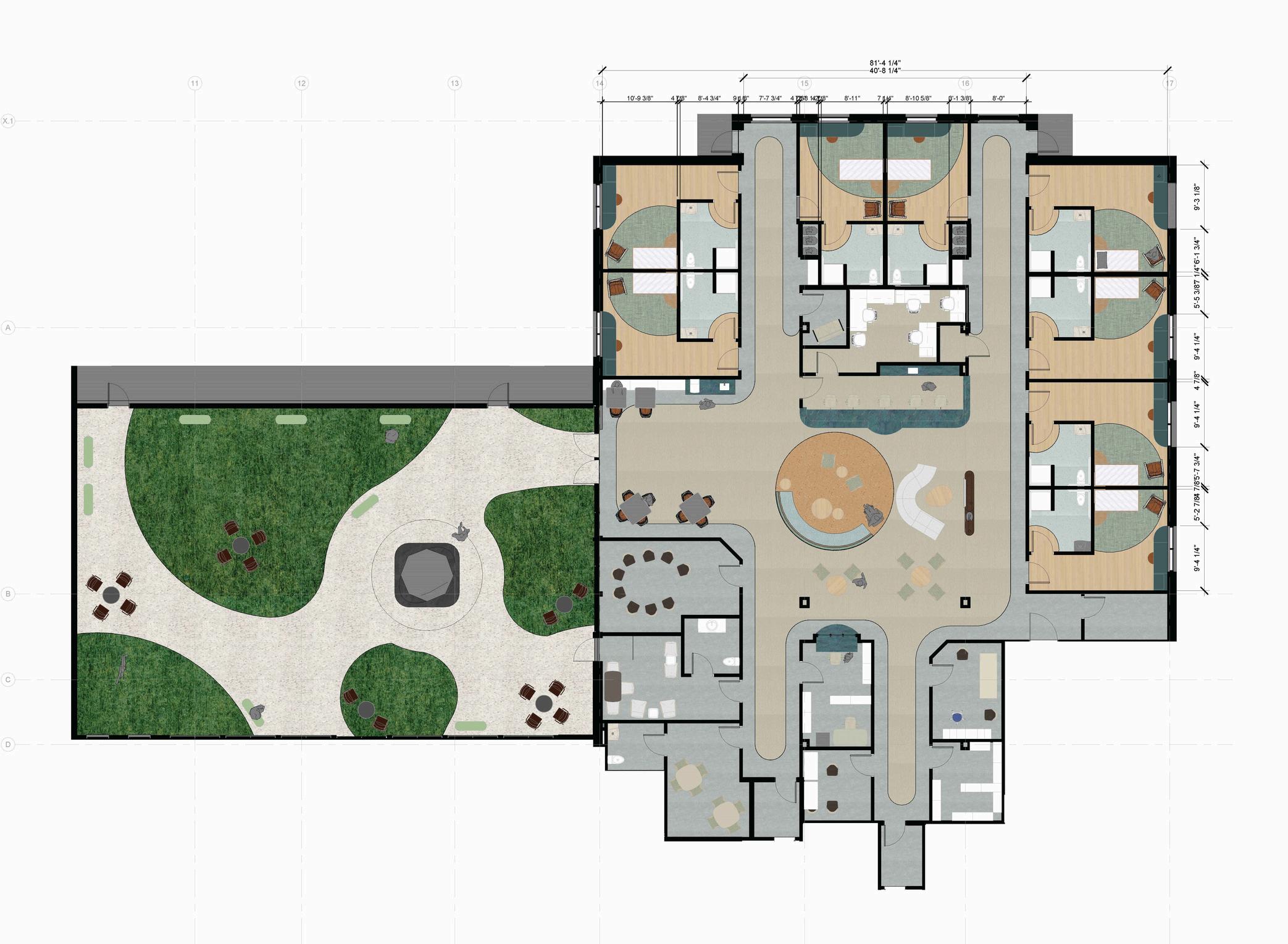
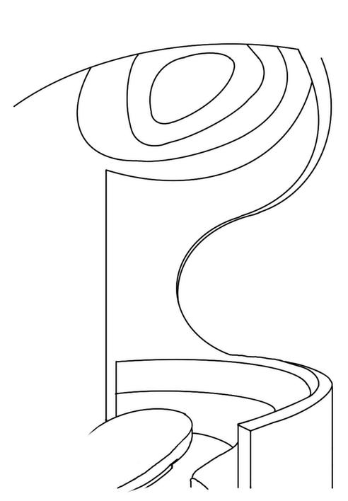
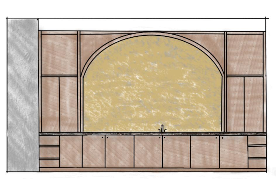
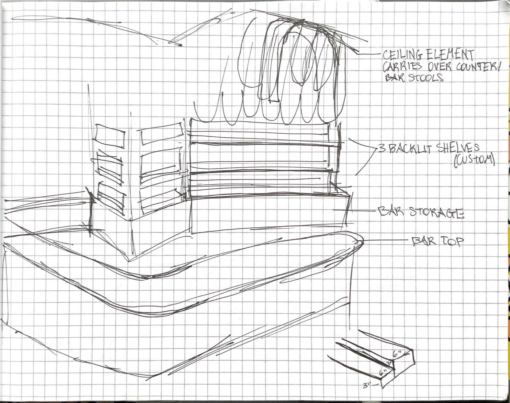
Researching two-level grocery stores is a key element of this process. The restrooms being located upstairs as soon as guests step off of the escalator was an eyesore we noticed during site visit. I proposed creating an accent wall for privacy and to address the structural column; my peer Delaney assisted with the sketch above. This transformed a challenge into a feature moment which remains in design development.