DI ONLINE
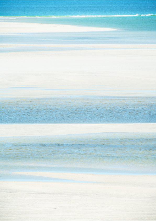


ThePhotographer: Hugh Milsom
TheImageTitle: BeachColoursSeilebost
AbouttheImage: This image was taken on Harris in 2001
From Hugh's Book, The Colours of Harris

Editor DI ONLINE: Melanie Chalk
Contact: dionline@rps.org
Our Chair, Janet, is currently out of the country, so this time you will just be hearing from the Editor.
We were very saddened to receive the news on 1 May that Hugh Milsom had passed away. Just the day before, on 30 April, a group of Digital Imaging members attended a talk by Leigh Preston entitled’ *Hugh and I’ —a pictorial essay celebrating Hugh’s emotive and atmospheric landscape work. Leigh’s presentation was a deeply personal tribute, pairing his own photographs with Hugh’s images from the same locations. Some were taken side by side, while others captured those places in different seasons and at different times, creating a thoughtful and moving dialogue between their work. The audience were totally absorbed viewing this wonderful body of work. Leigh has also written a touching tribute, published on page 6, reflecting both the depth of his admiration and the challenge of honouring such an influential photographer and friend.
Jonathan and Sue Vaines are custodians of Hugh’s extensive collection of images and books, and they shared a close friendship with him. Jonathan spent many hours with Hugh discussing images, print quality, and how to push creative boundaries, as well as planning the layout of future books. Jonathan also presents a print talk, *Spotlight on Hugh*. Hugh will be greatly missed by the many who knew him as both a friend and mentor. Jonathan kindly supplied the images shown in this issue.
Trevor Litherland, our DI Secretary, answered my call for content for DI Online by submitting his first article. Although he hadn’t written much before, he is now brimming with ideas for future pieces. I’ve since dubbed him our “Roving Reporter from Liverpool”—though, like many Scousers, he has drifted across the Mersey to the Wirral! Somehow “Roving Reporter from the Wirral” doesn’t have quite the same ring. Do enjoy his two articles in this issue.
Barry Senior has contributed a report on the annual Inter-Schools Competition, which Digital Imaging is pleased to support. The winning images are displayed and the quality and intereptation of the theme is impressive. It is good to celebrate and encourage the next generation of photographers.
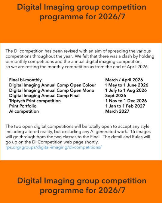
We also have the final results of the Bi-Monthly Competition, which is now being temporarily suspended to allow members to focus on entries for the Annual Digital Imaging Competition 2026. Submissions are now invited for the Open Colour round, with the Mono round opening in July.
Melanie DI Online Editor

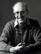
There's a deeply felt echo of sadness throughout our photography world following Hugh Milsom's very recent passing. Hugh was a Lode Star in my own and many other's photographic lives, he had a certain aura of permanence and such an extensive and emotively brilliant body of work. It's difficult to express what he meant foremost to his family, the gentle man he was , husband and father, as the grief and memories become such difficult companions. His life, all those 91 years, ebbed away quietly like a receding tide on his favourite Luskentyre beach. He meant so much to those he guided along a different path, changing perceptions and attitudes within their landscape photography. A rich seam of accolades came with that, from an RPS Fellowship to the panel that earned him his MFIAP distinction, not forgetting a thousand, yes a 1000 acceptances in international exhibitions. His landscape photographers 'voice' was revered by those who attended the workshops he ran with Iain McGowan. That voice was of a dedicated man married to his own sense of amazement, one which once echoed in many clubrooms, now sadly unheard. His many books, filled as they are with deeply resonant pictures, remain with us, pages holding a printed legacy that rewards repeated viewing.
Hugh was a photographer who had an unerring skill in expressing what he felt in such a significant and emotionally intelligent way allowing an underlying spirit to animate and inhabit his pictures. While others play on the obvious notes, Hugh looked for descant and improvisation, employing lost, often foreboding chords or delicate, pearlescent nocturnes. He understood just how potent restraint could be.
Hugh had a succinct and defined attitude to the photographic medium. His work has an honest individualism, deliberately non-conformist, principled, thereby side-stepping the mainstream. Much is allegorical, pensive, undefined and based around abstraction, while other pictures use deep impact apertures to benefit distant detail. In his extensive portfolios you can find poetic menace, revealing the measured beauty of an apprehensive calm, that perturbing silence before the storm. Those images carry his own unpretentious echoing truth, a harmonic signature of time and gold standard empathy.
He had a profound dislike of images manufactured for instant impact, the cold and the soulless anonymity often found among exhibitions now.
He was a member of Arena and the London Salon. Hugh 'graduated' on his own terms in the darkroom, with an aptitude for chemistry & film development, a master with Infra-Red film and gifted printer. Digital capture transformed brought him a softer lyrical style using harmonic pastel colours, personal psalms and arias, with a euphoric cadence and balanced precision, in reality marvels of economy and craft.
The painter inside his soul constructed and the photographer in him disclosed. Hugh made photographic confessions to the viewer, a highly acclaimed landscape photographer who dealt not just in landforms and geology but in loyalty to his art and the telling atmosphere of solitudehe's given us all a sublime and coherent portrayal of the 'serious still'.
Leigh Preston
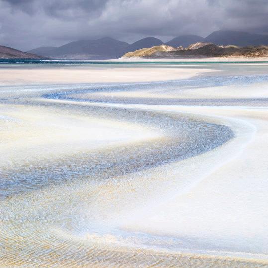
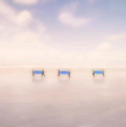
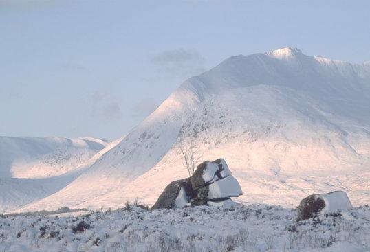
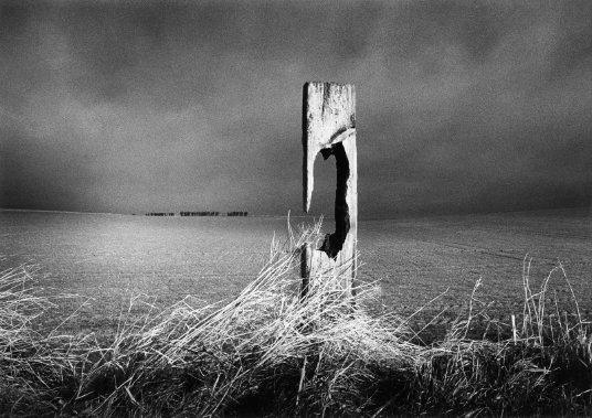
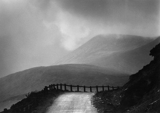
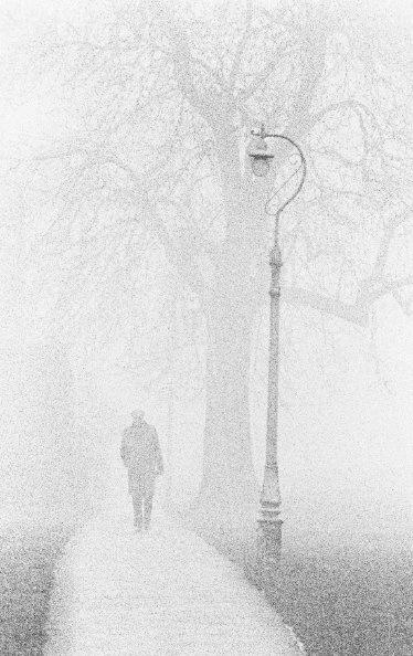
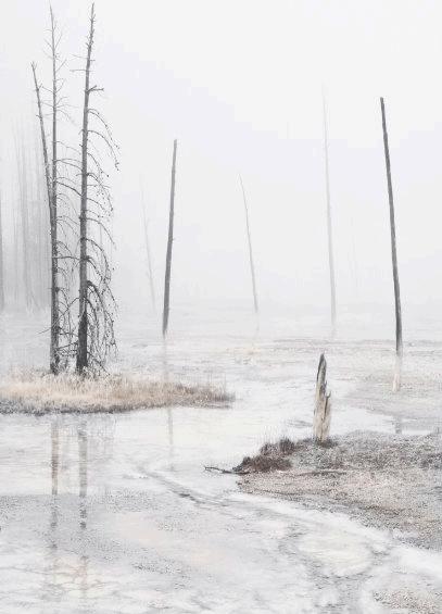
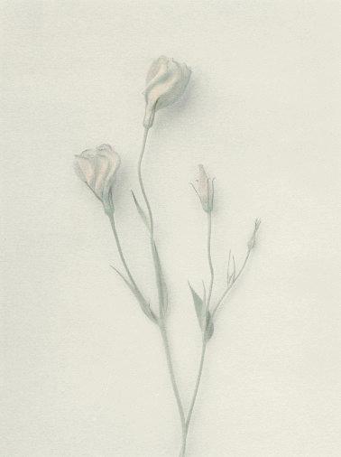
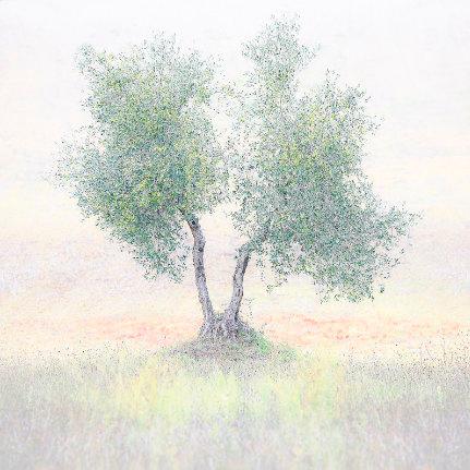
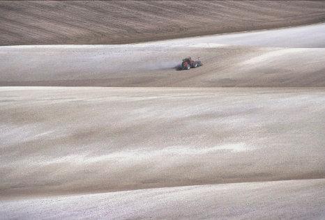
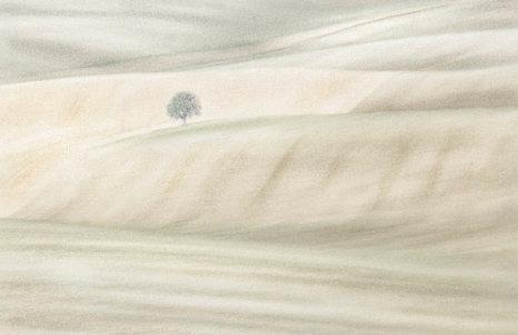
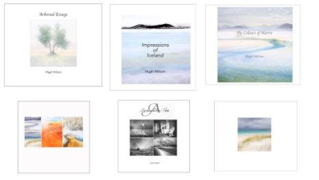
Hugh produced several books including Impressions of Iceland, Retrospective View, The Colours of Harris and Arboreal Essays.
There are a limited number of copies still available which can be purchased. Price range from £15 to £20 plus P&P.
Certified A3 prints are also available which are printed under licence and cost £25 plus P&P. For both books and prints please contact Jonathan Vaines at: jonathan.vaines@live.co.uk
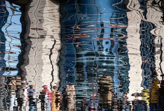
I asked Kim to tell us how she made her winning image. In her reply, she mentioned she has only recently joined the RPS and this was her first entry to a DI Competition. Kim welcome to our Group and Congratulations on your success. She wrote,
"I had co-organised a camera-club walk (Adderbury, Deddington & District) around the centre of Birmingham, which of course included the canalside. I noticed a tour group opposite, and the reflection they made in the water, with the building behind them. In Lightroom I flipped the picture vertically, but other than that tweaked very little (texture, clarity and dehaze, plus a little crop)."
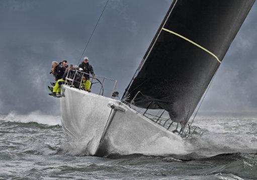
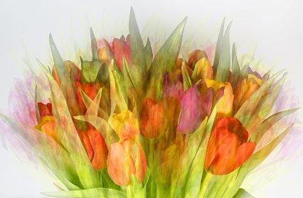
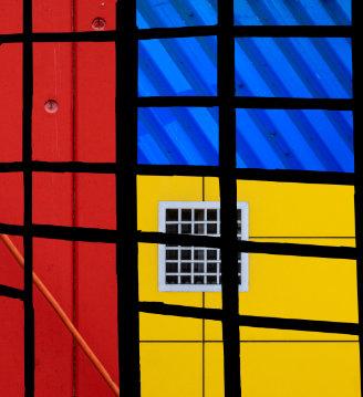
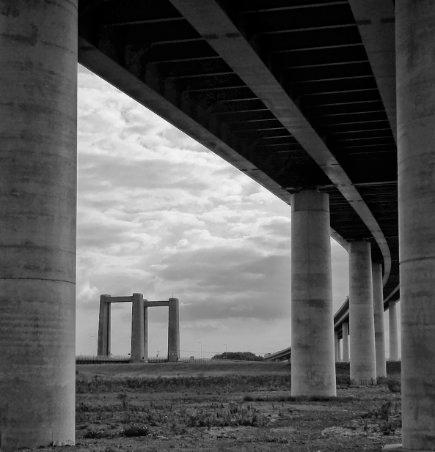
Some lovely images this month. Very well done to all concerned and many thanks to all who entered.
Fintan Healy DI Comp Secretary
In 2024 and 2025, we ran comprehensive programmes focused on books and zines for members interested in making their own publications. We covered many aspects of the process, including planning, sequencing, printing, working with printers, and we had some people making their own hand made book. Many books have since been compiled, printed, shared, and even sold, and two active Books and Zines e-Circles now meet regularly to discuss all things book-related. In 2026, we have continued to run talks and workshops on books and zines, but these have been incorporated into the general programme.
For 2027, I’m planning a special Books and Zines programme and would love your ideas. What topics would be most useful to you?
• Possible areas could include:
• Project development and editing.
• Sequencing and storytelling.
• Layout and design for print.
• Working with printers and choosing paper.
• Show-and-tell sessions with feedback on work in progress. Please do let me know any topics, formats, or speakers you’d like to see included, I do need some input from Books and Zines enthusiasts.
“One of our members, Robin Mudge, has put together a demonstration version of a learning and collaboration platform. His 'Photobook Studio' is aimed at people who enjoy making photobooks of all kinds - an activity that has proved popular with DI workshop attendees for the past 3 years. We invite you to join here: https://aproposmedia.net/portal/ - it only takes a moment to register, then you can have a look round and join any of the public spaces that interest you. It's early days in the development of the system, but if you have any comments or suggestions, add them in the feedback space provided.”
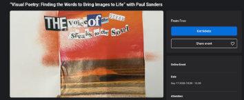
“VISUAL POETRY: Finding the Words to Bring Images to Life” with Paul Sanders
2 SESSIONS
THURSDAY September 17 at 10am
THURSDAY OCTOBER 1 at 10am Register your interest.
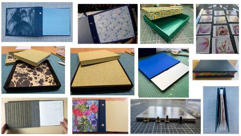
Some of the Books and Zines enthusiasts have been enjoying an ongoing workshop series entitled 'Beautifully Bound: Crafting Keepsakes for Your Prints with Mylyn McColl. It consists of 8 monthly sessions, with Mylyn demonstrating a new project each month, we then have time to make our own pieces and bring them to the next meeting to share progress and finished work. Mylyn has 20 years book making experience and and makes each project look effortless, often completing a book or box in 90 minutes to two hours. Many of us are new to the craft and often spend hours perfecting ours, but learning all the time. You need to master accuracy, good cuttting skills and glue management but the results can be very satisfying. The materials that we use are visually pleasing with choices of textured book cloths and very beauiful decorative papers. We are creating works of art to eventually showcase our photographic images.
Some of the finished work, Screw Post Books, Slip Covers and Lift off the Lid Boxes by Pat, Lindsay, Tracy, Janet, Owen, Colin and Melanie Owen made his Slip Cover for his Laptop!


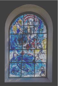
The T-W-T Walks to Sites of Religious Significance have been well supported by the membership at home as well as Internationally.
• We have 48 walks led by 42 leaders
• 6 co-leaders.
• 250 people have booked 344 places
• Plus 8 bookings from Islands and Internationals
• With 352 bookings in total.
The online talk about photographing sites of religious significance is on Monday the 18th of May, being given by Julian Elliott, who is a professional landscape and travel photographer and has photographed places of worship, ancient and modern, all over the world.
Many of you will be starting your walks very shortly and we will look forward to seeing your images in the TWT Gallery and e-zine that will be produced around July.
If you have thought about becoming a walk leader for the next TWT event in the autumn, following is a great article that Trevor wrote, which might encourage you to volunteer.

Well, why would you want to be a walk leader? It’s a lot of hassle, right? No!
I first volunteered to lead a walk on the inland waterways T-W-T. When you volunteer, it comes with some trepidation. Anything we do outside our comfort zone comes with worry and fear but sometimes to gain a sense of achievement you have to do it. For most of my life I’ve volunteered to do things that’s made me step outside of the box of comfort. I’ve respite fostered children with severe intellectual development, been a union representative dealing with peoples’ livelihoods, served as a layperson on a hospital medicines committee, even volunteered as secretary for your own DI committee.
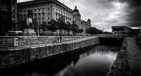
At the canal
So thinking of becoming a walk leader was in a sense a “no-brainer”. I chose the Liverpool-Leeds canal extension as it’s local to me. But then, as always, the doubts creep in. Am I up for the task, have I picked the right subject, is the location correct? Can I shepherd up to ten people around a large busy area and keep them interested? Do I have to teach them photographic techniques?
Then you realise that the members that sign up for the walks are seasoned photographers of the various SIGs within the RPS. They want to learn, maybe to them its the start of a new project or just a day out with old friends or new friends they don’t know yet. Remember, they are only people just like you. They’re not judging you but probably admiring your courage for putting yourself in the firing line.
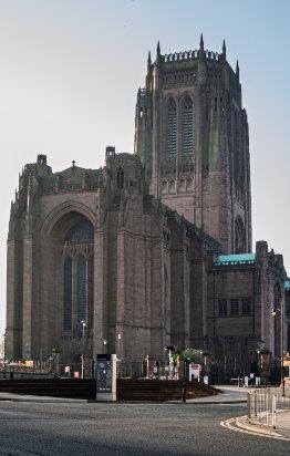
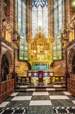
In this summer’s Talk-Walk-Talk around sites of religious significance, I’ve chosen to lead walks to Liverpool’s two cathedrals that are connected by a street named Hope. My first adventure will be to the Liverpool Anglican Cathedral, Britain’s largest cathedral. Built on St James’ Mount, it overlooks the city and River Mersey.
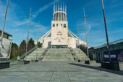
My second walk will be to Liverpool Metropolitan Cathedral, affectionately known as, “the Mersey Funnel" or "Paddy’s Wigwam”. Built atop Lutyen’s crypt, it is a cathedral for a new world.
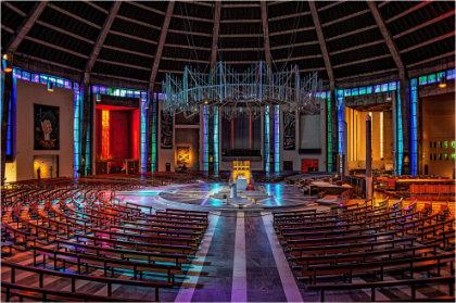
Find out its history, what features would make it interesting to other people besides yourself. It’s the history and features that are the skeleton of your walk. You can flesh it out with snippets of information, pointing out places, in your opinion, to photograph. Answer any questions if you can but be honest, if you don’t know, find out the answers for the follow up talk.
If you were at March’s members evening you may have heard Martin Tomes explain that the forms for adding a walk and risk assessment have been pre-designed for simplicity. There are no barriers to becoming a walk leader and help is always on hand. However if this doesn’t convince you, at least dip your toe in the water. If it’s piqued your interest but you think you couldn’t lead a walk, at least sign up to a walk. It’s an enjoyable experience, where you’ll meet other like minded photographers and maybe see a place you’ve never seen before.
So if you’re reading this and thinking of accepting the challenge, how do you do it? Think of it as a new photographic project. How would you do that? Research your subject, find out about where your walk is situated. Walk the walk and photograph the interesting areas, these will be your backbone of the walk.
Trevor Litherland

The 2026 DI PRINT PORTFOLIO will hit the doormats soon and those who entered this competition will receive a copy. But you can now view all the 30 Finalists' images in an online flip book HERE





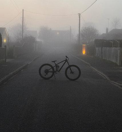
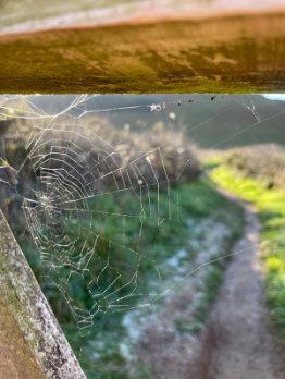
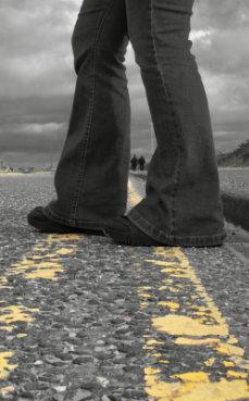
The Rotary Club of Ringwood Inter School Photographic Competition is organised in association with Ringwood School. The competition started as an initiative by the Rotary Club of Ringwood in 2011. For the last 6 years it has been supported by DIG with sponsorship, the award of certificates, and participation in the selection process.
This year there were more than 600 entries and the number of participating schools increased to over 24 schools from Dorset, Hampshire and Wiltshire. This year’s theme was ‘Perspective’. As in previous years the diversity, creativity, and skill demonstrated by the entries was high.
The selection of the 53 images which were printed for the exhibition was carried out by a team drawn from the Rotary Club of Ringwood, Ringwood School Art Department, The Royal Photographic Society Digital Imaging Group, Ringwood Camera Club and the Arts University Bournemouth. The images were selected within the four categories – Adult, Primary, Years 7-10 and Years 11-13. (Add 5 to determine the ages ). In each category, a winner, runner up and RPS DIG Certificates are awarded. In addition, The Arts University of Bournemouth makes an award and the Rotary Michael Lingam-Willgoss award is made for the ‘Best in Show’ selected from the winners in the pupil categories.
Barry Senior

Fearne, Avonwood Primary School
RPS DIG Certificate Primary
Joseph, Ringwood School, RPS DIG Certificate 7-10
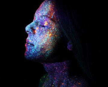
Keela, Ringwood School, Group Winner 11-13
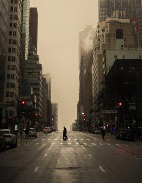
Harrison, Broome School, RPS DIG Certificate 11-13
All selected Exhibition images can be found on the DIG pages of the RPS website Preious years results also can be viewed HERE
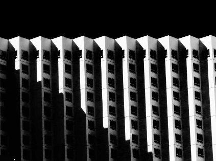
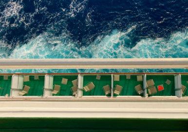
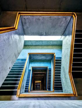
Photography is a powerful visual medium that allows photographers to capture moments, emotions, and stories. Among the many stylistic choices photographers may make, one of the most significant is deciding between black and white or colour photography. While colour photography offers realism and vibrancy, black and white photography provides unique artistic and emotional advantages. Each has its own strengths, but black and white photography continues to hold a distinctive and enduring appeal. Whether this is due from the founding of photography, where the process was limited by the chemistry, or whether we look back to the greats in photography and remember their famous images in monochrome.
One of the primary benefits of black and white photography is its ability to emphasise composition, texture, and contrast. By removing colour, the viewer’s attention is drawn to shapes, lines, shadows, and light. This simplification can make an image more striking and timeless. Elements such as wrinkles on a face, the roughness of a wall, or the dramatic contrast between light and dark often appear more powerful when colour distractions are eliminated. As a result, black and white photography is particularly effective in portraiture, architectural photography, and street photography.
Another advantage of black and white photography is its emotional depth. Monochrome images often evoke a sense of
nostalgia, seriousness, or intimacy. Without colour to guide emotional interpretation, viewers are encouraged to focus on facial expressions, body language, and mood. This can create a stronger emotional connection between the subject and the audience. Black and white photography is frequently used to convey themes such as loneliness, strength, resilience, or beauty in simplicity.
With this being said then a choice needs to be made. In the age of digital photography making photographs in monochrome should be your intent and not just an attempt at recovering a poor photograph. Henri CartierBresson’s idea was that all the elements of the composition should come together in the frame and form the decisive moment. This should be your intent by, as mentioned above, bringing textures, shapes and contrast together to construct the whole.
In contrast, colour photography excels in realism and storytelling. Colour allows photographers to accurately represent a scene as it appears in real life, making it ideal for documentary, nature, and commercial photography. Colours can convey mood instantly, warm tones suggest comfort or happiness, while cool tones may imply calm or melancholy. Additionally, colour helps differentiate subjects, adds visual interest, and can be essential when colour itself is a key part of the message, such as in fashion or product photography.
However, colour can sometimes overwhelm an image. Clashing tones or overly bright colours may distract from the subject or weaken the composition. Black and white photography avoids this issue by offering clarity and focus. It encourages photographers to think more carefully about lighting and framing, often leading to technically stronger images.
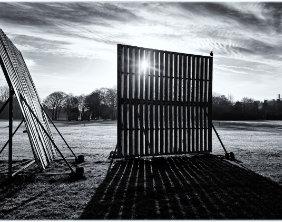
As I compose my images, sometimes an image leaps out and demands this monochrome rendition, as with the cricket screens with the sun fractured through them. The bird perched on the screen was an added bonus. In colour it was a pleasant, sunlit scene but as I approached I could pre-visualise in monochrome. It became a composition of strong light with contrasting shadows.
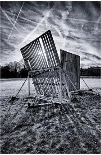
With the later image of the two screens together, there was an interplay between the shadows cast on the grass and the multiple contrails in the sky. Again, in colour it would have been a pleasant scene but in black and white it emphasises and forms a juxtaposition between the light and dark bars on the grass with the white contrails in the darkened sky.
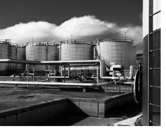
Industrial areas often offer photographers an opportunity to pre-visualise in monochrome. There may be pipes that offer leading lines into the subject. Also industrial areas are seldom tidy, with grime abounding because they are places of industry. This may detract in colour but in monochrome it can serve a purpose to highlight that these are places that are unloved, maybe not for public gaze. An image of pipes and tanks in colour would, maybe, beg the question why? However in black and white it plays into the setting, this is a place apart – serious processes happen here.
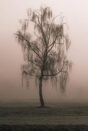
In this article I have often used the term monochrome interchangeably with black and white but some images need a monochrome treatment but not a purely black and white one. You may need to evoke a mood or feeling that you derived from the scene, how you felt at the time. The image of the lone tree in mist, to me, required a monochrome treatment. However black and white was too harsh, it rendered the scene too clinically cold. By warming the composition with a copper-ish tone, it returned the image to how I felt at the time. Remember, you are the artist, your images are your expressions of reality, of how you felt at the moment of making your image.
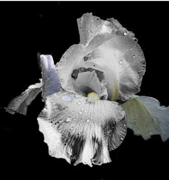
With this in mind and in regard to tone, should the image be purely monochrome in whatever hue you choose? A monochrome rendering of the image may not give the composition just what you intend. So in this circumstance I think we should remember we are also artists and not just photographers, and as such we should bring out the salient points in an image. Whether this means introducing a spot colour to focus the viewer’s eye or re-toning areas, by masking, to give an intimation of the delicacy of the form as in the image of the Iris flower. Here, after the initial conversion to black and white, I reintroduced some colours, by masking, to highlight the delicacy of the bloom.
Ultimately, neither black and white nor colour photography is superior in all situations. Each serves different artistic purposes. Black and white photography shines when emotion, form, and contrast are the priorities, while colour photography is invaluable for realism and expressive storytelling. The choice between the two depends on the intent of the photographer and the message they wish to convey. By understanding the benefits of both styles, photographers can make deliberate choices that enhance the impact of their work. So what’s stopping you? Get out and train your eye, look at scenes and try to see them stripped of colour. But remember, you’re the artist and it’s your choice.
Trevor Litherland
The advantage to using Billetto and Notion effectively.
The DI volunteer team has worked exceptionally hard to streamline how our workshops are booked and how you access the associated supporting resources. However it still remains a mystery why some members get in a muddle with it all, so we thought a reminder document (for you to keep and refer to) might be useful.
Booking a workshop couldn’t be easier.
• You can find the list of workshops by going to the DI home page and clicking on ‘Workshops’ from the top list.
• Alternatively you can go direct to Billetto and all that is bookable HERE
As an example let us assume you wish to book the Fotospeed Print workshop
• You click on the Billetto tile and it takes you to the booking page.
• For more information about the workshop open ‘Read More’.
• Booking is via the blue ‘Get Tickets’ button – click this.
• As a DI Member you modify the ticket number to read 1 and then click ‘Next’.
• If you are a registered user then you see your details and order summary.
• Click ‘Next’.…This is where some people go wrong !
• Under ‘add on services’ click No and No
• then it will look like this
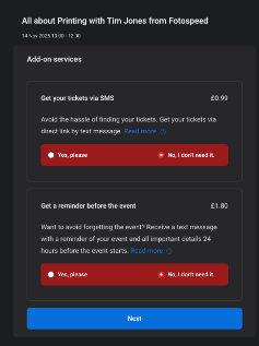
Click ‘Next’. You have now placed your order but this screen is VERY IMPORTANT as it is here that you find the link to the Notion document for this workshop. It is the blue text – you cannot miss it !
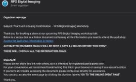
Click on this blue text and it takes you off to the Notion page – a Notion page is nothing more than a web page which you will need to refer to again – BOOK MARK it now. The Notion page provides you with the workshop details and the Zoom link. It is where you will find any resources the tutor provides. Plus post event it is where you will find the recording.
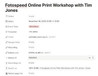
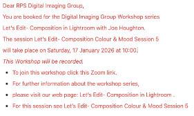
To make life even easier for you we also send out the Zoom link to the email you used to book 2 days and 2 hours prior to the event.
If you follow these simple instructions you cannot go wrong. It saves you time hunting for things as everything is on the Notion page and saves you emailing us. It saves us time in not having to respond to your emails. So please, please, please, get to grips with it. Once you have registered for an event you don’t really need to go back to Billetto, everything you need is contained in the emails.
Your co-operation is appreciated as it saves a lot of work for our overworked volunteer team. Thank you
Janet Haines DI Chair

DI Workshops recently ran a demonstration on Notion, when Joe Houghton showed how Photographers might use it, some ideas were:
• A To do list,
• Shoot Planning
• Location Scouting
• Gear research
• Competition Tracking
• Website Bookmarks
All great ideas for getting organised in 2026!
Notion is a flexible all-in-one digital workspace where you can write, organise, and link your notes, tasks, and databases in one place.
But I thought how a simple Notion table could help DI Online members organise and access the workshop resources all in one place. Do you have links scattered across emails and pages? Maybe by creating a simple Notion table or database this could index every DI Online recording, handout or resource. A document which is always up to date and searchable when you wish to return and rewatch a Workshop or Talk.
Taking the reminder emails you have all the links you need to easily add to your table. If anyone missed this free Talk and would like to have the YouTube link, email me: digworkshops@rps.org

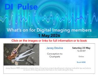
DI Pulse for WHAT’S ON THIS MONTH