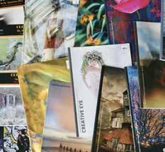

Welcome to the 100 th issue of the Creative Eye magazine!
Since our Group was formed 35 years ago, this publication has provided a platform for members to showcase their work and draw inspiration from the creative photography of others.
I continue to be impressed by the exceptional quality of each issue, expertly curated by our editor, Moira Ellice. The ongoing success of the magazine reflects the remarkable talent of our members, which enables Moira and her editorial team to produce such outstanding content time and again. This milestone issue once again demonstrates a variety of superb photographic creativity. Thank you to everyone who entered the front cover competition and congratulations to the winner, Steve Peel LRPS, whose image was chosen from 75 submissions.
I hope you enjoy this celebratory edition.

Clive Watkins ARPS
Creative Eye Group Chair
Chair
Clive Watkins ARPS creativecomms@rps.org
Secretary Graham Lingley LRPS creativesecretary@rps.org
Finance Officer
Nigel Rea ARPS creative.treasurer@rps.org
David Rutter FRPS creativeimage@rps.org
Steve Varman LRPS creative.publications@rps.org
Cover
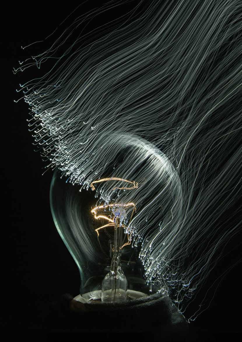
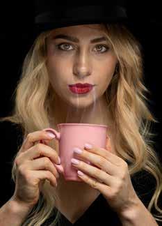
Throw New Light on the Subject by Steve Peel LRPS
Editor Moira Ellice ARPS
Editorial Assistant Dr Patricia Tutt ARPS
Design Lester Bennett
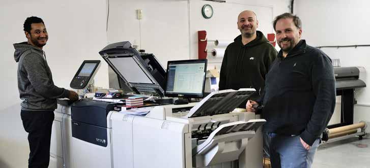
Printed by Keith Avis Printers Ltd., Rear of 68 High Street, Hadleigh, Ipswich IP7 5EF, UK CONTACT

and the Editor accept no liability for the misuse of any content or for any breach of copyright by a contributor. The views expressed in this magazine do not necessarily reflect the policies of The Royal Photographic Society or The Creative Eye Group. Unless otherwise indicated, all images are copyright of the photographers.
The Royal Photographic Society, HERE, 470 Bath Road, Bristol BS4 3AP, UK +44 (0)117 3164450 www.rps.org VAT Registration No. GB 753 305741 Registered Charity No. 1107831


SIMON HILL CPhot HonFRPS RPS PRESIDENT & CHAIR OF TRUSTEES
From its first edition, 35 years ago, to this landmark 100th edition Creative Eye has always been about sharing ideas and inspiring one another. If this edition proves anything, it’s that the creative energy within the Creative Eye Group is as vibrant and unpredictable as ever. There’s a real sense of play running through these pages; photographers experimenting, bending rules, and sometimes cheerfully ignoring them altogether.
This 100 th edition is also an opportunity to reaffirm the ambition that con tinues to drive the Group forward: to inspire, educate, and connect photographers exploring innovative and artistic approaches; to provide a platform for sharing ideas, techniques and critique; and to foster a supportive community that encourages experimentation and pushes boundaries in visual storytelling and expression.
This issue exemplifies that aim in action, and a sustained commi tment to creativity, exploration and shared purpose. Across its pages, there is such a remarkable breadth of work - images that challenge convention, reinterpret familiar subjects, and embrace both emerging technologies and established practices. From inventive still-life constructions and layered urban narratives to the expressive possibilities of smartphones, infrared, multiple exposure and monochrome, the work presented here reflects a community that is actively engaged in questioning and expanding the language of photography.
What stands out most is not simply technical accomplishment, but intent These images are thoughtful, exploratory, and often deeply personal. They demonstrate a willingness to take risks, to test ideas, and to embrace uncertainty as part of the creative process. In doing so, they embody the spirit of experimentation that sits at the heart of the Group’s ethos and is exactly what we, in the wider Royal Photographic Society, should be embracing as we strive to encourage ever more photographers to embrace the medium as a means of personal expression.
Equally important is the sense of connection that underpins this publication. Creative Eye has always been more than a showcase; it is a space for dialogue, for sharing approaches, exchanging perspectives and learning from one another. The continued strength of the magazine reflects the gen erosity and engagement of its contributors, as well as the dedication of the editorial team in shaping each issue with care and clarity.
This 100 th edition of Creative Eye is therefore not simply a celebration of the past, but a confident statement of intent for the future.

BY STEVE PEEL LRPS
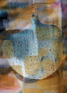
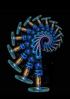
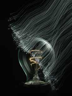
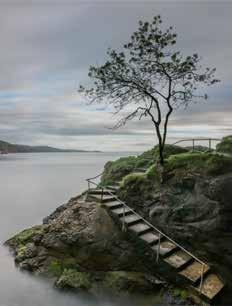
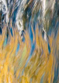
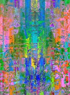
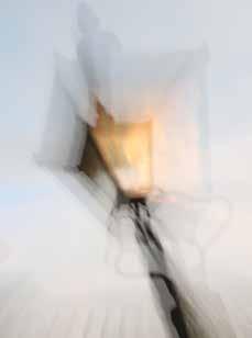
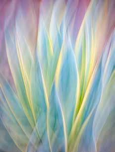
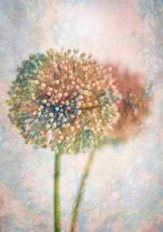
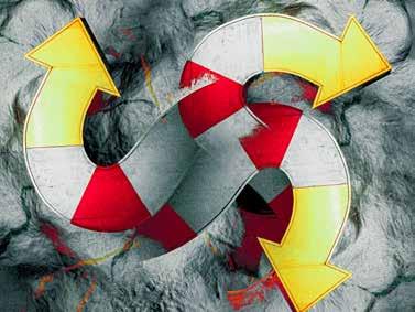
Iwas first drawn to light-painting through Michelle Essenson’s excellent online RPS workshops in 2020. From the beginning I have enjoyed working with intentional light movement using strands or swathes of light in tabletop setups to try to create meaningful images. This is a photographic interpretation of a common idiom – particularly apt for photographers seeking creative lighting.

STEVE VARMAN LRPS
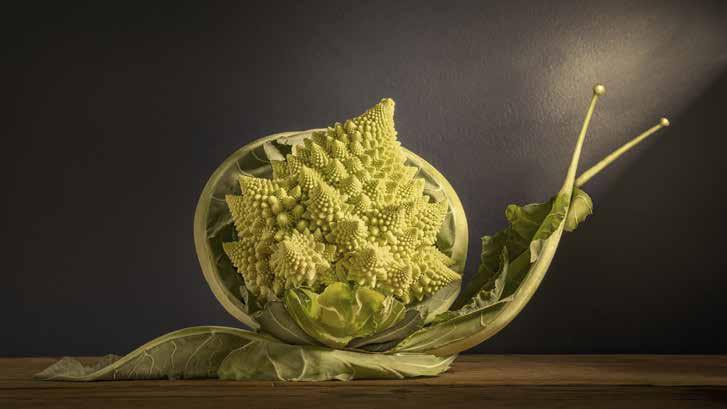
My photography spans street, landscape, macro and infrared, yet I’m continually drawn back to playful, creative food photography.
I’m a lazy photographer compared to those who rise before dawn for the perfect morning light, stake out wildlife in the rain, or travel across continents in pursuit of a single frame. I tend to walk into the kitchen.
Food is accessible - it doesn’t run away or move (mostly), and it doesn’t complain. But, within the everyday contents of a fridge or cupboard lies an almost endless playground of texture, colour and shape.
I’m not interested in producing Instagrammable, beautifully plated dishes. I’m more motivated by finding interesting and playful ways to photograph what I find lurking in the kitchen.
Icing sugar tends to clump together, to make an ice field; coffee grounds or tea leaves become earth and mud; flour becomes snow. You can create convincing snow drifts by sieving flour on a scene while gently blowing sideways, as in Carrothenge. Opposite (top)
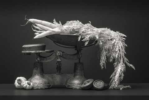
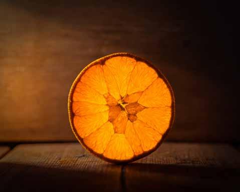
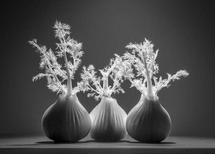
Sometimes it might just be a simple still life but lit in an unusual way - such as backlighting a slice of orange. Opposite (below). Or lighting from above and behind to create strong shadows and rimlighting. At other times, I might composite photographed food with photographed backgrounds, or experiment with infrared. The infrared glow from vegetables and foliage against a dark background gives excellent contrast, as in Carrots on Scales. Opposite (middle)
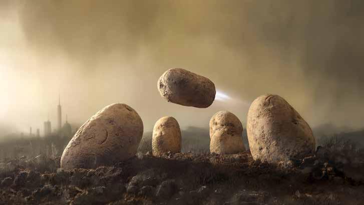
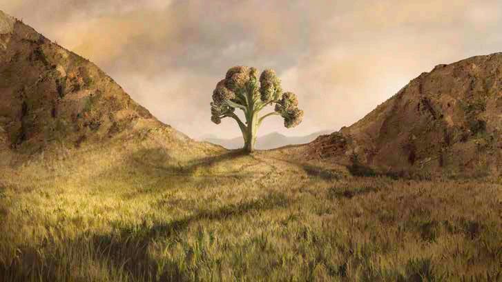
More recently, I’ve combined photography with digital painting, using Procreate on an iPad. As it supports layers, I can export selections from Photoshop as separate transparent PNGs. Once loaded into Procreate, I can paint entire backgrounds, paint over layers, and fiddle to my heart’s content, as in Potatoes in a Parallel Universe, and Broccoli Gap Overleaf (top and below)
My Romanesco Broccoli Snail was commended in the Pink Lady Food Photographer of the Year. It’s reassuring to know that a creative, conceptual approach to food has a place alongside more traditional culinary photography - particularly now, in a generative AI era.
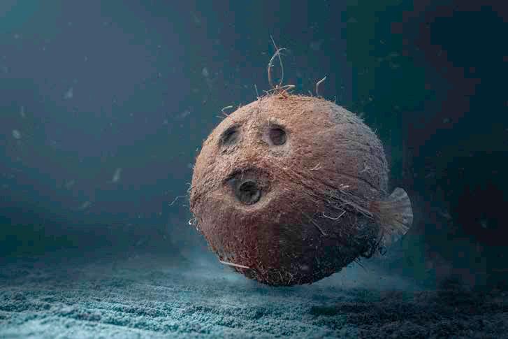
Of course, AI can generate surreal food landscapes in seconds, and it’s fair to question the value of spending hours building and refining a composite. But for me, AI isn’t a threat. Aside from questions of authenticity, it removes the part I enjoy most. It’s the process, and problem-solving I love, working out how to make something look as though it’s deep in the ocean (Coconut Fish), or how to construct convincing shadows and highlights. Shadows are surprisingly complex - there’s the occlusion shadow, cast shadow (umbra and penumbra), and the effect of distance, all needing careful consideration.
My workflow is straightforward. Basic adjustments begin in Lightroom: exposure, contrast, tone. If the image requires more complex work, it moves into Photoshop. Most of the heavy lifting is done with a relatively small set of standard tools: Curves, Hue and Saturation, Layer Masks, Brushes, the Clone Tool, the Pen Tool, selections and blending modes. Nothing particularly advanced. These tools exist in almost every editing application, but if you can master them, you can accomplish 99% of what you’ll ever need.
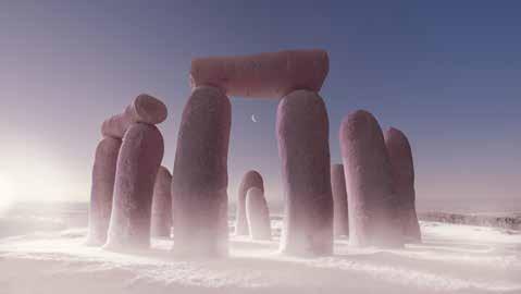
Carrothenge
If I had to nominate one crucial skill, it would be making accurate selections. When building a composite that’s meant to exist in the real world, edges are a dead giveaway and can immediately spoil the illusion. I sometimes work at 400% zoom or higher, refining edges in pursuit of perfection.
If you don’t get all the elements right, the viewer may not be able to
identify what’s wrong, but they’ll sense it - the image becomes uncanny. Of course, if you’re creating something more impressionistic, you have far more freedom when blending layers together.
Once the compositing is complete, the image returns to Lightroom for finishing touches. I sometimes apply a colour profile to help the overall consistency as a final touch.
Although I photograph across multiple genres, working with food means I’m limited not by location or weather, but only by what’s in the kitchen - and by my imagination.
Margaret describes why she has started using a smartphone for creative multiple exposure photography.
Over the years as an amateur photographer, I’ve drifted gradually away from a straight ‘representational’ style of photography towards a more creative one.
Standing in the tripod holes of others
at honeypot locations was fine and enjoyable for a couple of decades, but for me, it all eventually became a bit “So what?” and I found myself seeking something different to take home from my trips. I became drawn
to abstraction, gaining my FRPS in 2018 with a panel of architectural abstracts. I then ventured into the world of creating abstracts with incamera multiple exposures, and ICM, expanding my creative repertoire.
In recent years, I also find myself shooting more with a phone, rather than lugging my ‘big camera’ (actually a small mirrorless) everywhere. I’m an iPhone user in daily life, and there are dozens, if not hundreds, of photo apps for iPhone, lots of which I play with happily. However, I couldn’t find one that would let me do in-phone ME with the same control options I have on my camera. On that, I can take up to nine shots in any one of four blend modes and make various adjustments between each shot. The closest thing on iPhone was PhotoSplit, which is no longer available or supported. There’s a new app called ImageFlux which has potential, but is still buggy, and is also a very expensive subscription, which rules it out for casual use.
However, all is not lost. I was tipped off by fellow creatives to an option on Samsung (Android) phones, using an app called Samsung Expert RAW. This is for Samsung phones only (sorry other Android users). Deciding this was worth a look, I picked up a refurbished Galaxy S24 Ultra body, and downloaded the Expert RAW app. I’m not using this phone as a phone, it has no SIM card, it’s just a capable camera body that slides into your pocket and can always be with you.
Expert RAW gives you full camera controls (aperture, shutter, EV, ISO, WB) and shoots RAW or jpeg images, or both together, so for regular photography with the five lenses on the phone it’s very capable in what it allows for the experienced photographer. But for me, the particular beauty is that there’s a multiple exposure mode, where you can shoot up to nine shots either singly or in a burst. You can choose a blend mode from Average, Additive, Bright or Dark modes. You can adjust exposure compensation between shots. You can adjust white balance on a Kelvin scale between shots. You can pick up an existing image from your gallery as your base image and build on it. In short, everything I can do on my mirrorless camera in ME mode, I can now do on the Samsung phone. And my mirrorless only saves MEs as jpeg, not RAW like the Samsung.
So, carrying just this second phone body, I now have the capability of a bigger camera to create MEs on the spot, without needing to lug around bags of extra kit. As I’ve been consciously downsizing on kit for years, this is indeed a blessing! If you’re already a Samsung user, you can download Expert RAW from the Samsung app store, and it should work on any recent Galaxy model from S20 onwards, except on the budget FE versions, which apparently do not have the processing power for it. I’m not familiar with Samsung models other than the Galaxy, but if you can see the app in the store, it should probably work for you. Not every iPhone user is going to invest in a second phone body, I realise, but if MEs are an important creative option for you, perhaps consider it, and then you really can get magic in your pocket.
xpressionistcamera.com

I tend to favour creative styles in my own photography, preferring multi-imaging, abstracts and of course infrared.
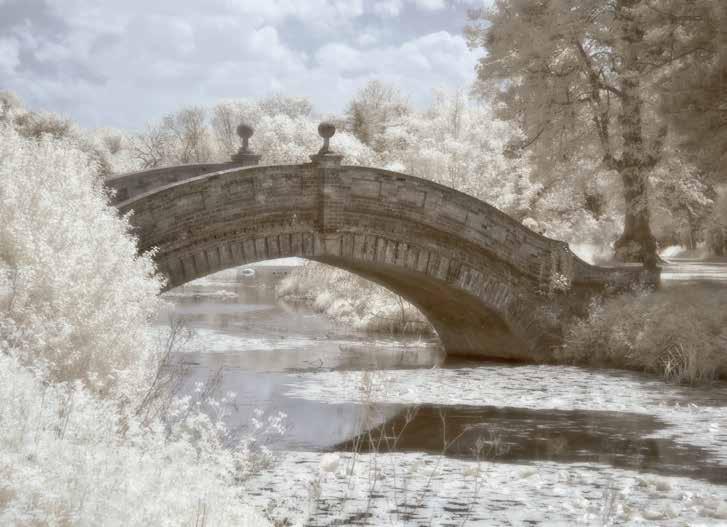
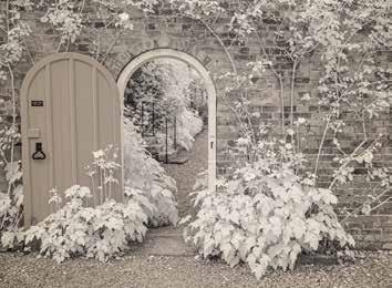
Ilove infrared photography, and I was delighted to be asked to share that love with you all, but what do we mean by infrared? The infrared spectrum of light is invisible to the human eye. It is reflected disproportionately by deciduous plants and trees and, by the use of a dense red filter in the system, we can photograph it. There are numerous ways of capturing infrared images,
from having a dense red filter on the front of the lens, or possibly using infrared film, to having a digital camera converted as is now the most common way. But as I want to talk about the joy of capturing images in infrared, I trust you will forgive me if I keep the technical side simple. I will just refer to my own experiences with my converted Nikon using a mid-range 690 nm filter fitted internally. This gives you
just a small amount of false colour in the image that allows some creative variations. You may still of course convert the image to monochrome.
When my camera, a Nikon D90, was converted by Mark Bond of Shoreham on Sea it was set up to produce a jpeg image ready for Photoshop, thereby breaking the fundamental good practice rule of using RAW, but I have found this no disadvantage at all.
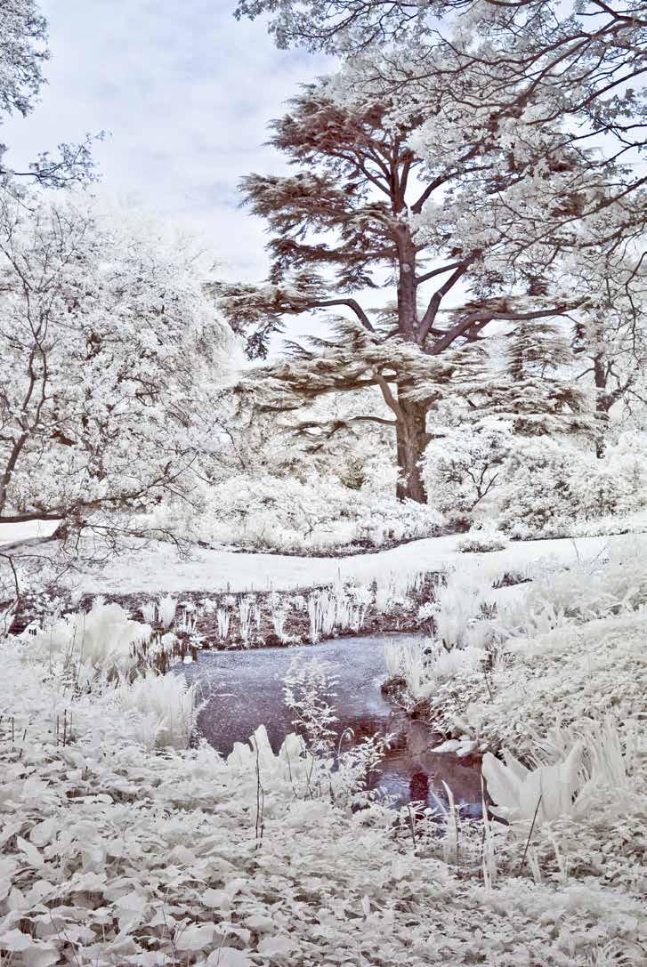
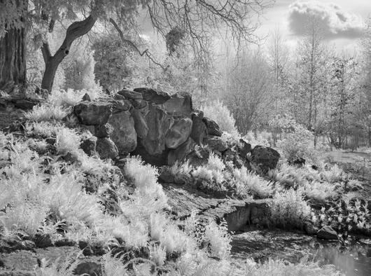
So, what turns me on about infrared? It is its ability to inject vitality into relatively prosaic scenes; it is like a light being switched on. But although that silvery monochrome style is magical there are several variations available, such as toning the mono image for example.
You can also utilise the false colour in the image. This is done by channel swapping. At this stage saturation may also be increased. In Photoshop, first adjust levels by clicking on auto (yes, I did say auto, it works). Now go into channel mixer and open the red channel, taking the red slider down to 0 and the blue up to 100. In the blue channel take the blue slider down to 0 and the red up to 100. You should now have a blue sky and sepia foreground with the customary light infrared foliage. It is a beguiling effect. Some tweaking of the colour balance may be necessary to get the desired tone in grass and foliage.
After having argued the case for channel swapping, I should add that the converted camera with a midrange filter (i.e. 680-730 nm) may also produce lovely tonal effects without any channel swapping at all.
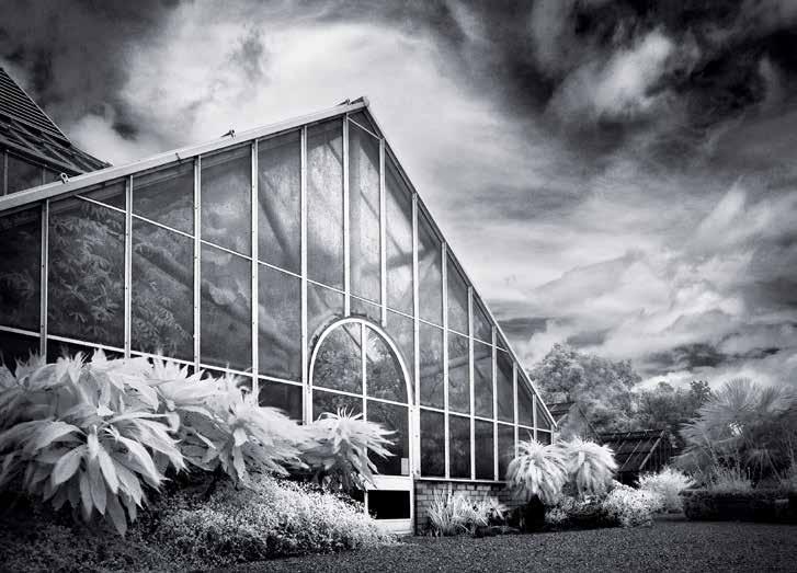
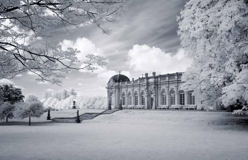
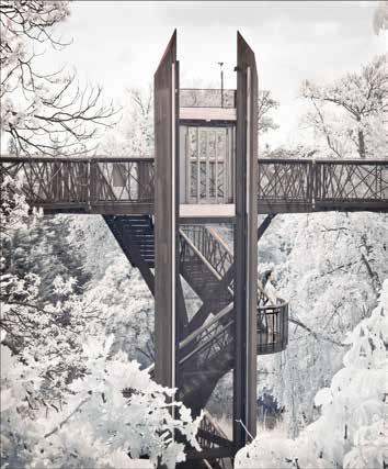
With the image Cambridge University Botanic Garden (Opposite, below), the dramatic sky lasted only a few minutes before becoming dull and overcast. It combines my love of infrared photography with my passion for glass houses!
www.colinsouthgate.com

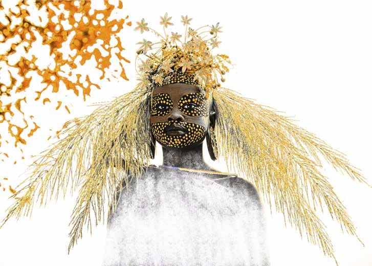
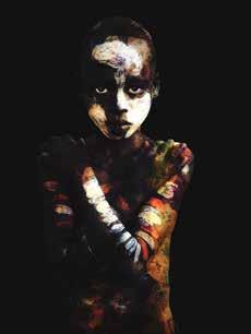
Ihave always been fascinated by people. The different cultures that can sometimes seem so similar to our own that there is a natural affinity. Or so very different that it is almost impossible to find a natural understanding of the community or individual.
Last September, I travelled to Ethiopia, primarily to camp for a couple of weeks, alongside the Suri tribe. Travelling to the Suri took over three solid days. At times I felt like I was in an episode of the TV programme Top Gear. Roads disappeared, washed away by engorged rivers, military checkpoints with armed guards looking for a quick buck, potholes the size of a small pond and the African massage of bumpy, bone shaking dirt tracks.
With each hour that passed it felt like I had travelled back a hundred years in time. Arriving at the Suri it felt like I had stepped into the Dark Ages.
The tribes are hierarchical. The chief is at the top, a series of male elders below him, the rest of the males and then the females. The tribes are polygamous, the position of the first wife is the most powerful within the female community. Women are in the main uneducated and do all the work. They are at the same level as a cow and are traded for cows when they are traded in marriage. When I say they do all the work, they do everything. They build the huts, sow and harvest the crops, collect water from the river, tend to the children, cook the food, the list goes on. Their work is never done!
The men tend the cattle and carry around AK47 guns as naturally as a handbag. They also enjoy quiet a lot of honey wine, which each village brews.
This is a very tough society. There are no shops, medical facilities, electricity or plumbed water. The tribe is largely unchanged from their ancestors. Here it is survival of the fittest, literally each day is a fight for survival. If the harvest fails or the river dries up, you starve. If you get sick, there is no medication beyond herbs.
Life within the tribes is very transactional. My access to take photos was controlled by the chief after negotiating of terms and payment.
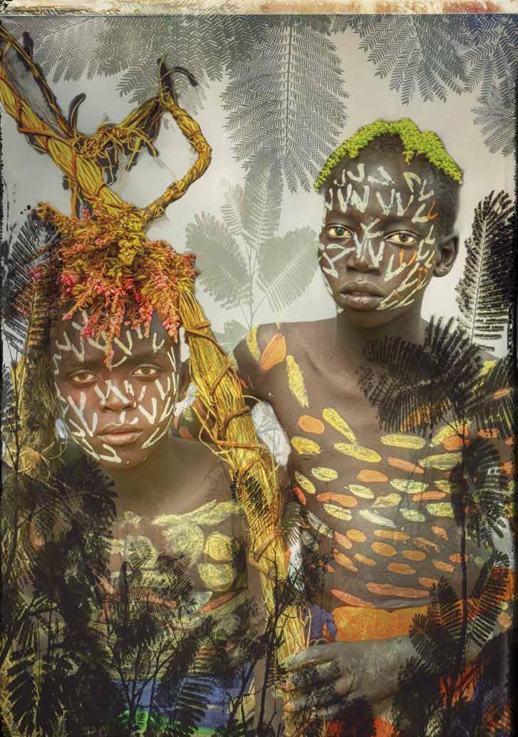
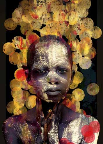
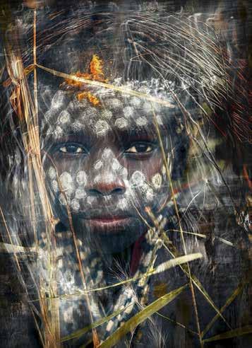
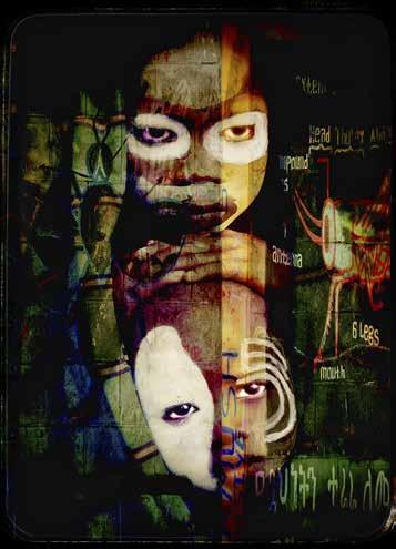
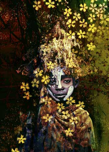
The children learn quickly to pose endearingly at the same time holding out their hand for soap, money or medication. Who can blame them, they have nothing.
In many ways it is the most honest society I have had the good fortune to visit. Once I understood that everything was a trade and my position as a woman, especially a white woman, was insignificant, life became very simple.
Learning how the Suri operate and think was fascinating. They are interested only in the here and now. Yesterday has gone, no need to worry about it. Tomorrow has not arrived, no need to consider it. Time is fluid, things happen when they happen. There is a simplicity and directness to this way of living. Numbers on a calendar mean nothing, neither do hands on a clock. Ethiopia is by their calendar seven years behind ours and their midnight is our 6pm. Not that anyone notices as they don’t have watches or clocks.
It is by western standards a brutal society. The tribes are very physical with each other, negotiation is not by word but deed. I found the physicality quiet frightening at times. Spitting, pushing, grabbing is not something I am used to, and the tribes are physically very strong. I discovered in certain situations being polite and smiley was not going to work. I had to establish that I was prepared to face up to aggressive behaviour with direct eye contact and a very firm, loud voice.
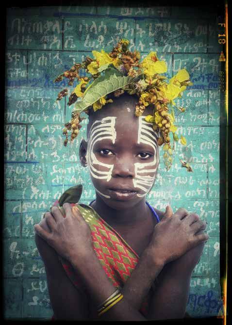
At the same time the tribe are completely at one with the land and the vegetation, showing deep respect for the bounty it offers them. Nothing goes to waste. They decorate their bodies and faces with mud from the stream and local foliage; creating headdresses and face decoration worthy of a Paris designer.
As a tribe they are exceptionally beautiful, with amazing teeth and symmetrical features. Their ability to stare straight into the lens is worthy of any top model.
Away from the lens they can be distant, obviously language and culture was a barrier. My greatest break through was when I introduced the tribe to bubble wands, which I had taken with me. Every member of the tribe from the Chief and Elders to the babies, laughed, giggled and squealed in delight as iridescent bubbles blew into the air. For that afternoon they all became childlike again and I was accepted as the bringer of magic.
My images are always multilayered. Normally I would layer in camera but as I had to shoot fast, I did not have that luxury. I find Photoshop is beyond me, so I work mainly in Procreate. The final results are always about tapping into my feelings about a moment. My subconscious finding oxygen. I let myself play, I don’t plan a final outcome or even have much of a preconceived idea. I simply add, subtract, sketch details in and play until something appears and speaks to me. A memory, a feeling, reimagined.
honeyjwalker.com

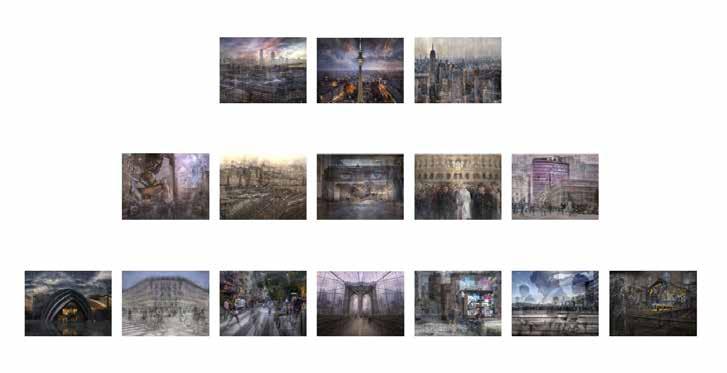
ASSOCIATE Presentation Layout
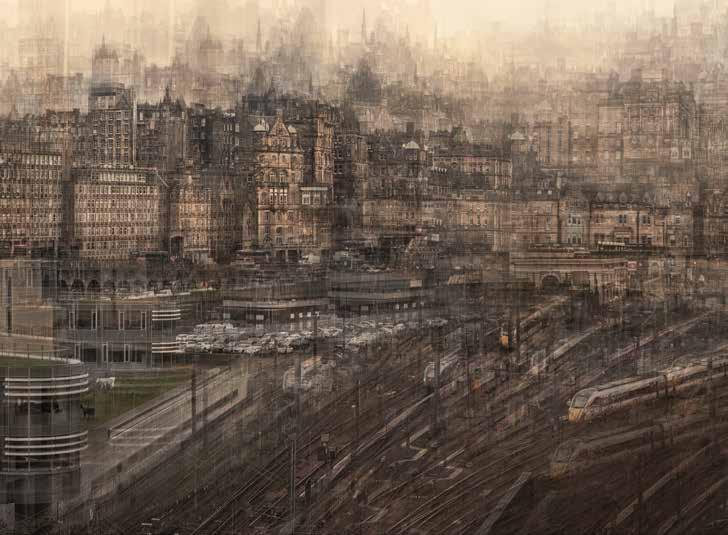
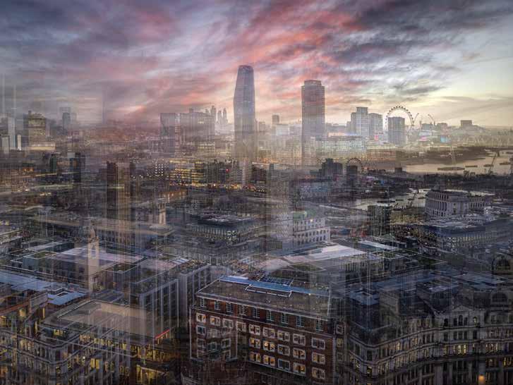
I live in a small rural farming village, but I love to visit the city. The panel I have created combines my love of urban photography and creative editing in Photoshop. My aim is to present a series of images that show the many different, varied, unique, beautiful layers that exist within the city — ancient and modern, dark and light, transient and permanent. This is my interpretation of the city. How it feels to me. The Layers of the City.
In the grand scheme of things, I am still relatively new to photography. Ten years ago, I had never picked up a proper camera, and the technical side of photography is something I never found easy. I had also never considered myself creative, so I have to say, this has all come as a bit of a surprise to me.
Looking back at my earlier images, there is a clear pattern in what I was drawn to: architecture, geometry, and strong lines, symmetry within the city, all working towards clean, uncluttered images. Long exposure was the first creative process that fascinated me. I loved that I could transform a scene into something different from what the eye sees, and I think the images that I make now are an extension of that process.
I progressed into a more creative editing style after a cancer diagnosis. The recuperation period after the surgery gave me both time to experiment, and a new perspective. Using images already in my back catalogue, I began to explore more complex editing. First, using a single image layered many times to create a pleasing effect, then moving onto using parts of multiple images to create composites.
As time passed, and life started returning to a more normal pace, I was able once more to explore new cities with my camera. My focus had now changed, to looking at how the scene in front of me felt, rather than how it looked, and translating these multi-faceted sides of an urban scene into a single image. Being able
to reshape and interpret the scene in front of me through my lens, my thought processes, and finally through postproduction, I find exciting. This body of work began as a Master Craftsman Panel for the Guild of Photographers and was initially presented in print format. I then decided to investigate whether my concept of layered urban images might work as an RPS Associate panel also. I undertook two one-to-one sessions and began reworking the panel to meet the requirements.
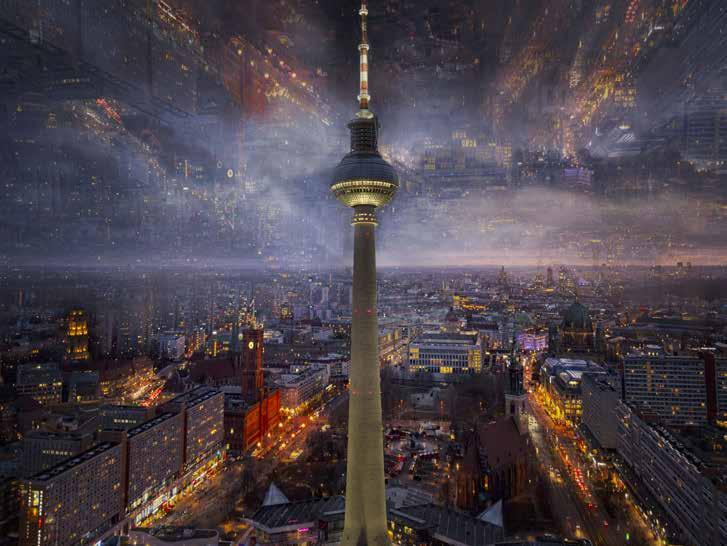
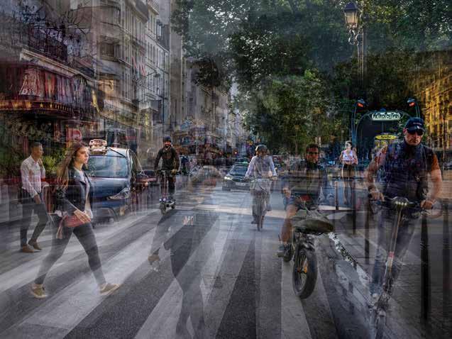
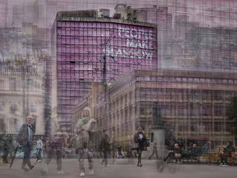
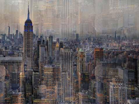
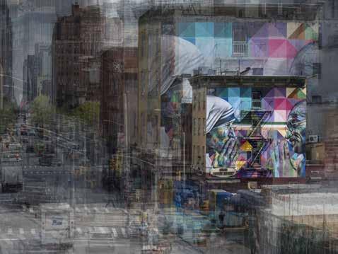
At the outset I already had a large collection of urban images. The challenge was identifying natural groupings and seeing which themes emerged. I had many overlapping ideas, rather like untidy Venn diagrams, that needed to be categorised, refined, and ultimately panelled.
The first step was organising the images by colour and visual coherence. Next, I had to be ruthless with cropping. I don’t normally work to a standard ratio, so looking to see which images worked within the landscape format I had chosen was essential. Images that had more of a leaning towards digital art, rather than composites, also had to be excluded.
As the panel began to take shape, a colour palette emerged: purples, blues, and soft pinks. With several images already selected, I returned to the city with a much more focused approach, deliberately seeking out these colours and scenes that would work within the developing panel.
I sat at fourteen panelled images I was happy with for a while – until eventually I made the final image that fitted into the missing space, and felt the panel was complete. In September, last year, I was awarded an ARPS with my panel, Layers of the City.
moragforbesphotography.com

ROB KERSHAW ARPS
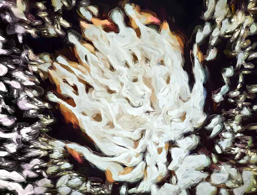
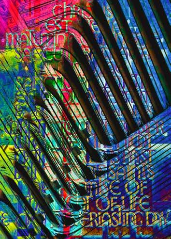
Back in 1998 a couple of my ink photos were published in the then Creative Magazine. This stemmed from working in the midnineties with a friend of mine to create images of his psychedelic ink patterns. The technique he used was based on the 60s and 70s light shows where light was projected through ink trapped between two glass slides. He used an old slide projector the type with a
push pull slide holder. None of your Leitz projectors here! Two pieces of glass were placed where a slide would normally sit, and then coloured inks were introduced by pipette between the glass (this can be messy). The heat of the projector lamp did the rest. It was, interestingly, a bit hit and miss as the ink moved around driven by the heat and the results were prone to many air bubbles. As the heat changed
the flow of the inks photos were taken of the images on the projection screen. The images changed all the time and were certainly not under artistic control other than deciding when to press the shutter. Once it seemed that a particular projection had run its course the glass slides were removed, cleaned and the process repeated with different inks. The possibilities were endless, and it was lots of fun!
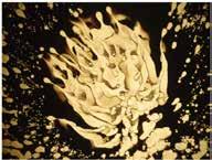
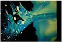
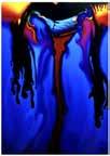
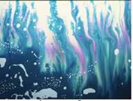
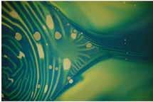
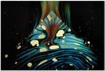
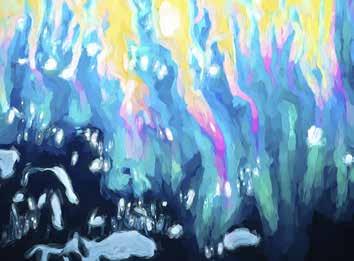
Three of the images 2, 5 and 6 were taken on a low resolution digital camera in 2004. The other original images were taken in the nineties on colour slide film and with, at the time, only a basic scanner to digitise them and no Photoshop, the images have languished on my computer. As can be seen on the contact sheet, the original slides required much work having been converted to jpeg from bmp format.
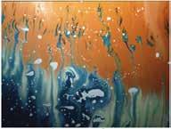
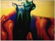
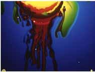
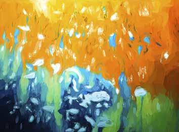
They were then 640x480 pixels at 72 DPI sRGB files. The final images are 3500 pixels on the long side at 300 DPI Adobe RGB files.
So now in the 21st century with a myriad of software options available I decided to revisit these images. Firstly, I entered one of the shots in the Creative Eye Group monthly e-mail circle and as it was well received, I decided to prepare this article.
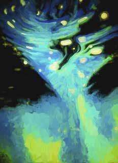
Each of the digital files was taken into Photoshop where the images were cropped and resized to the required magazine format. The Remove and/or the Spot Healing Brush were then used to clean up the image and remove ink artifacts and white ‘bubbles,’ where appropriate, though many were
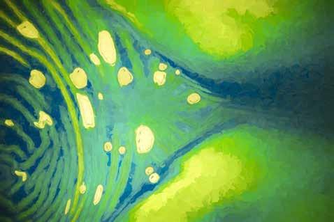
retained where they were part of the effect. The Camera Raw filter was then used to optimise the exposure and texture. However, perhaps the most important step was to manipulate the individual colours in the Color Mixer and finally reduce any noise.
Having completed the Photoshop
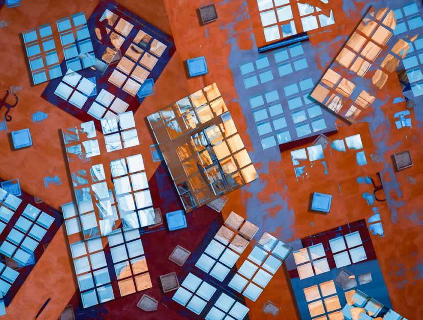
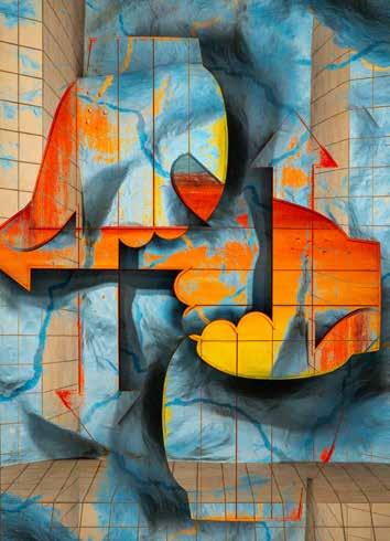
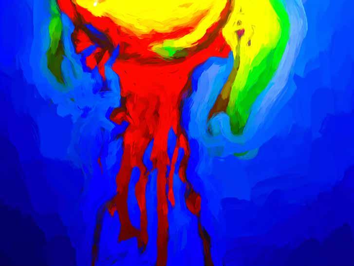
processing, I reviewed the selected images and decided to give them both a more abstract feel and a consistent look across the set. To do this I used Topaz Impressions 2 and applied the Impasto 2 filter to each image, and some were reorientated. The result is a riot of colour, shapes and patterns.
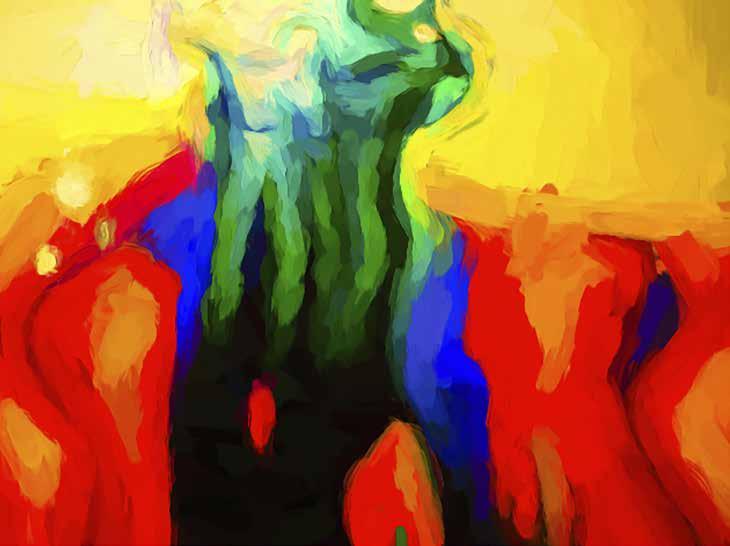
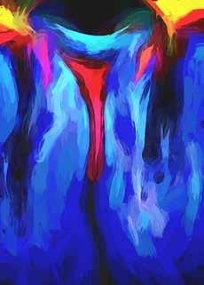
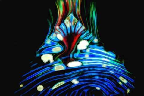
The rather random look will not necessarily please everybody’s eye, but I enjoyed doing them and resurrecting some old images. It’s amazing what today’s software can do!
Those of you who are interested in how the images are formed can see by visiting my friend Jean-Louis Gafner’s website. https://psychedelight.ch/en/ robckershawphotography.com

An opportunist photographer who has captured life through a seeing eye, often involving moment and monochrome in a creative way.
For photographers of a certain generation there is a nostalgia for producing monochrome prints personally using film and chemical processes. Others have either never stopped or are exploring film photography for the first time.
There is undoubtedly a feeling of achievement in shooting film, loading it into a developing tank in the dark, and processing it. This is followed by that first moment of excitement, or disappointment, when the film strip has been washed and hung up to dry…… the first sight of potential masterpieces, albeit in negative form. The production of a contact sheet follows and the choice of which image to print. It is then that the excitement is generated: the isolation in the dark, the smell of the chemicals and the anticipation followed by the emergence of the print in the developer, the fix and the wash, finally hung up to dry in all its glory.
This was the process that I followed until the turn of the twentieth century, when I was dragged screaming and shouting into the digital age of photography - the result of having lost the darkroom when moving from a house to a flat.
Not all was lost … at least I could scan negatives and print from the resultant digital file, as I adapted to digital workflow processes and utilised a commercial printing company. In my opinion, the process has changed but not the excitement. Instantly being able to see what I have taken on the camera screen and being able to take 1000+ images, if I want, without reloading the camera is clearly advantageous. However, the moment of truth in seeing a digital print for the first time has not gone away. It has simply transferred to the moment when I open a box of prints sent by a commercial printer and see my prints, ready for mounting - or not.
Although nowadays I produce colour images, I still ‘see’ in monochrome. Prior to pressing the shutter of my camera, I often decide that the scene that I am taking will be converted from a colour digital file to a monochrome print.
Generally, I look for subjects which have one or more of the following attributes: graphic subjects, shadows, silhouettes; bold shapes, high contrast; symmetry, texture, pattern; mood, threat, mystery.
In addition, monochrome can sanitise colour images and/or remove distractions. Nowadays, I continue to seek creative images where and whenever I see the opportunity.
Some examples of monochrome treatment are shown in my images.
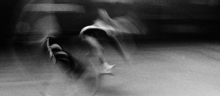
[Scanned from a darkroom negative]
A print from my Fellowship panel where I used a slow shutter speed to catch the movement and bold shapes of girl gymnasts, and developed the film to achieve a heavily textured image.
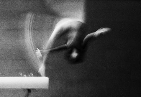
[Scanned from a darkroom negative]
An impression of a sailor leaving home to go overseas. The treatment was chosen to make the scene graphic and catch the mood of the occasion.
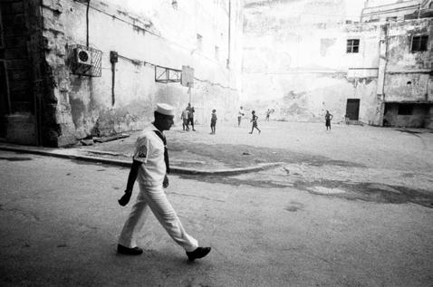
[Scanned from a darkroom negative]
This composition and the semi-silhouette treatment were chosen to link the boy in the crucifix pose with the couple at the end of the wall, implying a relationship between the three figures (which was not the case).
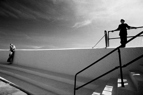
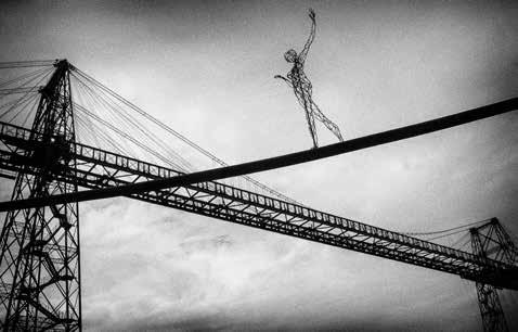
Wire Walker [Digital Image]
This image was taken in France at a transporter, a bridge structure with a moving platform underneath used to transfer people and goods across the river. This one was a hundred years old and the French authorities had organised an art installation, which included statues made of wire. My low viewpoint offered the optimum composition, and monochrome provided a degree of mystery with a graphic and textured treatment.
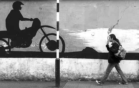
Smoke on the Wall [Digital Image]
This street shot was taken in front of a black and yellow wall, where I was fortunate enough to press the shutter just as the figure passed the crack in the wall, seemingly with ‘smoke’ coming out of his mouth. The monochrome treatment sanitises the image.
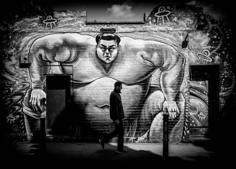
Sumo Threat [Digital Image]
I stood by an extremely colourful wall and waited for a person to pass… I thought a large man would be best, but this thin gentleman walked into my shot, and I realised monochrome would simplify the scene, and make it appear more threatening.
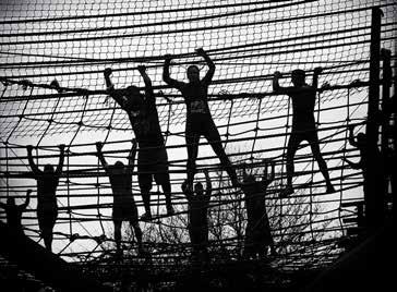
Hangers
[Digital Image]
A Tough Guy event in the Midlands offered the opportunity to photograph the participants as they strove to complete an extreme obstacle course. I waited by the rope wall and positioned myself to get the optimum silhouette, which I knew would be best in monochrome.
[Digital Image]
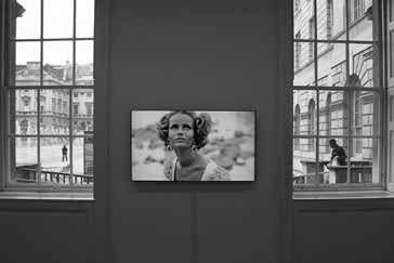
Taken in Somerset House at an exhibition, this image has a 1960’s fashion model in the frame, with male figures seen through the windows. Monochrome suited the scene, simplifying the symmetry of the composition.
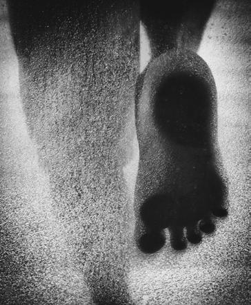
Footprint
[Digital Image]
Taken though frosted glass on a sailing boat. The graphic nature of the image is emphasised by the extreme texture of the silhouette.
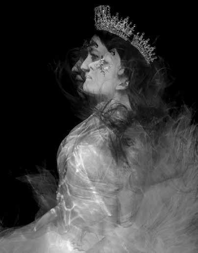
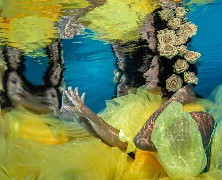
Nur is best known for her underwater photography, ranging from marine life and conservation-led storytelling to experimental projects exploring the human form beneath the surface. Whether documenting fragile ecosystems or exploring perception through abstraction and reflection, her work is drive n by curiosity and a fascination with how light, water, and movement shape the way we see.
For most of my career my work has focused on natural history - documenting marine life, behaviour, and underwater ecosystems. During the pandemic, when travel was impossible and the ocean suddenly out of reach, my practice shifted unexpectedly. Confined to my own swimming pool, I began experimenting with family
members and friends, initially without a defined outcome beyond staying creative. What started as informal play quickly developed into a serious and absorbing body of work.
Unlike most portrait photography, this process came without a team. There were no assistants for hair, make-up, lighting, or set design. I was responsible for everything: styling
the models, creating the costumes, arranging the set - including physically decorating the pool - and managing the lighting. I was also my own lighting assistant, safety support, and, at times, a substitute tripod. The simplicity of the setup was deceptive; working alone underwater magnified every practical challenge.
I became fascinated by how water alters perception. Reflections and refractions are not occasional effects underwater - they are constant and unavoidable. Sunlight fractures across the surface, bends through water, and reshapes form before the shutter is pressed. Although I often carried a clear choreography in my mind - sometimes developed months before a shootevery session ended with unexpected results. Each contact sheet revealed images I could not have fully anticipated, regardless of planning or experience.
This tension between preparation and unpredictability became central to the work. I would visualise a gesture or composition, only to have water, light, or material intervene. Fabric behaved differently from one moment to the next. Refraction shifted focal points. Reflections fractured the figure. Rather than resisting these outcomes, I began to treat them as part of the process. Control was never absolute, and learning to work within that limitation became essential.
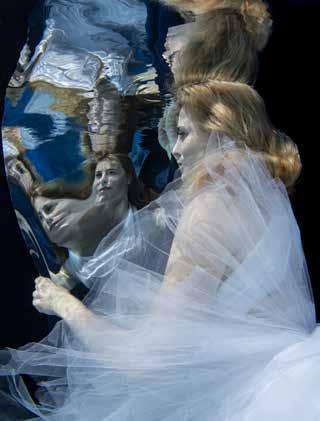
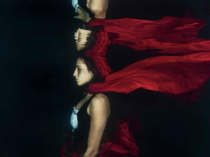
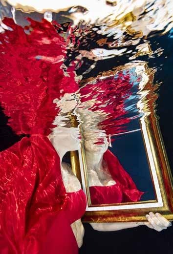
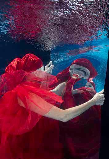
Costume quickly emerged as a key element. With no background in dressmaking, I made all the underwater costumes myself through trial and error. Materials that worked on land often failed underwater. Some became heavy and unmanageable; others floated too freely. Over time, I learned which fabrics held shape, which responded to light, and which introduced movement without overpowering the subject. The costumes were never intended to be perfect - they were functional tools, shaped by repeated failure and adjustment.
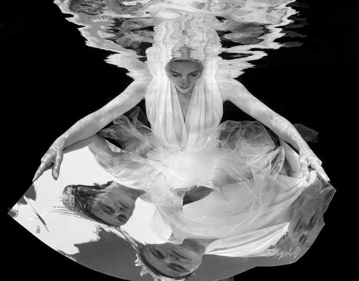
I later began working with mirrors underwater, adding another layer of complexity. Acrylic mirrors were used initially for safety, but repeated immersion caused many to crack or break. Rather than discarding them, I continued using these damaged surfaces. The fractures produced distorted, fragmented reflectionsimages that were incomplete and unstable. These imperfections became conceptually important, echoing a culture increasingly focused on surface appearances, where images are abundant but understanding remains shallow.
Practical challenges extended above the surface as well. Wind became a constant adversary. Fabrics floated uncontrollably, mirrors shifted or lifted, and carefully planned setups could unravel in seconds. Lightweight plastic materials required drilling and weighting to keep them in place. I found myself revisiting long-forgotten school physics - aerodynamics, buoyancy, drag - simply to stop objects from drifting out of frame or colliding mid-shoot. What appeared effortless in the final image was often the result of repeated adjustments and problemsolving.
Working with models underwater also demands a different approach to direction. Movement is slow and resistant, breath-holds impose natural limits, and communication is minimal. Gestures must be simplified; expressions are fleeting. The camera captures moments of adaptation rather than performance. The body responds instinctively to an unfamiliar environment, and that response brings a level of honesty that is difficult to replicate on land.
Colour plays a functional rather than decorative role. Fabric, light, and water interact continuously, altering tone, contrast, and depth. Colours deepen or disappear; edges soften. I use colour to guide attention and structure the frame, responding to how light behaves underwater rather than imposing a fixed aesthetic.
Ultimately, this body of work is grounded in experimentation rather than control. Despite careful planning, each shoot produces outcomes that cannot be fully predicted. Water resists precision, materials behave unpredictably, and reflections distort reality. Within those constraints, I have found a way of working that balances preparation with chance - where the final image remains, inevitably and productively, a surprise.
In a society increasingly shaped by selfies and carefully constructed images, this work questions the reliability of what we think we see. Underwater reflections fracture, distort and multiply the figure, reminding us that identity is never fixed or singular. What a subject attempts to project may not be what others perceive, and no single image can ever fully define a person. By embracing distortion, imperfection and unpredictability, these photographs invite the viewer to look beyond surface appearances and to accept that perception - like water itself - is fluid, subjective and continually shifting.
nurtucker.com
DAVID TOWNSHEND FRPS
If you go down to the sea today, you’re sure of a big surprise.
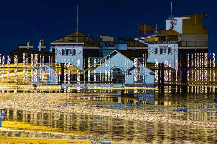
Imagine a sunny winter’s afternoon at a British seaside resort. An expanse of sea and sky, a beach of sand and mud at low tide; and perhaps a pier that has survived fires and a century of storms.
Add to that the light. Shapes and patterns are created by the sunlight shining through the pier supports and reflecting off the sand ripples and pools. The patterns change as the sun moves across the sky and the tide comes and goes – ever changing shapes, shadows and reflections.
A seaside resort is a happy mix of the natural and the manmade. Natural cliffs, headlands and sweeping
beaches, combined with striking architecture. Think of Blackpool Tower, Bexhill’s De La Warr Pavilion, The Cob at Lyme Regis, or Scarborough Castle. The seafront of Weston-super-Mare has its own recognisable seascape features, and these provide the raw material for my images.
Weston-super-Mare still has striking buildings from its Victorian and Edwardian heyday. It developed as a seaside resort from the early 1800s with the building of the Bath House on Knightstone headland in 1832, followed by the Pavilion & Opera House in 1902. The Grand Pier opened soon after – and was re-built after fires
in 1930 and again in 2008, resulting in its striking new pavilion.
The resort is sheltered from the south by Brean Down, a limestone headland in the care of the National Trust, with rich fauna and flora including the rare white rock rose. The final feature is the island of Steep Holm, isolated in the middle of the Bristol Channel. It has a distinctive profile, and also Britain’s only population of naturalised wild peonies, brought there by Augustinian monks from south-eastern Europe. But I digress.
These striking features embrace a huge intertidal expanse with sand ripple patterns and shallow, reflective tidal pools. At the top of the beach there are yet more shapes and shadows – curved stone benches at the foot of the seawall and curved shiny metal handrails along the promenade, installed as part of major seafront enhancements in 2010. And a final touch – a man feeding crows on the beach. Overleaf (top)
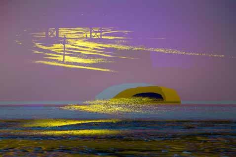
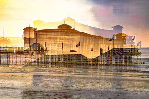

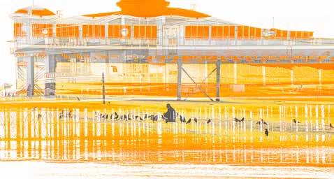
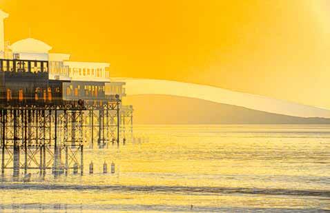
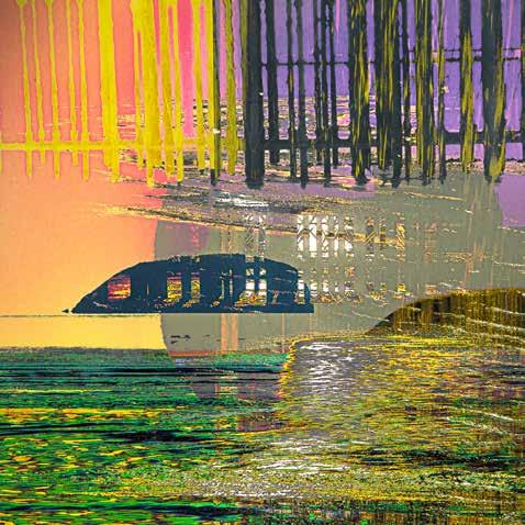
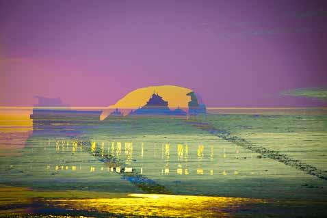
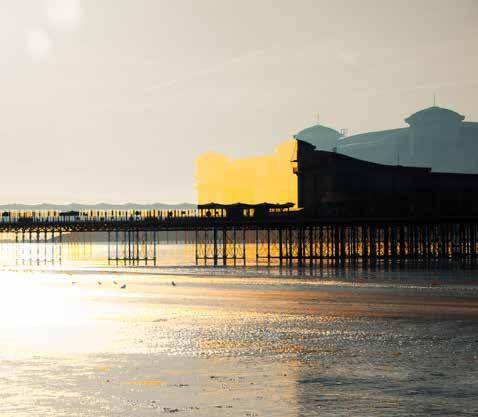
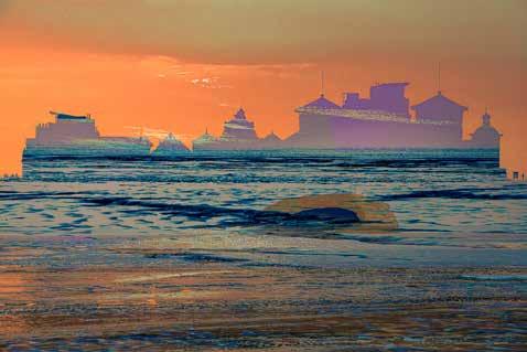
My images of Weston are not representational, but rather they interpret and explore the seafront by combining these seascape features in unique ways. Some images are abstracts, others impressions in which you can still spot the sand, pier or island. All the images were composed in-camera on one November afternoon, imbuing them with a sense of place and time.
My images contrast and juxtapose the natural and manmade curves, shadows and silhouettes, lines and grids, with the profile of Steep Holm a recurring motif. I have used colour to convey the joy from a day at the seaside, including the yellow and orange of the approaching sunset.
I hope my images encourage you to stop and look. Let them conjure thoughts in your mind - of joy, happiness, memories, perhaps stimulation perhaps calm; and enjoy the intrigue of what is in each image.
As you read this article, you might ponder on how different the view west from Weston would be if the oft-proposed Severn Barrage were to be built from Wales to Brean Down via Steep Holm….
davidtownshend.com
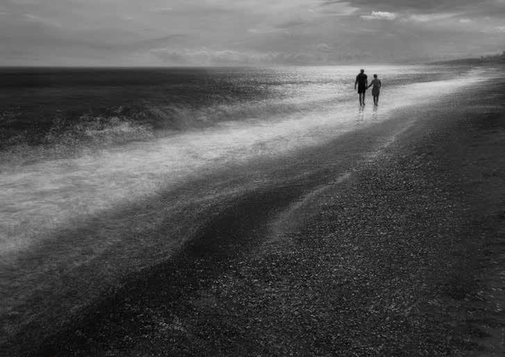
Ihave enjoyed photography for many years and use it as a counterbalance for the stresses and challenges of everyday life. I rarely go looking for pictures but find they seem to come to me.
The enjoyment of photography for me is waking up in the morning and wondering if this is the day I will capture that exceptional image. It rarely happens, but when it does, it makes it all worthwhile. I rarely go on specific photographic trips but enjoy photographing where I happen to be, in my local area, on weekends away, or on holiday. I find this a much more enjoyable and relaxing approach to photography.
I love thinking of new ideas and embracing new techniques and technology, thereby helping to improve my creative approach. For me, being creative can mean anything from enhancing a single image to creating a completely new one using multiple pictures. Whether a single or composite image, my aim is to create images which are thought-provoking and intriguing with an element of storytelling. Often a monochrome conversation enhances this approach.
I don’t use expensive equipment, with many of my images taken on a compact camera. Lately, I have also embraced my smartphone and the wonderful creative opportunities it
has to offer, including the wide variety of apps that are available for creative photographers. The two apps I favour the most on my phone are Spector, which is a long exposure App and Average Camera Pro, which I use to take multiple exposures, as my camera does not have this capability.
Being an open-minded photographer, I will have a go a photographing most things from studio to abstract. I go for a walk most days and always have my camera and or phone with me……. just in case!
I hope you enjoy the selection of monochrome images I have chosen to share with you.
racheldomleophotography. wordpress.com
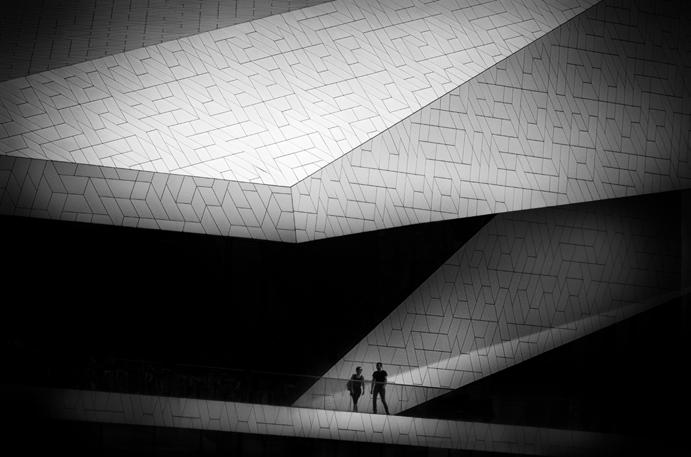
I shot this image looking towards Amsterdam’s EYE Film Museum. I was lucky enough to capture the couple at exactly the right moment. I removed other figures and chairs to the left of them and added a black overlay giving it a more impactful and minimalistic feel.
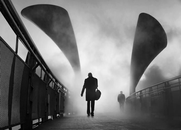
This image was taken during an art installation on Pero’s Bridge in Bristol, where a fog machine was installed to highlight the potential consequences of pollution.
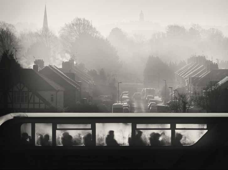
As with many of my photos, this image was not planned but evolved in post processing. Setting out to shoot a misty morning over Bristol, I took several images before noticing the buses going down the motorway full of people heading to work. The condensation created a lovely abstract feel. Later in the day I reviewed the images but didn’t have one single image that I felt worked well, so to create a more impactful image I blended two of the photos, one streetscape and one of a bus and then converted to monochrome.
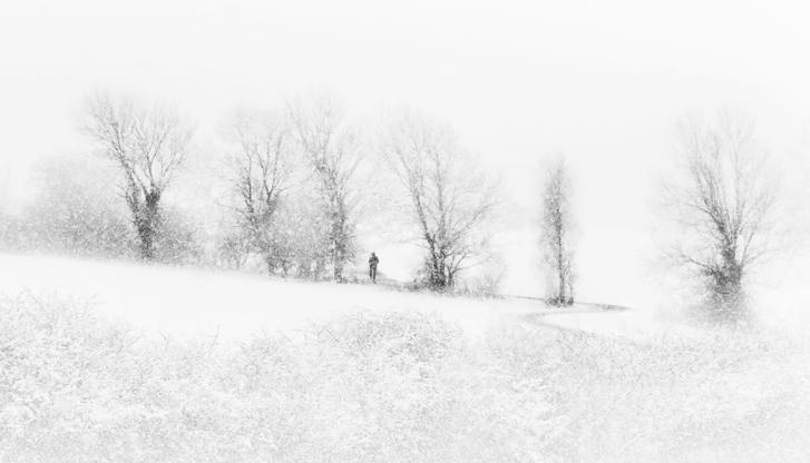
This scene near my home is usually a most uninspiring view but in the snow, it was transformed. As I approached, the snow intensified and I then noticed a figure walking through the gap, which completed the scene.
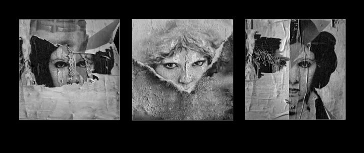
Sometimes I find grouping photos together creates a much stronger message. I often create triptychs and panels either on a single sheet or as separate printed images. This was part of a series of images taken of old posters and graphics spotted in the back streets.
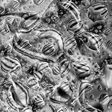
This image happened rather by accident. I had been using a small sheet of Perspex to create some images in the garden (which failed). I left it on the patio table and later in the day noticed it had started to rain and went to bring it in but saw the rain was creating some amazing abstract patterns of the seat below. I blended two of the images in post processing and converted to monochrome.
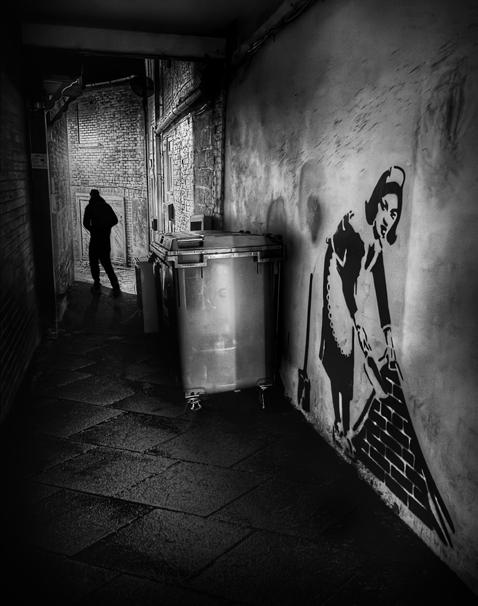
This image was taken using my phone, as it is spectacularly good for night shooting. I felt that this small alleyway with a Banksy copy at the entrance needed something extra, so added the figure to create a more of a sinister feel.
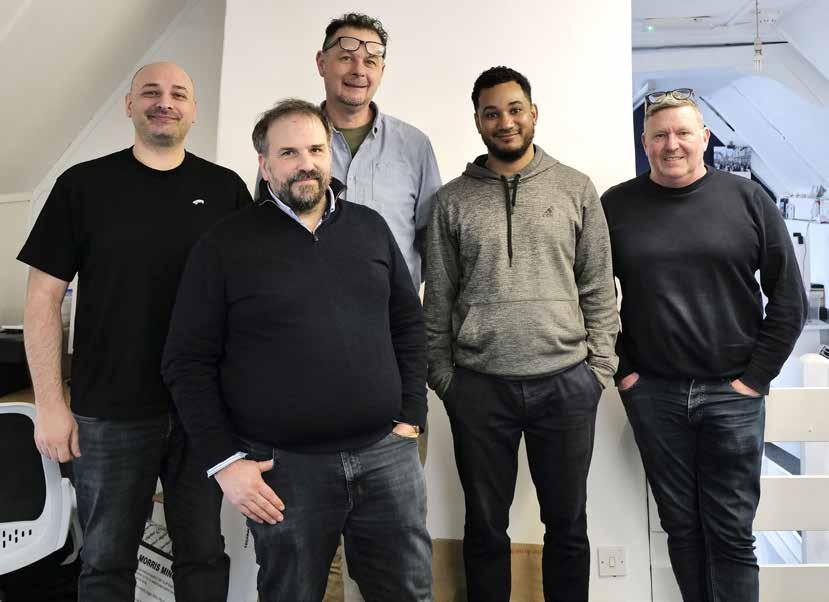
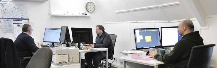
Keith Avis Printers is a family run business that has been working from the same High Street premises in Hadleigh, near Ipswich, Suffolk since 1969.
We are privileged to be based in a listed building of significant architectural interest that has been in continuous use as a printing works since around 1770.
Behind the façade and at the rear of the building is our print office and workshop, where we have a wide range of offerings, including in-house publications, bespoke design and print, large format printing and production of magazines.
In such a long-established printing works it makes us very conscious of our responsibility to continue a tradition, continuously investing in new machinery and technologies.
The personal service we offer has resulted in an impressive list of longstanding clients – ranging from small businesses to large national companies and organisations, local government departments, as well as advertising agencies and design consultants.
We are particularly proud that PFP/ KA has been responsible for printing over 60 issues of this magazine. To have played a part in its journey to this 100th edition is a privilege, and we extend our congratulations to everyone involved in reaching such an important milestone. We look forward to continuing our association for many issues to come.
Director