We acknowledge the people of the eastern Kulin Nation on whose unceded lands we conduct our business and we respectfully acknowledge their Ancestors and Elders, past and present.
And We Thought Nobody Was Watching: Australian Independent Typographic Publishing 1988–2008
Stephen Banham
Publishing in the Platform Age: Between Presence and Disappearance
Layla Tweedie-Cullen 52
58
This Page is Not Empty Sonali Mirpuri and Mille Almsig 42
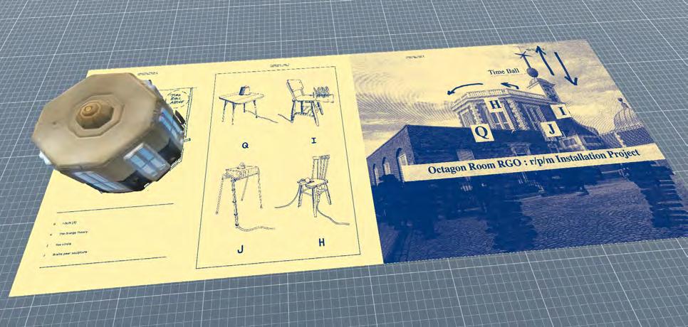
Publication As Archive. Designer As Archivist: How Can Publication Design be Utilised to Preserve, Spotlight and Unearth Counter Histories?
Mia Murone
60
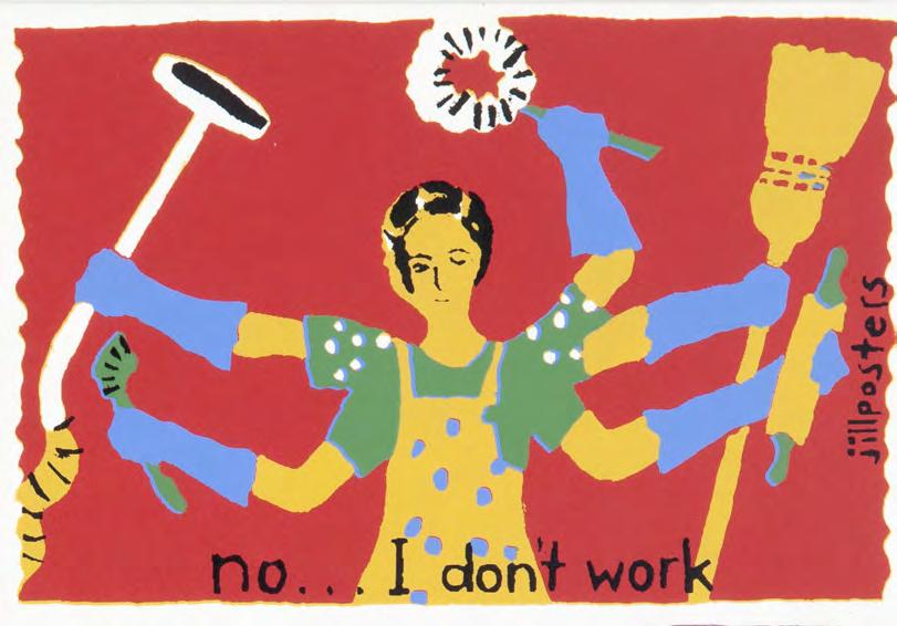
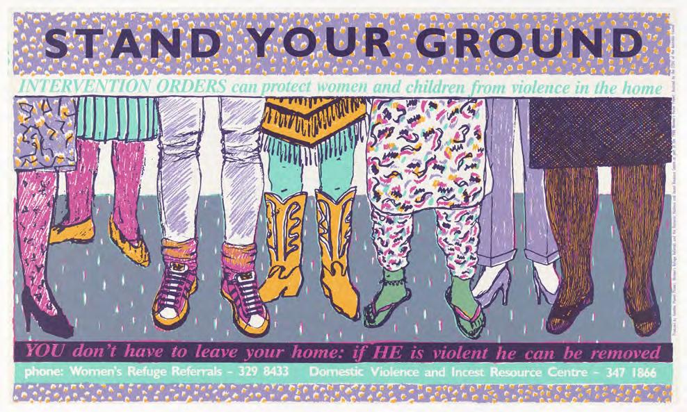
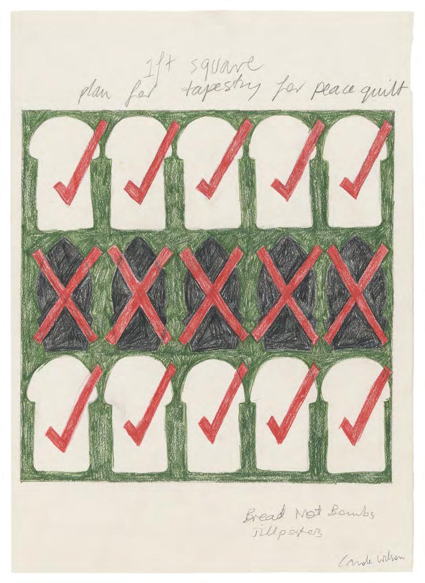
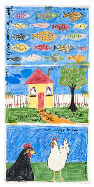
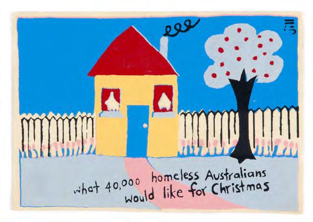
addition to the collection Jillposters and Another Planet Posters Collection Gift of Carole Wilson
Autonomous & interdependent design
The creative ecology of publishing has always been dependent on a diverse array of autonomous practitioners and interdependent and overlapping local, regional, national and international networks. Independent publishing provides a space for eclectic dialogue between diverse communities, the intersection of experimental practices, and a site for speculation, contestation and critical discourse.
The necessary collaborations and relationship building between authors, designers, editors and prospective publics requires trust, care and attention to materials, time and labour and a cross-pollination of ideas, which can be both personal and idiosyncratic and communal. The necessary firmament is a spirit of curiosity and inquiry which values a diversity of creative interpretations and a need to make visible new ways of being in, and engaging sensitively with the world.
Publishing has always been a risky and speculative venture operating in an ever-changing production and distribution environment, and thus a necessary collective enterprise in search of new publics. From punk proclamations to disciplined inquiry, subversive provocation to reflexive questioning, independent publishing provides a vital forum for disseminating new ideas, probing conventional orthodoxies, whether procedural or processual, and facilitating experimental practices. This issue of the journal explores the diversity of independent publishing in Australasia, with an emphasis on design as the interstitial and sticky glue between authorship and publication, as well as within and between different communities of practice.
In “On Zines and Printed Things”, Paul Davis immerses us in the Festival of the Photocopier in February 2025 in order to take us through a journey through time and space to the establishment of the artist-run Sticky Institute in Naarm/ Melbourne in 2001. While diy, Davis reveals the why of micro-publishing as more nuanced and heterogeneous than you would expect if you haven’t attended these intensive and personal events. He also reveals a more personal journey of exposing his sketchbooks through a series of hungrygeese and Raised Eyebrows across a multi-national journey, which coincidentally overlapped with an emergent zine scene in Melbourne. How this made its way into Libraryland is part of the exposé of his intriguing & intricate drawing process.
Michael Bojkowski explains how graphic design magazines enabled sole practitioners to connect and find a common ground in the developing processes and technologies of the profession. The emergent autonomy of the designer/editor provided provided both print and online fora, enabling independent designers to connect with an expanding network of people and processes. However, with the increasing cost of high quality printing and competition from the internet, small presses filled the void, and Risos were added to the ink mix. However, it was only through practitioners familiar with print and emergent digital infrastructures, who were able to respond intentionally and draw from a shared community of practice. Paul Davis and Michael Bojkowski both value the community and creative connection provided by zine fairs, online fora and tangible and experiential Art Book Fairs, marking out a communal space between solitary independent practice, gift and exchange, emergent practices and publishing futures.
Shane Thomson’s experience of a raw Subaud grabbing his attention in the Brunswick Street Book Store in 2002 sparked a 3-year collaboration with an architectural collective who sought to subordinate and challenge the monologic marketing of professional architecture. An interdisciplinary dialogic practice arose out of the collaboration, providing an opportunity for a slower and more deliberative approach to interpretation and translation of each issue, as well as a license to independently and collectively experiment within the Urchin studio.
By contrast, Stephen Banham demonstrates the value of the accumulation of independent typographic publishing across 20 years in Australia, which sustained disciplinaryspecific critical and creative practice. The agency of designer as author is contrasted with the idiosyncratic and uncoordinated development of a series of speculative publications which, in hindsight, sustained a community of practice and developed a more robust and cohering critical inquiry into local conditions for typo-graphic design. Its initial autonomy from international discourse was important to make visible specific cultural inflections, but ultimately generated a more nuanced and diversified understanding and appreciation of graphic design practice.
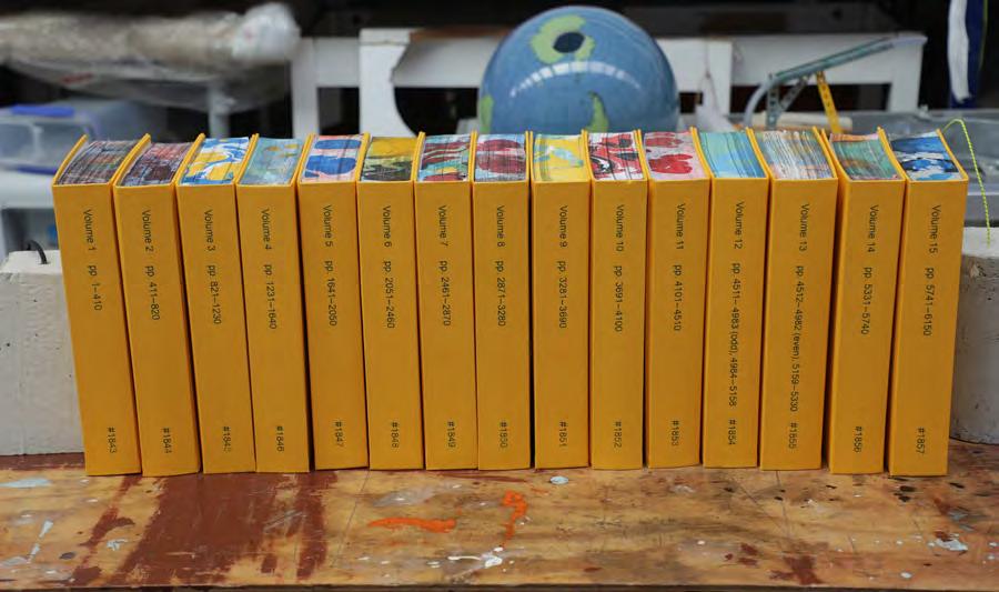
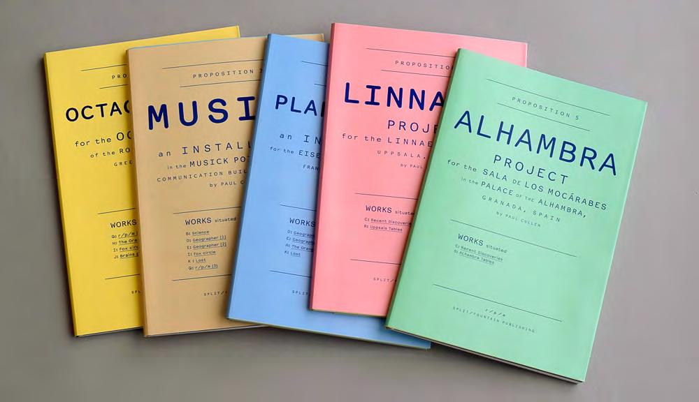
Layla Tweedie-Cullen reflects on her eight-year crossdisciplinary design, publishing and curatorial initiative split/fountain (s/f ) in light of the cultural flattening and shouting monad machine of the current Platform Age. In contrast to the algorithmic race to gain attention or eye-balls, Tweedie-Cullen’s project sought to expand the language of the book and to explore alternative models for circulation and distribution. This involved making time and space available for relationships to develop, maintaining active critical attention and facilitating dialogue and experimental practices. This resistance to, and tensions with the dominant commercial logic of publishing is characterised by fragility and tension, but the friction is also generative.
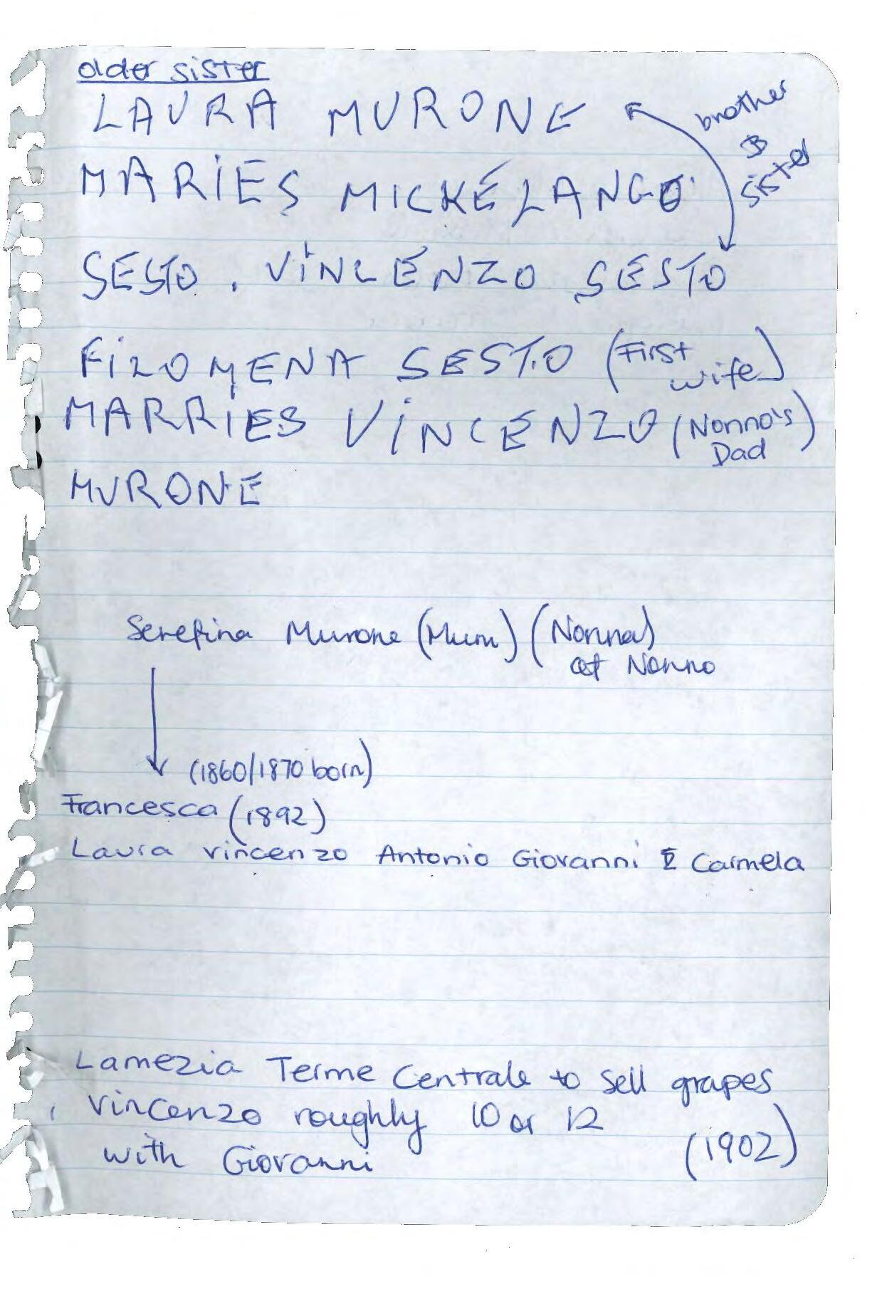
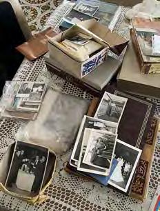
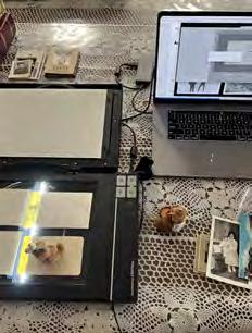
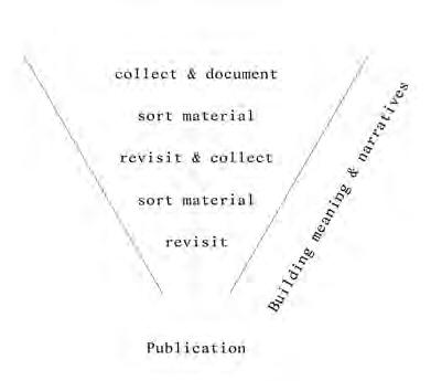
While focussed on a singular publication, Mia Murone explores another form of editorial autonomy through a hybrid practice of designing and archiving her family history. The process of documenting a family archive revealed a tension between the fragmented material artefacts and the intangible lived histories of her grandparents. A three-way dialogue between the designerauthor, her grandfather and the archival materials enriched the family history and informed the design of the book and the latent possibilities in both preserving and disseminating alternative histories.
Fittingly this issue concludes with the juxtaposition of dissemination and preservation in the forms of an exhibition spatialising and socialising independent publishing in 2025 and the gift by Carole Wilson of the Jillposters and Planet Posters collection to the rmit Design Archives. The exhibition proposed the question: What kind of world could we create if every voice had space on the page? It is hoped that this issue of the Journal has demonstrated the richness and diversity of independent publishing, and in totality, will inspire further research on the histories and futures of interdependent publishing.
Noel Waite Editor
On Zines and Printed Things
Paul Davis
On Zines and Printed Things
Paul Davis
At the Festival of the Photocopier zine fair in the Melbourne suburb of Kensington recently more than 350 stallholders sat behind trestle tables meticulously, lovingly colonised with their handmade ephemera. The weekend event was one of those niche festivals Melbourne does so well, ones that attract a large community of enthusiasts you didn’t know the city had. On the day I went it was a struggle to move between the tables, such was the crowd. I was there as a zine fan and as an occasional self-publisher looking for ideas and inspiration, and to catch up with old friends and zine heroes whose new work I wanted to buy. It was impossible to ignore how chuffed the zine makers were as they talked about their work with fans and friends. Visitors standing at a zinesters1 table would lose themselves in conversations around technique or style, perhaps even shyly taking their own zine out from their tote bag to show the stallholder, to maybe get some advice or offer a swap.
Despite the sign saying “zine fair” this was in reality a celebration of anything goes self-publishing. In addition to your archetypical black and white photocopied zines (which were a minority) the fair featured handstitched books, perfect-bound full colour comics, three-colour Risograph printed posters, vinyl stickers, potato print stamped paper bags, serialised graphic novels, and everything else zine adjacent. The effort these artists invested into the production of their idiosyncratic craft was astounding and was suitably rewarded by more than 4000 self-publishing enthusiasts who turned up to connect, meet their heroes, geek out on zine-making techniques, and to shop all things analogue.2
The Sticky Institute organised the festival and has been fostering zine-making and print-based self-publishing in all its forms in Melbourne/Narrm since 2001. The artist-run initiative continues to provide space, workshops, and festivals across the city for a fervent zine-loving community to buy, sell, swap, make, and discuss zines. Today, the popularity of zines and self-publishing in Melbourne and beyond is reflected in the growing collections of zines in some of the world’s major public institutions, including the State Library of Victoria, the Tate and the Los Angeles Public Library. The Seattle Public Library’s zapp Zine Collection has more than 30,000 zines and self-published titles.3
However, to anyone outside the zine community, this hysteria for the handmade might seem wildly incongruous, absurd even, compared to our obsessive dedication to
all things online and digital. This is because the zines’ handmade, paper-based format is an anarchism, a quaint throwback to old-fashioned analogue publishing. To many, zines are an evolutionary step backwards to a time when getting your work seen by the wider world was an arduous, Sisyphean task that invariably ended in despondency and disillusionment. What’s the point of going to all that effort to cut, paste, photocopy, and staple a few copies of your manifesto when you could just put it online for thousands to see?
To understand zines’ appeal, it is worth noting they are not necessarily an attempt to recreate old mainstream media.4 Nor are they arbitrary hardcopy printouts of one’s online Instagram or Substack posts. It is better, perhaps, to regard these time-consuming acts of slow publishing as loose, independent, punk proclamations in their own right. As simulacrums of formality, brazen diy statements in the face of better organised, slickly marketed, more lucrative media, zines are quintessentially micro, not mass, marketing. It is better also to see them as tangible artifacts of individuality, creativity, craft, or as personal statements, gonzo expressions, and exclamations, rendered on paper that refuse to be easily deleted, unfollowed, or sucked into the cloud.
To enthusiasts, zines have a certain tactile charm and cachet that ages and fades affectionately, like printed family photographs or newspaper cartoons you cut out and put on the fridge. Zines’ popularity makes sense, perhaps, when
we also consider the resurgent popularity of vinyl records and film photography. This kind of micro publishing doesn’t crave the attention of thousands of eyeballs. Instead, zines take comfort in their making, and in their humble community of fans. In some ways zines are closer to those mixtapes we cobbled together in bedrooms to proclaim our personal tastes, and to demonstrate our consideration of our friends’ tastes who we made the tapes for. Indeed, the reasons why someone might go to the effort to self-publish are as diverse as the subjects they cover and the ways they are made.
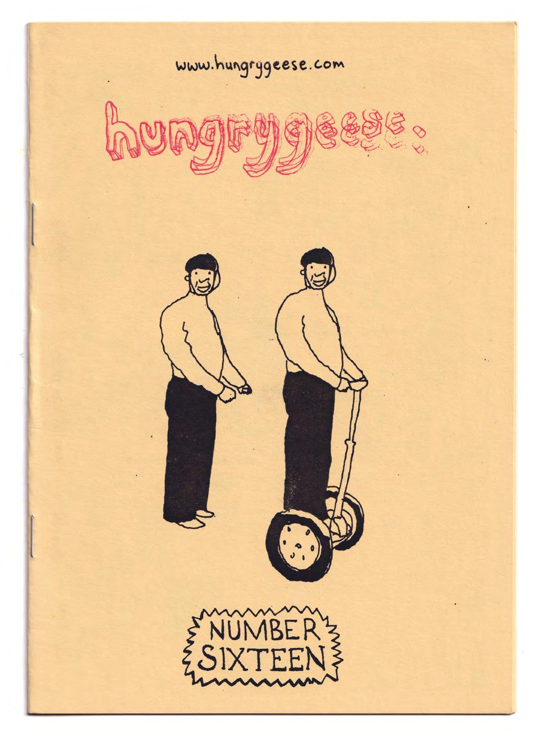
The reason why I started a journey into zines and selfpublishing is also idiosyncratic, beginning even before I knew what a zine was. I started making “printed things” in the late 1990s while working part-time jobs in India, Vietnam, and Japan. Travel and patchy employment gave me space and time to pursue hobbies in drawing, graphic design, and self-publishing. The drawings I made back then went from travel diary illustrations of street-side scenes in Ahmedabad, to wannabe New Yorker cartoons designed to make my friends laugh. Over time, I curated the best work from these sketchbooks into something called hungrygeese, a photocopied, A4 folded to A5, stapled, 8-page zine of drawn jokes. Each issue of hungrygeese was signed, numbered, and featured a red stamp of the hungrygeese masthead on the cover. Copies were mailed around the world to anyone who placed an order through my website—hungrygeese is free, just pay the postage!—and hand-delivered to friends, whether they wanted a copy or not. At its height hungrygeese had a readership of about eight people.
Making hungrygeese was a way to liberate my private, pithily scribbled jokes from sketchbooks to the graphically considered and nattily printed platform of a slightly more respectable self-published thing. Back then, entertaining my circle of friends with drawn “jokes”5 was the original point of hungrygeese, but over time this changed. As my design and printing skills improved the thrill was in seeing my drawings recontextualised: With the printed thing in your hands, hungrygeese invited a reconsideration of my drawings’ potential. Was I crazy to imagine my self-taught,
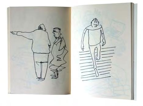
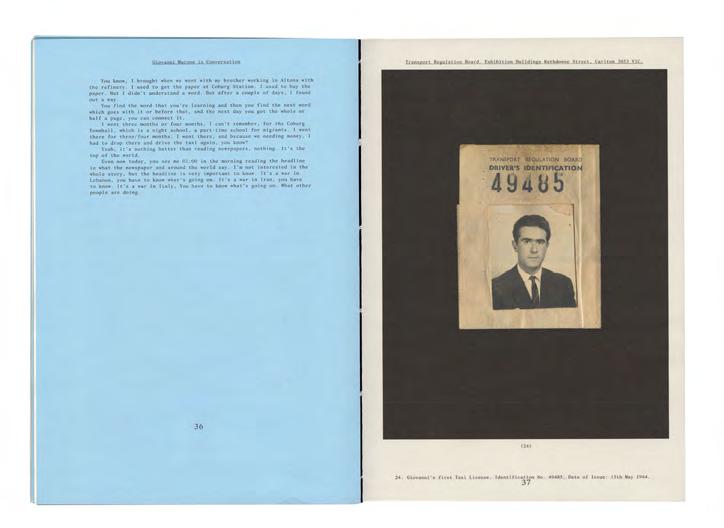
Top Internal spread of hungrygeese #13, 2003, author, illustrator and designer Paul Davis 2003, private collection.
self-published drawings as, one day, “other-published”? As validated by being published in a real newspaper or magazine, like The Age or The New Yorker, say?
In the early 2000s, living in Hanoi, I shifted from photocopied zines to making hardback books of cartoons. I scanned, designed, and printed my cartoons onto paper sourced from a merchant whose main business was printing pamphlets and ephemera for the Vietnamese Communist Party. I then took my cartoon printouts, and a few metres of coloured vinyl I picked up from a motorcycle seat shop, to a father-and-son bookbinding business run out of their tiny streetside apartment. Over the next few days the men cut, stitched, and glued my cartoons, as per my fussy instructions, into a short run of dinky A5-sized, vinylcovered hardback books. My Mum’s A Midget and Down On The Surface of the Moon cost about five dollars apiece to make and were posted to friends near and far, and sold in cafés across the Old Quarter.
After moving to Tokyo in the early 2000s I resumed hungrygeese, this time using the libraries’ state-of-the-art photocopiers and boutique paper bought from the city’s excellent stationery shops. Copies of hungrygeese were sent to distant friends, and to newspaper and magazine editors, and this led to occasional paid drawing work.
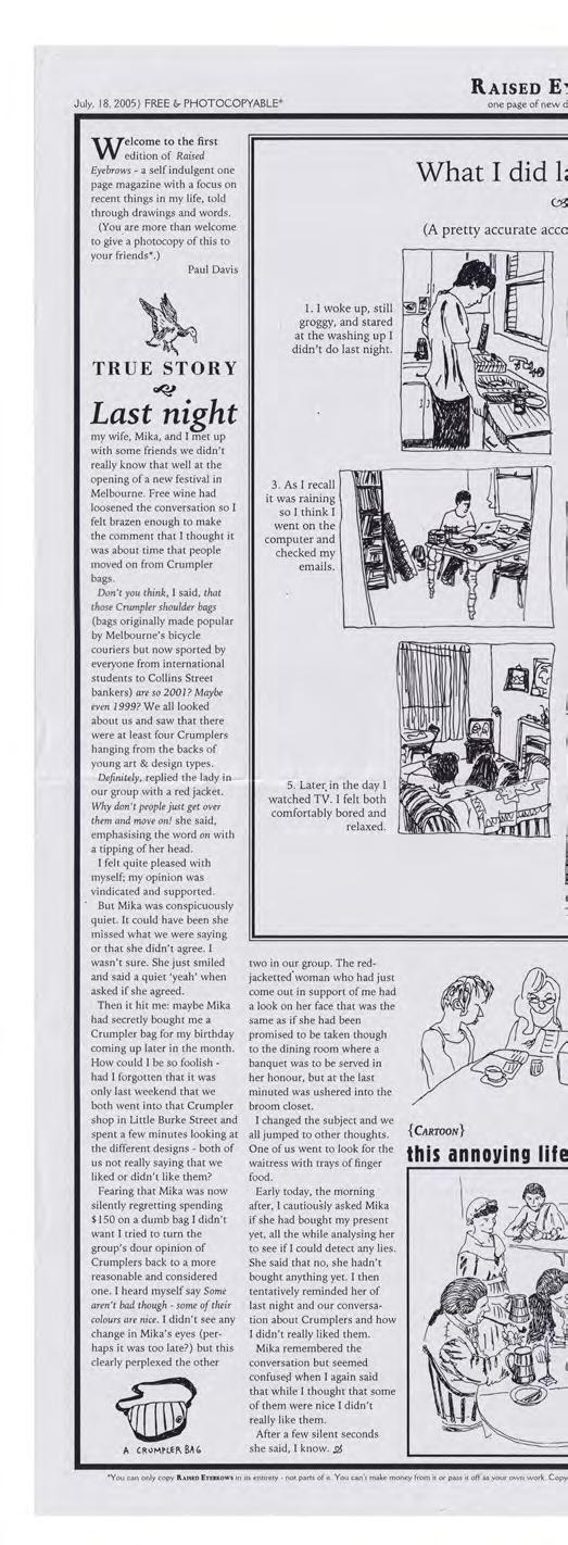
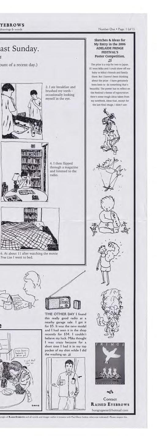
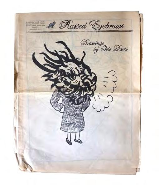
Upon returning to Australia in 2004 I began making Raised Eyebrows, a printed thing I proclaimed as “Melbourne’s only single-sided A3 magazine of cartoons.” I offered it for free at Sticky’s Degraves Street subway store and at a couple their zine fairs. In an effort to get it in front of more peoples’ eyeballs, I openly encouraged everyone to photocopy and distribute it. The point of Raised Eyebrows was to showcase my funny little drawings in a publishing context reflective of mainstream media. My drawings sat alongside short articles (that I also wrote) in such a way that a newspaper editor might see their potential, their publishability. It paid off: In 2005 I was commissioned to draw a handful of editorial cartoons for The Age, and in 2007 the paper started publishing my weekly cartoon Overheard in their Sunday edition.
The popularity of self-publishing may be partially attributed to the fact that bespoke printing continues to be budgetfriendly. Even the resurgence of the decidedly old-school Risograph machine has pushed artists and designers to make work on the cheap that looks and reads as good as anything produced by mainstream media. Of course, a case could be made that the lo-fi aesthetic of self-published works are more appealing than what one might see on a newsstand. Zines are sold, but usually only to cover print costs or zine fair stallholder fees (if there are any). Many zines are simply swapped or given away, a deliciously punk affront to commercialism. Nobody is beholden to anything, and the value of community, creative connection and “being seen” is prioritised over profit. The concept feels almost twee were it not for the pleasure one gets from making something that is then hand delivered to an appreciative fan.
Similarly, wide dissatisfaction and despondency with the quality, bias and fragmentation of news outlets and
endnotes
1 For want of a less inadequate term to describe this disparate assemblage of artists.
2 Organisers later told me they had to reduce the number of stallholders in 2025 because a more spacious venue had become unavailable.
3 “Zine Collection,” The Seattle Public Library (website), accessed April 9, 2025, https:// www.spl.org/books-andmedia/unique-collections/zinecollection.
4 The term zine, from magazine, was coined by fanzine enthusiast Russ Chauvenet almost a century ago. “Zine” entered the Oxford English Dictionary in 1949. “Zine,” Wikipedia (website), last modified January 15, 2025, 18:53, accessed April 9, 2025, https://en.wikipedia.org/wiki/ Zine
5 The quality and number of LOLs generated by my drawings back then was low and make for difficult viewing these days.
publishers makes diy publishing a more attractive alternative. And with fewer outlets in which to be published, newspaper pay rates that haven’t changed in ten years, and publishers’ royalty amounts that are insignificant compared to the years one might spend making a book, self-publishing feels like a more satisfactory, liberating, compromise-free, low-risk endeavour.
In the 2010s I redeveloped Raised Eyebrows into an eight or twelve-page tabloid newspaper. Raised Eyebrows was an unabashed nod to the media and medium I was most invested in and fascinated by. Newsprinters begrudgingly printed the shortest quantities of Raised Eyebrows they would allow—about 500 copies—which meant I regularly had cartons of the newspapers left over, even after sending multiple copies to friends, family and old and prospective clients. Again, these editions of Raised Eyebrows functioned as portfolios of previously published work.
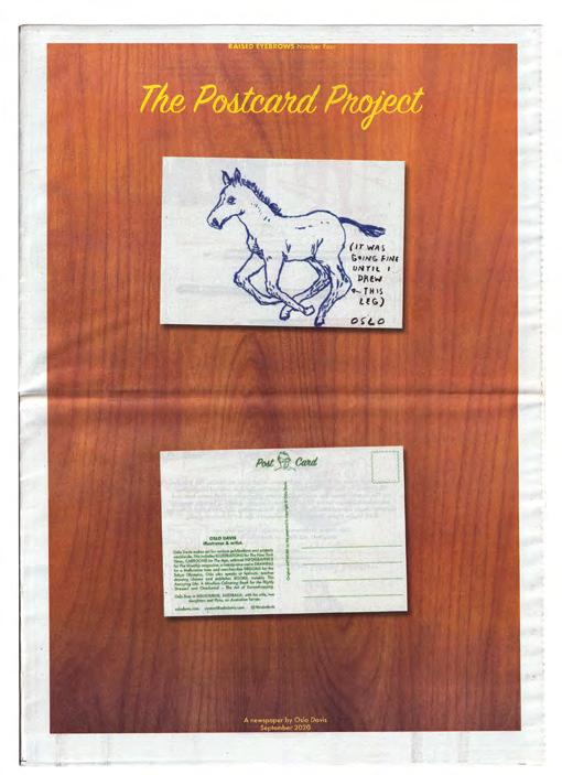
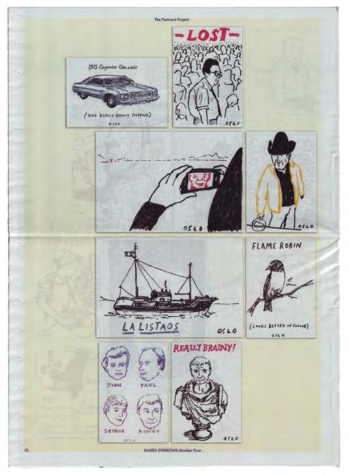
Soon, however, the Raised Eyebrows newspaper of drawings became a vehicle to advance or celebrate a larger event or project I was working on. As part of art residencies in the City of Darebin and in Queenstown in Tasmania/ lutruwita I made Raised Eyebrows newspapers that featured drawings and drawn jokes from my experiences in those places. Reservoiria and Spion Kop were distributed for free back into these communities. For the Melbourne Writers Festival I edited and curated Drawn From Life, a newspaper of comics by Australian cartoonists that referenced the lost history of newspaper cartoons that were once published regularly across Australian print media (“the funnies”). Festival volunteers handed out free copies of Drawn From Life to morning commuters at train stations across Melbourne for them to read on their way to work. And during covid I launched the Postcard Project, a direct-mail project whereby people could order an original drawing by me rendered and sent on a postcard. I drew more than 300 postcards, many of which were later published in an edition of Raised Eyebrows
Other self-published works have played with different print formats. After a Creative Fellowship at the State Library of Victoria I made Libraryland!, a small, perfect bound book, designed in collaboration with Stuart Geddes, that showcased my sketchbook drawings done at the Library. Libraryland!’s off-white stock, cardboard cover and images printed with a silvery sheen like that of a 2B pencil on Moleskine paper, created the impression you were holding the original sketchbook the drawings were done in. Then, a few years ago I illustrated a collection of absurd ex libris, designed on a single A3 sheet and printed in three colours on the Glom Press’s Risograph machine.
These days, as a regularly published artist working across various media, my self-publishing projects have become a way to publish on my own terms. But beyond the joy I get from independence, my motivation to make is driven by a philosophy common to many other artists I spoke with at the Festival of the Photocopier. There is pleasure, and an intangible currency to be gained, in the hand-making of a personal, printed thing, and there is a thrill to be had when this thing you did finds a fan and joins a community.
Opposite Top Left Front cover of Raised Eyebrows #1 (newspaper version), 2014, author, illustrator and designer Oslo Davis, private collection.
Opposite Bottom Left Front cover of Raised Eyebrows #4, The Postcard Project (newspaper version), 2022, author, illustrator and designer Oslo Davis, private collection.
Opposite Centre Internal page of Raised Eyebrows #4, The Postcard Project (newspaper version), 2022, author, illustrator and designer Oslo Davis, private collection.
The Solitary Arts | In 2005, Geoff McFetridge—a prolific designer at the time—co-founded a venture supplying parts for skateboards that they named The Solitary Arts. For a long time, I lingered under the assumption that this title was not only an ode to skateboarding, but the practice of graphic design. The parallels seemed clear. Skateboarding and graphic design were both things you could do in a group, at a skatepark or in a studio, but ultimately both activities boiled down to a dichotomy between an individual and the tool or craft that they manipulated.
For skaters, this was the skateboard; for graphic designers, this was design software and the machine these applications resided on. Contemporary graphic designers may work inhouse, or as part of a studio, or identify as part of a collective. They may join a co-working space, or collaborate via Figma and the like, but ultimately the activity of graphic designing boils down to a two-way conversation. It’s this symbiotic relationship that welcomes introverts, homebodies, and loners—the many that are sustained by this type of “cosy isolation.” And thank goodness for this!
But no commercial venture is an island. To know us is to hire us and graphic designers are as reliant on connection and the sharing of an image of an industry, as any other venture. To this end, graphic designers have forged opportunities to connect and form commons1—not only with potential clients and the wider public—but also with one another. This occurs through the sharing of portfolios and project work, presenting at conferences, symposia and the like, through education at various levels, and via acts of “making known,” or publishing.
Graphic designers have always been closely connected to the production end of publishing, forming an essential bridge between authors, editors, and producers with the mechanical and technical means of production and distribution. In Publishing as Artistic Practice, editor Annette Gilbert quotes Alexander Starre as describing graphic design as “the missing link between visual art and literature.”2 It can appear that any form of publishing cannot avoid passing through transformative design processes before reaching its publics.3 So, it makes sense that publishing would be a space where designers have been emboldened to raise their heads above the parapet of the computer screen, utilising skills and connections inherent to the profession to broadcast an image of themselves to the world.
How to Socialise a Profession
Although you will find many designer/publishers today, this is still a fairly recent role within the profession of graphic design. Initially, graphic design titles were produced in the form of industry journals that showcased the outcomes of client briefs and the various reproduction techniques employed in meeting these. As far back as 1895, The Penrose
Annual was a publication that started life as a compendium of items of interest to the printing industry before finding its way onto the shelves of design studios. Initially covering the physical machinery that powered the print industry, the title expanded year-on-year to include the latest trends in advertising, photography, design, and typography—even covering radio and broadcast television, leading up to the electronic transmission of information that would become known as the internet—before it closed in 1982. This accounts for almost one hundred years of providing an overview of, not only the evolution of design technologies, but of the profession and its concerns during this time. Indeed, key points in the evolution of graphic design as a profession would prove to be catalysts for many industry titles. In 1986, Desktop magazine launched in Australia. Desktop was so named because it attempted to pre-empt the desktop publishing phenomena that occurred with the integration of digital software into publishing workflows in the late ‘80s and early ‘90s.
With this came a moment when many graphic designers feared for their jobs, as photographic reproduction was rapidly replaced by digital means. But as would happen again and again in the years to come, designers would learn software and integrate new skills into their repertoires. Because of this the role of the “Desktop Publisher” didn’t stick around for long, and Desktop magazine would evolve to become Australia’s premiere graphic design journal. Initially edited by various journalists, in 2012, Desktop would welcome Heath Killen as the first designer/editor to take the helm.
Process Journal emerged a year before this in 2011 and was a truly independent endeavour. Designer/editor Thomas Williams self-funded every issue as well as taking on both design and editorial roles. As opposed to Desktop, Process Journal had its eye on wider markets and would include a mix of local and international designers and projects. Process Journal would also boast higher quality paper stock and overall reproduction, utilising a six-colour printing process, as opposed to the usual four. This came with an appropriately higher price tag and with fewer issues produced per year. Copies today are considered collectors
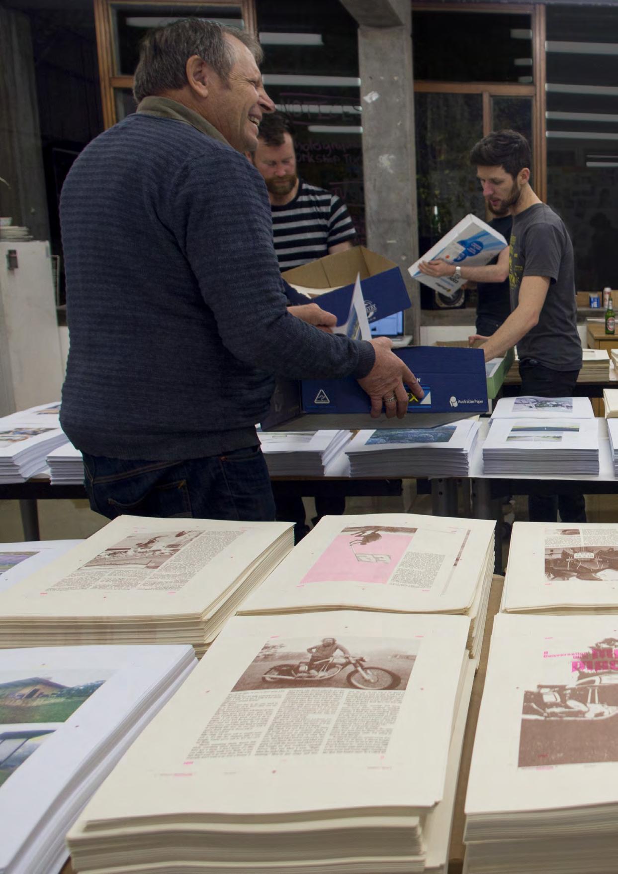
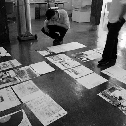
Preceding Pages Putting together Issue 3 of Head Full of Snakes Photograph courtesy of Stuart Geddes.
Opposite Cover illustration for Desktop magazine #283, on the theme of ‘co-working’, June 2012 issue. Produced as a collaboration between members of the in-house design team at Niche publishing: Keeley Atkins, Michael Bojkowski, Marlo Guanlao, Davin Lim, Abby
editions and can still be found on a select number of specialist sites. Process Journal’s popularity would also provide a platform for a raft of similar quality publications also initiated by Thomas Williams, but under the expanded remit of Made Publishers including MADE magazine and Nourished Journal
Forging a Commons
Come the turn of the millennium and just about every country was producing at least one home-grown graphic design title. These publications serviced localised graphic design communities while keeping an eye on international networks. They were usually staffed and published by editors and journalists who were welcomed as allies to the industry—helping to expand the industry’s ecosystem beyond the confines of graphic design practices. Many established titles would see their own editorial makeup adapt alongside evolving design and publishing technologies and ways of working—making transformative journeys of their own.
Take Grafik magazine for instance. Grafik started life in the 1980s under the dubious masthead of Hot Graphics International and was part of a cache of industry focused periodicals churned out by a publishing house based in the UK who specialised in business-to-business titles. In the 1990s they dropped the “Hot,” but continued as a subscription-based specialist title until, then editor, Caroline Roberts, took a leap and hired design studio Made Thought to completely redesign the magazine while moving to the more succinct name of Grafik
This established Grafik as a bona fide international newsstand title, eventually breaking free from its original publishing house to become an independent entity.
This would also set the magazine off on a rollercoaster ride, bouncing from funding source to funding source before landing back in the stable of one publishing house, then another, before going online only and eventually selling the title and assets to another independent publisher who—after more than ten years since the print edition folded—has yet to fulfil promises of a relaunch. Along the way the editors of Grafik would tap into a skill many designers possessed, but did not consider as central, or particular to their practices. It turned out graphic designers were pretty good at writing, devising, and producing editorial material. A factor many design titles would come to rely on, forming a symbiotic bond between designers who were looking to socialise their practice, and a design magazine’s need to reign in cost by identifying and fostering industry professionals who recognised the value in editorialising what they did as designers that extended beyond monetary gain.
Disappearing Ink
It’s hard to imagine any industry that hasn’t been affected by the rise of the internet. Both graphic design and publishing have been forced to adapt to the rapidly changing conditions that continue, unabated, today. For design magazines, the costs of paper, printing and distribution multiplied by the accelerating speed of information and associated dopamine hits offered by the internet, would lead to many titles folding or limping on as increasingly isolated internet sites.
But designers had developed a taste for publishing and being published so they began finding new ways to project images of the industry to niche and wider publics. Prior to the siloing of online content by big tech companies, blogs and forums were able to grow super engaged and dedicated audiences. Online sites like QBN’s Newstoday and Australian INfront became meeting places where you may not know someone’s face, but you would get to know their work and share an appreciation with other like minds. Launched in 1999 and run by designers Justin Fox and Damien Aistrope, Australian INfront provided a fertile, digital commons for Antipodean designers for two decades. During this time the site would not only host forums, but publish original editorial content, reaching out to designers and creatives—members and non-members—from around the country and publishing interviews, opinion pieces and articles by, and for them.
Small Presses Take Up the Slack
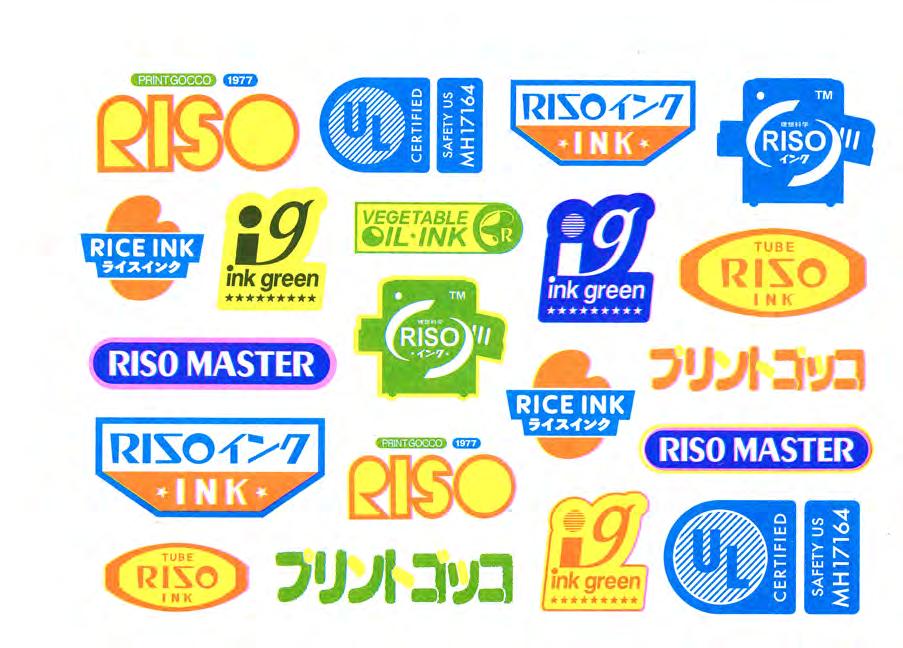
By the time Australian INfront had run its course, so too had both Desktop (closing its print edition in 2016) and Process Journal (which lasted twelve issues before folding in 2014), but this didn’t mean designers were done with publishing by any means. The need to socialise the industry was just as present, and possibly more urgent given the lack of visibility previously afforded by newsstand publications and blog sites. What would change was the speed, mechanical means and scale of production involved. Small presses sprung up in the 2010s, initially powered by the limited availability of Riso printing machines. Riso being the name of a Japanese printing machine that resembled a photocopier, but was more like a hybrid that blended mimeograph, photocopy, screen printing, and offset lithography styles using a special soy-based transparent ink that came in a wide gamut of colours (including neons and metallics). The snag was that only one colour could be printed at a time.
Melbourne quickly developed its own network of Riso enthusiasts—mostly graphic designers—who formed a type of coalition to support each other in sourcing the sometimes
Right Cover artwork painted by signwriter Ted Hanna for Desktop magazine #284, July 2012 issue. Commissioned by Brendan McKnight. Photographs by Michael Bojkowski. Opposite Riso print produced as an ode to the visual identity of the RISO Kagaku company—producers of RISO machines, designed and printed by Shuai Shao, founding member of Sandwich Press, c.2024.
hard-to-come-by supplies for said machines, such as inks and screens. Illustration agency and exhibition space, Jacky Winter held their inaugural Risographica show in 2020, featuring the work of local designers, illustrators, and artists, which sought to take a snapshot of the community that had sprung up around these machines. The show would go on to spawn another three editions due to the popularity of the medium.
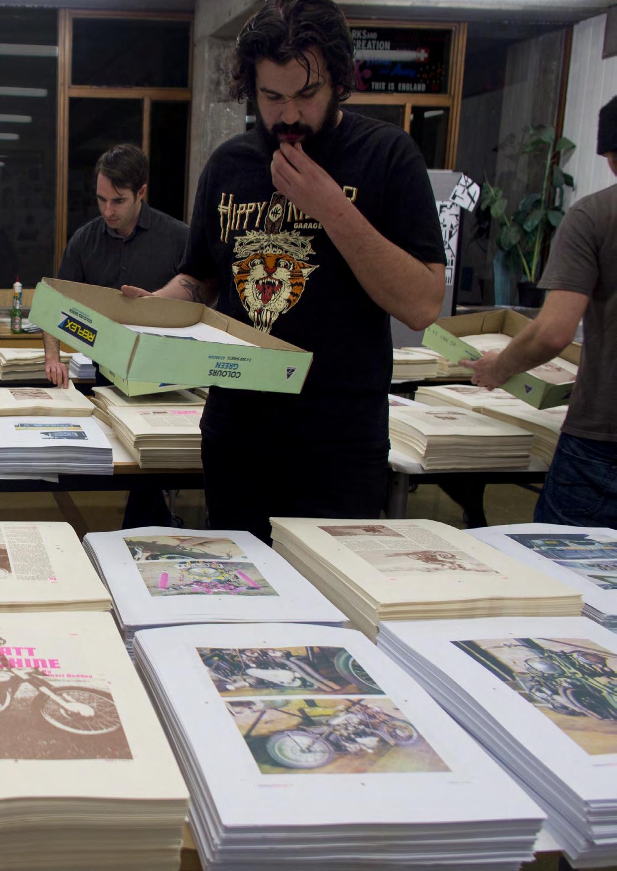
Designer Stuart Geddes, with Luke Wood, would employ a Riso machine to produce their paean to all things motorcycle related in the form of a 100+ page soft-cover publication they named Head Full of Snakes. This was an ambitious undertaking involving the overlaying of colours, requiring pages to pass through the printer several times before being collated into stacks, so volunteers could hand bind the various sheets (and flexi discs) together. Their first issue was released in 2011. There have been four issues since, spaced widely apart because of the labour involved in producing each run.
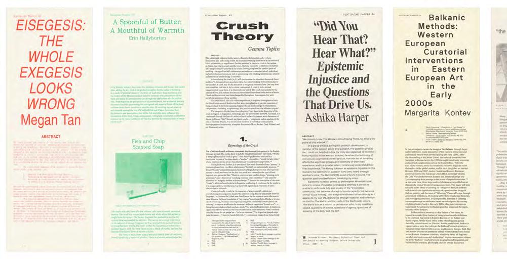
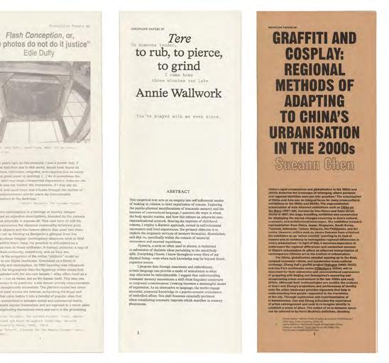
More recently, designers Zenobia Ahmed and Dennis Grauel have been producing material for clients on their own Riso machine, based in the studio they share in the innerMelbourne suburb of Coburg. This has resulted in a series of commissions for arts publisher Discipline called Discipline Papers which reproduces existing theses and reproduces them, one at a time, as a limited-run Riso printed publication.4 Up to six issues to date, these publications have become a way for their client to quickly build up a collectable series that they could then take to book fairs and similar events, as well as providing the designer with space to experiment with processes and formats particular to the constraints offered by Risograph techniques.
A community of Riso enthusiasts remains in Melbourne today, although members are less concerned with consolidating supplies (even though this is still an issue as inks, parts, and materials remain expensive to procure) and more about providing a reasonably inexpensive route to print production for independent, small-press publishers.
These publishers have the added bonus of getting to work with designers, and these designers often use their machines for publishing projects of their own. Many design schools in Melbourne (and around the world) have also adopted these machines as an access point into the world of publishing and print production for fledgling graphic designers, some going on to produce publishing imprints of their own, such as Sandwich Press in Melbourne.
Emergent Formats
Many other opportunities for designers to flex their publishing skills have emerged in recent times. From leveraging studio work, to self-funded publishing ventures, to crowdfunding via sites like Kickstarter, to utilising print-on-demand services and more.
Crowdfunding
When Thames & Hudson set up Volume, a publishing imprint and crowdfunding venture of their own, they handed the reins over to designer Darren Wall. Initially drawn to self-publishing through a love of video games, Wall moulded Volume’s output according to a designer’s mindset, lavishing campaigns with special cases and print effects while continuing to explore graphic design, video game culture and more, through the curation of the types of projects Volume would fund.
Adrian Shaughnessy, Tony Brook, and Patricia Finegan’s Unit Editions took a similar—although more acutely graphic design focused—approach, operating independently for a number of years before striking a deal with Thames & Hudson to shift some of their, previously crowdfunded titles over to T&H’s main imprint, allowing a select cache of titles that had already proved themselves popular, to join a much wider distribution network.
Print-On-Demand (pod)
In 2008, designer James Goggin led a group of German design students in a two-day workshop culminating in the design and publishing of a type of calibration book called Dear Lulu, which tested the quality of various print-ondemand services (Lulu being the name of one such pod
Opposite Discipline Papers (1–8), 2023–2024, designed and printed by Zenobia Ahmed and Dennis Grauel. Printing assistance for Discipline Papers 4 & 5 from Courtney Bree. Featuring texts by Megan Tan, Erin Hallyburton, Gemma Topliss, Ashika Harper, Margarita Kontev, Edie Duffy, Annie Wallwork, and Sueann Chen. Published by Discipline.
service).5 The promise of print-on-demand is that anyone could upload a file without consulting a print house or having to deal with reprographics of any sort, and you could order as many or as little number of copies of your finished publication, preventing waste and democratising the printpublishing process. Newspaper Club would launch in 2009, offering a nimble print-on-demand service that leveraged newsprint as its medium.6
Although aimed partially at designers eager to become publishers themselves, the constraints in terms of choice of paper stock, sizes, and finishing have so far failed to ignite vast enthusiasm from the sector. Still, it remains a niche form of publishing with much potential.
Art Book Fairs
If you seek out a graphic design presence within mainstream media today—away from social media—it might seem like a fairly sparse landscape. But this does not portray the many ways designers are still forging community and making commons through publishing. Art book fairs have become fertile ground for designers to meet to discuss design and to share works they have made or made for others.
Many art book fairs have sprung up around the world, initially inspired by independent publishing institution Printed Matter, which organised their first NY Art Book Fair in New York in 2006, becoming an annual event soon after. During the covid pandemic, Printed Matter set up their Virtual Art Book Fair that provided a platform for designers, artists, and publishers alike to congregate online to share knowledge and project work on a global scale, increasing access and visibility to a community of designers and publishers on a scale unseen before. 7
The first official art book fair in Australia was initiated in Melbourne in 2015 as part of the National Gallery of Victoria’s annual calendar of events, and has become a staple within their Melbourne Design Week program for the past decade. During this time the ngv ’s Melbourne Art Book Fair has provided a showcase for many local designer/ publishers as well as a meeting place for publishers from around the world. So popular has the art book fair concept become that Naarm-based publisher and distributor Perimeter Books launched its own event, the Same Page art book fair, in 2023. 8 Same Page looks like it will become another annual event in Melbourne of a similar scale, meaning the city currently plays host to two annual art book fairs.
Swarm Publishing
NM CODEX Y2K20 is the name given to a curious print publication that emerged out of a 69-member strong group of artists, designers, journalists, and writers from all over the world who met regularly via a Discord channel under the banner of New Models. Due to various lockdowns around the world, interest in the group swelled to the point where they felt a print publication was needed to document the many and varied activities of the group. The challenge was how to encapsulate the thoughts, writings, and works of the group without leaving out any members. At the time they called this activity “swarm publishing.” It is a mantle that has since been picked up by similar groups, resulting in the production of other print-on-demand style publications, podcasts, video reports and more.
It’s also the impetus behind a new publishing venture called Metalabel.9 Set up with the help of Kickstarter founder Yancey Strickler, Metalabel offers space and support for collaboration, distribution, and ways to fund individual and
swarm publishing projects with an overarching ideology of collaboration and “Release.” It will be interesting to see if designers find their space to gather within these new publishing structures. If the recent surge in designers utilising the email newsletter platform Substack is any indication, signs are hopeful.
To Who Knows Where Designers at the helm of the production process, often unquestioningly, assume the role of the filter, the lens, and the formatter of publishable material. They are also the generators of published material, positioning designers at the junction of the act of publishing, and a gateway to what is published. This also happens in reverse when self-publishing. The producer of published material must assume the role of designer to coerce content into appropriate formats for distribution.
In Christopher Hamamoto and Jon Sueda’s online publication On Publishing: Graphic Designers Who Publish they interview an array of designer/publishers to shed light on this issue, starting with the question “How and why do you publish?”10
The designers behind the Emigre type foundry and journal explained, “We started Emigre magazine to publish our own work and ideas and [that] of our friends. A magazine seemed like an easy shortcut to circumvent the regular route of galleries and museums and publishing houses.”11
Philippines-based designer/publishers, Hardworking Goodlooking did a good job of summarising this idea by stating that, “self-publishing is the key to selfrepresentation” and their motivation arose from “not seeing books in the market that covered the material [they] wanted to research” and that “typically came
1 ‘Commons’ are referred to in this article as pools of shared resources either from a community or forming a community. For a wider discussion on Commons and Commoning see Commonism: A New Aesthetics of the Real, Nico Dockx, Pascal Gielen (eds.), (Amsterdam, Netherlands: Valiz, 2018).
3 Publics’ refers a discussion by Paul Soulellis within a presentation called ‘Urgentcraft’ in which Soulellis references a text by Michael Warner, explaining that “Warner makes distinctions between the public, or ‘everyone out there,’ vs. a very specific public, say those particular people who have gathered intentionally around something. And so he gives us the notion of a plurality of publics. Multiple publics.” Michael Warner “Publics and Counterpublics,” The Quarterly Journal of Speech 88 (4), 2002: 413–25.
4 Discipline Papers, 2023, editors, Helen Hughes and Amy Sturt, www.discipline.net.au/
5 Lulu, (2002–), www.lulu.com/.
6 Newspaper Club, www.newspaperclub. com/.
7 Printed Matter's Virtual Art Book Fair, February 25 -28, 2021, accessed July 17, 2025, https://www.printedmatter.org/ programs/events/1162
8 The book fair was launched in partnership with Gertrude Contemporary in 2023, accessed July 17, 2025, https://gertrude.org.au/publicprogram/same-page-art-book-fair
9 Metalable, www.metalable.com.
10 Christopher Hamamoto and Jon Sueda, On Publishing: Graphic Designers Who Publish, (2021), accessed July 10, 2024 at https://onpublishing.page/.
11 Emigre. On Publishing: Graphic Designers Who Publish, (2021), accessed July 9, 2025 at https://onpublishing.page/#section-6
12 “Kristian Henson of HWGL”. On Publishing: Graphic Designers Who Publish, (2021), accessed July 9, 2025 at https://onpublishing.page/#section-9
from a western perspective”—making a case for “more nuance in the publishing world. More voices, more perspectives” to “keep it healthy and expand its growth.”12
Publishing also allows designers to tell the story of their practices and their industry as a local concern, but also as a practice that melts away borders through common ideas, practices, and issues. Publishing also expands practice definitions by allowing designers to assume a variety of roles such as researchers, archivists, authors, editors, publishers and more.
Here in Melbourne, we have all the facilities in place to continue to support a thriving independent designer-led publishing community. The Risos are in place, the art book fairs are busy—and multiplying; the online platforms are buzzing as more designers join Discord communities and set up Substack newsletters; and students are still flocking to Maker Spaces to get more zines and similar small-scale publications into the world. All this activity can only help in socialising an industry—especially post-covid lockdowns— which may not be able to rely on mainstream media, but are certainly not without a voice—or the means to amplify their concerns.
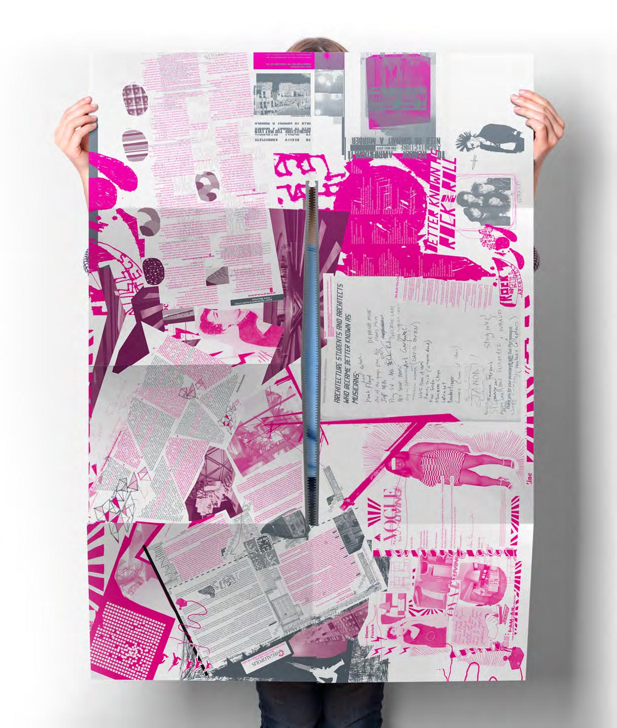
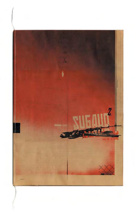
Subaud: We Built This City on Rock ’n’ Roll
Shane Thomson
Preceding Pages
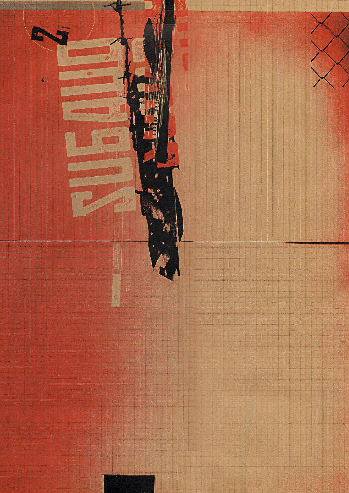
Subaud 2, 2002, DireTribe Studios, editors Christos Kastaniotis, Mark Raggatt, graphic design Urchin, courtesy of Shane Thomson.
This Page
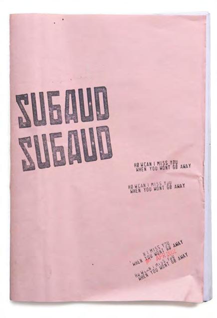
Subaud 1, April 2002, publishers DireTribe Studios, editors Christos Kastaniotis, Mark Raggatt, co-founder Damian Otto, graphic design Urchin, courtesy of Shane Thomson.
Opposite Top
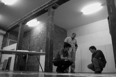
DireTribe editors
Mark Raggatt, Christos Kastaniotis, with Shane Thomson, Urchin Studio, Fitzroy, photographer Yong Ho Moon, courtesy of Shane Thomson.
Opposite Bottom
Mark Raggatt at Urchin Studio, 2002, unknown photographer, courtesy of Shane Thomson.
Subaud: We Built This City on Rock ’n’ Roll
Shane Thomson
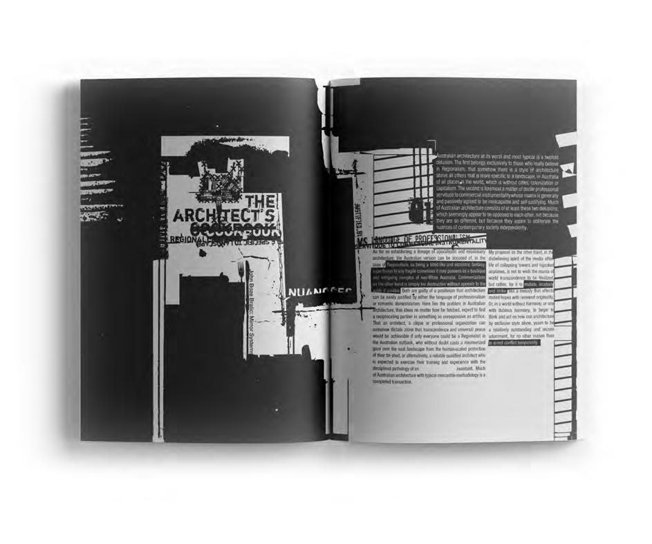
In 2002, I picked up a pink, photocopied zine from the shelves of the Brunswick Street Bookstore. It didn’t scream for attention, but it had energy I couldn’t ignore. Its pages were packed with dense architectural writing, thrown together without a shred of concern for visual finesse. But beneath that rawness was something magnetic, a kind of unfiltered confidence. The content was sharp, deeply intelligent and strangely more powerful because of the way it had been stripped of design conventions. That moment would spark one of the most creatively fulfilling collaborations of my life.
The zine was called Subaud, and it was created by Dire Tribe, a collective founded by Mark Raggatt, Christos Kastaniotis, Daimon Otto, and Vivek Subramanian was an early contributor. As the Creative Director of Urchin, the design studio I co-founded in 1993, I was no stranger to cool experimental projects—but this was different. Subaud wasn’t trying to be cool, it just was. There was an email address on the back, so I sent a message that said something like: “Subaud magazine is awesome and if you’re making another issue, I’d love to be involved.” A week later, I found myself in a Flinders Lane apartment, drinking beers with the creators. We quickly discovered we were on the same wavelength. They had the content and we had the art, but more than that—we had a shared philosophy: challenge conventions, honour the work, and never settle for what’s expected.
That conversation became the first step in a three-year (2002–2005) collaboration between DireTribe and Urchin that would push the boundaries of what a publication could be. Urchins, as we were fondly called, always did things differently and our varied skills and interests became the catalyst and blueprint for our methods, with collaboration and cross-pollination at the heart of it all—particularly for projects such as Subaud Subaud wasn’t formed in a vacuum, it was more like a vessel or a conceptual trojan horse.
In the early ‘90s, the original Urchin crew of Scott Vanden Bosch, Alex Denman, Travis Garone, Mark Kayler-Thomson, Nino Soeradinata and myself emerged as a creative outlet while studying graphic design at uni (Swinburne, Monash, and Bendigo). Four of us lived on the Surf Coast in Torquay—surfing, skating, making music, and creating experimental videos and art whenever we could—usually at an old farmhouse we called Cactus Ranch. We held art exhibitions, built a T-shirt label, and released a CD, among other collaborative projects. Though formally trained, we were— collectively—a beautiful contradiction of rebellious spirit and absolute competence.
Most people immediately recognise the friendship-turned -partnership business model as a recipe for disaster. We had never seen it that way—in fact the business model we had was never planned, but cultured through many years of mixing our skills with our lifestyle, looking, learning, and growing. After finishing uni and during stints in top-tier Melbourne studios (I personally worked under Garry Emery and was introduced to famous architects and the world of architectural graphics), we kept Urchin alive at night and on weekends, as we always did, eventually quitting our comfortable jobs and opening a full-time studio in a Fitzroy warehouse in 2001. Only four of the original six chose to pursue Urchin full-time.
Our studio flew under the radar and we honestly did not care about participating in design award programs because the projects we kept winning were enough of a reward. We started working with Quiksilver in 2002, then more global youth culture brands as well as architects and corporate entities. The corporates wanted our creative, youthful edge and the youth brands wanted our professionalism. It was this duality that made our studio interesting to work in. The primary focus of the business evolved from providing graphic design, branding, and advertising services to a globally focused creative agency with entrepreneurial tendencies. In 2003 we co-founded Movember, the world’s fastest “growing” charity funding men’s health and in 2014 we opened our first retail store—Doomsday. Shortly after that we launched our own skincare brand Brutal Truth. From the get-go, our client base grew quickly, often because we were producing work unlike anything else in Melbourne and Subaud was the perfect embodiment of that.
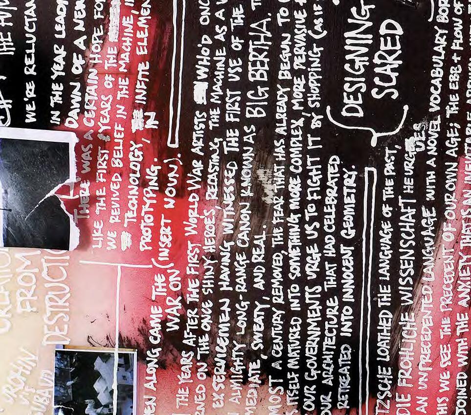
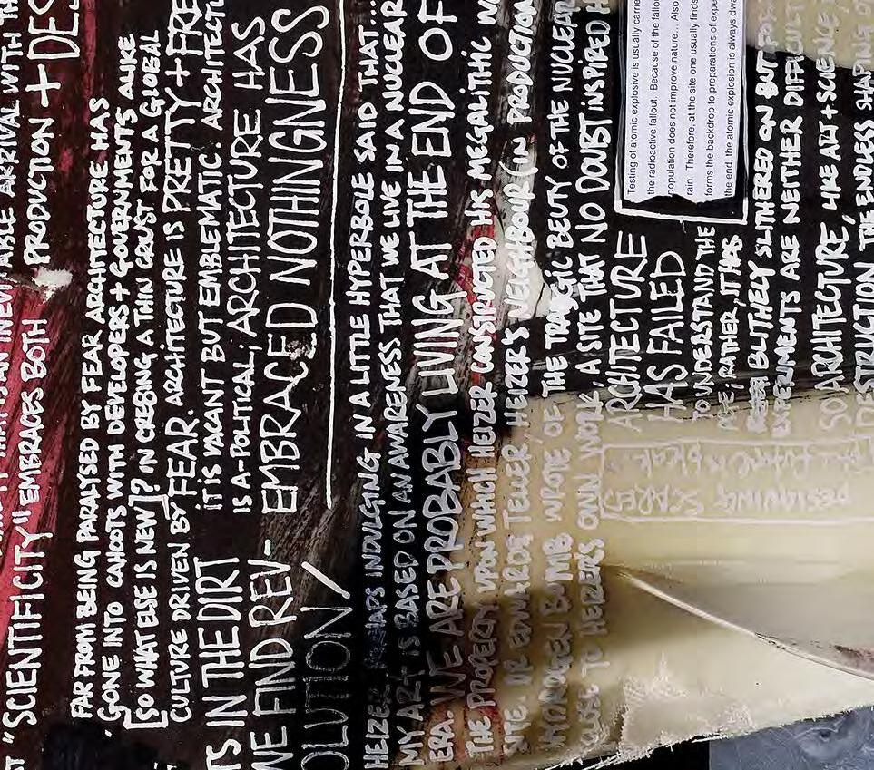
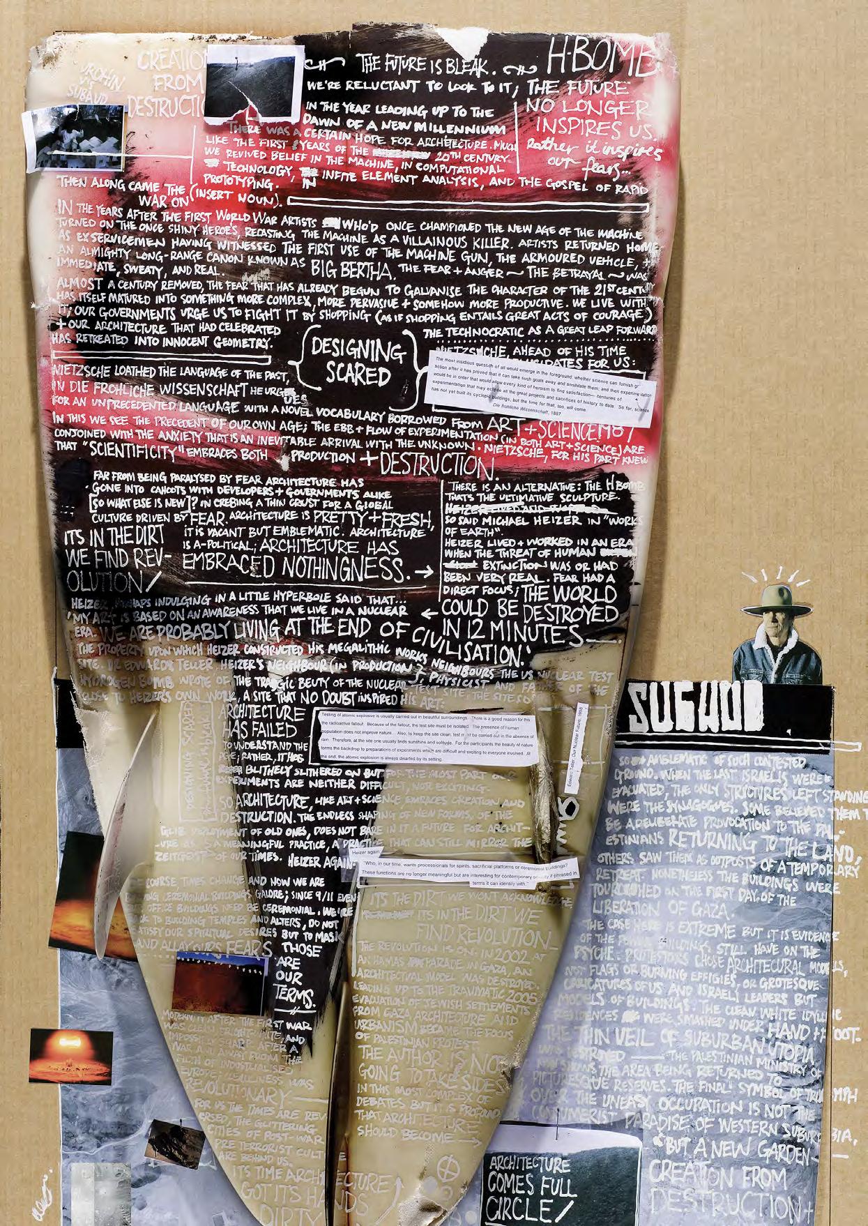
The team at DireTribe weren’t just interested in publishing ideas—they wanted to shake the foundations of the architectural establishment itself. They challenged the elite academic rhetoric and the self-perpetuating discourse that had, in their eyes, become bloated, self-important, and disconnected from the realities of contemporary life. To them, the traditional language of architecture felt exclusionary, verbose, and out of step with younger generations who craved relevance and honesty. Subaud was their vehicle to puncture that bubble. It wasn’t just about critiquing the content—it was about dismantling the structures that upheld it, and offering a more accessible, more human, and more urgent way of engaging with architectural thought.
Their team would get together, decide on their theme, load the content into a canon and come into our studio, all guns blazing and riled up with the enthusiasm of an anarchist, the heart of a soldier and the combined IQ of an arcade game high score, slapping down a folder of around 10 to 12 essays like it was the secret weapon for bringing down the enemy. After the dust had settled, we would divide and conquer. Some designers at Urchin felt strongly drawn to specific articles, while others preferred the challenge of interpretation. Either way, we made sure the allocation process respected both the content and the creative intuition of the team.
My self-appointed role was unapologetically self-indulgent, although not to the point of creative control, more like how
the Joker likes to create chaos in the name of creation, but philosophically like the Dadaists of deconstructionism of the 1920s. I set the tone of our first issue by designing a few articles and setting the scene and creating space for the work to unfold. I can’t remember if we were paid to design Subaud, which tells you something about the nature of the project. It was never about money, but more about freedom. And yet, it wasn’t freeform chaos. Each designer was expected to read their assigned article thoroughly, to understand it deeply, and to visually interpret it in a way that enhanced its ideas—not just to decorate the page. During the design development phase, our team would present concepts to the group, and the DireTribe crew would offer feedback—mostly centred on whether the intent of the article had been honoured. Some essays were simple. Others required more time, more listening, and more care. That process—of reading, digesting, interpreting, sharing—was the beating heart of Subaud.
Unlike most magazines, Subaud didn’t follow a consistent format. That was my idea—basically trying to break the whole notion of a formulaic series. Each edition became a response, not just to the content, but to the themes and undercurrents that emerged during the process. This was not about brand consistency. In fact, it was almost deliberately self-destructive. We challenged the commercial wisdom of building brand recognition through repetition.
This Page
Subaud 5 (cover) October 2003, publisher
DireTribe Studios, editors Christos Kastaniotis, Mark Raggatt, graphic design Urchin, courtesy of Shane Thomson.
Opposite
Subaud 5 (internal pages) October 2003, publisher DireTribe Studios, editors Christos Kastaniotis, Mark Raggatt, graphic design Urchin, courtesy of Shane Thomson.
Following Pages Left
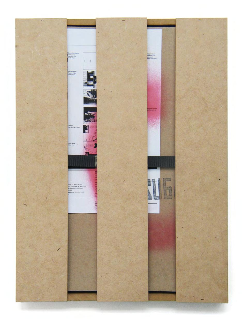
Subaud 4, 2003, publisher DireTribe Studios, editors Christos Kastaniotis, Mark Raggatt, graphic design Urchin, courtesy of Shane Thomson.
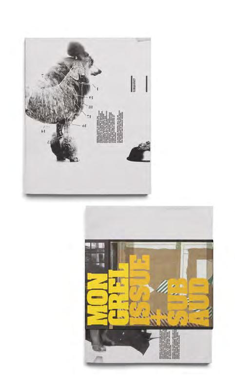
Subaud 7 | Mongrel Issue 1, 2005, publisher Mongrel, editors, Dean Boothroyd, Ian McDougall, Conrad Hamann, graphic design
Urchin, courtesy of Shane Thomson.
Instead we asked: What happens if we destroy the template every time?
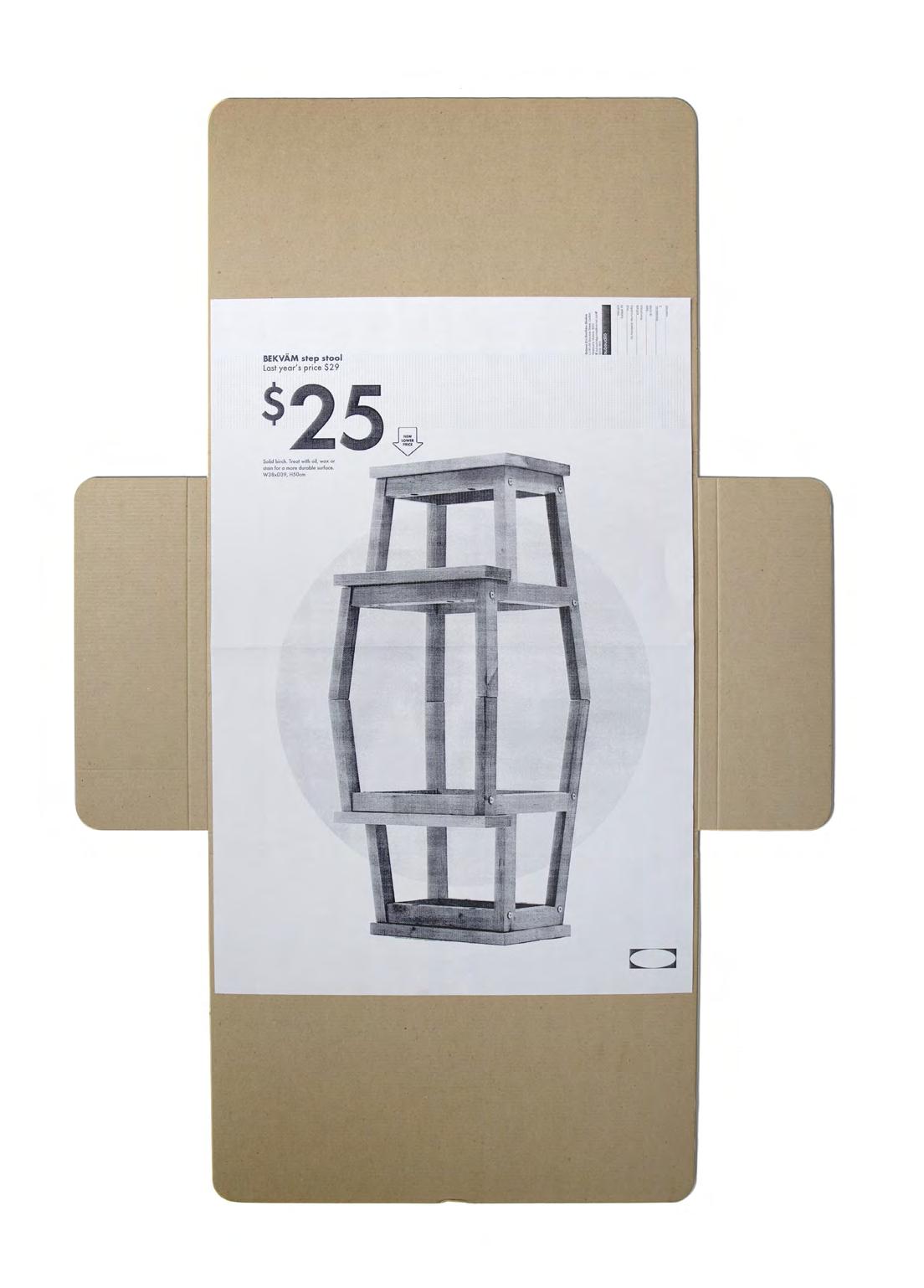
One of the best examples of this was the ikea crate edition. One of the essays in that issue described a project by architecture students, who would buy an item from ikea , rewrite the assembly instructions to transform it into a sculpture, then return it to the store with the new plans tucked inside. The next customer, unknowingly, would take home an entirely new creative possibility.
We loved the subversion of it—and so we leaned in completely. We decided to package that edition of Subaud inside a wooden crate, just like an ikea flatpack. You had to physically crack it open to access the content. We even used the original ikea receipts—enlarged to poster size —as the magazine pages. And here’s the part no one knows: I researched how to get the crates made and thankfully found an Australian Disability Enterprise who could handbuild every crate for us in their workshop—it would take the entire budget and then some to achieve this and they made it happen. The way we approached production for each issue was experimental in every sense—format, funding, intent—and it remains one of the most unforgettable editions we ever created.
Subaud had no reason to conform in any way whatsoever— in fact it was deliberately shape shifting—cleverly avoiding capture. Issues took the form of hand-sewn tabloids, posters, or books. Each edition and article sought visual independence. For example, an article written on a broken surfboard —a symbol of peace and freedom now rendered useless and hopeless—critiques how architecture has lost its soul, becoming a hollow expression in an age shaped by fear and control. The broken board becomes a metaphor for the collapse of personal freedom, expression and cultural
courtesy of Shane Thomson.
agency, reflecting a world where creativity is stifled and meaning is masked with aesthetics.
We weren’t interested in building a studio style—we had seen others pigeonholed by that very idea. We were committed to a process of rigorous interpretation—that’s the Urchin way and that’s what held it together. Every article was treated like an artefact with the designers required to read, research, and find the context to operate in. The designers had autonomy, but that autonomy was grounded in deep respect for the written word and the author’s intent.
The DireTribe team valued a deep understanding of each author’s intent, ensuring design elevated the ideas rather than serving style alone. I saw this as a chance for my team to learn how to articulate and defend their creative decisions—whether they saw it as a foam pit to practice in or a shooting range. Each designer was required to present their article and engage in discussion, with the DireTribe crew offering respectful but rigorous feedback if the intent felt unclear or superficial.
That kind of exchange was highly valued by us and a rare opportunity in commercial design work. It allowed our team to think differently, to slow down, and to treat the act of design as a form of translation and interpretation— between disciplines, between mediums, between minds. This inquisitive and investigatory method of approaching design was important to me and I wanted it to inform my staff’s approach to new work—this was one of my ways of building a culture in the studio.
Over time, Subaud evolved into Mongrel magazine, a blend of Subaud’s instinctive energy and a more structured academic publication called Issue, with Dean Boothroyd leading that part. Mark Raggatt coined the term Mongrel
for this new venture as it was like the “mongrel pup” of two different breeds (hence the imagery of the two different dog types on the cover).
I feel immense pride in what we built together. Apart from design, my contribution was to open it up—to bring more people in, to trust my team to carry the work forward, and to challenge conventional structures of authorship and design hierarchy. It was about saying: Let’s see what happens when we don’t know what happens next, and that takes courage and belief in others. As a creative director, I saw my role not only as an enabler, but as the sherpa— someone you need when you’re going into unchartered territory. My job was to create the space in which good work could grow and I absolutely loved the countless late nights pushing further and further.
To this day, Subaud remains one of the most creatively rewarding projects I’ve ever worked on. It wasn’t just a publication for me—it was a process, a question, a quiet rebellion. I only expected that doing the work in the moment was its own reward. There was no talk of legacy or longevity and that was mainly due to the fact that we always felt it was the last one we were working on—every time.
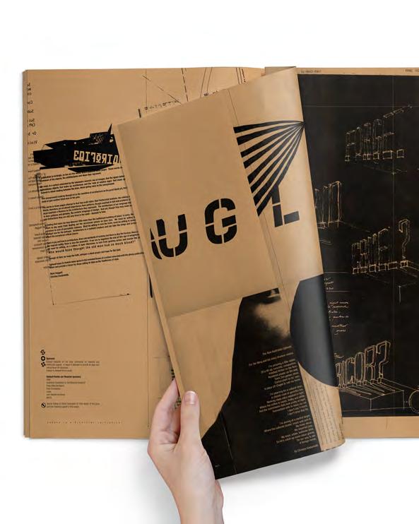
And We Thought Nobody Was Watching: Australian Independent Typographic Publishing 1988–2008
Stephen Banham
And We Thought Nobody Was Watching: Australian Independent Typographic Publishing 1988–2008
Stephen Banham
In parallel with a global fascination with cultural vernaculars, the rising proposition of design authorship also had impacts upon the Australian graphic design community of practice. Those engaged in typographic practice embraced this opportunity to open up channels of discourse, many of which broke through the familiar design community of practice and out into a wider, public discussion. abstract
The early 1990s saw an international flurry of independent publishing within the field of graphic design. Enabled by emerging digital technologies and catalysed by a design profession seeking to expand its creative control, many of these publications, such as Emigre and Eye, prompted vigorous debate within the design community.
In addition to broadly mapping the many independent graphic design, and specifically typographic, publications produced between 1988 and 2008, this paper will acknowledge and explore the tension between the intention of independence and the commercial paradigm of the graphic design discipline. It will highlight the underlying eco-system between the national and the international communities of practice by shedding light upon their context, influence, intent, and ultimate legacy.
In the Beginning
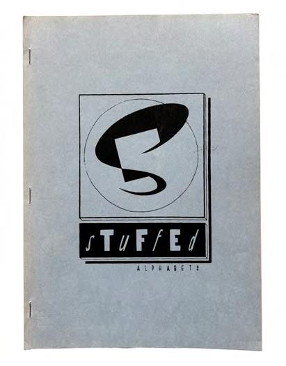
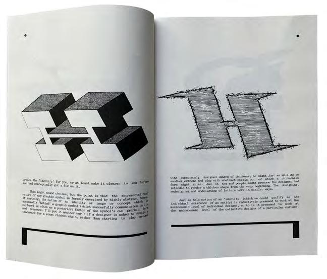
I recall the first time I encountered an independently produced Australian publication on typography. It was 1990, and in my hand I held a curious publication called Stuffed Alphabets. Despite its very humble production (simply photocopied in black and white and stapled) the author Philip Brophy’s perspective on letterforms and their identities offered a rare cultural reading of something that I had been taught was a utilitarian tool of trade.
Authorship may suggest new approaches to the issue of the graphic process in a profession traditionally associated more with the communication than the origination of messages. But theories of authorship also serve as legitimizing strategies, and authorial aspirations may end up reinforcing certain conservative notions of design production and subjectivity—ideas that run counter to recent critical attempts to overthrow the perception of design as based on individual brilliance.2
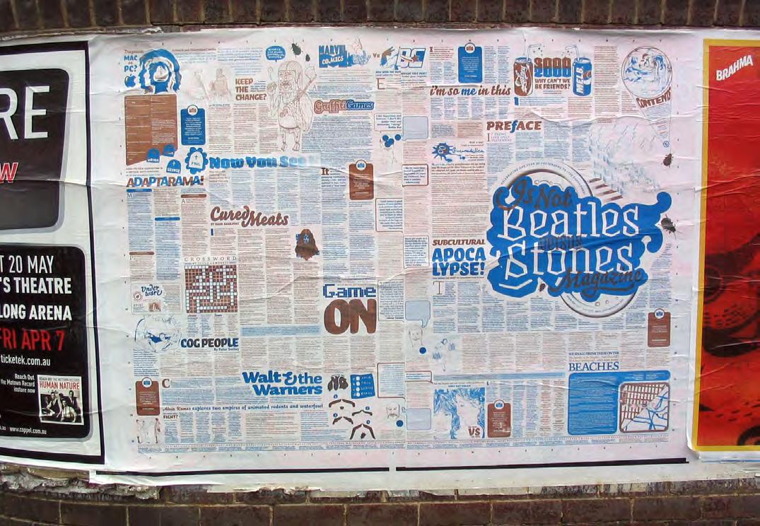
Previous Pages
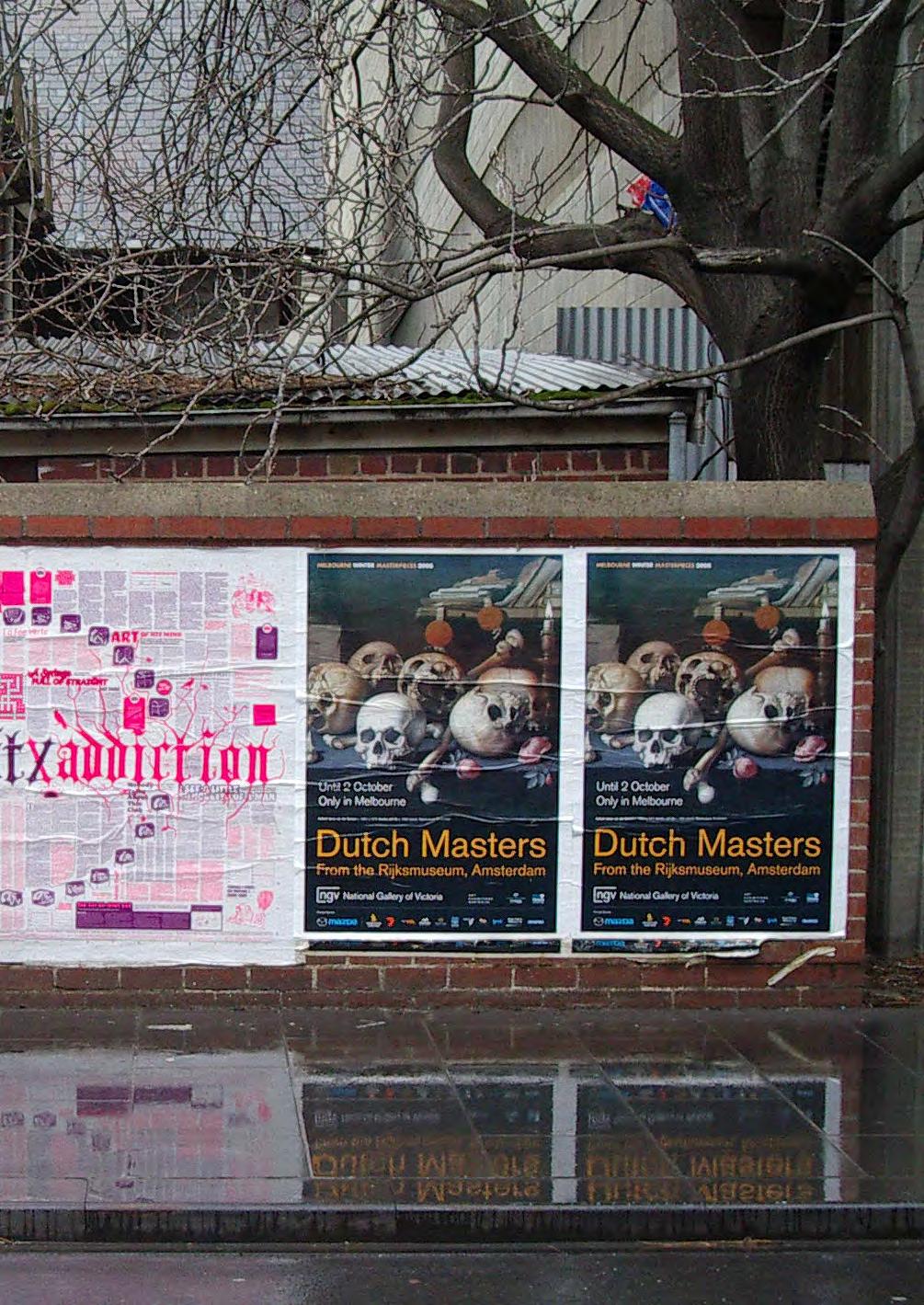
Is Not Magazine
Issue 3, 2003, pasted up on Lonsdale Street, Melbourne.
Stuffed Alphabets (1988) not only connected letterforms to the worlds of music, art, film, and pop culture, but wandered beyond to systems theorists such as Douglas Hofstadter and Donald Knuth. And to my absolute delight this publication had been produced in Melbourne. Writing forcefully from the edges of graphic design at a time when critique was rare, Brophy was one of the more interesting and unapologetic observers from this period. The significance of this series (Stuffed, Stuffing and ReStuff) was later reinforced when one of its essays, “Starting from Zero” by Keith Robertson, ended up as the primary text in Issue 19 of the highly esteemed Californian publication Emigre in 1991.1
Designer as Author
By the 1990s the authorial role of the designer in writing and publishing was being viewed as territory up for negotiation. The digital tools for small-scale desktop publishing had arrived, offering a simultaneous erosion of its trade typesetting base and rich possibilities for designers to climb higher up the cultural food-chain to author content as well as craft its visual representation.
In his seminal 1996 essay “The Designer as Author” design critic Michael Rock framed the inherent responsibilities and complexities of being the generator of content:
Critic Anne Burdick summed up the potential of this transition: With complete control over all aspects of the communication, the graphic designer as author, … has the freedom to explore more deeply the relationship between content and form, including issues which may be inappropriate to client communications but relevant to design. Autonomous works of total authorship must be considered a valuable contribution to graphic design.3
Burdick eloquently framed the proposition of “designer as author” as an expanded argument around the capacity of designers to even write in the first place, arguing that writing feeds the profession in two ways: through the challenge of critical analysis and through the exploratory freedom of selfinitiated work.4
For those arguing for the preservation of siloed roles, Burdick rationalised the demolition of such divisions, “Designers should not write more to become better writers but to become better designers.” Another design critic, Rick Poynor, recognised that not only did authorship call for content but that content demands meaning, especially when used as critique. Poynor describes the act of design as a form of editing, noting that the most significant choice of all, because it precedes everything else, is choosing what the design will be about.5
Looking for Alternatives
By the mid to late 1990s the editorial positions of many international periodicals such as Eye, Baseline and Emigre were beginning to bounce off each other, creating a somewhat self-referential cross-Atlantic loop. As an Australian looking on, there was a need to locate other publishing voices outside of conventional graphic design that emphasised a unique sense of place.
The books of Jake Tilson, particularly the Breakfast Special series (1986–89) presented a typographic abstraction threaded through a narrative—namely a fictitious character known as Mr. Emerson who eats five breakfasts in five cities over five days. Each of the five stories provides an opportunity “to explore local atmosphere and detail in which typography is as vital to the descriptive effect as the imagery used. The choice of a specific typeface to reflect each city was important—and to write in the local language, which in “Miasto Alfabet (Alphabet City)” meant using Polish.”6 Reminiscent of earlier figures such as Kurt Schwitters, Tilson used found typographic references, such as newspapers, magazines, wine labels and shopfronts to further suggest the typographic character of each of the five cities. Breakfast Special presents an archaeological journey using typographic artefacts as a binding narrative, representing a sense of discovery, and the observation of small things. Tilson’s laboriously tipped-in pages influenced their later use in publications such as Qwerty 7
Local and/or general
The rise of graphic design authorship offered the possibility of expressing one’s own cultural perspective through typography. The experience of teaching design during this period, where I witnessed blatant plagiarism from international design periodicals, became a catalyst to
produce something that reflected Australian content. The geographic isolation from discourse in the Northern Hemisphere highlighted that any distinctively Australian contribution would be a local one, based on identifying, articulating (or even at times contriving) a unique typographic voice.
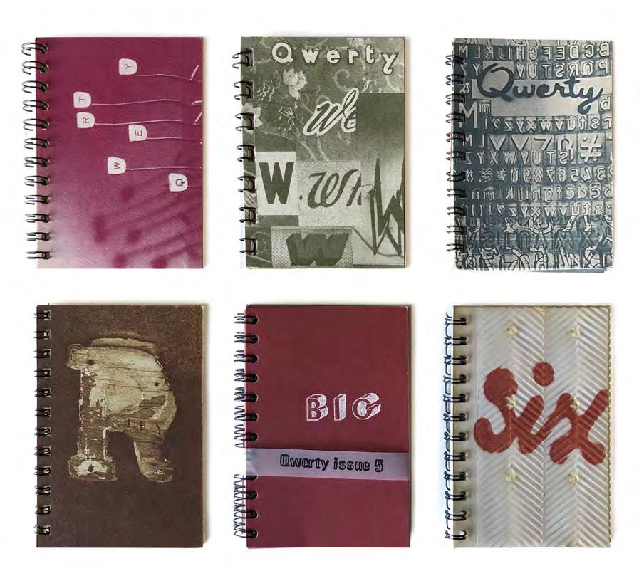
Produced between 1991 and 1997, the design of Qwerty 8 was developed during quiet nightshifts at the Sunday Age newspaper. Finally taking an A7 (74 x 105mm) spiral-bound booklet as a response to a limited budget, this diminutive format ended up not only being a unique identifier but also led to a more intimate reading experience.
Each issue of the pre-ordained six-part series focussed on a theme (Q: for those who get their fingers dirty; W: vernacular; E: stencils; R: the recession; T: large type; Y: the domestic) and was unapologetically Australian in its focus. This local referencing, particularly in the earlier issues of Qwerty, included the photographic documentation of typography found in the Australian environment—milk bar signage, old typewriters, date stamps, and suburban house numbering—an everyday visual language familiar and recognisable to Australians.9 Yet rather than being parochial, these observations sought to present quite the opposite— a unique typographic perspective to an audience beyond Australia. It was the looking inwards in order to project outwards.
This approach was not without precedent. Mimmo Cozzolino’s Symbols of Australia (1980) had presented an encyclopaedia-like reference of local trademarks as a “mirror of people’s dreams, ambitions and daily life”10 and was considered wide enough in its appeal to be accepted by major international publisher Penguin.
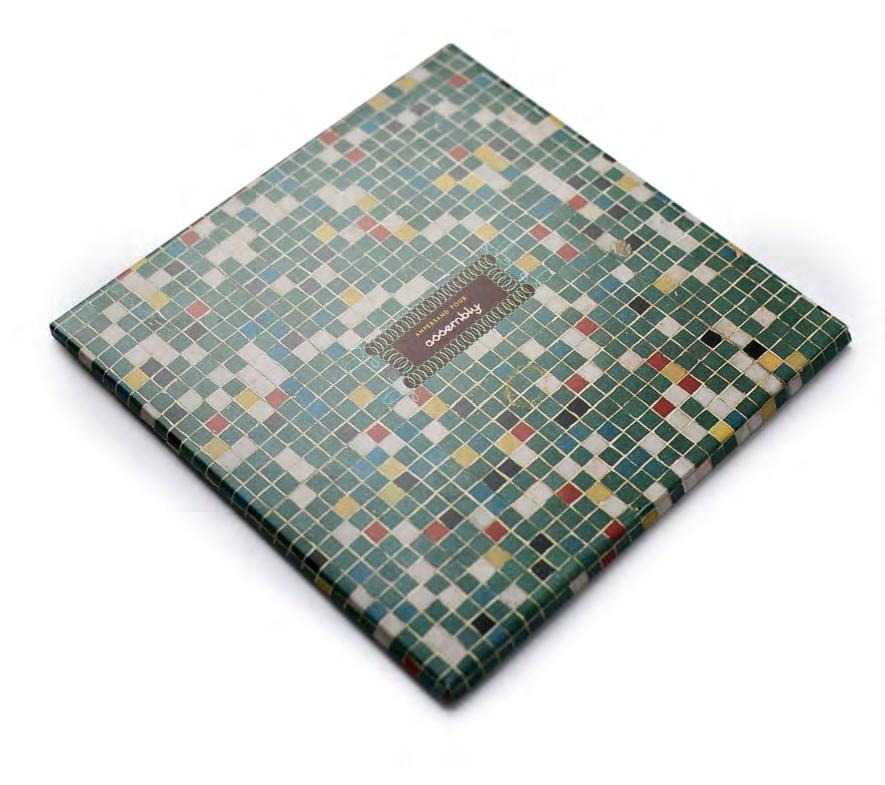
Top Assembly, 2000, cover packaging, author/designer
The fourth issue clarified my intention to develop a more critical voice, to re-orientate my publications from descriptive documentation into investigative forms. Qwerty shifted its focus from showing typographic phenomena in the streetscape to exploring the cultural meanings of those forms.
A 1994 review of the Qwerty series in Eye notes, In the hope of fostering a spirit of debate and interaction, contributions are solicited from readers during the magazine’s four-month production cycle. These offerings have inadvertently altered Qwerty’s aesthetic: from the somewhat predictable potted interviews with local design companies in Issue 1, it has become progressively more abstract and idiosyncratic.11
The Ampersand Series
Having learnt from my empowered authorial position, the series of Ampersand publications that followed were more culturally curious and critical.12 The need to directly centre the work around a national identity had receded as my confidence had grown in there being both a local and international readership.
Out of this came a series of publications, each pursuing a specific line of enquiry. The first of these, Ampersand (1997), compiled and expanded upon many of the earlier concerns of Qwerty. The texts centred upon the cultural life of typography, including signage lifespans (“The Life and Times of Mr. Typeface”), large scale typographic phenomena (“This Type is Bigger Than the Both of Us”) and the cleansing of local cultures (“This is a Story About a Door”). Indicative of emerging font-editing software, the back cover of Ampersand included a floppy disc containing the typeface Gingham. Like Qwerty it also featured handinserted and separately printed tipped-in sections.
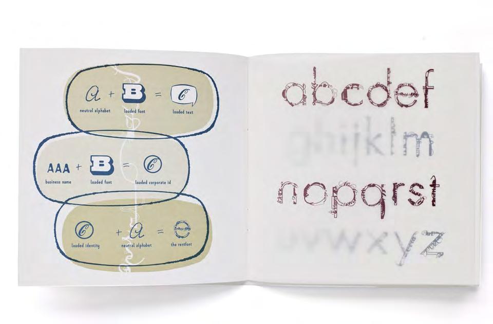
The second in the series, Rentfont (1998), took a decidedly political perspective. Posing the question “If you can design a corporate identity from fonts, why not a font out of corporate identities?” Rentfont satirically proposed a fully corporate-sponsored typeface, Futures, its entire structure being made of logos. With its comical reference to Paul Renner’s Futura, a typeface that symbolised the European modernist ideals of the 1920s, this publication was an unapologetic critique of the commercial orientation of the design profession—“Just as the ideal of the machine age represented efficiency and mass production in the time of Futura, our own time is governed by different factors such as abstract entities known as corporations, trademarks and an overwhelming financial prerogative.”13
My anti-modernist rhetoric reached its peak in the subsequent issue, Convoy (1999). This presented an unapologetic critique of a perceived superficial Australian graphic design industry— “Could you imagine a public meeting where the speakers only discuss the colour of the megaphone?” 14 The voice of Convoy was sheer agitation, “in the process of working out the how we have forgotten the what.”15 Again, it was the mercantile underpinnings of the design industry that were the real target, yet my forceful line of critique was written and designed with peers in mind. Two editions of Convoy were produced, one on paper
and one printed on plastic. With a readership situated primarily within design, Convoy sought to persuade the profession that it was not isolated from politics and economics, but rather was subject, or even obedient to such forces. Convoy set up humorously absurd juxtapositions, such as comparing two objects bearing a very strong visual resemblance yet imbued with completely different economic values, such as the “No Overtaking” truck mud flap and the Commonwealth Bank logo. By exposing such economic relationships and distributions of value, Convoy revealed the explicit monetisation of design through a playful outer skin of humour and absurdity.
The fourth issue, Assembly (2000), explored the indelible impact of graphic design upon a child’s visual memory through having 600 schoolchildren draw a logo completely from memory. It begins with the provocative statement that if current graphic design discourse was to be visualised as a digital typeface, “every keystroke would be an exclamation mark or a full stop, with a total absence of question marks.”16 By highlighting the effect of branding upon the minds of young children, Assembly proposed a more open-ended approach to questions of design by engaging the public directly. The publication sat both outside and inside design—directly involving an unconventional community (schoolchildren aged 7–15) in a process centred on their visual memory of design. The visual clarity of children’s logo recollections reinforces one of the key critical intents of Assembly, to highlight the complicity of graphic design with the brand indoctrination of young minds.
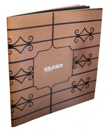
A year later, Grand (2001) investigated the link between typefaces and different socio-economic environments. This was done through an extensive typographic audit, using field research to note every instance of typography across 1000 metres (or eight city blocks) of central Melbourne. The publication featured a city block map per page with every typeface meticulously specified and listed. The variety and frequency of typefaces appearing across the kilometre were expressed through diagrams investigating the role of place, specifically socio-economic environments, in the choice and distribution of typefaces. The graphically reductive pages of Grand tell a tale of protest against a perceived cultural flattening through the overuse of Helvetica (along with its assumptive neutrality) during the insecure first few years of the new millennium. Grand sought to highlight the role of type in relation to place and national identity, reminding us that typefaces do, in fact, come from somewhere.
In 2003, Fancy toyed with fact and fiction in graphic design by presenting a series of twelve typographic stories—some true and some false. These range from the tale of a mysterious signage installer who would predict the longevity of businesses by writing forecasts in the glue that held up their signage (“Attack of the Glue Forecaster”), the story of Arthur Stace who evangelically chalked the word “Eternity” an estimated 500,000 times across the streets of Sydney, through to the South Australian bird-trainer who developed a new system of skywriting using highly trained geese (“Featherweight Letterforms”). The truth (or not) of these stories is never revealed to the reader, inviting open speculation.
As the last of the Ampersand set of publications, Fancy (2003) shift my perspective to being completely story based; it did not explicitly position itself as Australian (Qwerty 1, Qwerty 2), address issues of the Australian design industry (Convoy), or audit an Australian cultural landscape (Grand, Assembly). Instead, this emphasis on storytelling allowed an understanding of place beyond referring to a specific geographic area or national identity and instead looked into increasingly metaphoric places—such as, in the case of Fancy, the place that truth and fiction occupied within graphic design.
The Public
The late 1980s and early 1990s saw a huge rise in public awareness of typography, catalysed by the widespread use of personal computers whereby font selection became a regular public consideration. In terms of pop culture, 1988 saw the Victoria and Albert Museum exhibition The Graphic Language of Neville Brody catapult Neville Brody’s personal profile into the mainstream media. Along with it came a public interest in typography.
Cognisant of this greater public awareness, the media interest in the independent publishing of the Qwerty and Ampersand series beyond the design community several years later was significant within an Australian context. Appearing as full-page editorials, the discussion of Australian typography seemed an unlikely topic for public discourse, yet less surprising given that those publishing projects had always sought to reflect wider Australian cultural references beyond letterforms.
Other Typographic Voices
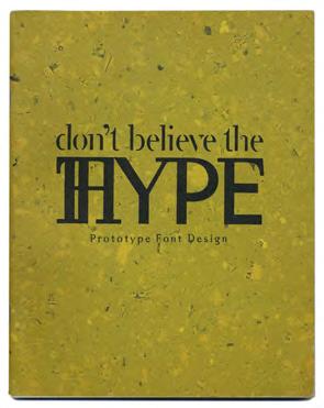
The wave of locally authored activity during the 1990s and 2000s included those sharing a typographic focus. These included Don’t Believe the (T)Hype, a 1996 type specimen from the Prototype foundry showing commissioned work and retail fonts. The opening mocking statement “There are only two typefaces in the world, Gill and Bodoni, and the moon is made of mozzarella”17 firmly positions a progressive view in the Emigre vs Vignelli “legibility wars” of the time. Part manifesto, part portfolio, the Australian cultural references in Don’t Believe the (T)Hype suggest an awakening interest in a more localised identity.
In 2003 Adelaide-based design firm Voice independently published a pocket-guide on typesetting, Type It Write, to address what was considered at the time to be a lack of knowledge in setting type, both within student and professional circles. Its handy format is deliberately reminiscent of the trade guide PrintMate, that had been distributed by the Associated Pulp and Paper Mills (appm ) to all design and printing students until 1989. Featuring no editorial other than the guidelines themselves, Type It Write is the most pragmatic and matter-of-fact independent publishing effort produced during this era.
A lesser-known independent typographic publication was TypoTastic (2005–2006), produced by Justy Phillips through the School of Art in Hobart, Tasmania. Although short-lived at just two issues, it sought to publish a range of writings, from interviews profiling international and national designers through to more localised material such as the tourist attracting Doo Town on the South-East coast of Tasmania.
A Chorus of Design Voices
To appreciate and contextualise the typographically centred independent publishing of the time, it is important that they be placed within the broader eco-system of publications dealing with the wider subject of graphic design. The two decades between 1988 and 2008 produced a chorus of different voices in graphic design publishing in Australia, ranging from the blatantly self-promotional through to the deeply critical.
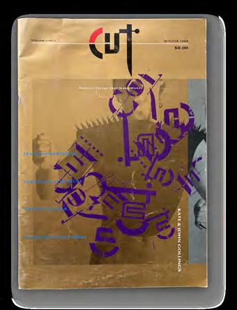
Launched in 1988, the single-issue Cut magazine (published by Xtension Partnership, producers of art magazine Tension) reflected the tight relationship between the advertising and design trades of the time. The text was written by copywriters, the editorial content reflected the advertisers and was peppered with practitioner profiles ranging from the illustrator Russell Mills, designer Milton Glaser, to photographer Kate Gollings. Appearing transparently commercial by contemporary standards, its emergence into an unformed late 1980s Melbourne graphic design community brought great excitement.
Funnel (1996) was published by the Sydney-based design agency Nelmes Smith Ashton Media. With its first and
only issue based on the theme of Nothing, Funnel aspired to a more philosophical approach to the discussion of design. Featuring a wide range of contributors from chefs to photographers through to established designers such as Garry Emery, its similarity in format to Emigre, its sparse layout and setting in the then-fashionable typeface Rotis18 suggested a more self-conscious appeal to a graphic design readership. The instigator of Funnel, Graeme Smith, claimed it was “a bit of an experiment” and a vessel to communicate “a more interesting understanding of what you do.”19
Name (1995–1997) emanated from Swinburne University, featuring visual contributions from students and alumni (Ben Chong, Matthew McCarthy, Toby Moore, David Recchia, and Andrew Trevillian) as well as articles by practitioners such as Mimmo Cozzolino. Name spanned four issues, each one with a specific theme: Self-Titled, Identity, Ownership, Evolution. Printed in a single colour, the design of Name is strongly indicative of the era, featuring many tipped-in sections and hand-stamping.20 As founder Matthew McCarthy noted, “It certainly wasn’t a commercial success. But I think it was a success in terms of learning to talk about design, learning to collaborate, those important soft skills as well as the production hard skills … Name helped to position us differently to our cohort.”21
In terms of format and editorial intent, the pioneering venture Is Not magazine (2005–2008) needs to be recognised. Spanning eleven issues (plus several special issues), Is Not was created by a group of five Melbourne writers and designers—Mel Campbell, Stuart Geddes, Natasha Ludowyk, Penny Modra, and Jeremy Wortsman. Its bill-poster format, measuring 1.5m x by 2m, was a defining and dramatic feature. Its typographic complexion was distinctly European, using only fonts created by the Dutch foundry Underware. The bi-monthly poster was posted across fifty sites around Melbourne—on both public walls and within venues. The publication operated as a non-profit enterprise receiving no revenue from advertising, instead raising funds from issue launches and subscriptions. Is Not opened up opportunities to re-think a relationship with the reader. Instead of page numbering conventionally used in sequential publications, Is Not had grid references
at its edges. In addition to submissions being accepted via post and email and sms, they could also be written on the posters themselves. As co-designer Jeremy Wortsman points out, “The idea that a magazine can be more than words on paper is something we like … it maintains this sense of curiosity, wonder and innovation.”22 In extending design far beyond formal composition and into the methods of content generation, production, delivery, and interaction, Is Not offered a truly innovative contribution to Australian independent design publishing.
The most sustained, yet least flamboyant, design publishing effort from this era was Open Manifesto (2003–2018) which spanned eight issues. Produced by advertising designer Kevin Finn, the issues are predominantly text-based, reinforcing the editorial emphasis on the ideas behind design rather than its visual appearance. Although it has been compared to its Dutch contemporary Dot Dot Dot (2001–2011), the design of Open Manifesto seems to take its cues from the later editions of Emigre (issues 64–69) which presented a more sober, scholarly complexion. Open Manifesto increasingly drew upon high-profile figures in the international design profession in an interviewbased format (including Michael Bierut, Bob Gill, Milton Glaser, Paula Scher, Wally Olins, Peter Saville, Ros Moriarty, Vince Frost, Rudy VanderLans and more) with later issues expanding the scope of interviewees (including philosopher Edward de Bono, film director Errol Morris, author Helen Walters and many more). Its greatest virtue was the considerable expansion of what design could be, making it one of the most outward-facing and intellectually aspirational publications of its time.23
But what exactly is Independence?
The exact meaning of the term “independent” in independent publishing is a contentious issue. Definitions range from the very broad, “a book or publication published outside of the five major publishing houses”24 through to the more uncompromising view that true independence can only be achieved by having no commercial intent at all.
Many self-publishers nobly claim their work offers new and unincumbered perspectives, and that by consciously producing this vision “independently” (i.e. self-funded)
a decision has been made to not “sully” this vision with a commercial agenda. Yet a common outcome of these publications, from Qwerty to Is Not, is the cultivation of opportunities leading to commissions or greater notoriety. In a field like graphic design where visibility, creativity, and differentiation all carry commercial currency, this tension between the intention of the publication and its outcome can become difficult to disentangle.
To illustrate this point, we need only reflect upon the late 1990s, a period when much “independent design publishing” offered little inquiry or critique and instead became narcissistic compilations of design projects. Describing the state of Australian design publishing in a 1998 article for the English typography magazine Baseline my frustration was unapologetic, pointing out that:
[W]hen Qwerty had begun (seven years prior) the counters of design bookshops in Australia had been simply an empty flat space used for wrapping. By 1998 these same spaces were piled high with self-published Australian design literature. Although a casual glance at this print material may have indicated a healthy cultivation of discussion and debate, most of these publications were based on a portfolio model—a record of current corporate identities, reports and packaging.25
Some publications, such as Cut (featuring advertisements and “advertorials”) unapologetically reflect the commercial nature of the design industry circa 1988. Later publications are less straightforward. Funnel, for instance, may have been initially conceptualised as an experiment for the agency that produced it, yet it proved highly effective in cultivating new work. As contributor to Funnel Andrew Ashton admitted “It became a bit of a business card. It got us lots of hospitality business.”26
Conclusion
This critical survey of independently produced typographic publications between 1988 and 2008 highlights the dynamic changes within the wider Australian graphic design practice during this period. Pre-dating the arrival of social media, this period of publishing invested a lingering faith in the power and opportunity of the printed word in transmitting community, culture, and ideas.
Although international precedents in independent typographic publishing (particularly Emigre) left an indelible trace upon many, these were expanded upon in formulating an Australian graphic design voice. Ranging from the diminutive (Qwerty) to the monumental (Is Not) the designed form the publication ultimately took seemed secondary to the desire to find a place in the wider international graphic design discourse. The growing confidence within Australian design in being “part of the world”27 seems to indicate that there was ultimately a reasonable degree of success in this intention.
These two decades that bridged the new millennium saw the graphic designer’s role substantially renegotiated amidst three factors: shifting digital technologies (desktop publishing, digital fonts); a redefinition of the designer’s voice and influence (through the designer as author movement); and a rising appreciation of graphic design generating cultural artefacts (through the vernacular movement). Looking across these Australian typographic design publications with the benefit of several decades hindsight has highlighted the gradual shift in its gaze from an inward focus on national identity to a more confident, outward international contribution, yet still spoken with a slight Australian accent.
endnotes
1 The essay was set in Barry Deck’s Template Gothic, a typographic hallmark of the early 1990s.
2 Michael Rock, “The Designer as Author,” in Looking Closer 4: Critical Writings on Graphic Design, (New York: Allworth Press, 2002), 237.
3 Anne Burdick, “What Has Writing Got to do With Design?” Eye, Journal of Graphic Design, Vol 1 Issue 9 (Eye Publishing, 1993), 5.
4 Anne Burdick, “What Has Writing Got to do With Design?”, 4.
5 Rick Poynor, “The Designer as Reporter,” Obey The Giant: Life in the Image World (London, Birkhauser, 2001), 188.
6 Jake Tilson, Investigations in Cities 1977–1997, (Museo Internacional de Electrografia, 1997), unnumbered.
7 Tilson’s “tipped-in” elements also influenced subsequent publishing such as Name magazine.
8 Unbeknown to the author, there had already been a Dutch design publication called Qwerty. It was produced by Hard Werken.
9 The hot metal type used in the first issue of Qwerty (Northcote, Vic: Letterbox 1991) had been scavenged from an abandoned bush printery just outside of the small Gippsland town of Walhalla.
10 Mimmo Cozzolino, “Geoffrey Blainey: Behind the Label” in Symbols of Australia, (Penguin Books Australia, 1980), 11.
11 Jim Davies, “Qwerty Review,” Eye, Journal of International Graphic Design, Issue 15 (Eye Publishing, 1994), 84.
12 Stephen Banham (text and design), Ampersand, text and design Stephen Banham, (Melbourne, Vic: Letterbox 1997). This was the first of my Ampersand series of publications.
13 Rentfont 1998, 19.
14 Convoy, text and design Stephen Banham, (Melbourne, Vic: Letterbox, 1999), 8.
15 Convoy 1999, 16.
16 Assembly (poster) 2000.
17 Don’t believe the (T)Hype, Terence Bergagna (Prototype Font Design, 1996), 1.
18 The Rotis typeface is set quite small across extraordinarily wide column widths, rendering it a very uncomfortable read.
19 Phone interview with Graeme Smith, February 15, 2025.
20 This may have been a design influence from Jake Tilson, via Qwerty
21 Phone interview with Matthew McCarthy and Andrew Trevillian, March 17, 2025.
22 Jeremy Wortsman quoted in https://en.wikipedia.org/ wiki/Is_Not_Magazine
23 An anthology of Open Manifesto was published by Formist in 2022.
24 A definition of independent publishing offered by the Independent Book Publishers Association (IBPA) on their website www.ibpa-online.org/
25 Stephen Banham, “The Problem with Koala Sans,” Baseline, Issue 25 (Bradbourne Publishing, 1998), 5.
26 Phone interview with Andrew Ashton, February 15, 2025.
27 Issue 46 of Eye magazine focussed solely on Australian graphic design.
Publishing in the Platform Age: Between Presence and Disappearance
Publishing in the Platform Age: Between Presence and Disappearance
Layla Tweedie-Cullen
At an academic event I attended earlier this year, a speaker opened his presentation by declaring his love of research and then described writing a book review without reading the book. Under deadline pressure, he had turned to an AI-powered scholarly tool—more specialised than a general-purpose chatbot— to summarise the text and simulate a dialogue with its content. To finish the review, he asked the AI to mimic the tone and structure of a previous piece of his writing. Reading, he implied, had become optional. Engagement had shifted from critical attention to informational extraction: accelerated, automated, and shaped by the logic of productivity tools. While positioned as a pragmatic solution, the gesture hinted at something more systemic: a shift in how knowledge is produced, mediated, and valued. This recalibration of engagement mirrors broader transformations in publishing infrastructures, where speed, reach, and algorithmic visibility often supersede criticality and depth.
At the time of the presentation, I was reflecting on how I might continue and expand split/fountain (s/f), a crossdisciplinary design, publishing, and curatorial initiative I cofounded in 2009 in Tāmaki Makaurau Auckland, Aotearoa New Zealand. Since closing the exhibition space in 2017, I have not initiated any new publishing projects; instead, I focused on paid design work, upskilling in interaction design, and eventually commencing doctoral research. Yet the project’s resonance has persisted. Eight years later, I am still approached, in person and via email, by artists, designers, and former collaborators who reflect on the impact and uniqueness of the s/f project—its hybrid model of bookshop, publisher, and project space—and ask if it might take shape in some form again. This lingering attention has prompted me to consider what a renewed version might look like and is one reason I decided to write this essay.
In 2025, I hold a tenured lecturer position at a university in Aotearoa, and the conditions under which publishing is practised, evaluated, and circulated feel radically altered. Digital systems now govern how work is encountered and assessed. ai-generated writing and imagery flood the cultural field—often stripped of voice, context, or intention. Within the academy, research is expected to be “impactful,” meaning increasingly visible, quantifiable, and searchable.1 Publishing must be peer-reviewed, cited, and categorised within output types. Journals are ranked by impact metrics; platforms—from databases to citation engines—determine what counts. These systems reward legibility over complexity and output over inquiry.
Philosopher Byung-Chul Han critiques this imperative for total exposure in The Transparency Society (2015), describing it as a compulsion that reduces communication to surface-level clarity, sacrificing depth and complexity for legibility and control.2 Han argues that the pursuit of transparency flattens discourse, stripping away ambiguity and fostering uniformity. In this optimised landscape, communication is no longer about meaningful exchange, but a constant flow of information designed to be measured, categorised, and controlled.3 Han’s decade-old critique has only grown more pertinent as the expansion of platform culture has deepened these dynamics.
This shift runs counter to the values that once underpinned the s/f project: slowness, depth, situatedness, and material engagement.4 In this essay, I consider how independent publishing might endure in this new landscape and ask: What forms of independent publishing might resist extractive systems? Can publishing occupy digital space without becoming another surface for optimisation? What might it mean to carve out moments of reflection and depth—however temporary— in a system designed to accelerate attention and flatten complexity?
The ai book review presentation raised further questions. If a language model can synthesise a book’s argument in seconds, is reading becoming performative—a gesture rather than a process? What is lost when engagement is instrumentalised and valued only for its outputs? What happens to practices that provoke thought, shift perspective, or deepen understanding?
This rmit Design Archives Journal issue focused on independent publishing as a space for critical discourse, dialogue, and experimental practice offers a timely frame for re-examining these concerns. In response, I revisit s/f not as a nostalgic return but as a lens for rethinking what publishing can still do. I reflect on two earlier s/f projects: a hybrid exhibition-publishing initiative and a publication series that embody an ethos of material engagement, situated knowledge, and collaborative experimentation. I then examine two recent publishing experiments (2022–23) that I produced as part of my doctoral research, asking how such approaches might persist or adapt within a cultural landscape shaped by automated visibility and platform-defined circulation.
Publishing as Collaboration: split/fountain 2009–2017 s/f began as a design studio and occasional bookshop, offering a curated selection of local and international artist and designer-led independent publishing—work we admired and aligned with.5 Over time, I expanded the project to include events, a s/f publishing imprint, and a full exhibition program.6 s/f publications took various forms, spanning silk-screened prints, Risograph editions, newspapers, and offset printed projects. These often functioned as situated extensions of events, artworks, or installations—operating in parallel as discursive forms. Exhibitions occurred within the s/f space and at other sites and galleries in Aotearoa and overseas, extending s/f ’s presence beyond our physical location. From the outset, the emphasis was on creative agency and collaboration. We worked primarily with local and emerging practitioners
operating at the intersection of art and design, and we supported projects that did not fit neatly within institutional or commercial frameworks. s/f was a platform to test ideas, share work, and sustain a community of artists and designers engaged in publishing as both form and critical discourse. Some of the most generative s/f projects emerged from these hybrid, discursive conditions. Temporary housing + shelter, co-edited with Japanese collective Whatever Press, was developed and printed for the 2012 Tokyo Art Book Fair. A second iteration was presented at The Physics Room in Ōtautahi Christchurch, Aotearoa, in 2013. The publication functioned as an evolving platform, shaped by a shifting editorial team for each issue and a wide range of contributors who responded to thematic prompts focused on space, precarity, and shelter. The Tokyo edition was produced locally using a network of Riso and office printers that generated a collection of unbound pages in varied sizes, formats, and stocks. The loose, modular structure allowed the publication to be added to, rearranged, or recompiled over time. At the Tokyo Art Book Fair, it was presented on furniture designed by artist Xin Cheng constructed from found materials—paper bales, plastic buckets with rope tops, and tables made from cardboard and bamboo—echoing the publication’s ethos of improvisation and responsiveness to site.
For the Christchurch edition, the publication was again printed locally and launched as part of an exhibition that included an improvised display and furniture system also designed by Cheng with artists Michael Parr and Blaine Western. Constructed from second-hand materials sourced via TradeMe (an Aotearoa online marketplace similar to Gumtree or eBay), these structures supported and framed the publication in dialogue with the post-earthquake context of the city—foregrounding themes of resourcefulness, material reuse, and provisional infrastructures. In this setting, publishing became more than a document or output; it was a spatial, social proposition shaped by its conditions of production and circulation.
distracted-reader was a collaborative publishing series I co-founded with writer Allan Smith in 2013 that brought together artists, writers, and designers to explore expanded approaches to publishing. Each issue responded to its content with a different format, positioning design, writing, and artistic practice as equal contributions—challenging the structural tendency to render the designer invisible. Smith and I were interested in how form, the technics of publication and design, not only transmits ideas, but actively shapes how they come into being. Here, we draw on Bernard Stiegler’s notion of technics as a transformative, mediating process that co-produces human experience and thought.7 distracted-reader was not just a publishing project, but an experiment in how artistic, critical, and material practices could be co-constituted through making. True to its title, the project remains unfinished. After the third issue, it stalled for practical and structural reasons, including time, funding, and resources. Yet the idea remains open: a provisional platform that could be reactivated and a reminder that publishing is always a temporal, fragile, and contingent practice.
Temporary housing + shelter and distracted-reader represent modes of production and distribution that are increasingly marginalised by platform-driven economies of visibility. While similar projects still emerge today, the conditions of their circulation have shifted. Discoverability, legitimacy, and impact are now tied to platform metrics, algorithmic sorting, and networked visibility. Between 2009–2017 when the s/f project space was active, platform culture was emerging, but had not yet become the dominant infrastructure it is today. Social media existed—and we used it—but algorithmic pressures were far less pervasive. Distribution of s/f publishing relied on informal, embodied networks: book fairs, artist-run spaces, and word-of-mouth exchange. Our projects circulated through events, exhibitions, and publication launches where publications were physically encountered—handled, discussed, and traded in person. Participation in art book fairs across cities like LA, New York, Tokyo, Vancouver, and Melbourne extended s/f’s international presence through direct engagement rather than platform amplification.8 These were not audiences captured by metrics, but communities formed through shared interests and situated encounters.
Between 2014 and 2017, s/f publishing was represented internationally by Idea Books (Amsterdam), but the relationship was difficult to maintain. Our irregular publishing schedule and focus on emerging or lesserknown artists and designers made marketing a challenge. Only specific titles—those conforming to conventional expectations of what a “book” should be were considered viable for broader distribution. These constraints reveal a structural tension at the heart of independent and experimental publishing: while the ambition is to expand the language and form of the book, the channels for circulation— distributors, shops, fairs—tended to reward legibility, coherence, and standardisation. These conditions shaped what we could publish and how that work was received. Even the most materially ambitious or critically engaged projects had to pass through systems of formatting and recognition that privileged familiarity over experimentation.
Locally, distribution posed different challenges. With few bookshops in Aotearoa supporting independent art and design publishing, circulation was limited and expensive.9 We relied on temporary infrastructures and shared networks—systems that were often personal rather than institutional. Copies were hand-posted to libraries, gallery reading rooms, and individuals we believed would meaningfully engage with the work. This trust-based approach prioritised connection over reach and often unfolded through informal, slow-moving channels. While meaningful, it was precarious—sustained by unpaid labour, collaborative goodwill, personal resources, and intermittent grant funding. I ran s/f alongside a full-time design job at Auckland War Memorial Museum Tāmaki Paenga Hira, maintaining the project through after-hours work and contributing to space rental costs out of pocket.
Publishing as Image:
The Collapse of Materiality in Platform Logic
In 2025, publishing is now inseparable from platform culture. Even the most political or materially grounded projects are mediated by the circuits through which they are made visible: Instagram posts, link-in-bio shops, and algorithmic feeds. Increasingly, it is not the publication itself but its image that circulates—books and zines reduced to photos on Instagram, digital mock-ups on websites, or compressed artefacts in online portfolios. Flattened, decontextualised, and reclassified as content, a publication becomes a surface, a signifier of taste or identity. Readers might share a publication on a platform less for its argument than for its ability to signal affiliation, branding themselves as progressive, critical, or culturally attuned.
In The Transparency Society, Byung-Chul Han argues that contemporary culture is driven by a logic of exhibition, where everything is measured by its display value, including the self, which is subjected to compulsory visibility and commodification.10 In this context, individuals become both producers and products, exposed for continuous consumption. Han describes this relentless exhibitionism as stripping away opacity and mystery, turning everything
into spectacle—objects and identities alike become instantly consumable and disposable. The result is a flattening of experience, where what is displayed is no longer encountered in-depth or through material form, but reduced to surface, circulated as a visual artefact.11
In a recent undergraduate publication design critique I led, I asked a group of students, most in their early twenties, whether they had looked at physical books to inform their work. Had they engaged with printed matter to consider how form, material, and layout shape meaning? Had they considered how the body encounters a publication and how this might affect the way it is read or understood? They all responded “no”; their references were entirely digital. While they were producing physical artefacts, they were primarily designing their projects to be seen on screen and distributed as images rather than held or absorbed. Online is where visibility happens, where they share their portfolios, apply for jobs, and maintain peer networks. This orientation is perhaps compounded by the limited infrastructure for distributing independent or artist/ designer-led publishing in Aotearoa, where even university libraries increasingly prioritise digital acquisitions over print.
This shift towards digital visibility aligns with Tiziana Terranova’s concept of “free labour”—the unpaid, affective, and cognitive work users contribute to digital platforms, where acts of self-expression and cultural production generate economic value without formal compensation.12 In her critique of networked capitalism, Terranova argues that even resistant or autonomous practices are subsumed into the platform economy, neutralising their critical edge by recoding them as productive contributions.13 What circulates as visibility thus becomes a form of labour—publishing, sharing, and content creation serve to sustain algorithmic infrastructures of surveillance, commodification, and extraction. Tightly controlled and perpetually recalibrated by platform owners, these algorithms maximise user interaction, reinforce platform dependency, and extract data for targeted advertising—a
logic the social psychologist and philosopher, Shoshana Zuboff describes as central to surveillance capitalism.14 Digital visibility becomes an index of algorithmic relevance dictated by profit-driven metrics that privilege engagement over critical discourse.
This raises a deeper question: can independent publishing still claim autonomy in a landscape where outputs are captured, flattened, and optimised before they can circulate on their own terms? Traditionally, independent publishing operates outside corporate or institutional control. While projects may receive arts funding or emerge through collaborations with cultural institutions, independent publishing is typically defined by its editorial autonomy shaped by the values and priorities of its editors and creators. But if discovery and engagement are increasingly dictated by platform logic, where algorithms and metrics govern circulation, can it still be considered independent? If small-scale publishers must adapt to the same mechanisms of optimisation as corporate media to reach audiences, what remains of that autonomy? The very practices that once defined independent publishing, such as material experimentation, local networks, and slower forms of distribution, are increasingly subsumed by digital infrastructures that prioritise metrics over depth. Rather than escaping institutional constraints, independent publishing risks becoming another surface for algorithmic capture, stripped of its criticality.
Situated Publishing: The Book as Archival Gesture
As digital circulation accelerates, the physical book increasingly takes on an archival role, serving as an artefact of labour, design, and material intent—a trace of cultural production fixed in time and space. It endures where the digital image often disappears. This idea informed a work I produced as part of my doctoral research, “Circles Within the Archive: Navigating the Paradoxes of Paul Cullen’s Practice” (2025), which focused on the archive of my late father, artist Paul Cullen (1949–2017).15 His archive contains an expansive collection of artworks, drawings, workbooks, and documentation amassed over his forty-year-long career.
Digital r/p/m proposition: four virtual exhibitions, 2023, digital realisations, Layla Tweedie-Cullen of four hypothetical installation concepts by Paul Cullen, originally presented across four alternate gatefold covers of the publication r/p/m, split/fountain publishing, 2011
Left to right, top to bottom:
proposition 1 Planetarium.
proposition 2 the Octagon Room.
proposition 3 Musick
proposition 4 Linnaeus Project
Digital models created by Ry Tweedie-Cullen and Layla Tweedie-Cullen, r/p/m publication cover designs Layla TweedieCullen and Jayme Yen with artwork by Paul Cullen, screenshots, Layla Tweedie-Cullen.
Among the materials in Paul’s studio, I uncovered a large stack of printed and photocopied texts and essays, likely gathered for research and teaching purposes.16 These ephemeral documents might typically be excluded from formal archival processes. However, I decided to preserve them to foreground the critical contexts and references that shaped his practice. I bound the documents into fifteen hardcover volumes, giving them yellow buckram covers and colourful marbled edges. The decision was partly practical, as a bound form made the texts easier to reference in my research, but I also saw these compilations as an act of situated publishing. However, these books exist solely within the Paul Cullen Archive, connected to my father’s body of work, and their value is rooted in this context, which is the only place they can be viewed. They are not digitised, not marketed, and not optimised for visibility. Within my exegesis, I positioned these volumes as a research output, and their value was legitimised through my conceptual framing of them.17 But, outside of this structure, they are invisible—neither peer-reviewed nor accessible, and their refusal to circulate outside the archive renders them materially present but institutionally absent. This echoes Han’s critique in The Transparency Society, where
he argues that visibility has become synonymous with existence; what is not captured, exhibited, or optimised is effectively erased.18 Han describes this as a kind of pornographic exhibitionism—a compulsive need for documentation and display that enforces visibility as proof of value.19
Yet, even as I question this logic, I am caught within it. To contextualise the fifteen volumes within my research, I photographed and exhibited them within my exegesis— transforming the books back into images and flattening their materiality for digital representation. And now, in writing this article, I reproduce them again here, inserting them into the platform logic of a hybrid print and digital journal. Although this act of publishing exists within a critical frame, it still demands visibility for validation. The yellow volumes must be made public, must be seen, to be recognised as valuable. In this sense, platform logic is not simply an external imposition—it is a condition of visibility that even resistance is compelled to perform. Virtual Publishing: Digital Transience
The tension between the materiality of publishing and the demands of platform logic prompted me to experiment with how space might be held differently in digital environments.
If books are increasingly flattened into images circulating as Instagram props or digital artefacts, what would it mean to resist this compression? Could publishing reclaim a sense of space, even within virtual formats? In another work produced as part of my doctoral research, I explored these questions through a series of virtual installations positioned on the covers of r/p/m (meaning revolutions per minute), a publication I designed with Paul in 2011 under split/fountain publishing. The publication features five distinct gatefold covers, each presenting a conceptual proposition by Paul to install works documented in the book at sites around the world. These installations included r/p/m sculptures with rotating components or constructed as systems that circulated water. The proposed locations were the Eise Eisinga Planetarium in the Netherlands, the Octagon Room in Greenwich, Musick Memorial Radio Station in Aotearoa, the Linnaeus Garden in Sweden, and the Sala de los Mocárabes in the Palace of the Alhambra Granada, Spain.20
I modelled the r/p/m sculptures using LiDAR and photogrammetry and collaborated with offshore creatives to capture scans of international locations (except for the Alhambra). I then brought these elements together in the open-source platform Mozilla Hubs, positioning the 3D artworks within the spaces or landscape according to Paul’s concept, transforming each cover into an interactive, navigable digital environment.21 This was an attempt to spatialise publishing, to create an experience that resisted the fast-scrolling visual logic of platform culture and could not be reduced to a static screenshot or thumbnail. Viewers could enter the virtual spaces, move within them, and linger, either on screen or with a 3D headset, for a more immersive experience. However, the experiment was not immune to the forces I sought to resist. Mozilla Hubs is now defunct, and the project and its imagined landscapes have vanished. What remains are fragments: 3D files, screenshots, isolated documentation, and the physical publication.22 The Hubs experiment became an interruption rather than a resolution. It gestured toward a more spatial and reflective mode of publishing, but it was also precarious, entirely dependent on the infrastructure that hosted it. Ultimately, these virtual landscapes have also been flattened and reduced to images.
15-Volume Reader and Digital r/p/m proposition: four virtual exhibitions point toward a different understanding of publishing—less as product and more as relational infrastructure. They resist optimisation by operating within systems of care, memory, and speculative activation. Rather than pursuing visibility or permanence, these works hold context, propose new orientations, and invite moments of engagement. I suggest that they expose the limits of independence as a framing and point toward the need for a more entangled, situated approach to publishing. These two projects might sketch out a possible direction for what s/f could become: not a publishing imprint in the traditional sense but a critical platform. Publishing here is not simply the production of books or content but an act of infrastructural thinking—shaping the conditions under which knowledge circulates, recirculates, or resists circulation altogether.
Interdependent Publishing
Independent publishing is a term used to signal autonomy from corporate or state influence, but the reality is more complex. Many so-called independent projects depend on public funding, operate within academic or cultural institutions, or are enabled by personal privilege—through unpaid labour, professional networks, or access to time and space. This was certainly the case for s/f. While we operated outside traditional publishing structures, we were never fully autonomous: the project received Arts Council funding and was sustained by my institutional affiliations, the unpaid contributions of artists and collaborators, and time carved out alongside full-time work.
In the present context, the notion of independence is further destabilised as publications increasingly take multiple forms, including print, digital, and audio, where they are distributed through platform infrastructures governed by algorithmic optimisation and commercial metrics. These are not neutral systems; they shape how cultural work is circulated, made visible, and valued.
In a recent conversation with the artist Ruth Buchanan, where I shared some of the questions I have explored in this essay, she proposed reframing independent publishing as interdependent publishing.23 Rather than holding onto the ideal of autonomy, she suggested that interdependence acknowledges the relational and contingent nature of publishing—its reliance on shared labour, uneven infrastructures, and support networks. If we position publishing as a way of making something public, its embeddedness within broader systems of influence and mediation becomes central, not peripheral.
A systems-thinking approach offers a helpful lens for reconsidering how publishing operates—less as a series of isolated outputs and more as a set of interdependent relationships, infrastructures, and flows. Like any system, publishing can be shaped by closed, extractive logic, prioritising efficiency, scale, and visibility, or by more open, generative models that allow feedback, care, and situated engagement. Distribution is a key site where these tensions play out.
Rather than accepting supply-chain pipelines optimised for reach and discoverability, we might ask how distribution could function more like an ecosystem: reciprocal, adaptive, and embedded in the contexts it serves.24 In this light, independence becomes less of a structural condition and more of an ongoing negotiation between voice and visibility, funding and freedom, solidarity and survival.
Conclusion: Provisional Publishing Futures
In this essay, I have considered how publishing might persist as a critical practice within a landscape shaped by platform logic, algorithmic optimisation, and extractive systems. I began by asking how independent publishing might endure in this context. Can it resist becoming another surface for optimisation? Can it still create space for reflection, depth, and material engagement, however fleeting, in a system designed to flatten complexity and accelerate attention?
Rather than arriving at fixed answers, this essay has traced a set of reflections shaped by s/f and projects developed through my doctoral research, reconsidering what independent publishing is and how it continues to function within shifting conditions. I argue for a change in emphasis: from independence to interdependence, from product to process, and from distribution as pipeline to distribution as relationship. The practices explored here do not escape platform infrastructures but attempt to operate at their margins carving out moments of resistance, pause, and slowness, even when they are fragile or provisional. Interdependent publishing resonates with my experience building publics through informal, relational modes of circulation. When active, s/f did not follow a standard supply chain; distribution moved through conversations, book fairs, and embodied spaces. While digital platforms can offer valuable tools for visibility and coordination, the logic of algorithmic optimisation risks flattening these relational ecologies, shifting attention toward reach over resonance and replacing situated publics with frictionless discoverability.
This brings me back to the question that prompted this essay: what now for s/f ? Perhaps the question is no longer whether to publish or whether to choose print or digital, but how to inhabit existing systems critically. Publishing, in this frame, becomes a way of interfering with the infrastructures that govern what is seen, shared, and valued. Rather than reviving s/f as it once was, I propose reimagining it as a conceptual framework that can be picked up, rerouted, or reactivated when the conditions are right. Not a rebranding or relaunch but a way of working with contingencies and systems of knowledge that resist capture. Instead of scaling up, s/f might scale sideways, resisting standardisation in favour of slower, situated, and sometimes messy forms of engagement, formats that prioritise relationships over reach and that disrupt rather than comply.
I argue that if publishing is to remain critical, it cannot exist outside platform logic, but it can operate at the points of friction. Perhaps the role of independent publishing today is not to retreat from these conditions, but to confront them directly, creating temporary spaces for friction, reflection, and critical engagement within systems that seek to smooth them out. To do so may require reimagining the notion of independence, not as autonomy, but as a form of interdependence grounded in relational infrastructures, collective agency, and situated resistance.
1 Much of what I produced through S/F—provisional, process-based, materially engaged—falls outside these systems. It does not meet the university’s criteria for formal research recognition. It wasn’t peerreviewed, wasn’t indexed, and was not designed to be.
2 Byung-Chul Han, The Transparency Society, trans. Erik Butler (Stanford Calif: Stanford Briefs, 2015), 1–8.
3 Han, 1–2.
4 With rising rents, platform dominance, and the demands of full-time work, maintaining a physical project space and bookshop is no longer viable. For this reason, my focus here is on S/F’s publishing practice.
5 I co-founded split/fountain with gallerist Michael Lett, after collaborating on a publication project with The Estate of L Budd. I took on full responsibility for split/fountain in December 2010.
6 The S/F project space and exhibition program ran from 2009 to 2016. The space was open two days a week on Friday and Saturday.
7 Bernard Stiegler, Technics and Time, 1: The Fault of Epimetheus, trans, Richard Beardsworth and George Collins, (Stanford, Calif: Stanford Univ. Pr, 1998), 82–133.
8 Using proceeds from S/F sales, we would purchase titles from other independent publishers or exchange books to bring back to Aotearoa. Often, these acquisitions were packed into overloaded bags and hand luggage, lugged through airports to avoid prohibitive shipping costs— hoping they wouldn’t be weighed.
9 Parsons Bookshop, which closed in 2012, was located beside Auckland Art Gallery Toi o Tāmaki (formerly Auckland City Art Gallery). Long regarded as a significant hub for art and design publishing, its closure highlighted a broader decline in local infrastructure for independent publishing in Tāmaki Makaurau.
10 Han, 9–13.
11 Han, 11.
12 Tiziana Terranova, “Free Labor: Producing Culture for the Digital Economy,” Social Text 18, no. 2 (63) (June 1, 2000): 33–36, https://doi. org/10.1215/01642472-18-2_63-33.
13 Terranova, 38, 51, 54.
14 Shoshana Zuboff, The Age of Surveillance Capitalism: The Fight for a Human Future at the New Frontier of Power, First edition (New York: PublicAffairs, 2019), 16, 186–87, 484.
15 I refer to the artist Paul Cullen by his first name to reflect our familial relationship. This is also consistent with how I have always addressed him.
16 Layla Tweedie-Cullen, “Circles Within the Archive: Navigating the Paradoxes of Paul Cullen’s Practice” (Auckland, New Zealand, Auckland University of Technology, 2025), 91–93, https:// openrepository.aut.ac.nz/items/b00909ba-f132-4fe0-bac0c667a76ea83a.
17 Tweedie-Cullen, 91–92, 244.
18 Han, 11–13
19 Han, 1, 11–12.
20 Tweedie-Cullen, 195–97, 201–2.
21 I initiated the idea to realise Paul Cullen’s concepts virtually and collaborated with Ry Tweedie-Cullen to bring this vision to fruition. We also engaged offshore creatives to scan the international locations and animate the digital models of the artworks that Ry and I scanned in the archive using LiDAR and photogrammetry.
22 Tweedie-Cullen, 177–87.
23 This conversation took place at Artspace Aotearoa in May 2025, during Ruth Buchanan’s tenure as Director (R. Buchanan, personal communication, May 2025).
24 I am also drawing here on Ruth Buchanan’s observation, shared in our May 2025 conversation at Artspace Aotearoa, that extractive distribution models are not limited to large publishing houses, but can also be found in smaller, more specialised sectors of the publishing field (R. Buchanan, personal communication, May 2025).
Publication As Archive. Designer As Archivist: How Can Publication Design be Utilised to Preserve, Spotlight and Unearth Counter Histories?
Mia Murone
Publication
As Archive. Designer As Archivist: How Can Publication Design be Utilised to Preserve, Spotlight and Unearth Counter Histories?
Mia Murone
The archive exists as a series of traces, fragments, and documentation and as a representation of what has been.
A publication acts as a conduit between the archive and the past, a physical tether to the tangible and intangible qualities of memory and of history. Traditionally archival practices look to index these moments within the structures determined by western scholarship. When examined, the archive exists as a powerful structure controlled by selected individuals or large institutions, which act as a filter, deciding what is and is not archivable.
Preceding Pages
Left Grandfather writing notes on his extended family, 7 October 2024, photographer Mia Murone
However, what happens when your history falls outside the confines of these strict parameters? My research project investigated the power of the archive by looking to publishing and publication design to challenge and rethink the power imbalance. I sought to position publications as an extension of the archive through its role in the dissemination of knowledge. My family archive was used as a case study to investigate the intricacies of the archival process through the gathering, deciphering, and collating of its materials to form and design a publication. These intersections of the archive, publishing, and design practice form the basis of this exploration with the goal to empower individuals or collectives to share and conserve their own histories through publishing. Designers are provided an opportunity to position themselves to actively challenge the notions of institutional bias in their practice, using publishing as a means to rebel against the narrow definitions of what is and isn’t archivable.1
Gathering
“Gathering is the tender and thoughtful collection of goods for your kin, and a moment for reunion, for celebration, and for introspection around those goods.”2
Gathering is a holistic and intentional pursuit to unearth memories and hidden narratives within a collection of artefacts. The act of gathering my family archive was the initial phase of my research project to better understand the intricacies of archival practice and its relationship to publication design. I was unaware of the extent of the contents of my own family archive prior to commencing, and the subsequent growth for my research, both tangible and intangible, that would occur in this intentional quest in preserving its contents.
The gathering took place over two key sessions with my paternal grandparents. It was through an accidental encounter with my auntie when she revealed an additional collection of artefacts hidden away within the confines of shoe and cigar boxes. This encounter was a defining point in the initial stage of the project and opened the archive
to an array of materials beyond photographs. The boxes contained an assortment of photos as well as significant documents, including my grandmother’s Italian passport and my grandfather’s taxi license. These documents marked major transitional periods within their lives and represented their migration to Australia from Italy in the 1960s. While archiving the artefacts, I noticed the tension emerging between the official (passports, licenses, and birth certificates) and unofficial documentation (letters and photographs), which presented a reoccurring challenge throughout the project.
In “Narrative Tensions: The Archive and the Eyewitness,” Jeffrey Wallen explains that “Archival material bears the imprint of the bureaucratic, of that which has been institutionally preserved. It gives us traces of the dead, evidence of the past that has been recorded but not (yet) brought into the public space of the published book, of the library or museum.” 3 Through this initial stage, I developed my responsibility as the researcher of the archive, consequently assuming the role as archivist. As archivist, I began to intervene with the imprint of the bureaucratic, working with the materials, both official and unofficial, and recording my findings by digitally scanning them. Prior to commencing the archival process, I had intended to document everything, with the preconceived idea that in order for an archive to be understood it had to represent the entirety of what existed. However, as I became increasingly overwhelmed by the enormity of the task and the responsibility of documenting peoples’ lives, I realised that this was not feasible. Instead, through the act of archiving, I came to understand that “each object is not just stored because of its singularity but because of what it means and does in relation to the other stored objects.”4
My task was to document as many materials as I could within the allotted time, giving myself permission to intentionally sift through all the artefacts and contemplate their meaning. By engaging with the “repository”5 of my familial archive, I was actively “consigning through gathering together signs,”6 using the uniting thread of my grandparents to lead the way. This moment was crucial in the development of the project, as it provided a preliminary filter to view the artefacts, while allowing me to work broadly and provide the materials an opportunity to shape their own narratives. My focus was to ensure that an attribution of a narrative was not prematurely projected onto the artefacts through my own bias.
Deciphering Traces
As a result of the gathering phase, I came away with a collection of materials, linked solely by their relationship to my grandparents: Photographs, letters, prayer cards, and certificates, all traces of their experiences and beliefs. However, when it was time to move beyond the preliminary filter of this newly formed archive, a fresh set of challenges and questions arose: What do these artefacts mean? What do they represent? Who do they represent? And what do they represent together?
I found that the material manifestations of diasporic life seemed to be disconnected from the individual perspectives of my grandparents. The state-issued documentation spoke
loosely to the history of Italian migration, providing a map through stamps, signatures and notations that represented their journey within government systems. However, this map significantly lacked the account of the eyewitness.
“The eyewitness … insists on the importance of individual experience against the crushingly impersonal forces of history; it demands that we hear the story and the voice of the victim (against the hand of the bureaucrat); it presents us with the power of living memory, and of truth that will not be forgotten.”7 I felt that these documents alone did not represent my grandparents in their entirety, stripping them of their personal experiences and individual voices.
In contrast, the array of family photographs began to provide a foundation of individual perspectives, offering more context and evidence to the life that my grandparents had built. However, these documents still lacked key information such as dates, events and identities of the people I didn’t recognise. I was struggling to piece together a narrative with the little information I had and felt that at this stage I was unable to reflect their histories sensitively. This struggle also seemed to be a crossroads within my practice between the roles of archivist and designer. The role of archivist had been characterised by the ordered documentation of materials, but, as a designer, I was eager to make sense of the archival materials and begin to form narratives. It was here that I decided to revisit the archive in search of more information. Revisiting the archive was a crucial step in the development of the publication. It allowed me to look at the material with a new perspective. As I worked through the materials archived in the gathering phase, I was taken aback by how much my perspective had shifted, how many details I had missed or overlooked. I developed my archival approach through the adaption of McNiff and Whitehead’s action reflection cycle,8 framing this process as a funnel, starting off broad and cycling through the stages of gathering, deciphering, and revisiting, resulting in the refinement of a narrative for publication. However, I was still struggling to address the disconnect between the archive and my grandparents. As I was revisiting the materials I began to engage in conversation with my grandfather in hopes of finding additional details about the photographs I had discovered. I found that when asked directly, my grandfather became uncertain of his recollections, mistrusting his own memories. However, to my surprise, when I presented the photographs to him, the once dormant artefacts suddenly came to life through detailed descriptions. The photographic prompts allowed him to recall stories beyond what was pictured before him, inviting me into a world of experiences of which I was unaware. These personal accounts were then expanded
through the contribution of other family members, including my grandmother, prompted by my grandfather’s recollections. As Maurice Halbwachs suggested, “If we examine a little more closely how we recollect things, we will surely realise that the greatest number of memories come back to us when our parents, our friends, or other persons recall them to us.”9
This was a crucial moment, as it highlighted the importance of the preservation of oral histories in the diasporic archive. As Gabriella Giannachi suggested, it is only when “focusing on the preservation of heritage that is both tangible (objects) and intangible (performances, stories, music, events, but also rituals, anecdotes), can the complexity of diverse cultural knowledge be documented, preserved, and transmitted.10 In this way “embracing diverse “ways of knowing” is “fundamental to experiencing and creating faithful representations of knowledges”.11 The seemingly small act of conversation became an integral component to the formation of the publication and the representation of the histories presented.
In Deborah Willis’s text “Speaking of Pictures: Shaping and Creating Narratives in the African American Family Album,” she explains that “images of family life and events in the photographic album are shaped and narrated through the voice of a family member or the keeper of the photographs … the maker of the family album curates a family history through visual storytelling and collective memory.”12 Based on this understanding, it became clear that the narrative that had emerged came from the perspective of my grandfather who had been the keeper of the family photographs, his curation of our family history unknowingly forming the basis of my archive. Additionally, his oral recollections of his migration to Australia, his work as a taxi driver and his experiences of building a family solidified this further by providing a rounded account through photographs, documents, and stories. I now felt that I was able to reflect the histories sensitively.
Forming Totalites
“History is that which transforms documents into monuments … it now deploys a mass of elements that have to be grouped, made relevant, placed in relation to one another to form totalities.”13
I was now tasked with the responsibility to begin to form
a totality with what I had gathered and deciphered. I had identified the narrative perspective, transitioning from my role as archivist into designer. Similarly, the shift in roles mirrored the transition the archive undertakes when going “from the private to the public.”14 I was beginning to shape a container for these private materials, a publication to be distributed and ultimately shared with the public. However, as I began to design the book, I became increasingly overwhelmed by the design possibilities. What size will it be? How many pages? Will it be in chronological order? What typefaces will I use? As a response, I decided to print off the images, using a whiteboard to arrange and brainstorm the possibilities. I found that shifting my workspace from digital to analogue allowed me to conceptualise the materiality of the printed page. I began to identify the relationships artefacts had with each other, ones I had missed through the homogeneous nature of a digital filing system. This process also made way for accidental encounters; I liked the looseness of the materials placed imperfectly on the page seemingly ignoring the parameters of a grid, like the way they lay on the dining table at my grandparents’ house.
These seemingly small details shaped my editorial sensibilities, allowing the materials of the archive and the materiality of the publication to engage in a dialogue where they could begin informing each other. “The systematic decisions are configured around this ‘conceived book.’ The imagined book comes first, the system follows and adapts.”15 As a result I began to construct a typographic grid based on my learnings, slowly assembling and arranging everything together.
Simultaneously, I had to start planning with the printer and binder. I was unfamiliar with both practices and felt intimidated by the complexity of the industrial process. It was within the constraints of production where the book started taking shape. I identified my interest in producing this project in a large size after assessing the arrangements developed through the whiteboard exercise. It was also important that the book opened flat, similar to the family photo albums from which I had sourced images. As a result, 219 x 318mm was the most economical option as I could print four pages comfortably on an sra 3 sheet size. In order for the book to sit flat, the pages would have to be section
sewn. These constraints allowed me to push the parameters, working around the limitations to continue forming the book. For example, the development of the editorial approach was determined by section sewing. Images and interviews were placed according to eight-page signatures to differentiate between images and text. I wanted the interviews to mirror bureaucratic documentation by selecting a light blue paper stock. This paper was to then be wrapped around these signatures resulting in their placement at pages 9–12, 21–24, 33–36, and 45–48. The placement of the pages allowed for natural chapters to form through the constraints of the printing and binding process. This required extensive troubleshooting, but it gave me a deeper understanding of the printing process and possibilities for future projects.
Swiss graphic designer, Jost Hochuli succinctly explained in Systematic Book Design? that, “I cannot imagine anyone setting out to design a book without having some sort of plan to follow, whether simple or more complicated; without at least trying to proceed systematically. But sooner or later, any designer is likely to reach a point at which external influences make it impossible to continue working systematically, many decisions will undoubtedly be taken spontaneously on the basis of feelings rather than systematically and according to a plan”.16 I quickly learnt that despite extensive planning, proposing an uncommon production can cause delay and uncertainty for the production team. The systematic qualities of book production require clear explanations, proofs, and calculations in order to receive the desired result. For independent publishing this is a crucial component of the process and one I severely underestimated. However, production difficulties allow “unconstrained wandering through the problems”17 pushing you to troubleshoot and find alternate solutions. Although frustrating, I learnt that it was an inevitable aspect of the design process and, if embraced, can open your production to a variety of different outcomes.
I set out to explore the relationship between the archive and publication design through their shared goal of preserving and disseminating histories. I discovered that a publication can act as an extension of the archive and be employed by practitioners to share alternate histories excluded through formal institutional modes of archiving. I used my family archive as a case study to illustrate the archival process, gathering and deciphering an array of materials. I developed an archival process based on McNiff and Whitehead’s action reflection cycle, which demonstrated the journey of creating an archive and the subsequent development of the publication. I now understand that an archive is always in flux, never stagnant, perpetually evolving, growing, and adapting. Therefore, the role of the publication is to offer a snapshot of the archive as a provocation for the reader to follow their own curiosity. By identifying the endlessness of the archive, it also provided a glimpse into my future practice and the lifelong opportunity to explore potential archives and continue developing my designer/archiver hybrid practice. The title of the resulting publication, 49485, comes from
my grandfather’s taxi license, an official number that was attributed to his career as a taxi driver spanning forty-five years. The publication is a culmination of the materials and stories I’ve gathered over the course of my research project. Despite complications through the printing process, 49485 provided an opportunity to reflect on my current practice and unexpectedly reflect on my identity and where my family has come from. It opened up opportunities to connect deeply with my family and understand their histories and experiences. “The archive returns you to the question of self-representation … One begins to understand that embracing the archival is not so much about finding the past or somebody else’s past, but instead the beginnings of self or the beginnings of one’s own claim on that past.”18
endnotes
1 This research project was completed as part of the RMIT Master of Communication Design Professional Research Project, Semester 2, 2024. It was divided into three phases over the duration of the semester. Supervised by Stuart Geddes with guidance from Dr Michael Dunbar, Dr Noel Waite, and Dr Oliver Vodeb. Special thanks and endless gratitude to my grandparents Giovanni and Maria Immacolata Murone
2 Mindy Seu, “On Gathering: Collecting, Sharing, and Creating the Cyberfeminism Index,” Shift Space, 2021, accessed May 2024, https:// issue1.shiftspace.pub/ongathering-mindy-seu.
3 Jeffrey Wallen, “Narrative Tensions: The Archive and the Eyewitness.” Partial Answers, 7, no. 2 (2009): 261–278. https:// doi.org/10.1353/pan.0.0154.
4 Ernst van Alphen, “Introduction,” in Productive Archiving, Artistic Strategies, Future Memories and Fluid Identities, ed. Ernst van Alphen (Amsterdam: Valiz, 2023), 17.
5 Wallen, 261.
6 Jacques Derrida, Archive Fever: A Freudian Impression, trans. Eric Prenowitz (Chicago: University, Chicago Press, 1995), 3.
7 Wallen, 261.
8 Jean McNiff and Jack Whitehead, Action Research: Principles and Practice, 3rd ed. (London: Routledge, 2011).
9 Maurice Halbwachs, On Collective Memory, trans. Lewis A. Coser (Chicago: University of Chicago Press, 1992), 38.
10 Gabriella Giannachi, “Diasporic Archives,” in Archive Everything: Mapping the Everyday (Cambridge, MA: MIT Press, 2016), 109.
11 Robin Boast, Michael Bravo, and Ramesh Srinivasan, “Return to Babel: Emergent Diversity, Digital Resources, and Local Knowledge,” The Information Society, 23, no. 5 (2007): 395–403, https://doi. rg/10.1080/01972240701575635, quoted in Gabriella Giannachi, Archive Everything, 109.
12 Deborah Willis, “Speaking of Pictures: Shaping and Creating Narratives in the African American Family Album,” in Imagining Everyday Life: Engagements with Vernacular Photography, eds., Tina M. Campt, Marianne Hirsch, Gil Hochberg, and Brian Wallis (New York: The Walther Collection/Steidl, 2020), 297.
13 Michel Foucault, The Archaeology of Knowledge, trans. A.M. Sheridan Smith (New York: Pantheon Books, 1972), 7.
14 Derrida, Archive Fever, 2.
15 John Morgan, “It Seemed to Me...,” in Systematic Book Design?, Jost Hochuli (France: Editions B42, 2020), 29.
18 John Akomfrah, “Memory and the Morphologies of Difference,” in Politics of Memory: Documentary and Archive, eds., Marco Scotini and Elisabetta Galasso (Berlin: Archive Books, 2013), 29.
This Page is Not Empty RMIT Master of Communication Design Exhibition
Melbourne Design Week 2025
Sonali Mirpuri and Mille Almsig
Curated by students in the Master of Communication Design program at rmit University, This Page is Not Empty was a public exhibition presented as part of Melbourne Design Week 2025. Hosted at Nightingale Wurru wurru biik in Brunswick, the exhibition explored the radical potential of independent publishing as a form of political authorship and cultural storytelling.
Rooted in Melbourne Design Week’s theme of Design the World You Want, the exhibition asked: What kind of world could we create if every voice had space on the page? It called attention to the voices historically left out of dominant narratives, and positioned publishing not as an afterthought of design, but as a central, urgent tool of resistance, visibility, and care.
Drawing inspiration from a diverse range of publishing formats—music zines, student magazines, feminist presses, literary journals, and Risograph print culture— the exhibition treated these printed works as living archives: messy, handmade, and deeply political. Each artifact served as an act of authorship and agency, a reminder that the blank page has always been a site of power.
The exhibition featured responses to publications such as Overland, Meanjin, The Suburban Review, Spinifex Press, Crowd Magazine, Farrago Magazine, rmit Catalyst, and Lindsay Magazine. Individual projects engaged both archival and contemporary material, including works by Frances Cannon and the Jillposters collective.
Rather than presenting a fixed narrative, This Page is Not Empty embraced the collaborative, tactile, and unapologetically imperfect spirit of diy publishing. It invited audiences to step into a space where stories are reclaimed, archives are rewritten, and design becomes an act of defiance.
As curators, we — Sonali Mirpuri and Mille Almsig — approached the exhibition as both a collaborative and deeply reflective process. From naming the exhibition to shaping its identity and curatorial direction, we aimed to honour the voices on every page and the hands behind every print. It was a privilege to co-create a space where publishing became both method and message.
This exhibition was developed and presented by: Audrey Nichola, Jinjing Yang, Julia Zhao, Lijun Wang, Maria Povadora, Mille Almsig, Raven Liu, Shafa Raihan, Sonali Mirpuri, Tzu-ning Yen, Xiaoteng Hu, Yijia Gao, Yiming Wei, Yiyuan Peng, Yue Xiang, Yuexin Qiu, Yumeng Liu, and Yuyang Zhang, as part of the Master of Communication Design program at rmit University.
Our responses took many forms—sculptural works, video installations, textiles, publications, postcards and redacted wall texts. For example, a projection paid tribute to Farrago Magazine and RMIT Catalyst, recognising their role in student protest and dissent; a hand-built paper house, glowing from within, responded to Sofia Stefanovic’s “Longing for a Lost Home” in Lindsay Magazine1; and a series of Risograph prints, inspired by Carole Wilson’s Archive, explored themes of censorship, migration, feminist solidarity, and erasure. A deconstructed garment, featuring Frances Cannon’s poetry and drawings reimagined the body as open, shifting, and unapologetically free. It was cut apart and pinned back together, not to repair, but to reclaim, honouring vulnerability as strength and rejecting imposed ideals. These were just a few among many thoughtful and varied installations that collectively celebrated independent publishing as a site of resistance, care, and creative power.
The exhibition was developed under the supervision of Dr Fayen d’Evie and Dr Noel Waite, whose support, insight, and mentorship were vital to its realisation.
1 Sofia Stefanovic, “Longing for a Lost Home,” Lindsay Magazine, Issue 2, (September 2018–March 2019): 14–16
ADDITION TO THE COLLECTION
Jillposters and Another Planet Posters Collection Gift of
Carole Wilson
This gift includes source material, design development drawings, stencil designs, colour separations, final artwork and published posters, annual reports, correspondence, financial records, media clippings, and other ephemera created by Jillposters (1983–1987) and Another Planet Posters (1984–1991).
Ann Carew
The rmit Design Archives is a unique repository of Melbourne-based designers and design practices from the mid-twentieth century to the present. Holding over 350,000 items, it serves as a reference and study collection for students and the design community. We seek to record and preserve the work of a diversity of designers and design practices, and collect archives that untangle designers’ processes, influences on their work, and demonstrate the iterative process of design.
Carole Wilson’s donation to the rmit Design Archives in 2023 contains records from two significant, though short-lived, design collectives: Jillposters (1983–1987) and Another Planet Posters (1984–1991). These materials hold aesthetic, social, and research significance, providing valuable social documentary evidence of Melbourne’s social, feminist, and political culture in the 1980s. They also illustrate the vitality and creativity of the independent publishing sector in the 1980s1
Carole Wilson (b. 1960) is an Australian artist who lives and works in Ballarat, Victoria, where she is Associate Professor in Visual Arts at Federation University Australia. Wilson completed her undergraduate study at the Canberra School of Art, where she studied under Mandy Martin. During
her time in Canberra, she discovered the historical links between screen-printing and the spread of “subversive” and “underground” ideas.2 In 1983 she moved to Melbourne, where she continued her art studies at Phillip Institute of Technology, now rmit University, and became a founding member of Jillposters. Other Jillposters’ members include Lesley Baxter, Ally Black, Linda Brassel, Julia Church, Zana Dare, Deej Fabyc, Maggie Fooke, Julie Higginbotham, Catriona Holyoake, Barbara Miles, Kate Reeves, Linda Rhodes, Julie Shiels, Lin Tobias, Julia Tobin, Kath Walters, Carole Wilson, Chaz, and Karen.
Jillposters was a self-funded poster group, formed by a small group of politically motivated women in February 1983. An Australian Federal Government election had just been called following the double dissolution of Parliament on February 4.3 The group decided to express their views on political issues affecting women with a poster campaign in the streets of Melbourne. The first poster printed by Jillposters was titled A Change is as Good as a Holiday. March 5. 4 (The Labor Party, led by Bob Hawke, would win a landslide victory against the Liberal National Party on 5 March.) Over their five years of operation Jillposters commented on issues affecting women, such as apartheid, civil war, domestic violence, the environment, homelessness, the mining of uranium, and the nuclear arms race. Although not affiliated with any political or community group, their activism intersected with groups such as Woman Against Poverty, the Woman’s Liberation Movement, and the People for Nuclear Disarmament movement.
The group was loosely structured and never sought government funding or aimed to establish a permanent studio space. Initially the posters were printed in the printmaking room at the University of Melbourne’s Union
Building, with members contributing ten dollars towards the cost of materials and supplies—the women involved were mostly students, or unemployed, and not all had artistic training. Later, posters were printed at the Phillip Institute of Technology, where Carole Wilson was an art student, or wherever members could find a free studio space.
The women pasted their posters up under the cover of darkness to avoid the fines for bill posting—the group’s name, Jillposters, was a wordplay on signs warning “Bill posters will be prosecuted.” The posters appeared overnight in the inner-city neighborhoods of Richmond, Northcote, Fitzroy, and Carlton. Requests to purchase the posters soon followed, prompting the collective to distribute them via Melbourne’s alternative bookstores and galleries, such as Sybylla Press and the Shrew Book Shop in Melbourne, Jura Books in Sydney, Canberra Contemporary Art Space, Experimental Art Foundation in South Australia, and Labrys Press in Hobart. The print runs varied from 150 to 200, with a third being offered for sale to cover production costs. Early collectors of the prints include the Art Gallery of Ballarat, the National Gallery of Australia, and the State Library of Victoria.
Reflecting their collaborative and collective values, Jillposters chose not to credit individual creators on their artwork. As part of the documentation processes at the rmit Design Archives, we can honour the collective’s intentions while also recognizing the individuals involved in creating the designs. In the case of Wilson’s archive, we will add collaborators and other contributors to the records in our collection management system, EMu. Across all design disciplines in the collection, identifying creators often occurs through the donation of work from original creators, or design practices. However, this is an ongoing
process with records being updated as new information and research become available.
In 1988, Carole Wilson began working for Another Planet Posters (1984–1991), a community access screen-printing project established to enable local communities to produce “high quality design” on subjects of community concern. The artworkers at Another Planet aimed to work towards developing “a democratic culture which enables marginalised, disadvantaged and oppressed the right of expression.”5 The facility was funded by the Community Cultural Development Fund of the Australia Council and the Victorian Ministry for the Arts, with additional income supplemented by local community groups.
Employed as a Community Arts Worker by Another Planet, Carole Wilson collaborated with community groups such as members of the Women’s Refuge Referrals, the Domestic Violence and Incest Resource Centre, the Salvadoran Women’s group in Kensington, women at Pentridge and Fairlea Women’s Prison, and the Janefield Training Centre for people with disabilities.6 Wilson’s projects aimed “to develop social expression of marginalised people in society,” and addressed contemporary social issues, such as poverty, domestic violence and calls for the de-institutionalisation of people with intellectual disabilities. In 1991 the group merged with the Redletter Community Workshop to form Red Planet Press.7
The Carole Wilson Archive is a welcome addition to the Design Archives developing collection of independent publishing.
endnotes
Opposite Design drawing for Bread Not Bombs, 1983, created by Carole Wilson for Jillposters.
1 The acquisition of Carole Wilson’s archive followed the exhibition of a suite of works by Carole Wilson in Radical Utopia: An Archaeology of a Creative City, curators Harriet Edquist and Helen Stuckey, RMIT Gallery, 2023. The exhibition is documented in the RMIT Design Archives Journal, Vol. 13, No. 1, 2023 | Radical Utopia.
2 “Reliving the 1970s,” a cover story and interview with Carole Wilson, The Courier, Ballarat, March 18, 2005, 5. RMIT Design Archives, Carole Wilson Archive, Box 1.
3 As part of the campaign the Labor party committed to a National Economic Summit Conference, to be held after the election by Bob Hawke, to provide a forum for views and to gain consensus on issues important to the current and future well-being of the nation, including the social and economic challenges of the country in the face of a deep recession and high unemployment.
4 Carole Wilson, “My Life as a ‘Jillposter’: The Radical Feminist Poster Group that Pasted Prints up around Melbourne in the ‘80s,” The Conversation, January 4, 2024, https://theconversation. com/my-life-as-a-jillposter-theradical-feminist-poster-groupthat-pasted-prints-aroundmelbourne-in-the-80s-214959.
5 Tracey McNaughton, “Chairperson’s Report,” Another Planet Posters Annual Report 1989, RMIT Design Archives, Carole Wilson Archive, Box 1.
6 Carole Wilson, “Community Projects Report,” Another Planet Posters Report, 1990–1991, RMIT Design Archives, Carole Wilson Archive, Box 1.
7 Amanda George, Chairperson, “Chairperson’s Report”, Another Planet Posters Report 1990–1991 RMIT Design Archives, Carole Wilson Archive, Box 1.
Researchers are able to access rmit Design Archives by prior appointment. For instructions and information see Collection Access at rmit.edu.au/about/culture/ collections/rmit-design-archives
Join our mailing list
To join our email list, email rmit.edu.au/about/culture/subscribe or submit an online request at rmit.edu.au/about/culture/ collections/rmit-design-archives
Support the RMIT Design Archives
Help bring Melbourne's design history to life. Your valued donation helps us develop and care for our collections, deliver educational programs and publish the awardwinning rmit Design Archives Journal. Visit rmit.edu.au/about/ culture/about/support
The rmit Design Archives has endeavoured to contact the copyright holder of this material. In the event you are the copyright holder of material contained within this edition, rmit is seeking to hear from you in the use of this work. Please contact rmit immediately to discuss permission release and consent. Contact: copyright@rmit.edu.au
This Page
Roger Kemp, Paul Howard, and Anh Tran, the 2023 recipient of the Ian Howard Memorial Scholarship, with Ian Howard's Aristoc Industries Album. RMIT Design Archives, 2024, photographer Ann Carew.
Contributors
Stephen Banham is a typographer, writer and Senior Lecturer in the rmit School of Design.
Michael Bojkowski is a design practitioner and Associate Lecturer at rmit University and runs the experimental publishing imprint, Res >^..^<, a commons for design research.
Ann Carew is curatorial officer, rmit Design Archives.
Layla Tweedie-Cullen is an Aotearoa New Zealand based designer, educator, and researcher working across publishing and critical practice. She is the co-founder and director of split/fountain (s/f) and is a lecturer in the School of Art and Design at Auckland University of Technology (aut).
Paul Davis is an illustrator and artist who works under the pseudonym Oslo Davis and is a PhD candidate at rmit ’s School of Design.
Sonali Mirpuri and Mille Almsig are Master of Communication Design students at rmit University. As co-curators of the exhibition and writers of this article, they played a leading role in the development and delivery of the exhibition This Page is Not Empty for Melbourne Design Week 2025.
Mia Murone is a graphic designer who holds a Master of Communication Design, rmit University School.
Shane Thomson is the Director of Urchin Creative, Australia.