Docomo 5G is a forward-thinking telecom brand designed to cater to the evolving needs of Gen Z and Millennials who crave a connected and immersive digital lifestyle. Positioned as the go-to choice for those seeking to lead the future of digital living, Docomo 5G stands out in the telecom space by offering hyper-personalized digital plans and exclusive virtual experiences.
IDENTITY
Vision
To be the leading telecommunications brand for the digital generation, shaping the future of connectivity with cutting-edge 5G technology. Our vision is to create an ecosystem where every interaction is enriched by fast, reliable, and immersive digital experiences, allowing individuals to live a limitless and hyper-connected life.
Mission
To empower Gen Z and Millennials by providing innovative, personalized, and 5G-powered digital experiences that seamlessly integrate into their connected lifestyle. We aim to revolutionize the way young people work, play, socialize, and create by offering hyper-connected solutions that push the boundaries of digital transformation focusing on inclusivity.
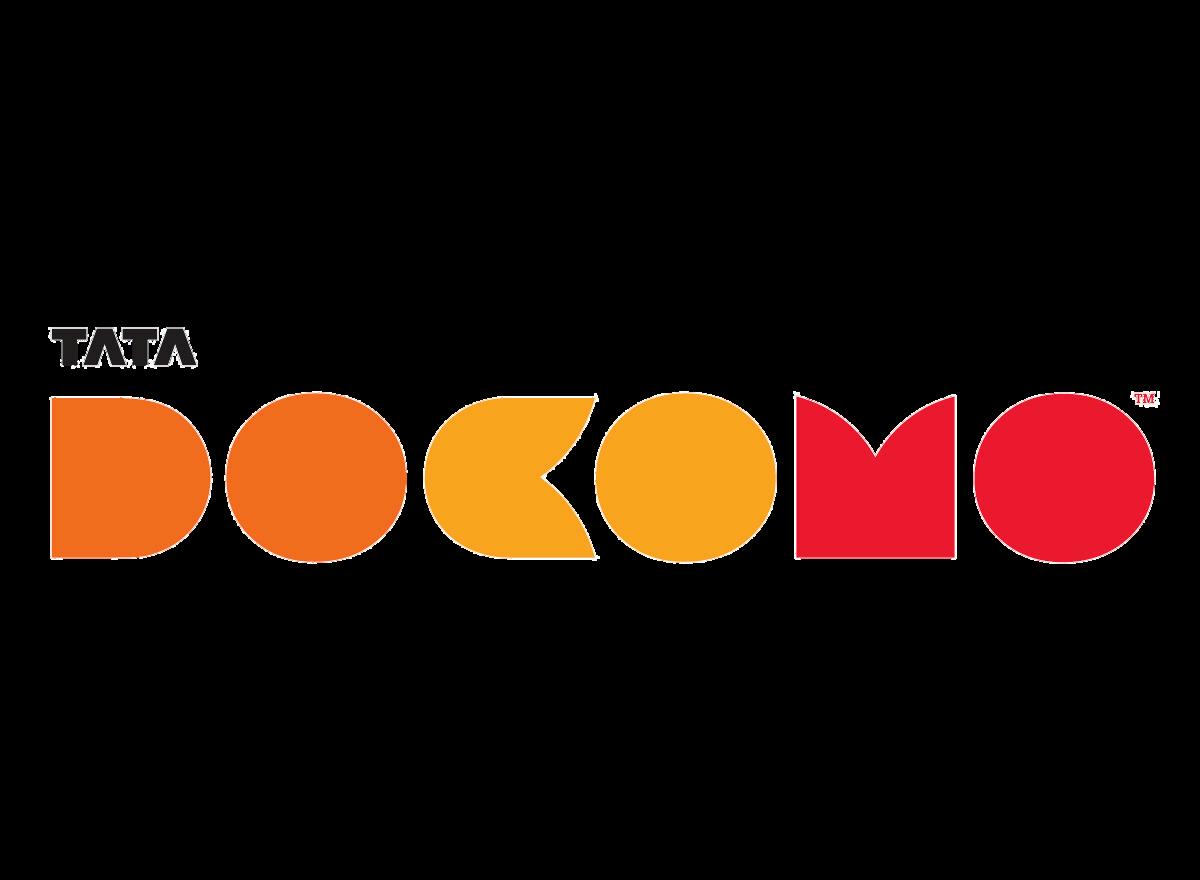
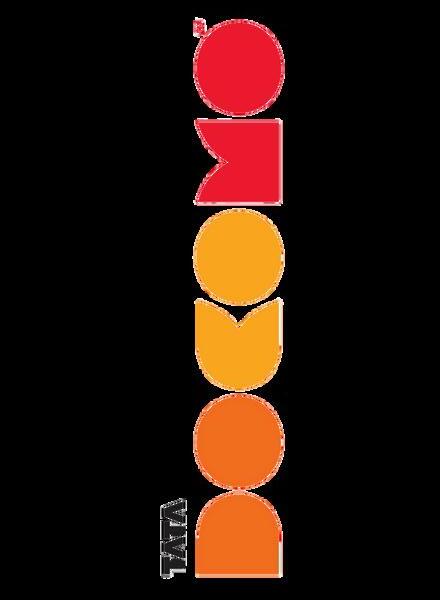
Brand Logo
Our logo is a visual representation of our identity. It is a modern, sleek design, futurist reflects both innovation and connectivity. Th should be used in accordance with esta guidelines. This includes the proper use of scale, and white space around it.
Brand Guidelines
Color Palette
Our color palette is inspired by POP colours, creating a vibrant and futuristic look. These colors should be used consistently across all media to maintain brand integrity.
HEX: #ED2426
HEX: #FFFFFF
HEX: #F15722
HEX: #000000
HEX: #FFD05D
Typography
We use a custom font selected for readability and emphasised on the futuristic, trendy, Gen-Z aspect. This typography helps to reinforce our brand identity and should be used in all communications.
Bagero
Font Style
PRIMARY FONT
SECONDARY FONT
Futura Medium
Docomo’s voice is friendly, engaging, confident and innovative. It should reflect the youthfu tech-savvy spirit of Gen Z and Millennials, while maintaining professionalism in communication.
AND TONE
Do's and Don'ts
Ensuring brand consistency across all platforms is key in building recognition and trust. Here are some basic guidelines to ensure our brand is represented appropriately:
Use Official Color Palette
Typography Consistency
Ensure you use the brand's specified colors in all assets. Use the specified fonts and styles in the brand guidelines for all written communications.
Follow Imagery Style
Consistent Messaging
Use photography and illustrations that match the brand's aesthetic. Ensure the message delivered is aligned with our brand values
Modify the Logo
Do not alter, distort, or change the logo colors without permission.
Misuse Design Elements
Avoid using the brand's graphic elements in a way that is not consistent with the guidelines.
Inappropriate Color Usage
Do not use colors that are not included in the brand s official palette for brand representation. Avoid communications that contradict or obscure our brand me
Conflicting Messages
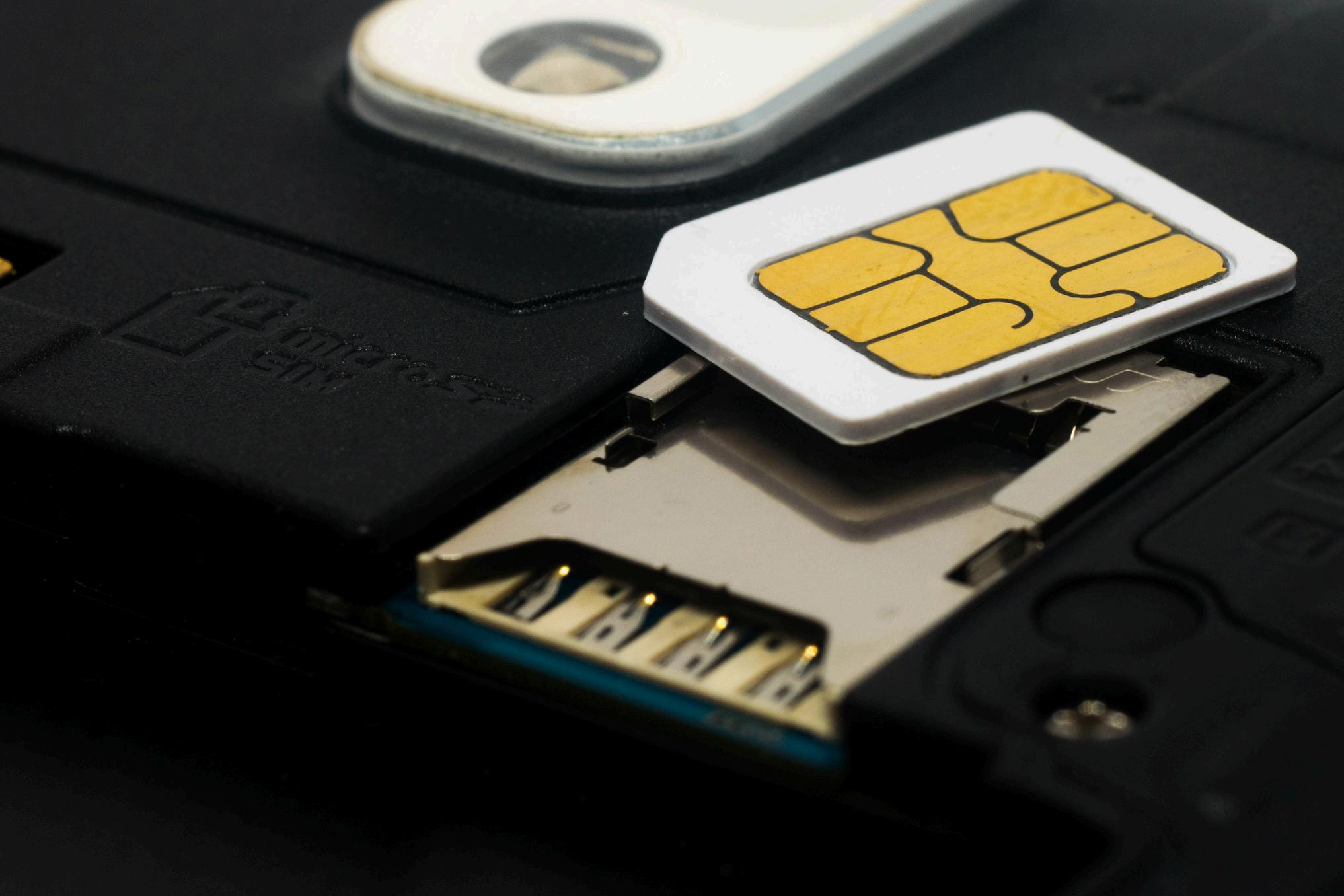
Imagery Style
Our imagery style should reflect the brand’s message, and what it conveys. Docomo aims for a more connected world that focuses on one ’ s individuality, making this world, built for you.
APPLICATION
Our brand Collections include a range of marketing and communication materials. From print to digital, each application should be consistent with our brand guidelines.