Why Psychology Matters in Storefront Signage
We all make fast decisions, and the retail industry is no different. Based only on visual signals, people establish views about a firm in less than three seconds. Your signage is part of that.
The goal of storefront signs is to produce a response, not only to look attractive. Even though customers may not understand why they passed your store, they may be unconsciously turned off by the incorrect placement, color, or typeface.
Your sign is more than branding it’s your business’s body language. Think of your sign as your silent sales rep. If it doesn’t speak clearly, confidently, and memorably, it’s costing you real opportunities.
Key Psychological Elements of Effective Storefront Signs
Color Psychology and Brand Alignment
Color expresses emotion and is not merely ornamental. Certain colors are linked by our brains to particular emotions:
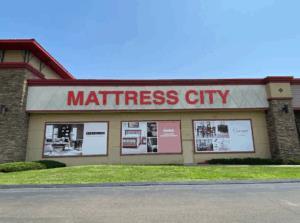
Red is a color of urgency, vigor, and hunger (excellent for food and retail).
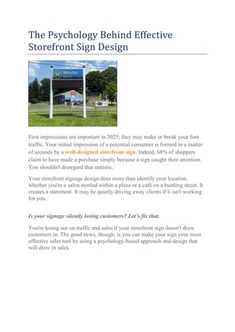
Blue is a symbol of professionalism, serenity, and trust (perfect for banks and healthcare).
Green (spas, wellness brands) means eco-friendliness, health, and peace.
Yellow (used for sales and signage accents) is a color that represents optimism and attention.
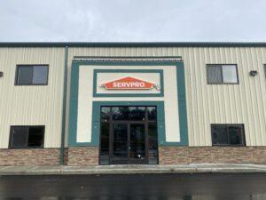
Black and grey are associated with luxury and sophistication (tech, high-end stores).
Recommendation: Don't be scared of contrast, but maintain brand consistency. A design with a lot of contrast improves recall and readability.
“What’s the best color for a storefront sign?”
→ The best color depends on your brand. Red and yellow are attentiongrabbing and energetic, while blue and green suggest trust and calm. Whatever you choose, make sure there’s a strong contrast between text and background to maximize visibility.
Font Choice & Readability
Fonts are not all made equal. Clarity always triumphs over inventiveness in signs.
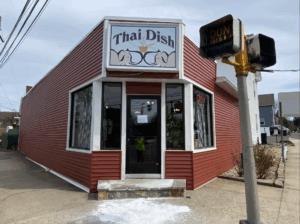
Sans-serif fonts (like Helvetica or Arial) are clean and readable from a distance.
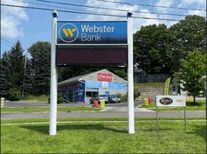
Serif fonts (like Times New Roman) add elegance but may lose impact at smaller sizes.
Focus on legibility from 20 to 50 feet away and limit your fonts to no more than one or two. Wide, bold font spacing makes text easier to read. To make your sign inclusive, take into account ADA-compliant fonts and sizes as well.
Avoid thin scripts, extremely decorative typefaces, and fonts with tight spacing. A sophisticated script font may seem good on a screen, but it could lose you consumers in a physical store.
Layout, Spacing & Visual Hierarchy
A cluttered or poorly structured sign isn’t just unattractive it’s a missed opportunity to connect with your customer instantly. In storefront signage, you just have seconds to make an impact; thus, visual hierarchy is essential.
Hierarchy is important. Your company's name or logo should be the visual anchor, the first thing people notice. Avoid burying crucial information in tiny print or clutter.
White space is powerful because it is strategic rather than empty. Proper spacing between items helps natural eye movement and lowers visual strain. When every inch of your sign is filled with text or graphics, it overwhelms the eye and dilutes your message.
Alignment and balance result in harmony. Grid-based layouts will help keep your design symmetrical and intentional. Misaligned elements may unintentionally convey a lack of professionalism or attention.
Your sign should direct the viewer's attention from top to bottom or left to right in a logical sequence. Consider your customer's perspective: what do they need to know first? What steps should they take next?
Shapes & Forms: How Geometry Affects Perception
Shapes are more than just design elements; they are visual cues that communicate meaning and create instinctive responses. When utilized properly in storefront signage design, shapes can reinforce your brand message and influence how potential customers perceive your business before they even enter.
Round shapes feel warm, welcoming, and approachable.
Squares and rectangles suggest stability and professionalism.
Triangles and arrows imply movement or direction great for guiding people inside.
Borders and frames focus attention and give structure. Using shape psychology subtly influences how customers feel before they even step inside.
Emotional Branding Through Signage
Storefront signs should represent the atmosphere of your establishment. Are you playful? Premium? Tech-savvy? Traditional? Whatever tone your brand takes, your signage should visually convey that personality at a glance. It's more than just looking good; it's also about feeling right with your audience.
A boutique may use rustic wood and script fonts to feel artisanal and warm.
A tech company might choose LED signs for storefronts with sharp edges and cool lighting.
A law office benefits from a no-nonsense serif font on a dark, matte background.
Emotion is what sticks. It’s what turns glances into entrances and entrances into sales.
Placement Psychology: Where Your Sign Sits Matters
You can have the best design, colors, and message, but if your sign isn't in the right spot, it won't be noticed or remembered. Placement is as important as design. The placement of your storefront sign determines how often it is noticed, how easy it is to read, and whether it attracts customers.
Mount at eye level or slightly above for best visibility.
Avoid obstructions like awnings, trees, or power poles.
Use lighting, especially if your business operates at night. LED signs for storefronts ensure 24/7 visibility.
Complementary signage, like window graphics or sidewalk signs, can enhance your street presence.
“Where should I place my storefront sign?”
Mount it at or above eye level in an open, unobstructed area. For optimum impact, combine lighting and window graphics.
Connecticut Relevance: Designing for the Local Business Scene
Designing storefront signs in Connecticut comes with its own set of considerations what works in one region may fall flat here if it's not built to handle local realities. That’s why working with a Connecticut-based signage expert isn’t just helpful it’s essential.
Weather matters: Your signage needs to handle rain, snow, and UV rays without fading or peeling.
Local codes: Each town has its own zoning rules and size restrictions. A local partner like Paragon Signs & Graphics knows how to navigate permits.
Visibility issues: In busy downtowns or shopping strips, standing out means designing for distance and distractions.
That’s why custom storefront signs made for Connecticut’s specific conditions work better and last longer.
Design With the Mind in Mind
A storefront sign is more than just an accessory; it's one of your most effective marketing tools. It operates 24 hours a day, seven days a week, speaking to every passerby, whether you are open or closed.
When it is created with psychological concepts in mind, it not only informs but also influences. Your sign is more than simply decoration; it's a direct path into your customer's head. So, why settle for average?