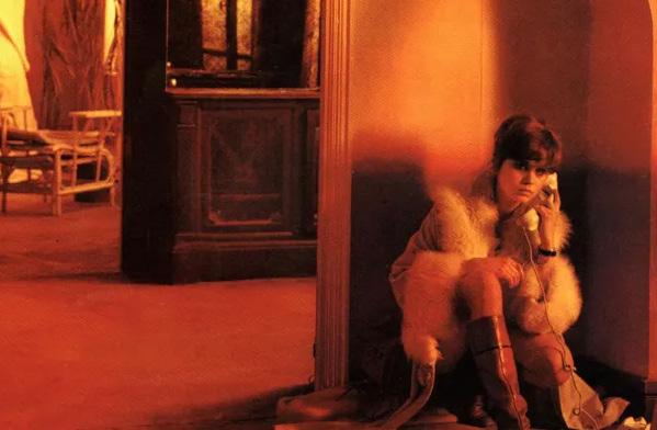
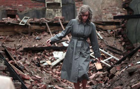
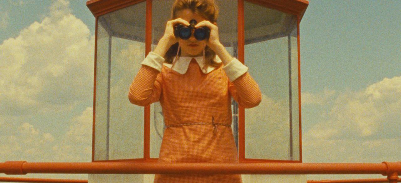
Sequences
Sequences
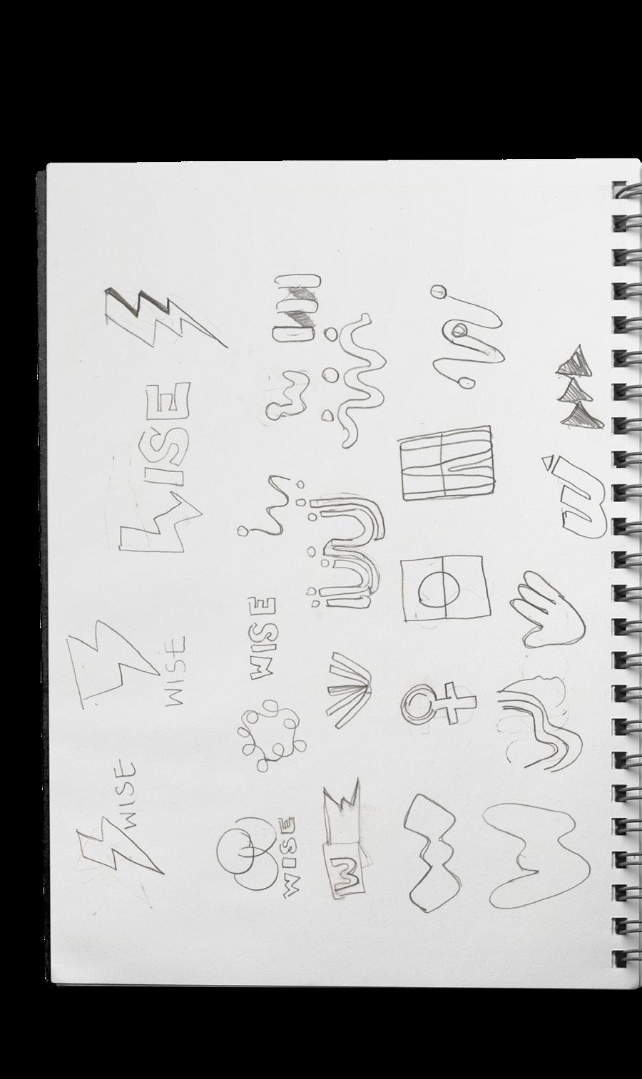
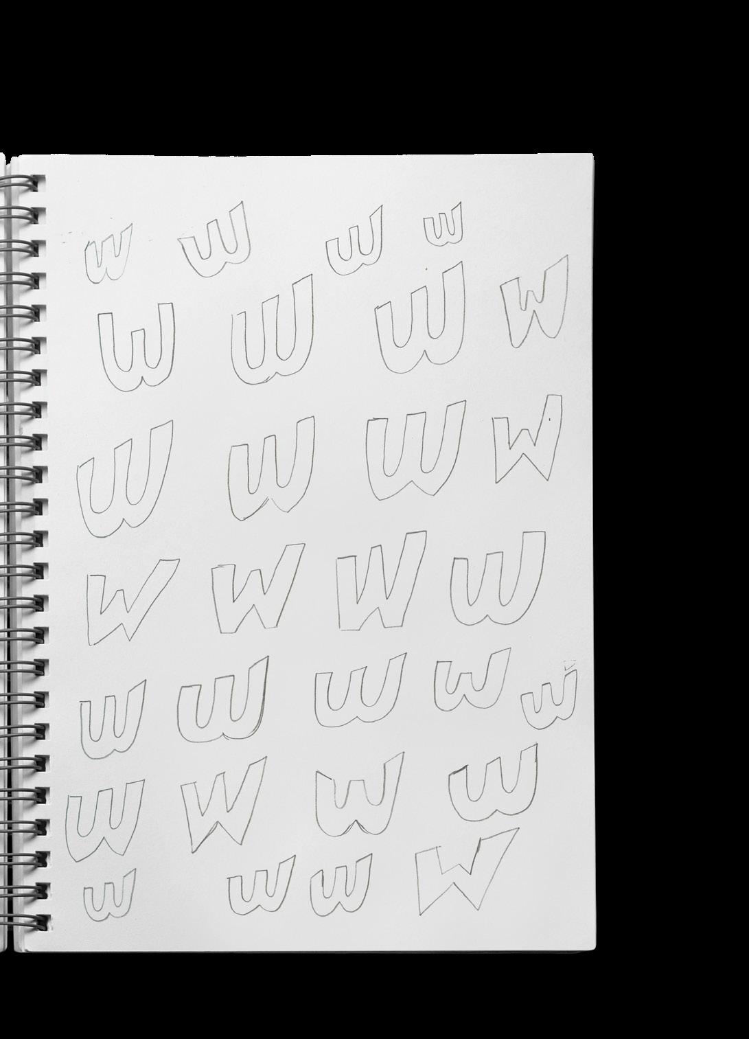
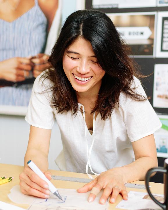
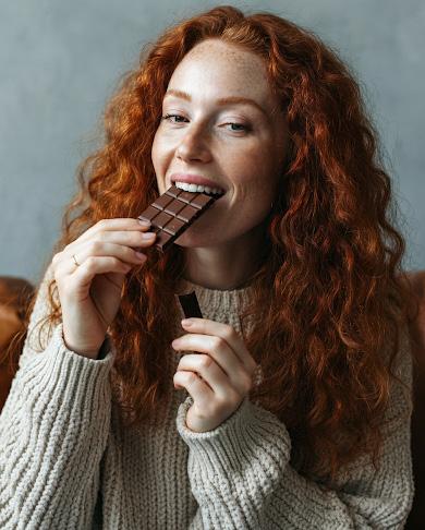
Design, for me, begins with an idea—a spark that leads to exploration, which I bring to life through sketches before transforming into digital form. Every step I take is intentional, and every element has meaning.
My journey into design was not a direct path. It began with a focus on science, a place I thought I was supposed to be. But as I explored more, I discovered what I truly love: the sequence and process of design. Though my path wasn’t linear, each twist and turn led me here, where every project is an opportunity to communicate something intentional, thoughtful, and deeply connected to the world around me.
Sequence 01 / Page 6
Sequence 02 / Page 30
Seqeunce 03 / Page 48
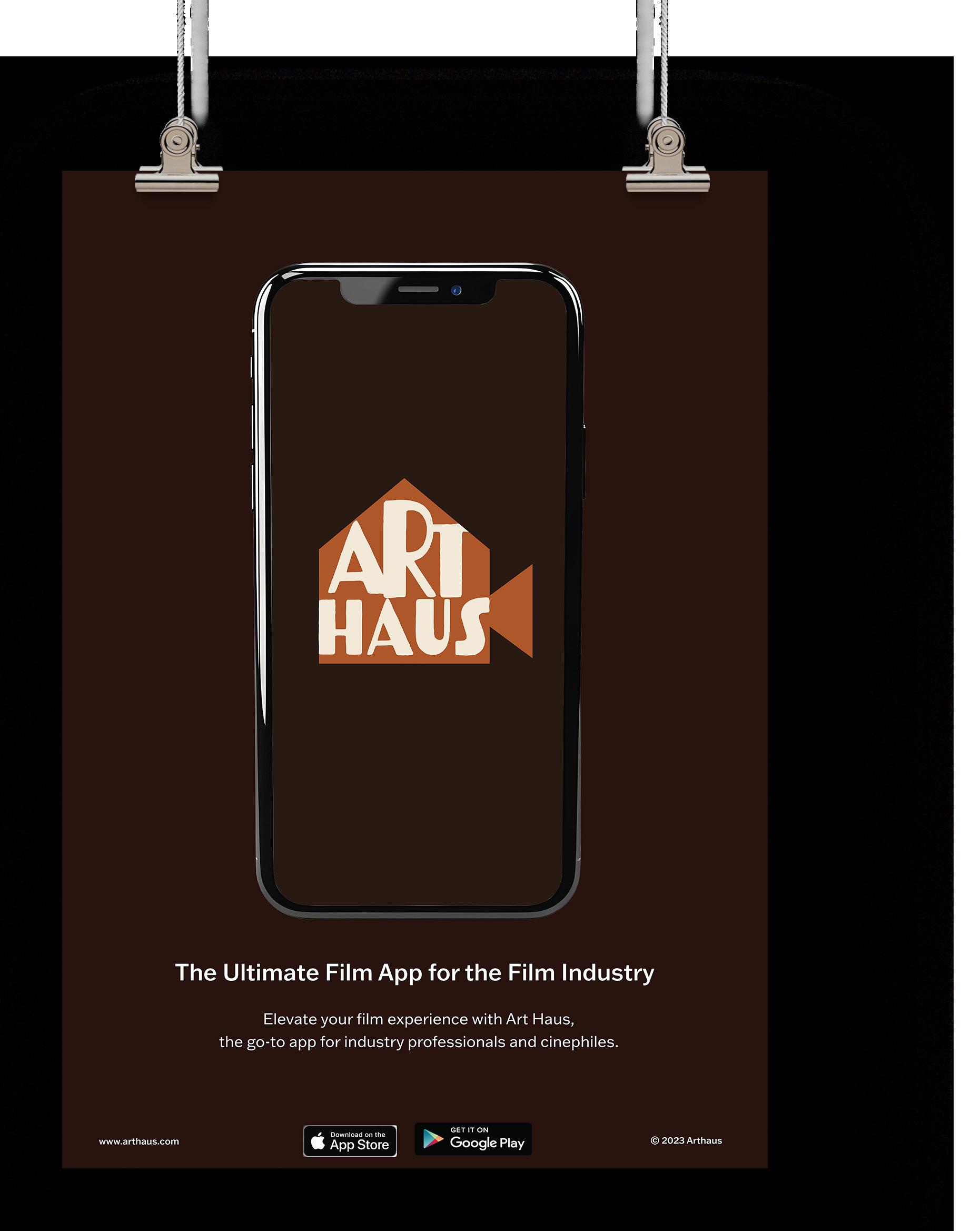
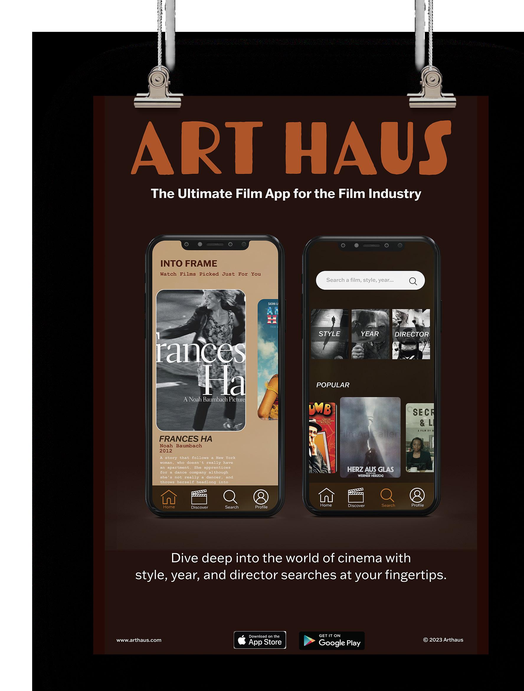
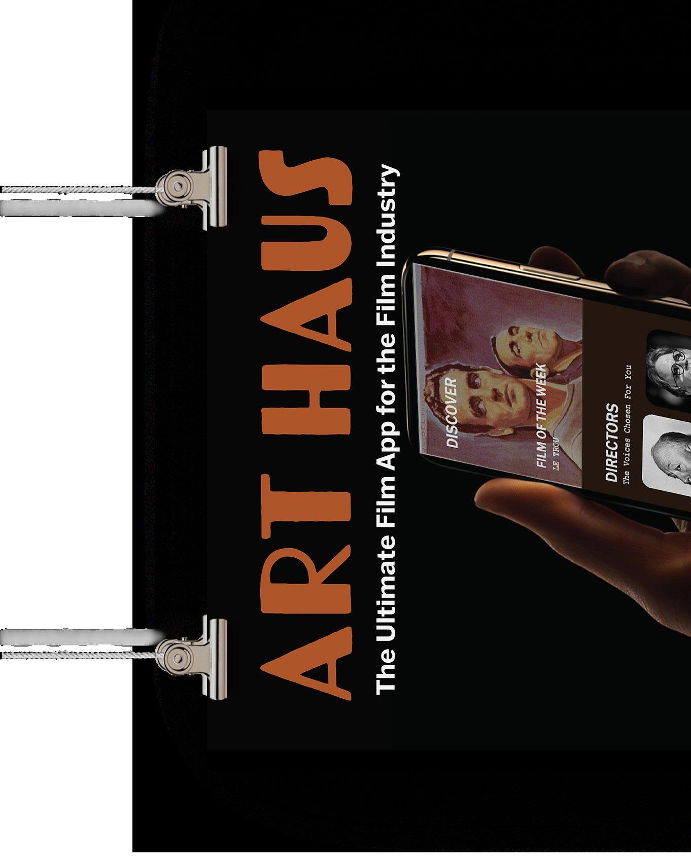
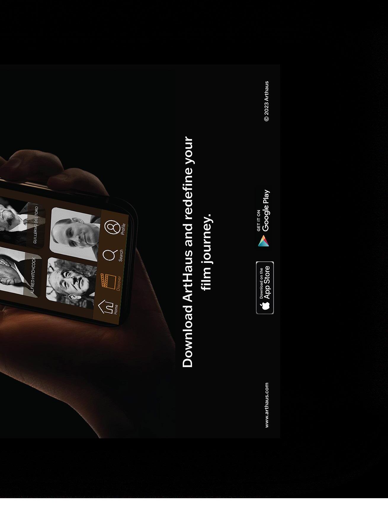
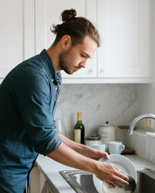
ArtHaus App
Sequence 04 / Page 62
Sequence 05 / Page 78
Sequence 06 / Page 92
Seqeunce 07 / Page 110
Sequence 08 / Page 126
Sequence 09 / Page 126
1 0 2

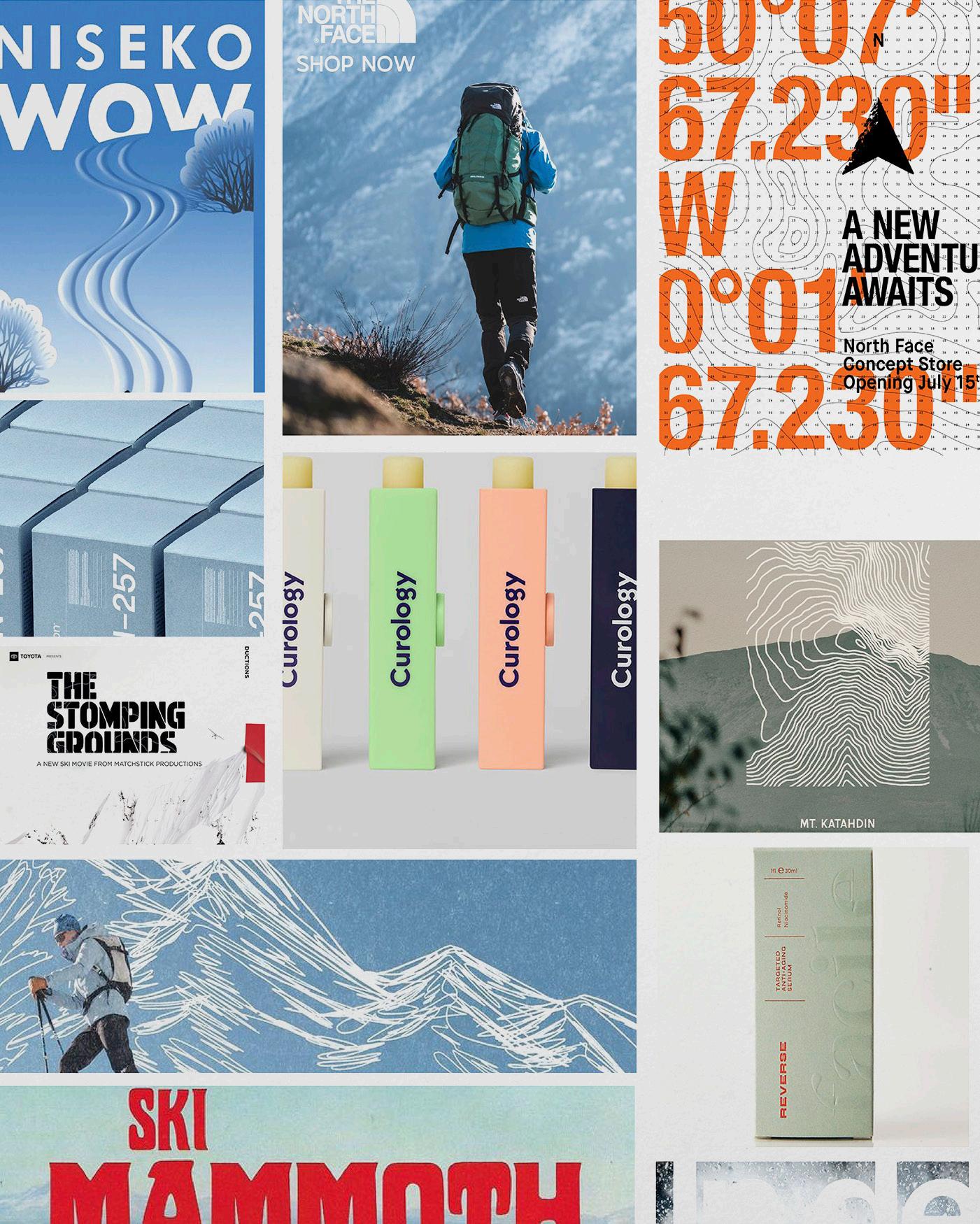
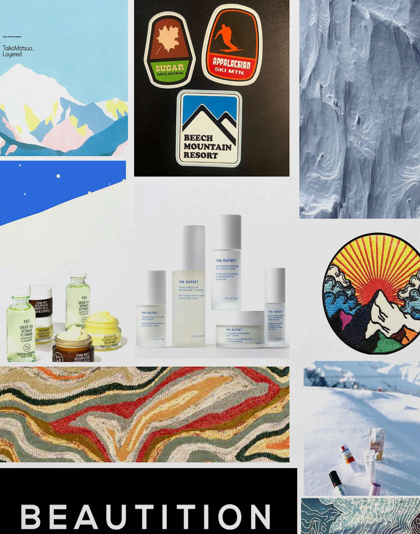
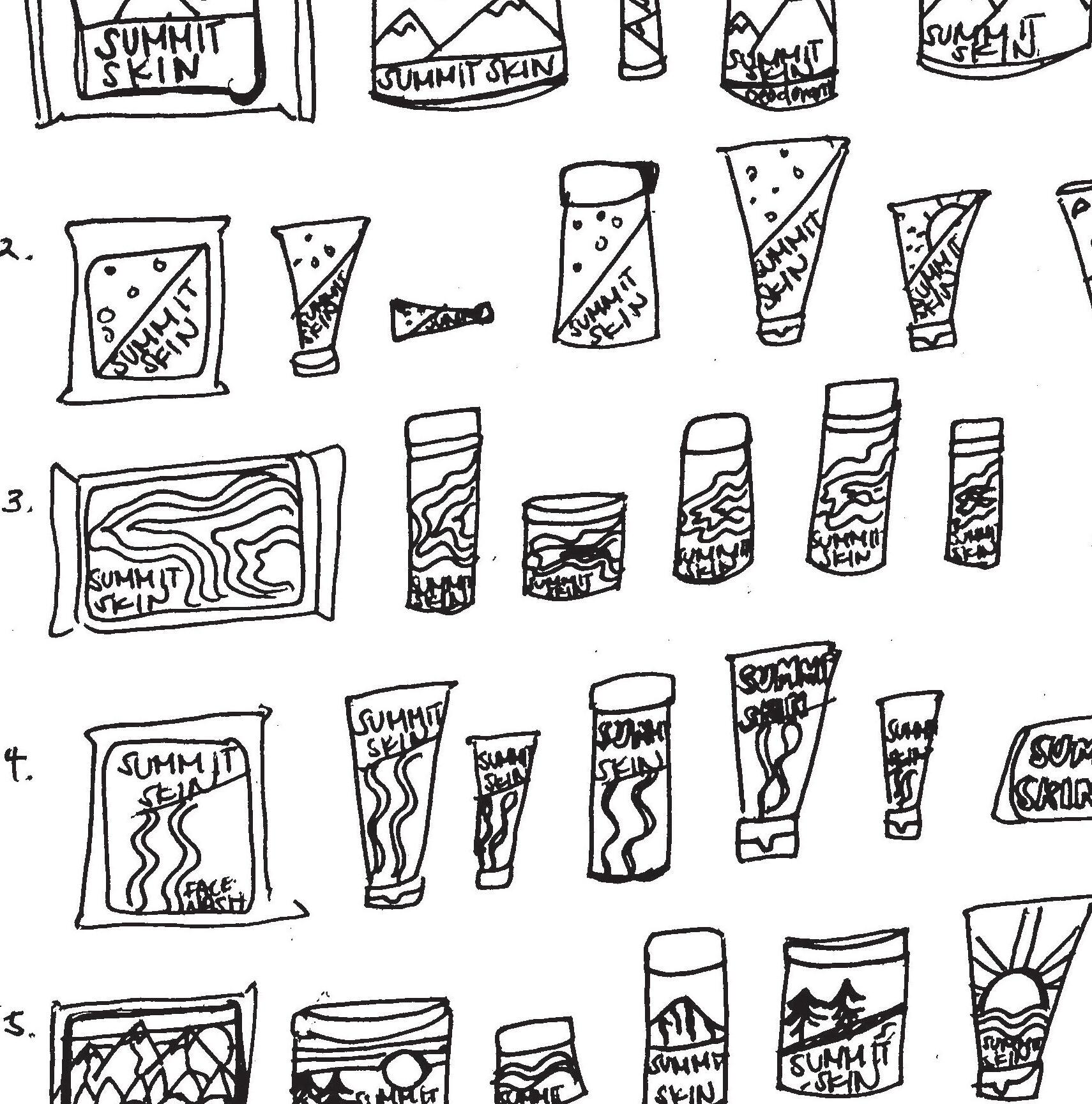
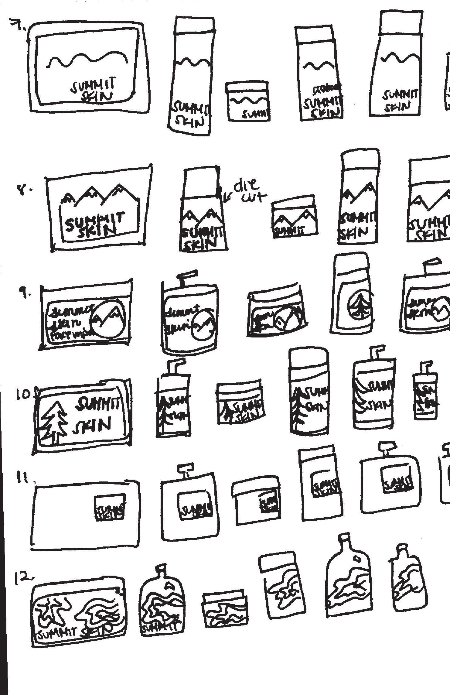
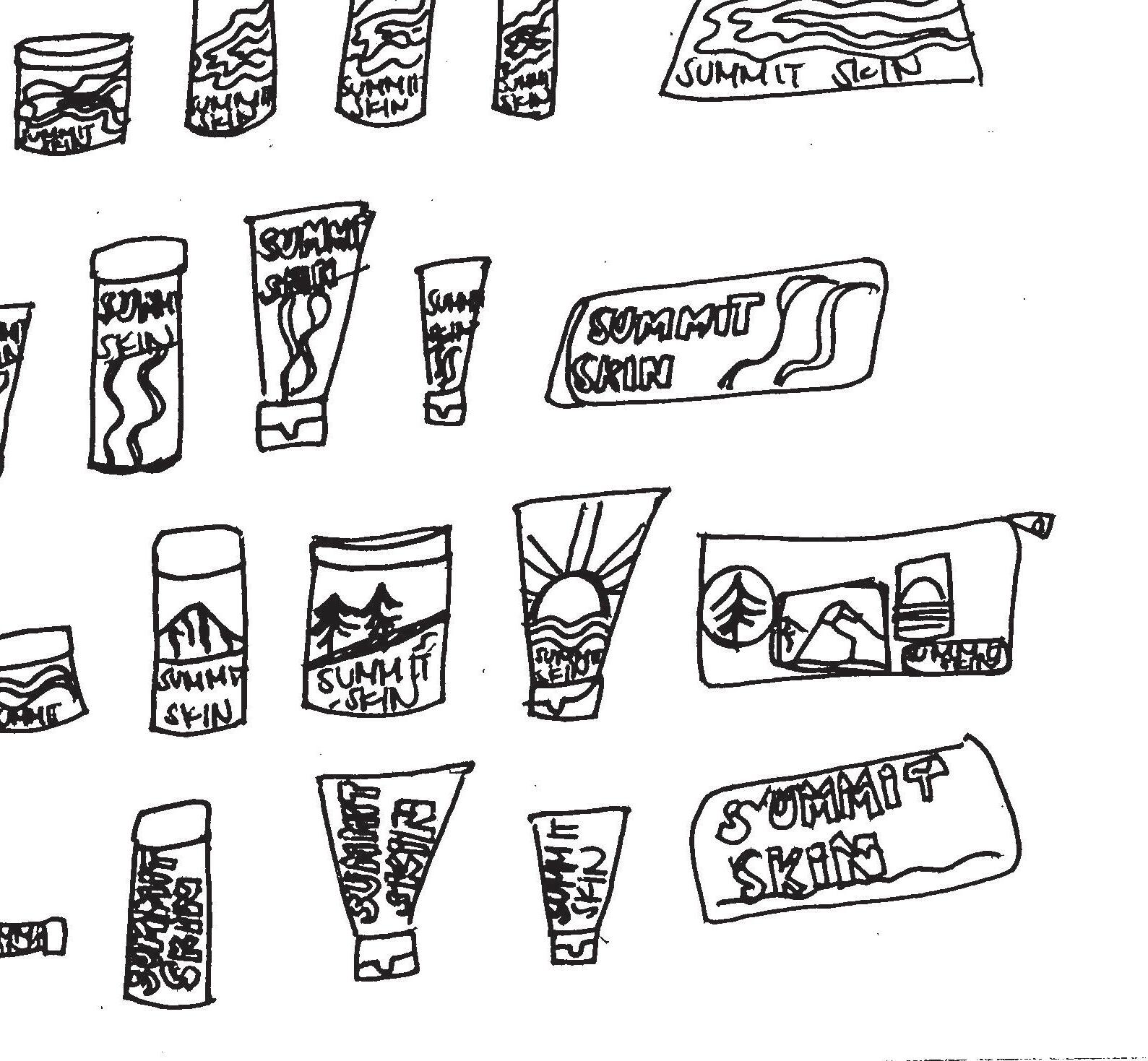
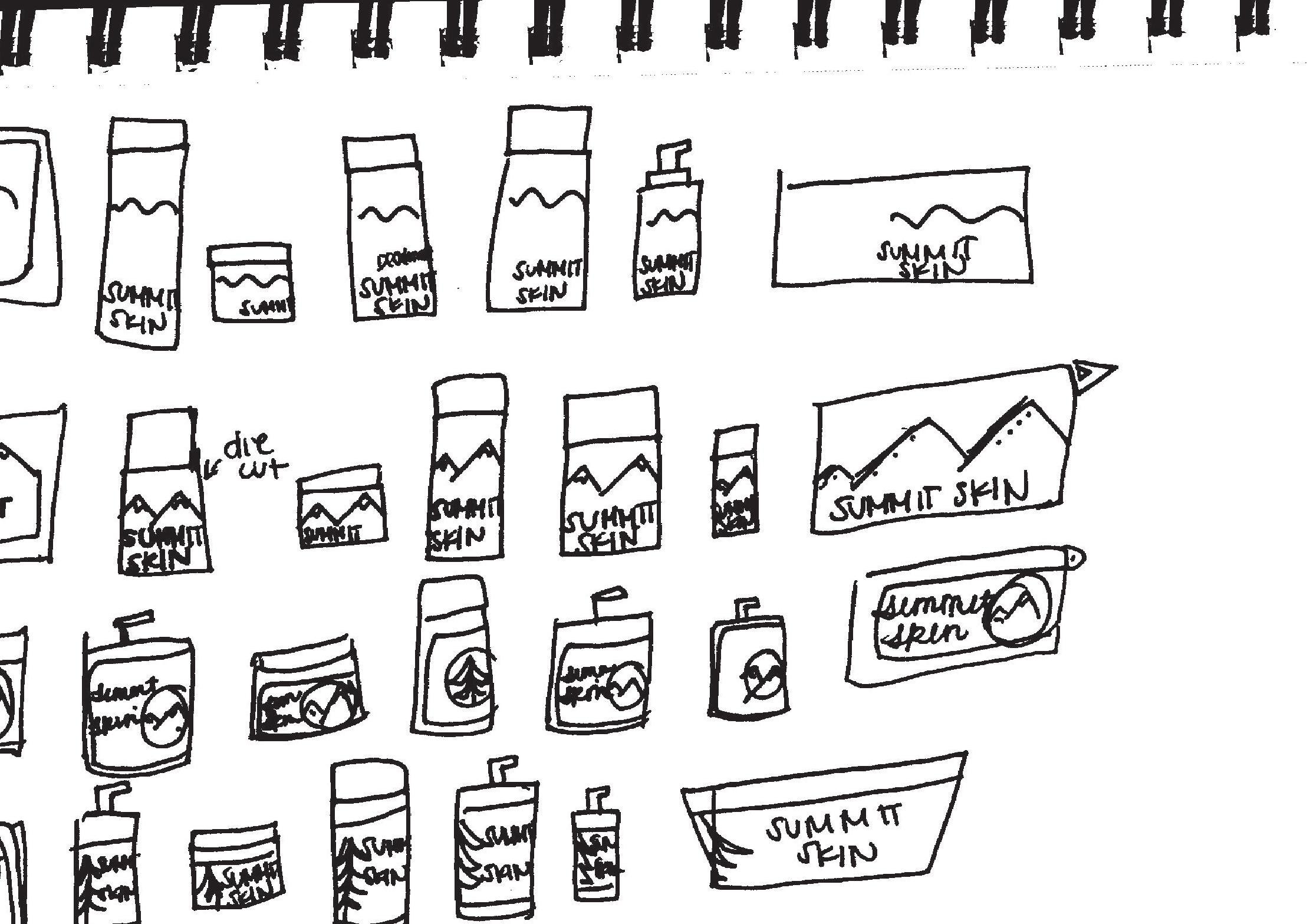
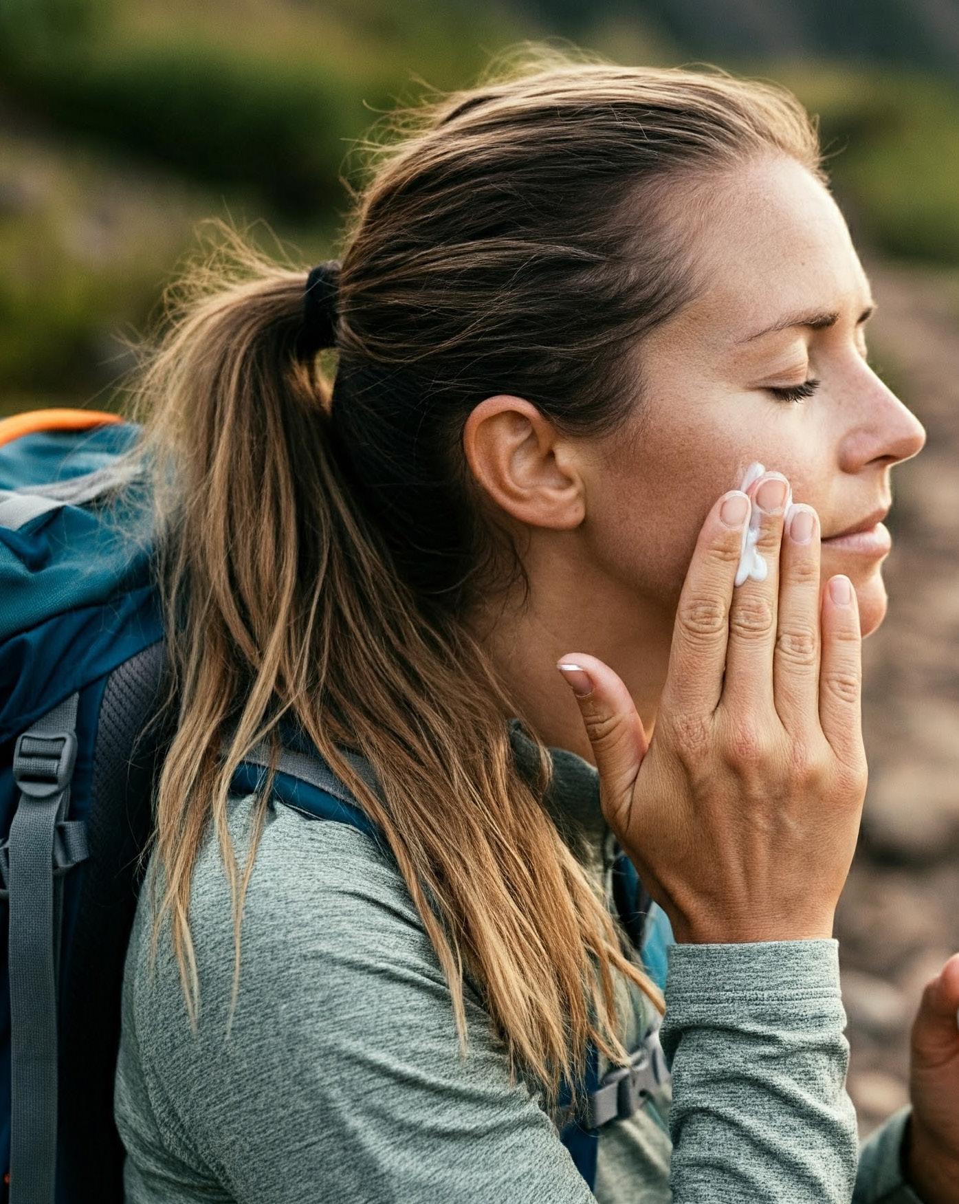
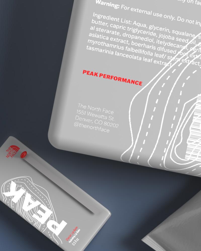
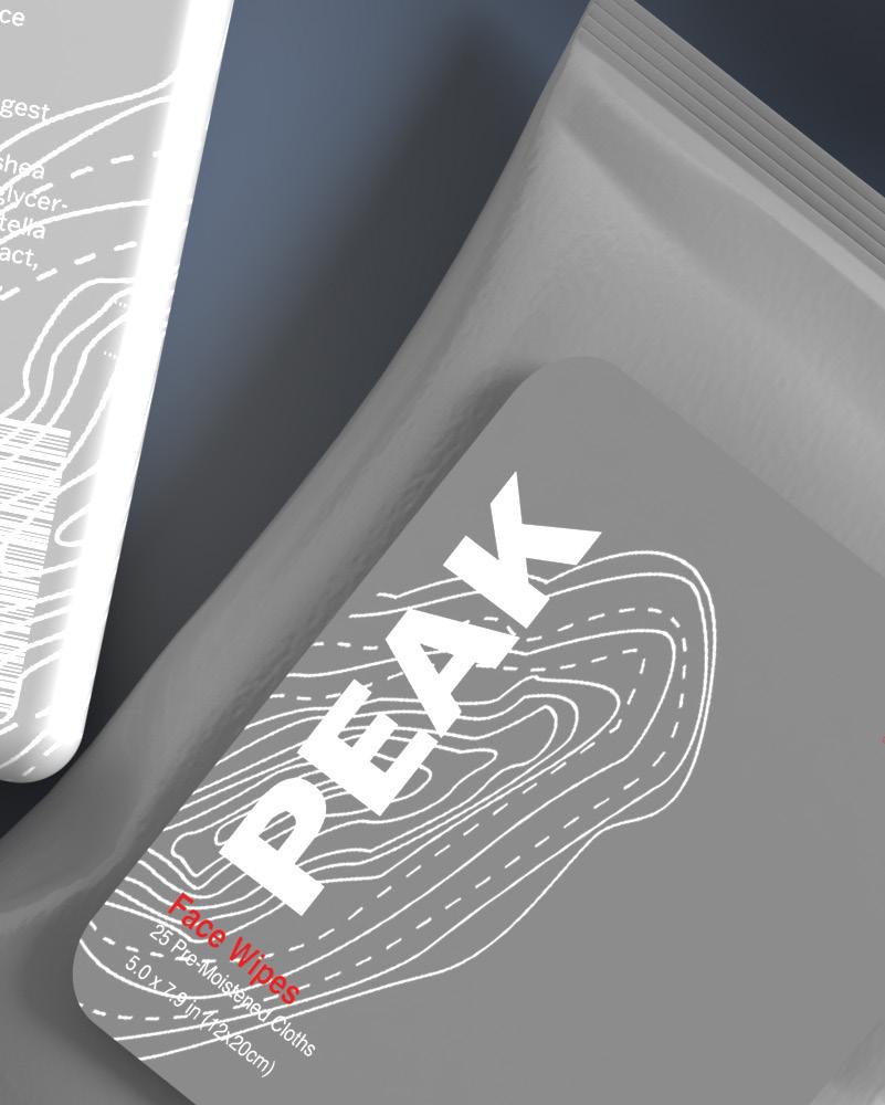
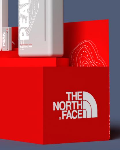
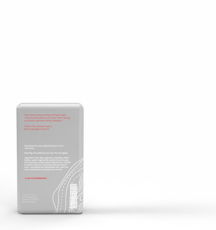
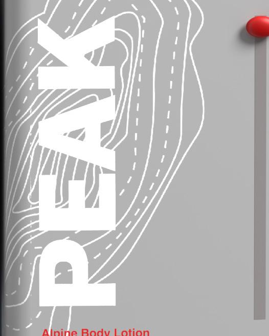
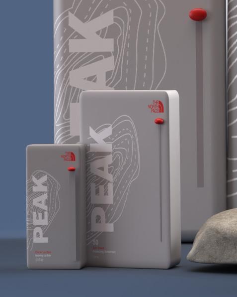
Protect, moisturize, sooth e, and explore.
Intent
For the Peak skincare line, my approach focused on creating a product that aligns with the adventurous spirit of The North Face. The main goal was to design a range that prioritizes both convenience and functionality—crafted specifically for people who never stop exploring. By designing packaging that allows easy, one-handed use, I ensured that the products cater to the needs of active individuals, enabling them to seamlessly integrate skincare into their on-the-go lifestyle without compromising on quality or performance.
Background
For the Peak skincare line, my approach focused on creating a product that aligns with the adventurous spirit of The North Face. The key goal was to design a range that prioritizes both convenience and functionality crafted specifically for people who never stop exploring. By designing packaging that allows easy, one handed use, I ensured that the products cater to the needs of active individuals, enabling them to seamlessly integrate skincare into their on the go lifestyle without compromising on quality or performance.


2 1 3
Empower, achieve, represent, and grow .
Intent
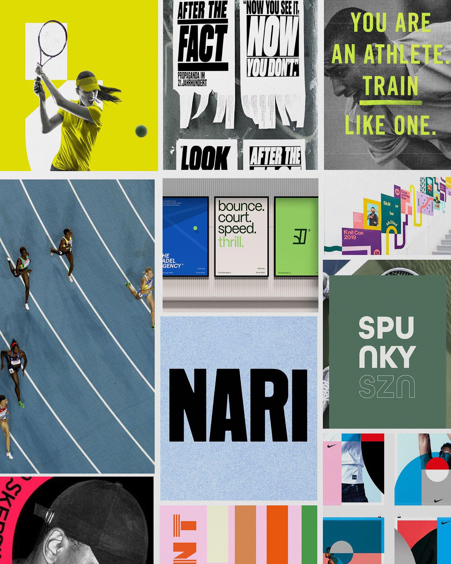
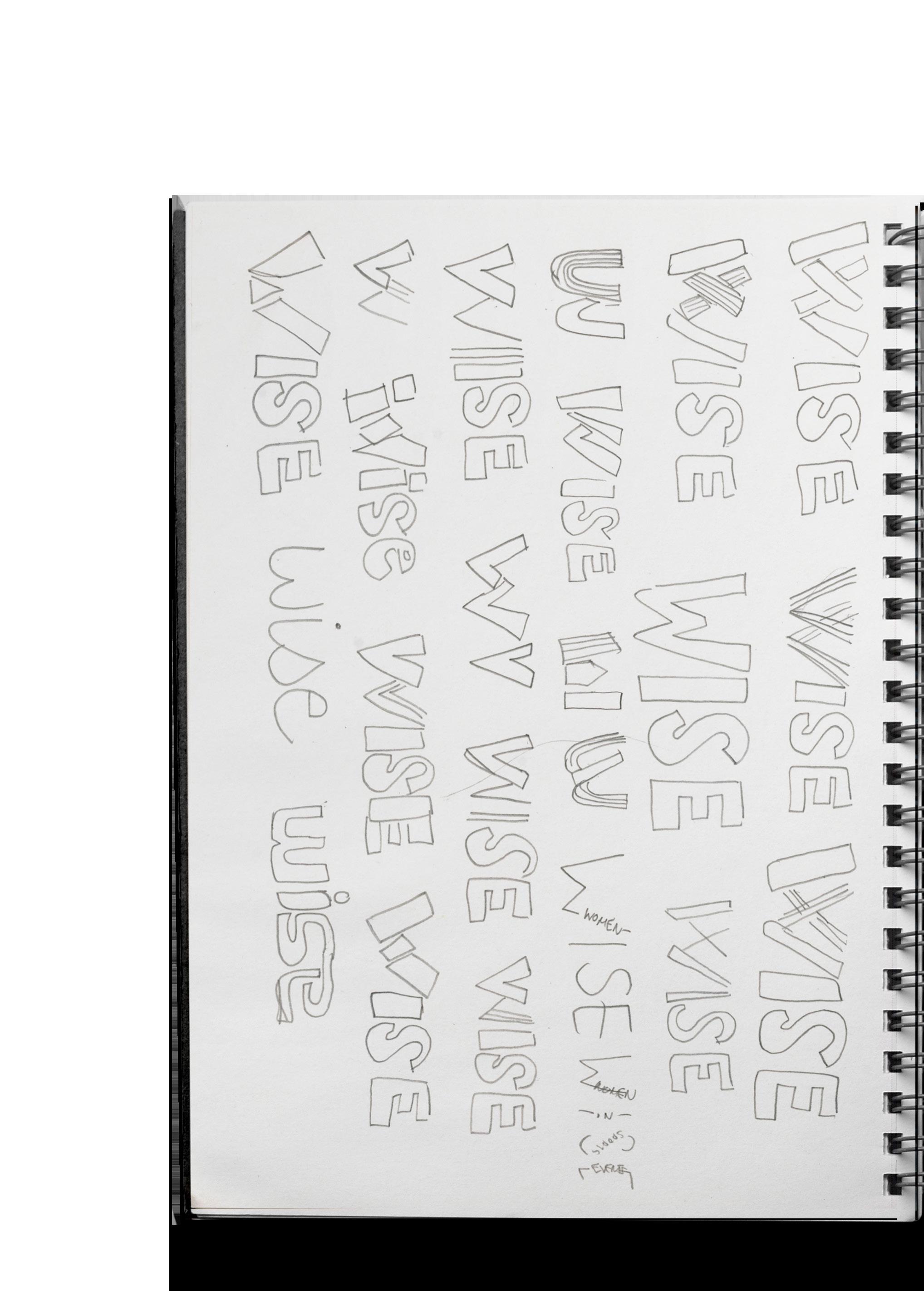
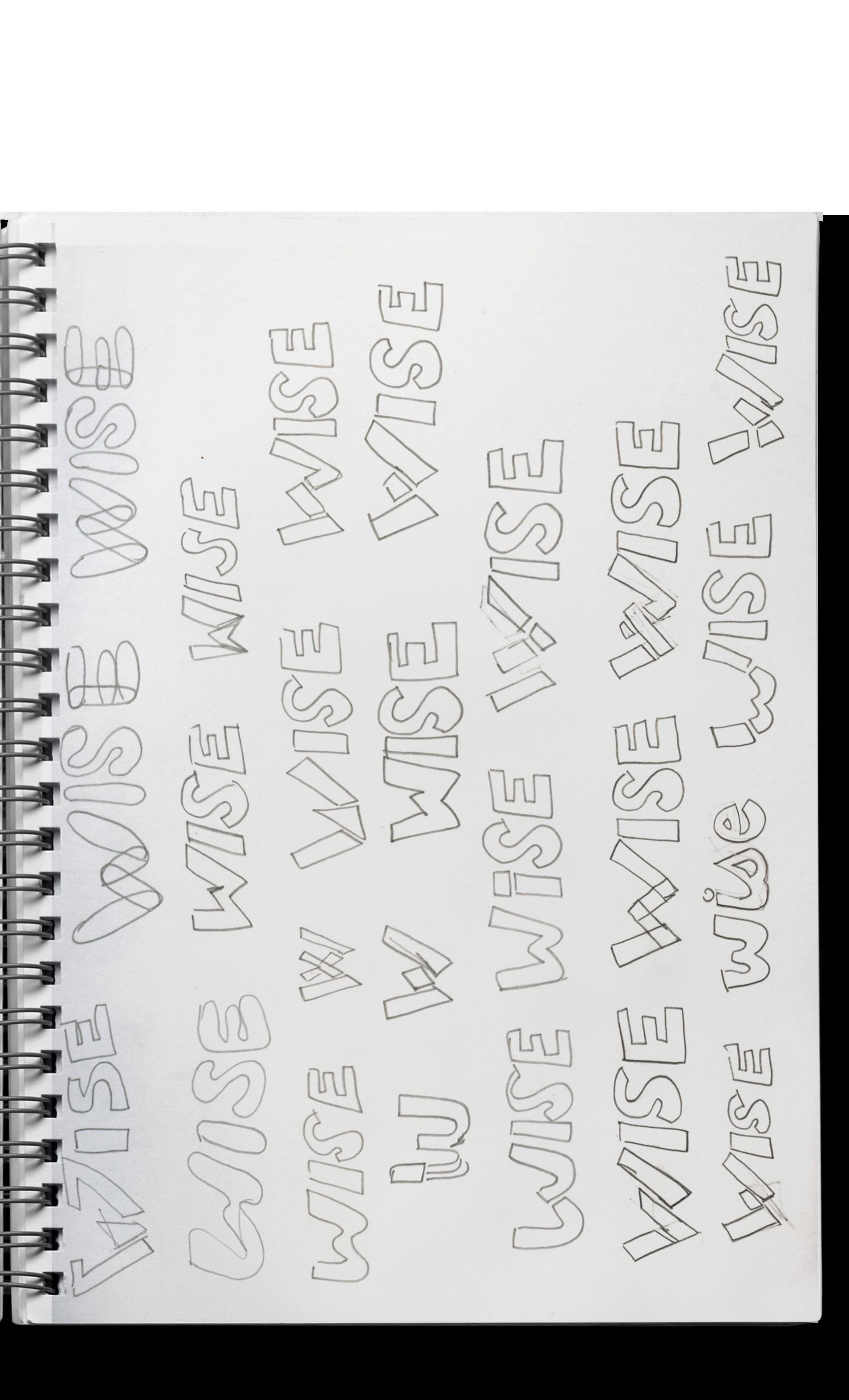
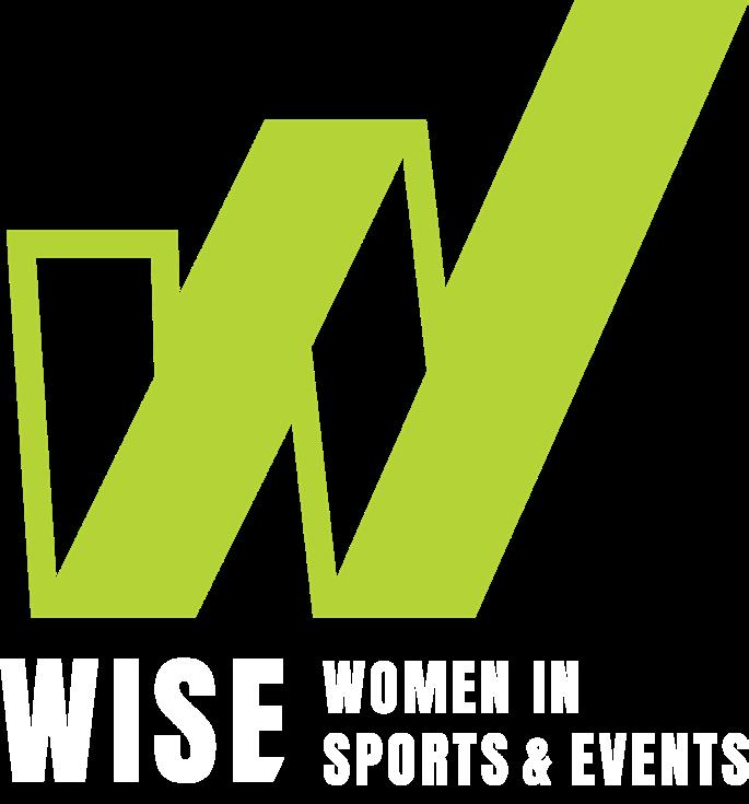
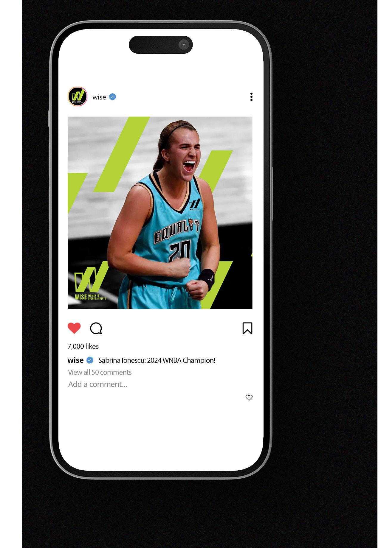
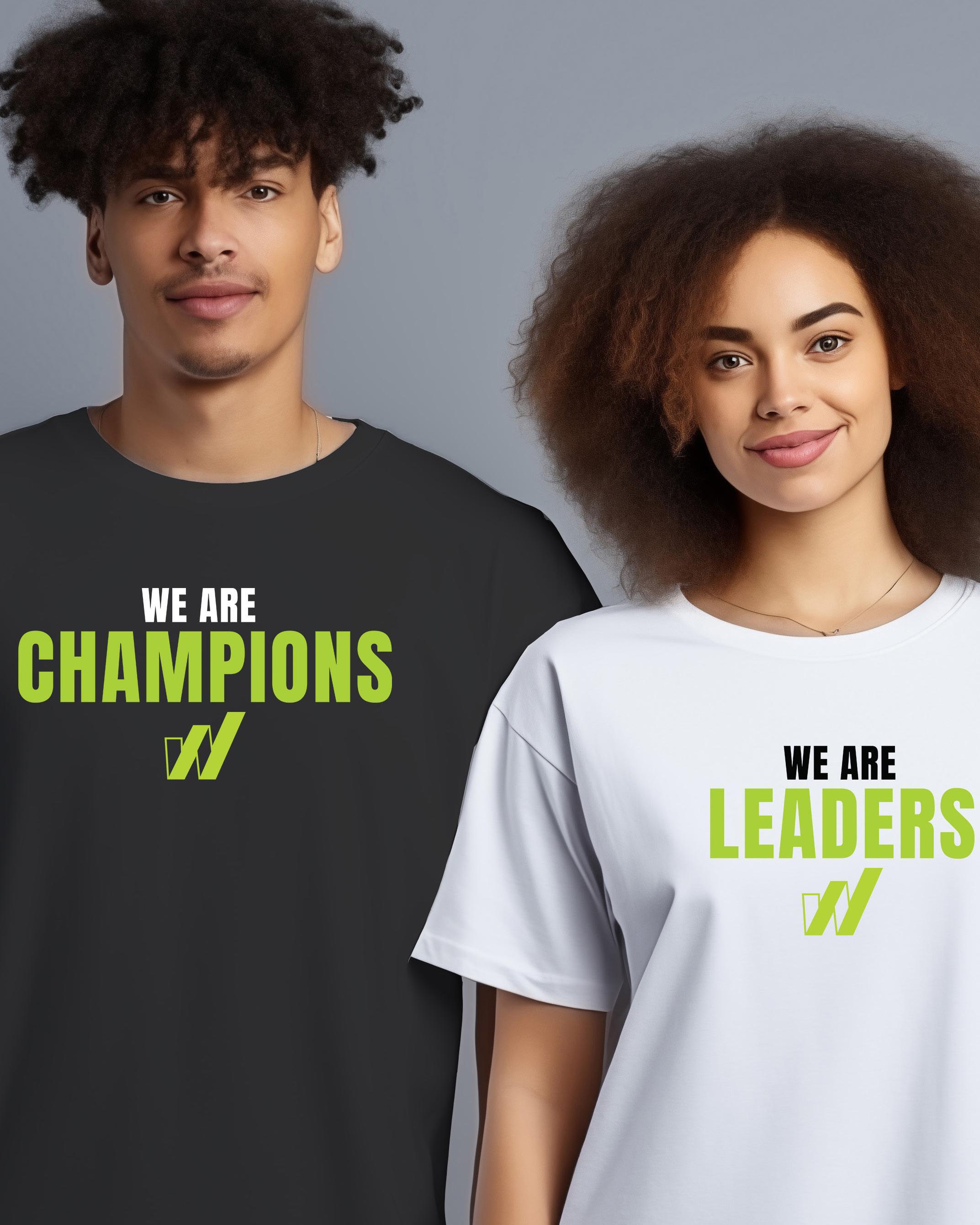
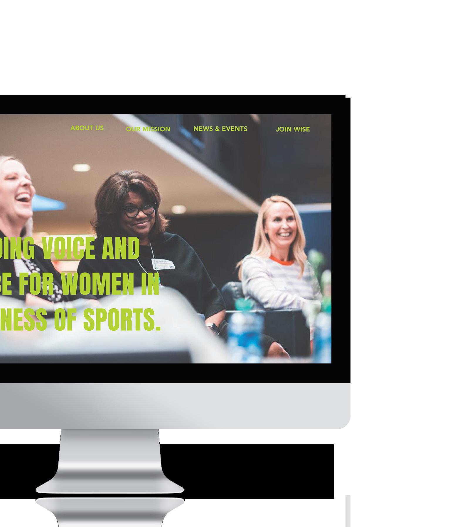
The rebranding of WISE aims to honor its legacy while positioning it for the future. My approach focuses on creating a visual identity that embodies strength, inclusivity, and leadership. By blending refined and bold elements, the design reflects WISE’s mission to empower women across sports and events.

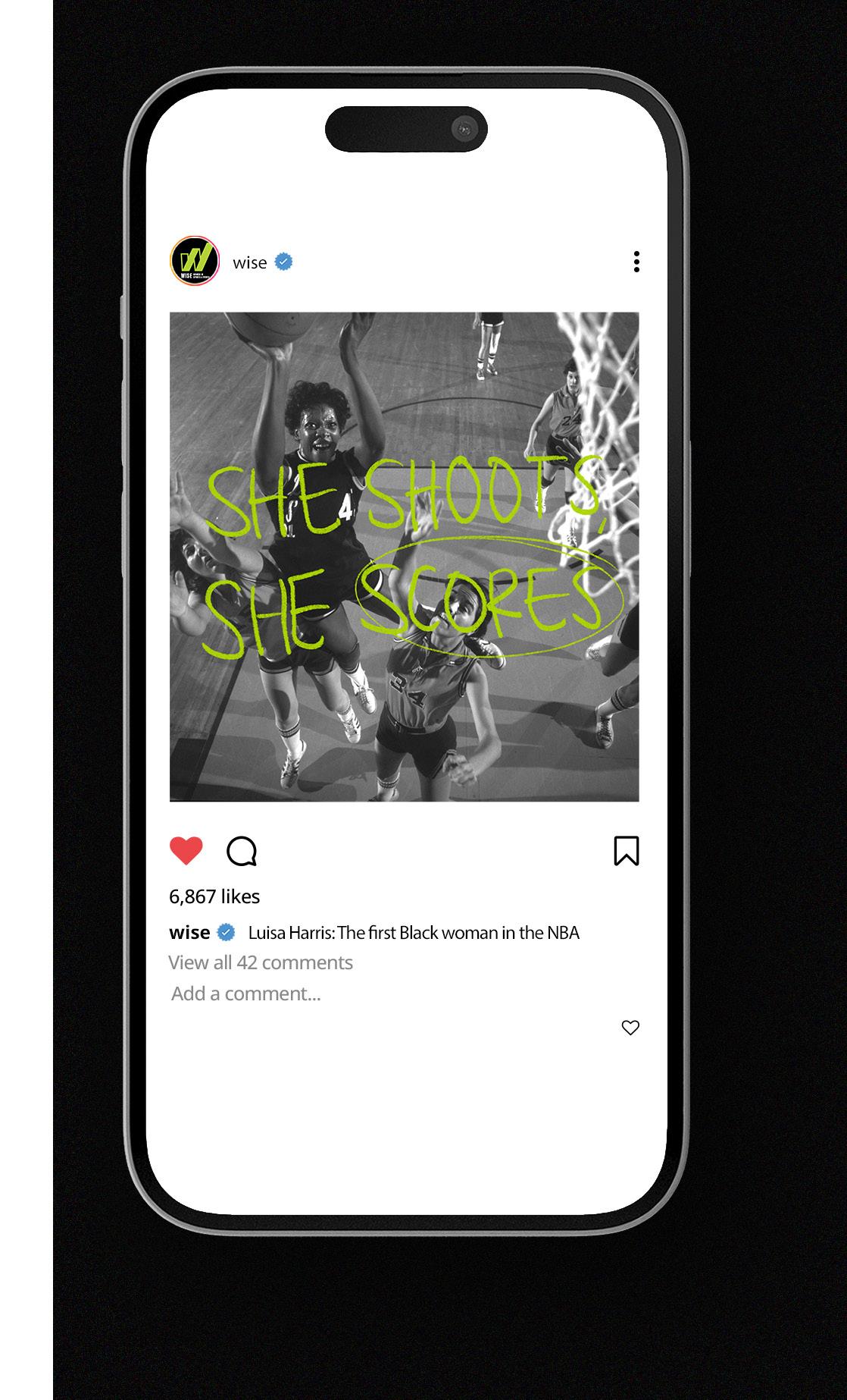
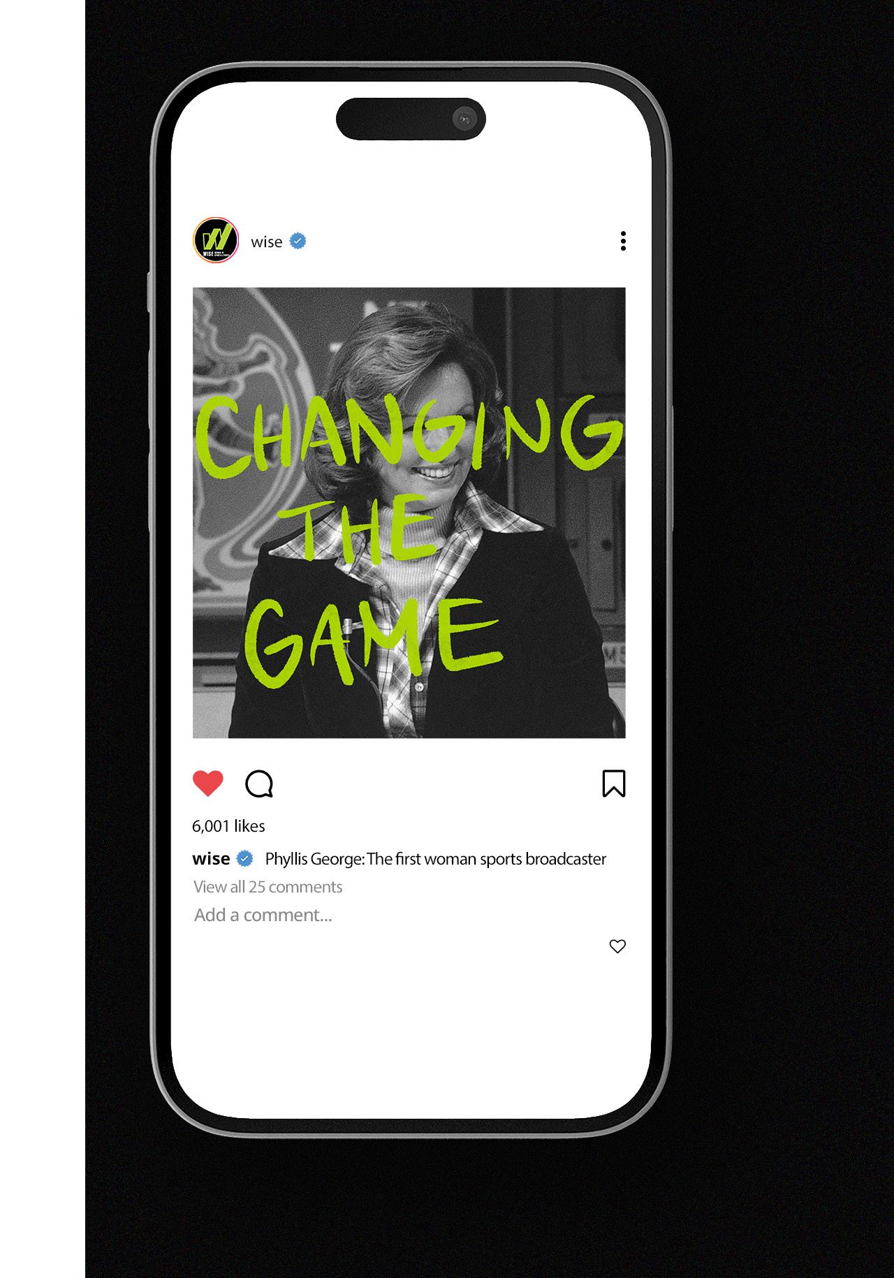
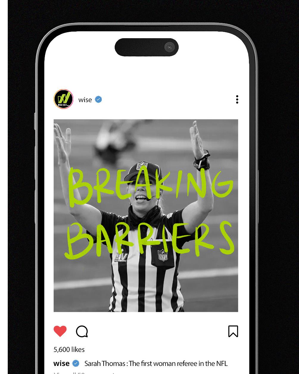
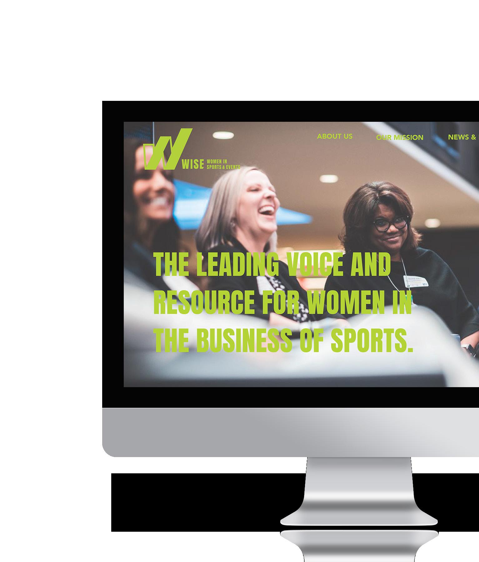
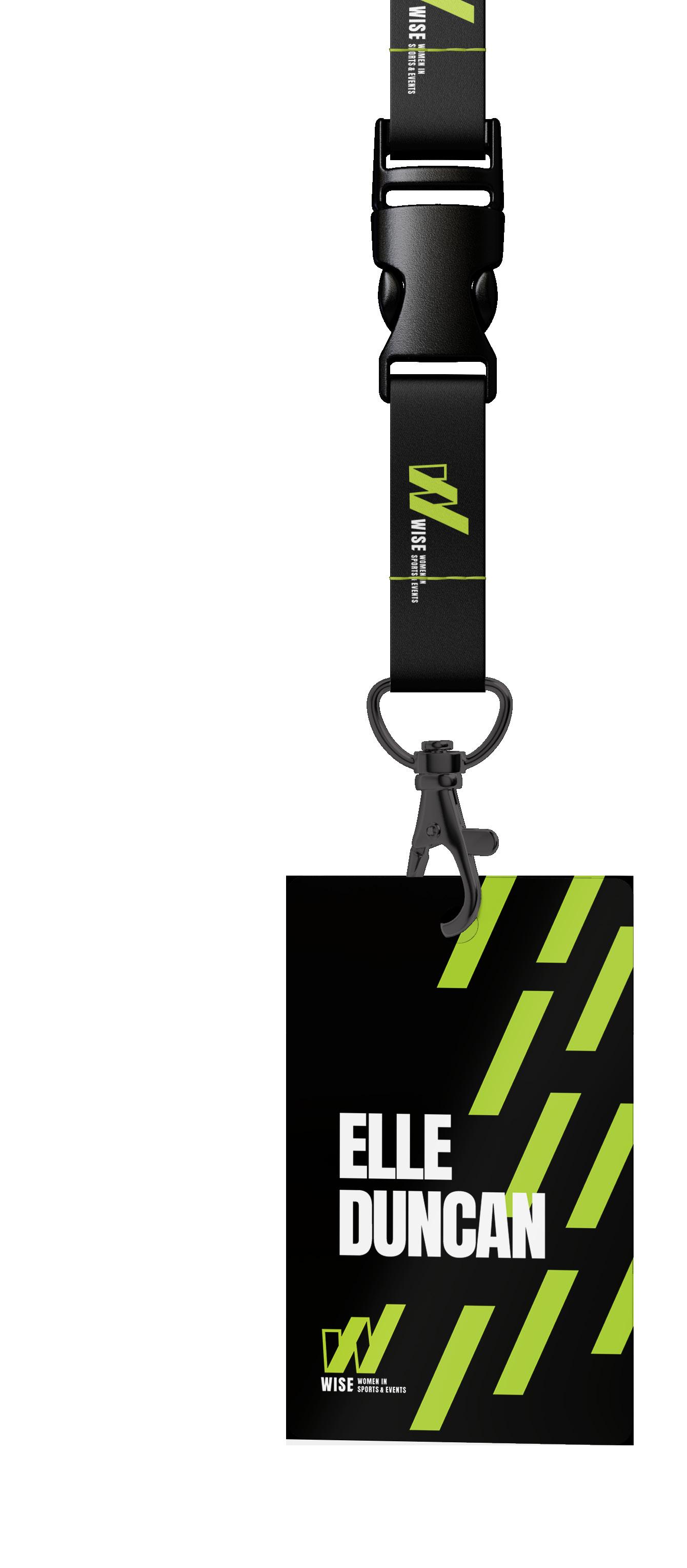
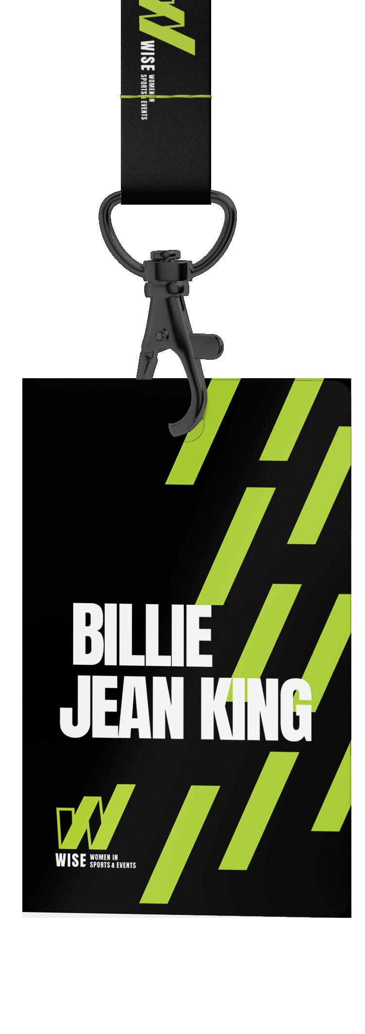
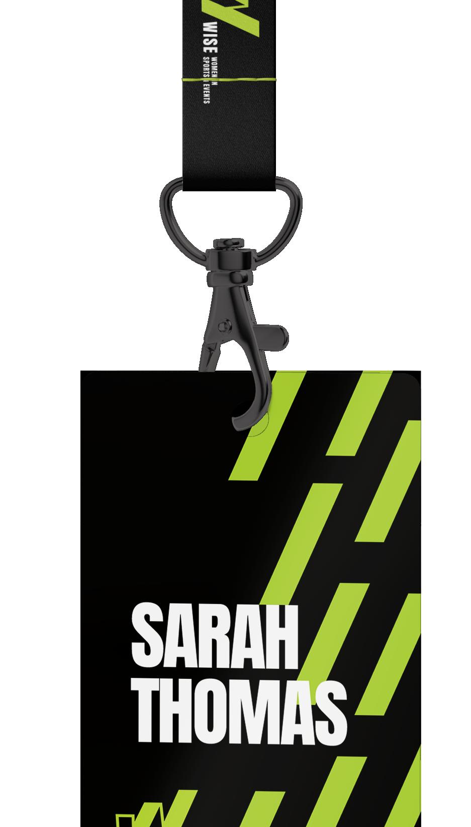
“I think that has maybe been what has made me the most successful in my career is building relationships with people. I’m covering people in these crazy moments of their life. Whether it is the Draft, or a crushing loss, or the biggest win of their life.”

3 2 4

Inspire, curate, engage, and create .
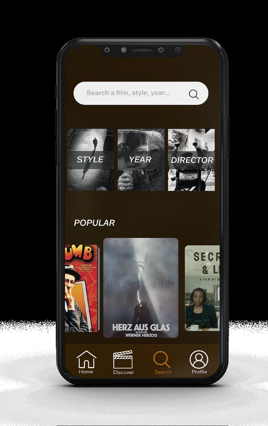
Intent
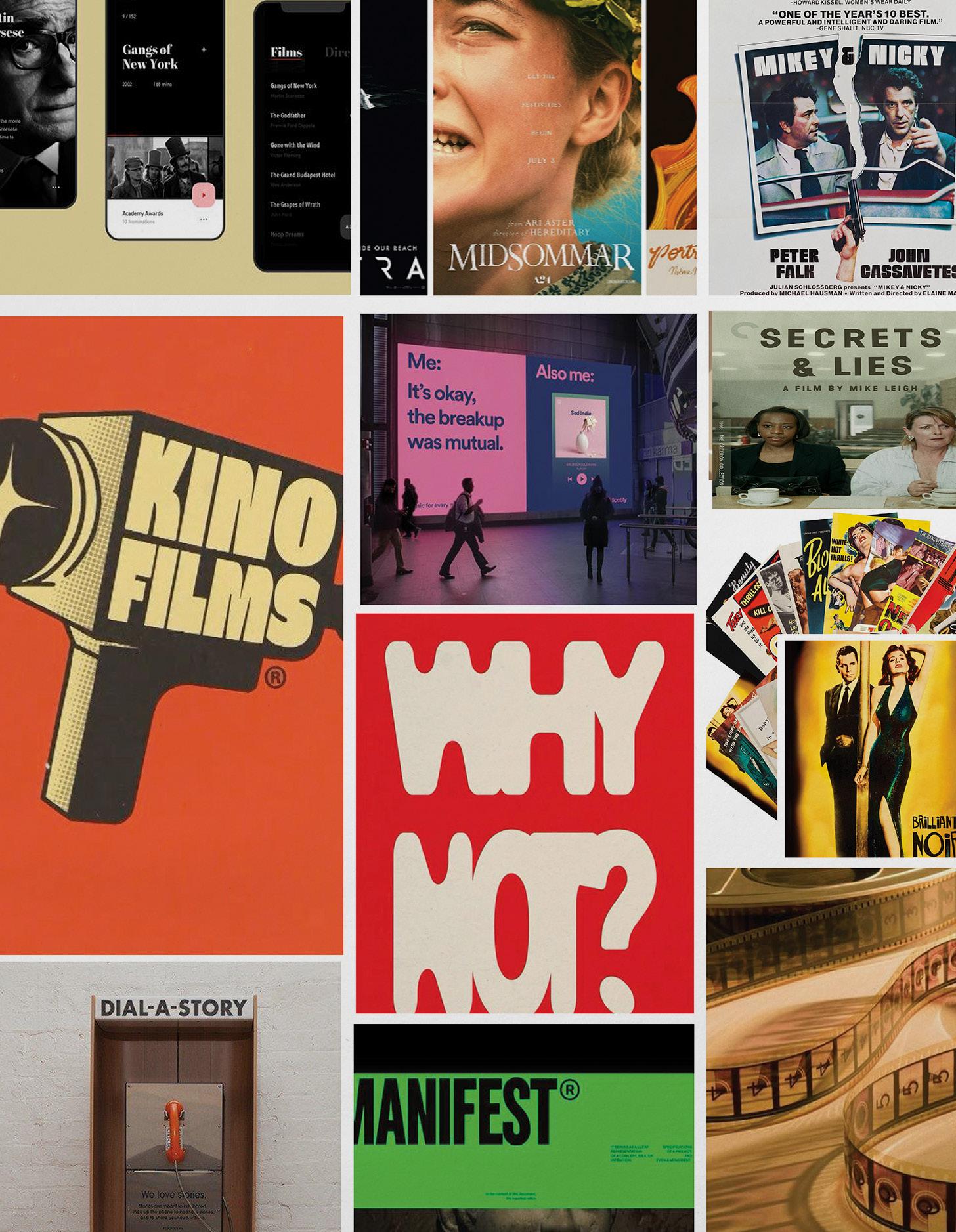
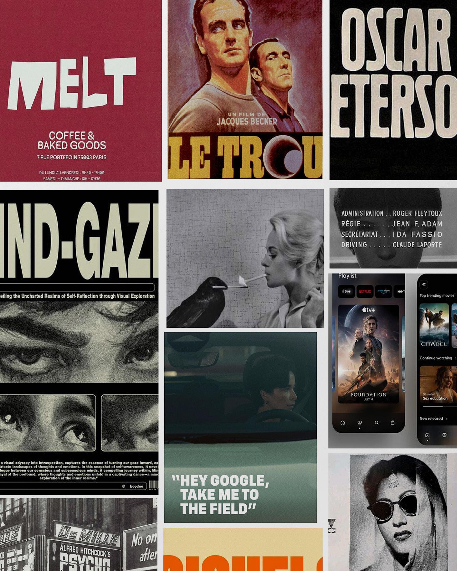
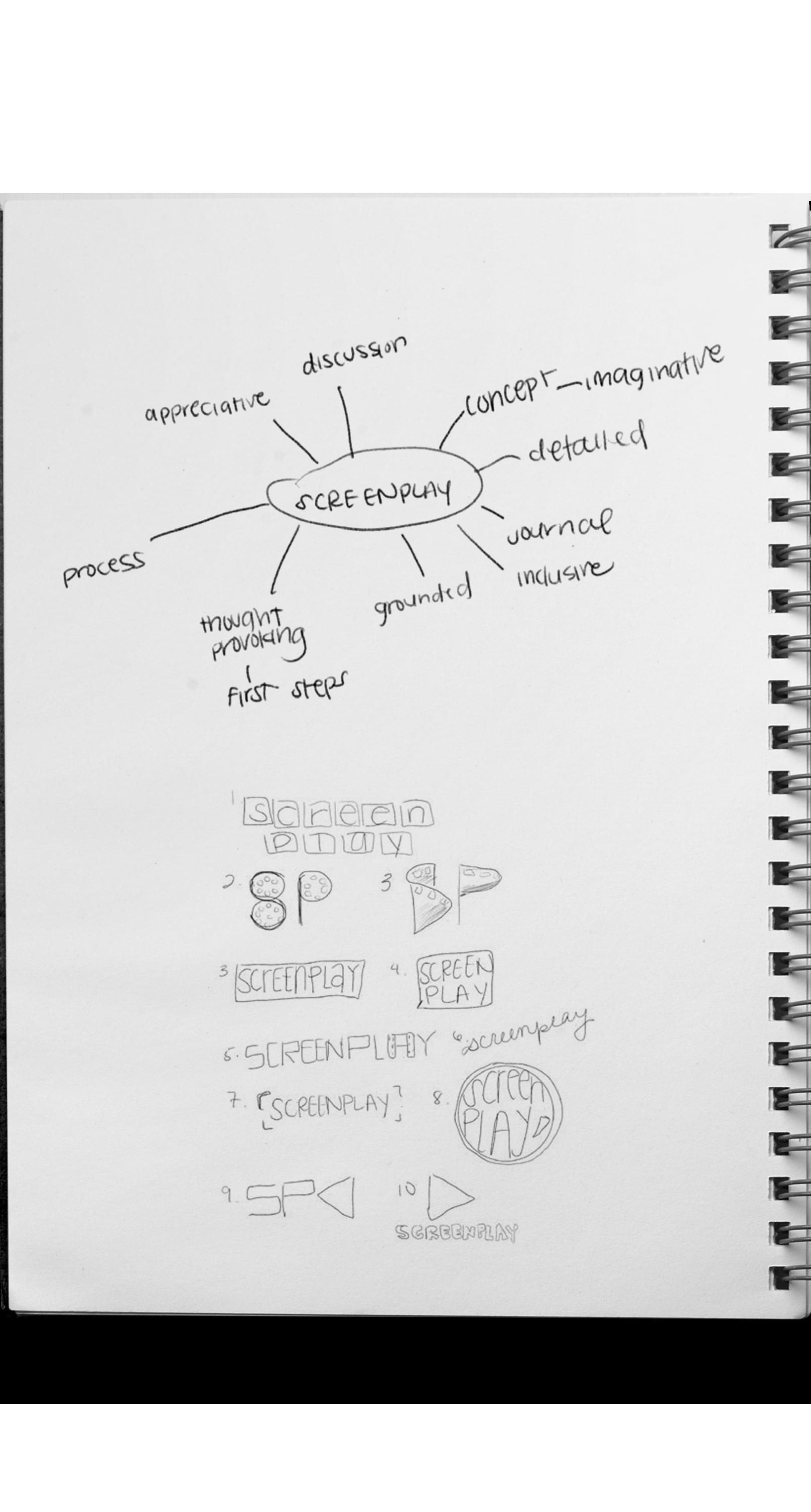
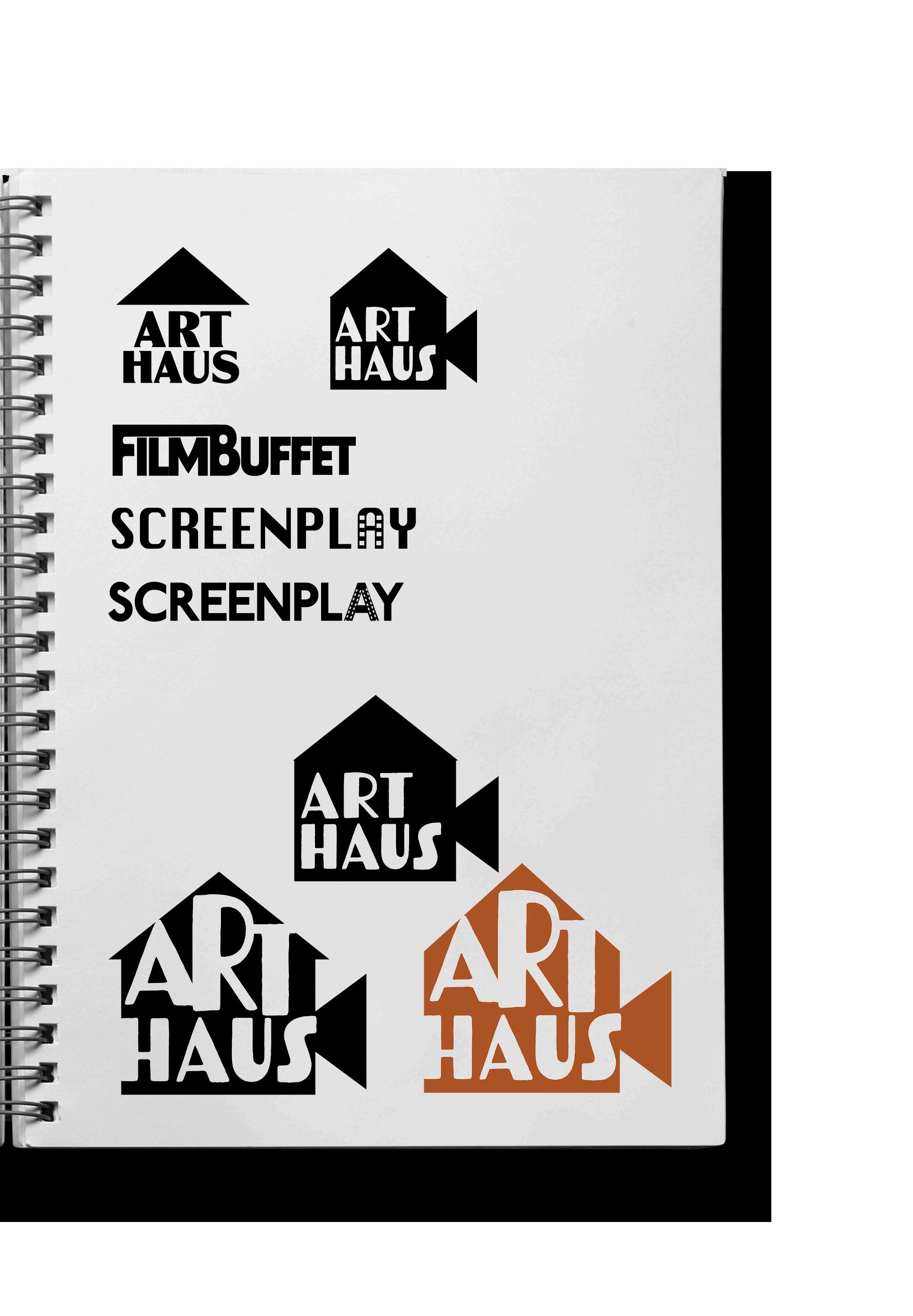
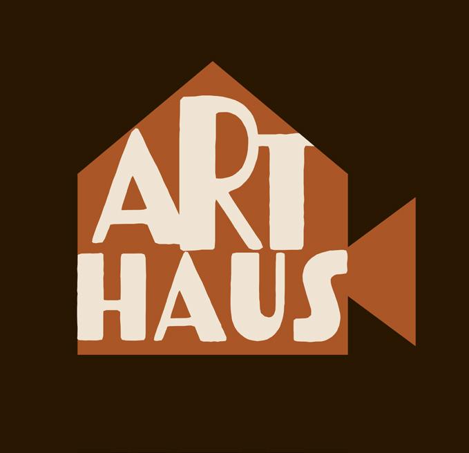
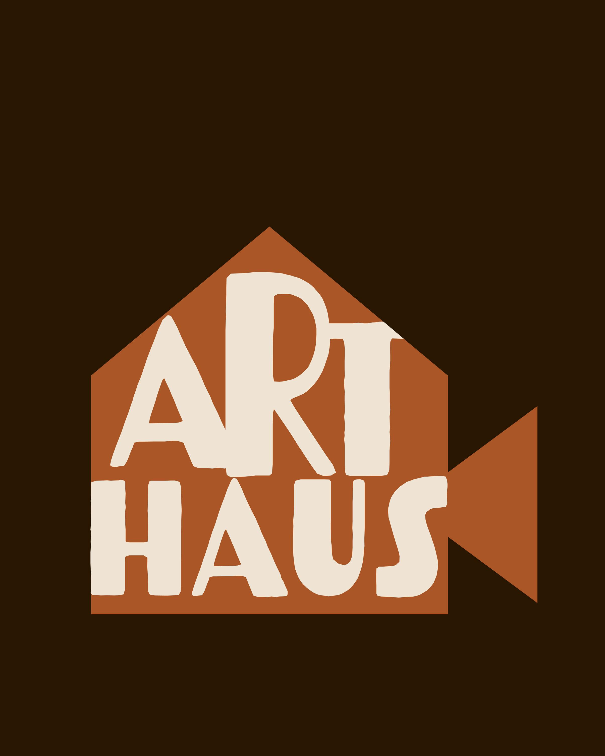
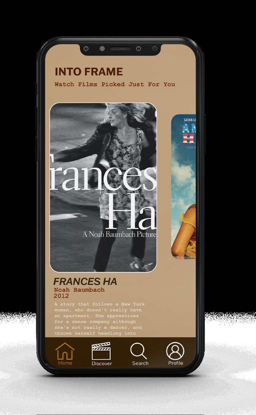
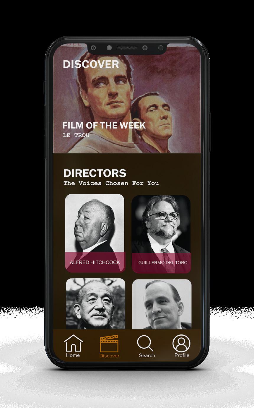
For the Arthaus app, I aimed to fill a gap in the current film app landscape by creating a platform that highlights classic, indie, and foreign films. As a cinephile myself, I noticed that there wasn’t a dedicated space where film lovers, professors, and students could easily access and appreciate these genres in one place. My approach was centered on building an app that not only provides access to these films, but also fosters a community of appreciation and learning around them.


4 3 5
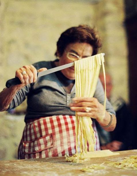
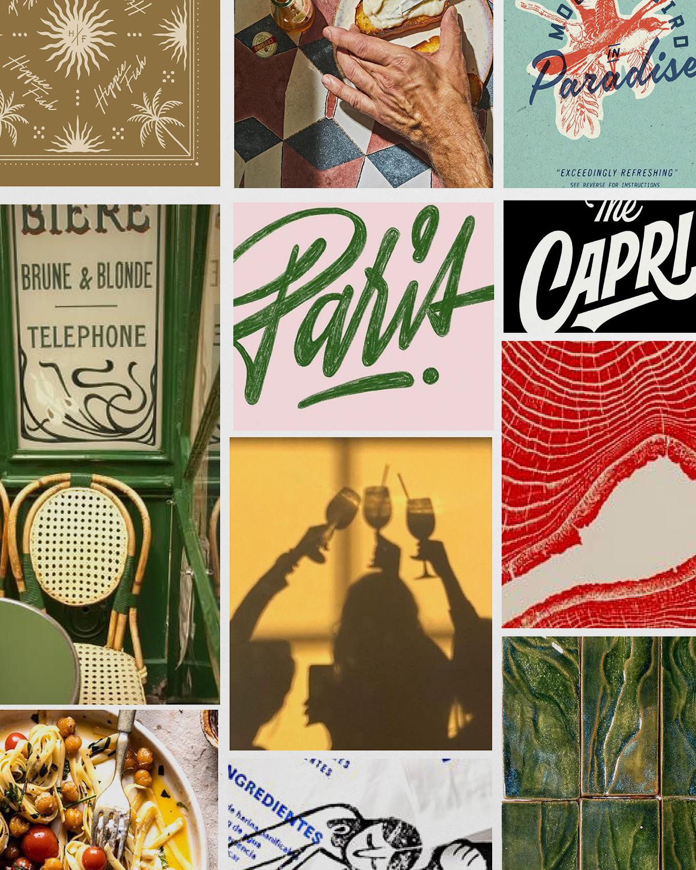
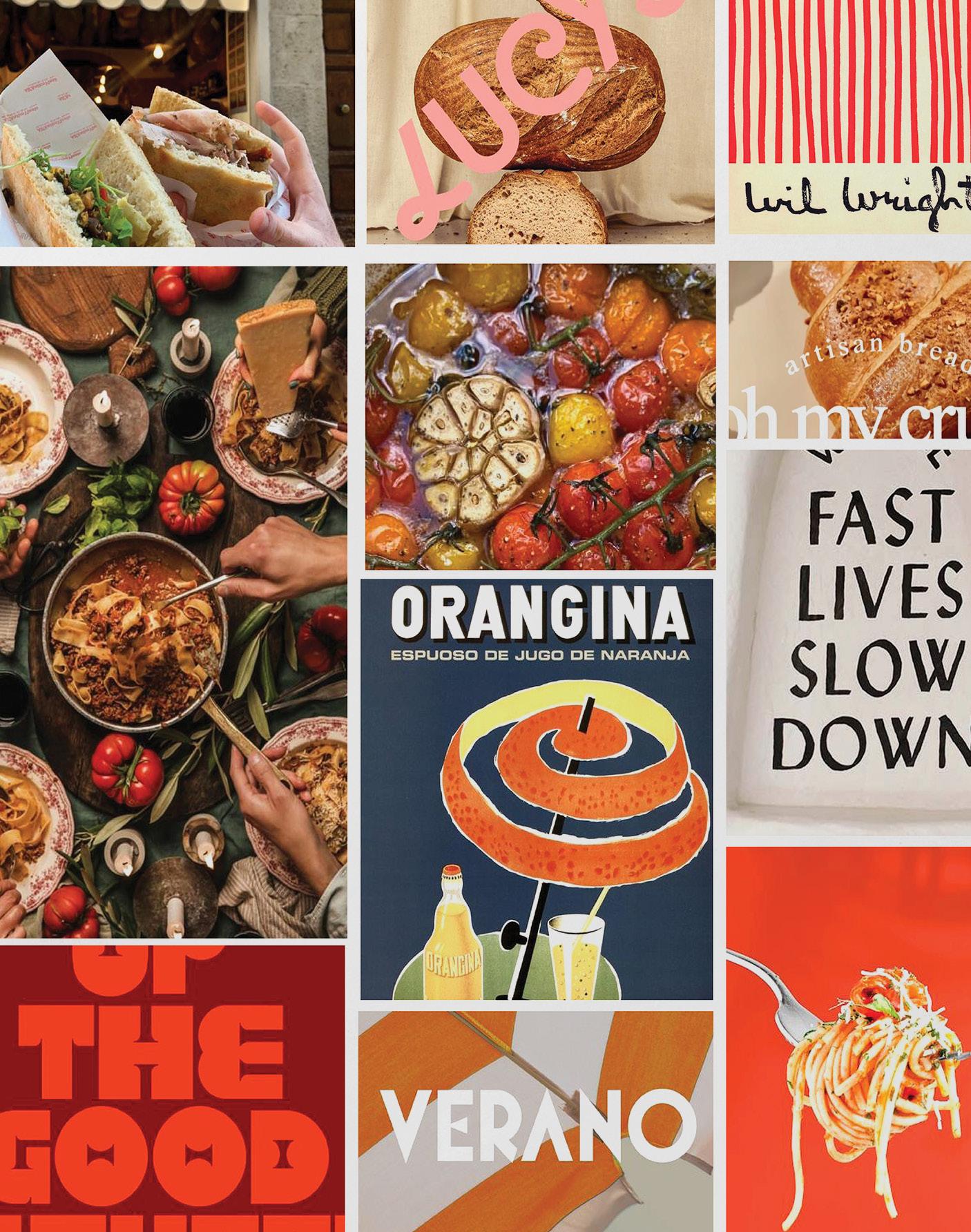
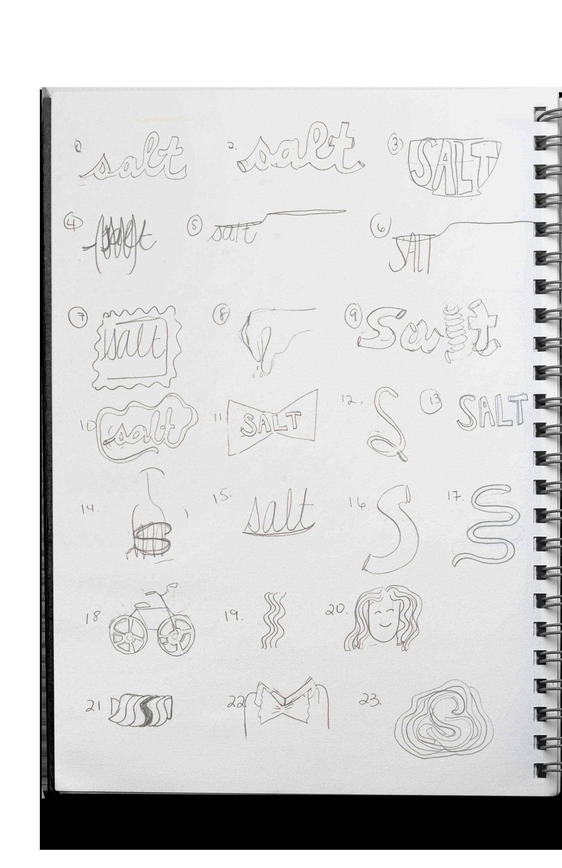
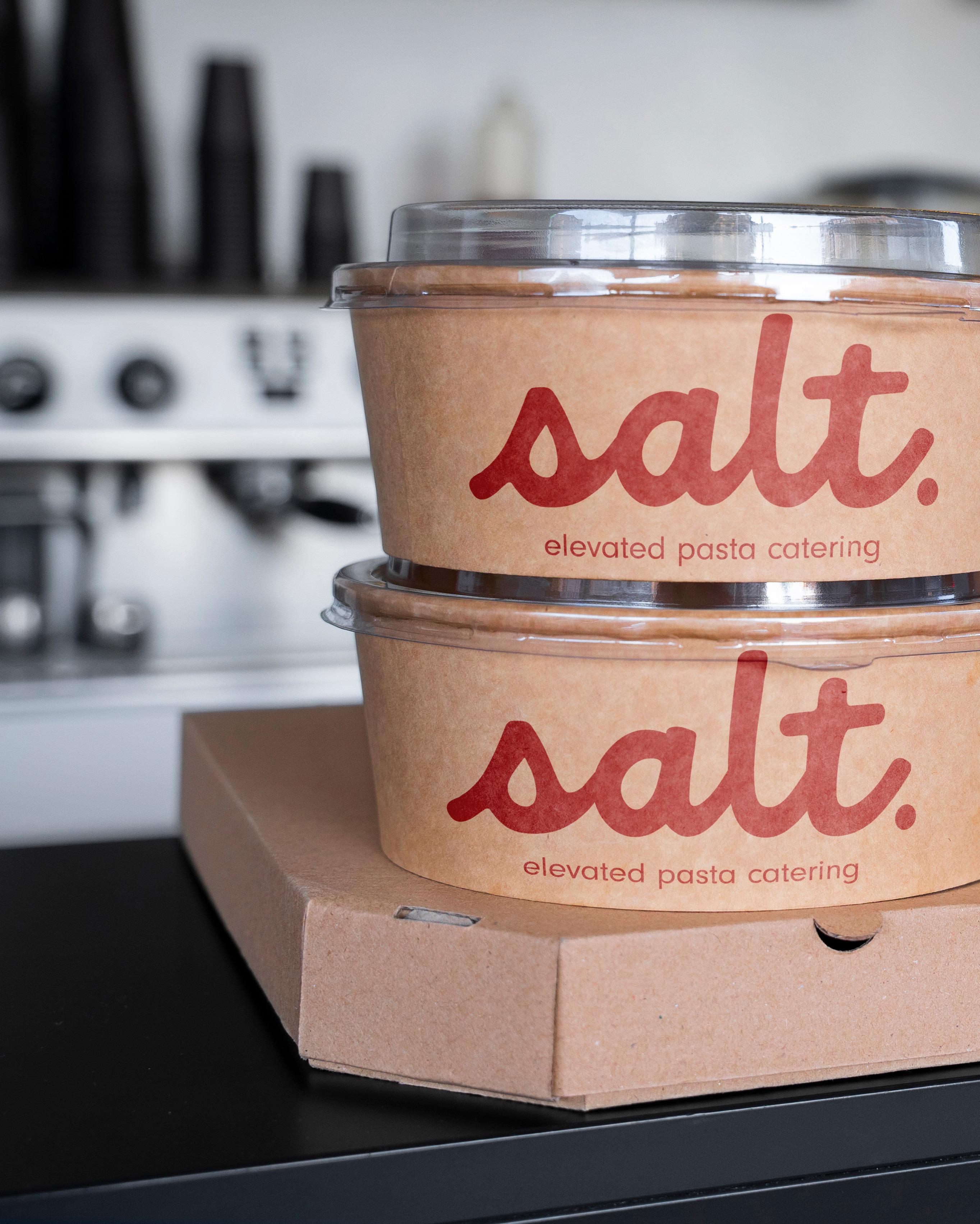
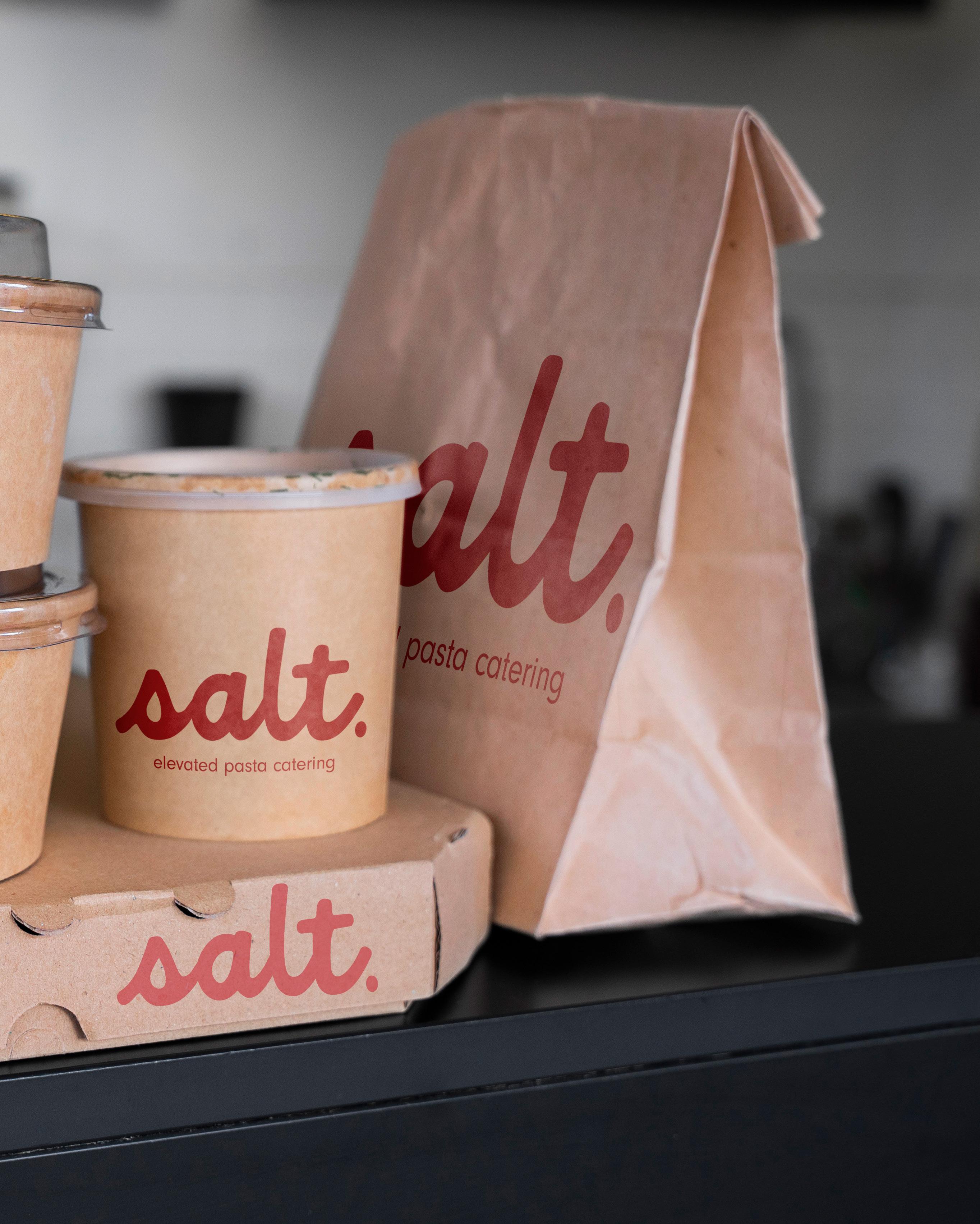
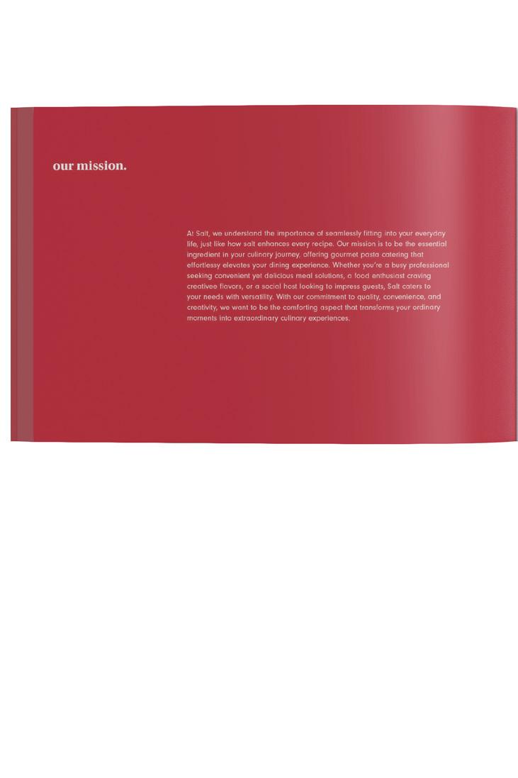
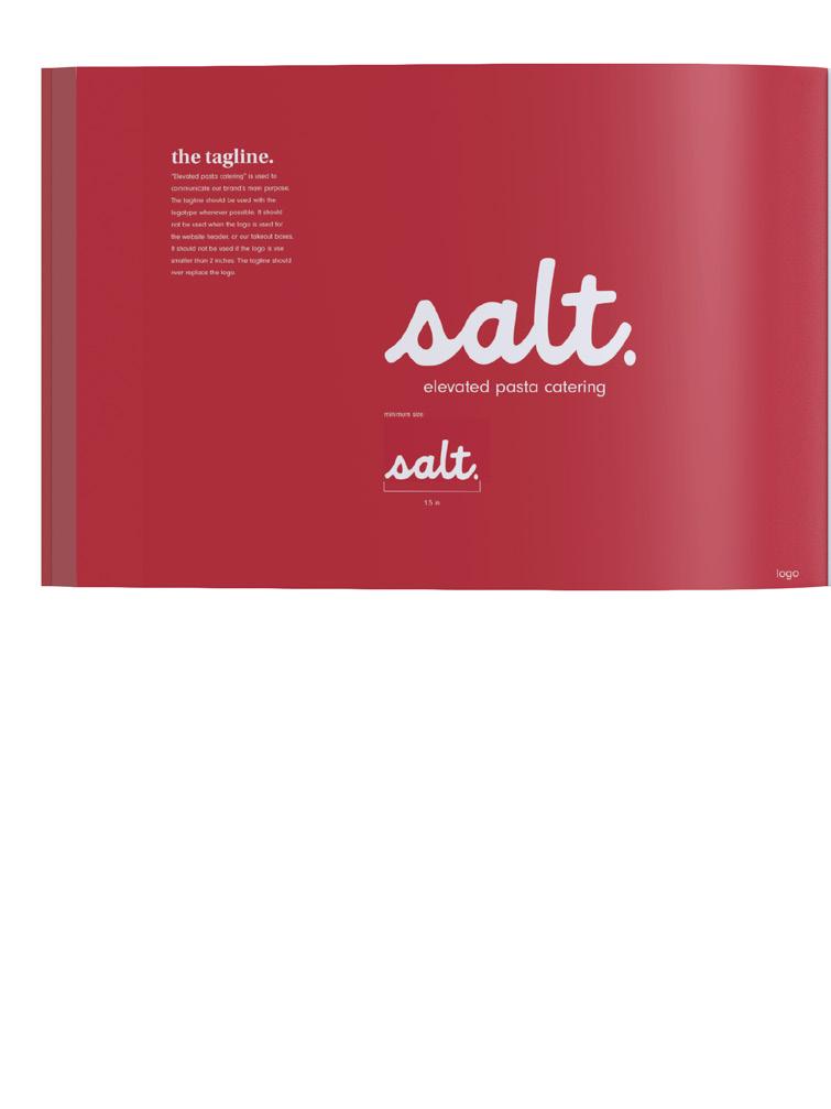
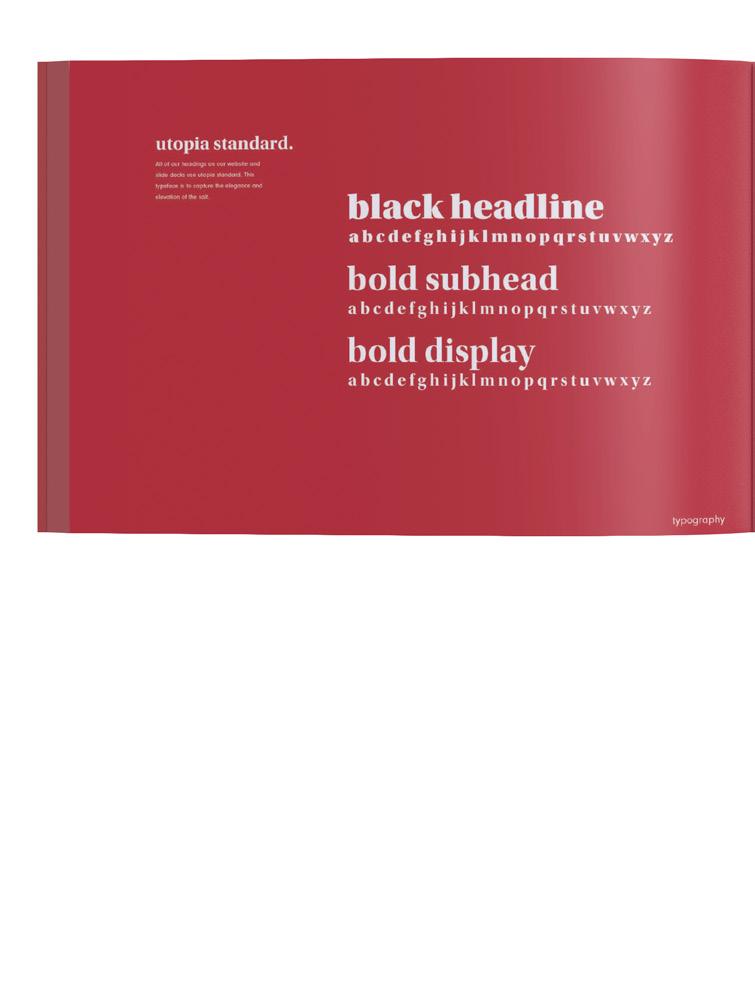
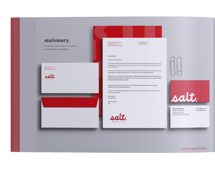
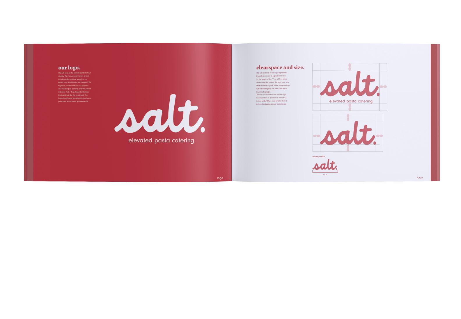
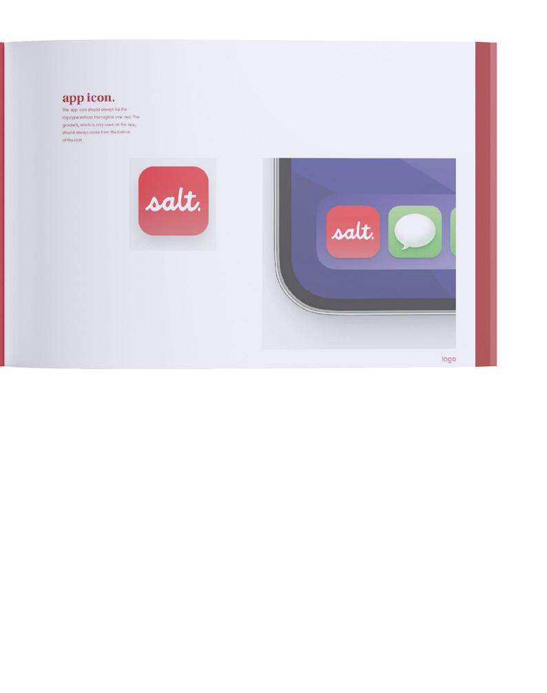
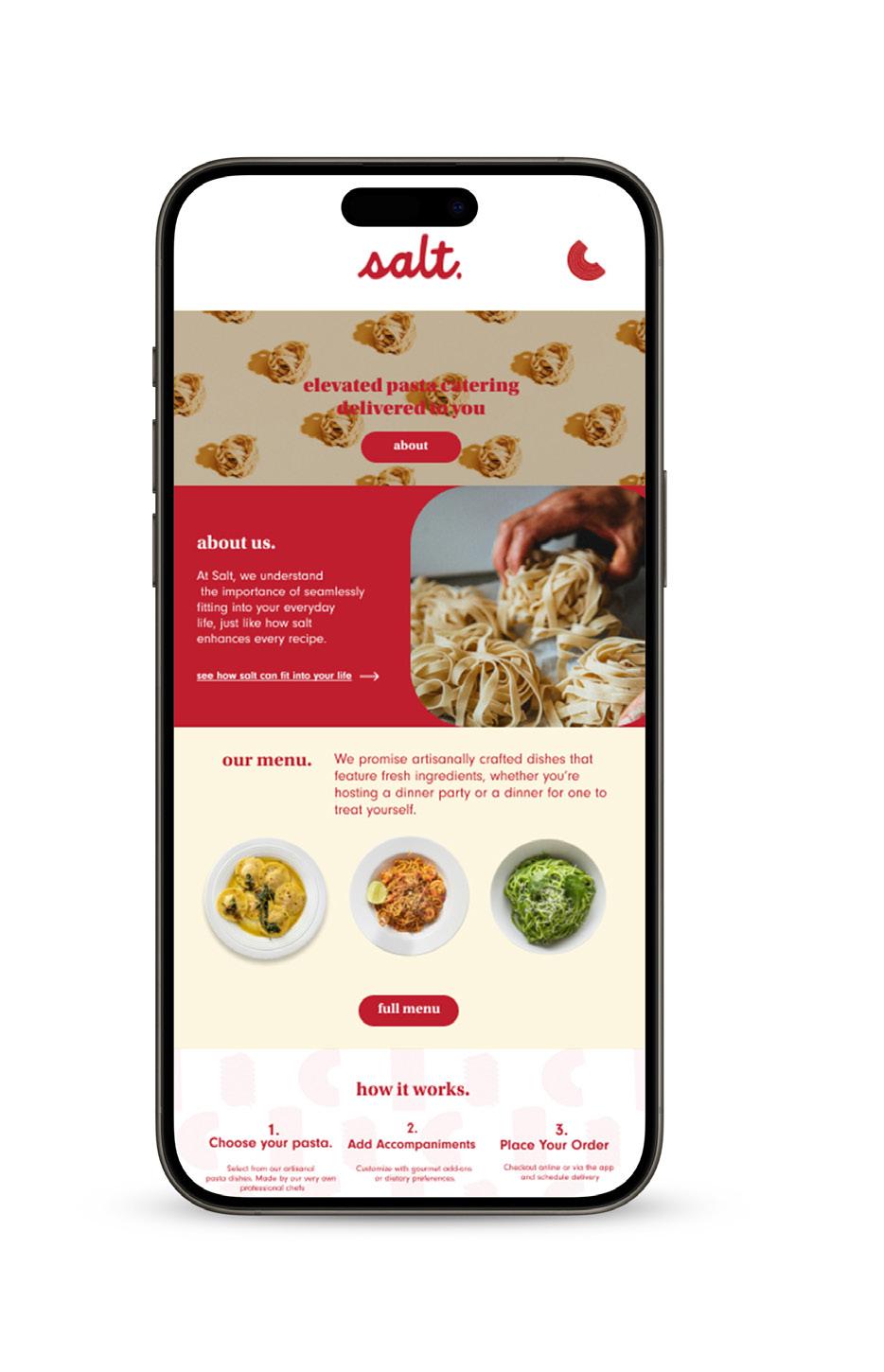
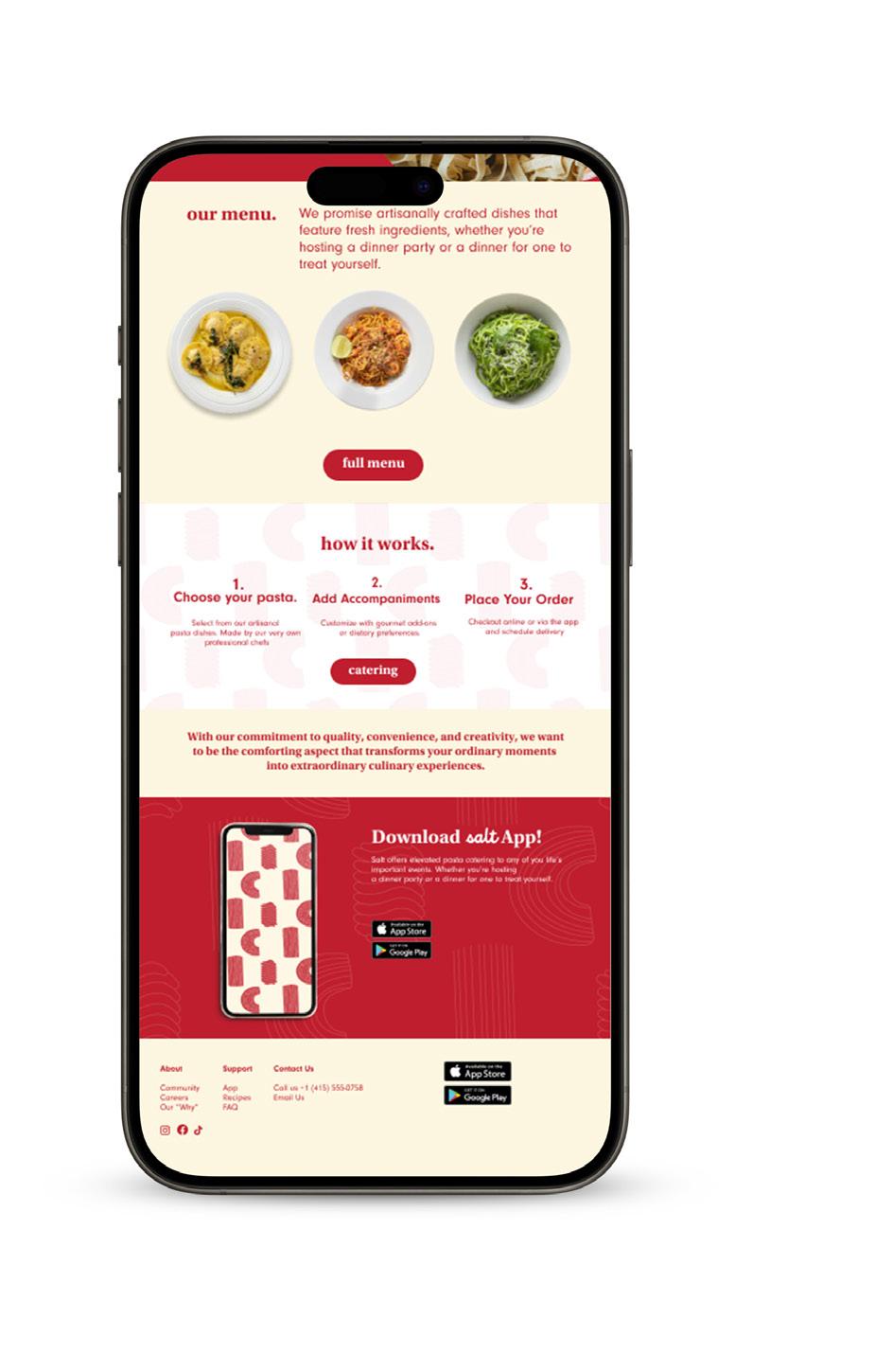
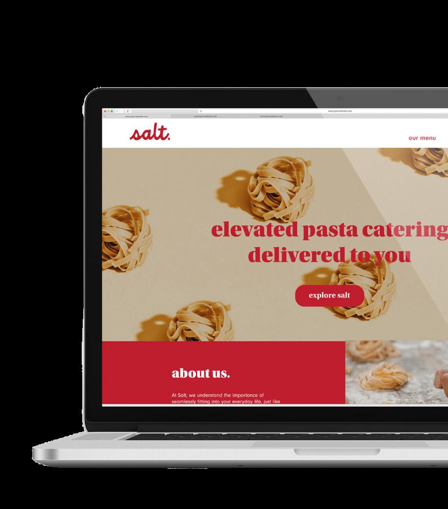
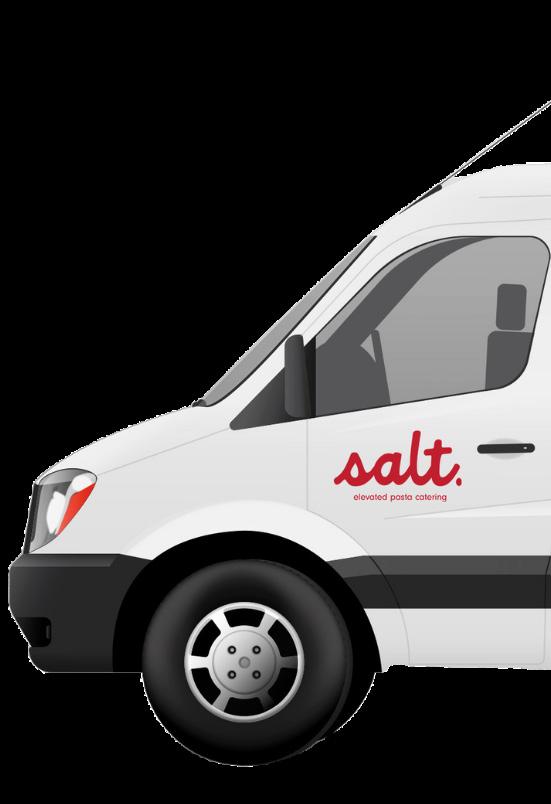
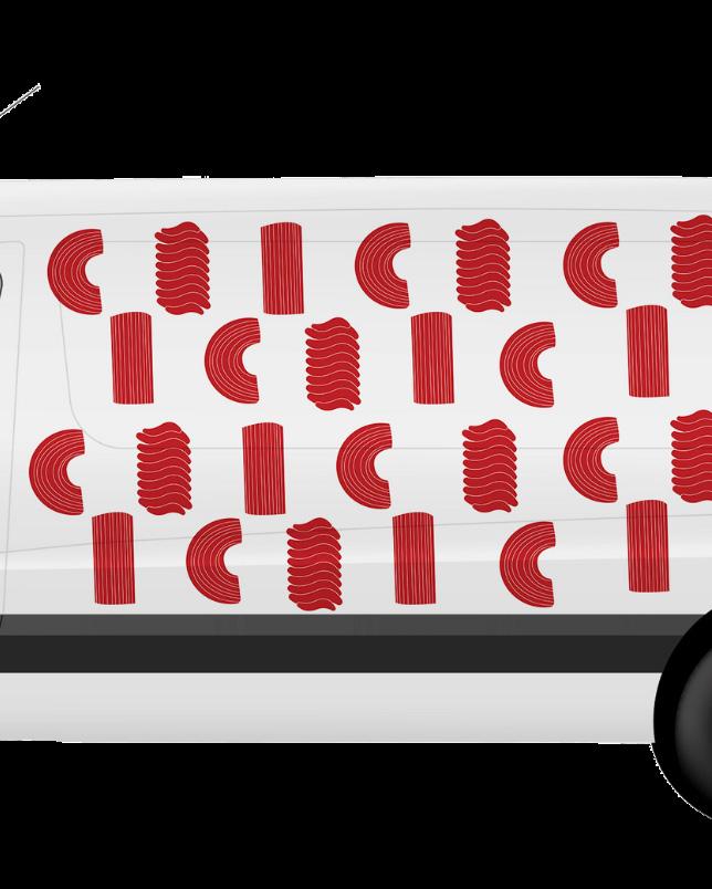
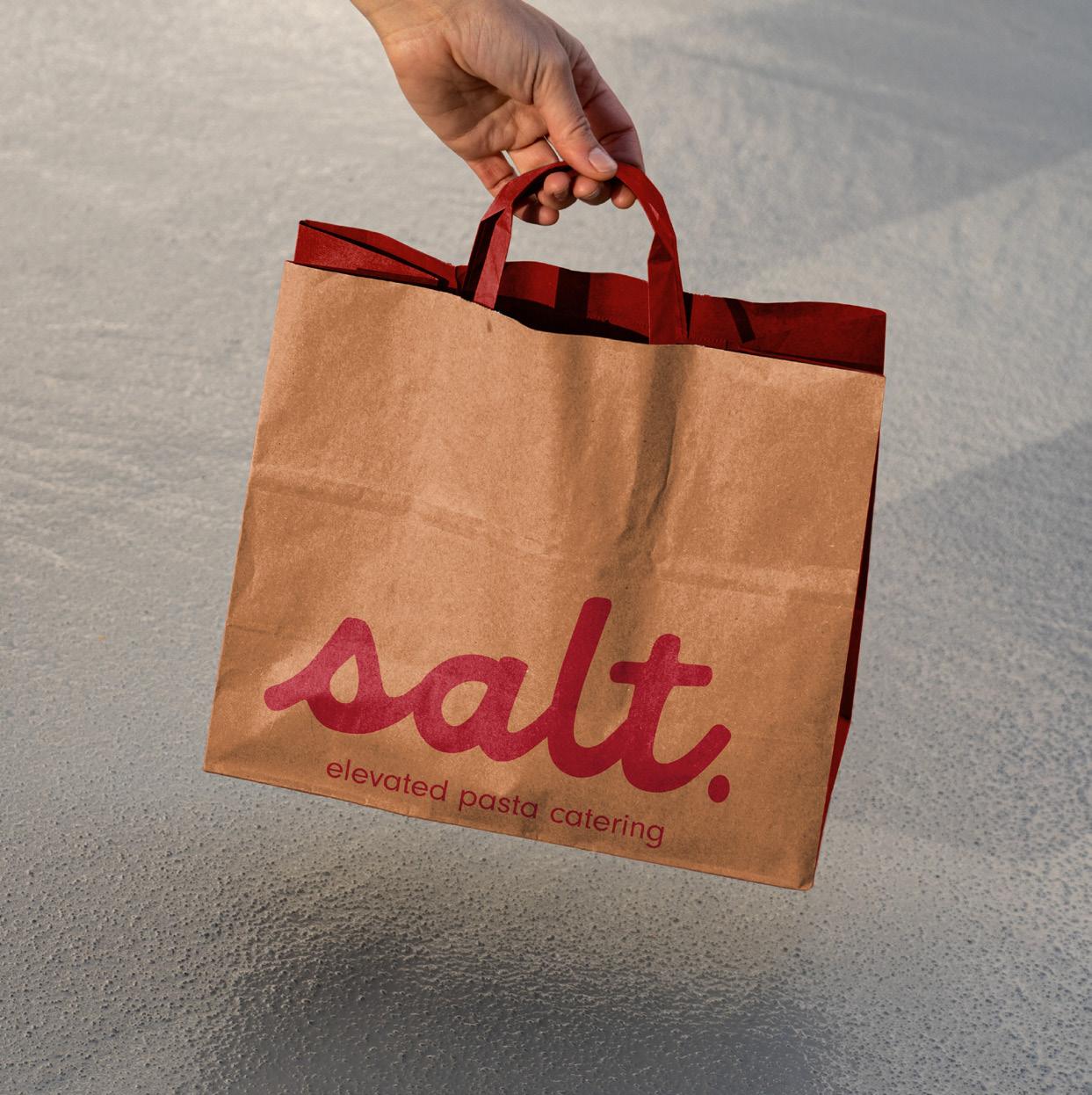
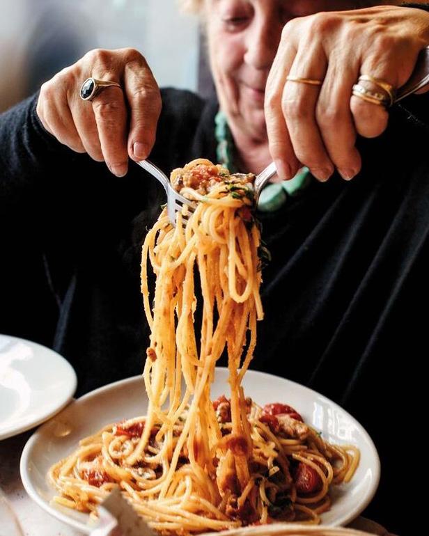
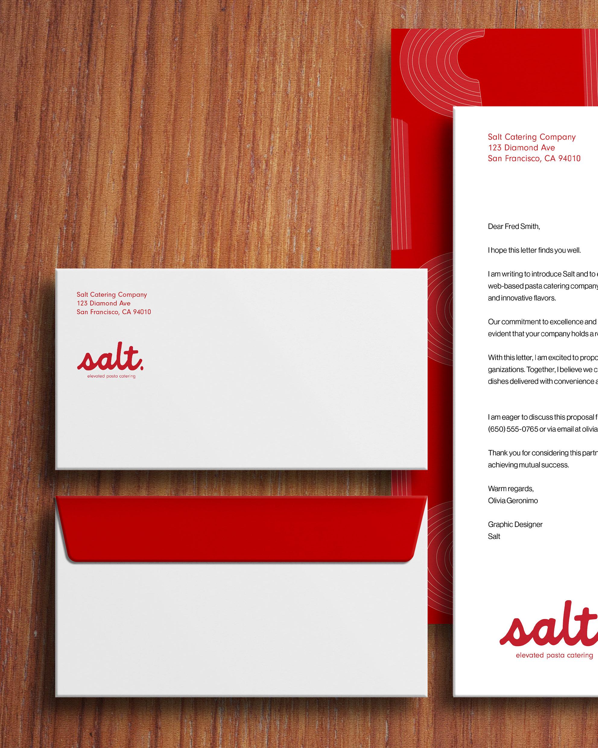
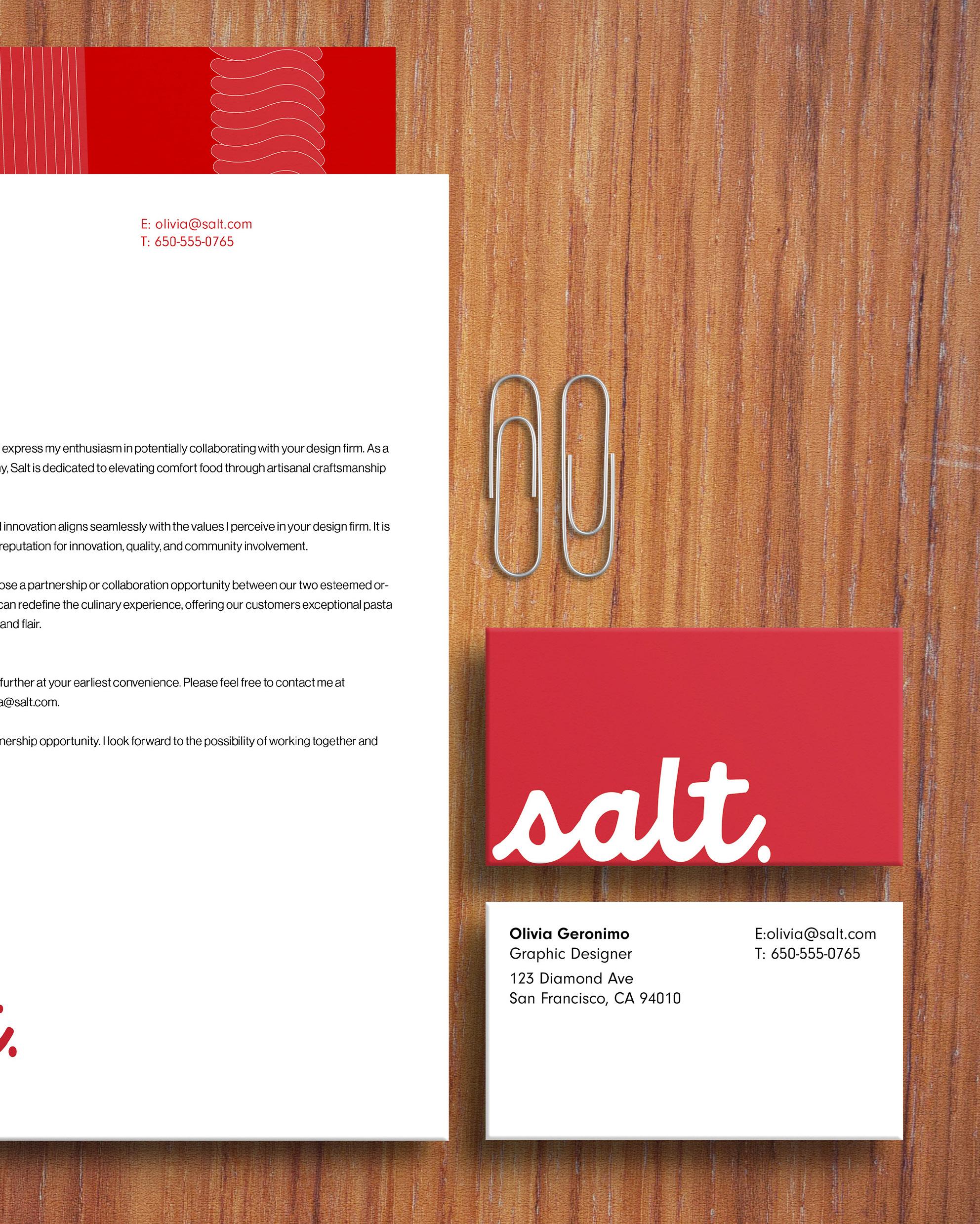
Comfort, curated, flavorful, and seamless .
Intent
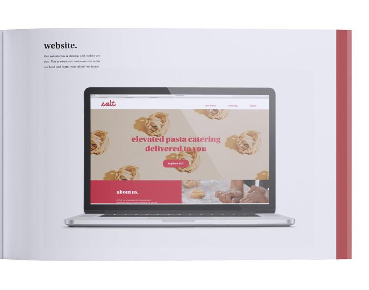
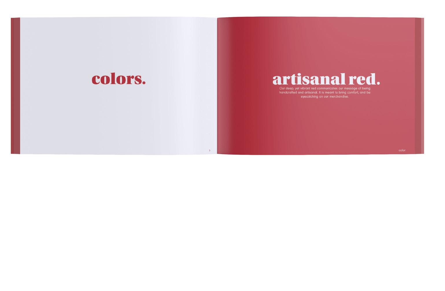
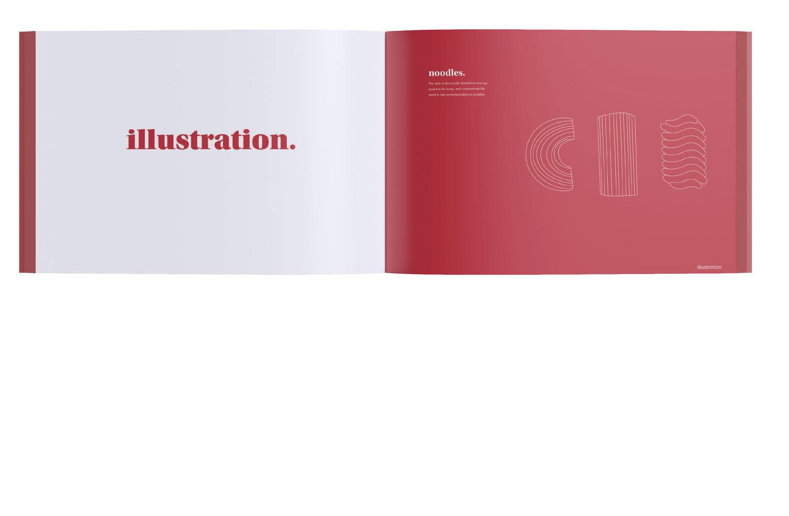
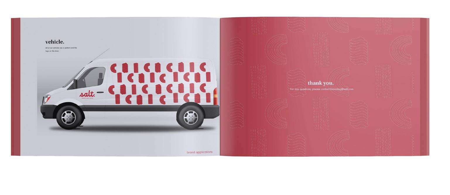
For the Salt catering app, my approach focused on creating a design that seamlessly fits into everyday life, much like salt enhances a meal. I aimed for a clean, intuitive interface that balances the warmth of home-cooked comfort with the sophistication of personalized catering. Every detail was crafted to ensure users feel supported and delighted, whether they’re planning a casual dinner or a special gathering.
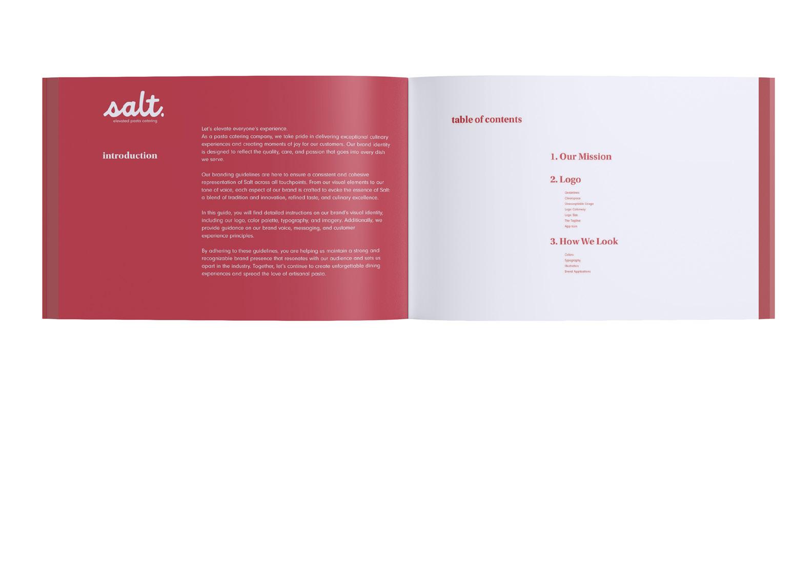
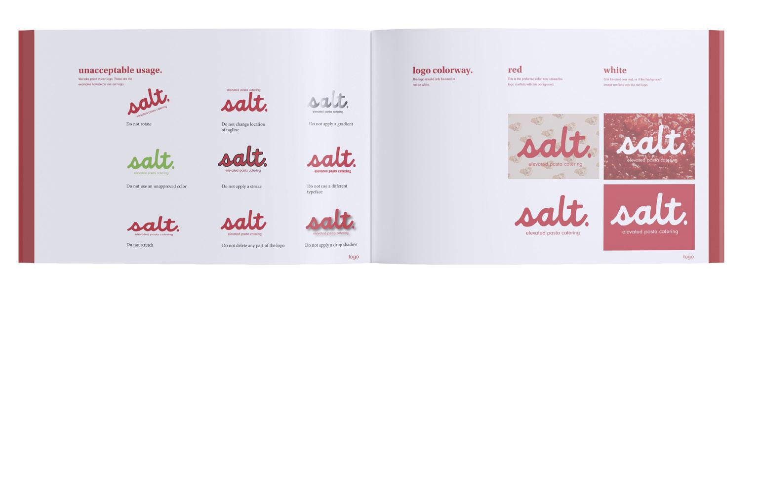
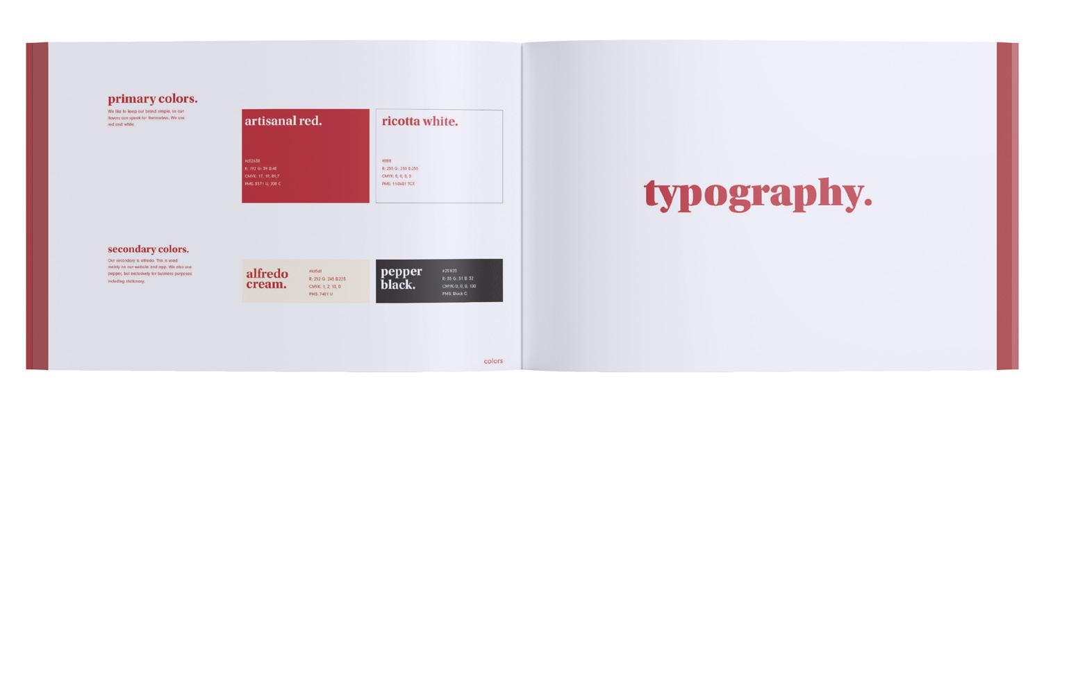
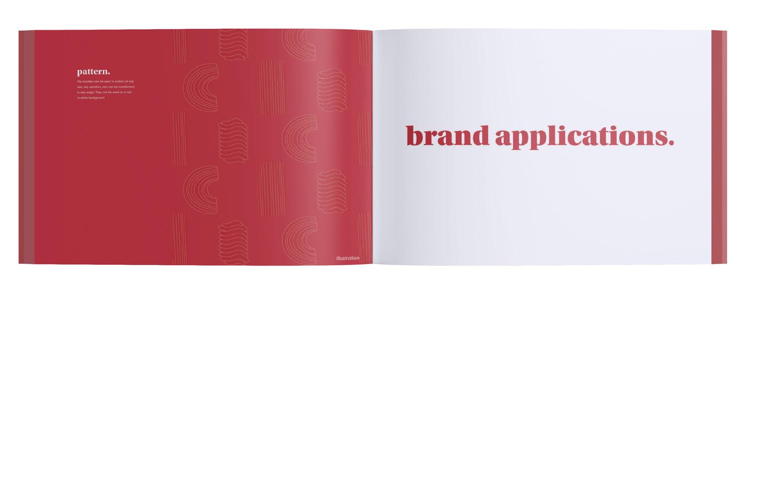
Project Name
Salt
Course
Strategies for Branding
Semester
Spring 2024
Instructor
Peter Chun


4
5
6

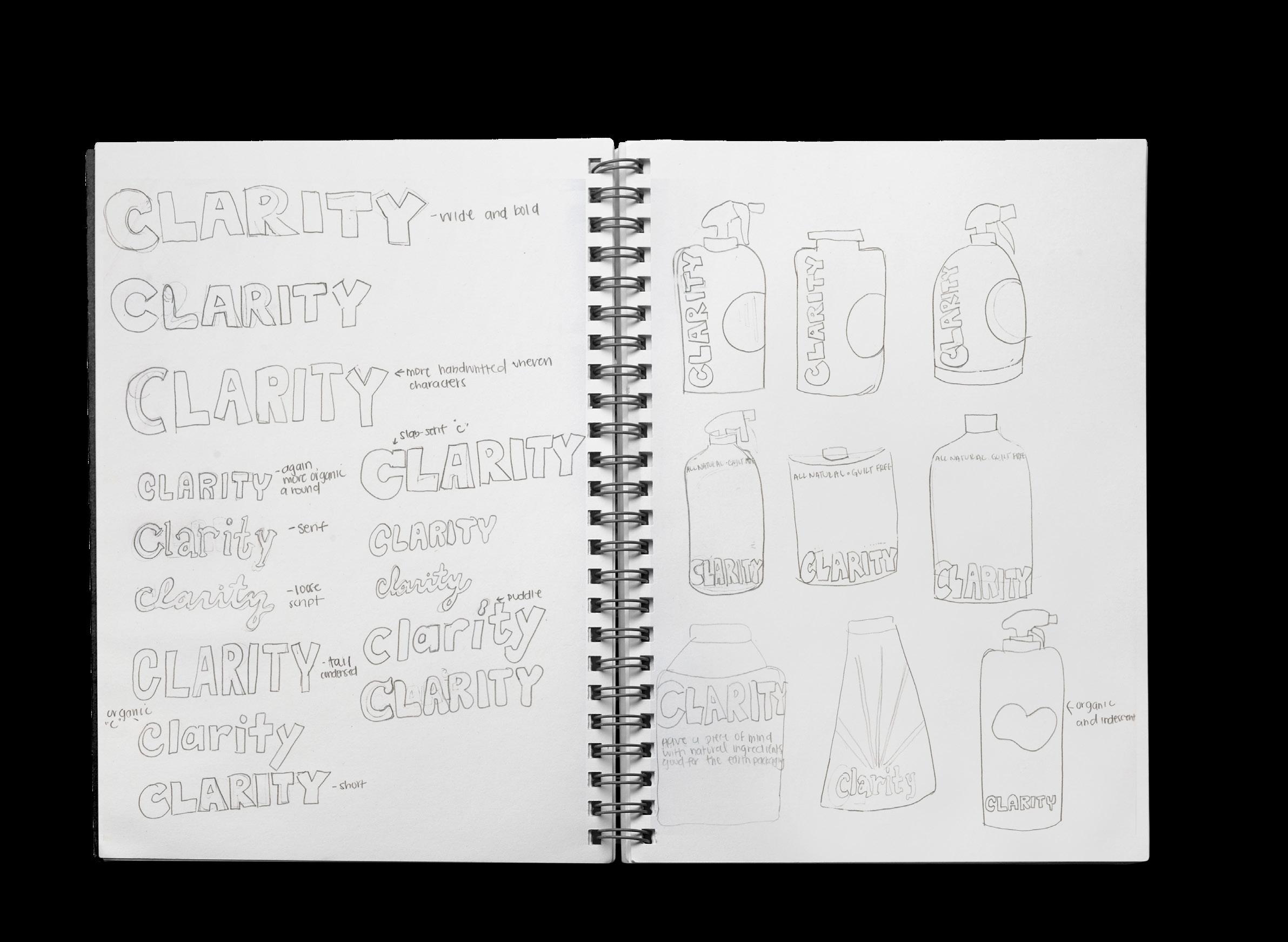
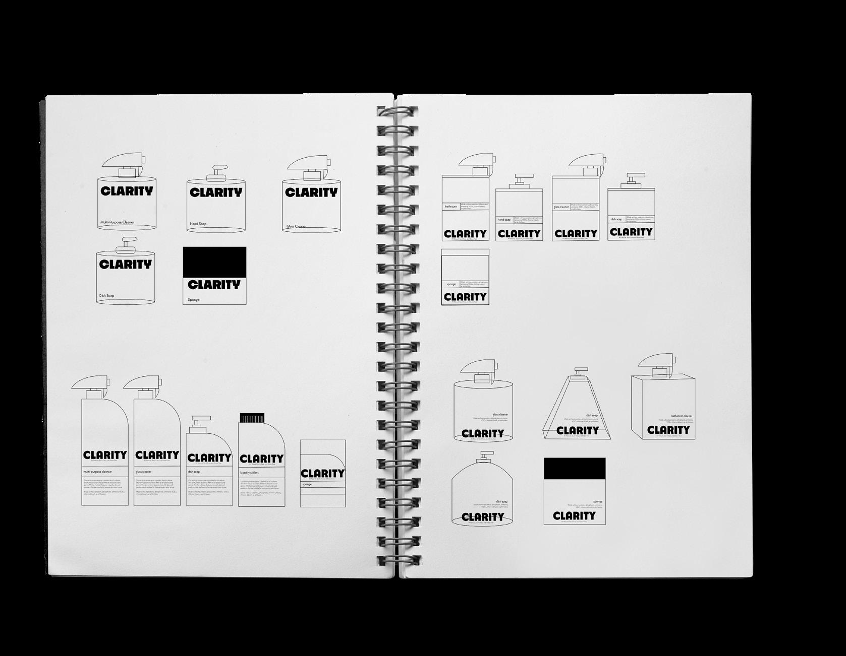
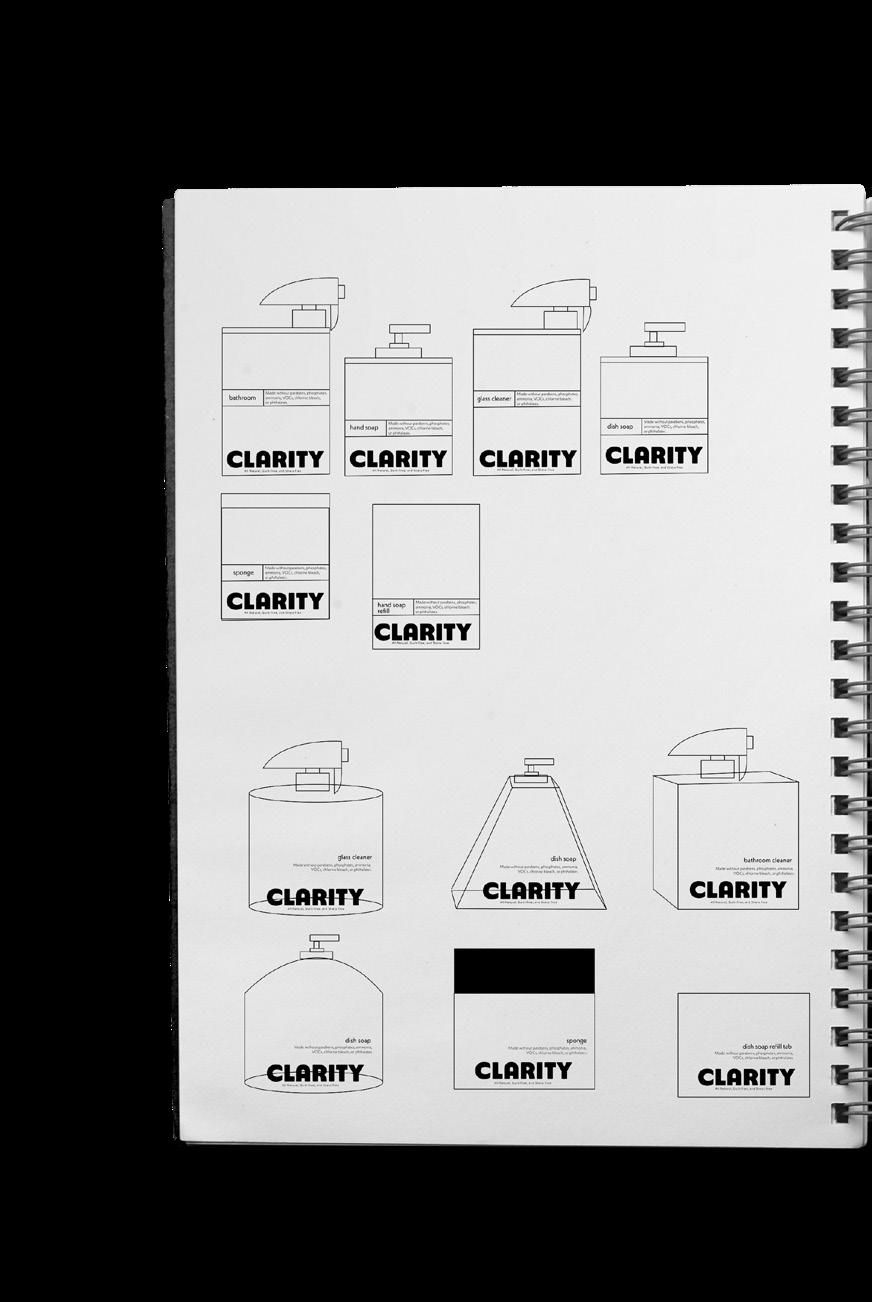
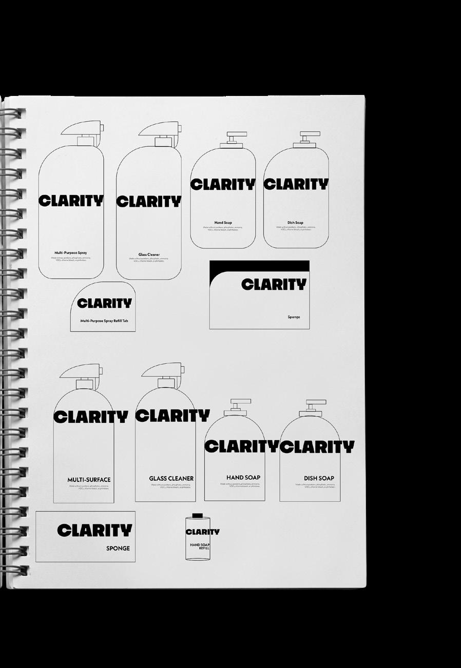
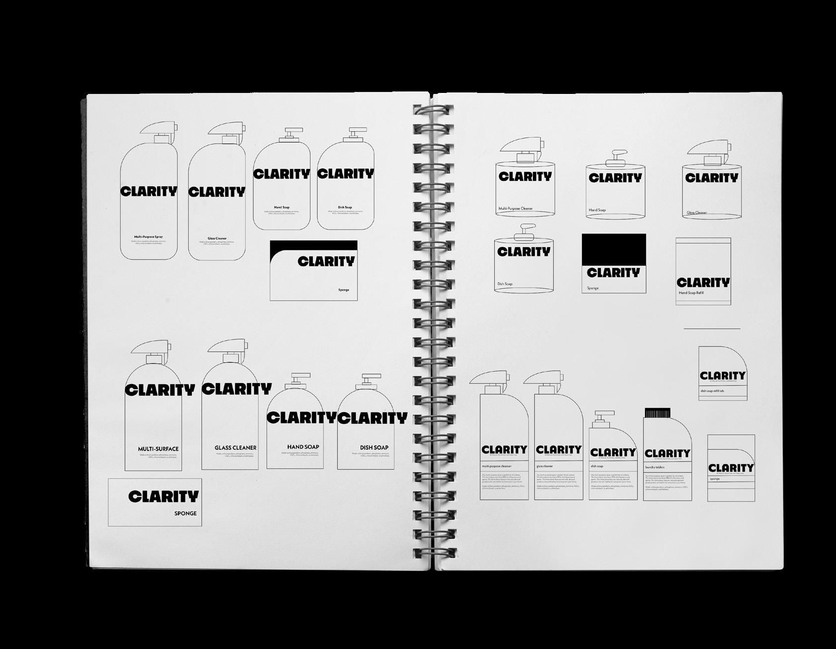
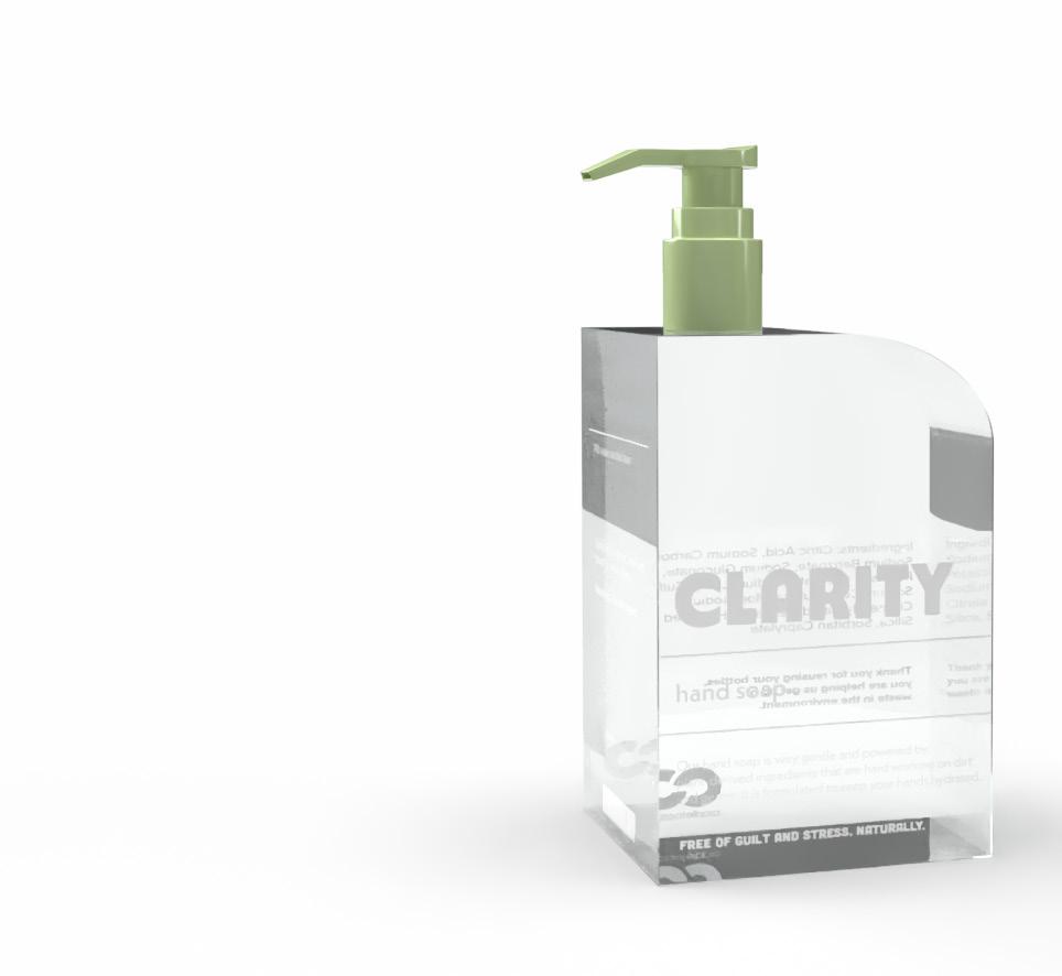
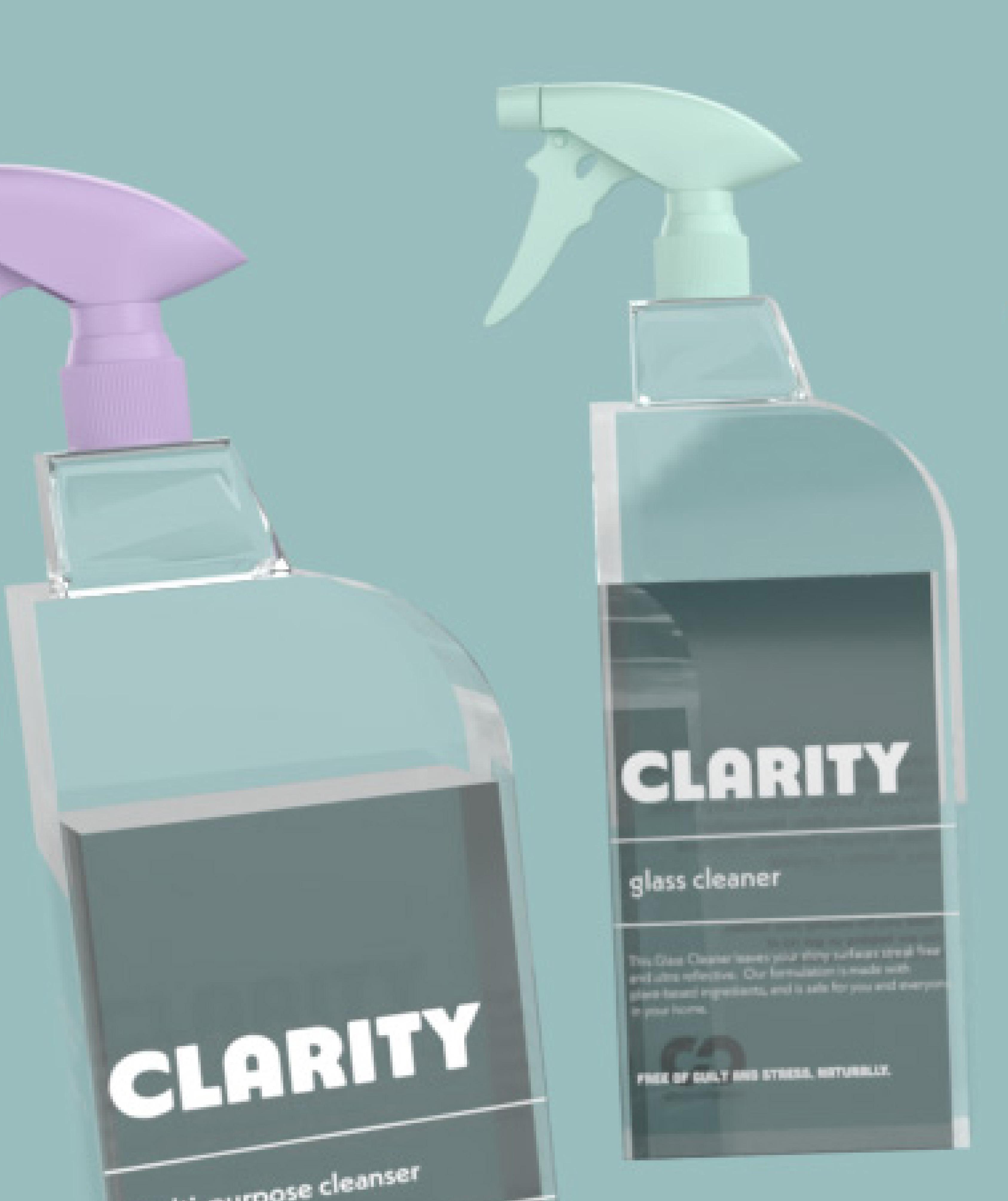
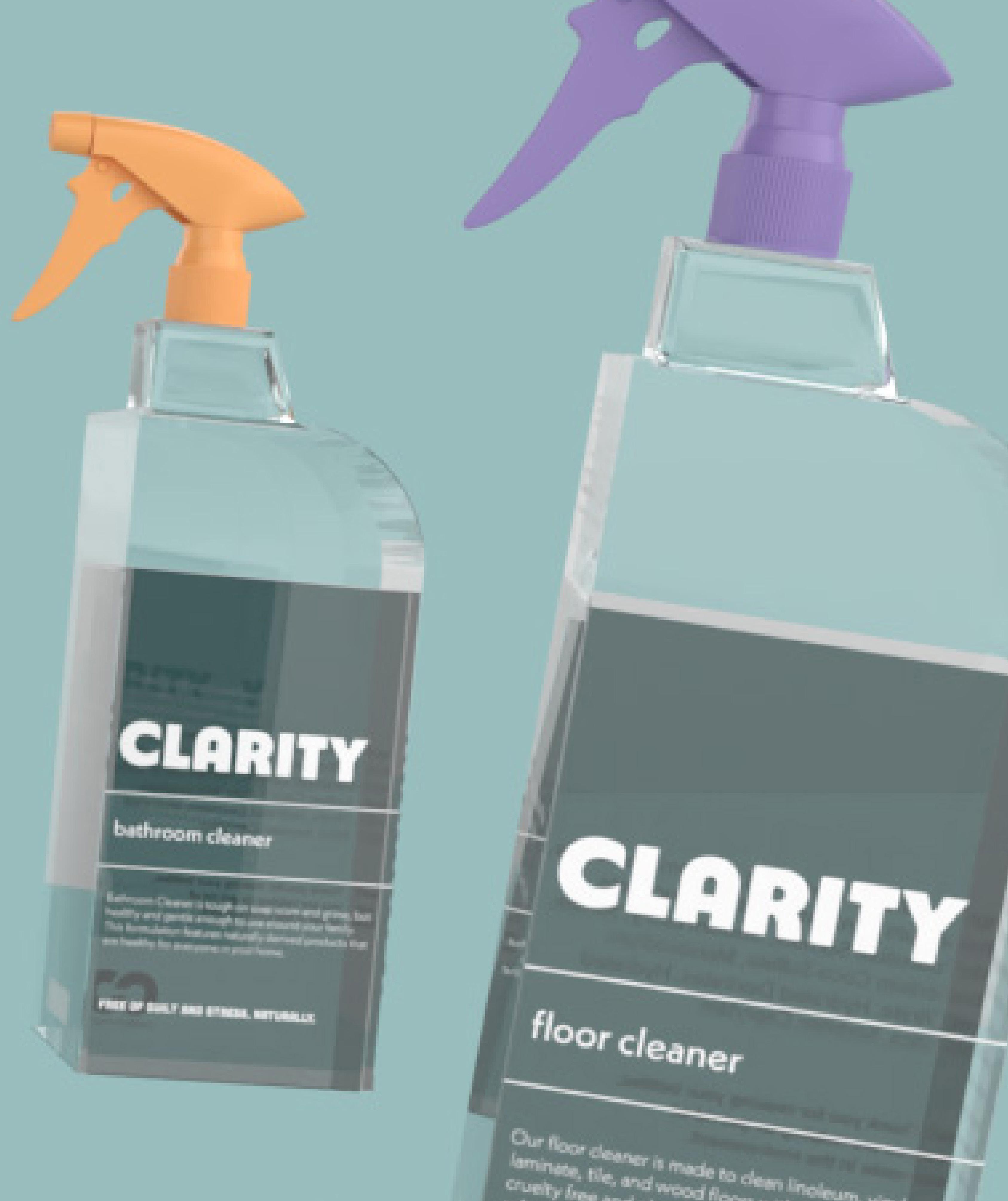
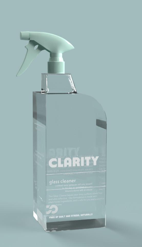
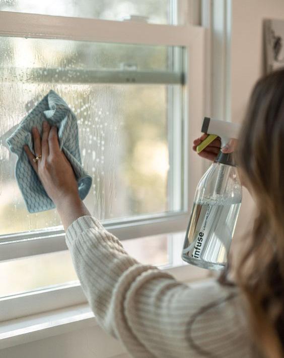
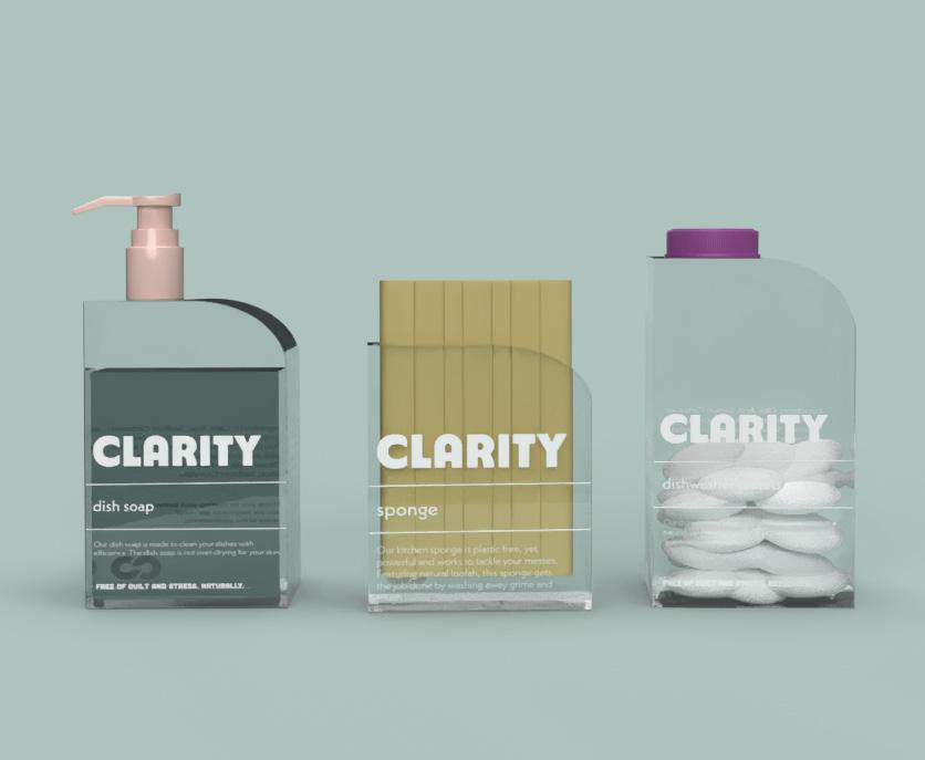
Cleanse, calm, sustain, and simplicity .
Intent
Clarity represents my approach to design—where functionality meets mindfulness. This project emphasizes the emotional impact of a clean space, evoking calm and control. With a focus on sustainability and transparency, Clarity blends eco-friendly solutions with stress-free and clean living. Every design choice, from packaging to messaging, aligns with the brand’s mission to provide peace of mind and a sense of ease in daily routines.

6 5 7

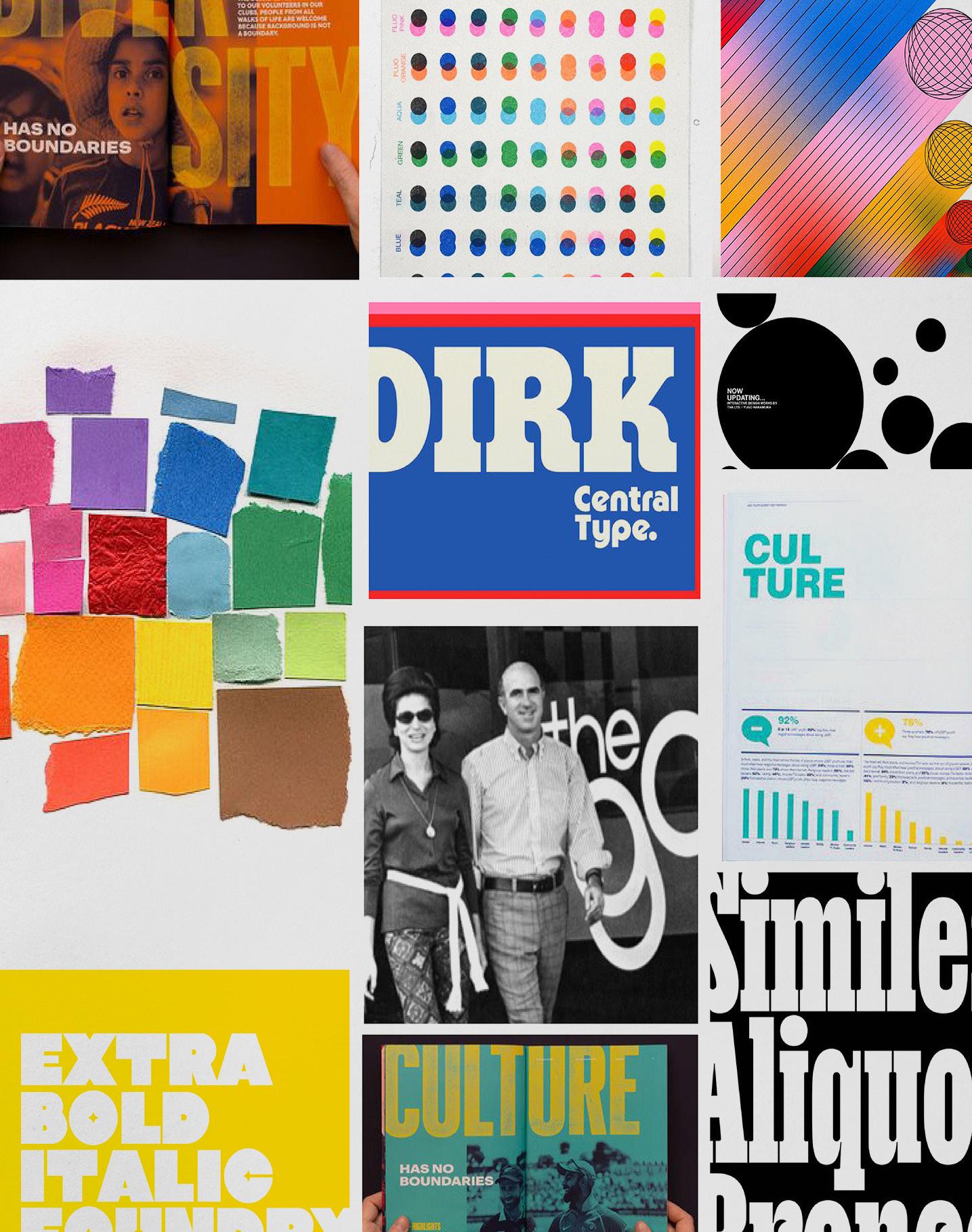
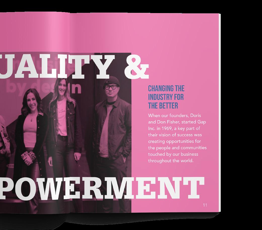
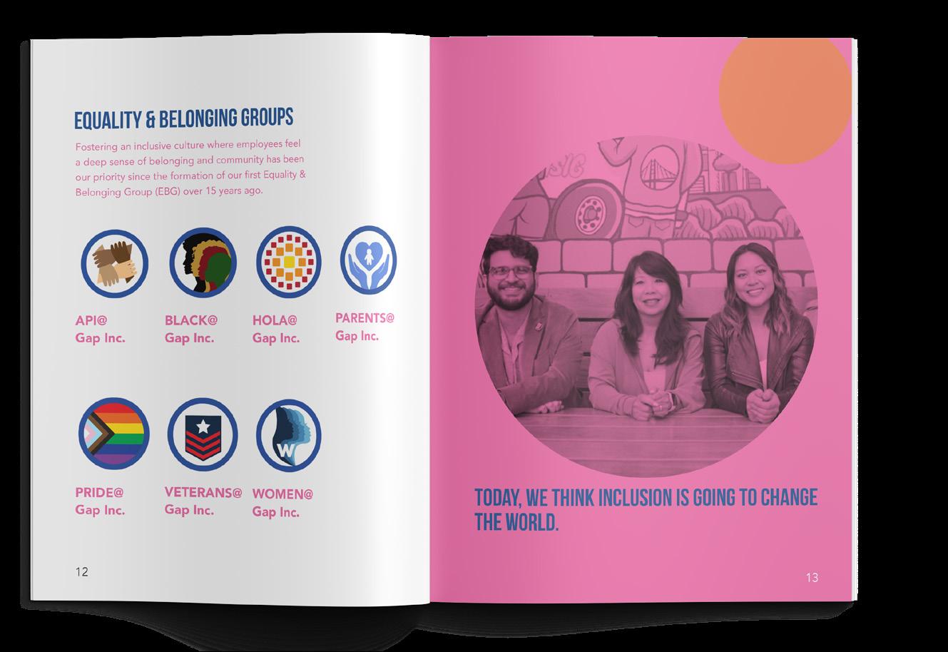
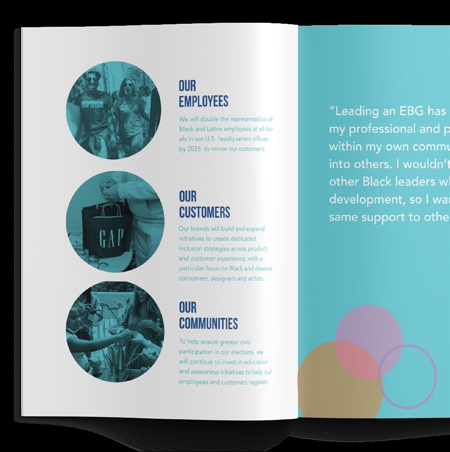
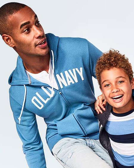
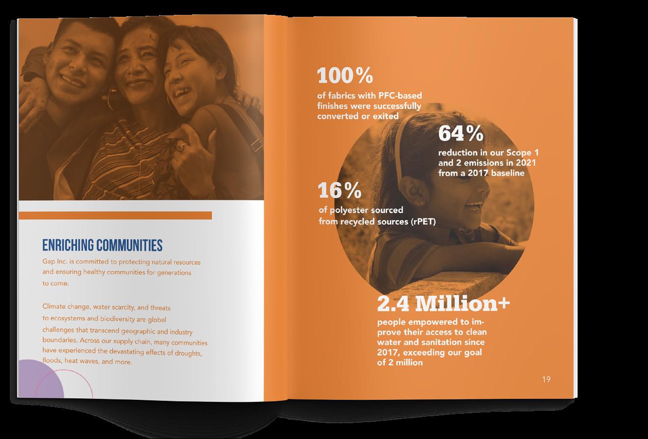
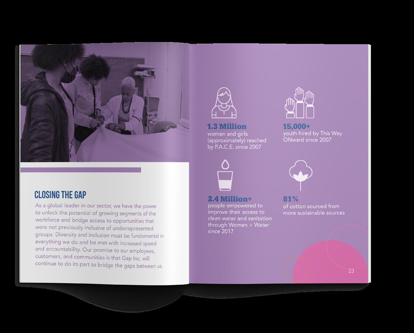
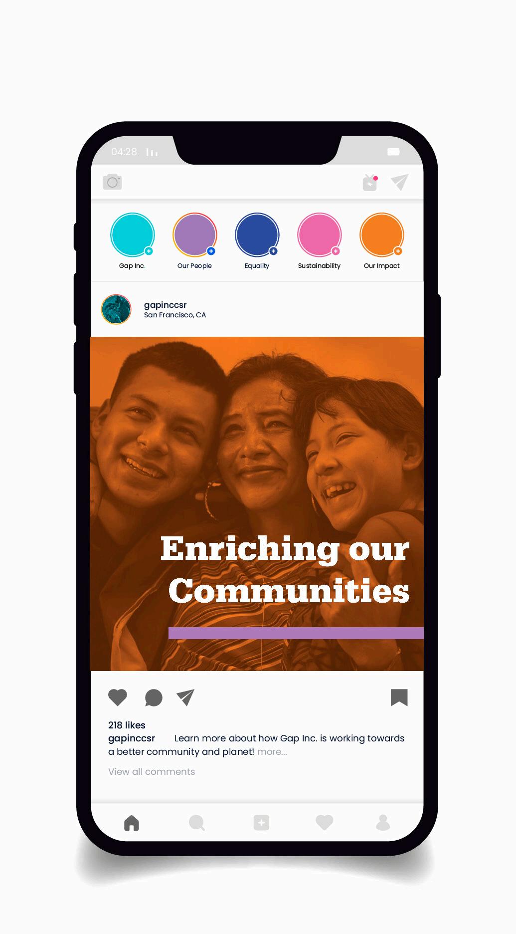
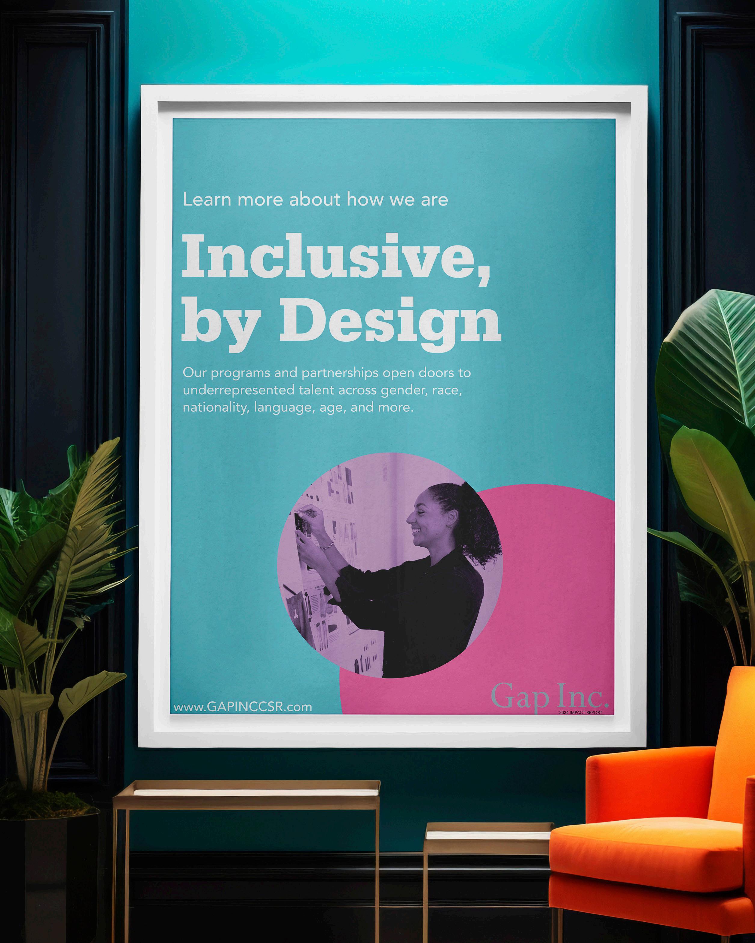
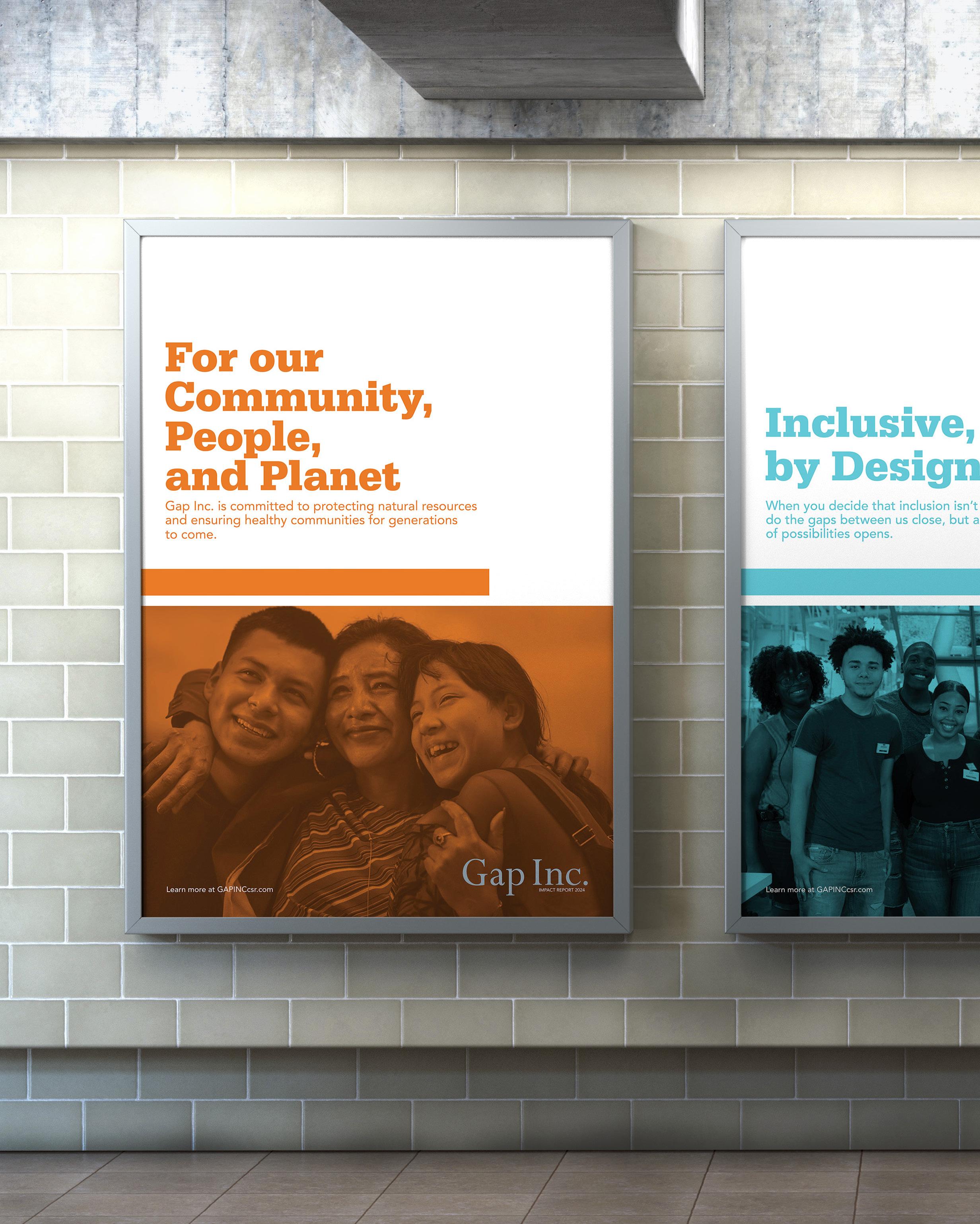
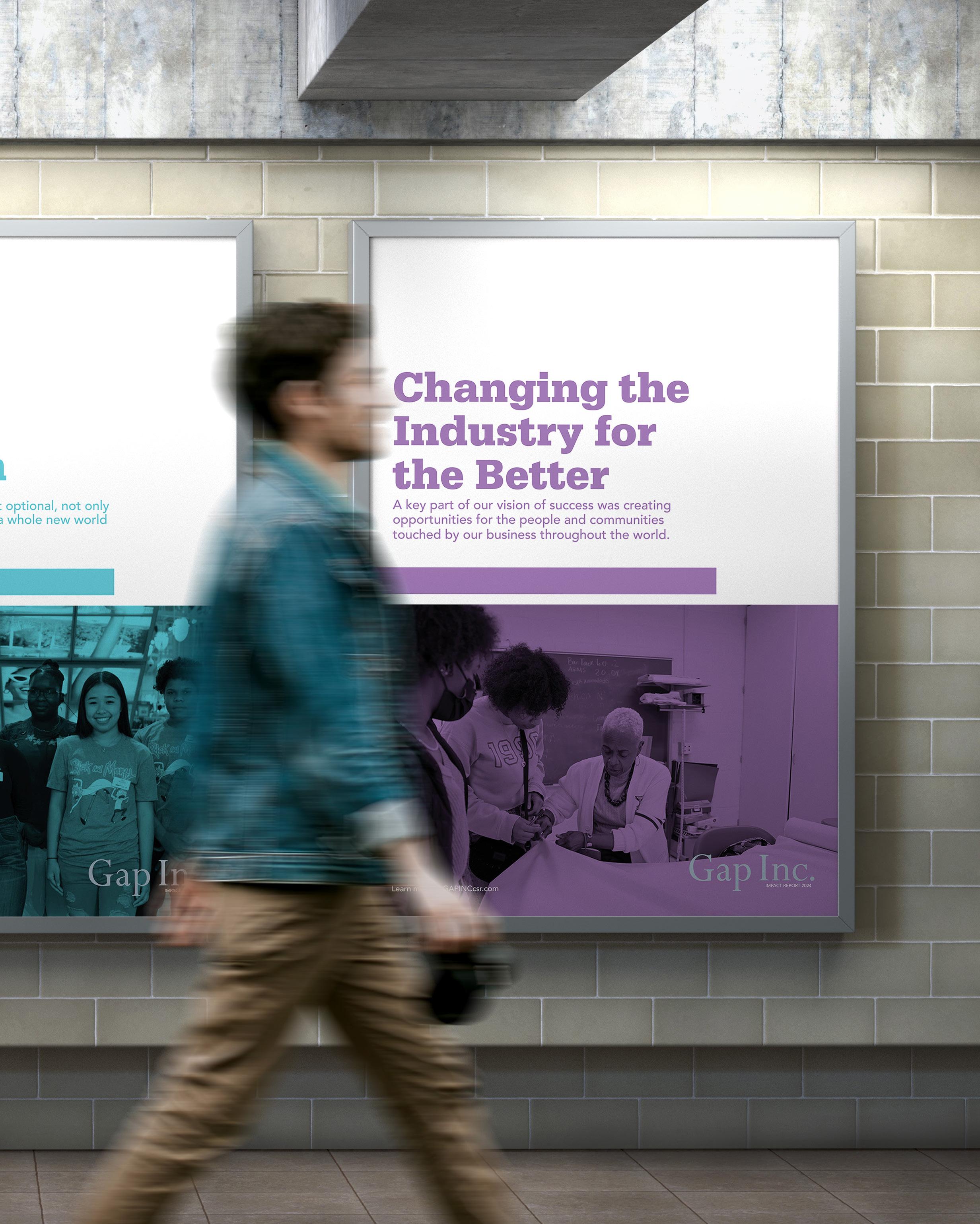
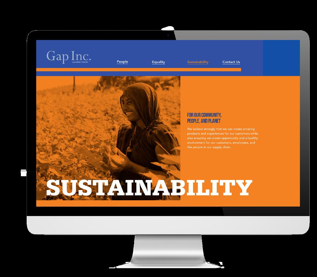
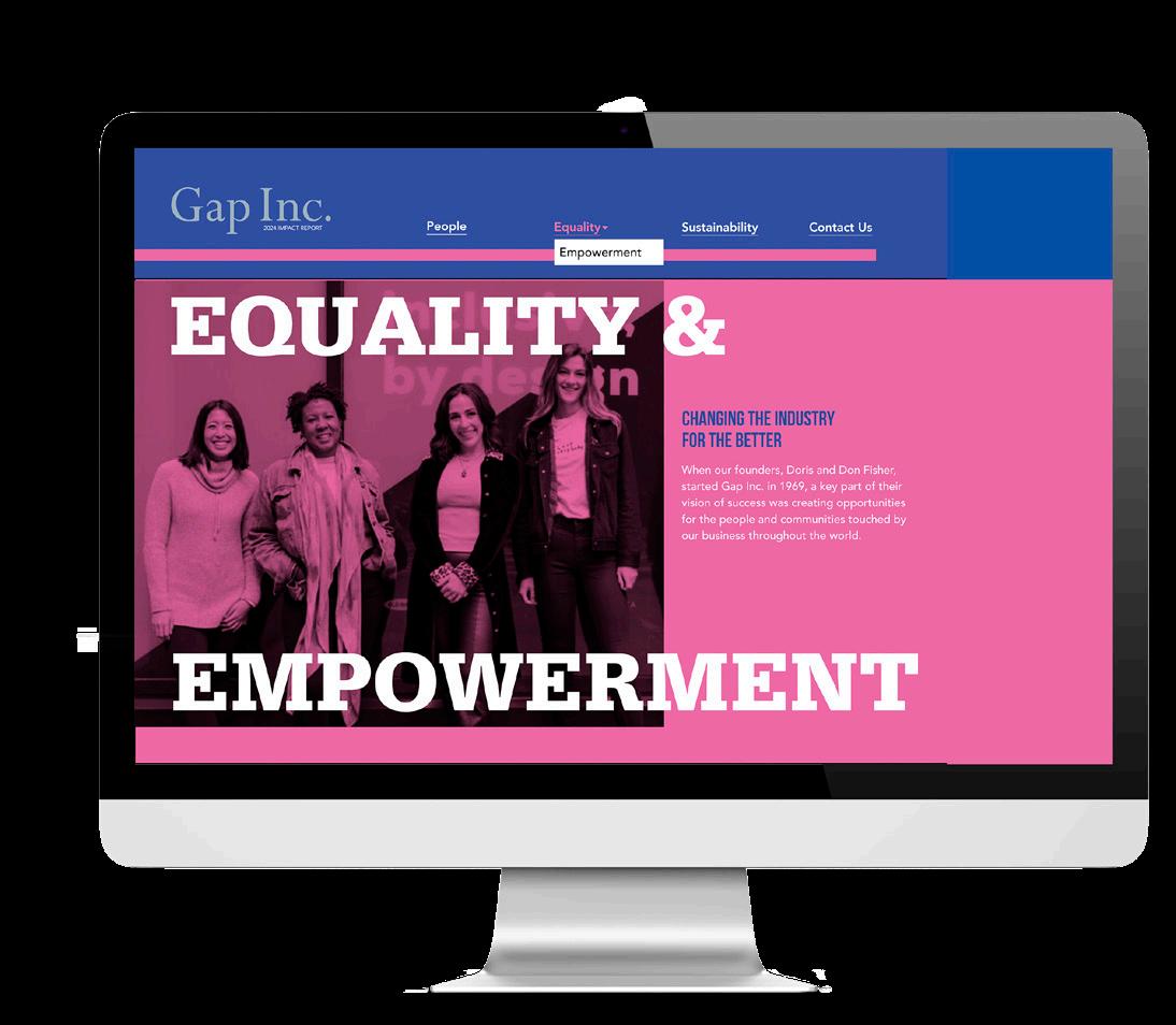
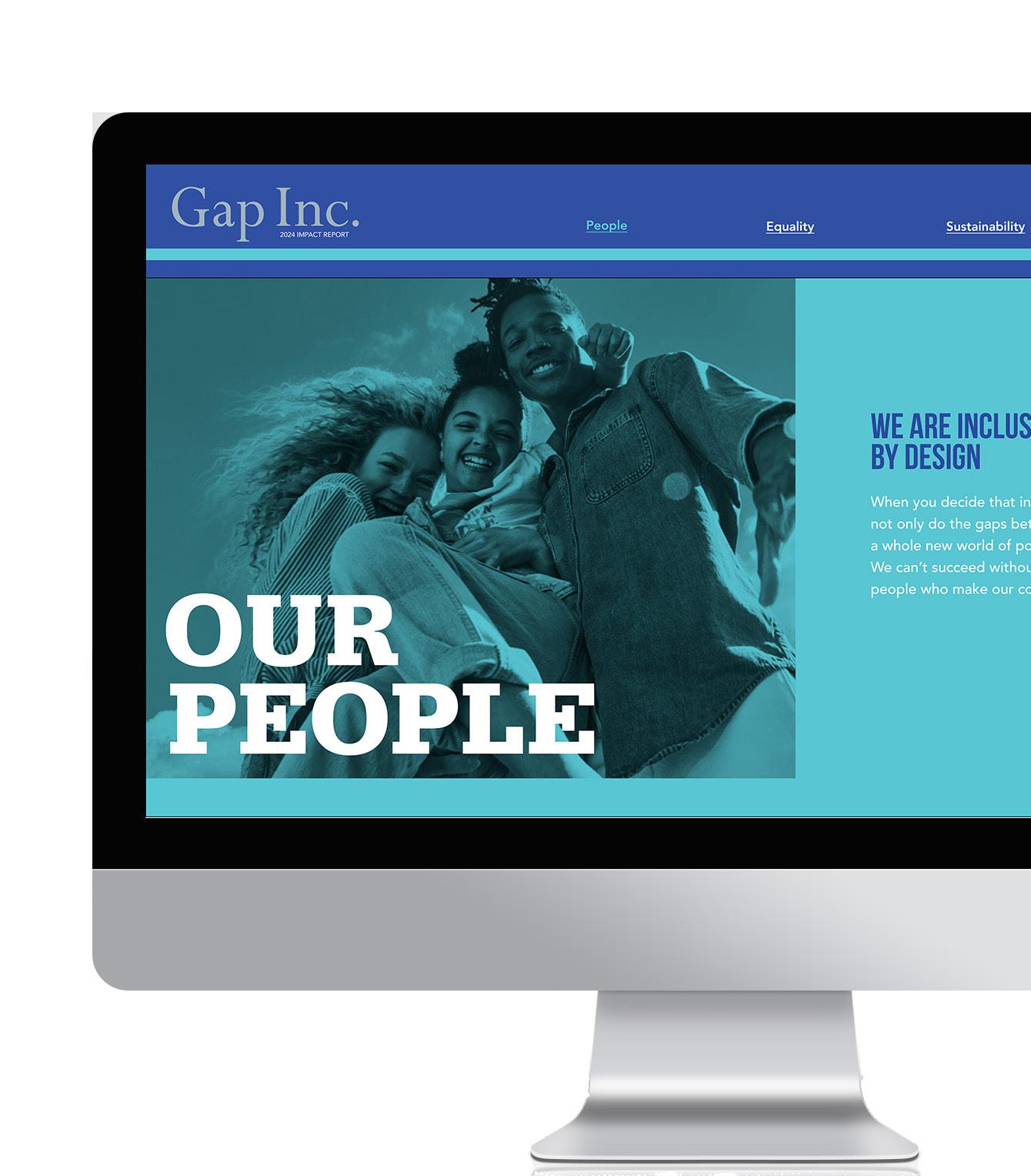
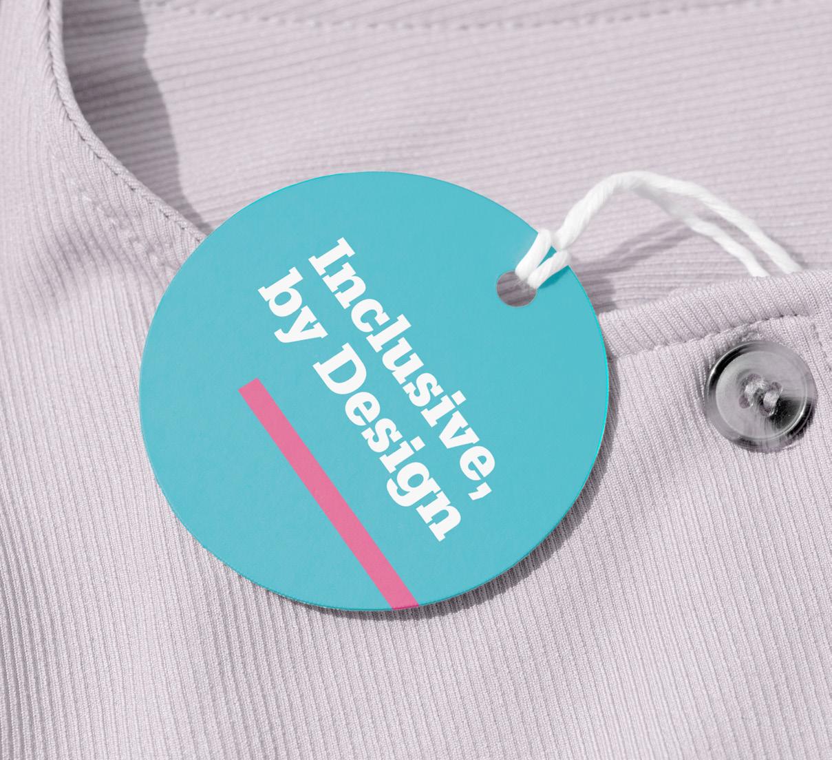
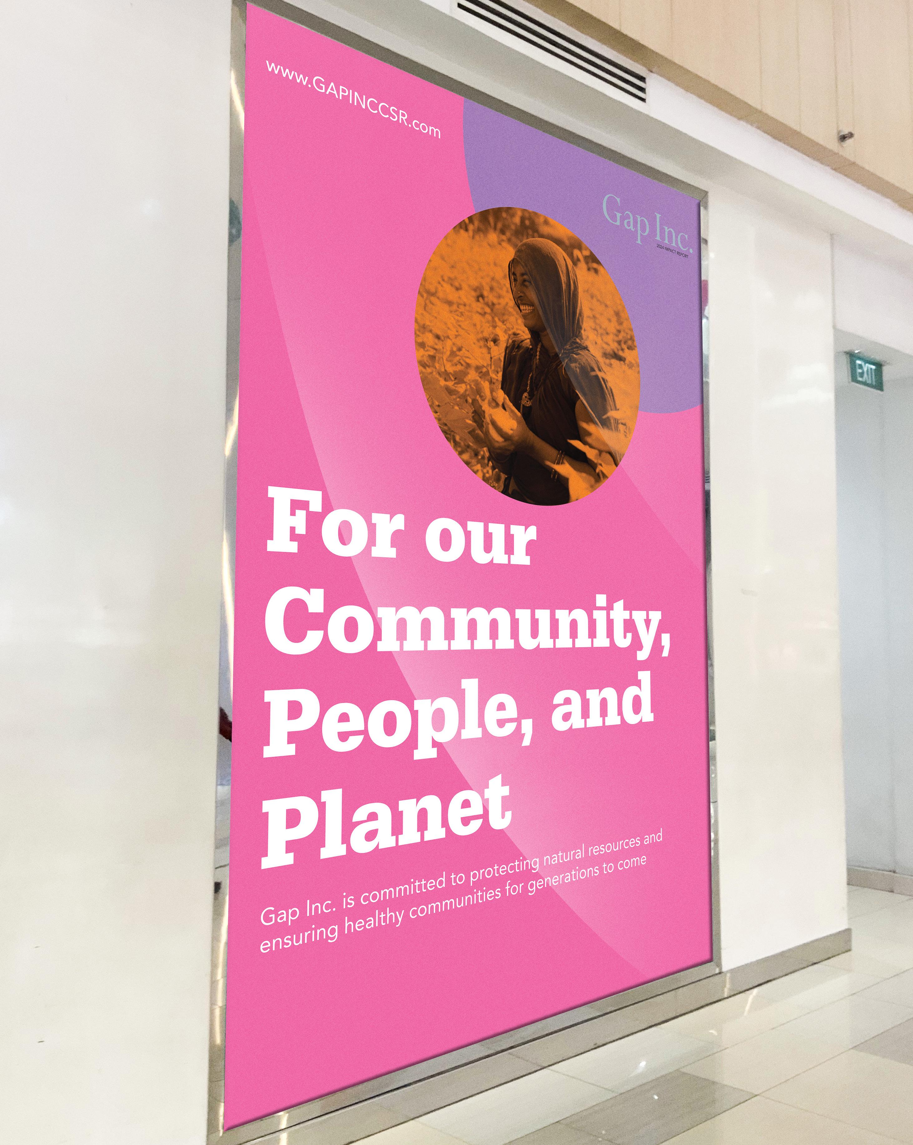
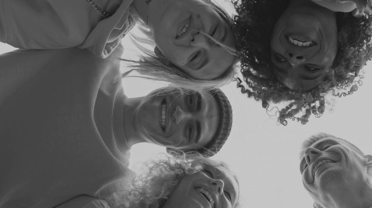
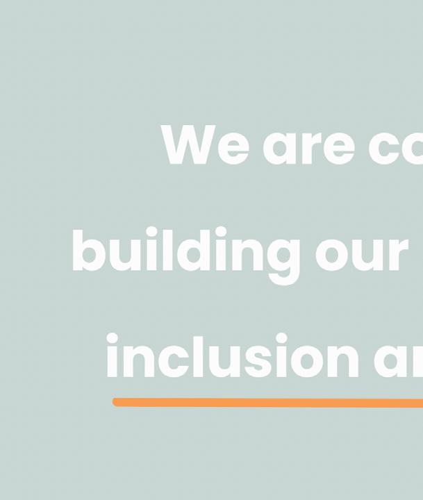
Unify, include, and bring awareness .
Intent
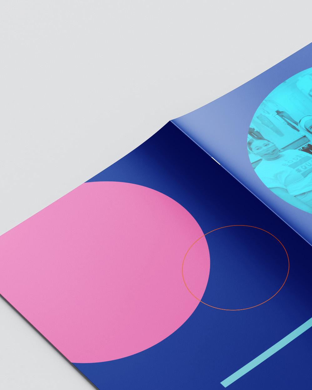
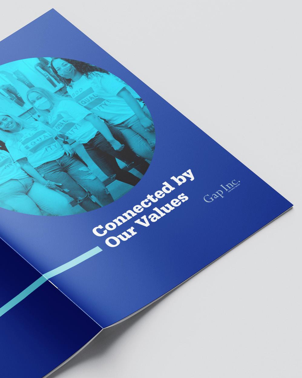
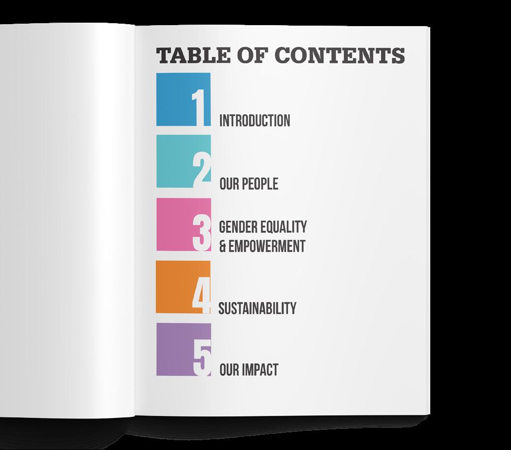
For this project, I combined my passion for fashion with Gap Inc.’s focus on sustainability, ethical practices, and empowering the community. My approach involved creating vibrant, clean, and impactful visuals that reflect the brand’s CSR values, emphasizing environmental consciousness, community support, and diversity. Through thoughtful design, I aimed to inspire the audience to engage with Gap’s amazing mission, while maintaining a balance between meaningful storytelling and fashion-forward aesthetics.


7
6 8
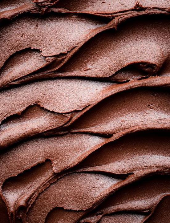
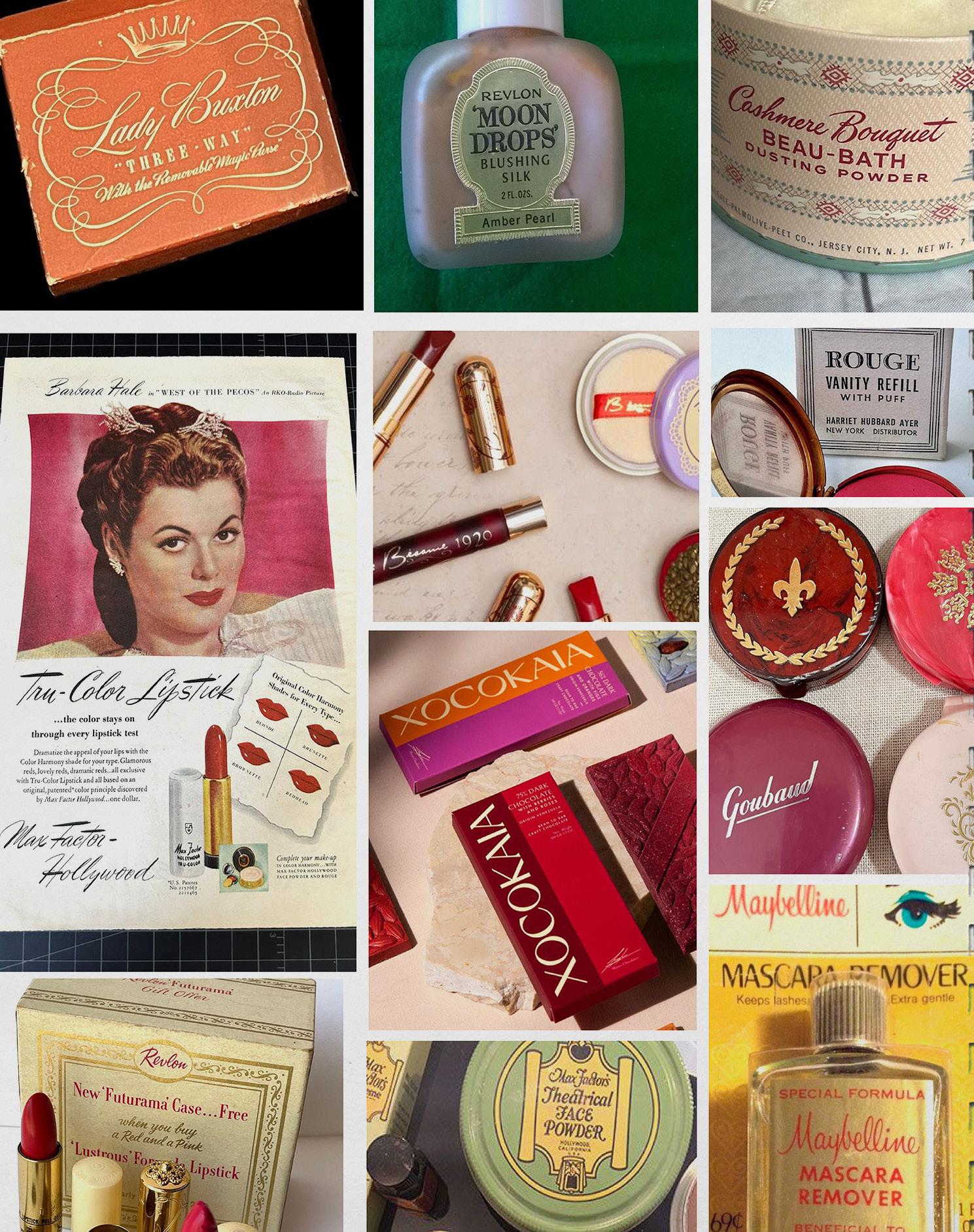
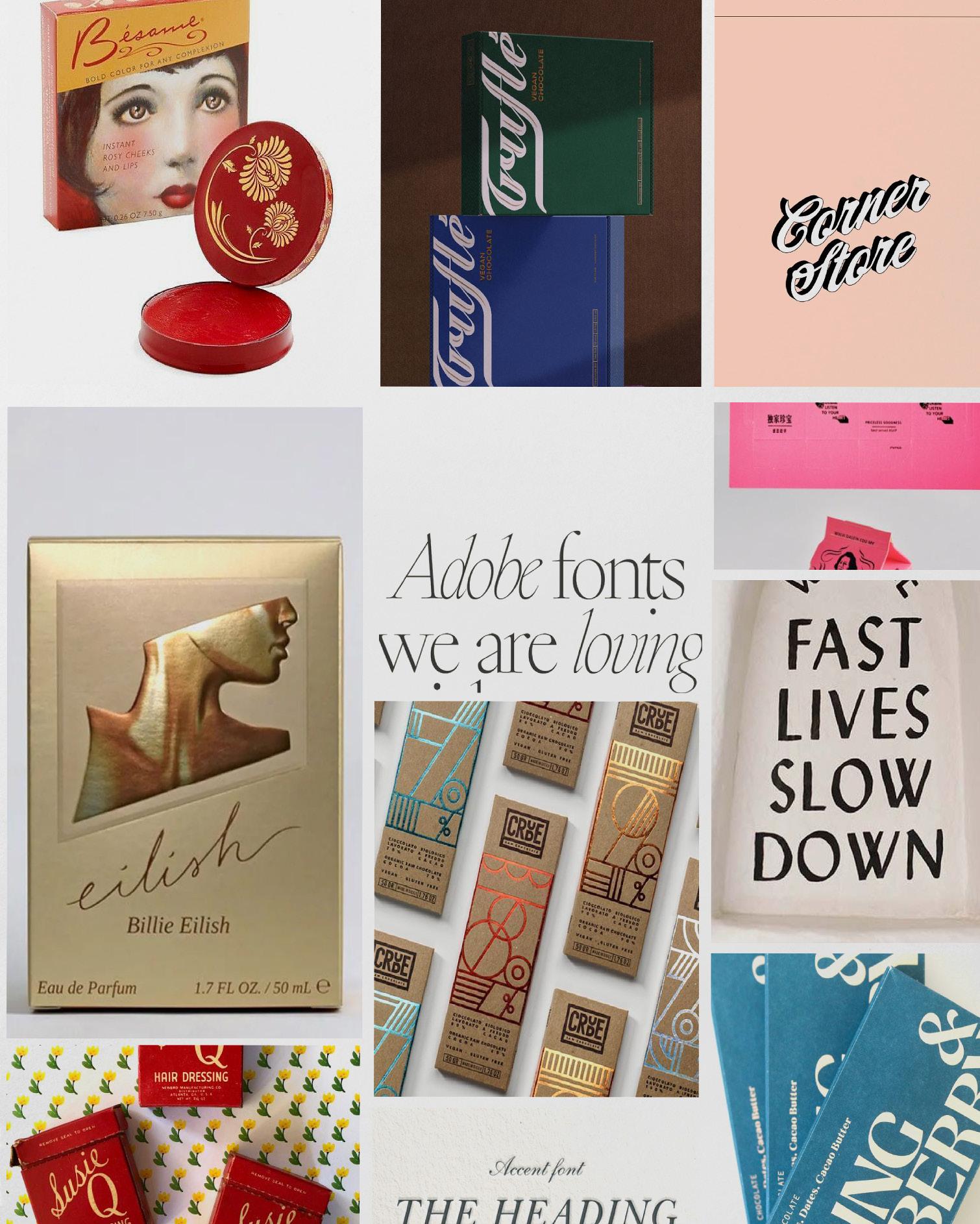
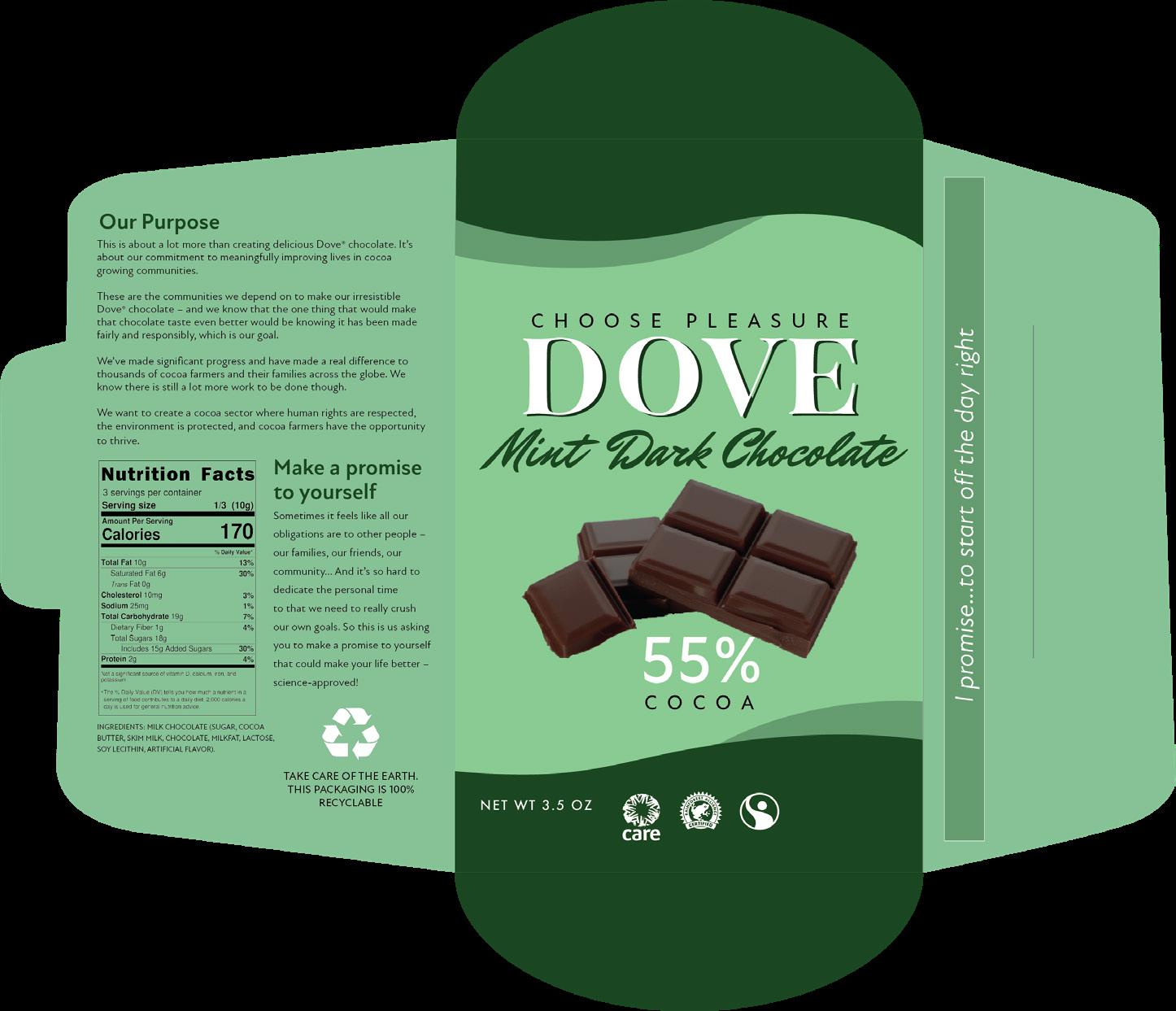
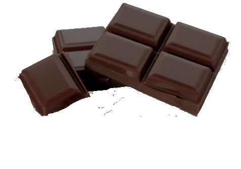
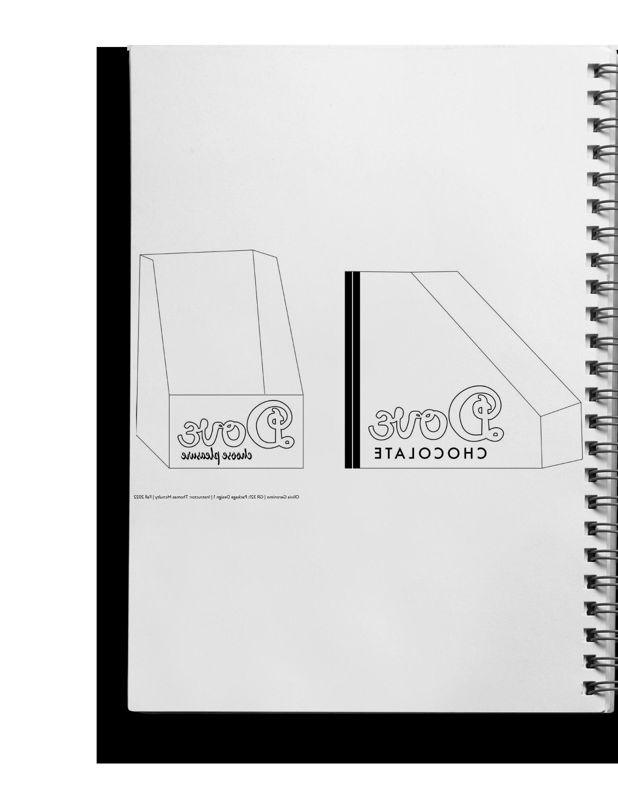
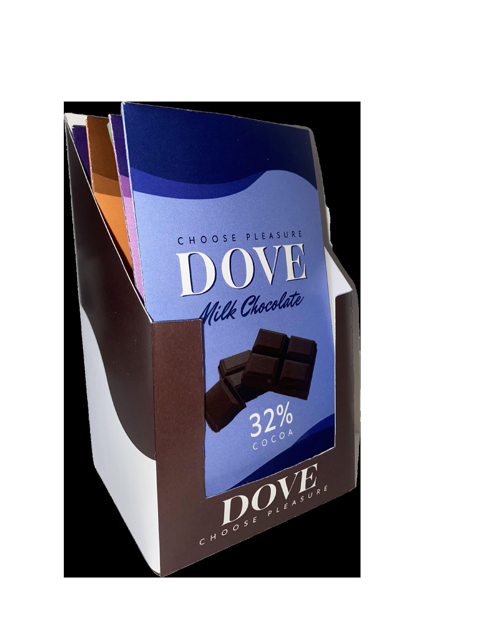
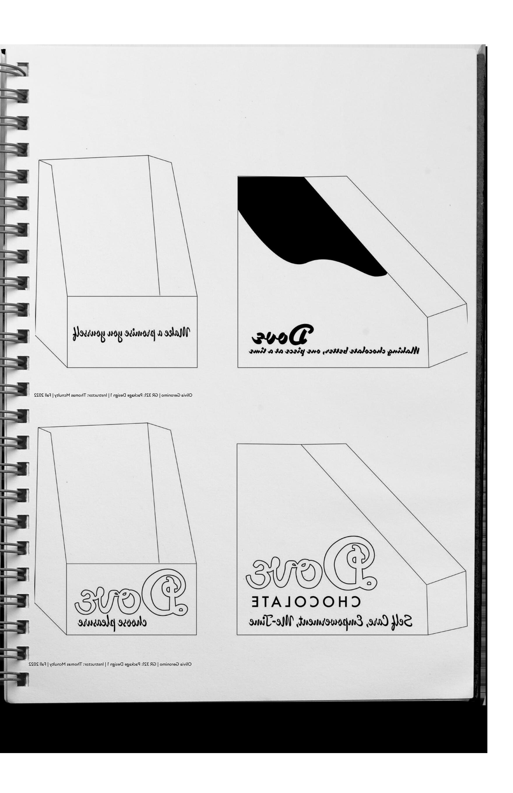
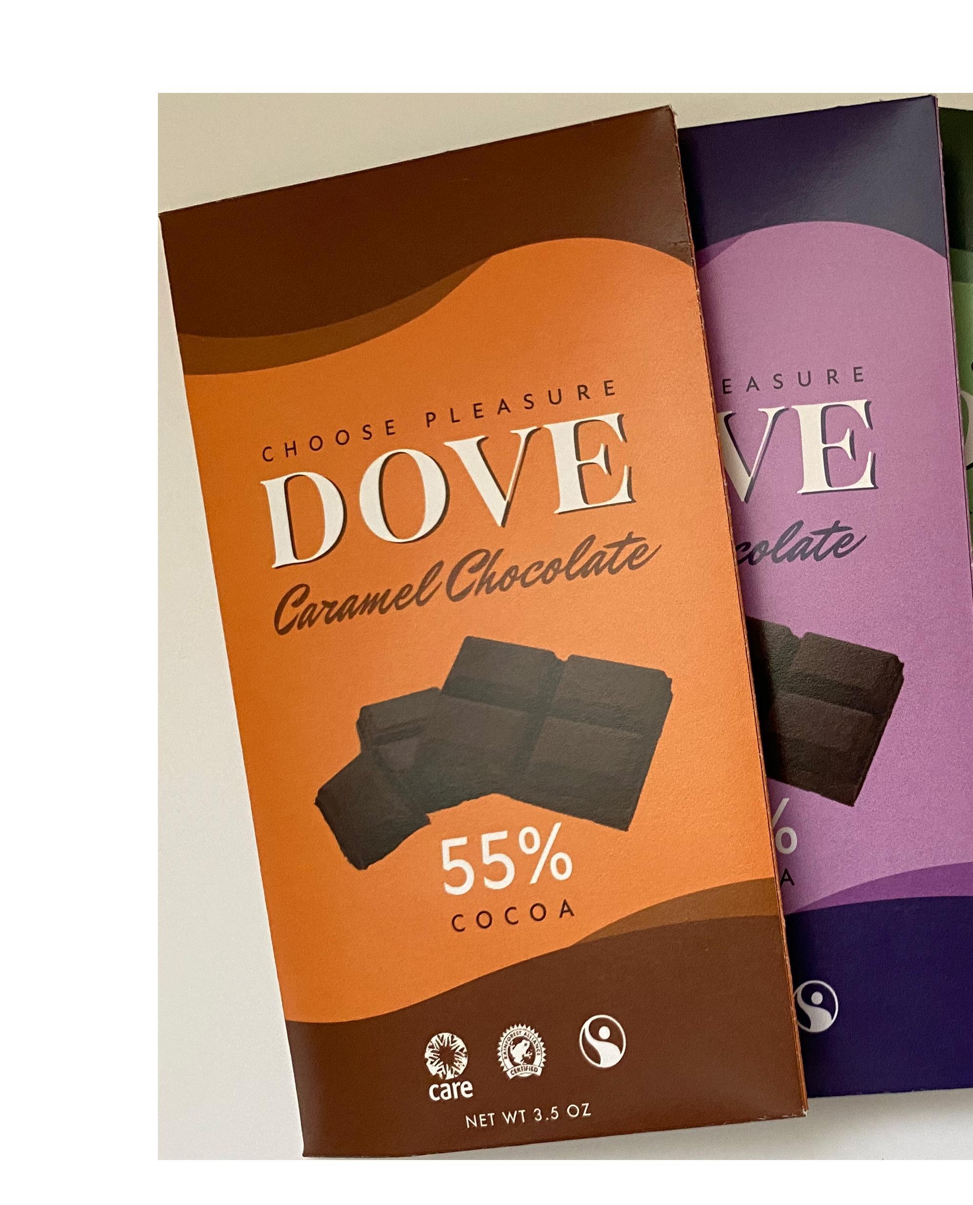
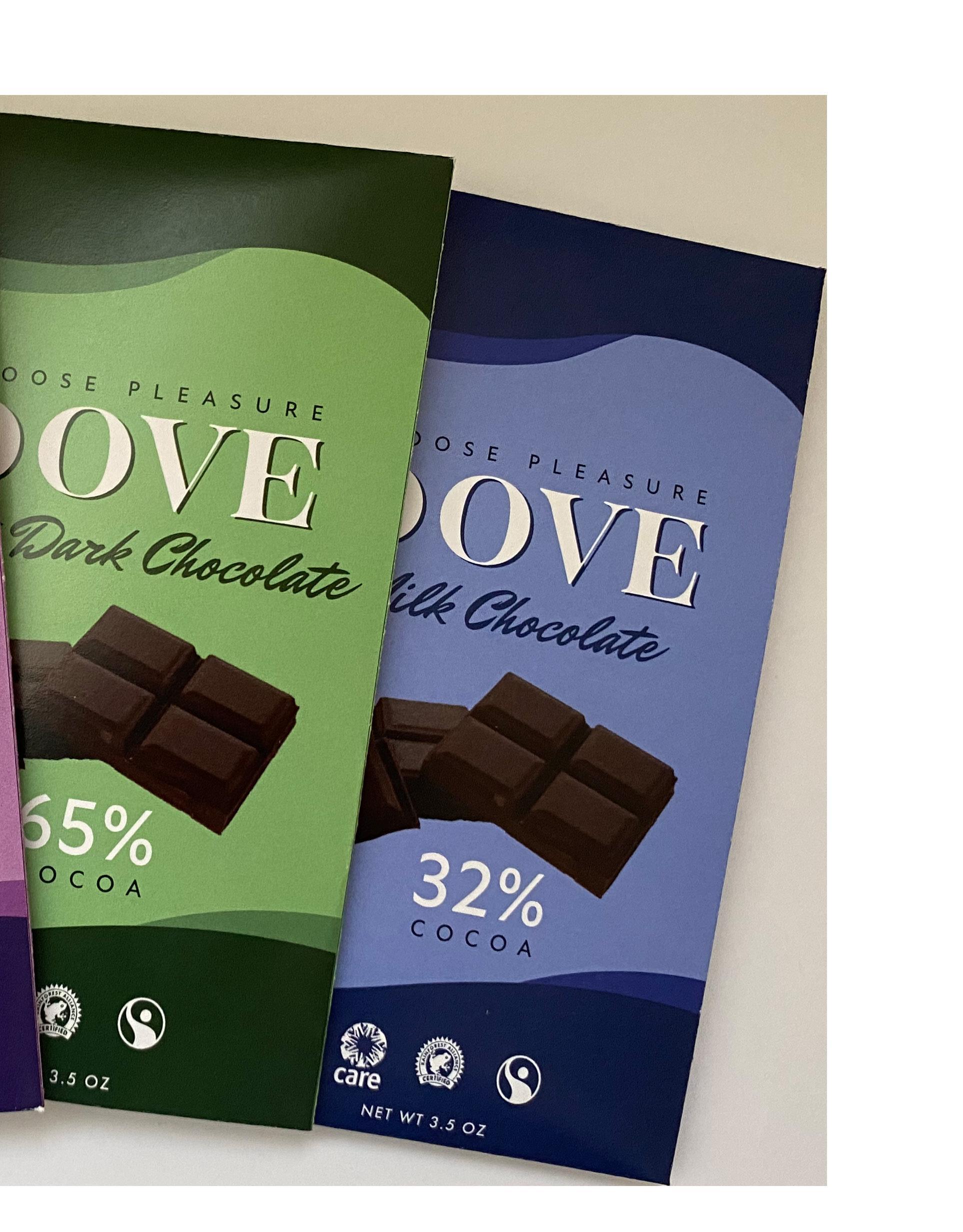
Pleasure, self-care, luxury, and decadence .
Intent
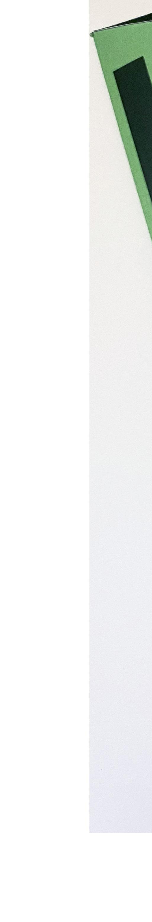
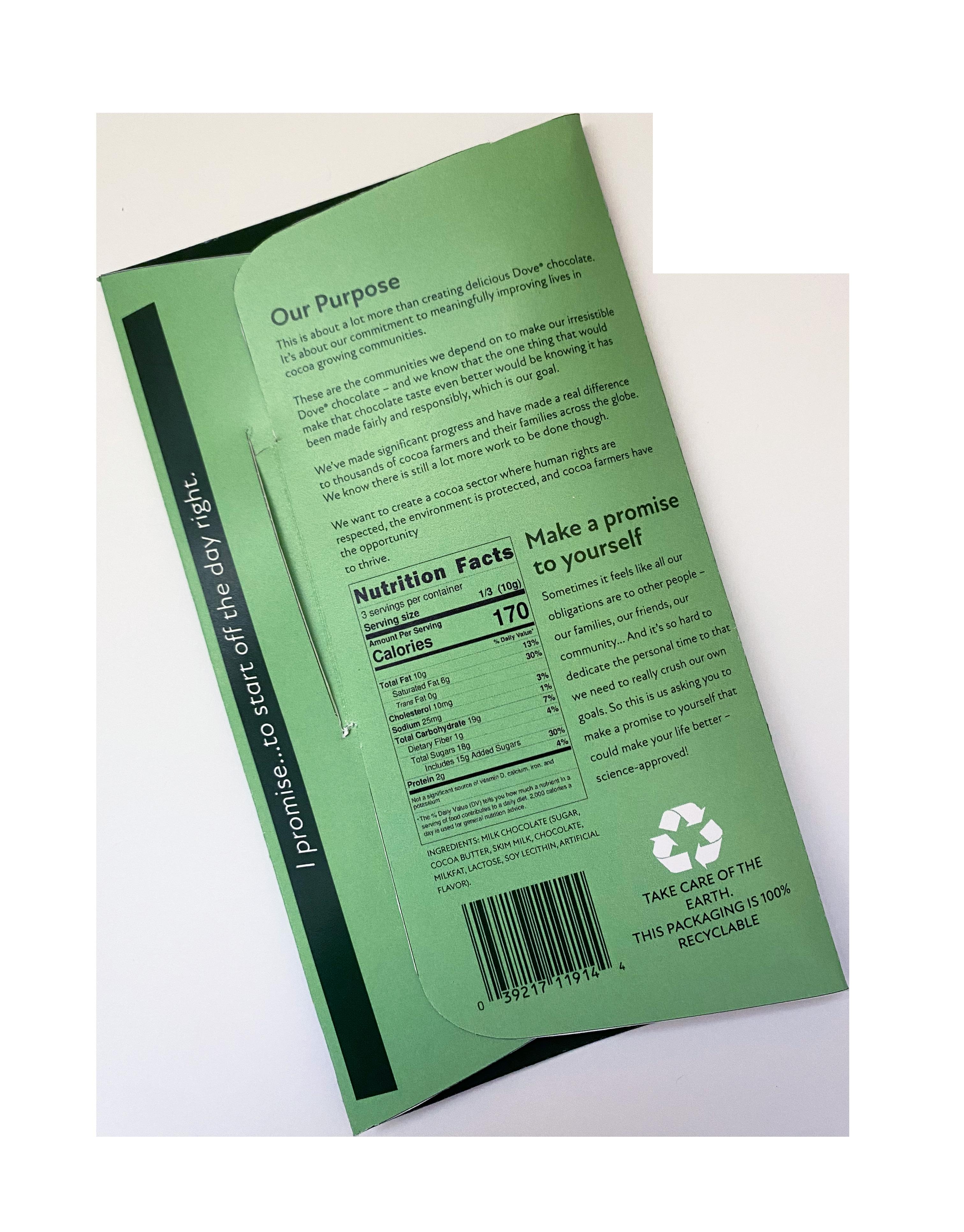
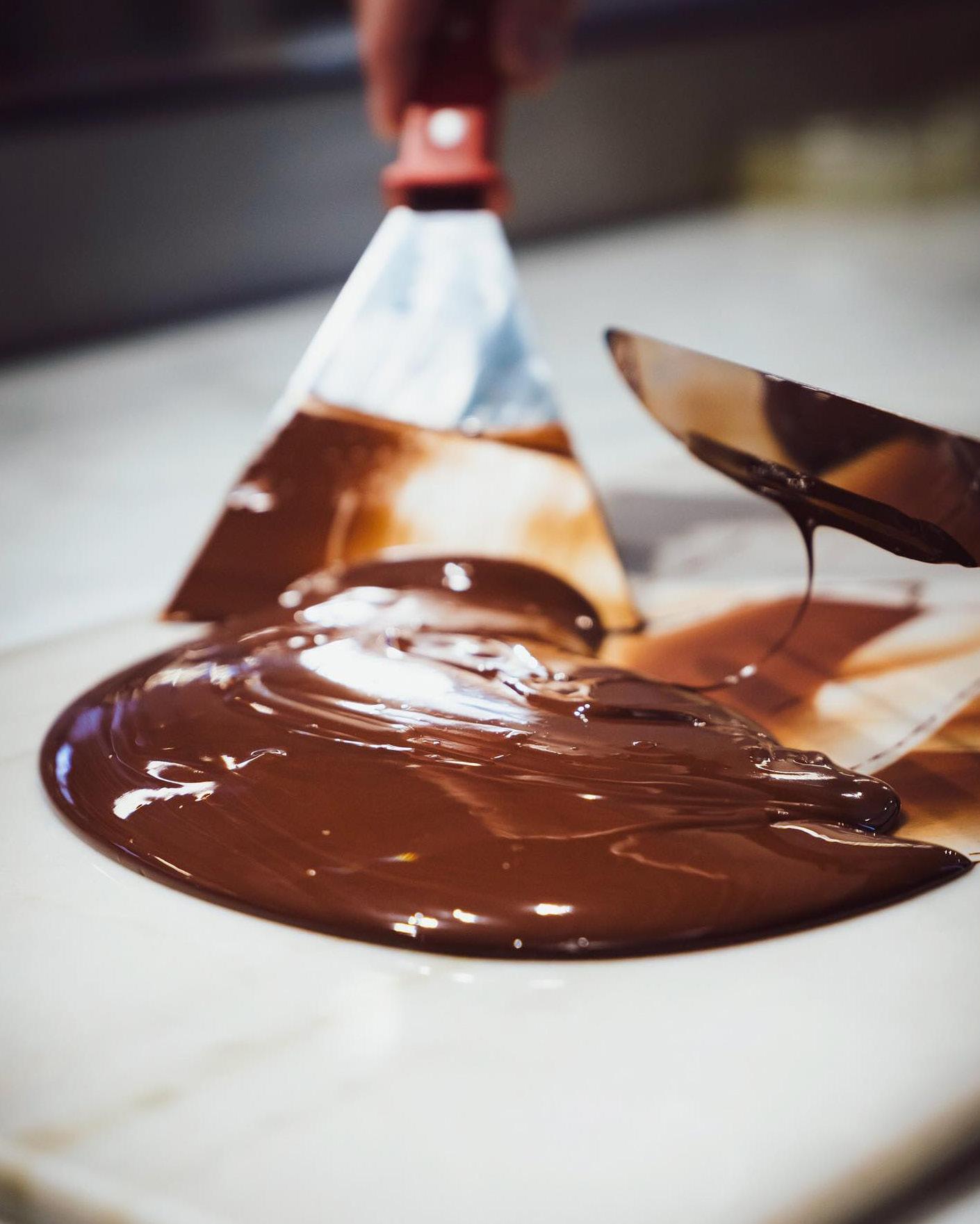
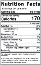
For my Dove chocolate bar repackaging project, I began by researching Dove’s target audience—women who value self-care, luxury, relaxation, and pleasure.
Inspired by the way makeup symbolizes self-care and luxury, I explored 1940s makeup packaging, which felt fitting since Dove was founded in the 40s. This timeless style informs my design, creating a nostalgic yet refreshing connection to Dove’s message of indulgent self-care.
Project Name
Dove Chocolate Repackaging
Course
Packaging Design 1
Semester
Fall 2022
Instructor
Thomas McNulty


8 7 9
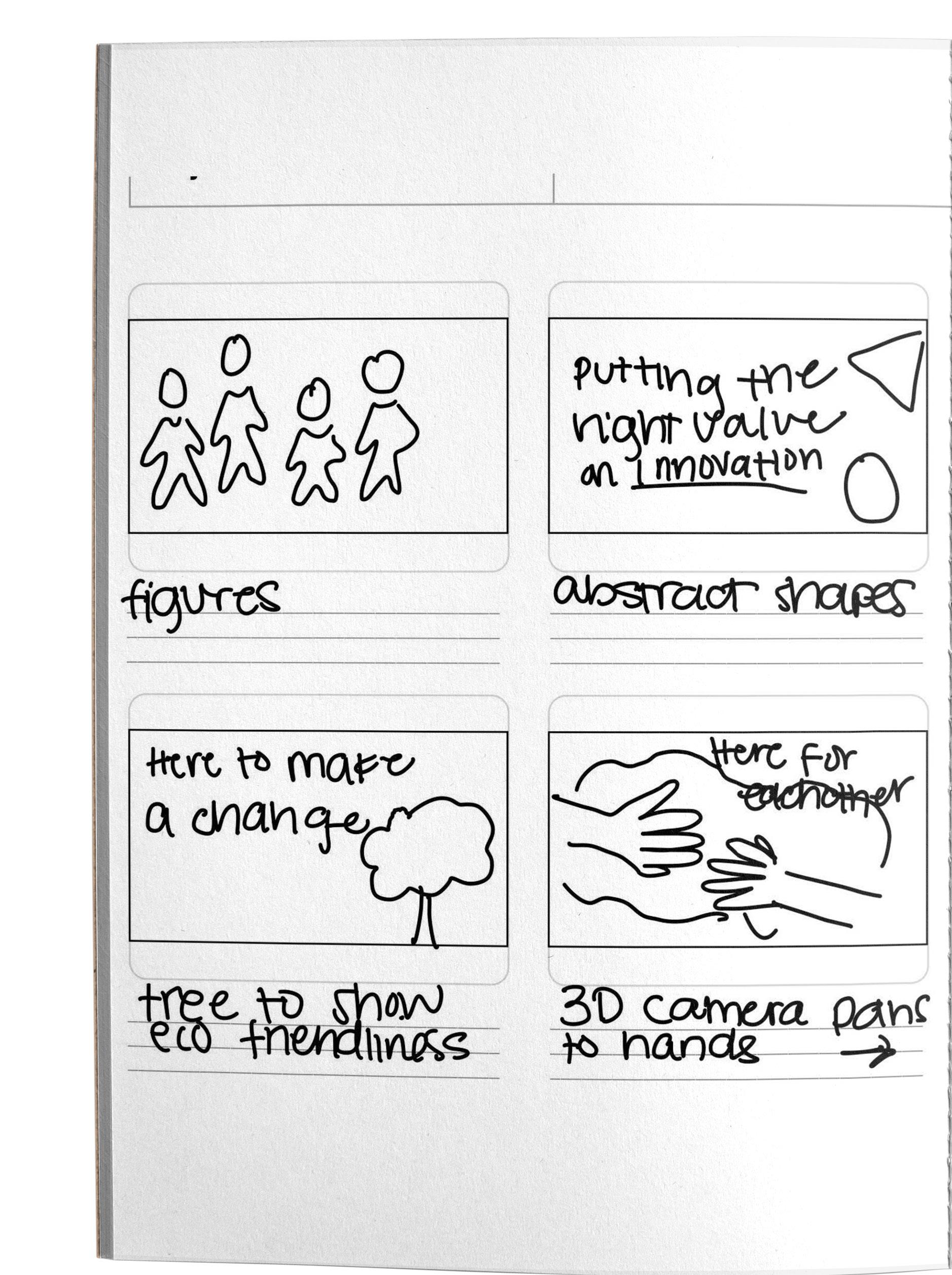
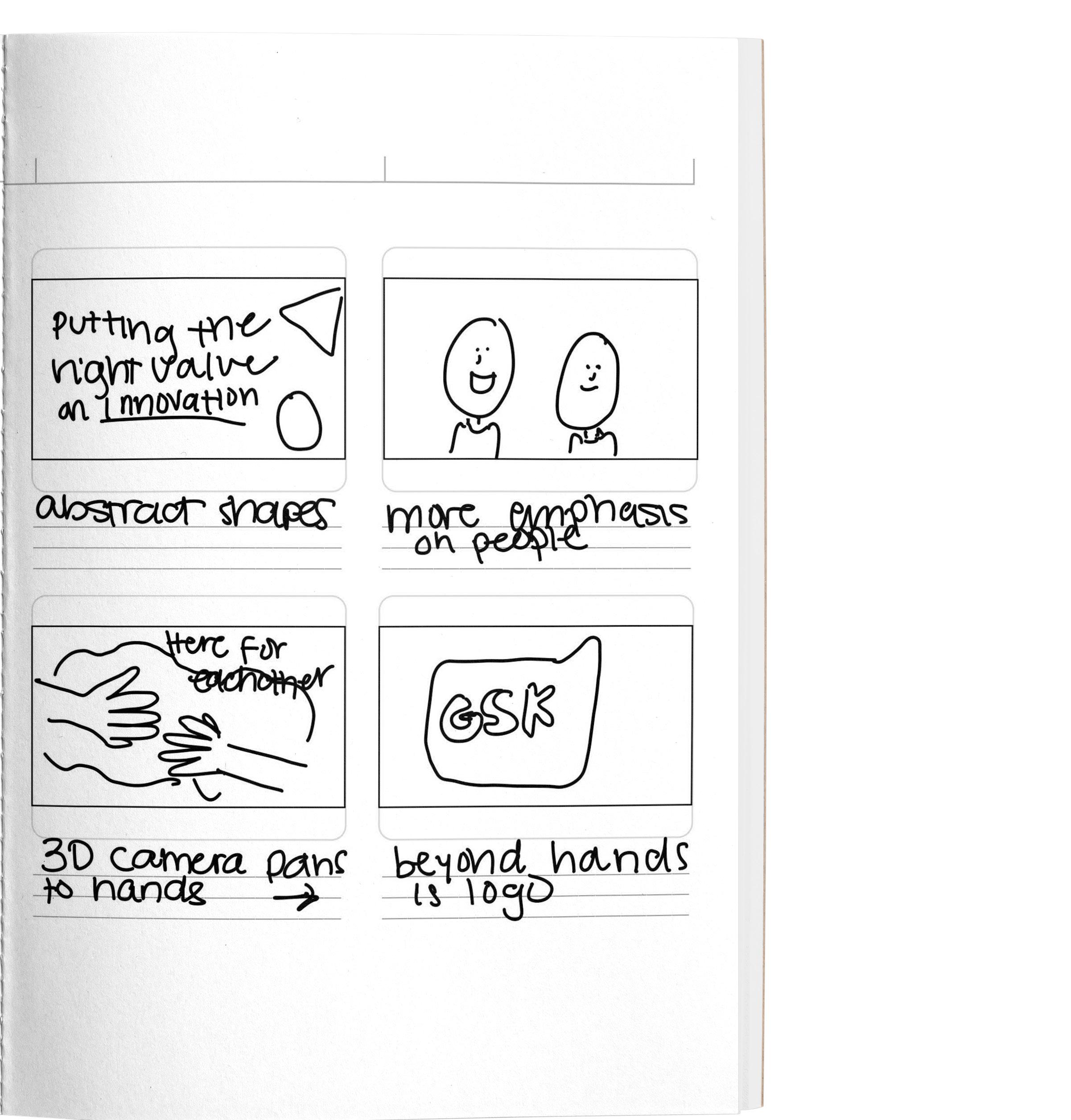
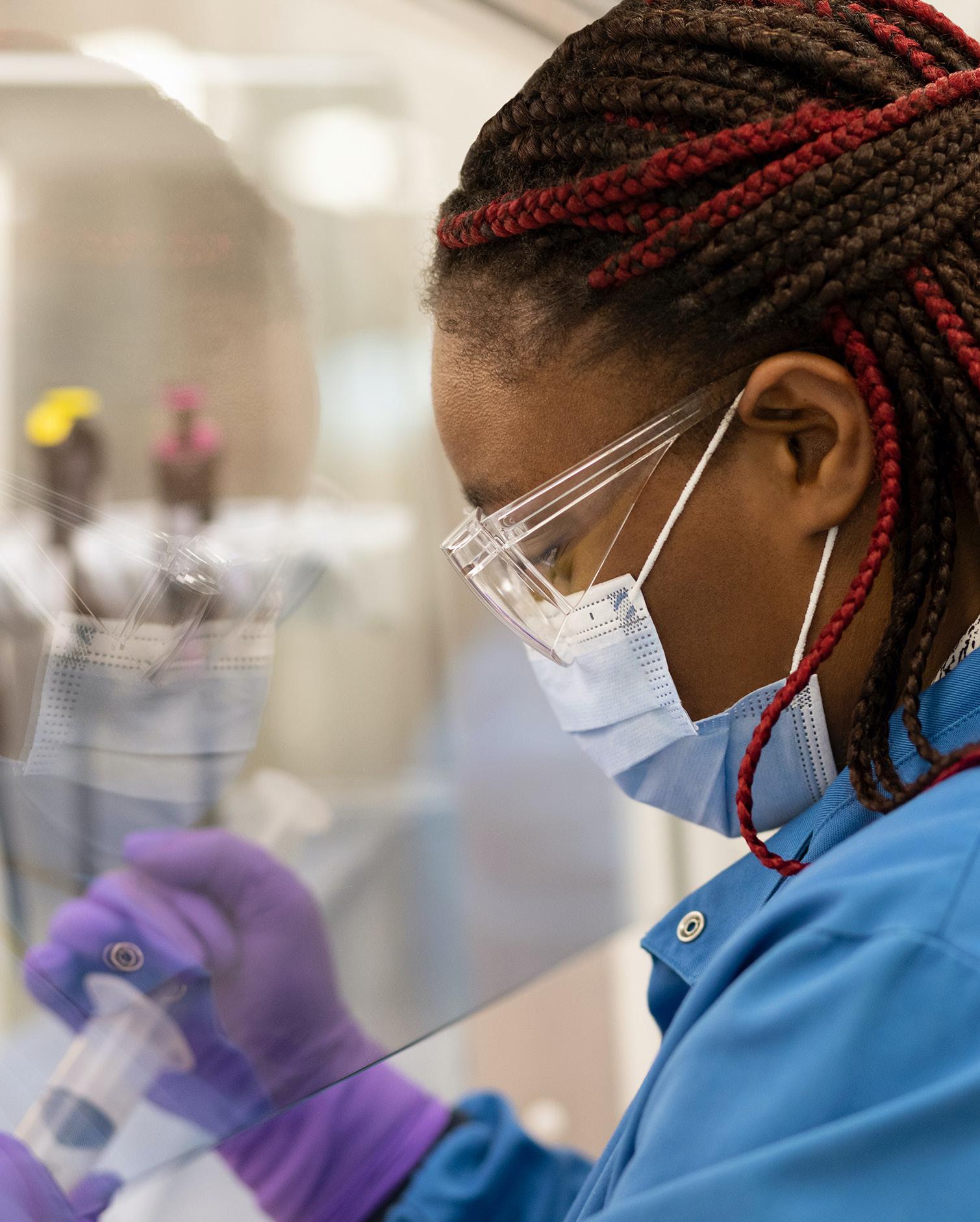
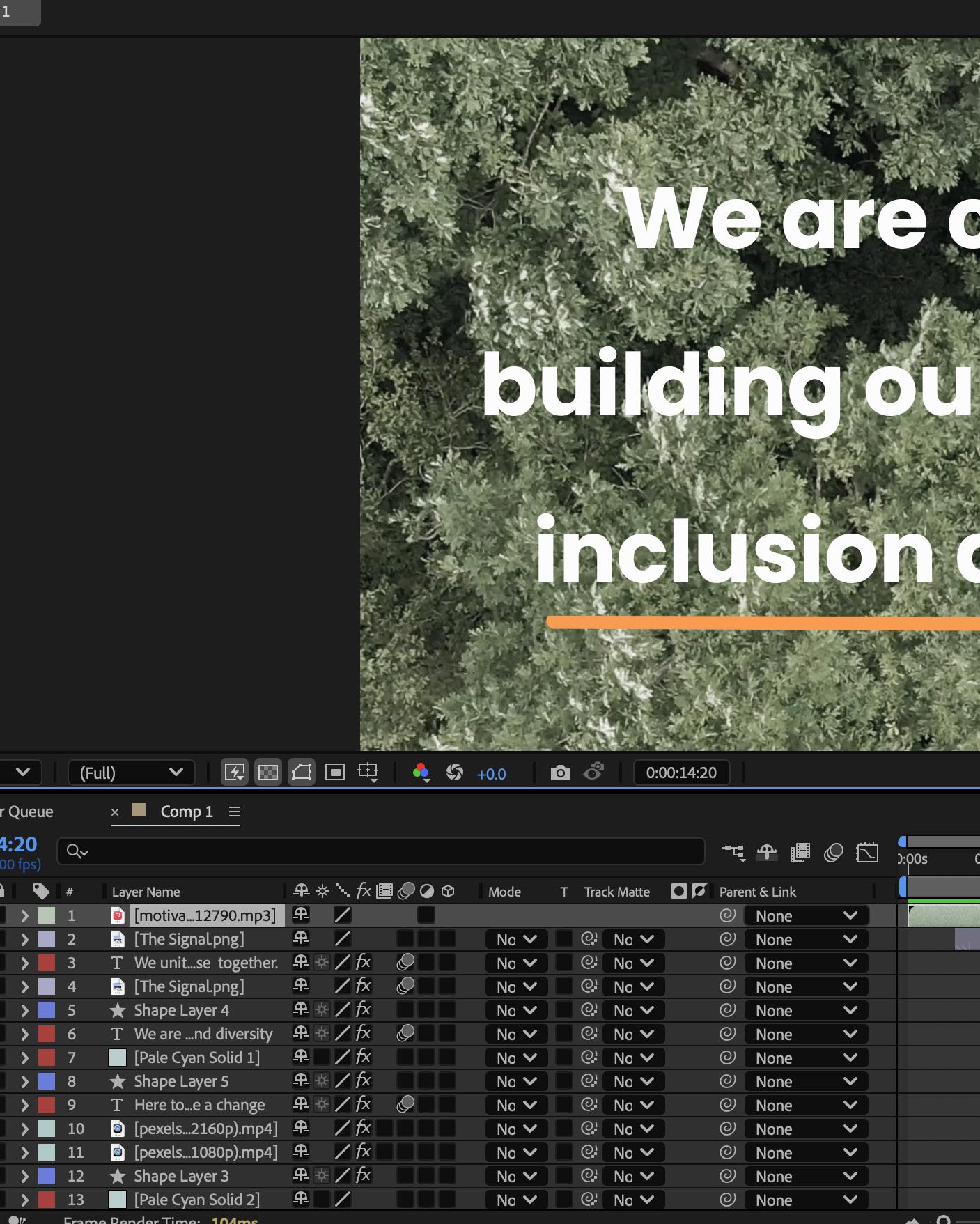
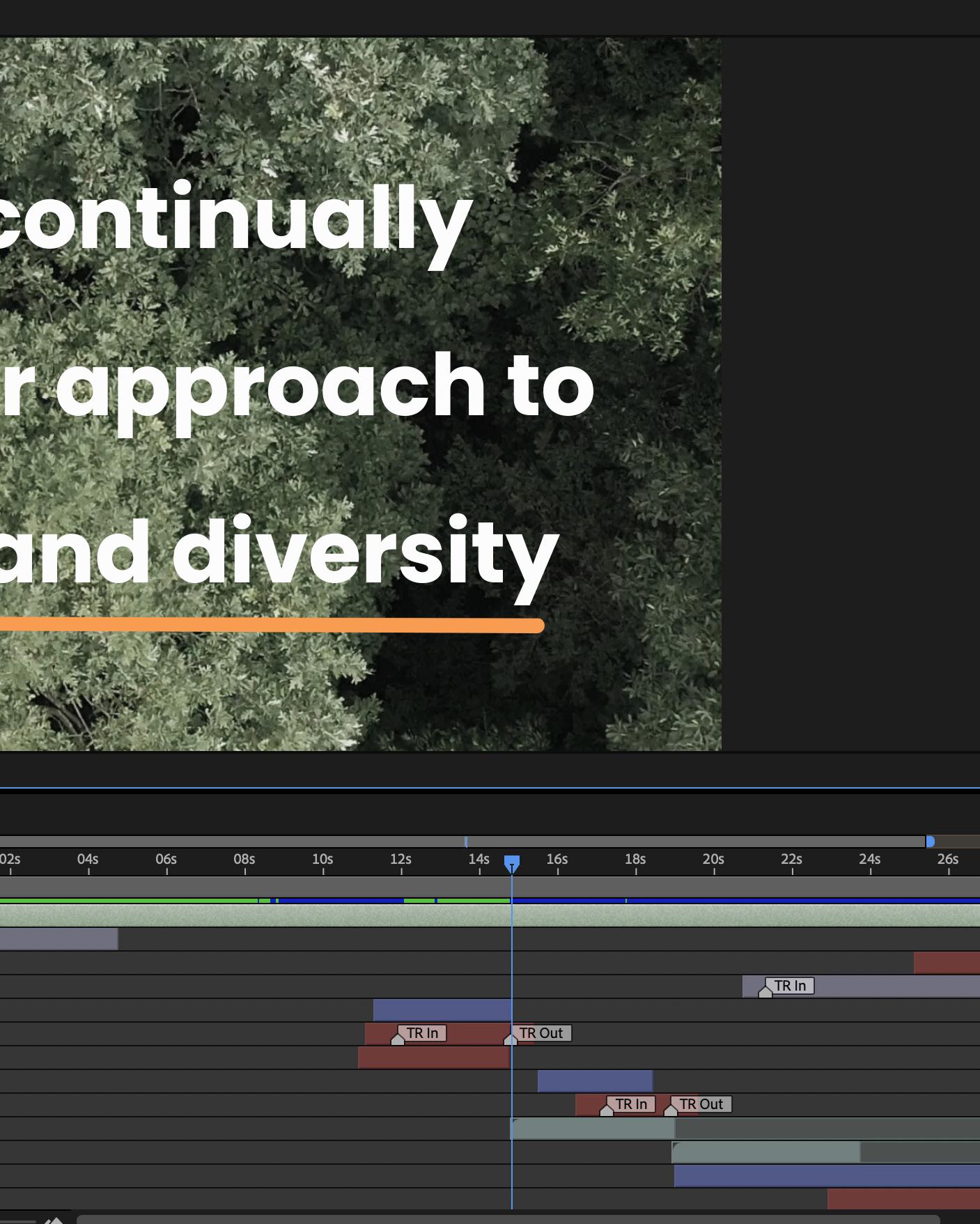
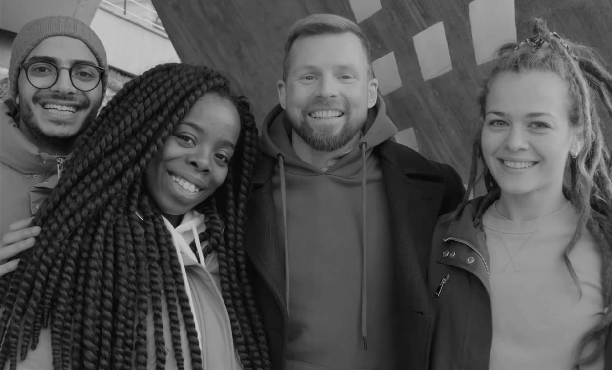
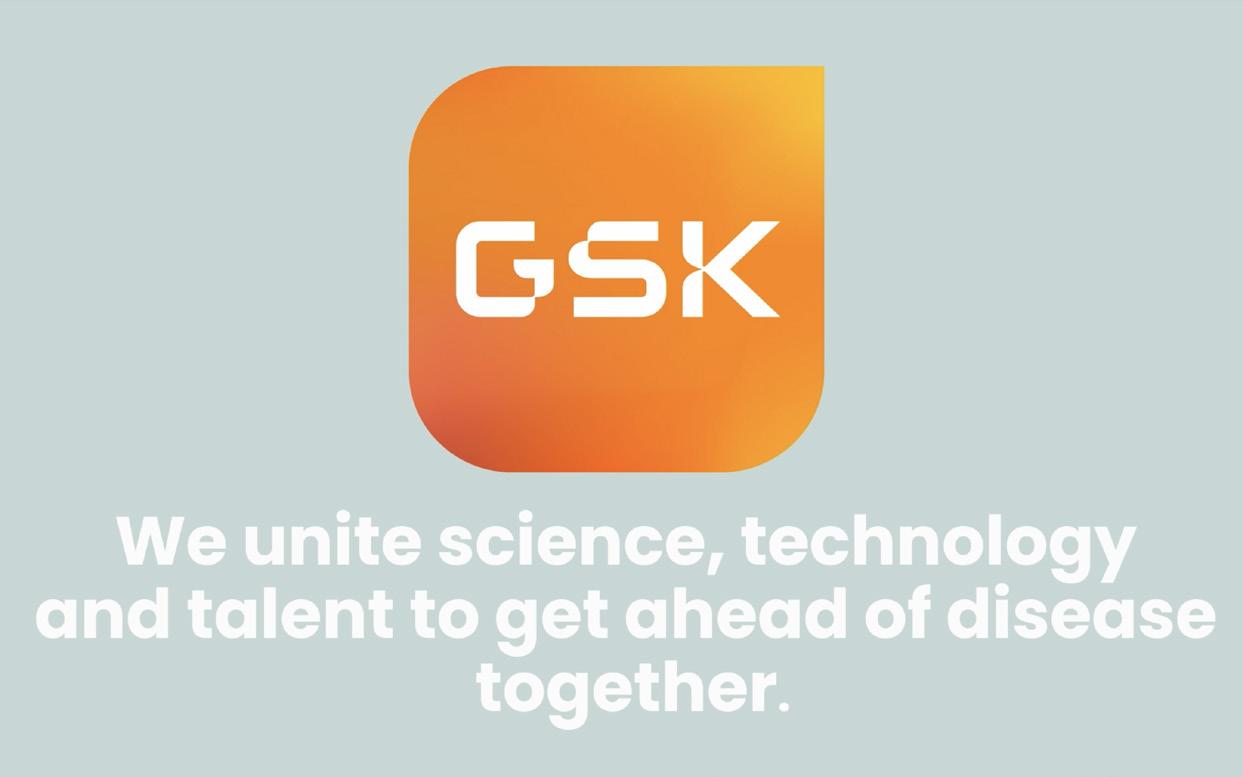
Illuminate, reframe, advocate, and engage .
Intent
In this project, I aimed to rebrand GSK by emphasizing its positive contributions to health and wellness amid its controversial reputation. I created a dynamic motion graphic that highlights the company’s commitment to innovation, patient care, and community support. Through engaging visuals and a compelling narrative, I sought to shift perceptions of GSK, showcasing its dedication to improving lives and fostering trust within the healthcare industry.
Project


8 10
9
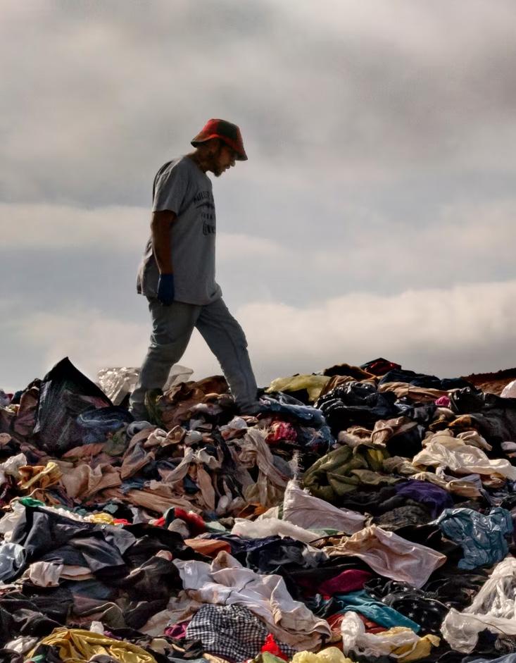
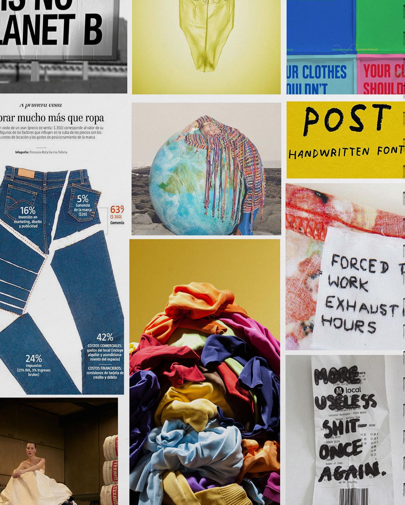
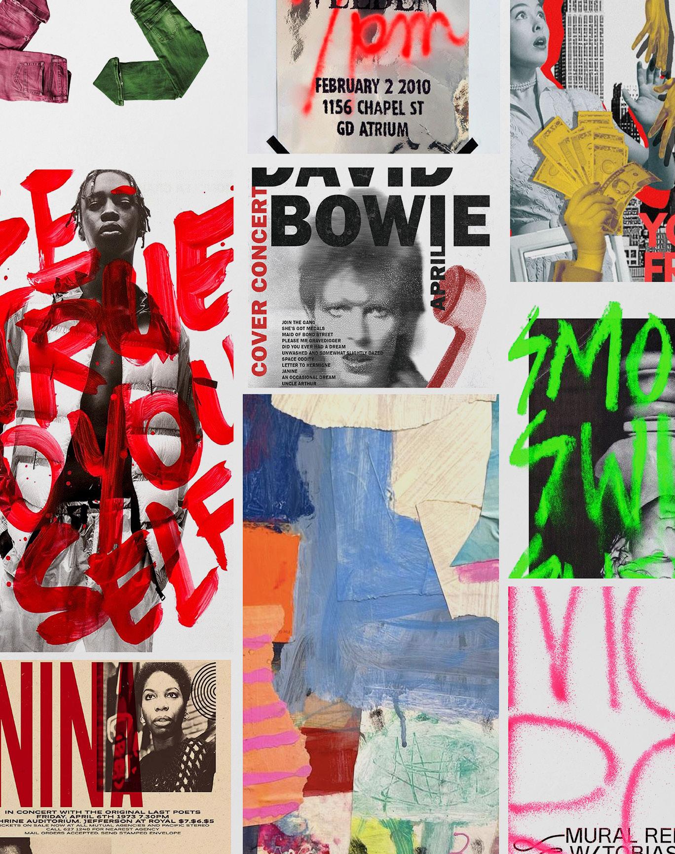
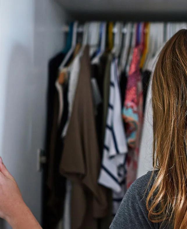
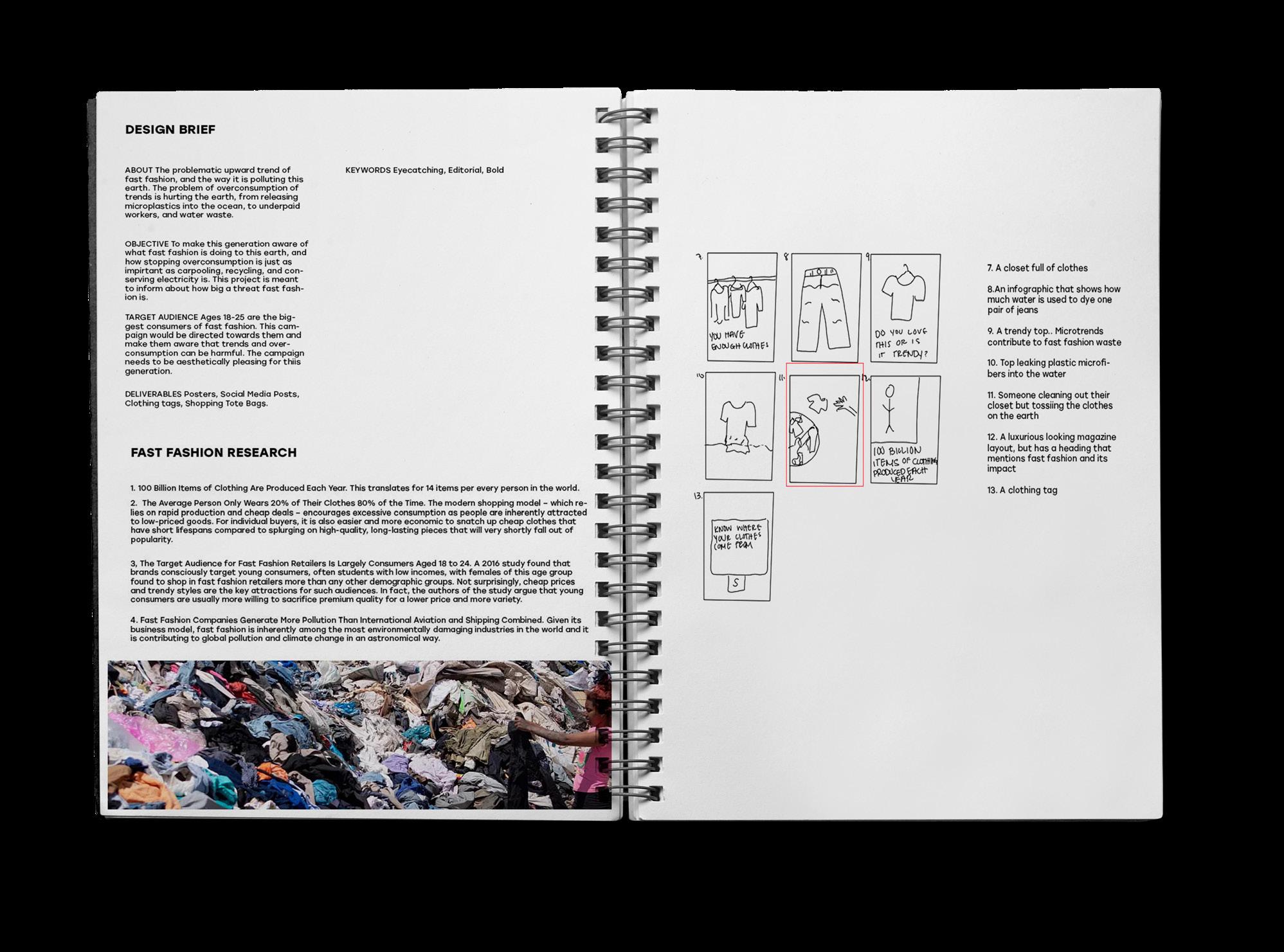
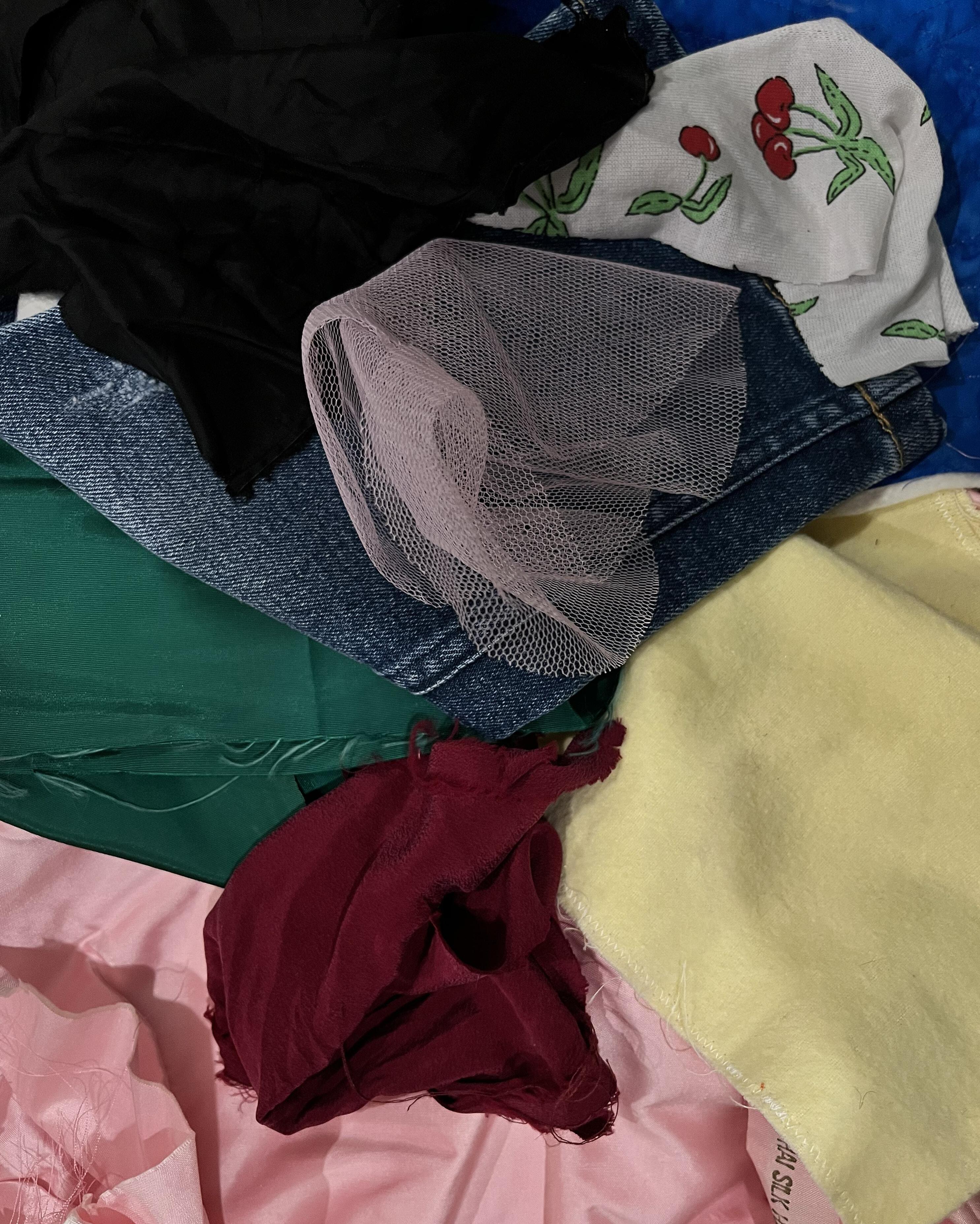
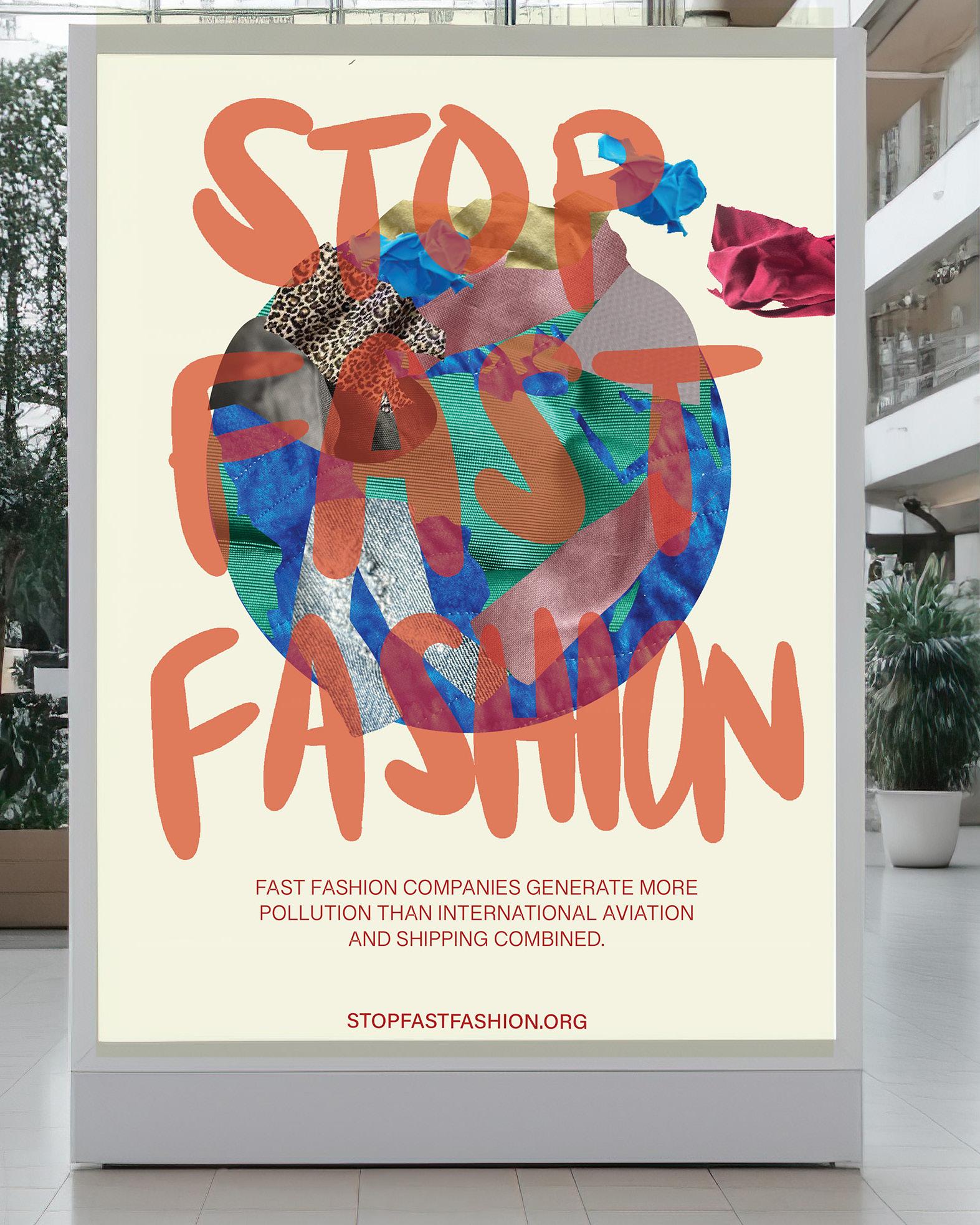
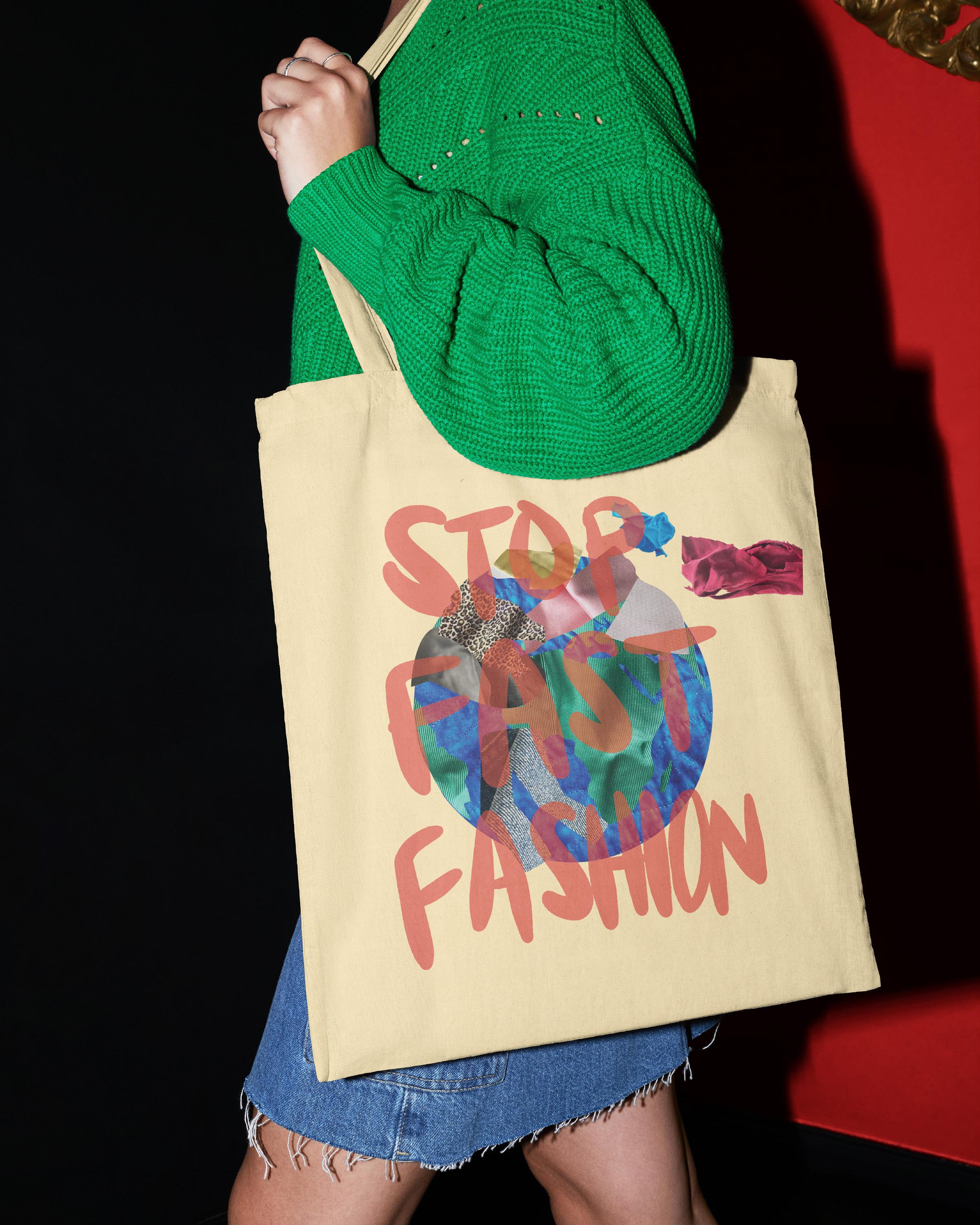
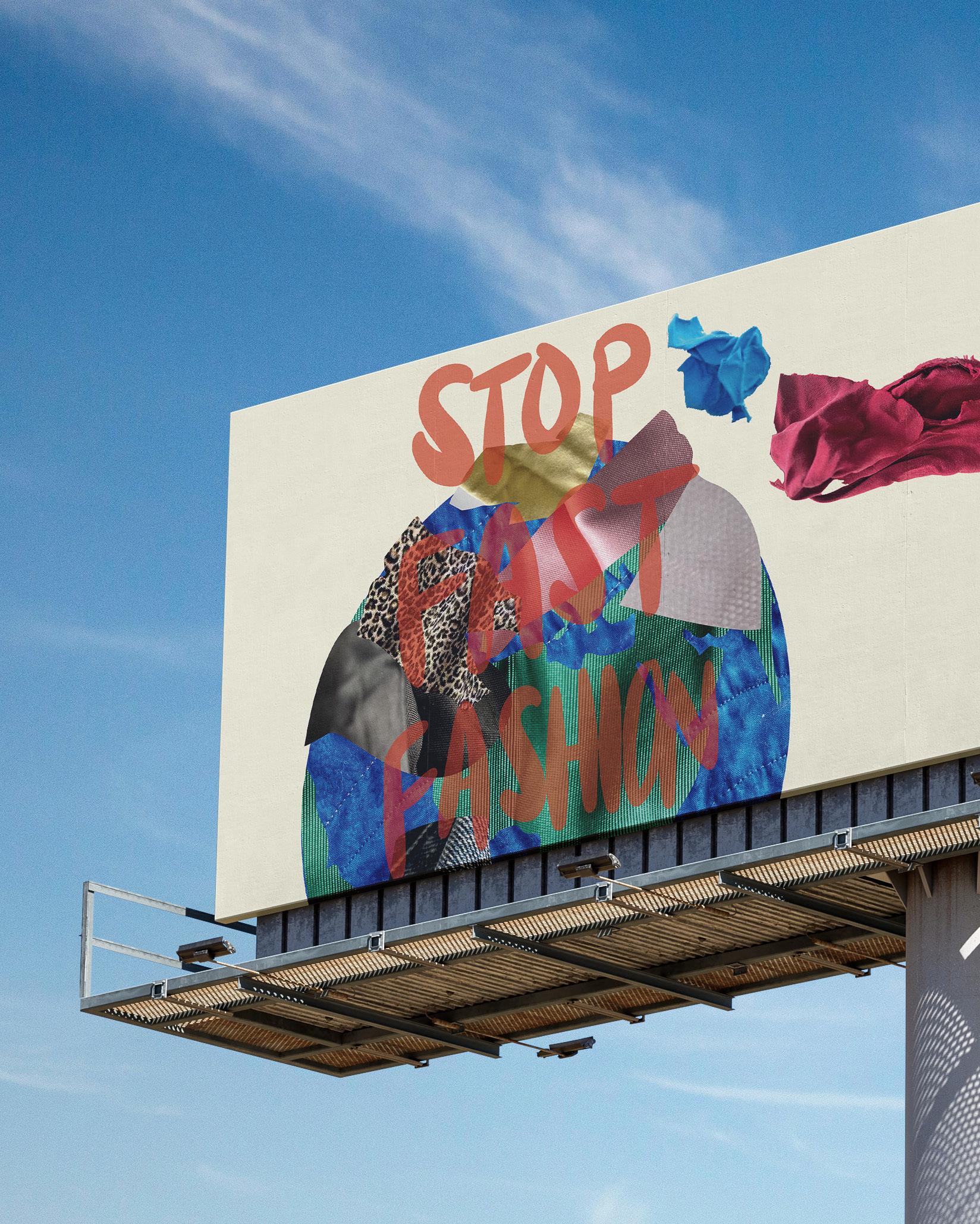
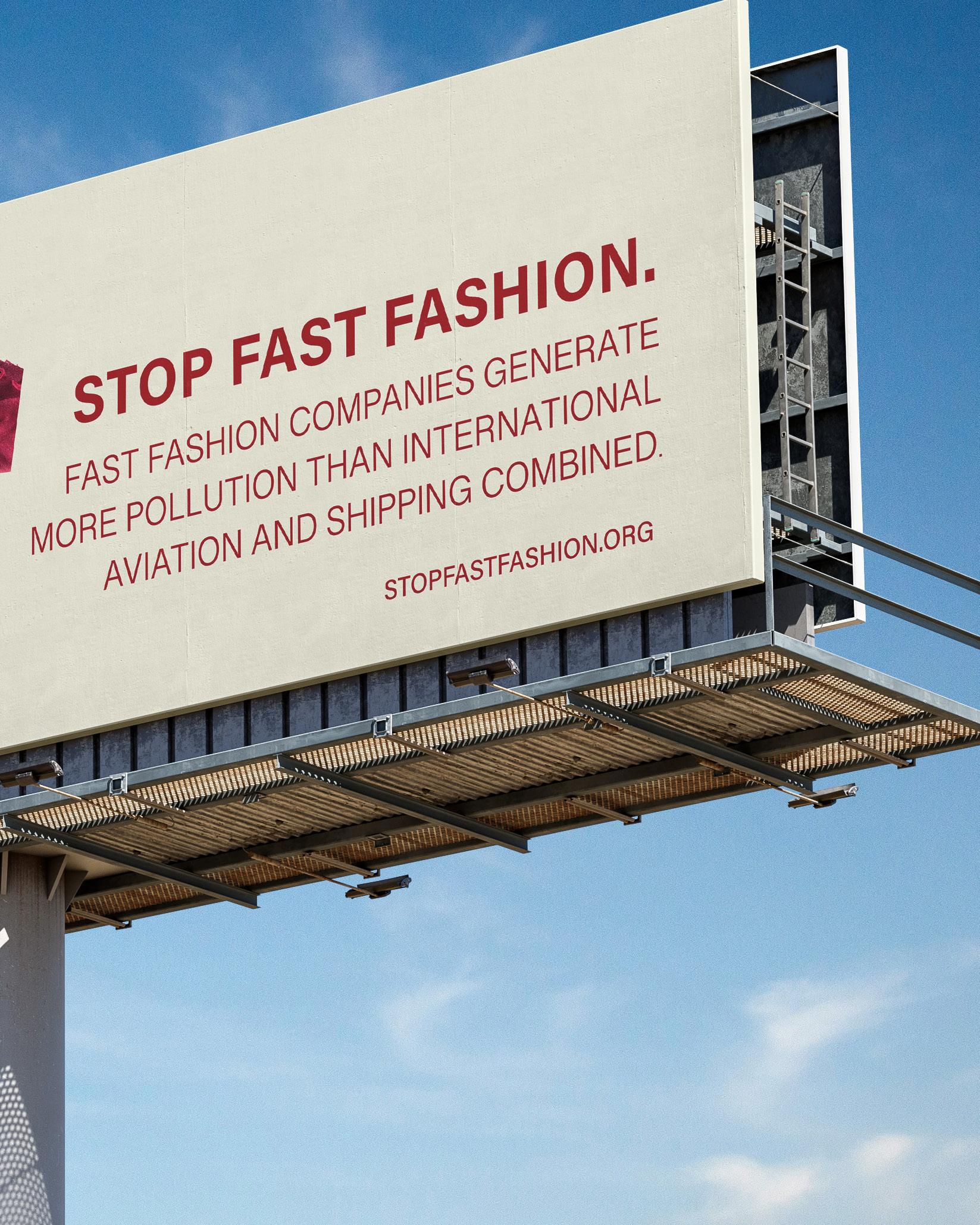
Impact, repurpose,and challenge .
Intent
In this project, I aimed to highlight the environmental impact of fast fashion through sustainable materials. Using fabric sourced from Scrap SF, a secondhand craft store, I created an Earth made from repurposed textiles to symbolize the burden of discarded fabrics. This design visually represents the waste generated by overconsumption and encourages viewers to reflect on the environmental costs of fast fashion and embrace more conscious consumption habits.

Thank you
To my family and friends
To the people who always pushed me forward and told me they were proud of me when I didn’t feel proud of myself. I am forever grateful to have surrounded myself with people who believed in me.
To my instructors
Thank you to Mary Scott, Peter Chun, David Hake, David Blankenship, Thomas McNulty, Troy Alders, Hunter Wimmer, and John Nettleton. I am grateful for your endless support. To Luna
Believe that you can do anything. Never be afraid to chase what you want in life. I will always be there to cheer you on. Always be yourself! I love you.
Colophon
Contact Information
Olivia Geronimo
+1 650 533 0576
olivia@oliviageronimo.com oliviageronimo.com
School Academy of Art University School of Graphic Design 79 New Montgomery Street San Francisco, CA
Major BFA, Graphic Design
Instructor
Mary Scott
Book Title
Sequential
Font Helvetica Neue
Printing and Binding blurb.com
Text and Cover Stock
Mohawk Superfine Eggshell 100# Text Hardcover, Image Wrap