
Home has a way of capturing the moments that make summer unforgettable—slow mornings, sunlit afternoons, and the simple pleasures that invite us to linger a little longer. In this issue ofNESTMagazine, we’re celebrating the beauty of summer at home, from breezy design ideas to the warm glow of everyday living.
You don’t need a getaway to feel the season’s magic. Sometimes it’s as simple as an open window, a welcoming porch, or a favorite corner caught in the golden hour I hope these pages inspire you to embrace the ease and brightness of the months ahead. And if you ever want help shaping a home that reflects what you love most, I’m always just a call or text away.

4
Editor’s Note
Let’s take a collective beat and relish in the easy, breezy, lazy days of summer.
5 Ask a Nester
We asked our esteemed panel of agents and brokers: How Do You Summer? Read on to see if you will have FOMO, or be inspired to set the bar even higher. HOME
30
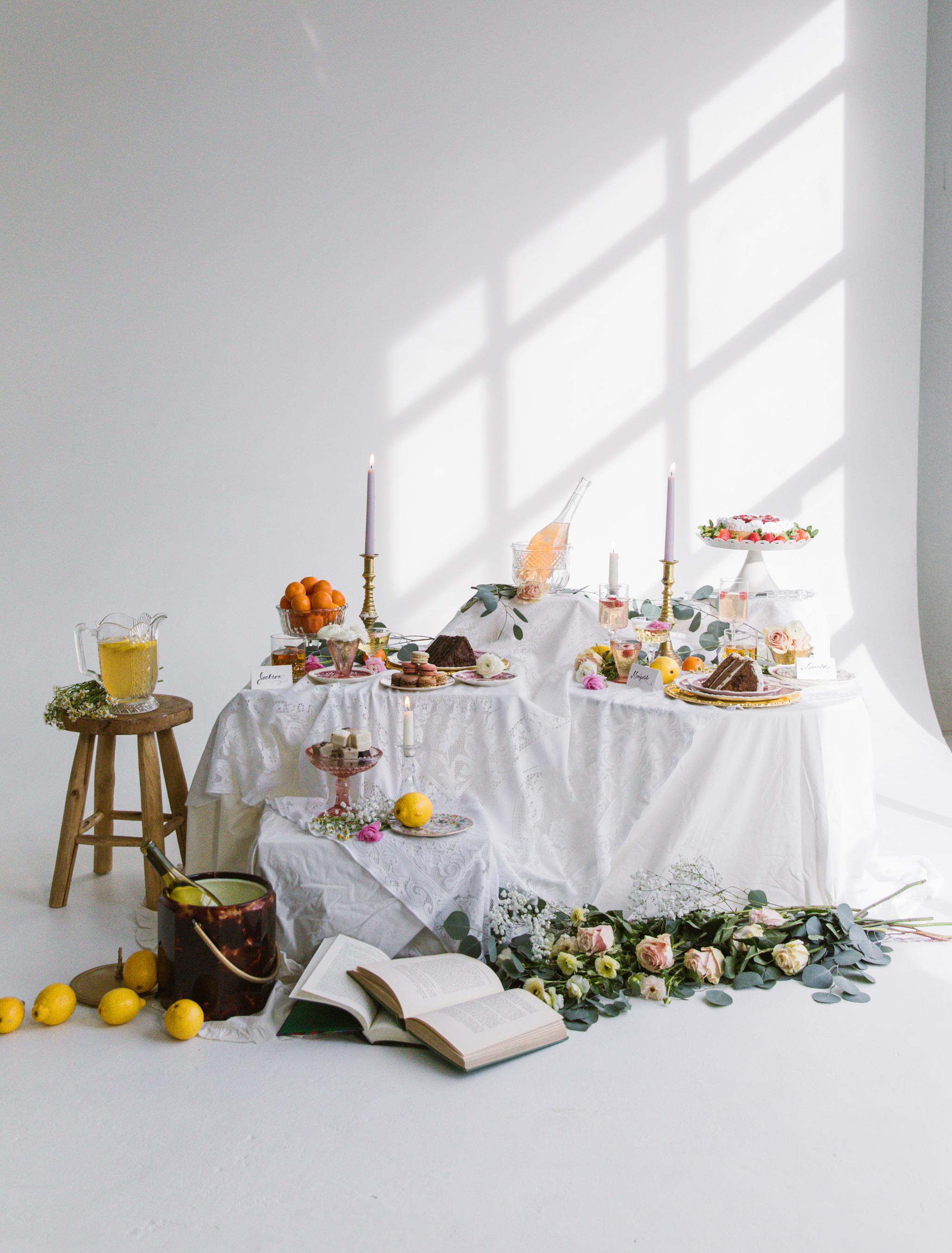
The Summer Table
Long afternoons, layered settings, and the kind of gatherings that stretch well into evening. Our guide to hosting with ease and effortless style.
24 Porch Culture
From southern galleries to urban stoops, we explore the social history of the American porch and its return as a central part of daily life.
36
The Summer Edit: Seasonal Shopping Guide
A curated collection of seasonal essentials.

8
House Tour: Southern Charmer Tour this stately home on the Intracoastal Waterway in Wilmington, NC, designed by Lindsey Gregg of Big Sky Interior Design. 18
The Importance of Scale
The quiet force behind every well-designed room. We break down the essential proportions for artwork, rugs, and furniture. 40
House Tour: Curated Maximalism
A masterclass in high-pigment living by Isabel Ladd Interiors. We tour a Lexington, KY, home that uses vibrant hues and unexpected patterns.
Celebrating the simple joys of summer. 46
Our Summer Reading List
Books to inspire your garden, your table, your home, and your imagination.
A meditation on the quiet art of doing nothing beautifully. Discover how to recalibrate your tempo through intentional rituals and unhurried days.

“Live in the sunshine, swim the sea, drink the wild air.”
~ Henry David Thoreau
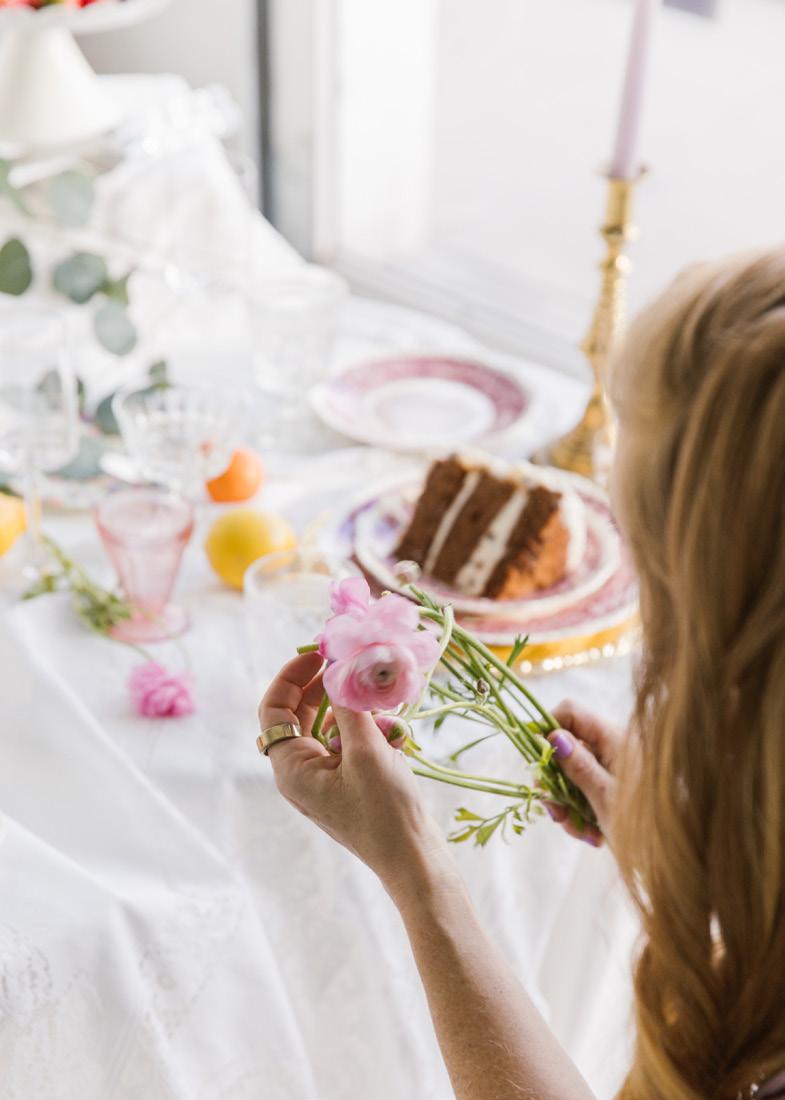

Summer has a way of clarifying what matters by softening everything else. The light lingers longer, routines loosen, and suddenly it’s the small, ordinary moments that feel most essential: coffee by an open window, a porch that invites you to sit awhile, a table set without fuss but full of intention.
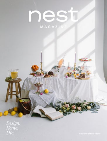
Preparing for our cover shoot is always a beautifully chaotic race of moving parts and tiny adjustments. Amid the noise, I had to slow...to steady delicate floral stems, light the candles, and focus on the tactile details. Those quiet moments of preparation became a reminder I’m carrying into the season: choosing to romanticize the process and remembering that the most meaningful parts of summer often happen in the in-between.
This issue of NEST Magazine is an invitation to lean into that rhythm. From the revival of porch culture and outdoor living rooms to effortless summer tables layered with mismatched plates and wildflowers, we celebrate the spaces and rituals that pull us outside and slow us down. You’ll step inside homes that embrace real life, explore how scale and light shape the way we live, and find a curated summer shopping guide and reading list—objects and books meant to be used, read, and lived with.
We also make room for reflection. In “Slow Season” we consider what it means to move at a gentler pace— through morning rituals and the quiet art of doing nothing beautifully.
Slow down or go all in—just make sure it’s your own version. Let’s celebrate the childlike idea of an endless summer and the freedom to shape it however you choose.
Welcome to summer. May it linger.
Jasmine Listou Bible Editor-In-Chief
Publisher Jonathan Kauffmann
Editor-In-Chief
Jasmine Bible
Design Director
Paigelee Hodges
Senior Editor
Aaron H. Bible
Contributing Staff
Megan Chandler
Willy Clair
Gilly Davison
Emily Fenger
Taylor Marrow
Elise Moya-Watkins
Taylor Titus
Contributing Videographer
Graeme Jenvey
Cover Photo
Jennifer Morgan, Fan Club Brands
Since its founding in 2015, NEST Magazine has been the place where design, home, and lifestyle converge. Published twice annually in Charlottesville, VA, in every issue we deliver fresh ideas, emerging trends, and inspired insights.
We asked the agents of Nest Realty a seemingly simple question: How do you summer? From the small rituals that signal the season’s arrival, to the spaces, colors, moments, and meals that make it feel endless, their responses reveal summer as more than a season, but a state of mind.
For many Nesters, summer officially begins when the windows fly open. In fact, 41% say fresh air moving freely through the house is the first true signal of the season. “Meals moving outdoors” follows closely at 34%, while a quarter mark summer by a simpler rule: shoes become optional.
Asked where they spend the most time on a summer day, Nesters overwhelmingly head outdoors. More than half gravitate toward the backyard or patio, making it the heart of summer living. Front porches and steps still hold charm at 11%, while 14% claim allegiance to anywhere with a breeze.
When it comes to summer decor, nature leads the color palette. Nearly half of Nesters favor blues and greens inspired by water, sky, and foliage. Pops of vibrant color appeal to 16%, while sunbleached neutrals—linen, sand, and soft white—round out the palette at 13%.
1135 Rose Hill Dr., Suite 100 Charlottesville, VA 22903
nestrealty.com/magazine
Summer entertaining skews casual. Drop-ins are welcome for 21% of Nesters, followed by neighborhood porch hangs at 19%. A smaller group of 6% centers entertaining around the Fourth of July, while 8% find themselves in a season of endless playdates.
If there’s one summer accessory Nesters won’t live without, it’s sunglasses—nearly a quarter say they’re always close at hand. A good book or magazine comes next at 11%, followed by frosty drinks and ice cream tied at 9%. Summer is like that: sun, something good to read, and a little indulgence.
Summer changes the way Nesters live in their homes. For more than a quarter of respondents, it means spending as much time outside as possible, effectively expanding the home’s footprint. Others (14%) embrace open doors and relaxed rules; while the same amount say swapping lightweight bedding to match the season is key. No one admitted to rearranging furniture to chase the light, suggesting summer’s flow is more about presence than perfection.
Golden hour reigns supreme as a third of Nesters say their ideal summer evening unfolds on the porch as the light softens in the evening. Neighborhood walks (10%) and long, unhurried meals (8%) follow, reinforcing the idea that summer evenings are meant to stretch out without agenda.
Celebrating longer days, local moments, and the simple joys that bring our neighborhoods together.
Summer transforms our neighborhoods into open air gathering places. Light lingers longer, front porches become living rooms, and parks and community spaces come alive with color and connection. There’s so much beauty in the way we come alive this time of year, savoring everything from local produce to local music.
Whether strolling through an outdoor book fair, discovering a new favorite food truck, or meeting friends for a glass of rosé under twinkling café lights, these shared experiences root us to where we live. Summer invites us to take in our surroundings, stay a little longer, and appreciate the people who make our communities shine.


TEXT BY JASMINE BIBLE + PHOTOGRAPHY BY MARY RAYNOR AND ANDREW SHERMAN
Lindsey Gregg doesn’t just design rooms—she builds worlds.
After nearly a decade in set decorating for film and television, Gregg brought that same story-first instinct to residential interiors, swapping sound stages for waterfront homes. In Wilmington, North Carolina, she and her firm, Big Sky Interior Design, helped renovate a lowcountry retreat perched on the Intracoastal Waterway.
Having previously worked with the clients, the project was built on a foundation of trust. Working alongside general contractor Tanner Konrady of Konrady & Son Construction, Gregg delivered a bright, inviting home for a family of four—one where every element feels intentional but never precious.
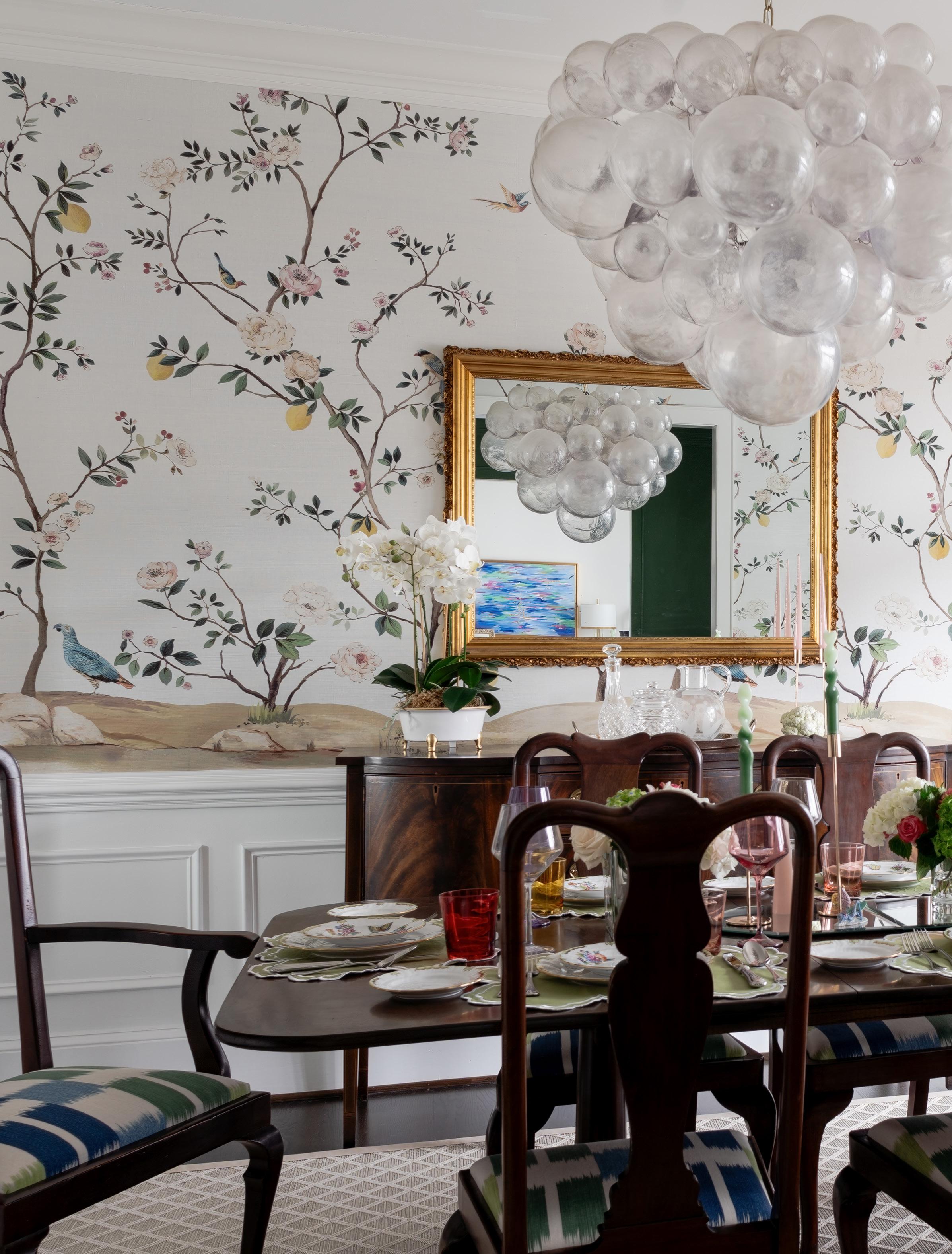
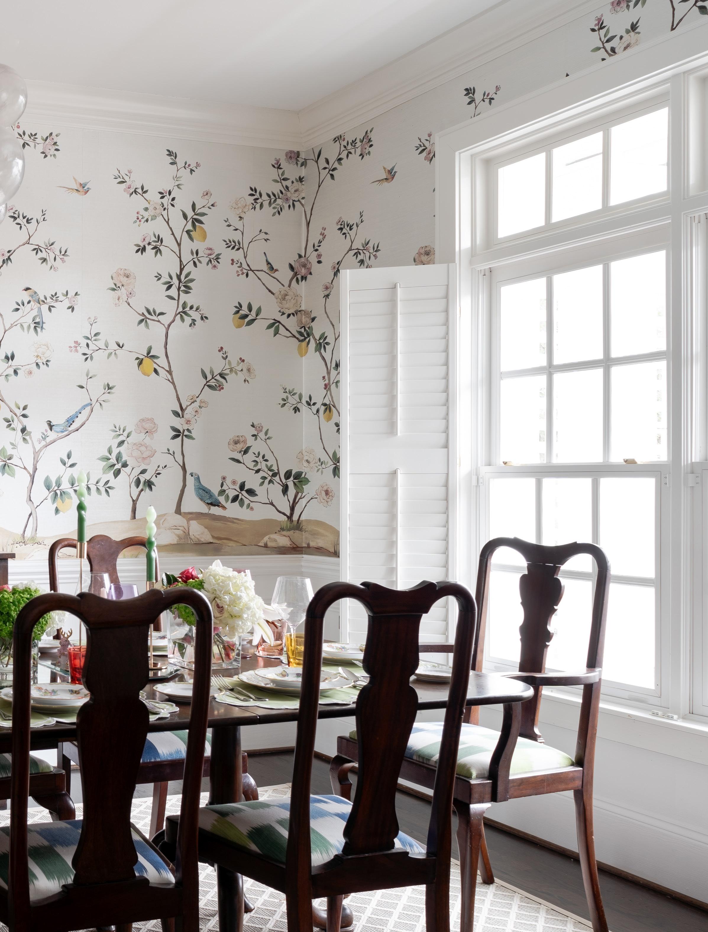
Perhaps the most dramatic space in the home, the dining room provided Gregg with an opportunity to play with contrast. The homeowners’ mahogany dining table and chairs were heirlooms passed down from a greatgrandmother, and the challenge was to make those darker, traditional elements feel at home in a light-filled coastal setting.

LINDSEY GREGG
Firm: Big Sky Interior Design
Home Location: Wilmington, North Carolina
Year Built: 1995
Insta: @bigskydesign
Website: bigskydesignonline.com
“Good design is about balance. If you can get it right—light and dark, soft and structured— the house just settles.”
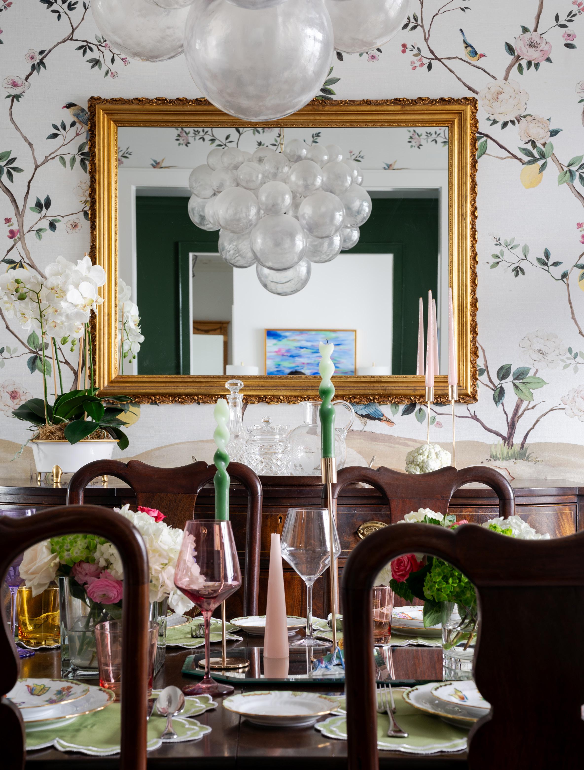
Rather than fighting the weight of the furniture, Gregg leaned into it. The Scalamandré mural wallpaper introduces softness and movement, while the grasscloth texture keeps it grounded. “I loved the idea of starting the house with something that felt feminine and expressive,” Gregg notes, “especially knowing we were about to move into a darker, moodier space just beyond.” Upholstered vintage dining chairs in a blue-and-green block print pull color directly from the mural, while a bubble chandelier adds a modern note overhead. A durable trellis-pattern rug keeps the room practical, reinforcing that this is a family home first and foremost.
The tabletop became a canvas for creativity. Using the homeowners’ own china—decorated with herons, butterflies, and a beautiful array of color—Gregg layered in Estelle colored glassware, playful candlesticks, and unexpected details that echo the mural behind it.
“When it comes to setting a table, more is more,” Gregg says. “Don’t limit yourself to what you think of as a proper table setting.” Mixing heirloom pieces with patterned paper plates, natural elements gathered from outside, or even small figurines adds personality and ease. It’s a reminder that a table doesn’t need to be precious to be beautiful.
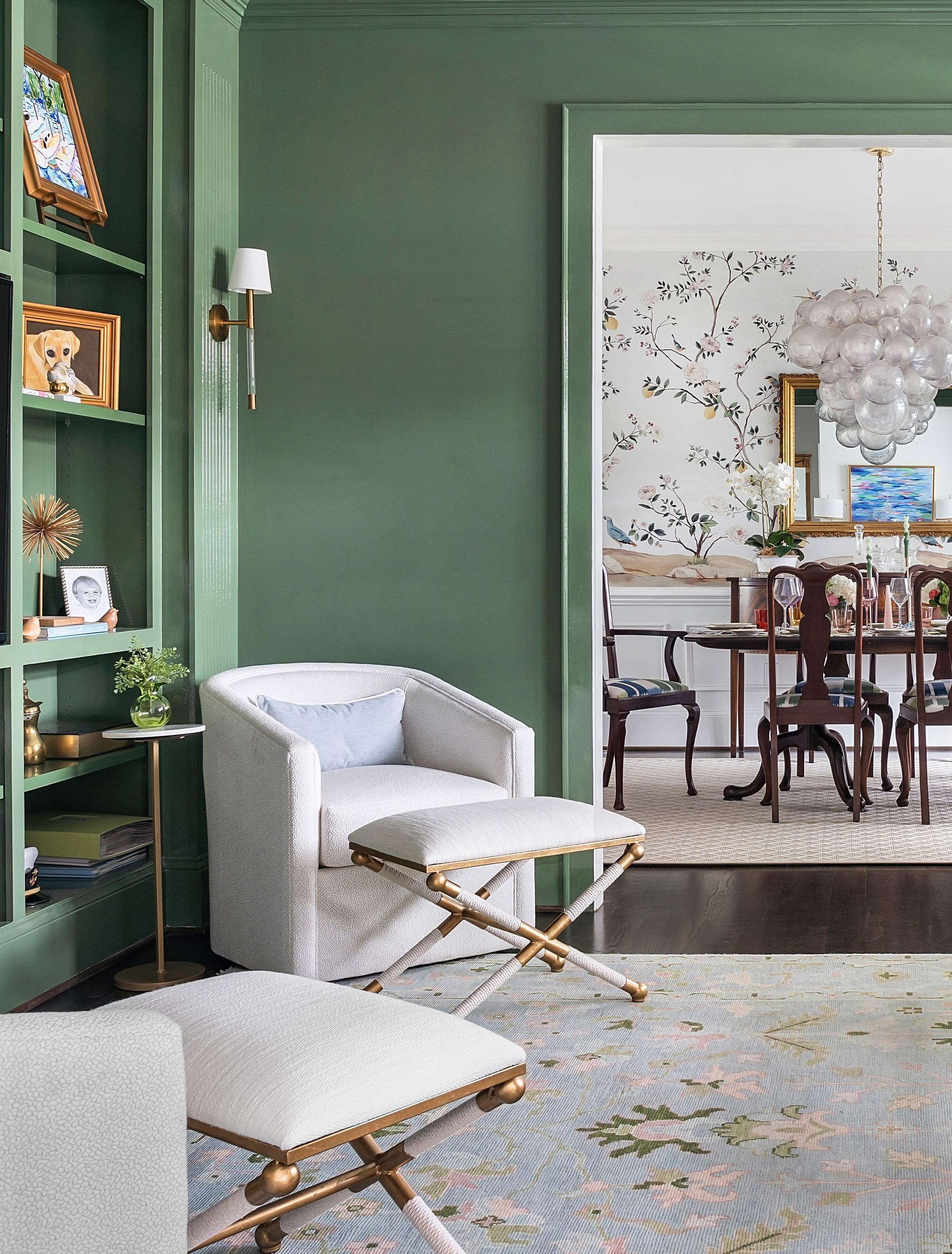
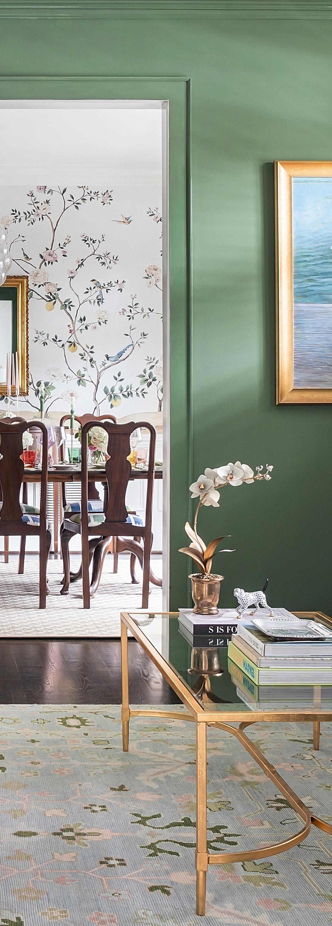
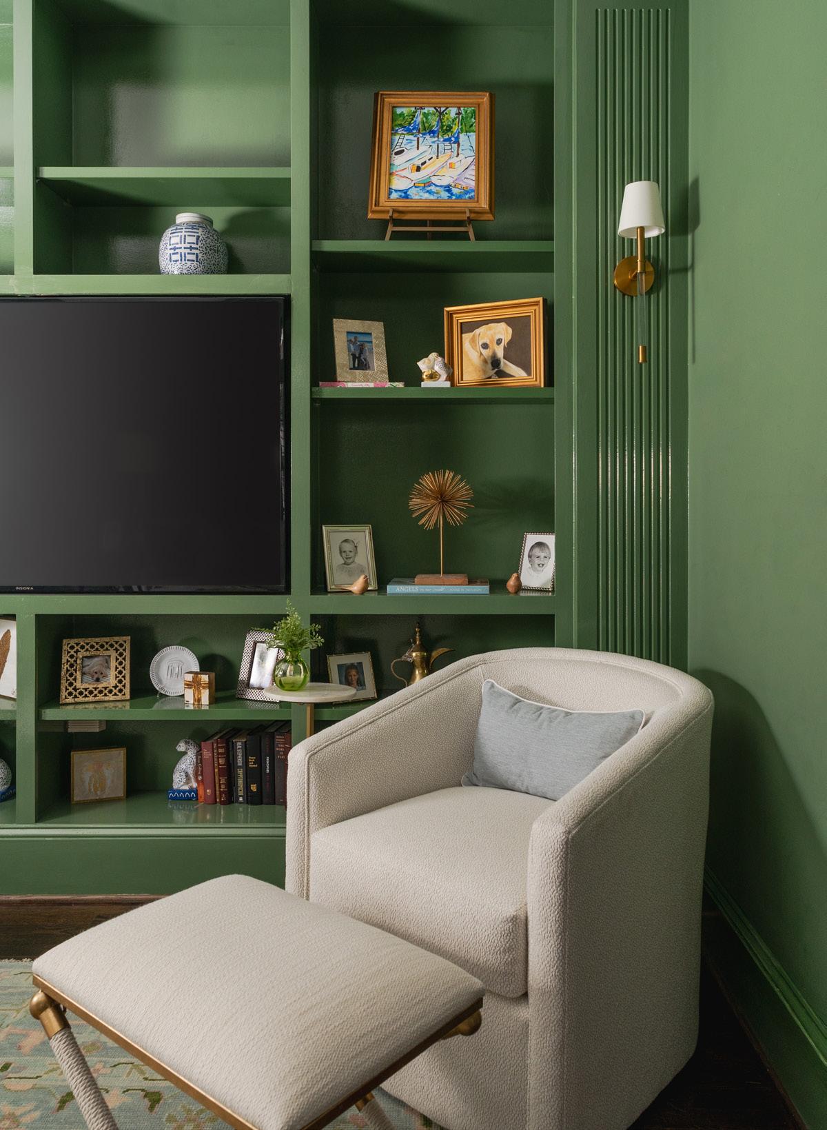
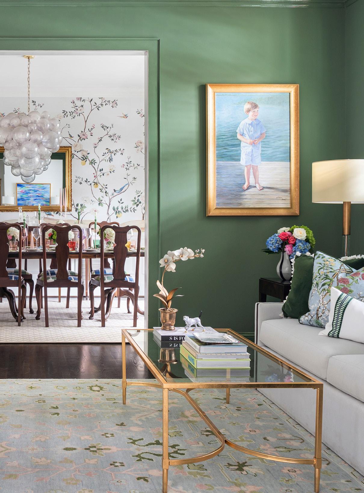
Just past the dining room, the den provides an intentional shift in tone. Painted a deep, saturated green, the space is meant to feel enveloping and calming. Where the dining room is light and expressive, the den is grounded and restrained. “I think the house really works because there’s a constant push and pull,” Gregg says. “Light and dark, masculine and feminine—it creates visual balance as you move through the rooms.”
Furnishings in the den are plush and performancedriven, selected to withstand everyday family life. Lighter upholstery softens the depth of the walls, while subtle details (wood inlay on the sofa arms, brass accents at the tables) quietly echo the heirloom tones of the dining room. A rug from Milagro Collective brings the color story underfoot, blending greens with muted pastels that reference the mural nearby.
Visible from the front entrance, the living room opens fully to the waterfront setting, and here Gregg let the view take center stage. Furniture is arranged to emphasize sightlines, allowing the eye to dance from the front door through the space and straight out to the water beyond. “We really wanted everything in this room to soften and fade toward the view,” Gregg explains. “Nothing should compete with what’s happening outside.”
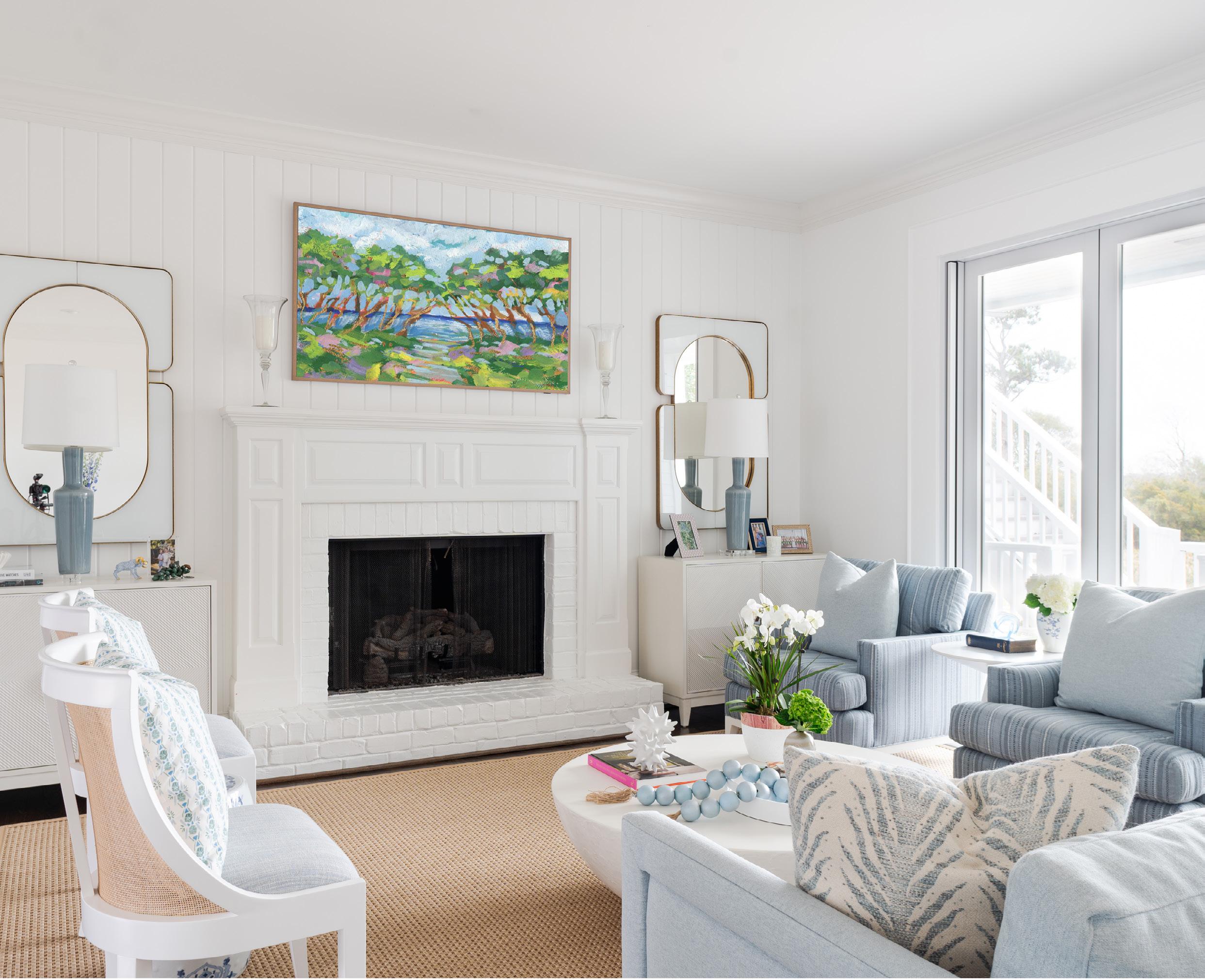
The color palette shifts in an ombre effect—from lighter blues to darker as you approach the windows and the water beyond. The furnishings are all done in performance fabrics like Crypton and Sunbrella to keep up with daily use and wet swimsuits.
The mix of subtle patterns and silhouettes keeps the room from feeling predictable or stuffy. Clean-lined seating balances more traditional architectural details, and symmetry around the fireplace lends a sense of calm. Gregg paid close attention to how the room reads from every angle, especially since much of the seating floats. A slim console table behind the sofa provides structure without interrupting the openness of the space. Even digital aspects feel considered: on the Samsung Frame TV, the screen displays a piece by local artist Elizabeth Sheats, adding personality without pulling focus.
A game table occupies a secondary zone, reinforcing the room’s role as a gathering space rather than a formal sitting room. It’s a place for chess matches, puzzles, and holiday
overflow. “I love rooms that can easily change with the holiday season,” Gregg says.
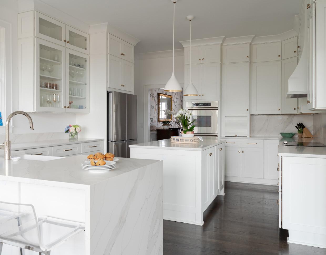
The kitchen continues the home’s balance of classic and contemporary. Clean-lined cabinetry, stainless appliances, and a farmhouse sink bring clarity to the space, while thoughtful backsplash decisions keep it from feeling rigid. Full-height quartz behind the range adds a modern edge, while a shorter backsplash along the window wall allows the space to feel lighter and more relaxed.
Metal finishes are intentionally mixed. With stainless appliances throughout, Gregg treated the sink and faucet as part of that language, allowing stainless to coexist comfortably with brass hardware elsewhere. The result feels layered rather than locked into a single moment in time.
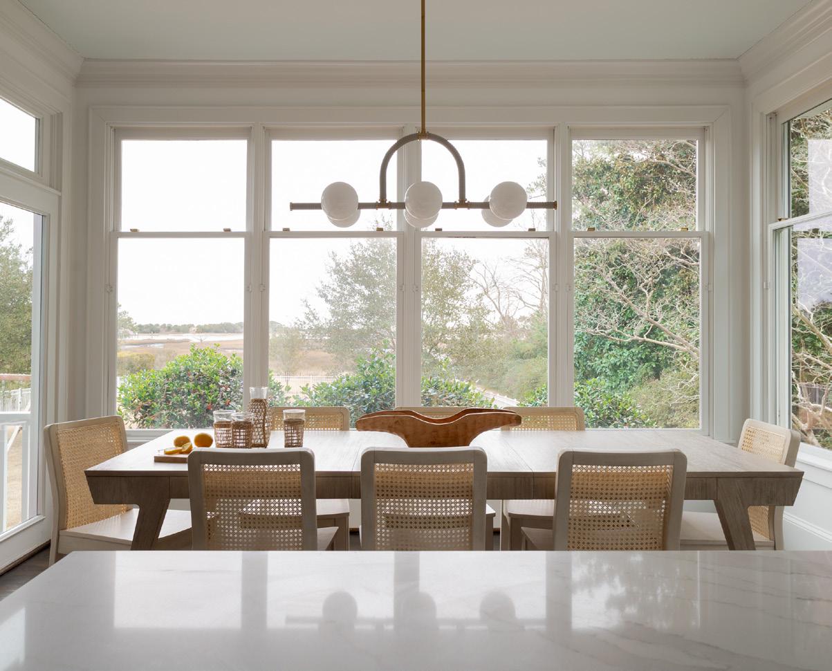
Just off the kitchen, the breakfast area is designed to feel like a bridge between indoors and out. Wrapped in windows and bathed in natural light, it projects into the landscape almost like a porch. Pale wood furniture and a decidedly
modern chandelier reinforce that feeling. “We wanted it to feel like you were already outside,” Gregg says, “even though you’re still very much in the house.”
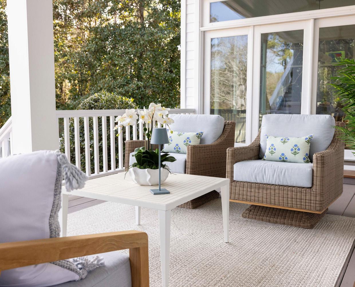
Outdoor living is central to the home, and the downstairs patio is treated as a true extension of the interior. Distinct zones define how the space is used: a generous dining table for entertaining and a lounge area oriented toward the water. Swivel chairs invite lingering conversations, while plantings by Coastal Succulent add softness without requiring constant upkeep. Materials were selected with the coastal environment in mind—durable, grounded, and able to withstand daily exposure.
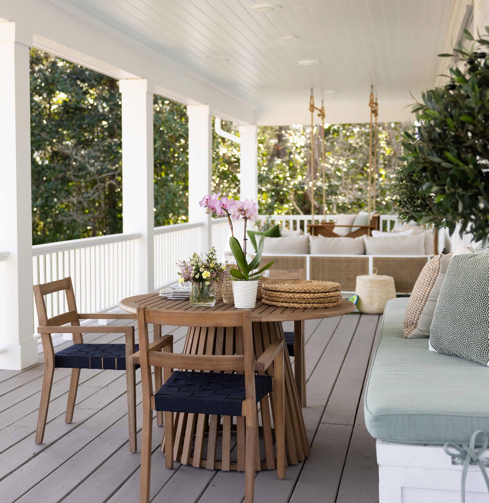
Upstairs, the porch becomes more intimate. This is where the family spends much of their time together, especially in the evenings. A custom porch swing built by Konrady & Son anchors the space, layered with cushions and pillows that reference the home’s interior palette. A sectional from Summer Classics provides ample seating, and furniture
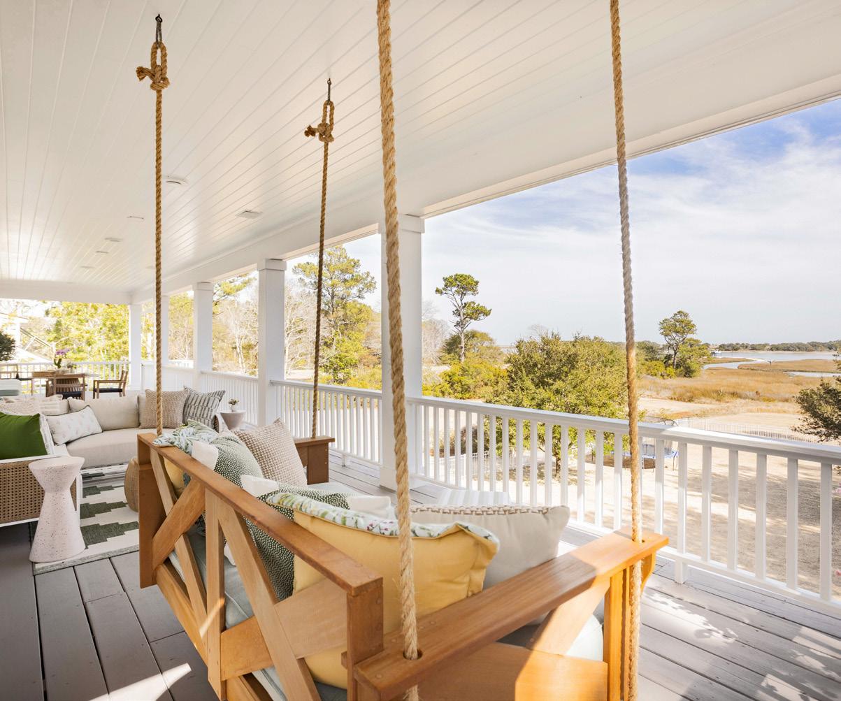
placement was carefully considered to allow for flexibility. Coastal conditions played a role in every decision. “When you’re on the water, even furniture weight matters,” Gregg notes. Pieces need to feel substantial enough to stay put in everyday wind, yet welcoming and comfortable. A terrazzo accent table adds a playful note without sacrificing durability, reinforcing the idea that outdoor spaces can have just as much personality as the rooms inside.
Throughout the home, Gregg’s approach is consistent: suggestions rather than declarations. There are no overt nautical motifs, no obvious coastal shorthand. Instead, the connection to place is felt through color, material, and contrast. “It’s about balance,” Gregg reflects. “If you can get that right—light and dark, soft and structured—the house just settles.”
The result is a southern charmer in the truest sense: gracious, relaxed, and quietly confident. A home designed to be lived in—season after season.


With its classic silhouette and elegant pierced metalwork, this accent piece adds a layer of sophisticated texture. It’s the perfect “moveanywhere” companion for a comfortable armchair or a stylish addition to a breezy sunroom.
Pippa Metal Accent Stool, $132, wayfair.com
A chic hourglass silhouette meets the durable, speckled texture of terrazzo in this petite yet impactful accent piece. Kim Drink Table, $562, alicelanehome.com

A timeless gourd silhouette and a crisp glazed finish make this ceramic lamp a quintessential addition to a coastal-inspired room. Safavieh Ceramic Table Lamp, $84, amazon.com
A playful medley of azure and sage blossoms dance across subtle stripes, bringing a fresh, botanical energy to your seating. Lucy Moss Outdoor Kidney Pillow, $85, julephomeandgift.com

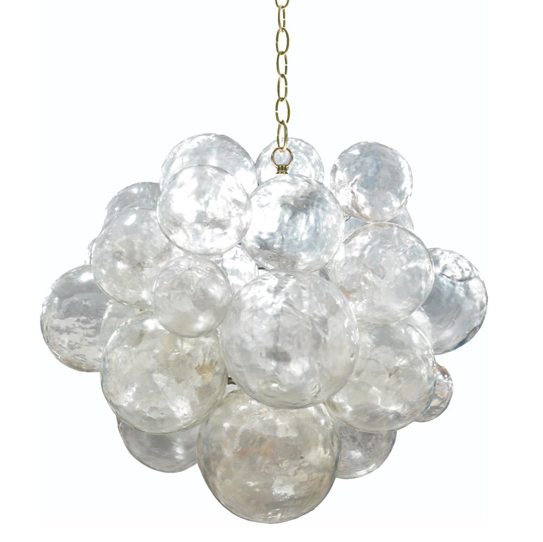
Ethereal glass bubbles are suspended from a hand-cast frame to create a fixture that is as much a piece of art as it is a light source. Muriel Chandelier, $5,125, olystudio.com
Bring a pop of curated color to your next dinner party with these handmade, dripless taper candles. Spiral Taper Candles in Green, $23, amazon.com


Supported by a solid teak base, this hand-woven wicker rocker with seamless swivel is perfect for following the conversation, or the sun, across the deck. Frances Swivel Rocker, $1,595, patio.com
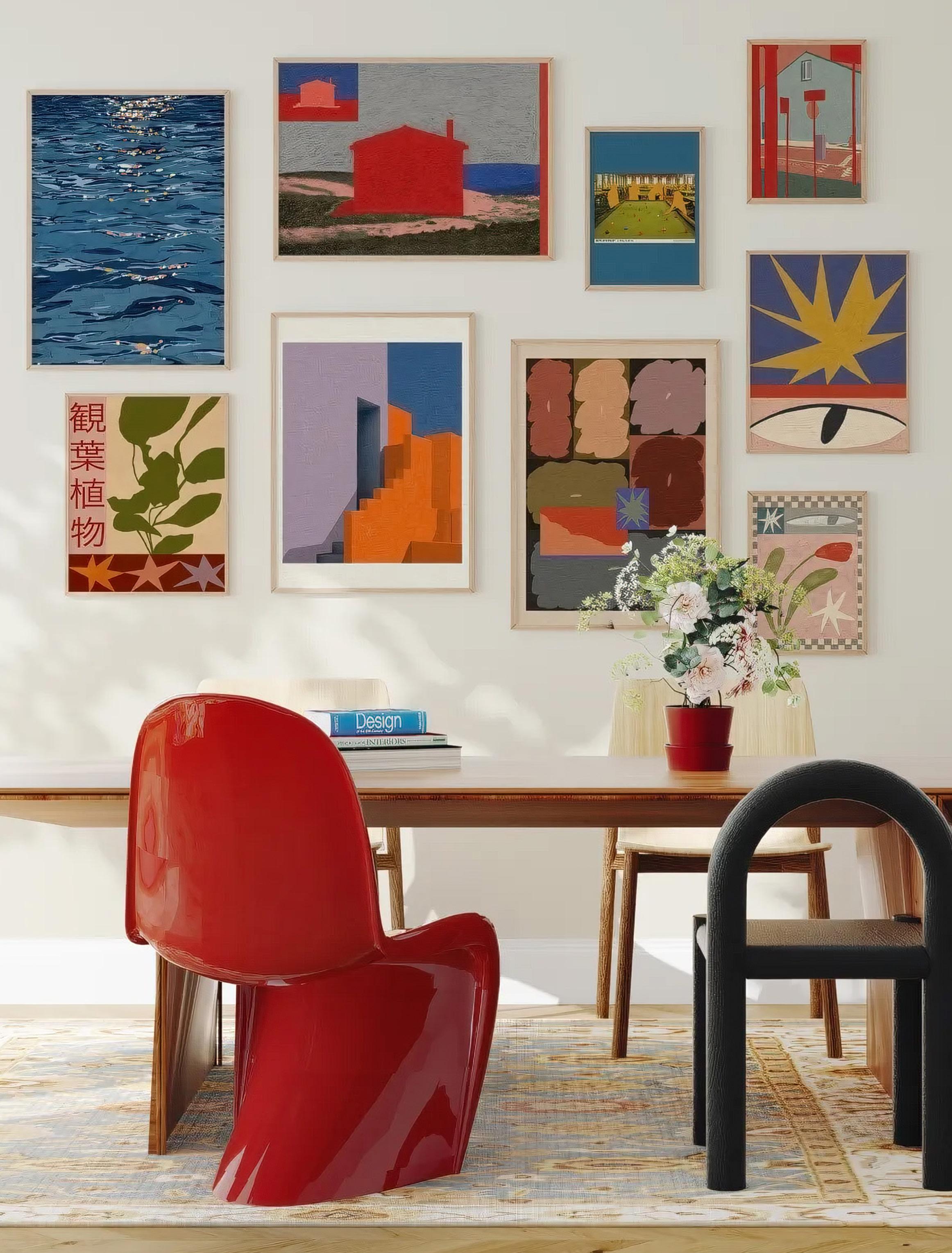
This gallery collection by artist Sophie Deller works thanks to its cohesive palette of reds, blues, pinks, and purples. Natural wood frames add warmth and balance. Available at goodmoodprints.com.
Why getting the proportions right makes all the difference in how a home feels.
Good design isn’t just about what you choose, it’s about how those choices relate to one another. To that end, scale is the quiet force that determines whether a room feels intentional or unsettled, expansive or cramped. When proportions are right, spaces feel effortless and balanced. When they’re off, even beautiful pieces can feel uncomfortable or misplaced. Understanding scale allows every element in a room to work together, creating harmony rather than competition.
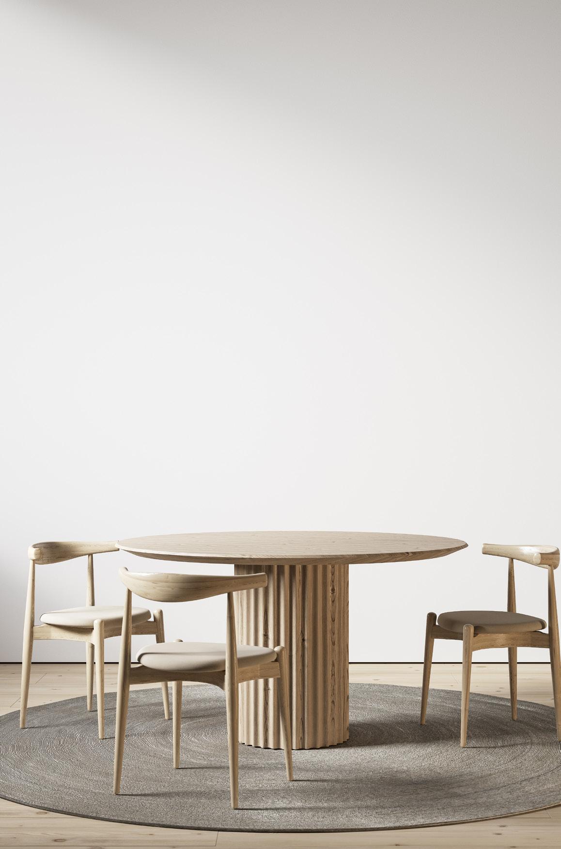
Artwork is often the first place scale reveals itself in a room, and it’s also one of the easiest places to misjudge proportion. It’s common to default to a standard 24-by-30-inch piece, only to hang it and realize it feels undersized—especially on larger walls. Unless artwork is headed for a powder room or narrow hallway, sizing up almost always creates a better result.
Large-scale art brings clarity and confidence to a space, anchoring the room in a way smaller pieces rarely do. As a general rule, artwork should be about 60-75 percent the width of the furniture it hangs above. When it’s floating on a wall by itself, aim for artwork to fill at least 50-60 percent of the wall width. Vertical scale matters too: don’t be afraid of height, especially with ceilings 9 feet or taller.
Gallery walls can also be a smart alternative to a single oversized piece, offering flexibility in cost, coverage, and sourcing. When treated as a single, large composition, smaller pieces (ones you may already have on hand) create the same sense of presence and scale. While each individual piece may be smaller in size, the overall arrangement can span six to seven feet, delivering impact without relying on a single statement work.

We love this piece by artist Shanon Vreeken, whose portraits are known for their use of color, emotion, and feminine energy. Available at goodmoodprints.com.
The flax linen sheets in a terracotta color pull together the warm hughes in the wood beams above and the checkers in the rug below. Sheets, pillowcases, and duvet cover available at bedthreads.com.
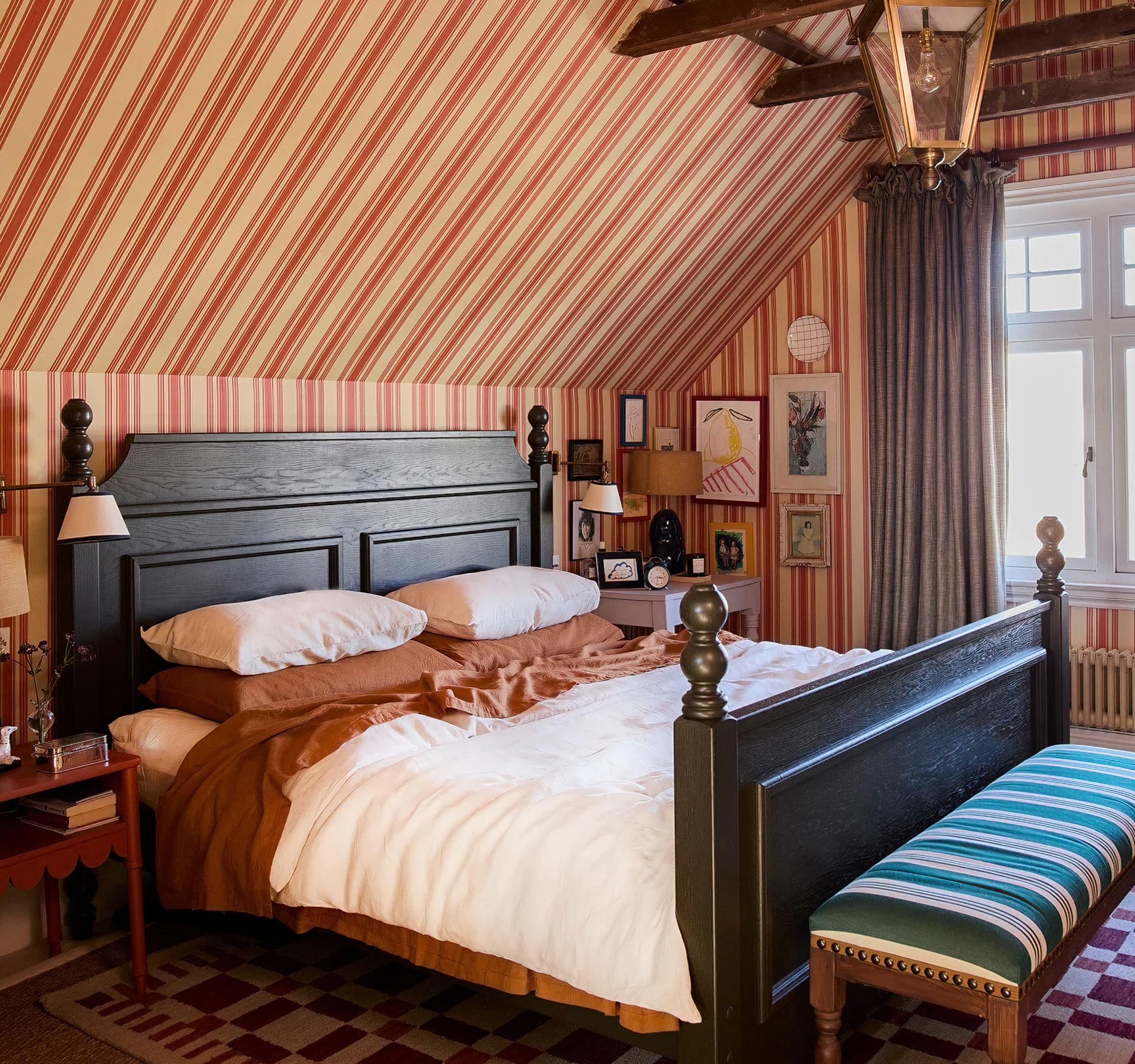
Pattern sets the rhythm of a room. It has the power to energize a space or overwhelm it, and scale is what determines the difference. In the room above, the striped wallpaper works because of its proportion. The stripes are wide enough to register across the soaring sloped ceiling and walls, yet refined enough to feel delicate rather than heavy. Instead of breaking up the architecture, the pattern unifies it, drawing the eye upward and emphasizing the room’s volume.
This room follows a reliable rule for mixing patterns: choose one large scale, one mid scale, and one small scale. Here, the wallpaper carries the largest scale, the striped bench anchors the middle, and the checkered rug provides the smaller counterpoint. The draperies and bedding, both rendered in solid colors, create a moment of visual rest. These quieter elements provide a necessary counterbalance, preventing the layered patterns from feeling chaotic. Together, the composition creates a visual cadence that keeps the eye moving comfortably through the space.
The Alfie rug in blush and rose by Chris Loves Julia x Loloi is hand-tufted from 100% wool. We suggest a plush rug pad underneath for added comfort and longevity. Available at rugsdirect.com.

Few elements define a blank room as quickly as a rug. When scaled correctly, it grounds the space; when it’s too small, everything around it begins to feel disconnected. A properly scaled rug should anchor the furniture it serves, creating a visual foundation rather than floating beneath it. When rugs are too small, the room itself can appear smaller and less grounded, and the negative space around the perimeter starts to dominate.
As a general rule, rugs should be large enough for at least the front legs of major furniture pieces to rest on them. When in doubt, choosing the larger size almost always results in a more cohesive and elevated space. In this space the rug works because of its generous proportions and restrained pattern. The subtle border provides definition without overpowering the room, allowing the furniture to sit comfortably within its frame. By extending beyond the sofa and chair, the rug unifies the seating area and gives the room a sense of calm and permanence.
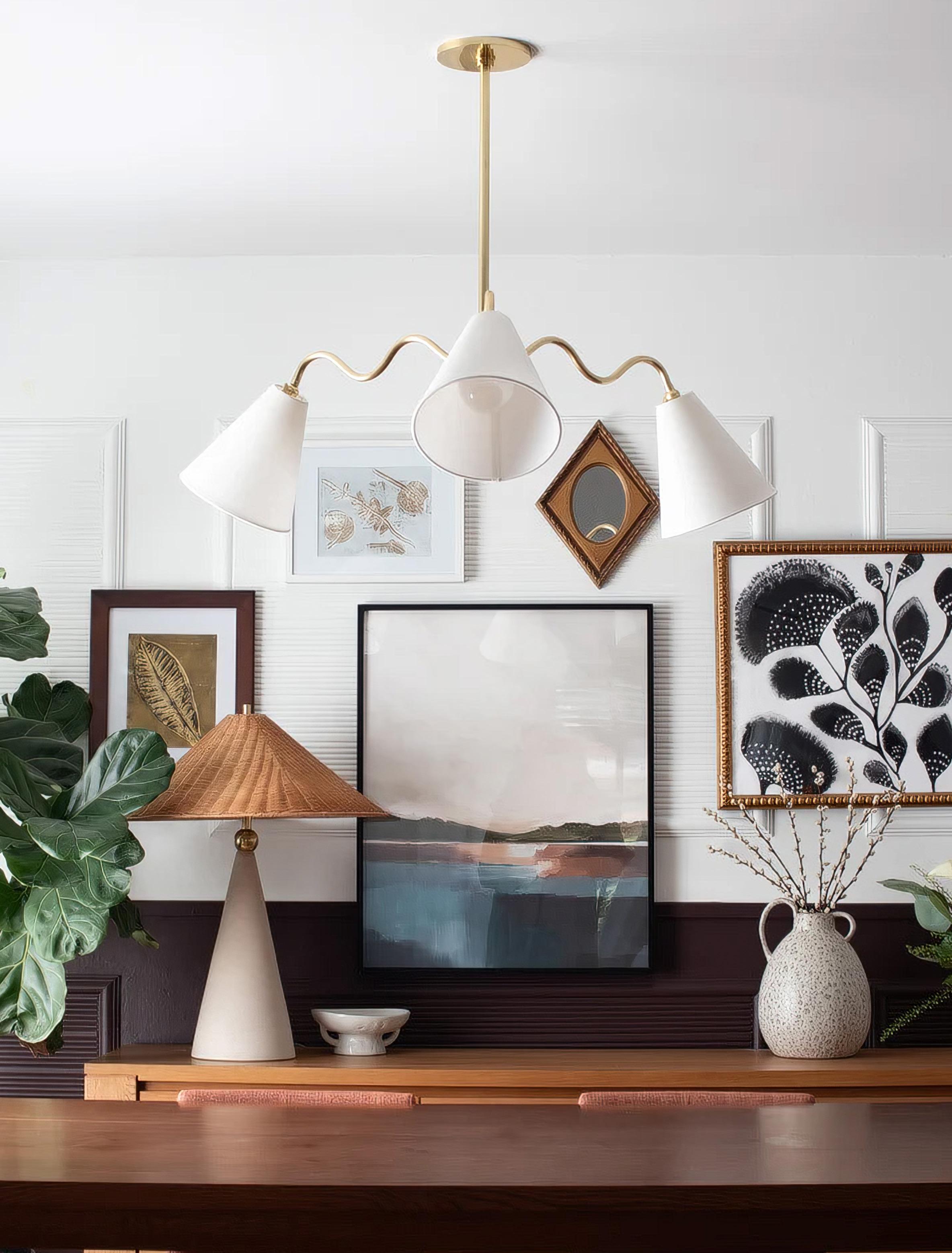
The Onda Chandelier by Mitzi anchors the dining table, while the table lamp adds layered light and balance—demonstrating how thoughtful lighting brings both function and visual harmony. Available at mitzi.com.
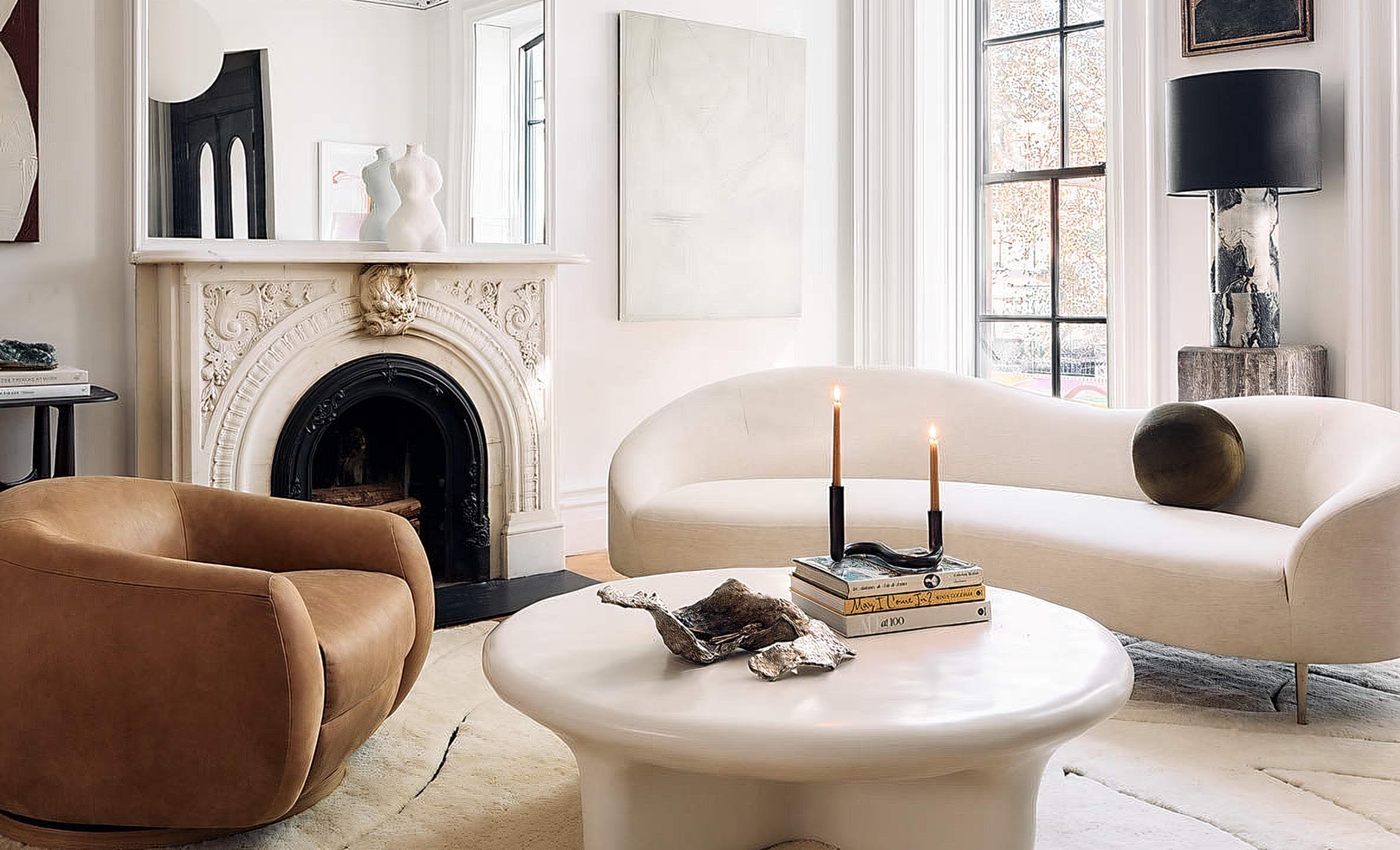
Generously scaled, the Curvo 96.5” sofa anchors the seating area, illustrating how furniture with presence can create balance and comfort when proportioned thoughtfully. Available at CB2.com.
Lighting has an outsized influence on how any room feels, especially when it comes to scale. Fixtures that are too small can feel timid or disappear entirely, especially in spaces with taller ceilings. Well-scaled lighting, on the other hand, provides structure and visual presence, helping define a room rather than simply illuminating it.
In the room pictured on the left, the chandelier works because of its proportion and placement. Its sculptural form and extended arms create horizontal reach, allowing it to hold its own above the dining table without overwhelming the room. The scale feels intentional, anchoring the table and reinforcing it as the focal point. Just as important, the surrounding lamps add a secondary layer of light, balancing the larger fixture and preventing the space from feeling top-heavy.
Furniture scale is about more than whether a piece physically fits in a room—it’s about how it relates to the
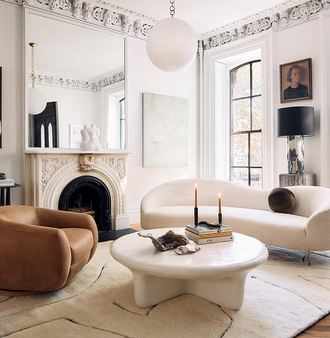
architecture and to the other elements within the space. The sofa in this room works because of its generous proportions and sculptural form. Rather than feeling oversized, it anchors the room, providing a strong visual foundation that allows the surrounding pieces to feel intentional.
Large furniture can feel surprisingly proportional when balanced correctly. Above, the curved sofa is paired with a substantial coffee table and grounded by a plush, oversized rug, creating a cohesive seating area that feels inviting rather than overwhelming. The key is contrast and balance: bold forms softened by organic shapes, and substantial pieces offset by negative space.
Scale isn’t about strict rules or perfect measurements— it’s about awareness. When artwork, pattern, rugs, furniture, and lighting are considered in relation to one another, rooms begin to breathe, giving each element the presence it deserves. It’s the difference between a room that simply exists and one that has been thoughtfully and intentionally curated.
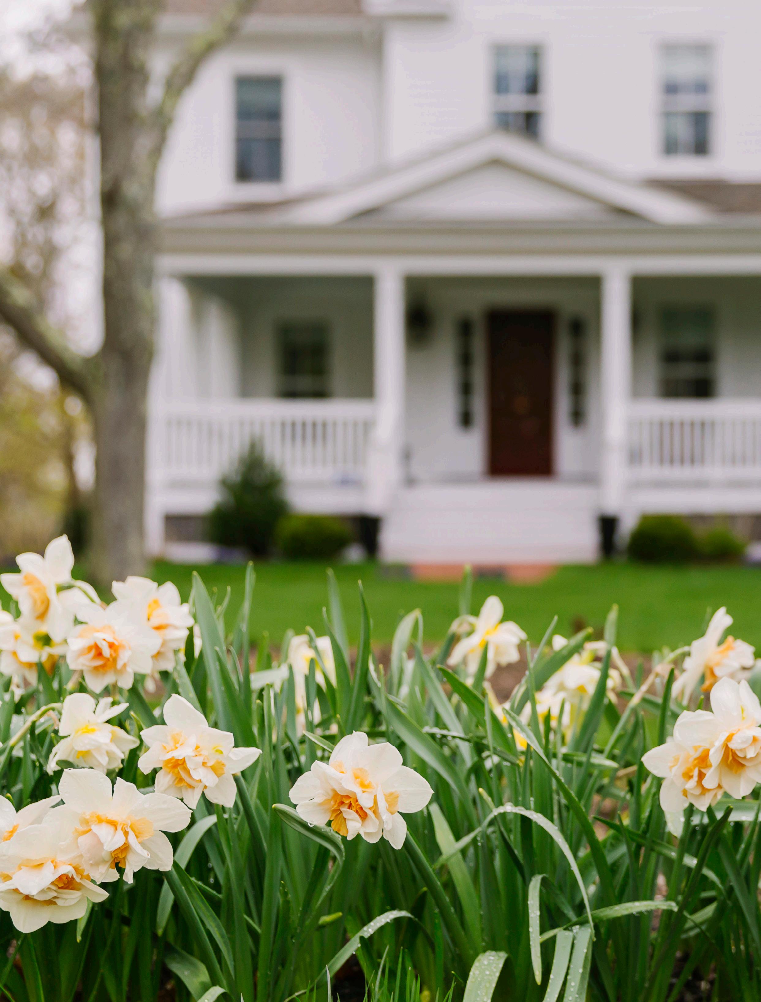
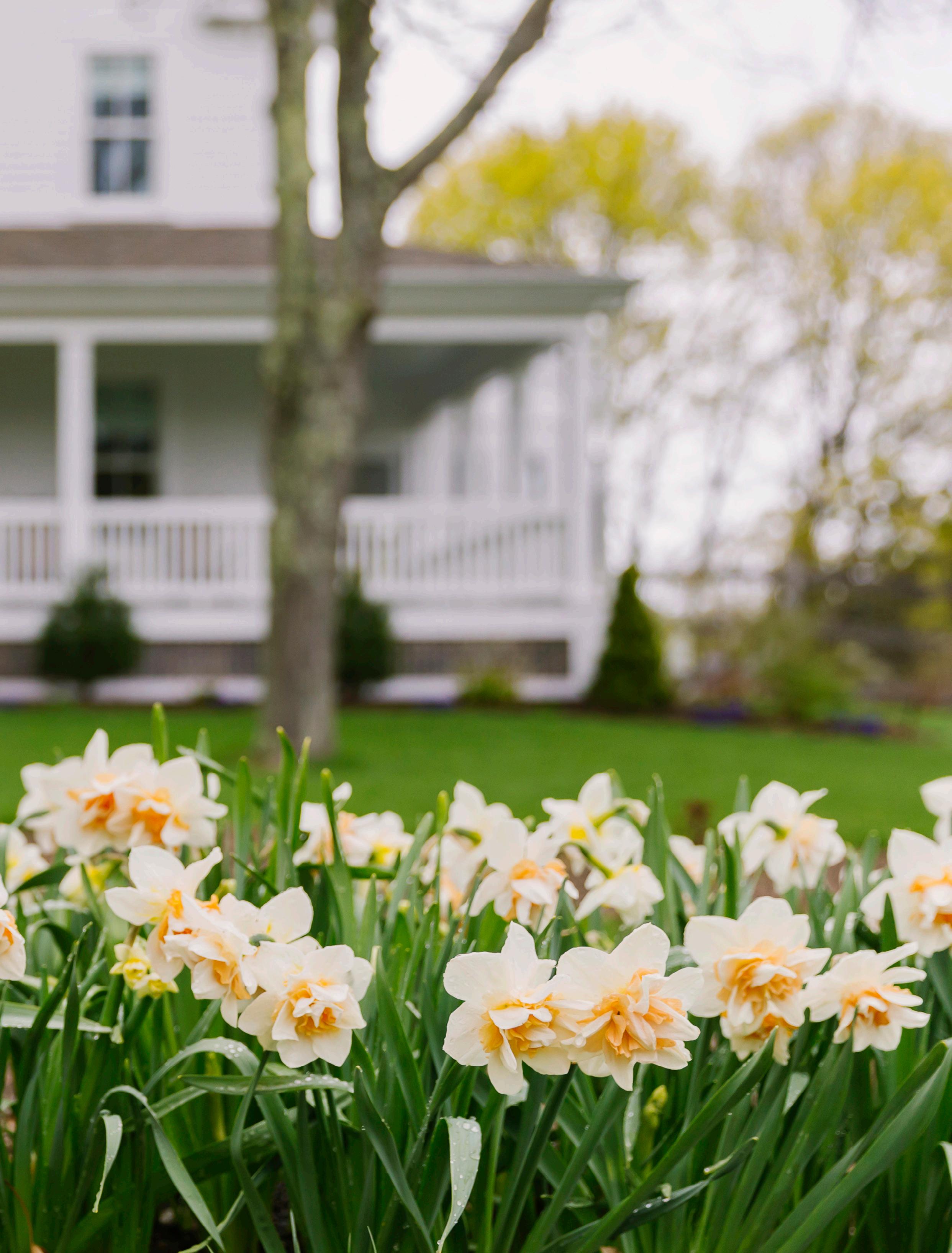
Today, porches are reemerging as purposeful transitional spaces—ones that reconnect homeowners to climate, neighborhood, and seasonal rhythms.
TEXT BY AARON H. BIBLE
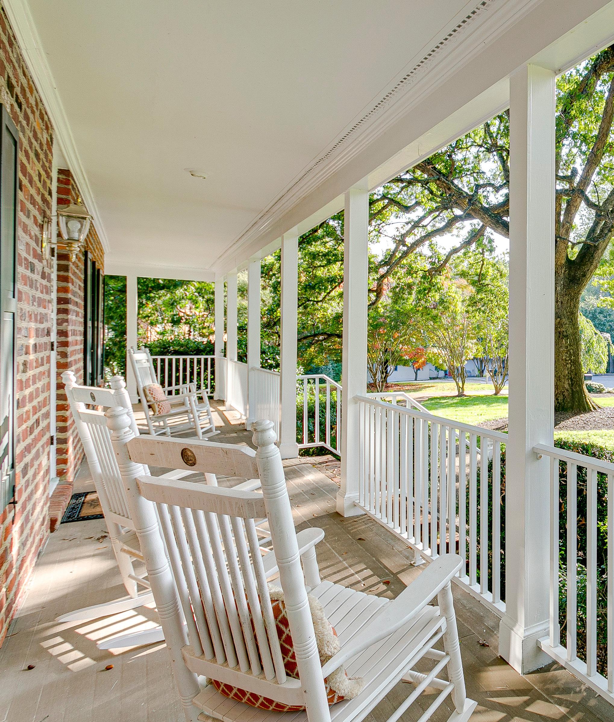
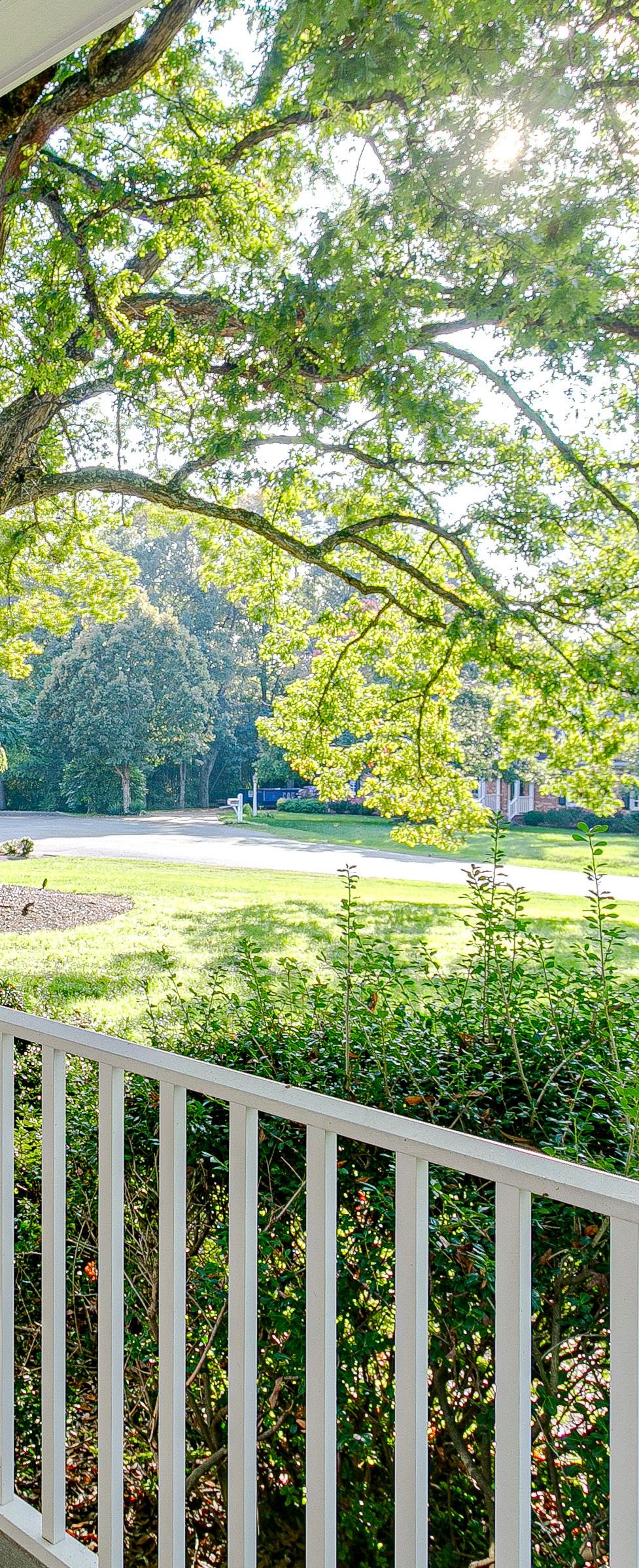
What returned as a pandemic novelty has become a central part of daily life again—and it’s for the better.
Porches are the threshold between home and the rest of the world. They shade interiors from sun, welcome breezes, and frame the meeting of private life and public space. Across the country, their form has evolved in response to climate, density, and social custom, making the porch both an architectural feature and cultural signal.
In the American South, porches historically took the shape of expansive wraparound galleries, often elevated to capture airflow and offer relief from heat and humidity. Wide eaves, columns, and deep shade were practical solutions, not stylistic flourishes. These porches became true extensions of the home: places where meals were shared, conversations lingered, and daily life spilled outdoors. In coastal regions, screened porches added protection from bugs and extend porch use. Open porches suit milder climates and offer a more direct connection to light and sound.
Urban porches developed differently. Stoops, balconies, and shallow front platforms prioritized connection over retreat. They offered city dwellers a way to observe street life, exchange greetings, and remain present in the neighborhood without leaving home. In dense areas where yards were limited or nonexistent, these small outdoor spaces functioned as communal stages—places of visibility, recognition, and quiet participation.
Climate influenced not only scale and orientation, but materials as well. Southern porches favored hardwoods suited to humidity, while northern porches relied on lighter timber or composites that could withstand freeze-thaw cycles. Paint colors and finishes were chosen to reflect light, resist weathering, and convey warmth. These decisions balanced behavior, durability, and aesthetics all at once.
Porches fell out of favor in the mid-20th century as air conditioning, automobile-centered planning, and inward-focused interiors reshaped domestic life. Streets became something to buffer against rather than engage with. But today, porches are reemerging as purposeful transitional spaces that reconnect homeowners to climate, neighborhood, and seasonal rhythms. They prove that design logic and community still matter.
At their best, porches extend living space. Materials, textures, and orientation mediate comfort, blurring the line between indoors and out. Successful porches acknowledge behavior as much as aesthetics, presence without performance.
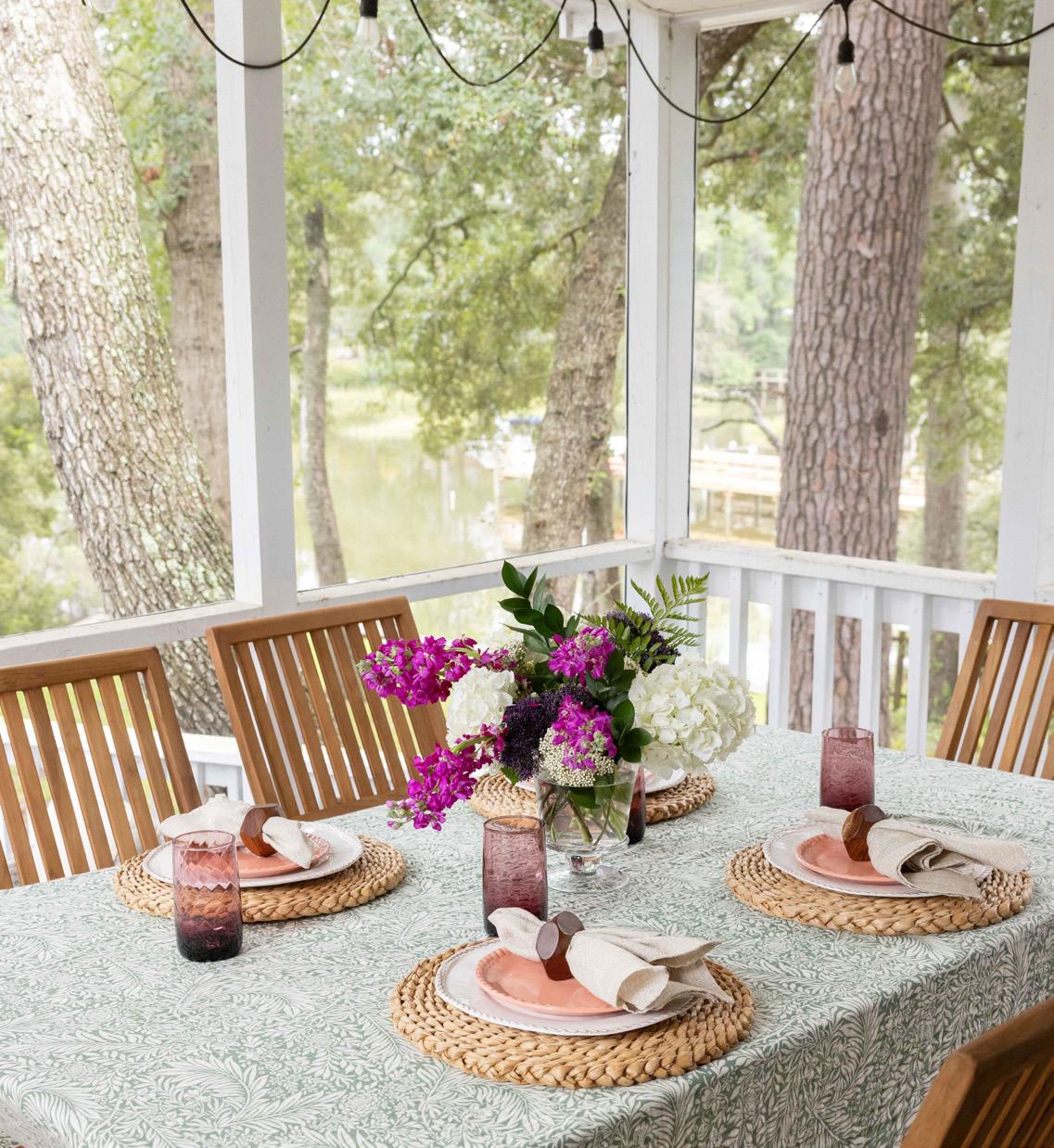
Porches have a way of softening time. In a culture shaped by screens and schedules, stepping onto a porch offers a pause. Architecture directs attention outward—to the angle of afternoon light, the movement of air through trees, the tempo of street life. Summer evenings bring familiar sensory cues: cicadas marking time, the scent of cut grass, voices drifting from nearby yards. The porch accommodates it all without demanding participation.
These spaces aren’t novelties; they host everyday rituals that make time feel less compressed. Morning coffee, afternoon lemonade, and evening drinks take on a different quality outdoors, shaped by light, temperature, and sound. As an in-between space, neither fully inside nor fully outside, the porch allows flexibility that interior rooms rarely replicate. What was once a necessity before air conditioning is now reclaimed, favoring observation over distraction, presence over productivity.
Porches function as informal gathering spaces where interaction happens without planning. They are the original social network, built on visibility rather than messaging. Historically, porches allowed neighbors to exchange news, children to play within view, and adults to spend time together. Their design made this easy: wide steps, open railings, and forward-facing seating encouraged brief encounters or longer conversations.
That dynamic still holds. Porch life supports a lowpressure form of connection. Eye contact happens naturally.

Greetings don’t require explanation. A passerby might wave or stop for a moment, creating familiarity without obligation. Over time, these small exchanges accumulate into trust and recognition.
Front porches face outward, connecting residents to the street and reinforcing shared rhythms of acknowledgment: a nod, a wave, a hello. Back porches turn inward, emphasizing privacy and retreat. They host family dinners, quiet conversations, and long evenings away from view. Thoughtful furniture placement, lighting, and sightlines help each porch serve its role without tension.
Furniture quietly determines how a porch is used. Rocking chairs, deep benches, swings, and low tables invite people to linger. Armrests and cushions support relaxed posture, signaling that there’s no rush. Materials that weather gracefully (wood that silvers, metal that develops patina, fabrics that soften) suggest use rather than display.
Orientation reinforces intention. Chairs facing outward support observation; inward-facing arrangements encourage conversation. In every case, comfort matters more than symmetry. A good porch doesn’t ask for attention. It simply makes staying easier.
Porch life is ultimately shaped by small, repeated habits: morning tea, evening pauses, watching the sky change. These moments foster belonging without pressure. Visibility allows recognition without surveillance; familiarity without obligation. Over time, the porch supports community through presence.
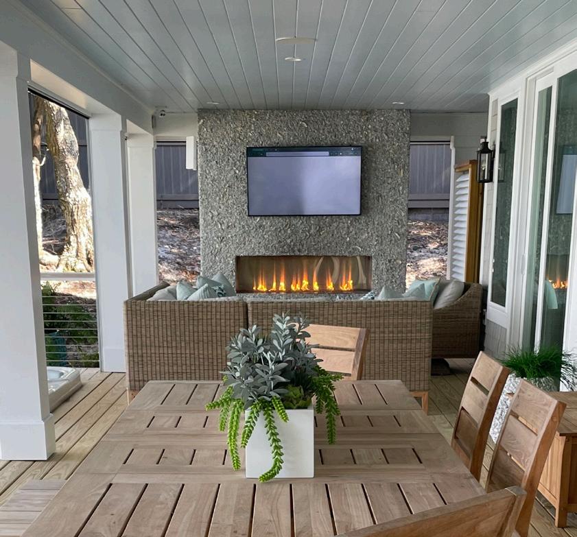
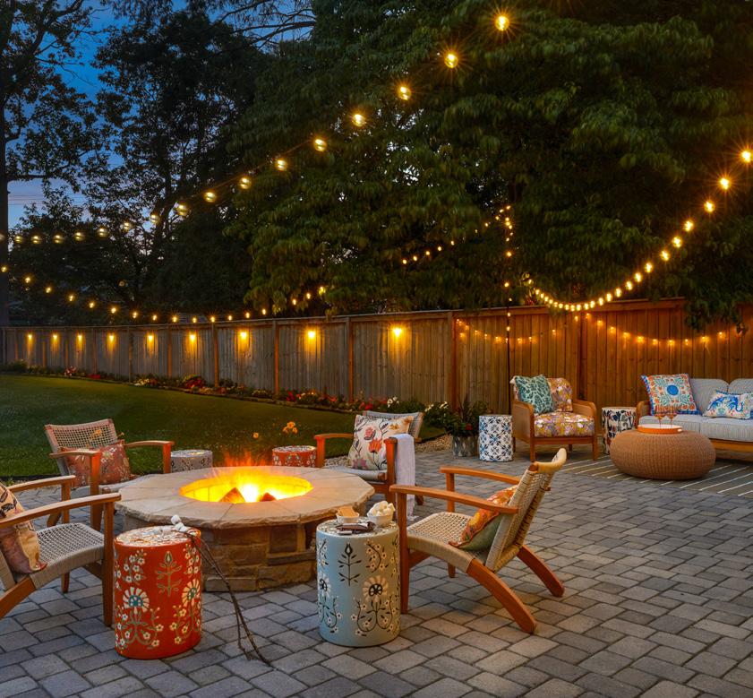
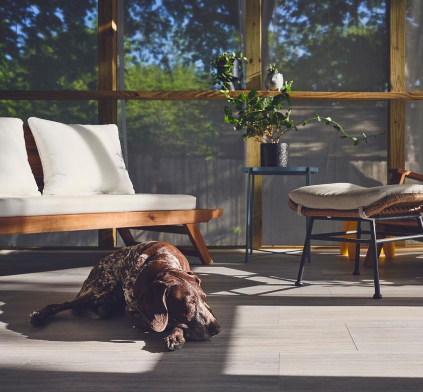
A successful porch balances ease with intention. Start with restraint—natural materials, simple palettes, and a limited number of elements keep the space inviting rather than staged. Rugs, planters, and thoughtful furniture placement can define zones without closing them off, helping the porch feel ordered, open, and flexible. When a space feels comfortable at a glance, people are more likely to settle in. Front porches encourage engagement, with outward-facing seating that supports casual interaction. Back porches prioritize privacy, hosting meals, music, and longer conversations. Furniture placement, lighting, and layout should reinforce each porch’s role so the space feels intuitive.
Warm, low lighting extends porch life into the evening. Lanterns, sconces, and subtle string lights create glow without glare, setting mood rather than spectacle. Modern LED options make it easy to adjust brightness as the night changes. The goal is welcoming light, not theatrical effects. Sound shapes the porch experience. Cicadas, footsteps, and distant conversation create a calm, quietly social backdrop, while silence feels intentional rather than empty. Music should stay subtle, enhancing the space without competing with natural sounds.
Furniture determines how long people stay. Deep chairs, swings, and benches encourage lingering, while armrests and cushions support relaxed posture. Side tables matter more than symmetry, offering a place for drinks or books. Choose materials that weather well—wood, metal, and durable outdoor fabrics signal that the porch is meant to be lived in.
Insect control works best when it’s unobtrusive. Citronella, ceiling fans, table fans, and discreet electric-powered repellents reduce mosquitoes and other biting insects without dominating the scene. Comfort should feel built in and there’s technology now to accommodate.
Good porch gatherings depend on easy movement. Arrange seating to allow people to shift and join conversations naturally. Keep tables accessible but out of circulation paths, and serve food and drinks informally to maintain a relaxed rhythm.
With a little planning, porches can accommodate pets and children comfortably and safely. Low gates, strategic furniture placement, toy chests, stairs and railings built to code, and subtle barriers help define boundaries. Shaded corners and familiar bedding give pets a place to settle without removing them from the scene.
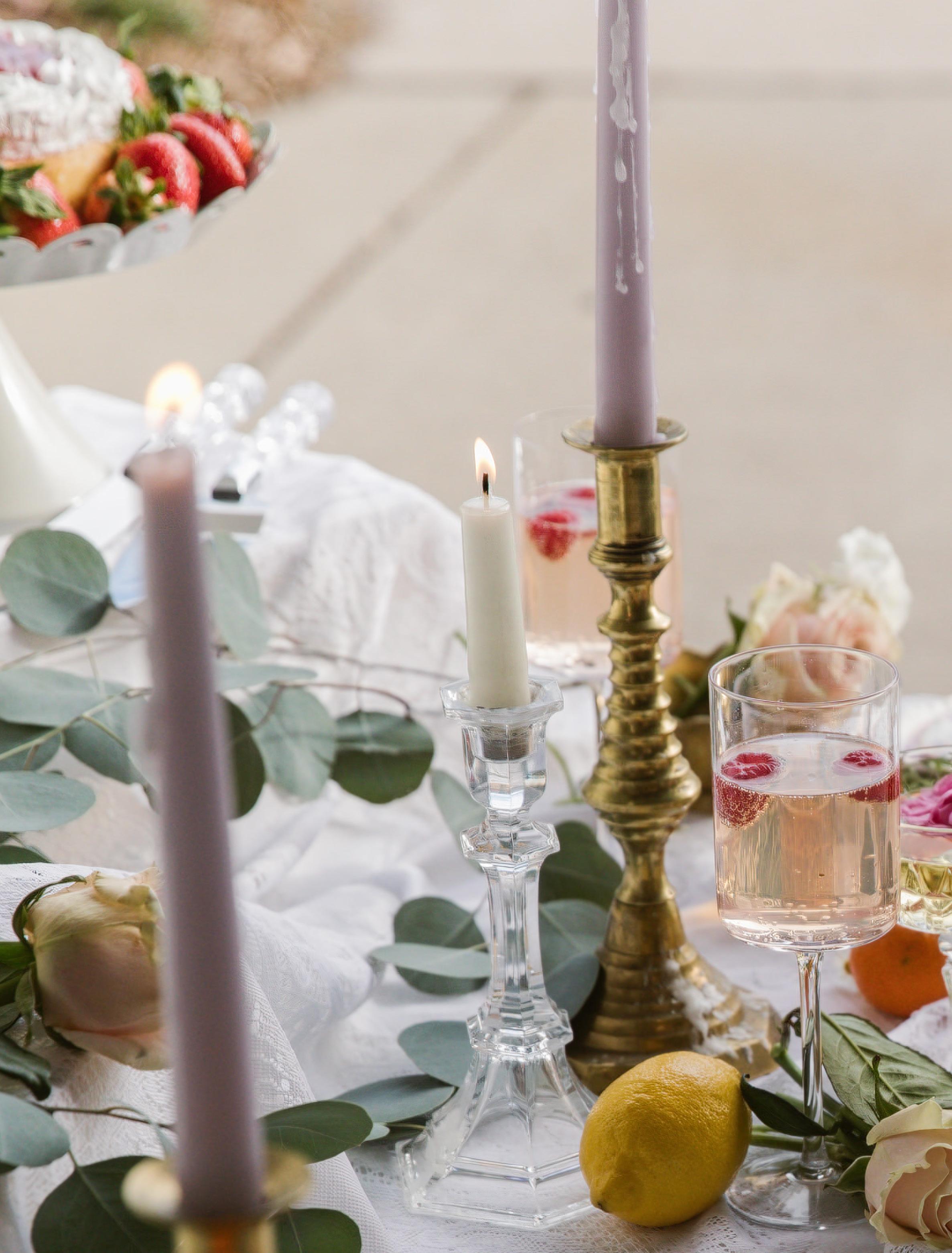
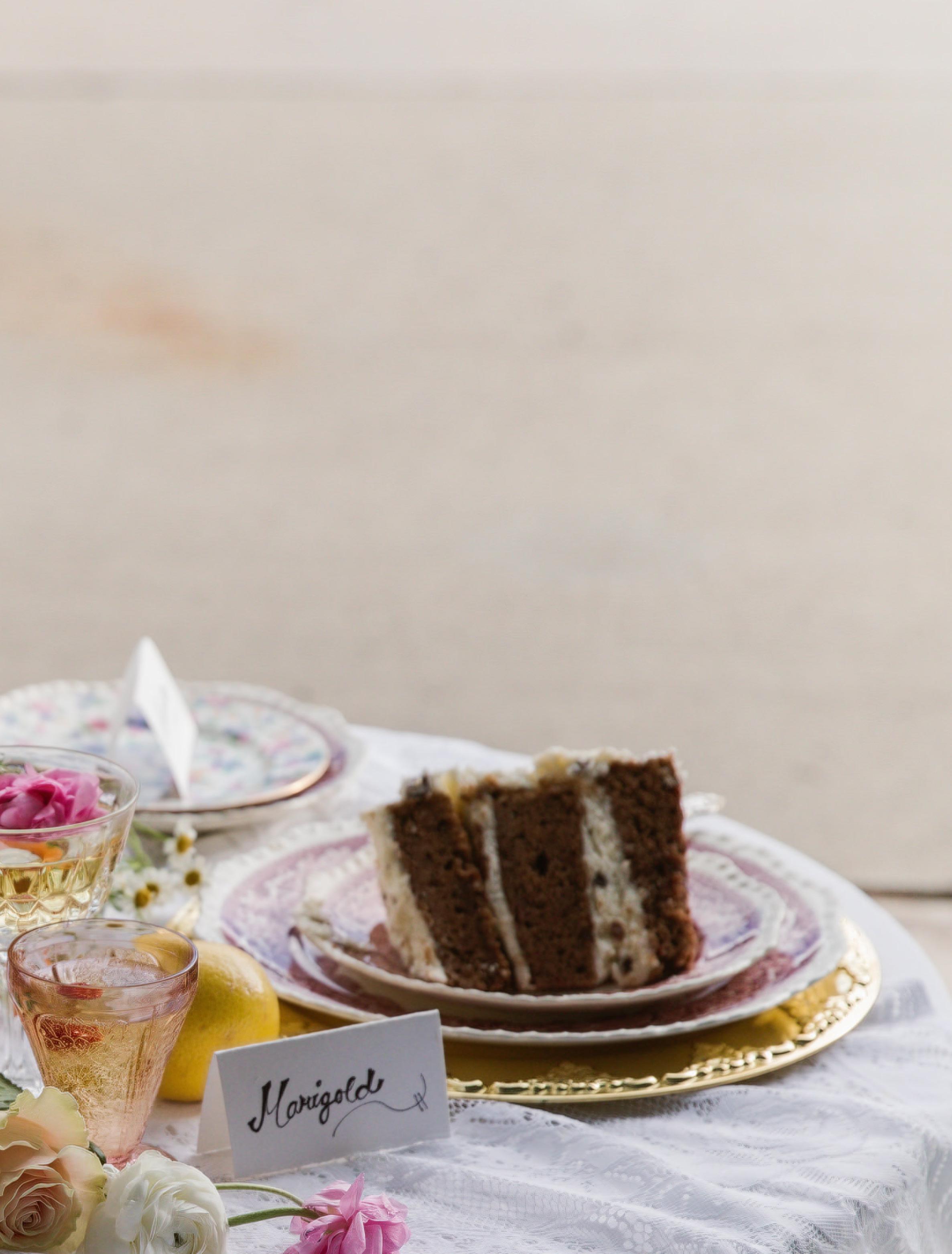
Simple food, layered tables, and the kind of gatherings that stretch well into evening
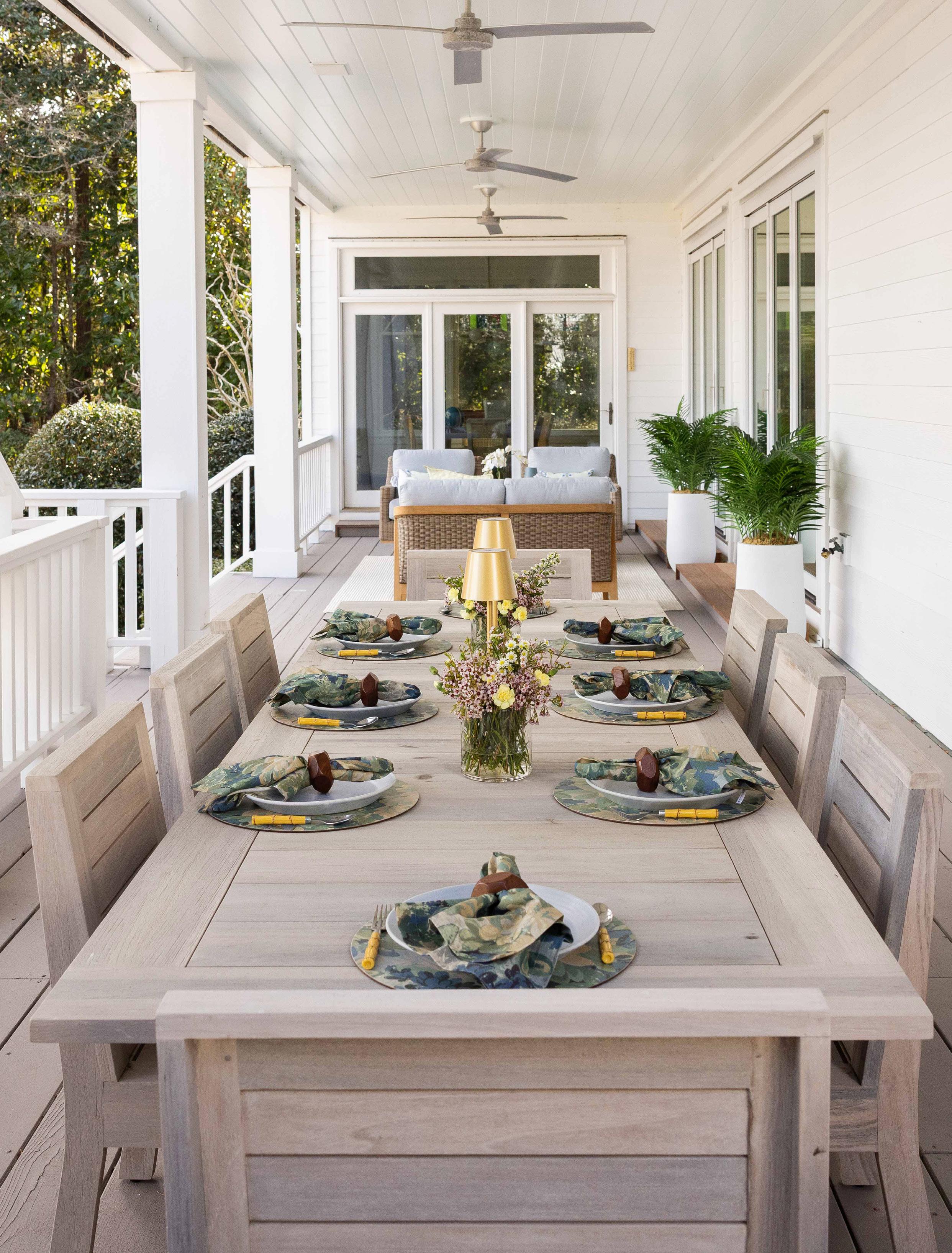
Summer tables aren’t built all at once—they evolve. A loaf of bread torn by hand, a bowl of tomatoes passed without asking, glasses refilled as the light shifts and conversation deepens. There’s less emphasis on ceremony and more on ease, creating a space where people feel welcome to stay a little longer.
In the pages that follow, we’ll guide you through elements that shape an effortless summer table— from generous food and easy drinks to layered settings and thoughtful ambiance—so you can create gatherings that feel relaxed, inviting, and entirely your own.




Summer food should feel generous, not plated. Think big bowls, shallow platters, and dishes designed to be passed rather than presented. The best summer tables begin with food that travels well (salads dressed simply, grilled vegetables still warm, torn bread, ripe fruit) and invites seconds without ceremony. Arrange dishes on wooden cutting boards or lovely platters, letting vegetables pulled from your garden or picked up that morning at the local farmers market take center stage. When food feels unfussy, people help themselves, the table loosens up, and gathering becomes second nature.
Design Tip: Fewer vessels, larger portions—design the table for sharing.
Drinks set the pace of the table. In summer, that rhythm is relaxed—chilled bottles, sweating glasses, and refills within easy reach. Rosé, spritzes, lemonade, or sparkling water all work as long as they’re simple to serve and stay cold. A mix of fancy glasses can instantly elevate the experience, while raspberries, lemon slices, or a few edible flowers add an extra dose of color and intention. Ice buckets and carafes keep everything flowing, so the host stays seated and the gathering finds its cadence naturally.
Design Tip: A little glassware drama goes a long way— vintage vessels make even the simplest drink feel special.

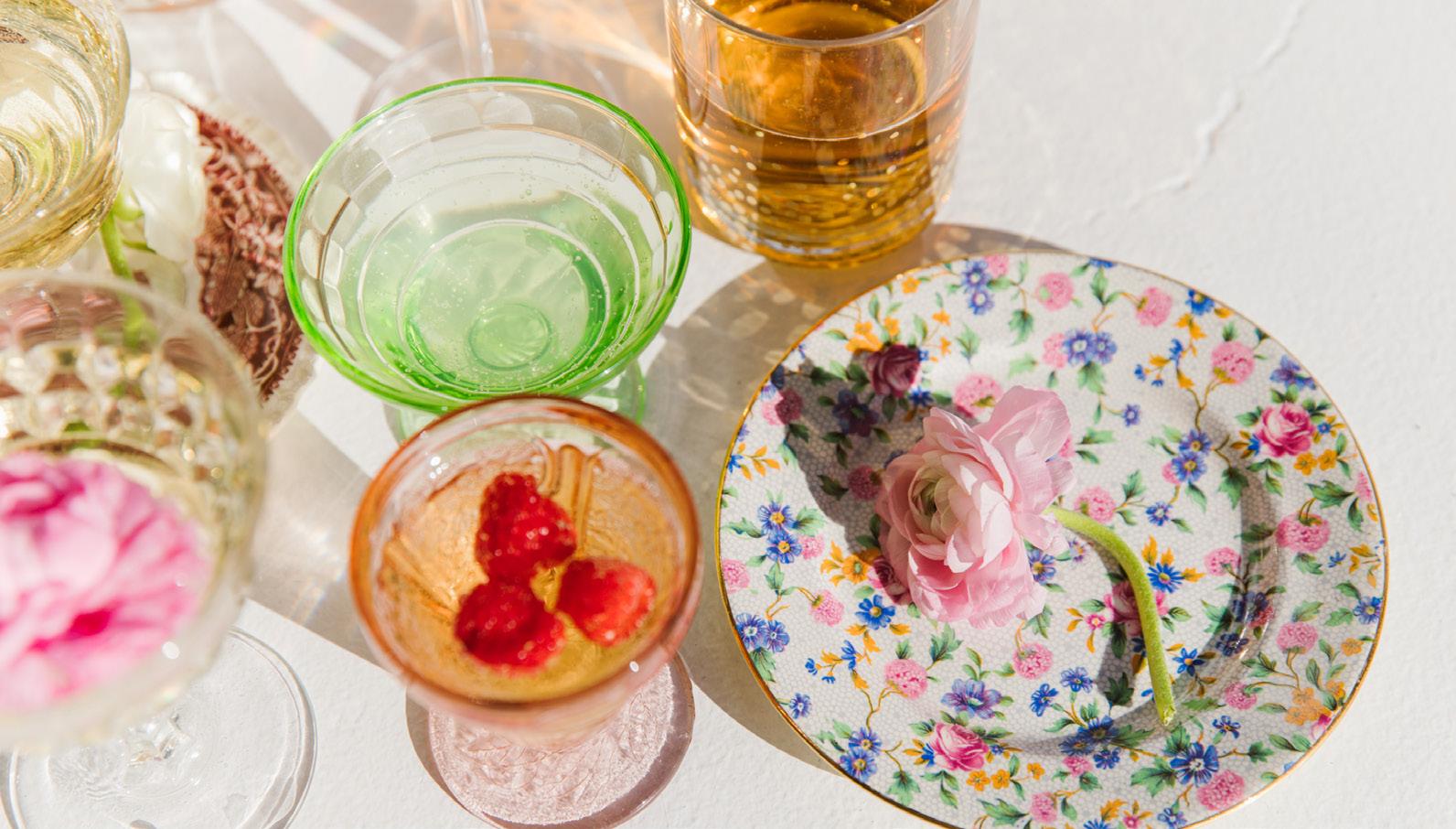

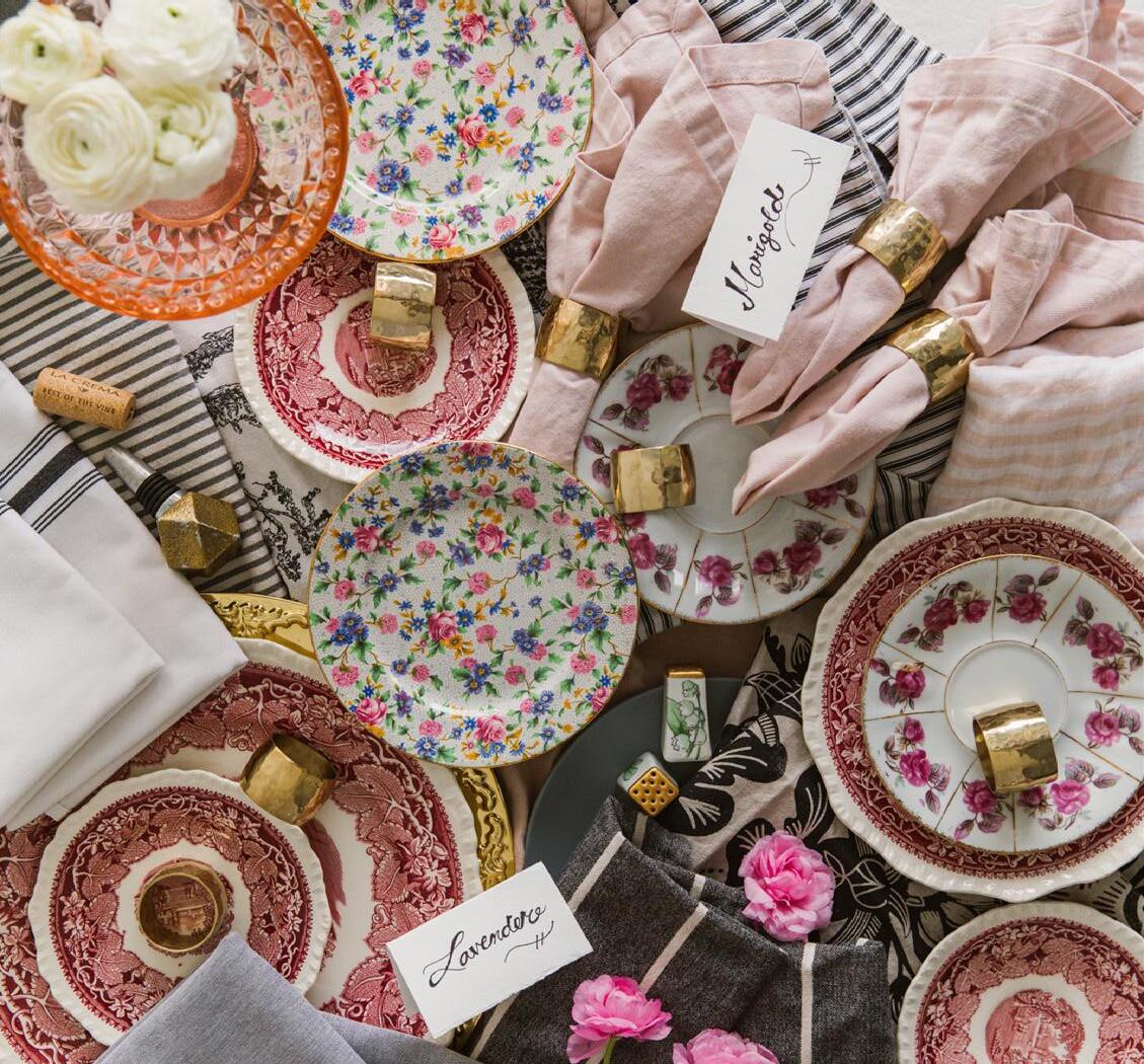
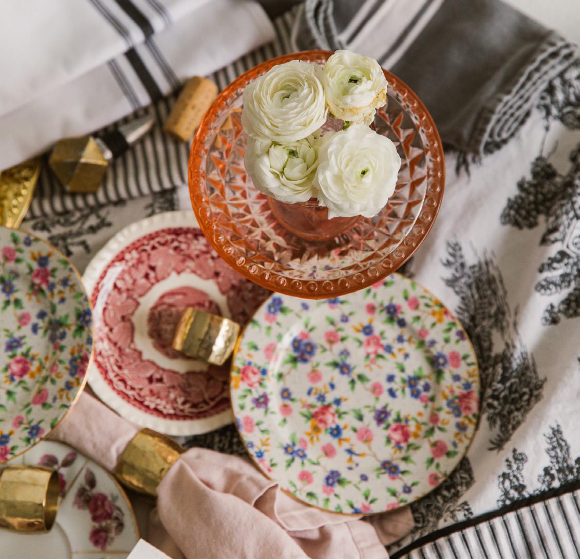
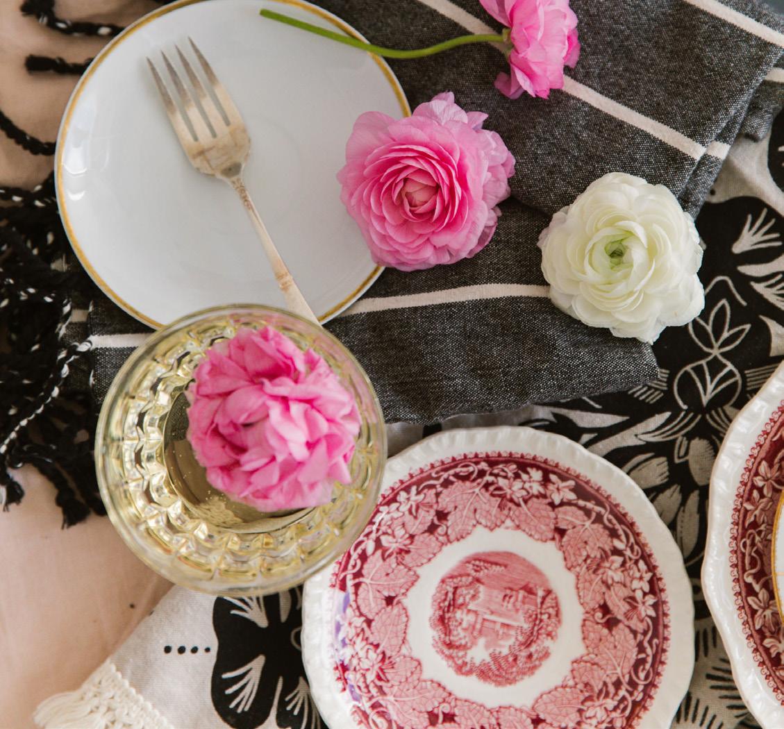
A great summer table is built in layers. Start with something soft—linen, a runner, or a loosely draped cloth—then add dishes and glassware that feel collected rather than matched. Fancy vintage glassware brings character and a sense of occasion, while subtle patterns introduced through napkins add just enough visual interest without overwhelming the table. The goal is a setting that feels considered but flexible, inviting guests to shift, share, and settle in comfortably.
Design Tip: Mix materials and eras for a table that feels lived-in rather than styled.
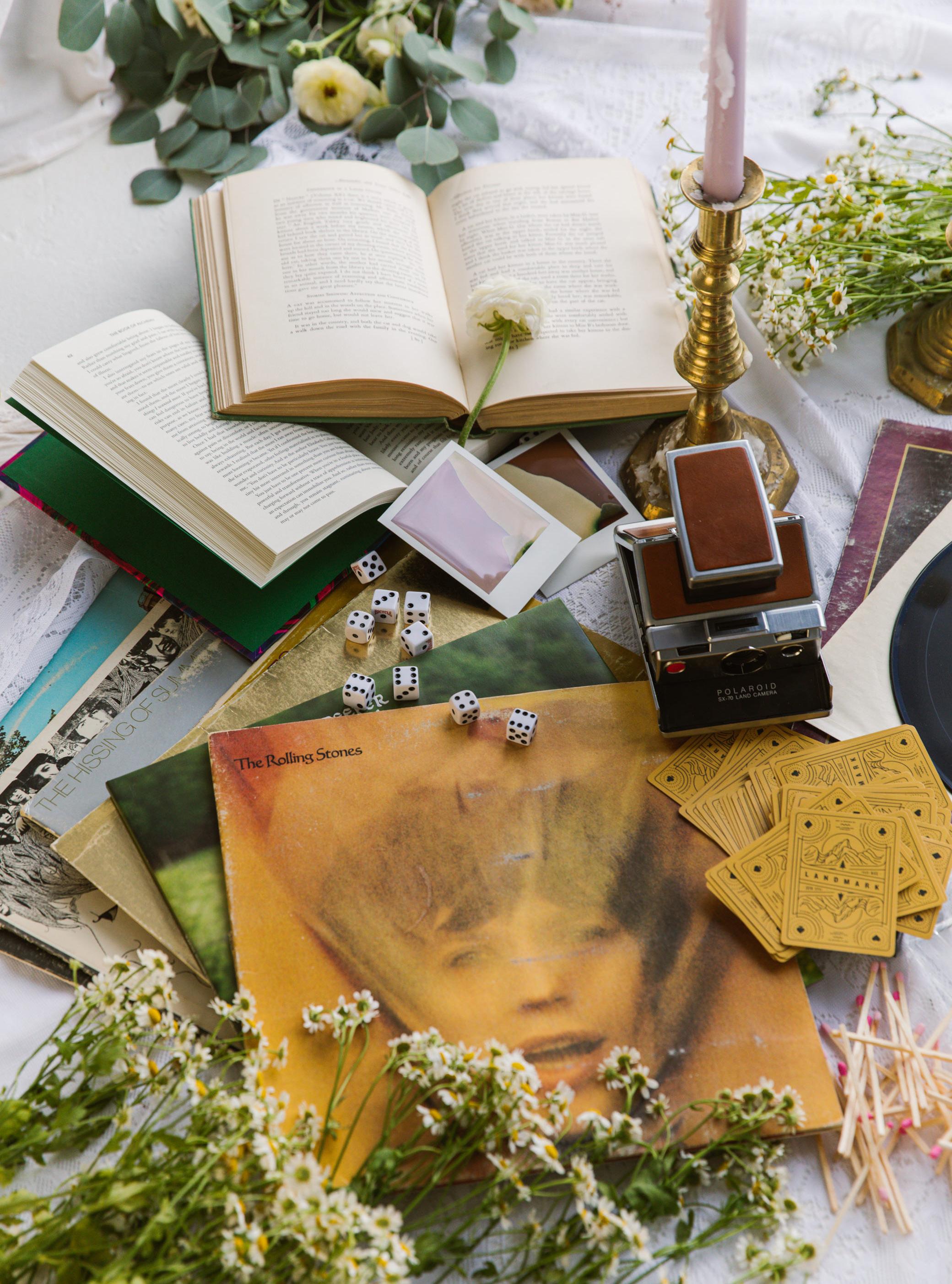
Ambiance is what turns a meal into a memory. It’s less about any single element and more about the feeling you create as the day drifts into evening. Soft music, whether from a favorite record spinning on the turntable or something quietly playing in the background, sets the tone. Candles add warmth as the light fades, while small, thoughtful touches invite guests to linger. A deck of cards, a simple game, or a Polaroid camera left within reach offers an easy way for the table to turn playful, capturing moments without planning them. The goal isn’t to impress or over-style, but to create an atmosphere that feels unhurried and welcoming, where people naturally settle in, forget the time, and let the evening carry on.
Design Tip: Create choices, not instructions— ambiance works best when it unfolds naturally.
In the end, the summer table isn’t about getting everything right—it’s about creating a place people want to return to. Long after the dishes are cleared and the candles burn out, what remains is the feeling of being welcome, of time well spent, of a gathering that unfolded just as it was meant to be.
Our summer shopping guide is a curated collection of warm-weather essentials: breathable linens, sun-washed hues, woven textures, and thoughtful finds designed to be used, layered, and lived with all season long.
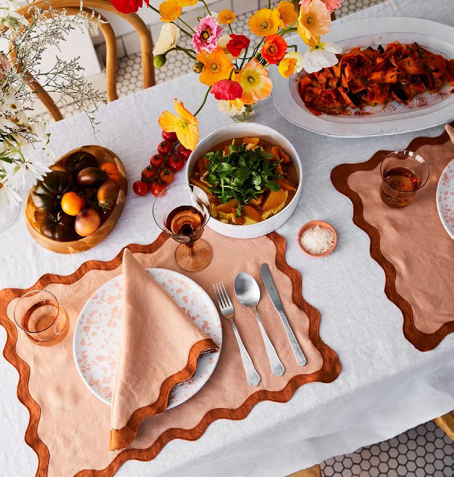
Softly structured with a playful scalloped edge, these linen placemats and napkins bring warmth and personality to the table without feeling precious. The terracotta and rust tones ground casual meals and elevate simple place settings—perfect for everyday use or impromptu summer dinners.
Terracotta & Rust Scalloped Placemats, Set of Four, $64, bedthreads.com
Terracotta & Rust Scalloped Napkins, Set of Four, $56, bedthreads.com
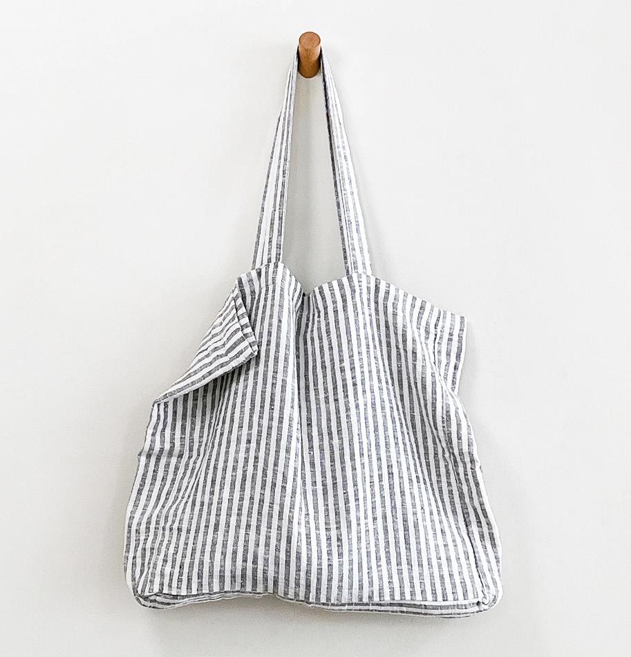
Equal parts practical and polished, this roomy linen tote is made for beach days, farmers markets, and weekend wandering. The classic stripe keeps it timeless, while the soft structure makes it easy to toss over your shoulder and go.
Striped Linen Beach Bag, $78, wilderhouse.com

Breathable, lightweight, and naturally rumpled in the best way, flax linen is a summer bedding essential. The muted, sun-faded palette feels calm and collected, creating a bedroom that stays cool and inviting through warm nights.
Linen Sheets, Pillow Cases and Duvet Cover in Rosewater, Terracotta, and Lavender, $104 - $216, bedthreads.com

The kind of utilitarian beauty that looks just as good draped over a sink as it does tucked into a picnic basket. These linen tea towels dry quickly, soften with age, and add an understated texture to kitchens that lean effortless rather than styled.
Linen Tea Towels, $29, loveheld.com

Light enough for summer evenings and substantial enough to layer, this woven cotton blanket is made for porch swings, beach picnics, and living rooms with open windows. The neutral pattern blends seamlessly into almost any space. Woven Cotton Blanket, $52.50, etsy.com
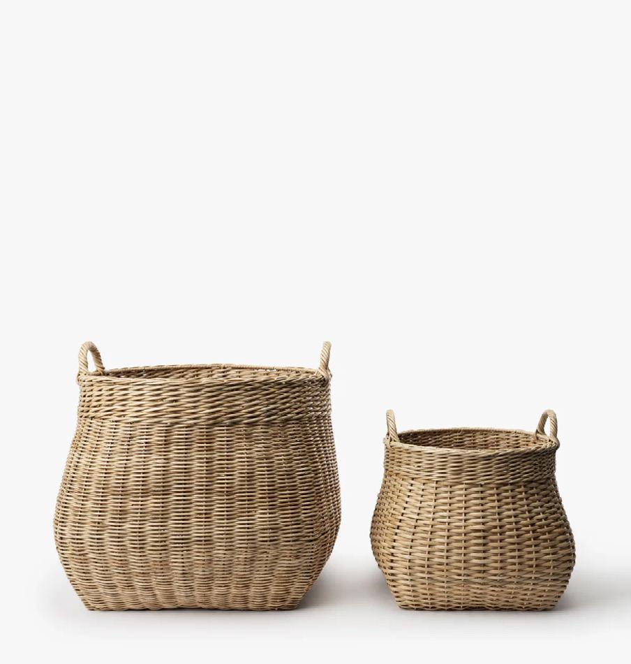
Designed for indoor living, this structured woven basket is ideal for corralling throws, magazines, or kids’ summer gear. It adds texture and warmth while keeping everyday clutter beautifully contained. Boyce Woven Basket, $145, mcgeeandco.com
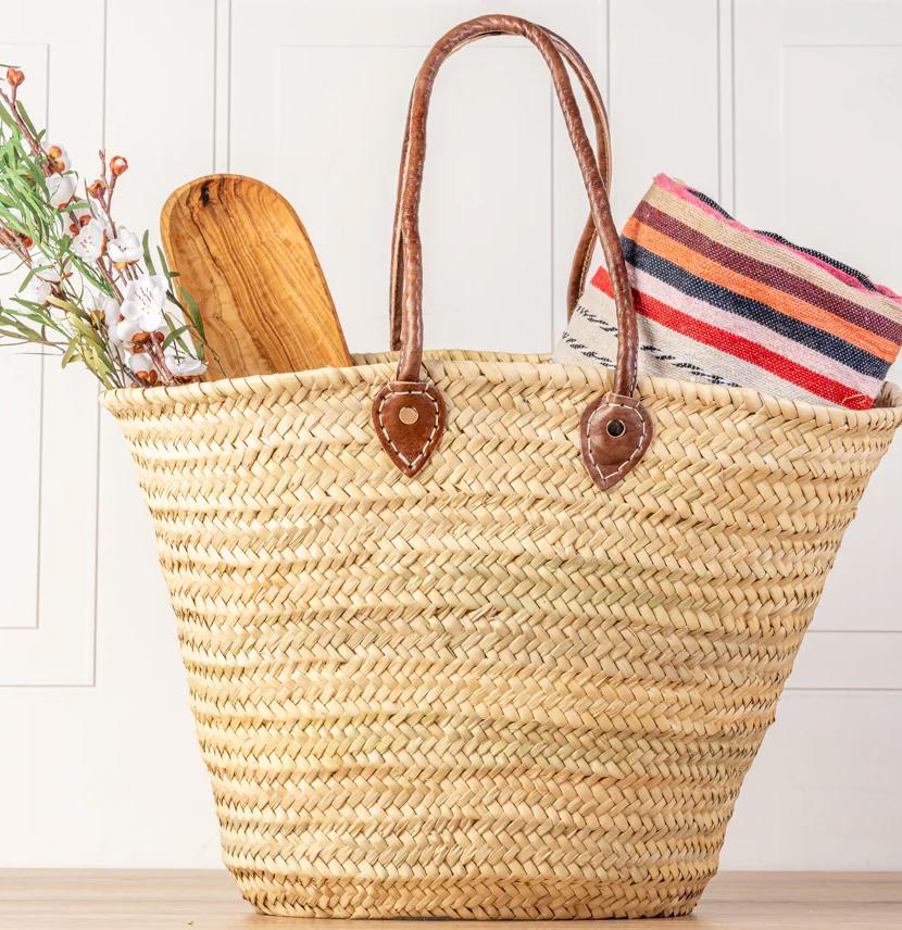
A warm-weather staple that works just as well at the farmers market as it does at the beach. Handwoven and generous in size, this basket brings charm and function to everyday summer errands. Moroccan Shopping Basket, $48, verveculture.com

A modern classic. These smoked glasses feel substantial without being heavy and stack neatly for easy storage—perfect for summer cocktails, iced coffee, or sparkling water on warm afternoons Buchanan Smoked Stacking Double Old-Fashioned Glass, Smoked, $8.95, cb2.com
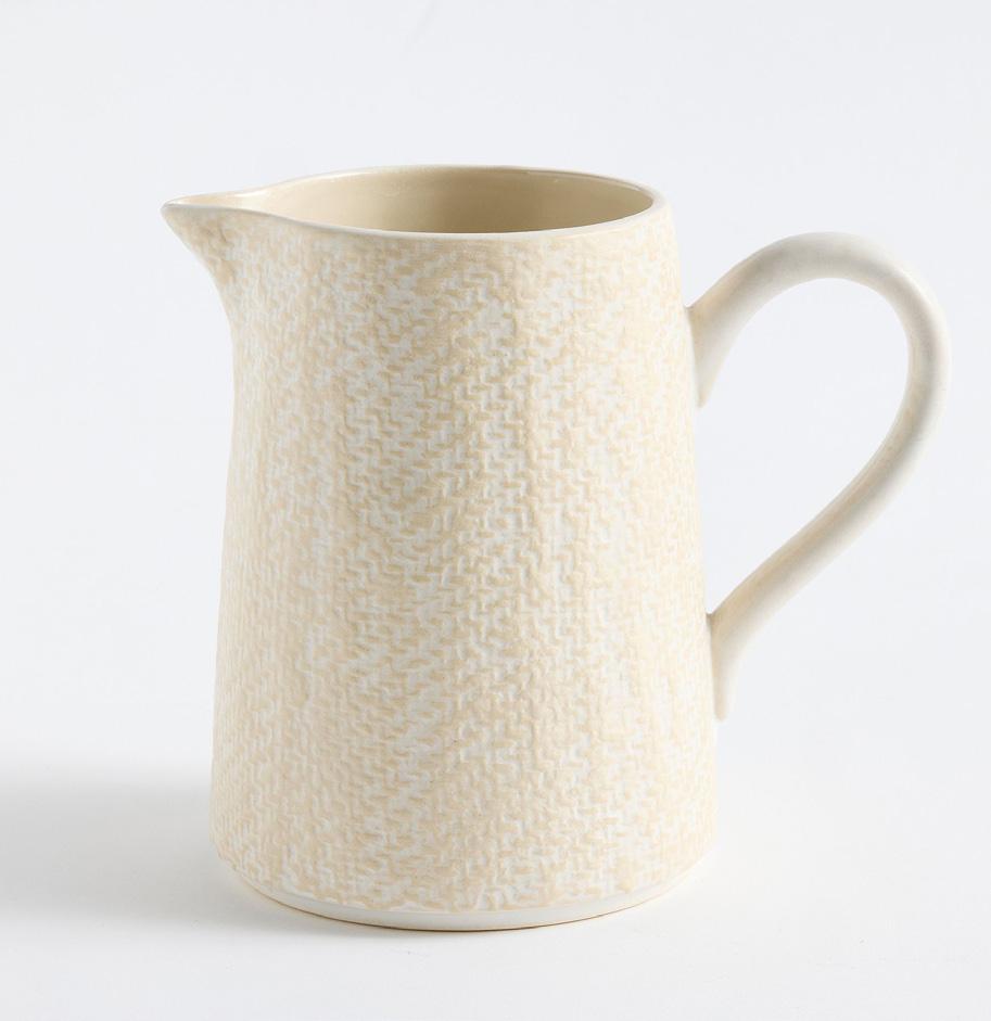
Casual yet sculptural, this stoneware pitcher moves easily from kitchen to table. Use it for lemonade, sangria, or fresh-cut flowers—it’s the kind of piece that earns its place year-round.
Elana Stoneware Pitcher, $49.50, potterybarn.com
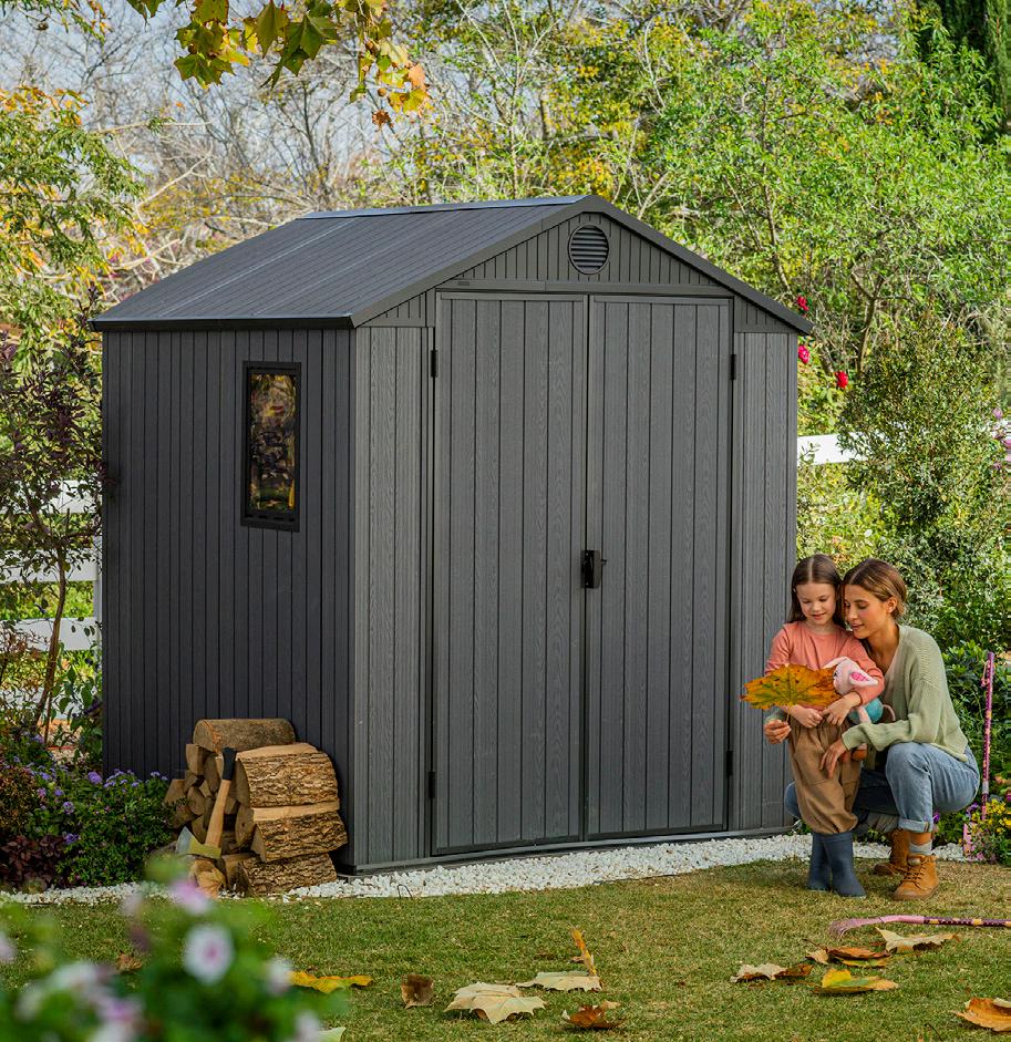
Once summer pillows, throws, and outdoor accessories start to accumulate, smart storage becomes essential. This compact shed keeps everything protected and organized without sacrificing style so outdoor spaces stay fresh, functional, and ready for use.
Darwin 6x4 Storage Shed with Windows - Graphite, $699, keter.com
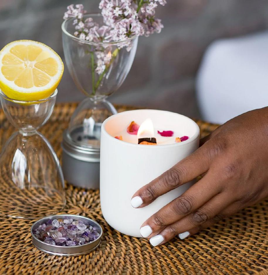
Softly scented and intentionally crafted, this candle adds a layer of quiet ritual to summer evenings. The embedded amethyst brings a subtle sense of grounding, making it as thoughtful as it is beautiful.
Pathway Candle with Amethyst by Cultivating Luminescence, $36, ladyfingersletterpress.com
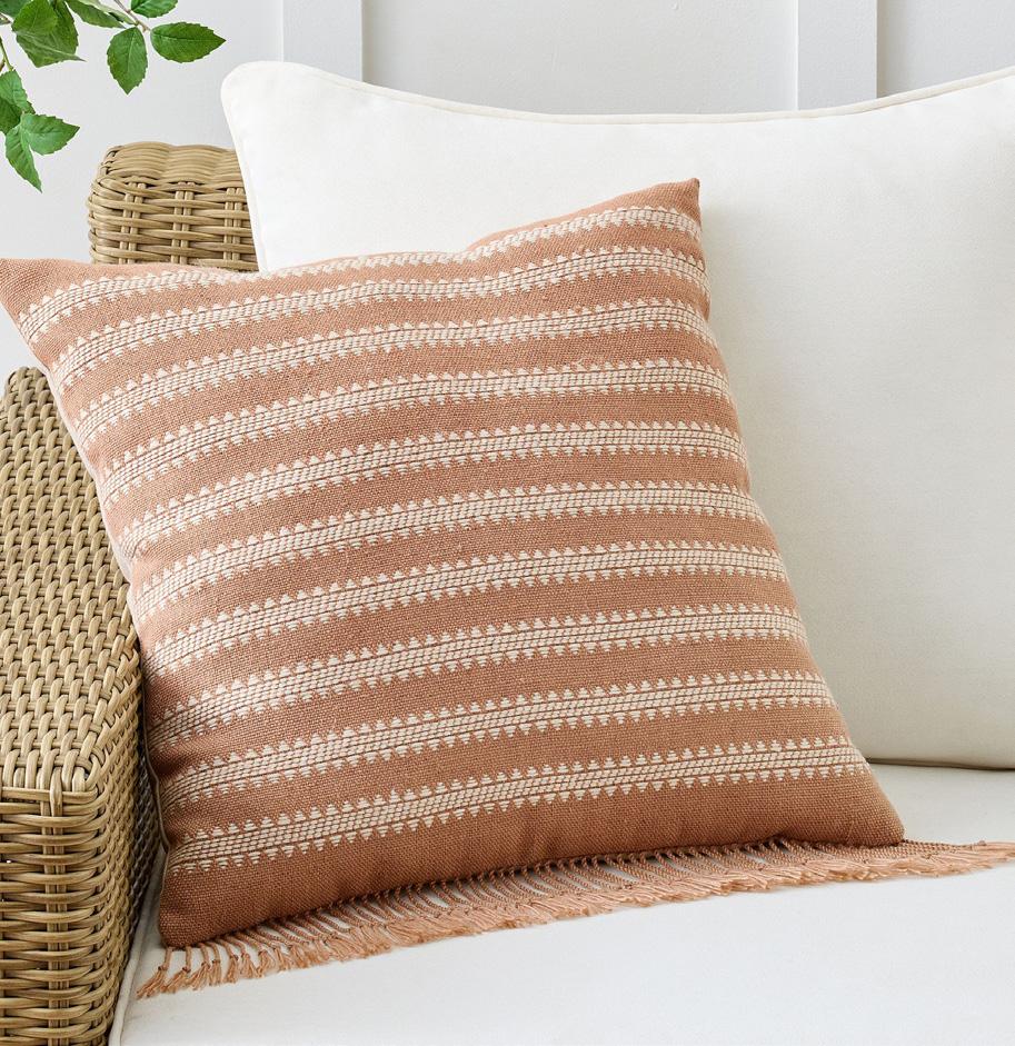
Durable enough for outdoor living but styled like an indoor accent, this woven pillow adds comfort and pattern to patios, porches, and decks. The subtle stripe feels classic, relaxed, and easy to mix.
Clemente Woven Striped Outdoor Pillow, $46, potterybarn.com
TEXT BY JASMINE BIBLE + PHOTOGRAPHY BY ANDREW KUNG
For Isabel Ladd, founder of Isabel Ladd Interiors, a room isn’t finished until it has a “jolt.” Ladd operates on a high-energy frequency of “pattern-pattern-pattern,” a creative obsession rooted in her professional background in textile design.
While many designers steer clients toward safe, neutral palettes for resale value, Ladd advocates for “curated maximalism”— an approach that gives homeowners permission to evolve and inhabit a space that is as bold and layered as their own history.
In this Lexington, Kentucky, project, the homeowners sought out Ladd specifically because they loved her fearless approach to design. Having worked with her before, they arrived with a deep appreciation for her signature style. Ladd’s process avoids the typical “what’s your favorite color” questionnaire; instead, she spends time ascertaining a client’s specific vibe and energy. By setting a specific artistic direction from the start, Ladd was able to transform a blank beige slate into a deeply collected reflection of the family’s lives, reinforcing her design philosophy that a busy family life is never an excuse to sacrifice style.
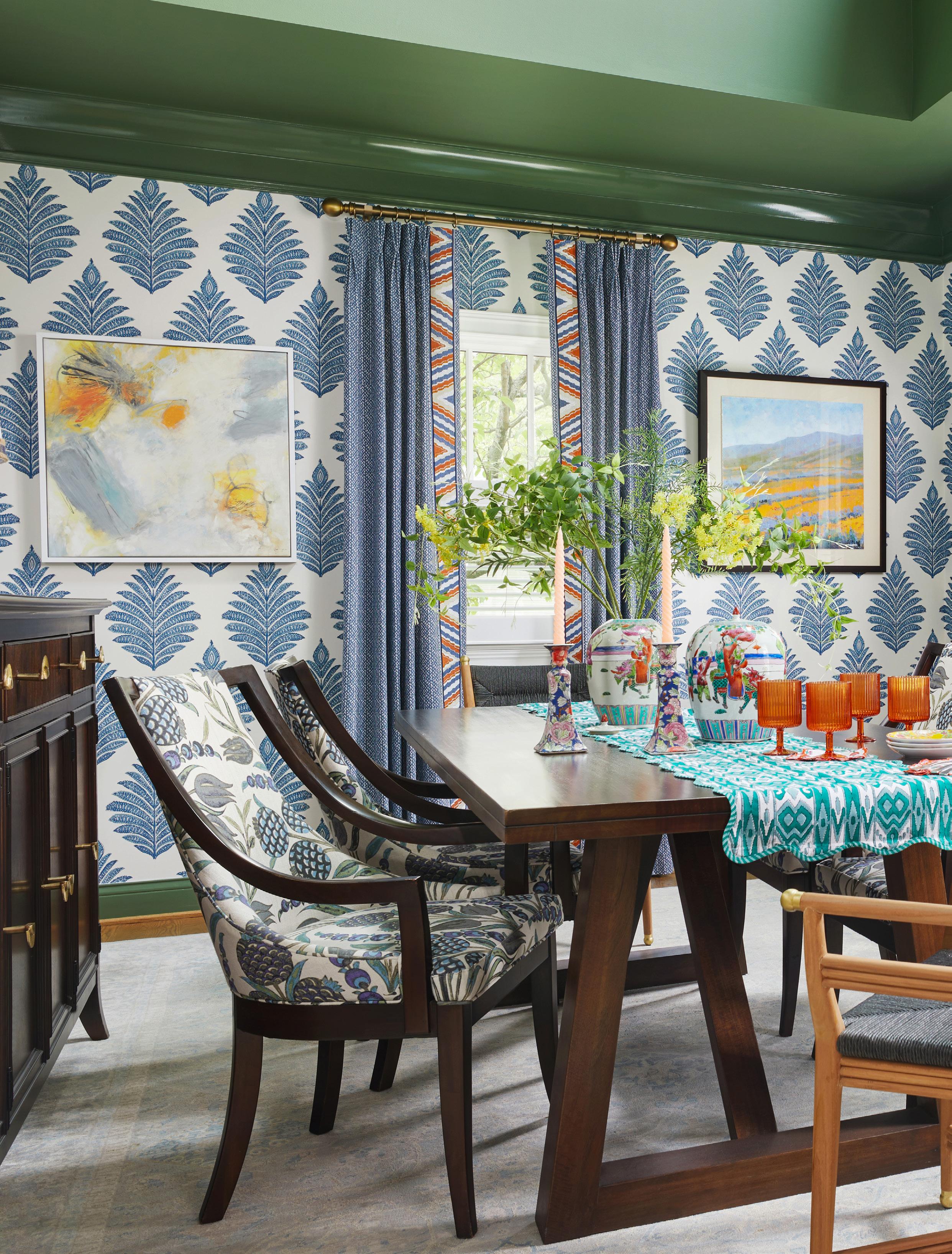
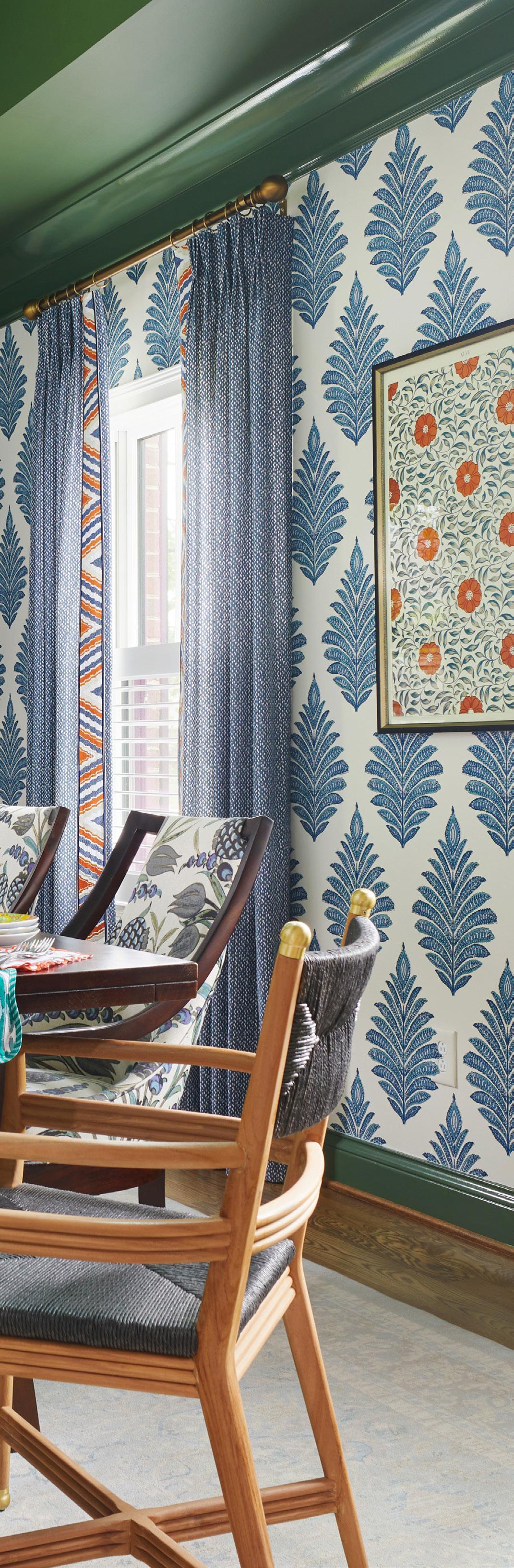
The dining room serves as a masterclass in pattern play, anchored by a bold wallpaper from Thibaut. While many equate Isabel Ladd with a love for color, she notes that it is her use of visual complexity and “pattern-drenching” that truly sets her work apart. We find patterns in the wallpaper, fabric on the dining chairs, the table runner, the rug, and even two different patterns on the draperies. The real drama, however, happens on the fifth wall: the tray ceiling is painted in Benjamin Moore’s Herb Garden, creating a saturated green canopy that connects the indoor space to the Kentucky landscape visible through the windows.

ISABEL LADD
Firm: Isabel Ladd Interiors
Home Location: Lexington, KY
Year Built: 2019
Insta: @isabel_ladd_interiors
Website: isabelladdinteriors.com
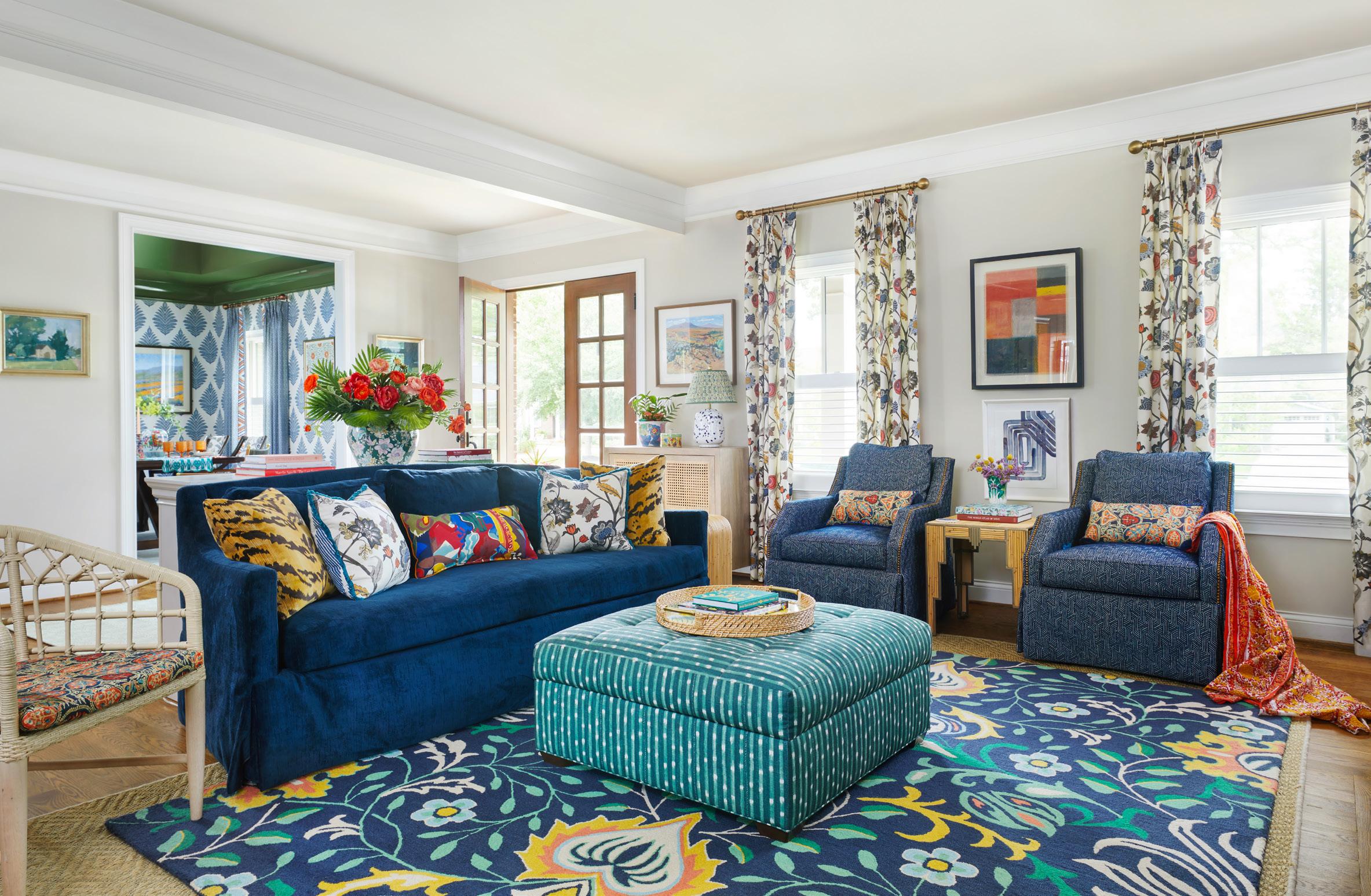
Anchored by a massive, floral-patterned rug that dictates the color thread for the entire open floor plan, the living room serves as a vibrant study in contrast. To ground the high energy of the patterns, Ladd filled the space with a plush navy velvet sofa and a pair of upholstered armchairs in a subtle blue pattern with orange piping. The secret to the room’s success is what Ladd calls “the weird”—that one unexpected color or texture that breaks the rules. While the room is predominantly swathed in blues and greens, she injected unusual pops of orange to prevent the space from feeling too predictable. Punchy orange appears in the draperies by Lacefield Designs, the artwork, and the pillows by Mind the Gap. A teal-striped ottoman serves as a central focal point, while a mix of silhouettes—from traditional upholstered armchairs to a sculptural woven side chair, ensures the space feels collected over time.
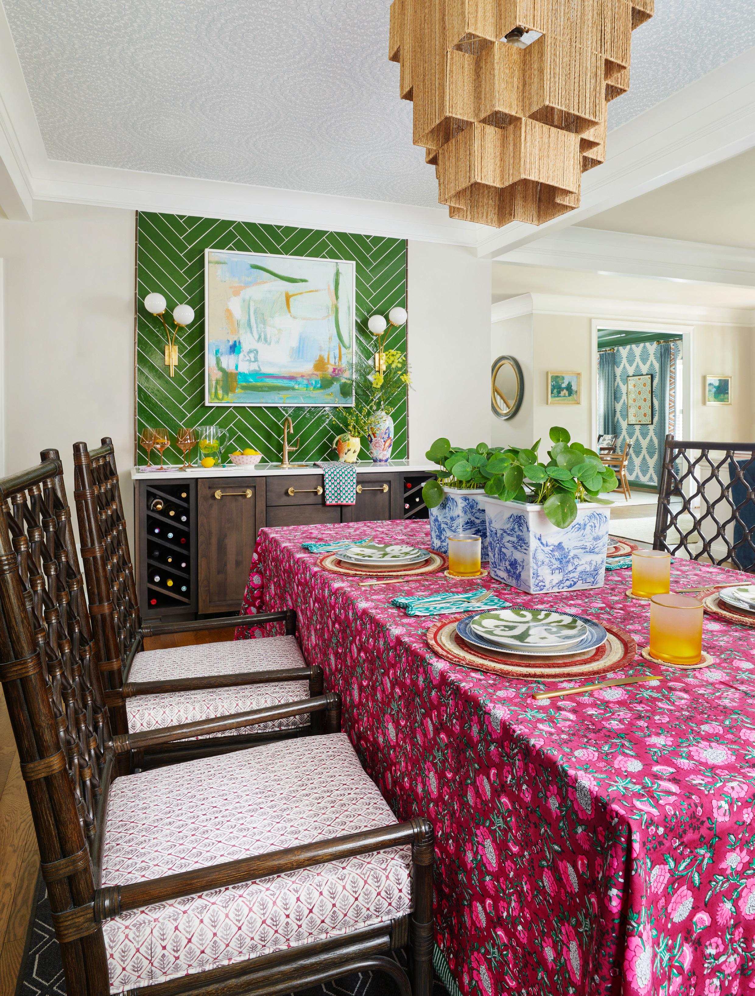
In the eating area off the kitchen, Ladd introduced architectural interest through texture rather than just paint. The wet bar features handmade Zellige tiles, chosen for their imperfect, wavy surface. Layered on top are playful gold sconces. To keep the eye moving, Ladd utilized the tray ceiling as a design opportunity, installing a subtle Thibaut floral wallpaper. A woven rattan and rope light fixture adds a structural, bohemian note that softens the high-gloss green cabinetry in the kitchen. This layering of artisanal finishes feels curated but not overly fussy.
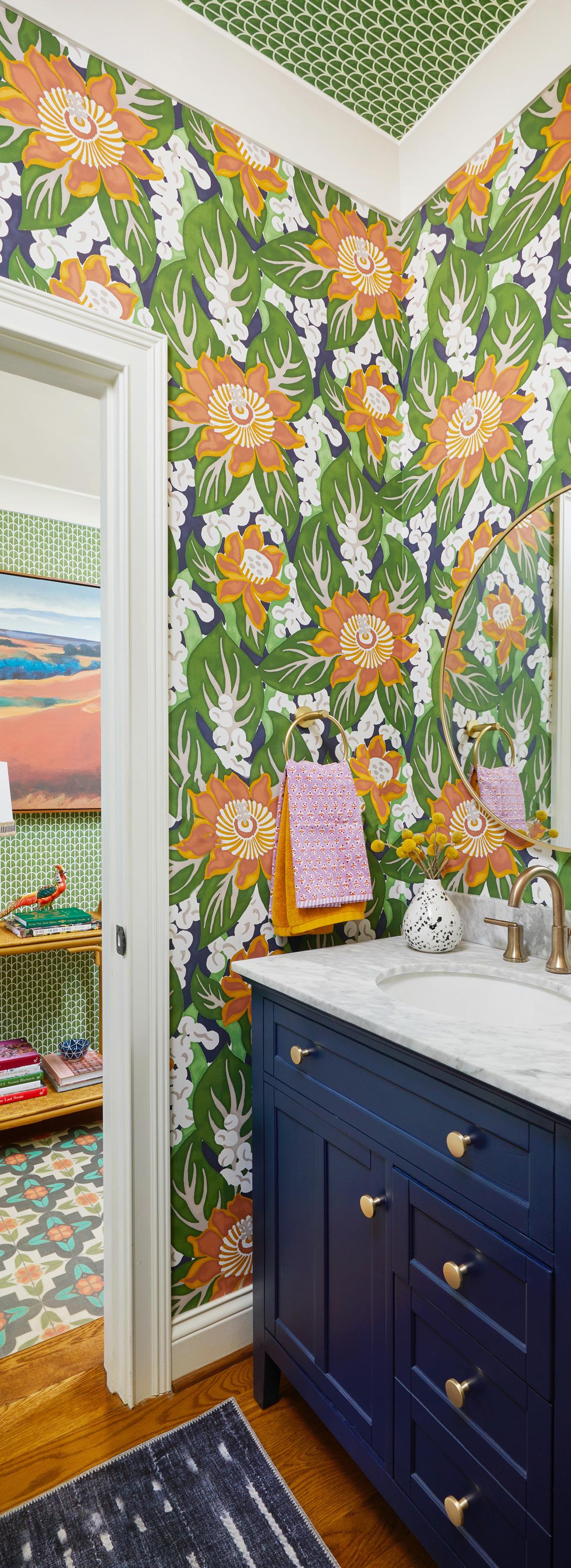
If the rest of the house is a conversation, the bathroom is a joyful shout. Ladd loves a bathroom that “screams happiness,” and this space delivers through a sophisticated play on scale. She layered different pattern sizes (using a large floral on the walls and a smaller trellis pattern by CW Stockwell on the ceiling and in the hallway) to create a room that feels expansive despite its footprint. A deep navy vanity with a marble top provides a saturated anchor for the room, while a circular gold mirror reflects the high-energy, pattern-drenched environment.
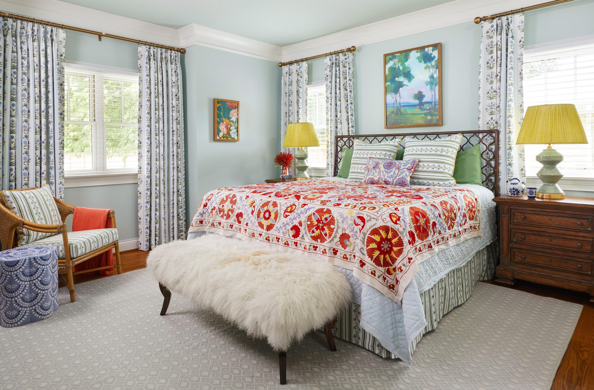
In the primary bedroom, Ladd created an enveloping, restful sanctuary. Once again, this room utilizes the technique of pattern drenching, but in this instance a single motif is repeated throughout. The delicate Indian floral pattern by Schumacher appears on the custom draperies and the bed skirt, with a coordinating pattern placed on the Euro shams and accent chair. To ensure the soft palette didn’t feel “flat,” Ladd introduced her signature jolt of energy through color and global textures. A vibrant, multi-colored vintage Suzani throw is layered over the bed, while a pair of pleated chartreuse lampshades add a sharp, modern punch against the light blue walls. The ceiling is once again included in the story, painted in a soft sky blue to enhance the sense of being completely cocooned within the space.
“Maximalism done right is curated and collected; everything has its place,” Ladd reflects. The result is a richly layered world to explore—one where pattern, color, and the weird come together in thoughtful balance. Perhaps that’s the most effortlessly chic approach of all.

Between the antiqued texture and that deep mossy hue, this glossy porcelain tile is a total showstopper— especially when laid in an elegant herringbone pattern. Glossy Porcelain Tile in Moss, $10/sq. ft., lowes.com
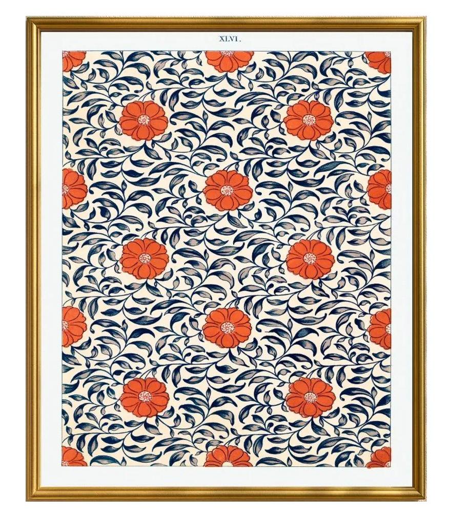
Who knew a 19th-century study of Chinese porcelain could look so fresh? This vibrant lithograph by design pioneer Owen Jones adds a layer of global history and sophisticated color to your gallery wall. Owen Jones Chinese Ornament Plate LXX Print, $117, etsy.com/shop/PathosStudioUK
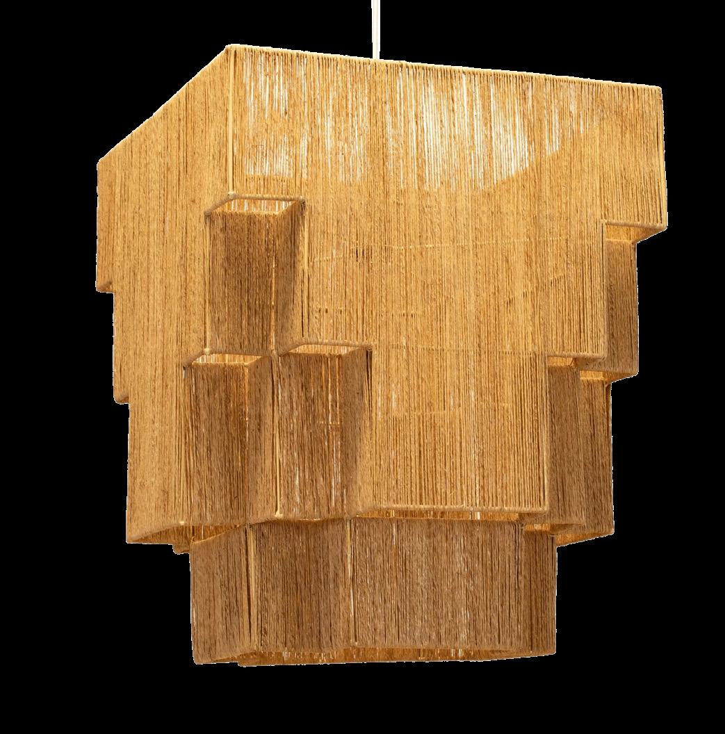
Art Deco geometry meets coastal texture with jute-wrapped tiers and a sophisticated ziggurat shilouette from Studio Shaolin. Emma Chandelier, $925, wovenbyshaolin.com
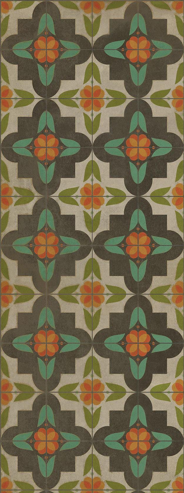
A trip-proof, pet-friendly alternative to a traditional rug, yes, please. This durable vinyl update to an 18thcentury floorcloth offers a weathered, vintage look that you can actually wipe clean. Vintage Vinyl Floorcloth in Anna’s Garden, From $58.50, hudsonandvine.com
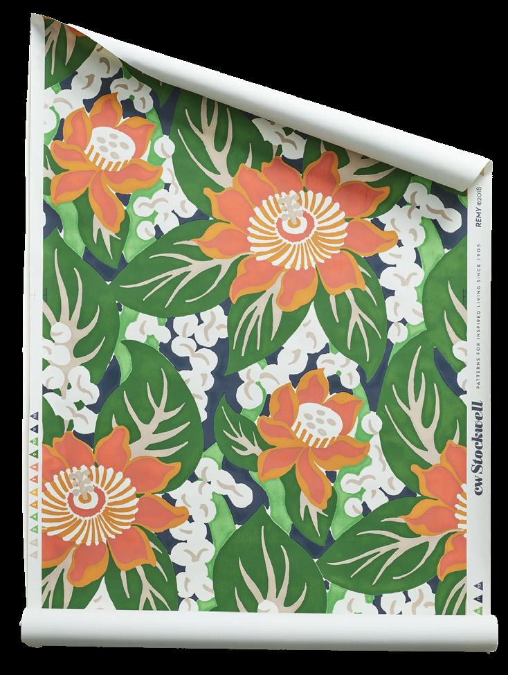
Talk about a citrus-hued masterpiece. This hand-drawn 1968 pattern requires 24 screen passes to achieve its rich watercolor effect, making these large-scale petals and leaves feel like a custom mural. Remy Wallpaper in Tangerine, $368 per roll, cwstockwell.com
Originally designed to catch soot in 19th-century homes, the “smoke bell” lantern gets a glow-up here. Pairing aged iron with antiqued mercury glass, this fixture brings a moody, vintage-meets-modern vibe to an entryway. Lorford Smoke Bell Lantern, $1,999, visualcomfort.com
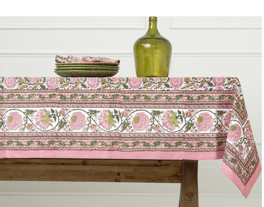
Hand-block printed in India, this 100% cotton tablecloth is a bohemian dream. The rhythmic floral motif in earthy moss and soft mauve adds instant warmth and artisanal soul to your next dinner party. Bohemian Floral Moss & Mauve Tablecloth, From $96, pomegranateinc.com

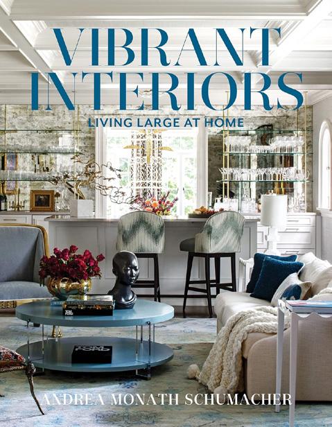
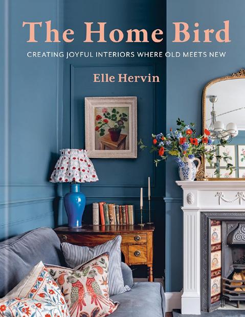



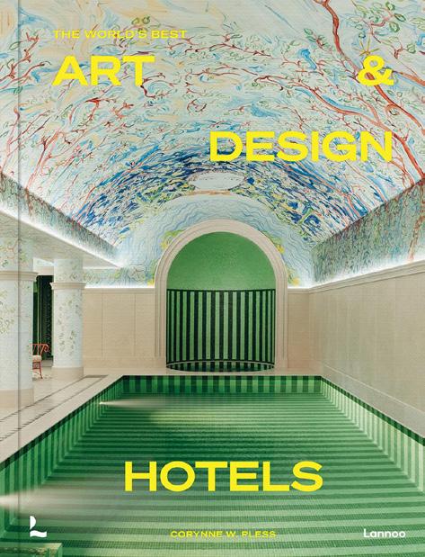

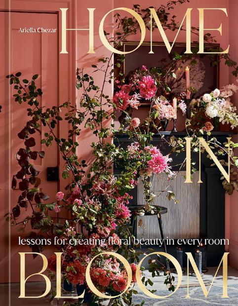
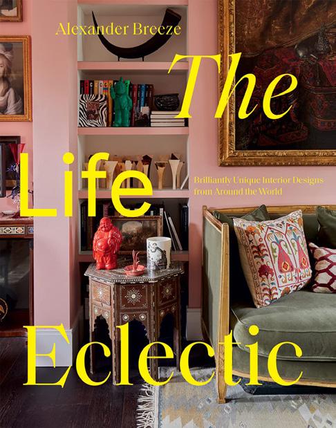
What we’re reading this summer: books to inspire your garden, your table, your home, and your imagination.



by Andrea Monath Schumacher
A fearless celebration of color, pattern, and personality. Schumacher’s proves sophisticated spaces don’t have to be quiet, offering bold inspiration for anyone ready to ditch beige and fully embrace expressive, joyful maximalist design.
The Home Bird by Elle
Hervin
Elle Hervin blends vintage charm with modern sensibility, celebrating slow collecting and deeply meaningful spaces. A warm reminder that the best homes evolve over time, shaped by instinct, memory, personal story, and everyday moments.
by Design Hotels
A curated journey through Design Hotels’ most striking properties, exploring atmosphere, architecture, and cultural context. Each space offers inspiration for travelers and aesthetes alike, with a side of irresistible wanderlust and daydream-worthy destinations.
The Book of Alchemy
by Suleika Jaouad
A thoughtful journaling guide combining essays and prompts to encourage creativity, reflection, and resilience. Inspired by Jaouad’s personal journey, it’s a grounding companion for quiet moments, gentle rituals, and meaningful personal reset.
by Beth Benton Buckley
Thirty visionary designers showcase custom, curated interiors rich with personality. Lavish imagery and editorial insight reveal creative philosophies while celebrating artisanship, collaboration, and unapologetically distinctive spaces across styles and geographies.
by Corynne W. Pless
Pless curates a dazzling collection of hotels where design takes center stage. From bold modernism to serene retreats, each property blurs hospitality and art, offering endless visual inspiration and global escape.
by Jane Hall
Jane Hall spotlights women reshaping interiors through bold ideas and deeply personal perspective. This visually rich collection celebrates creativity, identity, and the designers redefining how we experience space in everyday life.
by Lara Einzig
A vibrant tribute to women transforming surf culture through strength, creativity, and independence. Striking photography pairs with personal stories, making this an energizing read for ocean lovers, dreamers, and modern adventurers.
Alison Roman
Alison Roman turns simple pantry staples into stylish, flavor-packed meals. Her unfussy approach proves everyday cooking can feel elevated, making this a go-to guide for relaxed gatherings, weeknight dinners, and bold home cooking.
by
Padma Lakshmi
Padma Lakshmi explores American cuisine through migration and memory, blending vibrant recipes with personal stories. A celebration of cultural influence, perfect for leisurely cooking, lively gatherings, and lingering afternoons around the table.
by
Alexander Breeze
Alexander Breeze celebrates interiors that feel collected, not decorated. A joyful invitation to embrace bold choices, creative freedom, and surround yourself with colors and objects that make a home uniquely yours.
Ariella Chezar
Ariella Chezar brings garden beauty indoors with an intuitive, poetic approach to florals. Lush imagery inspires seasonal living, creative expression, and finding quiet beauty in imperfection.
There is a point in each year when the calendar loosens its grip. School lets out. Evenings stretch and the light lingers longer. Summer doesn’t arrive all at once. It settles in gradually, bringing with it the possibility of a slower pace.
At first, that slowness feels seasonal. Heat can stop us in our tracks, forced pause. But long days resist stoppage. Then, it becomes clear that summer offers more than a change in temperature or schedule, introducing a way of moving through life shaped by details rather than urgency.
Morning rituals are the first to shift. Coffee moves outside. A yoga mat on the back deck. Shoes stay by the door. The day begins without the immediate pull of screens. Birds announce themselves. These moments don’t ask to be optimized, only to be noticed.
Writer Annie Dillard once said, (and I love this quote) “How we spend our days is, of course, how we spend our lives.” Small, ordinary choices made daily shape the larger arc of a life, and it seems like we get more of those choices in summer.
Pools can become places of lingering rather than laps. Books are reread. Conversations unfold without an endpoint. Heat enforces restraint. In these hours, doing nothing becomes an active choice that requires resisting distraction and allowing time to pass without interference (a cocktail sometimes helps). The lesson extends beyond the season. The pace we choose in summer often reveals habits we carry throughout the year. How quickly we move through conversations or hurry past moments that deserve more care. Slowing down with children changes

the game entirely. When time is not managed, curiosity surfaces, questions linger, attention deepens. Even at work, deliberate pacing can sharpen judgment, improve focus, and reduce the sense of reaction.
Design can support a slower tempo. Outdoor spaces arranged for comfort rather than performance. Furniture that invites rest instead of posture. Shade that moves naturally throughout the day. Materials that weather and soften over time. When environments are designed to be lived in rather than managed, slowing down feels less like a decision and more like a natural response.
Easing off the accelerator, scenery returns into view, and the journey takes its rightful place. Nature reinforces these lessons. Cicadas mark time. Light shifts incrementally, indifferent to our attempts to rush it or block it. These patterns offer a reminder that processes unfold on their own. Evenings extend the invitation. Dinner drifts later. Fireflies appear. Music plays quietly, or not at all. There is no urgency to retreat indoors and the day resolves without insistence.
Slow season is not about escape or retreat, but recalibration: recognizing that speed left unchecked narrows our experience. Choosing a slower tempo, even briefly, expands time, allows us to notice patterns, strengthen relationships, and reconnect with environments that support us. As summer unfolds, the opportunity is not to do more, but to do less with intention. And remember that how we spend our days is not incidental, as over time our patterns come to shape our lives.

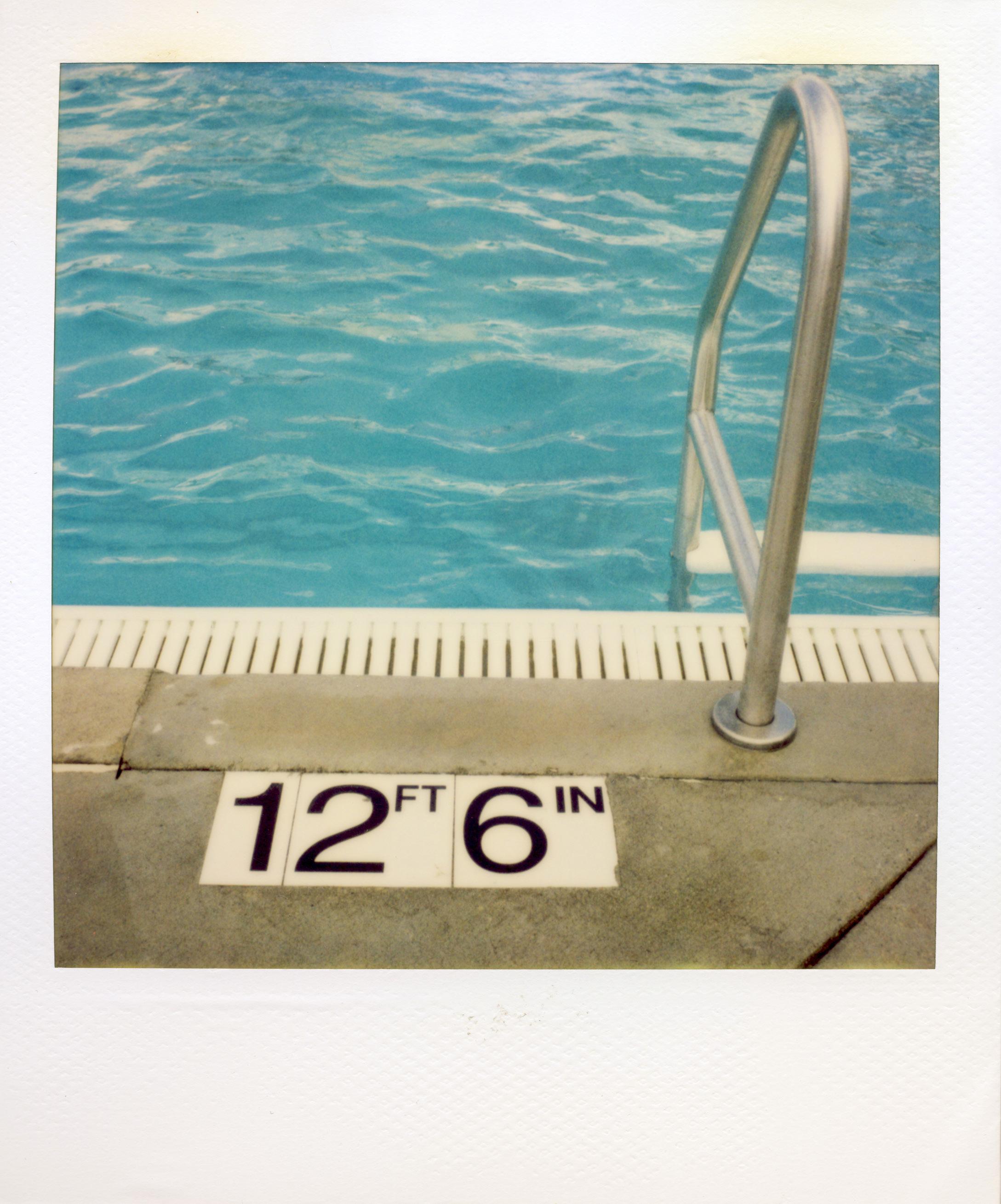
“Nature does not hurry, yet everything is accomplished”
— Lao Tzu