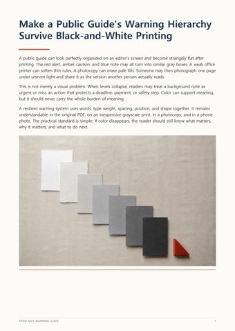
Make a Public Guide's Warning Hierarchy Survive Black-and-White Printing A public guide can look perfectly organized on an editor's screen and become strangely flat after printing. The red alert, amber caution, and blue note may all turn into similar gray boxes. A weak office printer can soften thin rules. A photocopy can erase pale fills. Someone may then photograph one page under uneven light and share it as the version another person actually reads. This is not merely a visual problem. When levels collapse, readers may treat a background note as urgent or miss an action that protects a deadline, payment, or safety step. Color can support meaning, but it should never carry the whole burden of meaning. A resilient warning system uses words, type weight, spacing, position, and shape together. It remains understandable in the original PDF, on an inexpensive grayscale print, in a photocopy, and in a phone photo. The practical standard is simple: if color disappears, the reader should still know what matters, why it matters, and what to do next.
PRINT-SAFE WARNING GUIDE
1