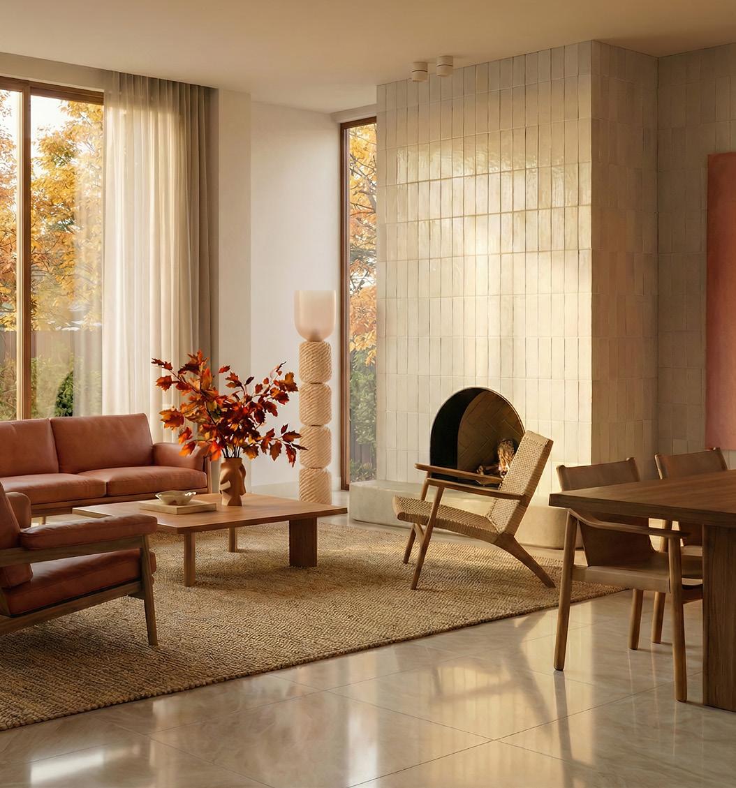
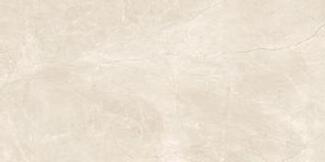
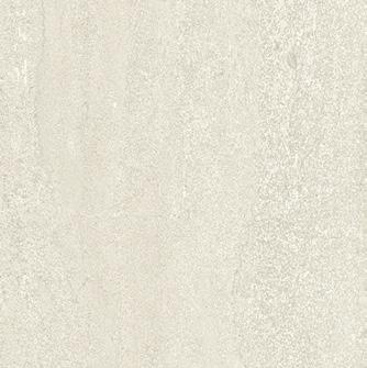
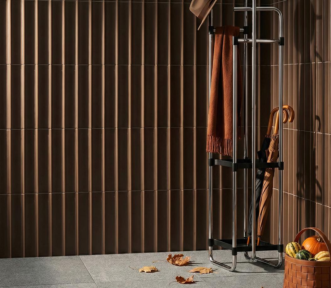
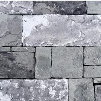
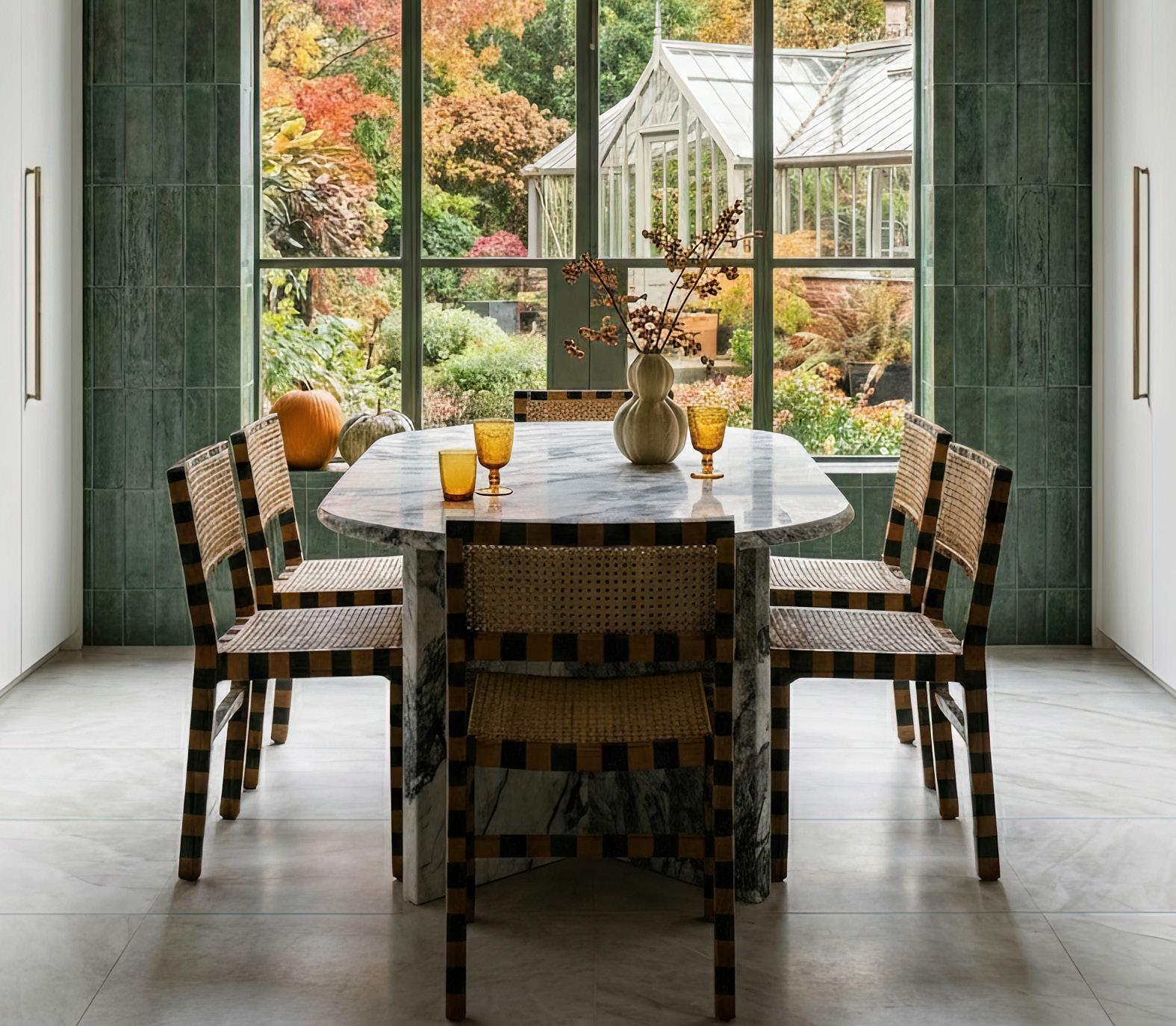
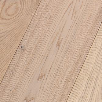
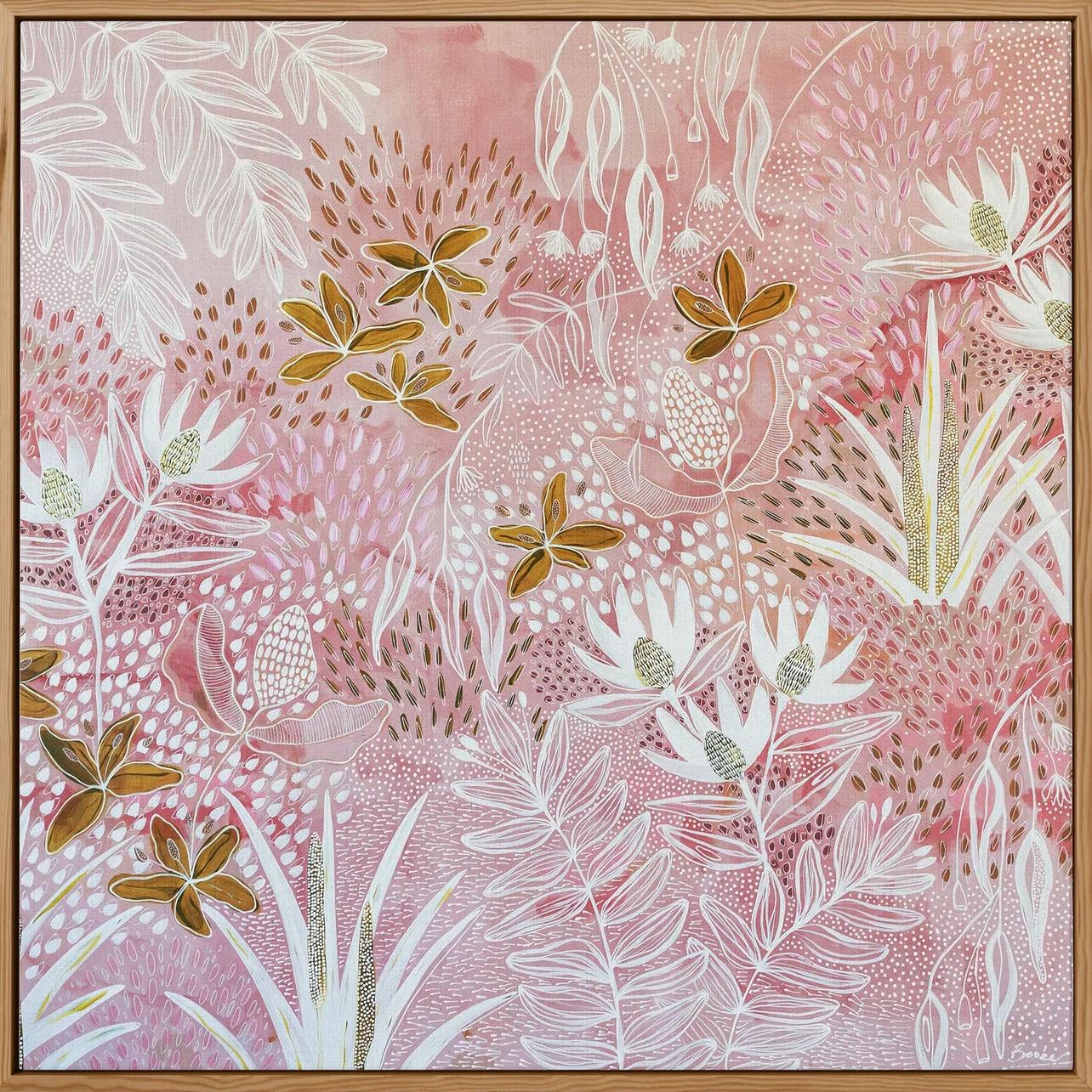
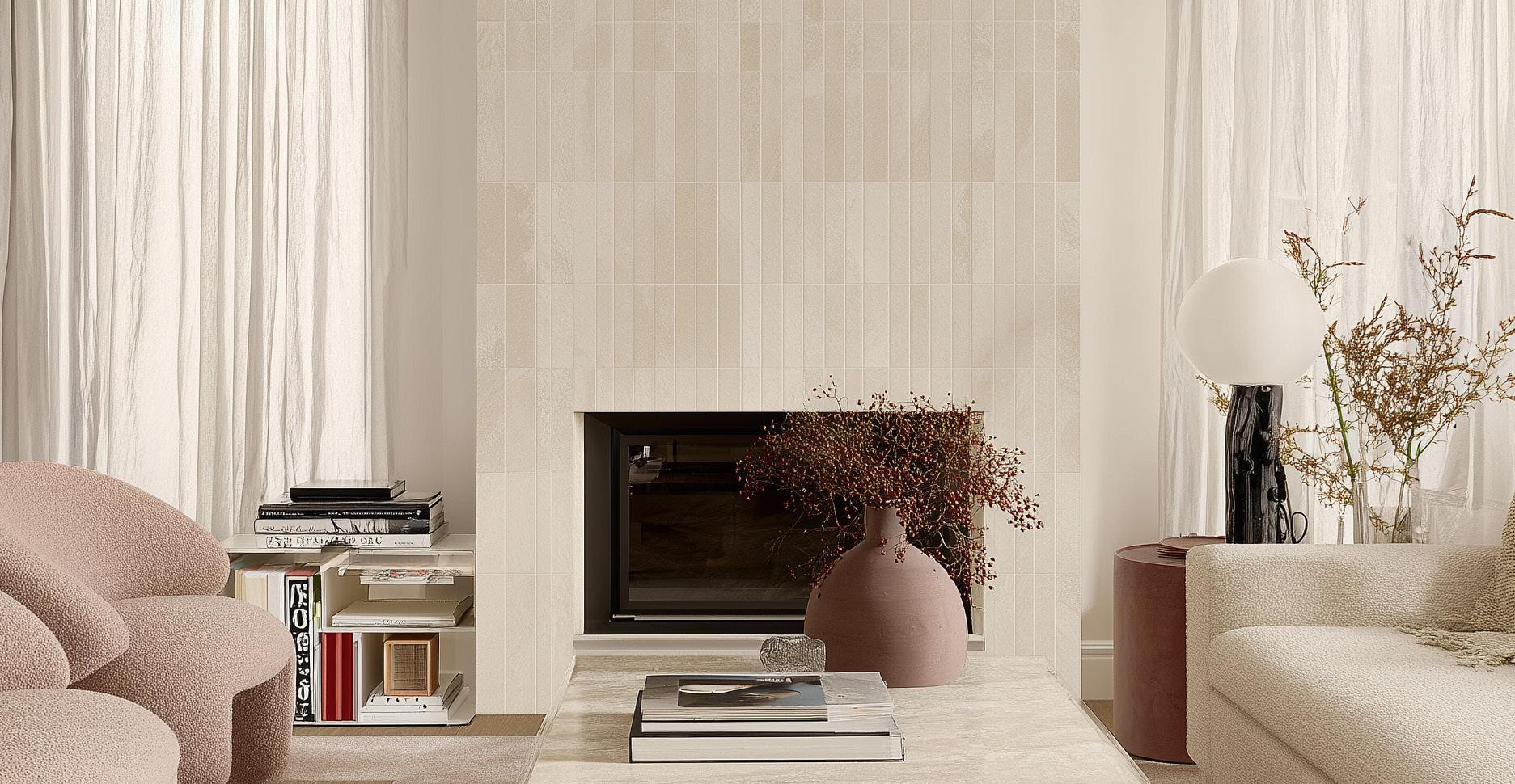
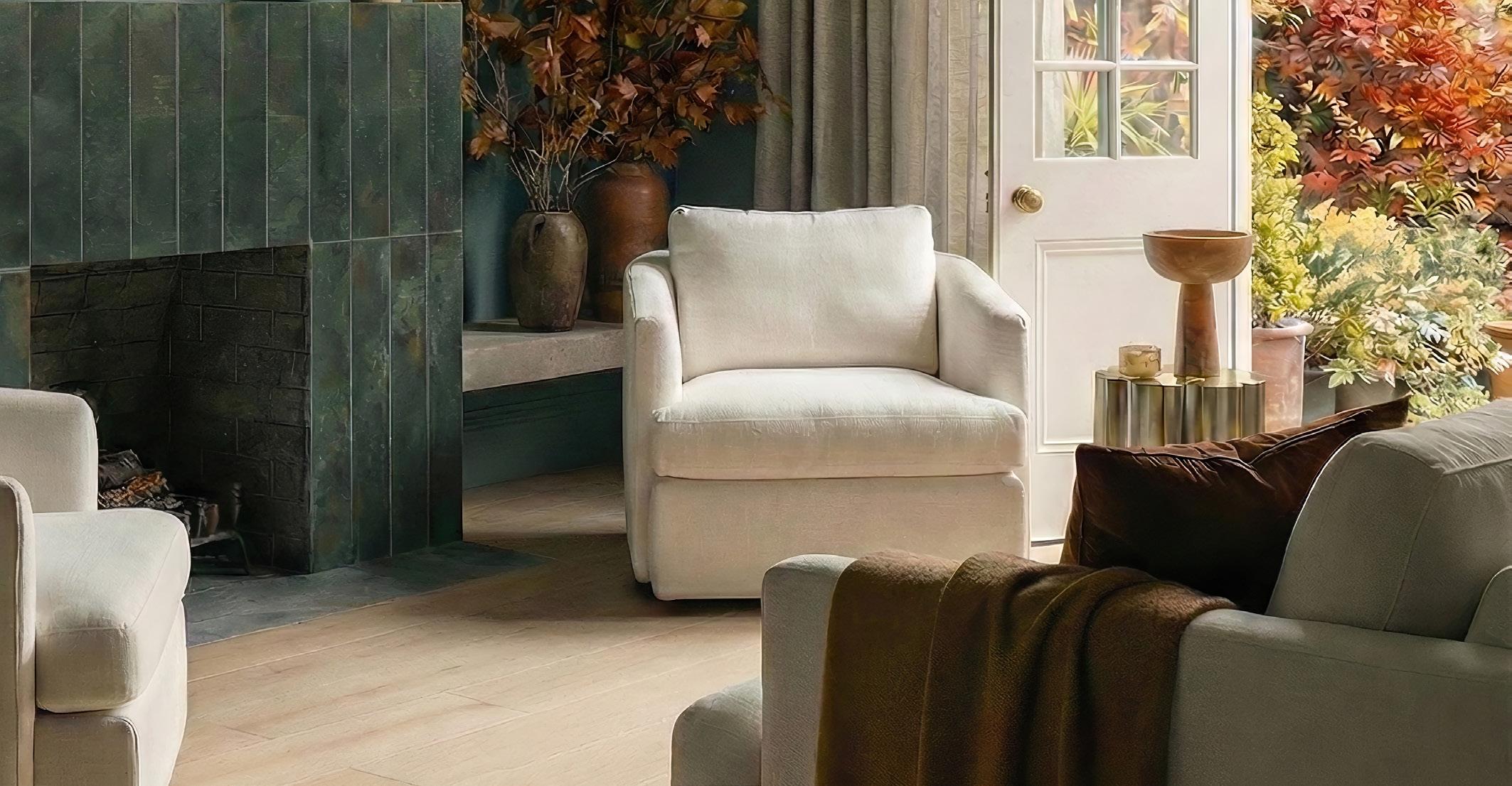
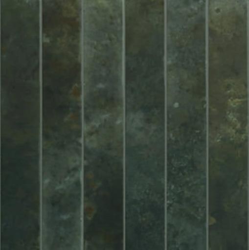
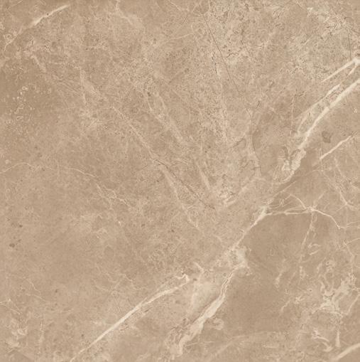
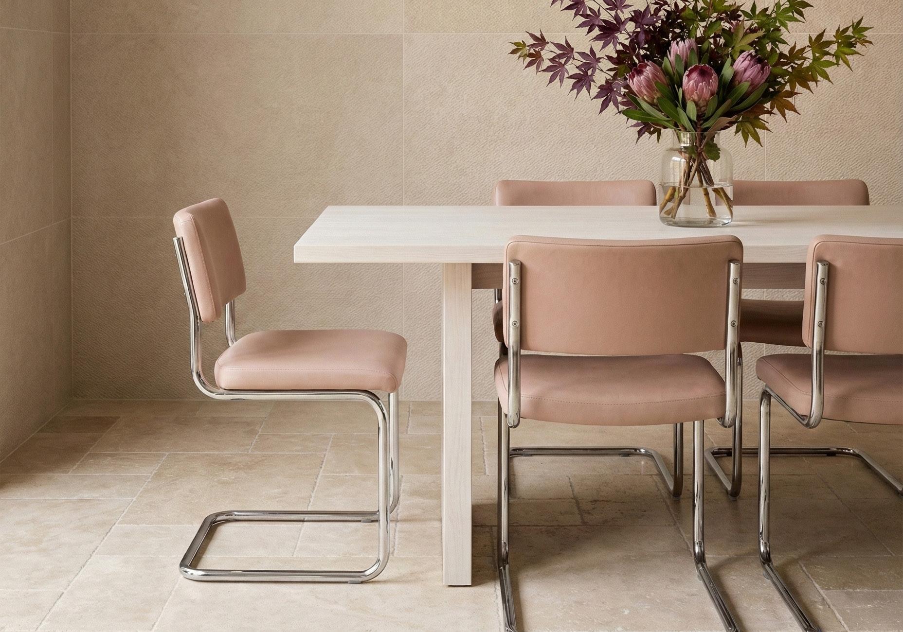
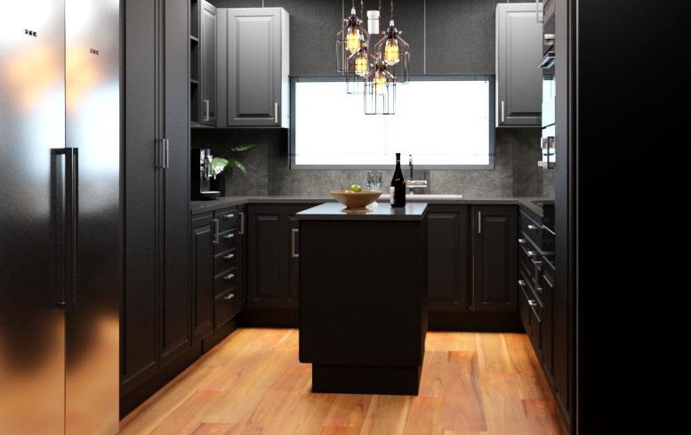
FIRE PLACES
Create a fireplace that commands attention. Stone cladding and carefully selected tiles elevate surrounds with visual impact, enduring style, and lasting quality. Designed for purpose, each surface balances warmth and sophistication, transforming any room into a focal point that is majestic, timeless and built to last.
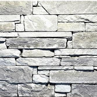
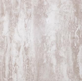
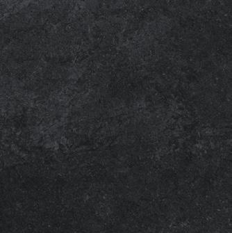
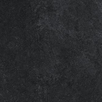
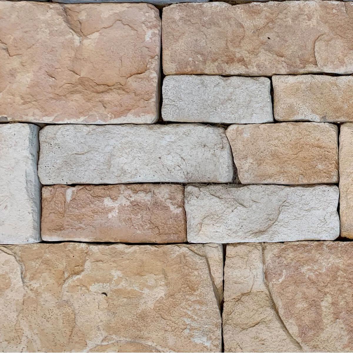
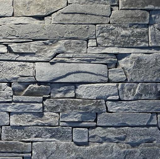
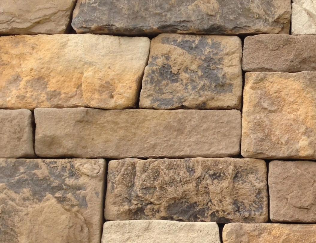
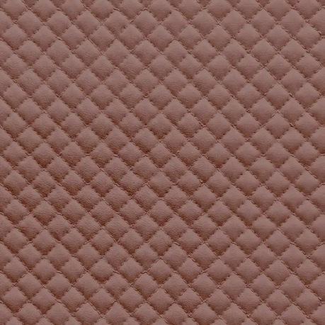
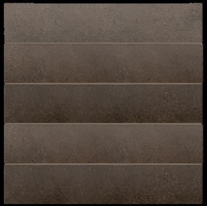
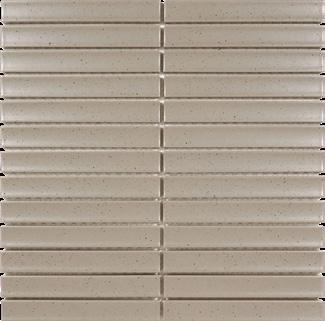
Ezystone Linea Slate Cladding
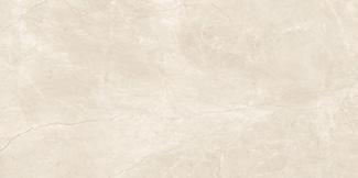
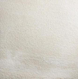
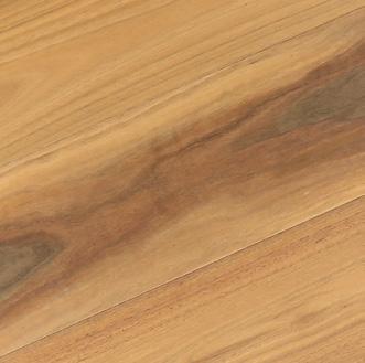
City Edge Vanilla Gloss Tile 75x300mm
Bali Stone Wall Pine Gloss Tile 50x400mm
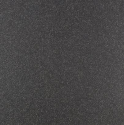
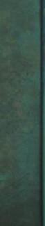
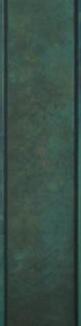
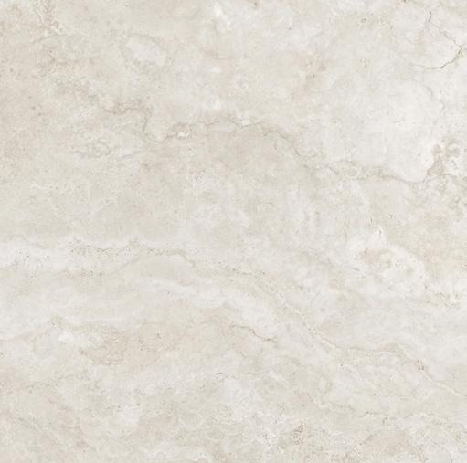
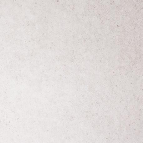
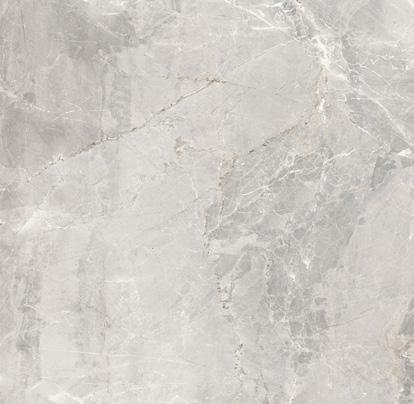
Ezystone Natura Limestone Cladding
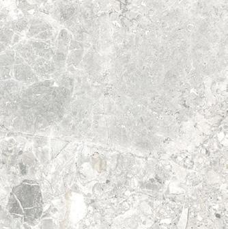
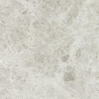
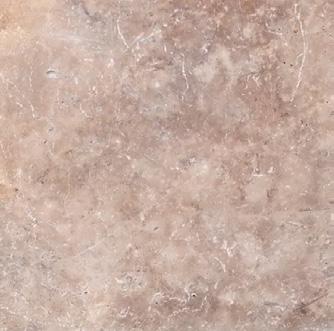
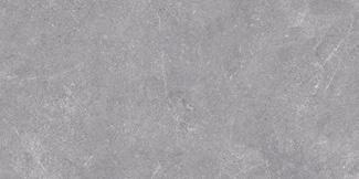
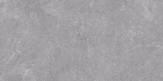
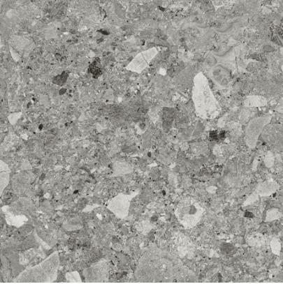
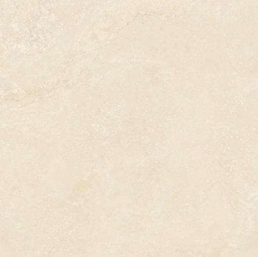
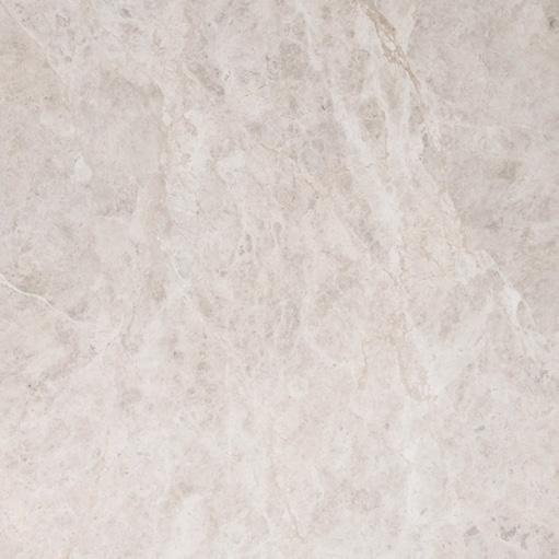
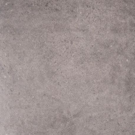
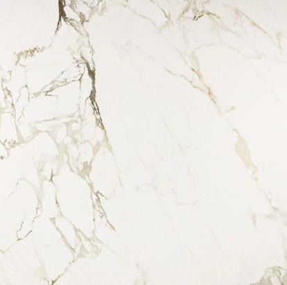
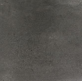
Verona Marron Polished Tile 600 x 600mm
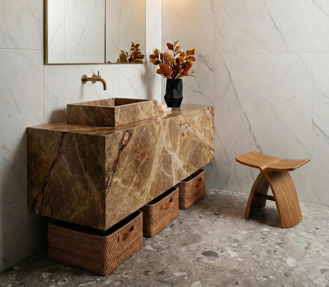
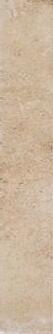
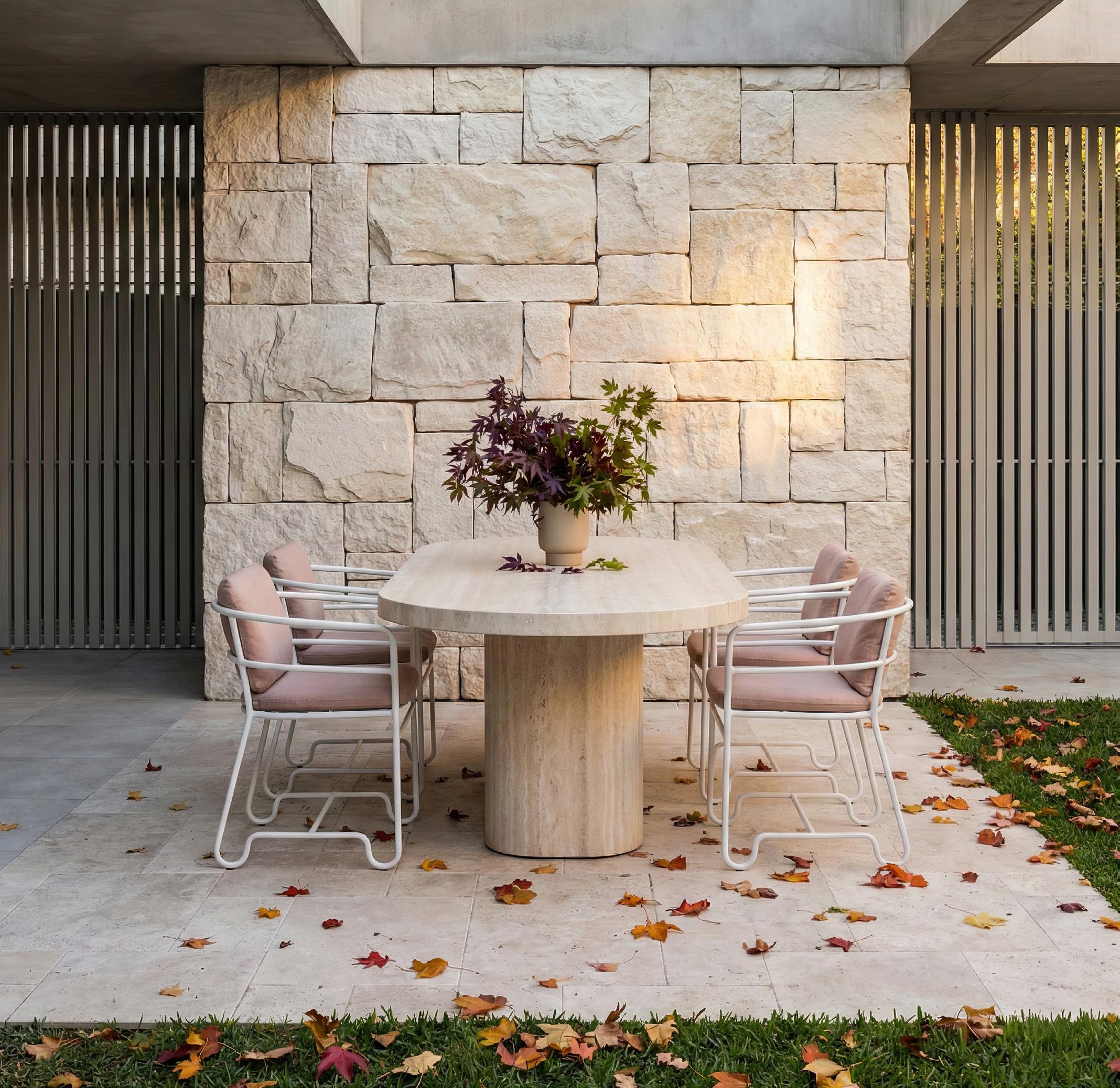
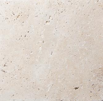
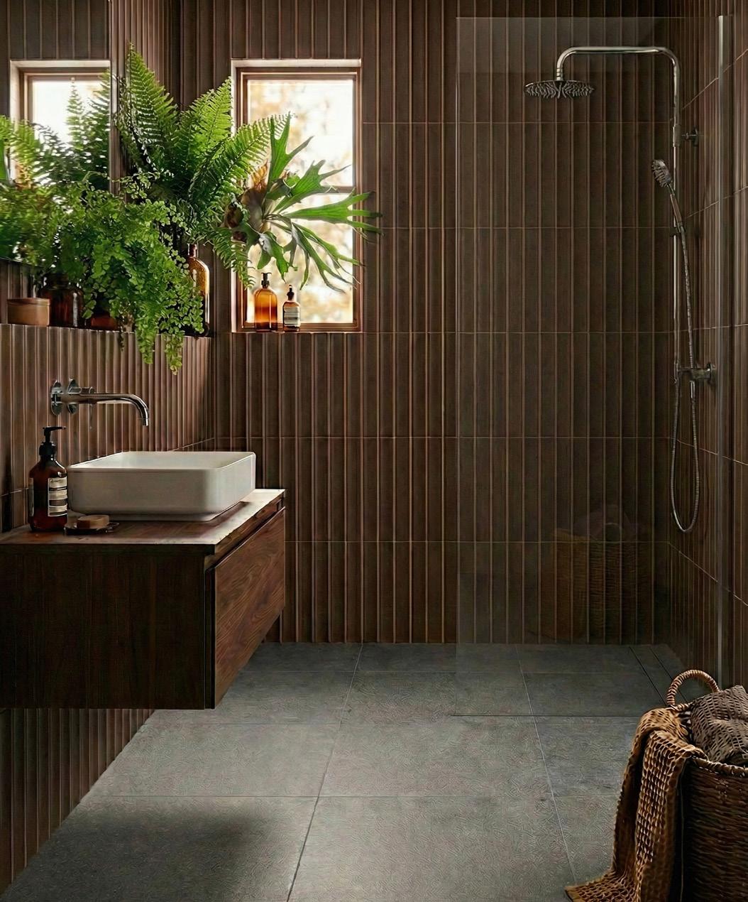
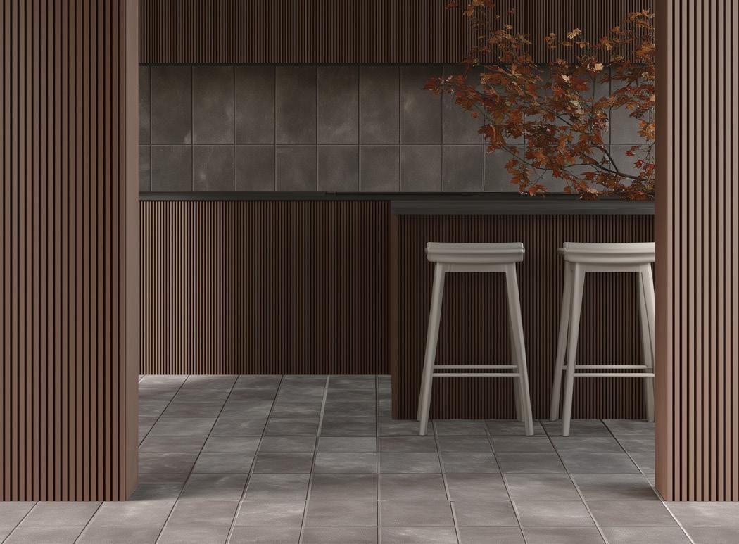
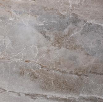
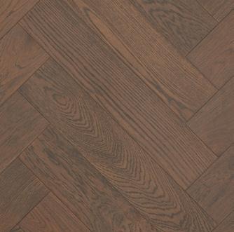
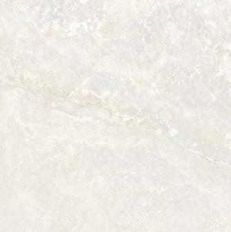
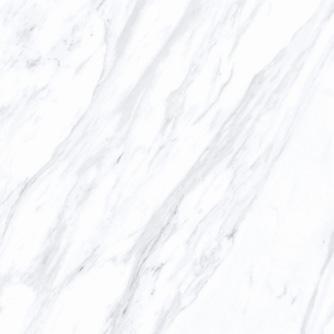
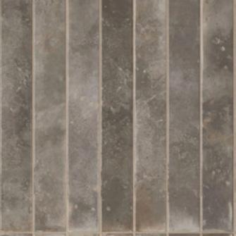
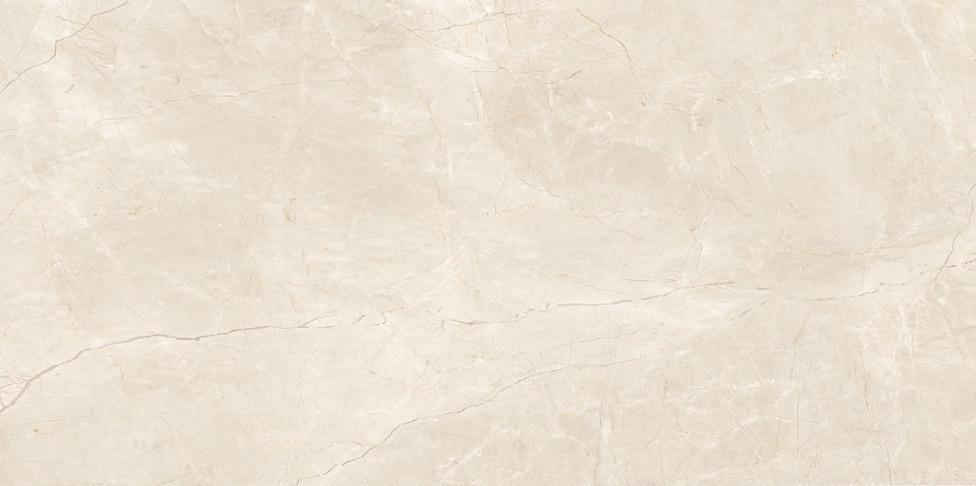
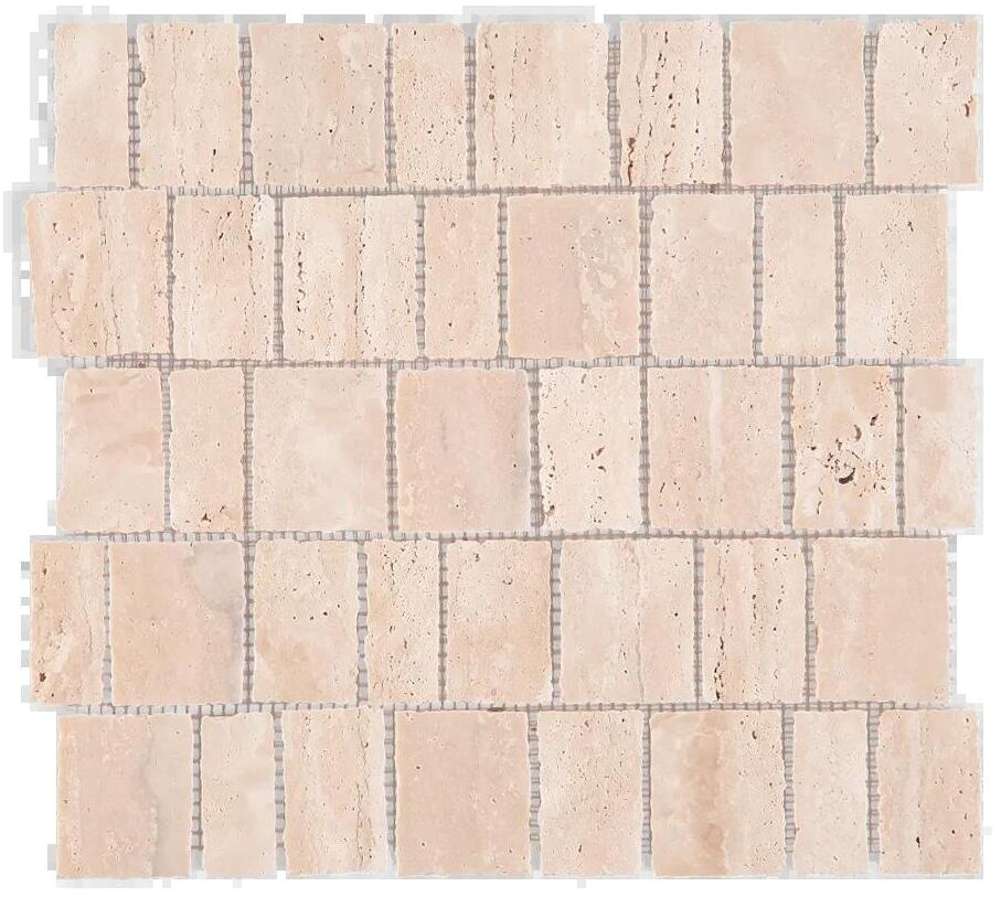
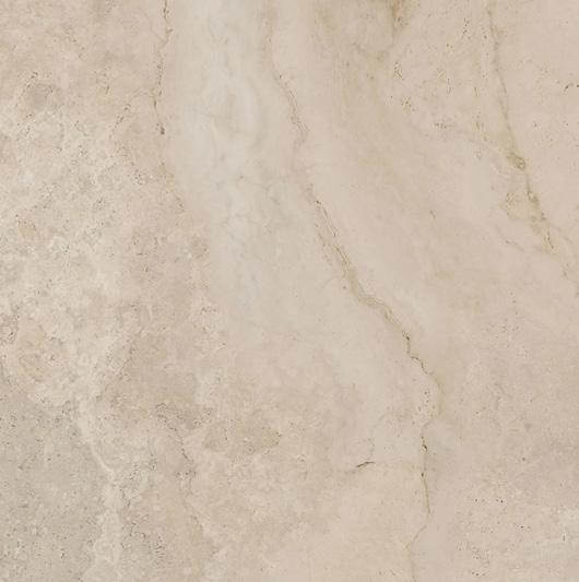
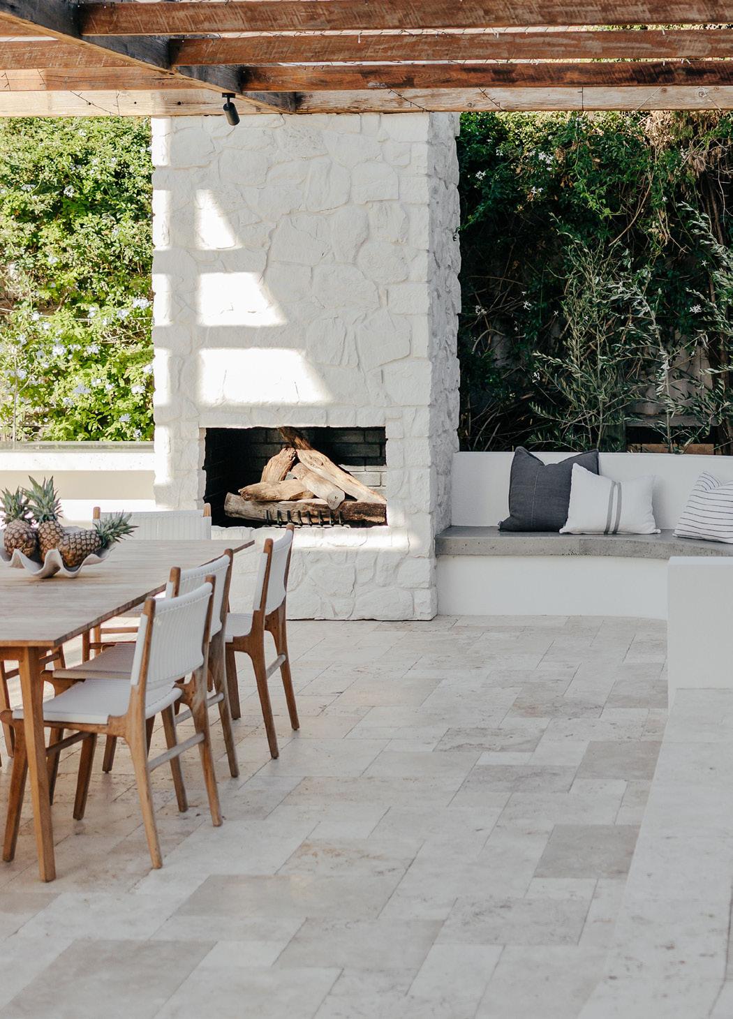
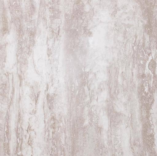
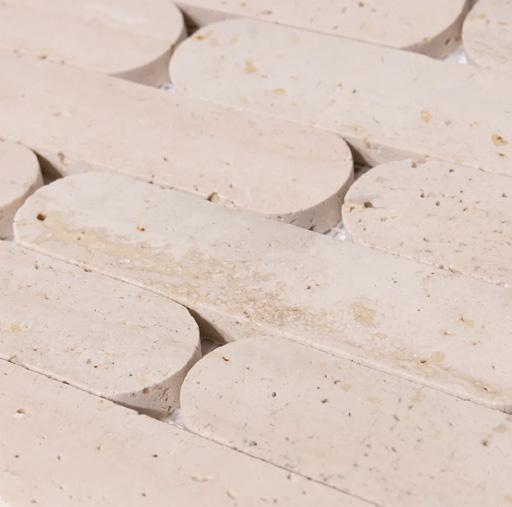
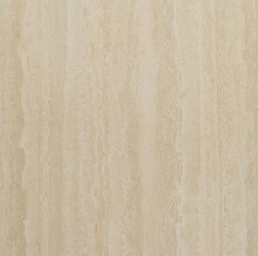
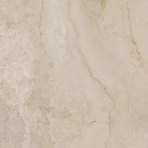
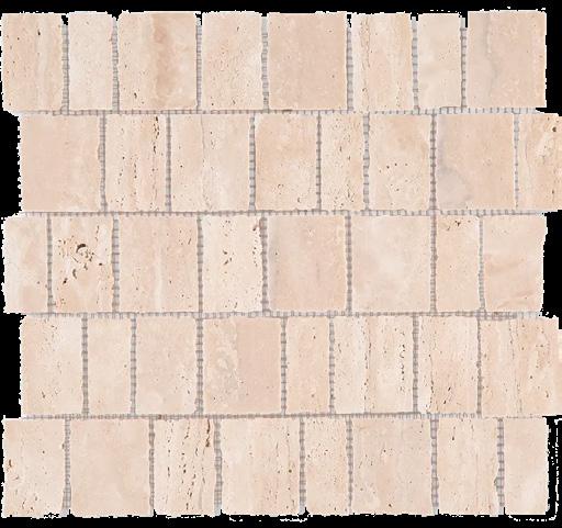
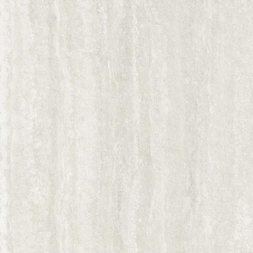
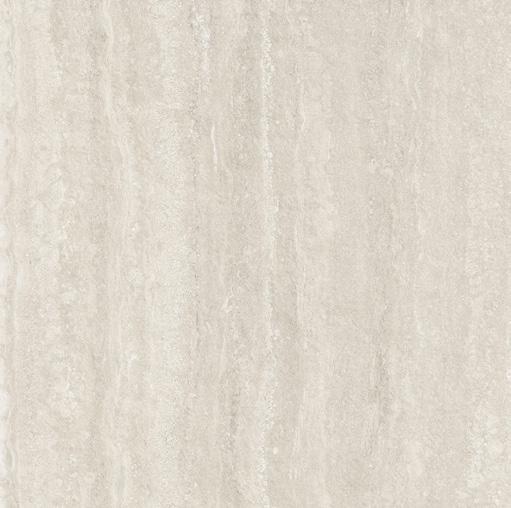
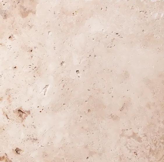
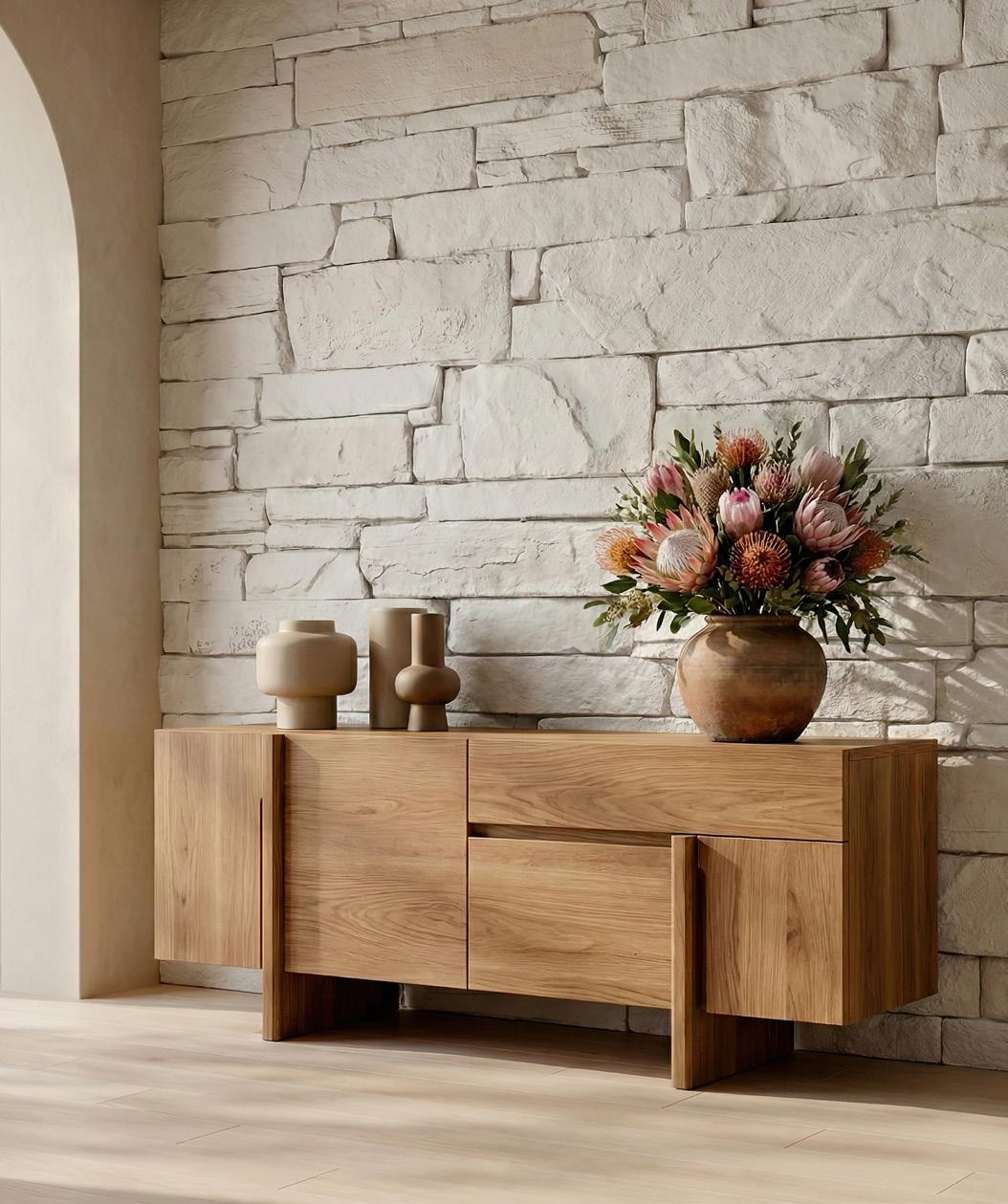
TALKING TRAVERTINE
Travertine’s natural elegance and warm, textured tones are defining interiors and exteriors this season. Durable yet refined, Travertine brings timeless sophistication to floors, walls, and feature surfaces, creating spaces that feel both grounded and effortlessly luxurious. Available in a range of sizes and shapes for indoor and outdoor use.
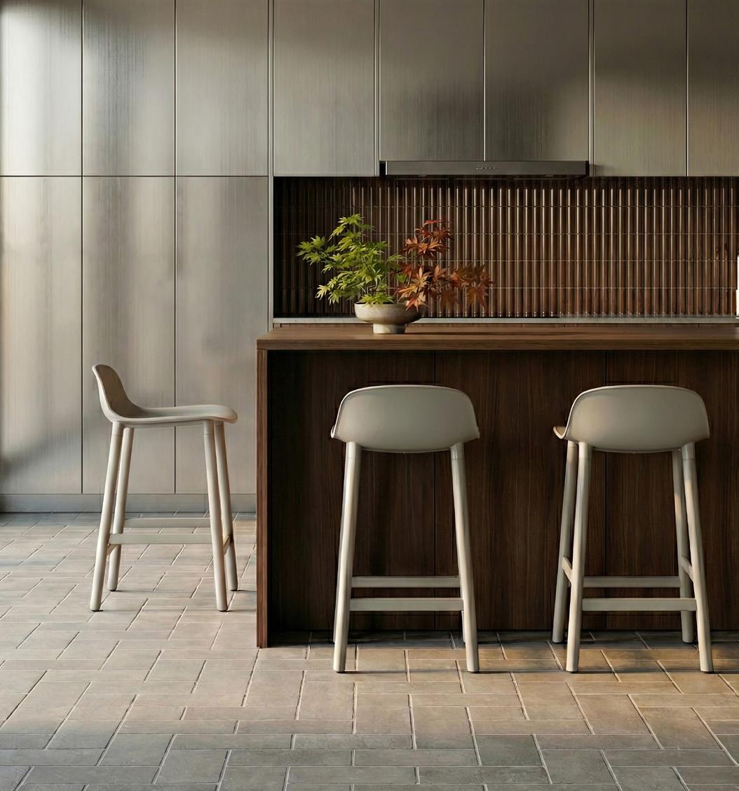
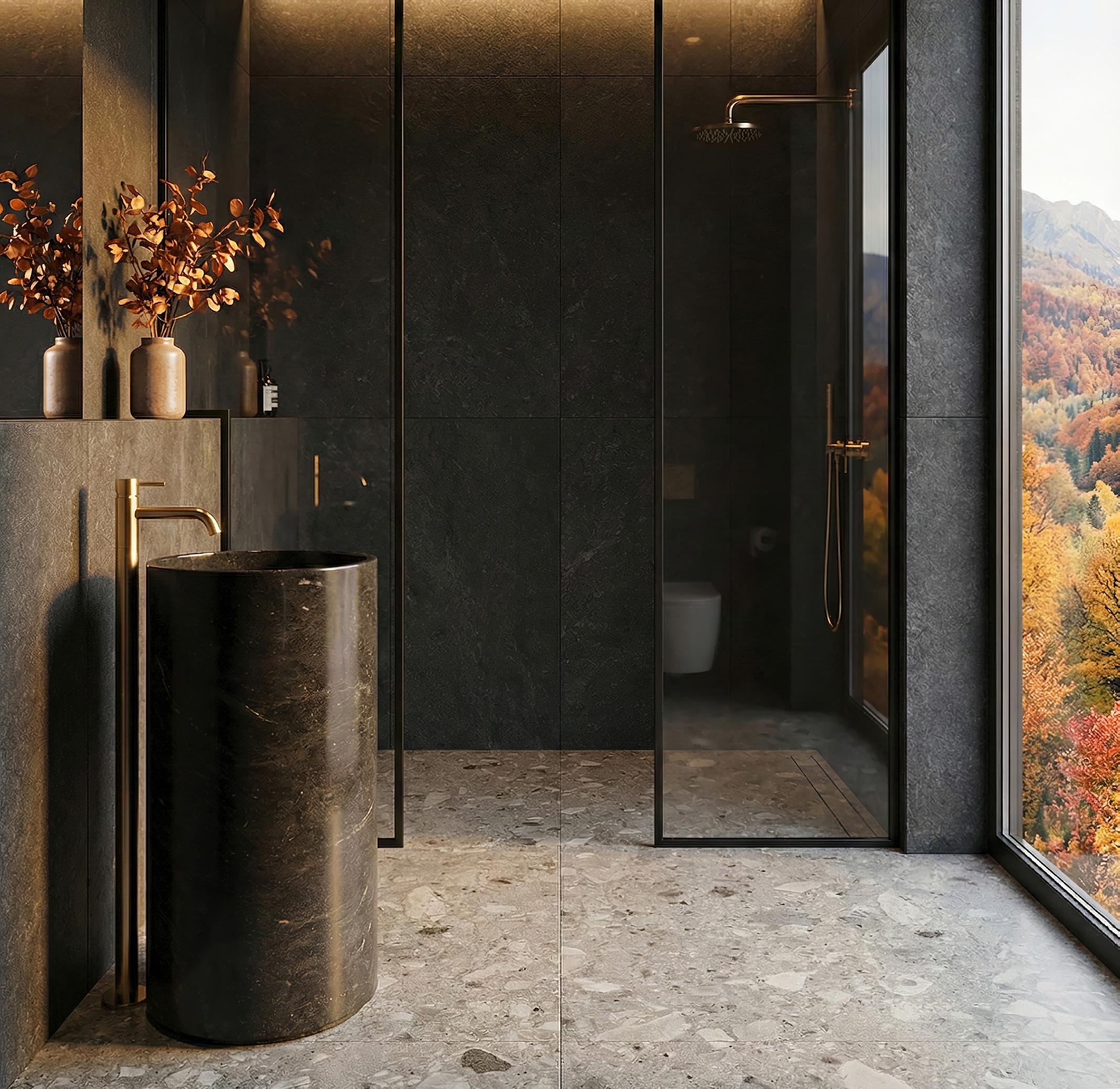
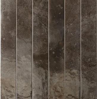
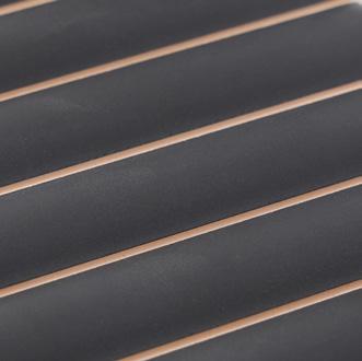
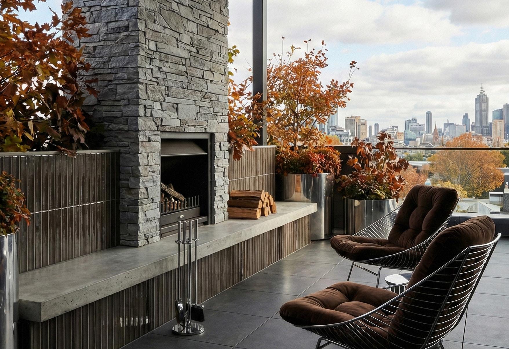
WHY WAIT?
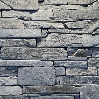
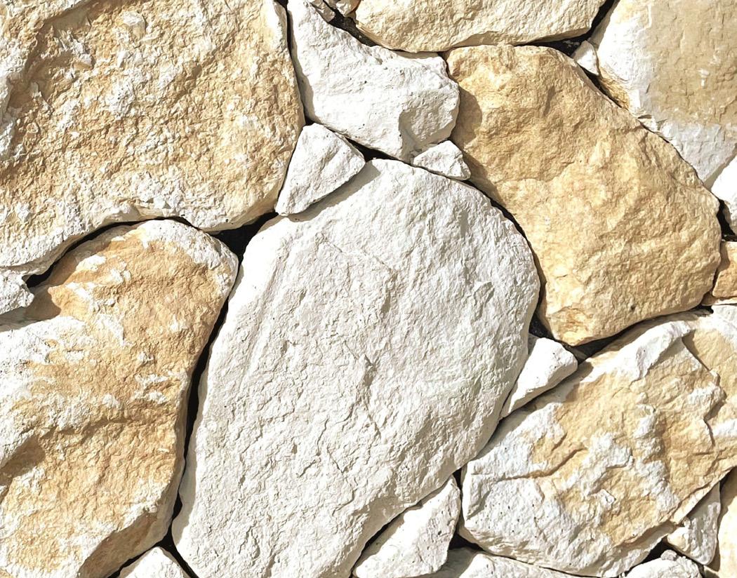
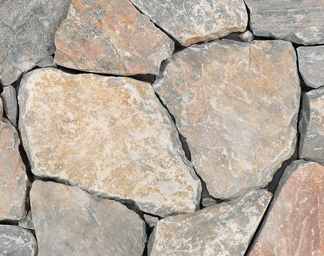
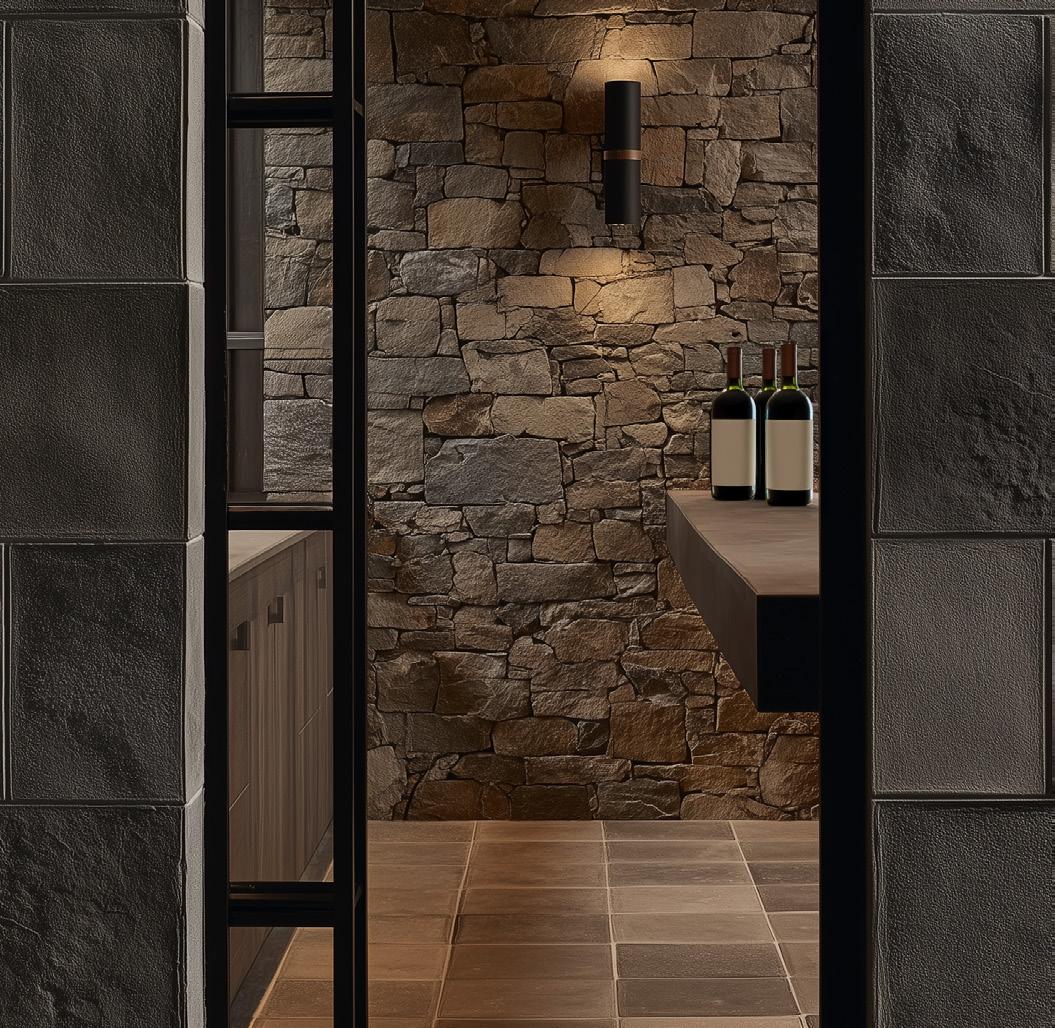
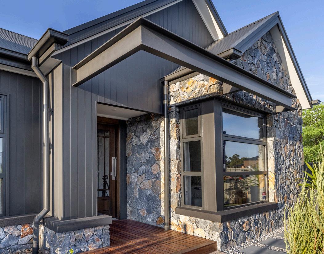
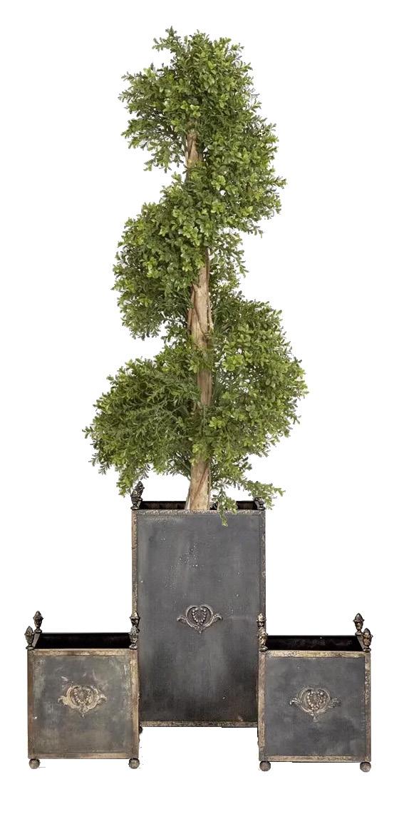
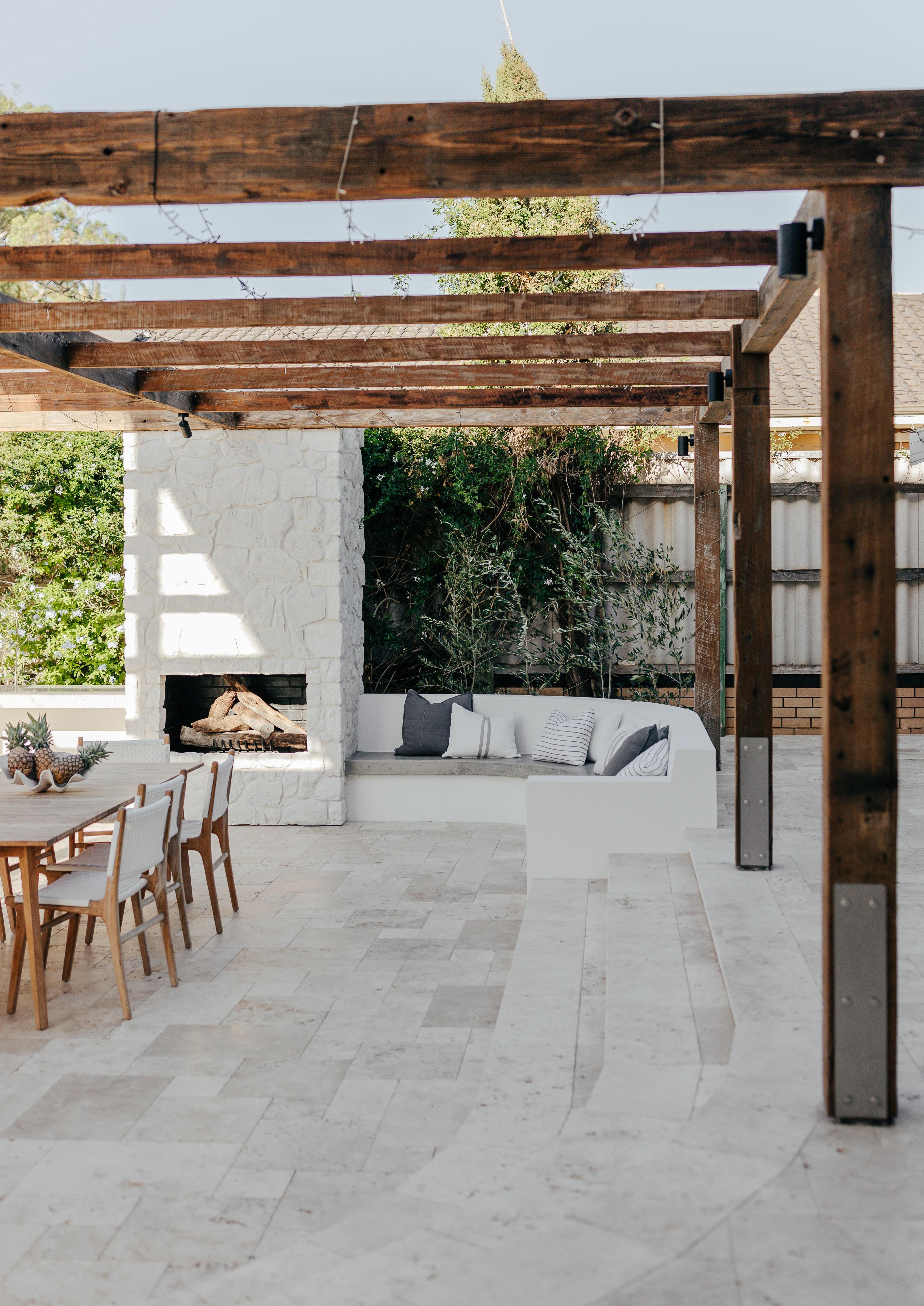
Stone cladding brings a sense of drama, texture, and timeless elegance to any space. Perfect for exteriors or striking feature walls, it transforms ordinary surfaces into extraordinary design statements. Its natural strength and durability ensure beauty that lasts, while its versatility allows for bold, contemporary expressions or subtle, refined backdrops.
Thoughtfully applied, stone cladding becomes more than a material – it’s a design tool that shapes atmosphere, highlights architectural features, and creates spaces that are as enduring as they are visually captivating.
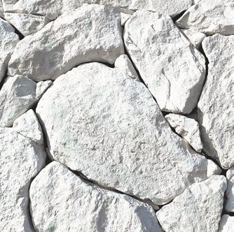
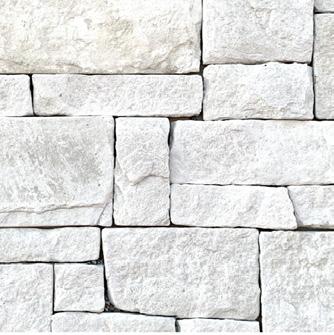
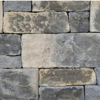
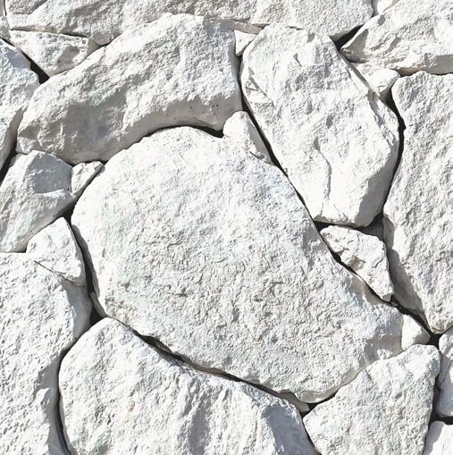
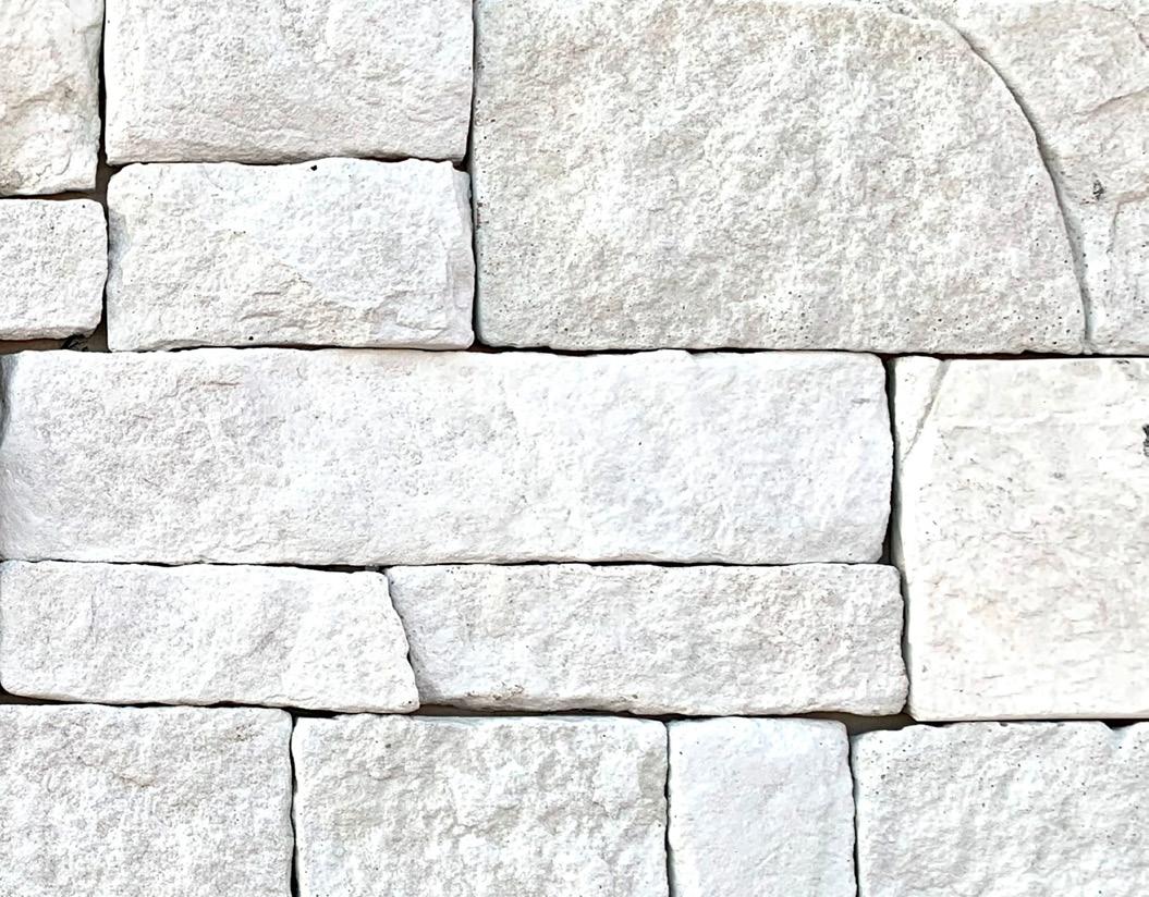
Landmark Grey Limestone Cladding
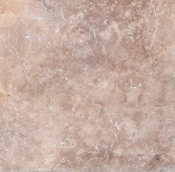
Ezystone Natura Bluestone Cladding
Ezystone Ridge Limestone Cladding
Ezystone Natura Dune Cladding
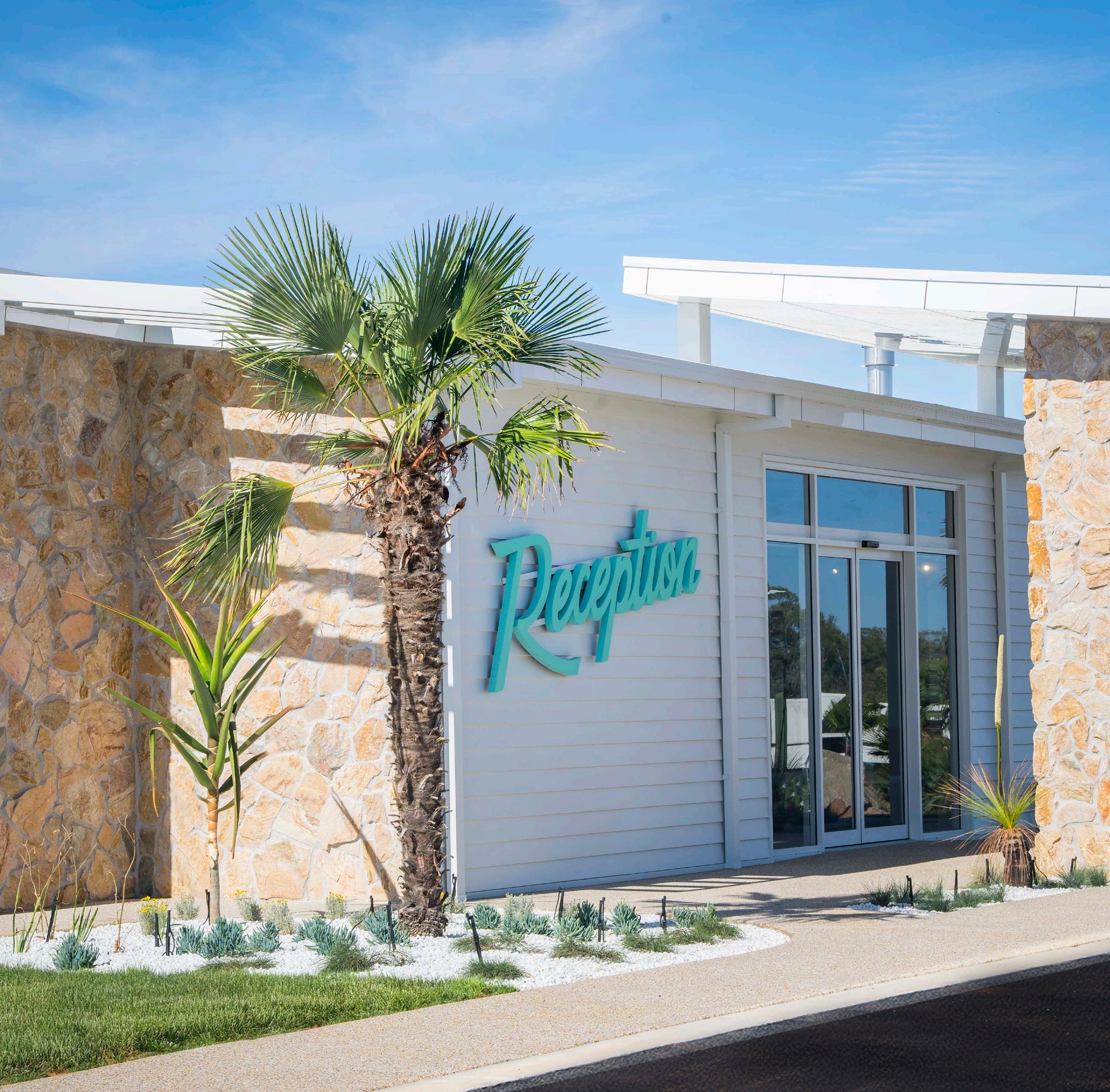
Image: Trentham Waters Mildura
DESIGN DNA
A Conversation with Sharon Parker
With over two decades of experience in interior design, Sharon Parker has built a reputation for curating spaces that feel deeply personal, layered and thoughtfully curated. Through her evolved practice, Sharon Parker Curated, she brings a considered, bespoke approach to residential, commercial and hospitality projects - most recently realised in Project ‘Chou Chou’, a Parisian inspired, design-led Airbnb and editorial grade shoot location in Albury NSW that redefines regional luxury.
We asked Sharon about her design philosophy, the importance of materiality, and how thoughtful tile selection can transform the way a space feels.
I’m less interested in trends and more focused on creating homes that feel rich in character, lived-in and emotionally resonant. “
NT: How did you first become involved in the world of interior design?
SP: Design has always been part of my world - it’s very much in my DNA. My father was a builder, so I grew up immersed in construction and interiors, constantly rearranging my bedroom and experimenting with colour and pattern from a young age. Even then, I was fascinated by how a room felt, not just how it looked. It was not until I had hands-on experience renovating and building my own properties, that took it more seriously and studied interior design whilst on maternity leave.
Professionally, I spent many years in the residential volume building industry, leading several large interior design teams to elevate the customer journey within display and selection spaces. That period really sharpened my ability to balance innovation and creativity with practicality and purpose - understanding more deeply how homeowners live within a space, the importance of material selections and what impact decision-making has on long-term value and functionality.
As time passed, I felt drawn back to the grass roots of interior design - sitting at the kitchen table with clients, working one-on-one in a more personal and considered way, curating designled solutions that gave them the confidence to create a home they truly connect with. That’s where the joy lies for me.
NT: What does Sharon Parker Curated represent, and how does it differ from your earlier work?
SP: Sharon Parker Curated represents a natural evolution of my practice - both personally and professionally. After more than 20 years designing under my previous studio name, I reached a point where I wanted to slow things down - to work in a more intentional and measured way, take on fewer projects and be deeply involved in every layer of the design.
Clients work directly with me as lead designer throughout the entire journey, drawing on my experience, intuition and love of storytelling to create spaces that feel layered, functional and deeply personal. It’s a highly collaborative and hands-on process. I’m less interested in trends and more focused on creating homes that feel rich in character, lived-in and emotionally resonant.
Projects like Chou Chou perfectly reflect this shift. It gave me the freedom to stretch creatively, to explore storytelling through colour, materiality and detail, and to design a space that feels immersive, expressive and unmistakably individual. It’s a project that feels very aligned with the direction I’m taking at Sharon Parker Curated.
NT: Do you work within a signature style, or do you adapt to each client?
SP: I would describe my work as warm, considered and inviting, but it’s never about imposing a style. Most clients don’t come to me with a defined aesthetic; they come with references, feelings and often an array of various ideas. The real work happens in unpacking those instincts. I spend a lot of time asking questions about how clients live, what they’re drawn to in fashion, travel and art, and how they want their home to feel. Those answers reveal far more than a Pinterest board ever could.
From there, establish a clear vision and design narrative, which becomes the anchor throughout the design process. That clarity builds trust and allows the space to evolve in a way that feels intentional, cohesive and authentic – never trend-led, always personal.
NT: Chou Chou is such a distinctive project. How did the concept come together?
SP: From the outset, Chou Chou was conceived as a destination; not simply a guest stay, but an experience. My client initially suggested a modern Mediterranean direction, which made sense given the trends influencing design at the time, but as
we spoke more, it became clear there was an opportunity to go deeper and create something far more personal.
She has a long-standing connection to Paris and the French culture, already owning two highly successful Provincial-style guest properties. Rather than repeating that aesthetic or following a popular formula, I wanted to reinterpret her love of France in a more sophisticated, layered and contemporary way.
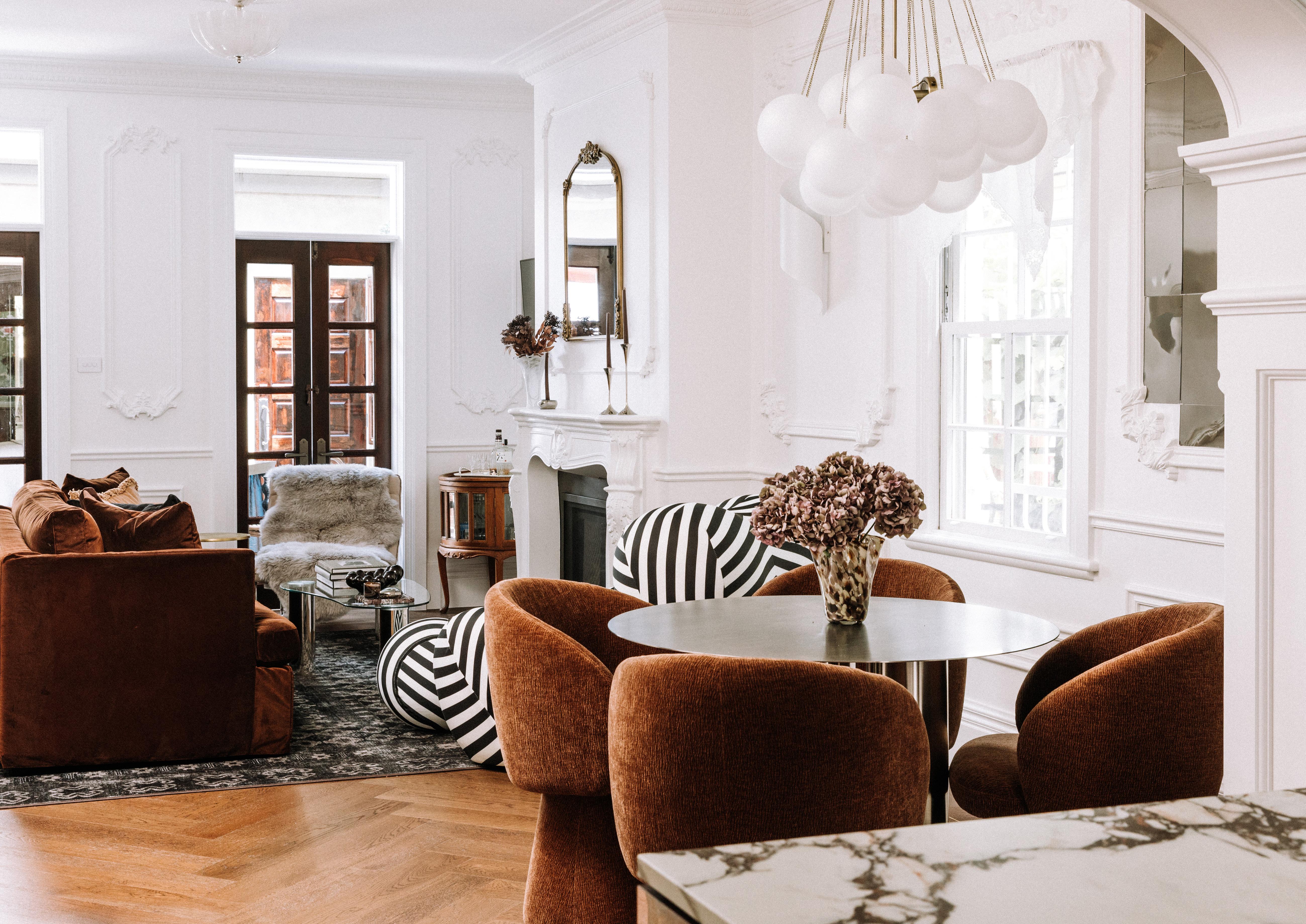
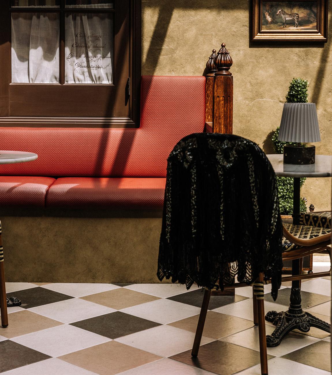
The idea of a Parisian-inspired apartment in Albury felt unexpected, and that sense of surprise became foundational to the concept. Chou Chou was about transporting guests into another world, one rich in detail, glamour and expression, where every space tells part of a larger narrative.
NT: How did colour and materiality shape the emotional tone of the space?
SP: Colour became one of the most powerful storytelling tools in the project. I consciously moved away from safe neutrals and leaned into rich, saturated hues such as deep browns, earthy greens, burgundies, rich plums and smooth chocolates. These colours weren’t chosen for trend as such - in isolation they’re grounding and cocooning. They create emotional depth.
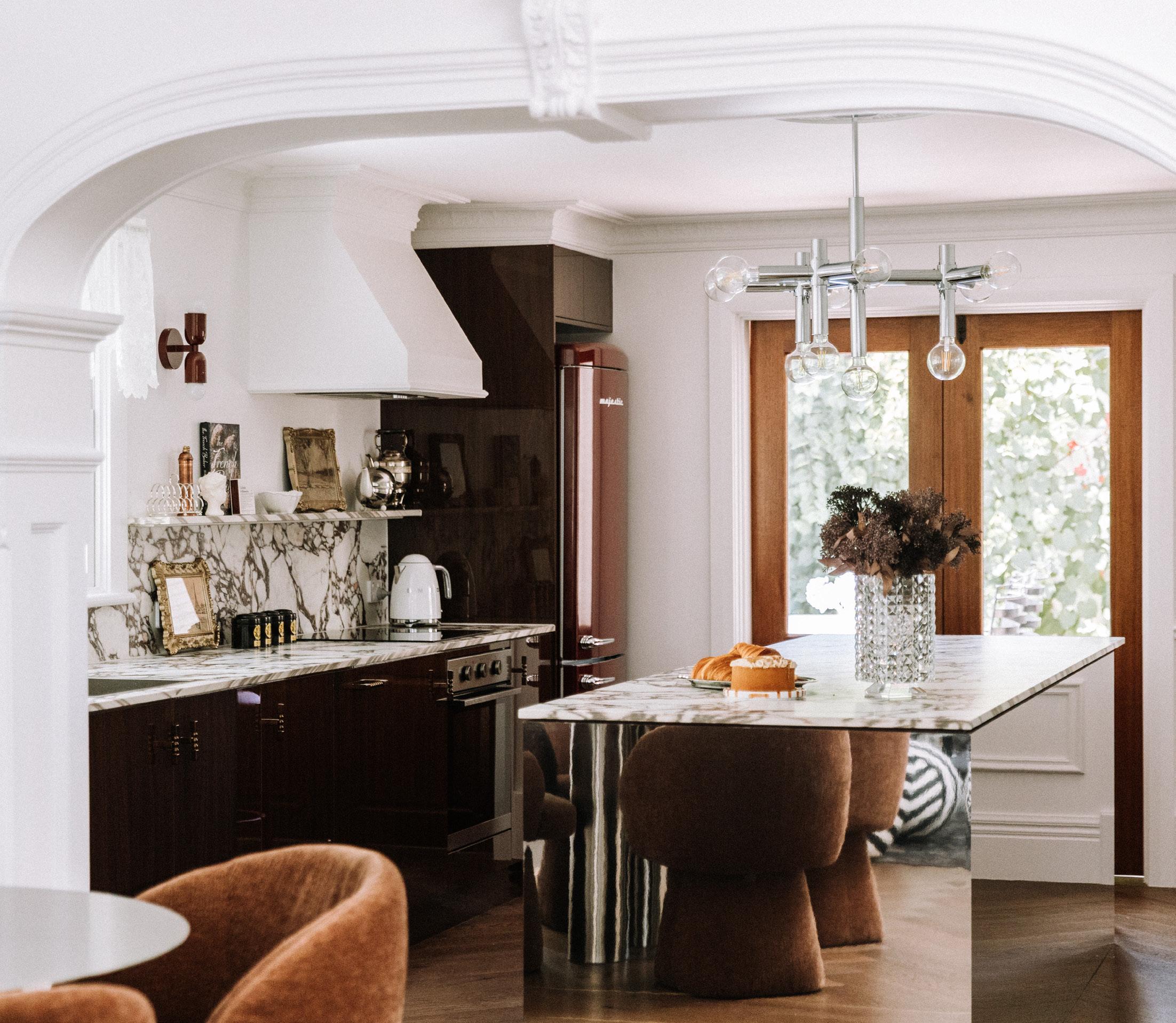
At Chou Chou, colour envelopes spaces from floor to ceiling, reinforcing the idea that design is about how a room feels, not just how it photographs. Nothing was accidental – parquet floors, intricate plasterwork, mirrored surfaces, ornate textureseven details like coloured grout were used to enhance geometry and elevate simple tiles into moments of drama.
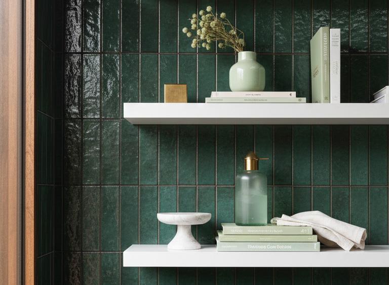
NT: Tiles play a key role throughout the home. How did you approach tile selection with National Tiles?
SP: Tiles were integral to Chou Chou’s design - not just as functional surfaces, but as architectural and emotional elements. Kitchens, bathrooms and open plan areas need materials that work hard, and tiles allow you to introduce texture, rhythm and visual impact without excess.
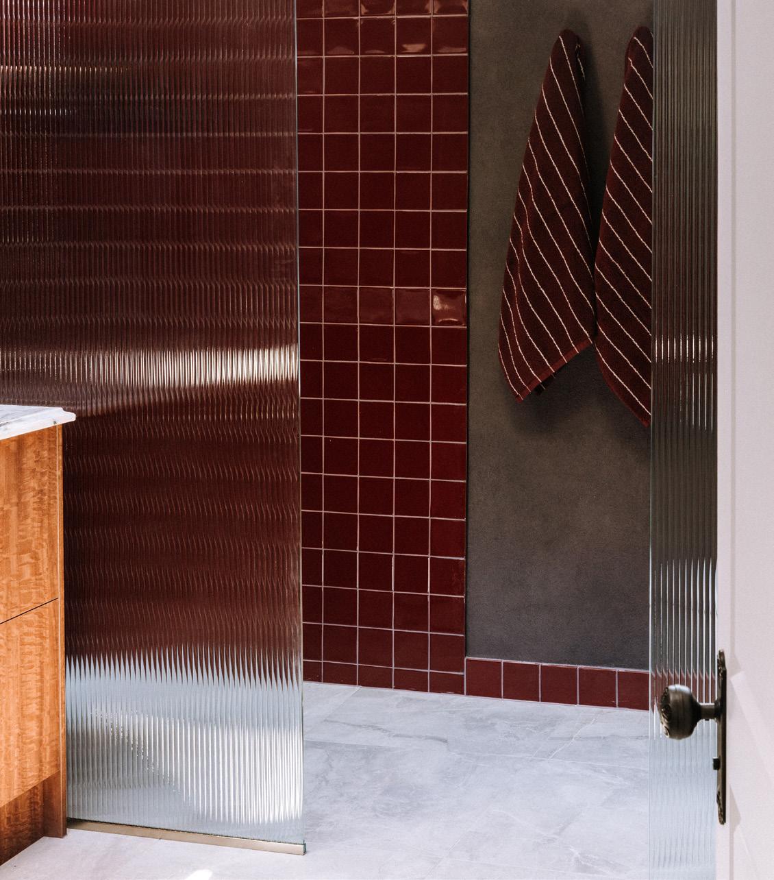
Working with National Tiles was seamless. Their range allowed me to explore how a single tile can feel entirely different depending on scale, layout and orientation. For example, in the
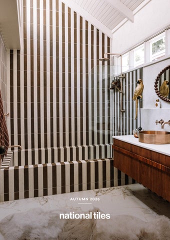
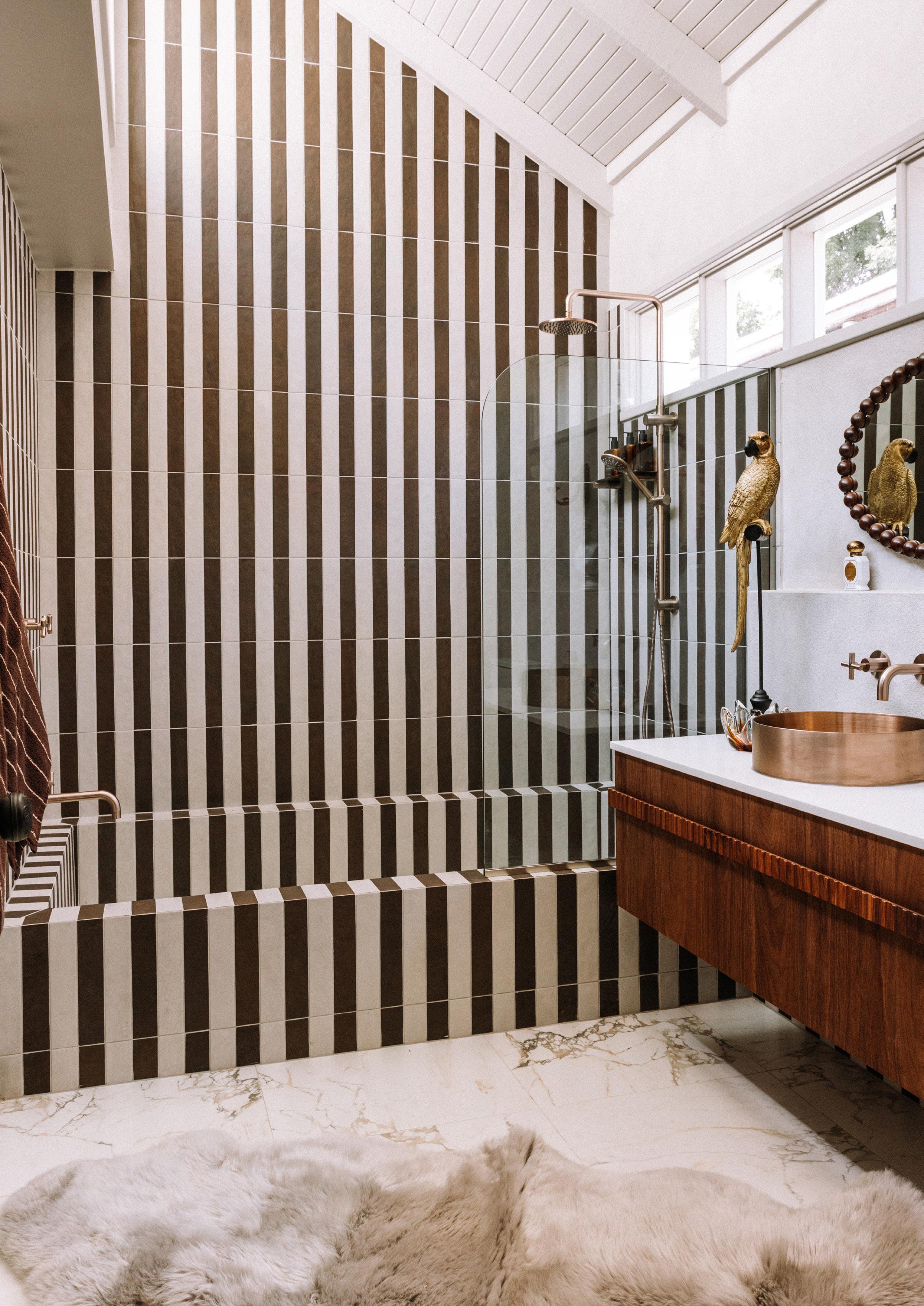
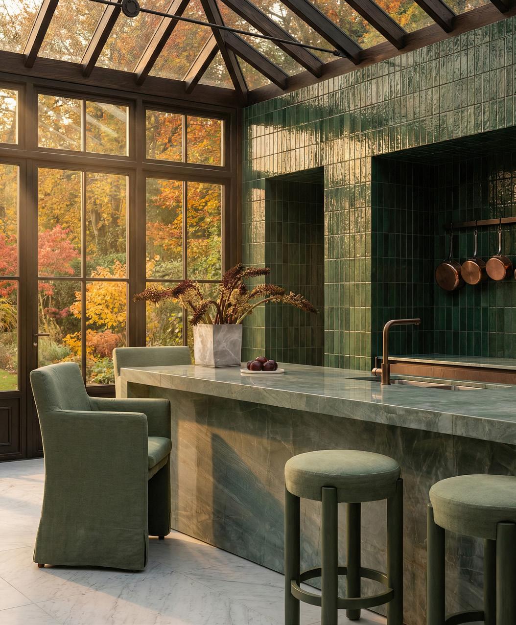
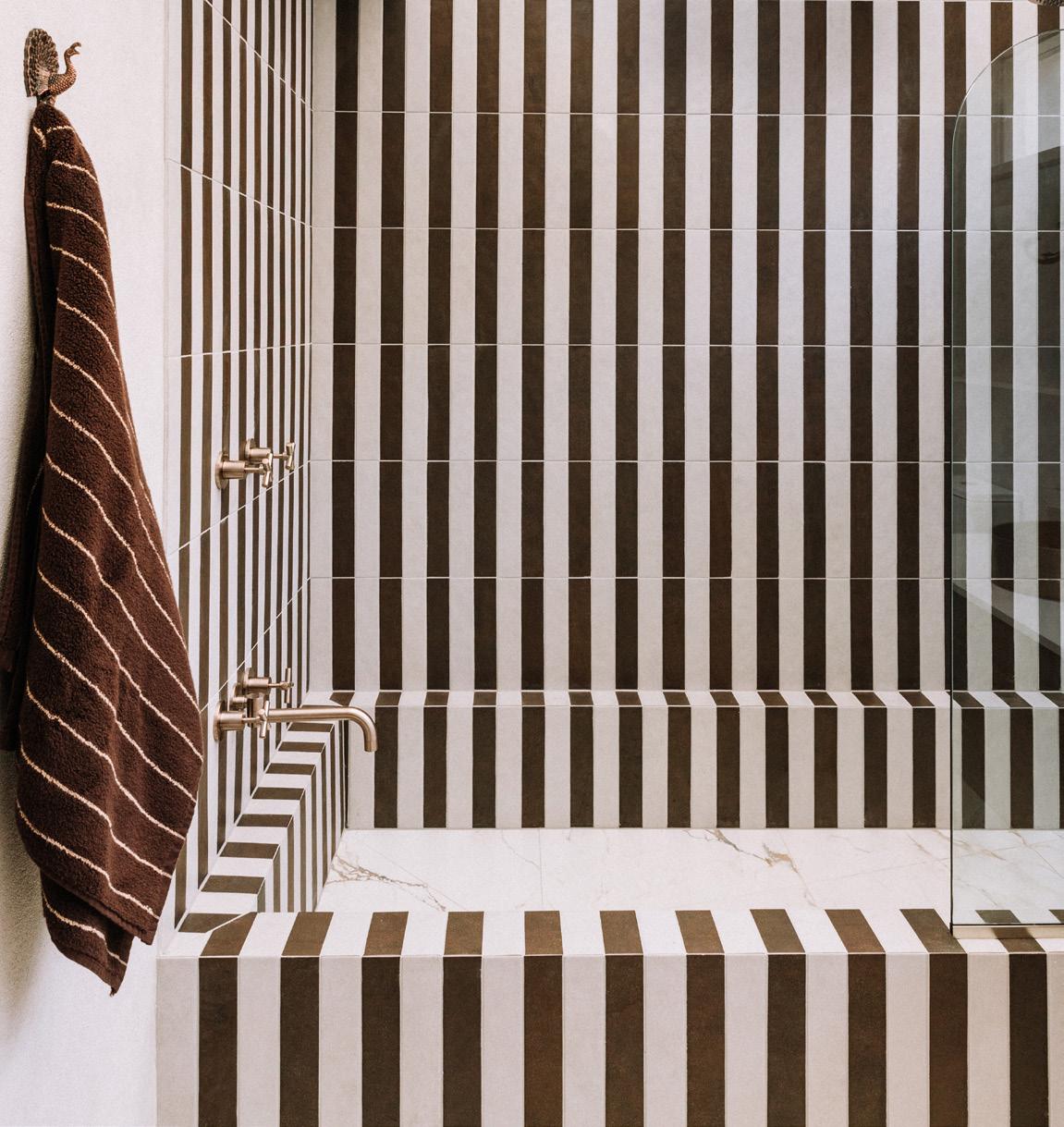
Ensuite we used brown and white subway tiles in a vertical stripe that wraps over the original Roman bath and extends high up to the vaulted ceiling - it’s a real moment of drama and escapism. National Tiles sourced the brown glaze tiles from Italy, and they truly were worth the wait.
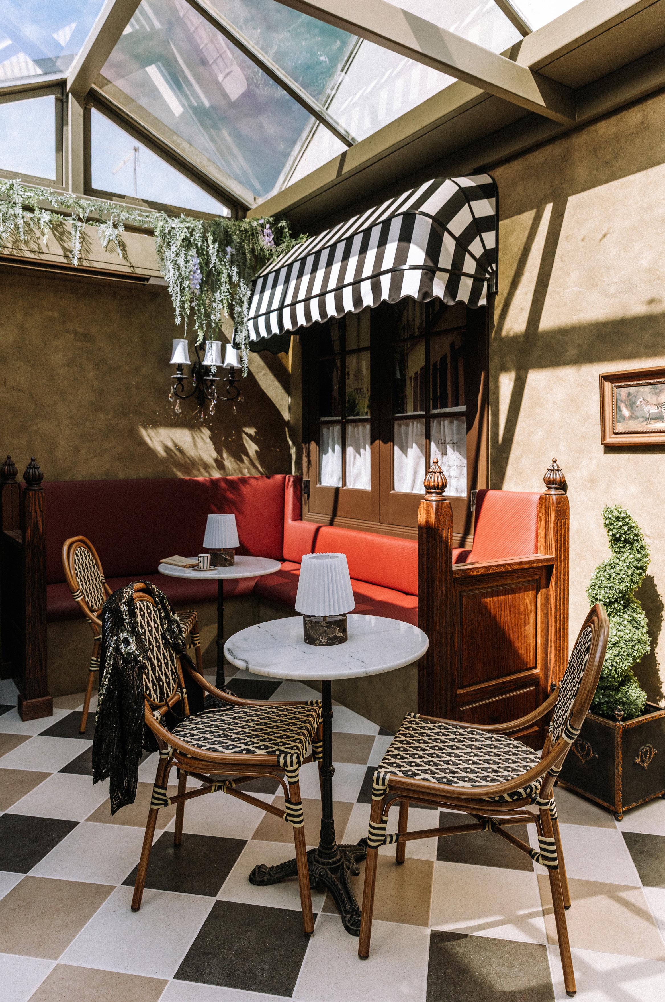
In the Conservatory, we designed a fun three-tone tiled checkerboard floor pattern with a solid border that sits beautifully alongside French-wash walls as shadows dance from the full glass ceiling above. A subtle nod to European streetscapes –playful, elegant and timeless.
NT: What advice would you give homeowners selecting tiles for their own projects?
SP: I recommend starting with the vision, not the product, and concentrate on the feeling you want the space to have. Tiles are not just a surface; they should support the mood you’re trying to create. Consider scale, repetition, grout colour and think carefully about how light will interact with the surface throughout the day and night.
Visiting a showroom like National Tiles is invaluable - seeing materials in person allows you to understand tone, texture and proportion, and helps take the guesswork out of decision-making. Once you’re clear on the bigger picture, it becomes easier to be confident and even a little playful with your choices, so don’t be afraid to be bold. A simple tile, thoughtfully used, can be quite transformative.
NT: What makes a project truly successful for you?
SP: Success, for me, is when a space unfolds slowly. When it changes with the light, feels different at various times of day and continues to surprise you in small, quiet ways. And Chou Chou does just that. Designed as an immersive experience, where every detail, from the tiles and finishes through to furniture, scent and sound, contributes to a broader emotional narrative. True success is when a space moves you, rather than simply impressing. When it lingers long after you’ve left, then know my job is done.
www.sharonparkercurated.com.au
Credits:
Project Name: Chou Chou – @chouchou_albury
Interior Designer: Sharon Parker Curated – @sharonparker_curated
Photographer: Bec Haycraft – @bechaycraft
Project Owner: Victoria Tonkin