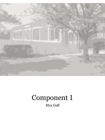

Component 1
Mya GullDesign brief.
For this project, I will be remodelling a local library to be more attractive and inviting. It will also be more friendly and inclusive for students to have a quiet place to study. Dagenham has quite a few schools around but it's rare to see any of them utilising the library. I will look into redesigning the library with some outside space while making it look more interesting to the public without ruining the aesthetic of the local area. This library is in the middle of two primary schools and a residential area. It is quite old fashioned and in modern times not many people will take a second look at it. I want it to fit in with the architectural aesthetic of the local area while making it look a lot better. My chosen theme is a combination of natural and organic and movement and flow; this will extend the natural landscape that valence park provides through to the residential area. Given that all houses in the area are quite similar, the design should catch the attention of passers-by.

Specification.

•Outdoor area to combine books with nature
•A place to hide the bins and staff cars so that it doesn’t ruin the aesthetic of the new library
•An upstairs for extra space and quiet rooms
•Disability access
•Has relation to the architecture of the school, library and café
•Multi use spaces
•Tech space
•Quiet study space
•Children’s space
• Visually interesting main entrance
Natural and organic Movement and flow
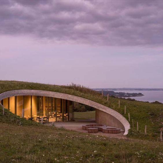
Buildingembedded in a hill,doesn’t impact the beauty of nature
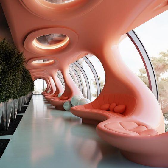
Huge round windows, helps to incorporatenatural light within the building.

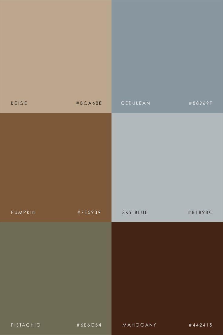
Incorporatenatural, nude colours. Brings warmth
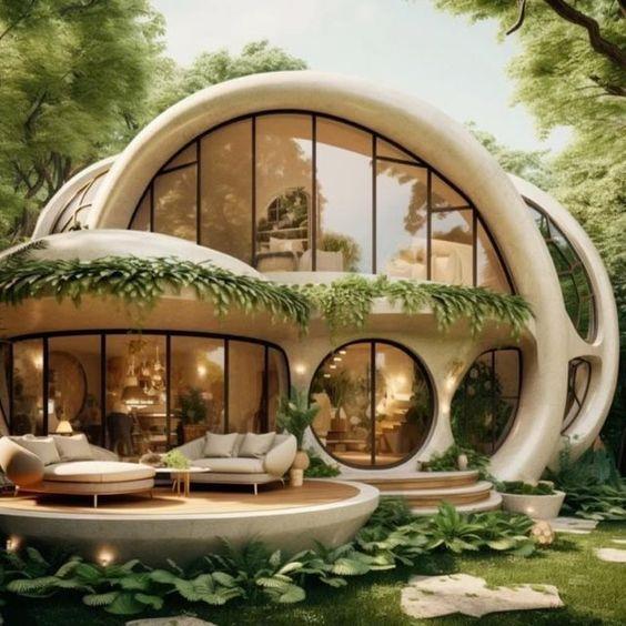
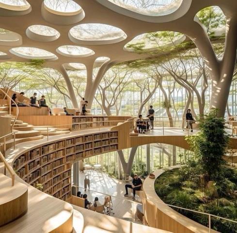
Organic shapes, makes it feel natural,they're not forcing any sharp edges
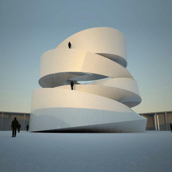
I like the layering and asymmetrical shap e of each storey, it adds depth
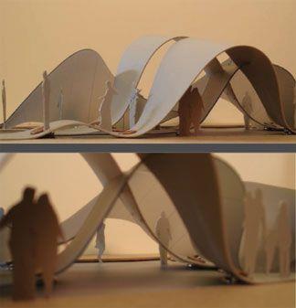
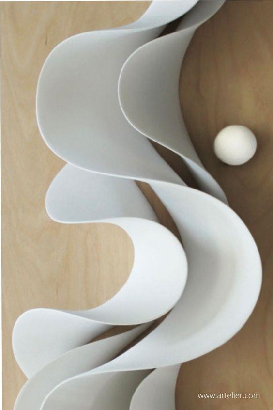
I like the smooth curves within movement and flow, I think it’s a good base to find a buildingshape.
Types / areas of project:
• Commercial
o Vegan restaurant
➢ Use natural sustainable resources
o Factor and product promotion centre
➢ Office space

➢ Appropriate conditions for computers
➢ Accessibility
o High tech design centre
➢ Appropriate conditions for computers
➢ Accessibility
• Domestic
o Recovery hospital
o Housing complex
➢ Aesthetic
➢ Appropriate materials for need
o Veterinary practice

• Leisure and entertainment
o Art gallery
➢ Choose a theme that will complement the artwork inside
➢ Consider conditions needed to keep the work
o Library communication centre
➢ Natural design
➢ Consider the conditions needed to preserve books
➢ Consider light exposure
o Museum
➢ Light exposure
➢ Space for displays
• Sport
o Sporting complex
• Infrastructure
o Connecting place and community
➢ Bridge
➢ Walkway
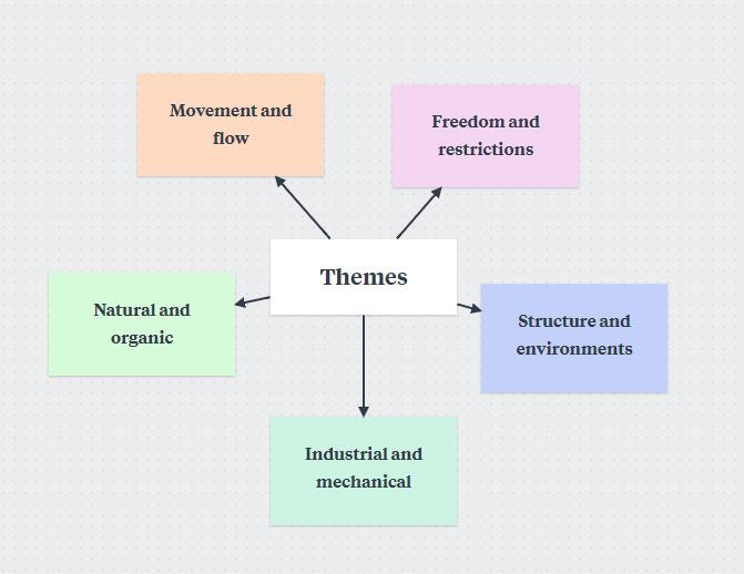
Potential themes
- Movement and flow
- Natural and organic
- Industrial and mechanical
- Freedom and restrictions
- Structures and environments
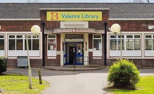
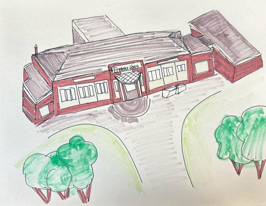
Valence Library, Becontree Avenue
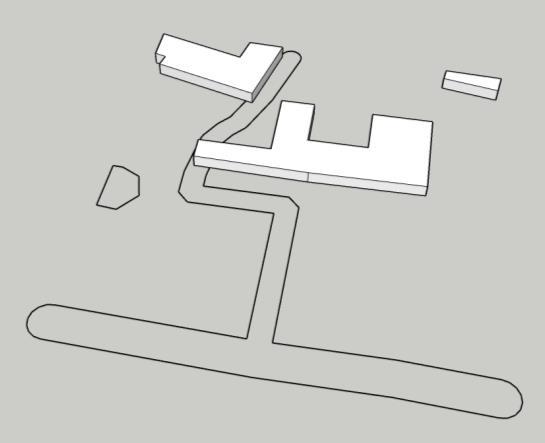
Local to Valence library
• Valence primary school
• Grafton primary school
• Robert clack school of science
• The Sydney Russel school
• Valence house museum
• Tulip tea room
• Valence park
The sites local to the library are important to consider since they contribute as the target audience. The Becontree area that it's located is primarily residential, so it would be a good idea to make it more visually pleasing. There are roughly 48 schools around the site so a few more activities to keep all age groups entertained could be beneficial.

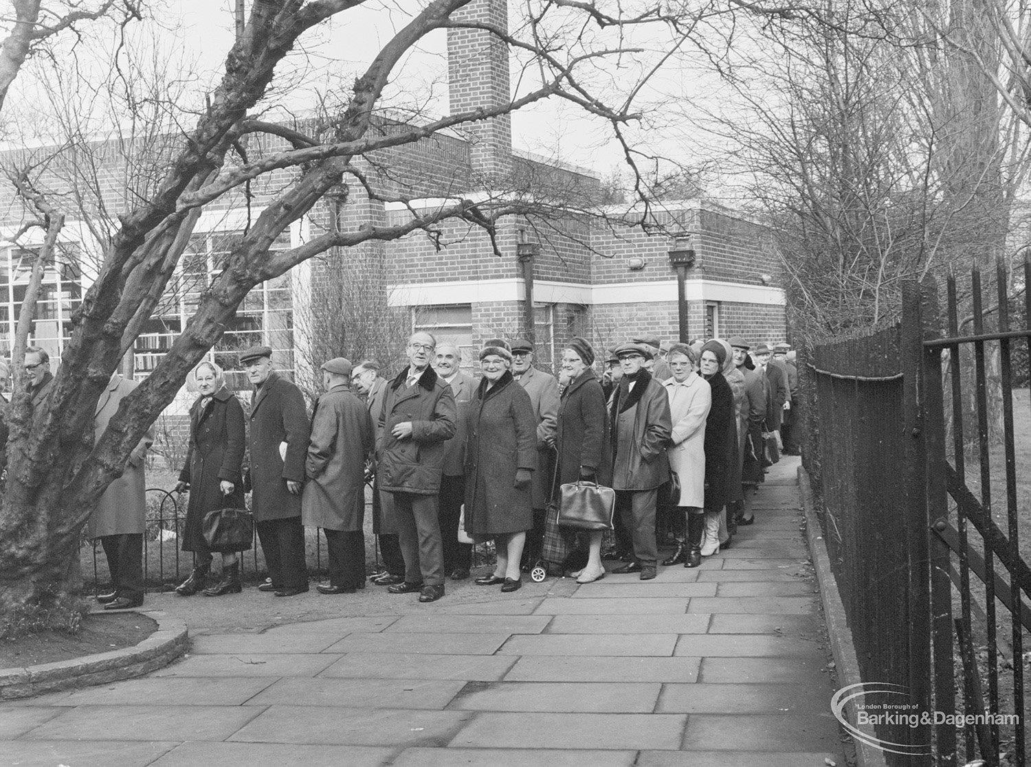
The exterior of this library is very outdated and ugly, the bricks make it too dark and less inviting.

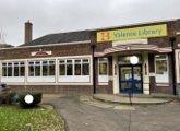
Old door, may not be very wheelchair accessible besides the ramp. Will need to change this as want to make the library as inclusive as possible.
A big, automatic, glass double door would be much more convenient and visual than the current blue door, this would make it more wheelchair friendly and lets in more natural light.

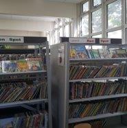
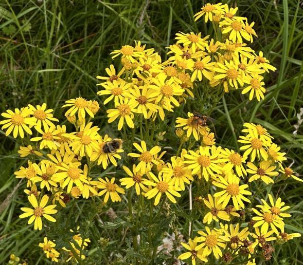
Not very visually pleasing, quite an old building, could do with an update to make it more inviting. Could also do with some gardening, maybe add in some community flower beds to help the bees.

Parking limited and inconvenient, bin located in front of building, makes it ugly. Need to include a bin shelter and an area designated for parking without damaging the image of the library


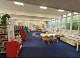
Not a lot of seating or private areas, not very friendly for students looking to study or people looking f or a quiet space as its more child friendly.
Cheap, non-permanent structures, not very aesthetic, kind of unsettling as doesn’t have that library feeling.

Here is valence libraries colour palette compared to that of mature libraries.

Lots of bright, block colours, designed more for children, not very inclusive of other ages.


Primary colours are playful which isn't the tone you want to set in a place where people study. You want to use natura colours like browns and nudes because browns add warmth and security which would make the public more comfortable using the library.
Biophilic architecture
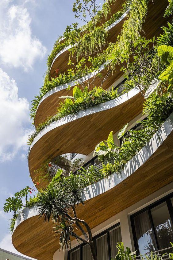
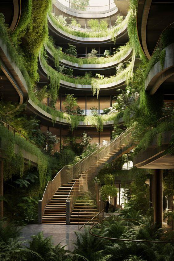
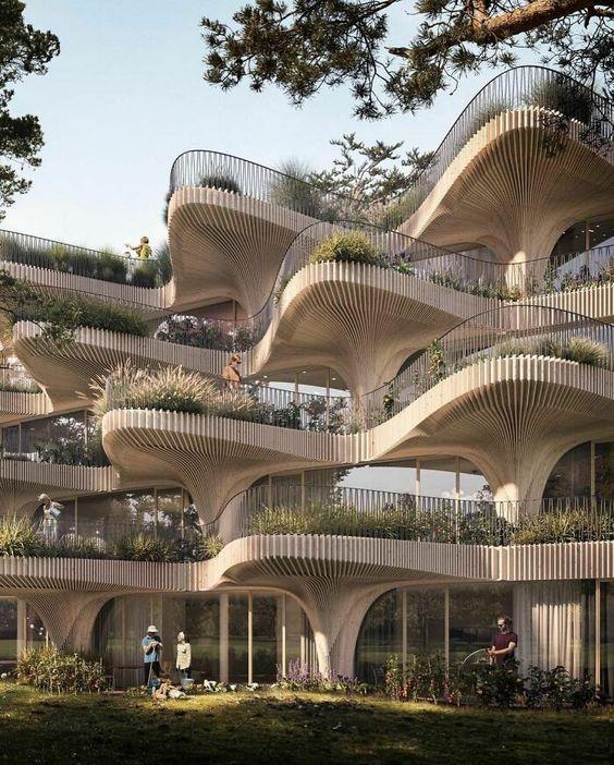


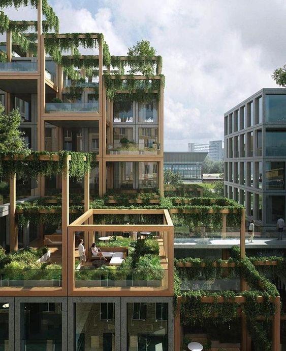
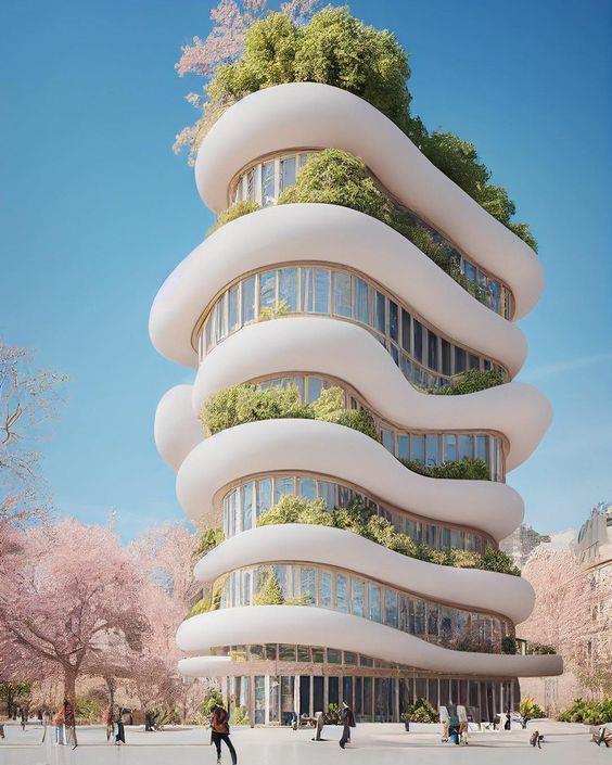
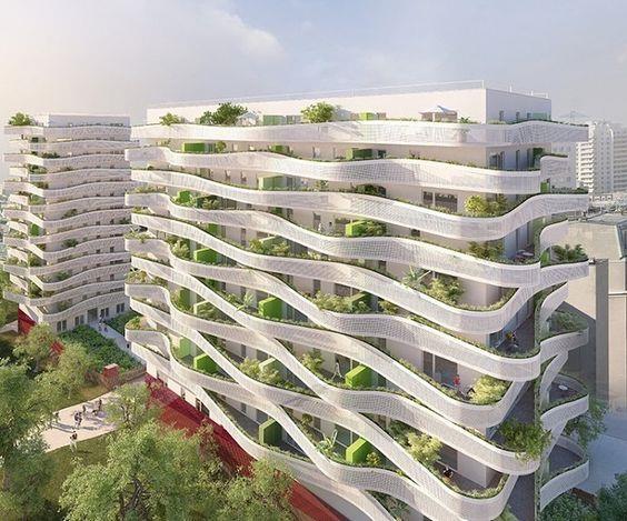
Biophilic architecture
Biophilic architecture is a design philosophy that seeks to create buildingsand spaces that connect people with nature. It incorporates natural elements, materials, and light to enhance the well-beingand productivity of occupants and the built environment's sustainability. Biophilic design is based on the belief that humans have an innate connection to nature, and that by bringingelements of the natural world into our built environment, we can improve our health, happiness, and overall quality of life.
Biophilic comes from the work biophilia which means “a love of nature”. The principleof biophilic architecture is bringingnature in the space. It involves incorporating natural elements into the built environment, such as plants,water features, and natural materials like wood and stone. It also involves natural shapes and forms in design such as curves, arches and irregular shapes.
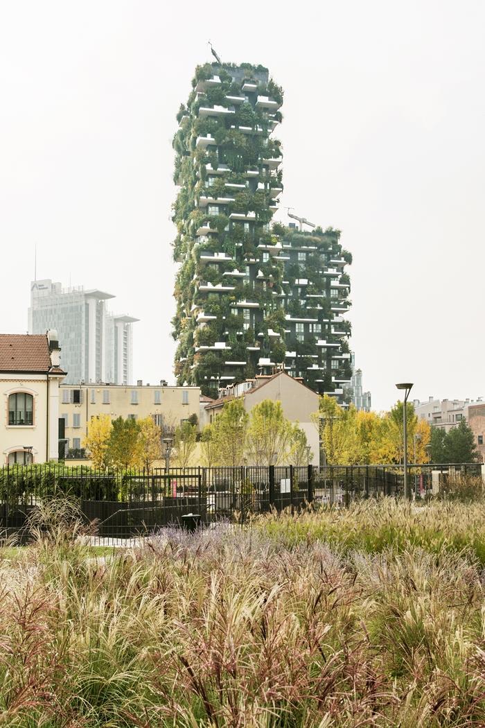
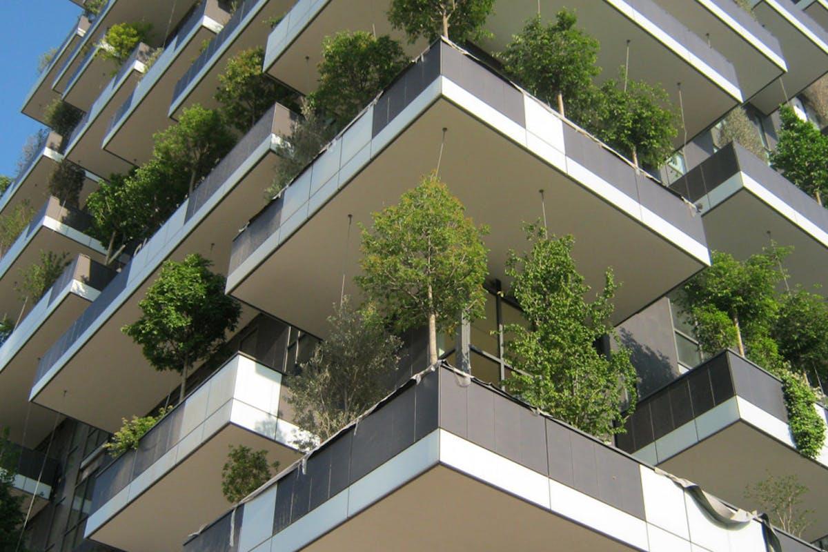
Milan’sIl Bosco Verticale (the Vertical Forest) is a new approach to high rise buildingsin which trees and humans co-exist. In essence it is an architectural concept which replaces traditional materialson urban surfaces using the changing polychromyof leaves for its walls. The project consists of two towers of 80m and 112m, planted with almost 17,000 trees, shrubs and plants. This provides the equivalentgreenery –over an urban surface of 1,500m²of 20,000m² of forest and undergrowth.
This is an approach that contributes to the regeneration of the environmentand urban biodiversity,without expanding the territory of the city.
The Bosco Verticale by Boeri Studio in Milan, Italy
Gardens by the bay
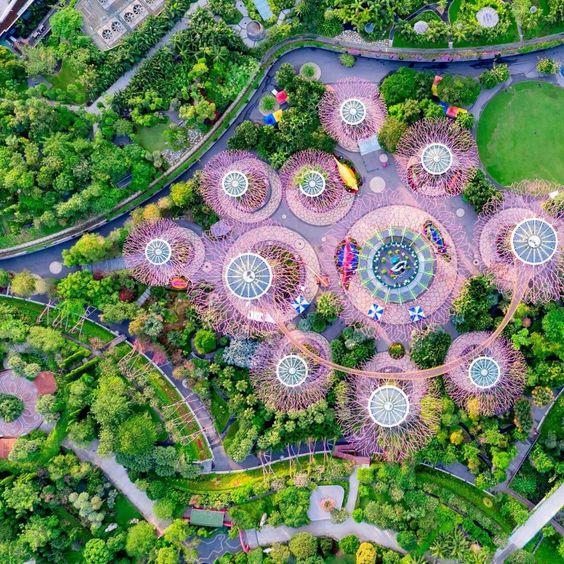

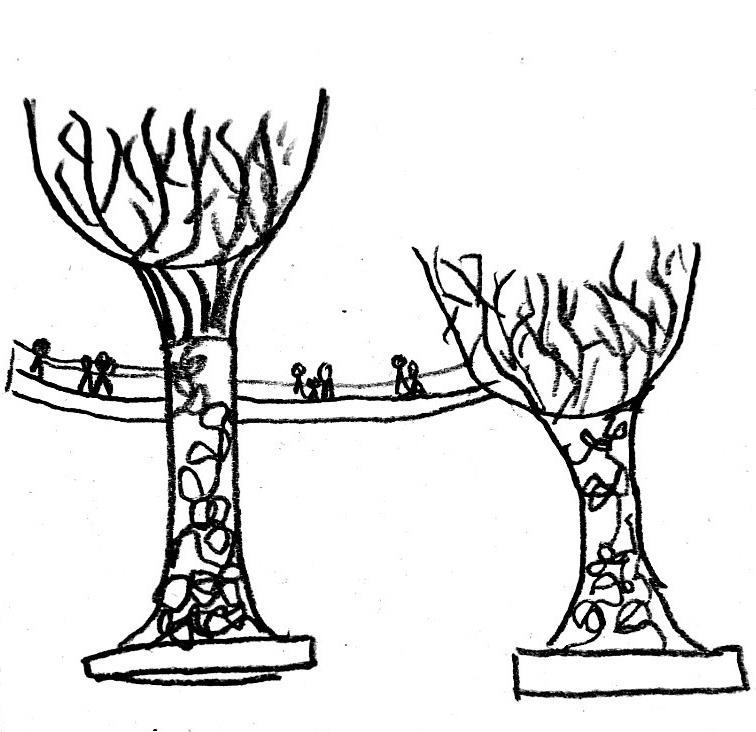
The trunk is made of metal framework arranged like branches. Within these frames is plants growing and filling the gaps while cleaning the air
The framework is made up of loads of supporting triangles, triangle is the best shape for support as it’s the strongest shape


This is a nature park that spans 101 hectares in the central region of Singapore.

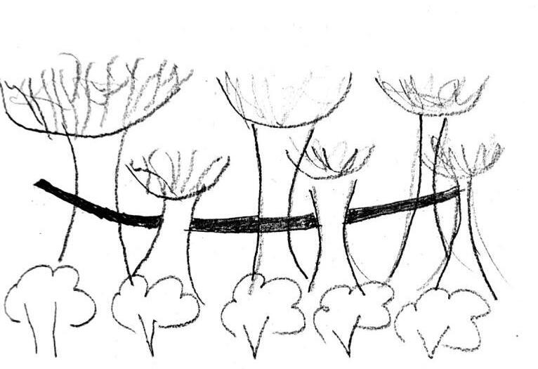
Tree like structures that are connected by a bridge that’s 22m above the ground.
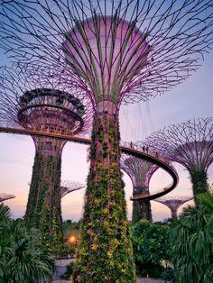
Tree like structures have vegetation climbing up it to have that natural element that real trees do, design is inspired by nature
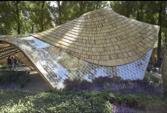
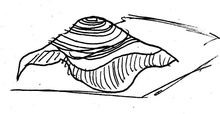
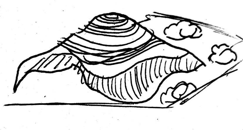

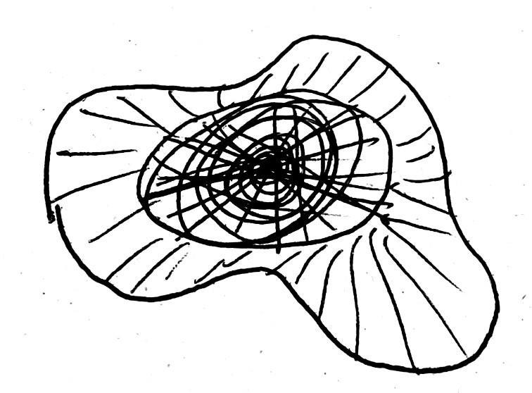


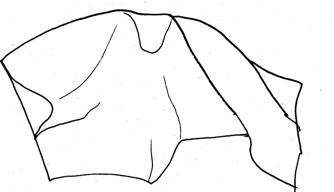
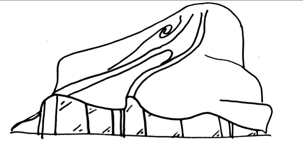
I like the natural flow of the hat, this inspired my final pavilion, I like how it flows like water and allows shade from all angles
Art hanging from ceiling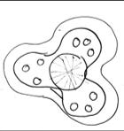
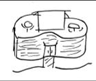
I liked this café design because it has a natural element of having 3 parts like a flower, how all flowers have a number of petals corresponding to Fibonacci's sequence

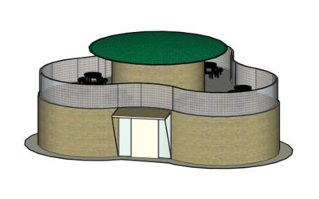
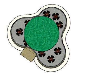
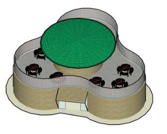

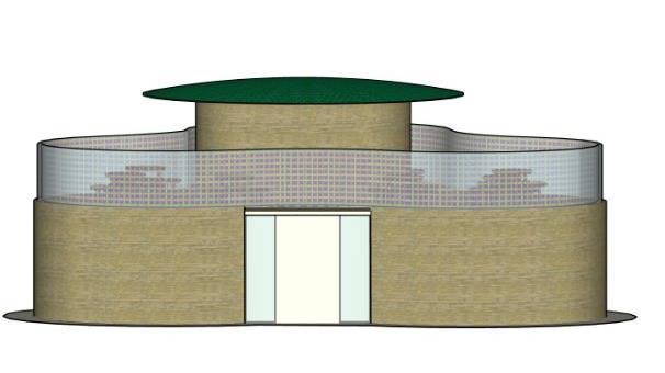
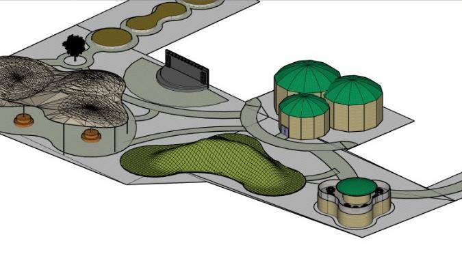
Paths looping around everything, gives everything a chance to be seen.
Everything looks similar but is built on a base that is completely different from the next, this gives the buildings individuality without them being completely different such as how trinity buoy wharf looks like today
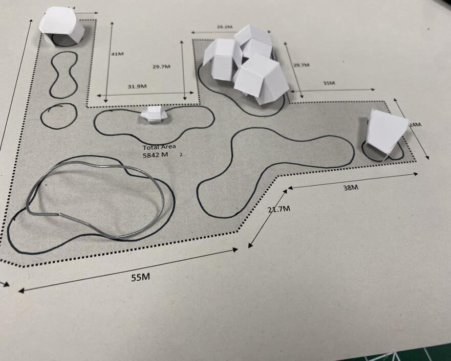
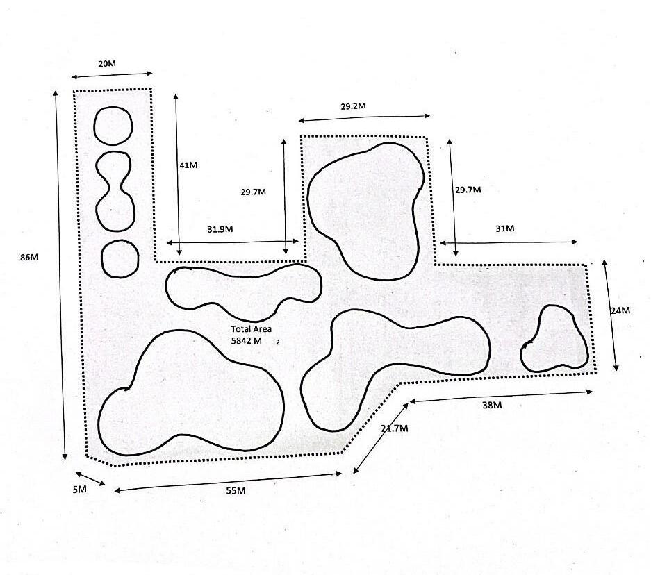
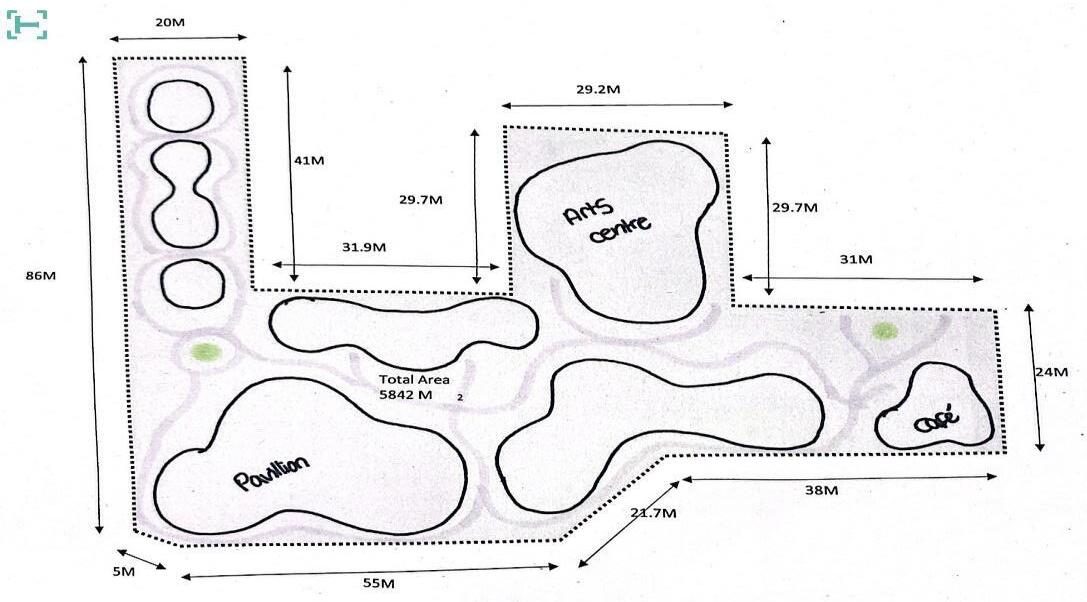
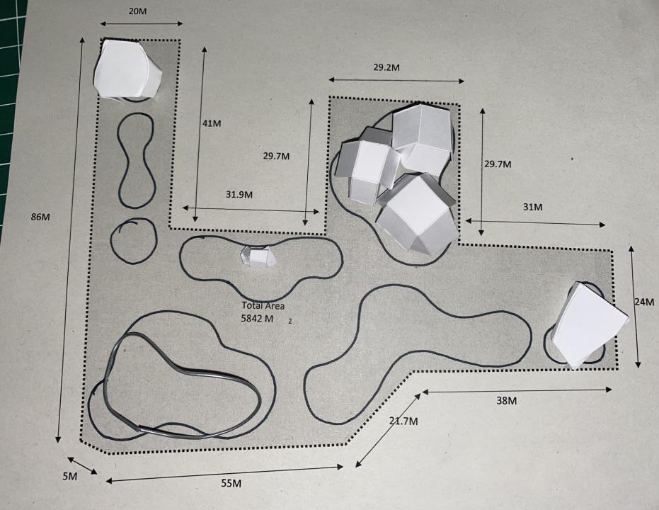

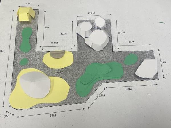
A small version of an amphitheatre, maybe to have local art exhibitions
hat shaped pavilion with a lot of shade
A hilled area to add some extra dimension to the landscape, a good area for a picnic
geometric arts centre
A geometric café to match the arts centre
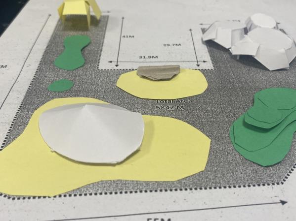
A floral area leading up to a second, smaller pavilion
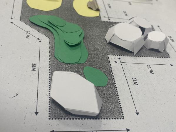
 A
A
A
A


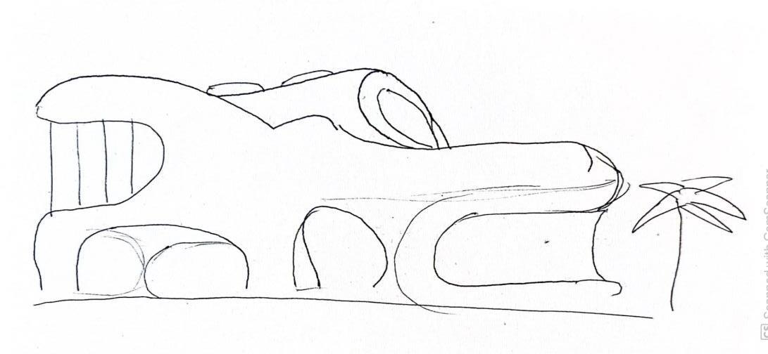
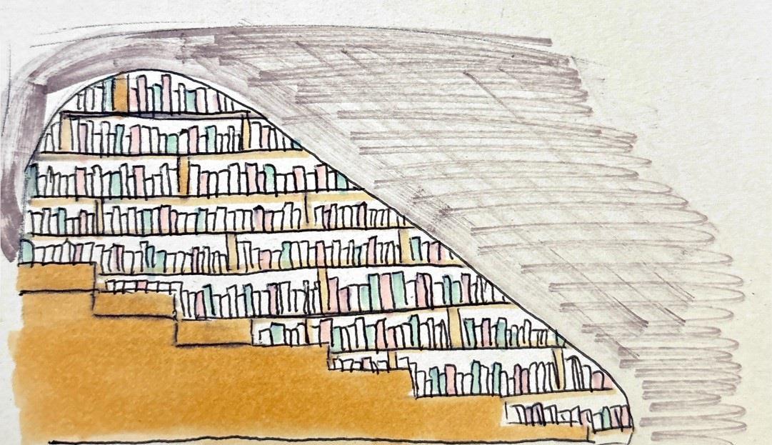

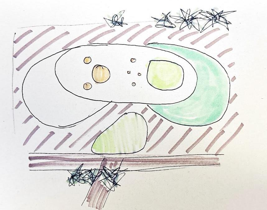
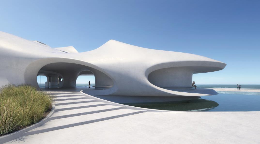
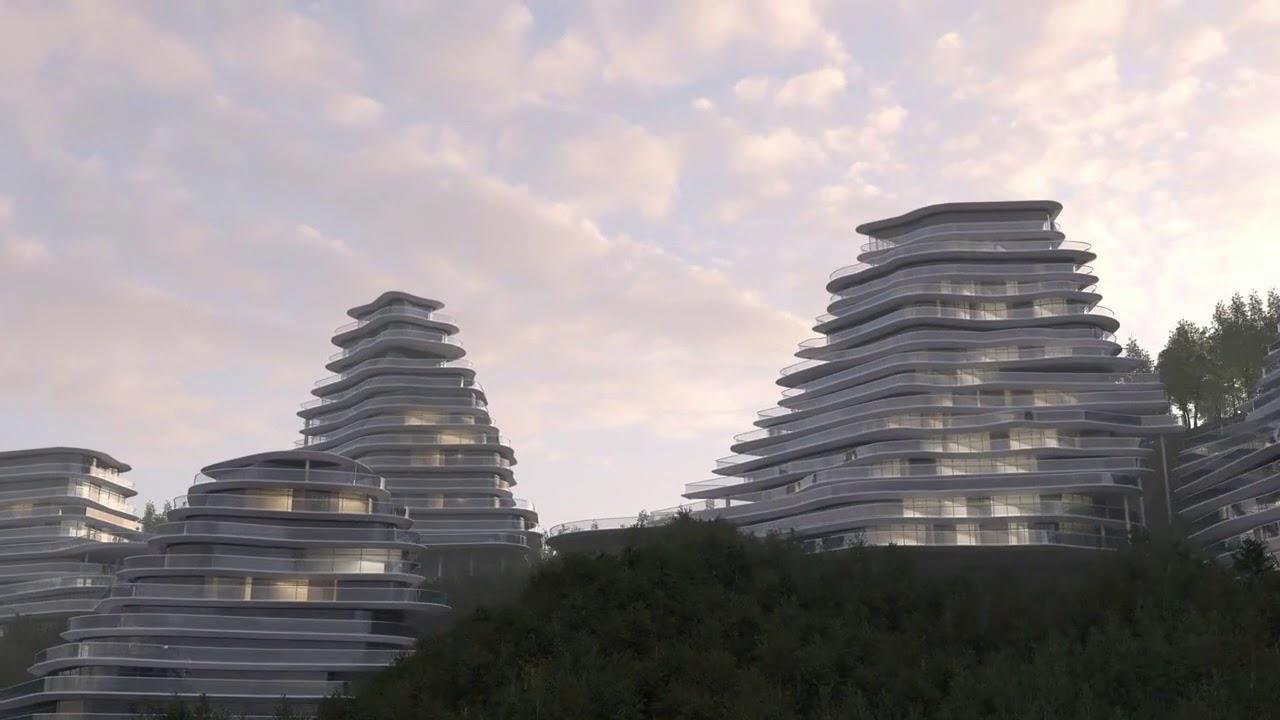
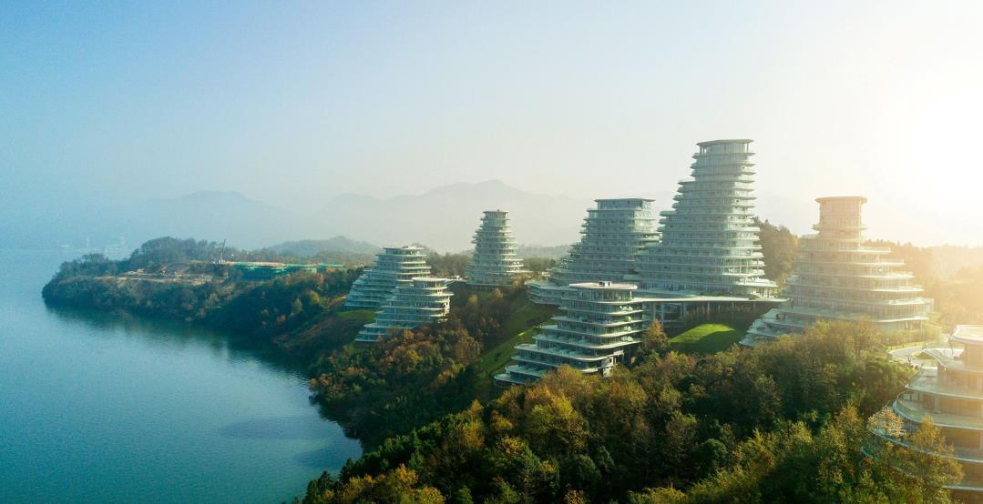
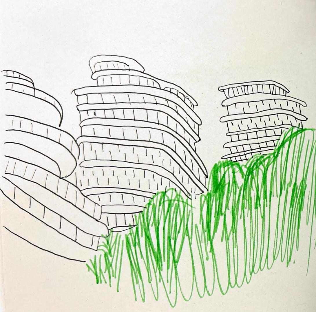
By using the contours from existing mountains,Ma Yansong of MAD Architects was able to create buildingsthat preserved the beauty of the natural environment
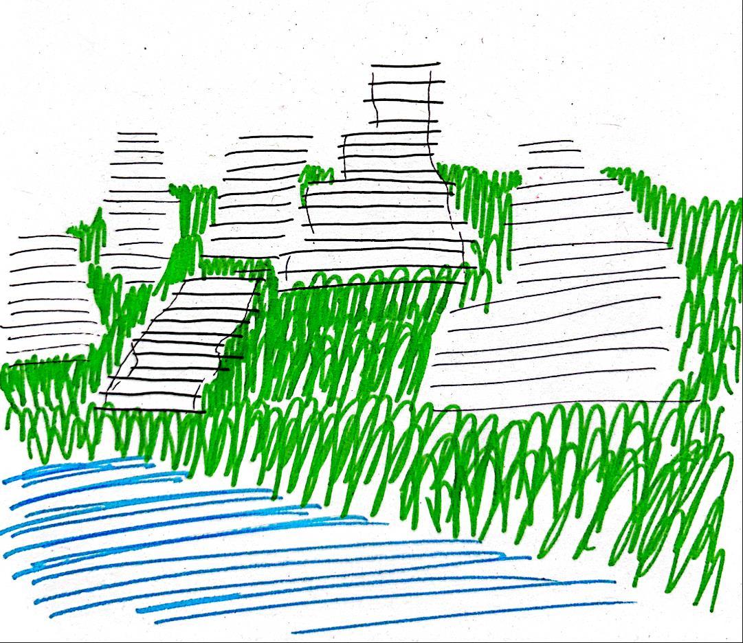
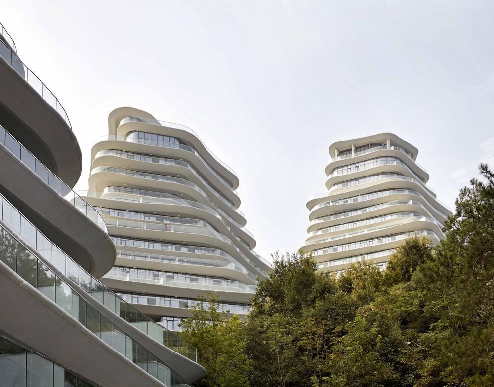
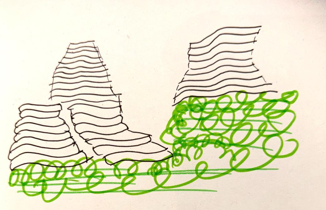
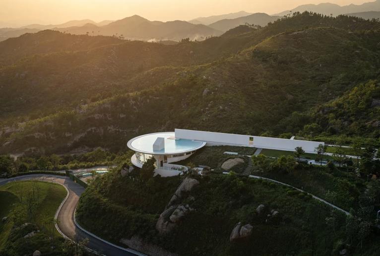
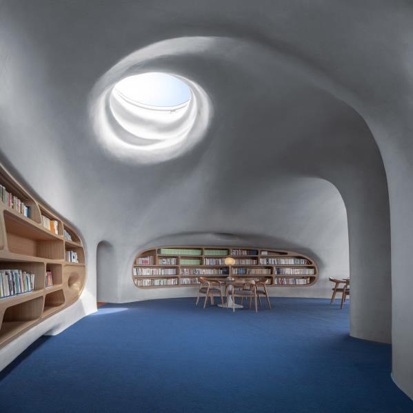
I like the open space and the use of white and windows to make the space feel bigger.



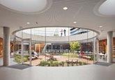
I like that they have included an open, green area within the middle of the building. It creates a contained freedom which is nice when you need to escape into a book and relax.
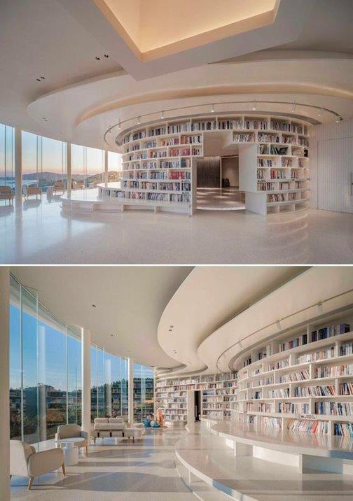

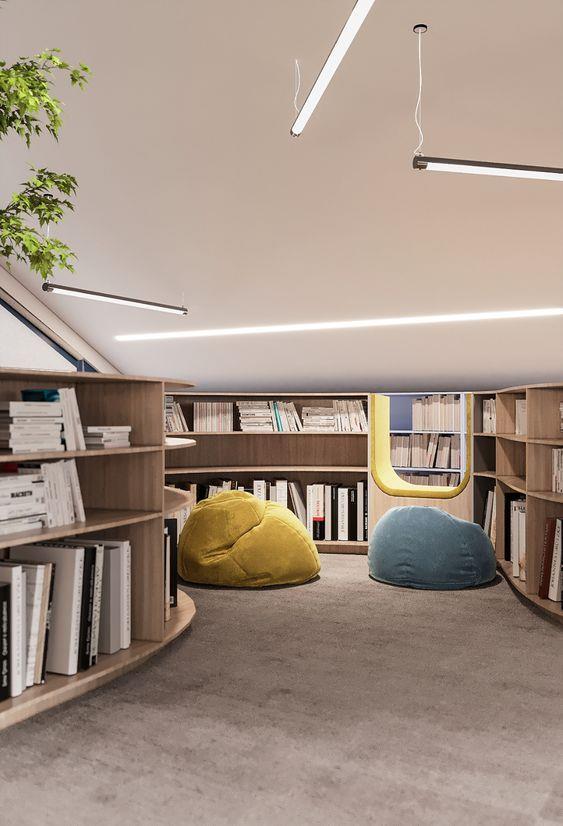
I like how privateand cosy this library is. It’s a good area for quiet rearing for people of all ages. The beanbag is a nice touch as they can mould to you for additional comfort.
Inspirational libraries
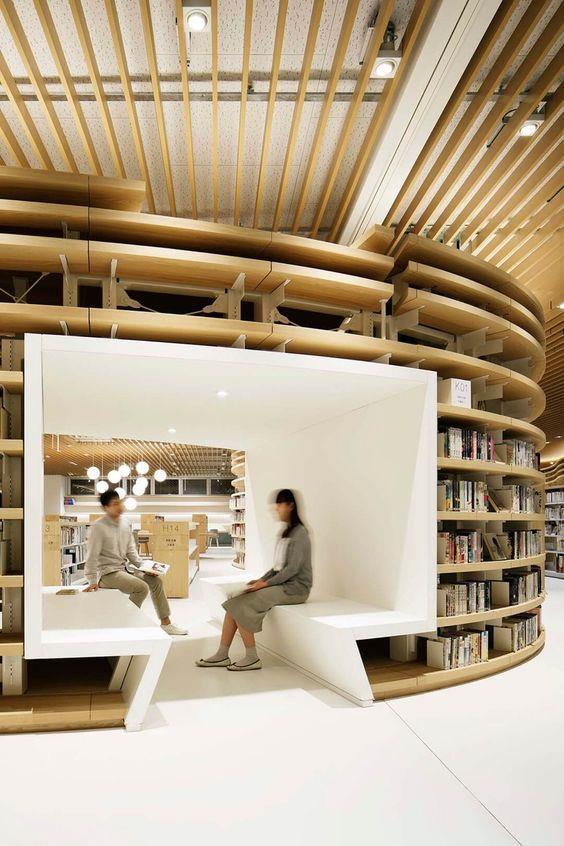
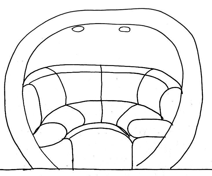
The continuousbookshelvesare a good feature of this library. It's visually pleasing and sets some sort of order. I like how the shapes are quite organic and flow quite nicely, this adds to the warmth of the room as it almost wraps around you like a blanket, having a librarylike this would make people feel secure in visiting and could be very beneficial for the libraryitself.
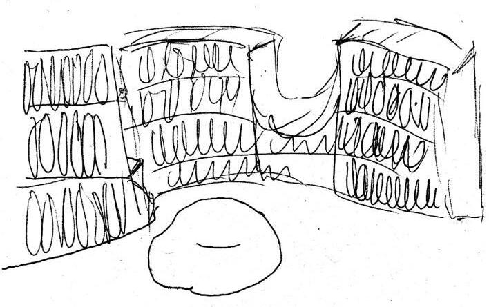
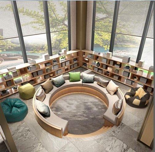
The rounded shape of the chair is quite interesting as they're not very common. It’s a good idea for group study or reads, maybe for a school visit.

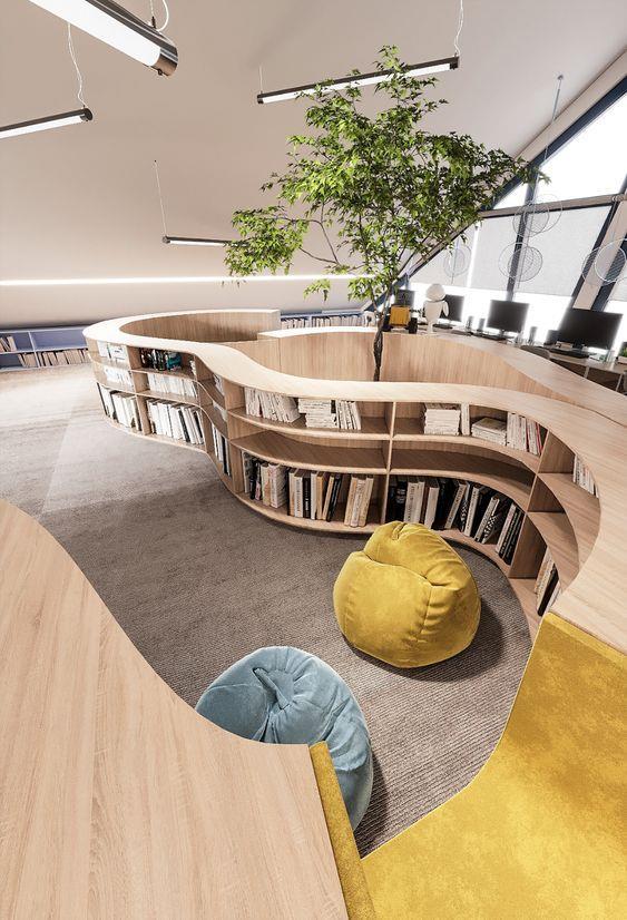
I quite like the combined chair within the shelf, its very inclusivewith the organic shape.
I also like the addition of a tree, whether it be real or faux, its quite a lovely feature which also strengthens the organic feel to the room.
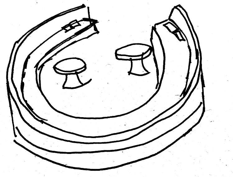
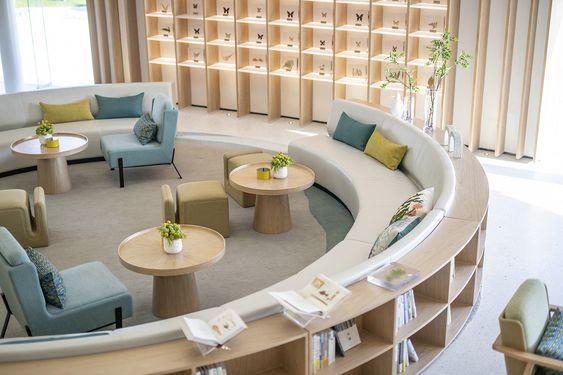

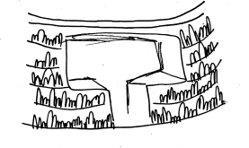

In these librariesI like how the seating and bookshelves are part of the interior architecture, that they're permanent.

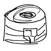
I like the natural fluidity of a round interior, it's quite comforting as you rarely fin corners in nature, Our bodies for example, they're fully rounded and hold no corners, so why should they be in a place with corners.
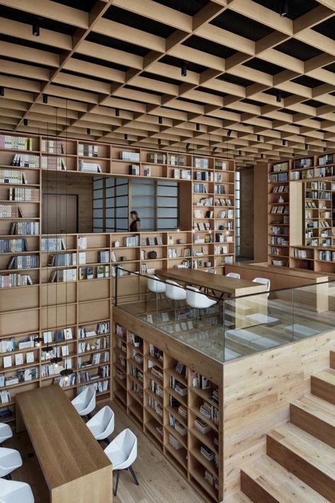

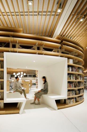
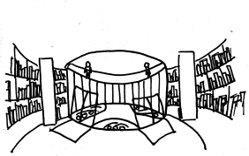
Mood board on interiors
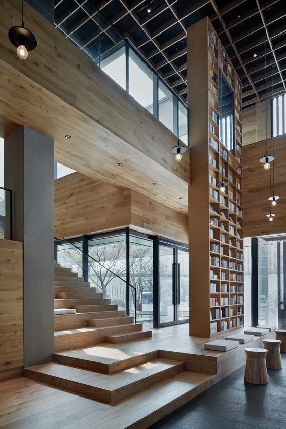

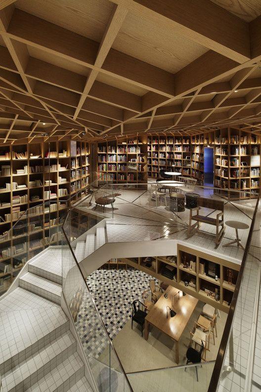

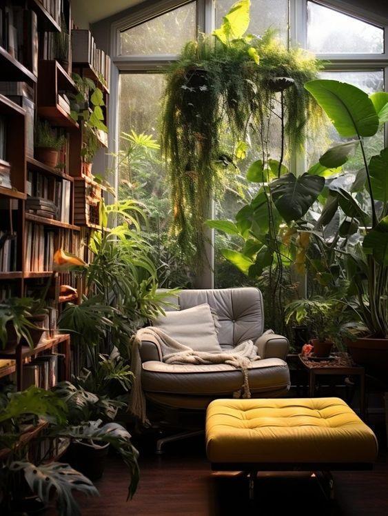
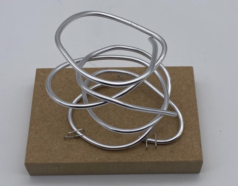
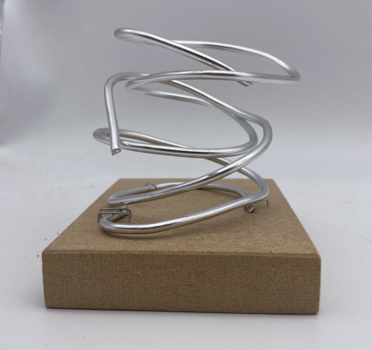
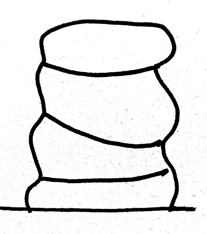
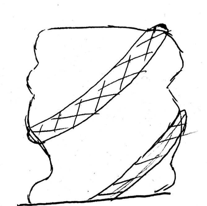
Model 1
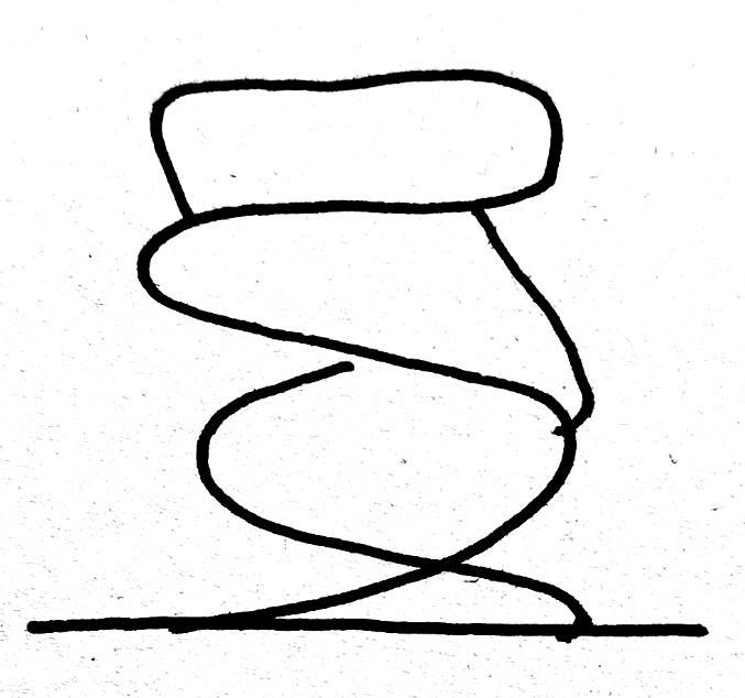
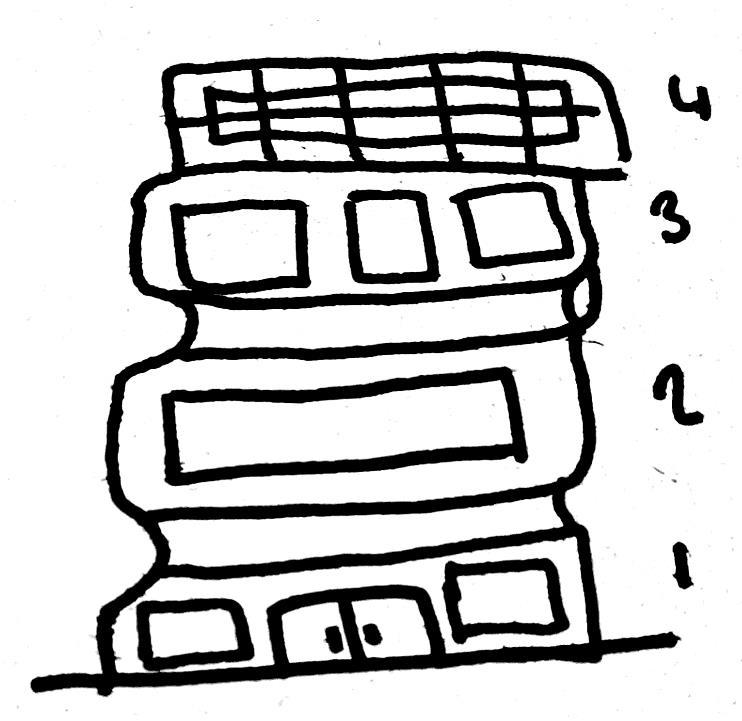
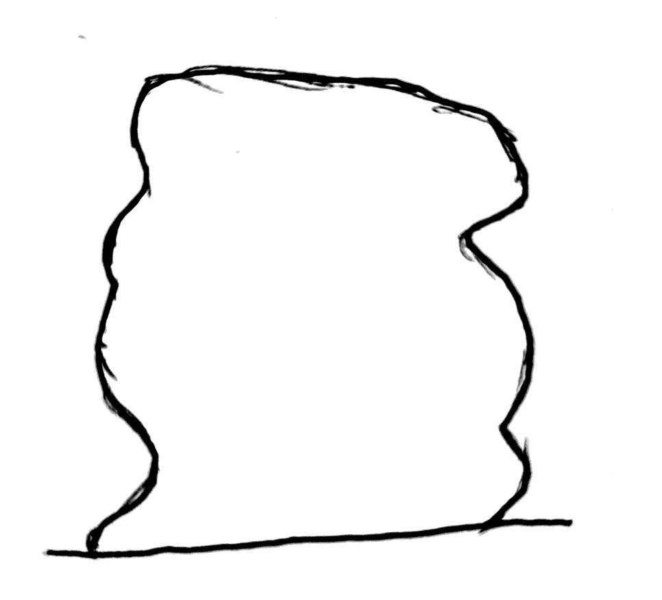


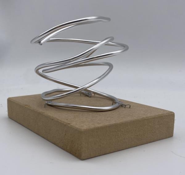
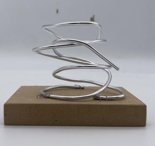
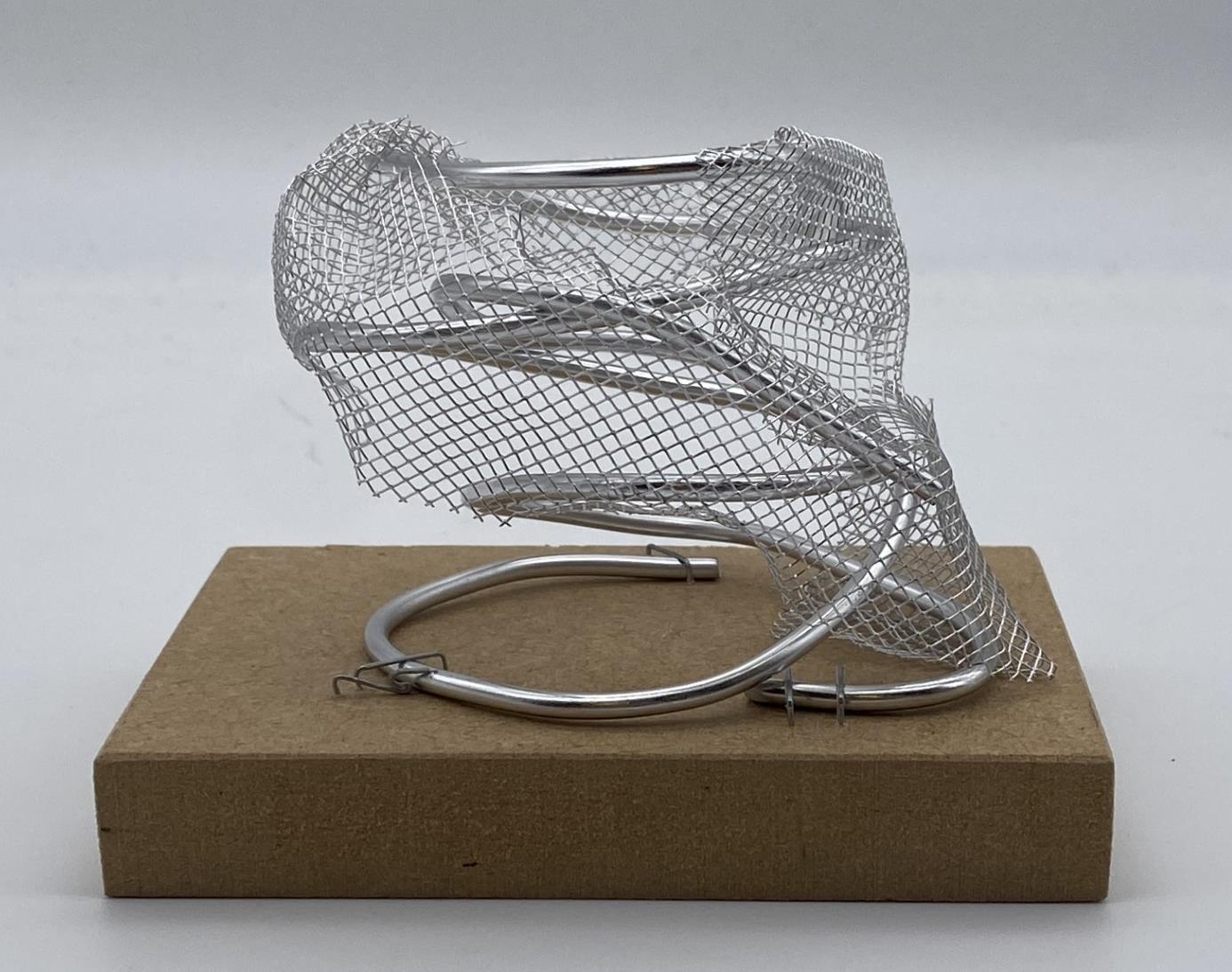
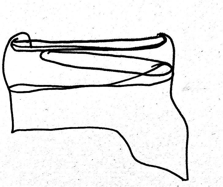
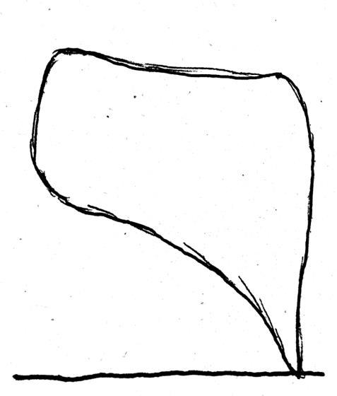

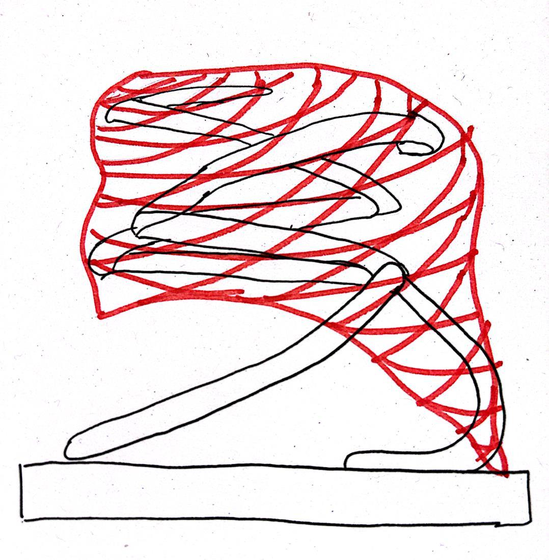
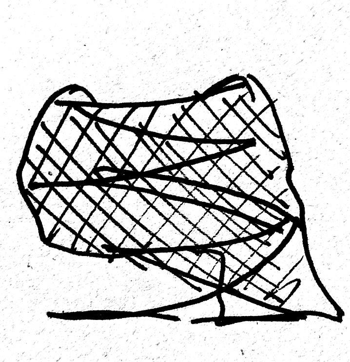
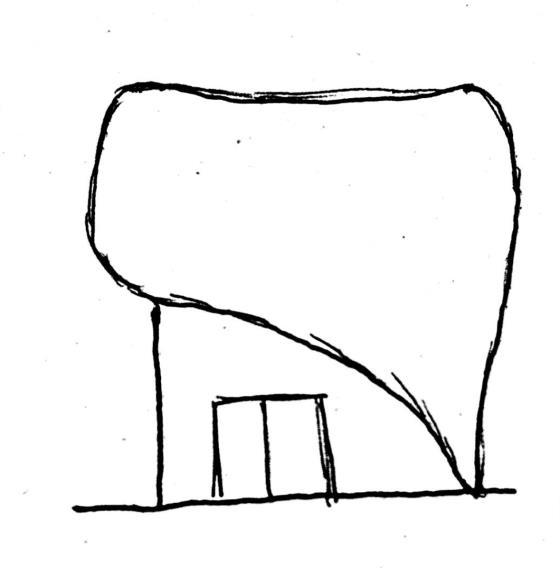

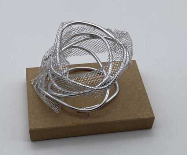


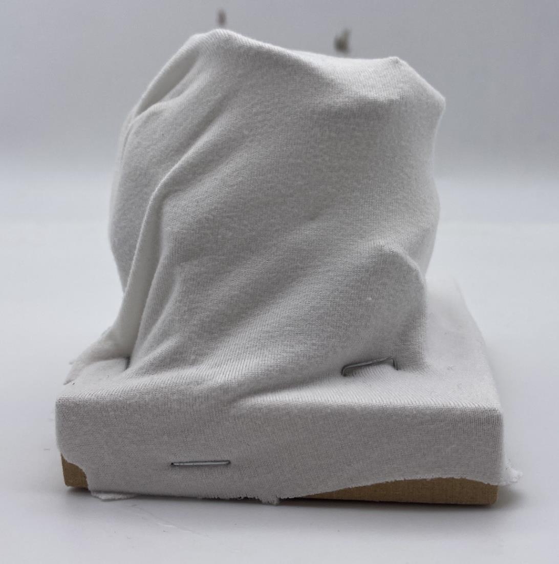
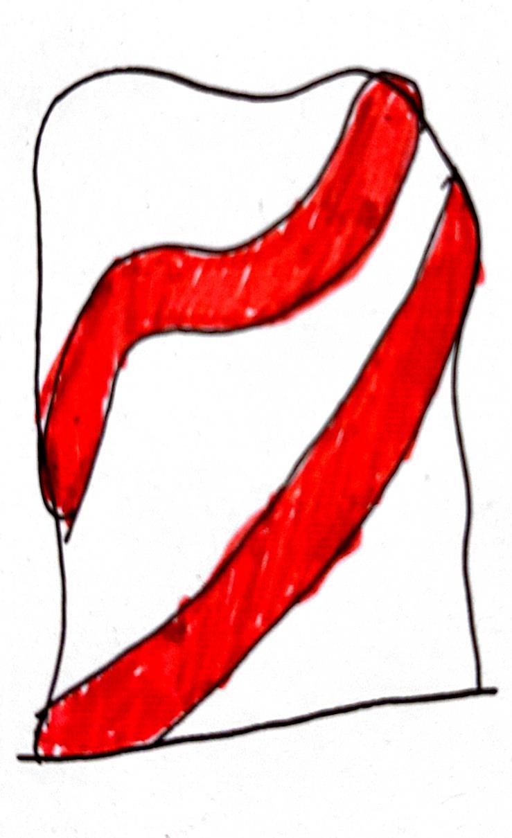
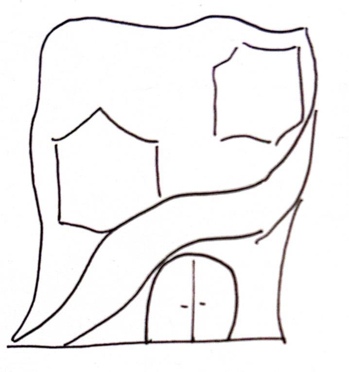
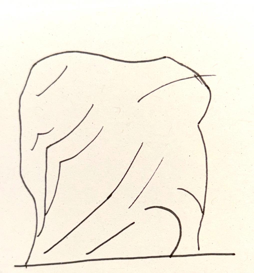
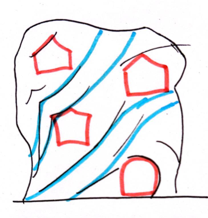
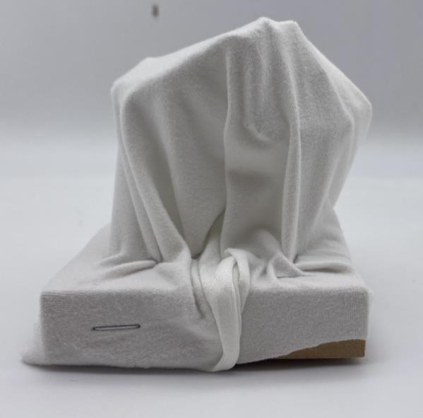
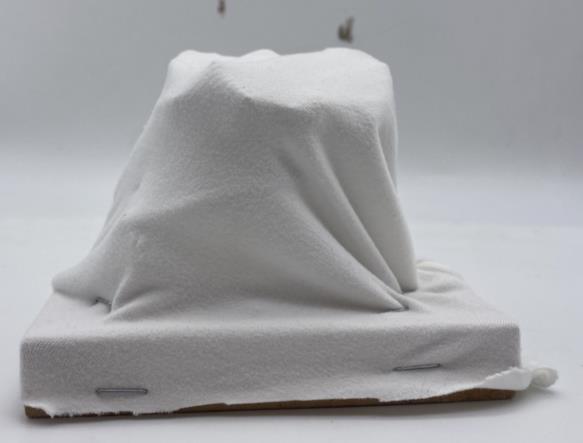
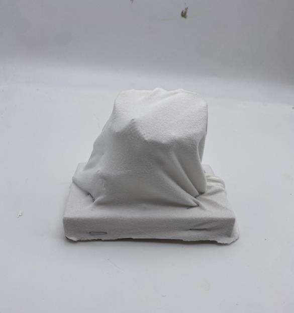
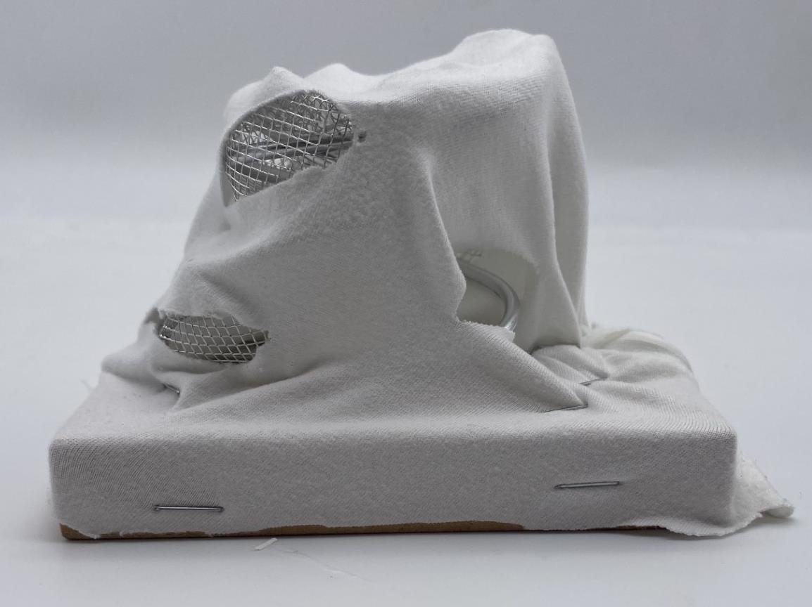
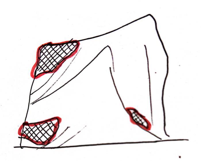
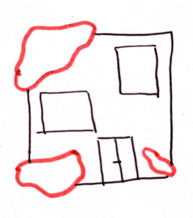
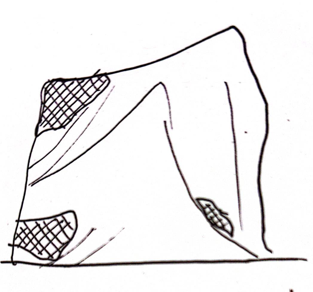
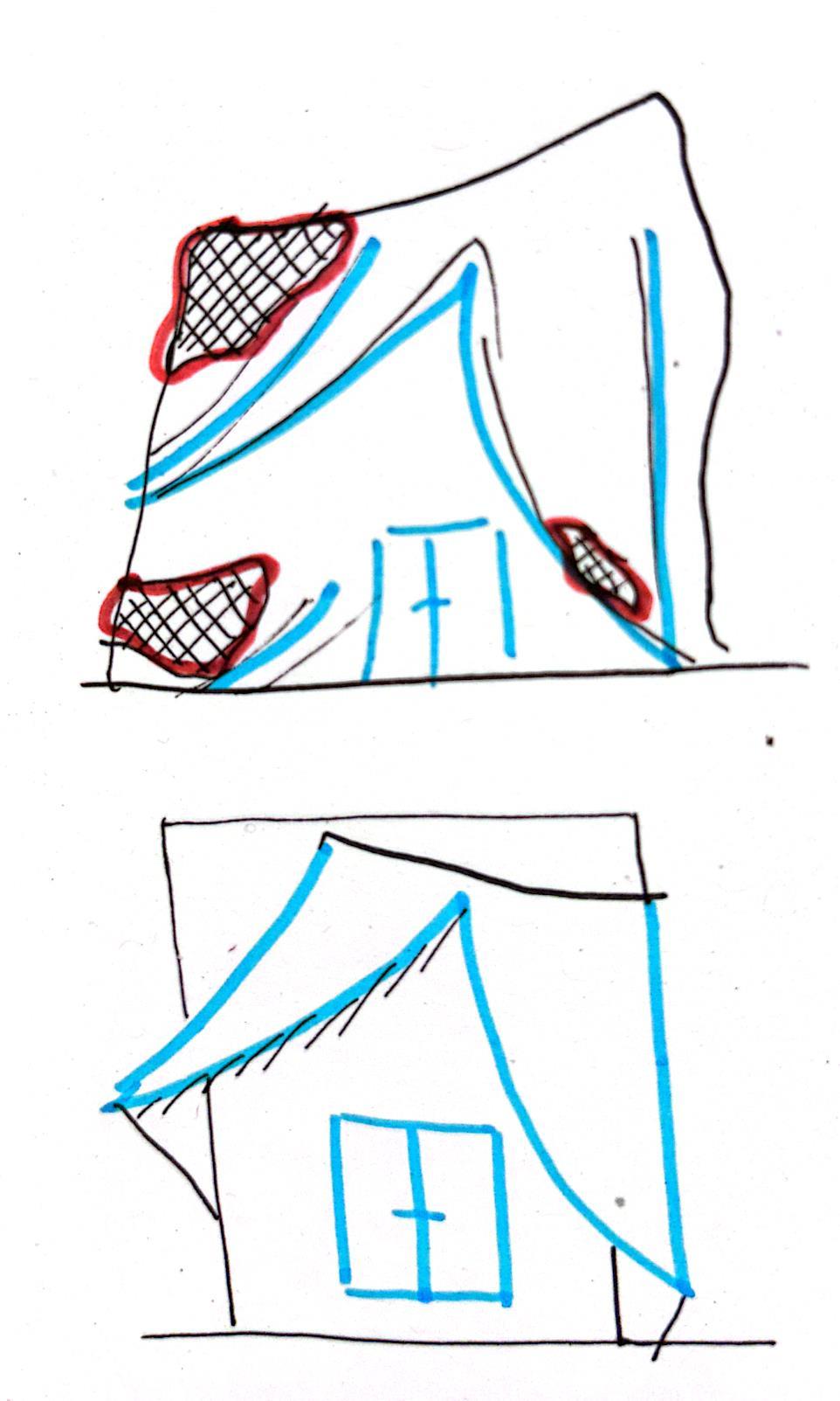
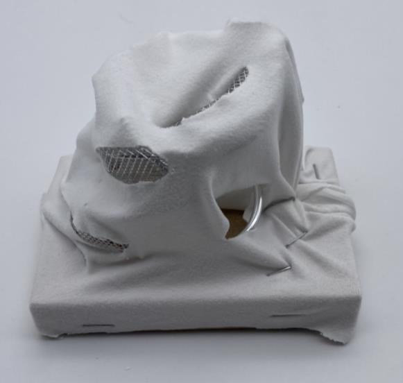

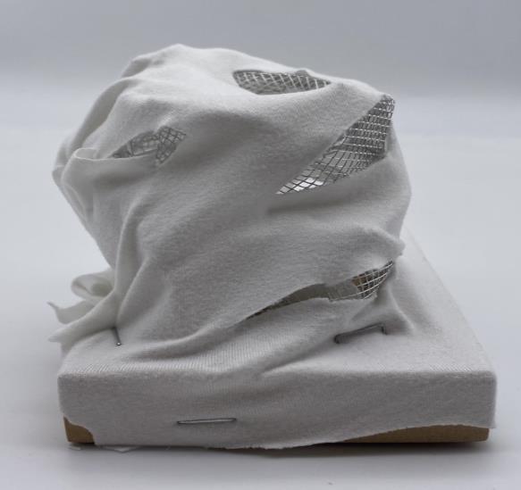
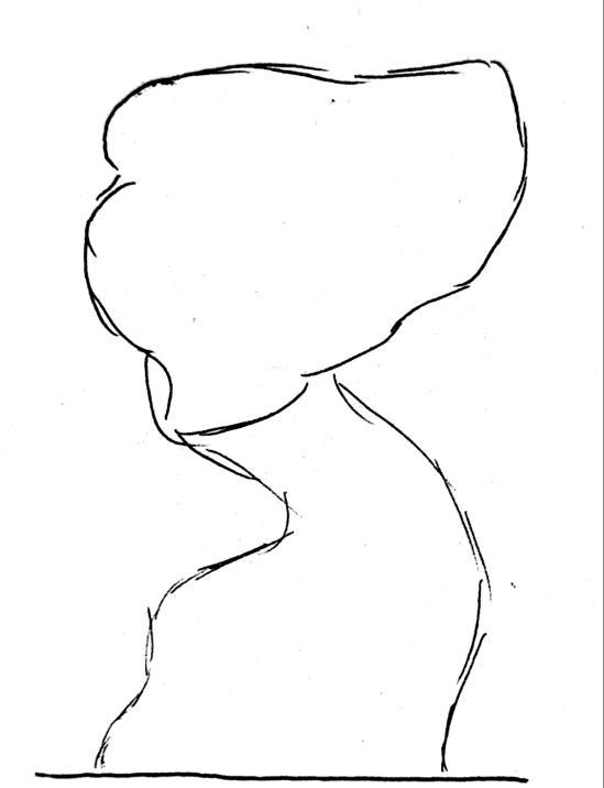
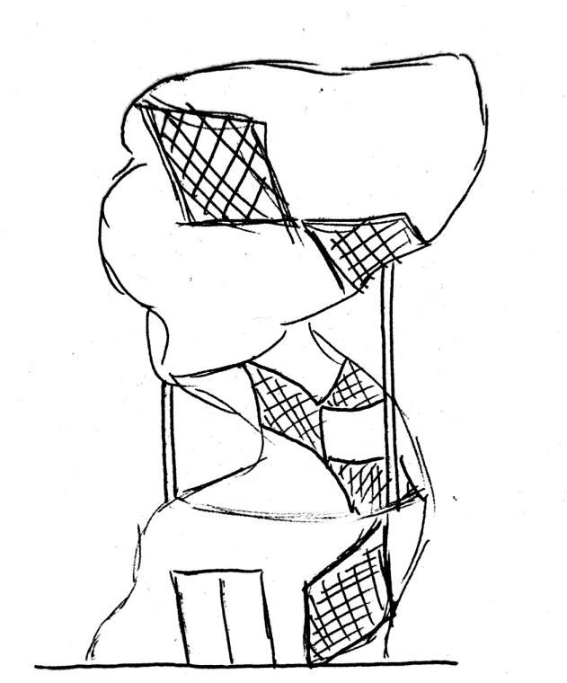
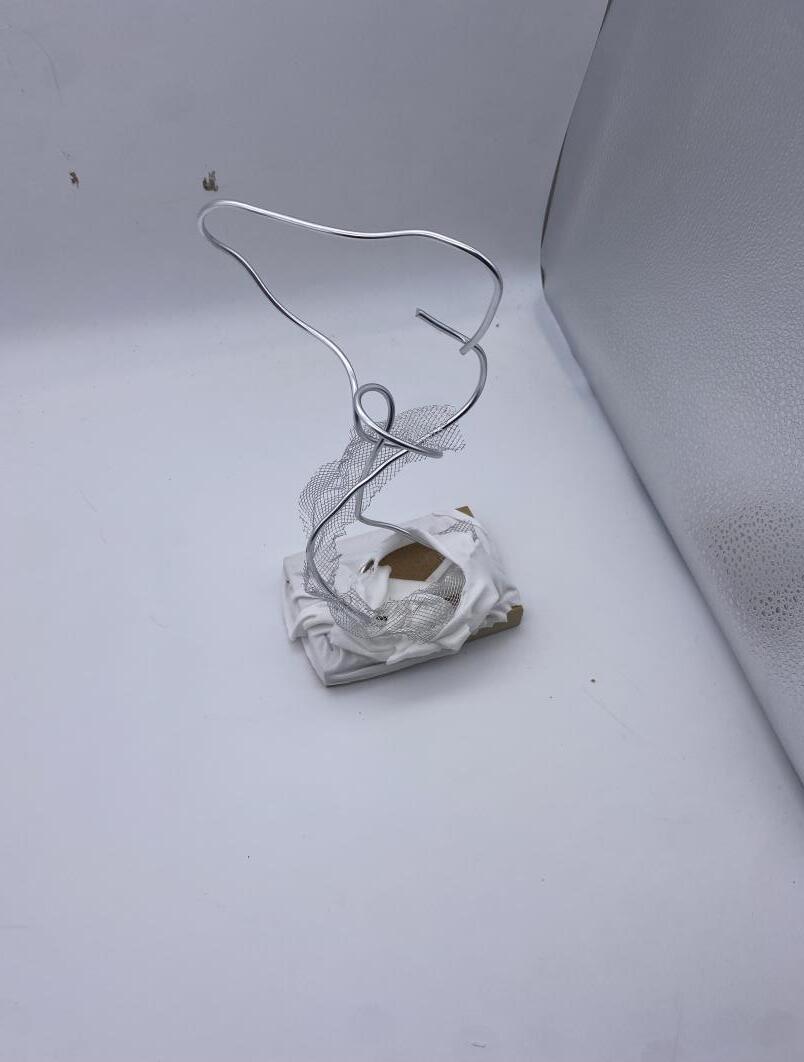
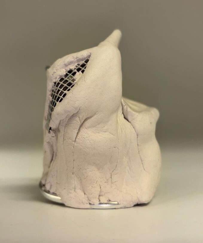

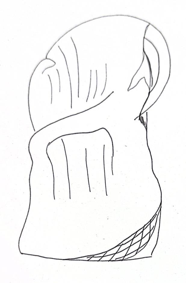
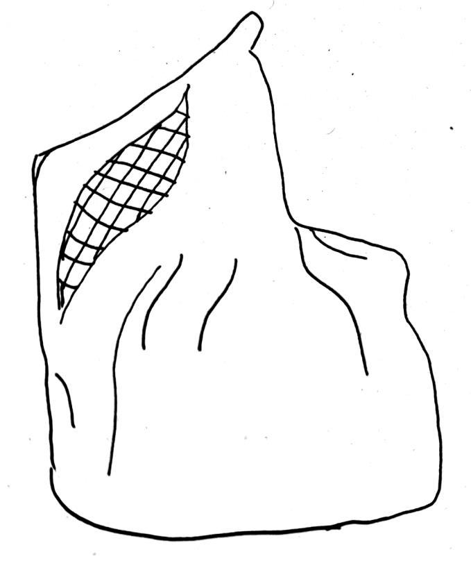


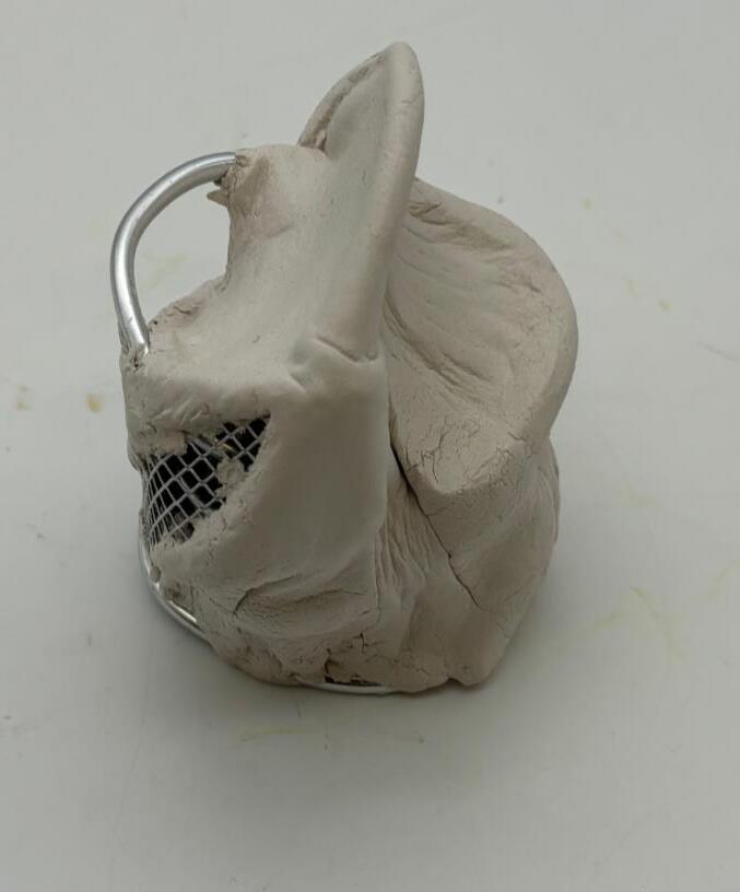
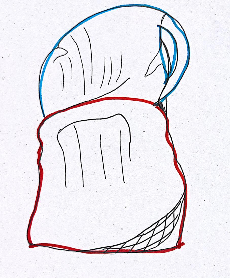
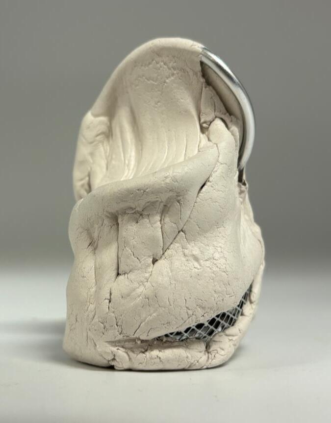
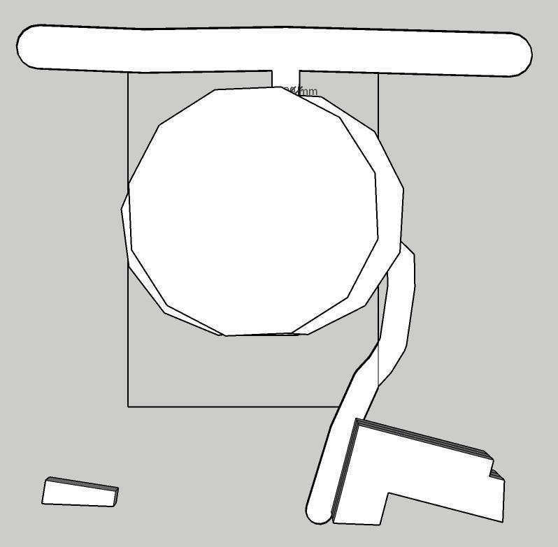
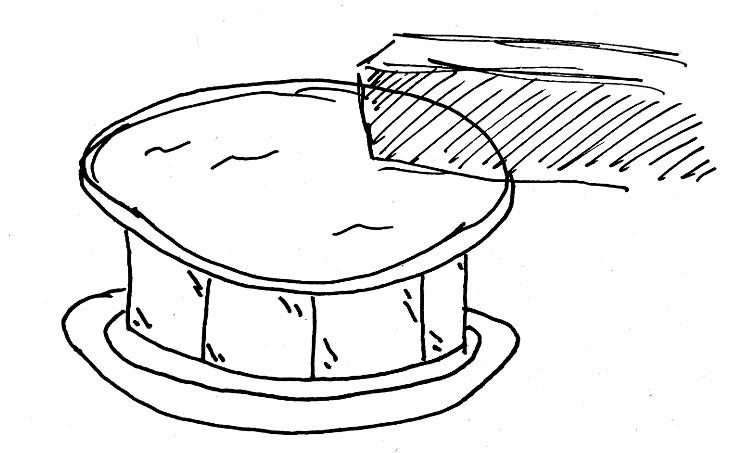
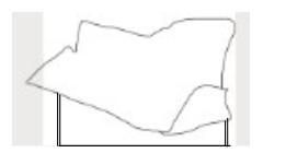
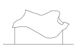
Potential addition of a skylight sort of thing, off centred.
Too much light can damage books so If I limit windows on one side and have a skylight on the other side it'll minimise damage for said books.

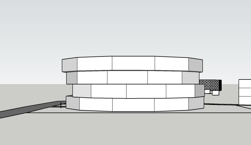
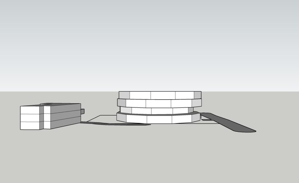
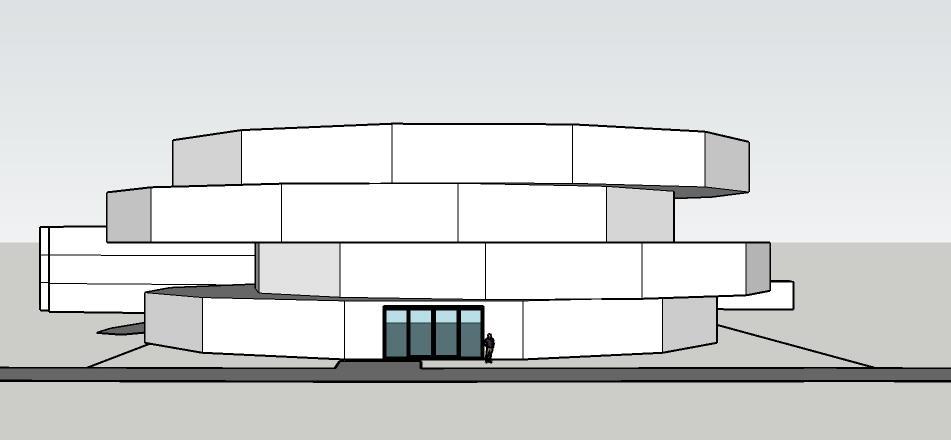


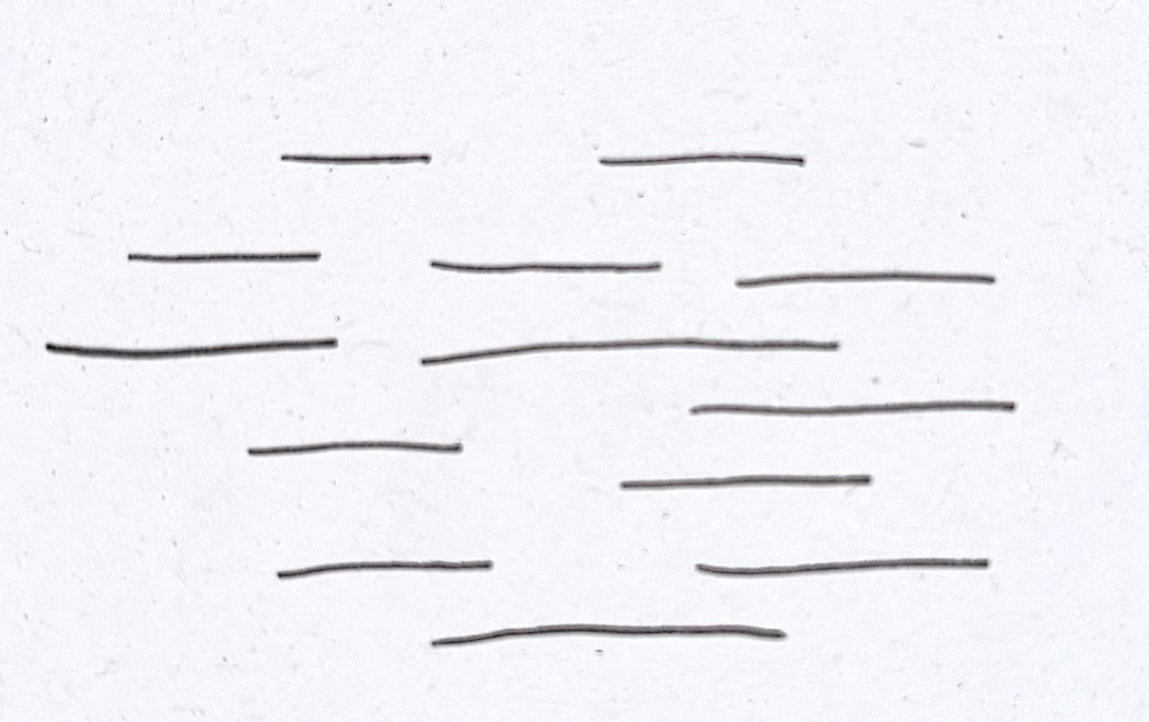
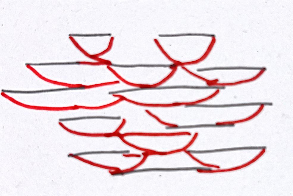

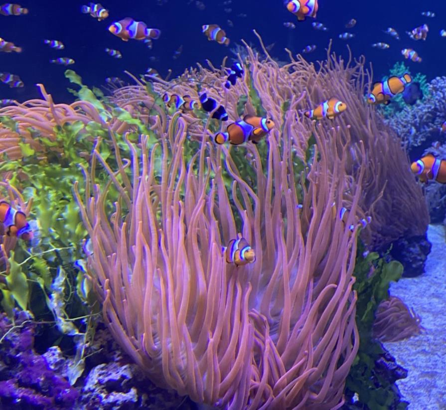

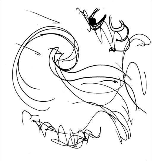
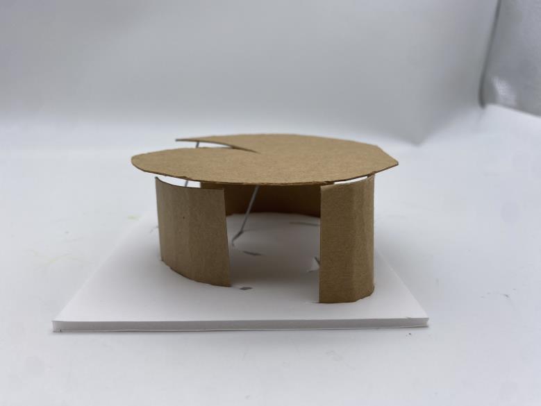

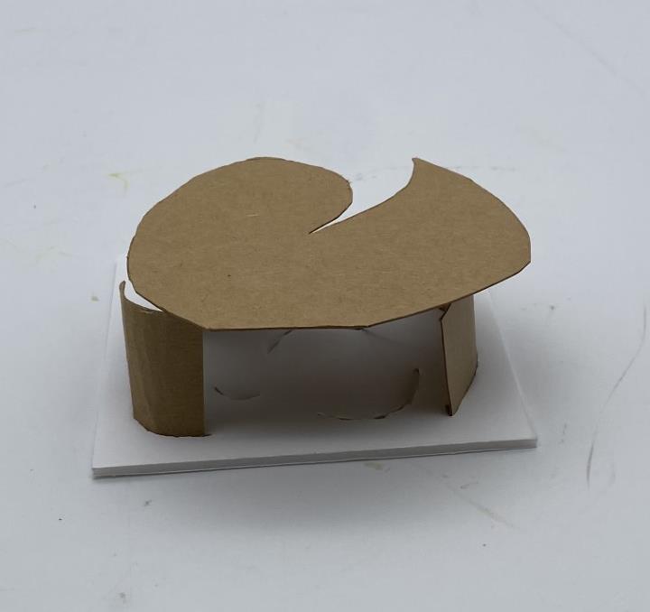
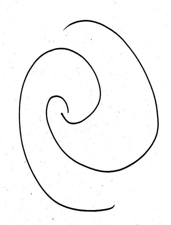

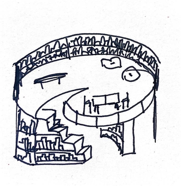
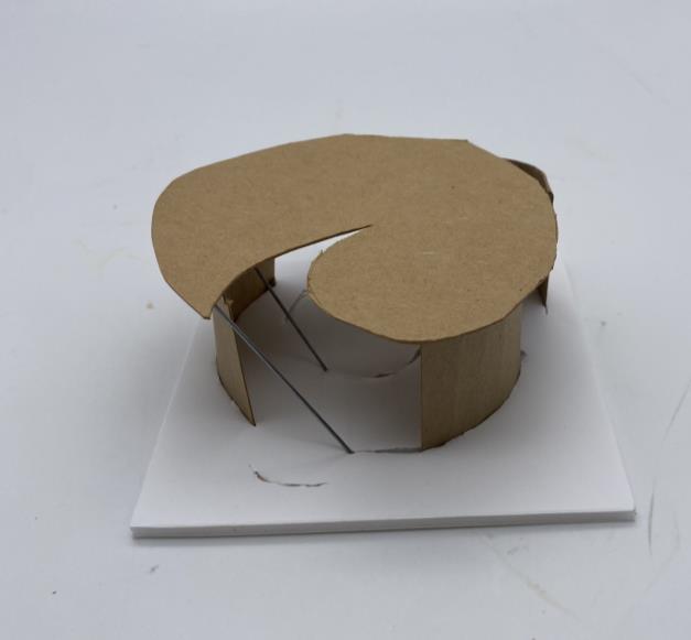
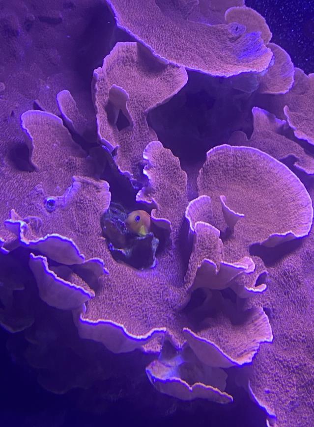
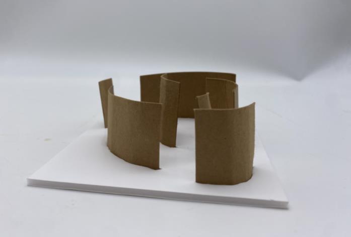
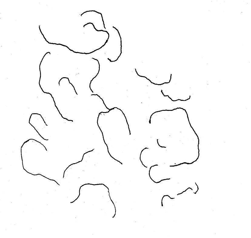


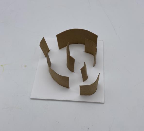

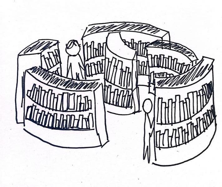
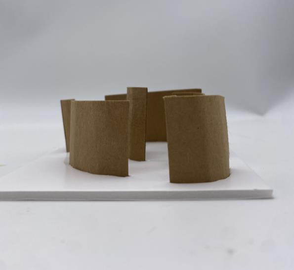

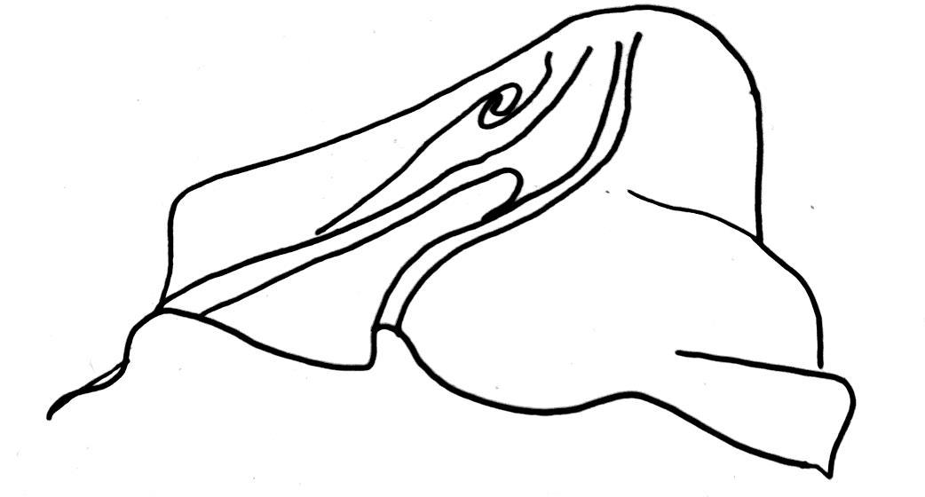
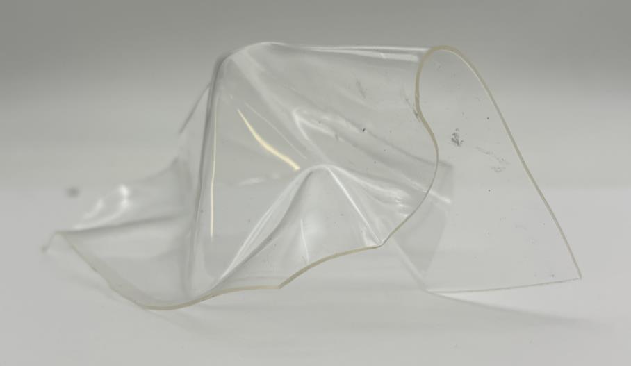
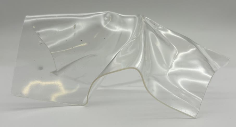
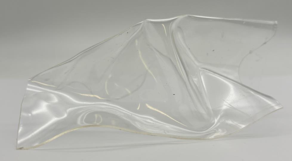

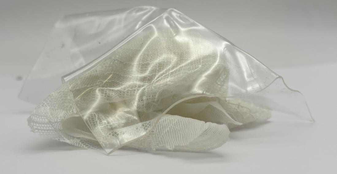
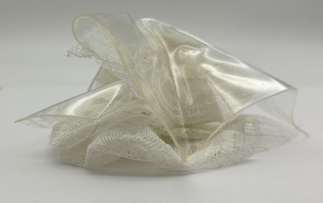


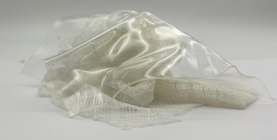
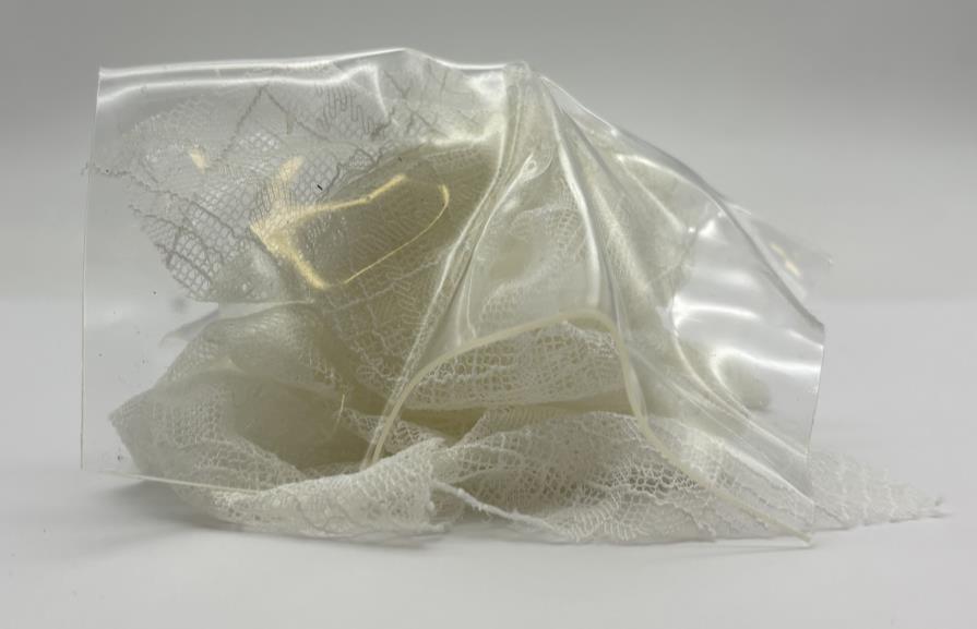
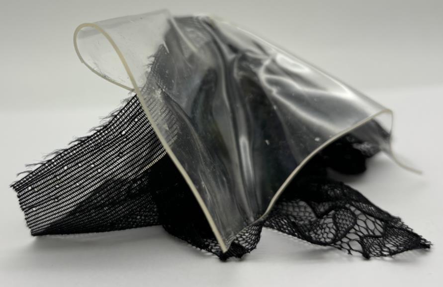
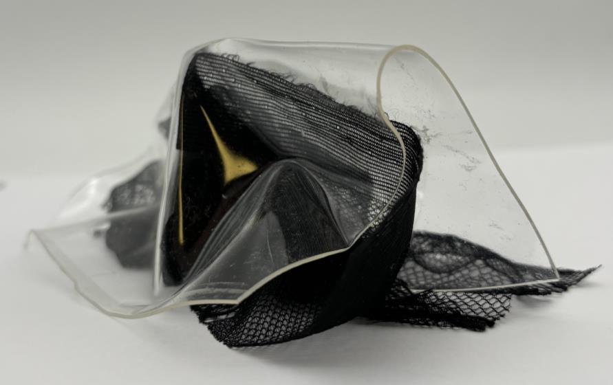
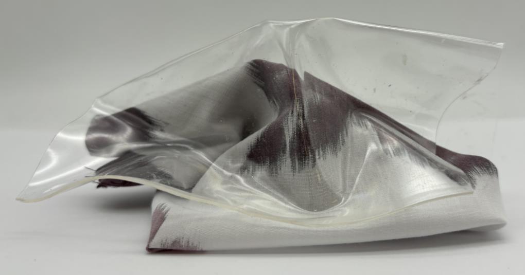
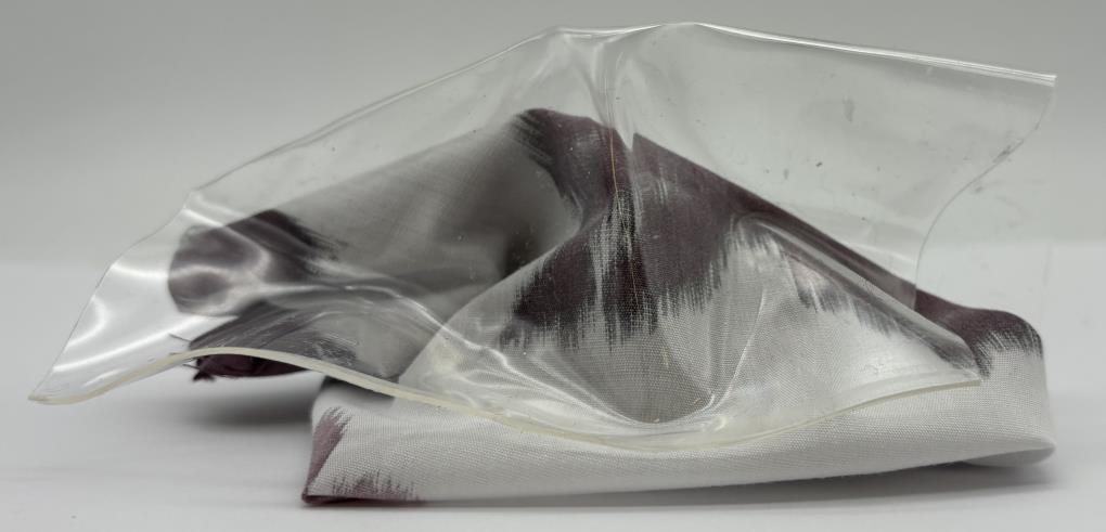
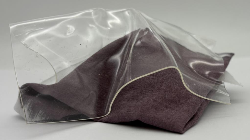
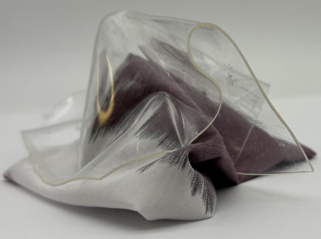
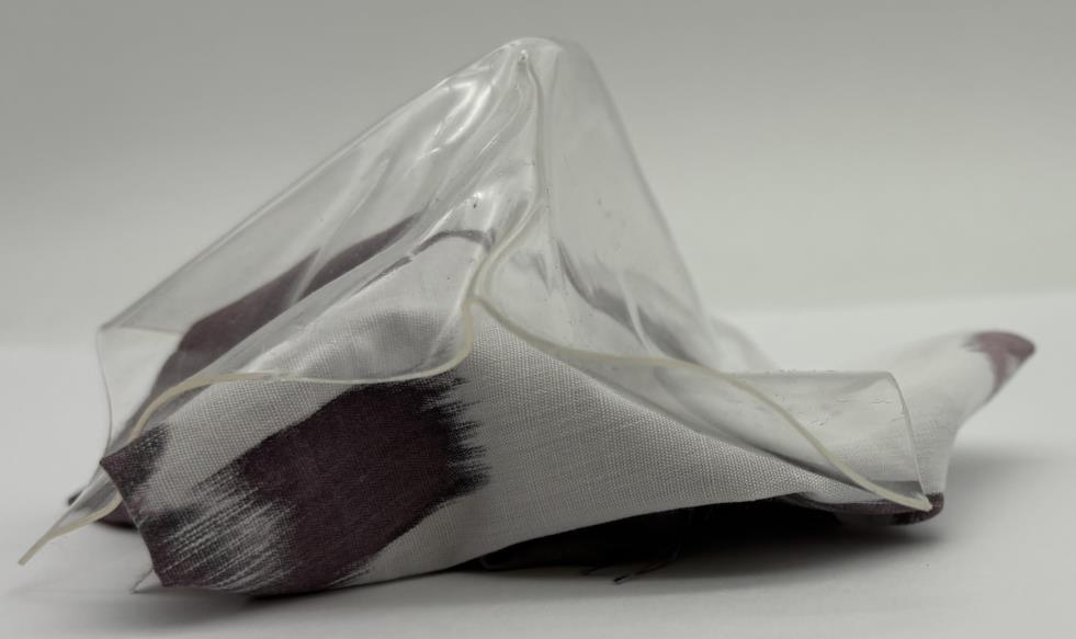

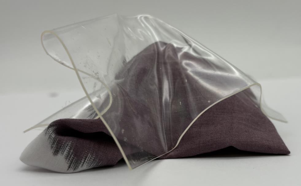
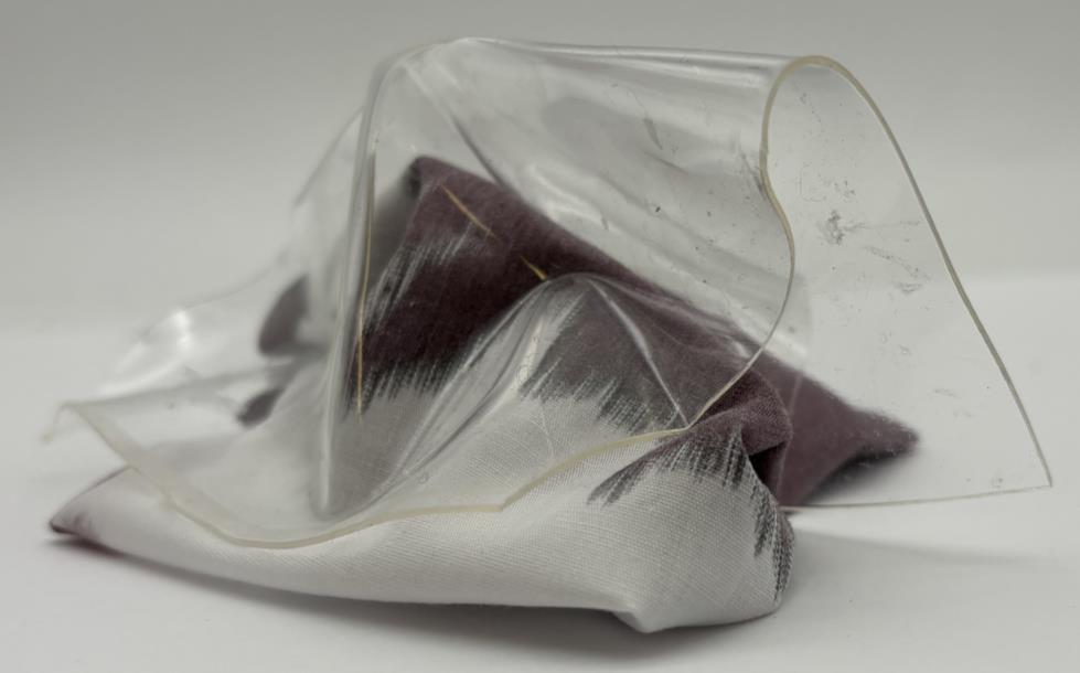
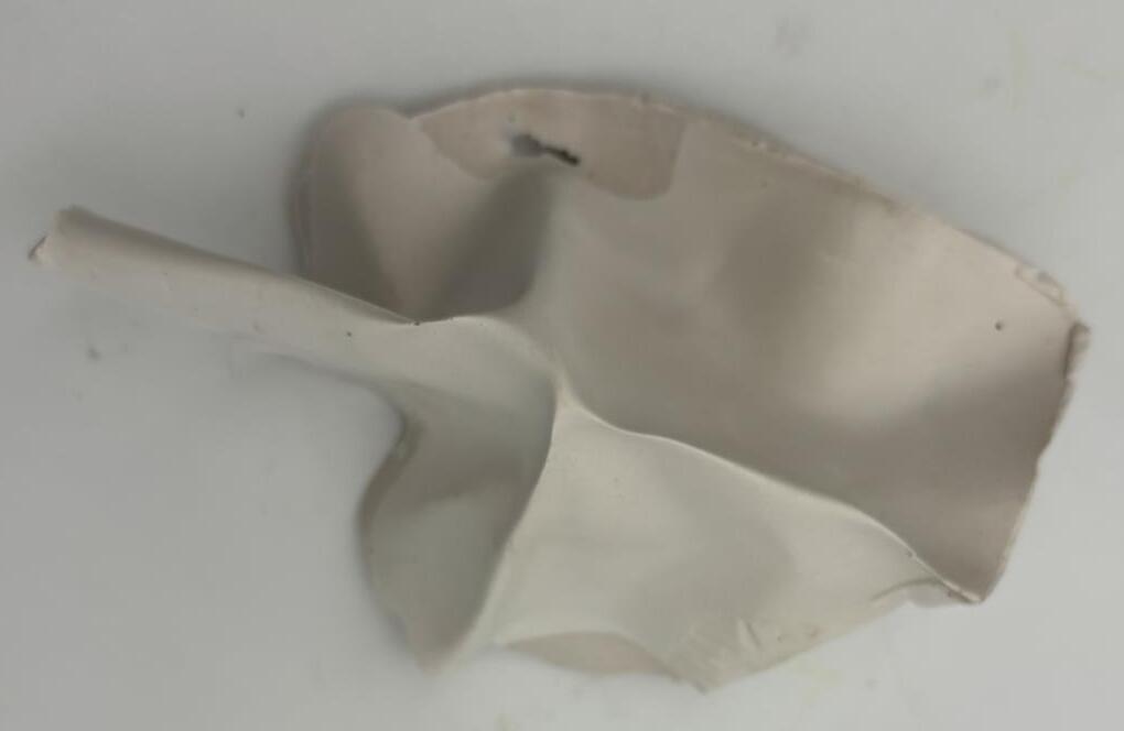
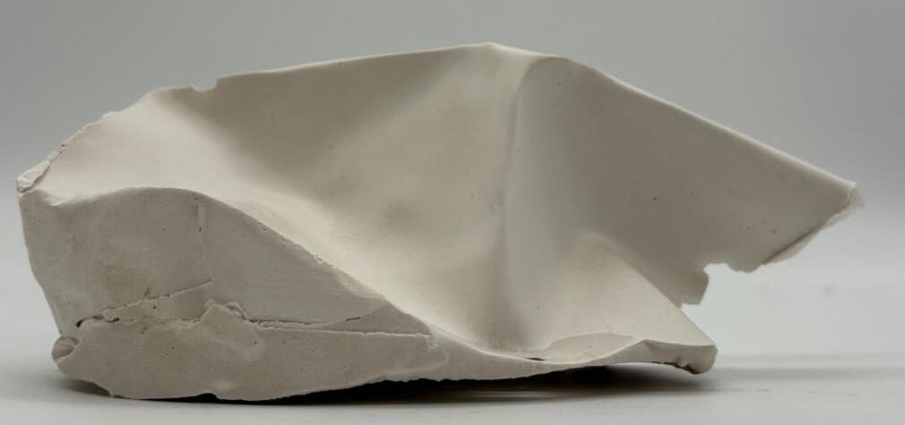
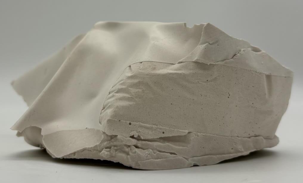
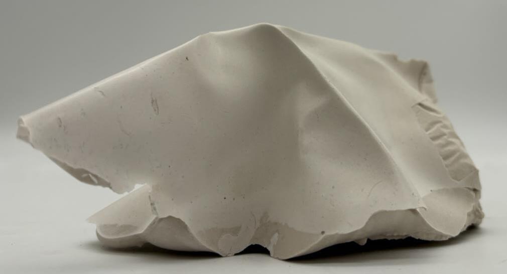
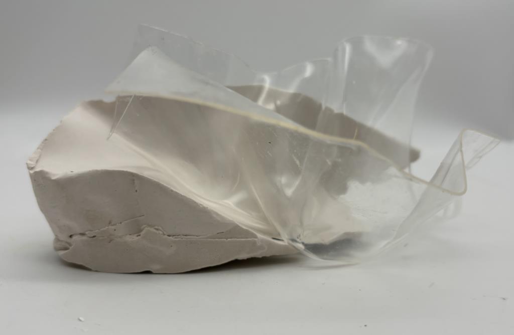


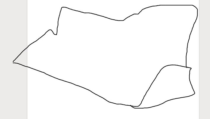
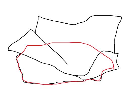
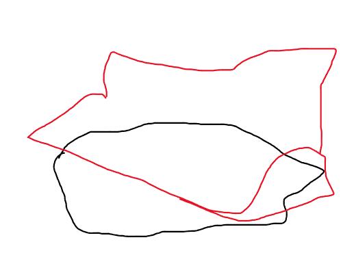

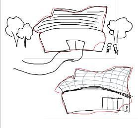

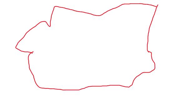

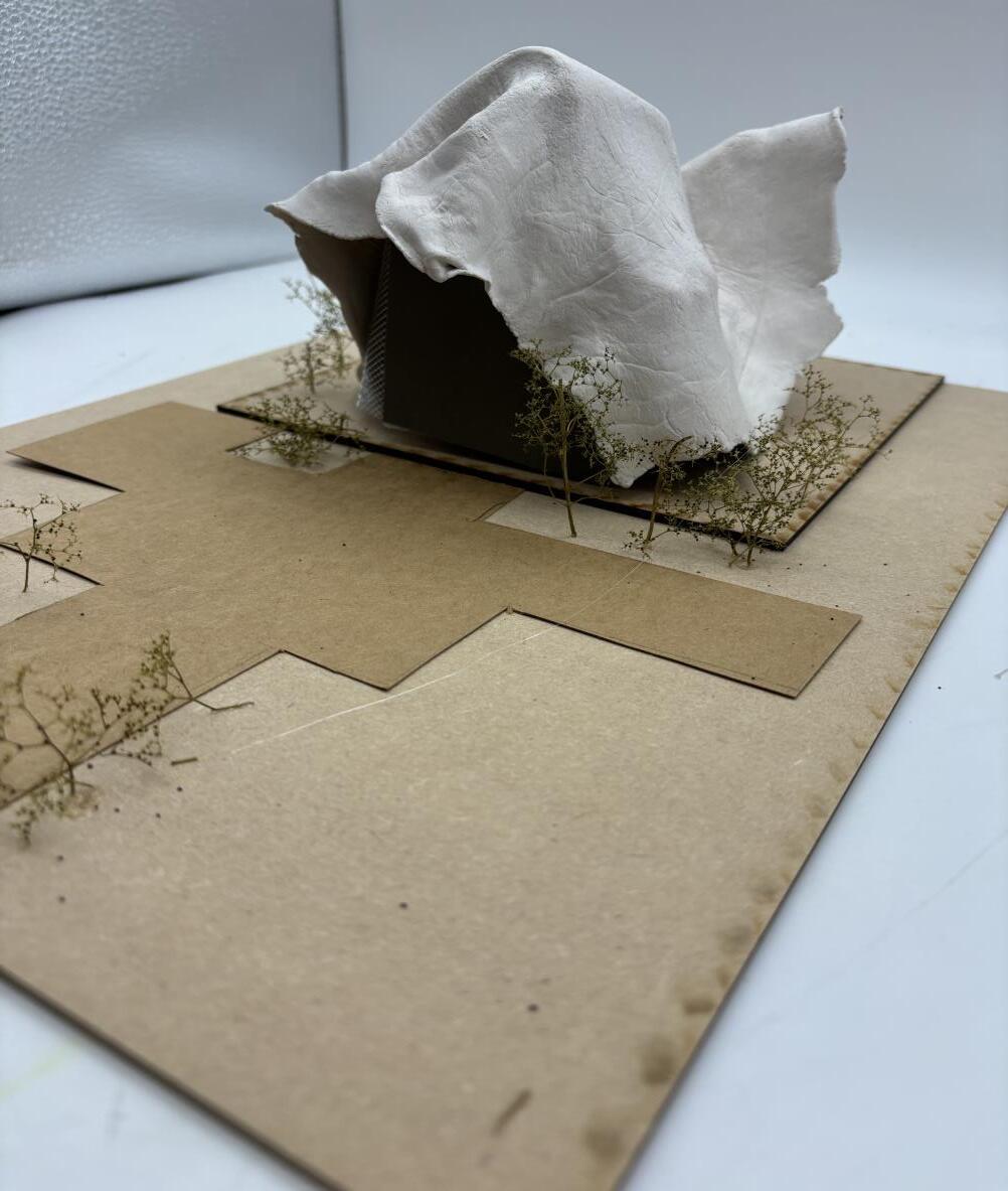
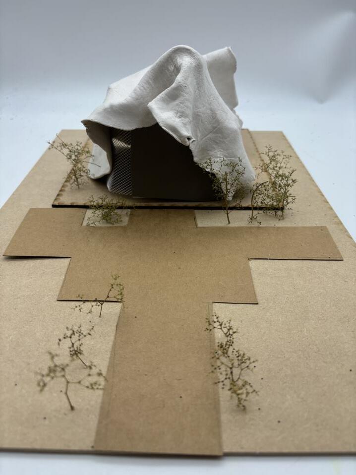

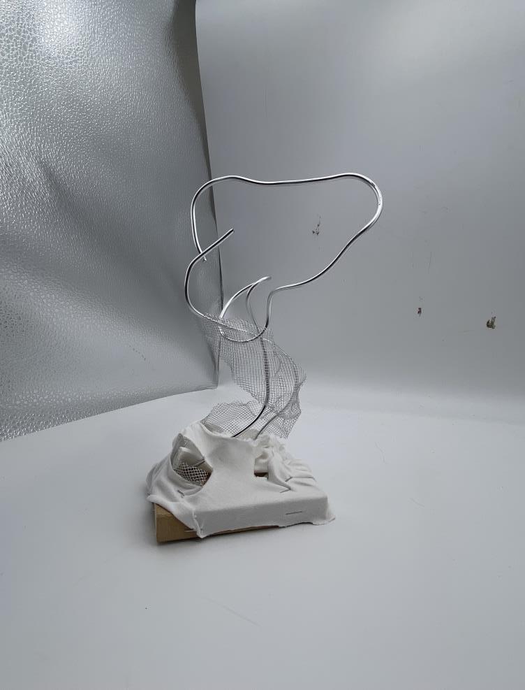
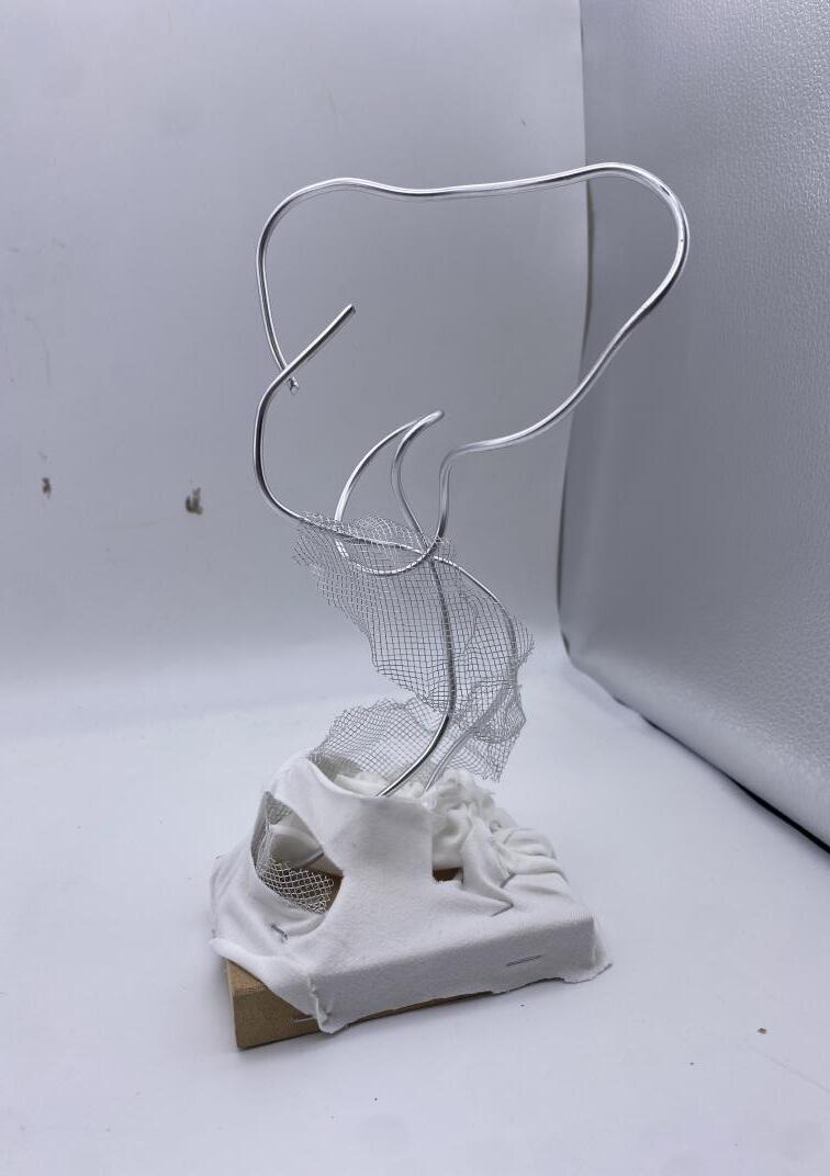
Final Model
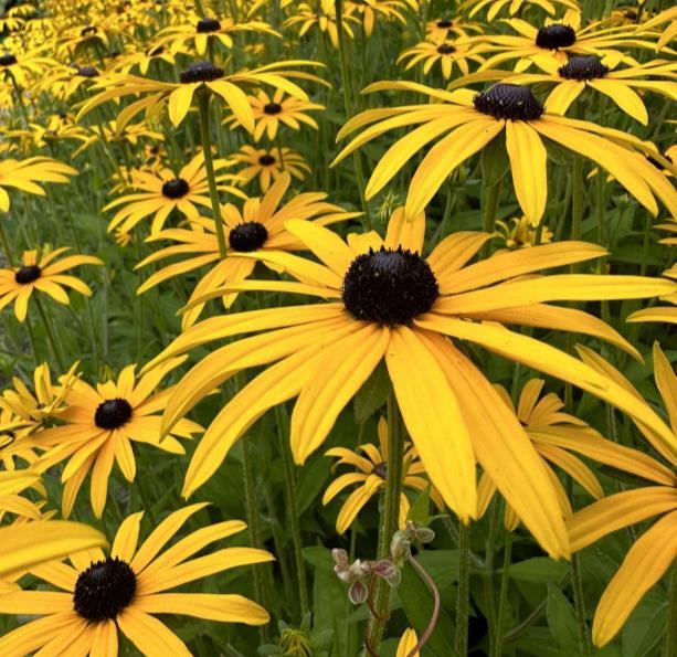
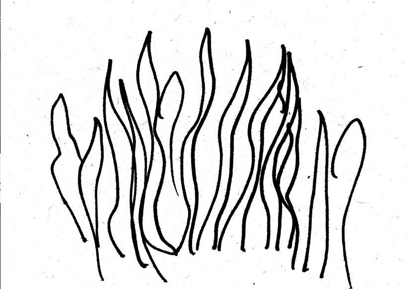
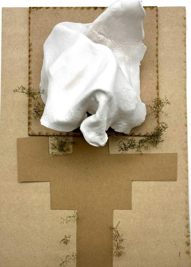
This is my final model for this project. I incorporated my original ideas of having the theme of movement and flow to create the main body of my library. In this model you can see there are minimum windows, which I have represented with a wire mesh. This is to cater to the needs of the books, to have a successful library, the books need to be kept within the right environmentto prevent them from getting ruined. You can also see how I have preserved the local nature, represented as trees, as I believe there is no need to destroy nature to create beautiful architecture.
Evaluation
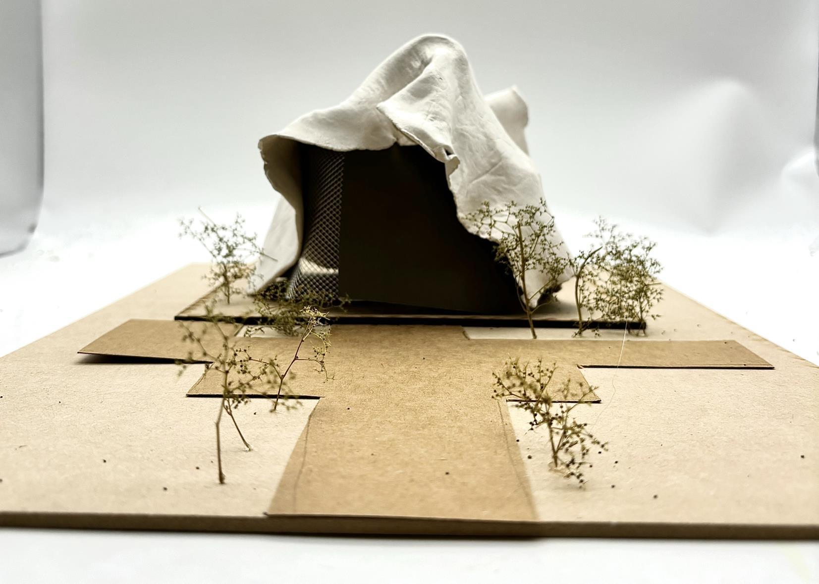
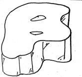
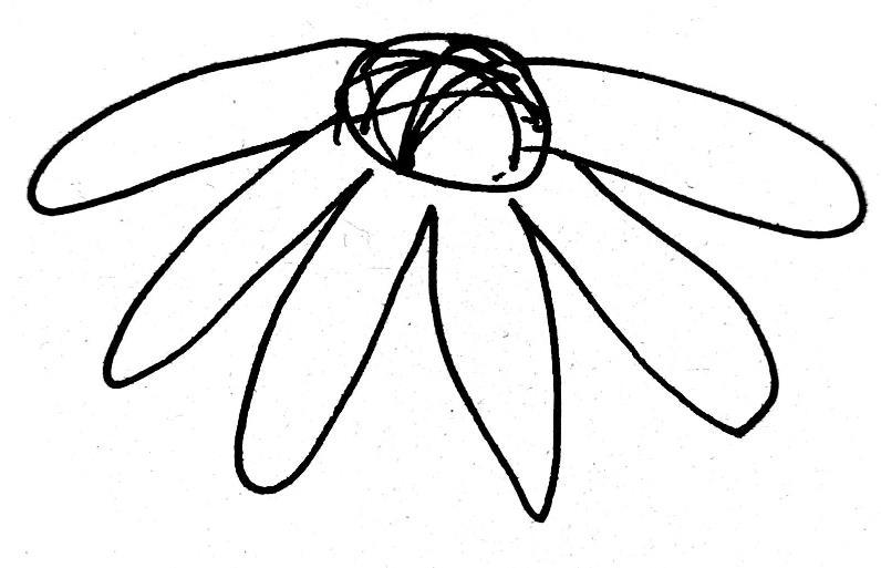
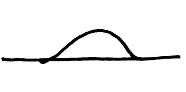
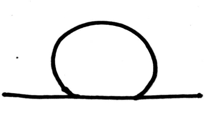
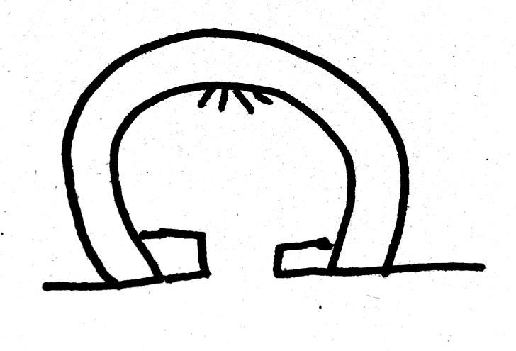
My overall aim for this project was to create a unique library which can tend to the need of books which being a functional library. My original inspiration for my buildingwas the natural curvature which you can find in mountainsand the center of flowers. This curve was a good start, but then my ideas changed to the natural flow of a summer hat. These hats have the perfect shape to block out the sun, which is exactly what a library would need to protect the older books. Rather than just using the exact shape of a hat, I experimented with a range of different materials such as plaster, plastic and air-drying clay.
