Contents:
Introduction: 1-4
Logo Guidelines: 5-9
Color Guidelines: 10-14
Typography Guidelines: 15-18
Executions: 19-22

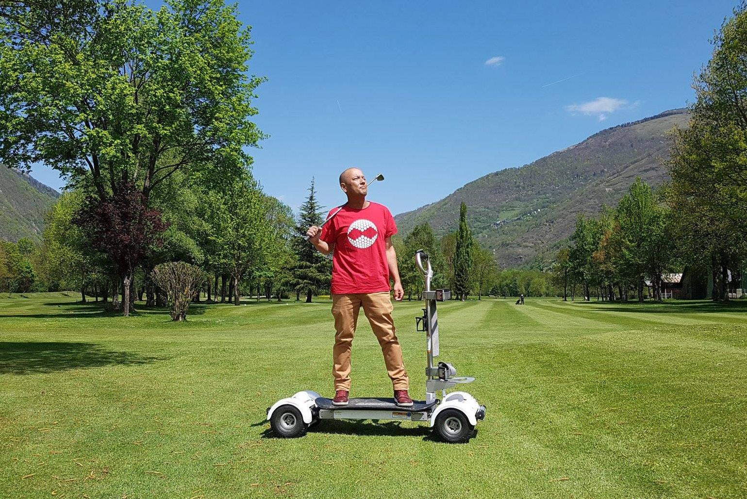
Now is
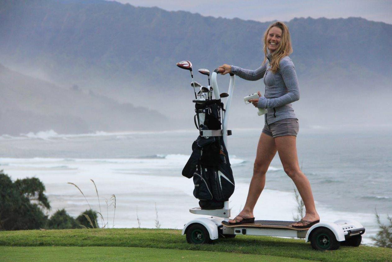
the time
to Surf the Earth...

so let’s surf style in
Logo Marks: Main Secondary
Additional Marks: Color Reverse
Above Par Logo Uses:
Do Not Scale Disproportionately Do Not Rotate
Do Not Reflect
Do Not Shear
Do Not Use Effects Do Adjust Paths
Stand-Alone Icon:
Colors:
Pantone:
Pantone:
Pantone:
Secondary Colors:
Pantone: 7494 C
Pantone: 5415 C
#5B7F95
Pantone: 7506 C
#9CAF88 C: 6 M: 12 Y: 33 K: 0 C: 69 M: 42 Y: 31 K: 4
#EFDAB1
C: 42 M: 20 Y: 54 K: 0
Hole-in One Color Uses:
Only use one secondary color at a time. Secondary colors should be use for emphasis, not in place of the main colors.
Typography:
Main: Body Texts: Filson
Pro Bold Bodoni Oldstyle72
Additional Typography: (use sparingly)
Emphasized Type:
You may use other thicknesses of Filson Pro, outside of the wordmark, but for readability stay between Regular and Bold.
Triple Bogey Type Uses: GOLFBOARD GolfBoard
Don’t use Bodoni as the workmark typeface.
The wordmark should be all caps and MUST be in Filson Pro Bold
GOLFBOARD
Don’t use black type for a “reverse” look, white only.
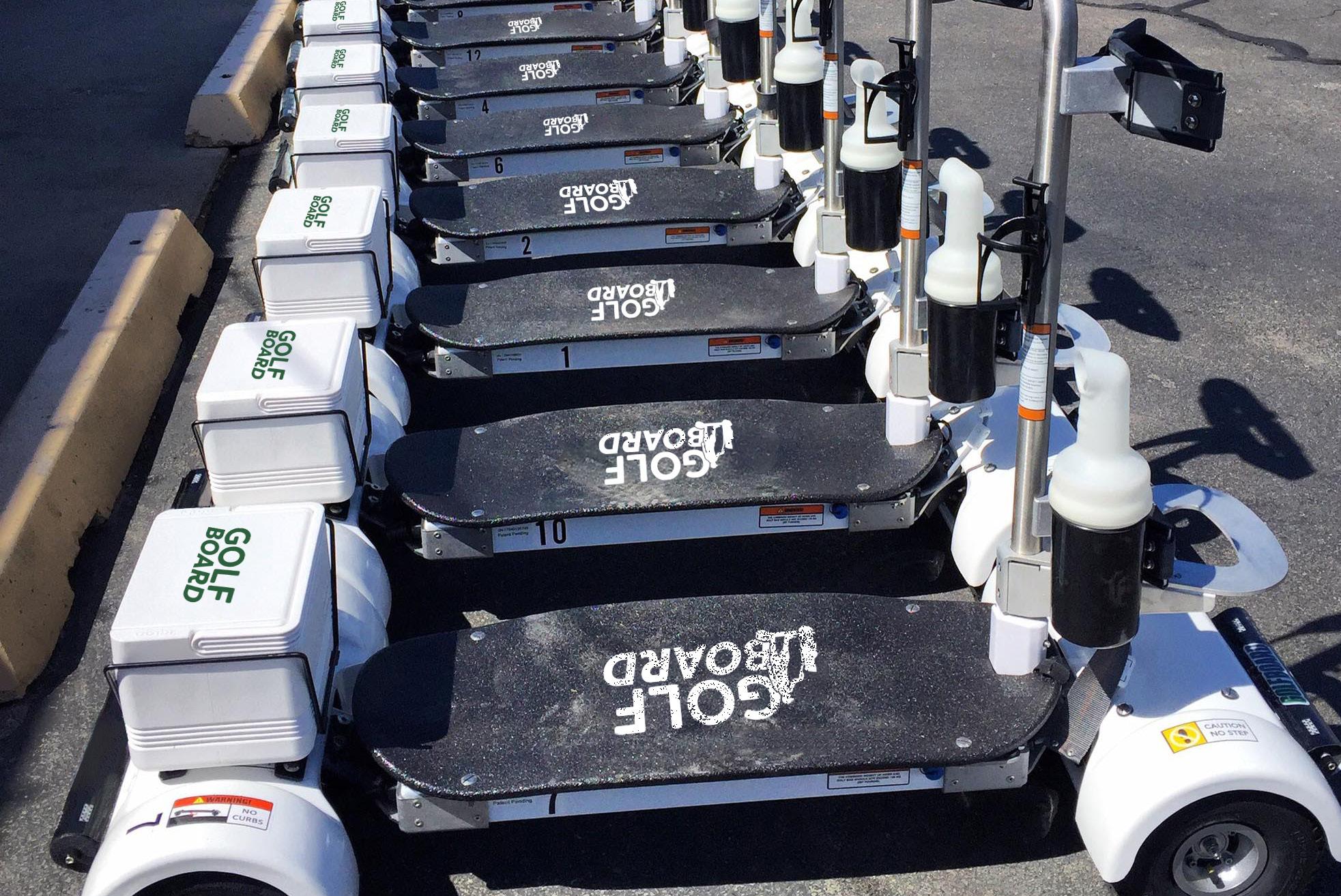
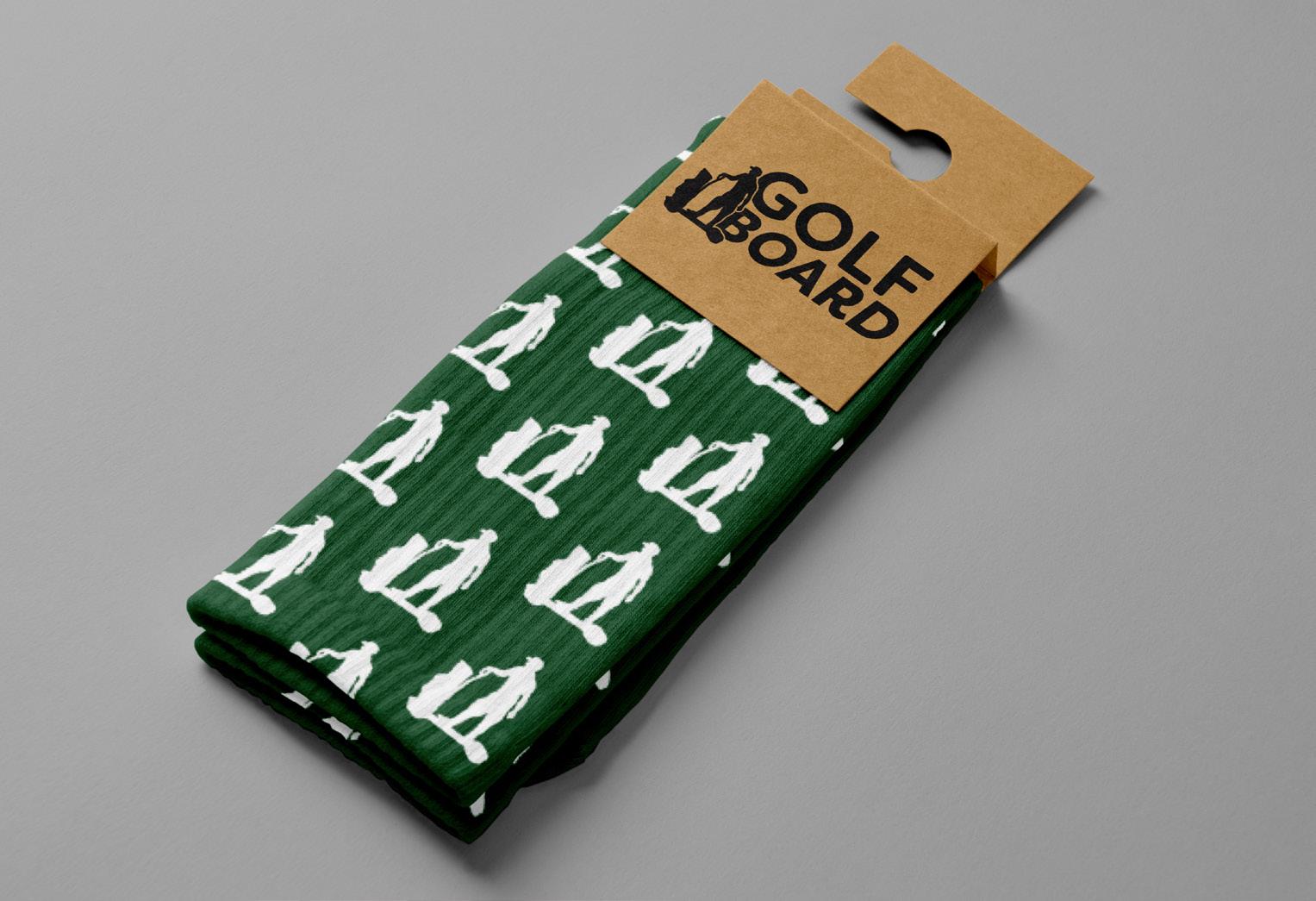
Executions:

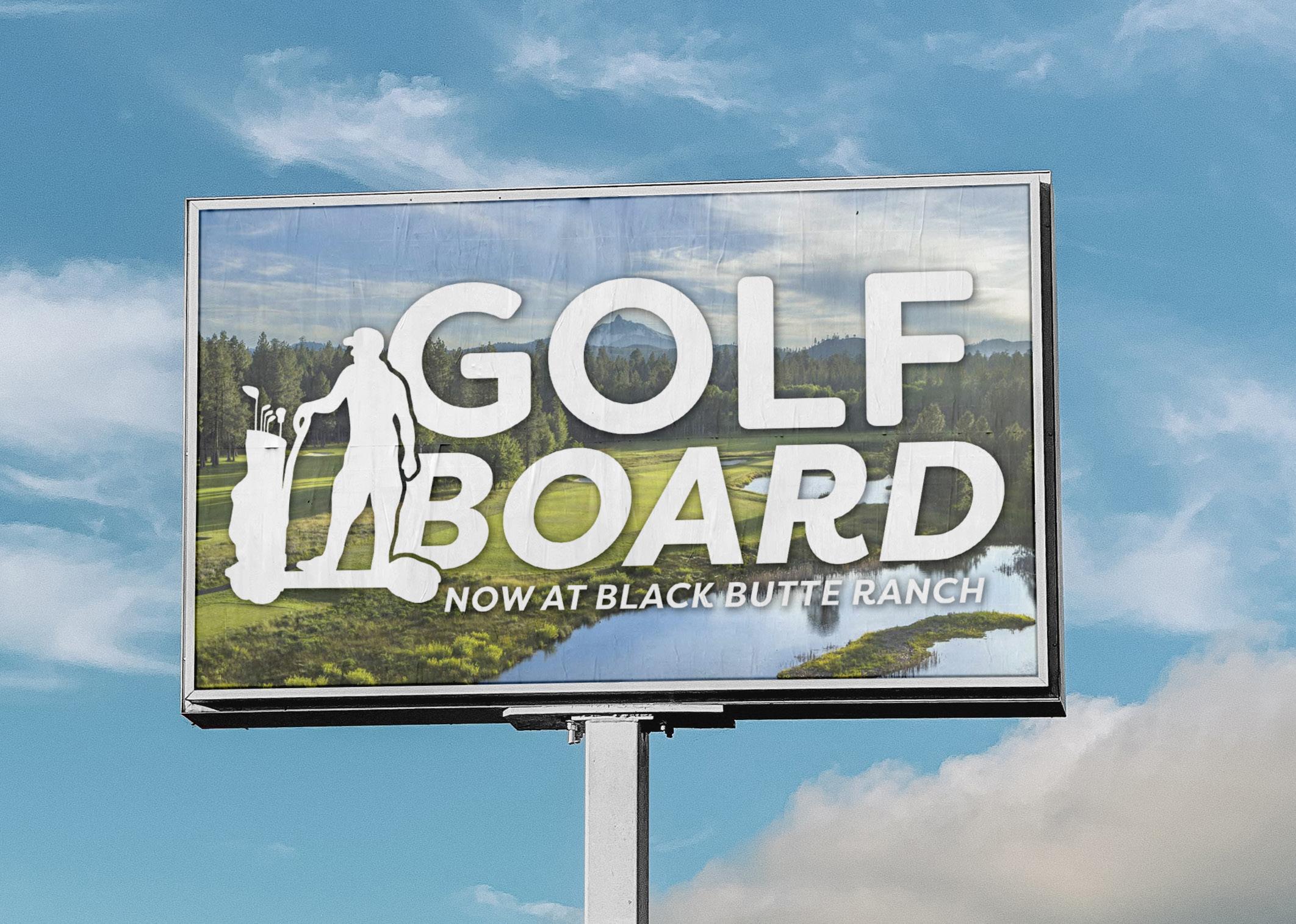

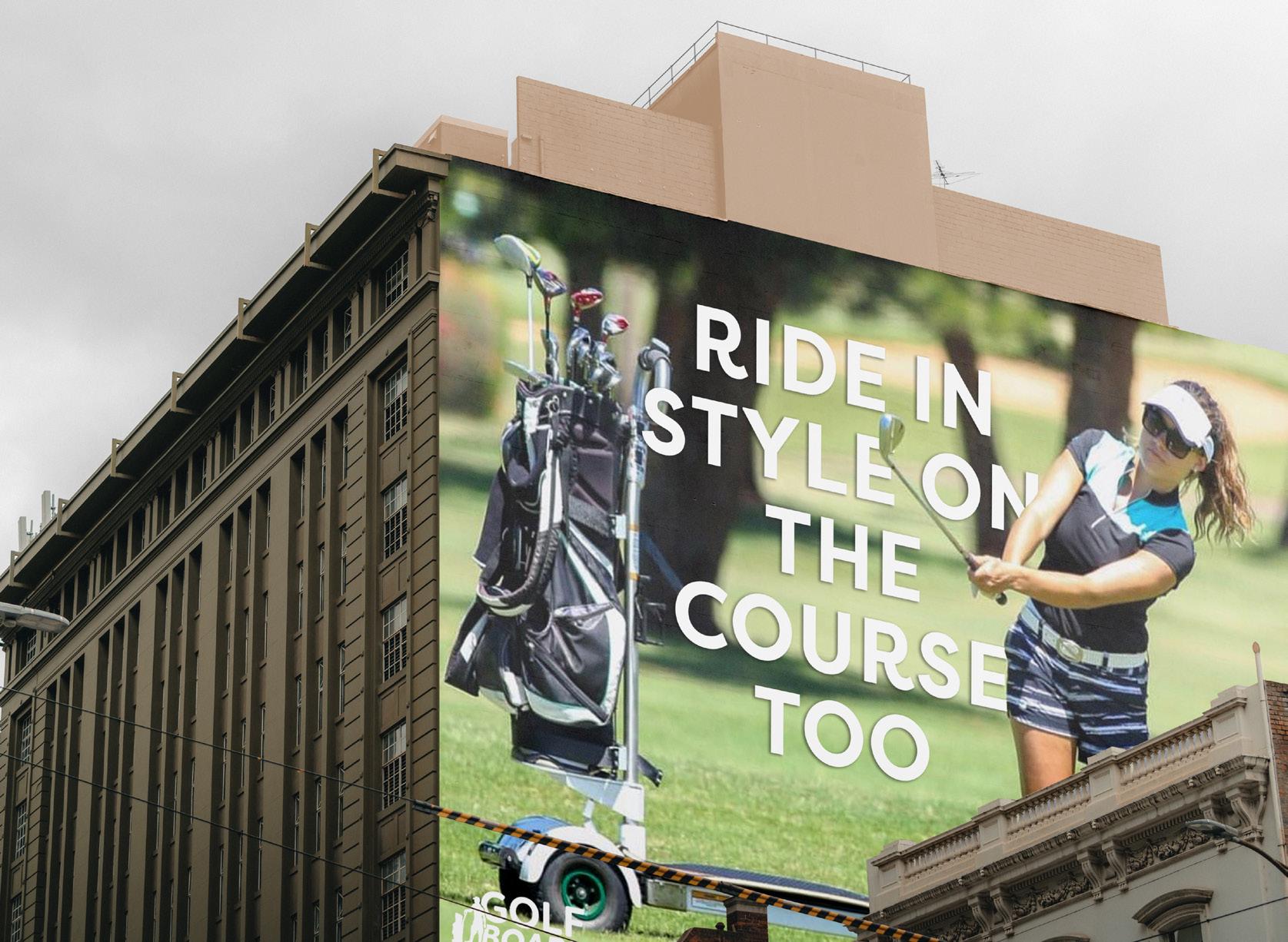
Executions:
