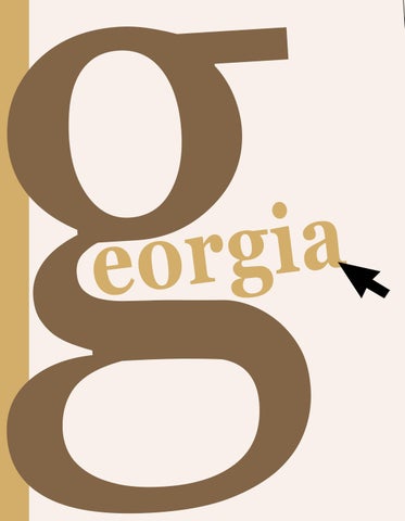
g eorgia

Matthew Carter is a British type designer born in London in 1937. He is one of the most influential figures in modern typography, known forbridging traditional craftsmanship and digital innovation.
Trained in the art of punch cutting at the Joh. Enschedé type foundry in the Netherlands,Carter is early experience shaped his deep understanding of letterform design. Throughout his career, he has created some of the world’s most widely used typefaces, including Georgia and Verdana for Microsoft, both designed to be highly legible on computer screens. He also founded Bitstream Inc. and later Carter & Cone Type Inc., where he continued to design fonts for both print and digital media. His work reflects a perfect balance between functionality and beauty, making him one of the most respected designers in the field. In recognition of his contributions, Carter received the MacArthur Fellowship in 2010.
Type Styles
Georgia - Regular Georgia - Italic
Georgia - Bold
Georgia - Bold Italic
vertical stress
Bracketed serifs
Type Classification and Identification Georgia belongs to the Transitional Serif classification a style that bridges the gap between the warm, humanist forms of Old Style typefaces and the refined precision of Modern serifs.Designed by Matthew Carter in 1993, Georgia reflects the balance of traditional elegance and digital functionality. It features vertical stress in rounded letters such as o and e moderate contrast between thick and thin strokes, and bracketed serifs that smoothly connect to the stems. The letters have a large x-height, making lowercase forms appear larger and improving readability on screens and in print. Georgia’s open counters, wide proportions, and clear shapes make it easy to identify, especially when compared to Times New Roman which has narrower letters and higher contrast.These characteristics define Georgia as a typeface that is both timeless and highly legible across different media.
arc
ear
link
rcrossbar
bowl
teye
counter
finial
Georgia is widely used across both digital and print media because of its elegance, readability, and professional appearance. Originally designed for Microsoft in the 1990s, it became one of the most popular typefaces for websites, online articles, and blogs, offering clear legibility on computer screens.
Many news organizations, such as The New York Times and BBC News, have used Georgia for body text and headlines due to its classic yet modern style. In print design, Georgia is often seen in books, magazines, invitations, packaging, and advertisements, where its refined letterforms create a timeless and trustworthy impression.
Its versatility allows it to adapt well to both formal and creative contexts, making it a favorite choice for designers seeking a balance between tradition and digital clarity.
“Type is a beautiful group of letters,not a group of beautiful letters”
• Microsoft Corporation. “Georgia Font Family.” Microsoft Typography. https://learn.microsoft.com/en-us/typography/font-list/georgia
• Georgia.” Designerly. https://designerly.com/georgia/
• Georgia: An Incomplete History of Type.” Talk Paper Scissors. https://www.talkpaperscissors.info/post/236-georgia-an-incompletehistory-of-type
• Matthew Carter Collection. TypeNetwork. https://typenetwork.com/articles/matthew-carter-collection
• “Georgia Typeface in Use.” Fonts In Use.
https://www.fontsinuse.com/typefaces/70/georgia
• Hieber, Taylor. “Georgia Type Set.” Taylor Hieber. https://taylorhieber.co/georgia-type-set/
• GEORGIA.” Scribd.
https://www.scribd.com/document/593873812/GEORGIA
• Grodske, Marie Anna Lee. Typography PDF. https://marieannalee.com/images/students/typography/pdf/grodske.pdf
• Georgia Typeface – Video Overview.” YouTube, video ID: jEnrAtnKp8s. https://youtu.be/jEnrAtnKp8s
Foundry Location: Cambridge, Massachusetts, USA. Georgia Pro® is a trademarked typeface from Carter & ConeTypeInc. Cambridge MA. Licensed for desktop/web/app use. For licensienquiries, contact:info@carterandcone.com or visit carterandcone.com/licensing.