Visual Merchandising Portfolio


In these pages, you’ll find snapshots of displays from my retail store. With only 2,000 square feet of space, I’ve learned to make every inch count, especially vertically.
You may notice that the displays hold a lot of product. That’s intentional. In a compact space, creating both drama and order is essential. I rely on color, repetition, and like materials to keep the space visually cohesive and impactful. Every display is designed to work hard, just like the space itself. Thanks for the opportunity to share it with you!

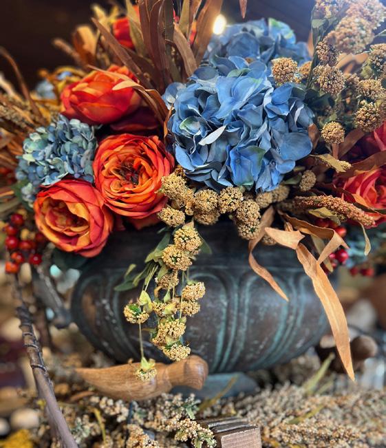
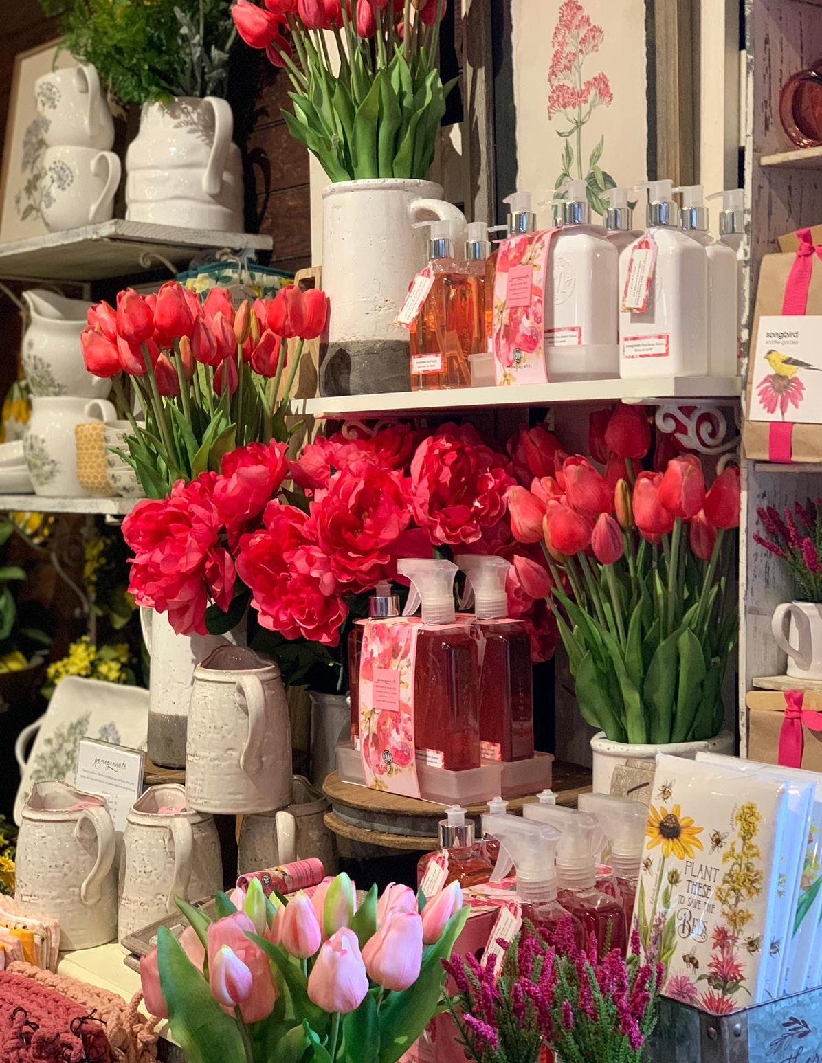
I love creating drama with bold colors, especially in oversized arrangements, and I carry that color palette throughout the display to create a cohesive and eye-catching presentation.
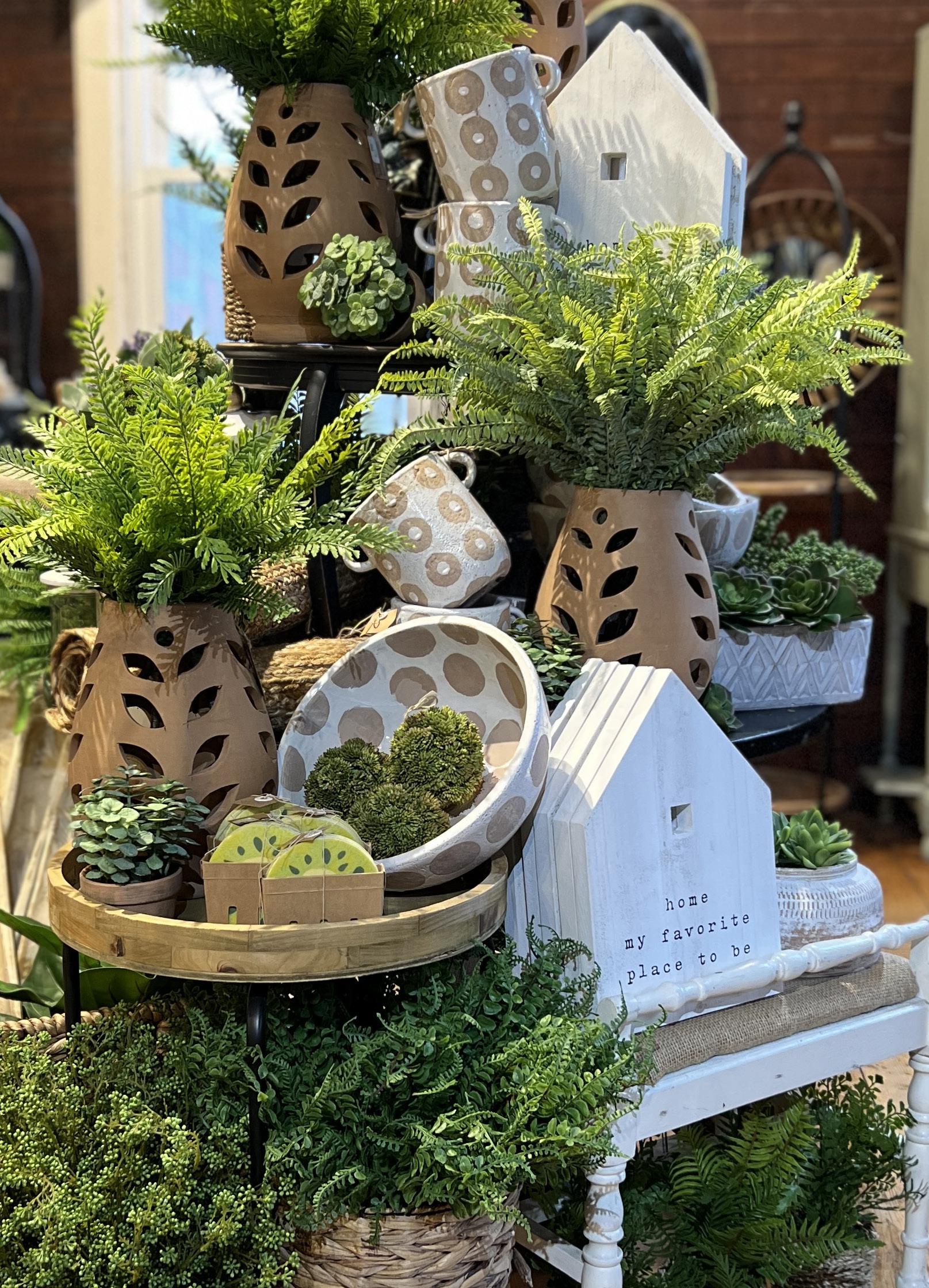
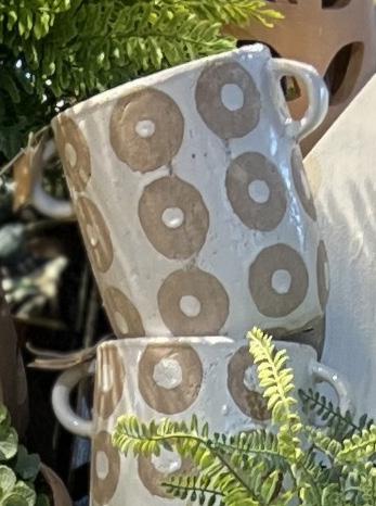
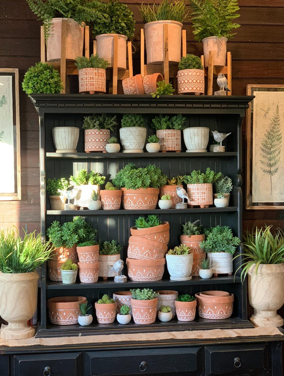
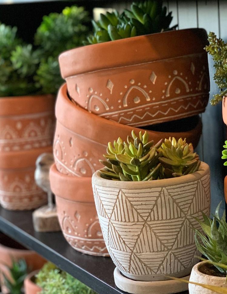
These bright green ferns are paired with terracotta pottery and polka dot cement bowls and vases.
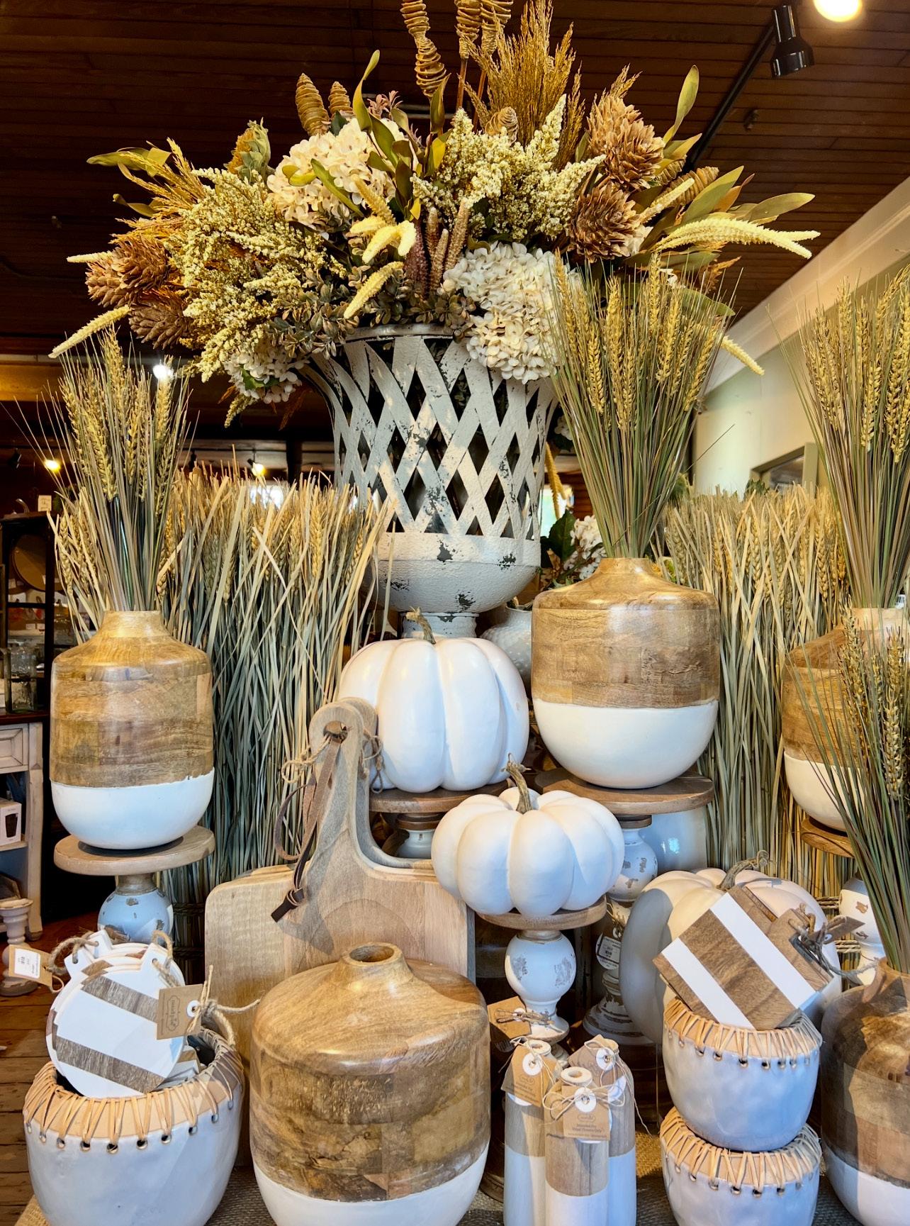
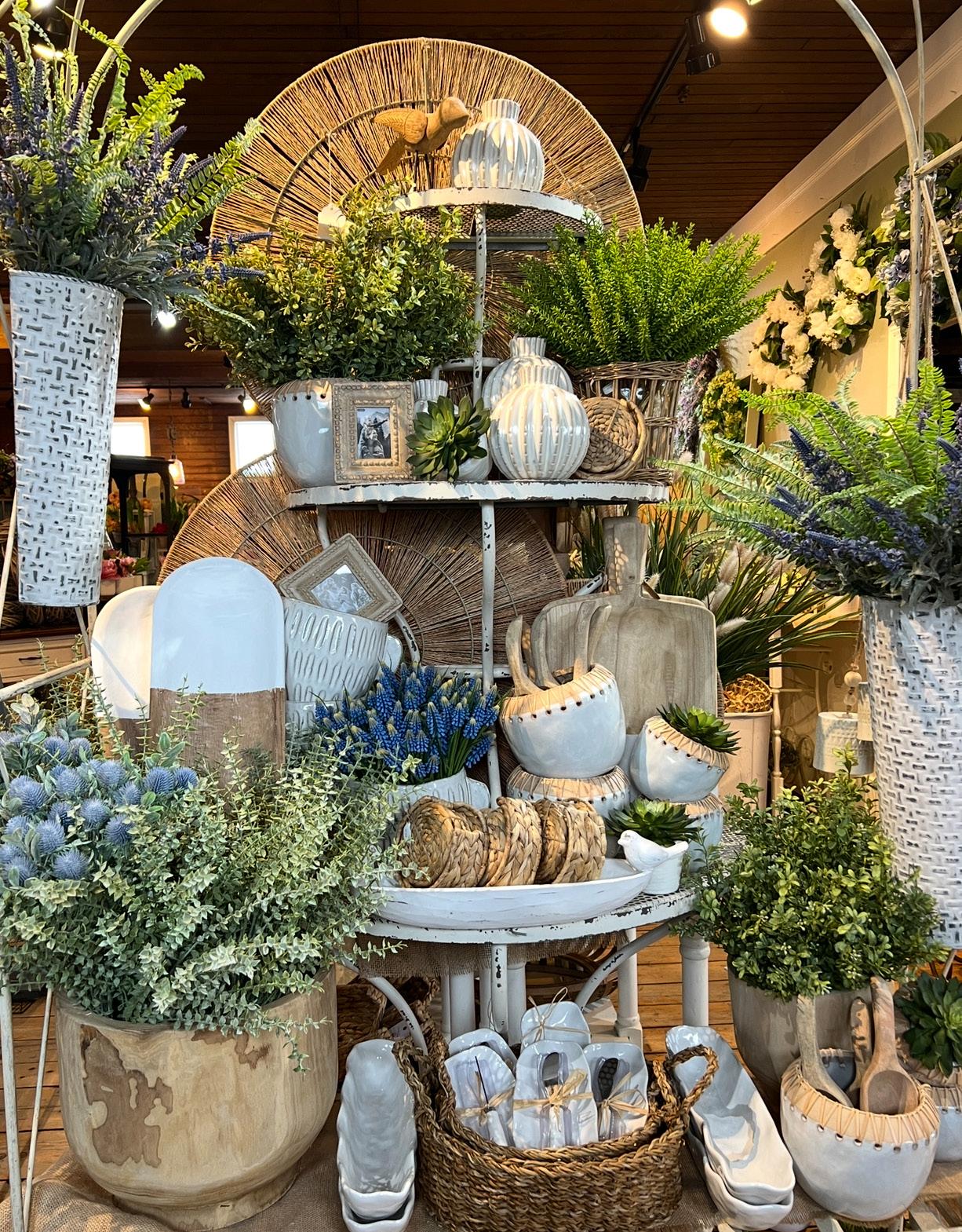
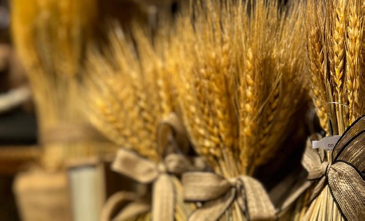
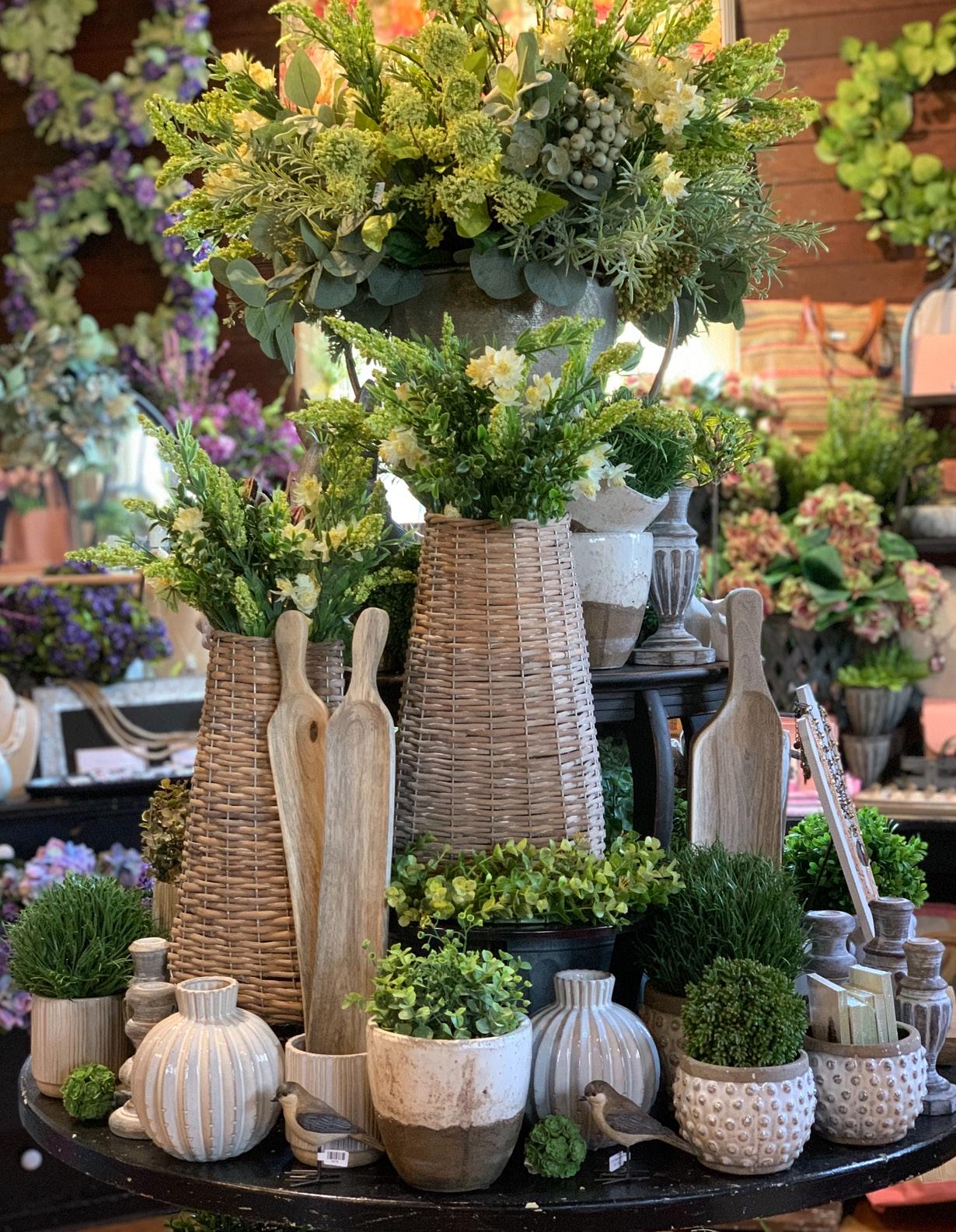
A neutral combination of white and natural wood in vases and cutting boards pair nicely with the organic feel of wheat sheaves.
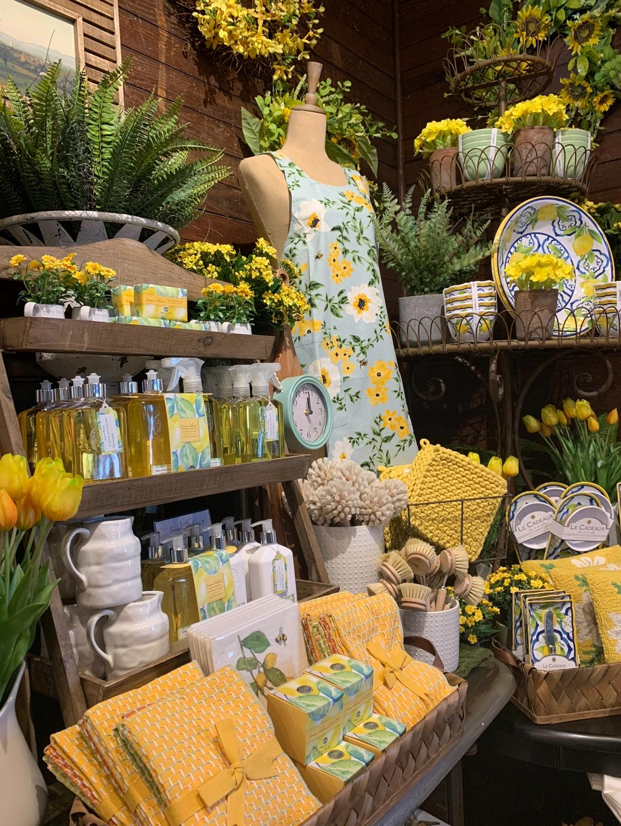
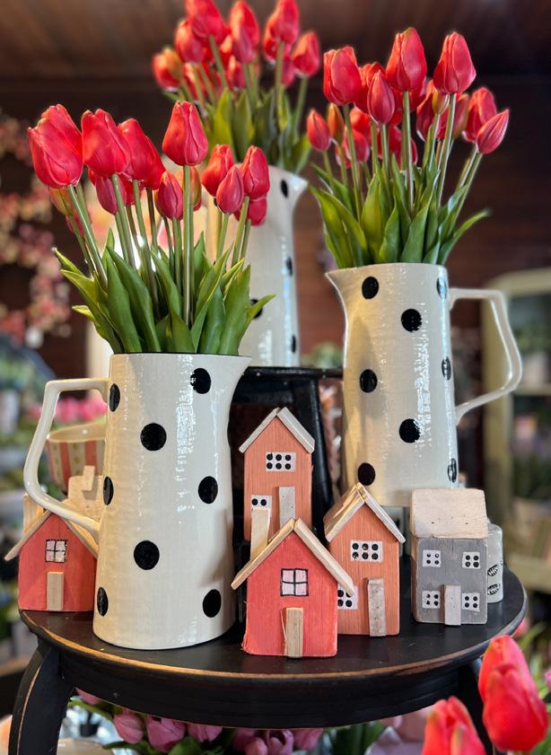
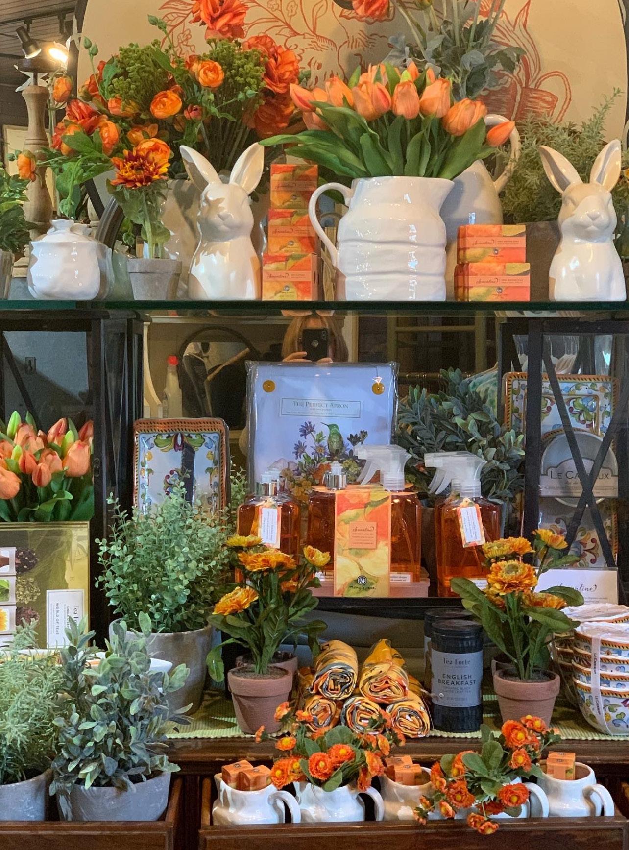
In early spring, when we’re still waiting for nature to awaken, a burst of color can instantly lift your mood. In this display, yellow acts as the common thread, tying together a variety of items with warmth and energy.

Using a variety of green textures, from boxwood to ferns, adds depth and visual interest to this display. Circular elements in the backdrop echo the shape of the shelves, creating a cohesive and harmonious design.
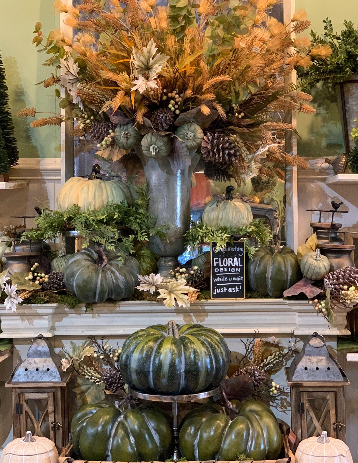
Deep green pumpkins add richness and help anchor the entire display, grounding it with their substantial scale and moody, saturated hue.
Pink tulips and peonies, densely arranged among white ceramics, create a striking contrast between soft florals and clean, structured elements.
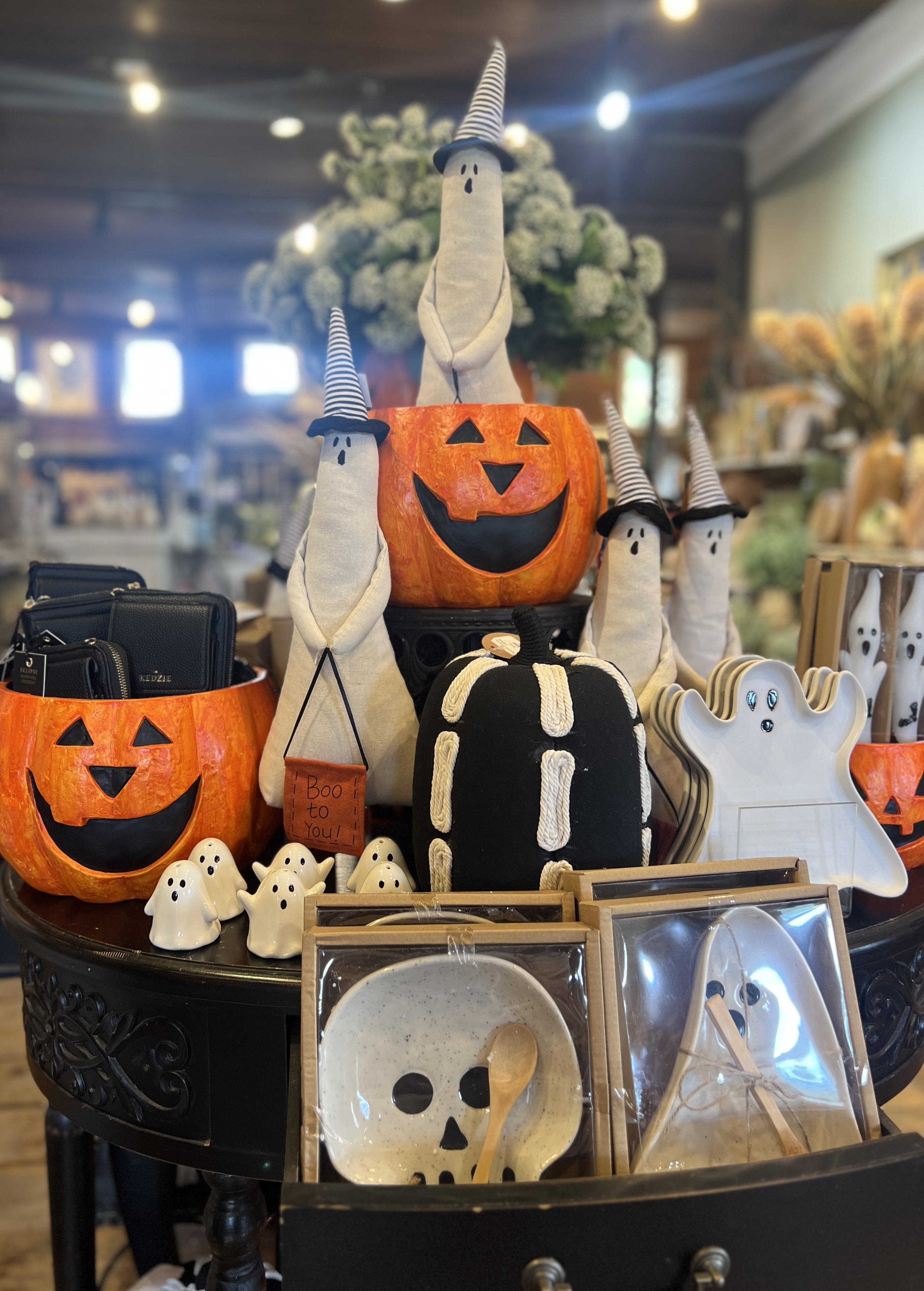
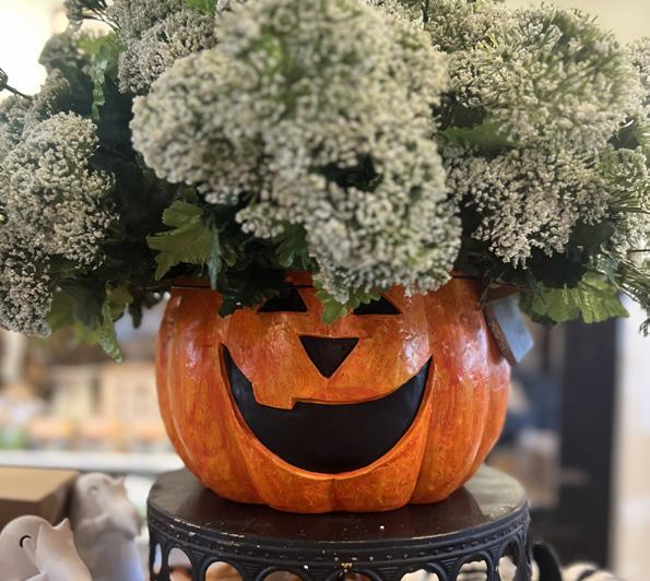
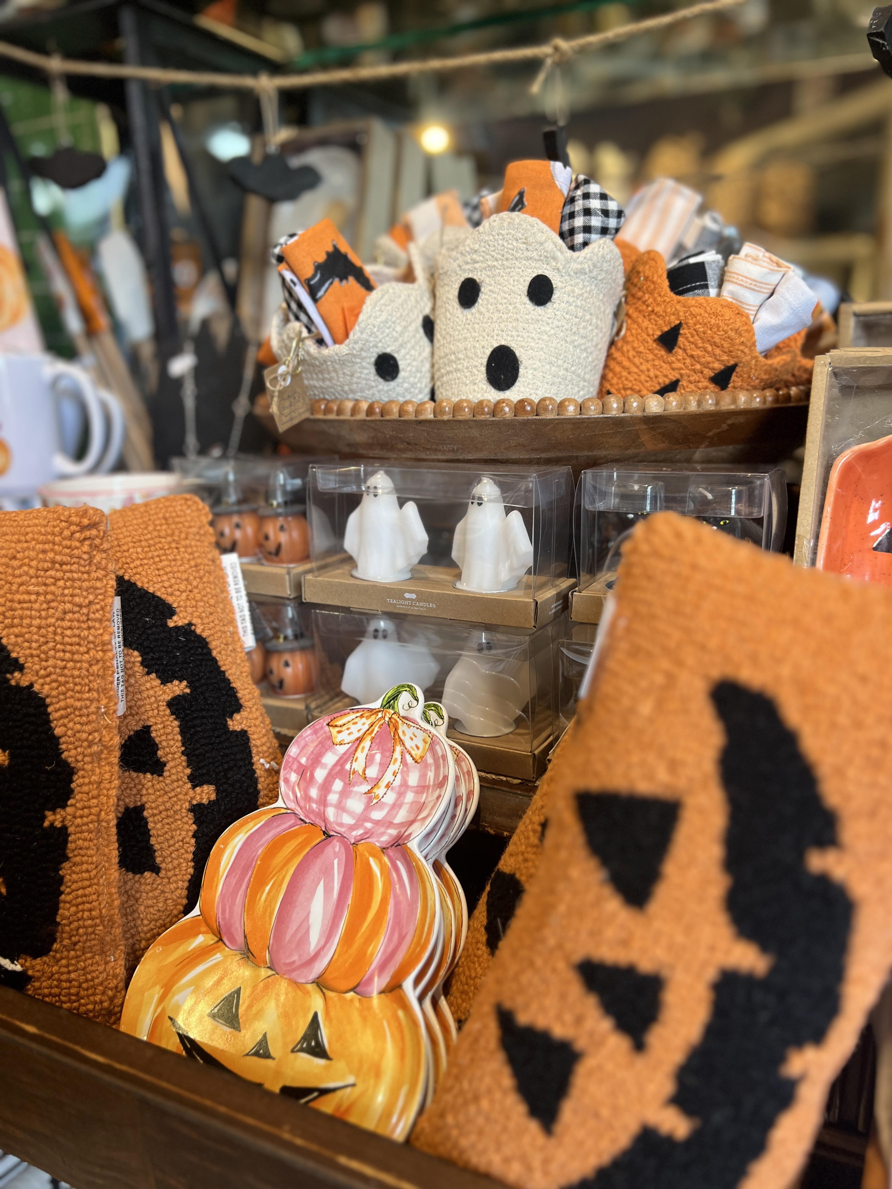
It’s easy to pull a simple display together when you stick to just three colors. Black, orange, and white contrast beautifully to create a visually striking and playful setup.

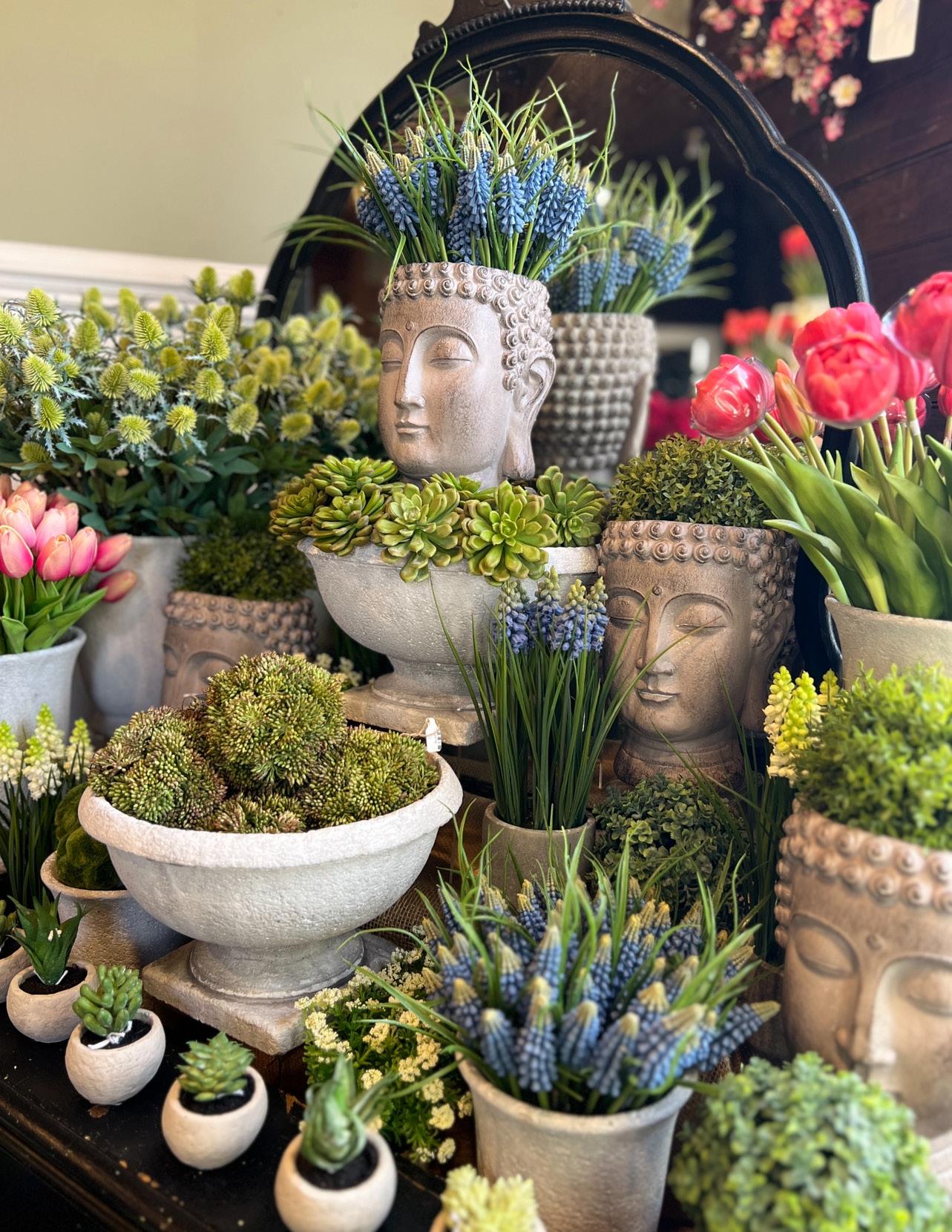
Small items can easily get lost in a retail setting unless they have a defined space. We used Buddha heads and concrete vessels to give these pieces presence and bring the display to life.
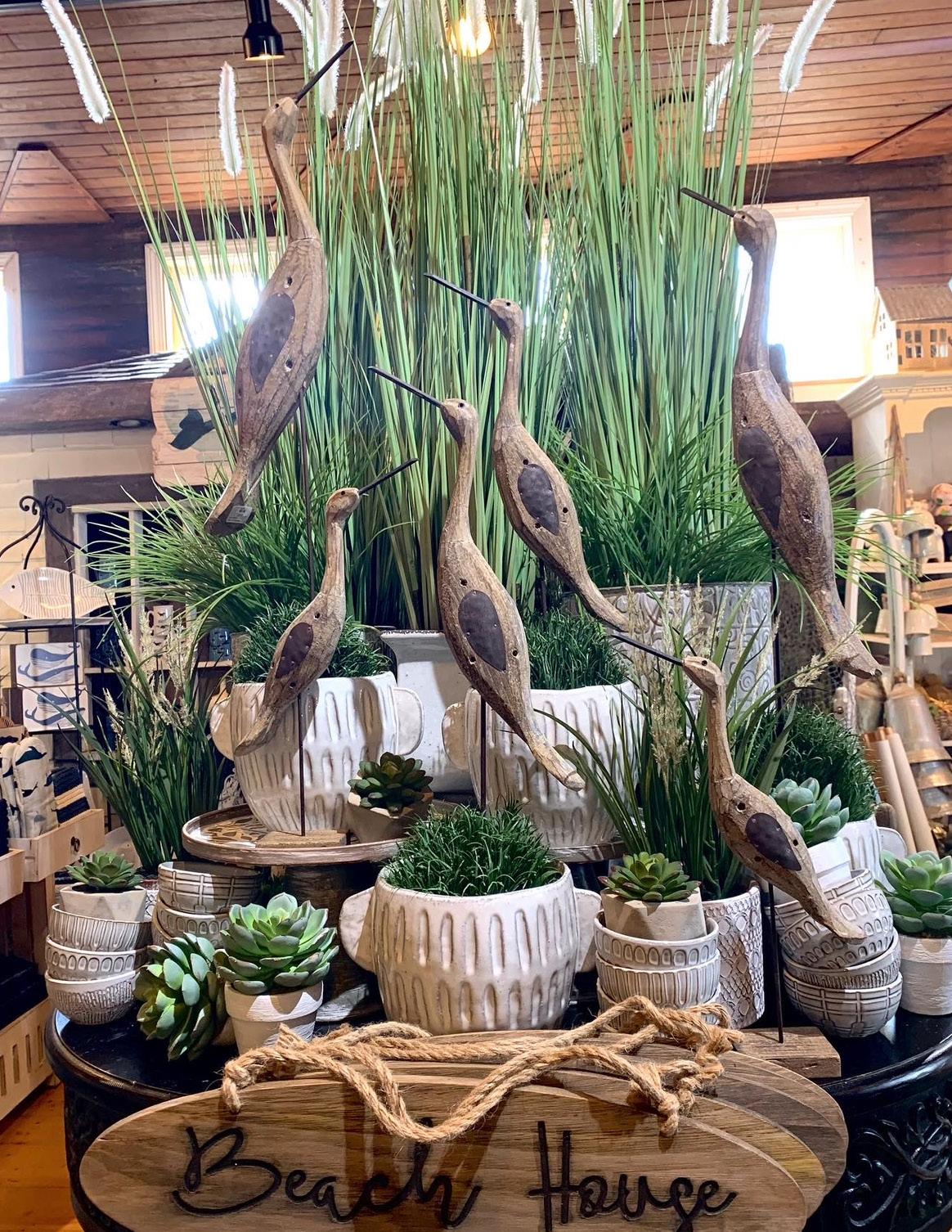
These cranes are tall by nature, so placing them in a setting that mimics their natural habitat felt like a logical choice. The display stands 10 feet tall, and the varying heights of the cranes naturally draw the eye upward.
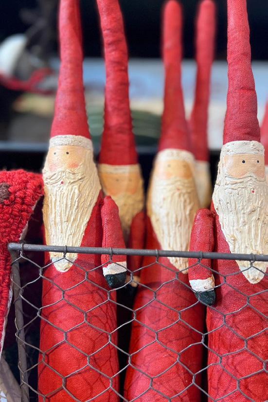
RED & WHITE IS CRISP AGAINST BLACK
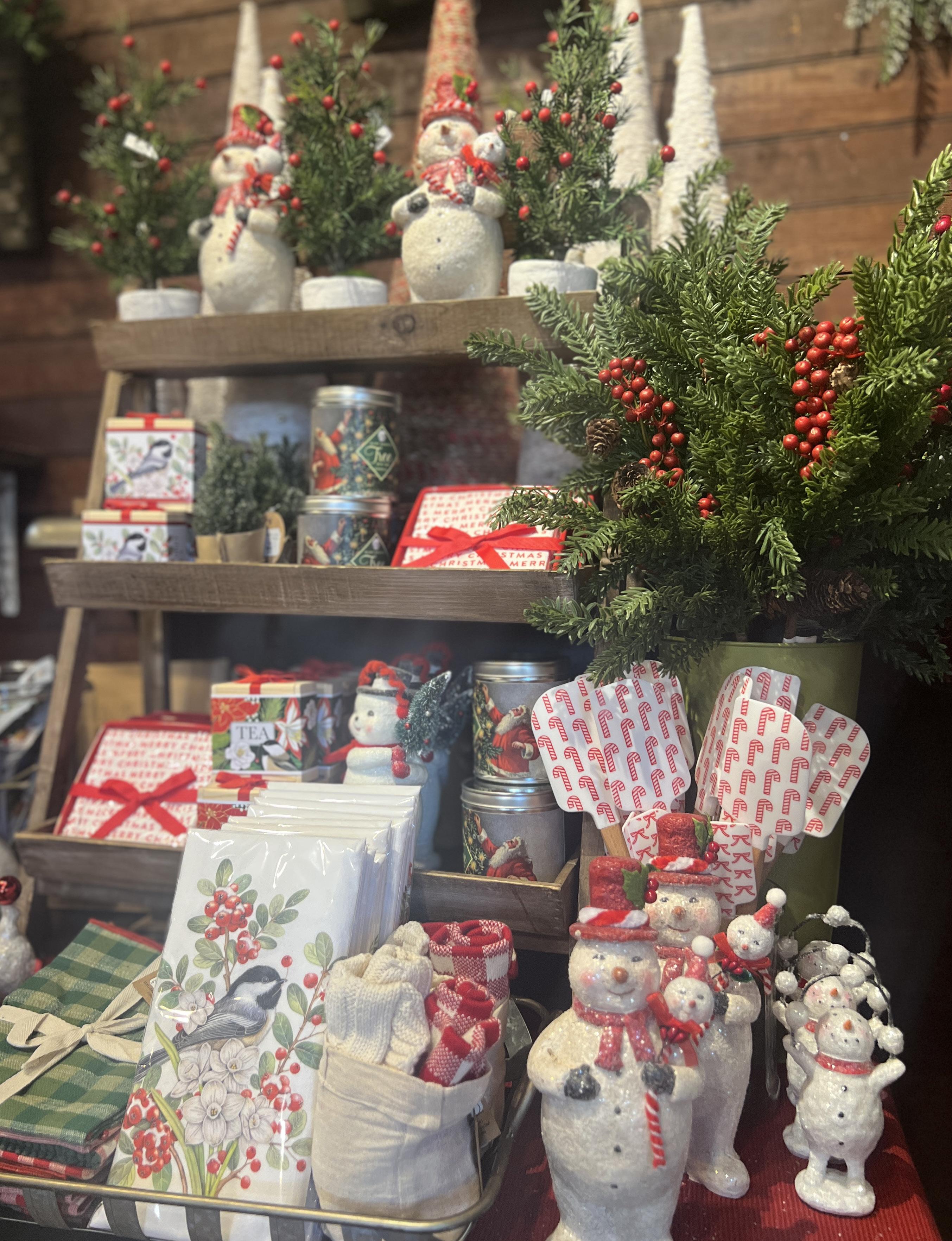
In all shapes and sizes, especially in classic red and white, Santas are always a hit. The bold red and crisp white pop against the black display, while every drawer is used to spread a little extra holiday cheer.

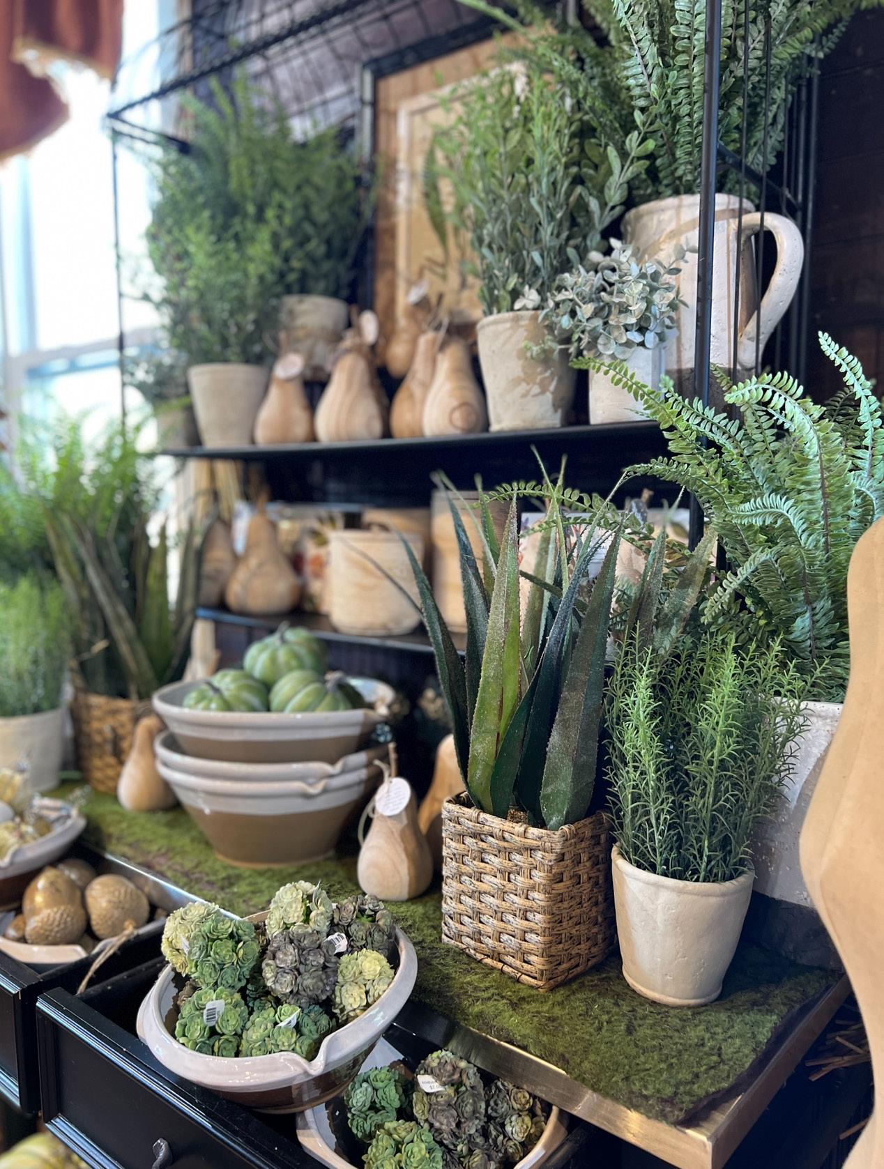
There is always an abundance of ferns, boxwood, thistle, and aloe vera plants to display. We fill earthy pitchers with greenery and finish the look with wooden fruit to complete the display.
Using color to define this category helps create a dedicated, inviting space for home fragrance, rather than simply lining products up on a sterile shelving unit.
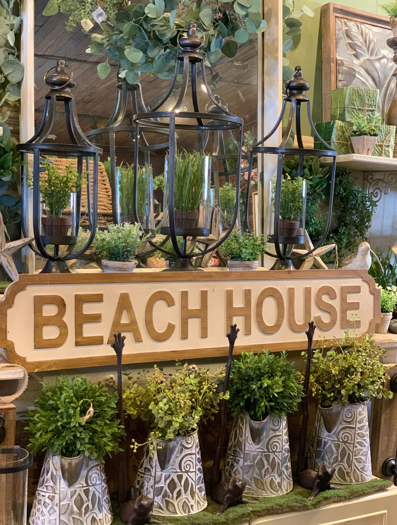
When all else fails, basic repeating the same items in a linear fashion just works. Creating a focal point (the sign) draws your eye in while everything else becomes the supporting actors.
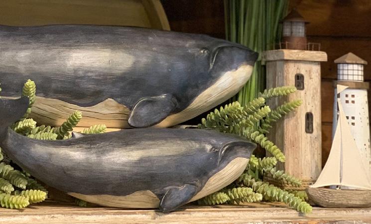
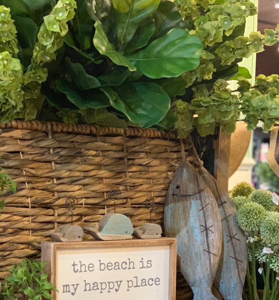
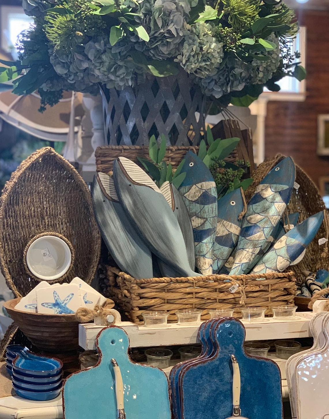
The right coastal pieces make all the difference. These hand-painted fish, nestled in a basket, are full of personality and definitely steal the show! Adding an unrelated item like a cutting board works because it’s all in the same color palette, shades of the ocean.
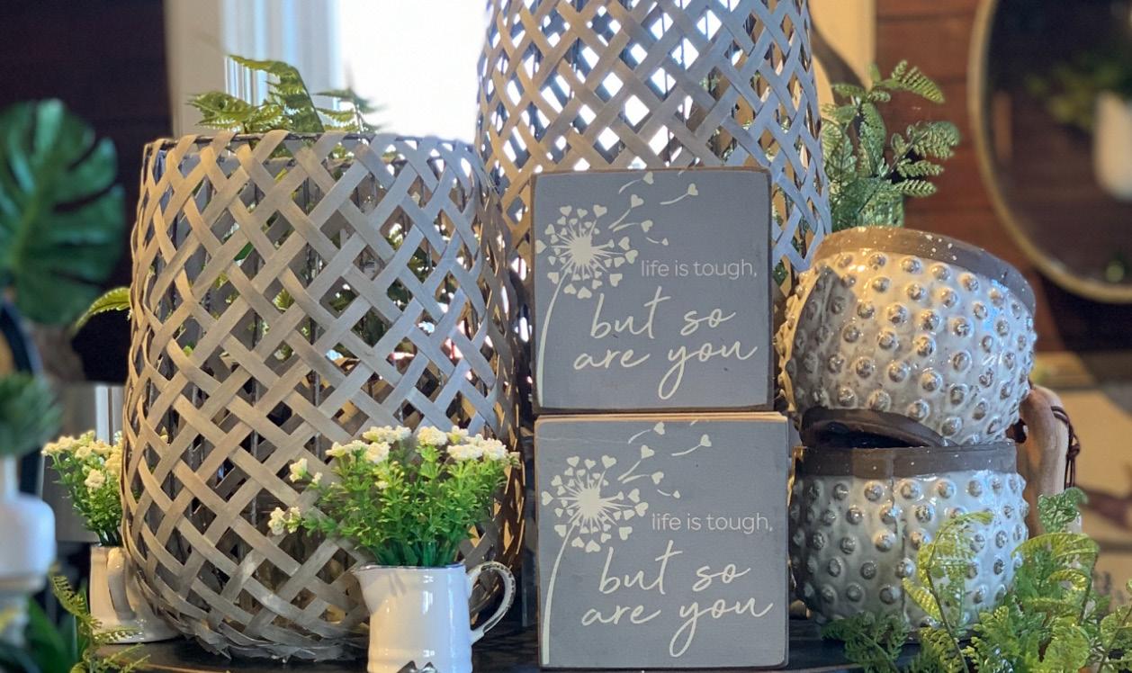
Sometimes it’s challenging to make a strong visual statement when displaying items from the same category. This display shows how varying the heights and evenly dispersing the white concrete pieces creates both balance and visual interest.

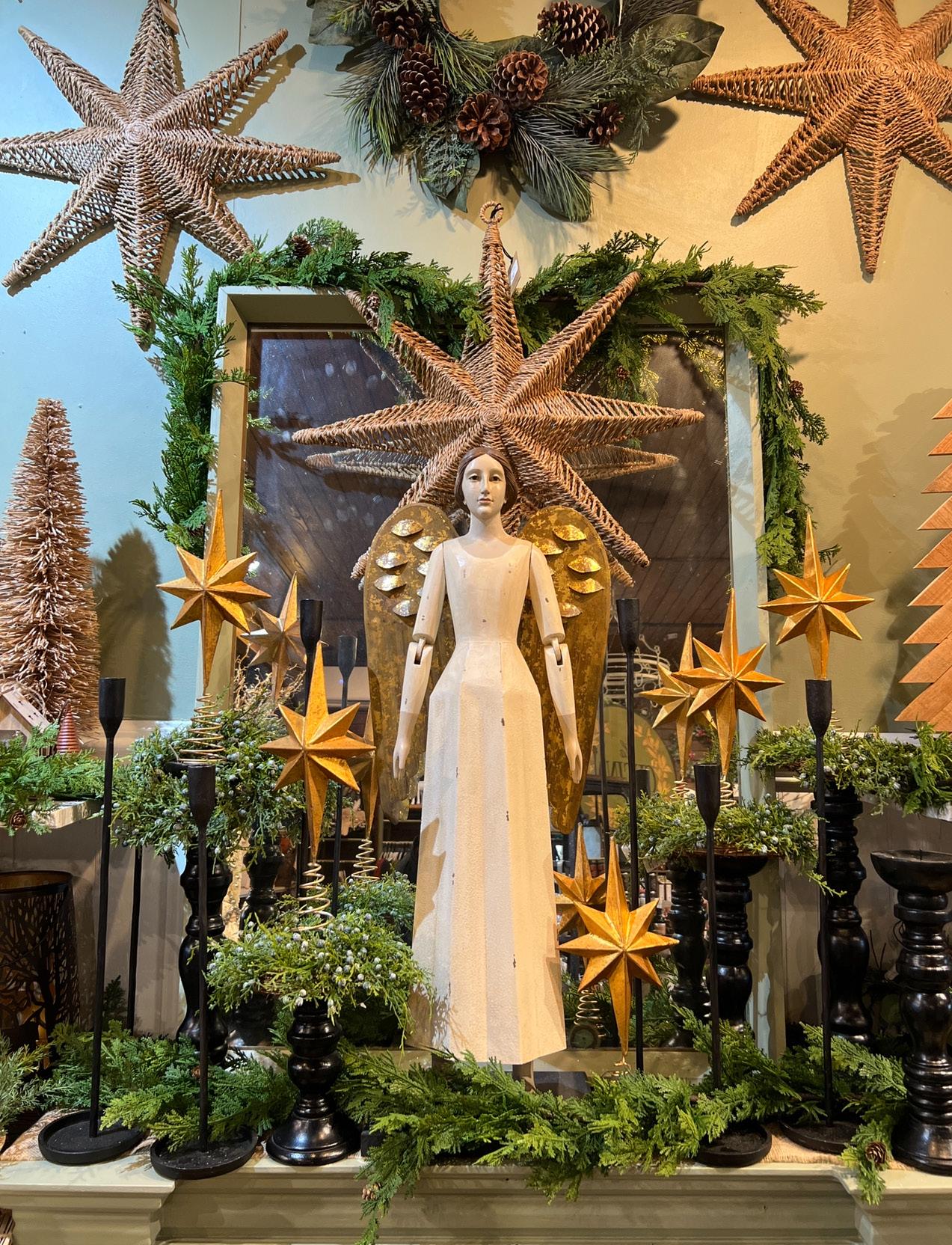
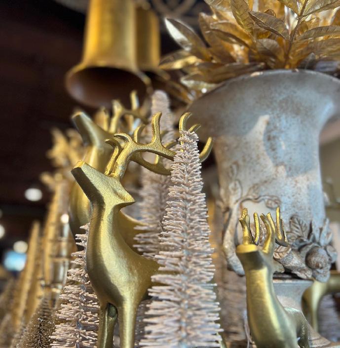
Displaying holiday items with a shared vintage feel is a great way to create a cohesive look. The sense of nostalgia shines through, and the common theme pulls the entire display together.
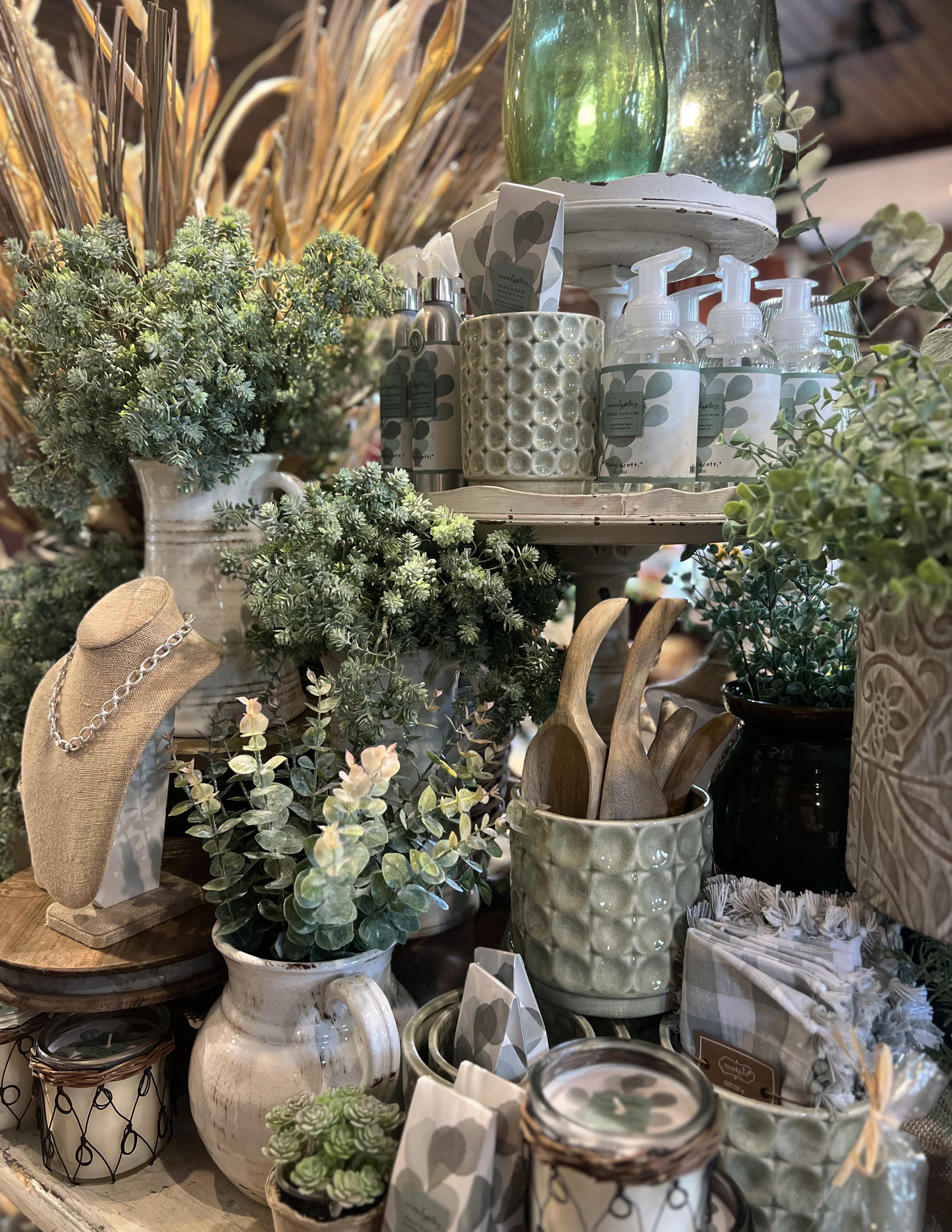
There are so many beautiful shades of green that work well together. This display highlights a softer take, eucalyptus green. It’s paired with the fragrance name to tie the theme and color story together seamlessly.
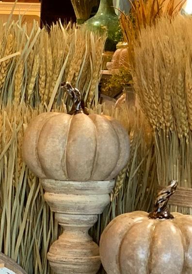
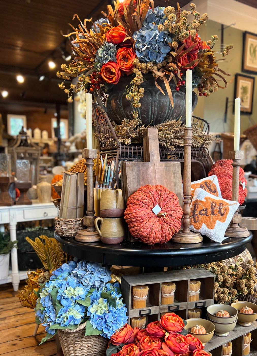
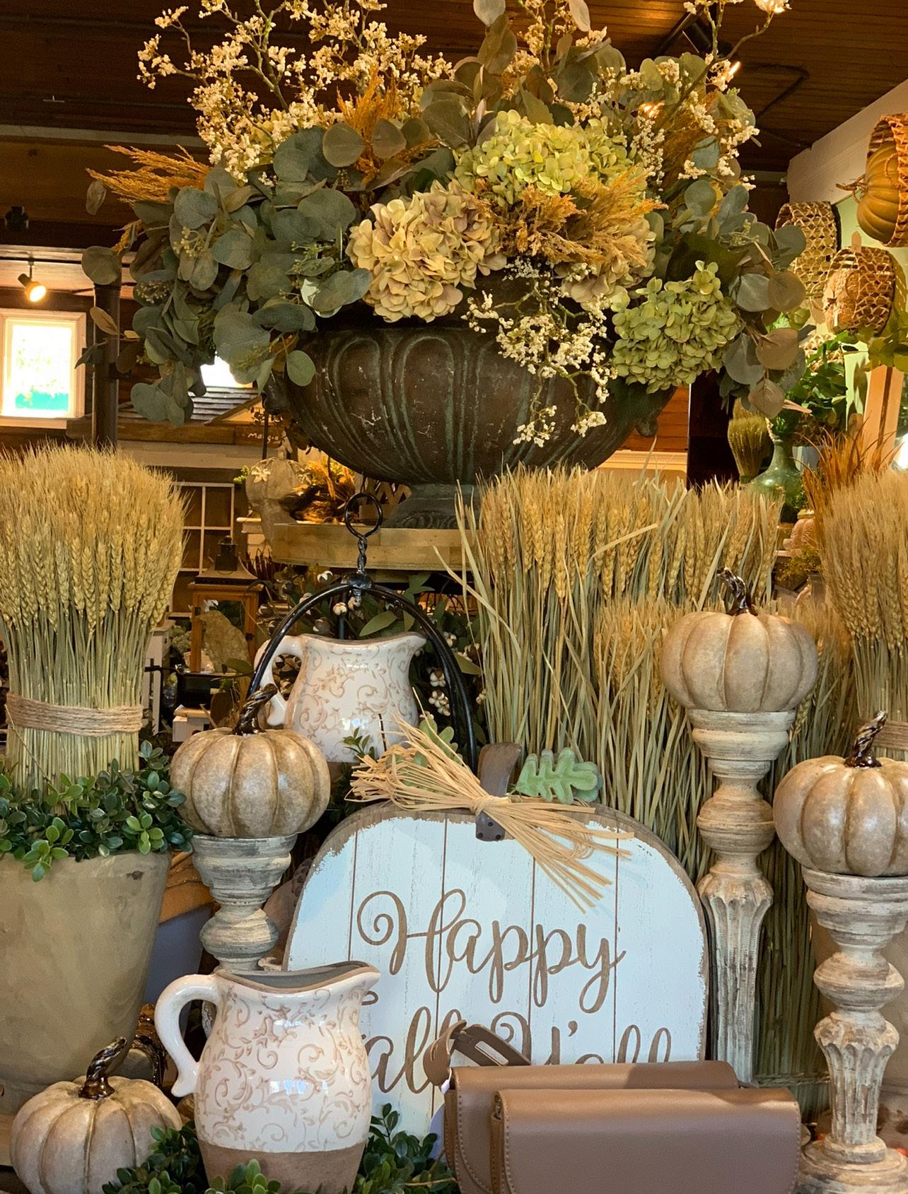
Year after year, wheat is a must-have for my customers, so I’m always looking for new ways to style it. This time, I treated the wheat like topiaries and elevated pumpkins on candlesticks to add height and dimension. And yes, I created another oversized floral display in my trusty urn—because some traditions are worth repeating!
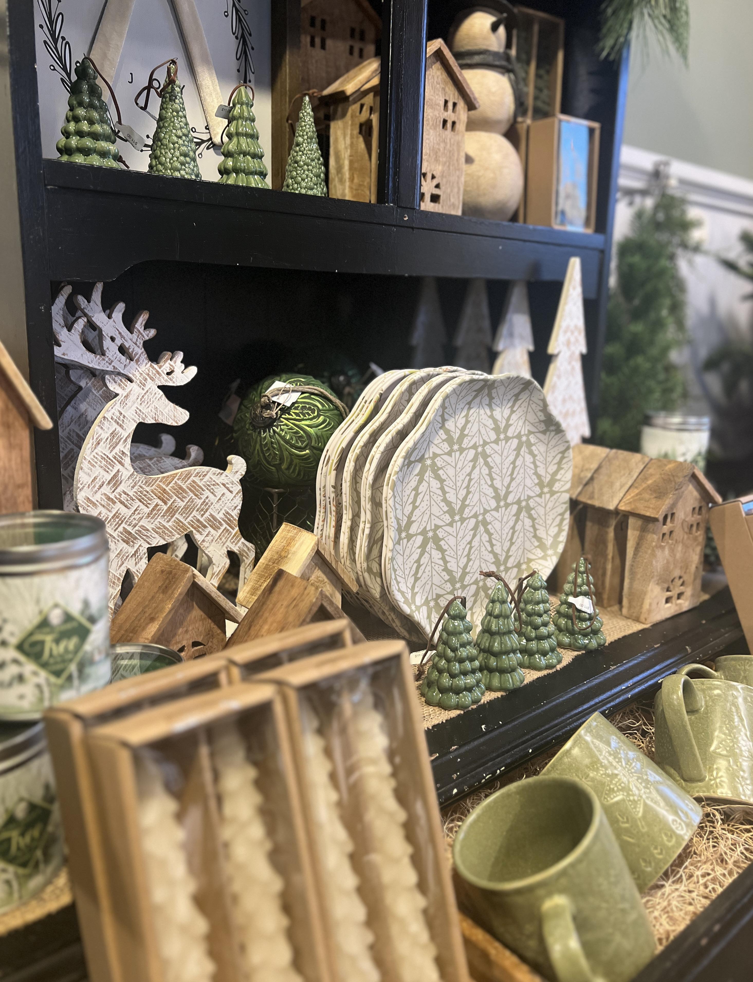
Now that you know I’m a fan of green, the last thing to do is to show it in holiday. By now you probably recognize the fixture! Again, every draw, every nook and cranny is used to display.
Sometimes it’s a challenge to make lower-cost, pick-up items feel elevated. Here, I mixed in a few higher-end pieces and gathered the rest in a beautiful bowl to create both mass and order.
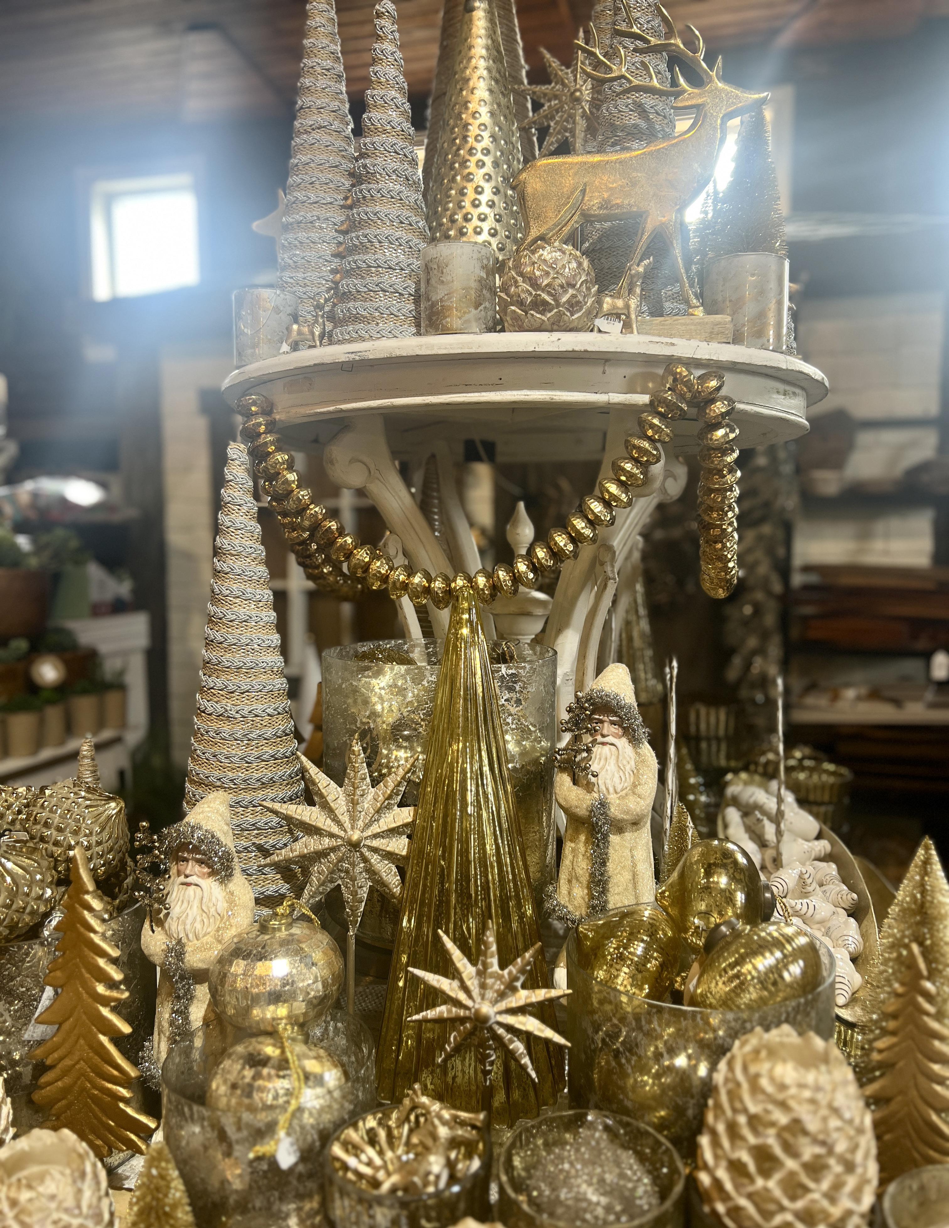
Gathering glass ornaments in gold bowls and mixing ing with trees if all shapes and sizes gives this monochromatic display shape and form.

Greenery, whether it’s stems, drop-in balls, wreaths or berry
bunches, it all works to bring depth to this display, just as long as they have different textures and tones.
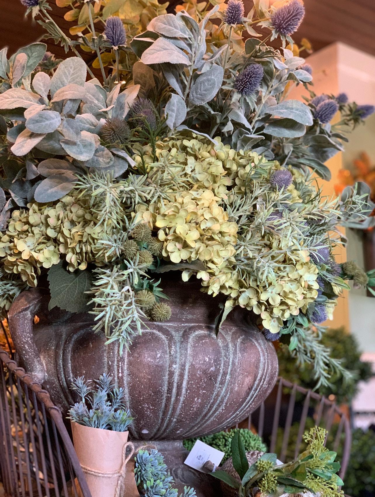

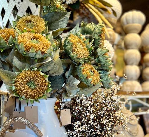
Not everything in the fall needs to be orange. These muted colors are a beautiful alternative to the expected. The dusty sage and rosemary were added to this arrangement for texture and color variation.
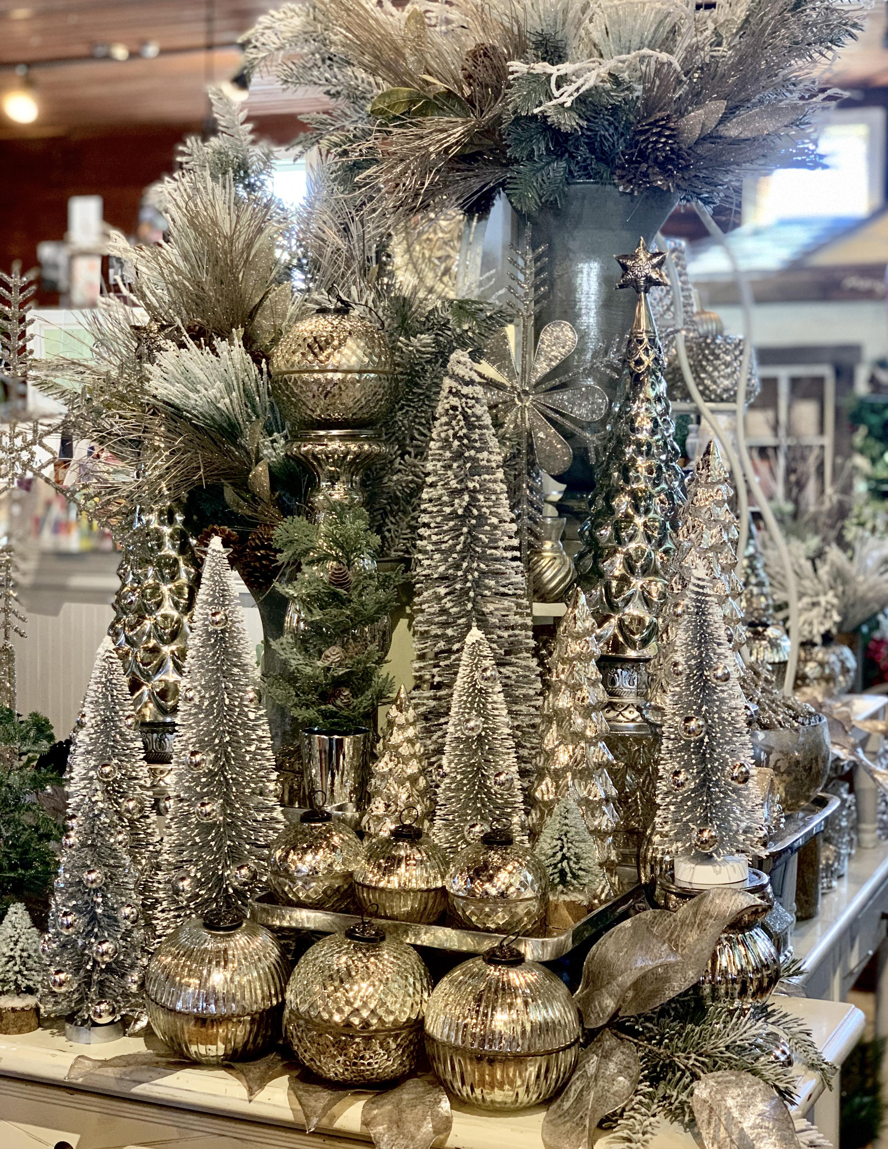
A mix of white and metallic bottle brush trees in varying heights, paired with mercury glass trees on silver risers, creates a shimmering, festive display.
Michele Mangiacotti michele@mangiacotti.com
c: 508-922-7320