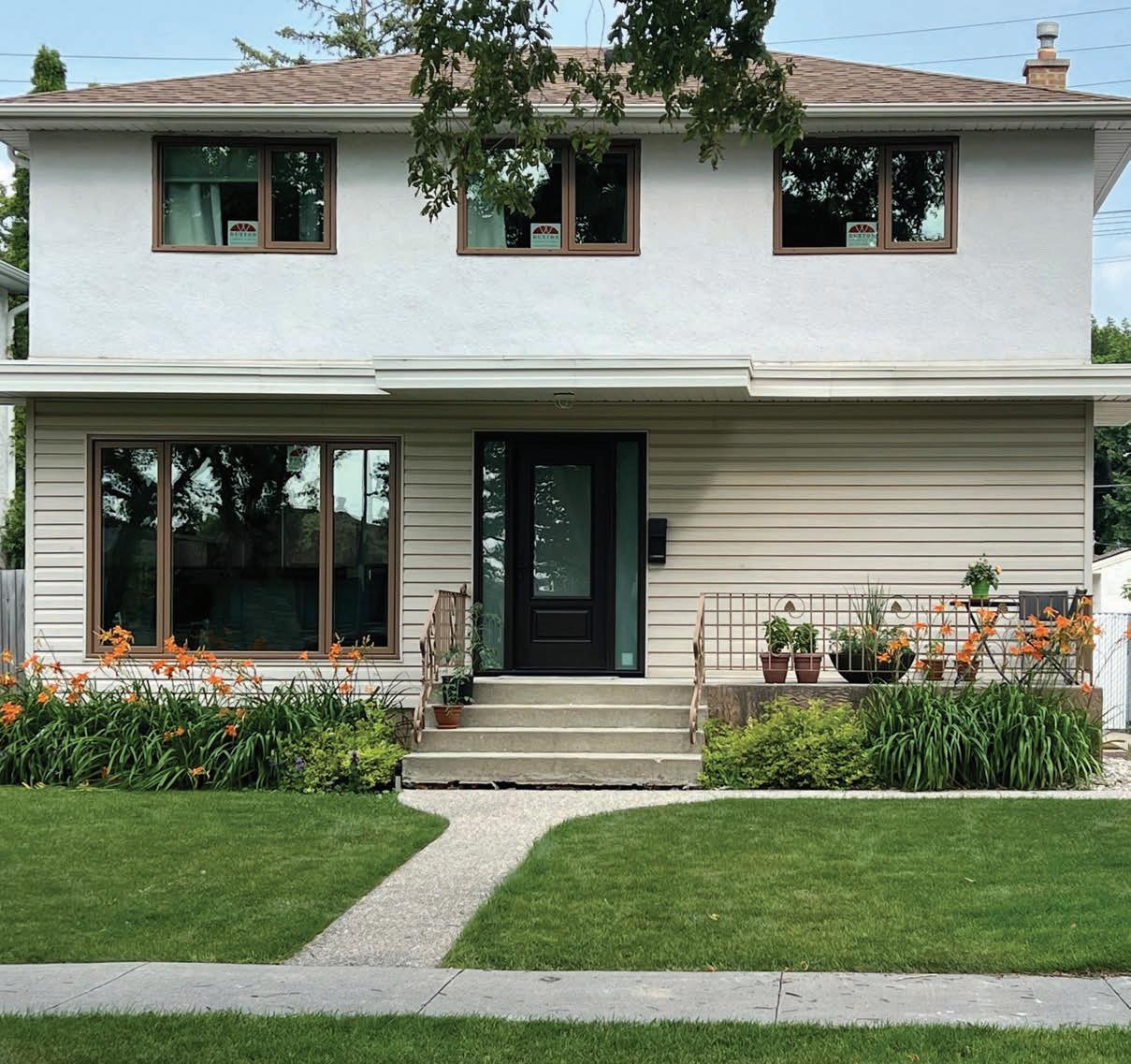


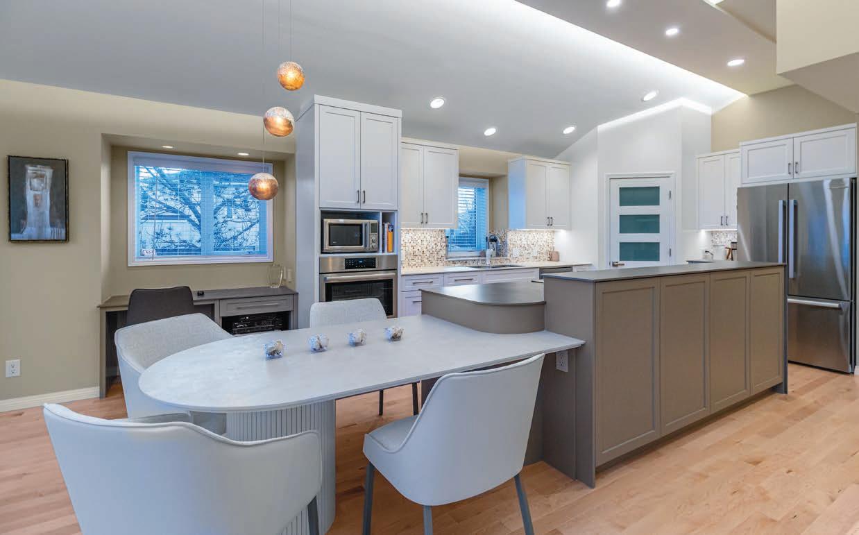
It’s the best renovation decision you can make. For over 80 years, members of the Manitoba Home Builders’ Association have upheld their commitment to quality, service and professionalism, keeping Manitobans among the best-housed people in the world. For your peace of mind, make the smart move – contact a MHBA RENOVATOR member for your next renovation! MHBA MEMBERS are affiliated with the Canadian Home Builders’ Association.

Ph. (204) 779-6900 www.allcanadianrenovations.ca

Ph. (204) 338-3151 www.harwoodbuilders.com
Ph. (204) 793-0500 www.hammerdown.ca

Ph. (204) 227-4662 www.rempelbuilders.com

Ph. (204) 894-1446 www.grindstonerenovations.com

Ph. (204) 339-2035 info@marichomes.com www.marichomes.com
Ph. (204) 233-8687 www.starbuildingmaterials.ca
Ph. (204) 895-0265 Fax. (204) 832-6335 www.oswaldconstruction.ca
Ph. (204) 799-5029 www.ican-construction.com
Ph. (204) 237-4294 info@characterhomesltd.ca

Ph. (204) 615-6500
Trevor.Kidd@alairhomes.com alairhomes.ca/winnipeg

Ph. (204) 940-4040 www.mcmunnandyates.com

Ph. (204) 474-2334 www.floform.com
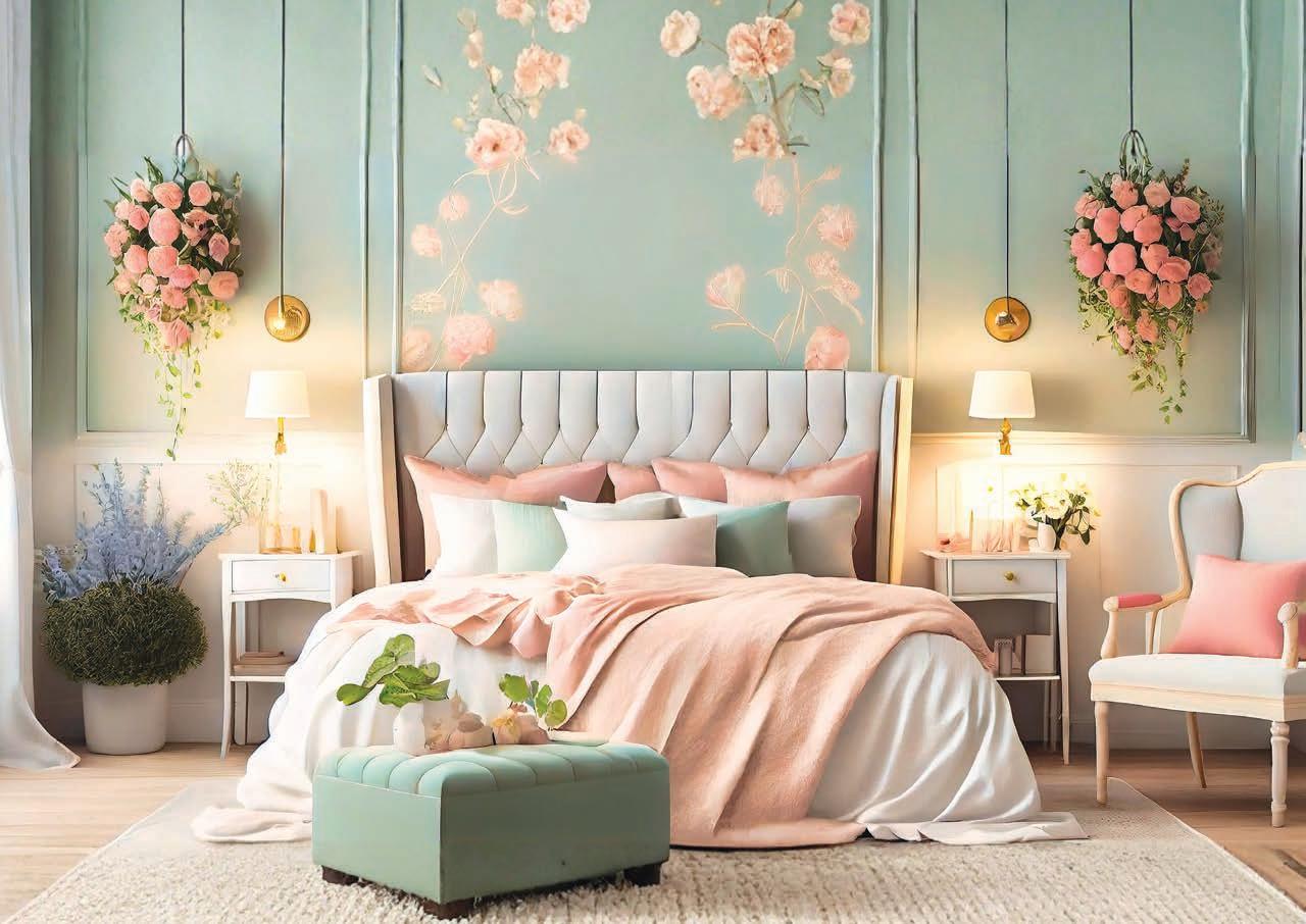

TR26-4-3
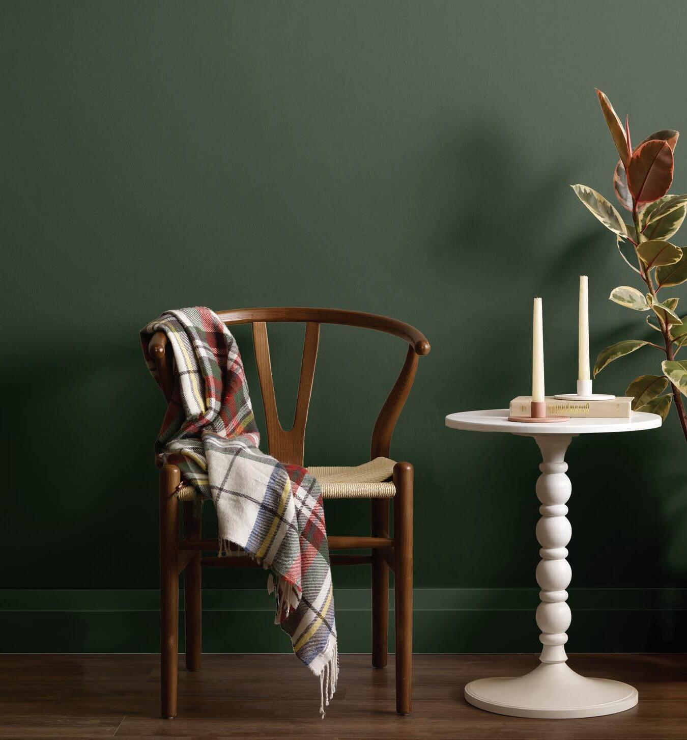




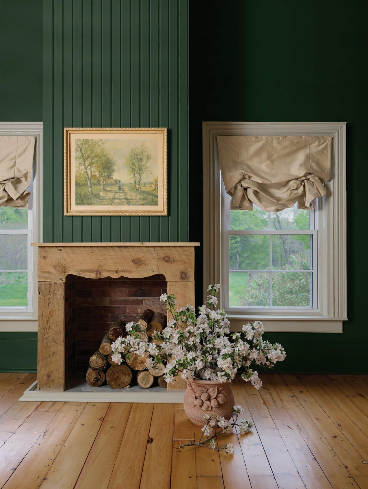
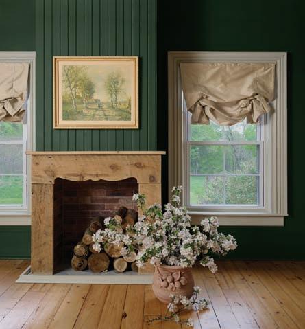
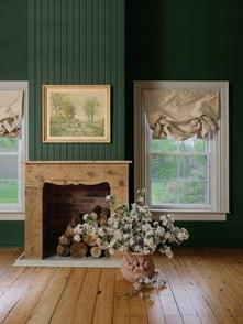
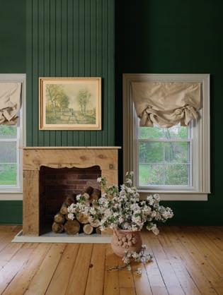
A deep, moody green with the earthy depth of classic artistry, where mystery meets light. It anchors spaces with introspective elegance, grounding and enriching the world around it.




INTERIOR
INTERIOR
HOME
DESIGNER’S
INTERIOR
Marlene Eisner, national editor
Outdoor
Merlyn Minty, Winnipeg editor

CONGRATULATIONS TO THE WINNERS OF THE CRAFTSMAN CONTEST: CONNOR S.; STEVE M.; JOHN M.; SERGIO S.; ASHLEY S.
After a harsh winter and reluctant spring, we can finally lean into summer’s lush, richly hued palette, and the barrage of emotions that come with it. Because that’s what colour does; it moves us.

There’s a point each year when home life naturally shifts outside. Decks and patios come back into use, backyards become part of the everyday routine and the projects that have been sitting on the list finally start to take shape. It’s often when the focus turns to the exterior – not just to maintain it, but to improve how it looks and how it works.
MARLENE EISNER EDITOR, NATIONAL marlene.eisner@nexthome.ca
Which brings me to this issue and its focus on the impact of colour, inside or outside your home. How to use it. Where to use it. And why. Because light or dark, soft or bold, the colours you choose set a tone, a mood and often a statement. It can relax you or set your teeth on edge.
On page 22, Amanda Aerin discusses the psychology of colour in design, while on page 55, Linda Mazur is all about the sway of the colour blue. Jessica Cinnamon, on page 64, finds the joy and magic in pastel colours for a nursery and on page 45, writer Sara Duck explores the beauty of dark, moody hues.
Aside from the details surrounding decor and interior design, many homeowners are wondering if they should buy up, or stay put and renovate. If you’ve been having similar thoughts, on page 28, Brendan Charters makes a compelling argument for how staying put and renovating your current home makes financial and emotional sense, and may be the best move you make.
Thank you for picking up this issue of RENO+DECOR. Let us know what you think.
To enter our contests, go to renoanddecor.com/contests or scan the QR code.
This issue highlights ideas and upgrades that enhance the appearance and performance of your home’s exterior. That could mean refreshing paint or siding, improving insulation and windows, or investing in outdoor spaces designed for relaxing and entertaining. Some updates are quick wins, while others take more planning, but all contribute to a home that feels more complete and comfortable.
Inside these pages, you’ll find a range of projects, practical advice and inspiration to help move your plans forward. We’re also pleased to present the winners of this year’s RenoMark Renovation Awards, recognizing Manitoba renovators whose work reflects a high level of craftsmanship, creativity and professionalism. Their projects offer a clear sense of what’s possible with the right approach and the right team.
For many homeowners, this is when ideas start to turn into action. Each step – big or small – helps shape a home that works better and feels right for how you live.
Enjoy your summer and happy renovating.

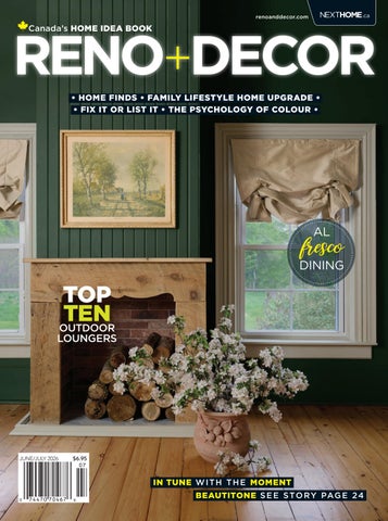
In tune with the moment: BEAUTITONE. See story page 24
MANITOBA HOME BUILDERS’ ASSOCIATION MHBA is the voice of the residential construction industry in Manitoba, providing a forum for the ongoing education of membership with respect to technology, business practices; and to promote affordability/choice in housing.
ARIDO ARIDO regulates interior designers in Ontario for the betterment of the profession and in the best interests of the public, sets education and experience standards for members, and advocates for the profession.
BILD With more than 1,300 members, BILD GTA is the voice of the home building, land development and professional renovation industry and is affiliated with the Ontario and Canadian Home Builders’ Associations. The Calgary region (BILDCR) works closely with various levels of government and stakeholder groups to ensure vibrant, established neighbourhoods and new communities in the region.



DDA The Decorators & Designers Association of Canada (DDA Canada) is a professional association that elevates the industry for design professionals, students and suppliers through education, events, training, advocacy and community building.
HAVAN The Homebuilders Association Vancouver is recognized as the leader in the homebuilding industry since 1974. Its knowledgeable, trusted and resourceful members build more than 65 per cent of Metro Vancouver’s homes.
IDC Interior Designers of Canada (IDC) is the national advocacy association for the interior design profession. representing more than 5,000 members, including fully qualified interior designers and related professionals.
NKBA The National Kitchen & Bath Association (NKBA) Ontario chapter was established in 1977 and is where industry members meet to learn what’s out there and what other members offer. The British Columbia chapter, formed in Jan. 1990, has a large provincial membership to facilitate member engagement, professional development and act as a consumer advocate for members, while being financially viable.
CANADIAN HOME BUILDERS’ ASSOCIATION Since 1943, the Canadian Home Builders’ Association (CHBA) has been “the voice of Canada’s residential construction industry,” with about 9,000 member-companies. The Edmonton-region branch engages and serves its core membership of builders, renovators, and general members by advocating on behalf of the residential construction industry in pursuit of members’ success.
RENOMARK RenoMark identifies professional contractors, custom homebuilders and trades who agree to abide by a professional code of conduct. RenoMark members are reliable, ethical and responsive.
SENIOR VICE-PRESIDENT, SALES, NEXTHOME
Hope McLarnon
416.708.7987, hope.mclarnon@nexthome.ca
SENIOR MEDIA CONSULTANTS
Amanda Bell 416.830.2911, amanda.bell@nexthome.ca
Merlyn Minty
204.782.8692, merlyn.minty@nexthome.ca
EDITOR – NATIONAL
Marlene Eisner
CONTRIBUTING EDITOR – ALBERTA
Pepper Rodriguez
CONTRIBUTING EDITOR – WINNIPEG
Merlyn Minty
EDITORIAL DIRECTOR
Amanda Pereira
CONTRIBUTING EDITOR – NATIONAL
Sara Duck
CONTRIBUTORS
Mariam Aboutaam, Amanda Aerin, Olivia Bailey, Brennen Bilyk, Kate Chapman, Brendan Charters, Jessica Cinnamon, Sara Duck, Marissa Graham, Gelanaz Hamati, Patricia Johnson, Linda Mazur, Lanny McInnes, Mimi Pineau
EXECUTIVE MEDIA CONSULTANT
Michael Rosset
VICE-PRESIDENT MARKETING – GTA
Leanne Speers
MANAGER CUSTOMER SALES/SERVICE
Marilyn Watling
SALES & MARKETING CO-ORDINATOR
Gary Chilvers
VICE-PRESIDENT, PRODUCTION – GTA
Lisa Kelly
BUSINESS DEVELOPMENT MANAGER
Josh Rosset
DISTRIBUTION distributionteam@nexthome.ca
ACCOUNTING INQUIRIES accountingteam@nexthome.ca
DIRECTOR OF PRINT MEDIA
Lauren Reid–Sachs
PRODUCTION MANAGER – GTA Yvonne Poon
GRAPHIC DESIGNER & PRE-PRESS COORDINATOR Hannah Yarkony

æ Sign up to receive digital editions and newsletters to your inbox!
Published by nexthome.ca
Advertising Call 1.888.761.3313 for rates and info. Email: info@nexthome.ca
Circulation At thousands of high-profile pick-up boxes and racks in the GTA, select retailers and designer showrooms. Plus, top consumer and trade shows.
Canadian subscriptions 1 year = 6 issues – $45 (inc. HST)
Single copy price $6.95 (plus HST). Canada Post – Canadian Publications Mail Sales Product Agreement 43643067.
Copyright 2026 All rights reserved. All copyright and other intellectual property rights in the contents hereof are the property of NextHome, and not that of the individual client. The customer has purchased the right of reproduction in NextHome and does not have the right to reproduce the ad or photo in any other place or publication without the previous written consent of NextHome.
Editorial Submissions from interested parties will be considered. Please submit to the editor at editorial@nexthome.ca.
Terms and Indemnification Advertisers and contributors: NextHome is not responsible for typographical errors, mistakes, or misprints. By approving your content and/ or submitting content for circulation, advertisers and contributors agree to indemnify and hold harmless NextHome and its parent company from any claims, liabilities, losses, and expenses (including legal fees) arising out of or in connection with the content provided, including but not limited to any claims of copyright infringement, unauthorized reproduction, or inaccuracies in the content. Advertisers acknowledge that they have the necessary rights, permissions, and licenses to provide the content for circulation, and they bear full responsibility for the content’s accuracy, legality, and compliance with applicable laws upon approval. Contributors acknowledge NextHome reserves the right to omit and modify their submissions at the publisher’s discretion.
Making energy-saving upgrades to your home is an investment that will pay off for years into the future. Discover the benefits of prioritizing energy efficiency and how we can help with the cost of upgrades!
Why energy efficiency?
Using less energy means lower monthly energy bills.
Proper insulation and air sealing keep your home comfortable year-round.
Reducing natural gas consumption lowers greenhouse gas emissions.
Improve your home’s insulation, windows, and doors to prevent drafts and maintain a comfortable temperature.
2
1
Find energy-saving opportunities with an EnerGuide evaluation.
3
Upgrade to an energy-efficient heating and cooling system, like a ground source heat pump or air source heat pump.
by SARA DUCK










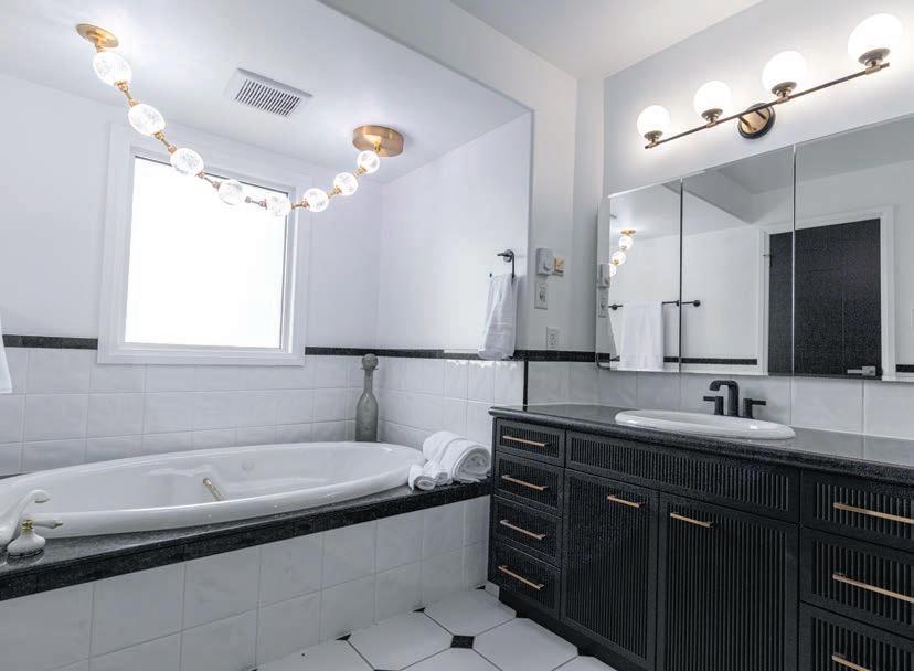
PROJECT | Primary suite in a dated condo gets a luxurious refresh.Condo living done right.
by BRENNEN BILYK





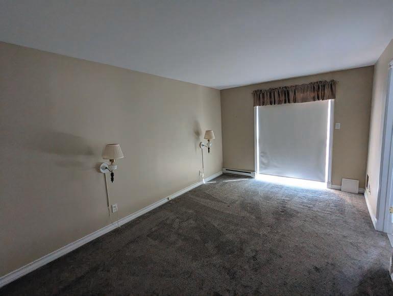










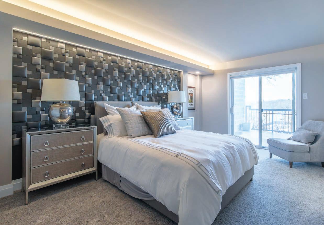
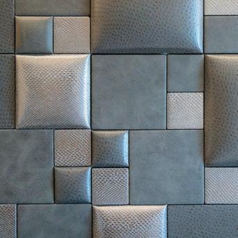
A new bulkhead was added to create some dramatic lighting effects. Indirect lighting added above for a soft comfortable general light. Wall washing light to highlight the headboard. Space for a pot light to illuminate one of the client’s favourite framed photos.
Textured leather tiles were used on the headboard. Providing a great texture and unique feature to anchor the room.
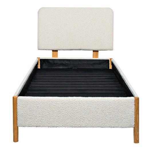
Wonderful bedding with a combination of textured pillows sitting on top of a great upholstered Canadian-made bed.
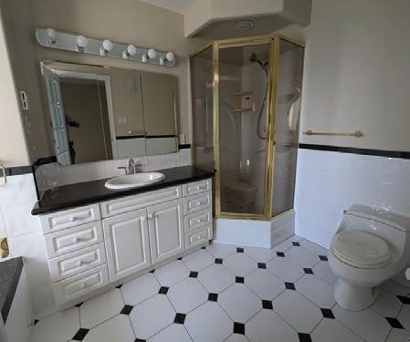
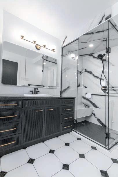
In the ensuite, the tired and peeling white cabinet was refaced with a more dramatic fluted black door. Doors were accented with champagne bronze handles. Granite stone top was saved, as it was in great condition and went perfectly with the black, white and champagne bronze theme.
New lighting throughout for a new glamorous look and feel. We weren’t allowed to relocate any of the duct work, so we used an elegant swing light over the tub to fill space.
Brennen Bilyk, B.Env.D., is the principal designer at Charisma, the Design Experience. 388 Academy Road, Winnipeg. 204-487-6994, charismadesign.ca 2 1 3 2 2
The old corner shower was replaced with a black and white tiled shower. This allowed us to maximize the shower size, while still maintaining the drain location. Shower floor was made to be as low profile as possible without modifying any structure or wrecking our original tile floor. 1 2 3 4 5 6

RENO+DECOR reaches more qualified readers than any other home improvement publication. Our readers are looking for project ideas and connections to professionals that specialize in home improvement, design and construction. Within our colourful, informative format, we can highlight your business, product or service in the best possible way: with creative advertising and/or informative articles and profiles. It’s the best way to get your business the valuable exposure it needs!

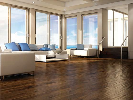




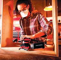

Complete a range of woodworking and metalworking jobs with this V20 Cordless 8-Tool Combo Kit. With 2 batteries and a charger included, you can start the workday with pride and confidence knowing you have the power needed to tackle a full day’s work. Drill, sand, and cut with this kit as you easily retrieve and store tools using the included storage bag, which can also be used to transport your set of tools, batteries, and chargers from one garage or workshop to another.

A home that is loved for its unique character
by GELANAZ HEMATI • photos ERIK ROTTER
This single-family 4,500-sq.-ft. home was designed for comfort, ease and luxury living. From the outset, the goal was to build a large house and design a home that would leave a lasting impression. A place loved for its character rather than its address.
The homeowners, a couple with a growing family, envisioned a multigenerational home where they could periodically host their in-laws. With three floors, the carefully thoughtout design comprises a main level with an elegant entrance foyer, home office, living room, dining room, powder room, family room,
kitchen and adjacent butler’s pantry; a second level with four bedrooms and a laundry room with hallway access; a 460-sq.-ft. master suite with a 150-sq.-ft. walk-in closet and 200-sq.-ft. ensuite bathroom; and on the lower level, a finished basement. An elevator located near the kitchen provides easy movement to all levels.
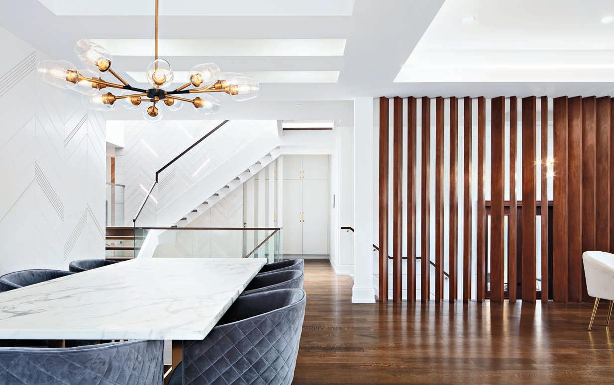
The entry was carefully designed to make a good first impression and flow smoothy toward the back of the house. A see-through slatted divider separates the living room from the foyer. The design provides a measure of privacy, and as you move forward, the large space is gradually revealed.
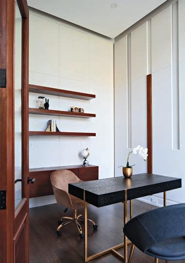
At the front of the house is the home office, which buffers the worker from distractions in the main living areas. The office ceiling height and millwork were carefully chosen to support focus. When the room shifts from quiet work to meetings – online or in person – concealed lighting emerges.
The central staircase is the home’s defining architectural statement. Two large skylights draw natural light from the top floor, filtering it down through the house. The adjacent wall is clad in custom chevron-patterned millwork, with directional lines that gently guide the eye upward. At night, hidden lighting in the wall transforms it into a dynamic feature that is functional, without being jarring. Throughout the home, pot lights and lighting are part
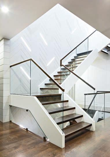
of a fully automated smart home and can be altered to enhance different moods and uses.
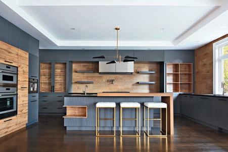
The kitchen sits at the back of the main level. Instead of relying on symmetry, the design embraces balance through proportion and flow. None of the walls mirror each other, yet the space feels grounded and comfortable, a place for cooking, conversation and gathering. The island anchors functionality and sociability, a centre of activity where meals are prepared as friends lean in for laughter and long conversations.
A key visual feature is the backsplash, where tile with a woodlike texture echoes the real wood used throughout the cabinetry and millwork. This thoughtful pairing creates continuity and unity, with different materials sending the same message. Rather than standing apart, they complement each other, and the result is cohesive and intentional.
The open-concept layout connects the kitchen and family room in a way that is functionally spacious and welcoming without sacrificing comfort. While occupying one large

area, each room has its own identity yet are obviously entwined. This connection is carried from the kitchen into the family room, where the fireplace is clad in floor-to-ceiling grey slabs that harmonize with the kitchen’s palette.
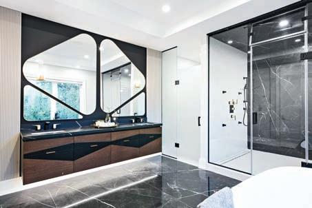
The second floor is reserved for family life and private living, with bedrooms designed for comfort and ease. Each features its own ensuite bathroom and walk-in closet. In the primary ensuite bathroom, the monochromatic palette reflects the homeowners’ preferences and is highlighted in the floor and walls with black-and-white slabs. A custom vanity and tailored mirrors complete the space.
The basement is designed for entertainment and functionality. As a nod to practical considerations, there is another laundry room, the furnace, cold storage and the entrance to a two-car garage. With family relaxation and interaction in mind, there is also a recreation room with plenty of natural light, a bar, pool table, powder room and a bedroom with an ensuite
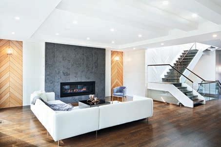
for when the in-laws visit. Here, functionality meets with personality.
With this home, every decision has been part of a larger picture to balance individual needs and preferences with cohesion, openness, privacy and calm energy. It is a house designed not to impress at first glance, but to be remembered long after you leave.
Gelanaz Hemati, founder of the award-winning multi-disciplinary interior design firm Gelanaz & Associates, is based in Toronto and combines architectural expertise with more than 20 years of experience to create refined, high-end residential designs. She also chairs NKBA programs and was a judge on the OHBA and NKBA 2024 competitions. gelanaz.ca IG: gelanazassociates
by AMANDA AERIN • photos LARRY ARNAL
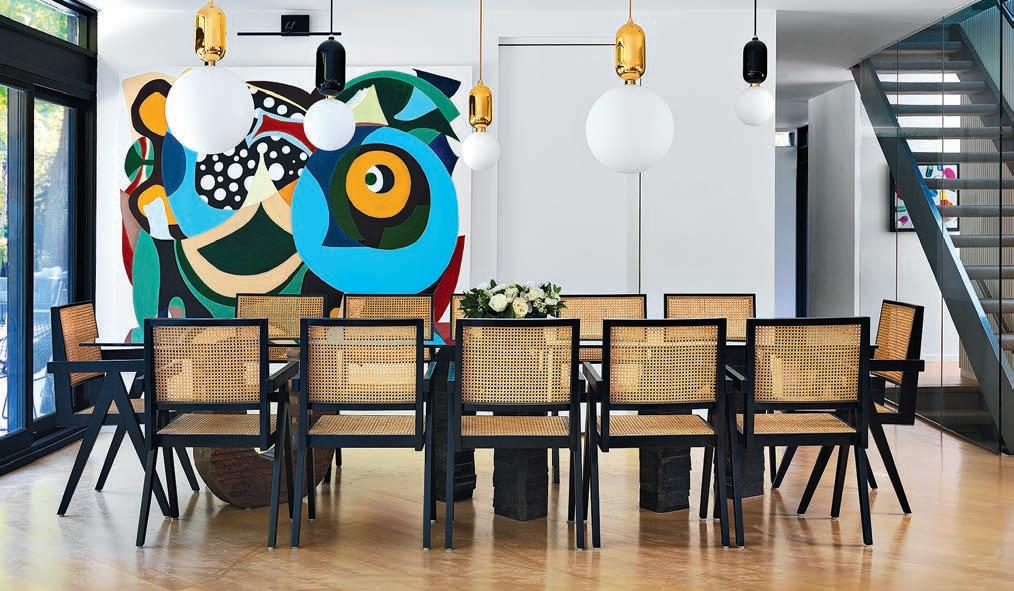
Colour has a way of asserting itself early in the design process, often before a layout is resolved or a single piece of furniture is chosen. It quietly establishes the mood of a room, shaping that first, instinctive impression the moment you step inside. Some spaces feel calm and cocooning, others lighter or more expansive, and more often than not, that feeling can be traced back to the colour palette.
With time, those colour choices become part of how a home is experienced day-to-day. There are rooms that naturally carry more energy, and others that invite you to slow down. It’s a subtle shift, but a meaningful one, and it doesn’t happen by accident. Always start with a colour that reflects how you want to feel in a space, not just how you want it to look. Let that guide your palette, then
At the core of any palette are the primary colours: Red, blue and yellow. These foundational tones influence every other hue we use in interiors, and each carries a distinct emotional response. Red is stimulating and warm, often associated with energy, passion and movement. In softer applications such as rust or clay, it brings depth and connection into a space without overwhelming it. Blue, by contrast, is calming and steady. It evokes a sense of clarity and rest, making it a natural choice for spaces where relaxation or focus is key. Yellow brings a sense of brightness and optimism. When softened into more muted tones, it can gently lift a room and feel naturally invigorating. Beyond the primary colours, there’s a wide range of hues that shape how a home feels on a daily basis.
Greens, for example, are closely tied to nature and bring a sense of calm and restoration. Soft sage, olive, or moss tones create a grounded feeling that works beautifully in modern and traditional interiors. It offers a quiet connection to the outdoors, to which many people instinctively respond.
Neutrals play an equally important role. Rather than being seen as empty or purely functional, it acts as the base layer that allows a space to come together. Warm whites, soft beiges, and layered taupes create continuity and ease, while the subtle undertones influence the overall atmosphere. A well-chosen neutral can feel warm and enveloping or light and airy, depending on how it’s used.
Darker tones add richness and dimension. Charcoal, espresso brown and saturated navy introduce a sense of intimacy that can make a space feel more personal. These colours often create defined areas within an open layout, without relying on physical boundaries.
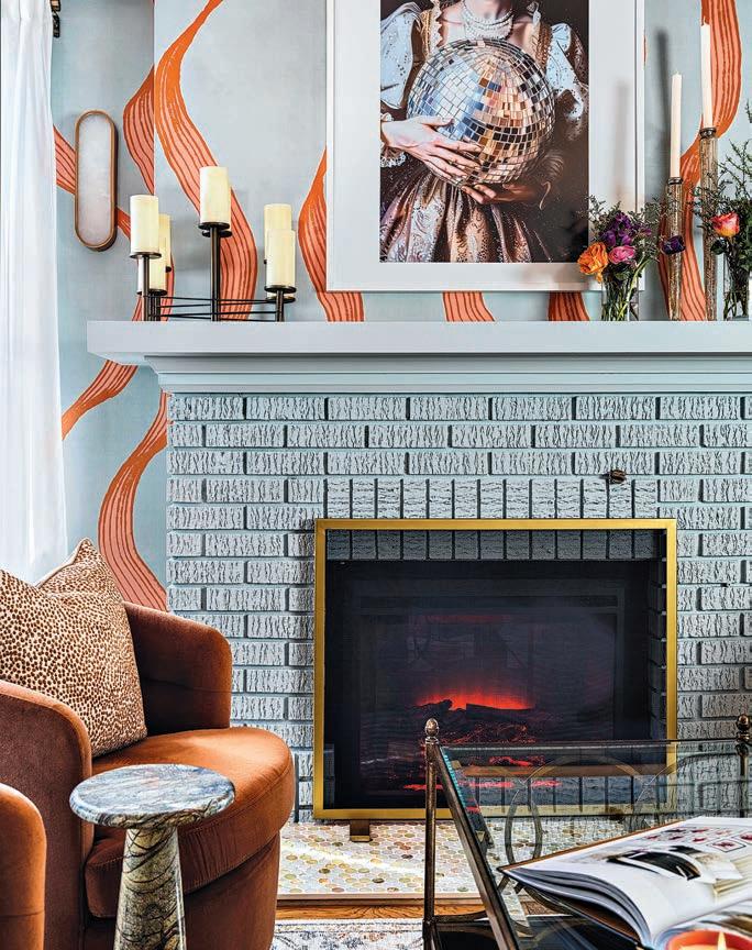
A colour can take on a leading role or a supporting one, depending on how it’s distributed throughout the room. Its placement decides where you first look in a room before you even realize it, shaping perception almost instantly. Our attention is naturally drawn to contrast, so a stronger or unexpected tone will always stand out against softer surroundings. This is why the use of colour is such a powerful psychological tool in interiors; it can quietly direct focus, highlight meaning and create a sense of importance around certain areas or objects.
In small spaces, this effect is amplified. With fewer visual cues,

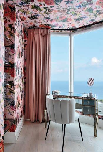
Using colour intentionally also means understanding how it interacts within a space. A palette doesn’t have to be bold to feel impactful. In many cases, subtle layering of tones creates a more lasting impression than a single dominant colour. This is where proportion comes into play.
even a minimal colour shift carries emotional weight. A single accent can energize a room and shift the mood, illustrating that colour doesn’t just decorate, it actively influences how we feel and what we notice.
What makes colour so impactful is its connection to memory and emotion. A particular shade can remind you of a place, a season, or a feeling you didn’t realize you carried with you. This is what transforms a well-designed space into one that feels personal and meaningful. In the end, colour in everyday living is about awareness, recognizing how your surroundings influence you and using it as a tool to shape that experience. When approached with intention, it becomes part of how a home feels.
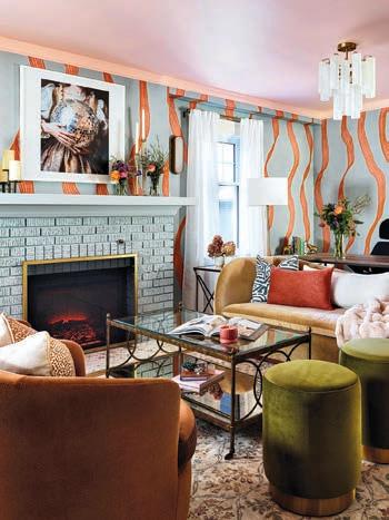
You know that feeling when something arrives at exactly the right moment? That’s what discovering the Colour of the Year feels
like, but it’s far from chance. Behind the scenes, the process is equal parts investigation, creativity and foresight (fueled by plenty of coffee).
We gather inspiration from everywhere: Fashion runways, home
decor, cultural shifts, emerging technologies and the overall mood of the world. We collaborate with global colour partners, exchange ideas and track patterns until a clear direction begins to emerge. Then we ask the
most important question: How will this colour live in our homes, and how will it shape how we want to feel?
From all of this, one colour rises to the surface. It’s the hue that captures attention, tells a meaningful story and sparks emotion. It’s the one you’ll start seeing everywhere, on social feeds, in design inspiration and woven into the spaces around you.
This year, we added an important perspective: Our BeautiTone paint experts across the country. These are the people having real conversations with customers every day, helping bring ideas to life. Their insight helped guide us toward a choice that feels timeless and perfectly in tune with the moment.
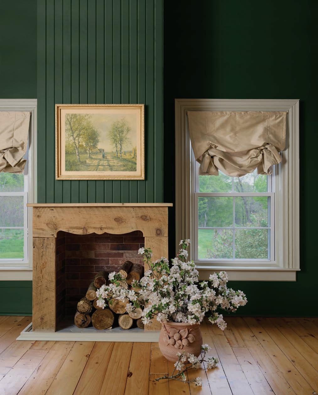
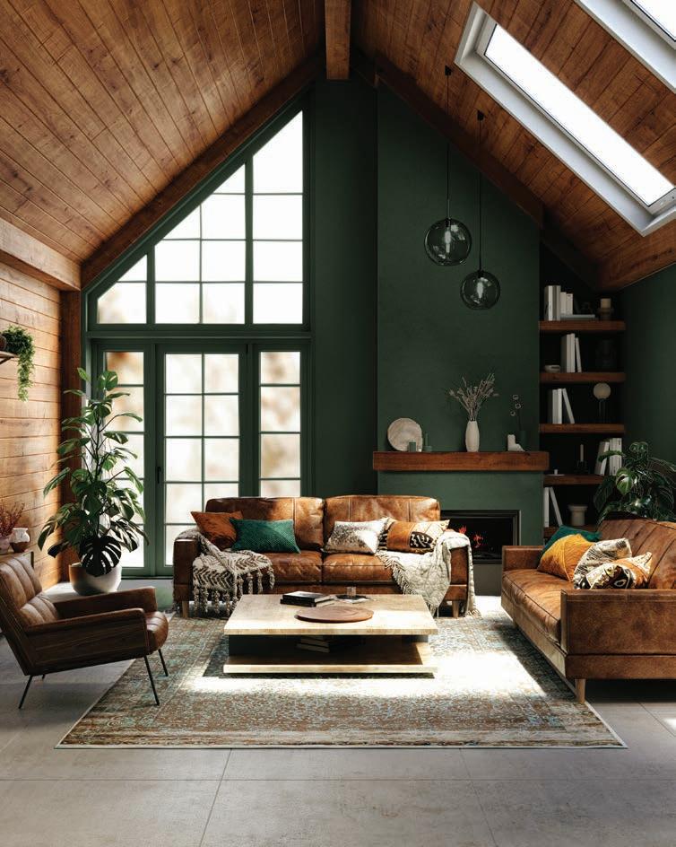
For 2026, the Colour of the Year is a deep, moody green.
Think of the richness of a shaded forest floor, the character of aged
patina and that quiet interplay between shadow and light. It’s grounding, yet full of depth and imagination. This is a colour that invites you to slow down, breathe deeply and create spaces that feel meaningful and layered.
Right now, we’re craving spaces that offer calm, depth and a connection to nature. We want environments that feel restorative, authentic and rooted. This deep green delivers on all fronts. It’s moody without feeling heavy, elegant without feeling cold and bold in a way that still feels livable.
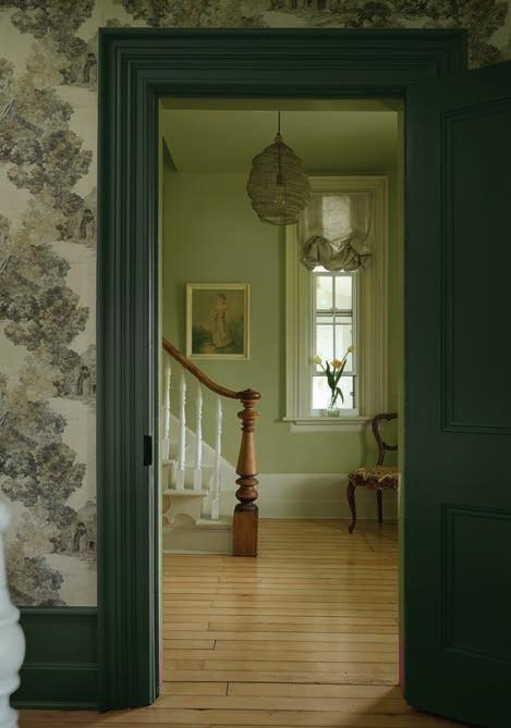
However you choose to use it, this green brings a sense of richness and intention into your home. It’s not just about colour, it’s about creating spaces that feel grounded, expressive and entirely your own.
1
2
GO ALL IN: Use it on all four walls in a dining room or bedroom. Paired with warm wood tones, brass accents and rich textures like velvet or wool, it creates a cocooning, elevated atmosphere.
FEATURE WALL: A single accent wall adds depth without overwhelming. It works beautifully behind artwork, shelving, or as a backdrop in a home office.
3 4
CABINETRY AND DOORS: Apply it to kitchen islands, bathroom vanities, or interior doors for a refined yet fresh update. It pairs effortlessly with marble, butcher block, or matte black finishes.
ACCENTS: Introduce the colour through textiles, pillows, rugs, or bedding, or a standout furniture piece like an armchair.
by PATRICIA JOHNSON
Summers are fleeting in our northern part of the world, and everyone wants to make the most of their outdoor spaces. Container gardening has grown far beyond plastic pots filled with old standbys. If you don’t have a yard, no worries. A balcony will do. Maximize the space you have by using hanging baskets, wall pots, window boxes or through vertical gardening using vines on trellises. No need for weeding or cultivating, just watering, fertilizing and removing dead blooms.
The style and selection of containers available today is mind-boggling, so use whatever strikes your fancy. Drainage is important. If the pots you choose don’t have drainage holes in the bottom, drill some to allow the excess water to flow through. Choose container colours and styles that complement your house and garden, and group different sizes and shapes of your planter pots together using similar plants and colour schemes in each to visually tie them together.
As for the soil, do not fill your containers with earth dug from your outdoor garden. It’s heavy, doesn’t drain well and can possibly contain insects or diseases. Instead, buy good quality potting soil. Don’t fill containers too full. Stop five to 10 cm

from the lip of the rim to the top to allow some room for watering.
Consider where you are planning to locate the pots and plant accordingly, placing all the sun-worshippers together, and saving the darker corners for the shade-lovers. Combine different sizes, colours and textures together in pleasing combinations.
The tried-and-true formula for successful container planting involves three main elements – the thriller, the filler and the spiller.
Thrillers are your tall focal-point plants located in the middle of a pot if viewed from all sides, and toward the back if viewed from one side. Fillers comprise various sizes and shapes of plants – foliage and flowering – to fill in around the focal point, while spillers are almost self-descriptive; these are trailing plants that cascade (or spill) over the edge and soften the look of the pot.
Cram in lots of plants for a full, lush container. Contrast fine textures with coarse, and use colours opposite each other on the colour wheel for a pleasant jolt. Mix in perennials, then move them to a permanent home in your flower beds in the fall. Use tropicals to transform your outdoor space into an exotic getaway, with

vibrant hibiscus and gently waving palms. These can be brought indoors in the winter, although they may have to adapt to the reduction in sunlight.
Container gardening can provide a feast for your table by mixing in vegetables with flowers or devoting entire containers to vegetables. Hang upside-down tomatoes, plant Swiss chard to complement some flowers, have cucumbers climbing up a balcony railing, or plant a small herb garden. Root crops such as carrots and potatoes can be planted in deep containers. Full sun is needed to grow all vegetables, ideally six to eight hours a day.
Containers require more frequent watering and fertilizing than plants in the ground, and hanging baskets especially need to be watered daily or even twice daily in hot weather. Mix slow-release fertilizer in with soil before you plant. Use a diluted solution of a balanced fertilizer such as 20-20-20, or if you choose the organic alternative, use compost tea or diluted seaweed or fish fertilizer. Contain your creativity, and enjoy your outdooor time to the fullest.




Investing in the home you already own can be the smartest move to make
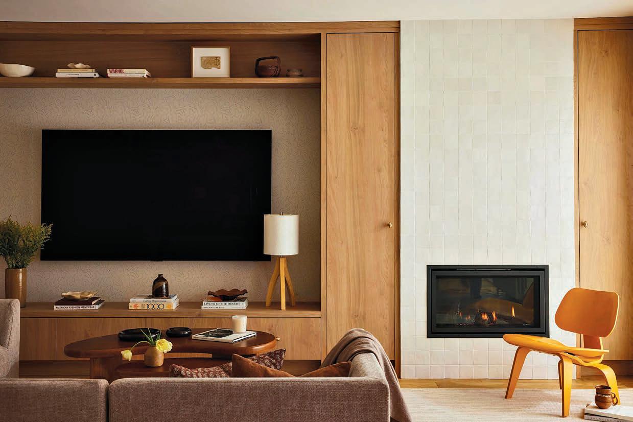
Love it, list it, orfix it
by BRENDAN CHARTERS • photos LAUREN MILLER PHOTOGRAPHY
For many families, the moment arrives when their home no longer fits their lifestyle or needs. It could be the kitchen feels cramped. Or the layout doesn’t support modern living. Perhaps energy costs are rising faster than expected, or the basement is leaking water.
In such cases, the instinct has been simple: Sell and move. But today, that course of action deserves a second look.
When you carefully account for the true cost of moving – real estate commissions, land transfer taxes (two times the tax in Toronto), legal fees, closing costs, moving expenses and the inevitable upgrades required in the
next house – the financial argument shifts dramatically. Factor in the newly expanded HST rebate opportunity for substantial renovations, and a powerful case emerges: Renovating your existing home is often the smarter financial and lifestyle decision.
In many cases, homeowners unknowingly leave $200,000 to $250,000 on the table when they
move instead of reinvesting in the home they already own. Those are unrecoverable costs that could otherwise be invested in making an existing home better. That’s potentially a lot of money wasted. Let’s unpack why.
Most homeowners begin their decision-making process by comparing purchase prices. But that’s only part of the story. Selling a home typically involves real estate commissions that can approach five or even six per cent of the sale price.
On a $1.5 million property (average price of a detached home in Toronto), that alone can represent $75,000. Then comes the land transfer tax on the new purchase, which in Toronto would exceed $52,000 using that same price range.
Add staging, any pre-sale prep (painting and small fixes?), legal fees, moving costs, mortgage discharge penalties, appraisal costs and closing adjustments, and suddenly you are well into six figures before you’ve even unpacked your first box. And here’s what most buyers discover next: The new house still needs work. Fresh
paint. Window coverings. Lighting upgrades. Storage improvements. Landscaping. Furniture adjustments. Small repairs. Minor renovations that quickly become major ones. It’s rare that a resale home delivers exactly what a family wants without compromise. What initially feels like a clean transition often becomes an expensive reset.
Imagine redirecting those same moving costs into your existing home. Instead of paying commissions and taxes that disappear the moment the deal closes, you could invest that capital into better insulation, improved layouts, additional living space, energy-efficient mechanical systems, or a redesigned kitchen that actually reflects how your family lives today. Those upgrades don’t vanish; they improve your lifestyle every day and increase your home’s long-term value. It also future-proofs your property against rising utility costs and evolving family needs. This is where renovating becomes not just a design decision, but a strategic financial one.
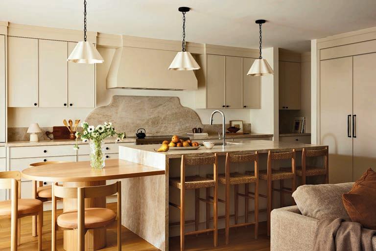
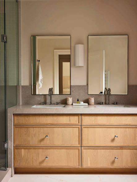
The recently enhanced HST rebate for substantial renovations represents one of the most important policy shifts homeowners have seen in years. Families undertaking major renovations can qualify for rebates upwards of $130,000, depending on the scope of work and eligibility conditions. That’s transformative. When combined with the avoided transaction costs of moving, you can effectively redirect hundreds of thousands of dollars into improving the house you already own, rather than spending it on relocation friction. Instead of paying taxes on moving, you can reclaim taxes while upgrading your home. That’s a rare opportunity.
As well, location matters more than ever. There’s a reason experienced real estate professionals repeat one piece of advice more than any other: Buy the worst house on the best street. Why? Because location drives long-term value.
When you renovate a well-located property, every dollar invested works harder. Improvements compound with neighbourhood desirability, school access, transit proximity and community stability. Trying to “find the perfect house” on the resale market often means paying a premium for someone else’s renovation decisions, choices that may not reflect your needs or your taste.
It also often comes with more competition with other home buyers seeking the same turnkey product. Renovating your own home allows you to control the investment and the outcome, and gives you a competitive advantage over others who lack the imagination and skill at identifying a diamond in the rough. That’s powerful.
Resale homes by nature mean compromising. Someone else chose the layout, the finishes and decided how the home interacts with the yard, the street and the light. Renovation flips that dynamic entirely – in your favour. It allows you to rethink how space is used, from open-concept kitchens to home offices and secondary suites that support multigenerational living or future income flexibility.
More importantly, it allows you to design with intention rather than reaction. That difference shows in how a home feels once it’s complete.
Energy performance is no longer optional. With utility costs rising and building standards evolving quickly, upgrading insulation, windows, HVAC systems and building envelopes is environmentally responsible and financially strategic. A thoughtfully planned renovation can dramatically reduce long-term operating costs, while improving comfort and resale value. It can also create a healthier living environment for you and your family.

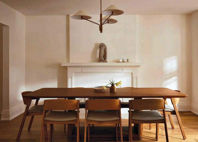
Homes built decades ago simply weren’t designed for today’s expectations, but they can be transformed. Doing that transformation now positions you ahead of the curve rather than chasing it later.
There’s also something less measurable, but equally important to consider. Homes hold memories. They anchor families to communities. They connect children to schools and friendships.
They tie daily routines to neighbourhood rhythms that take years to build. Renovating allows you to keep what already works while improving what doesn’t.
Instead of trading familiarity for uncertainty, you evolve your home alongside your life. That continuity has real value, even if it never appears on a spreadsheet.
When you add everything together –the avoided commissions, the double land transfer taxes in Toronto, the closing costs, the moving expenses, the inevitable upgrades to a new purchase and the potential sixfigure HST rebate now available for substantial renovations – the financial logic becomes increasingly clear.
Renovating isn’t just an alternative to moving. In many cases, it’s the better investment. It allows you to control the outcome, protect the location advantage, future-proof the property and redirect hundreds of thousands of dollars into improvements that benefit you directly.
When planning your own home renovation project, its always recommended to find the best professional you can afford to do the work. Experienced professionals can make the difference between a space that looks good and one that truly works.
by KATE CHAPMAN AND MARISSA GRAHAM photos MELANIE AT MANGO PHOTOGRAPHY
et on a beautiful rural property in Claremont, Ontario, this home’s mainfloor renovation was thoughtfully designed to better support the lifestyle of the semi-retired homeowners, which included social gatherings, hosting
family and enjoying the quiet forest views that surround their home.
The couple has been upgrading the 4,000-sq.-ft. home in stages. In this third project, and with each phase, the goal has remained the same: Create a home to live in that feels warm, functional and effortless.
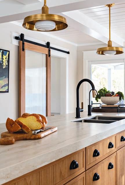
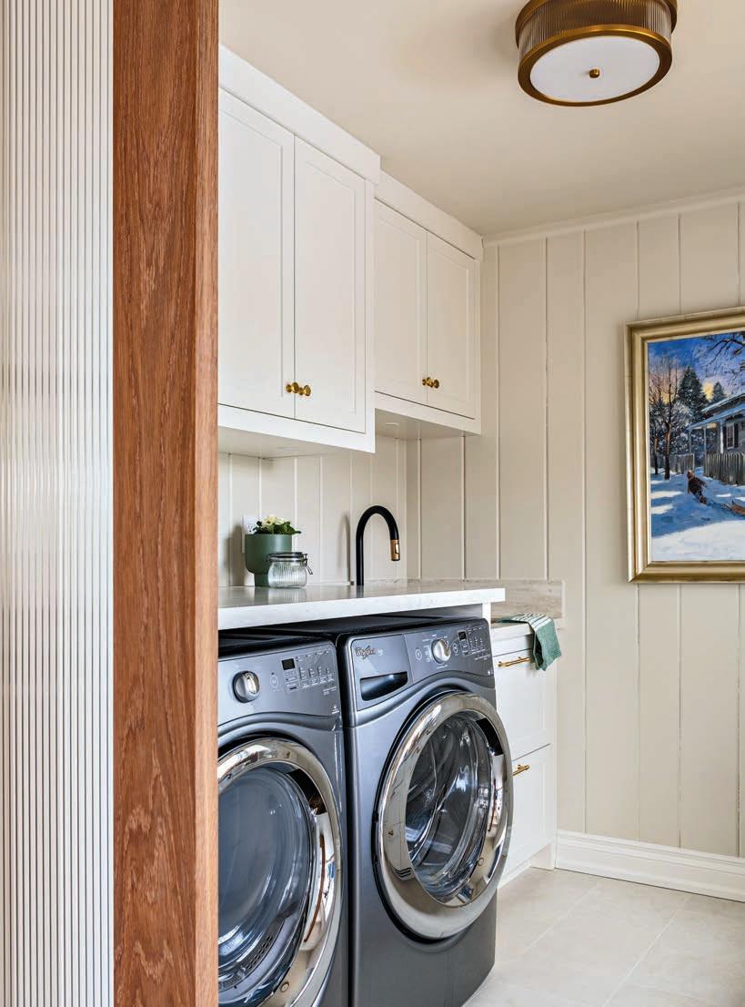
The sliding reeded glass door that separates the laundry room from the kitchen permits light to pass through while maintaining privacy. It’s a subtle feature, but one that adds character and function function.
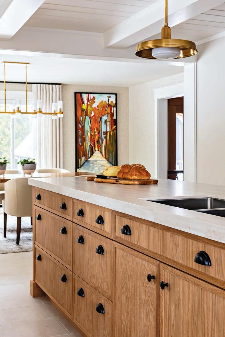
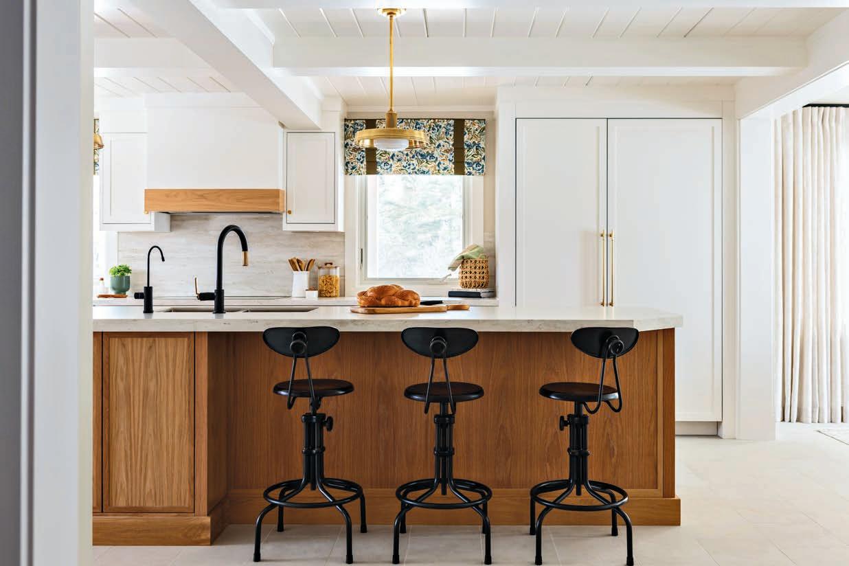
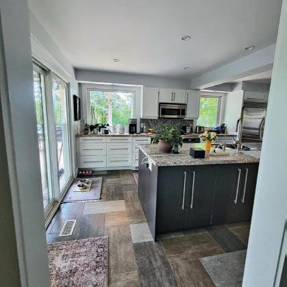
The focus this time round was to refresh the main floor kitchen, dining room and laundry area, keeping the existing 650-sq.-ft.-space intact, but giving the materials and finishes a major upgrade.
The original layout of the kitchen functioned well, but lacked the level of organization and timeless style the homeowners were looking for. Rather than make it larger, it was decided to
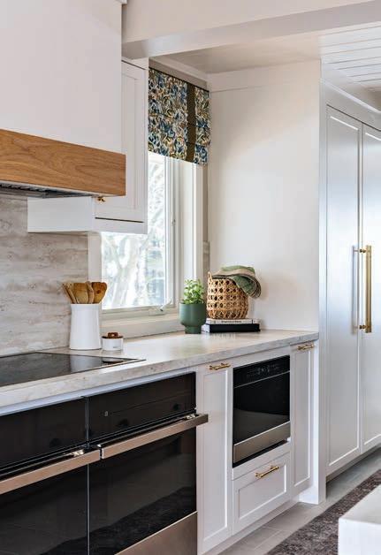
optimize and better use the existing footprint. Custom cabinetry was intentionally designed to incorporate a range of interior fittings such as a dedicated waste, recycling and compost sorting system; drawer dividers; tray and sheet organizers; and interior drawers, so everyday items are easy to access. Integrated appliances, including a generous stand-alone fridge and freezer, blend seamlessly into the cabinetry, creating a calm, uninterrupted backdrop.
At the centre of the room is a custom white oak island stained in a beautiful ashy brown that anchors the kitchen, bringing warmth and a natural focal point for gathering. Surrounding cabinetry stays soft and neutral, allowing the beautiful views from the windows to take focus. Natural light pours in from all sides, connecting the interior to the landscape beyond.
Materiality played a key role in tying everything together. Leathered Coverlam travertine was selected for the counters for durability and its rich texture, and is repeated in the backsplash to create a consistent and understated backdrop. Soft gold hardware and lighting were carefully chosen to echo the reeded glass detailing of the custom sliding wood door, introducing a quiet sense of continuity and adding a refined, cohesive layer of detail throughout the space.
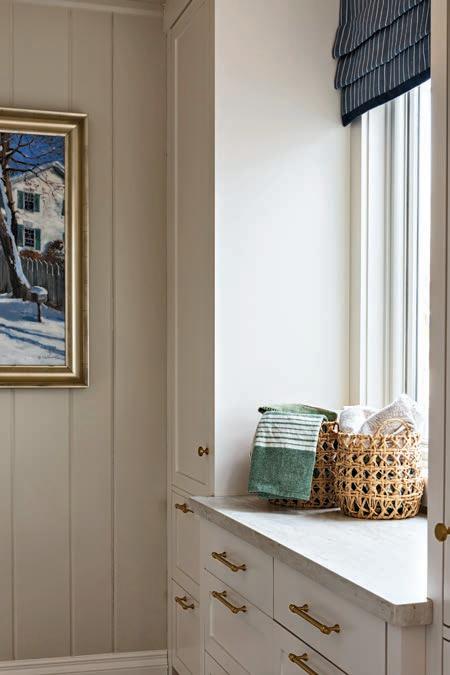
The kitchen ceiling is clad in V-groove millwork, echoing other areas of the home, adding warmth and subtle interest. The detail extends into the laundry room, applied to the walls to visually link the spaces and give even the most functional areas a sense of intention. The sliding reeded glass door that separates the laundry room from the kitchen permits light to pass through while maintaining privacy. It’s a subtle feature, but one that adds character and function.
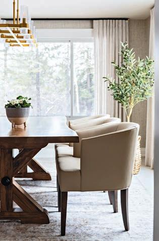
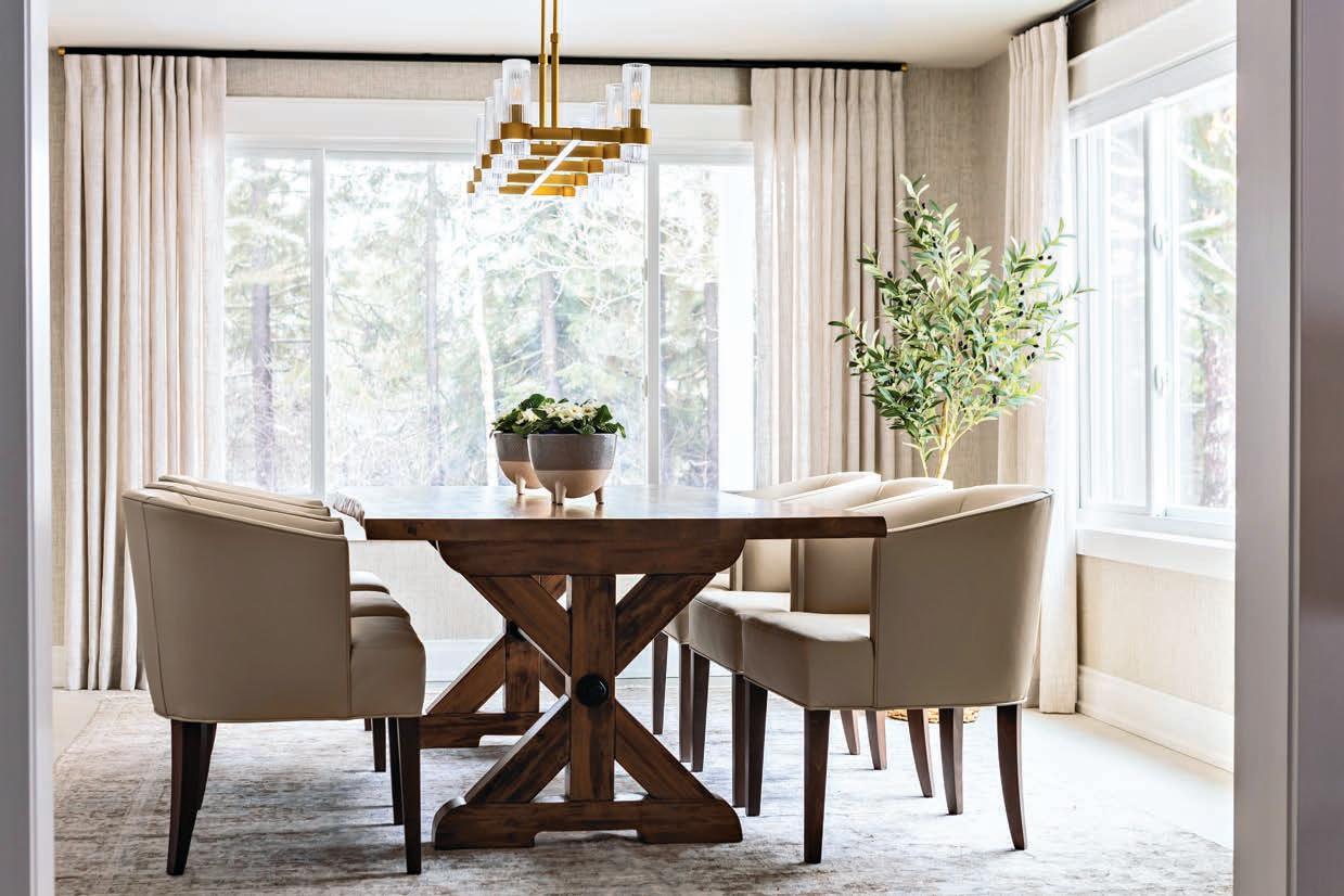
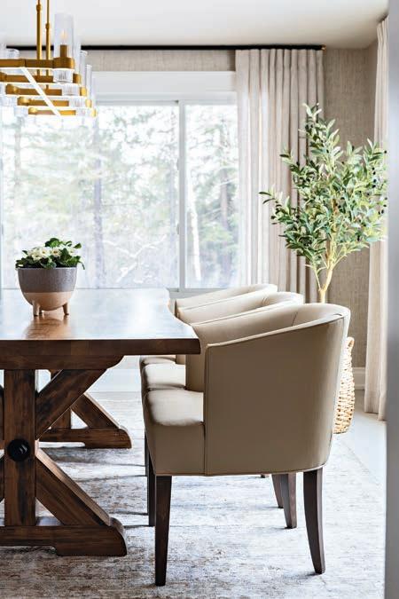
In the dining area, thoughts turn to gathering. A large table and tailored seating create a comfortable setting for long meals, while textured wallpaper brings depth and interest, the perfect canvas to display a collection of original Ontario art. Custom window treatments provide a
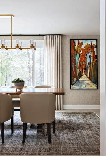
layer of softness and whimsy, bringing in pattern through the homeowners’ favourite shades of green. Subtle, yet full of personality.
A key challenge was working around the home’s windows and an existing structural beam that needed to remain. While it was important to create a more open-concept main floor, functionality remained essential. Generous below-counter storage was incorporated throughout, while cross beams and V-groove millwork were

used to transform the structural beam into a cohesive architectural feature.
The result is an upgrade that is in line with the previous renovations, while elevating how the main floor works day-to-day, designed not just for cooking, but for gathering, a space that supports busy family visits, quiet mornings, and everything in between.
lead designer
endlessideas.ca | IG: @endlessideasinteriors
by MARIAM ABOUTAAM
The primary ensuite is one of the most personal spaces in the home, yet it’s often approached purely from a functional standpoint. For me, it’s an environment that should feel grounding in the morning and restorative in the evening.
The space should support the quieter, in-between moments of the day, where mornings begin before the house fully wakes, and evenings slow down before rest. The most successful spaces feel effortless, where everything is exactly where it should be.
Layout is the foundation. A welldesigned primary ensuite should feel connected to the bedroom while still offering a sense of privacy, often transitioning through the walk-in closet. When this flow is resolved early, daily routines become seamless and uninterrupted.
Materiality plays a significant role in this room, which can easily feel cold if every surface is overly hard or polished. Introduce warmth through a balanced mix of finishes – wood tones, soft stone and layered textures that bring in a more residential quality. Incorporating radiant heated flooring adds another layer of comfort.
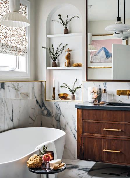
Start with the flow. Ensure a seamless connection between the bedroom, walk-in closet and ensuite.
Balance warmth and texture. Layer wood tones, stone and soft finishes to avoid a space that feels cold.
Incorporate radiant comfort. Heated floors add an understated layer of luxury and everyday comfort.
Elevate with plumbing fixtures. Select fixtures that complement your overall palette. Consider wall-mounted options to enhance function and visual clarity.
Separate key functions. If space allows, divide the tub and shower for a more spa-like experience.
Layer your lighting. Combine sconces, ambient lighting and decorative fixtures for flexibility.
Keep it calm and considered. Limit visual clutter and introduce simple, residential touches such as greenery. 1 2 3 4 5 6 7
The vanity is often the focal point. Depending on the home, it may be a piece that reads like furniture, with integrated shelving and refined detailing. Or, a wall-mounted approach that keeps the space feeling open and modern. In both cases, it should connect back to the broader palette of the home, so the transition into the ensuite feels cohesive.
Plumbing fixtures are one of the simplest ways to introduce personality. From polished and brushed chrome to warm brass, copper tones and matte black, each brings a different character to the space. Wall-mounted fixtures are a beautiful option that can free up countertop space, but they require careful coordination with the sink selection. Single-handle versus widespread configurations should align with the aesthetic and daily use.
Bathing spaces are where the room begins to take on a more restorative quality. Combined layouts are still

practical, but separating the tub and shower creates a more relaxed, spalike atmosphere. A freestanding tub invites you to slow down. The shower, however, is often the most frequently used feature. Layering tile through subtle pattern, tonal variation or a mix of finishes adds depth without overwhelming the space.
Lighting is another critical layer. Wall sconces provide softer, more flattering light, while a decorative ceiling fixture introduces a focal point, allowing the space to shift from bright and functional to calm and ambient.
Natural light enhances the experience even further. Soft window treatments that filtre daylight while maintaining privacy help create a more relaxed atmosphere. A stool, a side table, or greenery brings a lived-in quality that makes the space feel complete.
Ultimately, a well-designed primary ensuite should feel effortless and support the rhythm of everyday life.

by SARA DUCK • photos LUKE CLELAND
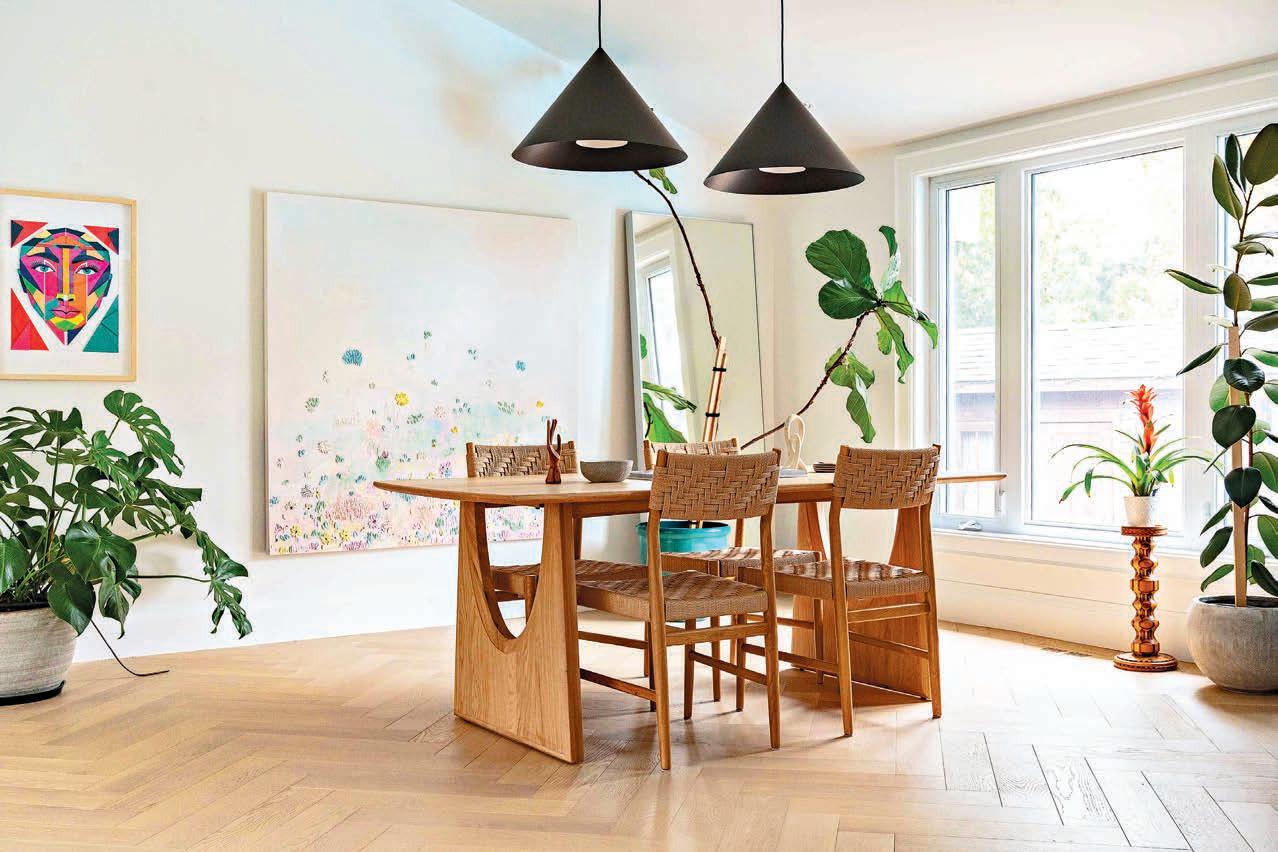
Contrast and calm meet in this whole
Set in Lorne Park, this 1970s home has been fully reimagined by Sansa Interiors as the personal residence of founder Jude Kamal. Designed as a family home and a retreat from the demands of running a design firm, the project reflects a clear focus on how the space functions day-today.
The design draws on organic shapes layered with contemporary
elements, using a sharp black-andwhite contrast to bring depth and definition throughout. Each decision supports flow, usability and a more holistic approach that unfolds as you move through the space.
“The non-negotiables were prioritizing natural light, creating intentional transitions between spaces and maximizing storage without clutter,” says Kamal. “These moves shaped the flow and feel of the home, not just the look. We also prioritized
the use of calming materials and palettes that are also fun.”
Informed by neuroaesthetics, the design supports mental clarity and stress reduction. Light, materials and acoustics work together to create a more settled environment from the moment you step inside. “This restrained yet rich palette acts as a quiet canvas, allowing the vibrant greens of indoor plants and the unique character of the artwork and fun materials to be noticed,” says Kamal.
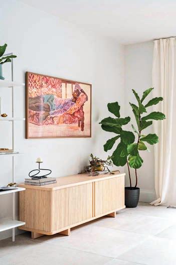
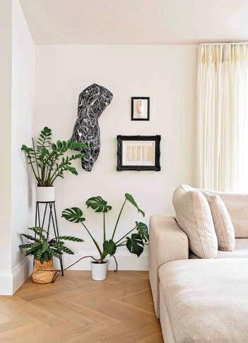
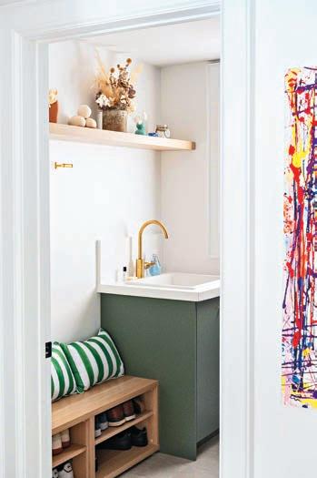
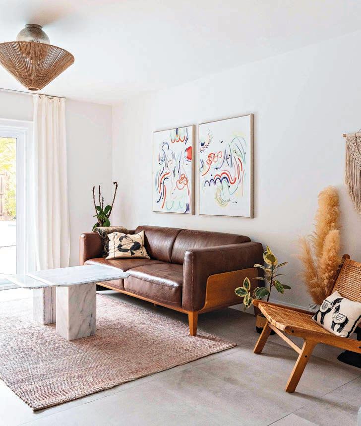
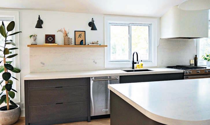
The main level was reworked to handle the realities of Canadian living and four seasons, where wet boots, pool days and everyday family
life overlap. A mudroom connects directly to the garage and doubles as a compact laundry space, with built-in storage for coats, shoes, towels and cleaning supplies. Everything has a place, and most of it stays out of sight.
From there, the space opens into a casual living area with direct views of the pool and backyard. It’s easy and relaxed. Indoor plants are layered throughout, softening the space and reinforcing the connection to the outdoors. The transition outside feels natural, helped by large-format concrete-look porcelain tile that runs throughout. It’s durable and slipresistant and keeps the space feeling continuous from inside to out.
There is also a shift in tone. While much of the home leans quiet, this level brings a bit more energy. Lighting stays simple but sculptural, including an inverted handwoven metallic globe fixture that adds texture without taking over.
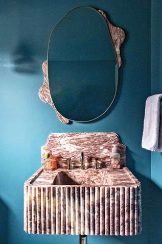
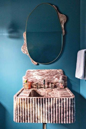
The powder room is fully colourdrenched in a deep blue, a clear departure from the rest of the home, and it works because of it. A custom fluted lilac-coloured marble sink becomes the focal point, paired with a matching mirror and polished nickel fixtures. It’s bold, but still controlled.
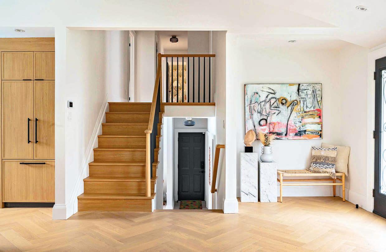
Herringbone flooring on the main level adds a sense of rhythm and balance. Rounded edges, soft curves, and subtle millwork shifts keep the spaces from feeling too rigid. “Curves were used sparingly and always tied to function,” Kamal says. “The goal was to add softness and approachability without leaning too heavily into trends.”
A staircase connects everything with a mix of old and new. White oak and charcoal tones tie it back to the kitchen, while Mediterranean-inspired detailing adds a layer of character.
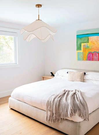
The second floor was reconfigured to better support family life with four bedrooms and two bathrooms. The primary bedroom is intentionally simple. Minimal furniture, soft textures, and a restrained palette make it a true retreat.
The ensuite introduces more texture without adding noise.
Speckled tiles are paired with jadegreen ceramic walls, while brushedbrass fixtures and fluted glass in the shower add subtle detail.
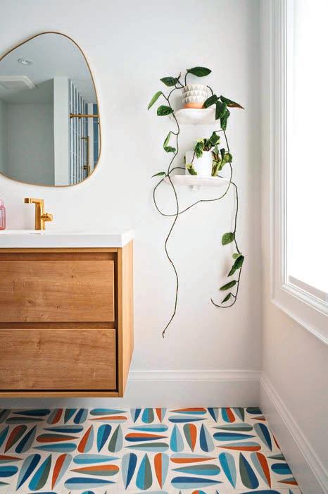
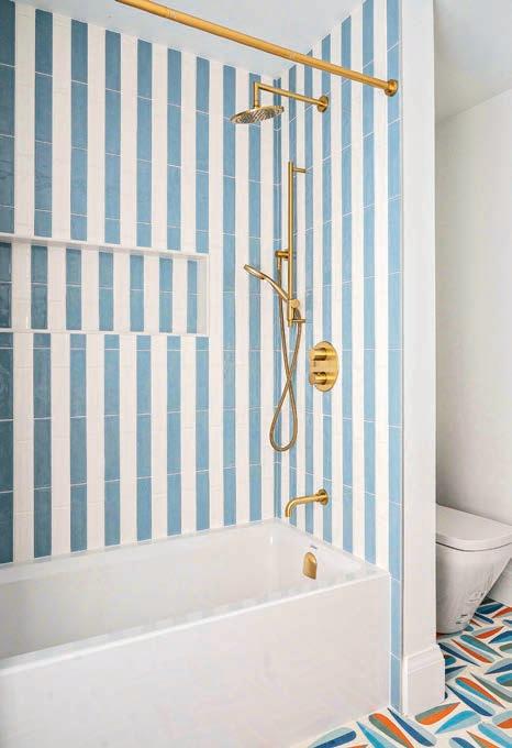
Other spaces shift in energy. The main bathroom is more playful, with geometric floor tiles and striped walls in earthy tones and blues. It’s brighter, more expressive and grounded by warm finishes.
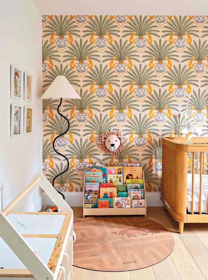
In the nursery, pattern and colour come forward through a handillustrated jungle wallpaper, paired with natural materials such as a white oak crib and cane detailing. “The thought process here was ‘contained maximalism.’ While

the walls are bold, the ceiling and trim remain crisp white to prevent visual overwhelm,” explains Kamal.
“We translated calm into design by limiting visual stimuli, using tactile materials, and creating clear zones for activity and rest,” says Kamal. “By stripping the home back to its studs, we reimagined the layout to prioritize wellness, natural light and functional minimalism – proving that a home can be a luxury statement and a deeply personal sanctuary.”
With more than 15 years’ experience as a magazine editor, writer and content creator, Sara brings her passion for design and decor to our pages each issue. Instagram: @bysaraduck
by SARA DUCK
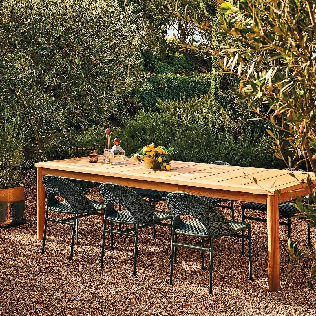
HOST WITH EASE ALL SEASON LONG WITH THESE ESSENTIAL PIECES THAT SET THE SCENE FOR DINING AL FRESCO.

Keep cool with this mini fan while entertaining fan!

1 2 3
A playful yet practical addition to your indoor plant styling, this borosilicate glass self-watering globe is shaped like a delicate bird. Simply fill with water and nestle into the soil near the roots. It’s an understated way to keep indoor greenery hydrated while adding a whimsical touch. Birdshaped self-watering garden bubble. $30. zarahome.com

5 6


10 9 7 4 8




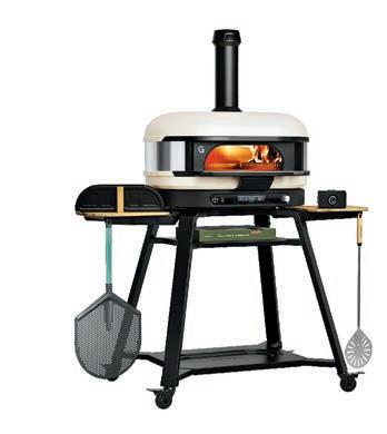
FROM OPEN FLAME TO CRISPED CRUSTS, THESE TOOLS WILL MAKE YOUR SUMMERTIME EATING FEEL EFFORTLESS AND ELEVATED.

1 2 3 4 5
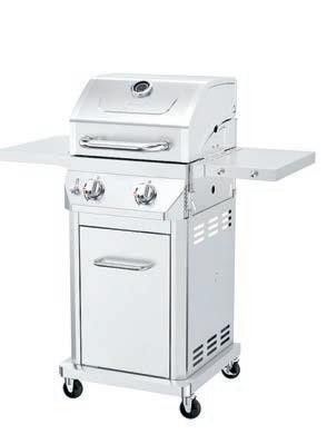


1. The complete grilling and barbecue cookbook. $54. indigo.ca
2. Two-burner stainless-steel propane BBQ grill convertible to natural gas by Nexgrill. $348. homedepot.ca
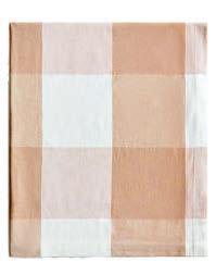
3. Grilling kitchen linen bundles in charcoal. $105. williams-sonoma.ca
4. Grill tool set. $200. zwilling.com
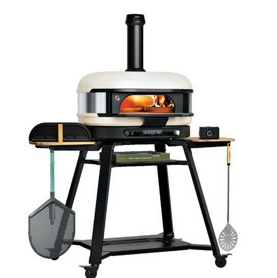
5. Dome XL ultimate bundle hybrid fuel propane pizza oven. $5,160. gozney.com
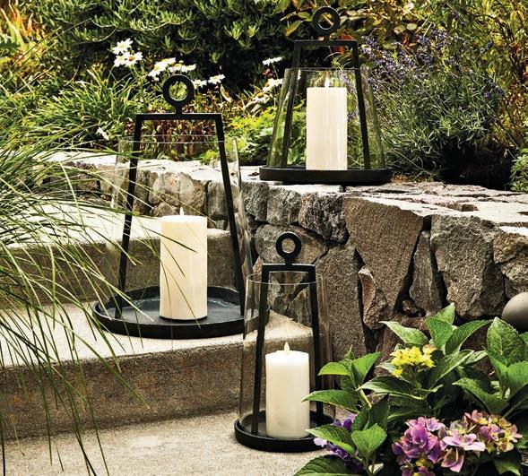
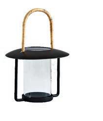
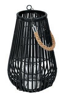
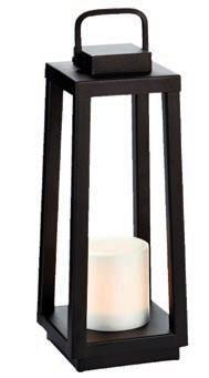
Dark lanterns ground an outdoor setting and add contrast, depth and a soft, ambient glow that feels intentional and atmospheric.
1. Easton forged-iron outdoor lantern. From $59. potterybarn.ca
2. Rattan-handled iron lantern in black. From $74. westelm.ca
3. Indoor/outdoor lantern by Canvas. $45. canadiantire.ca
4. Candle lantern. $60. linenchest.com 1 2 3 4
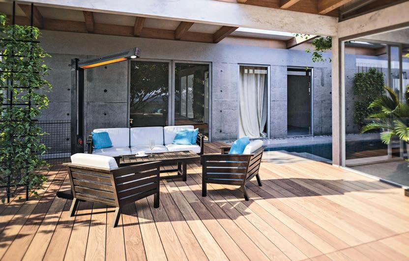
The Phantom Freestand Outdoor Electric Infrared Heater from Napoleon slips seamlessly into the landscape, offering quiet, targeted warmth without interrupting the visual flow. $849. napoleon.com
by SARA DUCK
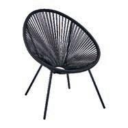
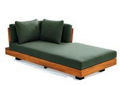
Outdoor lounge accent chairs that balance sculptural presence with real comfort, designed to anchor the backyard as they invite you to stay awhile

1

2 3 4 7 6 5 8 9 10





Bold restraint and a fearless palette redefine what it means to feel at home
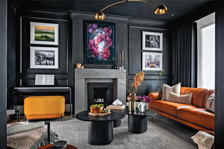
There’s a certain kind of house that asks to be pushed, a space where its structure is quietly waiting for something more expressive to take hold. In Roncesvalles, one such century home revealed itself not through photos, but in person. “We knew immediately that the listing photos weren’t doing it justice,” says lead designer and partner at Level Studio, Luca Campacci. “The bones were there for something dramatic.”
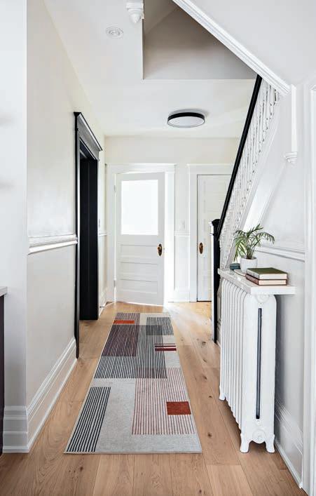
What followed wasn’t a full-scale reinvention, but something more considered: A series of deliberate moves that embraced contrast, tone and emotional resonance. The turning point came early. “The vision really came to life once we landed on the floor choice,” Campacci notes. A wider plank was chosen with a subtle yellow warmth, which quietly set the tone for everything that followed.
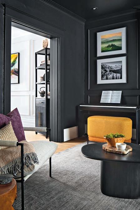
From there, the direction sharpened. The clients gravitated toward darker, moodier spaces, so the design team leaned in. “We suggested starting with a mock-up of an allblack living room and see where it goes,” he says. “The rest is history.”
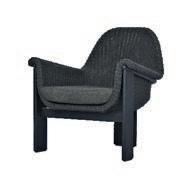
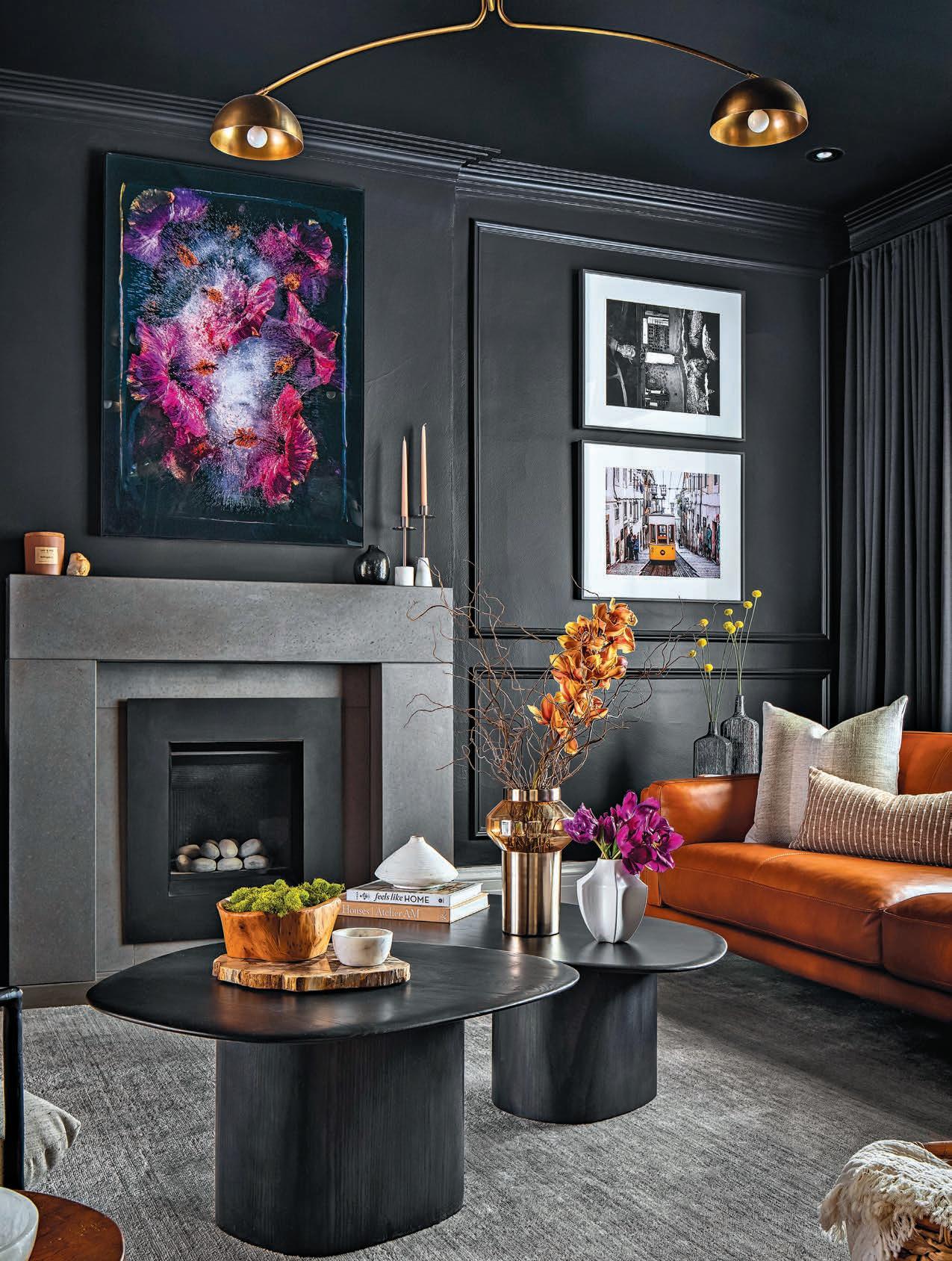
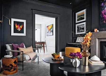
That living room now anchors the home with a kind of cinematic depth. Walls are rendered in toneon-tone black, but the effect is anything but heavy. Texture does the work. Soft drapery, supple leather and a neutral armchair temper the palette, while a caramel sofa and a yellow piano bench introduce just enough warmth to keep the space grounded. It’s a lesson that reveals bold doesn’t have to shout to hold attention.
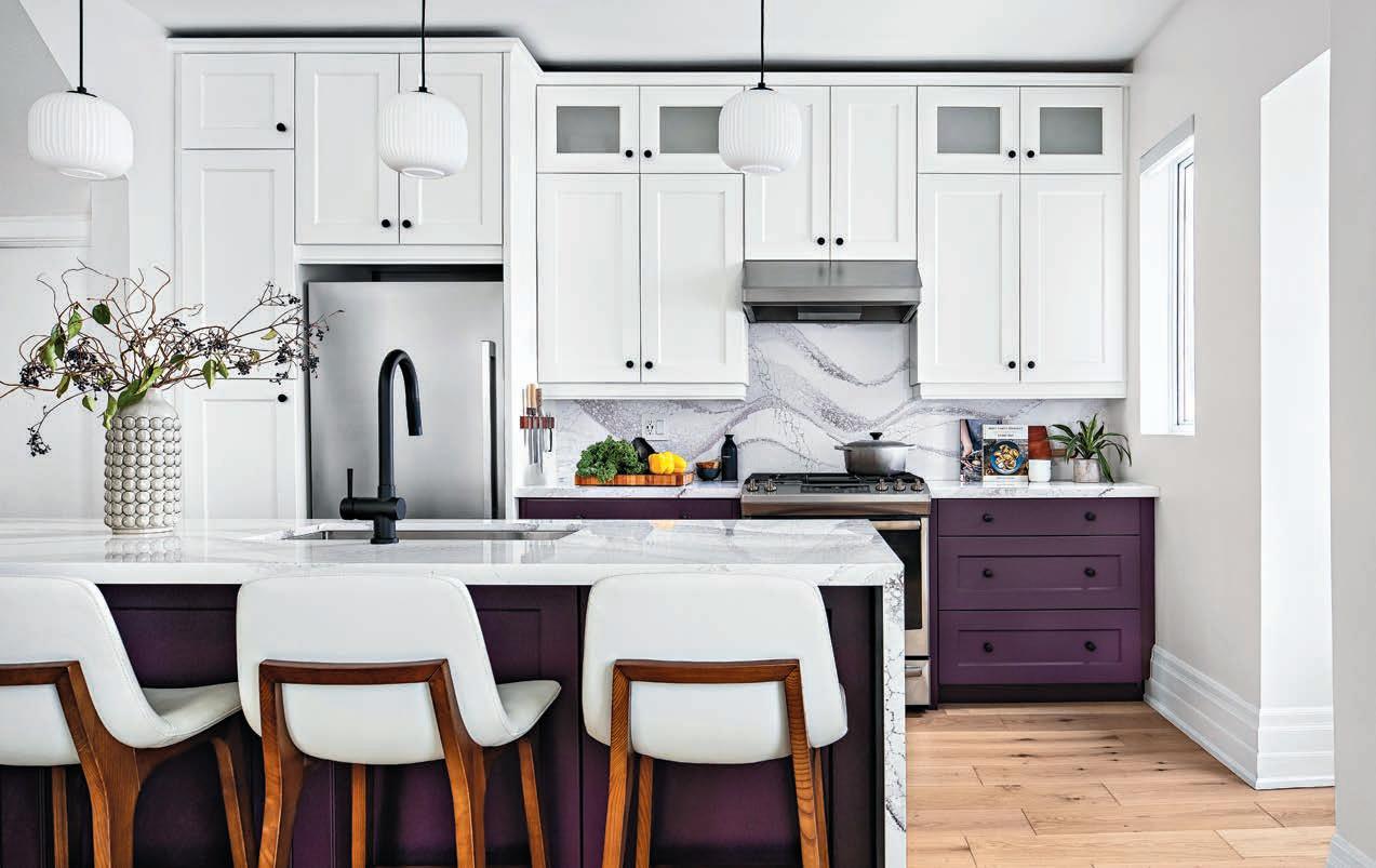
If the living room is where the home takes its risks, the kitchen is where it shows its discipline. Rather than starting from scratch, the team chose to work with what was already there. “The kitchen had genuinely good bones and a layout that already worked well,” Campacci explains. “Tearing it out would have been wasteful and unnecessary.”
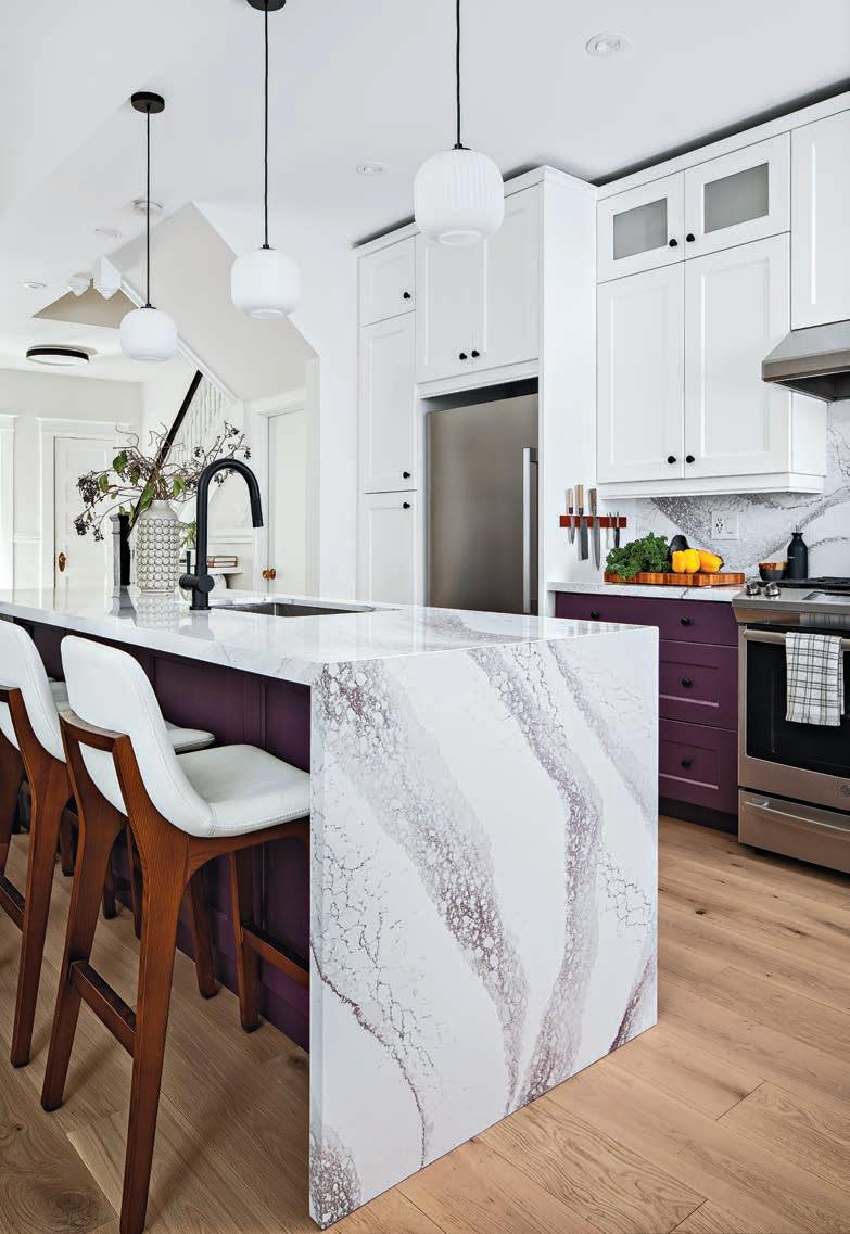
Instead, the space was refaced with new countertops, a fresh backsplash and a recalibrated colour story. That decision freed up the budget and the creative energy, allowing the design to focus on moments that would have greater impact elsewhere. “Knowing when not to demolish something is just as important as knowing when to go all in,” he adds.
Here, colour is treated less as decoration and more as structure. The approach is intuitive but precise. Lighter, more open spaces are punctuated with colour, while enclosed rooms are allowed to deepen. “We start with an anchor decision and let the rest follow,” Campacci says.
In the kitchen, that anchor becomes a deep purple applied to the base cabinetry and island, balanced by softly
When a material reinforces the colour story rather than just sitting alongside it, the whole scheme feels intentional rather than assembled
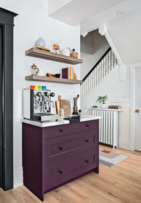
warmed off-white uppers. The real cohesion, however, comes from the stone, a surface with natural movement and subtle purple veining that quietly threads the palette together. Even the most functional requirements are approached with this same level of care. A custom coffee station (designed for clients with an extensive setup) could have easily disrupted the kitchen’s flow.
Instead, it becomes one of the home’s most thoughtful details. Integrated seamlessly into the existing cabinetry profile, it features warm oak floating shelves with built-in lighting. “What could have been an awkward addition ended up being one of the most personal and functional moments in the space,” Campacci says.
Art, too, is treated as part of the narrative. A limited-edition Bruce Boyd piece, Pink Hibiscus, hangs above the fireplace, its tones echoing the kitchen’s palette. It doesn’t read as a finishing touch, but as a continuation, another layer in a home that feels composed rather than decorated.
“When a material reinforces the colour story rather than just sitting alongside it, the whole scheme feels intentional rather than assembled,” he explains. That sense of intention carries throughout the main floor.
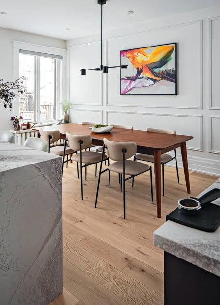
Wall panelling runs along the length of the dining room and into the living room, creating continuity, while nodding to the home’s history. It’s a subtle gesture, but one that keeps the space in its architectural roots.
Entryway casings are painted to frame the living room beyond “like a portal,” as Campacci describes it, drawing the eye inward and
heightening the sense of transition between spaces.
Throughout, there’s a clear understanding of longevity, not as neutrality, but as confidence. “Bold doesn’t have to mean trendy. Black walls are actually one of the most timeless choices you can make. It’s the how that determines whether it ages well.” The result is a space that reflects its owners.
“We want them to feel like themselves,” Campacci says. “This home has a personality. It’s a little dramatic, a little fearless and deeply considered. More than anything, we know this home feels like it was made for them, because it was.”
With more than 15 years’ experience as a magazine editor, writer and content creator, Sara brings her passion for design and decor to our pages each issue. Instagram: @bysaraduck
by MIMI PINEAU
Whether you’re refreshing a room or undertaking a full-scale renovation, window treatments are an essential finishing layer. From a design perspective, they balance decorative and functional needs, while adding softness, controlling light and privacy and introducing dimension and decorative layers to a room.
Privacy is often a primary concern. Consider proximity to neighbours, street-level exposure and the needs of specific rooms such as bedrooms and bathrooms. At night, large, uncovered windows can leave you feeling exposed.
Think about light control. Shift workers, light sleepers and families with young children often benefit from blackout options, particularly in bedrooms. In contrast, living spaces may call for softer light-filtering window treatments.
Drapery instantly elevates a space, framing views while adding softness, height and visual interest. With nearly endless fabric options, it can either quietly support or boldly define a room’s aesthetic. Drapery also absorbs sound, useful in busy households or condominium settings.
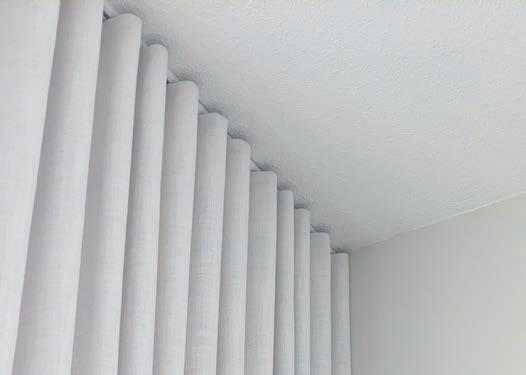
Hardware selections such as rods and finials, decorative trims and edge banding as well as the header (top edge) play a key role in defining style, from traditional pleats to modern ripplefold systems with clean, fluid lines.
Panels can skim the floor for a tailored look, gently break for an intentionally modern feel or puddle for added drama.
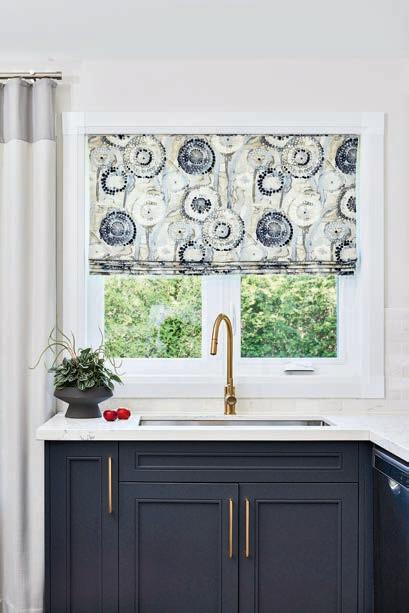
Roman shades combine softness with a tailored appearance. When raised, they stack neatly; when lowered,
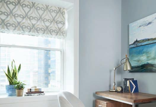
they provide full coverage and block the view. Light-filtering roller shades come in varying levels of opacity and strike a balance between privacy and natural light.
Fabric plays a central role in defining the look and feel of window coverings. Natural fibres such as linen, wool and cotton evoke a sense of ease and authenticity. Silk and other refined textiles introduce a more elevated, formal tone. Sheers create an airy quality, diffusing light, while synthetic fabrics offer design versatility and durability.
Designers often favour custom window treatments for its high-quality appearance and creative flexibility. With access to a wide range of fabrics, hardware and detailing, the result is a truly tailored finish.
For those taking a DIY approach, accurate measurements are essential. Thoughtful choices make a significant difference. Opt for a continuous drapery rod rather than an extendable version for a more polished look, and choose lined panels for added structure and longevity.
Window coverings are functional and expressive – an opportunity to enhance how your space looks, feels and lives.


Build your dream project with the right tools and materials from Home Hardware – Canada’s largest Dealerowned hardware, lumber, building materials, and furniture home improvement retailer with over 1,000 stores across Canada.
1(877) 940-5081
IG: @homehardware
FB: @homehardwarestores homehardware.ca
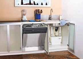
Create the kitchen or wet bar you really want – without breaking concrete. The powerful, compact Sanivite drain pump hides inside cabinetry, quietly handling hot water and grease from multiple fixtures and pumping it away for flexible, design‑forward renovations anywhere.
800.363.5874
IG: @saniflocanada
FB: @saniflocanada sfasaniflo.ca
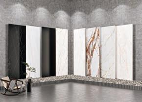
Discover Vicostone’s new Sintered Stone Collection, where timeless beauty meets unmatched performance. Crafted from nature and refined through innovation, these surfaces bring elegance, strength, and enduring style to every design.
905-760-7888
IG: @vicostonecanada
FB: @ vicostonecanada
sintered.vicostone.ca
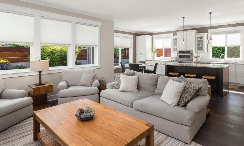
Here’s what is coming up in our next issue!
æ Smart home solutions
æ Styling strategies
æ Summer living
æ How to have a positive reno experience
Distribution will include:
• Interior Design Show - Vancouver
• Calgary Fall Home Show
• Canada Post targeted home delivery.
• Street boxes and retail locations.
• Design building centres and paint stores.
• On sale at major book stores.
• The digital edition, web and social will be used to promote the magazine.
• Magazine newsletters will be emailed to our large subscriber base.
by LANNY MCINNES
The Manitoba Home Builders’ Association celebrated outstanding renovation projects undertaken in Manitoba over the past year at the MHBA’s annual RenoMark Renovation of the Year Awards. This year’s event showcased entries across seven distinct award categories – Additions, Kitchens, Bathrooms, Exteriors, Whole House, Outdoor Structure, and Basement. Each nominated project exemplified the exceptional craftsmanship and innovation professional renovators bring to home upgrades. The winners were announced during the MHBA’s Renovation Awards Reception on May 15, 2026, with the full awards video available on MHBA’s YouTube page.
This year, 10 remarkable MHBA RenoMark renovators submitted a total of 44 diverse projects for consideration, each accompanied by comprehensive documentation including before and after photos, blueprints, detailed descriptions of the work undertaken, design nuances and supplementary information enriching the submission. A panel of judges meticulously evaluated each entry in every category to determine the deserving recipients.
Manitoba renovators have seen record levels of activity over the past few years. Homeowners continue to see renovating their homes as a great investment. This is the best time to look at changes you could or should make around the house. Everybody has something that they have been longing to improve in their kitchen. Bathrooms are being updated and modernized for comfort and practicality on a regular basis.

Many of us love our neighbourhood and love our house, but we also need change. Colours and styles from 10 years ago need a refresh. Basements can be more functional and provide more living space. Cooking becomes more of a chore in a room that stifles creativity and innovation. An addition is like creating a whole new living space; a whole new lifestyle for your family without the hassles associated with moving. The award nominated renovation projects featured in this edition can provide a great example of what you can do to make your own home more functional and livable.
If you’re considering a renovation, look to the standards and practices of a professional RenoMark renovator. The Code of Ethics and tips on what to look for when hiring a renovator can be found at the web site renomark.ca. The Manitoba Home Builders’ Association website is home to great tips, videos and a full listing of our renovator members by visiting homebuilders.mb.ca and clicking the “Renovating your home?” button.
Insist on the quality, professionalism and knowledge that come with a RenoMark renovator; your assurance of quality. To explore all the entries from this year’s RenoMark Renovation Awards, visit homebuilders.mb.ca/renovation-awards or scan the provided QR code. Your next renovation endeavour could be sparked by the innovative ideas showcased in this collection!


Lanny McInnes is president and CEO of the Manitoba Home Builders’ Association.
CATEGORY |

This thoughtfully designed two-storey front addition expands living space while preserving historic-character. Strategic planning overcame strict regulations and site challenges to deliver improved flow, private retreats, comfort and cohesive architecture – transforming a modest five-foot extension into a seamless, enduring family home.
CATEGORY | BASEMENT
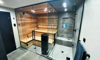
A highly functional lower-level that seamlessly combines a gathering area with gym and storage. The clients’ vision for a social entertainment hub and sauna retreat comes to life in a cohesive, inviting space that promotes both relaxation and connection.
CATEGORY | BATHROOM
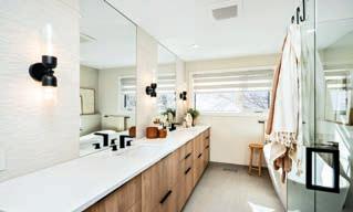
GRINDSTONE RENOVATIONS LTD.
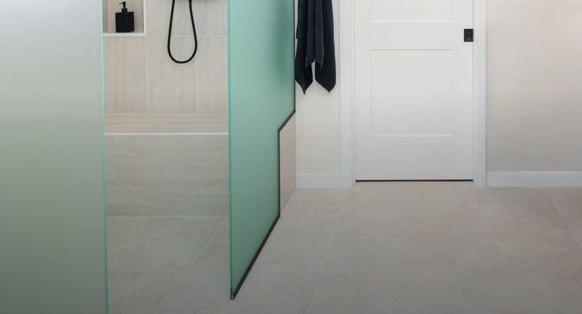
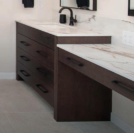
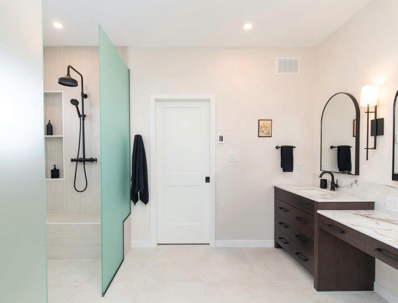
A former bedroom was transformed into a Scandinavian-inspired primary ensuite. Featuring a freestanding tub, expansive custom shower, dual vanities and heated floors, the redesign delivers calm minimalism and a purposeful space that the homeowners enjoy every day.
CATEGORY | BASEMENT

Transformed basement now delivers exactly what the homeowners envisioned. A spacious, inviting hub and a serene Zen bathroom that turns everyday routines into moments of calm. With smart layout changes and premium finishes.
CATEGORY | BATHROOM
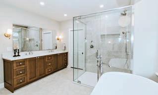
The Heritage Bathroom was a complete bathroom renovation to add more useable space while upgrading all fixtures. A custom stand alone tub, tile shower and dual vanities complete the space.
CATEGORY |

CATEGORY | BATHROOM
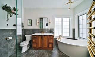
Upgrading newer ensuites make for tough decisions – what can you keep and what needs to go. When the layout isn’t working and the floor tile is integrated into the shower it doesn’t leave much choice, a total renovation is required.
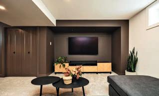
Once dark and underused, this basement was transformed into a warm, functional extension of the home. A new bathroom, upgraded staircase, soundproof music studio and thoughtfully designed living areas now support hosting, creativity and everyday family life.
CATEGORY | BATHROOM
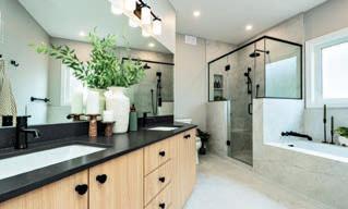
GRINDSTONE RENOVATIONS LTD.
This ensuite was redesigned to support aging in place without sacrificing style. A reconfigured layout, integrated soaker tub, enlarged custom shower and thoughtfully incorporated grab bars create a modern retreat built for long term comfort and independence.
CATEGORY | BATHROOM
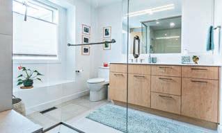
This renovation elevated the original ensuite into a modern, spa-like retreat, highlighted by a custom steam shower with expansive glass surround. Bright finishes, large-format tile and integrated cabinetry combined to create a space that feels both refined and effortlessly functional.
CATEGORY | EXTERIOR
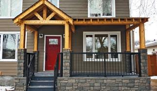
This exterior renovation completely refreshed the home’s curb appeal and performance. Upgrades included exterior foam insulation, stucco, roof, door and window cladding. Hardie plank siding and trim complement a craftsman-style cedar porch with faux stone skirting and durable composite decking.
CATEGORY | KITCHEN
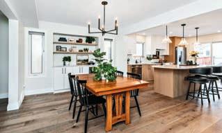
This full main-floor renovation reimagined a confined kitchen into an open, lightfilled family hub. Structural wall removal, two-tone cabinetry, integrated storage and a racetrack island design, create a space built for connection, entertaining and everyday life.
CATEGORY | OUTDOOR STRUCTURE

Designed to house classic cars while doubling as a welcoming gathering spot, the 650-square-foot structure pays homage to the original garage through its shape, colour and roof pitch – while elevating every detail.
CATEGORY | EXTERIOR

Set on a beautiful lake lot, our clients envisioned dedicated indoor spaces for focused work and elevated fitness – and as a bonus, their outdoor living spaces expanded with a blend of refined functionality with serene comfort.
CATEGORY | KITCHEN
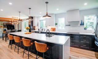
By eliminating restrictive walls, this cramped kitchen was entirely reimagined into an expansive, open-concept great room. The stunning new space is anchored by a massive 13-foot waterfall quartz island, custom two-toned cabinetry and seamless transitions for effortless daily living.
CATEGORY | OUTDOOR STRUCTURE
CATEGORY | KITCHEN
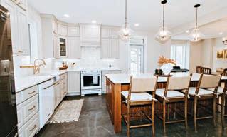
The Heritage Renovation was a main floor renovation with a heavy focus on the kitchen as a family meeting area. Great care and detail were put into all elements to form a cohesive and welcoming space.

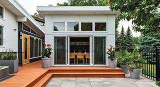
From a modest backyard to a modern mid-century outdoor escape, this project features a three-season gazebo, dedicated BBQ shelter and expansive wrap-around composite deck – creating a stylish, functional and family-friendly space perfect for seasonal entertaining, relaxing and enjoying time together.
CATEGORY | KITCHEN
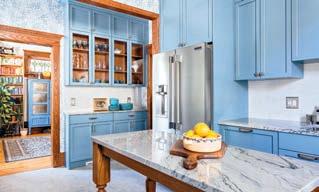
This gorgeous kitchen renovation successfully merged 100-year-old heritage with modern function. The blue paint, paired with the gorgeous wallpaper, establishes a bold aesthetic that deeply appeals to the homeowners’ desire for character.
CATEGORY | WHOLE HOUSE
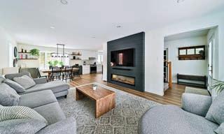
When a beautiful country acreage hits the market, but the house is a mostly original 80’s two-storey with good bones, what do you do? You make it yours! Out with the old and in with your modern touch.
CATEGORY |
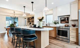
This project demonstrates how structural modifications and intentional design come together to create transformative results. We brought a vision to life by creating an open floor plan, which was built for every day living for their family of five!
CATEGORY | WHOLE HOUSE
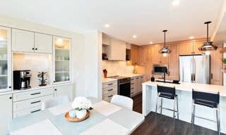
This renovation transforms the existing footprint into a seamless open-concept layout. Anchored by bold chevron tile and a custom entryway, the design maximizes flow. Modern finishes, including a highfunctioning kitchen and updated fireplace, balance sleek utility with warm, inviting style.
CATEGORY | WHOLE HOUSE
This whole-home renovation seamlessly blends a thoughtful two-storey addition with a complete interior transformation, improving layout, performance, and comfort. Historic charm is preserved through cohesive architectural details and timeless materials, creating a functional, light-filled home tailored for modern family living.

by LINDA MAZUR
We’ve all seen colour trends come and go, but one colour that always seems in trend, is blue. Why is blue always so popular? Because it’s a timeless colour that can evoke a certain calmness to a space and yet still be dramatic. It’s inviting, tranquil, bold and yet serene… and with so many hues and shades from which to choose, it can be the perfect statement maker. But with an endless selection of options, the question is: Which one should you use?
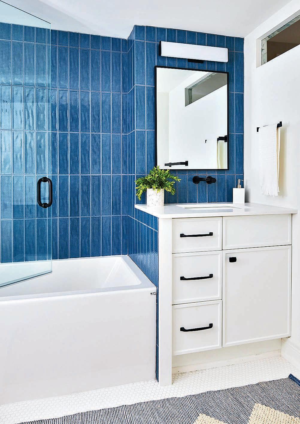
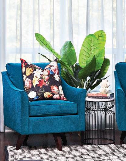
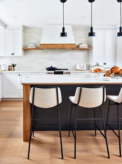
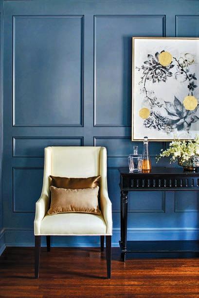
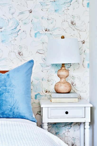
A lighter blue adds a certain freshness and serenity to a space. It can work just as a neutral would and pair great with almost all wood tones and colours. This could be a great choice for hallways, kitchens or bathrooms, to name a few. A light blue can give just a hint of colour to a room and be a great alternative to a simple white, especially in a sunfilled space. A couple of light shades to consider are Benjamin Moore’s Constellation (AF 540) or Windy Sky (1639) and Sherwin Williams Dew Drop (SW 9641).
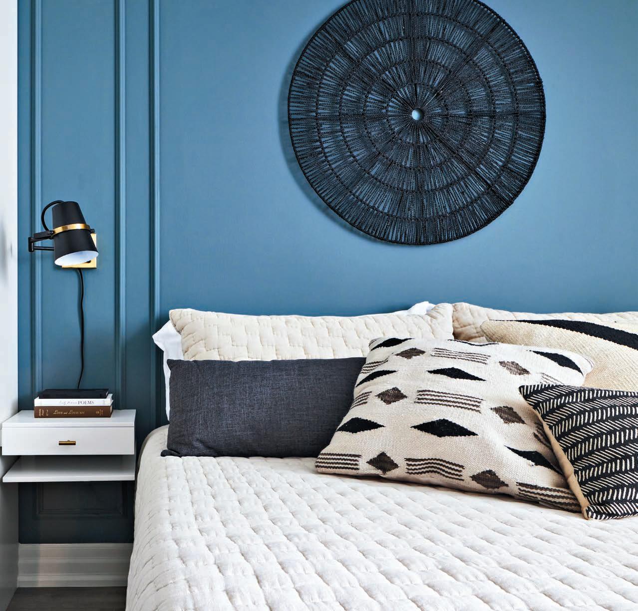
A mid-toned hue offers up great warmth and life. It’s very versatile for many different styles and aesthetics and can be ideal for feature walls, millwork, colour-drenching a space or layering within a space. This type of blue adds a certain energy to a space, while still being surprisingly relaxed and calming. It can be an ideal choice for a bedroom, or your main living and dining rooms. Some
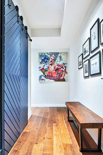
Blue is a timeless colour that can evoke a certain calmness to a space and yet still be dramatic
interesting selections are Sherwin Williams Distance (SW6243) and Blustery Sky (9140) or Benjamin Moore Santorini Blue (1634) and Stillwater (1650).
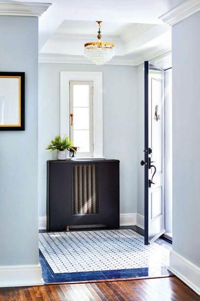
A deeper shade of blue can be rich and dramatic. This classic option can define a space, add interest, moodiness, luxury and a sense of sophistication. It pairs well with a multitude of colours and works great

on millwork, in a powder room or perhaps a home office. Darker blues that don’t disappoint are Benjamin Moore’s Gentleman’s Gray (206220), and Navy Masterpiece (1652), or Sherwin Williams Charcoal Blue (2739) or Rainstorm (5230).
The colour blue is so versatile, you’re bound to create a space that reflects your personality and style. Nonetheless, for the best results, there are some important things to consider before deciding what you like: Lighting, whether the room has natural, artificial or both; location; the desired mood of the space; will it be a focal point or used as an accent colour throughout; and finally, how committed are you to your choice.
Wherever you use decide to use blue in your home, you will ultimately create a welcoming and impactful space that you will enjoy for years to come.
LANESCAPE
l Custom Builder of the Year
by DAVE WILKES
It was an honour to celebrate the remarkable talent at the 2026 GTA RenoMark Awards on April 22 at the Bellagio event space in Vaughan.
More than 150 renovators and custom-home builders came together to celebrate excellence in craftsmanship.
Started in 1999, the awards recognize professional renovators and custom-home builders who are members of the Building Industry and Land Development Association (BILD) and the RenoMark program for their quality of work, innovation, customer service and industry leadership. The program is the largest of its kind in Canada. This year, BILD received 85 submissions in 20 categories, including the prestigious Renovator of the Year category.
I am always impressed by the high number of top calibre submissions and how our members continue to set a new standard with every passing year. This awards season was no different.
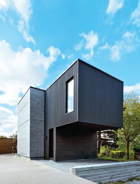
Top honours went to Sunnylea Homes, which was named Renovator of the Year. Lanescape was named Custom Builder of the Year; Norseman Construction won Best Overall Custom Home; and MENATWORK took home six awards, including Best Overall Space Renovation and Best Overall Home Renovation.
Renovating and building with confidence means working with a trusted contractor. For homeowners who want to find a participating renovator or custom homebuilder in their area, visit the RenoMark website at renomark.ca.
l Best Commercial Renovation
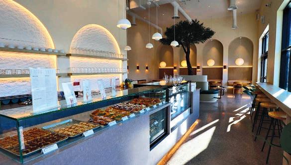
NORSEMAN CONSTRUCTION
l Best Custom Home under $2 Million
l Best Overall Custom Home
Dave Wilkes is President and CEO of the Building Industry and Land Development Association (BILD), the voice of the home building, land development and professional renovation industry in the GTA. For the latest industry news and new home data, visit www.bildgta.ca.
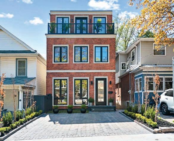
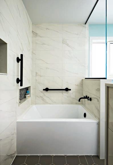
l Best Adaptiv Home Renovation
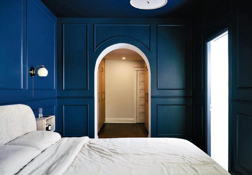
l Best Renovation (no addition) under $300,000
l Best Renovation (Addition) under $500,000
l Best Custom Home over $2 Million
l Renovator of the Year
l Best Condominium Renovation over $200,000
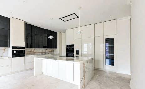
l Best Innovative Renovation
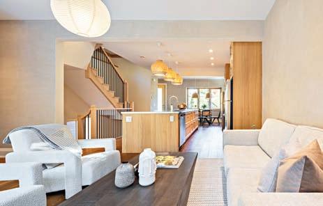
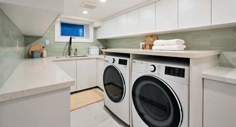
SELECT DESIGN BUILD INC.
– TASCO APPLIANCES
l Best Renovation (no addition) over $300,000
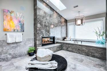
LIFESTYLES BY BARONS INC.
l Best Washroom Renovation
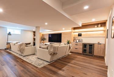
PINE GLEN HOMES
l Best Basement Renovation
l Best Kitchen Renovation under $100,000
l Best Kitchen Renovation over $100,000
l Best Overall Space Renovation
l Best Renovation (Addition) over $500,000
l Best Overall Home Renovation
l Best Exterior Home Renovation (Excludes Landscaping)
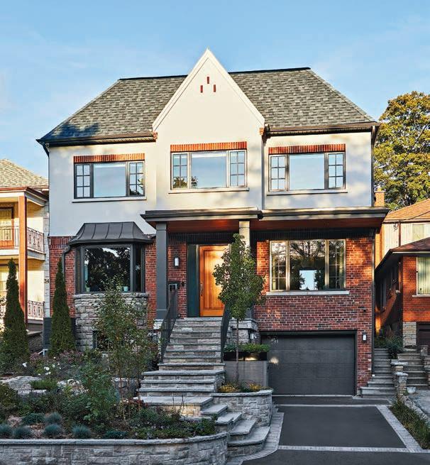
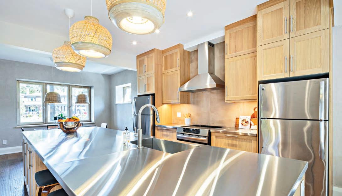
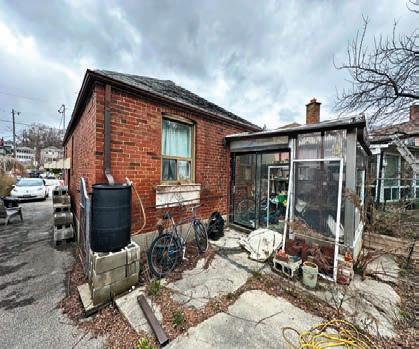
This project by Greening Homes transformed a deteriorated post-World War II bungalow into a resilient, all-electric, multi-generational home within an established urban neighbourhood. Two storeys were added vertically, expanding the house from 1,310 sq. ft. to 3,464 sq. ft., while dramatically improving performance. The expansion allows for three generations to live in the home.
The site presented major constraints. Located at the base of a ravine, groundwater was discovered directly beneath the slab, making underpinning impossible. To solve the issue, the ground floor was raised to achieve basement headroom,
and robust waterproofing was introduced to ensure durability. Limited site access and zoning variances further complicated construction. Despite these challenges, the design team prioritized retaining the existing structure to preserve embodied carbon.
Following Passive House design principles, the building was converted into a resilient, low-carbon, multigenerational dwelling following specific and strategic design decisions. For example, adaptive reuse and low-carbon materials such as cellulose insulation, wood-fibre exterior panels and reclaimed finishes significantly reduced embodied carbon. Other
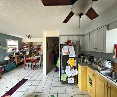
changes included a high-performance envelope design that included: All-electric mechanical systems such as heat pumps and an energy recovery ventilator; on-site renewable energy with a solar photovoltaic array offsetting approximately 69 per cent of annual electricity use; and portable rainwater harvesting using
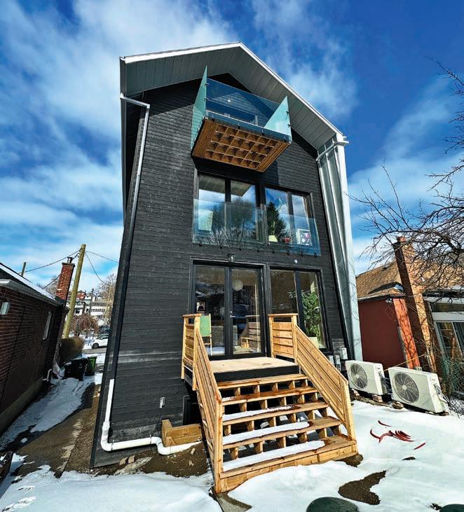
a 1,500-gallon tank and filtration system to supply roughly 31 per cent of household water demand. As well, triple-glazed windows frame ravine views while reducing heat loss; vapour-open wall assemblies use damp-packed cellulose insulation and exterior wood-fibre panels to achieve high thermal performance; heat pumps provide heating and cooling; and an ERV supplies filtered fresh air. Hot water is provided by a heat-pump water heater with drain-water heat recovery.
To reduce costs and embrace sustainable choices, the use of reclaimed and deadstock materials was encouraged, including vintage doors, barn-board ceilings and flooring. When unexpected construction challenges affected the budget, a volunteer earthen plaster event helped complete the clay plaster walls while maintaining the design intent.
Community participation played a direct role during construction. A volunteer “plaster party” brought
together neighbours and sustainability advocates to apply natural clay plaster when funds for finishes were limited. The event strengthened social connections, while sharing knowledge of natural building techniques. The project also served as an educational resource. Students from the George Brown College Renovation Program visited the site to learn about lowcarbon retrofit strategies.
The landscape incorporates ecological and productive elements. An edible garden and small food forest support biodiversity while providing food for the household. A third-floor drying room allows produce from the garden to be preserved, reinforcing the relationship between the building and landscape. Water management is supported by the potable rainwater harvesting system. Rainwater from the untreated galvalume roof is collected in a 1,500-gallon underground tank and treated through multi-stage filtration and ultraviolet purification, supplying approximately 31 per cent of the household’s annual water demand.

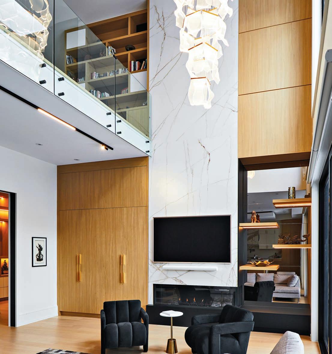
Daylighting and fresh air were key design priorities. A central stair functions as a vertical light well, bringing daylight into the core of the home and reducing the need for artificial lighting. The streamlined floorplan minimizes hallways and maximizes naturally lit spaces. Operable windows allow ventilation and cross-breezes when conditions permit. Mechanical ventilation is provided through a high-efficiency ERV, delivering continuous filtered fresh air while recovering heat from exhaust air. With the airtight envelope, this system maintains excellent indoor air quality with minimal energy loss.
The design promotes wellbeing. Interior finishes include natural clay plaster, low-VOC coatings, and CARB2-compliant flooring. Red Listfree adhesives and flashing support a healthy indoor environment. Reclaimed wood elements and biophilic design strengthen the connection to nature through large windows overlooking the ravine and a cantilevered sleeping deck. Shared living areas organized around a centrally located kitchen encourage daily interaction and support the social benefits of multi-generational living.
by OLIVIA BAILEY
Numbers. There’s something quietly magical about numbers, especially in design. They aren’t just measurements on a tape or points on a grid – they are the invisible thread that ties a
room together. Great design isn’t only about picking the perfect sofa or a statement chair; it’s about how every piece relates to the room and to each other. Every choice, from the distance between a coffee table and a chair to the placement of a lamp, shapes the way a space feels. It’s in these subtle
relationships that a room moves from ordinary to extraordinary.
One of my favourite tricks comes from art and photography: The Rule of Thirds. It’s surprisingly simple but incredibly effective. Imagine dividing a room into three equal parts, horizontally and vertically. Placing
Use the Rule of Thirds to position key furnishings and focal points for natural flow.
Embrace negative space to give your favourite pieces room to shine.
Group objects in odd numbers and varying heights to create visual intrigue and rhythm. 1 2 3
key furniture and accessories at those intersections creates balance and guides the eye through the space. If it feels abstract, take a photo and sketch a quick grid. This small adjustment can transform a room from cluttered to curated, making every element feel chosen.
Negative space is just as important as what we fill a room with. The areas we leave open – the walls, the floor, the space between furniture – aren’t empty; they’re intentional pauses that let the eye rest, highlight favourite pieces and enhance circulation. Too much furniture or too many accessories can make even the most beautiful room feel crowded. A little breathing room gives the space an effortless elegance.
Odd numbers are another secret to making a room feel alive. Group objects in threes, fives or sevens to create a sense of natural rhythm. Perfect symmetry can feel stiff, while asymmetry invites curiosity and exploration. Mixing textures and heights within the grouping – a tall vase, medium sculpture and low tray – adds layers of visual interest that feel dynamic and intentional.
Ceiling height is often overlooked, but it influences every design decision. High ceilings welcome dramatic furniture and artwork, while cosier rooms benefit from lower-profile pieces. Horizontal artwork, floating shelves and open sight lines make a lower-ceilinged room feel airy, while floor-to-ceiling drapes or tall shelving

emphasize grandeur in a room with soaring ceilings. Considering vertical scale ensures that each room feels balanced from bottom to top.
Accurate measurements are nonnegotiable. Know the dimensions of your space, the paths people walk and the locations of doors and windows. Measure hallways, stairwells and doorways, so nothing arrives too big or too small. A simple trick is using painter’s tape on the floor to map out the footprint of new furniture before it’s moved in. This saves mistakes, avoids frustration and allows you to see the flow of the space in real time.
Lighting is another subtle, yet powerful, element in design. How natural light interacts with a room, combined with well-placed lamps and fixtures, affects the perception of scale, colour and mood. Layering lighting with ambient, task and accent options create a welcoming environment at any hour, highlighting the details you love most.
Above all, trust your instincts. The numbers are guides, not hard rules. Your eye, your taste and the way a room feels when you step inside matter more than any calculation. Experiment with scale, grouping and proportion. Leave room for surprise and personality. A curated space has been lived in, loved and thoughtfully arranged.
Design is a dance between math and instinct. Combine careful measurements, a thoughtful eye and a little creativity, and a room is more than a space – it’s an experience.
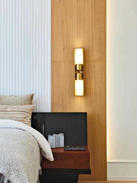
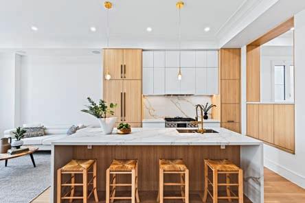
Olivia Bailey is the creative director and principal of Olivia Bailey Interiors, a Toronto-based luxury design studio celebrated for its refined, contemporary aesthetic. Serving Toronto, the GTA, across Ontario and nationally. oliviabaileydesign.com IG: oliviabailey.interiors
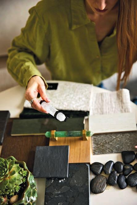
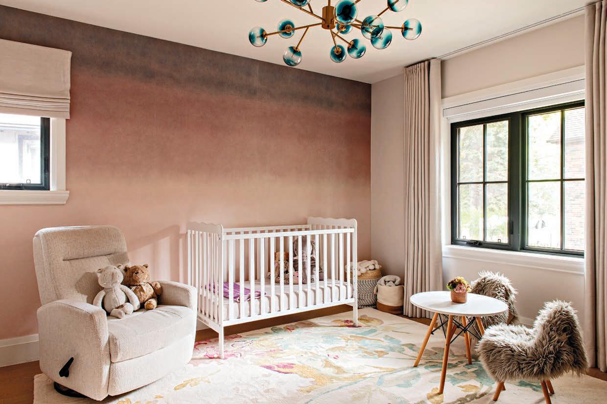
by JESSICA CINNAMON • photos MIKE CHAJECKI
olour, in a nursery, has a different kind of responsibility. It’s not just about how a space looks. It shapes how it feels in the quieter, in-between moments: Early mornings, late nights and the soft rhythm of daily routines. Pastels can strike a rare balance, bringing
colour in a way that feels gentle but intentional, with just enough presence to define the space without overwhelming it. When layered thoughtfully, it creates an environment that is calm, elevated and surprisingly enduring.
In this baby’s room, the foundation begins with a palette of softened
tones – a slightly dusty blush, muted lavender with a grey undertone, pale sage that feels grounded and a warm cream to tie it all together. It’s a combination that is quiet without being predictable. Pastels aren’t about colour in the traditional sense, they’re about atmosphere. When the undertones are aligned, the room
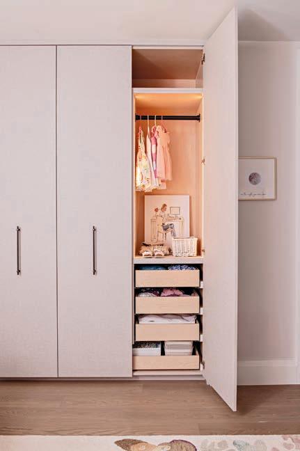
Finishes matter. A subtle satin or matte finish keeps things feeling modern and tailored, while thoughtful detailing such as simple millwork and clean hardware ensures the space doesn’t skew overly precious.
starts to feel cohesive before you’ve even introduced furniture.
Wallcoverings help set the tone in a way paint alone often can’t. I’m drawn to patterns that almost feel incidental, such as delicate botanicals, barely there geometrics, or something that looks hand-painted and slightly imperfect. These details bring a quiet depth to the walls without taking over the space. Paired with a complementary, tonal paint colour, the effect is seamless.
Cabinetry is introduced as a moment of intention. A built-in or
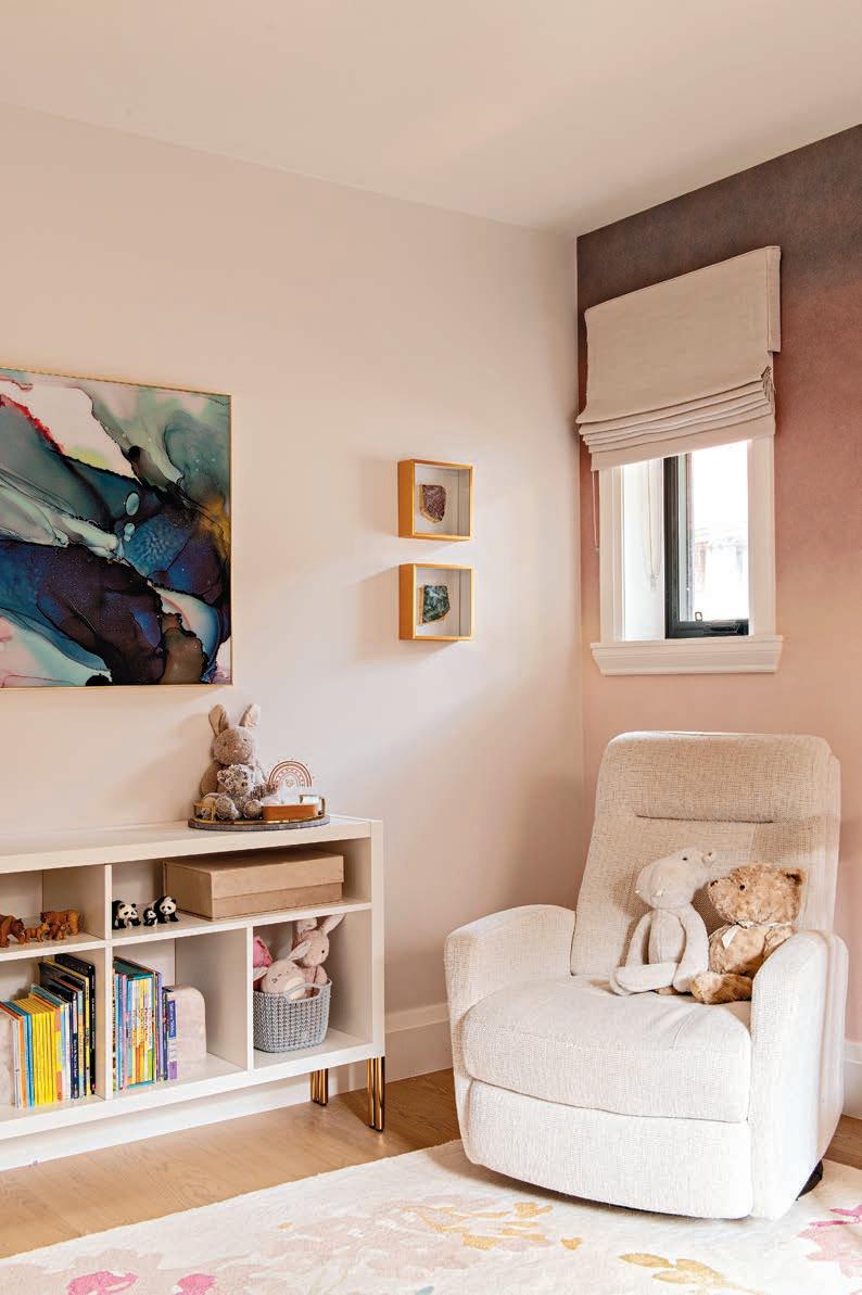
dresser in a soft pastel adds structure while maintaining the room’s softness. It’s less about making a statement and more about creating a focal point that feels integrated.
Lighting is where you can gently push the colour palette, especially when incorporating a sculptural fixture, particularly in coloured glass. A pendant or small chandelier in a turquoise-green hue as seen here, adds just enough contrast to keep the room from feeling too quiet, and brings warmth in an unexpected way.
Underfoot, the rug acts as the anchor, gently reinforcing the overall palette. A tonal pattern or a textured weave works beautifully, echoing the colours already at play, but with some added dimension. Of course, a rug is one of the most practical layers in a nursery – soft, forgiving and durable. What makes a pastel space feel elevated rather than overly themed is the layering and tonal variety. Instead of leaning into one dominant colour, let shades quietly repeat across the room.
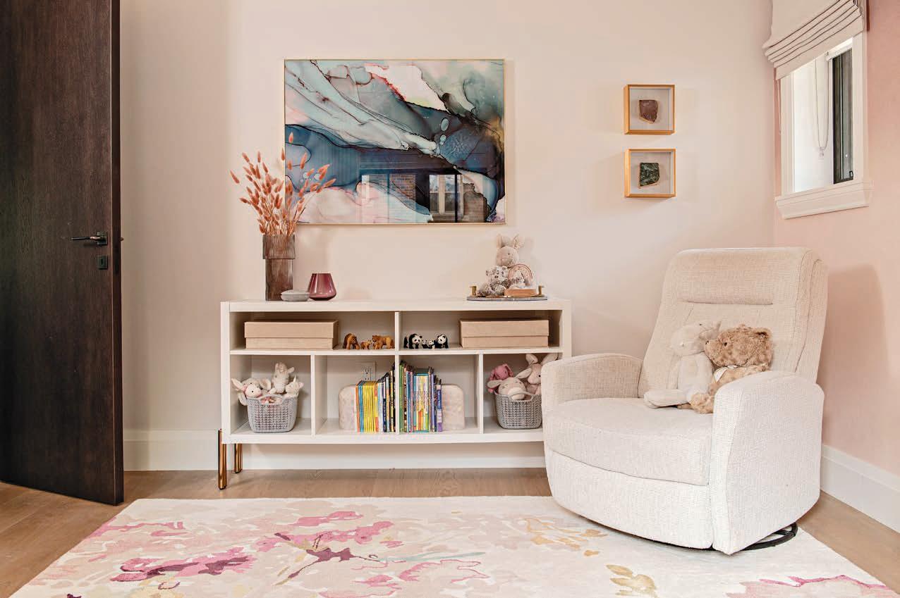
A hint of blush in the wallcovering might reappear in the rug, while that soft sage shows up again in cabinetry or trim. These small details create continuity and make the room feel curated.
Equally important is knowing when to ground the palette. Pastels, by nature, can drift into something overly delicate if left unchecked. Warm neutrals, natural wood tones, or even a touch of brushed metal add contrast and structure. A wood crib or a side table in a slightly deeper finish, for example, can anchor the space beautifully, ensuring the room has

When working with pastels, choose one leading tone and build outward using two or three complementary shades within the same undertone family. That consistency is what keeps the space feeling cohesive. From there, introduce contrast through texture and natural materials rather than sharper colour shifts. It’s a simple approach, but it’s what gives a pastel nursery its sense of ease and ultimately, its staying power.
A pastel nursery should feel as though it can grow with the child and the family, not be outgrown by it. When the palette is handled with restraint and intention, it becomes less about trend and more about creating something that can shift subtly over time with new layers, pieces and personality. The beauty is in that flexibility.
longevity and can evolve as the child grows without feeling too tied to a single moment.
A well-considered mix of soft colour, natural materials and thoughtful detailing creates a space that feels calm in the early days, but still relevant years down the line.