TURNER acknowledges First Nations peoples as the Traditional Custodians of the many lands upon which we gather, work and journey across. We recognise their ongoing connections to land, sea and community and pay our respects to their Elders past and present.
We are committed to working alongside First Nations people
to advocate for Connecting with Country principles through the work we do while operating on land that always was, and always will be Aboriginal land.
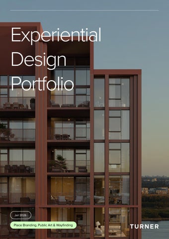
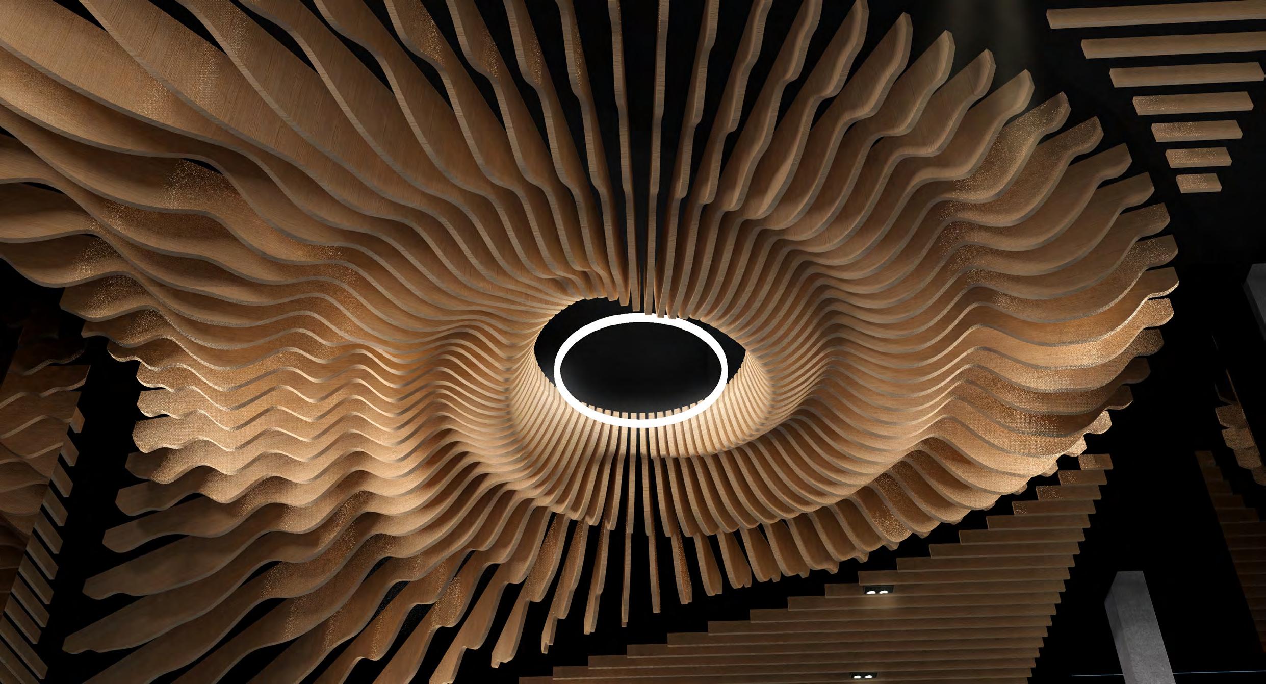
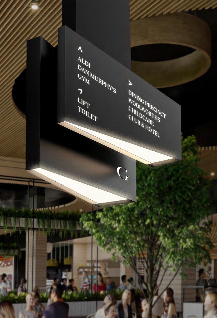
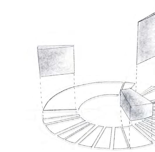
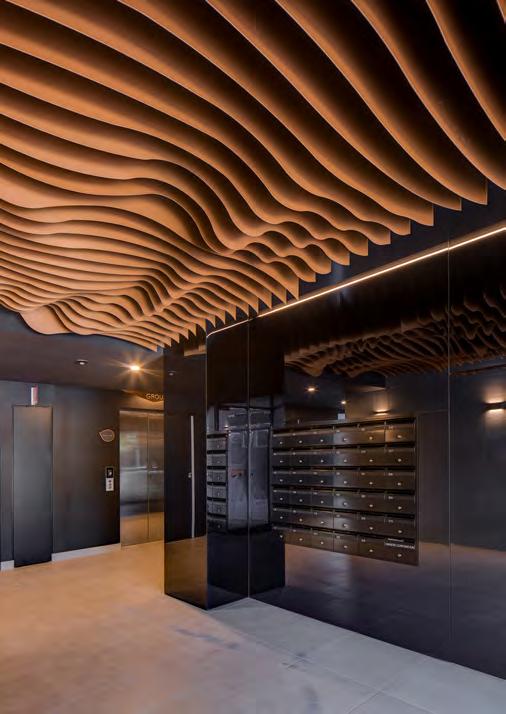
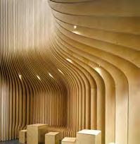
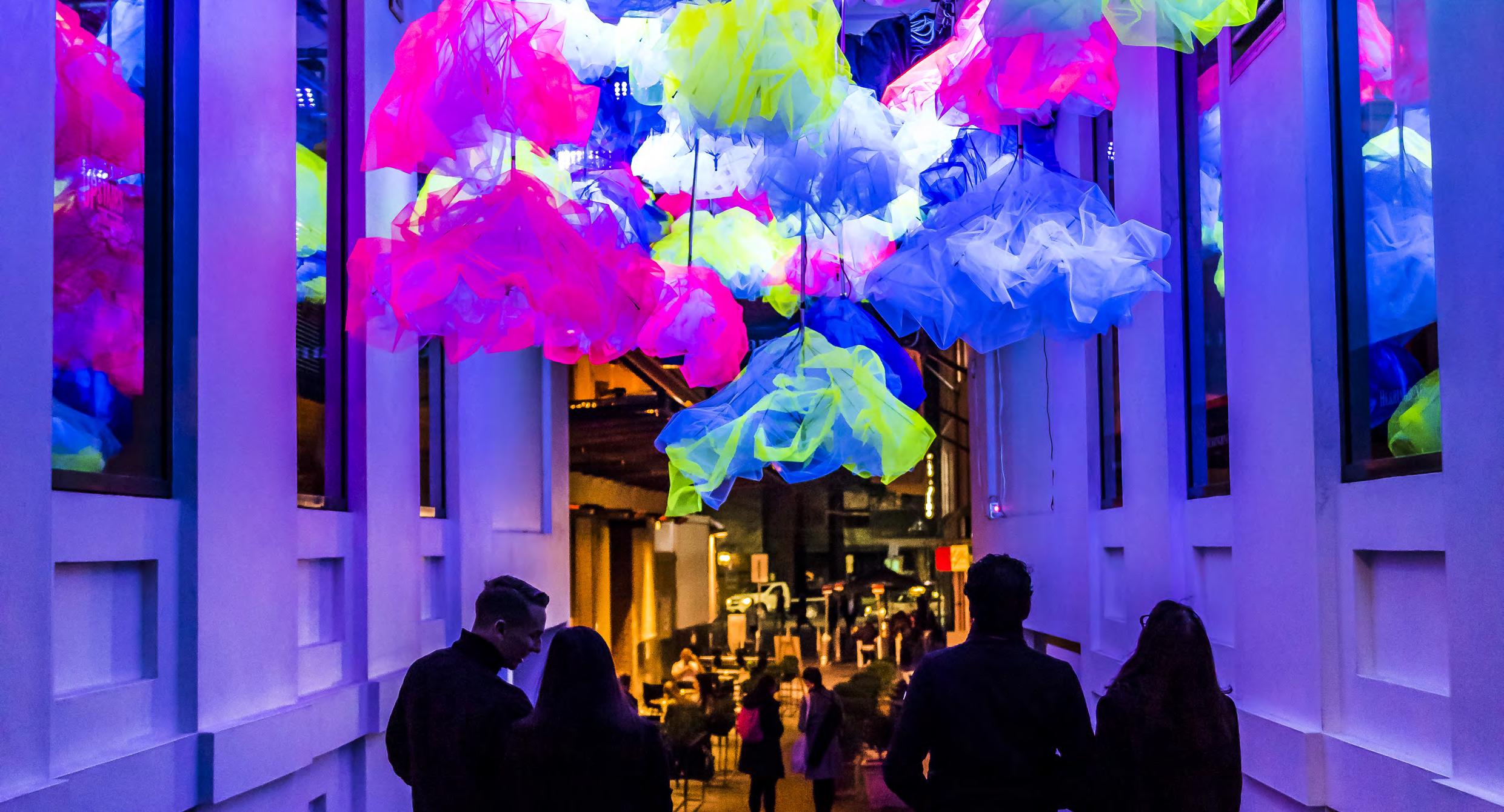
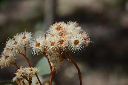
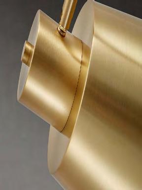
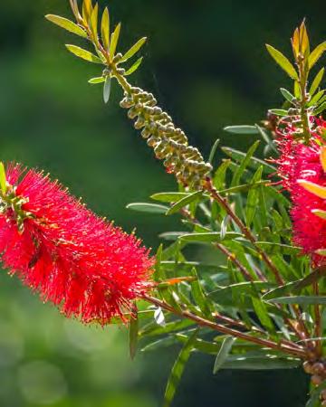
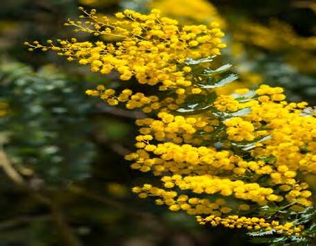
EXPERIENTIAL DESIGN
Experiential design is all about crafting spaces, interactions, or environments that are deeply engaging, emotionally resonant, and meaningful for the people who experience them. It blends elements of architecture, graphic design, digital media, public art, storytelling, and psychology to create immersive experiences that connect people to places, brands, or ideas.
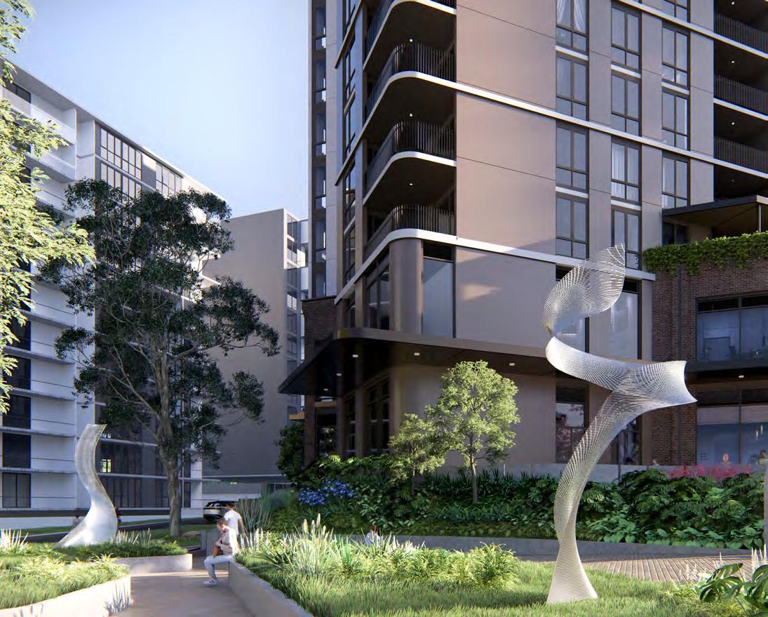
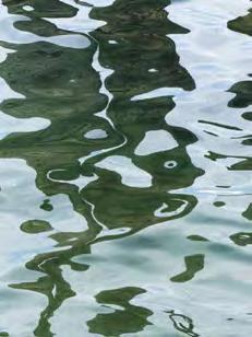
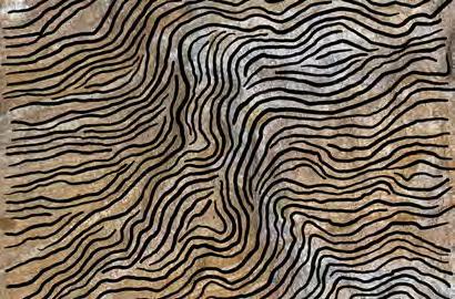
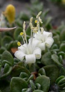
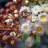
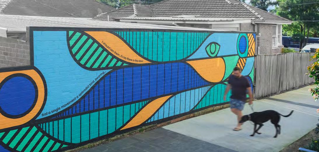
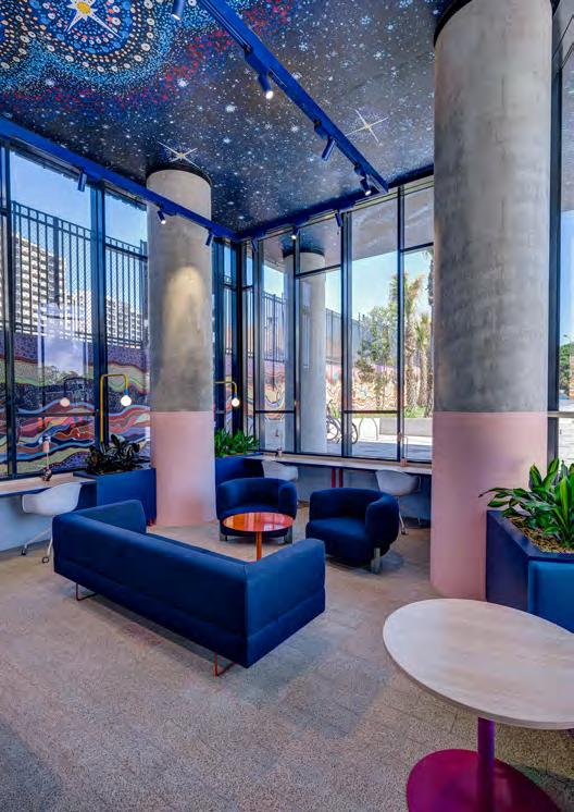
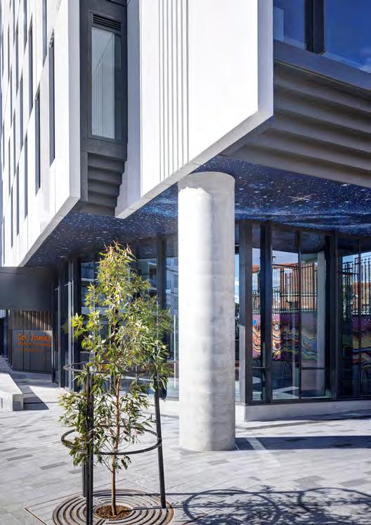
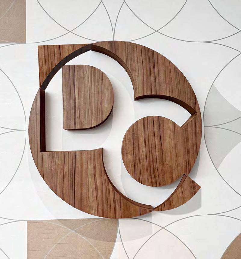
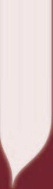
Artwork by Toby Bishop.
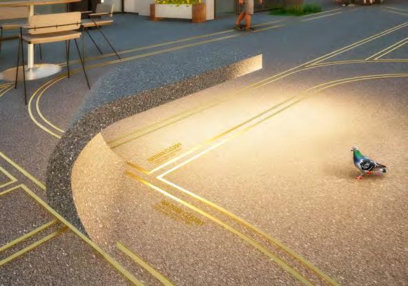
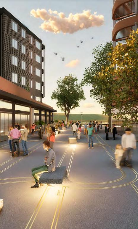
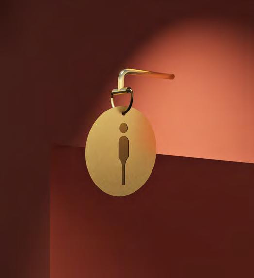
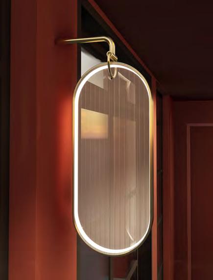
Place Branding
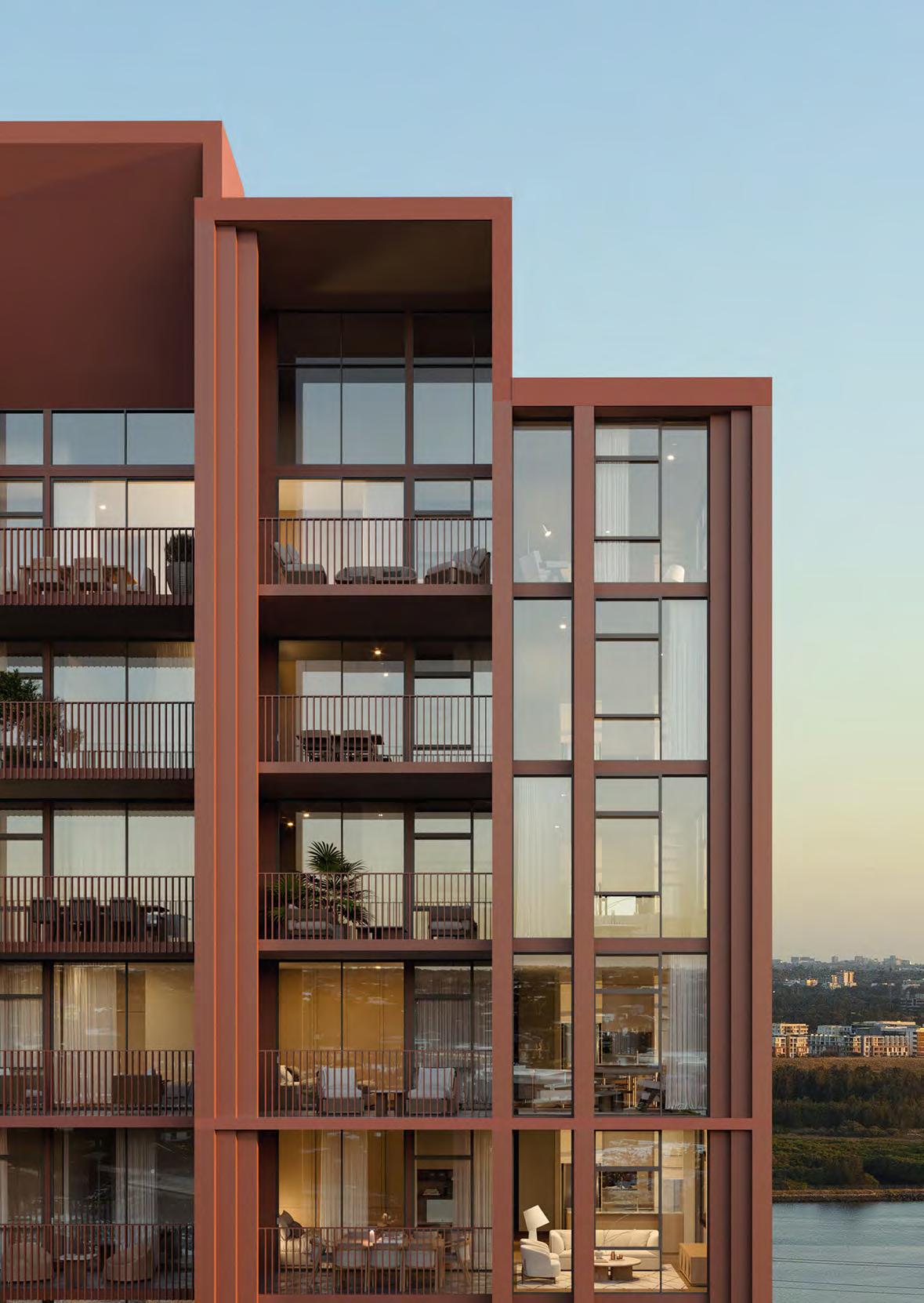
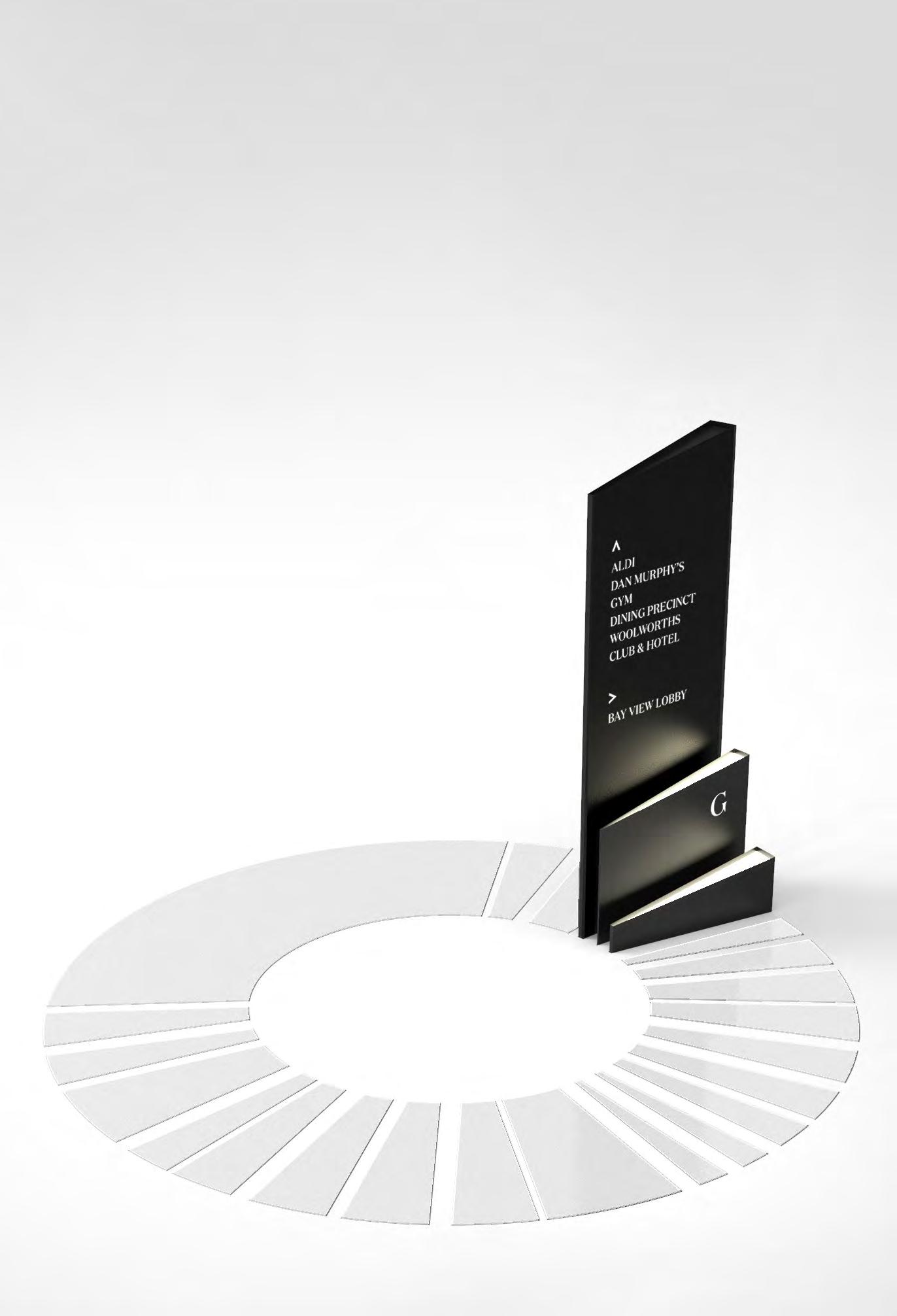
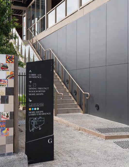
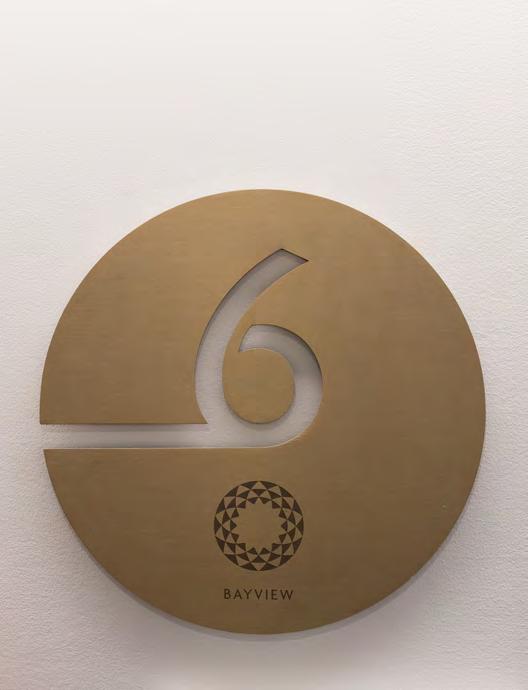
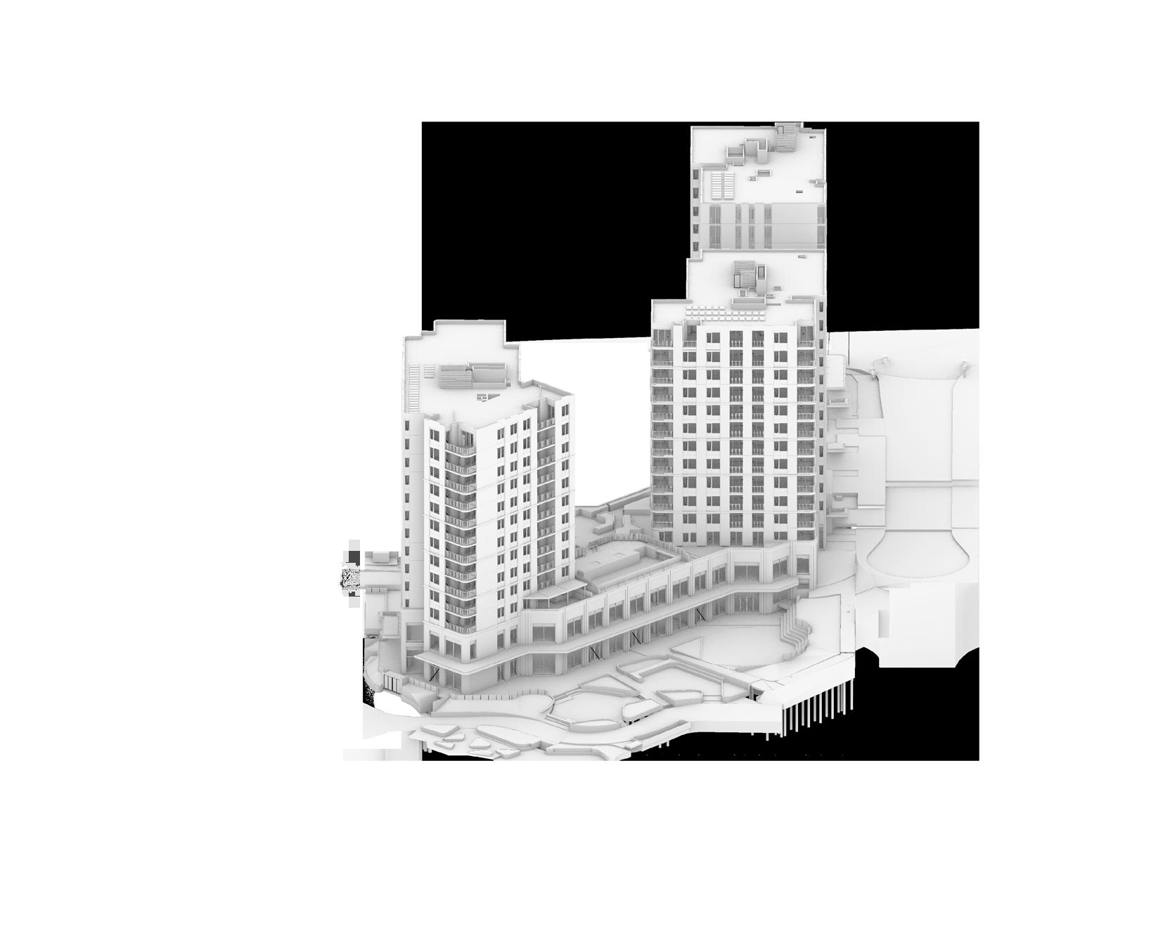
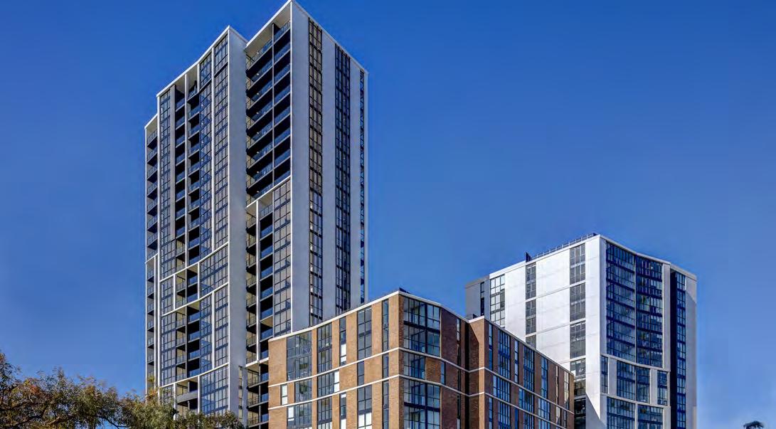
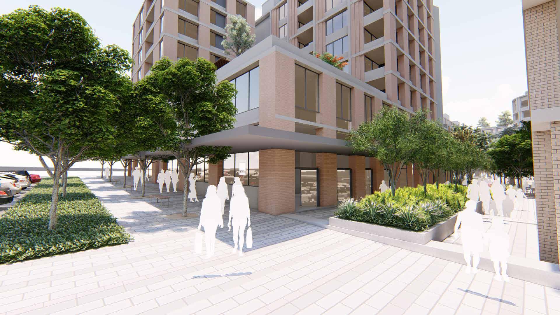
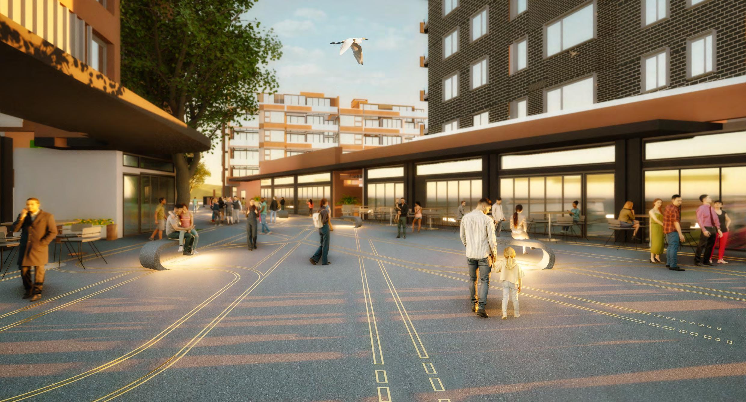
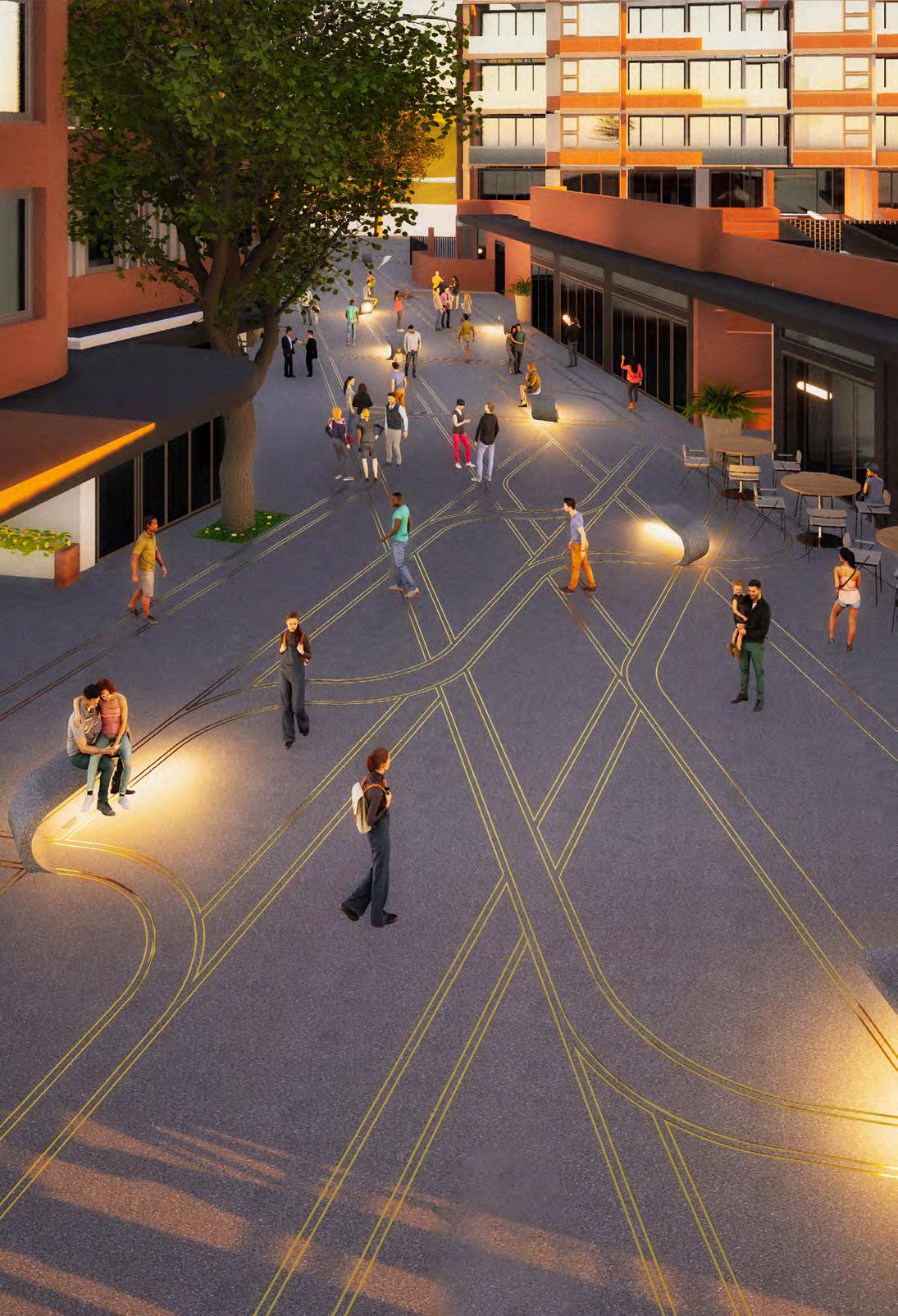
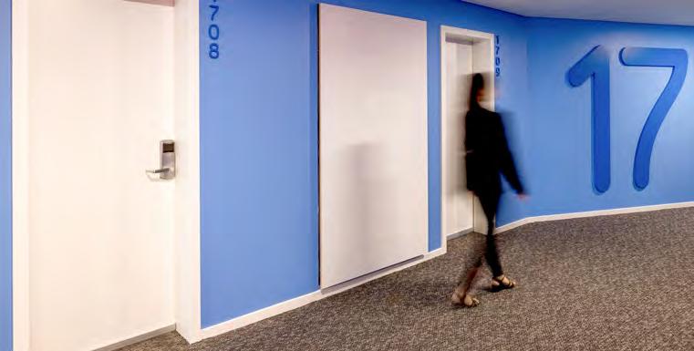
Bay Central
Location: Woolooware, NSW
Client: Aoyuan
LGA: City of Sydney
GFA: 58,000 sqm
Size: 970 sqm Commercial
Extruding forms inspired by the Bay Central branding to create a distinct environmental identity. Continuing the branded journey throughout the built environment.
The Bay Central precinct at Woolooware Bay comprises a new mixed-use town centre.
The development includes a new retail centre, refurbishment of the existing Leagues Club, hotel/ serviced apartments, and 255 apartments. The buildings range from 8 to 16 storeys, capturing views across Woolooware Bay towards the city.
The development reinvents this waterfront site to the east of the existing stadium by creating a dynamic new mixed-use destination.
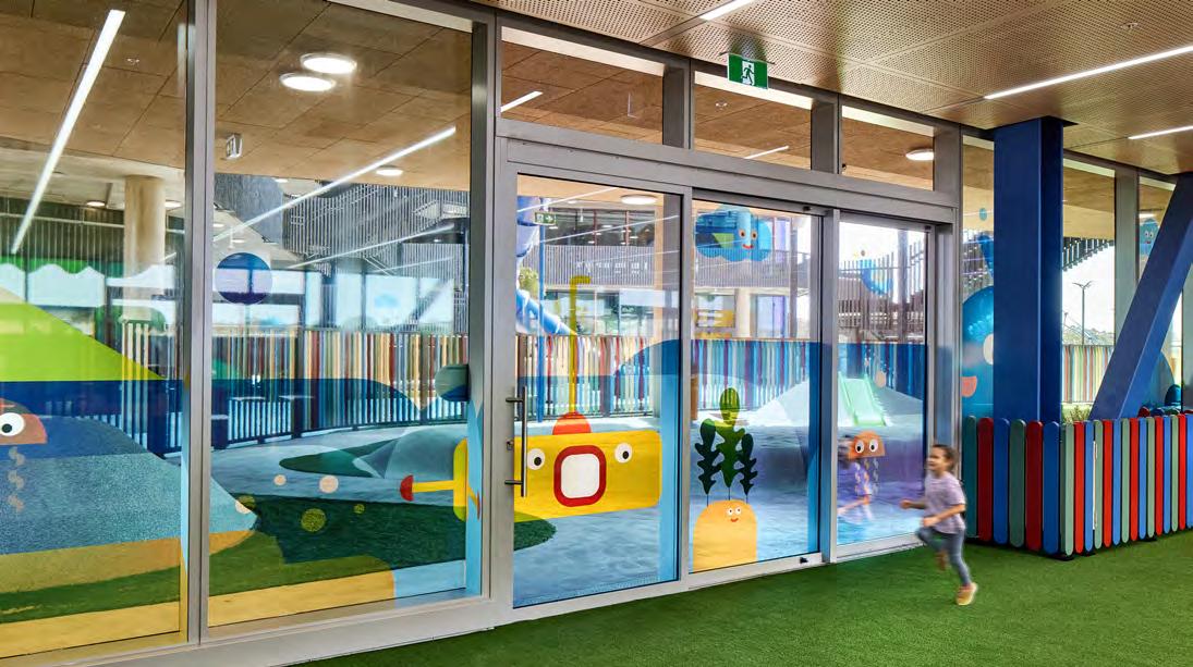
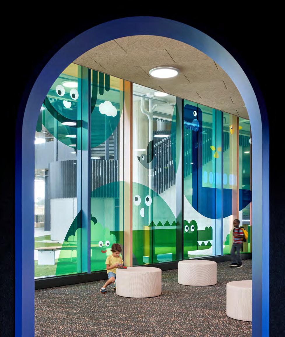
Our Lady of Lourdes Church and School
Location: Bauklham Hills, NSW
Client: Catholic Education Diocese of Parramatta
GFA: 15,000 sqm
Architects: FAL Construction
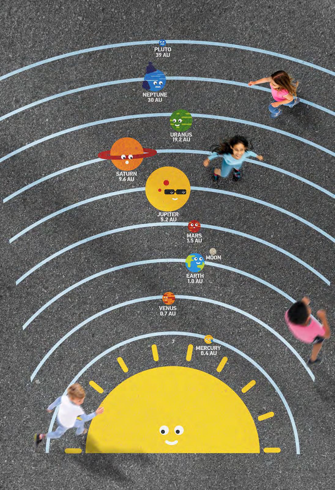
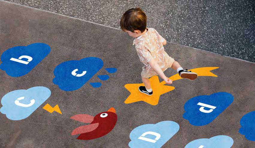
Shaping Spaces for Growing Minds.
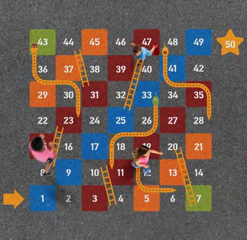
The environmental graphics s ervice provided to a school focuses on engaging children through vibrant and visually appealing elements. Incorporating themes like flora and fauna, the solar system, and the alphabet, these graphics aim to facilitate learning in an immersive way.
By using eye-catching colors and designs, the service creates an interactive environment where children can explore and absorb knowledge effortlessly.
Through these graphical representations, students not only learn about the natural world and outer space but also develop a fascination for learning that is both enjoyable and educational.
Key Elements
The environmental graphics are colourful and exciting, but also provide students with a more engaging and innovative place to learn. Translating educational processes through visual means is highly impactful for children.
Numbers needs to be presented in a fun and engaging way to maintain interest for children.
“Experience the wonders of knowledge through alphabet, where every letter is a gateway to the sky endless exploration.”
Fun and engaging floor graphics of solar system and alphabet further enhance the learning environment, ensuring that children remain enthusiastic and eager to explore
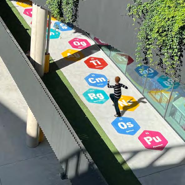
Hopscotch Solar System
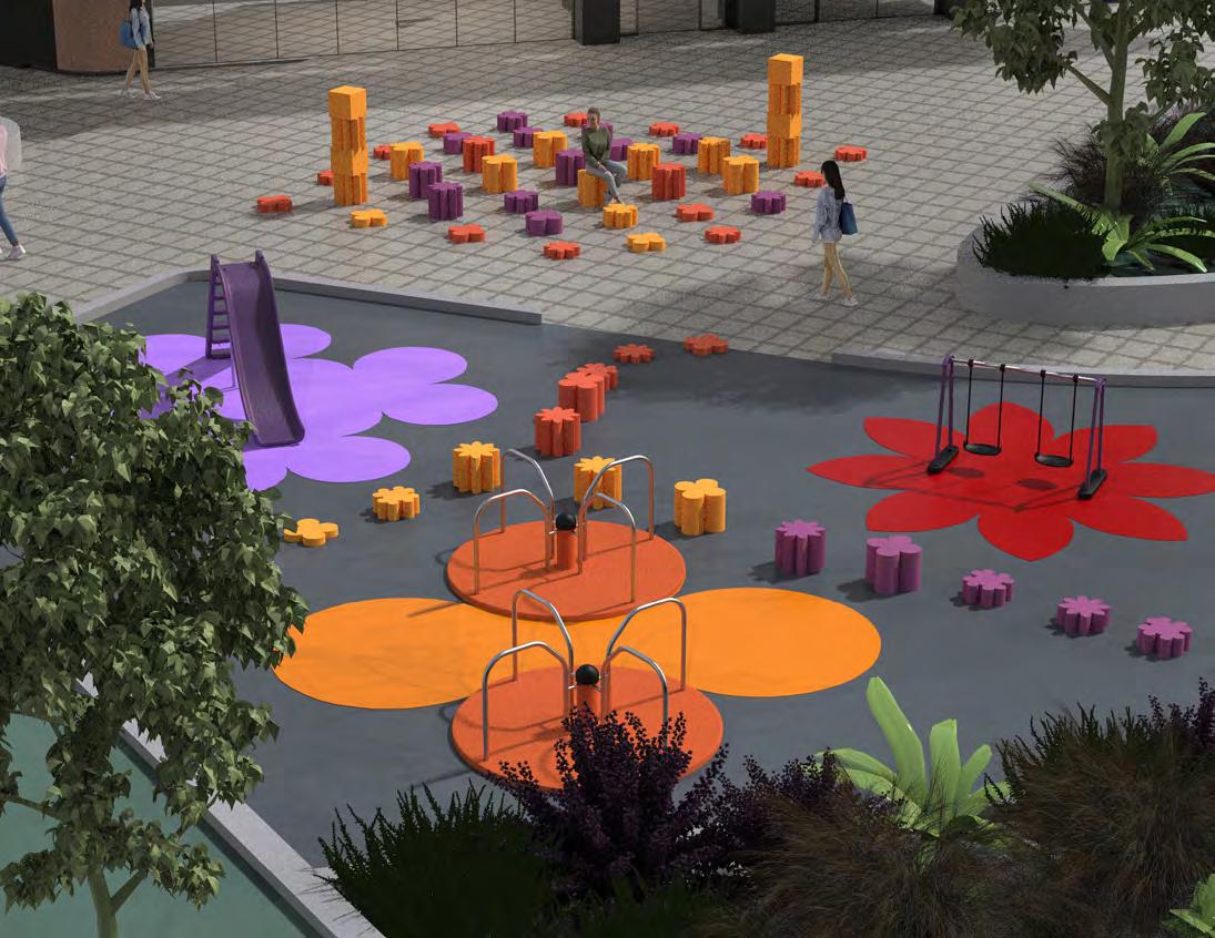
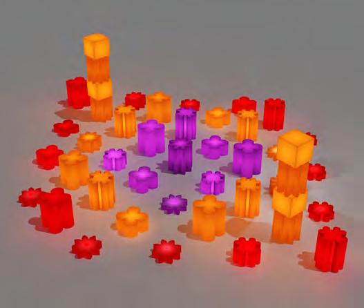
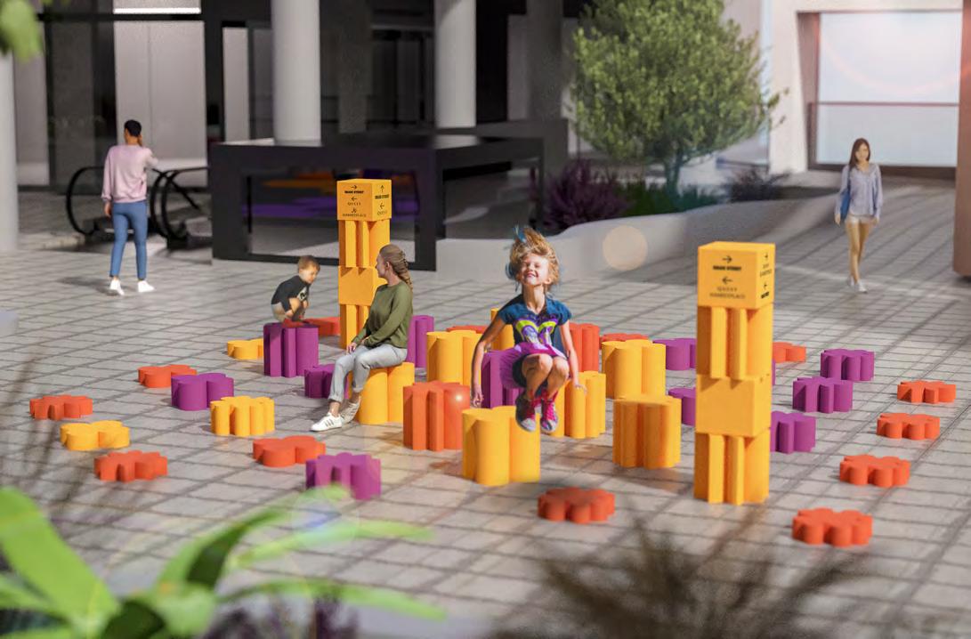
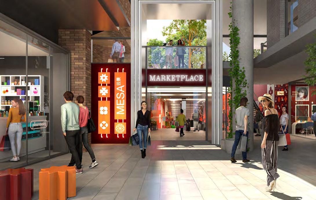
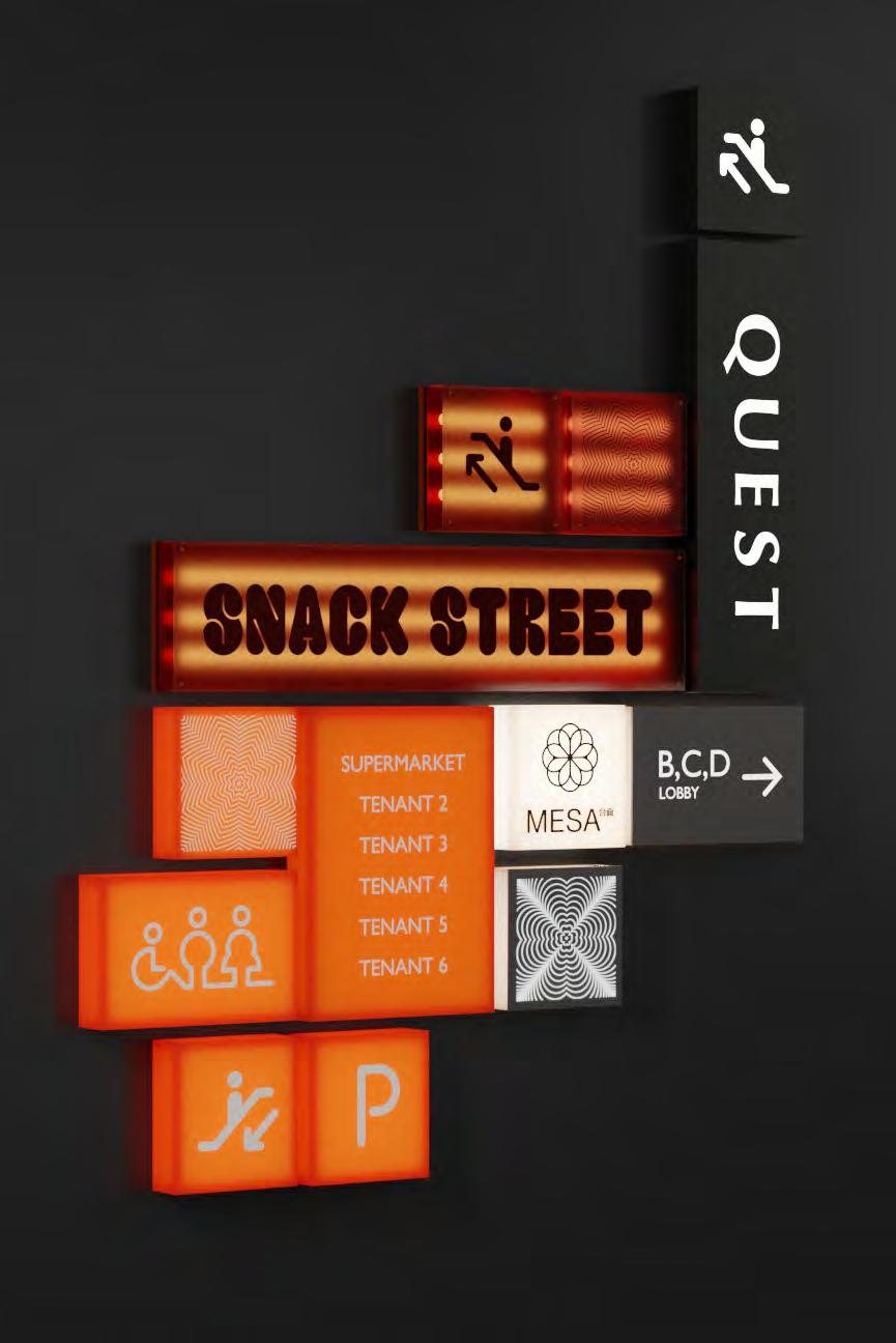
MESA extends its branding to the public domain, through its integration into the podium and playground, to create a unique place and experience.
Engagement extends to all uses and experiences from adults to kids, playing to observing, interacting and remembering. MESA creates a memorable space that extends to all visitors, day and night, with an equal presence both on the ground as well as to residents observing from within their apartments.
Day and Night Presence
Subtle identity throughout the project allows a strong language to develop without distracting the audience. The tone of the brand identity has been considered throughout all areas to develop a well-balanced design.
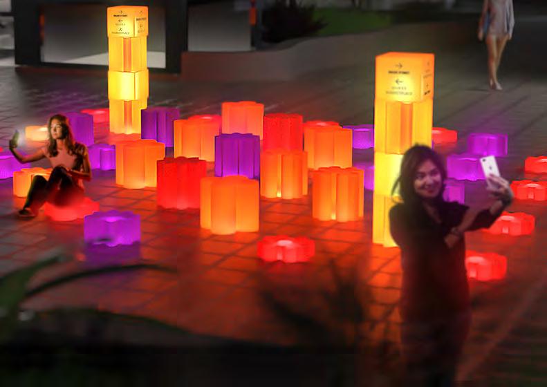
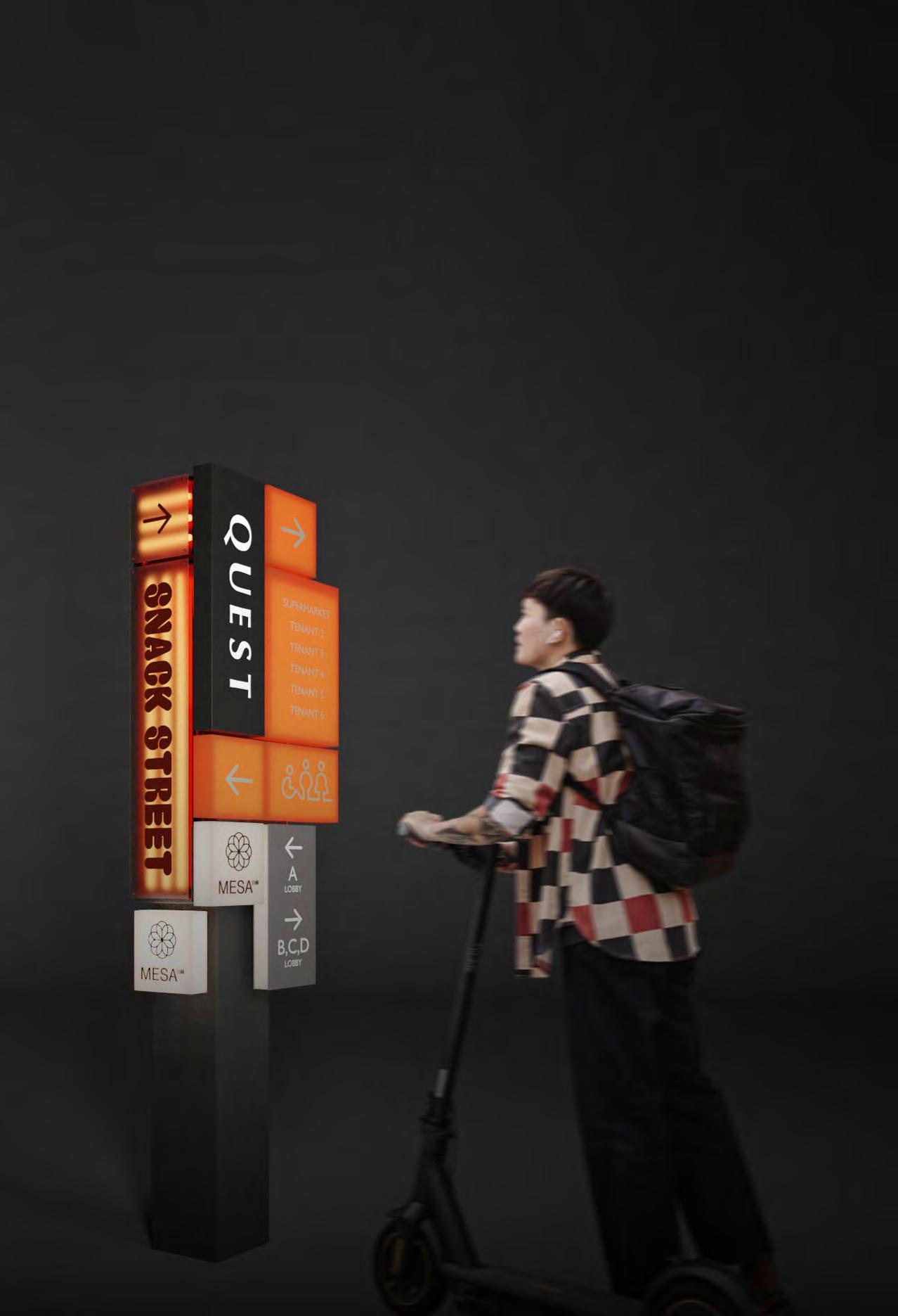
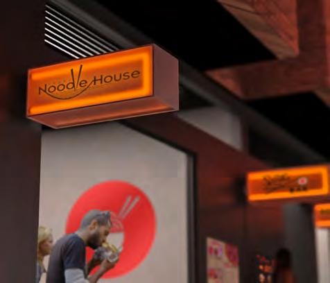
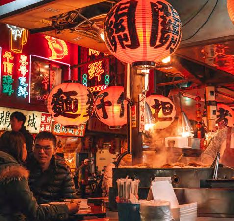
MESA’s Snack Street is inspired by the colourful nature of vintage Hong Kong with bright multi-coloured graphics, lighting and furniture. Retro-style fittings and objects including stacked storage, seating, and over-head lanterns are reminiscent of 70’s Hong-Kong.
This is further enhanced by the use of exciting, bold typography and neon-lighting.
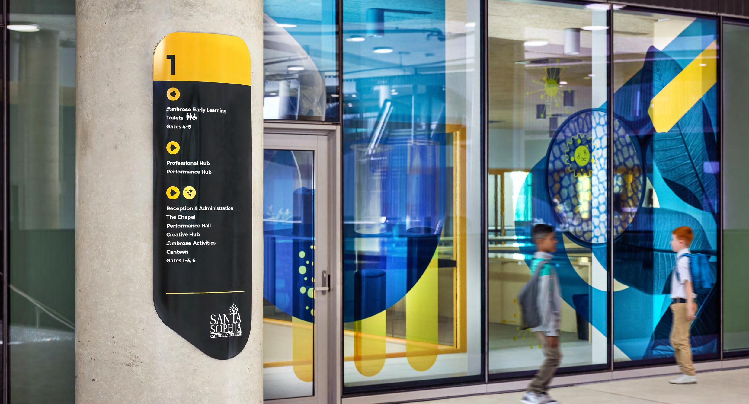
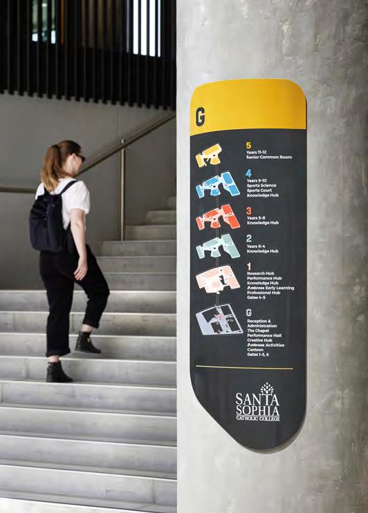
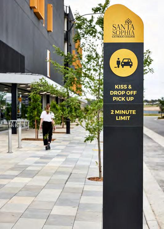
Santa Sophia Catholic College Designed for learning
Location: Box Hill, NSW
Client: Catholic Education Diocese of Parramatta
GFA: 15,000 sqm
Architects: BVN
Catholic Education Diocese of Parramatta (CEDP) is creating a contemporary preschool to post-school learning community in one of the fastest growing areas in Sydney.
Santa Sophia Catholic College at Box Hill consists of six storey towers with roof-top sporting facilities across four linked buildings, a knowledge centre, and fitness research hub.
BVN’s design envisions the four interconnected building as “a series of islands in a sea of decks.” Outdoor terraces surrounding the buildings will create spaces for learning and playing.
Visual Identity
Keeping to a minimal aesthetic, a versatile family of signage was developed which could seamlessly evolve across all the visual elements of the environmental branding.
All forms are a direct translation of architectural forms and colours.
Safety Decal & Identification Inquiry Hubs
Catholic Early Learning Centre
CELC’s learning spaces will inspire 60 students aged from 3-5 years to explore, innovate and thrive in their learning adventure.
The CELC graphic strikes the perfect balance between capturing the wonder and enchantment of childhood, and a learning environment.
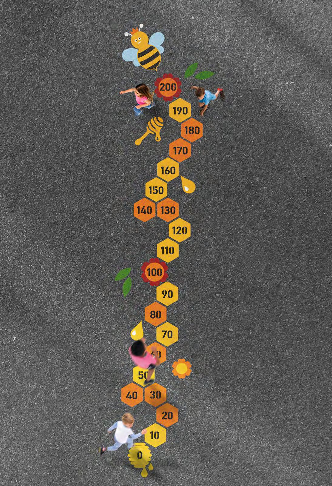
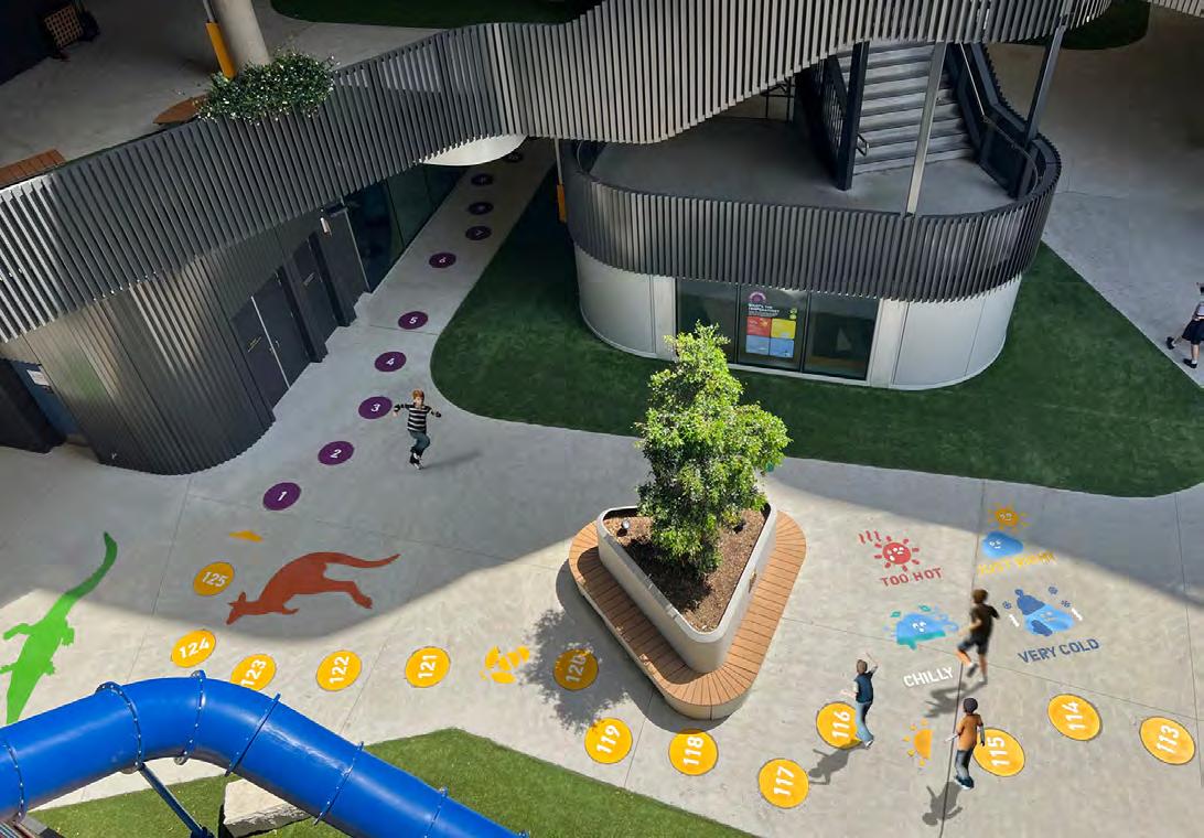
GREEN TRAIL
The ‘Green Trail’ consists of 12 sustainable stations located throughout the public areas on the ground and first floor, each designed to inform the students and visitors about the key features and concept of a Green Star building in a playful, bold and youthful approach.
Sustainable Transport
The environmental graphics are colourful and exciting, but also provide students with a more engaging and innovative place to learn. Translating educational processes through visual means is highly impactful for children.
Data needs to be presented in a fun and engaging way to maintain interest for both children and young adults.
Younger ages: Combining vibrant playful illustrations with large key facts.
Younger adults: Simplified data or information, overlaid onto design.
Building as Teaching Tool
Students can learn about sustainable transport, water management, pollution, healthy food, and energy, to name a few things. By integrating this information into the built environment - such as around the playground, water stations, and classroom windows - students are more likely to engage in the topic.
Floor features are located throughout the site - providing resources for students to learn about things such as the periodic table, numbers and counting, different animals, and songs. This is gamified through playground activities such as hopscotch.
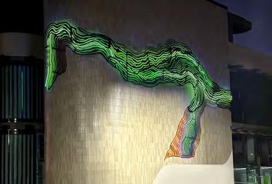
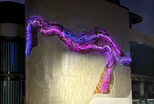
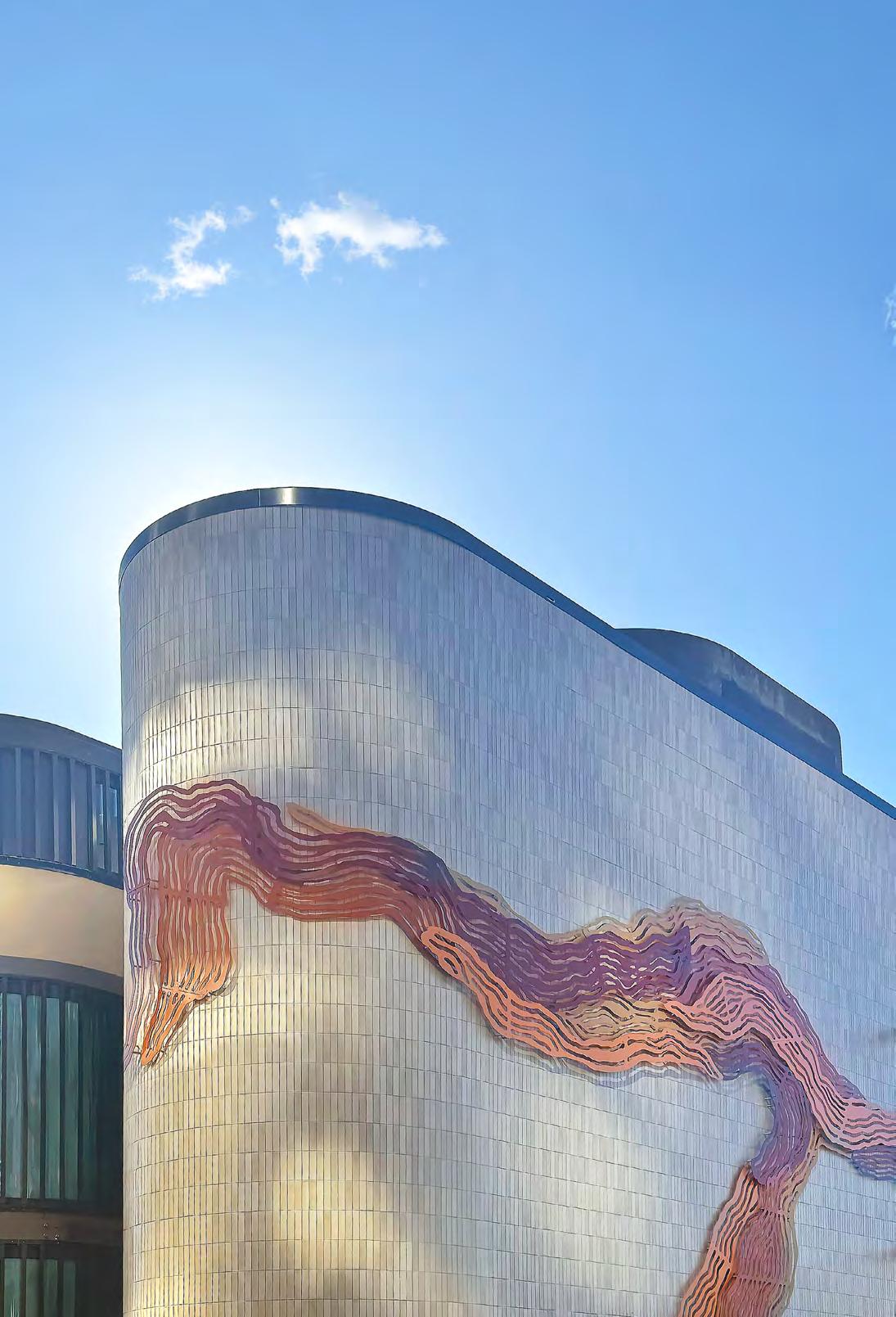
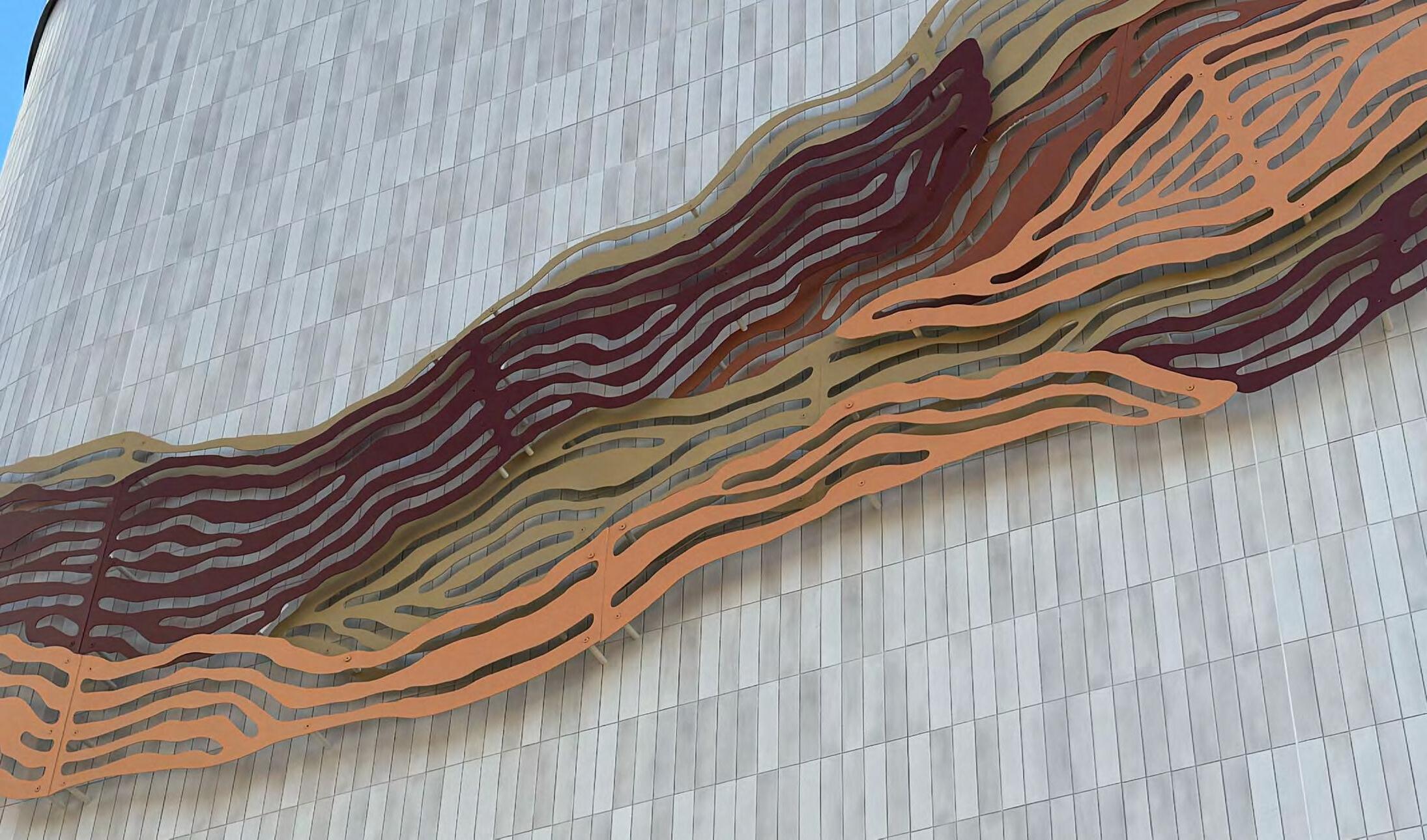
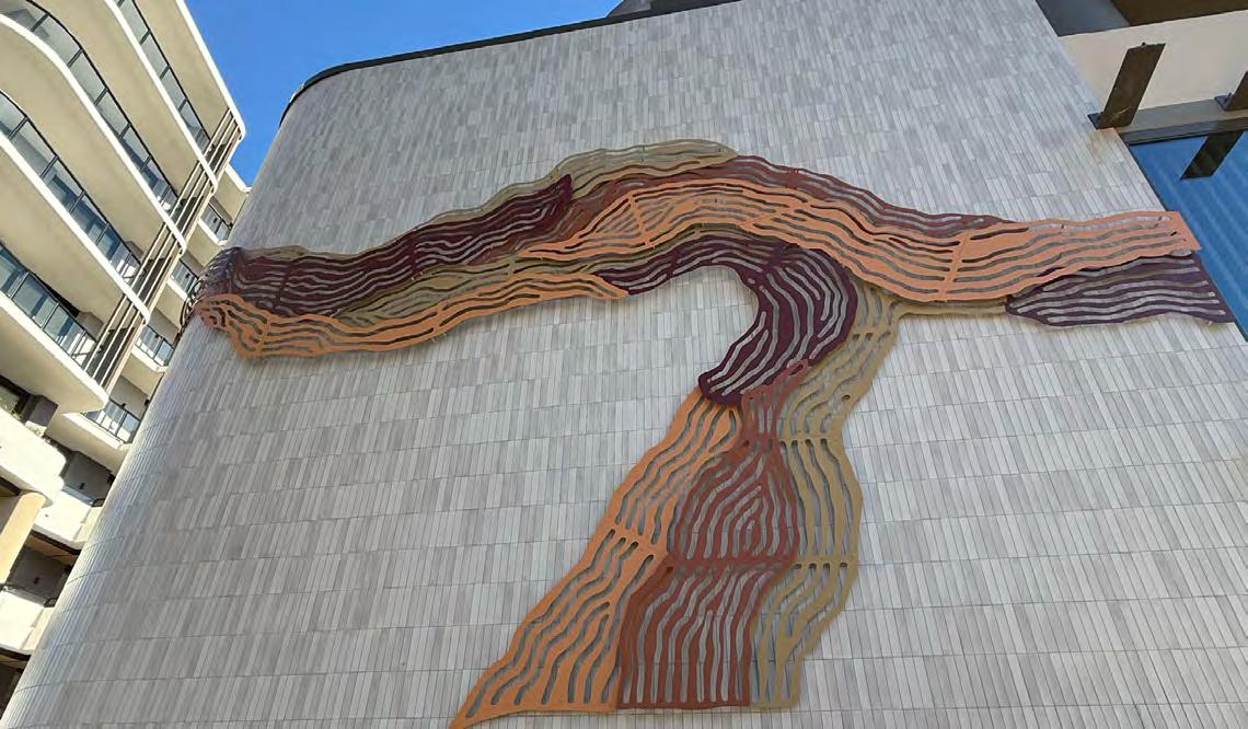
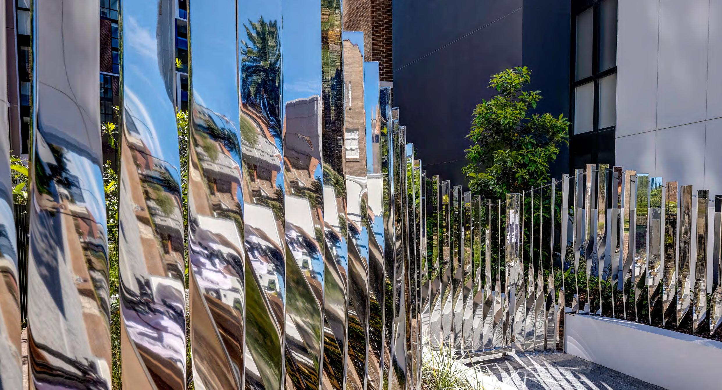
Public Art
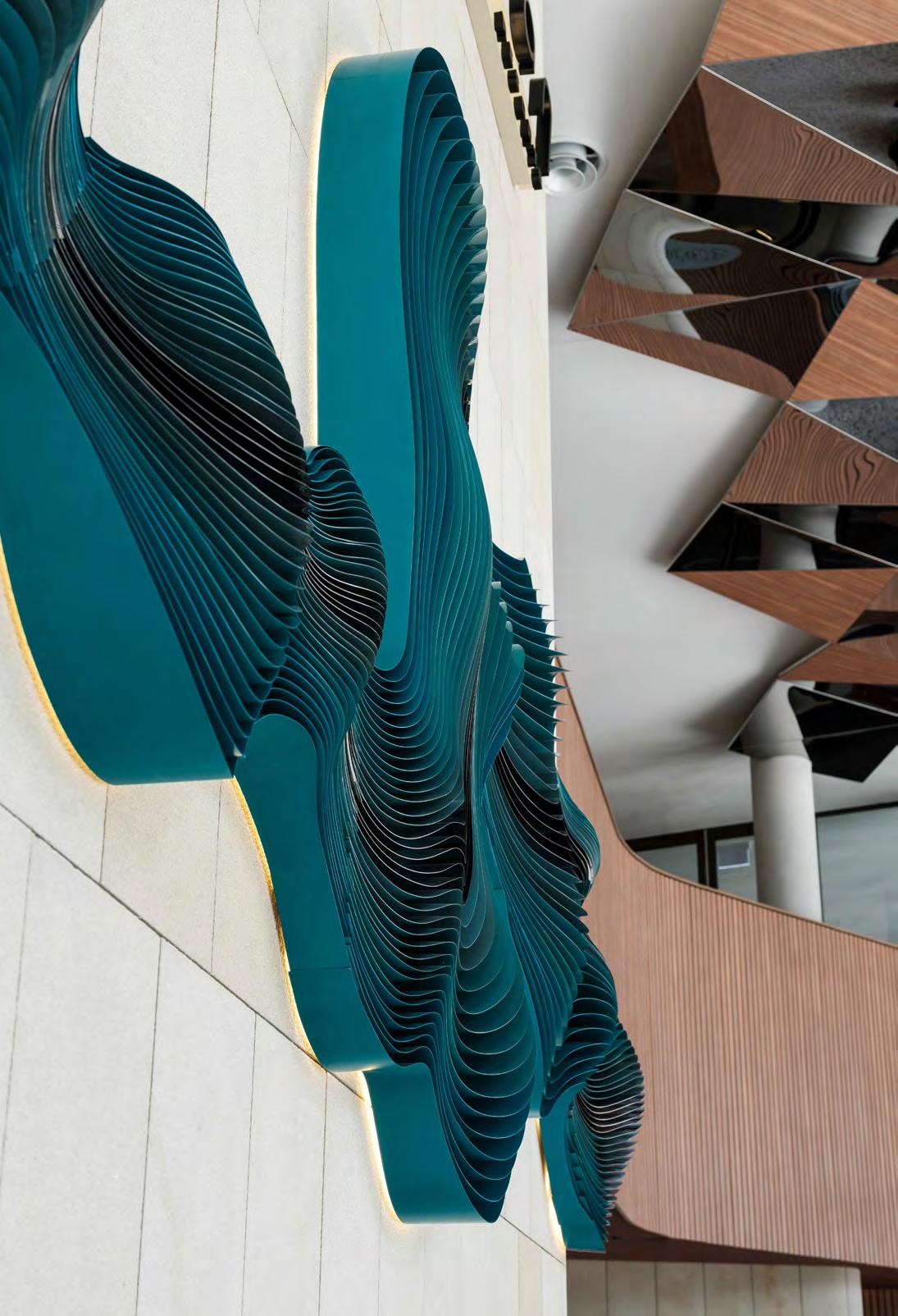
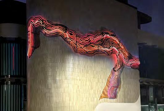
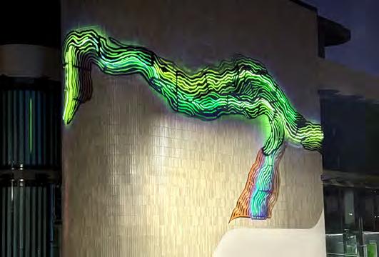
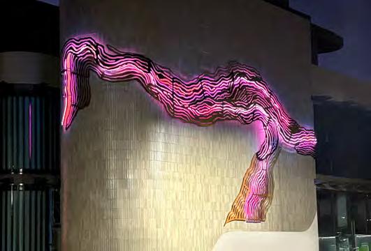
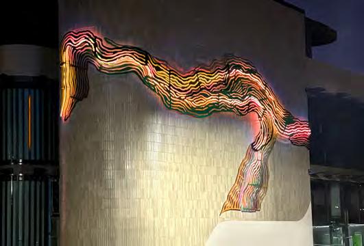
Nepean Looking Glass
Location: Penrith, NSW
Client: Panthers Group
Site Area: 18,463 sqm
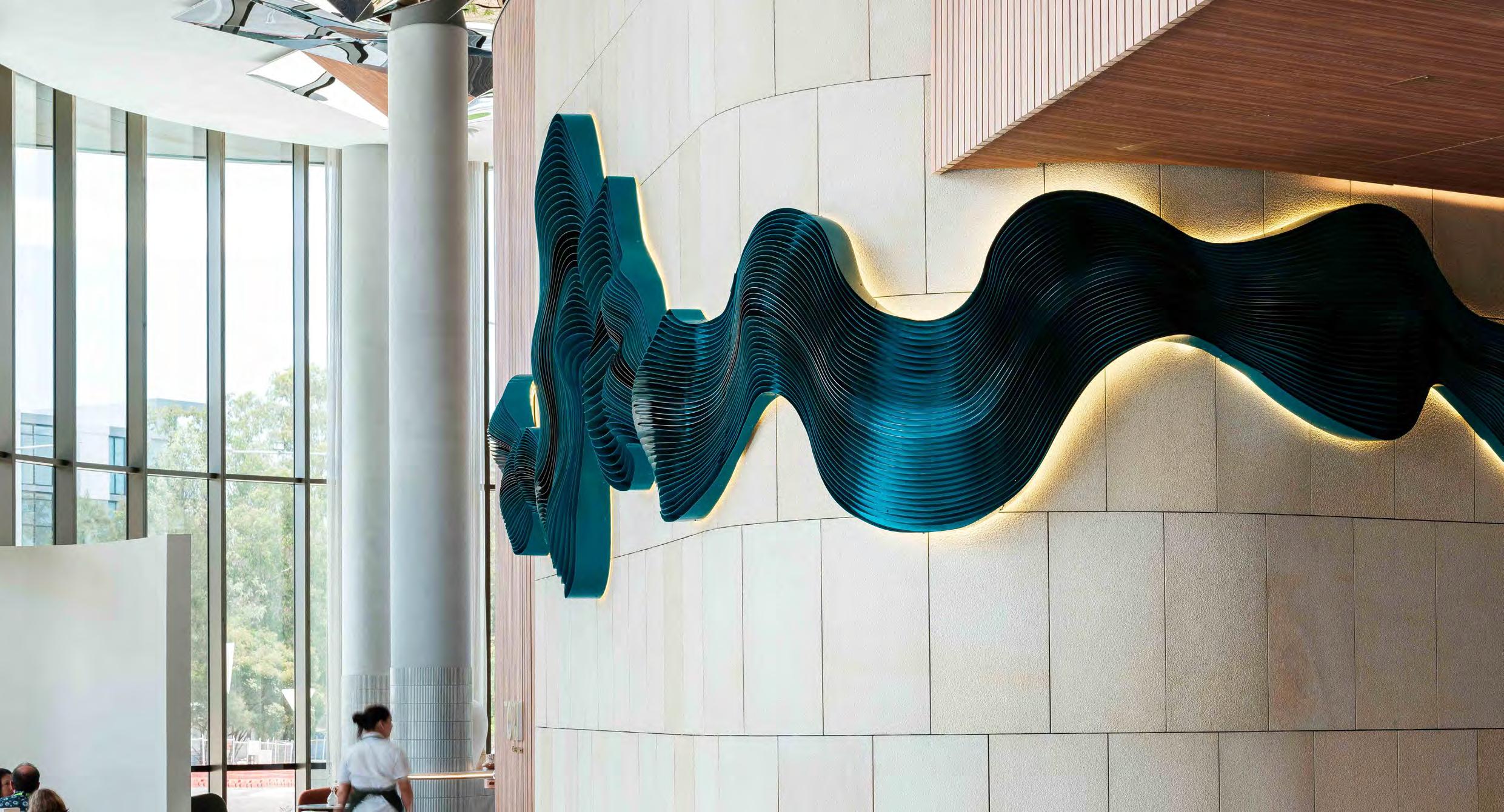
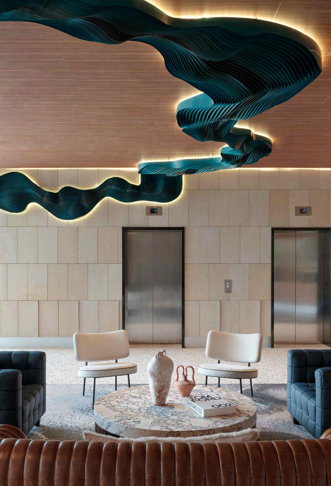
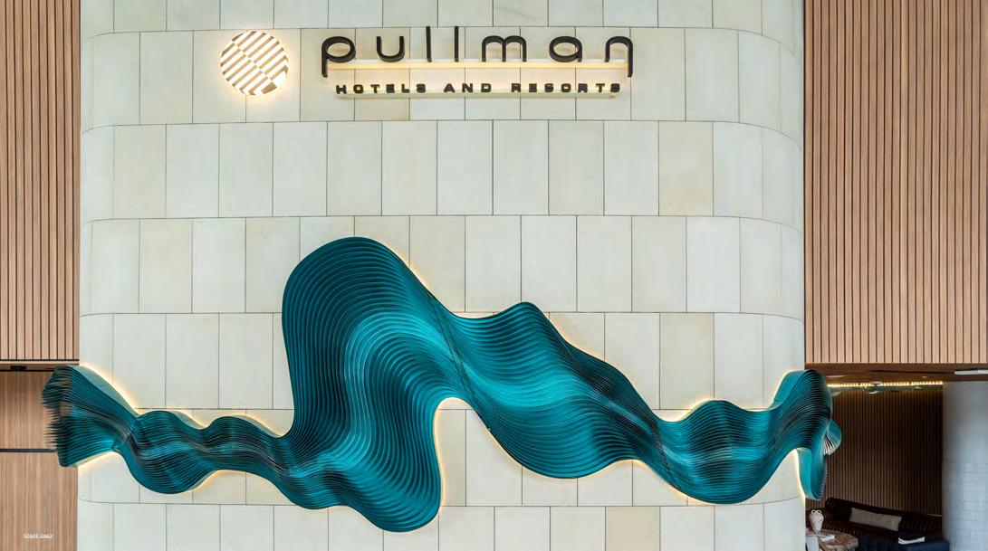
It transcends an artwork on the wall and emerges as a seamlessly integrated sculptural element that harmonises with the architectural and interior design.
The Nepean Looking Glass lives within the lobby of the Pullman Sydney Penrith, a symbolic reflection of the nearby Nepean River and a mesmerising first impression for guests checking into the 5-star hotel.
From the sandstone wall to the lofty ceiling, the artwork’s undulating reflective steel blades and a gradient of blue and green tones transform the lobby into an immersive masterpiece.
Environmental Graphics
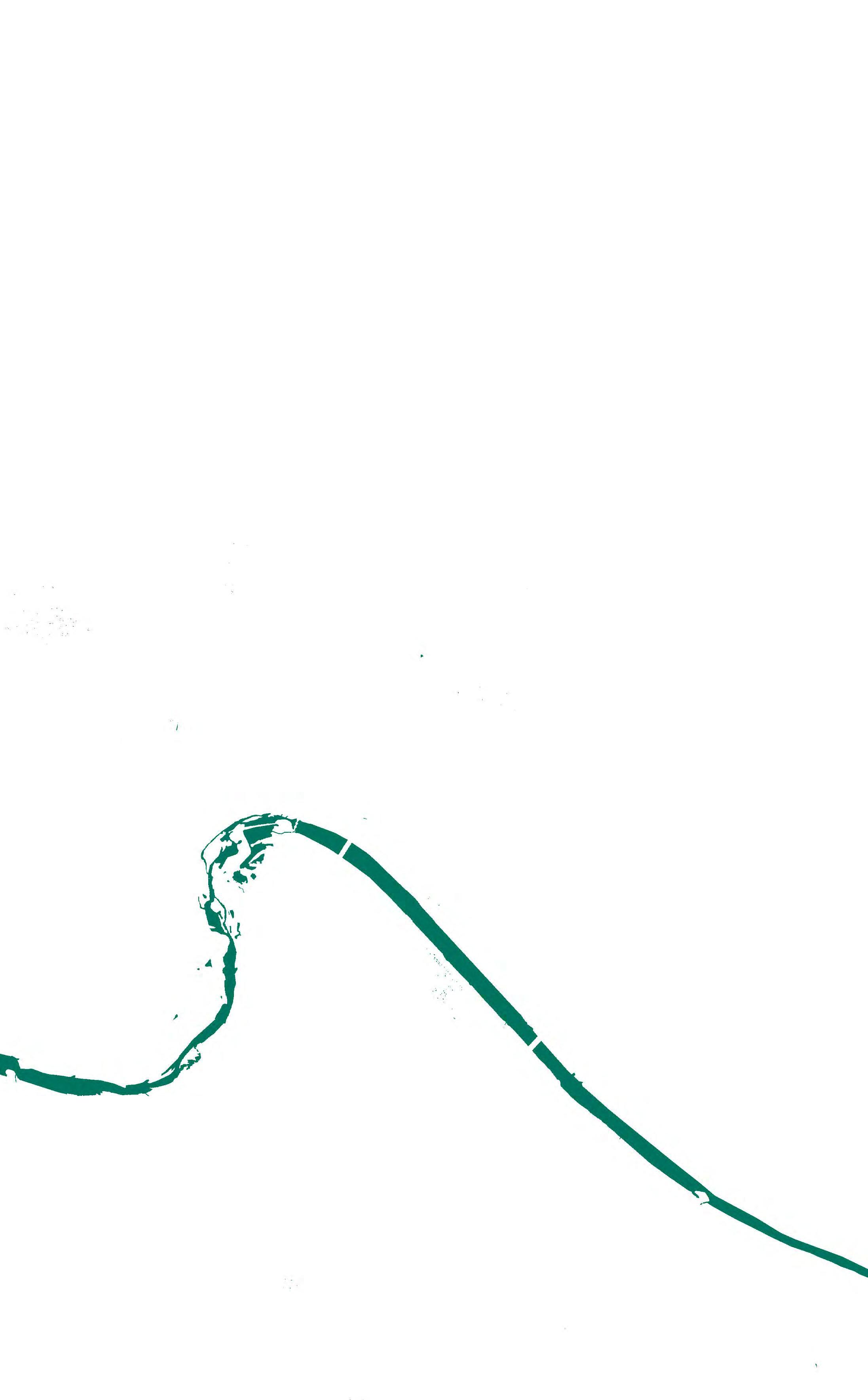
The artwork echoes the flow of the nearby Nepean River, which travels through Penrith to join the Hawkesbury River.
The Nepean Looking Glass, with its mirrored surface, serves as a symbolic reflection of the maternal essence inherent in nature, embodying its profound nurturing and sustaining role.
This artwork delves into the mirror stage theory, encapsulating the pivotal moment when a child constructs the ideal “I” by stepping before a mirror, thereby disrupting the unity between the child and the (m)other.
NEPEANRIVER
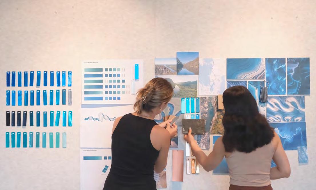
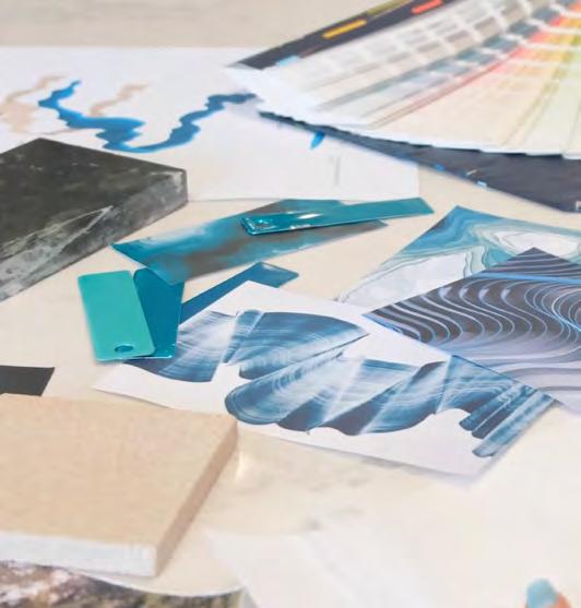
The project required an innovative and complex creative process.
Due to the scale (13 meters long) and complex geometry, the design team utilised parametric design and 3D modelling to aid the design development and construction of the artwork.
The positioning required extreme accuracy to ensure a seamless alignment over the curved sandstone wall, ensuring a precise transition from the wall onto the ceiling and around the lobby column.
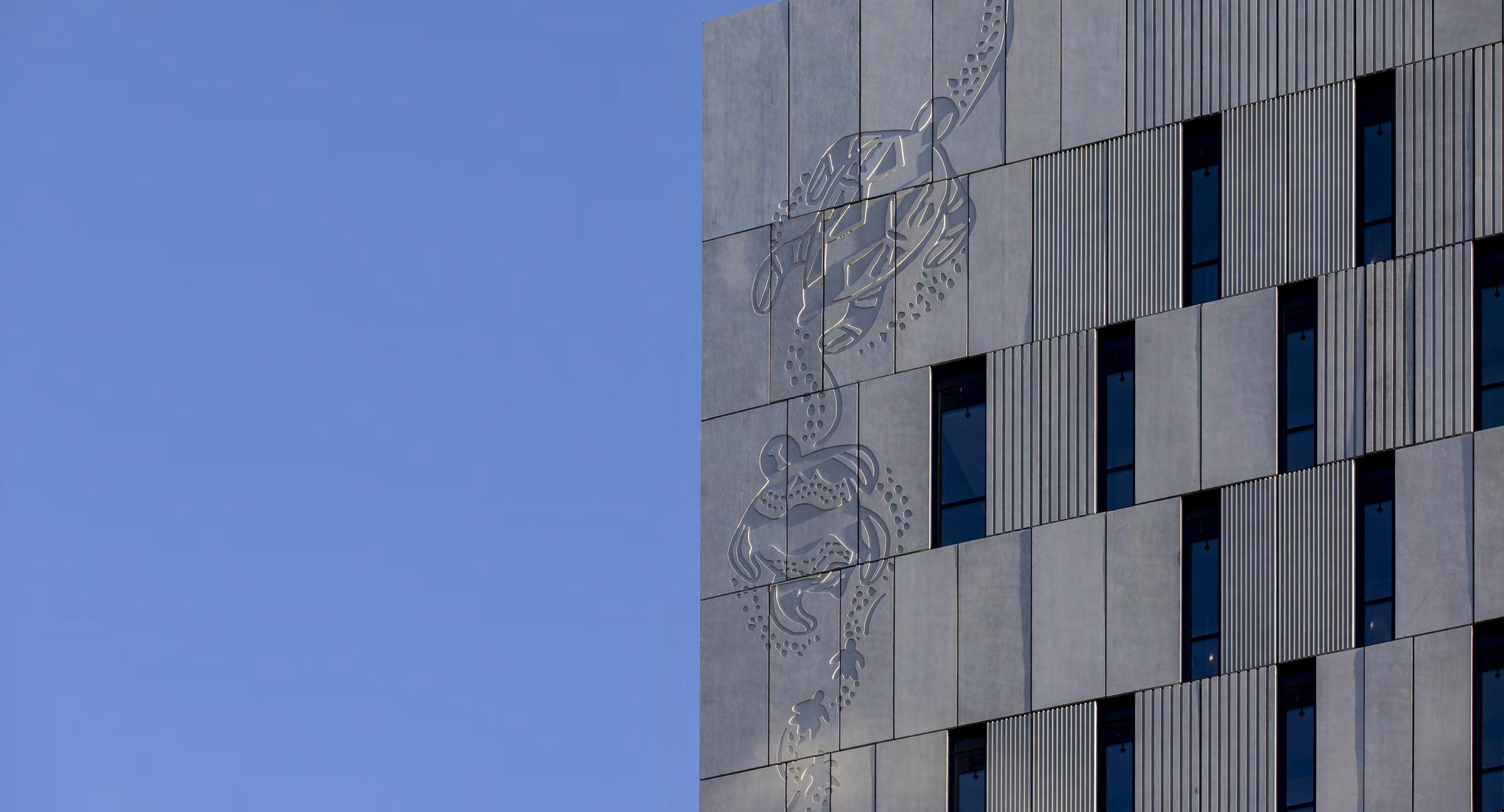
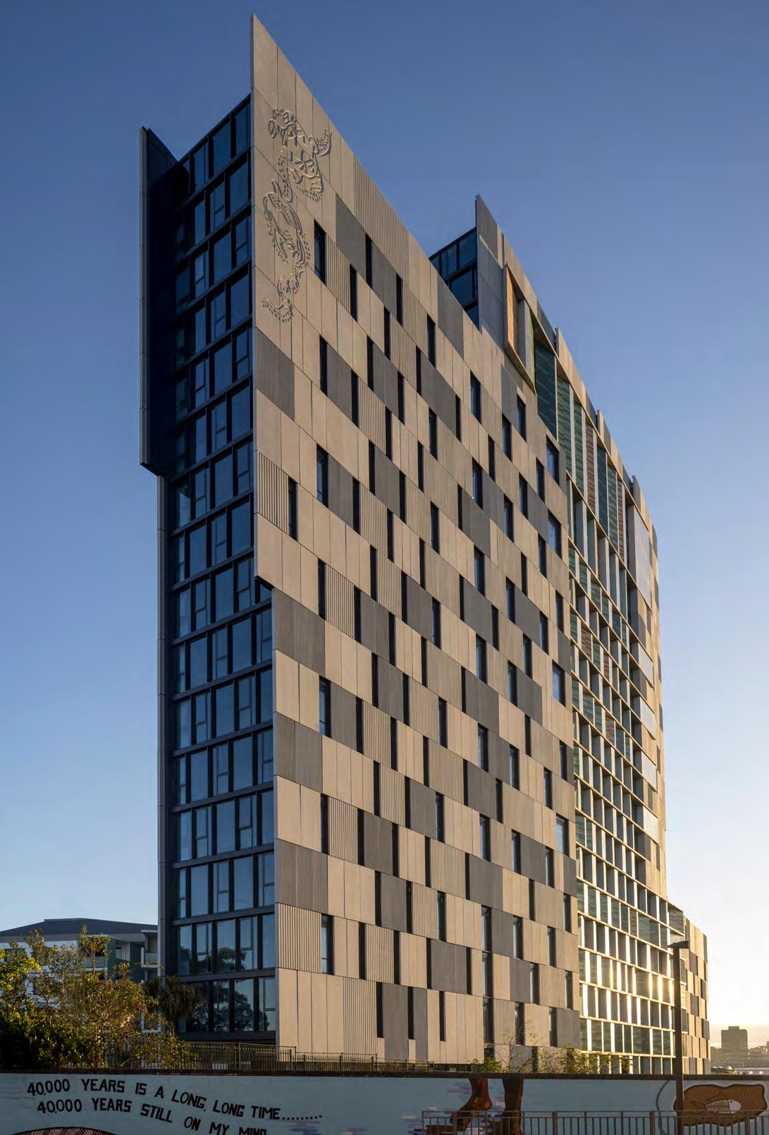
Location: Redfern, NSW
Client: Aboriginal Housing Company
Site Area: 2,380 sqm
Col James Student Accommodation It transcends an artwork on the wall and emerges as a seamlessly integrated sculptural element that harmonises with the architectural and interior design.
The design strategy for Pemulwuy stage 3 embraces the Aboriginal Housing Company’s (AHC) emphasis on culture and community and the significance of the site through the built form narrative, an inclusive family model for students and the integration of key public domain spaces and indigenous public art.
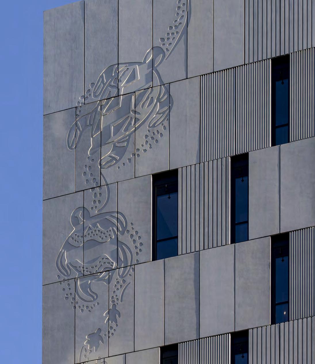
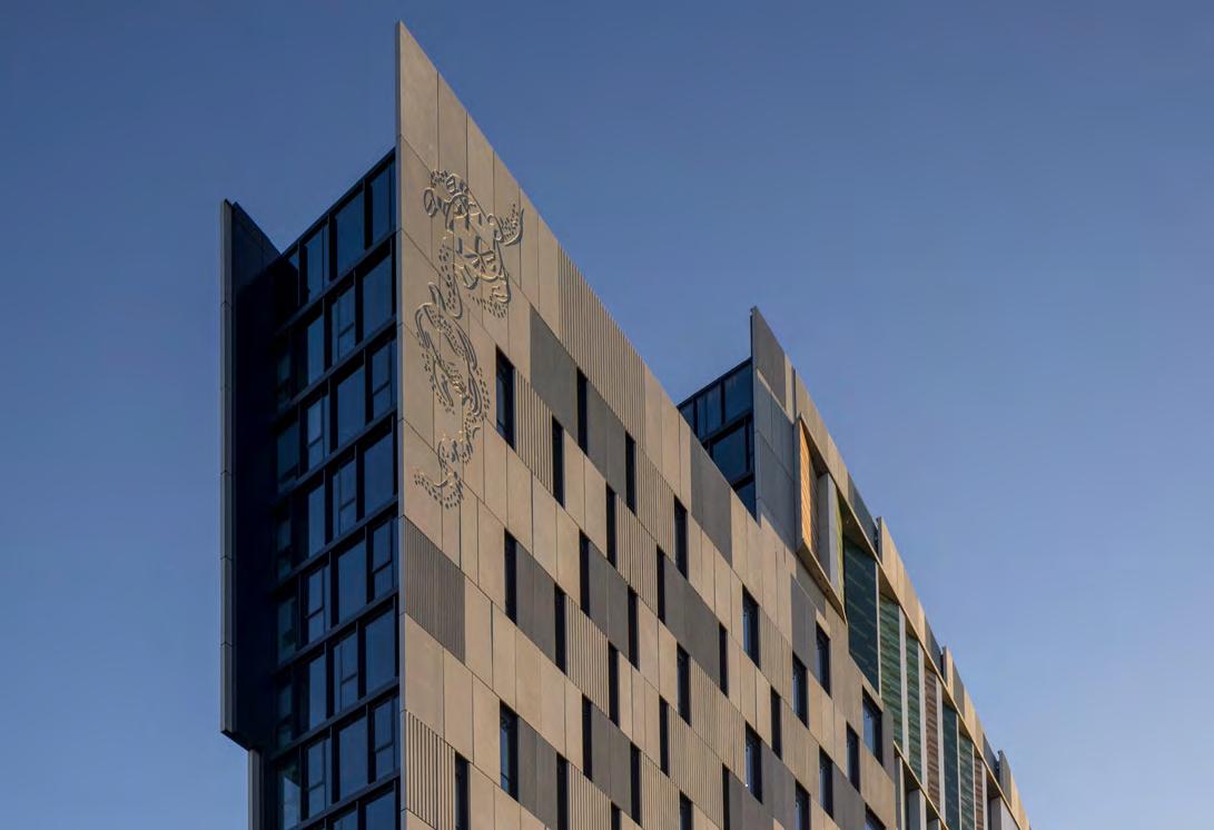
Turner created the framework for artists to trace their narrative into the urban fabric. The integrated public artwork ‘family of turtles’ was engaged by AHC to pass on the story of a culture of support and nurturing within the community.
Coordinating with the artist, Turner integrated a variety of pieces into strategic facade panels and key public ceiling and wall elements
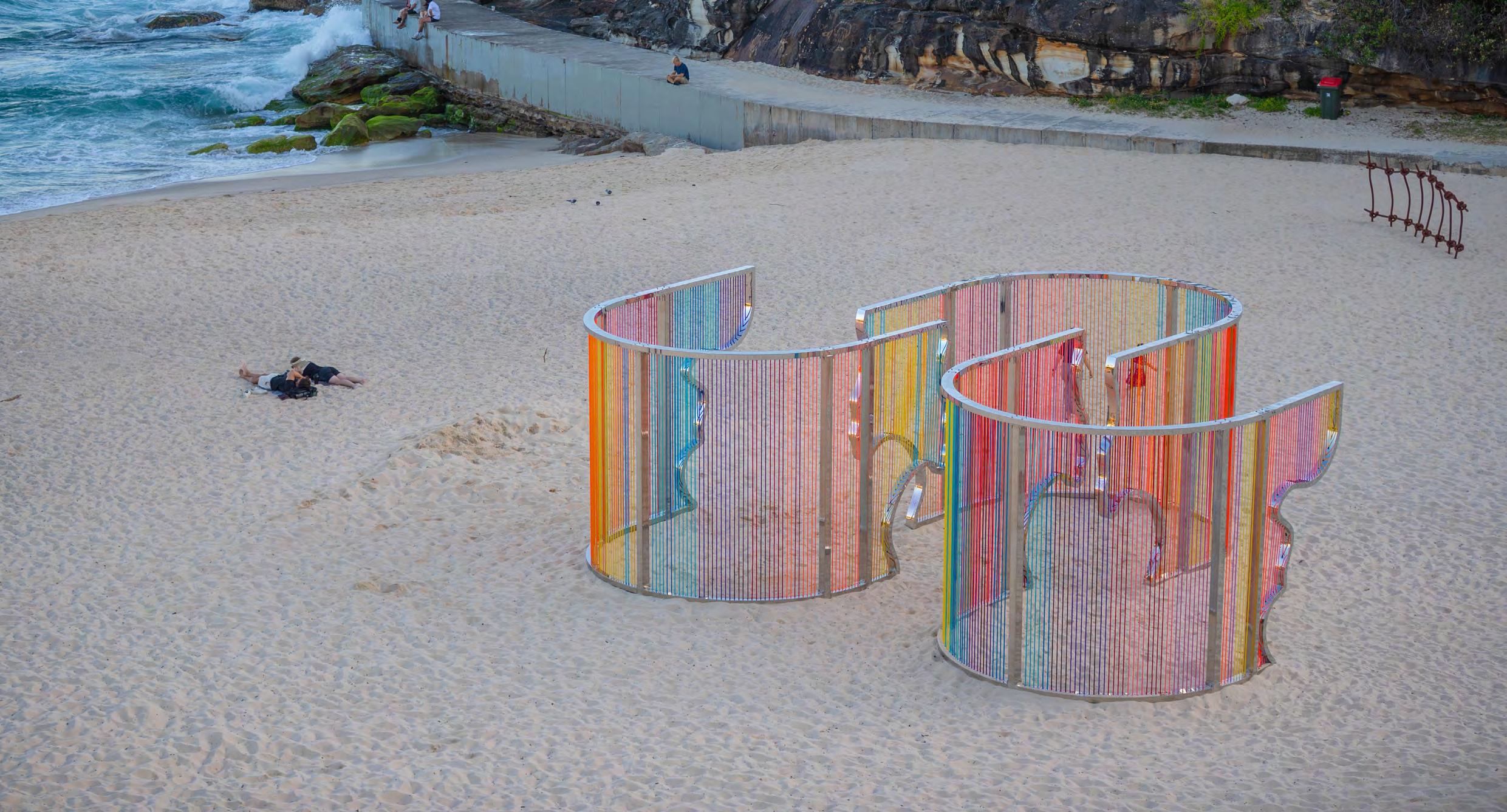
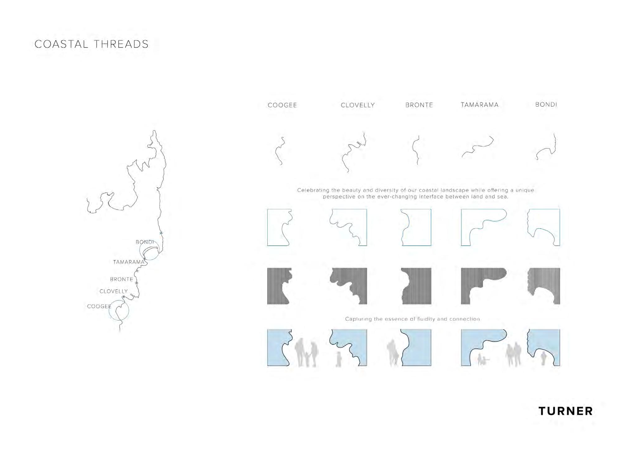
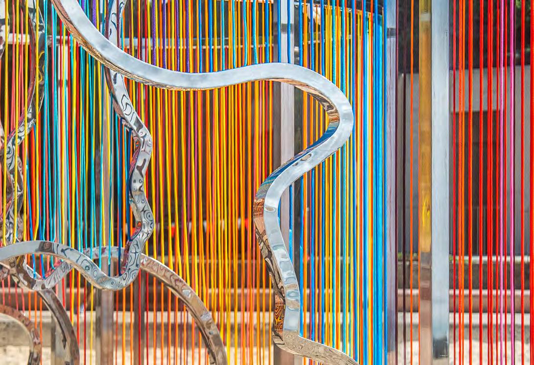
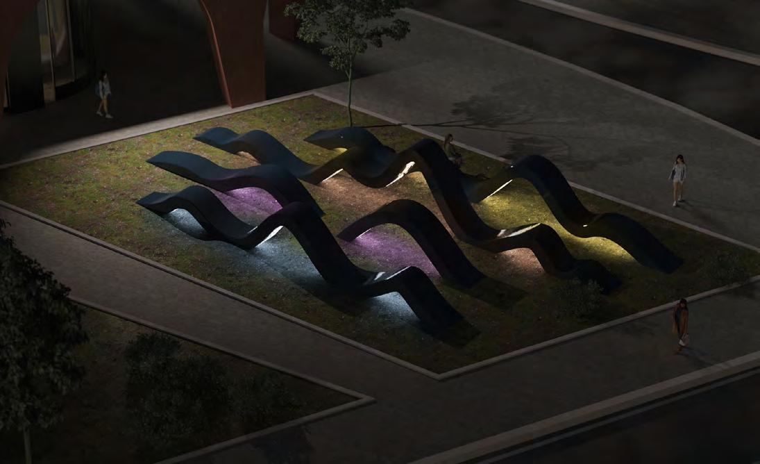
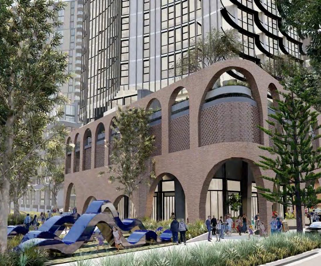
Coastal Threads
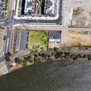
Client: Sculptures by the Sea
Location: Tamarama, NSW
Indigenous Country: Eora
LGA: Waverley
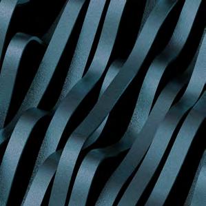
Sculptures by the Sea immerses viewers in a coastal journey with curved steel frames, sunset hues, and shifting ocean views.
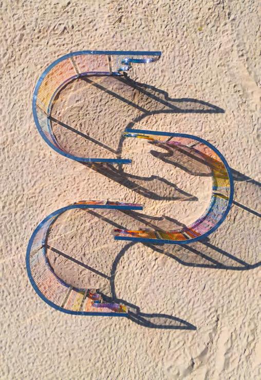
Sculptures by the Sea was an immersive installation inspired by the diverse coastlines along the Sculpture by the Sea walk. The artwork features three graceful curves, each beginning and ending with a coastal profile, creating a journey for viewers as they move through the piece.
The sleek polished steel frame was designed to appear almost invisible, blending with the sky above and the sand below, ensuring the focus remains on the interplay of nature and design. As viewers walk through the curves, ropes strung between the steel frames form a gradient
of sunset hues, adding depth and evoking the natural colours of the coastal environment. These rich colours contrast beautifully with the surrounding sand and enhance the unique experience of the artwork, which shifts as the viewer moves, offering different perspectives of the ocean in the background. The scale of the artwork made it a crowd favourite, with its placement at the heart of Tamarama Beach allowing for views from above and a dynamic walk-through experience, offering a fresh perspective from every angle.
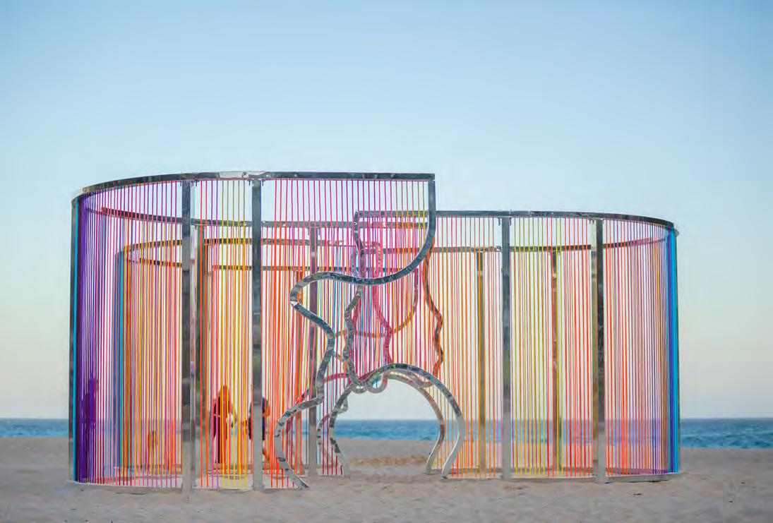
Sculptures by the Sea invites viewers on an ever-changing journey through its interlocking curves, creating a natural pathway that unfolds with each step.
The fluid curves guide visitors through the piece, offering moments of refuge and contemplation, while also drawing them toward the backdrop of the ocean. As the viewer moves, the ropes’ sunset hues reflect and contrast with the shifting colors of the sea, creating a dynamic interaction between the artwork and its environment.
The artwork’s design ensures that each experience is unique—each angle and every moment offers a different perspective, as the light, weather, and ocean evolve throughout the day. Whether viewed from afar or walked through, the piece is designed to constantly transform, offering a new persona with each visit and fostering a deeply personal, immersive connection with both art and nature.
Coastal Treads
College
Location: Morling College, NSW
Thoughtfully incorporated lighting further activates the space, making the experience immersive and inviting during both day and night.
Designed
Morling
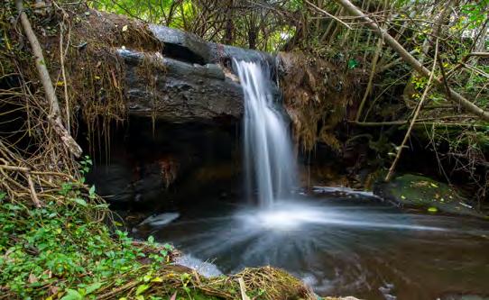
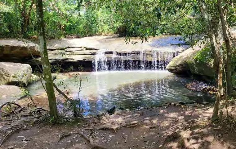
The symbolism of creeks in Ryde Council reflects their deep environmental, historical, and cultural significance.
Creeks such as Kittys Creek and Shrimptons Creek have long been natural landmarks, shaping the region’s landscape and serving as vital waterways for Indigenous Australians, early settlers, and modern urban planning.
They symbolize the connection between nature and the
community, reminding residents of the area’s ecological heritage and the importance of environmental conservation.
For the Wallumedegal people, the Traditional Custodians of the land, creeks were sources of life, providing water, food, and cultural meaning through Dreaming stories and sacred sites.
Today, Ryde Council recognizes these waterways as crucial to sustainability efforts, urban green spaces, and wildlife protection. Creeks continue to be valued as symbols of resilience, continuity, and the balance between development and nature in the region.
Terrys Creek
Mars Creek
Kikkiya Creek
Lane Cove River
Shrimptons Creek
Shrimpton’s Creek Mars Creek
Kikkiya Creek Terrys Creek
Further depth is added to the concept through thoughtful use of colour and materiality, enhancing the artworks’ connection to water by evoking both its natural tones and its reflective, ever-changing surface.
between Morling Residential College and the Ministry Learning Centre. The artworks seamlessly integrate into the landscape, guiding pedestrians through the site link and encircling the Macquarie Ride development before reaching Saunders Close.
continuous flow of engagement. Strategically placed in high-visibility locations for both vehicles and pedestrians, the trail enhances wayfinding and public interaction.
Thoughtfully incorporated lighting further activates the space, making the experience immersive and inviting during both day and night.
Colours
Mars Creek
Kikkiya Creek
Location: Kingsford, NSW
Indigenous Country: Eora
LGA: City of Sydney
Site area: 1,420 sqm
GFA: 2,840 sqm
35 Rooms
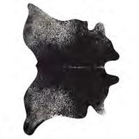
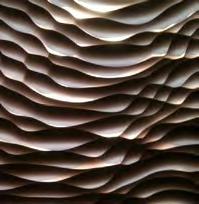
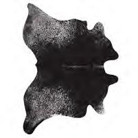
Under the Leather Under the Leather transforms the ceiling into a layered homage to the site’s tanning history, with aluminium sheets mimicking the textures of leather.
Under the Leather draws inspiration from the site’s history as a tannery and warehouse for the New South Wales Leather Company, which operated since the 1950s.
The artwork reflects the layered leather hides once hung on racks during the tanning process, acting as a poignant reminder of the building’s past. The ceiling becomes the canvas for this immersive installation, guiding pedestrians and marking the point of arrival into the entry lobby.
Made from solid aluminium sheets, the piece mimics the rich, warm tones of leather, with layers suspended to evoke the tactile, flowing nature of the hides.
The three-dimensional composition is brought to life with carefully placed lighting, which enhances the sculptural qualities and adds depth. The door pull to the Main Entry Lobby further extends the concept, serving as a tactile connection to the artwork and creating a seamless experience from entry to environment.
Cow Hide Leather Warehouse Layering
What Endures...
Location: Wentworth Point, NSW
Indigenous Country: Wann-gal
LGA: Parramatta
Site area: 14,750 sqm
Size: 171 Rooms
Seamlessly blending art, architecture, and culture, the artwork transforms the façade into a flowing tribute to sandstone, river, and Country.
This public artwork, designed in collaboration with artist Yuku Pin, is strategically integrated into the curved façade of the building to reflect the textures and warm tones of sandstone.
The flowing linework emulates the natural grain patterns found in sandstone, while the colour palette reinforces this geological reference.
The silhouette of the artwork is inspired by the meandering form of the Parramatta River as seen from above, anchoring the work in the local landscape.
Indigenous cultural themes are further embedded through a dynamic lighting design that shifts in response to the six Indigenous seasons, reflecting the flora that blooms throughout the year.
The layered panel composition enhances the sense of depth, casting subtle shadows and concealing structural fixings, resulting in a refined and immersive installation that invites people into the site and celebrates a deep connection to Country.
Colouring
The artwork’s colour palette draws from rich earthred hues and the natural tones of sandstone found along the edges of the Parramatta River. These warm, grounding colours not only echo the geological character of the local landscape but also enhance the connection to Country, embedding a sense of place and history into the façade.
Conceptual Narrative
The waterways need to be respected as the Dharug people would do through sustainable practices. The lines also reference the many people that would come together and connect along these shores, celebrating a diverse community both in ancient and contemporary ways.
Linework Drawn by Indigenous Artist Yuku pin
Night Presence INDIGENOUS SEASONAL COLOURING (JASMIN)
These colours and information has been sourced from Francis Bodkins Dharrawal climate and natural resources.
NSW Historical Imagery
COLD AND FROSTY, MAY-JUNE
HOT AND DRY, JAN-FEB
COOL GETTING WARMER, SEPT-OCT
COLD
What Endures...
Turner x Yuku Pin
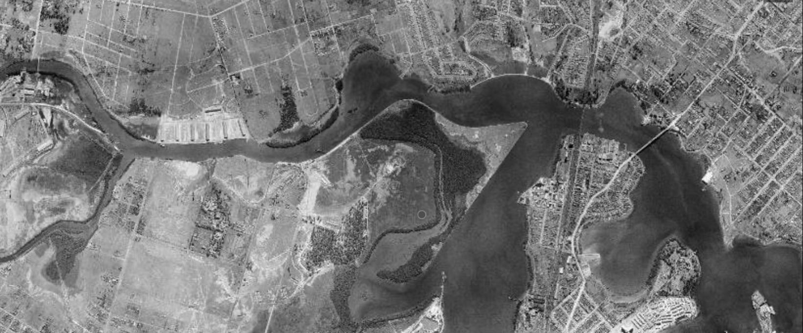
What Endures... is a visual reflection on the enduring presence and significance of the Parramatta River — a timeless symbol of connection, memory, and Country. Inspired by the sandstone contours shaped by the flow persistence of water over millennia. The artwork evokes the physical and cultural imprints left behind by the river’s journey through time.
The Parramatta River holds deep meaning for the local Indigenous clans of this area, with the name “Parramatta” believed to mean “place where the eels lie down.” This connection to place and water is central to the lives, practices, and stories of the Dharug people — the Traditional Custodians of the land.
Wall Art
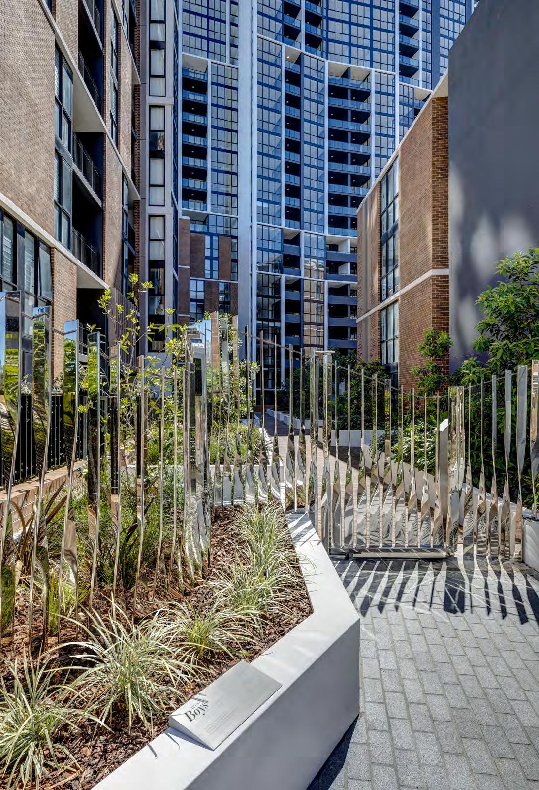
All Our Boys
Location: Westmead, NSW
Client: Confidential
Site Area: 9,389 sqm
The artwork depicts a suburban fence; a consistent, regular, and resilient form which the artist subtly twists while delving into the duality of all matter.
The St Vincent’s Boys’ Home stood on this site from 1896 to 1985 and represents a significant layer of Westmead’s cultural fabric. One page from the story of this place is of All Our Boys, who lived and worked through their childhood here and are part of the essence of this site.
Over 90 years the residents sustained themselves with enterprise, not the least by a print house. At its peak in 1943, with an all boy labor force, it published, printed, and sold 10,000 copies of their in-house magazine ‘Our Boys.’ On closer inspection the work is a meandering row of 87 reflective, individual structural pillars; each one strong, bold, and unique.
“These are the boys we depend on Our hope for the future-and, when Deeds noble and great for the world’s work await, Such boys will then prove to be men.”
Location Strategy
The main entry point to Highline on Student Lane presented an opportunity to create an integrated artwork in the form of a gateway. Inspiration was drawn from the unique location of the artwork. The entrance zone between the two buildings became the interface between private and public domains, contemporary and heritage sites.
The design intent for this artwork is to transform the gate and the fence beyond its practical purpose. Aiming to challenge the concept of a gated development, we transformed the gateway to be an artwork which provides security but does not block or cease the visual permeability. A gateway which announces the point of arrival leading into the residential podium.
L.C. Hardy, Feb 1, 1929, “Our Own Paper”
Sanctuary Phase 6
Location: Wentworth Point, NSW
Client: Sekisui House
Site Area: 9,389 sqm
Using the form to engage people, it allows the artwork to become integrated into its environment, and serve as more than just a sculpture.
The corner of Sanctuary Phase 6 was the forefront of the site and Sanctuary precinct. Directly adjacent to the Parramatta river, high activity retail precinct and park amenity, the location warranted an expression to public amenity and engagement.
Linking to the overall precinct theme of “One with nature” the sculpture takes references from its surroundings, depicting the ‘ribbons of water’.
Vivid Destination
Location: Sydney CBD, NSW
TURNER made its mark on one of Sydney’s biggest events with a stunning display of dancing lights.
As a part of VIVID 2017, which attracted more than 2.31 million people, “Supernova” was a miniaturised astronomical event displayed at Bulletin Place in the CBD.
The Vivid installation was created collaboratively by the Turner team.
Supernova represented the sudden and bright birth of a star which then fades back into a ‘milky way’ of shifting canopies.
Sanctuary
Phase 3
Location: Wentworth Point, NSW
Client: Sekisui House
Site area: 8,799 sqm
GFA: 26,398 sqm
Size: 323 Apartments
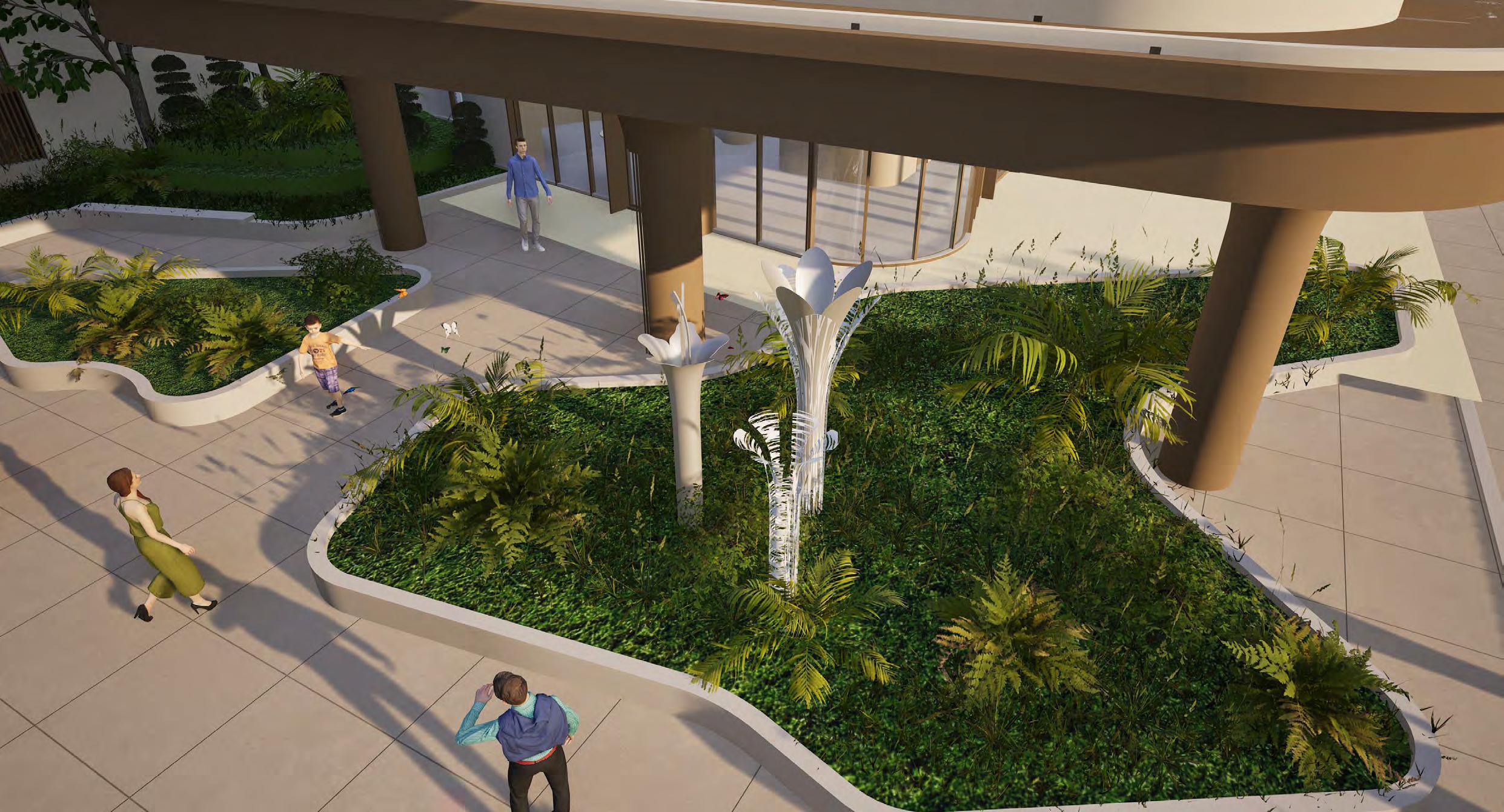
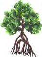
Designed to seamlessly integrate with the surrounding landscape, the artwork varies in height and placement, immersing viewers within the sculptural forms.
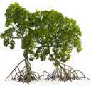
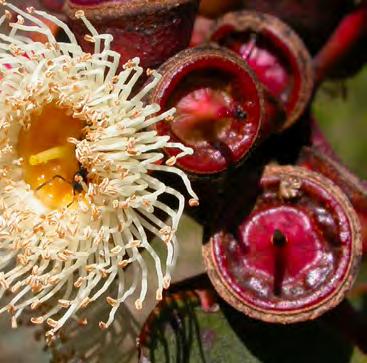
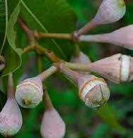
The concept for the public artwork is inspired by the rare flora that thrives in the challenging ecological conditions of Wentworth Point’s mangroves and salt marshes.
These resilient plant species have been reimagined in an abstract form that mirrors the curved architectural columns at the lobby entrance, subtly referencing the organic shapes of pistils, petals, and receptacles.
This approach creates a sense of discovery, allowing people to feel as though they are part of the natural environment—finding sanctuary and refuge among the flowers, just as wildlife does in the wetlands.
The Sanctuary public artwork will pay tribute to the rare and resilient flora that has adapted to the challenging environmental conditions of Wentworth Point’s mangroves and salt marshes.
These plant species, uniquely suited to fluctuating water levels and high salinity, demonstrate remarkable growth and resilience in an environment where few others can thrive.
Rooted in the “One with Nature” theme, the artwork will reflect this endurance, particularly within Phase 3, “The Green Heart,” where nature and urban life intertwine.
Just as the surrounding wetlands provide refuge and stability to the landscape, the artwork will evoke a sense of sanctuary—a safe haven where the community can find peace, connection, and a deeper appreciation for the natural world that continues to shape Wentworth Point.
PARRAMATTA RIVER
MANGROVES / SALT MARSHES
MANGROVES / SALT MARSHES
INLAND
INLAND
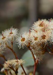
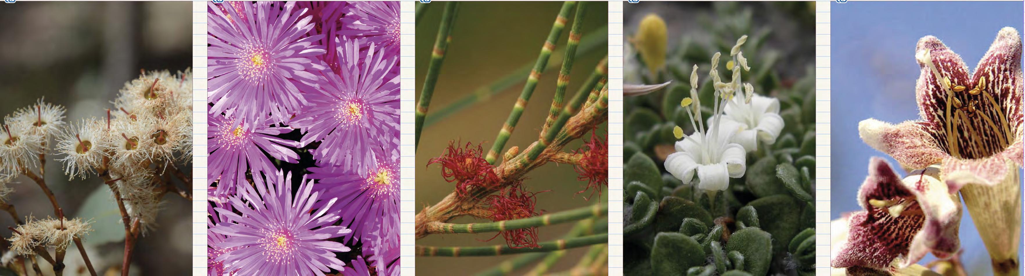
Eucalyptus fibrosa Wonga Wonga Vine
Lampranthus Tegens
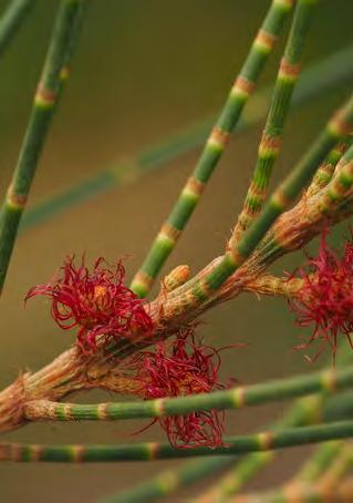
Casuarina Glauca
Wilsonia Backhousei
EUCALYPTUS FIBROSA BROAD LEAD IRONBARK
Texture
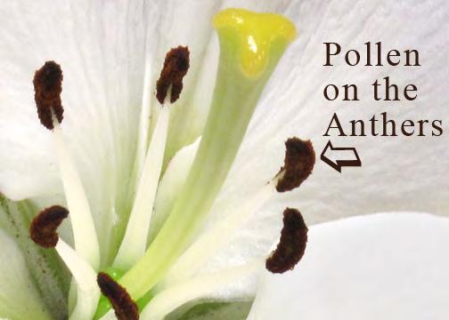
The concept delves deeper into the sensory experience of finding sanctuary beneath a tree, evoking the soft, dappled light that filters through leaves. This feeling is captured through the use of layered materials—solid and laser-cut elements—that create both texture and depth within the artwork.
The laser-cut pattern does not simply represent the petals or leaves directly, but rather abstracts the organic forms found in nature, translating the movement and intricacies of the flora into a dynamic design. The flow of
veins, the curvature of petals, and the fine tips of pollen are all subtly woven into the pattern, evoking a sense of life and growth.
This layering of solid and cut materials further adds to the depth of the piece, allowing it to shift and evolve with the changing light. The artwork plays with light and shadow, with the varying depths and angles creating a sense of movement as the viewer changes their perspective. sanctuary and refuge of the environment itself.
Conceptual Narrative
The concept for the public artwork is inspired by the rare flora that thrives in the challenging ecological conditions of Wentworth Point’s mangroves and salt marshes.
These resilient plant species have been reimagined in
Detail Drawing
an abstract form that mirrors the curved architectural columns at the lobby entrance, subtly referencing the organic shapes of pistils, petals, and receptacles.
Sketches
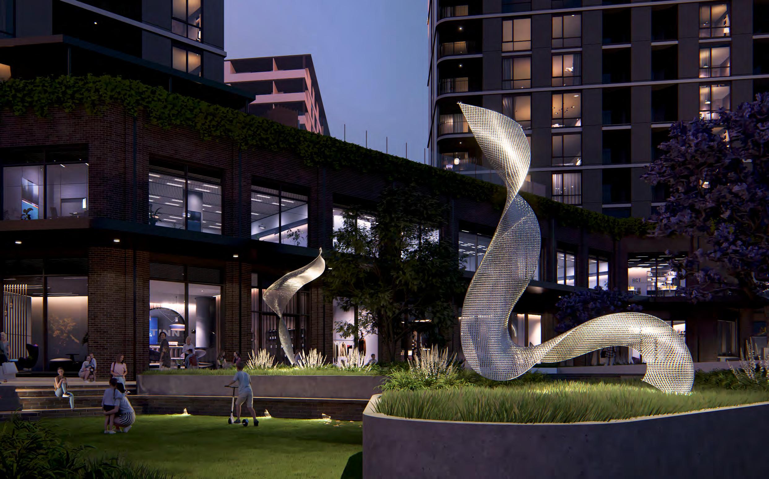
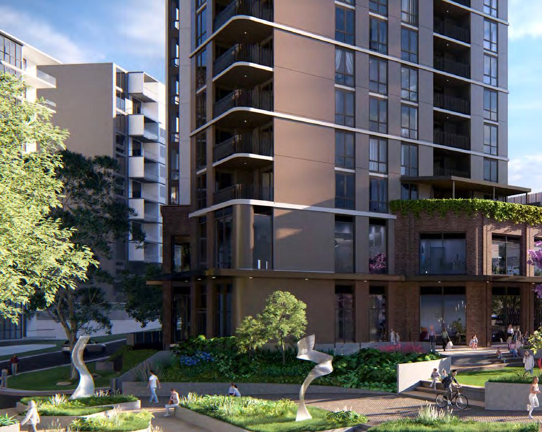
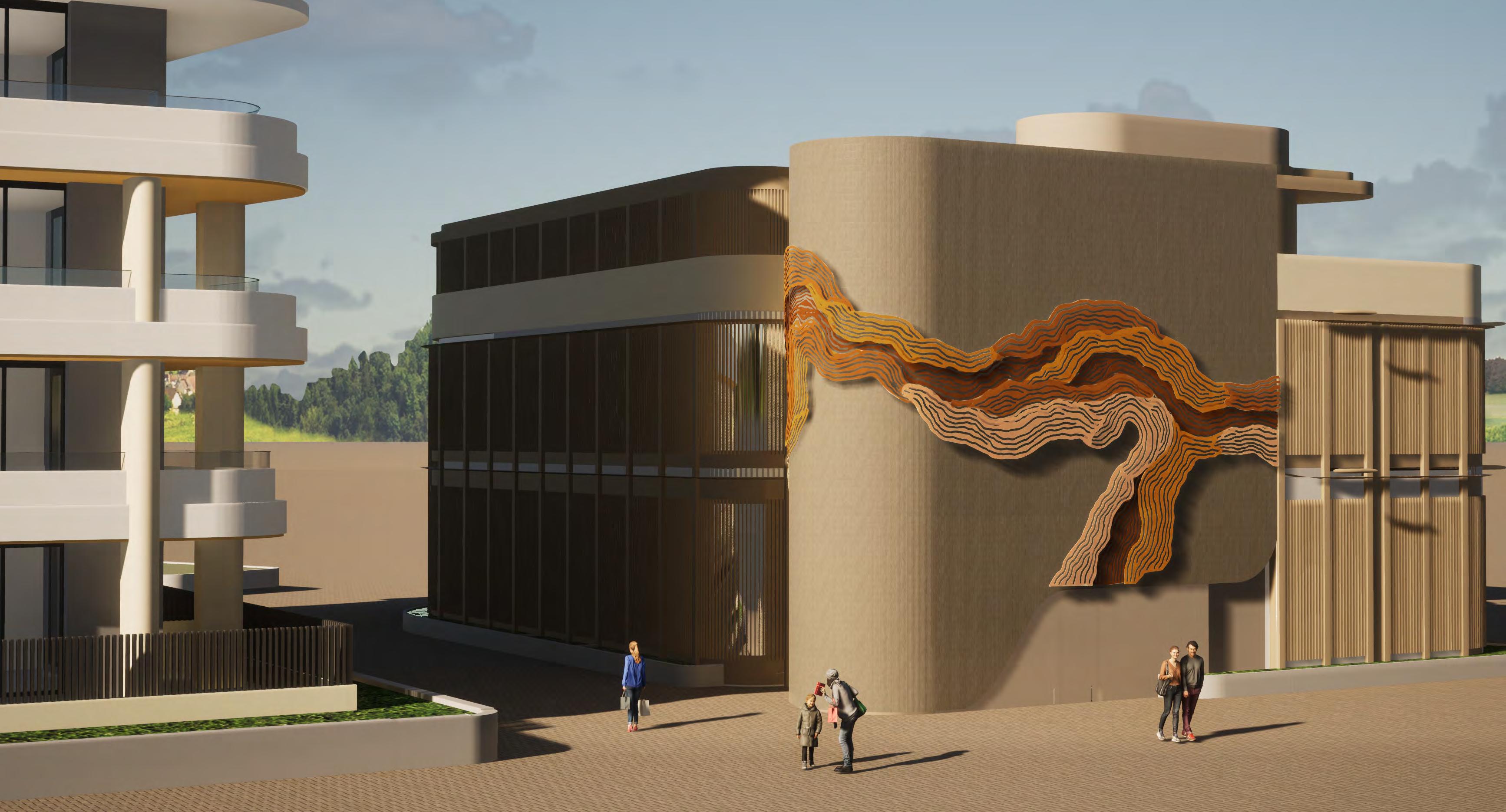
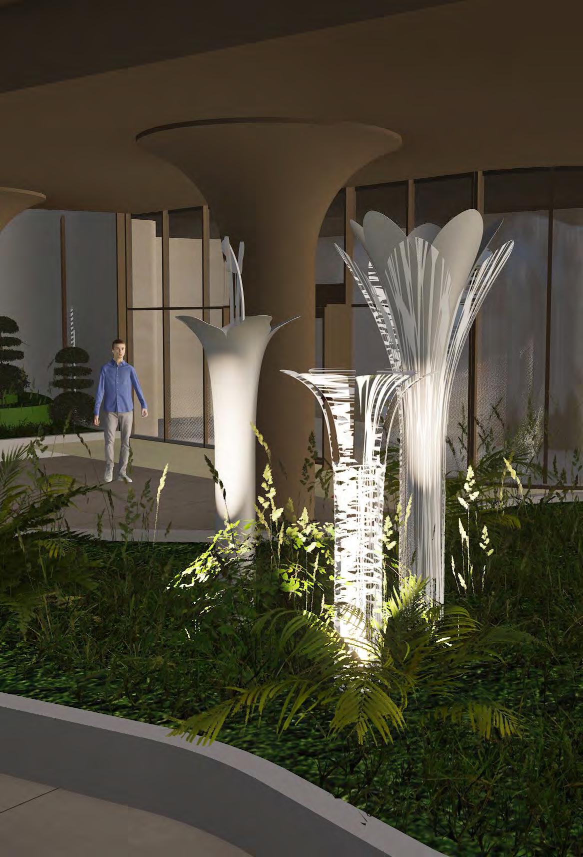
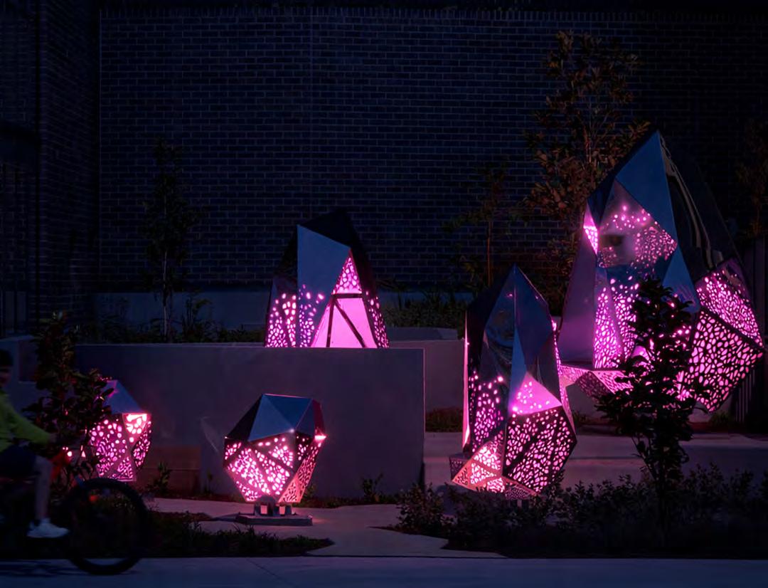
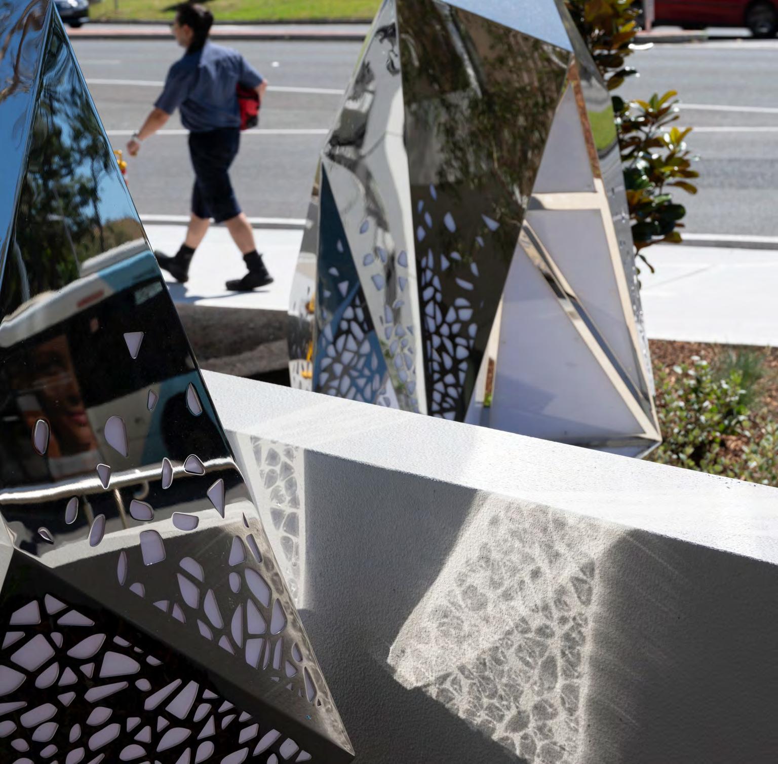
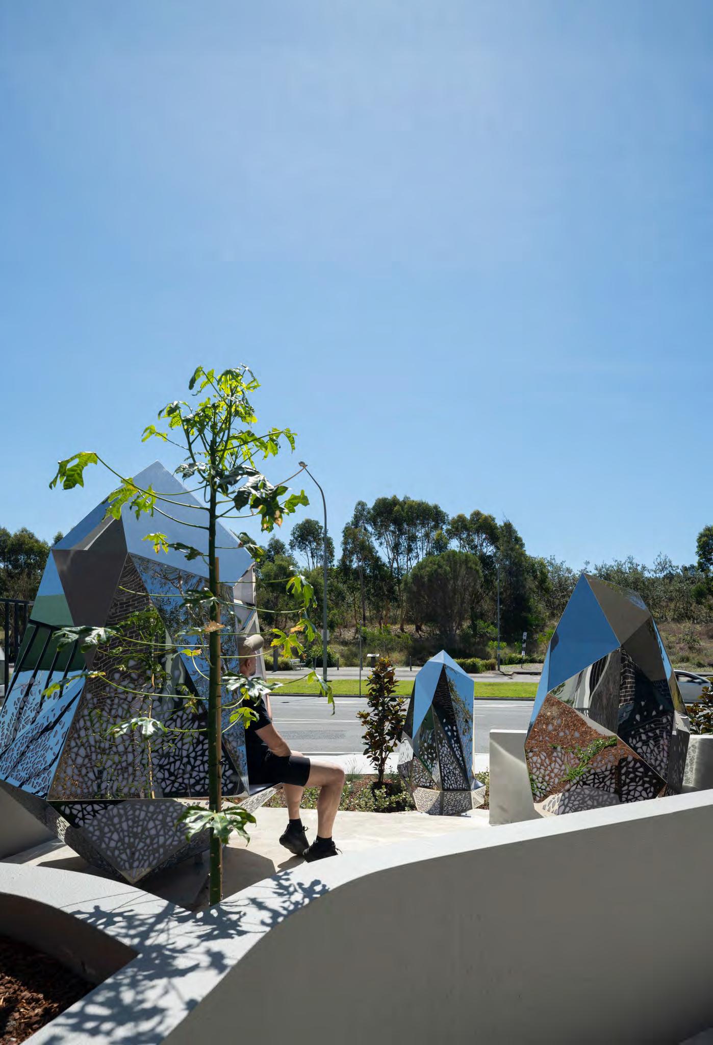
Alloy is a cluster of sculptural forms that speaks to the alchemy of progress — the merging of the natural and the industrial, of organic intelligence and engineered purpose.
Client: Piety Developments
Site Area: 25,570 sqm
GFA: 13,316 SQM
Size: 157 Apartments
Each structure echoes the angularity of industrial machinery, relics of a time when this land pulsed with production.
Yet woven through these forms are biomimetic cut-outs — patterns borrowed from nature’s own design language: branching veins, cellular lattices, the soft repetitions of growth.
Within each form lies a seat, gently lit from within. The light does not react, but waits — constant, patient, like a forge kept burning. When someone enters and sits, their silhouette is cast transforming them into a living figure within the machine.
From the outside, passersby witness this quiet moment of occupation — each person framed like a vital component, completing the form.
The title, Alloy, reflects more than material fusion. It is a metaphor for the tension and harmony between systems — natural and manmade, past and future, body and structure. It asks: What does it mean to design with nature, rather than over it? Can industry evolve by learning from the patterns that shaped us?
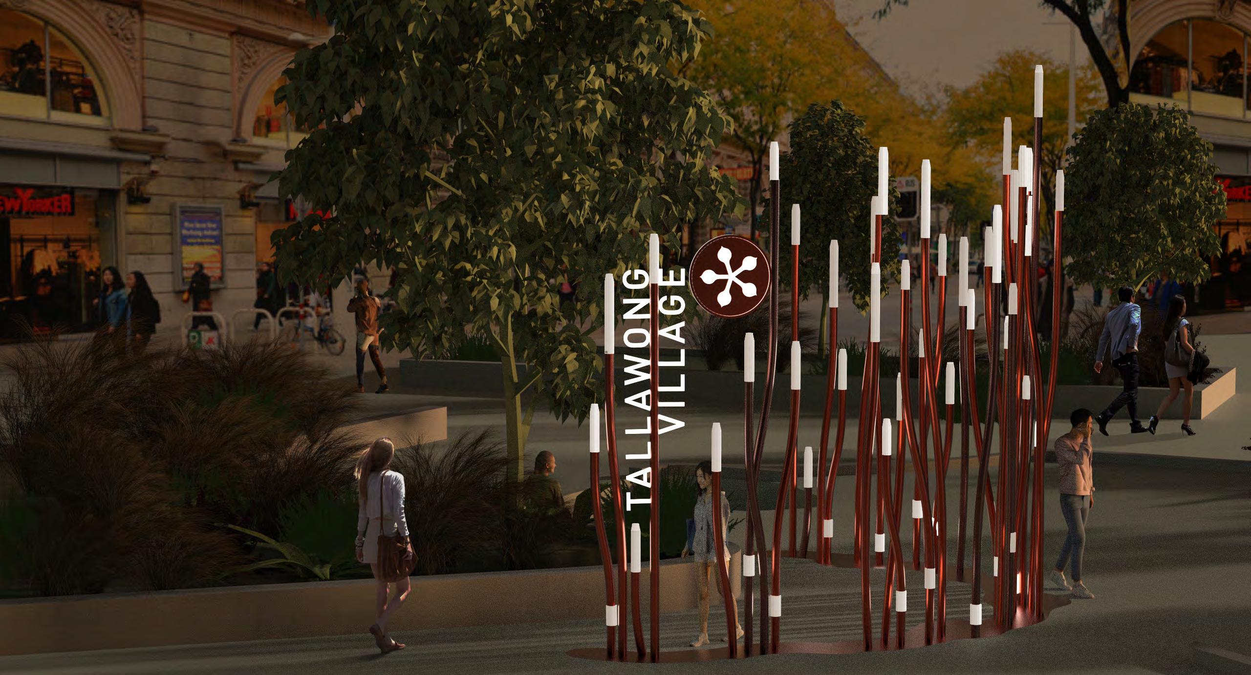
Tallawong Village
Location: Tallawong, NSW
Client: Confidential
Tallawong is a local name of Aboriginal significance - it is derived from the Dharug word ‘dalawng’, for the apple gum tree.
Inspired by the architectural structure of the apply gum flowers, Tallawong’s signage is designed to establish a sculptural placemaking identity.
Blossoming, interwoven linear elements are scattered throughout the village in key navigational locations, using varied scale and tessellated placement of messaging to create a unique, contemporary wayfinding signage system.
Signage Family HOLISTIC DESIGN APPROACH
The wayfinding system of Tallawong has been designed holistically to ensure a consistent signage family has been developed. This can be seen through the brandmark elements that are used throughout the graphic language , such as in the precinct IDs and pedestrian directionals.
RETAIL SIGNAGE
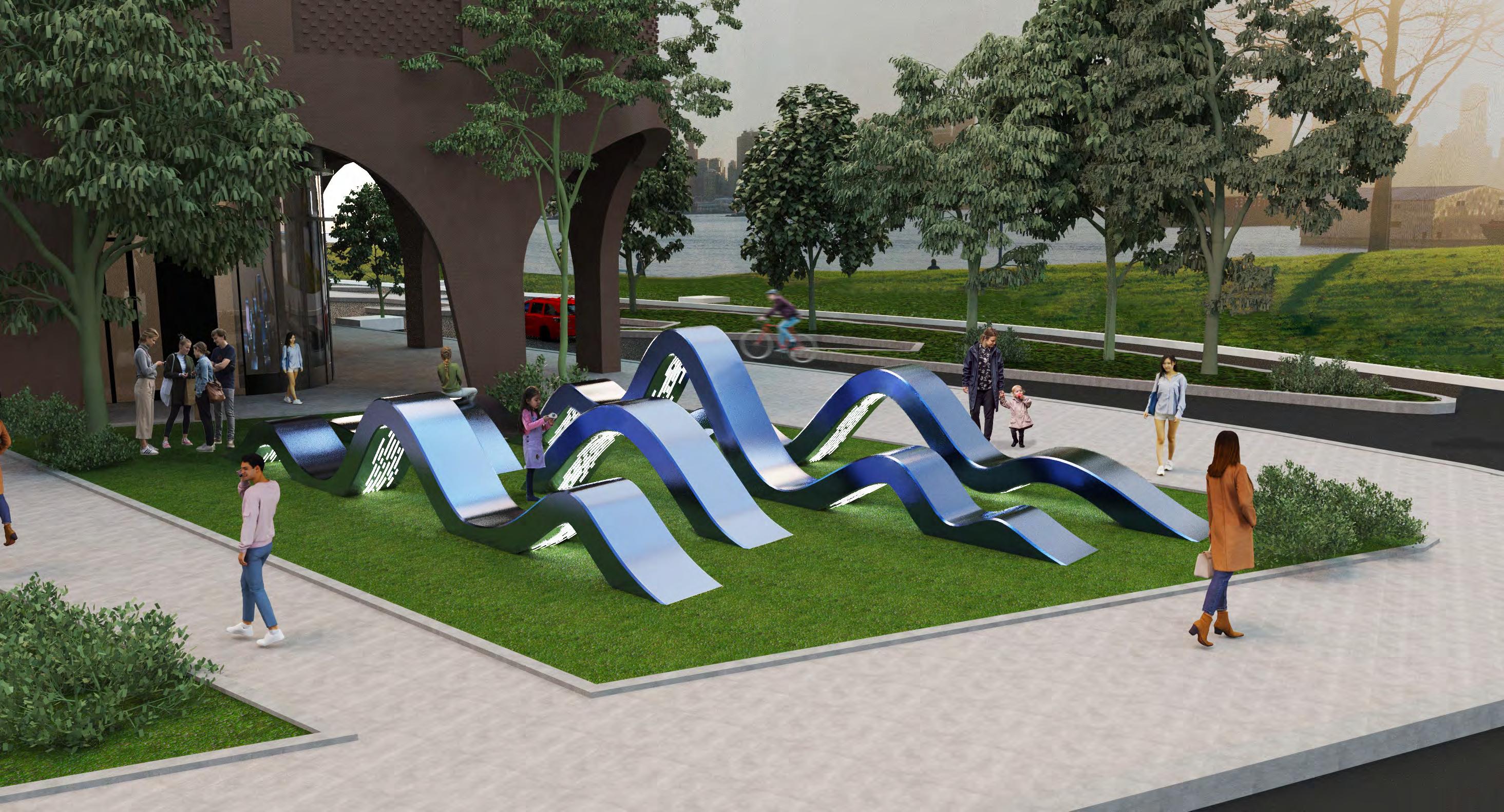
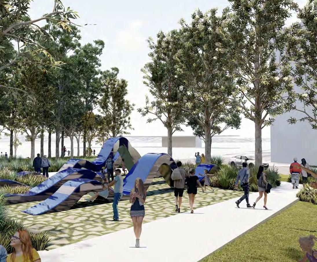
Eastern Quarter Civic Precinct
Location: Penrith, NSW
Client: James Place
GFA: 8,758 sqm
This prominent walkway — formerly fragmented by water features — will be reimagined as a continuous, inviting pathway that encourages visitors to pause and reflect on community figures who have positively impacted society through their meaningful contributions.
The integrated artwork will not only activate the space but also serve a functional wayfinding role, subtly guiding movement while offering varied perspectives and moments of engagement. As people move through this environment, the artwork will enrich their journey and deepen their connection to the place.
Floor Inlay & Custom Seat
The inlay within the artwork operates as both a tactile and symbolic thread, weaving together history, memory, and place. Drawing inspiration from the site’s deep-rooted connection to the railway, the ground plane is inscribed with linework that echoes the geometry of tracks — a visual language of movement, connection, and direction.
From this patterned surface, the sculptural seat appears to peel upward, as though lifting a layer of the past to reveal something sacred beneath.
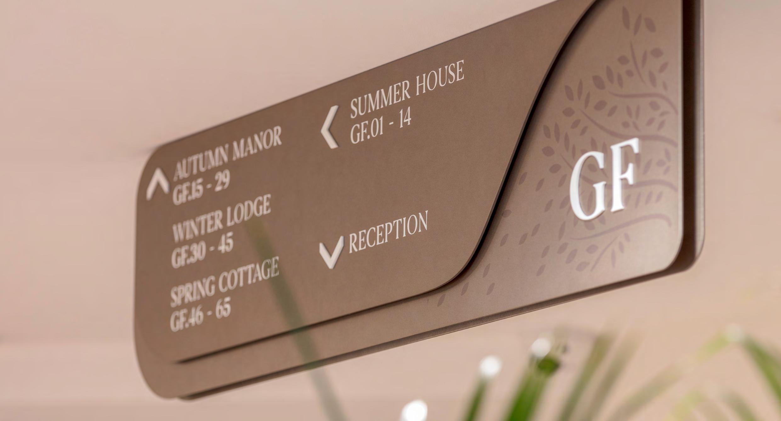
Wayfinding
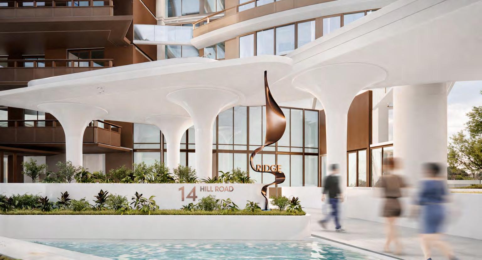
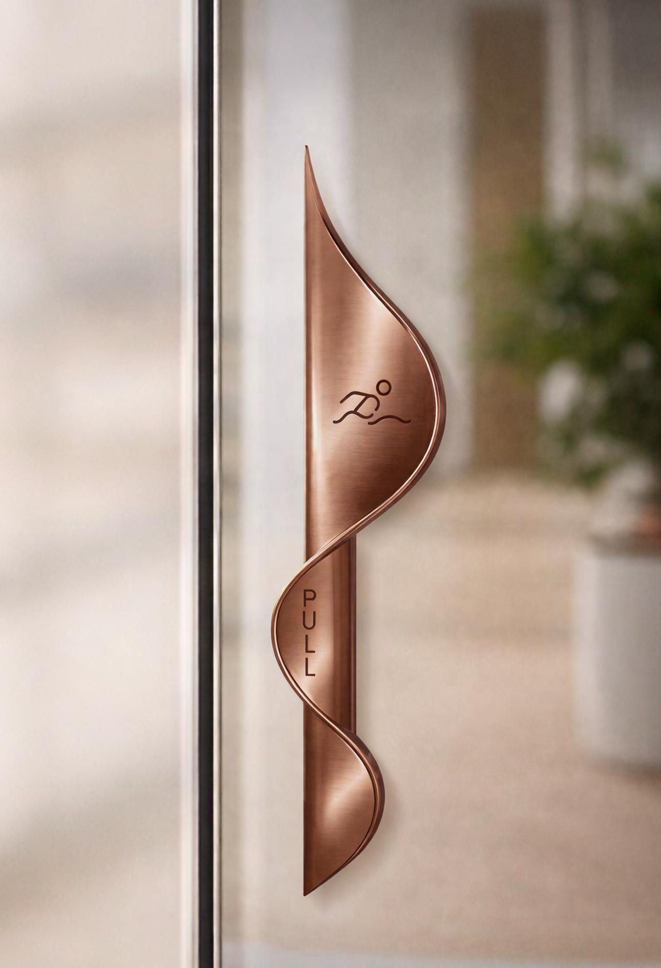
Summit & Ridge
Sanctuary Phase 2
Location: Wentworth, NSW
Client: Sekisui House
GFA: 8,758sqm
Sanctuary Phase 2 features two elegant mid-rise towers centred on health and wellbeing, with lush green spaces, a gym, and a heated pool.
The wayfinding and signage system takes inspiration from the lobby’s architectural forms, using a flowing ribbon design that complements the architecture and creates the feeling of walking through a living sculpture.
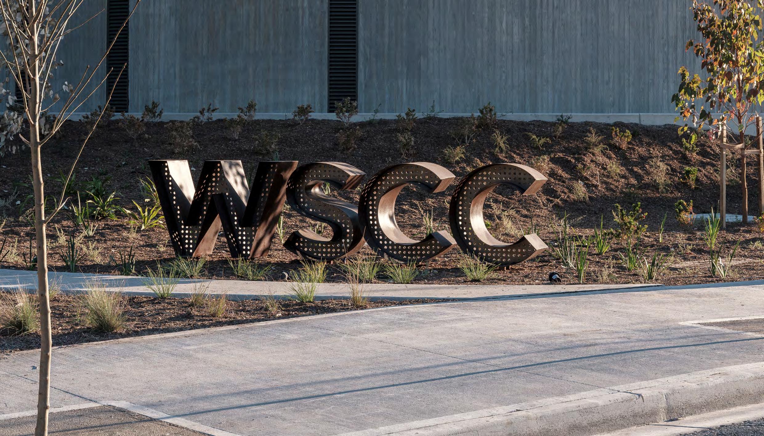
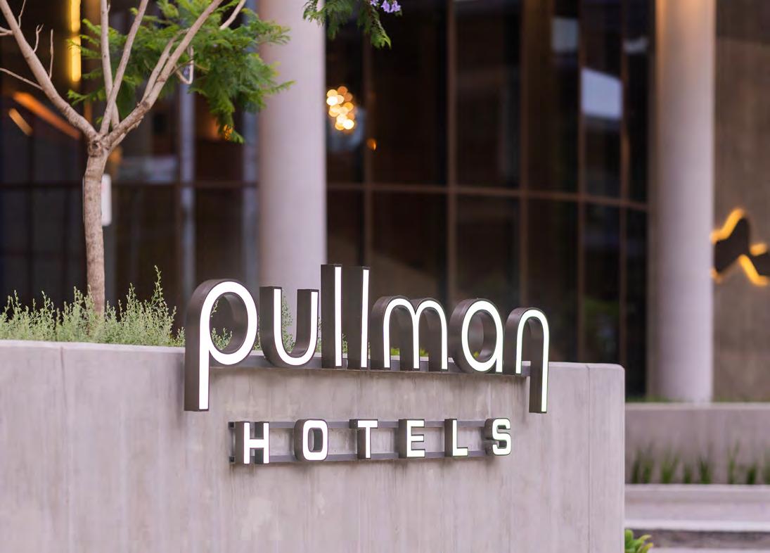
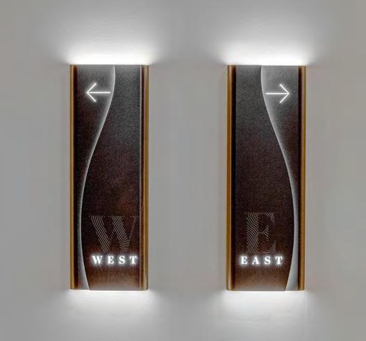
The Western Sydney Conference Centre was designed to create the most memorable experiences, and be a dynamic destination for multi-functional event spaces, and the premium Pullman Sydney Penrith, including exceptional dining and thrilling experiences.
The Experiential Design team designed the Branding for the Conference Centre which was enforced through sophisticated signage.
The team worked along side Pullman to implement their branding application across the site. The complexity of the hotel relied on Wayfinding to guide guests through the site and to access the vast range of facilities, as well as capturing the back of house features to ensure staff of the conference centre and restaurants find their way and access all necessary amenities.
WSCC - Pullman Hotel
Turner completed the branding for the
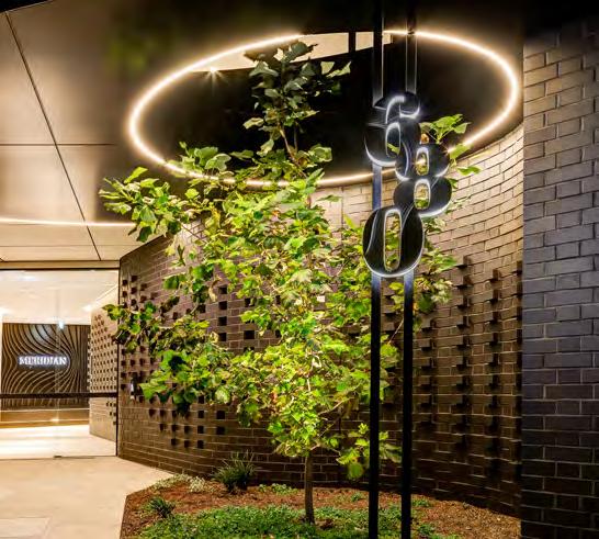
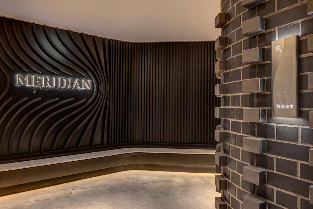
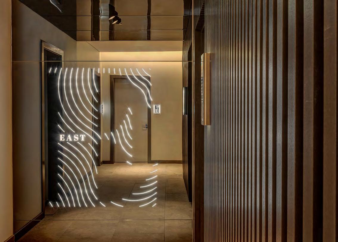
Designed with a holistic approach, from the built form, the landscaping through to the signage and wayfinding; the experience of Meridian is a statement in luxury and seamless design.
This form not only responds to the contours of this site, but also the fluid lines of the water and parks that surround the site. These curvaceous lines commence at the point of arrival in the two lobbies and extend through the buildings.
The signage and wayfinding echo the architectural form. The colours are chosen from a classic monochromatic palette of whites and dark greys that bring a sense of calmness to the composition.
CONNECTING THE PRIVATE AND PUBLIC DOMAINS
Particular care has been taken to fit Meridian Miranda into it’s urban context and the openness to the public lane on the West side of the site. The embellishment of this space forms part of this.
A public mural has recently been added to this space to make it even more valued by the local community. The mural is reflective of the endemic features of Meridian’s natural surrounds, such as the flora and fauna.
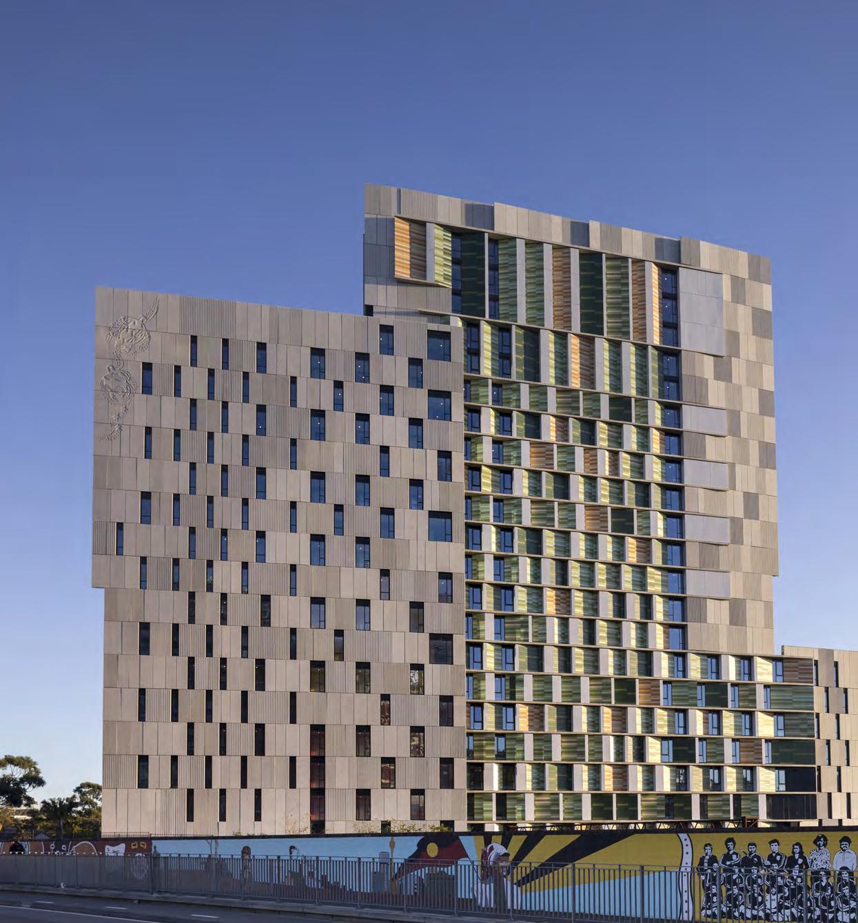
Col James
Student Living
Location: Pemulway Precinct, Redfern, NSW
Indigenous Country: Gadigal - Eora Nation
LGA: City of Sydney
Site area: 2,385 sqm
GFA: 17,080 sqm
Size: 522 Rooms, 596 Beds
Sensitively designed student living on an iconic and challenging site, as a result of a Design Excellence Process.
Prominently located adjacent to Redfern Station and in walking distance of Sydney’s key tertiary education facilities; its presence addresses the needs of students and the local community. The site, bordered by Eveleigh and Lawson Streets, now features a public domain forecourt and a building form that responds to the unique interfaces and urban context.
The facility includes 519 rooms ranging from studios to twin-share and clusters. 110 of the beds are reserved especially for Indigenous students.
Col James is part of the larger Pemulwuy precinct, including affordable housing, a community gym, a kindergarten, and local workplace spaces.
Working collaboratively with Scott Carver and Indigenous artist Danny Eastwood Turner integrated the public domain and public art strategy into the building fabric and identity – the art wall along the street edge, the soffit to the entry, and the family of turtles moving across the façade.
Environmental Graphics
The environmental graphics of Col James are a response to the site that reflects the complex layers of Redfern’s history. These include the geological and natural landscape, the Indigenous heritage, and the current context of the neighbourhood. Brought to life, each floor features a bold, distinctive colour palette that resonates throughout the building, creating a holistic yet unique identity.
Wayfinding Signage
Location: Redfern, NSW
Client: Confidential
At the heart of our approach lies a deep understanding of Deicorp’s ethos, values, and vision. We have meticulously crafted every aspect of the branding and wayfinding signage to resonate with the company’s identity, ensuring a seamless blend of functionality and aesthetic appeal.
Materiality plays a pivotal role in the design philosophy, with a curated palette comprising luxurious wood finishes, sleek glass elements, and timeless stone accents.
Bunji / Yura
Yaama
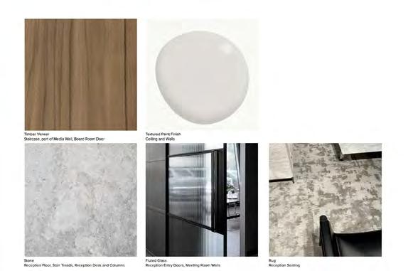
Timber VeneerTextured PaintStoneFluted GlassRug
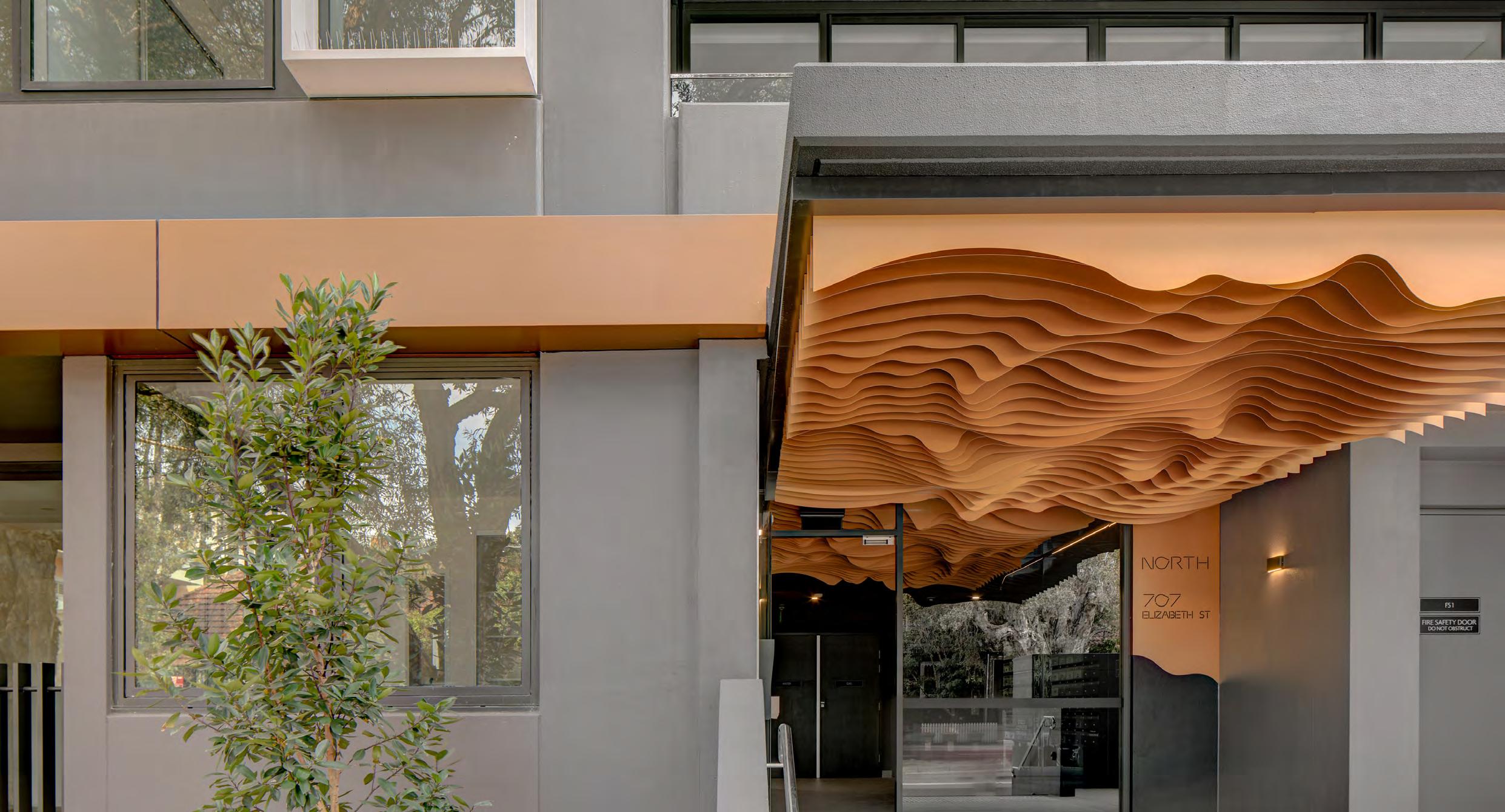
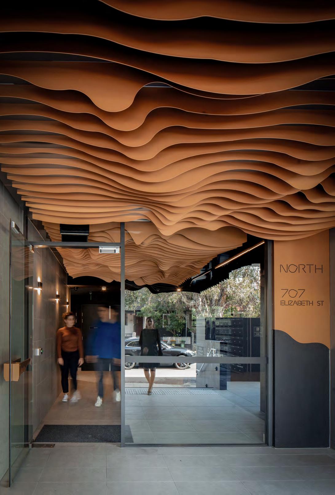
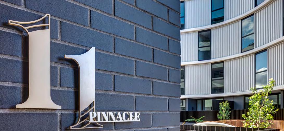
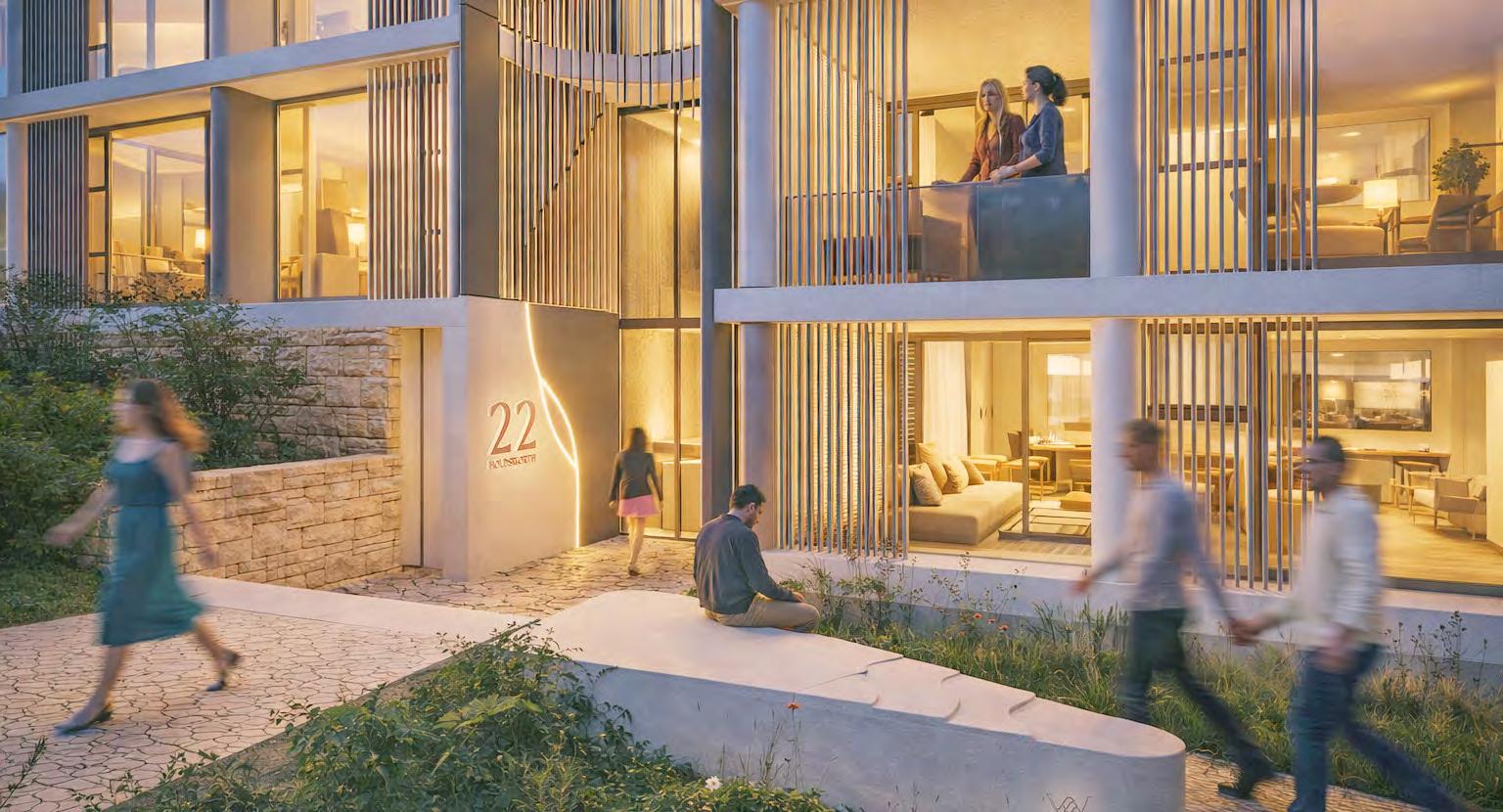
Located in the vibrant heart of St Leonards, this architectural development is designed to reflect and enhance the suburb’s evolving identity as a connected, family-friendly, and community-driven neighbourhood. Known for its leafy streets, excellent public transport links, and proximity to key education and health precincts, St Leonards has become a sought-after destination for young families seeking both lifestyle and convenience.
The development responds to this growing demand by offering thoughtfully designed homes that prioritise livability, sustainability, and a sense of belonging. Anchored by the client’s vision to build more than just housing, the project aims to expand on the distinct character of St Leonards—creating spaces that foster community connection, celebrate the local context, and support families as they grow within this flourishing urban village.
Waterstone
Location: St Leonards, NSW
Client: Sekisui House
8,758 sqm
Conceptual Narrative
The Wayfinding Concept draws inspiration from the ‘Waterstone’ branding, translating its essence into a sculptural, site-specific design language.
Taking an abstract interpretation of water flowing around stone, the concept features gently curved panels that wrap around the wayfinding elements, creating a sense of fluidity and movement.
This dynamic form not only enhances the visual identity of the space but also integrates harmoniously with the surrounding architecture. By layering materiality and form, the design introduces depth and subtle motion, responding to the brief’s call for a bespoke and elegant solution that elevates the user’s spatial experience.
The wayfinding design responds to the project’s ambition for luxury and refinement, using integrated lighting, sleek materials, and sculptural forms to create a premium, highly considered user experience. Each element has been designed not just to inform, but to enhance the architectural narrative— elevating the signage to a design feature in its own right.
Rather than being treated as a functional afterthought, the signage has been embedded into the fabric of the site from the outset. Through early collaboration and a clear design vision, the client embraced wayfinding as a signature layer of the project—one that anchors both navigation and identity.
Moments of place branding are seamlessly woven into the design, reinforcing a cohesive language across the site. Subtle curves, refined finishes, and custom detailing carry the visual story, creating a sense of continuity and quiet sophistication that aligns with the overall architectural intent.
The result is a suite of wayfinding elements that feel purpose-built and site-specific— responding to both the physical environment and the emotional tone of the space. It’s a design that guides, but also invites pause, connection, and a heightened sense of arrival.
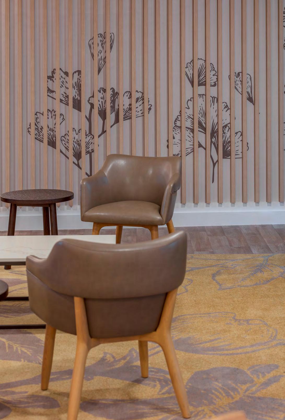
Edensor Garden is a new generation of residential aged care where the approach and experience is changing from hospice to hospitality.
Location: Edensor Park, NSW
Client: Kresner Group
GFA: 6,392 sqm
Size: 193 Beds
Resident’s orientation and movement through Edensor Gardens contributes to their quality of life through their sense of place and familiarity with their environment.
Edensor Gardens
Detailing BOTANICAL
SEASONS
Our signage communicates on many levels. Botanical seasons reiterate cyclical movement, and connection to nature, while communicating locational information on multiple levels.
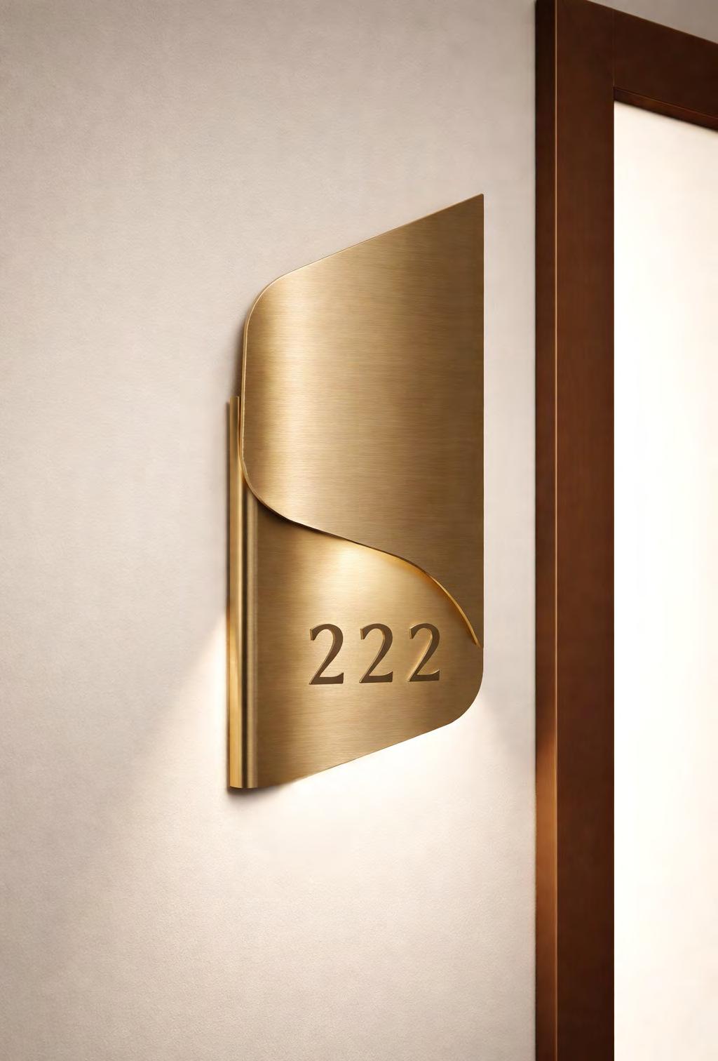
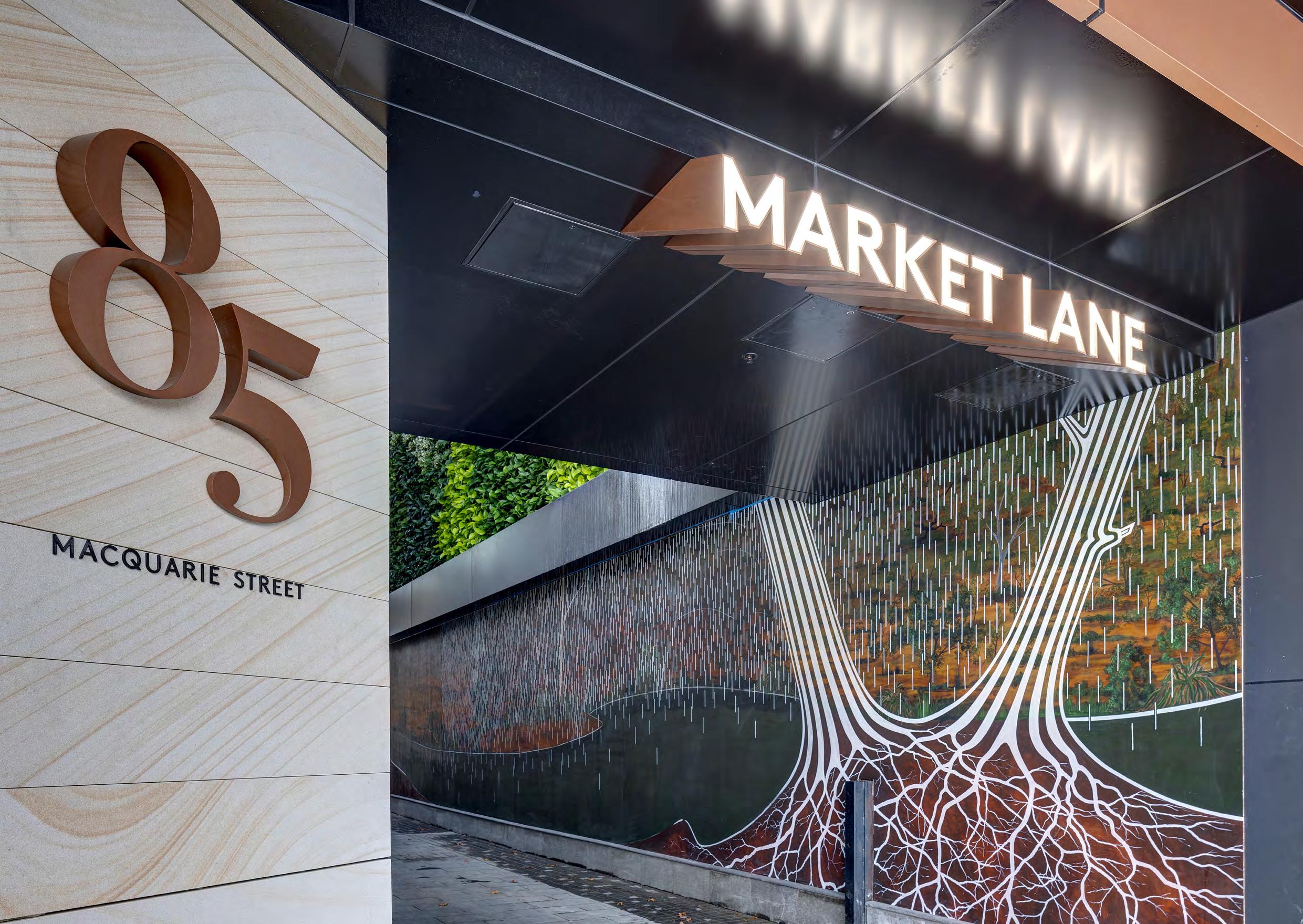
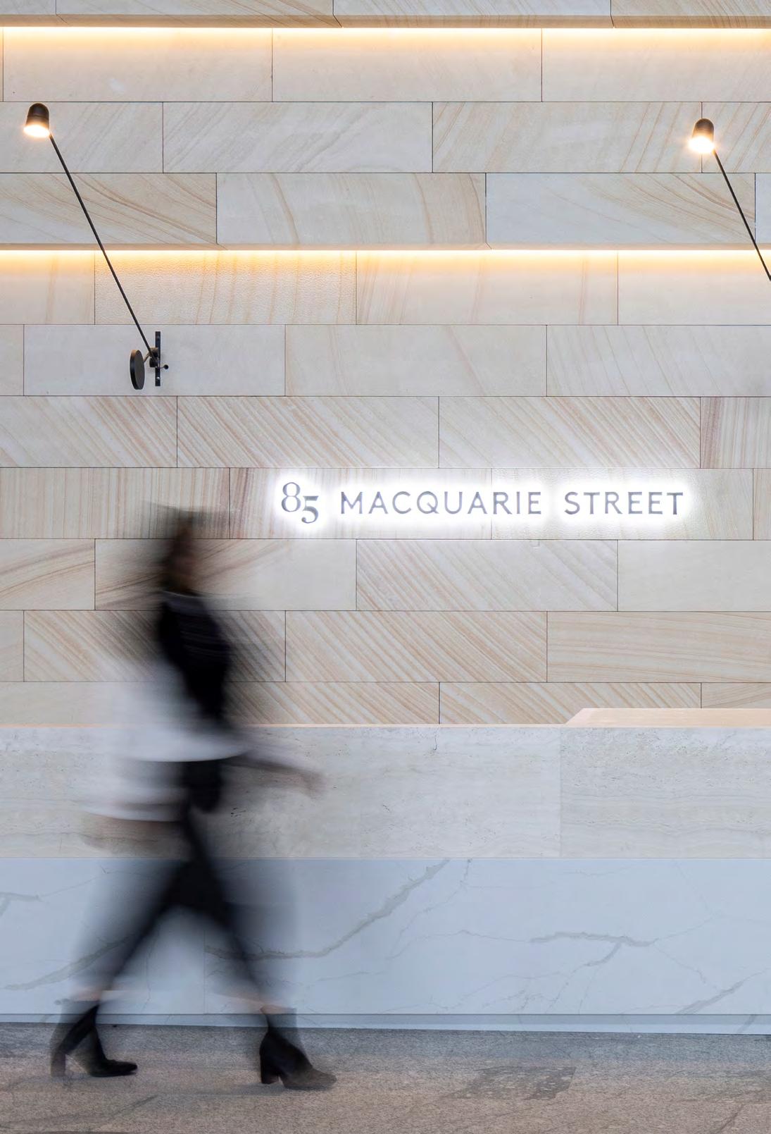
85 Macquarie Street
Location: Parramatta, NSW
Indigenous Country: Burramattagal
Client: Holdmark Constructions Pty Ltd
Site Area: 1,203 sqm
GFA: 9,668 sqm
85 Macquarie Street plays a pivotal role in shaping the identity of Parramatta’s evolving cityscape. As part of Sydney’s emerging second CBD, this boutique development stands as a visual and cultural bridge—linking the rich architectural heritage of Parramatta with its confident, contemporary future.
Positioned within the civic heart and overlooking Centenary Square, the building enjoys a unique dialogue with its historic neighbours, including the nearby church, town hall and Murray’s Building.
The design of the wayfinding and signage family was developed to create a sense of connection to place. Informed by the architectural datums of adjacent heritage structures, as well as Indigenous narratives expressed through landscape and public artworks, the signage is more than functional—it’s a layered visual language.
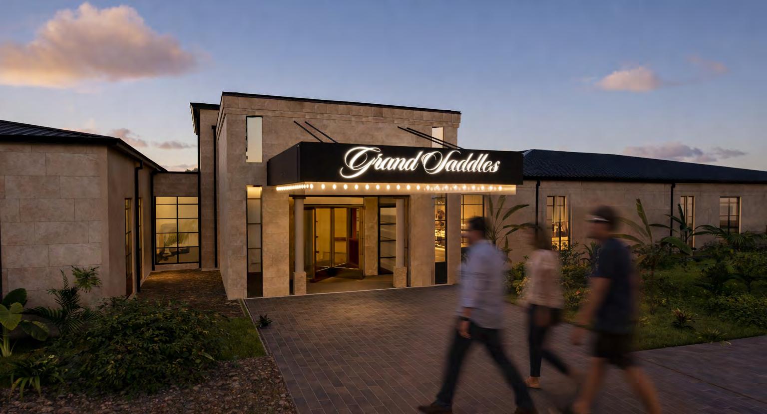
The Grand Saddles Lodge
Nestled in the lush landscapes of Mount White, Gosford, the upcoming hotel draws inspiration from the timeless elegance of New York’s Carlyle Hotel.
Designed as a sanctuary of tranquility, the development features 30 private lodges, each complete with its own plunge pool and freestanding copper bath, offering guests a bespoke retreat immersed in nature.
At the forefront of the property, a state-of-the-art wellness spa sets the tone for relaxation, complemented by a piano lounge and an exceptional restaurant that elevate the guest experience.
The client’s vision is to create a pocket of luxury that exudes sophistication while harmonising with the natural beauty of its surroundings, delivering an elevated escape unlike any other on the Central Coast.
Location: Mount White, NSW
Client: John Singleton Group
Conceptual Narrative
The Wayfinding concept for Grand Saddles draws inspiration from its namesake, evoking the elegance and craftsmanship of equestrian design. Signage fixings mimic the form of a saddle’s stirrup, echoing a recurring detail within the interior design and creating a cohesive language throughout the space.
Fluted glass paired with patina-brushed brass reinforces the narrative, tying the signage to the refined materiality of the 1920s Carlyle Hotel in New York. The result is a design that balances vintage sophistication with elevated luxury, enhancing the hotel’s distinctive atmosphere and guiding guests through the space with both clarity and style.
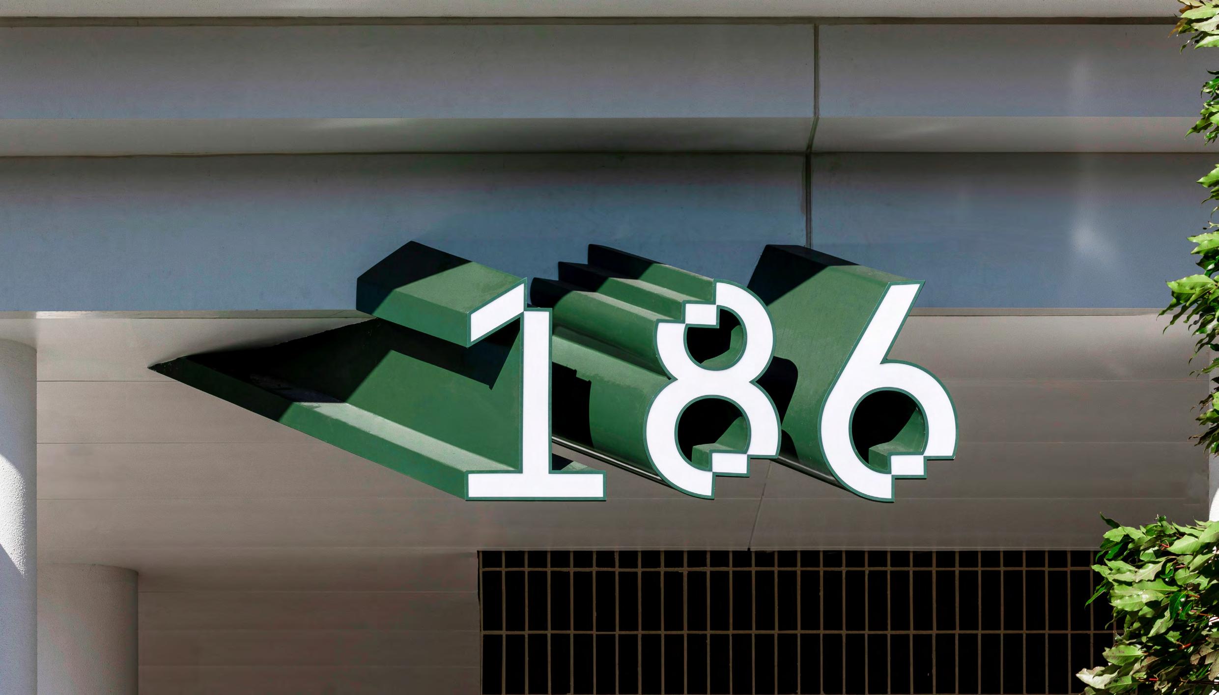
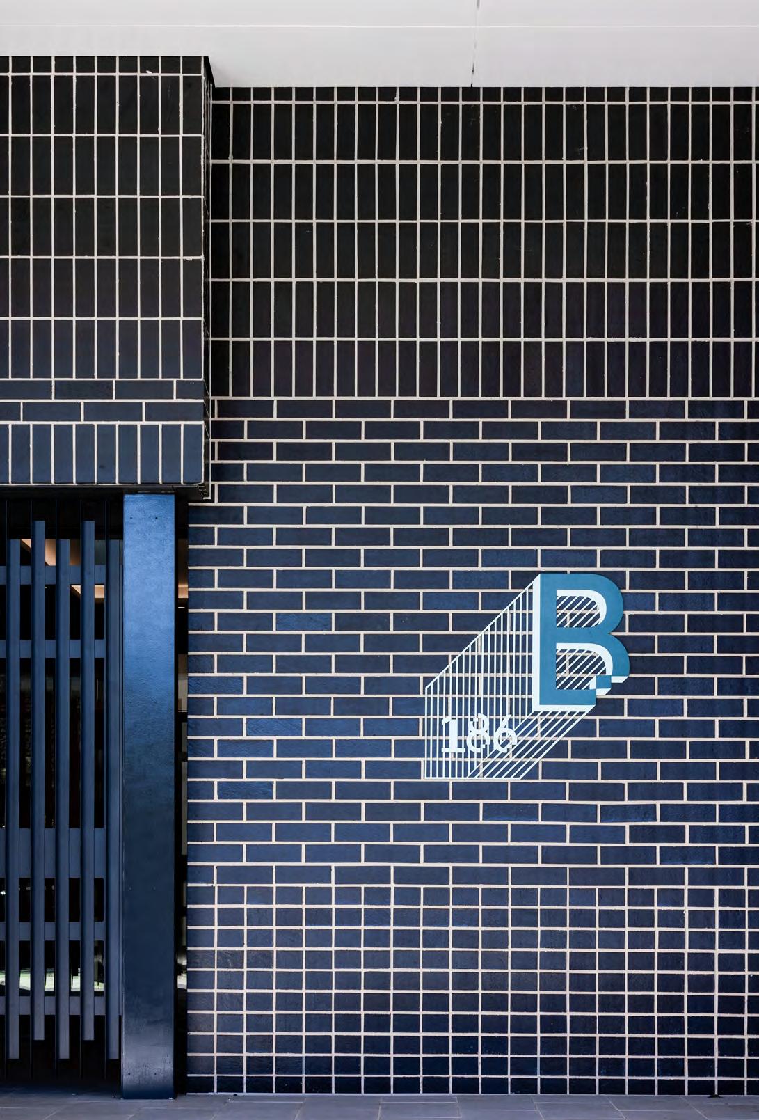
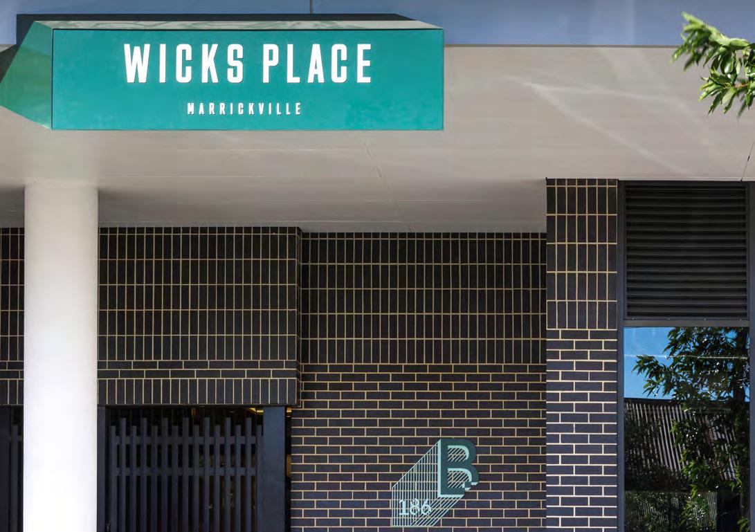
Wicks Place
Location: Marrickville, NSW
Client: Confidential
Site Area: 7,262sqm
GFA: 25,389 sqm
Size: 272 Units
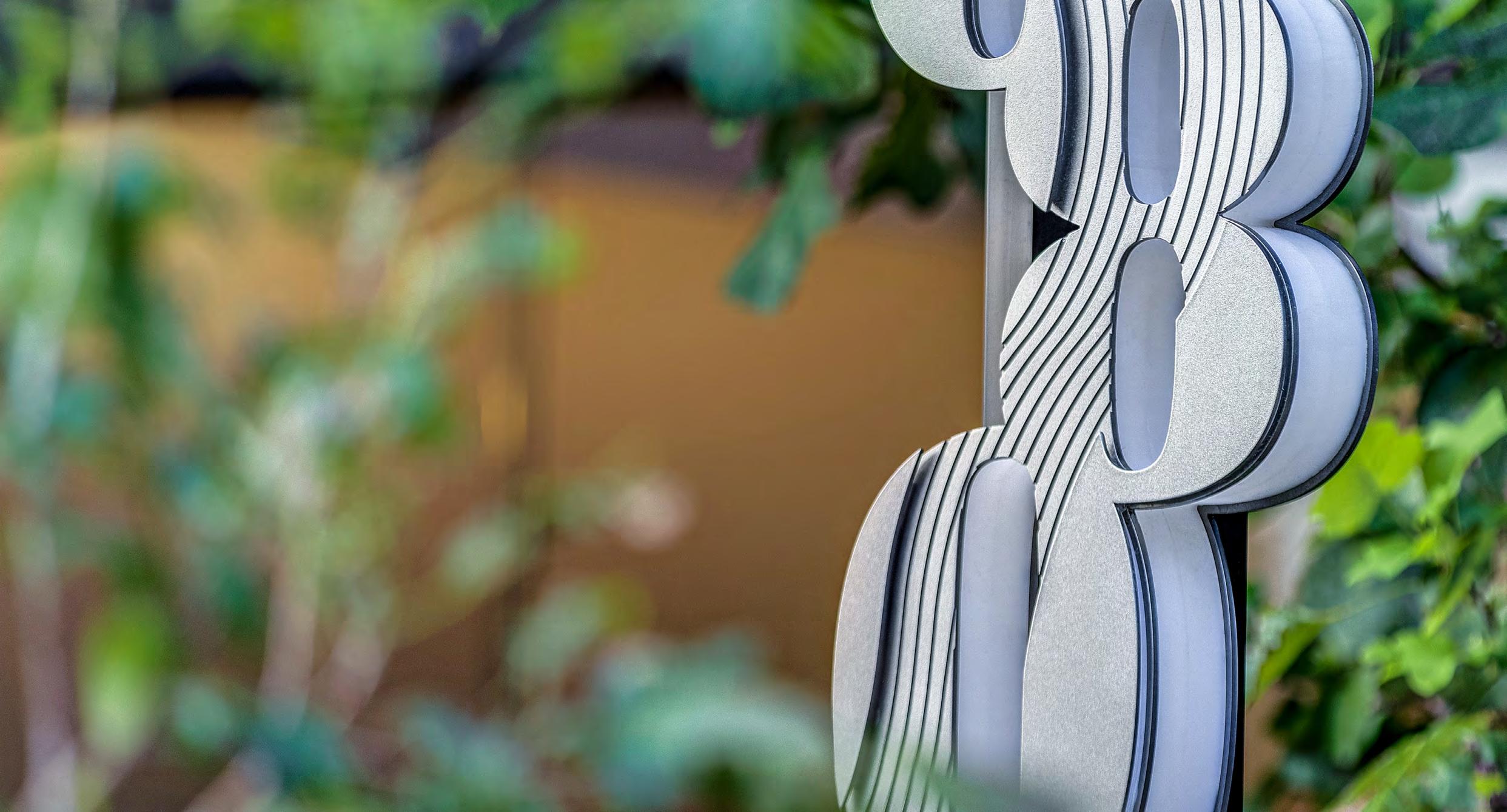
Marrickville is a vibrant and multi-layered suburb, rich with culture and community spirit. This wayfinding signage was developed as a reflection of the area’s unique character—eclectic, grounded, and full of creative energy.
Taking cues from the architectural language of the building, the custom numerals are constructed with strong, geometric forms—referencing the rhythm and repetition of brickwork and the solid presence of square motifs.
The bold, 3D design not only creates high visibility but also adds sculptural impact, echoing the depth and complexity of Marrickville itself.
This sign isn’t just directional—it’s a piece of the place.
Uniting Epping supports the ‘Humanitas Model of Care’ - promoting an intefrated community that is physically and socually involved in daily activities for improved wellbeing.
Resident’s orientation and movement through Uniting Epping contributes to their queality of life through their sense of place and familiariy with their environment.
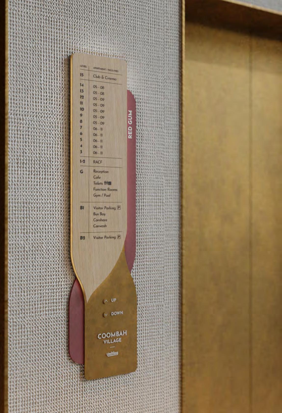
Wayfinding LIFT DIRECTORY
The concept revolves around Inosculation, naturally joined trees have been revered as a symbol of love and marriage in various cultures.
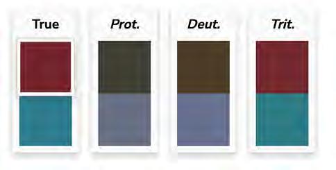
Two towers, Red Gum and Blue Bell, symbolizing unity, community, and care for seniors. We’ve prioritized accessibility, even conducting a color-blind test to ensure our wayfinding system is inclusive and user-friendly.
Colour Blind Test
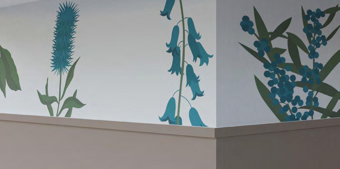
Wall Graphics NATIVE BOTANICALS
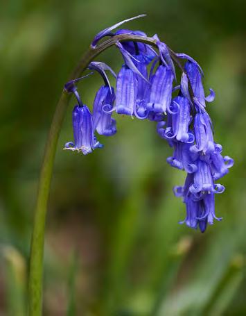
The wall graphics draw inspiration from Australian botanicals, reflecting the vibrant hues of Red Gum and Blue Bell. These colors symbolize vitality and serenity, blending seamlessly to create a harmonious atmosphere.
Botanical Inspiration
Wall Graphics STAFF BREAKROOM
The staff break rooms is transformed by botanical-inspired graphics. Each design is linked with the colours and branding of Uniting, fostering a rejuvenating space for consult or meeting.