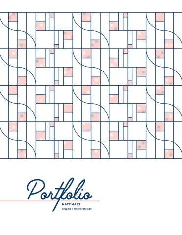
Portfolio
MATT MAST
Graphic + Interior Design
GRAPHIC + INTERIOR DESIGN
mattmast00@gmail.com
Hi, I’m Matt!

This portfolio is a collection of my work as an Interior Design student; near the end is a brief selection of my work as a graphic designer.
My approach to design is holistic; I am interested in how materials, signage, and details work together to create spaces that prioritize the occupants’ experience and, frankly, are fun to be in.
Design may not save the world, but why not at least make it look good?
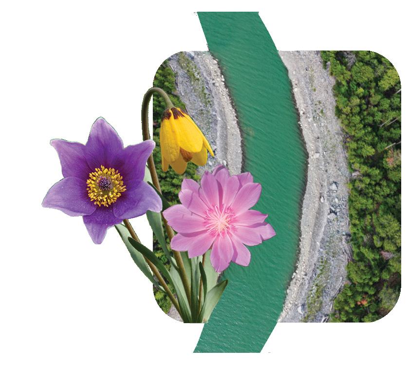
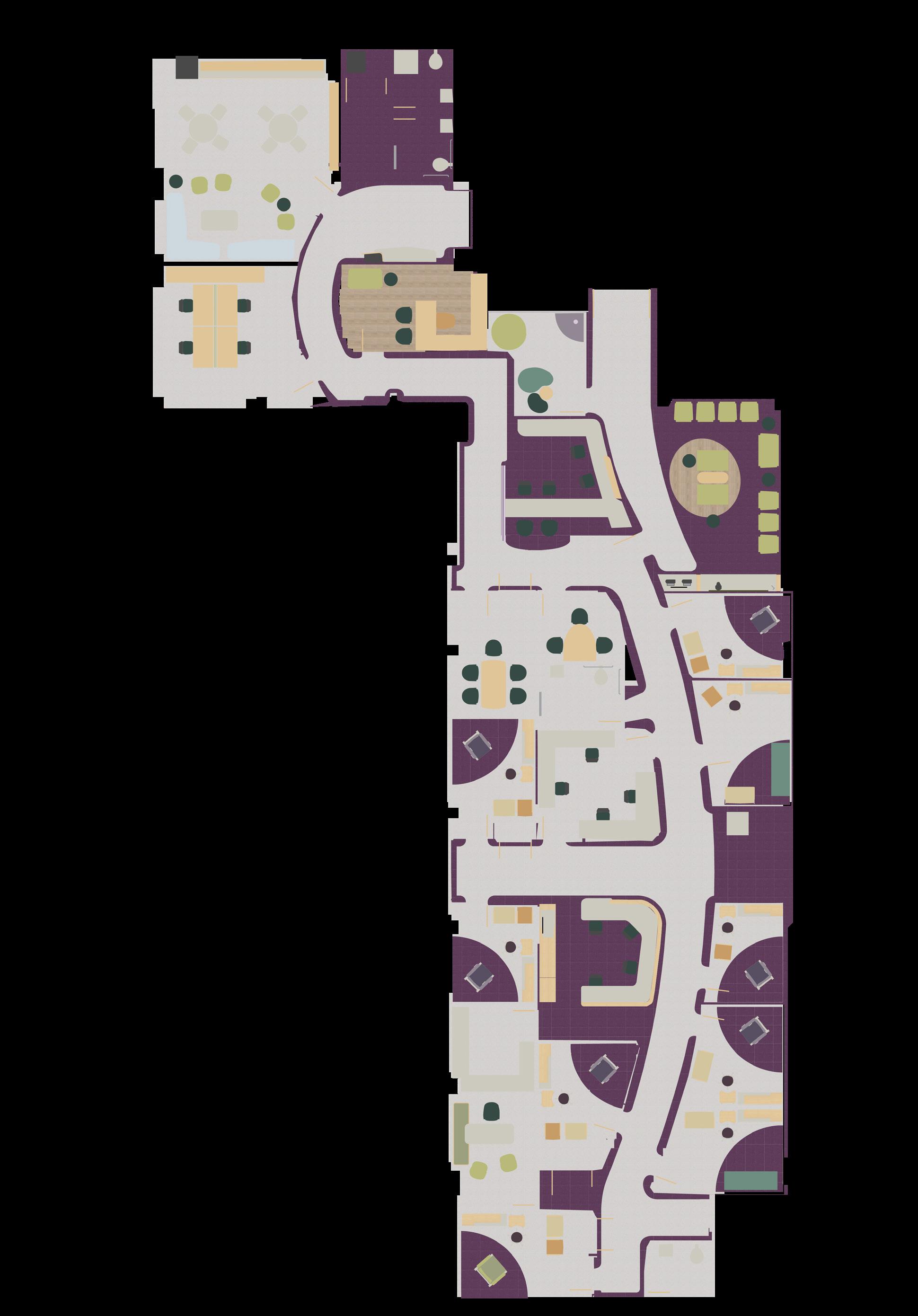
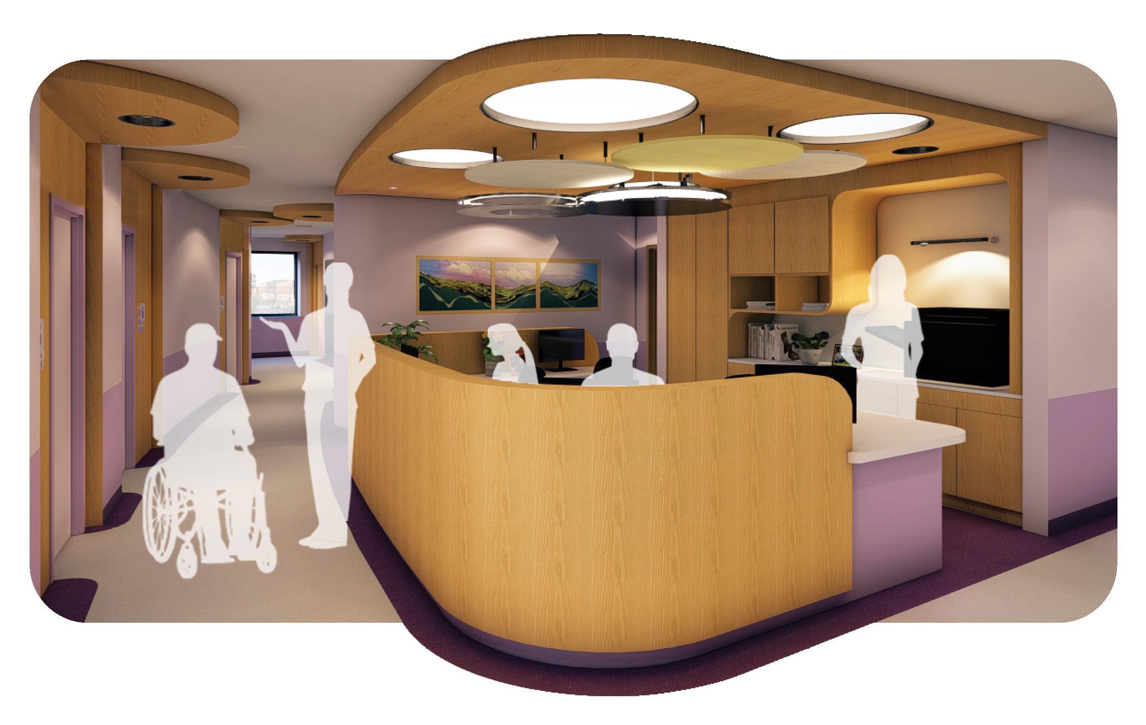
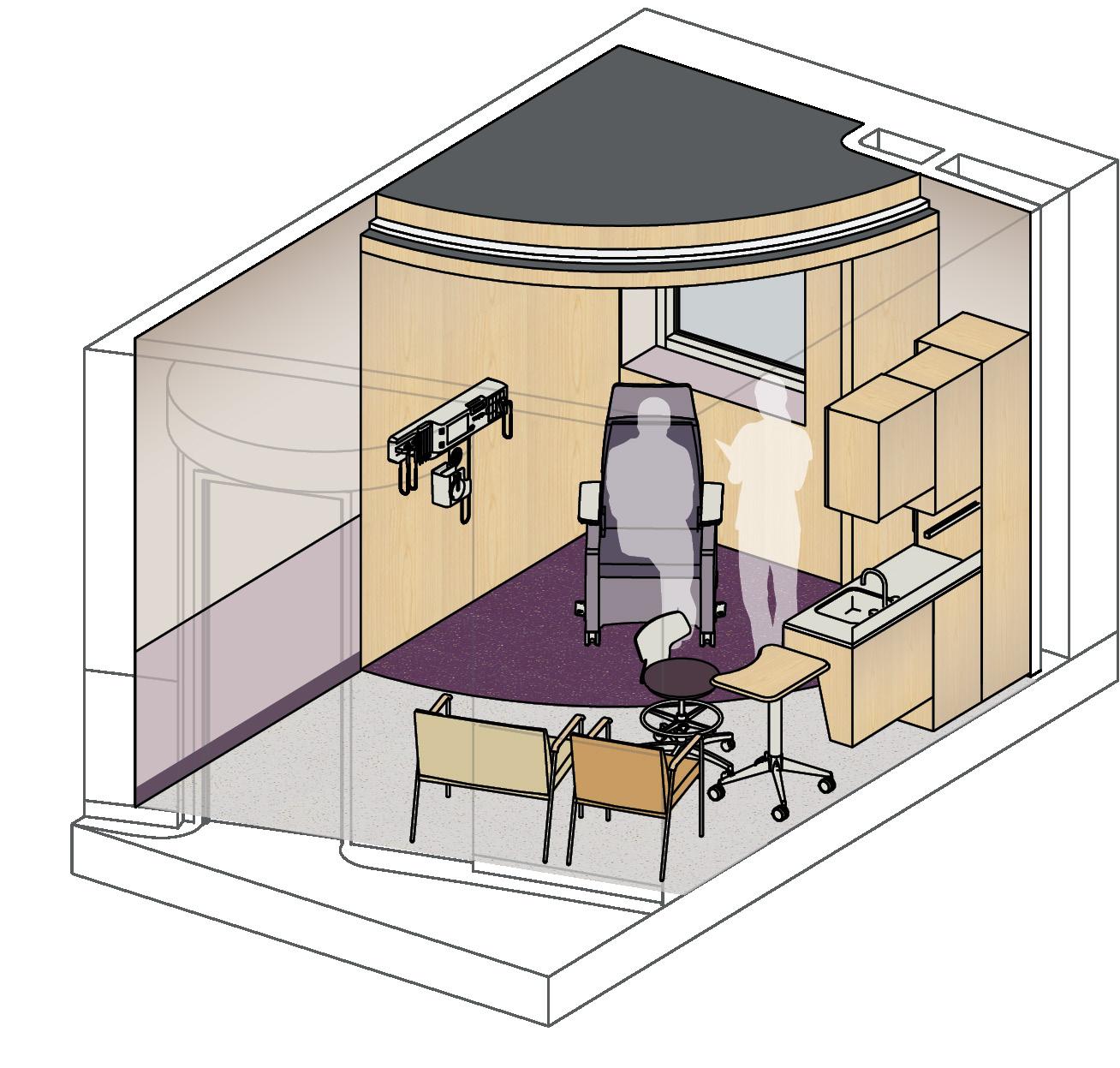
This project—a response to an IIDA Student Design Challenge—focused on creating a health care clinic in rural Northwest Montana. Careful consideration was taken not only regarding materiality and layout, but also demographics and environment.
The guiding concept, flow, draws from the continuous movement of the region’s rivers, emphasizing progression and adaptability, reflecting the patient’s journey through the clinic and the ongoing, responsive relationship between patients, providers, and the surrounding community.
Inspiration taken from the region—native Montana flowers and the many rivers and creeks that snake through the area—inform the lilac color palette, the softened edges, and the gentle bend of the main corridor. These elements root the clinic in its local environment while reinforcing its mission of unity, care, and collaboration.
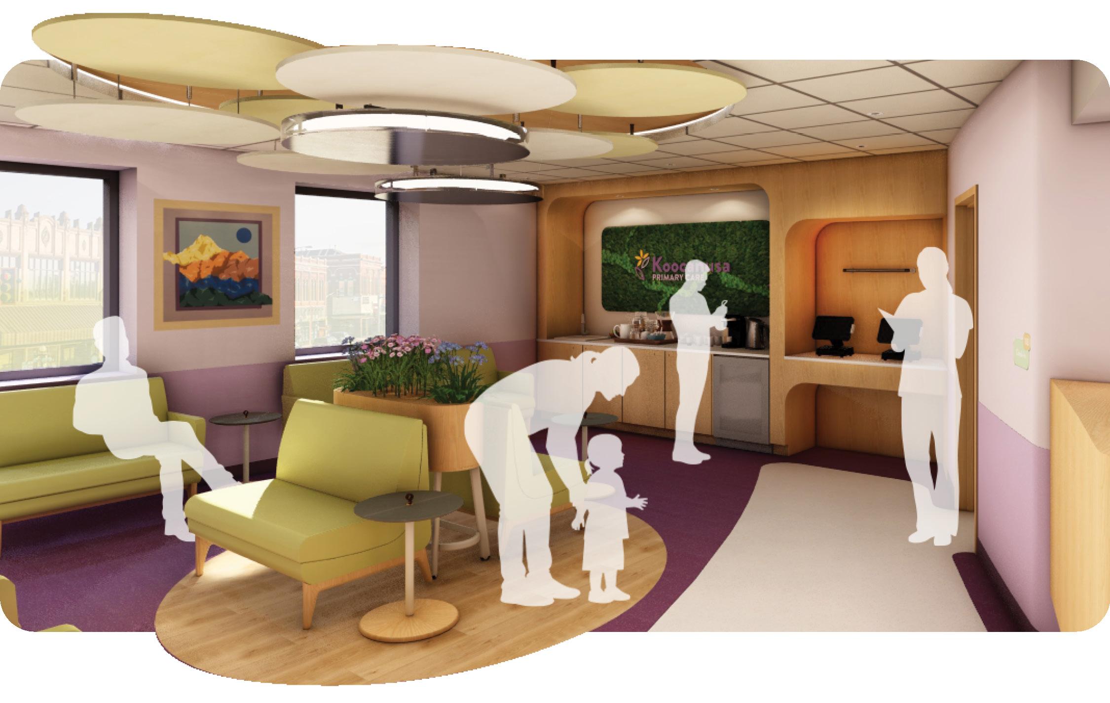

Nourishment: Encourage healthy eating by providing nutritious food and drink options in the Waiting Area.
Light: Maximize natural daylight by terminating corridors with windows.
Movement: Incorporate design features that encourage physical activity and reduce sedentary behavior.
Mind: Tranquil colors and curved design promote a relaxed and restorative atmosphere.


Wayfinding
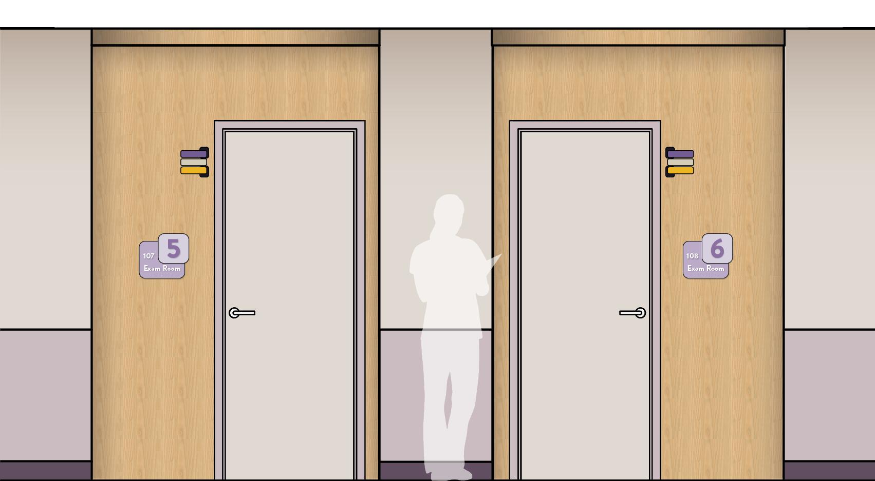
Elevation: Exam Room Doors Not to Scale
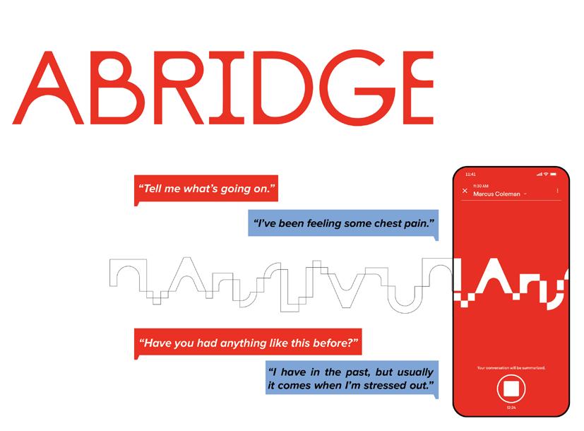
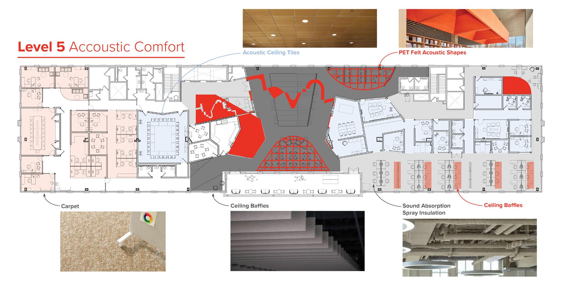
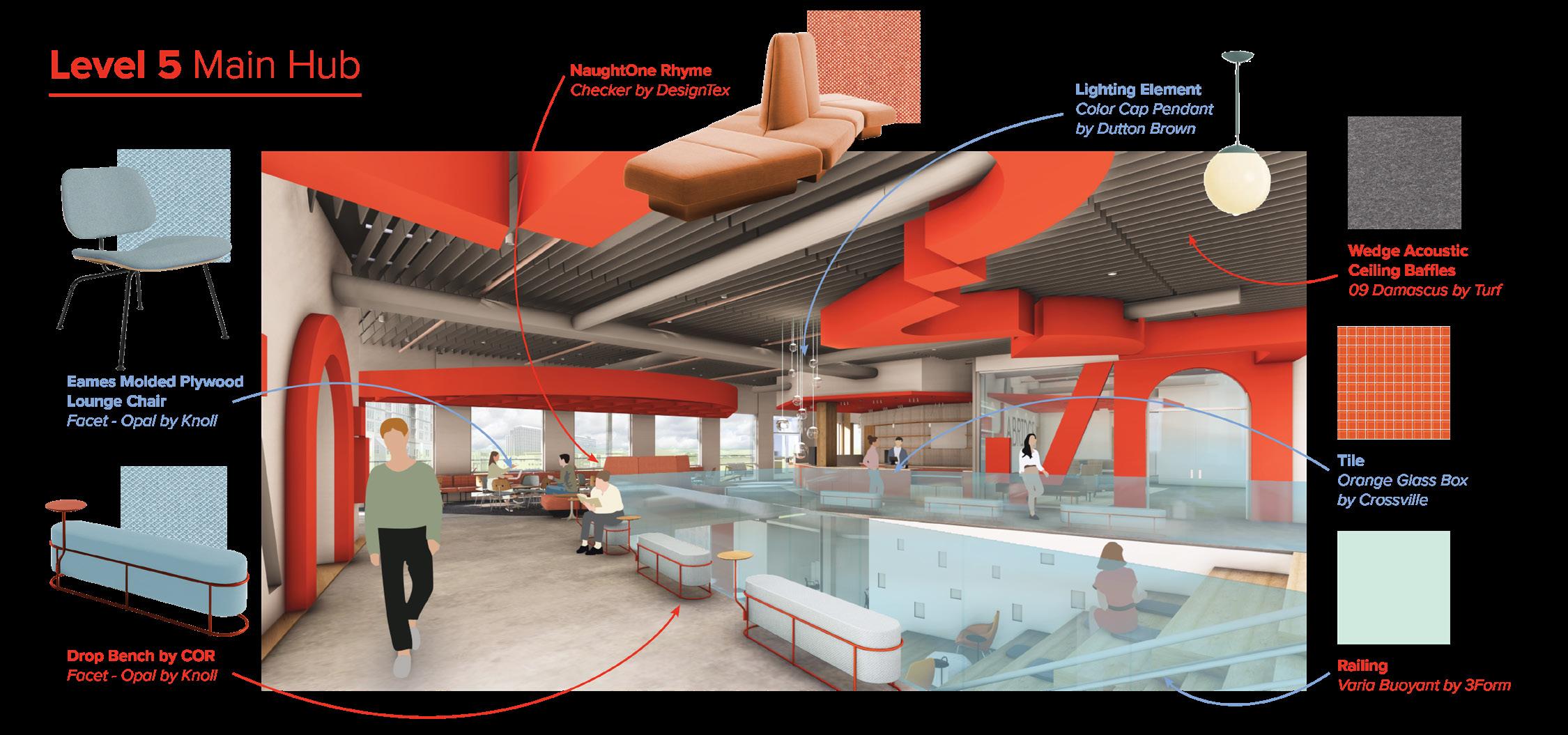
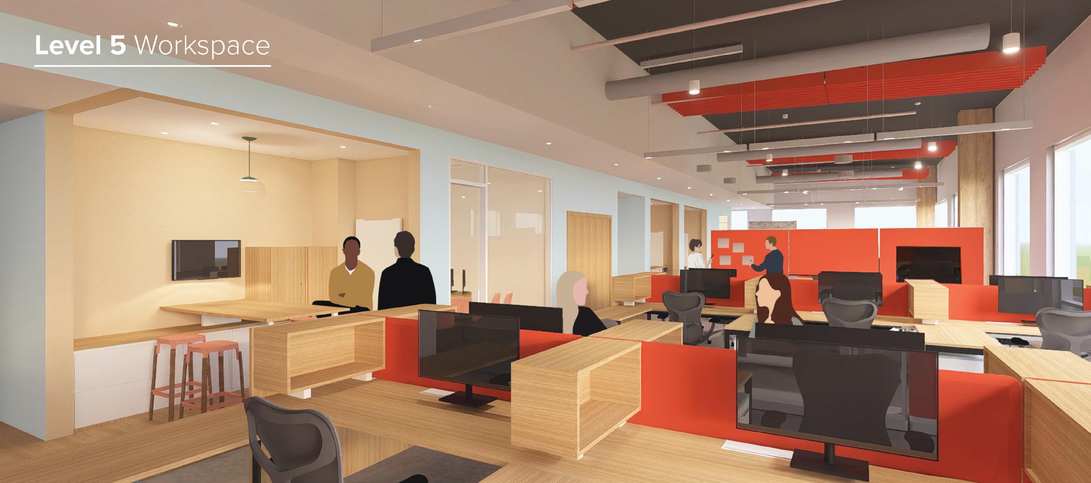
This project tackled the continually evolving challenge of workplace design. This concept for Abridge, a healthcare technology company that uses generative AI to transcribe patient/clinician conversations, translates their ideology into a physical space. Across two levels, the office balances public-facing and private functions while prioritizing employee well-being and productivity. Workstations line the perimeter to maximize natural light, while offices, meeting rooms, and huddle spaces are carved into the central core to support both focused and collaborative work. Brand elements such as Abridge’s signature orange, waveform-inspired forms, and acoustic felt features reinforce identity while creating a comfortable, flexible, and engaging workplace.


Due to budget cuts, please click on the profile to view remainder of portfolio.