MUSEUM COLLECTIONS: AN EMOTIONAL DATA VISUALIZATION
EXPERIENCE
Mariela Yeregui
Rhode
Island School of Design (RISD)
Abstract
This project explores the visualization of a museum's textile collection through the medium of embroidery, merging data with tactile and emotional elements. Unlike traditional visualizations that prioritize objectivity and clarity, this approach foregrounds the materiality and subjectivity of data. The visualization takes form on a tablecloth a symbol of domesticity, intimacy, and community used here as a culturally resonant and familiar canvas that bridges the gap between abstract data and everyday experience. Embroidering the data onto this surface underscores the labor inherent in both textile making and data construction, challenging the impersonal nature of digital data processing. This method invites viewers to engage with the Museum's collection on a sensory and emotional level, fostering a deeper, more embodied connection.
Keywords
Emotional data – visualization – textile collection – subjective repository
Introduction
In this paper, I reflect on my experience working at the Rhode Island School of Design (RISD) Museum as a professor-researcher and 2022–2023 Faculty Fellowship recipient. Before delving into the specifics of my research, I will briefly outline the key characteristics of the Museum and, in particular, the space where my inquiry took place: the textile art collection, curated by Kate Irvin.
Founded in the late 19th century, the RISD Museum houses a diverse array of artworks representing cultures from around the world. Its collections encompass over 100,000 objects, ranging from antiquity to contemporary art including paintings, sculptures, decorative arts, clothing, textiles, and furniture. Of these, approximately 2,000 are currently on view at the Museum, while around 83,000 can be accessed online, including nearly 1,000 recent acquisitions. Notably, about 30,000 objects belong to the textile collection.
The Museum began receiving textile and clothing donations in 1887, even prior to the official establishment of its collection in 1891. These early contributions included a pair of moccasins from Native American communities, Tongan tapa cloths, and a Siamese fan, followed by Italian garments, Kashmiri shawls, and North American quilt blankets. Japanese textiles, stencils, and fabric samples many of them early gifts form the foundation of the Museum's Japanese art holdings. Since then, the textile collection has expanded across two millennia, encompassing significant examples from a wide spectrum of world cultures.
A Museum in the Academic Space
Within this institutional framework, the Museum embedded in a university ecosystem and custodian of significant collections nourishes academic practice, while academia, in turn, imbues these collections with critical and contemporary relevance. Much of the curricular activity at RISD is structured around the Museum's holdings, fostering rich dialogues and encouraging interdisciplinary perspectives.
In my course "Decolonial Electronic Textile," students were invited to develop electronic textile pieces in dialogue with selected objects from the collection. For instance, Diana Sánchez chose a fragment of a Paracas textile to reflect on the tearing and fragmentation resulting from colonial processes. She created a loom-woven piece composed of pure cotton interwoven with transparent tubular cords carrying a thick red liquid reminiscent of blood. This work, along with others, was later installed in one of the Museum galleries housing the permanent collection specifically, the gallery dedicated to 16th- and 17th-century European painting.
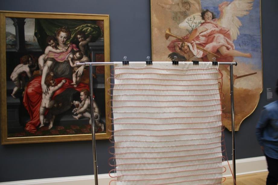
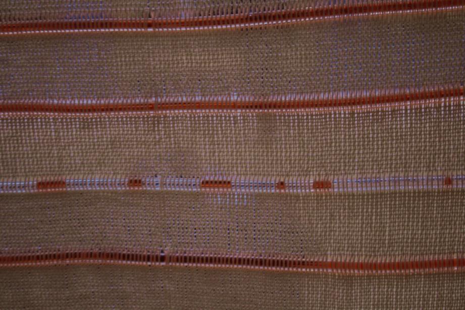
The students' works and the course itself were featured on the Museum's website in a section titled “A Pedagogical Model,” which highlights academic initiatives aligned with the Museum's content and programming. In this space, I created a project called “Stitching Together,” (https://risdmuseum.org/art-design/projects-publications/articles/stitching-together), showcasing works like a haptic-sound textile piece that incorporates recipe books from students' cultural heritage. These creative acts were a central part of my fellowship activities and emphasized the Museum's potential as a site for situated, embodied knowledge production.
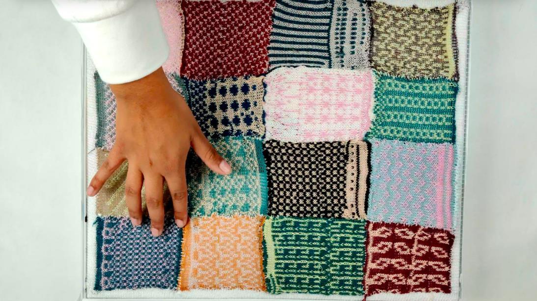
"Exploring Identity Through the Tablecloth:AHaptic-Sonic Piece"Artists: Carmen Sandoval & Isabela Chan, 2022 Photograph: Carmen Sandoval & Isabela Chan.
Database and Emotions: A Case Study in Textile Collection Analysis
Every two years, the Museum offers a research fellowship designed to engage RISD faculty from diverse disciplines in projects that integrate teaching, research, and community involvement
through the Museum’s collections. The most recent call centered on the textile collection, for which I submitted a project proposal that was ultimately selected. My proposal included three key dimensions: curricular integration (as previously described), community engagement through workshops with the Latino community in Providence, and a critical analysis of the textile collection’s database.
The research project aimed to document the origins of the textile collection and to develop visualization tools that track its evolution over nearly 150 years. For this, I chose to work with data visualization tools. Typically understood as diagrams, infographics, or animations, data visualizations are designed to present complex information in accessible and comprehensible ways. Yet these techniques often carry the implicit assumption of neutrality a claim to objectivity that deserves scrutiny.
As Donna Haraway notes in her seminal essay Situated Knowledges (1988), the supposed objectivity of scientific knowledge is a myth a “god trick” that positions itself as all-seeing and placeless. In contrast, she calls for a partial, embodied perspective that acknowledges the contestable and constructed nature of knowledge. "Vision in this technological feast becomes unregulated gluttony; all seems not just mythically about the god trick of seeing everything from nowhere." (Haraway, 1988, p. 581). In contrast, Haraway proposes "a doctrine and practice of objectivity that privileges contestation, deconstruction, passionate construction, webbed connections, and hope for transformation of systems of knowledge and ways of seeing. " (p. 5845). Haraway’s perspective advocates for an assumed and self-critical partiality.
From a viewpoint based on objective omniscience, data visualization is devoid of emotions. Opposite to this perspective that proposes a sort of visual minimalism in pursuit of objectivity –where redundant or superfluous information is disregarded, critical currents, and particularly data feminism, integrate the affective dimension into digital informational representation. This implies that there is always subjectivity behind each visualization, and that subjectivity has an emotional relationship with the information it is representing.
On one hand, the museum institution delineates a space for what could be considered a certain idea of an objective repository: objectivity materializes physically in a pristine conception of
museum spaces and its collection, serving as a sort of memory that refers to pasts, or presents which will quickly become past, and subsequently materializing into digital data. According to Brian O'Doherty in the classic text "Inside the White Cube: The Ideology of the Gallery Space" (2011), the concept of the "white cube" installs the neutrality as its main attribute:
Unshadowed, white, clean, artificial-the space is devoted to the ' technology of esthetics. Works of art are mounted, hung, scattered for study. Their ungrubby surfaces are untouched by time and its vicissitudes. Art exists in a kind of eternity of display (p. 15)
What does all this digression have to do with museums and the visualization of their collection data? What does the pursuit of objectivity, neutrality, and the tools of technoscience for cataloging museum collections have to do with a certain modern ideology? Quite a lot, it turns out. The archiving and cataloging of museum objects not only respond to organizational and classificatory needs but also involve a network of historical narratives, ideologies, and political perspectives that allow for the reconstruction of the genesis and socio-historical foundations that give meaning to the collection. The database of the various collections comprising the RISD Museum was recently reorganized on the MuseumPlus platform, a browser-based platform exclusively for use by museum curatorial teams and researchers. The platform is relatively userfriendly and has certain functionalities that are useful, such as adding annotations to each objectwhich can be kept public for all platform users or remain private - saving searches, and sharing them with other users, etc. Additionally, the Museum has an open-access website (https://risdmuseum.org/art-design/collection) through which the general public can access different pieces of the collection and obtain information about materials and techniques, dimensions, donors, inventory numbers, and the exhibition history of the piece in question.
In this spirit, my project questions the pretense of neutrality in the Museum’s data systems by engaging with the textile collection through a phenomenological lens one that foregrounds material, historical, and cultural layers. The goal is not simply to track changes in the collection, but to critically analyze what the database conveys about the concept of culture, and how shifting acquisition patterns have shaped the Museum’s cultural map over time.
To begin, I grouped objects based on the culture variable as defined by the database. I then organized these into six groups corresponding to 20-year acquisition periods. Within each group, individual cultures are represented by circles of varying sizes and colors, indicating the number of artworks acquired. However, this model soon revealed inconsistencies and ambiguities in categorization.
This is where the visualization processes begin to complexify, as the definition of “culture” can entail very diverse viewpoints and nuances that undermine the much-desired visual economy advocated by "objective knowledge." For example, the metadata of the Museum's textile collection includes pieces categorized as "Native American," while others explicitly mention the ethnic-cultural group (such as “Navajo”). However, within the "culture" category, there are also pieces defined by geographical affiliation, such as "North American," even if a piece from the Navajo culture or some of the Native American pieces belong to the North American geographic region in the collection. Alternatively, we may find pre-Columbian pieces culturally defined by the name of the country occupying the territory of that culture, thus defined by a geographical affiliation whose definition predates the existence of such a culture. We can then observe how the taxonomies of modernity are used to characterize premodern objects. Furthermore, in certain cases, presumed cultural definitions are based on religious rather than geographical definitions. These leaks, which cause some inconsistency when modeling metadata, simultaneously generate a very interesting granularity that I consider vital for visualization.
Rather than correcting these irregularities, I treat them as generative elements points of entry into the granular, affective, and political layers of the data.
In "Feminist Data Visualization",
Catherine D’Ignazio and Lauren F. Klein (2016) warn about "the technological perspective" of visualization, an approach that emphasizes technique and efficiency while ignoring historical, social, and rhetorical implications. Regarding the incorporation and emergence of the affective and emotional aspects, the authors propose different design questions, among which I retain the following:
- Is our metadata correct?
- What categories do we take for granted?
- How do we record what does not fit into the fixed categories?
- How can we leverage embodied and affective experience to enhance visualization design?
Concerning the final outcome, some of the pertinent questions would be as follows:
● How can we effectively communicate the boundaries of our categories in the final representation?
● Should we consider tactile, experiential, or social modes in data visualization?
● Can we conceive visual outputs in the expanded field, such as murals, sculptures, textiles, or data installations?
I will revisit these questions shortly, but for now, I will share how my datasets were constructed.
Visualization Modeling Process
To model the data digitally, I used InetSoft Visualize, a tool offering extensive flexibility. As mentioned before, each dataset corresponds to a 20-year period. I assigned a distinct color and circle to each culture, based on the Museum’s metadata The size of the circle represents the numerical volume of pieces from that particular culture. It is important to clarify that the included textile pieces are not authored works but anonymous productions.
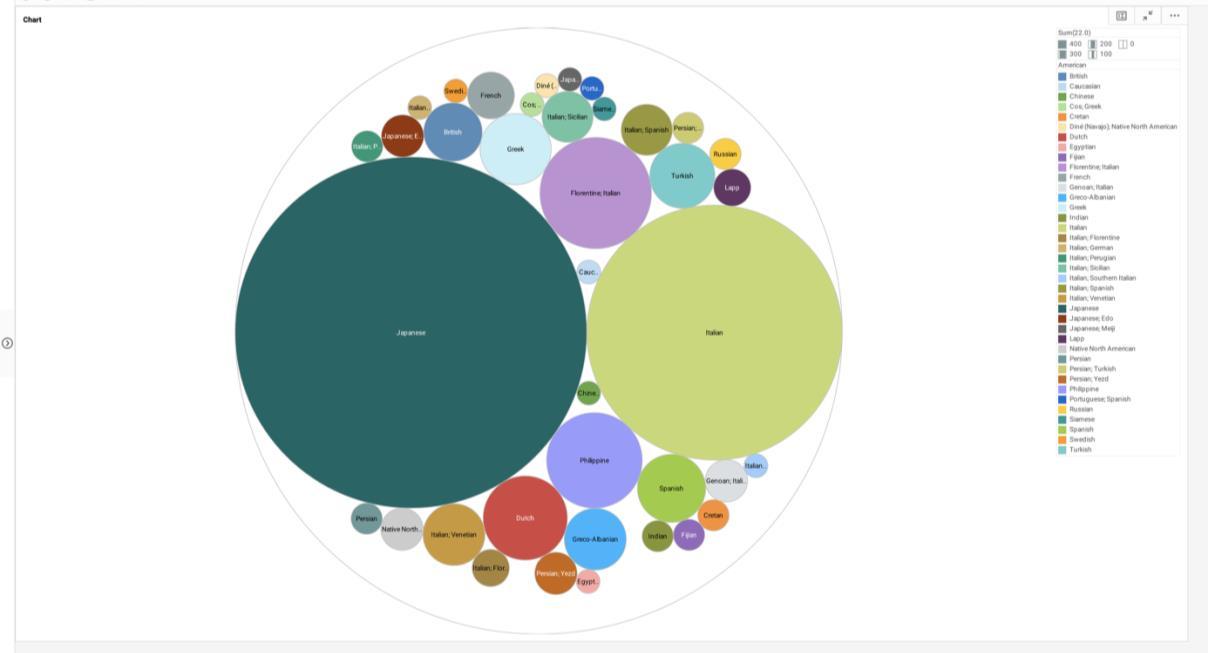
Dataset Visualization for the Biennium 1890-1909. Graphics by Mariela Yeregui.
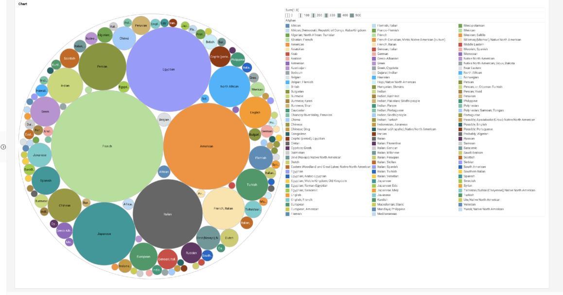
Dataset Visualization for the Biennium 1910-1929. Graphics by Mariela Yeregui.
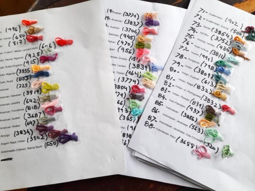
Given my deep engagement with textile arts, I translated these digital datasets into physical threads assigning thread colors to nearly 300 “cultures” . I began to consider textiles as a potential material output for visualizing the evolution of the collection's inventory. In essence, my goal was to approach a textile collection whose data can be visualized through its own materialities, aesthetics, and imaginaries
Shortly after starting this process, I questioned what the ultimate purpose of this journey was. What undoubtedly emerged is the idea of considering the process itself as a form of research, as a way of "caressing" the data to connect with a certain emotional aspect of a whole knowing that this whole encompasses materialities that reflect anonymous experiences with repositories of emotions and subjectivities. Echoing Calvillo's (2019) words, "The focus will not be on what the object can do for research, but on how the creation of an object [a digital visualization] can be a method of research" (p. 66), this research method aims to illuminate the emotionality of data as signifier of an object within the Museum collection. The method creates a transversal dialogue between digital texture and the sensitive data that shapes the physical-objectual. It allows us to recognize the emotional dimension of data and transform abstraction into material, affective form.
Simultaneously, I transferred each circle onto a world map to account for the geographical location of these cultures, resulting in the following graphics:
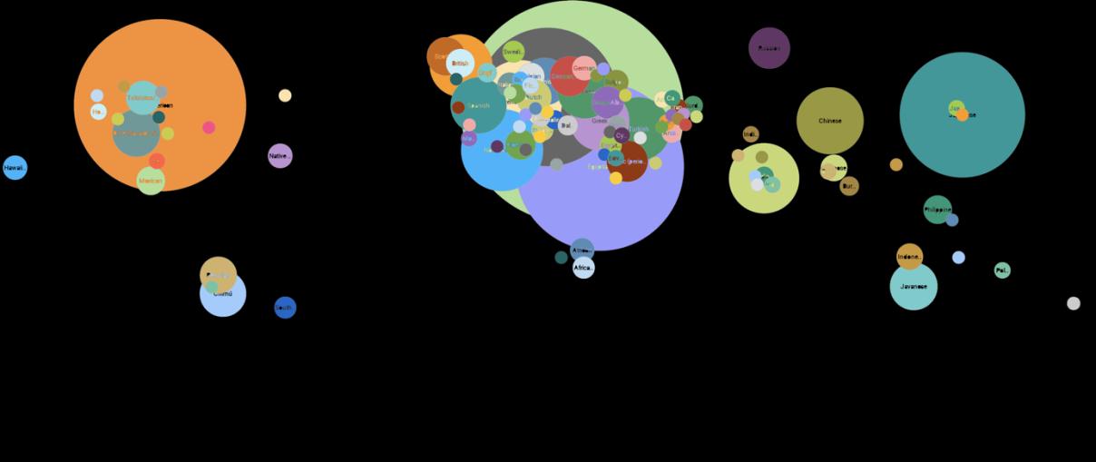
Dataset Visualization Geographically Distributed for the Biennium 1910-1929. Graphics by Mariela Yeregui.
In parallel, I meticulously and exhaustively took note of all the inconsistencies that the category "culture,” as conceived in the metadata, entails. Therefore, when analyzing the data, questions 1 and 2 ("Is our metadata correct?"; "What categories do we take for granted?") led me to think about a granularity of the data not necessarily incorrectness which would imply a type of design that accounts for these leaks, dispersions, and contradictions.
On the other hand, addressing question 4 regarding visualization design ("How can we leverage embodied and affective experience to enhance visualization design?"), there is something that particularly interests me In parallel, I meticulously and exhaustively took note of all the inconsistencies that the category "culture,” as conceived in the metadata, entails. Therefore, when analyzing the data, questions 1 and 2 ("Is our metadata correct?"; "What categories do we take for
granted?") led me to think about a granularity of the data not necessarily incorrectness which would imply a type of design that accounts for these leaks, dispersions, and contradictions.
On the other hand, addressing question 4 regarding visualization design ("How can we leverage embodied and affective experience to enhance visualization design?"), there is something that particularly interests me as I mentioned earlier and that is the translation of digital data into physical data.
In response to this ontological view of the material world, anthropologist Tim Ingold proposes an alternative perspective, which he calls the "textility of making." (2020). Emphasizing materials and forces, textility focuses on movement and processes of negotiation between material and human action, integrating aspects of corporeality, material properties, knowledge versus knowhow, and agency. In this sense, I see in the embroidery gesture and its potential to reinterpret, to capture corporeal dimensions, to articulate an embodied and haptic action - a resource that threads textility, imbuing emotional value into the data.
Final Stitches
A TABLE. A table means does it not my dear it means a whole steadiness. Is it likely that a change.
A table means more than a glass even a looking glass is tall. A table means necessary places and a revision a revision of a little thing it means it does mean that there has been a stand, a stand where it did shake.
(Gertrude Stein, Short Poems)
This research project involves visualizing the textile collection through its materialization on a 2.5m x 2m white cotton tablecloth, onto which hand embroideries corresponding to datasets illustrating over a hundred years of acquisitions will be transferred, grouped in sets of two decades. In the central part, small LCD screens will be embedded to include all annotations accounting for deviations, contradictions, and dispersions. If we revisit the questions posed
("How do we record what does not fit into the fixed categories?"; "How can we communicate the boundaries of our categories in the final representation?"; "Should we consider tactile, experiential, or social modes in data visualization?"; "Can we conceive visual outputs in the expanded field such as murals, sculptures, textiles, or data installations?"), this way of visualizing the collection largely responds to them by generating a critical and non-reductionist reading of the collection, deploying tactility, visuality, and critical questions that will reveal an emotional disruption in the objectivity of the data.
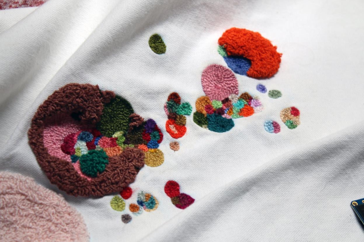
As developed above, in contemporary studies on data visualization, the emphasis typically falls on clarity and objectivity. Traditional visualizations rely on graphs, charts, and other forms of digital representation designed to convey complex data succinctly. However, this focus on neutrality often overlooks the subjective and emotional dimensions of data. The use of a tablecloth to embroider data shapes a device that is a medium which may provide a richer, more nuanced understanding of data by engaging with its materiality and emotional resonance.
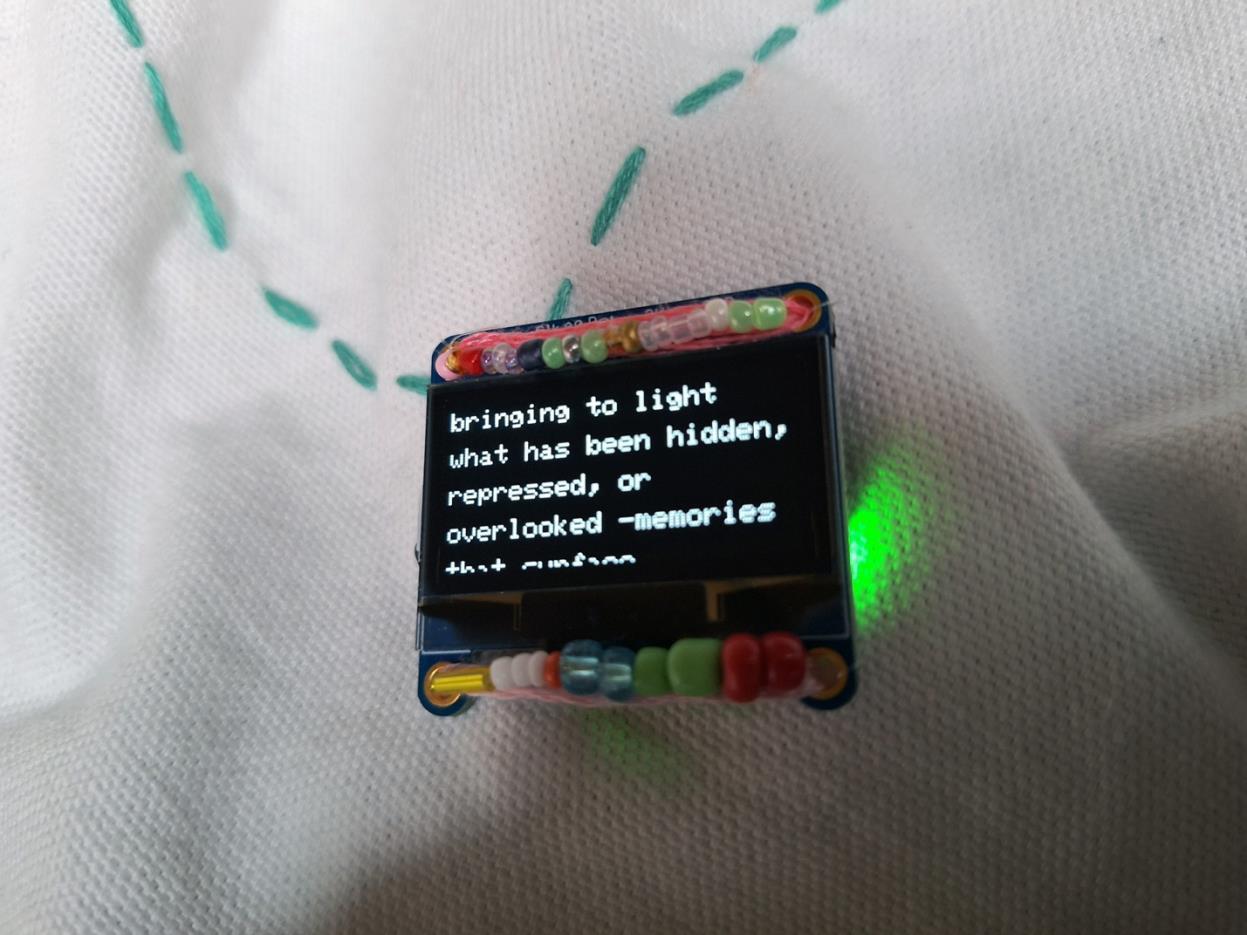
The tablecloth, a ubiquitous household item, represents domesticity, intimacy, and community elements often absent from conventional data visualizations. By choosing this as the canvas for data representation, this project situates data within a familiar and comforting context of home and family life. This domestic setting contrasts sharply with the typically neutral environment of digital screens and printed graphs, making the data more accessible and relatable to a broader audience.
A tablecloth, especially when embroidered and intervened, serves as a historical and cultural artifact in its own right. Textiles have long been used to document and commemorate cultural practices, events, and traditions. Thus, using a tablecloth to visualize Museum data creates a living document that bridges contemporary data practices with textile traditions. This historical continuity enriches the viewer's experience, adding layers of cultural and temporal context to the
data being presented. A tablecloth is inherently a communal object. It is often the centerpiece of family meals, celebrations, and gatherings, symbolizing the sharing of food, stories, and experiences. By using this as a medium for data visualization, the project invites viewers to gather around and engage in collective reflection and discussion about the Museum's collection. This communal aspect transforms data visualization from a solitary activity into a shared, social experience, enhancing its educational and interactive potential.
Embroidery is meticulous work that requires significant time, skill, and attention to detail. This element of manual labor contrasts with the often automated and impersonal processes involved in digital data visualization. By embroidering data onto a tablecloth, the project emphasizes the human element in both the creation of textiles and the curation of data. This focus on handmade work highlights the subjective and emotional labor involved in interpreting and presenting data. The act of embroidery also introduces a tactile dimension to data visualization. Viewers can physically touch and feel the embroidered data, engaging with it on a sensory level that is typically absent in digital representations. This haptic engagement fosters a deeper connection between the viewer and data, allowing for a more embodied and immersive experience.
A critical aspect of this project is its embrace of imperfection and failure, inherent in both handmade embroidery and technological processes. Handmade embroidery is naturally imperfect, with each stitch potentially varying in size and tension, reflecting the human touch and the inevitability of error. This imperfection is mirrored in the use of low-cost, tiny LCD screens embedded in the tablecloth, which often display texts that refer to the errors, failures and glitches that arise due to how the information is organized. These imperfections are not hidden but highlighted, revealing inherent flaws in both the creation process and data collection itself. This approach values the emotional resonance that comes from acknowledging and embracing error and failure, which challenges the conventional pursuit of perfection in data visualization.
The embroidery process itself, which involves interpreting and translating digital data into physical form, underscores the subjectivity inherent in data representation. Each stitch represents a deliberate choice and personal interpretation. The embroidered tablecloth exemplifies this interplay, as it materializes data through the tactile and haptic qualities of textiles. By placing
data within the familiar and culturally resonant context of a tablecloth, this approach fosters deeper connection between viewers and data, underscoring the importance of human work, community, situated practices and embodied engagement in data visualization, offering a rich, multi-layered narrative that bridges the digital and physical, the subjective and objective, and the past and present. This approach not only enriches the viewer's understanding of the Museum's collection but also highlights the historical and cultural significance of textiles, creating a powerful dialogue between art, data, and everyday life.
Conclusions
This research proposes a reframing of data visualization by challenging the dominant norms of objectivity, standardization, and digital efficiency. Instead, it embraces materiality, error, and emotional engagement as fundamental elements of knowledge-making. Through embroidery, the project foregrounds the tactile and affective labor embedded in both textiles and data, emphasizing the human touch in the process of interpretation and curation.
By placing the visualization within a familiar domestic object a tablecloth the work recontextualizes museum data in a shared, culturally resonant space. It turns a private, intimate symbol into a public and participatory artifact, encouraging collective engagement with institutional knowledge. In doing so, it situates the museum not as a neutral container of facts, but as a living, evolving repository shaped by histories, contradictions, and embodied experiences.
The embroidered visualization acknowledges ambiguity and resists closure. It invites a layered reading of the RISD Museum’s textile collection that is open to reinterpretation and grounded in a feminist and decolonial critique of data practices. This approach ultimately affirms that data is never neutral: it is always entangled with subjectivity, labor, power, and emotion.
As such, this project offers an alternative epistemology for working with institutional collections one that honors complexity, privileges touch, and makes space for narratives that might otherwise be lost within the conventions of data abstraction.
References
CALVILLO, Nerea. “Digital Visualizations for Thinking with the Environment”. In: VERTESI, Janet & RIBES, David (Ed.). digitalSTS A Field Guide for Science & Technology Studies. New Jersey: Princeton University Press, 2019, 61-75.
D’IGNAZIO, Catherine y KLEIN, Lauren. “Feminist Data Visualization.” Workshop on Visualization for the Digital Humanities at IEEE VIS Conference, Baltimore, Maryland, 2016.
HARAWAY, Donna. “Situated Knowledges: The Science Question in Feminism and the Privilege of Partial Perspective”. Feminist Studies, Vol. 14, No. 3,Autumn, 198), pp. 575-599.
INGOLD, Tim. “The textility of making”. Cambridge Journal of Economics, Vol. 34, Issue 1, pp. 91-102, 2010. Available in SSRN: https://ssrn.com/abstract=1540398 or http://dx.doi.org/10.1093/cje/bep042
O'DOHERTY, Brian. Dentro del cubo blanco: la ideología del espacio expositivo. Murcia: CENDEAC, 2011.
Mariela Yeregui
Rhode Island School of Design
myeregui@risd.edu
Electronic artist whose work includes interactive installations, net.art, interventions in public spaces, and robotic installations. Holds a Ph.D. in Media Philosophy from EGS, a Bachelor of Arts degree from the University of BuenosAires, and a Master's degree in Literature from the
Université Nationale de Côte d’Ivoire. She was the creator and director of the Master's program in ElectronicArts at the Universidad Nacional de Tres de Febrero. Currently serves as an Associate Professor in the Digital Media Department at the Rhode Island School of Design
