MARCELA E. DE LEÓN CRUZ
PORTFOLIO
HOME DESIGN & Interiors
Oakland
San Lazaro
Santa Rosalía
La Cañada
CONTENT
INTERIOR DESIGN
MRT
Oriflame
Nikao
T-15
BUILDING DESIGN
El Encinal
SYN
Marti
La Pradera
U2
IGA


HOME DESIGN & Interiors
Oakland
San Lazaro
Santa Rosalía
La Cañada
INTERIOR DESIGN
MRT
Oriflame
Nikao
T-15
BUILDING DESIGN
El Encinal
SYN
Marti
La Pradera
U2
IGA
What I liked the most about these projects is getting to know the personalities and very interesting and diverse tastes of the clients. To be able to express in the design each one of these emotions and personalities through materials, geometries, spatial experience, etc.


Project woked in: SHOARQ LAB
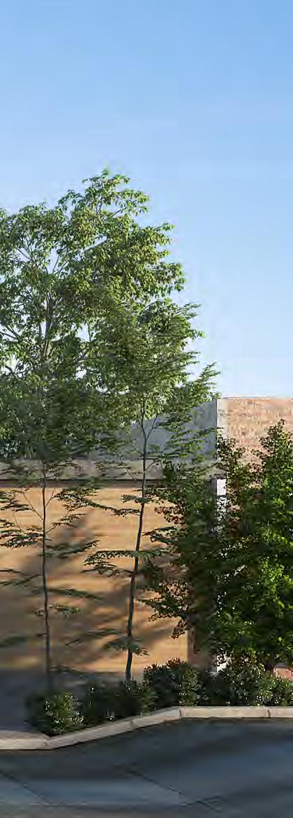
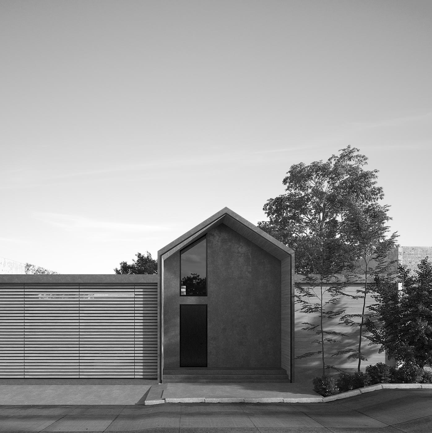
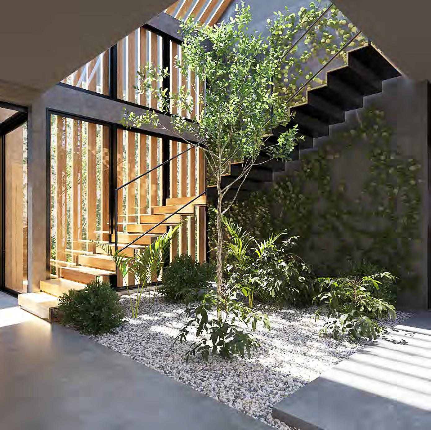
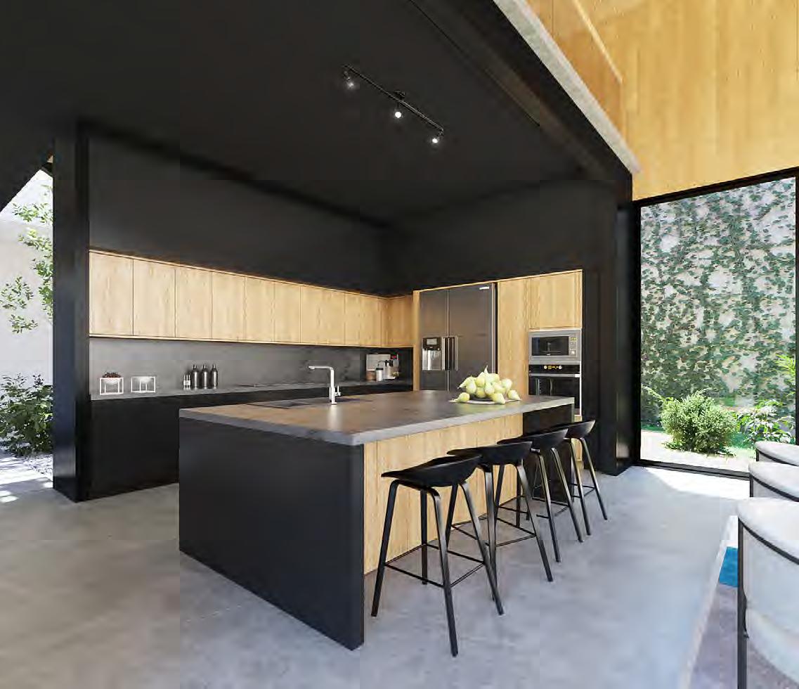
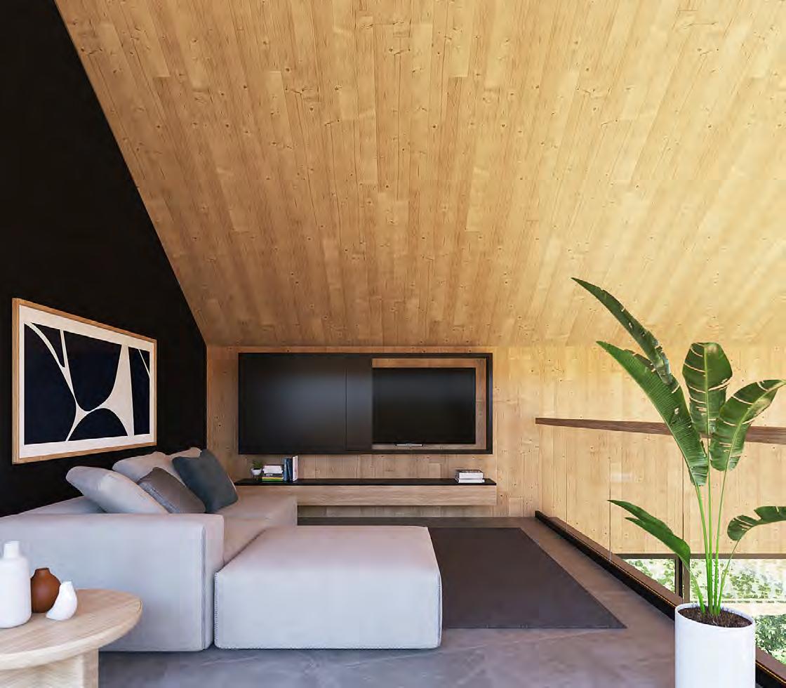
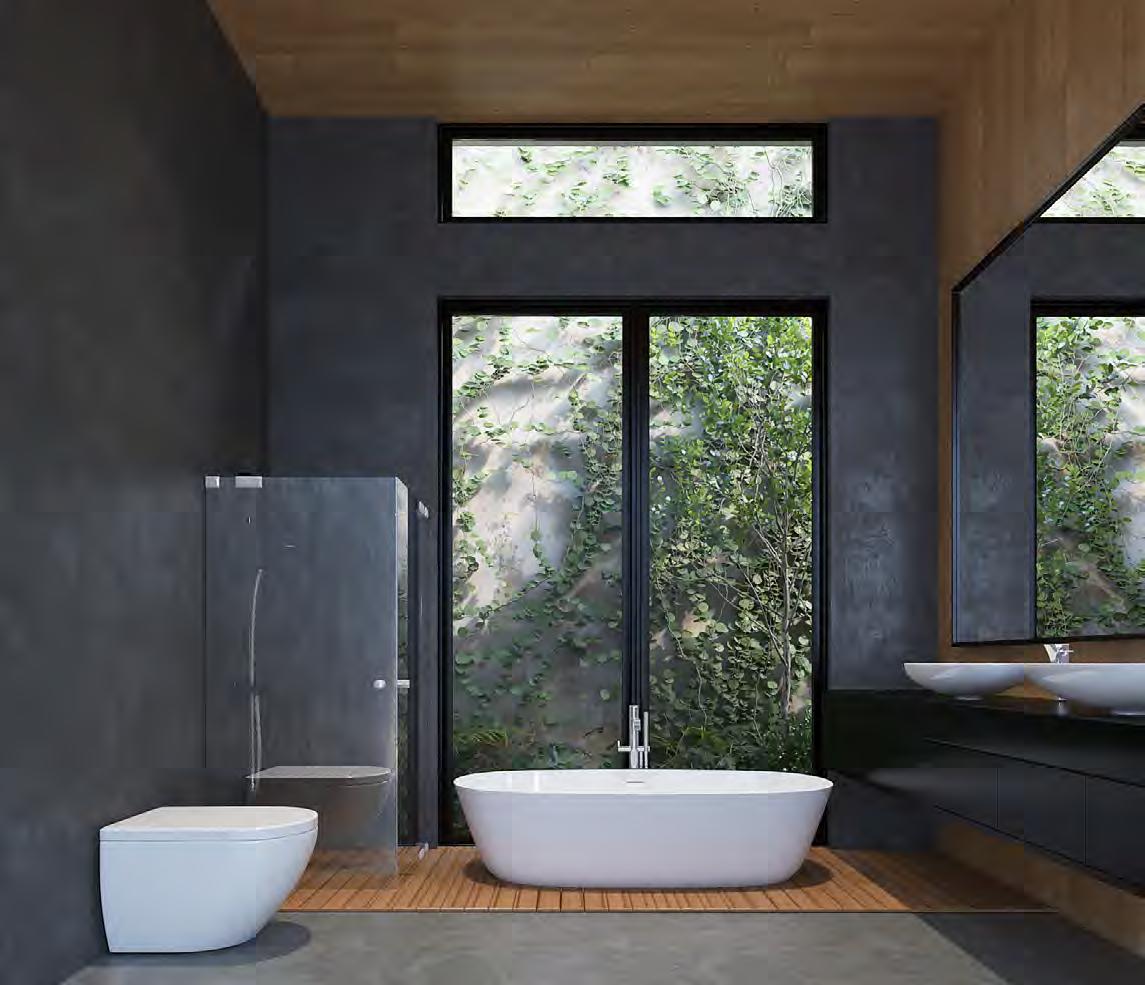
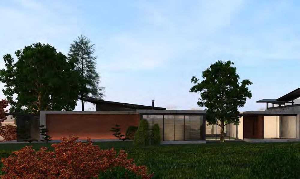
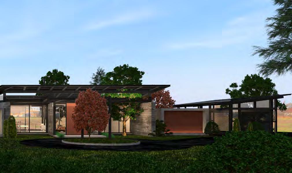
The concept of this house is based on pure geometry. The client is someone who appreciates the natural and simple, so we sought a geometry that would represent this idea and also help to give the necessary warmth in a home.
We aimed for the house to be surrounded by a garden and for there to be a sense of connection between the interior and exterior from any space. Creating a synergy between the interior and exterior spaces.
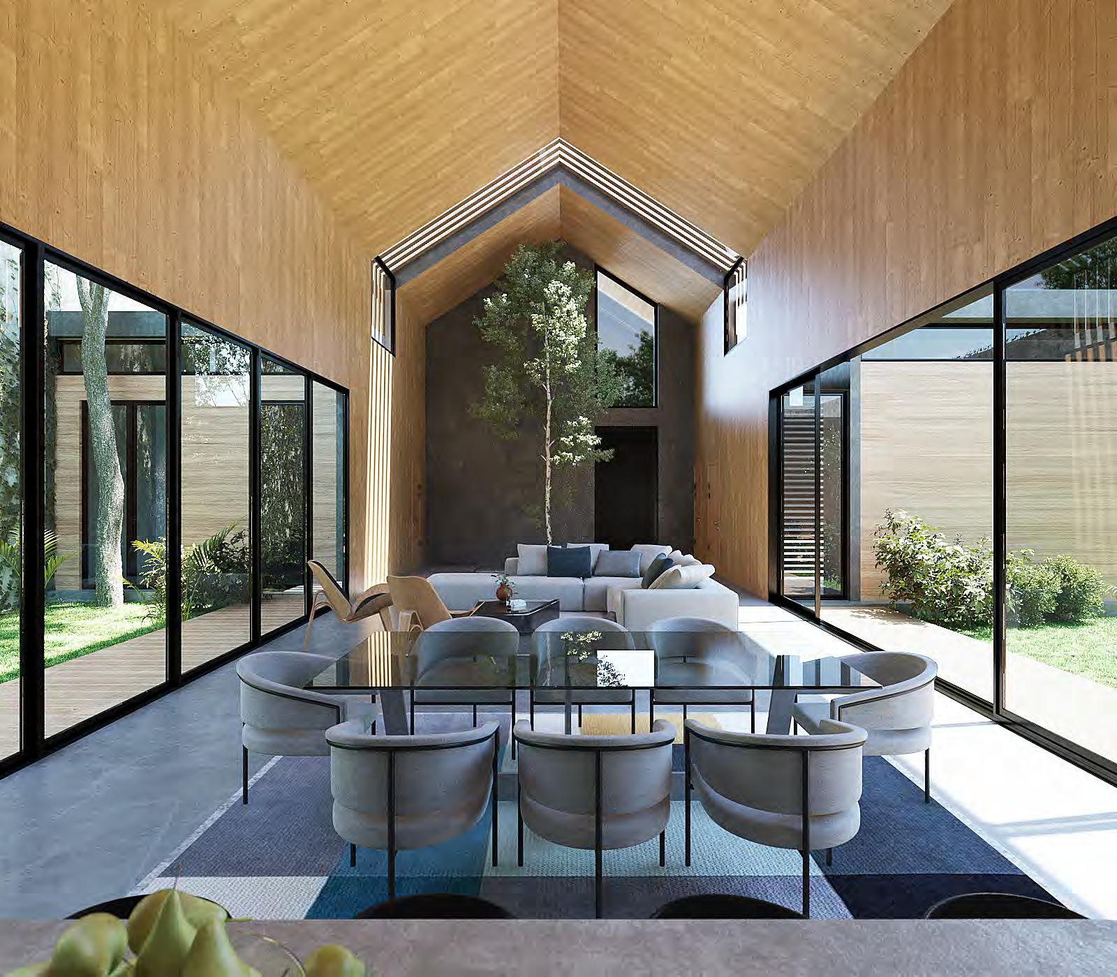
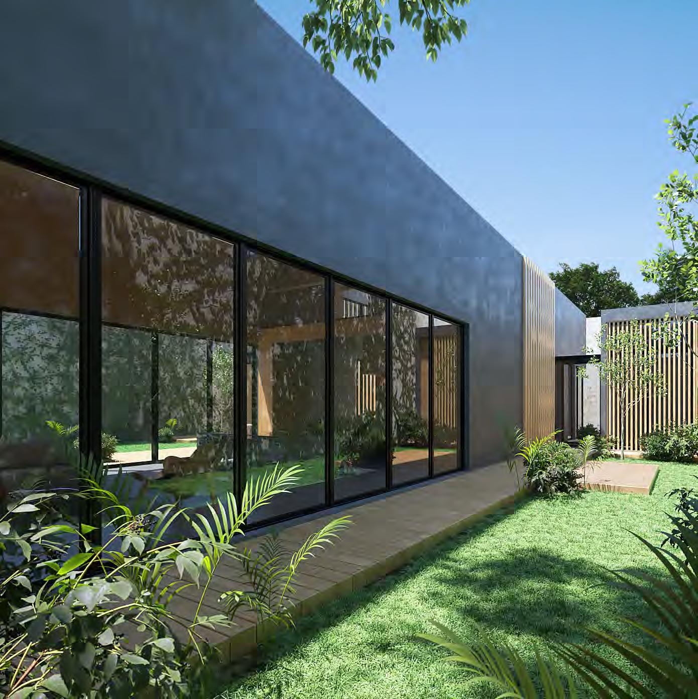

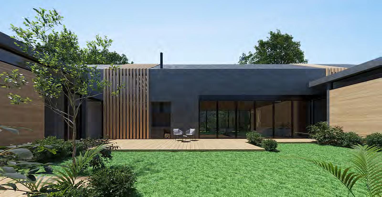

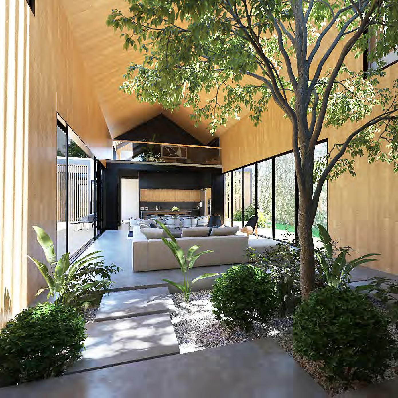
Pure materials, natural textures, vegetation, and lighting were used as the main design elements. Wood and concrete finishes were used as the house warming components, with black accents to provide elegance and balance to the home.



1300m2
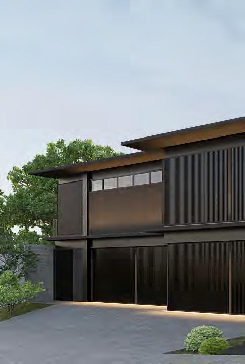
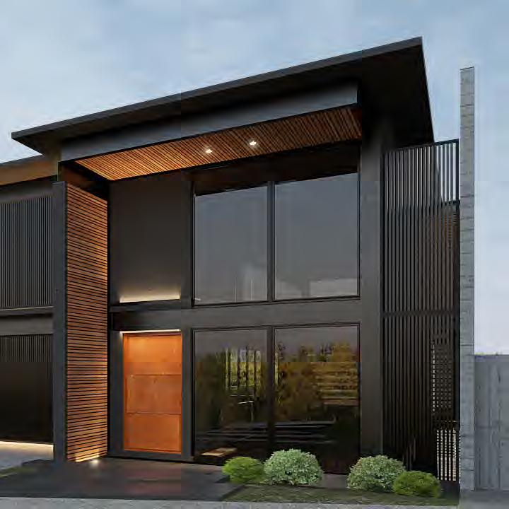
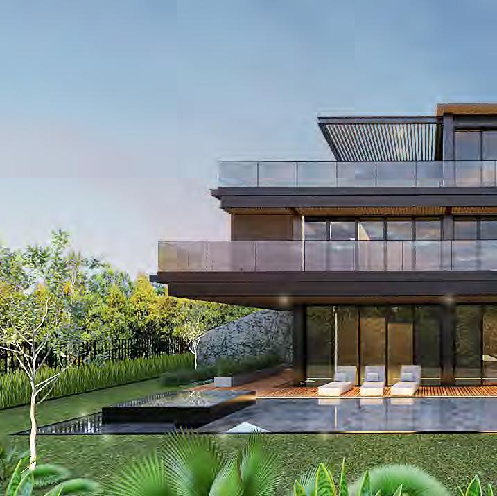
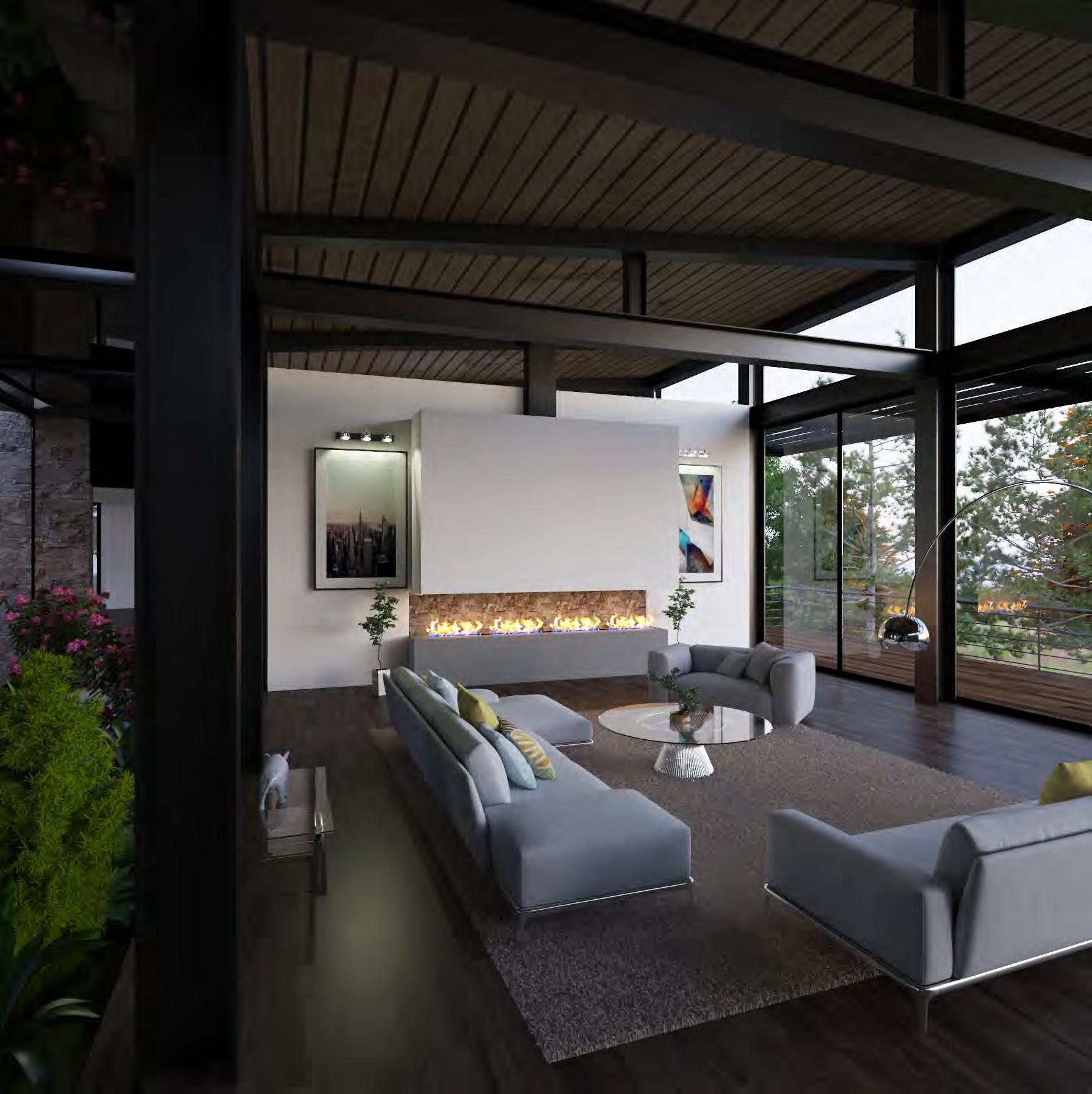
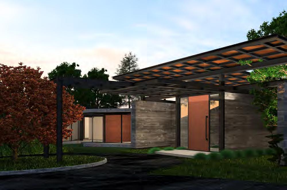
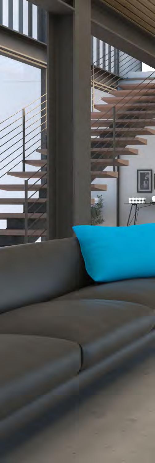
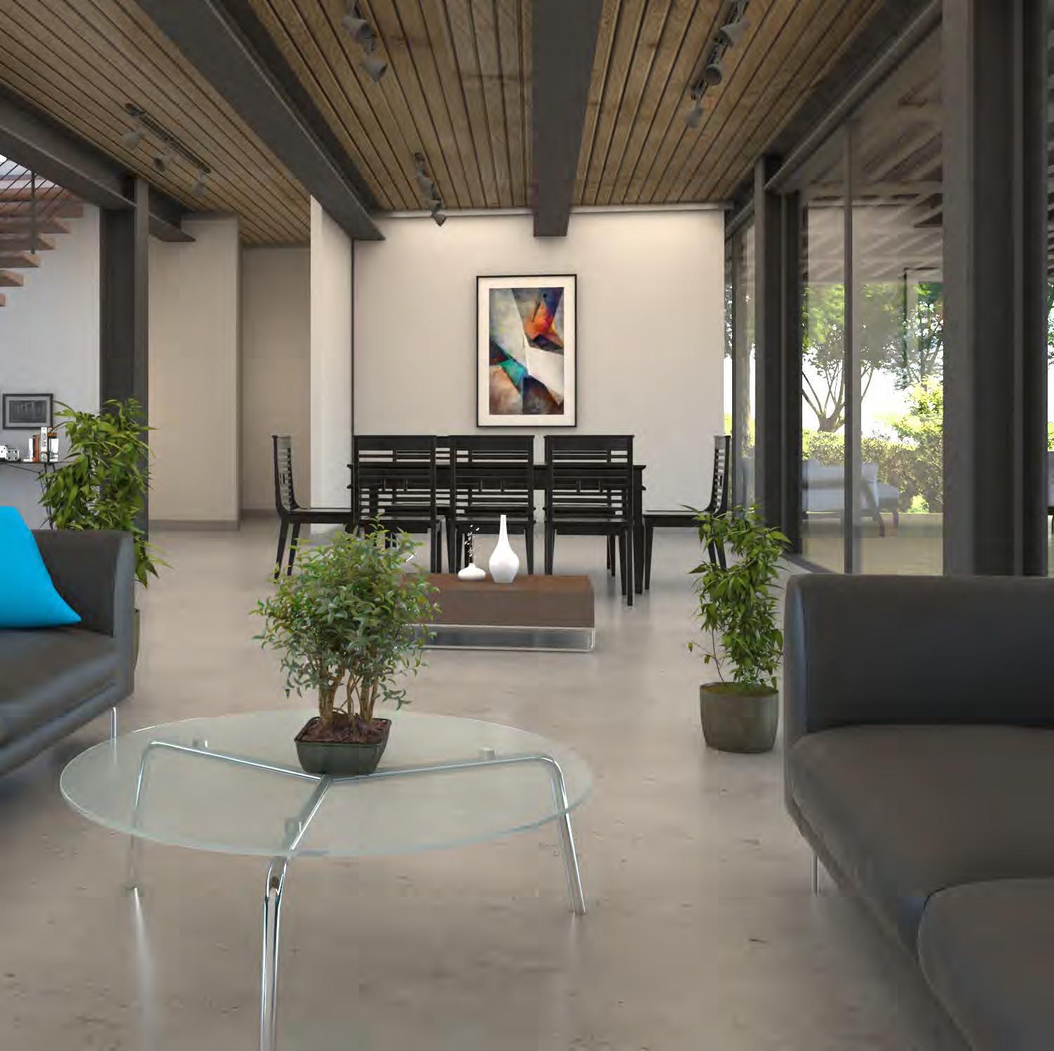
A very special house, where the client identifies with the color black. That’s why I decided to design a black structure and choose black finishes. I added wood details and glass transparency to give it elegance and remove the industrial appearance and thus provide the warmth and class that the client was looking for.



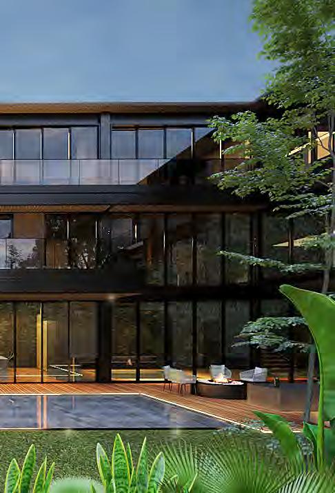
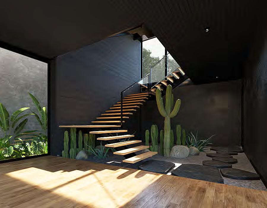
The interiors were designed in the same way. Mystery was sought through the black finishes. But with changes of textures, warmth was achieved. Also adding wood in key spaces to provide an industrial chic concept

With wood and concrete, warmth was provided to the project in the different spaces. As well as in the floating stairs, we took away the protagonism from the metal structure so as not to get bored of seeing metal in every space.
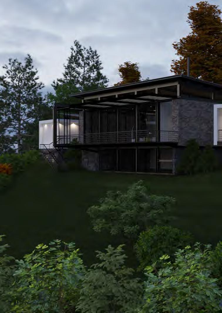

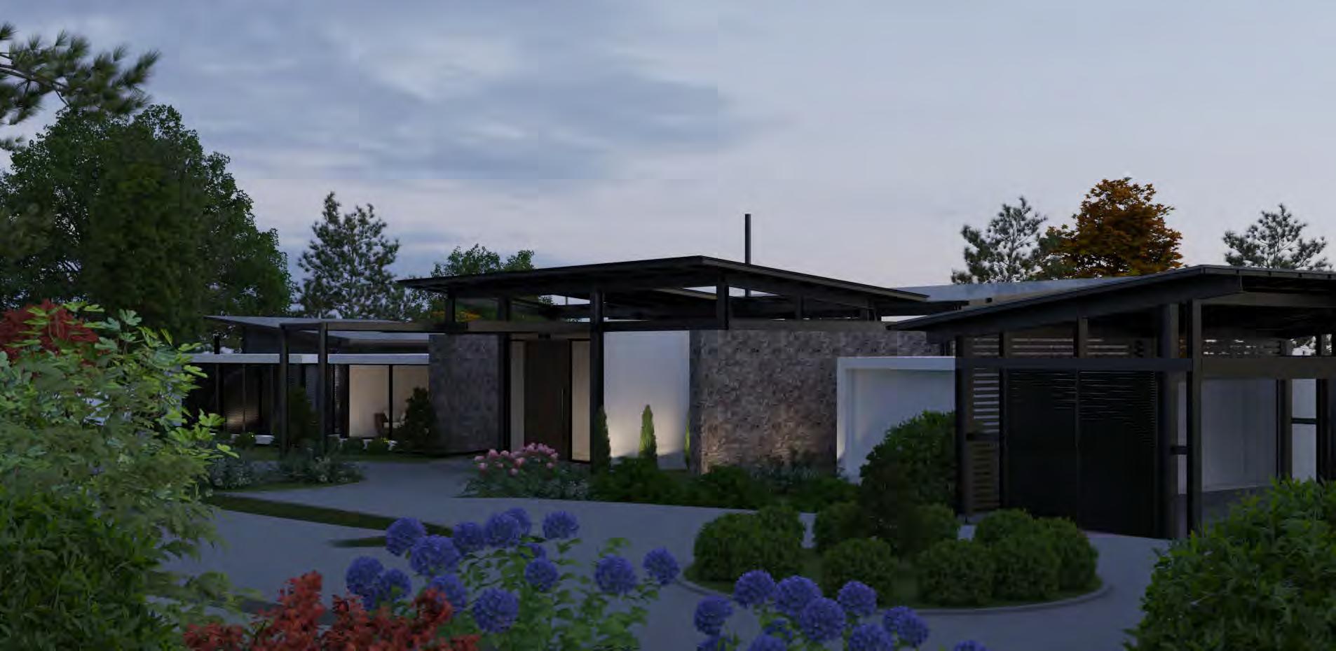
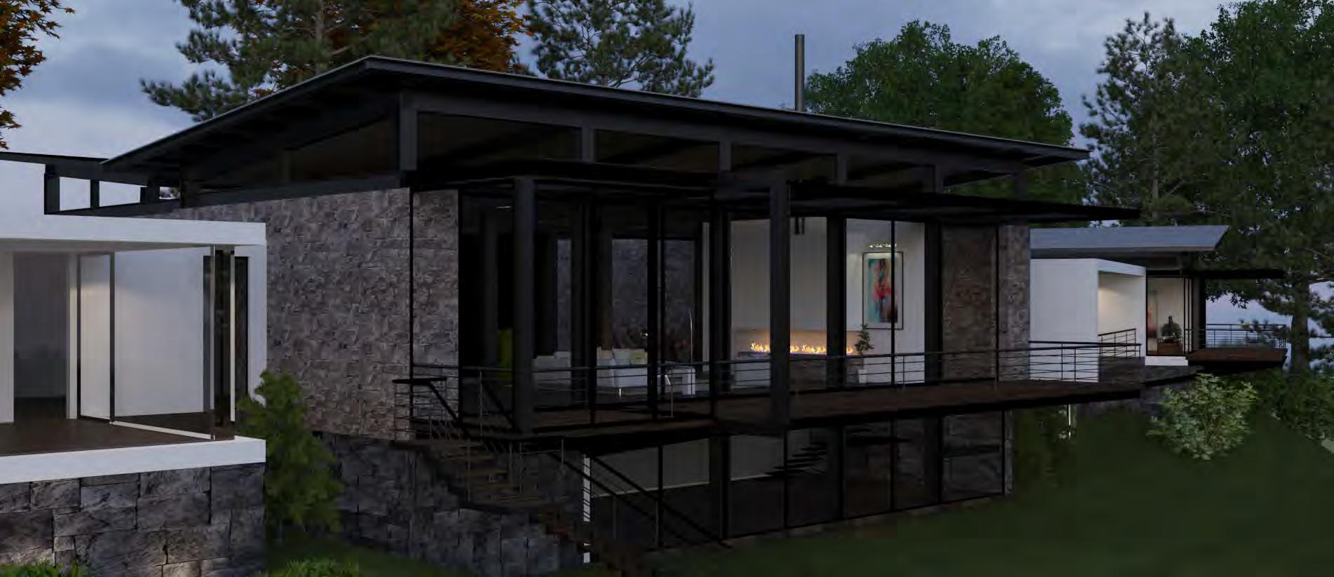
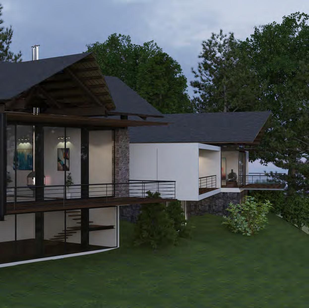
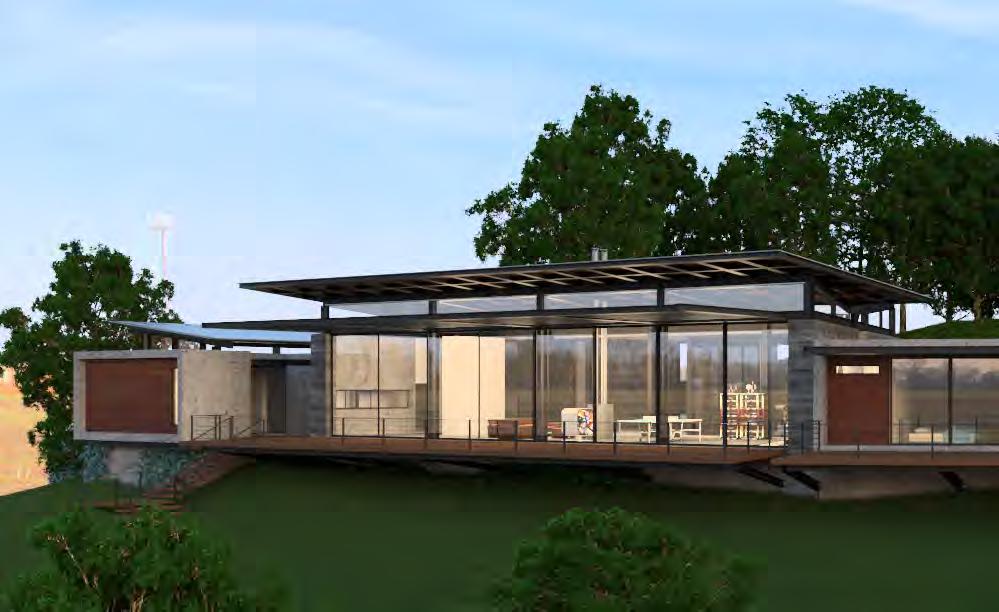
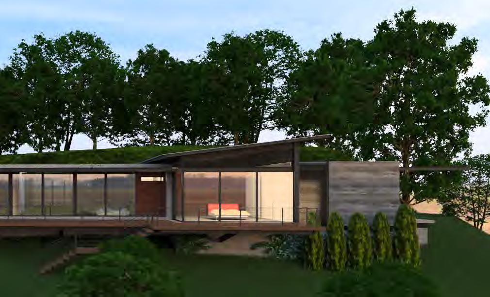
A panoramic house of a single level. Amplitude and visual connection were sought in each space. A house located on a mountain, so the materials fit the site. Wood, stone, concrete and metal were chosen as the main structure to give it lightness.
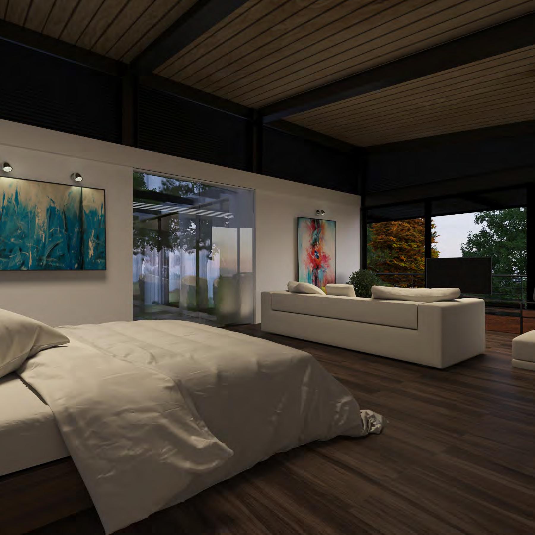

The house is strategically located so that all the social areas and bedrooms have a panoramic view.






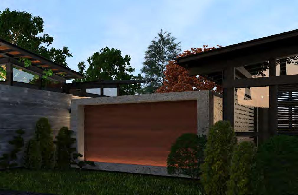

Project woked in: SOLARES & LARA
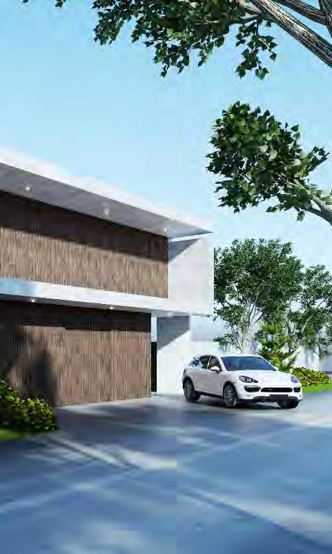


This was a remodeling where the main concept was to introduce nature into the spaces. Then, taking advantage of the wide entrance, a water axis was created that appears at the entrance and appears in the pool of the garden, as if it were the water course that guides us through the house.


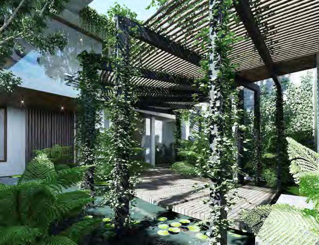
In these projects I found the passion for interior design. I get inspired by the sensations and emotions that I want the user to experience when being in the space to design. Always keeping the functionality and having clear who the design is aimed at.

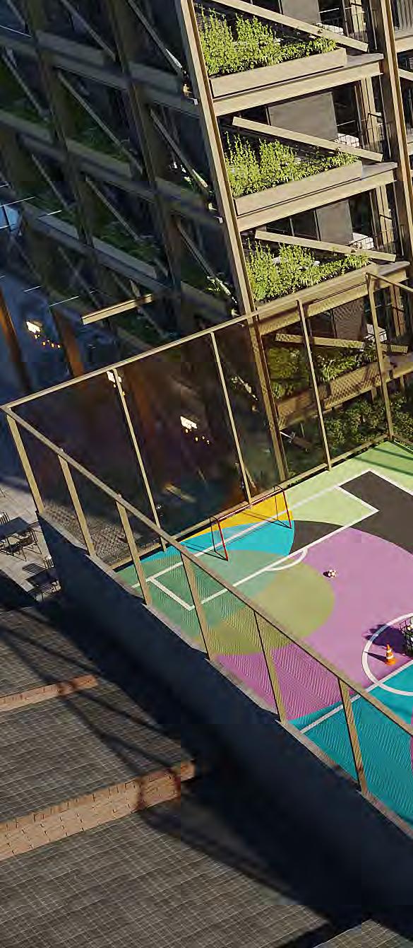
This project is a massive metal structure building that will be painted beige to give it lightness. The building is a family-friendly environment, so it needs appeal and warmth for children and parents. I decided to give the structure a total contrast with fun and cheerful colors that encourage children and parents to use the amenities, feel in a cozy and warm atmosphere.

Project woked in: SHOARQ LAB


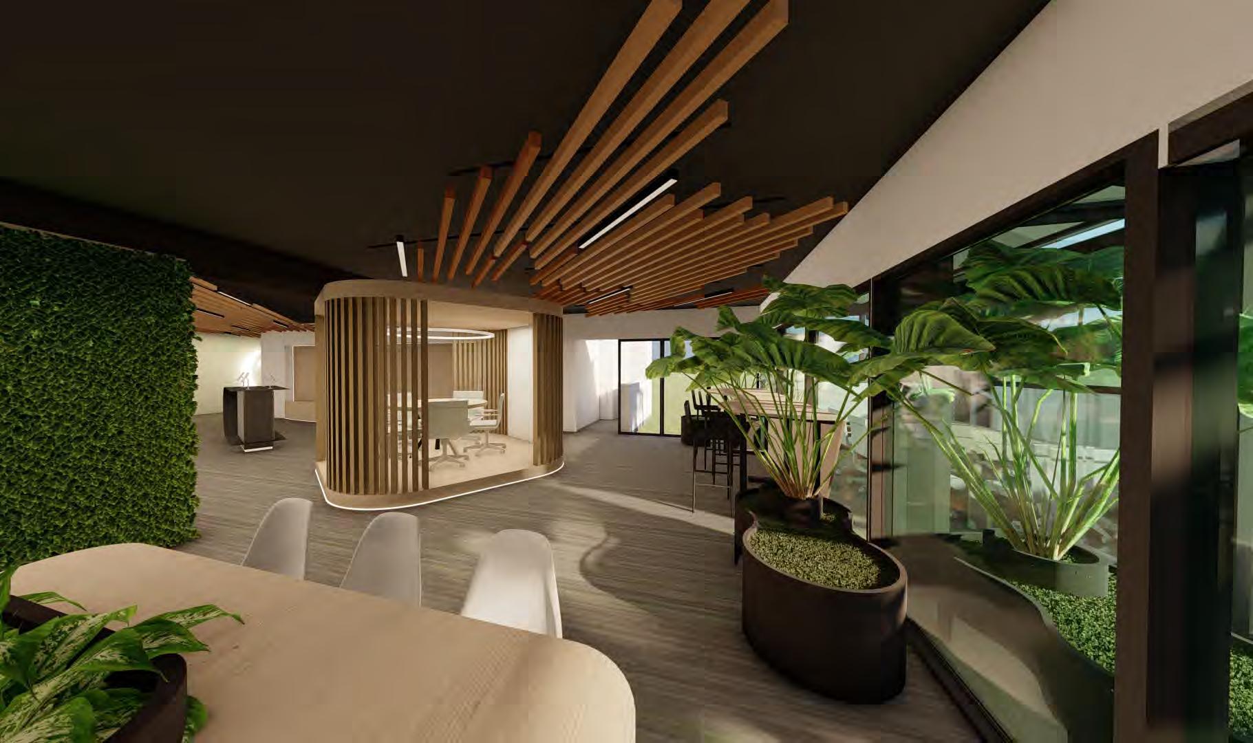
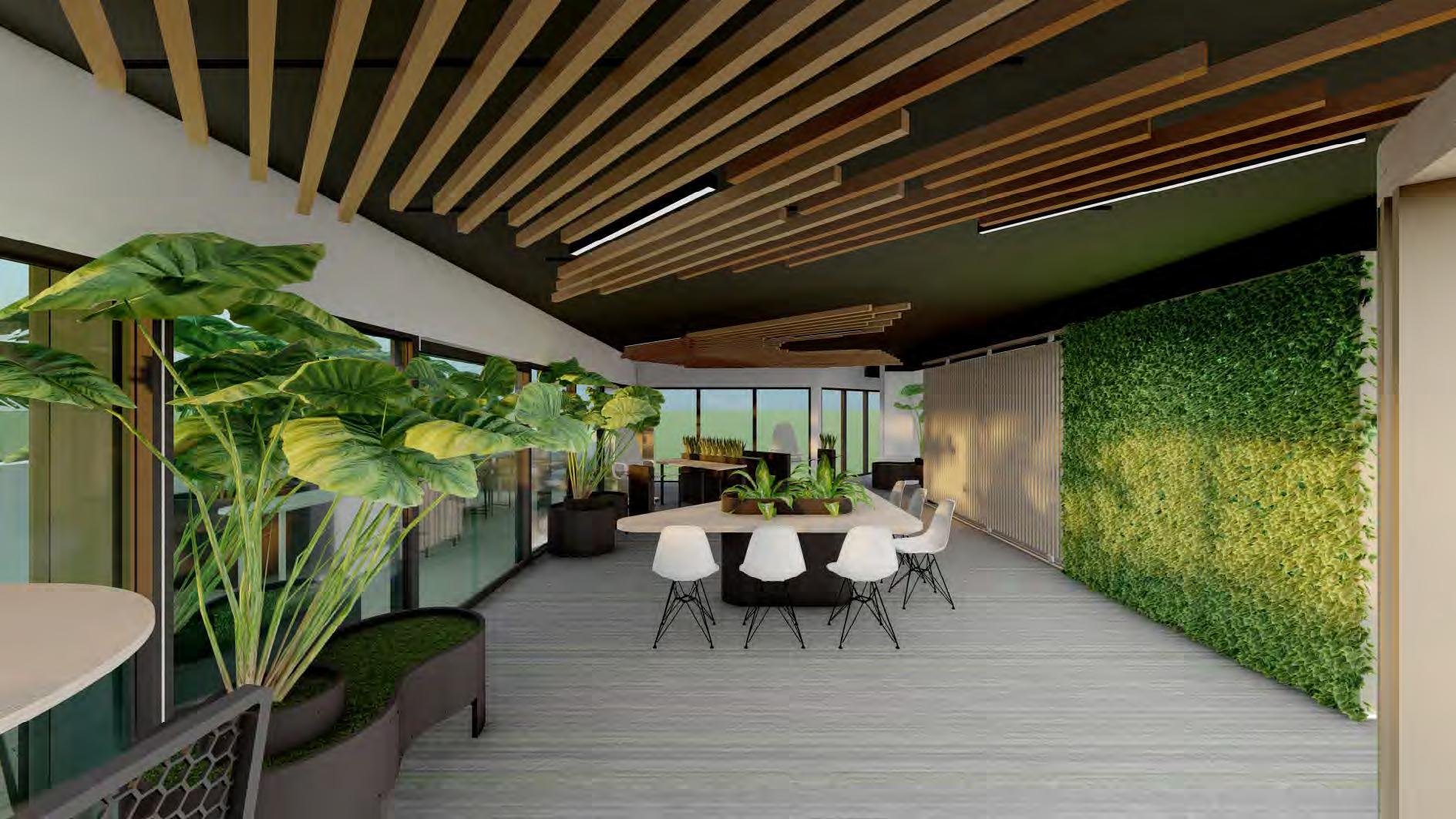
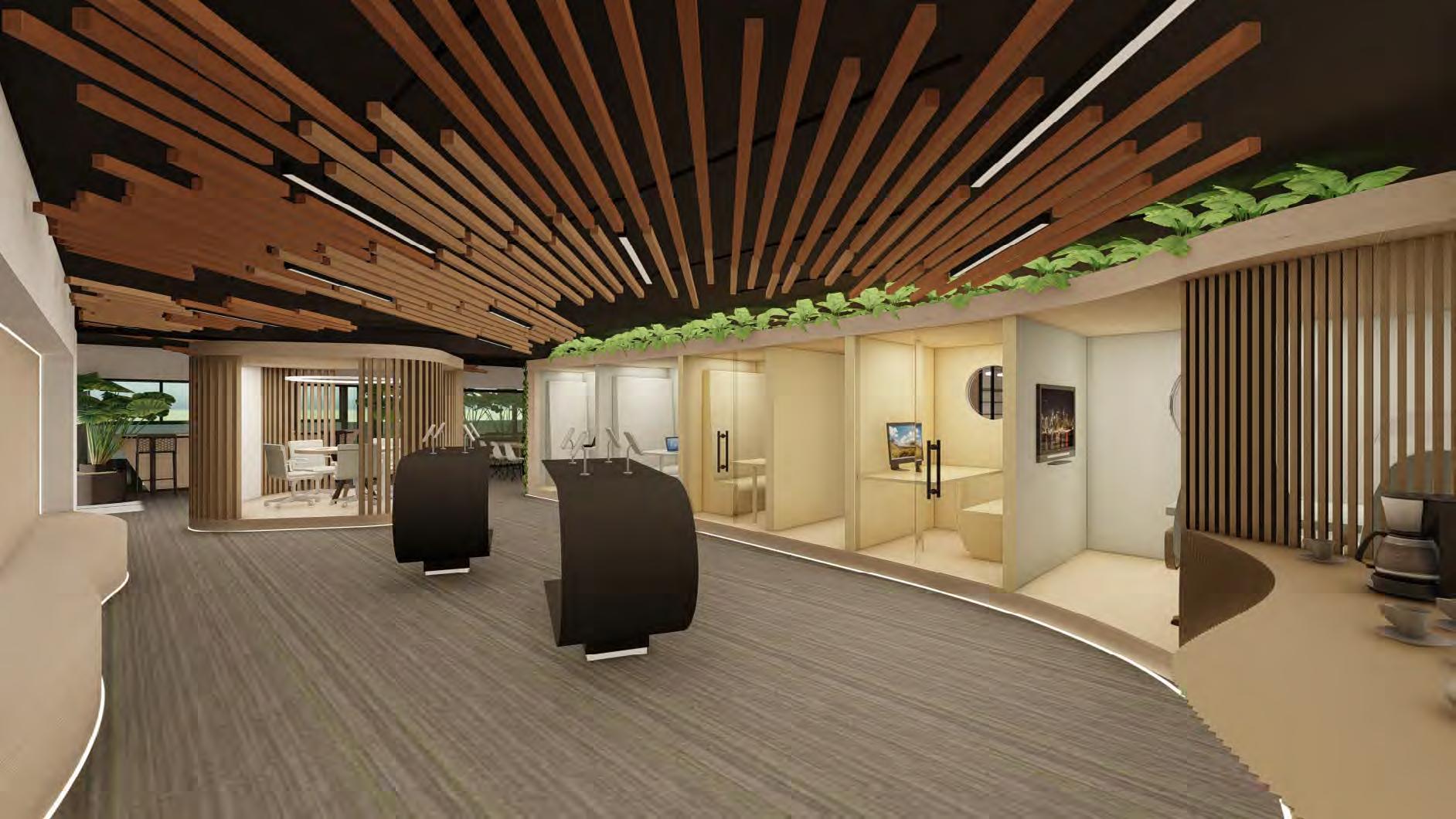
Oriflame is a cosmetics company based on natural and organic elements, I took this concept to apply it in their offices, with natural materials and a little of black metal to add some elegance. I looked for comfort, biophilia and diverse workspaces. For this proj ect, even the furniture was designed.



Project woked in: SHOARQ LAB
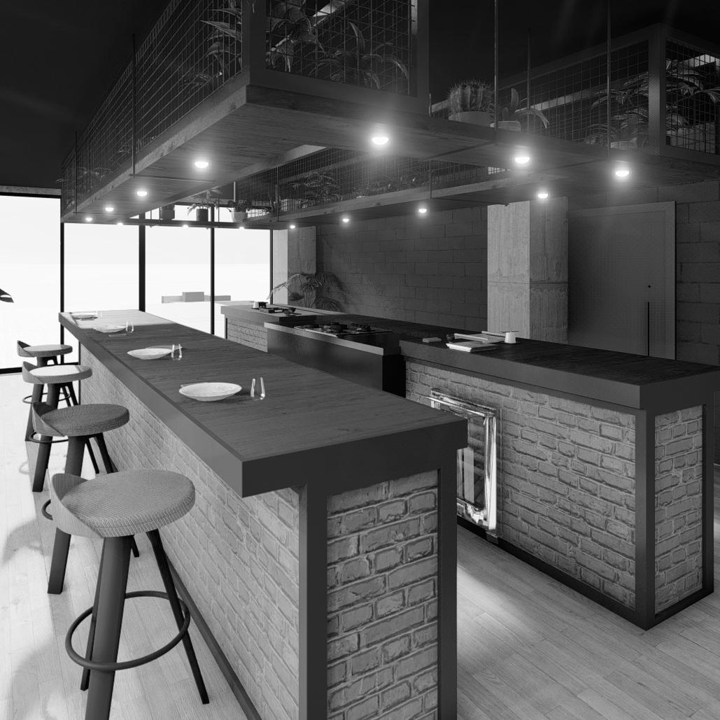
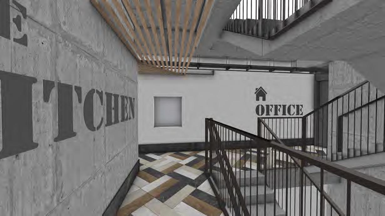
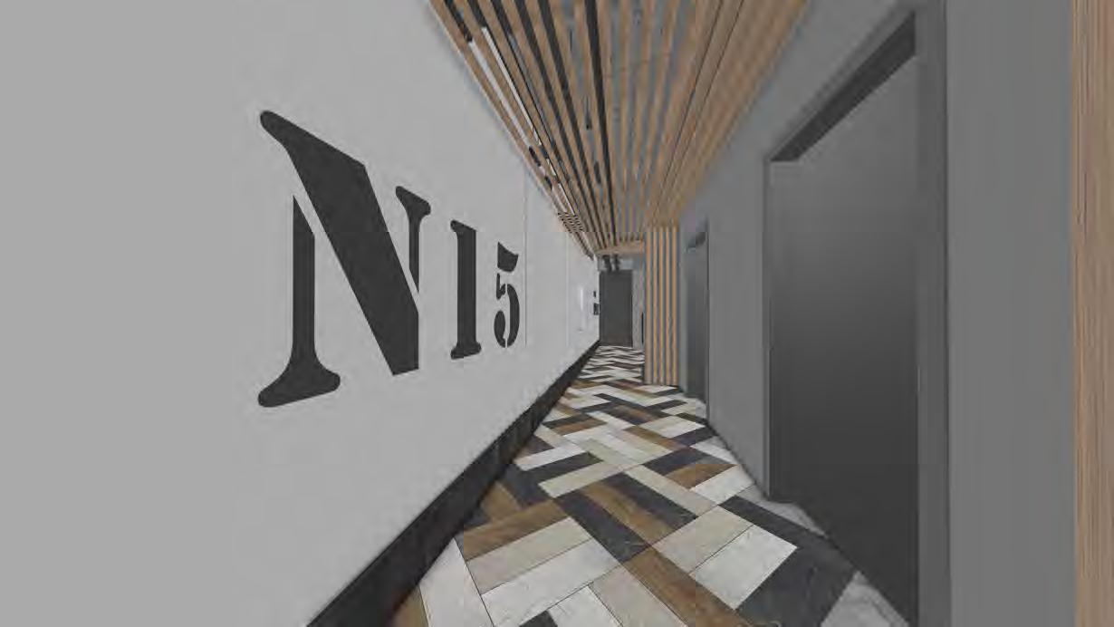
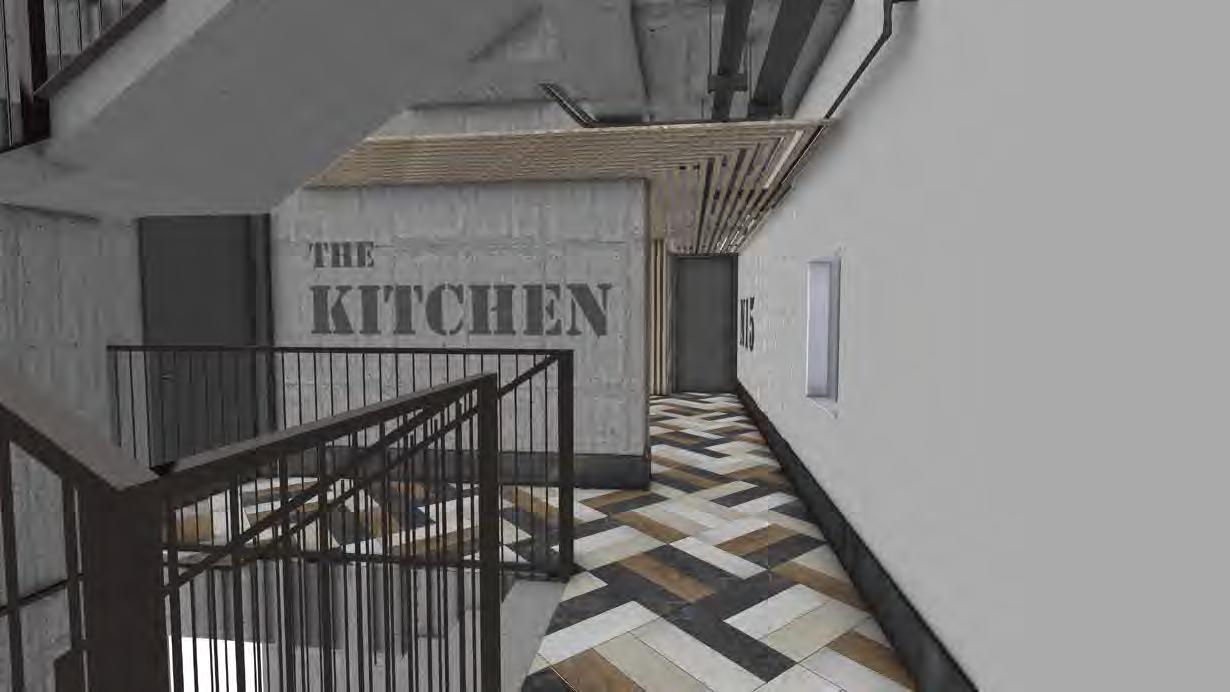
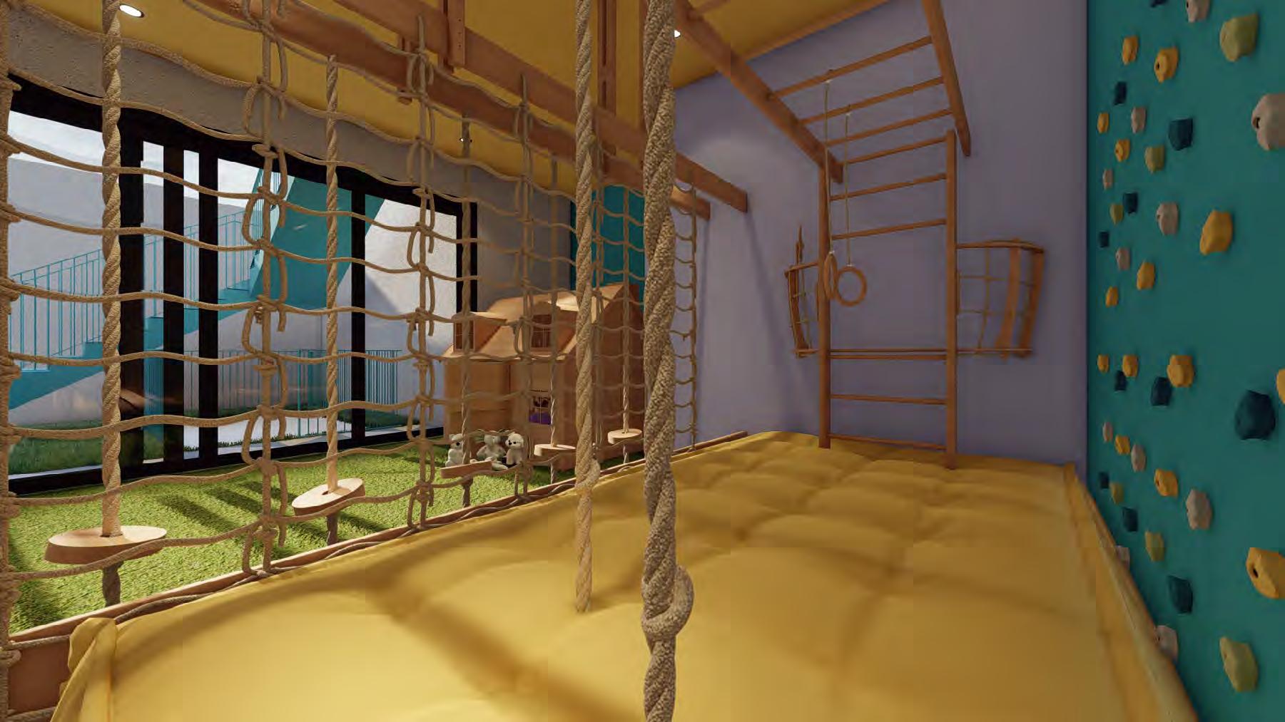
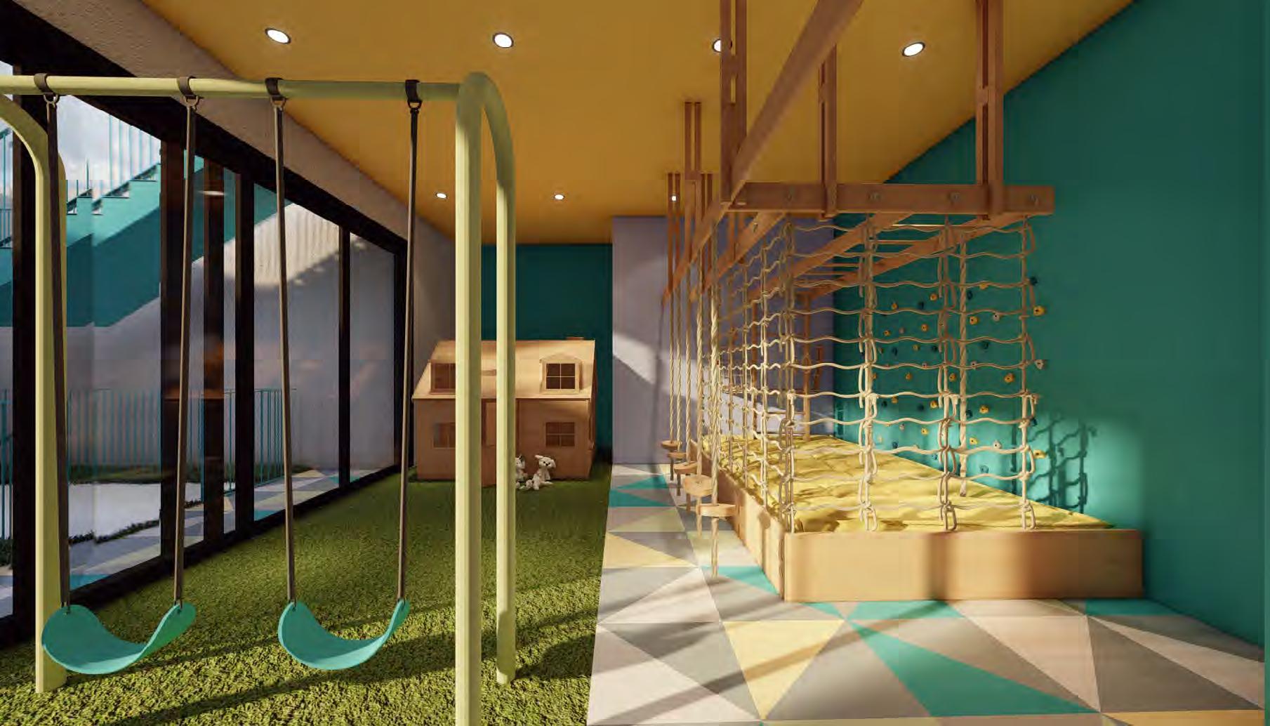
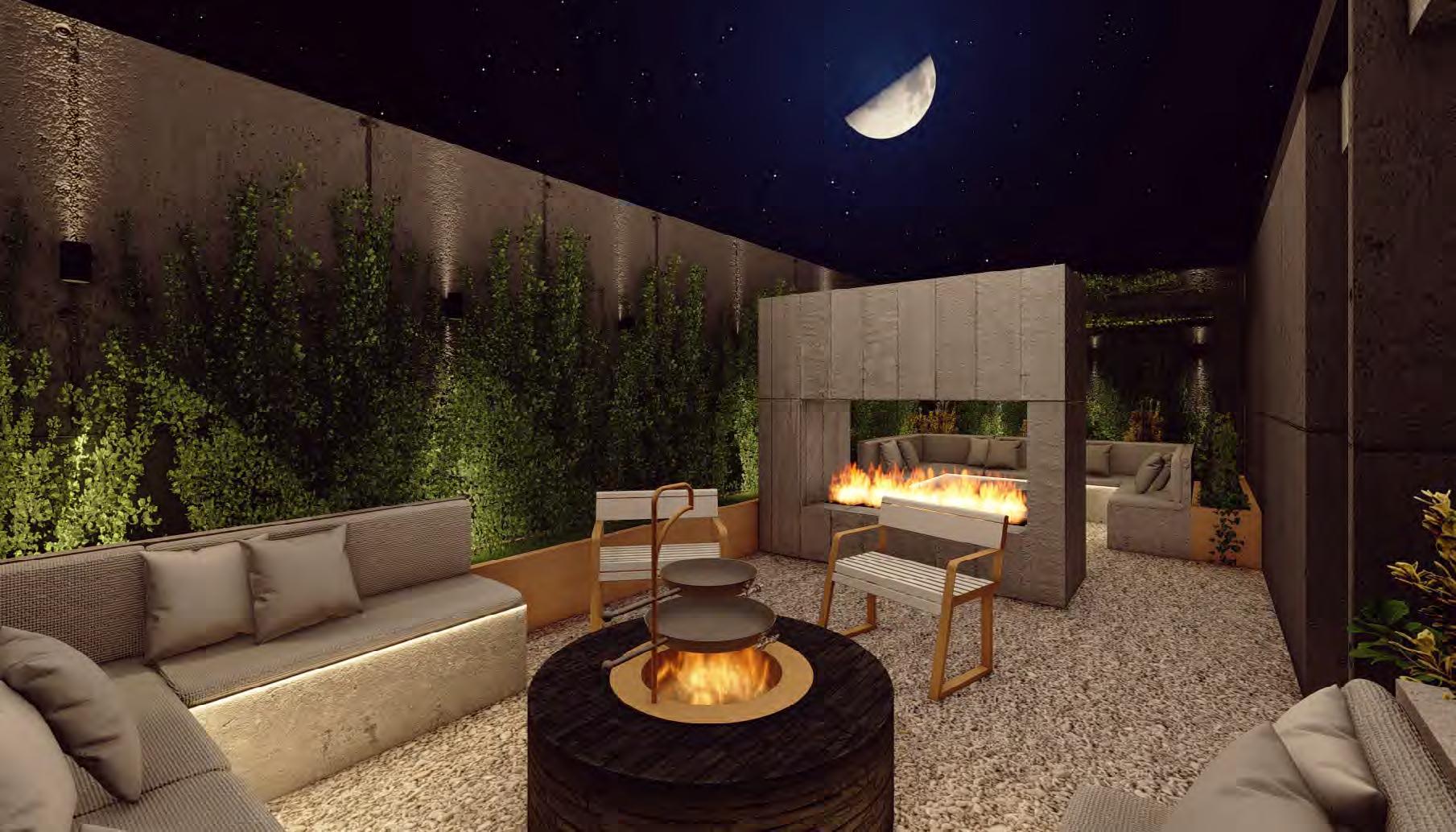
This challenge was very interesting. They are the amenities of an apartment building for low-income people. We worked with low-cost finishes and recycled elements from another project. The challenge was to make the spaces modern, cozy and luxurious-looking for the potential buyers of apartments in this building.
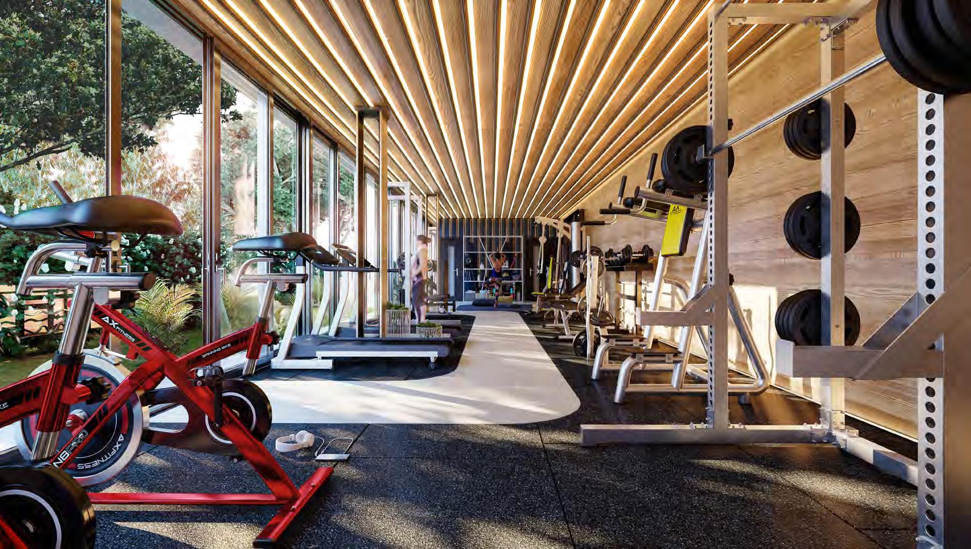
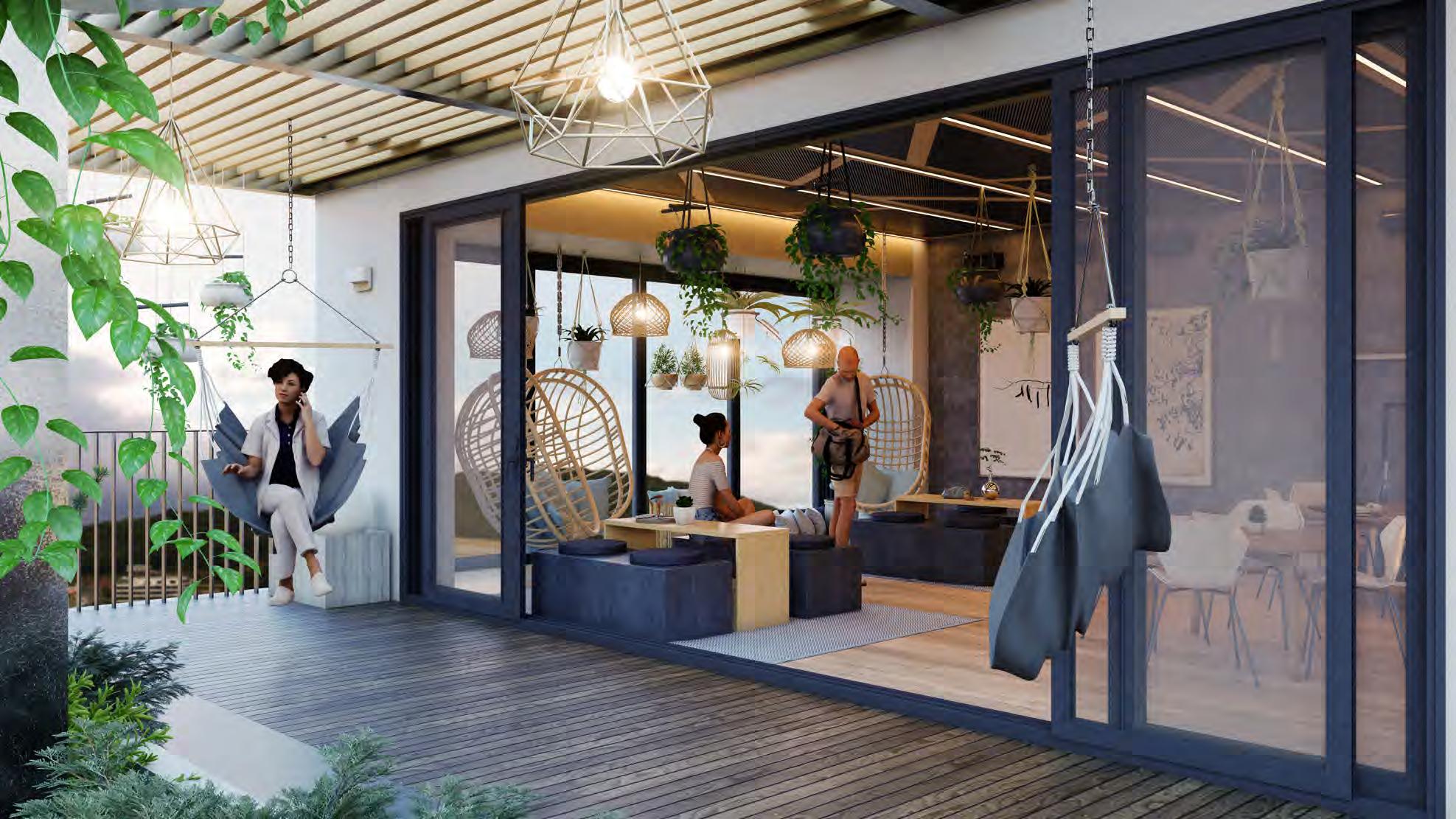


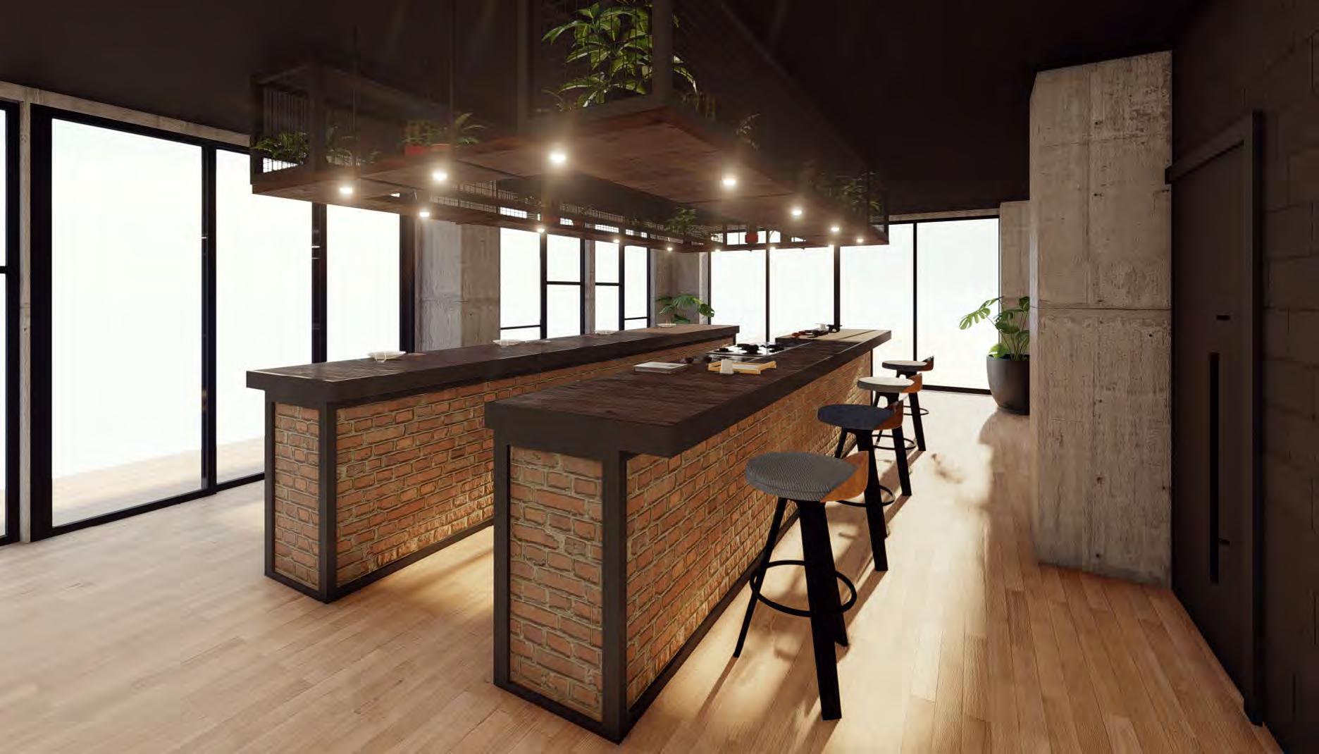
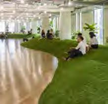
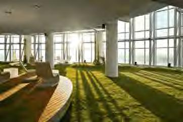
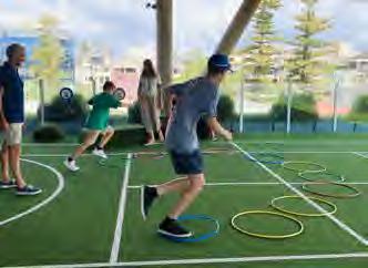
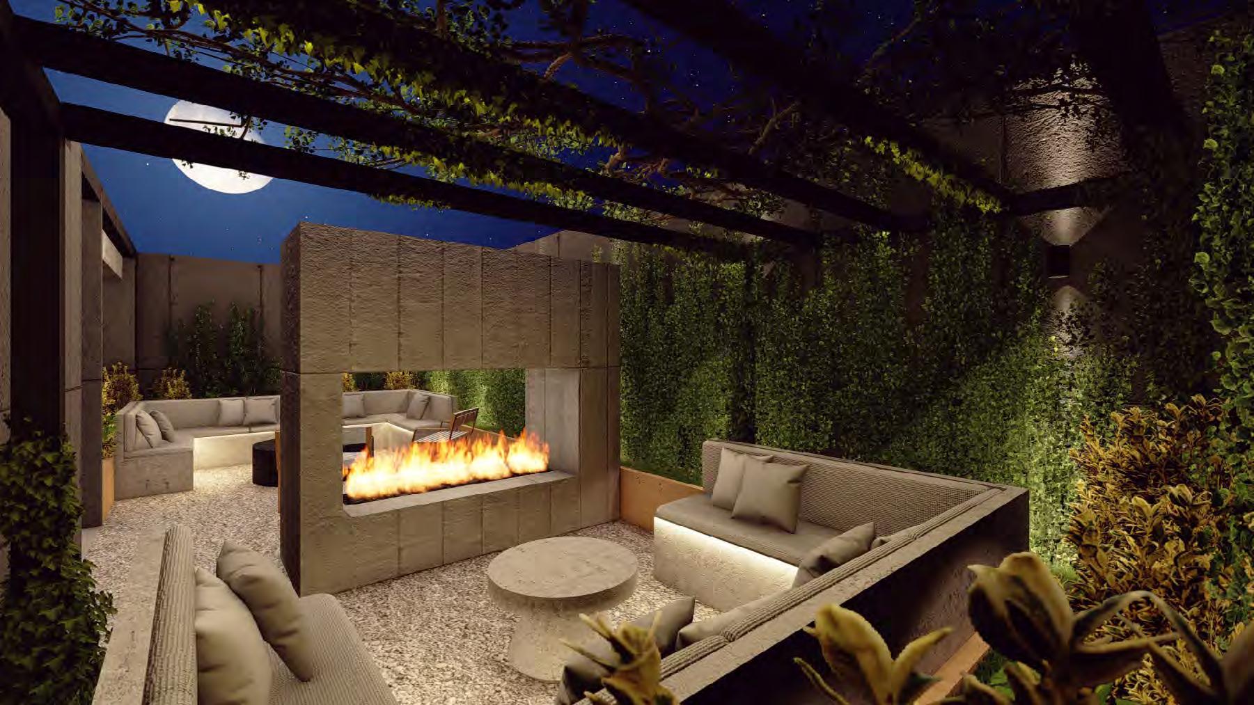
Interior design for the amenities of an apartment building, The interesting thing about this design is that a different design was sought for each amenity space, that each space expressed its use. Color in the children’s area, dim and natural space in the firepit area, brightness and elegance in the kitchen space and in the hallways an industrial concept expressing the materials with which the entire complex was built.
Project woked in:
In building projects I have contributed in various topics. In interior design of apartments and amenities, in volumetry and in facade design. I have worked on housing, commerce, mixed-use and school projects. The scale of these projects is a challenge but every aspect of them that needs to be designed and solved is interesting.

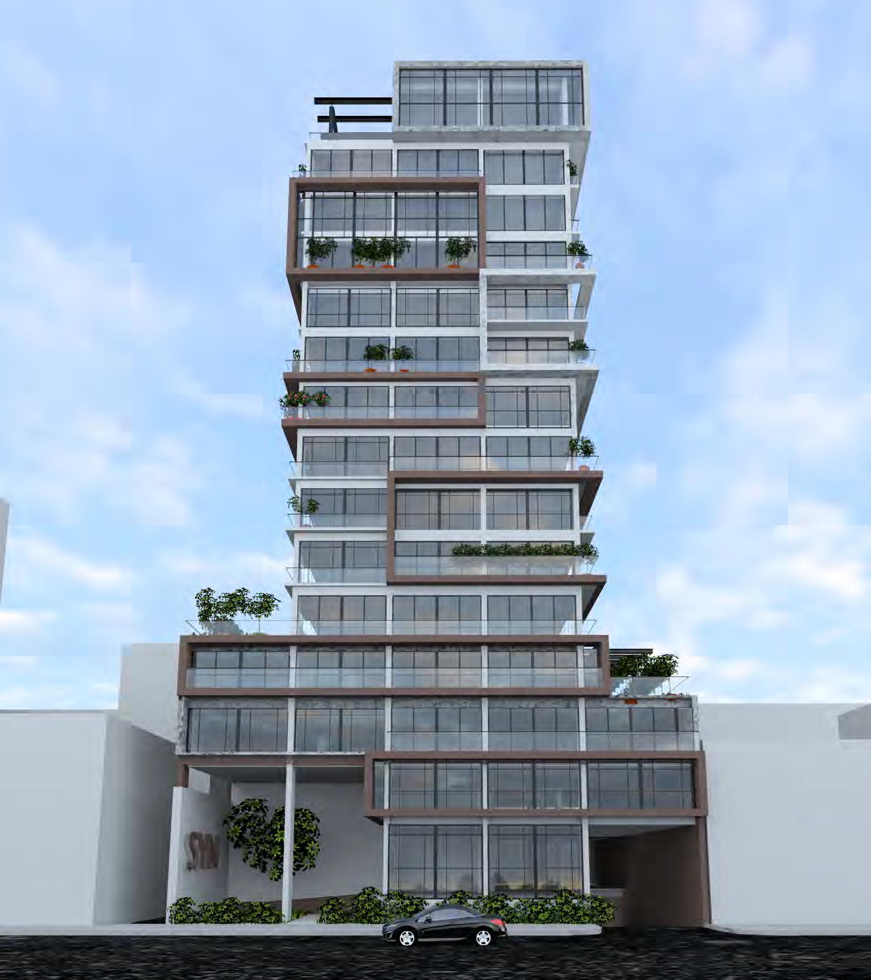
Within the spaces you can perceive the feeling of living in a house. All the apartments have a view of gardens and connection with the outside, they have terraces and outdoor spaces. And for still being apartment buildings they have the benefits of common amenities, basement and others.
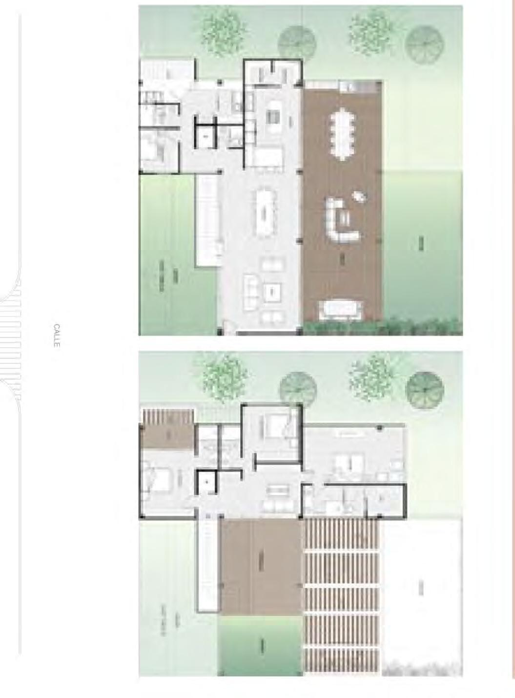
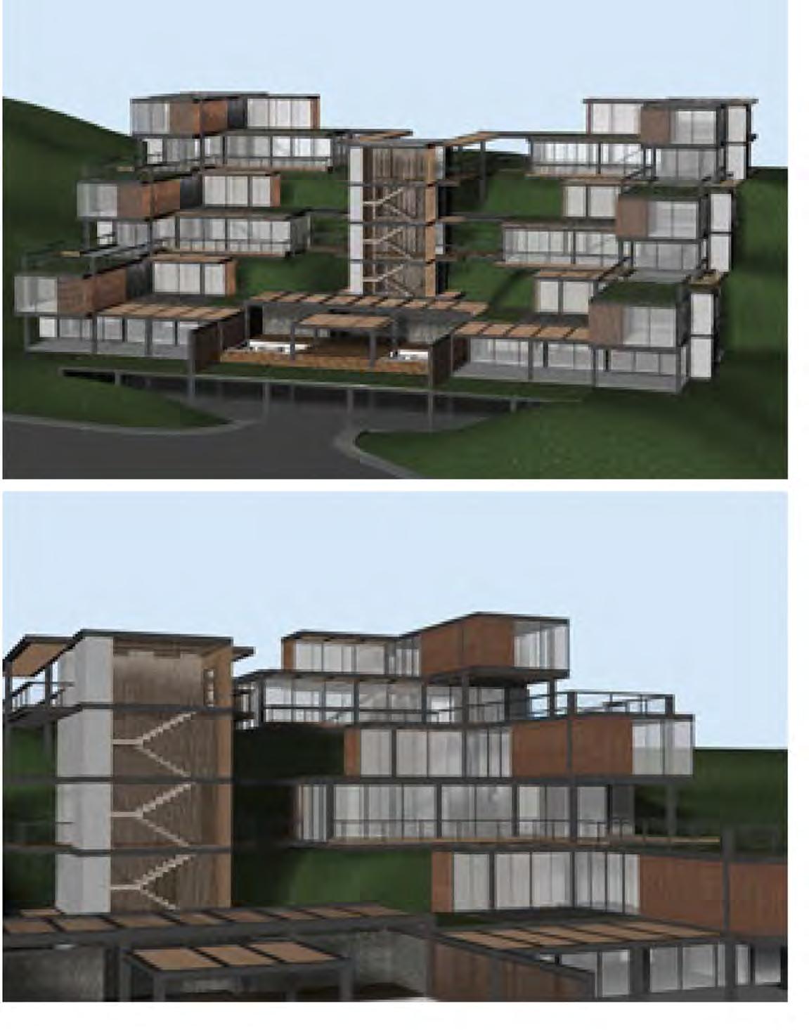
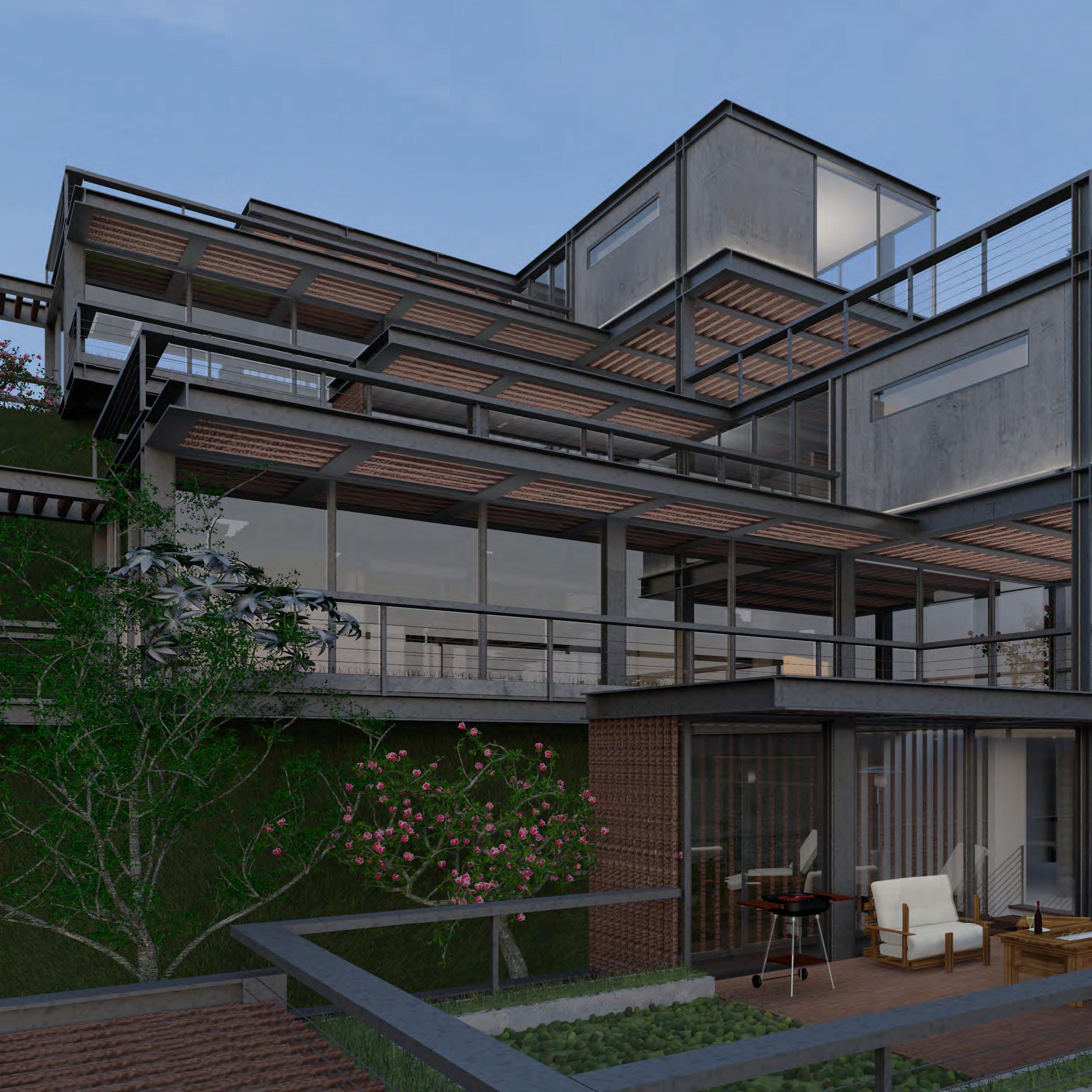
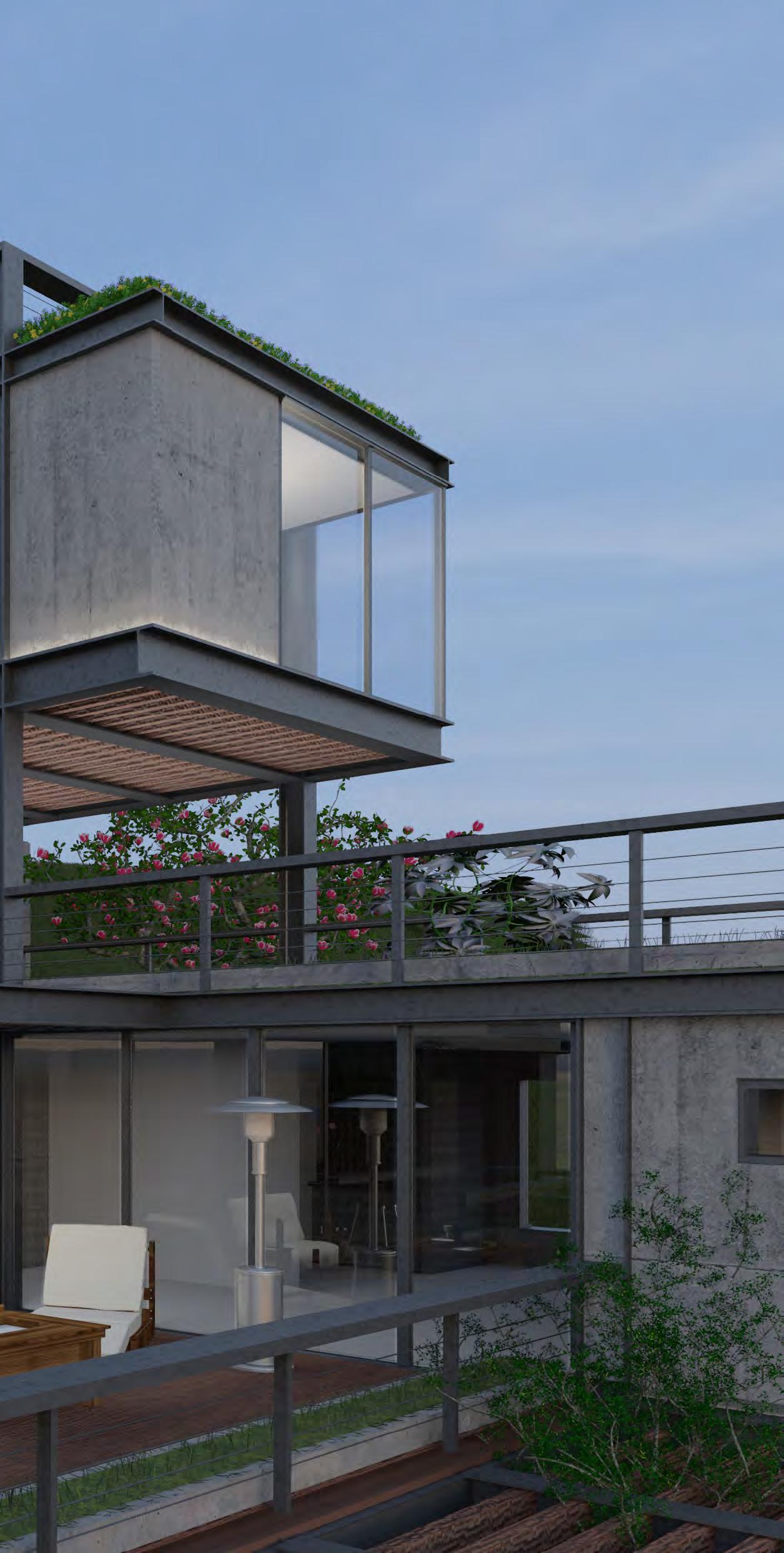
The design of these residences adapts to the topography of the land. Nowadays, vertical housing is very common, and there is little supply of houses. That is why in this concept I took advantage of the topography to create apartments that have the feeling of being individual houses.
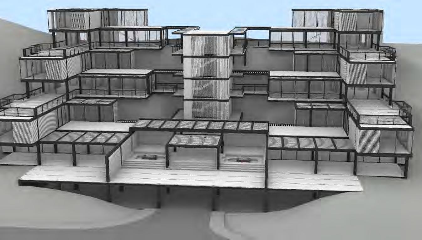
Since the project is located in a very green site, I included materials that contribute to biophilia to create a connection with the outside.


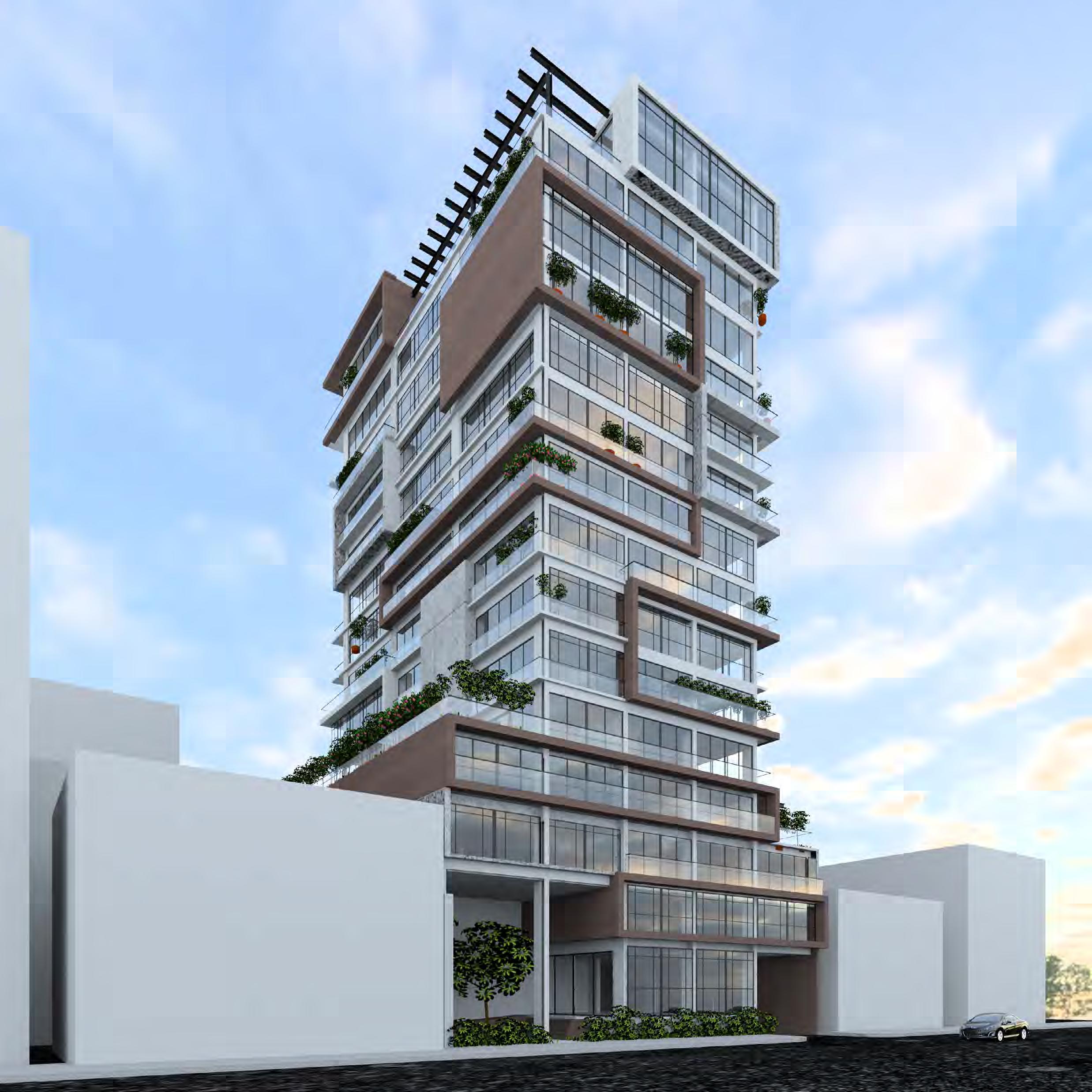
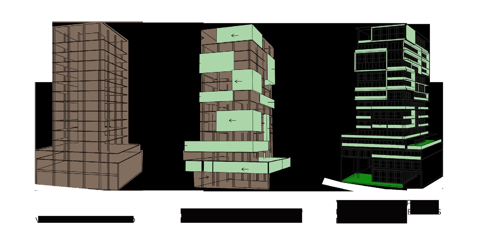
I created the concept of this building during the pandemic, where we began to see the lack of green spaces, terraces and gardens in vertical housing. So in this case instead of expanding the outdoor spaces outward, I did the opposite. I introduced the outdoor space into the interior and created a synthesis between both spaces, to give more versatility and openness to the apartments.

Project woked in: SHOARQ LAB
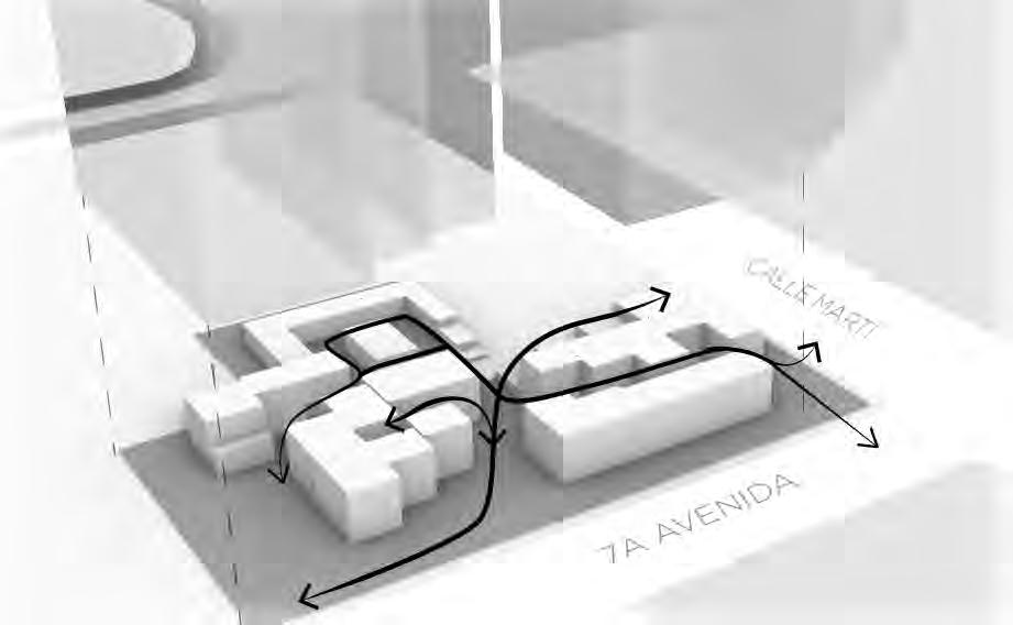
SITE EXTRUSION DEFINITION OF HIGHTS BASED ON STREET IMPORTANCE

CREATION OF A PASSAGE BETWEEN TOWERS OPENING BETWEEN TOWERS BASED IN VIEWS
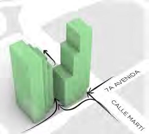
The urban strategy is bringing pedestrians into de project by opening key points.
The natural strokes created by the pedestrian flows become commercial passages on the first floor.
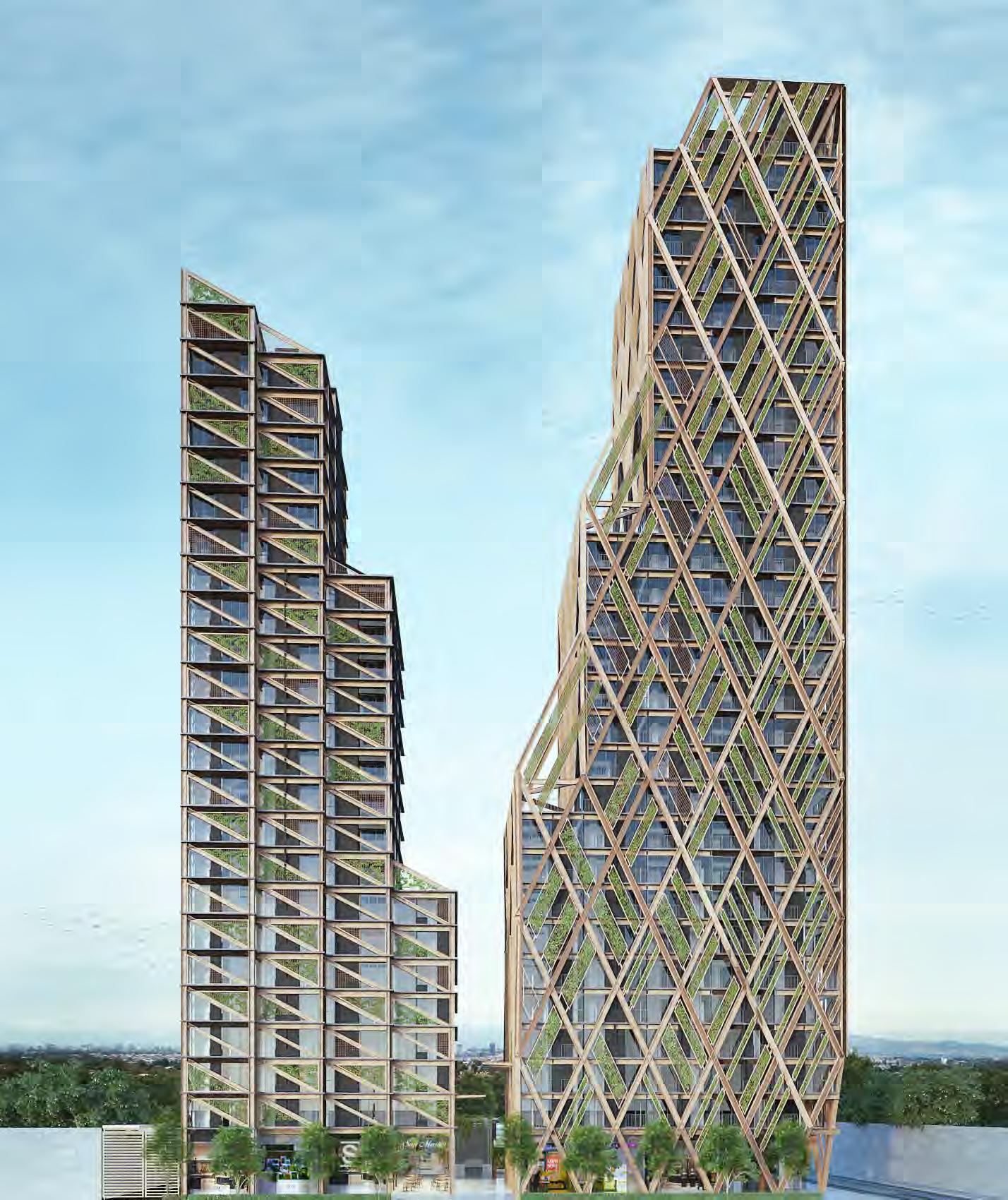
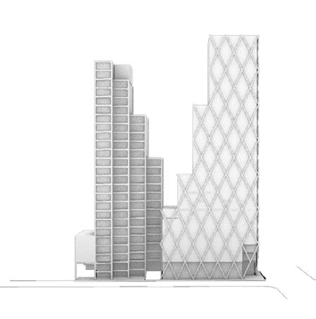
We wanted to create two towers that complemented each other as if they were talking to each other, but we never wanted to create twin towers. With this in mind, we used two different types of structure so that each tower had its own character and identity.
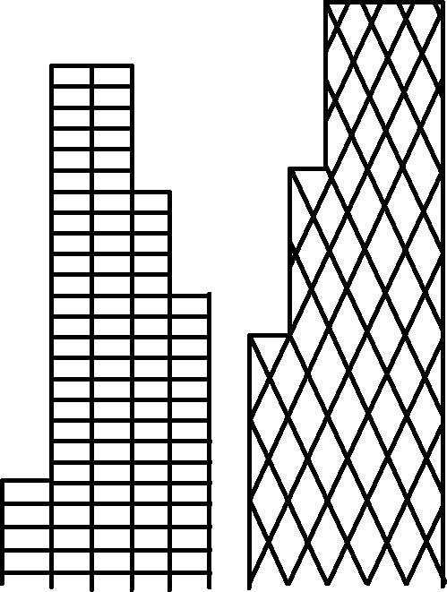
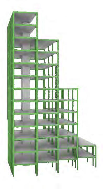
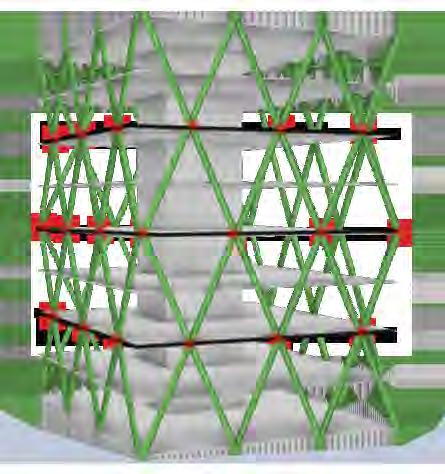
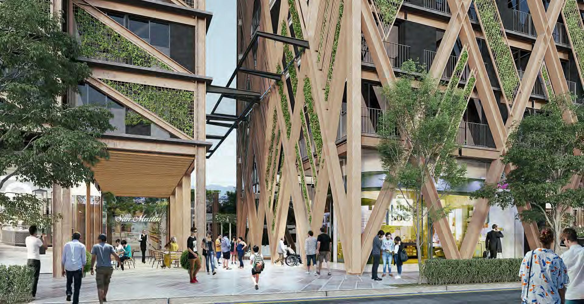
We wanted to create two towers that complemented each other as if they were talking to each other, but we never wanted to create twin towers. With this in mind, we used two different types of structure so that each tower had its own character and identity.

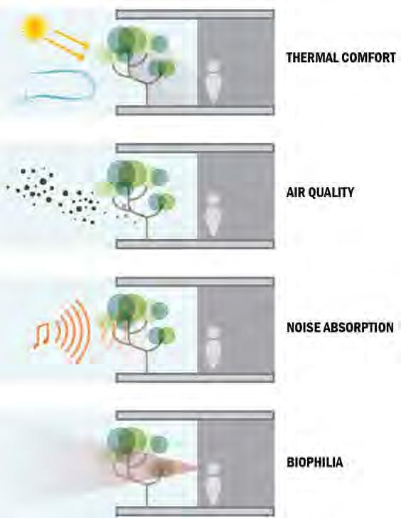
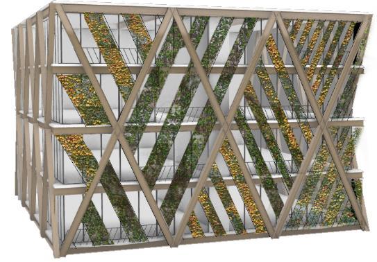
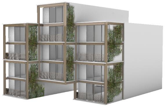
The project is located in an area with heavy traffic and pollution, so we decided to give the user a break from the urban noise by adding a green filter on the facades, improving the comfort and providing biophilia to the spaces.
Project woked in: SHOARQ LAB

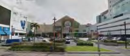
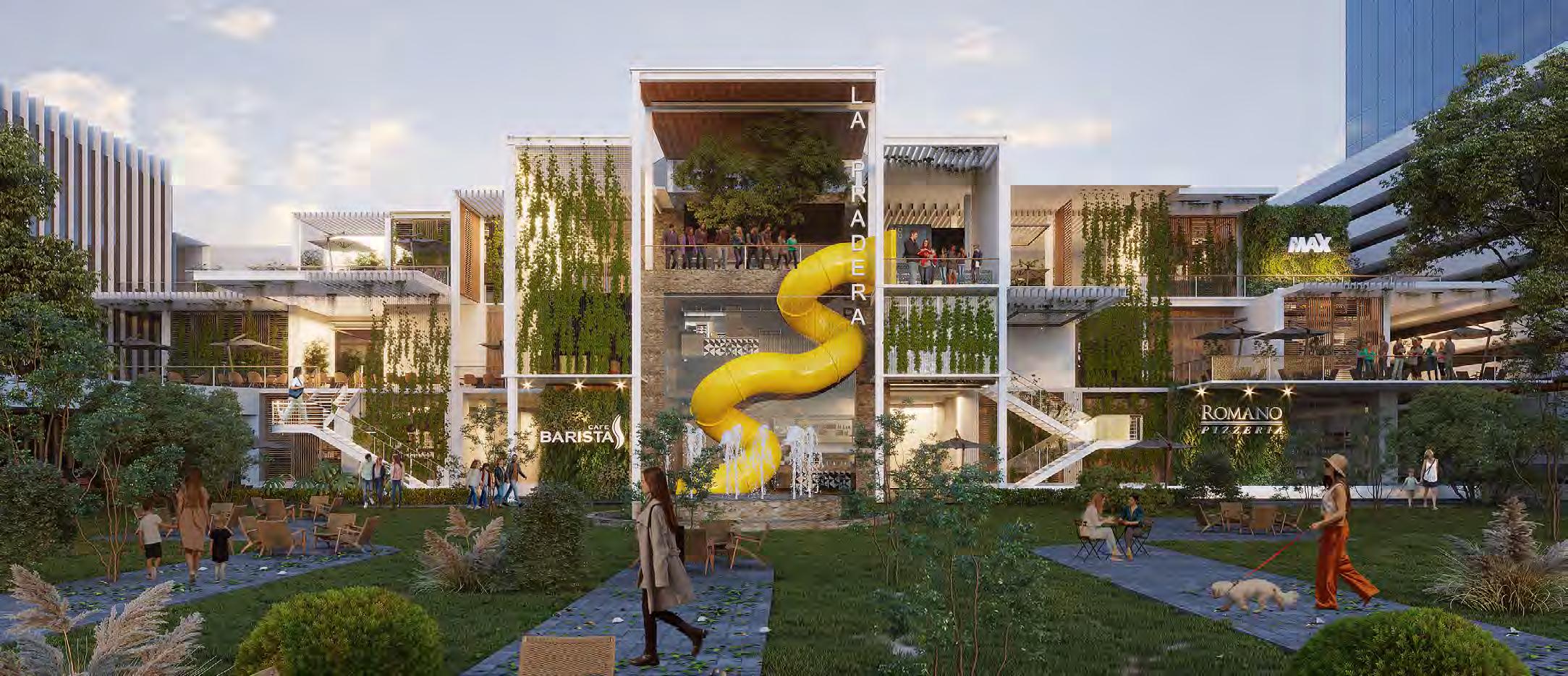
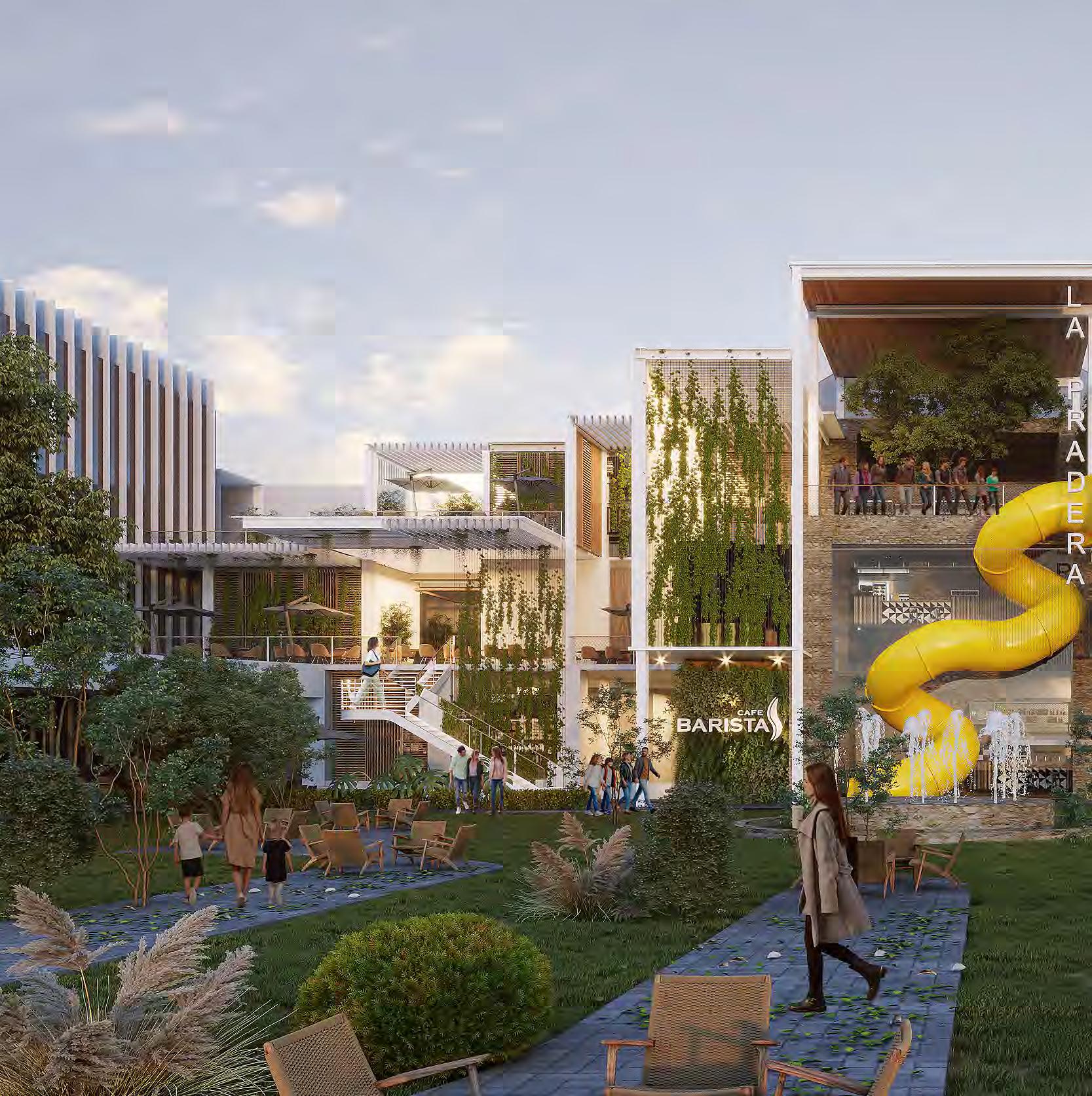
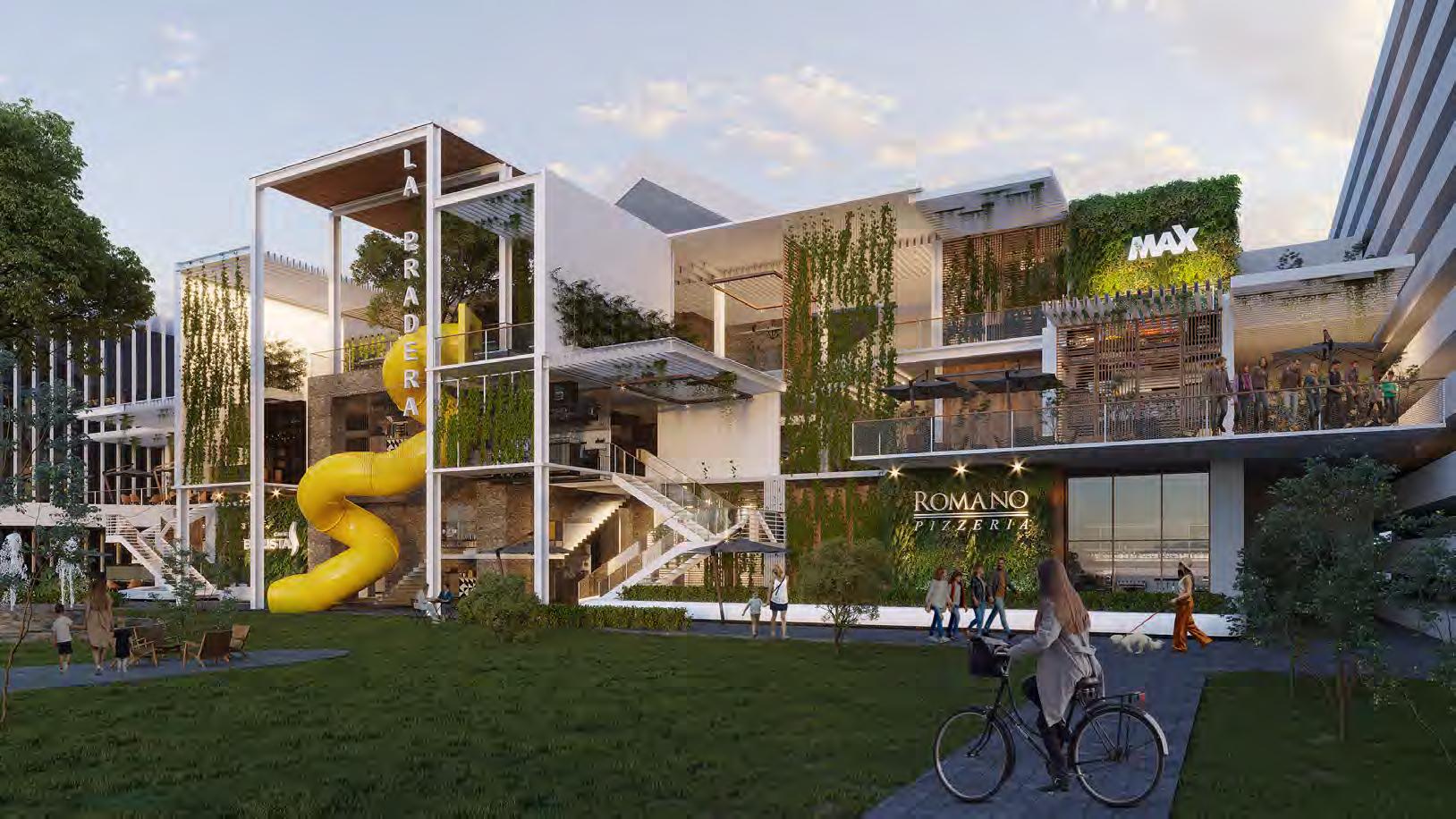
This shopping center is one of the oldest in Guatemala. In its time it was very popular, but it was lagging behind over the years. It was decided to give it a new look to attract customers again. So what was worked on, was the proposal of a new, clean and innovative facade, where we can see spaces with nature and outdoors. A mix between interior and exterior space. In front there was a parking lot. It has great potential as it is an area that opens up to one of the main roads of the city, so it’s being proposed to turn it into a large public and urban plaza.

Project woked in: SHOARQ LAB
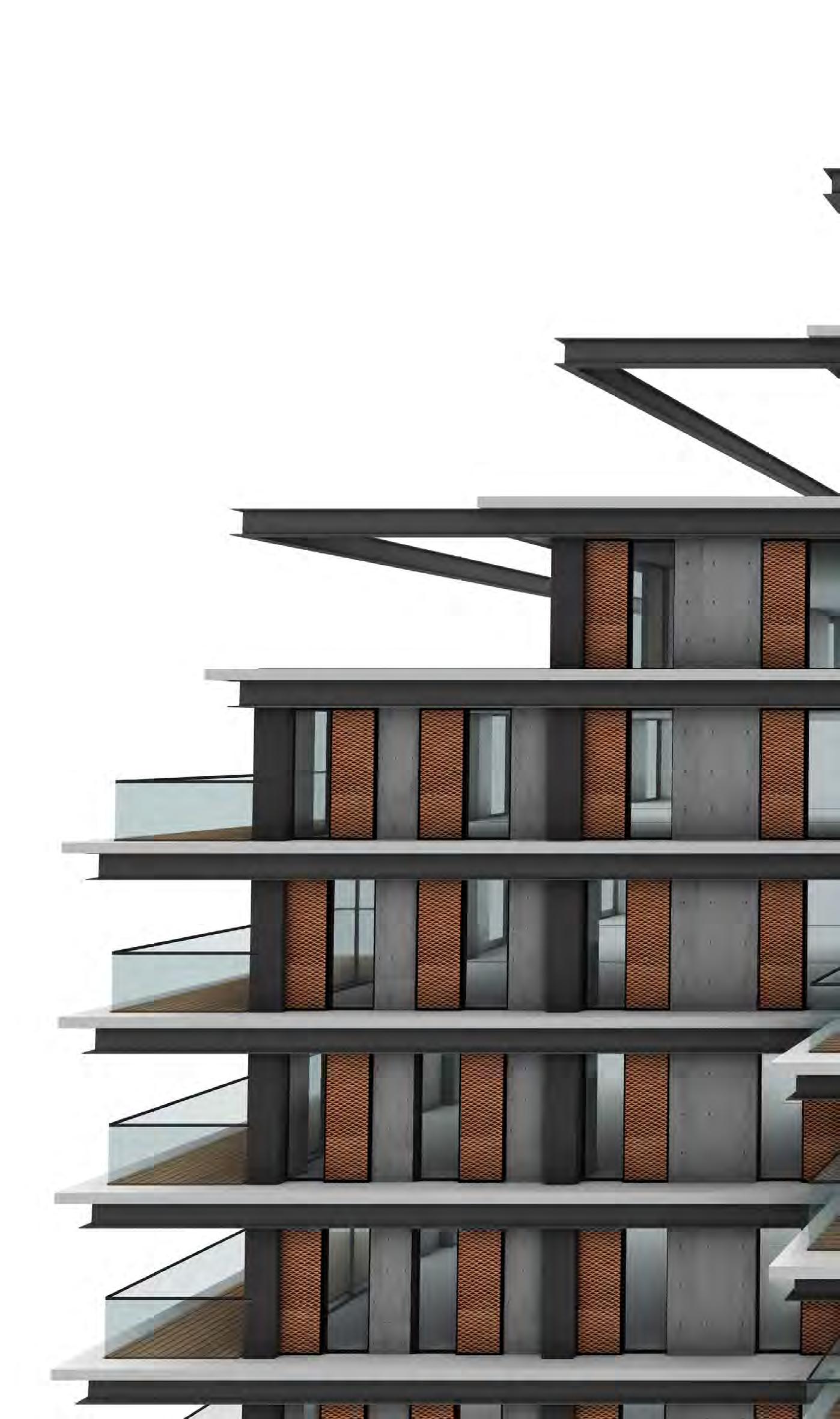
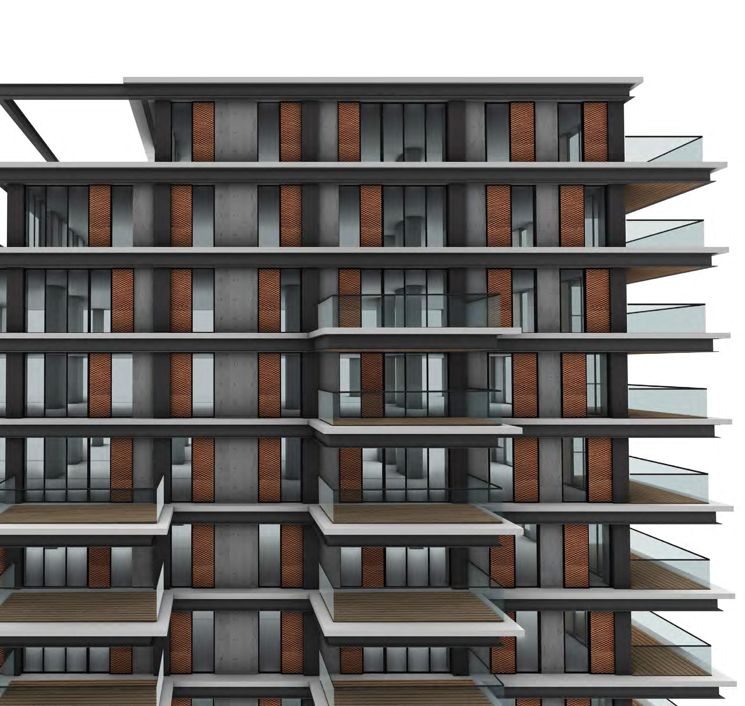
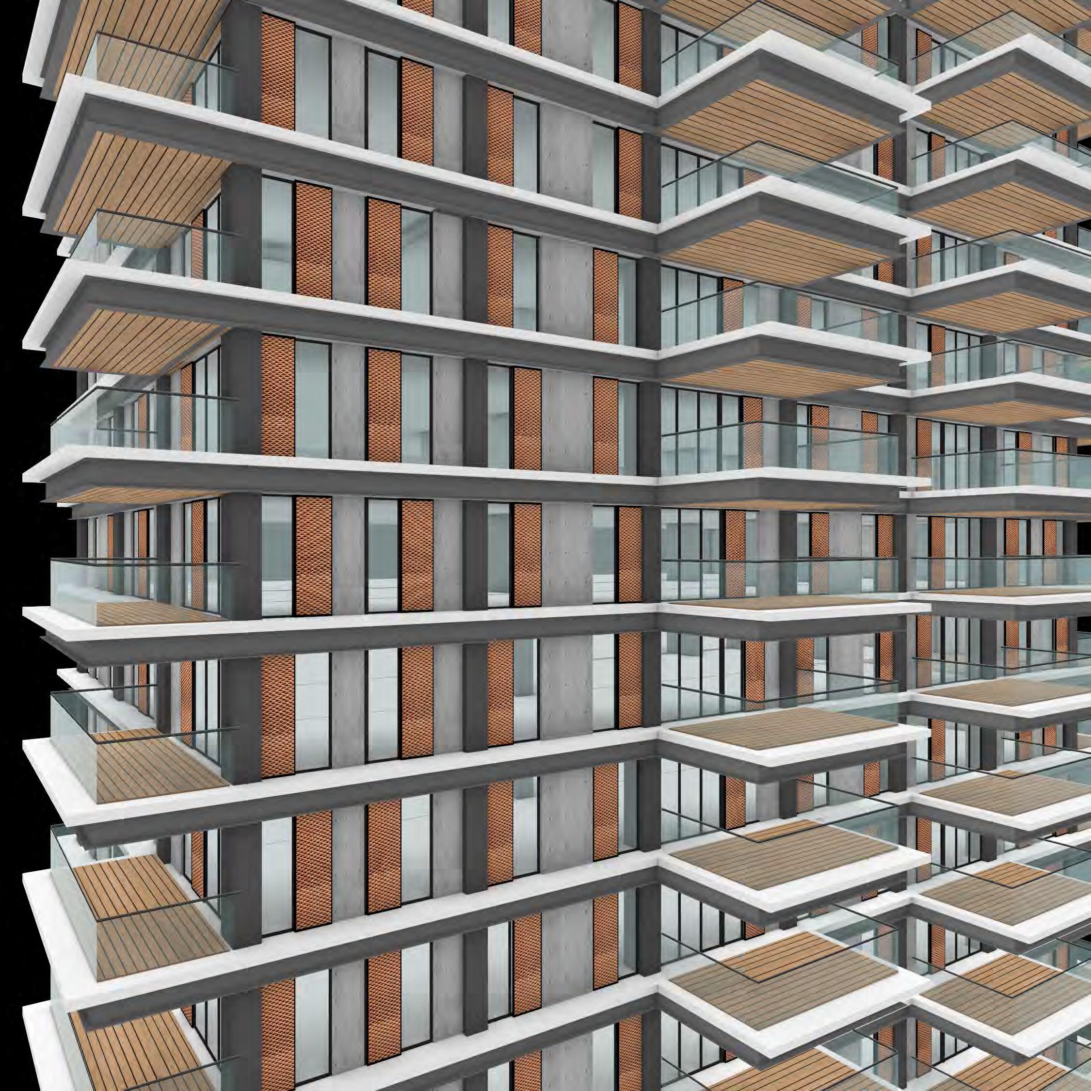

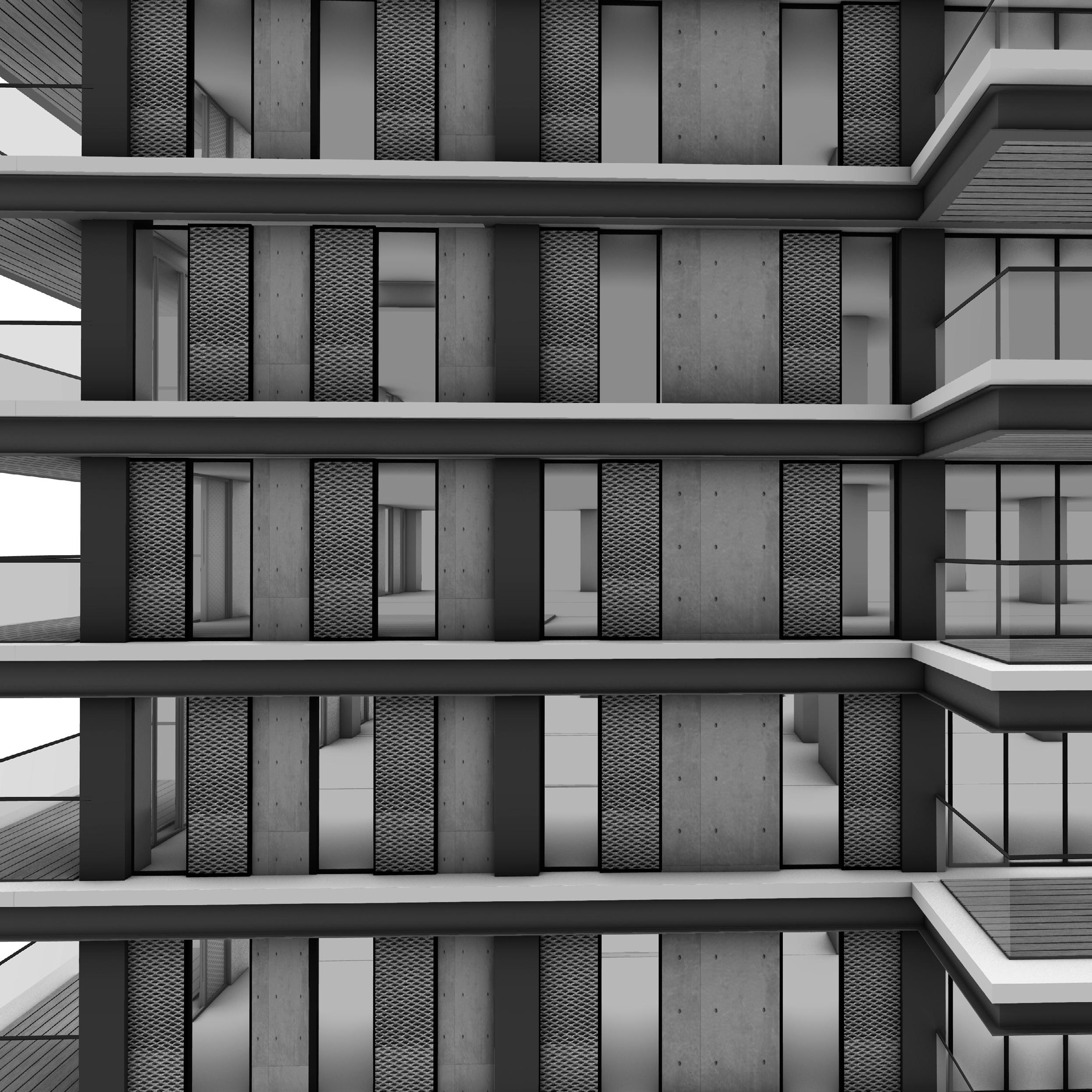
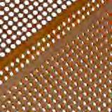
Perforated panel in corten steel color to give elegance to the building. The perforated panel allows me to give privacy and shade to the interior space, but maintaining the necessary lighting and ventilation.
The structure of the building was decided to be made of concrete for cost reasons, but to give it a more luxurious look, the columns were covered with black metal sheet.
I gave the walls an exposed concrete finish, to give more texture to the facade and dynamism to the vertical elements.
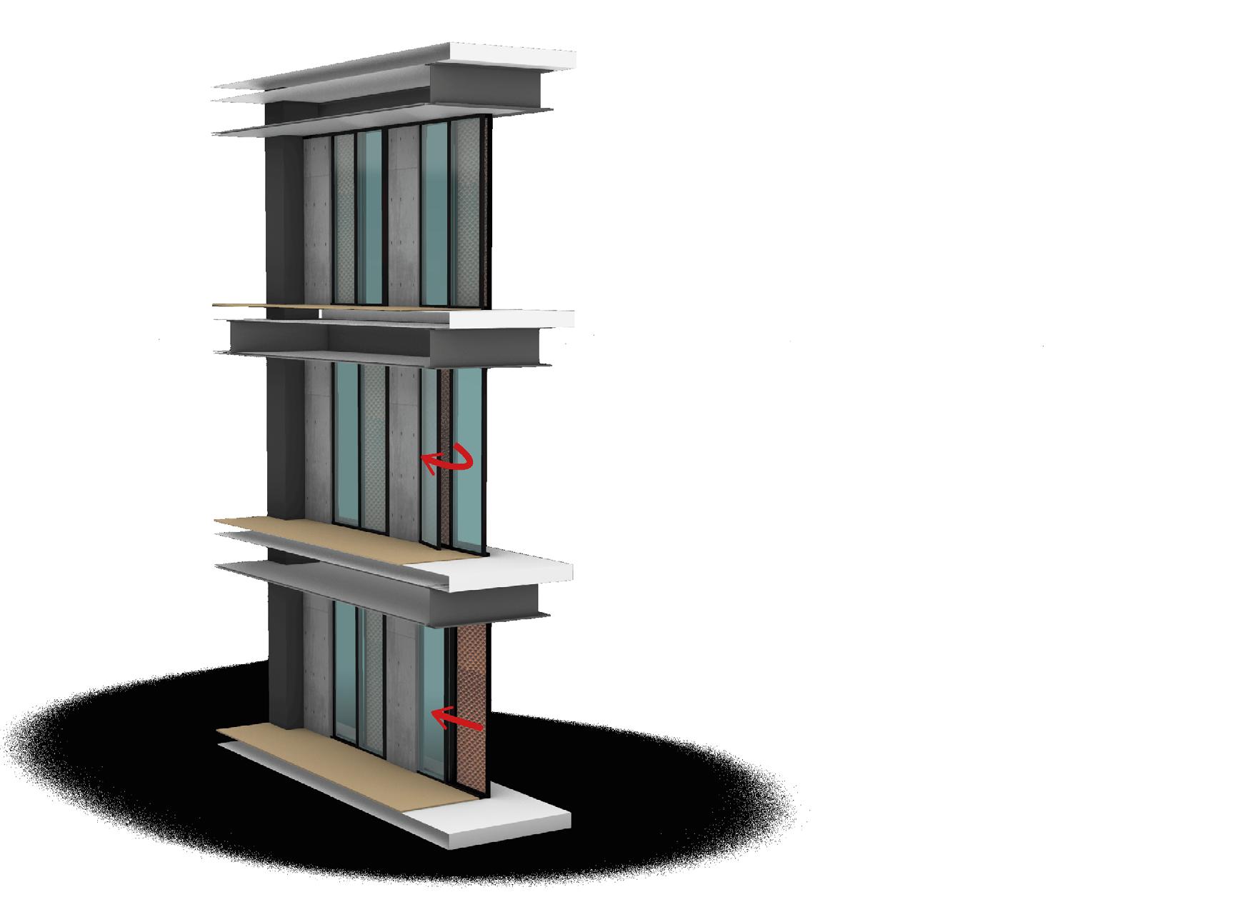
windows closed with solar protection by perforated panel
Projecting window with moderate opening only for ventilation and maintaining solar protection with perforated panel.
“Sliding door, allowing the space to be ventilated completely but always keeping the solar protection.
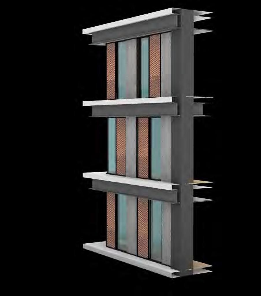
American Guatemalan Institute. One of the most important and antique institutes of the country. The project is a won contest between Shoarq Lab and another big firm of the city, Seis Arquitectos. I led this project from the beginning to the end.
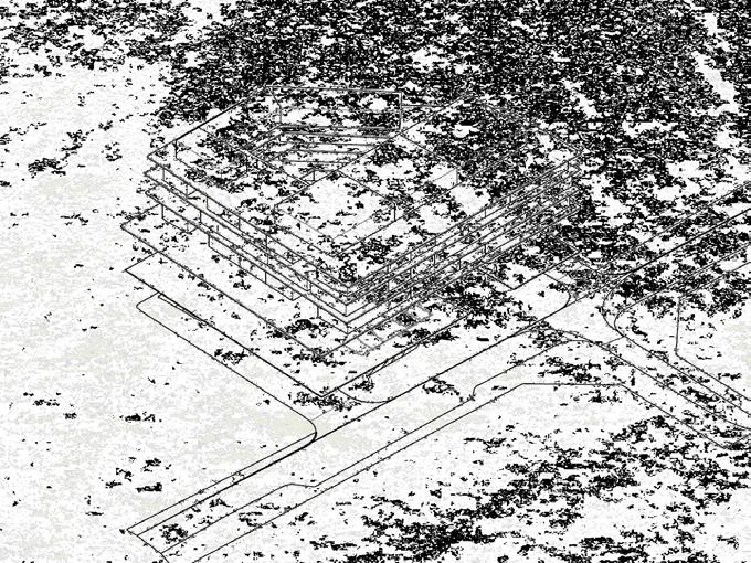
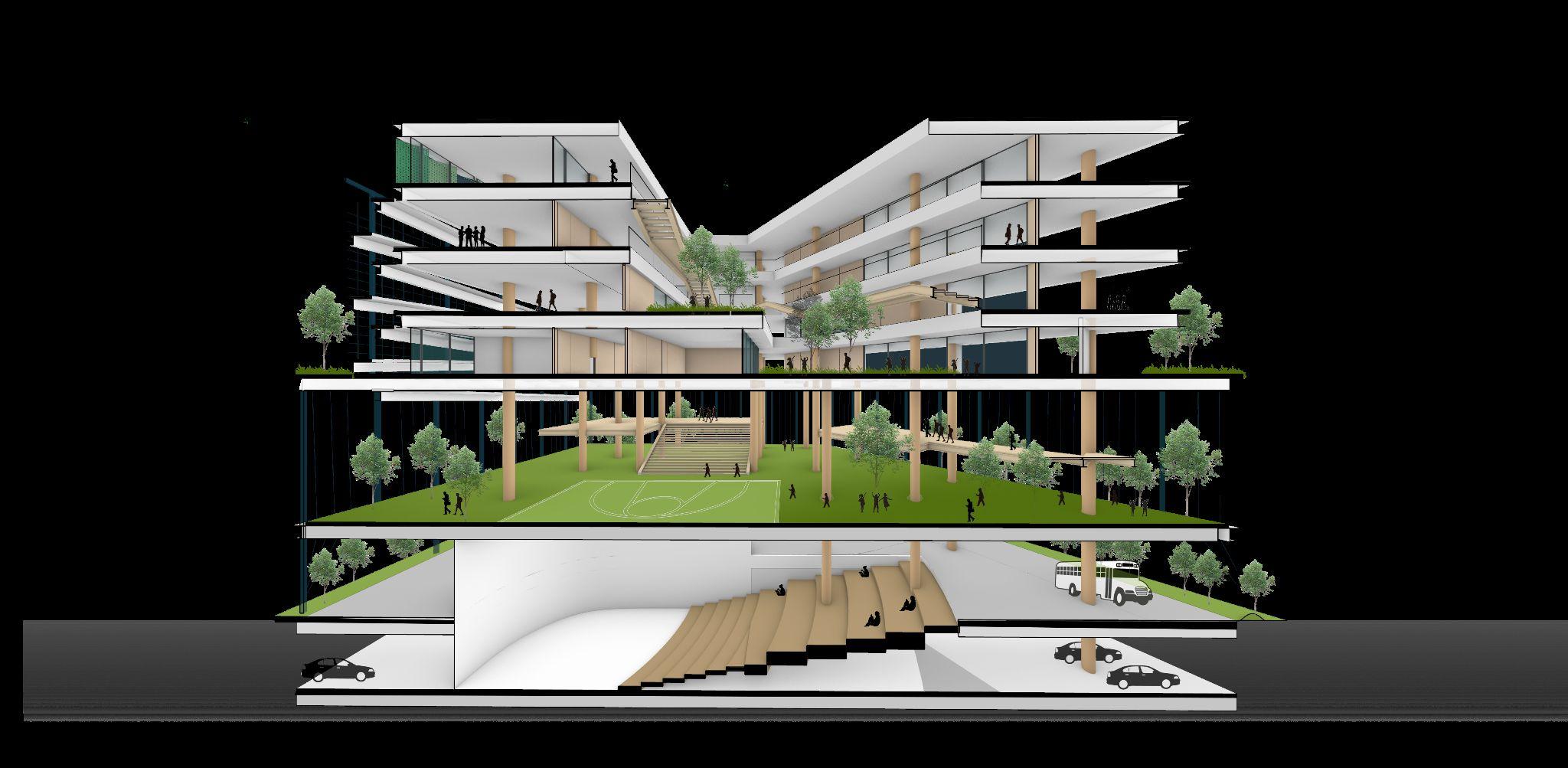
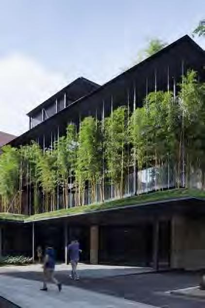
A primary and secondary school. Located in an urban site with heavy traffic and noise. Therefore, the main strategy is to distance the school spaces from this noise through vegetation buffers isolating noise and smog and giving security to the children.
Project woked in: SHOARQ LAB

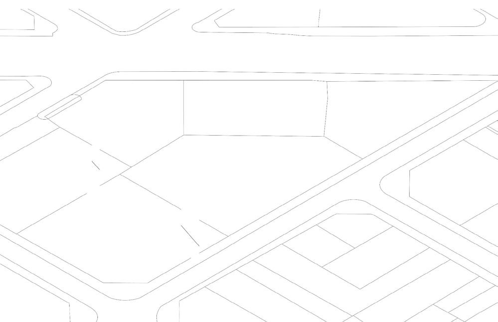
Site for the project.
Located in a urban space with a lot of noise and traffic.
Green Belt

A setback from the boundaries was left to create a green belt and a vegetation buffer.


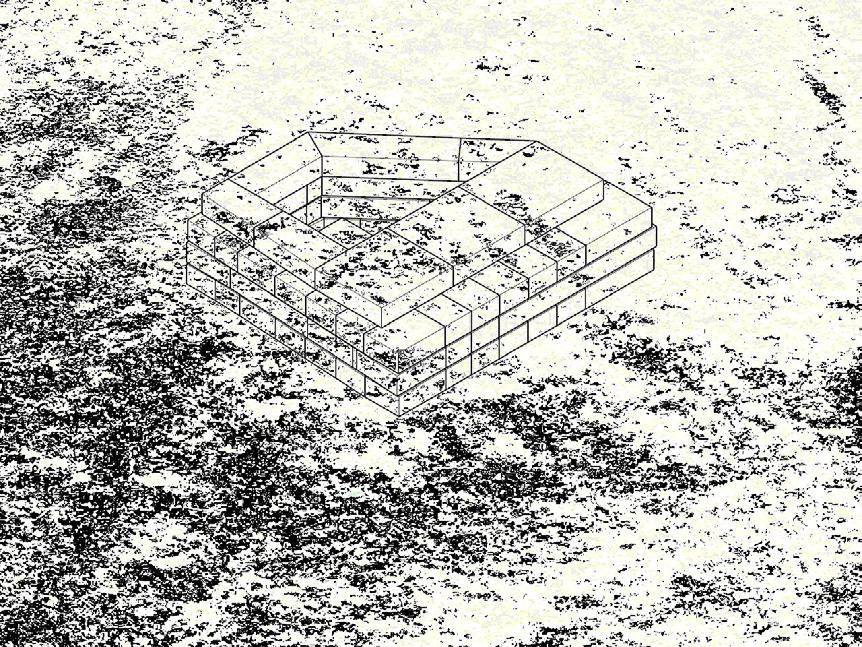
A geometry was created with the requested areas, leaving an atrium in the center for lighting and ventilation.

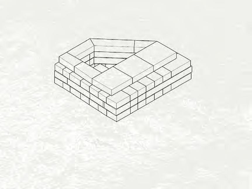

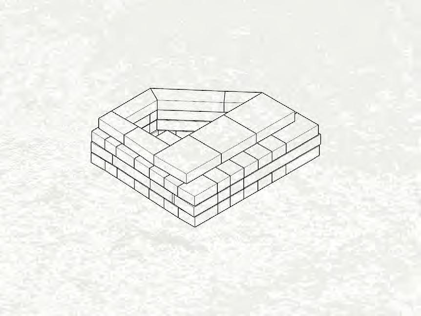


The volume was raised to give security to the children, keeping them away from direct communication with the traffic and urban noise.
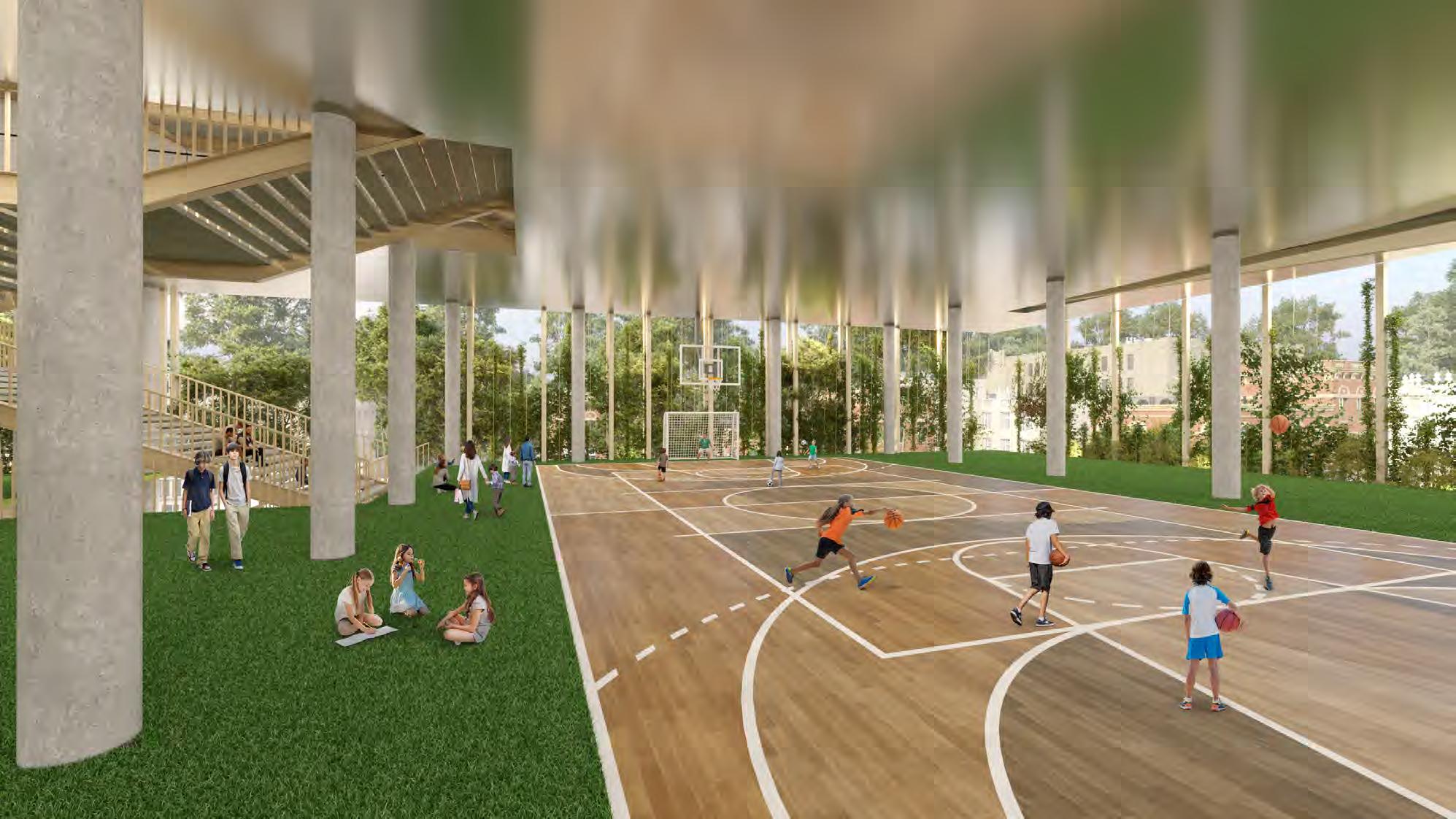
Green Patio
Taking advantage of the raised volume, we left the entire area on the ground floor as a playground.
Finally, we raise the whole project again to solve the logistics of buses and parking on the first level.
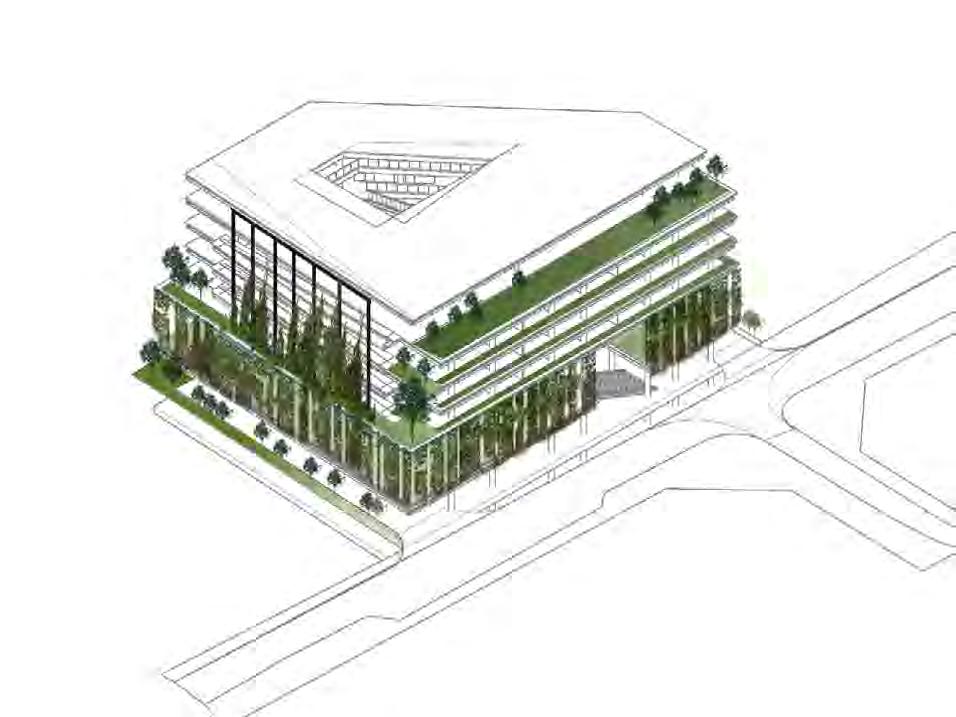
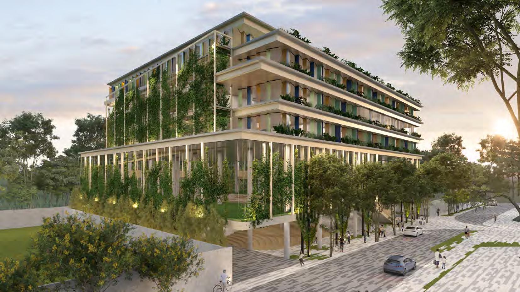
For the facade I used tones that connect with nature, wood and vegetation to create a breath of urban space.
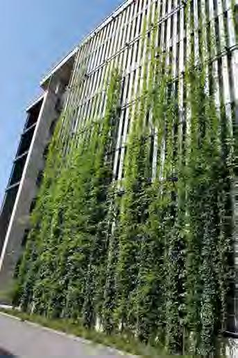
A structure was designed to let the vegetation climb and thus create an environment of comfort and well-being in the interior spaces, always allowing natural ventilation and lighting to enter the interior spaces.

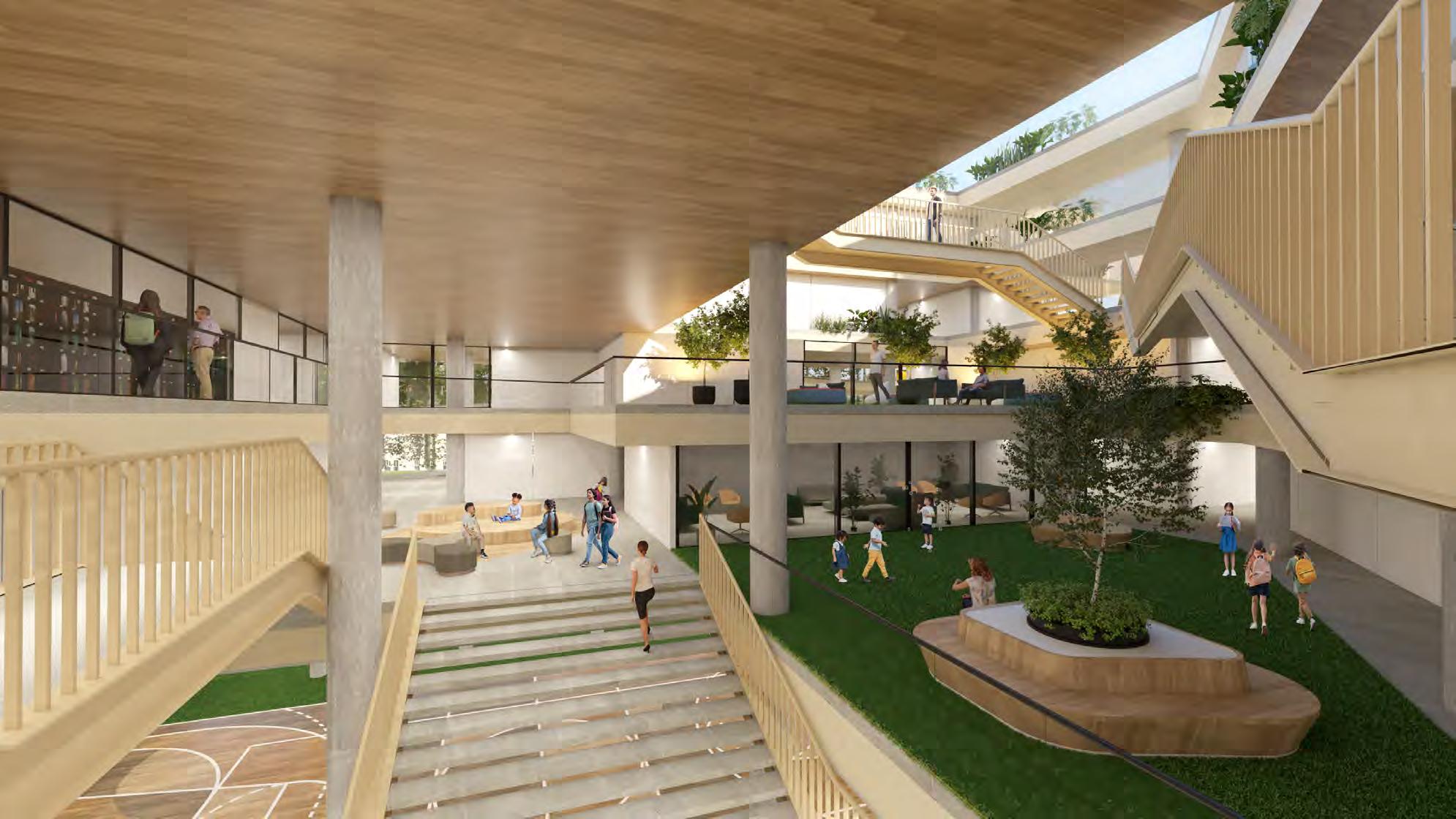
As one of the main design concepts, we created a central atrium, which allows us to have visual connection to all levels of the school. It gives us a space to breathe and natural lighting. We created courtyards in the center which give us a sense of spaciousness of interiors at all times.
