
MAIREN MANNING
Interior Architecture and Design || Florida State University
Bachelor of Science in Interior Design || Graduating May 2026
DESIGN PHILOSOPHY
Hello, I am Mairen Manning: an Interior Architecture and Design Student at Florida State University.
At the heart of my design, is the dedication to building connectivity. What is the goal of the project and how do you want the users to feel? How can we enhance the human experience? With people at the center of the design, a project should go beyond universal design standards, expanding inclusivity and serving the local community.
I have made it to where I am today due to the support from people around me. In turn, I aim to empower and support others through the influence of the built environment. As people spend more than half their lives indoors, these spaces matter. Regardless of who you are, and where you are in life, you deserve to be advocated for and supported to become the best ‘you’ you can be.
Throughout my portfolio, I hope you will notice each space’s intrinsic desire to be equitable, sustainable, and supportive.
PROFESSIONAL SUMMARY
EDUCATION
Bachelor of Science in Interior Design, Minor in Museum Studies
Florida State University, Tallahassee, FL
LEED® Green Associate™
Green Business Certification Inc. (GBCI)
AWARDS
1st Place - Material Bank’s Student Competition Spring 2025
FSU President’s List: Spring 2024, Spring 2025
FSU Dean’s List: Fall 2022, Spring 2023, Fall 2023, Fall 2024
EXPERIENCE
Resident Assistant
Florida State University, Tallahassee, FL
• Develop community engagement by organizing various events, creating hall decorations, and conducting discussions.
• Analyze resident concerns through individual discussions.
• Fulfill administrative paperwork by preparing proposals, incident reports, and maintenance requests.
Interior Design Intern
The Turett Collaborative, New York City, NY
• Managaed materials library and samples.
• Aided with redlines and document reviews.
• Updated product orders and quote sheets.
• Created renders and slides for client presentation.
Exhibition Co-Designer
Woven Together, WJB Gallery, Tallahassee, FL
• Done in Collaboration with Museum Studies Course at Florida State University.
• Produced Illustrator files for vinyl cut outs in the Exhibition.
• Created the SketchUp file for the Exhibition layout.
• Aided with installation of Artefacts into cases.
Exhibit and Operations Intern
Glazer Children’s Museum, Tampa, FL
• Maintained and repaired various props alongside team members.
• Created renders with SketchUp and Photoshop.
• Constructed exhibit prototypes.
• Measured rooms and created floor plans with AutoCAD.
May 2026
January 2026
August 2023 to Present
June 2025 to August 2025
May 2025
June 2024 to August 2024
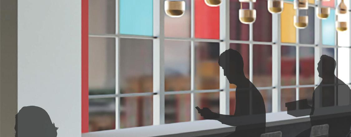
TABLE OF CONTENTS Kaleidoscopic Afterglow:
Crafty Office
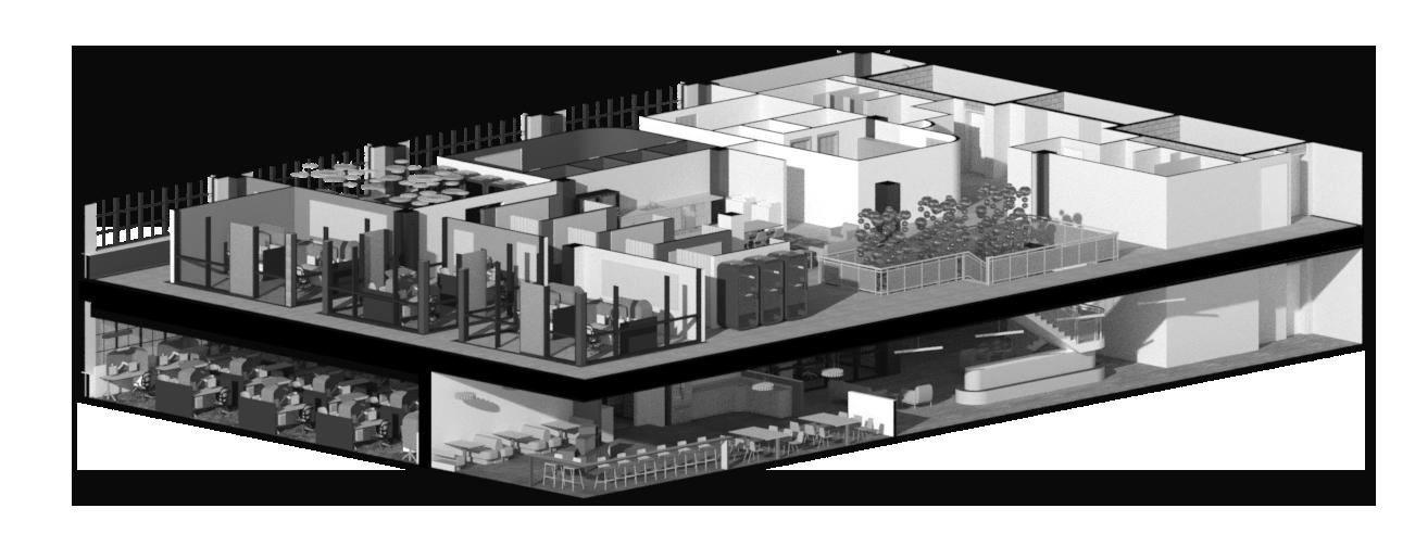
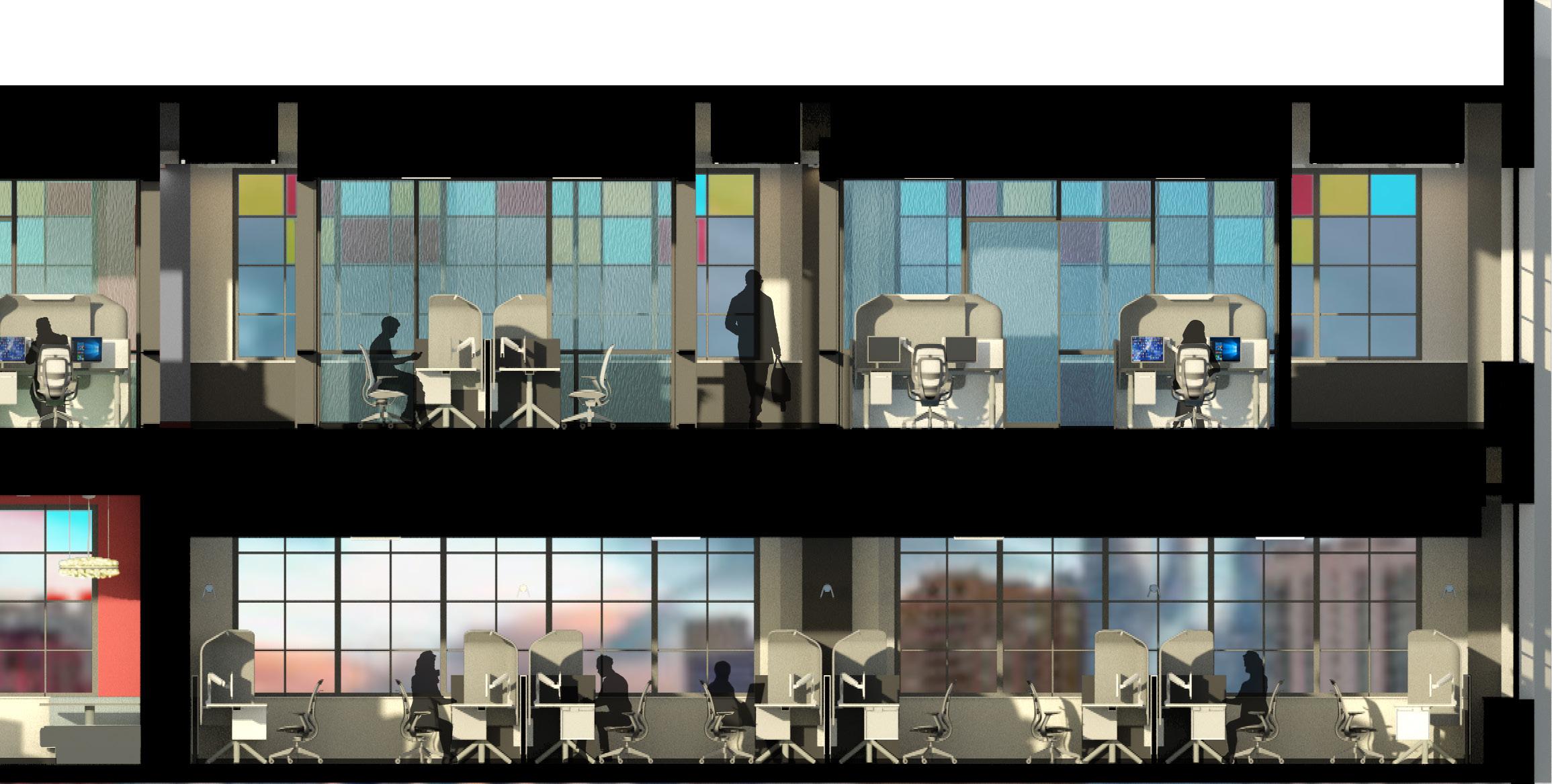
KALEIDOSCOPIC AFTERGLOW: A Crafty Office
Utilized Revit, Photoshop, and Physical Modeling


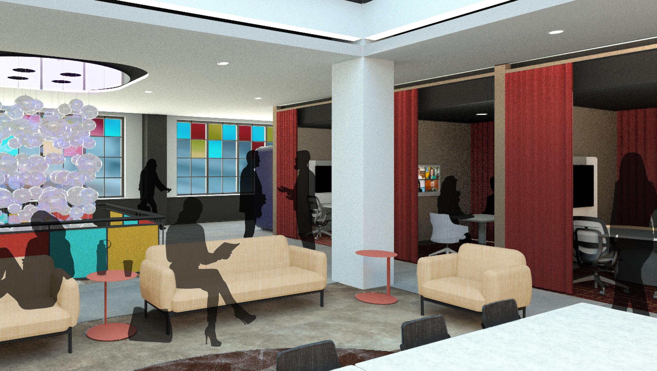
Entry Perspective of the 6th Floor
A Look into a Colorful Workplace:
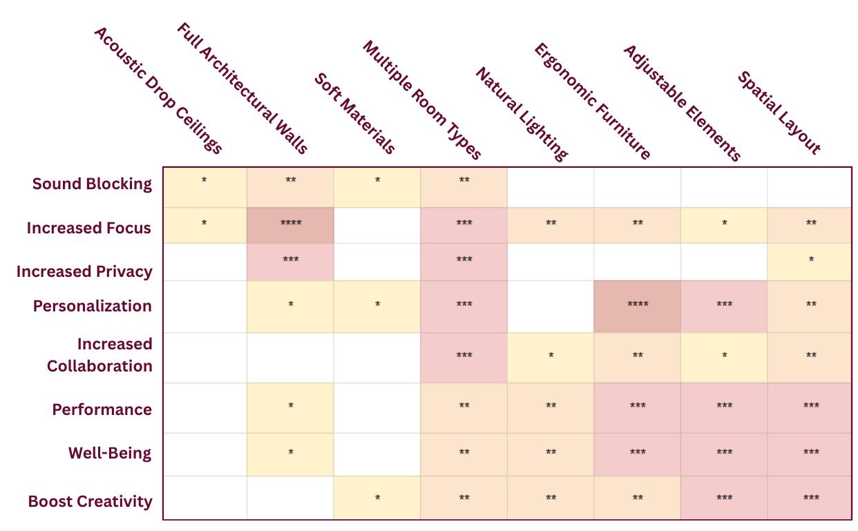
In a world where workers are expected to do more everyday, how do we ensure they feel supported and satisfied in their occupation? The Crafty workplace seeks to provide the variability workers need to succeed. Across 15 research articles, it is proven that spaces with more seperation increase focus, ergonomic furniture improves personalization, and therefore, more worker satisfaction. Below is the Evidence-based Design Matrix which compiles the research completed for this design project.
Space Planning:
Concept Development:
The Crafty Office design is inspired by the characteristics of a vending machine. Vending machines are vehicles for transactions rooted in food and drink, much like Crafty’s platform. Moreover, vending machines rely on human interaction in order to work. In the layout of the office, the concept will be demonstrated through rectilinear organization: points of privacy, spiraling movement, and boxes of connection. The design will be characterized by vibrant colors and elicit spontaneous moments of connection. Moreover, the heart of the company relies in communication and collaboration, resulting in a vibrant and colorful space.
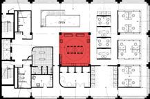
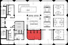
Across 16,000 square feet, a major influence of the planning was the idea of the visitor and the worker. Spaces that are open and used by visitors are placed near the front entry or have a clear line of sight. The second floor is maintained as an employee-only zone, however, the stair atrium will convey the spaciousness of the environment and allow for more light to filter through. The different workspaces are congregated into similar zones to provide workers with quick walks between departments, boosting the opportunity for communication and collaboration. Wellness zones are placed further away from these points of energy.

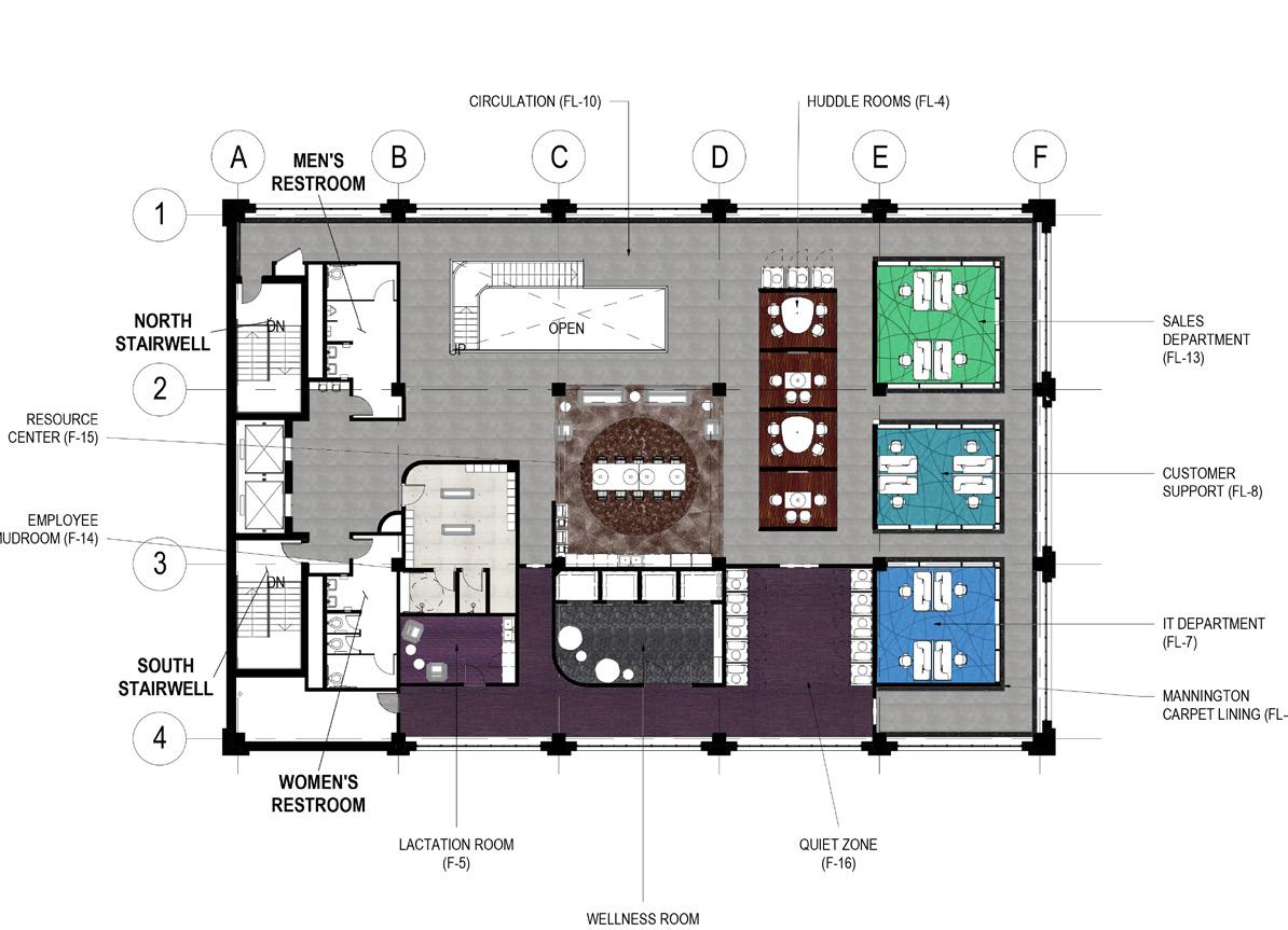
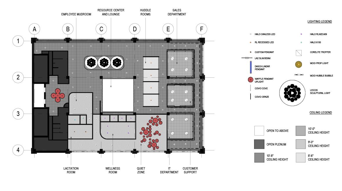
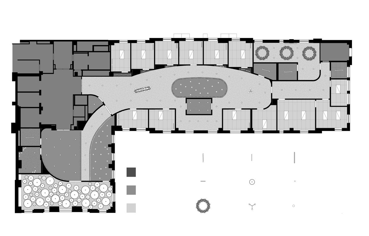
Floor Plan - 6th Level
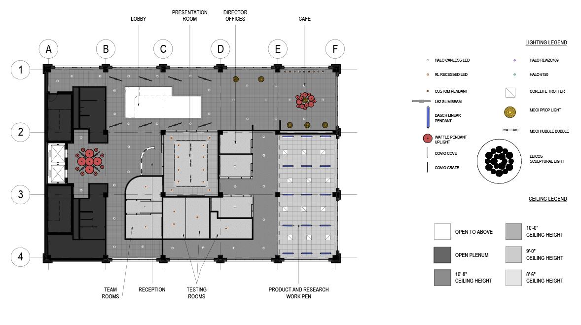
Reflected Ceiling Plan - 6th Level
Floor Plan - 7th Level
Reflected Ceiling Plan - 7th Level
SALES DEPARTMENT
Providing Variety:
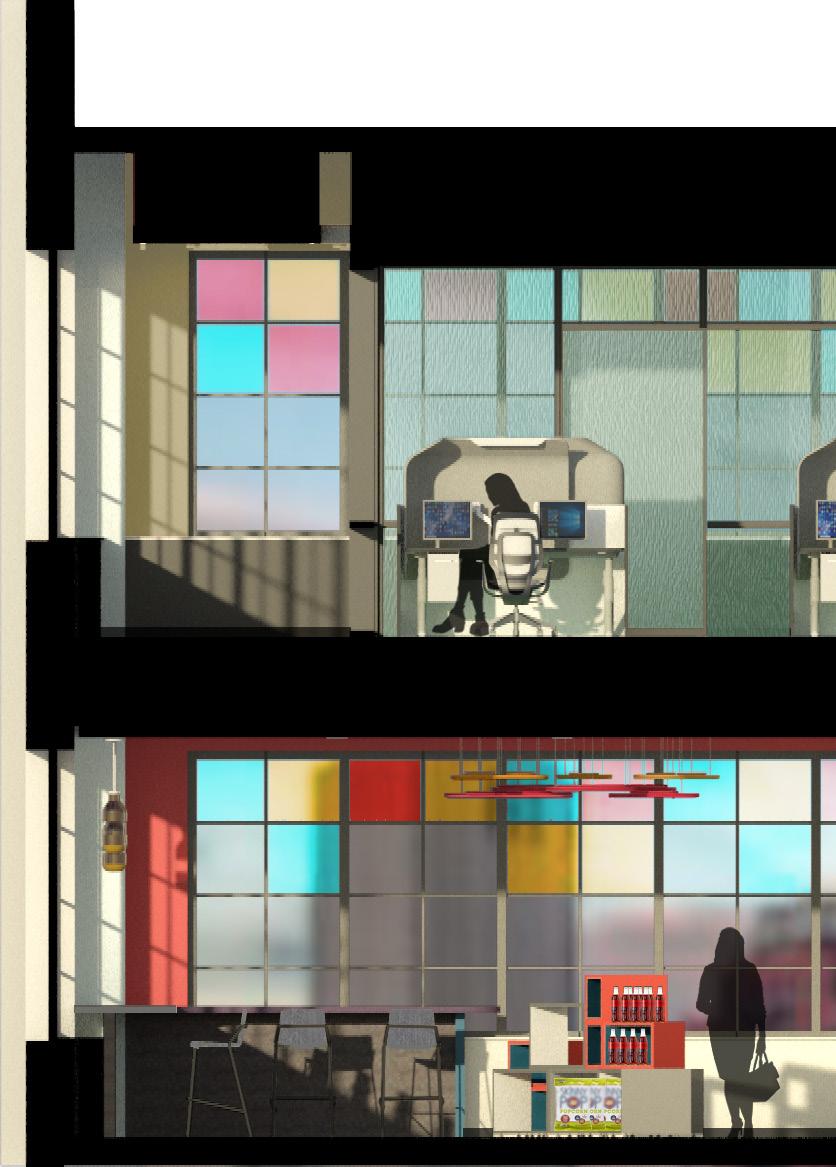
To provide for Crafty’s various departments and the workers’ different preferences, the office includes multiple types of work spaces: open zones, private pods, quiet zones, large collaborative tables, and the standard office desk. Providing choice ensures that each person feels control over their environment, increasing feelings of safety, privacy, and focus.
To cater towards personalisation, each space uses different vibrant colors: matching Crafty’s vibrancy while also adding a sense of identity for each department. For example, Sales is green, Customer Support is cyan, IT is bright blue, Research and Product Development is dark blue, and the quiet zone is purple.
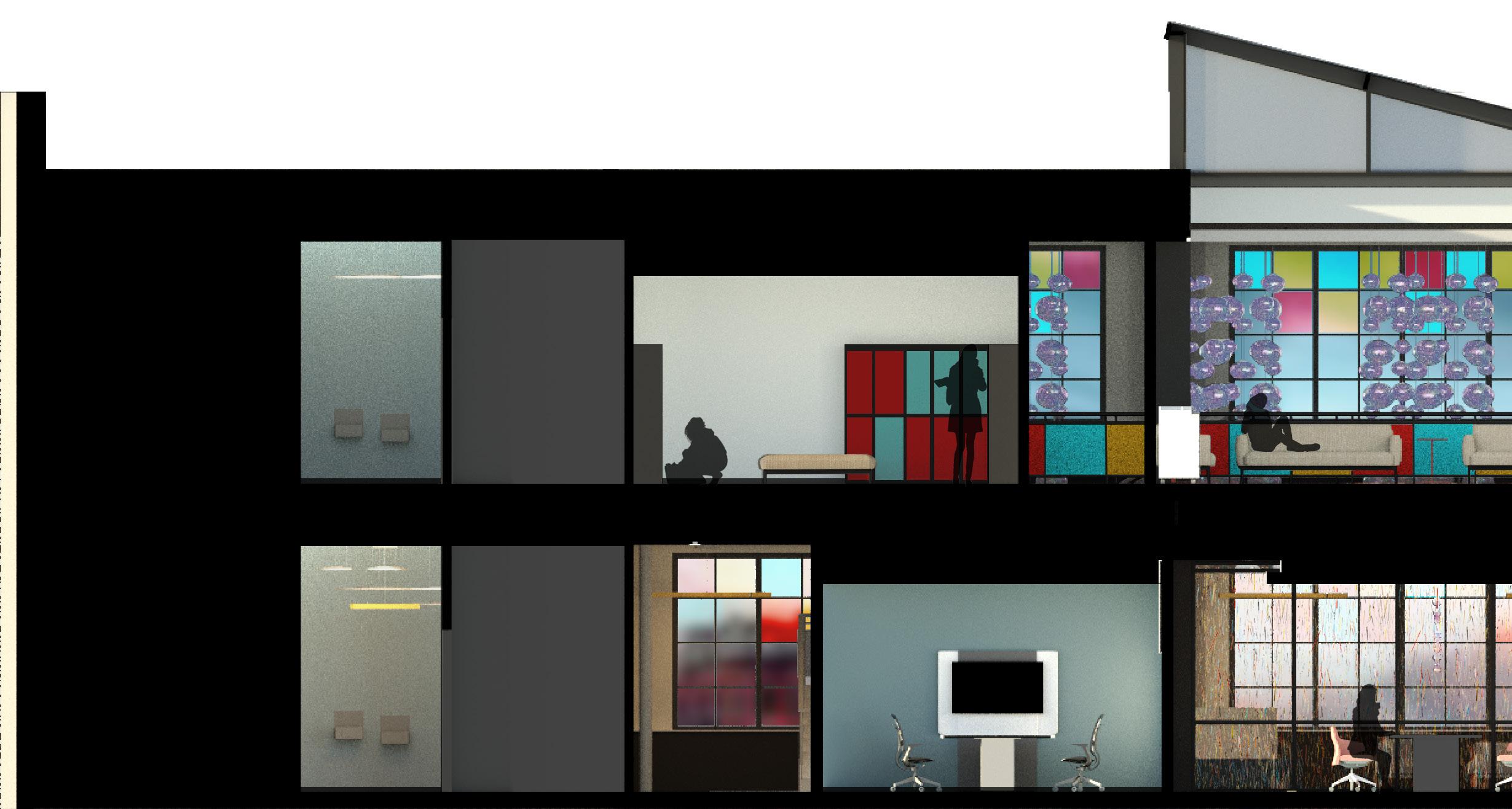
Section Cut - Facing East
EMPLOYEE MUDROOM
TEAM ROOMS
Section Cut - Facing North
DEPARTMENTAL OFFICES
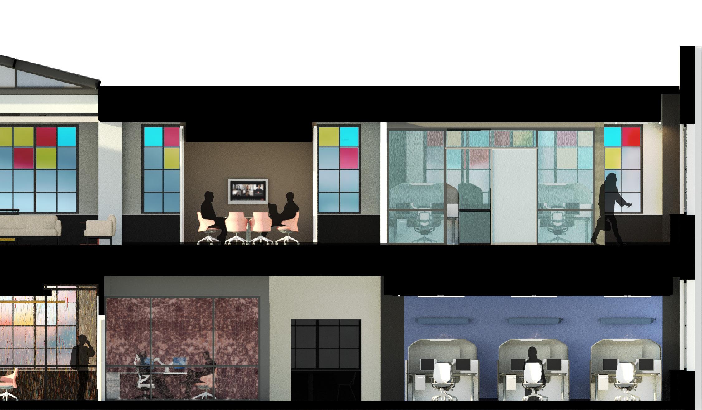
PRESENTATION ROOM DIRECTORS’ OFFICES
CUSTOMER SUPPORT IT DEPARTMENT
PRODUCT AND RESEARCH WORK PEN
PRODUCT AND RESEARCH WORK PEN
6th Floor Design Intentions:
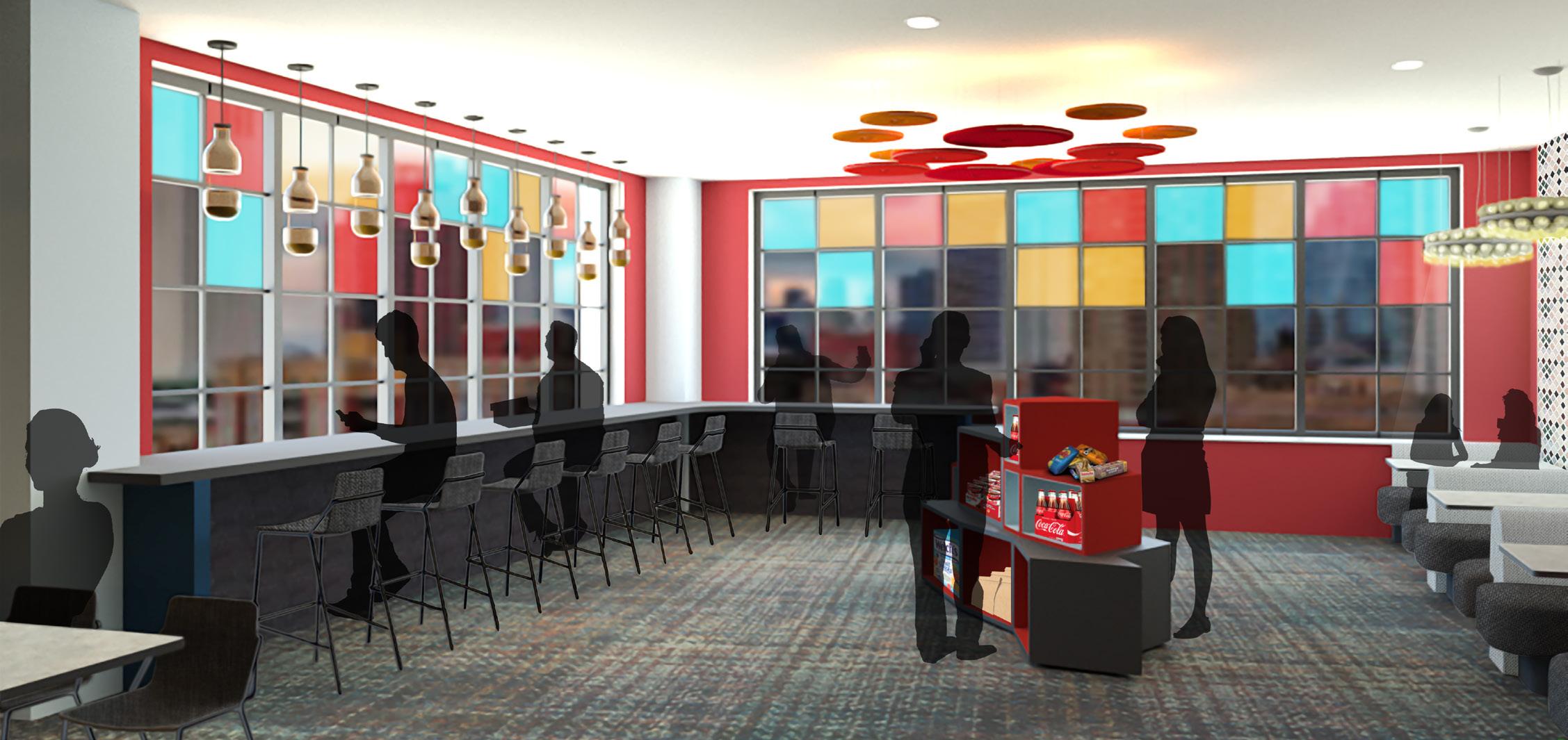
The 6th floor balances space for the public, whether that be potential clients or otherwise, and those who work within the office. The flooring materials demonstrate the transition between spaces that have different tasks and activities. The entry, presentation room, and cafe display Crafty’s playful side: taking on multiple colors and various forms. The other zones still maintain color, but are more relaxed. The work pen increases proximity to elevate spontaneous collaboration between its two departments.

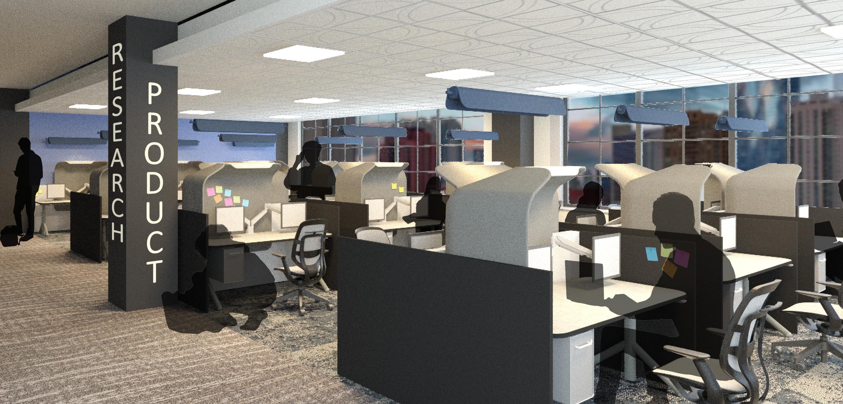
Work Pen Perspective
Cafe Perspective
7th Floor Design Intentions:
The 7th floor, while accessible to visitors, is largely reserved to Crafty’s workers. The resource center doubles as the central hub of this floor: providing views over the atrium, a lounge space, and adjacency to collaboration rooms. The freedom of choice allows each worker to choose the environment that suits them best, following an Activity-Based Work model, and therefore increase workers’ focus and satisfaction
Resource Center Perspective
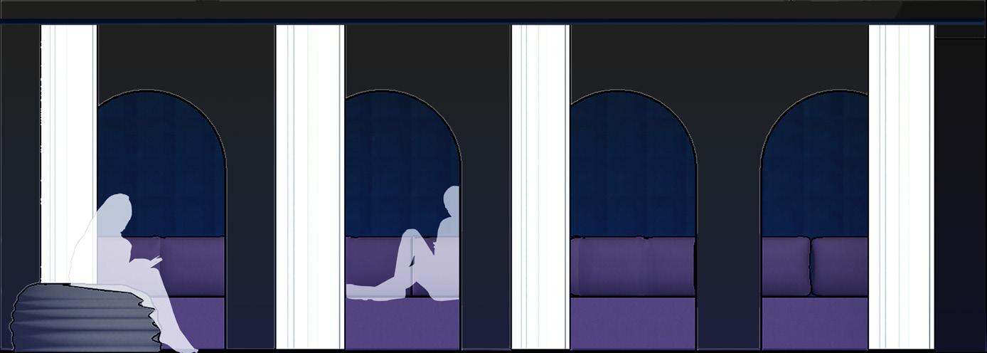
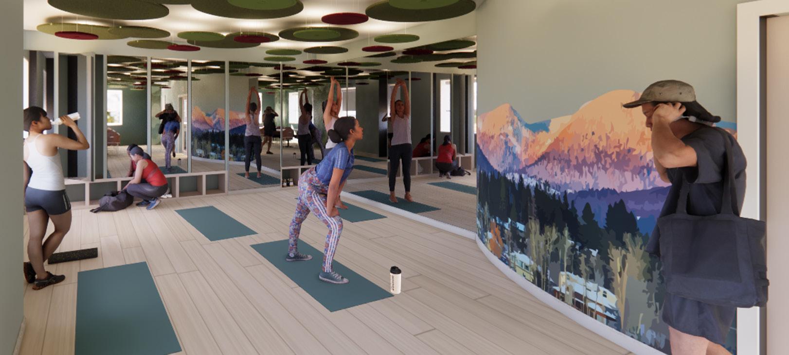
Wellness
Room Elevation and Lighting Model
Dim lighting enforces an atmosphere of quietness for workers to have a break during the day.
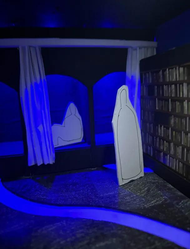
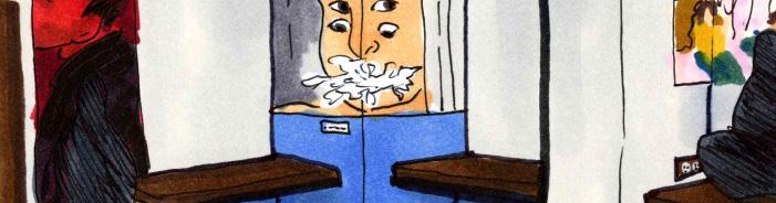
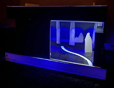
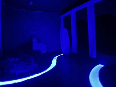
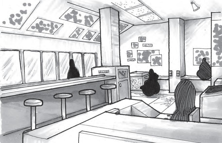
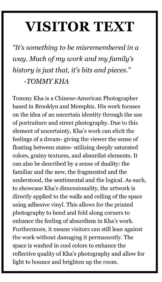
BLUE VIEWS OBSERVATION: An Airport Gallery
Utilized Sketch-Up and Hand-Rendering
NorthEast Corner
A Look into a Monograph Museum:
When airport travel is met with unexpected delays or gaps of boredom, it is imperative that there are spaces to provide relief and entertainment. Designed for the 1,566 square foot Tallahassee International Airport’s Observation Deck, Blue Views Observation uses the photography of Tommy Kha to create playful imagery for positive distraction while providing its users spaces for work and relaxation
Evidence-Based Design Considerations:
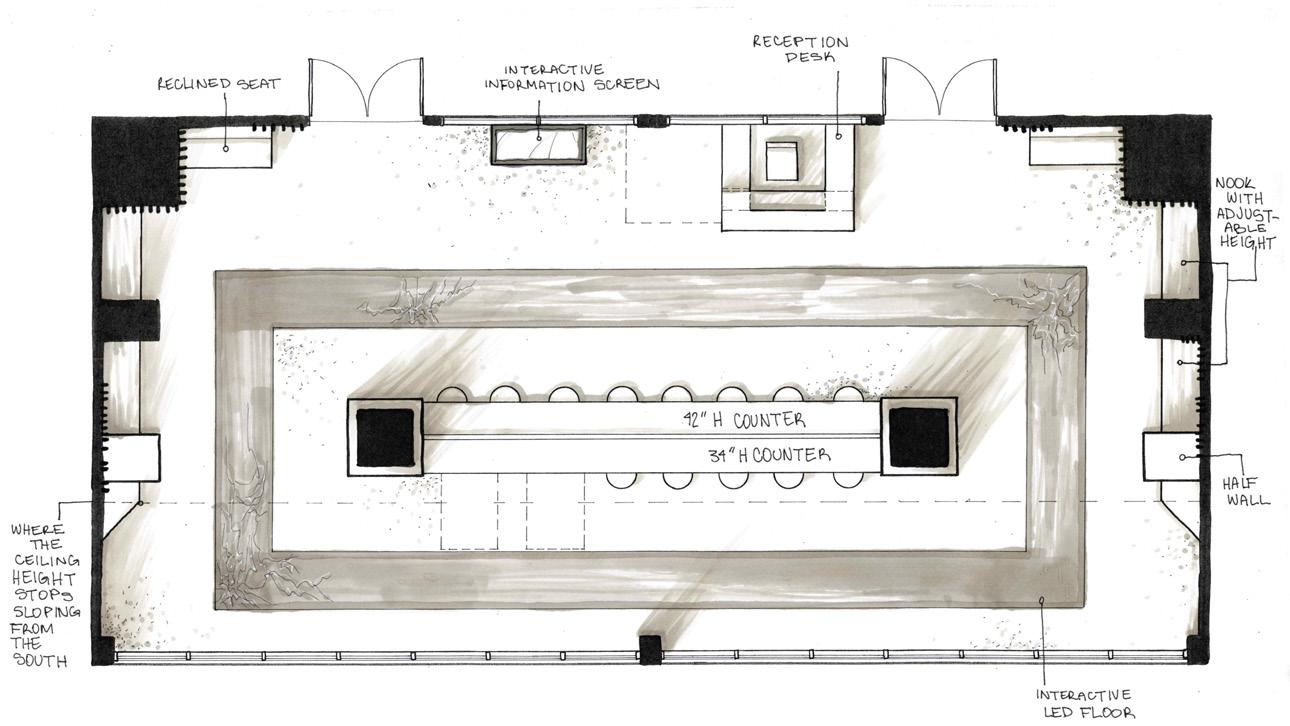
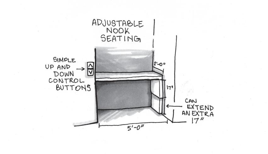
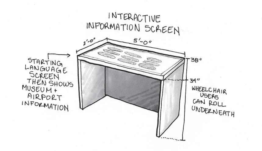
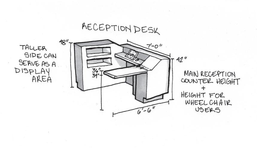
By initially observing the people interacting with the space, the space’s needs could be determined: rest, work, and waiting. Where these needs were and were not met was analyzed and solved using the Person-Environment Fit Theory and Universal Design Principles. Through the three design solutions below, the space can tackle adaptive use and flexibility in a way that is seamlessly integrated with the observation room. The Interactive Screen provides information on the museum and the airport utilizing simple and intuitive use. The Reception Desk utilizes multiple heights to provide various options regarding size and space for approach and use. The Nook seating provides flexibility in use by allowing the user to change the seat height: making easy seating for those of various body types.

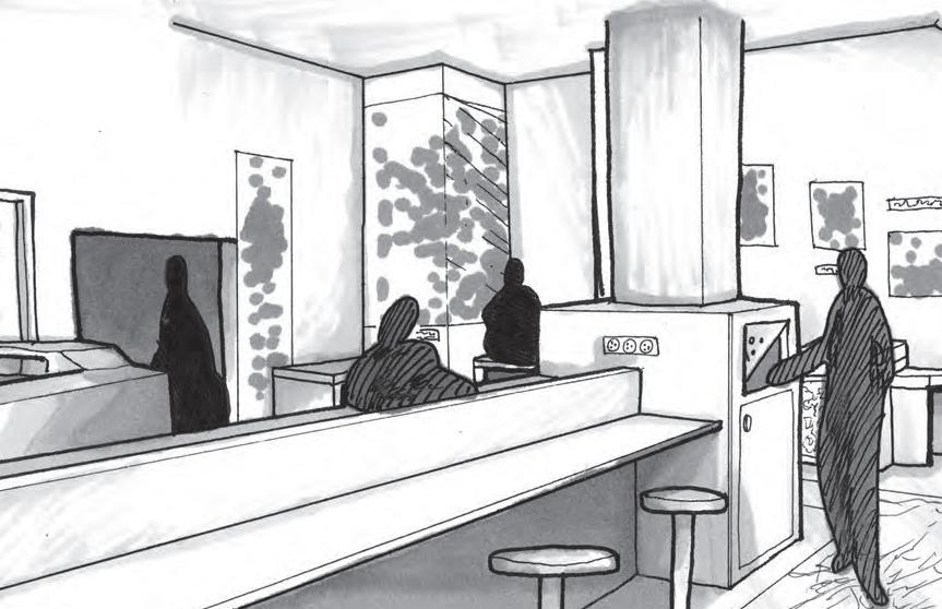
NorthEast View
SouthWest View
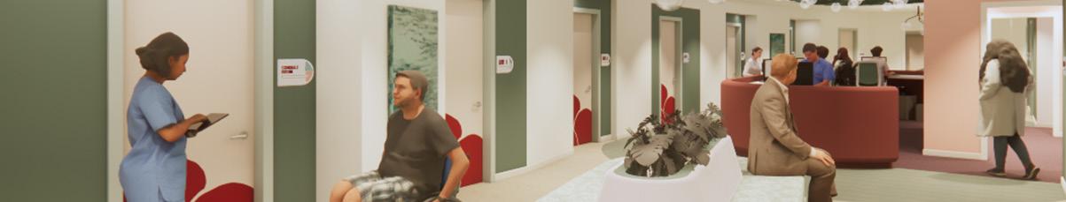
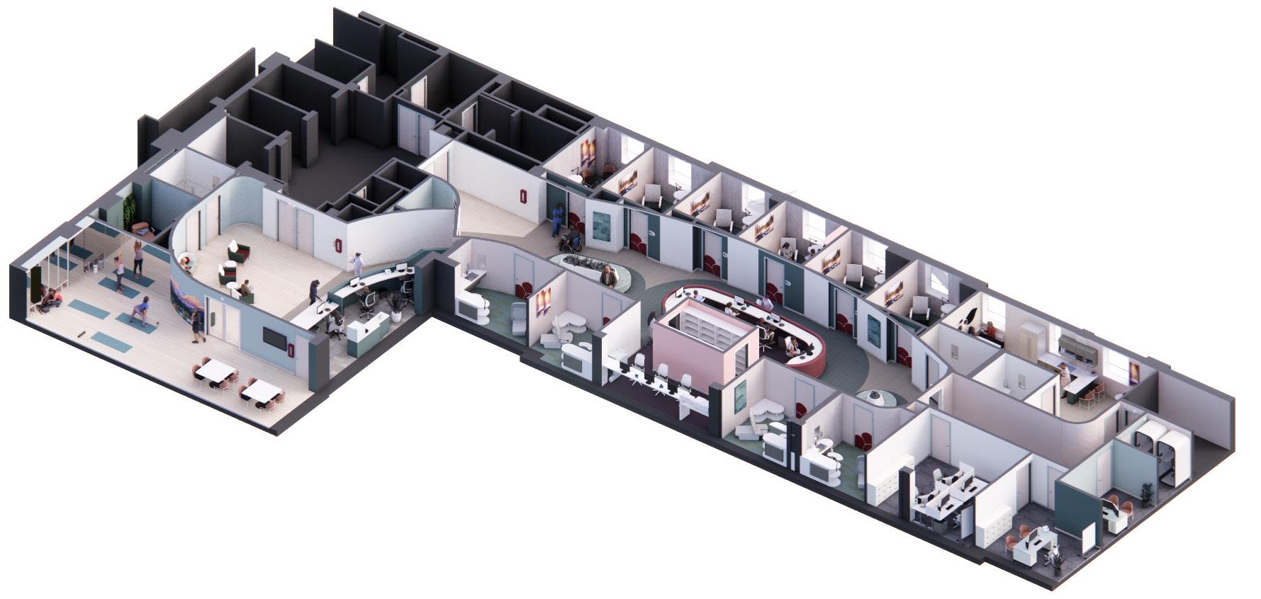
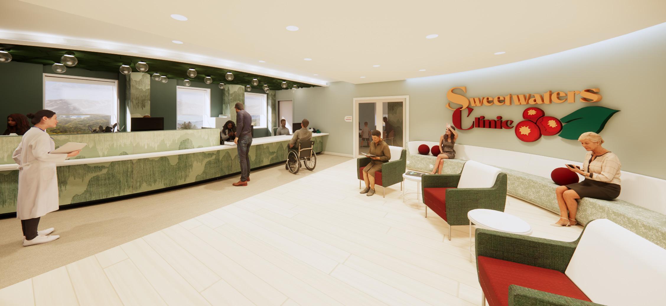
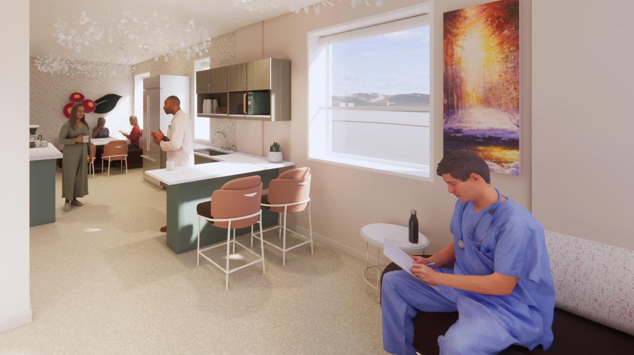
Sweetwaters Clinic: A Rural Primary Care Clinic
Utilized Revit, Enscape, Illustrator, and Photoshop
A Look into Sweetwaters Clinic:
Getting help should never be a question. Yet, Whitefish, Montana, faces continuous barriers to care. In a survey by Logan Health Hospital, their local Health chain, many of community members remarked that they often asked themselves if trying to get help would even be worth it because of these barriers. The goal is to deliver a primary care clinic that can easily address the community’s concerns regarding educational resources and being heard by their clinicians. Sweetwaters Clinic strives to be the proactive solution rather than a reactive one. To complete this mission, Sweetwaters implements evidence-based design, adaptable furniture, familiar imagery, and places of refuge
EXAM ROOM 3
EXAM ROOM 5
EXAM ROOM 7
EXAM ROOM 9
PATIENT RESTROOM
Programming:
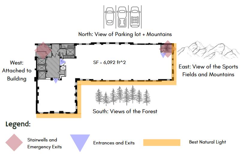
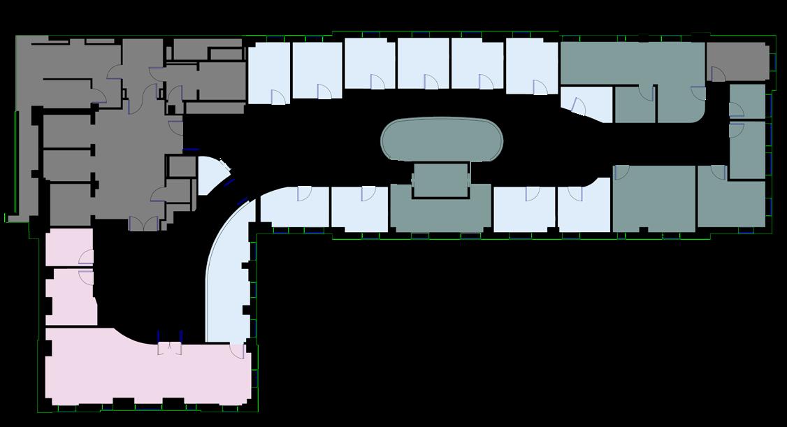
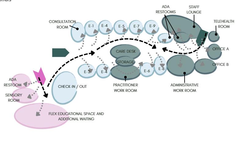
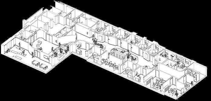
Sweetwaters Clinic is approximately 6,092 square feet and sits on the second floor of a hospital expansion project. It includes 2 ADA Restrooms, a Patient Restroom, a Sensory Room, a Multi-Use Space, a Waiting Room, a Check-In/ Out, a Vitals Check Room, 1 Consultation Room, 9 Exam Rooms, a Care Desk, Storage, a Practitioner’s Workroom, an Administrative Workroom, 2 Offices, a Telehealth Room, and a Staff Lounge.
The Design Process:
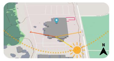
Site Analysis
Parti Diagram
Blocking Diagram
Rendered Space Plan


Bubble Diagram

Lighting Plan
Entry Perspective
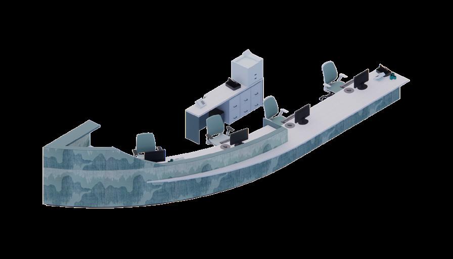
Reception Desk Details
Front Axonometric
Back Axonometric
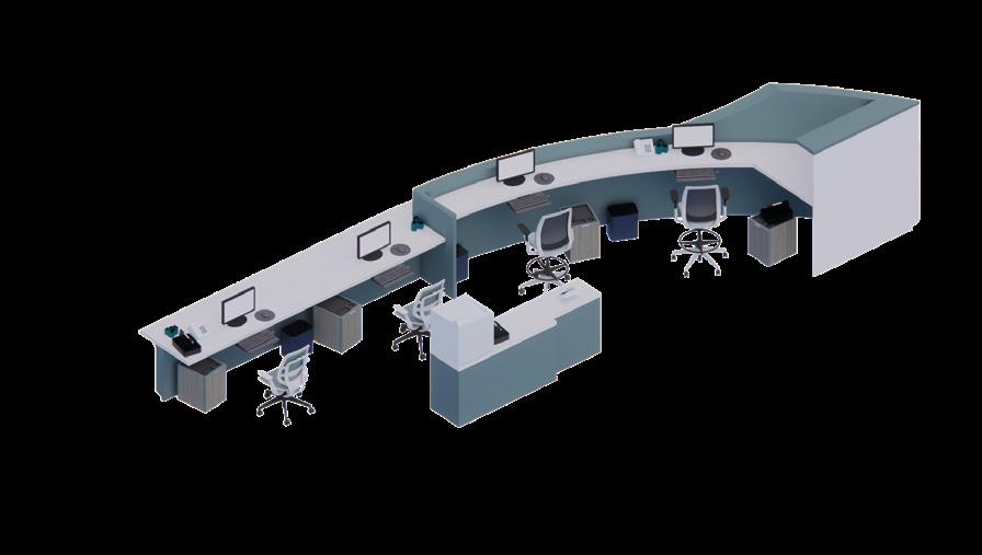
The Reception Desk for Check-In/Out utilizes Universal Design for Size of Approach. Both Staff and Visitor Sides utilize a 34” High counter for Wheelchair Users. Along the left side of the desk, there’s a 42” High counter for staff members who may prefer to work standing. Staff also recieve completely adjustable seats for their personalization
Surface Material: Moon Geyser by WilsonArt. Solid Surface at 1/2”
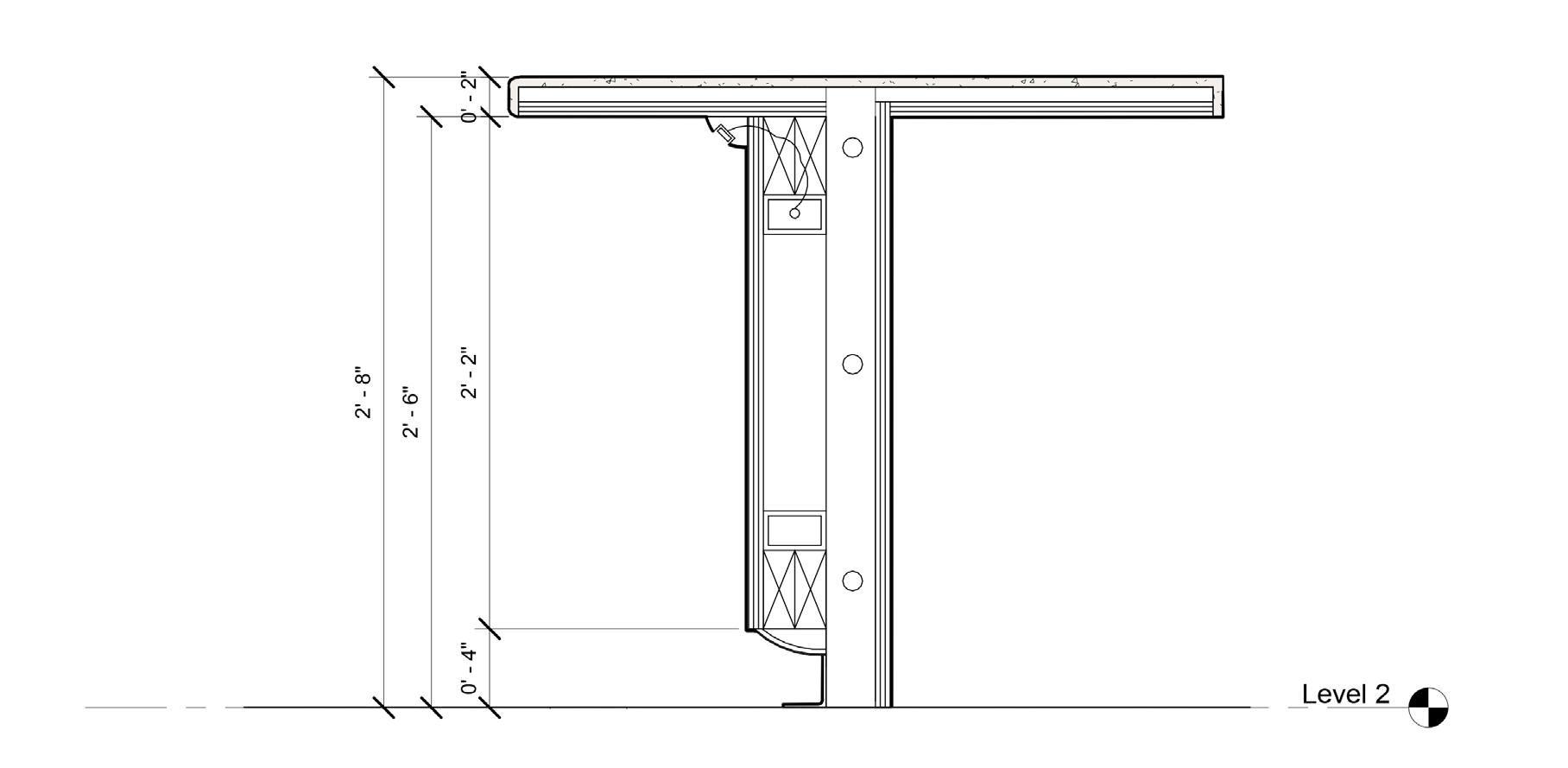
Horizontal Metal Support
Molded Sweep Support with Built-In LED for Underlighting. See Electrical Plan
LED Driver
2 1/2” Vertical Metal Stud
3/4” Plywood
Surface Material: Spruce Mist HPL by WilsonArt
Wood Blocking
Custom MDF Molded Sweep
Rubber Toe Kick
Branding as a Welcoming Factor:
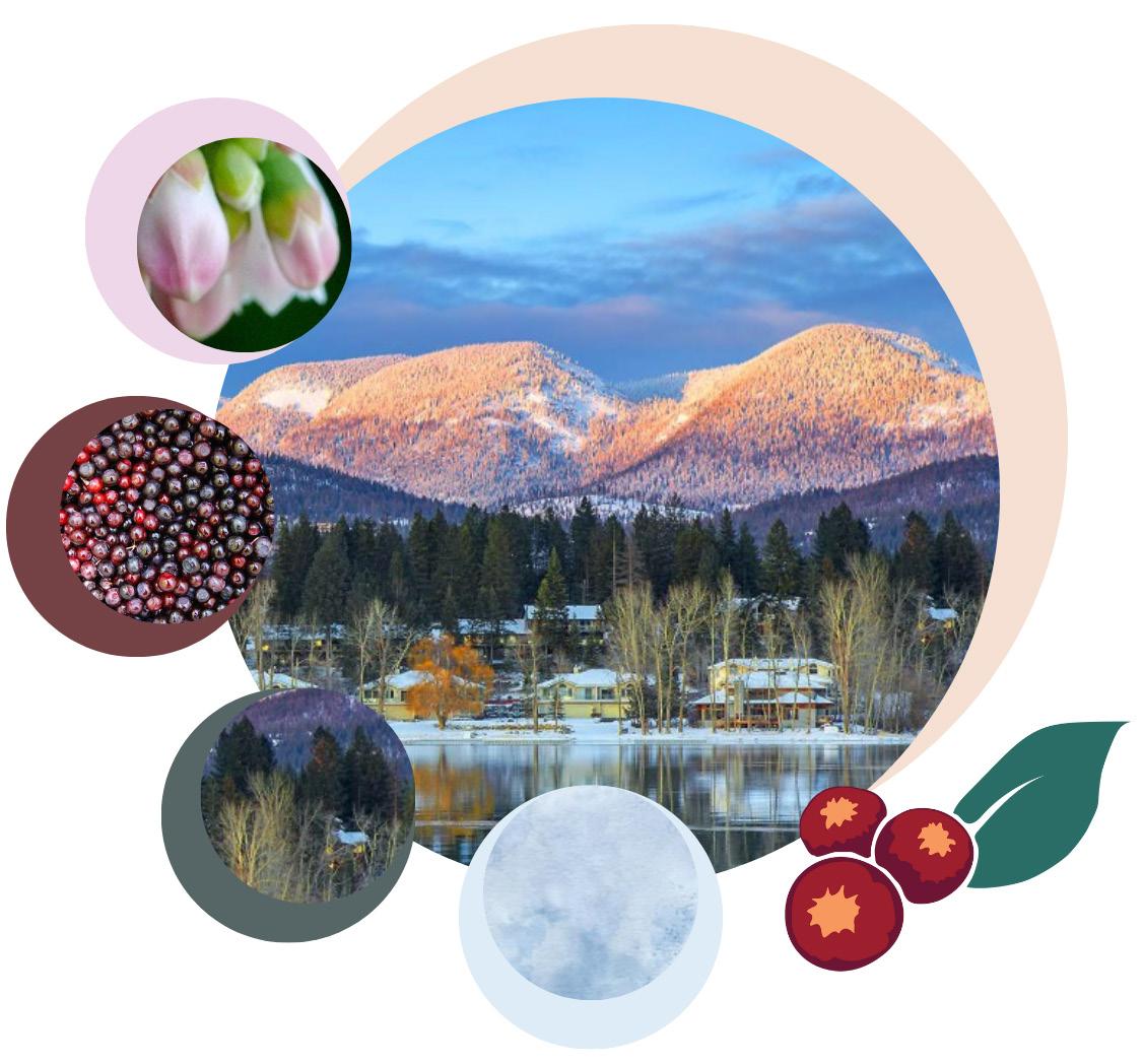
Sweetwaters Clinic establishes itself in the Whitefish community by understanding their relationship with their local nature. With huckleberries at the forefront of various community events and found along nearly all of their hiking trails, huckleberries become a prime source of inspiration for the space’s branding. Using this motif can be used as a welcoming factor because of the familiarity.
The Entry uses curves to match the branding, but also gaurantee sight-lines between workers and guests: ensuring safety as well as connection.
appear as abstracted forms in the Multi-Use Space’s acoustical ceiling.
Multi-Use Space Perspective
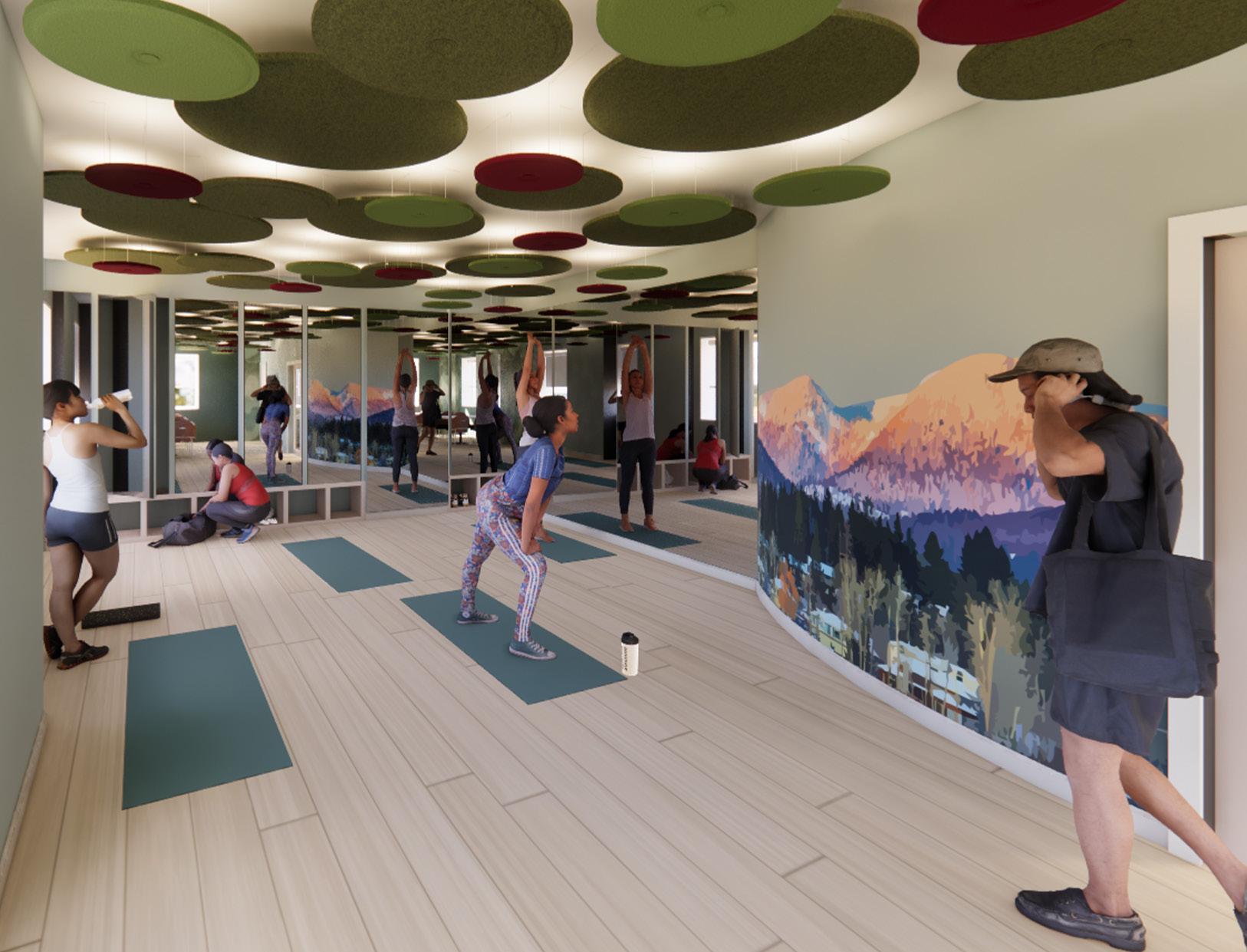
The Multi-Use Space provides educational resources by having flexible space for exercise classes, seminars, and various workshops. The Mountain Mural ties in community connections, building on familiarity and branding.
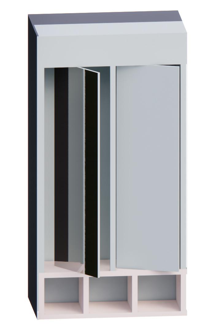
Mirrors sit on a Swivel to Alternate between Mirrors or an Acoustic PET Wall Panel
Huckleberries

Corridor Perspective
Like the reception, the ceiling works as a central node while embodying elements from the branding
Middle seating provides additional waiting space before appointments or during for guests of the patient
Staff Lounge Perspective
The Staff Lounge sits away from the noise of the rest of the facility, providing quietness when desired. The counters sit at 34” High, following ADA Guidelines. By having multiple seating zones, Staff can choose how they want to exist in the space, increasing their sense of control.
Being Adaptive to Change:
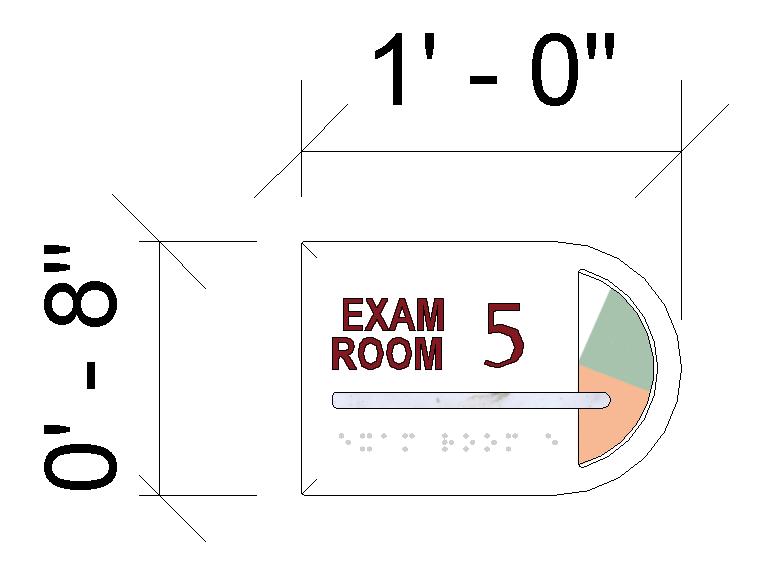
Multiple spaces throughout Sweetwaters Clinic utilizes elements that are adaptable to the needs of the user. The Exam Room signs feature a Spinnable Circle that changes color corresponding to the state of the room.
White = In Use
Green = Ready to Use
Orange = Needs to be Reset
Blue = Patient Needs to be Checked in On

Slides open for Guest Storage and can move out as a Stool
Typical Exam Room:
Each Exam Room provides multiple ways to exist in the space, including moveable and adjustable seating, space for guest storage, and positive distraction through natural views and artwork. Positive Number-ed exam rooms feature a Barrier-Free Exam Chair for additional services.
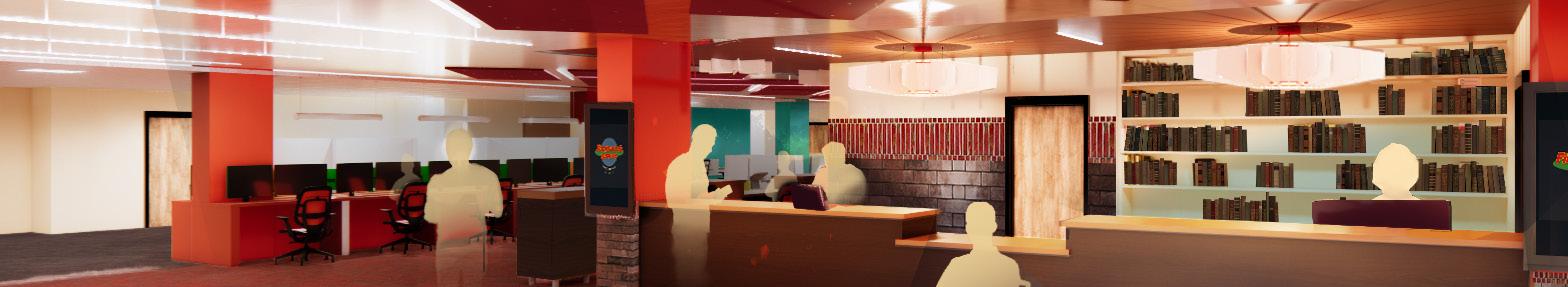
UNCLE BOBBY’S LIBRARY: A Strozier Redesign
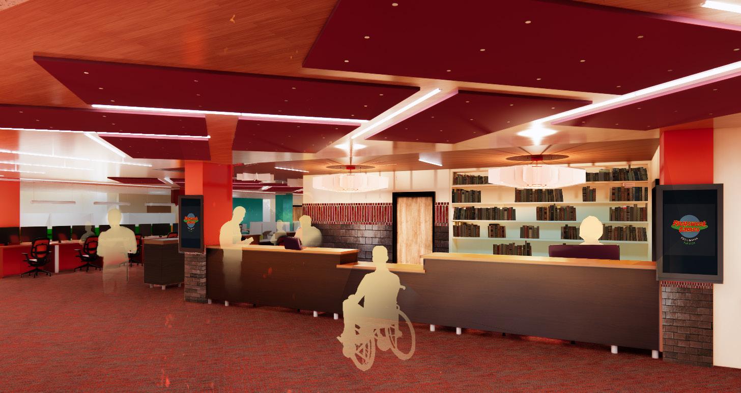

Reception Entry
A Look into an Inclusive Library:
The goal was to redesign the first-floor (approx. 20,000 SF) learning commons of Strozier Library at Florida State University. The process included meeting with the Library Staff, observing the use of the library during its operating hours, and conducting surveys with the student population on how they use the library. External research was also taken into account: looking into preexisting libraries, literature reviews on seating behaviors, and Affordances Theory.

Project Goals:
The redesign took inspiration from a campfire, as these are places typically associated with connection, gathering, and warmth. Similarly, the stakeholders of the Library wanted to go beyond typical library usage, becoming a key third place for the people of Florida State. To tackle this challenge, the project focused on the main commons, the cafe space, the reception, and the circulation. If these elements could be elevated, visitors would be guided through all portions of the library and engage with it on a deeper level.
Done in Collaboration with RJ Sagaya
Utilized Photoshop, Revit, and Enscape
STAFF-RELATED INTERACTION
RELAXATION-RELATED INTERACTION
STUDY-RELATED INTERACTION
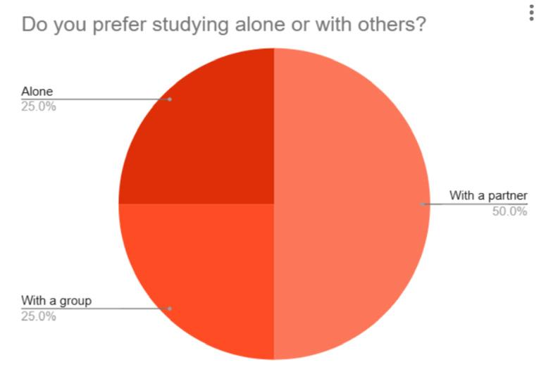
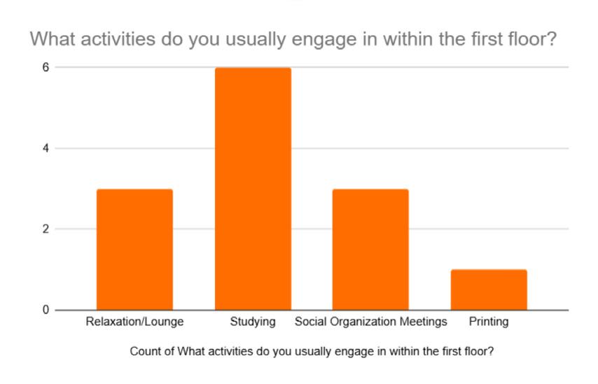
Initial Planning:
Through research, it was found that social behaviors decreased further away from the entry, where the cafe and tutoring were. Furthermore, the current design was reported to be hard to navigate; this is supported by how the main circulation desk is hard to see
from the entrance. To further support the library’s population and the behaviors of its users, high activity was kept towards the front. By creating a gradient of noise throughout the floor, users can go to each corresponding zone depending on their needs. By doing a noise gradient, higher energy areas can also be isolated from quiet zones to better prevent noise from traveling.
Designing a Space with Warmth:
Circulation reflects the concept of a hearth by relying on a central loop of passage and providing several offshoots for movement. Furthermore, these offshoots guide visitors into quieter zones, distancing them from the energy of the library’s center. The warm atmosphere is heightened through the warm lighting, soft lounge furniture, and anechoic acoustics. The design provides several areas for groups and individuals to rest and work, including various heights for different work needs. The color palette connects the warm colors from the concept with Florida State’s branding to create a signature look.
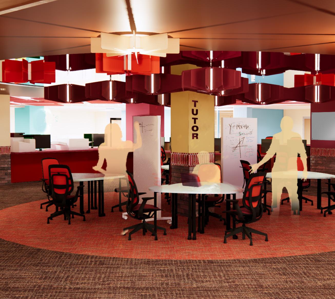
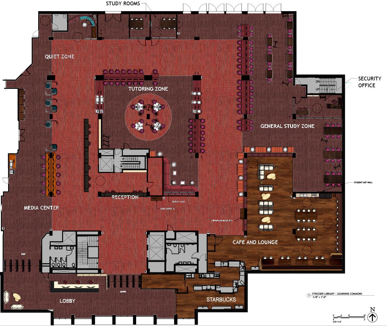
Tutor Zone Floor Plan
mairen.manning@gmail.com
https://www.linkedin.com/in/mairen-manning/
MAIREN MANNING