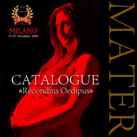
Curated by Art Directors Carlo Greco and Alessandra Magni Critical texts by Art Curators Alessia Perone Camilla Gilardi Cecilia Brambilla Erika Gravante Erminia Abbuonandi Federica D’Avanzo Francesca Brunello Giorgia Massari Giulia CalÏ Giulia Zanesi Guendalina Cilli Lorenza Traina Maria Cristina Bianchi Marta Graziano Martina Stagi Mery Malaventura Silvia Grassi Vanessa Viti
“Because I am the first and the last, I am the venerated and the despised one, I am the prostitute and the saint. I am the bride and the virgin. I am the mother and the daughter.” (Hymn to Isis, from the Oxyrhynchus Papyrus, 2nd century B.C.) From the beginnings of humanity, the woman was invoked, venerated and adored as a goddess, through countless forms, names and symbols, with the archetype of Magna Mater. The cult of the Great Mother, goes back to the Neolithic or even to the Paleolithic, and refers to a primordial divinity that embodies the fundamental aspects of human life. The mother, mother of all mothers, is the Earth, whose vocation is to generate, whose dark and humid appearance, recalls the womb and, therefore, the womb that generates life. Its power is in water, stones, animals, hills, trees and flowers. The faculty of procreation assigned to it by nature, has endowed the woman with a boundless power. Woman is in fact the one who gives life. Woman is the one who creates. According to this paradigm, the link between women and motherhood appears inseparable, a concept that was rooted six thousand years earlier with the birth of the ancient patriarchal culture. For these reasons, the existential experience was strongly marked by the presence of the mother figure in a broad sense. Sigmund Freud, father of psychoanalysis, investigates family relationships and in particular the “Oedipal complex”: the relationship between mother and son, which he himself defines as a necessary need for both sides, almost dependent. A strong umbilical cord, able to keep alive the maternal love, sometimes indestructible. The mother, in her golden aura, embodies the fundamental values of the family, of feeling, strength, courage, sacrifice, hope and perfection. She’s the one who plants and nourishes the first seeds of good within each of us, and teaches us to love the other. She’s the mirror in which we look at ourselves to understand what we were yesterday and what we have become today. But the love story between mother and son is not always easy. It’s often made of contrasts, devastation and dismay. What Freud in psychoanalytic terms calls Oedipus unresolved. It is, undoubtedly, a bond that has inspired artists of all times, who have chosen to give the mother figure a central role in its totality. Penelope, symbol of unshakable fidelity, exemplary wife and mother, emblem of love and hope for the poet Virgil, Medea, example of an assassin mother, uncontrolled and ruthless, for the poet Euripides. It is the “Mater Dulcissima” for Ungaretti, the emptiness at every step for Montale, the mother courage for Manzoni and Brecht, “The Queen of the Night” for Mozart, the intrusive mother for Jane Austen. It is the mother country for Foscolo, the Mother Nature friend for Pascoli, or enemy for Leopardi, the mother tongue for Dante, the Isola Madre for Flaubert. We could lose ourselves in a thousand other examples, mythological, literary, novelistic, but they would not be enough to strip the woman of her complex maternal role to expose all the other multiple meanings that it represents. She is a universal concept, difficult to express in words. She is strength, resilience, creative and destructive nature, she is salvation, she is hope, she is determination. She is the sun and the moon. M.A.D.S., with the project MATER «Reconditis Oedipus», in the wake of this text, intends to draw the attention of all artists, to dig into their memories, to push them to engage with the subject, each one bringing their own sense and their interpretation of motherhood. Whether it’s nature, whether it’s family, whether it’s love, it’s necessary to dig into us, understand who we are, bring back the past. The search is oriented on that vital force, capable at the same time to give life and to destroy it; to love and to be loved, on that intimate, contrasted and difficult relationship. The aim of this project is therefore to push the interlocutor to give shape to love, through the realization of an unpublished work. Who is ready to share this feeling with humanity? Who is ready to take off his ego and open up to the world?
Concept by Federica D’Avanzo, Art Curator, graduated in Art Management
1wh13 “When I am in my painting, I am not aware of what I’m doing. It is only after a short of ‘get acquainted’ period that I see what I have been about. I have no fears about making changes, destroying the image, etc., because the painting has a life of its own. I try to let it come through. It is only when I lose contact with the painting that the result is a mess. Otherwise there is pure harmony, an easy give and take, and the painting comes out well.” (Jackson Pollock)
1wh13 is a Korean artist who has recently started painting. His aesthetic research is aimed at discovering his identity, and motivates his choice to explore the canvas with the same genuineness and spontaneity of a child. The colors of his art are different, yellow, red and blue (the primary colors) that recur with a certain frequency. His brushstrokes are reminiscent of abstract expressionism, where matter’s line overlap and fit together creating a landscape of colours stacked on themselves. His aesthetics doesn’t have the fear of changing shapes and explore the connection between different languages: words and figures. The artist is young in his painting but he is totally immersed in it. For this reason, his works, although they remain “fresh”, retain the maturity of a man who waited 38 years to get “the artist’s eyes”. The artistic references seem to recall Basquiat’s graphics: emotions and thoughts meet on the canvas leaving a mark that does not seek to be decoded but aesthetically experienced. The technical choice allows the artist to explore the creative immensity that resides within him, leaving infinite interpretations to his creations as abstract expressionism usually does.
“I don’t listen to what art critics say. I don’t know anybody who needs a critic to find out what art is.” (Jean-Michel Basquiat)
Art Curator Cecilia Brambilla
1wh13
Who are I
Alexandra Köhl
The paintings by Alexandra Köhl express the multiplicity of the artist’s feelings through a skillful use of color, which is spread with large and scratched strokes and becomes the undisputed protagonist of her canvases. At first glance, her artwork Picture number 4 could appear similar to her other abstract paintings, due to a use of color that defines the space and Alexandra’s tendency to mark the composition with a number but not with a title. Nevertheless, this work introduces an unusual detail for the artist: the figurative element. By interpreting the concept chosen for this exhibition, Alexandra introduces the theme of motherhood placing two figures in the middle of the composition and making them the focus of the painting. Tight in an embrace that reminds a dance, they are protected by something like a domed ceiling, whose form reminds a house or, extending metaphorically its meaning, that kind of protection and safety that only motherly love can give. The artist reproduces her inner sensations through a technique full of vibrant and energetic brushstrokes, that reminds the painting movement of Action Painting. Just like the artists of the New York School, Alexandra translates the creative strength expressed by her hand on the canvas into an image. The magical atmosphere typical of her paintings, which pervades even Picture number 4, derives exactly from this unusual and instinctive creative method. When the artist starts painting, she doesn’t know in advance the result of her composition to the point of being astonished once finished. Alexandra’s style reveals her ability to perfectly combine abstractionism, which reveals itself in the choice of tones, that create an elegant visual experience, and action painting, evident in the use of an emotional and instinctive gesture.
Art Curator Marta Graziano
Alexandra KoĚˆhl
Picture number 4
Alison Lee “There is a little boy inside us who not only shivers, as Cebes Theban believed, who first discovered him in himself, but still tears and jubilation of his own.” (Giovanni Pascoli)
Alison Lee tells a story about childhood and its eternal memory. In Melodic Memories five individual pieces figuratively represent some of the delicate parts of the childhood: playful, innocence, a parent’s love and protection. Each colour standing for the uniqueness of youthful personalities. Like musical notes upon a staff, this piece strike a chord with the sights and sounds of melodic memories. In Remembrance she thinks about the pages of our stories that are never erased though their ink may fade. We may lose the ability to recall them over time but they are forever etched onto the papyrus of our mind. In My Little Playground the artist narrates that sometimes her inner child comes out to play. Out to the playground she’d dash away to the place where imagination grows. She brings the magic of the playground inside with this painting which emanates the freeness felt by running unrestricted, as only children can. Everyone must always remember the little kid that continues to live inside themselves while they are growing. Alison Lee does a sort of nostalgic and poetic return to her origins remembering through the simpleness of the materials what is childhood for everyone. A place where the human being can run remembering his/her innocence. The artist through poor materials does what the artists of the Arte Povera did. She “reduces to a minimum, in impoverishing the signs, to reduce them to their archetypes”. In the end, all we have left, are our memories.
Art Curator Erminia Abbuonandi
Alison Lee
Melodic Memories
Alison Lee
My Little Playground
Alison Lee
Remembrance
Amelie Egenolf A mother and a daughter are standing hand in hand in the sea, facing the horizon. In this painting Amelie Egenolf chose the vibrant simplicity of bright and flat colors and Motherhood creeps into every details. The mother and daughter are black, black like the first men to ever walk the Earth, a recall to Africa as the cradle of Life. If we had to imagine a metaphorical first Mother of humankind, she should be black. It should be noted how the artist chose to represent a girl, a daughter, whereas she could have as well draw a boy. Instead the painting talks of motherhood as much as it refers to womanhood, the two concepts are irremediably intertwined. It isn’t farfetched to assume, indeed, that the girl too will become a mother one day. Water is another element strongly connected to the concept of life and the idea of mother. Indeed, water is the first element the baby experiences in, within their mother womb. There, they live and breathe in water. No wonders, often ancient vases and amphora resembles in their shapes a pregnant woman, with their tall, thin neck and a rounder centre. Mother and daughter are walking toward an horizon, over which in an illusion of the painting, it splits into both night and day. It is dawning. The sun has already surged from the sea and the yellow of sunrise is tinting the sky, but up above it there is still the dark blue of the night and the full moon is shining bright. The full moon that has been for millennia linked with women and fertility. A menstrual cycle indeed tends to follow the same phases of the moon and even in modern days, with modern medicine, moon changes still influences when and how women give birth. On the other side of the sky we can spot the triskelion, a rotating triple spiral that is rooted in Celtic traditions from as far as the Neolithic and the Bronze Age. Among its multiplex meaning, one diffused and commonly accepted is that each spiral represents an aspect of the Goddess and femininity in general. One is the Virgin, one the Old woman, and one - the Mother; or in some interpretation, the Daughter, the Mother, and the Sister. Finally, a ribbon connects Mother and Daughter, a frail but ever present red string reminiscent of the umbilical chord.
Art Curator Guendalina Cilli
Amelie EgenolfÂ
Mother love
Anca Leahu
Anca Leahu is a Romanian artist - based in Bucharest - with a cosmopolitan upbringing, precious for developing a receptive and curious sensibility towards her surroundings. The practice of painting becomes therefore the means of investigation and valorisation of the people she met, the places she lived in, the experiences she had. The representation of beauty and intimacy is the nerve centre of Anca’s poetic quality, often chromatically conveyed by the choice of using intense colors such as violet, enlightened by blue brushes, as we can notice in her painting “Like a Prayer” portraying a woman in a peaceful and solemn act of praying. Drawing from the painting’s subject and from the semiotics of colours, violet represents that linking element between earth and sky, between reasoning and impulses. In fact it is often associated with prayer and contemplation: violet symbolizes the color of the spirit and purification, it acts on the unconscious giving spiritual strength and inspiration. Even in psychology violet is seen as an element that facilitates meditation and moderates irritability in people. Leonardo da Vinci himself, one of the greatest researchers in the science of colors, argued that our meditative power can be easily increased if meditation takes place under a violet light. The delicate and intimate quality of the painting powerfully conveys to the viewers a sense of serenity and positivity, allowing to immediately empathize with the represented woman, thanks to Anca’s accuracy and ability in combining forms and contents, colours and meanings.
Art Curator Cecilia Terenzoni
Anca Leahu
Like a prayer
Astrid Hutengs
Association in 2009, looking at this sculpture for example, each of us would say instantly that it depicts the kiss between a mother and her child: this is what the mind does as the first step related to visual interpretation. But “beauty�, as one might call it, is the second step, not easy for everyone and that requires not only a deep personality but also a desire to see the star more distant from our eyes, that is the in-depth interpretation. Then there is a third phase formed by the moral interpretation linked to personal memories that emerge by observing the sculpture. The third phase is considered the most complex, where the viewer associates what he sees with something more complex and then deduces personal memories. The watercolors by Astrid Hutengs have the same effect and draw attention to the five senses. Her is a painting ability with highly delicate hands, through which it is difficult not to feel the same emotion that the artist feels in realizing them. She puts her heart and soul into it. Her technique is elegant and refined, with soft nuances, which conveys love, affection, memory. An art made of details, in which the artist alternates close-ups -intimate and almost personal- to entire figures, where to be valued is the union and evolution of the relationship -just born and lasted over time- of mother and daughter. The various stages of growth become the themes of her art, where everything is a game of connections between those who observe. The lines are delicate and evanescent like the colors with which she chooses to paint her shapes: warm colors mixed with colder and distant tones such as blue and blue. The eyes are accomplices and want to talk to our souls, as an intimate and solitary conversation that is consumed exclusively with an exchange of glances.
Art Curator Federica D’Avanzo
Astrid Hutengs
Mother Love
Astrid Hutengs
Motherhood
Astrid Hutengs
Sensibility
Astrid Hutengs
Us
Astrid Hutengs
Whereto
Atsuko Yamamoto “Art is always more abstract than we imagine. Shape and color tell us about shape and color, and it all ends there.” (Oscar Wilde)
The Japanese artist Atsuko Yamamoto is an emerging painter who has exhibited nationwide. Inspired by natural beauty, her artistic mission is to communicate positivity through reflective abstract landscapes decorated with various motifs, fantastic and dreamlike scenes. Her abstract art finds inspiration for her ‘creating’ in color and sign. It is the perception that guides her; that set of shades that wants to impose itself on her gaze with an image that has a meaning different from everything else. Color for Atsuko is therefore, the meeting point with every form of art that in her canvases begins when the brush, soaked in color, is placed on the base to trace spaces of different shades and sizes. Other shapes of color and variable size will follow to give life to unpredictable and unique combinations. The artist mainly combines painting and digital production to create her shiny, bold and futuristic corpus, as in the work “We are all light”. Her compositions manage to project one’s self into a mystical aura in which aesthetic emotion and perception become one, because they are deeply connected to the energy of the whole.
“Abstract art does not exist. You always have to start with something. After you can remove all traces of reality.” (Pablo Picasso)
Art Curator Maria Cristina Bianchi
Atsuko Yamamoto
We are all light
Bana Moureiden “In the body and blood of everyone the mother roars.” (Cesare Pavese)
Every human in his life experiences maternal love, first of all as a son, we immediately learn which is our safe place and where we must go when we need true love. The mother not only gives us life, but every day she is there ready to give us lessons, after all she is the person from whom we learn everything. In Bana’s work we see two red elements that make us think of flowers, one large and well-formed, with its well-defined characteristics and the other much smaller but almost identical to the large flower. A mother and a daughter, a small being that has yet to grow and form its identity, but ready to follow in the footsteps of its mother, traces that act as a link between one and the other. If the umbilical cord holds mothers and sons together before birth, there are invisible cords to which each of us is tied and from which we will inexorably draw strength, from it we will nourish ourselves for life. The color chosen by the artist, the red, has great value, it is a symbol of blood and vital energy, it symbolizes passion and great emotions. A color that becomes a simulacrum of motherhood, an icon of timeless and spaceless love. Bana’s work is living matter, it moves in space, it emerges from two-dimensionality creating a real sculptural structure. The artist breaks the absolute boundary between painting and sculpture, Bana’s art finds its roots in informal art and in particular in materic painting, in which gestures, materials and their transformation were exalted, just like what Bana do with her art. Definitely, the young artist’s art represents an explosion of vivid color, vital energy and passion.
Art Curator Vanessa Viti
Bana Moureiden
Source
Bodil Fossheim-Bugge “If you persist in ignoring your intuition, you may find yourself stuck in a permanent holding pattern instead of taking the risks that lead to creative growth.” (Nita Leland)
Norwegian artist Bodil Fossheim-Bugge relies on her intuition both for creating and impressing her suggestions on canvas and for establishing an intimate and poetic dialogue with her interlocutors. Her artistic language encourages the viewer to explore a more abstract dimension and to get immersed into her captivating chromatic choice, mostly dominated by shades of blue and gold. In her painting “Opening” the artist, through a mixedmedia technique, paints an outbreak of soft colours. Perhaps the opening represented by the “crack” placed at the canvas’s centre symbolises an invitation to the viewers to open up their sensorial dimension, trying to perceive spontaneously what comes out of their encounter with the artwork.
Bodil Fossheim-Bugge
“Landscape� is even more delicate in its use of colours. The extremely gentle and mild use of colours evokes an almost oneiric dimension. The painting represents a view on a natural landscape, perhaps a Norwegian valley crossed by a river. This represented imaginary recalls how nature is the key catalyst that spurs the artist to be creative and to paint poetic reflection on what her surrounding reality is communicating to her, with the aim of immersing the audience in the same introspective journey.
Art Curator Cecilia Terenzoni
Bodil Fossheim-Bugge
Opening
Bodil Fossheim-Bugge
Landscape
Bolli Blas “With one eye you are looking at the outside world, while with the other you are looking within yourself.” (Amedeo Modigliani) Bolli Blasi is a Polish artist who lives in UK. She works mainly in large dimensions and, with the oil technique where she tries to convey his abstract ideas her values and beliefs by questioning the ideas of her interlocutors. As we can see, his works are characterized by characters who have large wide eyes that the artist calls “Bollis” with the intention of representing the windows of the soul, reflecting the reflection of modern society. Through the use of colors she tries to create a cheerful and simple representation, triggering emotional reactions to those who observe them. The deformation of her images is the essential need for a taste that contains in itself the antithesis to depth and surface, of construction and decoration. Empty, almost extraterrestrial eyes become the metaphor of a reality that cannot be represented and communicated in an absolutely correct or right form. Her poetry focuses on the themes of social identity, representing her vision of utopia, a place where ethnicity and background do not matter, where we are all equal, equal, where there are no prejudices, hatred or war. She paints people of all colors and sexual orientations because we are all the same in front of the world of art. Man is therefore part of a musical orchestra where matter is the instrument; the orchestral performance represents the vital rhythm and the resulting melody, the union between rationality and vitality. Thus, human beings are like part of the orchestra where each one in his own diversity and incompleteness, manages to create a perfect melody together with the others and through his story and her works Bolli manages to transmit those concepts to us.
Art Curator Erika Gravante
Bolli Blas
Berry da Live
Bolli Blas
Last Temptation
Bolli Blas
One Love
Brigitte Emonet
The French artist Brigitte Emonet has been painting for 25 years, using mixed techniques such as acrylic painting, charcoal, ink and pastels. Woman is the undisputed protagonist of her paintings, as well as the emotion she imports. A great example is the work entitled “Miss Flower” in which the beautiful face of a woman is the protagonist. The viewer’s eye is immediately captured by the large colored flower that the woman wears on her hair. This detail inevitably brings to mind the self-portraits of the Mexican artist Fida Khalo, who depicted herself adorned with colorful flowers. Other elements in common are definitely the neutral background and the gaze of the woman who releases melancholy. The woman’s eyes are magnetic. The viewer is attracted by them, that in this way become the fulcrum of the composition. They express a sweet melancholy that inevitably leads the viewer to empathize with the work, feeling almost a sense of piety. The choice of the artist to use different types of technique, allows her to decide which details to bring out and which to leave in the background. The flower, made of acrylic, stands out on everything: purple, orange, fuchsia and yellow blend in perfect harmony, reproducing the effect given by fluid art. The charcoal details, such as the hair and the contours of the face, remain in the background, simple and delicate.
Art Curator Giorgia Massari
Brigitte Emonet
Miss Flower
Carolina Bradbury
Carolina Bradbury is an Argentine artist based in Buenos Aires. While having a versatile style, she prefers to express herself through sculpture, her great passion. In fact, she says: “I feel constantly challenged by its threedimensionality and the complexity of materials: the lost wax percolated into bronze, epoxy, wire, stone, wood and clay inspire in me joy and strength when I witness the form coming to life from nothingness”. Her artwork is a sculptural group representing a mother and a child tight in a warm and tender embrace. The sculpture expresses an idea of reassuring and protective motherly love, as also pointed out by the title, Ágape, a word of Greek origin used to indicate the concept of pure, eternal and selfless love in the original Christian religion. According to some scholars, as opposed to the concept of Eros, which symbolizes carnal love, Ágape represents both the God’s love for man and brotherhood among men. In fact, over time the meaning was extended to indicate the banquet held by the early Christians to celebrate their convivial bond. In the sculpture by Carolina returns this reference to nourishment, symbolized by mother’s body. In Ágape even the material becomes a precious expressive element: just like in the sculpture Draped Reclining Mother and Baby (1983) by Henry Moore, where the artist exalts the sweetness of the hug between mother and child using the golden light games created by bronze, in the artwork by Carolina the concave volumes and the smoothed surface, shaped through the lost wax process and cast in resin, extol the fusion and the harmony of human forms in this tender embrace. The artist thereby celebrates motherhood in its most beautiful meaning, embodied by a loving mother who cares for her child, reassuring and protecting him.
Art Curator Marta Graziano
Carolina Bradbury
Ă gape
Christine Johnsen
Christine Johnsen is Norwegian artist based with her family in Skedsmokorset right outside of Oslo. “Under Fossen” portrays a view on a Norwegian waterfall with an oneiric and abstract connotation. To Christine, nature represents one of her biggest leitmotif of inspiration that gets shaped through her artistic lens and sensibility. “I use my intuitive feelings to create, and I find my inspiration from all the beauty around me. A painting is a poem without words” states the artist. Besides nature, the artist works by drawing insights from her surroundings in the broadest sense, from animals to other people, expressing on canvas the preciousness that emerges from her interaction with them. The inspirational muses become also the beneficiaries of her artworks as Christine cares to paint the amazement of her artistic stimuli, but also to celebrate them. She often donates the sale of her paintings - acknowledging her privilege - highlighting even more how the act of painting represents for her a genuine passion, means of personal investigation and of telling her vision of the world. “The best feeling for me is when paining hits you right in the heart” writes Christine. And this is precisely her artistic mission: to transposed on canvas her artistic interpretation of the real while permeating into the collective perception, and to valorize the surrounding as the most valuable strength for creating.
Art Curator Cecilia Terenzoni
Christine Johnsen
Under the waterfall on Norwegian called: Under Fossen
Christopher Rozitis One of the most important artistic currents, linked to molecular genetics is the so-called ‘Transgenic Art’, which gained the limelight of the media when Eduardo Kac, Brazilian bioartist, made known the birth of Alba, the fluorescent rabbit: a normal white rabbit with a jellyfish gene that makes it glowing in the dark, green. Following the precepts of transgenic art, Christopher Rozitiz explores the connections through cells, atoms and molecules, giving rise in his works to a new concept of grotesque with extremely strong and provocative colors. The artist’s imagination can therefore be freed, while maintaining a plausibility for the viewer. For Christopher, psychedelic colors, alternate in the works to symbolize the passage from moments of relative quiet to moments of greater chaos. His works are an interactive space that creates an interconnection between the public and the artist. The thread is a path that gives consistency to the invisible and that is marked by three dimensions: core, soul and essence. By observing these works it is almost possible to perceive in detail something infinitely tiny. Through this investigation, both internal and external, it is possible to observe reality and thus to deepen its genetic aspect. These works are a detailed investigation of the mother-son visceral relationship that goes beyond the act of conception. The artist focuses on the blood relationship that exists, a special spiritual connection between the mother and the child through the use of ‘gold wires’ that connect them forever. In his works are depicted, through shapes and colors, all the information that every human being needs to live and exist. In the history of art there are images that have established themselves in the collective consciousness, outside of the context in which they were born, called super imagery. The double helix of DNA is certainly an example, an image that carries within itself an enormous baggage of associations unrelated, at least directly, to the scientific context that gave birth to it.
Art Curator Federica D’Avanzo
Christopher Rozitis
Cellular Division
Christopher Rozitis
Golden Threads
Christopher Rozitis
Molecular Inheritance
Christopher Rozitis
Rebirth - Renew
Christopher Rozitis
Safe Space
Claudia Werth
Claudia Werth for this exhibition with a deep and sensitive theme, chooses to open up in all its intimacy and tell the world about her motherhood. The latter, over time, has captured the inspiration of countless painters through different eras and styles; from sacred to secular depictions, in the representation of ordinary people or rulers and noblewomen, equally united in the uniqueness of an experience common to every woman. The history of art is in fact full of maternal figures, a symbol of love and life, but not only: for many “mater” is a symbol of pride and protection, embodying a well-defined ideal. Artists such as Rembrandt, Chagall and even Andy Warhol have dedicated at least one work to their mothers. Among these stands the passionate portrait of Vincent Van Gogh, made in 1888 and dedicated to Anna Carbentus, a fundamental figure in the life of the young Van Gogh, having transmitted to her son from an early age the passion for drawing and painting. A loving relationship full of sacral respect, which is fully evident in the canvas. But there is an artist who more than anyone has been able to give a careful and sensitive look to the theme. Auguste Renoir, the painter of joie de vivre, has executed more than two thousand portraits in which children occupy a place of honor. Beyond the emerging feeling, the image of a child is, in fact, almost always associated with purity of mind, spontaneity and sincerity. “Joy”, is a photograph that captures the mother/ daughter relationship in its entirety. They are the loving eyes of an artist, and at the same time a mother, who are lost in the gaze of the fruit of her creation, her daughters and sisters, immensely joyful. Claudia, with her work, wanted to immortalize the spontaneity and naturalness of children, making merit to an infinite beauty, which translates into happiness and sometimes disarming truth.
Art Curator Federica D’Avanzo
Claudia Werth
Joy
Daniele Zaggia “The mystery of the soul is like that of a closed door. When you open it, you see something which was not there before.” (Oskar Kokoschka)
Daniele’s work is deeply inspired by German expressionist artists and philosophers. Like the great masters of the past, his production focuses on the ransom of individuality against the uniformitarianism of the contemporary society. In doing so, Daniele faces extraordinarily complex themes such as alienation and need of empathy. These concepts are perfectly exalted by his palette, composed mostly by acid colors, and his scratchy graphic sing. The theme of pursuit of uniqueness through emotions is embodied by Daniele’s choice in matter of artistic techniques. Indeed, he prevalently uses oil based pencils that allow him to stress the physical connection with the artwork thought the gesture, creating bonds with his models made of emotions and feelings. The artwork presented for this exhibition “Dono” (Gift) is the visual representation of the maternal gift of life. Daniele choses to portray a fetus embraced by the umbilical cord. The spiral signs that surround the baby, which give the sensation of maternal love and protection, are juxtaposed to the rapid and straight lines used to depict the child, which become symbol of vitality. With this artwork, Daniele stresses the value of a new life by exploring multifaced theme of mother-child relationship glorifying the concept of human empathy.
Art Curator Mery Malaventura
Daniele Zaggia
Dono
David Jason Mendoza From Gustav Klimt to Pablo Picasso to Berthe Morisot: each with his own sensitivity represented an inseparable union: that between mother and son. It is undeniable and undisputed that in the history of humanity the role of the mother is the most important and difficult one in society. The miracle of the mother-son bond has been taken up by poetic souls, whether they are writers, painters or singers. Pablo Picasso is one of these singers, and with a chromatic subtlety presents in Maternity (1905) the face of a woman in perfect symbiosis with her milk-colored body: attentive, devoted, concentrated and yet lost in the child who drinks breast milk from breasts. In the same year in which Picasso painted Maternity, Gustav Klimt created a work whose title is already emblematic: the three ages of women. With the quirks typical of secessionist art, Klimt outlines blue flowers like the night, sunflowers of the solar yellow and green leaves of eternal paradises, a mother who embraces her own son. Both are immersed in a deep sleep. This masterpiece symbolically represents the passage of a woman from being a daughter, mother, grandmother, in the union of three generations. In art it is clear, that many have been the forms of artistic interpretation of the theme. David Jason Mendoza, an artist with a colorful, deep and sensitive soul, tackles it by realizing an entire cycle of five works. The artist decides to depict motherhood in stages, starting from the act of conception that sees the couple join in an act of love. In “Verlobt”, in fact, passionate and carnal love is synthesized in the sinuosity of the naked bodies that unite and that flows into the work “Schwanger”, where the faceless woman is depicted pregnant. In “Mutterschaft” the act ends, and the mother embraces her child, holding him to her. Somehow David, as well as Klimt himself, wanted to use the canvas to express a life cycle, in this case evident in the emblematic figures of the mother and child. A very original and realistic interpretation, able to provide the complexity of the moment to the observer but at the same time the innate joy. Both will remain united and close, attacked even without awareness, dreamily living.
Art Curator Federica D’Avanzo
David Jason Mendoza
Mutterschaft
David Jason Mendoza
Schwanger
David Jason Mendoza
Singel
David Jason Mendoza
Verliebt
David Jason Mendoza
Verlobt
David Ortiz Fuertes
If you say the word “Mother”, a thousand memories and thoughts come to mind to each of us. It arouses a thousand emotions. The mother is the one who gives us life, who grows us, educates us, scolds us when we disobey, but she makes us understand why we are wrong. Each of us has a memory of our mother that makes us smile. And the smile is the protagonist of the work “Smile” by the artist David Ortiz Fuertes. In fact, at the center of the painting, we see the writing “Smile” from which all the expressive power of the work radiates, through the explosion of bright and intense colors, which gradually fade away from the center. This work is the third in a series in which the works “Love” and “Happy” appear, which express three aspects in the life of each of us. The mother is also, and perhaps above all, a personification given to nature. Nature amazes us every day with its beauty and its magnificence. David’s “Boreal” work represents one of the most magical and fascinating spectacles of nature: the Northern Lights. David was able to represent, with his unique style, the bright and vivid trails, typically red-greenblue, which characterize the phenomenon. The work conveys the sense of magic that this vision arouses in the observer. Also, in the work “Luna de Geminis”, David represents his very personal vision of an element of nature that has inspired artists and poets for centuries: the moon. More precisely, the moon when is in the sign of twins, it symbolically represents the young, intelligent and very open mother. Thanks to the special technique used, David is able to give the representation of the humped terrain of the moon, even the choice of gold and black help to give depth. The technique used is a drying technique, which is carried out by moving the work in different positions, even upside down, for several days, thus creating unique and particular reliefs. Technique that we also see in the work “Tulips Love”, in which it seems to be in front of a field of colorful tulips. The dynamism of the work and the application of color gives the viewer the feeling that the tulips are swaying in the wind. Finally, with the work “Evanescent”, David creates a representation of what the various feelings are, almost evanescent, not concretely perceptible, but they are everywhere, they radiate from us to spread to those around us. The color here creates large waterfalls that slide throughout the work, like a great waterfall of uncontrollable emotions and feelings, which we want to express and show to those we love.
Art Curator Silvia Grassi
David Ortiz Fuertes
Boreal
David Ortiz Fuertes
Evanescent
David Ortiz Fuertes
Gemini Moon
David Ortiz Fuertes
Smile
David Ortiz Fuertes
Tulips Love
DB Waterman The Dutch artist Db Waterman offers, through her works, an interesting reuse of old materials, intertwining them with new ones. The goal of her work is in fact to “do something beautiful from ruin”, as she says herself. The appearance of her works recalls the public posters faded by time, in fact her artistic research starts right from here. Waterman wants to recreate this aesthetic through a particular mixed technique she devised. In fact, it creates the works through collage and acrylic painting. From this point of view, the artist refers to the teachings of synthetic Cubist painters, particularly Picasso and Braque, in which they related pieces of the real world to the canvas, introducing the use of collage. Waterman’s greatest inspiration is children, often depicted in carefree moments. As in the works entitled “KID WITH KITE II” and “NEW YORKER II”. In the first work a child is playing with the kite. Most of the work is in black and white, except for a few details and the colorful kite. The choice to use black and white causes the viewer a sense of melancholy, as if the child were in a degraded environment. The same feeling is felt in admiring the second work mentioned above: a little girl swings carefree on a swing looking at gray buildings made with a collage of old newspapers. An interesting detail can be found in the work entitled “AGAINST ALL ODDS” in which the background is made from a mix of acrylic and collage of musical scores. A mother with her children enjoys a day at the beach. The title suggests that, once again, the situation is not easy but the carefree children overshadow all the problems that life puts before us. As she herself says “Children’s ability to transcend any given rotten situation is astounding. Playing tag in the ruins of a bombed Syrian city. Playing football in the most miserable neighborhoods. They are always looking for the light. They will save the future that our generations have really messed up, not even blaming us for it. If we only could keep the kid in ourselves a bit more, we wouldn’t be in such a mess. Art can help us to re-find our childlike innocence”.
Art Curator Giorgia Massari
DB Waterman
AGAINST ALL ODDS
DB Waterman
KID WITH KITE II
DB Waterman
NEW YORKER II
Diana Pimienta “Look deep into nature, and then you will understand everything better.� (Albert Einstein)
Diana Pimienta is an American artist with Latin origins. All her artistic work develops around the relationship with life and its continuous interconnection with nature and its elements. In this work, she focuses her attention on the importance of the female figure. Through a figurative language, made of warm and intense colors, she shows us a woman with Egyptian features, coming from those areas of the planet where, in the distant past, the foundations of our civilization were laid. In fact, in ancient Mesopotamia, women enjoyed numerous privileges, received an education and could play important roles, even holding high offices. Diana delves into the past, in order to demonstrate how important the female vision is within society. Elegant and full of beauty, in fact, she holds our Earth in her hands. While tongues of fire unfold around her, she envelops our planet as if she were carrying a child, thus becoming the creator of the world. She is herself the origin and, endowed with great sensitivity, it grows us and teaches us which is the best direction to take. The woman, in Diana’s work, is also Mother Earth, who inebriates us with her great energy and, at the same time, with a wonderful inner stillness. Guardian of our planet, mother of all and generator of strength and peace.
Art Curator Francesca Brunello
Diana Pimienta
Mawu
Eeva Forsström “Motherhood is still not another technique to be applied to our body but something that goes beyond us, that mysteriously binds us to the essence of our existence.” (Susanna Tamaro) The Finnish artist Eeva Forsström finds her inspiration from the surrounding environment around her: art is everywhere, in every gesture, signal, symbol, in what we admire every day, from nature to the depths of our soul. Emotions and moods are crucial in art, through which Eeva wants to create pleasant perceptions in the observer, aiming to an evolution with regards to the sensorial side. In fact, in “I’ll keep you safe” the artist conveys all love and affection by representing a mother while she is embracing and protecting her child. In this work, the theme of motherhood enshrines an intimate and familiar scene, characterized by a loving elegance and simplicity out of the ordinary. Just as in Gustave Klimt’s work “The three ages of the woman”, the mother wraps and leans towards her son, to cradle him and keep him safe from the hardships of life. The wise use of gold as in Klimt’s works, represents the material concentration of the divine light. Considered as the most representative and decorative shade, this takes on a role that goes beyond the historical re-enactment: combined with such a profound theme, it awakens, stimulates and spreads a new artistic sensibility. Other colours present are black and white: one opposite to the other but used and mixed together they create a union that emerges from the canvas itself, emphasizing the figures portrayed. Black is also found in the wavy lines depicted on the golden background, creating a harmonious dynamism, a light breeze that caresses the faces of the mother and child, in order to represent the typical maternal warmth. Whereas white represents an emblematic symbol of purity, giving a delicate source of light to the woman, radiating and surrounding the unborn child. The value of procreation is such a priceless gift that embodies the mystery of the life in the universe, by first marking the transformation in time and space of the female body, and lately the birth as a symbol of humanity. As a divine Nativity during the Renaissance era, Eeva’s work is a hymn to tenderness, as well as to the creation and protection of a new and innocent life.
Art Curator Alessia Perone
Eeva Forsström
I’ll keep you safe
Emelly Velasco
A poem dedicated to the ever-present memory of her mother: this is how the young artist Emelly Velasco presents her work entitled “Kamal”. Emelly’s painting speaks in every stroke of the power of female energy, exploring every aspect of it. With this work and this poem, Emelly transports to the canvas what motherhood represents for her, the feeling of a mother’s immense love next to her, even without physically having her with her. Being a mother includes in itself a thousand aspects of being first of all a woman, with her own femininity, passion, love, suffering, pleasure, fertility. To all this, becoming a mother adds the warmth and intensity of a love so deep never felt before. With her work Emelly transforms all these feelings and emotions into shapes and colors. Blue, a symbol of harmony and balance, joins next to him with red, which is instead a symbol of passion, and yellow, which is pure vital energy. These primary colors are then joined by green, which symbolizes balance and harmony. However, Emelly also adds a touch of preciousness to the work with gold leaves, just as precious is the love of a mother in the life of each of us.The colors with bright and intense shades give an amazing energy to the work. Reading the poem written by the artist while looking at the work intensely frees up a myriad of emotions within oneself, because it is possible to understand the state of mind of the artist, what she wants to convey: an immense love for the mother and the emotions that accompanied her life.
Art Curator Silvia Grassi
Emelly Velasco
Kamal
Ernest Compta Llinàs “We should seek neither to escape suffering nor to suffer less, but to remain untainted by suffering.” (Simone Weil)
Ernest Compta’s painting is mainly based on facial portrait. The faces of the women he paints carry deep secrets, sometimes difficult to understand. He uses colours that belong to the sphere of melancholy, such as blue, brown, blue, reminiscent of Picasso’s Blue Period. Ernest Compta’s mothers look at the spectator with a deep and determined gaze, they are not afraid of judgment. It is noted, observing carefully, that often the cheeks are dug out of grooves: a dimension of suffering and at the same time of awareness. They are women who pretend to be watched, who leave no room for the indifference of the other. The “other” is us, unaware of the inner world of these women, but obliged to look towards them. The gaze, however, is not that of the male man on a female object, as often the history of art teaches us when we observe a woman’s body. In Ernest Compta’s paintings we find women-subjects who – perhaps – want a social ransom, the right to stand in their place and exist as human beings. Suffering is transformed into awareness, and therefore the security of being in the world is highlighted, an almost ancestral resistance. Through the mere pictorial gesture, Ernest Compta manages to show souls with a deep interiority from which one cannot escape. We are obliged to listen, to watch, to reflect on their existence and resistance. No longer defenceless women, but thinking bodies full of dignity and pride.
Art Curator Giulia Calì
Ernest Compta Llinàs
Guardami
Ernest Compta Llinàs
Io non ti credo più
Ernest Compta Llinàs
Non me l’aspettavo
Eszter Bognár “What does art mean to me? I think art is a creative force for culture with its mythical shape and symbolic language.” (Eszter Bognár) Eszter Bognár is an artist who manages to bring out, through painting, her artistic skills, exploring some typical elements of the natural world, till reaching a purely abstract vision of her subconscious. She always uncovers new chromatic connections, different techniques and unedited concepts of expression: everything aims at catching the observer’s optical perception, involving him in a wide expanse of color, just as in “Broken Red”. Through this work, Eszter indelibly fixes emotions and moods on the canvas, enlivened by the vision of that vivid red and, as if it was an electric shock, by the presence of sea green that releases a charge of energy and vitality. The free brushstrokes and dense layers of tonality emphasize the creativeness of this artist, where red shades which turn into white represent feelings of a quiet soul, suggesting a new representation of dimensional spaces, in addition to the reality perceived. The gestuality which relies on tracing different traits while spreading the color, totally defines this work, which enshrine a collateral reality by itself, witnessing the making and being of matter and creation, as if the artist was painting with a simple act that energy which pervades her. Recalling the artistic movement of Abstractionism, Eszter Bognár wants to represent a revolutionary artistic language capable of improving even the complicated human condition. In this way an expressive and symbolic function of the color prevails, emphasizing the observer’s feelings and suggesting a close link between the viewer and the artwork. The ability to visualize a reality that is still not real, to activate the imagination through which numerous visions of the sensorial world can materialize, are some of this work’s peculiarities that help the artist to bring her own feelings inside the painting, in the search of completely new forms and images, with the aim express abstract and symbolic concepts.
“The modern artist works to express an inner world: movement, energy and other inner forces.” (Jackson Pollock)
Art Curator Alessia Perone
Eszter BognaĚ r
Broken red
Fatima Bush
Mexican artist Fatima Bush focuses her artistic production on the topic of breast cancer. Her great dedication and passion aims to sensitize the viewer to this terrible disease that unfortunately affects many women. Fatima decides to participate in the “MATER” exhibition organized by MADS gallery, in honor of the figure of the woman, not only to raise awareness but also to normalize the vision of the practice of mastectomy, which consists in the removal of the breast. The work, entitled “Mastectomy”, is a self-portrait of her own body in which the presence of only one breast is clearly visible, while the other is removed and marked by a horizontal scar. This work is clearly an act of courage that expresses a strong desire to accept one’s own body. Bush uses pink as a background, referring once again to the color of the ribbon that represents the disease. The color of the skin is given by various shades of pink and beige, given to spots like impressionist painters. On the other hand, Bush’s work is reminiscent of that of the Austrian painter Egon Schiele, who made paintings of naked bodies through various color palettes given to patches. Her simple and delicate style fits perfectly to the purpose of the painting: pass a message. The square canvas holds the bust perfectly positioned in the center. Bush does not represent a canonically perfect body but represents what are termed “imperfections”, but which are actually what makes all women beautiful and special. The artist decides to enhance the strength and beauty of the women even in adversity and illness.
Art Curator Giorgia Massari
Fatima Bush
Mastectomy
Fatma Aysun Özkan “We all have a thirst for wonder. It’s a deeply human quality. Science and religion are both bound up with it. What I’m saying is, you don’t have to make stories up, you don’t have to exaggerate. There’s wonder and awe enough in the real world. Nature’s a lot better at inventing wonders than we are.” (Carl Sagan)
Fatma Aysun Özkan is a Turkish painter whose artistic universe is dominated by intense and vivid explosions of colours. The artist is wisely able to keep throughout her work a precise identifying style, offering to the audience’s perception a personal and intimate language. The painting “Dream Tree” is a vibrant and multi-coloured journey obtained by the use of large brushes, with a dominance of a bluish/greenish chromatic choice. At the same time the blue/green outbreak is framed and contaminated by complementary colours such as beige, red and orange. The accuracy of the artist in composing details and combining shades of colours evokes suggestions able to bring us inside the story and into an aesthetic contemplation. The use of fluid brushes recalls the natural dimension, as propulsive and creative strength, as a “dreamy tree” able to bring oxygen and life to the earth. “Dream tree” is an homage to vitality that symbolizes a benevolent mother of extraordinary beauty and incisive verve, able to leave behind pragmatic messages while bringing a familiar and enchanting sense of reassurance to the audience.
Art Curator Cecilia Terenzoni
Fatma Aysun Özkan
Dream Tree
François Giordani
Giordani François is a self-taught French painter. Raised in between Corsica island and Paris, the artist transposes his personal heritage and life experiences on canvas, offering at the same time to his viewers a more universal space of identification. The act of painting becomes a “locus” for composing an intimate vision of reality, as a way to aestheticize it but also for offering an opportunity to reflect on it. The artist’s subjects and techniques are multiple, referring to the multifaceted aspect of life: “Portraits, landscapes, abstract, figurative, cubism, collage, [...] whatever the material or technique, whatever, just the search for the emotion and the rewards of the extracted feelings”, states Giordani (Gio). For the artist painting is a cathartic form of escapism of a struggling and challenging reality, though maintaining a lucid vision on how precious life is, accepting its double nature of joy and sorrow. To the artist, art is the nourishment able to shape his thoughts and talk about the world. “My creative process often consists of going beyond an intellectual or technical process. It consists of an immersion of emotions and sensations, as if I were a ‘fisherman’ of emotions. I am just the ‘antenna’ that collects things that are not totally mine” says Gio. His painting “La cueillette des fleurs”, literally “Picking flowers” symbolizing an artistic reflection of his vision on the human existence. The painter explains how “The painting portrays a feminine silhouette while collecting flowers, the flowers of destiny, of life. She represents a metaphor for our existential journeys, our struggles and our pleasures”. The colours of the painting are vivid and well contrasted, thanks to a wise use of the two main complementary colours: blue and yellow, two opposing force, as pain and joy. But as the peaceful gaze of the girl suggests, we should all serenely accept that unknown element of existence, made of thousands opportunities to pick and experience.
Art Curator Cecilia Terenzoni
François Giordani
La cueillette des fleurs
G.S.N.7.1.9 “When life is born When it changes from intangible to tangible Something invisible miracle power Probably born.” (G.S.N.7.1.9)
The work of G.S.N.7.1.9 is highly inspired by spirituality and the research of a link between the tangible and intangible. Her nom de plume itself comes from the need of connection with the incorporeal sphere. Indeed, it is the abbreviation of the full name of her partner, who she lost in a car accident when he was nineteen years old. She transmutes this tragedy into an artistic research that speaks of vitality and love for life in all its aspects, stimulating the viewers in their own research of connection the impalpable by reminding the importance of the essences that we can’t see, but surrounds us. In her artworks, the material used represent the physical world, while the spiritual side is symbolized by the abstract brush strokes and shapes. Her production can be read as a seek of balance between the opposite sides of existence: moon and sun, heaven and earth, life and death, man and woman. These concepts are also expressed through her choice of main colors, red and blue, respectively a warm and a cold shade. In the painting presented for this exhibition “Birth”, she focuses the themes of motherhood and nativity, passing through the concept of spirituality. With an oval shape, which is connected to the topics of rebirth, fertility, and immortality, G.S.N.7.1.9 captures the instant in which the intangible becomes tangible. The materiality of the brush strokes and the shades of red - symbol of femininity, sacrifice and vital energy - are juxtaposed to the use of gold and white, symbols of sacrality, holiness, candor and hope. Once again, the artist sublimes corporeity and spirit creating a visual connection between what is impalpable and what is perceptible.
Art Curator Mery Malaventura
G.S.N.7.1.9
Birth
Gali Naveh-Stern Gali Naveh-Stern is a self-taught artist, based in Tel-Aviv, Israel. Her extemporized art is characterized by some constants such as the use of brilliant colors and strong lines with which she creates her subjects. The artist in fact does not make preparatory drawings but the creative process evolves in dialogue with colors, lines, shapes and her inner voice. This process cannot but recall the thought of the French Fauvist artists of the early years of the ‘900. Their art was based on the simplification of forms, on the abolition of perspective and chiaroscuro, on the use of bright and unnatural colors, on the incisive use of pure color, often squeezed directly from the tube on the canvas and a clear and marked contour line. From Naveh-Stern’s art emerge strong emotions: happiness, mystery, deep feelings... every spectator can find his own interpretation. Her artworks undoubtedly pay close attention to the technique she uses but, at the same time this way of painting highlights the meaning she wants to give to the subject that stands out against the whole work. In some respects, the shapes of the faces recall Picasso’s cubism and the influence of African art is clear. Her art is represented at the MADS gallery by the work entitled “Family”. The horizontal composition places in the center the figure of the man, on the right of the woman and on the left of the children. The choice of placing the man at the center could refer to the patriarchy of our society but, at a second glance, you notice that the figure of the man almost disappears between the black lines, allowing the feminine figure, defined by strong lines and colors, to emerge in the foreground instilling a sense of concord that surrounds the entire work. The children are marginal in the composition, almost to fill the background with colors. They can also be interpreted as the whole of humanity: brotherhood, union, equality. Messages that unconsciously this work gives back to the spectators. On the other hand, the strong composition of colors, in which red prevails in contrast with black, and the face impressions and unnatural body gestures convey a mysterious note; a more dramatic feeling involves the viewer.
Art Curator Giorgia Massari
Gali Naveh-Stern
Family
Geisys GoĚ mez Passion, energy, talent and a wise use of color are the elements that characterize the works of the artist Geisys Gomez. Through her works you can breathe the energy that feeds her soul and her works of passion througha pictorial journey destined to be free of limits and contaminations, but deeply true in its essence. Signs, brushstrokes, color to represent a deep and attentive inner world. A clear and impulsive dynamism characterized by two important elements instinct and reason or perhaps it is better to speak of the heart. The pictorial gesture is the main element in her works which characterizes the entire pictorial composition and its artistic process. A constant presence within her works that nourishes and makes us dream, accompanying us to reflect on real intentions. The pictorial compositions are free and a certain aesthetic emotion is evident accompanied by the perception of experience, a profound and well-investigated combination of art and life by the artist. Are we talking about simple visions or much more? The color within her works becomes vibrant and intense, creating an expressive language from which a profound knowledge, care and attention emerges. A creative freedom that helps us to externalize tensions and to let our unconscious go. Instants, moments and a great poetic lyricism characterize the works of Geisys Gomez. Passion and strength two recurring elements in her works present here at the Mater exhibition at the Mads Gallery in Milan Observing her works is like living an emotional experience, it makes you feel enveloped by energy of her canvases and protagonist of an experience in direct contact with yourself, with your most intimate emotions in an almost multi-sensory journey. Her works become pure space to be filled for those who observe them and question their real meaning. An intense and fascinating existential poetics in which time is suspended and a choice is made, everything becomes material without space and time. Everything becomes essence. Everything becomes the place where you exist.
Art Curator Giulia Zanesi
Geisys Gómez
Red Diptych
Geisys GoĚ mez
ST 1
Geisys GoĚ mez
ST 2
George Marcu George Marcu, is a young artist of 24 years of Romanian origin who lives and works in Italy. His design made on black cardboard, indicates the perpetual movement of nature itself and all its intrinsic strength. The work “Mother Nature Crying” is a short account of the effect of man on our earth. In the drawing are represented, two snakes, a scarab and a bird perched with the wings unfolded that arrive to the “paradise”, where is the seat of mother nature. The animals are watching, some reluctantly, some angry, the crystal ball showing them a burning tree, while Mother Nature, from the top of her position, pours rivers of tears that fall into the pyramid. With this work, the artist wants to emphasize the creative and salvific nature of the woman, the strength and resilience that often characterize her and her fundamental role, and at the same time devote space to the animal world. The serpent, which appears twice, is an animal which, due to its characteristics, has struck and stimulated the human imagination, often entering, like a legendary creature, in the folklore and mythology of various peoples. Among the numerous attestations, the biblical account of Adam and Eve stands out, where the serpent is the representation of the tempting devil. The fascination they exert in the first place comes from the environment in which they live, as they can lurk in the rivers as in the deserts, in the forests as in the meadows. The second and perhaps principal element of interest lies in the ability of the serpents to change the moult, associated with the cyclicity of life and immortality. A symphony that unites or, better to say, unites the female body to its primordial element: the earth as the mother that welcomes and gives life. The chiaroscuro tones are altered by the use of the gold color, which in addition to highlighting the stylistic details, also makes evident the contours of individual objects and gives light to the work itself. The use of the other colors has a dual perception with the change of light; the black background, alternating reddish shades, the green from on the blue, and that’s how you have a great scenic effect.
Art Curator Federica D’Avanzo
George Marcu
Mother Nature crying
Gro Heining “I have nature, art and poetry, and if that is not enough, what else can I desire?” (Vincent Van Gogh) Through the works presented at the “Mater: Reconditis Oedipus” exhibition, the artist Gro Heining praises her love for the beauty of nature and the animal kingdom. Dealing with a universal idea of Nature as a generating power, this condition of “motherhood” to the artist results to be alive, intimate and spiritual. Within these paintings there is a great emotional intensity: in fact, in the two versions of “Mother and Child United”, the immense symbolic charge is originated by the vast feeling of maternal love that pervades nature and all living beings. The artist wishes to point out that maternal instinct also exists in animals, giving a secular but profoundly transcendental interpretation of motherhood. These cetaceans infuse a great tenderness and depth of soul, teaching to listen to their inner voice and encouraging them to embrace their emotions. An animal like the whale represents an emotional rebirth and emphasizes the value of the family, of that indissoluble bond between mother and child. In search of comfort and protection, the whale’s cub moves in unison with its mother, as if they were one, whispering harmonic and loving vibrations. All this love is also underlined by certain colors within the two artworks: nuances that change from blue to green are widely used, recalling the marine environment, symbolizing harmony, well-being and instilling a sweet tranquility. In this way, fertility is best represented, a strong correlation between the concept of mother understood both in the natural world and in the animal world: for this reason, green emerges from both canvases and recalls to life. Interesting is the point of view of the protagonists so close together, underlying at best the two monumental figures of a mother and a son, whose emanate a great source of an encompassing light, typical of the maternal warmth. Intimacy, serene rest and affection evoke a Holy Nativity, as in Renaissance paintings. A crucial element linking the two above mentioned works with the third one, “Tree of Fire”, is the constant presence of birds, which fill the inside of the different figures as if they were themselves acrylic colors. Symbols of spirituality, of the soul and mediators between the sky and Mother Earth, their flight was considered divine in various ancient cultures, as well as being the sign of prophetic visions and supernatural powers. The perception of freedom and their majesty probably allude to the rebirth of this imposing tree, like a phoenix reborn from its ashes; all this creates a connection with the energetic and vital presence of the color red: it instills an extraordinary strength, both on mental and sensoria side, stimulating creativity and great passion for art and Nature, the mother of every living being. Here fire becomes the emblem of continuous evolution, keeping the senses alive and activating all positive energies.
“Earth is a beautiful place and which it’s worth fighting for.” (Ernest Hemingway)
Art Curator Alessia Perone
Gro Heining
Mother and Child United I
Gro Heining
Mother and Child United II
Gro Heining
Tree of Fire
Guillermo Guzmán G.
Guillermo Guzmán G. is a Chilean artist, based in Santiago. He prefers oil painting and expresses himself through a unique style, drawing lessons from Expressionism and Abstractionism by adding an original component. In fact, it is often possible to recognize human faces in his works, through whose eyes Guzman expresses emotions. This is the case of the work “BIANCA” in which a woman is the protagonist. She is depicted in the center of the composition, represented in profile and kneeling. Purple dominates the background, created by geometric lines that recall the skyscrapers of a metropolis. The woman is made of black and white. The choice of colors creates a visual contrast that allows the viewer’s eye to focus on both the background and the subject in the center. It also allows to visually create a sort of light, as if the woman releases around her an aura of purity. The silhouette of the woman in fact recalls Mary, mother of Jesus. The connection is not explicit, so what woman really represents is spirituality. She is crouched, crushed by the weight of difficulties but who does not give up. She illuminates the dark night around her with her white thoughts. White as her soul and as the name that the artist gives her: Bianca.
Art Curator Giorgia Massari
Guillermo Guzmán G.
BIANCA
Heini Svartengren “In all things of nature there is something of the marvelous.” (Aristotele)
Heini Svartengren is an artist from Helsinki, now based in Sweden. Her art made of fresh colors mixed with golden details, reflects the close connection with the natural world, giving life to canvases that release energy between blues, greens and pinks. Her style, influenced by abstractionism, comes from the sensory experiences given by nature. Mountains, woods, lakes and rivers are the subjects she prefers to tell. Her works are characterized by the use of vertical lines that give the painting an upward momentum, a feeling of breath that accompanies our mind through the memories of a walk in the nature. This work, “At last”, with its dominant blue color, seems to want to tell us about an almost magical place, a clearing in the middle of a forest where, when the sunlight filters in, everything begins to shine. The application of the color, specially imprecise, leaves lumps on the canvas and the trunks of the trees and the flowers seem to vibrate. Everything takes on an ethereal and pleasant aura. Heini takes us, with her art, on a journey into the natural world, away from the noise and crowds. Silent and peaceful is the womb of Mother Nature, source of life and serenity.
Art Curator Francesca Brunello
Heini Svartengren
At last
Hideo Katsura “We were still attached to the representational image. We cut into the form, the different angles from which it could be seen, the perspective. The object turned in our hands, we turned round it. We were tortured by this mystery of form.” (Albert Glezies) The world is a dynamic place where infinite images and fragments of life are overlapping, mixing each other, creating a fluid mental frame of a life constantly in movement. In a single room, during a routine’s morning, thoughts floating with words, people, real or imaginary situations, that organised by a narrative voice can return an expanding story about a place, a moment, a scene. How translate this concept in painting? Hideo Katsura explore this sliding images with his acrylics, his paintings try to grasp the elusiveness of life in a collection called “vivid places” -defined by himself-. This creation explores an interesting oxymoron between the sense of the words (the semantic) and the pictorial representation (the figuration). In his paintings -that strongly reminded the protocubistic phases of Braque and Picassothoughts, images, details are collide with each other where the “fourth dimension” (the time), and the entire world composed by the rest of the representation, looks to exist like a “integral body”. In the immobility of a second, in the infinite possibilities of assimilating and feeling the same moment from multiple perspectives. Katsura’s paintings connect different rooms, different situations, just like the life of every man who moves from one area to another does. In front of Hideo’s world we find ourselves in a puzzle of emotions temporarily stuck together. In his idea of space, the artist formulates a thought that sounds like: “seeing myself as a form of space and perceiving myself as such”; where we notice how he feels transformed into a “space”. The atmosphere reminded a melancholic and nostalgic places: a casino, populated by viscous and paralysed inhibitions; a coffee immersed in the rain of an urban landscape; a valley illuminated by a crack of light but embraced by the darkness of the night. In a continuous evolution and expansion of space, Hideo hopes to promote a painting capable of defeating environments and immersing the viewer in a vivid memory of the world.
Art Curator Cecilia Brambilla
Hideo Katsura
Casino
Hideo Katsura
In The Café While It’s Raining
Hideo Katsura
Valley Of Buildings
Jane Gottlieb “Colors, like features, follow the changes of emotions.” (Pablo Picasso) The artists who often hide a complex and curious inner world are moved by the desire to arouse sensations and ignite emotions in the spectators of their works. One of the main means used is undoubtedly colour, the mirror of the soul and personality. Jane Gottlieb, an artist gifted with incredible strength and energy, makes colour the undisputed protagonist of her masterpieces. Thanks to the use of Photoshop and the photo saturation technique, she is able to express a new magical reality characterized by lively and surprising colour contrasts. In “Daydream romance” from an open red curtain you can see the silhouette of a couple in love intent on admiring the magical sunset. The blue of the sky and the sea contrasts with the fiery red of the curtains and the bright yellow of the sun creating a surprising chromatic effect. The feeling of peace and serenity conveyed by the work sees to it that the viewer is projected into the scene of the painting allowing him to hear the sound of the waves and enjoy the spectacle of nature in real time. In “ 3 Graces” the protagonists of the work are the three Graces, a subject of which the first representations date from the Greek civilization and of which, among the most famous versions, those of Canova and Botticelli are mentioned. Jane gives us an innovative and original interpretation of Graces: the three goddesses bearers of joy and beauty, daughters of Zeus and the nymph Eurinome, are represented with sinuous bodies and bright colors. They personify in order from the left poetry, beauty and elegance. The orange background contrasts with the colours of the various elements of the painting: the yellow of the bodies and birds, the purple of the Elegance’s dress, the Poetry’s hair and grapes and the blue of vegetation. Finally, in “Carousel in D.C.” Jane paints an urban landscape, a theme she often deals with in various works in which the subject varies from time to time. The famous Washington amusement park is represented with bright and surreal colours that perfectly convey the idea of euphoria and joy that children feel while playing. Innovation has always been the secret weapon of success and Jane, thanks to her creativity, has been able to offer a key to looking at the world with different eyes.
Art Curator Camilla Gilardi
Jane Gottlieb
3 Graces
Jane Gottlieb
Carousel in DC
Jane Gottlieb
Daydream Romance
Joe Bezer
Joe Bezer is an English artist currently living and working in Barcelona. His art is manifested through a purely figurative style, especially dealing with portraits. For “MATER” exhibition, proposed by the MADS gallery, he realizes the work entitled “Lake Bathing” in which the theme of the mother is represented by two elements: the mother par excellence that is mother nature and a woman. These two elements combine perfectly through the representation of a woman immersed in the waters of a lake. The woman keeps her eyes closed, almost as if to be lulled by the waters and thus get in tune with nature. The water that submerges it up to the neck, is rendered in an amazing way by the artist: the reflection of light on water illuminates the composition. The brush strokes given for the rendering of the small ripples of the lake look at the impressionistic technique of Claude Monet, one of the first artists to study pictorially the effects of light on water. The work of Bezer offers an important message to the viewers: the connection with nature and, therefore, the care that derives from it are fundamental for the survival of humans. We must love mother nature, the one who gives us life.
Art Curator Giorgia Massari
Joe Bezer
Lake bathing
Johann Neumayer
The Austrian artist Johann Neumayer presents at “MATER” exhibition his series titled: “The Space and dream imaging machine” made up by the software Rhino 5 that puts together art and design. The figure of woman, as we have seen in “DRESS ME” and “PHOTO AWARD” exhibition, is a constant in Johann’s works. In this exhibit, with the use of 3D printer, the artist gives rise to feminine figures that live an imagined world in which they seem confident. This sensation is given by the first image in which some girls walk with their head held high in the middle of a golden space that light up their proud and clear personalities. To better underline this explanation Neumayer has focused the attention on women’s heels that we can observe from different angles. The second image, in fact shows an enlargement on the heels to which are tied small male figures. This could be read as an upside down of the role reserved to men and women in society. Here the big heel and the small man, reject the stereotype for which women are subordined to men’s opinions, representing actually the opposite. According to this, the cold colors use in the last two images, that shows details from different points of view, let think about impassive women showing the value of their essence. The typical suitcase and the suit that combine career men, but also the paperworks are here another characteristic of the changement in action that see women on command of the society. This surrealist art refers to René Magritte works whose aim, brought again by Johann in a contemporary way, is to represent throught an enigma, usually at the center of the image, the real life just as we wish it were.
Art Curator Martina Stagi
Johann Neumayer
The space and dream imaging machine - 1
Johann Neumayer
The space and dream imaging machine - 2
Johann Neumayer
The space and dream imaging machine - 3
Johann Neumayer
The space and dream imaging machine - 4
Johann Neumayer
The space and dream imaging machine - 5
Juliusz Kegel
Juliusz Kegel is a Polish artist who takes his inspiration from his travels and memories, or simply by observing the surrounding environment, in what refers to that perspective defined as daily life. On his point of view, the artist adds different vibrant colors to his artwork, in a way that they are so vivid and present that seem to be in constant movement: in his works this aspect is strongly visible, almost as if he wanted to give new impulse to the famous 20th century artistic movement, the Futurism. For this reason, we can notice a radical change in the perception of the various elements that characterize a painting: in this way, the artist defines movement and its development as a new vision of the world. All this dynamism in his art accelerates sensations and perceptions in the viewer, becoming an active and participating subject and who is taken into the work with an involving and energetic motion. Three crucial examples of this concept are the works selected for this exhibition. Firstly, in “Cave”, the observer’s gaze analyze every single deep inlet, emphasized by the use of black, and he gets into an indefinite but colorful universe. One has the curiosity to get access to that world painted in gold and purple, to look inside it and let oneself be completely enveloped by that dimension so lively and sparkling. The painting turns out to be a project open to perceptions and interpretations, aiming at the subconscious of the user and his real sensations. Secondly, in “Flames”, in a blaze of brightly colored brushstrokes, the artist recalls the great work of Jackson Pollock and Action Painting. There is full a freedom of movement, which is common in the abstract and pictorial works of the Expressionism, emphasizing its way of framing art as an unstoppable force. A decisive gestural charge is evident, as well as the use of a spontaneous sign as a transcription of energy and prolongation of the action itself. In those thinner lines of color there is a representation of the “dripping” technique, through which the color is dripped directly on the canvas, securing to the artist an immediate result and allowing him an instant contact with the work itself. As for Pollock, in Juliusz Kegel there is an absolute concentration and determination on the work he is doing, as if he could perceive when the painting is finished because he feels to have expressed what he wanted to depict. Finally, in “Golden Desert” there are mainly three shades that stand out that immense natural expanse, where black, gold and blue/light blue make a play of shades, lights and shadows. This desert captures and strikes the observer’s view: the immersion in the unknown, at the same time, takes the observer into a fulfilling and boundless calm. As a force of nature, it knows no obstacles, a boundless space where one assumes the dimension of a grain of sand and becomes part of the whole.
“I am not afraid to make changes, nor am I afraid to destroy the image, because I know that the painting has a life of its own and I just try to make it come out.” (Jackson Pollock)
Art Curator Alessia Perone
Juliusz Kegel
Cave
Juliusz Kegel
Flames
Juliusz Kegel
Golden Desert
Kamonpoi
Folding, painting, shaping, rolling and unrolling, superimposing and stratifying are just some transformative ways of paper and cardboard that contemporary artists have used to give shape to materials rich in expressive potential. At the beginning of the twentieth century, with the revolutionary action promoted by the artistic avant-garde, traditional materials is added to a series of new mediums that progressively identify a very varied repertoire of natural and artificial elements, which have now become part of an “enlarged artistic field” that now characterizes contemporary art. Among these materials cardboard plays a prominent role and many artists begin to experiment with paper and painting, assembling the different materials. Simple and spontaneous gestures thus give life to an imaginary universe of forms, only apparently traceable to the sphere of reality. Art has always been confronted with the media and we do not count the examples of how current and present have become the object of artistic expression. But what happens when newspapers become the basis or material of an opera? Art becomes more and more truth, and its narration becomes the content and meaning of the work itself. Newspapers or media are generally used as a subject of representation if not explicitly as a material of creative work, as in the work of Kamonpoi, “Pastel Puke (ende)”, rich in paper references, which strikes above all for evocative power, since newspapers may in no case be neutral items or mere paper objects. A huge newspaper headline occupies the center, from which the title “ende” takes its name, appearing as the only legible and clear writing that together with the line of painting aimed at damping the colors of gray and white make the work alive and up-to-date.
Art Curator Federica D’Avanzo
Kamonpoi
Pastel puke (ende)
Kari Veastad Kari Veastad is a Norwegian painter. The natural landscape in which she lives represents an element of constant inspiration and, more in general, an opportunity of reflection of what exists and moves around her. The process of create becomes the means to express and deepen the dialogue between her subjectivity and her surroundings. Painting becomes a magnifying glass to both look introspectively and to explore with stupor what is unknown and far from our comfort zone of references. “In life I am inspired by beauty, movement, and interaction between body, soul, and spirit and my images often ends up in different directions between inner and outer landscapes” states Kari. This transformative process of making art subsists thus from the initial idea and stimulus to the final confrontation with the artistic outcome. “My colors and hands take me on a joyous and unfamiliar journey through inner and outer landscapes. I am constantly surprised by what comes on the canvas and learn a lot in the process” writes Kari. “Loved Creation” is a sweet and colourful hymn to the beauty all the existent creatures. The artwork aims at composing a compassionate gaze upon the world, referring to an unconditional and understanding affection the creator feels towards us. The painting is an inclusive poem full of hope and comprehension for what the world is, with strengths and weaknesses. On the other hand the piece “My world” portrays a more individualistic vision of human being: while being painted with reassuring and calming bluish and greenish tones, the painting represents the clash between different “worlds” of desires and urges. While the baby needs to be nourished, his mother is fantasying about a different life, and so on. “My world” points out perhaps the need to establish bridges of communication with our own needs and desires while respecting and understanding the ones of the other. “Curious” completes the triptych with once again a message of colorful hope: the artist invites her interlocutors to be curious and to challenge their own intellect, to go deeper, to dare to raise awareness.
Art Curator Cecilia Terenzoni
Kari Veastad
Curious
Kari Veastad
Loved creation
Kari Veastad
My world
Kari Wang Kari Wang is a Norwegian painter, who has chosen to dedicate her artistic career to the female subject, very important for her research. She began to deepen her studies on the theme of folklore and in particular on the traditional costumes made by hand of women. About half of Norwegian women own a “bunad” and use it often! A costume is the distinctive style of dressing of an individual or group, which reflects the social class, gender, profession, ethnicity, nationality, activity or era. The design of these dresses is always quite elaborate, with embroidery, scarves, shawls and jewelry. In Norway, the bunad is worn on various holidays, especially during the National Constitution Day celebrations on 17 May. In more recent years, this has extended its use to several other occasions, becoming a formal dress, as well as folklore. It is truly singular how art, from its most remote roots to the most contemporary forms, has been able to shape and incorporate in itself, in a process of acculturation, atavistic rites, popular beliefs and cults. Kari Wang in her canvases, through the use of colored brushes, devotes attention to every detail, from the hairstyle to the accessories. Lace, tiaras, everything is in place. An element that immediately shakes the eye of the spectator is the contrast of the meticulousness of the details on the clothes and the total absence of characteristic elements of the face. This would explain the importance that the artist gives to the female subject, in relation to the theme, understood in her collective and not in her individuality. The only element of which a sign is drawn, even if minimal in its shape, is the mouth. The female silhouettes, moreover, are depicted in a pose anything but static and intend to give the viewer an illusive speed and movement, as if they bowed or danced, or touched their hair. Apparatuses, decorations and ornaments connected to parties or special occasions, are very common elements in the history of art. The festival is one of the most emblematic moments of the Baroque age in particular; a celebratory instrument of political and religious power, considered the highest affirmation of the cultural end of the century: the search for “wonder”.
Art Curator Federica D’Avanzo
Kari Wang
Woman from East-Telemark wearing traditional costume
Kari Wang
Woman from Tinn in Telemark wearing traditional costume
Kari Wang
Woman from West-Telemark wearing traditional costume
Katja Wunder
Katja Wunder is a Siberian artist, living in Germany. Her works, mainly made of oil, revolve around the theme of the female figure. The sensuality and beauty of the woman are themes that shine through her works. For “MATER” exhibition , the artist chooses to exhibit one of her paintings belonging to the series “Woman’s eyes”. Abstraction and figurative drawing meet in a single work. The eye, the central element of the painting, is extrapolated from its “habitat”, and is reproduced on the canvas in solitude. This is evidence of Wunder’s technical skill, which faithfully reproduces the human eye. The central figure that the eye covers in her works, undoubtedly brings to mind the Surrealism. It was the main subject of many surrealist artists: in 1927, Man Ray realized “Bole de neige”, a bubble that shows inside the image of a painted eye; in 1944 Salvador Dalì conceived the surrealist object “Metronome” fixing the image of an eye on the pole of a metronome. In particular, in Dalì the eye becomes a real obsession, also using it in sculptures, sets and photographic shots. Undoubtedly, as for surrealist artists, Wunder uses the eye as a means to convey emotions. The gaze is the most powerful means of expressing feelings. The eyes are the only thing that will never change into a body, and for this reason are defined “the mirror of the soul”. The work on display here, entitled “Birth of life”, has a celestial background in which an intense rose acts as a contrast. There are two eyes outlined by two yellow circles and in the center is represented a hand, made from only contour lines. Despite the size and the centrality of the hand, the fulcrum of the composition remains the eyes, which capture the attention of the viewers, almost bewitching them.
“You can change a lot in a woman’s body, but her eyes and looks of eyes remain unchanged.” (Katja Wunder)
Art Curator Giorgia Massari
Katja Wunder
Birth of life
Kiyomi Baird
Kiyomi Baird is a Japanese- American artist who creates abstract spaces and forms, exploring the movements of the universe and the spirit of every human being. A crucial experience made by artist in working for a metallurgy department enabled her to find out new different plots and motifs that reflect themselves endlessly. In that environment the artist witnessed to a change in her views, which will become crucial for her artistic career. Her works are based with a multidimensionality, between the earthly and otherworldly worlds, making the observer feeling strength and vitality, who can freely express his emotions and moods. Her move to Tokyo was another turning point, absorbing the Japanese culture and aesthetics. Eastern and Western research merge into a single dynamic interconnection that the artist skillfully brings out from her paintings. In order not to lose sight of this objective, Kiyomi mainly uses three colors, black, yellow/gold and white. In addition, she constantly uses numerous symbols to evoke contrasting feelings in the viewer, such as plots and spheres, which help the viewer to concentrate and relax his mind and body. All this is clearly visible in three works. Firstly, with “Mother and Child” Kiyomi wishes to merge the heart of the work with the soul of the viewer. A new and energetic life branches off from the mother: the two characters merge into a single protective hug, while the woman is gently cradling her baby. Abstractly, the elements are inserted in a game of crossreferences between reality and imagination, until reaching a new way of understanding and feeling art as an opportunity to investigate the complex relationship between humanity and the universe. Such a pure feeling, unconditional love and the strong emotional charge of a mother who generates life. Secondly, in “Spirit Guide 2”, the presence of guardian angels who have the task of protecting every individual in the world is underlined. The artist urges the conscience by putting the observer in direct contact with the desire for infinity and eternity. A median entity that helps to overcome life’s difficult moments, which arouses strength, determination and protection. Finally, with the work “Zazen 2” the doors of meditation are opened, towards a complete liberation from negative energies. As if it was a Moon’s eclipse, the observer is invited to stand side by side and unite with his own soul, by making a path of spiritual elevation that leads to his inner enlightenment. By cultivating a deep quietness in the innermost recesses of the mind, this painting helps to observe and discover the true nature of human existence.
Art Curator Alessia Perone
Kiyomi Baird
Mother and Child
Kiyomi Baird
Spirit Guide 2
Kiyomi Baird
Zazen 2
Laila Kvalsund Solhaug Interpreted by many artists as a metaphor of the life that dies, but also as a symbol of the continuous change of the human soul, always able to create new colors, autumn was one of the favorite subjects of painters of the late nineteenth century, an era also perceived as the end and at the same time the beginning of something new. But not only the 19th century played with the warm and sad colors of autumn: even the Renaissance, now at the end of its splendor, used its forms to tell mysterious and fascinating allegories. Autumn dressed in white and crowned with flowers, sad and disturbing trees, or on the contrary bright and reassuring atmospheres. Many of the great artists, from Arcimboldo to Kandinsky, have looked at this season in very particular ways. The most curious and fascinating artist of the sixteenth century is undoubtedly Giuseppe Arcimboldo, also known at the time for his artistic “oddities”. His most famous works are the “Heads Compound”, funny portraits made using the combination of objects, fruits or vegetables. Famous are the tables that recreate the four seasons: allegorical portraits representing the various moments of the year, imagined as if they came to life and gave shape to characters funny and disturbing at the same time. Autumn, now in the Denver Art Museum, is decorated with all the elements that recall this particular period of the year: a barrel held together by branches of willow supports a face with decidedly unkind features, consisting of pears, pumpkins, mushrooms, grape shoots and curious chestnut curls that suggest a brisk and rebellious beard. Although interpreted in a form completely far from this just described, extreme autumn elements and colors we find them in “Colorful autumn” by Laila Kvalsund Solhaug, Norwegian artist who dedicates her artistic attention to nature. Her artistic interpretation is elegant, delicate and refined. The work is characterized by a typical abstract landscape, whose use of colors is appropriate and perfectly in line with the autumn palette, warm and cold, able to synthesize a state of mind of quiet happiness and creative melancholy. The foreground leaves are the only concrete shapes that the observer sees at first glance, along with this spot of pure white color in the center, which probably symbolizes the hope placed in the season that is about to arrive, winter.
Art Curator Federica D’Avanzo
Laila Kvalsund Solhaug
Colorful autumn
Leokadia Anna Tominska “Autumn is a second spring when every leaf is a flower.” (Albert Camus)
Originally from Poland, L. Anna Tominska is an intuitive and by heart abstract hobby artist based in Norway since the early Eighties. “Autumn Dream” is an enchanting and intimate poem able to create environments in a broadest sense: the warm palette - mainly red and yellow - penetrates into the viewer’s perception bringing a universal sense of reassurance and evoking precise settings, while being blurry in its contours. Anna brilliantly succeeds in making the undefined dialoguing with a sense of intangible familiarity, in making the absence of pragmatism able to establish new forms of investigation and communication with our inner soul. “I have a lot to tell through the pictures, so sometimes there is also a little poem to them. The ideas come to me on a conveyor belt, sometimes just by colors, tones or moods. I observe the local environment, people and nature to understand the interplay between them. This in turn gives me intuitive, suggestive and emotional expression” states the painter. The artist’s intuition on canvas becomes therefore an intense communicative channel with her audience, offering a collective opportunity of challenging our own sensorial universe and intuition in a transformative and reflective way.
Art Curator Cecilia Terenzoni
Leokadia Anna Tominska
Autumn dream
Lika Ramati “What is admirable about the fantastic is that there is no longer anything fantastic: there is only the real.” (André Breton)
Lika Ramati’s works appear almost transcendental, mysterious, indicating a feeling of contemplation, veneration or adoration of the scared dimension, or of divinity, implying a direct experience which exists beyond the universal characteristics of visible reality. This condition of intense participation in the divine is illustrated through the representation of women painted as goddesses who, through their body, are aimed at showing their immaterial and transcendent nature. In particular, the artist, in her works, wants to emphasize the deep veneration of nature. In the painting “Mystical Forest”, for instance, a woman is portrayed sitting on a trunk in the middle of a forest, with her eyes half-closed, in a contemplative state of sublimation. The style of the works, thanks to the use of bright colors and golden shades, contributes to creating a mystical atmosphere that takes the viewer into another dimension. In fact, in front of the women portrayed in “Blue Goddess of Nature”, “The Goddess Chariot” and “Another dimension”, the viewer has the feeling of experiencing a real mystical apparition. As if the painted women, through their magnetic gaze, were to convince the viewer to come with them into their world. It is interesting to underline how through human figures the artist manages to paint a reality that appears almost totally oneiric. In this way, Lika Ramati manages to reach a higher reality (surreality), by reconciling the two fundamental moments of human thought: that of waking-state and that of dream. Nevertheless, in the works, the two worlds - the oneiric and the real one - remain essentially distinguishable as two different dimensions.
“The image is a pure creation of the mind. It cannot be born from a comparison but from a juxtaposition of two more or less distant realities. The more the relationship between the two juxtaposed realities is distant and true, the stronger the image will be — the greater its emotional power and poetic reality.” (André Breton)
Art Curator Lorenza Traina
Lika Ramati
Another Dimension
Lika Ramati
Blue Goddess of Nature
Lika Ramati
Mystical Forest
Lika Ramati
Red Frida
Lika Ramati
The Goddess Chariot
Line Munkoee “As a woman I have no country. As a woman I want no country. As a woman, my country is the whole world.� (Virginia Woolf)
Line Monkoee is a Danish artist. All her artistic research revolves around the theme of motherhood and the mother-child relationship. Her language is characterized by bright and brilliant colors, which describe the figures through very precise signs distributed in space. Here, color notches and long tapered lines, show us a maternity that breaks with the mold. In front of us, a woman with feline features, shows herself proud carrying a child, whose cord binds to others who are dispersed in space. The background is inhabited by what looks like a universe of stars and planets where she comfortably twirls. She looks us straight in the eye, almost as a sign of challenge. The figure of the woman has been associated since ancient times with that of the cat. In Ancient Egypt, the goddess Bastet was one of the most important and venerated deities, with the role of protector of the house, fertility, women and births. Freya, a deity of Norse mythology, is also goddess of fertility, described in iconography as a woman on a chariot pulled by cats. The female figure who has always been forced to submit to the rules of others, here shows herself full of strength and vigor. In this Line’s work, we see an independent, creative and proud woman, bringing into the world new children. A self-confident woman who brings life, who in silence, unnoticed, moves freely, leaving an indelible trace of her passage.
Art Curator Francesca Brunello
Line Munkoee
Legacy of Generations: the mother animal
Lisa Chimes “Water in all its forms, as sea, lake, river, spring, is one of the most recurrent typologies of the unconscious, as well as it is the lunar femininity which is the most intimate aspect connected with water.” (Carl Gustav Jung) The artist Lisa Chimes expresses beauty in its most natural and essential form, through which the concept of purity can also emerge from the representation of nudity. This concept is evaluated in “Siren”, where femininity radiates a vital and positive energy, like a real force of nature. While in the ancient Greek and Roman traditions the Sirens were endowed with wings, a seductive face and a statuesque body, the woman with sea-like features refers instead to the sensuality typical of an iconography born in the Middle Ages until the early Renaissance. As in “The Birth of Venus” by Sandro Botticelli, Lisa represents this mythological figure as if she was a goddess, emphasizing the simplicity, the nobility of the soul, which reflects an exterior and interior beauty. In fact, her internal physiognomy is clearly visible, transparent as water, in which the observer can contemplate her as best as possible. The long tail tightens firmly around the sculptural body, taking an inevitable charge of irresistible beauty and elegance. In this work, the motherhood’s interpretation is covered by a light veil from which originates many different brushstrokes. The ambivalent charm of this daughter of the sea stands out between enchantment and illusion, as well as a vivid imagination that embodies the desires and fears of humanity. The design is harmonious, the lines are elegant and give an impression of movement throughout the composition, creating a vibrant atmosphere. The sharp colors immerse the figure in the light and transparency of the waves of the sea, enhancing its purity. The blue gives depth to the work, a space without boundaries, taking the observer into a new and mysterious world. Whereas, green refers to a total balance, composed of harmony and love. In all this, water is the symbol of life: because of its constant movement, the sea can be considered a reflection of the course of human existence and of the oscillations of human desires and feelings. Through this work, the user is confronted with both sexuality and vulnerability, blurring the boundaries between “the naked and the nude”.
Art Curator Alessia Perone
Lisa Chimes
Siren
Loretta Ribaudo Carter
Loretta Ribaudo Carter is an Australian artist who now lives and works on Lake Como. The artist expresses herself through figurative, abstract, cubist and contemporary art. Her subjects belong mainly to the female world and investigate the expressive power of women in contemporary society. Women in art not only understood as muses and models. The most famous is certainly Artemisia Gentileschi, the daughter of Orazio Gentileschi, a well-known Roman painter between 500 and 600, whose work was strongly influenced by Caravaggio. But, unlike the male painters of her contemporaries, Artemisia was always able to go beyond the lessons of the artist. It is, in fact, well known that her personal life and the history of violence by a friend of her father, have made her, through her works, a champion of justice against violence against women. Each of her works is full of anger, resentment and expressive strength. Loretta, in the wake of artists like Artemisia or others, identifies art as a tool to express the greatness and power of the female gender. The woman has always been the object of representations in art, covering different roles with different symbolic meanings. The way of representing it has changed not only because of the advancement of pictorial or sculptural techniques, the change of aesthetic taste and the variation of artistic currents, but also because of the way of conceiving the role of women in society. In ancient iconography, the woman was always associated with fertility and nature, she was a vehicle of the principle of life, a symbol of motherhood and procreation. In Greco-Roman society, women have a marginal role, always linked to motherhood, subject to male control and not free to participate actively in public activity. With the advent of the Renaissance, the themes of the paintings focus on the man who regains the center of artistic and literary interest; the woman is no longer represented only as a “saint”, but renews and evolves in increasingly diversified aspects, being depicted in episodes of daily life or mythological nature that exalt it in the eyes of the users. Sandro Botticelli and Raffaello Sanzio are the example of the female representation of the time: speaking of Botticelli you cannot fail to mention the painting the Birth of Venus painted between 1482-1485; but the Botticellian representation is not the divine exaltation of the woman rather it is the symbolic incarnation of Love, the driving force of human nature seen in its duality: both as a symbol of physical and sensual love, and as a love for philosophy, for intellect and knowledge. Gustav Klimt chooses to represent the women of his paintings as fatal and dangerous women for the man, as seen in the two works that have as their protagonist the biblical figure of Judith, the woman who managed to behead General Holofernes thanks to her sensual charm.”Woman Who am I” is a work of very important symbolic details that a little summarize in a single painting a long-lasting battle, where the woman has tried in all areas to establish herself and become an independent subject and strong in its complete individuality. The reinforcing elements that accentuate the artist’s goal are the pose, the proud and confident look, and clothing. Shapes, figures and colors that tell the subject and contextually also the artist, in search of her identity.
Art Curator Federica D’Avanzo
Loretta Ribaudo Carter
Woman Who am I
Lucia Heumann
Lucia Heumann is a young German artist, based in Hamburg. She discovered her passion for photography at the age of 11. She takes photos with an analog and manual camera, and develops her films herself in order to get the most real and haptic experience possible with the photos. The choice to make most of her photos in black and white, makes her photograph seem to come from another time. Heumann prefers shots taken outdoors, in the street, among people. Shots “stolen” from people unaware, while performing their daily routine. An example of this is the photograph entitled “Stairs” in which is portrayed a man who climbs the stairs, perhaps about to go home or perhaps to go to work. This type of photo allows the viewer to create with the imagination stories and characters. “Stairs” is a dynamic photograph, thanks to the blurred effect that the Heumann brilliantly uses. The perceived dynamism can only make us think of the studies of the Futurist Italian artists of the early years of the ‘900. In particular we remember the photodynamism of Anton Giulio Bragaglia, in which the vibration and the essence of the gesture emerge. The same mode can be found in Heumann’s photographs entitled “Train” and “Cups”. In particular, the latter depicts cups in flight in which the movement is the protagonist. The camera is used as a means of tracing the complexity and trajectory of the movement. Heumann’s ability is to reproduce what the human eye is missing. She captures in a photograph the suspension of a movement: the train before it disappears from view, the cups before they fall and shatter on the ground. This invites and allows the viewer to dwell on the moments, on the fleeting life, on what a moment before you can have and a second after there is no more.
Art Curator Giorgia Massari
Lucia Heumann
Cups
Lucia Heumann
Stairs
Lucia Heumann
Train
Luisa Barba
The Spanish artist Luisa Barba through “Veni, vidi vici” wants to offer a personal point of view about the tragic situation we are living because of COVID-19 emergency. The protagonist of the work is a big red mouth which, biting into the evil virus, wants to fight it and defeat it definitively. Luisa representing a smile wants to communicate the spirit with which we should face not only happy moments but also the obstacles that life often imposes on us: everyone has the strength to react and the right energy to overcome the difficulties that he meets during his life. The bright red lips contrast with the pure white of the teeth and the black background creates an effect where the mouth seems to come out of the canvas to meet us. In “Vision” the mother’s hand joins the newborn son’s hand who is swept away by the vortex of energy that life brings with it.
Luisa Barba
The mom gives love and strength to the child who, small and defenseless, prepares himself to grow up and face what fate keeps in reserve for him. The colorful world is wrapped in a white trail that stops to make room for the hand of the baby and the arm of the mother who united are preparing to overcome the challenges that life presents to them. A perfect chromatic balance is created by the cold and warm colors which, when combined, create a pleasant glance. From the white brush strokes a movement borns and perfectly gives us the sensation of enveloping that overwhelms us at the moment we come into the world. Although apparently distant, the two works have the intention of passing on the same message: do not get yourself disheartened by adversities but defeat them with grit and determination.
Art Curator Camilla Gilardi
Luisa Barba
Veni, vidi, vici
Luisa Barba
Vision
Luz Sanchez “Monet painted over two hundred water lilies looking at the same pond. This is a proof of how beautiful the same thing can be every day if only you look at it differently.” (Stella Nosella)
Monet’s water lilies are like women to Luz Sanchez. The Uruguayan artist is known for her works with a strong evocative power whose female figures painted with delicate watercolor brush strokes, express their naturalness and authenticity. Using bright colors in perfect harmony with each other, Luz brings out different sides of the woman’s personality: the woman as a mother in “Madre de Muchos” and “Mother”, the woman as a symbol of strength and solidarity in “Una somos todas”, the woman as a teacher of seduction and a symbol of power in “Reina universal”. In the first two works cited above, two different phases of the evolution of motherhood are represented: in “Mother” the woman is painted without veils, with her face in profile, putted up hair and sinuous shapes; she’is in a sitting position as if resting to relieve fatigue due to waiting for the baby. In the work “Madre de muchos”, however, we recognize a mother walking hand in hand with her children.
Luz Sanchez
The colored background conveys sensations of joy and vivacity that characterizes the spirit of carefree and naive children. In “Una somos todas” the woman is represented, as in the other paintings, with a face without defined features. Consequently, every woman who observes Luz’s works can let one’s imagination wander and dream that the face of the protagonists corresponds to her own. In this way, the artist manages to interact directly with the spectators establishing a profound dialogue with them. In “Reina universal” the woman, sitting in a sensual position and with a crown on her head, becomes an icon of seduction and a symbol of universal values essential for a change towards a better world. Luz, artist with a fascinating and strong personality, uses the magical art tool to be women spokespersons confering value and importance on the female world.
Art Curator Camilla Gilardi
Luz Sanchez
Madre
Luz Sanchez
Madre de muchos
Luz Sanchez
Reina Universal
Luz Sanchez
Una, somos todas
Maaria Rinta-aho
In an essay written more than sixty years ago “The Art of Loving”, Erich Fromm, psychoanalyst, sociologist and philosopher, wrote of a sophisticated art on which every day we all ask questions: the art of loving. According to Fromm, love is true if it is unconditional and if it is not born of need. Precisely we do not love someone if the latter “serves” us to fill a void that frightens us. We love someone in a mature way only when, strong in our personal development, the other enriches us without becoming an addiction. Love therefore has to do with the gift and not with the dependence that comes from a need. Therefore, this feeling is given by the joy of giving oneself unconditionally. In the eighties, Bert Hellinger, German theologian and psychologist, elaborates the theory of the Systemic Family Constellations, a phenomenological approach applied to the actual relationships of every kind. According to these studies, love is therefore something great, which has nothing to do with the expectation of “receiving” but consists in an active attitude, which as Hermann Hesse writes, “does not want to possess, only wants to love”. Maaria Rinta-aho, through her romantic and out-of-the-box painting, helps us to understand that if love is free, unpretentious and selfish, it brings us an incomparable happiness. Her way of telling the feeling makes you feel emotion, awakens feelings hidden deep in the heart of the viewer. “Unconditional Love” in its abstraction of forms, does not intend to depict or immortalize a physical act, but go further and leave the viewer the opportunity to immerse themselves in their own dimension, intimate and sentimental. The intent of the artist is to make him lose in endless brushstrokes that let him dream and love beyond the limits of reality.
Art Curator Federica D’Avanzo
Maaria Rinta-aho
Unconditional Love
Maddy Lane
Maddy Lane is a young artist with a strong pictorial trait. Her painting is abstract and conceptual. Her canvases are a set of geometry and colours in which matter, as a living body, continually tries to get out of the picture. Just Like You tells the idea of birth, the moment in which mother and son separate from the inside, to mirror themselves in the world. The birth is represented by the ochre dot marked at the center of the canvas, which is a clear call to the placenta for the color and veins, and the umbilical cord for the shape. Below the dot is the mother, as soul, who with her experiences and feelings generates other life. The mother is a forest of geometric figures that invade the canvas but that stop to give space to the other. Above the dot is the child, consisting of the same elements of the mother, but less defined, as a newly born soul. Two centripetal forces, therefore, similar and different, that push towards the center with an evident power, but also distant and ready to the change put in place. Maddy Lane proposes an abstract and conceptual painting, which recalls Kandinsky’s paintings and delves into the mysterious theme of the birth of all things. The birth of a new life seems here represented in fact as the birth of the Universe: the differences seem few, if you think that everything originates from a tiny dot in the world that releases an energy so powerful to push outward. A hymn to life, to the joy of existing, to the need to cling to the world and to want to stay there. Just Like You tells the deep mystery of the origin: the mother as a starting point, the world as a point to cross. In Maddy Lane’s painting, the concept of mother is feed by opposites: closeness and detachment, similarity and diversity, love translated into living matter, into pure energy.
Art Curator Giulia CalĂŹ
Maddy Lane
Just Like You
Manda Noorzad
The artist Manda Noorzard expresses emotions and feelings through an abstract art. Colours are the main means by which the artist releases the feelings and impressions of her most intimate moments. The work presented at the MADS gallery, on the occasion of “MATER” exhibition, is a work that combines abstract art and figurative painting. The work is titled “She is in love. Look at her” and it’s part of a trio collection, composed of three sections (“We came from collapsed era”; “Recovery” and “Tolerance”), in which woman is the protagonist. In “She is in love. Look at her”, a woman’s face emerges from the fluid and green resin distributed on the canvas. She has closed eyes, and two large red lips act as the fulcrum of the composition. The comparison with the “wet drapery” technique, devised by Phidias in the 5th century BC, is immediate. It’s as if a smooth wet cloth adhered to the face of the woman, letting glimpse her traits. In this sense the work is connected to the beautiful sculpture of the Italian artist Antonio Corradini, “Pudicizia” or also known as “Truth veiled”. The title that Noorzard gives to the work “She is in love. Look at her” therefore expresses the feeling of the woman: she is in love and for this she tends to hide herself. As in the sculpture of Corradini, which represents modesty and reserve, so the woman of the Noorzard wants to hide her love. The artist thus brings on display a romantic and sweet trait of the woman: blushing in front of a compliment, hiding emotions out of shyness. Almost to bring us back to those noble and ancient feelings of the “angelic woman” so praised by the fourteenth-century poets of Dolce Stil Novo or “Sweet new style”.
Art Curator Giorgia Massari
Manda Noorzad
She is in love. Look at her.
Maria Burberry
For the “Mater” exhibition the artist Maria Burberry presents two works with a strong aesthetic, symbolic and chromatic value. On the one hand, it is precisely the color, so lively and decisive, that captures the observer’s attention, creating contrasting feelings; on the other hand, the symbolism is decidedly accentuated and definitely involves the viewer inside the works. In “Number Pi”, which in mathematics expresses an infinite number, it recalls the female beauty. From the Renaissance, passing through the Baroque and up to the Belle Époque, the woman has always been depicted as mother, wife, worker and an inspiring muse, playing a decisive role in the history of art. As in the Mary’s work where form, colors and pose perfectly synthesize a different opening and representation, the relationship between art and the female world is increasingly vivid, placing the woman unequivocally at the center of the artistic universe. The woman is undoubtedly a light, a look, an invitation to happiness, she is harmony and undisputed elegance, with an unmistakable style in her costumes that frames something magical. The painting represents the emblem of sensuality and refinement, through which that idea of femininity and mysterious charm stands out. Whereas, in the second artwork entitled “The Creator”, it is as if the artist was referring to Marc Chagall’s famous painting of “The Creation of Man”.
Maria Burberry
Maria Burberry, through great creativity and dynamic vigor, represents the moment of Creation and the power of the Divine. All this is full of intense sensations, a mixture of love and despair that gets even to the Moon, a symbol of the women’s magic. At the center of the work, the circle of life is visible which has a double value: this representation encourages the priest on the right of the scene, to pray and to thank Heaven for the event; while it stimulates the artist to imagine and express her inner emotions. Both of them belong to the same Creation, even if the purple color of the artist slowly takes over the blue of the priest. Moreover, the other standing characters, which have been just brought to life, seem appearing instantaneously in the fierce creation of God, as if they were dancing in harmony. The power of colors and figures creates a powerful vibration, an echo of mystery in the Creation, recalling and inviting the observer to make a personal journey within his own soul. The work contains an essential component that unites the sacred and the profane, evoking an infinite sacredness.
“It seems to me that the Bible is the main source of poetry of all time. Since that time, I have always sought this reflection in life and art. To me, as for all Western’s painters, it has been the colorful alphabet into which I have dipped my brushes.” (Marc Chagall)
Art Curator Alessia Perone
Maria Burberry
Number Pi
Maria Burberry
The Creator
Marie Demiz
Maria Bychkova in art Marie Demiz, a Russian artist living in Sweden, presents her collection entitled “Eden” at MADS gallery during “MATER” exhibition. The first three paintings of this collection are united by the dark tones of the background, in contrast to the pearl white used to illuminate the composition. The paintings of Bychkova, mostly figurative and with the figure of the woman as the main subject, surprise and fascinate for their mysterious character. The artist brings to M.A.D.S. gallery a novelty: a totally abstract work that departs from her usual paintings. The contrast, however, is not entirely evident as the artist often uses sudden and free brushstrokes to outline “her women”. In the case of the work “Abstract Eden”, the choice to use red brushstrokes, almost given with dripping, intrigues the viewer, increasingly intrigued by the mystery that Bychkova wants to tell us. The red contrasts with the blue and purple brushstrokes in the center, which allow a magical appearance to be perceived. The other two works on display here, “Sia” and “Leia”, depict two women. Both have a pale white face, in which the use of blue contrasts, giving them a decisive and dramatic appearance. What characterizes the works of Bychkova is the mystery and melancholy that exudes from them. Her pictorial ability is able to go straight to the soul of the viewer, who empathizes with the work.
Art Curator Giorgia Massari
Marie Demiz
Abstract Eden
Marie Demiz
Leia
Marie Demiz
Sia
Marina Mongelli
Marina Mongelli, born in Baden, Switzerland and raised in Altdorf in the beautiful Urnerland, began painting at a particular moment in her life and found in painting a means to express her deepest emotions. Enchanted and in love with the beneficial effect of colors, strong and powerful, painting finds peace for her heart and soul. “Colorful mood “ is a work that tells the autumn, a source of great inspiration for artists of all ages: its colors, the particular light, the evocative power that have certain views give artists countless ideas, not only for painters, but also for writers and poets. In art there are many works dedicated to autumn, the most loved are certainly those of Atkinson Grimshaw, who with the accuracy of the Pre-raphaelite and his very personal drafting of the dominant color, it takes us through the streets and the country avenues, so vivid that we can smell the musk, the damp leaves of rain and whisper the sound of footsteps on the golden carpet of leaves. His painting is almost sensory, and it takes us to a lost world. The autumn woods immortalized by Van Gogh and Schiele identify, instead, more a mood than a season. Their trees actually move away from the naturalistic precision to transport us inside the soul of these painters who were first of all complex and tormented men, in which we can almost feel the swarm of leaves. Marina in her canvas perhaps intends to summarize both the importance of the season itself but also depict a state of mind, inspired by the great contemporary artists. She uses an abstract painting to provide the viewer with a landscape frame, not wanting to randomly, leave in the foreground the specifically well-outlined naturalistic elements. Her subject, dominated by pure white, bounces to the eyes of the viewer in sharp contrast of form, being in painting, perhaps the most “scientific” and psychological color ever.
Art Curator Federica D’Avanzo
Marina Mongelli
Colorful mood
MarioVaccaj <<mr WAVE>>
Sardinian artist Mario <<mr WAVE>> brilliantly shows his eclecticism by merging photography with digital art with a unique style. His creative process consists of taking pictures and subsequently making a digital transformation of them, transposing physical objects of representation on his screen, creating a powerful and personal way of conveying new meanings. In his tryptic Mario shapes an artistic homage to the feminine figure starting from a more classic iconography of the woman’s representation as mother while also looking at the future for a durable celebration of femininity. “Holy Mother” and “Evolution Woman” illustrate the same sculpture of Mother Mary and baby Jesus that the artist’s mother realized. If the first one is more faithful to a classic style of painting, the second one evokes a more futuristic way of representation. The artist’s insight is precisely the importance to keep that sacredness of woman throughout the time, over history and change. “No Woman No Life” mixes up the picture of Mario’s fingerprint with a woman’s face. This technique perhaps aims at leaving a personal and concrete signature on his conceptual work. “Woman gives life, woman is the future. Often society focuses more on masculinity while neglecting femininity” states the artist. Mario uses therefore the artistic means to immortalize a positive message of parity and hope, using a style that exclusively combines materiality with a digital language.
Art Curator Cecilia Terenzoni
Mario Vaccaj <<mr WAVE>>
Holy Mother
Mario Vaccaj <<mr WAVE>>
Evolution Woman
Mario Vaccaj <<mr WAVE>>
No Woman No Life
Martin Swoboda “Painting is the experience of one’s own soul.” (Martin Swoboda)
The work of Martin Swoboda can be described as a combination of pop art, abstract expressionism, impressionism and political activism. After recovering from a serious illness that affected him in 2016, he radically changed his art style, focusing on an intuitive approach, based on everyday emotions and feelings, which are the driver of existence itself. Thus, Martin’s production be deemed as a praise for life, an invite to regain self-consciousness by listening to our inner needs. They may be instinctuals or transitories, but they are the foundations of our being. The artist captures those concepts through his art, and thanks to his multipurpose approach, he is able to magisterially give a visual representation of such complex notions. In the work presented for this exhibition “M”, the theme of motherhood is addressed by the artist through visual contrasts. The soft strokes of white, red pink and grey spin chaotically around the black circle, which became the visual center of the canvass and an ideal center of contemplation. Through these juxtapositions and contrapositions Martin engages the viewer to be emotionally confronted to the controversial emotions toward a “mother”: a conceptual figure made of love and warmth, which is given meaning by strength and figure, notions that are also the bases of mother-child or a child-mother relationship. Thus, with the black Center (without having any meaning within itself) the painting becomes as a whole the sublimation of articulated feelings and emotions as well as an archetypal supporting pillar of meanings. Without it (the black Center), the soft colors which gravitates around it would only be a chaotic play, as it would be a child without the guidance of a maternal figure.
Art Curator Mery Malaventura
Martin Swoboda
M
Martine Bénéjean-Bouix Martine Bénéjean-Bouix is a French artist, based in Vichy. She is a great traveller and for this she draws inspiration from the colors and lights of all her travels. Her art is expressed by abstract canvases and canvases depicting the faces of women, in a style in which color is the dominant component. Contrast is an important component in Bénéjean’s painting as the pale faces of women stand out against a flat and homogeneous background. The line is also important: a marked black line outlines the faces and in particular the eyes, visual focus of her works. The MADS gallery exhibits three works that best exemplify her artistic conception. They represent three women, all different from each other and all with their history, but with one thing in common: being mothers. The work “Jocaste” in particular refers to the Greek myth recounted by Sophocles in the tragedy “Oedipus the King”. Jocaste is the mother of Oedipus who unknowingly marries his son, abandoned at birth due to a prophecy. They had four children and when, after ten years, Oedipus understood the truth about the matter he hanged himself. Giocasta instead survives the revelation. From this myth takes its name the “complex of Jocasta”, the incestuous desire that a mother nourishes towards her son. Bénéjean’s work is enigmatic: the son’s head is connected with a sort of umbilical cord to his mother’s mind and belly, as if to indicate a cycle. A cycle that never ends, a cycle in which the child is trapped in childhood because of the relationship with the mother. As if to indicate that everything returns, that everyone will return to their origins. Just like Oedipus, unaware of the identity of his parents, found after years by the will of fate. The last two works are less enigmatic but not less significant. One is entitled “Louna” and depicts the face of a woman, whose gaze dominates the composition. The woman has the appearance of a Madonna, not so much for her appearance but for her gaze: compassion and sadness exude from her eyes. It expresses a mother’s awareness of seeing her children grow and move away. The awareness of not being able to accompany them throughout the journey of life and the strength of a mother in letting go of her children. The work “Judith” is somehow connected to “Louna”: here the gaze, which is always the most important component in Bénéjean’s paintings, is mischievous, light and playful because she’s looking back to her own lost childhood.
Art Curator Giorgia Massari
Martine Bénéjean-Bouix
JOCASTE
Martine Bénéjean-Bouix
JUDITH
Martine Bénéjean-Bouix
LOUNA
Mauro Bursi When you come into contact with Mauro Bursi’s painting, something extraordinary, unique and profound happens, a poem is created that reveals a great emotional intensity of the artist of extraordinary strength and suggestion. His art represents a way of life, a way of creating something different and bringing back to life the essence and soul of lived and present moods, everything flows. This is an expressionism, as can be seen in this wonderful work entitled Flower of love characterized by sensitivity, emotion and thought in a soft and delicate atmosphere in which the artist manifests an extraordinary ability in the use of a purpose and tender colorism; Flower of love a tribute linked to motherhood, to the female figure and to a soul that takes shape in the heart of the artist and to which it gives voice, life and courage. Art as a metaphor of life, of hope and of truest and most intimate self. The artist describes his emotions through the words of the unspoken and gives us back through this image the untouchable richness of the heart. A refined delicate chromatism, an invitation to focus our attention on the image at the origin of everything, on our most intimate and profound thought. Our truest and most authentic essence .. The inner world and the surrounding reality find in Mauro Bursi work a meeting point in the delineation of this delicate atmosphere with great visual appeal. A symbolism rich in meaning. An intimate and personal representation created for the Mater exhibition at the Mads Gallery in Milan. A work that becomes a place of light and hope, in which it is possible to reflect on the present and reason about the future. A sign and a message of life that flow from his painting that is in some ways pleasant, but also of pain that each of us carries with us the wounds. A life story that is deeply linked to the artist’s experience and takes shape in the pictorial expression of "Flower of love" and his most intimate path. A precious testimony of the remarkable value that all lived experiences have, in order not to lose them, to then take care of them and pass on the memory to all those who love his art. Form and color in which it is evident a completely personal research linked to the events of his life. A process of profound psychological investigation that leads the artist to an active dialogue with the work. A place of the soul, a meeting that took place for a very brief moment, but immortalized forever in the masterpiece of his art, indelible.
Art Curator Giulia Zanesi
Mauro Bursi
Fiore d’amore
Mehak Mittal “Each person must live their life as a model for others.” (Rosa Parks)
Mehak Mittal is a self-taught Indian artist who lives and works in London. The use of watercolours as her primary medium is functional to catch the essence of movement and the cosmic mystery of life. The transparency of watercolours allows the pigments to dance and melt on paper so we have the possibility to dive into the abyss of our consciousness, a parallel universe where imagination and reality live together without any border and limitation. Her subjects come from Mother nature. She finds movement beautiful and her pieces usually depict the subject in motion. Her works portray some of the most extraordinary women in this world who have been a maternal figure and an example to many people. They have faced unimaginable adversities with great force. We find the portrait of Maria Theresa, the nun who became a saint and mother in the true sense of the word, dedicating her entire life to the care of the sick and the poor. Rosa Parks, the mother of the freedom movement in the United States, an American activist in the civil rights movement. Supreme Court Justice Ruth Bader Ginzburg where she dedicated herself to successfully fight against gender description. A photo gallery of stories of intelligence, talent, genius and strength dedicated to these women, to these “Mothers” who have made a meaningful contribution to the world by fighting not only for them but for future generations. Through her light, fast, transparent and bright watercolor Mehak, with just a few touches, she manages to make us touch the soul of these icons rich in nuances that supports the perception of the moment.
Art Curator Erika Gravante
Mehak Mittal
Mother Teresa
Mehak Mittal
Rosa Parks
Mehak Mittal
Ruth Bader Ginsburg
Michelle Monaghan
The figure of the mother and the role of motherhood in the life of a woman are complicated and debated, articulated in all their facets. Contemporary art has obviously treated the theme over and over again in every aspect. In fact, all the great artists have ventured with the subject, each bringing their own sense and interpretation of maternal love according to the canons of religion with Piero della Francesca, Leonardo, Botticelli, Michelangelo, Raphael, Titian, Ruben. During the following centuries, the theme was completely detached from the sacred sphere and with the end of the 19th century, Chagall and Dalí represented it during the course of the 20th century, with an increasingly human investigation of the figure of the mother. Michelle Monaghan, a woman artist, notoriously transgressive and high supporter of carnal and physical love, shows us motherhood as the fruit of a passionate and deep love. In the work “You Give Me Life”, she deals with the theme of motherhood, transmitting all the joy of a mother, but also of a father. A shared expectation that indicates at the same time an extremely courageous act, that of becoming parents. An intimate and delicate image that transmits peace and love to us. The couple is madly in love and absolutely unaware of their destiny, illuminated by the light of a full moon and happiness, is overwhelmed by an intimate kiss. The two naked bodies, with contrasting complexion, are harmonious and perfectly match, highlighting the dark background of a night landscape, but without stars. In the stillness of the soft colors we can see almost a sense of peace and serenity enclosed in the expectation of procreation itself.
Art Curator Federica D’Avanzo
Michelle Monaghan
You Give Me Life
Miranda Uijttewaal
Miranda Uijttewaal is a Dutch self-taught artist living in Belgium. Painting women’s faces is the reason for her art. A work that represents the result of the continuous interaction between what the artist feels inside and what is revealed on the canvas. In a continuous dialogue, which makes an emotion grow and evolve, giving it shape and color. Her continuous artistic research leads her to investigate the different facets of femininity, including sensuality. The female figure is one of the first signs traced by human hands and covers different canons of beauty. It must therefore be recognized that, painted and sculpted, female images have accompanied all the phases of our civilization. For centuries women-artists have been very few, although individually authors of extraordinary testimonies, not surprisingly often engaged in painting female subjects. Artemisia Gentileschi, Frida Kahlo, Tamara de Lempicka. The inspiration that revolves around the work created by Miranda, represents a material osmosis with light and color. The intensity with which it approaches the “truth” of the face, the delicacy of the incarnate make the subject, with a penetrating and intense look, almost real, as if it emerged from the canvas to dialogue with the observer. The warm colors used, from brown hair to dark complexion, make the subject almost ethereal. The delicate and slightly pronounced mouth highlights the eyes, with a light and delicate makeup. The use of acrylics so balanced, makes “Mary Magdalene” an elegant and deeply sensitive woman. Every detail in the work is taken care of and nothing is left to chance, even if it is not a painting with Renaissance forms.
Art Curator Federica D’Avanzo
Miranda Uijttewaal
Mary Magdalene (you are love)
Mirva Hamdi
Faces and profiles of women who hold roles in the world and in life, who take on the values and characteristics of mothers, daughters, goddesses. A woman, the mother who becomes the emblem of a timeless and spaceless love, the one who gives courage and comfort, always ready to extend her hand. In the work “Motherhood” the marked face of a woman is presented before the observer, eyes still and full of expressiveness, vital force emerges from them, that unique energy that belongs only to mothers. Mirva’s faces break through the work and come out, strongly intense lights and shadows give great expressiveness to the figures. Mirva uses color wisely, in her works it becomes the protagonist and pure matter, brushstrokes and drips become fundamental parts, nothing is there by chance. Mirva’s artistic work is indeed an expression of herself, but also attention and scrupulousness for details. Shades that recall the earth, water, therefore elements that give life, that recall the immense meaning of Mother Earth, from which everything is born, to which everything belongs, the only one capable of creating and destroying. A proverb belonging to Native Americans states: “The earth does not belong to man, it is man who belongs to the earth”, emblem of the power of the earth as creator and nurturer. The figure represented in the work “The Primitive Lady” possesses the same delicacy and shyness that emanate from the eyes of the bride portrayed in the famous fresco “Portrait of Paquio Proculo”. Abstract and contemporary works but with primitive and primordial echoes, Mirva’s works are powerful and seductive, full of expressed emotionality and unspoken memories.
“A split second and an eternity become interchangeable when you feel intense emotions.” (Jonathan Coe)
Art Curator Vanessa Viti
Mirva Hamdi
Motherhood
Mirva Hamdi
Shake that
Mirva Hamdi
The primitive lady
Nadine Auer
Nadine Auer is an Austrian artist, born and based in Salzburg. She creates paintings, drawings and sculptures in mixed media techniques. The work, created for the exhibition “MATER” at the gallery MADS, is made of acrylic and gold on canvas. The title, “Mother Heart and Golden Age”, perfectly reflects what the work wants to express. A woman is depicted visually occupying the right side of the composition, on a golden background. The figure of the woman is just hinted at by a contour of black lines, thus leaving the focus on her belly. She is pregnant and gathering in her embrace the representation of the Earth, made by a brilliant white pearl and gold. The Earth, as well as the planets painted on her body and the silver aura that shines around the woman, immediately suggest that it is the representation of the Universe, the spiritual entity that created the life and the world in which we live. It is interesting that Auer compares all this to a female figure, when history and the general vision teaches us instead to connect it to the male figure. It is an important reflection that the artist proposes to the spectators, reflecting on how the woman creates life and at the same time reflects on the new generations and on the cycle of life itself. The choice to use gold in fact leads to the second part of the title “Golden age”: are these the golden years? We must give confidence to the new generations that, as the artist herself defines them, are “the diamond of the Earth”.
Art Curator Giorgia Massari
Nadine Auer
Mother Earth and Golden age
Nam Heon Kim
Nam Heon Kim’s work stems from a deep investigation of the human being catapulted into what Zygmun Bauman would define as “liquid modernity”. According to the intellectual, the liquidity of society engenders behaviors that are unstable by definition. While in the modern age everything was given as a solid construction, nowadays, every aspect of life can be artificially reshaped. Therefore, nothing has clear, defined and fixed outlines. This deeply affect human relationships, which have become precarious because people do not want to feel enclosed in this type of society. In “Emotional Stream” the artist wished to reveal the inner emotions of the people who are trapped within images of momentary expressions of split seconds. The expressions of the two faces communicate the distortion of society. The artist, through the representations of bodies, wanted to represent his inner emotions, giving a sense of illusionary experience of visiting and seeing things. The colors, almost psychedelic, transmit a feeling of alienation and a search for the surreal. The key message of the artworks suggests the viewers to discover a time solely for themselves, disregarding social stereotypes and customs that limit one’s possibilities. In a condition of liquidity, anything is possible, but nothing is certain: this is the main feeling that the work seems to convey to the viewer. The discomfort that is unleashed through the gaze of the depicted faces almost pushes the viewer to want to seek a secure refuge, a safe place: whether in the arms of a mother, next to the beloved ones or within ourselves.
“Postmodernity means the exhilarating freedom to pursue anything, yet mind-boggling uncertainty as to what is worth pursuing and in the name of what one should pursue it.” (Zygmunt Bauman)
Art Curator Lorenza Traina
Nam Heon Kim
Emotional Stream
Natsuko Elgar Natsuko Elgar, is an artist who lets herself be carried away by her most true impressions to paint. Her works are inspired by the legendary “Phoenix”, the Sacred Bird of Fire. The Phoenix is a beautiful mythological bird that really existed, a source of inspiration for many since ever, but no one has ever really seen it. It is the symbol of rebirth and immortality, because being always reborn from its ashes, it appears eternal. The first who spoke of it were the Egyptians, who called it “Bennu” and then in Greek mythology became the Phoenix and, four centuries before Christ, the historian Herodotus describes it in this way: “another sacred bird was the Phoenix. I have never seen it with my own eyes, except in a painting, because it is very rare and visits this country only at intervals of 500 years: accompanied by a flight of turtledoves, he comes from Arabia on the occasion of the death of his father, carrying with him the remains of his father’s body embalmed in an egg of myrrh, to deposit it on the altar of the Sun god and burn them. And for its shape and size it looks more or less like an eagle”. The long life of the Phoenix and its dramatic rebirth from its ashes, made it the symbol of spiritual rebirth and symbol of divine Wisdom, so much so that around the fourth century a.d. it was identified with Christ presumably because of the fact that it returned to manifest three days after death, and as such was adopted as an early Christian symbol of immortality, resurrection and life after death. Natsuko, strongly fascinated by their eternal way of life, which repeats life and death, began to be inspired by that theme. “The moment of life and the Phoenix” is characterized by a strong symbolic value, according to which the artist identifies herself in the flight of the bird in search of a new rebirth and identity. A cyclical step that has an absolute value and condition: to evolve, to be reborn and to discover a new awareness. A work of intense and explosive chromaticity, whose multi-colored brushstrokes are material and do not leave out any details. However, being an abstract work, the subjects are clearly visible, two phoenicians motionless waiting for the moment.
Art Curator Federica D’Avanzo
Natsuko Elgar
The Moment of life and the Phoenix
Nicole Cecil Bräunig-Reichel
Nicole Cecil Bräunig-Reichel lives in Berlin and works in the international management of an electronics company. She began to express her experience in a very sensitive and personal way, reflecting on her personal perception of the world, fluctuating between the presence of death and the pure desire to live. “Everything is ok” is a work that in all its positivity, wants to focus the viewer’s gaze on the beauty of the subject. An unknown body, with shoulders, showing in its elegant and not vulgar nudity, slender and sculpted shapes, through which it is possible to glimpse the breasts and buttocks. The profile is not outlined, almost as if the woman wanted to keep her identity unknown. The artist’s intention is perhaps to expose the boundless force of the subject, indestructible and ready for anything. As a primordial archetype and abstract concept, the female figure is one of the first signs traced by human hands. Initially, in classical art, the beauty of the woman was linked to fertility, as evidenced by the statuette of the Venus of Willendorf; a woman with wide shapes, especially those of the womb and breast. At the time the woman was considered merely an artistic object. An idealized, prized, sophisticated and elusive object; sometimes even threatening, exciting, dangerous and demonic. But still, by definition, an object that had to be eradicated from anything that did not belong to the sphere of irrational. In the story we can see how the woman was Goddess and Madonna, mother and queen, lover and object of pleasure, naked or dressed coded by fashion and the decoration of the representation. In each of these manifold aspects it has given body to the canons of beauty, seductive reflections of harmonies, earthly and otherworldly pleasures. Between the end of the Middle Ages and the beginning of the Renaissance, the canons of feminine beauty changed radically. We passed from pale figures, with barely mentioned breasts, to ladies in flesh, with wide hips, generous curves, and faces with lips and vermilion-colored cheeks. Most of the patrons and artists of the time were certainly not immune to the charm of the features of women and exploited the sacred subjects as a pretext to excite sensuality. Nudity, in the Christian sphere, thus became increasingly ambivalent: an emblem of holiness, purity and mortification of one’s own body, but also a symbol of lust. In the eighteenth century, however, women begin to be more aware of their beauty, which is valued and exhibited. In the nineteenth century, then, appears one of the most revolutionary paintings: La Maja desnuda by Goya. For the first time, a naked woman is depicted in an opera without necessarily having to be a goddess or a mythological character. It is evident how that ideal of beauty sought by Nicole with the work “Everything is ok”, pure and eternal, from the lack of imperfections, has therefore distant origins and is not only a symptom of modern restlessness.
Art Curator Federica D’Avanzo
Nicole Cecil Bräunig-Reichel
Everything is ok
Padraic South Los Angeles artist Padraic South’s work focuses on the intersection of human form, nature and technology. The relationship between man and nature has become a theme of absolute centrality, both in scientific debates and in aesthetic-artistic ones. More and more frequently artists, in line with the widespread common feeling of the present time, base their artistic research on the exploration of the relationship between man and nature. Where a reflection on the human being opens up, art always comes into play, thus trying to deal with the key issues of its time with the means and language it has at its disposal. It can be said that from the beginning there has always been a very close relationship between art and nature. During the Renaissance we see the advent of the landscape and the environment as recurrent elements of pictorial representations. It is in fact between the fifteenth and sixteenth centuries that the landscape, in its natural configuration, begins to be used in a regular and constant way. It is used as an element of setting, the result of a pictorial approach increasingly aimed at a naturalistic and mimetic rendering. A more complex relationship between man and nature in painting begins here. With the birth of technology the artistic creation determines the transition to different functions of the art also changing the modalities of fruition. It is particularly interesting the role of social media, and on which Padraic investigates, and how this influences the world view of what is beautiful. The relationship between man and environment, told by the artist is idyllic. Man, sometimes lost, must find a connection with the natural elements. The brushstrokes of bright colors synthesize this symbiotic relationship and let the viewer glimpse a balance of forms in space. The subject becomes a symbol of feelings and passions, and nature is told by the American artist as an ethereal, beautiful and untouchable element. His paintings and drawings draw on a life lived around the world, and are organic - leaving the line, the paper, and the paint telling its story in each piece.
Art Curator Federica D’Avanzo
Padraic South
In the Lake
Padraic South
Suspended
Padraic South
Wish You Were Here
Paolo Solei All the details of Paolo Solei’s work “Grande Madre” are deeply symbolic and find their meaning in the artist’s life and in his intense relationship with his mother. The artwork itself is a manifesto of the artist’s serenity which derives from the awareness of the peaceful moments spent in the first years of his existence. “The two dimensions of memory, of reflection, of the inner path: Genesis, in the amniotic fluid that accompanies you throughout your life and the infinite, the absence of everything and everything in the Absolute”: this is how the artist describes his creative process and the hidden meaning of his work.Through an iconographic and iconological analysis of the painting, indeed, it is clear that the artists uses several symbols not only to illustrate his memories but, through cultural and mythological references, also the physical places that characterized his sweet and serene childhood, long distant times and the deep love he felt towards his mother. The representation of the “Grande Madre” is linked to the opera “Carmen” by the French composer George Bizet to symbolize the music that accompanied the times lived with the artist’s mother. The torus depicted, instead, symbolizes the zodiac sign and the strength that Solei’s mother manifested throughout her life. Furthermore, there are several symbols such as cypresses that indicates the physical places (in this case Tuscany) related to the artist’s memories. A regards the stylistic elements of the painting, the artist uses both warm colours (such as red, yellow, orange) to evoke strength, passion, joy and cool colors (such as blue, violet and indigo) to convey sweetness, contemplation, different shades of these frames of mind. This creates a contrast that gives to the viewer a mystic feeling of that specific peacefulness that artist wished to evoke when he created the artwork. To remember past years indeed, especially when it comes to the sweet and carefree childhood, elevates the individual from the miseries and sufferings of life. Recovering and admiring the past in present times allowed the artist to capture the essence, or even better the truth, hidden behind the events he thought he had forgotten forever.
“The past is hidden somewhere outside the realm, beyond the reach of intellect, in some material object (in the sensation which that material object will give us) which we do not suspect.” (Marcel Proust)
Art Curator Lorenza Traina
Paolo Solei
Grande Madre
Patrícia Patylene “There are many ways to express art. Nature itself is the most perfect art that exists.” (Patrícia Patylene) The artist Patrícia Patylene has an interest and she is passionate about an existential research, a path that starts from that unique relationship between the painter and his work, with the aim to discover and emphasize the structure of the material, making it a tangible artwork. By calculating the compositional balance of his paintings, she tries to shine as much as possible of the characteristics of the surface. Her interest does not rely on geometric forms to be represented, but it focuses on the diversification and use of different unusual elements to represent a work, as for instance the coffee powder. Above all Patrícia focuses on the texture and color of the material, while trying to safeguard the overall harmony of the image. Painting without a predetermined form, namely improvising on the wave of emotions with a spontaneity never seen before, allows to colors and materials to become the real characters on canvas. Passions, tensions and sensations emerge in a completely spontaneous way, outside of any pre-established scheme: as if the artist “builds” a work, letting the textures, the chromatic gradations and the consistency of the material express their meaning for themselves. It is an art guided by an expressiveness and spontaneous gesture, going beyond the traditional conception of painting. The works of this artist are interpretations of every facet of nature, from its beauty to its strangeness, reaching its most hidden and mysterious parts. Just as in “Apocalypse”, “Coral Reef II” and “Illusions”, Patrícia elaborates the composition of the elements, as if she wanted to dissect the earth’s surface extracting every single layer of rock, every inlet between colors, lights and shadows. Whereas, in “Rusty Plate” the material and the use of different shades evolve in the twelve panels, in “Snowstorm” the overall structure of the work, which could recall an expanse of ice seen from the space, which clearly prevails over the color. The experimentation of the material is dynamic and turns out to be a powerful means to be applied for developing an abstract and “informal” aesthetics and representing feelings, impressions and expressiveness. Moreover, this process helps the observer to freely interpret the artwork, becoming part of the artist’s creative process. Through this process, Patrícia Patylene probes the energetic and evocative potential of natural material, completely autonomous, making it emerge from its support: it becomes a bearer of communication and meaning, as well as of representative and expressive effectiveness.
Art Curator Alessia Perone
PatrĂcia Patylene
Apocalypse
PatrĂcia Patylene
Coral Reef II
PatrĂcia Patylene
Illusions
PatrĂcia Patylene
Rusty Plate
PatrĂcia Patylene
Snowstorm
Peter Martin
Peter Martin is an Austrian artist whose works remembered pop culture subjects and themes such as people coming from artistic world (actors; artists; musicians…), famous but revisited paintings and emotions too, in order to create something universally recognizable. The aim of the artist such as the aim of Pop Art is to let the viewers compare what they perceive observing the artworks to what is biased among society’s opinion. For example, he portrays Audrey Hepburn, Marylin Monroe, Van Gogh, Elvis Presley each one following Pop Art and especially recalling Andy Warhol’s style. Like Pop artists, Martin wants to reach the masses and not the single individual. Martin’s works are colorful and psychedelic; they immediately strike the eye of those who look at them. They have a strong visual impact thanks to the contrast of bright and fluorescent colors. For “MATER” exhibition at MADS gallery, Peter Martin chooses to exhibit his work entitled “MY LOVE” in which he portrays a beautiful woman with a melancholic gaze. The woman embraces herself, holding her breasts from which a painted heart with the inscription “need love”, emerges. It suggests a lack of affection in her life, because we all need love. The work in fact, represents how often women, especially mothers, give so much love to their children, without aspire to receive it back. Through the strong contrast of colors, in particular the petroleum green with the fuchsia and the bright red visible on the background Martin highlights the face of the woman, who looks up, waiting for love.
Art Curator Giorgia Massari
Peter Martin
My Love
Rachael Nyssen
Rachael Nyssen is a self-taught artist, born and raised in Oxfordshire, England. Rachael’s artwork “Carole” is a declaration of love on canvas to her mother, Carole. Here the mother becomes the propulsive force to create and paint, the inspirational muse that catalyses the urgency to exteriorise an affective language on canvas. The artist’s fluid way of painting evokes a stream of consciousness, as a liberating explosion of artistic impulses: “I love the fact that, in art, there are no right or wrong answers. This has allowed me to express how I feel on my canvas” states Rachael. The dominant colour on the chromatic sphere is blue - with brushes of light blue - that signifies eternity. This character of permanency explains how blue is the colour of loyalty and sweetness, the colour of bond, perhaps here glorifying the bond between mother and daughter. Moreover blue is often associated with a sense of balance and harmony, as a colour that protects. The chromatic sphere of “Carole” presents also shades of gold, recalling a sacred light and its dimension of shininess, resistance and incorruptibly, still elements of that unique and unconditional love relationship mother and daughter.
Art Curator Cecilia Terenzoni
Rachael Nyssen
Carole
Rajae Qarrou “We do not have to want to “be” only one thing or the other in our life. At least I reached the conclusion that my complex personality cannot thrill in steadiness but in versatility. “ (Rajae Qarrou) Rajae’s approach to art can be deemed as expressionist: starting from emotions, she develops a language that is able to take different directions depending on the feelings of the moment, creating a mix between figurative and abstract. That produces an “unfinished” look, which gives a visual representation of the concept of stream of consciousness. Thus, Rajae’s artworks are a mixture between simplicity and sophistication, terms that reflect her multifaced personality itself. Indeed, she sublimes her liberal thinking with her more scientific being. In her production, there is a lot of her own inner world, such as the loving reminiscences of her childhood spent with her great grandparents in a small village in the mountains of Morocco, or the complexity of the works of Maupassant, Flaubert, Victor Hugo and Albert Camus that shaped her artistic style. Furthermore, Rajae is a woman in the construction field and, first of all, a woman artist. This very last concept is perfectly embodied by the pieces chosen from this exhibition, in which the subjects of the paintings are, indeed, women. In “Absence”, “Severity” and “Love”, Rajae captures glances of a mother from a child’s perspective. The statuary feminine figures are dissolved through colors and material patterns, which suggest the complexity and, and the same time, instant temporality of feelings and emotions. Thus, throughout this articulated relationship between sophistication and simplicity, the artist calls the viewers to adopt the emotional glance of their own inner children, which scratches the surface of what we can see and it goes in dept on what we can feel.
Art Curator Mery Malaventura
Rajae Qarrou
Absence
Rajae Qarrou
Love
Rajae Qarrou
Severity
Randi Matushevitz
Randi Matushevitz is a visual artist who lives and works in Los Angeles. Her poetics investigate the emotional fragility caused by the puzzles of experience, by difficult things, by the guttural, private and secret worlds that create traumas big and small. Her works are more realistic than ever, as they give concrete form to the difficult trials of life. Towards the end of the 19th century, many painters began to reject realism to explore more subjective modes of expression. Free from the need to portray the world realistically, progressive artists diverted him in search of a psychological effect and often began to explore darker themes. The now abused iconic adjective can rightly be used to describe Munch’s 1893 painting, “Skrik”, one of the most reproduced paintings in the history of art. “ Skrik” was exhibited for the first time in 1893 on the occasion of a solo exhibition of the artist in Berlin. The work externalizes feelings and personal experiences of the artist. But the figures of an introspective work are not always human figures or objects of the material world, but also symbols of what moves within us. They represent the interaction between hidden inner parts, which are often difficult to access and unsuitable to be described with words. They are aggregates of thoughts, emotions and physical tensions that behave in a given way, strengthen over time, until they become resistant to our control and act with a certain autonomy. Using a painting to strip away our inner reality is an instrument that allows us to deepen our “knowledge” of ourselves. The close connection between art and psyche is a reality consolidated and developed by different creative currents. The father of psychoanalysis Sigmund Freud related for the first time the sculpture and the human psyche, highlighting how both used “extractive” techniques, the first by springing artistic forms from bare stone while the second, through psychoanalytic technique, digging into the human mind and extracting disorders and problems in order to dissolve inner conflicts and harmonize their own experience. “At the wedding” presents a theme quite “readable” as it recalls human emotions and the desire to escape from reality. The subject, with an unhappy expression, expresses an equal psychological depth; recalling the viewer to the deepest reflection on the female spirit, inviting to observe the world of women from a new angle; in the face of different sensations such as passion, anguish, torment, disturbance and restlessness, reinforced by the tonality of the colours, by their pastiness and materiality.
Art Curator Federica D’Avanzo
Randi Matushevitz
At the Wedding
ReCreativeArtwork
Acrylic paints react with each other and together they create organic and dynamic motifs, fluid colors that take the form of emotions and that in their composition create works completely abstract. Fluid art teaches us how to let go of a precise result, how to follow the flow and find joy in what comes out of mixing colors. It is a strong metaphor for life and acts as a mirror of our convictions. RecreativeArtwork, in her works, makes freedom of action her philosophy of life. Endowed with a remarkable artistic sensibility, RecreativeArtwork, draws inspiration from the elements of nature then air, earth, water and fire, managing to conceive evocative images rich in colors, essential features of these natural elements. The geometries of the paintings are mostly fluid, made with the method of casting single colors or mixed on the horizontal canvas, in order to give the feeling of movement to symbolize the eternal becoming of the fundamental elements of nature. The images make an intense emotional impact, highlighting the painter’s love for everything that Mother Nature has given to the human being by surrounding it at every moment of its existence. It is clear that this art is characterized by the combination of two currents, abstractism on the one hand and fluid painting on the other. The final result are works of high visual impact, where the fusion of the two forms of visual arts develops new images more impressive, whose colors and shapes are mixed into a new and unique image. Her paintings are characterized by strong tonal contrasts, shades, colors and images of nature, lights and reflections, evocations of energetic forms and a strong dynamism and forms in evolution and movement. Fluid fluctuating shapes, straight or curved lines, circles with concentric shapes, chiaroscuro with vivid colors, bright or soft colors, which stimulate the viewer many ideas for his imagination and creativity.
Art Curator Federica D’Avanzo
ReCreativeArtwork
A seed of hope is planted
ReCreativeArtwork
Golden vulva - the highway to life
ReCreativeArtwork
Life on the inside
ReCreativeArtwork
Trust your instincts, you’re the mom
ReCreativeArtwork
Water broke
Renée Stotijn “Above all, be the heroine of your life, not the victim.” (Nora Ephron)
Renée Stotijn (1940-2020) was an artist from Amsterdam. Since her youth she embarked on an artistic career, focusing her research above all on portraits. The female figure often returns and, each time, rediscovered and described in a different way. Investigating her subjects, she also delves into herself, making each painting a palette of her most hidden feelings. What transpires from her canvases and sketches is a set of feelings and moods that tell about isolation and loneliness. The women portrayed here seem motionless, as if they were resigned by too much waiting. One of them is sitting on a chair with her elbows resting on her legs, one hand wraps the other and her head is slightly tilted to the right. The colors of the background blend with her body until she almost disappears. The bluish and brown colors convey an apparent calm, while the young woman’s face speaks of resignation, loneliness and emptiness. A style that has its roots in Nordic expressionism, where the brushstroke did not analyze the details but, together with the choice of color, was a vehicle of feeling. Renée’s women rarely meet our gaze, their eyes stare into space, their mind is elsewhere. They are women who are tired and empty of life. Real estate in a world that does not recognize them as they would like. From these works of art, leak out tales of a soul that suffered, but at the same time speak about a woman who knew how to react and fight. The brush strokes are decisive, they do not hint at any insecurity, on the contrary, they delicately draw the strength of a great woman. A woman who left a mark with her art.
Art Curator Francesca Brunello
ReneĚ e Stotijn
Expecting
ReneĚ e Stotijn
Motherfigure
ReneĚ e Stotijn
Naked woman
ReneĚ e Stotijn
Thinking lady
ReneĚ e Stotijn
Two women seated on a bench
Riikka Korpela
Riika Korpela is an artist who lives and works in Berlin. She loves to use photography, digital art and collage techniques in her works. “The Day of Independence” is a photograph of very high sentimental depth, through which the artist metabolizes the detachment from the childhood family and implements the search for complete independence. A very complicated and courageous process that all children have to carry out at some point. Go in search of luck and hope so that you can really find the right way. The photo was taken in the attic of a church in the Czech Republic, where the artist had moved from Finland at that time. She lived here and there for a while before she found her place in the world. Art, the psyche and in particular the concept of «detachment» in its many variations and the continuous process of separation-individuation, often lead man to having to face fears, fantasies, inadequate relationships, losses that prevent the full realization of the truest self and the overcoming of this can result in liberation from psychological and affective loads. The representations of the many stages that the individual is faced with in the span of his life and that require detachment from parents, as in this case, or from sick love, are some of the psychological passages that allow the same to understand and reach one’s own subjectivity. The melancholy and dramatic tones are accentuated by the strong chiaroscuro play given by the contrast of red and black. In their optical, expressive and structural effect, it is precisely in the contrasts that emerge the essential stylistic qualities of color. Black represents the darkness and therefore the negation of the moment, red is the color of the blood that pulsates, of the vital frenzy and passion. The artist’s inspiration is expressed, therefore, with strong and irreverent combinations, whose colors become ethereal. They tell us a story showing all their ability to provoke emotions.
Art Curator Federica D’Avanzo
Riikka Korpela
The Day of Independence
Riitta Hellén-Vuoti
Riitta Hellén-Vuoti is a Finnish artist. Born in Oulu in 1959, she now works in Kuopio. Her artistic focus is contemporary art and poetry. She mainly uses mixed media. For “MATER” exhibition, proposed by the MADS gallery, the artist chooses to exhibit a painting made years ago, in 1999. At the dawn of her career, the artist created the work “When the Colours Ran Out, I Read the Book Matisse and Picasso” with charcoal and oil colors on paper. Riitta Hellén-Vuoti, with this work, carries out an analysis of the figure of the woman, in particular reflecting on the nature of mother, something common to all women. The work is in fact a young female figure, seemingly calm. What is immediately evident is the lack of eyes: they are inside the woman, who is making an introspective journey, a self-examination. The focal point of the composition is the round breast, represented by a red circle. The form, as well as the colour, lead back to love, to life. Love is what keeps man alive, and first of all the breast is what gives nourishment to the newborn child, is a symbol of life. The mysterious aspect of the work emerges from the serpentine module that the artist decides to use to cover the other breast and to paint the hair. The snake represents sexuality, among other things, another fundamental element in women. It is still taboo in some cultures and, even today, in Western culture it is not entirely accepted. The woman doesn’t have to be a mother, but in any case she is passion and desire. This darkness, this note of mystery, is even more accentuated by the choice to use grey as the dominant color and by another element: the woman has no arm. This missing element, however, is represented by a circle that reminds the mannequins. The artist, with this element, perhaps wants to remind us how often the woman is compared to an object without soul. Used only to bring children into the world and not considered in its entirety: strength, love, intelligence and sexuality.
Art Curator Giorgia Massari
Riitta HelleĚ n-Vuoti
When the Colours Ran Out, I Read the Book Matisse and Picasso
Rika Manabe “Sometimes the strength of motherhood is greater than natural laws.” (Barbara Kingsolver)
Rika Manabe is an American photographer who lives and works in Seattle. Her projects develop especially around social issues. The work presented here, “Apryl’s Fight”, closely recounts the life of a woman who was diagnosed with a very rare type of breast cancer during pregnancy. Rika shows us one of the possible realities, yet another obstacle that can arise during life and, in this case, in what should be a moment of happiness and calm. We are in a hospital room, Apryl has recently given birth to her daughter and is watching her intently as she envelops her with the hands. She smiles. Everything appears normal and the disease seems to have vanished. Instead, it is the energy of a new mother that spreads all around and that Rika was able to grasp and transmit to us. A strong woman, who, while is washing herself in the shower, looks us straight in the eye. Hers, is a determined look. Everything shows except discomfort, while the water slips on her bofy, purifying and taking away all the evil. The face of a difficult pregnancy, a mother in her weakness which however releases strength. The desire to fight and the joy of being able to give birth to a child despite the difficulties. The desire to fight, to want to accompany her on the life journey. This work tells us about how a woman’s energy can be amplified by becoming a mother. Thanks to the deep bond that is established with her baby, she transcends everything.
Art Curator Francesca Brunello
Rika Manabe
Fight to Live and New Life
Rika Manabe
Sentenced to Live
Rika Manabe
Fighter’s Scar
Rob King
Rob King is an American digital artist, based in Madison, Wisconsin. He is specialized in dynamic digital portraits drawn in a style of loose contemporary realism. Through digital, Rob manages to recreate the effects of oil painting in an amazing way. His great sensitivity to details allows him to convey emotions: in particular, the eyes of his portraits convey a strong expressiveness. The work exhibited at MADS gallery is entitled “Phoenix” and represents a beautiful red-haired woman. The light-dark and the contrast of the colors chosen by the artist, focus the viewer’s gaze on the face, in particular on the eyes that seem almost to penetrate the soul of the viewer. The title of the work, “Phoenix”, undoubtedly refers to the mythological bird, always associated with rebirth. In this sense the work represents the spirit of all women. In the words of the artist: “Her hair and the feathers are flames symbolic of the hardships and growth a mother faces throughout the day, just to face a rebirth the next morning, ready to burn brightly as an example for her young.” In the various cultures the phoenix has always been represented as a symbol of rebirth, so much so that the phrase “rise from the ashes” has become of common use, indicating a change. It is interesting to note that the artist chooses to impersonate the phoenix in the body of a woman, enhancing the strength and the ability to be born again every day, at the expense of difficulties. Rob King exalts the woman, likens her to a burning flame. A flame can stop burning but can be reborn from its own ashes. All this emotional charge is expressed by the woman’s gaze, which instills courage and hope in the viewer.
“As the legend goes, when the phoenix resurrects from the flames, she is even more beautiful than before.” (Danielle LaPorte)
Art Curator Giorgia Massari
Rob King
Phoenix
Saana Vähä-Kouvola
Saana Vähä-Kouvola, a Finnish artist, makes her land her second home, whose colors of nature that surrounds her are fundamental to finding artistic inspiration. In her works she is inspired by her subconscious reality, which flows gently and musically on the canvas through warm and enveloping colors. Her style is purely abstract but has a very wide chromatic variety. The artist associates every colour of her palette with a precise state of mind. For example, the warm colors such as yellow, red and orange, evident in the work “Moments of pure”, stimulate joy and vitality. Saana, through her art, intends to grasp the wonders that nature has always given us, which is constantly able to provoke amazement. In contemplating the immensity of her beauty, through her painting, she comes to us as a charge of energy, accompanied by a sense of quiet and serenity. To realize what effects nature has on man, it is enough to take a look at the world of past art and the many paintings in which it is tangible how the artist drew deep inspiration from the natural landscape around her. The emotional impact, often dramatic, has exerted on the artist profound and personal inner changes. And here, thinking of Munch’s Skrik is almost a must, giving the painting the meaning of “nature’s scream”. There is therefore no artist who has not found in this great creative and destructive force at the same time, the appropriate language to communicate their emotional state, their joys but also anguish. Nature is therefore the first inspiring muse of art. Although, in reality, it is nature itself that is a majestic and indisputable work of art.
Art Curator Federica D’Avanzo
Saana Vähä-Kouvola
Moments of pure joy
Sarah Rashidi Sarah Rashidi is an Iranian artist who studies and experiments different forms of art. Her intention is to investigate the multiple facets of human creativity. The theme she addressed in the opera “The separation from the Moon� is apparently dictated by the contrast between life and death. Life and death are words that have always filled the mind of every human being starting from prehistory, ending in our day. The representation of death has always aroused in art a nodal point of research, because unresolved, always mysterious and never really captured. When the viewer compares with the theme of death, he sees a representation of immobility, a deafening note of darkness. The artist is the only one who somehow manages to ward off the omen of the end, of death, and darkness becomes light, the canvas ripples the dry matter of thoughts and the body survives that drive of dark abandonment that withers the soul.An eternal question of shadow is dissipated by the brush, by the color. Art allows the acceptance of death by imagining it, providing us with a face. A process of understanding then occurs. Through all this the artistic function implements the process of sublimation. Death sits down to leave the place. One of the finest paintings of the 19th century that best represents the theme of death, is the painting of Ophelia by Sir John Everett Millais, a member of the Pre-raphaelite Brotherhood. Millais imposes with its creation a new way of understanding art and opens the doors to an inspiration illuminated by a new aesthetic spirit. Ophelia in fact incorporates the precepts of an innovative and original art, that aims to draw an ideal of eternal and immutable beauty in the ephemeral fleeting of everyday life and so a young saleswoman becomes the elected representative of one of the greatest heroines of literature. Looking at the artwork made by Sarah you perceive many elements in common with Ophelia. The female subject is made with slightly cleft hands, motionless almost to welcome the fateful moment. An eternal rest, a poetic abandonment on the infinite boundary that separates life and death. Thanks to the use of dark colors that give the work the tragedy of the moment, accentuated by the bright look of the woman, enveloping, the viewer cannot escape.
Art Curator Federica D’Avanzo
Sarah Rashidi
Separation from The Moon
Sarah Rawlinson Beaven “Every work of art is the child of its age and, in many cases, the mother of our emotions.” (Wassily Kandinsky)
Sarah Rawlinson Beaven is a british artist specialising in mixed-media artwork. Sarah studied Philosophy at Southampton University and graduated in 2002. Influenced by nostalgia, nature and people she meets, Sarah demonstrates her passion for art with her expressive and organic style.Her artworks reflect her respect for human life. She loves to include hidden details such as faces, flowers, buildings.Sarah believes original art should be accessible and affordable for all and she is delighted to share her artwork via virtual and social media platforms. The use of bright and at the same time deep colors, further strengthen these figures making Sarah’s works amazing and dreamy, able to capture the observer’s attention by transmitting sensations and emotions creating a poetic imagery.The artist creates faces hidden from the soul, in the midst of these suggestive atmospheres.The use of different tools express her most intense feelings and as a mother builds the most important and beautiful work that can exist, Sarah is also engaged in the mechanism of give birth to her creatures.Creative processes are always the basis of every change and are real moving engines for the evolution of the species.The face is a painting of our inner world. Paying attention to it allows us to better understand people, to predict their actions, to come into contact with authentic empathy. The face speaks. Spoken language is unable to summarize a person’s identity as the face can.With Sarah’s faces we are able to immerse ourselves in one mood after another, by getting us seduced by those gazes with the purpose to read us.
Art Curator Erika Gravante
Sarah Rawlinson Beaven
Concrete Borders
Sarah Rawlinson Beaven
Ghost’s Ghosts
Sarah Rawlinson Beaven
Life Force
Sarah Rawlinson Beaven
Remembering You (in purple)
Sarah Rawlinson Beaven
Skin
Satu Heikkilä
Satu Heikkilä is an alcoholic ink artist who lives and works in Elimäki, Finland. Nature is an important and close part of her life, in which she finds her inspiration from beauty. For Satu, art has always been a way to express itself fully in all its depth. “All for Love” is a work with a very strong emotional meaning. The use of bright red makes clear the meaning of love for the artist. She is a woman in love with life and nature, immense and deep in all its majesty. The subject is a flower, a very important subject in the art world. In Italy, the painting of flowers or natural subjects appears in mature form in the Renaissance, while in Europe the first to create a real work of art of this kind was the Flemish Hans Memling who in 1490 painted a vase of flowers; but the consecration of the genre itself is with Caravaggio and his basket of fruit. In the early 1960s, Andy Warhol, inspired by the photographic works of Patricia Caufield, created a series of works enclosed under the title of “Flower series”. The flower becomes, albeit in its simplicity of shape and size, a symbol of return to life and rebirth, just like the colors full and pure with which they are made the flowers themselves. A subject, therefore, considered a bearer of joy, whose name encloses its characteristics; it moves following the natural course of the sun, source of life. In this perspective, it thus becomes a symbol of absolute fidelity, of adoration. It is clear in this work all the artist’s dedication to nature that becomes her main source of inspiration, that does not need either the human presence or a vase, but dominates uncontested, the absolute protagonist of the painting.
Art Curator Federica D’Avanzo
Satu HeikkilaĚˆ
All for Love
Seiichi Matsumura “No one is every only one thing. Inside one person there are so many different people, and quite often they’re at war with each other, and sometimes one of them is winning, and sometimes another. We’re all so hard to understand, aren’t we?” (Louis de Bernières) The work of Seiichi Matsumura is a bridge between East and West, tradition and contemporary. Starting from the heritage of Japanese masters of prints, Matsumura integrates the western lithograph methods creating mutable forms that recall M.C. Escher’s imaginary. With his production, Matsumura gives to the viewer the reflection of a chaotic and mysterious environment, which is the product of our contemporary society. The artist creates endless levels of reality composed by turbulent agglomerates of forms, structures, and empty spaces. The lithograph process stresses the harsh cuts of the forms, exalted by magisterially conducted perspective games, which makes them seem emerging form the paper englobing the viewer. Starting from a drawing, Matsumura divides the images into forms and colors, transporting them over an aluminum board covered by print ink, which is successively pressed over the paper through a process that involves five printing blocks. In “Apple x Apple”, the fruits, symbols of Eve, the first woman mother of the humankind, are unstructured and recomposed into an endless spiral. The two apples borrow into a form that turns and twists, becoming the representation of humans’ relationship in contemporary society. Matsumura gives to the apples a solid, fabric-like feeling, which symbolizes the concreteness of the modern world. Thus, Matsumura’s fruits are the conceptual - and yet physical - representation of the ambiguous and kaleidoscopic person-to-person kind of relationship in contemporary society, whose complexity is masterfully sublimed in the shapes designed by the artist.
Art Curator Mery Malaventura
Seiichi Matsumura
Apple x Apple
Shusuke Funahashi “I start by drawing lines, and without deciding what to draw, I draw lines to some extent so that they resemble animals or people. Once completed, I will decide on a title. Then paint in the color with an oil-based pen”.
This is how Shusuke Funahashi, a Japanese self-taught artist, defines his art: in his works he mainly uses fragments of reality, real objects, elements that seem to be represented by the use of a painted ‘collage’. The artist manages to synthesize the reality that surrounds him by distorting the forms and enhancing them with a strong but well-balanced use of color; the true formal concept of what is represented remains only in the artist’s head, which concretizes them in the pictorial image.Geometric shapes and bright colors are combined, finding a link, generating a synergistic dialogue in the production of the Japanese artist’s works. A dialogue open to the subjective interpretation of the observer, in which the artist combines the irrationality of sentiment and emotionality with the rigor of precise and well-defined forms, as we can see in the work entitled “A woman in a colorful hat”, created with great skill especially for the balance of the use of colors. Reason almost seems to be married with fantasy. The technique that the artist favors is the oil on canvas: his brushstrokes so defined and well outlined seem to be made with computers. A young artist but with a big potential for becoming a great contemporary artist.
“Color is a means of exerting a direct influence on the soul. The color is the keyboard, the eyes are the hammer, the soul is a piano with many strings. The artist is the hand that plays, touching one key or the other, to cause vibrations in the soul.” (Vassily Kandinsky)
Art Curator Maria Cristina Bianchi
Shusuke Funahashi
A woman in a colorful hat
Sindhuja Galipalli One of the first iconic testimonies related to the maternal cult are some votive statuettes found in the locality of Abu Mena, south of Alexandria in Egypt, dating back to the 4th or 5th century AD, representing the woman with prominent breasts and swollen belly, become protectors of childbirth and fertility. In this sense, the cult fits perfectly into that panorama of female deities, linked to the sphere of reproduction and fertility, whose origins are lost in the depths of time. The intimacy of the domestic and family sphere becomes a privileged subject of painting since the seventeenth century and also the theme of motherhood, a religious theme, acquires increasingly secular characters, it is linked to the representation of the moral and social values of a rising class, the bourgeoisie. And so painters like Vermeer, Gabriel Metsu, Pieter de Hooch, Nicolaes Maes, Gerrit Dou specialize in interior paintings, almost always inhabited by women intent on their daily activities. One of these is the care of children, who are becoming increasingly important within the social context. The relationship between mother and son is defined as an exclusive relationship, which does not leave much space, at least within the scenes represented, to the father figure, rarely associated with the function of education of children. The nineteenth century is the century in which this theme is widely spread. The maternal relationship is definitively removed from the religious theme and is outlined as a human relationship of tenderness and love for the child by a mother who is more carnal than spiritual. Sindhuja Galipalli, through her works expresses three concepts that synthesize in some way, what has been said so far. For the artist, mother is the woman who carries the child as evidenced by “Motherhood”, mother is the nature that generates and destroys as in “Mothernature”, mother is Yashoda, emblematic figure of Hindu culture. Through these three reinterpretations Sindhuja investigates her concept of motherhood. For the artist the mother is the one who gives you life and receives unconditional love in return, it is the warmth of all living creatures that protects and watches over. The immeasurable love told here by the artist is clearly highlighted by the warm and bright colors, such as the red that warms the heart of the observer, or yellow, or orange that make his eyes and soul vibrate.
Art Curator Federica D’Avanzo
Sindhuja Galipalli
Motherhood
Sindhuja Galipalli
MotherNature
Sindhuja Galipalli
Yashoda Krishna
Snježana Boyd - Žana “In painting, I find my life purpose. In the twinkle of the observer’s eye, I find my personal fulfillment.” (Snježana Boyd - Žana) In the works of the artist Snježana Boyd - Žana positive vibrations are being transmitted, bringing out her thoughts and observations, as well as focusing on human behavior and the observer’s perception. A key element is the spiritual aspect, capable of originating an unbreakable bond between human beings and the Universe. Who is the person from whom this bound comes from and what does it stand for? The artist invites the viewer to observe her work and find the answer to this question. It is the woman who has become a mother, an endless source of energy and light, who illuminates our path, who gives us love and helps each individual to overcome any difficulty in life. As in the painting “Unbreakable”, there is a transcendental and indestructible connection between a mother and a child. This work is divided, in equal sections, emphasizing three main moments in the life of every human being: the birth of the child, recalling a Nativity typical of the sixteenth century; the growth, where the mother is stronger than ever and supports her child with all the love and joy of life; finally the separation, the moment when the child, who has now become a man, feels the need to create his own independence, starting again the cycle of life. The woman’s face is shaped by her tears because, whether they are of sadness or happiness, they give pure and vivid feelings that remain in our heart and soul. The different parts of this close bond expand themselves like a harmonious symphony and branch out into different leaves: these are the origin of the spiritual and physical evolution of both mother and son. For this reason, the woman, like a strong and powerful oak tree, offers her lifeblood to the child, conveying love and protecting him with hugs or holding his hand. In addition, the choice of certain shades to be used in her work are crucial for Žana: among them, the most important is the use of gold, which has always represented light, strength, warmth and richness, all that a mother can give with her life. Another predominant color is red, which represents vital energy and creativity, essential elements for the growth of a child; finally, black, which has the task of bringing together that maternal connection through a strong but flexible network on which life evolves and goes on. With this artwork, the artist wishes to dedicate to every woman the happiness of becoming a mother, giving strength and affection, hoping to that unconditional and infinite love with regards to a child of her.
Art Curator Alessia Perone
Snježana Boyd - Žana
Unbreakable
Snježana Ćirković
The artworks by Snježana Ćirković are characterized by an attention to the resonances of colors, which are able to create a language of universal sensations of the soul, as affirmed by Wassily Kandinsky in his text Concerning The Spiritual In Art. In fact, in her paintings each fragment of the canvas owns its aesthetic value, entrusted precisely to the color power to elicit an inner sensation in the viewer. The main theme of the three paintings shown on the occasion of this exhibition is womanhood, with a particular attention to motherhood as the titles suggest. While maintaining their own distinct identity, the artworks present themselves as a tryptic. Each canvas recalls the others in a frame of references, which demonstrate the ability of the artist to develop the same theme investigating its different facets. New Experience focuses on the adventure of becoming a mother and also alludes, with its pun, to the experience gained by a new mother. Colors are bright and express the joy and the strength of a new life. Don’t touch my child, with its impactful title, expresses the desire of a mother to protect her child from any potential danger caused by the wickedness of people. It’s mostly dedicated to all mothers whose children were sexually abused. Here the colors are strong, the brushstrokes energetic and almost violent; the dark tones of red and black are predominant. Power of a woman can be considered the link between the other two paintings. The positivity of the message is visible in the choice of brilliant colors that define the space and give a sense of esthetic harmony to the artwork. The color scheme seems to be created to encourage the invincible feminine strength and tenacity. With her painting Snježana motivates all women to keep fighting to assert themselves, their identity, their dreams.
Art Curator Marta Graziano
Snježana Ćirković
Don’t Touch My Child
Snježana Ćirković
New Experience
Snježana Ćirković
The Power of a Woman
Stephan Janssens
Stephan is the artist capable of surprising, he is always able to create a work that goes to impact with the soul of the one who observes it. The protagonist of the work is a large yellow / gold stain, from this precise point pure energy is released, all the forces are irradiated and cover the entire work. Stephan’s work is a real explosion, we can even hear its noise, a roar that spreads and invades space and time. Energy that finds perfect representation in the right shades: from blue to green, passing through white, brushstrokes of color form infinite rays which in a continuous motion take energy from the yellow fulcrum and radiate it towards the outside of the work itself. In Stephan’s work we could see what experts call the “primordial explosion”, from which everything had life, an explosion that is therefore the mother of everything and everyone. At the same time, if we want to refer to the more typically Christian iconography, that central area that recalls a source of light could be, in fact, divine light that is creative and floods the spirits of men. In fact, Stephan’s artistic work perfectly embodies the abstract ideals of the famous Kandinsky, he spoke of the dematerialization of the object, a concept that must be framed in relation to the scientific techniques of the time, such as: matter as a condensation of energy , the propagation of light, the space-time. If technically Stephan is a high-level abstractionist, he certainly is also from a theoreticalconceptual point of view. Ultimately, Stephan’s art always has the function of an intermediary, a means to lead the viewer on an inner journey to discover sensations and intimate or not yet explored places.
“When there is no energy there is no color, there is no shape, there is no life.” (Caravaggio)
Art Curator Vanessa Viti
Stephan Janssens
Reconditis Oedipus
Stephan Willems Stephan Willems is a German artist, based in Schweich. His art oscillates between Abstractionism and Expressionism. It is an immediate art, in which the gestures of the brushstroke prevail over the shape. Emotions fill the canvas through the force and action of the gesture, reminding us the teachings of Master Jackson Pollock. What Willems’ art does not reveal instantly is the great reflection that the artist makes before painting, that can be seen in the work “MARIA - Salvation of humanity vs. desperation of a mother”. This work, made of acrylic, contains a strong message of interpretation of the figure of Mary, mother of Jesus. Willems, during the exhibition “MATER” proposed by the MADS gallery in Milan, chooses to analyze the figure of the mother par excellence: Maria. It embodies what many women in history, and today, have been forced to undergo: seeing their personality reduced to the sole function of “container”, to the sole function of giving birth and bringing children to light. The artist in fact interprets the story of the birth of Jesus, through Mary, with these words: “My painting takes up the question: Would Mary have chosen the immaculate conception, if God had previously told her about the imminent martyrdom of her his Son in order to redeem humanity? In my eyes, God betrayed Mary of her son by depriving her of the truth!” The suffering of Mary following the loss of her son and the awareness of having been “used” is manifested in Willems’s work with the bloody tears that flow from her eyes closed in pain. The shape of Mary is just hinted at by orange lines, emphasizing even more how her personality is not as important as her function of “containing” Jesus. Its silhouette is created by gold spatula that blend with the background. The latter, the focal point of the composition, consists of black, white and red spatulates. They blend together, reminding us that there is no absolute good or evil, but humanity is only a shade of gray that oscillates between the desire to do good and evil, which belongs to everyone. The whole is surrounded by a golden frame that symbolizes the divine aura that surrounds each of us. Whatever kind of faith belongs to us, man is subject to the divine, to a higher will, which does not always act for our good.
Art Curator Giorgia Massari
Stephan Willems
MARIA - Salvation of humanity vs. desperation of a mother
Thea Louise Bostrup “A free spirit takes liberties even with liberty itself.” (Francis Picabia)
TheaLou is an artist from Copenhagen. Closely connected to the art world, she focuses her attention on issues concerning the woman’s body in society. Her works are characterized by a language which finds a constant point of reference in abstractionism. Through colored backgrounds with irregular and unpredictable shapes, she draws us into a world, where space is entirely dedicated to women. A woman who exhibits her strength and energy through transgression and the breaking of taboos to which she is socially subjected, regaining the space she needs. TheaLou’s paintings scream and they are shouts of joy that rise from the depths, after being suffocated for so long. “Woman in Labor”, painted in bright colors, such as pink, green and red, represents a vulva in the moment of enjoyment. The most intimate place for women, is shown here as a space dedicated to personal pleasure, taking on a new value and a new power. The color almost willing to form concentric circles, together with the white points, tells us about that otherworldly dimension that reaches a woman at the moment of orgasm. The canvas for TheaLou becomes a space dedicated to freedom. Once again, art, not only becomes a means of personal expression, but also a tool to awaken sleeping souls.
Art Curator Francesca Brunello
Thea Louise Bostrup
Peeing in the woods
Thomas Bienert
Art always had the task of telling, at times it has been the narrator of mythological tales, other times of true stories, still others of important historical facts that have changed the world and the lives of many people. Thomas, through his works, tells in a decidedly unique way some true and important stories that have left a mark on the conscience of all of us. Thomas’s work pays homage to some women who have courage, strength and determination in common. Lady Diana is and always will be the woman with a good soul that the whole world is in love with, no one will ever forget her eyes and her face, despite the fact that fate has taken her away so soon. What Thomas does is not retrace the moment of a tragic event, such as the car accident or the shooting of Minister Indira, but rather give value to life, the previous day. The series of works is entitled “The Day Before”, abstract photographs in which the concept is narrated through images to be deciphered, whose main aspect is the energy they emanate. Colors so vivid that they seem like a radiance, the view is dazzled by a vision of strong intensity, the observer is pervaded by a strong emotion, which refers to the strength of the women of which the artist speaks, from the unique power of maternal love that protects the little girl Edith in the concentration camps, or that of Lady Di for her two children, or the strength of the common destiny of Indira and her son. If Thomas’s art can be traced back to abstract art, in particular to abstract photography, there is also much of that romantic feeling, of the sublime, in front of which one feels dismay. The observer becomes like the “Wanderer on the sea of fog”, he finds himself contemplating the Infinite, understood in this case as eternal love, which leaves speechless and astonished. Thomas manages to strike deeply, his works become a door to hidden feelings.
Art Curator Vanessa Viti
Thomas Bienert
Edith Devries riding the train (1942)
Thomas Bienert
Indira Gandhi speaking to her indian landmen (1984)
Thomas Bienert
Lady Di swimming near Sardinia (1997)
Tickle Cosmos “For me, colors are living beings, individuals who integrate with us and with the whole world. Colors are the true inhabitants of space.” (Yves Klein)
A white and luminous background from which signs and shapes emerge, it almost seems that they come to life and move in space. Bright colors come together to create a huge puzzle, many small pieces joined to form an intertwining of abstract figures. Colors in movement, balanced and harmonious motions give life to a joyful work. The artist traces simple lines, now thin, now thicker, figure with sinuous contours, simple elements that Tickle he recovers from his childhood, therefore extremely pure forms that are free from external conditioning. Her art is certainly abstract but with pop and surrealist resonances, Joan Mirò himself merged, in his works, elements that belong to the world of the abstract with shapes coming from children’s scribbles. In fact, Tickle’s work seems to be a sort of “stream of consciousness”, where one thought runs after another, an inner monologue through which emotions and feelings emerge. The surrealist component is flanked by the pop one, in fact Tickle’s artistic work brings to mind the wonderful works of Keith Haring. Haring’s was an immediate and joyful style, the vivid and captivating colors and the simplicity of the shapes made his art iconic. The work of the young artist Tickle runs the same way, she paints everywhere: walls, canvases, everyday objects, also for this reason she embodies Haring’s idea of Popular Art. Definitely, Tickle’s artwork is a mellow harmony, a moment of joy and life, a gust of enthusiasm, all we need in this particular historical moment.
Art Curator Vanessa Viti
Tickle Cosmos
Craqรปre
Tjeerd Doosje
That of Tjeerd Doosje’s works is a story about revenge against the sufferings of life, against injustices, a hymn to maternal love. The photos portray a little girl depicted with a serene expression who is shyly and with extreme tenderness turning her gaze directly to the viewer. The representation of the child is an eternal reminder of the innocence of childhood, a reference to that phase of life that adulthood can only remember with nostalgia. For the artist, being a mother means giving shape to a love that previously was never believed to exist. When a woman takes her child in her arms, she seals a pact with him. Quietly, almost whispering, she promises that she will do everything she can to make him a happy person, to protect him from suffering and support him in all life choices, every day of his existence.
Tjeerd Doosje
At the same time, however, the son, only by existing, becomes the primary source of happiness for the mother. The artist himself told the story of the photos: “I was thinking of a girl being mother’s special child, because she’s the only girl she got. She’s also got an older son but he is physically handicapped”. So, in this case, through the representation of an instant, the artist wanted to represent the sacrifices of a painful life, the suffering, but also the revenge, the happiness, the love of a mother for a daughter which is all hidden in the eyes of that little girl represented in the photos.
“Birth is the sudden opening of a window, through which you look out upon a stupendous prospect. For what has happened? A miracle. You have exchanged nothing for the possibility of everything.” (William Macneile Dixon)
Art Curator Lorenza Traina
Tjeerd Doosje
Merlin (0101)
Tjeerd Doosje
Merlin (0105)
Torsten Wolber “In giving birth to our babies, we may find that we give birth to new possibilities within ourselves.” (Myla and Jon Kabat-Zinn)
Torsten is a polyhedric artist, who is able to combine different styles and techniques creating an imaginary of high visual impact. His production spaces from landscapes to portraits and it captures moments of real life that are celebrated by a sapient use of the color palette. Through his painting, he celebrates the beauty of the ordinary that becomes extraordinary. In his portraits, Torsten gives the viewer the concrete essence of the subjects represented in a game made of gestures and glances, which is stressed by the raw brushstrokes used by the artist that result in vivid and scratchy overall look. These elements can be found in the painting presented for the exhibition, titled “Expectation”. Torsten focuses over a particular moment of maternity: it is the delicate and, at the same time, joyful period of pregnancy, in which the future mother feels a new life in her womb dreaming about what their new shared path is going to be. The oneiric atmosphere is exalted by the choice of colors, from which the female figure materializes. With her flowing gown and her crown of flowers, the young lady reminds of an angelic presence. Indeed, the daisies themselves are symbols of innocence and purity. On the other hand, the circular shapes on the background are connected to the idea of femininity and fertility, representing the cyclicality of life, a being that offers her existence to another being. The result is an image of a strong emotional charge that magisterially transmits to the viewer the feeling of a sweet expectation
Art Curator Mery Malaventura
Torsten Wolber
Expectation
Tracy White
The conception, gestation and birth of a child are natural and central events in the history of the individual, the couple and the family, able to mobilize the deepest fantasies and the most powerful psychic mechanisms. With Freud (1914), psychoanalysis has since its origins questioned the meaning of a child’s desire and how the fantasies of parents can be transmitted from childhood. The act of creating a new life is realized in the mystery of the encounter between two individuals, defined in technical terms conception. Art has always represented the concept by putting on canvas the different and free interpretations of the theme. There are those who have accumulated the act of conception merely in the sexual sphere. There are also those who wanted to descend into the deepest depths, depicting what happens in the body of a woman. The work created by Tracy White, an American artist, in fact intends motherhood as a physical form that goes beyond the act itself. What the artist wants to depict is the most intense and intimate moment that takes place in the female body, synthesizing through forms and colors the primordial act of conception, that of fertilization. In this abstract work, Tracy tells something that not everyone sees or understands. In the center a circle that could symbolically allude to a fertilized egg. The movement of all the elements of the work with a joyful character and colour, become fundamental systems that underlie visible reality. A very strong image and the symbolic female meaning very exemplifying to explain to the observer her motherhood.
Art Curator Federica D’Avanzo
Tracy White
Woman
Trude L. Birkelund
Trude expresses her life, emotions, and her art in different but equally suggestive ways. Her works show a strong desire to communicate with the viewer, to convey the same feelings that the artist herself felt throughout the creative process. This happens both through stylistic choices, such as the use of colors and different techniques of painting, and through the figures represented that, through their expressions, hide the meaning of the work itself. In the painting “Mastery”, the artist, by representing her grandchild, suggests one of the most beautiful fortunes of her life: that of being a grandmother. Grandmothers, in fact, express the highest level of motherhood with all the responsibilities that this fundamental role entails. The grandchild’s face suggests all the tenderness and innocence that are characteristic of the first years of life. In the grandson’s smile, in the bent head and wide open eyes, the artist has expressed those emotions of purity that cannot be hidden and that, in their naturalness, they speak, communicate and make us reflect. The choice of lilac color appears rather significant: it, being the union of red and blue, expresses the conjunction of body and mind, the awakening of the soul and infuses extreme serenity. The work suggests that, in the face of life’s adversities, an unexpected salvation could be found in the people we love the most which do not serve as refuges but as authentic representations of the essence of life, able to reconstruct past events and make sense of one’s existence. As already mentioned, Trude has a strong artistic versality as a painter. In the painting “Awareness knows no blindness” the artist has reproduced the figure of the Tuareg Woman. Here, unlike the painting depicting her grandchild, the atmosphere seems to be gloomy. This is suggested both by the woman’s expression and by the choice to use only black and its nuances as colors. In the painting “Growing”, instead, the artist gives voice to her thoughts and emotions through the representation of abstract and colorful forms that leave a free interpretation to anyone who observes them. This is precisely the sense that Trude wants to give to her art: to transmit her inner self, to represent life and emotions, in an elegant way, through colors, gestures, and shapes.
“It is as grandmothers that our mothers come into the fullness of their grace.” (Christopher Morley)
Art Curator Lorenza Traina
Trude L. Birkelund
Awareness knows no blindness
Trude L. Birkelund
Crescendo
Trude L. Birkelund
Mastery
Varda Levy
Women have always been protagonists of the art world, they have been used as sources of passion and inspiration by many artists. Varda Levy’s paintings are a hymn to femininity, to delicate sensuality. The women represented in the artist’s paintings, only through their features become muses for those who observe them so that the feminine automatically becomes sublimation of beauty, connection between charm and soul. Both the works “Gemma” and “Maria” depict the portraits of two women. In the first above mentioned painting, the woman is portrayed in profile and, almost shyly, hinting at a smile, she turns her gaze to someone/something that is not visible to the viewer’s eyes. In this way, the artist manages to convey that curiosity, that instinct to go further, which automatically arouses the desire to know more about the portrayed-woman.
Varda Levy
In the painting “Maria”, instead, the woman is depicted with a gaze full of energy and sensuality directly addressed to the viewer. The red of her semi-open lips, that recalls the color of the roses used as a hair clips, symbolizes some of the characteristic elements of women: passion, love, rebirth. The red rose in fact is the symbol of love that wins over everything, of devotion, admiration, beauty and perfection. It also symbolizes the secret of life which is revealed with delicacy. Varda Levy, through her works, through details, colors, the posture of women’s bodies, some elements such as the rose, has managed, with extreme delicacy, to valorize femininity.
“There is nothing more rare, nor more beautiful, than a woman being unapologetically herself; comfortable in her perfect imperfection. To me, that is the true essence of beauty.” (Steve Meraboli)
Art Curator Lorenza Traina
Varda Levy
Gemma
Varda Levy
Maria
Véronique Lavigne
Véronique Lavigne is a Canadian artist, based in St-Bruno-de-Montarville. She works with different types of materials, such as acrylic paint, oil pastels, plastic, textile fibers, sand and other textured elements. She mainly paints colorful chicks, chickens and ducks. This because she draws inspiration by families, couples and friends around her. Lavigne’s art conveys positive energy and joy. Her choice to maintain a simple and linear style allows her to strike a large audience, not only adult. The contrast of color that often uses in her works, make them suitable to illuminate and color any type of environment. The work that best exemplifies her art is entitled « LA. Création » and it represents two ducks in profile, facing each other. The choice of the title is related to the name of the business of Veronique and her husband, Ian Labarre. The work is in fact inspired by the logo of their activity and is made with acrylic, sand, glue, plastic and molding paste. The two ducks visually occupy the whole composition. The white of their bodies stands out against the dark background and even more from the green that surrounds them. The use of glue, sand and other materials, create material effects that come out of the surface, just like the artists of the 1950s. This creates a feeling of closeness to the work, even more accentuated by the sweetness of the subject. Love is the protagonist. It emerges the importance of the family, in which the woman (protagonist of this exhibition), is symbolically protected by the “beak” of the man. The importance of mutual respect, which is the basis of a solid family, emerges.
Art Curator Giorgia Massari
Véronique Lavigne
LA.Création
Yahara Toshimitsu
Toshimitsu Yahara, a member of the French Arts Association ‘Le Salon’ and of the Millet Friendship Association, is a japanese artist who comes from Mie, near Kyoto, the west part of the country. His art is closed to the culture of this side of Japan in fact he portrays the figure of Maiko, a girl who studies to become a Geisha, whose origins widespread in the city since XVII century. His works call to mind the first bijinga portraits made by famous artists such as Utamaro; Suzuki Harunobu; Toyohara Chikanobu and Torii Kiyonaga, the main masters and innovators of the ukiyo-e genre. Toshimitsu, in order to spread the knowledge of this ancient art all over the world, follows Maikos in thier activities beginning from a walk around the city as the work titled “Dusk” presents, reaching the moment in which the girls are intent on practise their activities.“Dance” depicts two young girls in their habits during an exhibition in a tea room interior, the same scene can be seen also in “Maiko” piece, where the group composed by three women accompanies their movements with traditional songs, usually made by an instrument called: shamisen. Each work underline the traditional habits of a Maiko girl: the tipycal hairdo called ‘nihongami’; the colored kimono tied by a ‘hikuzuri’ (belt) let fallen like a swallow tail and the ‘okobo’ clog. The artist uses acrilyc (‘Maiko’ and ‘Dusk’ works) and oil-painting (‘Dance’; ‘Yukata in Summer’ and ‘Maiko’s back’) techniques which better define the important elements of the subjects. Each painting is notable for its soft and definited colors. The ability of Toshimitsu is to transmit the beauty of the girls through their gazings and their gesture that is what brings them to be considered as art. As ‘Yukata in summer’ and ‘Maiko’s back’ demonstrate, the face of these girls itself, can be considered as a piece of art where the make-up lends them a sophisticated and sensaul air, stand out by the two lines on the back of the neck.
Art Curator Martina Stagi
Yahara Toshimitsu
Dance
Yahara Toshimitsu
Dusk
Yahara Toshimitsu
Maiko
Yahara Toshimitsu
Maiko’s back
Yahara Toshimitsu
Yukata in summer
Zlatan Woszerow “My technique is simple: all my works are based on few of my drawings, photography or acrylic paintings from the “real world”, which I transform digitally using a digital finger painting techniques and mixing.”
So Zlatan Woszerow, Polish self-taught artist, describes his artist technique and his way of performing his work. The iPad screen becomes his virtual canvas on which he draws with his fingers, tracking geometries and shapes that break and recall the abstract cubism, the oniric images of Miro and Kandinsky “scribbling”. What the artist expresses is represented on the iPad without inhibitions and preordained purposes. His creations are often the result of an initial scribble from which the strangest and most unexpected designs take shape instinctively: abstract forms, soft, sweet, reassuring or darting lines, compulsive obsessive traits or romantic and relaxing designs, bright or dark colors, that express passions, feelings, moods of that moment. Often the artist starts from a memory, from a photo of a landscape dear to him and in this way, through a mental journey, he is able to extrapolate and synthesize what will subsequently take shape with his fingers on the electronic device and then will be printed on a canvas giving life to a real work of art. The digital elaborations of Zlatan Woszerow are placed in an abstract research field in which the relationship of lines and colors creates an energy of strong vitality. They are compositions where the visual symbol induces a free and pure expressiveness, in a harmony of evident lyrical sensitivity.
“I always do what I don’t know how to do, in order to learn how to do it.” (Vincent Van Gogh)
Art Curator Maria Cristina Bianchi
Zlatan Woszerow
Eternal longing
Zlatan Woszerow
Hidden desires
Zlatan Woszerow
Oracle sounds
Zlatan Woszerow
Shy jealousy
Zlatan Woszerow
Who is she?