The 57 th CALIFORNIA INTERNATIONAL ANTIQUARIAN BOOK FAIR
SIMS REED
nb.Bookdescriptionshavebeenabbreviatedforthisfairlist. Pleasecontactusforfulldescriptionsorfurtherimages.
info@simsreed.com|+44(0)2079305566
27 February–1 March 2026
Stand 150 | Pier 27, The Embarcadero
[01].
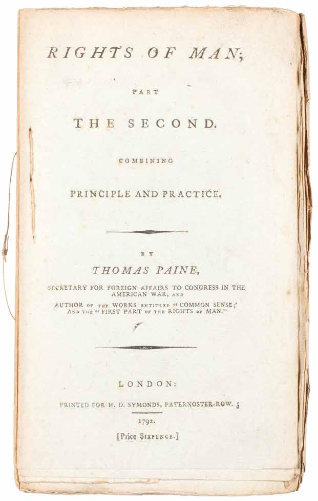
Thomas Paine
Rights of Man: Being An Answer to Mr. Burke’s Attack on the French Revolution. [AND:] Rights of Man. Part the Second... London. Printed for H. D. Symonds, Paternoster Row. 1792
¶ Superb, unsophisticated examples, uncut entirely and stitched as issued in pamphlet form, of the first two parts of Thomas Paine’s ‘Rights of Man’.
Composed in reaction to Edmund Burke’s 1790 ‘Reflections on the Revolution in France’ (and so advertised in Paine’s title as ‘An Answer to Mr. Burke’s Attack ...’), the first part of Paine’s response was first published in February 1791 by Joseph Johnson before its withdrawal – Johnson feared prosecution or worse – and its issue with a new imprint by J. S. Jordan in March of the same year. Despite efforts by the government of the day to censor the work – although Pitt feared the effect
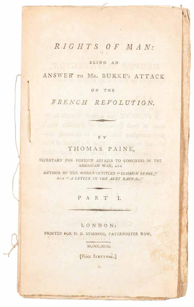
on the populace he himself (see PMM) thought Paine correct – the analysis of basic democratic rights was so crucial that it proved very popular and was reprinted numerous times. The two parts presented here, each with an individual price, unbound and stab stitched as issued, demonstrate that the ‘Rights of Man’ was made available as a pamphlet for ease of distribution and concurrent popular influence.
2 vols. 8vo. (208 × 126 mm). pp. iv, 78, (i); vii, (i), 9–90, (iv), (i). Unbound gatherings stab stitched in pamphlet form as issued.
— $10,000
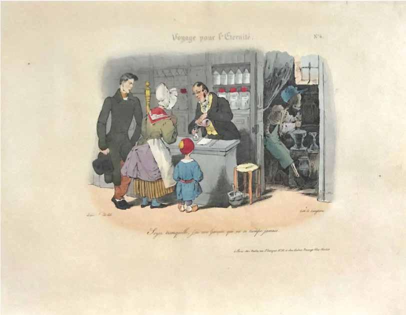
[02].
J. J. Grandville
Voyage pour l’Eternité. Service Général des Omnibus Accélerés.
Départ à Toute Heure et de Tous les Points du Globe Paris. Chez Bulla et Che Aubert. (1830)
¶ The complete series of Grandville’s scarce unfinished suite of satirical and moralistic hand-coloured lithographs.
Planned originally to have 23 plates, the publisher, Bulla, stopped publication after the ninth plate because of the political events of July 1830. As noted by Clive Getty: ‘Comme dans ‘Les Métamorphoses du Jour’, Grandville a probablement glissé quelques caricatures politiques parmi les planches moralisantes du ‘Voyage pour l’Eternité, où apparaissent vraisemblablement des personnages du gouvernement de Charles X.’
Grandville took the idea for this set from Holbein’s ‘Dance of Death’ series bringing the scenes up to date. Here, according to Grandville, death works in a pharmacy mixing drugs, in the army, as a prostitute, chef, chimney sweep and so on.
Oblong small folio. (272 × 364 mm). [10 leaves]. Loose as issued with the original lithograph cover.
— $9,500
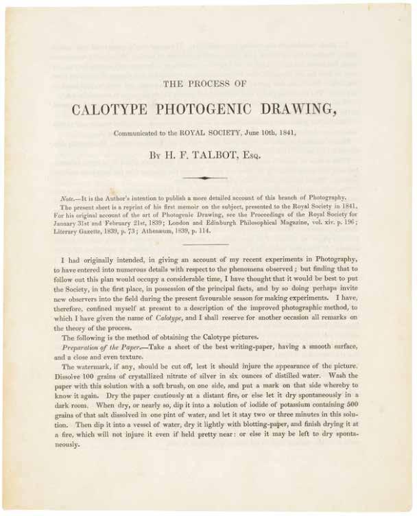
[03].
William Henry Fox Talbot
The Process of Calotype Photogenic Drawing, Communicated to the Royal Society, June 10th, 1841 London. Printed by J. L. Cox and Sons. 1841
¶ The rare first edition of the first announcement of Fox Talbot’s calotype method – the negative/positive photographic process – the most important innovation in the history of photography.
Although Talbot had announced his researches and progress in the field of what was to become photography in his 1839 lecture to the Royal Society (‘Some Account of the Art of Photogenic Drawing ... &c.’), that lecture, although ground-breaking, dealt largely with the achievement of an image on treated paper and only alluded briefly to the possibility of a more versatile development. It was not until his 1841 lecture to the same body (the title as per the present publication is ‘The Process of Calotype Photogenic Drawing ... &c.’) that the details of his refinements, and most particularly his successes with the negative / positive process, were delineated. Those successes and Talbot’s development of the resultant negative / positive process for photographic reproduction and duplication remained the predominant methodology in the field for more than 150 years; all subsequent refinements, whether in the chemicals used, differing methods for image capture, printing and so on, were merely variations on Talbot’s
original scheme. Talbot had patented his method in secret (he was awarded ‘Her Majesty’s Royal Letters Patent No. 8842’) in February 1841, prior to his lecture to the Royal Society, concerned by Arago’s announcement of Daguerre’s discoveries, the efforts of Hippolyte Bayard and the priority of his own work.
The document was reprinted with an altered title (‘The Process of Talbotype (formerly called Calotype) Photogenic Drawing ... &c.) in 1846.
‘Privately printed for the author for distribution to friends and editors.’
— Gernsheim
4to. (229 × 182 mm). [Single bifolium: pp. (4)]. Loose as issued, later moroccobacked portfolio.
—$37,000
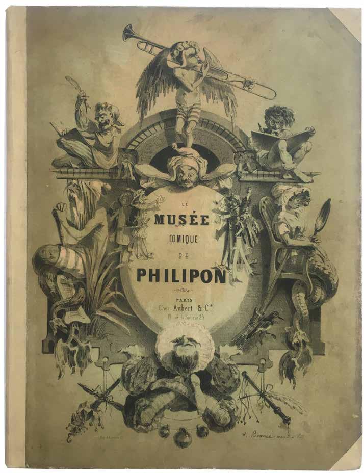
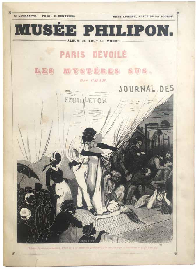
[04].
Grandville, Daumier, Cham, et al. Musée ou Magasin Comique de Philipon ... &c . (Musée Philipon. Album de Tout le Monde.) 1re–48e Livraison. (All Published) Paris. Chez Aubert et Cie. (1842–1843)
¶ A fine copy of Philipon’s profusely illustrated satirical magazine.
It is a testament to Philipon’s tireless satirical efforts that after the problems he experienced in editing La Caricature –constant harassment by the authorities, numerous arrests and prosecutions – he could continue to publish and in a similar vein. Announced in the first livraison as consisting of a prospective 96 livraisons, publication was curtailed after only 48. The illustrators used include several (principally Grandville and Daumier) employed by La Caricature as well as many making their names for the first
time. Illustrators included (as mentioned on the title pages) Cham, Daumier, Dollet, Eustache, Forest, Gavarni, Grandville, Eugène Lami, Lorentz, Plattier, Tromolet, Vernier, and others. Literary contributors included Philipon himself, as well as Bourget, P. Borel, Cham, L. Huart, Lorentz and Marco Sainte-Hilaire.
2 vols. Folio. (352 × 278 mm). pp. 192; 48; 241–384. Original publisher’s cream boards with elaborate pictorial titles, later cloth spine and corners.
— $1,250
[05].
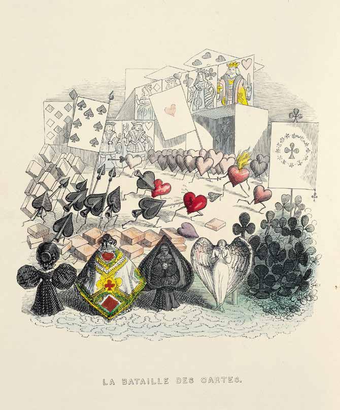
J. J. Grandville (& Taxile Delord)
Un Autre Monde: Transformations, visions, incarnations, ascensions,locomotions, explorations, peregrinations ... &c.
Paris. H. Fournier, Libraire-Editeur. 1844
¶ An excellent copy of Grandville’s finest book and magnum opus, an extraordinary imaginative tour de force in the original publisher’s polychromatic binding.
Grandville’s most remarkable book, an expansive flight of inspirational fantasy, and a remarkable precursor. It is clear that the influence of this work extends onward in the nineteenth and well into the twentieth centuries and beyond. Grandville produced the illustration which was then ‘illustrated’ with a commissioned text. The tale is of three demi-gods, ‘Dr. Puff’, ‘Dr. Krackq’, and ‘Dr. Hahblle’, their created worlds and travels. The work, a descendant of the works of Swift and Goya, inspired, in passing, Lewis Carroll (‘La Battaille des Cartes’), Max Ernst, the
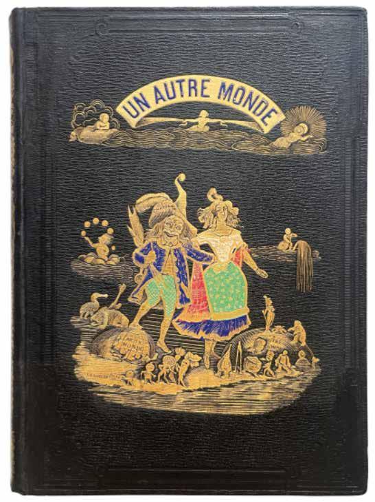
Surrealists in general as well as later caricaturists such as Steadman and Scarfe.
‘In this remarkable book, of the boldest possible originality, Grandville dared to reveal his dream to the public.’ — Ray
Large 8vo. (266 × 200 mm). pp. (ii), (i), (i), 295, (i). Original publisher’s midnight blue percaline with elaborate polychromatic decoration, front board with large central pictorial vignette reproducing the frontispiece with additional colour in red, white, green and blue (signed Liebherre), beneath an additional title vignette heightened in blue, gilt pictorial vignette to rear board, titles and elaborate gilt decoration heightened with colour to spine, additional decoration in blind, yellow glazed endpapers, a.e.g.
— $12,500
[06].
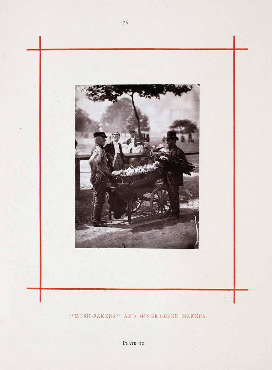
John Thomson (& Adolphe Smith)
Street Incidents. A Series of Twenty-One Permanent Photographs, with Descriptive Letter-Press London. Sampson Low, Marston, Searle, & Rivington. 1881
¶ John Thomson’s photographic depictions of London’s street life.
Published as a shortened version of Thomson’s earlier Street Life in London, Street Incidents contains 16 fewer plates, though apart from the altered title the binding is the same. It is unknown whether the plates were reprinted due to the popularity of the work or whether the present volume was reissued with fewer plates to ensure sale of the publisher’s stock.
Thomson’s photographs in ‘Street Life in London’ and the commentary upon the images by Thomson and Adolphe Smith, depict a London in which life is a harsh and continuous struggle. The characters on view here are familiar to us more from Dickens’ novels or from
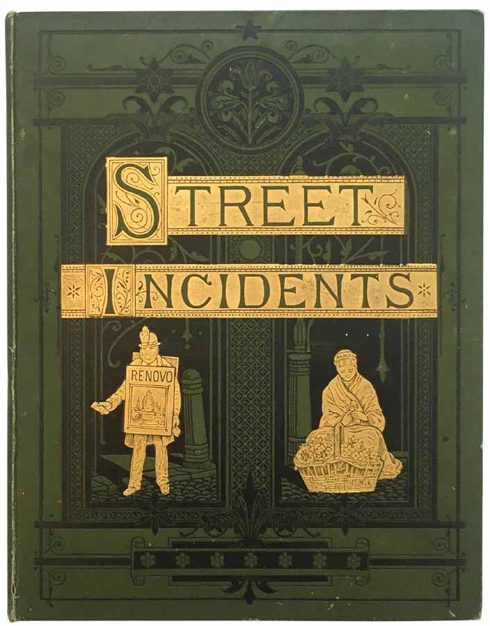
an idea of the Whitechapel of Jack the Ripper than from any nostalgic image of a strait-laced or patrician Victorianism. Each image is accompanied by descriptive text. Thomson and Smith are sympathetic to the objects of their study and seem intent on cataloguing the variety of types to be found rather than attempting any Barnum-like freakshow.
4to. (284 × 222 mm). pp. (i), 100 (including 21 leaves with plates). Original publisher’s green cloth, with gilt title and elaborate decoration in blind and gilt figures from ‘Covent Garden Flower Women’ and ‘the London Boardmen’, printed floral endpapers, later cloth box.
— $10,000
[07].
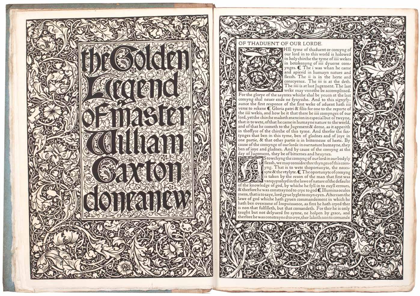
KELMSCOTT PRESS
Jacobus de Voragine
The Golden Legend of Master William Caxton Hammersmith. Kelmscott Press. 1892
¶ A very good copy of the first Kelmscott Press edition of Caxton’s The Golden Legend.
From the edition limited to 500 copies on Flower paper (no copies printed on vellum), volumes two and three unopened.
Morris’ first proposed publication by the Kelmscott Press, ‘The Golden Legend of Master William Caxton’ was announced in the ‘Literary Gossip’ column of the Athenaeum as early as September 13th 1890 (this is probably the earliest mention of the press in print). The ‘Legenda Aurea’, Jacobus de Voragine’s 13th-century compilation of Saints’ lives, an essential prism for the understanding of the medieval mind in Morris’ view, was enormously popular in manuscript and print: ‘ ... no other book was more usually reprinted in various languages between the years 1470 and 1520 ...’ (Ellis). A copy of Caxton’s first edition (printed c.1483 / 1484) was borrowed from Cambridge University and transcribed by Ellis’ daughter; corrections to the text were made by Ellis (in consultation with Morris) while Morris designed the mise en page and occupied himself with the printing. Ellis’ proposed glossary and bibliography of English editions of the ‘Legenda Aurea’,
which he intended for an introduction, found no favour with Morris, and in the published book the glossary is printed at the end of the third volume in truncated form. In addition Morris did allow Ellis to print a bibliographical notice, the ‘Memoranda, Bibliographical & Explanatory, Concerning the Legenda Aurea of Jacobus de Voragine & Some of the Translation of It’, also at the end of the third volume.
Also included, loosely inserted, is the slip of paper (70 x 202 mm) with Morris’ note to the binder.
3 vols. 4to. (304 × 216 mm). pp. xii, 464; 465–864; 865–1286. Woodcut title by William Morris and two full-page woodcut plates by Sir Edward Burne-Jones (all in vol. 1), each, together with facing leaves of text with elaborate woodcut borders, several additional woodcut decorative flourishes, numerous ten-line and six-line decorative woodcut initials throughout, colophon with woodcut Kelmscott Press vignette. Printed text in Morris’ Golden Type. Original publisher’s canvas-backed blue paper boards, printed paper title labels to spines, spines a little darkened, labels and free endpapers with some toning as usual.
—$12,500
[08].
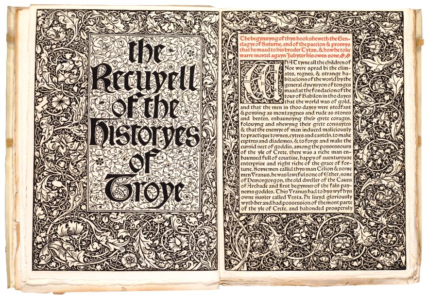
KELMSCOTT PRESS
Raoul Lefèvre
The Recuyell of the Historyes of Troye Hammersmith. Bernard Quaritch for Kelmscott Press. 1892
¶ The Kelmscott Press edition of Caxton’s ‘The Recuyell of the Historyes of Troye’, the first book printed in English.
From the edition limited to 305 copies, with this one of 300 on Flower paper.
Caxton’s edition of the text, using his own translation of Raoul Lefèvre’s Burgundian romance, was the first book printed in the English language in Bruges in 1473 or 1474. The book was also a favourite of William Morris. Although Caxton’s ‘Recuyell’ had been reprinted in numerous editions, this Kelmscott Press version was ‘the first to go back directly to Caxton’s text’ (Peterson). The text was edited by H. Halliday Sparling. Morris’ ornamental designs are printed here for the first time and his vine border – used twice in the second volume – also appears here for the first time.
‘As to the matter of the book, it makes a thoroughly amusing story, instinct with mediaeval thought and manners ... It is
the last issue of that story of Troy which had such a hold on men’s imaginations; the story built up from a rumour of the Cyclic Poets, of the heroic City of Troy, defended by Priam, with his gallant sons, led by Hector the ‘preux Chevalier’, beset by the violent & brutal Greeks, who were looked on as the necessary machinery for bringing about the undeniable tragedy of the fall of the city.’– Morris’ manuscript note for Quaritch’s catalogue in Cockerell’s presentation copy.
3 vols. in 2. Large 4to. (300 × 220 mm). [156 leaves, 214 leaves, with inserted blank; pp. xv, (i), 295; 297–718]. Elaborate decorative woodcut borders and initials throughout, text printed in Troy type, with table of characters and glossary in Chaucer type, printed in black and red throughout. Original publisher’s limp vellum with Yapp edges, green cloth ties, titles gilt to spines.
—$11,500
[09].
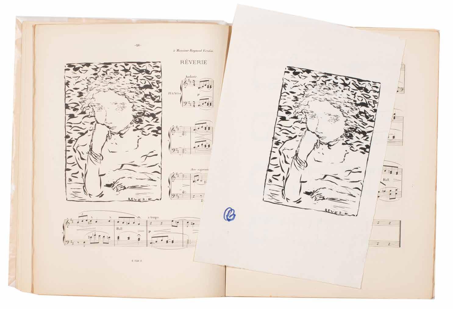
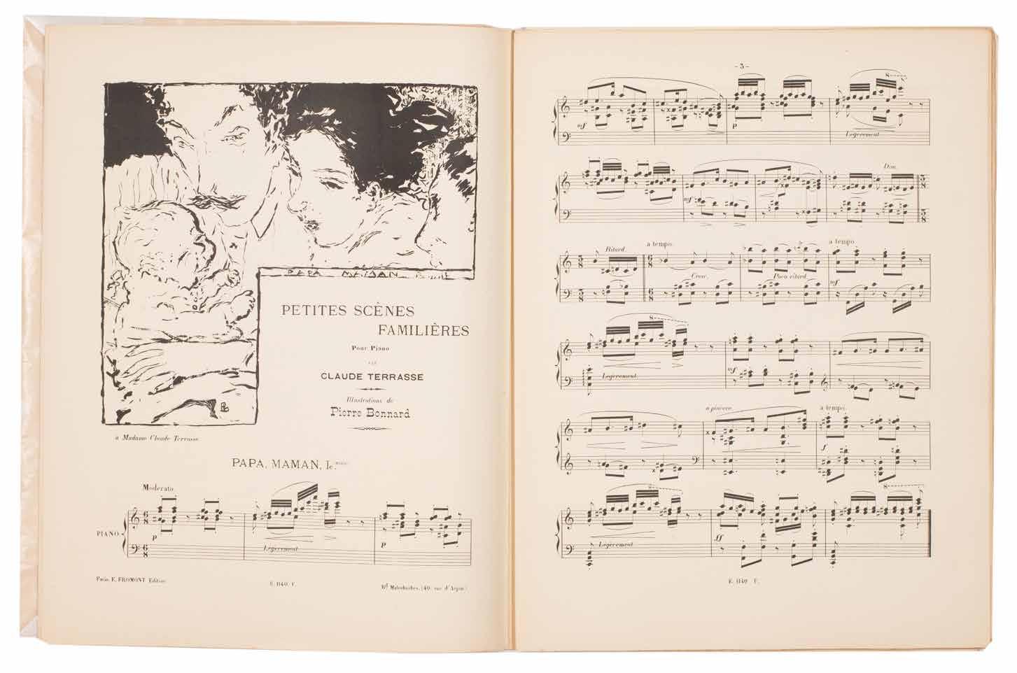
Pierre Bonnard Petites Scènes Familières. Pour Piano
Paris. E. Fromont. (1893)
¶ Charles Terrasse’s musical scores with Bonnard’s lithograph illustrations – one of his earliest works – together with the exceptionally rare signed suite on Chine.
The exceptionally rare suite of the 19 prints printed without text and with each image signed by Bonnard with his initials, in brush, either in scarlet or blue.
There were only some 20 copies printed of these proofs, all on sheets of Chine paper and without text.
Illustrated by Bonnard, Terrasse’s music for children is one of the artist’s
earliest illustrative projects. Although sometimes cited as his first, the listing of ‘Petit Solfège Illustré’ on the list of published works makes it clear that that work preceeds this.
Small folio. (352 × 274 mm). [17 bifolia + wrapper + 19 leaves of Chine; pp. 61, (i)]. Original publisher’s printed wrappers with reproduction manuscript title and small lithograph vignette to front cover.
— $33,750
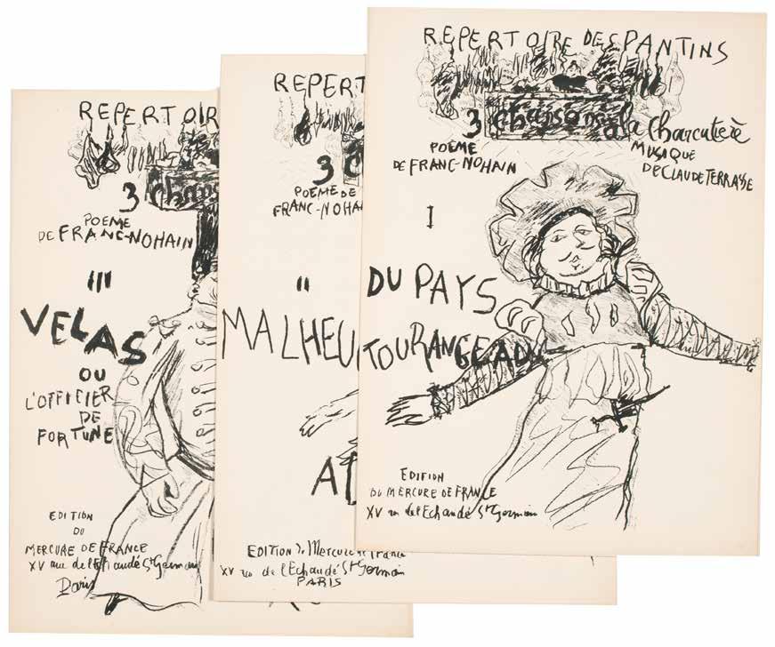
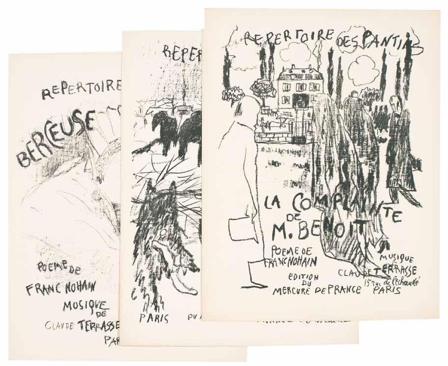
[10].
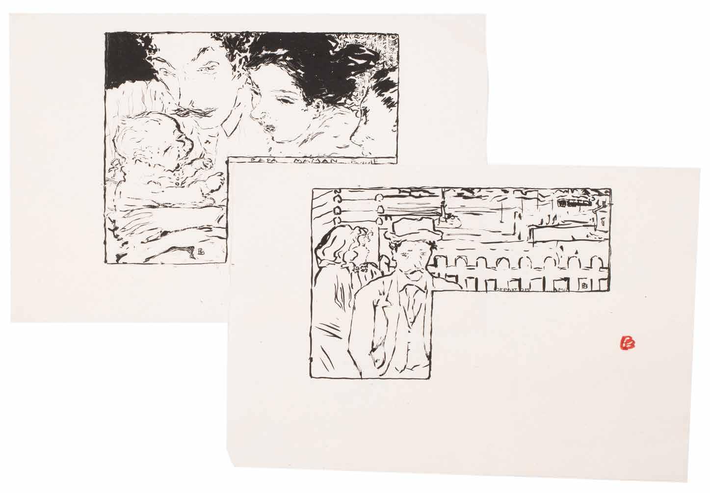
Pierre Bonnard & Paul Verlaine
Claude Terasse and Franc-Nohain
Répertoire des Pantins
Paris. Mercure de France. [1898]
¶ A complete set of the musical scores with covers illustrated by Pierre Bonnard for the Répertoire des Pantins.
The Théâtre des Pantins was a puppet theatre founded by Alfred Jarry, Franc-Nohain and Claude Terrasse. Bonnard produced six original lithograph covers for songs by Franc-Nohain with music by Claude Terrasse (three others were issued with covers by Jarry for his own music); Bonnard also made the marionettes for the theatre.
‘The Echo de Paris of 1 April 1898 gave the following description of the theatre: ‘Rue Ballu, at the back of a courtyard, on the first floor, a mini-theatre for a tiny audience. It was here that Alfred Jarry, with the aid of some ingenious marionettes, has recently staged a revival, lasting a few evenings, of his epic Ubu.
The auditorium is cramped but is pleasantly decorated by Edouard Vuillard with pyrotechnics of dazzling colour, and by Bonnard with some quite beautifully executed silhouettes in black and grey.’
— Bouvet: Bonnard. The Complete Graphic Work
6 issues. Folio. (c.350 × 270 mm). [Bifolium + inserted leaf or two bifolia for each number. Printed musical score for each, with ‘Poème de Franc-Nohain’ and ‘Musique de Claude Terrasse’ and each with original lithograph cover by Bonnard. Each loose as issued in original publisher’s printed wrappers, front covers with original monochrome lithograph illustration and text by Pierre Bonnard, advertisements to rear covers.
— $4,750
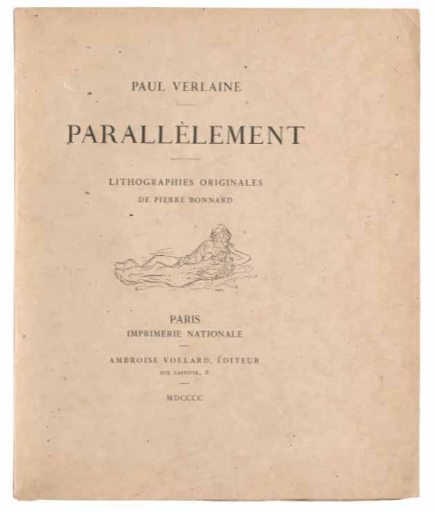
Pierre Bonnard & Paul Verlaine
Parallèlement
Paris. Imprimerie Nationale / Ambroise Vollard Editeur. 1900
¶ The ground-breaking Parallèlement, Ambroise Vollard’s first book, comprising Verlaine’s verse illustrated with Pierre Bonnard’s delicate rose lithographs, here in the original wrappers.
From the edition limited to 200 numbered copies, with this one of 170 copies on vélin de Hollande.
This copy was issued with the second version of the wrapper and title, with the vignette of the Imprimerie Nationale replaced with a vignette by Bonnard himself for each, after the privilège was withdrawn on the discovery that ‘Parallèlement’ was libidinous and erotic verse by a decadent Symbolist and not, as had been thought, a mathematical text. The initial privilège granted to the book was printed on the verso of an initial leaf and was replaced after its
withdrawal with an original lithograph by Bonnard printed in a slightly darker colour than the lithographs that illustrate the text. This copy, stitched as issued in the original wrappers, has had some minor repairs to the spine edges and the first leaf of text (‘Dédicace’) does feature a stain (it appears to be the artefact of a thin inserted item), however, it remains a very good copy.
‘An epoch-making book ...’.
— The Artist & the Book 1860–1960
Small folio. (308 × 256 mm). [74 leaves; pp. (vi), 139, (iii)]. Original publisher’s printed wrappers with titles and vignette by Bonnard to front cover in black, title to spine, later protective black box.
— $22,500
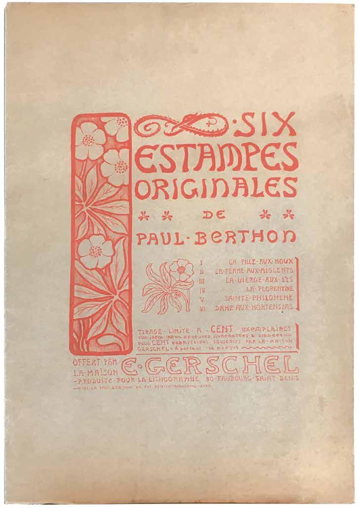
[12].
Paul Berthon
Six Estampes Originales de Paul Berthon. (Les Six Vierges) Paris. Offert par la Maison E. Gerschel - Produite pour la Lithographie / Atelier Paul Berthon. 1902
¶ An excellent and complete copy of Berthon’s rare portfolio.
From the edition limited to 200 copies, with this one of 100 ‘souscrits par la Maison Gerschel & portant sa marque’. The complete set of the 6 lithographic portraits by Paul Berthon printed in different colours. This set has an extra state of the first of the prints, ‘La Fille aux Houx’, on different paper and signed in pencil.
Folio. (560 × 382 mm). [6 leaves].
Wrapper with titles &c. and six original lithographs each in a single colour on large sheets of Japon Imperiale with large margins, each numbered beneath and with the stamp of Maison Gerschel. Loose as issued in original publisher’s tan wove printed paper wrapper, pictorial titles with decoration, list of plates &c. by Berthon to front cover in red, loose in later blue card portfolio with cloth tie.
— $7,750

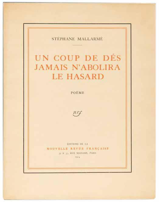
[13].
Stéphane Mallarmé
Un Coup de Dés Jamais N’Abolira le Hasard. Poème Paris. Editions de la Nouvelle Revue Française. 1914
¶ A large paper copy, completely unsophisticated, of the first edition of Stéphane Mallarmé’s revolutionary innovative typographic caprice.
From the edition limited to 100 numbered large paper copies, with this one of 90 on vélin d’Arches; 10 hors commerce copies – also large paper – on papier pur chanvre des papeteries de Montval were also issued as well as an unnumbered edition of 900 copies in smaller format on vergé.
In 1914, Stéphane Mallarmé’s ambitious typographical construction, the extraordinary poem, ‘Un Coup de Dés Jamais N’Abolira le Hasard: Poème’, was finally published – in the form that
Mallarmé had himself envisaged – by Gallimard’s ‘Editions de la Nouvelle Revue Française’. A version had appeared during Mallarmé’s lifetime, in 1897, in ‘La Revue Cosmopolis’ but the title aside, Mallarmé’s vision for the poem – refused by printers at the time as unfeasible and absurd – was ignored; Ambroise Vollard’s proposed edition illustrated by Odilon Redon never appeared.
Folio. (330 × 257 mm). [16 unnumbered leaves]. Original publisher’s japon wrappers with printed titles in red and black to front cover and publisher’s vignette in black to rear.
— $8,750
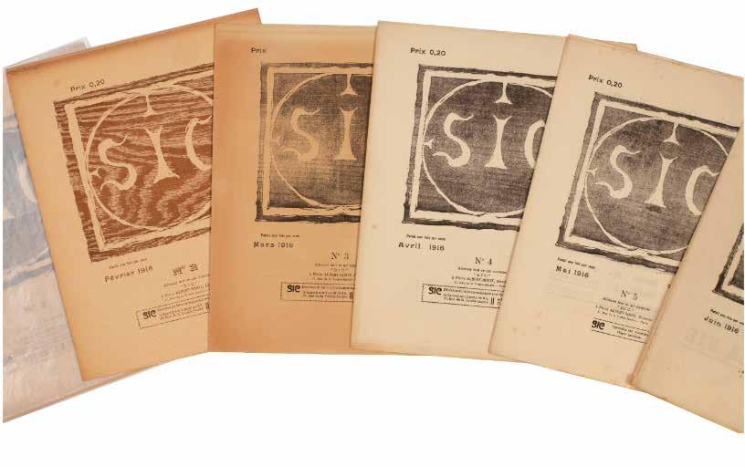
[14].
Pierre-Albert Birot (Directeur) SIC . Sons. Idées. Couleurs. Formes No. 1. (Janvier 1916). – No. 53 / 54. (Décembre 1919). (All Published). Paris. SIC, 37 rue de la Tombe-Issoire. Janvier 1916–Décembre 1919
¶ The scarce complete series of the influential avant garde review SIC.
Founded by the poet, painter, sculptor, publisher and typographer Pierre Albert-Birot (1876–1967) in 1916, SIC, with its focus on the avant garde was one of the most influential literary, musical and artistic periodicals of the period. From issue number two, Albert-Birot was aided by Gino Severini and in issue number 4, Apollinaire makes his first - but by no means his last - appearance with the poem ‘L’avenir’; Apollinaire continued to contribute until his death in 1918 and the triple issue 37 / 38 / 39 was ‘composé en mémoire de Guillaume Apollinaire’. Of particular note is the fact that SIC sought to represent the whole of the avant garde and promoted Cubism, Futurism, dada,
with Tzara contributing regularly, as well as contributions from Breton, Aragon and others who would develop Surrealism.
54 issues in 40 vols. 4to. (282 × 225 mm). Original publisher’s printed wrappers, stapled or loose as issued, with Albert-Birot’s device ‘SIC’ to covers where applicable in black or bistre, issues 26–34 with ‘SIC’ replaced with a reproduction of a work of art, the issues inserted loose into two pockets of a later hand-decorated patterned paper-covered and lined board protective folding box with title labels to front board and spine, additional notes loose in additional marbled paper envelope, grey silk-covered slipcase.
— $12,500
George Barbier
La Guirlande des Mois
Première Année (1917) – Cinquième Année (1921). (All Published)
Paris Chez Jules Meynial, Libraire. 1917–1921
¶ An excellent complete set of George Barbier’s Art Deco almanachs.
A showcase for Barbier’s beautiful illustrations, these miniature books were issued in decorative silk bindings, decorative dust-jackets of quality paper, and are some of the most delightful of Barbier’s work. Contributors included the Comtesse de Noailles, Gérard d’Houville, Albert Flament, René Boylesve, Barbier himself, Edmond Jaloux and others.
The protective coffret of the present example was designed by Livio Castiglioni (1911–1979), one of the three famous Castiglioni brothers who worked mainly in Milan.
Copies that have retained their jackets and slipcases have tended also to remain
very fresh in condition, as is the case for the present set, with the bindings bright and colourful.
5 vols. 12mo. (126 × 82 mm). pp. 88; 165; 122; 128; 137. Original publisher’s silk-covered boards, front boards and spine with decoration by Barbier, titles to spines, decorative patterned endpapers, a.e.g., paper jackets with decoration by Barbier, housed in a full mauve calf coffret by L. Castiglioni with his signature gilt, elaborate décor of inlaid purple morocco with gilt decorative tooling, interior lined with purple suede and edged in gold
— $6,750
[16].
Nadezhda Ivanova Liubavina & Sofiya Dubnova Mat’. (The Mother) Petrograd. Segodnia. 1918
¶ An enchanting children’s book by the Segodnia group, with hand-coloured linoleum cut illustrations.
From the edition limited to 1,000 copies, with this one of 125 hand-coloured copies, numbered in green ink to the inside cover.
The publisher of the present work, Segodnia (‘Today’), was the first avantgarde publisher of children’s books. The illustrator of ‘Mat’’, Nadezhda Liubavina, latterly became a member of the group after involvement with the Union of Youth.
A previous owner’s stamp (that of Alexey Viktorovich Ulitin, 1910–1970)
is printed to the inner front wrapper verso and the final leaf of text. Bookseller’s stamp and price to rear cover.
8vo. (200 × 150 mm). [2 bifolia: 4 unnumbered leaves; inner wrappers and initial and final leaves printed with letterpress text recto and verso, linocut illustrations with additional watercolour]. Original publisher’s stapled paper wrappers, woodcut titles in black with hand coloured illustration by Liubavina, publisher’s logo by Vera Ermolaeva to rear wrapper.
— $3,250
William Blake
Catalogue of the John Linnell Collection of Highly Important Works by William Blake Obtained Direct from the Artist ... &c. London. Christie, Manson & Woods. 1918
¶ A fine unsophisticated copy of the important catalogue of the sale of this highly significant collection of William Blake material.
The sale was held on Friday, March 16th, 1918 at Christie’s ‘Great Rooms’ in King Street, St. James’s.
In 1818 John Linnell (1792–1882) met William Blake (1757–1827), with whom he remained friendly until Blake’s death in 1827. Linnell became an important patron to Blake in the final years of his life, commissioning, among other works, a set of engravings illustrating the Book of Job and buying the watercolours that Blake had made for Milton’s ‘Paradise Regained’.
The first portion of the sale was made up of works by Linnell himself as well as works and prints by other artists. Lots 148 to 215 all relate to Blake and include among sketches, watercolours and letters, the 98 drawings for Dante, the drawings
for the ‘Illustrations of the Book of Job’, the drawings for Milton’s ‘Paradise Regained’, the illuminated books ‘America, A Prophecy’, ‘The Marriage of Heaven and Hell’, ‘Songs of Innocence and Experience’ (two copies), ‘There Is No Natural Religion’, ‘Vala’ and more; notable are also the eleven sets of Blake’s engravings for Dante and the 68 copies of the ‘Illustrations for the Book of Job’.
8vo. (246 × 155 mm). [16 leaves; pp. 30]. Title to front wrapper, conditions of sale verso and the details of 215 lots. Original publisher’s printed paper wrappers, stitched as issued, titles to front cover in black.
— $2,250
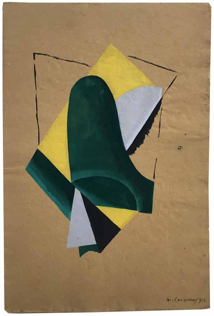
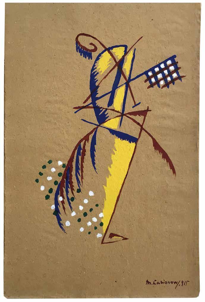
Natalia Goncharova & Mikhail Larionov L’Art Décoratif Théatral Moderne Paris. Edition ‘La Cible’. 1919
¶ The scarce publication reproducing Goncharova and Larionov’s works for the avant-garde stage, an exceptional copy that includes the two very rare additional colour pochoir plates by Larionov.
From the edition limited to 515 copies, with this one of 100 large paper subscriber copies signed by Goncharova and Larionov and numbered in ink and including the very scarce two additional prints.
The two additional prints, each a vibrant reproduction of a work by Larionov in pochoir, are on a thick and fibrous, tan / yellow handmade paper of larger size than the wrappers for the book (512 x 330 mmm / 510 x 340 mm); these two pochoirs are very uncommon and it is rare to find them included with the portfolio.
Goncharova and Larionov are credited with bringing cubism to the theatre, Goncharova with the ‘Coq d’Or’ of 1914 and Larionov with ‘Les Contes Russes’ in 1915. This impressive portfolio was published for Larionov and Goncharova’s large exhibition of their theatrical work, held at the Galerie Barbazanges to celebrate their arrival in Paris. It comprises
a series of pochoirs and prints of several of the designs on display. Valentin Parnack’s essay discusses Larionov’s theories about dance and theatre, and singles out the artist as the initiator of new types of choreography, including dances based on free movements, types of gait, animal movements, mechanical dance, and social dance related to work.
Folio. (498 × 362 mm). [6 bifolia: 12 leaves + 14 leaves of plates; pp. 18]. Leaf with justification, leaf with title with circular pochoir publisher’s colour vignette (by Larionov), copyright verso, 6 leaves with Valentin Parnack’s analysis with 8 tippedin illustrations on glossy paper (6 in colour), leaf with list of plates, leaf with list of text illustrations and 14 hors-texte plates: 6 pochoir colour plates (2 by Goncharova and 4 by Larionov) and 8 colour plates (listed as ‘Gravures’), 3 tipped-in; sheet size: 500 x 360 mm or the reverse. Loose as issued in original publisher’s printed paper portfolio with flaps, front cover with title and large vignette in black by Larionov, one cloth tie.
— $42,500
[19].
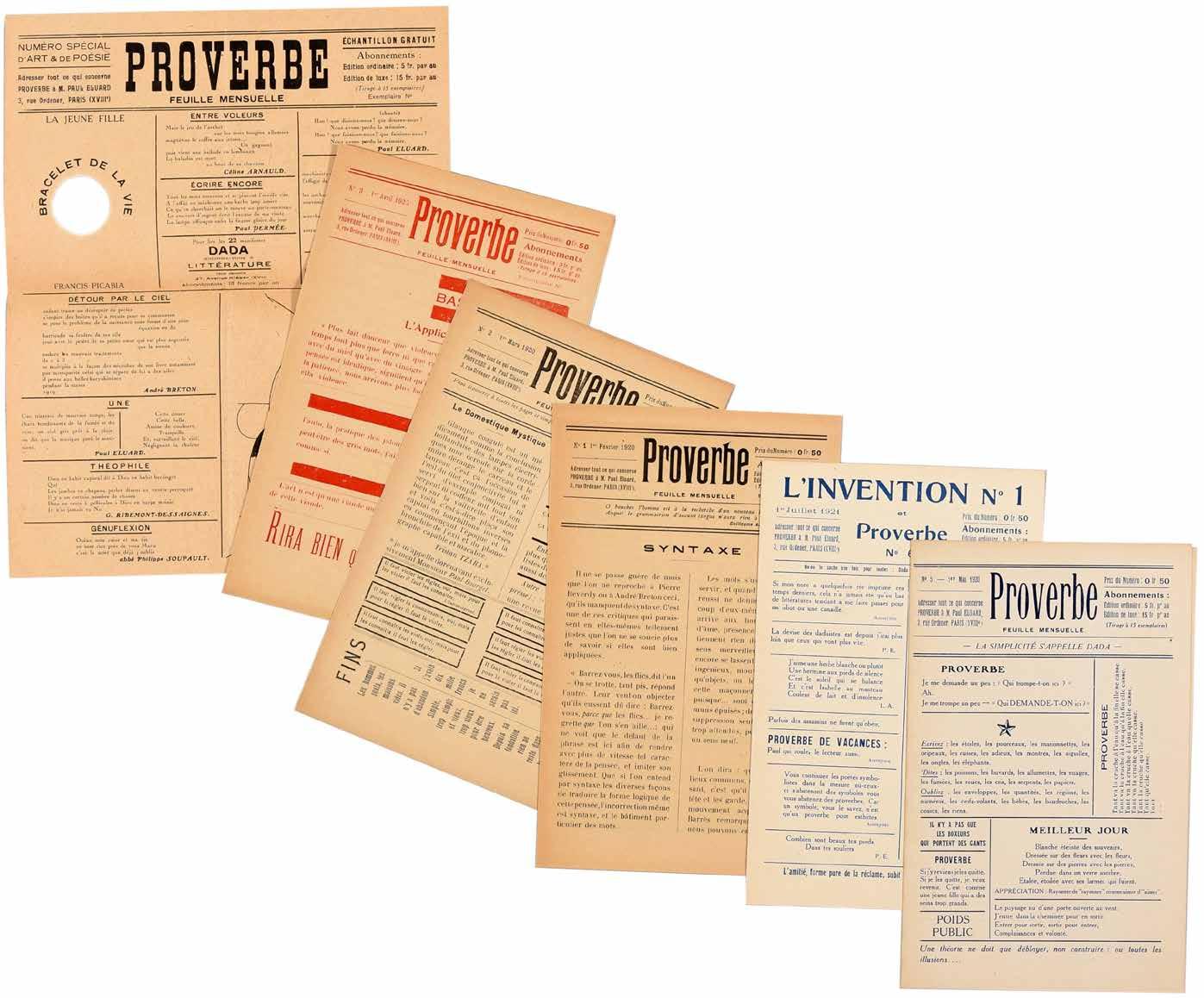
Paul Eluard (Ed.)
Proverbe. Feuille Mensuelle. Nos. 1 (1er Février 1920) – 5 (1er Mai 1920), plus No. 6. (Also L’Invention 1, 1er Juillet 1921). (All Published) Paris. 1920–1921
¶ A rare complete and unsophisticated set of this Paris dada periodical.
Edited by poet Paul Eluard, the focus of ‘Proverbe’ is far more seriously linguistic, although it retains the playfulness to be expected from dada, than many other periodicals of the period. Although the typical elements of dada typography are present – the variable font, different register, differing colours, the ruling and the use of different angles of printing to the plane of the page – here it is the word that reigns. In fact, only one of the issues is in any sense illustrated: issue 4 contains a reproduction of a drawing by Picabia, the ‘Machine de bon mots’, but even here Picabia’s concern is at least as semantic as visual.
The first article of the first issue makes the aim of ‘Proverbe’ clear: ‘Syntaxe’ by Jean Paulhan with its urge to reinvigorate language is followed by pieces by Phillipe Soupault, Tristan Tzara, an aperçu by the Marquis de Sade and an editorial page of aphorisms, mottoes, advertisements and instructions. Perhaps the most memorable of these latter is the reassuring announcement concerning Picabia’s
‘391’: ‘391 ne contient pas d’arsenic. On peut le prendre en toute sécurité et en secret sans rien changer à ses habitudes.’ The second issue saw the arrival of additional contributors and the editorial board of Louis Aragon, André Breton, Paul Eluard, Jean Paulhan, Francis Picabia, Maurice Raynal and Philippe Soupault was expanded to include Georges Ribemont-Dessaignes. Issue 4 – the only illustrated issue – was printed on the recto only of the sheet but with an excised circular hole (Picabia again) incorporated into the issue and titled ‘Bracelet de la Vie’.
6 issues. (221 × 139 mm). [Single folded sheets of newspaper stock; issue 3 printed in red, issue 4 printed vertically with no outer text]. Issue no. 4 with a printed illustration ‘Machine de bon mots’ after a drawing by Francis Picabia and the printed stamp in red on outer unprinted wrapper: ‘PROVERBE / n’existe que pour / justifier les mots.’ Single printed folded sheets as issued.
— $11,250
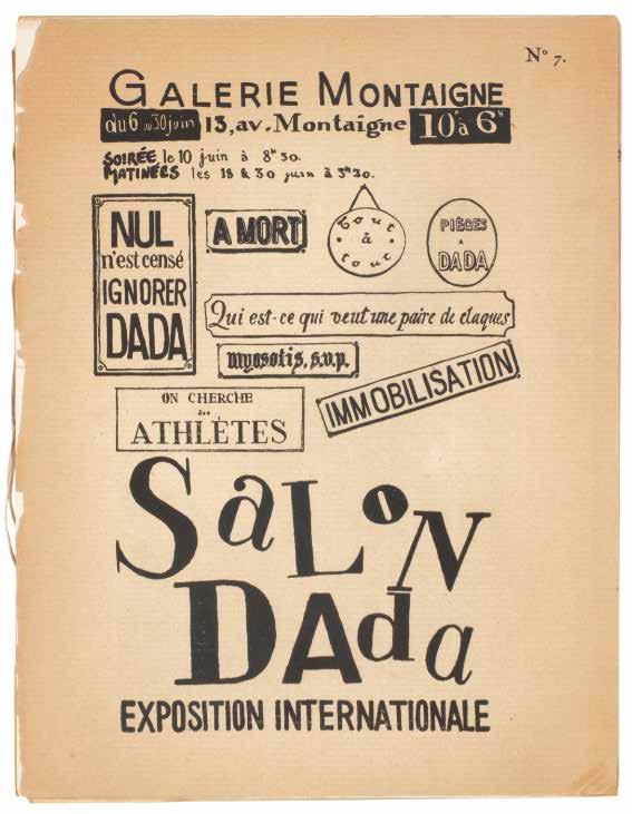
Hans Arp, Georges Ribemont-Dessaignes, Max Ernst & Marcel Duchamp. Tristan Tzara, Philippe Soupault, Benjamin Péret, Louis Aragon, et al.
SaLoN DAda. Exposition Internationale Paris. (Imprimerie Crémieu). (1921)
¶ A presentation copy of the very scarce ‘SaLoN DAda’ with the rare invitation to the highly controversial ‘Soirée dada’.
From the edition limited to 600 numbered copies, each stamp-numbered to the justification to front wrapper verso.
Tristan Tzara’s presentation is in black ink to the left-hand margin of the centre spread: ‘à Hannie et Aldo / van Eyck / Pour le 30ème Anniversaire / de Dada / avec le souvenir amical / de / Tristan TZARA / Sur les lieux du crime / Zürich 23 févr. 46’ and with a typical Tzara sketch of a flower. The spread also includes the legend ‘Conformément aux règlements en vigueur l’amour est interdit aux végétaux des squares’, (at left) Tzara’s ‘L’art et la chasse’ and (at right) the tipped-in illustration of Duchamp’s ‘Mariée’.
Opening with Philippe Soupault’s ‘Le Profil de dada’, the catalogue ‘SaLoN DAda’ represents both the highwater mark and the beginning of the end of dada in Paris. ‘SaLoN DAda’ was convened in June 1921, after Picabia had left the movement (although he was to return) despite all he had done to initiate ‘SaLoN DAda’, Breton did not participate and Duchamp had departed
both physically for New York and metaphorically: although his contribution to the catalogue (the reproduction of his painting ‘Mariée’) remains, his contributions to the exhibition (nos. ‘28’ to ‘31’ under his name are blank) were removed. ‘SaLoN DAda’ as an exhibition held at the Galerie Montaigne (within the Théâtre des Champs-Elysées) was largely successful albeit not without controversy, featuring international contributions from Arp, Baargeld, Man Ray, Charchoune, Walther Mehring, J. Evola, Aldo Fiozzi and Joseph Stella, as well as Jacques Rigaut, Jacques Vaché, Gala and Paul Eluard and Théodore Fraenckel among others.
Also included, inserted loose, is the announcement for ‘Soirée dada’, a single sheet of cream glossy paper printed in black recto only (270 x 206 mm).
Small 4to. (270 × 210 mm). [7 bifolia including wrappers]. Original publisher’s printed wrappers with typographic title to front cover in black, justification verso, catalogue to rear wrapper and interior, staple preserved, later stitching.
— $16,750
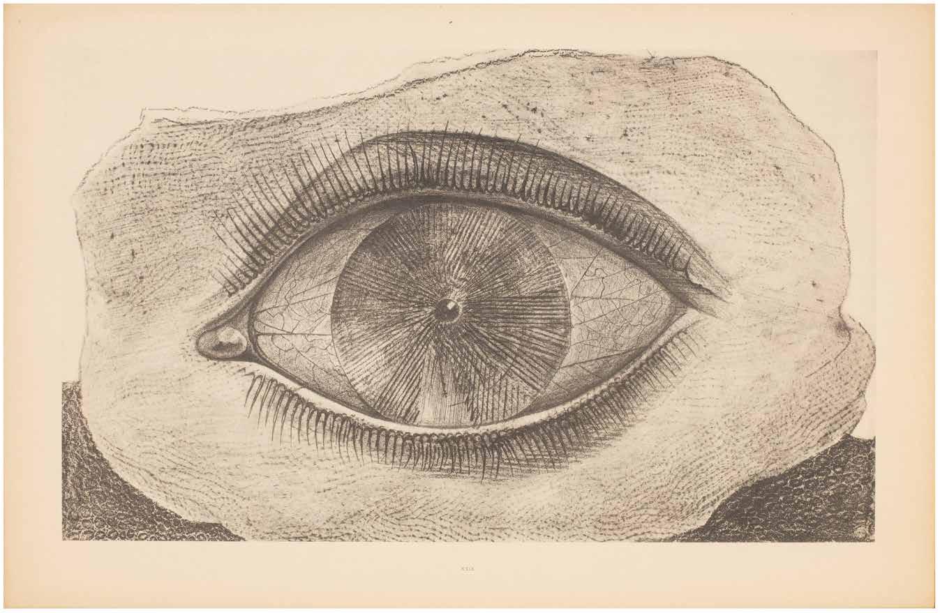
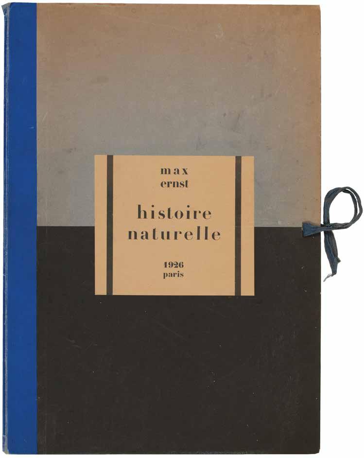
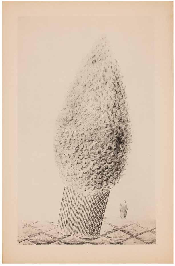
[21].
Max Erst & Hans Arp, (Intro.) Histoire Naturelle
Paris. (Editions Jeanne Bucher). 1926
¶ A superlative unsophisticated édition de tête example of exceptional rarity of Max Ernst’s early frottage experiments.
From the edition limited to 300 numbered copies (6 lettered hors commerce copies were also issued), with this one of the first 20 édition de tête copies on Japon Impérial signed and numbered ‘11’ in ink by Max Ernst.
One of Ernst’s earliest childhood recollections was of an imitation mahogany panel opposite his bed which he was prone to peruse while falling asleep. Such an image helped spark his invention of frottage (rubbings of diverse materials such as planks, bricks, watch parts, cheese graters, buttons, etc.).
Made during the latter half of 1925, this album represents only a small portion of the hundreds of frottages Ernst produced during that period. Bearing both poetic and descriptive titles (The
Fascinating Cypress, The Vaccinated Bread), the plates are introduced by Ernst’s dada compatriot Hans Arp by means of a long automatic prose poem. The text is printed without capitals throughout; the final plate (‘éve la seule qui nous reste’) is misnumbered ‘43’ in the list of plates.
Folio. (516 × 350 mm). [2 bifolia (text on smaller sheets) + 34 leaves of plates]. Leaf with title, leaf with list of plates recto and verso, leaf with Arp’s introductory text recto and verso, blank leaf with justification verso (all on smaller sheets) and 34 lithograph plates by Max Ernst each printed recto only and numbered I–XXXIV (sheet size: c.498 × 324 mm or the reverse). Loose as issued in original publisher’s cloth-backed blue, turquoise and black portfolio, printed title label to upper board, blue cloth ties.
— $40,000
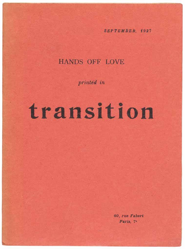
[22].
Nancy Cunard
Maxime Alexandre, Louis Aragon, Jacques Baron, et al. Hands Off Love. (Printed in Transition) (Paris). 1927
¶ The very scarce offprint, issued in defence of Surrealism’s hero Charlie Chaplin after his divorce and the publication of Lita Grey Chaplin’s scandalising ‘The Complaint of Lita’.
Charlie Chaplin’s divorce from Lita Grey Chaplin was concluded in August 1927 but her divorce complaint (i.e. ‘The Complaint of Lita’ listed above) had been made public – likely by Lita’s lawyers at her behest – and a grand, scandalous furore resulted. ‘Hands Off Love’, largely an expression of distaste at the
hypocrisy of the scandal and in defence of Chaplin, was printed first in the literary review ‘Transition’ in September 1927 before its appearance as this offprint. It appeared again, later and in French, in ‘La Révolution Surréaliste’ in October 1927.
12mo. (194 × 144 mm). [3 bifolia: 6 unnumbered leaves]. Original publisher’s pinkish-red printed wrappers, stapled as issued, titles to front cover in black.
— $3,000
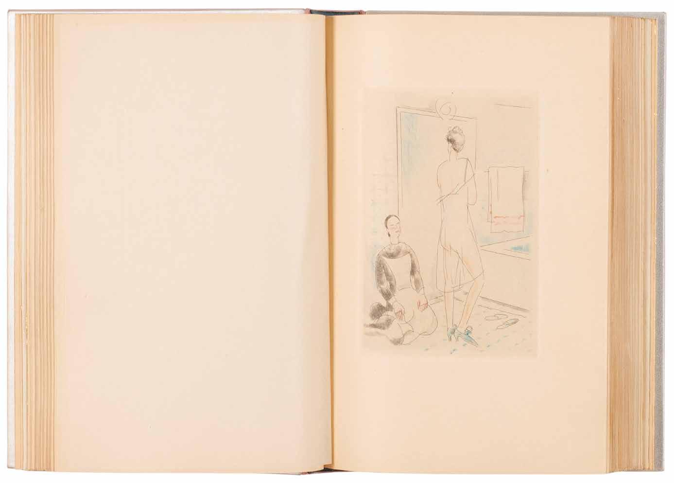
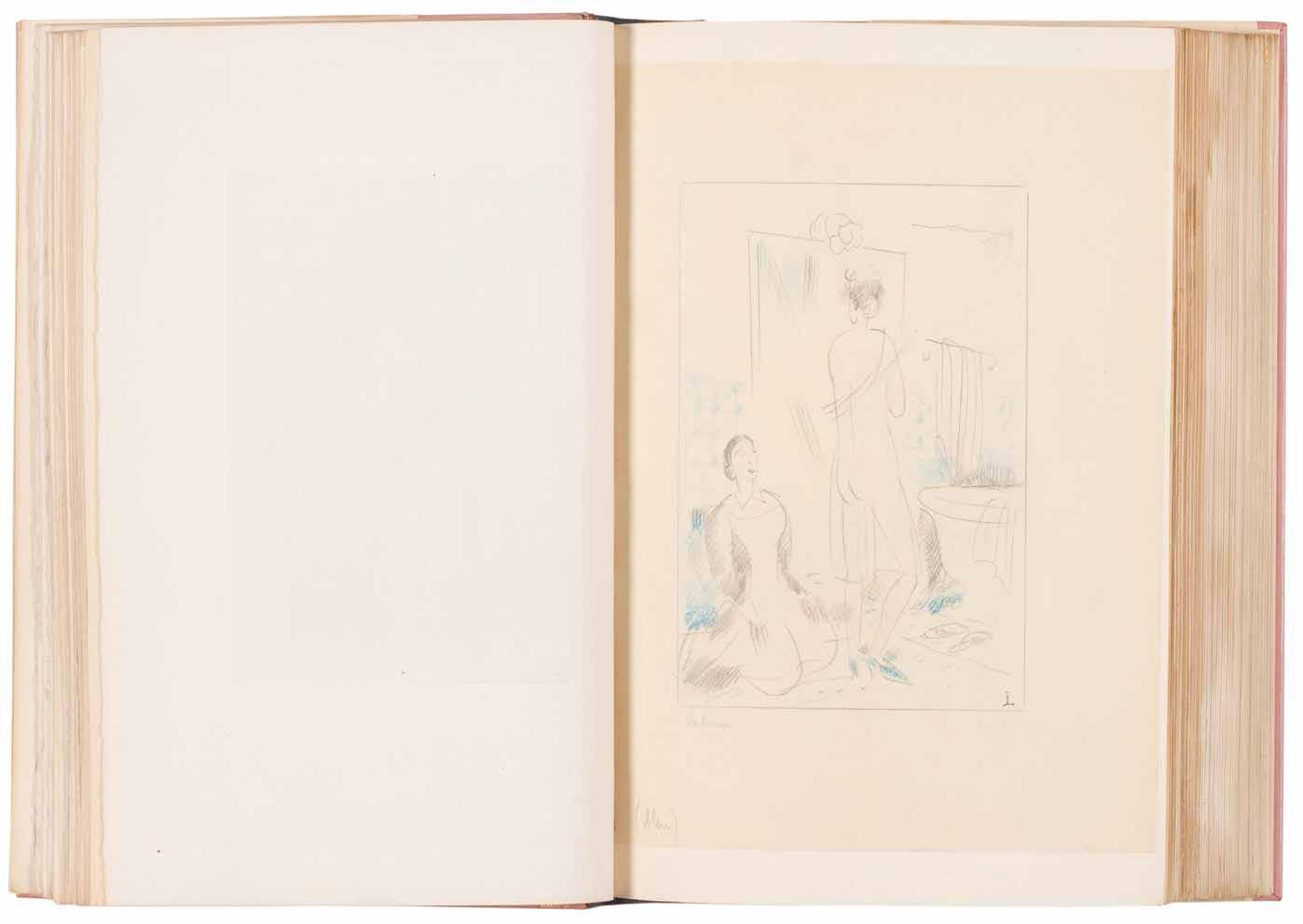
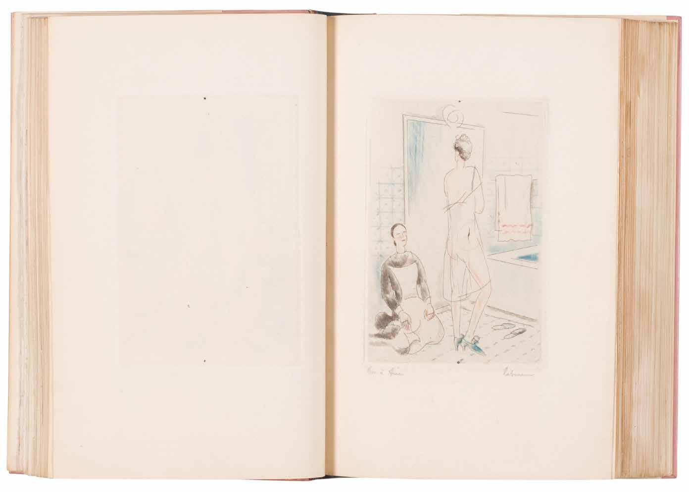
[23].
Jean-Emile Laboureur & Remy de Gourmont Couleurs. Contes avec des Gravures de J.-E. Laboureur Paris. Camille Bloch, Editeur. 1929
¶ The unique nominatif copy on papier Impérial du Japon printed for the publisher Camille Bloch, and with all of Laboureur’s original drawings for the book and much additional material.
From the edition limited to 335 copies (including 25 hors commerce lettered copies for the collaborators), with this unique nominatif copy aside for the publisher with the printed text ‘EXEMPLAIRE C. B. / imprimé pour MONSIEUR CAMILLE BLOCH’ to the justification; as for the copies of the édition de tête numbered in Roman numerals, this copy is printed on papier Impérial du Japon.
Remy de Gourmont’s compendium of texts, each of the twelve tales and one drama is titled with, inspired by or reflects upon a specific colour and opens with a relevant quotation, from Van Gogh (‘Jaune’), Baudelaire (’Noir’), Mallarmé (‘Blanc’) and so on. Each of de Gourmont’s texts is also the subject of a full-page colour etching, a colour initial to match the titles and a head-piece (several tail-pieces feature too) by Jean-Emile Laboureur. In a separate volume are gathered all of Laboureur’s drawings for
the book, those for the full-page plates are signed by Laboureur, an extensive series of suites of the plates that include proofs and trials, many signed by Laboureur or the printer and a letter from Laboureur to Bloch detailing his ideas for the initials and typography.
2 vols. 8vo. (240 × 168 mm). pp. 231. Together with a separate volume with suites, proofs and Laboureur’s original drawings. Full polished rose calf by Mercher with his signature gilt and dated 1970, oval excisions from front and rear boards with inset panels of clear plexiglass to show the colour decor to free endpapers, smooth spine with gilt title, doublures of argent silk, original cream printed patterned-paper wrappers and backstrip preserved, a.e.g., matching rose calf-backed white wool-lined wooden board chemise and matching slipcase, the drawings and suites in matching rose calf-backed white paper boards, a.e.g., and matching slipcase.
— $22,500
[24].
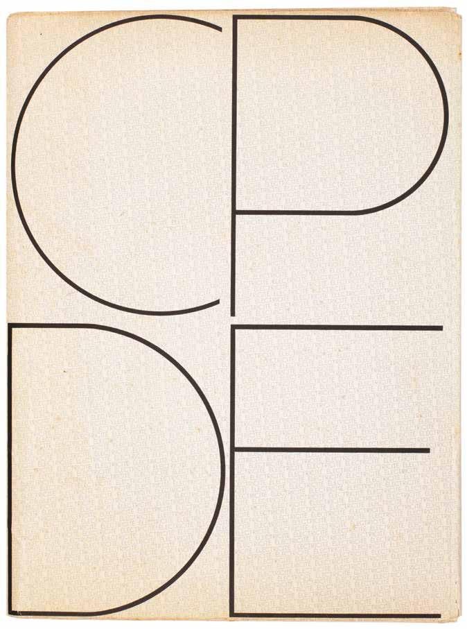
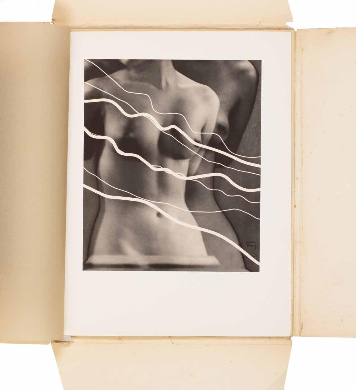
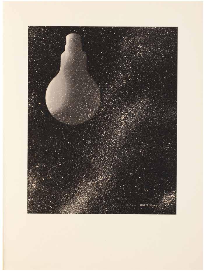
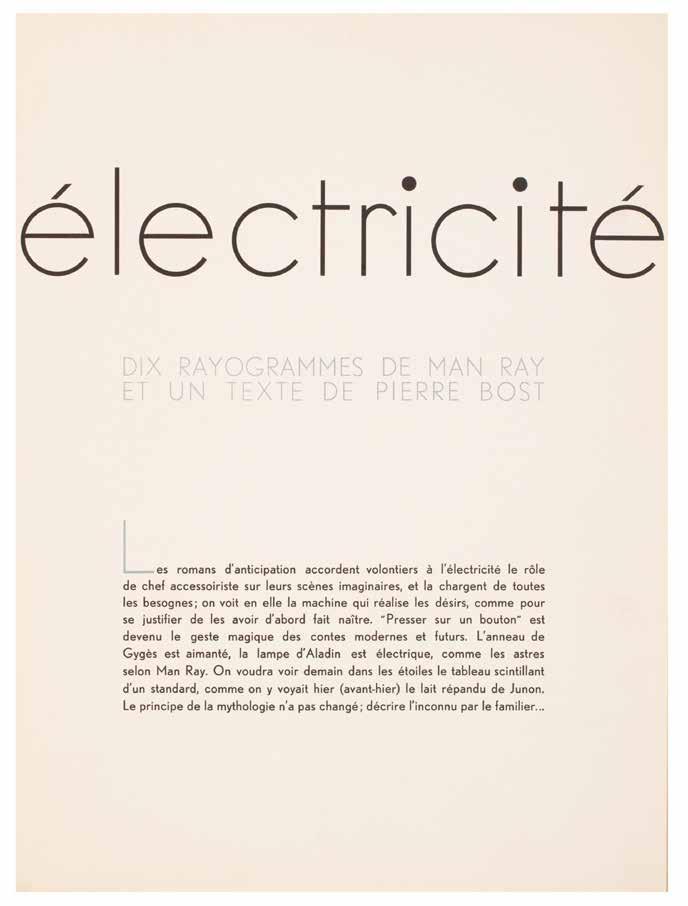
Man Ray & Pierre Bost
Électricité. Dix Rayogrammes de Man Ray et un Texte de Pierre Bost
Paris. CPDE (Compagnie Parisienne de Distribution d’Electricité). 1931
¶ Man Ray’s ‘Electricité’, an excellent, unsophisticated copy, with the original compliment slip.
From the edition limited to 500 copies each stamp-numbered to the justification (the justification and achevé d’imprimer are printed to the interior of the card portfolio).
This work was commissioned by a French electric company (La Compagnie Parisienne de Distribution d’Électricité) to promote and publicise the use of electricity. The portfolio consists of 10 photogravures made from Man Ray’s original rayograms; each rayogram makes use of some electrical device in the home. The conception is brilliant and the images among the most direct and uncontrived in Man Ray’s oeuvre. ‘Electricité’ is also notable as Man Ray’s last intensive investigation of the rayogram process.
‘Man Ray’s Electricité (Electricity) is not only one of the most ravishing and sought-after of company photobooks, but
it contains a cogent suite of photographs that the leading American Dadaist and commercial photographer himself never bettered. The ideas are generally simple, but formally adroit, even witty – full of visual poetry and delight ... Electricity is, of course, invisible, and in much of the portfolio Man Ray seeks to make the invisible visible, creating visual equivalents for electrical power ... Solarized images look as if they are pulsating with hidden energy ... They [CPDE] ended up with one of the most successful unions between commerce and the artistic avant garde, a monument of modernist bookmaking and a thoroughly contemporary, unexpected, beautiful and frequently playful vision of the brave new world of electrical energy.’ — Parr / Badger.
Folio. (384 × 284 mm). [2 bifolia (text) + 10 leaves of plates]. Original publisher’s printed card portfolio with typographic design in blue and black.
— $60,000
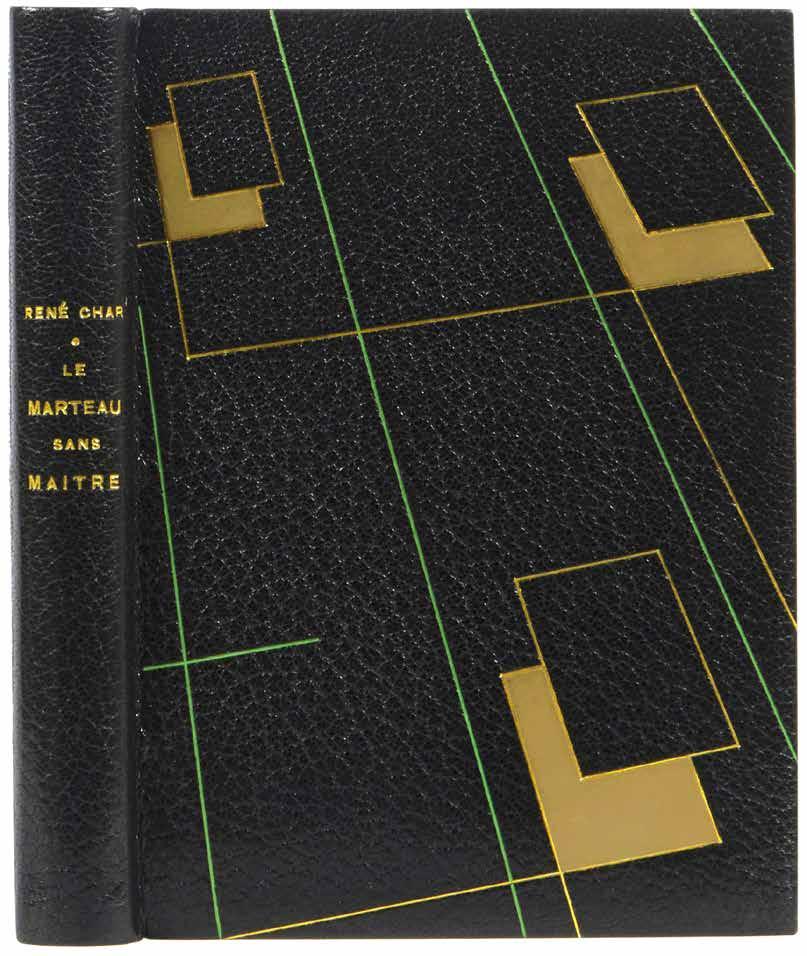
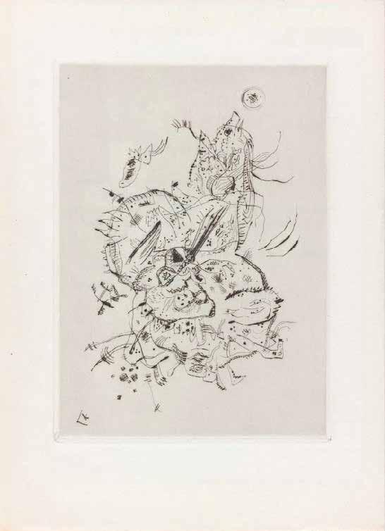
Wassily Kandinsky & René Char Le Marteau sans Maître Paris. Editions Surréalistes. 1934
¶ The édition de tête of the first edition of René Char’s collection with Wassily Kandinsky’s original frontispiece etching and bound by Georges Leroux.
From the édition de tête limited to 20 numbered copies on papier de Hollande van Gelder with Kandinsky’s original dry point engraving as frontispiece; only copies from the édition de tête were issued with the original engraving.
Also included, inserted loose, is the scarce subscription announcement printed on yellow paper with a quotation from the Comte de Lautréamont.
Kandinsky’s untitled etching, issued in only 20 impressions, was followed by only two further etchings, those for ‘La Main Passe’ (1934) and ‘Fraternity’ (1939), before Kandinsky’s death in 1944.
Pablo Picasso was a profound admirer of Char and of the work, which collected all of Char’s poems published after 1927, and submitted an etching for the second edition – printed in a very similar format to this edition – published again
by José Corti’s Editions Surréalistes, in 1945. A third illustrated edition was also published, illustrated by Joan Miró, in 1976. This first edition and in this issue of 20 copies with Kandinsky’s etching is the rarest of the editions; Picasso’s etching for the édition de tête was issued in 25 copies while the version with Miró’s etchings was an edition of 215 copies, 50 with an additional suite.
8vo. (192 × 146 mm). pp. 142, (i). Full black crushed morocco by Georges Leroux with his signature gilt, boards with abstract geometric rules in gilt and green and outlined parallelograms, several with inlaid café crème calf, smooth spine with gilt titles, café crème calf doublures, bright green brushed suede free endpapers, original publisher’s printed wrappers in black and red and backstrip with titles in black preserved, a.e.g., black morocco-edged green paper-covered board slipcase with additional signature at foot.
— $37,500
[26].
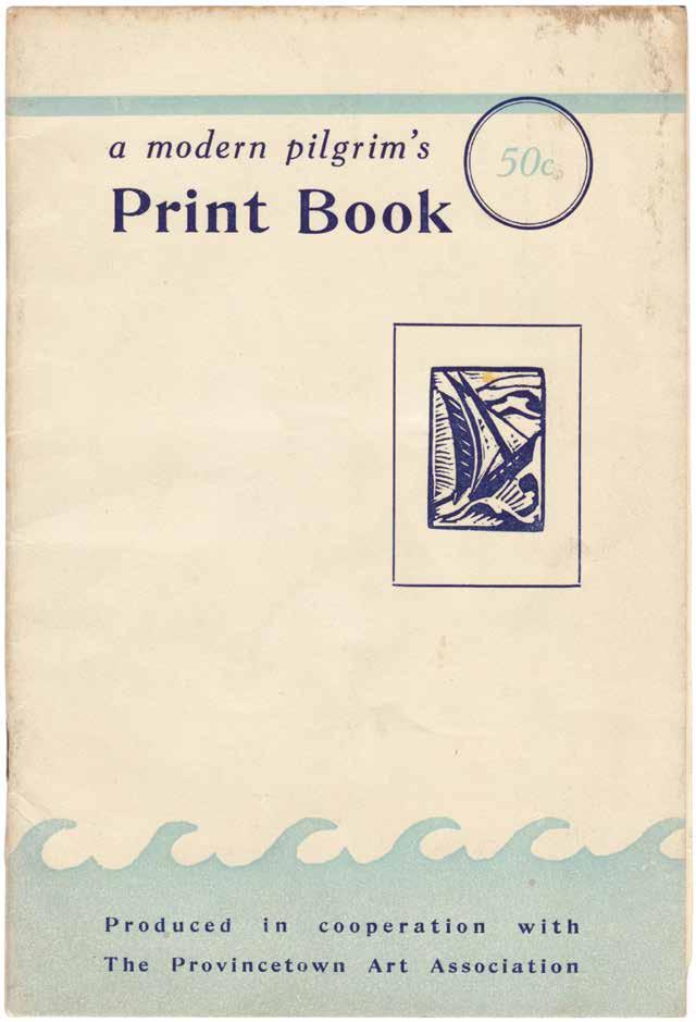
(Blanche Lazzell, et al.)
A Modern Pilgrim’s Print Book
Provincetown, Mass. Paul Smith. 1935
¶ An exceptional copy, inscribed by Blanche Lazzell and with her original contribution signed in ink.
The foreword by Mrs Harold Haven Brown (the artist Florence Bradshaw) and Paul Smith (the publisher of the present volume) states ‘the impressions you hold in your hands were made directly from the artist’s block without any interference from modern photo-engraving’.
The artists represented in the catalogue are: Tod Lindenmuth; Kal Knaths; Chas. Kaeselau; Oliver Chaffee; Blanche Lazzell; Agnes Weinrich; V. B. Rann; Saul Yalkeert; Shelby Shackelford; E. R. Eeuler; and Ada Gilmore.
This exceptional copy with a presentation in blue ink at the foot of
the first leaf: ‘To Martha Frances Sellers / from Aunt Pet (Blanche Lazzell) / Happy Birthday in 1950’; in addition, Lazzell has signed and inscribed her original linocut in black ink: ‘Blanche Lazzell - 1935 - My Studio, Provincetown’.
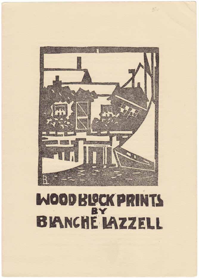
Also included, loosely inserted, is the prospectus for ‘Wood Block Prints by Blanche Lazzell’ with black and white linocut “Wharf Studios” on the front.
8vo. (216 × 146 mm). [12 unnumbered leaves]. Foreword and 11 original linocuts by various artists, each printed recto only and with facing descriptive text. Original publisher’s stapled wrappers, titles and decoration in blue to covers.
— $3,250
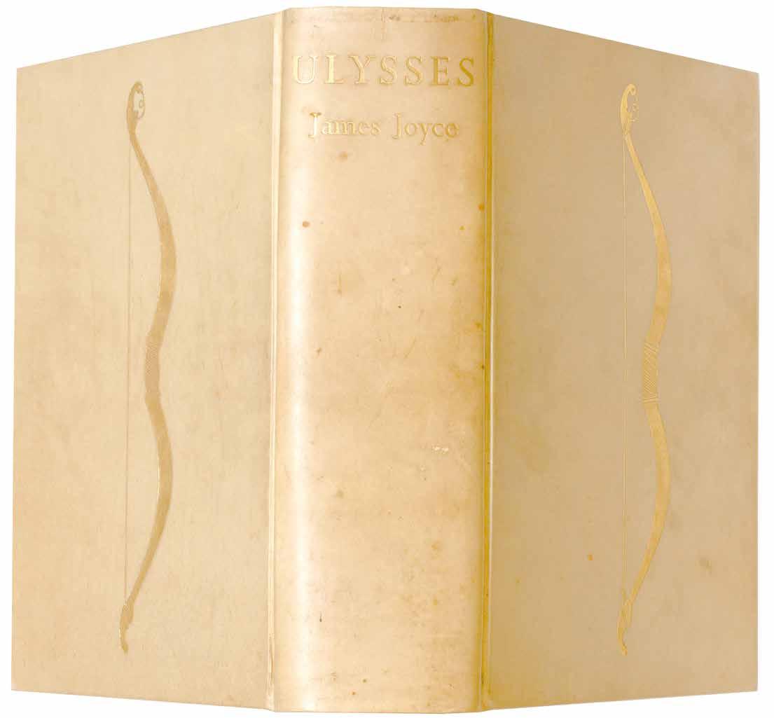
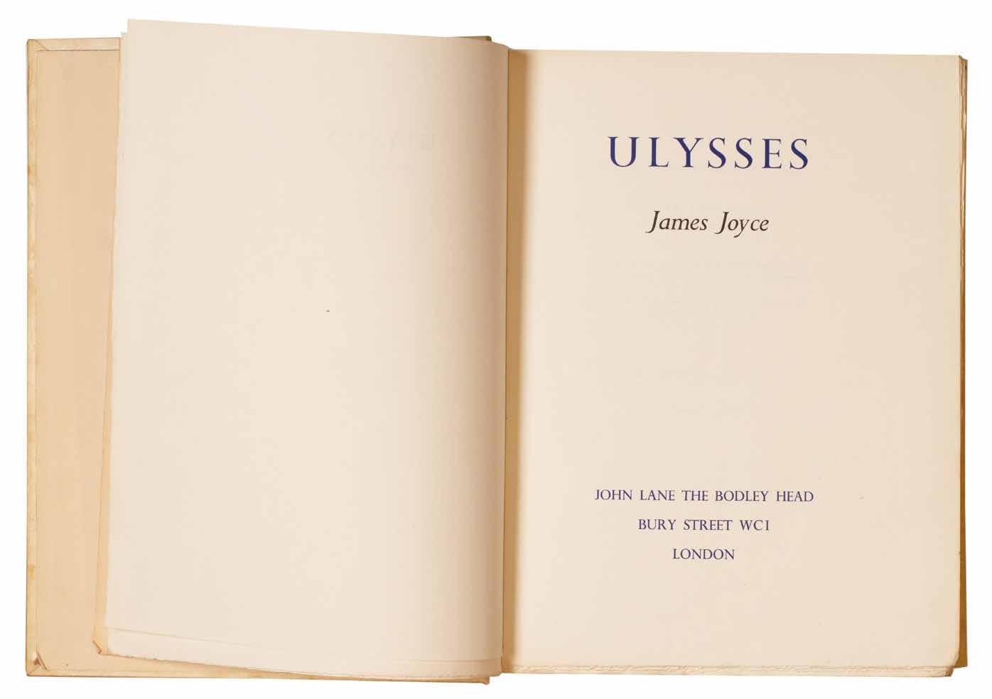
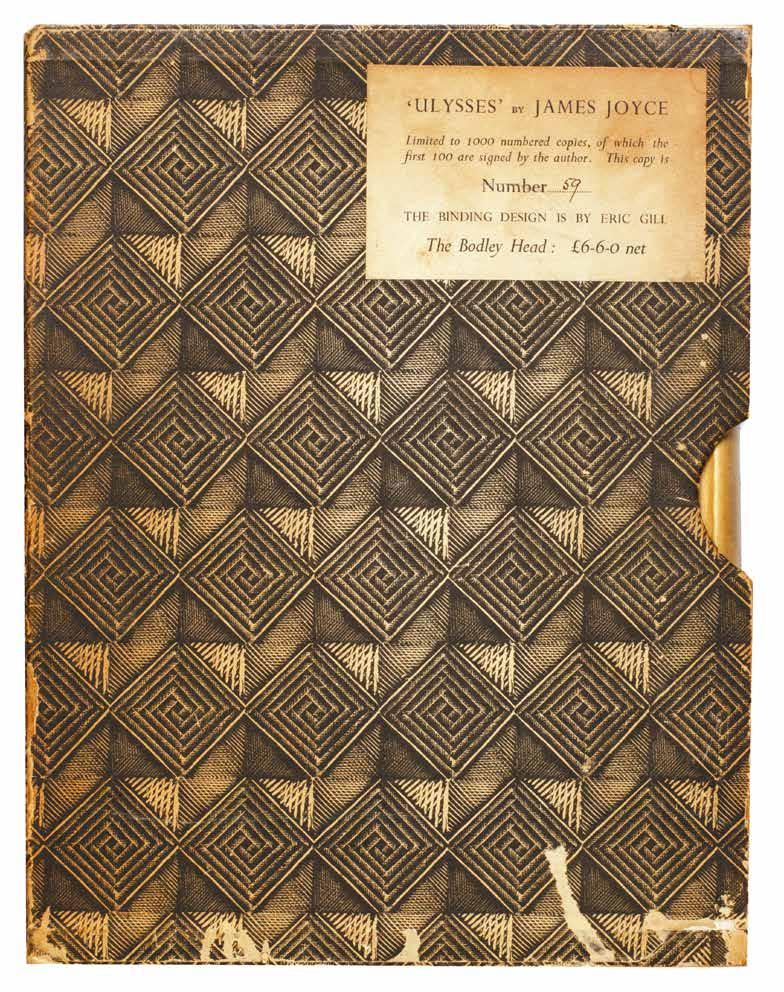
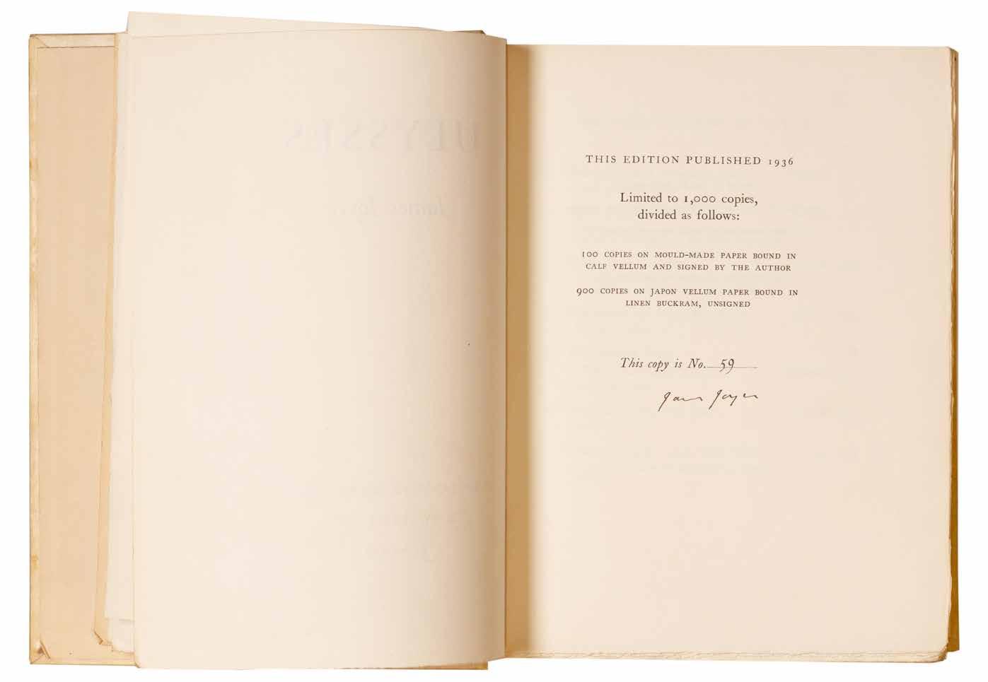
James Joyce Ulysses
London. John Lane / The Bodley Head. 1936
¶ The deluxe issue of the first edition of Joyce’s magnum opus to be printed in Great Britain.
From the edition limited to 1,000 copies, with this one of 100 on mould-made paper in the deluxe vellum binding designed by Eric Gill and signed and numbered by Joyce; the original slipcase features matching numbering to the book. This authoritative edition of ‘Ulysses’, the first to be published in Great Britain, features Joyce’s corrected text, details of the seven previous editions and their fates where applicable (for example for the Egoist Press edition ‘499 copies were seized by the Customs Authorities, Folkestone’) and detailed appendices concerning the protests, injunctions and trials relating to the publication of the book and a bibliography of works by Joyce.
Written over a seven year period during Joyce’s peripatetic tour of Trieste, Zurich and Paris (where it was eventually first published), ‘Ulysses’ chronicles a day in the life of Leopold Bloom: June 16th 1904. The book was banned in Britain, Ireland and America until the 1930s due to its apparent obscenity, hence the need originally for French publication. Considered by many to be the greatest work of literature in the English language, ‘Ulysses’ is certainly a supreme monument
of literary Modernism and conceivably the greatest work of literature of the 20th century; Nabokov considered it one of the ‘greatest masterpieces of twentieth century prose’. However, the greatness of ‘Ulysses’ has often been overshadowed by the novel’s difficulty, its ambiguities and its intense literary nature, all factors that led the publisher Sylvia Beach to announce the first edition of the work with the apology: ‘the publisher asks the reader’s indulgence for typographical errors unavoidable in the exceptional circumstances’; the errors are corrected in the present edition.
Although the slipcase for the present copy is rubbed and worn, it remains intact and the vellum of the binding of the book is fresh with only slight toning to the spine and some small marks to the boards; overall a good copy of this important text.
Large 8vo. (264 × 204 mm). pp. xiii, 765, (i). Original publisher’s full vellum designed by Eric Gill with gilt bow vignette to front and rear boards, cream endpapers, title gilt to spine, a.e.g., original patterned paper-covered board slipcase with white paper label with printed titles and matching copy number in ink.
— $37,500
[28].
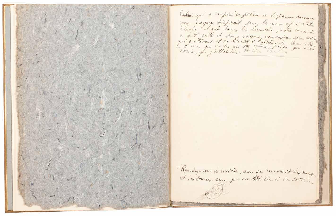
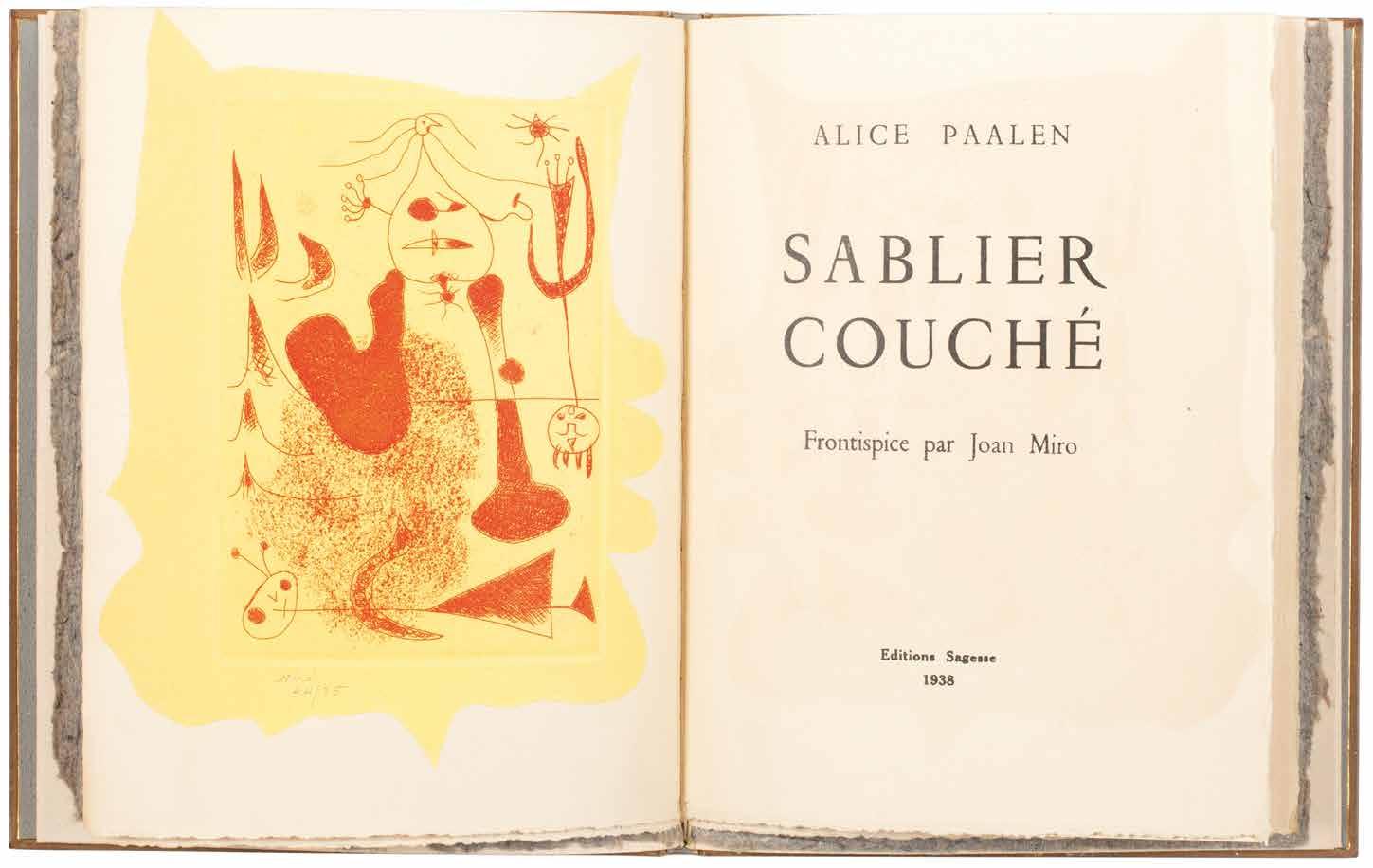
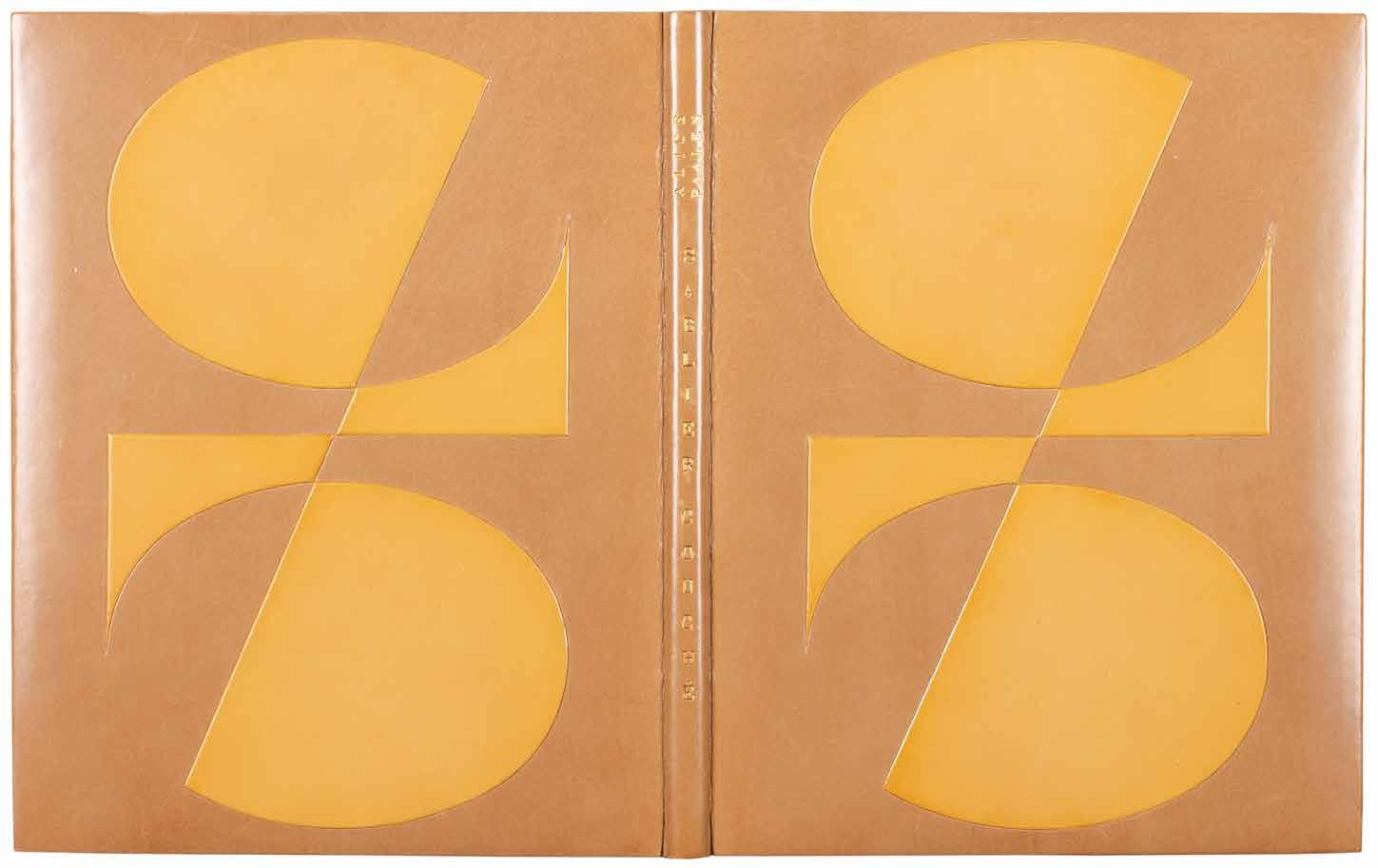
Joan Miro & Alice Paalen Sablier Couché (Paris). Editions Sagesse. 1938
¶ Sonja Sekula’s copy of ‘Sablier Couché’ presented by Paalen, with a manuscript poem, Miró’s superb signed frontispiece and bound by Pierre-Lucien Martin.
From the edition limited to 75 numbered copies on Arches paper signed and numbered in ink by Alice Paalen on the justification and signed and numbered by Miró on the etched frontispiece.
Paalen’s presentation is in black ink to the initial blank (please ask for a transcription).
The following page features Paalen’s poem ‘Mercure éteint’ in blue ink.
8vo. (210 × 174 mm). [8 unnumbered leaves; 4 bifolia]. Full tan polished calf by Pierre-Lucien Martin with his signature gilt to front turn-in and dated 1970, front and rear board with large abstract geometric onlays of crème caramel polished calf, turquoise suede doublures and free endpapers, smooth spine with title gilt, t.e.g., original grey handmade paper wrappers with titles in black to front cover preserved, matching wool-lined calf-backed paper board chemise with gilt title to spine and calf-edged slipcase.
— $22,500
Marc Chagall, Max Ernst, Yves Tanguy, André Breton, Piet Mondrian, et al. Soby, Alfred Thrall & Nicolas Calas Artists in Exile
New York. Pierre Matisse. 1942
¶ Margaret and Alfred Barr’s presentation copy of the catalogue for the exhibition they had done so much to enable, signed by all of the participating artists and by the gallerist Pierre Matisse.
Pierre Matisse’s presentation is in black ink to the foot of the blank ‘Notes’ leaf bearing the signatures of the participating artists: ‘THIS IS A SPECIALLY SIGNED COPY FOR MARGARET AND ALFRED BARR / Pierre Matisse / NEW YORK MARCH 3d 1942’.
The copy is signed in various colour inks by all of the participants: Marc Chagall (blue ink), Pavel Tchelitchew (turquoise), Ossip Zadkine (red), Eugene Berman (purple), Yves Tanguy (umber), Fernad Léger (red), Max Ernst (blue), André Masson (red), André Breton (turquoise), Amedée Ozenfant (blue), Kurt Seligmann (umber), Piet Mondrian (blue / black), Roberto Matta Echaurren (sepia) and Jacques Lipchitz (green).
It is significant that Margaret Scholari Barr, known as Marga, is listed first in the
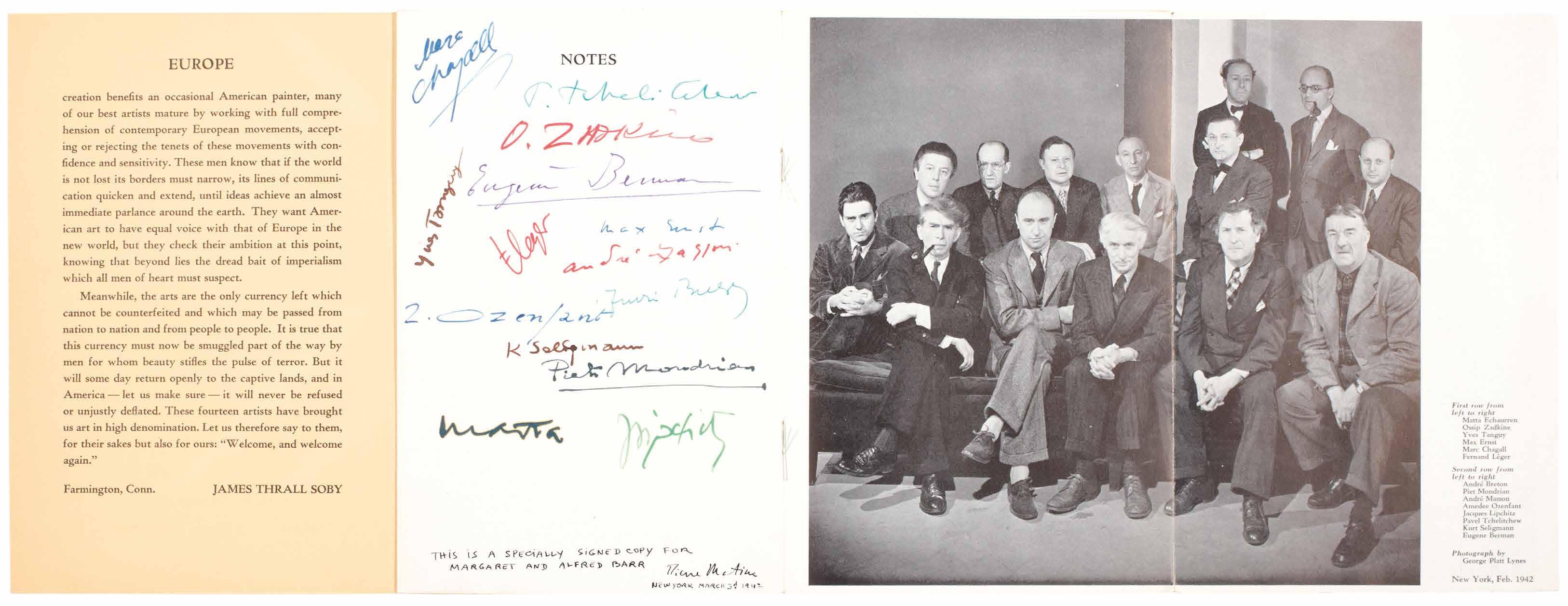
presentation by Pierre Matisse, as from 1940 she had taken charge of the ongoing operations to help artists and writers fleeing Europe. Each individual required ‘a visa from the State Department, an affidavit of financial support, an affidavit of moral sponsorship vouching that he or she was in imminent danger and would not be inimical to U.S. interests, biographical sketches and letters of reference proving identities and the above, and at least $400 for ocean passage’. Barr worked in conjunction with Curt Valentin (himself a beneficiary of the Barrs’ help), Kay Sage (she married Yves Tanguy, another beneficiary in 1940), Kay Boyle and the Emergency Rescue
Committee. Although no exact list of all of those who benefited from the help of the Barrs and the ERC remains extant, the majority of those who exhibited in ‘Artists in Exile’ did and the present catalogue represents a remarkable testament to their work, their efforts and their humanity.
8vo. (230 × 154 mm). [3 unnumbered leaves, one large and fold-out]. Original publisher’s pale yellow printed wrappers with folding flap, titles to front cover in green, later green board slipcase.
— $22,500
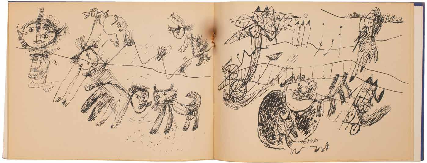
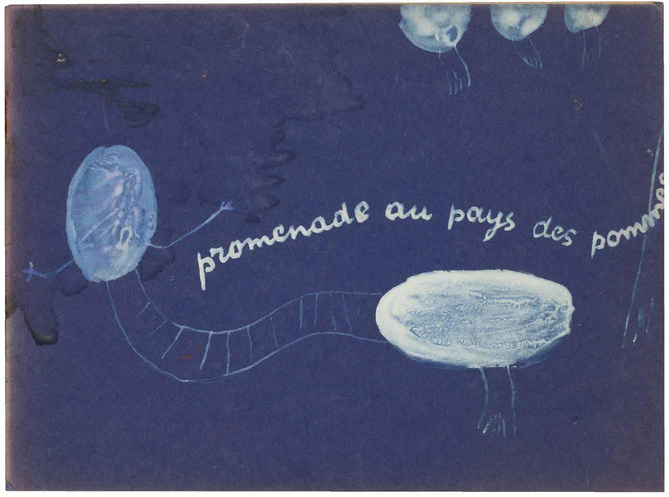
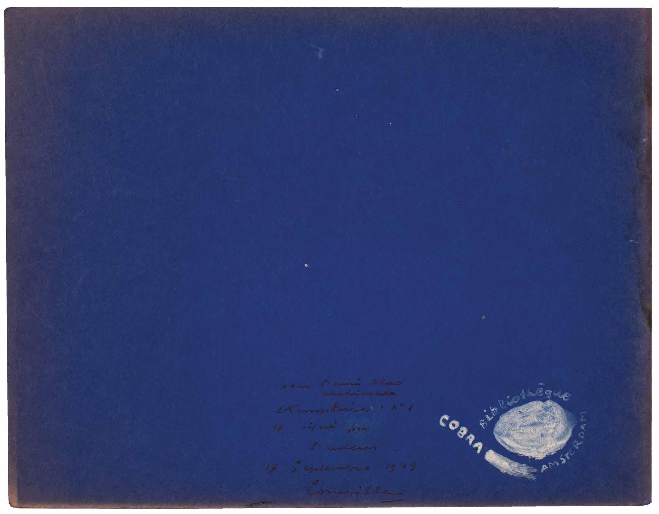
[30].
Corneille (Guillaume Cornelis van Beverloo) Promenade au Pays des Pommes. 16 Dessins de Corneille Amsterdam. Cobra Bibliothèque. 12 September 1949
¶ Copy number one, with a presentation to Aldo van Eyck, of Corneille’s legendary CoBrA artist book here with an original painting for the front cover.
From the edition limited to 12 copies, each signed and numbered by Corneille in ink to the rear cover.
Corneille’s presentation and manuscript justification are in black ink to the rear cover: ‘pour l’ami Aldo / architecte / eXemPlaire : nº 1 / et signé par / l’auteur. / 17 Septembre 1949 / Corneille [underlined]’.
Corneille (1922–2010) produced this early artist book in 1949 shortly after the formation of CoBrA. Issued in very small numbers - bibliographies detail 10 or 12 copies only - all feature an original wrapper, with an original drawing by Corneille to the front cover and a manuscript justification to the rear. Copies feature the wrapper in
various colours (most usually tan) and Corneille’s drawing and title in black ink. The present copy, in a blue cover, features a similar drawing and title, however here executed in white paint; the vignette to the rear cover for the ‘COBRA Bibliothèque Amsterdam’ is also in white and the justification in black ink. It seems clear that the painting for the cover of the present example represents the maquette for the edition and all other copies.
Oblong 8vo. (181 × 244 mm). [5 bifolia: 10 unnumbered leaves including blanks]. Original publisher’s blue card wrappers stapled as issued, front cover with manuscript title and drawing by Corneille in white paint, manuscript note in black ink by Corneille to rear cover with drawn vignette with text ‘Bibliothèque COBRA AMSTERDAM’ in white paint.
— $11,500
[31].
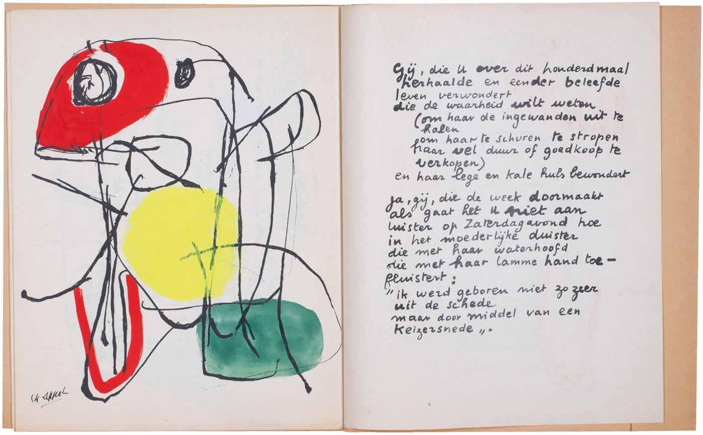
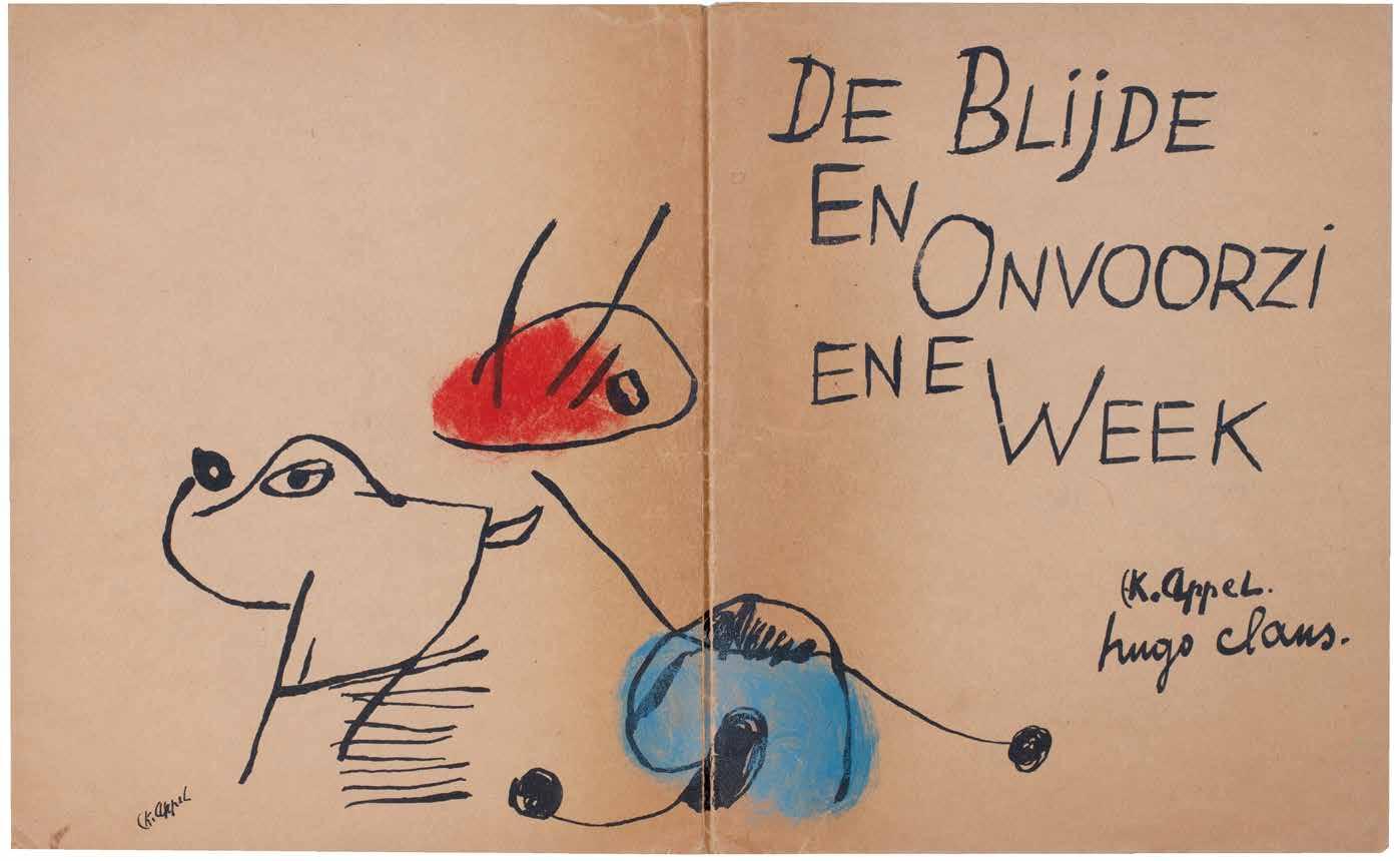
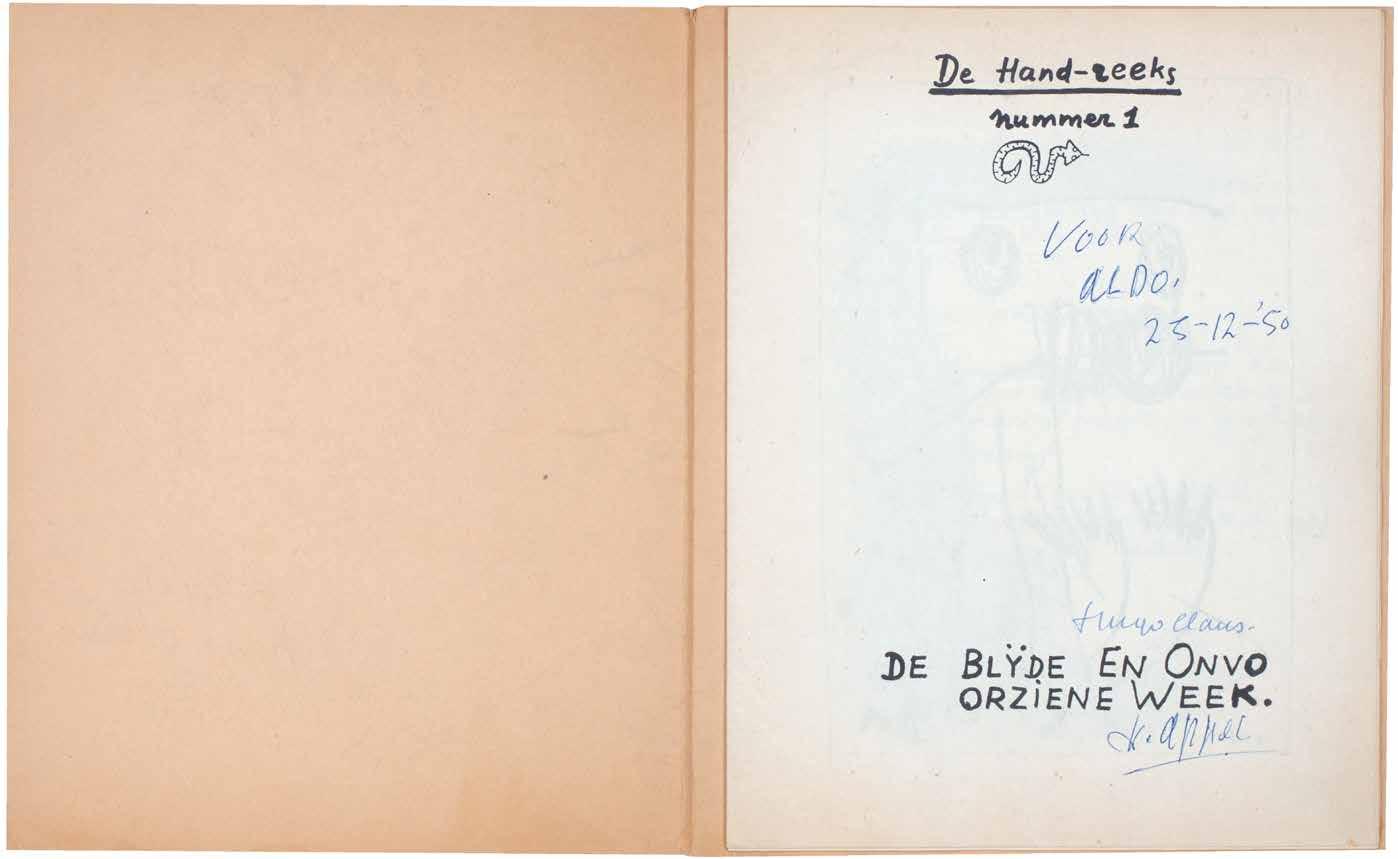
Karel Appel & Hugo Claus De Blijde En Onvoorziene Week. De Hand-Reeks Nummer 1. (The Happy and Unforeseen Week). (All Published) Paris. By the artists / COBRA-bibliotheek. December 1950
¶ A very rare presentation copy of Karel Appel and Hugo Claus’ photocopy artist book with additional handcoloured illustration by Appel.
From the edition limited to 200 numbered copies signed by Appel and Claus in blue ink to the title; Appel’s presentation is in blue ink to the same leaf: ‘VOOR / ALDO. / 25-12-’50’.
The first and only number of this very rare early CoBrA publication produced while the Belgian poet (Claus) and the Dutch painter (Appel) lived in Paris. Claus and Appel attempted to solicit subscriptions for what was to be a series of publications (each issue would be
available for three guilders) however only three copies were, in fact, subscribed for and the project was abandoned after this sole number. Produced in its entirety using a prototype photocopy method (‘een Foto-copy systeem’), the illustrations were coloured individually by Appel by hand using vibrant primary colours.
4to. (276 × 228 mm). [4 bifolia: 8 unnumbered leaves]. Original publisher’s tan photocopy card portfolio with flap, title after Claus’ manuscript to front cover with illustration by Appel across covers and spine coloured by the artist by hand.
— $10,000
[32].
Max Weber Woodcuts and Linoleum Blocks
New York / Great Neck, Long Island. E. Weyhe. 1956
¶ An excellent example of the édition de tête with the additional signed suite.
From the edition limited to 225 copies each signed and numbered by Weber in ink, with this one of the first 25 from the édition de tête specially bound and with the additional portfolio of signed woodcuts; the remaining copies were issued in cloth and without the signed suite.
Max Weber (1881–1961) was a pioneering American painter and printmaker who studied in Paris in the early years of the twentieth century where he was exposed to the work of Cézanne, Picasso and Matisse, met Guillaume Apollinaire, attended Gertrude Stein’s
salon and made friends with Douanier Rousseau (Weber helped organise his first US exhibition). On his return to the US in 1909, Weber is credited with introducing Cubism to the New World.
2 vols. 8vo. (258 × 174 mm). + Folio. (336 × 244 mm). [4 leaves of cream wove paper + 31 leaves of doubled Japon Shiduzoka].
Original publisher’s oatmeal cloth-backed printed paper-covered card boards, title gilt to spine, matching paper-covered board slipcase, additional prints loose in original grey card portfolio, white paper label with printed titles to upper cover.
— $4,750
[33].
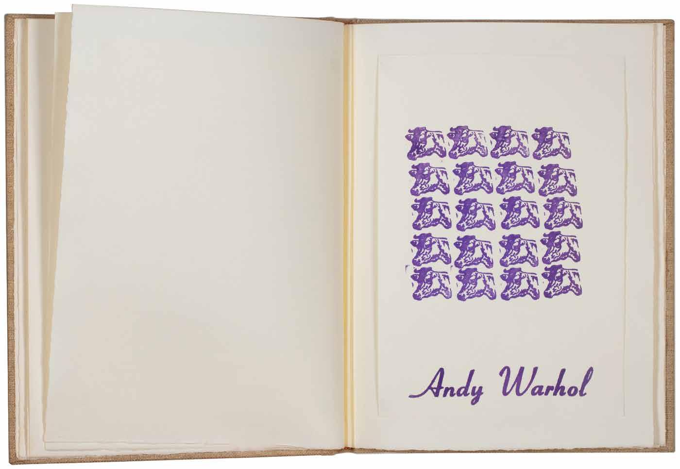
Andy Warhol A Gold Book (New York). (By the artist). (1957)
¶ A unique example of the most beautiful of Warhol’s pre-Pop books with a variant cover.
From the edition limited to 100 copies, signed by Andy Warhol in ink on the half-leaf justification and with the text: ‘Dedicated to / Boys / Filles / friuts [sic] / And / flowers / Shoes and t[ed] c[arey] and e[d]. W[allowitch]. / Book designed by / Miss Georgie Duffee’.
The cover for this copy features Warhol’s line drawing of a hand clasping a flower (see F & S IV.115), the whole image cut out and pasted to the gold papercovered front board. Printed in black
on gold paper, this example represents a unique variant, not described in Feldman & Schellman’s catalogue raisonné of Warhol’s prints, which gives details of the version printed on white paper only.
Small folio. (370 × 282 mm). [20 unnumbered lesaves: 14 leaves of gold paper (including half-leaf for title + 6 leaves of cream laid paper]. Original publisher’s gold paper-covered boards, front cover with collage decoupé lithograph of a hand clasping a flower in black on gold paper.
— $42,500
[34].
Pablo Picasso & Pindare. (Jean Beaufret, Trans.)
VIIIe Pythique
Alès. PAB. (P[ierre]. A[ndré]. B[enoit].). 1960
¶ A superb example of this superb collaboration between Picasso and PAB.
From the edition limited to 50 copies, with this one of 44 signed and numbered in pencil on the justification by the publisher and artist; six copies numbered in Roman numerals as well as six hors commerce copies were also issued. Picasso’s four original drypoint engravings are titled as follows: ‘Homme Grec Barbu’ (for the front cover; ‘Lutteur avec Lance et Bouclier’; ‘Athlète de Face’; ‘Athlète au Repos’.
‘Pindar’s Eighth Pythian Ode was, after Ovid’s Metamorphoses (1931) and Aristophanes’s Lysistrata (1934), the third and last text from classical antiquity which Picasso illustrated ... At the request of P. A. Benoit, Picasso executed four drypoints on celluloid for Pindar’s text ... The Eighth Pythian Ode was presented (i.e. sung) in 446 BC at Aegina, in honour of a certain Aristomenes who had won the wrestling competition at the Pythian
Games at Delphi. Pindar celebrates the youth’s splendid victory, but also mourns the transience of happiness and glory by evoking the sad fate of the defeated.’
Patrick Cramer.
Folio. (512 × 340 mm). [8 bifolia: 16 unnumbered leaves]. Loose as issued in original publisher’s printed wrappers with flaps, original drypoint engraving on celluloid (‘Homme Grec Barbu’) by Picasso to front cover, original publisher’s patterned paper-covered board chemise with title in black to spine and matching slipcase.
— $30,000
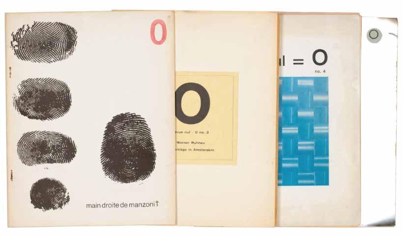
De Vries, Herman, Henk Peeters & Armando nul = 0. tijdschrift voor de nieuwe konseptie in de beeldende kunst (...) review of the new tendency in art. Nos. 1–4 Arnhem. Nul-Verlag. 1961–1964
¶ A very good complete set of ‘nul = 0’, a forerunner of de Vries’s review ‘Integration’.
From the edition limited to 500 unnumbered copies (nos. 1 & 2) or 300 unnumbered copies (nos. 3 & 4).
‘nul = 0’ was founded to support the artistic activities of the Dutch Nul group, which had strong affinities with the German Zero group. Stressing international dialogue, the magazine published contributions in French, German and English by artists including Yves Klein, Piero Manzoni (issue 2 was published in homage to both recently
deceased artists), Yayoi Kusama, Daniel Spoerri, Hans Haacke, Heinz Mack, Otto Piene, and the three founding editors, Herman de Vries, Henk Peeters, and Armando. Armando departed after the first issue and Peeters after the second; de Vries’ final two issues heralded his review ‘Integration’ which was launched in January 1965.
4 vols. 4to. (276 × 216 mm). Original publisher’s wrappers, stapled as issued, glossy silver paper with excision or printed or with label pasted to front cover.
— $6,000
[36].
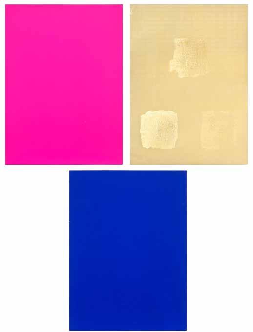
Yves Klein
Monochrome und Feuer Krefeld. Museum Haus Lange. 1961, (January–February)
¶ A very fine example of Yves Klein’s catalogue multiple ‘Monochrome und Feuer’ purchased at the Kaiser Wilhelm Museum in Krefeld at the time of the exhibition.
The Krefeld exhibition ‘Monochrome und Feuer’ (Monochrome and Fire) included a wide range of Klein’s work including his monochromes, sponge reliefs, sponge sculptures, anthropometries and cosmogonies. It also included a small void room and his drawings of his water and fire wall and fountain designs. Perhaps the most spectacular of all was the installation of his Fire Sculpture and Wall of Fire on the museum’s lawn.
The accompanying folder published for the exhibition is one of the most
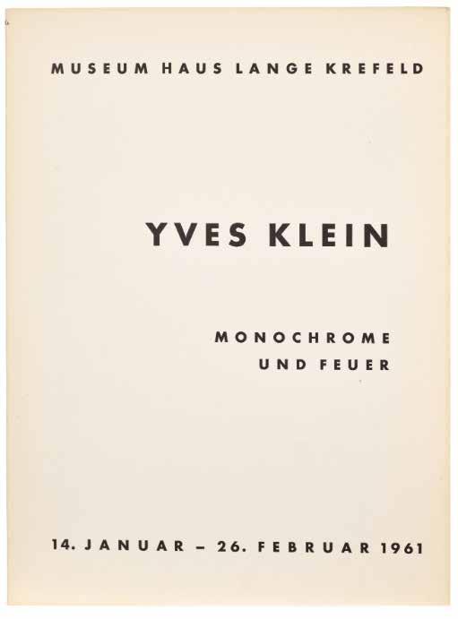
renowned of exhibition catalogues, including as part of its contents, the three original chromatic sheets by Klein, one in International Klein Blue (IKB), one in lucid pink, and the other gold. On the gold sheet, Klein has applied, by hand, three small sections of gold leaf. The resultant triptych is one of the most striking of Klein’s printed works.
4to. (320 × 235 mm). 9 pages of text and 24 illustrations and with the 3 chromatic sheets in blue, pink and gold, the latter decorated with three sections of applied gold leaf. Loose as issued in card folder, with accompanying text leaves.
— $27,500
[37].
Jean Dubuffet La Lunette Farcie
Alès / Paris. PAB. (P[ierre]. A[ndré]. B[enoit].). 1963
¶ Dubuffet’s extraordinary collaboration with PAB, a scintillating exemplar of inventive typography and illustration.
From the edition limited to 55 copies signed by Dubuffet on the justification, with this one of 5 hors commerce examples inscribed ‘H. C.’.
Dubuffet’s extraordinary collaboration with PAB features swirling typographic arrangements – the text appears to be rubber stamped – of Dubuffet’s words that dominate the pages. Dubuffet’s original lithographs provide windows in each blizzard of words that open onto different worlds. PAB seems to have
confined himself, unusually it must be said, to creating the mise en page for the book which combines Dubuffet’s words with his own lithographs. The text was printed by l’Imprimerie Union and the lithographs by Serge Lozingot on the artist’s own press.
Folio. (445 × 390 mm). [4 bifolia: 8 unnumbered leaves]. Loose as issued in original publisher’s printed lithograph wrapper with flaps by Dubuffet, original publisher’s black cloth portfolio with flaps and ties, printed title in white to front cover.
— $20,000
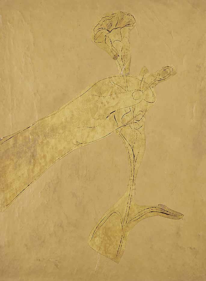
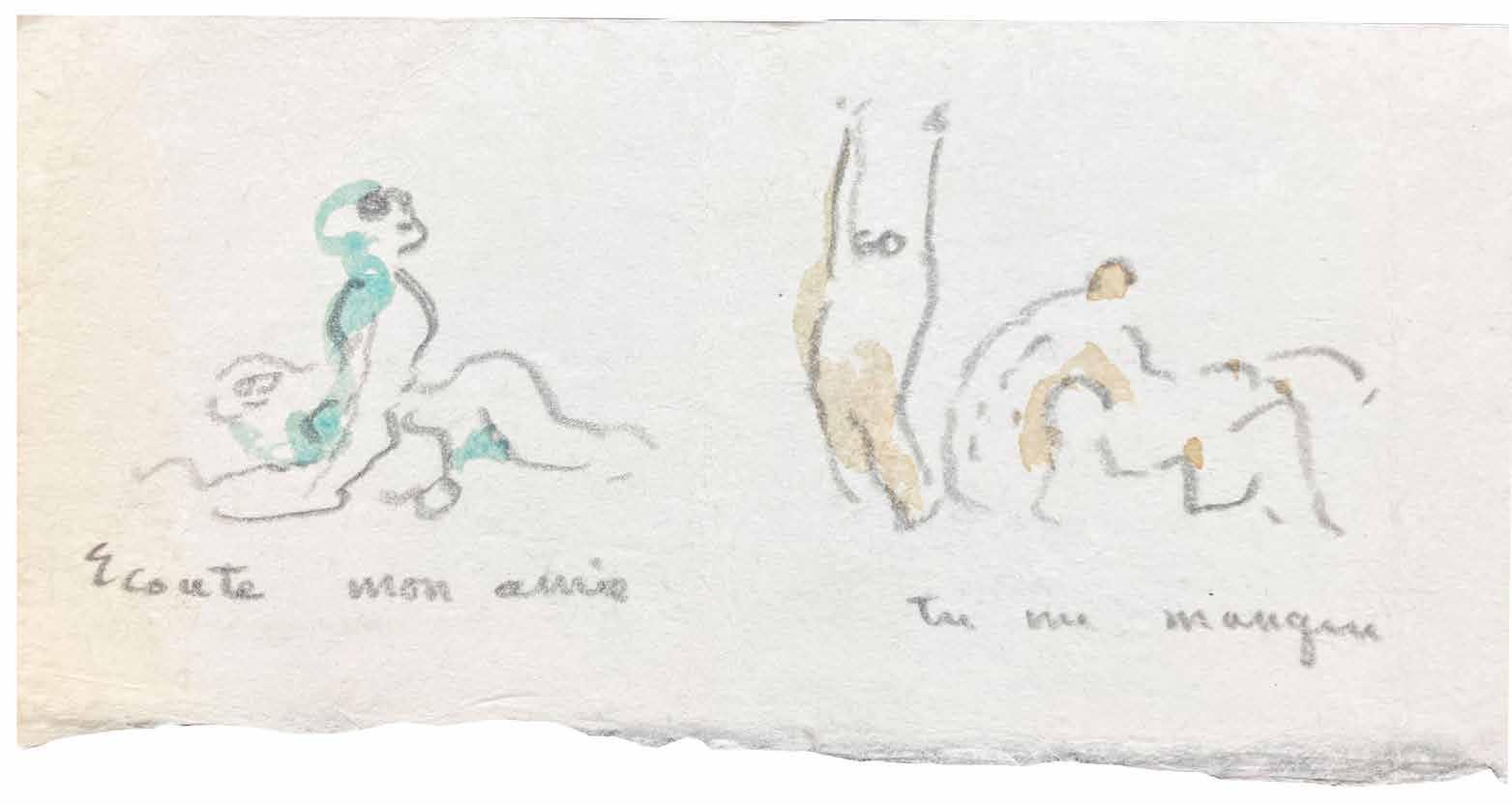
Dorothea Tanning
Frieze of 6 Erotic Original Watercolour
Drawings by Dorothea Tanning Paris. (c.1965)
¶ An original watercolour ‘frieze’ / leporello / letter by Dorothea Tanning.
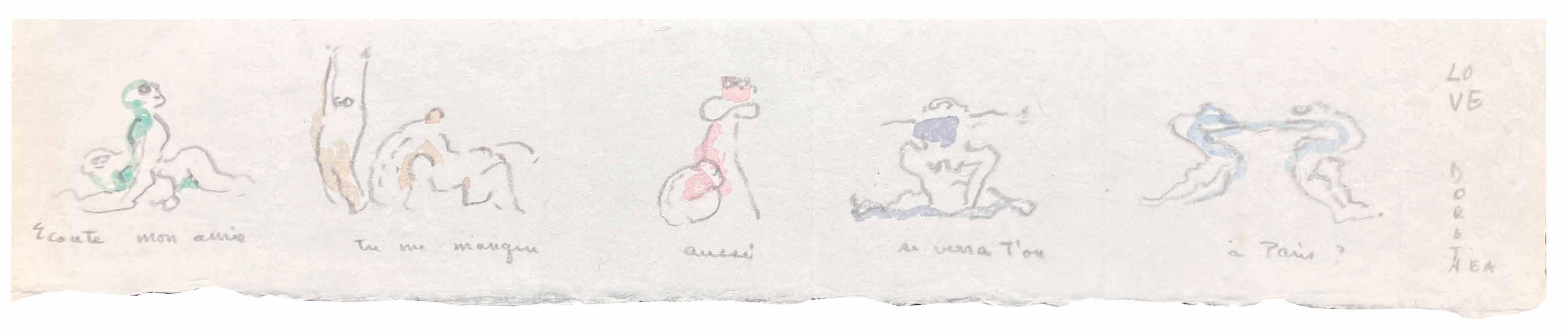
The 6 drawings in the frieze depict women in erotic or post coital poses; each is executed in watercolour and pencil on a single folded sheet of Japon paper with short manuscript text under each one, ‘Ecoute mon amie / Tu me manque / aussi / se verra t’on / à Paris / LOVE / DOROTHEA.’ (Listen my friend / I miss you / Also / We will see each other / in Paris.).
Tanning and her husband Max Ernst met Ylipe (Philippe) and Germaine
Larbarthe after their return to France at the end of the war and they built up a close professional and personal relationship, as evidenced by this folded invitation or letter.
Single sheet. (130 × 660 mm). 6 watercolour drawings, recto only, folded for mailing to form a leporello or card.
— $7,250
a detail: see next spread for full image
[39].
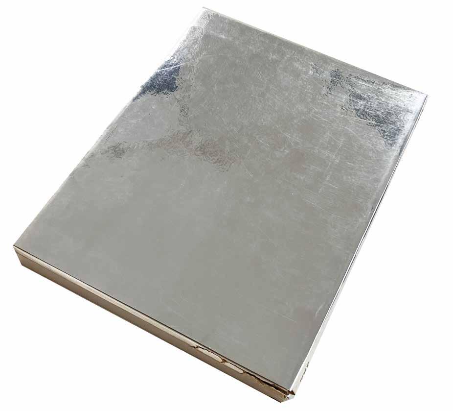
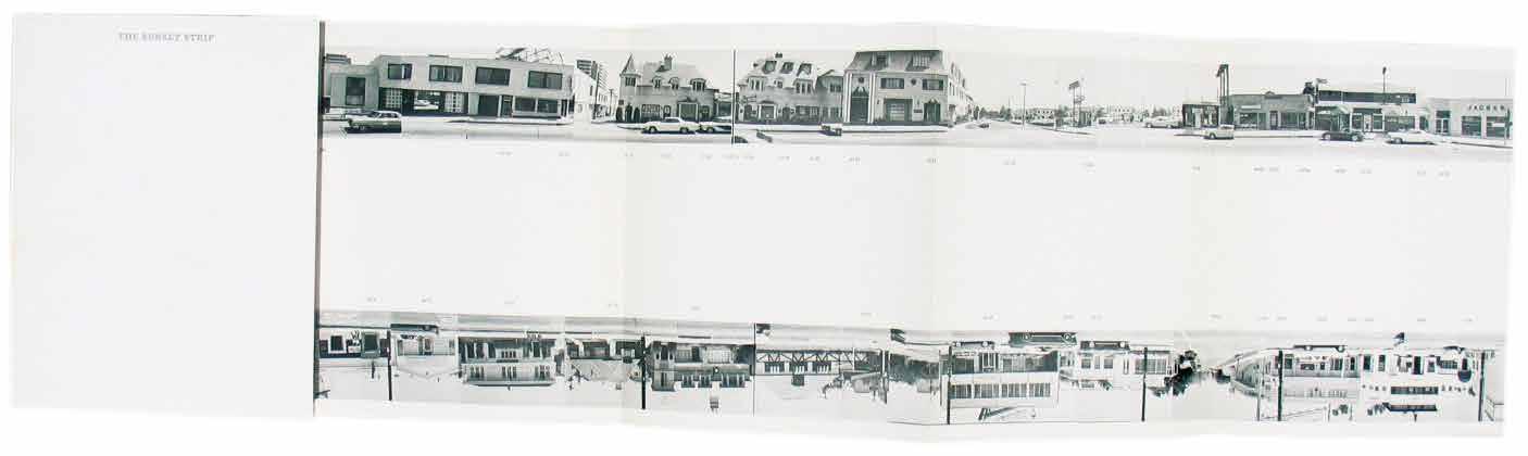
Ed Ruscha
Every Building On The Sunset Strip (Los Angeles). Edward Ruscha. 1966
¶ The first edition first issue, signed by Ruscha on the title, of this famous and important leporello artist book.
From the edition limited to 1000 copies, complete with the small folded flap at the end of the book (at 9176 and 9171 Sunset Boulevard); this copy signed on the title page by Ruscha.
‘The Sunset Strip satisfied one of Ruscha’s early ambitions: ‘In Oklahoma City, I delivered newspapers riding along on my bicycle with my dog ... I dreamed about making a model of all the houses on that route, a tiny but detailed model that I could study like an architect standing over a table and plotting a city”. As a result of his subsequent fascination with
the Sunset Strip, this unrealized youthful idea resurfaced in a different form. The accordion-fold structure of the book was an appropriate format for Ruscha’s intended depiction of the famous Hollywood thoroughfare as a series of two-dimensional storefront facades, like those of a Western town’. — Clive Phillpot.
8vo. (181 × 144 mm). Nine conjoined sheets (with the additional small folded flap at the end of the book) in leporello format; total size: 181 × 7,455 mm. Original publisher’s printed wrappers, title in silver to front cover and spine, original reflective silver slipcase.
— $7,250
Ed Ruscha Royal Road Test
Los Angeles. 1967
[43].
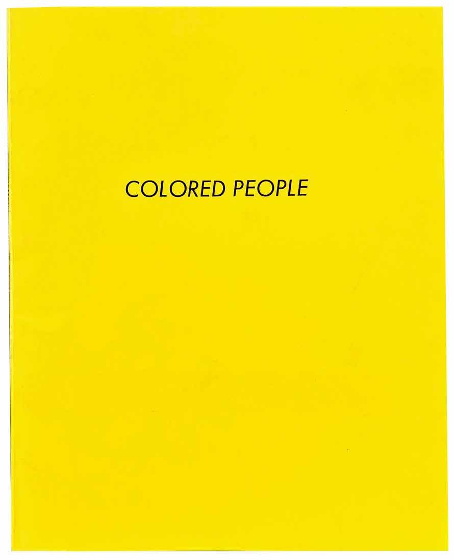
Ed Ruscha Coloured people (Los Angeles). 1972
[44].
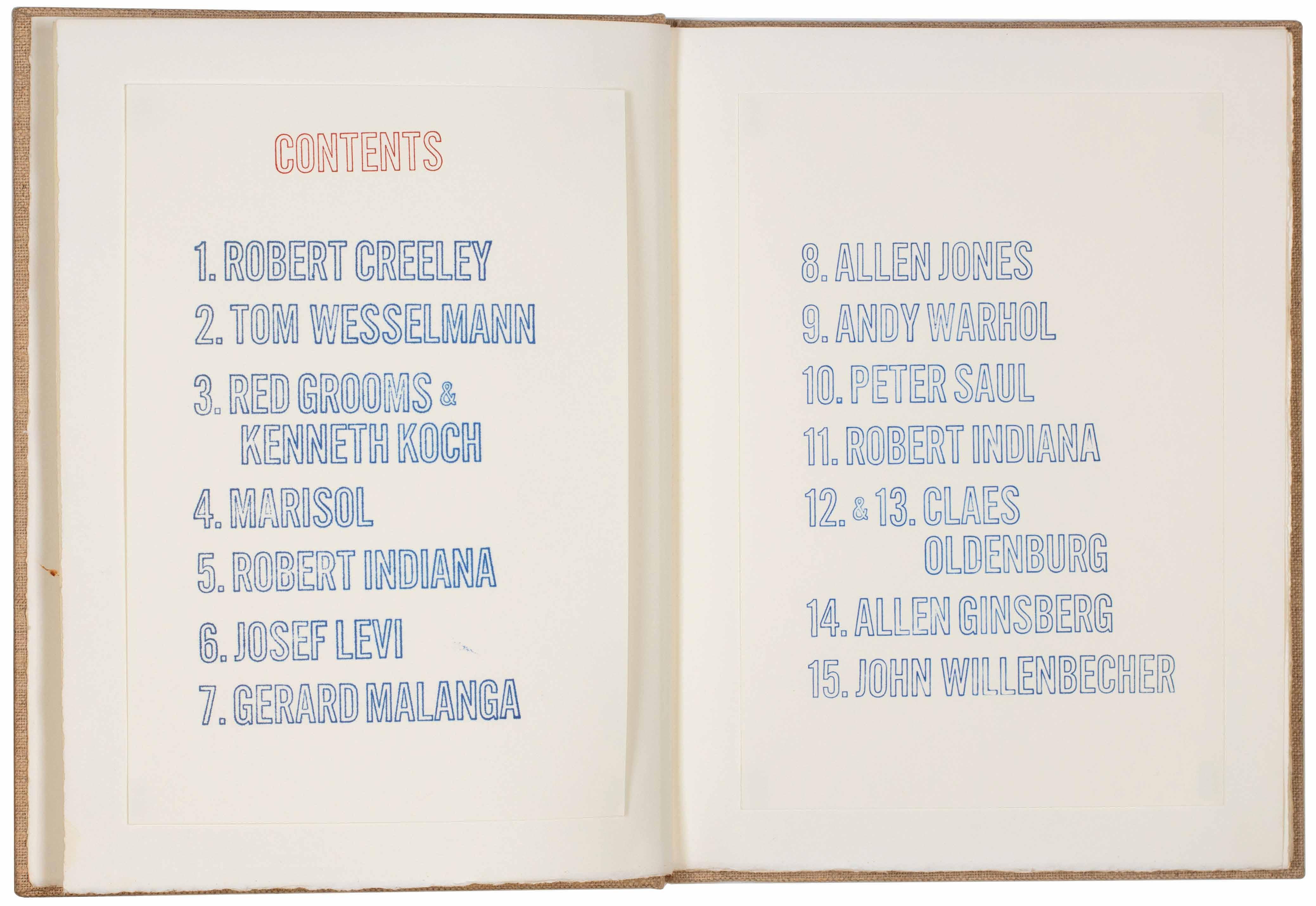
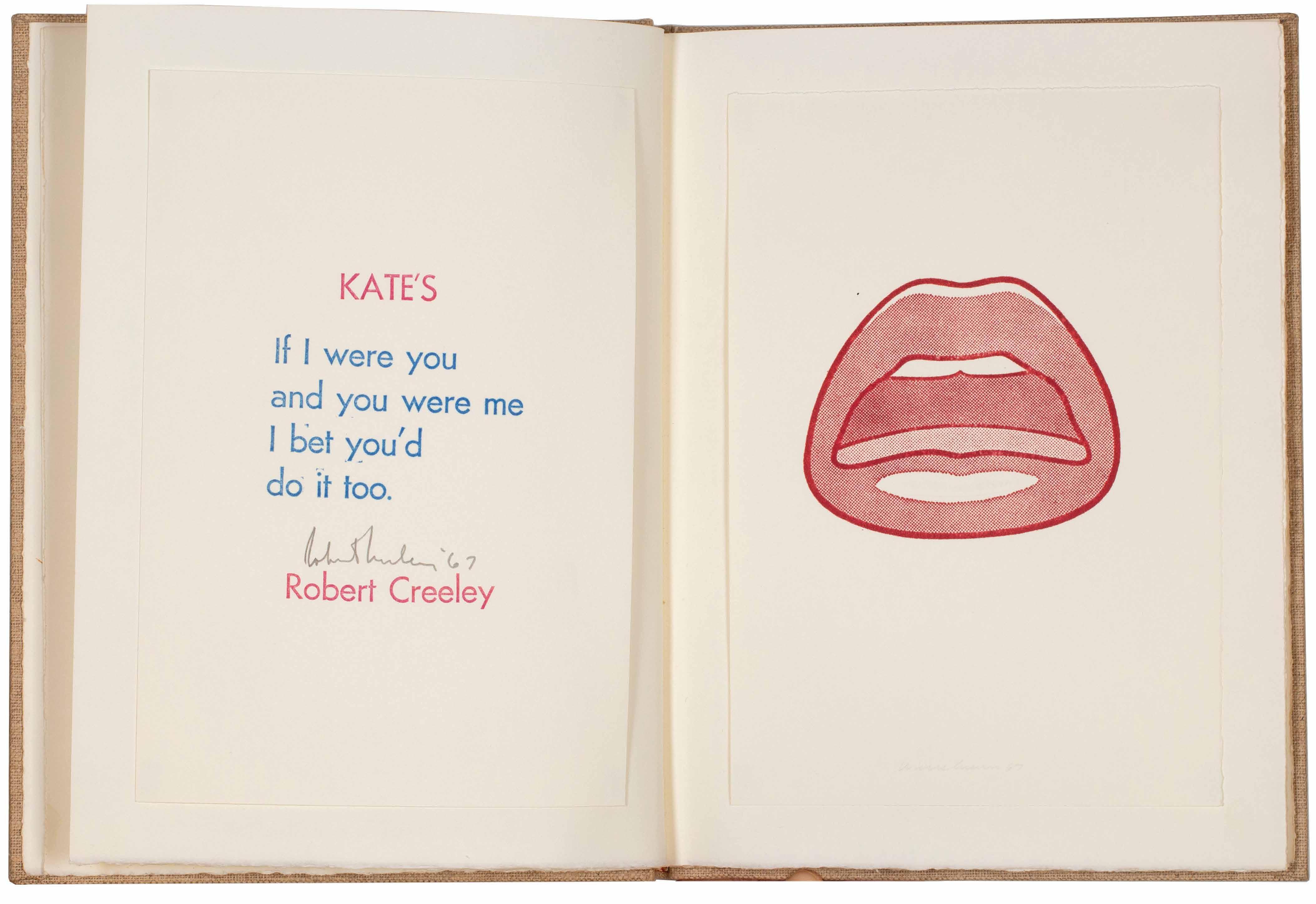
Andy Warhol, Tom Wesselmann, Allen Jones, et al. Creeley, Robert, Robert Indiana, Gerard Malanga et al. Katz, William (Ed.) Stamped Indelibly. A Collection of Rubberstamp Prints New York. William Katz / Indianakatz ... at the Bowery. 1967
¶ An excellent presentation copy of William Katz’s assemblage of rubberstamps by various poets and Pop artists.
From the edition limited to 225 numbered copies with each print signed by the artist (the Warhol and Red Grooms prints with stamp signatures as issued); only the first 110 copies were for sale, available through Multiples, Inc.
The presentation reads: ‘for Robert and Jen / With our love, / Bob [Creeley] / and In Friendship / Bill (Katz) / 3 Jan ‘72’.
‘William Katz, who began publishing books in 1964 as a college student, wanted to create a book using as modest and simple a technique as possible. He asked his Pop artist and writer friends to design
commercially made rubber stamps, which he then handprinted to create this book. (‘Stamped Indelibly’ contains Warhol’s first cow print and Oldenburg’s first drum pedal print.) Robert Indiana, an instructor whom Katz met at college, offered him space in which to work, thus Indianakatz became the imprint of this book. Katz later founded Bouwerie Editions to publish books of poetry with prints ...’.
— Elizabeth Phillips & Tony Zwicker.
4to. (292 × 225 mm). [14 unnumbered leaves with 19 mounted leaves recto and / or verso]. Original publisher’s coarse-weave oatmeal cloth as issued.
— $13,500
[45].
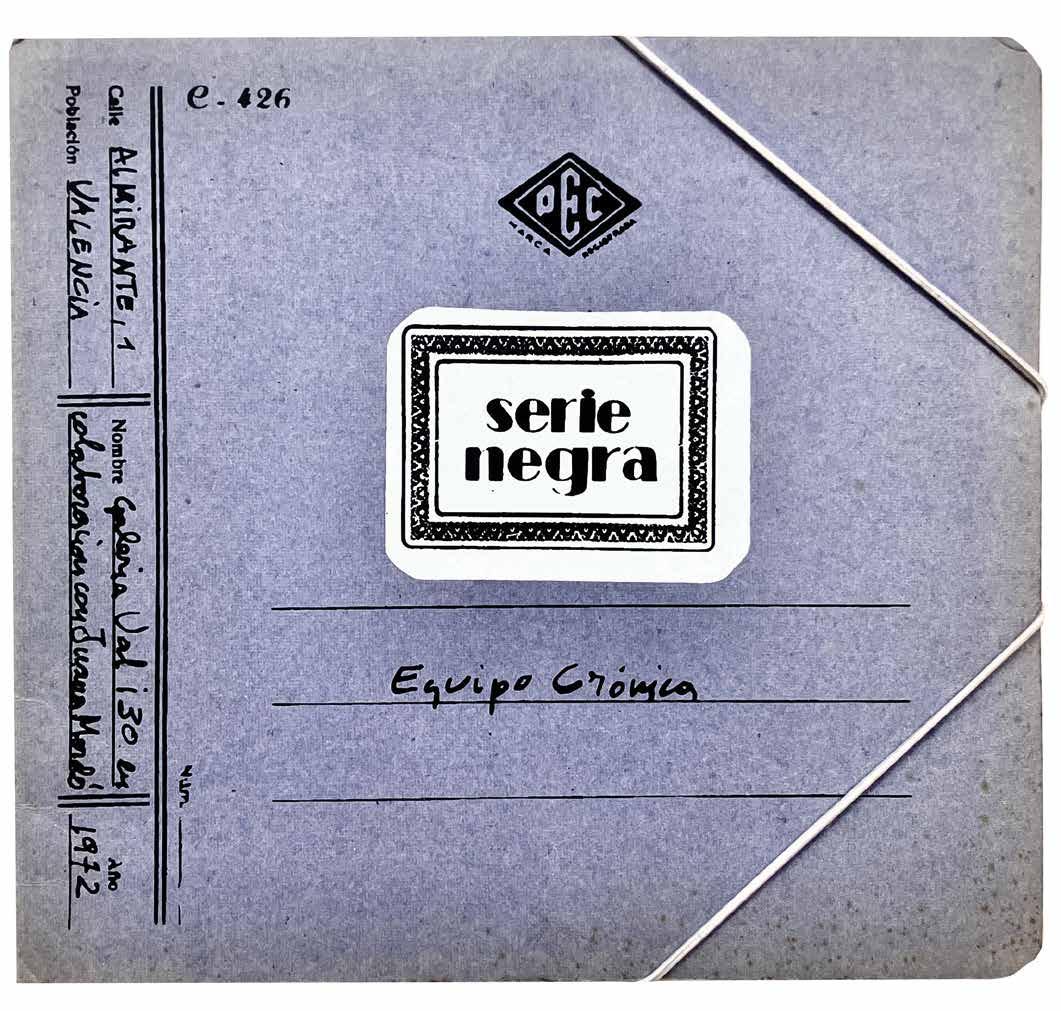
Equipo Cronica (Rafael Solbés & Manolo Valdés Blanco)
Serie Negra
Valencia. Galeria Val i30 en Colaboracion con Juana Mordó. 1972
¶ The extraordinary, scarce Pop artist book by the influential Spanish art collective ‘Equipo Crónica’.
Issued in the form of a film storyboard, ‘Seria Negra’ is a monochromatic screenprint composition of individual frames printed in a lush chocolate and cream. ‘Equipo Crónica’, the collective that produced the book, were a Popinfluenced duo of Manolo Valdés and Rafael Solbes (a third member had departed in 1967) founded in Valencia in 1964. Early exhibitions with Clavé, Saura, Tàpies and others prompted Valdés and Solbes to form first ‘Estampa Popular’,
a broader, looser grouping with shared artistic aims and then the smaller, more focussed ‘Equipo Crónica’. Small 4to. (210 × 228 mm). [Single folded sheet]. A single sheet pasted into the wrapper at both ends with screenprint recto only and folded to form 20 pages, the pages featuring 14 numbered silkscreen compositions conceived either as single pages or double-page spreads, sheet size: c.200 x 4,444 mm. Pasted as issued into original publisher’s blue portfolio with elastic fastening, white screenprint label with title to front cover with additional details in black.
— $2,250
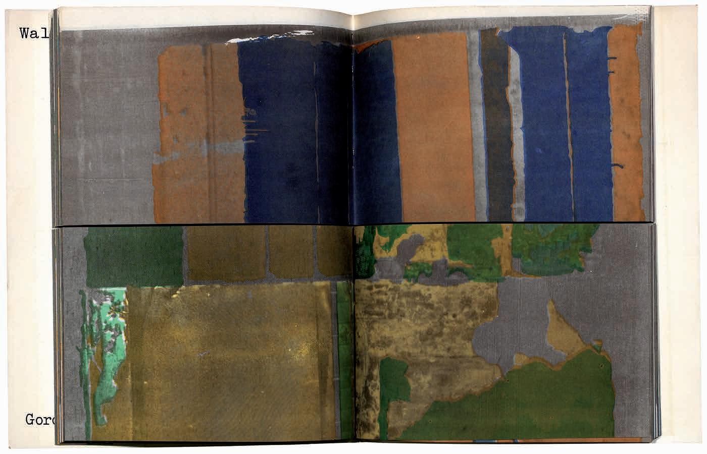
Gordon Matta-Clark Walls Paper
New York. Buffallo Press. 1973
¶ An excellent copy of this scarce artist book, and Matta-Clark’s most renowned photobook.
Gordon Matta-Clark, who died in 1978 aged only 35, was best known for his site-specific sculptural ‘building cuts’. These were sculptural transformations within constructions scheduled for demolition, made by cutting through them and exposing their cross section and interiors. Although requiring a good deal of quite violent hard work, Matta-Clark’s creations now exist primarily in the form of photographs, videos and films.
‘Walls Paper’ consists of a suite of colour photographs depicting the exposed interior
walls of Bronx tenement buildings that were being demolished. Clearly, MattaClark had not been able to get to these buildings before the wreckers, but instead of halving the building, he halved the book. Each page has been cut horizontally, so that the viewer can experience MattaClark’s creative process, and ‘split’ the building while turning the pages.
4to. (252 × 204 mm). pp. 144. Pages split horizontally into two sections, as designed. Original publisher’s printed wrappers with photographic reproductions to front and rear covers.
— $4,500
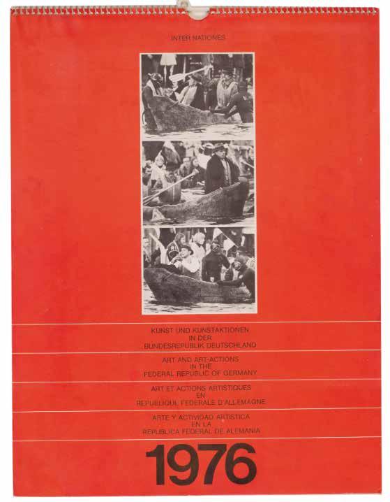
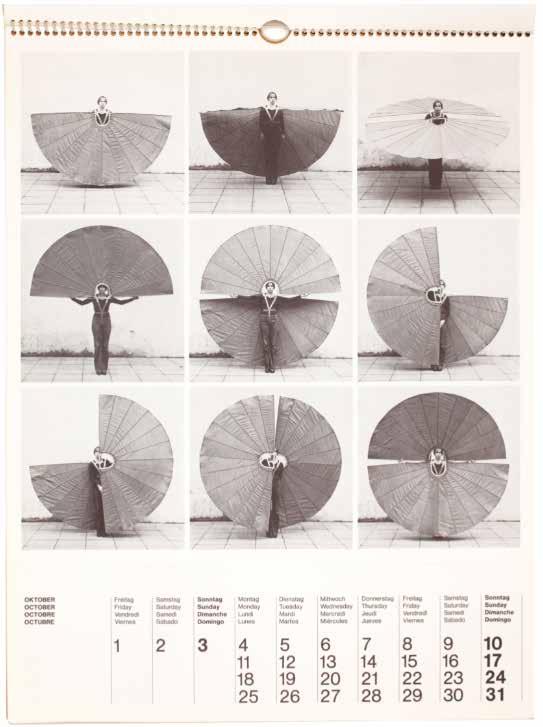
Christo, Beuys, Horn, et al. Wolfgang Längsfeld, (Ed.) Kunst und Kunstaktionen in der Bundesrepublik Deutschland = Art and art-actions in the Federal Republic of Germany... Munich. Heinz Moos Verlag. 1975
¶ A scarce art calendar for the year 1976 — an excellent document of time and place.
Richly illustrated with over 100 images documenting in detail art and art-actions in the Federal Republic of Germany in the mid-1970s. The cover reproduces an image of Joseph Beuys being rowed in a dug-out canoe across the Rhine at Düsseldorf in 1974.
Among the illustrated works is Christo’s ‘Packing Monschau Castle’ work (1971) as well as Rebecca Horn’s ‘Mechanical Body Fan’, 1973.
Folio. (420 × 320 mm). pp. 42. Original publisher’s spiral bound red printed boards.
— $1,250
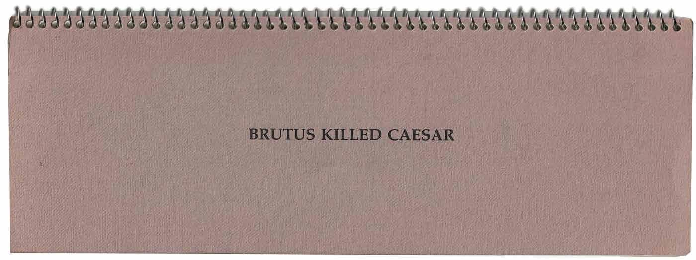
[48].
John Baldessari Brutus Killed Caesar Akron, Ohio. The Emily H. Davis Art Gallery of the University of Akron ... &c. 1976
¶ A very fine copy of John Baldessari’s artist book.
Baldessari is well known for using disparate elements of everyday life in his photographically generated works of art. In this, one of his earliest printed artists’ books, he juxtaposes three images in a linear format using two photographic portraits of a younger and older man facing each other with a photograph of a common household object between them. Each leaf repeats the same portraits but
illustrates a different ‘murder weapon’ or more mundane item that might be used to commit a murder: a kitchen knife, a wooden board, a magnifying glass, a book of matches, pushpins, a banana skin, an arrow, an apple etc.
Slim oblong 8vo. (274 × 95 mm). [35 unnumbered leaves]. Original publisher’s spiral bound printed wrappers with titles to front cover in black.
— $1,550
[49].
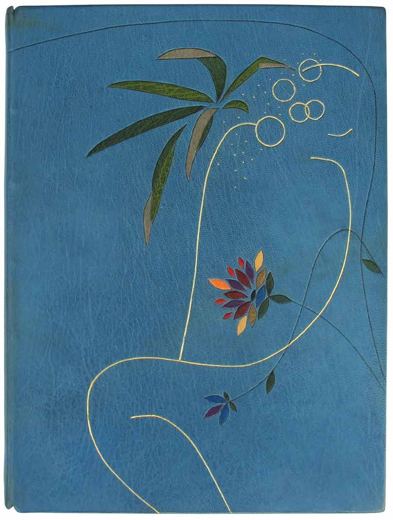
Susan Allix
The Song of Solomon London. The Willow Press. 1977
¶ An excellent copy of one of Susan Allix’s earliest artist books.
From the edition limited to 50 numbered copies, signed and numbered in ink by Allix on the justification.
The book is created in its entirety by Allix, who made the prints, developed the typography and mise-en-page and bound the book
Folio. (340 × 255 mm). [28 unnumbered leaves: 3 blank leaves, 20 leaves with text and illustration composed of uncut double leaves, leaf with justification, 4 blank
leaves]. Full light blue crushed morocco by Susan Allix with her blindstamped initials to rear pastedown, front board with gilt tooling to form an abstract female figure, tooling in blind flowing over both boards with additional inlaid sections of colour morocco to form a decorative floral design, turn-ins with additional inlaid sections of morocco and tooling in blind to match, blue handmade paper endpapers, loose in original wool-lined blue cloth box with gilt title to spine.
— $5,000
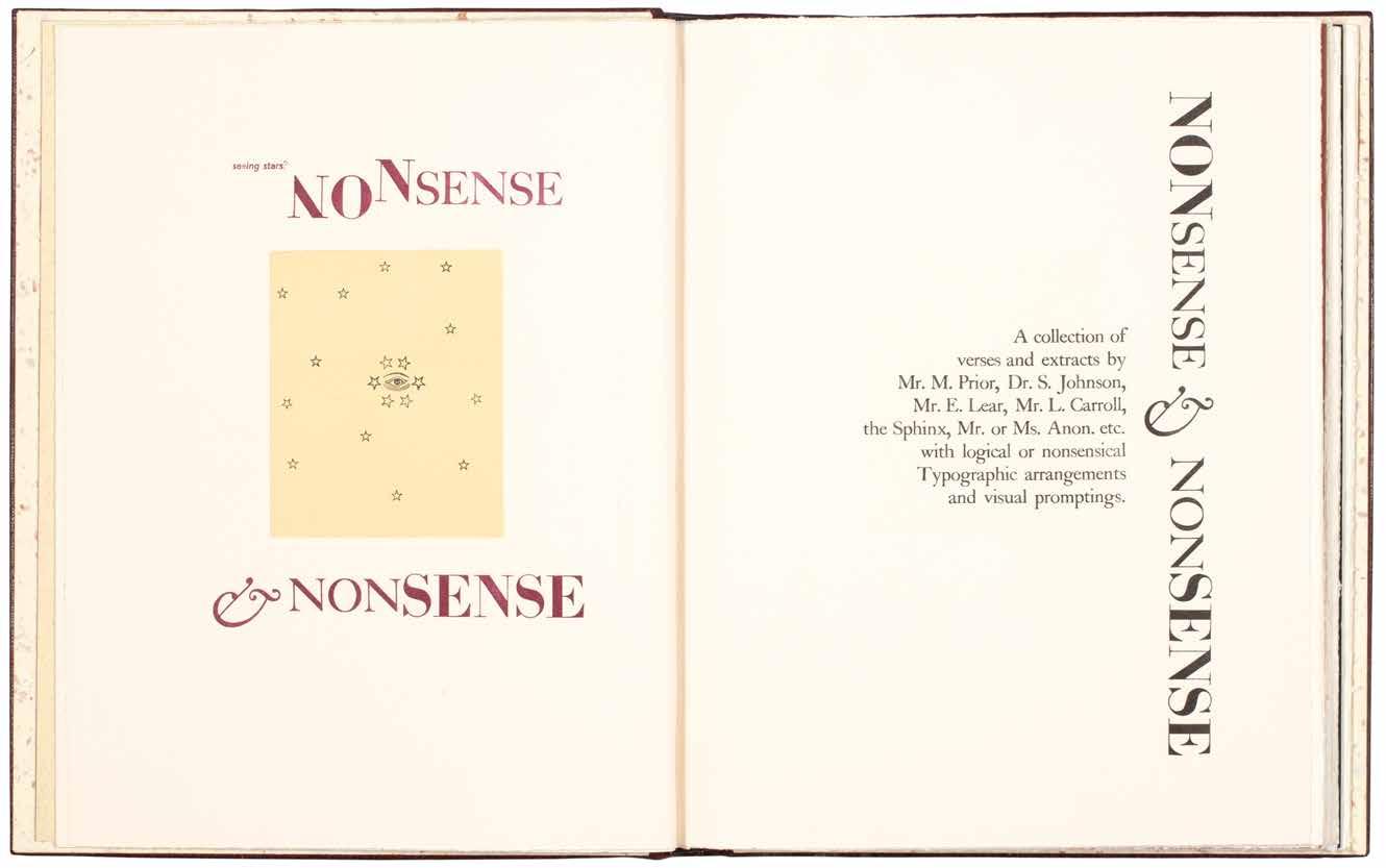
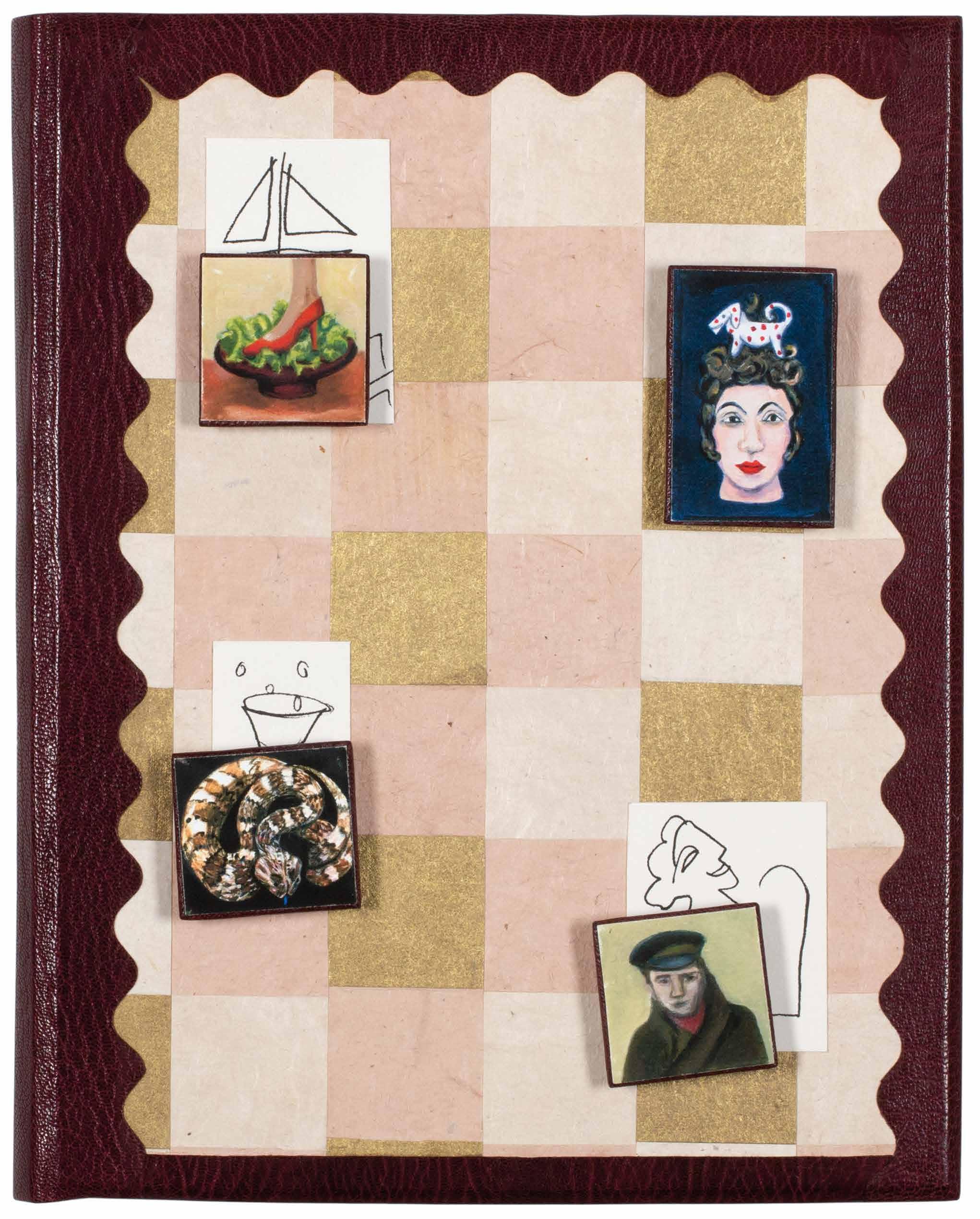
[50]. Susan Allix
Anon, old or unknown. Nonsense & Nonsense. A collection of verses and extracts by Mr. M. Prior, (...) London. (Susan Allix). 2008
¶The édition de tête in the deluxe magnetic binding of one of Susan Allix’s most extraordinary, inventive, capricious and whimsical artist books.
From the edition limited to 24 numbered copies signed and numbered by Allix in pencil, with this one of 8 from the édition de tête in the deluxe binding.
Allix’s detail regarding the book taken from the colophon is instructive:
‘Authors: old or unknown. / Typefaces: various (but including Grotesque, Gill, Granby and Gallia, with Caslon, Engravers Roman & altered and un-altered wood letter). / Papers: various (including Arches, Somerset, Zerkall). / Printing: by hand, by letterpress; with new intaglio plates and lino-cuts and old printer’s blocks.’
Also included, inserted loose, is the prospectus for the book.
Folio. (290 × 230 mm). [50 unnumbered leaves including blanks]. Full burgundy crushed morocco, excised sections with curvilinear edges reveal a checkerboard pattern of gilt, pink and café crème paper, front board with three applied sections of white paper with monochrome drawings and four colour paintings mounted to squares or rectangles of burgundy crushed morocco with magnetic fastenings, single painting mounted to rectangle of burgundy morocco affixed to centre of rear board, smooth spine with tooled title in black, cream handmade patterned paper doublures, bronze free endpapers, burgundy velvet-lined oatmeal drop-back box with morocco label to spine with title in black.
— $5,500
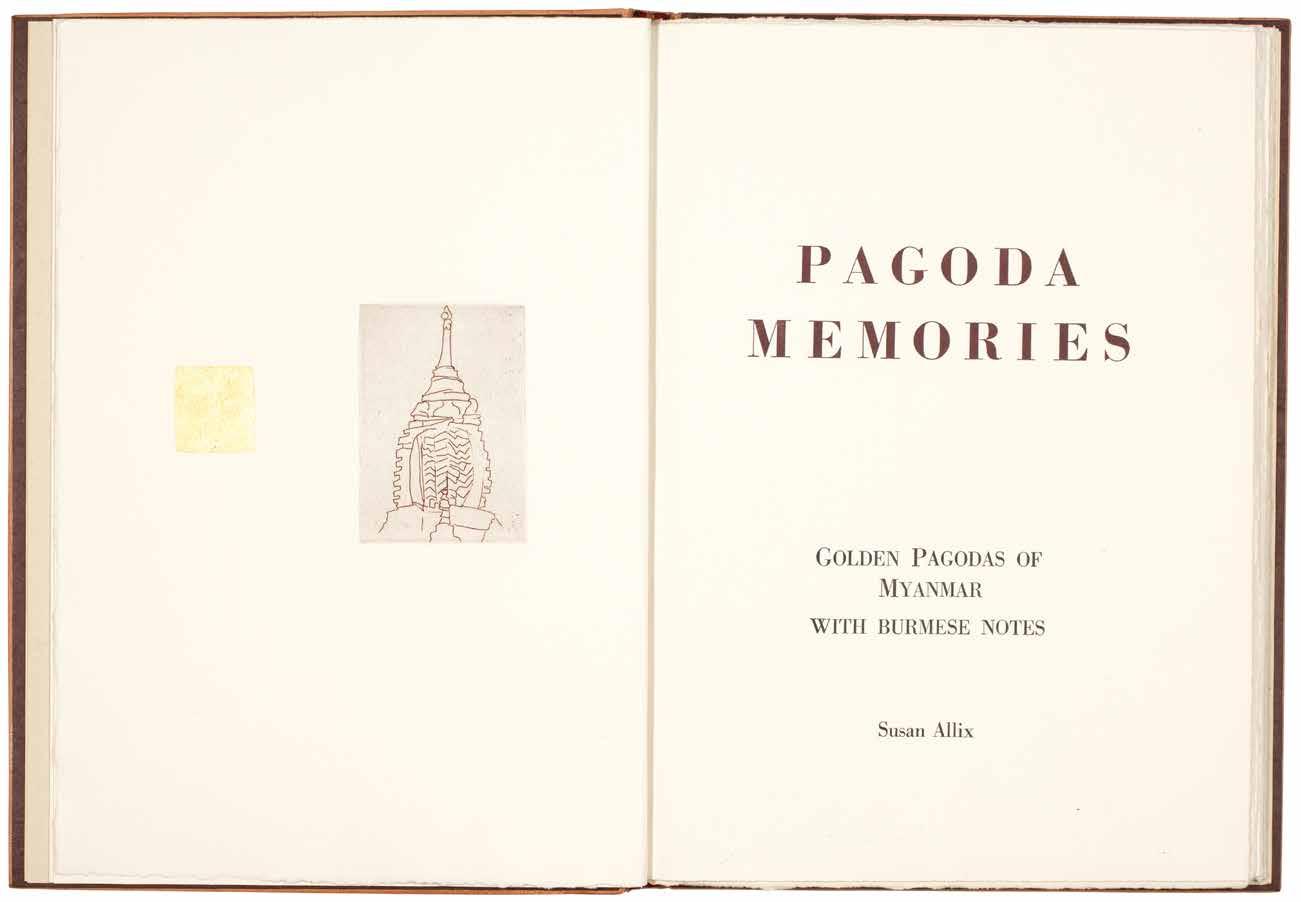
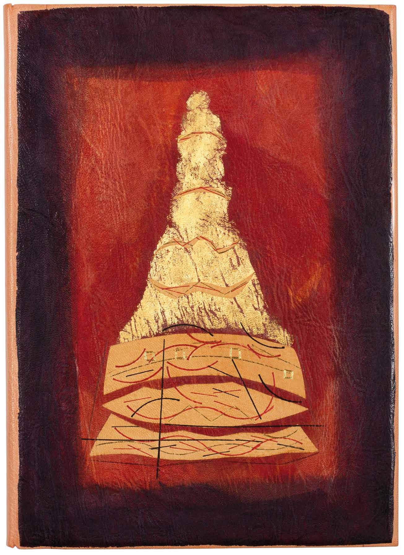
[51]. Susan Allix
Pagoda Memories. Golden Pagodas of Myanmar with Burmese Notes London. (Susan Allix). 2009
¶ A superb example of a Susan Allix illustrated book – created in its entirety by the artist – inspired by travels in Myanmar.
From the edition limited to 10 copies on Magnani Biblos and Burmese mulberry papers, signed and numbered by Allix in pencil.
Also included, inserted loose, is the prospectus for the book
The book was conceived and created in its entirety by Allix, who made the prints (intaglio prints with ‘line-drawing, aquatint, open-bite, softground, carborundum’ and colour), developed the typography and mise-en-page and bound the book. Four of Allix’s engravings also include applied gold leaf.
Folio. (340 × 248 mm). [33 unnumbered leaves]. Full terracotta crushed morocco, front and rear boards with large onlaid sections of burgundy to claret varicoloured morocco, front board with additional gilt decoration with onlaid sections of tan morocco with curvilinear decorative tooling in gilt, red and black to form a stylised pagoda motif, handmade textured chocolate paper doublures, burgundy gilt-patterned Kinwashi paper free endleaves, custard wool-lined burgundy cloth drop-back box with leather label to spine with title in black.
— $5,000
[52].
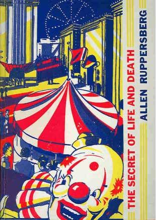
Allen Ruppersberg. Julia Brown (Ed.) Allen Ruppersberg. The Secret of Life and Death. Volume I, 1969–1984 Los Angeles / Santa Barbara. The Museum of Contemporary Art & Black Sparrow Press. 1985
¶ The deluxe edition, published on the occasion of Ruppersberg’s retrospective at MOCA Los Angeles.
This copy one of a limited edition of 250 numbered examples, handbound in pictorial boards by Earle Gray. This deluxe edition features an artwork / multiple entitled ‘Love Me Tender’ (which incorporates a primitive electronic ‘music box’ that plays a version of the Elvis Presley classic when opened - but as usual the battery is long dead).
4to. pp. 127. Colour & monochrome illustrations throughout. Essays and seven works by Ruppersberg. Bound-in folder: ‘Love Me Tender’, which contains five sheets of printed stationary, and eight 9 1/2 in. x 5 1/2 in. black & white photographic prints, and with the mounted device present. Original publisher’s colour printed boards and plain paper jacket as issued.
— $175
Sam Francis & Kathleen Fraser Boundayr
Santa Monica. The Lapis Press. 1988
¶ A beautiful Sam Francis illustrated book published by his own Lapis Press.
From the edition limited to 35 copies signed in pencil by the artist and author.
‘This book was designed and printed at the Lapis Press in Santa Monica, California by Lee Ferriss, Jaime Robles and Jack W. Stauffacher. The text was handset in Spectrum, a type designed by Jan Van Krimpen. The aquatints were printed by Jacob Samuel at the Litho
Shop Inc. Bound by Klaus-Ullrich S. Rötzscher.’ From the justification.
Folio. (398 × 288 mm). [18 unnumbered leaves]. Kathleen Fraser’s verse iIllustrated with six original colour aquatints by Sam Francis and justification. Original publisher’s wrappers with title in blind to front cover, original publisher’s blue cloth box.
— $11,500
[54].
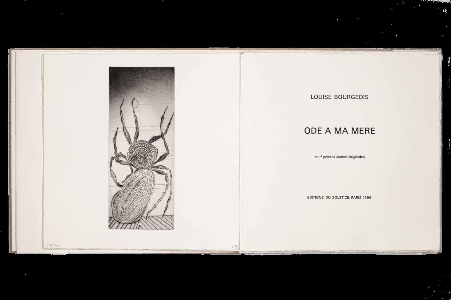
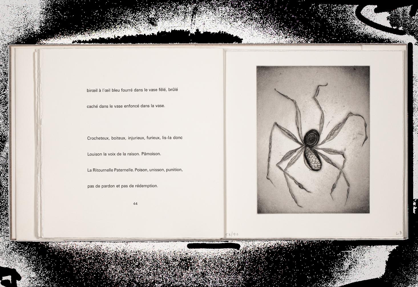
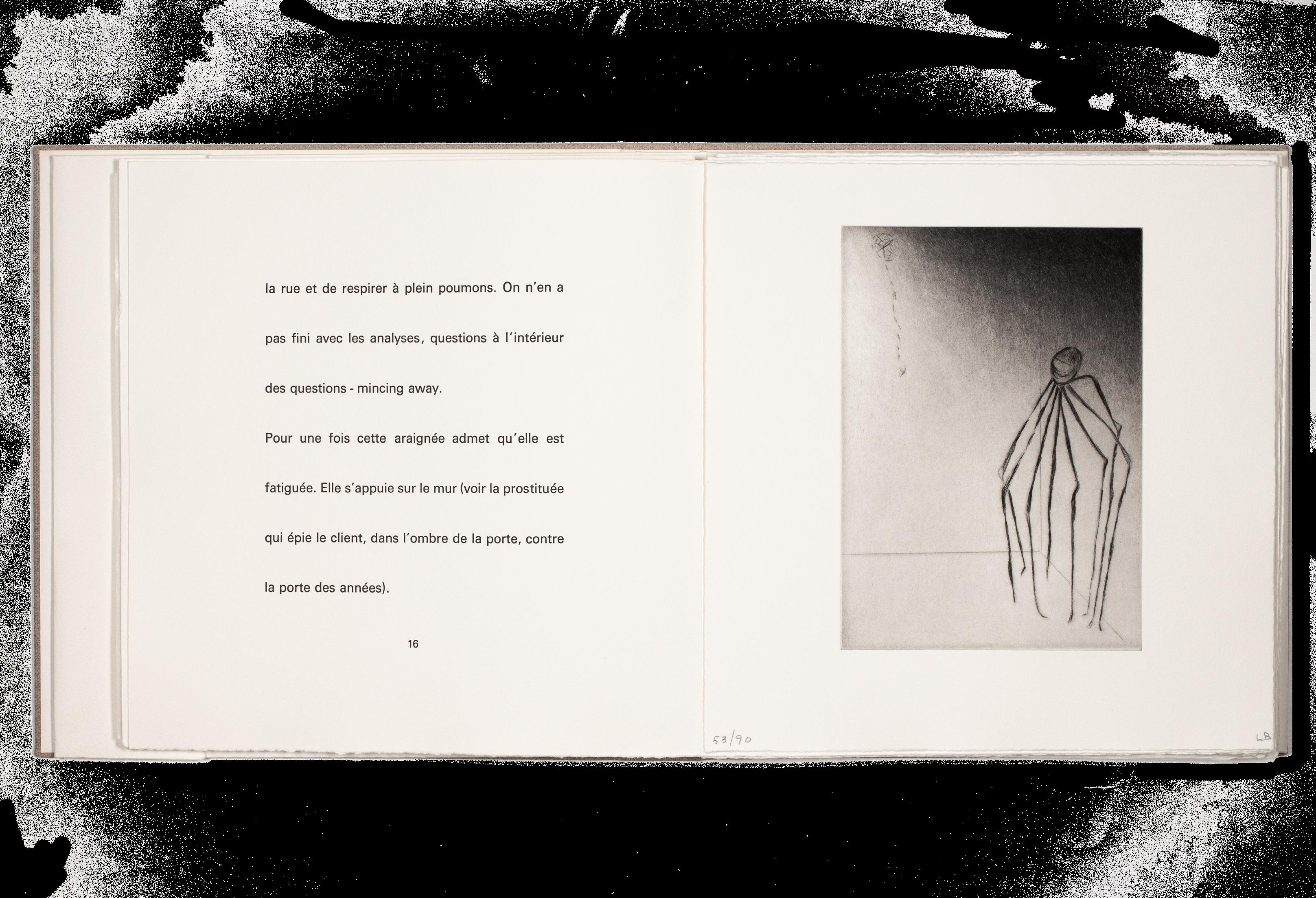
Louise Bourgeois Ode à Ma Mère
Paris. Editions du Solstice. 1995
¶ Louise Bourgeois’ extraordinary artist book of her own verse and her own engravings.
From the edition limited to 125 copies signed and numbered by Bourgeois in pencil, with this one of 90 copies ‘pour les sociétaires’ with all of the drypoints numbered and initialled by Bourgeois in pencil; 35 hors commerce examples numbered in Roman numerals were also issued.
All of Bourgeois’ engravings feature the motif of the spider: apparently different species of spiders engaged in different arachnid acts of spinning, climbing, making webs, hunting, or even in the final etching, seeming to give birth, albeit a human-headed spider to a human-headed baby. The accompanying verse – Bourgeois writes in a streamof-consciousness patois of English and French – delineate and underline the themes of her oeuvre that have now
become well-known. She writes in a clamorous tumult of different voices that seem to compete in different languages and tones, calling and responding, questioning and answering. Her words are of spiders, of her mother, of loss, remorse, anxiety, weaving, fear, joy and memory, regret and uncertainty, the effect a powerful complement to her images, the result a powerful tour de force and an extraordinary artist book.
‘Mes arraignées sont une ode à ma mère.’ Louise Bourgeois, from the text.
Square folio. (312 × 312 mm). [11 bifolia + 9 leaves with engravings = 31 leaves including blanks]. Loose as issued in original publisher’s plain cream wrappers, original coarse-weave cloth chemise with title to spine in black and matching slipcase by Atelier Bernard Duval.
— $62,500
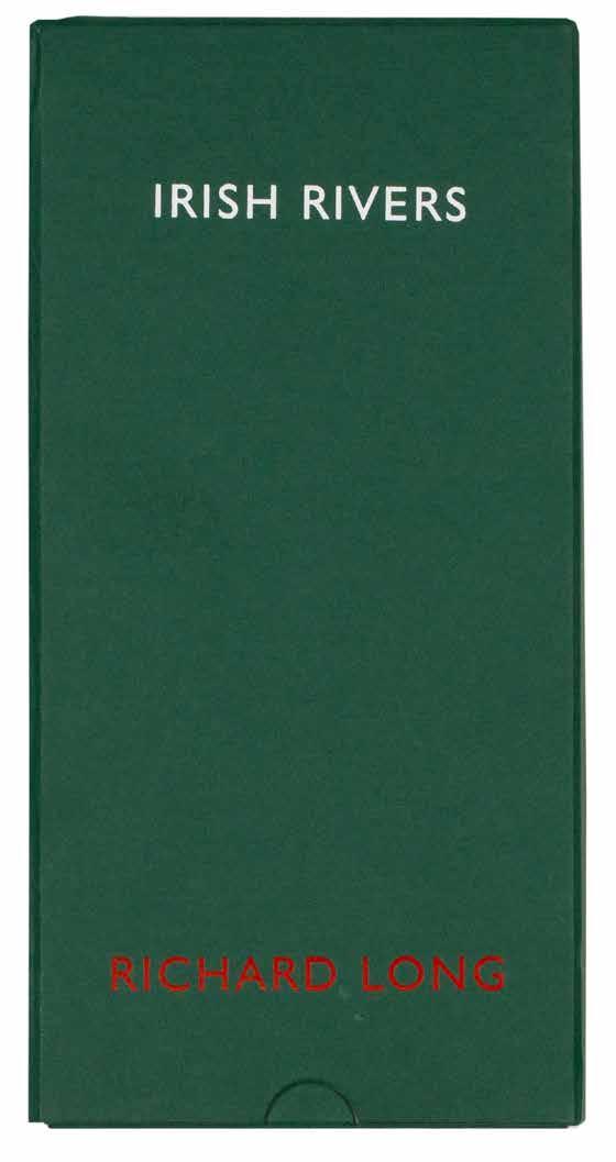
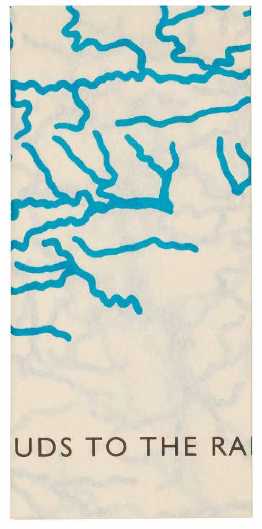
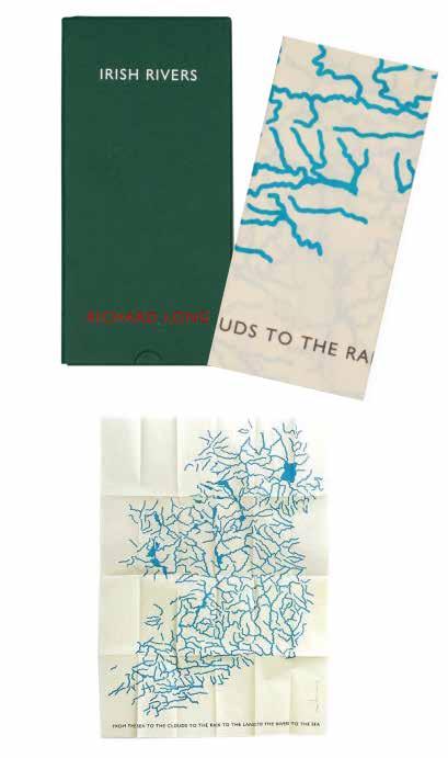
Richard Long Irish rivers
Turin. Marco Noire Editore. 1998
¶ An excellent example of Richard Long’s large format silkscreen map multiple on vellum.
From the edition limited to 60 copies, each signed and numbered by Richard Long in pencil.
Richard Long’s ‘Irish Rivers’ is just that: a silkscreen map of Ireland, deconstructed entirely, with all terrain, geography and topography excised and retaining only the rivers and loughs.
Printed entirely in blue, the rivers and loughs give an alternate sense of Ireland, usually imagined as the emerald isle, as an island of blue. Beneath Long’s image is the printed legend iterating the endless cycle of water: ‘FROM THE SEA TO THE CLOUDS TO THE RAIN TO THE LAND TO THE RIVERS TO THE SEA ’.
The multiple ‘Irish Rivers’ also relates to a group of works created by Richard
Long in the 1990s. Among them are an original drawing in blue pencil of all of the rivers of Ireland, and another drawing, of the rivers of England, Scotland and Wales. Executed too in 1998, both of Long’s drawings of rivers feature the same legend as this multiple version as the title beneath, in red for the Irish drawing and in blue for the UK drawings.
Tall 8vo. (256 × 128 mm). [Single folded leaf]. A single sheet of vellum with original silkscreen in blue and legend in black beneath by Richard Long recto, signed and numbered by Long in pencil at lower right; sheet size: 250 × 118 mm (folded), 1000 × 695 mm (unfolded). Original publisher’s green cloth slipcase with title in white and credit in red to front cover, matching chemise with flap.
— $3,750
44 st james’s place, london, sw1a 1ns info@simsreed.com | tel. +44 (0)20 7930 5566
SIMS REED
SIMS REED